q3 scoala
TRANSCRIPT
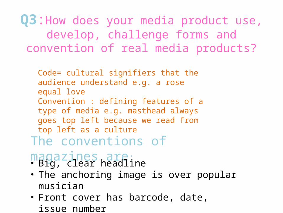
Q3:How does your media product use, develop, challenge forms and convention of real media
products?
The conventions of magazines are:
• Big, clear headline • The anchoring image is over popular musician • Front cover has barcode, date, issue number• Main cover lines indicating the articles
Code= cultural signifiers that the audience understand e.g. a rose equal love Convention : defining features of a type of media e.g. masthead always goes top left because we read from top left as a culture

Iconic- my magazine We Love Pop-real media product
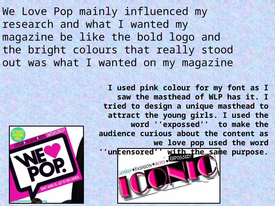
We Love Pop mainly influenced my research and what I wanted my magazine be like the bold logo and the bright colours that really stood out was what I wanted on my magazine
I used pink colour for my font as I saw the masthead of WLP has it. I tried to design a unique masthead to attract
the young girls. I used the word ‘’expossed’’ to make the audience
curious about the content as we love pop used the word ‘’uncensored’’ with
the same purpose.
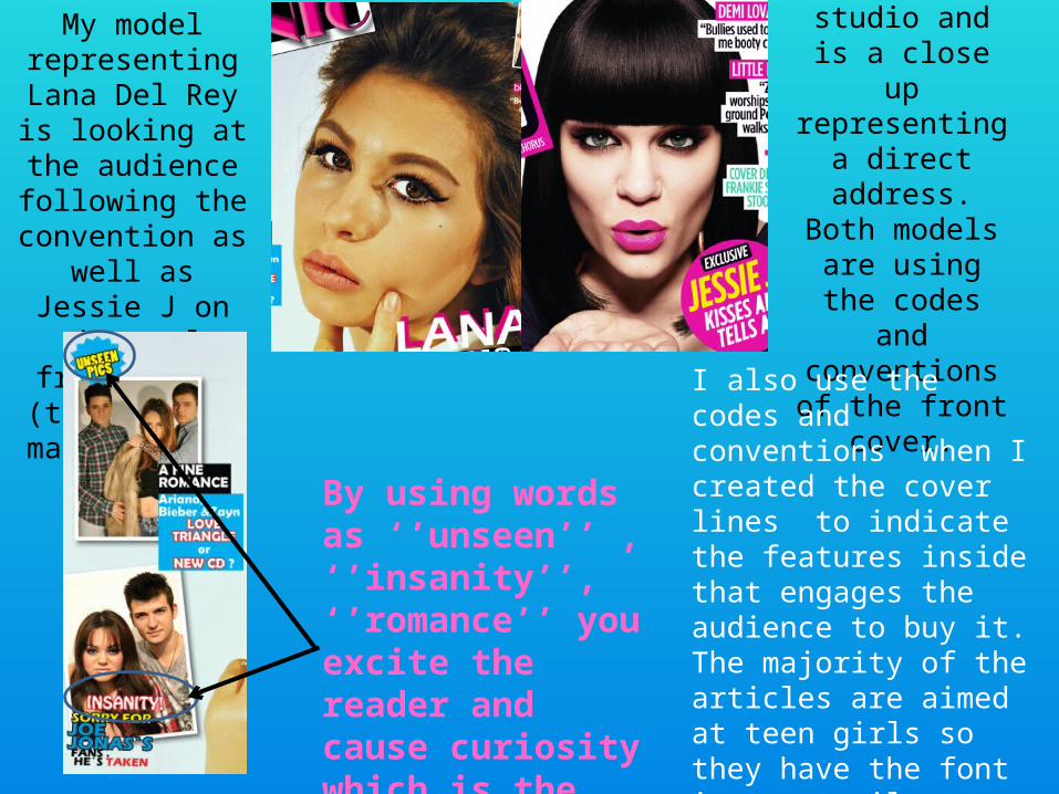
The central image was shoot in a studio and is a
close up representing a direct address.
Both models are using the codes and conventions
of the front cover.
My model representing Lana
Del Rey is looking at the audience following the
convention as well as Jessie J on the
real front cover (this is the main image.
I also use the codes and conventions when I created the cover lines to indicate the features inside that engages the audience to buy it. The majority of the articles are aimed at teen girls so they have the font in an easily readable
By using words as ‘’unseen’’ , ‘’insanity’’, ‘’romance’’ you excite the reader and cause curiosity which is the main purpose of the keywords

As any other front cover, mine has a barcode, issue number, date and website which is positioned on the bottom right corner Another convention of the front cover is that the image to follow the rule of thirds in order to be aesthetically pleasing. When I took the pictures I took care that to hold the camera vertically and to fit the model in such a way that it would follow it

The font-basic and simple.Many images that link to the younger audience. Main image is a medium shot.
Mode of address is informal.
Busy layout – reflect many amazing things you can find in the issue
Musthead same as front cover but different colour. Footer same to the front cover=> house style
Double page spread
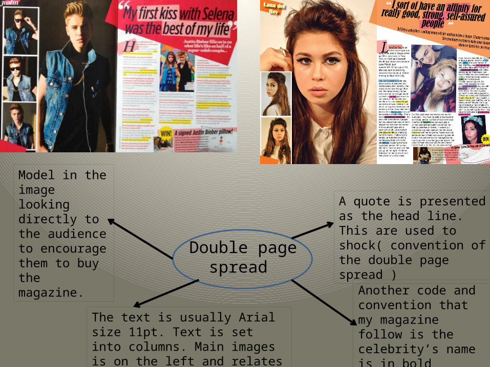
Double page spread
Model in the image looking directly to the audience to encourage them to buy the magazine.
A quote is presented as the head line. This are used to shock( convention of the double page spread )
Another code and convention that my magazine follow is the celebrity’s name is in bold
The text is usually Arial size 11pt. Text is set into columns. Main images is on the left and relates to the article is written informal