project 9 - marc schwartz
TRANSCRIPT
Portfolio
Marc A. Schwartz
d e s i g n
Contact
Marc Schwartz
208.932.8260
236 W 3rd SRexburg, Idaho83440
Blog: sch12018.wordpress.com
Contents
Brochure
Letterhead
Business Card
Web Page
Event Ad
Flier
Logos
Photodesign
Montage
Resume

d e s i g n
Course/Instructor:COMM 130, Section 7
Joel Judkins
Process:I first designed the logo and the background (which I created with a single 1.5” tile) in Illustrator.
I then laid out the basic design in InDesign, being careful to line things up just so.
After printing, I cut the margins off and the window out. Finally, I folded it on the sides, using the window as a precise guide to line it up.
Objective:Set up and align a two-sided, folding document.
Learn how to wrap text around a clipped image.
Use Paragraph styles in InDesign.
Date:March 29, 2014
Programs used:Adobe InDesign, Adobe Illustrator, Adobe Photoshop
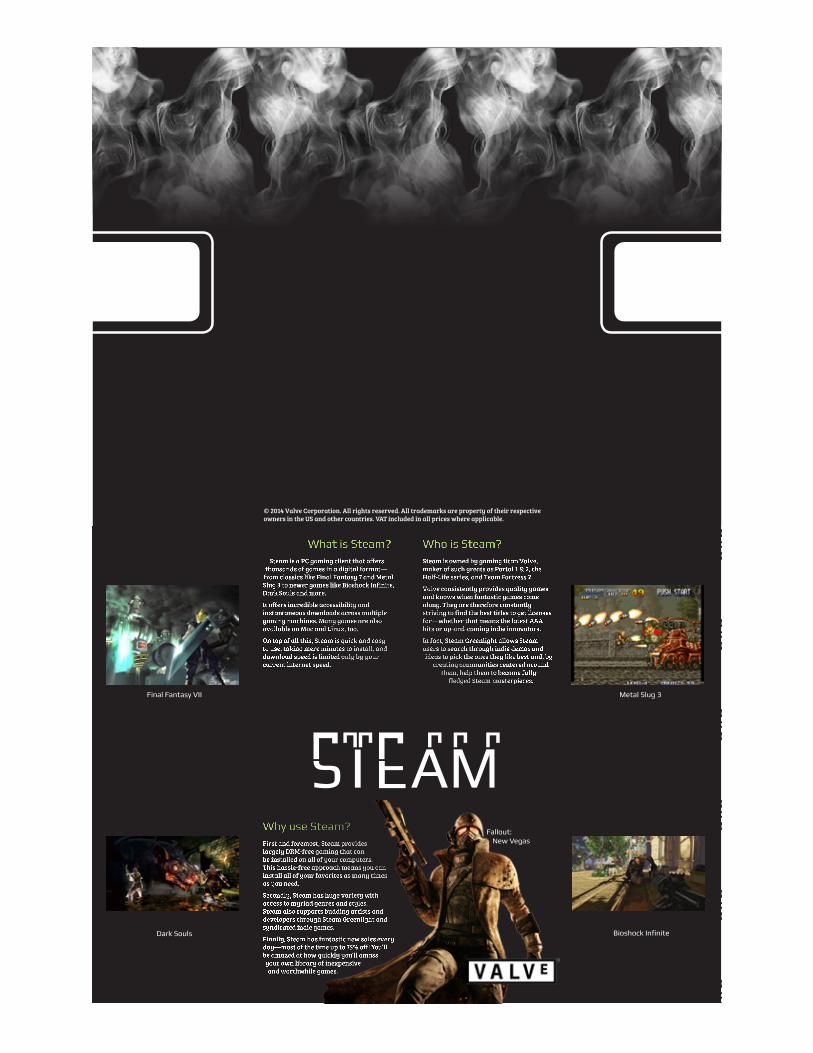
Description:A two sided (duplex) folding brochure designed to show off the PC gaming client Steam.
Brochure
© 2014 Valve Corporation. All rights reserved. All trademarks are property of their respective owners in the US and other countries. VAT included in all prices where applicable.
What is Steam?Steam is a PC gaming client that offers
thousands of games in a digital format—from classics like Final Fantasy 7 and Metal Slug 3 to newer games like Bioshock Infinite, Dark Souls and more.
It offers incredible accessibility and instantaneous downloads across multiple gaming machines. Many games are also available on Mac and Linux, too.
On top of all this, Steam is quick and easy to use, taking mere minutes to install, and download speed is limited only by your current internet speed.
Why use Steam?First and foremost, Steam provides largely DRM-free gaming that can be installed on all of your computers. This hassle-free approach means you can install all of your favorites as many times as you need.
Secondly, Steam has huge variety with access to myriad genres and styles. Steam also supports budding artists and developers through Steam Greenlight and syndicated indie games.
Finally, Steam has fantastic new sales every day—most of the time up to 75% off! You’ll be amazed at how quickly you’ll amass your own library of inexpensive and worthwhile games.
Who is Steam?Steam is owned by gaming titan Valve, maker of such greats as Portal 1 & 2, the Half-Life series, and Team Fortress 2.
Valve consistently provides quality games and knows when fantastic games come along. They are therefore constantly striving to find the best titles to get licenses for—whether that means the latest AAA hits or up-and-coming indie innovators.
In fact, Steam Greenlight allows Steam users to search through indie demos and ideas to pick the ones they like best and, by
creating communities centered around them, help them to become fully-
fledged Steam masterpieces.
Final Fantasy VII Metal Slug 3
Bioshock InfiniteDark Souls
Fallout: New Vegas
d e s i g n
Course/Instructor:COMM 130, Section 7
Joel Judkins
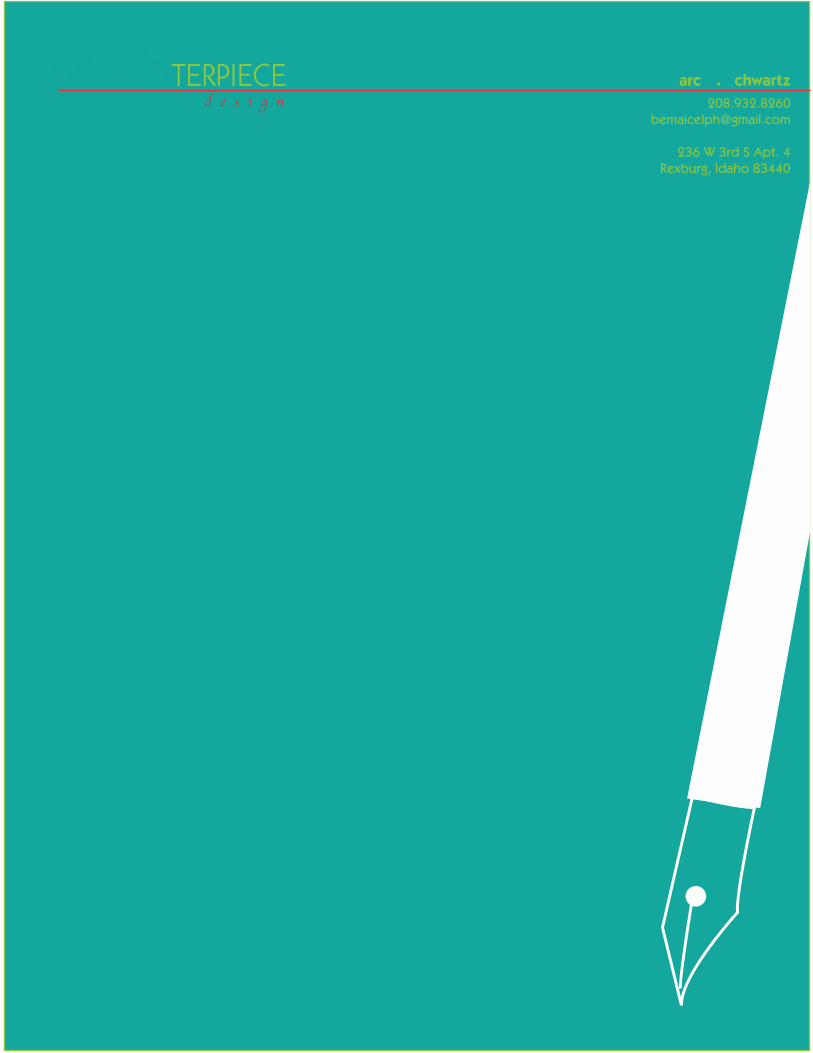
Process:I designed the logo in Adobe Illustrator, then linked it and various repurposed parts of it into InDesign, creating a workable layout. The light teal background, text, and added pen strokes were added in InDesign as well. I decided to go with a full-bleed layout for my letterhead and thought that a colored background would be a nice, unique touch.
The watermark of the fountain pen is the same shape as the logo, in white, at reduced opacity.
Objective:Create a new logo to fit a company or personal image.
Design consistent layouts for letterhead and business card.
Learning how to use watermarks and drop shadows.
Date:March 4, 2014
Programs used:Adobe Illustrator, Adobe InDesign
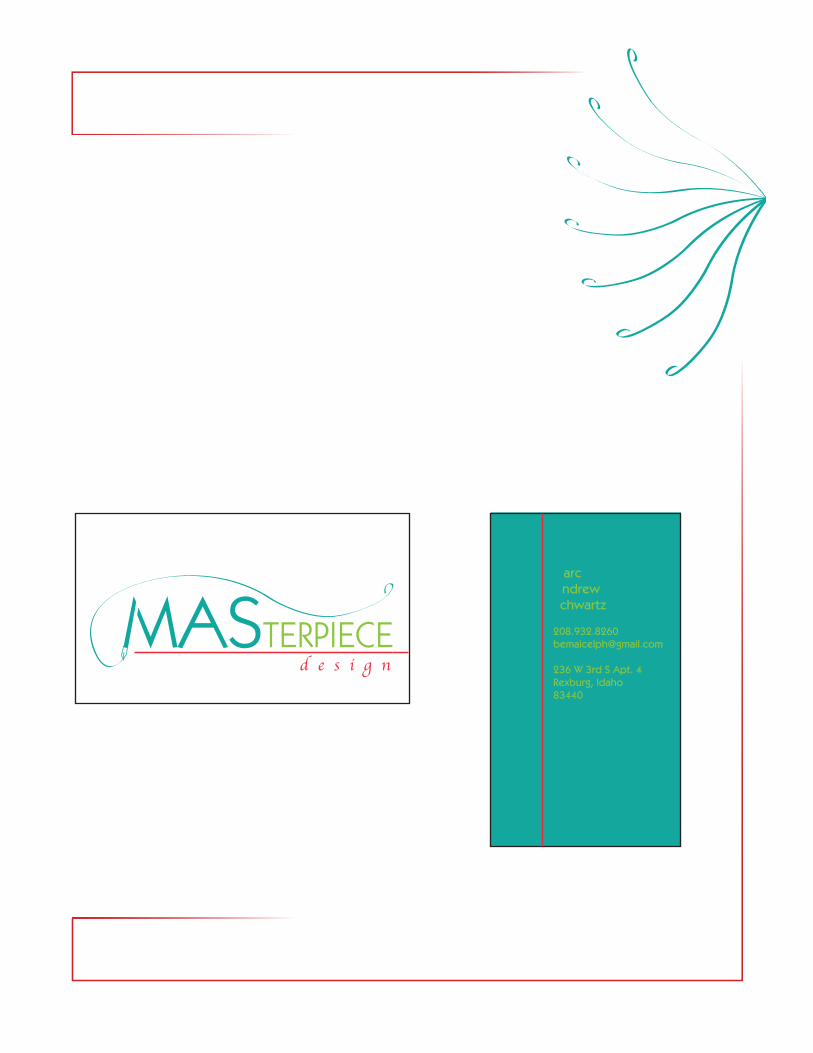
Description:Design for a letterhead for my personal design company.
Letterhead
d e s i g n
Course/Instructor:COMM 130, Section 7
Joel Judkins
Process:I designed the logo in Illustrator, then linked it in InDesign. I created two business card-sized boxes (one for the front and one for the back).
I continued the red line from the front to the back, tying them together. In order to keep it interesting I made the front horizontally oriented and the back vertical.
Finally, I added my contact info, keeping it readable but reasonable. I ordered it so the longest parts were in the middle.
Objective:Create a new logo to fit a company or personal image.
Design consistent layouts for letterhead and business card.
Learning how to use watermarks and drop shadows.
Date:March 4, 2014
Programs used:Adobe Illustrator, Adobe InDesign
Description:A business card designed for my personal design company.
Business Card
d e s i g n
Course/Instructor:COMM 130, Section 7
Joel Judkins
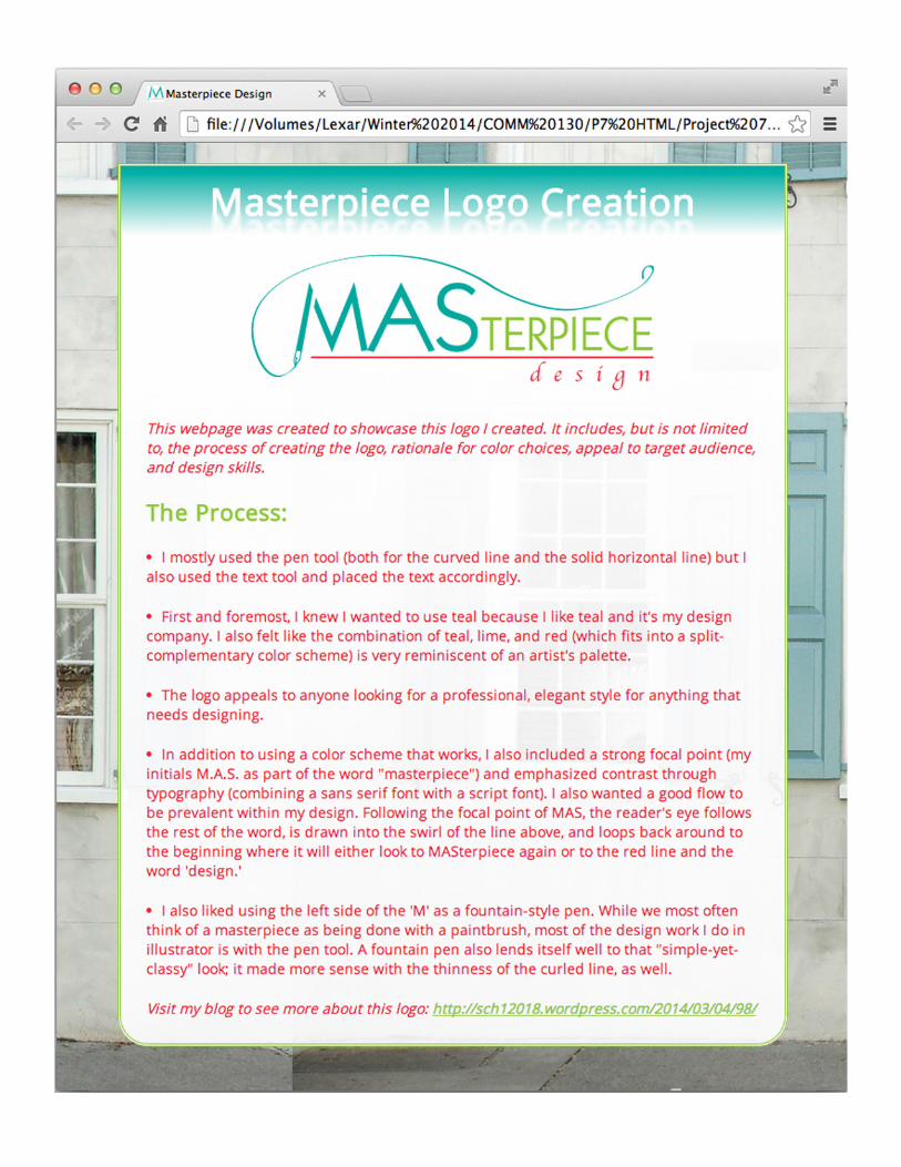
Process:I started with HTML in forming the semantics of the web page and linking to an image of my logo. I used CSS with an external style sheet.
In order to expand my skill-set, I had to look up how to do a few things with CSS; it surprised me when I saw the sheer quantity uses of CSS and HTML.
In the end, I much preferred using Notepad++ as an editor over TextWrangler.
Objective:Write content to describe the process of creating a logo and how it appeals to an audience.
Design a web page using HTML, using CSS to style it and learning how to use hex colors for web design.
Date:March 15, 2014
Programs used:Notepad++, TextWrangler (specifically using HTML and CSS)
Description:A website designed to showcase the logo I created for the previous two projects.
Web Page
d e s i g n
Course/Instructor:COMM 130, Section 7
Joel Judkins
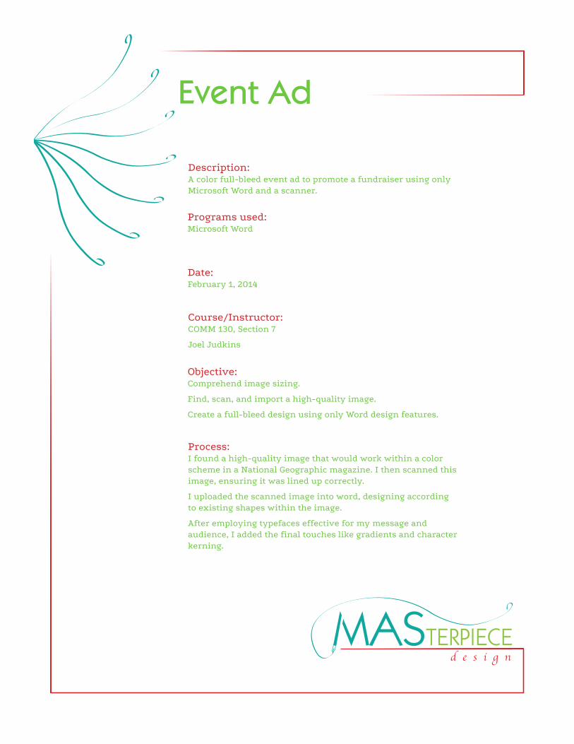
Process:I found a high-quality image that would work within a color scheme in a National Geographic magazine. I then scanned this image, ensuring it was lined up correctly.
I uploaded the scanned image into word, designing according to existing shapes within the image.
After employing typefaces effective for my message and audience, I added the final touches like gradients and character kerning.
Objective:Comprehend image sizing.
Find, scan, and import a high-quality image.
Create a full-bleed design using only Word design features.
Date:February 1, 2014
Programs used:Microsoft Word
Description:A color full-bleed event ad to promote a fundraiser using only Microsoft Word and a scanner.
Event Ad
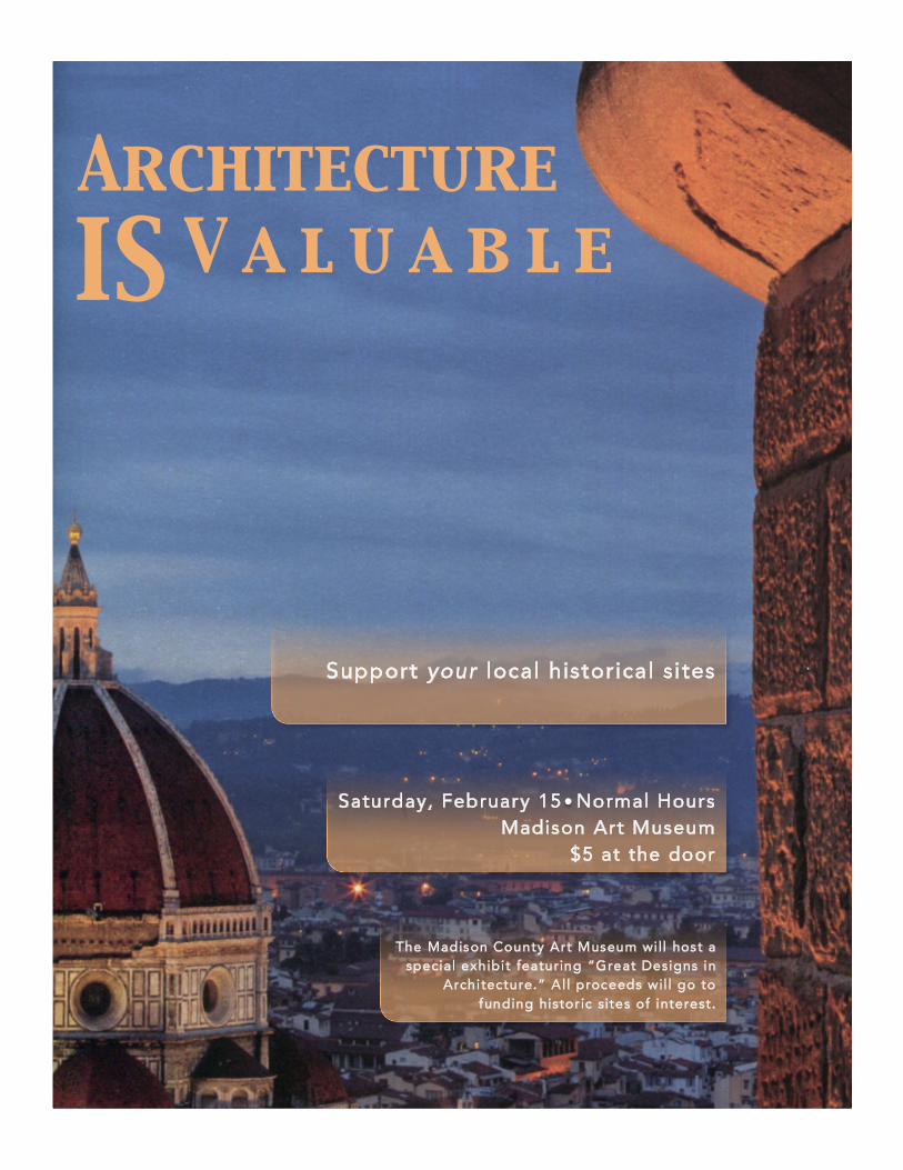
Support your local historical sites
The Madison County Art Museum wi ll host a special exhibit featuring “Great Designs in
Architecture.” Al l proceeds wil l go to funding histor ic sites of interest.
Saturday, February 15 Normal Hours Madison Art Museum
$5 at the door
Architecture V a l u a b l e IS
d e s i g n
Course/Instructor:COMM 130, Section 7
Joel Judkins
Process:I first selected the images I liked best from those available, designing four potential layouts focused around each image.
After sketching these designs, I decided on one to use for the rough draft, which I laid out in Adobe InDesign.
This particular design focused on the contrast of the darker parts of the image with the white space directly below. The image, logo, and text were provided for me.
Objective:Apply the design principles and use appropriate typography.
Incorporate basic InDesigns skills to improve basic flier layout.
Create a project folder with image, logo, and InDesign document to keep links intact.
Date:January 25, 2014
Programs used:Adobe InDesign
Description:A flier advertising a leadership conference for college students graduating in the field of business.
Flier

G R
A D
U A
T E
Lead
ersh
ip CO
NFER
ENCE
ww
w.v
ouan
tcom
m.c
om/l
ead
ers
Lin
coln
Con
ven
tion
Cen
ter
Oct
ober
21
8 a.
m. –
5 p
.m.
Do
you
wan
t to
have
the
com
pet
itiv
e ed
ge
in b
usin
ess?
Acq
uire
lead
ersh
ip s
kills
Mee
t top
exe
cutiv
es
Con
fere
nce
is a
vaila
ble
to g
rad
uati
ng s
enio
rs. S
pac
e is
lim
ited
.
Dur
ing
this
dyn
amic
thre
e-d
ay s
emin
ar, a
tten
dee
s w
ill m
eet w
ith
top
exe
cutiv
es o
f Vou
ant
Com
mun
icat
ions
to d
iscu
ss b
reak
thro
ugh
lead
ersh
ip te
chni
que
s w
hile
cul
tivat
ing
att
rib
utes
of
lead
ersh
ip th
at w
ill m
arke
t to
any
emp
loye
r.
Vou
ant C
omm
unic
atio
ns is
dev
oted
to h
elp
ing
tom
orro
w’s
lead
ers
gai
n es
sent
ial l
ead
ersh
ip
skill
s in
the
wor
kpla
ce.
Com
e le
arn
how
at V
ouan
t Com
mun
icat
ion’
s an
nual
Gra
dua
te L
ead
ersh
ip C
onfe
renc
e.
d e s i g n
Course/Instructor:COMM 130, Section 7
Joel Judkins
Process:I first sketched out a few ideas for logos that would communicate the intended message. I wanted to emphasize mutual understanding and having an open mind.
First logo: I found an image of a face in profile, traced with the pen tool, then typed and manipulated text.
Second logo: I traced this from a photo of two hands shaking. I spaced the tracking of the text as well.
Third logo: I used the star and ellipse tools to create most of the shapes. I added the filled-in ‘A’ (which represents a repetition of the rays of the flower/sun) with the pathfinder tool (divide).
Objective:Create three completely different, original logos.
Use only simple tools from Illustrator.
Gather opinions from at least ten outside sources about which logo appeals most to them.
Date:February 22, 2014
Programs used:Adobe Illustrator
Description:Three logos designed for the same organization.
Logos
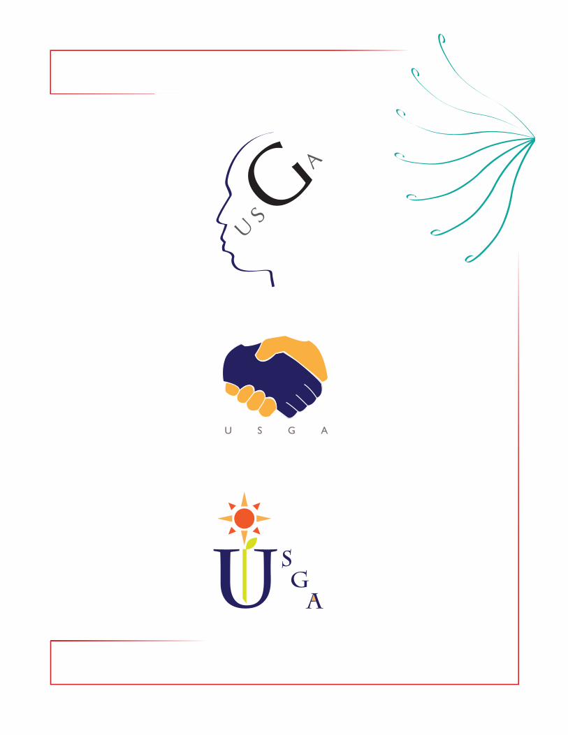
U S G A
Understanding Same-Gender Attraction

d e s i g n
Course/Instructor:COMM 130, Section 7
Joel Judkins
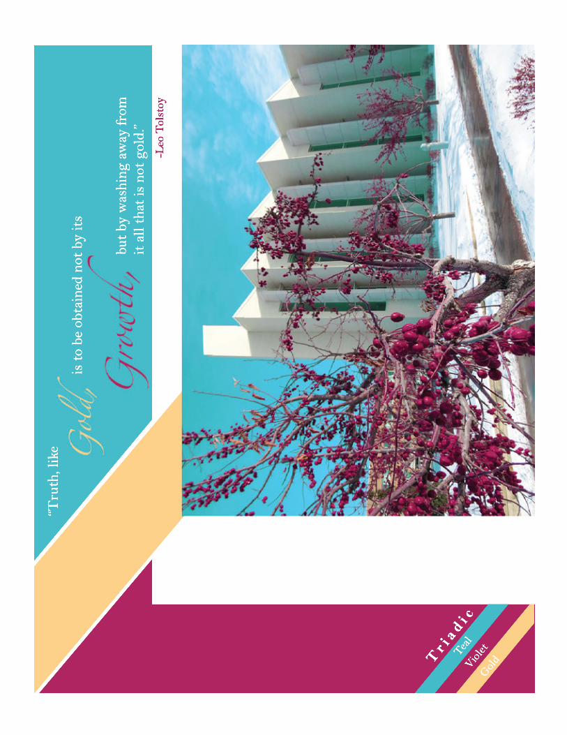
Process:After taking a photo that I could work with, I uploaded it to Photoshop, adjusting the colors to fit in with my color scheme a bit better.
I then designed a layout conducive to my photo, including consistent shapes and simple examples of my color scheme.
Finally, I found a quote that was thematically appropriate. I also added my swatch in the design using the aforementioned consistent shapes.
Objective:Learn basic photography skills.
Choose a color scheme incorporating a photo, combining it into a well-designed layout.
Acquire basic Photoshop skills.
Date:February 18, 2014
Programs used:Adobe Photoshop
Description:Incorporation of an appealing color scheme in poster form using original photography.
Photodesign
Gol
d
Viol
et Tea
l
Tr i
a d i c
“Tru
th, l
ike
is t
o be
obt
aine
d no
t by
its
but
by w
ashi
ng a
way
from
it
all
that
is n
ot g
old.
”-L
eo T
olst
oy
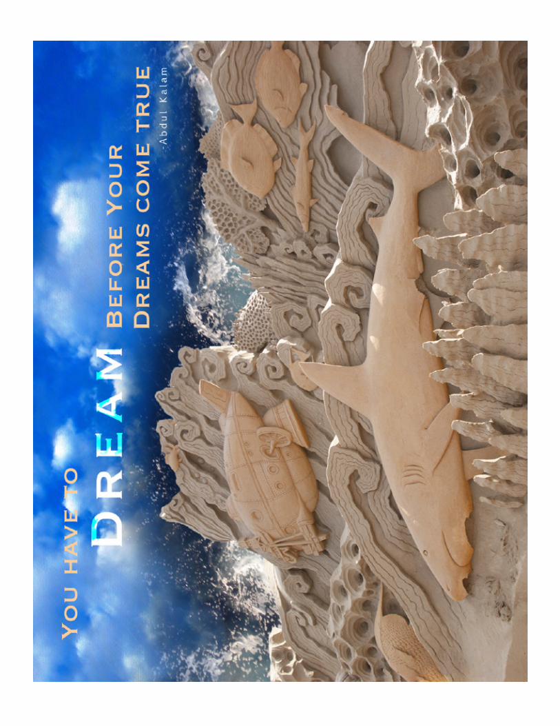
d e s i g n
Course/Instructor:COMM 130, Section 7
Joel Judkins
Objective:Learn to blend images together gradually, using masks.
Demonstrate more advanced Photoshop skills.
Apply typography principles.
Process:I started by finding suitable high quality photos online to use as a basis for this montage.
After I found three that I liked, I started with the background image in photoshop, cropping the image to a standard 8.5 x 11 in. I added in the other images, using selection tools to hide the parts of the image I didn’t want included.
I colorized the sculpture image to be more orange, added a semi-transparent black and white filter (while letting points of interest shine through), and added a pastel filter effect to the clouds in the background.
Date:February 15, 2014
Programs used:Adobe Photoshop
Description:An inspirational montage made by the blending of two or more images, and the use of typography.
Montage