programming graphical user interfaces in r
DESCRIPTION
RGtk2 Qt gWidgets R GUITRANSCRIPT


Programming Graphical User Interfaces in R
K12672_FM.indd 1 4/26/12 12:50 PM
© 2012 by Taylor & Francis Group, LLC

Chapman & Hall/CRCThe R Series
John M. ChambersDepartment of Statistics
Stanford University Stanford, California, USA
Duncan Temple LangDepartment of Statistics
University of California, DavisDavis, California, USA
Torsten HothornInstitut für Statistik
Ludwig-Maximilians-UniversitätMünchen, Germany
Hadley WickhamDepartment of Statistics
Rice UniversityHouston, Texas, USA
Aims and Scope
This book series reflects the recent rapid growth in the development and application of R, the programming language and software environment for statistical computing and graphics. R is now widely used in academic research, education, and industry. It is constantly growing, with new versions of the core software released regularly and more than 2,600 packages available. It is difficult for the documentation to keep pace with the expansion of the software, and this vital book series provides a forum for the publication of books covering many aspects of the development and application of R.
The scope of the series is wide, covering three main threads:• Applications of R to specific disciplines such as biology, epidemiology, genetics,
engineering, finance, and the social sciences.• Using R for the study of topics of statistical methodology, such as linear and mixed
modeling, time series, Bayesian methods, and missing data.• The development of R, including programming, building packages, and graphics.
The books will appeal to programmers and developers of R software, as well as applied statisticians and data analysts in many fields. The books will feature detailed worked examples and R code fully integrated into the text, ensuring their usefulness to researchers, practitioners and students.
Published Titles
Customer and Business Analytics: Applied Data Mining for Business Decision Making Using R, Daniel S. Putler and Robert E. Krider
Event History Analysis with R, Göran Broström
Programming Graphical User Interfaces with R, Michael F. Lawrence and John Verzani
R Graphics, Second Edition, Paul Murrell
Statistical Computing in C++ and R, Randall L. Eubank and Ana Kupresanin
Series Editors
K12672_FM.indd 2 4/26/12 12:50 PM
© 2012 by Taylor & Francis Group, LLC
The R Series
Programming Graphical User Interfaces in R
Michael F. Lawrence John Verzani
K12672_FM.indd 3 4/26/12 12:50 PM
© 2012 by Taylor & Francis Group, LLC

Windows is a registered trademark of Microsoft Corporation in the United States and other countries.
Nokia, the Nokia logo, Qt, and the Qt logo are trademarks of Nokia Corporation and/or its subsidiaries in Finland and other countries.
Linux is a ® trademark of Linus Torvalds in the United States, other countries or both.
Microsoft, Windows, XP, and the Windows logo are ® trademarks of Microsoft Corporation in the United States, other countries, or both.
Mac, Mac OS, OS X, and Time Machine are trademarks of Apple Inc., registered in the U.S. and other countries.
Java is a registered trademark of Oracle and/or its affiliates.
RStudio is a registered trademark of RStudio, Inc.
The TIBCO and Spotfire logos and Spotfire are trademarks or registered trademarks of TIBCO Software Inc.
SPSS is a registered trademarks of IBM.
CRC PressTaylor & Francis Group6000 Broken Sound Parkway NW, Suite 300Boca Raton, FL 33487-2742
© 2012 by Taylor & Francis Group, LLCCRC Press is an imprint of Taylor & Francis Group, an Informa business
No claim to original U.S. Government worksVersion Date: 20120503
International Standard Book Number-13: 978-1-4398-5683-3 (eBook - PDF)
This book contains information obtained from authentic and highly regarded sources. Reasonable efforts have been made to publish reliable data and information, but the author and publisher cannot assume responsibility for the validity of all materials or the consequences of their use. The authors and publishers have attempted to trace the copyright holders of all material reproduced in this publication and apologize to copyright holders if permission to publish in this form has not been obtained. If any copyright material has not been acknowledged please write and let us know so we may rectify in any future reprint.
Except as permitted under U.S. Copyright Law, no part of this book may be reprinted, reproduced, transmit-ted, or utilized in any form by any electronic, mechanical, or other means, now known or hereafter invented, including photocopying, microfilming, and recording, or in any information storage or retrieval system, without written permission from the publishers.
For permission to photocopy or use material electronically from this work, please access www.copyright.com (http://www.copyright.com/) or contact the Copyright Clearance Center, Inc. (CCC), 222 Rosewood Drive, Danvers, MA 01923, 978-750-8400. CCC is a not-for-profit organization that provides licenses and registration for a variety of users. For organizations that have been granted a photocopy license by the CCC, a separate system of payment has been arranged.
Trademark Notice: Product or corporate names may be trademarks or registered trademarks, and are used only for identification and explanation without intent to infringe.
Visit the Taylor & Francis Web site athttp://www.taylorandfrancis.com
and the CRC Press Web site athttp://www.crcpress.com
© 2012 by Taylor & Francis Group, LLC
Contents
Preface xiii
1 The Fundamentals of Graphical User Interfaces 11.1 A simple GUI in R . . . . . . . . . . . . . . . . . . . . . . . . . 11.2 GUI design principles . . . . . . . . . . . . . . . . . . . . . . . 41.3 Controls . . . . . . . . . . . . . . . . . . . . . . . . . . . . . . . . 8
Choice of control . . . . . . . . . . . . . . . . . . . . . . . . . . 9Presenting options . . . . . . . . . . . . . . . . . . . . . . . . . . 9
Checkboxes . . . . . . . . . . . . . . . . . . . . . . . . . . 9Radio buttons . . . . . . . . . . . . . . . . . . . . . . . . . 10Combo boxes . . . . . . . . . . . . . . . . . . . . . . . . . 10List boxes . . . . . . . . . . . . . . . . . . . . . . . . . . . 11Sliders and spin buttons . . . . . . . . . . . . . . . . . . 11
Initiating an action . . . . . . . . . . . . . . . . . . . . . . . . . 12Buttons . . . . . . . . . . . . . . . . . . . . . . . . . . . . . 12Icons . . . . . . . . . . . . . . . . . . . . . . . . . . . . . . 12Menu bars . . . . . . . . . . . . . . . . . . . . . . . . . . . 13Toolbars . . . . . . . . . . . . . . . . . . . . . . . . . . . . 13Action objects . . . . . . . . . . . . . . . . . . . . . . . . . 14
Modal dialogs . . . . . . . . . . . . . . . . . . . . . . . . . . . . 14Message dialogs . . . . . . . . . . . . . . . . . . . . . . . 14File choosers . . . . . . . . . . . . . . . . . . . . . . . . . 14
Displaying data . . . . . . . . . . . . . . . . . . . . . . . . . . . 15Tabular display . . . . . . . . . . . . . . . . . . . . . . . . 15Tree widgets . . . . . . . . . . . . . . . . . . . . . . . . . 15
Displaying and editing text . . . . . . . . . . . . . . . . . . . . 16Single lines of text . . . . . . . . . . . . . . . . . . . . . . 16Text-editing boxes . . . . . . . . . . . . . . . . . . . . . . 16
Guides and feedback . . . . . . . . . . . . . . . . . . . . . . . . 16Labels . . . . . . . . . . . . . . . . . . . . . . . . . . . . . 17Status bars . . . . . . . . . . . . . . . . . . . . . . . . . . . 17
v
© 2012 by Taylor & Francis Group, LLC

Contents
Tooltips . . . . . . . . . . . . . . . . . . . . . . . . . . . . 18Progress bars . . . . . . . . . . . . . . . . . . . . . . . . . 18
1.4 Containers . . . . . . . . . . . . . . . . . . . . . . . . . . . . . . 18Top-level windows . . . . . . . . . . . . . . . . . . . . . . 19Tabbed notebooks . . . . . . . . . . . . . . . . . . . . . . 20Frames . . . . . . . . . . . . . . . . . . . . . . . . . . . . . 20Expanding boxes . . . . . . . . . . . . . . . . . . . . . . . 20Paned boxes . . . . . . . . . . . . . . . . . . . . . . . . . . 20
Layout algorithms . . . . . . . . . . . . . . . . . . . . . . . . . . 21Box layout . . . . . . . . . . . . . . . . . . . . . . . . . . . 21Grid layout . . . . . . . . . . . . . . . . . . . . . . . . . . 22
I The gWidgets Package 23
2 gWidgets: Overview 252.1 Constructors . . . . . . . . . . . . . . . . . . . . . . . . . . . . . 272.2 Methods . . . . . . . . . . . . . . . . . . . . . . . . . . . . . . . . 292.3 Event handlers . . . . . . . . . . . . . . . . . . . . . . . . . . . . 302.4 Dialogs . . . . . . . . . . . . . . . . . . . . . . . . . . . . . . . . 322.5 Installation . . . . . . . . . . . . . . . . . . . . . . . . . . . . . . 35
3 gWidgets: Container Widgets 373.1 Top-level windows . . . . . . . . . . . . . . . . . . . . . . . . . 39
A modal window . . . . . . . . . . . . . . . . . . . . . . . . . . 413.2 Box containers . . . . . . . . . . . . . . . . . . . . . . . . . . . . 42
The ggroup container . . . . . . . . . . . . . . . . . . . . . . . . 42The gframe and gexpandgroup containers . . . . . . . . . . . 45
3.3 Grid layout: the glayout container . . . . . . . . . . . . . . . . 463.4 Paned containers: the gpanedgroup container . . . . . . . . . 473.5 Tabbed notebooks: the gnotebook container . . . . . . . . . . 48
4 gWidgets: Control Widgets 514.1 Buttons . . . . . . . . . . . . . . . . . . . . . . . . . . . . . . . . 514.2 Labels . . . . . . . . . . . . . . . . . . . . . . . . . . . . . . . . . 53
HTML text . . . . . . . . . . . . . . . . . . . . . . . . . . . . . . 53Status bars . . . . . . . . . . . . . . . . . . . . . . . . . . . . . . 53Icons and images . . . . . . . . . . . . . . . . . . . . . . . . . . 54
4.3 Text-editing controls . . . . . . . . . . . . . . . . . . . . . . . . 56Single-line, editable text . . . . . . . . . . . . . . . . . . . . . . 56Multiline, editable text . . . . . . . . . . . . . . . . . . . . . . . 58
4.4 Selection controls . . . . . . . . . . . . . . . . . . . . . . . . . . 61Checkbox widget . . . . . . . . . . . . . . . . . . . . . . . . . . 61Radio buttons . . . . . . . . . . . . . . . . . . . . . . . . . . . . 62
vi
© 2012 by Taylor & Francis Group, LLC

Contents
A group of checkboxes . . . . . . . . . . . . . . . . . . . . . . . 63A combo box . . . . . . . . . . . . . . . . . . . . . . . . . . . . . 64A slider control . . . . . . . . . . . . . . . . . . . . . . . . . . . 67A spin button control . . . . . . . . . . . . . . . . . . . . . . . . 68Selecting from the file system . . . . . . . . . . . . . . . . . . . 68Selecting a date . . . . . . . . . . . . . . . . . . . . . . . . . . . 68
4.5 Display of tabular data . . . . . . . . . . . . . . . . . . . . . . . 704.6 Display of hierarchical data . . . . . . . . . . . . . . . . . . . . 834.7 Actions, menus, and toolbars . . . . . . . . . . . . . . . . . . . 86
Toolbars . . . . . . . . . . . . . . . . . . . . . . . . . . . . . . . . 87Menu bars and pop-up menus . . . . . . . . . . . . . . . . . . 88
5 gWidgets: R-specific Widgets 915.1 A graphics device . . . . . . . . . . . . . . . . . . . . . . . . . . 915.2 A data frame editor . . . . . . . . . . . . . . . . . . . . . . . . . 965.3 Workspace browser . . . . . . . . . . . . . . . . . . . . . . . . . 975.4 Help browser . . . . . . . . . . . . . . . . . . . . . . . . . . . . . 995.5 Command line widget . . . . . . . . . . . . . . . . . . . . . . . 1005.6 Simplifying creation of dialogs . . . . . . . . . . . . . . . . . . 100
II The RGtk2 Package 101
6 RGtk2: Overview 1036.1 Synopsis of the RGtk2R Package!RGtk2 API . . . . . . . . . . 1046.2 Objects and classes . . . . . . . . . . . . . . . . . . . . . . . . . 1046.3 Constructors . . . . . . . . . . . . . . . . . . . . . . . . . . . . . 1056.4 Methods . . . . . . . . . . . . . . . . . . . . . . . . . . . . . . . . 1086.5 Properties . . . . . . . . . . . . . . . . . . . . . . . . . . . . . . . 1096.6 Events and signals . . . . . . . . . . . . . . . . . . . . . . . . . 1106.7 Enumerated types and flags . . . . . . . . . . . . . . . . . . . . 1126.8 The event loop . . . . . . . . . . . . . . . . . . . . . . . . . . . . 1136.9 Importing a GUI from Glade . . . . . . . . . . . . . . . . . . . 114
7 RGtk2: Windows, Containers, and Dialogs 1157.1 Top-level windows . . . . . . . . . . . . . . . . . . . . . . . . . 1157.2 Layout containers . . . . . . . . . . . . . . . . . . . . . . . . . . 117
Basics . . . . . . . . . . . . . . . . . . . . . . . . . . . . . . . . . 117Widget size negotiation . . . . . . . . . . . . . . . . . . . . . . 118Box containers . . . . . . . . . . . . . . . . . . . . . . . . . . . . 119Alignment . . . . . . . . . . . . . . . . . . . . . . . . . . . . . . 123
7.3 Dialogs . . . . . . . . . . . . . . . . . . . . . . . . . . . . . . . . 124Message dialogs . . . . . . . . . . . . . . . . . . . . . . . . . . . 124Custom dialogs . . . . . . . . . . . . . . . . . . . . . . . . . . . 125
vii
© 2012 by Taylor & Francis Group, LLC
Contents
File chooser . . . . . . . . . . . . . . . . . . . . . . . . . . . . . . 126Other choosers . . . . . . . . . . . . . . . . . . . . . . . . . . . . 127Print dialog . . . . . . . . . . . . . . . . . . . . . . . . . . . . . . 127
7.4 Special-purpose containers . . . . . . . . . . . . . . . . . . . . . 128Framed containers . . . . . . . . . . . . . . . . . . . . . . . . . . 128Expandable containers . . . . . . . . . . . . . . . . . . . . . . . 128Notebooks . . . . . . . . . . . . . . . . . . . . . . . . . . . . . . 128Scrollable windows . . . . . . . . . . . . . . . . . . . . . . . . . 131Divided containers . . . . . . . . . . . . . . . . . . . . . . . . . 132Tabular layout . . . . . . . . . . . . . . . . . . . . . . . . . . . . 133
8 RGtk2: Basic Components 1378.1 Buttons . . . . . . . . . . . . . . . . . . . . . . . . . . . . . . . . 1378.2 Static text and images . . . . . . . . . . . . . . . . . . . . . . . 140
Labels . . . . . . . . . . . . . . . . . . . . . . . . . . . . . . . . . 140Images . . . . . . . . . . . . . . . . . . . . . . . . . . . . . . . . . 142Stock icons . . . . . . . . . . . . . . . . . . . . . . . . . . . . . . 143
8.3 Input controls . . . . . . . . . . . . . . . . . . . . . . . . . . . . 143Text entry . . . . . . . . . . . . . . . . . . . . . . . . . . . . . . . 143Check button . . . . . . . . . . . . . . . . . . . . . . . . . . . . . 145Radio-button groups . . . . . . . . . . . . . . . . . . . . . . . . 146Combo boxes . . . . . . . . . . . . . . . . . . . . . . . . . . . . . 147Sliders and spin buttons . . . . . . . . . . . . . . . . . . . . . . 149
8.4 Progress reporting . . . . . . . . . . . . . . . . . . . . . . . . . . 150Progress bars . . . . . . . . . . . . . . . . . . . . . . . . . . . . . 150Spinners . . . . . . . . . . . . . . . . . . . . . . . . . . . . . . . . 151
8.5 Wizards . . . . . . . . . . . . . . . . . . . . . . . . . . . . . . . . 1518.6 Embedding R graphics . . . . . . . . . . . . . . . . . . . . . . . 1568.7 Drag-and-drop . . . . . . . . . . . . . . . . . . . . . . . . . . . . 162
Initiating a drag . . . . . . . . . . . . . . . . . . . . . . . . . . . 163Handling drops . . . . . . . . . . . . . . . . . . . . . . . . . . . 164
9 RGtk2: Widgets Using Data Models 1659.1 Displaying tabular data . . . . . . . . . . . . . . . . . . . . . . 165
Loading a data frame . . . . . . . . . . . . . . . . . . . . . . . . 165Displaying data as a list or table . . . . . . . . . . . . . . . . . 166Accessing GtkTreeModel . . . . . . . . . . . . . . . . . . . . . . 169Selection . . . . . . . . . . . . . . . . . . . . . . . . . . . . . . . 171Sorting . . . . . . . . . . . . . . . . . . . . . . . . . . . . . . . . 172Filtering . . . . . . . . . . . . . . . . . . . . . . . . . . . . . . . . 173Cell renderer details . . . . . . . . . . . . . . . . . . . . . . . . 175
9.2 Displaying hierarchical data . . . . . . . . . . . . . . . . . . . . 188Loading hierarchical data . . . . . . . . . . . . . . . . . . . . . 188Displaying data as a tree . . . . . . . . . . . . . . . . . . . . . 189
viii
© 2012 by Taylor & Francis Group, LLC

Contents
9.3 Model-based combo boxes . . . . . . . . . . . . . . . . . . . . . 1909.4 Text-entry widgets with completion . . . . . . . . . . . . . . . 1929.5 Sharing buffers between text entries . . . . . . . . . . . . . . . 1949.6 Text views . . . . . . . . . . . . . . . . . . . . . . . . . . . . . . 1949.7 Text buffers . . . . . . . . . . . . . . . . . . . . . . . . . . . . . . 196
Iterators . . . . . . . . . . . . . . . . . . . . . . . . . . . . . . . . 196Marks . . . . . . . . . . . . . . . . . . . . . . . . . . . . . . . . . 198Tags . . . . . . . . . . . . . . . . . . . . . . . . . . . . . . . . . . 199Selection and the clipboard . . . . . . . . . . . . . . . . . . . . 200Inserting nontext items . . . . . . . . . . . . . . . . . . . . . . . 200
10 RGtk2: Application Windows 20510.1 Actions . . . . . . . . . . . . . . . . . . . . . . . . . . . . . . . . 20510.2 Menus . . . . . . . . . . . . . . . . . . . . . . . . . . . . . . . . . 207
Menu bars . . . . . . . . . . . . . . . . . . . . . . . . . . . . . . 207Pop-up menus . . . . . . . . . . . . . . . . . . . . . . . . . . . . 209
10.3 Toolbars . . . . . . . . . . . . . . . . . . . . . . . . . . . . . . . . 21010.4 Status reporting . . . . . . . . . . . . . . . . . . . . . . . . . . . 213
Status bars . . . . . . . . . . . . . . . . . . . . . . . . . . . . . . 213Info bars . . . . . . . . . . . . . . . . . . . . . . . . . . . . . . . 214
10.5 Managing a complex user interface . . . . . . . . . . . . . . . 215
11 Extending GObject Classes 221
III The qtbase Package 225
12 Qt: Overview 22712.1 The Qt library . . . . . . . . . . . . . . . . . . . . . . . . . . . . 22712.2 An introductory example . . . . . . . . . . . . . . . . . . . . . 22812.3 Classes and objects . . . . . . . . . . . . . . . . . . . . . . . . . 23112.4 Methods and dispatch . . . . . . . . . . . . . . . . . . . . . . . 23312.5 Properties . . . . . . . . . . . . . . . . . . . . . . . . . . . . . . . 23412.6 Signals . . . . . . . . . . . . . . . . . . . . . . . . . . . . . . . . . 23512.7 Enumerations and flags . . . . . . . . . . . . . . . . . . . . . . 23712.8 Extending Qt classes from R . . . . . . . . . . . . . . . . . . . 237
Defining a class . . . . . . . . . . . . . . . . . . . . . . . . . . . 238Defining methods . . . . . . . . . . . . . . . . . . . . . . . . . . 238Defining signals and slots . . . . . . . . . . . . . . . . . . . . . 239Defining properties . . . . . . . . . . . . . . . . . . . . . . . . . 240
12.9 QWidget basics . . . . . . . . . . . . . . . . . . . . . . . . . . . . 243Fonts . . . . . . . . . . . . . . . . . . . . . . . . . . . . . . . . . . 244Styles . . . . . . . . . . . . . . . . . . . . . . . . . . . . . . . . . 245
12.10 Importing a GUI from QtDesigner . . . . . . . . . . . . . . . . 247
ix
© 2012 by Taylor & Francis Group, LLC
Contents
13 Qt: Layout Managers and Containers 24913.1 Layout basics . . . . . . . . . . . . . . . . . . . . . . . . . . . . . 251
Adding and manipulating child components . . . . . . . . . . 251Size and space negotiation . . . . . . . . . . . . . . . . . . . . . 252
13.2 Box layouts . . . . . . . . . . . . . . . . . . . . . . . . . . . . . . 25413.3 Grid layouts . . . . . . . . . . . . . . . . . . . . . . . . . . . . . 25513.4 Form layouts . . . . . . . . . . . . . . . . . . . . . . . . . . . . . 25713.5 Frames . . . . . . . . . . . . . . . . . . . . . . . . . . . . . . . . 25813.6 Separators . . . . . . . . . . . . . . . . . . . . . . . . . . . . . . 25813.7 Notebooks . . . . . . . . . . . . . . . . . . . . . . . . . . . . . . 25813.8 Scroll areas . . . . . . . . . . . . . . . . . . . . . . . . . . . . . . 26113.9 Paned windows . . . . . . . . . . . . . . . . . . . . . . . . . . . 262
14 Qt: Widgets 26314.1 Dialogs . . . . . . . . . . . . . . . . . . . . . . . . . . . . . . . . 263
Message dialogs . . . . . . . . . . . . . . . . . . . . . . . . . . . 263Input dialogs . . . . . . . . . . . . . . . . . . . . . . . . . . . . . 266Button boxes . . . . . . . . . . . . . . . . . . . . . . . . . . . . . 267Custom dialogs . . . . . . . . . . . . . . . . . . . . . . . . . . . 268Wizards . . . . . . . . . . . . . . . . . . . . . . . . . . . . . . . . 270File- and directory-choosing dialogs . . . . . . . . . . . . . . . 270Other choosers . . . . . . . . . . . . . . . . . . . . . . . . . . . . 272
14.2 Labels . . . . . . . . . . . . . . . . . . . . . . . . . . . . . . . . . 27214.3 Buttons . . . . . . . . . . . . . . . . . . . . . . . . . . . . . . . . 272
Icons and pixmaps . . . . . . . . . . . . . . . . . . . . . . . . . 27314.4 Checkboxes . . . . . . . . . . . . . . . . . . . . . . . . . . . . . . 274
Groups of checkboxes . . . . . . . . . . . . . . . . . . . . . . . 27414.5 Radio groups . . . . . . . . . . . . . . . . . . . . . . . . . . . . . 27614.6 Combo boxes . . . . . . . . . . . . . . . . . . . . . . . . . . . . . 27714.7 Sliders and spin boxes . . . . . . . . . . . . . . . . . . . . . . . 279
Sliders . . . . . . . . . . . . . . . . . . . . . . . . . . . . . . . . . 279Spin boxes . . . . . . . . . . . . . . . . . . . . . . . . . . . . . . 280
14.8 Single-line text . . . . . . . . . . . . . . . . . . . . . . . . . . . . 281Completion . . . . . . . . . . . . . . . . . . . . . . . . . . . . . . 282Masks and validation . . . . . . . . . . . . . . . . . . . . . . . . 282
14.9 QWebView widget . . . . . . . . . . . . . . . . . . . . . . . . . 28614.10 Embedding R graphics . . . . . . . . . . . . . . . . . . . . . . . 28814.11 Drag-and-drop . . . . . . . . . . . . . . . . . . . . . . . . . . . . 288
Initiating a drag . . . . . . . . . . . . . . . . . . . . . . . . . . . 289Handling a drop . . . . . . . . . . . . . . . . . . . . . . . . . . . 289
15 Qt: Widgets Using Data Models 29315.1 Displaying tabular data . . . . . . . . . . . . . . . . . . . . . . 293
Displaying an R data frame . . . . . . . . . . . . . . . . . . . . 293
x
© 2012 by Taylor & Francis Group, LLC
Contents
Memory management . . . . . . . . . . . . . . . . . . . . . . . 295Formatting cells . . . . . . . . . . . . . . . . . . . . . . . . . . . 296Column sizing . . . . . . . . . . . . . . . . . . . . . . . . . . . . 296
15.2 Displaying lists . . . . . . . . . . . . . . . . . . . . . . . . . . . 29815.3 Model-based combo boxes . . . . . . . . . . . . . . . . . . . . . 29915.4 Accessing item models . . . . . . . . . . . . . . . . . . . . . . . 29915.5 Item selection . . . . . . . . . . . . . . . . . . . . . . . . . . . . 300
Accessing the selection . . . . . . . . . . . . . . . . . . . . . . . 301Responding to selection changes . . . . . . . . . . . . . . . . . 302Assigning the selection . . . . . . . . . . . . . . . . . . . . . . . 302
15.6 Sorting and filtering . . . . . . . . . . . . . . . . . . . . . . . . 30315.7 Decorating items . . . . . . . . . . . . . . . . . . . . . . . . . . . 30415.8 Displaying hierarchical data . . . . . . . . . . . . . . . . . . . . 30715.9 User editing of data models . . . . . . . . . . . . . . . . . . . . 31115.10 Drag-and-drop in item views . . . . . . . . . . . . . . . . . . . 31215.11 Widgets with internal models . . . . . . . . . . . . . . . . . . . 318
Displaying short, simple lists . . . . . . . . . . . . . . . . . . . 31815.12 Implementing custom models . . . . . . . . . . . . . . . . . . . 32115.13 Implementing custom views . . . . . . . . . . . . . . . . . . . . 32515.14 Viewing and editing text documents . . . . . . . . . . . . . . . 329
16 Qt: Application Windows 33516.1 Actions . . . . . . . . . . . . . . . . . . . . . . . . . . . . . . . . 33616.2 Menu bars . . . . . . . . . . . . . . . . . . . . . . . . . . . . . . 33816.3 Context menus . . . . . . . . . . . . . . . . . . . . . . . . . . . . 33916.4 Toolbars . . . . . . . . . . . . . . . . . . . . . . . . . . . . . . . . 34016.5 Status bars . . . . . . . . . . . . . . . . . . . . . . . . . . . . . . 34116.6 Dockable widgets . . . . . . . . . . . . . . . . . . . . . . . . . . 342
IV The tcltk Package 343
17 Tcl/Tk: Overview 34517.1 A first example . . . . . . . . . . . . . . . . . . . . . . . . . . . 34617.2 Interacting with Tcl . . . . . . . . . . . . . . . . . . . . . . . . . 34717.3 Constructors . . . . . . . . . . . . . . . . . . . . . . . . . . . . . 350
The tkwidget function . . . . . . . . . . . . . . . . . . . . . . . 352Geometry managers . . . . . . . . . . . . . . . . . . . . . . . . . 352Tcl variables . . . . . . . . . . . . . . . . . . . . . . . . . . . . . 353Commands . . . . . . . . . . . . . . . . . . . . . . . . . . . . . . 354Themes . . . . . . . . . . . . . . . . . . . . . . . . . . . . . . . . 354Window properties and state: tkwinfo . . . . . . . . . . . . . 356Colors and fonts . . . . . . . . . . . . . . . . . . . . . . . . . . . 357Images . . . . . . . . . . . . . . . . . . . . . . . . . . . . . . . . . 359
xi
© 2012 by Taylor & Francis Group, LLC
Contents
17.4 Events and callbacks . . . . . . . . . . . . . . . . . . . . . . . . 360The tag . . . . . . . . . . . . . . . . . . . . . . . . . . . . . . . . 361Events . . . . . . . . . . . . . . . . . . . . . . . . . . . . . . . . . 361Callbacks . . . . . . . . . . . . . . . . . . . . . . . . . . . . . . . 363Percent substitutions . . . . . . . . . . . . . . . . . . . . . . . . 364
18 Tcl/Tk: Layout and Containers 36918.1 Top-level windows . . . . . . . . . . . . . . . . . . . . . . . . . 36918.2 Frames . . . . . . . . . . . . . . . . . . . . . . . . . . . . . . . . 372
Label frames . . . . . . . . . . . . . . . . . . . . . . . . . . . . . 37218.3 Geometry managers . . . . . . . . . . . . . . . . . . . . . . . . . 372
Pack . . . . . . . . . . . . . . . . . . . . . . . . . . . . . . . . . . 373Grid . . . . . . . . . . . . . . . . . . . . . . . . . . . . . . . . . . 380
18.4 Other containers . . . . . . . . . . . . . . . . . . . . . . . . . . . 385Paned windows . . . . . . . . . . . . . . . . . . . . . . . . . . . 385Notebooks . . . . . . . . . . . . . . . . . . . . . . . . . . . . . . 386
19 Tcl/Tk: Dialogs and Widgets 38919.1 Dialogs . . . . . . . . . . . . . . . . . . . . . . . . . . . . . . . . 389
Modal dialogs . . . . . . . . . . . . . . . . . . . . . . . . . . . . 389File and directory selection . . . . . . . . . . . . . . . . . . . . 390Choosing a color . . . . . . . . . . . . . . . . . . . . . . . . . . 391
19.2 Selection widgets . . . . . . . . . . . . . . . . . . . . . . . . . . 392Check buttons . . . . . . . . . . . . . . . . . . . . . . . . . . . . 392Radio buttons . . . . . . . . . . . . . . . . . . . . . . . . . . . . 394Entry widgets . . . . . . . . . . . . . . . . . . . . . . . . . . . . 395Combo boxes . . . . . . . . . . . . . . . . . . . . . . . . . . . . . 400Scale widgets . . . . . . . . . . . . . . . . . . . . . . . . . . . . . 402Spin boxes . . . . . . . . . . . . . . . . . . . . . . . . . . . . . . 404
20 Tcl/Tk: Text, Tree, and Canvas Widgets 40920.1 Scroll bars . . . . . . . . . . . . . . . . . . . . . . . . . . . . . . 40920.2 Multiline text widgets . . . . . . . . . . . . . . . . . . . . . . . 41020.3 Menus . . . . . . . . . . . . . . . . . . . . . . . . . . . . . . . . . 41520.4 Treeview widget . . . . . . . . . . . . . . . . . . . . . . . . . . . 420
Rectangular data . . . . . . . . . . . . . . . . . . . . . . . . . . . 420Editable tables of data . . . . . . . . . . . . . . . . . . . . . . . 436Hierarchical data . . . . . . . . . . . . . . . . . . . . . . . . . . 436
20.5 Canvas widget . . . . . . . . . . . . . . . . . . . . . . . . . . . . 440
Concept index 447
Class and method index 449
xii
© 2012 by Taylor & Francis Group, LLC
Preface
About this book
Two common types of user interfaces in statistical computing are the com-mand line interface (CLI) and the graphical user interface (GUI). The usualCLI consists of a textual console in which the user types a sequence ofcommands at a prompt, and the output of the commands is printed tothe console as text. The R console is an example of a CLI. A GUI is theprimary means of interacting with desktop environments, such as Win-dows and Mac OS X, and statistical software, such as JMP. GUIs are con-tained within windows, and resources, such as documents, are representedby graphical icons. User controls are packed into hierarchical drop-downmenus, buttons, sliders, etc. The user manipulates the windows, icons, andmenus with a pointer device, such as a mouse.
The R language, like its predecessor S, is designed for interactive usethrough a command line interface (CLI), and the CLI remains the primaryinterface to R. However, the graphical user interface (GUI) has emergedas an effective alternative, depending on the specific task and the targetaudience. With respect to GUIs, we see R users falling into three main targetaudiences: those who are familiar with programming R, those who are stilllearning how to program, and those who have no interest in programming.
On some platforms, such as Windows and Mac OS X, R has graphicalfront-ends that provide a CLI through a text console control. Similar exam-ples include the multi-platform RStudioTM IDE, the Java-based JGR, andthe RKWard GUI for the Linux KDE desktop. Although these interfaces areGUIs, they are still very much in essence CLIs, in that the primary modeof interacting with R is the same. Thus, these GUIs appeal mostly to thosewho are comfortable with R programming.
A separate set of GUIs targets the second group of users, those learningthe R language. Since this group includes many students, these GUIs areoften designed to teach general statistical concepts in addition to R. A CLIcomponent is usually present in the interface, though it is deemphasizedby the surrounding GUI, which is analogous to a set of training wheels
xiii
© 2012 by Taylor & Francis Group, LLC

Preface
on a bicycle. An example of such a GUI is R Commander, which providesa menu- and dialog-driven interface for a wide range of R’s functionalityand plugin support to extend the functionality.
The third group of users, those who require R only for certain tasksand do not wish to learn the language, are targeted by task-specific GUIs.These interfaces do not usually contain a command line, as the limitedscope of the task does not require it. If a task-specific GUI fits a taskparticularly well, it may even appeal to an experienced user. There aremany examples of task-specific GUIs in R. Many GUIs assist in exploratorydata analysis, including exploRase, limmaGUI, playwith, latticist, andRattle. Other GUIs are aimed at teaching statistics, e.g., teachingDemosand mosaicManip. There are a few tools to automatically generate a GUIthat invokes a particular R function, such as the fgui package and theguiDlgFunction function from the svDialogs package.
All of these examples are within the scope of this book. We set out toshow that, for many purposes, adding a graphical interface to one’s workis not terribly sophisticated or time consuming. This book does not attemptto cover the development of GUIs that require knowledge of another pro-gramming language, although several such projects exist. One example isprogramming a Java/Swing GUI through rJava, a native interface betweenR and Java. It is also possible to extend the RKWard GUI using a mixtureof XML and Javascript, and the biocep GUI supports Java extensions. Ourfocus is instead on programming GUIs with the R language.
The bulk of this text covers four different packages for writing GUIsin R. The gWidgets package is covered first. This provides a common pro-gramming interface over several R packages that implement low-level, na-tive interfaces to GUI toolkits. The gWidgets interface is much simpler –and less powerful – than the native toolkits, so it is useful for a program-mer who does not wish to invest too much time into perfecting a GUI.There are a few other packages that provide a high-level R interface to atoolkit such as rpanel or svDialogs, but we focus on gWidgets, as it isthe most general.
The next three parts introduce the native interfaces upon which gWid-gets is built. These offer fuller and more direct control of the under-lying toolkit and thus are well suited to the development of GUIs thatrequire special features or performance characteristics. The first of theseis the RGtk2 package, which provides a link between R and the cross-platform GTK+ library. GTK+ is mature, feature rich, and leveraged byseveral widely used projects.
Another mature and feature-rich toolkit is Qt, an open-source C++ li-brary from Nokia. The R package qtbase provides a native interface fromR to Qt. As Qt is implemented in C++, it is designed around the ability tocreate classes that extend the Qt classes. qtbase supports this from within
xiv
© 2012 by Taylor & Francis Group, LLC

Preface
R, although such object-oriented concepts may be unfamiliar to many Rusers.
Finally, we discuss the tcltk package, which interfaces with the Tklibraries. Although not as modern as GTK+ or Qt, these libraries come pre-installed with the Windows binary, thus bypassing any installation issuesfor the average end-user. The bindings to Tk were the first ones to appearfor R and most of the GUI projects above, notably Rcmdr, use this toolkit.
These four main parts are preceded by an introductory chapter on GUIs.This text is written with the belief that much can be learned by study-
ing examples. There are examples woven through the primary text, as wellas stand-alone demonstrations of simple yet reasonably complete applica-tions. The scope of this text is limited to features that are of most interest tostatisticians aiming to provide a practical interface to functionality imple-mented in R. Thus, not every dusty corner of the toolkits will be covered.For the tcltk, RGtk2, and qtbase packages, the underlying toolkits havewell documented APIs.
The package ProgGUIinR accompanies this text. It includes the completecode for all the examples. In order to save space, some examples in the texthave code that is not shown. The package provides the functions browseg-WidgetsFiles, browseRGtk2Files, browseQtFiles, and browseTclTkFilesfor browsing the examples from the respective chapters.
The authors would like to thank the following people for their helpfulcomments made regarding draft versions of this book: Richie Cotton, ErichNeuwirth, Jason Crowley, and Tengfei Yin.
xv
© 2012 by Taylor & Francis Group, LLC
1
The Fundamentals of Graphical User Interfaces
1.1 A simple GUI in R
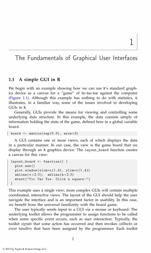
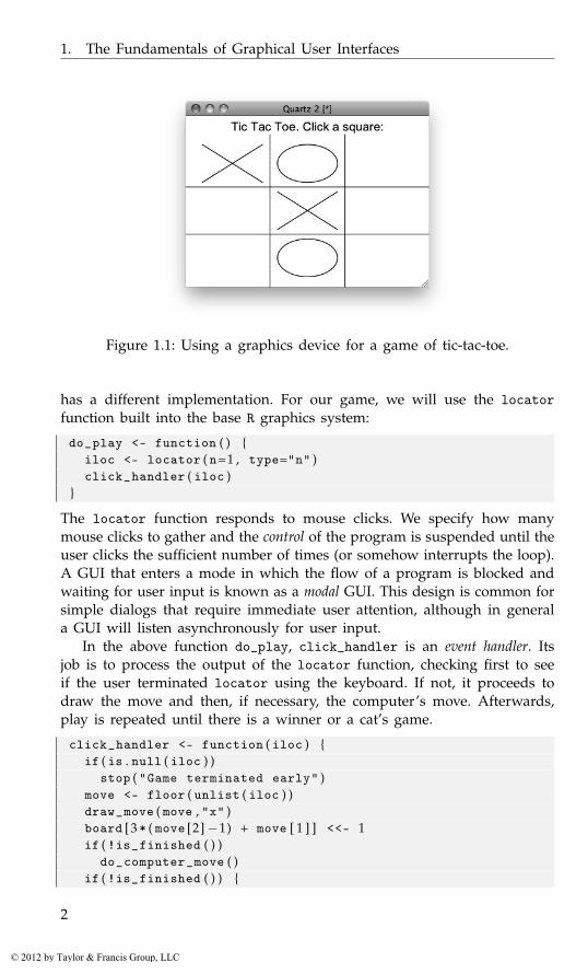
We begin with an example showing how we can use R’s standard graph-ics device as a canvas for a “game” of tic-tac-toe against the computer(Figure 1.1). Although this example has nothing to do with statistics, itillustrates, in a familiar way, some of the issues involved in developingGUIs in R.
Generally, GUIs provide the means for viewing and controlling someunderlying data structure. In this example, the data consists simply ofinformation holding the state of the game, defined here in a global variableboard.
board <- matrix ( rep ( 0 , 9 ) , nrow=3)
A GUI contains one or more views, each of which displays the datain a particular manner. In our case, the view is the game board that wedisplay through an R graphics device. The layout_board function createsa canvas for this view:
layout_board <- function ( ) {plot . new ( )plot . window ( xlim=c ( 1 , 4 ) , ylim=c ( 1 , 4 ) )abline ( v = 2 : 3 ) ; abline ( h= 2 : 3 )mtext ( "Tic Tac Toe. Click a square:" )
}
This example uses a single view; more complex GUIs will contain multiplecoordinated, interactive views. The layout of the GUI should help the usernavigate the interface and is an important factor in usability. In this case,we benefit from the universal familiarity with the board game.
The user typically sends input to a GUI via a mouse or keyboard. Theunderlying toolkit allows the programmer to assign functions to be calledwhen some specific event occurs, such as user interaction. Typically, thetoolkit signals that some action has occurred and then invokes callbacks orevent handlers that have been assigned by the programmer. Each toolkit
1
© 2012 by Taylor & Francis Group, LLC
1. The Fundamentals of Graphical User Interfaces
Figure 1.1: Using a graphics device for a game of tic-tac-toe.
has a different implementation. For our game, we will use the locatorfunction built into the base R graphics system:
do_play <- function ( ) {iloc <- locator ( n=1 , type="n" )click_handler ( iloc )
}
The locator function responds to mouse clicks. We specify how manymouse clicks to gather and the control of the program is suspended until theuser clicks the sufficient number of times (or somehow interrupts the loop).A GUI that enters a mode in which the flow of a program is blocked andwaiting for user input is known as a modal GUI. This design is common forsimple dialogs that require immediate user attention, although in generala GUI will listen asynchronously for user input.
In the above function do_play, click_handler is an event handler. Itsjob is to process the output of the locator function, checking first to seeif the user terminated locator using the keyboard. If not, it proceeds todraw the move and then, if necessary, the computer’s move. Afterwards,play is repeated until there is a winner or a cat’s game.
click_handler <- function ( iloc ) {if ( is . null ( iloc ) )
stop ( "Game terminated early" )move <- floor ( unlist ( iloc ) )draw_move ( move , "x" )board [3 * ( move [2]−1) + move [ 1 ] ] <<- 1if ( !is_finished ( ) )
do_computer_move ( )if ( !is_finished ( ) ) {
2
© 2012 by Taylor & Francis Group, LLC
1.1. A simple GUI in R
do_play ( )}
}
The use of <<- in the handler illustrates a typical issue in GUI de-sign in R. User input changes the state of the application through callbackfunctions. These callbacks need to modify variables in some shared scope,which may be application-wide or specific to a component. The lexicalscoping rules of R, i.e., nesting of closures, has proven to be a useful strat-egy for managing GUI state. In the above case, we simply modify theglobal environment, which encloses click_handler. When this is inconve-nient, direct manipulation of environment objects is sometimes a feasibleoption. If the scale of the GUI demands more formal mechanisms, werecommend the reference class framework from the methods package.
Validation of user input is an important task for a GUI. In the aboveexample, the click_handler function checks to see if the user terminatedthe game early and issues a message.
At this point, we have a data model, a view of the model, and thelogic that connects the two, but we still need to implement some of thefunctions to tie it together.
This next function draws either an “x” or an “o.” It does so using thelines function. The z argument contains the coordinates of the square todraw.
draw_move <- function ( z , type="x" ) {i <- max ( 1 , min ( 3 , z [ 1 ] ) ) ; j <- max ( 1 , min ( 3 , z [ 2 ] ) )if ( type == "x" ) {
lines ( i + c ( . 1 , . 9 ) , j + c ( . 1 , . 9 ) )lines ( i + c ( . 1 , . 9 ) , j + c ( . 9 , . 1 ) )
} else {theta <- seq ( 0 , 2 *pi , length=100)lines ( i + 1/2 + . 4 *cos ( theta ) , j + 1/2 + . 4 *sin ( theta ) )
}}
We could use text to place a text “x” or “o,” but this may not scalewell if the GUI is resized. Most GUI layouts allow for dynamic resizing.This is necessary to handle the variety of data a GUI will display. Eventhe labels, which one generally considers static, will display different textdepending on the language (as long as translations are available).
This function is used to test whether a game is finished:
is_finished <- function ( ) {( any ( abs ( rowSums ( board ) ) == 3) ||any ( abs ( colSums ( board ) ) == 3) ||abs ( sum ( diag ( board ) ) ) == 3 ||abs ( sum ( diag ( apply ( board , 2 , rev ) ) ) ) == 3)
3
© 2012 by Taylor & Francis Group, LLC
1. The Fundamentals of Graphical User Interfaces
}
The matrix m allows us to check easily all the possible ways to get threein a row.
This function picks a move for the computer:
do_computer_move <- function ( ) {new_move <- sample ( which ( board == 0 ) , 1 ) # random !board [ new_move ] <<- −1z <- c ( ( new_move−1) %% 3 , ( new_move−1) %/% 3) + 1draw_move ( z , "o" )
}
The move is converted into coordinates using %% to get the remainderand %/% to get the quotient when dividing an integer by an integer. Thisfunction just chooses at random from the leftover positions; we leave im-plementing a better strategy for the interested reader.
Finally, we implement the main entry point for our GUI:
play_game <- function ( ) {board <<- matrix ( rep ( 0 , 9 ) , nrow=3)layout_board ( )do_play ( )mtext ( "All done\n" , 1 )
}
When the game is launched, we first lay out the board and then calldo_play. When do_play returns, a message is written on the screen.
This example adheres to the model-view-controller design pattern thatis implemented by virtually every complex GUI. We will encounter thispattern throughout this book, although it is not always explicit.
For many GUIs there is a necessary trade-off between usability andcomplexity. As with any software, there is always the temptation to addfeatures continually without regard for the long-term cost. In this case,there are many obvious improvements: implementing a better artificial in-telligence, drawing a line connecting three in a row when there is a win,indicating who won, etc. Adding a feature increases the functionality, atthe cost of increased complexity and burden on the user.
1.2 GUI design principles
The most prevalent pattern of user interface design is denoted WIMP,which stands for Window, Icon, Menu, and Pointer. The WIMP approachwas developed at Xerox PARC in the 1970’s and later popularized by theApple Macintosh in 1984. This is particularly evident in the separationof the window from the menu bar on the Mac desktop. Other graphicaloperating systems, such as Microsoft Windows, later adapted the WIMP
4
© 2012 by Taylor & Francis Group, LLC

1.2. GUI design principles
paradigm, and libraries of reusable GUI components emerged to supportdevelopment of applications in such environments. Thus, GUI developmentin R adheres to the WIMP approach.
The primary WIMP component from our perspective is the window. Atypical interface design consists of a top-level window referred to as thedocument window that shows the current state of a “document,” whateverthat is taken to be. In R it could be a data frame, a command line, afunction editor, a graphic or an arbitrarily complex form containing anassortment of such elements.
Abstractly, WIMP is a command language, in which the user executescommands, often called actions, on a document by interacting with graph-ical controls. Every control in a window belongs to some abstract menu.Two common ways of organizing controls into menus are the menu barand toolbar.
The parameters of an action call, if any, are controlled in sub-windows.These sub-windows are termed application windows by Apple[8], but weprefer the term dialogs, or dialog boxes. These terms may also refer to smallersub-windows that are used for alerts or confirmation. The program oftenneeds to wait for user input before continuing with an action, in whichcase the window is modal. We refer to these as modal dialog boxes.
Each window or dialog typically consists of numerous controls laidout in some manner to facilitate the user interaction. Each window andcontrol is a type of widget, the basic element of a GUI. Every GUI isconstituted by its widgets. Not all widgets are directly visible by the user;for example, many GUI frameworks employ invisible widgets to lay outthe other widgets in a window.
There is a wide variety of available widget types, and widgets may becombined in an infinite number of ways. Thus, there are often numerousmeans to achieve the same goals. For example, Figures 1.2 and 1.3 showthree dialogs, representing typical dialogs from the three main operatingsystems, that perform the same task – collecting arguments from the userto customize the printing of a document. Although all were designed todo the same thing, there are many differences in implementation.
In some cases, typical usage suggests one control over another. Thechoice of printer for each is specified through a combo box. However, forother choices various widgets are employed. For example, the control toindicate the number of copies for the Mac is a simple text-entry window,whereas for the KDE and Windows dialog it is a spin button. The latterprovides a bit more functionality, for a bit more complexity. The KDEand Mac dialogs have icons to represent actions compactly, whereas theWindows example has none. The landscape icon for the Mac is very clearand provides this feature without having to use a sub-dialog.
[8] Apple Inc. http://developer.apple.com/.
5
© 2012 by Taylor & Francis Group, LLC

1. The Fundamentals of Graphical User Interfaces
Figure 1.2: Two print dialogs. One from Mac OS X 10.6 and one fromKDE 3.5.
6
© 2012 by Taylor & Francis Group, LLC

1.2. GUI design principles
Figure 1.3: R’s print dialog under Windows XP using XP’s native dialog.
The way the interfaces are laid out also varies. All panels are read topto bottom, although the Mac interface also has a very nice preview featureon the left side. The KDE dialog uses frames to separate out the printerarguments from the arguments that specify how the print job is to proceed.The Mac uses a vertical arrangement to guide the user through this. Forthe Mac, horizontal separators are used instead of frames to break up theareas, although a frame is used towards the bottom. Apple uses a centerbalance for its controls. Apple dialogs are not left justified as are the KDEand Windows dialogs. Apple has strict user-interface guidelines and thiscenter balance is a design decision.
The layout also determines how many features and choices are visibleto the user at a given time. For example, the Mac GUI uses “disclosurebuttons” to allow access to printer properties and PDF settings, whereasKDE uses a notebook container to show only a subset of the options atonce.
The Mac GUI provides a very nice preview of the current documentindicating to the user clearly what is to be printed and how many copies.Adjusting GUIs to the possible state is an important user interface property.GUI areas that are not currently sensitive to user input are grayed out.For example, the “collate” feature of the GUI makes sense only whenmultiple copies are selected, so the designers have it grayed out until then.A common element of GUI design is to enable controls only when theirassociated action is possible, given the state of the application.
7
© 2012 by Taylor & Francis Group, LLC
1. The Fundamentals of Graphical User Interfaces
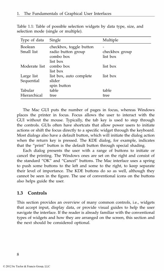
Table 1.1: Table of possible selection widgets by data type, size, andselection mode (single or multiple).
Type of data Single Multiple
Boolean checkbox, toggle button -Small list radio button group
combo boxlist box
checkbox grouplist box
Moderate list combo boxlist box
list box
Large list list box, auto complete list boxSequential slider
spin buttonTabular table tableHierarchical tree tree
The Mac GUI puts the number of pages in focus, whereas Windowsplaces the printer in focus. Focus allows the user to interact with theGUI without the mouse. Typically, the tab key is used to step throughthe controls. GUIs often have shortcuts that allow power users to initiateactions or shift the focus directly to a specific widget through the keyboard.Most dialogs also have a default button, which will initiate the dialog actionwhen the return key is pressed. The KDE dialog, for example, indicatesthat the “print” button is the default button through special shading.
Each dialog presents the user with a range of buttons to initiate orcancel the printing. The Windows ones are set on the right and consist ofthe standard “OK” and “Cancel” buttons. The Mac interface uses a springto push some buttons to the left and some to the right, to keep separatetheir level of importance. The KDE buttons do so as well, although theycannot be seen in the figure. The use of conventional icons on the buttonsalso helps guide the user.
1.3 Controls
This section provides an overview of many common controls, i.e., widgetsthat accept input, display data, or provide visual guides to help the usernavigate the interface. If the reader is already familiar with the conventionaltypes of widgets and how they are arranged on the screen, this section andthe next should be considered optional.
8
© 2012 by Taylor & Francis Group, LLC

1.3. Controls
Choice of control
A GUI comprises one or more widgets. The appropriate choice depends ona balance of considerations. For example, many widgets offer the user a se-lection from one or more possible choices. An appropriate choice dependson the type and size of the information being displayed, the constraints onthe user input, and the space available in the layout. As an example, Ta-ble 1.3 suggests different types of widgets used for this purpose dependingon the type and size of data and the number of items to select.
Figure 1.4 shows several such controls in a single dialog. A checkboxenables an intercept, a radio group selects either full factorial or a custommodel, a combo box selects the “sum of squares” type, and a list boxallows for multiple selection from the available variables in the data set.
For many R object types there are natural choices of widget. For ex-ample, values from a sequence map naturally to a slider or spin button; adata frame maps naturally to a table widget; or a list with similar struc-ture can map naturally to a tree widget. However, certain R types have lesscommon metaphors. For instance, a formula object can be fairly complex.Figure 1.4 shows an SPSS dialog for specifying terms in a model. R powerusers may be much faster specifying the formula through a text entry box,but beginning R users coming to grips with the command line and theconcept of a formula may benefit from the assistance of a well designedGUI. One might desire an interface that balances the needs of both typesof user, or the SPSS interface may be appropriate. Knowing the potentialuser base is important.
Presenting options
The widgets that receive user input need to translate that input into acommand that modifies the state of the application. Commands, like Rfunctions, often have parameters, or options. For many options, there is adiscrete set of possible choices, and the user needs to select one of them.Examples include selecting a data frame from a list of data frames, selectinga variable in a data frame, selecting certain cases in a data frame, selectinga logical value for a function argument, selecting a numeric value for aconfidence level or selecting a string to specify an alternative hypothesis.Clearly there can be no one-size-fits-all widget to handle the selection of avalue.
Checkboxes
A checkbox specifies a value for a logical (Boolean) option. Checkboxes havelabels to indicate which variable is being selected. Combining multiplecheckboxes into a group allows for the selection of one or more values ata time.
9
© 2012 by Taylor & Francis Group, LLC

1. The Fundamentals of Graphical User Interfaces
Figure 1.4: A dialog box from SPSS version 11 for specifying terms for alinear model. The graphic shows a dialog that allows the user to specifyindividual terms in the model using several types of widgets for selectionof values, such as a radio button group, a checkbox, combo boxes, andlist boxes.
Radio buttons
A radio button group selects exactly one value from a vector of possible val-ues. The analogy dates back to old car radios where there were a handfulof buttons for selecting preset channels. When a new button was pushedin, the previously pressed button popped out. Radio button groups areuseful, provided there are not too many values to choose from, as all thevalues are shown. These values can be arranged in a row, a column orboth rows and columns to better fill the available space. Figure 1.5 usesradio button groups for choosing the distribution, kernel and sample sizefor the density plot.
Combo boxes
A combo box is similar to a radio button group, in that it is used to selectone value from several. However, a combo box displays only the valuecurrently selected, which reduces visual complexity and saves space, at thecost of an extra click to show the choices. Toolkits often combine a combobox with a text entry area for specifying an arbitrary value, possibly onethat is not represented in the set of choices. A combo box is generallydesirable over radio buttons when there are more than four or five choices.However, the combo box also has its limits. For example, some web formsrequire choosing a country from a list of hundreds. In such cases, featuressuch as incremental type-ahead search are useful.
10
© 2012 by Taylor & Francis Group, LLC
1.3. Controls
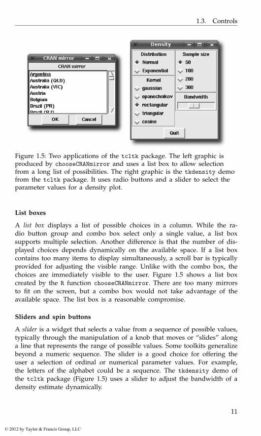
Figure 1.5: Two applications of the tcltk package. The left graphic isproduced by chooseCRANmirror and uses a list box to allow selectionfrom a long list of possibilities. The right graphic is the tkdensity demofrom the tcltk package. It uses radio buttons and a slider to select theparameter values for a density plot.
List boxes
A list box displays a list of possible choices in a column. While the ra-dio button group and combo box select only a single value, a list boxsupports multiple selection. Another difference is that the number of dis-played choices depends dynamically on the available space. If a list boxcontains too many items to display simultaneously, a scroll bar is typicallyprovided for adjusting the visible range. Unlike with the combo box, thechoices are immediately visible to the user. Figure 1.5 shows a list boxcreated by the R function chooseCRANmirror. There are too many mirrorsto fit on the screen, but a combo box would not take advantage of theavailable space. The list box is a reasonable compromise.
Sliders and spin buttons
A slider is a widget that selects a value from a sequence of possible values,typically through the manipulation of a knob that moves or “slides” alonga line that represents the range of possible values. Some toolkits generalizebeyond a numeric sequence. The slider is a good choice for offering theuser a selection of ordinal or numerical parameter values. For example,the letters of the alphabet could be a sequence. The tkdensity demo ofthe tcltk package (Figure 1.5) uses a slider to adjust the bandwidth of adensity estimate dynamically.
11
© 2012 by Taylor & Francis Group, LLC
1. The Fundamentals of Graphical User Interfaces
A spin button plays a similar role to the slider, in that it selects a valuewithin a set of bounds. Typically, this widget is drawn with a text boxdisplaying the current value and two arrows to increment or decrement theselection. Usually, the text box can be edited directly. A spin button hasthe advantage of using less screen space, and directly entering a specificvalue, if known, is easier than selecting it with a slider. One disadvantageis that the position of the selected value within the range is not as obviousas with the slider. As a compromise, combining a text box with a slider ispossible and often effective. A spin button is used in the KDE print dialogof Figure 1.2 to adjust the number of copies.
Initiating an action
After the user has specified the parameters of an action, typically by inter-acting with the selection widgets presented above, it comes time to executethe action. Widgets that execute actions include the familiar buttons, whichare often organized into menu bars and toolbars.
Buttons
A button issues commands when invoked, usually via a mouse click. InFigure 1.2, the “Properties” button, when clicked, opens a dialog for settingprinter properties. The button with the wizard icon also opens a dialog.As buttons execute an action, they are often labeled with a verb.[8] InFigure 1.4 we see how SPSS uses buttons in its dialogs: buttons which arenot valid in the current state are disabled; buttons which are designed toopen subsequent dialogs have trailing dots; and the standard actions ofresetting the data, canceling the dialog or requesting help are given theirown buttons on the right edge of the dialog box.
To speed the user through a dialog, a button may be singled out as thedefault button, so its action will be called if the user presses the return key.Actions may be given shortcut bindings, and their button proxies typicallyreflect the proper key combination to invoke the action. The KDE printdialog in Figure 1.2 has these bindings indicated via the underlined letteron the button labels.
Icons
In the WIMP paradigm, an icon is a pictorial representation of a resource,such as a document or program, or, more generally, a concept, such as atype of file. An application GUI typically adopts the more general defini-tion, in which an icon is used to complement or replace a text label ona button or other control. A button represents an action, so an icon on abutton should visually depict an action.
12
© 2012 by Taylor & Francis Group, LLC
1.3. Controls
Menu bars
Menus play a central role in the WIMP desktop. The menu bar containsitems for many of the actions supported by the application. By convention,menu bars are associated with a top-level window. This is enforced bysome toolkits and operating systems but not all. In Mac OS X, the menubar appears on the top line of the display, but other platforms place themenu bar at the top of the top-level window. In a statistics application, the“document” may be the active data frame, a report, or a graphic.
The styles used for menu bars are fairly standardized, as this allowsnew users to orient themselves quickly within a GUI. The visible menunames are often in the order File, Edit, View, Tools, application-specificmenus, and finally a Help menu. Each visible menu item, when clicked,opens a menu of possible actions. The text for these actions conventionallyuses a “...” to indicate that a subsequent dialog will open so that moreinformation can be gathered to complete the action. The text may alsoindicate a keyboard accelerator, such as Find Next F3, indicating that both“N” as a keyboard accelerator and F3 as a shortcut will initiate this sameaction. (Shortcuts are not translated, but keyboard accelerators must be. Assuch, they are less frequently used. In particular, keyboard accelerators arenot supported in Mac OS X menus.)
Not all actions will be applicable at any given time. It is recommended,that rather than deleting these menu items, disable them (grayed out) in-stead.
Menus may come to contain many items. To help the user navigate,menu items are usually grouped with either horizontal separators or hier-archical submenus.
The use of menus has evolved to allow the user to view and controlproperties of the application state. There may be checkboxes drawn nextto the menu item or an icon indicating the current state.
Another use of menus is to bind contextual menus (pop-up menus) tocertain mouse clicks on GUI elements. Typically, a right mouse click willpop up a menu that lists often-used commands that are appropriate forthat widget and the current state of the GUI. In Mac OS X one-buttonusers, these menus are bound to a control-click.
Toolbars
Toolbars are used to give immediate access to the frequently used actionsdefined in the menu bar. Toolbars typically have icons representing theaction and perhaps accompanying text. They traditionally appear on thetop of a window, but sometimes are used along the edges.
13
© 2012 by Taylor & Francis Group, LLC
1. The Fundamentals of Graphical User Interfaces
Action objects
When clicking on a button, the user expects some “action” to occur. Forexample, a save dialog is summoned, or a page is printed. GUI toolkitscommonly represent such actions as formal, invisible objects that are prox-ied by widgets, usually buttons, on the screen. Often, all of the primarycommands supported by an application have a corresponding action object,and the buttons associated with those actions are organized into menu barsand toolbars.
An action object is essentially a data model, with each proxy widgetacting as a view. Common components of an action include a textual label,an icon, perhaps a shortcut, and a handler to call when the action isselected.
Modal dialogs
A modal dialog box is a dialog box that keeps the focus until the user takesan action to dismiss the box. It prompts a user for immediate input, suchas asking for confirmation when overwriting a file. Modal dialog boxescan be disruptive to the flow of interaction, so they are used sparingly. Asthe control flow is blocked until the window is dismissed, functions thatdisplay modal dialogs can return a value when an event occurs, rather thanhave a handler respond to asynchronous input. The file.choose function,mentioned below, is a good example. When this function is called duringan interactive R session, the user is unable to interact with the commandline until a file has been specified or the dialog dismissed.
Message dialogs
A message dialog is a high-level dialog widget for communicating a messageto the user. By convention, there is a small rectangular box that appearsin the middle of the screen with an icon on the left and a message on theright. At the bottom is a button, often labeled “Ok,” to dismiss the dialog.Additional buttons/responses are possible. The confirmation dialog variantwould add a “Cancel” button, which would invalidate the proposed action.
File choosers
A file chooser allows for the selection of files and directories. They arefamiliar to any user of a GUI. A typical R installation has the functionsfile.choose and tkchooseDirectory (in the tcltk package) to select filesand directories.
Other common choosers are color choosers and font choosers.
14
© 2012 by Taylor & Francis Group, LLC
1.3. Controls
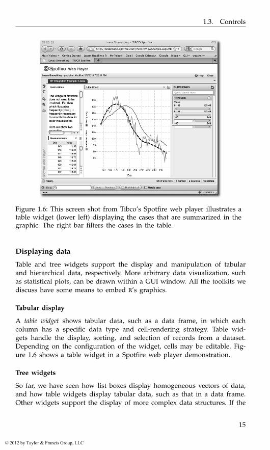
Figure 1.6: This screen shot from Tibco’s Spotfire web player illustrates atable widget (lower left) displaying the cases that are summarized in thegraphic. The right bar filters the cases in the table.
Displaying data
Table and tree widgets support the display and manipulation of tabularand hierarchical data, respectively. More arbitrary data visualization, suchas statistical plots, can be drawn within a GUI window. All the toolkits wediscuss have some means to embed R’s graphics.
Tabular display
A table widget shows tabular data, such as a data frame, in which eachcolumn has a specific data type and cell-rendering strategy. Table wid-gets handle the display, sorting, and selection of records from a dataset.Depending on the configuration of the widget, cells may be editable. Fig-ure 1.6 shows a table widget in a Spotfire web player demonstration.
Tree widgets
So far, we have seen how list boxes display homogeneous vectors of data,and how table widgets display tabular data, such as that in a data frame.Other widgets support the display of more complex data structures. If the
15
© 2012 by Taylor & Francis Group, LLC

1. The Fundamentals of Graphical User Interfaces
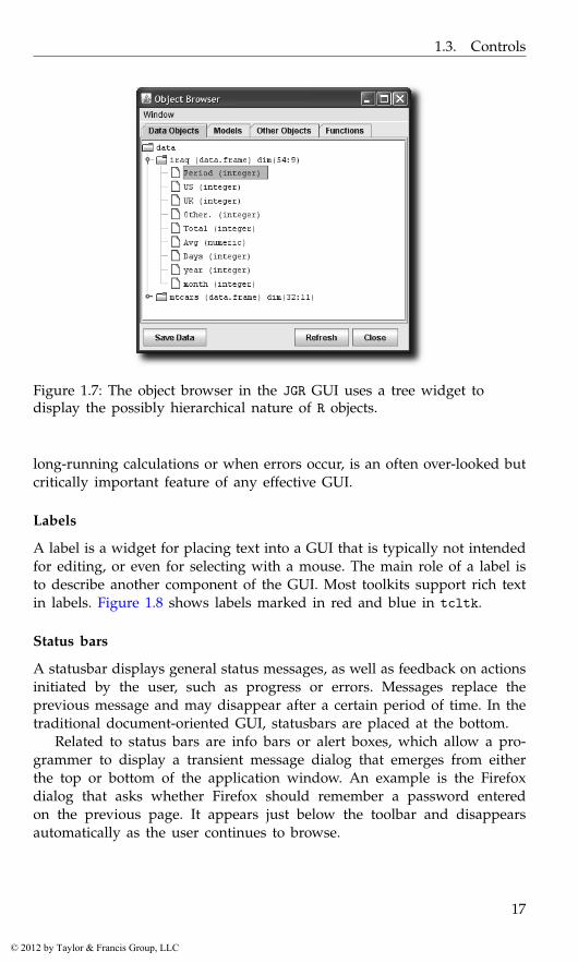
data has a hierarchical structure, then a tree widget may be appropriatefor its display. Examples of hierarchical data in R are directory structures,the components of a list, or class hierarchies. The object browser in JGRuses a tree widget to show the components of the objects in a user session(Figure 1.7). The root node of the tree is the “data” folder, and each dataobject in the global workspace is treated as an offspring of this root node.For the data frame iraq, its variables are considered as offspring of the dataframe. In this case these variables have no further offspring, as indicatedby the “page” icon.
Displaying and editing text
The letter P in WIMP stands for “pointer,” so it is not surprising that WIMPGUIs are designed around the pointing device. The keyboard is generallyrelegated to a secondary role, in part because it is difficult to type andmove the mouse at the same time. For statistical GUIs, especially whenintegrating with the command-line interface of R, the flexibility afforded byarbitrary text entry is essential for any moderately complex GUI. Toolkitsgenerally provide separate widgets for text entry depending on whetherthe editor supports a single line or multiple lines.
Single lines of text
A text-entry widget for editing a single line of text is found in the KDEprint dialog (Figure 1.2). It specifies the page range. Specifying a complexpage range, which might include gaps, would require a complex point-and-click interface. In order to avoid complicating the GUI for a featurethat is rarely useful, a simple language has been developed for specifyingpage ranges. There is overhead involved in the parsing and validation ofsuch a language, but it is still preferable to the alternative.
Text-editing boxes
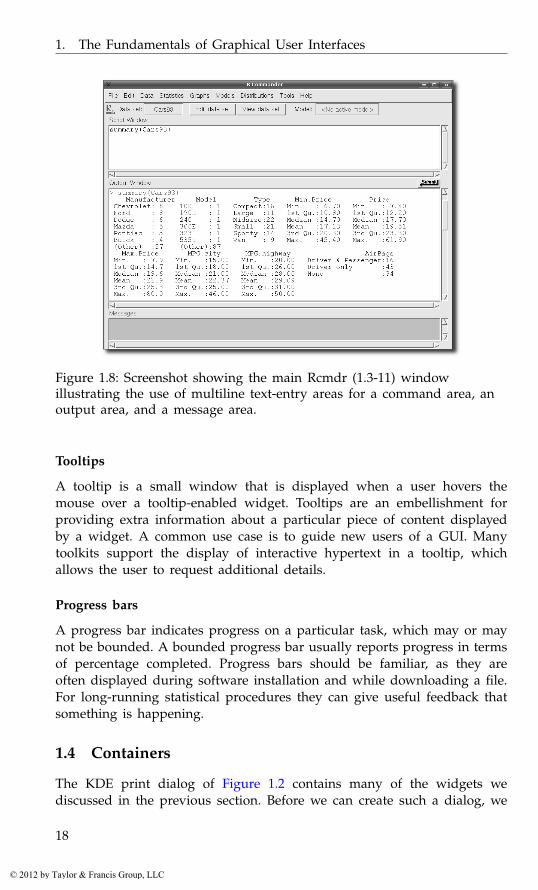
Figure 1.8 shows three multiline text entries in an Rcmdr window. It pro-vides an R console and status message area. The “Output Window” demon-strates the utility of formatting attributes. In this case, attributes specify thecolor of the commands, so that the input can be distinguished from theoutput.
Guides and feedback
Some widgets display information but do not respond to user input. Theirmain purpose is to guide the user through the GUI and to display feedbackand status messages. Communicating application status, such as during
16
© 2012 by Taylor & Francis Group, LLC
1.3. Controls
Figure 1.7: The object browser in the JGR GUI uses a tree widget todisplay the possibly hierarchical nature of R objects.
long-running calculations or when errors occur, is an often over-looked butcritically important feature of any effective GUI.
Labels
A label is a widget for placing text into a GUI that is typically not intendedfor editing, or even for selecting with a mouse. The main role of a label isto describe another component of the GUI. Most toolkits support rich textin labels. Figure 1.8 shows labels marked in red and blue in tcltk.
Status bars
A statusbar displays general status messages, as well as feedback on actionsinitiated by the user, such as progress or errors. Messages replace theprevious message and may disappear after a certain period of time. In thetraditional document-oriented GUI, statusbars are placed at the bottom.
Related to status bars are info bars or alert boxes, which allow a pro-grammer to display a transient message dialog that emerges from eitherthe top or bottom of the application window. An example is the Firefoxdialog that asks whether Firefox should remember a password enteredon the previous page. It appears just below the toolbar and disappearsautomatically as the user continues to browse.
17
© 2012 by Taylor & Francis Group, LLC
1. The Fundamentals of Graphical User Interfaces
Figure 1.8: Screenshot showing the main Rcmdr (1.3-11) windowillustrating the use of multiline text-entry areas for a command area, anoutput area, and a message area.
Tooltips
A tooltip is a small window that is displayed when a user hovers themouse over a tooltip-enabled widget. Tooltips are an embellishment forproviding extra information about a particular piece of content displayedby a widget. A common use case is to guide new users of a GUI. Manytoolkits support the display of interactive hypertext in a tooltip, whichallows the user to request additional details.
Progress bars
A progress bar indicates progress on a particular task, which may or maynot be bounded. A bounded progress bar usually reports progress in termsof percentage completed. Progress bars should be familiar, as they areoften displayed during software installation and while downloading a file.For long-running statistical procedures they can give useful feedback thatsomething is happening.
1.4 Containers
The KDE print dialog of Figure 1.2 contains many of the widgets wediscussed in the previous section. Before we can create such a dialog, we
18
© 2012 by Taylor & Francis Group, LLC

1.4. Containers
need to discuss the positioning of widgets on the screen. This process iscalled widget layout.
A layout emerges from the organization of the widgets into a hierarchy,in which a parent widget positions its children within its allocated space.The top-level window is parentless and forms the root of the hierarchy. Aparent visually contains its children and thus is usually called a container.This design is natural, because almost every GUI has a hierarchical layout.It is easy to apply a different layout strategy to each region of a GUI, andwhen a parent is added or removed from the GUI, so are its children.
It is sometimes tempting for novices to assign simply a fixed positionand dimensions for every widget in a GUI. However, such static layouts donot scale well to changes in the state of the application or simply changesin the window size dictated by the window manager. Thus, it is stronglyencouraged to delegate the responsibility of layout to a layout manager,which dynamically calculates the layout as constraints change. Dependingon the toolkit, the layout manager might be the container itself, or it mightbe a separate object to which the container delegates.
Regardless, the type of layout is generally orthogonal to the type ofcontainer. For example, a container might draw a border around its chil-dren, and this would be independent of how its children are laid out. Therest of this section is divided into two parts: container widgets and layoutalgorithms. We will continually refer back to the KDE print dialog exampleas we proceed.
Top-level windows
The top-level window of a GUI is the root of the container hierarchy. Allother widgets are contained within it. The conventional main applicationwindow will consist of a menubar, a toolbar and a status bar. The primarycontent of the window is inserted between the toolbar and the status bar, inan area known as the client area or content area. In the case of a dialog, thecontent usually appears above a row of buttons, each of which representsa possible response. The print dialog conforms to the dialog convention.The print options fill the content area, and there is a row of buttons at thebottom for issuing a response, such as “Print.”
A window is typically decorated with a title and buttons to iconify,maximize, or close. In the case of the print dialog, the top-level windowis entitled “Print – KPDF.” Besides the text of the title, the decorations aregenerally the domain of the window manager (often part of the operatingsystem). The application controls the contents of the window.
Once a window is shown, its dimensions are managed by the user,through the window manager. Thus, the programmer must size the win-dow before it becomes visible. This is often referred to as the “default”
19
© 2012 by Taylor & Francis Group, LLC
1. The Fundamentals of Graphical User Interfaces
size of the window. Positioning of a top-level window is generally left tothe window manager.
The top-level window forwards window-manager events to the appli-cation. For example, an application might listen to the window-close eventin order to prompt a user if there are any unsaved changes to a document.
Tabbed notebooks
A notebook widget depicts each child as if it were a page in a notebook.A page is selected by clicking on a button that appears as a tab. Only asingle child is shown at a time. The tabbed notebook is a space-efficient,categorizing container that is most appropriate when a user is interestedin only one page at a time. Modern web browsers take advantage of thetabbed notebook to allow several web pages to be open at once withinthe same window. In the KDE print dialog, detailed options are collapsedinto a notebook in order to save space and organize the many options intosimple categories: “Copies,” “Advanced Options,” and “Additional Tags.”
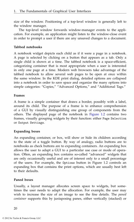
Frames
A frame is a simple container that draws a border, possibly with a label,around its child. The purpose of a frame is to enhance comprehensionof a GUI by visually distinguishing one group of components from theothers. The displayed page of the notebook in Figure 1.2 contains twoframes, visually grouping widgets by their function: either Page Selectionor Output Settings.
Expanding boxes
An expanding container, or box, will show or hide its children accordingto the state of a toggle button. By way of analogy, radio buttons are tonotebooks as check buttons are to expanding containers. An expanding boxallows the user to adapt a GUI to a particular use case or mode of opera-tion. Often, an expanding box contains so-called “advanced” widgets thatare only occasionally useful and are of interest only to a small percentageof the users. For example, the Options button in Figure 1.2 controls anexpanding box that contains the print options, which are usually best leftto their defaults.
Paned boxes
Usually, a layout manager allocates screen space to widgets, but some-times the user needs to adapt the allocation. For example, the user maywish to increase the size of an image to see the fine details. The panedcontainer supports this by juxtaposing panes, either vertically (stacked) or
20
© 2012 by Taylor & Francis Group, LLC
1.4. Containers
horizontally. The area separating the panes, sometimes called a sash, canbe adjusted by the user with the mouse.
Layout algorithms
Box layout
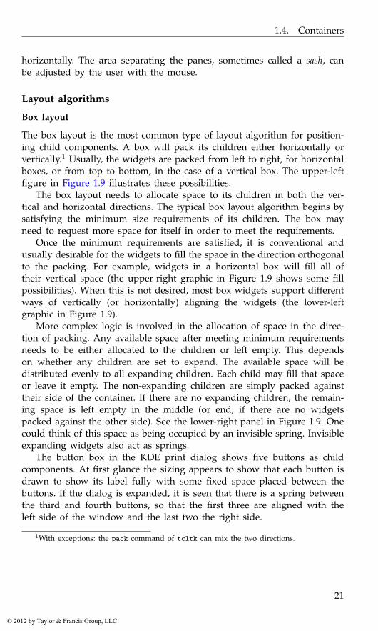
The box layout is the most common type of layout algorithm for position-ing child components. A box will pack its children either horizontally orvertically.1 Usually, the widgets are packed from left to right, for horizontalboxes, or from top to bottom, in the case of a vertical box. The upper-leftfigure in Figure 1.9 illustrates these possibilities.
The box layout needs to allocate space to its children in both the ver-tical and horizontal directions. The typical box layout algorithm begins bysatisfying the minimum size requirements of its children. The box mayneed to request more space for itself in order to meet the requirements.
Once the minimum requirements are satisfied, it is conventional andusually desirable for the widgets to fill the space in the direction orthogonalto the packing. For example, widgets in a horizontal box will fill all oftheir vertical space (the upper-right graphic in Figure 1.9 shows some fillpossibilities). When this is not desired, most box widgets support differentways of vertically (or horizontally) aligning the widgets (the lower-leftgraphic in Figure 1.9).
More complex logic is involved in the allocation of space in the direc-tion of packing. Any available space after meeting minimum requirementsneeds to be either allocated to the children or left empty. This dependson whether any children are set to expand. The available space will bedistributed evenly to all expanding children. Each child may fill that spaceor leave it empty. The non-expanding children are simply packed againsttheir side of the container. If there are no expanding children, the remain-ing space is left empty in the middle (or end, if there are no widgetspacked against the other side). See the lower-right panel in Figure 1.9. Onecould think of this space as being occupied by an invisible spring. Invisibleexpanding widgets also act as springs.
The button box in the KDE print dialog shows five buttons as childcomponents. At first glance the sizing appears to show that each button isdrawn to show its label fully with some fixed space placed between thebuttons. If the dialog is expanded, it is seen that there is a spring betweenthe third and fourth buttons, so that the first three are aligned with theleft side of the window and the last two the right side.
1With exceptions: the pack command of tcltk can mix the two directions.
21
© 2012 by Taylor & Francis Group, LLC
1. The Fundamentals of Graphical User Interfaces
Figure 1.9: Different possibilities for packing child components within abox. The upper left shows horizontal and vertical layout. The upper rightshows some possible alignments or anchorings. The lower left shows thata child could “expand” to fill the space either horizontally, vertically, orboth. The lower right shows both a fixed amount of space between thechildren and an expanding spring between the child components.
Grid layout
The box layout algorithm typically aligns its children along a single di-mension. The horizontal box, for example, aligns its children vertically.Nevertheless, nesting permits the construction of complex layouts usingonly simple boxes. It is sometimes desirable to align widgets in both di-mensions, i.e., to lay them out on a grid. The most flexible grid layoutalgorithms allow non-regular sizing of rows and columns, as well as theability for a widget to span multiple cells. Usually, a widget fills the cellsallocated to it, but if this is not possible, it may be anchored at a specificpoint within its cell.
22
© 2012 by Taylor & Francis Group, LLC
Part I
The gWidgets Package
23
© 2012 by Taylor & Francis Group, LLC
2
gWidgets: Overview
The gWidgets package provides a convenient means to create rapidly smallto medium-size GUIs within R. The package provides an abstract interfacefor the other graphical toolkits discussed in this text, allowing for similaraccess to each. Unlike the underlying toolkits, gWidgets has relatively fewconstructors and methods. Basically, the entire set is enumerated in Tables2.2, 3.1, 3.2, and 4.1. This means gWidgets is relatively easy to learn, al-lowing for rapid prototyping. (It also means that as projects progress, onemight need to move to a more powerful underlying toolkit.)
Typical uses of GUIs written in R involve teaching demos and, sharingfunctionality with less technically proficient colleagues, etc. In many casesthe end user may have a different operating system or different set ofgraphical libraries installed. The underlying toolkits supported by gWidgetsare all cross- platform, and gWidgets code is mostly-cross toolkit, althoughdifferences do come up. (Compare, for example, the same code realized ondifferent operating systems and toolkits in Figure 2.1.) This means, thereis a good chance that code you write can be shared easily with someoneelse.
The gWidgets package started as a port to RGtk2 of Simon Urbanek’siWidgets package which was written for Swing through rJava[12]. Alongthe way, gWidgets was extended and abstracted to work with other GUItoolkit backends available for R. A separate package provides the interface.As of writing there are interfaces for RGtk2, qtbase, and tcltk. The gWid-getsWWW2 package provides a similar interface for web programming, butthere are enough differences that we will not discuss it further.
We jump right in with an example and leave comments about installa-tion to the end of the chapter. The following shows some sample gWidgetscommands that set up a basic interface allowing a user to search his or her
[12] Simon Urbanek. iWidgets - Basic GUI widgets for R. http://www.rforge.net/iWidgets/index.html.
25
© 2012 by Taylor & Francis Group, LLC
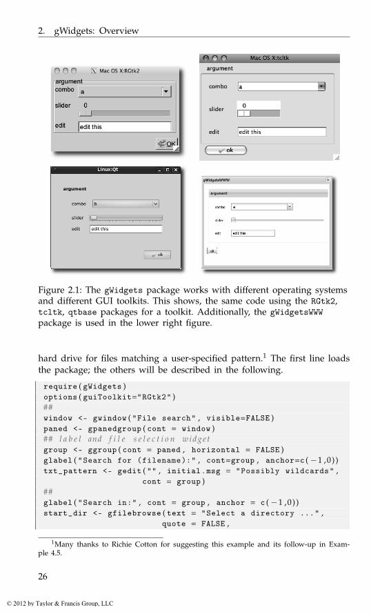
2. gWidgets: Overview
Figure 2.1: The gWidgets package works with different operating systemsand different GUI toolkits. This shows, the same code using the RGtk2,tcltk, qtbase packages for a toolkit. Additionally, the gWidgetsWWWpackage is used in the lower right figure.
hard drive for files matching a user-specified pattern.1 The first line loadsthe package; the others will be described in the following.
require ( gWidgets )options ( guiToolkit="RGtk2" )##window <- gwindow ( "File search" , visible=FALSE )paned <- gpanedgroup ( cont = window )## l a b e l and f i l e s e l e c t i o n w i d g e tgroup <- ggroup ( cont = paned , horizontal = FALSE )glabel ( "Search for (filename):" , cont=group , anchor=c (−1 ,0) )txt_pattern <- gedit ( "" , initial . msg = "Possibly wildcards" ,
cont = group )##glabel ( "Search in:" , cont = group , anchor = c (−1 ,0) )start_dir <- gfilebrowse ( text = "Select a directory ..." ,
quote = FALSE ,
1Many thanks to Richie Cotton for suggesting this example and its follow-up in Exam-ple 4.5.
26
© 2012 by Taylor & Francis Group, LLC

2.1. Constructors
Figure 2.2: A simple GUI for search for files matching a pattern. This GUIuses a paned group to separate the controls for searching from the results.
type = "selectdir" , cont = group )## A b u t t o n t o i n i t i a t e t h e s e a r c hsearch_button <- gbutton ( "Search" , cont = group )addSpring ( group )## Area f o r ou t pu tframe <- gframe ( "Output:" , cont = paned , horizontal = FALSE )search_results <- gtext ( "" , cont = frame , expand = TRUE )size ( search_results ) <- c ( 3 5 0 , 200)## add i n t e r a c t i v i t yaddHandlerChanged ( search_button , handler = function ( h , . . . ) {
pattern <- glob2rx ( svalue ( txt_pattern ) )file_names <- dir ( svalue ( start_dir ) , pattern ,
recursive = TRUE )if ( length ( file_names ) )
svalue ( search_results ) <- file_nameselse
galert ( "No matching files found" , parent = window )} )## d i s p l a y GUIvisible ( window ) <- TRUE
This example shows several different widgets being used to constructa GUI, as seen in Figure 2.2. For example, on the left is a text-entrywidget (gedit), a directory-browsing widget (gfilebrowse) and a button(gbutton). On the right is a multiline text widget (gtext) in a framedcontainer (gframe).
2.1 Constructors
The widgets are all produced by calling the appropriate constructor. In thegWidgets API most of these constructors have the following basic form:
27
© 2012 by Taylor & Francis Group, LLC

2. gWidgets: Overview
gname ( some_arguments , handler = NULL , action = NULL ,container = NULL , . . . , toolkit = guiToolkit ( ) )
where some_arguments varies depending on the object being made. Wediscuss now the common arguments.
In the example above, we can see that the gwindow constructor, for atop-level window, has two arguments passed in, an unnamed one for awindow title and a value for the visible property, whereas the gpaned-group constructor takes all the default arguments except for the parentcontainer.
The handler and action arguments The handler and action argumentsare used to pass in event handlers. We discuss those in Section 2.3.
The container argument A top-level window does not have a parentcontainer, but the other GUI components do. In gWidgets, for the sakeof portability, the parent container is passed to the widget constructorthrough the container argument, as it done in all the other constructors.This argument name can always be abbreviated cont. The ... argumentsare used to pass layout information to the parent container. This nestingdefines the GUI layout, a topic taken up in Chapter 3.
The ... argument Not only is the ... mechanism used to pass in argu-ments to the add method of the parent container, it may also used to passin additional values to the constructor in the toolkit package. Some tool-kits allow additional functionality beyond that specified in the basic API.Any documentation for these additional arguments appears in the toolkitpackage.
The toolkit argument The toolkit argument is usually not specified. Itis there to allow the user to mix toolkits within the same R session, but inpractice this can cause problems due to competing event loops. The defaultfor the toolkit argument is to call guiToolkit. This function will checkwhether a toolkit has been specified, or if only one is available. If neithercase is so, then a menu will be provided for the user to choose one. In ourexample we have called
options ( guiToolkit = "RGtk2" )
to explicitly set the toolkit.
Side effects The constructors produce one of three general types of wid-gets:
28
© 2012 by Taylor & Francis Group, LLC
2.2. Methods
• Containers: such as the top-level window window, the paned grouppaned, or the frame frame (Table 3.1)
• Components: such as the unnamed labels, the edit area txt_pattern,or the button search_button (Tables 4.1 and 5.1)
• Dialogs: such as galert and gfilebrowse (Table 2.4)
2.2 Methods
In addition to creating a GUI object, most gWidgets constructors also returna useful R object. This is an S4 object of a certain class, containing twocomponents: toolkit and widget. (Modal dialogs do not return an object,as the dialog will be destroyed before the constructor returns. Instead, theirconstructors return values reflecting the user response to the dialog.)
GUI objects have a state determined by one or more of their properties.In gWidgets, many properties are set at the time of construction. However,there are also several methods to adjust these properties for gWidgetsobjects.2
Depending on the class of the object, the gWidgets package providesmethods for the familiar S3 generics [, [<-, dim, length, names, names<-,dimnames, dimnames<- and update.
In our example, we see two cases of the use of generic methods definedby gWidgets. The call
svalue ( txt_pattern )
demonstrates the most used new generic svalue, that is used to get themain property of the widget. For the object txt_pattern, the main propertyis the text, for the button and label widgets this property is the label. Thesvalue<- assignment method is used to set this property programatically.We see the call
svalue ( search_results ) <- file_names
to update the text for the multi-line text widget search_results.For the selection widgets (of which there are none in our example),
there is a natural mapping between vectors or data frames, and the datato be selected. In this case, the user may want the value selected or theindex of the selected value. The index=TRUE argument of svalue may bespecified to refer to values by their index.
For these selection widgets the familiar [ and [<- methods refer to theunderlying data to be selected from.
2 We are a bit imprecise about the term “method” here. The gWidgets methods callfurther methods in the underlying toolkit interface, which we think of as a single methodcall. The actual S4 object has a slot for the toolkit and the widget created by the toolkitinterface to dispatch on.
29
© 2012 by Taylor & Francis Group, LLC

2. gWidgets: Overview
The call
visible ( window ) <- TRUE
sets the visibility property of the top-level window. In our example, thegwindow constructor is passed visible=FALSE to suppress an initial draw-ing, making this call to visible<- necessary to show the GUI. The visi-ble<- generic has different interpretations for the various widgets.
Some other methods to adjust the widget’s underlying properties arefont<-, to adjust the font of an object; size and size<- to query and setthe size of a widget; and enabled<-, to adjust whether a widget is sensitiveto user input.
The underlying toolkit widget The gWidgets API provides just a handfulof generic functions for manipulating an object’s properties compared tothe number of methods typically provided by a GUI toolkit for a similarobject. Although this simplicity makes gWidgets easier to work with, onemay wish to access the underlying toolkit object to take advantage of aricher API. In most cases, the getToolkitWidget will provide that object.For convenience, the method $ is implemented to call a method on the un-derlying toolkit widget, and the methods [[ and [[<- are implemented toinspect and set properties of the underlying widget. We will not illustratehere though, as we try to stay toolkit-agnostic in our examples.
2.3 Event handlers
In our example, the search button is created with:
search_button <- gbutton ( "Search" , cont = group )
However, without doing more work, this button will not initiate an action.For that we need to add an event handler, or callback, to be called whenan event occurs. For our example, our event is a button click, and theaction we want consists of several steps: turning our pattern into a regularexpression, searching for the specified pattern; and presenting the results.In our example, this is done through:
addHandlerChanged ( search_button , handler = function ( h , . . . ) {pattern <- glob2rx ( svalue ( txt_pattern ) )file_names <- dir ( svalue ( start_dir ) , pattern , recursive=TRUE )if ( length ( file_names ) )
svalue ( search_results ) <- file_nameselse
galert ( "No matching files found" , parent = window )} )
Callbacks in gWidgets have a common signature (h,...). The first argu-ment is a list with components obj, to pass in the receiver of the event
30
© 2012 by Taylor & Francis Group, LLC
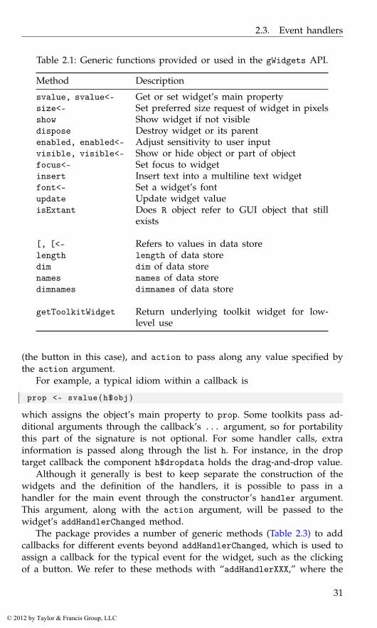
2.3. Event handlers
Table 2.1: Generic functions provided or used in the gWidgets API.
Method Description
svalue, svalue<- Get or set widget’s main propertysize<- Set preferred size request of widget in pixelsshow Show widget if not visibledispose Destroy widget or its parentenabled, enabled<- Adjust sensitivity to user inputvisible, visible<- Show or hide object or part of objectfocus<- Set focus to widgetinsert Insert text into a multiline text widgetfont<- Set a widget’s fontupdate Update widget valueisExtant Does R object refer to GUI object that still
exists
[, [<- Refers to values in data storelength length of data storedim dim of data storenames names of data storedimnames dimnames of data store
getToolkitWidget Return underlying toolkit widget for low-level use
(the button in this case), and action to pass along any value specified bythe action argument.
For example, a typical idiom within a callback is
prop <- svalue ( h$obj )
which assigns the object’s main property to prop. Some toolkits pass ad-ditional arguments through the callback’s ... argument, so for portabilitythis part of the signature is not optional. For some handler calls, extrainformation is passed along through the list h. For instance, in the droptarget callback the component h$dropdata holds the drag-and-drop value.
Although it generally is best to keep separate the construction of thewidgets and the definition of the handlers, it is possible to pass in ahandler for the main event through the constructor’s handler argument.This argument, along with the action argument, will be passed to thewidget’s addHandlerChanged method.
The package provides a number of generic methods (Table 2.3) to addcallbacks for different events beyond addHandlerChanged, which is used toassign a callback for the typical event for the widget, such as the clickingof a button. We refer to these methods with “addHandlerXXX,” where the
31
© 2012 by Taylor & Francis Group, LLC
2. gWidgets: Overview
XXX describes the event. These are useful when more than one event onthat widget is of interest. For example, for single-line text widgets, suchas txt_pattern in our example, the addHandlerChanged method sets acallback to respond when the user finishes editing, whereas a handler setby addHandlerKeystroke is called each time a key is pressed.
As an example of combining the handler and constructor, we couldhave specified the search button through:
search_button <- gbutton ( "Search" , cont = group ,handler = function ( h , . . . ) {
pattern <- glob2rx ( svalue ( h$action$txt ) )file_names <- dir ( svalue ( h$action$dir ) ,
pattern , recursive = TRUE )if ( length ( file_names ) )
svalue ( h$action$results ) <- file_nameselse
galert ( "No matching files found" , parent = w )} ,action = list ( txt = txt_pattern , dir = start_dir ,
results = search_results ))
By passing in the other widgets through the action argument, we canavoid worrying about any potential issues with scope.
The addHandlerXXX methods return an ID. This ID can be used withthe method removeHandler to remove the callback, or with the methodsblockHandler and unblockHandler to block temporarily a handler frombeing called.
If these few methods are insufficient and toolkit portability is not ofinterest, then the addHandler generic can be used to specify a toolkit-specific signal and a callback.
2.4 Dialogs
The gWidgets package provides a few constructors for quickly makingsome basic dialogs for showing messages or gathering information. Mostlythese are modal dialogs that take control of the event loop, not allowingany other part of the GUI to be active for interaction. As such, in gWid-gets, constructors of modal dialogs do not return an object to manipulatethrough its methods, but rather return the user response to the dialog. Forexample, the gfile dialog, described later, is a modal dialog that pops upa means to select a file returning the selected file path or NA. It is usedalong the lines of:
if ( !is . na ( f <- gfile ( ) ) ) source ( f )
32
© 2012 by Taylor & Francis Group, LLC
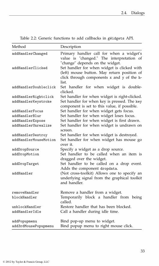
2.4. Dialogs
Table 2.2: Generic functions to add callbacks in gWidgets API.
Method Description
addHandlerChanged Primary handler call for when a widget’svalue is "changed." The interpretation of"change" depends on the widget.
addHandlerClicked Set handler for when widget is clicked with(left) mouse button. May return position ofclick through components x and y of the h-list.
addHandlerDoubleclick Set handler for when widget is double-clicked.
addHandlerRightclick Set handler for when widget is right-clicked.addHandlerKeystroke Set handler for when key is pressed. The key
component is set to this value, if possible.addHandlerFocus Set handler for when widget gets focus.addHandlerBlur Set handler for when widget loses focus.addHandlerExpose Set handler for when widget is first drawn.addHandlerUnrealize Set handler for when widget is undrawn on
screen.addHandlerDestroy Set handler for when widget is destroyed.addHandlerMouseMotion Set handler for when widget has mouse go
over it.addDropSource Specify a widget as a drop source.addDropMotion Set handler to be called when an item is
dragged over the widget.addDropTarget Set handler to be called on a drop event.
Adds the component dropdata.addHandler (Not cross-toolkit) Allows one to specify an
underlying signal from the graphical toolkitand handler.
removeHandler Remove a handler from a widget.blockHandler Temporarily block a handler from being
called.unblockHandler Restore handler that has been blocked.addHandlerIdle Call a handler during idle time.
addPopupmenu Bind pop-up menu to widget.add3rdMousePopupmenu Bind popup menu to right mouse click.
33
© 2012 by Taylor & Francis Group, LLC
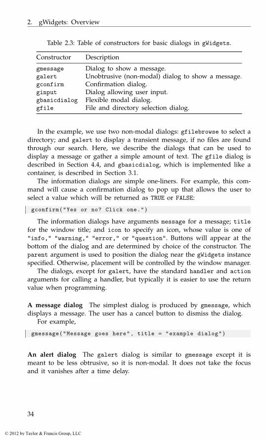
2. gWidgets: Overview
Table 2.3: Table of constructors for basic dialogs in gWidgets.
Constructor Description
gmessage Dialog to show a message.galert Unobtrusive (non-modal) dialog to show a message.gconfirm Confirmation dialog.ginput Dialog allowing user input.gbasicdialog Flexible modal dialog.gfile File and directory selection dialog.
In the example, we use two non-modal dialogs: gfilebrowse to select adirectory; and galert to display a transient message, if no files are foundthrough our search. Here, we describe the dialogs that can be used todisplay a message or gather a simple amount of text. The gfile dialog isdescribed in Section 4.4, and gbasicdialog, which is implemented like acontainer, is described in Section 3.1.
The information dialogs are simple one-liners. For example, this com-mand will cause a confirmation dialog to pop up that allows the user toselect a value which will be returned as TRUE or FALSE:
gconfirm ( "Yes or no? Click one." )
The information dialogs have arguments message for a message; titlefor the window title; and icon to specify an icon, whose value is one of"info," "warning," "error," or "question". Buttons will appear at thebottom of the dialog and are determined by choice of the constructor. Theparent argument is used to position the dialog near the gWidgets instancespecified. Otherwise, placement will be controlled by the window manager.
The dialogs, except for galert, have the standard handler and actionarguments for calling a handler, but typically it is easier to use the returnvalue when programming.
A message dialog The simplest dialog is produced by gmessage, whichdisplays a message. The user has a cancel button to dismiss the dialog.
For example,
gmessage ( "Message goes here" , title = "example dialog" )
An alert dialog The galert dialog is similar to gmessage except it ismeant to be less obtrusive, so it is non-modal. It does not take the focusand it vanishes after a time delay.
34
© 2012 by Taylor & Francis Group, LLC
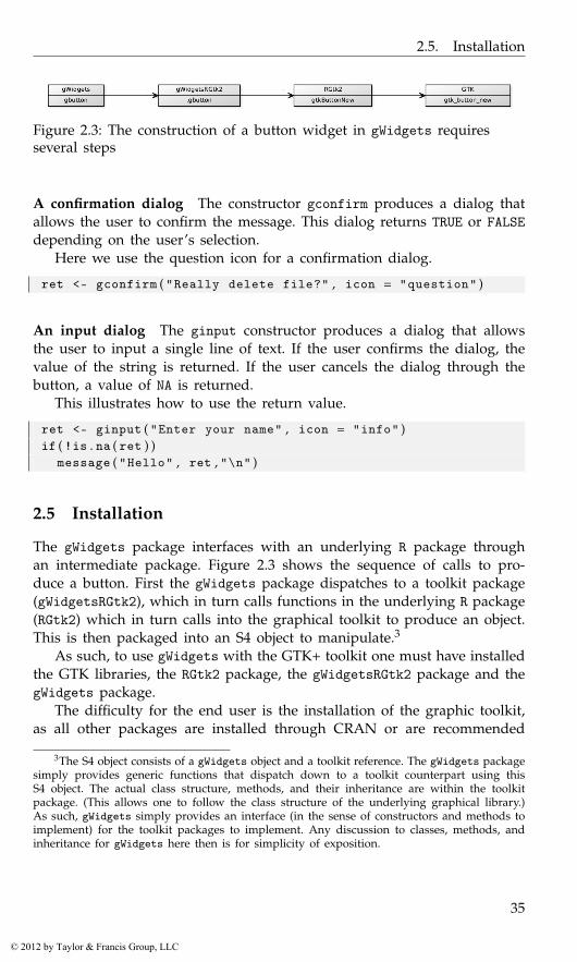
2.5. Installation
Figure 2.3: The construction of a button widget in gWidgets requiresseveral steps
A confirmation dialog The constructor gconfirm produces a dialog thatallows the user to confirm the message. This dialog returns TRUE or FALSEdepending on the user’s selection.
Here we use the question icon for a confirmation dialog.
ret <- gconfirm ( "Really delete file?" , icon = "question" )
An input dialog The ginput constructor produces a dialog that allowsthe user to input a single line of text. If the user confirms the dialog, thevalue of the string is returned. If the user cancels the dialog through thebutton, a value of NA is returned.
This illustrates how to use the return value.
ret <- ginput ( "Enter your name" , icon = "info" )if ( !is . na ( ret ) )
message ( "Hello" , ret , "\n" )
2.5 Installation
The gWidgets package interfaces with an underlying R package throughan intermediate package. Figure 2.3 shows the sequence of calls to pro-duce a button. First the gWidgets package dispatches to a toolkit package(gWidgetsRGtk2), which in turn calls functions in the underlying R package(RGtk2) which in turn calls into the graphical toolkit to produce an object.This is then packaged into an S4 object to manipulate.3
As such, to use gWidgets with the GTK+ toolkit one must have installedthe GTK libraries, the RGtk2 package, the gWidgetsRGtk2 package and thegWidgets package.
The difficulty for the end user is the installation of the graphic toolkit,as all other packages are installed through CRAN or are recommended
3The S4 object consists of a gWidgets object and a toolkit reference. The gWidgets packagesimply provides generic functions that dispatch down to a toolkit counterpart using thisS4 object. The actual class structure, methods, and their inheritance are within the toolkitpackage. (This allows one to follow the class structure of the underlying graphical library.)As such, gWidgets simply provides an interface (in the sense of constructors and methods toimplement) for the toolkit packages to implement. Any discussion to classes, methods, andinheritance for gWidgets here then is for simplicity of exposition.
35
© 2012 by Taylor & Francis Group, LLC

2. gWidgets: Overview
Table 2.4: Installation notes for GUI toolkits.
Gtk+ Qt Tk
Windows Installed by RGtk2 Included with qtbase In binary install of RLinux Standard Standard StandardOS X Download binary .pkg Vendor supplied In binary install of R
packages with an R installation (tcltk). Table 2.4 roughly describes the in-stallation process for different operating systems and toolkits. For Windowsusers, some details are linked to in the R for Windows FAQ.
Not all features of the gWidgets API are implemented for a toolkit.In particular, the easiest-to-install toolkit package (gWidgetstcltk) mighthave the fewest features, as the Tk libraries themselves do not have as manyfeatures. The help pages in the gWidgets package describe the API, withthe help pages in the toolkit packages indicating differences or omissionsfrom the API (e.g. ?gWidgetsRGtk2-package). For the most part, omissionsare gracefully handled by simply providing less functionality.
36
© 2012 by Taylor & Francis Group, LLC
3
gWidgets: Container Widgets
After identifying the underlying data to manipulate and deciding how torepresent it, GUI construction involves three basic steps:
• creation and configuration of the main components,
• the layout of these components, and
• connecting the components through callbacks to make a GUI interac-tive.
This chapter discusses the layout process within gWidgets. Layout ingWidgets is done by placing child components within parent containers,which in turn may be nested in other containers.1 In our file-search exam-ple from the previous chapter, we nested a framed box container inside apaned container inside a top- level window.
The gWidgets package provides just a few types of containers: top-level windows (gwindow), box containers (ggroup, gframe, gexpandgroup), agrid container (glayout), a paned container (gpanedgroup), and a notebookcontainer (gnotebook). Figure 3.1 shows most of these employed to producea GUI to select and then show the contents of a file.
In some toolkits, notably tcltk, the widget constructors require thespecification of a parent container for the widget. To accommodate that,the gWidgets constructors – except for top-level windows and dialogs –have the argument container to specify the immediate parent. Within theconstructor is the call add(container, child, ...), where the constructorcreates the child and ... values are passed from the constructor down tothe add method. That is, the widget construction and layout are coupledtogether. Although this isn’t necessary when utilizing RGtk2 or qtbase– and the two aspects can be separated – for the sake of cross-toolkitportability we do not illustrate this style here.
1This is more like GTK+, and not Qt, where layout managers control where the compo-nents are displayed.
37
© 2012 by Taylor & Francis Group, LLC
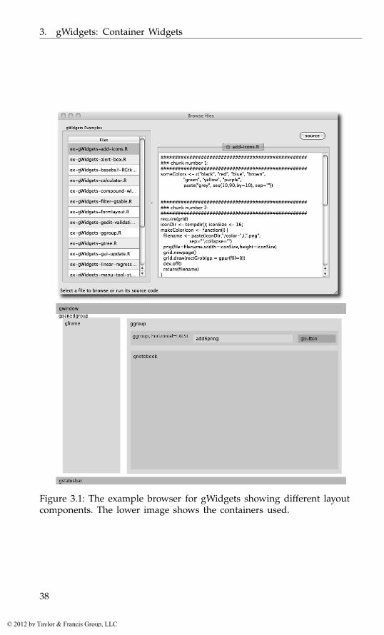
3. gWidgets: Container Widgets
Figure 3.1: The example browser for gWidgets showing different layoutcomponents. The lower image shows the containers used.
38
© 2012 by Taylor & Francis Group, LLC
3.1. Top-level windows
3.1 Top-level windows
The gwindow constructor creates top-level windows. The main windowproperty is the title, which is typically displayed in the window’s titlebar. This can be set during construction via the title argument or ac-cessed later through the object’s svalue<- method. A basic window thenis constructed as follows:
window <- gwindow ( "Our title" , visible = TRUE )
We can use this as a parent container for a constructor. For example:
label <- glabel ( "A child label" , container = window )
However, top-level windows allow only one child component. Typically,this child is a container, such as a box container, allowing for multiplechildren.
The optional visible argument, used above with its default valueTRUE2, controls whether the window is initially drawn. If it’s not drawn, thevisible<- method, taking a logical value, can be used to draw the windowlater. Often it is good practice to suppress the initial drawing, especiallyfor displaying GUIs with several controls, as the incremental drawing ofsubsequent child components can make the GUI seem sluggish. As well,this allows the underlying toolkit to compute the necessary size before itis displayed.3
For example, a typical usage follows this pattern:
window <- gwindow ( "Title" , visible = FALSE )## p e r f o r m l a y o u t h e r e . . .visible ( window ) <- TRUE
Size and placement In GUI programming, a window geometry is a spec-ification of position and size, often abbreviated w× h + x + y. The widthand height can be specified at construction through the width and heightarguments. This initial size is the default size but may be adjusted laterthrough the size method or through the window manager.
The initial placement of a window “x + y” will be decided by thewindow manager, unless the parent argument is specified. If this is donewith a vector of x and y pixel values, the upper-left corner will be placed atthis point. The parent argument can also be another gwindow instance. Inthis case, the new window will be positioned over the specified windowand be transient for the window. That is, it will be disposed when the
2If the option gWidgets:gwindow-default-visible-is-false is non NULL, then thedefault will be FALSE.
3For gWidgetstcltk, the update method will initiate this recomputation. This may benecessary to get the window to size properly.
39
© 2012 by Taylor & Francis Group, LLC

3. gWidgets: Container Widgets
parent window is. This is useful, say, when a main window opens a dialogwindow to gather values.
For example this call makes a child window of window with a squaresize of 200 pixels.
child_window <- gwindow ( "A child window" , parent = window ,width = 200 , height = 200)
Handlers Windows objects can be closed programmatically through theirdispose method. Windows may also be closed through the window man-ager with the click of a close icon in the title bar. The default event is theclose event. For example, the following will pop up any error messagesthrough a call to galert until the window is closed:
old_options <- options ( error = function ( ) {if ( msg <- geterrmessage ( ) != "" )
galert ( msg , parent = window )invisible ( msg )
} )#window <- gwindow ( "Popup errors" , visible = FALSE ,
handler = function ( h , . . . ) {## r e s t o r e o l d o p t i o n s when gui i s c l o s e doptions ( old_options )
} )
To illustrate, we add a button to initiate an error:
button <- gbutton ( "Click for error" , cont = window ,handler = function ( h , . . . ) {
stop ( "This is an error" )} )
Clicking the button will signal an error, and the error handler will displayan alert pop-up. (This last part fails under tcltk due to that package’shandling of errors in callbacks.)
The handler argument is called just before the window is destroyed,but one cannot prevent that from happening. The addHandlerUnrealizemethod can be used to call a handler between the initial click of the closeicon and the subsequent destroy event of the window. This handler mustreturn a logical value: if TRUE the window will not be destroyed; if FALSEthe window will be. For example:
window <- gwindow ( "Close through the window manager" )id <- addHandlerUnrealize ( window , handler = function ( h , . . . ) {
!gconfirm ( "Really close" , parent = h$obj )} )
40
© 2012 by Taylor & Francis Group, LLC
3.1. Top-level windows
Table 3.1: Constructors for container objects.
Constructor Description
gwindow Creates a top-level window.ggroup Creates a box-like container.gframe Creates a box container with a text label.gexpandgroup Creates a box container with a label and a
trigger to expand/collapse.glayout Creates a grid container.gpanedgroup Creates a container for two child widgets
with a handle to assign allocation of space.gnotebook Creates a tabbed notebook container for
holding a collection of child widgets.
In most GUIs, the use of menu bars, toolbars, and status bars is oftenreserved for the main window, while dialogs are not decorated so. IngWidgets it is suggested, although not strictly enforced unless done so bythe underlying toolkit, that these be added only to a top-level window. Wediscuss these widgets later in Section 4.7.
A modal window
The gbasicdialog constructor allows one to place an arbitrary widgetwithin a modal window. It also adds OK and Cancel buttons, unless theargument do.buttons is specified as FALSE. The argument title is usedto specify the window title.
As with the gconfirm dialog, this widget returns TRUE or FALSE de-pending on the user’s selection. To do something more complicated thangconfirm, a handler can be specified at construction. This is called justbefore the dialog is disposed.
This dialog is used in a slightly different manner, requiring the use of acall to visible (not visible<-). There are three basic steps: an initial callto gbasicdialog to return a container to be used as the parent containerfor a child component, a construction of the dialog, then a call to the vis-ible method on the dialog with set=TRUE specified. The dialog is closedthrough clicking one of its buttons, through a window manager event, orprogrammatically through its dispose method.
In Example 4.6 we define a GUI to assist with the task of collapsingfactor levels. This wrapper function is used:
collapseFactor <- function ( fac , parent = NULL ) {out <- character ( )window <-
gbasicdialog ( "Collapse factor levels" , parent = parent ,
41
© 2012 by Taylor & Francis Group, LLC
3. gWidgets: Container Widgets
Table 3.2: Container methods.
Method Description
add Adds a child object to a parent container.Called when a parent container is specifiedto the container argument of the widgetconstructor, in which case the ... argumentsare passed to this method.
delete Removes a child object from a parent con-tainer.
dispose Destroys container and children.enabled<- Sets sensitivity of child components.visible<- Hides or shows child components.
handler = function ( h , . . . ) {new_fac <- relevel_factor$get_value ( )out <<- factor ( new_fac )
} )group <- ggroup ( cont = window )relevel_factor <- CollapseFactor$new ( fac , cont = group )visible ( window , set = TRUE )out
}
By wrapping the gbasicdialog call within a function closure, we canreturn the factor, not just a logical, so the above can be used as
mtcars$am <- collapseFactor ( mtcars$am )
3.2 Box containers
The container produced by gwindow is intended to contain just a singlechild widget, not several. This section demonstrates variations on box con-tainers that can be used to hold multiple child components. Through nest-ing, fairly complicated layouts can be produced.
The ggroup container
The basic box container is produced by ggroup. Its main argument is hor-izontal to specify whether the child widgets are packed in horizontallyfrom left to right (the default) or vertically from top to bottom.
For example, to pack a cancel and ok button into a box container wemight have:
window <- gwindow ( "Some buttons" , visible = FALSE )
42
© 2012 by Taylor & Francis Group, LLC

3.2. Box containers
group <- ggroup ( horizontal = TRUE , cont = window )cancel_button <- gbutton ( "cancel" , cont = group )ok_button <- gbutton ( "ok" , cont = group )visible ( window ) <- TRUE
The add method When packing in child widgets, the add method is used.In our example above, this is called by the gbutton constructor when thecontainer argument is specified.4 Unlike with the underlying graphicaltoolkits, there is no means to specify other styles of packing, such as fromthe ends, or in the middle, by some index.
The add method for box containers has a few arguments to customizewhere the child widgets are placed and how they respond when theirparent window is resized. These are passed through the ... argument ofthe constructor. Figure 3.2 shows some difference in how these argumentsare implemented.5
expand The underlying layout algorithms have a means to allocate spaceto child widgets when the parent container expands to provide morespace than requested by the children. Those widgets which have ex-pand=TRUE specified should get the excess space shared among them.(This isn’t the case in gWidgetsQt, where a fill value needs to bespecified as well.)
fill, anchor When a child widget is placed into its allocated space, thespace is generally large enough to accommodate the child. If thereis additional space, it can be desirable that the widget grow to fillthe available space. The fill argument, taking a value of x, y, orboth (also TRUE) indicates how the widget should fill any additionalallocation (only when expand=TRUE).6
If a widget does not expand or if it does but does not fill in bothdirections, it can be anchored into its available space in more thanone position. The anchor argument can be specified to suggest whereto anchor the child. It takes a numeric vector representing Cartesian
4In this text, the add method is typically called from the constructor, but there are twocases for which one calls it directly. The first is if one wishes to integrate a widget from theunderlying graphical toolkit into a gWidgets GUI. An example where the tkrplot packageis embedded in a GUI is given in Section 5.1. The second case is when a widget is removedfrom a GUI through delete. In most cases it may be added back in with add.
5These arguments are not implemented consistently across toolkits, as the underlyingtoolkit may prevent it. For example, for RGtk2 the child widgets always fill in the directionopposite of how they are added (horizontal widgets always fill top to bottom), whereas tcltkwidgets will fill only if the expand argument is TRUE.
6For GTK+, filling always occurs orthogonally to the direction of packing. This is whythe top and bottom buttons (when expand=FALSE) in Figure 3.2 for gWidgetsRGtk2 stretchacross the container. To avoid this filling, pack the button in a horizontal ggroup container.
43
© 2012 by Taylor & Francis Group, LLC
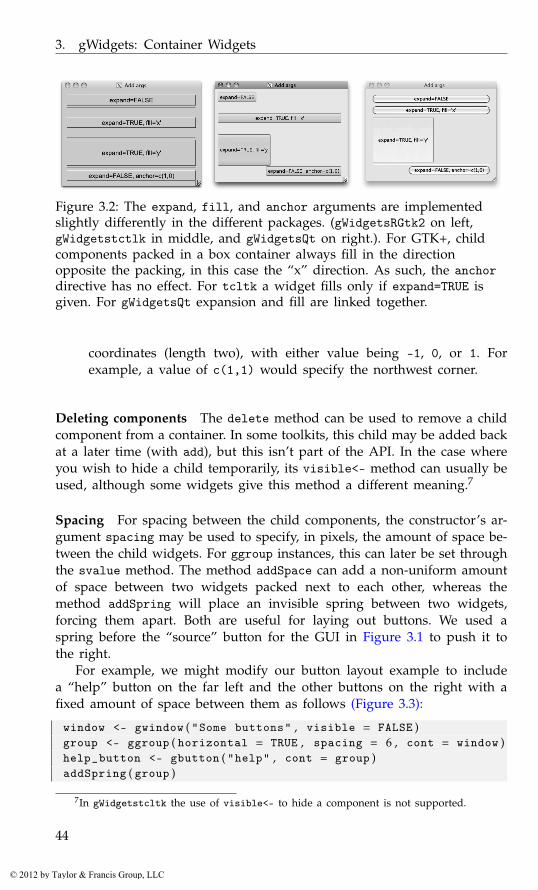
3. gWidgets: Container Widgets
Figure 3.2: The expand, fill, and anchor arguments are implementedslightly differently in the different packages. (gWidgetsRGtk2 on left,gWidgetstctlk in middle, and gWidgetsQt on right.). For GTK+, childcomponents packed in a box container always fill in the directionopposite the packing, in this case the “x” direction. As such, the anchordirective has no effect. For tcltk a widget fills only if expand=TRUE isgiven. For gWidgetsQt expansion and fill are linked together.
coordinates (length two), with either value being -1, 0, or 1. Forexample, a value of c(1,1) would specify the northwest corner.
Deleting components The delete method can be used to remove a childcomponent from a container. In some toolkits, this child may be added backat a later time (with add), but this isn’t part of the API. In the case whereyou wish to hide a child temporarily, its visible<- method can usually beused, although some widgets give this method a different meaning.7
Spacing For spacing between the child components, the constructor’s ar-gument spacing may be used to specify, in pixels, the amount of space be-tween the child widgets. For ggroup instances, this can later be set throughthe svalue method. The method addSpace can add a non-uniform amountof space between two widgets packed next to each other, whereas themethod addSpring will place an invisible spring between two widgets,forcing them apart. Both are useful for laying out buttons. We used aspring before the “source” button for the GUI in Figure 3.1 to push it tothe right.
For example, we might modify our button layout example to includea “help” button on the far left and the other buttons on the right with afixed amount of space between them as follows (Figure 3.3):
window <- gwindow ( "Some buttons" , visible = FALSE )group <- ggroup ( horizontal = TRUE , spacing = 6 , cont = window )help_button <- gbutton ( "help" , cont = group )addSpring ( group )
7In gWidgetstcltk the use of visible<- to hide a component is not supported.
44
© 2012 by Taylor & Francis Group, LLC

3.2. Box containers
Figure 3.3: Button layout for RGtk2 (top), tcltk (middle), and qtbase(bottom). Although the same code is used for each, the different stylingyields varying sizes.
cancel_button <- gbutton ( "cancel" , cont = group )addSpace ( group , 12 ) # 6 + 12 + 6 p i x e l sok_button <- gbutton ( "ok" , cont = group )visible ( window ) <- TRUE
Sizing The overall size of a ggroup container is typically determined bythe way in which it is added to its parent. However, a requested size canbe assigned through the size<- method.
For some toolkits the argument use.scrollwindow, when specified asTRUE, will add scroll bars to the box container so that a fixed size can bemaintained. Setting a requested size in this case is a good idea. (Althoughit is generally considered a poor idea to use scroll bars when there is achance the key controls for a dialog will be hidden, this can be useful fordisplaying lists of data.)
The gframe and gexpandgroup containers
We discuss briefly two widgets that provide the same interface as ggroup.Much of the previous discussion applies.
Framed containers are used to link the child elements visually using aborder and label. The gframe constructor produces them. In Figure 3.1 thetable to select the file is nested in a frame to give the user some indicationas to what to do.
For gframe the first argument, text, is used to specify the label. Thiscan later be adjusted through the names<- method. The argument pos canbe specified to adjust the label’s positioning, with 0 being the left and 1the right.
45
© 2012 by Taylor & Francis Group, LLC

3. gWidgets: Container Widgets
The basic framed container is used along these lines:
window <- gwindow ( "gframe example" )frame <- gframe ( "gWidgets Examples:" , cont = window )files <- list . files ( system . file ( "Examples" ,"ch-gWidgets" ,
package = "ProgGUIinR" ) )vars <- gtable ( files , cont = frame , expand = TRUE )
Expandable containers are useful when their child items need not bevisible all the time. The typical design involves a trigger icon with anaccompanying label indicating to the user that a click can disclose or hidesome additional information.8 This class overrides the visible<- methodto initiate the hiding or showing of its child area, not the entire container.
In addition, a handler can be added that is called whenever the widgettoggles its state.
Here we show how one might leave optional the display of a statisticalsummary of a model.:
res <- lm ( mpg ~ wt , mtcars )out <- capture . output ( summary ( res ) )##window <- gwindow ( "gexpandgroup example" , visible = FALSE )exp_group <- gexpandgroup ( "Summary" , cont = window )label <- glabel ( out , cont = exp_group )visible ( exp_group ) <- TRUE # d i s p l a y summaryvisible ( window ) <- TRUE
Separators Although not a container, the gseparator widget can be usedto place a horizontal or vertical line (with the horizontal=FALSE argument)in a layout to separate parts of the GUI.
3.3 Grid layout: the glayout container
The layout of dialogs and forms is usually seen with some form of align-ment between the widgets. The glayout constructor provides a grid con-tainer to do so, using matrix notation to specify location of the children.
To see its use, we can lay out a simple form for collecting information,as follows:
window <- gwindow ( "glayout example" , visible = FALSE )lyt <- glayout ( cont = window , spacing = 5)right <- c ( 1 , 0 ) ; left <- c (−1 ,0)lyt [ 1 , 1 , anchor = right ] <- "name"lyt [ 1 , 2 , anchor = left ] <- gedit ( "George Washington" ,
8How each toolkit resizes after a the child widget collapses varies, so using this containercan cause layout issues if cross-toolkit portability is an issue.
46
© 2012 by Taylor & Francis Group, LLC
3.4. Paned containers: the gpanedgroup container
cont = lyt )#lyt [ 2 , 1 , anchor = right ] <- "rank"lyt [ 2 , 2 , anchor = left ] <- gedit ( "General" , cont = lyt )#lyt [ 3 , 1 , anchor = right ] <- "serial number"lyt [ 3 , 2 , anchor = left ] <- gedit ( "1" , cont = lyt )visible ( window ) <- TRUE
When adding a child, in addition to being on the left-hand side of the[<- call, the glayout container should be specified as the widget’s parentcontainer.9 For convenience, if the right-hand side is a string, a label willbe generated. To align a widget within a cell, the anchor argument of the[<-glayout method is used. The example above illustrates how this can beused to achieve a center balance.
The constructor has a few arguments to configure the appearance ofthe container. The spacing between each cell may be specified through thespacing argument; the default is 10 pixels. A value of 5 is used aboveto tighten up the display. To impose a uniform cell size, the homogeneousargument can be specified with a value of TRUE. The default is FALSE.
As seen, children may be added to the grid at a specific row andcolumn. To specify this, R’s matrix notation, [<-, is used with the indicesreflecting the placement by row and column. A child may span more thanone row or column. The corresponding index should be a contiguous vectorof indices indicating so.
The [ method may be used to return the children. This method returnsa single item, a list of items, or a matrix of items. The main properties ofthe widgets in the above example can be returned through:
sapply ( lyt [ , 2 ] , svalue )
[1] "George Washington" "General" "1"
3.4 Paned containers: the gpanedgroup container
The gpanedgroup constructor produces a container that has two childrenseparated by a visual gutter, which can be adjusted by the user with amouse to allocate the space between them. Figure 3.1 uses such a containerto separate the file selection controls from those for file display. For thiscontainer, the children are aligned side by side (by default) or top tobottom, if the horizontal argument is given as FALSE.
9This is necessary only for the toolkits where a container must be specified, where theright-hand side is used to pass along the parent information and the left-hand side is usedfor the layout.
47
© 2012 by Taylor & Francis Group, LLC
3. gWidgets: Container Widgets
To add children, the container should be passed as the parent duringthe construction of each of the two child widgets. These might be othercontainer constructors, which is the typical usage for more complicatedlayouts.
The main property of this container is the sash position, a value in [0,1].This may be configured programmatically through the svalue<- method. Avalue from 0 to 1 specifies the proportion of space allocated to the leftmost(topmost) child. This specification works only after the containing windowis drawn, as the percentage is based on the size of the window.
A simplified version of the layout code in Figure 3.1 would be
examples <- system . file ( "Examples" , "ch-gWidgets" ,package = "ProgGUIinR" )
files <- list . files ( examples )#window <- gwindow ( "gpanedgroup example" , visible = FALSE )paned <- gpanedgroup ( cont = window )tbl <- gtable ( files , cont = paned ) # l e f t s i d etxt_widget <- gtext ( "" , cont = paned , expand = TRUE ) # r i g h tvisible ( window ) <- TRUEsvalue ( paned ) <- 0 . 3 3 # a f t e r drawing
3.5 Tabbed notebooks: the gnotebook container
The gnotebook constructor produces a tabbed notebook container. The GUIin Figure 3.1 uses a notebook to hold different text widgets, one for eachfile being displayed.
The constructor has a few arguments, not all supported by each toolkit.The argument tab.pos is used to specify the location of the tabs by as-signing a value of 1 through 4, with 1 being the bottom, 2 the left side, 3the top, and 4 the right side, with the default being 3 (similar numberingas used in par). The closebuttons argument takes a logical value indicat-ing whether the tabs should have close buttons on them. In this case, theargument dontCloseThese can be used to specify which tabs, by index,should not be closable.
Methods Pages are added through the add method for the notebook con-tainer. The extra label argument is used to specify the tab label. (As addis called implicitly when a widget is constructed, this argument is usuallypassed to the constructor.)
The svalue method returns the index of the currently raised tab,whereas svalue<- can be used to switch the page to the specified tab.The currently shown tab can be removed using the dispose method. Toremove a different tab, use this method in combination with svalue<-.
48
© 2012 by Taylor & Francis Group, LLC
3.5. Tabbed notebooks: the gnotebook container
(When removing many tabs, you will want to start from the end, as oth-erwise the tab positions change during removal.)
From some viewpoint, the notebook widget is viewed as a vector ofchild widgets, named according to the tab labels. As such, the [ methodreturns the child components (by index), the names method refers to thetab names, and the length method returns the number of pages held bythe notebook.
Example 3.1: Tabbed notebook exampleIn the GUI of Figure 3.1, a notebook is used to hold differing pages. Thefollowing is the basic setup used:
window <- gwindow ( "gnotebook example" )notebook <- gnotebook ( cont = window )
New pages are added as follows:
add_a_page <- function ( file_name ) {f <- system . file ( file_name , package = "ProgGUIinR" )gtext ( paste ( readLines ( f ) , collapse="\n" ) ,
cont = notebook , label = file_name )}add_a_page ( "DESCRIPTION" )
For pages holding more than one widget, a container is used:
lyt <- glayout ( cont = notebook , horizontal = FALSE ,label = "Help" )
lyt [ 1 , 1 ] <- gimage ( "help" , dir = "stock" , cont = lyt )lyt [ 1 , 2 ] <- glabel ( paste ( "To add a page:" ,
"Click on a file in the left pane, and its contents" ,"are displayed in a notebook page." , sep = "\n" ) ,cont = lyt )
To manipulate the displayed pages, say to set the page to the last one,we have:
svalue ( notebook ) <- length ( notebook )
To remove the current page:
dispose ( notebook )
49
© 2012 by Taylor & Francis Group, LLC

4
gWidgets: Control Widgets
This chapter discusses the basic GUI controls provided by gWidgets. Wedefer discussion of the R-specific widgets to the next chapter.
4.1 Buttons
The button widget allows a user to initiate an action through clicking onit. Buttons have labels, conventionally verbs, indicating action, and oftenicons. The gbutton constructor has an argument text to specify the text.For text that matches the stock icons of gWidgets (Section 4.2), an icon willappear. (The ok button below, but not the parButton one.)
In common with the other controls, the argument handler is used tospecify a callback, and the action argument will be passed along to thiscallback (unless it is a gaction object, whose case is described in Sec-tion 4.7). The default handler is the click handler, which can be specifiedat construction, or afterward through addHandlerClicked.
The following example shows how a button can be used to call a sub-dialog to collect optional information. We imagine this as part of a dialogto generate a plot.
window <- gwindow ( "Make a plot" )group <- ggroup ( horizontal = FALSE , cont = window )glabel ( "... Fill me in ..." , cont = group )button_group <- ggroup ( cont = group )addSpring ( button_group )parButton <- gbutton ( "par (mfrow) ..." , cont = button_group )
Our callback opens a subwindow to collect a few values for the mfrowoption.
addHandlerClicked ( parButton , handler = function ( h , . . . ) {child <- gwindow ( "Set par values for mfrow" , parent = window )lyt <- glayout ( cont = child )lyt [ 1 , 1 , align = c (−1 ,0) ] <- "mfrow: c(nr,nc)"lyt [ 2 , 1 ] <- ( nr <- gedit ( 1 , cont = lyt ) )lyt [ 2 , 2 ] <- ( nc <- gedit ( 1 , cont = lyt ) )
51
© 2012 by Taylor & Francis Group, LLC
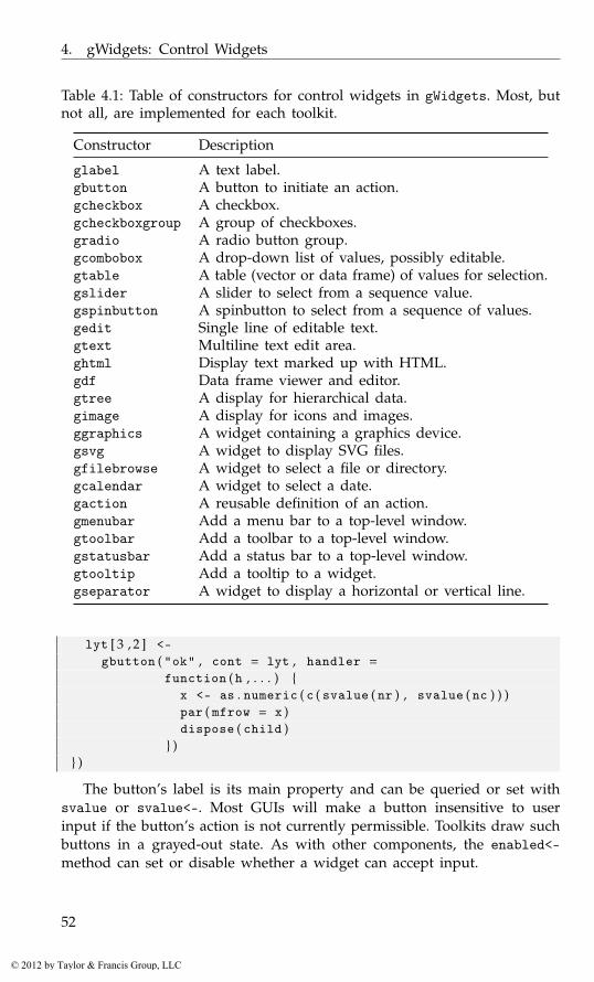
4. gWidgets: Control Widgets
Table 4.1: Table of constructors for control widgets in gWidgets. Most, butnot all, are implemented for each toolkit.
Constructor Description
glabel A text label.gbutton A button to initiate an action.gcheckbox A checkbox.gcheckboxgroup A group of checkboxes.gradio A radio button group.gcombobox A drop-down list of values, possibly editable.gtable A table (vector or data frame) of values for selection.gslider A slider to select from a sequence value.gspinbutton A spinbutton to select from a sequence of values.gedit Single line of editable text.gtext Multiline text edit area.ghtml Display text marked up with HTML.gdf Data frame viewer and editor.gtree A display for hierarchical data.gimage A display for icons and images.ggraphics A widget containing a graphics device.gsvg A widget to display SVG files.gfilebrowse A widget to select a file or directory.gcalendar A widget to select a date.gaction A reusable definition of an action.gmenubar Add a menu bar to a top-level window.gtoolbar Add a toolbar to a top-level window.gstatusbar Add a status bar to a top-level window.gtooltip Add a tooltip to a widget.gseparator A widget to display a horizontal or vertical line.
lyt [ 3 , 2 ] <-gbutton ( "ok" , cont = lyt , handler =
function ( h , . . . ) {x <- as . numeric ( c ( svalue ( nr ) , svalue ( nc ) ) )par ( mfrow = x )dispose ( child )
} )} )
The button’s label is its main property and can be queried or set withsvalue or svalue<-. Most GUIs will make a button insensitive to userinput if the button’s action is not currently permissible. Toolkits draw suchbuttons in a grayed-out state. As with other components, the enabled<-method can set or disable whether a widget can accept input.
52
© 2012 by Taylor & Francis Group, LLC
4.2. Labels
4.2 Labels
The glabel constructor produces a basic label widget. We’ve already seenits use in a number of examples. The main property, the label’s text, isspecified through the text argument. This is a character vector of length 1or is coerced into one by collapsing the vector with newlines. The svaluemethod will return the label text as a single string, whereas the svalue<-method is available to set the text programmatically. The font<- methodcan also be used to set the text markup (Table 4.3).1
To make a form’s labels have some emphasis we could do:
window <- gwindow ( "label example" )frame <- gframe ( "Summary statistics:" , cont = window )lyt <- glayout ( cont = frame )lyt [ 1 , 1 ] <- glabel ( "xbar:" , cont = lyt )lyt [ 1 , 2 ] <- gedit ( "" , cont = lyt )lyt [ 2 , 1 ] <- glabel ( "s:" , cont = lyt )lyt [ 2 , 2 ] <- gedit ( "" , cont = lyt )sapply ( lyt [ , 1 ] , function ( i ) {
font ( i ) <- c ( weight = "bold" , color = "blue" )} )
The widget constructor also has the argument editable, which, whenspecified as TRUE, will add a handler to the event so that the text can beedited when the label is clicked. Although this is popular in some familiarinterfaces, such as a spreadsheet tab, it has not proven to be intuitive tomost users, as labels are not generally expected to change.
HTML text
Not all toolkits have the native ability, but for those that do (Qt), the ghtmlconstructor allows HTML-formatted text to be displayed, in a mannersimilar to glabel. This widget is intended simply for displaying HTML-formatted pages. There are no methods for handling the clicking of links,etc.
Status bars
In gWidgets, status bars are simply labels placed at the bottom of a top-level window to leave informative, but non-disruptive, messages for theuser. The gstatusbar constructor provides this widget. The container ar-gument should be a top-level window instance. The only property is the
1For some of the underlying toolkits, setting the argument markup to TRUE allows a nativemarkup language to be used (GTK+ has PANGO, Qt has rich text).
53
© 2012 by Taylor & Francis Group, LLC
4. gWidgets: Control Widgets
label’s text. This may be specified at construction with the argument text.Subsequent changes are made through the svalue<- method.
Icons and images
The gWidgets package provides a few stock icons that can be added tovarious GUI components. A list of the defined stock icons is returned bythe function getStockIcons. The names attribute defines the valid stockicon names. It was mentioned that if a button’s label text matches a stockicon name, that icon will appear adjacent to the label.
Other graphic files and the stock icons can be displayed by the gimagewidget.2 The file to display is specified through the filename argument ofthe constructor. This value is combined with that of the dirname argumentto specify the file path. Stock icons are specified by using their name forthe filename argument and the character string "stock" for the dirnameargument.3
The svalue<- method is used to change the displayed file. In this case,a full path name or the stock icon name, is specified.
The default handler is a button-click handler.
To illustrate, a simple means to embed a graph within a GUI is asfollows:
f <- tempfile ( )png ( f ) # not g W i d g e t s t c l t k !hist ( rnorm ( 1 0 0 ) )dev . off ( )#window <- gwindow ( "Example to show a graphic" )gimage ( basename ( f ) , dirname ( f ) , cont = window )
More stock icon names may be added through the function addStock-Icons. This function requires a vector of stock icon names and a vector ofcorresponding file paths, and is illustrated through the following example.
Example 4.1: Adding and using stock iconsThis example shows how to add to the available stock icons and use gimageto display them. It creates a table (Figure 4.1) to select a color from, as analternative to a more complicated-color chooser dialog.4
We begin by defining 16 arbitrary colors.
2Not all file types can be displayed by each toolkit. In particular, gWidgetstcltk candisplay only gif, ppm, and xbm files.
3For gWidgetsRGtk2, the size of a stock icon can be adjusted through the size argument,with a value from "menu", "small_toolbar", "large_toolbar", "button", or "dialog".
4If gWidgetstcltk is used the image files would need to be converted to gif format, aspng format is not a natively supported image type.
54
© 2012 by Taylor & Francis Group, LLC
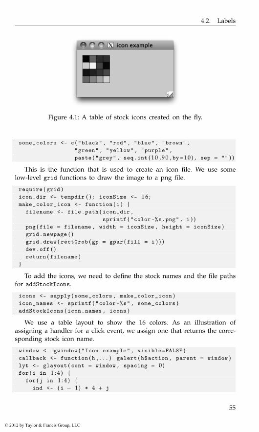
4.2. Labels
Figure 4.1: A table of stock icons created on the fly.
some_colors <- c ( "black" , "red" , "blue" , "brown" ,"green" , "yellow" , "purple" ,paste ( "grey" , seq . int ( 1 0 , 9 0 , by=10) , sep = "" ) )
This is the function that is used to create an icon file. We use somelow-level grid functions to draw the image to a png file.
require ( grid )icon_dir <- tempdir ( ) ; iconSize <- 1 6 ;make_color_icon <- function ( i ) {
filename <- file . path ( icon_dir ,sprintf ( "color-%s.png" , i ) )
png ( file = filename , width = iconSize , height = iconSize )grid . newpage ( )grid . draw ( rectGrob ( gp = gpar ( fill = i ) ) )dev . off ( )return ( filename )
}
To add the icons, we need to define the stock names and the file pathsfor addStockIcons.
icons <- sapply ( some_colors , make_color_icon )icon_names <- sprintf ( "color-%s" , some_colors )addStockIcons ( icon_names , icons )
We use a table layout to show the 16 colors. As an illustration ofassigning a handler for a click event, we assign one that returns the corre-sponding stock icon name.
window <- gwindow ( "Icon example" , visible=FALSE )callback <- function ( h , . . . ) galert ( h$action , parent = window )lyt <- glayout ( cont = window , spacing = 0)for ( i in 1 : 4 ) {
for ( j in 1 : 4 ) {ind <- ( i − 1) * 4 + j
55
© 2012 by Taylor & Francis Group, LLC
4. gWidgets: Control Widgets
lyt [ i , j ] <- gimage ( icons [ ind ] , handler = callback ,action = icon_names [ ind ] , cont = lyt )
}}visible ( window ) <- TRUE
SVG graphics Finally, we mention that the gsvg constructor is similar togimage, but allows us to display SVG files, as produced by the svg driver,say. It currently is not available for gWidgetsRGtk2 and gWidgetstcltk.
4.3 Text-editing controls
The gWidgets package, following the underlying toolkits, has two mainwidgets for editing text: gedit for a single line of editable text and gtextfor multiline, editable text. Each is simple to use but provides much lessflexibility than is possible with the toolkit widgets.
Single-line, editable text
The gedit constructor produces a widget to display a single line of editabletext. The main property is the text, which can be set initially through thetext argument. If not specified, and the argument initial.msg is, thenthis initial message is shown until the widget receives the focus to guidethe user. If it is desirable to set the width of the widget, the width argu-ment allows the specification in terms of number of characters allowed todisplay without horizontal scrolling. The width of the widget may also bespecified in pixel size through the size<- method.
A simple usage might be:
window <- gwindow ( "Simple gedit example" , visible = FALSE )group <- ggroup ( cont = window )entry <- gedit ( "" , initial . msg = "Enter your name..." ,
cont = group )visible ( window ) <- TRUE
Methods The text is returned by the svalue method and may be setthrough the svalue<- method. The svalue method will return a charactervector by default. However, it may be desirable to use this widget tocollect numeric values or perhaps some other type of variable. We couldwrite code to coerce the character to the desired type, but it is sometimesconvenient to have the return value be a certain non-character type. In thiscase, the coerce.with argument can be used to specify a function of asingle argument to call before the value is returned by svalue.
56
© 2012 by Taylor & Francis Group, LLC
4.3. Text-editing controls
The visible method is overridden to mask out the letters in the field,not to hide the component. This allows us to use the widget to collectpasswords.
Auto completion The underlying toolkits offer some form of auto com-pletion where the entered text is matched against a list of values. These val-ues anticipate what a user wishes to type and a simple means to completean entry is offered. The [<- method allows these values to be specifiedthrough a character vector, as in obj[] <- values.
For example, the following can be used to collect one of the fifty statenames in the United States:
window <- gwindow ( "gedit example" , visible = FALSE )group <- ggroup ( cont = window )glabel ( "State name:" , cont = group )entry <- gedit ( "" , cont = group )entry [ ] <- state . namevisible ( window ) <- TRUE
Handlers The default handler for the gedit widget is called when thetext area is activated by the return key being pressed. Use addHandlerBlurto add a callback for the event of losing focus. The addHandlerKeystrokemethod can assign a handler to be called when a key is released. For thetoolkits that support it, the specific key is given in the key component ofthe list h (the first argument).5
Example 4.2: ValidationGUIs for R may differ a bit from many GUIs users typically interact with, asR users expect to be able to use variables and expressions whereas typicallya GUI expects just characters or numbers. As such, it is helpful to indicateto the user whether a value is a valid expression. This example showshow to implement a validation framework on a single-line edit widget sothat the user has feedback when an expression will not evaluate properly.When the value is invalid we set the text color to red.
window <- gwindow ( "Validation example" )lyt <- glayout ( cont = window )lyt [ 1 , 1 ] <- "R expression:"lyt [ 1 , 2 ] <- ( entry <- gedit ( "" , cont = lyt ) )
We use the evaluate package to see if the expression is valid.6
5There are differences in what keys are returned. Currently, only the letter keys areconsistently given. In particular, no modifier keys or other keys are returned.
6The basic way to evaluate an R expression given as a string is to use the combinationof eval and parse, as in eval(parse(text=string)). The resulting output can usually be
57
© 2012 by Taylor & Francis Group, LLC
4. gWidgets: Control Widgets
require ( evaluate )isValid <- function ( e ) {
out <- try ( evaluate : : : evaluate ( e ) , silent=TRUE )! ( inherits ( out , "try-error" ) || is ( out [ [ 2 ] ] , "error" ) )
}
We validate our expression when the user commits the change by press-ing the return key while the widget has focus.
addHandlerChanged ( entry , handler = function ( h , . . . ) {cur_val <- svalue ( entry )if ( isValid ( cur_val ) ) {
font ( entry ) <- c ( color = "black" )} else {
font ( entry ) <- c ( color = "red" )}
} )
Multiline, editable text
The gtext constructor produces a multiline text-editing widget with scrollbars to accommodate large amounts of text. The text argument is forspecifying the initial text. The initial width and height can be set throughsimilarly named arguments. For widgets with scroll bars, specifying aninitial size is usually required, as there is otherwise no indication as tohow large the widget should be.
The svalue method retrieves the text stored in the buffer. If the argu-ment drop=TRUE is specified, then only the currently selected text will bereturned. Text in multiple lines is returned as a single string with "\n"separating the lines.
The contents of the text buffer can be replaced with the svalue<-method. To clear the buffer, the dispose method may be used. The insertmethod adds text to a buffer. The signature is insert(obj, text, where,font.attr) where text is a character vector. New text is added to the endof the buffer by default, but the where argument can specify "beginning"or "at.cursor".
Fonts Fonts can be specified for the entire buffer or the selection usingthe specifications in Table 4.3. To specify fonts for the entire buffer, usethe font.attr argument of the constructor. The font<- method serves thesame purpose, provided there is no selection when it is called. If there is a
captured with the capture.output function. However, there can be errors: parse errors orotherwise. A few packages provide functions to assist with this task, notably the evaluatefunction in the same-named evaluate package, and the parseText and captureAll functionsin the svMisc package. We illustrate both in this part of the text.
58
© 2012 by Taylor & Francis Group, LLC
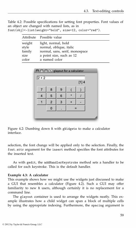
4.3. Text-editing controls
Table 4.2: Possible specifications for setting font properties. Font values ofan object are changed with named lists, as infont(obj)<-list(weight="bold", size=12, color="red").
Attribute Possible value
weight light, normal, boldstyle normal, oblique, italicfamily normal, sans, serif, monospacesize a point size, such as 12color a named color
Figure 4.2: Dumbing down R with gWidgets to make a calculatorinterface.
selection, the font change will be applied only to the selection. Finally, thefont.attr argument for the insert method specifies the font attributes forthe inserted text.
As with gedit, the addHandlerKeystroke method sets a handler to becalled for each keystroke. This is the default handler.
Example 4.3: A calculatorThis example shows how we might use the widgets just discussed to makea GUI that resembles a calculator (Figure 4.2). Such a GUI may offerfamiliarity to new R users, although certainly it is no replacement for acommand line.
The glayout container is used to arrange the widgets neatly. This ex-ample illustrates how a child widget can span a block of multiple cellsby using the appropriate indexing. Furthermore, the spacing argument is
59
© 2012 by Taylor & Francis Group, LLC
4. gWidgets: Control Widgets
used to tighten up the appearance. The example also illustrates a usefulstrategy: storing the widgets using a list for subsequent manipulations.
The following sets up the layout of the display and buttons:
buttons <- rbind ( c ( 7 : 9 , "(" , ")" ) ,c ( 4 : 6 , "*" , "/" ) ,c ( 1 : 3 , "+" , "-" ) )
#window <- gwindow ( "glayout for a calculator" , visible = FALSE )group <- ggroup ( cont = window , expand = TRUE , horiz = FALSE )lyt <- glayout ( cont = group , spacing = 2)lyt [ 1 , 1 : 5 , anchor = c (−1 ,0) ] <- # span 5 columns
( eqn_area <- gedit ( "" , cont = lyt ) )lyt [ 2 , 1 : 5 , anchor = c ( 1 , 0 ) ] <-
( output_area <- glabel ( "" , cont = lyt ) )#button_list <- list ( )for ( i in 3 : 5 ) {
for ( j in 1 : 5 ) {val <- buttons [ i−2, j ]lyt [ i , j ] <- ( button_list [ [ val ] ] <- gbutton ( val , cont=lyt ) )
}}lyt [ 6 , 2 ] <- ( button_list [ [ "0" ] ] <- gbutton ( "0" , cont = lyt ) )lyt [ 6 , 3 ] <- ( button_list [ [ "." ] ] <- gbutton ( "." , cont = lyt ) )lyt [ 6 , 4 : 5 ] <- ( eq_button <- gbutton ( " = " , cont = lyt ) )#visible ( window ) <- TRUE
This code defines the handler for each button except the equals buttonand then assigns the handler to each button. This is done efficiently, usingthe generic addHandlerChanged. The handler simply pastes the text foreach button into the equation area.
add_button <- function ( h , . . . ) {cur_expr <- svalue ( eqn_area )new_char <- svalue ( h$obj ) # t h e but ton ’ s v a l u esvalue ( eqn_area ) <- paste ( cur_expr , new_char , sep = "" )svalue ( output_area ) <- "" # c l e a r l a b e l
}sapply ( button_list , addHandlerChanged , handler = add_button )
When the equals sign is clicked, the expression is evaluated, and, ifthere are no errors, the output is displayed in the label.
require ( evaluate )addHandlerClicked ( eq_button , handler = function ( h , . . . ) {
curExpr <- svalue ( eqn_area )out <- try ( evaluate : : : evaluate ( curExpr ) , silent = TRUE )
60
© 2012 by Taylor & Francis Group, LLC
4.4. Selection controls
if ( inherits ( out , "try-error" ) ) {galert ( "Parse error" , parent = eq_button )
} else if ( is ( out [ [ 2 ] ] , "error" ) ) {msg <- sprintf ( "Error: %s" , out [ [ 2 ] ] $message )galert ( msg , parent = eq_button )
} else {svalue ( output_area ) <- out [ [ 2 ] ]svalue ( eqn_area ) <- "" # r e s t a r t
}} )
4.4 Selection controls
A common task for a GUI control is to select a value or values from a setof numbers or a table of numbers. Figure 4.3 shows a simple GUI for theEBImage package allowing a user to adjust a few of the image propertiesusing various selection widgets. Although it is unlikely we would use R forsuch a task, as opposed to Gimp, say, we use this example, as the mappingbetween controls and actions should be familiar.
In gWidgets the abstract view for selection widgets is that the user ischoosing from a set of items stored as a vector (or data frame). The familiarR methods are used to manipulate this underlying data store. The controlsin gWidgets that display such data have the methods [, [<-, length, dim,names, and names<-, as appropriate. The svalue method then refers to theuser-selected value. This selection may be a value or an index, and thesvalue method has the argument index to specify which.
This section discusses several such selection controls, which serve asimilar purpose but make different use of screen space.
Checkbox widget
The simplest selection control is the checkbox widget that allows the userto set a state as TRUE or FALSE. The constructor has an argument text toset a label and checked to indicate whether the widget should initially bechecked. The default is TRUE (there is no third, uncommitted state as ispossible with some toolkits). By default the label will be drawn aside abox that the user can check. If the argument use.togglebutton is TRUE, atoggle button – which appears depressed when TRUE – is used instead.
In Figure 4.3, a toggle button is used for “Thresh” and could be con-structed as
window <- gwindow ( "Checkbox example with toggle button" )check_box <- gcheckbox ( "Thresh" , checked = TRUE ,
use . togglebutton = TRUE , cont = window )
61
© 2012 by Taylor & Francis Group, LLC
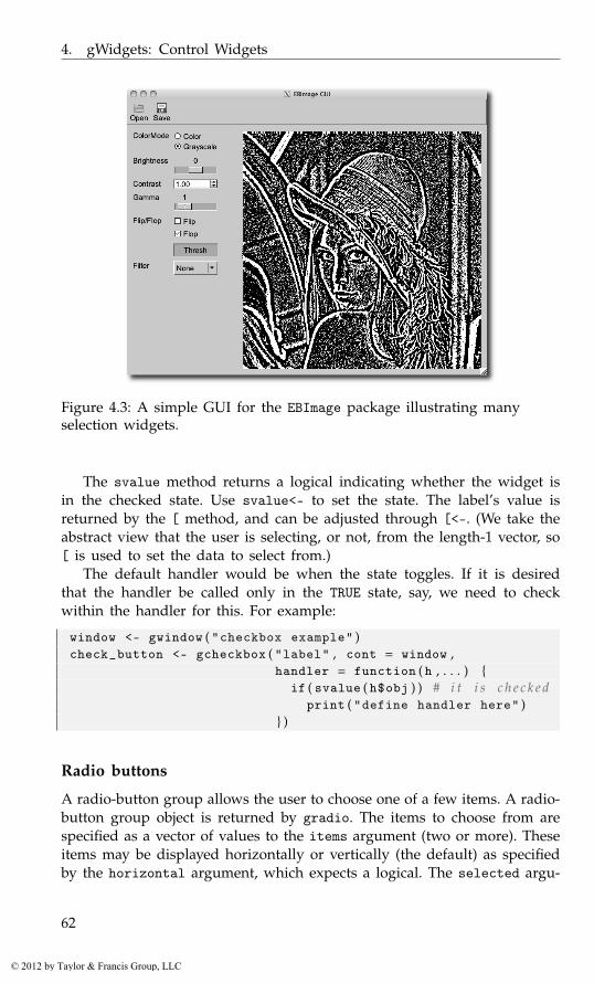
4. gWidgets: Control Widgets
Figure 4.3: A simple GUI for the EBImage package illustrating manyselection widgets.
The svalue method returns a logical indicating whether the widget isin the checked state. Use svalue<- to set the state. The label’s value isreturned by the [ method, and can be adjusted through [<-. (We take theabstract view that the user is selecting, or not, from the length-1 vector, so[ is used to set the data to select from.)
The default handler would be when the state toggles. If it is desiredthat the handler be called only in the TRUE state, say, we need to checkwithin the handler for this. For example:
window <- gwindow ( "checkbox example" )check_button <- gcheckbox ( "label" , cont = window ,
handler = function ( h , . . . ) {if ( svalue ( h$obj ) ) # i t i s c h e c k e d
print ( "define handler here" )} )
Radio buttons
A radio-button group allows the user to choose one of a few items. A radio-button group object is returned by gradio. The items to choose from arespecified as a vector of values to the items argument (two or more). Theseitems may be displayed horizontally or vertically (the default) as specifiedby the horizontal argument, which expects a logical. The selected argu-
62
© 2012 by Taylor & Francis Group, LLC

4.4. Selection controls
ment specifies the initially selected item, by index, with a default of thefirst.
In Figure 4.3 a radio button is used for ColorMode and could be con-structed as
window <- gwindow ( "Radio button example" )radio_button <- gradio ( c ( "Color" , "Grayscale" ) , selected = 2 ,
horizontal = FALSE , cont = window )
The currently selected item is returned by svalue as the label text orby the index if the argument index is TRUE. The item may be set with thesvalue<- method. Again, the item may be specified by the label or by anindex, the latter when the argument index=TRUE is specified.
The data store is the set of labels and may be respecified with the [<-method.
The handler, if given to the constructor or set with addHandlerChanged,is called on a toggle event.
A group of checkboxes
A group of checkboxes is produced by the gcheckboxgroup constructor.This convenience widget is similar to a radio group, except that it allowsthe selection of none, one, or more than one of a set of items. The itemsargument is used to specify the values. The state of whether an item isselected can be set with a logical vector of the same size as the numberof items to the checked argument; recycling is used. The item layout canbe controlled by the horizontal argument. The default is a vertical layout(horizontal=FALSE).
For some toolkits, the argument specification use.table=TRUE will ren-der the widget in a table with checkboxes to select from. This allows muchlarger sets of items to be used comfortably, as there is a scroll bar pro-vided. (This offers a similar functionality to using the gtable widget withmultiple selection.)
In Figure 4.3 a group of check boxes is used to allow the user to flipor flop the image. It could be created with
window <- gwindow ( "Checkbox group example" )check_box_group <-
gcheckboxgroup ( c ( "Flip" ,"Flop" ) , horizontal = FALSE ,checked = c ( FALSE , TRUE ) , cont = window )
The current selection is retrieved as a character vector through thesvalue method. The index=TRUE argument instructs svalue to return theselected indices instead. These are 0-length if no selection is made. As acheckbox group is like both a checkbox and a radio button group, we canset the selected values three different ways. As with a checkbox, the se-lected values can be set by specifying a logical vector through the svalue<-
63
© 2012 by Taylor & Francis Group, LLC
4. gWidgets: Control Widgets
method. As with radio-button groups, the selected values can also be setwith a character vector indicating which labels should be selected, or ifindex=TRUE is given, using a numeric index vector.
That is, each of these has the same effect:
svalue ( check_box_group ) <- c ( "Flop" )svalue ( check_box_group ) <- c ( FALSE , TRUE )svalue ( check_box_group , index = TRUE ) <- 2
The labels are returned through the [ method and, if the underlyingtoolkit allows it, set through the [<- method. As with gradio, the lengthmethod returns the number of items.
A combo box
Combo boxes are constructed by gcombobox.7 As with the other selectionwidgets, the choices are specified to the argument items. However, thismay be a vector of values or a data frame in which the first column definesthe choices. For toolkits that support icons in the combo box widget, if thedata is specified as a data frame, the second column may be used signifya stock icon to decorate the selection, and, by design (but implementedonly for gWidgetsQt), a third column specifies a tooltip to appear whenthe mouse hovers over a possible selection.
The combo box in Figure 4.3 could be coded with:
window <- gwindow ( "gcombobox example" )combo_box <- gcombobox ( c ( "None" ,"Low" ,"High" ) , cont = window )
This example shows how to create a combo box to select from theavailable stock icons. For toolkits that support icons in a combo box, theicons appear next to the label.
nms <- getStockIcons ( ) # gWidgets i c o n sDF <- data . frame ( names = names ( nms ) , icons = names ( nms ) ,
stringsAsFactors = FALSE )window <- gwindow ( "Combo box with icons example" )combo_box <- gcombobox ( DF , cont = window )
The argument editable accepts a logical value indicating whether theusers can supply their own values by typing into a text-entry area. Thedefault is FALSE. When editing is possible, the constructor, like gedit, alsosupports the coerce.with argument.
7Some make a distinction between drop-down lists and combo boxes, the latter allowingediting. We don’t here, although we note that the constructor gdroplist is an alias forgcombobox.
64
© 2012 by Taylor & Francis Group, LLC
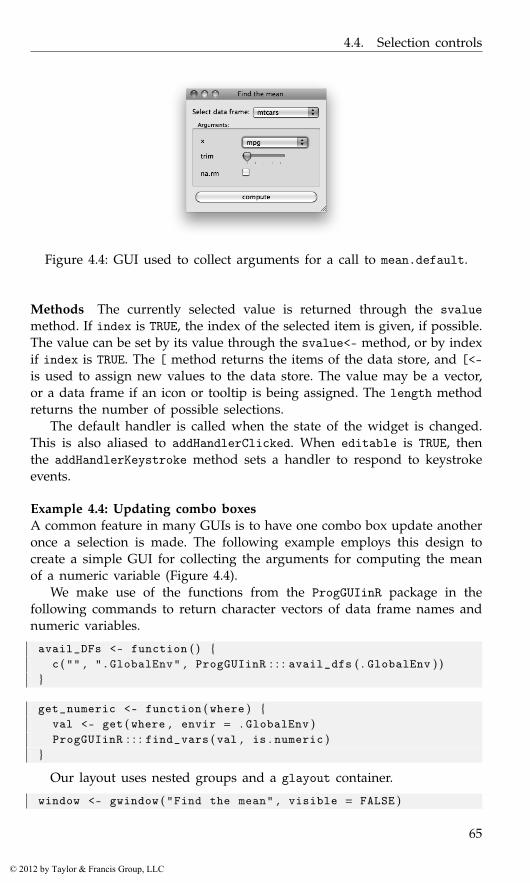
4.4. Selection controls
Figure 4.4: GUI used to collect arguments for a call to mean.default.
Methods The currently selected value is returned through the svaluemethod. If index is TRUE, the index of the selected item is given, if possible.The value can be set by its value through the svalue<- method, or by indexif index is TRUE. The [ method returns the items of the data store, and [<-is used to assign new values to the data store. The value may be a vector,or a data frame if an icon or tooltip is being assigned. The length methodreturns the number of possible selections.
The default handler is called when the state of the widget is changed.This is also aliased to addHandlerClicked. When editable is TRUE, thenthe addHandlerKeystroke method sets a handler to respond to keystrokeevents.
Example 4.4: Updating combo boxesA common feature in many GUIs is to have one combo box update anotheronce a selection is made. The following example employs this design tocreate a simple GUI for collecting the arguments for computing the meanof a numeric variable (Figure 4.4).
We make use of the functions from the ProgGUIinR package in thefollowing commands to return character vectors of data frame names andnumeric variables.
avail_DFs <- function ( ) {c ( "" , ".GlobalEnv" , ProgGUIinR : : : avail_dfs ( . GlobalEnv ) )
}
get_numeric <- function ( where ) {val <- get ( where , envir = . GlobalEnv )ProgGUIinR : : : find_vars ( val , is . numeric )
}
Our layout uses nested groups and a glayout container.
window <- gwindow ( "Find the mean" , visible = FALSE )
65
© 2012 by Taylor & Francis Group, LLC
4. gWidgets: Control Widgets
group <- ggroup ( cont = window , horizontal = FALSE )group1 <- ggroup ( cont = group )glabel ( "Select data frame:" , cont = group1 )df_combo_box <- gcombobox ( avail_DFs ( ) , cont = group1 )##frame <- gframe ( "Arguments:" , cont = group , horizontal=FALSE )enabled ( frame ) <- FALSElyt <- glayout ( cont = frame , expand = TRUE )widget_list <- list ( )##lyt [ 1 , 1 ] <- "x"lyt [ 1 , 2 ] <- ( widget_list$x <- gcombobox ( " " ,
cont = lyt ) )##lyt [ 2 , 1 ] <- "trim"lyt [ 2 , 2 ] <-
( widget_list$trim <- gslider ( from = 0 , to = 0 . 5 , by = 0 . 0 1 ,cont = lyt ) )
##lyt [ 3 , 1 ] <- "na.rm"lyt [ 3 , 2 ] <-
( widget_list$na . rm <- gcheckbox ( "" , checked = TRUE ,cont = lyt ) )
group2 <- ggroup ( cont = group )compute_button <- gbutton ( "compute" , cont = group2 )
We stored the primary widgets in a list with names matching the argu-ments to our function, mean.default. As well, the initial argument to thex combo box pads out the width under some toolkits.
Here is how we update the x combo box when the combo box for data-frame selection is changed. If there is a value, we enable our widgets andthen populate the secondary combo box with the names of the numericvariables.
addHandlerChanged ( df_combo_box , handler = function ( h , . . . ) {val <- svalue ( h$obj )enabled ( frame ) <- val !=""enabled ( compute_button ) <- val != ""if ( val != "" )
widget_list$x [ ] <- get_numeric ( val )svalue ( widget_list$x , index = TRUE ) <- 0
} )
As we stored the widgets in an appropriately named list, we can conve-niently use do.call (below) to write the callback for the compute_buttonbutton in just a few lines. The only trick is to replace the variable namewith its actual value.
addHandlerChanged ( compute_button , handler = function ( h , . . . ) {
66
© 2012 by Taylor & Francis Group, LLC

4.4. Selection controls
out <- lapply ( widget_list , svalue )out$x <- get ( out$x , get ( svalue ( df_combo_box ) ,
envir = . GlobalEnv ) )print ( do . call ( mean . default , out ) )
} )
A slider control
The gslider constructor creates a scale widget that allows the user to selecta value from the specified sequence. The basic arguments mirror that ofthe seq function in R: from, to, and by. However, if from is a vector, then itis assumed it presents an ordered sequence of values from which to select.In addition to the arguments to specify the sequence, the argument valueis used to set the initial value of the widget, and horizontal controls howthe slider is drawn, TRUE for horizontal, FALSE for vertical.
In Figure 4.3, a slider is used to update the brightness. The call issimilar to:
window <- gwindow ( "Slider example" )brightness <- gslider ( from = −1, to = 1 , by = . 0 5 , value = 0 ,
handler = function ( h , . . . ) {cat ( "Update picture with brightness" , svalue ( h$obj ) , "\n" )
} , cont = window )
The svalue method returns the currently chosen value. The [<- methodcan be used to update the sequence of values from which to choose.
In Figure 4.3, the gWidgetsRGtk2 package is used. That toolkit shows atooltip with the current value; for other toolkits the slider implementationdoes not show the value. We can add a label to show this (or combine theslider with a spin button). Adding a label follows this pattern:
window <- gwindow ( "Add a label to the slider" , visible=FALSE )group <- ggroup ( cont = window , expand = TRUE )slider <- gslider ( from = 0 , to = 100 , by = 1 , cont = group ,
expand = TRUE )label <- glabel ( sprintf ( "%3d" , svalue ( slider ) ) , cont = group )font ( label ) <- c ( family = "monospace" )addHandlerChanged ( slider , function ( h , . . . ) {
svalue ( h$action ) <- sprintf ( "%3d" , svalue ( h$obj ) )} , action = label )
visible ( window ) <- TRUE
(Using sprintf and monospace ensures the label takes a fixed amount ofspace.)
67
© 2012 by Taylor & Francis Group, LLC
4. gWidgets: Control Widgets
A spin button control
The spin button control constructed by gspinbutton is similar to gsliderwhen used with numeric data but presents the user a more precise way toselect the value. The from, to, and by arguments must be specified. Theargument digits specifies the number of digits displayed.
In Figure 4.3 a spin button is used to adjust the contrast, which expectsa numeric value. The following will reproduce it:
window <- gwindow ( "Spin button example" )spin_button <- gspinbutton ( from = 0 , to = 10 , by = . 0 5 ,
value = 1 , cont = window )
Selecting from the file system
The gfile dialog allows us to select a file or directory from the file system.This is a modal dialog, which returns the name of the selected file ordirectory. The gfilebrowse constructor creates a widget with a button thatinitiates this selection.
The “Open” button in Figure 4.3 is bound to this action:
f <- gfile ( "Open an image file" ,type="open" ,filter=list ( "Image file" = list (
patterns = c ( "*.gif" , "*.jpg" , "*.png" )) ,
"All files" = list ( patterns = c ( "*" ) )) )
if ( !is . na ( f ) )readImage ( f ) ## . . .
The selection type is specified by the type argument with values of opento select an existing file, save to select a file to write to, and selectdirto select a directory. The filter argument is toolkit dependent. For RGtk2,the filter argument used above will filter the possible selections. Thedialog returns the path of the file, or NA if the dialog was canceled.
Although working with the return value is easy enough, if desired, wecan specify a handler to the constructor to call on the file or directoryname. The component file of the first argument to the handler containsthe file name.
Selecting a date
The gcalendar constructor returns a widget for selecting a date. If thereis a native widget in the underlying toolkit, this will be a text area witha button to open a date-selection widget. Otherwise it is just a text-entry
68
© 2012 by Taylor & Francis Group, LLC
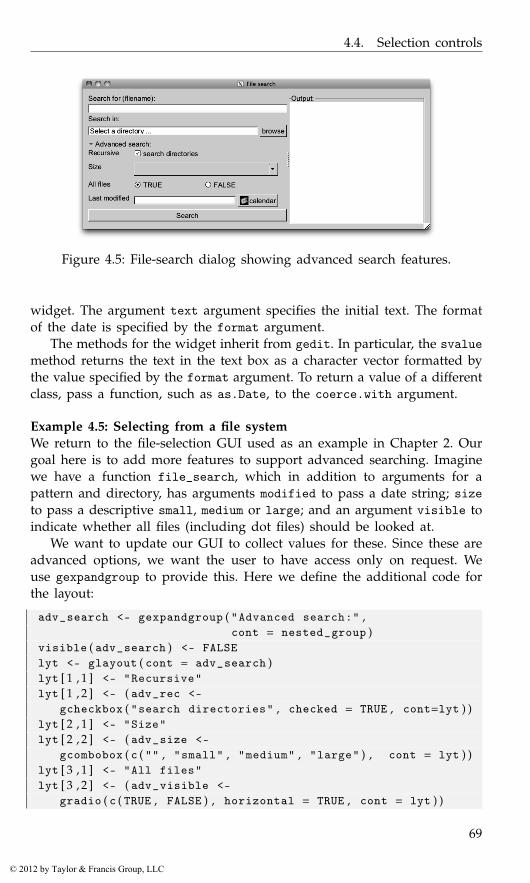
4.4. Selection controls
Figure 4.5: File-search dialog showing advanced search features.
widget. The argument text argument specifies the initial text. The formatof the date is specified by the format argument.
The methods for the widget inherit from gedit. In particular, the svaluemethod returns the text in the text box as a character vector formatted bythe value specified by the format argument. To return a value of a differentclass, pass a function, such as as.Date, to the coerce.with argument.
Example 4.5: Selecting from a file systemWe return to the file-selection GUI used as an example in Chapter 2. Ourgoal here is to add more features to support advanced searching. Imaginewe have a function file_search, which in addition to arguments for apattern and directory, has arguments modified to pass a date string; sizeto pass a descriptive small, medium or large; and an argument visible toindicate whether all files (including dot files) should be looked at.
We want to update our GUI to collect values for these. Since these areadvanced options, we want the user to have access only on request. Weuse gexpandgroup to provide this. Here we define the additional code forthe layout:
adv_search <- gexpandgroup ( "Advanced search:" ,cont = nested_group )
visible ( adv_search ) <- FALSElyt <- glayout ( cont = adv_search )lyt [ 1 , 1 ] <- "Recursive"lyt [ 1 , 2 ] <- ( adv_rec <-
gcheckbox ( "search directories" , checked = TRUE , cont=lyt ) )lyt [ 2 , 1 ] <- "Size"lyt [ 2 , 2 ] <- ( adv_size <-
gcombobox ( c ( "" , "small" , "medium" , "large" ) , cont = lyt ) )lyt [ 3 , 1 ] <- "All files"lyt [ 3 , 2 ] <- ( adv_visible <-
gradio ( c ( TRUE , FALSE ) , horizontal = TRUE , cont = lyt ) )
69
© 2012 by Taylor & Francis Group, LLC
4. gWidgets: Control Widgets
lyt [ 4 , 1 ] <- "Last modified"lyt [ 4 , 2 ] <- ( adv_modified <-
gcalendar ( "" , format = "%Y-%m-%d" , cont = lyt ) )
As can be seen (Figure 4.5), we use a grid layout and a mix of the controlsoffered by gWidgets.
We modify our button handler so that it uses these values, if specified.
addHandlerChanged ( search_btn , handler=function ( h , . . . ) {pattern <- glob2rx ( svalue ( txt_pattern ) )start_at <- svalue ( start_dir )modified <- NULLsize <- NULL
## from advancedsubfolders <- svalue ( adv_rec )visible <- svalue ( adv_visible )if ( ( tmp <- svalue ( adv_size ) ) != "" ) size <- tmpif ( !is . na ( tmp <- svalue ( adv_modified ) ) ) modified <- tmp
## f u n c t i o n c a l lfile_names <- file_search ( pattern , start_at , subfolders ,
modified = modified ,size = size , visible = visible )
dispose ( search_results ) # c l e a rif ( length ( file_names ) )
svalue ( search_results ) <- file_nameselse
galert ( "No matching files found" , parent = window )} )
4.5 Display of tabular data
The gtable constructor8 produces a widget that displays data in a tabularform from which the user can select one (or more) rows. The performanceunder gWidgetsRGtk2 and gWidgetsQt is much faster and able to handlelarger data stores than under gWidgetstcltk, as there is no enhanced dataframe model in Tcl/Tk. At a minimum, all perform well on moderate-sizeddata sets (ten or so columns and fewer than 500 rows).9
8The gtable widget shows clearly the tradeoffs between using gWidgets and a nativetoolkit under R. As will be seen in later chapters, setting up a table to display a data frameusing the toolkit packages directly can involve a fair amount of coding as compared to gtable,which makes it very easy. However, gWidgets provides far less functionality. For example,there is no means to adjust the formatting of the displayed text, or to embed other widgets,such as check boxes, into the tabular display.
9For gWidgetsRGtk2, the gdfedit widget can show very large tables taking advantage ofthe underlying RGtk2Extras package.
70
© 2012 by Taylor & Francis Group, LLC
4.5. Display of tabular data
The data is specified through the items argument. This value may bea data frame, matrix, or vector. Vectors and matrices are coerced to dataframes, with stringsAsFactors=FALSE. The data is presented in a tabularform, with column headers derived from the names attribute of the dataframe (but no row names). The items argument can be a 0-row data frame,but the column classes must match the eventual data to be used.
To illustrate, a widget to select from the available data frames in theglobal environment can be generated with:
window <- gwindow ( "gtable example" )DFs <- gtable ( ProgGUIinR : : : avail_dfs ( ) , cont = window )
Often the table widget is added to a box container with the argumentexpand=TRUE. Otherwise, the size of the widget should be specified throughsize<-. This size can be a list with components width and height (pixelwidths). As well, the component columnWidths can be used to specify thecolumn widths. (Otherwise a heuristic is employed.)
Icons The icon.FUN argument can be used to place a stock icon in a left-most column. This argument takes a function of a single argument – thedata frame being shown – and should return a character vector of stockicon names, one for each row.
Selection Users can select by case (row) – not by observation (column)– from this widget. The actual value returned by a selection is controlledby the constructor’s argument chosencol, which specifies which column’svalue will be returned for the given index, as the user can specify only therow. The multiple argument can be specified to allow the user to selectmore than one row.
Methods The svalue method will return the currently selected value. Ifthe argument index is specified as TRUE, then the selected row index (orindices) will be returned. These refer to the data store, not the visible data,when filtering is being used (below). The argument drop specifies whetherjust the chosen column’s value is returned (the default) or, if specified asFALSE, the entire row is.
The underlying data store is referenced by the [ method. (That ismatrix-like access is supported, but not list-like.) Indices can be used toaccess a slice. Values can be set using the [<- method, but be warnedthat this method is not as flexible as assigning to a data frame. The un-derlying toolkits may not like to change the type of data displayed in acolumn or reduce the number of columns displayed, so when updatinga column do not assume some underlying coercion, as can happen withR’s data frames. (This is why the initial items, even if specified through
71
© 2012 by Taylor & Francis Group, LLC
4. gWidgets: Control Widgets
a 0-row data frame, need to be of the correct class.) To replace the datastore, the [<- can be used, as with obj[] <- new_data_frame. The methodsnames and names<- refer to the column headers, and dim and length theunderlying dimensions of the data store.
To update the list of data frames in our DFs widget, we can define afunction such as the following:
updateDfs <- function ( ) {DFs [ ] <- ProgGUIinR : : : avail_dfs ( )
}
Handlers Selection is done through a single click. The addHandlerClickmethod can be used to assign a handler to a change of selection event.The default handler, addHandlerDoubleclick, will assign a handler fora double-click event. Also of interest are the addHandlerRightclickand add3rdMousePopupMenu methods for assigning handlers to right-clickevents.
To add a handler to the data-frame selection widget above, we couldhave:
addHandlerDoubleclick ( DFs , handler = function ( h , . . . ) {val <- svalue ( h$obj )print ( summary ( get ( val , envir = . GlobalEnv ) ) ) # some a c t i o n
} )
Example 4.6: Collapsing factorsA somewhat tedious task in R is the recoding or collapsing of factor levels.This example provides a GUI to facilitate this. In Section 3.1 we provideda function to wrap this GUI within a modal dialog.
We will use a reference class, as it allows us to couple the main methodand the widgets without worrying about scoping issues. For formattingpurposes, we define the methods individually, then piece them together.
Our initialization call simply stores the values and then passes on thecall to make the GUI.
initialize <- function ( fac , cont = gwindow ( ) ) {old <<- as . character ( fac )make_gui ( cont )callSuper ( )
}
This make_gui function does the hard work. (Figure 4.6 shows a screen-shot.) We have just two widgets, placed in a paned group. The one on theleft is a table that displays two columns: the old values and the collapsedor recoded values. The widget on the right is a combo box for entering a
72
© 2012 by Taylor & Francis Group, LLC
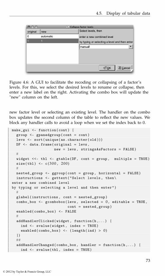
4.5. Display of tabular data
Figure 4.6: A GUI to facilitate the recoding or collapsing of a factor’slevels. For this, we select the desired levels to rename or collapse, thenenter a new label on the right. Activating the combo box will update the"new" column on the left.
new factor level or selecting an existing level. The handler on the combobox updates the second column of the table to reflect the new values. Weblock any handler calls to avoid a loop when we set the index back to 0.
make_gui <- function ( cont ) {group <- gpanedgroup ( cont = cont )levs <- sort ( unique ( as . character ( old ) ) )DF <- data . frame ( original = levs ,
new = levs , stringsAsFactors = FALSE )#widget <<- tbl <- gtable ( DF , cont = group , multiple = TRUE )size ( tbl ) <- c ( 3 0 0 , 200)#nested_group <- ggroup ( cont = group , horizontal = FALSE )instructions <- gettext ( "Select levels, then\
enter a new combined levelby typing or selecting a level and then enter" )
#glabel ( instructions , cont = nested_group )combo_box <- gcombobox ( levs , selected = 0 , editable = TRUE ,
cont = nested_group )enabled ( combo_box ) <- FALSE#addHandlerClicked ( widget , function ( h , . . . ) {
ind <- svalue ( widget , index = TRUE )enabled ( combo_box ) <- ( length ( ind ) > 0)
} )##addHandlerChanged ( combo_box , handler = function ( h , . . . ) {
ind <- svalue ( tbl , index = TRUE )
73
© 2012 by Taylor & Francis Group, LLC
4. gWidgets: Control Widgets
if ( length ( ind ) == 0)return ( )
#tbl [ ind , 2 ] <- svalue ( combo_box )svalue ( tbl , index = TRUE ) <- 0blockHandler ( combo_box )combo_box [ ] <- sort ( unique ( tbl [ , 2 ] ) )svalue ( combo_box , index = TRUE ) <- 0unblockHandler ( combo_box )
} )}
This method returns the newly recoded factor. The tediousness of thetask is in the specification of the new levels, not necessarily this part.
get_value <- function ( ) {"Return factor with new levels"old_levels <- widget [ , 1 ]new_levels <- widget [ , 2 ]new <- oldfor ( i in seq_along ( old_levels ) ) # one p a s s
new [ new == old_levels [ i ] ] <- new_levels [ i ]factor ( new )
}
Finally, we stitch the above together into a reference class:
CollapseFactor <- setRefClass ( "CollapseFactor" ,fields = list (old = "ANY" ,widget = "ANY") ,
methods = list (initialize = initialize ,make_gui = make_gui ,get_value = get_value
) )
Filtering The arguments filter.column and filter.FUN allow us tospecify whether the user can filter, or limit, the display of the values inthe data store. The simplest case is if a column number is specified tothe filter.column argument. In this case a combo box is added to thewidget with values taken from the unique values in the specified column.Changing the value of the combo box restricts the display of the data tojust those rows in which the value in the filter column matches the combobox value. More advanced filtering can be specified using the filter.FUNargument. If this is a function, then it takes arguments (data_frame, fil-ter.by) where the data frame is the data, and the filter.by value is the
74
© 2012 by Taylor & Francis Group, LLC
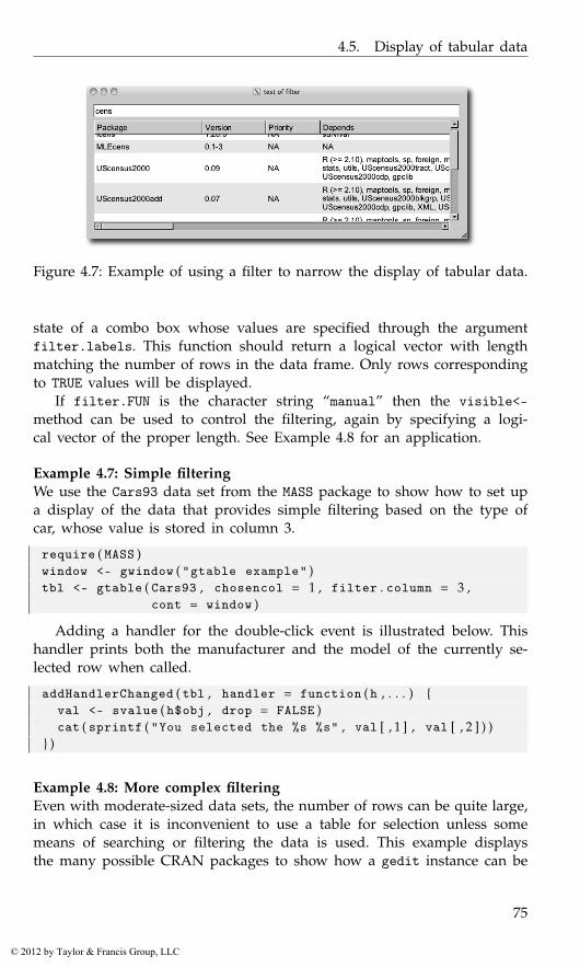
4.5. Display of tabular data
Figure 4.7: Example of using a filter to narrow the display of tabular data.
state of a combo box whose values are specified through the argumentfilter.labels. This function should return a logical vector with lengthmatching the number of rows in the data frame. Only rows correspondingto TRUE values will be displayed.
If filter.FUN is the character string “manual” then the visible<-method can be used to control the filtering, again by specifying a logi-cal vector of the proper length. See Example 4.8 for an application.
Example 4.7: Simple filteringWe use the Cars93 data set from the MASS package to show how to set upa display of the data that provides simple filtering based on the type ofcar, whose value is stored in column 3.
require ( MASS )window <- gwindow ( "gtable example" )tbl <- gtable ( Cars93 , chosencol = 1 , filter . column = 3 ,
cont = window )
Adding a handler for the double-click event is illustrated below. Thishandler prints both the manufacturer and the model of the currently se-lected row when called.
addHandlerChanged ( tbl , handler = function ( h , . . . ) {val <- svalue ( h$obj , drop = FALSE )cat ( sprintf ( "You selected the %s %s" , val [ , 1 ] , val [ , 2 ] ) )
} )
Example 4.8: More complex filteringEven with moderate-sized data sets, the number of rows can be quite large,in which case it is inconvenient to use a table for selection unless somemeans of searching or filtering the data is used. This example displaysthe many possible CRAN packages to show how a gedit instance can be
75
© 2012 by Taylor & Francis Group, LLC
4. gWidgets: Control Widgets
used as a search box to filter the display of data (Figure 4.7). The addHan-dlerKeystroke method is used, so that the search results are updated asthe user types.
The available.packages function returns a data frame of all availablepackages. If a CRAN site is not set, the user will be queried to set one.
avail_pkgs <- available . packages ( ) # p i c k a cran s i t e
This basic GUI is barebones: for example, we skip adding text labels toguide the user.
window <- gwindow ( "test of filter" )group <- ggroup ( cont = window , horizontal = FALSE )entry <- gedit ( "" , cont = group )tbl <- gtable ( avail_pkgs , cont = group , filter . FUN = "manual" ,
expand = TRUE )
The filter.FUN value of "manual" allows us to filter by specifying a logicalvector.
Different search criteria may be desired, so it makes sense to separatethis code from the GUI code using a function. The one below uses grep tomatch, so that regular expressions can be used. Another reasonable choicewould be to use the first letter of the package. (That filtering could alsobe specified easily through the filter.FUN argument.)
our_match <- function ( cur_val , vals ) {grepl ( cur_val , vals )
}
Finally, the addHandlerKeystroke method calls its handler every timea key is released while the focus is in the edit widget. In this case, thehandler finds the matching indices using the our_match function, convertsthese into logical format, and then updates the display using the visible<-method for gtable.
id <- addHandlerKeystroke ( entry , handler = function ( h , . . . ) {vals <- tbl [ , 1 , drop = TRUE ]cur_val <- svalue ( h$obj )visible ( tbl ) <- our_match ( cur_val , vals )
} )
Example 4.9: Using the “observer pattern” to write a workspace viewThis example takes the long way to make a workspace browser. (The shortway is to use gvarbrowser.) The goal is to produce a GUI that will allowthe user to view the objects in their current workspace. We would like thisview to be dynamic – when the workspace changes we would like theview to update. Furthermore, we may want to have different views, suchas one for functions and one for data sets. These should all be coordinated.
76
© 2012 by Taylor & Francis Group, LLC
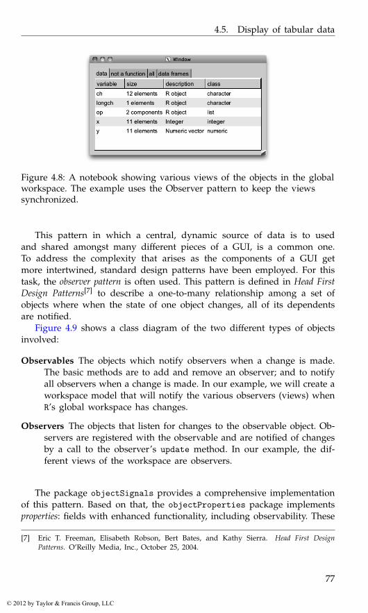
4.5. Display of tabular data
Figure 4.8: A notebook showing various views of the objects in the globalworkspace. The example uses the Observer pattern to keep the viewssynchronized.
This pattern in which a central, dynamic source of data is to usedand shared amongst many different pieces of a GUI, is a common one.To address the complexity that arises as the components of a GUI getmore intertwined, standard design patterns have been employed. For thistask, the observer pattern is often used. This pattern is defined in Head FirstDesign Patterns[7] to describe a one-to-many relationship among a set ofobjects where when the state of one object changes, all of its dependentsare notified.
Figure 4.9 shows a class diagram of the two different types of objectsinvolved:
Observables The objects which notify observers when a change is made.The basic methods are to add and remove an observer; and to notifyall observers when a change is made. In our example, we will create aworkspace model that will notify the various observers (views) whenR’s global workspace has changes.
Observers The objects that listen for changes to the observable object. Ob-servers are registered with the observable and are notified of changesby a call to the observer’s update method. In our example, the dif-ferent views of the workspace are observers.
The package objectSignals provides a comprehensive implementationof this pattern. Based on that, the objectProperties package implementsproperties: fields with enhanced functionality, including observability. These
[7] Eric T. Freeman, Elisabeth Robson, Bert Bates, and Kathy Sierra. Head First DesignPatterns. O’Reilly Media, Inc., October 25, 2004.
77
© 2012 by Taylor & Francis Group, LLC
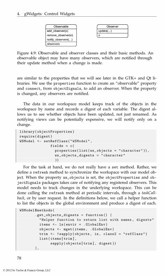
4. gWidgets: Control Widgets
Figure 4.9: Observable and observer classes and their basic methods. Anobservable object may have many observers, which are notified throughtheir update method when a change is made.
are similar to the properties that we will see later in the GTK+ and Qt li-braries. We use the properties function to create an “observable” propertyand connect, from objectSignals, to add an observer. When the propertyis changed, any observers are notified.
The data in our workspace model keeps track of the objects in theworkspace by name and records a digest of each variable. The digest al-lows us to see whether objects have been updated, not just renamed. Asnotifying views can be potentially expensive, we will notify only on achange.
library ( objectProperties )require ( digest )WSModel <- setRefClass ( "WSModel" ,
fields = c (properties ( list ( ws_objects = "character" ) ) ,ws_objects_digests = "character") )
For the task at hand, we do not really have a set method. Rather, wedefine a refresh method to synchronize the workspace with our model ob-ject. When the property ws_objects is set, the objectProperties and ob-jectSignals packages takes care of notifying any registered observers. Thismodel needs to track changes in the underlying workspace. This can bedone calling the refresh method at periodic intervals, through a taskCall-back, or by user request. In the definitions below, we call a helper functionto list the objects in the global environment and produce a digest of each.
WSModel$methods (. get_objects_digests = function ( ) {
"Helper function to return list with names, digests"items <- ls ( envir = . GlobalEnv )objects <- mget ( items , . GlobalEnv )trim <- !sapply ( objects , is , class2 = "refClass" )list ( items [ trim ] ,
sapply ( objects [ trim ] , digest ) )} ,
78
© 2012 by Taylor & Francis Group, LLC
4.5. Display of tabular data
initialize = function ( ) {objs <- . get_objects_digests ( ) # c a l l h e l p e rinitFields ( ws_objects = objs [ [ 1 ] ] ,
ws_objects_digests = objs [ [ 2 ] ] )callSuper ( )
} ,refresh = function ( ) {
objs <- . get_objects_digests ( )cur_objects <- objs [ [ 1 ] ]cur_digests <- objs [ [ 2 ] ]## c h a n g e s ?if ( length ( cur_digests ) != ws_objects_digests ||
length ( ws_objects_digests ) == 0 ||any ( cur_digests != ws_objects_digests ) ) {
ws_objects <<- cur_objects # s i g n a lws_objects_digests <<- cur_digests
} } )
To simplify the work for our views, our model provides a get method thatfilters its return value to specified classes. This class is specified with acharacter string and may include a not operator.
WSModel$methods (get = function ( klass ) {
"klass a string, such as ’numeric’ or ’!function’"if ( missing ( klass ) || length ( klass ) == 0)
return ( ws_objects )## i f we have k l a s s , more workind <- sapply ( mget ( ws_objects , . GlobalEnv ) ,
function ( x ) {any ( sapply ( klass , function ( j ) {
if ( grepl ( "^!" , j ) )!is ( x , substr ( j , 2 , nchar ( j ) ) )
elseis ( x , j )
} ) )} )
##if ( length ( ind ) )
ws_objects [ ind ]else
character ( 0 )} )
Finally, our model defines a convenience method to add an observerusing the naming convention of objectProperties.
WSModel$methods (add_observer = function ( FUN , . . . ) {
79
© 2012 by Taylor & Francis Group, LLC
4. gWidgets: Control Widgets
. self$ws_objectsChanged$connect ( FUN , . . . )} )
To use this model, we create a base view class, adding a new methodto set the model. A view has at least two methods, an update method torefresh the view and one to set the model, so that it can play the part ofan observer.
WSView <- setRefClass ( "WSView" ,methods = list (
update = function ( model ) {"Subclass this"
} ,set_model = function ( model ) {
FUN <- function ( ) . self$update ( model )model$add_observer ( FUN )
}) )
The following WidgetView class uses the template method pattern, leav-ing subclasses to construct the widgets through the call to initialize.
WidgetView <-setRefClass ( "WidgetView" ,
contains = "WSView" ,fields = list (
klass = "character" , # which c l a s s e s t o showwidget = "ANY") ,
methods = list (initialize = function ( parent , model ,
klass=character ( 0 ) , . . . ) {if ( !missing ( model ) ) set_model ( model )if ( !missing ( parent ) ) init_widget ( parent , . . . )initFields ( klass=klass )update ( model )callSuper ( )
} ,init_widget = function ( parent , . . . ) {
"Initialize widget"} ) )
We write a WidgetView subclass to view the workspace objects using agtable widget:
TableView <-setRefClass ( "TableView" ,
contains = "WidgetView" ,methods = list (
init_widget = function ( parent , . . . ) {
80
© 2012 by Taylor & Francis Group, LLC
4.5. Display of tabular data
widget <<- gtable ( makeDataFrame ( character ( 0 ) ) ,cont = parent , . . . )
} ,update = function ( model , . . . ) {
widget [ ] <<- makeDataFrame ( model$get ( klass ) )} ) )
This subclass of the widget view class shows the values in theworkspace using a table widget. The makeDataFrame function generatesthe details. We now turn to the task of defining that function.
To generate data on each object, we define some S3 classes. These aremore convenient than reference classes for this task. First, we want a nicedescription of the size of the object:
size_of <- function ( x , . . . ) UseMethod ( "size_of" )size_of . default <- function ( x , . . . ) "NA"size_of . character <- size_of . numeric <-
function ( x , . . . ) sprintf ( "%s elements" , length ( x ) )size_of . matrix <- function ( x , . . . )
sprintf ( "%s x %s" , nrow ( x ) , ncol ( x ) )
Now, we desire a short description of the type of object we have:
short_description <- function ( x , . . . )UseMethod ( "short_description" )
short_description . default <- function ( x , . . . ) "R object"short_description . numeric <- function ( x , . . . ) "Numeric vector"short_description . integer <- function ( x , . . . ) "Integer"
The following function produces a data frame summarizing the objectspassed in by name to x. It is a bit awkward, as the data comes row by row,not column by column, and we want to have a default when x is empty.
makeDataFrame <- function ( x , envir = . GlobalEnv ) {DF <- data . frame ( variable = character ( 0 ) ,
size = character ( 0 ) ,description = character ( 0 ) ,class = character ( 0 ) ,stringsAsFactors = FALSE )
if ( length ( x ) ) {l <- mget ( x , envir )short_class <- function ( x ) class ( x ) [ 1 ]DF <- data . frame ( variable = x ,
size = sapply ( l , size_of ) ,description=sapply ( l , short_description ) ,class = sapply ( l , short_class ) ,stringsAsFactors = FALSE )
}DF
}
81
© 2012 by Taylor & Francis Group, LLC
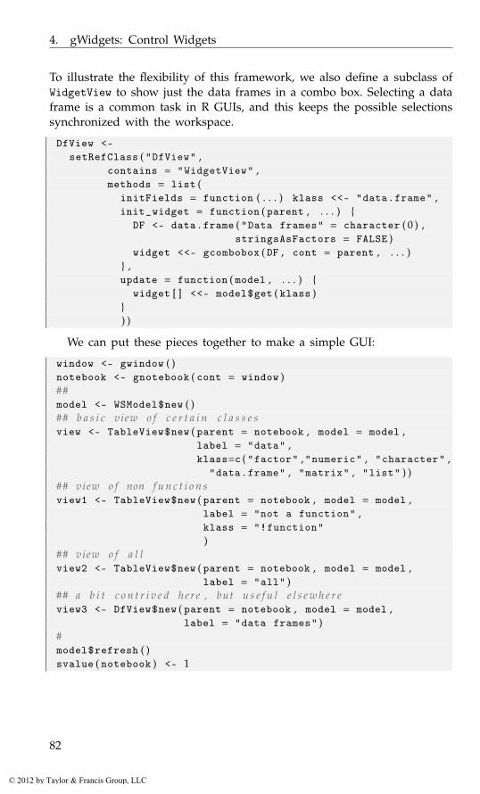
4. gWidgets: Control Widgets
To illustrate the flexibility of this framework, we also define a subclass ofWidgetView to show just the data frames in a combo box. Selecting a dataframe is a common task in R GUIs, and this keeps the possible selectionssynchronized with the workspace.
DfView <-setRefClass ( "DfView" ,
contains = "WidgetView" ,methods = list (
initFields = function ( . . . ) klass <<- "data.frame" ,init_widget = function ( parent , . . . ) {
DF <- data . frame ( "Data frames" = character ( 0 ) ,stringsAsFactors = FALSE )
widget <<- gcombobox ( DF , cont = parent , . . . )} ,update = function ( model , . . . ) {
widget [ ] <<- model$get ( klass )}) )
We can put these pieces together to make a simple GUI:
window <- gwindow ( )notebook <- gnotebook ( cont = window )##model <- WSModel$new ( )## b a s i c view o f c e r t a i n c l a s s e sview <- TableView$new ( parent = notebook , model = model ,
label = "data" ,klass=c ( "factor" ,"numeric" , "character" ,
"data.frame" , "matrix" , "list" ) )## view o f non f u n c t i o n sview1 <- TableView$new ( parent = notebook , model = model ,
label = "not a function" ,klass = "!function")
## view o f a l lview2 <- TableView$new ( parent = notebook , model = model ,
label = "all" )## a b i t c o n t r i v e d her e , but u s e f u l e l s e w h e r eview3 <- DfView$new ( parent = notebook , model = model ,
label = "data frames" )#model$refresh ( )svalue ( notebook ) <- 1
82
© 2012 by Taylor & Francis Group, LLC
4.6. Display of hierarchical data
4.6 Display of hierarchical data
The gtree constructor can be used to display hierarchical structures, suchas a file system or the components of a list. To use gtree we describe thetree to be shown dynamically through a function that computes the childcomponents in terms of the path of the parent node. Although a bit morecomplex, this approach allows trees with many ancestors to be shown,without needing to compute the entire tree at the time of construction.
The offspring argument is assigned a function of two arguments, thepath of a particular node and the arbitrary object passed through theoptional offspring.data argument. This function should return a dataframe with each row referring to an offspring for the node and whose firstcolumn is a key that identifies each of the offspring.
To indicate whether a node has offspring, a function can be passedthrough the hasOffspring argument. This function takes the data framereturned by the offspring function and should return a logical vector witheach value indicating which rows have offspring. If it is more convenient tocompute this within the offspring function, then when hasOffspring isleft unspecified and the second column returned by offspring is a logicalvector, that column will be used.
As an illustration, this function produces an offspring function to ex-plore the hierarchical structure of a list. The list is passed in through theoffspring.data argument of the constructor.
offspring <- function ( path = character ( 0 ) , lst , . . . ) {if ( length ( path ) )
obj <- lst [ [ path ] ]else
obj <- lst#f <- function ( i ) is . recursive ( i ) && !is . null ( names ( i ) )data . frame ( comps = names ( obj ) ,
hasOffspring = sapply ( obj , f ) ,stringsAsFactors = FALSE )
}
The above offspring function will produce a tree with only one column,as the data frame has just the comps column specifying values. By addingcolumns to the data frame above, say a column to record the class of thevariable, more information can easily be presented.
To see the above used, we define a list to explore.
lst <- list ( a = "1" , b = list ( a = "2" , b = "3" ,c = list ( a = "4" ) ) )
window <- gwindow ( "Tree test" )tree <- gtree ( offspring , offspring . data = lst , cont = window )
83
© 2012 by Taylor & Francis Group, LLC
4. gWidgets: Control Widgets
A single click is used to select a row. Multiple selections are possible ifthe multiple argument is given a TRUE value.
For some toolkits the icon.FUN argument can be used to specify astock icon to be displayed next to the first column. This function, likehasOffspring, has as an argument the data frame returned by offspringand should return a character vector with each entry indicating whichstock icon is to be shown.
For some toolkits, the column type must be determined prior to ren-dering (just as is needed for gtable). By default, a call to offspring withargument c() indicating the root node is made. The returned data frameis used to determine the column types. If that is not correct, the argu-ment col.types can be used. It should be a data frame with column typesmatching those returned by offspring.
Methods The svalue method returns the currently selected key or nodelabel. There is no assignment method. The [ method returns the path forthe currently selected node. This is what is passed to the offspring func-tion. The update method updates the displayed tree by reconsidering thechildren of the root node. The method addHandlerDoubleclick specifies afunction to call on a double-click event.
Example 4.10: Using gtree to explore a recursive partitionThe party package implements a recursive partitioning algorithm for tree-based regression and classification models. The package provides an ex-cellent plot method for the object, but in this example we demonstratehow the gtree widget can be used to display the hierarchical nature ofthe fitted object. As working directly with the return object is not for thefaint of heart, such a GUI can be useful.
First, we fit a model from an example that appears in the package’svignette.
require ( party )data ( "GlaucomaM" , package = "ipred" ) # l o a d d a t agt <- ctree ( Class ~ . , data = GlaucomaM ) # f i t model
The party object tracks the hierarchical nature through its nodes. Thisobject has a complex structure using lists to store data about the nodes.Next, we define an offspring function that:
• tracks the node by number, as is done in the party object,
• records whether a node has offspring through the terminal compo-nent (bypassing the hasOffspring function), and
• computes a condition on the variable that creates the node.
84
© 2012 by Taylor & Francis Group, LLC
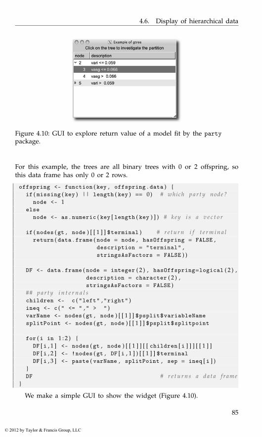
4.6. Display of hierarchical data
Figure 4.10: GUI to explore return value of a model fit by the partypackage.
For this example, the trees are all binary trees with 0 or 2 offspring, sothis data frame has only 0 or 2 rows.
offspring <- function ( key , offspring . data ) {if ( missing ( key ) || length ( key ) == 0) # which p a r t y node ?
node <- 1else
node <- as . numeric ( key [ length ( key ) ] ) # key i s a v e c t o r
if ( nodes ( gt , node ) [ [ 1 ] ] $terminal ) # r e t u r n i f t e r m i n a lreturn ( data . frame ( node = node , hasOffspring = FALSE ,
description = "terminal" ,stringsAsFactors = FALSE ) )
DF <- data . frame ( node = integer ( 2 ) , hasOffspring=logical ( 2 ) ,description = character ( 2 ) ,stringsAsFactors = FALSE )
## p a r t y i n t e r n a l schildren <- c ( "left" ,"right" )ineq <- c ( " <= " ," > " )varName <- nodes ( gt , node ) [ [ 1 ] ] $psplit$variableNamesplitPoint <- nodes ( gt , node ) [ [ 1 ] ] $psplit$splitpoint
for ( i in 1 : 2 ) {DF [ i , 1 ] <- nodes ( gt , node ) [ [ 1 ] ] [ [ children [ i ] ] ] [ [ 1 ] ]DF [ i , 2 ] <- !nodes ( gt , DF [ i , 1 ] ) [ [ 1 ] ] $terminalDF [ i , 3 ] <- paste ( varName , splitPoint , sep = ineq [ i ] )
}DF # r e t u r n s a d a t a f rame
}
We make a simple GUI to show the widget (Figure 4.10).
85
© 2012 by Taylor & Francis Group, LLC
4. gWidgets: Control Widgets
window <- gwindow ( "Example of gtree" )group <- ggroup ( cont = window , horizontal = FALSE )label <- glabel ( "Click on the tree to investigate thepartition" , cont = group )
tree <- gtree ( offspring , cont = group , expand = TRUE )
A single click is used to expand the tree. Here we create a binding toa double-click event to create a basic graphic. The party vignette showshow to make more complicated – and meaningful – graphics for this modelfit.
addHandlerDoubleclick ( tree , handler = function ( h , . . . ) {node <- as . numeric ( svalue ( h$obj ) )if ( nodes ( gt , node ) [ [ 1 ] ] $terminal ) { # i f t e r m i n a l p l o t
weights <- as . logical ( nodes ( gt , node ) [ [ 1 ] ] $weights )plot ( response ( gt ) [ weights , ] )
} } )
4.7 Actions, menus, and toolbars
Actions are non-graphical objects representing an application commandthat is executable through one or more widgets. Actions in gWidgetsare created through the gaction constructor. The arguments are label,tooltip, icon, key.accel,10 parent, and the standard handler and ac-tion.
The label appears as the text on a button, a menu item, or a toolbarbutton, whereas the icon will decorate the same, if possible. For sometoolkits, the tooltip pops up when the mouse hovers. The parent argumentis used to specify a widget whose top-level container will process theshortcut.
Methods The main methods for actions are svalue<- to set the label textand enabled<- to adjust whether the widget is sensitive to user input. Allproxies of the action are set through one call. There is no method to invokethe action.
Buttons An action can be assigned to a button by setting it as the actionargument of the gbutton constructor, in which case all other argumentsfor the constructor are ignored.
window <- gwindow ( "gaction example" )action <- gaction ( "click me" , tooltip = "Click for a message" ,
icon = "ok" ,handler = function ( h , . . . ) {
10The key accelerator implementation varies depending on the underlying toolkit.
86
© 2012 by Taylor & Francis Group, LLC
4.7. Actions, menus, and toolbars
print ( "Hello" )} ,parent = window )
button <- gbutton ( action = action , cont = window )## . . t o changeenabled ( action ) <- FALSE # can ’ t c l i c k now
Action handlers do not have the sender object (button, above) passed backto them.
Toolbars
Toolbars and menu bars are implemented in gWidgets using gaction items.Both are specified using a named list of action components.
For a toolbar, this list has a simple structure. Each named componentdescribes either a toolbar item or a separator, where the toolbar itemsare specified by gaction instances and separators by gseparator instanceswith no container specified.
For example, first we define some actions:
stub <- function ( h , . . . ) gmessage ( "called handler" ,parent = window )
action_list = list (new = gaction ( label = "new" , icon = "new" ,
handler = stub , parent = window ) ,open = gaction ( label = "open" , icon = "open" ,
handler = stub , parent = window ) ,save = gaction ( label = "save" , icon = "save" ,
handler = stub , parent = window ) ,save . as = gaction ( label = "save as..." , icon = "save as..." ,
handler = stub , parent = window ) ,quit = gaction ( label = "quit" , icon = "quit" ,
handler = function ( . . . ) dispose ( window ) , parent = window ) ,cut = gaction ( label = "cut" , icon = "cut" ,
handler = stub , parent = window ))
Then a toolbar list might look like this:
window <- gwindow ( "gtoolbar example" )tool_bar_list<- c ( action_list [ c ( "new" ,"save" ) ] ,
sep = gseparator ( ) ,action_list [ "quit" ] )
tool_bar <- gtoolbar ( tool_bar_list , cont = window )gtext ( "Lorem ipsum ..." , cont = window )
The gtoolbar constructor takes the list as its first argument. As toolbarsbelong to the window, the corresponding gWidgets objects use a gwindowobject as the parent container. (Some of the toolkits relax this to allow
87
© 2012 by Taylor & Francis Group, LLC
4. gWidgets: Control Widgets
other containers.) The argument style can be "both", "icons", "text", or"both-horiz", to specify how the toolbar is rendered.
Menu bars and pop-up menus
Menu bars and pop-up menus are specified similarly as toolbars withmenu items being defined through gaction instances and visual separatorsthrough gseparator instances. Menus differ from toolbars, as submenusrequire a nested structure. This is specified using a nested list as thecomponent to describe the submenu. The lists all have named components.In this case, the corresponding name labels the submenu item. For menubars, it is typical that all the top-level components be lists, but for pop-upmenus, this wouldn’t necessarily be the case.
An example of such a list might be:
menu_bar_list <- list ( file = list (new = action_list$new ,open = action_list$open ,save = action_list$save ,"save as..." = action_list$save . as ,sep = gseparator ( ) ,quit = action_list$quit) ,
edit = list (cut = action_list$cut)
)
Figure 4.11 shows this simple GUI using gWidgetsRGtk2. Under MacOS X, with a native toolkit, menu bars may be drawn along the top of thescreen, as is the custom of that OS.
Menu bar and toolbar Methods The main method for toolbar andmenu bar instances is the svalue method, which will return the list. Thesvalue<- method can be used to redefine the menu bar or toolbar. Use theadd method to append to an existing menu bar or toolbar, again using alist to specify the new items.
Here we show how to disable groups of actions. Suppose we want todisable the saving and cut actions if there are no characters in the textbuffer. We could use this handler:
no_changes <- c ( "save" ,"save.as" ,"cut" )keyhandler <- function ( . . . ) {
for ( i in no_changes )enabled ( action_list [ [ i ] ] ) <-
( nchar ( svalue ( txt_widget ) ) > 0 )}
88
© 2012 by Taylor & Francis Group, LLC

4.7. Actions, menus, and toolbars
Figure 4.11: Menu bar and toolbar decorating a basic text editing widget.The “Save” icon is disabled, as there is no text typed in the buffer.
addHandlerKeystroke ( txt_widget , handler = keyhandler )keyhandler ( )
Pop-up menus Pop-up menus can be created for right-click eventsthrough the add3rdMousePopupmenu constructor (or control-button-1 forMac OS X). This constructor has arguments obj to specify a widget, like abutton, to initiate the pop-up, menulist to specify the menu, and optionallyan action argument.
Example 4.11: Pop-up menusThis example shows how to add a simple pop-up menu to a button.
window <- gwindow ( "Popup example" )button <- gbutton ( "click me or right click me" , cont = window ,
handler = function ( h , . . . ) {cat ( "You clicked me\n" )
} )f <- function ( h , . . . ) cat ( "you right clicked on" , h$action )menu_bar_list <-
list ( one = gaction ( "one" , action = "one" , handler = f ) ,two = gaction ( "two" , action = "two" , handler = f ))
add3rdMousePopupmenu ( button , menu_bar_list )
89
© 2012 by Taylor & Francis Group, LLC
5
gWidgets: R-specific Widgets
The gWidgets package provides some R specific widgets for producingGUIs. Table 5.1 lists them.
5.1 A graphics device
Some toolkits support an embeddable graphics device (gWidgetsRGtk2through cairoDevice, gWidgetsQt through qtutils). In this case, theggraphics constructor produces a widget that can be added to a container.The arguments width, height, dpi, and ps are similar to other graphicsdevices.
When working with multiple devices, it becomes necessary to switchbetween devices. A mouse click in a ggraphics instance will make thatdevice the current one. Otherwise, the visible<- method can be usedto set the object as the current device. The ggraphicsnotebook creates anotebook that allows the user to easily navigate multiple graphics devices.
The default handler for the widget is set by addHandlerClicked. Thecoordinates of the mouse click, in user coordinates, are passed to the han-dler in the components x and y. As well, the method addHandlerChanged
Table 5.1: Table of constructors for R-specific widgets in gWidgets
Constructor Description
ggraphics Embeddable graphics deviceggraphicsnotebook Notebook for multiple devicesgdf Data frame editorgdfnotebook Notebook for multiple gdf instancesgvarbrowser GUI for browsing variables in the workspacegcommandline Command line widgetgformlayout Creates a GUI from a list specifying layoutggenericwidget Creates a GUI for a function based on its formal
arguments or a defining list
91
© 2012 by Taylor & Francis Group, LLC
5. gWidgets: R-specific Widgets
is used to assign a handler to call when a region is selected by draggingthe mouse. The components x and y describe the rectangle that was tracedout, again in user coordinates.
This shows how the two can be used:
library ( gWidgets ) ; options ( guiToolkit = "RGtk2" )window <- gwindow ( "ggraphics example" , visible = FALSE )plot_device <- ggraphics ( cont = window )x <- mtcars$wt ; y <- mtcars$mpg#addHandlerClicked ( plot_device , handler = function ( h , . . . ) {
cat ( sprintf ( "You clicked %.2f x %.2f\n" , h$x , h$y ) )} )addHandlerChanged ( plot_device , handler = function ( h , . . . ) {
rx <- h$x ; ry <- h$yif ( diff ( rx ) > diff ( range ( x ) ) /100 &&
diff ( ry ) > diff ( range ( y ) ) / 100) {ind <- rx [ 1 ] <= x & x <= rx [ 2 ] & ry [ 1 ] <=y & y <= ry [ 2 ]if ( any ( ind ) )
print ( cbind ( x = x [ ind ] , y = y [ ind ] ) )}
} )visible ( window ) <- TRUE#plot ( x , y )
The underlying toolkits may pass in more information about the event,such as whether a modifier key was being pressed, but this isn’t toolkitindependent.
Using tkrplot The tkrplot provides a means to embed graphics in TkGUIs, but is not a graphics device. As such, there is no ggraphics im-plementation in gWidgetstcltk. You can embed tkrplot though. The fol-lowing is a simple modification of the example from the help page fortkrplot:
options ( guiToolkit = "tcltk" ) ; require ( tkrplot )window <- gwindow ( "How to embed tkrplot" , visible = FALSE )group <- ggroup ( cont = window , horizontal = FALSE )bb <- 1img <- tkrplot ( getToolkitWidget ( group ) ,
fun = function ( ) plot ( 1 : 2 0 , ( 1 : 2 0 ) ^ bb ) )add ( group , img )f <- function ( . . . ) {
b <- svalue ( slider )print ( b )if ( b != bb ) {
92
© 2012 by Taylor & Francis Group, LLC

5.1. A graphics device
Figure 5.1: A GUI to filter a data frame and display an accompanyinggraphic.
bb <<- btkrreplot ( img )
}}slider <- gslider ( from = 0 . 0 5 , to = 2 , by = 0 . 0 5 , cont = group ,
handler = f , expand = TRUE )visible ( window ) <- TRUE
Example 5.1: A GUI for filtering and visualizing a data setA common GUI application for data analysis consists of means to visualize,query, aggregate and filter a data set. This example shows how one cancreate such a GUI using gWidgets featuring an embedded graphics device.In addition a visual display of the filtered data, and a means to filter,or narrow, the data that is under consideration, is presented (Figure 5.1).Although, our example is not too feature rich, it illustrates a frameworkthat can easily be extended.
This example is centered around filtering a data set; we choose a con-venient one:
data ( "Cars93" , package = "MASS" )
93
© 2012 by Taylor & Francis Group, LLC
5. gWidgets: R-specific Widgets
We use a notebook to hold two tabs, one to give information and onefor the main GUI. This basic design comes from the spotfire demos attibco.com.
window <- gwindow ( "Spotfire example" , visible = FALSE )notebook <- gnotebook ( cont = window )
We use a simple label for information, although a more detailed de-scription would be warranted in an actual application.
descr <- glabel ( gettext ( "A basic GUI to explore a data set" ) ,cont = notebook , label = gettext ( "About" ) )
Now we specify the layout for the second tab. This is a nested layoutmade up of three box containers. The first, group, uses a horizontal layoutin which we pack in box containers that will use a vertical layout.
group <- ggroup ( cont = notebook , label = gettext ( "Explore..." ) )left_group <- ggroup ( cont = group , horizontal = FALSE )right_group <- ggroup ( cont = group , horizontal = FALSE )
The left side will contain an embedded graphic device and a view ofthe filtered data. The ggraphics widget provides the graphic device.
ggraphics ( cont = left_group )
Our tabular view of the data is provided by the gtable widget, whichfacilitates the display of a data frame. The last two arguments allow formultiple selection (for marking points on the graphic) and for filteringthrough the visible<- method. In addition to the table, we add a label todisplay the number of cases being shown. This label is packed into a boxcontainer, and forced to the right side through the addSpring method ofthe box container.
tbl <- gtable ( Cars93 , cont = left_group , multiple = TRUE ,filter . FUN = "manual" )
size ( tbl ) <- c ( 5 0 0 , 200) # s e t s i z elabel_group <- ggroup ( cont = left_group )addSpring ( label_group )no_cases <- glabel ( "" , cont = label_group )
The right panel is used to provide the user a means to filter the display.We place the widgets used to do this within a frame to guide the user.
filter_frame <- gframe ( gettext ( "Filter by:" ) ,cont = right_group , expand = TRUE )
The controls are laid out in a grid. We have two here to filter by: type andthe number of cylinders.
lyt <- glayout ( cont = filter_frame )widget_list <- list ( ) # s t o r e w i d g e t s
94
© 2012 by Taylor & Francis Group, LLC
5.1. A graphics device
lyt [ 1 , 1 ] <- "Type:"lyt [ 1 , 2 ] <- ( widget_list$Type <-
gcombobox ( c ( "" , levels ( Cars93$Type ) ) ,cont = lyt ) )
lyt [ 2 , 1 ] <- "Cylinders:"lyt [ 2 , 2 ] <- ( widget_list$Cylinders <-
gcombobox ( c ( "" , levels ( Cars93$Cyl ) ) , cont = lyt ) )
Of course, we could use many more criteria to filter by. The above filtersare naturally represented by a combo box. However, one could have usedmany different styles, depending on the type of data. For instance, onecould employ a checkbox to filter through Boolean data, a checkbox groupto allow multiple selection, a slider to pick out numeric data, or a textbox to specify filtering by a string. The type of data dictates this. In thisexample it isn’t needed, but since the layout is done, we might have codeto initialize the controls in the filter. Adding such a call makes it easy tosave the state of the GUI.
We now move on to the task of making the three main components –the display, the table and the filters – interact with each other. We keepthis example simple, but note that if we were to extend the example wewould likely write using the observer pattern introduced in Example 4.9as that makes it easy to decouple the components of an interface. As itis, we define function calls to a) update the data frame when the filterschange and b) update the graphic.
For the first, we need to compute a logical variable indicating whichrows are to be displayed. Within the definition of the following function,we use the global variables widget_list, tbl and no_cases.
update_data_frame <- function ( . . . ) {vals <- lapply ( widget_list , svalue )vals <- vals [ vals != "" ]out <- sapply ( names ( vals ) , function ( i ) {
Cars93 [ [ i ] ] == vals [ [ i ] ]} )ind <- apply ( out , 1 , function ( x ) Reduce ( "&&" , x ) )## u pd a t e t a b l evisible ( tbl ) <- ind## u pd a t e l a b e lnsprintf <- function ( n , msg1 , msg2 , . . . )
ngettext ( n , sprintf ( msg1 , n ) , sprintf ( msg2 , n ) , . . . )svalue ( no_cases ) <- nsprintf ( sum ( ind ) , "%s case" , "%s cases" )
}
This next function is used to update the graphic. A real applicationwould provide a more compelling plot.
update_graphic <- function ( . . . ) {ind <- visible ( tbl )
95
© 2012 by Taylor & Francis Group, LLC
5. gWidgets: R-specific Widgets
if ( any ( ind ) )plot ( MPG . city ~ Weight , data = Cars93 [ ind , ] )
elseplot . new ( )
}
We now add a handler to be called whenever one of our combo boxesis changed. This handler simply calls both our update functions.
callback <- function ( h , . . . ) {update_data_frame ( )update_graphic ( )
}sapply ( widget_list , addHandlerChanged , handler = callback )
For the data display, we wish to allow the user to view individual casesby clicking on a row of the table. The following will do so.
addHandlerClicked ( tbl , handler = function ( h , . . . ) {update_graphic ( )ind <- svalue ( h$obj , index = TRUE )points ( MPG . city ~ Weight , cex = 2 , col = "red" , pch = 16 ,
data = Cars93 [ ind , ] )} )
We could also use the addHandlerChanged method to add a handler to callwhen the user drags out a region in the graphics device, but leave this forthe interested reader.
Finally, we draw the GUI with an initial graphic:
visible ( window ) <- TRUEupdate_graphic ( )
5.2 A data frame editor
The gdf constructor returns a widget for editing data frames. The intent isfor each toolkit to produce a widget at least as powerful as the data.entryfunction. The implementations differ between toolkits, with some offeringmuch more. We describe what is in common below.1
The constructor has its main argument items to specify the data frameto edit. A basic usage might be:
1 For gWidgetstcltk, there is no native widget for editing tabular data, so the tktableadd-on widget is used (tktable.sourceforge.net). A warning will be issued if this is notinstalled. Again, as with gtable, the widget under gWidgetstcltk is slower, but can load amoderately sized data frame in a reasonable time.
For gWidgetsRGtk2 there is also the gdfedit widget which can handle very large datasets and has many improved usability features. The gWidgets function merely wraps thegtkDfEdit function from RGtk2Extras. This function is not exported by gWidgets, so thetoolkit package must be loaded before use.
96
© 2012 by Taylor & Francis Group, LLC
5.3. Workspace browser
window <- gwindow ( "gdf example" )DF <- gdf ( mtcars , cont = window )## . . . make some e d i t s . . .new_data_frame <- DF [ , ] # s t o r e c h a n g e s
Some toolkits render columns differently for different data types, andsome toolkits use character values for all the data, so values must becoerced back when transferring to R values. As such, column types areimportant. Even if one is starting with a 0-row data frame, the columnstypes should be defined as desired. Also, factors and character types maybe treated differently, although they may render in a similar manner.
Methods The svalue method will return the selected values or selectedindices if index=TRUE is given. The svalue<- method is used to specify theselection by index. This is a vector or row indices, or for some toolkits alist with components rows and columns indicating the selection to mark.The [ and [<- methods can be used to extract and set values from thedata frame by index. As with gtable, these are not as flexible as for adata frame. In particular, it may not be possible to change the type of acolumn, or add new rows or columns through these methods. Using noindices, as in the above example with df[,], will return the current dataframe. The current data frame can be completely replaced when no indicesare specified in the replacement call.
There are also several methods defined that follow those of a dataframe: dimnames, dimnames<-, names, names<-, and length.
The following methods can be used to assign handlers: addHan-dlerChanged (cell changed), addHandlerClicked, addHandlerDoubleclick.Some toolkits also have addHandlerColumnClicked, addHandlerColumnDou-bleclick, and addHandlerColumnRightclick implemented.
The gdfnotebook constructor produces a notebook that can hold severaldata frames to edit at once.
5.3 Workspace browser
A workspace browser is constructed by gvarbrowser, providing a meansto browse and select the objects in the current global environment. Thisworkspace browser uses a tree widget to display the items and their namedcomponents.
The svalue method returns the name of the currently selected valueusing the $-notation to refer to child elements. One can call svalue on thisstring to get the corresponding R object.
The default handler object calls do.call on the object for the functionspecified by name through the action argument. (The default is to print
97
© 2012 by Taylor & Francis Group, LLC
5. gWidgets: R-specific Widgets
a summary of the object.) This handler is called on a double click. A singleclick is used for selection. One can pass in other handler functions ifdesired.
The update method will update the list of items being displayed. Thiscan be time consuming. Some heuristics are employed to do this automat-ically, if the size of the workspace is modest enough. Otherwise it can bedone programmatically.
Example 5.2: Using drag-and-drop with gWidgetsWe use the drag-and-drop features to create a means to plot variablesfrom the workspace browser. Our basic layout is fairly simple. We placethe workspace browser on the left, and on the right have a graphic deviceand few labels to act as drop targets.
window <- gwindow ( "Drag-and-drop example" )group <- ggroup ( cont = window )workspace_browser <- gvarbrowser ( cont = group )nested_group <- ggroup ( horizontal = FALSE , cont = group ,
expand = TRUE )ggraphics ( cont = nested_group )xlabel <- glabel ( "" , cont = nested_group )ylabel <- glabel ( "" , cont = nested_group )clear <- gbutton ( "clear" , cont = nested_group )
We create a function to initialize the interface.
init_txt <- "<Drop %s variable here>"initUI <- function ( . . . ) {
svalue ( xlabel ) <- sprintf ( init_txt , "x" )svalue ( ylabel ) <- sprintf ( init_txt , "y" )enabled ( ylabel ) <- FALSE
}initUI ( ) # i n i t i a l c a l l
Separating this out allows us to link it to the clear button.
addHandlerClicked ( clear , handler = initUI )
Next, we write a function to update the user interface. As we didn’tabstract out the data from the GUI, we need to figure out which state theGUI is currently in by consulting the text in each label.
updateUI <- function ( . . . ) {if ( grepl ( svalue ( xlabel ) , sprintf ( init_txt , "x" ) ) ) {
## none s e tenabled ( ylabel ) <- FALSE
} else if ( grepl ( svalue ( ylabel ) , sprintf ( init_txt , "y" ) ) ) {## x , not yenabled ( ylabel ) <- TRUEx <- eval ( parse ( text = svalue ( xlabel ) ) , envir=. GlobalEnv )
98
© 2012 by Taylor & Francis Group, LLC
5.4. Help browser
plot ( x , xlab = svalue ( xlabel ) )} else {
enabled ( ylabel ) <- TRUEx <- eval ( parse ( text = svalue ( xlabel ) ) , envir=. GlobalEnv )y <- eval ( parse ( text = svalue ( ylabel ) ) , envir=. GlobalEnv )plot ( x , y , xlab = svalue ( xlabel ) , ylab = svalue ( ylabel ) )
}}
Now we add our drag-and-drop information. Drag-and-drop supportin gWidgets is implemented through three methods: one to set a widgetas a drag source (addDropSource), one to set a widget as a drop target(addDropTarget), and one to call a handler when a drop event passes overa widget (addDropMotion).
The addDropSource method needs a widget and a handler to call whena drag-and-drop event is initiated. This handler should return the valuethat will be passed to the drop target. The default value is that returnedby calling svalue on the object. In this example we don’t need to set this,as gvarbrowser already calls this with a drop data being the variable nameusing the dollar sign notation for child components.
The addDropTarget method is used to allow a widget to receive adropped value and to specify a handler to call when a value is dropped.The dropdata component of the first argument of the callback, h, holds thedrop data. In our example below we use this to update the receiver object,either the x or y label.
dropHandler <- function ( h , . . . ) {svalue ( h$obj ) <- h$dropdataupdateUI ( )
}addDropTarget ( xlabel , handler = dropHandler )addDropTarget ( ylabel , handler = dropHandler )
The addDropMotion registers a handler for when a drag event passesover a widget. We don’t need this for our GUI.
5.4 Help browser
The ghelp constructor produces a widget for showing help pages usinga notebook container. Although R now has excellent ways to dynamicallyview help pages through a web browser (in particular the helpr packageand the standard built-in help page server) this widget provides a light-weight alternative that can be embedded in a GUI.
To add a help page, the add method is used, where the value argumentdescribes the desired page. This can be a character string containing the
99
© 2012 by Taylor & Francis Group, LLC
5. gWidgets: R-specific Widgets
topic, a character string of the form package:::topic to specify the pack-age, or a list with named components package and topic. The disposemethod of notebooks can be used to remove the current tab.
The ghelpbrowser constructor produces a stand-alone GUI for display-ing help pages, running examples from the help pages or opening vignettesprovided by the package. This GUI provides its own top-level window anddoes not return a value for which methods are defined.
5.5 Command line widget
A simple command line widget is created by the gcommandline constructor.This is not meant as a replacement for any of R’s command lines, butis provided for light-weight usage. A text box allows users to enter Rcommands. The programmer may issue commands to be evaluated anddisplayed through the svalue<- method. The value assigned is a characterstring holding the commands. If there is a names attribute, the results willbe assigned to a variable in the global workspace with that name. Thesvalue and [ methods return the command history.
5.6 Simplifying creation of dialogs
The gWidgets package has two means to simplify the creation of GUIs.2
The gformlayout constructor takes a list defining a layout and producesa GUI, the ggenericwidget constructor can take a function name andproduce a GUI based on the formal arguments of the function. This toouses a list, which can be modified by the user before the GUI is constructed.We leave the details to their manual pages.
2The traitr package provides another, but is not discussed here. There are similar facil-ities in RGtk2Extras for RGtk2 and the fgui package can do such a thing for tcltk.
100
© 2012 by Taylor & Francis Group, LLC
Part II
The RGtk2 Package
101
© 2012 by Taylor & Francis Group, LLC

6
RGtk2: Overview
As the name implies, the RGtk2 package is an interface, or binding, be-tween R and GTK+, a mature, cross-platform GUI toolkit. The letters GTKstand for the GIMP ToolKit, with the word GIMP recording the originof the library as part of the GNU Image Manipulation Program. GTK+provides the same widgets on every platform, though it can be cus-tomized to emulate platform-specific look and feel. The library is writ-ten in C, which facilitates access from languages like R that are also im-plemented in C. GTK+ is licensed under the Lesser GNU Public License(LGPL), while RGtk2 is under the GNU Public License (GPL). The pack-age is available from the Comprehensive R Archive Network (CRAN) athttp://CRAN.R-project.org/package=RGtk2.
The name RGtk2 also implies that there exists a package named RGtk,which is indeed the case. The original RGtk is bound to the previous gen-eration of GTK+, version 1.2. RGtk2 is based on GTK+ 2.0, the currentgeneration. This book covers RGtk2 specifically, although many of the fun-damental features of RGtk2 are inherited from RGtk.
RGtk2 provides virtually all of the functionality in GTK+ to the R pro-grammer. In addition, RGtk2 interfaces with several other libraries in theGTK+ stack: Pango for font rendering; Cairo for vector graphics; Gdk-Pixbuf for image manipulation; GIO for synchronous and asynchronousinput/output for files and network resources; ATK for accessible interfaces;and GDK, an abstraction over the native windowing system, supportingeither X11 or Windows. These libraries are multi-platform and extensive,and have been used for many major projects, such as the Linux versionsof Firefox and Open Office.
The API of each of these libraries is mapped to R in a way that is con-sistent with R conventions and familiar to the R user. Much of the RGtk2API consists of autogenerated R functions that call into one of the underly-ing libraries. For example, the R function gtkContainerAdd eventually callsthe C function gtk_container_add. The naming convention is that the Cname has its underscores removed and each following letter capitalized(camelCase style).
103
© 2012 by Taylor & Francis Group, LLC
6. RGtk2: Overview
The full API for GTK+ is quite large, and complete documentation of itis beyond our scope. However, the GTK+ documentation is algorithmicallyconverted into the R help format during the generation of RGtk2. Thisallows the programmer to refer to the appropriate documentation within anR session, without having to consult a web page, such as http://library.gnome.org/devel/gtk/stable/, which lists the C API of the stable versionof GTK+.
In this chapter, we give an overview of how RGtk2 maps the GTK+API, including its classes, constructors, methods, properties, signals, andenumerations, to an R-level API that is relatively familiar to, and convenientfor, an R user.
6.1 Synopsis of the RGtk2 API
Constructing a GUI with RGtk2 generally proceeds by constructing a wid-get and then configuring it by calling methods and setting properties.Handlers are connected to signals, and the widget is combined with otherwidgets to form the GUI. For example:
button <- gtkButton ( "Click Me" )button [ ’image’ ] <- gtkImage ( stock = "gtk-apply" ,
size = "button" )gSignalConnect ( button , "clicked" , function ( button ) {
message ( "Hello World!" )} )##window <- gtkWindow ( show = FALSE )window$add ( button )window$showAll ( )
Once one understands the syntax and themes of the above example, it isonly a matter of reading through the proceeding chapters and the docu-mentation to discover all of the widgets and their features. The rest of thischapter will explain these basic components of the API.
6.2 Objects and classes
In any toolkit, all widget types have functionality in common. For example,they are all drawn on the screen in a consistent style. They can be hiddenand shown again. To formalize this relationship and to simplify implemen-tation by sharing code between widgets, GTK+, like many other toolkits,defines an inheritance hierarchy for its widget types. In the parlance ofobject-oriented programming, each type is represented by a class.
For specifying the hierarchy, GTK+ relies on GObject, a C library thatimplements a class-based, single-inheritance, object-oriented system. A GOb-
104
© 2012 by Taylor & Francis Group, LLC

6.3. Constructors
ject class encapsulates behaviors that all instances of the class share. Everyclass has at most one parent through which it inherits the behaviors of itsancestors. A subclass can override some specific inherited behaviors. Theinterface defined by a class consists of constructors, methods, properties,and signals.
The type system supports reflection, so we can, for example, obtain alist of the ancestors for a given class:
gTypeGetAncestors ( "GtkWidget" )
[1] "GtkWidget" "GtkObject"[3] "GInitiallyUnowned" "GObject"
For those familiar with object-oriented programming in R, the returnedcharacter vector could be interpreted as if it were a class attribute on anS3 object.
Single inheritance can be restrictive when a class performs multipleroles in a program. To circumvent this, GTK+ adopts the popular conceptof the interface, which is essentially a contract that specifies which methods,properties and signals a class must implement. As with languages likeJava and C#, a class can implement multiple interfaces, and an interfacecan be composed of other interfaces. An interface allows the programmerto treat all instances of implementing classes in a similar way. However,unlike class inheritance, the implementation of the methods, properties,and signals is not shared. For example, we list the interfaces implementedby GtkWidget:
gTypeGetInterfaces ( "GtkWidget" )
[1] "AtkImplementorIface" "GtkBuildable"
We explain the constructors, methods, properties, and signals of classesand interfaces in the following sections and demonstrate them in the con-struction of a simple “Hello World” GUI, shown in Figure 6.1. A moredetailed and technical explanation of GObject is available in Chapter 11.
6.3 Constructors
The next few sections will contribute to a unifying example that displays abutton in a window. When clicked, the button will print a message to theR console. The first step in our example is to create a top-level windowto contain our GUI. Creating an instance of a GTK widget requires callinga single R function, known as a constructor. Following R conventions, theconstructor for a class has the same name as the class, except the firstcharacter is lowercase. The following statement constructs an instance ofthe GtkWindow class:
105
© 2012 by Taylor & Francis Group, LLC
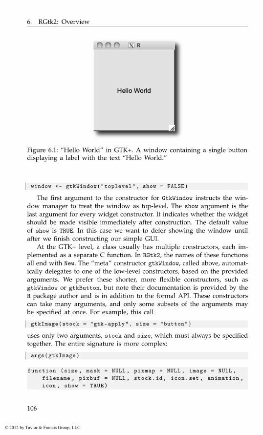
6. RGtk2: Overview
Figure 6.1: “Hello World” in GTK+. A window containing a single buttondisplaying a label with the text “Hello World.”
window <- gtkWindow ( "toplevel" , show = FALSE )
The first argument to the constructor for GtkWindow instructs the win-dow manager to treat the window as top-level. The show argument is thelast argument for every widget constructor. It indicates whether the widgetshould be made visible immediately after construction. The default valueof show is TRUE. In this case we want to defer showing the window untilafter we finish constructing our simple GUI.
At the GTK+ level, a class usually has multiple constructors, each im-plemented as a separate C function. In RGtk2, the names of these functionsall end with New. The “meta” constructor gtkWindow, called above, automat-ically delegates to one of the low-level constructors, based on the providedarguments. We prefer these shorter, more flexible constructors, such asgtkWindow or gtkButton, but note their documentation is provided by theR package author and is in addition to the formal API. These constructorscan take many arguments, and only some subsets of the arguments maybe specified at once. For example, this call
gtkImage ( stock = "gtk-apply" , size = "button" )
uses only two arguments, stock and size, which must always be specifiedtogether. The entire signature is more complex:
args ( gtkImage )
function (size , mask = NULL , pixmap = NULL , image = NULL ,filename , pixbuf = NULL , stock.id , icon.set , animation ,icon , show = TRUE)
106
© 2012 by Taylor & Francis Group, LLC
6.3. Constructors
A GTK+ object created by the R user has an R-level object as its proxy.Thus, window is a reference to a GtkWindow instance. A reference objectwill not be copied before modification. This is different from the behaviorof most R objects. For example, calling abs on a numeric vector does notchange the value assigned to the original symbol:
a <- −1abs ( a )
[1] 1
a
[1] -1
Setting the text label on our button, however, will change the originalvalue:
gtkButtonSetLabel ( button , "New text" )gtkButtonGetLabel ( button )
[1] "New text"
If this widget were displayed on the screen, the label would also be up-dated.
The class hierarchy of an object is represented by the class attribute.We interpret the attribute according to S3 conventions, so that the classnames are in order from most to least derived:
class ( window )
[1] "GtkWindow" "GtkBin" "GtkContainer"[4] "GtkWidget" "GtkObject" "GInitiallyUnowned"[7] "GObject" "RGtkObject"
We find that the GtkWindow class inherits methods, properties, and sig-nals from the GtkBin, GtkContainer, GtkWidget, GtkObject, GInitial-lyUnowned, and GObject classes. Every type of GTK+ widget inherits fromthe base GtkWidget class, which implements the general characteristicsshared by all widget classes, e.g., properties storing the location and back-ground color, and methods for hiding, showing, and painting the widget.We can also query window for the interfaces it implements:
interface ( window )
[1] "AtkImplementorIface" "GtkBuildable"
When the underlying GTK+ object is destroyed, i.e., deleted from mem-ory, the class of the proxy object is set to <invalid>, indicating that it canno longer be manipulated.
107
© 2012 by Taylor & Francis Group, LLC

6. RGtk2: Overview
6.4 Methods
The next steps in our example are to create a “Hello World” button and toplace the button in the window that we have already created. This relieson an understanding of how one programmatically manipulates widgetsby invoking methods. In RGtk2, a method represents a type of messagethat is passed to a widget. Methods are implemented as functions thattake an instance of their class as the first argument and instruct the widgetto perform some behavior, according to any additional parameters.
Although class information is stored in the style of S3, RGtk2 intro-duces its own mechanism for method dispatch.1 The call obj$method(...)resolves to a function call f(obj,...). The function is found by looking forany function that matches the pattern classNameMethodName, the concate-nation of one of the names from class(obj) or interface(obj) with themethod name. The search begins with the interfaces and proceeds througheach character vector in order.
For instance, if win is a gtkWindow instance, then to resolve the callwin$add(widget) RGtk2 considers gtkBuildableAdd, atkImplementorI-faceAdd, gtkWindowAdd, gtkBinAdd, and finally finds gtkContainerAdd,which is called as gtkContainerAdd(win, widget). The $ method for RGtk2objects does the work.
We take advantage of this convenience when we add the “Hello World”button to our window and set its size:
button <- gtkButton ( "Hello World" )window$add ( button )window$setDefaultSize ( 2 0 0 , 200)
The above code calls the gtkContainerAdd and gtkWindowSetDefaultSizefunctions with less typing and fewer demands on the memory of the user.
Understanding this mechanism allows us to add to the RGtk2 API. Forinstance, we can add to the button API with:
gtkButtonSayHello <- function ( obj , target )obj$setLabel ( paste ( "Hello" , target ) )
button$sayHello ( "World" )button$getLabel ( )
[1] "Hello World"
Some common methods are inherited by all widgets, as they are de-fined in the base GtkWidget class. These include: show to specify that thewidget should be drawn; hide to hide the widget until specified; destroyto destroy a widget and clear up any references to it; getParent to find
1RGtk2 uses R’s standard dollar-sign notation (also used with reference classes) for class-based method dispatch.
108
© 2012 by Taylor & Francis Group, LLC
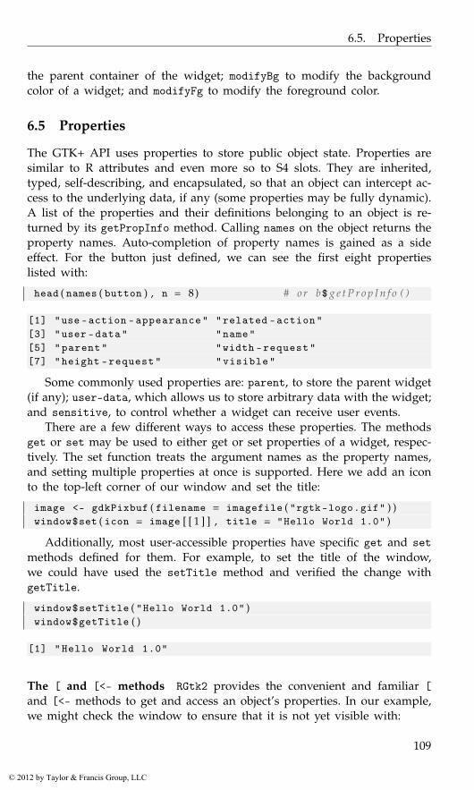
6.5. Properties
the parent container of the widget; modifyBg to modify the backgroundcolor of a widget; and modifyFg to modify the foreground color.
6.5 Properties
The GTK+ API uses properties to store public object state. Properties aresimilar to R attributes and even more so to S4 slots. They are inherited,typed, self-describing, and encapsulated, so that an object can intercept ac-cess to the underlying data, if any (some properties may be fully dynamic).A list of the properties and their definitions belonging to an object is re-turned by its getPropInfo method. Calling names on the object returns theproperty names. Auto-completion of property names is gained as a sideeffect. For the button just defined, we can see the first eight propertieslisted with:
head ( names ( button ) , n = 8) # or b$ g e t P r o p I n f o ( )
[1] "use -action -appearance" "related -action"[3] "user -data" "name"[5] "parent" "width -request"[7] "height -request" "visible"
Some commonly used properties are: parent, to store the parent widget(if any); user-data, which allows us to store arbitrary data with the widget;and sensitive, to control whether a widget can receive user events.
There are a few different ways to access these properties. The methodsget or set may be used to either get or set properties of a widget, respec-tively. The set function treats the argument names as the property names,and setting multiple properties at once is supported. Here we add an iconto the top-left corner of our window and set the title:
image <- gdkPixbuf ( filename = imagefile ( "rgtk-logo.gif" ) )window$set ( icon = image [ [ 1 ] ] , title = "Hello World 1.0" )
Additionally, most user-accessible properties have specific get and setmethods defined for them. For example, to set the title of the window,we could have used the setTitle method and verified the change withgetTitle.
window$setTitle ( "Hello World 1.0" )window$getTitle ( )
[1] "Hello World 1.0"
The [ and [<- methods RGtk2 provides the convenient and familiar [and [<- methods to get and access an object’s properties. In our example,we might check the window to ensure that it is not yet visible with:
109
© 2012 by Taylor & Francis Group, LLC
6. RGtk2: Overview
window [ "visible" ]
[1] FALSE
Finally, we can make our window visible by setting the “visible” property,although calling gtkWidgetShow is more conventional:
window [ "visible" ] <- TRUEwindow$show ( ) # same e f f e c t
For ease of referencing the appropriate help pages, we tend to use thefull method name in the examples, although at times the move R-like vectornotation will be used for commonly accessed properties.
6.6 Events and signals
In RGtk2, a user action, such as a mouse click, key press, or drag-and-dropmotion triggers the widget to emit a corresponding signal. A GUI can bemade interactive by specifying a callback function to be invoked upon theemission of a particular signal.
The signals provided by a class or interface are returned by the functiongTypeGetSignals. For example
names ( gTypeGetSignals ( "GtkButton" ) )
[1] "pressed" "released" "clicked" "enter" "leave"[6] "activate"
shows the “clicked” signal in addition to others. Note that this lists onlythe signals provided directly by the GtkButton. To list all inherited signals,we need to loop over the hierarchy, but it is not common to do this inpractice, as the documentation includes information on the signals.
The gSignalConnect function adds a callback to a widget’s signal. Itssignature is
args ( gSignalConnect )
function (obj , signal , f, data = NULL , after = FALSE ,user.data.first = FALSE)
The basic usage is to call gSignalConnect to connect a callback functionf to the signal named signal belonging to the object obj. The functionreturns an identifier for managing the connection. This is not usually nec-essary to store, but uses will be discussed later.
We demonstrate gSignalConnect by adding a callback to our “HelloWorld” example, so that “Hello World” is printed to the console when thebutton is clicked:
gSignalConnect ( button , "clicked" ,function ( button ) message ( "Hello World!" ) )
110
© 2012 by Taylor & Francis Group, LLC
6.6. Events and signals
We now review the remaining arguments. The data argument allowsarbitrary data to be passed to the callback. The user.data.first argumentspecifies whether the data argument should be the first argument to thecallback or (the default) the last. The after argument is a logical valueindicating whether the callback should be called after the default handler(see ?gSignalConnect).
The signature for the callback varies for each signal. Unlessuser.data.first is TRUE, the first argument is the widget. Other argu-ments are possible depending on the signal type. For window events, thesecond argument is a GdkEvent type, which can carry with it extra infor-mation about the event that occurred. The GTK+ API lists the signature ofeach signal.
It is important to note that the widget, and possibly other arguments,are references, so their manipulation has side effects outside of the callback.This is obviously a critical feature, but it is one that may be surprising tothe R user.
window <- gtkWindow ( ) ; window [ ’title’ ] <- "test signals"x <- 1 ;button <- gtkButton ( "click me" ) ; window$add ( button )gSignalConnect ( button , signal = "clicked" ,
f = function ( button ) {button$setData ( "x" , 2 )x <- 2return ( TRUE )
} )
Then after clicking, we would have
cat ( x , button$getData ( "x" ) , "\n" ) # 1 and 2
1 2
Callbacks for signals emitted by window-manager events are expectedto return a logical value. Failure to do so can cause errors to be raised. Areturn value of TRUE indicates that no further callbacks should be called,whereas FALSE indicates that the next callback should be called. In otherwords, the return value indicates whether the handler has consumed theevent. In the following example, only the first two callbacks are executedwhen the user clicks the button:
button <- gtkButton ( "click" )window <- gtkWindow ( )window$add ( button )gSignalConnect ( button , "button-press-event" ,
function ( button , event , data ) {message ( "hi" ) ; return ( FALSE )
} )
111
© 2012 by Taylor & Francis Group, LLC
6. RGtk2: Overview
gSignalConnect ( button , "button-press-event" ,function ( button , event , data ) {
message ( "and" ) ; return ( TRUE )} )
gSignalConnect ( button , "button-press-event" ,function ( button , event , data ) {
message ( "bye" ) ; return ( TRUE )} )
Multiple callbacks can be assigned to each signal. They will be pro-cessed in the order they were bound to the signal. The gSignalConnectfunction returns an ID that can be used to disconnect a handler, if de-sired, using gSignalHandlerDisconnect. To block a handler temporarily,call gSignalHandlerBlock and then gSignalHandlerUnblock to unblock.The help page for gSignalConnect gives the details.
6.7 Enumerated types and flags
At the beginning of our example, we constructed the window thusly:
window <- gtkWindow ( "toplevel" , show = FALSE )
The first parameter indicates the window type. The set of possible windowtypes is specified by what in C is known as an enumeration. A value froman enumeration can be thought of as a length-one factor in R. The possi-ble values defined by the enumeration are analogous to the factor levels.Since enumerations are foreign to R, RGtk2 accepts string representationsof enumeration values, such as "toplevel".
For every GTK+ enumeration, RGtk2 provides an R vector that mapsthe nicknames to the underlying numeric values. In the above case, thevector is named GtkWindowType.
GtkWindowType
An enumeration with values:toplevel popup
0 1
The names of the vector indicate the allowed nickname for each valueof the enumeration. It is rarely necessary to use the enumeration vectorsexplicitly; specifying the nickname will work in most cases, including allmethod invocations, and is preferable as it is easier for human readers tocomprehend.
Flags are an extension of enumerations, where the value of each mem-ber is a unique power of two, so that the values can be combined unam-biguously. An example of a flag enumeration is GtkWidgetFlags.
GtkWidgetFlags
112
© 2012 by Taylor & Francis Group, LLC
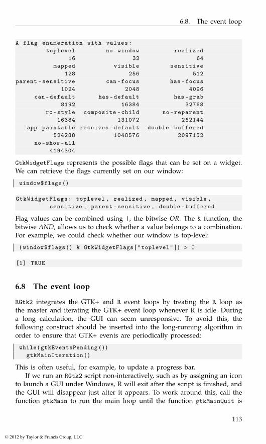
6.8. The event loop
A flag enumeration with values:toplevel no -window realized
16 32 64mapped visible sensitive
128 256 512parent -sensitive can -focus has -focus
1024 2048 4096can -default has -default has -grab
8192 16384 32768rc -style composite -child no -reparent
16384 131072 262144app -paintable receives -default double -buffered
524288 1048576 2097152no -show -all
4194304
GtkWidgetFlags represents the possible flags that can be set on a widget.We can retrieve the flags currently set on our window:
window$flags ( )
GtkWidgetFlags: toplevel , realized , mapped , visible ,sensitive , parent -sensitive , double -buffered
Flag values can be combined using |, the bitwise OR. The & function, thebitwise AND, allows us to check whether a value belongs to a combination.For example, we could check whether our window is top-level:
( window$flags ( ) & GtkWidgetFlags [ "toplevel" ] ) > 0
[1] TRUE
6.8 The event loop
RGtk2 integrates the GTK+ and R event loops by treating the R loop asthe master and iterating the GTK+ event loop whenever R is idle. Duringa long calculation, the GUI can seem unresponsive. To avoid this, thefollowing construct should be inserted into the long-running algorithm inorder to ensure that GTK+ events are periodically processed:
while ( gtkEventsPending ( ) )gtkMainIteration ( )
This is often useful, for example, to update a progress bar.If we run an RGtk2 script non-interactively, such as by assigning an icon
to launch a GUI under Windows, R will exit after the script is finished, andthe GUI will disappear just after it appears. To work around this, call thefunction gtkMain to run the main loop until the function gtkMainQuit is
113
© 2012 by Taylor & Francis Group, LLC
6. RGtk2: Overview
called. Since there is no interactive session, gtkMainQuit should be calledthrough some event handler.
6.9 Importing a GUI from Glade
This book focuses almost entirely on the direct programmatic constructionof GUIs. Some developers prefer visually constructing a GUI by pointing,clicking and dragging in another GUI, which one might call a GUI builder,a type of RAD (Rapid Application Development) tool. Glade is the primaryGUI builder for GTK+ and exports an interface as XML that is loadableby GtkBuilder. It is freely available for all major platforms from http://glade.gnome.org/. Documentation is also at that location.
We will assume that the reader has saved an interface as a GtkBuilderXML file named buildable.xml and is ready to load it with RGtk2:
builder <- gtkBuilder ( )builder$addFromFile ( "buildable.xml" )
$retval[1] 1
$errorNULL
The getObject extracts a widget by its ID, which is specified by the userthrough Glade. It normally suffices to load the top-level widget, nameddialog1 in this example, and show it:
dialog1 <- builder$getObject ( "dialog1" )dialog1$showAll ( )
In order to add behaviors to the GUI, we need to register R functionsas signal handlers. In Glade, the user should specify the name of an Rfunction as a handler for some signal. RGtk2 extends GtkBuilder to look upthe functions and connect them to the appropriate signals. Let us assumethat the user has named the ok_button_clicked function as the handlerfor the clicked signal on a GtkButton. The connectSignals method willestablish that connection and any others in the interface:
ok_button_clicked <- function ( button , userData ) {message ( "hello world" )
}builder$connectSignals ( )
The GUI should now be ready for use.
114
© 2012 by Taylor & Francis Group, LLC
7
RGtk2: Windows, Containers, and Dialogs
This chapter covers top-level windows, dialogs, and the container objectsprovided by GTK+.
7.1 Top-level windows
As we saw in our “Hello World” example, top-level windows are con-structed by the gtkWindow constructor. This function has the argumenttype to specify the type of window to create. The default is a top-levelwindow, which we will always use, as the alternative is for pop-ups, whichare meant for internal use, e.g., for implementing menus. The second argu-ment is show, which by default is TRUE, indicating that the window shouldbe shown. If set to FALSE, the window, like other widgets, can later beshown by calling its show method. The showAll method will also showany child components. These can be reversed with hide and hideAll.
As with all objects, windows have several properties. The window titleis stored in the title property. As usual, this property can be accessedvia the “get” and “set” methods getTitle and setTitle, or using the [function. To illustrate, the following sets up a new window with a title.
window <- gtkWindow ( show=FALSE ) # use d e f a u l t t y p ewindow$setTitle ( "Window title" ) # s e t window t i t l ewindow [ ’title’ ] # or use g e t T i t l e
[1] "Window title"
window$setDefaultSize ( 2 5 0 , 3 0 0 ) # 250 wide , 300 h ighwindow$show ( ) # show window
Window size The initial size of the window can be set with the set-DefaultSize method, as shown above, which takes a width and heightargument specified in pixels. This specification allows the window to be re-sized but must be made before the window is drawn, as the window thenfalls under control of the window manager. The setSizeRequest method
115
© 2012 by Taylor & Francis Group, LLC

7. RGtk2: Windows, Containers, and Dialogs
will request a minimum size, which the window manager will usuallyhonor, as long as a maximum bound is not violated. To fix the size of awindow, the resizable property can be set to FALSE.
Adding a child component to a window A window is a container. Gtk-Window inherits from GtkBin, which derives from GtkContainer and allowsonly a single child. As before, this child is added through the add method.We illustrate the basics by adding a simple label to a window.
window <- gtkWindow ( show = FALSE )window$setTitle ( "Hello World" )label <- gtkLabel ( "Hello World" )window$add ( label )
To display multiple widgets in a window, we simply need to add a non-GtkBin container as the child widget. We will discuss additional containertypes in Section 7.2.
Destroying windows A window is normally closed by the window man-ager. Most often, this occurs in response to the user clicking on a closebutton in a title bar. When this happens, the window manager requeststhat the window be deleted, and the delete-event signal is emitted. Aswith any window manager event, the default handler is overridden if acallback connected to delete-event returns TRUE. This can be useful forconfirming the intention of the user before closing the window. For exam-ple:
gSignalConnect ( window , "delete-event" , function ( event , . . . ) {dialog <- gtkMessageDialog ( parent = window , flags = 0 ,
type = "question" ,buttons = "yes-no" ,"Are you sure you want to quit?" )
out <- dialog$run ( ) ; dialog$destroy ( )out != GtkResponseType [ "yes" ]
} )
(We describe the use of message dialogs in Section 7.3.) The contract ofdeletion is that the window should no longer be visible on the screen. It isnot necessary for the actual window object to be removed from memory,although this is the default behavior. Calling the hideOnDelete methodconfigures the window to hide but not destroy itself.
It is also possible to close a window programmatically by calling itsdestroy method:
window$destroy ( )
116
© 2012 by Taylor & Francis Group, LLC
7.2. Layout containers
Transient windows New windows may be stand-alone top-level windowsor may be associated with some other window. For example, a dialog isusually associated with the primary document window. The setTransient-For method specifies the window with which a transient (dialog) windowis associated. This hints to the window manager that the transient windowshould be kept on top of its parent. The position relative to the parentwindow can be specified with setPostion, which takes a value from theGtkWindowPosition enumeration. Optionally, a dialog can be set to be de-stroyed with its parent. For example:
## c r e a t e a window and a d i a l o g windowwindow <- gtkWindow ( show = FALSE )window$setTitle ( "Top level window" )##dialog <- gtkWindow ( show = FALSE )dialog$setTitle ( "dialog window" )dialog$setTransientFor ( window )dialog$setPosition ( "center-on-parent" )dialog$setDestroyWithParent ( TRUE )window$show ( )dialog$show ( )
The above code produces a non-modal dialog window from scratch. Due toits transient nature, it can hide parts of the top-level window, but, unlikea modal dialog, it does not prevent that window from receiving events.GTK+ provides a number of convenient high-level dialogs, discussed inSection 7.3, that support modal operation.
7.2 Layout containers
Once a top-level window is constructed, it remains to fill the window withthe controls that will constitute our GUI. As these controls are graphi-cal, they must occupy a specific region on the screen. The region couldbe specified as a fixed rectangle. However, as a user interface, a GUI isdynamic and interactive. The size constraints of widgets will change, andthe window will be resized. The programmer can ill afford to manage adynamic layout explicitly. Thus, GTK+ implements automatic layout in theform of container widgets.
Basics
In GTK+, the widget hierarchy is built when children are added to a parentcontainer. In this example, a window is made the parent of a label:
window <- gtkWindow ( show=FALSE )window$setTitle ( "Hello World" )
117
© 2012 by Taylor & Francis Group, LLC

7. RGtk2: Windows, Containers, and Dialogs
label <- gtkLabel ( "Hello World" )window$add ( label )
The method getChildren will return the children of a container as alist. Since in this case the list will be at most length one, the getChildmethod may be more convenient, as it directly returns the only child, ifany. For instance, to retrieve the label text we could do:
window$getChild ( ) [ ’label’ ]
[1] "Hello World"
The [[ method accesses the child widgets by number, as a convenientwrapper around the getChildren method:
window [ [ 1 ] ] [ ’label’ ]
[1] "Hello World"
Conversely, the getParent method for GTK+ widgets will return the parentcontainer of a widget.
Every container supports removing a child with the remove method.The child can later be re-added. For instance
window$remove ( label )window$add ( label )
To remove a widget from the screen but not its container, use the hidemethod on the widget. The reparent method is a convenience for movinga widget between containers that ensures the child is not garbage collectedduring the transition.1
Widget size negotiation
We have already seen perhaps the simplest automatic layout container,GtkBin, which fills all of its space with its child. Despite the apparent sim-plicity, there is a considerable amount of logic for calculating the size of thewidget on the screen. The child will first inform the parent of its desirednatural size. For example, a label might ask for the dimensions necessaryto display all of its text. The container then decides whether to allocate therequested size or to allocate more or less than the requested amount. Thechild then consumes the allocated space. Consider the previous exampleof adding a label to a window:
window <- gtkWindow ( )window$setTitle ( "Hello World" )label <- gtkLabel ( "Hello World" )window$add ( label )
1An object becomes available for garbage collection when it has no references to it, whichcan happen if it is removed from the parent container.
118
© 2012 by Taylor & Francis Group, LLC
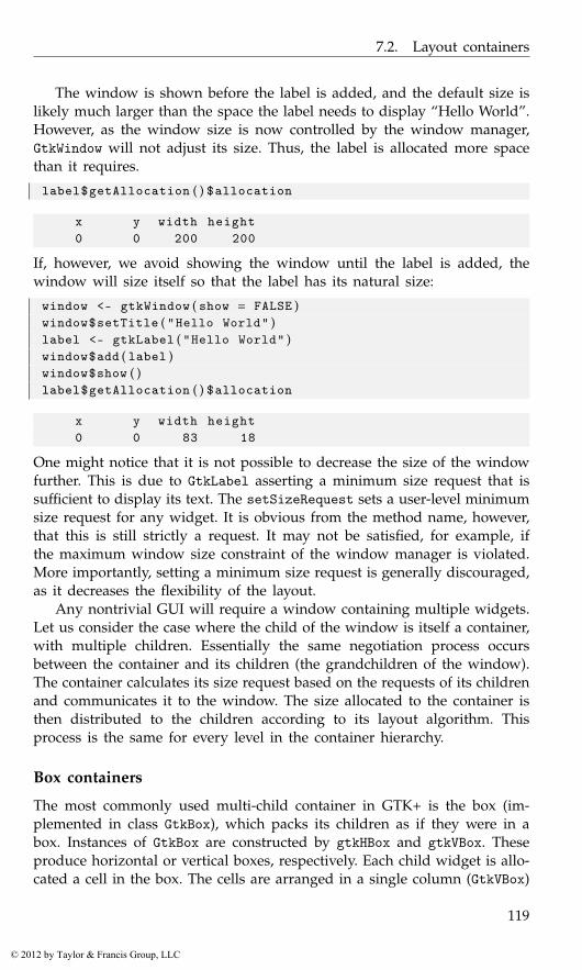
7.2. Layout containers
The window is shown before the label is added, and the default size islikely much larger than the space the label needs to display “Hello World”.However, as the window size is now controlled by the window manager,GtkWindow will not adjust its size. Thus, the label is allocated more spacethan it requires.
label$getAllocation ( ) $allocation
x y width height0 0 200 200
If, however, we avoid showing the window until the label is added, thewindow will size itself so that the label has its natural size:
window <- gtkWindow ( show = FALSE )window$setTitle ( "Hello World" )label <- gtkLabel ( "Hello World" )window$add ( label )window$show ( )label$getAllocation ( ) $allocation
x y width height0 0 83 18
One might notice that it is not possible to decrease the size of the windowfurther. This is due to GtkLabel asserting a minimum size request that issufficient to display its text. The setSizeRequest sets a user-level minimumsize request for any widget. It is obvious from the method name, however,that this is still strictly a request. It may not be satisfied, for example, ifthe maximum window size constraint of the window manager is violated.More importantly, setting a minimum size request is generally discouraged,as it decreases the flexibility of the layout.
Any nontrivial GUI will require a window containing multiple widgets.Let us consider the case where the child of the window is itself a container,with multiple children. Essentially the same negotiation process occursbetween the container and its children (the grandchildren of the window).The container calculates its size request based on the requests of its childrenand communicates it to the window. The size allocated to the container isthen distributed to the children according to its layout algorithm. Thisprocess is the same for every level in the container hierarchy.
Box containers
The most commonly used multi-child container in GTK+ is the box (im-plemented in class GtkBox), which packs its children as if they were in abox. Instances of GtkBox are constructed by gtkHBox and gtkVBox. Theseproduce horizontal or vertical boxes, respectively. Each child widget is allo-cated a cell in the box. The cells are arranged in a single column (GtkVBox)
119
© 2012 by Taylor & Francis Group, LLC

7. RGtk2: Windows, Containers, and Dialogs
or row (GtkHBox). This one-dimensional stacking is usually all that a lay-out requires. The child widgets can be containers themselves, allowing forvery flexible layouts. For special cases where some widgets need to spanmultiple rows or columns and align themselves in both dimensions, GTK+provides the GtkTable class, which is discussed later. Many of the princi-ples we discuss in this section also apply to GtkTable.
Here we will explain and demonstrate the use of GtkHBox, the generalhorizontal box layout container. GtkVBox can be used exactly the same way;only the direction of stacking is different. Figure 7.1 illustrates a samplingof the possible layouts that are possible with a GtkHBox.
The code for some of these layouts is presented here. We begin bycreating a GtkHBox widget. We pass TRUE for the first parameter, homoge-neous. This means that the horizontal allocation of the box will be evenlydistributed between the children. The second parameter directs the box toleave five pixels of space between children. The following code constructsthe GtkHBox:
box <- gtkHBox ( TRUE , 5 )
The equal distribution of available space is strictly enforced; the minimumsize requirement of a homogeneous box is set such that the box alwayssatisfies this assertion, as well as the minimum size requirements of itschildren.
The packStart and packEnd methods pack a widget into a box againstthe left and right side (top and bottom for a GtkVBox), respectively. Forthis explanation, we restrict ourselves to packStart, since packEnd worksthe same except for the direction. Below, we pack two buttons, button_aand button_b against the left side:
button_a <- gtkButton ( "Button A" )button_b <- gtkButton ( "Button B" )box$packStart ( button_a , fill = FALSE )box$packStart ( button_b , fill = FALSE )
First, button_a is packed against the left side of the box, and then we packbutton_b against the right side of button_a. This results in the first row inFigure 7.1. The space distribution is homogeneous, but making the spaceavailable to a child does not mean that the child will fill it. That dependson the natural size of the child, as well as the value of the fill parameterpassed to packStart. In this case, fill is FALSE, so the extra space is notfilled and the widget is aligned in the center of its space. When a widgetis packed with the fill parameter set to TRUE, the widget is resized toconsume the available space. This results in rows 2 and 3 in Figure 7.1.
In many cases, it is desirable to give children unequal amounts ofavailable space, as in rows 4–9 in Figure 7.1. To create a heterogeneouslyspaced GtkHBox, we pass FALSE as the first argument to the constructor, asin the following code:
120
© 2012 by Taylor & Francis Group, LLC

7.2. Layout containers
Figure 7.1: A screenshot demonstrating the effect of packing two buttonsinto GtkHBox instances using the packStart method with differentcombinations of the expand and fill settings. The effect of thehomogeneous spacing setting on the GtkHBox is also shown.
121
© 2012 by Taylor & Francis Group, LLC

7. RGtk2: Windows, Containers, and Dialogs
Figure 7.2: Examples of packing widgets into a box container. The top rowshows no padding, whereas the second and third illustrate the differencebetween padding (an amount around each child) and spacing (an amountbetween the children). The last two rows show the effect of fill whenexpand=TRUE. This illustration follows one in the original GTK+ tutorial.
box <- gtkHBox ( FALSE , 5 )
A heterogeneous layout is freed of the restriction that all widgets mustbe given the same amount of available space; it needs only to ensurethat each child has enough space to meet its minimum size requirement.After satisfying this constraint, a box is often left with extra space. Theprogrammer may control the distribution of this extra space through theexpand parameter to packStart. When a widget is packed with expandset to TRUE, we will call the widget an expanding widget. All expandingwidgets in a box are given an equal portion of the entirety of the extraspace. If no widgets in a box are expanding, as in row 5 of Figure 7.1, theextra space is left undistributed.
It is common to mix expanding and non-expanding widgets in thesame box. An example is given below, where button_a is expanding, whilebutton_b is not:
box$packStart ( button_a , expand = TRUE , fill = FALSE )box$packStart ( button_b , expand = FALSE , fill = FALSE )
The result is shown in row 6 of Figure 7.1. The figure contains severalother permutations of the homogeneous, expand, and fill settings.
Padding There are several ways to add space around widgets in a boxcontainer. The spacing argument for the constructors specifies the amountof space between the cells, in pixels. This defaults to zero. The pack meth-ods have a padding argument, also defaulting to zero, for specifying thepadding in pixels on either side of the child. It is important to note thedifference: spacing is between children and the same for every boundary,
122
© 2012 by Taylor & Francis Group, LLC
7.2. Layout containers
while the padding is specific to a particular child and occurs on eitherside, even on the ends. The spacing between widgets is the sum of thespacing value and the two padding values when the children are added.Example 8.3 provides an example and Figure 7.2 an illustration.
Positioning The reorderChild method reorders the child widgets. Thenew position of the child is specified using 0-based indexing. This codewill move the third child of hbox to the second position:
b3 <- hbox [ [ 3 ] ]hbox$reorderChild ( b3 , 2 − 1) # s e c o n d i s 2 − 1
Alignment
We began this section with a simple example of a window containing alabel:
window <- gtkWindow ( ) ; window$setTitle ( "Hello World" )label <- gtkLabel ( "Hello World" )window$add ( label )
The window allocates all of its space to the label, despite the actual textconsuming a much smaller region. The size of the text is fixed, accordingto the font size, so it could not be expanded. Thus, the label decidedto center the text within itself (and so the window). A similar problemis faced by widgets displaying images. The image cannot be expandedwithout distortion. Widgets that display objects of fixed size inherit fromGtkMisc, which provides methods and properties for tweaking how theobject is aligned within the space of the widget. For example, the xalignand yalign properties specify how the text is aligned in our label andtake values between 0 and 1, with 0 being left and top. Their defaults are0.5, for centered alignment. We modify them below to make our label leftjustified:
label [ "xalign" ] <- 0
Unlike a block of text or an image, a widget usually does not have a fixedsize. However, the user may wish to tweak how a widget fills the spaceallocated by its container. GTK+ provides the GtkAlignment container forthis purpose. For example, rather than adjust the justification of the labeltext, we could have instructed the layout not to expand but to positionitself against the left side of the window:
window <- gtkWindow ( ) ; window$setTitle ( "Hello World" )alignment <- gtkAlignment ( )alignment$set ( xalign = 0 , yalign = 0 . 5 , xscale = 0 , yscale=1)window$add ( alignment )
123
© 2012 by Taylor & Francis Group, LLC
7. RGtk2: Windows, Containers, and Dialogs
label <- gtkLabel ( "Hello World" )alignment$add ( label )
7.3 Dialogs
GTK+ provides a number of convenient dialogs for the most common usecases, as well as a general infrastructure for constructing custom dialogs.A dialog is a window that generally consists of an icon, a content area,and an action area containing a row of buttons representing the possibleuser responses. Typically, a dialog belongs to a main application windowand might be modal, in which case input is blocked to other parts of theGUI. GtkDialog represents a generic dialog and serves as the base classfor all special-purpose dialogs in GTK+.
Message dialogs
Communicating textual messages to the user is perhaps the most commonapplication of a dialog. GTK+ provides the gtkMessageDialog conveniencewrapper for GtkDialog for creating a message dialog showing a primaryand secondary message. We construct one presently:
window <- gtkWindow ( ) ; window [ ’title’ ] <- "Parent window"#dialog <- gtkMessageDialog ( parent=window ,
flags="destroy-with-parent" ,type="question" ,buttons="ok" ,"My message" )
dialog [ ’secondary -text’ ] <- "A secondary message"
The flags argument allows us to specify a combination of values fromGtkDialogFlags. These include destroy-with-parent and modal. Here, thedialog will be destroyed upon destruction of the parent window. The typeargument specifies the message type, using one of the four values fromGtkMessageType, which determines the icon that is placed adjacent to themessage text. The buttons argument indicates the set of response buttonswith a value from GtkButtonsType. The remaining arguments are pastedtogether into the primary message. The dialog has a secondary-text prop-erty that can be set to give a secondary message.
Dialogs are optionally modal. Below, we enable modality by calling therun method, which will additionally block the R session:
response <- dialog$run ( )if ( response == GtkResponseType [ "cancel" ] ||
response == GtkResponseType [ "close" ] ||response == GtkResponseType [ "delete-event" ] ) {
124
© 2012 by Taylor & Francis Group, LLC
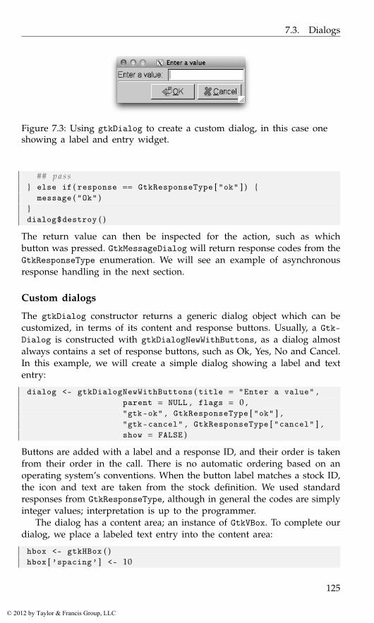
7.3. Dialogs
Figure 7.3: Using gtkDialog to create a custom dialog, in this case oneshowing a label and entry widget.
## p a s s} else if ( response == GtkResponseType [ "ok" ] ) {
message ( "Ok" )}dialog$destroy ( )
The return value can then be inspected for the action, such as whichbutton was pressed. GtkMessageDialog will return response codes from theGtkResponseType enumeration. We will see an example of asynchronousresponse handling in the next section.
Custom dialogs
The gtkDialog constructor returns a generic dialog object which can becustomized, in terms of its content and response buttons. Usually, a Gtk-Dialog is constructed with gtkDialogNewWithButtons, as a dialog almostalways contains a set of response buttons, such as Ok, Yes, No and Cancel.In this example, we will create a simple dialog showing a label and textentry:
dialog <- gtkDialogNewWithButtons ( title = "Enter a value" ,parent = NULL , flags = 0 ,"gtk-ok" , GtkResponseType [ "ok" ] ,"gtk-cancel" , GtkResponseType [ "cancel" ] ,show = FALSE )
Buttons are added with a label and a response ID, and their order is takenfrom their order in the call. There is no automatic ordering based on anoperating system’s conventions. When the button label matches a stock ID,the icon and text are taken from the stock definition. We used standardresponses from GtkResponseType, although in general the codes are simplyinteger values; interpretation is up to the programmer.
The dialog has a content area; an instance of GtkVBox. To complete ourdialog, we place a labeled text entry into the content area:
hbox <- gtkHBox ( )hbox [ ’spacing’ ] <- 10
125
© 2012 by Taylor & Francis Group, LLC

7. RGtk2: Windows, Containers, and Dialogs
#hbox$packStart ( gtkLabel ( "Enter a value:" ) )entry <- gtkEntry ( )hbox$packStart ( entry )#vbox <- dialog$getContentArea ( )vbox$packStart ( hbox )
The content is placed above the button box, with a separator between them.In the message dialog example, we called the run method to make the
dialog modal. To make a non-modal dialog, do not call run but connect tothe response signal of the modal dialog. The response code of the clickedbutton is passed to the callback:
gSignalConnect ( dialog , "response" ,f=function ( dialog , response , user . data ) {
if ( response == GtkResponseType [ "ok" ] )print ( entry$getText ( ) ) # R e p l a c e t h i s
dialog$Destroy ( )} )
dialog$showAll ( )dialog$setModal ( TRUE )
File chooser
A common task in a GUI is the selection of files and directories, for exam-ple to load or save a document. GtkFileChooser is an interface shared bywidgets that choose files. GTK+ provides three such widgets. The first isGtkFileChooserWidget, which can be placed anywhere in a GUI. The othertwo are based on the first. GtkFileChooserDialog embeds the chooserwidget in a modal dialog, while GtkFileChooserButton is a button thatdisplays a file path and launches the dialog when clicked.
Example 7.1: An open-file dialogHere, we demonstrate most commonly used of the three file-choosing dia-log. An open file dialog can be created with:
dialog <- gtkFileChooserDialog ( title = "Open a file" ,parent = NULL , action = "open" ,"gtk-ok" , GtkResponseType [ "ok" ] ,"gtk-cancel" , GtkResponseType [ "cancel" ] ,show = FALSE )
The dialog constructor allows us to specify a title, a parent, and an ac-tion,: either open, save, select-folder, or create-folder. In addition, thedialog buttons must be specified, as with the last example, using gtkDi-alogNewWithButtons.
We connect to the response signal
126
© 2012 by Taylor & Francis Group, LLC
7.3. Dialogs
gSignalConnect ( dialog , "response" ,f = function ( dialog , response , data ) {
if ( response == GtkResponseType [ "ok" ] ) {filename <- dialog$getFilename ( )print ( filename )
}dialog$destroy ( )
} )
The file selected is returned by getFilename. If multiple selection is en-abled (via the select-multiple property) we should call the plural get-Filenames.
For the open dialog, we may wish to specify one or more filters thatnarrow the available files for selection:
fileFilter <- gtkFileFilter ( )fileFilter$setName ( "R files" )fileFilter$addPattern ( "*.R" )fileFilter$addPattern ( "*.Rdata" )dialog$addFilter ( fileFilter )
The gtkFileFilter function constructs a filter, which is given a name anda set of file-name patterns, before being added to the file chooser. Filteringby MIME type is also supported.
The save file dialog would be similar. The initial file name could bespecified with setFilename, or folder with setFolder. The do-overwrite-confirmation property controls whether the user is prompted when at-tempting to overwrite an existing file.
Other features not discussed here include embedding of preview andother custom widgets, and specifying shortcut folders.
Other choosers
There are several other types of dialogs for making common types of selec-tions. These include GtkCalendar for picking dates, GtkColorSelection-Dialog for choosing colors, and GtkFontSelectionDialog for fonts. Theseare very high-level dialogs that are trivial to construct and manipulate, ata cost of flexibility.
Print dialog
Rendering documents for printing is outside our scope; however, we willmention that GtkPrintOperation can launch the native, platform-specificprint dialog for customizing a printing operation. See Example 8.11 for anexample of printing R graphics using cairoDevice.
127
© 2012 by Taylor & Francis Group, LLC
7. RGtk2: Windows, Containers, and Dialogs
7.4 Special-purpose containers
In Section 7.2, we presented GtkBox and GtkAlignment, the two most usefullayout containers in GTK+. This section introduces some other importantcontainers. These include the merely decorative GtkFrame; the interactiveGtkExpander, GtkPaned, and GtkNotebook; and the grid-style layout con-tainer GtkTable. All of these widgets are derived from GtkContainer, andso share many methods.
Framed containers
The gtkFrame function constructs a container that draws a decorative, la-beled frame around its single child:
frame <- gtkFrame ( "Options" )vbox <- gtkVBox ( )vbox$packStart ( gtkCheckButton ( "Option 1" ) , FALSE )vbox$packStart ( gtkCheckButton ( "Option 2" ) , FALSE )frame$add ( vbox )
A frame is useful for visually segregating a set of conceptually relatedwidgets from the rest of the GUI. The type of decorative shadow is storedin the shadow-type property. The setLabelAlign aligns the label relativeto the frame. This is to the left, by default.
Expandable containers
The GtkExpander widget provides a button that hides and shows a singlechild upon demand. This is often an effective mechanism for managingscreen space. Expandable containers are constructed by gtkExpander:
expander <- gtkExpander ( "Advanced" )expander$add ( frame )
Use gtkExpanderNewWithMnemonic if a mnemonic is desired. The expandedproperty, which can be accessed with getExpanded and setExpanded, repre-sents the visible state of the widget. When the expanded property changes,the activate signal is emitted.
Notebooks
The gtkNotebook constructor creates a notebook container, a widget thatdisplays an array of buttons resembling notebook tabs. Each tab corre-sponds to a widget, and when a tab is selected, its widget is made visible,while the others are hidden. If GtkExpander is like a check button, Gt-kNotebook is like a radio-button group.
We create a notebook and add some pages:
128
© 2012 by Taylor & Francis Group, LLC
7.4. Special-purpose containers
notebook <- gtkNotebook ( )notebook$appendPage ( gtkLabel ( "Page 1" ) , gtkLabel ( "Tab 1" ) )
[1] 0
notebook$appendPage ( gtkLabel ( "Page 2" ) , gtkLabel ( "Tab 2" ) )
[1] 1
A page specification consists of a widget for the page and a widget forthe tab. Any type of widget is accepted, although a label is typically usedfor the tab. This flexibility allows for more complicated tabs, such as a boxcontainer with a label and a close icon.
The tabs can be positioned on any of the four sides of the notebook;this depends on the tab-pos property, with a value from GtkPositionType:"left", "right", "top", or "bottom". By default, the tabs are on top. Wemove the current ones to the bottom:
notebook [ ’tab-pos’ ] <- "bottom"
Methods and properties that affect pages expect the page index, insteadof the page widget. To map from the child widget to the page number,use the method pageNum. The page property holds the zero-based index ofthe active tab. We make the second tab active:
notebook [ ’page’ ] <- 1notebook [ ’page’ ]
[1] 1
To move sequentially through the pages, call the methods nextPageand prevPage. The signal switch-page is emitted when the current pagechanges.
Pages can be reordered using the reorderChild, although it is usuallydesirable to allow the user to reorder pages. The setTabReorderable en-ables drag and drop reordering for a specific tab. It is also possible for theuser to drag and drop pages between notebooks, as long as they belong tothe same group, which depends on the group-id property. Pages can bedeleted using the method removePage.
Managing many pages By default, a notebook will request enough spaceto display all of its tabs. If there are many tabs, space may be wasted. Gt-kNotebook solves this with the scrolling idiom. If the property scrollableis set to TRUE, arrows will be added to allow the user to scroll throughthe tabs. In this case, the tabs may become difficult to navigate. Setting theenable-popup property to TRUE enables a right-click pop-up menu listingall of the tabs for direct navigation.
129
© 2012 by Taylor & Francis Group, LLC

7. RGtk2: Windows, Containers, and Dialogs
Figure 7.4: Simple illustration of customized tab in a notebook. Theseinclude close buttons.
Example 7.2: Adding a page with a close buttonA familiar element of notebooks in many web browsers is a tab closebutton. The following defines a new method insertPageWithCloseButtonthat will use the themeable stock close icon. The callback passes both thenotebook and the page through the data argument, so that the properpage can be deleted.
gtkNotebookInsertPageWithCloseButton <-function ( object , child , label . text="" , position=−1) {
icon <- gtkImage ( pixbuf =object$renderIcon ( "gtk-close" , "button" , size = "menu" ) )
closeButton <- gtkButton ( )closeButton$setImage ( icon )closeButton$setRelief ( "none" )##label <- gtkHBox ( )label$packStart ( gtkLabel ( label . text ) )label$packEnd ( closeButton )##gSignalConnect ( closeButton , "clicked" , function ( button ) {
index <- object$pageNum ( child )object$removePage ( index )
} )object$insertPage ( child , label , position )
}
Here is a simple demonstration of its usage:
window <- gtkWindow ( )notebook <- gtkNotebook ( ) ; window$add ( notebook )notebook$insertPageWithCloseButton ( gtkButton ( "hello" ) ,
label . text = "page 1" )notebook$insertPageWithCloseButton ( gtkButton ( "world" ) ,
label . text = "page 2" )
130
© 2012 by Taylor & Francis Group, LLC
7.4. Special-purpose containers
Scrollable windows
The GtkExpander and GtkNotebook widgets support efficient use of screenreal estate. However, when a widget is always too large to fit in a GUI,partial display is necessary. A GtkScrolledWindow supports this by provid-ing scroll bars for the user to adjust the visible region of a single child. Therange, step, and position of GtkScrollbar are controlled by an instance ofGtkAdjustment, just as with the slider and spin button. Scrolled windowsare most often used with potentially large widgets like table views andwhen displaying images and graphics.
Our example will embed an R-graphics device in a scrolled windowand allow the user to zoom in and out and pull on the scroll bars topan the view. First, we create an R-graphics device using the cairoDevicepackage
library ( cairoDevice )device <- gtkDrawingArea ( )device$setSizeRequest ( 6 0 0 , 400)asCairoDevice ( device )
and then embed it within a scrolled window:
scrolled <- gtkScrolledWindow ( )scrolled$addWithViewport ( device )
The widget in a scrolled window must know how to display only apart of itself, i.e., it must be scrollable. Some widgets, including GtkTree-View and GtkTextView, have native scrolling support. Other widgets, likeour GtkDrawingArea, must be embedded within the proxy GtkViewport.The GtkScrolledWindow convenience method addWithViewport allows theprogrammer to skip the GtkViewport step.
Next, we define a function for scaling the plot:
zoomPlot <- function ( x = 2 . 0 ) {allocation <- device$getAllocation ( ) $allocationdevice$setSizeRequest ( allocation$width * x ,
allocation$height * x )updateAdjustment <- function ( adjustment ) {
adjustment$setValue ( x * adjustment$getValue ( ) +( x − 1) * adjustment$getPageSize ( ) / 2)
}updateAdjustment ( scrolled$getHadjustment ( ) )updateAdjustment ( scrolled$getVadjustment ( ) )
}
The function gets the current size allocation from the device, scales it by x,and requests the new size. It then scrolls the window to preserve the centerpoint. The state of each scroll bar is represented by a GtkAdjustment. Weupdate the value of the horizontal and vertical adjustments to scroll the
131
© 2012 by Taylor & Francis Group, LLC

7. RGtk2: Windows, Containers, and Dialogs
window. The value of an adjustment corresponds to the left/top positionof the window, so we adjust by half the page size after scaling the value.
We had key-press events, so that pressing + zooms in and pressing -zooms out:
gSignalConnect ( scrolled , "key-press-event" ,function ( scrolled , event ) {
key <- event [ [ "keyval" ] ]if ( key == GDK_plus )
zoomPlot ( 2 . 0 )else if ( key == GDK_minus )
zoomPlot ( 0 . 5 )TRUE
} )
Despite its name, the scrolled window is not a top-level window. Thus,it needs to be added to a top-level window:
win <- gtkWindow ( show = FALSE )win$add ( scrolled )win$showAll ( )
Finally, a basic scatterplot is displayed in the viewer:
plot ( mpg ~ hp , data = mtcars )
The properties hscrollbar-policy and vscrollbar-policy determinewhen the scroll bars are drawn. By default, they are always drawn. The"automatic" value from the GtkPolicyType enumeration draws the scrollbars only if needed, i.e, if the child widget requests more space than canbe allocated. The setPolicy method allows both to be set at once.
Divided containers
The gtkHPaned and gtkVPaned constructors create containers that hold twochild widgets, arranged horizontally or vertically and separated by a di-vider displaying a handle allowing the user to adjust the allocation ofspace between the child components. We will demonstrate only the hori-zontal pane GtkHPaned here, without loss of generality.
First, we construct an instance of GtkHPaned:
paned <- gtkHPaned ( )
The two children can be added two different ways. The simplest ap-proach calls add1 and add2 for adding the first and second child, respec-tively.
paned$add1 ( gtkLabel ( "Left (1)" ) )paned$add2 ( gtkLabel ( "Right (2)" ) )
132
© 2012 by Taylor & Francis Group, LLC
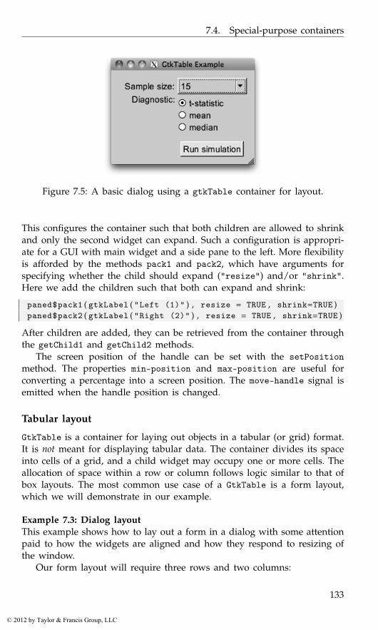
7.4. Special-purpose containers
Figure 7.5: A basic dialog using a gtkTable container for layout.
This configures the container such that both children are allowed to shrinkand only the second widget can expand. Such a configuration is appropri-ate for a GUI with main widget and a side pane to the left. More flexibilityis afforded by the methods pack1 and pack2, which have arguments forspecifying whether the child should expand ("resize") and/or "shrink".Here we add the children such that both can expand and shrink:
paned$pack1 ( gtkLabel ( "Left (1)" ) , resize = TRUE , shrink=TRUE )paned$pack2 ( gtkLabel ( "Right (2)" ) , resize = TRUE , shrink=TRUE )
After children are added, they can be retrieved from the container throughthe getChild1 and getChild2 methods.
The screen position of the handle can be set with the setPositionmethod. The properties min-position and max-position are useful forconverting a percentage into a screen position. The move-handle signal isemitted when the handle position is changed.
Tabular layout
GtkTable is a container for laying out objects in a tabular (or grid) format.It is not meant for displaying tabular data. The container divides its spaceinto cells of a grid, and a child widget may occupy one or more cells. Theallocation of space within a row or column follows logic similar to that ofbox layouts. The most common use case of a GtkTable is a form layout,which we will demonstrate in our example.
Example 7.3: Dialog layoutThis example shows how to lay out a form in a dialog with some attentionpaid to how the widgets are aligned and how they respond to resizing ofthe window.
Our form layout will require three rows and two columns:
133
© 2012 by Taylor & Francis Group, LLC
7. RGtk2: Windows, Containers, and Dialogs
table <- gtkTable ( rows = 3 , columns = 2 , homogeneous = FALSE )
By default, the cells are allowed to have different sizes. This may be over-ridden by passing "homogeneous = TRUE" to the constructor, which forcesall cells to have the same size.
We construct the widgets that will be placed in the form:
size_label <- gtkLabel ( "Sample size:" )size_combo <- gtkComboBoxNewText ( )sapply ( c ( 5 , 10 , 15 , 3 0 ) , size_combo$appendText )##diag_label <- gtkLabel ( "Diagnostic:" )diag_radio <- gtkVBox ( )radiogp <- list ( )radiogp$t <- gtkRadioButton ( label = "t-statistic" )radiogp$mean <- gtkRadioButton ( radiogp , label = "mean" )radiogp$median <- gtkRadioButton ( radiogp , label = "median" )sapply ( radiogp , diag_radio$packStart )##submit_vbox <- gtkVBox ( )submit_vbox$packEnd ( gtkButton ( "Run simulation" ) , expand=FALSE )
We align the labels to the right, up against their corresponding entrywidgets, which are left-aligned:
size_label [ ’xalign’ ] <- 1diag_label [ ’xalign’ ] <- 1 ; diag_label [ ’yalign’ ] <- 0diag_align <- gtkAlignment ( xalign = 0)diag_align$add ( diag_radio )
The labels are aligned through the GtkMisc functionality inherited byGtkLabel. The GtkVBox with the radio buttons does not support this, sowe have embedded it within a GtkAlignment instance. We have alignedthe diagnostic label to the top of its cell; otherwise, it would have beencentered vertically. The radio buttons are left-aligned, up against the label(cf. Figure 7.5).
Child widgets are added to a GtkTable instance through its at-tach method. The child can span more than one cell. The argumentsleft.attach and right.attach specify the horizontal bounds of the childin terms of its left column and right column, respectively. Analogously,top.attach and bottom.attach define the vertical bounds. By default, thewidgets will expand into and fill the available space, much as if expandand fill were passed as TRUE to packStart (see Section 7.2). There isno padding between children by default. Both the resizing behavior andpadding can be overridden by specifying additional arguments to attach.
The following attaches the combo box, radio buttons, and their labelsto the table:
134
© 2012 by Taylor & Francis Group, LLC
7.4. Special-purpose containers
table$attach ( size_label , left . attach = 0 , 1 , top . attach = 0 , 1 ,xoptions = c ( "expand" , "fill" ) , yoptions = "" )
table$attach ( size_combo , left . attach = 1 , 2 , top . attach = 0 , 1 ,xoptions = "fill" , yoptions = "" )
##table$attach ( diag_label , left . attach = 0 , 1 , top . attach = 1 , 2 ,
xoptions = c ( "expand" , "fill" ) ,yoptions = c ( "expand" , "fill" ) )
##table$attach ( diag_align , left . attach = 1 , 2 , top . attach = 1 , 2 ,
xoptions = c ( "expand" , "fill" ) , yoptions = "" )##table$attach ( submit_vbox , left . attach = 1 , 2 , top . attach = 2 , 3 ,
xoptions = "" , yoptions = c ( "expand" , "fill" ) )
The labels are allowed to expand and fill in the x direction, becausecorrect alignment, to the right, requires them to have the same size. Thecombo box is instructed to fill its space, as it would otherwise be undesir-ably small, due to its short menu items.
We can add spacing to the right of cells in a particular row or column.Here we add five pixels of space to the right of the label column:
table$setColSpacing ( 0 , 5 )
We complete the example by placing the table into a window:
window <- gtkWindow ( show=FALSE )window [ ’border-width’ ] <- 14window$setTitle ( "GtkTable Example" )window$add ( table )
135
© 2012 by Taylor & Francis Group, LLC
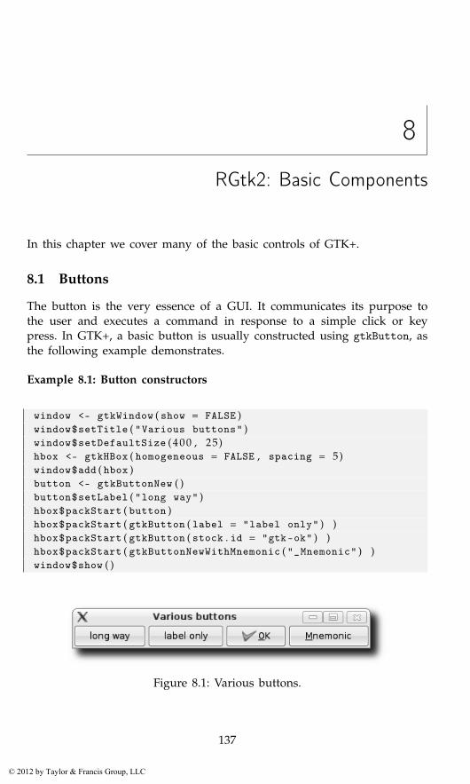
8
RGtk2: Basic Components
In this chapter we cover many of the basic controls of GTK+.
8.1 Buttons
The button is the very essence of a GUI. It communicates its purpose tothe user and executes a command in response to a simple click or keypress. In GTK+, a basic button is usually constructed using gtkButton, asthe following example demonstrates.
Example 8.1: Button constructors
window <- gtkWindow ( show = FALSE )window$setTitle ( "Various buttons" )window$setDefaultSize ( 4 0 0 , 25)hbox <- gtkHBox ( homogeneous = FALSE , spacing = 5)window$add ( hbox )button <- gtkButtonNew ( )button$setLabel ( "long way" )hbox$packStart ( button )hbox$packStart ( gtkButton ( label = "label only" ) )hbox$packStart ( gtkButton ( stock . id = "gtk-ok" ) )hbox$packStart ( gtkButtonNewWithMnemonic ( "_Mnemonic" ) )window$show ( )
Figure 8.1: Various buttons.
137
© 2012 by Taylor & Francis Group, LLC
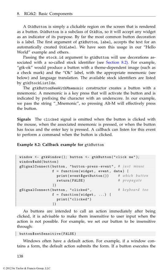
8. RGtk2: Basic Components
A GtkButton is simply a clickable region on the screen that is renderedas a button. GtkButton is a subclass of GtkBin, so it will accept any widgetas an indicator of its purpose. By far the most common button decorationis a label. The first argument of gtkButton, label, accepts the text for anautomatically created GtkLabel. We have seen this usage in our “HelloWorld” example and others.
Passing the stock.id argument to gtkButton will use decorations as-sociated with a so-called stock identifier (see Section 8.2). For example,“gtk-ok” would produce a button with a theme-dependent image (such asa check mark) and the “Ok” label, with the appropriate mnemonic (seebelow) and language translation. The available stock identifiers are listedby gtkStockListIds.
The gtkButtonNewWithMnemonic constructor creates a button with amnemonic. A mnemonic is a key press that will activate the button and isindicated by prefixing the character with an underscore. In our example,we pass the string “_Mnemonic”, so pressing Alt-M will effectively pressthe button.
Signals The clicked signal is emitted when the button is clicked withthe mouse, when the associated mnemonic is pressed, or when the buttonhas focus and the enter key is pressed. A callback can listen for this eventto perform a command when the button is clicked.
Example 8.2: Callback example for gtkButton
window <- gtkWindow ( ) ; button <- gtkButton ( "click me" ) ;window$add ( button )gSignalConnect ( button , "button-press-event" , # j u s t mouse
f = function ( widget , event , data ) {print ( event$getButton ( ) ) # which b u t t o nreturn ( FALSE ) # p r o p a g a t e
} )gSignalConnect ( button , "clicked" , # k e y b o a r d t o o
f = function ( widget , . . . ) {print ( "clicked" )
} )
As buttons are intended to call an action immediately after beingclicked, it is advisable to make them insensitive to user input when theaction is not possible. For example, we set our button to be insensitivethrough:
button$setSensitive ( FALSE )
Windows often have a default action. For example, if a window con-tains a form, the default action submits the form. If a button executes the
138
© 2012 by Taylor & Francis Group, LLC
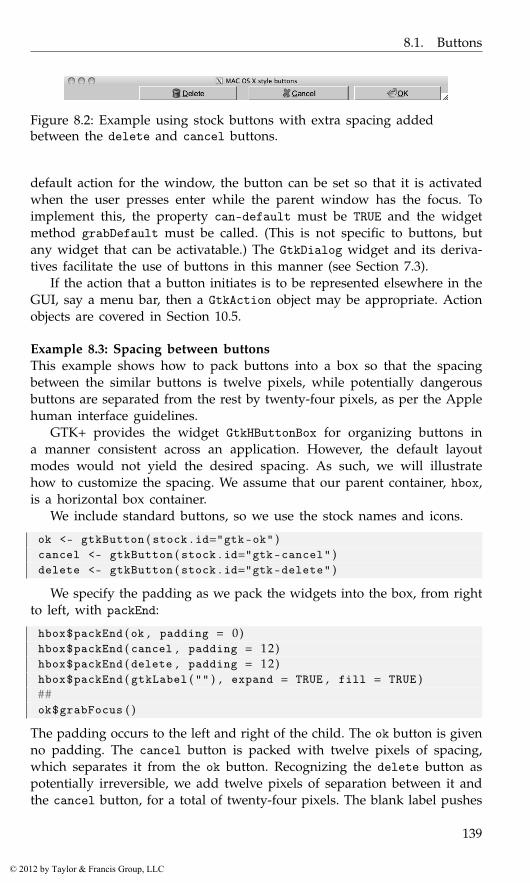
8.1. Buttons
Figure 8.2: Example using stock buttons with extra spacing addedbetween the delete and cancel buttons.
default action for the window, the button can be set so that it is activatedwhen the user presses enter while the parent window has the focus. Toimplement this, the property can-default must be TRUE and the widgetmethod grabDefault must be called. (This is not specific to buttons, butany widget that can be activatable.) The GtkDialog widget and its deriva-tives facilitate the use of buttons in this manner (see Section 7.3).
If the action that a button initiates is to be represented elsewhere in theGUI, say a menu bar, then a GtkAction object may be appropriate. Actionobjects are covered in Section 10.5.
Example 8.3: Spacing between buttonsThis example shows how to pack buttons into a box so that the spacingbetween the similar buttons is twelve pixels, while potentially dangerousbuttons are separated from the rest by twenty-four pixels, as per the Applehuman interface guidelines.
GTK+ provides the widget GtkHButtonBox for organizing buttons ina manner consistent across an application. However, the default layoutmodes would not yield the desired spacing. As such, we will illustratehow to customize the spacing. We assume that our parent container, hbox,is a horizontal box container.
We include standard buttons, so we use the stock names and icons.
ok <- gtkButton ( stock . id="gtk-ok" )cancel <- gtkButton ( stock . id="gtk-cancel" )delete <- gtkButton ( stock . id="gtk-delete" )
We specify the padding as we pack the widgets into the box, from rightto left, with packEnd:
hbox$packEnd ( ok , padding = 0)hbox$packEnd ( cancel , padding = 12)hbox$packEnd ( delete , padding = 12)hbox$packEnd ( gtkLabel ( "" ) , expand = TRUE , fill = TRUE )##ok$grabFocus ( )
The padding occurs to the left and right of the child. The ok button is givenno padding. The cancel button is packed with twelve pixels of spacing,which separates it from the ok button. Recognizing the delete button aspotentially irreversible, we add twelve pixels of separation between it andthe cancel button, for a total of twenty-four pixels. The blank label pushes
139
© 2012 by Taylor & Francis Group, LLC
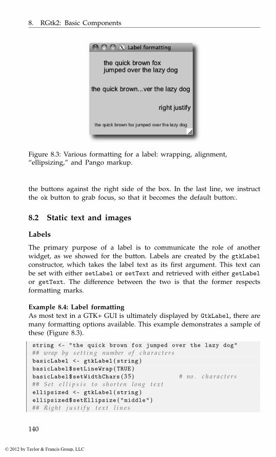
8. RGtk2: Basic Components
Figure 8.3: Various formatting for a label: wrapping, alignment,“ellipsizing,” and Pango markup.
the buttons against the right side of the box. In the last line, we instructthe ok button to grab focus, so that it becomes the default button:.
8.2 Static text and images
Labels
The primary purpose of a label is to communicate the role of anotherwidget, as we showed for the button. Labels are created by the gtkLabelconstructor, which takes the label text as its first argument. This text canbe set with either setLabel or setText and retrieved with either getLabelor getText. The difference between the two is that the former respectsformatting marks.
Example 8.4: Label formattingAs most text in a GTK+ GUI is ultimately displayed by GtkLabel, there aremany formatting options available. This example demonstrates a sample ofthese (Figure 8.3).
string <- "the quick brown fox jumped over the lazy dog"## wrap by s e t t i n g number o f c h a r a c t e r sbasicLabel <- gtkLabel ( string )basicLabel$setLineWrap ( TRUE )basicLabel$setWidthChars ( 3 5 ) # no . c h a r a c t e r s## S e t e l l i p s i s t o s h o r t e n l on g t e x tellipsized <- gtkLabel ( string )ellipsized$setEllipsize ( "middle" )## Right j u s t i f y t e x t l i n e s
140
© 2012 by Taylor & Francis Group, LLC

8.2. Static text and images
## use x a l i g n p r o p e r t y f o r a l i g n i n g e n t i r e b l o c krightJustified <- gtkLabel ( "right justify" )rightJustified$setJustify ( "right" )rightJustified [ ’xalign’ ] <- 1## PANGO markuppangoLabel <- gtkLabel ( )tmpl <- "<span foreground=’blue’ size=’x-small’>%s</span>"pangoLabel$setMarkup ( sprintf ( tmpl , string ) )#sapply ( list ( basicLabel , ellipsized , rightJustified , pangoLabel ) ,
vbox$packStart , expand = TRUE , fill = TRUE )window$showAll ( )
Many of the text formatting options are demonstrated in Example 8.4.Line wrapping is enabled with setLineWrap. Labels also support explicitline breaks, specified with “\n.” The setWidthChars method is a conve-nience for instructing the label to request enough space to show a specifiednumber of characters in a line. When space is at a premium, long labelscan be ellipsized, i.e., have some of their text replaced with an ellipsis, “...”.By default, this is turned off; to enable, call setEllipsize. The propertyjustify, with values taken from GtkJustification, controls the alignmentof multiple lines within a label. To align the entire block of text within thespace allocated to the label, modify the xalign property, as described inSection 7.2.
Pango markup GTK+ allows markup of text elements using the Pangotext attribute markup language, an XML-based format that resembles basicHTML. The method setMarkup accepts text in the format. Text is markedusing tags to indicate the style. Some convenient tags are <b> for bold, <i>for italics, <ul> for underline, and <tt> for monospace text. Hyperlinksare possible with <a>, as of version 2.18, and similar logic to browseURL isimplemented for launching a web browser. Connect to the activate_linksignal to override it. More complicated markup involves the <span> tagmarkup, such as <span color=’red’>some text</span>. As with HTML,the text may need to be escaped first so that designated entities replacereserved characters.
Although mostly meant for static text display, GtkLabel has some inter-active features. If the selectable property is set to TRUE, the text can be se-lected and copied into the clipboard. Labels can hold mnemonics for otherwidgets; this is useful for navigating forms. The mnemonic is specified atconstruction time with gtkLabelNewWithMnemonic. The setMnemonicWidgetmethod identifies the widget to which the mnemonic refers.
For efficiency reasons GtkLabel does not receive any input events. Itlacks an underlying GdkWindow, meaning that there are no window-systemresources allocated for receiving the events. Thus, to make a label inter-
141
© 2012 by Taylor & Francis Group, LLC
8. RGtk2: Basic Components
active, we must first embed it within a GtkEventBox, which provides theGdkWindow.
Images
It is often said that a picture can be worth a thousand words. Applying thisto a GUI, good images can be worth thousands of screen pixels, as theycan compactly represent ideas and actions. GtkImage is the widget thatdisplays images. The constructor gtkImage creates images from variousin-memory image representations, files, and other sources. Images can beloaded after construction, as well. For example, the setFromFile methodloads an image from a file.
Example 8.5: Using a pixmap to present graphsThis example shows how to use a GtkImage object to embed a graphicwithin RGtk2, using the cairoDevice package. The basic idea is to drawonto an off-screen pixmap using cairoDevice and then to construct aGtkImage from the pixmap.
We begin by creating a window of a certain size.
window <- gtkWindow ( show = FALSE )window$setTitle ( "Graphic window" )window$setSizeRequest ( 4 0 0 , 400)hbox <- gtkHBox ( ) ; window$add ( hbox )window$showAll ( )
The size of the image is taken as the size allocated to the box hbox. Thisallows the window to be resized prior to drawing the graphic. Unlike aninteractive device, after drawing, this graphic does not resize itself whenthe window resizes.
theSize <- hbox$getAllocation ( ) $allocationwidth <- theSize$width ; height <- theSize$height
We create a GdkPixmap of the correct dimensions and initialize an Rgraphics device that targets the pixmap. A simple histogram is then plottedusing base R graphics.
require ( cairoDevice )pixmap <- gdkPixmap ( drawable = NULL ,
width = width , height = height , depth=24)asCairoDevice ( pixmap )hist ( rnorm ( 1 0 0 ) )
The final step is to create the GtkImage widget to display the pixmap:
image <- gtkImage ( pixmap = pixmap )hbox$packStart ( image , expand = TRUE , fill = TRUE )
142
© 2012 by Taylor & Francis Group, LLC
8.3. Input controls
The image widget, like the label widget, does not have a parent Gd-kWindow, which means it does not receive window events. As with the labelwidget, the image widget can be placed inside a GtkEventBox container ifwe wish to connect to such events.
Stock icons
In GTK+, standard icons, like the one on the “OK” button, can be cus-tomized by themes. This is implemented by a database that maps a stockidentifier to an icon image. The stock identifier corresponds to a com-monly performed type of action, such as the “OK” response or the “Save”operation. There is no hard-coded set of stock identifiers, however GTK+provides a default set for the most common operations. These identifiersare all prefixed with “gtk-”. Users may register new types of stock icons.
As mentioned previously, the full list of stock icons is returned, as alist, by gtkStockListIds. The first three are:
head ( unlist ( gtkStockListIds ( ) ) , n=3)
[1] "gtk -zoom -out" "gtk -zoom -in" "gtk -zoom -fit"
The use of stock identifiers over specific images is encouraged, as itallows an application to be customized through themes. The gtkButtonand gtkImage constructors accept a stock identifier passed as stock.idargument, and the icons in toolbars and menus are most convenientlyspecified by a stock identifier.
8.3 Input controls
Text entry
The widgets explained thus far are largely static, i.e., it is not possible toedit a label or image. GTK+ has two different widgets for editing text. Oneis optimized for multiline text documents, the other for single-line entry.We will discuss complex multiline text editing in Section 9.6. For enteringa single line of text, the GtkEntry widget is appropriate:
entry <- gtkEntry ( )
The text property stores the text. This can be set with the methodsetText and retrieved with getText. When the user has committed anentry, e.g., by pressing the enter key, the activate signal is emitted. Herewe connect to this signal to obtain the entered text upon activation:
gSignalConnect ( entry , "activate" , function ( ) {message ( "Text entered: " , entry$getText ( ) )
} )
143
© 2012 by Taylor & Francis Group, LLC
8. RGtk2: Basic Components
Figure 8.4: Illustration of adding an icon to a GtkEntry instance toindicate whether the text entered is valid.
Sometimes the length of the text needs to be constrained to some num-ber of characters. The max argument to gtkEntry specifies this, but thatusage is deprecated, in favor of the setMaxLength method.
The GtkEditable interface Editing text programmatically relies on theGtkEditable interface, which GtkEntry implements. The method insert-Text inserts text before a position specified by a 0-based index. The returnvalue is a list with the component position indicating the position afterthe new text. The deleteText method deletes text between two positions.
The GtkEditable interface supports three signals: changed when text ischanged, delete-text for delete events, and insert-text for insert events.It is possible to prevent the insertion or deletion of text by connecting tothe corresponding signal and stopping the signal propagation with gSig-nalStopEmission.
Advanced GtkEntry features GtkEntry has a number of features beyondbasic text entry, including: completion, buffer sharing, icons, and progressreporting. We discuss completion in Section 9.4 and shared buffers in Sec-tion 9.5. The progress reporting API, introduced with version 2.16, is vir-tually identical to that of GtkProgressBar, introduced in Section 8.4. Wetreat icons here. This feature has been present since version 2.16.
We can set an icon on an entry from a GdkPixbuf, stock ID, iconname, or GIcon (Figure 8.4). Two icons are possible, one at the beginning(primary) and one at the end (secondary). A common use would be toplace a search icon in an entry widget, were it used for searching. In ourexample below, an entry might listen to its input and update its icon toindicate whether the entered text is valid (in this case, consisting only ofletters):
validatedEntry <- gtkEntry ( )gSignalConnect ( validatedEntry , "changed" , function ( entry ) {
text <- entry$getText ( )if ( nzchar ( gsub ( "[a-zA-Z]" , "" , text ) ) ) {
entry$setIconFromStock ( "primary" , "gtk-no" )entry$setIconTooltipText ( "primary" ,
144
© 2012 by Taylor & Francis Group, LLC
8.3. Input controls
"Only letters are allowed" )} else {
entry$setIconFromStock ( "primary" , "gtk-yes" )entry$setIconTooltipText ( "primary" , NULL )
}} )validatedEntry$setIconFromStock ( "primary" , "gtk-yes" )
We add a tooltip on the error icon to indicate the nature of the problemto the user. Icons can also be made clickable and used as a source fordrag-and-drop operations.
Check button
Very often, the action performed by a button simply changes the value ofa state variable in the application. GTK+ defines several types of buttonsthat explicitly manage and display one aspect of the application state. Thesimplest type of state variable is binary (Boolean) and is usually proxiedby a GtkCheckButton.
A GtkCheckButton is constructed by gtkCheckButton:
checkButton <- gtkCheckButton ( "Option" )
The state of the binary variable is represented by the active property. Wecheck our button:
checkButton [ ’active’ ]
[1] FALSE
checkButton [ ’active’ ] <- TRUE
When the state is changed the toggle signal is emitted. The callbackshould check the active property to determine if the button has beenenabled or disabled:
gSignalConnect ( checkButton , "toggled" , function ( button ) {state <- ifelse ( button$active , "active" ,"inactive" )message ( "Button is " , state )
} )
An alternative to GtkCheckButton is the lesser used GtkToggleButton,which is actually the parent class of GtkCheckButton. A toggle button isdrawn as an ordinary button. It is drawn as depressed while the statevariable is TRUE, instead of relying on a checkbox to communicate thebinary value.
145
© 2012 by Taylor & Francis Group, LLC
8. RGtk2: Basic Components
Radio-button groups
GTK+ provides two widgets for discrete, state variables that accept morethan two possible values: combo boxes, discussed in the next section,and radio buttons. The gtkRadioButton constructor creates an instanceof GtkRadioButton, an extension of GtkCheckButton. Each radio buttonbelongs to a group, and only one button in a group may be active at once.
Example 8.6: Basic radio-button usageWhen we construct a radio button, we need to add it to a group. Thereis no explicit group object; rather, the buttons are chained together as alinked list. By default, a newly constructed button is added to its owngroup. If the group list is passed to the constructor, the newly createdbutton is added to the group:
labels <- c ( "two.sided" , "less" , "greater" )radiogp <- list ( ) # l i s t f o r groupradiogp [ [ labels [ 1 ] ] ] <- gtkRadioButton ( label=labels [ 1 ] )for ( label in labels [−1])
radiogp [ [ label ] ] <- gtkRadioButton ( radiogp , label=label )
As a convenience, there are constructor functions ending with FromWidgetthat determine the group from a radio button belonging to the group. Aswe will see in our second example, this allows for a more natural sapplyidiom that avoids the need to allocate a list and populate it in a for loop.
We add each button to a vertical box:
window <- gtkWindow ( ) ; window$setTitle ( "Radio group example" )vbox <- gtkVBox ( FALSE , 5 ) ; window$add ( vbox )sapply ( radiogp , gtkBoxPackStart , object = vbox )
We can set and query which button is active:
vbox [ [ 3 ] ] $setActive ( TRUE )sapply ( radiogp , ‘ [ ‘ , "active" )
two.sided less greaterFALSE FALSE TRUE
The toggle signal is emitted when a button is toggled. We need toconnect a handler to each button:
sapply ( radiogp , gSignalConnect , "toggled" , # c o n n e c t e a c hf = function ( button , data ) {
if ( button [ ’active’ ] ) # s e t b e f o r e c a l l b a c kmessage ( "clicked" , button$getLabel ( ) , "\n" )
} )
146
© 2012 by Taylor & Francis Group, LLC

8.3. Input controls
Example 8.7: Radio group via a FromWidget constructorIn this example, we illustrate using the gtkRadioButtonNewWithLabel-FromWidget function to add new buttons to the group:
radiogp <- gtkRadioButton ( label=labels [ 1 ] )btns <- sapply ( labels [−1] , gtkRadioButtonNewWithLabelFromWidget ,
group = radiogp )window <- gtkWindow ( )window [ ’title’ ] <- "Radio group example"vbox <- gtkVBox ( ) ; window$add ( vbox )sapply ( rev ( radiogp$getGroup ( ) ) , gtkBoxPackStart , object = vbox )
The getGroup method returns a list containing the radio buttons in thesame group. However, it is in the reverse order of construction (newestfirst). This results from an internal optimization that prepends, rather thanappends, the buttons to a linked list. Thus, we need to call rev to reversethe list before packing the widgets into the box.
Combo boxes
The combo box is a more space-efficient alternative to a radio button groupand is better suited when there are a large number of options. A basic, text-only GtkComboBox is constructed by gtkComboBoxNewText. In Section 9.3 wewill discuss combo boxes that are based on an external data model.
We can construct and populate a simple combo box with:
combo <- gtkComboBoxNewText ( )sapply ( c ( "two.sided" , "less" , "greater" ) , combo$appendText )
The index of the currently active item is stored in the active property.The index, as usual, is 0-based, and a value of −1 indicates that no valueis selected (the default):
combo [ ’active’ ]
[1] -1
The getActiveText method retrieves the text shown by the basic combobox.
When the active index changes, the changed signal is emitted. Thehandler then needs to retrieve the active index:
gSignalConnect ( combo , "changed" ,f = function ( button , . . . ) {
if ( button$getActive ( ) < 0 )message ( "No value selected" )
elsemessage ( "Value is" , button$getActiveText ( ) )
} )
147
© 2012 by Taylor & Francis Group, LLC
8. RGtk2: Basic Components
Although combo boxes are much more space efficient than radio but-tons, it can still be difficult to use a combo box when there are a largenumber of items. Placing the items in columns lessens this. The setWrap-Width method specifies the preferred number of columns for displayingthe items.
Example 8.8: Using one combo box to populate anotherThe goal of this example is to populate a combo box of variables whenevera data frame is selected in another. We use two convenience functions fromthe ProgGUIinR package to find the possible data frames, and for a dataframe to find its variables.
We create the two combo boxes and the enclosing window:
window <- gtkWindow ( show = FALSE )window$setTitle ( "gtkComboBox example" )df_combo <- gtkComboBoxNewText ( )var_combo <- gtkComboBoxNewText ( )
Our layout uses boxes. To add a twist, we will hide our variable combobox until after a data frame has been initially selected.
vbox <- gtkVBox ( ) ; window$add ( vbox )#vbox1 <- gtkHBox ( ) ; vbox$packStart ( vbox1 )vbox1$packStart ( gtkLabel ( "Data frames:" ) )vbox1$packStart ( df_combo )#vbox2 <- gtkHBox ( ) ; vbox$packStart ( vbox2 )vbox2$packStart ( gtkLabel ( "Variable:" ) )vbox2$packStart ( var_combo )vbox2$hide ( )
Finally, we configure the combo boxes. When a data frame is selected,we first clear out the variable combo box and then populate it:
sapply ( avail_dfs ( ) , df_combo$appendText )df_combo$setActive (−1)#gSignalConnect ( df_combo , "changed" , function ( df_combo , . . . ) {
var_combo$getModel ( ) $clear ( )sapply ( find_vars ( df_combo$getActiveText ( ) ) ,
var_combo$appendText )vbox2$show ( )
} )
An extension of GtkComboBox, GtkComboBoxEntry, replaces the mainbutton with a text entry. This supports the entry of arbitrary values, inaddition to those present in the menu.
148
© 2012 by Taylor & Francis Group, LLC

8.3. Input controls
Sliders and spin buttons
The slider widget and spin-button widget allow selection from a regularlyspaced, semi-continuous list of values. Both have their possible values forselection determined by an instance of GtkAdjustment, which is used torepresent ranges that have an upper and lower bound with step and pageincrements. This adjustment may be specified to the constructor or, morefrequently, will be created by the widget after an appropriate specificationof the range.
Sliders Sliders are implemented by GtkScale with constructors gtkHScaleand gtkVScale, the difference being the orientation.
These constructors have arguments min, max, and step to specify therange, if an adjustment is not specified.
The value property stores the currently selected value. When this ischanged, the value-changed signal is emitted.
A few properties define the appearance of the slider widget. The dig-its property controls the number of digits after the decimal point. Theproperty draw-value toggles the drawing of the selected value near theslider. Finally, value-pos specifies where this value will be drawn usingvalues from GtkPositionType. The default is top.
In Example 8.12 we show how a slider can be used to update a graphic.
Spin buttons The spin-button widget is very similar to the slider widget,conceptually and in terms of the GTK+ API. Spin buttons are constructedwith gtkSpinButton. As with sliders, this constructor requires specifyingadjustment values, either as a GtkAdjustment or through the min, max, andstep arguments. The argument digits is used to configure how many dig-its are displayed, and climb.rate can adjust how fast the display changeswhen the button is held depressed.
As with GtkScale, the value property holds the state and the value-changed signal is emitted when this changes.
A spin button has a few additional features. The property snap-to-ticks can be set to TRUE to force the new value to belong to the sequence ofvalues in the adjustment. The wrap property indicates whether the sequencewill “wrap” around at the bounds.
Example 8.9: A range widgetThis example shows how to make a range widget that combines boththe slider and spin button to choose a single number (Figure 8.5). Sucha widget is useful, as the slider is better at large changes and the spinbutton better at finer changes. In GTK+ we use the same GtkAdjustmentmodel, so changes to one widget propagate without effort to the other.
149
© 2012 by Taylor & Francis Group, LLC

8. RGtk2: Basic Components
Figure 8.5: A range widget with coordinated slider and spin box sharingthe same GtkAdjustment instance.
We name our scale parameters according to the corresponding argu-ments to the seq function:
from <- 0 ; to <- 1 0 0 ; by <- 1
The slider is drawn without a value, as the value is already displayedby the spin button. The call to gtkHScale implicitly creates an adjustmentfor the slider. The spin button is then created with the same adjustment.
slider <- gtkHScale ( min = from , max = to , step = by )slider [ ’draw-value’ ] <- FALSEadjustment <- slider$getAdjustment ( )spinbutton <- gtkSpinButton ( adjustment = adjustment )
Our layout places the two widgets in a horizontal box container withthe slider, but not the spin button, set to expand into the available space.
hbox <- gtkHBox ( )hbox$packStart ( slider , expand=TRUE , fill = TRUE , padding = 5)hbox$packStart ( spinbutton , expand = FALSE , padding = 5)
8.4 Progress reporting
Progress bars
It is common to use a progress bar to indicate the progress of a long-running computation. This is implemented by GtkProgressBar. A text labeldescribes the current operation, and the progress bar communicates thefraction completed:
window <- gtkWindow ( ) ; window$setTitle ( "Progress bar example" )progress_bar <- gtkProgressBar ( )window$add ( progress_bar )#progress_bar$setText ( "Please be patient..." )for ( i in 1 : 1 0 0 ) {
progress_bar$setFraction ( i/ 100)Sys . sleep ( 0 . 0 5 ) ## r e p l a c e wi th a s t e p in t h e p r o c e s s
}progress_bar$setText ( "All done." )
150
© 2012 by Taylor & Francis Group, LLC
8.5. Wizards
We can indicate indefinite activity by periodically pulsing the bar:
progress_bar$pulse ( )
Spinners
Related to a progress bar is the GtkSpinner widget, which is a graphicalheartbeat to assure the user that the application is still alive during long-running operations. Spinners are commonly found in web browsers. Thebasic usage is straightforward:
spinner <- gtkSpinner ( )spinner$start ( )spinner$stop ( )
8.5 Wizards
The GtkAssistant class provides a wizard widget for GTK+. The simplestsetup is that one adds pages to the assistant object that are navigated in alinear manner. In our example, we override this.
Wizard pages have a certain type, which must be declared. These areenumerated in GtkAssistantPageType and set by setPageType. The lastpage must be of type "confirm", "summary", or "progress". Each wizardpage has a content area and buttons. As well, each page in the assistantobject has an optional side image, header image, and/or page title thatcan be customized. The buttons allow the user to navigate through thewizard. The content area of a wizard page is simply an instance of classGtkWidget (e.g., some container) and is added to the assistant throughthe appendPage, insertPage, or prependPage methods. Pages are referredto by the GtkWidget object or by their page index, 0-based. The forwardbutton on a page must be made sensitive by calling setPageComplete withthe widget and logical value.
Signals The cancel button emits a cancel signal that can be connectedto for destroying the wizard widget. The apply signal is emitted on a pagechange. The prepare signal is emitted just before a page is made visible,which is needed to create the dynamically generated pages in our example.
Example 8.10: An install.packages wizardThis example wraps the install.packages function into a wizard withdifferent pages for the (optional) selection of a CRAN mirror, the selectionof the package to install, the configuration options provided, and feedback.In general, wizards are quite common for software installation.
First, we define our assistant and connect to its cancel signal:
151
© 2012 by Taylor & Francis Group, LLC
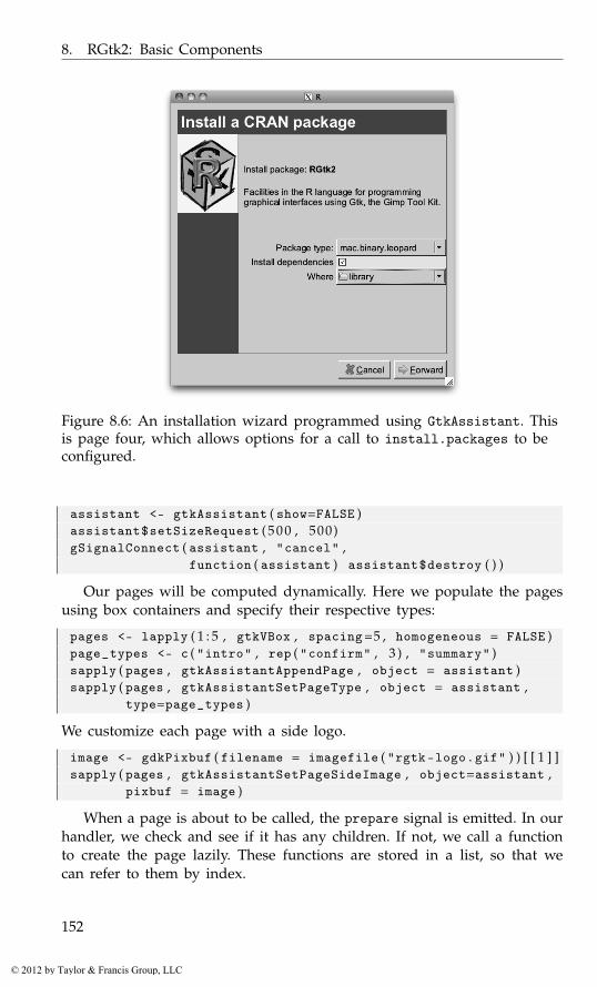
8. RGtk2: Basic Components
Figure 8.6: An installation wizard programmed using GtkAssistant. Thisis page four, which allows options for a call to install.packages to beconfigured.
assistant <- gtkAssistant ( show=FALSE )assistant$setSizeRequest ( 5 0 0 , 500)gSignalConnect ( assistant , "cancel" ,
function ( assistant ) assistant$destroy ( ) )
Our pages will be computed dynamically. Here we populate the pagesusing box containers and specify their respective types:
pages <- lapply ( 1 : 5 , gtkVBox , spacing=5 , homogeneous = FALSE )page_types <- c ( "intro" , rep ( "confirm" , 3 ) , "summary" )sapply ( pages , gtkAssistantAppendPage , object = assistant )sapply ( pages , gtkAssistantSetPageType , object = assistant ,
type=page_types )
We customize each page with a side logo.
image <- gdkPixbuf ( filename = imagefile ( "rgtk-logo.gif" ) ) [ [ 1 ] ]sapply ( pages , gtkAssistantSetPageSideImage , object=assistant ,
pixbuf = image )
When a page is about to be called, the prepare signal is emitted. In ourhandler, we check and see if it has any children. If not, we call a functionto create the page lazily. These functions are stored in a list, so that wecan refer to them by index.
152
© 2012 by Taylor & Francis Group, LLC
8.5. Wizards
populate_page <- list ( )gSignalConnect ( assistant , "prepare" ,
function ( assistant , page , data ) {page_no <- which ( sapply ( pages , identical , page ) )if ( !length ( page$getChildren ( ) ) )
populate_page [ [ page_no ] ] ( )} )
Although we do not show how to create the CRAN selection page (cf.Example 9.5 for a similar construction), we call setForwardPageFunc to seta function that will skip this page if it is not needed, i.e., if the mirrorhas already been selected. The callback simply returns an integer with thenext page number based on the previous one.
assistant$setForwardPageFunc ( function ( page_index , data ) {if ( page_index == 0 && have_CRAN ( ) )
2Lelse
as . integer ( page_index + 1)} , data=NULL )
We have a few script globals that allow us to pass data between pages:
CRAN_package <- NAinstall_options <- list ( ) # type , d e p e n d e n c i e s , l i b
We now show how some of the pages are populated. The initial screenis simply a label with a welcome message.
populate_page [ [ 1 ] ] <- function ( ) {assistant$setPageTitle ( pages [ [ 1 ] ] , "Install a CRAN package" )pages [ [ 1 ] ] $packStart ( label <- gtkLabel ( ) )pages [ [ 1 ] ] $packStart ( gtkLabel ( ) , expand=TRUE ) # a s p r i n g
label$setMarkup ( paste ("<span font=’x-large’>Install a CRAN package</span>" ,"This wizard will help install a package from" ,"<b>CRAN</b>. If you have not already specified a" ,"CRAN repository , you will be prompted to do so." ,sep="\n" ) )
assistant$setPageComplete ( pages [ [ 1 ] ] , TRUE )}
We skip showing the pages to select a CRAN site and a package,as they are based on the forthcoming GtkTreeView class. On the fourthpage (cf. Figure 8.6 for a realization) is a summary of the package takenfrom CRAN and a chance for the user to configure a few options for theinstall.packages function.
populate_page [ [ 4 ] ] <- function ( ) {
153
© 2012 by Taylor & Francis Group, LLC
8. RGtk2: Basic Components
assistant$setPageTitle ( pages [ [ 4 ] ] , "Install a CRAN package" )##get_desc <- function ( pkgname ) {
o <- "http://cran.r-project.org/web/packages/%s/%s"x <- readLines ( sprintf ( o , pkgname , "DESCRIPTION" ) )f <- tempfile ( ) ; cat ( paste ( x , collapse="\n" ) , file=f )read . dcf ( f )
}desc <- get_desc ( CRAN_package )#label <- gtkLabel ( )label$setLineWrap ( TRUE )label$setWidthChars ( 4 0 )label$setMarkup ( paste (
sprintf ( "Install package: <b>%s</b>" , desc [ 1 , ’Package’ ] ) ,"\n" ,sprintf ( "%s" , gsub ( "\\n" , " " , desc [ 1 , ’Description’ ] ) ) ,sep="\n" ) )
pages [ [ 4 ] ] $packStart ( label )##table <- gtkTable ( )pages [ [ 4 ] ] $packStart ( table , expand=FALSE )pages [ [ 4 ] ] $packStart ( gtkLabel ( ) , expand=TRUE )
##combo <- gtkComboBoxNewText ( )pkg_types <- c ( "source" , "mac.binary" , "mac.binary.leopard" ,
"win.binary" , "win64.binary" )sapply ( pkg_types , combo$appendText )combo$setActive ( which ( getOption ( "pkgType" ) == pkg_types )−1)gSignalConnect ( combo , "changed" , function ( combo , . . . ) {
cur <- 1L + combo$getActive ( )install_options [ [ ’type’ ] ] <<- pkg_types [ cur ]
} )table$attachDefaults ( gtkLabel ( "Package type:" ) , 0 , 1 , 0 , 1 )table$attachDefaults ( combo , 1 , 2 , 0 , 1 )
##checkButton <- gtkCheckButton ( )checkButton$setActive ( TRUE )gSignalConnect ( checkButton , "toggled" , function ( ck_btn ) {
install_options$dependencies <<- ck_btn$getActive ( )} )table$attachDefaults ( gtkLabel ( "Install dependencies" ) ,
0 , 1 , 1 , 2 )table$attachDefaults ( checkButton , 1 , 2 , 1 , 2 )
154
© 2012 by Taylor & Francis Group, LLC
8.5. Wizards
##file_chooser <- gtkFileChooserButton ( "Select directory..." ,
"select-folder" )file_chooser$setFilename ( . libPaths ( ) [ 1 ] )gSignalConnect ( file_chooser , "selection -changed" ,
function ( file_chooser ) {dir <- file_chooser$getFilename ( )install_options [ [ ’lib’ ] ] <<- dir
} )table$attachDefaults ( gtkLabel ( "Where" ) , 0 , 1 , 2 , 3 )table$attachDefaults ( file_chooser , 1 , 2 , 2 , 3 )## a l i g n l a b e l s t o r i g h t and s e t s p a c i n gsapply ( table$getChildren ( ) , function ( child ) {
widget <- child$getWidget ( )if ( is ( widget , "GtkLabel" ) ) widget [ ’xalign’ ] <- 1
} )table$setColSpacing (0L , 5L )##assistant$setPageComplete ( pages [ [ 4 ] ] , TRUE )
}
Our last page, where the selected package is installed, would natu-rally be of type progress, but there is no means to interrupt the flow ofinstall.packages to update the page. A better application would needto reimplement the install.packages functionality. Instead we just set amessage once the package install attempt is finished.
populate_page [ [ 5 ] ] <- function ( ) {assistant$setPageTitle ( pages [ [ 5 ] ] , "Done" )install_options$pkgs <- CRAN_packageout <- try ( do . call ( "install.packages" , install_options ) ,
silent=TRUE )
label <- gtkLabel ( ) ; pages [ [ 5 ] ] $packStart ( label )if ( !inherits ( out , "try-error" ) ) {
label$setMarkup ( sprintf ( "Package %s was installed." ,CRAN_package ) )
} else {label$setMarkup ( paste ( sprintf ( "Package %s, failed install" ,
CRAN_package ) ,paste ( out , collapse="\n" ) ,sep="\n" ) )
}
assistant$setPageComplete ( pages [ [ 5 ] ] , FALSE )}
155
© 2012 by Taylor & Francis Group, LLC
8. RGtk2: Basic Components
To conclude, we populate the first page and call the assistant’s showmethod:
populate_page [ [ 1 ] ] ( )assistant$show ( )
8.6 Embedding R graphics
The package cairoDevice is an R graphics device based on the Cairographics library. It supports alpha-blending and antialiasing and re-ports user events through the getGraphicsEvent function. RGtk2 andcairoDevice are integrated through the asCairoDevice function. If a Gtk-DrawingArea, GdkDrawable, Cairo context, or GtkPrintContext is passedto asCairoDevice, an R graphics device will be initialized that targets itsdrawing to the object. For simply displaying graphics in a GUI, the Gtk-DrawingArea is the best choice.
This is the simplest usage:
library ( cairoDevice )device <- gtkDrawingArea ( )asCairoDevice ( device )##window <- gtkWindow ( show=FALSE )window$add ( device )window$showAll ( )plot ( mpg ~ hp , data = mtcars )
In the above, we create the GtkDrawingArea, coerce it to a Cairo-basedgraphics device, and then place it in a window. Example 7.4 goes furtherby embedding the drawing area into a scrolled window to support zoomingand panning.
For more complex use cases, such as compositing a layer above orbelow the R graphic, one should pass an off-screen GdkDrawable, like aGdkPixmap, or a Cairo context. The off-screen drawing could then be com-posited with other images when displayed. Example 8.5 generates an iconby pointing the device to a pixmap. Finally, passing a GtkPrintContextto asCairoDevice allows printing R graphics through the GTK+ printingdialogs.
Example 8.11: Printing R graphicsThis example will show how to use the printing support in GTK+ forprinting an R plot.
A print operation is encapsulated by GtkPrintOperation:
print_op <- gtkPrintOperation ( )
156
© 2012 by Taylor & Francis Group, LLC
8.6. Embedding R graphics
A print operation may perform several different actions: print directly,print through a dialog, show a print preview and export to a file. Beforeperforming any such action, we need to implement the rendering of ourdocument into printed form. This is accomplished by connecting to thedraw-page signal. The handler is passed a GtkPrintContext, which con-tains the target Cairo context. In general, one would call Cairo functions torender the document, which is beyond our scope. In this case, though, wecan pass the context directly to cairoDevice for rendering the R plot:
gSignalConnect ( print_op , "draw-page" ,function ( print_op , context , page_nr ) {
asCairoDevice ( context )plot ( mpg ~ wt , data = mtcars )
} )
The final step is to run the operation to perform one of the availableactions. In this example, we launch a print dialog:
print_op$run ( action = "print-dialog" , parent = NULL )
When the user confirms the dialog, the draw-page handler is invoked, andthe rendered page is sent to the printer.
Example 8.12: The manipulate package in RGtk2RStudioTM is an excellent IDE for R that provides a similar interfacewhether run on any of its supported operating systems or through a webbrowser. Accompanying the IDE is an R package manipulate that providesa convenient means to create simple graphical interfaces for plotting. AsRStudio leverages web technologies to render its widgets and there is nopublic interface, the package is not available for non-RStudio users. Toobad. This example shows how we can use RGtk2 to provide a similar in-terface. In the example, we borrow liberally from the manipulate code,which is released under an AGPL license. Although we don’t show theentire code here, the ProgGUIinR package contains it all.
The manipulate package uses environments to store state etc. Here weuse reference classes, as they allow for a more structured programminginterface.
A typical use of manipulate (Figure 8.7) is along the lines of the fol-lowing example from the manipulate help pages:
manipulate ( ## e x p r e s s i o nplot ( cars , xlim = c ( x . min , x . max ) , type = type ,
axes = axes , ann = label ) ,## c o n t r o l sx . min = slider ( 0 , 1 5 ) ,x . max = slider ( 1 5 , 30 , initial = 2 5 ) ,type = picker ( "p" , "l" , "b" , "c" , "o" , "h" , "s" ) ,axes = checkbox ( TRUE , label = "Draw Axes" ) ,
157
© 2012 by Taylor & Francis Group, LLC

8. RGtk2: Basic Components
Figure 8.7: An implementation of RStudio’sTM manipulate package inRGtk2.
label = checkbox ( FALSE , label = "Draw Labels" ))
The first argument is an expression, possibly containing parameters, thatproduces a plot. The other arguments create widgets that control the pa-rameter values in the plotting expression. There are three basic controls: aslider, a picker (combo box), and a checkbox. The constructors have a tersebut simple set of arguments. A main task ahead will be mapping thesecontrols to one of GTK+’s widgets.
For now, we begin by defining our Manipulate class to have two prop-erties: one to hold the expression and the other to hold a list of controls.
Manipulate <- setRefClass ( "Manipulate" ,fields=list (
. code="ANY" ,
. controls="list") )
When one of the controls is changed, the entire plot will be redrawn.The following handler will be assigned to each control. Note that eachcontrol is expected to provide its own get_value method.
Manipulate$methods (get_values = function ( ) {
sapply ( . controls ,function ( control ) control$get_value ( ) ,simplify=FALSE ) # r e t u r n a l i s t
158
© 2012 by Taylor & Francis Group, LLC
8.6. Embedding R graphics
} ,change_handler = function ( . . . ) {
"Evaluate code with current values"values <- get_values ( )result <- withVisible ( eval ( . code , envir=values ) )if ( result$visible ) {
eval ( print ( result$value ) )}
} )
The execute method is called after initialization to set up the GUI. Weuse a GtkHPaned instance to allow the user to adjust the space between thegraphic device and the controls frame. Each control is expected to providea make_gui method.
Manipulate$methods (execute=function ( ) {
"Make the GUI"window <- gtkWindow ( show=FALSE )window$setTitle ( "ManipulateR" )## S e t up g r a p h i c d e v i c ehpaned <- gtkHPaned ( )window$add ( hpaned )device <- gtkDrawingArea ( )device$setSizeRequest ( 4 8 0 , 480)asCairoDevice ( device )hpaned$add ( device )## C o n t r o l s f rameframe <- gtkFrame ( "Controls" )control_table <- gtkTableNew ( )control_table$setHomogeneous ( FALSE )control_table [ ’column-spacing’ ] <- 10## i n s e r t h o r i z o n t a l s t r u tcontrol_table$attach ( strut <- gtkHBox ( ) , 1 , 2 , 0 , 1 ,
xoptions="" , yoptions="shrink" )strut$setSizeRequest ( 7 5 , −1)frame$add ( control_table )hpaned$add ( frame )## add e a c h c o n t r o lsapply ( . controls , function ( control ) {
control$make_gui ( cont=control_table ,handler=. self$change_handler )
} )window$show ( )change_handler ( ) # i n i t i a l
} )
159
© 2012 by Taylor & Francis Group, LLC
8. RGtk2: Basic Components
The control_table is used hold the respective controls. We added astrut to request a minimum width for the second column, as otherwise theslider controls can render too narrowly.
The initialize method calls a function provided by the manipulate pack-age to pick the controls out of the ... argument. The validate_controlsmethod is not shown but simply borrows code from the package to dosome error checking, ensuring the controls are defined properly.
Manipulate$methods (initialize = function ( code , . . . ) {
controls <- resolveVariableArguments ( list ( . . . ) )initFields ( . code = code ,
. controls = controls )validate_controls ( )callSuper ( )
} )
We now provide a constructor allowing access to our class.
manipulate <- function ( ‘ _expr ‘ , . . . ) {manip <- Manipulate$new ( substitute ( ‘ _expr ‘ ) , . . . )manip$execute ( )
}
There are three main controls, but perhaps more could be added. Wegive ourselves the flexibility to expand by creating a base class for a controlthat can be subclassed. We define the class below. The properties are l, tostore a list of arguments (a legacy of the original code); widget, to storethe widget; label, to hold the label for the control; and initial.
ManipulateControls <- setRefClass ( "ManipulateControls" ,fields=list (
l="list" ,widget = "ANY" ,label="ANY" ,initial="ANY") )
The main interface for a control requires three methods: vali-date_inputs (to ensure the control is defined properly, the previouslynoted get_value, and make_gui (defined separately).
ManipulateControls$methods (validate_inputs = function ( . . . ) {
"Validate input code"} ,get_value = function ( . . . ) {
"Get value of widget"} )
160
© 2012 by Taylor & Francis Group, LLC

8.6. Embedding R graphics
The make_gui method has two tasks: to define the widget instance andto add the widget to the GUI. This is done in the base class. The label andwidget are added as a row to a GtkTable instance.
ManipulateControls$methods ( make_gui = function ( cont ) {"Create widget, then add to table"## c o n t a GtkTab l e i n s t a n c enrows <- cont [ ’n-rows’ ]label_widget <- gtkLabel ( label )label_widget [ ’xalign’ ] <- 1cont$attach ( label_widget , 0 , 1 , nrows , nrows + 1 ,
xoptions = "shrink" , yoptions="shrink")
cont$attach ( widget , 1 , 2 , nrows , nrows + 1 ,xoptions = c ( "expand" , "fill" ) ,yoptions = "" )
} )
The slider constructor just creates an instance of a soon-to-be-definedsubclass of the ManipulateControls class. The arguments follow RStudio’s.
slider <- function ( min , max , initial = min , label=NULL ,step = −1, ticks = TRUE ) {
Slider$new ( min , max , initial = initial , label = label ,step = step , ticks = ticks )
}
The Slider class has no new properties:
Slider <- setRefClass ( "Slider" ,contains = "ManipulateControls" )
The initialize method simply creates a list and sets some properties.This follows the setup of the original package.
Slider$methods (initialize = function ( min , max , initial = min ,
label = NULL , step = −1, ticks = TRUE , . . . ) {validate_inputs ( min , max , initial , step , ticks )## c r e a t e s l i d e r and r e t u r n i tslider <- list ( type = 0 ,
min = min ,max = max ,step = step ,ticks = ticks )
initFields ( l = slider , label = label ,initial = initial )
callSuper ( )} )
161
© 2012 by Taylor & Francis Group, LLC
8. RGtk2: Basic Components
Our make_gui method basically defines the widget, turning the argu-ments of the constructor into those for the GTK+ widget. It then calls thesame method from the superclass to lay out the widget. Here we definea slider and initialize it using the values in the list, l. The handler is thechange handler passed in from a Manipulate instance.
Slider$methods (make_gui = function ( cont , handler , . . . ) {
widget <<- gtkHScale ( min = l$min , max = l$max ,step = l$step )
widget$setValue ( initial )gSignalConnect ( widget , "value-changed" , handler )callSuper ( cont )
} ,get_value = function ( ) {
as . numeric ( widget$getValue ( ) )} )
The picker and checkbox functions (and their classes) are similarlydefined. For example, for the Checkbox class, the three main methods aregiven by:
Checkbox$methods (initialize = function ( initial=FALSE , label= NULL ) {
validate_inputs ( initial , label )checkbox <- list ( type = 2)initFields ( l = checkbox , label = label ,
initial = initial )callSuper ( )
} ,make_gui = function ( cont , handler , . . . ) {
widget <<- gtkCheckButton ( ) # no l a b e lwidget$setActive ( initial )gSignalConnect ( widget , "toggled" , handler )callSuper ( cont )
} ,get_value = function ( ) widget [ ’active’ ])
We don’t provide a label to the check button, as one is provided in thetable.
8.7 Drag-and-drop
A drag-and-drop operation is the movement of data from a source widgetto a target widget. In GTK+ the source widget serializes the selected itemas MIME data, and the destination interprets that data to perform someoperation, often creating an item of its own. Our task is to configure the
162
© 2012 by Taylor & Francis Group, LLC
8.7. Drag-and-drop
source and destination widgets, so that they listen for the appropriateevents and understand each other. As a trivial example, we allow the userto drag the text from one button to another.
Initiating a drag
When a drag-and-drop is initiated, different types of data may be trans-ferred. We need to define a target type for each type of data, as a GtkTar-getEntry structure:
TARGET . TYPE . TEXT <- 80 # our enumera t i onTARGET . TYPE . PIXMAP <- 81widgetTargetTypes <-
list ( text = gtkTargetEntry ( "text/plain" , 0 ,TARGET . TYPE . TEXT ) ,
pixmap = gtkTargetEntry ( "image/x-pixmap" , 0 ,TARGET . TYPE . PIXMAP ) )
The first component of GtkTargetEntry is the name, which is often aMIME type. The flags come next, which are usually left at 0, and finallywe specify an arbitrary identifier for the target. We will use only the "text"target in this example.
We construct a button and call gtkDragSourceSet to instruct it to actas a drag source:
window <- gtkWindow ( ) ; window [ ’title’ ] <- "Drag Source"drag_source_widget <- gtkButton ( "Text to drag" )window$add ( drag_source_widget )gtkDragSourceSet ( drag_source_widget ,
start . button . mask=c ( "button1-mask" , "button3-mask" ) ,targets=widgetTargetTypes [ [ "text" ] ] ,actions="copy" )
The start.button.mask, with values from GdkModifierType, indicates themodifier buttons that need to be pressed to initiate the drag. The allowedtarget is "text" in this case. The actions argument lists the supportedactions, such as copy or move, from the GdkDragAction enumeration.
When a drag is initiated, we will receive the drag-data-get signal,which needs to place some data into the passed GtkSelectionData object:
gSignalConnect ( drag_source_widget , "drag-data-get" ,function ( widget , context , sel , tType , eTime ) {
sel$setText ( widget$getLabel ( ) )} )
If we had allowed the move action, we would also need to connect todrag-data-delete, in order to delete the data that was moved away.
163
© 2012 by Taylor & Francis Group, LLC

8. RGtk2: Basic Components
Handling drops
In a separate window from the drag source button, we construct anotherbutton and call gtkDragDestSet to mark it as a drag target:
window <- gtkWindow ( ) ; window [ ’title’ ] <- "Drop Target"drop_target_widget <- gtkButton ( "Drop here" )window$add ( drop_target_widget )gtkDragDestSet ( drop_target_widget ,
flags="all" ,targets=widgetTargetTypes [ [ "text" ] ] ,actions="copy" )
The signature is similar to that of gtkDragSourceSet, except for the flagsargument, which indicates which operations, of the set motion, highlight,and drop, GTK+ will handle with reasonable default behavior. Specifyingall is the most convenient course, in which case we need only to imple-ment the extraction of the data from the GtkSelectionData object. For adrop to occur, there must be a non-empty intersection between the targetspassed to gtkDragSourceSet and those passed to gtkDragDestSet.
When data is dropped, the destination widget emits the drag-data-received signal. The handler is responsible for extracting the draggeddata from selection and performing some operation with it. In this case,we set the text on the button:
gSignalConnect ( drop_target_widget , "drag-data-received" ,function ( widget , context , x , y , sel , tType , eTime ) {
dropdata <- sel$getText ( )widget$setLabel ( rawToChar ( dropdata ) )
} )
The context argument is a GdkDragContext, containing information aboutthe drag event. The x and y arguments are integer valued and represent theposition in the widget where the drop occurred. The text data is returnedby getText as a raw vector, so it is converted with rawToChar.
164
© 2012 by Taylor & Francis Group, LLC
9
RGtk2: Widgets Using Data Models
Many widgets in GTK+ use the model-view-controller (MVC) paradigm.For most, like the button widget, the MVC pattern is implicit; however,widgets that primarily display data explicitly incorporate the MVC patterninto their design. The data model is factored out as a separate object, whilethe widget plays the role of the view and controller. The MVC approachadds a layer of complexity but facilitates the display of the dynamic datain multiple, coordinated views.
9.1 Displaying tabular data
Widgets that display lists, tables, and trees are all based on the samebasic data model, GtkTreeModel. Although its name suggests a hierarchicalstructure, GtkTreeModel is also tabular. We first describe the display of anR data frame in a list or table view. The display of hierarchical data, as wellas further details of the GtkTreeModel framework, are treated subsequently.
Loading a data frame
As an interface, GtkTreeModel can be implemented in any number of ways.GTK+ provides simple in-memory implementations for hierarchical andnonhierarchical data. R uses data frames to hold tabular data, where eachcolumn is of a certain class, and each row is related to some observationalunit. This fits the structure of GtkTreeModel when there is no hierarchy. TheRGtkDataFrame class implements GtkTreeModel on top of an R data frame.Compared to the model implementations built into GTK+, RGtkDataFrameaffords the R programmer the benefits of improved speed, convenience andfamiliarity.
For nonhierarchical data, this is usually the model of choice, so wediscuss it first. Populating an RGtkDataFrame is far faster than for a GTK+model, because data is retrieved from the data frame on demand. Thereis no need to copy the data row by row into a separate data structure.Such an approach would be especially slow if implemented as a loop in
165
© 2012 by Taylor & Francis Group, LLC
9. RGtk2: Widgets Using Data Models
R.1 The constructor rGtkDataFrame takes a data frame as an argument. Thecolumn classes are important, so even if this data frame is empty, the usershould specify the desired column classes upon construction.
An object of class RGtkDataFrame supports the familiar S3 methods [,[<-, dim, and as.data.frame. The [<- method does not have quite thesame functionality as it does for a data frame. Columns cannot be removedby assigning values to NULL, and column types should not be changed.These limitations are inherent in the design of GTK+: columns cannot beremoved from GtkTreeModel, and views expect the data type to remainthe same.
Example 9.1: Defining and manipulating an RGtkDataFrameThe basic data frame methods are similar.
data ( Cars93 , package="MASS" ) # mix o f c l a s s e smodel <- rGtkDataFrame ( Cars93 )model [ 1 , 4 ] <- 12model [ 1 , 4 ] # g e t v a l u e
[1] 12
As with a data frame, assignment to a factor must be from one of thepossible levels.
The data frame combination functions rbind and cbind are unsup-ported, as they would create a new data model, rather than modify themodel in place. Thus, we should add rows with appendRows and addcolumns with appendColumns (or sub-assignment, [<-).
The setFrame method replaces the underlying data frame.
model$setFrame ( Cars93 [ 1 : 5 , 1 : 5 ] )
Replacing the data frame is the only way to remove rows, as this isnot possible with the conventional data frame sub-assignment interface.Removing columns or changing their types remains impossible. The newdata frame cannot contain more columns and rows than the current one.If the new data frame has more rows or columns, then the appropriateappend method should be used first.
Displaying data as a list or table
GtkTreeView is the primary view of GtkTreeModel. It serves as the list,table, and tree widget in GTK+. A treeview is essentially a container ofcolumns, where every column has the same number of rows. If the viewhas a single column, it is essentially a list. If there are multiple columns,
1As is proved with tcltk, where this is needed.
166
© 2012 by Taylor & Francis Group, LLC

9.1. Displaying tabular data
it is a table. If the rows are nested, it is a tree table, where every node hasvalues on the same columns.
A treeview is constructed by gtkTreeView:
view <- gtkTreeView ( model )
Usually, as in the above, the model is passed to the constructor. Otherwise,the model may be accessed with setModel and getModel.
A newly created treeview displays zero columns, regardless of the num-ber of columns in the model. Each column, an instance of GtkTreeViewCol-umn, must be constructed, inserted into the view, and instructed to rendercontent based on one or more columns in the data model:
column <- gtkTreeViewColumn ( )column$setTitle ( "Manufacturer" )cell_renderer <- gtkCellRendererText ( )column$packStart ( cell_renderer )column$addAttribute ( cell_renderer , "text" , 0 )view$insertColumn ( column , 0 )
A column with the title “Manufacturer” is inserted at the first position(0-based). For displaying a simple data frame, we need only to render text.Each row in a column consists of one or more cells, managed in a layout.The number of cells and how each cell is rendered is uniform down acolumn. As an implementation of GtkCellLayout, GtkTreeViewColumn del-egates the responsibility of rendering to one or more GtkCellRenderer ob-jects. The cell renderers are packed into the column, which behaves muchlike a box container. Rendering of text cells is the role of the GtkCell-RendererText class. There are several properties that control how the textis rendered. An attribute links a model column to a renderer property. Themost important property is text, the text itself. In the example, we bindthe text property to the first (0-indexed) column in the model.
GtkTreeView provides the insertColumnWithAttributes conveniencemethod to perform all of these steps with a single call. We invoke it toadd a second column in our view:
view$insertColumnWithAttributes ( position = −1,title = "Model" ,cell = gtkCellRendererText ( ) ,text = 2 − 1) # s e c o n d column
The −1 passed as the first argument indicates that the column shouldbe appended. Next, we specify the column title, a cell renderer, and anattribute that links the text renderer property to the second column in themodel. In general, any number of attributes may be defined after the thirdargument. We will use the above idiom in all of the following examples,as it is much more concise than performing each step separately.
167
© 2012 by Taylor & Francis Group, LLC

9. RGtk2: Widgets Using Data Models
Figure 9.1: A GtkTreeView instance shown with a scrolled window.
Displaying the entire Cars93 data frame is not much different. Here,we reconstruct the view, inserting a view column for every column in thedata frame, i.e., the model.
view <- gtkTreeView ( model )mapply ( view$insertColumnWithAttributes ,
position = −1,title = colnames ( model ) ,cell = list ( gtkCellRendererText ( ) ) ,text = seq_len ( ncol ( model ) ) − 1)
Figure 9.1 shows the view within a scrollable window:
window <- gtkWindow ( )window$setTitle ( "Tabular view of data frame" )scrolled_window <- gtkScrolledWindow ( )window$add ( scrolled_window )scrolled_window$add ( view )
Manipulating view columns The GtkTreeView widget is essentially a col-lection of columns. Columns are added to the treeview with the methodsinsertColumn or, as shown above, insertColumnWithAttributes. A col-umn can be moved with the moveColumnAfter method, and removed withthe removeColumn method. The getColumns method returns a list contain-ing all of the treeview columns.
There are several properties for controlling the behavior and dimensionsof a GtkTreeViewColumn instance. The property "resizable" determineswhether the user can resize a column by dragging with the mouse. The sizeproperties "width", "min-width", and "fixed-width" control the size. Thevisibility of the column can be adjusted through the setVisible method.
Additional features Treeviews have several special features, includingsorting, incremental search, and drag-and-drop reordering. Sorting is dis-cussed in Section 9.1. To turn on searching, enable-search should be TRUE
168
© 2012 by Taylor & Francis Group, LLC
9.1. Displaying tabular data
(the default) and the search-column property should be set to the col-umn to be searched. The treeview will pop up a search box when theuser types control-f. To designate an arbitrary text entry widget as thesearch box, call setSearchEntry. The entry can be placed anywhere in theGUI. Columns are always reorderable by drag and drop. Reordering rowsthrough drag-and-drop is enabled by the reorderable property.
Aesthetic properties GtkTreeView is capable of rendering some visualguides. The rules-hint, if TRUE, will instruct the theme to draw rows inalternating colors. To show grid lines, set enable-grid-lines to TRUE.
Accessing GtkTreeModel
Although RGtkDataFrame provides a familiar interface for manipulating thedata in a GtkTreeModel, it is often necessary to interact directly with theGTK+ API, such as when using another type of data model or interpretinguser selections. There are two primary ways to index into the rows of atree model: paths and iterators.
To index directly into an arbitrary row, a GtkTreePath is appropriate.For a table, a tree path is essentially the row number, 0-based; for a treeit is a sequence of integers referring to the offspring index at each level.The sequence of integers can be expressed as either a numeric vector or astring, using gtkTreePathNewFromIndices or gtkTreePathNewFromString,respectively. For a flat table model, there is only one integer in the se-quence:
second_row <- gtkTreePathNewFromIndices ( 1 )
Referring to a row in a hierarchy is slightly more complex:
abc_path <- gtkTreePathNewFromIndices ( c ( 0 , 2 , 1 ) )abc_path <- gtkTreePathNewFromString ( "0:2:1" )
In the above, both paths refer to the second child of the third child of thefirst top-level node. To recover the integer or string representation of thepath, use getIndices or toString, respectively.
Iterators The second means of row indexing is through an iterator, Gtk-TreeIter, which is better suited for traversing a model. An iterator is aprogramming object used to traverse through some data, such as a textbuffer or table of values. Iterators are typically transient, in the sense thatthey are invalidated when their source is modified. An iterator is oftenupdated by reference, behavior that is atypical in R programming.
While a tree path is an intuitive, transparent row index, an iterator is anopaque index that is efficiently incremented. It is probably most common
169
© 2012 by Taylor & Francis Group, LLC
9. RGtk2: Widgets Using Data Models
for a model to be accessed in an iterative manner, so all of the data-accessor methods for GtkTreeModel expect GtkTreeIter, not GtkTreePath.The GTK+ designers imagined that the typical user would obtain an iter-ator for the first row and visit each row in sequence:
iter <- model$getIterFirst ( )manufacturer <- character ( )while ( iter$retval ) {
manufacturer <- c ( manufacturer , model$get ( iter$iter , 0 ) [ [ 1 ] ] )iter$retval <- model$iterNext ( iter$iter )
}
In the above, we recover the manufacturer column from the Cars93data frame. Whenever a GtkTreeIter is returned by a GtkTreeModel, thereturn value in R is a list of two components: retval, a logical indicatingwhether the iterator is valid, and iter, the pointer to the underlying Cdata structure. The call to get also returns a list, with an element for eachcolumn index passed as an argument. The method iterNext updates thepassed iterator in place, i.e., by reference, to point to the next row. Thus,no new iterator is returned. This is unfamiliar behavior in R. Instead, themethod returns a logical value indicating whether the iterator is still valid,i.e., FALSE is returned if no next row exists.
It is clear that the above usage is designed for languages like C, wheremultiple return values are conveniently passed by reference parameters.This iterator design also prevents the use of the apply functions (R’s iter-ators), which are generally preferred over the while loop for reasons ofperformance and clarity. An improvement would be to obtain the numberof children, generate the sequence of row indices, and access the row foreach index:
nrows <- model$iterNChildren ( NULL )manufacturer <- sapply ( seq ( nrows ) − 1L , function ( i ) {
iter <- model$iterNthChild ( NULL , i )model$get ( iter$iter , 0 ) [ [ 1 ] ]
} )
Here we use NULL to refer to the virtual root node that sits above therows in our table. Unfortunately, this usage too is neither intuitive nor fast,so the benefits of RGtkDataFrame should be obvious.
Converting between paths and iterators We can convert between pathsand iterators. The method getIter on GtkTreeModel returns an iterator fora path. A shortcut from the string representation of the path to an iteratoris getIterFromString. The path pointed to by an iterator is returned bygetPath.
One final point: GtkTreeIter is created and managed by the model,while GtkTreePath is model independent. It is not possible to use iterators
170
© 2012 by Taylor & Francis Group, LLC

9.1. Displaying tabular data
across models or even across modifications to a model. After a modelchanges, an iterator is invalid. A tree path may still point to a valid row,though it will not in general be the same row from before the change. Torefer to the same row across tree-model changes, GtkTreeRowReference isused.
Selection
There are multiple modes of user interaction with a treeview: if the cellsare not editable, then selection is the primary mode. A single click selectsthe value, and a double click is often used to initiate an action. If the cellsare editable, then a double click or a click on an already selected row willinitiate editing of the content. Editing of cell values is a complex topic andis handled by derivatives of GtkCellRenderer, see Section 9.1. Here, welimit our discussion to selection of rows.
GTK+ provides the class GtkTreeSelection to manage row selection.Every treeview has a single instance of GtkTreeSelection, returned by thegetSelection method.
The usage of the selection object depends on the selection mode, i.e.,whether multiple rows may be selected. The mode is configured with thesetMode method, with values from GtkSelectionModel, including "mult-iple" for allowing more than one row to be selected and "single" forlimiting selections to a single row, or none. For example, we create a viewand limit it to single selection:
model <- rGtkDataFrame ( mtcars )view <- gtkTreeView ( model )selection <- view$getSelection ( )selection$setMode ( "single" )
When only a single selection is possible, the method getSelected re-turns the selected row as a list, with components retval to indicate success,model pointing to the tree model, and iter representing an iterator to theselected row in the model. If our treeview is shown and a selection made,this code will return the value in the first column:
selected <- selection$getSelected ( )with ( selected , model$getValue ( iter , 0 ) $value )
[1] 21.4
When multiple selection is permitted, then the method getSelected-Rows returns a list with the model and retval, a list of tree paths.
To respond to a selection, connect to the changed signal on GtkTree-Selection. Upon a selection, this handler will print the selected values inthe first column:
171
© 2012 by Taylor & Francis Group, LLC
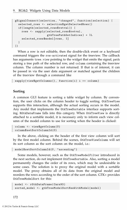
9. RGtk2: Widgets Using Data Models
gSignalConnect ( selection , "changed" , function ( selection ) {selected_rows <- selection$getSelectedRows ( )if ( length ( selected_rows$retval ) ) {
rows <- sapply ( selected_rows$retval ,gtkTreePathGetIndices ) + 1L
selected_rows$model [ rows , 1 ]}
} )
When a row is not editable, then the double-click event or a keyboardcommand triggers the row-activated signal for the treeview. The callbackhas arguments tree.view pointing to the widget that emits the signal, pathstoring a tree path of the selected row, and column containing the treeviewcolumn. The column number is not returned. If that is of interest, it canbe passed in via the user data argument or matched against the childrenof the treeview through a command like
sapply ( view$getColumns ( ) , function ( i ) i == column )
Sorting
A common GUI feature is sorting a table widget by column. By conven-tion, the user clicks on the column header to toggle sorting. GtkTreeViewsupports this interaction, although the actual sorting occurs in the model.Any model that implements the GtkTreeSortable interface supports sort-ing. RGtkDataFrame falls into this category. When GtkTreeView is directlyattached to a sortable model, it is necessary only to inform each view col-umn of the model column to use for sorting when the header is clicked:
column <- view$getColumn ( 0 )column$setSortColumnId ( 0 )
In the above, clicking on the header of the first view column will sortby the first model column. Behind the scenes, GtkTreeViewColumn will setits sort column as the sort column on the model, i.e.:
model$setSortColumnId ( 0 , "ascending" )
Some models, however, such as the GtkTreeModelFilter introduced inthe next section, do not implement GtkTreeSortable. Also, sorting a modelpermanently changes the order of its rows, which may be undesirable insome cases. The solution is to proxy the original model with a sortablemodel. The proxy obtains all of its data from the original model andreorders the rows according to the order of the sort column. GTK+ providesGtkTreeModelSort for this:
model <- rGtkDataFrame ( Cars93 )sorted_model <- gtkTreeModelSortNewWithModel ( model )
172
© 2012 by Taylor & Francis Group, LLC
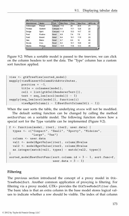
9.1. Displaying tabular data
Figure 9.2: When a sortable model is passed to the treeview, we can clickon the column headers to sort the data. The "Type" column has a customsort function applied.
view <- gtkTreeView ( sorted_model )mapply ( view$insertColumnWithAttributes ,
position = −1,title = colnames ( model ) ,cell = list ( gtkCellRendererText ( ) ) ,text = seq_len ( ncol ( model ) ) − 1)
sapply ( seq_len ( ncol ( model ) ) , function ( i )view$getColumn ( i − 1) $setSortColumnId ( i − 1 ) )
When the user sorts the table, the underlying store will not be modified.The default sorting function can be changed by calling the method
setSortFunc on a sortable model. The following function shows how aspecial sort for the Type variable can be implemented (Figure 9.2).
f <- function ( model , iter1 , iter2 , user . data ) {types <- c ( "Compact" , "Small" , "Sporty" , "Midsize" ,
"Large" , "Van" )column <- user . dataval1 <- model$getValue ( iter1 , column ) $valueval2 <- model$getValue ( iter2 , column ) $valueas . integer ( match ( val1 , types ) − match ( val2 , types ) )
}sorted_model$setSortFunc ( sort . column . id = 3 − 1 , sort . func=f ,
user . data = 3 − 1)
Filtering
The previous section introduced the concept of a proxy model in Gtk-TreeModelSort. Another common application of proxying is filtering. Forfiltering via a proxy model, GTK+ provides the GtkTreeModelFilter class.The basic idea is that an extra column in the base model stores logical val-ues to indicate whether a row should be visible. The index of that column
173
© 2012 by Taylor & Francis Group, LLC
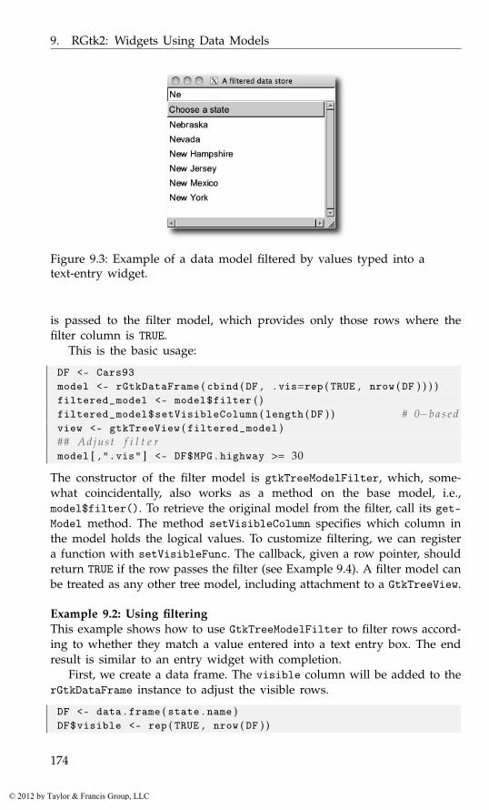
9. RGtk2: Widgets Using Data Models
Figure 9.3: Example of a data model filtered by values typed into atext-entry widget.
is passed to the filter model, which provides only those rows where thefilter column is TRUE.
This is the basic usage:
DF <- Cars93model <- rGtkDataFrame ( cbind ( DF , . vis=rep ( TRUE , nrow ( DF ) ) ) )filtered_model <- model$filter ( )filtered_model$setVisibleColumn ( length ( DF ) ) # 0−b a s e dview <- gtkTreeView ( filtered_model )## Adjus t f i l t e rmodel [ , ".vis" ] <- DF$MPG . highway >= 30
The constructor of the filter model is gtkTreeModelFilter, which, some-what coincidentally, also works as a method on the base model, i.e.,model$filter(). To retrieve the original model from the filter, call its get-Model method. The method setVisibleColumn specifies which column inthe model holds the logical values. To customize filtering, we can registera function with setVisibleFunc. The callback, given a row pointer, shouldreturn TRUE if the row passes the filter (see Example 9.4). A filter model canbe treated as any other tree model, including attachment to a GtkTreeView.
Example 9.2: Using filteringThis example shows how to use GtkTreeModelFilter to filter rows accord-ing to whether they match a value entered into a text entry box. The endresult is similar to an entry widget with completion.
First, we create a data frame. The visible column will be added to therGtkDataFrame instance to adjust the visible rows.
DF <- data . frame ( state . name )DF$visible <- rep ( TRUE , nrow ( DF ) )
174
© 2012 by Taylor & Francis Group, LLC

9.1. Displaying tabular data
model <- rGtkDataFrame ( DF )
The filtered model needs to have the column specified that contains thelogical values; in this example, it is the last column.
filtered_model <- model$filter ( )filtered_model$setVisibleColumn ( ncol ( DF ) − 1) # o f f s e tview <- gtkTreeView ( filtered_model )
Next, we create a basic view of a single column:
view$insertColumnWithAttributes ( 0 , "Col" ,gtkCellRendererText ( ) , text = 0)
An entry widget will be used to control the filtering. In the callback,we adjust the visible column of the rGtkDataFrame instance to reflect therows to be shown. When val is an empty string, the result of grepl isTRUE, so all rows will be shown.
entry <- gtkEntry ( )gSignalConnect ( entry , "changed" , function ( entry , user . data ) {
pattern <- entry$getText ( )DF <- user . data$getModel ( )values <- DF [ , "state.name" ]DF [ , "visible" ] <- grepl ( pattern , values )
} , data=filtered_model )
Figure 9.3 shows the two widgets placed within a simple GUI.
Cell renderer details
The values in a tree model are rendered in a rectangular cell by the deriva-tives of GtkCellRenderer. Cell renderers are interactive, in that they alsomanage editing and activation of cells.
A cell renderer is independent of any data model. Its rendering roleis limited to drawing into a specified rectangular region according to itscurrent property values. An object that implements the GtkCellLayoutinterface, like GtkTreeViewColumn and GtkComboBox (see Section 9.3), asso-ciates a set of attributes with a cell renderer. An attribute is a link betweenan aesthetic property of a cell renderer and a column in the data model.When the GtkCellLayout object needs to render a particular cell, it config-ures the properties of the renderer with the values from the current modelrow, according to the attributes. Thus, the mapping from data to visual-ization depends on the class of the renderer instance, its explicit propertysettings, and the attributes associated with the renderer in the cell layout.
For example, to render text, a GtkCellRendererText is appropriate. Thetext property is usually linked via an attribute to a text column in themodel, as the text would vary from row to row. However, the background
175
© 2012 by Taylor & Francis Group, LLC

9. RGtk2: Widgets Using Data Models
color (the cell-background property) might be common to all rows in thecolumn and thus is set explicitly, without use of an attribute:
cell_renderer <- gtkCellRendererText ( )cell_renderer [ ’cell-background’ ] <- "gray"
The base class GtkCellRenderer defines a number of properties that arecommon to all rendering tasks. The xalign and yalign properties specifythe alignment, i.e., how to position the rendered region when it does notfill the entire cell. The cell-background property indicates the color forthe entire cell background.
The rest of this section describes each type of cell renderer, as well assome advanced features.
Text cell renderers GtkCellRendererText displays text and numeric val-ues. Numeric values in the model are shown as strings. The most importantproperty is text, the actual text that is displayed. Other properties controlthe display of the text, such as the font family and size, the foregroundand background colors, and whether to ellipsize or wrap the text if thereis not enough space for display. For example, we display right-aligned textin a Helvetica font:
cell_renderer <- gtkCellRendererText ( )cell_renderer [ ’xalign’ ] <- 1 # d e f a u l t 0 . 5 = c e n t e r e dcell_renderer [ ’family’ ] <- "Helvetica"
When an attribute links the text property to a numeric column in themodel, the property system automatically converts the number to its stringrepresentation. This occurs according to the same logic that R follows toprint numeric values, so options like scipen and digits are considered.See the “Overriding attribute mappings” paragraph below for further cus-tomization.
Editable cells When the editable property of a text cell (or activatableproperty of a toggle cell) is set to TRUE, then the cell contents can bechanged. This allows the user to make changes to the underlying modelthrough the GUI. Although the view automatically reflects changes madeto the model, the reverse is not true. A callback must be assigned to theeditable (toggled) signal for the cell renderer to implement the change.The callback for the "edited" signal has arguments renderer, path forthe path of the selected row (as a string), and new.text containing thevalue of the edited text as a string. These arguments do not include thetreeview object nor the column index, so these should be provided bysome other means, e.g., from the enclosing environment of the handler.For example, here is how we can update an RGtkDataFrame model fromwithin the callback:
176
© 2012 by Taylor & Francis Group, LLC
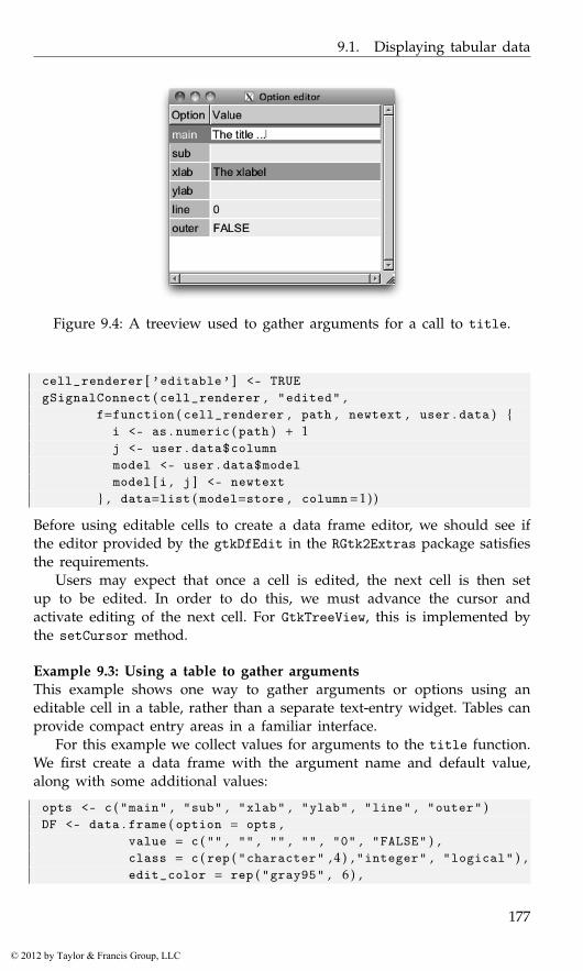
9.1. Displaying tabular data
Figure 9.4: A treeview used to gather arguments for a call to title.
cell_renderer [ ’editable’ ] <- TRUEgSignalConnect ( cell_renderer , "edited" ,
f=function ( cell_renderer , path , newtext , user . data ) {i <- as . numeric ( path ) + 1j <- user . data$columnmodel <- user . data$modelmodel [ i , j ] <- newtext
} , data=list ( model=store , column = 1 ) )
Before using editable cells to create a data frame editor, we should see ifthe editor provided by the gtkDfEdit in the RGtk2Extras package satisfiesthe requirements.
Users may expect that once a cell is edited, the next cell is then setup to be edited. In order to do this, we must advance the cursor andactivate editing of the next cell. For GtkTreeView, this is implemented bythe setCursor method.
Example 9.3: Using a table to gather argumentsThis example shows one way to gather arguments or options using aneditable cell in a table, rather than a separate text-entry widget. Tables canprovide compact entry areas in a familiar interface.
For this example we collect values for arguments to the title function.We first create a data frame with the argument name and default value,along with some additional values:
opts <- c ( "main" , "sub" , "xlab" , "ylab" , "line" , "outer" )DF <- data . frame ( option = opts ,
value = c ( "" , "" , "" , "" , "0" , "FALSE" ) ,class = c ( rep ( "character" , 4 ) , "integer" , "logical" ) ,edit_color = rep ( "gray95" , 6 ) ,
177
© 2012 by Taylor & Francis Group, LLC
9. RGtk2: Widgets Using Data Models
dirty = rep ( FALSE , 6 ) ,stringsAsFactors = FALSE )
Unfortunately, we need to coerce the default values to character, inorder to store them in a single column. We preserve the class in the classcolumn, for coercion later. The edit_color and dirty columns are relatedto editing and explained later.
Now we create our model and configure the first column:
model <- rGtkDataFrame ( DF )view <- gtkTreeView ( model )##cell_renderer <- gtkCellRendererText ( )cell_renderer [ ’background’ ] <- ’gray80’view$insertColumnWithAttributes ( position = −1,
title = "Option" ,cell = cell_renderer ,text = 1 − 1)
The first column has a special background color, specified below, whichindicates that the cells are not editable. The second column is editable andhas a background color that is state dependent and indicates whether acell has been edited (The xlab column in Figure 9.4):
cell_renderer <- gtkCellRendererText ( )cell_renderer [ ’editable’ ] <- TRUEview$insertColumnWithAttributes ( position = −1,
title = "Value" ,cell = cell_renderer ,text = 2 − 1 ,background = 4 − 1)
To attach the view to the model, we connect the cell renderer to theedited signal. Here we use the class value to format the text and thenset the background color and dirty flag of the entry. The latter allows usto easily find the values which were edited.
gSignalConnect ( cell_renderer , "edited" ,function ( cell_renderer , path , new . text , user . data ) {
model <- user . data$modeli <- as . numeric ( path ) + 1 ; j <- user . data$columnval <- as ( new . text , model [ i , ’class’ ] )model [ i , j ] <- as ( val , "character" )model [ i , ’dirty’ ] <- TRUE # mark d i r t ymodel [ i , ’edit_color’ ] <- ’gray70’ # change c o l o r
} , data=list ( model=model , column = 2 ) )
A simple window displays our GUI.
178
© 2012 by Taylor & Francis Group, LLC
9.1. Displaying tabular data
window <- gtkWindow ( show=FALSE )window [ ’title’ ] <- "Option editor"window$setSizeRequest ( 3 0 0 , 5 0 0 )scrolled_window <- gtkScrolledWindow ( )window$add ( scrolled_window )scrolled_window$add ( view )window$show ( )
Implementing this dialog into a GUI requires writing a function to mapthe model values into the appropriate call to the title function. The dirtyflag makes this easy, but this is a task we do not pursue here. Instead weadd a bit of extra detail by providing a tooltip.
Tooltips For this example, our function has built-in documentation. Be-low, we use an internal function from the helpr package2 to extract thedescription for each of the arguments. We leave this in a list, descs, forlater lookup.
require ( helpr , quietly=TRUE )package <- "graphics" ; topic <- "title"rd <- helpr : : : parse_help ( helpr : : : pkg_topic ( package , topic ) ,
package = package )descs <- rd$params$argsnames ( descs ) <- sapply ( descs , function ( i ) i$param )
For many widgets, adding a tooltip is as easy as calling setTooltip-Text. However, it is more complicated in a treeview, as each cell shouldget a different tip. To add tooltips to the treeview we first indicate that wewant tooltips, then connect to the query-tooltip signal:
view [ "has-tooltip" ] <- TRUEgSignalConnect ( view , "query-tooltip" ,
function ( view , x , y , key_mode , tooltip , user . data ) {out <- view$getTooltipContext ( x , y , key_mode )if ( out$retval ) {
model <- view$getModel ( )i <- as . numeric ( out$path$toString ( ) ) + 1val <- model [ i , "option" ]txt <- descs [ [ val ] ] $desctxt <- gsub ( "code>" ,"b>" , txt ) # no c o d e in Pangotooltip$setMarkup ( txt )
}out$retval
} )
2It is important to note that we are calling internal routines of a package still underactive development, which in turn relies on volatile features of R. In general, such practicecan lead to maintenance headaches. The purpose of this example is only to provide a naturaldemonstration of tooltips on a treeview.
179
© 2012 by Taylor & Francis Group, LLC
9. RGtk2: Widgets Using Data Models
Within this callback we check to see if we have the appropriate context(we are in a row), then, if so, use the path to find the description to set inthe tooltip. The descriptions use HTML for markup, but the tooltip usesonly Pango. As the code tag is not PANGO, we change to a bold tag usinggsub.
Combo and spin cell renderers GtkCellRendererCombo and GtkCell-RendererSpin allow editing a text cell with a combo box or spin but-ton, respectively. Populating the combo-box menu requires specifying twoproperties: model and text-column. The menu items are retrieved from theGtkTreeModel given by model at the column index given by text-column.If has-entry is TRUE, a combo box entry is displayed.
cell_renderer <- gtkCellRendererCombo ( )model <- rGtkDataFrame ( state . name )cell_renderer [ ’model’ ] <- modelcell_renderer [ ’text-column’ ] <- 0cell_renderer [ ’editable’ ] <- TRUE # n e e d e d
The spin button editor is configured by setting a GtkAdjustment on theadjustment property.
The changed signal is emitted when an items is selected in the combobox. The spin cell renderer inherits the edited signal from GtkCell-RendererText.
Pixbuf cell renderers To display an image in a cell, GtkCellRenderer-Pixbuf is appropriate. The image is specified through one of these proper-ties: stock-id, a stock identifier; icon-name, the name of a themed icon; orpixbuf, an actual GdkPixbuf object, holding an image in memory. Usinga list, we can store a GdkPixbuf in a data.frame, and thus an RGtk-DataFrame. This is demonstrated in the next example.
Example 9.4: A variable selection widgetThis example shows how to create a GUI for selecting variables from adata frame. The GUI is based on two lists. The left one indicates thevariables that can be selected, and the right shows the variables that havebeen selected. An icon, indicating the variable type, is placed next to thevariable name (Figure 9.5). A similar mechanism is part of the SPSS modelspecification GUI of Figure 1.4. For illustration purposes we use the Cars93data set.
DF <- get ( data ( Cars93 , package="MASS" ) )
First, we render an icon for each variable. The make_icon function fromthe ProgGUIinR package creates an icon as a grid object, which we renderwith cairoDevice:
180
© 2012 by Taylor & Francis Group, LLC
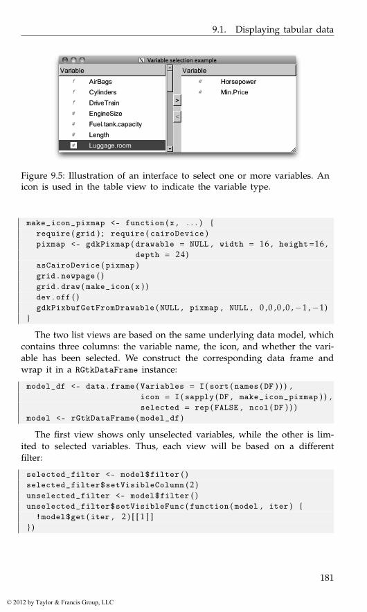
9.1. Displaying tabular data
Figure 9.5: Illustration of an interface to select one or more variables. Anicon is used in the table view to indicate the variable type.
make_icon_pixmap <- function ( x , . . . ) {require ( grid ) ; require ( cairoDevice )pixmap <- gdkPixmap ( drawable = NULL , width = 16 , height=16 ,
depth = 24)asCairoDevice ( pixmap )grid . newpage ( )grid . draw ( make_icon ( x ) )dev . off ( )gdkPixbufGetFromDrawable ( NULL , pixmap , NULL , 0 ,0 ,0 ,0 ,−1 ,−1)
}
The two list views are based on the same underlying data model, whichcontains three columns: the variable name, the icon, and whether the vari-able has been selected. We construct the corresponding data frame andwrap it in a RGtkDataFrame instance:
model_df <- data . frame ( Variables = I ( sort ( names ( DF ) ) ) ,icon = I ( sapply ( DF , make_icon_pixmap ) ) ,selected = rep ( FALSE , ncol ( DF ) ) )
model <- rGtkDataFrame ( model_df )
The first view shows only unselected variables, while the other is lim-ited to selected variables. Thus, each view will be based on a differentfilter:
selected_filter <- model$filter ( )selected_filter$setVisibleColumn ( 2 )unselected_filter <- model$filter ( )unselected_filter$setVisibleFunc ( function ( model , iter ) {
!model$get ( iter , 2 ) [ [ 1 ] ]} )
181
© 2012 by Taylor & Francis Group, LLC
9. RGtk2: Widgets Using Data Models
The selected filter is relatively easy to define, using selected as the vis-ible column. For the unselected filter, we need to define a custom visiblefunction that inverts the selected column.
Next, we create a view for each filter:
views <- list ( )views$unselected_view <- gtkTreeView ( unselected_filter )views$selected_view <- gtkTreeView ( selected_filter )##sapply ( views , function ( view ) {
selection <- view$getSelection ( )selection$setMode ( ’multiple’ )
} )
Each cell needs to display both an icon and a label. This is achieved bypacking two cell renderers into the column:
make_view_column <- function ( ) {column <- gtkTreeViewColumn ( )column$setTitle ( "Variable" )column$packStart ( cell_renderer <- gtkCellRendererPixbuf ( ) )column$addAttribute ( cell_renderer , "pixbuf" , 1L )column$packStart ( cell_renderer <- gtkCellRendererText ( ) )column$addAttribute ( cell_renderer , "text" , 0L )column
}sapply ( views , function ( view )
view$insertColumn ( make_view_column ( ) , 0 ) )
For later use we extend the API for a treeview – one method to findthe selected indices (1-based) and one to indicate if there is a selection:
## add t o t h e g tkTreeView API f o r c o n v e n i e n c egtkTreeViewSelectedIndices <- function ( object ) {
model <- object$getModel ( ) # F i l t e r e d !paths <- object$getSelection ( ) $getSelectedRows ( ) $retvalpath_strings <- sapply ( paths , function ( i ) {
model$convertPathToChildPath ( i ) $toString ( )} )if ( length ( path_strings ) == 0)
integer ( 0 )else
as . numeric ( path_strings ) + 1 # 1−b a s e d}## d o e s o b j e c t have s e l e c t i o n ?gtkTreeViewHasSelection <-
function ( obj ) length ( obj$selectedIndices ( ) ) > 0
182
© 2012 by Taylor & Francis Group, LLC
9.1. Displaying tabular data
Now we create the buttons and connect to the clicked signal. Thehandler moves the selected values to the other list by toggling the selectedvariable:
buttons <- list ( )buttons$unselect_button <- gtkButton ( "<" )buttons$select_button <- gtkButton ( ">" )toggleSelectionOnClick <- function ( button , view ) {
gSignalConnect ( button , "clicked" , function ( button ) {message ( "clicked" )ind <- view$selectedIndices ( )model [ ind , "selected" ] <- !model [ ind , "selected" ]
} )}sapply ( 1 : 2 , function ( i ) toggleSelectionOnClick ( buttons [ [ i ] ] ,
views [[3−i ] ] ) )
We want our buttons to be sensitive only if there is a possible move.This is determined by the presence of a selection:
sapply ( buttons , gtkWidgetSetSensitive , FALSE )trackSelection <- function ( button , view ) {
gSignalConnect ( view$getSelection ( ) , "changed" ,function ( x ) button [ ’sensitive’ ] <- view$hasSelection ( ) )
}sapply ( 1 : 2 , function ( i ) trackSelection ( buttons [ [ i ] ] ,
views [[3−i ] ] ) )
We now lay out our GUI using a horizontal box, into which we pack theviews and a box holding the selection buttons. The views will be scrollable,so are placed in scrolled windows:
window <- gtkWindow ( show=FALSE )window$setTitle ( "Select variables example" )window$setDefaultSize ( 6 0 0 , 400)hbox <- gtkHBox ( )window$add ( hbox )## s c r o l l w i n d o w sscrolls <- list ( )scrolls$unselected_scroll <- gtkScrolledWindow ( )scrolls$selected_scroll <- gtkScrolledWindow ( )mapply ( gtkContainerAdd , object = scrolls , widget = views )mapply ( gtkScrolledWindowSetPolicy , scrolls ,
"automatic" , "automatic" )## b u t t o n sbutton_box <- gtkVBox ( )centered_box <- gtkVBox ( )button_box$packStart ( centered_box , expand=TRUE , fill = FALSE )centered_box$setSpacing ( 1 2 )
183
© 2012 by Taylor & Francis Group, LLC

9. RGtk2: Widgets Using Data Models
sapply ( buttons , centered_box$packStart , expand = FALSE )##hbox$packStart ( scrolls$unselected_scroll , expand = TRUE )hbox$packStart ( button_box , expand = FALSE )hbox$packStart ( scrolls$selected_scroll , expand = TRUE )
Finally, we show the top-level window:
window$show ( )
Toggle cell renderers Binary data can be represented by a toggle. ThegtkCellRendererToggle will create a check box in the cell that will appearchecked if the active property is TRUE. If an attribute is defined for theproperty, then changes in the model will be reflected in the view. Morework is required to modify the model in response to user interaction withthe view. The activatable attribute for the cell must be TRUE in orderfor it to receive user input. The programmer then needs to connect to thetoggled to update the model in response to changes in the active state.
cell_renderer <- gtkCellRendererToggle ( )cell_renderer [ ’activatable’ ] <- TRUE # c e l l can be a c t i v a t e dcell_renderer [ ’active’ ] <- TRUEgSignalConnect ( cell_renderer , "toggled" , function ( w , path ) {
model$active [ as . numeric ( path ) + 1] <- w [ ’active’ ]} )
To render the toggle as a radio button instead of a checkbox, set theradio property to TRUE. Again, the programmer is responsible for imple-menting the radio-button logic via the toggled signal.
Example 9.5: Displaying a checkbox column in a treeviewThis example demonstrates the construction of a GUI for selecting oneor more rows from a data frame. We will display a list of the installedpackages that can be upgraded from CRAN, although this code is triviallygeneralized to any list of choices. The user selects a row by clicking on acheckbox produced by a toggle-cell renderer.
To get the installed packages that can be upgraded, we use some of thefunctions provided by the utils package.
old_packages <-old . packages ( ) [ , c ( "Package" , "Installed" , "ReposVer" ) ]
DF <- as . data . frame ( old_packages )
This function will be called on the selected rows. Here, we simply callinstall.packages to update the selected packages.
doUpdate <- function ( old_packages )install . packages ( old_packages$Package )
184
© 2012 by Taylor & Francis Group, LLC
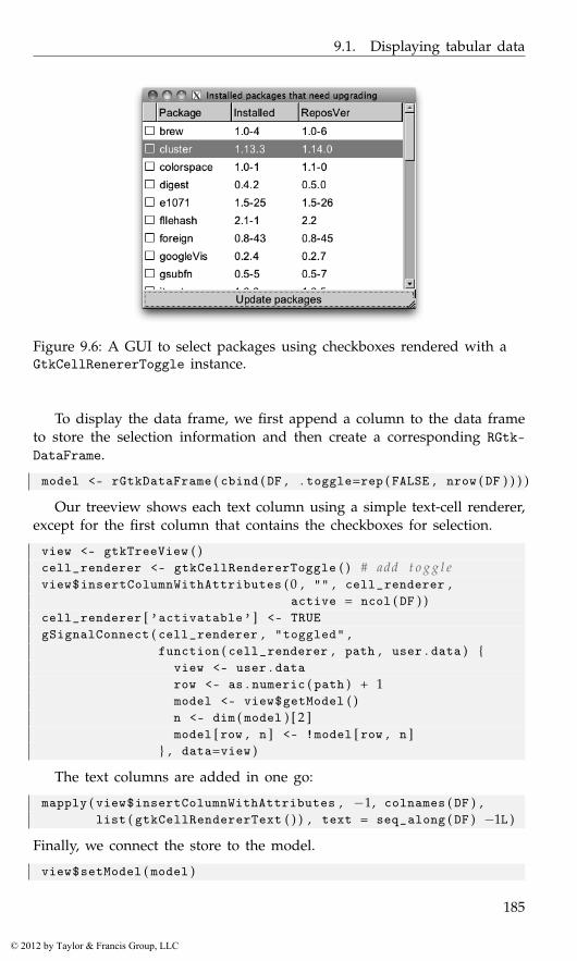
9.1. Displaying tabular data
Figure 9.6: A GUI to select packages using checkboxes rendered with aGtkCellRenererToggle instance.
To display the data frame, we first append a column to the data frameto store the selection information and then create a corresponding RGtk-DataFrame.
model <- rGtkDataFrame ( cbind ( DF , . toggle=rep ( FALSE , nrow ( DF ) ) ) )
Our treeview shows each text column using a simple text-cell renderer,except for the first column that contains the checkboxes for selection.
view <- gtkTreeView ( )cell_renderer <- gtkCellRendererToggle ( ) # add t o g g l eview$insertColumnWithAttributes ( 0 , "" , cell_renderer ,
active = ncol ( DF ) )cell_renderer [ ’activatable’ ] <- TRUEgSignalConnect ( cell_renderer , "toggled" ,
function ( cell_renderer , path , user . data ) {view <- user . datarow <- as . numeric ( path ) + 1model <- view$getModel ( )n <- dim ( model ) [ 2 ]model [ row , n ] <- !model [ row , n ]
} , data=view )
The text columns are added in one go:
mapply ( view$insertColumnWithAttributes , −1, colnames ( DF ) ,list ( gtkCellRendererText ( ) ) , text = seq_along ( DF ) −1L )
Finally, we connect the store to the model.
view$setModel ( model )
185
© 2012 by Taylor & Francis Group, LLC
9. RGtk2: Widgets Using Data Models
To allow the user to initiate the action, we create a button and assigna callback. We pass in the view, rather than the model, in case the modelwould be recreated by the doUpdate call. In a real application, once apackage is upgraded it would be removed from the display.
button <- gtkButton ( "Update packages" )gSignalConnect ( button , "clicked" , function ( button , data ) {
view <- datamodel <- view$getModel ( )old_packages <-
model [ model [ , ncol ( model ) ] , −ncol ( model ) , drop = FALSE ]doUpdate ( old_packages )
} , data=view )
Our basic GUI places the view into a box container that also holds thebutton to initiate the action.
window <- gtkWindow ( show = FALSE )window$setTitle ( "Installed packages that need upgrading" )window$setSizeRequest ( 3 0 0 , 300)vbox <- gtkVBox ( ) ; window$add ( vbox )scrolled_window <- gtkScrolledWindow ( )vbox$packStart ( scrolled_window , expand = TRUE , fill = TRUE )scrolled_window$add ( view )scrolled_window$setPolicy ( "automatic" , "automatic" )vbox$packStart ( button , expand = FALSE )window$show ( )
Progress cell renderers To communicate progress within a cell visually,both progress bars and spinner animations are supported. These modes cor-respond to GtkCellRendererProgress and GtkCellRendererSpinner, re-spectively.
In the case of GtkCellRendererProgress, its value property takes avalue between 0 and 100 indicating the amount finished, with a defaultvalue of 0. Values out of this range will be signaled by an error message.For example,
cell_renderer <- gtkCellRendererProgress ( )cell_renderer [ "value" ] <- 50
For indicating progress in the absence of a definite end point, Gtk-CellRendererSpinner is more appropriate. The spinner is displayed whenthe active property is TRUE. Increment the pulse property to drive theanimation.
Overriding attribute mappings The default behavior for mapping modelvalues to a renderer property is simple: values are extracted from the
186
© 2012 by Taylor & Francis Group, LLC
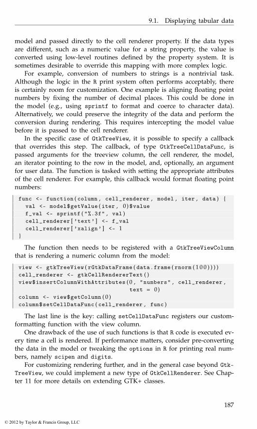
9.1. Displaying tabular data
model and passed directly to the cell renderer property. If the data typesare different, such as a numeric value for a string property, the value isconverted using low-level routines defined by the property system. It issometimes desirable to override this mapping with more complex logic.
For example, conversion of numbers to strings is a nontrivial task.Although the logic in the R print system often performs acceptably, thereis certainly room for customization. One example is aligning floating pointnumbers by fixing the number of decimal places. This could be done inthe model (e.g., using sprintf to format and coerce to character data).Alternatively, we could preserve the integrity of the data and perform theconversion during rendering. This requires intercepting the model valuebefore it is passed to the cell renderer.
In the specific case of GtkTreeView, it is possible to specify a callbackthat overrides this step. The callback, of type GtkTreeCellDataFunc, ispassed arguments for the treeview column, the cell renderer, the model,an iterator pointing to the row in the model, and, optionally, an argumentfor user data. The function is tasked with setting the appropriate attributesof the cell renderer. For example, this callback would format floating pointnumbers:
func <- function ( column , cell_renderer , model , iter , data ) {val <- model$getValue ( iter , 0 ) $valuef_val <- sprintf ( "%.3f" , val )cell_renderer [ ’text’ ] <- f_valcell_renderer [ ’xalign’ ] <- 1
}
The function then needs to be registered with a GtkTreeViewColumnthat is rendering a numeric column from the model:
view <- gtkTreeView ( rGtkDataFrame ( data . frame ( rnorm ( 1 0 0 ) ) ) )cell_renderer <- gtkCellRendererText ( )view$insertColumnWithAttributes ( 0 , "numbers" , cell_renderer ,
text = 0)column <- view$getColumn ( 0 )column$setCellDataFunc ( cell_renderer , func )
The last line is the key: calling setCellDataFunc registers our custom-formatting function with the view column.
One drawback of the use of such functions is that R code is executed ev-ery time a cell is rendered. If performance matters, consider pre-convertingthe data in the model or tweaking the options in R for printing real num-bers, namely scipen and digits.
For customizing rendering further, and in the general case beyond Gtk-TreeView, we could implement a new type of GtkCellRenderer. See Chap-ter 11 for more details on extending GTK+ classes.
187
© 2012 by Taylor & Francis Group, LLC
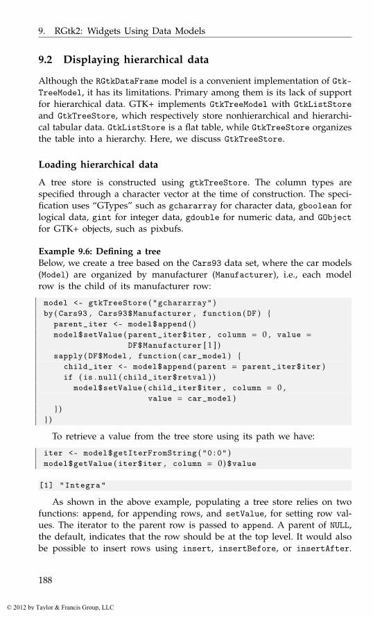
9. RGtk2: Widgets Using Data Models
9.2 Displaying hierarchical data
Although the RGtkDataFrame model is a convenient implementation of Gtk-TreeModel, it has its limitations. Primary among them is its lack of supportfor hierarchical data. GTK+ implements GtkTreeModel with GtkListStoreand GtkTreeStore, which respectively store nonhierarchical and hierarchi-cal tabular data. GtkListStore is a flat table, while GtkTreeStore organizesthe table into a hierarchy. Here, we discuss GtkTreeStore.
Loading hierarchical data
A tree store is constructed using gtkTreeStore. The column types arespecified through a character vector at the time of construction. The speci-fication uses “GTypes” such as gchararray for character data, gboolean forlogical data, gint for integer data, gdouble for numeric data, and GObjectfor GTK+ objects, such as pixbufs.
Example 9.6: Defining a treeBelow, we create a tree based on the Cars93 data set, where the car models(Model) are organized by manufacturer (Manufacturer), i.e., each modelrow is the child of its manufacturer row:
model <- gtkTreeStore ( "gchararray" )by ( Cars93 , Cars93$Manufacturer , function ( DF ) {
parent_iter <- model$append ( )model$setValue ( parent_iter$iter , column = 0 , value =
DF$Manufacturer [ 1 ] )sapply ( DF$Model , function ( car_model ) {
child_iter <- model$append ( parent = parent_iter$iter )if ( is . null ( child_iter$retval ) )
model$setValue ( child_iter$iter , column = 0 ,value = car_model )
} )} )
To retrieve a value from the tree store using its path we have:
iter <- model$getIterFromString ( "0:0" )model$getValue ( iter$iter , column = 0) $value
[1] "Integra"
As shown in the above example, populating a tree store relies on twofunctions: append, for appending rows, and setValue, for setting row val-ues. The iterator to the parent row is passed to append. A parent of NULL,the default, indicates that the row should be at the top level. It would alsobe possible to insert rows using insert, insertBefore, or insertAfter.
188
© 2012 by Taylor & Francis Group, LLC
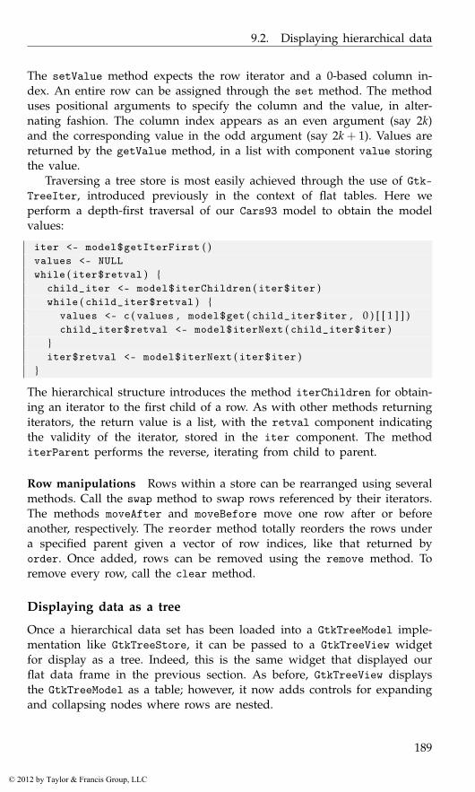
9.2. Displaying hierarchical data
The setValue method expects the row iterator and a 0-based column in-dex. An entire row can be assigned through the set method. The methoduses positional arguments to specify the column and the value, in alter-nating fashion. The column index appears as an even argument (say 2k)and the corresponding value in the odd argument (say 2k + 1). Values arereturned by the getValue method, in a list with component value storingthe value.
Traversing a tree store is most easily achieved through the use of Gtk-TreeIter, introduced previously in the context of flat tables. Here weperform a depth-first traversal of our Cars93 model to obtain the modelvalues:
iter <- model$getIterFirst ( )values <- NULLwhile ( iter$retval ) {
child_iter <- model$iterChildren ( iter$iter )while ( child_iter$retval ) {
values <- c ( values , model$get ( child_iter$iter , 0 ) [ [ 1 ] ] )child_iter$retval <- model$iterNext ( child_iter$iter )
}iter$retval <- model$iterNext ( iter$iter )
}
The hierarchical structure introduces the method iterChildren for obtain-ing an iterator to the first child of a row. As with other methods returningiterators, the return value is a list, with the retval component indicatingthe validity of the iterator, stored in the iter component. The methoditerParent performs the reverse, iterating from child to parent.
Row manipulations Rows within a store can be rearranged using severalmethods. Call the swap method to swap rows referenced by their iterators.The methods moveAfter and moveBefore move one row after or beforeanother, respectively. The reorder method totally reorders the rows undera specified parent given a vector of row indices, like that returned byorder. Once added, rows can be removed using the remove method. Toremove every row, call the clear method.
Displaying data as a tree
Once a hierarchical data set has been loaded into a GtkTreeModel imple-mentation like GtkTreeStore, it can be passed to a GtkTreeView widgetfor display as a tree. Indeed, this is the same widget that displayed ourflat data frame in the previous section. As before, GtkTreeView displaysthe GtkTreeModel as a table; however, it now adds controls for expandingand collapsing nodes where rows are nested.
189
© 2012 by Taylor & Francis Group, LLC
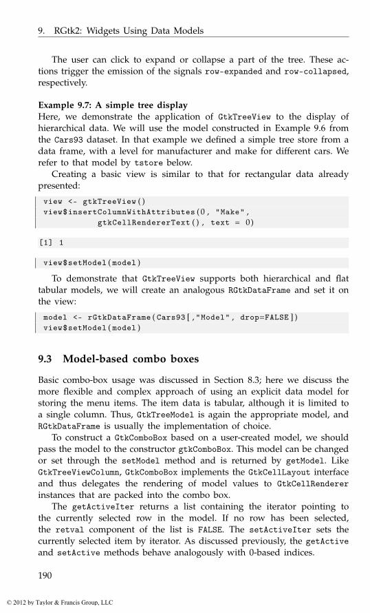
9. RGtk2: Widgets Using Data Models
The user can click to expand or collapse a part of the tree. These ac-tions trigger the emission of the signals row-expanded and row-collapsed,respectively.
Example 9.7: A simple tree displayHere, we demonstrate the application of GtkTreeView to the display ofhierarchical data. We will use the model constructed in Example 9.6 fromthe Cars93 dataset. In that example we defined a simple tree store from adata frame, with a level for manufacturer and make for different cars. Werefer to that model by tstore below.
Creating a basic view is similar to that for rectangular data alreadypresented:
view <- gtkTreeView ( )view$insertColumnWithAttributes ( 0 , "Make" ,
gtkCellRendererText ( ) , text = 0)
[1] 1
view$setModel ( model )
To demonstrate that GtkTreeView supports both hierarchical and flattabular models, we will create an analogous RGtkDataFrame and set it onthe view:
model <- rGtkDataFrame ( Cars93 [ , "Model" , drop=FALSE ] )view$setModel ( model )
9.3 Model-based combo boxes
Basic combo-box usage was discussed in Section 8.3; here we discuss themore flexible and complex approach of using an explicit data model forstoring the menu items. The item data is tabular, although it is limited toa single column. Thus, GtkTreeModel is again the appropriate model, andRGtkDataFrame is usually the implementation of choice.
To construct a GtkComboBox based on a user-created model, we shouldpass the model to the constructor gtkComboBox. This model can be changedor set through the setModel method and is returned by getModel. LikeGtkTreeViewColumn, GtkComboBox implements the GtkCellLayout interfaceand thus delegates the rendering of model values to GtkCellRendererinstances that are packed into the combo box.
The getActiveIter returns a list containing the iterator pointing tothe currently selected row in the model. If no row has been selected,the retval component of the list is FALSE. The setActiveIter sets thecurrently selected item by iterator. As discussed previously, the getActiveand setActive methods behave analogously with 0-based indices.
190
© 2012 by Taylor & Francis Group, LLC
9.3. Model-based combo boxes
Example 9.8: A combo box with memoryThis example uses an editable combo box as an simple interface to theR help system. Along the way, we record the number of times the usersearches for a page.
Our model for the combo box will be an RGtkDataFrame instance withthree columns: a function name, a string describing the number of visits,and an integer to record the number of visits.
model <- rGtkDataFrame ( data . frame ( filename = character ( 0 ) ,visits = character ( 0 ) ,nvisits = integer ( 0 ) ,stringsAsFactors = FALSE ) )
As introduced in the previous chapter, the GtkComboBoxEntry widgetextends GtkComboBox to provide an entry widget for the user to enterarbitrary values. To construct a combo box entry on top of a tree model,we should pass the model, as well as the column index that holds thetextual item labels, to the gtkComboBoxEntry constructor. It is not necessaryto create a cell renderer for displaying the text, as the entry depends onhaving text labels and thus enforces their display. It is still possible, ofcourse, to add cell renderers for other model columns. We create the combobox with this model using the first column for the text:
combo_box <- gtkComboBoxEntryNewWithModel ( model ,text . column = 0)
It is not currently possible to put tooltip information on the drop-downelements of a combo box, as was done with a treeview. Instead, we borrowfrom popular web browser interfaces and add textual information aboutthe number of visits to the drop-down menu. This requires us to packin a new cell renderer to accompany the original label provided by thegtkComboBoxEntry widget:
cell_renderer <- gtkCellRendererText ( )combo_box$packStart ( cell_renderer )combo_box$addAttribute ( cell_renderer , "text" , 1 )cell_renderer [ ’foreground’ ] <- "gray50"cell_renderer [ ’ellipsize’ ] <- "end"cell_renderer [ ’style’ ] <- "italic"cell_renderer [ ’alignment’ ] <- "right"
This helper function will be called each time a help page is requested.It first updates the visit information, selects the text for easier editing thenext time around, then calls help.
callHelpFunction <- function ( combo_box , value ) {model <- combo_box$getModel ( )ind <- match ( value , model [ , 1 , drop=TRUE ] )nvisits <- model [ ind , "nvisits" ] <- model [ ind , "nvisits" ]+1
191
© 2012 by Taylor & Francis Group, LLC

9. RGtk2: Widgets Using Data Models
model [ ind , "visits" ] <-sprintf ( ngettext ( nvisits , "%s visit" ,"%s visits" ) , nvisits )
## s e l e c t f o r e a s i e r e d i t i n gcombo_box$getChild ( ) $selectRegion ( start = 0 , end = −1)help ( value )
}gSignalConnect ( combo_box , "changed" ,
f = function ( combo_box , . . . ) {if ( combo_box$getActive ( ) >= 0) {
value <- combo_box$getActiveText ( )callHelpFunction ( combo_box , value )
}} )
When the user enters a new value in the entry, we need to checkwhether we have previously accessed the item. If not, we add the value toour model.
gSignalConnect ( combo_box$getChild ( ) , "activate" ,f = function ( combo_box , entry , . . . ) {
value <- entry$getText ( )if ( !any ( value == combo_box$getModel ( ) [ , 1 ] ) ) {
model <- combo_box$getModel ( )tmp <- data . frame ( filename = value , visits = "" ,
nvisits = 0 ,stringsAsFactors = FALSE )
model$appendRows ( tmp )}callHelpFunction ( combo_box , value )
} , data = combo_box , user . data . first = TRUE )
We place this in a minimal GUI with a label:
window <- gtkWindow ( show = FALSE )window [ ’border-width’ ] <- 15hbox <- gtkHBox ( ) ; window$add ( hbox )hbox$packStart ( gtkLabel ( "Help on:" ) )hbox$packStart ( combo_box , expand = TRUE , fill = TRUE )#window$show ( )
An alternative approach would be to use the completion support ofGtkEntry, presented next, but we leave that as an exercise to the reader.
9.4 Text-entry widgets with completion
Often, the number of possible choices is too large to list in a combo box.One example is a web-based search engine: the possible search terms,
192
© 2012 by Taylor & Francis Group, LLC

9.4. Text-entry widgets with completion
while known and finite in number, are too numerous to list. The auto-completing text entry has emerged as an alternative to a combo box andmight be described as a sort of dynamic combo-box entry widget. When auser enters a string, partial matches to the string are displayed in a menuthat drops down from the entry.
The GtkEntryCompletion object implements text completion in GTK+.An instance is constructed with gtkEntryCompletion. The underlyingdatabase is a GtkTreeModel, like RGtkDataFrame, set via the setModelmethod. To connect a GtkEntryCompletion to an actual GtkEntry widget,call the setCompletion method on GtkEntry. The text-column propertyspecifies the column containing the completion candidates.
There are several properties that can be adjusted to tailor the completionfeature; we mention some of them. Setting the property inline-selectionto TRUE will place the top completion suggestion to the entry inline asthe completions are scrolled through; inline-completion will automati-cally add the common prefix to the entry widget; popup-single-matchis a logical indicating whether a pop up is displayed on a single match;minimum-key-length takes an integer specifying the number of charactersneeded in the entry before completion is checked (the default is 1).
By default, the rows in the data model that match the current value ofthe entry widget in a case insensitive manner are displayed. This match-ing function can be overridden by setting a new R function through thesetMatchFunc method. The signature of this function is the completion ob-ject, the string from the entry widget (lowercase), an iterator pointing toa row in the model, and, optionally user data that is passed through thefunc.data argument of the setMatchFunc method. This callback shouldreturn TRUE or FALSE depending on whether that row should be displayedin the set of completions.
Example 9.9: Text entry with completionThis example illustrates the steps to add completion to a text entry.
We create an entry with a completion database:
entry <- gtkEntry ( ) ; completion <- gtkEntryCompletion ( )entry$setCompletion ( completion )
We will use an RGtkDataFrame instance for our completion model, tak-ing a convenient list of names for our example. We set the model and textcolumn index on the completion object and then set some properties tocustomize how the completion is handled:
model <- rGtkDataFrame ( state . name )completion$setModel ( model )completion$setTextColumn ( 0 )completion [ ’inline-completion’ ] <- TRUEcompletion [ ’popup-single-match’ ] <- FALSE
193
© 2012 by Taylor & Francis Group, LLC
9. RGtk2: Widgets Using Data Models
We wish for the text search to match against any part of a string, notonly the beginning, so we define our own match function:
matchAnywhere <- function ( completion , key , iter , user . data ) {model <- completion$getModel ( )row_value <- model$getValue ( iter , 0 ) $valuekey <- completion$getEntry ( ) $getText ( ) # c a s e s e n s i t i v i t ygrepl ( key , row_value )
}completion$setMatchFunc ( matchAnywhere )
We get the string from the entry widget, not the passed value, as thelatter has been standardized to lowercase.
9.5 Sharing buffers between text entries
As of GTK+ version 2.18, multiple instances of GtkEntry can synchronizetheir text through a shared buffer. Each entry obtains its text from the sameunderlying model, a GtkEntryBuffer. Here, we construct two entries, witha shared buffer:
buffer <- gtkEntryBuffer ( )entry1 <- gtkEntry ( buffer = buffer )entry2 <- gtkEntry ( buffer = buffer )entry1$setText ( "echo" )entry2$getText ( )
[1] "echo"
The change of text in "entry1" has been reflected in "entry2".
9.6 Text views
Multiline text areas are displayed through GtkTextView instances. Theseprovide a view of an accompanying GtkTextBuffer, which is the modelthat stores the text and other objects to be rendered. The view is responsiblefor the display of the text in the buffer and has methods for adjustingtabs, margins, indenting, etc. The text buffer stores the actual text, and itsmethods are for adding and manipulating the text.
A text view is created with gtkTextView. The underlying text buffer canbe passed to the constructor. Otherwise, a buffer is automatically created.This buffer is returned by the method getBuffer and can be set with thesetBuffer method. Text views provide native scrolling support and thusare easily added to a scrolled window (Section 7.4).
Example 9.10: Basic gtkTextView usageThe steps to construct a text view consist of:
194
© 2012 by Taylor & Francis Group, LLC
9.6. Text views
view <- gtkTextView ( )scrolled_window <- gtkScrolledWindow ( )scrolled_window$add ( view )scrolled_window$setPolicy ( "automatic" , "automatic" )##window <- gtkWindow ( )window [ ’border-width’ ] <- 15window$add ( scrolled_window )
To set all the text in the buffer requires accessing the underlying buffer:
buffer <- view$getBuffer ( )buffer$setText ( "Lorem ipsum dolor sit amet ..." )
Manipulating the text requires an understanding of how positions arereferred to within the buffer (iterators or marks). As an indicator, to getthe contents of the buffer can be done as follows:
start <- buffer$getStartIter ( ) $iterend <- buffer$getEndIter ( ) $iterbuffer$getText ( start , end )
[1] "Lorem ipsum dolor sit amet ..."
Adding text Text can be added programmatically through various meth-ods of the text buffer. The most basic setText, which simply replaces thecurrent text, is shown in the example above. The method insertAtCursorwill add the text to the buffer at the current position of the cursor. Othermeans are described in the following sections.
Properties By default, the text in a view is editable. This can be disabledthrough the editable property. Typically, we then set the cursor-visibleproperty to "FALSE" so that the cursor is hidden:
view [ ’editable’ ] <- FALSEview [ ’cursor-visible’ ] <- FALSE
Formatting The text view supports several general formatting options.Automatic line wrapping is enabled through setWrapMode, which takes avalue from GtkWrapMode: one of "none", "char", "word", and "word_char".The justification for the entire buffer is controlled by the justificationproperty, which takes a GtkJustification value from "left", "right","center", and "fill". The global value may be overridden for parts ofthe text buffer through the use of text tags (see Section 9.7). The left andright margins are adjusted through the left-margin and right-marginproperties.
195
© 2012 by Taylor & Francis Group, LLC
9. RGtk2: Widgets Using Data Models
Fonts The size and font can be set globally for a text view using themodifyFont method. To set the font for specific regions, use text tags (seeSection 9.7). The font is specified as a Pango font description, which may begenerated from a string through pangoFontDescriptionFromString. Thesestrings may contain up to three parts: the first is a comma-separated listof font families, the second a white-space separated list of style options,and the third a size in points or pixels if the unit “px” is included. Atypical value might look like "serif, monospace bold italic condensed16". The various style options are enumerated in PangoStyle, PangoVari-ant, PangoWeight, PangoStretch, and PangoGravity. The help page forPangoFontDescription contains more information.
9.7 Text buffers
Text buffer properties include text for the stored text and has-selectionto indicate whether text is currently selected in a view. The buffer alsotracks whether it has been modified. This information is available throughthe buffer getModified method, which returns TRUE if the buffer haschanged. To clear this state, such as when a buffer has been saved todisk, we can pass FALSE to setModified.
In order to do more with a text buffer, such as retrieve a selection, ormodify text attributes, we need to become familiar with the two mecha-nisms for referencing text in a buffer: iterators and marks. A text iteratoris an opaque, transient pointer to a region of text, whereas a text markspecifies a location that remains valid across buffer modifications.
Iterators
In GTK+ a text iterator is the primary means of specifying a position in abuffer. As mentioned in Section 9.1, iterators are typically transient, in thesense that they are invalidated or updated by reference when their sourceis modified.
Several methods of the text buffer return iterators marking positionsin the buffer. Iterators are returned as lists with two components: iter,which represents the actual C iterator object, and retval, a logical valueindicating whether the iterator is valid. The beginning and end of thebuffer are returned by the methods getStartIter and getEndIter. Bothof these iterators are returned together in a list by the method getBounds.For example:
bounds <- buffer$getBounds ( )bounds
$retvalNULL
196
© 2012 by Taylor & Francis Group, LLC
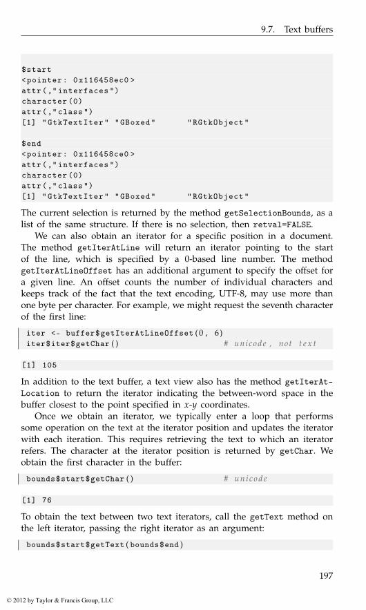
9.7. Text buffers
$start<pointer: 0x116458ec0 >attr(," interfaces ")character (0)attr(,"class")[1] "GtkTextIter" "GBoxed" "RGtkObject"
$end<pointer: 0x116458ce0 >attr(," interfaces ")character (0)attr(,"class")[1] "GtkTextIter" "GBoxed" "RGtkObject"
The current selection is returned by the method getSelectionBounds, as alist of the same structure. If there is no selection, then retval=FALSE.
We can also obtain an iterator for a specific position in a document.The method getIterAtLine will return an iterator pointing to the startof the line, which is specified by a 0-based line number. The methodgetIterAtLineOffset has an additional argument to specify the offset fora given line. An offset counts the number of individual characters andkeeps track of the fact that the text encoding, UTF-8, may use more thanone byte per character. For example, we might request the seventh characterof the first line:
iter <- buffer$getIterAtLineOffset ( 0 , 6 )iter$iter$getChar ( ) # unicode , not t e x t
[1] 105
In addition to the text buffer, a text view also has the method getIterAt-Location to return the iterator indicating the between-word space in thebuffer closest to the point specified in x-y coordinates.
Once we obtain an iterator, we typically enter a loop that performssome operation on the text at the iterator position and updates the iteratorwith each iteration. This requires retrieving the text to which an iteratorrefers. The character at the iterator position is returned by getChar. Weobtain the first character in the buffer:
bounds$start$getChar ( ) # u n i c o d e
[1] 76
To obtain the text between two text iterators, call the getText method onthe left iterator, passing the right iterator as an argument:
bounds$start$getText ( bounds$end )
197
© 2012 by Taylor & Francis Group, LLC

9. RGtk2: Widgets Using Data Models
[1] "Lorem ipsum dolor sit amet ..."
The insert method will insert text at a specified iterator:
buffer$insert ( bounds$start , "prefix" )
The delete method will delete the text between two iterators. An im-portant observation is that we always pass the actual iterator, i.e., the itercomponent of the list, to the above methods. Passing the original list wouldnot work.
Next, we introduce the methods for updating an iterator. We canmove an iterator forward or backward, stopping at a certain type oflandmark. Supported landmarks include characters (forwardChar, for-wardChars, backwardChar, and backwordChars), words (forwardWordEndand backwardWordStart), and sentences (backwardSentenceStart and for-wardSentenceEnd). There are also various methods, such as insideWord, fordetermining the textual context of the iterator. Example 9.11 shows howsome of the above are used, in particular how these methods update theiterator rather than return a new one.
Example 9.11: Finding the word that is clicked by the userThis example shows how we can find the iterator corresponding to amouse click. In the callback we obtain the X and Y coordinates of themouse-button-press event, find the corresponding iterator, and retrieve thesurrounding word:
gSignalConnect ( view , "button-press-event" ,f=function ( view , event , . . . ) {
start <- view$getIterAtLocation ( event$getX ( ) ,event$getY ( ) ) $iter
end <- start$copy ( )start$backwardWordStart ( )end$forwardWordEnd ( )val <- start$getText ( end )print ( val )return ( FALSE ) # c a l l n ex t h a n d l e r
} )
Marks
A text mark tracks a position in the document that is relative to other textand is preserved across buffer modifications. We can think of a mark asan invisible object stuck between two characters. An example is the textcursor, the position of which is represented by a mark.
Marks are identified by name. We retrieve the mark for the cursor,which is called "insert":
198
© 2012 by Taylor & Francis Group, LLC

9.7. Text buffers
insert <- buffer$getMark ( "insert" )
To access the text at a mark, we need the corresponding iterator:
insert_iter <- buffer$getIterAtMark ( insert ) $iterbounds$start$getText ( insert_iter )
[1] "Lorem ipsum dolor sit amet ..."
Marks have a gravity of "left" or "right", with "right" being thedefault. If text is inserted at a mark with right gravity, then the mark ismoved to the end of the insertion. A mark with left gravity would not bemoved. This is intuitive if we relate it to the behavior of the text cursor,which has right gravity. For obvious reasons, the cursor always advancesas the user inserts text by typing. We demonstrate this programmatically:
insert_iter$getOffset ( )
[1] 36
buffer$insert ( insert_iter , "at insertion point" )buffer$getIterAtMark ( insert ) $iter$getOffset ( )
[1] 54
A custom mark is created with its name, gravity, and position. Wecreate one for the start of the document:
mark <- buffer$createMark ( mark . name = "start" ,where = buffer$getStartIter ( ) $iter ,left . gravity = TRUE )
If we set left.gravity to "TRUE", the iterator will not move when textis inserted.
Tags
Tags are annotations placed on specific regions of a text buffer. To createa tag, we call the createTag method, which takes an argument for eachattribute to apply to the text. Here, we create three tags: one for bold text,one for italicized text, and one for large text:
tag_bold <- buffer$createTag ( tag . name="bold" ,weight=PangoWeight [ "bold" ] )
tag_emph <- buffer$createTag ( tag . name="emph" ,style=PangoStyle [ "italic" ] )
tag_large <- buffer$createTag ( tag . name="large" ,font="Serif normal 18" )
Next, we associate the tags with one or more regions of text:
199
© 2012 by Taylor & Francis Group, LLC

9. RGtk2: Widgets Using Data Models
iter <- buffer$getBounds ( )buffer$applyTag ( tag_bold , iter$start , iter$end ) # i t e r s upd a t ebuffer$applyTagByName ( "emph" , iter$start , iter$end )
Selection and the clipboard
The selection is defined by the text buffer as the region between the "in-sert" and "selection_bound" marks. While we could move the marksaround directly, calling selectRange is more efficient and convenient. Here,we select the first word:
start_iter <- buffer$getStartIter ( ) $iterend_iter <- start_iter$copy ( ) ; end_iter$forwardWordEnd ( )buffer$selectRange ( start_iter , end_iter )
GtkTextBuffer provides some convenience methods for interaction withthe clipboard: copyCliboard, cutClipboard, and pasteClipboard. To usethese, we first need a clipboard object:
clipboard <- gtkClipboardGet ( )
We can then, for example, copy the selected text (the first word) and pasteit at the end:
buffer$copyClipboard ( clipboard )buffer$pasteClipboard ( clipboard ,
override . location = buffer$getEndIter ( ) $iter ,default . editable = TRUE )
The default.editable argument indicates that the pasted text shouldbe editable. If we had passed NULL to the override.location argument,the insertion would have occurred at the cursor.
Inserting nontext items
If desired, we can insert images and/or widgets into a text buffer. Themethod insertPixbuf will insert a GdkPixbuf object. The buffer will countthe image as a character, although getText will obviously not return theimage.
Arbitrary child widgets, like buttons, can also be inserted. First, wemust create an anchor in the text buffer with createChildAnchor:
anchor <- buffer$createChildAnchor ( buffer$getEndIter ( ) $iter )
To add the widget, we call the textview method addChildAtAnchor:
button <- gtkButton ( "click me" )view$addChildAtAnchor ( button , anchor )
200
© 2012 by Taylor & Francis Group, LLC
9.7. Text buffers
Figure 9.7: A basic R terminal implemented using a gtkTextView widget.
Example 9.12: A simple command-line interfaceThis example shows how to create a simple command-line interface withthe textview widget (Figure 9.7). While few statistical applications willinclude a command-line widget, the example is familiar and shows severaldifferent, but useful, aspects of the widget.
We begin by defining our textview widget and retrieving its buffer.Then we specify a fixed-width font for the buffer:
view <- gtkTextView ( )buffer <- view$getBuffer ( )font <- pangoFontDescriptionFromString ( "Monospace" )view$modifyFont ( font ) # w id ge t wide
We will use a few formatting tags, defined next. We do not need the tagobjects as variables in the workspace, as we refer to them later by name.
buffer$createTag ( tag . name = "cmdInput" )buffer$createTag ( tag . name = "cmdOutput" ,
weight = PangoWeight [ "bold" ] )buffer$createTag ( tag . name = "cmdError" ,
weight = PangoStyle [ "italic" ] , foreground = "red" )buffer$createTag ( tag . name = "uneditable" , editable = FALSE )
We define a mark to indicate the beginning of a newly entered com-mand; and another mark tracks the end of the buffer:
start_cmd <- buffer$createMark ( "start_cmd" ,buffer$getStartIter ( ) $iter ,left . gravity = TRUE )
bufferEnd <- buffer$createMark ( "bufferEnd" ,buffer$getEndIter ( ) $iter )
There are two types of prompts needed: one for entering a new com-mand and one for a continuation. This function adds either, depending onits argument:
201
© 2012 by Taylor & Francis Group, LLC

9. RGtk2: Widgets Using Data Models
add_prompt <- function ( obj , prompt = c ( "prompt" , "continue" ) ,set_mark = TRUE )
{prompt <- match . arg ( prompt )prompt <- getOption ( prompt )
end_iter <- obj$getEndIter ( )obj$insert ( end_iter$iter , prompt )if ( set_mark )
obj$moveMarkByName ( "start_cmd" , end_iter$iter )obj$applyTagByName ( "uneditable" , obj$getStartIter ( ) $iter ,
end_iter$iter )}add_prompt ( buffer ) ## p l a c e an i n i t i a l prompt
This helper method writes the output of a command to the text buffer:
add_ouput <- function ( obj , output , tag_name = "cmdOutput" ) {end_iter <- obj$getEndIter ( )if ( length ( output ) > 0)
sapply ( output , function ( i ) {obj$insertWithTagsByName ( end_iter$iter , i , tag_name )obj$insert ( end_iter$iter , "\n" , len=−1)
} )}
We did not arrange to truncate large outputs, but that would be anice addition. By passing in the tag name, we can specify whether this isnormal output or an error message.
This next function uses the start_cmd mark and the end of the bufferto extract the current command. The "regex" is used to parse multilinecommands.
find_cmd <- function ( obj ) {end_iter <- obj$getEndIter ( )start_iter <- obj$getIterAtMark ( start_cmd )cmd <- obj$getText ( start_iter$iter , end_iter$iter , TRUE )regex <- paste ( "\n[" , getOption ( "continue" ) , "] " , sep = "" )cmd <- unlist ( strsplit ( cmd , regex ) )cmd
}
The following function takes the current command and evaluates itusing the evaluate package. It uses a hack (involving grepl) to distinguishbetween an incomplete command and a true syntax error.
require ( evaluate )eval_cmd <- function ( view , cmd ) {
buffer <- view$getBuffer ( )out <- try ( evaluate : : : evaluate ( cmd , . GlobalEnv ) ,
202
© 2012 by Taylor & Francis Group, LLC
9.7. Text buffers
silent = TRUE )
if ( inherits ( out , "try-error" ) ) {## p a r s e e r r o radd_ouput ( buffer , out , "cmdError" )
} else if ( inherits ( out [ [ 2 ] ] , "error" ) ) {if ( grepl ( "end" , out [ [ 2 ] ] ) ) { # a hack h e r e
add_prompt ( buffer , "continue" , set_mark = FALSE )return ( )
} else {add_ouput ( buffer , out [ [ 2 ] ] $message , "cmdError" )
}} else {
add_ouput ( buffer , out [ [ 2 ] ] , "cmdOutput" )}add_prompt ( buffer , "prompt" , set_mark = TRUE )
}
We arrange that the eval_cmd command is called when the return keyis pressed next. Other key bindings might also be of interest, such as onefor tab completion.
gSignalConnect ( view , "key-release-event" ,f=function ( view , event ) {
buffer <- view$getBuffer ( )keyval <- event$getKeyval ( )if ( keyval == GDK_Return ) {
cmd <- find_cmd ( buffer )if ( length ( cmd ) && nchar ( cmd ) > 0)
eval_cmd ( view , cmd )}
} )
Finally, we connect moveViewport to the changed signal of the textbuffer, so that the view always scrolls to the bottom when the contents ofthe buffer are modified:
scroll_viewport <- function ( view , . . . ) {view$scrollToMark ( bufferEnd , within . margin = 0)return ( FALSE )
}gSignalConnect ( buffer , "changed" , scroll_viewport , data=view ,
after = TRUE , user . data . first = TRUE )
203
© 2012 by Taylor & Francis Group, LLC
10
RGtk2: Application Windows
In the traditional WIMP-style GUI, the user executes commands by select-ing items from a menu. In GUI terminology, such a command is known asan action. A GUI may provide more than one control for executing a partic-ular action. Menu bars and toolbars are the two most common widgets fororganizing application-wide actions. An application also needs to report itsstatus in an unobtrusive way. Thus, a typical application window contains,from top to bottom, a menu bar, a toolbar, a large application-specific re-gion, and a status bar. In this chapter, we will introduce actions, menus,toolbars and status bars and conclude by explaining the mechanisms inGTK+ for conveniently defining and managing actions and associated wid-gets in a large application.
10.1 Actions
GTK+ represents actions with the GtkAction class. A GtkAction can beproxied by widgets like buttons in a GtkMenuBar or GtkToolbar. ThegtkAction function is the constructor:
action <- gtkAction ( name = "ok" , label = "_Ok" ,tooltip = "An OK button" , stock . id = "gtk-ok" )
The constructor takes arguments name (to refer programmatically to theaction), label (the displayed text), tooltip, and stock.id (identifying astock icon). The command associated with an action is implemented by acallback connected to the activate signal:
gSignalConnect ( action , "activate" ,f = function ( action , data ) {
print ( action$getName ( ) )} )
An action plays the role of a data model describing a command, whilewidgets that implement the GtkActivatable interface are the views and
205
© 2012 by Taylor & Francis Group, LLC
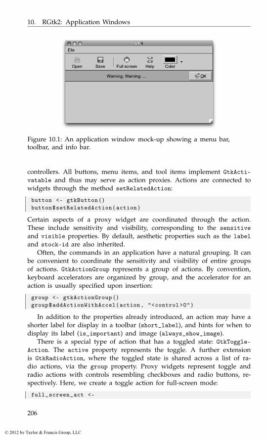
10. RGtk2: Application Windows
Figure 10.1: An application window mock-up showing a menu bar,toolbar, and info bar.
controllers. All buttons, menu items, and tool items implement GtkActi-vatable and thus may serve as action proxies. Actions are connected towidgets through the method setRelatedAction:
button <- gtkButton ( )button$setRelatedAction ( action )
Certain aspects of a proxy widget are coordinated through the action.These include sensitivity and visibility, corresponding to the sensitiveand visible properties. By default, aesthetic properties such as the labeland stock-id are also inherited.
Often, the commands in an application have a natural grouping. It canbe convenient to coordinate the sensitivity and visibility of entire groupsof actions. GtkActionGroup represents a group of actions. By convention,keyboard accelerators are organized by group, and the accelerator for anaction is usually specified upon insertion:
group <- gtkActionGroup ( )group$addActionWithAccel ( action , "<control>O" )
In addition to the properties already introduced, an action may have ashorter label for display in a toolbar (short_label), and hints for when todisplay its label (is_important) and image (always_show_image).
There is a special type of action that has a toggled state: GtkToggle-Action. The active property represents the toggle. A further extensionis GtkRadioAction, where the toggled state is shared across a list of ra-dio actions, via the group property. Proxy widgets represent toggle andradio actions with controls resembling checkboxes and radio buttons, re-spectively. Here, we create a toggle action for full-screen mode:
full_screen_act <-
206
© 2012 by Taylor & Francis Group, LLC
10.2. Menus
gtkToggleAction ( "fullscreen" , "Full screen" ,"Toggle full screen" ,stock . id = "gtk-fullscreen" )
gSignalConnect ( full_screen_act , "toggled" , function ( action ) {if ( full_screen_action [ ’active’ ] )
window$fullscreen ( )else
window$unfullscreen ( )} )
We connect to the toggled signal to respond to a change in the actionstate.
10.2 Menus
A menu is a compact, hierarchically organized collection of buttons, each ofwhich may proxy an action. Menus listing window-level actions are usuallycontained within a menu bar at the top of the window or screen. Menuswith options specific to a particular GUI element may “pop up” whenthe user interacts with the element, such as by clicking the right mousebutton. Menu bars and pop-up menus can be constructed by appendingeach menu item and submenu separately, as illustrated below. For menuswith more than a few items, we recommend the strategies described inSection 10.5.
Menu bars
We will first demonstrate the menu bar, leaving the pop-up menu for later.Figure 10.1 shows a realization. The first step is to construct the menu baritself:
menubar <- gtkMenuBar ( )
A menu bar is a special type of container called a menu shell. Aninstance of GtkMenuShell contains one or more menu items. GtkMenuItemis an implementation of GtkActivatable, so each menu item may proxyan action. Usually, a menu bar consists of multiple instances of the othertype of menu shell: the menu, GtkMenu. Here, we create a menu object forour “File” menu:
file_menu <- gtkMenu ( )
As a menu is not itself a menu item, we first must embed the menu intoa menu item, which is labeled with the menu title:
file_item <- gtkMenuItemNewWithMnemonic ( label = "_File" )file_item$setSubmenu ( file_menu )
207
© 2012 by Taylor & Francis Group, LLC
10. RGtk2: Application Windows
The underscore in the label indicates the key associated with the mnemonicfor use when navigating the menu with a keyboard. Finally, we appendthe item containing the file menu to the menu bar:
menubar$append ( file_item )
In addition to append, it is also possible to prepend and insert menuitems into a menu shell. As with any container, we can remove a childmenu item, although the convention is to desensitize an item, through thesensitive property, when it is not currently relevant.
Next, we populate our file menu with menu items that perform somecommand. For example, we may desire an open item:
open_item <- gtkMenuItemNewWithMnemonic ( "_Open" )
This item does not have an associated GtkAction, so we need to imple-ment its activate signal directly:
gSignalConnect ( open_item , "activate" , function ( item ) {file . show ( file . choose ( ) )
} )
The item is now ready to be added to the file menu:
file_menu$append ( open_item )
It is recommended, however, that we create menu items that proxy anaction. This will facilitate, for example, adding an equivalent toolbar itemlater. We demonstrate with a “Save” action:
save_action <-gtkAction ( "save" , "Save" , "Save object" , "gtk-save" )
Then the appropriate menu item is generated from the action and addedto the file menu:
save_item <- save_action$createMenuItem ( )file_menu$append ( save_item )
A simple way to organize menu items, besides grouping into menus,is to insert separators between logical groups of items. Here, we insert aseparator item, rendered as a line, to group the open and save commandsapart from the rest of the menu:
file_menu$append ( gtkSeparatorMenuItem ( ) )
Toggle menu items, i.e., a label next to a checkbox, are also supported.A toggle action will create one implicitly:
auto_save_action <- gtkToggleAction ( "autosave" , "Autosave" ,"Enable autosave" )
auto_save_item <- auto_save_action$createMenuItem ( )file_menu$append ( auto_save_item )
208
© 2012 by Taylor & Francis Group, LLC
10.2. Menus
Finally, we add our menu bar to the top of a window:
main_mindow <- gtkWindow ( )vbox <- gtkVBox ( )main_mindow$add ( vbox )vbox$packStart ( menubar , FALSE , FALSE )
Pop-up menus
Example 10.1: Pop-up menusTo illustrate pop-up menus, we construct one and display it in response toa mouse click. We start with a gtkMenu instance, to which we add someitems:
popup <- gtkMenu ( ) # t o p l e v e lpopup$append ( gtkMenuItem ( "cut" ) )popup$append ( gtkMenuItem ( "copy" ) )popup$append ( gtkSeparatorMenuItem ( ) )popup$append ( gtkMenuItem ( "paste" ) )
Let us assume that we have a button that will pop up a menu whenclicked with the third (right) mouse button:
button <- gtkButton ( "Click me with right mouse button" )window <- gtkWindow ( ) ; window$setTitle ( "Popup menu example" )window$add ( button )
This menu will be shown by calling gtkMenuPopup in response to thebutton-press-event signal on the button:
gSignalConnect ( button , "button-press-event" ,f = function ( button , event , menu ) {
if ( event$getButton ( ) == 3 ||( event$getButton ( ) == 1 && # a macevent$getState ( ) == GdkModifierType [ ’control-mask’ ] ) )
gtkMenuPopup ( menu ,button = event$getButton ( ) ,activate . time = event$getTime ( ) )
return ( FALSE )} , data = popup )
The gtkMenuPopup function is called with the menu, some optional argu-ments for placement, and some values describing the event: the mousebutton and time. The event values can be retrieved from the second argu-ment of the callback (a GdkEvent).
The above will pop up a menu, but until we bind a callback to theactivate signal on each item, nothing will happen when a menu item isselected. Below we supply a stub for sake of illustration:
209
© 2012 by Taylor & Francis Group, LLC
10. RGtk2: Application Windows
sapply ( popup$getChildren ( ) , function ( child ) {if ( !inherits ( child , "GtkSeparatorMenuItem" ) ) # s k i p t h e s e
gSignalConnect ( child , "activate" ,f = function ( child , data ) message ( "replace me" ) )
} )
We iterate over the children, avoiding the separator.
10.3 Toolbars
Toolbars are like menu bars in that they are containers for activatable items,but toolbars are not hierarchical. Also, their items are usually visible forthe lifetime of the application, not upon user interaction. Thus, toolbarsare not appropriate for storing a large number of items, only those thatare activated most often.
We begin by constructing an instance of GtkToolbar:
toolbar <- gtkToolbar ( )
In analogous fashion to the menu bar, toolbars are containers for toolitems. Technically, an instance of GtkToolItem could contain any type ofwidget, yet toolbars typically represent actions with buttons. The GtkTool-Button widget implements this common case. Here, we create a tool buttonfor opening a file:
open_button <- gtkToolButton ( stock . id = "gtk-open" )
Tool buttons have a number of properties, including label and severalfor icons. Above, we specify a stock identifier, for which there is a prede-fined translated label and theme-specific icon. As with any other container,the button can be added to the toolbar with the add method:
toolbar$add ( open_button )
This appends the open button to the end of the toolbar. To insert intoa specific position, we would call the insert method.
Usually, any application with a toolbar also has a menu bar, in whichcase many actions are shared between the two containers. Thus, it is of-ten beneficial to construct a tool button directly from its correspondingaction:
save_button <- save_action$createToolItem ( )toolbar$add ( save_button )
A tool button is created from the saveAction object of the previous section.Like menus, related buttons may be grouped using separators:
toolbar$add ( gtkSeparatorToolItem ( ) )
Any toggle action will create a toggle tool button as its proxy:
210
© 2012 by Taylor & Francis Group, LLC
10.3. Toolbars
full_screen_button <- full_screen_act$createToolItem ( )toolbar$add ( full_screen_button )
A GtkToggleToolButton embeds a GtkToggleButton, which is de-pressed whenever its active property is TRUE.
As mentioned above, toolbars, unlike menus, are usually visible for theduration of the application. This is desirable, as the actions in a toolbarare among those most commonly performed. However, care must be takento conserve screen space. The toolbar style controls whether the tool itemsdisplay their icons, their text, or both. The possible settings are in theGtkToolbarStyle enumeration. The default value is specified by the globalGTK+ style (theme). Here, we override the default to display only images:
toolbar$setStyle ( "icon" )
For canonical actions like open and save, icons are usually sufficient.Some actions, however, may require textual explanation. The is-importantproperty on the action will request display of the label in a particular toolitem, in addition to the icon:
full_screen_act [ "is-important" ] <- TRUE
Normally, tool items are tightly packed against the left side of thetoolbar. Sometimes, a more complex layout is desired. For example, wemay wish to place a help item against the right side. We can achieve thiswith an invisible item that expands against its siblings:
expander <- gtkSeparatorToolItem ( )expander [ "draw" ] <- FALSEtoolbar$add ( expander )toolbar$childSet ( expander , expand = TRUE )
The dummy item is a separator with its draw property set to FALSE andits expand child property set to TRUE. Now we can add the help item:
help_action <- gtkAction ( "help" ,"Help" ,"Get help" ,"gtk-help" )toolbar$add ( help_action$createToolItem ( ) )
It is now our responsibility to place the toolbar at the top of the win-dow, under the menu created in the previous section:
vbox$packStart ( toolbar , FALSE , FALSE )
Example 10.2: Color-menu tool buttonSpace in a toolbar is limited, and sometimes there are several actions thatdiffer only by a single parameter. A good example is the color tool buttonfound in many word processors. Including a button for every color in thepalette would consume an excessive amount of space. A common idiom isto embed a drop-down menu next to the button, much like a combo box,for specifying the color, or, in general, any discrete parameter.
211
© 2012 by Taylor & Francis Group, LLC

10. RGtk2: Application Windows
We demonstrate how one might construct a color-selecting tool button.Our menu will list the colors in the R palette. The associated button isa GtkColorButton. When the user clicks on the button, a more complexcolor selection dialog will appear, allowing total customization.
gdk_color <- gdkColorParse ( palette ( ) [ 1 ] ) $colorcolor_button <- gtkColorButton ( gdk_color )
The gtkColorButton constructor requires the initial color to be specifiedas a GdkColor, which we parse from the R color name.
The next step is to build the menu. Each menu item will display a20x20 rectangle, filled with the color, next to the color name:
colorMenuItem <- function ( color ) {drawing_area <- gtkDrawingArea ( )drawing_area$setSizeRequest ( 2 0 , 20)drawing_area$modifyBg ( "normal" , color )image_item <- gtkImageMenuItem ( color )image_item$setImage ( drawing_area )image_item
}color_items <- sapply ( palette ( ) , colorMenuItem )color_menu <- gtkMenu ( )for ( item in color_items )
color_menu$append ( item )
An important realization is that the image in a GtkImageMenuItem maybe any widget that presumably draws an icon; it need not be an actualGtkImage. In this case, we use a drawing area with its background setto the color. When an item is selected, its color will be set on the colorbutton:
colorMenuItemActivated <- function ( item ) {color <- gdkColorParse ( item$getLabel ( ) ) $colorcolor_button$setColor ( color )
}sapply ( color_items , gSignalConnect , "activate" ,
colorMenuItemActivated )
Finally, we place the color button and menu together in the menu toolbutton:
menu_button <- gtkMenuToolButton ( color_button , "Color" )menu_button$setMenu ( color_menu )toolbar$add ( menu_button )
Some applications may offer a large number of actions, where there isno clear subset of actions that are more commonly performed than the
212
© 2012 by Taylor & Francis Group, LLC
10.4. Status reporting
rest. It would be impractical to place a tool item for each action in a statictoolbar. GTK+ provides a tool palette widget, which leaves the configurationof a multi-row toolbar to the user, as one solution. The tool items are or-ganized into collapsible groups, and the grouping is customizable throughdrag-and-drop.
GtkToolPalette is a container of GtkToolItemGroup widgets, each ofwhich is a container of tool items and implements GtkToolShell, likeGtkToolbar. We begin our brief example by creating two groups of toolitems:
file_group <- gtkToolItemGroup ( "File" )file_group$add ( gtkToolButton ( stock . id = "gtk-open" ) )file_group$add ( save_action$createToolItem ( ) )help_group <- gtkToolItemGroup ( "Help" )help_group$add ( help_action$createToolItem ( ) )
The groups are then added to an instance of GtkToolPalette:
palette <- gtkToolPalette ( )palette$add ( file_group )palette$add ( help_group )
Finally, we can programmatically collapse a group:
help_group$setCollapsed ( TRUE )
10.4 Status reporting
Status bars
In GTK+, a status bar is constructed through the gtkStatusbar function.Status bars must be placed at the bottom of top-level windows. A statusbar keeps various stacks of messages for display. Stacks and messagesare associated with a context ID, which represents a message source. Itis required to register each context ID against a string description. Thevisibility depends on the ordering of the global stack, while the context IDallows the status bar to maintain a separate message stack for each part ofan application, without worry of interference between components.
To display a message, we push it onto the top of the global stack,as well as a context stack, through the push method, which expects aninteger value for context.id and a message. To pop a message from acontext stack, pass the context ID to the pop method. If the message wason top of the global stack, the next message down becomes visible.
Below, we create a status bar, register a context for I/O-related mes-sages, display the message, and then pop it to restore the original state:
statusbar <- gtkStatusbar ( )
213
© 2012 by Taylor & Francis Group, LLC
10. RGtk2: Application Windows
io_id <- statusbar$getContextId ( "I/O" )statusbar$push ( io_id , "Incomplete final line" )## . . .statusbar$pop ( io_id )
Info bars
An info bar is similar in purpose to a message dialog, but it is intendedto be less obtrusive. Typically, an info bar raises from the bottom of thewindow, displaying a message, possibly with response buttons. It thenfades away after a number of seconds. The focus is not affected, nor is theuser interrupted. GTK+ provides the GtkInfoBar class for this purpose.The use is similar to a dialog: we place widgets into a content area andlisten to the response signal.
We create our info bar:
info_bar <- gtkInfoBar ( show=FALSE )info_bar$setNoShowAll ( TRUE )
We call setNoShowAll to prevent the widget from being shown whenshowAll is called on the parent. Normally, an info bar is not shown untilit has a message.
We will emit a warning message by adding a simple label with the textand specifying the message type as warning, from GtkMessageType:
label <- gtkLabel ( "Warning, Warning ...." )info_bar$setMessageType ( "warning" )info_bar$getContentArea ( ) $add ( label )
A button to allow the user to hide the bar can be added as follows:
info_bar$addButton ( button . text = "gtk-ok" ,response . id = GtkResponseType [ ’ok’ ] )
This is similar to the dialog API: the appearance of the “Ok” button isdefined by the stock ID gtk-ok, and the response ID will be passed to theresponse signal when the button is clicked. Our handler simply closes thebar:
gSignalConnect ( info_bar , "response" ,function ( info_bar , resp . id ) info_bar$hide ( ) )
Finally, we add the info bar to our main window and show it:
vbox$packStart ( info_bar , expand = FALSE )info_bar$show ( )
214
© 2012 by Taylor & Francis Group, LLC
10.5. Managing a complex user interface
10.5 Managing a complex user interface
Complex applications implement a large number of actions and operatein a number of different modes. Within a given mode, only a subset ofactions are applicable. For example, a word processor may have an editingmode and a print preview mode. GTK+ provides a user interface manager,GtkUIManager, to manage the layout of the toolbars and menu bars acrossmultiple user-interface modes. We illustrate through an example.
The steps required to use GTK+’s UI manager are:
1. construct the UI manager,
2. specify in XML the layout of the menu bars and toolbars,
3. define the actions in groups,
4. connect the action group to the UI manager,
5. set up an accelerator group for keyboard shortcuts, and finally
6. display the widgets.
Example 10.3: UI manager exampleIn this example, we show how to use a UI manager to create the menu andtoolbars for a data-frame editor, similar to, but with enhanced functionality,as produced on some platforms by the data.entry function.
Our menu bar and toolbar layout is expressed in XML according to aschema specified by the UI manager framework. The XML can be storedin a file or an R character vector. The structure of the file can be graspedquickly from this example:
ui . xml <- readLines ( out <- textConnection ( ’<ui>
<menubar name="menubar"><menu name="FileMenu" action="File">
<menuitem action="Save"/><menuitem action="SaveAs" /><menu name="Export" action="Export">
<menuitem action="ExportToCSV" /><menuitem action="ExportToSaveFile" />
</menu><separator /><menuitem name="FileQuit" action="CloseWindow" />
</menu><menu action="Edit">
<menuitem name="EditUndo" action="Undo" /><menuitem name="EditRedo" action="Redo" />
215
© 2012 by Taylor & Francis Group, LLC
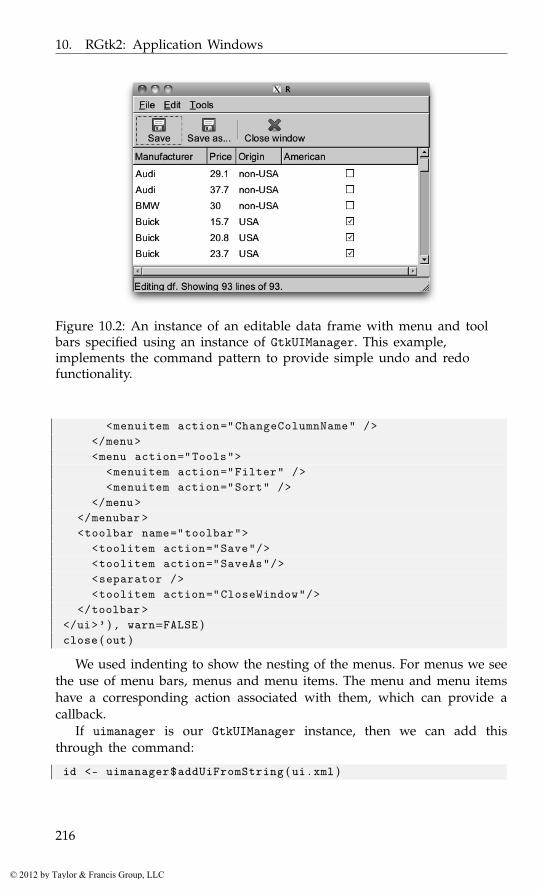
10. RGtk2: Application Windows
Figure 10.2: An instance of an editable data frame with menu and toolbars specified using an instance of GtkUIManager. This example,implements the command pattern to provide simple undo and redofunctionality.
<menuitem action="ChangeColumnName" /></menu><menu action="Tools">
<menuitem action="Filter" /><menuitem action="Sort" />
</menu></menubar><toolbar name="toolbar">
<toolitem action="Save"/><toolitem action="SaveAs"/><separator /><toolitem action="CloseWindow"/>
</toolbar></ui>’ ) , warn=FALSE )close ( out )
We used indenting to show the nesting of the menus. For menus we seethe use of menu bars, menus and menu items. The menu and menu itemshave a corresponding action associated with them, which can provide acallback.
If uimanager is our GtkUIManager instance, then we can add thisthrough the command:
id <- uimanager$addUiFromString ( ui . xml )
216
© 2012 by Taylor & Francis Group, LLC
10.5. Managing a complex user interface
Alternately, we could load the code from a file. The return value is an IDthat can be used to unmerge this part of the UI. The ability to merge andunmerge parts of the UI is one main attraction for using this framework,although we do not illustrate that here.
To define the actions, we can use lists. Each item contains six pieces ofinformation: a name (which we use in fun to call the appropriate method),a stock-id, a label, a keyboard accelerator, a tooltip, and finally a callbackfor when the action is invoked. This list defines the file menu:
file_list <-list ( ## name , ID , l a b e l , a c c e l e r a t o r , t o o l t i p , c a l l b a c k
list ( "File" , NULL , "_File" , NULL , NULL , NULL ) ,list ( "Save" , "gtk-save" , "Save" , "<ctrl>S" ,
"Save data to variable" , fun ) ,list ( "SaveAs" , "gtk-save" , "Save as..." , NULL ,
"Save data to variable" , fun ) ,list ( "Export" , NULL , "Export" , NULL , NULL , NULL ) ,list ( "ExportToCSV" , "gtk-export" , "Export to CSV" ,
NULL , "Save data to CSV file" , fun ) ,list ( "ExportToSaveFile" , "gtk-export" ,
"Export to save file" , NULL ,"Save data to save() file" , fun ) ,
list ( "CloseWindow" , "gtk-close" , "Close window" ,"<ctrl>W" , "Close current window" , fun )
)
We can add these items to an action group, along the lines of
action_group <- gtkActionGroup ( "FileGroup" )action_group$addActions ( file_list )
We can then insert the action group into the UI manager:
uimanager$insertActionGroup ( action_group , 0 )
The position (0) is used to determine which action will be called, whenthere is more than one with the same name.
We now place the UI manager controls into the GUI. The uimanager in-stance creates widgets that can be retrieved through its getWidget method.The following code uses this to sketch out the layout of the GUI:
window <- gtkWindow ( show = FALSE )##vbox <- gtkVBox ( )window$add ( vbox )##menubar <- uimanager$getWidget ( "/menubar" )vbox$packStart ( menubar , FALSE )toolbar <- uimanager$getWidget ( "/toolbar" )vbox$packStart ( toolbar , FALSE )
217
© 2012 by Taylor & Francis Group, LLC

10. RGtk2: Application Windows
## . . .
The menubar and toolbar widgets are referred to by their path, whichcomes from the names specified in the XML description separated by "/".So, in the definition above, the following lines define the path "/menubar",where <ui> is always the root element, and may be omitted from the path:
<ui><menubar name="menubar">
...
Finally, to connect the UI manager to the window, we add the keyboardaccelerator group:
window$addAccelGroup ( uimanager$getAccelGroup ( ) )
Figure 10.2 shows an illustration of the finished application. The fulldetails are found in the code in our accompanying package ProgGUIinR.
Command pattern Now, we discuss how the command pattern is imple-mented to provide a simple undo and redo feature to our editing. Ac-cording to Head First Design Patterns[7], the command pattern is used toencapsulate a request (method call) as an object. A basic command objecthas just one method, execute. Any needed parameters are stored in theobject as properties. The command pattern has GUI-related applications be-yond the undo and redo stack, including the action objects (i.e., instancesof GtkAction) that are managed by GtkUIManager.
For our implementation of the undo/redo stack, we use a referenceclass with fields:
Command <- setRefClass ( "Command" ,fields = list (
receiver="ANY" ,meth="character" ,params="list" ,old_params="list") )
The receiver property stores the object referred to in the method call.For a simple function call, this could be the environment enclosing thefunction. The meth property is the name of the method, and params is alist of parameters. With these we define the main methods:
Command$methods (initialize = function ( receiver , meth , . . . ) {
[7] Eric T. Freeman, Elisabeth Robson, Bert Bates, and Kathy Sierra. Head First DesignPatterns. O’Reilly Media, Inc., October 25, 2004.
218
© 2012 by Taylor & Francis Group, LLC
10.5. Managing a complex user interface
. params <- list ( . . . )initFields ( receiver = receiver , meth = meth ,
params = . params , old_params = . params )callSuper ( )
} ,execute = function ( params ) {
do . call ( call_meth ( meth , receiver ) , params )} )
Notice we pass in the arguments to our execute method, rather thanuse those in the property params. This allows us to implement the do andundo methods in a similar manner:
Command$methods (do = function ( ) {
out <- execute ( params )old_params$value <<- out
} ,undo = function ( ) execute ( old_params ))
This assumes the method executed can return a value that can be used toreverse the call. If a method call is not so straightforward to reverse, weneed only subclass the Command call and provide a new undo method.
A simple illustration might be:
x <- 1set_x <- function ( value ) {
old <- xx <<- valueold
}cmd <- Command$new ( . GlobalEnv , "set_x" , value = 2)cmd$do ( ) ; x
[1] 2
cmd$undo ( ) ;
x
[1] 1
In our example, we create a stack of commands to keep track of whatwas done. This stack has methods add, undo, and redo, each calling the door undo method of the appropriate command in the stack.
The first command we add to the stack is the setting of a column nameon a data frame:
219
© 2012 by Taylor & Francis Group, LLC
10. RGtk2: Application Windows
cmd <- Command$new ( df_model , "set_col_name" , j=j , value=value )command_stack$add ( cmd )
To explain, df_model is an instance of a yet-to-be-defined reference classdefining a data model for the data frame being edited, and j and value aredetermined by a dialog called before the command is created. The pointis, the method call for the df_model object is encapsulated along with theneeded parameters (a column number and new name) and then added tothe command stack. The add method calls the do method of the commandto invoke the changing of the name.
The data frame model (defined in our reference class DfModel) is awrapper around an RGtkDataFrame object that holds the data. The methodcall above is implemented by:
DfModel$methods (get_col_name = function ( j ) varnames [ j , 1 ] ,get_col_names = function ( ) varnames [ , 1 ] ,set_col_name = function ( j , value ) {
"Set name, return old"old_col_name <- get_col_name ( j )varnames [ j , 1 ] <<- valueold_col_name
} )
We return the old value, as that is required by the implementation ofthe do method for the commands. An instance of RGtkDataFrame stores thevariable (column) names, hence the double index. This allows us to listenfor changes through the row-changed signal on the model. The details, andmore, are in the accompanying package.
220
© 2012 by Taylor & Francis Group, LLC
11
Extending GObject Classes
GTK+, as well as several of its dependencies, with the notable exception ofCairo, is based on the GObject library for object-oriented programming inC. GObject forms the basis of many other open-source projects, includingthe GNOME and XFCE desktops and the GStreamer multimedia framework.
Given the broad use of signals in the GTK+ API, it is very rarely nec-essary to extend a widget class when developing a typical GUI. However,it is generally good practice to encapsulate the behavior of a widget in aformal class. Although there are several such formalisms in R, RGtk2 pro-vides one that is congruent with the rest of GTK+. It interfaces with partsof GObject and permits the R programmer to create new GObject classesin R. A subclass can override certain methods inherited from its parentand define new methods, properties, and signals. If a method is declaredby a C class, it can be overridden only if it is a so-called virtual method,and there is no documentation as to which methods are virtual. There is aloose convention that every signal has a corresponding virtual method. Theultimate resource is the C header files. A bug in a method override couldvery easily crash R, so use of this feature takes some commitment fromthe programmer. Any method declared by an R class may be overriddenby an R subclass.
Our example will be a GUI that displays a scatterplot along with aslider for adjusting the alpha level of the points (Figure 11.1). Usually,a slider operates in linear fashion. When there are a large number ofpoints, on the order of tens of thousands or more, changing the alphalevel does not have a strong visual effect until it approaches its lower limit.We desire greater control in the lower part of the alpha scale, withoutlimiting the range of the slider. To achieve this, we need to perform anonlinear transformation from the slider value to the alpha of the plot andreflect that transformation in the label on the slider. One solution is toconnect to the format-value signal to override the text in the label. Wepresent an alternative that involves extending GtkHScale and overriding itsformat_value virtual method.
221
© 2012 by Taylor & Francis Group, LLC
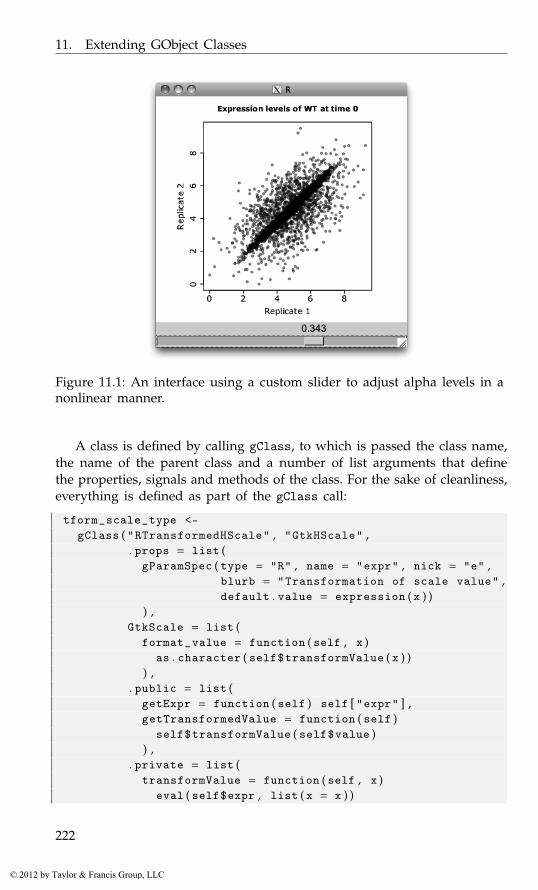
11. Extending GObject Classes
Figure 11.1: An interface using a custom slider to adjust alpha levels in anonlinear manner.
A class is defined by calling gClass, to which is passed the class name,the name of the parent class and a number of list arguments that definethe properties, signals and methods of the class. For the sake of cleanliness,everything is defined as part of the gClass call:
tform_scale_type <-gClass ( "RTransformedHScale" , "GtkHScale" ,
. props = list (gParamSpec ( type = "R" , name = "expr" , nick = "e" ,
blurb = "Transformation of scale value" ,default . value = expression ( x ) )
) ,GtkScale = list (
format_value = function ( self , x )as . character ( self$transformValue ( x ) )
) ,. public = list (
getExpr = function ( self ) self [ "expr" ] ,getTransformedValue = function ( self )
self$transformValue ( self$value )) ,
. private = list (transformValue = function ( self , x )
eval ( self$expr , list ( x = x ) )
222
© 2012 by Taylor & Francis Group, LLC
11. Extending GObject Classes
))
The class definition for RTransformedHScale starts with a property forthe R expression that transforms the value from the slider to the alphalevel. A property is defined by a GParamSpec structure that specifies aname, nickname, descriptive blurb, value type, and other options. Thereare subclasses of GParamSpec for particular types that permit specificationof further constraints. For example, GParamSpecInt is specific to integersand can be configured to restrict its valid range of integer values between aminimum and maximum. Many GParamSpec subclasses also permit defaultvalues. The type argument may refer to any C type by name. The names ofR types, like “integer” and “character”, are mapped to the correspondingscalar C type, if available. An “R” property, like our expression, stores anynative R value. The actual R type, as returned by typeof, may be specifiedas the s.type argument; otherwise, it is taken from the default value.
We turn our attention to the methods in the class definition. The classoverrides the format_value virtual from GtkScale and defines two publicmethods, getExpr and getTransformedValue, for retrieving the transfor-mation expression and the transformed value, respectively. There is oneprivate method, transformValue, that is a utility for evaluating the expres-sion on the current value.
Methods are implemented with R functions that are grouped into lists.The names of the list identify the methods. An override is placed into thelist corresponding to the class in which the original method is declared.For new methods, the division is by the access level: public, protected,or private. Public members can be accessed by any code, while protectedmembers are restricted to methods belonging to the same class or a sub-class. Access to private members is the most restricted, as they are availableonly to methods in the same class.
A function implementing a virtual method may delegate to the methodthat it overrides. This is achieved by calling the parentHandler functionand passing it the name of the method and the arguments to forward tothe method. This is similar to the super function in qtbase. For example,in the override of format_value in the RGtkTransformedHScale class, wecould call parentHandler("format_value", self, x) to delegate to theimplementation of format_value in GtkScale.
If a non-function, like a vector, is placed in the .public, .protected, or.private list, it represents a field, which is initialized to the given value.
Two elements of the class definition that are not in the example aboveare the list of signal definitions and the initialization function. The signaldefinition list is passed as a parameter named .signals and contains a listfor each signal. Each list includes the name, return type, and parametertypes of the signal. The types can be specified in the same format as
223
© 2012 by Taylor & Francis Group, LLC
11. Extending GObject Classes
used for property definitions. The initialization function, passed as the.initialize parameter, is invoked whenever an instance of the class iscreated, before any properties are set. It takes the newly created instanceof the class as its only parameter.
The next step in our example is to create an instance of RGtkTrans-formedHScale and to register a handler on the value-changed signal thatwill draw the plot using the transformed value as the alpha setting:
adj <- gtkAdjustment ( 0 . 5 , 0 . 1 5 , 1 . 0 0 , 0 . 0 5 , 0 . 5 , 0 )s <- gObject ( tform_scale_type , adjustment = adj ,
expr = expression ( x^ 3 ) )gSignalConnect ( s , "value_changed" , function ( scale ) {
plot ( ma_data , col = rgb ( 0 , 0 , 0 , scale$getTransformedValue ( ) ) ,xlab = "Replicate 1" , ylab = "Replicate 2" ,main = "Expression levels of WT at time 0" , pch = 19)
} )
Instances of any GObject class can be created using the gObject func-tion. The value of the expr property is set to the R expression x3 when theobject is created. The signal handler now calls the new getTransformed-Value method, instead of getValue as in the original version. The ma_dataobject is a matrix of points that is meant to resemble expression valuesfrom two replicates of a microarray experiment.
We complete the example by placing the slider and a graphics devicein a window:
win <- gtkWindow ( show = FALSE )da <- gtkDrawingArea ( )vbox <- gtkVBox ( )vbox$packStart ( da )vbox$packStart ( s , FALSE )win$add ( vbox )win$setDefaultSize ( 4 0 0 , 400)#require ( cairoDevice )asCairoDevice ( da )#win$showAll ( )par ( pty = "s" )s$setValue ( 0 . 7 )
224
© 2012 by Taylor & Francis Group, LLC

Part III
The qtbase Package
225
© 2012 by Taylor & Francis Group, LLC
12
Qt: Overview
12.1 The Qt library
Qt is an open-source, cross-platform application framework that is perhapsbest known for its widget toolkit. The features of Qt are divided into abouta dozen modules. We highlight some of the more important and interestingones:
Core Basic utilities, collections, threads, I/O, ...
Gui Widgets, models, etc., for graphical user interfaces
OpenGL Convenience layer (e.g., 2-D drawing API) over OpenGL
Webkit Embeddable HTML renderer (shared with Safari, Chrome)
Other modules include functionality for networking, XML, SQLdatabases, SVG, and multimedia. However, R packages already providemany of those features.
The history of Qt begins with Haavard Nord and Eirik Chambe-Eng in1991 and follows with the Trolltech company until 2008. It is now owned byNokia, a major cell-phone manufacturer. While it was originally unavailableas open source on every platform, version 4 was released universally underthe GPL. With the release of Qt 4.5, Nokia additionally placed Qt underthe LGPL, so it is available for use in proprietary software as well. Popularsoftware developed with Qt includes the communication application Skypeand the KDE desktop for Linux. The desktop version of RStudio usesthe QWebView widget to present a cross-platform web application on thedesktop. This book assumes version Qt 4.7.3 and should remain compatiblefor the remainder of the 4.x series.
Qt is developed in C++ with extensions that require a special prepro-cessor called the Meta Object Compiler (MOC). The MOC allows for convenientsyntax in the definition of signals, slots (signal handlers), and properties,which behave very similarly to those of GTK+.
227
© 2012 by Taylor & Francis Group, LLC
12. Qt: Overview
There are many languages with bindings to Qt, and R is one such lan-guage. The qtbase package interfaces with every module of the library. Asits name suggests, qtbase forms the base for a number of R packages thatprovide high-level special-purpose interfaces to Qt. The qtpaint packageextends the QGraphicsView canvas to better support interactive statisticalgraphics. Features include: a layered buffering strategy, efficient spatialqueries for mapping user actions to the data, and an OpenGL rendereroptimized for statistical plots. An interface resembling that of the latticepackage is provided for qtpaint by the mosaiq package. The cranvaspackage builds on qtpaint to provide a collection of high-level interactiveplots in the conceptual vein of GGobi. A number of general utilities areimplemented by qtutils, including an object browser widget, an R consolewidget, and a conventional R graphics device based on QGraphicsView.
While qtbase is not yet as mature as tcltk and RGtk2, we include itin this book, as Qt compares favorably to GTK+ in terms of GUI featuresand excels in several other areas, including its fast graphics canvas andintegration of the WebKit web browser.1 In addition, Qt, as a commerciallysupported package, has thorough documentation of its API[2], includingmany C++ examples. However, the complexity of C++ and Qt may presentsome challenges to the R user. In particular, the developer should have astrong grounding in object-oriented programming and have a basic under-standing of memory management.
The qtbase package is available from CRAN. The package depends onthe Qt framework, available as a binary install from http://qt.nokia.com/. Before qtbase is loaded, an automated attempt to install the frame-work is made, if it is not already present.
12.2 An introductory example
As a synopsis for how to program a GUI using qtbase, we present asimple dialog that allows the user to input a date. A detailed introductionto these concepts will follow this example.
The package may be loaded like any other R package:
library ( qtbase )
Constructors As with all other toolkits, Qt widgets are objects, and theobjects are created with constructors. For our GUI we have four basicwidgets: a widget used as a container to hold the others, a label, a single-line edit area, and a button.
1There is a GTK+ WebKit port, but it is not included with GTK+ itself.
[2] Nokia Corporation. http://http://doc.qt.nokia.com/.
228
© 2012 by Taylor & Francis Group, LLC
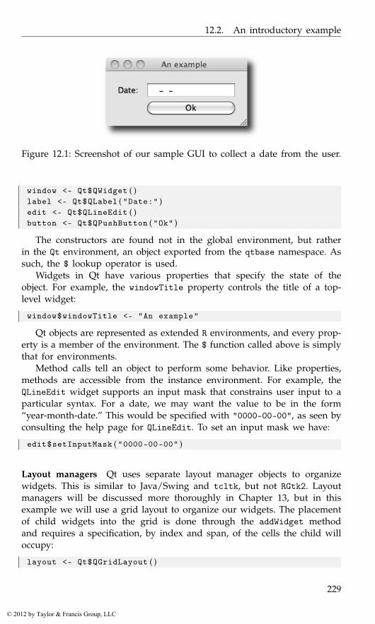
12.2. An introductory example
Figure 12.1: Screenshot of our sample GUI to collect a date from the user.
window <- Qt$QWidget ( )label <- Qt$QLabel ( "Date:" )edit <- Qt$QLineEdit ( )button <- Qt$QPushButton ( "Ok" )
The constructors are found not in the global environment, but ratherin the Qt environment, an object exported from the qtbase namespace. Assuch, the $ lookup operator is used.
Widgets in Qt have various properties that specify the state of theobject. For example, the windowTitle property controls the title of a top-level widget:
window$windowTitle <- "An example"
Qt objects are represented as extended R environments, and every prop-erty is a member of the environment. The $ function called above is simplythat for environments.
Method calls tell an object to perform some behavior. Like properties,methods are accessible from the instance environment. For example, theQLineEdit widget supports an input mask that constrains user input to aparticular syntax. For a date, we may want the value to be in the form“year-month-date.” This would be specified with "0000-00-00", as seen byconsulting the help page for QLineEdit. To set an input mask we have:
edit$setInputMask ( "0000-00-00" )
Layout managers Qt uses separate layout manager objects to organizewidgets. This is similar to Java/Swing and tcltk, but not RGtk2. Layoutmanagers will be discussed more thoroughly in Chapter 13, but in thisexample we will use a grid layout to organize our widgets. The placementof child widgets into the grid is done through the addWidget methodand requires a specification, by index and span, of the cells the child willoccupy:
layout <- Qt$QGridLayout ( )
229
© 2012 by Taylor & Francis Group, LLC
12. Qt: Overview
layout$addWidget ( label , row = 0 , column = 0 ,rowSpan = 1 , columnSpan = 1)
layout$addWidget ( edit , 0 , 1 , 1 , 1 )layout$addWidget ( button , 1 , 1 , 1 , 1 )
We need to attach our layout to the widget window:
window$setLayout ( layout )
Finally, to view our GUI (Figure 12.1), we must call its show method.
window$show ( )
Callbacks As with other GUI toolkits, interactivity is implemented bycallbacks connected to particular signals. To react to the clicking of thebutton, the programmer attaches a handler to the clicked signal using theqconnect function. The function requires the object, the signal name, andthe handler. Here, we print the value stored in the “Date” field.
handler <- function ( ) print ( edit$text )qconnect ( button , "clicked" , handler )
We will discuss callbacks more completely in Section 12.6.
Object-oriented support QLineEdit can validate text input, and we wouldlike to validate the entered date. There are a few built-in validators. Forthis purpose the regular expression validator could be used, but it wouldbe difficult to write a sufficiently robust expression. Instead we attempt tocoerce the string value to a date via R’s as.Date function with a format of"%Y-%m-%d". In GTK+, validation would be implemented by a signal han-dler or other callback. However, as C++ is object-oriented, Qt expects theprogrammer to derive a new class from QValidator and pass an instanceto the setValidator method on QLineEdit.
It is possible to define R subclasses of C++ classes with qtbase. Moredetails on working with classes and methods are provided in Section 12.8.For this task, we need to extend QValidator and override its validatevirtual method. The qsetClass function defines a new class:
qsetClass ( "DateValidator" , Qt$QValidator ,function ( parent = NULL ) {
super ( parent )} )
To override validate, we call qsetMethod:
qsetMethod ( "validate" , DateValidator , function ( input , pos ) {if ( !grepl ( "^[0-9]{4}-[0-9]{1,2}-[0-9]{1,2}$" , input ) )
return ( Qt$QValidator$Intermediate )else if ( is . na ( as . Date ( input , format="%Y-%m-%d" ) ) )
230
© 2012 by Taylor & Francis Group, LLC
12.3. Classes and objects
return ( Qt$QValidator$Invalid )else
return ( Qt$QValidator$Acceptable )} )
The signature of the validate method is a string containing the inputand an index indicating where the cursor is in the text box. The returnvalue indicates a state of “Acceptable,” “Invalid,” or, if neither can bedetermined, “Intermediate.” These values are listed in an enumeration inthe Qt$QValidator class (cf. Section 12.7 for more on enumerations).
The class object, which doubles as the constructor, is defined in thecurrent top-level environment as a side effect of qsetMethod. We call it toconstruct an instance, which is passed to the edit widget:
validator <- DateValidator ( )edit$setValidator ( validator )
12.3 Classes and objects
The qtbase package exports very few objects. The central one is an envi-ronment, Qt, that represents the Qt library in R.2 The components of thisenvironment are RQtClass objects that represent an actual C++ class ornamespace. For example, the QWidget class is represented by Qt$QWidget:
Qt$QWidget
Class ’QWidget ’ with 315 public methods
An RQtClass object contains methods in the class scope (static methodsin C++), enumerations defined by the class, and additional RQtClass ob-jects representing nested classes or namespaces. Here we list some of thecomponents of QWidget:
head ( names ( Qt$QWidget ) , n = 3)
[1] "connect" "DrawChildren" "DrawWindowBackground"
then access one of the enumeration values:
Qt$QWidget$DrawChildren
Enum value: DrawChildren (2)
Most importantly, however, an instance of RQtClass is in fact an R functionobject, and serves as the constructor of instances of the class. For example,we could construct an instance of QWidget with:
2 The Qt object is an instance of RQtLibrary. The qtbase package provides infrastructurefor binding any conventional C++ library, even those independent of Qt. Third-party packagescan define their own RQtLibrary object for some other library.
231
© 2012 by Taylor & Francis Group, LLC
12. Qt: Overview
widget <- Qt$QWidget ( )
The widget object has a class structure that reflects the class inheritancestructure of Qt:
class ( widget )
[1] "QWidget" "QObject" "QPaintDevice"[4] "UserDefinedDatabase" "environment" "RQtObject"
The base class, RQtObject, is an environment containing the properties andmethods of the instance. For widget, we list the first few using ls:
head ( ls ( widget ) , n=3)
[1] "mapFromParent" "setContextMenuPolicy" "showMinimized"
Properties and methods are accessed from the environment in the usualmanner. The most convenient extractor is the $ operator, but [[ and getwill also work. (With the $ operator R’s completion mechanism works(?rcompgen).) For example, a QWidget has a windowTitle property whichis used when the widget draws itself with a window:
widget$windowTitle # i n i t i a l l y NULL
NULL
widget$windowTitle <- "a new title" # s e t p r o p e r t ywidget$windowTitle
[1] "a new title"
Although Qt defines methods for accessing properties, the R user willnormally invoke methods that perform some action. For example, we couldshow our widget:
widget$show ( )
The environment structure of the object masks the fact that the prop-erties and methods can be defined in a parent class of the object. Forexample, a button widget is provided by the QPushButton constructor, asin
button <- Qt$QPushButton ( )
QPushButton extends QWidget and thus inherits the properties like visi-ble:
is ( button , "QWidget" )
[1] TRUE
232
© 2012 by Taylor & Francis Group, LLC

12.4. Methods and dispatch
button$visible
[1] FALSE
It is important to realize this distinction when referencing the documen-tation. As with GTK+, the methods are documented with the class thatdeclares the method.
12.4 Methods and dispatch
In C++, it is possible to have multiple methods and constructors with thesame name, but different signatures. This is called overloading. An over-loaded method is roughly similar to an S4 generic, save the obvious differ-ence that an S4 generic does not belong to any class. The selected overloadis that with the signature that best matches the types of the arguments.The exact rules of overload resolution are beyond our scope.
It is particularly common to overload constructors. For example, a sim-ple push button can be constructed in several different ways. Here againis the invocation of the QPushButton constructor with no arguments:
button <- Qt$QPushButton ( )
By convention, all classes derived from QObject, including QWidget,provide a constructor that accepts a parent QObject. This has importantconsequences that are discussed later. We demonstrate this for QPushBut-ton:
widget <- Qt$QWidget ( )button <- Qt$QPushButton ( widget )
An alternative constructor for QPushButton accepts the text for the labelon the button:
button <- Qt$QPushButton ( "Button text" )
Buttons can also have icons. for example,
style <- Qt$QApplication$style ( )icon <- style$standardIcon ( Qt$QStyle$SP_DialogOkButton )button <- Qt$QPushButton ( icon , "Ok" )
We have passed three types of objects as the first argument toQt$QPushButton: a QWidget, a string, and finally a QIcon. The dispatchdepends only on the type of argument, unlike the constructors in RGtk2,which dispatches based on which arguments are specified. (In particular,dispatch in Qt is based on position of argument, but not on names givento arguments. We use names only for clarity in our examples.)
The function qmethods will show the methods defined for a class. Itreturns a data frame with variables indicating the name, return value,
233
© 2012 by Taylor & Francis Group, LLC

12. Qt: Overview
signature, and whether the method is protected and static. For example, tolearn the methods for a simple button, we would call:
method_info <- qmethods ( Qt$QPushButton )dim ( method_info )
[1] 431 6
head ( method_info [ , 1 : 3 ] , n = 3)
name return signature1 QPushButton QPushButton* QPushButton ()2 QPushButton QPushButton* QPushButton(QWidget *)3 QPushButton QPushButton* QPushButton(QIcon , QString)
12.5 Properties
Every QObject, which includes every widget, may declare a set of prop-erties that represents its state. We list some of the available properties forour button:
head ( qproperties ( button ) )
type readable writableobjectName QString TRUE TRUEmodal bool TRUE FALSEwindowModality Qt:: WindowModality TRUE TRUEenabled bool TRUE TRUEgeometry QRect TRUE TRUEframeGeometry QRect TRUE FALSE
As shown in the table, every property has a type and logical settings forwhether the property is readable and/or writable. Virtually every propertyvalue can be read, and it is common for properties to be read-only. Forexample, we can fully manipulate the objectName property, but our attemptto modify the modal property fails:
button$objectName <- "My button"button$objectName
[1] "My button"
button$modal
[1] FALSE
cat ( try ( button$modal <- TRUE ) )
234
© 2012 by Taylor & Francis Group, LLC
12.6. Signals
Error in button$modal <- TRUE : Property ’modal ’ is read -only
Qt provides accessor methods for getting and setting properties. Thegetter methods have the same name as the property, so they are maskedat the R level. Setter methods are available and are typically named withthe word "set" followed by the property name:
button$setObjectName ( "My button" )
However, it is recommended to use the replacement syntax shown in theprevious example, for the sake of symmetry.
12.6 Signals
Qt uses an architecture of signals and slots to have components commu-nicate with each other. A component emits a signal when some eventhappens, such as a user clicking on a button. Qt allows us to define a spe-cial type of method known as a slot in another component (or the same)that can be connected to the signal as the handler. The two components aredecoupled, as the emitter does not need to know about the receiver exceptthrough the signal connection. In R, any function can be treated as a slotand connected as a signal handler. This is similar to the signal handling inRGtk2. The function qconnect establishes the connection of an R functionto a signal. For example:
button <- Qt$QPushButton ( "click me" )qconnect ( button , "clicked" , function ( ) message ( "ouch" ) )button$show ( )
Signals are defined by a class and are inherited by subclasses. Here, welist some of the available signals for the QPushButton class:
tail ( qsignals ( Qt$QPushButton ) , n = 5)
name signature4 pressed pressed ()5 released released ()6 clicked clicked(bool)7 clicked clicked ()8 toggled toggled(bool)
The signal definition specifies the callback signature, given in the signa-ture column. Like other methods, signals can be overloaded so that thereare multiple signatures for a given signal name. Signals can also have de-fault arguments, and arguments with a default value are optional in thesignal handler. We see this for the clicked signal, where the bool (logical)argument, indicating whether the button is checked, has a default valueof FALSE. The clicked signal is automatically overloaded with a signaturewithout any arguments.
235
© 2012 by Taylor & Francis Group, LLC
12. Qt: Overview
The qconnect function attempts to pick the correct signature by con-sidering the number of formal arguments in the callback. Rarely, two sig-natures will have the same number of arguments, in which case one willbe chosen arbitrarily. To connect to a specific signature, the full signa-ture, rather than only the name, should be passed to qconnect. For ex-ample, there are two signatures for the clicked signal: clicked() andclicked(bool). Even if we specify only clicked as the signal name, theclicked(bool) signature is chosen, since our handler has a single argu-ment. Thus, these two calls are equivalent:
qconnect ( button , "clicked" , function ( checked ) print ( checked ) )qconnect ( button , "clicked(bool)" ,
function ( checked ) print ( checked ) )
Any object passed to the optional argument user.data is passed as thelast argument to the signal handler. The user data serves to parameterizethe callback. In particular, it can be used to pass in a reference to thesender object itself, although we encourage the use of closures for thispurpose.
Disconnecting or blocking signals The qconnect function returns adummy QObject instance that provides the slot that wraps the R func-tion. This dummy object can be used with the disconnect method on thesender to break the signal connection:
proxy <- qconnect ( button , "clicked" ,function ( ) message ( "ouch" ) )
button$disconnect ( proxy )
[1] TRUE
The above will permanently disconnect the signal handler. To block all ofthe signals emitted by a particular QObject temporarily, call the blockSig-nals method. The method takes a logical value indicating whether thesignals should be blocked.
Hardware events Unlike GTK+, Qt widgets generally do not emit hard-ware events, such as a mouse-press event, via signals. Instead, a method inthe widget is invoked upon receipt of an event. The developer is expectedto extend the widget’s class and override the method to catch the event.The apparent philosophy of Qt is that hardware events are low level andthus should be handled by the widget, not some other instance. We willdiscuss extending classes in Section 12.8.
236
© 2012 by Taylor & Francis Group, LLC
12.7. Enumerations and flags
12.7 Enumerations and flags
Often, it is useful to have discrete variables with more than two states, inwhich case a logical value is no longer sufficient. For example, the labelwidget has a property for how its text is aligned. It supports the alignmentstyles left, right, center, top, bottom, etc. These styles are enumerated byinteger values and Qt defines these by name within the relevant class or,for global enumerations, in the Qt namespace. Here are examples of both:
Qt$Qt$AlignRight
Enum value: AlignRight (2)
Qt$QSizePolicy$Expanding
Enum value: Expanding (7)
The first is the value for right alignment from the Alignment enumerationin the Qt namespace, while the second is from the Policy enumeration inthe QSizePolicy class.
Although these enumerations can be specified directly as integers, theyare given the class QtEnum and have the overloaded operators | and &to combine values bitwise. This makes the most sense when the valuescorrespond to bit flags, as is the case for the alignment style. For example,aligning the text in a label in the upper right can be done through:
label <- Qt$QLabel ( "Our text" )label$alignment <- Qt$Qt$AlignRight | Qt$Qt$AlignTop
To check if the alignment is to the right, we could query by:
as . logical ( label$alignment & Qt$Qt$AlignRight )
[1] TRUE
12.8 Extending Qt classes from R
As Qt is implemented in an object-oriented language, C++, the designersof the API expect the developer to extend Qt classes, like QWidget, dur-ing the normal course of GUI development. This is a significant differencefrom GTK+, where it is necessary to extend classes only when we needto alter the behavior of a widget fundamentally (cf. Chapter 11). The qt-base package allows the R user to extend C++ classes in order to enhancethe features of Qt. The qtbase package includes functions qsetClass andqsetMethod to create subclasses and their methods. Methods may overridevirtual methods in an ancestor C++ class, and C++ code will invoke theR implementation when calling the overridden virtual. A property may be
237
© 2012 by Taylor & Francis Group, LLC
12. Qt: Overview
defined with a getter and setter function. If a type is specified, and theclass derives from QObject, the property will be exposed by Qt. It is alsopossible to store arbitrary objects in an instance of an R class; we will referto these as dynamic fields. They are private to the class but are otherwisesimilar to attributes on any R object. Their type is not checked, and theyare useful as storage mechanisms for implementing properties.
Defining a class
Here, we show a generic example and follow with a specific one.
qsetClass ( "SubClass" , Qt$QWidget )
This creates a variable named SubClass in the workspace:
SubClass
Class ’R::. GlobalEnv ::SubClass ’ with 315 public methods
Its value is an RQtClass object that behaves like the RQtClass for thebuilt-in classes, such as Qt$QWidget. There are no static methods or enu-merations in an R class, so the class object is essentially the constructor:
instance <- SubClass ( )
By default, the constructor delegates directly to the constructor in theparent class. A custom constructor is often useful, for example, to initial-ize fields or to make a compound widget. The function implementing theconstructor should be passed as the constructor argument. By conven-tion, QObject subclasses should provide a parent constructor argumentfor specifying the parent object. A typical usage would be:
qsetClass ( "SubClass2" , Qt$QWidget ,function ( property , parent = NULL ) {
super ( parent )this$property <- property
} )
Within the body of a constructor, the super variable refers to the con-structor of the parent class, often called the “super” class. In the above,we call super to delegate the registration of the parent to the QWidgetconstructor. Another special symbol in the body of a constructor is this,which refers to the instance being constructed. We can set and implicitlycreate fields in the instance by using the same syntax as setting properties.
Defining methods
We can define new methods, or override methods from a base class,through the qsetMethod function. For example, accessors for a field canbe defined with:
238
© 2012 by Taylor & Francis Group, LLC
12.8. Extending Qt classes from R
qsetMethod ( "field" , SubClass , function ( ) field )qsetMethod ( "setField" , SubClass , function ( value ) {
this$field <- value} )
For an override of an existing method to be visible from C++, themethod must be declared virtual in C++. The access argument specifiesthe scope of the method: "public" (default), "protected", or "private".These have the same meaning as in C++.
As with a constructor, the symbol this in a method definition refersto the instance. There is also a super function that behaves similarly tothe super found in a constructor: it searches for an inherited method of agiven name and invokes it with the passed arguments:
qsetMethod ( "setVisible" , SubClass , function ( value ) {message ( "Visible: " , value )super ( "setVisible" , value )
} )
In the above, we intercept the setting of the visibility of our widget. Ifwe hide or show the widget, we will receive a notification to the console:
instance$show ( )
This is somewhat similar to the behavior of callNextMethod, except superis not restricted to calling the same method.
Defining signals and slots
Two special types of methods are slots and signals, introduced earlier in thechapter. These exist only for QObject derivatives. Most useful are signals.Here we define a signal:
qsetSignal ( "somethingHappened" , SubClass )
If the signal takes an argument, we need to indicate that in the signa-ture:
qsetSignal ( "somethingHappenedAtIndex(int)" , SubClass )
Writing a signature requires some familiarity with C/C++ types andsyntax, but this is concise and consistent with how Qt describes its meth-ods. Although almost always public, it is possible to make a signal pro-tected or private, via the access argument.
Defining a slot is very similar to defining a signal, except a methodimplementation must be provided as an R function:
qsetSlot ( "doSomethingToIndex(int)" , SubClass , function ( index ) {# . . . .
} )
239
© 2012 by Taylor & Francis Group, LLC

12. Qt: Overview
The advantage of a slot compared to a method is that a slot is exposedto the Qt metaobject system. This means that a slot could be called fromanother dynamic environment, like from Javascript running in the QScriptmodule or via the D-Bus through the QDBus module. It is also necessaryto use slots as signal handlers for a GUI built with QtDesigner, if we areusing the automated connection feature (see Section 12.10).
Defining properties
A property, introduced earlier, is a self-describing field that is encapsulatedby a getter and a setter. We can define a property on any class using theqsetProperty function. Here is the simplest usage:
qsetProperty ( "property" , SubClass )
[1] "property"
We can now access property like any other property; for example:
instance <- SubClass ( )instance$property # i n i t i a l l y NULL
NULL
instance$property <- "value"instance$property
[1] "value"
However, the property is not actually exposed by Qt to dynamic sys-tems, like the QtScript Javascript engine, which would understand onlyQt types. To export a property, we must provide the type argument, whichis covered later.
By default, the property value is actually stored as a (private) field inthe object, named by the format ".property". We can override the defaultbehavior by passing a getter and/or setter function to the read and/orwrite arguments, respectively. For example:
qsetProperty ( "checkedProperty" , SubClass , write=function ( x ) {if ( !is ( x , "character" ) )
stop ( "’checkedProperty ’ must be a character vector" )this$ . checkedProperty <- x
} )
We have taken advantage of the setter override to check the validity ofthe incoming value. If NULL is passed as the write argument, the propertyis read-only. We might also want to override the read function, for caseswhere a property depends only on other properties or on some externalresource.
240
© 2012 by Taylor & Francis Group, LLC
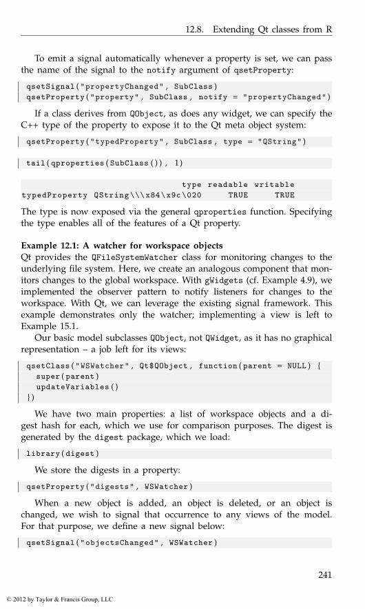
12.8. Extending Qt classes from R
To emit a signal automatically whenever a property is set, we can passthe name of the signal to the notify argument of qsetProperty:
qsetSignal ( "propertyChanged" , SubClass )qsetProperty ( "property" , SubClass , notify = "propertyChanged" )
If a class derives from QObject, as does any widget, we can specify theC++ type of the property to expose it to the Qt meta object system:
qsetProperty ( "typedProperty" , SubClass , type = "QString" )
tail ( qproperties ( SubClass ( ) ) , 1 )
type readable writabletypedProperty QString \\\x84\x9c \020 TRUE TRUE
The type is now exposed via the general qproperties function. Specifyingthe type enables all of the features of a Qt property.
Example 12.1: A watcher for workspace objectsQt provides the QFileSystemWatcher class for monitoring changes to theunderlying file system. Here, we create an analogous component that mon-itors changes to the global workspace. With gWidgets (cf. Example 4.9), weimplemented the observer pattern to notify listeners for changes to theworkspace. With Qt, we can leverage the existing signal framework. Thisexample demonstrates only the watcher; implementing a view is left toExample 15.1.
Our basic model subclasses QObject, not QWidget, as it has no graphicalrepresentation – a job left for its views:
qsetClass ( "WSWatcher" , Qt$QObject , function ( parent = NULL ) {super ( parent )updateVariables ( )
} )
We have two main properties: a list of workspace objects and a di-gest hash for each, which we use for comparison purposes. The digest isgenerated by the digest package, which we load:
library ( digest )
We store the digests in a property:
qsetProperty ( "digests" , WSWatcher )
When a new object is added, an object is deleted, or an object ischanged, we wish to signal that occurrence to any views of the model.For that purpose, we define a new signal below:
qsetSignal ( "objectsChanged" , WSWatcher )
241
© 2012 by Taylor & Francis Group, LLC

12. Qt: Overview
We then pass this signal name to the notify argument when definingthe objects property, so that assignment will emit the signal:
qsetProperty ( "objects" , WSWatcher , notify = "objectsChanged" )
To monitor changes, we keep track of the digest values and names ofthe old objects:
qsetProperty ( "old_digests" , WSWatcher )qsetProperty ( "old_objects" , WSWatcher )
Our class has a few methods defined for it. We need one to updatethe variable list. This implementation simply compares the digest of thecurrent workspace objects with a cached list. If there are differences, weupdate the objects, which will in turn signal a change.
qsetMethod ( "updateVariables" , WSWatcher , function ( ) {x <- sort ( ls ( envir = . GlobalEnv ) )objs <- sapply ( mget ( x , . GlobalEnv ) , digest )
if ( ( length ( objs ) != length ( digests ) ) ||length ( digests ) == 0 ||any ( objs != digests ) ) {
this$old_digests <- digests # o l dthis$old_objects <- objectsthis$digests <- objs # u pd a t e c a c h ethis$objects <- x # e m i t s s i g n a l
}invisible ( )
} )
For convenience to any user of this class, we define two more methods:one to indicate which objects were changed and one to indicate whichobjects were added:
qsetMethod ( "changedVariables" , WSWatcher , function ( ) {changed <- setdiff ( old_digests , digests )old_objects [ old_digests %in% changed ]
} )##qsetMethod ( "addedVariables" , WSWatcher , function ( ) {
added <- setdiff ( digests , old_digests )objects [ digests %in% added ]
} )
Finally, we arrange to call our update function as needed. If theworkspace size is modest, using a task callback is a reasonable strategy:
watcher <- WSWatcher ( ) # an i n s t a n c eaddTaskCallback ( function ( expr , value , ok , visible ) {
watcher$updateVariables ( )
242
© 2012 by Taylor & Francis Group, LLC
12.9. QWidget basics
TRUE} )
Another alternative would be to use a timer to call the updateVariablesmethod periodically:
timer <- Qt$QTimer ( )timer$setSingleShot ( FALSE ) # or TRUE f o r run onceqconnect ( timer , "timeout" , function ( ) watcher$updateVariables ( ) )timer$start ( as . integer (3 * 1 0 0 0 ) ) # 3 s e c o n d s
To illustrate, we connect a handler to the objectsChanged signal andexpect the handler to be invoked when we create a new_object in theworkspace:
qconnect ( watcher , "objectsChanged" , function ( )message ( "workspace objects were updated" ) )
new_object <- "The change should be announced"
workspace objects were updated
12.9 QWidget basics
The widgets we discuss in the next section inherit many properties andmethods from the base QObject and QWidget classes. The QObject class isthe base class and forms the basis for the object hierarchy. It implementsthe event processing and property systems. The QWidget class is the baseclass for all widgets and implements their shared functionality.
Upon construction, widgets are invisible, so that they may be configuredbehind the scenes. The visible property controls whether a widget isvisible.
widget <- Qt$QWidget ( )widget$visible
[1] FALSE
The show and hide methods are the corresponding convenience func-tions for making a widget visible and invisible, respectively.
widget$show ( )
widget$visible
[1] TRUE
widget$hide ( )
widget$visible
243
© 2012 by Taylor & Francis Group, LLC
12. Qt: Overview
[1] FALSE
There is an S3 method for print on QWidget that invokes show. When-ever a widget is shown, all of its children are also made visible. Themethod raise will raise the window to the top of the stack of windows.
Similarly, the property enabled controls whether a widget is sensitiveto user input, including mouse events.
button <- Qt$QPushButton ( "button" )button$enabled <- FALSE
Only one widget can have the keyboard focus at once. The user shiftsthe focus by tab-key navigation or mouse clicks (although this behaviorcan be customized, cf. focusPolicy). When a widget has the focus, itsfocus property is TRUE. The property is read-only; the focus is shiftedprogrammatically to a widget by calling its setFocus method.
Qt has a number of mechanisms for the user to query a widget forsome description of its purpose and usage. Tooltips, stored as a stringin the toolTip property, may be shown when the mouse hovers over thewidget. Similarly, the statusTip property holds a string to be shown in thestatus bar instead of in a pop-up window. Finally, Qt provides a “What’sThis?” tool that will show the text in the whatsThis property in responseto a query, such as pressing SHIFT+F1 when the widget has focus.
Except for top-level windows, the position and size of a widget aredetermined automatically by a layout algorithm; see Chapter 13. To specifythe size of a top-level window, manipulate the size property, which holdsa QSize object:
widget$size <- qsize ( 4 0 0 , 400)## orwidget$resize ( 4 0 0 , 400)widget$show ( )
We create the QSize object with the qsize convenience function imple-mented by the qtbase package. The resize method is another convenientshortcut. We should generally configure the size of a window before show-ing it, as this helps the window manager place the window optimally.
Fonts
Fonts in Qt are represented by the QFont class. The qtbase package definesa convenience constructor for QFont called qfont. The constructor accepts afamily, such as helvetica; pointsize, an integer; weight, an enumeratedvalue such as Qt$QFont$Light (or Normal, DemiBold, Bold, or Black); andwhether the font should be italicized, as a logical. Defaults are obtainedfrom the application font, returned by Qt$QApplication$font().
For example, we could create a 12-point, bold, italicized font from theHelvetica family with:
244
© 2012 by Taylor & Francis Group, LLC
12.9. QWidget basics
font <- qfont ( family = "helvetica" , pointsize = 12 ,weight = Qt$QFont$Bold , italic = TRUE )
The font for a widget is stored in the font property. For example, wechange the font for a label:
label <- Qt$QLabel ( "Text for the label" )label$font <- font
The QFont class has several methods to query the font and to adjustproperties. For example, there are the methods setFamily, setUnderline,setStrikeout, and setBold among others.
To discover which fonts are available from the windowing system, con-struct a QFontDatabase and call its methods, like families, pointSizes,styles, etc.
Styles
Palette Every platform has its own distinct look and feel, and an applica-tion should generally conform to platform conventions. Qt hides these de-tails from the application. Every widget has a palette, stored in its paletteproperty and represented by a QPalette object. A QPalette maps thestate of a widget to a group of colors that is used for painting the wid-get. The possible states are active, inactive, and disabled. Each colorwithin a group has a specific role, as enumerated in QPalette::ColorRole.Examples include the color for the background (Window), the foreground(WindowText), and the selected state (Highlight). Qt chooses the correctdefault palette depending on the platform and the type of widget. We canchange the colors used in rendering a widget by manipulating the palette.
Style sheets Cascading style sheets (CSS) are used by web designers todecouple the layout and look and feel of a web page from the content ofthe page. In Qt it is also possible to customize the rendering of a widgetusing CSS syntax. The supported syntax is described in the overview onstyle sheets provided with Qt documentation and is not summarized here,as it is quite readable.
The style sheet for a widget is stored in its styleSheet property, as astring. For example, for a button, we could set the background to whiteand the foreground to red (see Figure 12.2):
button <- Qt$QPushButton ( "Style sheet example" )button$show ( )button$styleSheet <-
"QPushButton {color: red; background: white}"
The CSS syntax may be unfamiliar to R programmers, so the qtbasepackage provides an alternative interface that is reminiscent of the parfunction. We specify the above style sheet in this syntax:
245
© 2012 by Taylor & Francis Group, LLC
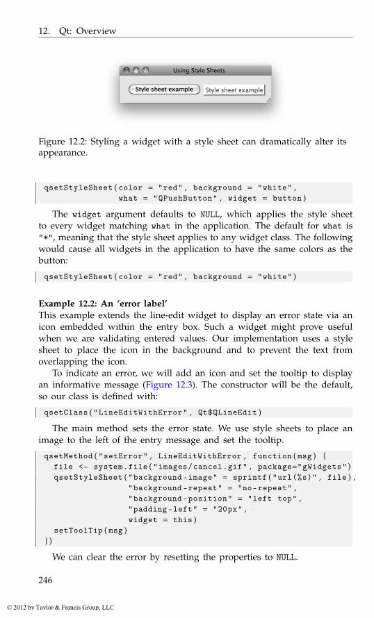
12. Qt: Overview
Figure 12.2: Styling a widget with a style sheet can dramatically alter itsappearance.
qsetStyleSheet ( color = "red" , background = "white" ,what = "QPushButton" , widget = button )
The widget argument defaults to NULL, which applies the style sheetto every widget matching what in the application. The default for what is"*", meaning that the style sheet applies to any widget class. The followingwould cause all widgets in the application to have the same colors as thebutton:
qsetStyleSheet ( color = "red" , background = "white" )
Example 12.2: An ’error label’This example extends the line-edit widget to display an error state via anicon embedded within the entry box. Such a widget might prove usefulwhen we are validating entered values. Our implementation uses a stylesheet to place the icon in the background and to prevent the text fromoverlapping the icon.
To indicate an error, we will add an icon and set the tooltip to displayan informative message (Figure 12.3). The constructor will be the default,so our class is defined with:
qsetClass ( "LineEditWithError" , Qt$QLineEdit )
The main method sets the error state. We use style sheets to place animage to the left of the entry message and set the tooltip.
qsetMethod ( "setError" , LineEditWithError , function ( msg ) {file <- system . file ( "images/cancel.gif" , package="gWidgets" )qsetStyleSheet ( "background -image" = sprintf ( "url(%s)" , file ) ,
"background -repeat" = "no-repeat" ,"background -position" = "left top" ,"padding-left" = "20px" ,widget = this )
setToolTip ( msg )} )
We can clear the error by resetting the properties to NULL.
246
© 2012 by Taylor & Francis Group, LLC
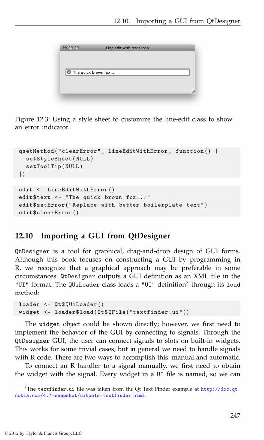
12.10. Importing a GUI from QtDesigner
Figure 12.3: Using a style sheet to customize the line-edit class to showan error indicator.
qsetMethod ( "clearError" , LineEditWithError , function ( ) {setStyleSheet ( NULL )setToolTip ( NULL )
} )
edit <- LineEditWithError ( )edit$text <- "The quick brown fox..."edit$setError ( "Replace with better boilerplate text" )edit$clearError ( )
12.10 Importing a GUI from QtDesigner
QtDesigner is a tool for graphical, drag-and-drop design of GUI forms.Although this book focuses on constructing a GUI by programming inR, we recognize that a graphical approach may be preferable in somecircumstances. QtDesigner outputs a GUI definition as an XML file in the"UI" format. The QUiLoader class loads a "UI" definition3 through its loadmethod:
loader <- Qt$QUiLoader ( )widget <- loader$load ( Qt$QFile ( "textfinder.ui" ) )
The widget object could be shown directly; however, we first need toimplement the behavior of the GUI by connecting to signals. Through theQtDesigner GUI, the user can connect signals to slots on built-in widgets.This works for some trivial cases, but in general we need to handle signalswith R code. There are two ways to accomplish this: manual and automatic.
To connect an R handler to a signal manually, we first need to obtainthe widget with the signal. Every widget in a UI file is named, so we can
3The textfinder.ui file was taken from the Qt Text Finder example at http://doc.qt.nokia.com/4.7-snapshot/uitools-textfinder.html.
247
© 2012 by Taylor & Francis Group, LLC
12. Qt: Overview
call the qfindChild utility function to find a specific widget. Assume wehave a button named “findButton” and corresponding text entry “lineEdit”in our UI file, then we retrieve them with:
find_button <- qfindChild ( widget , "findButton" ) # by nameline_edit <- qfindChild ( widget , "lineEdit" )
Then we connect to the clicked signal:
qconnect ( find_button , "clicked" , function ( ) {findText ( line_edit$text )
} )
Alternatively, we could establish the signal connections automatically.This requires defining each signal handler to be a slot in the parent object,which will need to be of a custom class:
qsetClass ( "MyMainWindow" , Qt$QWidget , function ( ) {loader <- Qt$QUiLoader ( )widget <- loader$load ( Qt$QFile ( "textfinder.ui" ) , this )Qt$QMetaObject$connectSlotsByName ( this )
} )
The constructor first loads the UI definition, with the main windowas the parent for the loaded interface. It then calls connectSlotsByNameto establish the connections automatically. This descends the widget hi-erarchy, attempting to match signals in the descendants to slots in thetop-level widget. For a slot to be connected to the correct signal, it mustbe named according to the convention "on_[objectName]_[signalName]".For example,
qsetSlot ( "on_findButton_clicked" , MyMainWindow , function ( ) {findText ( line_edit$text )
} )
defines a handler for the clicked signal on findButton. Finally, the signalhandler connection is established upon construction of the main window:
MyMainWindow ( )
In the case of a large, complex GUI, this automatic approach is probablymore convenient than manually establishing the connections.
248
© 2012 by Taylor & Francis Group, LLC
13
Qt: Layout Managers and Containers
Qt provides a set of classes to facilitate the layout of child widgets of acomponent. These layout managers, derived from the QLayout class, aretasked with determining the geometry of child widgets, according to aspecific layout algorithm. Layout managers will generally update the layoutwhenever a parameter is modified, a child widget is added or removed,or the size of the parent changes. Unlike GTK+, where this managementis tied to a container object, Qt decouples the layout from the widget.
This chapter will introduce the available layout managers, of whichthere are three types: box (QBoxLayout), grid (QGridLayout), and form(QFormLayout). Widgets that function primarily as containers, such as theframe and notebook, are also described here.
Example 13.1: Synopsis of layouts in QtThis example uses a combination of different layout managers to organize areasonably complex GUI. It serves as a synopsis of the layout functionalityin Qt. A more gradual and detailed introduction will follow this example.Figure 13.1 shows a screenshot of the finished layout.
First, we need a widget as the top-level container. We assign a gridlayout to the window for arranging the main components of the applica-tion:
window <- Qt$QWidget ( )window$setWindowTitle ( "Layout example" )grid_layout <- Qt$QGridLayout ( )window$setLayout ( grid_layout )
There are three objects managed by the grid layout: a table (we use alabel as a placeholder), a notebook, and a horizontal box layout for somebuttons. We construct them with:
fake_table <- Qt$QLabel ( "Table widget" )notebook <- Qt$QTabWidget ( )button_layout <- Qt$QHBoxLayout ( )
Then add them to the grid layout:
249
© 2012 by Taylor & Francis Group, LLC

13. Qt: Layout Managers and Containers
Figure 13.1: A mock GUI illustrating various layout managers providedby Qt.
grid_layout$addWidget ( fake_table , row=0 , column=0 ,rowspan=1 , colspan=1)
grid_layout$addWidget ( notebook , 0 , 1 )grid_layout$addLayout ( button_layout , 1 , 1 )
Next, we construct our buttons and add them to the box putting 12pixels of space between the last two.
b <- sapply ( c ( "OK" , "Cancel" , "Help" ) ,function ( i ) Qt$QPushButton ( i ) )
button_layout$setDirection ( Qt$QBoxLayout$RightToLeft )button_layout$addStretch (1 L ) # s t r e t c hbutton_layout$addWidget ( b$OK )button_layout$addWidget ( b$Cancel )button_layout$addSpacing (12L ) # s p a c i n gbutton_layout$addWidget ( b$Help )
We added a stretch, which acts much like a spring, to pack our buttonsagainst the right side of the box. A fixed space of 12 pixels is insertedbetween the “Cancel” and ”Help” buttons.
The notebook widget is constructed next, with a single page:
notebook_page <- Qt$QWidget ( )notebook$addTab ( notebook_page , "Tab label" )notebook$setTabToolTip ( 0 , "A notebook page with a form" )
250
© 2012 by Taylor & Francis Group, LLC

13.1. Layout basics
The form layout allows us to create standardized forms where each rowcontains a label and a widget. Although this could be done with a gridlayout, using the form layout is more convenient and allows Qt to stylethe page as appropriate for the underlying operating system. We place aform layout in the notebook page and populate it:
form_layout <- Qt$QFormLayout ( )notebook_page$setLayout ( form_layout )l <- sapply ( c ( "name" , "rank" , "snumber" ) , Qt$QLineEdit )form_layout$addRow ( "Name" , l$name )form_layout$addRow ( "Rank" , l$rank )form_layout$addRow ( "Serial number" , l$snumber )
Each addRow call adds a label and an adjacent input widget, in this case atext entry.
This concludes our cursory demonstration of layout in Qt. We haveconstructed a mock-up of a typical application layout using the box, grid,and form layout managers.
13.1 Layout basics
Adding and manipulating child components
We will demonstrate the basics of layout in Qt with a horizontal box layout,QHBoxLayout:
layout <- Qt$QHBoxLayout ( )
QHBoxLayout, like all other layouts, is derived from the QLayout baseclass. Details specific to box layouts are presented in Section 13.2.
A layout is not a widget. Instead, a layout is set on a widget, and thewidget delegates the layout of its children to the layout object:
widget <- Qt$QWidget ( )widget$setLayout ( layout )
Child widgets are added to a container through the addWidget method:
layout$addWidget ( Qt$QPushButton ( "Push Me" ) )
In addition to adding child widgets, we can nest child layouts by callingaddLayout.
Internally, layouts store child components as items of class QLayoutItem.The item at a given index (0-based) is returned by the itemAt method. Weget the first item in our layout:
item <- layout$itemAt ( 0 )
The actual child widget is retrieved by calling the widget method on theitem:
251
© 2012 by Taylor & Francis Group, LLC

13. Qt: Layout Managers and Containers
button <- item$widget ( )
Qt provides the methods removeItem and removeWidget to remove anitem or widget from a layout:
layout$removeWidget ( button )
Although the widget is no longer managed by a layout, its parent widgetis unchanged. The widget will not be destroyed (removed from memory)as long as it has a parent. Thus, to destroy a widget, we should set theparent of the widget NULL using setParent:
button$setParent ( NULL )
Size and space negotiation
The allocation of space to child widgets depends on several factors. TheQt documentation for layouts spells out the steps well:1
1. All the widgets will initially be allocated an amount of space inaccordance with their sizePolicy and sizeHint.
2. If any of the widgets have stretch factors set, with a value greaterthan zero, then they are allocated space in proportion to their stretchfactor.
3. If any of the widgets have stretch factors set to zero they will getmore space only if no other widgets want the space. Of these, spaceis allocated to widgets with an expanding size policy first.
4. Any widgets that are allocated less space than their minimum size (orminimum size hint if no minimum size is specified) are allocated thisminimum size they require. (Widgets don’t have to have a minimumsize or minimum size hint, in which case the stretch factor is theirdetermining factor.)
5. Any widgets that are allocated more space than their maximum sizeare allocated the maximum size space they require. (Widgets do nothave to have a maximum size, in which case the stretch factor is theirdetermining factor.)
Every widget returns a size hint to the layout from the sizeHintmethod/property. The interpretation of the size hint depends on thesizePolicy property. The size policy is an object of class QSizePolicy.
1http://doc.qt.nokia.com/4.7/layout.html
252
© 2012 by Taylor & Francis Group, LLC
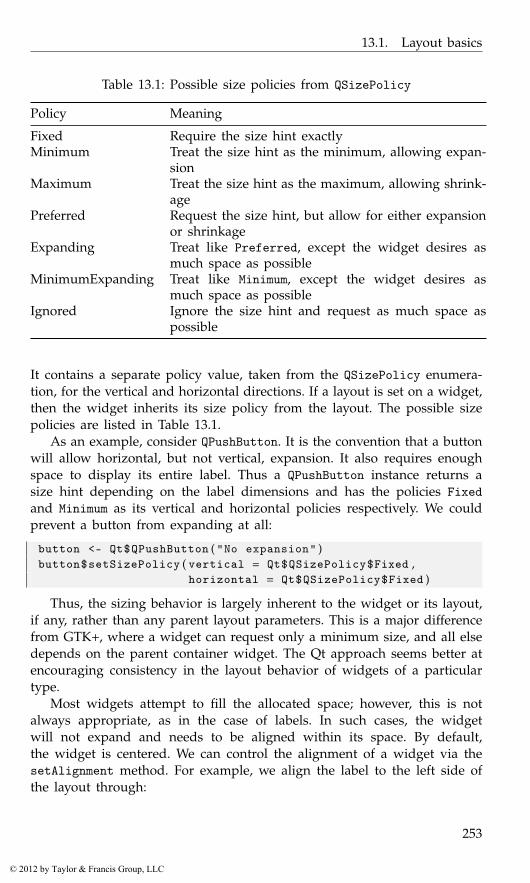
13.1. Layout basics
Table 13.1: Possible size policies from QSizePolicy
Policy Meaning
Fixed Require the size hint exactlyMinimum Treat the size hint as the minimum, allowing expan-
sionMaximum Treat the size hint as the maximum, allowing shrink-
agePreferred Request the size hint, but allow for either expansion
or shrinkageExpanding Treat like Preferred, except the widget desires as
much space as possibleMinimumExpanding Treat like Minimum, except the widget desires as
much space as possibleIgnored Ignore the size hint and request as much space as
possible
It contains a separate policy value, taken from the QSizePolicy enumera-tion, for the vertical and horizontal directions. If a layout is set on a widget,then the widget inherits its size policy from the layout. The possible sizepolicies are listed in Table 13.1.
As an example, consider QPushButton. It is the convention that a buttonwill allow horizontal, but not vertical, expansion. It also requires enoughspace to display its entire label. Thus a QPushButton instance returns asize hint depending on the label dimensions and has the policies Fixedand Minimum as its vertical and horizontal policies respectively. We couldprevent a button from expanding at all:
button <- Qt$QPushButton ( "No expansion" )button$setSizePolicy ( vertical = Qt$QSizePolicy$Fixed ,
horizontal = Qt$QSizePolicy$Fixed )
Thus, the sizing behavior is largely inherent to the widget or its layout,if any, rather than any parent layout parameters. This is a major differencefrom GTK+, where a widget can request only a minimum size, and all elsedepends on the parent container widget. The Qt approach seems better atencouraging consistency in the layout behavior of widgets of a particulartype.
Most widgets attempt to fill the allocated space; however, this is notalways appropriate, as in the case of labels. In such cases, the widgetwill not expand and needs to be aligned within its space. By default,the widget is centered. We can control the alignment of a widget via thesetAlignment method. For example, we align the label to the left side ofthe layout through:
253
© 2012 by Taylor & Francis Group, LLC
13. Qt: Layout Managers and Containers
label <- Qt$QLabel ( "Label" )layout$addWidget ( label )layout$setAlignment ( label , Qt$Qt$AlignLeft )
Alignment is also possible to the top, bottom, and right. The alignmentvalues are flags and may be combined with | to specify both vertical andhorizontal alignment.
The spacing between every cell of the layout is in the spacing property.The following requests five pixels of space:
layout$spacing <- 5L
13.2 Box layouts
Box layouts arrange child widgets as if they were packed into a box ineither the horizontal or vertical orientation. The QHBoxLayout class imple-ments a horizontal layout, whereas QVBoxLayout provides a vertical one.Both of these classes extend the QBoxLayout class, where most of the func-tionality is documented. We create a horizontal layout and place it in awindow:
hbox <- Qt$QHBoxLayout ( )widget <- Qt$QWidget ( )w$setLayout ( hbox )
Child widgets are added to a box container through the addWidgetmethod:
buttons <- sapply ( letters [ 1 : 3 ] , Qt$QPushButton )sapply ( buttons , hbox$addWidget )
The direction property specifies the direction in which the widgetsare added to the layout. By default, this is left to right (top to bottom fora vertical box).
The addWidget method for a box layout takes two optional parameters:the stretch factor and the alignment. Stretch factors proportionally allocatespace to widgets when they expand.2 However, recall that the widget sizepolicy and hint can alter the effect of a stretch factor. After the child hasbeen added, the stretch factor can be modified with setStretchFactor:
hbox$setStretchFactor ( buttons [ [ 1 ] ] , 2 . 0 )
If the layout later grows horizontally, the first button will grow (stretch) attwice the rate of the other buttons.
2For those familiar with GTK+, the difference between a stretch factor of 0 and 1 isroughly equivalent to the difference between "FALSE" and "TRUE" for the value of the expandparameter to gtkBoxPackStart.
254
© 2012 by Taylor & Francis Group, LLC

13.3. Grid layouts
Spacing There are two types of spacing between two children: fixed andexpanding. Fixed spacing between any two children was already described.To add a fixed amount of space between two specific children, call theaddSpacing method while populating the container. The following line isfrom Example 13.1:
hbox$addSpacing (12L )hbox$addWidget ( Qt$QPushButton ( "d" ) )
We have placed a gap of twelve pixels between button "c" and the newbutton "d".
An expanding, spring-like spacer between two widgets is known as astretch. We add a stretch with a factor of 2.0 and subsequently add a childbutton that will be pressed against the right side of the box as the layoutgrows horizontally:
hbox$addStretch ( 2 )hbox$addWidget ( Qt$QPushButton ( "Help..." ) )
This is just a convenience for adding an invisible widget with some stretchfactor.
Struts It is sometimes desirable to restrict the minimum size of a layoutin the perpendicular direction. For a horizontal box, this is the height. Thebox layout provides the strut for this purpose:
hbox$addStrut ( 1 0 ) # a t l e a s t 10 p i x e l s h igh
13.3 Grid layouts
The QGridLayout class provides a grid layout for aligning its child widgetsinto rows and columns. To illustrate grid layouts we mock up a GUIcentered around a text area widget (Figure 13.2). To begin, we create thewindow with the grid layout:
window <- Qt$QWidget ( )window$setWindowTitle ( "Layout example" )layout <- Qt$QGridLayout ( )window$setLayout ( layout )
When we add a child to the grid layout, we need to specify the zero-based row and column indices:
layout$addWidget ( Qt$QLabel ( "Entry:" ) , 0 , 0 )layout$addWidget ( Qt$QLineEdit ( ) , 0 , 1 , rowspan = 1 , colspan=2)
In the second call to addWidget, we pass values to the optional argumentsfor the row and column span. These are the numbers of rows and columns,respectively, that are spanned by the child. For our second row, we add alabeled combo box:
255
© 2012 by Taylor & Francis Group, LLC
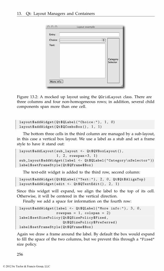
13. Qt: Layout Managers and Containers
Figure 13.2: A mocked up layout using the QGridLayout class. There arethree columns and four non-homogeneous rows; in addition, several childcomponents span more than one cell.
layout$addWidget ( Qt$QLabel ( "Choice:" ) , 1 , 0 )layout$addWidget ( Qt$QComboBox ( ) , 1 , 1 )
The bottom three cells in the third column are managed by a sub-layout,in this case a vertical box layout. We use a label as a stub and set a framestyle to have it stand out:
layout$addLayout ( sub_layout <- Qt$QVBoxLayout ( ) ,1 , 2 , rowspan=3 , 1 )
sub_layout$addWidget ( label <- Qt$QLabel ( "Category\nSelector" ) )label$setFrameStyle ( Qt$QFrame$Box )
The text-edit widget is added to the third row, second column:
layout$addWidget ( Qt$QLabel ( "Text:" ) , 2 , 0 , Qt$Qt$AlignTop )layout$addWidget ( edit <- Qt$QTextEdit ( ) , 2 , 1 )
Since this widget will expand, we align the label to the top of its cell.Otherwise, it will be centered in the vertical direction.
Finally we add a space for information on the fourth row:
layout$addWidget ( label <- Qt$QLabel ( "More info:" ) , 3 , 0 ,rowspan = 1 , colspan = 2)
label$setSizePolicy ( Qt$QSizePolicy$Fixed ,Qt$QSizePolicy$Preferred )
label$setFrameStyle ( Qt$QFrame$Box )
Again we draw a frame around the label. By default the box would expandto fill the space of the two columns, but we prevent this through a "Fixed"size policy.
256
© 2012 by Taylor & Francis Group, LLC
13.4. Form layouts
There are a number of parameters controlling the sizing and spacingof the rows and columns. The concepts apply equivalently to both rowsand columns, so we will limit our discussion to columns, without lossof generality. A minimum width is set through setColumnMinimumWidth.The actual minimum width will be increased, if necessary, to satisfy theminimal width requirements of the widgets in the column. If more spaceis available to a column than requested, the extra space is apportionedaccording to the stretch factors. A column stretch factor is set by callingthe setColumnStretch method.
Since there are no stretch factors set in our example, the space allocatedto each row and column would be identical when resized. To allocate extraspace to the text area, we set a positive stretch factor for the third row andsecond column:
layout$setRowStretch ( 2 , 1 ) # t h i r d rowlayout$setColumnStretch ( 1 , 1 ) # s e c o n d column
As it is the only item with a positive stretch factor, it will be the onlywidget to expand when the parent widget is resized.
The spacing between widgets can be set in both directions via the spac-ing property, or set for a particular direction with setHorizontalSpacingor setVerticalSpacing. The default values are derived from the style.
The method itemAtPosition returns the QLayoutItem instance corre-sponding to the specified row and column:
edit <- layout$itemAtPosition ( 0 , 1 ) $widget ( )
The item method widget returns the corresponding widget. Removing awidget is similar to a box layout, using removeItem, or removeWidget. Themethods rowCount and columnCount return the dimensions of the grid.
13.4 Form layouts
Forms can easily be arranged with the grid layout, but Qt provides aconvenient high-level form layout (QFormLayout) that conforms to platform-specific conventions. A form consists of a number of rows, where each rowhas a label and an input widget. We create a form and add some rows forgathering parameters to the dnorm function:
window <- Qt$QWidget ( )window$setWindowTitle ( "Wrapper for ’dnorm’ function" )window$setLayout ( layout <- Qt$QFormLayout ( ) )sapply ( c ( "quantile" , "mean" , "sd" ) , function ( statistic ) {
layout$addRow ( statistic , Qt$QLineEdit ( ) )} )layout$addRow ( Qt$QCheckBox ( "log" ) )
257
© 2012 by Taylor & Francis Group, LLC
13. Qt: Layout Managers and Containers
The first three calls to addRow take a string for the label and a textentry for entering a numeric value. Any widget could serve as the label. Afield may be any widget or layout. The final call to addRow places only asingle widget in the row. As with other layouts, we could call setSpacingto adjust the spacing between rows.
To retrieve a widget from the layout, call the itemAt method, passingthe 0-based row index and the role of the desired widget. Here, we obtainthe edit box for the quantile parameter:
item <- layout$itemAt ( 0 , Qt$QFormLayout$FieldRole )quantile_edit <- item$widget ( )
13.5 Frames
The frame widget, QGroupBox, groups conceptually related widgets bydrawing a border around them and displaying a title. QGroupBox is of-ten used to group radio buttons (see Section 14.5 for an example). Thetitle, stored in the title property, may be aligned to left, right or center,depending on the alignment property. If the checkable property is TRUE,the contents can have their sensitivity to events toggled by clicking anaccompanying check button.
13.6 Separators
Like frames, a horizontal or vertical line is also useful for visually separat-ing widgets into conceptual groups. There is no explicit line or separatorwidget in Qt. Rather, we configure the more general widget QFrame, whichdraws a frame around its children. Somewhat against intuition, a framecan take the shape of a line:
separator <- Qt$QFrame ( )separator$frameShape <- Qt$QFrame$HLine
This yields a horizontal separator. A frame shape of Qt$QFrame$VLinewould produce a vertical separator.
13.7 Notebooks
A notebook container is provided by the class QTabWidget:
notebook <- Qt$QTabWidget ( )
To create a page, we need to specify the label for the tab and the widgetto display when the page is active:
258
© 2012 by Taylor & Francis Group, LLC
13.7. Notebooks
notebook$addTab ( Qt$QPushButton ( "page 1" ) , "page 1" )icon <- Qt$QIcon ( "small-R-logo.jpg" )notebook$addTab ( Qt$QPushButton ( "page 2" ) , icon , "page 2" )
As shown in the second call to addTab, we can provide an icon todisplay next to the tab label. We can also add a tooltip for a specific tab,using 0-based indexing:
notebook$setTabToolTip ( 0 , "This is the first page" )
The currentIndex property holds the 0-based index of the active tab.We make the second tab active:
notebook$currentIndex <- 1
The tabs can be positioned on any of the four sides of the notebook;this depends on the tabPosition property. By default, the tabs are on top,or "North". We move them to the bottom:
notebook$tabPosition <- Qt$QTabWidget$South
Other features include close buttons, movable pages by drag-and-drop,and scroll buttons for when the number of tabs exceeds the available space.We enable all of these:
notebook$tabsClosable <- TRUEqconnect ( notebook , "tabCloseRequested" , function ( index ) {
notebook$removeTab ( index )} )notebook$movable <- TRUEnotebook$usesScrollButtons <- TRUE
We would need to connect to the tabCloseRequested signal to actuallyclose the tab when the close button is clicked.
Example 13.2: A help-page browserThis example shows how to create a help browser using the QWebView classto show web pages. The only method from this class we use is setUrl. Thekey to this is informing browseURL to open web pages using an R function,as opposed to the default system browser.
qsetClass ( "HelpBrowser" , Qt$QTabWidget , function ( parent=NULL ) {super ( parent )#this$tabsClosable <- TRUEqconnect ( this , "tabCloseRequested" , function ( index ) {
this$removeTab ( index )} )this$movable <- TRUE ; this$usesScrollButtons <- TRUE#this$browser <- getOption ( "browser" )
259
© 2012 by Taylor & Francis Group, LLC
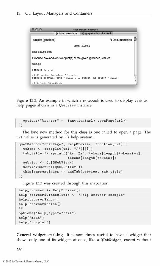
13. Qt: Layout Managers and Containers
Figure 13.3: An example in which a notebook is used to display varioushelp pages shown in a QWebView instance.
options ( "browser" = function ( url ) openPage ( url ) )} )
The lone new method for this class is one called to open a page. Theurl value is generated by R’s help system.
qsetMethod ( "openPage" , HelpBrowser , function ( url ) {tokens <- strsplit ( url , "/" ) [ [ 1 ] ]tab_title <- sprintf ( "%s: %s" , tokens [ length ( tokens )−2] ,
tokens [ length ( tokens ) ] )webview <- Qt$QWebView ( )webview$setUrl ( Qt$QUrl ( url ) )this$currentIndex <- addTab ( webview , tab_title )
} )
Figure 13.3 was created through this invocation:
help_browser <- HelpBrowser ( )help_browser$windowTitle <- "Help Browser example"help_browser$show ( )help_browser$raise ( )##options ( "help_type"="html" )help ( "mean" )help ( "boxplot" )
General widget stacking It is sometimes useful to have a widget thatshows only one of its widgets at once, like a QTabWidget, except without
260
© 2012 by Taylor & Francis Group, LLC
13.8. Scroll areas
the tabs. There is no way to hide the tabs of QTabWidget. Instead, weshould use QStackedWidget, which stacks its children so that only thewidget on top of the stack is visible. There is no way for the user toswitch between children; it must be done programmatically. The actuallayout is managed by QStackedLayout, which should be used directly ifonly a layout is needed, e.g., as a sub-layout.
13.8 Scroll areas
Sometimes a widget is too large to fit in a layout and thus must be dis-played partially. Scroll bars then allow the user to adjust the visible portionof the widget. Widgets that often become too large include tables, lists,and text-edit panes. These inherit from QAbstractScrolledArea and thusnatively provide scroll bars without any special attention from the user.Occasionally, we are dealing with a widget that lacks such support andthus need to explicitly embed the widget in a QScrollArea. This oftenarises when displaying graphics and images. To demonstrate, we will cre-ate a simple zoomable image viewer. The user can zoom in and out anduse the scroll bars to pan around the image. First, we place an image in alabel and add it to a scroll area:
image <- Qt$QLabel ( )image$pixmap <- Qt$QPixmap ( "someimage.png" )scroll_area <- Qt$QScrollArea ( )scroll_area$setWidget ( image )
Next, we define a function for zooming in on the image:
zoomImage <- function ( x = 2 . 0 ) {image$resize ( x * image$pixmap$size ( ) )updateScrollBar <- function ( sb ) {
sb$value <- x * sb$value + ( x − 1) * sb$pageStep / 2}updateScrollBar ( scroll_area$horizontalScrollBar ( ) )updateScrollBar ( scroll_area$verticalScrollBar ( ) )
}
Of note here is that we are scaling the size of the pixmap using the* function, which qtbase is forwarding to the corresponding method onthe QSize object. Updating the scroll bars is also somewhat tricky, sincetheir value corresponds to the top left, while we want to preserve thecenter point. We leave the interface for calling the zoomImage function asan exercise for the interested reader.
The geometry of a scroll area is such that there is an empty space inthe corner between the ends of the scroll bars. To place a widget in thecorner, pass it to the setCornerWidget method.
261
© 2012 by Taylor & Francis Group, LLC
13. Qt: Layout Managers and Containers
13.9 Paned windows
QSplitter is a split-pane widget, a container that splits its space betweenits children, with draggable separators that adjust the balance of the spaceallocation.
Unlike GtkPaned in GTK+, there is no limit on the number of childpanes. We add three with addWidget:
splitter <- Qt$QSplitter ( )splitter$addWidget ( Qt$QLabel ( "One" ) )splitter$addWidget ( Qt$QLabel ( "Two" ) )splitter$addWidget ( Qt$QLabel ( "Three" ) )
The orientation can be adjusted dynamically through setOrientation.
splitter$setOrientation ( Qt$Qt$Vertical )
In addition to adjusting the space allocation with a mouse, we canadjust the sizes programmatically through the setSizes method:
splitter$setSizes ( c (100L , 200L , 300L ) )
If needed, we can connect to the splitterMoved signal. The callbackreceives the position of the moved handle and its index.
262
© 2012 by Taylor & Francis Group, LLC
14
Qt: Widgets
This chapter covers some of the basic dialogs and widgets provided by Qt.Together with layouts, these form the basis for most user interfaces. Thenext chapter will introduce the more complex widgets that typically act asviews for separate data models.
14.1 Dialogs
Qt implements the conventional high-level dialogs, including those forprinting, selecting files, selecting colors, and, most usefully, sending simplemessages and input requests to the user. We first introduce message andinput dialogs. This is followed by a discussion of the infrastructure in Qtfor implementing custom dialogs and wizards. Finally, we briefly introducesome of the remaining high-level dialogs, such as the file selector.
Message dialogs
All dialogs in Qt are derived from QDialog. The message dialog, QMes-sageBox, communicates a textual message to the user. At the bottom ofthe dialog are a set of buttons, each representing a possible response. Nor-mally, the type of message is indicated by an icon. If extra details areavailable, the dialog provides the option for the user to view them.
Qt provides two ways to create a message box (Figure 14.1). The sim-plest approach is to call a static convenience method for issuing commontypes of messages, including warnings and simple questions. The alter-native, described later, involves several steps and offers more control at acost of convenience. Here we take the simple path for presenting a warningdialog:
response <- Qt$QMessageBox$warning ( parent = NULL ,title = "Warning!" , text = "Warning message..." )
This call will block the flow of the program until the user responds andreturns the standard identifier for the button that was clicked. Each type
263
© 2012 by Taylor & Francis Group, LLC
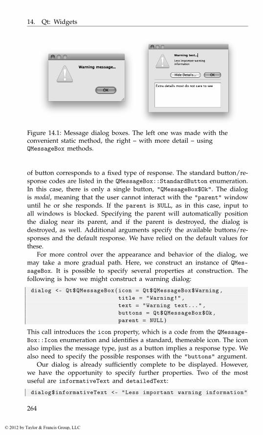
14. Qt: Widgets
Figure 14.1: Message dialog boxes. The left one was made with theconvenient static method, the right – with more detail – usingQMessageBox methods.
of button corresponds to a fixed type of response. The standard button/re-sponse codes are listed in the QMessageBox::StandardButton enumeration.In this case, there is only a single button, "QMessageBox$Ok". The dialogis modal, meaning that the user cannot interact with the "parent" windowuntil he or she responds. If the parent is NULL, as in this case, input toall windows is blocked. Specifying the parent will automatically positionthe dialog near its parent, and if the parent is destroyed, the dialog isdestroyed, as well. Additional arguments specify the available buttons/re-sponses and the default response. We have relied on the default values forthese.
For more control over the appearance and behavior of the dialog, wemay take a more gradual path. Here, we construct an instance of QMes-sageBox. It is possible to specify several properties at construction. Thefollowing is how we might construct a warning dialog:
dialog <- Qt$QMessageBox ( icon = Qt$QMessageBox$Warning ,title = "Warning!" ,text = "Warning text..." ,buttons = Qt$QMessageBox$Ok ,parent = NULL )
This call introduces the icon property, which is a code from the QMessage-Box::Icon enumeration and identifies a standard, themeable icon. The iconalso implies the message type, just as a button implies a response type. Wealso need to specify the possible responses with the "buttons" argument.
Our dialog is already sufficiently complete to be displayed. However,we have the opportunity to specify further properties. Two of the mostuseful are informativeText and detailedText:
dialog$informativeText <- "Less important warning information"
264
© 2012 by Taylor & Francis Group, LLC
14.1. Dialogs
dialog$detailedText <- "Extra details most do not care to see"
Both provide additional textual information at an increasing level of detail.The informativeText will be rendered as secondary to the actual messagetext. To display the detailedText, the user will need to interact with acontrol in the dialog. An example is a stack trace for the warning.
After we specify the desired properties, the dialog is shown. The ap-proach to showing the dialog depends on whether the dialog should bemodal. A modal dialog is displayed with the exec method.
dialog$exec ( ) # r e t u r n s r e s p o n s e c o d e
[1] 1024
As its name implies, exec executes a loop that will block until theuser responds. As with the static convenience methods, the return valueindicates the button/response.
To present a non-modal dialog, we first need to register a responselistener, as the response will arrive asynchronously:
qconnect ( dialog , "finished" , function ( response ) {dialog$close ( )
} )
There are several signals that indicate user response, including "fin-ished", "accepted", and "rejected". The most general is "finished",which passes the button/response code as its only argument.
Finally, we show, raise, and activate the dialog with:
dialog$show ( )dialog$raise ( )dialog$activateWindow ( )
Modal dialogs may be window modal (Qt$Qt$WindowModal), where thedialog blocks all access to its ancestor windows, or application modal(Qt$Qt$ApplicationModal),the default, where all windows are blocked. Tospecify the type of modality, call setWindowModality.
To summarize, we present a general message box supporting multipleresponses:
dialog <- Qt$QMessageBox ( )dialog$windowTitle <- "[This space for rent]"dialog$text <- "This is the main text"dialog$informativeText <- "This should give extra info"dialog$detailedText <- "And this provides\neven more detail"dialog$icon <- Qt$QMessageBox$Criticaldialog$standardButtons <-
Qt$QMessageBox$Cancel | Qt$QMessageBox$Ok## ’ Cance l ’ i n s t e a d o f ’Ok ’ i s t h e d e f a u l t
265
© 2012 by Taylor & Francis Group, LLC
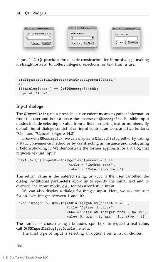
14. Qt: Widgets
Figure 14.2: Qt provides three static constructors for input dialogs, makingit straightforward to collect integers, selections, or text from a user.
dialog$setDefaultButton ( Qt$QMessageBox$Cancel )##if ( dialog$exec ( ) == Qt$QMessageBox$Ok )
print ( "A Ok" )
Input dialogs
The QInputDialog class provides a convenient means to gather informationfrom the user and is in a sense the inverse of QMessageBox. Possible inputmodes include selecting a value from a list or entering text or numbers. Bydefault, input dialogs consist of an input control, an icon, and two buttons:“Ok” and “Cancel” (Figure 14.2).
Like with QMessageBox, we can display a QInputDialog either by callinga static convenience method or by constructing an instance and configuringit before showing it. We demonstrate the former approach for a dialog thatrequests textual input:
text <- Qt$QInputDialog$getText ( parent = NULL ,title = "Gather text" ,label = "Enter some text" )
The return value is the entered string, or NULL if the user cancelled thedialog. Additional parameters allow us to specify the initial text and tooverride the input mode, e.g., for password-style input.
We can also display a dialog for integer input. Here, we ask the userfor an even integer between 1 and 10:
even_integer <- Qt$QInputDialog$getInt ( parent = NULL ,title="Gather integer" ,label="Enter an integer from 1 to 10" ,value=0 , min = 2 , max = 10 , step = 2)
The number is chosen using a bounded spin box. To request a real value,call Qt$QInputDialog$getDouble instead.
The final type of input is selecting an option from a list of choices:
266
© 2012 by Taylor & Francis Group, LLC

14.1. Dialogs
Figure 14.3: Dialog button boxes and their implementation under Mac OSX and Linux.
item <- Qt$QInputDialog$getItem ( parent = NULL ,title = "Select item" ,label = "Select a letter" ,items = LETTERS , current = 17)
The dialog contains a combo box filled with the capital letters. The initialchoice is 0-based index 17, or the letter “R.” The chosen string is returned.
QInputDialog has a number of options that cannot be specified byone of the static convenience methods. These option flags are listed inthe QInputDialog$InputDialogOption enumeration and include hiding the“Ok” and “Cancel” buttons and selecting an item with a list widget insteadof a combo box. If such control is necessary, we must explicitly constructa dialog instance, configure it, execute it, and retrieve the selected item.
dialog <- Qt$QInputDialog ( )dialog$setWindowTitle ( "Select item" )dialog$setLabelText ( "Select a letter" )dialog$setComboBoxItems ( LETTERS )dialog$setTextValue ( LETTERS [ 1 8 ] )dialog$setOptions ( Qt$QInputDialog$UseListViewForComboBoxItems )
if ( dialog$exec ( ) )print ( dialog$textValue ( ) )
[1] "O"
Button boxes
Before discussing custom dialogs, we first introduce the QDialogButton-Box utility for arranging dialog buttons in a consistent and cross-platformmanner. Dialogs often have a standard button placement that varies amongdesktop environments. QDialogButtonBox is a container of buttons that ar-ranges its children according to the convention of the platform. We placesome standard buttons into a button box:
267
© 2012 by Taylor & Francis Group, LLC
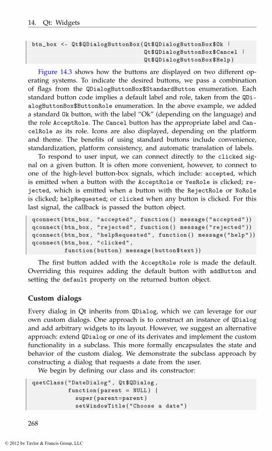
14. Qt: Widgets
btn_box <- Qt$QDialogButtonBox ( Qt$QDialogButtonBox$Ok |Qt$QDialogButtonBox$Cancel |Qt$QDialogButtonBox$Help )
Figure 14.3 shows how the buttons are displayed on two different op-erating systems. To indicate the desired buttons, we pass a combinationof flags from the QDialogButtonBox$StandardButton enumeration. Eachstandard button code implies a default label and role, taken from the QDi-alogButtonBox$ButtonRole enumeration. In the above example, we addeda standard Ok button, with the label “Ok” (depending on the language) andthe role AcceptRole. The Cancel button has the appropriate label and Can-celRole as its role. Icons are also displayed, depending on the platformand theme. The benefits of using standard buttons include convenience,standardization, platform consistency, and automatic translation of labels.
To respond to user input, we can connect directly to the clicked sig-nal on a given button. It is often more convenient, however, to connect toone of the high-level button-box signals, which include: accepted, whichis emitted when a button with the AcceptRole or YesRole is clicked; re-jected, which is emitted when a button with the RejectRole or NoRoleis clicked; helpRequested; or clicked when any button is clicked. For thislast signal, the callback is passed the button object.
qconnect ( btn_box , "accepted" , function ( ) message ( "accepted" ) )qconnect ( btn_box , "rejected" , function ( ) message ( "rejected" ) )qconnect ( btn_box , "helpRequested" , function ( ) message ( "help" ) )qconnect ( btn_box , "clicked" ,
function ( button ) message ( button$text ) )
The first button added with the AcceptRole role is made the default.Overriding this requires adding the default button with addButton andsetting the default property on the returned button object.
Custom dialogs
Every dialog in Qt inherits from QDialog, which we can leverage for ourown custom dialogs. One approach is to construct an instance of QDialogand add arbitrary widgets to its layout. However, we suggest an alternativeapproach: extend QDialog or one of its derivates and implement the customfunctionality in a subclass. This more formally encapsulates the state andbehavior of the custom dialog. We demonstrate the subclass approach byconstructing a dialog that requests a date from the user.
We begin by defining our class and its constructor:
qsetClass ( "DateDialog" , Qt$QDialog ,function ( parent = NULL ) {
super ( parent=parent )setWindowTitle ( "Choose a date" )
268
© 2012 by Taylor & Francis Group, LLC
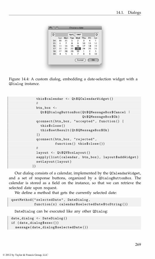
14.1. Dialogs
Figure 14.4: A custom dialog, embedding a date-selection widget with aQDialog instance.
this$calendar <- Qt$QCalendarWidget ( )#btn_box <-
Qt$QDialogButtonBox ( Qt$QMessageBox$Cancel |Qt$QMessageBox$Ok )
qconnect ( btn_box , "accepted" , function ( ) {this$close ( )this$setResult ( Qt$QMessageBox$Ok )
} )qconnect ( btn_box , "rejected" ,
function ( ) this$close ( ) )#layout <- Qt$QVBoxLayout ( )sapply ( list ( calendar , btn_box ) , layout$addWidget )setLayout ( layout )
} )
Our dialog consists of a calendar, implemented by the QCalendarWidget,and a set of response buttons, organized by a QDialogButtonBox. Thecalendar is stored as a field on the instance, so that we can retrieve theselected date upon request.
We define a method that gets the currently selected date:
qsetMethod ( "selectedDate" , DateDialog ,function ( x ) calendar$selectedDate$toString ( ) )
DateDialog can be executed like any other QDialog:
date_dialog <- DateDialog ( )if ( date_dialog$exec ( ) )
message ( date_dialog$selectedDate ( ) )
269
© 2012 by Taylor & Francis Group, LLC

14. Qt: Widgets
Wizards
QWizard implements a wizard – a multipage dialog that guides the userthrough a sequential, possibly branching process. Wizards are composed ofpages, and each page has a consistent interface, usually including buttonsfor moving backward and forward through the pages. The look and feelof a QWizard is consistent with platform conventions.
We create a wizard object and set its title:
wizard <- Qt$QWizard ( )wizard$setWindowTitle ( "A wizard" )
Each page is represented by a QWizardPage. We create one for request-ing the age of the user and add the page to the wizard:
get_age_page <- Qt$QWizardPage ( wizard )get_age_page$setTitle ( "What is your age?" )layout <- Qt$QFormLayout ( )get_age_page$setLayout ( layout )layout$addRow ( "Age" , ( age <- Qt$QLineEdit ( ) ) )wizard$addPage ( get_age_page )
Two more pages are added:
get_toys_page <- Qt$QWizardPage ( wizard )get_toys_page$setTitle ( "What toys do you like?" )layout <- Qt$QFormLayout ( )get_toys_page$setLayout ( layout )layout$addRow ( "Toys" , ( toys <- Qt$QLineEdit ( ) ) )wizard$addPage ( get_toys_page )##get_games_page <- Qt$QWizardPage ( wizard )get_games_page$setTitle ( "What games do you like?" )layout <- Qt$QFormLayout ( )get_games_page$setLayout ( layout )layout$addRow ( "Games" , ( games <- Qt$QLineEdit ( ) ) )wizard$addPage ( get_games_page )
Finally, we run the wizard by calling its exec method:
response <- wizard$exec ( )if ( response )
message ( toys$text )
File- and directory-choosing dialogs
QFileDialog allows the user to select files and directories by default usingthe platform native file dialog. As with other dialogs, there are static meth-ods to create dialogs with standard options. These are "getOpenFileName",
270
© 2012 by Taylor & Francis Group, LLC

14.1. Dialogs
"getOpenFileNames", "getExistingDirectory", and "getSaveFileName".To select a file name to open we would have:
filename <- Qt$QFileDialog$getOpenFileName ( NULL ,"Open a file..." , getwd ( ) )
All take as initial arguments a parent, a caption and a directory. Otherarguments allow us to set a filter, say. For basic use, these are nearly aseasy to use as R’s file.choose function. If a file is selected, filename willcontain the full path to the file; otherwise it will be NULL.
To allow multiple selection, call the plural form of the method:
filenames <- Qt$QFileDialog$getOpenFileNames ( NULL ,"Open file(s)..." , getwd ( ) )
To select a file name for saving, we have:
filename <- Qt$QFileDialog$getSaveFileName ( NULL ,"Save as..." , getwd ( ) )
And to choose a directory,
dirname <- Qt$QFileDialog$getExistingDirectory ( NULL ,"Select directory" , getwd ( ) )
To specify a filter by file extension, we use a “name filter.” A name filteris of the form Description (*.ext *.ext2), no comma, where this wouldmatch files with extensions ext or ext2. Multiple filters can be used byseparating them with two semicolons. For example, this would be a naturalfilter for R users:
name_filter <- paste ( "R files (*.R .RData)" ,"Sweave files (*.Rnw)" ,"All files (*.*)" ,sep=";;" )
##filenames <- Qt$QFileDialog$getOpenFileNames ( NULL ,
"Open file(s)..." , getwd ( ) , name_filter )
Although the static functions provide most of the functionality, tofully configure a dialog, it may be necessary to construct and manipu-late a dialog instance explicitly. Examples of options not available from thestatic methods are history (previously selected file names), sidebar shortcutURLs, and filters based on low-level file attributes such as permissions.
Example 14.1: File dialogsWe construct a dialog for opening an R-related file, using the directoryname selected above as the history:
dialog <- Qt$QFileDialog ( NULL , "Choose an R file" , getwd ( ) ,name_filter )
271
© 2012 by Taylor & Francis Group, LLC

14. Qt: Widgets
dialog$fileMode <- Qt$QFileDialog$ExistingFilesdialog$setHistory ( dirname )
The dialog is executed like any other. To get the specified files, callselectedFiles:
if ( dialog$exec ( ) )print ( dialog$selectedFiles ( ) )
Other choosers
Qt provides several additional dialog types for choosing a particular typeof item. These include QColorDialog for picking a color and QFontDialogfor selecting a font. These special-case dialogs will not be discussed furtherhere.
14.2 Labels
As demonstrated in many of the preceding examples, basic labels in Qtare instances of the QLabel class. Labels in Qt are the primary means fordisplaying static text and images. Textual labels are the most common, andthe constructor accepts a string for the text, which can be plain text or, forrich text, HTML. Here we use HTML to display red text:
label <- Qt$QLabel ( "<font color=’red’>Red</font>" )
By default, QLabel guesses whether the string is rich or plain text. In theabove, the rich-text format is identified from the markup. The textFormatproperty can override this.
The label text is stored in the text property. Properties relevant to textlayout include alignment, indent (in pixels), margin, and wordWrap.
14.3 Buttons
As we have seen, the ordinary button in Qt is created by QPushButton,which inherits most of its functionality from QAbstractButton, the com-mon base class for buttons. We create a simple “Ok” button:
button <- Qt$QPushButton ( "Ok" )
Like any other widget, a button can be disabled, so that the user cannotpress it:
button$enabled <- FALSE
This is useful for preventing the user from attempting to execute com-mands that do not apply to the current state of the application. Qt changesthe rendering widget, including that of the icon, to indicate the disabledstate.
272
© 2012 by Taylor & Francis Group, LLC
14.3. Buttons
Signals A push button usually executes some command when clickedor otherwise invoked. The QAbstractButton class provides the signalsclicked, for when the button is activated, and pressed and releasedto track button clicks and releases. For example, to respond with a simplemessage, we could have:
qconnect ( button , "clicked" , function ( ) message ( "Ok clicked" ) )
Icons and pixmaps
A button is often decorated with an icon, which serves as a visual indicatorof the purpose of the button. The QIcon class represents an icon. Icons canbe defined for different sizes and display modes (normal, disabled, active,selected); however, this is often not necessary, as Qt will adapt an icon asnecessary. As we have seen, Qt automatically adds the appropriate icon toa standard button in a dialog. When using QPushButton directly, there areno such conveniences. For our “Ok” button, we could add an icon from afile:
icon_file <- system . file ( "images/ok.gif" , package="gWidgets" )button$icon <- Qt$QIcon ( icon_file )
However, in general, this will not be consistent with the current style.Instead, we need to get the icon from the QStyle:
style <- Qt$QApplication$style ( )button$icon <- style$standardIcon ( Qt$QStyle$SP_DialogOkButton )
The QStyle::StandardPixmap enumeration lists all of the possible iconsthat a style should provide. In the above, we passed the key for an “Ok”button in a dialog.
We can also create a QIcon from image data in a QPixmap object.QPixmap stores an image in a manner that is efficient for display on thescreen.1 We can load a pixmap from a file or create a blank image and drawon it using the Qt painting API (not discussed in this book). Also, usingthe qtutils package, we can draw a pixmap using the R graphics engine.For example, the following uses ggplot2 to generate an icon representinga histogram. First, we create the Qt graphics device (cf. Section 14.10) andplot the icon with grid:
require ( qtutils )device <- QT ( )grid : : : grid . newpage ( )grid : : : grid . draw ( ggplot2 : : : GeomHistogram$icon ( ) )
1QPixmap is not to be confused with QImage, which is optimized for image manipulation,or the vector-based QPicture.
273
© 2012 by Taylor & Francis Group, LLC

14. Qt: Widgets
Next, we create the blank pixmap and render the device to a paintcontext attached to the pixmap:
pixmap <- Qt$QPixmap ( device$size$toSize ( ) )pixmap$fill ( )painter <- Qt$QPainter ( )painter$begin ( pixmap )device$render ( painter )painter$end ( )
Finally, we use the icon in a button:
button <- Qt$QPushButton ( "Histogram" )button$setIcon ( Qt$QIcon ( pixmap ) )
14.4 Checkboxes
The QCheckBox class implements a checkbox. Like the QPushButton class,QCheckBox extends QAbstractButton. Thus, QCheckBox inherits the signalsclicked, pressed, and released and the signal stateChanged is added.
We create a checkbox for demonstration with:
checkbox <- Qt$QCheckBox ( "Option" )
The checked property indicates whether the button is checked:
checkbox$checked
[1] FALSE
Sometimes, it is useful for a checkbox to have an indeterminate statethat is neither checked nor unchecked. To enable this, set the tristateproperty to TRUE. In that case, we need to call the checkState method todetermine the state, as it is no longer Boolean but from the Qt::CheckStateenumeration.
The stateChanged signal is emitted whenever the checked state of thebutton changes:
qconnect ( checkbox , "stateChanged" , function ( state ) {if ( state == Qt$Qt$Checked )
message ( "checked" )} )
The argument is from the Qt::CheckState enumeration; it is not a logicalvector.
Groups of checkboxes
Checkboxes and other types of buttons are often naturally grouped intological units. The frame widget, QGroupBox, is appropriate for visually
274
© 2012 by Taylor & Francis Group, LLC
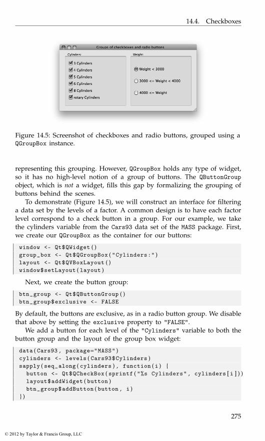
14.4. Checkboxes
Figure 14.5: Screenshot of checkboxes and radio buttons, grouped using aQGroupBox instance.
representing this grouping. However, QGroupBox holds any type of widget,so it has no high-level notion of a group of buttons. The QButtonGroupobject, which is not a widget, fills this gap by formalizing the grouping ofbuttons behind the scenes.
To demonstrate (Figure 14.5), we will construct an interface for filteringa data set by the levels of a factor. A common design is to have each factorlevel correspond to a check button in a group. For our example, we takethe cylinders variable from the Cars93 data set of the MASS package. First,we create our QGroupBox as the container for our buttons:
window <- Qt$QWidget ( )group_box <- Qt$QGroupBox ( "Cylinders:" )layout <- Qt$QVBoxLayout ( )window$setLayout ( layout )
Next, we create the button group:
btn_group <- Qt$QButtonGroup ( )btn_group$exclusive <- FALSE
By default, the buttons are exclusive, as in a radio button group. We disablethat above by setting the exclusive property to "FALSE".
We add a button for each level of the "Cylinders" variable to both thebutton group and the layout of the group box widget:
data ( Cars93 , package="MASS" )cylinders <- levels ( Cars93$Cylinders )sapply ( seq_along ( cylinders ) , function ( i ) {
button <- Qt$QCheckBox ( sprintf ( "%s Cylinders" , cylinders [ i ] ) )layout$addWidget ( button )btn_group$addButton ( button , i )
} )
275
© 2012 by Taylor & Francis Group, LLC

14. Qt: Widgets
sapply ( btn_group$buttons ( ) ,function ( button ) button$checked <- TRUE )
Every button is initially checked. (The buttons method returns a list of themanaged buttons.)
Buttons can be removed through removeButton, where the button object(not its index) is specified for removal.
Here, we retrieve the buttons in the group and query their checkedstate:
checked <- sapply ( btn_group$buttons ( ) , function ( i ) i$checked )if ( any ( checked ) ) {
checked_cyls <- Cars93$Cylinders %in% cylinders [ checked ]message ( sprintf ( "You’ve selected %d cases" ,
sum ( checked_cyls ) ) )}
Button groups emit signals paralleling the QAbstractButton class (inparticular the buttonClicked signal, but also buttonPressed and button-Released). By attaching a callback to the buttonClicked signal,2 we willbe informed when any of the buttons in the group are clicked:
qconnect ( btn_group , "buttonClicked(QAbstractButton*)" ,function ( button ) {
msg <- sprintf ( "Level ’%s’: %s" ,button$text , button$checked )
message ( msg )} )
14.5 Radio groups
Another type of checkable button is the radio button, QRadioButton. Radiobuttons always belong to a group, and only one radio button in a groupmay be checked at once (they are exclusive). Continuing our filtering ex-ample (Figure 14.5), we create several radio buttons for choosing a rangefor the "Weight" variable in the "Cars93" data set:
window <- Qt$QGroupBox ( "Weight:" )radio_buttons <-
list ( Qt$QRadioButton ( "Weight < 3000" , w ) ,Qt$QRadioButton ( "3000 <= Weight < 4000" , w ) ,Qt$QRadioButton ( "4000 <= Weight" , w ) )
In the above we specified the parent to the constructor to group the objects.The simplest way to arrange the radio boxes is to place them into the
same layout:
2See Section 12.6 for why we need the (QAbstractButton*).
276
© 2012 by Taylor & Francis Group, LLC
14.6. Combo boxes
layout <- Qt$QVBoxLayout ( )window$setLayout ( layout )sapply ( radio_buttons , layout$addWidget )radio_buttons [ [ 1 ] ] $setChecked ( TRUE )
As with any other derivative of QAbstractButton, the checked state isstored in the checked property:
radio_buttons [ [ 1 ] ] $checked
[1] TRUE
The button’s toggled signal is emitted when a button is checked orunchecked:
sapply ( radio_buttons , function ( button ) {qconnect ( button , "toggled" , function ( checked ) {
if ( checked ) {message ( sprintf ( "You checked %s." , button$text ) )
}} )
} )
Managing the radio buttons in a list, as above, is often inconvenientand difficult to maintain. Instead, we can have a QButtonGroup instancemanage the radio buttons:
btn_group <- Qt$QButtonGroup ( )lapply ( radio_buttons , btn_group$addButton )
Since our button group is exclusive, we can query for the currently checkedbutton through the checkedButton method:
btn_group$checkedButton ( ) $text
[1] "Weight < 3000"
As well, we can listen for events on the button group, rather thanlisten on each radio button, as was done above. This strategy makes itmuch easier to add (or remove) items, although we do need to add to (orremove from) both the layout and the button group.
14.6 Combo boxes
A combo box allows a single selection from a drop-down list of options.In this section, we describe the basic usage of QComboBox. This includespopulating the menu with a list of strings and optionally allowing arbitraryinput through an associated text entry. For the more complex approach ofderiving the menu from a separate data model, see Section 15.3.
277
© 2012 by Taylor & Francis Group, LLC
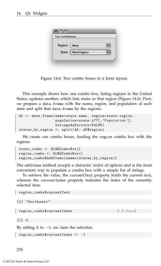
14. Qt: Widgets
Figure 14.6: Two combo boxes in a form layout.
This example shows how one combo box, listing regions in the UnitedStates, updates another, which lists states in that region (Figure 14.6). First,we prepare a data.frame with the name, region, and population of eachstate and split that data.frame by the regions:
df <- data . frame ( name=state . name , region=state . region ,population=state . x77 [ , ’Population’ ] ,stringsAsFactors=FALSE )
states_by_region <- split ( df , df$region )
We create our combo boxes, loading the region combo box with theregions:
state_combo <- Qt$QComboBox ( )region_combo <- Qt$QComboBox ( )region_combo$addItems ( names ( states_by_region ) )
The addItems method accepts a character vector of options and is the mostconvenient way to populate a combo box with a simple list of strings.
To retrieve the value, the currentText property holds the current text,whereas the currentIndex property indicates the index of the currentlyselected item:
region_combo$currentText
[1] "Northeast"
region_combo$currentIndex # 0−b a s e d
[1] 0
By setting it to −1, we clear the selection.
region_combo$currentIndex <- −1
278
© 2012 by Taylor & Francis Group, LLC

14.7. Sliders and spin boxes
To respond to a change in the current index, we connect to the acti-vated signal:
qconnect ( region_combo , "activated(int)" , function ( index ) {state_combo$clear ( )state_combo$addItems ( states_by_region [ [ index + 1] ] $name )
} )
Our handler resets the state combo box to correspond to the selected re-gion, indicated by "index", which is 0-based.
Finally, we place the widgets in a form layout:
window <- Qt$QGroupBox ( "Two combo boxes" )layout <- Qt$QFormLayout ( )window$setLayout ( layout )layout$addRow ( "Region:" , region_combo )layout$addRow ( "State:" , state_combo )layout$fieldGrowthPolicy <- # grow combo b o x e s
Qt$QFormLayout$AllNonFixedFieldsGrow
To allow a user to enter a value not in the menu, the property editablecan be set to TRUE. This would not be sensible for our example.
14.7 Sliders and spin boxes
Sliders and spin boxes are similar widgets used for selecting from a rangeof values. Sliders give the illusion of selecting from a continuum, whereasspin boxes offer a discrete choice. However, underlying each is an arith-metic sequence. Our example will include both widgets and synchronizethem for specifying a single range. The slider allows for quick movementacross the range, while the spin box is best suited for fine adjustments.
Sliders
Sliders are implemented by QSlider, a subclass of QAbstractSlider. Theclass allows selection only from integer values. We create an instance andspecify the bounds of the range:
slider <- Qt$QSlider ( )slider$minimum <- 0slider$maximum <- 100
We can also customize the step size:
slider$singleStep <- 1slider$pageStep <- 5
Single step refers to the effect of pressing one of the arrow keys, whilepressing "Page Up/Down" adjusts the slider by pageStep.
279
© 2012 by Taylor & Francis Group, LLC
14. Qt: Widgets
The current cursor position is given by the property value; we set it tothe middle of the range:
slider$value
[1] 0
slider$value <- 50
A slider has several aesthetic properties. We set our slider to be orientedhorizontally (vertical is the default) and place the tick marks below theslider, with a mark every ten values:
slider$orientation <- Qt$Qt$Horizontalslider$tickPosition <- Qt$QSlider$TicksBelowslider$tickInterval <- 10
The valueChanged signal is emitted whenever the value property ismodified. An example is given below, after the introduction of the spinbox.
Spin boxes
There are several spin-box classes: QSpinBox (for integers), QDoubleSpinBoxand QDateTimeEdit. All of these derive from a common base, QAbstract-SpinBox. As our slider is integer-valued, we will introduce QSpinBox here.Configuring a QSpinBox proceeds much as it does for QSlider:
spinbox <- Qt$QSpinBox ( )spinbox$minimum <- slider$minimumspinbox$maximum <- slider$maximumspinbox$singleStep <- slider$singleStep
There is no "pageStep" for a spin box. Since we are communicating apercentage, we specify "%" as the suffix for the text of the spin box:
spinbox$suffix <- "%"
It is also possible to set a prefix.Both QSlider and QSpinBox emit the valueChanged signal whenever
the value changes. We connect to the signal on both widgets to keep themsynchronized:
f <- function ( value , obj ) obj$value <- valueqconnect ( spinbox , "valueChanged" , f , user . data = slider )qconnect ( slider , "valueChanged" , f , user . data = spinbox )
We pass the other widget as the user data, so that state changes in oneare forwarded to the other. A race condition is avoided, as valueChangedis emitted only when the value actually changes.
280
© 2012 by Taylor & Francis Group, LLC
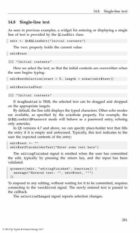
14.8. Single-line text
14.8 Single-line text
As seen in previous examples, a widget for entering or displaying a singleline of text is provided by the QLineEdit class:
edit <- Qt$QLineEdit ( "Initial contents" )
The text property holds the current value:
edit$text
[1] "Initial contents"
Here we select the text, so that the initial contents are overwritten whenthe user begins typing:
edit$setSelection ( start = 0 , length = nchar ( edit$text ) )
edit$selectedText
[1] "Initial contents"
If dragEnabled is TRUE, the selected text can be dragged and droppedon the appropriate targets.
By default, the line edit displays the typed characters. Other echo modesare available, as specified by the echoMode property. For example, theQt$QLineEdit$Password mode will behave as a password entry, echoingonly asterisks.
In Qt versions 4.7 and above, we can specify place-holder text that fillsthe entry if it is empty and unfocused. Typically, this text indicates to theuser the expected contents of the entry:
edit$text <- ""edit$setPlaceholderText ( "Enter some text here" )
The editingFinished signal is emitted when the user has committedthe edit, typically by pressing the return key, and the input has beenvalidated:
qconnect ( edit , "editingFinished" , function ( ) {message ( "Entered text: ’" , edit$text , "’" )
} )
To respond to any editing, without waiting for it to be committed, requiresconnecting to the textEdited signal. The newly entered text is passed tothe callback.
The selectionChanged signal reports selection changes.
281
© 2012 by Taylor & Francis Group, LLC
14. Qt: Widgets
Completion
Using the QCompleter framework, a list of possible words can be presentedfor completion when text is entered into a QLineEdit.
Example 14.2: Implementing completion of Qt classes and methods
This example shows how completion can assist in exploring the classesand namespaces of the Qt library. A form layout arranges two line editwidgets – one to gather a class name and one for method and propertynames. See Figure 14.8 to see this widget example embedded into a webpage.
class_browser <- Qt$QWidget ( )layout <- Qt$QFormLayout ( )class_browser$setLayout ( layout )layout$addRow ( "Class name" , class_edit <- Qt$QLineEdit ( ) )layout$addRow ( "Method name" , method_edit <- Qt$QLineEdit ( ) )
Next, we construct the completer for the class entry, listing the compo-nents of the "Qt" environment with ls:
class_completer <- Qt$QCompleter ( ls ( Qt ) )class_edit$setCompleter ( class_completer )
The completion for the methods depends on the class. As such, weupdate the completion when editing is finished for the class name:
qconnect ( class_edit , "editingFinished" , function ( ) {class_name <- class_edit$textif ( class_name == "" ) return ( )class_object <- get ( class_name , envir = Qt )if ( !is . null ( class_object ) ) {
method_completer <- Qt$QCompleter ( ls ( class_object ( ) ) )method_edit$setCompleter ( method_completer )
}} )
Masks and validation
QLineEdit has various means to restrict and validate user input. ThemaxLength property restricts the number of allowed characters. Beyondthat, there are two mechanisms for validating input: masks and QValida-tor. An input mask is convenient for restricting input to a simple pattern.We could, for example, force the input to conform to the pattern of aUnited States Social Security number:
edit$inputMask <- "999-99-9999"
282
© 2012 by Taylor & Francis Group, LLC
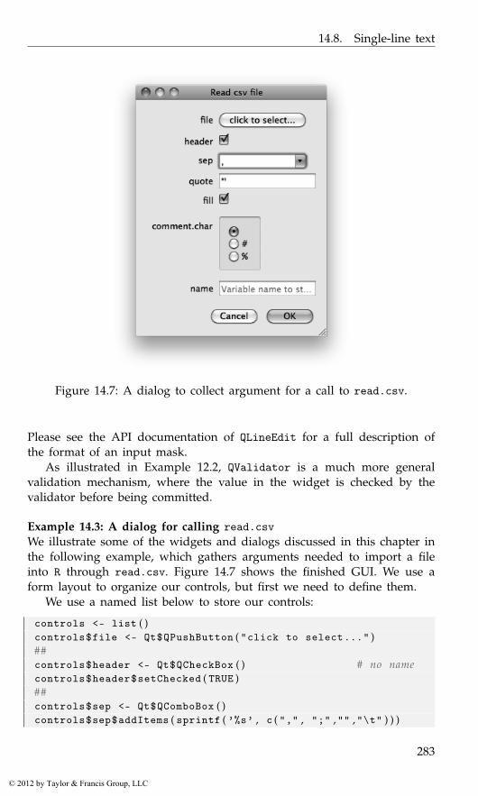
14.8. Single-line text
Figure 14.7: A dialog to collect argument for a call to read.csv.
Please see the API documentation of QLineEdit for a full description ofthe format of an input mask.
As illustrated in Example 12.2, QValidator is a much more generalvalidation mechanism, where the value in the widget is checked by thevalidator before being committed.
Example 14.3: A dialog for calling read.csvWe illustrate some of the widgets and dialogs discussed in this chapter inthe following example, which gathers arguments needed to import a fileinto R through read.csv. Figure 14.7 shows the finished GUI. We use aform layout to organize our controls, but first we need to define them.
We use a named list below to store our controls:
controls <- list ( )controls$file <- Qt$QPushButton ( "click to select..." )##controls$header <- Qt$QCheckBox ( ) # no namecontrols$header$setChecked ( TRUE )##controls$sep <- Qt$QComboBox ( )controls$sep$addItems ( sprintf ( ’%s’ , c ( "," , ";" ,"" ,"\t" ) ) )
283
© 2012 by Taylor & Francis Group, LLC
14. Qt: Widgets
controls$sep$setEditable ( TRUE )##controls$quote <- Qt$QLineEdit ( "\"’")##controls$fill <- Qt$QCheckBox()controls$fill$setChecked(TRUE)
The names of the list will become the label associated with the corre-sponding control. A button is chosen for the file, which we will later useto open a file selection dialog. Otherwise, the controls have a fairly obviousmapping to the arguments of read.csv.
To illustrate radio buttons, we use a set of them to select the commentcharacter argument. Here we store the container in the list and create aseparate (global) variable to hold the radio-button widgets themselves.
controls$comment . char <- Qt$QGroupBox ( ) # c o n t a i n e rcomment . char <- lapply ( sprintf ( "%s" , c ( "" ,"#" ,"%" ) ) ,
Qt$QRadioButton , controls$comment . char )comment . char [ [ 1 ] ] $setChecked ( TRUE )## managecomment . char . bg <- Qt$QButtonGroup ( )sapply ( comment . char , comment . char . bg$addButton )## l a y o u tlayout <- Qt$QVBoxLayout ( )controls$comment . char$setLayout ( layout )sapply ( comment . char , layout$addWidget )
The variable name uses a simple line-edit widget to which we add aninstructional placeholder. We also populate its auto-completion databasewith the current global workspace variable names.
controls$name <- Qt$QLineEdit ( "" )controls$name$setPlaceholderText ( "Variable name to store data" )completer <- Qt$QCompleter ( ls ( . GlobalEnv ) )controls$name$setCompleter ( completer )
The form layout goes quickly, as we can iterate over the list compo-nents:
form_layout <- Qt$QFormLayout ( )mapply ( form_layout$addRow , names ( controls ) , controls )
A dialog button box ensures consistency with the operating -systemconventions.
button_box <-Qt$QDialogButtonBox ( Qt$QMessageBox$Cancel |
Qt$QMessageBox$Ok )
We use a simple widget to lay out the form and the buttons.
284
© 2012 by Taylor & Francis Group, LLC
14.8. Single-line text
window <- Qt$QWidget ( )window$windowTitle <- "Read csv file"window$setLayout ( window_layout <- Qt$QVBoxLayout ( ) )window_layout$addLayout ( form_layout )window_layout$addWidget ( button_box )
At this point, the widgets are set up and laid out. We turn to the taskof adding interactivity. First, the file button, when clicked, should opena file-selection dialog. If a file load is successful, we change the label onthe button to indicate the selection, using the global filename to store thevalue.
filename <- NULLqconnect ( controls$file , "clicked" , function ( ) {
name_filter <- "CSV file (*.csv);; All files (*.*)"filename <<- Qt$QFileDialog$getOpenFileName ( window ,
"Select a CSV file..." , getwd ( ) , name_filter )if ( !is . null ( filename ) )
controls$file$setText ( basename ( filename ) )} )
We connect to the signals on the dialog button box. The rejectedcallback simply hides the dialog. The accepted callback is more complex.After checking that a file and variable name have been selected, we gatherthe values from the dialog through various means. These are stored in thelist args below. Finally, once the arguments are collected, we execute thecall to read.csv.
qconnect ( button_box , "rejected" , function ( ) window$hide ( ) )##qconnect ( button_box , "accepted" , function ( ) {
if ( !is . null ( filename ) && nchar ( controls$name$text ) > 0) {args <- list ( file=filename ,
header=controls$header$checked ,sep=controls$sep$currentText ,quote=controls$quote$text ,fill=controls$fill$checked)
args$comment . char <- comment . char . bg$checkedButton ( ) $text##val <- do . call ( "read.csv" , args )assign ( controls$name$text , val , . GlobalEnv )window$hide ( )
} else {Qt$QMessageBox$warning ( parent = window ,
title = "Warning!" ,text = "You need to select a file and variable name" )
}} )
285
© 2012 by Taylor & Francis Group, LLC

14. Qt: Widgets
Figure 14.8: An example of QWebView holding an embedded widgetwithin a web page.
14.9 QWebView widget
The QtWebKit module provides a Qt-based implementation of the cross-platform WebKit API. The standards support is comparable to that of otherWebKit implementations like Safari and Chrome. This includes HTML ver-sion 5, Javascript and SVG. The Javascript engine, provided by the QtScriptmodule, allows bridging Javascript and R, which will not be discussed. Thewidget QWebView uses QtWebKit to render web pages in a GUI.
This is the basic usage:
webview <- Qt$QWebView ( )webview$load ( Qt$QUrl ( "http://www.r-project.org" ) )
A web browser typically provides feedback on the URL loading process.The signals loadStarted, loadProgress, and loadFinished are providedfor this purpose. History information is stored in a QWebHistory object,retrieved by calling history on the web view. This could be used forimplementing a “Back” button.
Embedding Qt widgets A unique feature of QtWebKit is the ability toembed Qt widgets into a web page (Figure 14.8). This is one mechanismfor constructing hybrid web/desktop applications. Widget embedding isimplemented through the standard HTML "object" tag. We can registera plug-in, manifested as a QWidget, for a particular MIME type, specifiedthrough the "type" attribute of the "object" element.
For example, we might have the following simple HTML:
html <- readLines ( out <- textConnection ( "<html xmlns=’http://www.w3.org/1999/xhtml’>
<body><h1>Qt class browser embedded into a QWebView </h1>Search for a class:<br/>
286
© 2012 by Taylor & Francis Group, LLC
14.9. QWebView widget
<object type=’application/x-qt-class-browser’ width=’500’height=’100’/>
</body></html>" ) ) ; close ( out )html <- paste ( html , collapse = "\n" )
For our plug-in, we use the class browser widget, constructed in Ex-ample 14.2. To provide the plug-in, we need to implement a custom QWeb-PluginFactory:
qsetClass ( "RPluginFactory" , Qt$QWebPluginFactory )
The factory has two duties: describing its available plug-ins and creatinga plug-in, in the form of a QWidget, for a given MIME type. The pluginsmethod returns a list of plug-in descriptions:
qsetMethod ( "plugins" , RPluginFactory , function ( ) {plugin <- Qt$QWebPluginFactory$Plugin ( )plugin$setName ( "Class Browser" )mimeType <- Qt$QWebPluginFactory$MimeType ( )mimeType$setName ( "application/x-qt-class-browser" )plugin$setMimeTypes ( list ( mimeType ) )list ( plugin )
} )
Our factory provides a single plug-in, with a single MIME type thatmatches the type of the "object" element in the HTML. The createmethod constructs the actual QWidget corresponding to the plug-in:
qsetMethod ( "create" , RPluginFactory ,function ( mime_type , url , arg_names , arg_vals ) {
if ( mime_type== "application/x-qt-class-browser" )class_browser
else Qt$QWidget ( )} )
If the MIME type does not match our plug-in, we simply return an emptywidget.
Finally, we need to enable plug-ins, register our factory, and load theHTML:
globalSettings <- Qt$QWebSettings$globalSettings ( )globalSettings$setAttribute ( Qt$QWebSettings$PluginsEnabled ,
TRUE )webview$page ( ) $setPluginFactory ( RPluginFactory ( ) )webview$setHtml ( html )
287
© 2012 by Taylor & Francis Group, LLC
14. Qt: Widgets
14.10 Embedding R graphics
The qtutils package includes a Qt-based graphics device, written by Deep-ayan Sarkar. We make a simple scatterplot:
library ( qtutils )qt_device <- QT ( )plot ( mpg ~ hp , data = mtcars )
The "qtDevice" object may be shown directly or embedded within a GUI.For example, we might place it in a notebook of multiple plots:
notebook <- Qt$QTabWidget ( )notebook$addTab ( qt_device , "Plot 1" )print ( notebook )
The device provides a context menu with actions for zooming, export-ing and printing the plot. We can execute an action programmatically byextracting the action from "qtDevice" and activating it.
To increase performance at a slight cost of quality, we could direct thedevice to leverage hardware acceleration through OpenGL. This requirespassing "opengl = TRUE" to the QT constructor:
qt_opengl_device <- QT ( opengl = TRUE )
Even without the help of OpenGL, the device is faster than most othergraphics devices, in particular cairoDevice, due to the general efficiencyof Qt graphics.
Internally, the device renders to a QGraphicsScene. Every primitivedrawn by R becomes an object in the scene. Nothing is rasterized to pixelsuntil the scene is displayed on the screen. This presents the interestingpossibility of programmatically manipulating the graphical primitives afterthey have been plotted; however, this is beyond our scope. See Exam-ple 14.3 for a way to render the scene to an off-screen QPixmap for use asan icon.
14.11 Drag-and-drop
Some Qt widgets, such as those for editing text, natively support basicdrag-and-drop activities. For other situations, it is necessary to programagainst the low-level drag-and-drop API, presented here. A drag-and-dropevent consists of several stages: the user selects the object that initiatesthe drag event, drags the object to a target, and finally drops the objecton the target. For our example, we will enable the dragging of text fromone label to another, following the Qt tutorial. Example 15.2 has a morerealistic example.
288
© 2012 by Taylor & Francis Group, LLC
14.11. Drag-and-drop
Initiating a drag
We begin by setting up a label to be a drag target:
qsetClass ( "DragLabel" , Qt$QLabel ,function ( text = "" , parent = NULL ) {
super ( parent )setText ( text )##setAlignment ( Qt$Qt$AlignCenter )setMinimumSize ( 2 0 0 , 200)
} )
When a drag-and-drop sequence is initiated, the source, i.e., the widgetreceiving the mouse press event, needs to encode a chosen graphical objectas MIME data. This might be as an image, text, or other data type. Thisoccurs in the mouseEventHandler of the source:
qsetMethod ( "mousePressEvent" , DragLabel , function ( event ) {mime_data <- Qt$QMimeData ( )mime_data$setText ( text )
drag <- Qt$QDrag ( this )drag$setMimeData ( mime_data )
drag$exec ( )} )
We store the text in a QMimeData and pass it to the QDrag object, whichrepresents the drag operation. The drag object is given this as its parent,so that drag is not garbage collected when the handler returns. Finally,calling the exec method is necessary to initiate the drag. It is also possibleto call setPixmap to set a pixmap to represent the object as it is beingdragged to its target.
Handling a drop
Implementing a label as a drop target is a bit more work, as we customizeits appearance. Our basic constructor follows:
qsetClass ( "DropLabel" , Qt$QLabel ,function ( text="" , parent=NULL ) {
super ( parent )
setText ( text )this$acceptDrops <- TRUE
this$bgrole <- backgroundRole ( )this$alignment <- Qt$Qt$AlignCenter
289
© 2012 by Taylor & Francis Group, LLC
14. Qt: Widgets
setMinimumSize ( 2 0 0 , 200)this$autoFillBackground <- TRUEclear ( )
} )
The important step is to allow the widget to receive drops by settingacceptDrops to TRUE. The other settings ensure that the label fills a min-imal amount of space and draws its background. The background role ispreserved so that we can restore it later, after applying highlighting.
First, we define a couple of utility methods:
qsetMethod ( "clear" , DropLabel , function ( ) {setText ( this$orig_text )setBackgroundRole ( this$bgrole )
} )qsetMethod ( "setText" , DropLabel , function ( text ) {
this$orig_text <- textsuper ( "setText" , text ) # nex t method
} )
The clear method is used to restore the label to an initial state. The back-ground role is remembered in the constructor, and the setText overridesaves the original text.
When the user drags an object over our target, we need to verify that thedata is of an acceptable type. This is implemented by the dragEnterEventhandler:
qsetMethod ( "dragEnterEvent" , DropLabel , function ( event ) {mime_data <- event$mimeData ( )if ( mime_data$hasImage ( ) || mime_data$hasHtml ( ) |
mime_data$hasText ( ) ){
super ( "setText" , "<Drop Text Here>" )setBackgroundRole ( Qt$QPalette$Highlight )event$acceptProposedAction ( )
}} )
If the data type is acceptable, we accept the event. This changes the mousecursor, indicating that a drop is possible. A secondary role of this han-dler is to indicate that the target is receptive to drops; we highlight thebackground of the label and change the text. To undo the highlighting, weoverride the dragLeaveEvent method:
qsetMethod ( "dragLeaveEvent" , DropLabel , function ( event ) {clear ( )
} )
290
© 2012 by Taylor & Francis Group, LLC
14.11. Drag-and-drop
Finally, we have the important drop-event handler. The following codeimplements this more generally than is needed for this example, as wehave only text in our MIME data:
qsetMethod ( "dropEvent" , DropLabel , function ( event ) {mime_data <- event$mimeData ( )
if ( mime_data$hasImage ( ) ) {setPixmap ( mime_data$imageData ( ) )
} else if ( mime_data$hasHtml ( ) ) {setText ( mime_data$html )setTextFormat ( Qt$Qt$RichText )
} else if ( mime_data$hasText ( ) ) {setText ( mime_data$text ( ) )setTextFormat ( Qt$Qt$PlainText )
} else {setText ( "No match" ) # r e p l a c e . . .
}
setBackgroundRole ( this$bgrole )event$acceptProposedAction ( )
} )
We are passed a QDropEvent object, which contains the QMimeData seton the QDrag by the source. The data is extracted and translated to one ormore properties of the target. The final step is to accept the drop event, sothat the drag-and-drop operation is completed.
291
© 2012 by Taylor & Francis Group, LLC
15
Qt: Widgets Using Data Models
The model, view, controller (MVC) pattern is fundamental to the designof widgets that display and manipulate data. Keeping the model separatefrom the view allows multiple views for the same data. Generally, themodel is an abstract interface. Thus, the same view and controller compo-nents are able to operate on any data source (e.g., a database) for which amodel implementation exists.
Qt provides QAbstractItemModel as the base for all of its data models.Like GtkTreeModel, QAbstractItemModel represents tables, optionally witha hierarchy. The precise implementation depends on the subclass. Widgetsthat view item models extend QAbstractItemView and include tables, lists,trees, and combo boxes. This section will outline the available model andview implementations in Qt and qtbase.
15.1 Displaying tabular data
Displaying an R data frame
As mentioned, Qt expects data to be stored in a QAbstractItemModel in-stance. In R, the canonical structure for tabular data is data.frame. TheDataFrameModel class bridges these structures by wrapping data.framein an implementation of QAbstractItemModel. This essentially allows adata.frame object to be passed to any part of Qt that expects tabular data.It also offers significant performance benefits: there is no need to copy thedata frame into a C++ data structure, which would be especially slow ifthe looping occurred in R.
Displaying a simple table of data with DataFrameModel is much easierthan with GTK+ and RGtkDataFrame. Here, we construct a widget to showa data.frame in a table view:
model <- qdataFrameModel ( mtcars )view <- Qt$QTableView ( )view$setModel ( model )
293
© 2012 by Taylor & Francis Group, LLC
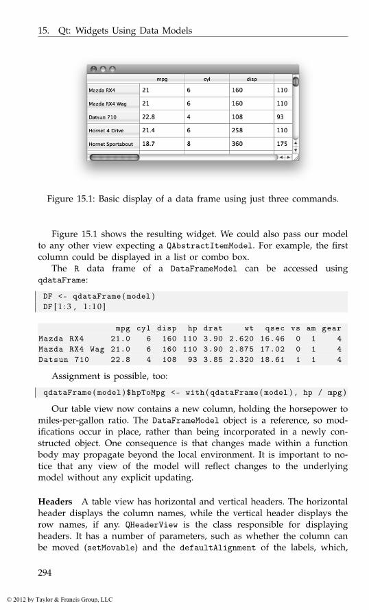
15. Qt: Widgets Using Data Models
Figure 15.1: Basic display of a data frame using just three commands.
Figure 15.1 shows the resulting widget. We could also pass our modelto any other view expecting a QAbstractItemModel. For example, the firstcolumn could be displayed in a list or combo box.
The R data frame of a DataFrameModel can be accessed usingqdataFrame:
DF <- qdataFrame ( model )DF [ 1 : 3 , 1 : 1 0 ]
mpg cyl disp hp drat wt qsec vs am gearMazda RX4 21.0 6 160 110 3.90 2.620 16.46 0 1 4Mazda RX4 Wag 21.0 6 160 110 3.90 2.875 17.02 0 1 4Datsun 710 22.8 4 108 93 3.85 2.320 18.61 1 1 4
Assignment is possible, too:
qdataFrame ( model ) $hpToMpg <- with ( qdataFrame ( model ) , hp / mpg )
Our table view now contains a new column, holding the horsepower tomiles-per-gallon ratio. The DataFrameModel object is a reference, so mod-ifications occur in place, rather than being incorporated in a newly con-structed object. One consequence is that changes made within a functionbody may propagate beyond the local environment. It is important to no-tice that any view of the model will reflect changes to the underlyingmodel without any explicit updating.
Headers A table view has horizontal and vertical headers. The horizontalheader displays the column names, while the vertical header displays therow names, if any. QHeaderView is the class responsible for displayingheaders. It has a number of parameters, such as whether the column canbe moved (setMovable) and the defaultAlignment of the labels, which,
294
© 2012 by Taylor & Francis Group, LLC
15.1. Displaying tabular data
as we will see later, can be overridden by the model for specific columns.By default, the labels are centered. Here, we specify left alignment for thecolumn labels:
header <- view$horizontalHeader ( )header$defaultAlignment <- Qt$Qt$AlignLeft
Aesthetic properties QTableView provides a number of aesthetic features.By default, a grid is drawn that delineates the cells. We can set showGridto "FALSE" to disable this. If a table has more than a few columns, it maybe a good idea to fill the row backgrounds with alternating colors:
view$alternatingRowColors <- TRUE
Memory management
A view keeps a reference to its model, and the model method returns themodel object. However, we offer a word of caution: since multiple viewscan refer to a single model, a view does not own its model. This meansthat if a model becomes inaccessible to R, i.e., if it goes out of scope, themodel will be garbage collected, due to lack of an owner. For example,this does not work:
broken_view <- Qt$QTableView ( )broken_view$setModel ( qdataFrameModel ( mtcars ) )gc ( )
broken_view$model ( ) # NULL, g a r b a g e c o l l e c t e d
NULL
To prevent this, we should either (1) maintain a reference to the modelin R, which we typically do in this text, or (2) explicitly give the viewownership of the model by setting the view as the parent of the model,like this:
parental_view <- Qt$QTableView ( )broken_view$setModel ( qdataFrameModel ( mtcars ,
parent = parental_view ) )gc ( )
broken_view$model ( ) # not g a r b a g e c o l l e c t e d
DataFrameModel instance
295
© 2012 by Taylor & Francis Group, LLC
15. Qt: Widgets Using Data Models
Formatting cells
Let us now assume that a missing value (NA) has been introduced into ourdata set:
qdataFrame ( model ) $mpg [ 1 ] <- NA
The table view will display this as "nan" or "inf", which is inconsistentwith the notation of R. The conversion of the numeric data to text is car-ried out by an item delegate. Similar to a GTK+ cell renderer (Section 9.1),an item delegate is responsible for the rendering and editing of items(cells) in a view. Every type of item delegate is derived from the QAb-stractItemDelegate class. By default, views in Qt will use an instanceof QStyledItemDelegate, which renders items according to the currentstyle. As Qt is unaware of the notion and encoding of missing values inR, we need to give Qt extra guidance. The qtbase package provides theRTextFormattingDelegate class for this purpose. To use it, we create aninstance and set it as the item delegate for the view:
delegate <- qrTextFormattingDelegate ( )view$setItemDelegate ( delegate )
Delegates can also be assigned on a per-column or per-row basis.RTextFormattingDelegate will handle missing values in numeric vectors,as well as adhere to the numeric formatting settings in options(), namely"digits" and "scipen".
Column sizing
Managing the column widths of a table view is a challenge. This sectionwill describe some of the strategies and suggest some best practices. Theappropriate strategy depends, in part, on whether the table is expandingin its container.
When the table view is expanding, it will not necessarily fill its availablespace. To demonstrate,
model <- qdataFrameModel ( mtcars [ , 1 : 5 ] )view <- Qt$QTableView ( )view$setModel ( model )window <- Qt$QWidget ( )window$resize ( 1 0 0 0 , 500)vbox <- Qt$QVBoxLayout ( )vbox$addWidget ( view )window$setLayout ( vbox )
There is a gap between the last column and the right side of the win-dow. It is difficult to appropriately size the columns of an expanding table.The simplest solution is to expand the last column:
296
© 2012 by Taylor & Francis Group, LLC

15.1. Displaying tabular data
header <- view$horizontalHeader ( )header$stretchLastSection <- TRUE
To avoid the last column being too large, we can set pixel widths onthe other columns. The simplest approach is to set the defaultSectionSizeproperty, which gives all of the columns (except for the last) the same initialsize:
header$defaultSectionSize <- 150header$stretchLastSection <- TRUE
This usually yields an appropriate initial sizing. To resize specificcolumns, we could call resizeSection. Although specifying exact pixelsizes is inherently inflexible, the user is still free to adjust the columnwidths.
If, instead, we wish to pack a table so that it is not expanding, it maybe desirable to initialize the column widths so that the columns optimallyfit their contents:
view$resizeColumnsToContents ( )
This will need to be called each time the contents change.By default, the size is always under control of the user (and the pro-
grammer), although this depends on the resize mode. The resizeModeproperty represents the default resize mode for all columns, and it defaultsto "Interactive". The other modes are "Fixed", "Stretch" (expanding),and "ResizeToContents" (constrained to width needed to fit contents).The setResizeMode method changes the resize mode of a specific column.Below, we make all of our columns expand:
header$resizeMode ( Qt$QHeaderView$Stretch )
The drawback to any of these modes is that the resizing is no longerinteractive: the user cannot tweak the column widths.
When the size of a column is reduced such that it can no longer natu-rally display its contents, special logic is necessary. By default, QTableViewwill wrap text at word boundaries. This is controlled by the wordWrapproperty. When a single word is too long, the text will be ellipsized, i.e.,truncated and appended with “...”. This can be disabled with
view$textElideMode <- Qt$Qt$ElideNone
When the user attempts to reduce the size of a column to the point whereellipisizing would be necessary, it may be preferable to reduce instead thewidths of the other columns. This mode is enabled with
header$cascadingSectionResizes <- TRUE
297
© 2012 by Taylor & Francis Group, LLC
15. Qt: Widgets Using Data Models
15.2 Displaying lists
It is often desirable to display a list of items, usually as text. A singlecolumn QTableView approximates this but also includes row and columnheaders, by default. Also, the two-dimensional API of QTableView is morecomplicated than needed for a one-dimensional list. For these and otherreasons, Qt provides QListView for displaying a single column from aQAbstractItemModel as a list. We can use DataFrameModel to display thefirst column from a data frame (or anything coercible into a data frame)quickly:
model <- qdataFrameModel ( rownames ( mtcars ) )view <- Qt$QListView ( )view$setModel ( model )
By default, QListView displays the first column from the model, althoughthe column index can be customized.
Using a data model allows us to share data between multiple views.For example, we could view a data frame as a table using a QTableViewand also display the row identifiers in a separate list:
mtcars_id <- cbind ( makeAndModel = rownames ( mtcars ) , mtcars )model <- qdataFrameModel ( mtcars_id )table_view <- Qt$QTableView ( )table_view$setModel ( model )##list_view <- Qt$QListView ( )list_view$setModel ( model )
Now, when we resort the model, both views will be updated:
DF <- qdataFrame ( model )qdataFrame ( model ) <- DF [ order ( DF$mpg ) , ]
The QStringListModel class When the list items are not associated witha data frame, they may be conveniently represented as a character vector. Inthis case, DataFrameModel is not very appropriate, as the character vectorwill be coerced to a data frame. Instead, consider QStringListModel fromQt. In qtbase, QStringList refers to a character vector. We demonstrate theuse of QStringListModel to populate a list view from a character vector:
model <- Qt$QStringListModel ( rownames ( mtcars ) )list_view <- Qt$QListView ( )list_view$setModel ( model )
Now we can retrieve the values as a character vector with thestringList method, rather than as a data frame:
head ( model$stringList ( ) )
298
© 2012 by Taylor & Francis Group, LLC
15.3. Model-based combo boxes
[1] "Mazda RX4" "Mazda RX4 Wag" "Datsun 710"[4] "Hornet 4 Drive" "Hornet Sportabout" "Valiant"
QListView supports features beyond those of a simple list, includingfeatures often found in file browsers and desktops. For example, the itemscan be wrapped into additional columns or displayed in an icon mode.The widget also supports unrestricted layout and drag-and-drop.
15.3 Model-based combo boxes
Combo boxes were previously introduced as containers of string itemsand accompanying icons. The high-level API is sufficient for most uses;however, it is beneficial to understand that a combo box displays its pop-up menu with a QListView, which is based on a QStandardItemModel bydefault. It is possible to provide a custom data model for the list view.Explicitly leveraging the MVC pattern with a combo box affords greateraesthetic control and facilitates synchronizing the items with other views.
For example, we can create a combo box that lists the same cars thatare present in our table and list views:
combo_box <- Qt$QComboBox ( )combo_box$setModel ( model )
By default, the first column from the model is displayed; this is controlledby the modelColumn property.
15.4 Accessing item models
We have shown how DataFrameModel and QStringListModel allow thestorage and retrieval of data in familiar data structures. However, this isnot true of all data models, including most of those in Qt. Alternativemodels are required, for example, in the case of hierarchical data. In suchcases, or when interpreting user input, such as selection, it is necessary tointeract with the low-level, generic API of the item/view framework.
An item model refers to its rows, columns, and cells with QModelIndexobjects, which are created by the model:
index <- model$index ( 0 , 0 )c ( row = index$row ( ) , column = index$column ( ) )
row column0 0
Our "index" refers to the first row of the QStringListModel, using 0-basedindices. The index points to a cell in the model, and we can retrieve thedata in the cell using only the index:
299
© 2012 by Taylor & Francis Group, LLC

15. Qt: Widgets Using Data Models
( first_car <- index$data ( ) )
[1] "Mazda RX4"
We vectorize the above to retrieve all of the items in the list:
items <- sapply ( seq ( model$rowCount ( ) ) , function ( i ) {model$index ( i − 1 , 0 ) $data ( )
} )head ( items , n=6)
[1] "Mazda RX4" "Mazda RX4 Wag" "Datsun 710"[4] "Hornet 4 Drive" "Hornet Sportabout" "Valiant"
Setting the data is also possible, yet it requires calling setData on themodel, not the index:
model$setData ( index , toupper ( first_car ) )
[1] TRUE
We will leave the population of a model with the low-level API as anexercise for the reader. Recall that DataFrameModel and QStringListModelprovide an interface that is much faster and more convenient. When usingsuch models, it is usually necessary to directly manipulate a QModelIndexonly when handling user input, as we describe in the next section.
15.5 Item selection
Selection is likely the most common type of user interaction with lists andtables. There are five selection modes for item views; they are defined bythe QAbstractItemView::SelectionMode enumeration and include:
• "SingleSelection" mode: allows only a single item to be selected atonce.
• "ExtendedSelection" mode: the default; supports canonical multipleselection, where a range of items is selected by clicking the end pointswhile holding the Shift key; clicking with the Ctrl key pressed addsarbitrary items to the selection.
• "ContiguousSelection" mode: disallows the Ctrl key behavior.
• "MultiSelection" mode: allows selection on mouse-over, with rangeselection by clicking and dragging.
We configure our list view for single selection with:
300
© 2012 by Taylor & Francis Group, LLC

15.5. Item selection
list_view$selectionMode <- Qt$QAbstractItemView$SingleSelection
For our tabular view, selection may be row-wise, column-wise, or item-wise (GTK+, by comparison, supports only row-wise selection). By default,selection is by item. While this is common in spreadsheets, we usuallydesire row-wise selection in a table, so we will override the default:
table_view$selectionBehavior <- Qt$QAbstractItemView$SelectRows
Accessing the selection
The selection state is stored in its own data model, QItemSelectionModel:
selection_model <- list_view$selectionModel ( )
This design allows views to synchronize selection. It also supports viewson the selection state, such as a label indicating how many items areselected, independent of the particular type of item view.
We can query the selection model for the selected items in our list. Letus assume that we have selected the third row. We retrieve the data (label)in that row:
indices <- selection_model$selectedIndexes ( )indices [ [ 1 ] ] $data ( )
[1] "Datsun 710"
When multiple selection is allowed, we must take care to interpret theselection efficiently, especially if a table has many rows. In the above, weobtained the selected indices. A selection is more formally represented bya QItemSelection object, which is a list of QItemSelectionRange objects.Under the assumption that the user has selected three separate rangesof items from the list view, we retrieve that selection from the selectionmodel:
selection <- selection_model$selection ( )
Next, we coerce the QItemSelection to an explicit list of QItem-SelectionRange objects and generate a vector of the selected indices:
indicesForSelection <- function ( selection ) {selection_ranges <- as . list ( selection )unlist ( lapply ( selection_ranges , function ( range ) {
seq ( range$top ( ) , range$bottom ( ) )} ) )
}indicesForSelection ( selection )
[1] 3 4 5 10 11 12 13 14 15 16 20 21 22 23 24
301
© 2012 by Taylor & Francis Group, LLC

15. Qt: Widgets Using Data Models
Coercion with as.list is possible for any class extending QList; QItem-Selection is the only such class the reader is likely to encounter. Usually,the user selects a relatively small number of ranges, although the rangescan be wide. Looping over the ranges, but not the individual indices, willbe significantly more efficient for large selections.
Responding to selection changes
To respond to a change in selection, connect to the selectionChangedsignal on the selection model:
selected_indices <- rep ( FALSE , nrow ( mtcars ) )selectionChangedHandler <- function ( selected , deselected ) {
selected_indices [ indicesForSelection ( selected ) ] <<- TRUEselected_indices [ indicesForSelection ( deselected ) ] <<- FALSE
}qconnect ( selection_model , "selectionChanged" ,
selectionChangedHandler )
The change in selection is communicated as two QItemSelection ob-jects: one for the selected items, the other for the deselected items. Weupdate a vector of the selected indices according to the change.
Assigning the selection
It is also possible to change the selection programmatically. For example,we may wish to select the first list item:
list_view$setCurrentIndex ( model$index ( 0 , 0 ) )
This approach is simple but only supports selecting a single item. Theselection is most generally modified by calling the select method on theselection model:
selection_model$select ( model$index ( 0 , 0 ) ,Qt$QItemSelectionModel$Select )
The second argument describes how the selection is to be changed withregard to the index. It is a flag value and thus can specify several optionsat once, all listed in QItemSelectionModel::SelectionFlags. In the above,we issued the "Select" command. Other commands include "Deselect"and "Toggle". Thus, we could deselect the item in similar fashion:
selection_model$select ( model$index ( 0 , 0 ) ,Qt$QItemSelectionModel$Deselect )
To select a range of items, efficiently we construct a QItemSelection objectand set it on the model:
302
© 2012 by Taylor & Francis Group, LLC
15.6. Sorting and filtering
selection <- Qt$QItemSelection ( model$index ( 3 , 0 ) ,model$index ( 1 0 , 0 ) )
selection_model$select ( selection ,Qt$QItemSelectionModel$Select )
We have selected items 4 to 11. Multiple ranges can be added to theQItemSelection object by repeatedly calling its select method.
Querying a selection in a table view is essentially the same as for the listview, except we can request indices representing entire rows or columns. Inthis example, we are interested in the rows, where the user has selected:
selection_model <- table_view$selectionModel ( )sapply ( selection_model$selectedRows ( ) , qinvoke , "row" )
list()
We invoke the row method on each returned QModelIndex object to getthe row indices.
When we are setting the selection, there are conveniences for selectingan entire row or column. We select the first row of the table:
table_view$selectRow ( 0 )
Selecting a range of rows is very similar to selecting a range of listitems, except we need to add the "Rows" selection flag:
selection_model$select ( selection ,Qt$QItemSelectionModel$Select | Qt$QItemSelectionModel$Rows )
15.6 Sorting and filtering
One of the benefits of the MVC design is that models can serve as proxiesfor other models. Two common applications of proxy models are sortingand filtering. Decoupling the sorting and filtering from the source modelavoids modifying the original data. The filtering and sorting is dynamic, inthe sense that no data is actually stored in the proxy. The proxy delegates tothe child model, while mapping indices between the filtered and unfiltered(or sorted and unsorted) coordinate space. Thus, there is little cost inmemory.
Qt implements both sorting and filtering in a single class: QSortFilter-ProxyModel.1 After constructing an instance and specifying the child model,the proxy model can be handed to a view like any other model:
proxy_model <- Qt$QSortFilterProxyModel ( )proxy_model$setSourceModel ( model )table_view$setModel ( proxy_model )list_view$setModel ( proxy_model )
1In RGtk2 there are separate proxy models for sorting and filtering, cf. Section 9.1.
303
© 2012 by Taylor & Francis Group, LLC
15. Qt: Widgets Using Data Models
Our views will now draw data through the proxy, rather than from theoriginal model.
Both table views and treeviews provide interfaces for the user to sortthe underlying model. The user clicks on a column header to sort by thecorresponding column. Clicking multiple times toggles the sort order. Thisbehavior is enabled by setting the sortingEnabled property:
table_view$sortingEnabled <- TRUE
Since the sort occurs in the model, both the table view and list viewdisplay the sorted data. The sort has been applied to both the table andlist view. It is also possible to sort programmatically by calling the sortmethod, passing the index of the sort column. We sort our data by the"mpg" variable:
proxy_model$sort ( 1 ) # mpg in column 2 o f model
The built-in sorting logic understands basic data types such as strings andnumbers. Customizing the sorting requires overriding the lessThan virtualmethod in a new class.
QSortFilterProxyModel supports filtering by row. The column indi-cated by the filterKeyColumn property is matched against a string pat-tern. Only rows with a matching value in the key column are allowed pastthe filter. The pattern is a QRegExp, which supports several different syntaxforms, including: fixed strings, wild cards (globs), and regular expressions.For example, we can filter for cars made by Mercedes:
proxy_model$filterKeyColumn <- 0proxy_model$filterRegExp <- Qt$QRegExp ( "^Merc" )
This approach should satisfy the majority of use cases. To achieve morecomplex filtering, including filtering of columns, subclassing is necessary.
It is also possible to hide rows and columns at the view by calling set-ColumnHidden or setRowHidden. For example, we hide the "Price" column(column 5):
table_view$setColumnHidden (5 − 1L , TRUE )
It is common for different views to display different types of information,which translates to different sets of columns. For row filtering, the proxymodel approach is usually preferable to hiding view rows, as the filteringwill apply to all views of the data.
15.7 Decorating items
Thus far, we have considered only the display of plain text in item views.To move beyond this, the model needs to communicate extra renderinginformation to the view. With GTK+, this information is stored in extra
304
© 2012 by Taylor & Francis Group, LLC
15.7. Decorating items
columns, which are mapped to visual properties. Unlike GTK+, however,Qt does not require every cell in a column to have the same rendering strat-egy or even the same type of data. Thus, Qt stores rendering information atthe item level. An item is actually a collection of data elements, each witha unique role identifier. The mapping of roles to visual properties dependson the QItemDelegate associated with the item. The default item delegate,QStyledItemDelegate, understands most of the standard roles listed in theQt::ItemDataRole enumeration, selectively listed in Table 15.7.
For example, when we create a DataFrameModel, the default be-havior is to associate the data-frame values with the Qt$DisplayRole.QStyledItemDelegate (and its extension RTextFormattingDelegate) con-vert the value to a string for display. Other roles control aspects like thebackground and foreground colors, the font, and the decorative icon, ifany.
DataFrameModel roles DataFrameModel instances support role-specific val-ues for each item, provided "useRoles = TRUE" is passed to the construc-tor. It is then up to the programmer to indicate the mapping from adata-frame column to a column and role in the model. The mapping isencoded in the column names. Each column name should have the syn-tax "[.NAME][.ROLE]", where "NAME" indicates the column name in themodel2 and "ROLE" refers to a value in Qt::ItemDataRole, without the"Role" suffix. If the column name does not contain a period (i.e., there isno "ROLE"), the display role is assumed.
For example, to customize the row names, we could shade the back-ground of the first column, the makes and models, in gray:
mtcars_id <- cbind ( makeAndModel=rownames ( mtcars ) , mtcars )model <- qdataFrameModel ( mtcars_id , useRoles = TRUE )qdataFrame ( model ) $ . makeAndModel . background <-
list ( qcolor ( "gray" ) )
In the above, we store a list of QColor instances in our data frame.3
The set of supported data types for each role depends on the delegate.For delegates derived from QStyledItemDelegate, see the documentationfor that class. Due to implicit conversion in the internals of Qt, the numberof possible inputs is much greater than those explicitly documented. Forexample, the "background" role demonstrated above formally accepts aQBrush object, while implicit conversion allows types such as QColor andQGradient.
2"NAME" can refer to multiple columns, if separated by periods, or all columns if omitted.3Storing objects other than atomic vectors in a data frame requires some care, which we
avoid here. If we had added that column in a call to "data.frame" or cbind, it would havebeen necessary to wrap the list with I() in order to prevent coercion of the list to a dataframe.
305
© 2012 by Taylor & Francis Group, LLC
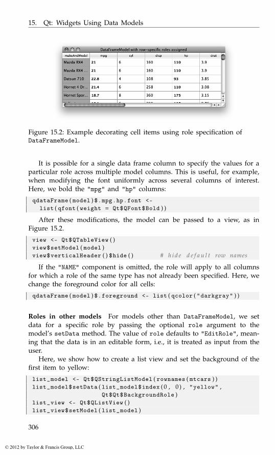
15. Qt: Widgets Using Data Models
Figure 15.2: Example decorating cell items using role specification ofDataFrameModel.
It is possible for a single data frame column to specify the values for aparticular role across multiple model columns. This is useful, for example,when modifying the font uniformly across several columns of interest.Here, we bold the "mpg" and "hp" columns:
qdataFrame ( model ) $ . mpg . hp . font <-list ( qfont ( weight = Qt$QFont$Bold ) )
After these modifications, the model can be passed to a view, as inFigure 15.2.
view <- Qt$QTableView ( )view$setModel ( model )view$verticalHeader ( ) $hide ( ) # h i d e d e f a u l t row names
If the "NAME" component is omitted, the role will apply to all columnsfor which a role of the same type has not already been specified. Here, wechange the foreground color for all cells:
qdataFrame ( model ) $ . foreground <- list ( qcolor ( "darkgray" ) )
Roles in other models For models other than DataFrameModel, we setdata for a specific role by passing the optional role argument to themodel’s setData method. The value of role defaults to "EditRole", mean-ing that the data is in an editable form, i.e., it is treated as input from theuser.
Here, we show how to create a list view and set the background of thefirst item to yellow:
list_model <- Qt$QStringListModel ( rownames ( mtcars ) )list_model$setData ( list_model$index ( 0 , 0 ) , "yellow" ,
Qt$Qt$BackgroundRole )list_view <- Qt$QListView ( )list_view$setModel ( list_model )
306
© 2012 by Taylor & Francis Group, LLC
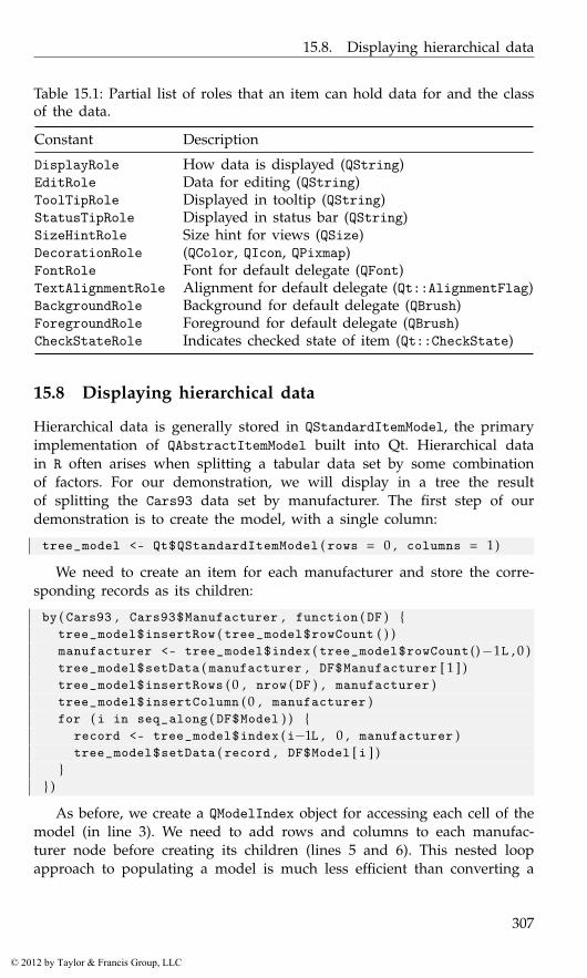
15.8. Displaying hierarchical data
Table 15.1: Partial list of roles that an item can hold data for and the classof the data.
Constant Description
DisplayRole How data is displayed (QString)EditRole Data for editing (QString)ToolTipRole Displayed in tooltip (QString)StatusTipRole Displayed in status bar (QString)SizeHintRole Size hint for views (QSize)DecorationRole (QColor, QIcon, QPixmap)FontRole Font for default delegate (QFont)TextAlignmentRole Alignment for default delegate (Qt::AlignmentFlag)BackgroundRole Background for default delegate (QBrush)ForegroundRole Foreground for default delegate (QBrush)CheckStateRole Indicates checked state of item (Qt::CheckState)
15.8 Displaying hierarchical data
Hierarchical data is generally stored in QStandardItemModel, the primaryimplementation of QAbstractItemModel built into Qt. Hierarchical datain R often arises when splitting a tabular data set by some combinationof factors. For our demonstration, we will display in a tree the resultof splitting the Cars93 data set by manufacturer. The first step of ourdemonstration is to create the model, with a single column:
tree_model <- Qt$QStandardItemModel ( rows = 0 , columns = 1)
We need to create an item for each manufacturer and store the corre-sponding records as its children:
by ( Cars93 , Cars93$Manufacturer , function ( DF ) {tree_model$insertRow ( tree_model$rowCount ( ) )manufacturer <- tree_model$index ( tree_model$rowCount ()−1L , 0 )tree_model$setData ( manufacturer , DF$Manufacturer [ 1 ] )tree_model$insertRows ( 0 , nrow ( DF ) , manufacturer )tree_model$insertColumn ( 0 , manufacturer )for ( i in seq_along ( DF$Model ) ) {
record <- tree_model$index ( i−1L , 0 , manufacturer )tree_model$setData ( record , DF$Model [ i ] )
}} )
As before, we create a QModelIndex object for accessing each cell of themodel (in line 3). We need to add rows and columns to each manufac-turer node before creating its children (lines 5 and 6). This nested loopapproach to populating a model is much less efficient than converting a
307
© 2012 by Taylor & Francis Group, LLC
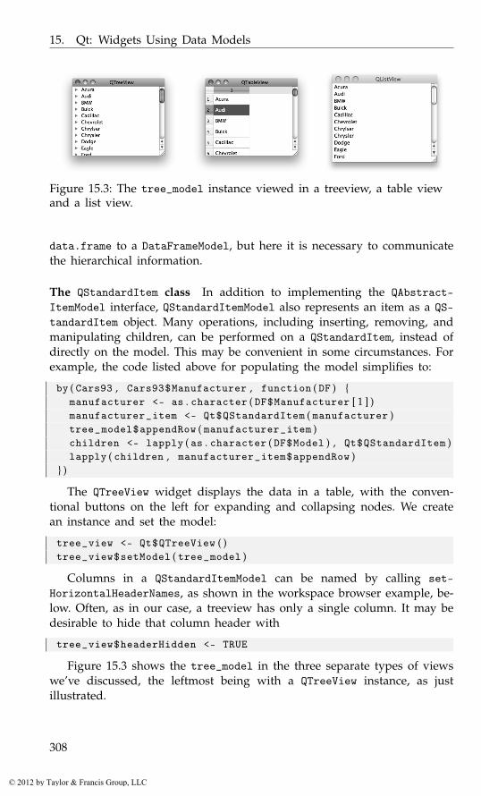
15. Qt: Widgets Using Data Models
Figure 15.3: The tree_model instance viewed in a treeview, a table viewand a list view.
data.frame to a DataFrameModel, but here it is necessary to communicatethe hierarchical information.
The QStandardItem class In addition to implementing the QAbstract-ItemModel interface, QStandardItemModel also represents an item as a QS-tandardItem object. Many operations, including inserting, removing, andmanipulating children, can be performed on a QStandardItem, instead ofdirectly on the model. This may be convenient in some circumstances. Forexample, the code listed above for populating the model simplifies to:
by ( Cars93 , Cars93$Manufacturer , function ( DF ) {manufacturer <- as . character ( DF$Manufacturer [ 1 ] )manufacturer_item <- Qt$QStandardItem ( manufacturer )tree_model$appendRow ( manufacturer_item )children <- lapply ( as . character ( DF$Model ) , Qt$QStandardItem )lapply ( children , manufacturer_item$appendRow )
} )
The QTreeView widget displays the data in a table, with the conven-tional buttons on the left for expanding and collapsing nodes. We createan instance and set the model:
tree_view <- Qt$QTreeView ( )tree_view$setModel ( tree_model )
Columns in a QStandardItemModel can be named by calling set-HorizontalHeaderNames, as shown in the workspace browser example, be-low. Often, as in our case, a treeview has only a single column. It may bedesirable to hide that column header with
tree_view$headerHidden <- TRUE
Figure 15.3 shows the tree_model in the three separate types of viewswe’ve discussed, the leftmost being with a QTreeView instance, as justillustrated.
308
© 2012 by Taylor & Francis Group, LLC

15.8. Displaying hierarchical data
Figure 15.4: The completed workspace browser showing a hierarchicalview of the objects in the global environment.
Example 15.1: A workspace browserThis example shows how to use the tree-widget item to display a snapshotof the current workspace. Figure 15.4 shows an illustration. Each objectin the workspace maps to an item, where recursive objects with nameswill have their components represented in a hierarchical manner. In Ex-ample 12.1 we created a class WSWatcher to monitor the workspace forchanges. Now we build on that example.
The following addItem function creates an item from a named compo-nent of a parent object and adds the new item under the given parentindex:
addItem <- function ( varname , parent_object , parent_item ) {
obj <- parent_object [ [ varname ] ]## main i n t e r a c t i o n with t r e e modelitem <- Qt$QStandardItem ( varname )class_item <- Qt$QStandardItem ( paste ( class ( obj ) ,
collapse = ", " ) )parent_item$appendRow ( list ( item , class_item ) )
## R e c u r s i v e l y c r e a t e a n c e s t o r i t ems , i f n e ed ednms <- NULLif ( is . recursive ( obj ) ) {
if ( is . environment ( obj ) )nms <- ls ( obj )
else if ( !is . null ( names ( obj ) ) )nms <- names ( obj )
}
309
© 2012 by Taylor & Francis Group, LLC
15. Qt: Widgets Using Data Models
sapply ( nms , addItem , parent_item = item ,parent_object = obj )
}
Our main function is one called when changes are made to theworkspace. There are two cases: when we need to remove expired itemsand when we need to add new ones.
updateTopLevelItems <- function ( ws_watcher , view ,env = . GlobalEnv ) {
## remove t h e s e ( by i n d e x )remove <- ws_watcher$changedVariables ( )cur_shown <- sapply ( seq ( model$rowCount ( ) ) ,
function ( i ) model$index ( i − 1 , 0 ) $data ( ) )indices_to_remove <- which ( cur_shown == remove )indices_to_remove <- sort ( inds_to_remove , decreasing=TRUE )## add t h e s e ( by v a r i a b l e name )new_names <- ws_watcher$addedVariables ( )
## r e p l a c e /add t h e s emodel <- view$model ( )view$updatesEnabled <- FALSEif ( length ( indices_to_remove ) )
sapply ( indices_to_remove −1L , model$removeRow )## addsapply ( new_names , addItem , parent_object = env ,
parent_item = model$invisibleRootItem ( ) )model$sort ( 0 , Qt$Qt$AscendingOrder )view$updatesEnabled <- TRUE
}
We remove objects corresponding to expired digests by their index. Weneed to sort the indices in decreasing order so as not to invalidate anyindices along the way. Then we add in new or changed variable names.Finally, the model is sorted. We set the updatesEnabled property to freezethe view while the model is updated to make a smoother transition.
This function is used to initialize the view:
initializeTopLevelItems <- function ( ws_watcher , view ,env = . GlobalEnv )
{current_names <- ws_watcher$objectsmodel <- view$model ( )view$updatesEnabled <- FALSEsapply ( current_names , addItem , parent_object = env , # add
parent_item = model$invisibleRootItem ( ) )model$sort ( 0 , Qt$Qt$AscendingOrder )view$updatesEnabled <- TRUE
}
310
© 2012 by Taylor & Francis Group, LLC
15.9. User editing of data models
Finally, we construct the model and view:
model <- Qt$QStandardItemModel ( rows = 0 , columns = 2)model$setHorizontalHeaderLabels ( c ( "Name" , "Class" ) )view <- Qt$QTreeView ( )view$windowTitle <- "Workspace Browser"view$headerHidden <- FALSEview$setModel ( model )
This last call initializes the workspace model and display:
ws_watcher <- WSWatcher ( )ws_watcher$updateVariables ( )initializeTopLevelItems ( ws_watcher , view )
Assuming we are updating the workspace model by some means,all that remains is calling the function to update the top-level items asneeded:
qconnect ( ws_watcher , "objectsChanged" , function ( )updateTopLevelItems ( ws_watcher , view ) )
15.9 User editing of data models
Some data models, including DataFrameModel, QStringListModel, andQStandardItemModel, support modification of their data. To determinewhether an item may be edited, call the flags method on the model,passing the index of the item, and check for the ItemIsEditable flag:
( tree_model$index ( 0 , 0 ) $flags ( ) & Qt$Qt$ItemIsEditable ) > 0
[1] TRUE
To enable editing on a column in a DataFrameModel, it is necessary tospecify the edit role for the column. For example, we might add a logicalcolumn named Analyze to the mtcars data frame for indicating whether arecord should be included in an analysis. In the view, the user will be ableto use a combo box to choose between TRUE and FALSE. We could displayan editable Analyze column by adding a column named .Analyze.edit,but instead we take advantage of a convenience of DataFrameModel. Wesimply add the Analyze column and pass its name as the editable argu-ment to qdataFrameModel:
DF <- mtcarsDF$Analyze <- TRUEmodel <- qdataFrameModel ( DF , editable = "Analyze" )
If a view is assigned an editable model, it will enter its editing modeupon a certain trigger. By default, derivatives of QAbstractItemView will
311
© 2012 by Taylor & Francis Group, LLC
15. Qt: Widgets Using Data Models
initiate editing of an editable column upon double mouse-button click or akey press. This is controlled by the editTriggers property, which acceptsa combination of QAbstractItemView::EditTrigger flags. For example, wecould disable editing through a view:
view$editTriggers <- Qt$QAbstractItemView$NoEditTriggers
When editing is requested, the view will pass the request to the dele-gate for the item. The standard item delegate, QStyledItemDelegate, willpresent an editing widget created by its instance of QItemEditorFactory.The default item editor factory will create a combo box for logical data,a spin box for numeric data, and a text-edit box for character data. Othertypes of data, like times and dates, are also supported. To specify a customeditor widget for some data type, it is necessary to subclass QItemEditor-CreatorBase and register an instance with the item editor factory.
15.10 Drag-and-drop in item views
The item views have native support for drag-and-drop. All of the built-in models, as well as DataFrameModel, communicate data in a commonformat so that drag-and-drop works automatically between views. Data-FrameModel also provides its data in the R serialization format, correspond-ing to the "application/x-rlang-transport" MIME type. This facilitatesimplementing custom drop targets for items in R.
Dragging is enabled by setting the dragEnabled property to "TRUE":
view$dragEnabled <- TRUE
Enabling drops is the same as for any other widget, with one addition:
view$acceptDrops <- TRUEview$showDropIndicator <- TRUE
The second line tells the view to indicate visually where the item will bedropped.
The following enables moving items within a view, i.e., reordering:
view$dragDropMode <- Qt$QAbstractItemView$InternalMove
However, that will prevent receiving drops from other views, and draggingto other views will always be a move, not a copy.
Although we have enabled drag-and-drop on the view, the level ofsupport actually depends on the model. The supported actions can bequeried with supportedDragActions and supportedDropActions. The itemflags determine whether an individual item can be dragged or droppedupon. Most of the built-in models will support both copy and move actions,when dragging or dropping. DataFrameModel supports only copy actionswhen dragging; dropping is not supported.
312
© 2012 by Taylor & Francis Group, LLC

15.10. Drag-and-drop in item views
Figure 15.5: A table widget to display contingency tables and a means tospecify the variables through drag and drop.
Example 15.2: A drag-and-drop interface to xtabsThis example uses a table view to display the output from xtabs. Tospecify the variables, the user drags variable names from a list to one oftwo labels, representing terms in the formula.
A VariableSelector class First, we define the VariableSelector widget,which contains a combo box for choosing a data frame and a list view forthe variable names. When a data frame is chosen in the combo box, itsvariables are shown in the list:
qsetClass ( "VariableSelector" , Qt$QWidget ,function ( parent = NULL ) {
super ( parent )## w i d g e t sthis$df_combo_box <- Qt$QComboBox ( )this$variable_list <- Qt$QListView ( )this$variable_list$setModel (
qdataFrameModel ( data . frame ( ) , this ,useRoles = TRUE ) )
this$variable_list$dragEnabled <- TRUE
## l a y o u tlayout <- Qt$QVBoxLayout ( )layout$addWidget ( df_combo_box )layout$addWidget ( variable_list )variable_list$setSizePolicy ( Qt$QSizePolicy$Expanding ,
Qt$QSizePolicy$Expanding )setLayout ( layout )
updateDataSets ( )
313
© 2012 by Taylor & Francis Group, LLC

15. Qt: Widgets Using Data Models
qconnect ( df_combo_box , "activated(int)" , function ( ind ) {this$dataFrame <- df_combo_box$currentText
} )} )
This utility populates the combo box with a list of data frames, keepingthe selected data frame if still valid.
qsetMethod ( "updateDataSets" , VariableSelector , function ( ) {current_text <- df_combo_box$currentTextdf_combo_box$clear ( )DFs <- ProgGUIinR : : : avail_dfs ( . GlobalEnv )if ( length ( DFs ) ) {
this$df_combo_box$addItems ( DFs )if ( is . null ( current_text ) || !current_text %in% DFs ) {
this$df_combo_box$currentIndex <- −1this$dataFrame <- NULL
} else {this$df_combo_box$currentIndex <-
which ( current_text == DFs )this$dataFrame <- current_text
}}
} )
The data frame is stored in the following call to qsetProperty. Weoverwrite the underlying write method to also update our model for thevariable list, as well.
qsetProperty ( "dataFrame" , VariableSelector ,write = function ( DF ) {
if ( is . null ( DF ) )DF <- data . frame ( )
else if ( is . character ( DF ) )DF <- get ( DF , . GlobalEnv )
##model <- variable_list$model ( )icons <- lapply ( DF , getIcon )qdataFrame ( model ) <-
data . frame ( variable=names ( DF ) ,variable . decoration=I ( icons ) )
this$ . dataFrame <- DFdataFrameChanged ( )
} )
When the property is written, the variable selector will emit this sig-nal:
qsetSignal ( "dataFrameChanged" , VariableSelector )
314
© 2012 by Taylor & Francis Group, LLC
15.10. Drag-and-drop in item views
A QLabel subclass Next, a derivative of QLabel is defined that acceptsdrops from the variable list and is capable of rotating text for displayingthe y-label component:
qsetClass ( "VariableLabel" , Qt$QLabel , function ( parent=NULL ) {super ( parent )this$rotation <- 0LsetAcceptDrops ( TRUE )setAlignment ( Qt$Qt$AlignHCenter | Qt$Qt$AlignVCenter )
} )
We define two properties, one for the rotation and the other for thevariable name, which is not always the same as the label text:
qsetProperty ( "rotation" , VariableLabel )qsetProperty ( "variable_name" , VariableLabel )
To enable client code to respond to a drop, we define a signal:
qsetSignal ( "variableNameDropped" , VariableLabel )
This utility tries to extract a variable name from the MIME data, whichDataFrameModel should have serialized appropriately:
variableNameFromMimeData <- function ( mime_data ) {name <- NULLRDA_MIME_TYPE <- "application/x-rlang-transport"if ( mime_data$hasFormat ( RDA_MIME_TYPE ) ) {
name_list <- unserialize ( mime_data$data ( RDA_MIME_TYPE ) )if ( length ( name_list ) && is . character ( name_list [ [ 1 ] ] ) )
name <- name_list [ [ 1 ] ]}name
}
To handle the drag events, we override the methods dragEnterEvent,dragLeaveEvent, and dropEvent. The first two simply change the back-ground of the label to indicate a valid drop:
qsetMethod ( "dragEnterEvent" , VariableLabel , function ( event ) {mime_data <- event$mimeData ( )if ( !is . null ( variableNameFromMimeData ( mime_data ) ) ) {
setForegroundRole ( Qt$QPalette$Dark )event$acceptProposedAction ( )
}} )qsetMethod ( "dragLeaveEvent" , VariableLabel , function ( event ) {
setForegroundRole ( Qt$QPalette$WindowText )event$accept ( )
} )
315
© 2012 by Taylor & Francis Group, LLC

15. Qt: Widgets Using Data Models
To respond to a drop event, we get the variable name, set the text ofthe label, and emit the variableNameDroppedVariableLabel signal:
qsetMethod ( "dropEvent" , VariableLabel , function ( event ) {setForegroundRole ( Qt$QPalette$WindowText )mime_data <- event$mimeData ( )this$variable_name <- variableNameFromMimeData ( mime_data )if ( !is . null ( variable_name ) ) {
this$text <- variable_namevariableNameDropped ( )setBackgroundRole ( Qt$QPalette$Window )event$acceptProposedAction ( )
}} )
To complete the VariableLabel class, we override the paintEvent eventto respect the rotation property. Drawing low-level graphics is beyond ourscope. In short, we translate the origin to the center of the label rectangle,rotate the coordinate system by the angle, then draw the text:
qsetMethod ( "paintEvent" , VariableLabel , function ( event ) {painter <- Qt$QPainter ( )painter$begin ( this )
painter$save ( )painter$translate ( width / 2 , height / 2)painter$rotate (−(rotation ) )rect <- painter$boundingRect ( 0 , 0 , 0 , 0 ,
Qt$Qt$AlignCenter , text )painter$drawText ( rect , Qt$Qt$AlignCenter , text )painter$restore ( )painter$end ( )
} )
An XTabsWidget class Our main widget consists of three child widgets:two drop labels for the formula and a table widget to show the output.This could be extended to include a third variable for three-way tables,but we leave that exercise for the interested reader. The constructor simplycalls two methods:
qsetClass ( "XtabsWidget" , Qt$QWidget , function ( parent = NULL ) {super ( parent )initWidgets ( )initLayout ( )
} )
We do not list the initLayout method, as it simply adds the widgetsto a grid layout. The initWidgets method initializes three widgets:
316
© 2012 by Taylor & Francis Group, LLC

15.10. Drag-and-drop in item views
qsetMethod ( "initWidgets" , XtabsWidget , function ( ) {this$xlabel <- VariableLabel ( )qconnect ( xlabel , "variableNameDropped" , invokeXtabs )
this$ylabel <- VariableLabel ( )pt <- ylabel$font$pointSize ( )ylabel$minimumWidth <- 2*pt ; ylabel$maximumWidth <- 2*ptylabel$rotation <- 90Lqconnect ( ylabel , "variableNameDropped" , invokeXtabs )
this$table_view <- Qt$QTableView ( )table_view$setModel ( qdataFrameModel ( data . frame ( ) , this ) )clearLabels ( )
} )
The xlabel is straightforward: we construct it, then connect to the dropsignal. For the ylabel we also adjust the rotation and constrain the widthbased on the font size (otherwise the label width reflects the length of thedropped text). The clearLabels method (not shown) just initializes thelabels.
This function builds the formula, invokes xtabs, and updates the tableview; we hide the conditional call to xtabs.
qsetMethod ( "invokeXtabs" , XtabsWidget , function ( ) {if ( is . null ( dataFrame ) )
return ( )
x <- xlabel$variable_namey <- ylabel$variable_name
if ( !is . null ( table <- call_xtabs ( dataFrame , x , y ) ) )updateTableView ( table )
} )
We define a method to update the table view:
qsetMethod ( "updateTableView" , XtabsWidget , function ( table ) {model <- table_view$model ( )if ( length ( dim ( table ) ) == 1)
qdataFrame ( model ) <- data . frame ( count = unclass ( table ) )else qdataFrame ( model ) <- data . frame ( unclass ( table ) )
} )
Finally, we define a property for the data frame held in the XtabsWidgetclass:
qsetProperty ( "dataFrame" , XtabsWidget ,write = function ( dataFrame ) {
clearLabels ( )this$ . dataFrame <- dataFrame
317
© 2012 by Taylor & Francis Group, LLC
15. Qt: Widgets Using Data Models
} )
All that remains is to place the VariableSelector and XtabsWidgettogether in a split pane and then connect a handler that keeps the datasets synchronized:
w <- Qt$QSplitter ( )w$setWindowTitle ( "GUI for xtabs()" )w$addWidget ( vs <- VariableSelector ( ) )w$addWidget ( tw <- XtabsWidget ( ) )w$setStretchFactor ( 1 , 1 )qconnect ( vs , "dataFrameChanged" , function ( ) {
tw$dataFrame <- vs$dataFrame} )w$show ( ) ; w$raise ( )
Figure 15.5 shows the result after the user has dragged two variablesonto the labels.
15.11 Widgets with internal models
While separating the model from the view provides substantial flexibility,in practice it is often sufficient and slightly more convenient to manipulatea view with a built-in data model. Qt provides a set of view widgets withinternal models:
QListWidget for simple lists of items,
QTableWidget for a flat table, and
QTreeWidget for a tree table.
In our experience, the convenience of these classes is not worth theloss in flexibility and other advantages of the model/view design pat-tern. QTableWidget, in particular, precludes the use of DataFrameModel, soQTableWidget is usually not nearly as convenient or performant as themodel-based QTableView. Thus, we are inclined to omit a detailed descrip-tion of these widgets. However, we will describe QListWidget, out of anacknowledgement that displaying a short, simple list of items is a commontask in a GUI.
Displaying short, simple lists
QListWidget is an easy-to-use widget for displaying a set of items forselection (Figure 15.6). As with combo boxes, we can populate the itemsdirectly from a character vector through the addItems method:
318
© 2012 by Taylor & Francis Group, LLC
15.11. Widgets with internal models
list_widget <- Qt$QListWidget ( )list_widget$addItems ( state . name )
This saves one line of code compared to populating a QListView viaa QStringListModel. To clear a list of its items, call the clear method.Passing an item to takeItem will remove that specific item from the widget.
The items in a QListWidget instance are of the QListWidgetItem class.New items can be constructed directly through the constructor:
item <- Qt$QListWidgetItem ( "Puerto Rico" , list_widget )
The first argument is the text and the optional second argument a parentQListWidget. If no parent is specified, the item may be added throughthe method addItem or the method insertItem, for inserting to a specificinstance.
To retrieve an item given its index, we call the item method:
first <- list_widget$item ( 0 )first$text ( )
[1] "Alabama"
Many aspects of an item can be manipulated. These roughly correspondto the built-in roles of items in QAbstractItemModel. We can specify thetext, font, icon, status and tooltips, as well as foreground and backgroundcolors.
By default, QListWidget allows only a single item to be selected si-multaneously. As with other QAbstractItemView derivatives, this may beadjusted to allow multiple selection through the selectionMode property:
list_widget$selectionMode <- Qt$QListWidget$ExtendedSelection
We can programmatically select the states that begin with "A":
sapply ( grep ( "^A" , state . name ) ,function ( i ) list_widget$item ( i − 1) $setSelected ( TRUE ) )
The method selectedItems will return the selected items in a list:
selected_items <- list_widget$selectedItems ( )sapply ( selected_items , qinvoke , "text" )
[1] "Alabama" "Alaska" "Arizona" "Arkansas"
To handle changes in the selection, connect to itemSelectionChanged:
qconnect ( list_widget , "itemSelectionChanged" , function ( ) {selected <- list_widget$selectedItems ( )selected_text <- sapply ( selected , qinvoke , "text" )message ( "Selected: " , paste ( selected_text , collapse = ", " ) )
} )
319
© 2012 by Taylor & Francis Group, LLC
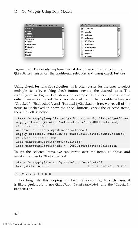
15. Qt: Widgets Using Data Models
Figure 15.6: Two easily implemented styles for selecting items from aQListWidget instance: the traditional selection and using check buttons.
Using check buttons for selection It is often easier for the user to selectmultiple items by clicking check buttons next to the desired items. Theright figure in Figure 15.6 shows an example. The check box is shownonly if we explicitly set the check state of item. The possible values are"Checked", "Unchecked", and "PartiallyChecked". Here, we set all of theitems to unchecked to show the check buttons, check the selected items,then turn off selection.
items <- sapply ( seq ( list_widget$count ) − 1L , list_widget$item )sapply ( items , qinvoke , "setCheckState" , Qt$Qt$Unchecked )## c h e c k s e l e c t e dselected <- list_widget$selectedItems ( )sapply ( selected , function ( x ) x$setCheckState ( Qt$Qt$Checked ) )## c l e a r s e l e c t i o n nowlist_widget$selectionModel ( ) $clear ( )list_widget$selectionMode <- Qt$QListWidget$NoSelection
To get the selected items, we can iterate over the items, as above, andinvoke the checkedState method:
state <- sapply ( items , "qinvoke" , "checkState" )head ( state , n = 8) # 2 i s c h e c k e d , 0 not
[1] 2 2 2 2 0 0 0 0
For long lists, this looping will be time consuming. In such cases, itis likely preferable to use QListView, DataFrameModel, and the "Checked-StateRole".
320
© 2012 by Taylor & Francis Group, LLC

15.12. Implementing custom models
15.12 Implementing custom models
Normally, the DataFrameModel and the models in Qt are sufficient. We canimagine other cases, however. For example, we might need to view aninstance of a formal reference class that conforms to a tabular or hierarchi-cal structure. In such case, it may be appropriate to implement a custommodel in R. We warn the reader that this is a significant undertaking, and,unfortunately, custom models do not scale well, due to frequent callbacksinto R.
Required methods The basic interface of a model requires that at a min-imum the methods rowCount, columnCount, and data be provided. Thefirst two describe the size of the table for any views. We have alreadydemonstrated the use of the data method in the previous sections. It pro-vides data to the view for a particular cell and role. For example, if weare displaying numeric data, the DisplayRole might format the numericvalues (showing a fixed number of digits, say), yet the EditRole role mightdisplay all the digits so accuracy is not lost. If a role is not implemented, avalue of NULL should be returned. We can also implement the headerDatamethod to populate the view headers.
Editable models For editable models, we must also implement the flagsmethod to return a flag containing ItemIsEditable and the setDatamethod. When a value is updated, we should call the dataChanged methodto notify the views that a portion of the model is changed. This methodtakes two indices, which together specify a rectangle in the table.
To provide for resizable tables, Qt requires us to notify the views aboutdimension changes. For example, an implemented insertColumns shouldcall beginInsertColumns before adding the column to the model and thenendInsertColumns just after.
Example 15.3: Using a custom model to edit a data frameThis example shows how to create a custom model to edit a data frame.Given that DataFrameModel supports editing, there is actually no reason touse this model. The purpose is to illustrate the steps in model implemen-tation. The performance is poor compared to that of DataFrameModel, asthe bulk of the operations are done at the R level. We speed things up abit by placing column headers into the first row of the table, instead ofoverriding the headerData method, which the Qt views call far too often.
Our basic constructor simply assigns to a dataframe property the dataframe passed to it.
qsetClass ( "DfModel" , Qt$QAbstractTableModel ,function ( DF = data . frame ( V1 = character ( 0 ) ) ,
321
© 2012 by Taylor & Francis Group, LLC
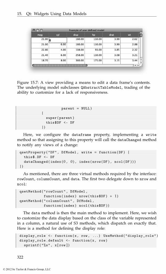
15. Qt: Widgets Using Data Models
Figure 15.7: A view providing a means to edit a data frame’s contents.The underlying model subclasses QAbstractTableModel, trading of theability to customize for a lack of responsiveness.
parent = NULL ){
super ( parent )this$DF <- DF
} )
Here, we configure the dataframe property, implementing a writemethod so that assigning to this property will call the dataChanged methodto notify any views of a change:
qsetProperty ( "DF" , DfModel , write = function ( DF ) {this$ . DF <- DFdataChanged ( index ( 0 , 0 ) , index ( nrow ( DF ) , ncol ( DF ) ) )
} )
As mentioned, there are three virtual methods required by the interface:rowCount, columnCount, and data. The first two delegate down to nrow andncol:
qsetMethod ( "rowCount" , DfModel ,function ( index ) nrow ( this$DF ) + 1)
qsetMethod ( "columnCount" , DfModel ,function ( index ) ncol ( this$DF ) )
The data method is then the main method to implement. Here, we wishto customize the data display based on the class of the variable representedin a column, a natural use of S3 methods, which dispatch on exactly that.Here is a method for defining the display role:
display_role <- function ( x , row , . . . ) UseMethod ( "display_role" )display_role . default <- function ( x , row )
sprintf ( "%s" , x [ row ] )
322
© 2012 by Taylor & Francis Group, LLC

15.12. Implementing custom models
display_role . numeric <- function ( x , row )sprintf ( "%.2f" , x [ row ] )
display_role . integer <- function ( x , row )sprintf ( "%d" , x [ row ] )
We see that numeric values are formatted to have decimal points. Thedata is still stored in its native form; a string is returned only for display.An alternative approach would be to provide the raw data and rely onRTextFormattingDelegate to display the numeric values according to thecurrent R configuration. However, the above approach generalizes basicnumeric formatting.
Our data method has this basic structure (we avoid showing the casesfor all the different roles):
qsetMethod ( "data" , DfModel , function ( index , role ) {row <- index$row ( )col <- index$column ( ) + 1
if ( role == Qt$Qt$DisplayRole ) {if ( row > 0)
display_role ( DF [ , col ] , row )else
names ( DF ) [ col ]} else if ( role == Qt$Qt$EditRole ) {
if ( row > 0)as . character ( DF [ row , col ] )
elsenames ( DF ) [ col ]
} else {NULL
}} )
To allow the user to edit the values we need to override the flagsmethod to return ItemIsEditable in the flag, so that any views are awareof this ability:
qsetMethod ( "flags" , DfModel , function ( index ) {if ( !index$isValid ( ) ) {
return ( Qt$Qt$ItemIsEnabled )} else {
current_flags <- super ( "flags" , index )return ( current_flags | Qt$Qt$ItemIsEditable )
}} )
To edit cells we also need to implement a method to set the data onceedited. Since the data method provides a string for the edit role, setData
323
© 2012 by Taylor & Francis Group, LLC
15. Qt: Widgets Using Data Models
will be passed one, as well. We define some methods on the S3 genericfit_in, which will coerce the string to the original type. For example:
fit_in <- function ( x , value ) UseMethod ( "fit_in" )fit_in . default <- function ( x , value ) valuefit_in . numeric <- function ( x , value ) as . numeric ( value )
The setData method is responsible for taking the value from the dele-gate and assigning it into the model:
qsetMethod ( "setData" , DfModel , function ( index , value , role ) {if ( index$isValid ( ) && role == Qt$Qt$EditRole ) {
DF <- this$DFrow <- index$row ( )col <- index$column ( ) + 1
if ( row > 0) {x <- DF [ , col ]DF [ row , col ] <- fit_in ( x , value )
} else {names ( DF ) [ col ] <- value
}this$DF <- DFdataChanged ( index , index )
return ( TRUE )} else {
super ( "setData" , index , value , role )}
} )
For a data frame editor, we may wish to extend the API for our tableof items to be R specific. For example, this method allows us to replace acolumn of values:
qsetMethod ( "setColumn" , DfModel , function ( col , value ) {## pad with NA i f n e e d e dn <- nrow ( this$DF )if ( length ( value ) < n )
value <- c ( value , rep ( NA , n − length ( value ) ) )value <- value [ 1 : n ]DF <- this$DFDF [ , col ] <- valuethis$DF <- DF # o n l y n o t i f y a b o u t t h i s columndataChanged ( index ( 0 , col − 1 ) ,
index ( rowCount ( ) − 1 , col − 1 ) )return ( TRUE )
} )
324
© 2012 by Taylor & Francis Group, LLC
15.13. Implementing custom views
We implement a method similar to the insertColumn method but spe-cific to our task. Since we may add a new column, we call the "begin" and"end" methods to notify any views.
qsetMethod ( "addColumn" , DfModel , function ( name , value ) {DF <- this$DFif ( name %in% names ( DF ) ) {
return ( setColumn ( min ( which ( name == names ( DF ) ) ) , value ) )}beginInsertColumns ( Qt$QModelIndex ( ) ,
columnCount ( ) , columnCount ( ) )DF [ [ name ] ] <- valuethis$DF <- DFendInsertColumns ( )return ( TRUE )
} )
To demonstrate our model, we construct an instance and set it on aview:
model <- DfModel ( mtcars )view <- Qt$QTableView ( )view$setModel ( model )
Finally, we customize the view by defining the edit triggers and hidingthe row and column headers:
trigger_flag <- Qt$QAbstractItemView$DoubleClicked |Qt$QAbstractItemView$SelectedClicked |Qt$QAbstractItemView$EditKeyPressed
view$setEditTriggers ( trigger_flag )view$verticalHeader ( ) $setHidden ( TRUE )view$horizontalHeader ( ) $setHidden ( TRUE )
15.13 Implementing custom views
Thus far, we have discussed the application of QAbstractItemView forviewing items in a QAbstractItemModel. This is the canonical model/viewapproach in Qt. The role of a QAbstractItemView is to display each itemin a model, more or less simultaneously. Sometimes it is useful to viewan individual item from a model in a simple widget like a label or evenan editing widget, such as a line edit or spin box. For example, a GUIfor entering records into a database might want to associate each of itswidgets with a column in the model, one row at a time.
The QDataWidgetMapper class facilitates this by associating a column(or row) in a model with a property on a widget. By default, the user
325
© 2012 by Taylor & Francis Group, LLC

15. Qt: Widgets Using Data Models
Figure 15.8: The QDataWidgetMapper maps the cell value in a column to aproperty of one or more widgets. Here the line-edit widget issynchronized with the Model of the selected row.
property is selected. The user property is marked as the primary user-facing property of a widget; there is only one per class. An example is thetext property on a QLineEdit.
Example 15.4: Mapping selected model items to a text entryWe will demonstrate QDataWidgetMapper by displaying a table view of theCars93 data set, along with a label. When a row is selected, the Modelname of the record will be displayed in the label. First, we establish themapping:
data ( Cars93 , package="MASS" )model <- qdataFrameModel ( Cars93 , editable=names ( Cars93 ) )mapper <- Qt$QDataWidgetMapper ( )mapper$setModel ( model )##label <- Qt$QLineEdit ( )mapper$addMapping ( label , 1 )
The addMapping establishes a mapping between the view widget and the0-based column index in the model. The method prefix is add rather thanset, as more than one mapping is possible.
Next, we construct a table view and establish a handler that changesthe current row of the data mapper upon selection:
326
© 2012 by Taylor & Francis Group, LLC
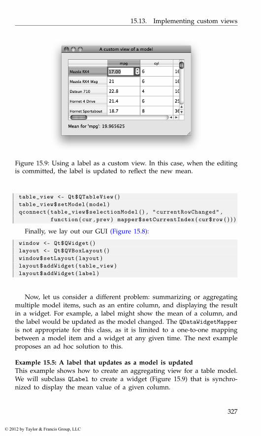
15.13. Implementing custom views
Figure 15.9: Using a label as a custom view. In this case, when the editingis committed, the label is updated to reflect the new mean.
table_view <- Qt$QTableView ( )table_view$setModel ( model )qconnect ( table_view$selectionModel ( ) , "currentRowChanged" ,
function ( cur , prev ) mapper$setCurrentIndex ( cur$row ( ) ) )
Finally, we lay out our GUI (Figure 15.8):
window <- Qt$QWidget ( )layout <- Qt$QVBoxLayout ( )window$setLayout ( layout )layout$addWidget ( table_view )layout$addWidget ( label )
Now, let us consider a different problem: summarizing or aggregatingmultiple model items, such as an entire column, and displaying the resultin a widget. For example, a label might show the mean of a column, andthe label would be updated as the model changed. The QDataWidgetMapperis not appropriate for this class, as it is limited to a one-to-one mappingbetween a model item and a widget at any given time. The next exampleproposes an ad hoc solution to this.
Example 15.5: A label that updates as a model is updatedThis example shows how to create an aggregating view for a table model.We will subclass QLabel to create a widget (Figure 15.9) that is synchro-nized to display the mean value of a given column.
327
© 2012 by Taylor & Francis Group, LLC
15. Qt: Widgets Using Data Models
In the constructor we define a label property and call our setModelmethod:
qsetClass ( "MeanLabel" , Qt$QLabel ,function ( model , column = 0 , parent = NULL ){
super ( parent )this$model <- modelthis$column <- columnupdateMean ( ) # i n i t i a l i z e t e x tqconnect ( model , "dataChanged" ,
function ( top_left , bottom_right ) {if ( top_left$column ( ) <= column &&
bottom_right$column ( ) >= column )updateMean ( )
} )} )
Whenever the data in the model changes, we want to update the displayof the mean value. In the above we call this private method to perform theupdate:
qsetMethod ( "updateMean" , MeanLabel , function ( ) {if ( is . null ( model ) ) {
text <- "No model"} else {
DF <- qdataFrame ( model )colname <- colnames ( DF ) [ column + 1L ]text <- sprintf ( "Mean for ’%s’: %s" , colname ,
mean ( DF [ , colname ] ) )}this$text <- text
} , access="private" )
To demonstrate the use of our custom view, we put it in a simple GUIalong with an editable data-frame view. When we edit the data, the textin our label is updated accordingly.
model <- qdataFrameModel ( mtcars , editable = colnames ( mtcars ) )table_view <- Qt$QTableView ( )table_view$setModel ( model )table_view$setEditTriggers ( Qt$QAbstractItemView$DoubleClicked )##mean_label <- MeanLabel ( model )##window <- Qt$QWidget ( )layout <- Qt$QVBoxLayout ( )window$setLayout ( layout )layout$addWidget ( table_view )layout$addWidget ( mean_label )
328
© 2012 by Taylor & Francis Group, LLC
15.14. Viewing and editing text documents
15.14 Viewing and editing text documents
Multiline text is displayed and edited by the QTextEdit widget, which isthe view and controller for a QTextDocument model. The model may beshared among many different views, allowing for synchronized buffers.
QTextEdit supports both plain and rich text in HTML format, includingimages, lists and tables. Applications that display only plain text may bebetter served by QPlainTextEdit, which is faster due to a simpler layoutalgorithm. QPlainTextEdit is otherwise equivalent to QTextEdit in termsof API and functionality, so we will focus our discussion on QTextEdit,with little loss of generality.
Constructor Here, we create a QTextEdit instance and populate it withsome text. Although the text is actually stored in a QTextDocument instance,it is usually sufficient for us to interact with the QTextEdit directly:
text_edit <- Qt$QTextEdit ( )
The underlying QTextDocument instance can be set by the setDocumentmethod but need not be, as one is created on construction.
Adding text to the document can be done easily through the slot set-PlainText, which replaces the existing text; or the slot append, whichappends the text as a new paragraph to the end of the buffer.
text_edit$setPlainText ( "The quick brown fox" )text_edit$append ( "jumped over the lazy dog" )
As described in its manual page, the widget works on paragraphs andcharacters, a paragraph being a formatted string, word-wrapped to fit intothe width of the widget. For plain text, new lines signify paragraphs.
To return the contents of the model as text, the toPlainText method isavailable:
text_edit$toPlainText ( )
[1] "The quick brown fox\njumped over the lazy dog"
The hard line break \n is present, as append created a new paragraph.When text is added to a buffer, it can be undone through the undo
slot. There are also redo to reverse the decision and undoAvailable andredoAvailable to check for the possibility of each action.
HTML support Instead of plain text, we can also add and insert HTMLformatted text for display. The slots setHTML and append can be used.The toPlainText method will return the text with markup stripped off,whereas toHtml will return the source HTML of the page.
329
© 2012 by Taylor & Francis Group, LLC

15. Qt: Widgets Using Data Models
The text cursor To manage selections, insert special objects like tablesand images, or apply the full range of formatting options, it is necessaryto interact with a text cursor object, of class QTextCursor. Here, we obtainthe user-visible cursor and move it to the end of the document:
n <- nchar ( text_edit$toPlainText ( ) )cursor <- text_edit$textCursor ( )cursor$setPosition ( n )text_edit$setTextCursor ( cursor )
Manipulating the cursor object does not actually modify the locationand parameters of the cursor on the screen. We need to set the modi-fied cursor object on the QTextEdit explicitly through its setTextCursormethod. This behavior is often convenient, because it allows us to mod-ify arbitrary parts of the document, without affecting the user cursor. Forexample, we could insert a 32- x -32-pixel image at the beginning:
cursor$setPosition ( 0 ) # move t o b e g i n n i n gstyle <- Qt$QApplication$style ( )icon <- style$standardIcon ( Qt$QStyle$SP_DialogOkButton )sz <- qsize (32L , 3 2 L )anImage <- icon$pixmap ( icon$actualSize ( sz ) ) $toImage ( )cursor$insertImage ( anImage )
In the above, we moved the cursor through its setPosition method.If the document is viewed as a single string of characters, the position iwould refer to the space between the ith and i + 1st character, 0 being theinitial point in the document.
The motion of the cursor is described by the enumeration QTextCur-sor$MoveOperation, with several values such as "Start", "End","StartOfLine", "EndOfLine", "StartOfWord", "EndOfWord" etc.
For example, to move the cursor to the start of the second line, wecould do:
cursor <- text_edit$textCursor ( )cursor$movePosition ( Qt$QTextCursor$Start ) # MoveAnchor d e f a u l tcursor$movePosition ( Qt$QTextCursor$Down ) # down one l i n etext_edit$setTextCursor ( cursor )
Selection Selection is a component of the QTextCursor state. For plaintext, the selected text is returned by the selectedText method:
text_edit$textCursor ( ) $selectedText ( ) # no c u r r e n t s e l e c t i o n
NULL
The NULL value indicates that the user has not selected any text.A text cursor has an anchor position in addition to its position. The
selection is the text between the two. When moving the cursor through
330
© 2012 by Taylor & Francis Group, LLC
15.14. Viewing and editing text documents
its movePosition method, we can choose to move or keep the anchor inplace. Normally, the anchor and cursor are at the same position. To make aselection programatically, we move the cursor independently of its anchor.The QTextCursor$MoveMode enumeration with values "MoveAnchor" and"KeepAnchor" can be specified to movePostion to control this. Here we setthe selection to include the first three words of the text in the second line.We have:
cursor <- Qt$QTextCursor ( text_edit$document ( ) )cursor$movePosition ( Qt$QTextCursor$Start ) # as b e f o r ecursor$movePosition ( Qt$QTextCursor$Down ) # moves anchorcursor$movePosition ( Qt$QTextCursor$WordRight , # anchor f i x e d
Qt$QTextCursor$KeepAnchor , 3 )text_edit$setTextCursor ( cursor )
The 3 specified to movePostion calls the action three times.Now our selection yields:
cursor$selectedText ( )
[1] "jumped over the "
Signals There are several different signals emitted by QTextEdit in-stances: textChanged, when the text changes; cursorPositionChanged,when the cursor position changes; and selectionChanged, when the se-lection changes (according to the user-visible cursor). For the latter, thecopyAvailable signal is largely equivalent, except it passes a Boolean ar-gument indicating whether the selection is non-empty.
qconnect ( text_edit , "textChanged" , function ( ) {message ( "Text has changed to" , text_edit$toPlainText ( ) )
} )##qconnect ( text_edit , "cursorPositionChanged" , function ( ) {
message ( "Cursor has changed. It is now in position" ,text_edit$textCursor ( ) $position ( ) )
} )##qconnect ( text_edit , "selectionChanged" , function ( ) {
message ( "text: " , text_edit$textCursor ( ) $selectedText ( ) )} )
Formatting properties By default, the widget will wrap text as entered.For use as a code editor, this is not desirable. The lineWrapMode propertytakes values from the enumeration QTextEdit::LineWrapMode to controlthis:
331
© 2012 by Taylor & Francis Group, LLC

15. Qt: Widgets Using Data Models
Figure 15.10: Context menu showing completion candidates for the token"mean" taken from the current selection.
text_edit$lineWrapMode <- Qt$QTextEdit$NoWrap
We can fix the wrapping at a certain number of characters by using a wrapmode of FixedColumnWidth and setting the count through lineWrapColum-nOrWidth.
The setAlignment method aligns the current paragraph (the one withthe cursor) with values from Qt::Alignment.
Character attributes The widget keeps track of a current set of format-ting options in an object of class QTextCharFormat. The text-edit methodssetCurrentFont, setFontFamily, and setFontWeight, among others, mod-ify the current settings. If called when there is a selection, the change willbe applied to the selection in addition to any new text.
Syntax highlighting The text-edit widget supports syntax highlightingthrough the QSyntaxHighlighter class. To implement a specific highlight-ing rule, we must subclass QSyntaxHighlighter and override the high-lightBlock method to apply highlighting. This is of somewhat specialinterest, so we will not give an example. For a syntax-highlighting R-codeviewer and editor, see qeditor in the qtutils package.
Searching The find method will search for a given string and adjust thecursor to select the match. For example, we can search through a standardtypesetting string starting at the cursor point for the common word “qui”as follows:
text_edit <- Qt$QTextEdit ( LoremIpsum ) # some t e x ttext_edit$find ( "qui" , Qt$QTextDocument$FindWholeWords )
332
© 2012 by Taylor & Francis Group, LLC
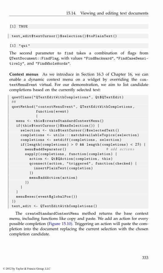
15.14. Viewing and editing text documents
[1] TRUE
text_edit$textCursor ( ) $selection ( ) $toPlainText ( )
[1] "qui"
The second parameter to find takes a combination of flags fromQTextDocument::FindFlag, with values "FindBackward", "FindCaseSensi-tively", and "FindWholeWords".
Context menus As we introduce in Section 16.3 of Chapter 16, we canenable a dynamic context menu on a widget by overriding the con-textMenuEvent virtual. For our demonstration, we aim to list candidatecompletions based on the currently selected text:
qsetClass ( "QTextEditWithCompletions" , Qt$QTextEdit )##qsetMethod ( "contextMenuEvent" , QTextEditWithCompletions ,
function ( event ){
menu <- this$createStandardContextMenu ( )if ( this$textCursor ( ) $hasSelection ( ) ) {
selection <- this$textCursor ( ) $selectedText ( )completions <- utils : : : matchAvailableTopics ( selection )completions <- setdiff ( completions , selection )if ( length ( completions ) > 0 && length ( completions ) < 25) {
menu$addSeparator ( ) # add a c t i o n ssapply ( completions , function ( completion ) {
action <- Qt$QAction ( completion , this )qconnect ( action , "triggered" , function ( checked ) {
insertPlainText ( completion )} )menu$addAction ( action )
} )}
}menu$exec ( event$globalPos ( ) )
} )text_edit <- QTextEditWithCompletions ( )
The createStandardContextMenu method returns the base contextmenu, including functions like copy and paste. We add an action for everypossible completion (Figure 15.10). Triggering an action will paste the com-pletion into the document replacing the current selection with the chosencompletion candidate.
333
© 2012 by Taylor & Francis Group, LLC
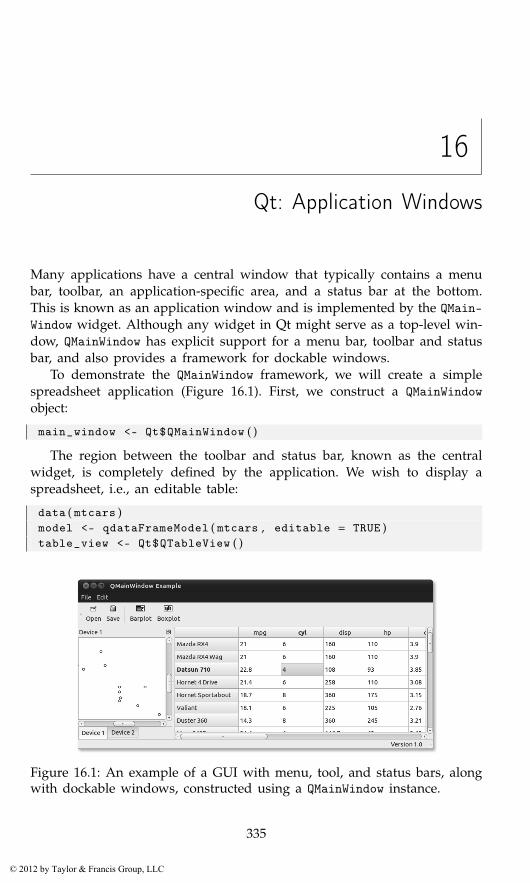
16
Qt: Application Windows
Many applications have a central window that typically contains a menubar, toolbar, an application-specific area, and a status bar at the bottom.This is known as an application window and is implemented by the QMain-Window widget. Although any widget in Qt might serve as a top-level win-dow, QMainWindow has explicit support for a menu bar, toolbar and statusbar, and also provides a framework for dockable windows.
To demonstrate the QMainWindow framework, we will create a simplespreadsheet application (Figure 16.1). First, we construct a QMainWindowobject:
main_window <- Qt$QMainWindow ( )
The region between the toolbar and status bar, known as the centralwidget, is completely defined by the application. We wish to display aspreadsheet, i.e., an editable table:
data ( mtcars )model <- qdataFrameModel ( mtcars , editable = TRUE )table_view <- Qt$QTableView ( )
Figure 16.1: An example of a GUI with menu, tool, and status bars, alongwith dockable windows, constructed using a QMainWindow instance.
335
© 2012 by Taylor & Francis Group, LLC
16. Qt: Application Windows
table_view$setModel ( model )main_window$setCentralWidget ( table_view )
We will continue by adding a menu bar and toolbar to our window. Thisdepends on an understanding of how Qt represents actions.
16.1 Actions
The buttons in the menu bar and toolbar, as well as other widgets inthe GUI, might share the same action. Thus, it is sensible to separate thedefinition of an action from any individual control. An action is definedby the QAction class. As with other toolkits, an action encapsulates acommand that may be shared among parts of a GUI, in this case menubars, toolbars, and keyboard shortcuts. The properties of a QAction includethe label text, icon, toolTip, statusTip, keyboard shortcut, and whetherthe action is enabled.
We construct an action for opening a file:
open_action <- Qt$QAction ( "Open" , main_window )
The label text is passed to the constructor along with the parent window.We can specify additional properties, such as the text to display in thestatus bar when the user moves the mouse over a widget proxying theaction:
open_action$statusTip <- "Load a spreadsheet from a CSV file"
We could also set an icon:
style <- Qt$QApplication$style ( )open_action$icon <-
style$standardIcon ( Qt$QStyle$SP_DialogOpenButton )
Actions emit a triggered signal when activated. The application shouldconnect to this signal to implement the command behind the action:
qconnect ( open_action , "triggered" , function ( ) {filename <- Qt$QFileDialog$getOpenFileName ( )table_view$model <-
qdataFrameModel ( read . csv ( filename ) , editable = TRUE )} )
Toggle and radio actions An action may have a Boolean state, i.e., itmay be checkable. This is controlled by the checkable property. When acheckable action is triggered, its state is toggled and the current state ispassed to the trigger handler. For example, we could have an action totoggle whether the spreadsheet will be saved on exit:
336
© 2012 by Taylor & Francis Group, LLC

16.1. Actions
save_on_exit_action <- Qt$QAction ( "Save on exit" , main_window )save_on_exit_action$checkable <- TRUE
The checked property reports whether the action has been checked ornot. For this type of action, we would query this on exit. For other im-plementations, where the action should be enacted immediately, we wouldconnect to the changed signal.
A checkable action in isolation behaves much like a check button. Ifcheckable actions are placed together into a QActionGroup, the defaultbehavior is such that only one is checked at once, analogous to a set ofradio buttons. We could have an action for controlling the justificationmode for the text entry:
just_group <- Qt$QActionGroup ( main_window )just_action <- list ( )just_action$left <- Qt$QAction ( "Left Align" , just_group )just_action$right <- Qt$QAction ( "Right Align" , just_group )just_action$center <- Qt$QAction ( "Center" , just_group )sapply ( just_action , function ( action ) action$checkable <- TRUE )
Here, we connect to each action’s changed signal to broadcast which buttonwas pressed.
sapply ( just_action , function ( action )qconnect ( action , "changed" , function ( ) {
button_number <-which ( sapply ( just_action , ‘ [ [ ‘ , "checked" ) )
message ( "Button " , button_number , " was depressed" )} ))
We could also connect to the triggered signal of the action group. Thecallback is passed the action object.
qconnect ( just_group , "triggered" , function ( action ) {message ( action$text )
} )
Keyboard shortcuts Every platform has a particular convention for map-ping key presses to typical actions. Qt abstracts some common commandsvia the QKeySequence::StandardKey enumeration, a member of which mayrefer to multiple key combinations, depending on the command and theplatform. We assign the appropriate shortcuts for our “Open” action:
open_action$setShortcut ( Qt$QKeySequence ( Qt$QKeySequence$Open ) )
Whenever the window has focus and the user presses the conventional keysequence, such as Ctrl-O on Windows, our action will be triggered. It isimportant not to confuse this shortcut mechanism with mnemonics, which
337
© 2012 by Taylor & Francis Group, LLC
16. Qt: Application Windows
are often indicated by underlining a letter in the label text of a menu item.A mnemonic is active only when the parent menu is active. Mnemonicsare disabled by default on Windows and Mac installations of Qt and thusare not covered here.
16.2 Menu bars
Applications often support too many actions to display them all at once.The typical solution is to group the actions into a hierarchical systemof menus. The menu bar is the top-level entry point to the hierarchy.The placement of the menu bar depends on the platform. On Mac OSX, applications share a menu bar area at the top of the screen. On otherplatforms, the menu bar is typically found at the top of the main windowfor the application.
We create an instance of QMenuBar and set it for the main window:
menubar <- Qt$QMenuBar ( )main_window$setMenuBar ( menubar )
A QMenuBar instance is a container for QMenu objects, which representthe submenus. We create a QMenu for the “File” and “Edit” menus and addthem to the menu bar:
file_menu <- Qt$QMenu ( "File" )menubar$addMenu ( file_menu )edit_menu <- Qt$QMenu ( "Edit" )menubar$addMenu ( edit_menu )
To each QMenu we may add:
1. an action through the addAction method,
2. a separator through addSeparator, or
3. nested submenus through the addMenu method.
We demonstrate each of these operations by populating the “File” and“Edit” menus:
file_menu$addAction ( open_action )file_menu$addSeparator ( )file_menu$addAction ( save_on_exit_action )file_menu$addSeparator ( )quit_action <- file_menu$addAction ( "Quit" )just_menu <- edit_menu$addMenu ( "Justification" )sapply ( just_action , just_menu$addAction )
338
© 2012 by Taylor & Francis Group, LLC
16.3. Context menus
In the above, we take advantage of the convenient overloads of addActionand addMenu that accept a string title and return a new QAction or QMenu,respectively.
16.3 Context menus
Sometimes, an action pertains to a single widget or portion of a widget,instead of the entire application. In such cases, the menu bar is an inappro-priate container. An alternative is to place the actions in a menu specificto their context. This is known as a context menu. The precise user actionthat displays a context menu depends on the platform. It commonly suf-fices to click the right mouse button while the pointer is over the widget.The simplest approach to providing a context menu involves two steps.First, add the desired actions to the widget:
sort_menu <- Qt$QMenu ( "Sort by" )sapply ( colnames ( qdataFrame ( model ) ) , sort_menu$addAction )table_view$addAction ( sort_menu$menuAction ( ) )
Second, we configure the widget to display a menu of the actions whena context menu is requested:
table_view$contextMenuPolicy <- Qt$Qt$ActionsContextMenu
The simple approach is appropriate in most cases. One limitation, how-ever, is that the actions need to be defined prior to the context menurequest. For example, if we allowed adding and removing columns inthe spreadsheet, we would need to adjust the actions in the sort contextmenu. Another example is a code-entry widget, where a pop-up windowcould list possible code completions. In Section 15.14, we implement atext-completion pop-up in an override of the contextMenuEvent virtualmethod.
If subclassing is undesirable, we could change the context menu pol-icy to CustomContextMenu and connect to the signal customContextMenu-Requested:
showCompletionPopup <- function ( event , edit ) {popup <- Qt$QMenu ( )completions <- utils : : : matchAvailableTopics ( ed$text )completions <- head ( completions , 10 ) # t r im i f l a r g esapply ( completions , function ( completion ) {
action <- popup$addAction ( completion )qconnect ( action , "triggered" ,
function ( . . . ) edit$setText ( completion ) )} )popup$popup ( edit$mapToGlobal ( qpoint (0L , 0 L ) ) )
}
339
© 2012 by Taylor & Francis Group, LLC
16. Qt: Application Windows
##edit <- Qt$QLineEdit ( )edit$contextMenuPolicy <- Qt$Qt$CustomContextMenuqconnect ( edit , "customContextMenuRequested" ,
showCompletionPopup , user . data = edit )
16.4 Toolbars
The toolbar manages a compact layout of frequently executed actions, sothat the actions are readily available to the user without consuming anexcessive amount of screen space. We create a QToolBar and add it to ourmain window:
toolbar <- Qt$QToolBar ( )main_window$addToolBar ( toolbar )
The main window places the toolbar into a toolbar area, which mightcontain multiple toolbars. It is possible, by default, for the user to rearrangethe toolbars by clicking and dragging with the mouse. If the toolbar ispulled out of the toolbar area, it will become an independent window.
To add items to a toolbar we might call
• addAction to add an action,
• addWidget to embed an arbitrary widget, or
• addSeparator to place a separator between items.
We create each action, set its icon (the getIcon function is not shown),and store it in a list for ease of manipulation at a later time in the pro-gram:
file_actions <- list ( )file_actions$open <- Qt$QAction ( "Open" , main_window )file_actions$open$setIcon ( getIcon ( "open" ) )file_actions$save <- Qt$QAction ( "Save" , main_window )file_actions$save$setIcon ( getIcon ( "save" ) )plot_actions <- list ( )plot_actions$barplot <- Qt$QAction ( "Barplot" , main_window )plot_actions$barplot$setIcon ( getIcon ( "barplot" ) )plot_actions$boxplot <- Qt$QAction ( "Boxplot" , main_window )plot_actions$boxplot$setIcon ( getIcon ( "boxplot" ) )
Finally, we add the actions to the toolbar, with a separator between thefile actions and plot actions:
340
© 2012 by Taylor & Francis Group, LLC
16.5. Status bars
sapply ( file_actions , toolbar$addAction )toolbar$addSeparator ( )sapply ( plot_actions , toolbar$addAction )
QToolBar will display actions as buttons, and the precise configurationof the buttons depends on the toolbar style. For example, the buttons mightdisplay only text, only icons, or both. By default, only icons are shown.We instruct our toolbar to display an icon, with the label underneath:
toolbar$setToolButtonStyle ( Qt$Qt$ToolButtonTextUnderIcon )
By default, toolbars pack their items horizontally. Vertical packing isalso possible; see the orientation property.
16.5 Status bars
Main windows reserve an area for a status bar at the bottom of the window.The status bar is used to display messages about the current state of theprogram, as well as any status tips assigned to actions.
A status bar is an instance of the QStatusBar class. We create one andadd it to our window:
statusbar <- Qt$QStatusBar ( )main_window$setStatusBar ( statusbar )
There are three types of messages in a status bar:
• Temporary, where the message stays briefly, such as for status tips;
• Normal, where the message stays but may be hidden by temporarymessages; and
• Permanent, where the message is never hidden and appears at thefar right.
In addition to messages, we can embed widgets into the status bar.
For example, we could communicate a temporary message when a dataset is loaded:
statusbar$showMessage ( "Load complete" , 1000)
The second argument above is optional and indicates the duration of themessage in milliseconds. If not specified, the message must be explicitlycleared with clearMessage.
Normal and permanent messages must be placed into a QLabel, whichis then added to the status bar like any other widget:
statusbar$addWidget ( Qt$QLabel ( "Ready" ) )statusbar$addPermanentWidget ( Qt$QLabel ( "Version 1.0" ) )
341
© 2012 by Taylor & Francis Group, LLC
16. Qt: Application Windows
16.6 Dockable widgets
QMainWindow supports window docking. There is a dock area for each ofthe four sides of the window (top, bottom, left, and right). If a widgetis assigned to a dock area, the user may, by default, drag the widgetbetween the docking areas. If multiple widgets are placed into the samearea, they are grouped into a tabbed notebook. Dragging a docked widgetto a location outside of a dock area will convert the widget into a top-levelwindow.
For example, we could add an R-graphics device as a dockable widget.The first step is to wrap the widget in a QDockWidget:
library ( qtutils )device <- QT ( )dock <- Qt$QDockWidget ( "Device 1" )dock$setWidget ( device )
The string passed to the QDockWidget constructor is an optional label/titlefor the docked window.
By default, the dock widget is closable, movable and floatable. This isadjustable through the features property. For example, we could disableclosing of the graphics device:
dock$features <- Qt$QDockWidget$DockWidgetMovable |Qt$QDockWidget$DockWidgetFloatable
The allowedAreas property specifies the valid docking areas for a dockwidget. By default, all are allowed.
After configuring the dock widget, we add it to the main window, inthe left docking area:
main_window$addDockWidget ( Qt$Qt$LeftDockWidgetArea , dock )
A second graphics device could be added with the first, on a separatepage of a tabbed notebook:
device2 <- QT ( )dock2 <- Qt$QDockWidget ( "Device 2" , device2 )main_window$tabifyDockWidget ( dock , dock2 )
To make dock2 a top-level window instead, we could set the floatingproperty to "TRUE":
dock2$floating <- TRUE
342
© 2012 by Taylor & Francis Group, LLC
Part IV
The tcltk Package
343
© 2012 by Taylor & Francis Group, LLC
17
Tcl/Tk: Overview
“Tool Command Language” (Tcl) is a scripting language and interpreter ofthat language. Originally developed in the late 1980s by John Ousterhoutas a “glue” to combine two or more complicated applications, it evolvedover time to find use not just as middleware, but also as a stand-alonedevelopment tool.
Tk is an extension of Tcl that provides GUI components through Tcl.Tk was first developed in 1990, again by John Ousterhout. It quickly foundwidespread usage, as at the time it made programming GUIs for X11easier and faster. Over the years, other graphical toolkits have evolved andsurpassed this one, but Tk still has many users.
There are a large number of language bindings available for Tk, in-cluding Perl, Python, Ruby, and, through the tcltk package, R. The tcltkpackage was developed by Peter Dalgaard and has been included withbase R since version 1.1.0. Since then, the package has been used in anumber of GUI projects for R, most notably the Rcmdr GUI. The tcltk2package provides additional bindings and bundles in some useful externalTCL code. Our focus here is limited to the base tcltk package.
Tk had a major change between versions 8.4 and 8.5, with the latterintroducing themed widgets. Many widgets were rewritten and their APIdramatically simplified. In tcltk there can be two different functions toconstruct a similar widget. For example, tklabel or ttklabel. The latter,with the ttk prefix, corresponds to the newer themed variant of the wid-get. We assume the Tk version is 8.5 or higher, as this was a major stepforward.1
Despite Tk’s limitations as a graphical toolkit as compared to GTK+or Qt, the Tk libraries are widely used for R GUIs. R for Windows hasbeen bundled with the necessary Tk version for years, so there are noinstallation issues for that platform. For Linux users, it is typically trivialto install the newer libraries, and for Mac OS X users, the provided binaryinstallations include the newer Tk libraries.
1In fact, we assume version 8.5.8, which was the release accompanying R for Windowsversion 2.13.1.
345
© 2012 by Taylor & Francis Group, LLC
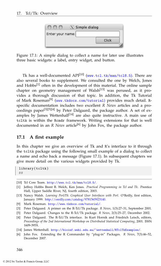
17. Tcl/Tk: Overview
Figure 17.1: A simple dialog to collect a name for later use illustratesthree basic widgets: a label, entry widget, and button.
Tk has a well-documented API[10] (www.tcl.tk/man/tcl8.5). There arealso several books to supplement. We consulted the one by Welch, Jonesand Hobbs[1] often in the development of this material. The online samplechapter on geometry management of Walsh[13] was perused, as it pro-vides a thorough discussion of that topic. In addition, the Tk Tutorialof Mark Roseman[9] (www.tkdocs.com/tutorial) provides much detail. R-specific documentation includes two excellent R News articles and a pro-ceedings paper[3][5][4] by Peter Dalgaard, the package author. A set of ex-amples by James Wettenhall[14] are also quite instructive. A main use oftcltk is within the Rcmdr framework. Writing extensions for that is welldocumented in an R News article[6] by John Fox, the package author.
17.1 A first example
In this chapter we give an overview of Tk and R’s interface to it throughthe tcltk package using the following small example of a dialog to collecta name and echo back a message (Figure 17.1). In subsequent chapters wegive more detail on the various widgets provided by Tk.
library ( tcltk )##
[10] Tcl Core Team. http://www.tcl.tk/man/tcl8.5/.[1] Jeffrey Hobbs Brent B. Welch, Ken Jones. Practical Programming in Tcl and Tk. Prentice
Hall, Upper Saddle River, NJ, fourth edition, 2003.[13] Nancy Walsh. Learning Perl/Tk: Graphical User Interfaces with Perl. O’Reilly, first edition,
January 1999. http://oreilly.com/catalog/9781565923140.[9] Mark Roseman. http://www.tkdocs.com/tutorial/.[3] Peter Dalgaard. A primer on the R-Tcl/Tk package. R News, 1(3):27–31, September 2001.[5] Peter Dalgaard. Changes to the R-Tcl/Tk package. R News, 2(3):25–27, December 2002.[4] Peter Dalgaard. The R-Tcl/Tk interface. In Kurt Hornik and Friedrich Leisch, editors,
Proceedings of the 2nd International Workshop on Distributed Statistical Computing, 2001. ISSN1609-395X.
[14] James Wettenhall. http://bioinf.wehi.edu.au/~wettenhall/RTclTkExamples/.[6] John Fox. Extending the R Commander by “plug-in” Packages. R News, 7(3):46–52,
December 2007.
346
© 2012 by Taylor & Francis Group, LLC
17.2. Interacting with Tcl
window <- tktoplevel ( )tkwm . title ( window , "Simple dialog" )##frame <- ttkframe ( window , padding = c ( 3 , 3 , 1 2 , 1 2 ) )tkpack ( frame , expand = TRUE , fill = "both" )##nested_frame <- ttkframe ( frame ) ; tkpack ( nested_frame )##label <- ttklabel ( nested_frame , text = "Enter your name:" )tkpack ( label , side = "left" )##text_var <- tclVar ( "" )entry <- ttkentry ( nested_frame , textvariable = text_var )tkpack ( entry )##button_frame <- ttkframe ( frame )tkpack ( button_frame , anchor = "ne" )button <- ttkbutton ( button_frame , text = "Click" )tkpack ( button , side = "right" )##handler <- function ( ) {
msg <- sprintf ( "Hello %s" , tclvalue ( text_var ) )print ( msg )
}tkconfigure ( button , command = handler )
In the above, the first block defines a top-level window and the second anunderlying frame container. We then define and place three widgets – alabel, entry widget, and button – into a frame. Finally, we add a callbackto respond when the button is clicked.
17.2 Interacting with Tcl
As the example above makes clear, using tcltk does not necessarily requireknowing anything about the underlying Tk or Tcl workings, though it canbe useful to have a rough sense of these technologies and how tcltkinterfaces with them. As such, we give a quick overview.
Although both are scripting languages, the basic syntax of Tcl is unlikethat of R. For example a simple string assignment would be made at tclsh,the Tcl shell with (using % as a prompt):
% set x {hello world}hello world
Unlike R, in which braces are used to form blocks, this example shows howTcl uses braces instead of quotes to group the words as a single string. The
347
© 2012 by Taylor & Francis Group, LLC
17. Tcl/Tk: Overview
use of braces instead of quotes in this example is optional, but in generalit isn’t, as expressions within braces are not evaluated.
The example above assigns to the variable x the value of hello world.Once assignment has been made, we can call commands on the valuestored in x using the $ prefix:
% puts $xhello world
The puts command in this usage simply writes back its argument to theterminal. Had we used braces, the argument would not have been substi-tuted:
% puts {$x}$x
More typical within the tcltk package is the idea of a subcommand.For example, the string command provides the subcommand length toreturn the number of characters in the string.
% string length $x11
The tcltk package provides the low-level function .Tcl for direct accessto the Tcl interpreter:
library ( tcltk ). Tcl ( "set x {some text}" ) # a s s i g n m e n t
<Tcl > some text
. Tcl ( "puts $x" ) # p r i n t s t o s t d o u t
some text
. Tcl ( "string length $x" ) # c a l l a command
<Tcl > 9
The .Tcl function simply sends a command as a text string to the Tclinterpreter and returns the result as an object of class tclObj (cf. ?.Tcl).The .Tcl function can be used to read in Tcl scripts as with .Tcl("sourcefilename"). This allows arbitrary Tcl scripts to run within an R session.Tcl packages can be read in with tclRequire.2
2The add-on package tcltk2 uses both techniques to enhance the base tcltk packagewith some open-source Tk extensions.
348
© 2012 by Taylor & Francis Group, LLC

17.2. Interacting with Tcl
The tclObj class The tcltk package creates objects with a few differentclasses, tclObj being the primary one (tclVar and tkwin are two otherimportant ones). The tclObj objects print with the leading <Tcl>. Thestring representation of objects of class tclObj is returned by tclvalue orby coercion through the as.character function. These two differ in howthey treat spaces and new lines. Conversion to vectors of mode charac-ter, double, integer, and logical is possible, though, in general, directconversion of complicated Tcl expressions is not supported. We can createobjects of this class through as.tclObj.
Convenience functions The Tk extensions to Tcl have a complicated com-mand structure, and, thankfully, tcltk provides some more convenientlynamed functions. To illustrate, the Tcl command to configure the text prop-erty for a label object (.label) would look like
% .label configure -text "new text"
The tcltk package provides a corresponding function tkconfigure. Theabove would be done in an R-like way as (assuming label is a label object):
tkconfigure ( label , text = "new text" )
The Tk API for ttklabel’s configure subcommand is
pathName configure ?option? ?value option value ...?
The pathName is the ID of the label widget. This can be found fromthe object label above, in label$ID, or in some cases is a return value ofsome other command call. In the Tk documentation, paired question marksindicate optional values. In this case, we can specify nothing, returning alist of all options; just an option, to query the configured value; the optionwith a value, to modify the option; or possibly more than one at at time.For commands such as configure, there will usually correspond a functionin R of the same name with a tk prefix, as in the case tkconfigure.
To make consulting the Tk manual pages easier in the text we woulddescribe the configure subcommand as ttklabel configure [options]. (The Rmanual pages simply redirect the reader to the original Tk documentation;understanding this is important for reading the API.) However, if such afunction shortcut is present, we will typically use the shortcut when weillustrate code.
Some subcommands have further subcommands. An example is withsetting the selection. In the R function, the second command is appendedwith a dot, as in tkselection.set. (There are a few necessary exceptionsto this.)
349
© 2012 by Taylor & Francis Group, LLC
17. Tcl/Tk: Overview
The tcl function Within tcltk, the tkconfigure function is defined by
function ( widget , . . . ) tcl ( widget , "configure" , . . . )
The tcl function is the workhorse used to piece together Tcl commands,call the interpreter, and then return an object of class tclObj. Behind thescenes it
• turns an R object, widget, into the pathName above (using its IDcomponent)
• passes along strings as subcommands (configure)
• converts R key=value pairs into -key value options for Tcl; namedarguments are for only the -key value expansion, we follow the Tcllanguage and call the arguments “options” in the following
• adjusts any callback functions allowing, R functions and expressionsto be called
The tcl function uses position to create its command. The order of thesubcommands needs to match that of the Tk API, so although it is truethat often the R object is first, this is not always the case.
17.3 Constructors
In this chapter, we will stick to a few basic widgets – labels, entry widgets,and buttons – to illustrate the usage of tcltk, leaving for later more detailon containers and widgets.
Unlike GTK+, say, the construction of widgets in tcltk is linked tothe widget hierarchy. Tk widgets are constructed as children of a parentobject, with the parent specified to the constructor. When the Tk shell, wish,is used or the Tk package is loaded through the Tcl command packagerequire Tk, a top-level window named “.” is created. (This is .TkRoot inR.) In the variable name .label, from above, the dot refers to the top-levelwindow. In tcltk, a top-level window is created separately through thetktoplevel constructor, as was done in the example with:
window <- tktoplevel ( )
Top-level windows will be explained in more detail in Chapter 18.Other widget constructors require that a parent widget be specified as
the first argument of the constructor. A typical invocation was given in theexample.
label <- ttklabel ( nested_frame , text = "Enter your name:" )
350
© 2012 by Taylor & Francis Group, LLC
17.3. Constructors
Options The first argument of a widget constructor is the parent con-tainer; subsequent arguments, given as key=value pairs, are used to spec-ify the options for the constructor. The Tk API lists these options alongwith their descriptions.
For a simple label, the following options are possible: anchor,background, font, foreground, justify, padding, relief, text, andwraplength. This is in addition to the standard options class, compound,cursor, image, state, style, takefocus, text, textvariable, underline,and width. (Although clearly lengthy, this list is significantly reduced fromthe options for tklabel, where options for the many style properties arealso included.)
Many of the options meanings are clear from their name. The mainoption, text, takes a character string. The label will be multiline if it con-tains new line characters. The padding argument allows the specificationof space in pixels between the text of the label and the widget bound-ary. This may be set as four values (left, top, right, bottom), or fewer,with bottom defaulting to top, right to left, and top to left. The reliefargument specifies how a 3-D effect around the label should look, if spec-ified. Possible values are "flat", "groove", "raised", "ridge", "solid",and "sunken".
The functions tkconfigure, tkcget Option values can be set through theconstructor or adjusted afterwards by tkconfigure. A listing (in Tcl code)of possible options that can be adjusted can be seen by calling tkconfigurewith just the widget as an argument.
head ( as . character ( tkconfigure ( label ) ) ) # f i r s t 6 on ly
[1] "-background frameColor FrameColor {} {}"[2] "-foreground textColor TextColor {} {}"[3] "-font font Font {} {}"[4] "-borderwidth borderWidth BorderWidth {} {}"[5] "-relief relief Relief {} {}"[6] "-anchor anchor Anchor {} {}"
The tkcget function returns the value of an option (again as a tclObjobject). The option can be specified two ways: using the Tk style of aleading dash or using the R convention that NULL values mean to returnthe value and not set it.
tkcget ( label , "-text" ) # r e t r i e v e t e x t p r o p e r t y
<Tcl > Enter your name:
tkcget ( label , text = NULL ) # a l t e r n a t e s yn ta x
<Tcl > Enter your name:
351
© 2012 by Taylor & Francis Group, LLC
17. Tcl/Tk: Overview
Coercion to character As mentioned, the tclObj objects can be coercedto characters in two ways. The conversion through as.character breaksthe return value along white space:
as . character ( tkcget ( label , text = NULL ) )
[1] "Enter" "your" "name:"
whereas conversion by the tclvalue function does not:
tclvalue ( tkcget ( label , text = NULL ) )
[1] "Enter your name:"
The tkwidget function
Constructors call the tkwidget function, which returns an object of classtkwin. (In Tk, the term “window” is used to refer to the drawn widgetand not just a top-level window). For example,
str ( button )
List of 2$ ID : chr ".1.1.2.1"$ env:<environment: 0x1032edd40 >- attr(*, "class ")= chr "tkwin"
The returned widget objects are lists with two components: an ID andan environment. The ID component keeps a unique ID of the constructedwidget. This is a character string, such as ".1.2.1", coming from thewidget hierarchy of the object. This value is generated behind the scenesby the tcltk package using numeric values to keep track of the hierarchy.The env component contains an environment that keeps a count of thesubwindows, the parent window, and any callback functions. This helpsensure that any copies of the widget refer to the same object.[4] As theconstruction of a new widget requires the ID and environment of its parent,the first argument to tkwidget (and hence any constructor), parent, mustbe a tkwin object, not simply its character ID, as is possible for the tclfunction.
Geometry managers
In the example we saw several calls to tkpack. For example,
tkpack ( frame , expand = TRUE , fill = "both" )tkpack ( label , side = "left" )tkpack ( entry )tkpack ( button_frame , anchor = "ne" )
352
© 2012 by Taylor & Francis Group, LLC

17.3. Constructors
As with Qt, when a new widget is constructed it is not automaticallymapped. Tk uses geometry managers to specify how the widget will bedrawn within the parent container. We will discuss two such geometrymanagers, tkpack and tkgrid, in Chapter 18.
The tkpack command packs the widgets into the parent container ina boxlike manner. The example shows various arguments that adjust theposition of the child component and how space is to be allocated when anexcess of space is present.
Tcl variables
For the button and label widgets in our example, their text propertyis configured through calls to their constructors. Many widgets allow analternative way to specify one or two important properties using an inde-pendent Tcl variable.
In the call to ttkentry in the example we had:
text_var <- tclVar ( "" )entry <- ttkentry ( g , textvariable = text_var )
The first line defines a new object of class tclVar which is used for thetextvariable option when defining the entry widget. This variable is dy-namically bound to the widget, so that changes to the variable are prop-agated to the GUI. (The Tcl variable is a model and the widget a viewof the model.) The Tcl variable can be used with more than one widget,allowing a simple form of synchronization.
The basic functions involved are tclVar to create a Tcl variable,tclvalue to get the assigned value, and tclvalue<- to modify the value.
tclvalue ( text_var ) <- "Somebody ’s name"tclvalue ( text_var )
[1] "Somebody ’s name"
Tcl variables have a unique identifier, returned by as.character:
as . character ( text_var )
[1] ":: RTcl1"
The advantages of Tcl variables are like those of the MVC paradigm –a single data source can have its changes propagated to several widgetsautomatically. If the same text is to appear in different places, the usage ofTcl variables is recommended. One disadvantage is that in a callback, thevariable is not passed to the callback and can’t be recovered from the objectitself. Hence, it must be found through R’s scoping rules. (In Section 19.2we show a work-around.)
353
© 2012 by Taylor & Francis Group, LLC

17. Tcl/Tk: Overview
The package also provides the function tclArray to store an array of Tclvariables. The usual list methods, [[ and $, and their forms for assignmentare available for arrays, but values are referred to only by name, not index:
x <- tclArray ( ) # no i n i tx$one <- 1 ; x [ [ 2 ] ] <- 2 # $<- and [ [ <-x [ [ 1 ] ] # no match by i n d e x
NULL
names ( x ) # t h e s t o r e d names
[1] "2" "one"
x [ [ ’2’ ] ] # match by name , not i n d e x
<Tcl > 2
Commands
In the definition of the button we saw:
button <- ttkbutton ( button_frame , text = "Click" )#handler <- function ( ) {
msg <- sprintf ( "Hello %s" , tclvalue ( text_var ) )print ( msg )
}tkconfigure ( button , command = handler )
Button widgets are used to initiate some action or command, and thecommand option is used to specify this. This may be given as a function orexpression, though we illustrate only the former. The command is invokedby clicking and releasing the mouse on the button, by pressing the spacebar when the button has the focus, or by calling the widget’s ttkbuttoninvoke subcommand.
The command option is available for many widgets, but it is not the onlymeans to invoke a function call, as Tk also allows us to bind to varioustypes of events (e.g., button clicks). More on callbacks in tcltk will beexplained in Section 17.4.
Themes
As mentioned, the newer themed widgets have a style that determineshow they are drawn based on the state of the widget. The separation ofstyle properties from the widget, as opposed to having these set for eachconstruction of a widget, makes it much easier to change the look of a GUI
354
© 2012 by Taylor & Francis Group, LLC
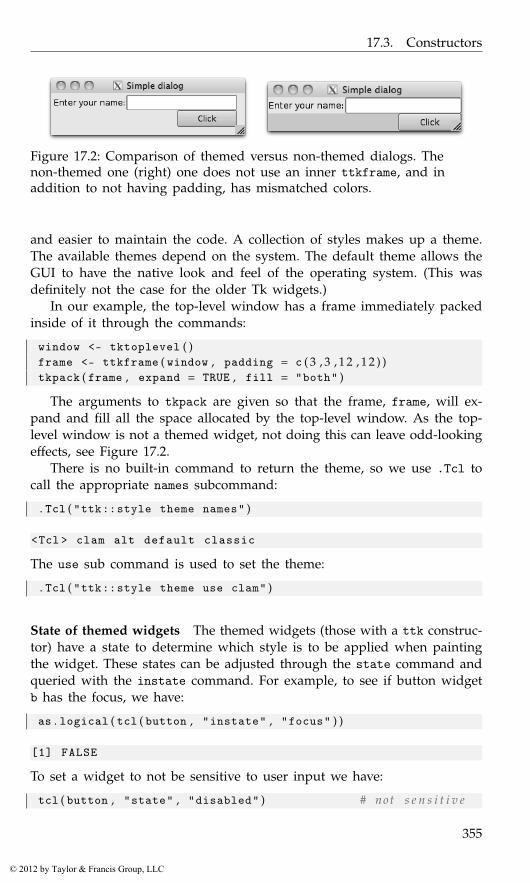
17.3. Constructors
Figure 17.2: Comparison of themed versus non-themed dialogs. Thenon-themed one (right) one does not use an inner ttkframe, and inaddition to not having padding, has mismatched colors.
and easier to maintain the code. A collection of styles makes up a theme.The available themes depend on the system. The default theme allows theGUI to have the native look and feel of the operating system. (This wasdefinitely not the case for the older Tk widgets.)
In our example, the top-level window has a frame immediately packedinside of it through the commands:
window <- tktoplevel ( )frame <- ttkframe ( window , padding = c ( 3 , 3 , 1 2 , 1 2 ) )tkpack ( frame , expand = TRUE , fill = "both" )
The arguments to tkpack are given so that the frame, frame, will ex-pand and fill all the space allocated by the top-level window. As the top-level window is not a themed widget, not doing this can leave odd-lookingeffects, see Figure 17.2.
There is no built-in command to return the theme, so we use .Tcl tocall the appropriate names subcommand:
. Tcl ( "ttk::style theme names" )
<Tcl > clam alt default classic
The use sub command is used to set the theme:
. Tcl ( "ttk::style theme use clam" )
State of themed widgets The themed widgets (those with a ttk construc-tor) have a state to determine which style is to be applied when paintingthe widget. These states can be adjusted through the state command andqueried with the instate command. For example, to see if button widgetb has the focus, we have:
as . logical ( tcl ( button , "instate" , "focus" ) )
[1] FALSE
To set a widget to not be sensitive to user input we have:
tcl ( button , "state" , "disabled" ) # not s e n s i t i v e
355
© 2012 by Taylor & Francis Group, LLC
17. Tcl/Tk: Overview
<Tcl > !disabled
The states are bits and can be negated by prefacing the value with !:
tcl ( button , "state" , "!disabled" ) # s e n s i t i v e a g a i n
<Tcl > disabled
The full list of states is in the manual page for ttk::widget.The writing of themes will not be covered, but in Example 18.5 we
show how to create a new style for a button. This topic is covered in somedetail in the Tk tutorial by Roseman.
Window properties and state: tkwinfo
For a widget, the function tkcget is used to get the values of its options.If it is a themed widget, the instate command returns its state values.
To query the values of the containing window of the widget the tk-winfo function is used. When widgets are mapped, the “window” they arerendered to has properties, such as class or size. There are a few subcom-mands provided by tcltk, but by no means is this exclusive. Rather, onecan pass in the subcommand as an argument to tkwinfo. If the subcom-mand’s API is of the form
winfo subcommand_name window
the specification to tkwinfo is in the same order (the widget is not thefirst argument). For instance, the class3 of a label is returned by the classsubcommand:
tkwinfo ( "class" , label )
<Tcl > TLabel
The window, in this example label, can be specified as an R object, orby its character ID. This is useful, as the return value of some functionsis the ID. For instance, the children subcommand returns IDs. Below theas.character function will coerce these into a vector of IDs.
( children <- tkwinfo ( "children" , window ) )
<Tcl > .4.1 .4.2
sapply ( as . character ( children ) , function ( i ) tkwinfo ( "class" ,i ) )
3The class of a widget is more like an attribute and should not be confused with class inthe object-oriented sense. The class is used internally for bindings and styles.
356
© 2012 by Taylor & Francis Group, LLC
17.3. Constructors
$‘.4.1 ‘<Tcl > TButton
$‘.4.2 ‘<Tcl > TButton
There are several possible subcommands. Here we list a few. The tk-winfo geometry sub command returns the location and size of the widget’swindow in the form width x height + x + y; the subcommands tkwinfoheight, tkwinfo width, tkwinfo x, or tkwinfo y can be used to return justthose parts. The tkwinfo exists command returns 1 (TRUE) if the windowexists and 0 otherwise; the tkwinfo ismapped sub command returns 1 or0 if the window is currently mapped (drawn); the tkwinfo viewable sub-command is similar, except that it checks that all parent windows are alsomapped.
For traversing the widget hierarchy, we have available the tkwinfo par-ent subcommand which returns the immediate parent of the component,tkwinfo toplevel which returns the ID of the top-level window; and tkwinfochildren, which returns the IDs of all the immediate child components, ifthe object is a container, such as a top-level window.
Colors and fonts
Colors and fonts are typically specified through a theme, but at times it isdesirable to customize them.
The label color can be set through its foreground property. Colors canbe specified by name – for common colors – or by hex RGB values whichare common in web programming.
tkconfigure ( label , foreground = "red" )tkconfigure ( label , foreground = "#00aa00" )
To find the hex RGB value, we can use the rgb function to create RGBvalues from intensities in [0,1]. The R function col2rgb can translate anamed color into RGB values. The as.hexmode function will display aninteger in hexadecimal notation.
In Example 19.2 we show how to modify a style, as opposed to theforeground option, to change the text color in an entry widget.
Fonts Fonts are a bit more involved than colors. Tk version 8.5 made itmore difficult to change font properties of individual widgets, by followingthe practice of centralizing style options for consistency, ease of maintainingcode, and ease of theming. To set a font for a label, rather than specifyingthe font properties, we configure the font options using a predefined fontname, such as
tkconfigure ( label , font = "TkFixedFont" )
357
© 2012 by Taylor & Francis Group, LLC
17. Tcl/Tk: Overview
Table 17.1: Standard font names defined by a theme.
Standard font name Description
TkDefaultFont Default font for all GUI items not otherwise specifiedTkTextFont Font for text widgetsTkFixedFont Fixed-width fontTkMenuFont Menu bar fontsTkHeadingFont Font for column headingsTkCaptionFont Caption font (dialogs)TkSmallCaptionFont Smaller caption fontTkIconFont Icon and text font
The "TkFixedFont" value is one of the standard font names, in thiscase to use a fixed-width font. A complete list of the standard names isprovided in Table 17.3. Each theme sets these defaults accordingly.
Using tkfont.create The tkfont.create function can be used to createa new font, as with the following commands:
tkfont . create ( "our_font" , family = "Helvetica" , size = 12 ,weight = "bold" )
<Tcl > our_font
tkconfigure ( label , font = "our_font" )
As font families are system dependent, only "Courier", "Times" and"Helvetica" are guaranteed to be there. A list of an installation’s availablefont families is returned by the function tkfont.families. Figure 17.3shows a display of some available font families on a Mac OS X machine.See Example 20.7 for details.
The arguments for tkfont.create are optional. The size argumentspecifies the pixel size. The weight argument can be used to specify "bold"or "normal". Additionally, a slant argument can be used to specify either"roman" (normal) or "italic". Finally, underline and overstrike can beset with a TRUE or FALSE value.
Font metrics The average character size is important in setting the widthand height of some components. (For example, the text widget specifiesits height in lines, not pixels.) These sizes can be found using the tk-font.measure and tkfont.metrics. Although the average text size variesfor proportional fonts, the size of the M character is often used.
font_measure <- tcl ( "font" , "measure" , "TkTextFont" , "M" )font_width <- as . integer ( tclvalue ( font_measure ) )
358
© 2012 by Taylor & Francis Group, LLC

17.3. Constructors
Figure 17.3: A scrollable frame widget (cf. Example 20.7) showing theavailable fonts on a system.
tmp <- tkfont . metrics ( "TkTextFont" , "linespace" = NULL )font_height <- as . numeric ( tclvalue ( tmp ) )#c ( width = font_width , height = font_height )
width height10 14
Images
Many tcltk widgets, including both labels and buttons, can show images(in these cases, either with or without an accompanying text label). Con-structing images to display is similar to constructing new fonts, in that anew image object is created and can be reused by various widgets. Thisshared use of resources reduces memory consumption and is an exampleof the flyweight design pattern.
Images are created by the tkimage.create function. The following com-mand shows how an image object can be made from the file tclp.gif inthe current directory:
tkimage . create ( "photo" , "::img::tclLogo" , file = "tclp.gif" )
359
© 2012 by Taylor & Francis Group, LLC
17. Tcl/Tk: Overview
<Tcl > ::img:: tclLogo
The first argument, "photo" specifies that a full-color image is beingused (this option could also be "bitmap" but that is more a legacy op-tion).4 The second argument specifies the name of the object. We followthe advice of the Tk manual and preface the name with ::img:: so that wedon’t inadvertently overwrite any existing Tcl commands. (The commandtcl("image", "names") will return all defined image names.) The thirdargument file specifies the graphic file. The basic Tk image command canonly show GIF and PPM/PNM images. Unfortunately, not many R devicesoutput in these formats. (The GDD device driver can.) We may need systemutilities to convert to the allowable formats or install add-on Tcl packagesthat can display other formats.
To use the image, one specifies the image name to the image option:
label <- ttklabel ( window , image = "::img::tclLogo" ,text = "logo text" , compound = "top" )
By default the text will not show. The compound argument takes a valueof either "text", "image" (default), "center", "top", "left", "bottom", or"right" specifying where the label is in relation to the text.
Image manipulation Once an image is created, there are several optionsto manipulate the image. These are found in the Tk manual page for photo,not image. For instance, to change the palette so that instead of fullcoloronly sixteen shades of gray are used to display the icon, We can issue thecommand
tkconfigure ( "::img::tclLogo" , palette = 16)
Other commands allow us to scale an image (copy zoom and copy subsam-ple).
17.4 Events and callbacks
The button widget has the command option for assigning a callback, which isinvoked when the user clicks the mouse on the button (among other ways).In addition to such commands, we can use tkbind to invoke callbacks inresponse to many other events that the user may initiate. The basic call istkbind(tag, event, script).
4The tkrplot package allows a third option, Rplot. This package has the high-levelcommand tkrplot, but the low-level use of a) calling .my.tkdev(hscale = 1,vscale = 1),b) creating a graphic, and c) creating an image object through tkimage.create("Rplot",img_name) will produce a new image object we can use.
360
© 2012 by Taylor & Francis Group, LLC
17.4. Events and callbacks
The tag
The tag object is more general than just a widget (or its id). It can be:
the name of a widget, in which case the command will be bound to thatwidget;
a top-level window, in which case the command will be be bound to theevent for the window and all its internal widgets;
a class of widget, such as "TButton", in which case all such widgets willget the binding; or
the value "all", in which case all widgets in the application will get thebinding.
This flexibility makes it easy to create keyboard accelerators. For ex-ample, the following mimics the Linux shortcut Control-q to close a win-dow.
window <- tktoplevel ( )button <- ttkbutton ( window , text = "Some widget with focus" )tkpack ( button )tkbind ( window , "<Control-q>" , function ( ) tkdestroy ( window ) )
By binding to the top-level window, we ensure that no matter which widgethas the focus the command will be invoked by the keyboard shortcut.
Events
Of course, the possible events (or sequences of events) vary from widgetto widget. In addition, these events can be specified in a few ways.
The example below uses two types of events. A single key press event,such as “C” or “O,” can invoke a command and is specified by just itscharacter, whereas the event of pressing the return key is specified usingReturn. In the following, we bind the key presses to the top-level windowand the return event to any button with the default class TButton.
window <- tktoplevel ( )label <- ttklabel ( window , text = "Click Ok for a message" )button1 <- ttkbutton ( window , text = "Cancel" ,
command = function ( ) tkdestroy ( window ) )button2 <- ttkbutton ( window , text = "Ok" , command=function ( ) {
print ( "initiate an action" )} )sapply ( list ( label , button1 , button2 ) , tkpack )##tkbind ( window , "C" , function ( ) tcl ( button1 , "invoke" ) )tkconfigure ( button1 , underline = 0)
361
© 2012 by Taylor & Francis Group, LLC

17. Tcl/Tk: Overview
Figure 17.4: Simple GUI showing buttons with underline property. Theunderlined letters match bindings to the top-level window to invoke thebutton.
##tkbind ( window , "O" , function ( ) tcl ( button1 , "invoke" ) )tkconfigure ( button2 , underline = 0)tkfocus ( button2 )##tkbind ( "TButton" , "<Return>" , function ( W ) {
tcl ( W , "invoke" )} )
We modified our buttons using the underline option to give the user anindication that the “C” and “O” keys will initiate some action (Figure 17.4).Our callbacks simply cause the appropriate button to invoke their com-mand. The latter one uses a percent substitution (below), which is how Tkpasses along information about the event to the callback.
Events with modifiers More complicated events can be described withthe pattern
<modifier-modifier-type-detail>.
Examples of a “type” are <KeyPress> or <ButtonPress>. The event<Control-q>, used above, has the type q and modifier Control, whereas<Double-Button-1> uses the detail 1 to indicate which mouse button. Thefull list of modifiers and types is described in the manual page for bind.Some familiar modifiers are Control, Alt, Double, and Triple. The eventtypes are the standard X event types, along with some abbreviations. Theseare also listed in the bind manual page. Some commonly used ones areReturn (as above), ButtonPress, ButtonRelease, KeyPress, KeyRelease,FocusIn, and FocusOut.
362
© 2012 by Taylor & Francis Group, LLC
17.4. Events and callbacks
Window-manager events Some events are based on window-managerevents. The <Configure> event happens when a component is resized.The <Map> and <Unmap> events happen when a component is drawn orundrawn.
Virtual events Finally, the event may be a “virtual event.” These are rep-resented as <<EventName>>. There are predefined virtual events listedin the event man page. These include <<MenuSelect>> when workingwith menus, <<Modified>> for text widgets, <<Selection>> for textwidgets, and <<Cut>>, <<Copy>>, and <<Paste>> for working withthe clipboard. New virtual events can be produced with the tkevent.addfunction. This function takes at least two arguments, an event name anda sequence which will initiate that event. The event man page has theseexamples coming from the Emacs world:
tkevent . add ( "<<Paste>>" , "<Control-y>" )tkevent . add ( "<<Save>>" , "<Control-x><Control-s>" )
In addition to virtual events occurring when the sequence is performed,the tkevent.generate can be used to force an event for a widget. Thisfunction requires a widget (or its ID) and the event name. Other optionscan be used to specify substitution values, described below. To illustrate,this command will generate the <<Save>> event for the button button:
tkevent . generate ( button , "<<Save>>" )
Example 17.1 uses virtual events to implement drag and drop features.
Callbacks
The tcltk package implements callbacks in a manner different from Tk,as the callback functions are R functions, not Tk procedures. This is muchmore convenient but introduces some slight differences. In tcltk thesecallbacks can be expressions (unevaluated calls) or functions. We use onlythe latter. The basic callback function need not have any arguments andthose that do have only percent substitutions passed in.
The callback’s return value is generally not important, although we shallsee that within the validation framework of entry widgets (Section 19.2) itcan matter.5
In tcltk only one callback can be associated with a widget and eventthrough the call tkbind(widget,event,callback). (Although callbacks forthe widget associated with classes or top-level windows can differ.) Calling
5The difference in processing of return values can make porting some Tk code to tcltkdifficult. For example, the break command to stop a chain of callbacks does not work.
363
© 2012 by Taylor & Francis Group, LLC
17. Tcl/Tk: Overview
tkbind another time will replace the callback. To remove a callback, simplyassign a new callback that does nothing.6
Percent substitutions
We cannot pass arbitrary user data to a callback; rather, such values mustbe found through R’s usual scoping rules. However, Tk provides a mech-anism called percent substitution to pass information about the event tocallbacks bound to the event. The basic idea is that in the Tcl callback,expressions of the type %X, for different characters X, will be replaced byvalues coming from the event. In tcltk, if the callback function has anargument X, then that variable will correspond to the value specified by%X. The complete list of substitutions is in the bind manual page. Someuseful ones are x and X to specify the relative or absolute x-postion of amouse click (the difference can be found through the rootx property of awidget), y and Y for the y-position, k and K for the keycode (ASCII) andkey symbol of a <KeyPress> event, and W to refer to the ID of the widgetthat signaled the event the callback is bound to.
The following trivial example illustrates the steps, whereas Example 17.1will put these to use.
window <- tktoplevel ( )button <-
ttkbutton ( window , text = "Click me for the x,y position" )tkpack ( button )tkbind ( button , "<ButtonPress -1>" , function ( W , x , y , X , Y ) {
print ( W ) # an IDprint ( c ( x , X ) ) # c h a r a c t e r c l a s sprint ( c ( y , Y ) )} )
The after command The Tcl command after will execute a commandafter a certain delay (specified in milliseconds as an integer) while notinterrupting the control flow while it waits for its delay. The function iscalled in a manner like this:
ID <- tcl ( "after" , 1000 , function ( ) print ( "1 second passed" ) )
The ID returned by after may be used to cancel the command before itexecutes. To execute a command repeatedly can be done along the linesof:
after_ID <- ""some_flag <- TRUE
6This event handling can prevent us from being able to port some Tk code into tcltk.In those cases, we can consider sourcing in Tcl code directly.
364
© 2012 by Taylor & Francis Group, LLC
17.4. Events and callbacks
repeat_call <- function ( ms = 100 , f ) {after_ID <<- tcl ( "after" , ms , function ( ) {
if ( someFlag ) {f ( )after_ID <<- repeat_call ( ms , f )
} else {tcl ( "after" , "cancel" , after_ID )
}} )
}repeat_call ( 2 0 0 0 , function ( ) {
print ( "Running. Set someFlag <- FALSE to stop." )} )
Example 17.1: Drag-and-dropThis relatively involved example7 shows several different uses of the eventframework to implement drag and drop behavior between two widgets. Itcertainly can be skipped on first reading.
In tcltk much more work is involved with drag and drop, than withRGtk2 and qtbase, as there is no provided framework.
Here we go through the steps needed to make one widget a drop sourceand the other a drop target. The basic idea is that when a value is beingdragged, virtual events are generated for the widget the cursor is over. Ifthat widget has callbacks listening to these events, then the drag and dropcan be processed.
To begin, we create a simple GUI to hold three widgets. We use buttonsfor drag and drop, but only for convenience. Other widgets would be usedin a real application.
window <- tktoplevel ( )b_drag <- ttkbutton ( window , text = "Drag me" )b_drop <- ttkbutton ( window , text = "Drop here" )tkpack ( b_drag )tkpack ( ttklabel ( window , text = "Drag over me" ) )tkpack ( b_drop )
Before beginning, we define three global variables that can be sharedamong drop sources to keep track of the drag and drop state.
. dragging <- FALSE # c u r r e n t l y d r a g g i n g ?
. drag_value <- "" # v a l u e t o t r a n s f e r
. last_widget_id <- "" # l a s t w id ge t dragged o v e r
To set up a drag source, we bind to three events: a mouse-button press,mouse motion, and a button release. For the button press, we set the valuesof the three global variables.
7The idea for the example code originated with http://wiki.tcl.tk/416
365
© 2012 by Taylor & Francis Group, LLC

17. Tcl/Tk: Overview
tkbind ( b_drag , "<ButtonPress -1>" , function ( W ) {. dragging <<- TRUE. drag_value <<- as . character ( tkcget ( W , text = NULL ) ). last_widget_id <<- as . character ( W )
} )
This initiates the dragging immediately. A more common strategy is torecord the position of the mouse click and then initiate the dragging aftera certain minimal movement is detected.
For mouse motion, we do several things. First we set the cursor to indi-cate a drag operation. The choice of cursor is a bit outdated. The commentrefers to a web page showing how we can put in a custom cursor froman xbm file, but this doesn’t work for all platforms (e.g., OS X and Aqua).After setting the cursor, we find the ID of the widget the cursor is hoveringover. We use tkwinfo to find the widget containing the x and y-coordinatesof the cursor position. We then generate the <<DragOver>> virtual eventfor this widget, and if this widget is different from the previous “lastwidget,” we generate the <<DragLeave>> virtual event.
tkbind ( window , "<B1-Motion>" , function ( W , X , Y ) {if ( ! . dragging ) return ( )## s e e c u r s o r h e l p page in API f o r more o p t i o n s## For custom c u r s o r s c f . h t t p : //w i k i . t c l . t k / 8674 .tkconfigure ( W , cursor = "coffee_mug" ) # s e t c u r s o r
win <- tkwinfo ( "containing" , X , Y ) # w i d g e t mouse i s o v e rif ( as . logical ( tkwinfo ( "exists" , win ) ) ) # d o e s w id ge t e x i s t ?
tkevent . generate ( win , "<<DragOver >>" )
## g e n e r a t e drag l e a v e i f we l e f t l a s t w i dge tif ( as . logical ( tkwinfo ( "exists" , win ) ) &&
nchar ( as . character ( win ) ) > 0 &&length ( . last_widget_id ) > 0) { # i f not c h a r a c t e r ( 0 )
if ( as . character ( win ) != . last_widget_id )tkevent . generate ( . last_widget_id , "<<DragLeave >>" )
}. last_widget_id <<- as . character ( win )
} )
Finally, if the button is released, we generate the <<DragLeave>>and, most importantly, <<DragDrop>> virtual events for the widget weare over.
tkbind ( b_drag , "<ButtonRelease -1>" , function ( W , X , Y ) {if ( ! . dragging ) return ( )w <- tkwinfo ( "containing" , X , Y )
if ( as . logical ( tkwinfo ( "exists" , w ) ) ) {
366
© 2012 by Taylor & Francis Group, LLC
17.4. Events and callbacks
tkevent . generate ( w , "<<DragLeave >>" )tkevent . generate ( w , "<<DragDrop >>" )tkconfigure ( w , cursor = "" )
}. dragging <<- FALSE. last_widget_id <<- ""tkconfigure ( W , cursor = "" )
} )
To set up a drop target, we bind callbacks for the virtual events generatedabove to the widget. For the <<DragOver>> event we make the widgetactive, so that it appears ready to receive a drag value.
tkbind ( b_drop , "<<DragOver >>" , function ( W ) {if ( . dragging )
tcl ( W , "state" , "active" )} )
If the drag event leaves the widget without dropping, we change the stateback to not active.
tkbind ( b_drop , "<<DragLeave >>" , function ( W ) {if ( . dragging ) {
tkconfigure ( W , cursor = "" )tcl ( W , "state" , "!active" )
}} )
Finally, if the <<DragDrop>> virtual event occurs, we set the widget valueto that stored in the global variable .drag_value.
tkbind ( b_drop , "<<DragDrop >>" , function ( W ) {tkconfigure ( W , text = . drag_value ). drag_value <- ""
} )
367
© 2012 by Taylor & Francis Group, LLC
18
Tcl/Tk: Layout and Containers
18.1 Top-level windows
Top-level windows are created through the tktoplevel constructor. Basicoptions include the ability to specify the preferred width and height andto specify a menu bar through the menu argument. (Menus will be coveredin Section 20.3.)
Other properties can be queried and set through the Tk command wm.This command has several subcommands, leading to tcltk functions withnames such as tkwm.title, the function used to set the window title. Forall such functions, either the top-level window object, or its ID must bethe first argument. In this case, the new title is the second.
Suppressing the initial drawing When a top-level window is constructedthere is no option for it not to be shown. However, we can use the tclSer-viceMode function to suspend/resume drawing of any widget through Tk.This function takes a logical value indicating that the updating of widgetsshould be suspended. We can set the value to FALSE, initiate the widgets,then set to TRUE to display the widgets. To iconify an already drawn win-dow can be done through the tkwm.withdraw function and reversed withthe tkwm.deiconify function. Either of these can be useful in the construc-tion of complicated GUIs, as the drawing of the widgets can seem slow.(The same can be done through the tkwm.state function with an optionof "withdraw" or "normal".)
Window sizing The preferred size of a top-level window can be config-ured through the width and height arguments of the constructor. Nega-tive values mean the window will not request any size. The absolute sizeand position of a top-level window in pixels can be queried or specifiedthrough the tkwm.geometry function. The geometry is specified as a string,as was described for tkwinfo in Section 17.3. If this string is empty, thenthe window will resize to accommodate its child components.
369
© 2012 by Taylor & Francis Group, LLC
18. Tcl/Tk: Layout and Containers
The tkwm.resizable function can be used to prohibit the resizing ofa top-level window. The syntax allows either the width or height to beconstrained. The following command would prevent resizing of both thewidth and height of the top-level window window.
tkwm . resizable ( w , FALSE , FALSE ) # width f i r s t
When a window is resized, we can constrain the minimum and max-imum sizes with tkwm.minsize and tkwm.maxsize. The aspect ratio(width/height) can be set through tkwm.aspect.
For resizable windows, the ttksizegrip widget can be used to add avisual area (usually the lower-right corner) for the user to grab on to witha mouse for resizing the window. On some operating systems (e.g., MacOS X) these are added automatically by the window manager.
Dialog windows For dialogs, a top-level window can be related to adifferent top-level window. The function tkwm.transient allows one tospecify the master window as its second argument (cf. Example 18.1). Thenew window will mirror the state of the master window, including thecase when the master is withdrawn.
For some dialogs it may be desirable not to have the window managerdecorate the window with a title bar, etc. The command tktoplevel wm over-rideredirect logical takes a logical value indicating whether the windowshould be decorated. Not all window managers respect this.
Bindings Bindings for top-level windows are propagated down to all oftheir child widgets. If a common binding is desired for all the children,then it need be specified only once for the top-level window (cf. Sec-tion 17.4 where keyboard shortcuts are defined this way).
The tkwm.protocol function (not tkbind) is used to assign commandsto window-manager events, most commonly the delete event when the userclicks the close button on the window decorations. A top-level window canbe removed through the tkdestroy function or through the user clicking onthe correct window decorations. When the window decoration is clicked,the window manager issues a "WM_DELETE_WINDOW" event. To bind to this,a command of this form tkwm.protocol(win, "WM_DELETE_WINDOW", call-back) is used.
To illustrate, if window is a top-level window, and entry a text entrywidget (cf. tktext in Section 20.2), then the following snippet of codewould check to see whether the text widget has been modified before clos-ing the window. This uses a modal message box described in Section 19.1.
tkwm . protocol ( window , "WM_DELETE_WINDOW" , function ( ) {modified <- tcl ( entry , "edit" , "modified" )if ( as . logical ( modified ) ) {
370
© 2012 by Taylor & Francis Group, LLC
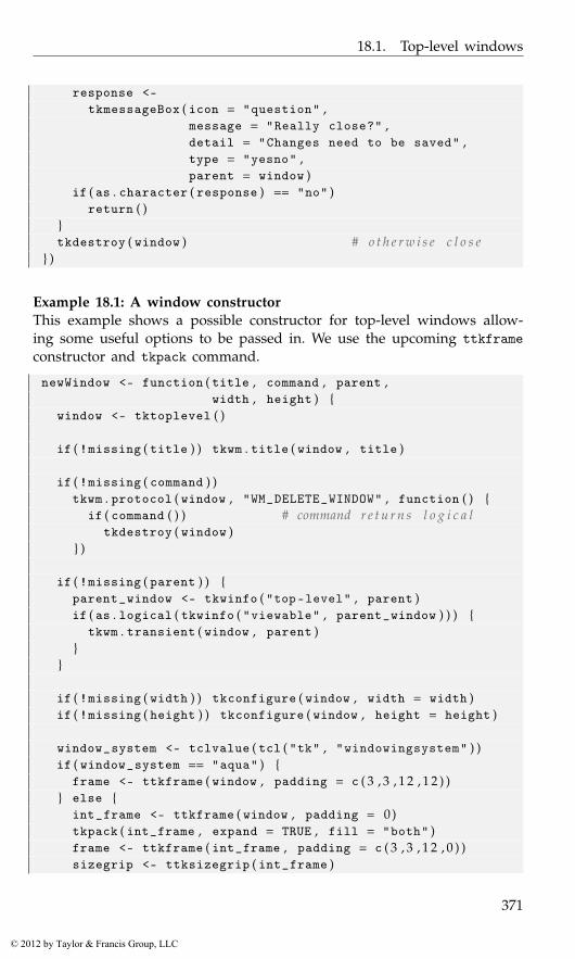
18.1. Top-level windows
response <-tkmessageBox ( icon = "question" ,
message = "Really close?" ,detail = "Changes need to be saved" ,type = "yesno" ,parent = window )
if ( as . character ( response ) == "no" )return ( )
}tkdestroy ( window ) # o t h e r w i s e c l o s e
} )
Example 18.1: A window constructorThis example shows a possible constructor for top-level windows allow-ing some useful options to be passed in. We use the upcoming ttkframeconstructor and tkpack command.
newWindow <- function ( title , command , parent ,width , height ) {
window <- tktoplevel ( )
if ( !missing ( title ) ) tkwm . title ( window , title )
if ( !missing ( command ) )tkwm . protocol ( window , "WM_DELETE_WINDOW" , function ( ) {
if ( command ( ) ) # command r e t u r n s l o g i c a ltkdestroy ( window )
} )
if ( !missing ( parent ) ) {parent_window <- tkwinfo ( "top-level" , parent )if ( as . logical ( tkwinfo ( "viewable" , parent_window ) ) ) {
tkwm . transient ( window , parent )}
}
if ( !missing ( width ) ) tkconfigure ( window , width = width )if ( !missing ( height ) ) tkconfigure ( window , height = height )
window_system <- tclvalue ( tcl ( "tk" , "windowingsystem" ) )if ( window_system == "aqua" ) {
frame <- ttkframe ( window , padding = c ( 3 , 3 , 1 2 , 1 2 ) )} else {
int_frame <- ttkframe ( window , padding = 0)tkpack ( int_frame , expand = TRUE , fill = "both" )frame <- ttkframe ( int_frame , padding = c ( 3 , 3 , 1 2 , 0 ) )sizegrip <- ttksizegrip ( int_frame )
371
© 2012 by Taylor & Francis Group, LLC
18. Tcl/Tk: Layout and Containers
tkpack ( sizegrip , side = "bottom" , anchor = "se" )}tkpack ( frame , expand = TRUE , fill = "both" , side = "top" )
return ( frame )}
18.2 Frames
The ttkframe constructor produces a themeable container that can be usedto organize visible components within a GUI. As mentioned, for themereasons, It is often the first thing packed within a top-level window.
The options include width and height to set the requested size. Thepadding option can be used to to put space between the border and sub-sequent children. Frames can be decorated. Use the option borderwidthto specify a border around the frame of a given width, and relief to setthe border style. The value of relief is chosen from (the default) "flat","groove", "raised", "ridge", "solid", and "sunken".
Label frames
The ttklabelframe constructor produces a frame with an optional labelthat can be used to set off and organize components of a GUI. The labelis set through the option text. Its position is determined by the optionlabelanchor taking values labeled by compass headings (combinations ofn, e, w, and s. The default is theme dependent, although typically "nw"(upper left).
Separators As an alternative to a border, the ttkseparator widget canbe used to place a single line to separate areas in a GUI. The lone widget-specific option is orient, which takes values of "horizontal" (the default)or "vertical". This widget must be told to stretch when added to acontainer, as described in the next section.
18.3 Geometry managers
Tcl uses geometry managers to place child components within their parentwindows. There are three such managers, but we describe only two, leav-ing the lower-level place command for the official documentation. The useof geometry managers allows Tk to reallocate space to a GUI’s componentsquickly when a window is resized. The tkpack function will place childreninto their parent in a boxlike manner. We have seen several examples in thetext that use nested boxes to construct quite flexible layouts. Example 18.4
372
© 2012 by Taylor & Francis Group, LLC
18.3. Geometry managers
will illustrate that once again. When simultaneous horizontal and verticalalignment of child components is desired, the tkgrid function can be usedto manage the components.1
A GUI may use a mix of pack and grid to manage the child compo-nents, but all immediate siblings in the widget hierarchy must be managedthe same way. Mixing the two will typically result in a lockup of the Rsession.
Pack
We have illustrated how tkpack can be used to manage how child compo-nents are viewed within their parent. The basic usage tkpack(child) willpack in the child components from top to bottom. There are many optionsto adjust this default behavior.
The side option can take a value of "left", "right", "top" (default),or "bottom" to adjust where the children are placed. Unlike GTK+ or Qt,where boxes are packed in just one direction, these can be mixed andmatched, but sticking to just one direction is typical, with nested framesto give additional flexibility.
before, after The before and after options can be used to place the childbefore or after another component. These are used as with tkpack(child1,after = child2). The object child2 can be an R object or its ID.
forget Child components can be forgotten by the window manager, un-mapping them but not destroying them, with the tkpack forget subcom-mand, or the convenience function tkpack.forget. Example 20.5 shows ausage. After a child component is removed this way, it can be replaced inthe GUI using a geometry manager.
Introspection The subcommand tkpack slaves will return a list of thechild components packed into a frame. Coercing these return values tocharacter via as.character will produce the IDs of the child components.The subcommand tkpack info will provide the packing info for a child.
These commands are illustrated below, where we show how we mightimplement a ticker tape effect, where words scroll to the left.
window <- tktoplevel ( )frame <- ttkframe ( window , padding = c ( 3 , 3 , 1 2 , 1 2 ) )
1An excellent online reference, albeit for Perl/Tk, is Learning Perl/Tk: Graphical UserInterfaces with Perl, by Nancy Walsh. See http://www.rigacci.org/docs/biblio/online/lperltk/ch02.html for information about this topic.
373
© 2012 by Taylor & Francis Group, LLC
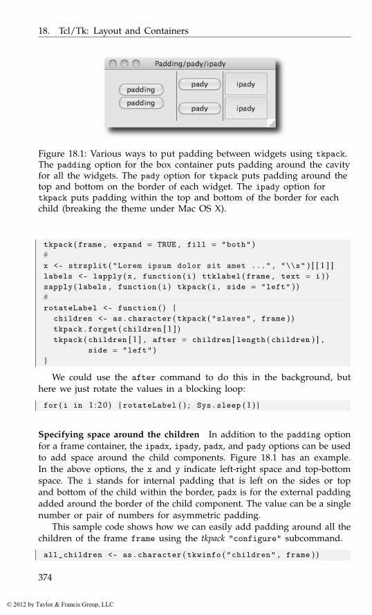
18. Tcl/Tk: Layout and Containers
Figure 18.1: Various ways to put padding between widgets using tkpack.The padding option for the box container puts padding around the cavityfor all the widgets. The pady option for tkpack puts padding around thetop and bottom on the border of each widget. The ipady option fortkpack puts padding within the top and bottom of the border for eachchild (breaking the theme under Mac OS X).
tkpack ( frame , expand = TRUE , fill = "both" )#x <- strsplit ( "Lorem ipsum dolor sit amet ..." , "\\s" ) [ [ 1 ] ]labels <- lapply ( x , function ( i ) ttklabel ( frame , text = i ) )sapply ( labels , function ( i ) tkpack ( i , side = "left" ) )#rotateLabel <- function ( ) {
children <- as . character ( tkpack ( "slaves" , frame ) )tkpack . forget ( children [ 1 ] )tkpack ( children [ 1 ] , after = children [ length ( children ) ] ,
side = "left" )}
We could use the after command to do this in the background, buthere we just rotate the values in a blocking loop:
for ( i in 1 : 2 0 ) { rotateLabel ( ) ; Sys . sleep ( 1 ) }
Specifying space around the children In addition to the padding optionfor a frame container, the ipadx, ipady, padx, and pady options can be usedto add space around the child components. Figure 18.1 has an example.In the above options, the x and y indicate left-right space and top-bottomspace. The i stands for internal padding that is left on the sides or topand bottom of the child within the border, padx is for the external paddingadded around the border of the child component. The value can be a singlenumber or pair of numbers for asymmetric padding.
This sample code shows how we can easily add padding around all thechildren of the frame frame using the tkpack "configure" subcommand.
all_children <- as . character ( tkwinfo ( "children" , frame ) )
374
© 2012 by Taylor & Francis Group, LLC
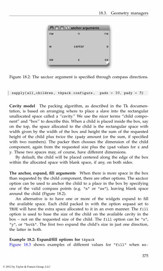
18.3. Geometry managers
Figure 18.2: The anchor argument is specified through compass directions.
sapply ( all_children , tkpack . configure , padx = 10 , pady = 5)
Cavity model The packing algorithm, as described in the Tk documen-tation, is based on arranging where to place a slave into the rectangularunallocated space called a “cavity.” We use the nicer terms “child compo-nent” and “box” to describe this. When a child is placed inside the box, sayon the top, the space allocated to the child is the rectangular space withwidth given by the width of the box and height the sum of the requestedheight of the child plus twice the ipady amount (or the sum, if specifiedwith two numbers). The packer then chooses the dimension of the childcomponent, again from the requested size plus the ipad values for x andy. These two spaces may, of course, have different dimensions.
By default, the child will be placed centered along the edge of the boxwithin the allocated space with blank space, if any, on both sides.
The anchor, expand, fill arguments When there is more space in the boxthan requested by the child component, there are other options. The anchoroption can be used to anchor the child to a place in the box by specifyingone of the valid compass points (e.g. "n" or "se"), leaving blank spacearound the child (Figure 18.2).
An alternative is to have one or more of the widgets expand to fillthe available space. Each child packed in with the option expand set toTRUE will have the extra space allocated to it in an even manner. The filloption is used to base the size of the child on the available cavity in thebox – not on the requested size of the child. The fill option can be "x","y", or "both". The first two expand the child’s size in just one direction,the latter in both.
Example 18.2: Expand/fill options for tkpackFigure 18.3 shows examples of different values for "fill" when ex-
375
© 2012 by Taylor & Francis Group, LLC

18. Tcl/Tk: Layout and Containers
Figure 18.3: Similar layout with expand=TRUE but different values of fill.The space allocated to the top and bottom buttons through expansion fillsthe vertical area, as these were added with side set to "top" and"bottom", respectively, whereas the left and right buttons expand in thehorizontal direction, as they were added with sides "left" and "right".The different fill values direct the buttons to take up this allocatedspace in different manners.
pand=TRUE is specified. Following an example of Walsh[13] we used thefollowing code to create the images:
window <- tktoplevel ( )tkwm . title ( window , "Expand/Fill arguments" )frame <- ttkframe ( window , padding = c ( 3 , 3 , 1 2 , 1 2 ) )tkpack ( frame , expand = TRUE , fill = "both" )##pack_btn <- function ( txt , . . . )
tkpack ( button <- ttkbutton ( frame , text = txt ) , . . . )##pack_btn ( "Top" , side="top" , expand=TRUE , fill="both" )pack_btn ( "Bottom" , side="bottom" , expand=TRUE , fill="both" )pack_btn ( "Left" , side="left" , expand=TRUE , fill="both" )pack_btn ( "Right" , side="right" , expand=TRUE , fill="both" )
Modifying the fill styles was easy. For example,
children <- as . character ( tkwinfo ( "children" , frame ) )sapply ( children , tkpack . configure , fill = "none" )
376
© 2012 by Taylor & Francis Group, LLC
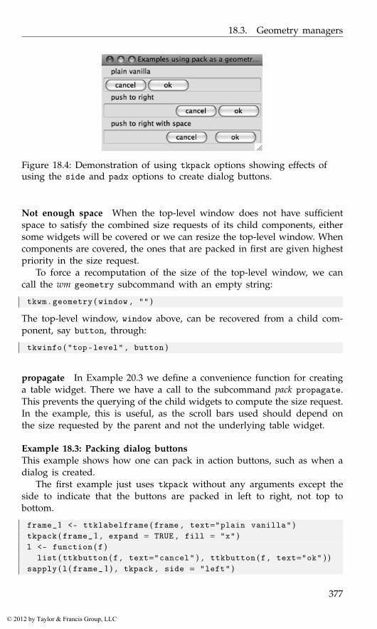
18.3. Geometry managers
Figure 18.4: Demonstration of using tkpack options showing effects ofusing the side and padx options to create dialog buttons.
Not enough space When the top-level window does not have sufficientspace to satisfy the combined size requests of its child components, eithersome widgets will be covered or we can resize the top-level window. Whencomponents are covered, the ones that are packed in first are given highestpriority in the size request.
To force a recomputation of the size of the top-level window, we cancall the wm geometry subcommand with an empty string:
tkwm . geometry ( window , "" )
The top-level window, window above, can be recovered from a child com-ponent, say button, through:
tkwinfo ( "top-level" , button )
propagate In Example 20.3 we define a convenience function for creatinga table widget. There we have a call to the subcommand pack propagate.This prevents the querying of the child widgets to compute the size request.In the example, this is useful, as the scroll bars used should depend onthe size requested by the parent and not the underlying table widget.
Example 18.3: Packing dialog buttonsThis example shows how one can pack in action buttons, such as when adialog is created.
The first example just uses tkpack without any arguments except theside to indicate that the buttons are packed in left to right, not top tobottom.
frame_1 <- ttklabelframe ( frame , text="plain vanilla" )tkpack ( frame_1 , expand = TRUE , fill = "x" )l <- function ( f )
list ( ttkbutton ( f , text="cancel" ) , ttkbutton ( f , text="ok" ) )sapply ( l ( frame_ 1 ) , tkpack , side = "left" )
377
© 2012 by Taylor & Francis Group, LLC

18. Tcl/Tk: Layout and Containers
Figure 18.5: Example of a simple dialog.
Typically the buttons are right-justified. One way to do this is to packin using side with a value of "right". This shows how to use a blankexpanding label to take up the space on the left.
frame_2 <- ttklabelframe ( frame , text = "push to right" )tkpack ( frame_2 , expand = TRUE , fill = "x" )tkpack ( ttklabel ( frame_2 , text = " " ) ,
expand = TRUE , fill = "x" , side = "left" )sapply ( l ( frame_ 2 ) , tkpack , side = "left" )
Finally, we add some padding to conform to Apple’s design specifica-tion that such buttons should have a 12-pixel separation.
frame_3 <- ttklabelframe ( frame , text="push right with space" )tkpack ( frame_3 , expand = TRUE , fill = "x" )tkpack ( ttklabel ( frame_3 , text = " " ) , expand=TRUE , fill="x" ,
side = "left" )sapply ( l ( frame_ 3 ) , tkpack , side = "left" , padx = 6)
Example 18.4: A non-modal dialogThis example shows how to use a window, frames, labels, buttons, icons,packing, and bindings to create a non-modal dialog.
Although it’s not written as a function, we set aside the values thatwould be passed in if it were.
title <- "message dialog"message <- "Do you like tcltk so far?"parent <- NULLtkimage . create ( "photo" , "::img::tclLogo" ,
file = system . file ( "images" ,"tclp.gif" ,package = "ProgGUIinR" ) )
The main top-level window is given a title then withdrawn while theGUI is created.
window <- tktoplevel ( )tkwm . title ( window , title )tkwm . state ( window , "withdrawn" )frame <- ttkframe ( window , padding = c ( 3 , 3 , 12 , 1 2 ) )tkpack ( frame , expand = TRUE , fill = "both" )
378
© 2012 by Taylor & Francis Group, LLC
18.3. Geometry managers
As usual, we added a frame so that any themes are respected.If the parent is non-null and viewable, then the dialog is made transient
to a parent. The parent need not be a top-level window, so tkwinfo is usedto find the parent’s top-level window. For Mac OS X, we use the notifyattribute to bounce the dock icon until the mouse enters the window area.
if ( !is . null ( parent ) ) {parent_window <- tkwinfo ( "toplevel" , parent )if ( as . logical ( tkwinfo ( "viewable" , parent_window ) ) ) {
tkwm . transient ( window , parent )## have fun with OS Xif ( as . character ( tcl ( "tk" , "windowingsystem" ) ) == "aqua" ) {
tcl ( "wm" ,"attributes" , parent_window , notify = TRUE )tkbind ( parent_window , "<Enter>" , function ( )
tcl ( "wm" ,"attributes" , parent_window ,notify = FALSE ) ) # s t o p bounce
}}
}
We will use a standard layout for our dialog, with an icon on the left,a message, and buttons on the right. We pack the icon into the left side ofthe frame,
label <- ttklabel ( frame , image = "::img::tclLogo" , padding=5)tkpack ( label , side = "left" )
A nested frame will be used to lay out the message area and but-ton area. Since the tkpack default is to pack in top to bottom, no sidespecification is made.
frame_1 <- ttkframe ( frame )tkpack ( frame_1 , expand = TRUE , fill = "both" )#m <- ttklabel ( frame_1 , text = message )tkpack ( m , expand = TRUE , fill = "both" )
The buttons have their own frame, as they are laid out horizontally.
frame_2 <- ttkframe ( frame_ 1)tkpack ( frame_ 2)
The callback function for the “OK” button prints a message then destroysthe window.
ok_callback <- function ( ) {print ( "That’s great" )tkdestroy ( window )
}ok_button <- ttkbutton ( frame_2 , text = "OK" ,
command = ok_callback )
379
© 2012 by Taylor & Francis Group, LLC
18. Tcl/Tk: Layout and Containers
cancel_button <- ttkbutton ( frame_ 2 , text = "Cancel" ,command = function ( ) tkdestroy ( window ) )
#tkpack ( ok_button , side = "left" , padx = 12) # g i v e some s p a c etkpack ( cancel_button )
As our interactive behavior is consistent for both buttons, we make abinding to the TButton class, not to each button individually. The first willinvoke the button command when the return key is pressed; the latter twowill highlight a button when the focus is on it.
tkbind ( "TButton" , "<Return>" , function ( W ) tcl ( W , "invoke" ) )tkbind ( "TButton" , "<FocusIn>" , function ( W )
tcl ( W , "state" , "active" ) )tkbind ( "TButton" , "<FocusOut >" , function ( W )
tcl ( W , "state" , "!active" ) )
Now we bring the dialog back from its withdrawn state, fix the size, andset the initial focus on the “OK” button.
tkwm . state ( window , "normal" )tkwm . resizable ( window , FALSE , FALSE )tkfocus ( ok_button )
Grid
The tkgrid geometry manager is used to align child widgets in rows andcolumns. In its simplest usage, a command like
tkgrid ( child1 , child2 , . . . , childn )
will place the n children in a new row, in columns 1 through n. If desired,the specific row and column can be specified through the row and columnoptions. Counting of rows and columns starts with 0. Spanning of mult-iple rows and columns can be specified with integers 2 or greater by therowspan and colspan options. These options, and others, can be adjustedthrough the tkgrid.configure function.
The tkgrid.rowconfigure and tkgrid.columnconfigure commandsWhen the managed container is resized, the grid manager consultsweights that are assigned to each row and column to see how to al-locate the extra space. Allocation is based on proportions, not specifiedsizes. The weights are configured with the tkgrid.rowconfigure and tk-grid.columnconfigure functions through the option weight. The weightis a value between 0 and 1. If there are just two rows, and the first rowhas weight 1/2 and the second weight 1, then twice as much extra spaceis allocated for the second row. The specific row or column must also bespecified. Again. rows and columns are referenced starting with 0, not the
380
© 2012 by Taylor & Francis Group, LLC

18.3. Geometry managers
Figure 18.6: Illustration of using tkpack and tkgrid to make a toolbar.
usual R-like 1. To specify a weight of 1 to the first row would be donewith a command like:
tkgrid . rowconfigure ( parent , 0 , weight = 1)
The sticky option The tkpack command had options anchor, expand andfill to control what happens when more space is available than requestedby a child component. The sticky option for tkgrid combines these. Thevalue is a combination of the compass points "n","e","w", and "s". Aspecification "ns" will make the child component “stick” to the top andbottom of the cavity that is provided, similar to the fill="y" option fortkpack. A value of "news" will make the child component expand in alldirections, like expand=TRUE, fill="both".
Padding As with tkpack, tkgrid has options ipadx, ipady, padx, andpadx to give internal and external space around a child.
Size The function tkgrid.size will return the number of columns androws of the specified parent container that is managed by a grid. This canbe useful when trying to position child components through the optionsrow and column.
Forget To remove a child from the parent, the tkgrid.forget functioncan be used with the child object as its argument.
Example 18.5: Using tkgrid to create a toolbarTk does not have a toolbar widget. Here we use tkgrid to show how wecan add one to a top-level window in a manner that is not affected byresizing. We begin by packing a frame into a top-level window.
381
© 2012 by Taylor & Francis Group, LLC

18. Tcl/Tk: Layout and Containers
window <- tktoplevel ( ) ; tkwm . title ( window , "Toolbar example" )frame <- ttkframe ( window , padding = c ( 3 , 3 , 1 2 , 1 2 ) )tkpack ( frame , expand = TRUE , fill = "both" )
Our example has two main containers: one to hold the toolbar buttonsand one to hold the main content.
tool_bar_frame <- ttkframe ( frame , padding = 0)content_frame <- ttkframe ( frame , padding = 4)
The tkgrid geometry manager is used to place the toolbar at the topand the content frame below. The choice of sticky and the weights ensurethat the toolbar does not resize vertically if the window does.
tkgrid ( tool_bar_frame , row = 0 , column = 0 , sticky = "we" )tkgrid ( content_frame , row = 1 , column = 0 , sticky = "news" )tkgrid . rowconfigure ( frame , 0 , weight = 0)tkgrid . rowconfigure ( frame , 1 , weight = 1)tkgrid . columnconfigure ( frame , 0 , weight = 1)#txt <- "Lorem ipsum dolor sit amet..." # sample t e x ttkpack ( ttklabel ( content_frame , text = txt ) )
Now to add some buttons to the toolbar. We first show how to cre-ate a new style for a button (Toolbar.TButton), slightly modifying thethemed button to set the font and padding, and eliminate the border if theoperating system allows.
tcl ( "ttk::style" , "configure" , "Toolbar.TButton" ,font = "helvetica 12" , padding = 0 , borderwidth = 0)
This make_icon function finds stock icons from the gWidgets packageand adds them to a button.
make_icon <- function ( parent , stock_name , command = NULL ) {icon_file <- system . file ( "images" ,
paste ( stock_name , "gif" , sep = "." ) ,package = "gWidgets" )
if ( nchar ( icon_file ) == 0) {b <- ttkbutton ( parent , text = stock_name , width = 6)
} else {icon_name <- paste ( "::img::" , stock_name , sep = "" )tkimage . create ( "photo" , icon_name , file = icon_file )b <- ttkbutton ( parent , image = icon_name ,
style = "Toolbar.TButton" , text=stock_name ,compound = "top" , width = 6)
if ( !is . null ( command ) )tkconfigure ( b , command = command )
}return ( b )
}
382
© 2012 by Taylor & Francis Group, LLC
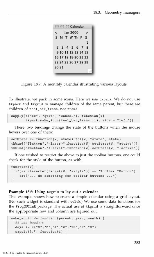
18.3. Geometry managers
Figure 18.7: A monthly calendar illustrating various layouts.
To illustrate, we pack in some icons. Here we use tkpack. We do not usetkpack and tkgrid to manage children of the same parent, but these arechildren of tool_bar_frame, not frame.
sapply ( c ( "ok" , "quit" , "cancel" ) , function ( i )tkpack ( make_icon ( tool_bar_frame , i ) , side = "left" ) )
These two bindings change the state of the buttons when the mousehovers over one of them:
setState <- function ( W , state ) tcl ( W , "state" , state )tkbind ( "TButton" ,"<Enter>" , function ( W ) setState ( W , "active" ) )tkbind ( "TButton" ,"<Leave>" , function ( W ) setState ( W , "!active" ) )
If one wished to restrict the above to just the toolbar buttons, one couldcheck for the style of the button, as with:
function ( W ) {if ( as . character ( tkcget ( W , "-style" ) ) == "Toolbar.TButton" )
cat ( "... do something for toolbar buttons ..." )}
Example 18.6: Using tkgrid to lay out a calendarThis example shows how to create a simple calendar using a grid layout.(No such widget is standard with tcltk.) We use some data functions forthe ProgGUIinR package. The actual use of tkgrid is straightforward oncethe approporiate row and column are figured out.
make_month <- function ( parent , year , month ) {## add h e a d e r sdays <- c ( "S" ,"M" ,"T" ,"W" ,"Th" ,"F" ,"S" )sapply ( 1 : 7 , function ( i ) {
383
© 2012 by Taylor & Francis Group, LLC
18. Tcl/Tk: Layout and Containers
label <- ttklabel ( parent , text = days [ i ] )tkgrid ( label , row = 0 , column = i−1, sticky = "" )
} )## add dayssapply ( seq_len ( ProgGUIinR : : : days . in . month ( year , month ) ) ,
function ( day ) {label <- ttklabel ( parent , text = day )row <- ProgGUIinR : : : week . of . month ( year , month , day )col <- ProgGUIinR : : : day . of . week ( year , month , day )tkgrid ( label , row = 1 + row , column = col ,
sticky = "e" )} )
}
Next, we would like to incorporate the calendar widget into an interfacethat allows the user to scroll through month-by-month beginning with:
year <- 2000 ; month <- 1
Our basic layout will use a box layout with a nested layout for thestep-through controls and another holding the calendar widget.
window <- tktoplevel ( )frame <- ttkframe ( window , padding = c ( 3 , 3 , 1 2 , 1 2 ) )tkpack ( frame , expand = TRUE , fill = "both" , side = "top" )c_frame <- ttkframe ( frame )cal_frame <- ttkframe ( frame )tkpack ( c_frame , fill = "x" , side = "top" )tkpack ( cal_frame , expand = TRUE , anchor = "n" )
Our step-through controls are packed in through a horizontal layout.We use anchoring and expand=TRUE to keep the arrows on the edge and thelabel with the current month centered, should the container be resized.
previous_button <- ttklabel ( c_frame , text = "<" )next_button <- ttklabel ( c_frame , text = ">" )current_month <- ttklabel ( c_frame )#tkpack ( previous_button , side = "left" , anchor = "w" )tkpack ( current_month , side = "left" , anchor = "center" ,
expand = TRUE )tkpack ( next_button , side = "left" , anchor = "e" )
The set_month function first removes the previous calendar containerand then redefines one to hold the monthly calendar. Then it adds in a newmonthly calendar to match the year and month. The call to make_monthcreates the calendar. Packing in the frame after adding its child componentsmakes the GUI seem much more responsive.
set_month <- function ( ) {
384
© 2012 by Taylor & Francis Group, LLC
18.4. Other containers
tkpack ( "forget" , cal_frame )cal_frame <<- ttkframe ( frame )make_month ( cal_frame , year , month )tkconfigure ( current_month , # month l a b e l
text = sprintf ( "%s %s" , month . abb [ month ] , year ) )tkpack ( cal_frame )
}set_month ( ) # i n i t i a l c a l e n d a r
The arrow labels are used to scroll, so we connect to the Button-1event the corresponding commands. This shows the binding to decrementthe month and year using the global variables month and year.
tkbind ( previous_button , "<Button-1>" , function ( ) {if ( month > 1) {
month <<- month − 1} else {
month <<- 1 2 ; year <<- year − 1}set_month ( )
} )
Our calendar is static, but if we wanted to add interactivity to a mouseclick, we could make a binding as follows:
tkbind ( "TLabel" , "<Button-1>" , function ( W ) {day <- as . numeric ( tkcget ( W , "-text" ) )if ( !is . na ( day ) )
print ( sprintf ( "You selected: %s/%s/%s" , month , day , year ) )} )
18.4 Other containers
Tk provides just a few other basic containers. Here we describe panedwindows and notebooks.
Paned windows
A paned window, with sashes to control the individual pane sizes, isconstructed by the function ttkpanedwindow. The primary option, outsideof setting the requested width or height with width and height, is orient,which takes a value of "vertical" (the default) or "horizontal". Thisspecifies how the children are stacked, and is opposite of how the sash isdrawn.
The returned object can be used as a parent container, although we donot use the geometry managers to manage these objects. Instead, the addcommand is used to add a child component. For example:
385
© 2012 by Taylor & Francis Group, LLC
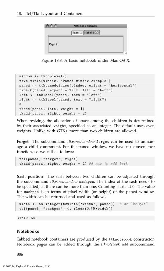
18. Tcl/Tk: Layout and Containers
Figure 18.8: A basic notebook under Mac OS X.
window <- tktoplevel ( )tkwm . title ( window , "Paned window example" )paned <- ttkpanedwindow ( window , orient = "horizontal" )tkpack ( paned , expand = TRUE , fill = "both" )left <- ttklabel ( paned , text = "left" )right <- ttklabel ( paned , text = "right" )#tkadd ( paned , left , weight = 1)tkadd ( paned , right , weight = 2)
When resizing, the allocation of space among the children is determinedby their associated weight, specified as an integer. The default uses evenweights. Unlike with GTK+ more than two children are allowed.
Forget The subcommand ttkpanedwindow forget can be used to unman-age a child component. For the paned window, we have no conveniencefunction, so we call as follows:
tcl ( paned , "forget" , right )tkadd ( paned , right , weight = 2) ## how t o add b a c k
Sash position The sash between two children can be adjusted throughthe subcommand ttkpanedwindow sashpos. The index of the sash needs tobe specified, as there can be more than one. Counting starts at 0. The valuefor sashpos is in terms of pixel width (or height) of the paned window.The width can be returned and used as follows:
width <- as . integer ( tkwinfo ( "width" , paned ) ) # or " h e i g h t "tcl ( paned , "sashpos" , 0 , floor ( 0 . 7 5 *width ) )
<Tcl > 54
Notebooks
Tabbed notebook containers are produced by the ttknotebook constructor.Notebook pages can be added through the ttknotebook add subcommand
386
© 2012 by Taylor & Francis Group, LLC
18.4. Other containers
or inserted after a page through the ttknotebook insert subcommand. Thelatter requires a tab ID to be specified, as described below. Typically, thechild components would be containers to hold more complicated layouts.The tab label is configured similarly to ttklabel through the options textand (the optional) image, which, if given, has its placement determinedby compound. The placement of the child component within the notebookpage is manipulated similarly as tkgrid through the sticky option, withvalues specified through compass points. Extra padding around the childcan be added with the padding option.
Tab identifiers Many of the commands for a notebook require a specifi-cation of a desired tab. This can be given by index, starting at 0; by thevalues "current" or "end"; by the child object added to the tab, as eitheran R object or an ID; or in terms of x-y coordinates in the form "@x,y"(likely found through a binding).
To illustrate, if notebook is a ttknotebook object, then these commandswould add pages (cf. Figure 18.8):
icon_file <- system . file ( "images" , paste ( "help" ,"gif" , sep="." ) ,package = "gWidgets" )
icon_name <- "::tcl::helpIcon"tkimage . create ( "photo" , icon_name , file = icon_file )#page2_label <- ttklabel ( notebook , text = "Page 2" )tkadd ( notebook , page2_label , sticky = "nswe" , text="label 2" ,
image = icon_name , compound = "right" )## put page 1 l a b e l f i r s t ( a tabID o f 0 ) ; use t k i n s e r tpage1_label <- ttklabel ( notebook , text = "Page 1" )tkinsert ( notebook , 0 , page1_label , sticky = "nswe" ,
text = "label 1" )
There are several useful subcommands for extracting information fromthe notebook object. For instance, index to return the page index (0-based),tabs to return the page IDs, select to select the displayed page, andforget to remove a page from the notebook. (There is no means to placeclose icons on the tabs.) Except for tabs, these require a specification of atab ID.
tcl ( notebook , "index" , "current" ) # c u r r e n t page f o r tabID
<Tcl > 1
length ( as . character ( tcl ( notebook , "tabs" ) ) ) # number o f p a g e s
[1] 2
387
© 2012 by Taylor & Francis Group, LLC
18. Tcl/Tk: Layout and Containers
tcl ( notebook , "select" , 0 ) # s e l e c t by i n d e xtcl ( notebook , "forget" , page1_label ) # " f o r g e t " removes a pagetcl ( notebook , "add" , page1_label ) # can be managed a g a i n .
The notebook state can be manipulated through the keyboard, providedtraversal is enabled. This can be done through
tcl ( "ttk::notebook::enableTraversal" , notebook )
If enabled, the shortcuts such as control-tab to move to the next tab areimplemented. If new pages are added or inserted with the option under-line, which takes an integer value (0-based) specifying which character inthe label is underlined, then a keyboard accelerator is added for that letter.
Bindings Beyond the usual events, the notebook widget also generates a<<NotebookTabChanged>> virtual event after a new tab is selected.
The notebook container in Tk has a few limitations. For instance, thereis no graceful management of too many tabs, as there is with GTK+; aswell there is no easy way to implement close icons, as in Qt.
388
© 2012 by Taylor & Francis Group, LLC

19
Tcl/Tk: Dialogs and Widgets
This chapter covers both the standard dialogs provided by Tk and thevarious controls used to create custom dialogs. We begin with a discussionof the standard dialogs, then cover the basic controls in this chapter, leavingthe next chapter for the more involved tktext, ttktreeview, and tkcanvaswidgets.
19.1 Dialogs
Modal dialogs
The tkmessageBox constructor can be used to create simple modal dialogs,allowing a user to confirm an action. These use the native toolkit if pos-sible. This constructor replaces the older tkdialog dialogs. The argumentstitle, message, and detail are used to set the text for the dialog. Thetitle may not appear for all operating systems. A message dialog hasan icon argument. The default icon is "info" but could also be "error","question", or "warning". The buttons used are specified through thetype argument; with values of "ok", "okcancel", "retrycancel", "yesno",or "yesnocancel". When a button is clicked, the dialog is destroyed andthe button label returned as a value. The argument parent can be given tospecify which window the dialog belongs to. Depending on the operatingsystem, this may be used when drawing the dialog.
A sample usage is:
Figure 19.1: A basic modal dialog constructed by tkmessageBox.
389
© 2012 by Taylor & Francis Group, LLC
19. Tcl/Tk: Dialogs and Widgets
tkmessageBox ( title = "Confirm" , message = "Really exit?" ,detail = "Changes need saving." ,icon = "question" , type = "okcancel" )
The tkwait function If the default modal dialog is not enough – forinstance there is no means to gather user input – then a top-level windowcan be made modal. The tkwait function will cause a top-level window tobe modal, and tkgrab.release will return the interactivity for the window.We illustrate a simple use by example, beginning by adding a label to awindow:
msg <- "We care ..."dialog <- tktoplevel ( ) ; tkwm . withdraw ( dialog )tkwm . overrideredirect ( dialog , TRUE ) # no d e c o r a t i o nframe <- ttkframe ( dialog , padding = 5)tkpack ( frame , expand = TRUE , fill = "both" )tkpack ( ttklabel ( frame , text = msg ) , pady = 5)
There are different ways to use tkwait. The function tkwait.windowwill make a top-level window modal, waiting until it is destroyed. Inthe following we will use tkwait.variable. This will keep the windowmodal until a change to a specified variable, in this case flag. In thebutton’s command we release the window then change this value, endingthe wait.
flag <- tclVar ( "" )tkpack ( ttkbutton ( frame , text="dismiss" , command=function ( ) {
tkgrab . release ( dialog )tclvalue ( flag ) <- "Destroy"
} ) )
Now we show the window and wait for the flag variable to change.
tkwm . deiconify ( dialog )tkwait . variable ( flag )
When the value of flag is changed in the callback the flow returns tothe program.
File and directory selection
Tk provides constructors for selecting a file, selecting a directory or speci-fying a filename when saving. These are implemented by tkgetOpenFile,tkchooseDirectory, and tkgetSaveFile, respectively. Each of these can becalled with no argument, and each returns a tclObj object. The value isempty when there is no selection made.
The dialog will appear in a relationship with a top-level window ifthe argument parent is specified. The initialdir and initialfile can
390
© 2012 by Taylor & Francis Group, LLC
19.1. Dialogs
be used to specify the initial values in the dialog. The defaultextensionargument can be used to specify a default extension for the file.
It can be convenient to filter the available file types that can be selected,when browsing for files. The filetypes argument is used for this task.However, the file types are specified using Tcl brace-notation, not R code.For example, to filter out various image types, we could use:
tkgetOpenFile ( filetypes = paste ("{{jpeg files} {.jpg .jpeg} }" ,"{{png files} {.png}}" ,"{{All files} {*}}" , sep = " " ) ) # n e e d s s p a c e
Extending this pattern is hopefully clear from above.
Example 19.1: A ’File’ menuTo illustrate, a simple example for a file menu (Section 20.3) could in-clude:
window <- tktoplevel ( )tkwm . title ( window , "File menu example" )menu_bar <- tkmenu ( window )tkconfigure ( window , menu = menu_bar )file_menu <- tkmenu ( menu_bar )tkadd ( menu_bar , "cascade" , label="File" , menu = file_menu )tkadd ( file_menu , "command" , label = "Source file..." ,
command = function ( ) {file_name <- tkgetOpenFile ( filetypes=
"{{R files} {.R}} {{All files} *}" )if ( file . exists ( file_name <- as . character ( file_name ) ) )
source ( tclvalue ( file_name ) )} )
tkadd ( file_menu , "command" , label = "Save workspace as..." ,command = function ( ) {
file_name <- tkgetSaveFile ( defaultextension = "Rsave" )if ( nchar ( fname <- as . character ( file_name ) ) )
save . image ( file = file_name )} )
tkadd ( file_menu , "command" , label="Set working directory..." ,command = function ( ) {
dir_name <- tkchooseDirectory ( )if ( nchar ( dir_name <- as . character ( dir_name ) ) )
setwd ( dir_name )} )
Choosing a color
Tk provides the command tk_chooseColor to construct a dialog for selec-tion of a color by RGB value. There are three optional arguments: initial-
391
© 2012 by Taylor & Francis Group, LLC
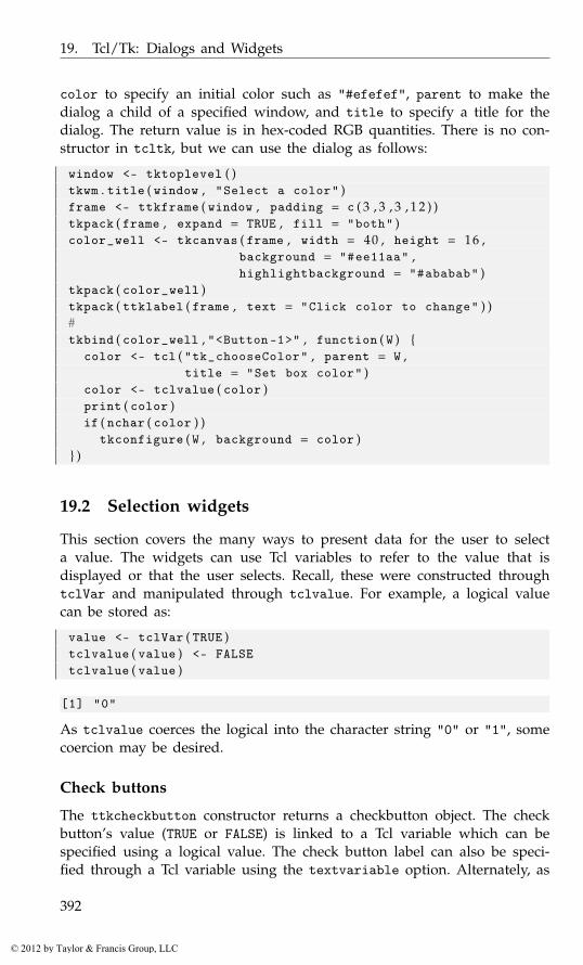
19. Tcl/Tk: Dialogs and Widgets
color to specify an initial color such as "#efefef", parent to make thedialog a child of a specified window, and title to specify a title for thedialog. The return value is in hex-coded RGB quantities. There is no con-structor in tcltk, but we can use the dialog as follows:
window <- tktoplevel ( )tkwm . title ( window , "Select a color" )frame <- ttkframe ( window , padding = c ( 3 , 3 , 3 , 1 2 ) )tkpack ( frame , expand = TRUE , fill = "both" )color_well <- tkcanvas ( frame , width = 40 , height = 16 ,
background = "#ee11aa" ,highlightbackground = "#ababab" )
tkpack ( color_well )tkpack ( ttklabel ( frame , text = "Click color to change" ) )#tkbind ( color_well , "<Button-1>" , function ( W ) {
color <- tcl ( "tk_chooseColor" , parent = W ,title = "Set box color" )
color <- tclvalue ( color )print ( color )if ( nchar ( color ) )
tkconfigure ( W , background = color )} )
19.2 Selection widgets
This section covers the many ways to present data for the user to selecta value. The widgets can use Tcl variables to refer to the value that isdisplayed or that the user selects. Recall, these were constructed throughtclVar and manipulated through tclvalue. For example, a logical valuecan be stored as:
value <- tclVar ( TRUE )tclvalue ( value ) <- FALSEtclvalue ( value )
[1] "0"
As tclvalue coerces the logical into the character string "0" or "1", somecoercion may be desired.
Check buttons
The ttkcheckbutton constructor returns a checkbutton object. The checkbutton’s value (TRUE or FALSE) is linked to a Tcl variable which can bespecified using a logical value. The check button label can also be speci-fied through a Tcl variable using the textvariable option. Alternately, as
392
© 2012 by Taylor & Francis Group, LLC
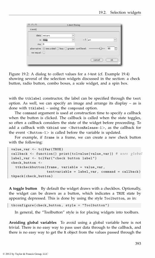
19.2. Selection widgets
Figure 19.2: A dialog to collect values for a t-test (cf. Example 19.4)showing several of the selection widgets discussed in the section: a checkbutton, radio button, combo boxes, a scale widget, and a spin box.
with the ttklabel constructor, the label can be specified through the textoption. As well, we can specify an image and arrange its display – as isdone with ttklabel – using the compound option.
The command argument is used at construction time to specify a callbackwhen the button is clicked. The callback is called when the state toggles,so often a callback considers the state of the widget before proceeding. Toadd a callback with tkbind use <ButtonRelease-1>, as the callback forthe event <Button-1> is called before the variable is updated.
For example, if frame is a frame, we can create a new check buttonwith the following:
value_var <- tclVar ( TRUE )callback <- function ( ) print ( tclvalue ( value_var ) ) # u s e s g l o b a llabel_var <- tclVar ( "check button label" )check_button <-
ttkcheckbutton ( frame , variable = value_var ,textvariable = label_var , command = callback )
tkpack ( check_button )
A toggle button By default the widget draws with a checkbox. Optionally,the widget can be drawn as a button, which indicates a TRUE state byappearing depressed. This is done by using the style Toolbutton, as in:
tkconfigure ( check_button , style = "Toolbutton" )
In general, the “Toolbutton” style is for placing widgets into toolbars.
Avoiding global variables To avoid using a global variable here is nottrivial. There is no easy way to pass user data through to the callback, andthere is no easy way to get the R object from the values passed through the
393
© 2012 by Taylor & Francis Group, LLC
19. Tcl/Tk: Dialogs and Widgets
percent substitution values. The variable holding the value can be foundthrough:
tkcget ( check_button , "variable" = NULL )
<Tcl > ::RTcl5
But then, we need a means to look up the variable from this id. Hereis a wrapper for the tclVar function and a look up function that use anenvironment created by the tcltk package in place of a global variable.
our_tcl_var <- function ( . . . ) {var <- tclVar ( . . . ). TkRoot$env [ [ as . character ( var ) ] ] <- varvar
}## l o o k u p f u n c t i o nget_tcl_var_by_id <- function ( id ) {
. TkRoot$env [ [ as . character ( id ) ] ]}
Assuming we used our_tcl_var above, then the callback could be de-fined to avoid a (new) global variable by:
callback <- function ( W ) {id <- tkcget ( W , "variable" = NULL )print ( get_tcl_var_by_id ( id ) )
}
In Section 19.2 we demonstrate a better way – encapsulating the widgetand its variable in a reference class so that we need not worry aboutscoping rules to reference the variable.
Radio buttons
Radio buttons are basically differently styled check buttons linked througha shared Tcl variable. Each radio button is constructed through the ttk-radiobutton constructor. Each button has both a value and a text label,which need not be the same. The variable option refers to the value. Aswith the ttklabel widget, the radio button labels can be specified througha text variable or the text option, in which case, as with a ttklabel, animage may also be incorporated through the image and compound options.In Tk, the placement of the buttons is managed by the programmer.
This small example shows how radio buttons can be used for selectionof an alternative hypothesis, assuming frame is a parent container.
values <- c ( "less" , "greater" , "two.sided" )var <- tclVar ( values [ 3 ] ) # i n i t i a l v a l u ecallback <- function ( ) print ( tclvalue ( var ) )
394
© 2012 by Taylor & Francis Group, LLC
19.2. Selection widgets
sapply ( values , function ( i ) {radio_button <- ttkradiobutton ( frame , variable = var ,
text = i , value = i ,command = callback )
tkpack ( radio_button , side = "top" , anchor = "w" )} )
Entry widgets
The ttkentry constructor provides a single-line text-entry widget. The wid-get can be associated with a Tcl variable at construction to facilitate gettingand setting the displayed values through its argument textvariable. Thewidth of the widget can be adjusted at construction time through the widthargument. This takes a value for the number of characters to be displayed,assuming average-width characters. The text alignment can be set throughthe justify argument taking values of "left" (the default), "right", and"center". For gathering passwords, the argument show can be used, suchas with show="*", to show asterisks in place of all the characters.
The following constructs a basic example.
txt_var <- tclVar ( "initial value" )entry <- ttkentry ( window , textvariable = txt_var )tkpack ( entry )
We can get and set values using the Tcl variable.
tclvalue ( txt_var )
[1] "initial value"
tclvalue ( txt_var ) <- "set value"
The get command can also be used.
tkget ( entry )
<Tcl > set value
Indices The entry widget uses an index to record the different positionswithin the entry box. This index can be a number (0-based), an x-coordinateof the value (@x), or one of the values "end" or "insert" to refer to theend of the current text and the insert point as set through the keyboard ormouse. The mouse can also be used to make a selection. In this case, theindices "sel.first" and "sel.last" describe the selection.
With indices, we can insert text with the ttkentry insert command.
tkinsert ( entry , "end" , "new text" )
395
© 2012 by Taylor & Francis Group, LLC
19. Tcl/Tk: Dialogs and Widgets
Or, we can delete a range of text, in this case the first four characters,using ttkentry delete:
tkdelete ( entry , 0 , 4 )
The first value is the left-most index to delete (0-based), the second valuethe index to the right of the last value deleted.
The ttkentry icursor command can be used to set the cursor positionto the specified index.
tkicursor ( entry , 0 ) # move t o b e g i n n i n g
Finally, we note that the selection can be adjusted using the ttkentryselection range subcommand. This takes two indices. Like delete, thefirst index specifies the first character of the selection, and the secondindicates the character to the right of the selection boundary. The followingexample would select all the text.
tkselection . range ( entry , 0 , "end" )
The ttkentry selection clear subcommand clears the selection and ttkentryselection present signals if a selection is currently made.
Events Several useful events include <KeyPress> and <KeyRelease> forkey presses and <FocusIn> and <FocusOut> for focus events.
Example 19.2: Putting in an initial messageIn this example, we show how to augment the ttkentry widget to allowthe inclusion of an initial message to direct the user. As soon as the userfocuses the entry area, say by clicking the mouse on it, the initial messageclears and the user can type in a value.
We use an R reference class for our programming, as it allows us toencapsulate the entry widget, its Tcl variable and the initial message. Themain properties we have are defined via
setOldClass ( c ( "tkwin" , "tclVar" ) )TtkEntry <- setRefClass ( "TtkEntry" ,
fields = list (entry = "tkwin" , # e n t r ytcl_var = "tclVar" , # t e x t v a r i a b l einit_msg = "character") )
We need to indicate to the user that the initial message is not thecurrent text. We do so with a style that simply sets the foreground (text)color to gray:
. Tcl ( "ttk::style configure Gray.TEntry -foreground gray" )
396
© 2012 by Taylor & Francis Group, LLC
19.2. Selection widgets
Now we create methods to accommodate the initial message. We havemethods is_init_msg, to compare the current text with the initial message,and show_init_msg and hide_init_msg to toggle the messages. The onlynovelty is using the style option for a themeable widget.
TtkEntry$methods (is_init_msg = function ( ) {
"Is the init text showing?"as . character ( tclvalue ( tcl_var ) ) == init_msg
} ,hide_init_msg = function ( ) {
"Hide the initial text"if ( is_init_msg ( ) ) {
tkconfigure ( entry , style = "TEntry" )set_text ( "" , hide = FALSE )
}} ,show_init_msg = function ( ) {
"Show the initial text"tkconfigure ( entry , style = "Gray.TEntry" )set_text ( init_msg , hide = FALSE )
} )
Our accessor methods, set_text and get_text, must work around apossible initial message.
TtkEntry$methods (set_text = function ( text , hide = TRUE ) {
"Set text into widget"if ( hide ) hide_init_msg ( )tcl_var_local <- tcl_var # a v o i d warningtclvalue ( tcl_var_local ) <- text
} ,get_text = function ( ) {
"Get the text value"if ( !is_init_msg ( ) )
as . character ( tclvalue ( tcl_var ) )else
""} )
In the initialize method, we will add bindings to switch between theinitial message and the entry area. We use the focus in and out events toinitiate this.
TtkEntry$methods (add_bindings = function ( ) {
"Add focus bindings to make this work"tkbind ( entry , "<FocusIn>" , hide_init_msg )
397
© 2012 by Taylor & Francis Group, LLC
19. Tcl/Tk: Dialogs and Widgets
tkbind ( entry , "<FocusOut >" , function ( ) {if ( nchar ( get_text ( ) ) == 0)
show_init_msg ( )} )
} )
Our initialization method follows.
TtkEntry$methods (initialize = function ( parent , text , init_msg = "" , . . . ) {
tcl_var <<- tclVar ( )entry <<- ttkentry ( parent , textvariable = tcl_var )init_msg <<- init_msg##if ( missing ( text ) )
show_init_msg ( )else
set_text ( text )add_bindings ( )callSuper ( . . . )
} )
Finally, to use this widget, we call its new method to create an in-stance. The actual entry widget is kept in the e field, so we pack inwidget$entry.
window <- tktoplevel ( )widget <- TtkEntry$new ( parent = window ,
init_msg = "type value here" )tkpack ( widget$entry )#button <- ttkbutton ( window , text = "focus out onto this" ,
command = function ( ) {print ( widget$get_text ( ) )
} )tkpack ( button )
Example 19.3: Using validation for datesAs previously mentioned, there is no native calendar widget in tcltk.This example shows how we can use the validation framework for entrywidgets to check that user-entered dates conform to an expected format.
Validation happens in a few steps. A validation command is assignedto some event. This call can come in two forms. Prevalidation is when achange is validated prior to being committed – for example, when eachkey is pressed. Revalidation is when the value is checked after it is sent tobe committed, say, when the entry widget loses focus or the enter key ispressed.
398
© 2012 by Taylor & Francis Group, LLC
19.2. Selection widgets
When a validation command is called it should check whether thecurrent state of the entry widget is valid or not. If valid, it returns a valueof TRUE; FALSE otherwise. These need to be Tcl Boolean values, so in thefollowing, the command tcl("eval","TRUE") (or tcl("eval", "FALSE"))is used. If the validation command returns FALSE, then a subsequent callto the specified invalidation command is made.
For each callback, a number of substitution values are possible, in ad-dition to the standard ones, such as W to refer to the widget. These are:d for the type of validation being done: 1 for insert prevalidation, 0 fordelete prevalidation, or -1 for revalidation; i for the index of the string tobe inserted or deleted or -1; P for the new value if the edit is accepted (inprevalidation) or the current value in revalidation; s for the value prior toediting; S for the string being inserted or deleted, v for the current valueof validate, and V for the condition that triggered the callback.
In the following callback definition we use W so that we can change theentry text color to black and format the data in a standard manner and Pto get the entry widget’s value just prior to validation.
To begin, we define some patterns for acceptable date formats.
date_patterns <- c ( )for ( i in list ( c ( "%m" ,"%d" ,"%Y" ) , # U. S . s t y l e
c ( "%m" ,"%d" ,"%y" ) ) ) {for ( j in c ( "/" ,"-" ," " ) )
date_patterns [ length ( date_patterns ) + 1 ] <-paste ( i , sep = "" , collapse = j )
}
Our callbacks set the color to black or red, depending on whether wehave a valid date. First, our validation command.
is_valid_date <- function ( W , P ) { # P i s t h e c u r r e n t v a l u efor ( i in date_patterns ) {
date <- try ( as . Date ( P , format = i ) , silent = TRUE )if ( !inherits ( date , "try-error" ) && !is . na ( date ) ) {
tkconfigure ( W , foreground = "black" ) # or use s t y l etkdelete ( W , 0 ,"end" )tkinsert ( W , 0 , format ( date , format = "%m/%d/%y" ) )return ( tcl ( "expr" ,"TRUE" ) )
}}return ( tcl ( "expr" ,"FALSE" ) )
}
This is our invalid command.
indicate_invalid_date <- function ( W ) {tkconfigure ( W , foreground = "red" )tcl ( "expr" , "TRUE" )
}
399
© 2012 by Taylor & Francis Group, LLC
19. Tcl/Tk: Dialogs and Widgets
The validate argument is used to specify when the validation com-mand should be called. This can be a value of "none" for validation whencalled through the validation command; "key" for each key press; "fo-cusin" for when the widget receives the focus; "focusout" for when itloses focus; "focus" for both of the previous; and "all" for any of theprevious. We use "focusout" below, so also give a button widget so thatthe focus can be set elsewhere.
entry <- ttkentry ( frame , validate = "focusout" ,validatecommand = is_valid_date ,invalidcommand = indicate_invalid_date )
button <- ttkbutton ( frame , text = "click" ) # f o c u s t a r g e tsapply ( list ( entry , button ) , tkpack , side = "left" , padx = 2)
Combo boxes
The ttkcombobox constructor returns a combo box object allowing for se-lection from a list of values, or, with the appropriate option, allowing theuser to specify a value using an entry widget. The value of the combo boxcan be specified using a Tcl variable to the option textvariable, makingthe getting and setting of the displayed value straightforward. The possiblevalues to select from are specified as a character vector through the valuesoption. (This may require us to coerce the results to the desired class.)
Unlike with GTK+ and Qt there is no option to include images in thedisplayed text. We can adjust the alignment through the justify options.By default, a user can add in additional values through the entry-widgetpart of the combo box. The state option controls this, with the default"normal" and the value "readonly" as an alternative. For editable comboboxes, the widget also supports some of the ttkentry commands justdiscussed.
To illustrate, again suppose frame is a parent container. Then we beginby defining some values to choose from and a Tcl variable.
values <- state . namevar <- tclVar ( values [ 1 ] ) # i n i t i a l v a l u e
The constructor call is as follows:
combo_box <- ttkcombobox ( frame ,values = values ,textvariable = var ,state = "normal" , # or " r e a d o n l y "justify = "left" )
tkpack ( combo_box )
The possible values the user can select from can be configured afterconstruction through the values option:
400
© 2012 by Taylor & Francis Group, LLC
19.2. Selection widgets
tkconfigure ( combo_box , values = tolower ( values ) )
There is one case where the above won’t work: when there is a singlevalue and this value contains spaces. In this case, we can coerce the valueto be of class tclObj:
tkconfigure ( combo_box , values = as . tclObj ( "New York" ) )
Setting the value Setting values can be done through the Tcl variable. Aswell, the value can be set by a matching value using the ttkcombobox setsubcommand through tkset or by index (0-based) using the ttkcomboboxcurrent sub command.
tclvalue ( var ) <- values [ 2 ] # us ing t c l v a r i a b l etkset ( combo_box , values [ 4 ] ) # by v a l u etcl ( combo_box , "current" , 4 ) # by i n d e x
Getting the value We can retrieve the selected object in various ways:from the Tcl variable, or the ttkcombobox get subcommand can be usedthrough tkget.
tclvalue ( var ) # TCL v a r i a b l e
[1] "california"
tkget ( combo_box ) # g e t subcommand
<Tcl > california
tcl ( combo_box , "current" ) # 0−b a s e d i n d e x
<Tcl > 4
Events The virtual event <<ComboboxSelected>> occurs with selection.When the combo box can be edited, a user may expect some action whenthe return key is pressed. This triggers a <Return> event. To bind to thisevent, we can do something like the following:
tkbind ( combo_box , "<Return>" , function ( W ) {val <- tkget ( W )cat ( as . character ( val ) , "\n" )
} )
401
© 2012 by Taylor & Francis Group, LLC
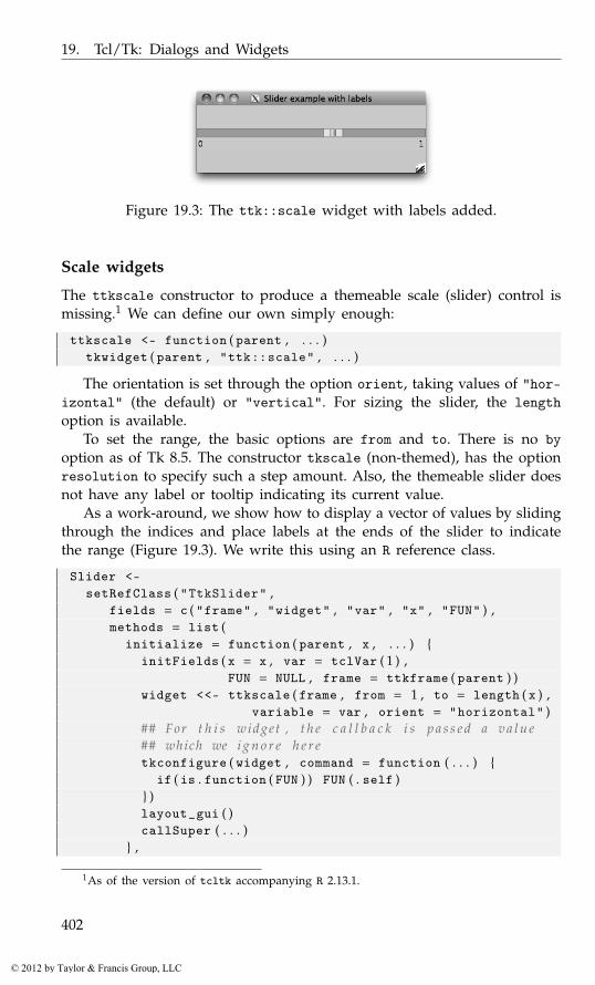
19. Tcl/Tk: Dialogs and Widgets
Figure 19.3: The ttk::scale widget with labels added.
Scale widgets
The ttkscale constructor to produce a themeable scale (slider) control ismissing.1 We can define our own simply enough:
ttkscale <- function ( parent , . . . )tkwidget ( parent , "ttk::scale" , . . . )
The orientation is set through the option orient, taking values of "hor-izontal" (the default) or "vertical". For sizing the slider, the lengthoption is available.
To set the range, the basic options are from and to. There is no byoption as of Tk 8.5. The constructor tkscale (non-themed), has the optionresolution to specify such a step amount. Also, the themeable slider doesnot have any label or tooltip indicating its current value.
As a work-around, we show how to display a vector of values by slidingthrough the indices and place labels at the ends of the slider to indicatethe range (Figure 19.3). We write this using an R reference class.
Slider <-setRefClass ( "TtkSlider" ,
fields = c ( "frame" , "widget" , "var" , "x" , "FUN" ) ,methods = list (
initialize = function ( parent , x , . . . ) {initFields ( x = x , var = tclVar ( 1 ) ,
FUN = NULL , frame = ttkframe ( parent ) )widget <<- ttkscale ( frame , from = 1 , to = length ( x ) ,
variable = var , orient = "horizontal" )## For t h i s widget , t h e c a l l b a c k i s p a s s e d a v a l u e## which we i g n o r e h e r etkconfigure ( widget , command = function ( . . . ) {
if ( is . function ( FUN ) ) FUN ( . self )} )layout_gui ( )callSuper ( . . . )
} ,
1As of the version of tcltk accompanying R 2.13.1.
402
© 2012 by Taylor & Francis Group, LLC
19.2. Selection widgets
layout_gui = function ( ) {tkgrid ( widget , row = 0 , column = 0 , columnspan = 3 ,
sticky = "we" )tkgrid ( ttklabel ( frame , text = x [ 1 ] ) ,
row = 1 , column = 0)tkgrid ( ttklabel ( frame , text = x [ length ( x ) ] ) ,
row = 1 , column = 2)tkgrid . columnconfigure ( frame , 1 , weight = 1)
} ,add_callback = function ( FUN ) FUN <<- FUN ,get_value = function ( ) x [ as . numeric ( tclvalue ( var ) ) ] ,set_value = function ( value ) {
"Set value. Value must be in x"ind <- match ( value , x )if ( !is . na ( ind ) ) {
var_local <- vartclvalue ( var_local ) <- ind
}}) )
To use this, we have:
window <- tktoplevel ( )frame <- ttkframe ( window , padding = c ( 3 , 3 , 1 2 , 1 2 ) )tkpack ( frame , expand = TRUE , fill = "both" )x <- seq ( 0 , 1 , by = 0 . 0 5 )##slider <- Slider$new ( parent = window , x = x )tkpack ( slider$frame , expand = TRUE , fill = "x" , anchor = "n" )##slider$set_value ( 0 . 5 )print ( slider$get_value ( ) )
[1] 0.5
As seen in the initialize and get_value methods, the variable op-tion can be used for specifying a Tcl variable to record the value of theslider. This is convenient when the variable and widget are encapsulatedinto a class, as above. Otherwise, the value option is available. The tkgetand tkset functions (using the ttkscale get and ttkscale set subcommands)can be used to get and set the value shown. They are used in the samemanner as the same-named subcommands for a combo box.
The add_callback method can be used to add a callback function whenthe slider changes value.
slider$add_callback ( function ( obj ) print ( obj$get_value ( ) ) )
We pass back in a reference to the object when we call this function, sothere is no issue with finding the Tcl variable to get the value.
403
© 2012 by Taylor & Francis Group, LLC
19. Tcl/Tk: Dialogs and Widgets
Spin boxes
A themeable spin box is introduced in Tk version 8.5.9. However, as ofthis writing, the libraries accompanying R for Windows are 8.5.8, so wewill assume there is no themeable spin box widget. In Tk the spinboxcommand produces a non-themeable spin box. Again, there is no directtkspinbox constructor, but one can be defined with:2
tkspinbox <- function ( parent , . . . )tkwidget ( parent , "tk::spinbox" , . . . )
The non-themeable widgets have many more options than the theme-able ones, as style properties can be set on a per-widget basis. We won’tdiscuss those here. The spin box can be used to select from a sequence ofnumeric values or a vector of character values.
For example, the following allows a user to scroll in either directionthrough the fifty states of the U.S.
window <- tktoplevel ( )spin_box <- tkspinbox ( window , values = state . name , wrap=TRUE )
Whereas, this invocation will allow scrolling through a numeric se-quence:
spin_box1 <- tkspinbox ( window , from=1 , to = 10 , increment = 1)
The basic options to set the range for a numeric spin box are from, to,and increment. The textvariable option can be used to link the spin boxto a Tcl variable. As usual, this allows the user to get and set the valuedisplayed easily. Otherwise, the tkget and tkset functions can be used forthese tasks.
As seen, in Tk spin boxes can also be used to select from a list of textvalues. These are specified through the values option. In the state.nameexample above, we set the wrap option to TRUE, so that the values wraparound when the end is reached.
The option state can be used to specify whether the user can entervalues, the default of "normal"; not edit the value but simply select oneof the given values ("readonly"), or not select a value ("disabled"). Aswith a combo box, when the Tk spin box displays character data and is inthe "normal" state, the widget can be controlled like the entry widget ofSection 19.2.
Example 19.4: A GUI for t.testThis example illustrates how the basic widgets can be combined to makea dialog for gathering information to run a t-test. A realization is shownin Figure 19.2.
2We augment this to compare the result of tcl("info", "patchlevel") to 8.5.9 and use"ttk::spinbox" when the underlying libraries support it.
404
© 2012 by Taylor & Francis Group, LLC
19.2. Selection widgets
We will use a data store to hold the values to be passed to t.test. Forthe data store, we use an environment to hold Tcl variables.
e <- new . env ( )e$x <- tclVar ( "" ) ; e$f <- tclVar ( "" ) ; e$data <- tclVar ( "" )e$mu <- tclVar ( 0 ) ; e$alternative <- tclVar ( "two.sided" )e$conf . level <- tclVar ( 9 5 ) ; e$var . equal <- tclVar ( FALSE )
This allows us to write a function to evaluate a t-test easily enough,although we don’t illustrate that.
Our layout is basic. Here we pack a label frame into the window togive the dialog a nicer look. We will use the tkgrid geometry managerbelow.
label_frame <- ttklabelframe ( frame , text = "t.test()" ,padding = 10)
tkpack ( label_frame , expand = TRUE , fill = "both" ,padx = 5 , pady = 5)
The grid will have four columns, with columns 0 and 2 being for labels.We don’t want the labels to expand the same way we want the widgetcolumns to, so we assign different weights:
tkgrid . columnconfigure ( label_frame , 0 , weight = 1)tkgrid . columnconfigure ( label_frame , 1 , weight = 10)tkgrid . columnconfigure ( label_frame , 2 , weight = 1)tkgrid . columnconfigure ( label_frame , 1 , weight = 10)
This helper function simplifies the task of adding a label.
put_label <- function ( parent , text , row , column ) {label <- ttklabel ( parent , text = text )tkgrid ( label , row = row , column = column , sticky = "e" )
}
Our first widget will be one to select a data frame. For this, a combobox is used, although if a large number of data frames is a possibility, adifferent widget may be better suited. Also not shown are two similar callsto create combo boxes, x_combo and factor_combo, which allow the userto specify parts of a formula.
put_label ( label_frame , "data:" , 0 , 0 )data_combo <- ttkcombobox ( label_frame , state = "readonly" ,
values = ProgGUIinR : : : avail_dfs ( ) ,textvariable = e$data )
tkgrid ( data_combo , row = 0 , column = 1 , sticky="ew" , padx = 2)tkfocus ( data_combo ) # g i v e f o c u s
We use a ttkentry widget for the user to specify a mean. For thispurpose, the use is straightforward.
405
© 2012 by Taylor & Francis Group, LLC
19. Tcl/Tk: Dialogs and Widgets
put_label ( label_frame , "mu:" , 2 , 0 )mu_combo <- ttkentry ( label_frame , textvariable = e$mu )tkgrid ( mu_combo , row = 2 , column = 1 , sticky = "ew" , padx = 2)
The selection of an alternative hypothesis is a natural choice for a combobox or a radio-button group; we use the latter.
put_label ( label_frame , "alternative:" , 3 , 0 )rb_frame <- ttkframe ( label_frame )sapply ( c ( "two.sided" ,"less" ,"greater" ) , function ( i ) {
radio_button <-ttkradiobutton ( rb_frame , variable = e$alternative ,
text = i , value = i )tkpack ( radio_button , side = "left" )
} )tkgrid ( rb_frame , row = 3 , column = 1 , sticky = "ew" , padx = 2)
Here we use a range widget to specify the confidence level. The slideris quicker to use but less precise than the spin box. By sharing a textvariable, the widgets are automatically synchronized.
put_label ( label_frame , "conf.level:" , 3 , 2 )conf_level_frame <- ttkframe ( label_frame )tkgrid ( conf_level_frame , row = 3 , column = 3 , columnspan = 2 ,
sticky = "ew" , padx = 2)##conf_level_scale <- ttkscale ( conf_level_frame ,
from = 75 , to = 100 ,variable = e$conf . level )
conf_level_spin <- tkspinbox ( conf_level_frame ,from = 75 , to = 100 , increment = 1 ,textvariable = e$conf . level , width = 5)
##tkpack ( conf_level_scale , expand = TRUE , fill = "y" ,
side = "left" )tkpack ( conf_level_spin , side = "left" )
A checkbox is used to collect the logical value for var.equal:
put_label ( label_frame , "var.equal:" , 4 , 0 )var_equal_check <-
ttkcheckbutton ( label_frame , variable = e$var . equal )tkgrid ( var_equal_check , row = 4 , column = 1 , stick = "w" ,
padx = 2)
The dialog has standard "cancel" and "ok" buttons.
button_frame <- ttkframe ( frame )cancel_button <- ttkbutton ( button_frame , text = "cancel" )ok_button <- ttkbutton ( button_frame , text = "ok" )#
406
© 2012 by Taylor & Francis Group, LLC
19.2. Selection widgets
tkpack ( button_frame , fill = "x" , padx = 5 , pady = 5)tkpack ( ttklabel ( button_frame , text = " " ) , expand = TRUE ,
fill = "y" , side = "left" ) # add a s p r i n gsapply ( list ( cancel_button , ok_button ) , tkpack ,
side = "left" , padx = 6)
For the ok_button button we want to gather the values and run thefunction. The runTTest function does this. We configure both buttons, thenadd to the default button bindings to invoke either of the buttons’ com-mands when they have the focus and return is pressed.
tkconfigure ( ok_button , command = runTTest )tkconfigure ( cancel_button ,
command = function ( ) tkdestroy ( window ) )tkbind ( "TButton" , "<Return>" , function ( W ) tcl ( W , "invoke" ) )
At this point our GUI is complete, but we would like to have it reflectany changes to the underlying R environment that affect its display. Assuch, we define a function, update_ui, which does two basic things: itsearches for new data frames and it adjusts the controls depending onthe current state. The work is cumbersome, as three different means areneeded to disable the widgets.
update_ui <- function ( ) {dfName <- tclvalue ( e$data )curDfs <- ProgGUIinR : : : avail_dfs ( )tkconfigure ( data_combo , values = curDfs )if ( !dfName %in% curDfs ) {
dfName <- ""tclvalue ( e$data ) <- ""
}
if ( dfName == "" ) {## 3 ways t o d i s a b l e n e e d e d !!x <- list ( x_combo , factor_combo , mu_combo ,
conf_level_scale , var_equal_check , ok_button )sapply ( x , function ( W ) tcl ( W , "state" , "disabled" ) )sapply ( as . character ( tkwinfo ( "children" , rb_frame ) ) ,
function ( W ) tcl ( W , "state" , "disabled" ) )tkconfigure ( conf_level_spin , state = "disabled" )
} else {## e n a b l e u n i v a r i a t e , oksapply ( list ( x_combo , mu_combo , conf_level_scale , ok_button ) ,
function ( W ) tcl ( W , "state" , "!disabled" ) )sapply ( as . character ( tkwinfo ( "children" , rb_frame ) ) ,
function ( W ) tcl ( W , "state" , "!disabled" ) )tkconfigure ( conf_level_spin , state = "normal" )
DF <- get ( dfName , envir = . GlobalEnv )
407
© 2012 by Taylor & Francis Group, LLC

19. Tcl/Tk: Dialogs and Widgets
numVars <- get_numeric_vars ( DF )tkconfigure ( x_combo , values = numVars )if ( ! tclvalue ( e$x ) %in% numVars )
tclvalue ( e$x ) <- ""
## b i v a r i a t eavail_factors <- get_two_level_factor ( DF )sapply ( list ( factor_combo , var_equal_check ) ,
function ( W ) {val <- if ( length ( avail_factors ) ) "!" else ""tcl ( W , "state" , sprintf ( "%sdisabled" , val ) )
} )tkconfigure ( factor_combo , values = avail_factors )if ( !tclvalue ( e$f ) %in% avail_factors )
tclvalue ( e$f ) <- ""
}}update_ui ( )tkbind ( data_combo , "<<ComboboxSelected >>" , update_ui )
This function could be bound to a “refresh” button, or we could arrangeto have it called in the background. Using the after command we couldperiodically check for new data frames, using a task callback. We can callthis every time a new command is issued. As the call could potentially becostly, we call only if the available data frames have been changed. Hereis one way to arrange that:
require ( digest )create_function <- function ( ) {
. DFs <- digest ( ProgGUIinR : : : avail_dfs ( ) )f <- function ( . . . ) {
if ( ( val <- digest ( ProgGUIinR : : : avail_dfs ( ) ) ) != . DFs ) {. DFs <<- valupdate_ui ( )
}return ( TRUE )
}}
Then to create a task callback we have:
id <- addTaskCallback ( create_function ( ) )
408
© 2012 by Taylor & Francis Group, LLC
20
Tcl/Tk: Text, Tree, and Canvas Widgets
This chapter focuses on a few of the more complex widgets of Tk, primarilythe text widget, the treeview widget, and the canvas widget.
20.1 Scroll bars
Tk has several scrollable widgets – those that use scroll bars. Widgetsthat accept a scroll bar (without too many extra steps) have the optionsxscrollcommand and yscrollcommand. For these, to use scroll bars in tcltkrequires two steps: the scroll bars must be constructed and bound to somewidget, and that widget must be told it has a scroll bar. This way changesto the widget can update the scroll bar and vice versa. Suppose parent isa container and widget has these options, then the following will set upboth horizontal and vertical scroll bars.
xscr <- ttkscrollbar ( parent , orient = "horizontal" ,command = function ( . . . ) tkxview ( widget , . . . ) )
yscr <- ttkscrollbar ( parent , orient = "vertical" ,command = function ( . . . ) tkyview ( widget , . . . ) )
The tkxview and tkyview functions set the part of the widget being shown.To link the widget back to the scroll bar, the set command is used
in a callback to the scroll command. For this example we configure theoptions after the widget is constructed, but this can be done at the time ofconstruction as well. Again, the command takes a standard form:
tkconfigure ( widget ,xscrollcommand = function ( . . . ) tkset ( xscr , . . . ) ,yscrollcommand = function ( . . . ) tkset ( yscr , . . . ) )
Although scroll bars can appear anywhere, the conventional place is onthe right and lower side of the parent. The following adds scroll bars usingthe grid manager. The combination of weights and stickiness below willcause the scroll bars to expand as expected if the window is resized.
tkgrid ( widget , row = 0 , column = 0 , sticky = "news" )
409
© 2012 by Taylor & Francis Group, LLC
20. Tcl/Tk: Text, Tree, and Canvas Widgets
tkgrid ( yscr , row = 0 , column = 1 , sticky = "ns" )tkgrid ( xscr , row = 1 , column = 0 , sticky = "ew" )tkgrid . columnconfigure ( parent , 0 , weight = 1)tkgrid . rowconfigure ( parent , 0 , weight = 1)
This is a bit tedious, but it does give the programmer some flexibilityin arranging scroll bars. For subsequent usage, we turn the above intothe function addScrollbars (not shown). In base Tk, there are no simplemeans to hide scroll bars when they are not needed, although the tcltk2package has some code that may be employed for that.
20.2 Multiline text widgets
The tktext widget creates a multiline text-editing widget. If constructedwith no options but a parent container, the widget can have text enteredinto it by the user:
window <- tktoplevel ( )tkwm . title ( window , "Simple tktext example" )txt_widget <- tktext ( window )addScrollbars ( window , txt_widget )
The text widget is not a themed widget; hence it has numerous argu-ments to adjust its appearance. We mention a few here and leave the rest tobe discovered in the manual page (along with much else). The argumentswidth and height are there to set the initial size, with values specifyingnumber of characters and number of lines (not pixels; to convert see Sec-tion 17.3). The actual size is font dependent, with the default for 80 by24 characters. The wrap argument, with a value from "none", "char", or"word", indicates whether wrapping is to occur, and, if so, does it happenat any character or only a word boundary. The argument undo takes alogical value indicating whether the undo mechanism should be used. Ifso, the control-z keyboard shortcut or the subcommand tktext edit can beused to undo a change
Inserting text Inserting text can be done through the ttktext insert sub-command. This shows how we can use \n to add new lines:
tkinsert ( txt_widget ,"1.0" ,paste ( "Lorem ipsum dolor" ,
"sit amet," , sep = "\n" ) )
Images and other windows can be added to a text buffer, but we do notdiscuss that here. The value "1.0" is an index (described below) markingthe beginning of the buffer.
410
© 2012 by Taylor & Francis Group, LLC
20.2. Multiline text widgets
Getting text The tktext get subcommand is used to retrieve the text in thebuffer. We specify what part of the text buffer should be returned usingindices. The following shows how to retrieve the entire contents of thebuffer:
value <- tkget ( txt_widget , "1.0" , "end" )as . character ( value ) # wrong way
[1] "Lorem" "ipsum" "dolor" "sit" "amet ,"
tclvalue ( value )
[1] "Lorem ipsum dolor\nsit amet ,\n"
The return value is of class tclObj. The above example shows thatcoercion to character should be done with tclvalue and not as.characterto preserve the distinction between spaces and line breaks.
Indices As with the entry widget, several commands take indices to spec-ify position within the text buffer. Only, for the multiline widget are botha line and character needed in some instances. These indices can be speci-fied in many ways. We can use row and character numbers separated by aperiod in the pattern line.char. The line is 1-based; the column 0-based(e.g., 1.0 says start on the first row and first character). In general, we canspecify any line number and character on that line, with the keyword endused to refer to the last character on the line.
Text buffers may carry transient marks. Predefined marks include end,to specify the end of the buffer, insert, to track the insertion point in thetext buffer were the user to begin typing, and current, which follows thecharacter closest to the mouse position.
The specification
value <- tkget ( txt_widget , "1.0" , "end" )
uses the index 1.0 to refer to the beginning of the buffer and the mark"end" to refer to the character after the end.
As well, pieces of text may be tagged. The format tag.first andtag.last index the range of the tag tag. Marks and tags are describedfurther below. If the x-y postion of the spot is known (through percentsubstitutions, say) the index can be specified by postion, as x,y.
Indices can also be adjusted relative to the above specifications. Thisadjustment can be by a number of characters (chars), index positions(indices), or lines. For example, insert + 1 lines refers to one lineunder the point. The values linestart, lineend, wordstart, and wordendare also available. So, insert linestart refers the beginning of the linefrom the insert point, end -1 wordstart refers to the beginning of the last
411
© 2012 by Taylor & Francis Group, LLC
20. Tcl/Tk: Text, Tree, and Canvas Widgets
word in the buffer and end - 1 chars wordend refers to the ending of thelast word in the buffer. (The end index refers to the character just after thenew line, so we go back two steps.)
Deleting text The text between two indices can be deleted usingtkdelete, as with tkdelete(txt_widget, "1.0", "end"), which wouldclear the entire buffer’s contents.
Panning the buffer: tksee After text is inserted, the visible part of thebuffer may not be what is desired. The ttktext see subcommand is used toposition the buffer on the specified index, its lone argument.
Tags Tags are a means to assign a name to characters within the textbuffer. Tags can be used to adjust the foreground, background, and fontproperties of the tagged characters from those specified globally at thetime of construction of the widget, or configured thereafter. Tags can beset when the text is inserted by appending to the argument list, as with:
tkinsert ( txt_widget , "end" , "last words" , "lastWords" )
Tags can be set after the text is added through the tktext tag addsubcommand, using indices to specify location. The following marks thefirst word with the first_word tag:
tktag . add ( txt_widget , "first_word" ,"1.0 wordstart" , "1.0 wordend" )
The tktext tag configure can be used to configure properties of the taggedcharacters. For example:
tktag . configure ( txt_widget , "first_word" , foreground = "red" ,font = "helvetica 12 bold" )
There are several other configuration options for a tag. From within anR session, a cryptic list can be produced by calling the subcommand tktexttag configure without a value for configuration.
Selection The current selection, if any, is indicated by the sel tag, withsel.first and sel.last providing indices to refer to the selection (as-suming the option exportSelection was not modified). These tags can beused with tkget to retrieve the currently selected text. An error will bethrown if there is no current selection. To check whether there is a currentselection, the following can be used:
has_selection <- function ( W ) {ranges <- tclvalue ( tcl ( W , "tag" , "ranges" , "sel" ) )length ( ranges ) > 1 || ranges != ""
}
412
© 2012 by Taylor & Francis Group, LLC

20.2. Multiline text widgets
Cut, copy, and paste The cut, copy, and paste commands are implementedthrough the Tk functions tk_textCut, tk_textCopy and tk_textPaste.Their lone argument is the text widget. These work with the current selec-tion and insert point. For example, to cut the current selection, we have:
tcl ( "tk_textCut" , txt_widget )
Marks Tags mark characters within a buffer; marks denote positionswithin a buffer that can be modified. For example, the marks insert andcurrent refer to the position of the cursor and the current position of themouse. Such information can be used to provide context-sensitive pop-upmenus, as in this code example:
popup_context <- function ( W , x , y ) {## or use s p r i n t f ("@%s ,% s " , x , y ) f o r " c u r r e n t "cur <- tkget ( W , "current wordstart" , "current wordend" )cur <- tclvalue ( cur )popup_context_menu_for ( cur , x , y ) # some f u n c t i o n
}
To assign a new mark, we use the tktext mark set subcommand spec-ifying a name and a position through an index. Marks refer to spacesbetween characters. The gravity of the mark can be left or right. Whenit is right (the default), new text inserted is to the left of the mark. Forinstance, to keep track of an initial insert point and the current one, theinitial point (marked leftlimit below) can be marked with:
tkmark . set ( txt_widget , "leftlimit" , "insert" )tkmark . gravity ( txt_widget , "leftlimit" , "left" ) # k e e p on l e f ttkinsert ( txt_widget , "insert" , "new text" )tkget ( txt_widget , "leftlimit" , "insert" )
<Tcl > new text
The use of the subcommand tktext mark gravity is done so that the markattaches to the left-most character at the insert point. The right-most onechanges as more text is inserted, so it would be a poor choice here.
The edit command The subcommand tktext edit can be used to undotext. As well, it can be used to test whether the buffer has been modified,as follows:
tcl ( txt_widget , "edit" , "undo" ) # no o ut pu ttcl ( txt_widget , "edit" , "modified" ) # 1 = TRUE
<Tcl > 1
413
© 2012 by Taylor & Francis Group, LLC

20. Tcl/Tk: Text, Tree, and Canvas Widgets
Figure 20.1: A text widget used to show formatted R commands and theiroutput.
Events The text widget has a few important events. The widget definesvirtual events <<Modified>> and <<Selection>> indicating when thebuffer is modified or the selection is changed. Like the single-line textwidget, the events <KeyPress> and <KeyRelease> indicate key activity.The percent substitution k gives the keycode and K the key symbol as astring (N is the decimal number).
Example 20.1: Displaying commands in a text bufferThis example shows how a text buffer can be used to display the output ofR commands, using an approach modified from Sweave. We envision thisas a piece of a larger GUI which generates the commands to evaluate. Forthis example though, we make a simple GUI (Figure 20.1).
w <- tktoplevel ( ) ; tkwm . title ( w , "Text buffer example" )f <- ttkframe ( w , padding = c ( 3 , 3 , 1 2 , 1 2 ) )tkpack ( f , expand = TRUE , fill = "both" )txt <- tktext ( f , width = 80 , height = 24) # d e f a u l t s i z eaddScrollbars ( f , txt )
To distinguish between commands and their output we define the fol-lowing tags:
tktag . configure ( txt , "commandTag" , foreground = "blue" ,font = "courier 12 italic" )
tktag . configure ( txt , "outputTag" , font = "courier 12" )tktag . configure ( txt , "errorTag" , foreground = "red" ,
font = "courier 12 bold" )
The following function does the work of evaluating a command chunkthen inserting the values into the text buffer, using the different markuptags specified above to indicate commands from output.
eval_cmd_chunk <- function ( txt , cmds ) {
414
© 2012 by Taylor & Francis Group, LLC
20.3. Menus
cmd_chunks <- try ( parse ( text = cmds ) , silent = TRUE )if ( inherits ( cmd_chunks , "try-error" ) ) {
tkinsert ( t , "end" , "Error" , "errorTag" ) # add markup t a g}
for ( cmd in cmd_chunks ) {cutoff <- 0 . 7 5 * getOption ( "width" )dcmd <- deparse ( cmd , width . cutoff = cutoff )command <-
paste ( getOption ( "prompt" ) ,paste ( dcmd , collapse = paste ( "\n" ,
getOption ( "continue" ) , sep = "" ) ) ,sep = "" , collapse = "" )
tkinsert ( txt , "end" , command , "commandTag" )tkinsert ( txt , "end" ,"\n" )## output , s h o u l d c h e c k f o r e r r o r s in e v a l !output <- capture . output ( eval ( cmd , envir = . GlobalEnv ) )output <- paste ( output , collapse = "\n" )tkinsert ( txt , "end" , output , "outputTag" )tkinsert ( txt , "end" ,"\n" )
}}
This is how it can be used.
eval_cmd_chunk ( txt , "2 + 2; lm(mpg ~ wt, data = mtcars)" )
20.3 Menus
Menu bars and pop-up menus in Tk are constructed with tkmenu. Theparent argument depends on what the menu is to do. A top-level menubar, such as appears at the top of a window has a top-level window asits parent; a submenu of a menu bar uses the parent menu; and a pop-upmenu uses a widget.
The menu widget in Tk has an option to be “torn off.” This featurewas at one time common in GUIs but now is rarely seen, so it is recom-mended that this option be disabled. The tearoff option can be used atconstruction time to override the default behavior. Otherwise, the followingcommand will do so globally:
tcl ( "option" ,"add" ,"*tearOff" , 0 ) # d i s a b l e t e a r o f f menus
A top-level menu bar is attached to a top-level window using tkcon-figure to set the menu option of the window. For the aqua Tk libraries forMac OS X, this menu will appear on the top menu bar when the windowhas the focus. For other operating systems, it appears at the top of the
415
© 2012 by Taylor & Francis Group, LLC
20. Tcl/Tk: Text, Tree, and Canvas Widgets
window. For Mac OS X, a default menu bar with no relationship to yourapplication will be shown if a menu is not provided for a top-level window.Testing for native Mac OS X may be done via the following function:
using_Mac <- function ( )as . character ( tcl ( "tk" , "windowingsystem" ) ) == "aqua"
The tkpopup function facilitates the creation of a pop-up menu. Thisfunction has arguments for the menu bar, and for the postion where themenu should be popped up. For example, the following code will bind apop-up menu, pmb (yet to be defined), to the right-click event for a buttonb. As Mac OS X may not have a third mouse button, and when it doesit refers to it differently, the callback is bound conditionally to differentevents.
doPopup <- function ( X , Y ) tkpopup ( pmb , X , Y ) # d e f i n e c a l l b a c kif ( using_Mac ( ) ) {
tkbind ( button , "<Button-2>" , doPopup ) # r i g h t c l i c ktkbind ( button , "<Control -1>" , doPopup ) # C o n t r o l + c l i c k
} else {tkbind ( button , "<Button-3>" , doPopup )
}
Adding submenus and action items Menus show a hierarchical view ofaction items. Items are added to a menu through the tkmenu add subcom-mand. The nested structure of menus is achieved by specifying a tkmenuobject as an item, using the tkmenu add cascade subcommand. The op-tion label is used to label the menu and the menu option to specify thesubmenu.
Grouping of similar items can be done through nesting, or, on occasion,through visual separation. The latter is implemented with the tkmenu addseparator subcommand.
There are a few different types of action items that can be added:
Commands An action item is one associated with a command. The sim-plest proxy is a button in the menu that activates a command whenselected with the mouse. The tkmenu add command allows us to specifya label, a command and optionally an image with a value for com-pound to adjust its layout. Action commands can possibly be calledfor different widgets, so the use of percent substitution is problematic.We can also specify that a keyboard shortcut be displayed throughthe option accelerator, but a separate callback must listen for thiscombination.
Checkboxes Action items may also be proxied by checkboxes. To createone, the subcommand tkmenu add checkbutton is used. The available
416
© 2012 by Taylor & Francis Group, LLC
20.3. Menus
arguments include label to specify the text, variable to specify aTcl variable to store the state, onvalue and offvalue to specify thestate to the tcl variable, and command to specify a callback when thechecked state is toggled. The initial state is set by the value in theTcl variable.
Radio buttons Additionally, action items may be presented through ra-diobutton groups. These are specified with the subcommand tkmenuadd radiobutton. The label option is used to identify the entry,variable to set a text variable and to group the buttons that areadded, and command to specify a command when that entry is se-lected.
Action items can also be placed after an item, rather than at the end,using the tkmenu insert command index subcommand. The index maybe specified numerically, with 0 being the first item for a menu. Moreconveniently, the index can be determined by specifying a pattern to matchagainst the menu’s current labels.
Set state The state option is used to retrieve and set the current state of amenu item. This value is typically normal or disabled, the latter to indicatethat the item is not available. The state can be set when the item is addedor configured after the fact, through the tkmenu entryconfigure command.This function needs the menu bar specified and the item specified as anindex or pattern to match the labels.
Example 20.2: Simple menu exampleThis example shows how we might make a very simple code editor usinga text-entry widget. We use the svMisc package, as it defines a few GUIhelpers that we use.
library ( svMisc ) # f o r some h e l p e r sshowCmd <- function ( cmd ) {
writeLines ( captureAll ( parseText ( cmd ) ) )}
We begin with a simple GUI comprised of a top-level window contain-ing the text-entry widget.
window <- tktoplevel ( )tkwm . title ( window , "Simple code editor" )frame <- ttkframe ( window , padding = c ( 3 , 3 , 1 2 , 1 2 ) )tkpack ( frame , expand = TRUE , fill = "both" )text_buffer <- tktext ( frame , undo = TRUE )addScrollbars ( frame , text_buffer )
417
© 2012 by Taylor & Francis Group, LLC
20. Tcl/Tk: Text, Tree, and Canvas Widgets
Using tkmenu, we create a top-level menu bar, menu_bar, and attachit to our top-level window. Following that, we make “file” and “edit”submenus.
menu_bar <- tkmenu ( window )tkconfigure ( window , menu = menu_bar )#file_menu <- tkmenu ( menu_bar )tkadd ( menu_bar , "cascade" , label = "File" , menu = file_menu )#edit_menu <- tkmenu ( menu_bar )tkadd ( menu_bar , "cascade" , label = "Edit" , menu = edit_menu )
To these sub-menu bars, we add action items. First we create a com-mand to evaluate the contents of the buffer:
tkadd ( file_menu , "command" , label = "Evaluate buffer" ,command = function ( ) {
cur_val <- tclvalue ( tkget ( text_buffer , "1.0" , "end" ) )showCmd ( cur_val )
} )
then a command to evaluate just the current selection:
tkadd ( file_menu , "command" , label = "Evaluate selection" ,state = "disabled" ,command = function ( ) {
cur_sel <- tclvalue ( tkget ( text_buffer ,"sel.first" , "sel.last" ) )
showCmd ( cur_sel )} )
and finally, we end the file menu with a separator and quit action:
tkadd ( file_menu , "separator" )tkadd ( file_menu , "command" , label = "Quit" ,
command = function ( ) tkdestroy ( window ) )
The edit menu has an undo and redo item. For illustration purposes,we add an icon to the undo item.
img <- system . file ( "images" ,"up.gif" , package = "gWidgets" )tkimage . create ( "photo" , "::img::undo" , file = img )tkadd ( edit_menu , "command" , label = "Undo" ,
image = "::img::undo" , compound = "left" ,state = "disabled" ,command = function ( ) tcl ( text_buffer , "edit" , "undo" ) )
tkadd ( edit_menu , "command" , label="Redo" , state = "disabled" ,command = function ( ) tcl ( text_buffer , "edit" , "redo" ) )
For updating the GUI, we want to configure the menu items to reflectwhether the current buffer has a selection or can undo or redo. To checkthe selection we have:
418
© 2012 by Taylor & Francis Group, LLC
20.3. Menus
tkbind ( text_buffer , "<<Selection >>" , function ( W ) {hasSelection <- function ( W ) {
ranges <- tclvalue ( tcl ( W , "tag" , "ranges" , "sel" ) )length ( ranges ) > 1 || ranges != ""
}## c o n f i g u r e us ing an i n d e xsel_state <- ifelse ( hasSelection ( W ) , "normal" , "disabled" )tkentryconfigure ( file_menu , 2 , state = sel_state )
} )
To check for do and undo, we bind to the Modified virtual event.
tkbind ( text_buffer , "<<Modified >>" , function ( W ) {## not r e a l l y can_undo/ can_ r e d o but n o t h i n g s u i t a b l ecan_undo <- as . logical ( tcl ( W , "edit" , "modified" ) )undo_state <- ifelse ( can_undo , "normal" , "disabled" )sapply ( c ( "Undo" , "Redo" ) , function ( i ) # match p a t t e r n
tkentryconfigure ( edit_menu , i , state = undo_state ) )} )
We add a shortcut entry to the menu bar and a binding to the top-levelwindow for the keyboard shortcut for “undo.”
if ( using_Mac ( ) ) {tkentryconfigure ( edit_menu , "Undo" , accelerator="Cmd-z" )tkbind ( window , "<Option-z>" , function ( ) {
tcl ( text_buffer , "edit" , "undo" )} )
} else {tkentryconfigure ( edit_menu , "Undo" , accelerator="Control-u" )tkbind ( window , "<Control-u>" , function ( ) {
tcl ( text_buffer , "edit" , "undo" )} )
}
To illustrate pop-up menus, we define one within our text widget thatwill grab all functions that complete the current word, using the comple-tion function from the svMisc package to provide the completions. Theuse of current wordstart and current wordend, below, to find the wordat the insertion point isn’t quite right for R, as it stops at periods, but wedon’t pursue fixing this.
do_popup <- function ( W , X , Y ) {cur <- tclvalue ( tkget ( W , "current wordstart" ,
"current wordend" ) )tcl ( W , "tag" , "add" , "popup" , "current wordstart" ,
"current wordend" )possible_vals <- head ( completion ( cur ) [ , 1 , drop=TRUE ] , n=20)if ( length ( possible_vals ) > 1) {
popup <- tkmenu ( text_buffer ) # c r e a t e menu f o r popup
419
© 2012 by Taylor & Francis Group, LLC
20. Tcl/Tk: Text, Tree, and Canvas Widgets
sapply ( possible_vals , function ( i ) {tkadd ( popup , "command" , label=i , command = function ( ) {
tcl ( W , "replace" , "popup.first" , "popup.last" , i )} )
} )tkpopup ( popup , X , Y )
} }
For a pop-up, we set the appropriate binding for the underlying win-dowing system. For the second mouse button binding in OS X, we clearthe clipboard. Otherwise the text will be pasted in, as this mouse actionalready has a default binding for the text widget.
if ( !using_Mac ( ) ) {tkbind ( text_buffer , "<Button-3>" , do_popup )
} else {tkbind ( text_buffer , "<Button-2>" , function ( W , X , Y ) {
## UNIX l e g a c y r e mouse−2 c l i c k f o r s e l e c t i o n copytcl ( "clipboard" ,"clear" , displayof = W )do_popup ( W , X , Y )} ) # r i g h t c l i c k
tkbind ( text_buffer , "<Control -1>" , do_popup ) # C t r l + c l i c k}
20.4 Treeview widget
The themed treeview widget can be used to display rectangular data, likea data frame, or hierarchical data, like a list. The usage is similar, but fora minor change to indicate the hierarchical structure.
Rectangular data
The ttktreeview constructor creates the tree widget. There is no separatemodel for this widget, as there is in GTK+ or Qt, but there is a means toadjust what is displayed. The argument columns is used to specify internalnames for the columns and indicate the number of columns. A value of 1:nwill work here unless explicit names are desired. The argument display-columns is used to control which of the columns are actually displayed.The default is "all", but a vector of indices or names can be given.
The size of the widget is specified two ways. The height argument isused to adjust the number of visible rows. The requested width of thewidget is determined by the combined widths of each column, whoseadjustments are mentioned later.
If frame is a frame, then the following call will create a treeview widgetwith just one column showing 25 rows at a time, like the older, non-themed, list-box widget of Tk.
420
© 2012 by Taylor & Francis Group, LLC

20.4. Treeview widget
treeview <-ttktreeview ( frame ,
columns = 1 , # column i d e n t i f i e r i s "1"show = "headings" , # not "#0"height = 25)
addScrollbars ( frame , treeview ) # our s c r o l l b a r f u n c t i o n
The treeview widget has an initial column for showing the tree-likeaspect with the data. This column is referenced by #0. The show argumentcontrols whether this column is shown. A value of "tree" leaves just thiscolumn shown; "headings" will show the other columns, but not the first;and the combined value of "tree headings" will display both (the default).Additionally, the treeview is a scrollable widget, so it has the argumentsxscrollcommand and yscrollcommand for specifying scroll bars.
Adding values Rectangular data has a row and column structure. In R,data frames are stored internally by column vectors, so each column mayhave its own type. The treeview widget is different: it stores all data ascharacter data and we interact with the data row by row.
Values can be added to the widget through the ttktreeview insert parentitem [text] [values] subcommand. This requires the specification of a parent(always the root "" for rectangular data) and an index for specifying thelocation of the new child among the previous children. The special value"end" indicates placement after all other children, as would a numberlarger than the number of children. A value of 0 or a negative valuewould put it at the beginning.
In the example, this is how we can add a list of possible CRAN mirrorsto the treeview display.
x <- getCRANmirrors ( )Host <- x$Hostshade <- c ( "none" , "gray" ) # t a g namesfor ( i in seq_along ( Host ) )
ID <- tkinsert ( treeview , "" , "end" ,values = as . tclObj ( Host [ i ] ) ,tag = shade [ i %% 2 ] ) # none or gray
tktag . configure ( treeview , "gray" , background = "gray95" )
For filling in each row’s content the values option is used. If there isa single column, like the current example, care needs to be taken whenadding a value. The call to as.tclObj prevents the widget from droppingvalues after the first space.1 Otherwise, we can pass a character vector ofthe proper length.
There are a number of other options for each row. If column #0 ispresent, the text option is used to specify the text for the tree row, and
1As does wrapping the values within braces.
421
© 2012 by Taylor & Francis Group, LLC
20. Tcl/Tk: Text, Tree, and Canvas Widgets
the option image can be given to specify an image to place to the left ofthe text value. Finally, we mention the tag option for insert that can beused to specify a tag for the inserted row. This allowed the use of thesubcommand ttktreeview tag configure to configure the background color.In addition, we can adjust foreground color, font, or image for an item.
Column properties The columns can be configured on a per-column ba-sis. Columns can be referred to by the name specified through the columnsargument or by number starting at 1 with "#0" referring to the tree column.The column headings can be set through the ttktreeview heading subcom-mand. The heading, similar to the button widget, can be text, an image,or both. The text placement of the heading may be positioned through theanchor option. For example, this command will center the text heading ofthe first column:
tcl ( treeview , "heading" , 1 , text = "Host" , anchor = "center" )
The ttktreeview column subcommand can be used to adjust a column’sproperties, including the size of the column. The option width is used tospecify the pixel width of the column (the default is large); as the widgetmay be resized, we can specify the minimum column width through theoption minwidth. When more space is allocated to the tree widget thanis requested by the columns, columns with a TRUE value specified to theoption stretch are resized to fill the available space. Within each column,the placement of each entry within a cell is controlled by the anchor option,using the compass points.
For example, this command will adjust properties of the lone columnof treeview:
tcl ( treeview , "column" , 1 , width = 400 ,stretch = TRUE , anchor = "w" )
Example 20.3: A convenience function for populating a tableWe put the above commands together into a convenience function forsubsequent use. The following assumes m is a character matrix. It returnsa list containing the enclosing frame and the treeview object.
populate_rectangular_treeview <- function ( parent , m ) {enc_frame <- ttkframe ( parent )frame <- ttkframe ( enc_frame )tkpack ( frame , expand = TRUE , fill = "both" )treeview <- ttktreeview ( frame ,
columns = seq_len ( ncol ( m ) ) ,show = "headings" )
addScrollbars ( frame , treeview )tkpack . propagate ( enc_frame , FALSE ) # s i z e from frame
422
© 2012 by Taylor & Francis Group, LLC
20.4. Treeview widget
## head ings , w id th sfont_measure <- tcl ( "font" ,"measure" ,"TkTextFont" ,"0" )charWidth <- as . integer ( tclvalue ( font_measure ) )sapply ( seq_len ( ncol ( m ) ) , function ( i ) {
tcl ( treeview , "heading" , i , text = colnames ( m ) [ i ] )tcl ( treeview , "column" , i ,
width = 10 + charWidth*max ( apply ( m , 2 , nchar ) ) )} )tcl ( treeview , "column" , ncol ( m ) , stretch = TRUE )## v a l u e sif ( ncol ( m ) == 1) m <- as . matrix ( paste ( "{" , m , "}" , sep="" ) )apply ( m , 1 , function ( vals )
tcl ( treeview , "insert" , "" , "end" , values = vals ) )##return ( list ( treeview = treeview , frame = enc_frame ) )
}
The use of tkpack.propagate allows us to control the size of the enclosingcomponent by configuring the size of the enclosing frame. Otherwise, inthe computation for requested size, the treeview widget will respond witha width computed by its column widths. However, we use a horizontalscroll bar to avoid this.
To use this we need to configure the size of the scrollable frame widget.For example:
window <- tktoplevel ( )m <- sapply ( mtcars , as . character )a <- populate_rectangular_treeview ( window , m )tkconfigure ( a$treeview , selectmode = "extended" ) # m u l t i p l etkconfigure ( a$frame , width = 300 , height = 200) # f rame s i z etkpack ( a$frame , expand = TRUE , fill = "both" )
Item IDs Each row has a unique item ID generated by the widget whena row is added. The base ID is "" (why this was previously specified forthe value of parent for rectangular data). For rectangular displays, the listof all IDs can be found through the ttktreeview children subcommand,which we will describe in the next section. Here we see it used to find thechildren of the root. As well, we show how the ttktreeview index commandreturns the row index.
children <- tcl ( treeview , "children" , "" )( children <- head ( as . character ( children ) ) ) # as . c h a r a c t e r
[1] "I001" "I002" "I003" "I004" "I005" "I006"
sapply ( children , function ( i ) tclvalue ( tkindex ( treeview , i ) ) )
423
© 2012 by Taylor & Francis Group, LLC

20. Tcl/Tk: Text, Tree, and Canvas Widgets
I001 I002 I003 I004 I005 I006"0" "1" "2" "3" "4" "5"
Retrieving values The ttktreeview item subcommand can be used to getthe values and other properties stored for each row. We specify the itemand the corresponding option:
x <- tcl ( treeview , "item" , children [ 1 ] , "-values" ) # no t k i t e mas . character ( x )
[1] "Universidad Nacional de La Plata"
The value returned from the item command can be difficult to parse, asTcl places braces around values with blank spaces. The coercion throughas.character works much better at extracting the individual columns. Apossible alternative to using the item command, is to keep the originaldata frame and use the index of the item to extract the value from theoriginal.
Moving and deleting items The ttktreeview move subcommand can beused to replace a child. As with the insert command, a parent and anindex for where the new child is to go among the existing children isneeded. The item to be moved is referred to by its ID. The ttktreeviewdelete and ttktreeview detach can be used to remove an item from thedisplay, as specified by its ID. The latter command allows for the item tobe reinserted at a later time.
Selection The user may select one or more rows with the mouse, ascontrolled by the option selectmode. Multiple rows may be selected withthe default value of "extended", a restriction to a single row is specifiedwith "browse", and no selection is possible if this is given as none.
The ttktreeview select command will return the current selection. Thecurrent selection marks zero, one or more than one items if "extended"is given for the selectmode argument. If converted to a string usingas.character this will be a character vector of the selected item IDs.Further subcommands set, add, remove, and toggle can be used to adjustthe selection programatically.
For example, to select the first six children, we have:
tkselect ( treeview , "set" , children )
To toggle the selection, we have:
tkselect ( treeview , "toggle" , tcl ( treeview , "children" , "" ) )
Finally, the selected IDs are returned with:
IDs <- as . character ( tkselect ( treeview ) )
424
© 2012 by Taylor & Francis Group, LLC
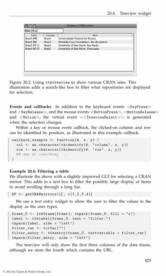
20.4. Treeview widget
Figure 20.2: Using ttktreeview to show various CRAN sites. Thisillustration adds a search-like box to filter what repositories are displayedfor selection.
Events and callbacks In addition to the keyboard events <KeyPress>and <KeyRelease>, and the mouse events <ButtonPress>, <ButtonRelease>and <Motion>, the virtual event <<TreeviewSelect>> is generatedwhen the selection changes.
Within a key or mouse event callback, the clicked-on column and rowcan be identified by position, as illustrated in this example callback.
callback_example <- function ( W , x , y ) {col <- as . character ( tkidentify ( W , "column" , x , y ) )row <- as . character ( tkidentify ( W , "row" , x , y ) )## now do someth ing . . .
}
Example 20.4: Filtering a tableWe illustrate the above with a slightly improved GUI for selecting a CRANmirror. This adds in a text box to filter the possibly large display of itemsto avoid scrolling through a long list.
DF <- getCRANmirrors ( ) [ , c ( 1 , 2 , 5 , 4 ) ]
We use a text entry widget to allow the user to filter the values in thedisplay as the user types.
frame_0 <- ttkframe ( frame ) ; tkpack ( frame_ 0 , fill = "x" )label <- ttklabel ( frame_ 0 , text = "filter:" )tkpack ( label , side = "left" )filter_var <- tclVar ( "" )filter_entry <- ttkentry ( frame_ 0 , textvariable = filter_var )tkpack ( filter_entry , side = "left" )
The treeview will only show the first three columns of the data frame,although we store the fourth which contains the URL.
425
© 2012 by Taylor & Francis Group, LLC
20. Tcl/Tk: Text, Tree, and Canvas Widgets
frame_1 <- ttkframe ( frame )tkpack ( frame_1 , expand = TRUE , fill = "both" )treeview <- ttktreeview ( frame_1 , columns = 1 : ncol ( DF ) ,
displaycolumns = 1 : ( ncol ( DF ) − 1 ) ,show = "headings" , # not " t r e e "selectmode = "browse" ) # s i n g l e s e l e c t i o n
addScrollbars ( frame_ 1 , treeview )
We configure the column widths and titles as follows:
widths <- c ( 1 0 0 , 75 , 400) # hard c o d e dnms <- names ( DF )for ( i in 1 : 3 ) {
tcl ( treeview , "heading" , i , text = nms [ i ] )tcl ( treeview , "column" , i , width = widths [ i ] ,
stretch = TRUE , anchor = "w" )}
The treeview widget does not do filtering internally.2 As such we willreplace all the values when filtering. This following helper function is usedto fill in the widget with values from a data frame.
fillTable <- function ( treeview , DF ) {children <- as . character ( tcl ( treeview , "children" , "" ) )for ( i in children )
tcl ( treeview , "delete" , i ) # out with o l dshade <- c ( "none" , "gray" )for ( i in seq_len ( nrow ( DF ) ) )
tcl ( treeview , "insert" , "" , "end" , tag = shade [ i %% 2 ] ,text = "" ,values = unlist ( DF [ i , ] ) ) # in with new
tktag . configure ( treeview , "gray" , background = "gray95" )}
The initial call populates the table from the entire data frame.
fillTable ( treeview , DF )
The filter works by grepping the user input against the host value.We bind to <KeyRelease> (and not <KeyPress>) so we capture the lastkeystroke.
cur_ind <- 1 : nrow ( DF )tkbind ( filter_entry , "<KeyRelease >" , function ( W , K ) {
val <- tclvalue ( tkget ( W ) )poss_vals <- apply ( DF , 1 , function ( . . . )
paste ( . . . , collapse = " " ) )ind<- grep ( val , poss_vals )
2The model-view-controller architecture of GTK+ and Qt, makes this task much easier, asit allows for an intermediate proxy model.
426
© 2012 by Taylor & Francis Group, LLC
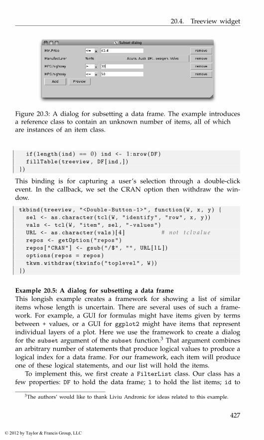
20.4. Treeview widget
Figure 20.3: A dialog for subsetting a data frame. The example introducesa reference class to contain an unknown number of items, all of whichare instances of an item class.
if ( length ( ind ) == 0) ind <- 1 : nrow ( DF )fillTable ( treeview , DF [ ind , ] )
} )
This binding is for capturing a user’s selection through a double-clickevent. In the callback, we set the CRAN option then withdraw the win-dow.
tkbind ( treeview , "<Double-Button -1>" , function ( W , x , y ) {sel <- as . character ( tcl ( W , "identify" , "row" , x , y ) )vals <- tcl ( W , "item" , sel , "-values" )URL <- as . character ( vals ) [ 4 ] # not t c l v a l u erepos <- getOption ( "repos" )repos [ "CRAN" ] <- gsub ( "/$" , "" , URL [1 L ] )options ( repos = repos )tkwm . withdraw ( tkwinfo ( "toplevel" , W ) )
} )
Example 20.5: A dialog for subsetting a data frameThis longish example creates a framework for showing a list of similaritems whose length is uncertain. There are several uses of such a frame-work. For example, a GUI for formulas might have items given by termsbetween + values, or a GUI for ggplot2 might have items that representindividual layers of a plot. Here we use the framework to create a dialogfor the subset argument of the subset function.3 That argument combinesan arbitrary number of statements that produce logical values to produce alogical index for a data frame. For our framework, each item will produceone of these logical statements, and our list will hold the items.
To implement this, we first create a FilterList class. Our class has afew properties: DF to hold the data frame; l to hold the list items; id to
3The authors’ would like to thank Liviu Andronic for ideas related to this example.
427
© 2012 by Taylor & Francis Group, LLC
20. Tcl/Tk: Text, Tree, and Canvas Widgets
hold an internal counter to reference the list items by; and frame to holda ttkframe instance, the parent container for each item.
setOldClass ( "tkwin" )setOldClass ( "tclVar" )FilterList <- setRefClass ( "FilterList" ,
fields = list (DF = "data.frame" ,l = "list" ,id = "ANY" ,frame = "tkwin") )
The main interface for a filter list is limited. For management, we definea method to add a list item and one to remove a list item. We also need amethod (get_value) for analyzing the items and producing a logical vectorwith which to subset the data frame. Beyond that we have methods to setup the GUI, a preview method to see the current subsetting, and a methodto select a variable from the data frame.
First, we define a method to set up our GUI. Here, into a parent con-tainer that is passed in, we pack in a frame (enc_frame) to hold the piecesof our GUI.4 These consist of a frame to hold the items and a frame tohold the buttons. We use the tkgrid layout manager, which allows us togrow the top frame as needed, yet have the buttons receive the additionalexpanding space.
FilterList$methods (setup_gui = function ( parent ) {
enc_frame <- ttkframe ( parent , padding = 5)tkpack ( enc_frame , expand = TRUE , fill = "both" )frame <<- ttkframe ( enc_frame )button_frame <- ttkframe ( enc_frame )## use g r i d t o manage t h e s etkgrid ( frame , sticky = "news" )tkgrid ( button_frame , sticky = "new" )tkgrid . rowconfigure ( enc_frame , 1 , weight = 1)tkgrid . columnconfigure ( enc_frame , 0 , weight = 1)##add_button <-
ttkbutton ( button_frame , text = "Add" ,command = function ( ) . self$add ( ) )
preview_button <-ttkbutton ( button_frame , text = "Preview" ,
command = function ( ) . self$preview ( ) )
4This means that tkpack needs to be used to manage any other children of this parent.An alternative would be to pass back the enclosing frame object so that it can be managedas the user desires.
428
© 2012 by Taylor & Francis Group, LLC
20.4. Treeview widget
##sapply ( list ( add_button , preview_button ) , tkpack ,
side = "left" , padx = 5)} )
The initialize method simply initializes our fields and then sets upthe GUI. As the point of this is to filter a data frame, the DF argument hasno default value and must be specified.
FilterList$methods (initialize = function ( DF , parent , . . . ) {initFields ( DF = DF , l = list ( ) , id = 0L )setup_gui ( parent )callSuper ( . . . )
} )
Before showing a filter, we force the user to select a variable by whichto filter. This selection involves choosing one from possibly many. A tableis an excellent choice for this, as it gracefully handles many values. Thisconvenience method provides a table selection widget in a modal dialogwindow. Selection happens when a user selects one of the rows of thetable.
FilterList$methods (select_variable = function ( ) {
"Return a variable name from the data frame"x <- sapply ( DF , function ( i ) class ( i ) [ 1 ] )m <- cbind ( Variables = names ( x ) , Type = x )window <- tktoplevel ( )fr <- ttkframe ( window , padding = c ( 3 , 3 , 3 , 1 2 ) )tkpack ( fr , expand = TRUE , fill = "both" )##a <- populate_rectangular_treeview ( fr , m )tkconfigure ( a$frame , width = 300 , height = 200)tkpack ( a$frame , expand = TRUE , fill = "both" )## s e l e c t a va lue , s t o r e in outout <- NAtkbind ( a$tr , "<<TreeviewSelect >>" , function ( W ) {
sel <- tcl ( W , "selection" )val <- tcl ( W , "item" , sel , "-values" )assign ( "out" , as . character ( val ) [ 1 ] ,
inherits = TRUE )tkdestroy ( window )
} )tkwait . window ( window )return ( out )
} )
Our main add method has a few tasks: to select a variable, to create anew filter item, to create a container, to do the internal bookkeeping, and
429
© 2012 by Taylor & Francis Group, LLC
20. Tcl/Tk: Text, Tree, and Canvas Widgets
finally to call the items make_gui method. The newFilterItem call is an S3generic used as a factory method to find the correct filter item referenceclass to produce an appropriate filter for the variable.
FilterList$methods (add = function ( variable_name , . . . ) {
if ( missing ( variable_name ) )variable_name <- select_variable ( )
x <- get ( variable_name , DF )## new i t e mid <<- id + 1item <- newFilterItem ( x , variable_name , id , . self )## make f rameenc_frame <- ttkframe ( frame )tkpack ( enc_frame ,
expand = TRUE , fill = "both" , pady = 2)l [ [ as . character ( id ) ] ] <<- list ( frame = enc_frame ,
item = item )item$make_gui ( enc_frame )
} )
To remove an object requires us to remove it from our internal list andfrom the GUI. We use tkpack to manage the items, so tkpack.forget isused to remove the item. In the add method we store the enclosing frameto make this task easy.
FilterList$methods (remove=function ( id_obj , . . . ) {
"Remove. id is character or item object"if ( !is . character ( id_obj ) )
id_obj <- id_obj$idtkpack . forget ( l [ [ id_obj ] ] $frame )l [ [ id_obj ] ] <<- NULL
} )
Here we query all the items and combine them to create a logical indexvector. The item interface described below will provide its own get_valuemethod, so this task is a matter of combining the results of each of thosecalls. We use all here, but if we wanted to extend this GUI, one areawould be to allow the user to specify “and” or “or” between each item.
FilterList$methods (get_value = function ( ) {
"Return logical value for all filter items"if ( length ( l ) == 0)
return ( rep ( TRUE , length=nrow ( DF ) ) )##out <- sapply ( l , function ( i ) i$item$get_value ( ) )out [ is . na ( out ) ] <- FALSE ## c o e r c e NA t o FALSE
430
© 2012 by Taylor & Francis Group, LLC
20.4. Treeview widget
apply ( out , 1 , all )} )
The get_value method makes it easy to provide a preview method toshow the current state of the subsetting. Basically, we just need to createa character matrix that we want to display and then use our previouslydefined populate_rectangular_treeview function.
FilterList$methods (preview = function ( ) {
"Preview data frame"ind <- get_value ( )if ( !any ( ind ) ) {
message ( "No matches" )return ( )
}## c o e r c e t o c h a r a c t e rm <- DF [ ind , ]for ( i in seq_along ( m ) )
m [ , i ] <- as . character ( m [ , i ] )##window <- tktoplevel ( )fr <- ttkframe ( window , padding = c ( 3 , 3 , 3 , 1 2 ) )tkpack ( fr , expand = TRUE , fill = "both" )a <- populate_rectangular_treeview ( fr , m )tkconfigure ( a$frame , width = 400 , height = 300)tkpack ( a$frame , expand = TRUE , fill = "both" )##button <- ttkbutton ( fr , text = "dismiss" ,
command=function ( ) tkdestroy ( window ) )tkpack ( button , anchor = "sw" )tkwait . window ( window )
} )
To use this new class, we would integrate it into a dialog. The basiccall needed would be something along the lines of the following:
window <- tktoplevel ( )require ( MASS )filter_list <- FilterList$new ( DF = Cars93 , parent = window )
But before that will work, we need to define the filter item classes.
Filter items As mentioned, we use an S3 generic to select the referenceclass to provide the appropriate filter item. These are still to be defined,but we show the default choice.
newFilterItem <- function ( x , nm = deparse ( substitute ( x ) ) , id ,list_ref ) UseMethod ( "newFilterItem" )
431
© 2012 by Taylor & Francis Group, LLC

20. Tcl/Tk: Text, Tree, and Canvas Widgets
newFilterItem . default <- function ( x , nm=deparse ( substitute ( x ) ) ,id , list_ref ) {
FilterItemNumeric$new ( x = x , nm = nm , id = id ,list_ref = list_ref )
}
A filter item needs to produce a logical vector used for indexing. At aminimum, we require a few properties: x to store the variable’s data thatwe are considering; nm to store the name of this variable; id to store theid of where this item is stored in the filter list; and list_ref to store areference to the filter list.
FilterItem <- setRefClass ( "FilterItem" ,fields = list (
x = "ANY" ,nm = "character" ,id = "character" ,list_ref = "ANY") )
The filter item interface is not complicated. The most important methodis get_value to return a logical variable. This was called by the filter list’ssimilarly named get_value method. As well, we call the item’s make_guimethod in the filter list. The last method is simply a remove method thatcalls back up into the remove method of the item’s parent filter list.
FilterItem$methods (initialize = function ( . . . ) {
initFields ( . . . ). self
} ,get_value = function ( ) {
"Return logical value of length x"stop ( "Must be subclassed" )
} ,remove = function ( ) list_ref$remove ( . self ) ,make_gui = function ( parent , . . . ) {
"Set up GUI, including defining widgets"remove_button <- ttkbutton ( parent , text="remove" ,
command = function ( ) {. self$remove ( )
} )tkpack ( remove_button , side = "right" )
} )
The interesting things happen in the subclasses. For numeric values weadd two new properties to help with our get_value method: one to storean inequality operator and one to store an expression the user can enter.
FilterItemNumeric <- setRefClass ( "FilterItemNumeric" ,
432
© 2012 by Taylor & Francis Group, LLC
20.4. Treeview widget
contains = "FilterItem" ,fields = list (
ineq_variable = "tclVar" ,value_variable = "tclVar") )
With these two properties, our get_value method becomes a matter ofpasting together an expression then evaluating it. We evaluate this withinthe data frame so that value_variable could use variable names from thedata framed.
FilterItemNumeric$methods (get_value = function ( ) {
xpr <- paste ( nm , tclvalue ( ineq_variable ) ,tclvalue ( value_variable ) )
eval ( parse ( text = xpr ) ,envir = list_ref$DF , parent . frame ( ) )
} )
Our GUI has three widgets: a label, a combo box for the inequality, andan entry widget to put in values. We could simplify this, say with a sliderto slide through the possible values, but using an entry widget gives moreflexibility in the specification. We see that we simply pack these widgetsinto the parent that is passed in to the method call.
FilterItemNumeric$methods (make_gui = function ( parent ) {
## s t a n d a r d width f o r l a b e llabel_width <- max ( sapply ( names ( list_ref$DF ) , nchar ) )label <- ttklabel ( parent , text=nm , width=label_width )## i n e q combovals <- c ( ">=" , ">" , "==" , "!=" , "<" , "<=" )ineq_variable <<- tclVar ( "<=" )ineq <- ttkcombobox ( parent , values = vals ,
textvariable = ineq_variable , width = 4)## e n t r yvalue_variable <<- tclVar ( max ( x , na . rm = TRUE ) )val <- ttkentry ( parent , textvariable = value_variable )##sapply ( list ( label , ineq , val ) , tkpack , side = "left" ,
padx = 5)callSuper ( parent )
} )
The character selection class, also used with factors, is more involved.Our get_value method is basically x %in% cur_vals, where cur_vals isa selection from all possible values. We might want to use a group ofcheckboxes here, but that can get unwieldy when there are more than a
433
© 2012 by Taylor & Francis Group, LLC
20. Tcl/Tk: Text, Tree, and Canvas Widgets
handful of choices.5 We opt instead for a table-selection widget. That cantake up vertical screen space. To avoid this we use a button that showsthe currently selected values, and that can be clicked to open a dialog toadjust these values. To keep a consistent horizontal size to these buttonswe “ellipsize” the button’s text in the ellipsize method. Some graphicaltoolkits, but not Tk, have built-in “ellipsize” methods that prove usefulwhen controlling space allocations when translations are involved, as thesecan vary widely in the number of characters needed to display.
For our new subclass, we have four additional properties, the tree viewfor selection, the button, and vectors to store the possible values and thecurrently selected values.
FilterItemCharacter <-setRefClass ( "FilterItemCharacter" ,
contains = "FilterItem" ,fields = list (
tr = "tkwin" ,button = "tkwin" ,poss_vals = "character" ,cur_vals = "character") )
As mentioned, our get_value method is easy to define:
FilterItemCharacter$methods (get_value = function ( ) {
x %in% cur_vals} )
The main work is in our select_values_dialog, defined below. Weuse the following helper function to preselect the currently selected valueswhen the dialog is opened.
sel_by_name <- function ( tr , nms ) {all_ind <- as . character ( tcl ( tr , "children" , "" ) )vals <- sapply ( all_ind , function ( i ) {
as . character ( tcl ( tr , "item" , i , "-values" ) )} )ind <- names ( vals [ vals %in% nms ] )sapply ( ind , function ( i ) tcl ( tr , "selection" , "add" , i ) )sapply ( setdiff ( all_ind , ind ) ,
function ( i ) tcl ( tr , "selection" , "remove" , i ) )}
Here is our previously mentioned convenience method to make thebutton size uniform by “ellipsizing” the button’s label.
5A table of checkboxes might also be used, but this isn’t directly supported by thetreeview widget of tcltk. The intrepid could set the image attribute for each row to show acheck or non-check depending on the state.
434
© 2012 by Taylor & Francis Group, LLC

20.4. Treeview widget
FilterItemCharacter$methods ( ellipsize = function ( ) {tmp <- paste ( cur_vals , collapse = ", " )if ( ( N <- nchar ( tmp ) ) > 50)
tmp <- sprintf ( "%s...%s" , substr ( tmp , 0 , 1 5 ) ,substr ( tmp , N−12, N ) )
sprintf ( "%50s" , tmp )} )
This is the main dialog for selecting values. Here multiple selection isachieved by extending the selection through holding the shift and controlkeys while clicking on items.
FilterItemCharacter$methods (select_values_dialog = function ( ) {
window <- tktoplevel ( )fr <- ttkframe ( window , padding = c ( 3 , 3 , 1 2 , 1 2 ) )tkpack ( fr , expand = TRUE , fill = "both" )tkpack ( ttklabel ( fr ,
text = "Select values by extending selection" ) )## s e l e c t i o nm <- matrix ( poss_vals )colnames ( m ) <- "Values"a <- populate_rectangular_treeview ( fr , m )tkconfigure ( a$tr , selectmode = "extended" )tkconfigure ( a$frame , width = 200 , height = 300)tkpack ( a$frame , expand = TRUE , fill = "both" )
sel_by_name ( a$tr , cur_vals ) # s e e a b o v e
tkbind ( a$tr , "<<TreeviewSelect >>" , function ( ) {ind <- as . character ( tcl ( a$tr , "selection" ) )cur <- sapply ( ind , function ( i ) {
as . character ( tcl ( a$tr , "item" , i , "-values" ) )} )if ( length ( cur ) == 0)
cur <- character ( 0 )cur_vals <<- cur
} )## b u t t o n sframe_1 <- ttkframe ( fr )tkpack ( frame_ 1)toggle_button <- ttkbutton ( frame_1 , text="toggle" ,
command=function ( ) toggle_sel ( a$tr ) )set_button <- ttkbutton ( frame_ 1 , text = "set" ,
command=function ( ) tkdestroy ( window ) )sapply ( list ( toggle_button , set_button ) , tkpack ,
side = "left" , padx = 5)## make modal
435
© 2012 by Taylor & Francis Group, LLC
20. Tcl/Tk: Text, Tree, and Canvas Widgets
tkwait . window ( window )tkconfigure ( button , text = ellipsize ( ) )
} )
Our main GUI for a character or factor item then has three widgets:labels for the name and %in% operator and a button.
FilterItemCharacter$methods ( make_gui = function ( parent ) {poss_vals <<- sort ( unique ( as . character ( x ) ) )cur_vals <<- poss_vals## l a b e l , ineq , v a ll_width <- max ( sapply ( names ( list_ref$DF ) , nchar ) )label <- ttklabel ( parent , text = nm ,
width = l_width )##in_label <- ttklabel ( parent , text = "%in%" )##button <<- ttkbutton ( parent , text = ellipsize ( ) ,
command = . self$select_values_dialog )##sapply ( list ( label , in_label ) , tkpack ,
side = "left" , padx = 5)tkpack ( button ,
expand = TRUE , fill = "x" , side = "left" )callSuper ( parent )
} )
We leave it as an exercise for the reader to add a subclass for logicalvariables or date variables.
Editable tables of data
There is no native widget for editing the cells of tabular data, as isprovided by the edit method for data frames. The tktable widget(http://tktable.sourceforge.net/) provides such an add-on to the baseTk. We don’t illustrate its usage here, as we keep to the core set of func-tions provided by Tk. An interface for this Tcl package is provided in thetcltk2 package (tk2edit). The gdf function of gWidgetstcltk is based onthis.
Hierarchical data
Specifying tree-like or hierarchical data is nearly identical to specifyingrectangular data for the ttktreeview widget. The widget provides column#0 to display this extra structure. If an item, except the root, has children,a trigger icon to expand the tree is shown. This is in addition to any textand/or an icon that is specified. Children are displayed in an indented
436
© 2012 by Taylor & Francis Group, LLC
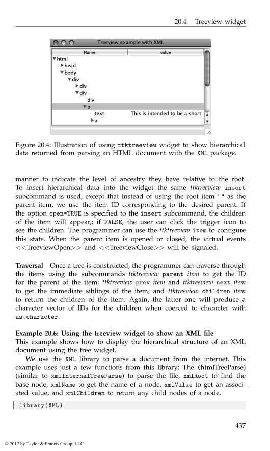
20.4. Treeview widget
Figure 20.4: Illustration of using ttktreeview widget to show hierarchicaldata returned from parsing an HTML document with the XML package.
manner to indicate the level of ancestry they have relative to the root.To insert hierarchical data into the widget the same ttktreeview insertsubcommand is used, except that instead of using the root item "" as theparent item, we use the item ID corresponding to the desired parent. Ifthe option open=TRUE is specified to the insert subcommand, the childrenof the item will appear,; if FALSE, the user can click the trigger icon tosee the children. The programmer can use the ttktreeview item to configurethis state. When the parent item is opened or closed, the virtual events<<TreeviewOpen>> and <<TreeviewClose>> will be signaled.
Traversal Once a tree is constructed, the programmer can traverse throughthe items using the subcommands ttktreeview parent item to get the IDfor the parent of the item; ttktreeview prev item and ttktreeview next itemto get the immediate siblings of the item; and ttktreeview children itemto return the children of the item. Again, the latter one will produce acharacter vector of IDs for the children when coerced to character withas.character.
Example 20.6: Using the treeview widget to show an XML fileThis example shows how to display the hierarchical structure of an XMLdocument using the tree widget.
We use the XML library to parse a document from the internet. Thisexample uses just a few functions from this library: The (htmlTreeParse)(similar to xmlInternalTreeParse) to parse the file, xmlRoot to find thebase node, xmlName to get the name of a node, xmlValue to get an associ-ated value, and xmlChildren to return any child nodes of a node.
library ( XML )
437
© 2012 by Taylor & Francis Group, LLC
20. Tcl/Tk: Text, Tree, and Canvas Widgets
file_name <- "http://www.omegahat.org/RSXML/shortIntro.html"doc <- htmlTreeParse ( file_name , useInternalNodes = TRUE ,
error = function ( . . . ) { } )root <- xmlRoot ( doc )
Our GUI is primitive, with just a treeview instance added.
treeview <- ttktreeview ( frame , displaycolumns = "#all" ,columns = 1)
addScrollbars ( frame , treeview )
We configure our column headers and set a minimum width below.Recall that the tree column is designated "#0".
tcl ( treeview , "heading" , "#0" , text = "Name" )tcl ( treeview , "column" , "#0" , minwidth = 20)tcl ( treeview , "heading" , 1 , text = "value" )tcl ( treeview , "column" , 1 , minwidth = 20)
To map the tree-like structure of the XML document into the widget, wedefine the following function to add to the treeview instance recursively.We add to the value column (through the values option) only when thenode does not have children. We use do.call, as a convenience, to avoidconstructing two different calls to the insert subcommand.
insertChild <- function ( treeview , node , parent = "" ) {l <- list ( treeview , "insert" , parent , "end" ,
text = xmlName ( node ) )children <- xmlChildren ( node )if ( length ( children ) == 0) { # add in v a l u e s
values <- paste ( xmlValue ( node ) , sep = " " , collapse = " " )l$values <- as . tclObj ( values ) # a v o i d s p l i t on s p a c e s
}tree_path <- do . call ( "tcl" , l )
if ( length ( children ) ) # r e c u r s efor ( i in children ) insertChild ( treeview , i , tree_path )
}insertChild ( treeview , root )
At this point, the GUI will allow us to explore the markup structure of theXML file. We continue this example to show two things of general interest,but that are really artificial for this example.
Drag and drop First, we show how we might introduce drag and dropto rearrange the rows. We begin by defining two global variables that storethe row that is being dragged and a flag to indicate whether a drag eventis ongoing.
. selected_id <- "" # g l o b a l s
. dragging <- FALSE
438
© 2012 by Taylor & Francis Group, LLC

20.4. Treeview widget
We provide callbacks for three events: a mouse click, mouse motion, andmouse release. This first callback sets the selected row on a mouse click.
tkbind ( treeview , "<Button-1>" , function ( W , x , y ) {. selected_id <<- as . character ( tcl ( W , "identify" ,"row" , x , y ) )
} )
The motion callback configures the cursor to indicate a drag event andsets the dragging flag. We might also put in code to highlight any dropareas.
tkbind ( treeview , "<B1-Motion>" , function ( W , x , y , X , Y ) {tkconfigure ( W , cursor = "diamond_cross" ). dragging <<-TRUE
} )
When the mouse button is released we check that the widget we areover is indeed the tree widget. If so, we then move the rows. We can’tmove a parent to be a child of its own children, so we wrap the ttktreeviewmove subcommand within try. The move command places the new valueas the first child of the item it is being dropped on. If a different action isdesired, the "0" below would need to be modified.
tkbind ( treeview , "<ButtonRelease -1>" , function ( W , x , y , X , Y ) {if ( . dragging && . selected_id != "" ) {
w <- tkwinfo ( "containing" , X , Y )if ( as . character ( w ) == as . character ( W ) ) {
dropID <- as . character ( tcl ( W , "identify" ,"row" , x , y ) )try ( tkmove ( W , . selected_id , dropID , "0" ) , silent = TRUE )
}}. dragging <<- FALSE ; . selected_id <<- "" # r e s e t
} )
Walking the tree Our last item of general interest is a function that showsone way to walk the structure of the treeview widget to generate a listrepresenting the structure of the data. A potential use of this might beto allow a user to rearrange an XML document through drag and drop.The subcommand ttktreeview children proves useful here, as it is used toidentify the hierarchical structure. When there are children a recursive callis made.
tree_to_list <- function ( treeview ) {l <- list ( )walk_tree <- function ( child , l ) {
l$name <- tclvalue ( tcl ( treeview , "item" , child , "-text" ) )l$value <- as . character ( tcl ( treeview , "item" , child ,
"-values" ) )
439
© 2012 by Taylor & Francis Group, LLC
20. Tcl/Tk: Text, Tree, and Canvas Widgets
children <- as . character ( tcl ( treeview , "children" , child ) )if ( length ( children ) ) {
l$children <- list ( )for ( i in children )
l$children [ [ i ] ] <- walk_tree ( i , list ( ) ) # r e c u r s e}return ( l )
}walk_tree ( "" , l )
}
20.5 Canvas widget
The canvas widget provides an area to display lines, shapes, images, andwidgets. The canvas widget is quite complicated, and we content ourselvesto describing a subset of its possibilities. For an excellent example of howit can be used to provide a useful GUI for R see the RnavGraph packageby Waddell and Oldford.
As described on its manual page, the canvas widget implements struc-tured graphics, displaying any number of items or objects of various types.Methods exist to create, move, and delete these objects, allowing the canvaswidget to be the basis for creating interactive GUIs. The constructor tkcan-vas for the widget, being a non-themeable widget, has many arguments,including these standard ones: width, height, background, xscrollcom-mand, and yscrollcommand.
The create command The subcommand tkcanvas create type [options] isused to add new items to the canvas. The options vary with the type ofitem. The basic shape types that we can add are "line", "arc", "polygon","rectangle", and "oval". Their options specify the size using x and ycoordinates. Other options allow us to specify colors, etc. The complete listis covered in the canvas manual page, which we refer the reader to, as thedescription is lengthy. In the examples, we show how to use the "line"type to display a graph and how to use the "oval" type to add a point toa canvas. Additionally, we can add text items through the "text" type. Thefirst options are the x and y coordinates, and the text option specifies thetext. Other standard text options are possible (e.g., font, justify, anchor).
The type can also be an image object or a widget (a window ob-ject). Images are added by specifying an x and y position, possibly ananchor position, a value for the "image" option, and, optionally, for state-dependent display, specifying "activeimage" and "disabledimage" values.The "state" option is used to specify the current state. Window objectsare added similarly in terms of their positioning, along with options for
440
© 2012 by Taylor & Francis Group, LLC

20.5. Canvas widget
"width" and "height". The window itself is added through the "window"option. An example shows how to add a frame widget.
Items and tags The tkcanvas.create function returns an item ID. Thiscan be used to refer to the item at a later stage. Optionally, tags can be usedto group items into common groups. The "tags" option can be used withtkcreate when the item is created, or the tkcanvas addtag subcommand canbe used. The call tkaddtag(canvas, tagName, "withtag", item) wouldadd the tag “tagName”to the item returned by tkcreate. (The "withtag"is one of several search specifications.) As well, if we are adding a tagthrough a mouse click, the call tkaddtag(W, tagName, "closest", x, y)could be used with W, x and y coming from percent substitutions. Tags canbe deleted through the tkcanvas dtag tag subcommand.
There are several subcommands that can be called on items as speci-fied by a tag or item ID. For example, the tkcanvas itemcget and tkcanvasitemconfigure subcommands allow us to get and set options for a givenitem. The tkcanvas delete tag_or_ID subcommand can be used to delete anitem. Items can be moved and scaled but not rotated. The tkcanvas movetag_or_ID x y subcommand implements incremental moves (where x and yspecify the horizontal and vertical shift in pixels). The subcommand tkcan-vas coords tag_or_ID [coordinates] allows us to respecify the coordinates forthe item. The tkcanvas scale command is used to rescale items. Except forwindow objects, an item can be raised to be on top of the others throughthe tkcanvas raise item_or_ID subcommand.
Bindings As usual, bindings can be specified overall for the canvasthrough tkbind. However, bindings can also be set on specific itemsthrough the subcommand tkcanvas bind tag_or_ID event function (or withtkitembind). This allows bindings to be placed on items sharing a tagname, without having the binding on all items. Only mouse, keyboard, orvirtual events can have such bindings.
Example 20.7: Using a canvas to make a scrollable frameThis example6 shows how to use a canvas widget to create a box containerthat scrolls when more items are added than will fit in the display area.The basic idea is that a frame is added to the canvas equipped with scrollbars using the tkcanvas create window subcommand.
There are two bindings to the <Configure> event. The first updatesthe scroll region of the canvas widget to include the entire canvas, whichgrows as items are added to the frame. The second binding ensures the
6This example is modified from an example found at http://mail.python.org/pipermail/python-list/1999-June/005180.html
441
© 2012 by Taylor & Francis Group, LLC
20. Tcl/Tk: Text, Tree, and Canvas Widgets
child window is the appropriate width when the canvas widget resizes.The height is not adjusted, as this is controlled by the scrolling.
scrollable_frame <- function ( parent , width=300 , height=300) {canvas_widget <-
tkcanvas ( parent ,borderwidth = 0 , highlightthickness = 0 ,width = width , height = height )
addScrollbars ( parent , canvas_widget )#frame <- ttkframe ( canvas_widget , padding = c ( 0 , 0 , 0 , 0 ) )frame_id <- tkcreate ( canvas_widget , "window" , 0 , 0 ,
anchor = "nw" , window = frame )tkitemconfigure ( canvas_widget , frame_id , width = width )## u pd a t e s c r o l l r e g i o ntkbind ( frame , "<Configure >" , function ( ) {
bbox <- tcl ( canvas_widget , "bbox" , "all" )tcl ( canvas_widget , "config" , scrollregion = bbox )
} )## a d j u s t "window" width when canvas i s r e s i z e d .tkbind ( canvas_widget , "<Configure >" , function ( W ) {
width <- as . numeric ( tkwinfo ( "width" , W ) )frame_width <- as . numeric ( tkwinfo ( "width" , frame ) )if ( frame_width < width )
tkitemconfigure ( canvas_widget , frame_id , width = width )} )return ( frame )
}
To use this, we create a simple GUI as follows:
window <- tktoplevel ( )tkwm . title ( window , "Scrollable frame example" )frame <- ttkframe ( window )tkpack ( frame , expand = TRUE , fill = "both" )scroll_frame <- scrollable_frame ( frame , 300 , 300)
To display a collection of available fonts requires a widget or containerthat could possibly show hundreds of similar values. The scrollable frameserves this purpose well (cf. Figure 17.3). The following shows how a labelcan be added to the frame whose font is the same as the label text. Theavailable fonts are returned by tkfont.families.
font_families <- as . character ( tkfont . families ( ) )## s k i p odd named one sfont_families <- font_families [ grepl ( "^[[:alpha:]]" ,
font_families ) ]for ( i in seq_along ( font_families ) ) {
font_name <- sprintf ( "::font::-%s" , i )
442
© 2012 by Taylor & Francis Group, LLC
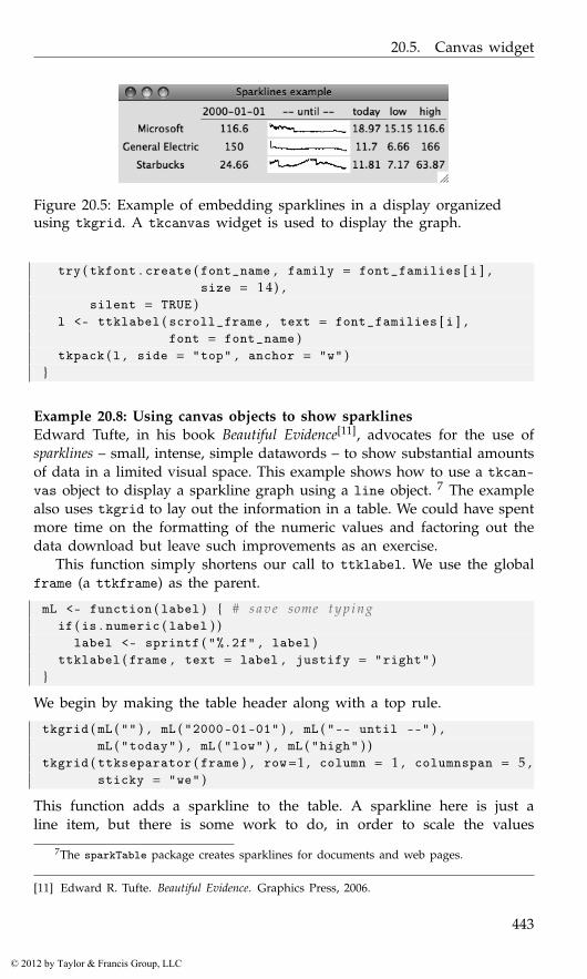
20.5. Canvas widget
Figure 20.5: Example of embedding sparklines in a display organizedusing tkgrid. A tkcanvas widget is used to display the graph.
try ( tkfont . create ( font_name , family = font_families [ i ] ,size = 1 4 ) ,
silent = TRUE )l <- ttklabel ( scroll_frame , text = font_families [ i ] ,
font = font_name )tkpack ( l , side = "top" , anchor = "w" )
}
Example 20.8: Using canvas objects to show sparklinesEdward Tufte, in his book Beautiful Evidence[11], advocates for the use ofsparklines – small, intense, simple datawords – to show substantial amountsof data in a limited visual space. This example shows how to use a tkcan-vas object to display a sparkline graph using a line object. 7 The examplealso uses tkgrid to lay out the information in a table. We could have spentmore time on the formatting of the numeric values and factoring out thedata download but leave such improvements as an exercise.
This function simply shortens our call to ttklabel. We use the globalframe (a ttkframe) as the parent.
mL <- function ( label ) { # s a v e some t y p i n gif ( is . numeric ( label ) )
label <- sprintf ( "%.2f" , label )ttklabel ( frame , text = label , justify = "right" )
}
We begin by making the table header along with a top rule.
tkgrid ( mL ( "" ) , mL ( "2000-01-01" ) , mL ( "-- until --" ) ,mL ( "today" ) , mL ( "low" ) , mL ( "high" ) )
tkgrid ( ttkseparator ( frame ) , row=1 , column = 1 , columnspan = 5 ,sticky = "we" )
This function adds a sparkline to the table. A sparkline here is just aline item, but there is some work to do, in order to scale the values
7The sparkTable package creates sparklines for documents and web pages.
[11] Edward R. Tufte. Beautiful Evidence. Graphics Press, 2006.
443
© 2012 by Taylor & Francis Group, LLC
20. Tcl/Tk: Text, Tree, and Canvas Widgets
to fit the allocated space. This example uses stock market values, as wecan conveniently employ the get.hist.quote function from the tseriespackage to get interesting data.
add_sparkline <- function ( label , symbol = "MSFT" ) {width <- 1 0 0 ; height = 15 # f i x width , h e i g h ty <- get . hist . quote ( instrument=symbol , start = "2000-01-01" ,
quote = "C" , provider = "yahoo" ,retclass = "zoo" ) $Close
min <- min ( y ) ; max <- max ( y )##start <- y [ 1 ] ; end <- tail ( y , n = 1)rng <- range ( y )##spark_line_canvas <- tkcanvas ( frame ,
width=width , height = height )x <- 0 : ( length ( y )−1) * width/length ( y )if ( diff ( rng ) != 0) {
y1 <- ( y − rng [ 1 ] ) /diff ( rng ) * heighty1 <- height − y1 # a d j u s t t o canvas c o o r d i n a t e s
} else {y1 <- height/2 + 0 * y
}## make l i n e with : pathName c r e a t e l i n e x1 y1 . . . xn ynl <- list ( spark_line_canvas , "create" ,"line" )sapply ( seq_along ( x ) , function ( i ) {
l [ [ 2 *i + 2 ] ] <<- x [ i ]l [ [ 2 *i + 3 ] ] <<- y1 [ i ]
} )do . call ( "tcl" , l )
tkgrid ( mL ( label ) , mL ( start ) , spark_line_canvas ,mL ( end ) , mL ( min ) , mL ( max ) , pady = 2 , sticky = "e" )
}
We can then add some rows to the table as follows:
add_sparkline ( "Microsoft" , "MSFT" )add_sparkline ( "General Electric" , "GE" )add_sparkline ( "Starbucks" , "SBUX" )
Example 20.9: Capturing mouse movementsThis example is a stripped-down version of the tkcanvas.R demo thataccompanies the tcltk package. That example shows a scatterplot withregression line. The user can move the points around and see the effectthis has on the scatterplot. Here we focus on the moving of an object on acanvas widget. We assume we have such a widget in the variable canvas.
444
© 2012 by Taylor & Francis Group, LLC
20.5. Canvas widget
This following adds a single point to the canvas using an oval object.We add the "point" tag to this item, for later use. Clearly, this code couldbe modified to add more points.
x <- 2 0 0 ; y <- 1 5 0 ; r <- 6item <- tkcreate ( canvas , "oval" , x − r , y − r , x + r , y + r ,
width = 1 , outline = "black" ,fill = "blue" )
tkaddtag ( canvas , "point" , "withtag" , item )
In order to indicate to the user that a point is active, in some sense, thefollowing changes the fill color of the point when the mouse hovers over.We add this binding using tkitembind so that is will apply to all pointitems and only the point items.
tkitembind ( canvas , "point" , "<Any-Enter>" , function ( )tkitemconfigure ( canvas , "current" , fill = "red" ) )
tkitembind ( canvas , "point" , "<Any-Leave>" , function ( )tkitemconfigure ( canvas , "current" , fill = "blue" ) )
There are two key bindings needed for movement of an object. First,we tag the point item that gets selected when a mouse clicks on a pointand update the last position of the currently selected point.
last_pos <- numeric ( 2 ) # g l o b a l t o t r a c k p o s i t i o ntag_selected <- function ( W , x , y ) {
tkaddtag ( W , "selected" , "withtag" , "current" )tkitemraise ( W , "current" )last_pos <<- as . numeric ( c ( x , y ) )
}tkitembind ( canvas , "point" , "<Button-1>" , tag_selected )
When the mouse moves, we use tkmove to have the currently selectedpoint move too. As tkmove is parameterized by differences, we track thedifferences between the last position recorded and the current position.
move_selected <- function ( W , x , y ) {pos <- as . numeric ( c ( x , y ) )tkmove ( W , "selected" , pos [ 1 ] − last_pos [ 1 ] ,
pos [ 2 ] − last_pos [ 2 ] )last_pos <<- pos
}tkbind ( canvas , "<B1-Motion>" , move_selected )
A further binding, for the <ButtonRelease-1> event, would be added todo something after the point is released. In the original example, the oldregression line is deleted, and a new one drawn. Here we simply deletethe "selected" tag.
tkbind ( canvas , "<ButtonRelease -1>" ,function ( W ) tkdtag ( W , "selected" ) )
445
© 2012 by Taylor & Francis Group, LLC
Concept index
GUI conceptsclipboard, 200, 413data-frame model, 165, 293dialogs, 5, 263drag-and-drop, 99, 162, 288,
365event handlers, 1, 30, 235, 360,
361event loop, 113hardware events, 236keyboard shortcuts, 337keystroke events, 57, 132modal dialog, 2, 32, 124, 265,
389properties, 234selection, 300signals, 1, 235, 361stock icons, 54, 138, 264text markup, 141text selection, 330top-level window, 5, 39, 115,
369validation, 3, 57, 144, 282, 398widget hierarchy, 19, 28, 117,
357GUI layout
alignment, 375box layout, 21, 42, 119, 254,
373grid layout, 22, 46, 133, 255,
380resizing, 3, 21
space allocation, 43, 118, 252,375, 380
spacing, 255, 374spring, 378springs, 21, 44, 140, 255stretch, 254struts, 44, 160, 255top-level window size, 115
Programming conceptsclass structure, 35, 104, 232,
349command pattern, 218encapsulation, 109, 218enumeration, 112, 237evaluating strings, 57, 60, 98,
202, 417, 433event handlers, 363garbage collection, 118, 295interface, 105, 293iteration, 60iterator, 169, 320method dispatch, 35, 108model-view-controller, 165, 293observer pattern, 77overloading, 233properties, 109R’s object-oriented notation,
108, 229references, 107, 169reflection, 105, 232, 373subclass, 221, 237
447
© 2012 by Taylor & Francis Group, LLC
Concept index
task callback, 242, 408template pattern, 80timers, 243, 364variable scope, 3, 107, 231window-manager events, 363
448
© 2012 by Taylor & Francis Group, LLC
Class and method index
addanchor, 47label, 48
add3rdMousePopupmenu, 89
container, 19
enumeration, 112event handler, 2
gaction, 52, 86action, 86enabled<-, 86handler, 86icon, 86key.accel, 86label, 86parent, 86svalue<-, 86tooltip, 86
galert, 34gbasicdialog, 34, 41dispose, 41do.buttons, 41title, 41
gbutton, 51, 52action, 51, 86addHandlerClicked, 51handler, 51svalue<-, 52svalue, 52text, 51
gcalendar, 52, 68
coerce.with, 69format, 69svalue, 69text, 69
gcheckbox, 52[<-, 62[, 62checked, 61svalue<-, 62svalue, 62text, 61use.togglebutton, 61
gcheckboxgroup, 52, 63[<-, 64[, 64checked, 63horizontal, 63items, 63length, 64svalue<-, 63svalue, 63
gClass.private, 223.protected, 223.public, 223
gcombobox, 52, 64[<-, 65[, 65addHandlerClicked, 65addHandlerKeystroke, 65coerce.with, 64editable, 64
449
© 2012 by Taylor & Francis Group, LLC

Class and method index
items, 64length, 65svalue<-, 65svalue, 65
gcommandline, 91, 100svalue<-, 100
gconfirm, 34, 35gdf, 52, 91, 96[<-, 97[, 97addHandlerChanged, 97addHandlerClicked, 97addHandlerColumnClicked, 97addHandlerColumnDoubleclick,
97addHandlerColumnRightclick,
97addHandlerDoubleclick, 97dimnames<-, 97dimnames, 97items, 96length, 97names<-, 97names, 97svalue<-, 97svalue, 97
gdfedit, 70, 96gdfnotebook, 91, 97gdroplist, 64gedit, 52, 56, 57[<-, 57addHandlerKeystroke, 57coerce.with, 56initial.msg, 56svalue<-, 56svalue, 56text, 56visible, 57width, 56
gexpandgroup, 41visible<-, 46
gfile, 34, 68filter, 68
gfilebrowse, 52, 68gformlayout, 91gframe, 41, 45names<-, 45pos, 45text, 45
ggenericwidget, 91ggraphics, 52, 91, 94addHandlerChanged, 91, 96addHandlerClicked, 91dpi, 91height, 91ps, 91visible<-, 91width, 91
ggraphicsnotebook, 91ggroup, 41, 42addSpace, 44addSpring, 44, 94add, 43, 44delete, 44horizontal, 42size<-, 45spacing, 44svalue, 44use.scrollwindow, 45
ghelp, 99add, 99dispose, 100
ghelpbrowser, 100ghtml, 52, 53gimage, 52, 54, 56dirname, 54filename, 54size, 54svalue<-, 54
ginput, 34, 35glabel, 52, 53editable, 53font<-, 53markup, 53svalue<-, 53svalue, 53
450
© 2012 by Taylor & Francis Group, LLC
Class and method index
text, 53glayout, 41, 46, 59homogeneous, 47spacing, 47
gmenuaction, 89add, 88menulist, 89svalue<-, 88svalue, 88
gmenubar, 52gmessage, 34icon, 34message, 34parent, 34title, 34
gnotebook, 41, 48add, 48closebuttons, 48dispose, 48dontCloseThese, 48length, 49names, 49svalue<-, 48svalue, 48tab.pos, 48
GObject[[, 118$, 108getChildren, 118getPropInfo, 109get, 109set, 109
gpanedgroup, 41, 47horizontal, 47svalue<-, 48
gParamSpecs.type, 223type, 223
gradio, 52, 62, 64[<-, 63horizontal, 62items, 62
selected, 62svalue<-, 63svalue, 63
gseparator, 46, 52gSignalConnectafter, 111data, 111f, 110obj, 110signal, 110user.data.first, 111
gslider, 52, 67, 68[<-, 67by, 67from, 67horizontal, 67svalue, 67to, 67value, 67
gspinbutton, 52, 68digits, 68
gstatusbar, 52, 53svalue<-, 54text, 54
gsvg, 52, 56gtable, 52, 63, 70, 94[<-, 71[, 71add3rdMousePopupMenu, 72addHandlerClick, 72addHandlerDoubleclick, 72addHandlerRightclick, 72chosencol, 71dim, 72filter.FUN, 74, 76filter.column, 74filter.labels, 75font.attr, 58icon.FUN, 71items, 71length, 72multiple, 71names<-, 72
451
© 2012 by Taylor & Francis Group, LLC
Class and method index
names, 72svalue, 71visible<-, 75, 94
gtext, 52, 56, 58addHandlerKeystroke, 59dispose, 58font<-, 58insert, 58svalue<-, 58svalue, 58text, 58
GTK enumerationsGdkDragAction, 163GtkAssistantPageType, 151GtkPositionType, 129, 149GtkResponseType, 125GtkToolbarStyle, 211GtkWindowPosition, 117GtkWindowType, 112
gtkAction, 205label, 205name, 205stock.id, 205tooltip, 205
GtkActivatablesetRelatedAction, 206
GtkAssistantappendPage, 151insertPage, 151prependPage, 151setForwardPageFunc, 153setPageComplete, 151setPageType, 151
GtkBoxpackEnd, 120, 139packStart, 120–122, 134reorderChild, 123
gtkBoxPackStartexpand, 121, 122, 134, 254fill, 120–122, 134homogeneous, 121, 122padding, 122
GtkBuilder
connectSignals, 114getObject, 114
gtkButton, 137, 138, 143label, 138stock.id, 138
gtkButtonNewWithMnemonic,138
gtkCellRendererToggle, 184gtkColorButton, 212GtkComboBoxactive, 147getActiveIter, 190getActiveText, 147getActive, 190getModel, 190setActiveIter, 190setActive, 190setModel, 190setWrapWidth, 148
gtkComboBox, 190gtkComboBoxEntry, 191gtkComboBoxNewText, 147GtkContaineradd, 116, 210getChildren, 118remove, 208
GtkDialogrun, 124, 126
gtkDialog, 125gtkDialogNewWithButtons, 125gtkDragDestSetflags, 164
gtkDragSourceSetactions, 163start.button.mask, 163
GtkEditabledeleteText, 144insertText, 144
GtkEntrygetText, 143setCompletion, 193setMaxLength, 144setText, 143
452
© 2012 by Taylor & Francis Group, LLC
Class and method index
gtkEntrymax, 144
GtkEntryCompletionsetMatchFunc, 193setModel, 193
gtkEntryCompletion, 193GtkExpandergetExpanded, 128setExpanded, 128
GtkFileChoosergetFilenames, 127getFilename, 127setFilename, 127setFolder, 127
gtkFileFilter, 127GtkFramesetLabelAlign, 128
gtkFrame, 128gtkHBoxhomogeneous, 120spacing, 122
gtkHPaned, 132gtkHScale, 149, 150GtkImagesetFromFile, 142
gtkImage, 142, 143size, 106stock, 106
GtkLabelgetLabel, 140getText, 140setEllipsize, 141setLabel, 140setLineWrap, 141setMarkup, 141setMnemonicWidget, 141setText, 140setWidthChars, 141
gtkLabel, 140GtkListStoregetValue, 189
GtkMenuShellappend, 208
insert, 208prepend, 208
gtkMessageDialog, 124buttons, 124flags, 124type, 124
GtkNotebookinsertPageWithCloseButton,
130nextPage, 129pageNum, 129page, 129prevPage, 129removePage, 129reorderChild, 129setTabReorderable, 129tab-pos, 129
gtkNotebook, 128GtkPanedadd1, 132add2, 132getChild1, 133getChild2, 133pack1, 133pack2, 133setPosition, 133
GtkRadioButtongetGroup, 147
gtkRadioButtonNewWithLabelFromWidget,147
GtkScaleformat_ value, 221max, 149min, 149step, 149
GtkScrolledWindowaddWithViewport, 131setPolicy, 132
gtkSpinButton, 149climb.rate, 149digits, 149max, 149min, 149
453
© 2012 by Taylor & Francis Group, LLC

Class and method index
step, 149GtkStatusbarpop, 213push, 213
gtkStatusbar, 213GtkTableattach, 134
gtkTableAttachbottom.attach, 134left.attach, 134right.attach, 134top.attach, 134
GtkTextBuffercopyCliboard, 200createChildAnchor, 200createTag, 199cutClipboard, 200delete, 198getBounds, 196getEndIter, 196getIterAtLineOffset, 197getIterAtLine, 197getModified, 196getSelectionBounds, 197getStartIter, 196getText, 200insertAtCursor, 195insertPixbuf, 200insert, 198pasteClipboard, 200selectRange, 200setModified, 196setText, 195
gtkTextBufferCreateMarkleft.gravity, 199
GtkTextIterbackwardChar, 198backwardSentenceStart, 198backwardWordStart, 198backwordChars, 198forwardChars, 198forwardChar, 198forwardSentenceEnd, 198
forwardWordEnd, 198getChar, 197getText, 197insideWord, 198
GtkTextViewaddChildAtAnchor, 200cursor-visible, 195editable, 195getBuffer, 194setBuffer, 194setWrapMode, 195
gtkTextView, 194GtkToolbarinsert, 210
GtkTreeModelgetIterFromString, 170getIter, 170getPath, 170get, 170iterChildren, 189iterParent, 189
GtkTreeModelFiltersetVisibleColumn, 174
gtkTreeModelFiltersetVisibleFunc, 174
GtkTreePathgetIndices, 169toString, 169
gtkTreePathNewFromIndices, 169gtkTreePathNewFromString, 169GtkTreeSelectiongetSelectedRows, 171getSelected, 171setMode, 171
GtkTreeSortablesetSortFunc, 173
GtkTreeStoreappend, 188clear, 189insertAfter, 188insertBefore, 188insert, 188iterNext, 170
454
© 2012 by Taylor & Francis Group, LLC
Class and method index
moveAfter, 189moveBefore, 189remove, 189reorder, 189setValue, 188, 189set, 189swap, 189
gtkTreeStore, 188GtkTreeViewgetColumns, 168getIterAtLocation, 197getModel, 167getSelection, 171insertColumnWithAttributes,
167, 168insertColumn, 168moveColumnAfter, 168removeColumn, 168setCursor, 177setModel, 167setSearchEntry, 169
gtkTreeView, 167GtkTreeViewColumnsetCellDataFunc, 187setVisible, 168
GtkUIManagergetWidget, 217
gtkVPaned, 132gtkVScale, 149GtkWidgetdestroy, 108, 116getChild, 118getParent, 108grabDefault, 139hideAll, 115hide, 108, 115, 118modifyBg, 109modifyFg, 109modifyFont, 196remove, 118reparent, 118setNoShowAll, 214setSizeRequest, 115, 119
setTooltipText, 179showAll, 115, 214show, 108, 115
GtkWindowgetTitle, 109, 115setDefaultSize, 115setTitle, 109setTransientFor, 117
gtkWindow, 115height, 115setTitle, 115width, 115
gtoolbar, 52, 87style, 88
gtooltip, 52gtree, 52, 83[, 84addHandlerDoubleclick, 84col.types, 84hasOffspring, 83icon.FUN, 84multiple, 84offspring.data, 83offspring, 83svalue, 84update, 84
guiWidget$, 30size<-, 56
gvarbrowser, 76, 91action, 97handler, 97update, 98
gWidgetsenabled<-, 52
gwindow, 39, 41, 42, 87addHandlerUnrealize, 40dispose, 40handler, 40height, 39parent, 39size, 39title, 39
455
© 2012 by Taylor & Francis Group, LLC
Class and method index
visible<-, 39visible, 39width, 39
insertfont.attr, 59where, 58
interface, 105
layout manager, 19
observer pattern, 77
packpropagate, 377
Pango, 141pasteClipboarddefault.editable, 200override.location, 200
percent substitution, 364properties, 234
QAbstractButtonchecked, 277
QAbstractItemModelsetData, 300, 306sort, 304supportedDragActions, 312supportedDropActions, 312
QAbstractItemViewdragEnabled, 312model, 295
QAbstractScrollAreasetCornerWidget, 261
QAbstractSliderpageStep, 279value, 280
QAbtractItemViewselectionMode, 319
QBoxLayoutaddWidget, 254direction, 254
QButtonGroupbuttons, 276checkedButton, 277
exclusive, 275removeButton, 276
QCheckBoxcheckState, 274checked, 274tristate, 274
QComboBoxaddItems, 278currentIndex, 278currentText, 278editable, 279
qconnect, 235user.data, 236
qdataFrame, 294QDataWidgetMapperaddMapping, 326
QDialogexec, 265
QDialogButtonBoxaddButton, 268
QDockWidgetfloating, 342
QDragexec, 289setPixmap, 289
QFileDialogselectedFiles, 272
QFontsetBold, 245setFamily, 245setStrikeout, 245setUnderline, 245
QFontDatabasefamilies, 245pointSizes, 245styles, 245
QFormLayoutaddRow, 251itemAt, 258setSpacing, 258
QGridLayoutcolumnCount, 257itemAtPosition, 257
456
© 2012 by Taylor & Francis Group, LLC
Class and method index
rowCount, 257setColumnMinimumWidth, 257setColumnStretch, 257setHorizontalSpacing, 257setVerticalSpacing, 257
QGroupBoxalignment, 258checkable, 258title, 258
QHeaderViewdefaultAlignment, 294defaultSectionSize, 297resizeMode, 297resizeSection, 297setMovable, 294setResizeMode, 297
QItemSelectionselect, 303
QItemSelectionModelselect, 302
QLabelalignment, 272indent, 272margin, 272textFormat, 272text, 272, 326wordWrap, 272
QLayoutaddLayout, 251addWidget, 229, 251, 254itemAt, 251removeItem, 252, 257removeWidget, 252, 257setAlignment, 253spacing, 257
QLayoutItemwidget, 257
QLineEditdragEnabled, 281echoMode, 281maxLength, 282text, 281
QListWidget
addItems, 318addItem, 319clear, 319insertItem, 319item, 319selectedItems, 319takeItem, 319
QListWidgetItemcheckedState, 320
QMenuaddAction, 338, 339addMenu, 338, 339addSeparator, 338
QMessageBoxdetailedText, 264informativeText, 264setWindowModality, 265
QMetaObjectconnectSlotsByName, 248
qmethods, 233QModelIndexrow, 303
QObjectblockSignals, 236disconnect, 236
qsetClassconstructor, 238
qsetMethodaccess, 239
qsetmethod, 238qsetProperty, 240notify, 241, 242read, 240type, 240write, 240
qsetSignalaccess, 239
QSlidervalue, 280
QSortFilterProxyModellessThan, 304
QSplitteraddWidget, 262
457
© 2012 by Taylor & Francis Group, LLC
Class and method index
setOrientation, 262setSizes, 262
QStandardItemModelsetHorizontalHeaderNames,
308QStatusBarclearMessage, 341
QStringListModelstringList, 298
Qt enumerationsAlignment, 237CustomContextMenu, 339Policy, 237QAbstractItemView::EditTrigger,
312QAbstractItemView::SelectionMode,
300QDialogButtonBox$
ButtonRole, 268QDialogButtonBox$
StandardButton, 268QInputDialog$
InputDialogOption, 267QItemSelectionModel::SelectionFlags,
302QKeySequence::StandardKey,
337QMessageBox::Icon, 264QMessageBox::StandardButton,
264QPalette::ColorRole, 245QSizePolicy, 253QStyle::StandardPixmap, 273QTextCursor$ MoveMode, 331QTextCursor$ MoveOperation,
330QTextDocument::FindFlag, 333QTextEdit::LineWrapMode, 331Qt::AlignmentFlag, 307Qt::Alignment, 332Qt::CheckState, 274, 307Qt::ItemDataRole, 305Qt$ DisplayRole, 305
QTableViewsetColumnHidden, 304setRowHidden, 304showGrid, 295wordWrap, 297
QTabWidgetaddTab, 259currentIndex, 259tabPosition, 259
QTextCursormovePosition, 331selectedText, 330setPosition, 330
QTextEditappend, 329createStandardContextMenu,
333find, 332, 333lineWrapColumnOrWidth, 332lineWrapMode, 331setAlignment, 332setCurrentFont, 332setDocument, 329setFontFamily, 332setFontWeight, 332setHTML, 329setPlainText, 329setTextCursor, 330toHtml, 329toPlainText, 329undo, 329
QToolBaraddAction, 340addSeparator, 340addWidget, 340orientation, 341
QUiLoaderload, 247
QValidatorvalidate, 230, 231
QWebPluginFactorycreate, 287plugins, 287
458
© 2012 by Taylor & Francis Group, LLC
Class and method index
QWebViewhistory, 286setUrl, 259
QWidgetacceptDrops, 290contextMenuEvent, 339dragEnterEvent, 290dragLeaveEvent, 290enabled, 244focusPolicy, 244focus, 244font, 245hide, 243mouseEventHandler, 289palette, 245raise, 244resize, 244setFocus, 244setParent, 252show, 230, 243, 244sizeHint, 252sizePolicy, 252size, 244statusTip, 244styleSheet, 245toolTip, 244visible, 243whatsThis, 244windowTitle, 232
QWizardexec, 270
R PackageCairo, 221EBImage, 61, 62GNOME, 221GObject, 104, 105, 221, 224GStreamer, 221GTK+ 2.0, 103Glade, 114JGR, 16, 17MASS, 75, 275ProgGUIinR, xv, 65, 148, 157,
180, 218, 383
QtDesigner, 247QtScript, 240RGtk2Extras, 70, 96, 100, 177RGtk2, xiv, xv, 25, 26, 35–37,
43, 45, 100, 103, 104, 106,108–110, 112–114, 142,156–158, 221, 228, 229, 233,235, 303, 365
RGtk, 103RKWard, xivRcmdr, xv, 16, 345, 346RnavGraph, 440Sweave, 414XFCE, 221XML, 437biocep, xivcairoDevice, 91, 127, 131, 142,
156, 157, 180, 288cranvas, 228digest, 241evaluate, 57, 58, 202exploRase, xivfgui, xiv, 100gWidgetsQt, 44, 64, 70, 91gWidgetsRGtk2, 35, 43, 44, 54,
56, 67, 70, 88, 91, 96gWidgetsWWW2, 25gWidgetsWWW, 26gWidgetstcltk, 36, 39, 44, 54,
56, 70, 92, 96, 436gWidgetstctlk, 44gWidgets, xiv, 25–37, 41, 43,
51–54, 56, 59, 61, 70, 86,87, 91, 93, 96, 98–100, 241,382
ggplot2, 273, 427grid, 55, 180, 273helpr, 99, 179iWidgets, 25lattice, 228latticist, xivlimmaGUI, xivmanipulate, 157, 158, 160
459
© 2012 by Taylor & Francis Group, LLC
Class and method index
methods, 3mosaicManip, xivmosaiq, 228objectProperties, 77–79objectSignals, 77, 78party, 84, 86playwith, xivqtbase, xiv, xv, 25, 26, 36, 37,
45, 223, 228–231, 237, 244,245, 261, 293, 296, 298, 365
qtpaint, 228qtutils, 91, 228, 273, 288, 332rJava, xiv, 25sparkTable, 443svDialogs, xivsvMisc, 58, 417, 419tcltk2, 345, 348, 410, 436tcltk, xv, 11, 14, 17, 21, 25, 26,
36, 37, 40, 43–45, 100, 166,228, 229, 345–350, 352, 354,356, 359, 363–365, 369, 383,392, 394, 398, 402, 409,434, 444
teachingDemos, xivtkrplot, 43, 92, 360traitr, 100tseries, 444utils, 184
RGtkDataFrame[<-, 166[, 166appendColumns, 166appendRows, 166as.data.frame, 166dim, 166setFrame, 166
rGtkDataFrame, 166
setDatarole, 306
SubClassproperty, 240
subsetsubset, 427
super, 238, 239svalue, 29
tk_ chooseColorinitialcolor, 392parent, 392title, 392
tkcanvas, 389, 440addtag, 441background, 440bind, 441coords, 441create window, 441create, 440delete, 441dtag, 441height, 440itemcget, 441itemconfigure, 441move, 441raise, 441scale, 441width, 440xscrollcommand, 440yscrollcommand, 440
tkchooseDirectory, 390tkconfigurestyle, 397
tkfontcreate, 358
tkfont.createoverstrike, 358size, 358slant, 358underline, 358weight, 358
tkgetOpenFile, 390filetypes, 391initialdir, 390initialfile, 390parent, 390
tkgetSaveFile, 390defaultextension, 391
tkgrid
460
© 2012 by Taylor & Francis Group, LLC
Class and method index
rowconfigure, 380colspan, 380column, 380ipadx, 381ipady, 381padx, 381rowspan, 380row, 380sticky, 381
tkgrid.columnconfigureweight, 380
tkimage.createfile, 360
tkmenu, 415add cascade, 416add checkbutton, 416add command, 416add radiobutton, 417add separator, 416add, 416entryconfigure, 417insert command index, 417tearoff, 415
tkmessageBox, 389detail, 389icon, 389message, 389parent, 389title, 389type, 389
tkpack, 373after, 373anchor, 375before, 373expand, 375fill, 375forget, 373info, 373ipadx, 374ipady, 374padx, 374pady, 374side, 373
slaves, 373tkscale, 402resolution, 402
tkspinbox, 404from, 404increment, 404state, 404textvariable, 404to, 404values, 404wrap, 404
tktext, 389, 410edit, 410, 413get, 411height, 410mark gravity, 413mark set, 413tag add, 412tag configure, 412undo, 410width, 410wrap, 410
tktoplevel, 350menu, 369wm overrideredirect, 370
tkwinfochildren, 357exists, 357geometry, 357height, 357ismapped, 357parent, 357toplevel, 357viewable, 357width, 357x, 357y, 357
ttkbuttoninvoke, 354
ttkcheckbutton, 392command, 393compound, 393textvariable, 392
461
© 2012 by Taylor & Francis Group, LLC

Class and method index
text, 393ttkcombobox, 400current, 401get, 401justify, 400set, 401state, 400textvariable, 400values, 400
ttkentry, 395, 405delete, 396icursor, 396insert, 395justify, 395selection clear, 396selection present, 396selection range, 396show, 395textvariable, 395validate, 400width, 395
ttkframeborderwidth, 372height, 372padding, 372relief, 372width, 372
ttklabelcompound, 360configure, 349image, 360padding, 351relief, 351
ttklabelframe, 372labelanchor, 372text, 372
ttknotebook, 386add, 386compound, 387image, 387insert, 387padding, 387sticky, 387
text, 387underline, 388
ttkpanedwindow, 385add, 385forget, 386height, 385orient, 385sashpos, 386width, 385
ttkradiobutton, 394compound, 394image, 394text, 394variable, 394
ttkscale, 402from, 402get, 403length, 402orient, 402set, 403to, 402value, 403variable, 403
ttkseparator, 372orient, 372
ttksizegrip, 370ttktextinsert, 410see, 412
ttktreeview, 389, 420children, 423, 437, 439columns, 420column, 422delete, 424detach, 424displaycolumns, 420heading, 422height, 420index, 423insert, 421, 437item, 424, 437move, 424, 439next, 437
462
© 2012 by Taylor & Francis Group, LLC
Class and method index
parent, 437prev, 437selectmode, 424select, 424show, 421tag configure, 422xscrollcommand, 421yscrollcommand, 421
wmgeometry, 377
WSWatcherobjects, 242
XtabsWidgetinitLayout, 316initWidgets, 316
463
© 2012 by Taylor & Francis Group, LLC