proceedings of the workshop on statistics on networks · · 2014-09-19proceedings of a workshop...
TRANSCRIPT

Proceedings of a Workshop on Statistics on Networks
Scott T. Weidman, Editor
Committee on Applied and Theoretical Statistics
Board on Mathematical Sciences and Their Applications
Division on Engineering and Physical Sciences

THE NATIONAL ACADEMIES PRESS 500 Fifth Street, N.W. Washington, DC 20001
NOTICE: The project that is the subject of this report was approved by the Governing Board of the National Research Council, whose members are drawn from the councils of the National Academy of Sciences, the National Academy of Engineering, and the Institute of Medicine.
This study was supported by Grant #H-98230-05-1-0019 between the National Academy of Sciences and the National Security Agency. Any opinions, findings, conclusions, or recommendations expressed in this publication are those of the author(s) and do not necessarily reflect the views of the organizations or agencies that provided support for the project. Copies of this report on CD-ROM are available from the Board on Mathematical Sciences and Their Applications, 500 Fifth Street, N.W., Room 960, Washington, D.C. 20001. Additional copies of this CD-ROM are available from the National Academies Press, 500 Fifth Street, N.W., Lockbox 285, Washington, DC 20055; (800) 624-6242 or (202) 334-3313 (in the Washington metropolitan area); Internet, http://www.nap.edu. Copyright 2007 by the National Academy of Sciences. All rights reserved. Printed in the United States of America

COMMITTTEE ON APPLIED AND THEORETICAL STATISTICS EDWARD J. WEGMAN, Chair, George Mason University DAVID L. BANKS, Duke University AMY BRAVERMAN, Jet Propulsion Laboratory EMERY N. BROWN, Harvard Medical School ALICIA CARRIQUIRY, Iowa State University THOMAS COVER, Stanford University KAREN KAFADAR, University of Colorado at Denver KATHRYN B. LASKEY, George Mason University MICHAEL LESK, Rutgers University THOMAS LOUIS, Johns Hopkins University DOUGLAS NYCHKA, National Center for Atmospheric Research LELAND WILKINSON, SPSS, Inc. Staff Board on Mathematical Sciences and Their Applications (BMSA) Workshop Organizers: SCOTT WEIDMAN, BMSA Director BARBARA WRIGHT, Administrative Assistant
iv

v
PROGRAM COMMITTEE
DAVID L. BANKS, Chair, Duke University EMERY N. BROWN, Massachusetts General Hospital KATHLEEN CARLEY, Carnegie Mellon University MARK HANDCOCK, University of Washington RAVI IYENGAR, Mount Sinai School of Medicine ALAN F. KARR, National Institute of Statistical Sciences ROBERT D. NOWAK, University of Wisconsin-Madison WALTER WILLINGER, AT&T-Research __________________ NOTE: Funding for this workshop and its proceedings was generously provided by the National Security Agency.

BOARD ON MATHEMATICAL SCIENCES AND THEIR APPLICATIONS C. DAVID LEVERMORE, Chair, University of Maryland MASSOUD AMIN, University of Minnesota MARSHA J. BERGER, New York University PHILIP A. BERNSTEIN, Microsoft Corporation PATRICIA F. BRENNAN, University of Wisconsin-Madison PATRICK L. BROCKETT, University of Texas at Austin DEBRA ELKINS, General Motors Corporation LAWRENCE CRAIG EVANS, University of California at Berkeley JOHN F. GEWEKE, University of Iowa DARRYLL HENDRICKS, UBS AG JOHN E. HOPCROFT, Cornell University CHARLES M. LUCAS, AIG (retired) CHARLES F. MANSKI, Northwestern University JOYCE R. McLAUGHLIN, Rensselaer Polytechnic Institute JILL PORTER MESIROV, Broad Institute ANDREW M. ODLYZKO, University of Minnesota JOHN RICE, University of California at Berkeley STEPHEN M. ROBINSON, University of Wisconsin-Madison GEORGE SUGIHARA, University of California at San Diego EDWARD J. WEGMAN, George Mason University LAI-SANG YOUNG, New York University Staff SCOTT WEIDMAN, Director NEAL GLASSMAN, Senior Staff Officer BARBARA WRIGHT, Administrative Assistant
vi

Preface and Workshop Rationale
On September 26 and 27, 2005, the Committee on Applied and Theoretical Statistics of the National Research Council conducted a 2-day workshop that explored statistical inference on network data so as to stimulate further progress in this field. To encourage cross-fertilization of ideas, the workshop brought together a wide range of researchers who are dealing with network data in different contexts. The presentations focused on five major areas of research: network models, dynamic networks, data and measurement on networks, robustness and fragility of networks, and visualization and scalability of networks.
Disciplines such as biology, social sciences, and telecommunications have created different kinds of statistical theory for inference on network data. The workshop was organized to draw together experts from the various domains and to facilitate the sharing of their statistical, mathematical, and computational toolkits. The ubiquity of networks and network data created a challenging environment for the discovery of common problems and techniques.
The overall goals of this report, which is produced only on a CD and not in printed form, are to improve communication among various communities working on problems associated with network data and to increase relevant activity within the statistical sciences community. Included in this report are the full and unedited text of the 18 workshop presentations, the agenda of the workshop and a list of attendees (Appendix A) and biographical sketches of the speakers (Appendix B). The presentations represent independent research efforts on the part of academia, the private sector, federally funded laboratories, and government agencies, and as such they provide a sampling rather than a comprehensive examination of the range of research and research challenges posed by massive data streams. This proceedings represents the viewpoints of its authors only and should not be taken as a consensus report of the Board on Mathematical Sciences and Their Applications or the National Research Council.
vii

Contents
Keynote Address, Day 1
Network Complexity and Robustness 2
John Doyle
Network Models Neurons, Networks, and Noise: An Introduction 62
Nancy Kopell Mixing Patterns and Community Structure in Networks 74
Mark Newman
Dimension Selection for Latent Space Models of Social Networks 97 Peter Hoff
Dynamic Networks
Embedded Networked Sensing (Redux?) 121
Deborah Estrin
The Functional Organization of Mammalian Cells 146 Ravi Iyengar
Dynamic Network Analysis in Counterterrorism Research 169 Kathleen M. Carley
Data and Measurement Current Developments in a Cortically Controlled Brain-Machine Interface 189
Nicho Hatsopoulos
Some Implications of Path-Based Sampling on the Internet 207 Eric D. Kolaczyk
Network Data and Models 226
Martina Morris
The State of the Art in Social Network Analysis The State of the Art in Social Network Analysis Stephen P. Borgatti 255
ix

Keynote Address, Day 2 Variability, Homeostasis per Contents and Compensation in Rhythmic Motor Networks 271
Eve Marder
Dynamics and Resilience of Blood Flow in Cortical Microvessels 292 David Kleinfeld
Robustness and Fragility
Robustness and Fragility 318 Jean M. Carlson
Stability and Degeneracy of Network Models 343 Mark S. Handcock
Visualization and Scalability Characterizing Brain Networks with Granger Causality 376
Mingzhou Ding
Visualization and Variation: Tracking Complex Networks Across Time and Space 396 Jon Kleinberg
Dependency Networks for Relational Data 425 David Jensen
Appendixes A Workshop Agenda and List of Attendees 450 B Biographical Sketches of Workshop Speakers 455
x

Dynamics and Resilience of Blood Flow in Cortical Microvessels
David Kleinfeld, University of California at San Diego
DR. KLEINFELD: Like Eve Marder, I’m also a neuroscientist, but I’m going to talk to
you about blood flow. Some years ago we used some optical techniques invented by Larry
Cohen to study the cortex, which Eve uses as well. That data came out with unexpectedly large
variance as a result of blood flow. This gave rise to a series of studies—both measurement
studies and perturbation studies on blood flow in cortex. What I’m going to talk about today is
work that is aimed at understanding the relationship between the topology of the vasculature,
which are graph-like structures, and the dynamics of blood flow within the cortical vasculature.
It’s interesting, because as you look at this problem from a physics or math point of view, you see
highly interconnected networks; and the first thing you think about is percolation networks. You
can add defects to these networks, and they should keep working until some critical junction
occurs, and then they will stop flowing. If you talk to a neurologist or a stroke doctor, they also
have this same notion, that you are constantly building up defects throughout your life in your
cortical vasculature, and every so often you get these small, little microstrokes that occur
throughout your life.
I broke the talk into three topics. First, I want to warm everybody up to just how violent
the world of blood flow is in your brain, and also introduce you to a little bit of the technology
that we use to measure flow in the cortex. In the spirit of using optics not just as a tool to
visualize things but also as a tool to perturb, we will talk about two sets of experiments. One
takes place on the vasculature and runs across the top of your neocortex and actually supplies
blood to individual cortical columns. Another is about a separate network that exists in three
dimensions and is within the bulk of the cortex itself, and how one could perturb flow in that
region, and what the nature of that response is. So, the idea is measure and perturb and measure
again.
Just for a little bit of background, Figure 1 shows a rat’s brain. Just to give you some
flavor in terms of your own anatomy, there are four carotid arteries that come up your neck. Two
of them feed directly into this thing called the Circle of Willis that is on the bottom of your brain.
It makes your brain somewhat resilient. If somebody tries to choke you on one side, you’ll get
full flow of blood on the other side so there is a level of redundancy built in. Coming out of the
Circle of Willis are another set of cerebral arteries. One in particular is called the middle cerebral
292

artery that is labeled in the middle image in Figure 1, and this comes around the side of the cortex
and branches as it comes off. In fact, it meets up with another artery that comes through the
midline called the anterior cerebral artery. The point is that the redundancy actually begins to
break down, and if a block is made in the main trunk of the middle cerebral artery, which has
been a favorite model system of the neurology community, large swathes of your brain will start
to die off.
FIGURE 1
We are now going to look in finer scale at the region marked with the “X” in Figure 1,
which is fed by the branches of these major cerebral arteries, and discuss what’s known from the
past. Others besides me, notably Rob Harrison, also got intrigued by the idea of variability
between neural signals and blood flow. He did a beautiful experiment. He had done imaging
studies and saw a lot of variability across the cortex. He wanted to see if this variability could be
293

explained in terms of different vascularization. This is shown in the top image of Figure 2.
These images are from rats in which the entire vasculature was filled with latex, then you chew
away the tissue and cover the latex with gold and look with a scanning electronic microscope.
They give you beautiful pictures, but they are quantitatively useless, because you can’t see deep
into the tissue. Nonetheless, what Rob found is that if you look at the surface architecture, you
see a lot of loops. All of a sudden, this is the first serious indication that, rather than a tree-like
structure that you see in textbooks, you actually have this loopy or graph-like structure.
FIGURE 2
What Rob did next is look deep into the brain—the bottom image in Figure 2 shows a
region in which a piece of the cast has chipped off—and follow from arterial to vein to venule,
going from red to yellow to blue. At least qualitatively it looks like one sees fewer loops. This
was very suggestive that the topology on the surface of the brain, maybe if only because it’s in
2-D, is rather different from the topology below the brain’s surface. Our question here is what in
fact are the dynamic consequences of these differences in topology? So, we need a method.
294
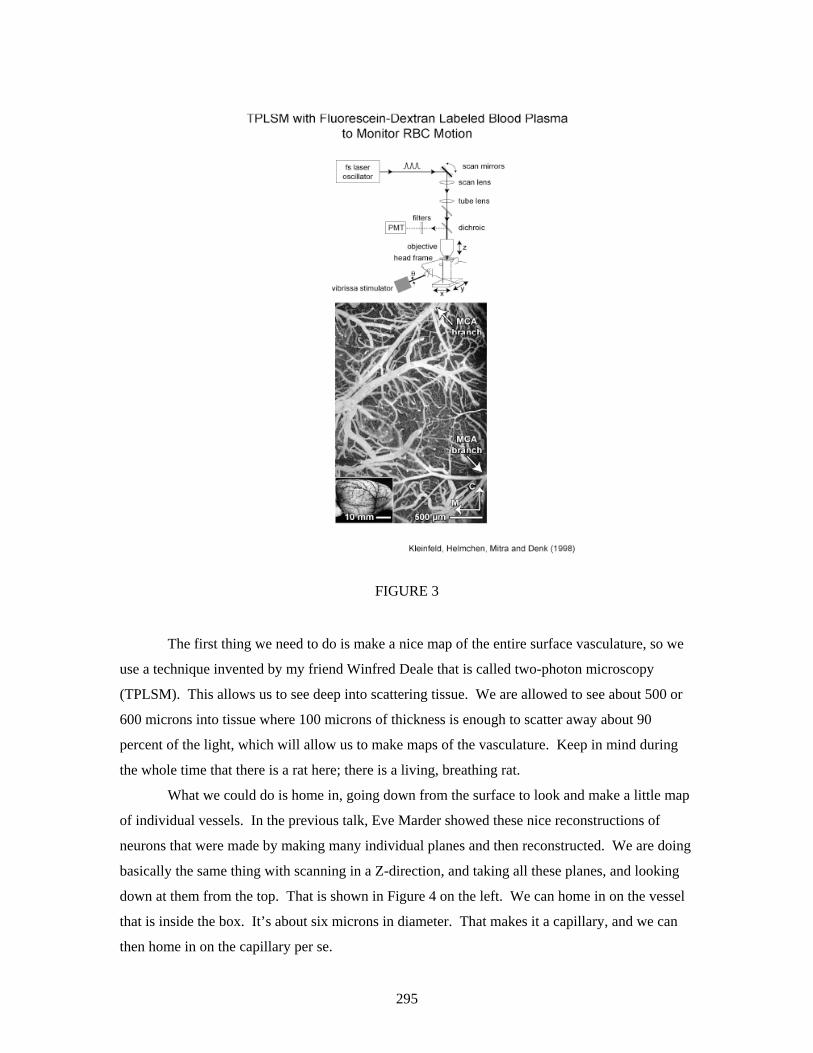
FIGURE 3
The first thing we need to do is make a nice map of the entire surface vasculature, so we
use a technique invented by my friend Winfred Deale that is called two-photon microscopy
(TPLSM). This allows us to see deep into scattering tissue. We are allowed to see about 500 or
600 microns into tissue where 100 microns of thickness is enough to scatter away about 90
percent of the light, which will allow us to make maps of the vasculature. Keep in mind during
the whole time that there is a rat here; there is a living, breathing rat.
What we could do is home in, going down from the surface to look and make a little map
of individual vessels. In the previous talk, Eve Marder showed these nice reconstructions of
neurons that were made by making many individual planes and then reconstructed. We are doing
basically the same thing with scanning in a Z-direction, and taking all these planes, and looking
down at them from the top. That is shown in Figure 4 on the left. We can home in on the vessel
that is inside the box. It’s about six microns in diameter. That makes it a capillary, and we can
then home in on the capillary per se.
295

FIGURE 4
We want to get some contrast to see movements of individual blood cell components. In
this case we can use a very simple mechanism. We put large dextrose in, big sugar molecules
that are coated with dye, so the blood plasma glows bright and fluoresces. Particular red blood
cells eschew the dye, so they are dark objects; we are imaging dark objects on a bright
background. If you look at successive frames from 1 to 2 to 3 to 4 to 5 in the right half of Figure
4, these are roughly at video rate, there is a dark object progressively moving over to the right.
That is the movement of a single red blood cell moving from a capillary, and this forms the
notion of our basic data. We could look at individual red blood cells, or any cell for that matter,
moving through vessels that are within, in our case, about the top millimeter of cortex, halfway
through the thickness of rat cortex.
As a technical issue, the red blood cells move pretty quickly, maybe 1 millimeter per
second or so. In order to quantify what the speed or the flux of these vessels is we use a
technique called line scans. We scan the laser repeatedly across a single vessel. When there is
just plasma, we get a bright image. When we hit a red blood cell, we get no light coming back,
and when we get past the red blood cell it goes bright again. As we scan a little bit later in time,
the red blood cell has moved, so it takes a while longer to hit the dark region. We then build up a
succession of strips in a space/time plot, as shown in the right-hand image of Figure 4. The slope
of this goes as one over the speed, and that’s basically enough to quantify what is going on.
296

FIGURE 5
Let’s see what happens just walking around the cortex in different columns, and looking
at different capillaries. The images in Figure 5 are in some sense typical. You see these in a
succession. These are slow speeds, medium speeds, high speeds, and different slopes. Not
surprising, if you plot the speed versus the flux, the number of particles that pass per second is
rather linear at low values of flux. In fact, as you might expect, it may begin to saturate at high
flux. It’s in 1-D and it’s going to have a Pringle potato chip kind of transition.
The real thing that gets you is that you are sitting there, and all the sudden the speed
jumps. It’s very hard to find long swatches of time where the speed is uniform, or if this is a case
where the red blood cells are moving, all of a sudden they stall and stop within the capillary.
They will sit there for tens of seconds, or even more interesting, if nature very politely decided
that capillaries should meet at Ts, what’s a better present to somebody who is doing scanning.
Here we are scanning two legs of a T. We have seen one come in from this side and one come in
from that side. Particles are conserved, so we know what’s coming out the third leg. Right in the
middle of this, marked R for reversal on the right-most image of Figure 5, the direction flips;
therefore, this business of things flipping in direction is just a signature of feedback loops. This
data doesn’t tell you what the spatial scale of the loop is, but this is the typical thing and it’s wild.
Fritjof Helmchen and I gave a demonstration at Cold Spring Harbor Laboratories a
297

couple of summers ago at an imaging course, and it was like driving in Boston. We found a little
round-about and you see the blood go this way, and then it goes that way, and then it goes this
way, so it’s like driving in the round-about. The other thing that is very interesting is you could
ask where most of the variation lives. We could turn this kind of data into a time series of speed
or velocity, because the direction is changing versus time. We can then compute the spectral
power density of this time series. This is shown on the top plot of Figure 6, and what you see is
that most of the variation lives at this very low frequency that comes in at about 0.1 Hertz. This
is an old topic; it is actually a 110-year old topic. The noise is known as vasomotion. Its origin is
unsolved and there is a real prize for this. This is the dominant noise in imaging techniques like
functional magnetic resonance imaging and optical imaging. So, already at this capillary level
you see this dominant noise source, and it is what got us into this game in the first place.
FIGURE 6
What is the scale of this variability? How can I put this into something realistic? One
thing I could do is give a stimulus. I could ask if the speed of the blood changes as a function of
stimulation. I believe this is true from various sorts of functional imaging experiments. At the
298

very top line in Figure 6, which is the time series of speed, you see that it’s noisy or ratty—no
pun intended. Towards the end of the trace you see a number of bumps. These little boxes mark
the time stamp of when we actually went in and simulated the animal. In this case, we are
recording from the vibursa area of the rat cortex, and we are tweaking the vibrissae at a level
where we get about one spike per tweak, which is the normal physiological level of spiking.
Sometimes you see a blood change and sometimes you don’t. It’s a statement of a signal-to-noise
of one. If we take all those traces together and average them as shown in the lower left of Figure
6, there is clearly a response, an increase in the speed during the stimulus. The standard deviation
is pretty much on the order of the mean itself, again, a statement of a signal-to-noise ratio of 1.
To be more precise, if we take that time series on top and calculate its spectral power density, we
have a stimulus peak that comes in at about 0.5 hertz, 1/20 seconds, and that’s shown in the lower
right. We then have our noise peak, our vasomotion peak, and they are about the same amplitude.
You might argue that this is entrainment, so you look right before we put the stimulus on, and you
see about the same amplitude. This is the bottom line, the variability in blood flow, and the scale
for this is that the changes in blood flow in response to normal stimulation are on the same size as
the noise. This could be why functional signals are weak, because they are right around the noise
level. It could say something about regulation.
Things are so noisy, and there are all kind of loops, then you think this might almost be
resilient to defects. We went ahead and tried this kind of experiment, and now I’m going back to
our set-up, as shown in Figure 7. I’m imaging on the surface, and the first series of experiments
we’re looking at are changes in, or rearrangements of, flow on the surface. These branches of
cerebral arteries constantly form these interconnections, and this has a name. It’s the connecting
or communicating arterials, and what we could do is measure the direction and speed and
magnitude of flow in all of these different vessels. We will then go in and accrue data, make a
blockage at this point, and look at the downstream flow.
299

FIGURE 7
We may ask, does it just stall out? This is what you would expect for a tree structure. Is
there going to be some rapid rearrangement to the flow? We need to introduce another new toy to
do this. The trick is these terrible molecules called photosensitizers that make a free radical when
you shine light on them. Within a couple of milliseconds these free radicals will actually damage
the nearest piece of tissue. In our case they will cause a little bit of irritation to the wall of a
vessel. This means we could inject these into an animal, do our observation at a wavelength that
doesn’t excite these molecules, and then come in with a second beam of light to excite the
molecules of interest and then see what’s going on.
The gist of it is the following, as illustrated in Figures 8 and 9. We map the surface
vasculature to determine where we’re going to target a particular point. In this example flow is
300

going this way, and then it actually comes down and it branches, first here, and then branches in
this direction. Then I’m going to shine light. The deal is that I adjust this dye, this rose bengal,
which is very fancy name for a molecule that does damage. It’s everywhere in the bloodstream,
but I want to make a block just at the surface, so I come in with just-above-threshold levels of
intensity. I could actually activate the molecule on the surface, but once I get below the vessels,
lensing due to the vessel and scattering through the issue will drop the intensity below threshold.
I could then gradually build up a clot at this point and see that the flow, which was now all
moving downward on the time scale of the block, would rapidly rearrange itself.
FIGURE 8
FIGURE 9
301

Looking at Figure 10, I’m going to start irradiating at the point marked with a red X and
then begin to build up a clot. The clot begins to form, and slowly the direction of these vessels is
beginning to reverse, and gradually we’ll make a stable clot. As a matter of fact, the flow is
almost completely stopped at this point, so the key result is already shown here, that we make a
block, and we immediately get this rapid reversal in flow. More so, the point is that the speed in
the reverse vessel is very much on the same order, which means the rate of perfusion is on the
same order as the initial flow.
FIGURE 10
There are a number of examples here, and they illustrate the loopiness of what’s going
on. Let’s look at the top example in Figure 10 for a moment. What we see is a blockage that is
302

shown on the right by the red X. Initially, the speed of the flow coming into the downstream
vessels was on the order of 5.7, let’s say 6, and 3 millimeters per second. After the blockage, it’s
down to 2 and 5 millimeters per second. So, it’s the same order of speed.
You can just run through many animals. We have done this on 30+ animals and 60+
vessels, and you always immediately see a reversal in flow. Things don’t stall. This magnitude
of the speed is on the same order as the initial speed. In fact, if we could plot this, we could plot
the speed after the clot as a function of the speed before the clot on these immediate downstream
vessels which are marked D1 in Figure 11. The speed is slightly down, but not by much. The
critical thing is that if we multiply the speed times the cross-section of the vessel, which we can
also measure we get an idea of sort of the volume flux. That distribution is shown in the right-
hand graph of Figure 11. The diagonal line there is the line of no change and the line parallel and
to the right of it is about a reduction to 10 percent of the initial value. This is the point at which
physiologically you begin to get in trouble. The point is that the rearrangement is well within
physiological means to keep the neurons viable, and there is a set of histology that I’m not
showing here that is also consistent in showing that neurons and glia stay viable.
303

FIGURE 11
The idea is that you have this mesh, and this mesh could rearrange its direction after a
perturbation. This should also hold if we make a much grosser kind of perturbation to the system.
Here we appeal to a technique that, as I mentioned earlier, has been in the neurology literature for
a long time. That is putting a very fine filament through the carotids, and then up into the middle
cerebral artery, and blocking this main artery itself. Therefore, it’s not a complete blockage, and
there is also a flow that comes in through the anterior cerebral artery. The point is that we
changed the pressure balance in the system, so to speak. What we see in Figure 12 is again
dominated completely by vessels changing their direction of flow when we go in and perturb
even one of the main pipes. This kind of business of very delicate balance of flow and changes in
the direction seems, at least experimentally or phenomenologically, to be somewhat general.
304

FIGURE 12
One can summarize all of this as follows, as shown in Figure 13. If we look at the first
downstream vessels I mentioned, the flow after the fact is on average about half its initial value.
That is lower than physiological levels. If we make a blockage and look at vessels that fit parallel
regions, there is virtually no change. If we look here at vessels further downstream, on average
there is no change, but quite a lot of variability. It really is completely the loopiness of this
system, and when you look in the textbooks they draw arterials as coming out as tree structures,
and this is wrong. The images in Figure 14 are actually taken in vivo by staining the vessels with
a lipid-like fluorescein dye that stains the surface. You can look at these regions and it’s fed this
way; it’s fed this way and it’s fed this way. It’s just a fantastic amount of redundancy.
305

FIGURE 13
306

FIGURE 14
DR. MARDER: How big is the section that is sensing the pressure? How far away from
the inclusion do you see changes in flow?
DR. KLEINFELD: Immediately downstream.
DR. MARDER: Two millimeters away?
DR. KLEINFELD: Let me give you a sense with the cartoon of vasculature in Figure
14. From here to here is a few hundred microns for the next sort of primary downstream vessels.
By the time we get to secondary and tertiary vessels we are talking about 500 microns, and there,
I think statistically, you would be even sensitive to this effect. We are talking scales of 100
microns, not millimeters, which may be, more importantly, of scale of cortical column in the rat.
There is a deep issue, in fact, if this turns out to be a regulatory mechanism for blood flow in the
rat. That will take an awake-behaving imaging experiment, which we are slowly moving
towards.
The last point I want to get at is the noise in the system. We have talked about the
redundancy on the surface, and now we actually want to move below the surface and look at the
deep microvascular network, which at least superficially has less connectivity. Now we have to
introduce a different toy, as illustrated schematically in Figure 15, because initially we used light
307

to make a blockage, but we relied on the fact that the intensity was just enough to cause a
blockage right at the surface. What we need now is a means to actually cause a blockage below
the surface. That means I have to go nonlinear, so to speak, and I need to have an interaction,
which is only effective at the focus of the lens.
FIGURE 15
Just like we use nonlinear interactions to do our imaging, which means that we only get
appreciable absorption at the focus, I can also come in with very, very short 100 femtosecond
pulses, and I could only cause damage right at the focus of the lens. Again, we are going to make
a map of the surface, and then I can also map down below the surface. I could find small arterials
below the surface, and I could target these for damage.
308

FIGURE 16
The ideas of lasers in biology to perturb things are not new. About 10 years ago people,
particularly Eric Mazur at Harvard, started applying nonlinear interactions to actually perturb
transparent objects. We picked up on these ideas of using very-high electric fields to perturb
things only at the focus. I think it’s a nice technique for all of neuroscience. What is going to
happen is that we can target below, and there are three ranges of energies. I guess at some level
of energy you longer have a rat, so that is not interesting. But at modest energies you actually
cause an aneurysm to form. At more intermediate energies you get something very interesting:
we cause a little cavitation bubble to form inside an arterial. We are picking a 10 micron object,
and focusing light within the center of that object. We can cause a little cavitation bubble to
form, and that will actually cause temporary leakage in the blood-brain barrier. It’s basically
pulling apart the endothelial cells and we inject dye into the surrounding media. It is similar
energies, but by actually targeting the edge of the vessel, we can cause a blockage in a vessel that
is below the surface. This will allow us to get access to a new topology, and this is what happens.
309

FIGURE 17
Figure 17 shows a vessel that is about 300 microns below the surface, and we are homing
in on the small region that is covered by a box on top. There is flow going through this vessel,
and I make a blockage at this point and map the speeds like I talked about before. The key
difference here is that I made a blockage at this point in this less connected network that lies well
below the surface.
When I look downstream, again I get a reversal of flow, but the magnitude of these
changes is about an order of magnitude smaller than what I have gotten on the surface. This is
not such a resilient network, so let’s see what happens. On average we see the following. In this
case, if I look upstream, there is not much change below the surface. If I look downstream I
really do have pretty much a cessation of flow. This holds for a fairly large sample, about 16
animals and about 30 data points, as shown in Figure 18. This vasculature in a qualitative way is
missing loopiness, and I can compare it directly to what happens on the surface. Again, upstream
there is very little difference, but downstream on the surface you get this tremendous restoration
of flow.
310

FIGURE 18
There are a lot of controlled experiments that we have done; there is a lot of histology I
purposely left out. One thing you could always say is that these changes had nothing to do with
making a blockage, because you have gone in artificially. You have made this transient
mechanical disturbance and you have sent an electrical signal down the epithelial cells, down the
vasculature. Maybe you have turned on all kinds of inflammation and damage mechanisms.
I could go back and look at this other case that takes place at the same energies, where we
go in, target the middle of a vessel, and cause a disruption of the wall, which we sense because
dye that is normally confined completely in the vessel sort of oozes out for a short period of time.
The important point is during this entire procedure I have now hit the system with laser pulses. I
have caused dye to leave, but I’m looking at the motion of the red blood cells at the same time,
and that motion is unchanged as shown in Figure 19. So, at least on these types of timescales of
311

hundreds of seconds, whatever changes happened in flow appear to be due to the blockage, and
not due to biochemistry.
FIGURE 19
The last point has to do with what one could do to restore this flow, and the role that
viscosity could possibly play in this mechanism. We did the same kind of experiment by making
blockages at single points, and we asked if we looked further downstream, if some of the blood
flow could be restored by actually dropping the viscosity of the blood. This is an old idea. What
physicians used to do for stroke patients was just to dilute their blood. It sounds on the same
order of leeches. Scary! The point is that we normally look at baseline levels, and then we cause
a clot. Even if we try to dilute the blood, Figure 20 shows that there is virtually no change in the
immediate downstream flow, and this region is stalled out. If I look a little bit downstream,
things are also fairly stalled out. Yet, if you dilute the blood by 30 percent, you really do get this
restoration of flow. This is just more data to say that we are limited by simple fluid dynamics as
to how the flow rearranges itself. At least our neurology colleagues also think that this might be
something that should be revisited in medical settings.
312

FIGURE 20
I have talked about ideas for trying to relate topology to blood flow, about how flow is
very noisy in the vascular system, and about how we could go in and perturb flow on two
different networks—a surface network and a deep network. This one is highly interconnected,
this one is less connected, and how there are quite differences in the dynamics. Right now we are
in the midst of quantifying the cortical angioarchitecture. I mentioned at the beginning that the
casts are very difficult to reconstruct because you can’t see into them. We actually have a way to
reconstruct big swatches of the vascular.
313
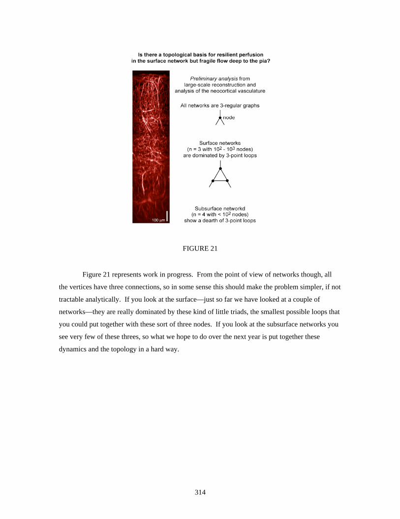
FIGURE 21
Figure 21 represents work in progress. From the point of view of networks though, all
the vertices have three connections, so in some sense this should make the problem simpler, if not
tractable analytically. If you look at the surface—just so far we have looked at a couple of
networks—they are really dominated by these kind of little triads, the smallest possible loops that
you could put together with these sort of three nodes. If you look at the subsurface networks you
see very few of these threes, so what we hope to do over the next year is put together these
dynamics and the topology in a hard way.
314

FIGURE 22
I noted Eve reverted to math form, but I will revert to biology form and put the people at
the end. The initial flow experiments involved my colleagues Winfried Denk, Fritjoff Helmcien
and Partha Mitra. The National Academies more recent perturbation-based experiments were
done in collaboration with Patrick Lyden’s laboratory at UCSD and involved Beth Triedman,
Nozomi Nishimura, Chris Schaffer and Phil Tsai. Beth and Phil, along with Pablo Blinder, Ben
Migliori and Andy Shih, are continuing this collaborative effort.
QUESTIONS AND ANSWERS
DR. DING: My question is how long is the latency when you stimulate and measure the
speed change?
DR. KLEINFELD: The latency is about 300 milliseconds.
DR. DING: So, it’s very fast.
DR. KLEINFELD: Yes, but I think if you look at intrinsic imaging, which is where
people measure in a gross sense by average the change from oxy to deoxy, they typically quote
numbers like 400 milliseconds. I think the difference here is we are looking directly at individual
vessels. I have to be straight, we could see no faster than 200 milliseconds, because we have to
average over a window of time to detect the speed change.
DR. DING: A second question is that in the absence of stimulation you still see a lot of
315

316
activities in that flow. You used the noise to describe. Can you say a little more about what is
underlying those noisy activities?
DR. KLEINFELD: I can and I can’t. This is a deep intellectual embarrassment to the
neuroimaging field. There are regions in the rat that are at least on the order of a couple of
millimeters square in area, and in human patients they are probably a few centimeters square.
This is based on Pertha Mitra’s analysis of fMRI data. Basically, you get changes in the arterials
and changes in the musculature in the arterial that regulate the flow. What controls this is not
known. It’s the question of neural control. There are interneurons and there are two populations
of inhibitory interneurons. One puts out somatostatin, which causes things to get smaller, and one
puts out vasoactive intestinal peptide, which causes it to get larger. The hypothesis is that there
must be within some region of the cortex enough coupling among these interneuron networks that
the blood flow is seeing some delicate balance of what’s going on in these inhibitory networks,
but that has not been tested. The one thing you can’t do is put a catheter in the carotid artery to
look at the fluctuations and predict what’s going in the cortex. This would solve a lot of practical
problems, but it has not worked.
REFERENCES
Harrison, R.V., N. Harel, J. Panesar, and R.J. Mount. 2002. “Blood capillary distribution correlates with hemodynamic-based functional imaging in cerebral cortex.” Cereb Cortex. 12(3):225-233. Kleinfeld, D., P.P. Mitra, F. Helmchen, and W. Denk. 1998. “Fluctuations and stimulus-induced changes in blood flow observed in individual capillaries in layers 2 through 4 of rat neocortex.” Proceedings of the National Academy of Sciences 95(26):15741-15746. Nishimura, N., C.B. Schaffer, B. Friedman, P.S. Tsai, P.D. Lyden, and D. Kleinfeld. 2006. “Targeted insult to subsurface cortical blood vessels using ultrashort laser pulses: Three models of stroke.” Nature Methods 3(2):99-108. Schaffer, C.B., B. Friedman, N. Nishimura, L.F. Schroeder, P.S. Tsai, F.F. Ebner, P.D. Lyden, and D. Kleinfeld. 2006. “Two-photon imaging of cortical surface microvessels reveals a robust redistribution in blood flow after vascular occlusion.” PLoS Biology 4(2):258-270.