pro .net 2.0 windows forms and custom controls in...
TRANSCRIPT
Pro .NET 2.0 Windows Forms and Custom Controls in C#
■ ■ ■
Matthew MacDonald
Macdonald_4398Front.fm Page i Friday, November 18, 2005 5:14 PM

Pro .NET 2.0 Windows Forms and Custom Controls in C#
Copyright © 2006 by Matthew MacDonald
All rights reserved. No part of this work may be reproduced or transmitted in any form or by any means, electronic or mechanical, including photocopying, recording, or by any information storage or retrieval system, without the prior written permission of the copyright owner and the publisher.
ISBN (pbk): 1-59059-439-8
Printed and bound in the United States of America 9 8 7 6 5 4 3 2 1
Trademarked names may appear in this book. Rather than use a trademark symbol with every occurrence of a trademarked name, we use the names only in an editorial fashion and to the benefit of the trademark owner, with no intention of infringement of the trademark.
Lead Editor: Dominic ShakeshaftTechnical Reviewer: Christophe NasarreEditorial Board: Steve Anglin, Dan Appleman, Ewan Buckingham, Gary Cornell, Tony Davis, Jason Gilmore,
Jonathan Hassell, Chris Mills, Dominic Shakeshaft, Jim SumserAssociate Publisher: Grace WongProject Manager: Beckie BrandCopy Edit Manager: Nicole LeClercCopy Editor: Candace EnglishAssistant Production Director: Kari Brooks-CoponyProduction Editor: Janet VailCompositor: Susan GlinertProofreader: Nancy SixsmithIndexer: Michael BrinkmanArtist: Kinetic Publishing Services, LLCInterior Designer: Van Winkle Design GroupCover Designer: Kurt KramesManufacturing Director: Tom Debolski
Distributed to the book trade worldwide by Springer-Verlag New York, Inc., 233 Spring Street, 6th Floor, New York, NY 10013. Phone 1-800-SPRINGER, fax 201-348-4505, e-mail [email protected], or visit http://www.springeronline.com.
For information on translations, please contact Apress directly at 2560 Ninth Street, Suite 219, Berkeley, CA 94710. Phone 510-549-5930, fax 510-549-5939, e-mail [email protected], or visit http://www.apress.com.
The information in this book is distributed on an “as is” basis, without warranty. Although every precaution has been taken in the preparation of this work, neither the author(s) nor Apress shall have any liability to any person or entity with respect to any loss or damage caused or alleged to be caused directly or indirectly by the information contained in this work.
The source code for this book is available to readers at http://www.apress.com in the Source Code section.
Macdonald_4398Front.fm Page ii Friday, November 18, 2005 5:14 PM
111
■ ■ ■
C H A P T E R 4
The Classic Controls
This chapter considers some of the most common types of controls, such as labels, text boxes, and buttons. Many of these controls have existed since the dawn of Windows programming and don’t need much description. To keep things interesting, this chapter also presents some related .NET variants. For example, at the same time you look at the label, list box, and domain controls, you will learn about the hyperlink label, checked list box, and rich date controls.
In addition, you’ll see a few features that are supported by a wide variety of controls: drag and drop, automatic completion, and tooltips. You’ll also learn how to create wrappers that let you use legacy ActiveX controls, and you’ll see how to create a system tray application with the NotifyIcon control.
The Classic Control GalleryOver the past three chapters, you’ve learned about the basic fundamentals of controls and forms. Now it’s time to look at some of the familiar controls every programmer knows and loves.
■Note Many common controls also support images. For example, you can display an image alongside text in a label control. You’ll learn about this in Chapter 5.
LabelsLabel controls place static text on a form. The text is contained in the Text property and aligned according the TextAlign property. Table 4-1 lists a few less familiar (but useful) label properties.
Macdonald_4398C04.fm Page 111 Monday, November 21, 2005 7:40 AM
112 C H A P T E R 4 ■ T H E C L A S S I C C O N T R O L S
LinkLabelThis specialty label inherits from the Label class, but adds some properties that make it partic-ularly well suited to representing links. For example, many applications provide a clickable link to a company Web site in an About window.
The LinkLabel handles the details of displaying a portion of its text as a hyperlink. You specify this portion in the LinkArea property using a LinkArea structure that identifies the first character of the link and the number of characters in the link. Depending on the LinkBehavior property, this linked text may always be underlined, it may be displayed as normal, or it may become underlined when the mouse hovers over it.
Here’s the basic code that creates a link on the Web site address:
lnkWebSite.Text = "See www.prosetech.com for more information.";
// Starts at position 4 and is 17 characters long.lnkWebSite.LinkArea = new LinkArea(4, 17);lnkWebSite.LinkBehavior = LinkBehavior.HoverUnderline;
■Tip You can also set the LinkArea property using a designer in Visual Studio. Just click the ellipsis (...) next to the LinkArea property, and select the area you want to make clickable so it becomes highlighted.
Table 4-1. Label Properties
Property Description
AutoEllipsis If set to true and the label text doesn’t fit in the current bounds of the label, the label will show an ellipsis (…) at the end of the displayed text. This property has no effect if you have set AutoSize to true. Note that the ellipsis may occur in the middle of a word.
BorderStyle Gives you a quick way to add a flat or sunken border around some text (consider container controls such as the Panel for a more powerful and configurable approach). Be sure to use this in conjunction with the Padding property so there is some breathing room between the text and the border.
UseMnemonic When set to true, ampersands in the label’s Text property are automatically interpreted as Alt access keys. The user can press this access key, and the focus switches to the next control in the tab order (for example, a labeled text box).
Macdonald_4398C04.fm Page 112 Monday, November 21, 2005 7:40 AM

C H A P T E R 4 ■ T H E C LA S S I C C O N T R O L S 113
You need to handle the actual LinkClicked event to make the link functional. In this event handler, you should set the LinkVisited property to true so that the color is updated properly and then perform the required action. For example, you might start Internet Explorer with the following code:
private void lnkWebSite_LinkClicked(Object sender, LinkLabelLinkClickedEventArgs e){ // Change the color if needed. e.LinkVisited = true;
// Use the Process.Start method to open the default browser with a URL. System.Diagnostics.Process.Start("http://www.prosetech.com");}
If you need to have more than one link, you can use the Links property, which exposes a special collection of Link objects. Each Link object stores its own Enabled and Visited proper-ties, as well as information about the start and length of the link (Start and Length). You can also use the LinkData object property to associate some additional data with a link. This is useful if the link text does not identify the URL (for example, a “click here” link).
lnkBuy.Text = "Buy it at Amazon.com or Barnes and Noble.";lnkBuy.Links.Add(10, 10, "http://www.amazon.com");lnkBuy.Links.Add(24, 16, "http://www.bn.com");
You can also access LinkArea objects after you create them and modify the Start, Length, or LinkData property dynamically.
lnkBuy.Links[0].LinkData = "http://www.amazon.co.uk";
The LinkClicked event provides you with a reference to the Link object that was clicked. You can then retrieve the LinkData and use it to decide what Web page should be shown.
private void lnkBuy_LinkClicked(Object sender, LinkLabelLinkClickedEventArgs e){ e.Link.Visited = true; System.Diagnostics.Process.Start((string)e.Link.LinkData);}
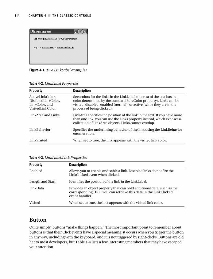
Figure 4-1 shows both of these LinkLabel examples. Table 4-2 lists the LinkLabel properties, and Table 4-3 provides the LinkLabel.Link properties.
Macdonald_4398C04.fm Page 113 Monday, November 21, 2005 7:40 AM
114 C H A P T E R 4 ■ T H E C L A S S I C C O N T R O L S
Figure 4-1. Two LinkLabel examples
ButtonQuite simply, buttons “make things happen.” The most important point to remember about buttons is that their Click events have a special meaning: it occurs when you trigger the button in any way, including with the keyboard, and it is not triggered by right-clicks. Buttons are old hat to most developers, but Table 4-4 lists a few interesting members that may have escaped your attention.
Table 4-2. LinkLabel Properties
Property Description
ActiveLinkColor, DisabledLinkColor, LinkColor, and VisitedLinkColor
Sets colors for the links in the LinkLabel (the rest of the text has its color determined by the standard ForeColor property). Links can be visited, disabled, enabled (normal), or active (while they are in the process of being clicked).
LinkArea and Links LinkArea specifies the position of the link in the text. If you have more than one link, you can use the Links property instead, which exposes a collection of LinkArea objects. Links cannot overlap.
LinkBehavior Specifies the underlining behavior of the link using the LinkBehavior enumeration.
LinkVisited When set to true, the link appears with the visited link color.
Table 4-3. LinkLabel.Link Properties
Property Description
Enabled Allows you to enable or disable a link. Disabled links do not fire the LinkClicked event when clicked.
Length and Start Identifies the position of the link in the LinkLabel.
LinkData Provides an object property that can hold additional data, such as the corresponding URL. You can retrieve this data in the LinkClicked event handler.
Visited When set to true, the link appears with the visited link color.
Macdonald_4398C04.fm Page 114 Monday, November 21, 2005 7:40 AM
C H A P T E R 4 ■ T H E C LA S S I C C O N T R O L S 115
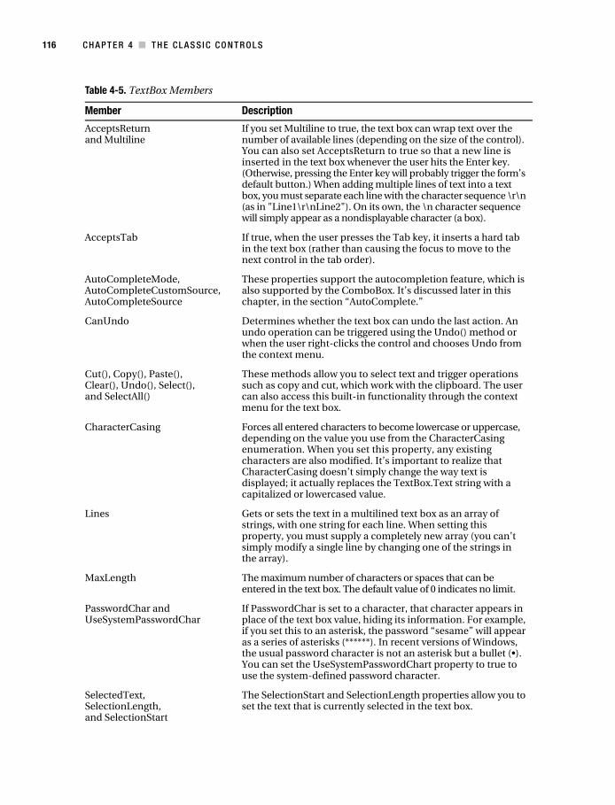
TextBoxAnother staple of Windows development, the text box allows the user to enter textual informa-tion. The previous chapter explained how you can react to and modify key presses in the text box. Interestingly, text boxes provide a basic set of built-in functionality that the user can access through a context menu (see Figure 4-2).
Figure 4-2. The built-in TextBox menu
Much of this functionality is also exposed through TextBox class members, and some of it is implemented by the base class TextBoxBase (which is shared with the MaskedTextBox and RichTextBox classes). See Table 4-5 for a complete rundown.
Table 4-4. Special Button Members
Member Description
PerformClick() “Clicks” the button programmatically. In other words, it causes the button to fire the Click event. This method is useful for wizards and other feature where code “drives” the program. It also allows you to set up relationships between controls. For example, if you set a default button for a form (by setting the Form.AcceptButton property to point to your button), the form can programmatically “click” your button by calling PerformClick() when the user presses the Enter key.
DialogResult If set, indicates that this button will close the form automatically and return the indicated result to the calling code, provided the window is shown modally. This technique is explained in Chapter 3, which discusses dialog forms.
FlatStyle and FlatAppearance
FlatStyle allows you to choose between standard button rendering and two more unusual modes. If FlatStyle is set to FlatStyle.Popup, the button is given a thin etched border that appears to become raised when the mouse moves over the button. If FlatStyle is set to FlatStyle.Flat, the FlatAppearance settings take over. They specify the width of the border, its color, and the background color that should be employed when the user moves the mouse over the button and presses it. Overall, the results are far from impressive, and a better choice is to use the custom button-drawing techniques covered in Chapter 23.
Macdonald_4398C04.fm Page 115 Monday, November 21, 2005 7:40 AM
116 C H A P T E R 4 ■ T H E C L A S S I C C O N T R O L S
Table 4-5. TextBox Members
Member Description
AcceptsReturn and Multiline
If you set Multiline to true, the text box can wrap text over the number of available lines (depending on the size of the control). You can also set AcceptsReturn to true so that a new line is inserted in the text box whenever the user hits the Enter key. (Otherwise, pressing the Enter key will probably trigger the form’s default button.) When adding multiple lines of text into a text box, you must separate each line with the character sequence \r\n (as in "Line1\r\nLine2"). On its own, the \n character sequence will simply appear as a nondisplayable character (a box).
AcceptsTab If true, when the user presses the Tab key, it inserts a hard tab in the text box (rather than causing the focus to move to the next control in the tab order).
AutoCompleteMode, AutoCompleteCustomSource, AutoCompleteSource
These properties support the autocompletion feature, which is also supported by the ComboBox. It’s discussed later in this chapter, in the section “AutoComplete.”
CanUndo Determines whether the text box can undo the last action. An undo operation can be triggered using the Undo() method or when the user right-clicks the control and chooses Undo from the context menu.
Cut(), Copy(), Paste(), Clear(), Undo(), Select(), and SelectAll()
These methods allow you to select text and trigger operations such as copy and cut, which work with the clipboard. The user can also access this built-in functionality through the context menu for the text box.
CharacterCasing Forces all entered characters to become lowercase or uppercase, depending on the value you use from the CharacterCasing enumeration. When you set this property, any existing characters are also modified. It’s important to realize that CharacterCasing doesn’t simply change the way text is displayed; it actually replaces the TextBox.Text string with a capitalized or lowercased value.
Lines Gets or sets the text in a multilined text box as an array of strings, with one string for each line. When setting this property, you must supply a completely new array (you can’t simply modify a single line by changing one of the strings in the array).
MaxLength The maximum number of characters or spaces that can be entered in the text box. The default value of 0 indicates no limit.
PasswordChar and UseSystemPasswordChar
If PasswordChar is set to a character, that character appears in place of the text box value, hiding its information. For example, if you set this to an asterisk, the password “sesame” will appear as a series of asterisks (******). In recent versions of Windows, the usual password character is not an asterisk but a bullet (•). You can set the UseSystemPasswordChart property to true to use the system-defined password character.
SelectedText, SelectionLength, and SelectionStart
The SelectionStart and SelectionLength properties allow you to set the text that is currently selected in the text box.
Macdonald_4398C04.fm Page 116 Monday, November 21, 2005 7:40 AM
C H A P T E R 4 ■ T H E C LA S S I C C O N T R O L S 117
■Tip .NET 2.0 also adds a masked text box control that automatically formats data as the user enters text. For more information about this useful addition, and how to extend it, refer to Chapter 18.
RichTextBoxIf you’re looking for a text box control with more formatting muscle, consider the RichTextBox. Although it won’t help you build the next Microsoft Word (for that, you’d need much more fine-grained control to intercept key presses and control painting), it does allow you to format arbitrary sections of text in the font, color, and alignment you choose.
The RichTextBox control derives from TextBoxBase, as does the TextBox, so it shares most of its properties and methods (as listed in Table 4-5). Along with these features, the RichTextBox adds the ability to handle rich formatting, images, and links. It also provides a LoadFile() and a SaveFile() method for saving RTF documents painlessly.
One of the key enhancements the RichTextBox adds is a set of selection properties that allow you to manipulate the formatting of the currently selected text. The RichTextBox supports the familiar SelectedText, SelectionLength, and SelectionStart properties, but it also adds a much more impressive set of properties including SelectionColor, SelectionBackColor, SelectionFont, and SelectionAlignment, which allow you to adjust the formatting of the selected text. Table 4-6 has the lowdown.
ReadOnly If true, the contents of a read-only text box can be modified in your code, but not by the user. Making a text box read-only instead of disabling it allows the text to remain clearly visible (instead of “grayed out”), and it allows the user to scroll through if it does not fit in the display area, and select and copy the content to the clipboard.
ShortcutsEnabled When false, the user won’t be able to use the shortcut keys for copying and pasting text or be able to use the right-click context menu with the same commands.
WordWrap In a multiline text box, this property indicates whether text should automatically wrap to the next line (the default, true), or extend indefinitely until a line break is reached (false). If you set this property to false, you’ll probably also set AcceptReturn to false to allow the user to insert hard returns.
ScrollToCaret() In a multiline text box, this method moves to the location of the cursor.
GetPositionFromCharIndex(), GetLineFromCharIndex(), GetFirstCharIndexFromLine(), GetCharFromPosition(), and GetCharIndexFromPosition()
These methods (new in .NET 2.0) allow you to get detailed infor-mation about the current position of the cursor in the text box, either as an offset into the text string (char index) or as the screen location (point). This is handy if you need to show a pop-up menu next to the current insertion point in a large text box. These methods are also available (and generally more useful) for the RichTextBox control.
Table 4-5. TextBox Members
Member Description
Macdonald_4398C04.fm Page 117 Monday, November 21, 2005 7:40 AM
118 C H A P T E R 4 ■ T H E C L A S S I C C O N T R O L S
Table 4-6. RichTextBox Added Members
Member Description
AutoWordSelection If true, the nearest word is automatically selected when the user double-clicks inside the text box.
BulletIndent Sets the number of pixels to indent text that’s styled as bulleted. You use the SelectionBullet property to turn this style on or off.
DetectUrls and LinkClicked event
If the DetectUrls property is true (the default), the text box will detect URLs in the text and convert them to clickable hyperlinks. You can handle the LinkClicked event handler to examine what text was clicked, and handle the click (for example, by showing a new document or launching an external process like Internet Explorer).
EnableAutoDragDrop If true, the user can rearrange selected text and images by dragging them to a new position. The default is false.
Rtf and SelectedRtf Whereas the Text property gets the plain, unformatted text content, the Rtf property gets or sets the formatted text, including all rich text format (RTF) codes. This is useful primarily when interacting with another program that understands RTF (like Microsoft Word). For more information about RTF codes, see the rich text format (RTF) specification at http://msdn.microsoft.com/library/en-us/dnrtfspec/html/rtfspec.asp.
SelectionAlignment The type of horizontal alignment (left, right, or center) to use to align the selected text.
SelectionBackColor The background color for the selected text. If this is equal to Color.Empty, it indicates that the selection includes more than one background color.
SelectionBullet True if the selected text should be formatted with the bullet style (meaning each paragraph is preceded by a bullet).
SelectionCharOffset Determines whether the selected text appears on the baseline, as a superscript, or as a subscript below the baseline.
SelectionColor The foreground color for the selected text. If this is equal to Color.Empty, it indicates that the selection includes more than one color.
SelectionFont The font used for the selected text. A null reference indicates that the selection includes more than one typeface.
SelectionHangingIndent The spacing (in pixels) between the left edge of the first line of text in the selected paragraph and the left edge of subsequent lines in the same paragraph.
SelectionIndent The spacing (in pixels) between the left edge of the text box and the left edge of the text selection.
SelectionRightIndent The distance (in pixels) between the right edge of the text box and the right edge of the text selection.
SelectionProtected and Protected event
If set to true, the user will be prevented from modifying this text. Initially, no text is protected. If the user attempts to change protected text, the Protected event is raised.
Macdonald_4398C04.fm Page 118 Monday, November 21, 2005 7:40 AM

C H A P T E R 4 ■ T H E C LA S S I C C O N T R O L S 119
Unless you want to master the complexities of RTF codes (which are not for the faint of heart), steer away from the Rtf and SelectedRtf properties. Instead, perform all your formatting by manipulating the selection properties. First set the SelectionStart and SelectionLength properties to define the range of text you want to format. Then apply the formatting by assigning a new selection color, font, or alignment through properties like SelectionColor and SelectionFont. Use the SelectedText property to set or change the content of the selected text.
Here’s an example that formats the text in the entire control with bold formatting:
richTextBox1.SelectionStart = 0;richTextBox1.SelectionLength = richTextBox1.Text.Length-1;richTextBox1.SelectionFont = new Font(richTextBox1.SelectionFont, FontStyle.Bold);
Notice that you can’t modify the properties of the SelectionFont. Instead, you need to assign a new font, although you can use the current font as a starting point, and simply change the style or size as needed.
You can set the selection formatting properties even if there’s currently no selected text (in other words, SelectionLength is 0). In this case, the formatting options apply to the current insertion point (wherever SelectionStart is positioned). In other words, if you use the following line of code, when the user starts to type, the text will appear in blue. However, if the user first moves to a new location, this formatting selection will be lost.
richTextBox1.SelectionColor = Colors.Blue;
You can also use this technique to add formatted text. For example, here’s the code that adds some text to the end of the text box, using a large font:
richTextBox1.SelectionStart = richTextBox1.Text.Length-1;richTextBox1.SelectionFont = new Font("Tahoma", 20);richTextBox1.SelectedText = "Hi";
Note that if you swapped the first and second line so that you applied the selection format-ting before you set the selection position, the formatting would be lost and the new text would have the default formatting (the formatting of the character immediately to the left of the cursor).
ShowSelectionMargin Shows a margin on the left where the user can click to quickly select a line of text (or double-click to select an entire paragraph).
ZoomFactor Adjusts the scaling of the text to make it larger or smaller. A ZoomFactor of 1 (the default) is equivalent to 100%, which means each font appears at its normal size. A ZoomFactor of .75 is 75%, 2 is 200%, and so on.
LoadFile() and SaveFile() Allows you to save (or load) the content for the text box. You can use a string with a file path, or supply a stream. You also have the choice of saving (or loading) plain text files or formatted RTF files.
SelectionChanged event Fires when the SelectionStart of SelectionLength properties change.
Table 4-6. RichTextBox Added Members
Member Description
Macdonald_4398C04.fm Page 119 Monday, November 21, 2005 7:40 AM
120 C H A P T E R 4 ■ T H E C L A S S I C C O N T R O L S
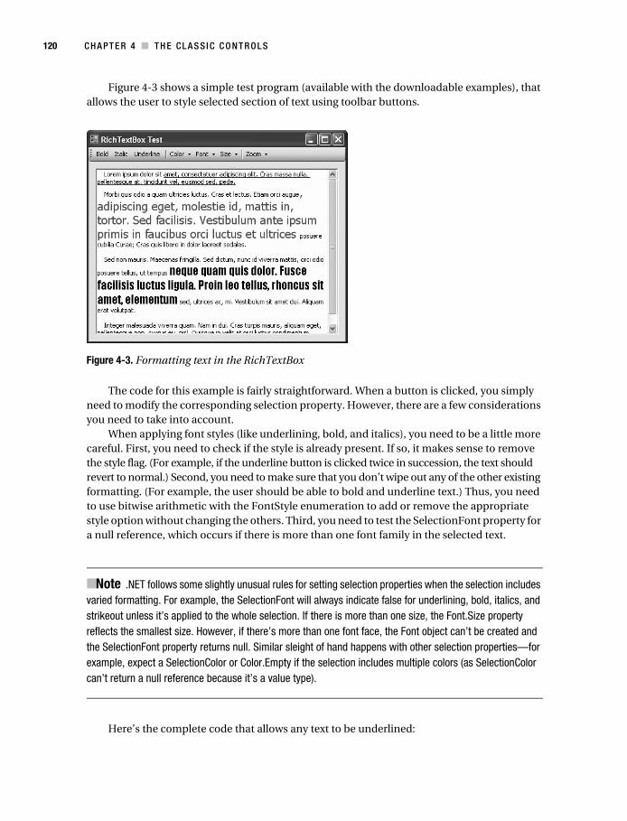
Figure 4-3 shows a simple test program (available with the downloadable examples), that allows the user to style selected section of text using toolbar buttons.
Figure 4-3. Formatting text in the RichTextBox
The code for this example is fairly straightforward. When a button is clicked, you simply need to modify the corresponding selection property. However, there are a few considerations you need to take into account.
When applying font styles (like underlining, bold, and italics), you need to be a little more careful. First, you need to check if the style is already present. If so, it makes sense to remove the style flag. (For example, if the underline button is clicked twice in succession, the text should revert to normal.) Second, you need to make sure that you don’t wipe out any of the other existing formatting. (For example, the user should be able to bold and underline text.) Thus, you need to use bitwise arithmetic with the FontStyle enumeration to add or remove the appropriate style option without changing the others. Third, you need to test the SelectionFont property for a null reference, which occurs if there is more than one font family in the selected text.
■Note .NET follows some slightly unusual rules for setting selection properties when the selection includes varied formatting. For example, the SelectionFont will always indicate false for underlining, bold, italics, and strikeout unless it’s applied to the whole selection. If there is more than one size, the Font.Size property reflects the smallest size. However, if there’s more than one font face, the Font object can’t be created and the SelectionFont property returns null. Similar sleight of hand happens with other selection properties—for example, expect a SelectionColor or Color.Empty if the selection includes multiple colors (as SelectionColor can’t return a null reference because it’s a value type).
Here’s the complete code that allows any text to be underlined:
Macdonald_4398C04.fm Page 120 Monday, November 21, 2005 7:40 AM
C H A P T E R 4 ■ T H E C LA S S I C C O N T R O L S 121
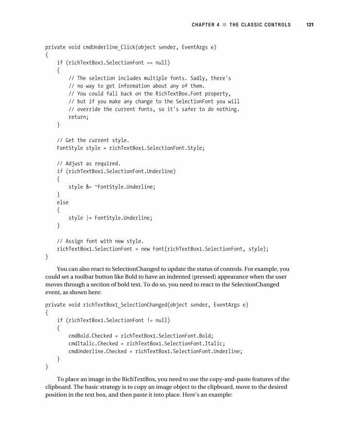
private void cmdUnderline_Click(object sender, EventArgs e){ if (richTextBox1.SelectionFont == null) { // The selection includes multiple fonts. Sadly, there's // no way to get information about any of them. // You could fall back on the RichTextBox.Font property, // but if you make any change to the SelectionFont you will // override the current fonts, so it's safer to do nothing. return; }
// Get the current style. FontStyle style = richTextBox1.SelectionFont.Style;
// Adjust as required. if (richTextBox1.SelectionFont.Underline) { style &= ~FontStyle.Underline; } else { style |= FontStyle.Underline; }
// Assign font with new style. richTextBox1.SelectionFont = new Font(richTextBox1.SelectionFont, style);}
You can also react to SelectionChanged to update the status of controls. For example, you could set a toolbar button like Bold to have an indented (pressed) appearance when the user moves through a section of bold text. To do so, you need to react to the SelectionChanged event, as shown here:
private void richTextBox1_SelectionChanged(object sender, EventArgs e){ if (richTextBox1.SelectionFont != null) { cmdBold.Checked = richTextBox1.SelectionFont.Bold; cmdItalic.Checked = richTextBox1.SelectionFont.Italic; cmdUnderline.Checked = richTextBox1.SelectionFont.Underline; }}
To place an image in the RichTextBox, you need to use the copy-and-paste features of the clipboard. The basic strategy is to copy an image object to the clipboard, move to the desired position in the text box, and then paste it into place. Here’s an example:
Macdonald_4398C04.fm Page 121 Monday, November 21, 2005 7:40 AM

122 C H A P T E R 4 ■ T H E C L A S S I C C O N T R O L S
// Get the image.Image img = Image.FromFile(Path.Combine(Application.StartupPath, "planet.jpg"));
// Place it on the clipboard.Clipboard.SetImage(img); // Move to the start of the text box.richTextBox1.SelectionStart = 0;
// Paste the image.richTextBox1.Paste();
// Optionally, remove the data from the clipboard.Clipboard.Clear();
This is not an ideal solution, because it modifies the clipboard without notifying the user, which is a problem if the user already has some data there. Unfortunately, there’s no other solution possible without mastering the intricacies of RTF codes. For more information and a more complex workaround, you may want to check out an article on the subject at http://www.codeproject.com/cs/miscctrl/csexrichtextbox.asp.
CheckBox and RadioButtonThe CheckBox and RadioButton controls provide a Checked property that indicates whether the control is checked or “filled in.” After the state is changed, a CheckedChanged event occurs.
You can create a special three-state check box by setting the ThreeState property to true. You need to check the CheckState property to examine whether it is Checked, Unchecked, or Indeterminate (shaded but not checked).
By default, the control is checked and unchecked automatically when the user clicks it. You can prevent this by setting AutoCheck to false and handling the Click event. This allows you to programmatically prevent a check box or radio button from being checked (without trying to “switch it back” after the user has made a change).
PictureBoxA picture box is one of the simplest controls .NET offers. You can set a valid image using the Image property and configure a SizeMode from the PictureBoxSizeMode enumeration. For example, you can set the picture to automatically stretch to fit the picture box.
pic.Image = System.Drawing.Image.FromFile("mypic.bmp");pic.SizeMode = PictureBoxSizeMode.StretchImage;
You’ll learn more about how to manipulate images in .NET in Chapter 5 and Chapter 7.
Macdonald_4398C04.fm Page 122 Monday, November 21, 2005 7:40 AM
C H A P T E R 4 ■ T H E C LA S S I C C O N T R O L S 123
List Controls.NET provides three basic list controls: ListBox, CheckedListBox, and ComboBox. They all inherit (directly or indirectly) from the abstract ListControl class, which defines basic function-ality that allows you to use a list control with data binding. Controls can be bound to objects such as the DataSet, arrays, and ArrayList collections, regardless of the underlying data source (as you’ll see in Chapter 8).
// Bind a list control to an array of city names.String[] cityChoices = {"Seattle", "New York", "Singapore", "Montreal"};lstCity.DataSource = cityChoices;
You can access the currently selected item in several ways. You can use the SelectedIndex property to retrieve the zero-based index number identifying the item, or you can use the Text property to retrieve the displayed text. You can also set both of these properties to change the selection.
// Search for the item with "New York" as its text, and select it.lstCity.Text = "New York";
// Select the first item in the list.lstCity.SelectedIndex = 0;
If you are using a multiselect ListBox, you can also use the SelectedIndices or SelectedItems collection. Multiselect list boxes are set based on the SelectionMode property. You have two multiselect choices: SelectionMode.MultiExtended, which requires the user to hold down Ctrl or Shift while clicking the list to select additional items, and SelectionMode.MultiSimple, which selects and deselects items with a simple mouse click or press of the space bar. The CheckedListBox does not support multiple selection, but it does allow multiple items to be checked. It provides similar CheckedIndices and CheckedItems properties that provide infor-mation about checked items.
Here’s an example that iterates through all the checked items in a list and displays a message box identifying each one:
foreach (string item in chkList.CheckedItems){ // Do something with checked item here. MessageBox.Show("You checked " + item);}
You can also access all the items in a list control through the Items collection. This collec-tion allows you to count, add, and remove items. Note that this collection is read-only if you are using a data-bound list.
Macdonald_4398C04.fm Page 123 Monday, November 21, 2005 7:40 AM
124 C H A P T E R 4 ■ T H E C L A S S I C C O N T R O L S
lstFood.Items.Add("Macaroni"); // Added to bottom of list.lstFood.Items.Add("Baguette"); // Added to bottom of list.
lstFood.Items.Remove("Macaroni"); // The list is searched for this entry.lstFood.Items.RemoveAt(0); // The first item is removed.
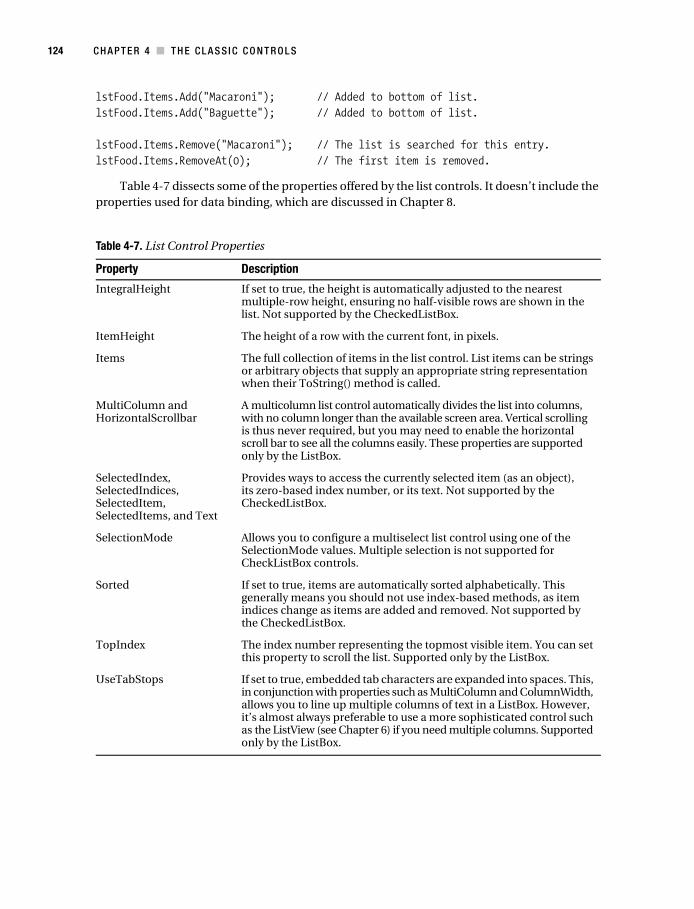
Table 4-7 dissects some of the properties offered by the list controls. It doesn’t include the properties used for data binding, which are discussed in Chapter 8.
Table 4-7. List Control Properties
Property Description
IntegralHeight If set to true, the height is automatically adjusted to the nearest multiple-row height, ensuring no half-visible rows are shown in the list. Not supported by the CheckedListBox.
ItemHeight The height of a row with the current font, in pixels.
Items The full collection of items in the list control. List items can be strings or arbitrary objects that supply an appropriate string representation when their ToString() method is called.
MultiColumn and HorizontalScrollbar
A multicolumn list control automatically divides the list into columns, with no column longer than the available screen area. Vertical scrolling is thus never required, but you may need to enable the horizontal scroll bar to see all the columns easily. These properties are supported only by the ListBox.
SelectedIndex, SelectedIndices, SelectedItem, SelectedItems, and Text
Provides ways to access the currently selected item (as an object), its zero-based index number, or its text. Not supported by the CheckedListBox.
SelectionMode Allows you to configure a multiselect list control using one of the SelectionMode values. Multiple selection is not supported for CheckListBox controls.
Sorted If set to true, items are automatically sorted alphabetically. This generally means you should not use index-based methods, as item indices change as items are added and removed. Not supported by the CheckedListBox.
TopIndex The index number representing the topmost visible item. You can set this property to scroll the list. Supported only by the ListBox.
UseTabStops If set to true, embedded tab characters are expanded into spaces. This, in conjunction with properties such as MultiColumn and ColumnWidth, allows you to line up multiple columns of text in a ListBox. However, it’s almost always preferable to use a more sophisticated control such as the ListView (see Chapter 6) if you need multiple columns. Supported only by the ListBox.
Macdonald_4398C04.fm Page 124 Monday, November 21, 2005 7:40 AM
C H A P T E R 4 ■ T H E C LA S S I C C O N T R O L S 125
The CheckedListBox has no concept of selected items. Instead, it recognizes items that are either checked or not checked. Table 4-8 shows the properties it adds.
The ComboBox supports the same selection properties and Items collection as a standard ListBox. It also adds the properties shown in Table 4-9. The ComboBox can work in one of three modes, as specified by the DropDownStyle property. In ComBoxStyle.DropDown mode, the combo box acts as a nonlimiting list where the user can type custom information. In ComboBoxStyle.DropDownList, pressing a key selects the first matching entry. The user cannot enter items that are not in the list.
■Tip You should always make sure to choose the right kind of combo box. The DropDown style is ideal for selected choices that are not comprehensive (such as a field where users can type the name of their operating system). The available list items aren’t mandatory, but they will encourage consistency. The DropDownList style is ideal for a database application where a user is specifying a piece of search criteria by using the values in another table. In this case, if the value doesn’t exist in the database, it’s not valid and can’t be entered by the user.
Table 4-8.CheckedListBox-Specific Properties
Property Description
CheckedItems and CheckedIndices
Provides a collection of currently checked items (as objects) or their index numbers. Supported only by the CheckedListBox.
CheckOnClick If set to true, the check box for an item is toggled with every click. Otherwise, you need to click first to select the item and then click again to change the checked state. Supported only by the CheckedListBox.
ThreeDCheckBoxes Configures the appearance of check boxes for a CheckedListBox. Has no effect if Windows XP styles are used.
Table 4-9. ComboBox-Specific Properties
Property Description
AutoCompleteMode, AutoCompleteCustomSource, AutoCompleteSource
These properties support the autocompletion feature, which is also supported by the TextBox. It’s discussed later in this chapter, in the section “AutoComplete.”
DropDownStyle This specifies the type of drop-down list box. It can be a restrictive or nonrestrictive list.
DropDownHeight This specifies the height (in pixels) of the drop-down portion of the list.
DropDownWidth This specifies the width (in pixels) of the drop-down portion of the list.
Macdonald_4398C04.fm Page 125 Monday, November 21, 2005 7:40 AM
126 C H A P T E R 4 ■ T H E C L A S S I C C O N T R O L S
List Controls with Objects
In the preceding examples, the Items property was treated like a collection of strings. In reality, it’s a collection of objects. To display an item in the list, the list control automatically calls the object’s ToString() method. In other words, you could create a custom data object and add instances to a list control. Just make sure to override the ToString() method, or you will end up with a series of identical items that show the fully qualified class name.
For example, consider the following Customer class:
public class Customer{ public string FirstName; public string LastName; public DateTime BirthDate;
public Customer() {}
public Customer(string firstName, string lastName, DateTime birthDate) { FirstName = firstName; LastName = lastName; BirthDate = birthDate; }
public override string ToString() { return FirstName + " " + LastName; }}
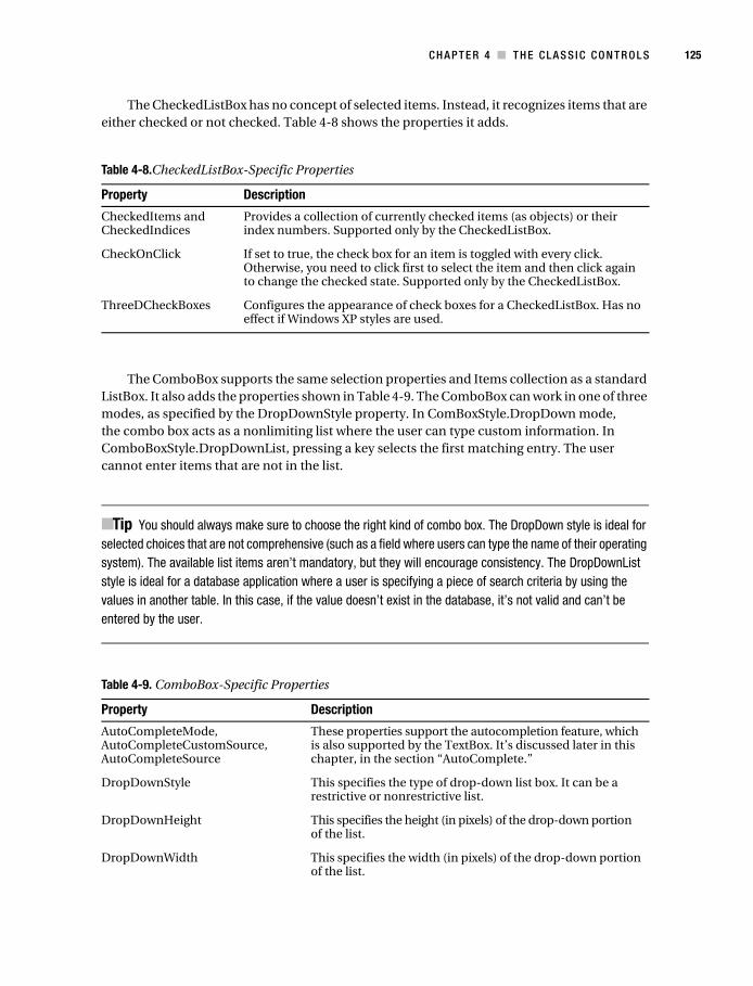
You can add customer objects to the list control natively. Figure 4-4 shows how these Customer objects appear in the list.
DroppedDown This Boolean property indicates whether the list is currently dropped down. You can also set it programmatically.
FlatStyle Allows you to change the rendering of the ComboBox to a flat look that was considered more modern before the introduction of Windows XP styling.
MaxDropDownItems This specifies how many items will be shown in the drop-down portion of the list.
MaxLength For an unrestricted list, this limits the amount of text the user can enter.
DropDown and DropDownClosed events
These events occur when the drop-down portion of the combo box is shown and when it is hidden, respectively.
Table 4-9. ComboBox-Specific Properties (Continued)
Property Description
Macdonald_4398C04.fm Page 126 Monday, November 21, 2005 7:40 AM
C H A P T E R 4 ■ T H E C LA S S I C C O N T R O L S 127
lstCustomers.Items.Add(new Customer("Maurice", "Respighi", DateTime.Now));lstCustomers.Items.Add(new Customer("Sam", "Digweed", DateTime.Now));lstCustomers.Items.Add(new Customer("Faria", "Khan", DateTime.Now));
It’s just as easy to retrieve the currently selected Customer.
Customer cust = (Customer)lstCustomers.SelectedItem;MessageBox.Show("Birth Date: " + cust.BirthDate.ToShortDateString());
Figure 4-4. Filling a list box with objects
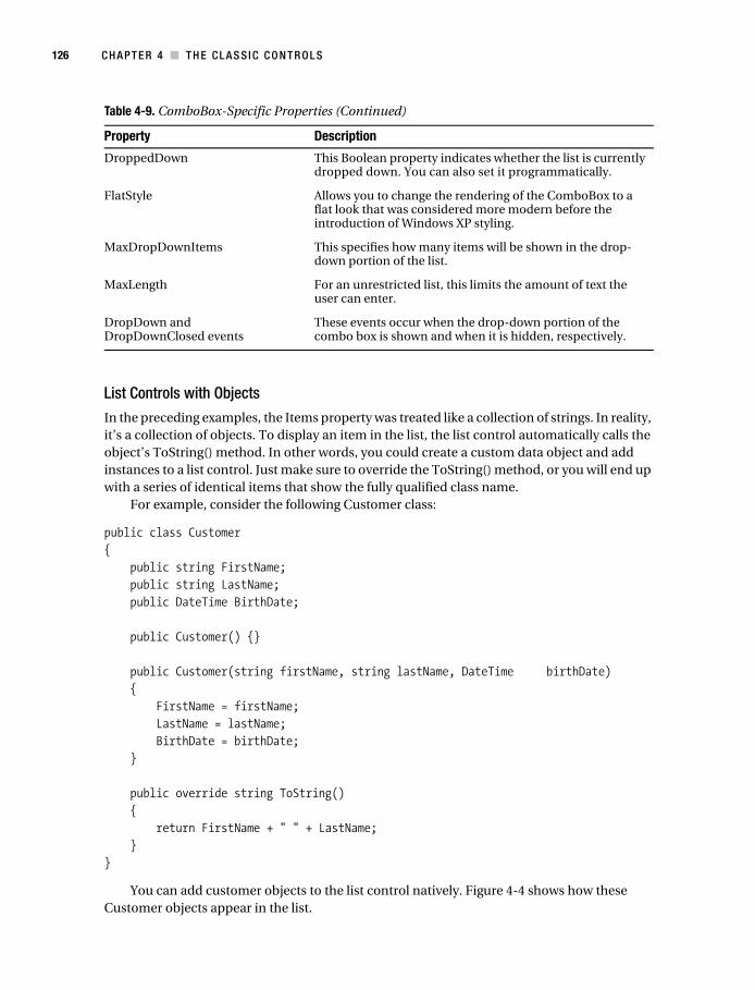
Other Domain ControlsDomain controls restrict user input to a finite set of valid values. The standard ListBox is an example of a domain control, because a user can choose only one of the items in the list. Figure 4-5 shows an overview of the other domain controls provided in .NET.
Figure 4-5. The domain controls
DomainUpDown
DomainUpDown is similar to a list control in that it provides a list of options. The difference is that the user can navigate through this list using only the up/down arrow buttons, moving to either the previous item or the following item. List controls are generally more useful, because they allow multiple items to be shown at once.
To use the DomainUpDown control, add a string for each option to the Items collection. The Text or SelectedIndex property returns the user’s choice.
Macdonald_4398C04.fm Page 127 Monday, November 21, 2005 7:40 AM
128 C H A P T E R 4 ■ T H E C L A S S I C C O N T R O L S
// Add Items.udCity.Items.Add("Tokyo");udCity.Items.Add("Montreal");udCity.Items.Add("New York");
// Select the first one.udCity.SelectedIndex = 0;
NumericUpDown
The NumericUpDown list allows a user to choose a number value by using the up/down arrow buttons (or typing it in directly). You can set the allowed range using the Maximum, Minimum, and DecimalPlaces properties. The current number in the control is set or returned through the Value property.
// Configure a NumericUpDown control.udAge.Maximum = 120;udAge.Minimum = 18;udAge.Value = 21;
TrackBar
The track bar allows the user to choose a value graphically by moving a tab across a vertical or horizontal strip (use the Orientation property to specify it). You set the range of values through the Maximum and Minimum properties, and the Value property returns the current number. However, the user sees a series of “ticks,” not the exact number. This makes the track bar suit-able for a setting that doesn’t have an obvious numeric significance or where the units may be arbitrary, such as when setting volume levels or pitch in an audio program.
// Configure a TrackBar.barVolume.Minimum = 0;barVolume.Maximum = 100;barVolume.Value = 50;
// Show a tick every 5 units.barVolume.TickFrequency = 5;
// The SmallChange is the amount incremented if the user clicks an arrow button// (or presses an arrow key).// The LargeChange is the amount incremented if the user clicks the barVolume// (or presses PageDown or PageUp).barVolume.SmallChange = 5;barVolume.LargeChange = 25;
Macdonald_4398C04.fm Page 128 Monday, November 21, 2005 7:40 AM
C H A P T E R 4 ■ T H E C LA S S I C C O N T R O L S 129
ProgressBar
The progress bar is quite different from the other domain controls because it doesn’t allow any user selection. Instead, you can use it to provide feedback about the progress of a long-running task. As with all the number-based domain controls, the current position of the progress bar is identified by the Value property, which is significant only as it compares to the Maximum and Minimum properties that set the bounds of the progress bar. You can also set a number for the Step property. Calling the Step() method then increments the value of the progress bar by that number.
// Configure the progress bar.// In this case we hard-code a maximum, but it would be more likely that this// would correspond to something else (such as the number of files in a directory).progress.Maximum = 100;progress.Minimum = 0;progress.Value = 0;progress.Step = 5;
// Start a task.for (int i = progress.Minimum; i < progress.Maximum; i += progress.Step){ // (Do work here.)
// Increment the progress bar. progress.PerformStep();}
The Date ControlsRetrieving date information is a common task. For example, requiring a date range is a good way to limit database searches. In the past, programmers have used a variety of controls to retrieve date information, including text boxes that required a specific format of month, date, and year values.
The date controls make life easier. For one thing, they allow dates to be chosen from a graphical calendar view that’s easy to use and prevents users from choosing invalid dates (such as the 31st day in February, for example). They also allow dates to be displayed in a range of formats.
Two date controls exist: DateTimePicker and MonthCalendar. DateTimePicker is ideal for choosing a single date value and requires the same amount of space as an ordinary drop-down list box. When the user clicks the drop-down button, a full month calendar page appears. The user can page from month to month (and even from year to year) looking for a specific date with the built-in navigational controls. The control handles these details automatically.
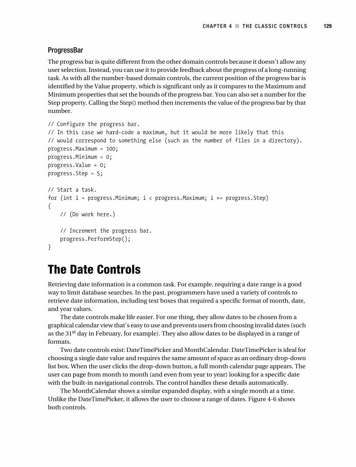
The MonthCalendar shows a similar expanded display, with a single month at a time. Unlike the DateTimePicker, it allows the user to choose a range of dates. Figure 4-6 shows both controls.
Macdonald_4398C04.fm Page 129 Monday, November 21, 2005 7:40 AM
130 C H A P T E R 4 ■ T H E C L A S S I C C O N T R O L S
Figure 4-6. The date controls
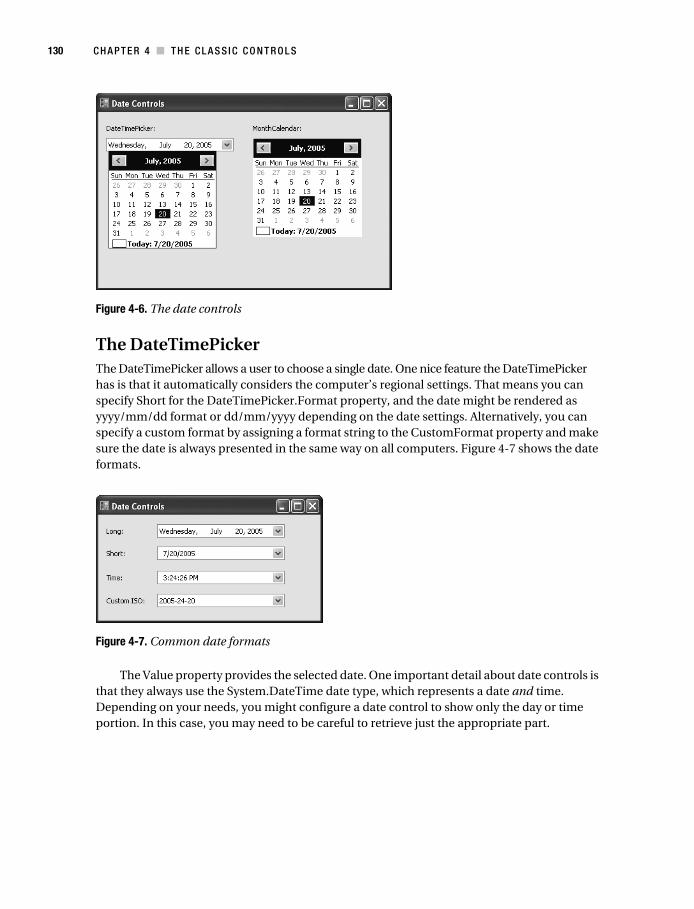
The DateTimePickerThe DateTimePicker allows a user to choose a single date. One nice feature the DateTimePicker has is that it automatically considers the computer’s regional settings. That means you can specify Short for the DateTimePicker.Format property, and the date might be rendered as yyyy/mm/dd format or dd/mm/yyyy depending on the date settings. Alternatively, you can specify a custom format by assigning a format string to the CustomFormat property and make sure the date is always presented in the same way on all computers. Figure 4-7 shows the date formats.
Figure 4-7. Common date formats
The Value property provides the selected date. One important detail about date controls is that they always use the System.DateTime date type, which represents a date and time. Depending on your needs, you might configure a date control to show only the day or time portion. In this case, you may need to be careful to retrieve just the appropriate part.
Macdonald_4398C04.fm Page 130 Monday, November 21, 2005 7:40 AM
C H A P T E R 4 ■ T H E C LA S S I C C O N T R O L S 131
For example, imagine you are using a DateTimePicker control, which allows the user to choose the start date for a database search. The date control is configured to show dates in the long format, which doesn’t include time information.
When the form loads, you configure the date control.
dtStart.Value = DateTime.Now; // Sets dtStart to the current date and time.
The user might then click a different date. However, choosing a different date updates only the month, year, and day components of the date. The time component remains, even though it is not displayed!
// The next line performs a search based on the date and the original time.// This artificially limits the returned results.string SQLSelect = "SELECT * FROM Orders WHERE Date >'" + dtStart.Value.ToString() + "'";
If you initialized the DateTimePicker at lunchtime, you could lose the first half of the day from your search.
You can avoid this problem in a number of ways. For example, you can use the DateTime.Date property, which returns another DateTime object that has its time portion set to 0 (midnight).
// This gets the full day.string SQLSelect = "SELECT * FROM Orders WHERE Date >'" + dtStart.Value.Date.ToString() + "'";
You could also use the DateTime.Today property to set the initial value instead of DateTime.Now. This is a good technique for the MonthCalendar control as well. The MonthCalendar automatically sets the time component for the current value to 0 when the user selects a date, but if the user leaves the default date unchanged, and you’ve assigned a date with information, the time portion remains.
But the best approach is to use a format string to control exactly what comes out when you convert a date to a string. Here’s an example that ensures you’re using the ISO-standard year-month-day format, which is understood by almost every relational database product:
// This ensures the correct date format (and ignores the time component).string SQLSelect = "SELECT * FROM Orders WHERE Date >'" + dtStart.Value.Date.ToString("yyyy-mm-dd") + "'";
You can also use a DateTimePicker to represent a time value with no date component. To do so, set the Format property to Time. You also need to set the UseUpDown property to true. This prevents the drop-down month display from being shown. Use the up/down scroll buttons instead to increment the highlighted time component (hours, minutes, or seconds).
Table 4-10 lists the important properties of the DateTimePicker control.
Macdonald_4398C04.fm Page 131 Monday, November 21, 2005 7:40 AM
132 C H A P T E R 4 ■ T H E C L A S S I C C O N T R O L S
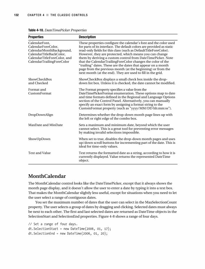
MonthCalendarThe MonthCalendar control looks like the DateTimePicker, except that it always shows the month page display, and it doesn’t allow the user to enter a date by typing it into a text box. That makes the MonthCalendar slightly less useful, except for situations when you need to let the user select a range of contiguous dates.
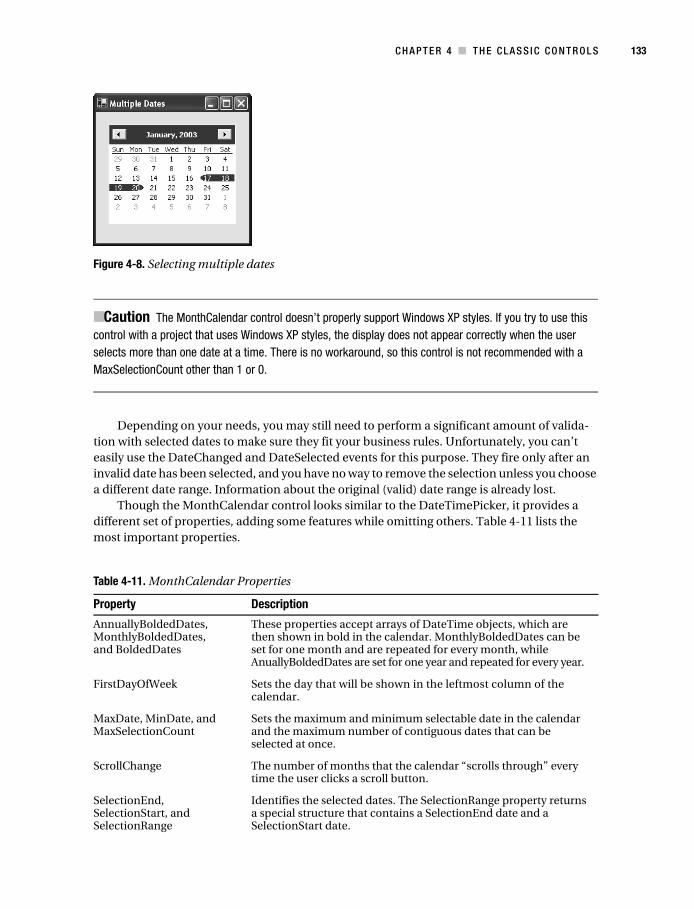
You set the maximum number of dates that the user can select in the MaxSelectionCount property. The user selects a group of dates by dragging and clicking. Selected dates must always be next to each other. The first and last selected dates are returned as DateTime objects in the SelectionStart and SelectionEnd properties. Figure 4-8 shows a range of four days.
// Set a range of four days.dt.SelectionStart = new DateTime(2006, 01, 17);dt.SelectionEnd = new DateTime(2006, 01, 20);
Table 4-10. DateTimePicker Properties
Properties Description
CalendarFont, CalendarForeColor, CalendarMonthBackground, CalendarTitleBackColor, CalendarTitleForeColor, and CalendarTrailingForeColor
These properties configure the calendar’s font and the color used for parts of its interface. The default colors are provided as static read-only fields for this class (such as DefaultTitleForeColor). However, they are protected, which means you can change them by deriving a custom control from DateTimePicker. Note that the CalendarTrailingForeColor changes the color of the “trailing” dates. These are the dates that appear on a month page from the previous month (at the beginning) or from the next month (at the end). They are used to fill in the grid.
ShowCheckBox and Checked
ShowCheckBox displays a small check box inside the drop-down list box. Unless it is checked, the date cannot be modified.
Format and CustomFormat
The Format property specifies a value from the DateTimePickerFormat enumeration. These options map to date and time formats defined in the Regional and Language Options section of the Control Panel. Alternatively, you can manually specify an exact form by assigning a format string to the CustomFormat property (such as “yyyy/MM/DD hh:mm:ss”).
DropDownAlign Determines whether the drop-down month page lines up with the left or right edge of the combo box.
MaxDate and MinDate Sets a maximum and minimum date, beyond which the user cannot select. This is a great tool for preventing error messages by making invalid selections impossible.
ShowUpDown When set to true, disables the drop-down month pages and uses up/down scroll buttons for incrementing part of the date. This is ideal for time-only values.
Text and Value Text returns the formatted date as a string, according to how it is currently displayed. Value returns the represented DateTime object.
Macdonald_4398C04.fm Page 132 Monday, November 21, 2005 7:40 AM
C H A P T E R 4 ■ T H E C LA S S I C C O N T R O L S 133
Figure 4-8. Selecting multiple dates
■Caution The MonthCalendar control doesn’t properly support Windows XP styles. If you try to use this control with a project that uses Windows XP styles, the display does not appear correctly when the user selects more than one date at a time. There is no workaround, so this control is not recommended with a MaxSelectionCount other than 1 or 0.
Depending on your needs, you may still need to perform a significant amount of valida-tion with selected dates to make sure they fit your business rules. Unfortunately, you can’t easily use the DateChanged and DateSelected events for this purpose. They fire only after an invalid date has been selected, and you have no way to remove the selection unless you choose a different date range. Information about the original (valid) date range is already lost.
Though the MonthCalendar control looks similar to the DateTimePicker, it provides a different set of properties, adding some features while omitting others. Table 4-11 lists the most important properties.
Table 4-11. MonthCalendar Properties
Property Description
AnnuallyBoldedDates, MonthlyBoldedDates, and BoldedDates
These properties accept arrays of DateTime objects, which are then shown in bold in the calendar. MonthlyBoldedDates can be set for one month and are repeated for every month, while AnuallyBoldedDates are set for one year and repeated for every year.
FirstDayOfWeek Sets the day that will be shown in the leftmost column of the calendar.
MaxDate, MinDate, and MaxSelectionCount
Sets the maximum and minimum selectable date in the calendar and the maximum number of contiguous dates that can be selected at once.
ScrollChange The number of months that the calendar “scrolls through” every time the user clicks a scroll button.
SelectionEnd, SelectionStart, and SelectionRange
Identifies the selected dates. The SelectionRange property returns a special structure that contains a SelectionEnd date and a SelectionStart date.
Macdonald_4398C04.fm Page 133 Monday, November 21, 2005 7:40 AM
134 C H A P T E R 4 ■ T H E C L A S S I C C O N T R O L S
Container ControlsThe .NET Framework defines a few controls that are designed explicitly for grouping other controls:
• GroupBox. This control is drawn as a titled box and is commonly used for visually isolating related groups of controls.
• Panel. This control has no default appearance but supports scrolling and padding.
• SplitContainer. This control combines two Panel controls, separated by a splitter bar.
• TabControl. This control hosts one or more TabPage controls (only one of which can be shown at a time). The TabPage controls are the containers that hold your controls.
• FlowLayoutPanel and TableLayoutPanel. These controls are designed for automating highly dynamic or configurable interfaces and are discussed in Chapter 21.
The Panel and GroupBox are the simplest of the five. The Panel control is similar to the GroupBox control; however, only the Panel control can have scroll bars (when the AutoScroll property is set to true), and only the GroupBox control displays a caption (set in the Text prop-erty). Also, the Panel control supports DockPadding, which makes it a necessary ingredient in the complex resizable forms you’ll learn about later in this chapter). The GroupBox control does not provide this ability.
You will probably group controls using one of these container controls for two reasons. The first reason occurs when you have more than one group of radio buttons. To associate these as a group (so that only one option in the group can be selected at a time), you must place them into separate containers. The other reason is to manage the layout of the controls. Some controls do little in this regard (such as the GroupBox), while others add support for resizing dynamically (the SplitContainer), hiding individual groups (the TabControl), scrolling (the Panel), and producing complex layouts (the FlowLayoutPanel and TableLayoutPanel).
You’ve already learned about the GroupBox, Panel, and SplitContainer in the previous chapter. The next section describes the TabControl.
ShowToday and ShowTodayCircle
These properties, when true, show the current day in a special line at the bottom of the control and highlight it in the calendar.
ShowWeekNumbers If true, displays a number next to each week in the year from 1 to 52.
TodayDate and TodayDateSet
TodayDate indicates what date is shown as “today” in the MonthCalendar. If you set this value manually in code, TodayDateSet is true.
TitleBackColor, TitleForeColor, and TrailingForeColor
Sets colors associated with the MonthCalendar. Note that the TrailingForeColor changes the color of the “trailing” dates. These are the dates that appear on a month page from the previous month (at the beginning) or from the next month (at the end). They are used to fill in the grid.
Table 4-11. MonthCalendar Properties (Continued)
Property Description
Macdonald_4398C04.fm Page 134 Monday, November 21, 2005 7:40 AM
C H A P T E R 4 ■ T H E C LA S S I C C O N T R O L S 135
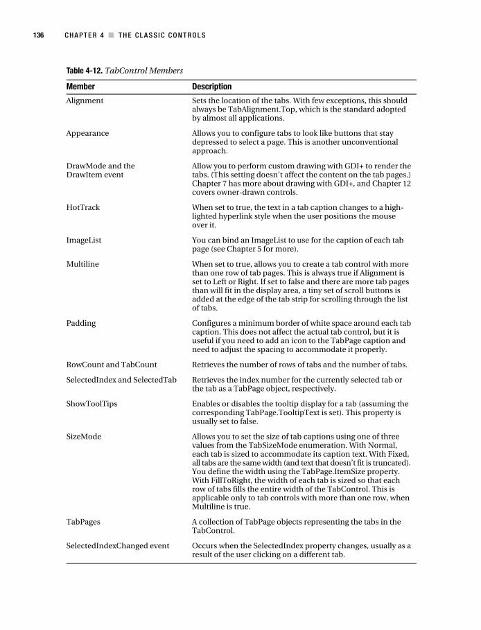
The TabControlThe TabControl is another staple of Windows development—it groups controls into multiple “pages.” The technique has become remarkably successful because it allows a large amount of information to be compacted into a small, organized space. It’s also easy to use because it recalls the tabbed pages of a binder or notebook. Over the years, the tab control has evolved into today’s forms, which are sometimes called property pages.
In .NET, you create a TabControl object, which contains a collection of TabPage objects in the TabPages property. Individual controls are then added to each TabPage object. The example that follows shows the basic approach, assuming your form contains a TabControl called tabProperties:
TabPage pageFile = new TabPage("File Locations");TabPage pageUser = new TabPage("User Information");
// Add controls to the tab pages.// The code for creating and configuring the child controls is omitted.pageUser.Controls.Add(txtFirstName);pageUser.Controls.Add(txtLastName);pageUser.Controls.Add(lblFirstName);pageUser.Controls.Add(lblLastName);tabProperties.TabPages.Add(pageFile);tabProperties.TabPages.Add(pageUser);
Figure 4-9 shows the output for this code.
Figure 4-9. Using the TabPage control
Of course, most of the time you won’t create a tab page and add controls by hand. Instead, you’ll drag and drop controls at design time, and Visual Studio will add the necessary code to your form.
Table 4-12 lists some of the most important TabControl properties. Table 4-13 lists the TabPage properties.
Macdonald_4398C04.fm Page 135 Monday, November 21, 2005 7:40 AM
136 C H A P T E R 4 ■ T H E C L A S S I C C O N T R O L S
Table 4-12. TabControl Members
Member Description
Alignment Sets the location of the tabs. With few exceptions, this should always be TabAlignment.Top, which is the standard adopted by almost all applications.
Appearance Allows you to configure tabs to look like buttons that stay depressed to select a page. This is another unconventional approach.
DrawMode and the DrawItem event
Allow you to perform custom drawing with GDI+ to render the tabs. (This setting doesn’t affect the content on the tab pages.) Chapter 7 has more about drawing with GDI+, and Chapter 12 covers owner-drawn controls.
HotTrack When set to true, the text in a tab caption changes to a high-lighted hyperlink style when the user positions the mouse over it.
ImageList You can bind an ImageList to use for the caption of each tab page (see Chapter 5 for more).
Multiline When set to true, allows you to create a tab control with more than one row of tab pages. This is always true if Alignment is set to Left or Right. If set to false and there are more tab pages than will fit in the display area, a tiny set of scroll buttons is added at the edge of the tab strip for scrolling through the list of tabs.
Padding Configures a minimum border of white space around each tab caption. This does not affect the actual tab control, but it is useful if you need to add an icon to the TabPage caption and need to adjust the spacing to accommodate it properly.
RowCount and TabCount Retrieves the number of rows of tabs and the number of tabs.
SelectedIndex and SelectedTab Retrieves the index number for the currently selected tab or the tab as a TabPage object, respectively.
ShowToolTips Enables or disables the tooltip display for a tab (assuming the corresponding TabPage.TooltipText is set). This property is usually set to false.
SizeMode Allows you to set the size of tab captions using one of three values from the TabSizeMode enumeration. With Normal, each tab is sized to accommodate its caption text. With Fixed, all tabs are the same width (and text that doesn’t fit is truncated). You define the width using the TabPage.ItemSize property. With FillToRight, the width of each tab is sized so that each row of tabs fills the entire width of the TabControl. This is applicable only to tab controls with more than one row, when Multiline is true.
TabPages A collection of TabPage objects representing the tabs in the TabControl.
SelectedIndexChanged event Occurs when the SelectedIndex property changes, usually as a result of the user clicking on a different tab.
Macdonald_4398C04.fm Page 136 Monday, November 21, 2005 7:40 AM

C H A P T E R 4 ■ T H E C LA S S I C C O N T R O L S 137
AutoCompleteLooking for a way to make text entry a little easier? A common solution in Windows applications is AutoComplete input controls. These controls store recent entries and offer them when the user starts to type something similar. You’ll see autocompletion at work when you type a URL into Internet Explorer’s address bar or when you enter a file name in the Run dialog box (choose Run from the Start menu). Other applications use them for a variety of purposes, such as tracking recent help searches in Microsoft Word and tracking recent cell entries in Microsoft Excel.
In .NET 1.0 and 1.1, developers who wanted autocompletion functionality had to code it themselves. And though the process is conceptually simple, the low-level quirks in how different controls handle keystrokes and selection often caused problems or unusual behavior. In .NET 2.0, the TextBox and ComboBox controls provide built-in support for autocompletion through three properties: AutoCompleteSource, AutoCompleteMode, and (optionally) AutoCompleteCustomSource. When using autocompletion, you can use your own list of suggestions or one of the lists maintained by the operating system (such as the list of recently visited URLs).
First, you need to specify what list of values will be used for suggestions. You do this by setting the AutoCompleteSource property to one of the values listed in Table 4-14.
Table 4-13. TabPage Properties
Property Description
ImageIndex and ImageKey
The image shown in the tab (see Chapter 5).
Text The text shown in the tab.
ToolTipText The tooltip shown when the user hovers over the tab, if the TabControl.ShowToolTips property is true. No ToolTipProvider is used.
Table 4-14. AutoCompleteSource Values
Value Description
FileSystem Includes recently entered file paths.
HistoryList Includes URLs from Internet Explorer’s history list.
RecentlyUsedList Includes all the documents in the current user’s list of recently used appli-cations, which appears in the Start menu (depending on system settings).
AllUrl Represents the combination of the HistoryLisy and RecentlyUsedList (with duplicates omitted).
AllSystemSources Represents the combination of the FileSystem and AllUrl options (with duplicates omitted).
ListItems This option applies only to a ComboBox (it isn’t supported for TextBox controls). If you use this option, this list of items is taken from the ComboBox.Items collection.
CustomSource Uses the collection of strings you’ve specified in the control’s AutoCompleteCustomSource collection. You need to add these items at design time using the Properties window or add them programmatically.
Macdonald_4398C04.fm Page 137 Monday, November 21, 2005 7:40 AM

138 C H A P T E R 4 ■ T H E C L A S S I C C O N T R O L S
■Tip When using autocompletion with a combo box, the AutoCompleteSource.ListItems option makes the most sense. Otherwise, you’ll have two different lists of items that the user can choose from—a list of items that appears in the control and a list of autocompletion suggestions that appears as the user types.
Next, you need to set the control’s AutoCompleteMode mode to one of the options in Table 4-15. This determines how the autocompletion behavior will work with the control.
Figure 4-10 shows an AutoComplete combo box that uses AutoCompleteMode.SuggestAppend and AutoCompleteSource.ListItems. The items are added to the list with this line of code:
string[] colorNames = Enum.GetNames(typeof(KnownColor));lstColors.Items.AddRange(colorNames);
Figure 4-10. An AutoComplete combo box
Table 4-15. AutoCompleteMode Values
Value Description
Append With this mode, the AutoComplete suggestion is automatically inserted into the control as the user types. For example, if you start by pressing the E key within a text box, the first item that starts with E appears in the control. However, the added portion is selected so that if the user continues to type, the new portion will be replaced. This is the autocompletion behavior used in Excel and older versions of Internet Explorer.
Suggest With this mode, a drop-down list of matching AutoComplete values appears underneath the control. If one of these entries matches what you want, you can select it and it will be inserted in the control automatically. This is usually the preferred autocompletion option, because it allows the user to see multiple suggestions at once. It’s the same as the behavior provided in modern versions of Internet Explorer.
SuggestAppend This mode combines Append and Suggest. As with Suggest, a list of matches appears in a drop-down list under the control. However, the first match is also added inserted in the control and selected.
Macdonald_4398C04.fm Page 138 Monday, November 21, 2005 7:40 AM

C H A P T E R 4 ■ T H E C LA S S I C C O N T R O L S 139
Drag-and-DropDrag-and-drop operations aren’t quite as common today as they were a few years ago, because programmers have gradually settled on other methods of copying information that don’t require holding down the mouse button (a technique that many users find difficult to master). For example, a drawing program is likely to use a two-step operation (select an object, and then draw it) rather than a single drag-and-drop operation. Programs that do support drag-and-drop often use it as a shortcut for advanced users, rather than a standard way of working.
Drag-and-drop is also sometimes confused with the ability to “drag” a picture or piece of user interface around a window. This “fake” drag-and-drop is useful in drawing and diagram-ming applications (including the drawing application developed in Chapter 24), but it needs to be coded manually. In the following sections, you will learn about both types of dragging operations.
“Fake” Drag-and-DropTrue drag-and-drop is a user-initiated way to exchange information between two controls. You don’t need to use drag-and-drop events to create objects that the user can move around the form. For example, consider the program shown in Figure 4-11, which allows a user to click a picture box, drag it, and release it somewhere else on the form.
Figure 4-11. Dragging a control around a form
Conceptually, a control is being dragged and dropped, but all the logic takes place in the appropriate mouse-handling events of the draggable control. In this case, you need to handle MouseDown (to start the dragging operation), MouseUp (to end it), and MouseMove (to move the control if the drag is in progress). A Form-level isDragging variable keeps track of when fake drag-and-drop mode is currently switched on.
// Keep track of when fake "drag-and-drop" mode is enabled.private bool isDragging = false;
// Store the location where the user clicked the control.private int clickOffsetX, clickOffsetY;
Macdonald_4398C04.fm Page 139 Monday, November 21, 2005 7:40 AM

140 C H A P T E R 4 ■ T H E C L A S S I C C O N T R O L S
// Start dragging.private void picDragger_MouseDown(System.Object sender, System.Windows.Forms.MouseEventArgs e){ isDragging = true; clickOffsetX = e.X; clickOffsetY = e.Y;}
// End dragging.private void picDragger_MouseUp(System.Object sender, System.Windows.Forms.MouseEventArgs e){ isDragging = false;}
// Move the control (during dragging).private void picDragger_MouseMove(System.Object sender, System.Windows.Forms.MouseEventArgs e){ if (isDragging) { // The control coordinates are converted into form coordinates // by adding the label position offset. // The offset where the user clicked in the control is also // accounted for. Otherwise, it looks like the top-left corner // of the label is attached to the mouse. lblDragger.Left = e.X + lblDragger.Left - clickOffsetX; lblDragger.Top = e.Y + lblDragger.Top - clickOffsetY; }}
Three components factor into the position calculation:
• The e.X and e.Y parameters provide the position of the mouse over the control, where (0,0) is the top-left corner of the control.
• The lblDragger.Left and lblDragger.Top properties give the distance between the top-left corner of the control and the top-left corner of the form.
• The ClickOffsetX and ClickOffsetY variables give the position between the control’s top-left corner and where the user actually clicked to start dragging. By taking this into account, the label acts as though it is “glued” to the mouse at that point.
Authentic Drag-and-DropReal drag-and-drop operations are quite a bit different from fake ones. Essentially, they work like this:
Macdonald_4398C04.fm Page 140 Monday, November 21, 2005 7:40 AM

C H A P T E R 4 ■ T H E C LA S S I C C O N T R O L S 141
1. The user clicks a control (or a specific region inside a control) and holds down the mouse button. At this point, some information is set aside, and a drag-and-drop oper-ation begins.
2. The user moves the mouse over another control. If this control can accept the current type of content (for example, a picture or text), the mouse cursor changes to a special drag-and-drop icon. Otherwise, the mouse cursor becomes a circle with a line drawn through it.
3. When the user releases the mouse button, the control receives the information and decides what to do with it. The operation should also be cancelable by pressing the Esc key (without releasing the mouse button).
Unlike the fake drag-and-drop example, a real drag-and-drop operation can easily take place between controls, or even two different applications, as long as the drag-and-drop contract is followed.
The example program shown in Figure 4-12 uses drag-and-drop to take a picture from a label control and draw it onto a picture box control. You’ll find the complete code with the samples for this chapter under the project name AuthenticDragAndDrop.
Figure 4-12. A sample drag-and-drop application
The first step is to configure the picture box control to accept dropped information.
picDrawingArea.AllowDrop = true;
To start the drag-and-drop, you can use the DoDragDrop() method of the source control. In this case, it is one of three labels. Dragging is initiated in the MouseDown event for the label.
private void lbl_MouseDown(object sender, System.Windows.Forms.MouseEventArgs e){ Label lbl = (Label)sender; lbl.DoDragDrop(lbl.Image, DragDropEffects.Copy);}
Macdonald_4398C04.fm Page 141 Monday, November 21, 2005 7:40 AM
142 C H A P T E R 4 ■ T H E C L A S S I C C O N T R O L S
The same event handler takes care of the MouseDown event for each label. In the event handler, the generic sender reference (which points to the object that sent the event) is converted into a label. Then, a drag-and-drop copy operation starts. The information associated with this operation is the image from the label control.
To allow the drop target picture box to receive information, you need to verify that the information is the correct type in the DragEnter event and then set a special event argument (e.Effect). DragEnter occurs once when the mouse moves into the bounds of the control.
private void picDrawingArea_DragEnter(object sender, System.Windows.Forms.DragEventArgs e){ if (e.Data.GetDataPresent(DataFormats.Bitmap)) e.Effect = DragDropEffects.Copy; else e.Effect = DragDropEffects.None;}
The last step is to respond to the information once it is dropped by handling the DragDrop event. You can do anything you want with the dropped information. In the current example, a GDI+ drawing operation starts (although it could make just as much sense to set its Image property).
private void picDrawingArea_DragDrop(object sender, System.Windows.Forms.DragEventArgs e){ // Use this offset to center the 30x30-pixel images. int offset = 15;
// Convert the coordinates from screen-based to form-based. Point p = this.PointToClient(new Point(e.X - offset, e.Y - offset));
// Paint a temporary picture at this location. Graphics g = picDrawingArea.CreateGraphics(); g.DrawImage((Image)e.Data.GetData(DataFormats.Bitmap), p);}
Note that the event handler provides screen coordinates, which must be converted into the appropriate coordinates for the picture box.
Practically, you can exchange any type of object through a drag-and-drop operation. However, while this free-spirited approach is perfect for your applications, it isn’t wise if you need to communicate with other applications. If you want to drag and drop into other applica-tions, you should use data from a managed base class (such as String or Image) or an object that implements ISerializable or IDataObject (which allows .NET to transfer your object into a stream of bytes and reconstruct the object in another application domain).
Macdonald_4398C04.fm Page 142 Monday, November 21, 2005 7:40 AM

C H A P T E R 4 ■ T H E C LA S S I C C O N T R O L S 143
Extender ProvidersExtender providers are a specialized type of component that can add properties to other controls on the same form. They’re useful because they allow you to add a feature to a number of controls at the same time. The possible alternatives—writing code for each individual control or deriving custom controls—require much more work. Of course, because of the way provider components are implemented, they work only for certain types of extensions. Because providers are separate classes, they don’t have the ability to reach into a control and tweak its inner work-ings. However, they do have the ability to react to events, display information elsewhere on the form, and perform any other action.
The easiest way to understand the role of extender providers is to consider an example. .NET provides three extender provider components:
• ToolTip. This provider lets you show a pop-up tooltip window with descriptive informa-tion next to any control. The ToolTip provider is discussed in this section.
• ErrorProvider. This provider lets you show a flashing error icon (with a tooltip error message) when invalid data is entered. It’s described in Chapter 18.
• HelpProvider. This provider lets you show help messages or launch a context-sensitive help topic in another window. You’ll use it in Chapter 22.
■Note Three other .NET types implement the IExtenderProvider interface but aren’t considered to be dedicated extender providers. The FlowLayoutPanel and TableLayoutPanel use it to add features to the child controls they contain (see Chapter 21). The PropertyTab uses it as part of the infrastructure for the Visual Studio Properties window.
Some providers derive from Component and appear in the component tray under the design surface of the form. Other providers derive from Control, which allows them to be placed on the form. It all depends on how the extender provider works and whether it needs a piece of dedicated screen real estate. For example, the ToolTip provider appears in the compo-nent tray. It displays a tooltip on any control when the mouse hovers over it.
Once you’ve added a ToolTip provider to a form, you can set a tooltip on any control in one of two ways:
• At design time, select the appropriate control, and look in the Properties window for the property ToolTip on tipProvider (where tipProvider is the name of the ToolTip component).
• At runtime, call tipProvider.SetToolTip() with a reference to the control. You can also use the GetToolTip() method to retrieve a control’s tooltip.
Macdonald_4398C04.fm Page 143 Monday, November 21, 2005 7:40 AM
144 C H A P T E R 4 ■ T H E C L A S S I C C O N T R O L S
■Tip There really isn’t any difference between using the SetToolTip() method and the extended ToolTip property provided by the Form designer. With providers, Visual Studio simply translates what you type in the Properties window into the appropriate method call and adds the code to the form class. So, when you visually set the ToolTip property, you are still in fact using the SetToolTip() method. Take a look at InitializeComponent() to see what is generated by Visual Studio.
Here’s an example of how you can (and can’t) use a ToolTip provider programmatically:
// This code works. It uses the SetToolTip() method to attach a tooltip// to the txtName control.tips.SetToolTip(txtName, "Enter Your Name Here");
// This code doesn't work! It attempts to set the tooltip of the txtName control// directly, even though the TextBox class does not provide a ToolTip property.txtName.ToolTip = "Enter Your Name Here";
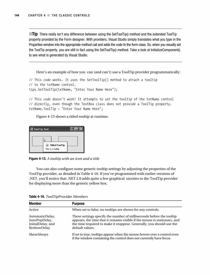
Figure 4-13 shows a titled tooltip at runtime.
Figure 4-13. A tooltip with an icon and a title
You can also configure some generic tooltip settings by adjusting the properties of the ToolTip provider, as detailed in Table 4-16. If you’ve programmed with earlier versions of .NET, you’ll notice that .NET 2.0 adds quite a few graphical niceties to the ToolTip provider for displaying more than the generic yellow box.
Table 4-16. ToolTipProvider Members
Member Purpose
Active When set to false, no tooltips are shown for any controls.
AutomaticDelay, AutoPopDelay, InitialDelay, and ReshowDelay
These settings specify the number of milliseconds before the tooltip appears, the time that it remains visible if the mouse is stationary, and the time required to make it reappear. Generally, you should use the default values.
ShowAlways If set to true, tooltips appear when the mouse hovers over a control even if the window containing the control does not currently have focus.
Macdonald_4398C04.fm Page 144 Monday, November 21, 2005 7:40 AM
C H A P T E R 4 ■ T H E C LA S S I C C O N T R O L S 145
■Note For a lower-level look at how providers work, see Chapter 25, where you’ll learn how to create your own.
The NotifyIconIn many other programming frameworks, it’s difficult to use a system tray icon. In .NET it’s as easy as adding the straightforward NotifyIcon component, which is described in Table 4-17.
SetToolTip(), GetToolTip(), and RemoveAll()
These methods allow you to attach a descriptive string to a control and retrieve it. To remove a tooltip, either attach an empty string or use RemoveAll() to clear all tooltips at once. (To temporarily disable tooltips without removing the tooltip information, use the Active property.)
ForeColor and BackColor
Adjusts the colors of the tooltip text and background.
ToolTipTitle Sets a title that appears, in boldface, above the tooltip text in the tooltip window. Note that this title isn’t control-specific—you set it once, and it applies to all the tooltips you show.
ToolTipIcon Takes one of four values: None, Info, Warning, or Error. If you don’t use None, the corresponding icon will appear in the tooltip window.
IsBalloon Draws the tooltip as a balloon. This will fail without an error if you've disabled balloon tips. Balloon tips are disabled when there's an EnableBalloonTips registry setting with a value of 0 in the HKEY_CURRENT_USER\Software\Microsoft\Windows\CurrentVersion\Explorer\Advanced section.
UseAnimation and UseFading
Sets whether the tooltip uses animated effects and when they appear and fade away, if the system settings allow them.
OwnerDraw and Draw events
If set to true, your code has the chance to draw the tooltip. To do so, you need to respond to the Draw event and use GDI+ drawing code, as described in Chapter 7.
Table 4-17. NotifyIcon Members
Member Description
ContextMenuStrip The ContextMenuStrip object defines a menu for your system tray icon. It is displayed automatically when the user right-clicks the icon. For more information about creating and fine-tuning menus, see Chapter 14.
Icon The graphical icon that appears in the system tray (as an Icon object). You can get a few commonly used icons from the properties of the SystemIcons class, or use the image library included with Visual Studio (see Chapter 5 for details).
Text The tooltip text that appears above the system tray icon.
Table 4-16. ToolTipProvider Members
Member Purpose
Macdonald_4398C04.fm Page 145 Monday, November 21, 2005 7:40 AM

146 C H A P T E R 4 ■ T H E C L A S S I C C O N T R O L S
Technically, the NotifyIcon is a component (not a control), that displays an icon in the system tray at runtime. In many cases, it’s more useful to create the NotifyIcon dynamically at runtime. For example, you might create a utility application that loads into the system tray and waits quietly, monitoring for some system event or waiting for user actions. In this case, you need to be able to create the system tray icon without displaying a form.
The next example demonstrates exactly such an application. When it first loads, it creates a system tray icon (see Figure 4-14), attaches two menu items to it, and begins monitoring the file system for changes (using the System.IO.FileSystemWatcher class). No windows are displayed.
Figure 4-14. A system tray icon
In this example, it’s important that the NotifyIcon is displayed even though no forms have been loaded. This is a fairly easy task to accomplish. All you need to do is create the form that contains the NotifyIcon component, without calling the Show() or ShowDialog() method to display that form. The NotifyIcon appears immediately when its Visible property is set to true.
For a lightweight option, you can host the NotifyIcon on a component class instead of a form. To create the component, just select Project ➤ Add Component in Visual Studio. Every component has the ability to host design-time controls—just drag and drop the control onto the design-time view of the class, and Visual Studio will create the code in the special hidden designer region, just as it does with a form. And for an even lighter option, you could create the NotifyIcon object yourself in the Main() method, and set its Visible property to true to make it appear in the system tray. However, you’ll surrender some notable design-time conveniences.
Visible Set this to true to show the icon. It defaults to false, giving you a chance to set up the rest of the required functionality.
Click, DoubleClick, MouseDown, MouseMove, and MouseUp events
These events work the same as the Control-class events with the same names. They allow you to respond to the mouse actions.
BalloonTipText, BalloonTipTitle, BalloonTipIcon
Define the text, title, and icon for a balloon-style tooltip. This tooltip won’t appear until you call the ShowBalloonTip() method in your code.
ShowBalloonTip() Shows the balloon tooltip defined by the BalloonTipText, BalloonTipTitle, and BalloonTipIcon properties. You specify the delay (in milliseconds) before the tooltip is cleared. An overloaded version of this method allows you to specify a new BalloonTipText, BalloonTipTitle, and BalloonTipIcon.
BalloonTipShown, BalloonTipClicked, and BalloonTipClosed events
Allow you to react when the tip is first shown, subsequently clicked, and closed by the user.
Table 4-17. NotifyIcon Members (Continued)
Member Description
Macdonald_4398C04.fm Page 146 Monday, November 21, 2005 7:40 AM
C H A P T E R 4 ■ T H E C LA S S I C C O N T R O L S 147
For example, if you want to create a linked menu for the icon, you’ll need to write the code by hand. If you’ve placed your NotifyIcon on a form or component, you can simply add a ContextMenuStrip in the same place, and customize it in the Properties window.
Here’s an example of a component that includes a NotifyIcon, ContextMenuStrip, and FileSystemWatcher:
public partial class FileSystemTray : Component{ // Constructors omitted.
// Track newly created files here. private List<string> newFiles = new List<string>();
// Fires when a new file is added. private void fileSystemWatcher1_Changed(object sender, System.IO.FileSystemEventArgs e) { newFiles.Add(e.Name); }
// Fires when the Exit menu command is clicked. private void cmdExit_Click(object sender, System.EventArgs e) { Application.Exit(); }
// Fires when the Show Files menu command is clicked. private void cmdShowFiles_Click(object sender, System.EventArgs e) { FileList frmFileList = new FileList(); frmFileList.FillList(newFiles); frmFileList.Show(); }}
And here’s the Main() method code that gets it all started:
static void Main(){ Application.EnableVisualStyles();
// Show the system tray icon. FileSystemTray cmp = new FileSystemTray();
// Start a message loop and don't exit. Application.Run();}
Macdonald_4398C04.fm Page 147 Monday, November 21, 2005 7:40 AM
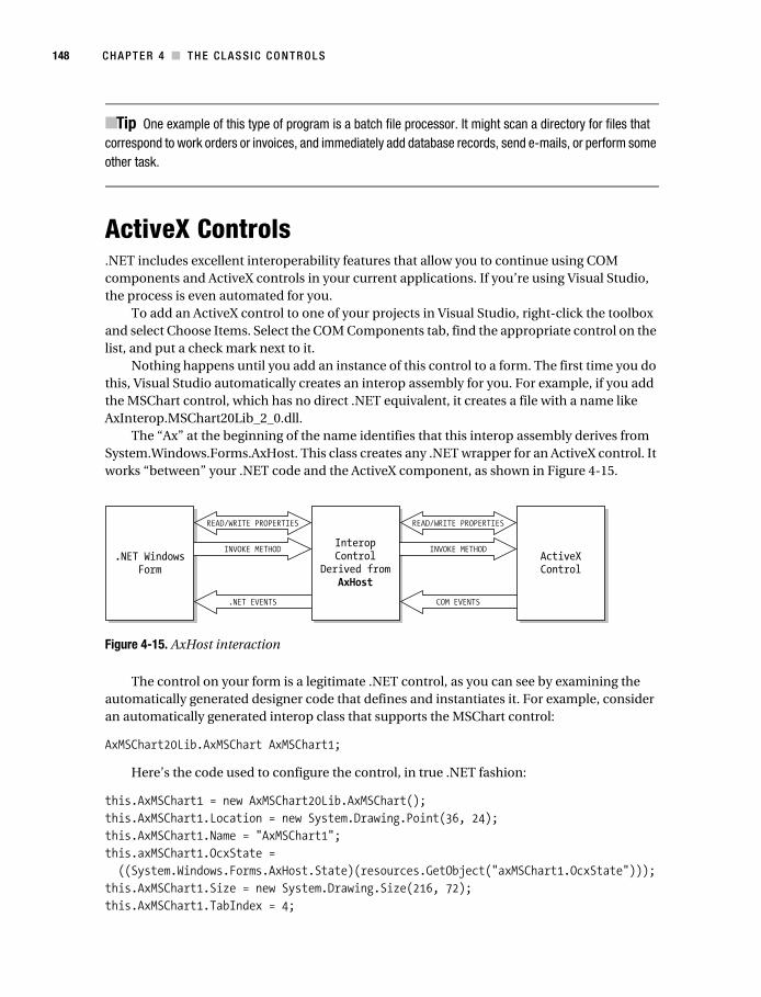
148 C H A P T E R 4 ■ T H E C L A S S I C C O N T R O L S
■Tip One example of this type of program is a batch file processor. It might scan a directory for files that correspond to work orders or invoices, and immediately add database records, send e-mails, or perform some other task.
ActiveX Controls.NET includes excellent interoperability features that allow you to continue using COM components and ActiveX controls in your current applications. If you’re using Visual Studio, the process is even automated for you.
To add an ActiveX control to one of your projects in Visual Studio, right-click the toolbox and select Choose Items. Select the COM Components tab, find the appropriate control on the list, and put a check mark next to it.
Nothing happens until you add an instance of this control to a form. The first time you do this, Visual Studio automatically creates an interop assembly for you. For example, if you add the MSChart control, which has no direct .NET equivalent, it creates a file with a name like AxInterop.MSChart20Lib_2_0.dll.
The “Ax” at the beginning of the name identifies that this interop assembly derives from System.Windows.Forms.AxHost. This class creates any .NET wrapper for an ActiveX control. It works “between” your .NET code and the ActiveX component, as shown in Figure 4-15.
Figure 4-15. AxHost interaction
The control on your form is a legitimate .NET control, as you can see by examining the automatically generated designer code that defines and instantiates it. For example, consider an automatically generated interop class that supports the MSChart control:
AxMSChart20Lib.AxMSChart AxMSChart1;
Here’s the code used to configure the control, in true .NET fashion:
this.AxMSChart1 = new AxMSChart20Lib.AxMSChart();this.AxMSChart1.Location = new System.Drawing.Point(36, 24);this.AxMSChart1.Name = "AxMSChart1";this.axMSChart1.OcxState = ((System.Windows.Forms.AxHost.State)(resources.GetObject("axMSChart1.OcxState")));this.AxMSChart1.Size = new System.Drawing.Size(216, 72);this.AxMSChart1.TabIndex = 4;
Macdonald_4398C04.fm Page 148 Monday, November 21, 2005 7:40 AM
C H A P T E R 4 ■ T H E C LA S S I C C O N T R O L S 149
You can see that this control supports basic .NET properties such as Size and Location. It also uses a special OcxState property (inherited from the AxHost class) that retrieves the persisted state of an ActiveX control. From your program’s point of view, you can communi-cate with a normal .NET control that supports .NET event handling and the basic set of features in the Control class. The AxHost-based control quietly communicates with the original ActiveX control and mimics its behavior on the form. You can even dynamically resize the control and modify its properties using the built-in property pages, and it will respond exactly as it should.
In some cases, the new class may introduce changes. For example, when the MSFlexGrid control is imported, it changes the syntax used to set some properties into method calls:
grid.set_ColWidth(1, 3000); // This was grid.ColWidth(1) = 3000;grid.set_ColAlignment(0, 1); // This was grid.ColAlightment(0) = 1;
Fortunately, you can always use the Object Browser to get to the bottom of any new changes.If you are a war-hardened COM veteran, you can create interop controls by hand. However,
this process is time-consuming and error-prone, and it generally won’t produce a better result than Visual Studio’s automatic support. Instead, you might want to subclass the interop control that Visual Studio creates. In other words, you could create a custom control that inherits from the interop control. This extra layer gives you the chance to add.NET features and won’t hamper performance.
Should You Import ActiveX Controls?Importing controls is easy, and it most cases it works without a hitch. However, it introduces an ugly legacy of problems:
• ActiveX registration issues are back. .NET controls demonstrate the amazing xcopy installation capability of the .NET platform. ActiveX controls, however, need to be registered and reregistered whenever a change occurs. This isn’t a new problem, but the return of an ugly one.
• Security issues appear. The .NET Framework uses a fine-grained approach to security, which allows controls to be used in semitrusted environments with most of their func-tionality intact. ActiveX controls require full unmanaged code permission, which makes them more difficult to use in some scenarios.
• Performance could be affected. Generally, this is the least likely concern. ActiveX emula-tion is extremely fast in .NET. In some cases, certain controls may exhibit problems, but that will be the exception.
.NET controls will always be the best solution, and many third-party .NET controls surpass most of the legacy ActiveX controls still around today. Well-known component vendors with cutting-edge .NET offerings include Infragistics (www.componentsource.com), ComponentOne (www.componentone.com), and Developer Express (www.devexpress.com).
Macdonald_4398C04.fm Page 149 Monday, November 21, 2005 7:40 AM

150 C H A P T E R 4 ■ T H E C L A S S I C C O N T R O L S
The Last WordThis chapter has toured the most common Windows controls and demonstrated a few .NET twists. You’ve also learned about the basic types of controls and the techniques you can use for AutoComplete edit boxes, drag-and-drop support, and tooltips. In the next chapter, you’ll learn how controls work with images and other types of resources.
Macdonald_4398C04.fm Page 150 Monday, November 21, 2005 7:40 AM