prints screens of progress
TRANSCRIPT

I have typed up my masthead and I am choosing the shade of red I want, I trying to find the right colour between a bright red and a brown.
I have decided to put my font behind the models head so I highlighting his head with the magnetic lasso tool so I can put it onto another layer so the text can be behind.
Because I have altered the layers the text is now behind the head I think this works as it makes the magazine more professional.
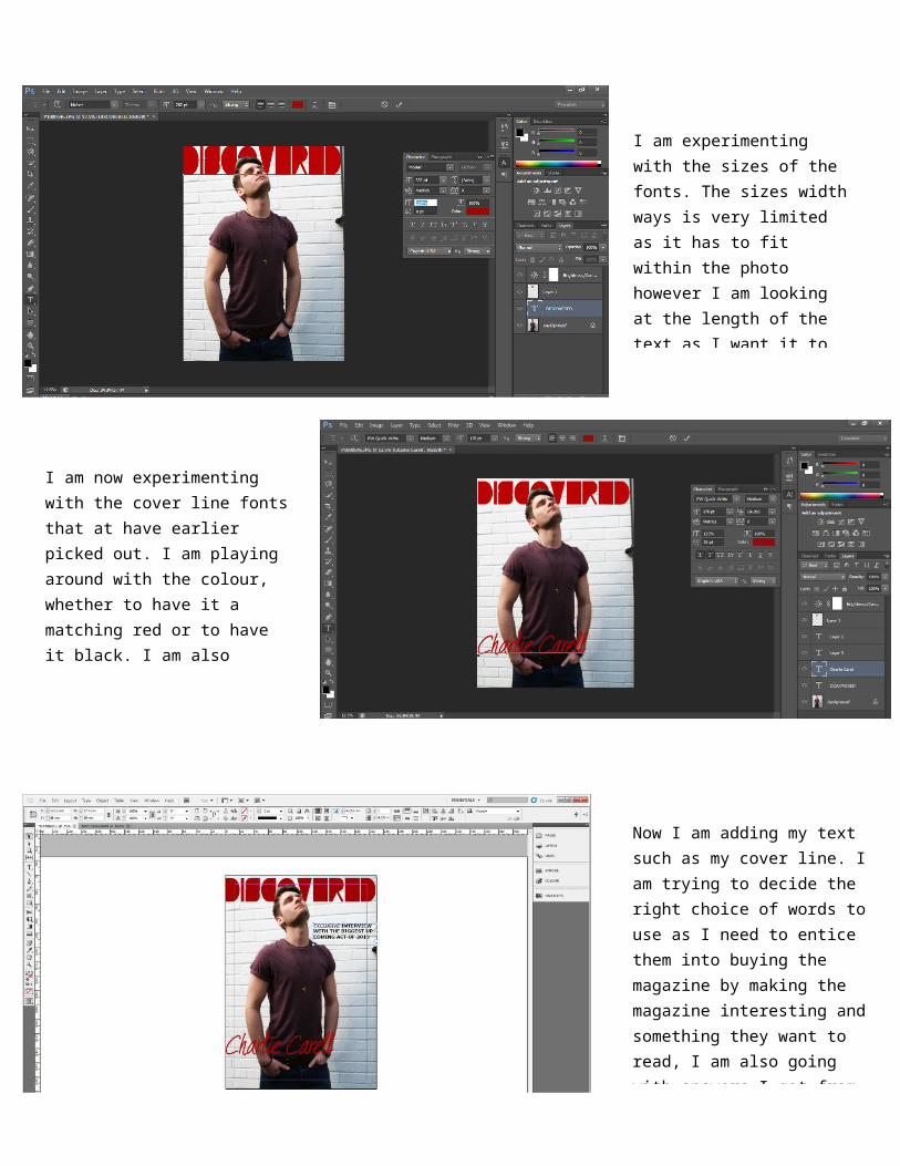
I am experimenting with the sizes of the fonts. The sizes width ways is very limited as it has to fit within the photo however I am looking at the length of the text as I want it to be more eye grabbing as before I felt like it wasn’t
I am now experimenting with the cover line fonts that at have earlier picked out. I am playing around with the colour, whether to have it a matching red or to have it black. I am also choosing the size and the placement of the font to see what works well and most professional.
Now I am adding my text such as my cover line. I am trying to decide the right choice of words to use as I need to entice them into buying the magazine by making the magazine interesting and something they want to read, I am also going with answers I got from my questionnaire so I know what to include
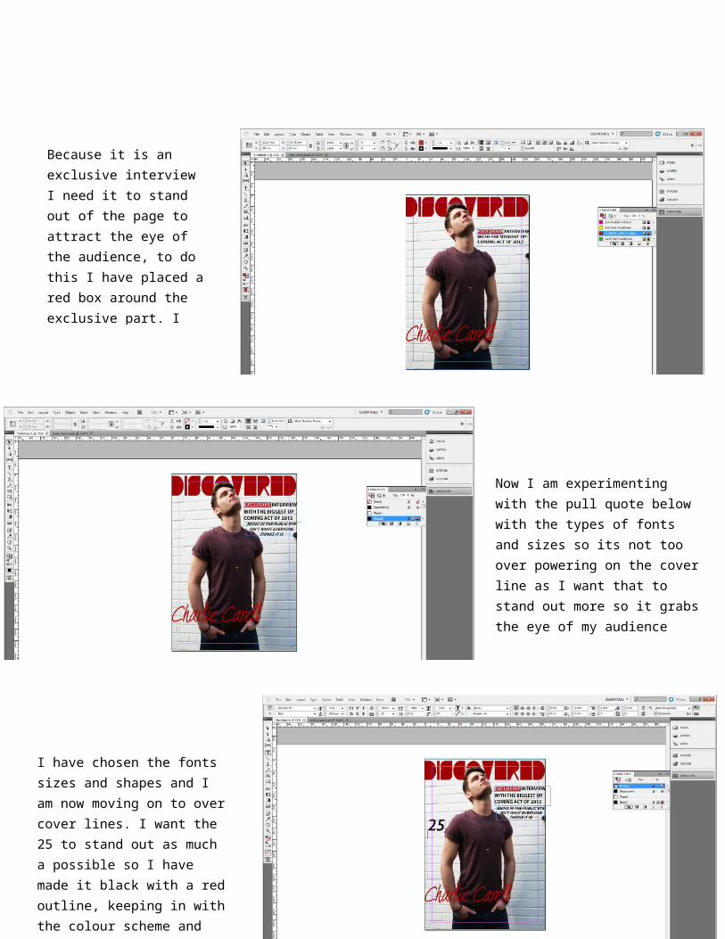
Because it is an exclusive interview I need it to stand out of the page to attract the eye of the audience, to do this I have placed a red box around the exclusive part. I have kept it red to keep with the colour scheme and this shows consistency
Now I am experimenting with the pull quote below with the types of fonts and sizes so its not too over powering on the cover line as I want that to stand out more so it grabs the eye of my audience
I have chosen the fonts sizes and shapes and I am now moving on to over cover lines. I want the 25 to stand out as much a possible so I have made it black with a red outline, keeping in with the colour scheme and also making it stand out more against the white background

I want the cover lines to fit around the models body and this doesn’t work in one text box with the size of the font I want and without dashes that cut if the text so I had to put them into spate text boxes to fit in
After looking at other magazine covers I am finding that the big main stories are one of the main attractions of the cover, so I have decided to make the text bigger so it stands out more and attracts the eye of the audience more.
I am now starting to build more cover lines to the cover and it is all now padding out. Here I am choosing the fonts and the size to fit into the cover, I want the 15 ti standout so I have put it into red with a black outline fitting in with the colour scheme and standing out against the white background

I have enlarged the 25 and 15 as I feel it need to be bigger so It stands out more to make it more eye catching for the audience.
I have gone back to the original image in Photoshop so I have make the cover line of the artists mane longer so it stands out more and fills in the left over space
This is my final magazine cover I have now exported it and it ready for my blog