print vs web
TRANSCRIPT

Typography: Print versus Web
By Pam Harris for Broward College 2009

The physical aspects
Print Web
Hold content in your hand
See on a billboard or poster
Access content on computers
and other devices.

What do print type and web
type have in common?
Both have form and content
Both should be well designed
Both should communicate the intended message
Both should utilize rules of readability:
Avoid wide columns of text
Avoid all caps for body copy
Avoid Widows, Orphans, Ladders and Rivers
Watch background and text combinations
Carefully plan and limit typefaces (2-3)
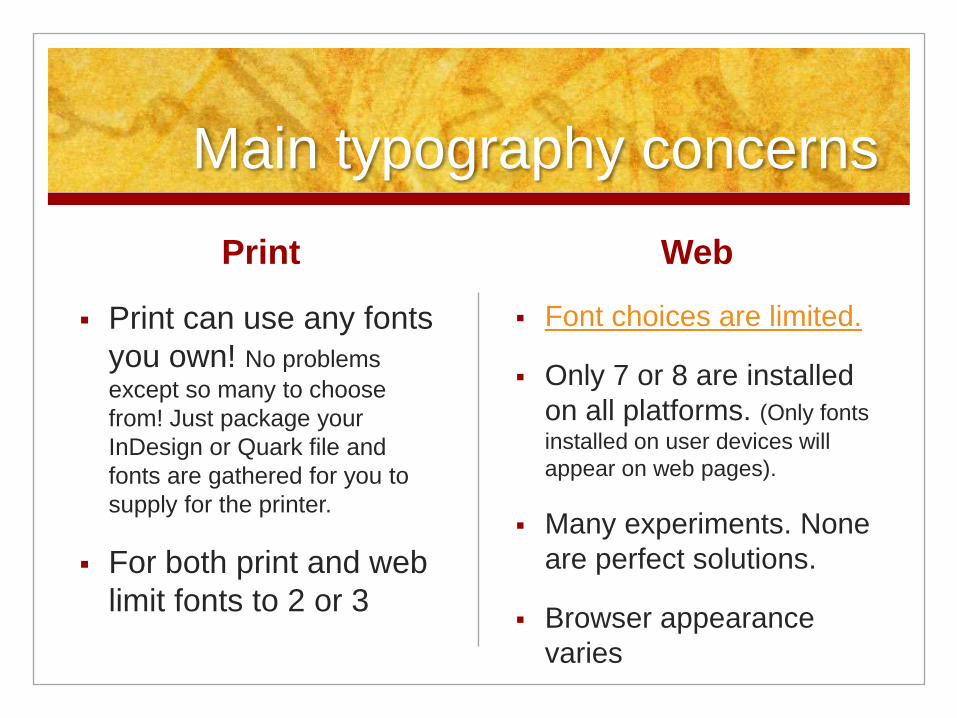
Main typography concerns
Print can use any fonts
you own! No problems
except so many to choose
from! Just package your
InDesign or Quark file and
fonts are gathered for you to
supply for the printer.
For both print and web
limit fonts to 2 or 3
Web
Font choices are limited.
Only 7 or 8 are installed
on all platforms. (Only fonts
installed on user devices will
appear on web pages).
Many experiments. None
are perfect solutions.
Browser appearance
varies
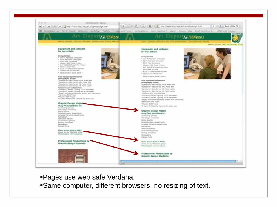
Pages use web safe Verdana.
Same computer, different browsers, no resizing of text.

Dustinbrewer.com
Chart of most
common fonts and
operating systems.
Green marks =
very common fonts.
Yellow = not so
common
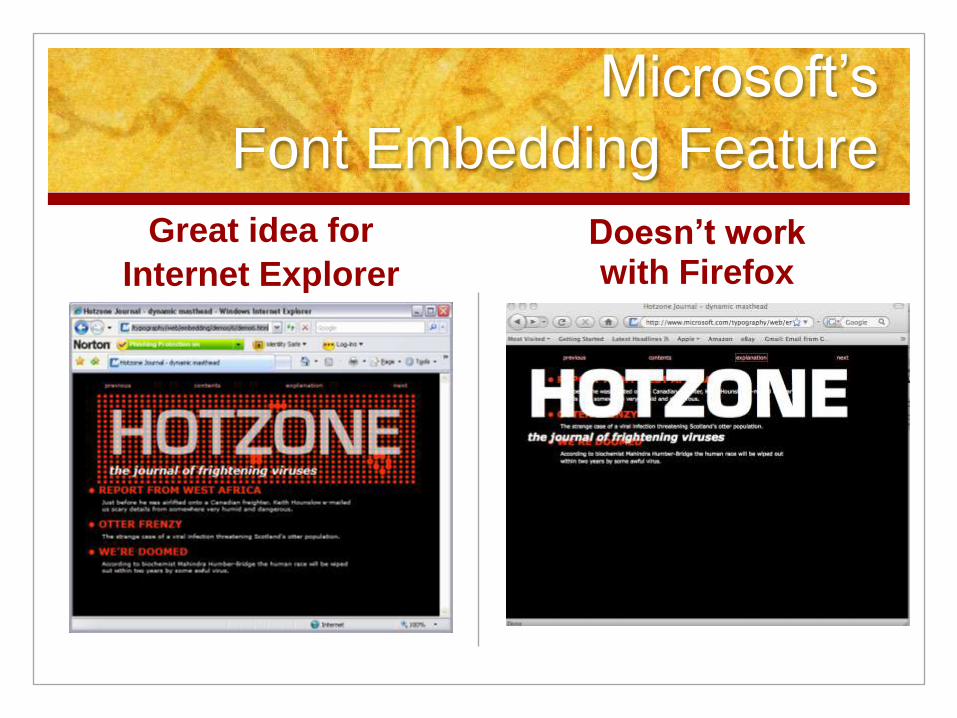
Microsoft’s
Font Embedding Feature
Great idea for
Internet Explorer
Doesn’t work with Firefox

Experiments with CSS
CSS Intent CSS on a Mac

Experiments with web type
Grey area: highlighted
text
Above: tested on all browsers.
Note: unlike print, cannot
create type at any angle.
JonTangerine.co
m
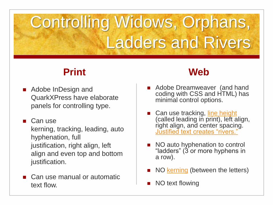
Controlling Widows, Orphans,
Ladders and Rivers
Adobe InDesign and
QuarkXPress have elaborate
panels for controlling type.
Can use
kerning, tracking, leading, auto
hyphenation, full
justification, right align, left
align and even top and bottom
justification.
Can use manual or automatic
text flow.
Web
Adobe Dreamweaver (and hand coding with CSS and HTML) has minimal control options.
Can use tracking, line height (called leading in print), left align, right align, and center spacing. Justified text creates “rivers.”
NO auto hyphenation to control “ladders” (3 or more hyphens in a row).
NO kerning (between the letters)
NO text flowing

Print can’t be resized. Some
web pages give readers a
choice
Liquid layout, narrow Liquid layout, wide
Learn more about setting type on the web at A List
Apart.com

Using wrong em or en not as
noticeable in print
Wrong em applied
(Mac)Reads fine on Windows
Peter K Sheerin states that most em and en dash HTML references are wrong.
The entire range from  to 159 should not be used.

Print can’t be resized. Web
browsers give readers a
choice
Once an item is printed, users
can’t change or control size of
text except by using a
magnifying glass.
Some printers publish large
print versions for visually
challenged. Voluntary.
Web
Viewers can resize web pages
to see text better.
Visually challenged can use
screen readers to view web
pages.
It’s up to the web
designer/programmer to provide
proper alt tags. Section 508

Closing thoughts
Can’t be changed once printed.
Costly to redo a botched job.
Can’t be altered or fixed by
users (exception is graffiti ;-)
Catalogued by librarians
Has to be scanned to archive
Web
Can be changed in an instant if
you use web text and not
image maps.
Searchable and available to all
Anyone can have a Blog
Social bookmarking sites like
Digg and del.ico.us
Important to learn the important details of both
media.