presenting data using infographics - msktc.org · tips on presenting infographics . what are...
TRANSCRIPT

Presenting Data Using Infographics
Purpose This tool provides tips for presenting data using infographics to various audiences.
Format The document contains examples of different types of infographics and how to use them to present various data.
Audience This tool is designed primarily for researchers from the Model Systems that are funded by the National Institute on Disability and Rehabilitation Research (NIDRR). The tool can be adapted by other NIDRR-funded grantees and the general public.
The contents of this tool were developed under a grant from the Department of Education, NIDRR grant number H133A110004. However, those contents do not necessarily represent the policy of the Department of Education, and you should not assume endorsement by the Federal Government.

Tips on Presenting Infographics WHAT ARE INFOGRAPHICS?
Information graphics, or infographics, are visual representations of information, data, or knowledge. These types of graphics present complex information quickly and clearly. Infographics are increasingly popular because they can provide a great amount of complex information succinctly, using visually appealing elements that draw attention and facilitate retention.
WHAT ARE THE BENEFITS OF USING INFOGRAPHICS?
Infographics can be used to:
• Present a variety of data elements together to create a powerful visual impact • Raise awareness and attract interest • Present data in a more powerful way than text only
WHAT ARE THE TIPS FOR USING INFOGRAPHICS?
If you decide to use infographics to present your research data, it is important to:
• Decide what story you want to tell or what message you want to convey • Use a combination of text, figures, graphs, and pictures • Communicate only one main story in each infographic
WHAT ARE DIFFERENT TYPES OF INFOGRAPHICS FOR PRESENTING DATA?
There are many ways that visualizations can be used to represent the same set of data; we present eight of the most common types of infographics in this section. As you consider the infographics on the following pages, notice that each one has three essential pieces: a visual, content knowledge, and a story.
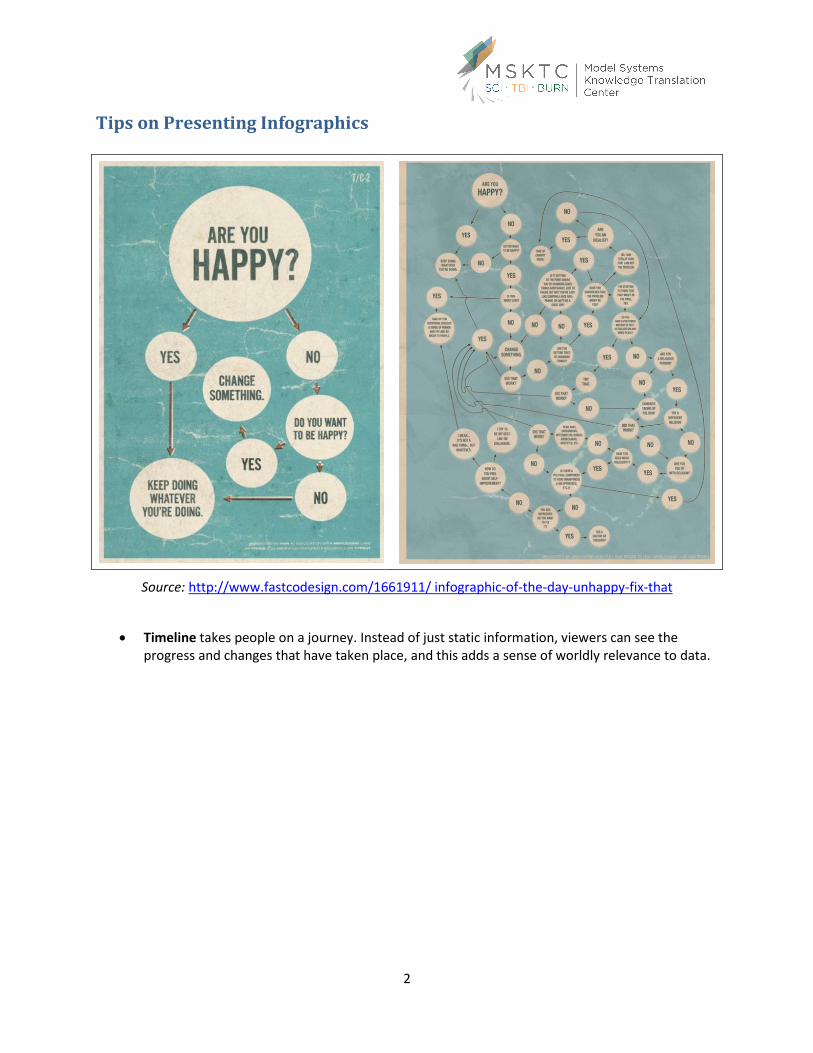
• Flowchart solves problems, from the practical to the irrelevant to the spiritual. When done well, they can make people linger longer on your infographic to explore the different paths they can take. The most popular flowcharts tend to be humorous and are ideal for when the answer is simple and solves a relevant problem for the viewer.
1
Tips on Presenting Infographics
2
Source: http://www.fastcodesign.com/1661911/ infographic-of-the-day-unhappy-fix-that
• Timeline takes people on a journey. Instead of just static information, viewers can see the progress and changes that have taken place, and this adds a sense of worldly relevance to data.
Tips on Presenting Infographics
3
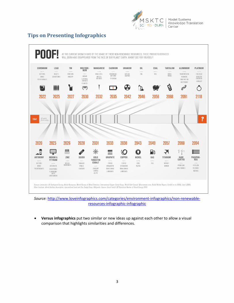
Source: http://www.loveinfographics.com/categories/environment-infographics/non-renewable-resources-infographic-infographic
• Versus infographics put two similar or new ideas up against each other to allow a visual comparison that highlights similarities and differences.

Tips on Presenting Infographics
Source: http://blog.mindjet.com/2012/05/between-minds-left-brain-vs-right-brain-thinkers/
• By the Numbers infographics can be used to display a wealth of data through an engagingdesign. These numerical infographics use a lot of numbers with a moderate amount ofvisualization or text to help with comprehension. See, for example, the graphics below forexamples from the U.S. Bureau of the Census:
4
Source: http://www.census.gov/1940census/then_and_now/

Tips on Presenting Infographics
5
Source: http://theclarklawoffice.com/auto-accident-attorneys/traumatic-brain-injury-infographic/
Tips on Presenting Infographics
6
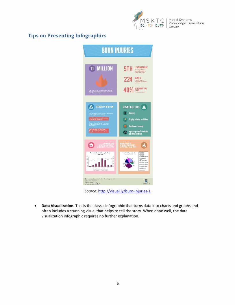
Source: http://visual.ly/burn-injuries-1
• Data Visualization. This is the classic infographic that turns data into charts and graphs and often includes a stunning visual that helps to tell the story. When done well, the data visualization infographic requires no further explanation.

Tips on Presenting Infographics
7
Source: http://www.apparelyzed.com/american-spinal-cord-injury-infographic.html
Steps to Create Effective Infographics
When you design an infographic, you become both data analyst and creative director. To create an infographic, you will need to:
• Identify the target audience • Decide what story to tell • Determine which data to use • Tell your story simply

Tips on Presenting Infographics Although we discuss each step in sequential order, they are usually decided concurrently. For example, the data you have available may determine your story and audience.
• Step 1: Identify Your Target Audience
The first critical piece of developing an infographic is to select your audience. Rather than jumping right into the data, you will need to take some time to figure out who you are trying to reach—patients, caregivers, researchers or policymakers? The audience will drive your planning, creating, and designing. Potential audiences are:
• Step 2: Decide What Story to Tell
Along with your audience, you need to decide what story you want to tell them through the infographic. Consider what you want to say in light of what interests your audience by thinking about the following questions:
What am I trying to tell my audience or what is my goal?
How can I be helpful to my audience?
What would my audience’s reaction be and why?
How can I make my message relevant to my target audience?
• Think about the audiences identified in Step 1 and the stories you might want to tell each of them. Step 3: Determine Which Data to Use
With your target audience identified and the story you want to tell them in mind, the next step is to figure out which data you will need. Consider the data you need to tell your story to the target audiences. The following questions will help you decide which data and information you will need:
Is it important to compare the data by gender, age, and severity of the injury? Do you want to emphasize the health outcome immediately after hospital discharge? Or is it important to focus on the long term outcome of the injury? Would your story be told better by including both but going into less detail?
Do you need other data located outside of the model systems? For example, you may need census data, data from other agencies, or data from public statistics databases.
Whatever data you use, it is critical that the data are timely and relevant to your story and are of good quality.
• Step 4: Tell Your Story Simply
You know who you want to reach, what you want to tell them, and what information you need to share with them. Now you need to make sure that they will understand what you are trying to say. Even if your story or data are complex, you need to make your story as easy to grasp as possible to make sure that your target audience can understand it. What you share with your audience needs to be simple enough to be understood quickly without much analysis.
8