presentation board layout architectural technology ... · presentation board layout architectural...
TRANSCRIPT
NEW YORK CITY COLLEGE OF TECHNOLOGYTHE CITY UNIVERSITY OF NEW YORK
PRESENTATION BOARD LAYOUT
ARCHITECTURAL TECHNOLOGY DEPARTMENTwritten by annie boccella
spring 2010

PRESENTATION BOARD LAYOUT
1. BEFORE YOU BEGIN...
• Organize yourself. What is your argument or what main idea do you want your presentation to convey? What drawings, images, and information (text) best support this argument?
Gather this information and outline the points you will cover. This will help guide how your board should be organized.
You want the content that you select to speak for itself, so choose your best work. This doesn’t mean that processes sketches aren’t important. Just make sure everything is neat, scanned at a good resolution (approx. 200 dpi), and touched up in Photoshop if needed.

PRESENTATION BOARD LAYOUT
2. LAYOUT ESSENTIALS
• The Grid
A grid helps you organize visual elements on the page. These elements may be drawings, images, diagrams, or text. Grids can range from complex to very neat and straightforward.
Decide on an appropriate page size. Will you have one or more pages? If more, it might make sense to have a repeating title bar with your name and any other pertinent information. This title bar should appear in the same place on each page for consistency throughout your presentation. Creating a master page in InDesign can help achieve such continuity.
36 in. 2 in.margin
horizontal grid line with a 1/4 in. gutter space in between.
Title bar - the content is up to you. Maybe this includes your info or maybe this describes what the board is about.
24 in.
0.5 in.margin
vertical grid linewith 1/4 in.gutter.
YOUR NAMECLASS TITLE | PROFESSOR | DATE
This 36 x 24 page is organized with a basic grid with 6 columns and 5 rows. The bottom margin is larger than the top and sides, allowing for a title bar that repeats on each page.

PRESENTATION BOARD LAYOUT
2. LAYOUT ESSENTIALS
(CONTINUED)
• Visual hierarchy
The concept of hierarchy should be considered when laying out your board. That is, certain drawings or images should receive more (or less) visual attention. This emphasis or de-emphasis can help better communicate your idea. When viewing your presentation board, there should be something to discover from a distance, from 6 feet away, and from up close.
When you gather your material, arrange your drawings, images, and text in order of importance.
Sketch out some possible organizations depending on the content that you’ve selected.
This exercise will focus on creating hierarchy by playing with scale. However, we will discuss other ways to create hierarchy in a layout.
Think about proportion, scale, and balance. The same concepts that you employ when designing architecture are important when laying out your boards.
project info
plan 3
plan 2
plan 1
section
rendering
rendering
image image
main diagram
diagram 4
diagram 3
diagram 2
diagram 1
title bar
title bar

PRESENTATION BOARD LAYOUT
2. LAYOUT ESSENTIALS (CONTINUED)
• Rhythm
Just as a rhythm or pattern can stimulate a work of art or music, visual rhythm can also create order or stimulation. Grids help create the structure for a visual rhythm.

PRESENTATION BOARD LAYOUT
3. THE TRUTH ABOUT TEXT
With so many typeface designs, the task of choosing the right typeface can seem a design challenge in itself.
There are two main classifications of typefaces: Serifs and Sans-serif. Serif typefaces contain semi-structural details called serifs at the end of some of the letter strokes. A typeface without these details is called sans-serif. Within these two categories exist a range of fonts.
• Which one is right for architecture?
Many architects gravitate towards the simplicity and clean lines of Sans-serif fonts. However, selecting your font depends on the nature of the content being presented. The personality of the letters should correspond with your presentation style, while not overpowering the content. Keep it simple!
sans serif
serif
serifs (in red)
SERIF FACES
Baskerville
Garamond
Palatino
Times New Roman
SANS SERIF FACES
Franklin Gothic
Gill Sans
Helvetica
Swis721

PRESENTATION BOARD LAYOUT
3. TEXT (CONTINUED)
• How many fonts?
One font is usually sufficient. Two can be used at the most. It is wise to select a typeface that belongs to a larger type family. That way, you can consistently use the regular version and use the bold version when emphasis is needed. However, if you do select more than one font, the font matrix to the right may help.
• What font size is ok?
Similar to limiting the amount of fonts you choose, you should also limit the size of fonts to two or three different sizes. That is, set a size to be used for titles, text, and captions, for example. Titles should be visible from a distance. Text and captions may require a closer view. There is no foolproof way to predict your font sizes except to practice and print out in advance. Avoid huge font sizes that take away from your content.
8.5 in. 8.5 in. 34 in.
presentation board2 facing portfolio pages
11 in. 22 in.
reduce by 50%
Quick tip: If you design your presentation board at 34 x 22, you can reduce it by 50% to achieve two 8.5 x 11 pages for your portfolio. This is also a way to gauge your font size.
This font matrix can help when combining two fonts. The most important consideration is contrast:serif with sanserif, Roman with script, heavy with light, thick with thin, simple with ornamental.

PRESENTATION BOARD LAYOUT
4. ARCHITECTURE SPECIFIC
Presentation boards for architectural drawings need to clearly communicate specific information relative to architecture. It’s important to keep the following in mind:
• Drawing Relationships
Architectural drawings such as sections and plans should be aligned and coordinated. Plans and sections should be aligned vertically and of the same scale. This should be the case regarding scale unless you want one drawing to receive more/less attention.
• Visual Gravity
Extending the ground of sections at the bottom of the page can offer visual gravity or weight to the layout.
• Symbols
Symbols such as the North arrow, a scale indicator, and arrows/leaders should be included to clarify drawings.
The Belvedereplan and section De8 architetti
The drawings to the left are vertically aligned and of the same scale so that drawings are able to reference one another accurately.
The sections are horizontally aligned and of the same scale.If placed at the bottom of the page, they are grounded by visual gravity.
Office for Metropolitan Architecture

PRESENTATION BOARD LAYOUT
5. EXAMPLES
• Competition entry for the Art Fund Pavilion by 3SixO Architecture.
Note how the next four boards are organized as an entire composition. The title bar on the right hand offers a consistent space for information. Images are of various sizes, exhibiting a level of hierarchy to keep the viewer’s interest. Sectional drawings, which are clearly aligned, anchor the page at the bottom.
Note the nice use of white space - images are sparsely arranged so that the page is not “choked” with visual information. However, key information is always present, such as the site map with its corresponding North arrow.

PRESENTATION BOARD LAYOUT
5. EXAMPLES (CONTINUED)
• Competition entry for the Art Fund Pavilion by 3SixO Architecture (continued from previous page.)
PRESENTATION BOARD LAYOUT
5. EXAMPLES (CONTINUED)
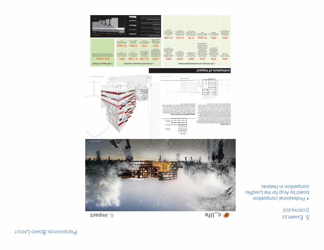
• Professional competition board by Arup for the Low2No competition in Helsinki.

PRESENTATION BOARD LAYOUT
5. EXAMPLES (CONTINUED)
• Competition entry for the Art Fund Pavilion by 3SixO Architecture (continued from previous page.)

PRESENTATION BOARD LAYOUT
5. EXAMPLES (CONTINUED)
• Competition board from the 9/11 memorial designs.

PRESENTATION BOARD LAYOUT
5. EXAMPLES (CONTINUED)
• Student competition entry

PRESENTATION BOARD LAYOUT
6. RESOURCES
•Layout Essentials: 100 Design Principles for Using Grids by Beth Tondreau
•Making and Breaking the Grid: A Graphic Design Layout Workshop by Timothy Samara