preliminary task photos
TRANSCRIPT
Preliminary Task Photos
Meghan Moore
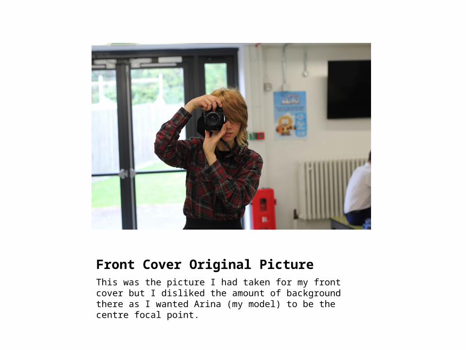
Front Cover Original PictureThis was the picture I had taken for my front cover but I disliked the amount of background there as I wanted Arina (my model) to be the centre focal point.

Front Cover Final PictureThis was the resized picture I eventually used as my front cover as I didn’t want to have all the background that was originally there. It also made it more profile than landscape, which is what I wanted.
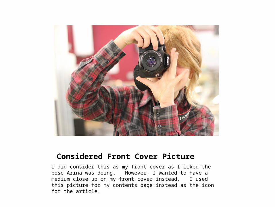
Considered Front Cover PictureI did consider this as my front cover as I liked the pose Arina was doing. However, I wanted to have a medium close up on my front cover instead. I used this picture for my contents page instead as the icon for the article.
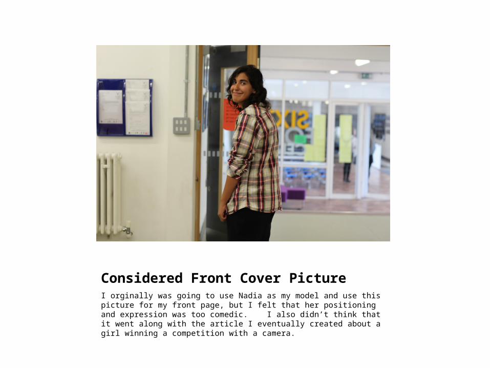
Considered Front Cover PictureI orginally was going to use Nadia as my model and use this picture for my front page, but I felt that her positioning and expression was too comedic. I also didn’t think that it went along with the article I eventually created about a girl winning a competition with a camera.
Final Contents Page LogoI used this image as it is the logo of the school, and it would make sense to have it there. It make the magazine seem more realistic as it would highlight to a reader that the magazine is specialized to one place.

Final Contents Page Picture for “New Year, New You”I used this as my picture for my article about tips for the new school year. I liked this shot because you could see a wide variety of stationery and was very colourful. I felt it best represented the idea of having everything you need for the new school year.
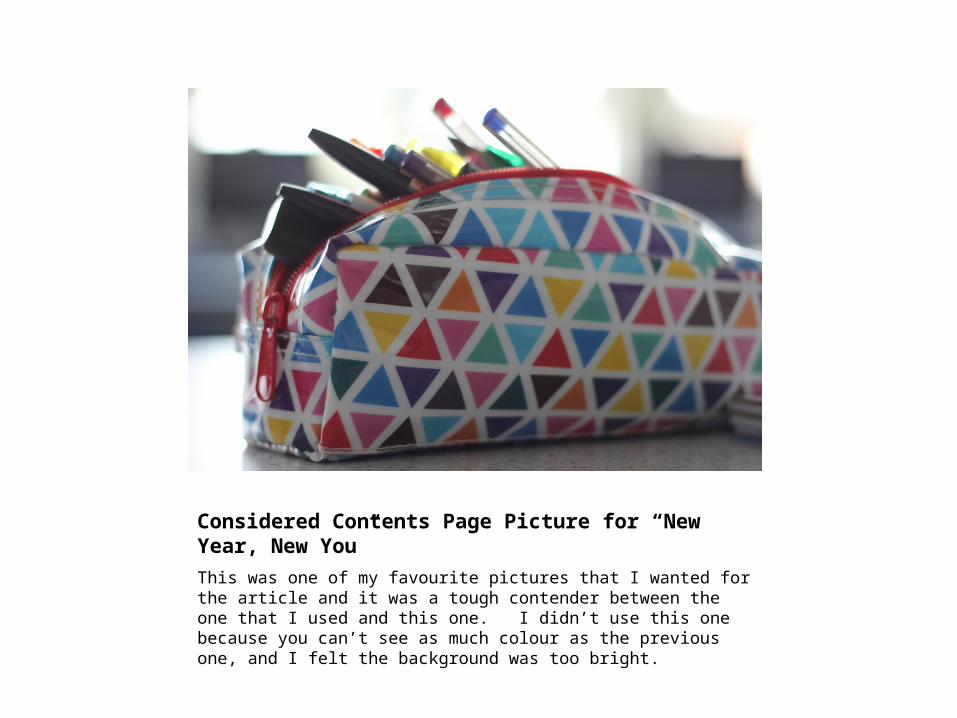
Considered Contents Page Picture for “New Year, New You”This was one of my favourite pictures that I wanted for the article and it was a tough contender between the one that I used and this one. I didn’t use this one because you can’t see as much colour as the previous one, and I felt the background was too bright.

Considered Contents Page Pictures for “New Year, New You”I didn’t like any of these pictures as they were too dark. As you can see, one of them has a chair in front of it (which is bad photography and looks unprofessional). The bottom one also looked very blurry, especially with the background
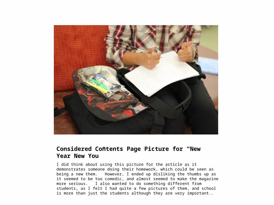
Considered Contents Page Picture for “New Year New You”I did think about using this picture for the article as it demonstrates someone doing their homework, which could be seen as being a new them. However, I ended up disliking the thumbs up as it seemed to be too comedic, and almost seemed to make the magazine more serious. I also wanted to do something different from students, as I felt I had quite a few pictures of them, and school is more than just the students although they are very important..
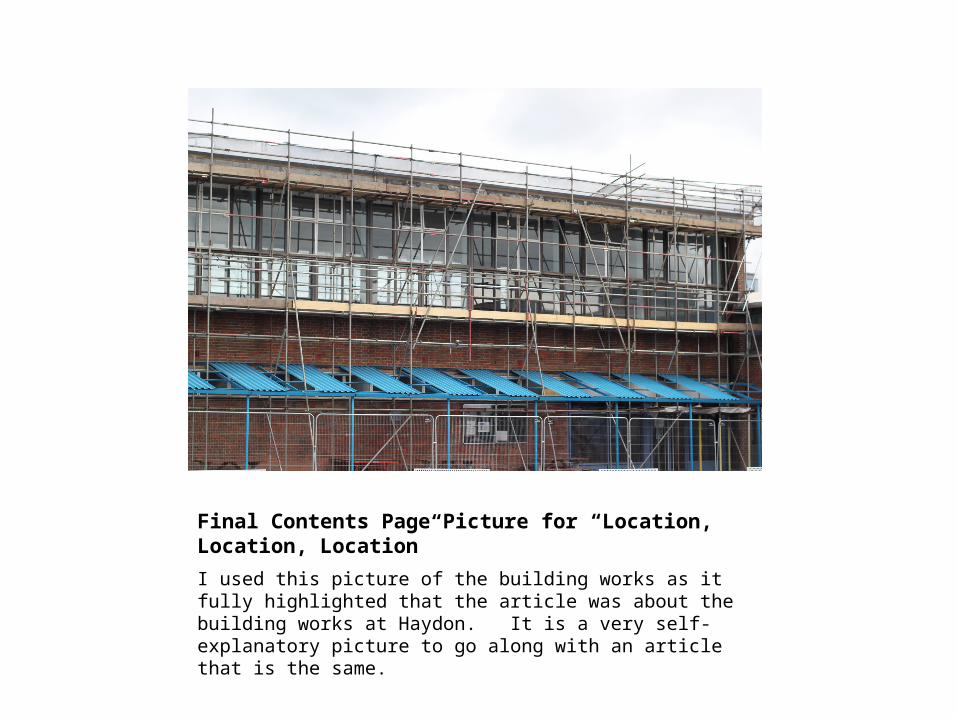
Final Contents Page Picture for “Location, Location, Location”I used this picture of the building works as it fully highlighted that the article was about the building works at Haydon. It is a very self-explanatory picture to go along with an article that is the same.
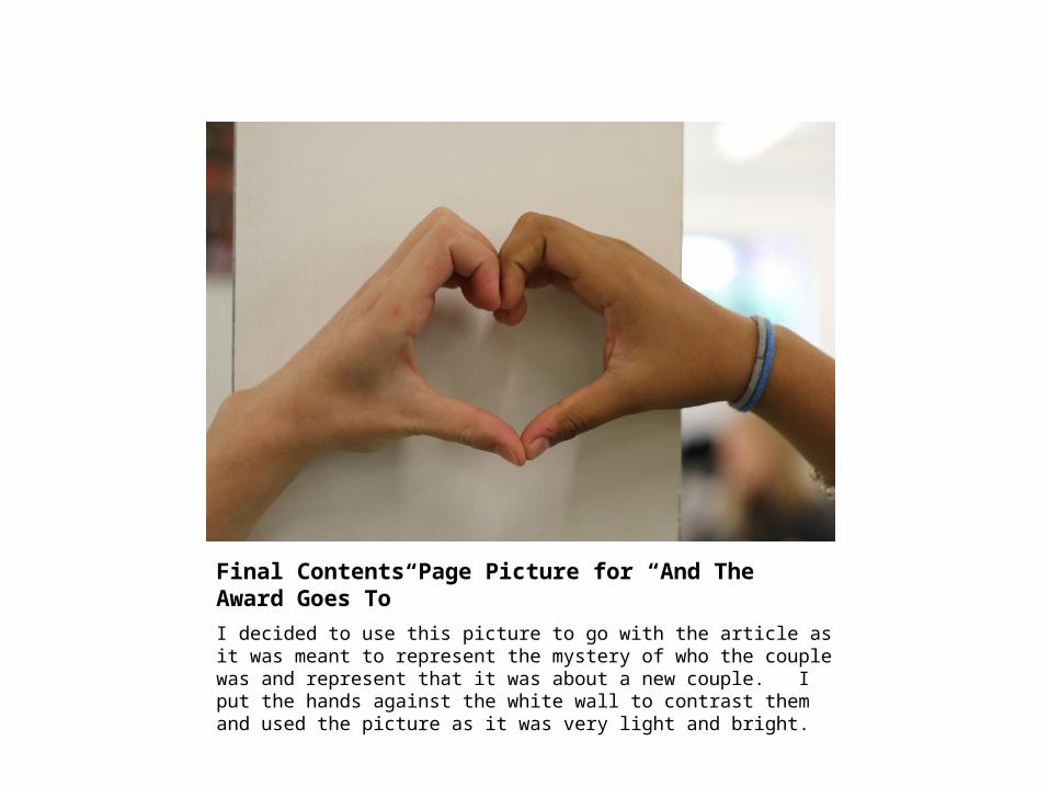
Final Contents Page Picture for “And The Award Goes To”I decided to use this picture to go with the article as it was meant to represent the mystery of who the couple was and represent that it was about a new couple. I put the hands against the white wall to contrast them and used the picture as it was very light and bright.
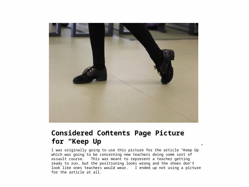
Considered Contents Page Picture for “Keep Up”I was originally going to use this picture for the article “Keep Up” which was going to be concerning new teachers doing some sort of assault course. This was meant to represent a teacher getting ready to run, but the positioning looks wrong and the shoes don’t look like ones teachers would wear. I ended up not using a picture for the article at all.
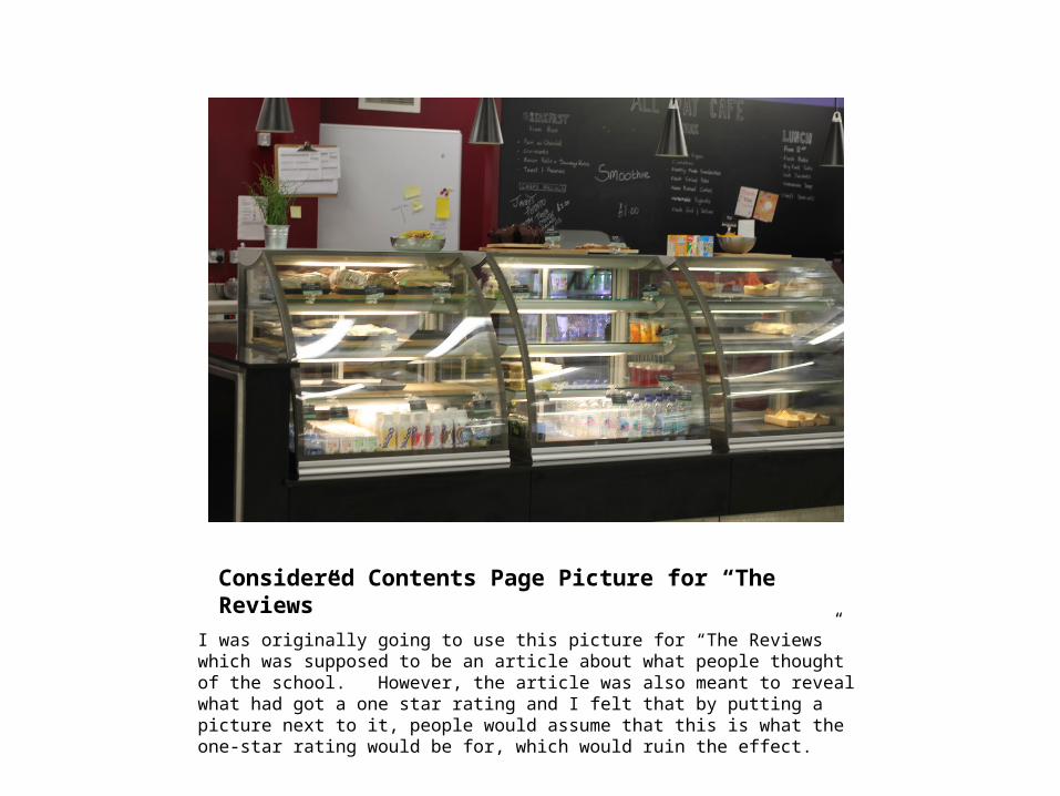
Considered Contents Page Picture for “The Reviews”I was originally going to use this picture for “The Reviews” which was supposed to be an article about what people thought of the school. However, the article was also meant to reveal what had got a one star rating and I felt that by putting a picture next to it, people would assume that this is what the one-star rating would be for, which would ruin the effect.