preliminary task in comparison to full magazine product
TRANSCRIPT
Preliminary task in comparison to full magazine product7. Looking back to your preliminary task, what do you feel that you have learnt in the progression from it to
the full product?
Alex Okoampa
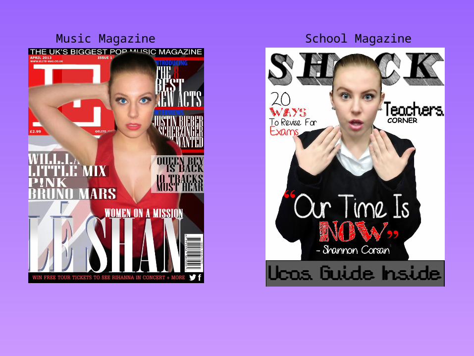
Music Magazine School Magazine
The masthead has dramatically changedSince my school magazine. I always had an image thatMy masthead will be a word stretched across as seenIn my school magazine, with such a simplistic font. This changedIn my music magazine; it now has an iconic logo with the letter‘E’ placed on the left hand side, giving my magazine more spacefor connotations and sell lines to be written.
My main image is of the same model, which I like, because it shows how diverse this model can be, and will suit any specific requirements I ask her to do. She also slightly has the same facial expression, but more toned down in my music magazine. In my school magazine, she is covered up, and the only thing that shows her off is her facial expression and hand position, whereas in the music magazine, I took it to my advantage to make her facial expression and hands loud and evident, whilst stripping back more clothing, to make her look like a fully fledged pop star.
The sell lines have dramatically changed in my final product!At first, I wasn’t so keen on having a lot of sell lines which willDraw the audience away from the main image, so in my schoolMagazine I kept it minimal and small. The main caption was visible,To give the audience a sense of motivation and so it looks like theImage Is talking to you.This differed in my music magazine, where I used many sell lines to make the magazine full-featured and to suit conventions of other Magazines.
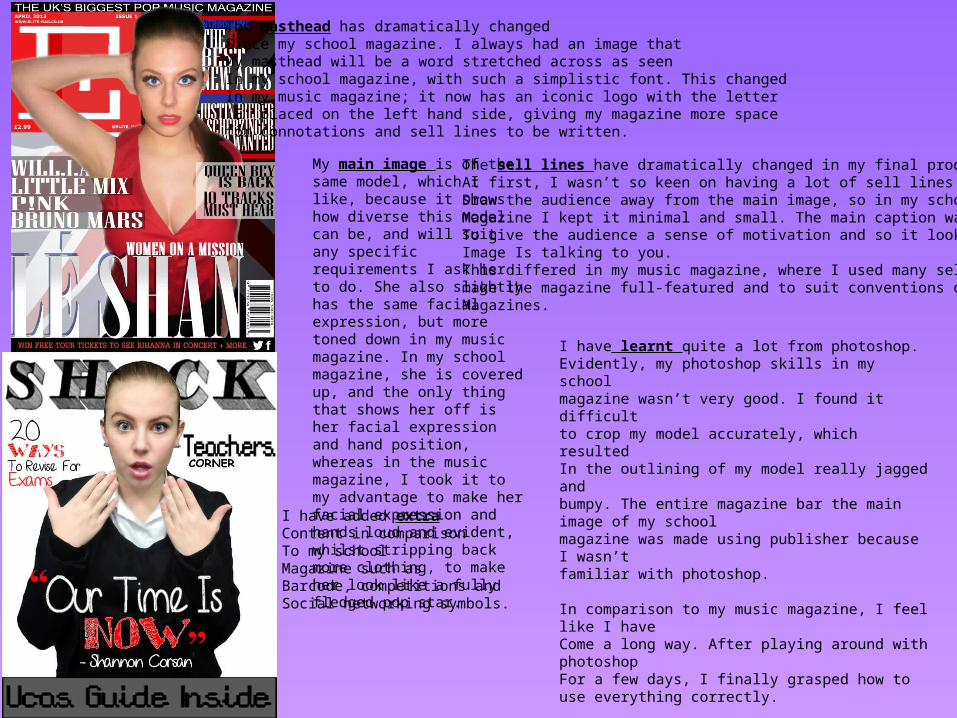
I have learnt quite a lot from photoshop.Evidently, my photoshop skills in my schoolmagazine wasn’t very good. I found it difficultto crop my model accurately, which resultedIn the outlining of my model really jagged and bumpy. The entire magazine bar the main image of my schoolmagazine was made using publisher because I wasn’tfamiliar with photoshop.
In comparison to my music magazine, I feel like I haveCome a long way. After playing around with photoshopFor a few days, I finally grasped how to use everything correctly.
What I am most proud of is how I cut out my model properly, and made it look professional.
I have added extraContent in comparisonTo my schoolMagazine such as Barcode, competitions andSocial networking symbols.
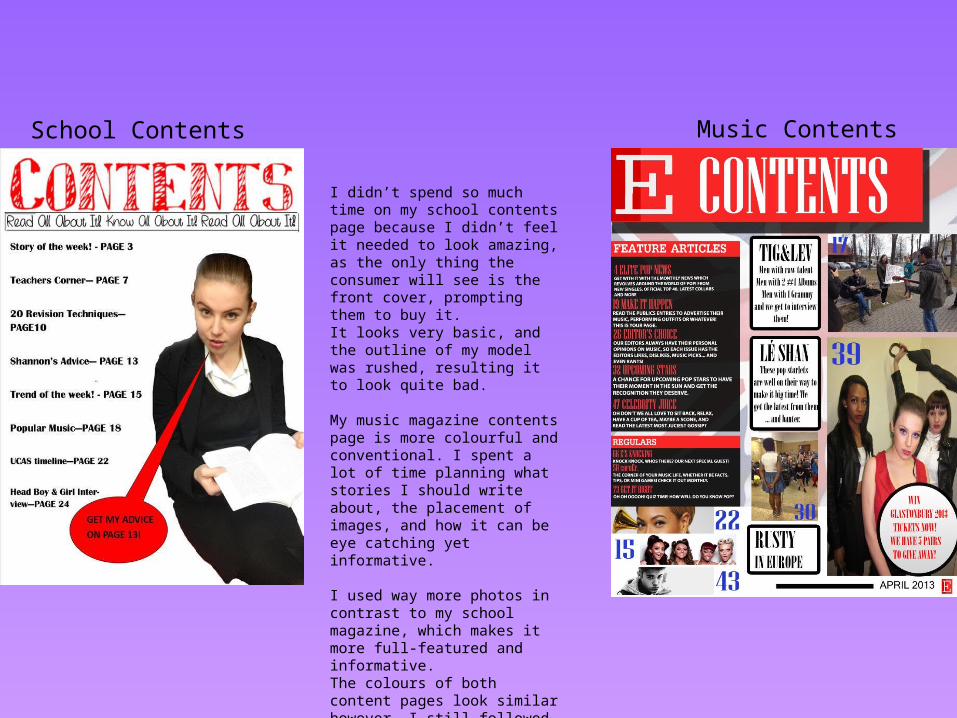
I didn’t spend so much time on my school contents page because I didn’t feel it needed to look amazing, as the only thing the consumer will see is the front cover, prompting them to buy it.It looks very basic, and the outline of my model was rushed, resulting it to look quite bad.
My music magazine contents page is more colourful and conventional. I spent a lot of time planning what stories I should write about, the placement of images, and how it can be eye catching yet informative.
I used way more photos in contrast to my school magazine, which makes it more full-featured and informative.The colours of both content pages look similar however. I still followed the colour code of white and red predominantly.
Music ContentsSchool Contents
Feedback
• When asked for opinions on my school magazine, the response was lukewarm. Some loved it, some didn’t, this is because there wasn’t many sell lines and it was too simplistic. Others spotted how inaccurately I cut out my model, while others didn’t spot it, and praised the way I used my model, and her expression.
• My music magazine received an amazing response. They loved my model, her clothes, her image and her posture. They also praised how much time I took to make it and the amount of magazine drafts it took me to reach my final product. I have received a few comments that it looks like a real magazine.