pie graphing in geography. pie graphs are used when all of the things you are working with can be...
TRANSCRIPT
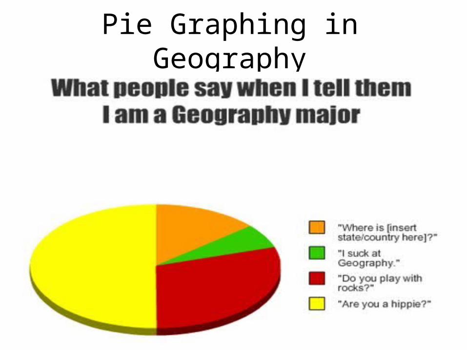
Pie Graphing in Geography
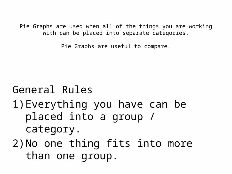
Pie Graphs are used when all of the things you are working with can be placed into separate categories.
Pie Graphs are useful to compare.
General Rules1) Everything you have can be placed into a
group / category.2) No one thing fits into more than one group.

Pie Graphs Use 360 degrees of a Circle to represent 100%
Interesting point … 360 divided by 100 = 3.6
¼ of a pie = 25%
¾ = 75%
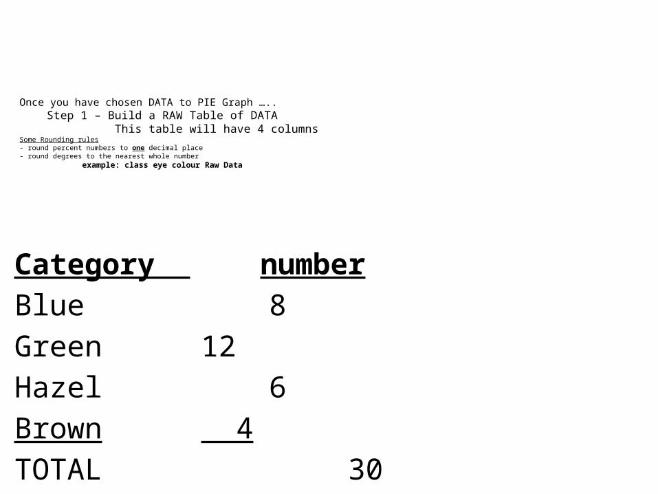
Once you have chosen DATA to PIE Graph ….. Step 1 – Build a RAW Table of DATA This table will have 4 columnsSome Rounding rules- round percent numbers to one decimal place- round degrees to the nearest whole number example: class eye colour Raw Data
Category numberBlue 8Green 12Hazel 6Brown 4TOTAL 30

This class of 30 has 4 different Eye colours
Next … add a column for percentage and DO THE MATH

Category number Percent Blue 8 (8/30)*100 = 26.7Green 12 (12/30)*100 = 40.0Hazel 6 (6/30)*100 = 20.0Brown 4 (4/30)*100 = 13.3TOTAL 30 100.0
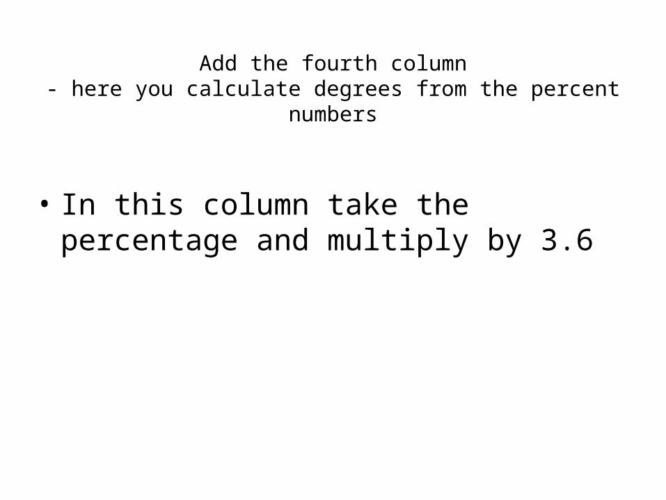
Add the fourth column- here you calculate degrees from the percent numbers
• In this column take the percentage and multiply by 3.6

Category number Percent DegreesBlue 8 (8/30)*100 = 26.7 26.7*3.6= 96Green 12 (12/30)*100 = 40.0 40.0*3.6= 144Hazel 6 (6/30)*100 = 20.0 20.0*3.6= 72Brown 4 (4/30)*100 = 13.3 13.3*3.6= 48TOTAL 30 100.0 360

In our class, the order in which the slices of the pie get organized will matter.
• In some cases Pie graph slice order seems random.
• In other cases it can be used to show patterns better.

Unless otherwise mentioned …for our geography class
• Draw a pie graph from smallest to largest.• Start at the 12 o’clock position when drawing• This leaves all the math rounding error for the
last and largest slice.

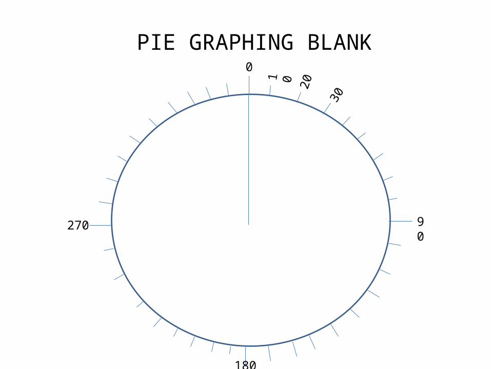
We will use a Blank Pie Graph that has tick marks every 10 degrees when drawing our PIE GRAPHS.
• The line position will get calculated and the lines can be drawn based on numbers in a second “organized” table.
• Each tick mark has a number between 0 and 360.• All tick marks go up by 10 as you go clockwise
90270
180
10
20
0
30
PIE GRAPHING BLANK
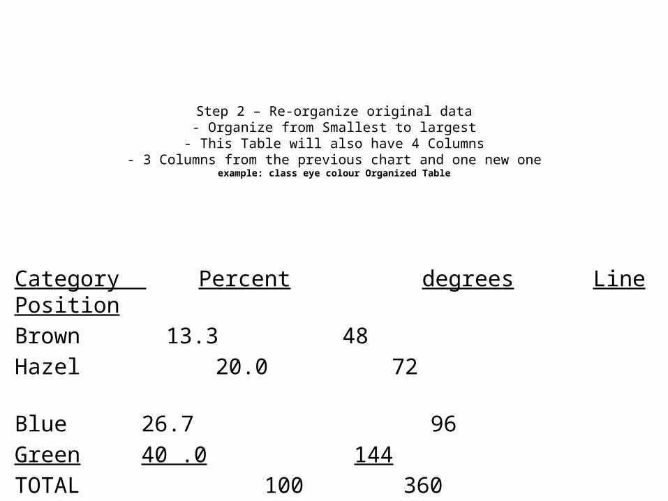
Category Percent degrees Line PositionBrown 13.3 48 Hazel 20.0 72 Blue 26.7 96Green 40 .0 144TOTAL 100 360
Step 2 – Re-organize original data- Organize from Smallest to largest
- This Table will also have 4 Columns- 3 Columns from the previous chart and one new one
example: class eye colour Organized Table
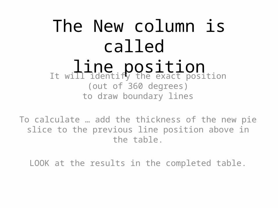
The New column is called line position
It will identify the exact position (out of 360 degrees)
to draw boundary lines
To calculate … add the thickness of the new pie slice to the previous line position above in the table.
LOOK at the results in the completed table.
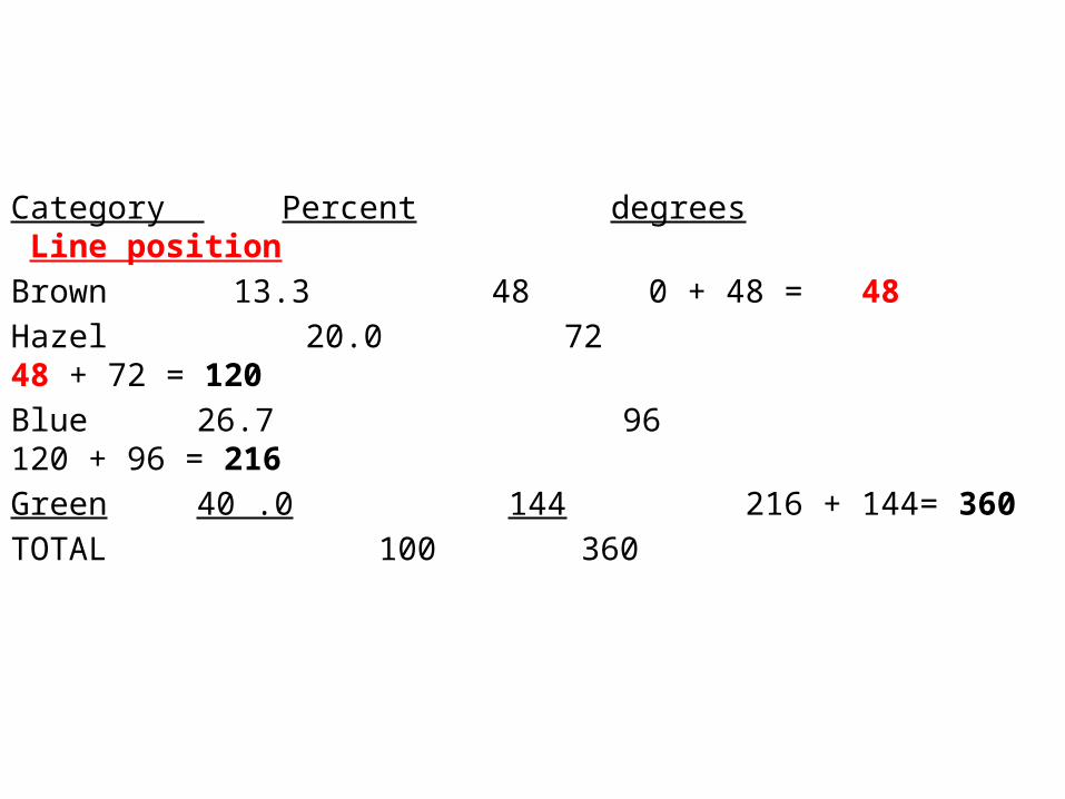
Category Percent degrees Line positionBrown 13.3 48 0 + 48 = 48Hazel 20.0 72 48 + 72 = 120Blue 26.7 96 120 + 96 = 216Green 40 .0 144 216 + 144= 360TOTAL 100 360
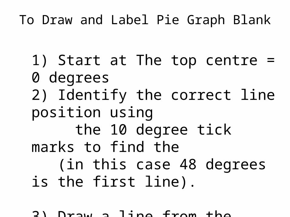
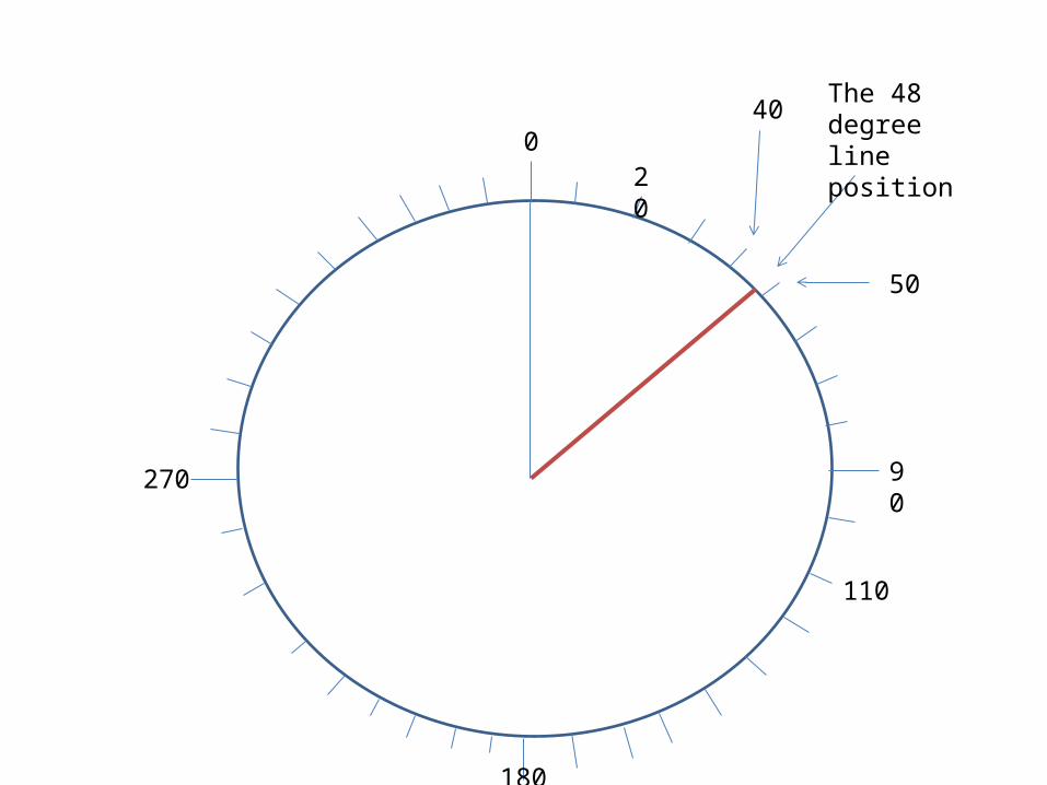
To Draw and Label Pie Graph Blank
1) Start at The top centre = 0 degrees2) Identify the correct line position using the 10 degree tick marks to find the (in this case 48 degrees is the first line).
3) Draw a line from the centre of the pie to the edge at this exact line position. (you may have to estimate between ticks)
90270
180
20
110
The 48 degree line position
40
50
0

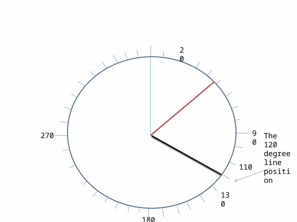
Find Line position for Line #2 on the pie graph and draw it in Place.
(In this case it is at line position of 120 degrees)
90270
180
20
110
The 120 degree line position
130
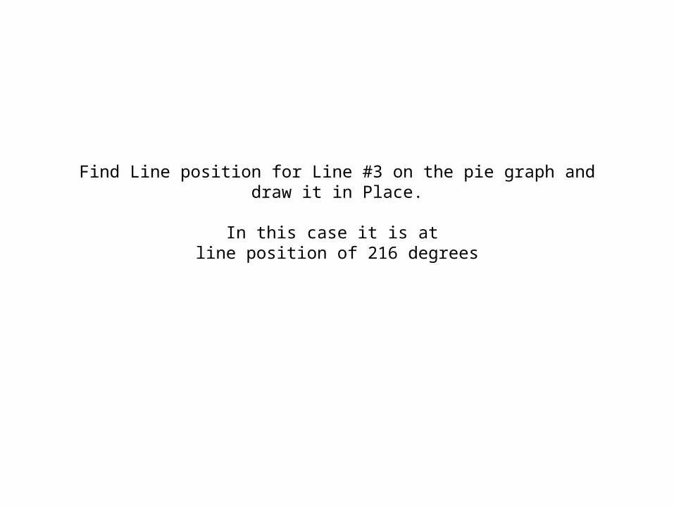
Find Line position for Line #3 on the pie graph and draw it in Place.
In this case it is at line position of 216 degrees
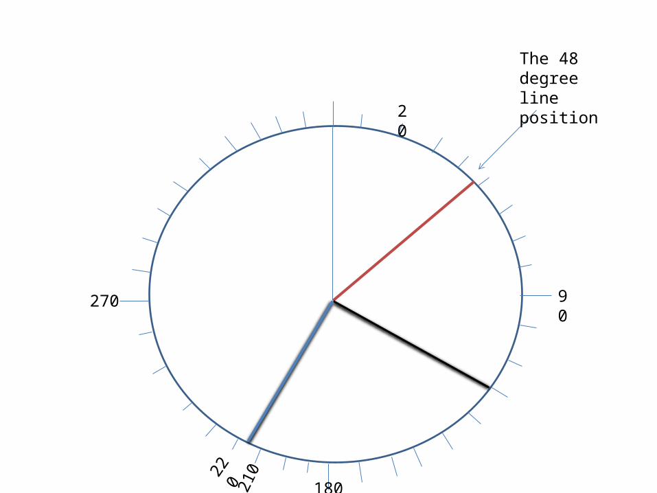
90270
180
20
210
The 48 degree line position
220

When all lines are drawn, it’s
time to add some colour and make a
legend.
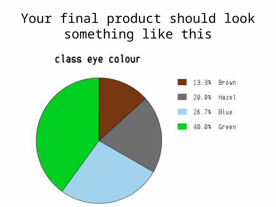
Your final product should look something like this

Some other important uses
for pie graphs