physics for future presidents - amazon web services · 1 . physics for future presidents: . the...
TRANSCRIPT

1
PHYSICS FOR FUTURE PRESIDENTS: THE SCIENCE BEHIND THE HEADLINES
BY RICHARD A. MULLER

2
Figure 1.1. Collapse of the South Tower of the World Trade Center, September 11, 2001, after being struck by an airplane hijacked by al-Qaeda terrorists.

3
Figure 2.1. The smallest nuke: the Davy Crockett nuclear weapon. (A) U.S. officials examine the device. (B) The Davy Crockett is exploded in a test July 1962.
(A)
(B)

4
Figure 2.2. Projected effects of a 1-kiloton blast in San Francisco. The inner circle is the region destroyed by the blast; the outer circle is the region with deaths from flying debris.
Figure 3.1. Passengers of American Airlines Flight 63 gang up on terrorist Richard Reid, preventing him from detonating his shoe bomb.

5
Figure 3.2. X-ray of a shoe bomb. The Transportation Security Administration prepared this photo on the basis of the Richard Reid device. The photo was
distributed to security agents to show them what to look for.
Figure 4.1. The anthrax-laden letter that Senator Tom Daschle received on October 9, 2001.
6
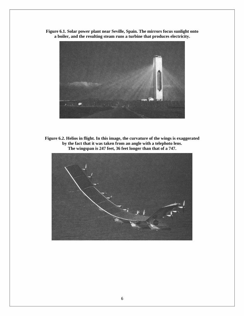
Figure 6.1. Solar power plant near Seville, Spain. The mirrors focus sunlight onto a boiler, and the resulting steam runs a turbine that produces electricity.
Figure 6.2. Helios in flight. In this image, the curvature of the wings is exaggerated by the fact that it was taken from an angle with a telephoto lens.
The wingspan is 247 feet, 36 feet longer than that of a 747.

7
Figure 7.1. The Hubbert curve for oil. The plot shows the growing consumption of oil in the past, the peak (occurring about now), and the predicted drop in usage as world supplies are depleted.
From the Association for the Study of Peak Oil and Gas (ASPO).
Figure 7.2. Oil prices (adjusted for inflation) from 1970 to the present. Notice that the current price for 2008, when measured in constant dollars, is only a bit higher than the price in the early 1980s.
Adapted from www.chartoftheday.com

8
Figure 8.1. Cancer from radiation: the linear effect.
Figure 8.2. Levels of radiation from the Chernobyl disaster that reached various parts of Europe.

9
Figure 8.3. Low-dose region of the cancer dose plot, enlarged from Figure 8.1. The bent line is drawn to show what we would expect if there were a cancer threshold of 6 rem.
Figure 9.1. Giant ants in the 1954 movie Them!

10
Figure 9.2. A fluorescent X-ray machine used in shoe stores in the 1950s to help guarantee a good fit. Fig. 1. The antique X-ray shoe fitter. Fig. 2. Adrian X-ray Shoe Fitter, Inc. Fig. 3. Patrons
looked inside to see how their shoes fit—X-ray exposure was anywhere from 5 to 45 seconds long.

11
Figure 10.1. Mushroom cloud from the explosion of the plutonium bomb over Nagasaki
.
Figure 10.2. The Hiroshima bomb. It was 10.5 feet long, and its cylindrical shape was due to the 6-foot cannon inside that shot two pieces of uranium together to make a critical mass.

12
Figure 10.3. A calutron, the device used to enrich uranium for the Hiroshima bomb.
Figure 10.4. The uranium diffusion plant in Oak Ridge, Tennessee.

13
Figure 10.5. Gas centrifuge for separating uranium-235 from uranium-238.
Figure 10.6. The Nagasaki plutonium bomb. The round shape is due to the spherical shell of explosives required for implosion.
14
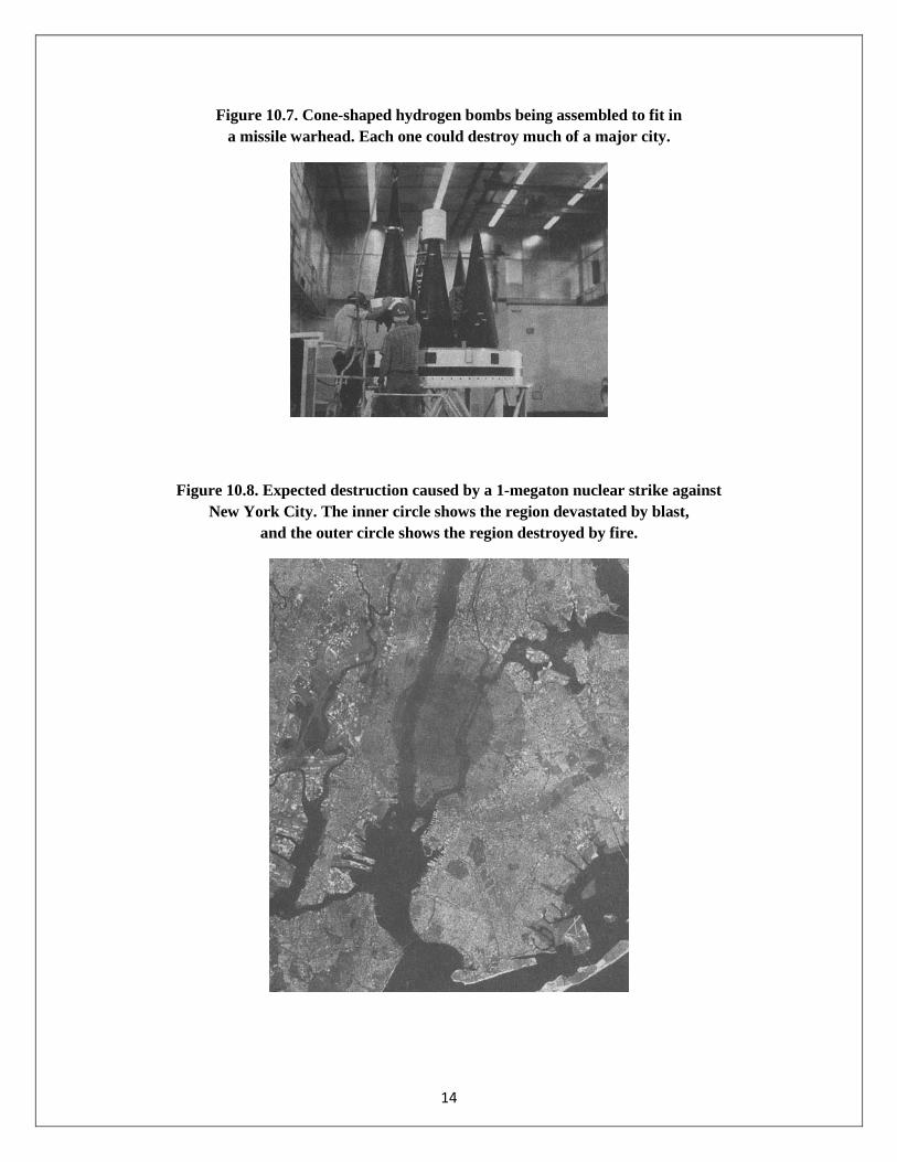
Figure 10.7. Cone-shaped hydrogen bombs being assembled to fit in a missile warhead. Each one could destroy much of a major city.
Figure 10.8. Expected destruction caused by a 1-megaton nuclear strike against New York City. The inner circle shows the region devastated by blast,
and the outer circle shows the region destroyed by fire.

15
Figure 11.1. The Los Alamos Primer (page 21), as originally declassified and published by the United States during the 1950s Atoms for Peace program. This page
describes the possible gun-style uranium bombs.

16
Figure 11.2. An Iraqi calutron after being destroyed by the United Nations.
Figure 12.1. A nuclear power plant, with the cooling tower in prominent view.

17
Figure 12.2. Schematic of a nuclear power plant. The sustained chain reaction takes place in the small reactor. The heat from the fission is used to make steam;
the steam runs a turbine that operates a generator to make electricity.
Figure 12.3. The destroyed reactor at Chernobyl. Unlike U.S. reactors, this one had no concrete containment building.

18
Figure 13.1. Yucca Mountain, Nevada, the site of the prototype nuclear waste storage facility.
Figure 14.1. The inside of a tokamak under construction at Princeton. Note the person sitting on the left.

19
Figure 14.2. The ITER tokamak design. The man at lower left reveals the enormous size of this reactor.

20
Figure 14.3. The NIF laser building at Livermore. It is filled with 192 large lasers.
Figure 15.1. Earth from space.

21
Figure 15.2. Asia at night. Note the difference between North and South Korea.
Figure 15.3. The path of a capsule shot from a tower. Path A reflects a lower velocity (1 mile per second); Path B, a higher velocity (5 miles per second).

22
Figure 15.4. Map of the United States. Find the unique location that is 800 miles from New York City, 900 miles from New Orleans, and 2200 miles from San Francisco.
Figure 16.1. Water in the Amazon region, detected by the GRACE satellites from its gravitational force. The difference between March and August amounts to about an inch of water on the surface.

23
Figure 16.2. A gravity map showing the rings of the buried Chicxulub crater. This is the crater formed by an asteroid impact 65 million years ago, resulting in the demise of the dinosaurs.
Figure 17.1. The explosion of the space shuttle Columbia on February 1, 2003.

24
Figure 17.2. Some of Saturn’s moons. The biggest surprise was that they are all different from each other.
Figure 18.1. Night vision: an infrared image of people cutting a fence and climbing over. Note that the warm parts of the image (face and hands)
are brighter than the cooler outside surface of clothing.

25
Figure 18.2. The Earth's surface temperature pattern, measured from a satellite with an IR camera. The warmer regions emit more IR, and so appear brighter in the image.
Figure 18.3. Weather satellite image showing the water vapor path over the western United States.

26
Figure 18.4. The Global Hawk unmanned air vehicle (UAV).
Figure 18.5. Light bouncing off a right-angle corner. It returns in the opposite direction from which it came.

27
Figure 18.6. Nighthawk stealth fighter. Its surface is covered with flat radar mirrors which, ironically, make it immune to radar.
Figure 18.7. A stealth ship. As with the Nighthawk fighter, the flat surfaces reflect radar, but usually not back to the transmitter.

28
Figure 18.8. Radar images taken using synthetic aperture radar (SAR): (A) The pentagon in Washington, D.C. (B) New York City.
(A)
(B)
29
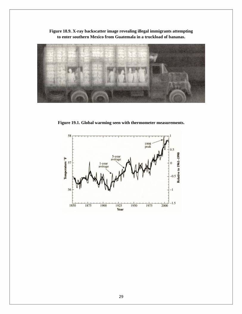
Figure 18.9. X-ray backscatter image revealing illegal immigrants attempting to enter southern Mexico from Guatemala in a truckload of bananas.
Figure 19.1. Global warming seen with thermometer measurements.

30
Figure 19.2. A cover of Amazing Stories magazine from the 1950s: the ice age returns to New York City.

31
Figure 19.3. A photograph of St. Mary's Park in the South Bronx, taken by the author from his bedroom window in 1956. The grooves visible on the rocks were made
by a mile-high glacier that scraped over the region 12,000 years ago.
Figure 19.4. The Earth's climate for the past 14,000 years, deduced from Greenland ice.

32
Figure 20.1. The physics of the greenhouse effect. Sunlight passes right through the atmosphere and warms the Earth, but the IR radiation emitted by the Earth is absorbed
by air, and some is reflected back down. As a result, the blanket of air keeps the Earth’s surface warmer than it would otherwise be.
Figure 20.2. The physics of the greenhouse effect, with cloud reflection and atmospheric leakage included.

33
Figure 20.3. Carbon dioxide in the atmosphere over the past 1200 years. The sudden 36% rise in the recent past is due primarily to the burning of fossil fuels.

34
Figure 20.4. Ozone hole, 1981 to 1999. Antarctica is prominent, and the southern tip of South America is seen in the upper right. Darker gray indicates ozone depletion.

35
Figure 22.1. Monetary damages from U.S. hurricanes. The plot in (A) shows the dollar cost from 1900 to 2005. The plot in (B) shows the cost when it is compensated for
inflation and the increase in building near the coast.
(A)
(B)
Figures based on the 12th edition (2007) of the Index of Leading Environmental Indicators, published by the American Enterprise Institute for Public Policy Research (www.pacificreserch.corg).

36
Figure 22.2. Tropical storms making landfall in the United States. The tall bars give the number of all storms in each decade; the shorter bars represent the number of storms in categories 4 and 5.
Figure based on the 12th edition (2007) of the Index of Leading Environmental Indicators, published by the American Enterprise Institute for Public Policy Research (www.pacificreserch.corg).
Figure 22.3. Number of strong to violent (F3–F5) tornadoes in the United States (March to August), 1950–2006.

37
Figure 22.4. NOAA data on U.S. wildfires, 1960–2006. (A) Number of acres burned in wildfires. (B) Number of wildfires.
(A)
(B)

38
Figure 22.5. Temperature of Fairbanks, Alaska, 1949–2005, reported by the Alaska Climate Research Center.
Figure 22.6. The hockey stick plot, an attempt to bring together all the best records to give a true global average of temperature over the past 1000 years. The name derives from the resemblance
of the shape to a hockey stick. The gray regions show the range of uncertainty.

39
Figure 22.7. The ancient records of temperature and carbon dioxide, showing the correlation, adapted from An Inconvenient Truth.
Figure 23.1. Carbon dioxide emissions in the twentieth century.

40
Figure 23.2. Greenhouse gas emission intensity. The ratio of carbon dioxide emissions to gross national product is compared for several countries.
Figure 24.1. Fluorescent lights in the chandeliers of Notre Dame in Paris.

41
Figure 24.2. Art Rosenfeld.
Figure 25.1. One of the best crops for biofuels: Miscanthus giganteus, 11.5 feet high.

42
Figure 25.2. Wind turbines at the Altamont Pass in California.
Figure 25.3. Proposed location of a wind turbine park off the coast of Massachusetts.