philips saeco xelsis redesign - shengfenggu.com
TRANSCRIPT

Philips Saeco XelsisRedesign
Group B3

Alessia Kayalibay
Team members
Italy
Gijs Spierings
Netherlands Netherlands
Shengfeng GuLiangyi Li
China China
Marieke Wijngaard
2 3

4 5
1 Introduction 8
2 Analysis 10
2.1 Product Overview 12
2.2 Problem statement 14
2.3 Design brief 16
3 Initial conceptualisation 18
3.1 The 3 exploring concepts 20
3.2 Takeaway from the 3 concepts 21
Table of content

6 7
4 Redesign concept 22
4.1 Design highlights 24
4.2 Main design features and decisions 27
4.3 Design details and decisions 30
5 Redesign test plan 34
5.1 Research goals 37
5.2 Test procedure 38
5.3 Participants of the usability test 41
5.4 Prototype 42
6 Results of usability test 44
6.1 System usability scale 46
6.2 Insights grouping 48
6.3 Insights mapping 49
6.4 Discussion of insights 56
6.5 Conclusons 64
7 Recommendations & re-redesign 64
7.1 Opportunities for improvement 68
7.2 Final Re-redesign 70
8 76
9 Acknowledgments 78
Appendix 80

8 9
1 Introduction
Dear reader,
In this report you will find the final redesign of the Philips Saeco Xelsis SM7580/00, a fully automatic coffee machine. During the design process of this project there were three phases, this report will focus on the final phase and will explain the first two phases briefly to explain where the concept is com-ing from. First the analysis phase will be explained. In this phase the coffee machine with its functionalities and the target group are explored and problems considering user experience are defined. This resulted in a design brief that contains the requirements for the redesign are set up.In the second phase, the conceptualisation phase, three concepts are presented which are based on the design brief. These con-cepts are tested using paper mock-ups. Based on the findings in the user test, a conceptual redesign is set up. In the third and last phase, detailing and testing, the conceptual redesign is worked out in detail. A prototype is made from this redesign which is then tested thoroughly. Based on the findings in this test a final redesign is presented.
Enjoy!

10 11
2 Analysis
During the first part of the project, the main focus was to do research about the Philips Saeco Xelsis fully automatic coffee machine. First, the machine itself and its functionalities were explored. This is done by making a description of all the com-ponents, making a flowchart of the machine, performing a cognitive jog through and an initial user test where ten people interacted with the machine. Besides this, the market of the machine was mapped.Lastly, the needs and wishes of the target users were researched. This was done by visiting a store, reading online reviews and finally creating a Persona based on all the results from the research. From this, a design goal and requirements have been set up.

12 13
2.1 Product Overview2.1.1 Product buildupOn this page you can find the product build-up which gives an overview of the product and its functionalities. For this report, research based on the Saeco Xelsis SM7580/00. Compared to the other Saeco Xelsis ma-chines, this machine has a LCD touch button display.
Main beverage options of 7 drinks
LCD Display
Menu zone
Power button
Opertation zone
• Select• Return• OK
• Profile function for saving personalized customized coffee
• 6 more secondary drinks options
• Auto cleaning functions
• Setting
Start/stop
milk bottle drip tray
water tank
grounds container
beans container
control pan-nal
Figure 2-1 Interface of the Saeco Xelsis SM7580/00 Figure 2-2 Physical coponents of the Saeco Xelsis SM7580/00
2.1 Product Overview2.1.2 Persona and content of use
Intended user: 35+ ageHigh incomePremium lifestyle
Extended users:
Guests
Symbiotic products:
Cups, milk, coffee beans, filters, cable manual, water
Persona and context of use are derived from the analysis phase. The persona and context of use give you an idea about the people using the machine and the interactions of the product in the intended context, mainly in a family home.
Content of use Mainly for domestic use, especially for families.
German/ Engineer/ 35 years old
A Lazy coffee lover
Hans6 cups of coffee per day
Coffee knowledge level
“I like inviting friends to my place. And I would always serve them coffee with high-quality.”
“I am sensitive and picky with the taste of my coffee.”
“I always have a busy life. I like starting my day with a coffee before I go to work.”
Figure 2-3 Persona Figure 2-4 Content of use

14 15
2.2 Problem statement
The users do not have a clear idea of their customization process, customizing takes a lot of time as well.
The users are not using the pro-file function, as they are confused about the link between the custom-ization and profile function.
Problem with coffee making
“Too much set-ting. I just want to make sure that the tense of the coffee is the strongest I do not care the rest.”
“I’ve done with the profile, but How can I brew the coffee?”
“So what is the next step after a profile is acti-vated?”
Here you find the problems that are derived from the analysis phase. They are split in two groups, the maintenance and coffee making.
The maintenance is not integrated into the coffee making process flow and this tends to disturb the process of making coffee. Notifications about required maintenance pops up in at unexpected moments.
The users don’t have an overview of what maintenance is required and when before the notification pops up.
Problem with maintenance
“It is annoying that I am asked to refill the water after I pressed to brew and the machine has started grinding.”

16 17
2.3 Design brief
“The design goal is to improve the interaction of the Saeco coffee machine by providing an intuitive and seamless on-screen and physical experience,
where the user can enjoy the process of making coffee (including mainte-nance), making the user feel confident, guided and in control.
The user should feel in control of the machine while making a drink as well as during maintenance.”
Build a better link between the customization process and profile function.
Design strategy
Provide beforehand maintenance information.
Provide guides of the maintenance through the physical components of the machine.
Design goal
Based on the analysis phase a design brief is set-up, it consists of one generic design goal, a strate-gy that shows three focus points and the detailed requirements for the redesign. This design brief is used as basis for the development of the redesign. Design requirements
1. Overview of navigation
• The hierarchy of information on the inter-face must be clear;
• People should always know where they are in the system and have an overview of all the steps taken or still needed to reach a goal;
• People should have the possibility to go back to their settings and easily change their previous choices.
3. Be able to constantly check the maintenance status• People should have in advance an over-
view of the maintenance needed. So, they will not be unexpectedly disturbed during the process of making coffee.
• There should be clear feedback indicat-ing when the particular maintenances are needed (refill water, coffee beans, empty coffee ground.
2. Clear communication of the cof-fee settings• The meaning of the different icons should
be clear and easily understandable by the user without consulting the manual;
• The meaning of all the customization settings should be clear in order to allow the user to have full control over the taste of his coffee;
• The interface should provide the user with additional information in case icons are difficult to understand
5. Aesthetically pleasing machine
• The target expects to buy a high-end product. So, it should look professional and appealing;
• The target is willing to show off the product to its guests.
4. Save and have easy access to the preferred drinks in order to get quick drinks• People should have the possibility to
save quickly their preferences, avoiding to customize their drinks every time fol-lowing all the steps;
• Completing a task should be as easy as possible, and take as little time as possible;
• People should find immediately their saved drinks and the profile section should be easy and quick to find;
• Coffee section and profile section should be integrated into a single path.

18 19
3 Conceptualizing interaction
On the basis of the knowledge and insights gained from the analysis phase, three concepts were designed and made into low fidelity paper mock-ups, followed by a comparative user testing session involving 8 participants.In this chapter, all three concepts will be introduced and briefly explained in terms of their different focuses and highlights, and the user test results and insights will be discussed, serving as the foun-dation and iterative process towards to the redesign concept.
Introduction of chapter 3

20 21
This concept focuses on the primary function of coffee making. The machine has a small touch screen with on the left and right of the screen are two buttons for turning the machine on and brewing coffee. A mobile application is provided to access the other functions of the machine, like setting up a profile. This machine focuses primarily on making the coffee making process quick.
This concept has a complete touch screen where all functionalities are included. The screen gives a quick overview of all the func-tionalities, choosing a drink, customization and maintenance status of the machine. The machine always gives the user an overview of the maintenance status.
This concept has a more physical way of inter-acting with the machine. With a turning knob to control the main functions of the machine. There are two displays, one on the turning knob which is showing basic information that changes according to how you turn the knob and what settings you are controlling. The second display on the right to shows more detailed information.
Hi, *Member A*
2 coffees available
Espresso Coffee Americano Cappuccino Latte Macchiato Cafe Latte Hot Water Milk froth
X2
Press toselect
Press toselect
EspressoEspresso
Espresso
30 mlespresso
CustomizationStrength
Taste
TemperatureCoffeeamountPress to
brew
Strength
Concept 1 - Basic screen Concept 2 - Full touch screen Concept 3 - Turning Knob
Below the three concepts that are tested during the analysis phase can be found. All concepts focus on the control panel of the coffee machine. They all explore a different way of interaction with the machine.
3.1 The 3 exploring concepts
• The participants liked the maintenance information at the bottom of the screen, which shows how many cups can still be made.
• The icons on the containers guided people in finding the water and ground contain-er.
• A small amount of functions made the machine easier to use, and the testers liked this simplicity.
• People didn’t like this visual style, they said it looks cheap.
• The screen (Figure 3-1) was a bit too small for some actions, for example, to customize a drink.
• Participants liked the visual style of this concept above the other styles.
• Easy customizing and saving of drinks. (Figure 3-2 )
• The big touchscreen made the product feel luxurious and gave people a good over-view.
• The maintenance information page(Fig-ure 3-3) which is the start screen in this concept, people just wanted to focus on coffee, not the maintenance.
• People liked the physical experience and the visual style of this concept.
• Too many ways to control the machine, so users did not feel in control. An overview of the panel of this concept is shown in Figure 3-4
• too many buttons to control the different functions
• two separate screens are confusing for people. Because the information is split.
Concept 1 - Basic screen Concept 2 - Full touch screen Concept 3 - Turning Knob
3.2 Takeaway from the 3 concepts
Figure 3-2 Customization screen of concept2 Figure 3-4 Panel of concept 3
Figure 3-3 Maintenance information page
Figure 3-1 Customization screen of concept1

22 23
4. Redesign Concept In this chapter, the redesign concept will be presented. This redesign is based on the findings from the three concepts. In this chapter first the highlights of the machine will be presented and then the design and design decisions will be explained into detail.
Introduction of chapter 4

24 25
4.1 design highlights
Touch screen interface with full functionality.
Physical power button
Icon on beans container, with light indication.
Physical brew button
Icon on grounds container, with light indication.
Icon on water tank, with light indication.
Figure4-1 New design components of the machine
On this page you find the redesign with it’s high-lights explained. The focus of the redesign was on the digital interface which is connected with some physical parts on the product. An overview of the different screens is explained on figure XX on the next page.
Highlight 1: Coffee IDThe redesign makes the flow of making a coffee easier and saving a customized drink to a profile is integrated in the coffee making process.
Highlight 2: Maintenance forecastTo make doing maintenance more convenient, a bar in the interface is implemented, showing how many more drinks the user can still make before they have to perform maintenance. Click-ing on this bar will give you an overview of the maintenance status.
Highlight 3: Physical light indicationNext to this light indicators are placed on the water, beans, and grounds containers to indi-cate when they need to be refilled/emptied. The location of these lights and the touchscreen panel are indicated in Figure4-1.
Figure4-2 Overview of the interface

26 27
Figure 4.3 Rendering picture of the machine in its usage environment
Coffee ID (Figure 4-4) is designed to give quick access to the personal preference(profile) of that drink from the drink page. It is designed to be non-intrusive, so it does not limit the coffee making experience. Using dif-ferent colours, the user can quickly see which profile is theirs.The profile panel and customization panel are both placed on the right side of the screen with the same visual style to show the connection be-tween both functions. Each panel can be selected individually. Each panel is displayed in the collapsed view where the selected profile (or default) and an overview of drink settings are presented. They can be expanded to access profiles as a shortcut (Figure 4-5) and coffee customization where coffee settings and profiles are bonded to each other.The design enables multiple ways to access the profiles and it is closely connected to customization because they are inseparable and in the home context profile is a more frequent feature for lazy coffee lovers to interact with than customization.
Figure 4-4 Profile & customization as a whole
Figure 4-5 Selecting or create profiles via the upper panel
Figure 4-6 Selcting or create profiles via the ustomi-zation page
4.2 Main design features and decisions4.2.1 Design highlight 1: Coffee ID

28 29
Maintenance forecast consists of two parts, the maintenance indication bar and the mainte-nance information page. It is designed to be the main place for monitoring and managing the frequent maintenance of the machine(e.g. Filling water/beans and emptying the coffee grounds tank), aimed at eliminating the hassle caused by maintenance and giving more control over maintenance to users.
Maintenance indication bar
The maintenance indication bar (Figure 4-7) represents the maintenance status so that users can quickly make a decision, whether to do maintenance or not, by showing the number of coffees that can be made with the ingredients left in the machine. It only shows up when the available ingredients can support three drinks or less. It is intended to work as a mild reminder when maintenance is almost required.
Maintenance information page
By tapping on the maintenance indication bar, the maintenance information page can be ac-cessed. This page will also pop-up when main-tenance is being done (e.g. water tank is taken out) and when there are not enough ingredients to make the desired drink.In the maintenance information page, an over-view of the amount of water, coffee beans and grounds capacity are displayed and converted to the number of drinks (Americano) that can be made with the available ingredients. By display-ing all the information together, users can decide to do other maintenance
4.2 Main design features and decisions4.2.2 Design highlight 2: Maintenance forecast
Figure 4-7 maintenance indication bar on the top
Figure 4-8 maintenance information page Figure 4-9 Imaintenance information (explana-tion page)
In the new redesign, there are LEDs on the water, coffee ground and coffee beans containers. The aim of these lights is to help the user to easily check and be advised about the maintenance status. In addition, the connection between the maintenance information on the interface and the physical lights will help the user to find the ingredients that need to be refilled. The LEDs can have two different colours: white and red. The colours are linked with the maintenance urgency and when maintenance is not needed, there will be no light indication. There are three different cases:
2 coffees availables
Blinking white light (2s delay) that indicates the ingredient to refill/empty
The blinking light is supposed to be just a soft advice. For this reason, a lower blinking speed (2s) is used. This is because a higher blinking speed (1s) would be linked with a more serious and urge nt situation.
No notification on the interface
No light notification on the physical icons in case maintenance is not needed
3 cups (or more) available
1 coffees available
Red light that indicates the ingredient to refill / empty
The red light will not blink because the color will already indicate the need for urgent maintenance.
4.2 Main design features and decisions4.2.3 Design highlight 3: Physical light indication

30 31
4.3 Design details and decisions4.3.1 Physical light notification
Existing light indicatorsTo find a suitable solution for the light indicator on the containers (water, coffee ground, coffee beans), products from different fields (dashboard car, alarm devic-es, phone notifications, other technological devices) were analyzed in order to find inspiration and check if there were certain notification systems that were always the same, in order to understand the reason behind it.
White lightsWhite lights were used to recall a non-serious attention signal. This is because, by analyzing the perception that white light has on people, it appears to be perceived as a soft notification signal, not a urgent one. Indeed, in our case, this type of lu-minous feedback wants to be only a slight reminder about the state of the ingredi-ents (the ingredients are enough to make two drinks).
Red lightsIn contrast, the light changes colour from white to red when maintenance be-comes more urgent (ingredients for one drink left).This is because, on a perceptive level, we associate this red colour with a strong sense of emergency. This light will grab the attention of the user and calls for action.
In this way, a hierarchy of importance was also created through the physical light notification.
On this page you find the inspiration for the physical light notification of the main-tenance.
Figure 4-10 Moodboard inspirations (interior car, alarm devices, phone notification, other techno-logical devices)
A test, to improve the readability of the icons that are used in the redesign, was conducted. The test is conducted with seven participants which resulted in the improved icons below. Detail about the test can be found in Appendix 2.
4.3 Design details and decisions4.3.2 Result of readability test of icons
Stars are added to the clean-ing icon, to create the feeling of ‘clean’. The straight line is changed into the curve in order to add more details.
Previous icons
Improved icons
I would relate this icon to wa-ter rather than cleaning.
I assumed this icon means temperature. I prefer the icon also show its mechanism.
It makes sense that this icon is about water. But I can’t link it to the amount of water on my own.
3 beans are used for the strength icon to represent the strength is controlled by the number of beans.
Scale is added to the water glass and milk bottle. Then adapted the tyle of the tem-perature icon into the other two.
The icon of the bean changed into one bean. So, while the ground icon compares to the bean icon, the user can better understand what does the grounds icon means.
The Aroma icon is combined with the pressure( the mechanism) element and the coffee cup.

32 33
4.3 Design details and decisions4.3.3 Digital interface
The new design (Figure 4-11) of the control panel remains a similar orientation as the original one where two physical touch buttons of ON/OFF and Brew/Stop are placed on the left and right sides with a 16:9 full-colour touch screen in the middle.The size of the control panel is similar but a bit larger than the original design because the screen needs to be big enough but still match the aesthetics of the machine.
Redesign of the control panel
Figure 4-11 Dimensions of the control panel
Figure 4-12 Visual languege
Figure 4-13 layout anf navigation
4.3 Design details and decisions4.3.4 Visual identity
The visual language of the new design aims at creating an elegant and high-end feeling of the coffee machine. To achieve this, the visual lan-guage follows 3 main ideas. The first one is the use of a dark and warm colour scheme derived from the colour of coffee beans. The second is the use of transparency to create a rich-layer effect. Last-ly, illumination was widely used in the design to strengthen and highlight content as well as indica-tion.
The visual language
A grid system of rows and columns is used for dis-playing elements and content but mainly in columns since the display is landscape. The navigation of the interface is designed in a 3-dimensional way that vertical navigation (scrolling or tapping) is designed to navigate between options (e.g. Coffee selection page), the horizontal navigation is used to go through the system (e.g. to customize your drink) and layering navigation that especially designed for the maintenance. (e.g. by clicking on the mainte-nance indicator you find an overview of the mainte-nance)
Layout and navigation design

5 Redesign test plan
34 35
A test plan was made to identify issues in the redesign with regard to interaction and user experience. Further unforeseen problems are taken into account for the final redesign. The test plan consists of the overall design of the user test and the protocol which is followed throughout the user tests. The user test design states the goal of the test, the research questions which need to be answered and all the components needed for this. The test protocol is set up to execute the tests consis-tently across all participants.During the tests, feedback is gathered about the experience and interaction of the participants. Later this data is analysed and conclusions are drawn based on these insights. More about the test results can be read in chapter 6.
Introduction of chapter 5

36 37
On this page you find the research goals. Research questions have been set-up to achieve the research goals, these can be found in Appendix 3. The research goals and research questions are based on the design requirements set up in the design brief. These research questions and the goals are the basis for the setup of the test. It is necessary to find out what went wrong with the prototype and why it went wrong to improve the concept.
Find out whether people have a fluent experience with the coffee machine
Find out what people think about the aesthetics of the machine.
Find out whether people understand the informa-tion, icons and interactions provided by the machine.
Find out whether the maintenance is disturbing the coffee making pro-cess.
5.1 Research goals
1.3.
2. 4.
Research goals about highlight features Research goals about general usability and experience

38 39
5.2 Test procedure5.2.1 Overview
Below, figure 5-1, you can find the pro-cedure of the usability tests. This proce-dure is followed throughout all the tests to have a consistent approach for all the participants. A more detailed descrip-tion and contents of the procedure can be found in Appendix 4. The set up of the test (setup room, task division, roles) can be found in Appendix 5.
Figure 5-1. Procedure of the usability test.
Welcoming & introduction
Consent form Survey of general
information
Scenario 1Interview about first impression
Scenario 2 Scenario 3Explore the machine Make a regular espresso
for yourselfMake coffee for
guests and yourself
System Usability Scale
Ending sessionInterview about the experience
1 2 3
4
6 87
5
Figure 5-2. Description of each step of the us-ability test
1. Welcoming & introduction
The participant is welcomed and introduced to both the team and the project.
4. First impression
Before the user test is started, the partici-pant is asked about their first impression on both the machine and the interface.
8. Wrap up
The participant is thanked for their partici-pation and the test setup is prepared for the next participant.
7. System Usability Scale
Fill the System Usability Scale question-naires.
6. General Interview
A short interview to get some deeper insight into the participants’ experience while using the machine.
5. Task performance
The test consists of three various scenarios to answer the research questions.
2. Consent form
The participant will be asked to sign the con-sent form (which is sent before the test).
3. General questionnaire
A short interview is held to get some insight into the participant. In the interview some background information (eg. age, gender, household), experience with different coffee machines coffee knowledge is gathered.

40 41
5.2 Test procedure5.2.2 TasksIn the user test three tasks are proposed to the participant, using a scenario to explain the situation. The scenario’s contained three tasks the participant had to perform. This way the user is not guided too much in how to perform the tasks. To test the maintenance, this hidden task was part of task 3. A more detailed description with the scenario can be found in appendix 7.
Goal of the task: Let the user make two the same cappuccinos for this they can use the two drinks buton. During this task they will have to perform main-tenance during the process of reparing coffee. The goal is to see if people link the lights to the icons on the display, and if the indication bar makes them aware that they need to perform maintenance soon.
Task 3 - Make two cappuccino and an espresso for yourselfhidden task - do maintenance
Task 2 - Make an espresso with cus-tomized taste
Goal of the task:Let the participant prepare an espresso for themselves and customize the taste. And see is people will save the drink, and if they know how to save the drink to a profile.
Task 1 - Explore the functionalities of the ma-chine
HostTester
Goal of the task:Let the user explore the different sections of the machine to get accustomed with the machine.
Scenario:“You just bought the machine and did not yet try it out. Explore the functionalities of the machine. When you think you have a clear idea of the machine you can stop.”
Scenario:“It is a sunday afternoon, you are going to make an espresso for yourself, you like your espresso a bit larger with a strong taste. You would like to drink this espresso more often, for example in the morning before going to work.”
Scenario:“Two friends are visiting you you can ask them what they will drink and you would like to have your favourite espresso. First serve your friend and then serve your-self. Imagine “member A and B” are your friends.”
P1 P2 P3 P4 P5 P6 P7 P8 P9 P10
Gender Female Male Female Male Male Male Female Male Female Female
Age 23 23 23 23 23 33 23 56 55 27
Occupation IPD studentMechanicalengineeringstudent
DFI studentAppliedMathematicsstudent
ManagementEngineeringmasterstudent
Chemicalengineer DFI student
ServiceemployeeTUdelft
Pastor DFI student
Nationality Dutch Chinese Dutch Dutch Italian German Chinese Dutch Dutch Korean
Owns ahouse No No No No No Yes No Yes Yes Yes
Amount ofcoffee theydrink
1 cup per day.Less than3 times amonth
3 or 4 cupsper day
2 cups perday
3 - 5 cups perday
At least 2cups a day
2 cups perday
15 cups perday
2 to 10 cupsper day
10 cups perday
Knowledgeabout coffee Moderate Beginner Moderate Moderate Moderate Moderate Beginner Beginner Beginner Moderate
Experiencewith fullyautomaticcoffeemachines
Yes No Yes A bit A bit No Yes No No No
Someone fromthe target group.
5.3 Participants of the usability test
In order to gather valuable insights from the usability test, ten participants have been se-lected. The focus was to find a group of partic-ipants that represents the target group. A wide range of participants was gathered of which one represented the target group, two working people to represent the older generation of users and in total seven students (of which four design students). As this group represented different nationalities, different age groups and different study/work background, this group is sufficient for testing the usability of the redesign.
Figure 5-3. Characteristics of the participants

42 43
The prototype(Figure 5-4) for the usability test includes both physical and digital parts. The main goal of the prototype was to support natural and realistic interactions as designed in the redesign phase. With the focus to have as little differences from the redesign.
5.4 Prototype
Interface prototype
Physical prototype:Lighting icons on wa-ter tanks an grounds container
Physical prototype:Ipad holder
Figure 5-4. The main components of the prototype Figure 5-5. The structure of the prototype
The physical part consists of a cardboard iPad housing set (iPad holder and screen cover with cutout), see Figure 5-5, and the addition of lights to the water reservoir, coffee grounds tank and coffee beans container. These lights were connected to Arduino and were remotely controlled by one of the test assistants during user tests. In addition, the selection of material and colour was a major concern for making the prototype more realistic and less distracting.
5.4.2 Interface prototypeThe digital prototype used during user tests was made with Framer X (Figure 5-7) and host-ed in a 9.7 inches iPad running on Framer app (Figure 5-8). A piece of black cardboard with cutout was covered on the iPad to resemble the size of the interface and reduce distractions.Efforts were poured into designing a high fidelity user interface and fluent interaction flows, but due to the limitations and bugs of Framer X, animation effects and design components with code were not achieved. Therefore, the final digital prototype tested was merely a in-teraction within the pre-defined flows and was not explorative enough, and it also required manual controls from test assistant.
5.4 Prototype5.4.1 Physical prototype
Figure 5-6. Picture of the prototype
Figure 5-7 Framer X and its working space
Figure 5-8 Explosion view of digital proto-type
Figure 5-9. Picture of the prototype

44 45
6 Results of usability test
In this chapter you find the results of the usability test. The gathered data is analysed and visualized in this chapter and conclusions are drawn based on the findings.For the analysis of the data from the usability test, three methods were used for evaluating the test results: System Usability scale, Usage Pattern (detailed outcomes of the usage pattern can be found in appendix 8) and Observation & statement cards clustering. In this chapter, the outcome of the test and the outcomes of all the methods combined, are present-ed. The findings from the usage pattern, observations and statement cards are visualized using the flow of a system. The insights gathered from this usability test form the basis of the re-redesign presented in chapter 7.
Introduction of chapter 6

46 47
6.1 System usability scaleResult & discussion
Participant Score
1
Participant Score
1
Item 4* Item 10**
87,5 1 1
2 72,5 1 2
3 82,5 1 1
4 87,5 1 1
5 90 1 2
6 66 1 2
7 87,5 1 1
8 66 3 4
9 62,5 2 2
10 70 1 1
Average 77,2 1,3 1,7
non design students
Design studentsTarget userEmployed people
* Item 4 - I think that I would need the support of atechnical person to be able to use this system.
** Item 10 - I needed to learn a lot of things before Icould get going with this system
Table 6-1 - SUS scores average + scores 1 & 4
https://cui.unige.ch/isi/icle-wiki/_media/ipm:test-suschapt.pdf Brooke, J., Quick, S. U. S. A., & Scale, D. U. URL: http://www. itu. dk/courses/U. E2005/litteratur/sus. pdf.(9.4. 2012.).Sauro, J. (2011, feb). Measuring Usability with the System Usability Scale (SUS).https://measu-ringu.com/sus/ consulted.
The System Usability Scale (SUS) is used to rate the usability and learnability of the rede-sign concept. In the SUS the participants rate ten items from (1)strongly agree to (5)strongly disagree. The average SUS score of the group of participants is used to find a percentile score that measures the perceived usability.1,2 A score above 68 means that the perceived usabil-ity is above average.
In table XX you can find the scores from the SUS, which are placed on the graph in figure XX, where the brown line represents the perceived usability based on the SUS score. The aver-age SUS score is 77,2. Looking at the graph in figure XX, a percentile ranking of around 81% is scored. This means that the redesign concept is perceived to have a higher usability than 81% of the products tested with the SUS.
Usability score (percentile)
According to Measuring U 2, the learnability of the system is shown by items 4 and 10. When the participants rate these with a low score this means the system is easy to learn. Looking at table XX (learnability system) it can be said that the system is easy to learn as the average scores are 1.3 and 1.7.
Learnability
Table 6-2 - Graph to calculate the percentile ranking of the tested product
100%
90%
80%
70%
60%
50%
40%
30%
20%
10%
0%
0 10 20 30 40 50 60 70 80 90 100
SUS score
abovetested
products
Percentilepreference
77,2 (SUS score)
Participant(+number)
SUS score conducteduser test
Preference aboveproducts testedwith SUS
81% (Percentile preference above tested products)
9
86
10
1
2
341
75
The SUS scores differ quite a lot (Table 6-2). For the students, this score is on average much higher than for the employed people. A reason for this could be that the students are more used to working with touch screen devices or are more interested in high-tech products. There is not a big difference between design and non-design students.
Conclusion and discussion

4948
A The physical brew button
B Coffee customization setting
C Save button (On the customization page)
D Profile
E Maintenance information
F Led icons on the machine
G Aesthetics
H Others
8 groups of insights4 hierarchies and their criteria
The insights gained through interview, observations and usage pattern were first clustered into 8 groups using statement cards, see figure 6-1. The clusters are split into the severity of the problem(critical, serious and minor) or positive points about the concept. The rating took place after discussing the possible impact on the usability if this issue would not be resolved.On the next page you can find an overview of the insights found. These insights are presented on the intended flow of the redesign. For a more elaborate explanation of the insights, you can go to chapter 6.4
1 Nielsen Norman Group (January 1, 1995). Severity Ratings for Usability Problems. 151Retrieved May 29, 2018 from http://goo.gl/y0ihHL
---Critical problems
Problems: If we do not fix this, users will not be able to complete the scenario / task
-Minor problems
Problems: Users are annoyed, but this does not keep them from completing the scenario. This problem is not urgent
--Serious problems
Problems: Many users will be frustrated if we do not fix this
+ Positive points
Points: Users find this helpful in com-pleting the scenario. This should be kept like this.
6.2 Insights groupingCatogories of insights and the criteria of the hierarchy
After having analyzed the 8 groups mentioned in chapter 6.2.1 in detail, the insights were summarized and shown in the flows on the next pages that serve to show the interaction between the interface pages and to compare the intended flow (as the interface flow had been thought and planned in the redesign phase) with the unintended flow (how users actually interacted with the interface) and the steps that have been skipped by people.In addition, for each intended/unintended/skipped step, the number of users who showed the same be-havior has been indicated and the linked group code (e.g. A1) was marked to reconnect the action to the analysis on the previous pages.
6.3 Insights mapping
6.3.1 Insights from exploration stage and overal impression
The meaning icon of the brew button was unclear.
A1 Participants perceive this machine a high-end and professional.
G1

50 51
1. Select espresso
2A.2a Choose to add a new profile
2B.2 Type name and save the profile
Put on the cup(s) on the machine
6.3.2 Insights from the process of making a regular espresso
Participants don’t have difficulties to save their drink to their profile or set up a profile.
C2
7 testers forgot to put on the cups before brewing the coffee
H1
5/10
1/10
4/10
1/10
4/10
1/10
1/10
2/10
Participants have different perspec-tive towards the function of the save button.
C1
2 testers want to do coffee customize directly from the coffee detail page
B1
2A.1 Do customization2A.2 Save customization
2B.1 Create new profile
Insights with group code
A
interaction flow
not conducted interaction flow
amount of testers of a certain step
represent the hierarchy
1/10
Intended flow
Legend
Skipped flow
Unintended flow
2B.3 Do customization and save it
2A.3 Type name and save the profile
The process of creating and saving a new profile was clear and fluent.
D1
5/10
4/10
3. Brew the coffee
No one noticed the change of the maintanence information bar
E1
4. Wait for the coffee
3A. Back to the coffee detailed page
The lighting of the brew button is a clear indication that the machine is ready to brew.
A2
Participants don’t know how to go back to the previous page (coffee details page)
B2

52 53
10/10
Users don’t understand the mean-ing of the maintenance bar.
E2
No one utilizing the maintenance indication bar.
E3
6.3.3 Insights from the process of doing maintanence while making 2 cups of coffee
1B Select cuppucino1A Check maintenance infomation 1A.1 Check detailed maintenance
infomation
1B.1 Open customization page 1B.2 Do customizatio 1B.3 choose 2 cups
1A.2 Do maintenance 1A.3 Select cappuccino
4/10
4/10
2/10
The light behind the icon doesn’t help participants find where the tanks are immediately
F1
Participants get annoyed and confused when the option of 2 cups is active and is able to press the brew button but it pops up the maintenance page.
E4
Lights do not attract attention and participants didn’t see the physical lights on the tanks
F2
The icons on the physical parts help people to know which part needs maintenance.
F3
1B.4 Maintenance requirement pop up
(1B.5a Remove the cups)
1B.5 Do mainte-nance
1A.4 Open customization page 1A.5 Do customization2 Choose 2 cups3 Put on cups
4 Press brew button
Put on the cup(s) on the machine

54 55
Put the cups on
2/10
All participants used profile to control their customization.
D1
Participants expect the selected profile is always their own one
D2
6.3.4 Insights from the process of making a cup of espresso from the user’s profile
1 Select espresso 2A Open profile card 2A.1 Select profile 2A.2 Press to brew2B Open customization card
2B.1 Select profile2B.2 Press to brew 3 Wait for coffee

56 57
“What’s the meaning of this button?”
A1: The meaning of the icon of the brew button was unclear.
The icon is similar to the play button of media like video and music so the partic-ipants don’t expect the brew button to be used to brew the coffee.
“The button seems like an arrow, it seems like it is going to a different page, not that you make the coffee”
“I got that I had to press the button looking at the blinking”
A2: The lighting of the brew button is a clear indication that the machine is ready to brew
Participants felt guided by the machine because the white light attracted their attention. In this way, they immediately understood that they needed to press that button to brew the coffee.
Insights about the physical brew buttonA
Quote:Quote:
Discussion:Discussion:
On the following pages an in depth explanation of the insights gained through the usability test. The in-sights are split according to the 8 groups, from A to HEach insight was found through analyzing the data gathered during the user test (videos, notes, survey and observations). For all the insights an explanation of the insight and discussion is giv-en. In the discussion the reasoning behind the insight is given. The in-sights are supported by number of participants involved, observations or quotes from one of the partici-pants.
6.4 Discussion of insights
Insights about customization (coffee settings)BB1: Participants wanted to change/customize coffee settings directly from the coffee detail page.
This could be because people may want to change settings in the quickest and the most accessible way. The bars look like they can directly be edit-ed, eventhough they are small.
‘I assume the after clicking the save, it will go back to the main page. The save button invites me more to click on rather than the arrow.’
Some participant swiped from left to right on the customization bar to change the customization of the coffee.
B2:Participants don’t know how to go back to the previous page (coffee details page).
This problem could have happened because the indication arrow is on the left of the page where is out of focus. The prototype didn’t include the animation of the pop up of the cus-tomization page which will influence the expectation of how to go back to the coffee detailed page.The participants expect that the customization page will dissappear after saving the drink to a profile.
Quote:
Discussion:
Discussion:
Observation:

58 59
Insights about the save button (On the customization page) C
“I think I have to neces-sarily save it before I can brew it”
“Oh, I pressed the save button but my coffee is not brewing!”
C1Participants have different expectations towards the function of the save button and what happens when they press it.
The meaning could be unclear because it was so close to the cus-tomization settings and so different from the other ones (red bright color). In that way, people thought that press it was a necessary step to follow in order to brew their coffee. If the color and the contrast of the button was less evident, probably people would not have been attracted by it and they would be guid-ed to press the brew button more.
“Yes, so now I save my coffee to a profile.”
C2: Participants don’t have difficulties to save their drink to their profile or set up a profile.
If the user is in the default mode, there is a guiding page to guide him/her to choose a profile or build a new one. The save button lights up when settings changed, this is an easy indicator to save the drink.
Quote:Quote:
Discussion:
Discussion:
Insights about profile functionD
“It was nice, I had no problems, was clear.” “I like that my profile is already there. But I assume that it is because I am the last one using it.’”
D1: The process of creating and saving a new profile was clear and fluent.
After clicking the save button, a guide of selecting or creating profiles is provided to lead the user. Also, the users have a clear mind about the function of the profile, because the profile was close to the customization settings on the screen and the users can easily un-derstand the link between the profile and customization.
D2: One participant expects the selected profile is always their own one.
Because users want to have quick access to their own profile without searching, they expect the coffee machine remembers their settings.
Quote:Quote:
Discussion:Discussion:

This kind of bars is more commonly used as the the indicator of different screens.There is no explanation about the mainte-nance indicator and it’s function, so people don’t understand what it is about.
The participants pay more attention to preparing the cofee than to any other in-formation on the screen. The change is too small for the partici-pants to notice.
This may not because they did not want to do maintenance in advance but the main-tenance bar failed to catch their attention.The visual of the maintenance bar doesn’t have any indication that it is related to the amount of coffee that the machine is able to make. The users tended to ignore it because they cannot get any useful information with their first glance.
60 61
Some participants regard it as the indica-ter of different screens.
No one pay attention to this chang-es after brewing the coffee
E2: Users don’t understand the meaning of the maintenance bar.
E1: No one noticed the change of the maintanence information bar
Insights about Maintenance informationE
ObservationObservation:
Discussion:
Discussion: The users did not understand the mainte-nance indicator, so they were not updated about the maintenance status. The re-quired maintenance came out of nowhere.
A few participants got stuck when the maintenance requirements pop-up after they chose to make 2 cups of coffee and click the brew button. ( The machine is only available for 1 cup of coffee).
Observation:
Discussion:
All the participants did maintenance after the maintenance requirement popped up instead of doing maintenance before they started making coffee.
E3: No one utilizing the maintenance indication bar. Ask friends for what to drink
Notice the maintenance indi-cation bar
Do maintenance
Check the maintenance infor-matin
Maintenance requirement pops up
Customize coffee
Put cups on
Brew the coffee
E4:Participants get annoyed and confused when the maintenance required page pops up while they want to prepare two drinks.
Observation:
Discussion:

One of the main reason is during the test, the machine did not make the real cof-fee, so they did not hear the grinding or brewing of the coffee. These sounds could subconsciously trigger the user to put a cup under.At the same time, there is not any notifi-cation from the interface that reminds the user to put on the cups.
62 63
“Where is the water tank? I can’t find it” “I didn’t notice the lights, should I ?”
F1The light behind the icon doesn’t help participants find where the tanks are immediately.
F2Lights do not attract attention and participants didn’t see the physi-cal lights on the tanks
“Ok I understood that I might also need to clean the grounds because of this lights”
F3The icons on the physical parts help people to know which part (almost) needs maintenance.
Insights about Lights (On physical parts)F
The users had the perception that the water tank is at the back of the machine because they are used to finding the water tank there. They first didn’t pay attention to the lights on the water tank at the front.
While performing the tasks, people were completely focused on the interface and they didn’t pay attention to the surround-ings.At the same time, the panel physically blocked the lights which are placed too high on the container.
Height of the LED icon
The users learned, from the experience of refilling water, that if the icons of the water tank/ grounds container lights up, they need to do maintenance for that part.
Quote:Quote: Quote:
Discussion:
Discussion: Discussion:
“It looks professional, fancy, I like it” The tester put the cup on the machine after the machine start-ed brewing the coffee.
G1Participants perceive this machine a high-end and professional.
This could be because of the UI graphic, the black color that is linked with profes-sionalismand the soft lights on the containers.The machine itself is perceived as high-end and professional.
Insight about Aesthetics
G Insight from others aspect
H
H1:Participants forget to put cups before brewing coffee(s).
Quote: Observation:
Discussion:
Discussion:

64 65
The combination of the profile function and the customization function works well to able the users to quickly prepare their coffee. Users use the profile function to save and control their customization of coffee without extra effort.
With the results of the usability test the research questions are answered and also showed that the redesign achieves the design goal. According to the result of the test, there are still some parts that can be improved. Below these fields of improvement can be found. The next chapter is about the recommendations of how to improve the system.
6.5 Conclusions
The redesign is improved with regard to the usability, the user could more easily nav-igate through the system and the infor-mation provided by the machine improved (providing extra information when the user needs it). Most participants had no diffi-culties in understanding most of the icons and text. But the brew button and the save button remains a bit unclear.
From the result of the test, the user experi-enced the machine as a high-end product.
General usability
General impression
About the highlight 1: Coffee ID
Some potential directions for improvement were also found. Many testers forgot to put on their cups before pressing the brew button and they might need a reminder of putting their cups on the machine.
Potential improvement direction
The physical light icons on the tank and container failed to catch the attention at first, after understanding their meaning, the users immediately started to utilize it.
The maintenance forecast provided by the maintenance indication bar was not used by the users. The visual elements of the main-tenance indicator were not clear to the user. However, the test still showed the potential needs of this function as a lot of partici-pants expressed their impatience about doing maintenance in the middle of making 2 cups of coffee.
About the highlight 2: Maintenance forecast
About the highlight 3: Physical light indication

66 67
7 Recommenda-tions & re-redesign
After the tests a lot was learned about the concept and the ex-perience of people while interacting with the machine and the interface. Based on the results gathered from the usability test opportunities for improving the design were gathered. In chap-ter 7.1 these opportunities can be read and in chapter 7.2 the final re-redesign is described. The final re-redesign is based upon all the research done during this project.

68 69
7.1 Opportunities for improvement
• Change the “play” icon because unclear. Replace with a cup of coffee
• Add a text with a visual in the screen to indicate “ press the button to brew ”
• Narrow down the height• Change the visual to be a “disabled-feel
like” one (using greyish colour
Brew button
• Change the name of the button into ‘save to profile’.
• Change the colour to be a less bright one (less attention-catching).
• Change the position, closer to the profile section.
Save buttonDuring the usability test, manny insights were gained about the rede-sign as can be read in chapter 6. From these insights, multiple oppor-tunities for improvement of the design were created and listed in eight categories. Within those categories, five of that have been selected as urgent ones (according to the severity rating mentioned in chapter 6.2) and imple-mented in the final redesign. (Hightlighted with green outline)The other three categories were not tackled because their implementa-tion would not have had a critical impact on the usability.
• Change the visualization and use coffee cup icons to indicate how many drinks left instead of bars
• Add text to indicate how many drinks can still be made. E.g. 2 drinks left
• Include an arrow indicating that people can slide down a new page
Maintenance indication bar
• This page should be triggered when “2 cups” is chosen, instead of pressing on the brew button
• Give a mild indication on the maintenance bar (blinking), and when then pop up when brew button is pressed (a progres-sive way)
Auto-poping up of the maintenance infor-mation page before brewing
• Provide more specific requirements. Eg. ‘Please add water’ instead of ‘1 cup of coffee left with available ingredients’
Wording on the maintenance information page
• Position where the LEDs visual will not be blocked by the control panel
Lower the position of the LED lights on the tank and the container.
• Provide users the chance of reordering the drinks on the selection page
Reorder the drinks on the selection page
• Add a visual indication of placing the cup after pressing the brew button.
A reminder of putting the cups on

70 71
According to the test results and insights, four elements (The physical brew button, Maintenance indication bar, save button in customization page and a tip remind-ing placing the cup) were picked for re-redesigning because major problems fall on these elements identified in the user test analysis phase.
The icon of the brew button is changed to a cup with steam, as shown in Figure 7-1. During the test participants were not sure about the meaning of the icon and many could not link it to brewing coffee but they connected it to a play button or an arrow.
The maintenance indication bar is changed from 3 bars to 3 coffee icons accompanied by text explaining the meaning of these icons, also, the height of the indication bar is adjusted a bit higher than the previous one. (shown as the one on the top in Figure 7-2) There are many problems that fall on the design of maintenance indication bar, most participants do not un-derstand the meaning and it did not catch their eyes during the user tests. Therefore, the re-redesign is meant to eliminate the unclarity of the 3 bars into a more clear image.
Figure 7-1. Visualization of the change in the brew button and maintenance indication bar.
Figure 7-2. Re-redesign of the coffee page
7.2 Final Re-redesign
1. The brew button. 2. Maintenance indication bar

72 73
3. Save customizationIn the Customization page, the wording of the Save button is changed from Save to the Save to profile (Figure 7-3). It aims to clarify the functionality of this save button (saving customization to profile) because participants’ expectations of this button varied distinctively as the test results show, therefore caused their misunderstanding and confusion. With the new wording, the functionality is implied and it nar-rows down their expectations to the scope as it is designed to be.Next to this the colour of the button is changed to make it less prominent in the screen. It is still clearly visible, but it does not seem like the but-ton needs to always be pressed.
3. Save customization
Figure 7-3. Visualization of the change of save button (inactive and active modes)
Figure 7-4. Re-redesign of customization page
4. Lower the position of the LED lights on the tank and the container.
The position of the light icons on the containers (water and coffee grounds) has been lowered.This change was made in order to make the icons more visible to the user while interacting with the machine. Indeed, during the usability test, it became clear that the control panel hindered the view to the LED lights, even if only slightly. By making this change, the user can see the maintenance information on the interface and the connected lights at the same time, as was intended during the conceptualization phase.
Figure 7-5. the position of the icon of the previous redesign concept
Figure 7-6. the improvement of the position of the icon

74 75
5. Place the cup on
When the brew button is pressed, an illustration with text that reminds people to put the cup(s) in the right position is added before it brews the coffee, and it will automatically turn to the brew-ing page as the progress bar adds up (Figure 7-7). The adjustment was not intended in the design brief, but it happened quite often during the user tests where participants forgot to place the cup.It was not just because participants were in the testing context but people do forget small things.
Figure 7-7. Visualization of the change
Figure 7-8. Re-redesign of the coffee preparation page

76 77
8 Conclusion
The overall project was challenging, stimulating and gave interesting learning op-portunities for the team.During the project the Human-centred design approach was used and this meth-odology helped the team to fully understand the importance of conducting a struc-tured and in-depth user research to come up with a design that is truly relevant for the target.The project gave the opportunity to not only design for the final users, but to also collaborate with them, including the target user in the design phase. The insights gathered during the user tests helped to broaden the scope of the team and to come up with a challenging final redesign that was not expected at the beginning. Another big learning point was working together with team members of different backgrounds. All team members have a background in design, but still all of them had a different approach to the design process. The fact that all team members have different backgrounds and nationalities made that there were some strug-gles during the work, but more importantly a lot was learned from the different strengths everyone brought to the team. The goal and challenge was to overcome the problems and to find the right balance in the team and work together to im-prove our weakness by learning from each other.The final redesign made the team really proud because it is considered to be a rele-vant design that can figure out the actual problems of the Saeco coffee machine for it is based on depth insights gathered from usability testing.
78 79
We want to thank everyone that helped us during this project. We want to start by thanking Bart-Jan and Philips for given us the opportunity to work on the redesign of their coffee machine and for having provided us with stimulating feedback during the process. We want to thank Anton, Marije and the other UXAD teachers for having guided us during the project, pushing us to always keep improving. Last but not least we want to thank all the participants of our tests.
9 Acknowledgments

Appendix
Appendix List
Appendix 1 Interaction flows of the 3 exploring concepts
Appendix 2 Questionnaire of icon readability test
Appendix 3 Research questions
Appendix 4 Detailed explanation of test procedure
Appendix 5 Test setup
Appendix 6 Note-taking form
Appendix 7 Detailed description of the tasks
Appendix 8 Usage pattern
Appendix 9 Raw data of system usability scale
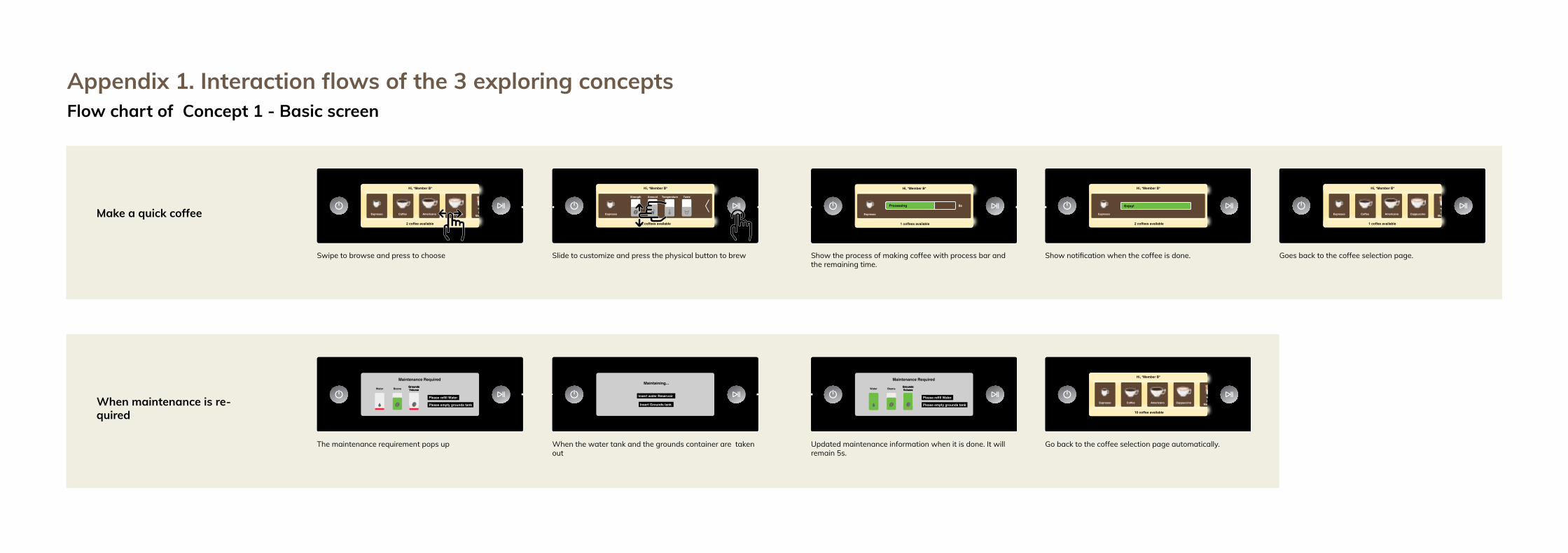
Make a quick coffee
When maintenance is re-quired
Hi, *Member B*
2 coffee available
Espresso Coffee Americano Cappuccino Latte Macchiato Cafe Latte
Maintenance Required
BeansGroundsVolumeWaterGroundsVolume
Please refill Water
Please empty grounds tank
Hi, *Member B*
2 coffees available
Espresso
Strength Amount TasteTemperature
Hot Water Milk froth
Insert water Reservoir
Insert Grounds tank
Maintaining...
Hi, *Member B*
1 coffees available
Espresso
Processing 8s
Maintenance Required
BeansGroundsVolumeWaterGroundsVolume
Please refill Water
Please empty grounds tank
Hi, *Member B*
2 coffees available
Espresso
Enjoy!
Hi, *Member B*
10 coffee available
Espresso Coffee Americano Cappuccino Latte Macchiato Cafe Latte
Hi, *Member B*
1 coffee available
Espresso Coffee Americano Cappuccino Latte Macchiato Cafe Latte
Swipe to browse and press to choose
The maintenance requirement pops up When the water tank and the grounds container are taken out
Updated maintenance information when it is done. It will remain 5s.
Go back to the coffee selection page automatically.
Slide to customize and press the physical button to brew Show the process of making coffee with process bar and the remaining time.
Show notification when the coffee is done. Goes back to the coffee selection page.
Appendix 1. Interaction flows of the 3 exploring conceptsFlow chart of Concept 1 - Basic screen

Do specific maintenance
Change profile A into profile B
Hi, *Member B*
1 coffee available
Espresso Coffee Americano Cappuccino Latte Macchiato Cafe Latte
Hi, *Member A*
1 coffee available
Espresso Coffee Americano Cappuccino Latte Macchiato Cafe Latte
BeansGroundsVolumeWater
HygieSteam
Cleaning
Deep Milk Clean
Brew Group Clean
Milk froth
Milk froth
Member A Member B Member CMember A Member B Member C
Cleaning done
Brew Group Clean
Finished!
Member A Member B Member CMember A Member B Member C
Cleaning...
Brew Group Clean
Processing
Hi, *Member B*
10 coffee available
Espresso Coffee Americano Cappuccino Latte Macchiato Cafe Latte
BeansGroundsVolumeWater
HygieSteam
Cleaning
Deep Milk Clean
Brew Group Clean
Descal-ing
Swipe down to up to go to the maintenance page.
Swipe top to down to go to the profile page. The page will show the activated profile A. Press to select profile B. Swipe up to go back to the mainpage.
Swipe right to left to browse all the maintenance functions.Press to select the cleaning function.
Show the procss of cleaning with process bar. Show notification when the leaing is done, Go back to the maintenance page.

Make a cup of Espresso
When maintenance is required
Select a profile
The start screen. See the maintenance status.Select the fingerprint to get a drink from your profile or select the coffee cup to make a drink.
The maintenance requirement pops up when it is needed.
Select the drink of your preference. In this case espresso.
When the maintenance is done, it goes back to the previous page. And the status on the right bottom of the mainte-nance will changed.
1. Personalize the drink by moving the sliders.2. Choose if you want one or two cups by selecting one or two.3. Select brew to make the drink ( Or select save to save drink to
a profile.)
Select the profile icon on the left. Select the drink of your preference. In this case espresso.
1
2 3
Appendix 1. Interaction flows of the 3 exploring conceptsFlow chart of Concept 2 - Full touch screen

Make coffee
When maintenance is re-quired
The start screen. See the maintenance status.Select the fingerprint to get a drink from your profile or select the coffee cup to make a drink.
The drink can be customized when it is selected. These settings can be changed by turning the knob. User can see the amount of change from both on the light pattern around the turning knob and the right screen. User can use the arrow buttons on the right side of the screen to change the other customization steps.
When the maintenance is done, it goes back to the previous page. And the status on the right bottom of the mainte-nance will changed.
The start screen, the user is currently in coffee mode. Here the user can select the preferred drink. On the right screen the contents of the drinks is shown to give the user an overview.
To make sure the user understands the steps of customization, a pop up will appear that explains the current step (ex. Taste, strength, etc.) When the user interacts with the machine, the pop up will disappear. When the user is satisfied with the cus-tomization, the turning knob can be pressed. (The turning knob can be pressed during the whole customization process, so the user does not need to set all the settings.
The process of brewing the coffee is visualised with the light pattern, so the user knows how long the coffee making process will take.
When the user turns the turning knob the light pattern will change. This way the user quickly can see the position of the drink in the coffee menu. The drink can be selected by pressing the turning knob.
Appendix 1. Interaction flows of the 3 exploring conceptsFlow chart of Concept 3 - Turning knob

Profile
The user can press the profile button to access the pro-files. The light pattern will change colors depending on the chosen profile. The profile can be selected by pressing the turning knob.
When the user wants to edit the drink, the customization screen shows up. The blue light pattern and the “B-Espres-so” show the user in what menu he is. The user can save the personalised drink by pressing the turning knob.
Now the user can add a drink to the selected profile by turn-ing and pressing the turning knob.
Within the selected profile the user can add their preferred drink and edit their preferences for each drink.
If the user wants to add a drink to the profile, the turning knob will be turned an extra step after the two drinks in the profile. When selected the user can choose from all the drink options and set them up for a profile.
Within the selected profile the user can add their preferred drink and edit their preferences for each drink.
The user can get a quick overview of the settings of the per-sonalised drinks. With the turning knob the user can scroll through their personalised drinks. The user can press the turning knob to brew the selected drink or hold the turning knob to edit the drink.
Appendix 1. Interaction flows of the 3 exploring conceptsFlow chart of Concept 3 - Turning knob

Appendix 2. Questionnaire of icon readability test

Script The script is used as a guide through the user test. The script has to be followed during the tests, to make sure all the participants go through the same test procedure, the results will be more reliable.
Introduction (5 min) The participant is introduced to the procedure. To make sure the participant understands the setup and the goal of the test. To make the user feel at ease. Welcome the tester. Thank you for participating. Please sit down.
● Introduce team: ○ Host Guide you through the test. ○ Note taker Take notes ○ Assistant Wizard of ozzing.
PRACTICALITIES
● Recording (video and photo) These recording materials will only be used for the research on the Philips Saeco during the UXAD course.
● Consent form Please sign the consent form we have sent you. You volunteer as a participant, video and photo material, sharing.
● The test will take about 60 min. THE REDESIGN Gathering basic information
● short interview → to get insight in you as a participant about your coffee habits and knowledge.
Prototype
● Usability of the redesign prototype. ● We are using an ipad to represent a touch screen display and two physical
buttons. The machine does not function with this prototype, so don’t expect any coffee. Try to imagine it.
● Scrolling interactions don't work THE TEST Explain procedure
● 3 scenarios → you will then do the tasks. ● There is no wrong answer, as we are testing the redesign and not you. ● Think aloud.
● Questions? → ask them
Interview (5 min) First we will do a short interview to get insight into the participant and its knowledge of coffee and coffee machines. These answers are filled in into a Google Forms to keep the answers on the same place. Goal Get insight into our participants (general, coffee machines and coffee knowledge). General
● Gender: ○ M/F
● What is your age? ● What is your nationality? ● Activity , student ? ● How does your household look like? Student house? Alone/studio.
Coffee ● How much coffee do you drink? ● How often do you make coffee at home? And at what moments do you do this?
Why on this specific moment? ● What is your knowledge on coffee?
○ expert/beginner/moderate? ● With what coffee machines do you usually prepare coffee?
○ Show list of coffee machines ● What is your expectation of a fully automatic coffee machine?
Appendix 4. Detailed explanation of test procedureAppendix 3. Research questions
1. Does the profile section help to user to get a quick coffee?
2. Do the participants understand when they are able to press the brew button? (to pre-pare the coffee)
1. Do they understand the different functional-ities (drinks, clean and settings)?
2. Do they understand the icons meanings? (Maintenance, functionalities, customization)
3. Do participants understand the wording of the interface? (customization + explanation, maintenance + explanation) and did people use the extra information when needed?
1. Do people understand the maintenance indication bar?
2. Is the maintenance information helping the user to be prepared for the maintenance?
3. Do the participants understand the mean-ing of the light icon(water, beans and coffee grounds) on the coffee machine?
Are the participants able to quickly prepare a coffee?
Do the participants understand the icons, text and interactions provided by the machine.
Is the maintenance (the information and the activity of doing the mainte-nance) disturbing the coffee making process?fee? Do the participants experience the
product as a luxurious product (inter-face & machine)?
1. 3.
2.
4.
Research questions about highlight features Research questiona about general usability and experience

First impression (<5 min) The first impression of the participant is gathered about the machine and it’s interface. There is no interaction yet. The redesign is shown as a rendering on a poster. Goal Get an impression of the first thoughts about the aesthetics of the machine.
● What is your first impression of this product? You can look at the interface and the machine itself.
It is important to not interrupt the test. So these questions can help to not guide the participant too much, but still, try to get insight into the problem. Helpful questions for during the test
- You look a bit lost, can you maybe explain why? - What do you think caused this to happen? - What is causing this problem?
System usability scale (5 min) The System Usability Scale (SUS) is a 10 item Likert scale questionnaire to measure the usability of a product or service. With the SUS the usability of the coffee machine is checked. The participant is asked to rate the 10 questions from strongly disagree to strongly agree. System usability scale Strongly Strongly
agree disagree
Question 1 2 3 4 5
1. I think that I would like to use this system frequently.
2. I found the system unnecessarily complex.
3. I thought the system was easy to use.
4. I think that I would need the support of a technical person to be able to use this system.
5. I found the various functions in this system were well integrated.
6. I thought there was too much inconsistency in this system.
7. I would imagine that most people would learn to use this system very quickly.
8. I found the system very cumbersome to use.
9. I felt very confident using the system.
10. I needed to learn a lot of things before I could get going with this system.
When the results are gathered:
● The best way to interpret your results involves “normalizing” the scores to produce a percentile ranking.
● The participant’s scores for each question are converted to a new number, added together and then multiplied by 2.5 to convert the original scores of 0-40 to 0-100. Though the scores are 0-100, these are not percentages and should be considered only in terms of their percentile ranking.
● Based on research, a SUS score above a 68 would be considered above average and anything below 68 is below average.
Interview (5 min) The interview at the end of the user test is used to find in depth information about the usability problems and opportunities.
- Can you describe the experience you had with the machine? What went wrong and what went right? And why?
- Did you understand when you were able to brew your coffee? - What did you think about the maintenance information?
- Icons on the containers - The maintenance indicator - The maintenance information + overview
- What did you think about the aesthetic look of the machine? - Did you have any difficulties with the icons provided on the machine?
- Coffee selection - Menu structures / functionalities - Customization - Profile section - Maintenance
- Did you have any difficulties with the information provided on the machine? - Maintenance - Customization - Waiting time - Functionalities
- If you have to compare the machine from a Volkswagen to a Bentley (choose from these cars)

To have a fluent test it is important to think about the setup of the room. This is important to gather data the right way, but also to make the participants feel comfortable during the tests and to make them imagine the right setting. Figure A3.1 shows the setup of the room which will be explained in detail.
Figure A3.1
Prototype
Host
Participant
Assistant
Camera man
Note taker
The data from the user tests is gathered in different ways. The table on the right is used to start the test, sign the consent form, to do the in-terviews before and after the actual test and to fill in the System Usability Scale. The user tests, with the three scenarios are done at the table on the top. To record the user tests two cameras are set up. One to capture the facial expressions and body language of the participant and one to capture the interactions with the coffee machine.
Convinient to gathering data
To make sure the participants feel comfortable the complete user test is divided over two tables. The welcoming, consent form and interviews are done at the right table while being seated to cre-ate a relaxed environment. here the participant can take a snack if wanted.
Make testers feel comfortable
To make the participant imagine the setting of the test, a kitchen layout has been replicated to help the participant imagine the normal setting where the machine is used. A plant is added to the setting of the room to dress the room and to separate the note-taker and assistant from the testing.
Help testers to imagine the setting
Appendix 5. Test setupRoom setup
Host GijsServe as a host during the whole test, introduce all the tasks and host all the test, also introduce the participants, take the consent form and interviews.
Assistant Marieke & Gu
The assistants will operate some parts of the prototype from a distance(wizard of oz). (The lights on the container will be turned on and off from a distance, and some screens of the interface need to be controlled from a distance)
Camera-man Liangyi Make video recordings of the test. Upload the data on the drive as
soon as possible after the test.
Note taker Alessia Takes notes during the test. A note-taking form is provided to make the note-taking easier to do and to interpret.
Appendix 5. Test setupRoles and positions
Figure A3.2 Roles and role division during the usability test

Appendix 5. Test setupParticipants recruiment
To get results from the user test that represent the target group, it is important to test with this target group. At least two participants that represent the target group are wanted for the test.In total a group of 8 participants is required.
• People with a day job• Age between 30-50 years old• Likes high-end products• Likes to drink coffee• The participant is from one of the targeted
countries (the Netherlands, Poland, USA, China, Germany)
Tester from target group >=2
Total testers >=8
For the other testers:
• Can be both male and female.• Has experience interacting with touch
screens.• Drinks at least one cup of coffee a day.
Participants requirements
Appendix 6. Note-taking form
Good Bad
Turn on machine
Button
Experience
(General)
Coffee selection
Grid
Icons
(General)
Overview of coffee
½ cups
Coffee picture
Customization
Profile
(General)
Customization
Icons
Text
Extra information
Bars
Profiles
(General)
Brewing
Progress bar
(General)
Maintenance
Maintenance indicator
Maintenance overview
Maintenance icons on machine
Doing the maintenance
(General)

Appendix 7. Detailed description of the tasks
Tasks (20 min) Scenario 1 - Explore the functionalities of the machine. (5 min) Maintenance status: 3 cups available. “You just bought the machine and did not yet try it out. Explore the functionalities of the machine. When you think you have a clear idea of the machine you can stop.” (The machine is turned off) Task 1.1 - Turn on the machine Turn on the machine to start the test, participant can experience the start up Task 1.2 - Explore the functionalities. The participant can look through the system a little bit. 1.3 - Turn off machine After a while the machine turns off automatically, or you can press the Test goal
- See how a first-time user operates the machine. - See whether people understand the interface of the machine at first time use - See whether people understand the icons and text that are provided at first time
use. - Find out what the person expresses about the aesthetics.
Maintenance When the drink is prepared, there is water left for 3 more drinks. ! Maintenance indicator pops up. Water left for 3 more drinks. “The machine will turn off automatically” [machine is turned off by the assistant]
Scenario 2 - Make an espresso with customized taste and (create your own profile) Maintenance status: 3 cups available. “Sunday afternoon: You are going to make an espresso for yourself, you like your espresso a bit larger with a strong taste. You would like to drink this espresso more often, for example in the morning before going to work.” Depending whether the maintenance is done, this still needs to happen. Task 2.1 - Turn on machine The participant can explore the process of making a drink. He/she can choose to save the drink to a profile. Task 2.2 - Prepare the espresso from the profile section The participant can select his/her own profile to get the favourite espresso as fast as possible. Test goal
- See whether people can quickly and easily prepare their preferred drink using the profiles.
“You will go to the living room to drink your espresso. The machine will turn off automatically” [machine is turned off by the assistant]
Scenario 3 - Make an espresso and a cappuccino (10 min) Maintenance status: 2 cups available. “A friend (teammember) is visiting you, he would like to drink a cappuccino and you would like to have your favourite espresso. First serve your friend and then serve yourself. Imagine “teammember” is your friend.” Task 3.1 - Turn on machine The participant can explore the process of making a drink. He/she can choose to save the drink to a profile. Task 3.2 - Prepare the cappuccino and save it Go through all of the steps to prepare the drink. ! After the brewing → Maintenance message on top of the screen. “Water left for 1 more drinks” When the water tank is pulled out → maintenance overview pops up. Task 3.3 - Prepare the coffee Go through all of the steps to prepare the drink. ! after the brewing → Maintenance message pops up. “Water needs to be refilled” When the water tank is pulled out → maintenance overview pops up. Test goal
- See whether the maintenance (information and the activity) is disturbing the participant.
- See whether people can easily save their preferred drink. - See whether people understand the interface of the machine - See whether people understand the icons and text that are provided
“The machine will turn off automatically” [the machine is turned off by the assistant]

Appendix 8. Usage pattern
Usage pattern was used to compare the real user’s task flows and the anticipated ones as we designed for identifying flow issues and helping narrow down the scope.
First, we drew up an ideal process for complet-ing one task and used it as the benchmark for comparison. Second, we reviewed all videos of the user test to find and fill out each partici-pant’s task flow.
By comparing the real usage pattern with the anticipated one, we discovered the differenc-es for further discussion and determination of whether these differences are design issues or solely usage difference. This gave us a general overview of the design evaluation and formed the basis for a more detailed analysis approach Observation and statement card clustering
Step with problem
Brew the coffee
Put the cups on
Type name and save the profile
Choose to add a new profile
Press the save button
Do customization
Open the customization page
Start: Select espresso
Back to the coffee detailed page
click on ½ cups
Usage pattern of making a regular espresso
Actual usage pattern
Ideal usage pattern
The ideal process
Ideal usage pattern
Actual usage pat-tern of the testers
Extra steps
Appendix 8. Usage patternSet and make espresso for regular drinking
Brew the coffee
Put the cups on
Type name and save the profile
Choose to add a new profile
Press the save button
Do customization
Open the customization page
Start: Select espresso
Back to the coffee detailed page
click on ½ cups
Usage pattern of making a regular espresso
Wrong step
Step with difficulty
Steps skipped by tester
P1 P2 P3 P4 P5 P6 P7 P8 P9 P10

Appendix 8. Usage patternDoing maintenance while making 2 cups of coffee
Press the Brew button
Put the cups on
Choose 2 cups
Back to coffee detialed page
Do customization
Ask friends for preference
Choose cappuccino
Find container & clean the grounds
Find the tank & add water
Check the maintenance information
Notice the maintenance bar
Start: Ask friends for what to drink
Maintenance requirement pops up
Press the save button
Press the info button of maintenance
Remove the cups
Usage pattern doing maintenance while making 2 cups of coffee
P1 P2 P3 P4 P5 P6
Press the Brew button
Put the cups on
Choose 2 cups
Back to coffee detialed page
Do customization
Ask friends for preference
Choose cappuccino
Find container & clean the grounds
Find the tank & add water
Check the maintenance information
Notice the maintenance bar
Start: Ask friends for what to drink
Maintenance requirement pops up
Press the save button
Press the info button of maintenance
Remove the cups
Wrong stepFailed task
Step with difficultySteps skipped by tester
P9 P10P7 P8

Press the brew button
Put on the cup
Select/check their profile
Select espresso
Back to drink selection page
Check the customization
Do customization
Usage pattern of making a cup of espresso from the user’s own profile Step with problem
Skiped steps
P1 P2 P6 P7 P9 P10P3 P4 P8
Appendix 8. Usage patternMake a cup of espresso from profile
P5
Appendix 9. Raw data of system usability scale

Appendix 9. Raw data of system usability scale
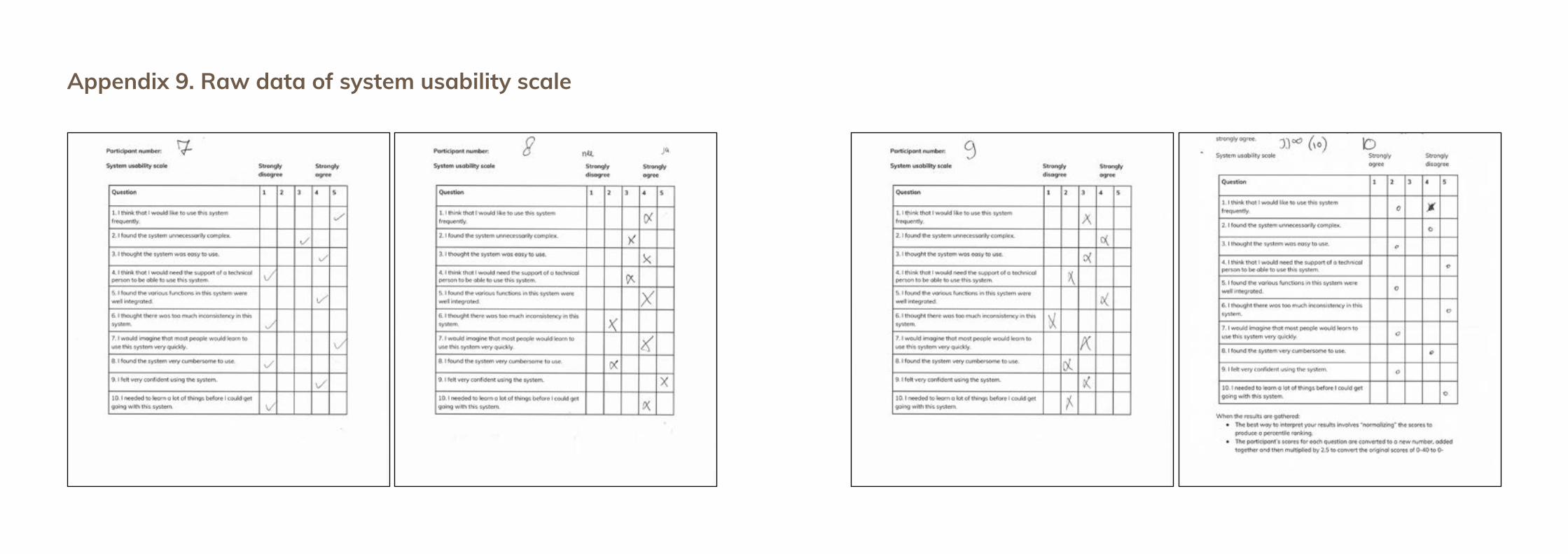
Appendix 9. Raw data of system usability scale