pharmasug china 2015 build child growth charts … 1 - pharmasug china 2015 build child growth...
TRANSCRIPT

- 1 -
PharmaSUG China 2015
Build Child Growth Charts Using SAS GTL
Rajesh Moorakonda, Singapore Clinical Research Institute, Singapore
ABSTRACT
Creating child growth charts in SAS with different requirements such as plotting the different lines for P5, Median and P95 for each treatment group by distinguishing the treatment period with multi-pattern lines, unequal axis intervals and printing axis aligned statistics table with same treatment color codes below graph within graphics area is daunting task in child nutritional trials. This paper will explain the difficulties faced during the development of a growth chart and their step-by-step programming solutions using the SAS 9.3 Graph Template Language along with an example.
INTRODUCTION
To understand development of child, Growth charts will be created and compared to WHO reference lines. Growth charts consist of smooth curves of an anthropometric parameter (e.g., weight, height, upper arm circumference) plotted against age or another anthropometric parameter. The curves represent a set of percentile values (e.g., 97th, 90th, 75th , 50th, 25th, 10th and 3rd percentiles) or values corresponding to standard deviation scores (e.g., 1, 2, 3 SD above/below reference mean or median value) of the parameter based on data of same gender at various ages based on local or multi-country general population. In child nutritional trials, it is useful to plot the data against the WHO child growth standards to compare the effect of the nutritional formula on the child growth and the graph will be similar to below:
Figure 1: Subject’s weight over age with reference to the WHO child growth standards

Build Child Growth Charts Using SAS GTL, continued
2
DATA OVERVIEW In this paper, we are considering body weight as the anthropometric parameter of interest for male children (SEX=1) during birth to 360 days of age.
1. For plotting WHO child growth standards reference lines (median and ±3 SD, ± 2 SD, ± 1 SD from median), we need dataset ‘weianthro.sas7bdat‘ having variables SEX, AGE, L, M, S (explained later in detail). This can be downloaded from WHO Child Growth Standards - SAS igrowup package from the WHO website.
2. By using simple PROC MEANS compute the summary statistics (N, P5, and Median & P95) of the weight of the subjects at each visit by treatment.
3. Calculate the age at each visit and merge the statistics to the WEIANTHRO dataset by age.
PROGRAMMING OVERVIEW
WHO growth standards provide values of L, M and S parameters for series of age-groups for both male and female children. Thus, by supplying subject’s weight, age and gender to LMS method formula, Z-score = [(Weight/M)
L-
1]/(L*S), one can obtain Z-score. It is useful to assess whether the subject weight is higher or lower than the median
weight of children from general population with same gender and age-group, and to what extent. Alternatively, we can also calculate weight corresponding to a given Z-score using formula Weight = M(1 + L*S*Z-score)
1/L and compare
with subject’s weight. For comparing subject’s weight at various study visits, we use the later approach. We calculate the weights corresponding to 0, ±1, ±2 and ±3 WHO child growth standards Z-score for male population at ages corresponding time from birth to the study visits. These serve as WHO child growth standards reference lines. The line corresponding to 0 Z-score represents 50
th percentile (median) of population weight for male children.
Below sample data step to calculate weights for plotting the reference lines:
The graphs presented in this paper are generated by ODS GRAPHICS procedure SGRENDER, which uses the templates defined and compiled by GTL and appropriate input dataset. The above shown example growth chart is plotted by LAYOUT OVERLAY and GTL Annotation (DRAW statements). I assume that you are familiar with basic GTL concepts.
Following simple statements produce the plot for reference lines (Figure 2).
define statgraph gc_wei;
begingraph/drawspace=datavalue;
entrytitle 'P5, Median and P95 of Weight(kg) of male subjects by treatment';
layout overlay;
seriesplot x=age y=sdz/group=sdn lineattrs=(color=gray60 pattern=34)
smoothconnect=true;
endlayout;
endgraph;
end;
libname _reflib "C:\WHO\igrowup_sas";
data sdz(keep=SEX AGE sd:);
set _reflib.weianthro(where=(SEX=1 and AGE le 390));
array sdx(7) sd3neg sd2neg sd1neg sd0 sd1pos sd2pos sd3pos;
do _i=-3 to 3;
sdx[_i+4]=m*((1+_i*l*s)**(1/l));
end;
run;

Build Child Growth Charts Using SAS GTL, continued
3
Figure 2: by using a simple series plot in GTL
Figure 3: adding the labels to the plotted lines
Add the labels to the reference lines (Figure 3) by using
layout overlay;
seriesplot x=age y=sdz/group=sdn lineattrs=(color=gray60 pattern=34)
smoothconnect=true curvelabel=sdn CURVELABELLOCATION=outside
CURVELABELATTRS=(size=8pt);
endlayout;
Build Child Growth Charts Using SAS GTL, continued
4
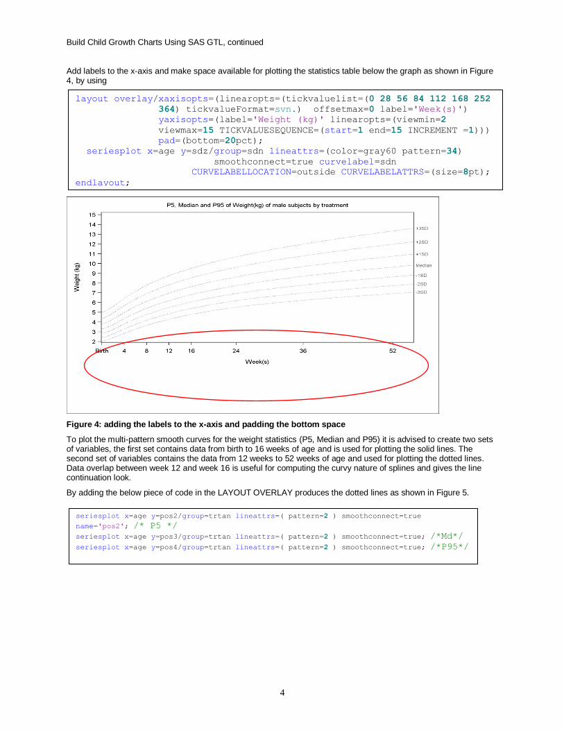
Add labels to the x-axis and make space available for plotting the statistics table below the graph as shown in Figure 4, by using
Figure 4: adding the labels to the x-axis and padding the bottom space
To plot the multi-pattern smooth curves for the weight statistics (P5, Median and P95) it is advised to create two sets of variables, the first set contains data from birth to 16 weeks of age and is used for plotting the solid lines. The second set of variables contains the data from 12 weeks to 52 weeks of age and used for plotting the dotted lines. Data overlap between week 12 and week 16 is useful for computing the curvy nature of splines and gives the line continuation look.
By adding the below piece of code in the LAYOUT OVERLAY produces the dotted lines as shown in Figure 5.
seriesplot x=age y=pos2/group=trtan lineattrs=( pattern=2 ) smoothconnect=true
name='pos2'; /* P5 */
seriesplot x=age y=pos3/group=trtan lineattrs=( pattern=2 ) smoothconnect=true; /*Md*/
seriesplot x=age y=pos4/group=trtan lineattrs=( pattern=2 ) smoothconnect=true; /*P95*/
layout overlay/xaxisopts=(linearopts=(tickvaluelist=(0 28 56 84 112 168 252
364) tickvalueFormat=svn.) offsetmax=0 label='Week(s)')
yaxisopts=(label='Weight (kg)' linearopts=(viewmin=2
viewmax=15 TICKVALUESEQUENCE=(start=1 end=15 INCREMENT =1)))
pad=(bottom=20pct);
seriesplot x=age y=sdz/group=sdn lineattrs=(color=gray60 pattern=34)
smoothconnect=true curvelabel=sdn
CURVELABELLOCATION=outside CURVELABELATTRS=(size=8pt);
endlayout;

Build Child Growth Charts Using SAS GTL, continued
5
Figure 5: Plotting the treatment period 2 lines
Add the below code in the LAYOUT OVERLAY to draw the period 1 statistics curves
Now it is time to use the GTL annotations for adding the multi-pattern treatment code legend inset. Also add table heading for statistics table to be printed below the graph. A macro is created for the DRAW statements as below and is called in the LAYOUT OVERLAY. The graph generated is shown in Figure 6.
seriesplot x=age y=pre2/group=trtan lineattrs=( pattern=solid ) smoothconnect=true
name='pre2';
seriesplot x=age y=pre3/group=trtan lineattrs=( pattern=solid ) smoothconnect=true;
seriesplot x=age y=pre4/group=trtan lineattrs=( pattern=solid ) smoothconnect=true;
%macro printn;
%do i=1 %to 4;
%let liy=%sysevalf(15.5-&i);
drawline x1=0 y1=&liy x2=15 y2=&liy /lineattrs=(pattern=solid
color=&&nc&i:color) drawspace=datavalue;
drawtext textattrs=(size=8pt color=&&nc&i:color) "&&lbl&i"
/x=30 y=&liy drawspace=datavalue;
%end;
drawtext textattrs=(size=8pt color=black weight=bold) "No. of
Subjects at each Visit" /x=0 y=-25 anchor=bottomleft width=35
xspace=datavalue yspace=datapercent;
%mend printn;

Build Child Growth Charts Using SAS GTL, continued
6
Figure 6: plotting the treatment period 1 lines with legend and table header
Now add the statistics table and also add the second reference lines in the legend by modifying the annotation macro as below
The updated graph is shown in Figure 7.
%macro printn;
%do i=1 %to &total;
drawtext textattrs=(size=8pt color=&&nc&i:color) "&&n&i" /x=&&nx&i
y=&&ny&i xspace=datavalue yspace=datapercent ;
%end;
%do i=1 %to 4;
drawtext textattrs=(size=8pt color=&&nc&i:color) "&&lbl&i" /x=&&lx&i
y=&&ny&i xspace=datavalue yspace=datapercent;
%let liy=%sysevalf(15.5-&i);
drawline x1=0 y1=&liy x2=15 y2=&liy /lineattrs=(pattern=solid
color=&&nc&i:color) drawspace=datavalue;
drawtext textattrs=(size=8pt color=&&nc&i:color) "&&lbl&i" /x=30
y=&liy drawspace=datavalue;
drawline x1=45 y1=&liy x2=60 y2=&liy /lineattrs=(pattern=2
color=&&nc&i:color) drawspace=datavalue;
%end;
drawtext textattrs=(size=8pt color=black weight=bold) "No. of Subjects
at each Visit" /x=0 y=-25 anchor=bottomleft width=35
xspace=datavalue yspace=datapercent;
%mend printn;

Build Child Growth Charts Using SAS GTL, continued
7
Figure 7: append the statistics table and also treatment period 2 data lines legend
Now add the labels (P5, P50, and P95) to the data lines and also add inset for WHO reference standards by adding the below code in LAYOUT OVERLAY.
The final graph will look like as shown in Figure 1.
HARD TIME…
Little tricky situation is to get the x-axis aligned statistics table with same treatment colors even for labels along with the WHO reference lines labels to be printed outside. We may use the multi-cell graphs for this situation but then not possible to get the curve labels outside. BLOCKPLOT statement is not useful for creating axis table with the same colors as the treatment. In SAS 9.4 AXISTABLE is very useful to handle the situation. But in SAS 9.3 we are not left with any other option except Annotations in GTL. So here comes with the decision to make use of annotations.
drawtext textattrs=(size=8pt color=gray60 weight=bold) "..... WHO
reference standards" /x=250 y=2.5 anchor=bottomleft border=true
width=30 xspace=datavalue yspace=datapercent;
drawtext textattrs=(size=8pt color=black weight=bold) "P5 "{unicode
"007B"x} /x=-14 y=2.5 anchor=bottomleft xspace=datavalue
yspace=datapercent;
drawtext textattrs=(size=8pt color=black weight=bold) "P50
"{unicode "007B"x} /x=-17 y=7 anchor=bottomleft xspace=datavalue
yspace=datapercent;
drawtext textattrs=(size=8pt color=black weight=bold) "P95
"{unicode "007B"x} /x=-17 y=11.5 anchor=bottomleft xspace=datavalue
yspace=datapercent;

Build Child Growth Charts Using SAS GTL, continued
8
CONCLUSION
The Graph Template Language provides a powerful syntax to create the complex graphs used in the pharmaceutical domain. Whenever we have difficult situation to handle in the graphs, SAS annotation facility is always been very handy and helpful. With the flexible GTL and its annotation features, one can have the complete control over the complex graphs.
REFERENCES
Monitoring Child Growth and Safety Profile using Growth Charts
www.pharmasug.org/proceedings/china2014/pt/pharmasug-china-2014-PT07.pdf
The WHO Child Growth standards
www.who.int/childgrowth/en
Graphically speaking
http://blogs.sas.com/content/graphicallyspeaking
SAS Graph Template Language: reference
ACKNOWLEDGEMENT
I would like to thank Parag Wani, Senior Statistical Analyst, Singapore Clinical research institute for presenting the paper at the Conference Proceedings.
CONTACT INFORMATION Your comments and questions are valued and encouraged. Please contact the author to obtain the full code that was used at: Name: Rajesh Babu Moorakonda Enterprise: Singapore Clinical Research Institute Address: 31 Biopolis way City, State ZIP: Singapore 138669 Work Phone: +65 6508 8327 Fax: +65 65088317 E-mail: [email protected] Web: www.scri.edu.sg SAS and all other SAS Institute Inc. product or service names are registered trademarks or trademarks of SAS Institute Inc. in the USA and other countries. ® indicates USA registration. Other brand and product names are trademarks of their respective companies.