the greater boston housing report card 2015/media...chapter two home sales, ... this year, we are ....
TRANSCRIPT

The Greater Boston HousingReport Card 2015
The Housing Cost ConundrumBarry BluestoneJames HuessyEleanor White
Charles EisenbergTim Davis
with assistance fromWilliam Reyelt
Prepared by
The Kitty and Michael Dukakis Center for Urban and Regional Policy
Northeastern University
for
The Boston Foundation
Edited byRebecca KoepnickMary Jo MeisnerKathleen Clute
The Boston Foundation
U N D E R S T A N D I N G B O S T O N
November 2015

Design: Kate Canfield, Canfield Design Production: Mayerchak & Company
Cover Photo: Richard Howard, Richard Howard Photography
© 2015 by the Boston Foundation. All rights reserved.
The Boston Foundation, Greater Boston’s community foundation, is one of the largest community foundations in the
nation, with net assets of some $1 billion. In 2014, the Foundation and its donors made more than $112 million in grants
to nonprofit organizations and received gifts of nearly $112 million. In celebration of its Centennial in 2015, the Boston
Foundation has launched the Campaign for Boston to strengthen the Permanent Fund for Boston, the only endowment
fund focused on the most pressing needs of Greater Boston. The Foundation is proud to be a partner in philanthropy,
with more than 1,000 separate charitable funds established by donors either for the general benefit of the community or
for special purposes. The Boston Foundation also serves as a major civic leader, think tank and advocacy organization,
commissioning research into the most critical issues of our time and helping to shape public policy designed to advance
opportunity for everyone in Greater Boston. The Philanthropic Initiative (TPI), an operating unit of the Foundation,
designs and implements customized philanthropic strategies for families, foundations and corporations around the globe.
For more information about the Boston Foundation and TPI, visit tbf.org or call 617-338-1700.
The Kitty and Michael Dukakis Center for Urban and Regional Policy at Northeastern University conducts interdisciplinary
research, in collaboration with civic leaders and scholars both within and beyond Northeastern University, to identify
and implement real solutions to the critical challenges facing urban areas throughout Greater Boston, the Common-
wealth of Massachusetts, and the nation. Founded in 1999 as a “think and do” tank, the Dukakis Center’s collaborative
research and problem-solving model applies powerful data analysis, a bevy of multidisciplinary research and evaluation
techniques, and a policy-driven perspective to address a wide range of issues facing cities and towns. These include
affordable housing, local economic development, workforce development, transportation, public finance, and environ-
mental sustainability. The staff of the Dukakis Center works to catalyze broad-based efforts to solve urban problems,
acting as both a convener and a trusted and committed partner to local, state, and national agencies and organizations.
The Center is housed within Northeastern University’s innovative School of Public Policy and Urban Affairs.
The Warren Group collects public record data on real estate sales and ownership throughout New England and offers a
range of real estate products, information services and printed publications, including the weekly newspapers Banker &
Tradesman and The Commercial Record. The company also produces and organizes trade shows and events for a variety
of industries, including bankers, mortgage brokers, credit unions and lawyers. Based in Boston, the company was estab-
lished in 1872 and is now in its fourth generation of family ownership and management.
UNDERSTANDING BOSTON is a series of forums, educational events and research sponsored by the Boston Foundation to provide
information and insight into issues affecting Boston, its neighborhoods, and the region. By working in collaboration with
a wide range of partners, the Boston Foundation provides opportunities for people to come together to explore challenges
facing our constantly changing community and to develop an informed civic agenda. Visit www.tbf.org to learn more
about Understanding Boston and the Boston Foundation.

Contents
Letter from Paul Grogan . . . . . . . . . . . . . . . . . . . . . . . . . . . . . . . . . . . . . . . . . . . . . . . . . . . . . . . . . . . . . . . . . . . . . . . . . . . . . . . . . . . . . . . . 4
Executive Summary . . . . . . . . . . . . . . . . . . . . . . . . . . . . . . . . . . . . . . . . . . . . . . . . . . . . . . . . . . . . . . . . . . . . . . . . . . . . . . . . . . . . . . . . . . . . 5
CHAPTER ONE Introduction . . . . . . . . . . . . . . . . . . . . . . . . . . . . . . . . . . . . . . . . . . . . . . . . . . . . . . . . . . . . . . . . . . . . . . . . . . . . . . . . . .11
CHAPTER TWO Home Sales, Housing Production and Foreclosures in Greater Boston . . . . . . . . . . . . . . . . . . . . . . . . . .17
CHAPTER THREE Home Prices and Rents in Greater Boston . . . . . . . . . . . . . . . . . . . . . . . . . . . . . . . . . . . . . . . . . . . . . . . . . . . . .32
CHAPTER FOUR The Cost of Housing Development . . . . . . . . . . . . . . . . . . . . . . . . . . . . . . . . . . . . . . . . . . . . . . . . . . . . . . . . . . . . .41
CHAPTER FIVE Public Policy and Public Spending on Housing in the Commonwealth . . . . . . . . . . . . . . . . . . . . . . . . . . .56
CHAPTER SIX Toward New Housing Policy . . . . . . . . . . . . . . . . . . . . . . . . . . . . . . . . . . . . . . . . . . . . . . . . . . . . . . . . . . . . . . . . . . .61
Endnotes . . . . . . . . . . . . . . . . . . . . . . . . . . . . . . . . . . . . . . . . . . . . . . . . . . . . . . . . . . . . . . . . . . . . . . . . . . . . . . . . . . . . . . . . . . . . . . . . . . . . .65
LIST OF FIGURES AND TABLES
FIGURE 1 .1 Growth in Real Output Massachusetts vs . U .S . 2009–2015 (Projected) . . . . . . . . . . . . . . . . . . . . . . . . . . . . . . . . . . . . . . . . . . .12
FIGURE 1 .3 Massachusetts Civilian Unemployment Rate 2009–2015 (July) . . . . . . . . . . . . . . . . . . . . . . . . . . . . . . . . . . . . . . . . . . . . . . . .12
FIGURE 1 .2 Total Non-Farm Employment: Seasonally Adjusted Massachusetts 2009–2015 (July) . . . . . . . . . . . . . . . . . . . . . . . . . . . . . . .12
FIGURE 1 .4 Five-County Greater Boston Total Non-Farm Employment 2008–2014 (December) . . . . . . . . . . . . . . . . . . . . . . . . . . . . . . . .12
FIGURE 1 .5 Real Average Weekly Wage, Private Industry, Massachusetts 2001–2014 (Real 2014 $) . . . . . . . . . . . . . . . . . . . . . . . . . . . . . .13
TABLE 1 .1 Demographic Profile of the Five-County Greater Boston Region . . . . . . . . . . . . . . . . . . . . . . . . . . . . . . . . . . . . . . . . . . . . . . .15
TABLE 1 .2 Housing Cost Burden—Greater Boston . . . . . . . . . . . . . . . . . . . . . . . . . . . . . . . . . . . . . . . . . . . . . . . . . . . . . . . . . . . . . . . . . .16
FIGURE 2 .1 Annual Number of Sales of Single-Family Homes in Five-County Greater Boston Region, 2000–2015 . . . . . . . . . . . . . . . . . .18
FIGURE 2 .2 Homeownership Rate Boston Metro Area 2005–2015 (Q1 & Q2) . . . . . . . . . . . . . . . . . . . . . . . . . . . . . . . . . . . . . . . . . . . . . . .18
FIGURE 2 .3 Annual Number of Sales of Condominiums in Five-County Greater Boston Region, 2000–2015 . . . . . . . . . . . . . . . . . . . . . .19
FIGURE 2 .4 Annual Number of Sales of Homes in Two-Unit and Three-Unit Structures
in Five-County Greater Boston Region, 2000–2015 . . . . . . . . . . . . . . . . . . . . . . . . . . . . . . . . . . . . . . . . . . . . . . . . . . . . . . . . . .19
TABLE 2 .1A Municipal Leaders in Single-Home Sales in Greater Boston, 2010– 2015 (est .) . . . . . . . . . . . . . . . . . . . . . . . . . . . . . . . . . . . . .20
TABLE 2 .1B Municipal Leaders in Sales of Homes in Three-Unit Structures in Greater Boston, 2010–2015 (est .) . . . . . . . . . . . . . . . . . . . .21

2 U n d e r s t a n d i n g B o s t o n
TABLE 2 .1C Municipal Leaders in Sales of Condominiums in Greater Boston, 2010–2015 (est .) . . . . . . . . . . . . . . . . . . . . . . . . . . . . . . . . .21
FIGURE 2 .5 Total Housing Permits Issued in Five-County Greater Boston Region, 2000–2015 . . . . . . . . . . . . . . . . . . . . . . . . . . . . . . . . . .22
FIGURE 2 .6 Number of Housing Unit Permits in Five-County Greater Boston Region, by Structure Type 2000–2015 . . . . . . . . . . . . . . . .22
TABLE 2 .2 Single-Family and Multi-family Building Permits in Greater Boston 2000–2015 (est .) . . . . . . . . . . . . . . . . . . . . . . . . . . . . . . .23
FIGURE 2 .7 5+ Unit Housing Unit Permits as a Percent of All Housing Permits Greater Boston, 2000–2015 . . . . . . . . . . . . . . . . . . . . . . .24
TABLE 2 .3A Municipalities Adding the Most New Housing Units, 2011–2015
TABLE 2 .3B Municipalities Adding the Most New Single- Family Home Units, 2011–2015 . . . . . . . . . . . . . . . . . . . . . . . . . . . . . . . . . . . . .26
TABLE 2 .3C Municipalities Adding the Most New Units in 5+ Structures, 2011–2015 . . . . . . . . . . . . . . . . . . . . . . . . . . . . . . . . . . . . . . . . .26
TABLE 2 .3D Permitting by Housing Type for Five Greater Boston Counties, 2014–2015 . . . . . . . . . . . . . . . . . . . . . . . . . . . . . . . . . . . . . . .27
TABLE 2 .4 Housing Units Constructed in Chapter 40R Smart-Growth Districts in Massachusetts . . . . . . . . . . . . . . . . . . . . . . . . . . . . . .28
FIGURE 2 .8 Annual Number of Foreclosure Petitions in Single-Family Homes in Five-County Greater Boston Region, 2000–2015 . . . . .29
FIGURE 2 .9 Annual Number of Foreclosure Deeds in Single-Family Homes in Five-County Greater Boston Region, 2000–2015 . . . . . . .29
TABLE 2 .5A Municipal Leaders in Foreclosures on Single Home Sales in Greater Boston, 2010–2015 (est .) . . . . . . . . . . . . . . . . . . . . . . . .30
TABLE 2 .5B Municipal Leaders in Foreclosures on Condominiums in Greater Boston, 2010–2015 (est .) . . . . . . . . . . . . . . . . . . . . . . . . . .30
FIGURE 3 .1 Annual Percent Change in Case-Shiller Home Price Index (Single Family), Greater Boston Metropolitan Area,
1987–2015 (est .) . . . . . . . . . . . . . . . . . . . . . . . . . . . . . . . . . . . . . . . . . . . . . . . . . . . . . . . . . . . . . . . . . . . . . . . . . . . . . . . . . . . . .33
FIGURE 3 .2 Greater Boston Housing Cycles 1988–1997 vs . 2005–2015 Case-Shiller Home Price Index (Single Family) . . . . . . . . . . . . . . .33
FIGURE 3 .3 Homeowner Vacancy Rates, Greater Boston vs . U .S . Metro Areas, 1990–2015 . . . . . . . . . . . . . . . . . . . . . . . . . . . . . . . . . . . . .34
FIGURE 3 .4 Annual Median Price of Single-Family Homes in Five-County Greater Boston Region, 2000–2015 . . . . . . . . . . . . . . . . . . . .34
FIGURE 3 .5 Annual Median Price of Condominiums in Five-County Greater Boston Region, 2000–2015 . . . . . . . . . . . . . . . . . . . . . . . . .35
TABLE 3 .1 Ratio of Single-Family Home Prices 2015: Q2 vs . 2005 . . . . . . . . . . . . . . . . . . . . . . . . . . . . . . . . . . . . . . . . . . . . . . . . . . . . . . .36
FIGURE 3 .6 Ratio of Condominiums to Single-Family Home Prices in Five-County Greater Boston Region, 2000–2015 . . . . . . . . . . . . . .37
FIGURE 3 .7 Annual Median Price of Homes in Two- and Three-Unit Structures in Five-County
Greater Boston Region, 2000–2015 . . . . . . . . . . . . . . . . . . . . . . . . . . . . . . . . . . . . . . . . . . . . . . . . . . . . . . . . . . . . . . . . . . . . . .38
FIGURE 3 .8 Boston Metro Area Rental Vacancy Rates, 2000–2015: Q2 . . . . . . . . . . . . . . . . . . . . . . . . . . . . . . . . . . . . . . . . . . . . . . . . . . . . .39
FIGURE 3 .9 Monthly Rent for Boston-Area Apartments, 2-Bedroom Units 2009: Q3 – 2015: Q2 . . . . . . . . . . . . . . . . . . . . . . . . . . . . . . . . .39
TABLE 4 .1 Dukakis Cost Analysis Communities . . . . . . . . . . . . . . . . . . . . . . . . . . . . . . . . . . . . . . . . . . . . . . . . . . . . . . . . . . . . . . . . . . . .43
FIGURE 4 .1 Total Housing Development Costs per Square Foot, Massachusetts vs . Out-of-State Urban vs . Suburban Projects,
2004–2008 vs . 2011–2015 . . . . . . . . . . . . . . . . . . . . . . . . . . . . . . . . . . . . . . . . . . . . . . . . . . . . . . . . . . . . . . . . . . . . . . . . . . . . . .44
FIGURE 4 .2 Total Housing Development Costs per Square Foot by Cost Component, Massachusetts Urban Projects, 2011–2015 . . . . . .45
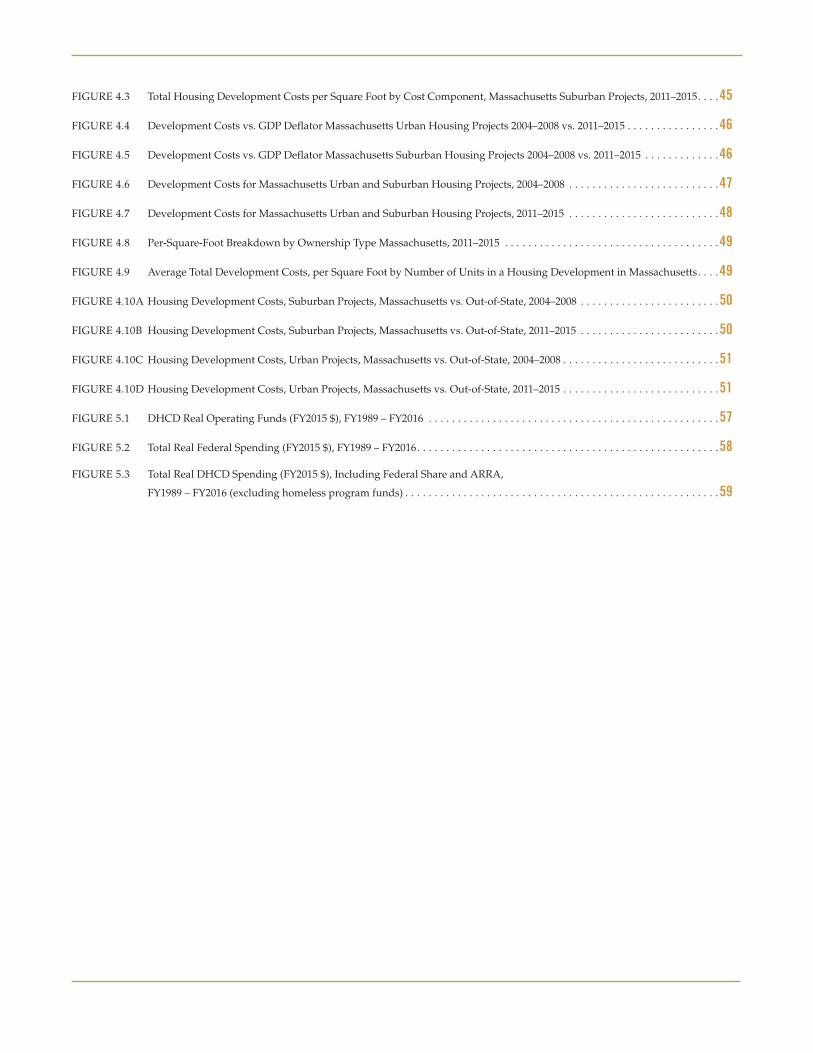
FIGURE 4 .3 Total Housing Development Costs per Square Foot by Cost Component, Massachusetts Suburban Projects, 2011–2015 . . . .45
FIGURE 4 .4 Development Costs vs . GDP Deflator Massachusetts Urban Housing Projects 2004–2008 vs . 2011–2015 . . . . . . . . . . . . . . . .46
FIGURE 4 .5 Development Costs vs . GDP Deflator Massachusetts Suburban Housing Projects 2004–2008 vs . 2011–2015 . . . . . . . . . . . . .46
FIGURE 4 .6 Development Costs for Massachusetts Urban and Suburban Housing Projects, 2004–2008 . . . . . . . . . . . . . . . . . . . . . . . . . .47
FIGURE 4 .7 Development Costs for Massachusetts Urban and Suburban Housing Projects, 2011–2015 . . . . . . . . . . . . . . . . . . . . . . . . . .48
FIGURE 4 .8 Per-Square-Foot Breakdown by Ownership Type Massachusetts, 2011–2015 . . . . . . . . . . . . . . . . . . . . . . . . . . . . . . . . . . . . .49
FIGURE 4 .9 Average Total Development Costs, per Square Foot by Number of Units in a Housing Development in Massachusetts . . . .49
FIGURE 4 .10A Housing Development Costs, Suburban Projects, Massachusetts vs . Out-of-State, 2004–2008 . . . . . . . . . . . . . . . . . . . . . . . .50
FIGURE 4 .10B Housing Development Costs, Suburban Projects, Massachusetts vs . Out-of-State, 2011–2015 . . . . . . . . . . . . . . . . . . . . . . . .50
FIGURE 4 .10C Housing Development Costs, Urban Projects, Massachusetts vs . Out-of-State, 2004–2008 . . . . . . . . . . . . . . . . . . . . . . . . . . .51
FIGURE 4 .10D Housing Development Costs, Urban Projects, Massachusetts vs . Out-of-State, 2011–2015 . . . . . . . . . . . . . . . . . . . . . . . . . . .51
FIGURE 5 .1 DHCD Real Operating Funds (FY2015 $), FY1989 – FY2016 . . . . . . . . . . . . . . . . . . . . . . . . . . . . . . . . . . . . . . . . . . . . . . . . . .57
FIGURE 5 .2 Total Real Federal Spending (FY2015 $), FY1989 – FY2016 . . . . . . . . . . . . . . . . . . . . . . . . . . . . . . . . . . . . . . . . . . . . . . . . . . . .58
FIGURE 5 .3 Total Real DHCD Spending (FY2015 $), Including Federal Share and ARRA,
FY1989 – FY2016 (excluding homeless program funds) . . . . . . . . . . . . . . . . . . . . . . . . . . . . . . . . . . . . . . . . . . . . . . . . . . . . . .59

4 U n d e r s t a n d i n g B o s t o n
Letter
Dear Friends,
Each year, the Boston Foundation asks economist Barry Bluestone and his team at Northeastern University’s Kitty and Michael Dukakis Center for Urban and Regional Policy to dive into the data and find out what is happening in the Greater Boston housing market and why. For many years, the Northeastern team has been documenting the falling vacancy rates and rising prices that have wreaked such hardship on renters and potential home buyers. As the authors note in these pages, we are now at the point where it takes an
annual income of $100,000 a year to comfortably afford Boston’s median monthly rent of $2,497.
Attracted by a robust economy, almost 172,000 people moved into the region between 2010 and 2014, yet only 15,000 new houses, condominiums and apartments were built. To find out why supply has stubbornly been unable to meet demand year after year, the authors collected and analyzed cost data from developers and housing agencies. Their conclusion is very unsettling: the numbers just don’t add up. Land, construction and development costs in Massachusetts are so high and zoning against high-density developments is so pervasive that builders simply can’t produce housing that working and middle-income families can afford. Virtually all new low-density projects cater to the high end of the market.
We believe this state of affairs poses a real threat to Greater Boston’s future health and prosperity. As the Boston Foundation celebrates its Centennial this year, we not only look back with pride on our accomplishments on behalf of this great city, we position ourselves for another century of service. That means asking some hard questions. What will Boston be like in 20, 50 or 100 years if we don’t build more homes and apartments that working people can afford? Will our now thriving economy continue to flourish if people won’t come here for jobs or leave for more affordable cities elsewhere? How will we close the achievement gap in our schools if the children in them lack the stable foundation that a safe, affordable place to live can provide?
For decades, we have funded the work of advocates, community development corporations, and others who believe along with us that everyone deserves a decent home to live in and a paycheck big enough to pay for it. To that end, we convened the Commonwealth Housing Task Force in 2003. This year, we are reaffirming our commitment to the task force and expanding it so it can be an even more potent force for shaping and guiding the public policy changes we need in order to create and preserve affordable housing in the future.
Paul S. GroganPresident and CEOThe Boston Foundation

5T h e G r e a t e r B o s t o n H o u s i n g R e p o r t C a r d 2 0 1 5
Executive Summary
Fifteen years ago, the newly founded Center for Urban and Regional Policy at Northeastern University (now the Dukakis Center) published its first research on housing . Titled A New Paradigm for Housing in Greater Boston, it began with what would become prophetic words:
. . . prosperity brings its own challenges . None is more acute than the region’s severe housing crisis . Vacancy rates are now so low that home prices and rents are being bid up substantially faster than most household incomes . As a result, many long-time residents of the region, in addition to many newcomers, are facing a severe affordability gap between their incomes and what they must pay to rent housing or purchase a home . Prices and rents are rising so quickly that not only are the poor in trouble, but an increasing number of working and lower middle income families worry that pros-perity may price them out of the Boston housing market .
Those words written in 2000 are just as valid today in 2015 .
The New Paradigm report analyzed the supply and demand gap for housing and concluded that Greater Boston would need to produce approximately 7,200 additional new units per year — a total of 36,000 units above current production levels — if supply were to match demand . Otherwise, prices and rents would continue to escalate faster than household and family incomes .
Beginning in 2002, The Boston Foundation asked the Center to produce an annual Greater Boston Housing Report Card (GBHRC) so that we could keep track of how well the region was doing at meeting this target . Ever since, with the full support of the Founda-tion, an annual report has been prepared . This is the 13th edition .
Our research has shown that in only one year since 2000 did the region come close to meeting the target set out in our first report . That was in 2005, when more
than 15,000 units of housing were permitted in a single year . The number permitted would drop to little more than 4,700 in 2009 before slowly recovering . The conse-quence, as we warned in that original report, would be rising home prices — only to be interrupted by the Great Recession — and rents that have increased nearly every year regardless of the state of the economy .
Why has housing supply not kept up with housing demand? This is the question we decided to finally tackle head-on in this edition of the Greater Boston Housing Report Card by undertaking an in-depth study of detailed housing cost data that we have collected from housing agencies and developers . The answer to our question is an unsettling one . We have failed to meet housing production targets because there is no way to do so given the high cost of producing housing for working and middle-income households. In part, this is because of the extreme barriers to new construction, especially in the form of severely restrictive zoning at the local level across much of Massachusetts. The cost of developing new housing requires a price point or rent beyond the pocketbooks of such households and therefore developers only produce such housing, in quite limited numbers, when they are required to do so by so-called “inclusionary zoning” regulations or when they are able to secure limited public funding and subsidies to support afford-ability . The very high cost of land and site preparation, major contributors to prohibitive total development costs, will not come down until zoning restrictions are relaxed .
The lack of new housing then drives up the price and rent on all housing as the number of housing units demanded far exceeds the number of total units on the market .
Solving this problem of insufficient housing supply will require a battery of new approaches to zoning and construction techniques — something that has eluded developers and policymakers alike . We suggest in these pages some new approaches to increase housing supply .

6 U n d e r s t a n d i n g B o s t o n
accounted for only a quarter of total permits while two-thirds were for the construction of single-family homes . We should add that there is also some good news on the Chapter 40R front . As of this year, an additional 370 units of new housing, virtually all of it in multi-unit developments, were completed under this 10-year-old Smart Growth Zoning and Housing Production statute .
Home Sales and PricesWith the increase in the number of households, sales of existing homes as well as new ones increased to more than 30,000 in the region in 2015, somewhat higher than in the previous three years and one-third higher (32 .8 percent) than in 2011 . Condo sales have been rela-tively stable over the same three-year period, but up by 39 percent since 2011 .
But with the shortfall in production, the increase in home sales could only be accomplished through reduced vacancy rates and indeed this is what occurred . In 2010, the homeowner vacancy rate in Greater Boston was just 1 .2 percent, less than half the U .S . average for metro regions . But by 2014, it was down to just 0 .8 percent and would fall to 0 .7 percent in 2015 . Such a “hot” market is a seller’s market, where those who are selling homes or offering them for rent can boost their asking prices and households who want to live here are forced to pay them .
With such low vacancy rates, prices had to rise and they did . Between 2010 and 2014, the median price of a single-family home in the region increased by 12 percent — from $354,207 to $395,740 . By the middle of 2015, the median price exceeded $405,000 . Over the longer period, 2000–2014, the median price of a single-family home in Greater Boston soared by 52 percent while the nominal growth of homeowner household income rose by just 34 percent . As such, today 38 .4 percent of owner-occupied households are paying more than 30 percent of their gross income for housing (the federal standard for affordability) compared with just 26 .7 percent in 2000 .
Not all municipalities experienced such an escala-tion in home prices, but some have exceeded it by a wide margin . Wealthier communities like Belmont, Wellesley, Concord, Lexington, Newton, Brookline, downtown Boston, and Cambridge had single-family
The Current State of the Greater Boston Economy
What is compounding the housing crisis today is the strength of the Greater Boston economy, which is now attracting more young people to settle here given the attractiveness of the region’s labor market . Over the past seven years, the Massachusetts economy has outperformed the national economy, often by a good deal, and this year is projected to grow at its fastest pace since the early 2000s . The result is that the state’s unemployment rate is now below 5 percent for the first time in eight years . Between December 2009 and December 2014, employment in the five counties of Greater Boston (Essex, Middlesex, Norfolk, Plymouth, and Suffolk) has increased by more than 213,000 . Nearly 100,000 of those new jobs were generated in the last two years . Those working here have to find a place to live, and this has driven demand for housing to new heights .
Population Growth and Housing Production
With such strong employment growth, Greater Boston has been a magnet for population growth . Between 2010 and 2014, the five-county region added 67,000 households . Unfortunately, the number of housing units increased by only 15,000 during that period, despite the fact that 41,000 building permits were issued . Even if every one of those permits had resulted in a constructed unit, household growth would have exceeded housing production . In 2015, we project that nearly 12,800 building permits will be issued, the most since 2005 . This should help boost the number of new housing units over the next few years . But it can hardly make up for the actual lack of production between 2010 and 2014 . Demand for housing continues to outstrip supply by a fair margin .
The one really good piece of news we have to report on the housing front, besides the tick up in overall production, is that developers have read the tea leaves and now recognize the demographic shifts in the region . As such, we estimate that by the end of the year, more than two-thirds (68 .2 percent) of the permits issued will be for multi-family developments with five or more units . Back in 2000, such developments

7T h e G r e a t e r B o s t o n H o u s i n g R e p o r t C a r d 2 0 1 5
last quarter of 2009 . At this rent, a household spends $31,224 per year in rent . Not surprisingly, slightly more than half of all renter households (50 .6 percent) now pay more than 30 percent of their gross income on rent while more than a quarter of such households (26 .4 percent) are forced to pay more than half their income for shelter .
ForeclosuresFinally, despite the strong improvement in the regional economy, foreclosure activity is on the rise again as banks and mortgage companies accelerate the pace of getting these properties off their books . Between 2013 and 2015, foreclosure petitions that begin the foreclo-sure process nearly doubled in Greater Boston from 1,682 in 2013 to 3,154 in 2015 . Completed foreclosure deeds are up over the same period from 737 to 1,112 . The number of foreclosure petitions and deeds is a fraction of what they were between 2006 and 2012, but the new trend foretells some more stress, particularly in low-income communities .
The Cost of New Housing Development
During the past summer, the Dukakis Center staff worked with housing agencies, as well as for-profit and nonprofit developers, to generate a new database including 115 new rental housing development proj-ects . These are located in both urban and suburban municipalities in Massachusetts and other states . We collected data on the size of each project and the individual components of housing cost, including the costs of land acquisition, site preparation, construction, soft costs including legal and accounting fees, project financing, and developer fees . We focused our atten-tion on low-rise and town house multi-family develop-ments rather than luxury high-rises .
What we found is that across Massachusetts, the total development cost per square foot for urban housing projects completed between 2004 and 2008 averaged nearly $242 . That meant total development costs would amount to more than $387,000 for a family-sized unit of 1,600 square feet . By 2011 to 2015, the cost of that same unit had increased to nearly $274 per square foot, or more than $438,000 . For a new rental unit of
prices that have skyrocketed since the end of the last housing bubble in 2005 . Today, median home prices in Wellesley are 24 percent higher than in 2005; Newton’s prices are 47 percent higher; and downtown Boston’s have increased by 76 percent over the previous peak . Cambridge set a new record with single-family prices now averaging more than twice what they were in 2005 .
Condo and Triple Decker PricesThe demographic shift toward both aging baby boom empty nesters and a new crop of millennials has changed the nature of housing demand . These grow-ing demographic groups are seeking smaller hous-ing units, often in multi-family developments . As such, the demand for condominiums has soared so much that the median price of a condo unit in Greater Boston today is $401,398 — only 1 percent below the median single-family sales price . As late as 2000, the typical condo sold for just 68 percent of the typical single-family home .
What has really exploded in price are the iconic “triple-deckers” in Greater Boston . Built for the most part between 1870 and 1920 when massive immigra-tion tripled the city’s population, the median price of a single unit in a triple-decker was $244,172 in 2009 . By mid-2015, the median sales price had shot up to $477,057 — an increase of 95 percent in the span of just six years . The demand for units in such build-ings — driven in large part by undergraduate and graduate students, medical interns and residents and other young professionals who can pair up, triple up, and quadruple up to pay mushrooming rents — has made such housing an investment bonanza . Rental-unit vacancy rates have fallen to 2 .6 percent in Greater Boston, less than half the 5 .5 percent that research shows is needed to stabilize rents so they rise no faster than normal inflation . Landlords compete aggres-sively to purchase such buildings and in doing so have pushed prices up to astounding levels .
RentsWith such a decline in rental vacancy rates, rents have continued to spiral upward . By the second quarter of 2015, the average monthly rent for a two-bedroom apartment had reached $2,602, up 42 percent from the
8 U n d e r s t a n d i n g B o s t o n
Indeed, our analysis suggests that developments with fewer than 30 units cost, on average, in excess of $263 per square foot to build while large projects with 151 units or more cost “only” $164 per square foot . Clearly, making it possible to build much larger housing projects could reduce the cost of development significantly.
Suburban housing projects in Massachusetts continue to be more expensive to develop than similar projects in other states with a cost differential of more than 20 percent . On the other hand, while out-of-state urban projects in the early part of last decade tended to be much less expensive than those in the Commonwealth ($158 vs . $242 per square foot), the cost of developing out-of-state urban housing projects has nearly caught up with the cost here . The cost differential today is less than 2 percent — mainly because of soaring urban construction and land acquisition costs in other states .
What makes development so expensive? Here are the factors we found to be most important:
■ Land costs are very high in desirable places to work and live
■ Few want to reduce the quality of the housing units produced
■ We have a strong focus on preserving “community character,” which means little or no new construc-tion and a limit on the size and density of develop-ments under current zoning regulations
■ We favor strong government regulations for rental housing, especially for low-income families, the elderly, and the disabled and this drives up the cost of construction
■ Strong public support for “green” construction drives up current costs even as they may reduce long-term expenses .
For all these reasons, the cost of developing new hous-ing for working and middle-income households has become prohibitive in Massachusetts . Radical remedies will be needed to overcome the barriers to housing production or supply will continue to fall behind demand and prices and rents will continue to escalate .
this size, monthly rent would amount $3,215 in order to cover development costs, taxes, insurance, utilities, and maintenance .
Can a Boston family afford this typical unit? The answer is clearly no . The median income of households in Greater Boston was $73,935 in 2013 . To afford that $3,215 per month payment, such a household would need to spend 52 percent of its gross income for shelter alone . Even if the family downsized to a 1,200-foot unit, at current development and operating costs it would need to spend $2,544 per month on rent, or 41 percent of its income . Because of the exorbitant cost of development relative to household income, developers have been unable to produce housing for most work-ing and middle-income families . And because demand exceeds supply for existing housing, prices and rents continue to surge beyond the simple increase in cost . As such, under current conditions it is virtually impossible for supply to match demand and therefore the vicious cycle of price appreciation and rent escalation in Greater Boston is fundamentally unmanageable under current economic and political conditions.
What is driving the high cost of housing development? Of the average $274 per-square-foot cost of urban proj-ects in Massachusetts, $159 is devoted to construction . This amounts to 58 percent of total development costs . Land acquisition is the second biggest cost component at nearly $41 per square foot . For a 2,000-square-foot unit, the cost of urban land is now close to $66,000 . Site preparation costs add another $29 per square foot so that land acquisition and site preparation together account for $70 per square foot with developer fees, on average, of $19 and financing fees of $17 .
Suburban projects in the Commonwealth are no longer much cheaper to build as the cost of acquir-ing land, preparing the site, and building the housing has soared . Today, the cost of building in Massachu-setts suburbs is $262 per square foot, only 4 percent less than in cities . Back in 2004–2008, the suburban “discount” was 17 percent .
We were somewhat surprised to find that nonprofit developments were more expensive to build than for-profit projects . A large part of this difference is due to the fact that nonprofit developments tend to be smaller undertakings that lack some of the economies of scale of the larger projects built by for-profit companies .

9T h e G r e a t e r B o s t o n H o u s i n g R e p o r t C a r d 2 0 1 5
What Is To Be Done?In order to reverse the trend toward soaring develop-ment costs, constrained housing supply, rising home prices, and soaring condo prices and rents in Greater Boston, we have suggested the following steps:
1 . Encourage larger housing projects to take advantage of economies of scale in construction
2 . Encourage zoning for multi-family housing at higher density
3 . Create incentives for communities, housing authori-ties, nonprofit organizations and businesses to donate land for affordable and mixed-income housing
4 . Push for local zoning reform more forcefully
5 . Encourage innovation in the design of more efficient housing units and buildings including such projects as the Millennial Village for young professionals in order to reduce price pressure on the older housing stock
6 . Create incentives for the production of more afford-able modular housing
7 . Encourage labor agreements for affordable and mixed-income housing
8 . Encourage the appropriation of more public funding for affordable housing developments
Only by taking aggressive action now to find innova-tive solutions to the high cost of housing development can Greater Boston bring supply into accord with demand and thereby slow the increase in housing costs . Until then, housing will become more and more unaffordable for all but the wealthy .
Public Policy and Public Spending on Housing in the Commonwealth
The Commonwealth has been a leader in the initia-tion of public programs to encourage the produc-tion of affordable housing . Massachusetts Chapter 13A provides an analogue to the Federal Section 236 interest subsidy program, and the Massachusetts Rental Voucher Program (MRVP) adds to the assis-tance already provided to low-income families by the Federal Section 8 rental subsidy . The state has a Low-Income Housing Tax Credit (LIHTC) and a Historic Tax Credit, which help subsidize the production of housing for low- and moderate-income households . Other programs are administered by a battery of quasi-public agencies including MassHousing, the Commu-nity Economic Development Assistance Corporation (CEDAC), the Massachusetts Housing Partnership and MassDevelopment . It has implemented both Chapter 40B and 40R to address zoning restrictions in local municipalities . All of this has helped meet the hous-ing needs of families who cannot afford market prices and rents .
Public spending from the state treasury for housing program operating funds (in inflation-adjusted dollars) has risen over the past few years from $123 .7 million in FY2010 to $182 .5 million in FY2016, but it still falls well behind what the Commonwealth was spending on housing in the late 1980s and early 1990s when annual outlays exceeded $300 million .
Federal funding for Massachusetts housing programs peaked in 2011 once economic recovery funds dried up following the Great Recession . Today, federal aid to Massachusetts housing programs amounts to $483 .2 million, down from $853 .9 million five years ago . Alto-gether, state plus federal housing expenditures have shrunk from $1 .14 billion in FY2011 to $875 million in FY2016 . This does not bode well for the production of low- and moderate-income housing or rental subsi-dies . With the price of housing rising due to supply constraints, the need for rental subsidies and public housing is greater than ever .

CHAPTER ONE
Chapter Head
10 U n d e r s t a n d i n g B o s t o n

11T h e G r e a t e r B o s t o n H o u s i n g R e p o r t C a r d 2 0 1 5
In this 13th edition of the Greater Boston Housing Report Card, we have some good news to convey about the state of the Massachusetts economy, an upturn in new housing production, and a continuing shift in the type of housing developments that can help meet the needs of seniors and young millennials alike . For existing homeowners whose main asset is their home, we have good news about the recovery of housing prices from the depths of the Great Recession and the bursting of the housing bubble a decade ago .
But there is also troubling news for working families in the region and their attempts to find housing they can afford . The rise in home prices that benefits exist-ing homeowners has added to the housing cost burden of those seeking to enter the market . While produc-tion of new housing has increased over the past year, especially in multi-unit developments, demand for that housing still far outstrips supply, leading to steeper prices . As a result, especially for those who rent homes or apartments, the cost of housing has increased to all-time highs throughout much of the region . Moreover, demand from a growing number of single-person households and smaller families has driven the median price of condos to a point where it nearly equals the selling price of single-family homes .
What is driving the cost of new housing is analyzed for the first time in this series of report cards . Here we present a detailed analysis of the costs of developing housing in Massachusetts and the barriers that both for-profit and nonprofit developers face in building new affordable housing for middle-income house-holds . Based on data acquired on 115 new multi-unit rental housing developments completed between 2004 and 2015 in both urban and suburban communities in Massachusetts and other states, this research provides the first comprehensive analysis of what components of cost are rising the fastest and where . It helps to explain why it is so difficult, if not virtually impossible, to build new housing that middle-income families can afford in Greater Boston . More than that, it shows that unless government and the private sector can figure out how to reduce the cost of producing housing, it
will continue to be virtually impossible to build new houses, condos and apartments anywhere near Boston that working families can afford .
And once again, we track state and federal expen-ditures in support of housing . Despite clarion calls from both municipal and state officials to boost hous-ing production, this analysis suggests that funding to encourage the production of affordable housing remains well below the levels of government support of several decades ago .
The Massachusetts EconomyAt root, the price of housing at any given time is deter-mined by a confluence of many factors on the demand and supply sides of the market . Demand for housing is a function of such factors as population growth, fluc-tuations in the state of the underlying economy, and changes in the type of housing demanded by consum-ers . The supply of housing is determined by a range of economic and political factors, including the cost of production and restrictions on development caused by zoning regulations or other constraints imposed by state or local governments .
During the past year, Massachusetts has enjoyed buoyant economic growth and projections for all of 2015 suggest that real output in the state will expand by close to 5 percent, a rate not seen since the late 1990s, when the state’s unemployment rate plum-meted to less than 3 percent . As Figure 1.1 reveals, the state’s economy expanded at a healthy rate of 3 .1 percent during 2014, easily outpacing the 2 .5 percent national rate of real output .1 What is more, despite the difficult winter this year, the Massachusetts economy expanded at a 3 .2 percent clip during the first quarter of 2015, more than five times the growth rate of the U .S . economy . In the second quarter, total real output expanded by an explosive 7 .5 percent and projections for the rest of the year suggest growth at better than a 5 percent rate for the year as a whole . Such extraordi-nary growth reflects not only increased productivity,
CHAPTER ONE
Introduction

12 U n d e r s t a n d i n g B o s t o n
in Massachusetts has increased by more than a quar-ter of a million — 289,000 — since 2009, an increase of 9 percent . In the past year alone, employment expanded by more than 78,000, the largest one-year increase since at least 2009 .2 Only one year (2000) has exceeded this record of one-year job growth in the last quarter of a century .
but a solid increase in employment and earnings — each of which normally translates into increased demand for housing .
Figure 1.2 reveals just how fast employment has been growing in the Commonwealth since the end of the Great Recession . The number of total non-farm jobs
FIGURE 1 .3
Massachusetts Civilian Unemployment Rate 2009–2015 (July)
7.6%7.5%
6.6%
6.1%
5.7%
6.4%
4.7%
4.0%
4.5%
5.0%
5.5%
6.0%
6.5%
7.0%
7.5%
2015 (July)2013 20142012201120102009
8.0%
Source: U .S . Bureau of Labor Statistics
FIGURE 1 .1
Growth in Real Output Massachusetts vs. U.S. 2009–2015 (Projected)
-1.0%
0.0%
1.0%
2.0%
3.0%
4.0%
5.0%
6.0%
7.0%
8.0%
2015:IV2015:III2015:II2015:I201420132012201120102009(Projected)
-0.2
0.4
2.73.0
1.7
3.8
1.6
0.6
1.7
3.1 3.1 3.1
2.5
7.5
4.7
4.0
3.23.7
U.S.Massachusetts
Source: Mass Benchmarks; World Bank
FIGURE 1 .2
Total Non-Farm Employment: Seasonally Adjusted Massachusetts
2009–2015 (July)
3,100,000
3,150,000
3,200,000
3,250,000
3,300,000
3,350,000
3,400,000
3,450,000
3,500,000
2015 (July)201420132012201120102009
3,203,3423,214,017
3,250,250
3,301,917
3,359,092
3,413,558
3,492,100
Source: U .S . Bureau of Labor Statistics
FIGURE 1 .4
Five-County Greater Boston Total Non-Farm Employment 2008–2014 (December)
2,000,000
2,050,000
2,100,000
2,150,000
2,200,000
2,250,000
2,300,000
2,350,000
2,400,000
2014(Dec.)
2013(Dec.)
2012(Dec.)
2011(Dec.)
2010(Dec.)
2008 2009
2,215,341
2,141,957
2,187,518
2,221,277
2,262,857
2,354,988
2,301,877
Source: U .S . Bureau of Labor Statistics

13T h e G r e a t e r B o s t o n H o u s i n g R e p o r t C a r d 2 0 1 5
weekly wages were up by nearly $1,200 per year (see Figure 1.5) . With more money in renters’ and home-owners’ pockets, landlords and developers could demand higher rents and prices and find households willing to pay . Still, it is important to recognize that real wages in 2014 were only 1 .5 percent higher than in 2007, a trivial increase relative to the appreciation in housing costs and rents . 6
As a result of the strong growth in employment, the state’s unemployment rate in July of this year fell to 4 .7 percent, as Figure 1.3 demonstrates . This was the lowest jobless rate since January 2008 .3 Such a strong labor market has attracted people to move to Massa-chusetts, increasing the demand for housing .
What is true of Massachusetts is especially true of the Greater Boston region comprised of Essex, Middlesex, Norfolk, Plymouth, and Suffolk counties . As Figure 1.4 reveals, employment in the region has continued to grow each year . Between the end of 2010 and end of 2014, total non-farm employment expanded by nearly 167,500 . As such, nearly 80 percent of the growth in total Massachusetts employment over this period occurred in Greater Boston .4
Population growth was even more concentrated in Greater Boston between 2010 and 2014, when the five-county region gained 171,900 residents, compared to 197,780 statewide . Nearly 87 percent of the growth in the state’s population occurred within the five counties of Essex, Middlesex, Norfolk, Plymouth, and Suffolk out of the 14 counties in the Commonwealth .5
Last year (2014) also saw the first significant increase in real average weekly wages in the Massachusetts private sector since 2010 . After controlling for inflation,
FIGURE 1 .5
Real Average Weekly Wage, Private Industry, Massachusetts 2001–2014 (Real 2014 $)
$1,100
$1,120
$1,140
$1,160
$1,180
$1,200
$1,220
$1,240
$1,260
20142013201220112010200920082007200620052004200320022001
$1,173
$1,154$1,161
$1,190 $1,188$1,193
$1,227
$1,204 $1,204
$1,223 $1,222$1,227
$1,223
$1,246
Source: Massachusetts Department of Labor and Workforce Development – ES202 Data

14 U n d e r s t a n d i n g B o s t o n
Racial/Ethnic ProfileGreater Boston continues to become demographi-cally diverse . Between 1990 and the Census estimate for 2009–2014, the white share of the population has dropped by nearly 13 percentage points from 88 .1 to 75 .6 percent . Meanwhile, the percentage of African-Americans grew to 8 .4 percent from 6 .2 percent while both the Asian and Hispanic populations more than doubled to 7 .9 percent and 11 percent, respec-tively .7 The expansion of these minority populations accounted for roughly 45 percent of total popula-tion growth in the Greater Boston region and an even greater source of labor force growth . Ensuring that these new households have access to housing throughout the region must be an important goal of public policy .
Household IncomeDespite continued job growth since the end of the Great Recession and the spike in real average weekly earnings over the past year or so, median household income has been largely stagnant for more than a decade . Adjusting for inflation, the 2014 Census esti-mate for real median household income has increased by only 1 .4 percent since 2000 . This pattern is not confined to Greater Boston . Nationwide, income growth has stagnated as a result of many factors: the continuing shift toward services and away from higher-wage manufacturing, a breakdown in the historic relationship between productivity growth and worker compensation, the decline in unionization and increased global competition . Between 2000 and 2010, homeowners, who tend to be older and have more work experience, have fared better than renters, experi-encing a modest increase of 3 .3 percent in real median income compared to a loss of 16 percent for renters .
Rising Housing Cost BurdensIf stagnant household incomes were offset by fall-ing housing costs, they would be less of a concern . Therefore, it should come as no surprise that stagnant or falling real incomes, combined with rising rents and house prices, have significantly increased the share of households in the Greater Boston area facing substantial housing cost burdens . The severity of that burden has increased as well . During the 1990s,
Greater Boston Demographic and Economic Profile
As we noted in the previous Greater Boston Housing Report Card, “While overall population growth and a strengthening economy will almost inevitably add to the demand for housing in the region, demographic shifts may have an even greater impact on the kind of housing demanded .” With new data for 2014, we have been able to update Greater Boston’s demographic profile .
Population GrowthThe new data we have for 2014 relates to the size of the population, the number of households, and the region’s age profile (see Table 1.1) . Total population for Greater Boston now stands at just under 4,306,000, an increase of 4 .3 percent or 172,000 since 2010 . The number of households in 2014 has increased since 2010 by 4 .2 percent or nearly 67,000 . This popula-tion increase has helped fuel the increase in housing demand, home prices and rents .
What is demographically most dramatic is the aging of the existing population . Between 1990 and 2014, the median age of Greater Boston residents increased from 33 .4 years to 38 .6 years . This trend is driven by a decline in the population aged 44 and younger combined with a continuing expansion of the popula-tion over age 45 .
Household SizeChanges in household size will also affect the structure of housing demand . During the past several decades, Greater Boston has experienced a decline in household size from 2 .61 persons in 1990 to 2 .49, according to the U .S . Census Bureau’s latest estimate . Part of this decline is due to the relative growth in the number of single-person households from 26 percent in 1990 to 29 percent, possibly reflecting both the aging of the population as well as the delay of household formation among the younger millennial generation . Regardless of the reason, trends toward smaller households and more people living alone are likely to result in a shift away from large single-family homes toward smaller units either as rentals or condos .

15T h e G r e a t e r B o s t o n H o u s i n g R e p o r t C a r d 2 0 1 5
TABLE 1 .1
Demographic Profile of the Five-County Greater Boston Region
Percent Change
1990 2000 2010 2014 1990–2000 2000–2010 2010–2014
Total Population 3,783,817 4,001,752 4,134,036 4,305,935 5 .8% 3 .3% 4 .3%
Age
Percent 0–24 33 .7% 32 .5% 32 .0% 30 .9% –1 .3% –1 .4% –3 .4%
Percent 25–44 34 .7% 32 .6% 27 .7% 27 .7% –2 .1% –14 .9% 0 .0%
Percent 45–64 18 .7% 22 .1% 27 .1% 27 .2% 3 .4% 22 .4% 0 .5%
Percent 65 and Older 12 .8% 12 .8% 13 .2% 14 .3% 0 .0% 2 .9% 8 .6%
Median Agea 33 .4 36 .1 38 .3 38 .6 8 .2% 6 .1% 0 .8%
Household Size
Number of Households 1,412,190 1,532,549 1,598,451 1,665,400 8 .5% 4 .3% 4 .2%
Average Household Size 2 .61 2 .54 2 .48 2 .49 –2 .6% –2 .4% 0 .4%
Average Household Size, Owner-Occupied Units 2 .86 2 .75 2 .70 2 .73 –3 .9% –1 .7% 1 .0%
Average Household Size, Renter-Occupied Units 2 .22 2 .16 2 .18 2 .21 –2 .5% 0 .7% 1 .5%
Percent of Households with One Person 26 .4% 28 .2% 28 .9% 29 .1% 1 .9% 2 .4% 0 .6%
Race/Ethnicity
Percent White 88 .1% 82 .0% 77 .2% 75 .6% –6 .1% –5 .8% –2 .1%
Percent Black 6 .2% 6 .6% 7 .9% 8 .4% 0 .4% 19 .9% 6 .3%
Percent Asian 3 .1% 4 .9% 6 .9% 7 .9% 1 .9% 40 .2% 14 .5%
Percent Hispanic (Any Race) 4 .9% 6 .9% 9 .7% 11 .0% 2 .0% 40 .1% 13 .4%
Household Composition
Percent Owner-Occupied 57 .5% 59 .8% 60 .3% 60 .0% 2 .3% 0 .8% –0 .5%
Percent Renter-Occupied 42 .5% 40 .2% 39 .7% 40 .0% –2 .2% –1 .3% 0 .8%
Number of Owner-Occupied 812,660 916,659 963,866 964,981 12 .8% 5 .1% 0 .1%
Number of Renter Occupied 599,530 616,160 634,585 627,445 2 .8% 3 .0% –1 .1%
Household Income
Median Household Income (Nominal)a $40,165 $55,109 $68,802 $73,935 37 .2% 24 .8% 7 .5%
Median Household Income (2010 $)a $67,010 $69,784 $68,802 $69,206 4 .1% –1 .4% 0 .6%
Median Homeowner Income (Nominal)a $51,682 $71,437 $93,484 $99,891 38 .2% 30 .9% 6 .9%
Median Homeowner Income (2010 $)a $86,225 $90,460 $93,484 $93,502 4 .9% 3 .3% 0 .0%
Median Renter Income (Nominal)a $26,245 $34,204 $39,208 $42,075 30 .3% 14 .6% 7 .3%
Median Renter Income (2010 $)a $46,979 $46,723 $39,208 $39,384 –0 .5% –16 .1% 0 .4%
Note (a) These are averages (weighted according to the proper unit of analysis) of the median statistics in Essex, Middlesex, Norfolk, Plymouth and Suffolk counties .
Sources: U .S . Census Bureau, 1990 Census of Housing, General Housing Characteristics, Massachusetts; U .S . Census Bureau, 1990 Census of Population, General Population Characteristics, Massachusetts; U .S . Census Bureau, 1990 Census of Population and Housing, Summary Social, Economic, and Housing Characteristics, Massachusetts; U .S . Census Bureau, 1990 Census of Housing, Detailed Housing Characteristics; U .S . Census Bureau, 2000 Profile of General Demographic Characteristics; U .S . Census Bureau, 2010 Profile of General Population and Housing Characteristics; U .S . Census Bureau, 2009–2014 American Community Survey . All data are collected at the county level for Essex, Middlesex, Norfolk, Plymouth and Suffolk counties .

16 U n d e r s t a n d i n g B o s t o n
increase in total state employment has occurred since 2010 . Moreover, real wages are on the rise, increas-ing faster in 2014 than in any year since 2007 . With employment and earnings improving, it is natural for housing demand to increase as well .
A growing population, attracted by a buoyant econ-omy, is also putting stress on the housing market . As we will see later in this report, the growth in housing demand has reduced housing vacancy rates to near all-time lows, producing a “seller’s market” where devel-opers and landlords can raise prices and rents with little fear of leaving their properties vacant .
On its own, the growth in the economy and population is good for Greater Boston . It means that as its popula-tion ages, there is a ready supply of younger replace-ment workers to fill job vacancies . It ultimately means that as the baby boom generation reaches retirement age, there will be younger households to share the tax burden of state and local services .
But if barriers to development keep housing supply from catching up with housing demand, economic and population dynamics will inevitably lead to higher housing prices and rents and to higher hous-ing cost burdens for an increasing number of families and households . The real question for Massachusetts and Greater Boston is whether the good fortune of the economy can be matched by new approaches that will help match housing supply to growing housing demand .
the share of renter households that were considered “cost burdened”— spending more than 30 percent of their income on rent — actually declined as household income rose faster than rents . The same was true for homeowners . But since 2000, housing cost burdens in Greater Boston have soared as revealed in Table 1.2 . Among renter households, 39 .2 percent were paying more than 30 percent of their income on rent in 2000 . The latest estimate for the period 2009–2013 suggests that more than half (50 .6 percent) of all renter house-holds in the region are paying more than 30 percent . Even more alarming, at least a quarter of all renter households are now paying half or more of their annual income on rent—up from 18 .4 percent in 2000 . This is largely because renters face a “double-whammy” of both falling incomes and rising rents .
Homeowners also face a mounting affordability issue . However, declining affordability for homeowners stems largely from rising prices rather than falling incomes . Between 2000 and the 2009–2013 American Community Survey estimates, the share of owner households considered “cost burdened” rose by nearly 12 percentage points from 26 .7 to 38 .4 percent . This is despite record-low interest rates that allowed many homeowners to refinance and obtain a lower monthly mortgage payment — if they had sufficient equity .
Summing UpThe two major drivers of housing demand in any region are the rate of its economic growth and the growth rate of its population . In the case of Greater Boston, both have accelerated . During the current year, the growth in real output in Massachusetts will likely end up at close to 5 percent, an increase greater than any single year since 2000 .8 Much of this growth is concentrated in Greater Boston, where four-fifths of the
TABLE 1 .2
Housing Cost Burden–Greater Boston
1990 2000 2009–2013
Renter- Occupied Households Paying More than 30% of Income on Rent 41 .7% 39 .2% 50 .6%
Renter- Occupied Households Paying More than 50% of Income on Rent 19 .6% 18 .4% 26 .4%
Owner- Occupied Households with Mortgages Paying More than 30% of Income on Housing
28 .3% 26 .7% 38 .4%
Source: U .S . Census Bureau

17T h e G r e a t e r B o s t o n H o u s i n g R e p o r t C a r d 2 0 1 5
Back in 2004, more than 35,000 single-family homes were sold in the five-county region of Greater Boston (Essex, Middlesex, Norfolk, Plymouth, and Suffolk counties) . In each of the four years following that peak sales year, single-family home sales declined . By 2008, the total number of sales in the region had fallen by 36 percent to fewer than 23,000 homes and it would remain near that level through 2011 . Only in 2012 did sales begin to perk up again, and in 2013 the sales figure reached nearly 30,000 . With continued improve-ment in the region’s economy in terms of jobs and lower unemployment and with population growth, one would expect to see increased home sales in 2014 and 2015 .
The stronger economy should also be leading to more housing production . Anyone who has lately toured the South Boston waterfront or seen the Boston skyline from the air is aware of the proliferation of cranes erecting a brand new set of commercial and housing developments . Housing production appears to be liter-ally on the rise .
The stronger economy, with real wages finally increas-ing, should also portend a decline in foreclosure rates in Greater Boston .
Of these three conjectures about the relationship between a strengthening economy and the Greater Boston housing market, it turns out that only one is correct .
Home Sales VolumeThe September 2015 Warren Group Newsletter on home sales and prices reported that “The Bay State’s housing boom continued into August with 6,284 single-family home sales, a 16 .0 percent year-over-year increase . It [was] the third straight month of double-digit growth .”1
It would seem that this would have meant a leap in home sales in Greater Boston, but alas this was not the case . In the five-county Greater Boston region, single-family home sales increased during this same period by just 7 .7 percent . . . only slightly higher than the previous two years . What drove the statewide sales numbers were strong sales gains outside of Greater Boston in Hampden County (+19 .4%), Hampshire County (+14 .0%), and Worcester County (+13 .8%), where the median single-family home sale price was $225,800 — compared with $432,000 in Greater Boston . Even with the strengthening economy, this seems to suggest that homebuyers are seeking out communities beyond Greater Boston where prices are considerably lower .
Figure 2.1 provides data on the number of single-family sales in Greater Boston through 2014 with our prediction for 2015 . Essentially, annual sales have been relatively flat at around 30,000 for the past three years, despite a strong Massachusetts economy . What we believe is happening is a culmination of three factors leading to stagnant single-family housing sales in the region . One important element is a precipitous decline in the region’s homeownership rate as shown in Figure 2.2 . As late as 2013, the annual average homeownership rate in the Boston metro area was 66 .3 percent . By the first half of 2015, it was down to under 60 percent .
This is likely tied to a second factor concerning the demographic shifts in the region we detailed in the last Greater Boston Housing Report Card .2 Baby boom empty-nesters are beginning to move away from their single-family homes to condos and rental housing . Similarly, an increase in the number of unmarried millennials, many of whom are highly mobile, has led to fewer young households seeking to own a home, at least until they are much older .
A third factor may be the increased indebtedness of younger households . Saddled with increasing college
CHAPTER TWO
Home Sales, Housing Production and Foreclosures in Greater Boston

18 U n d e r s t a n d i n g B o s t o n
FIGURE 2 .2
Homeownership Rate Boston Metro Area 2005–2015 (Q1 & Q2)
63.0
64.8
66.3 66.1 66.366.0
59.4
56%
58%
60%
62%
64%
2015:I&II2012 2013
62.9
20142010
66.5
20112008
65.5
200920072005
64.7
2006
68%
66%
Source: U .S . Census Bureau, “Quarterly Vacancy and Homeowneship Rates by State and Region”
debt, it is increasingly difficult for them to afford homeownership and perhaps even to qualify for mort-gage financing . If they do seek to buy, it appears they are looking outside the region where home prices are considerably less expensive .
Within the Greater Boston housing market, condo-minium sales have also been more or less holding steady at between 16,000 and 17,000 per year as shown in Figure 2.3 . This is consistent with a shift from single-family homeownership to condo ownership, despite the sharp drop in overall homeownership rates .
Sales of two-unit duplexes have declined somewhat over the past three years, but the sales of three-unit “triple deckers,” common in the Greater Boston hous-ing market, have been steadily rising since 2011 (see Figure 2.4) . For all of 2015, we project that sales of triple-decker units will exceed 1,400, nearly 24 percent higher than in 2011 . With a large number of under-graduate students, graduate students, and teaching hospital interns and residents seeking housing with roommates in such units, investors have been buying up this type of housing stock as an investment asset and renting these units at a premium, as we discuss in the next chapter .
Remaining consistent with previous years, Brock-ton, Newton, Plymouth, Framingham and Quincy
FIGURE 2 .1
Annual Number of Sales of Single-Family Homes in Five-County Greater Boston Region, 2000–2015
0
5,000
10,000
15,000
20,000
25,000
30,000
35,000
40,000
2015(est.)
201420132012201120102009200820072006200520042003200220012000
33,31031,000
31,935 32,485
35,44433,317
27,92725,886
22,787 23,482 23,534 22,635
27,372
29,792 30,07028,884
Source: The Warren Group

19T h e G r e a t e r B o s t o n H o u s i n g R e p o r t C a r d 2 0 1 5
FIGURE 2 .3
Annual Number of Sales of Condominiums in Five-County Greater Boston Region, 2000–2015
0
5,000
10,000
15,000
20,000
25,000
30,000
2015(est.)
201420132012201120102009200820072006200520042003200220012000
17,79816,844
18,10819,093
23,194
26,127
22,33520,615
16,02714,980 14,471
12,269
15,43716,752
17,00516,875
Source: The Warren Group
FIGURE 2 .4
Annual Number of Sales of Homes in Two-Unit and Three-Unit Structures in Five-County Greater Boston Region, 2000–2015
0
1,000
2,000
3,000
4,000
5,000
6,000
2015(est.)
201420132012201120102009200820072006200520042003
4,468
2,101
5,5395,209
3,791
2,575
3,075 3,216 3,1102,886
3,374 3,431 3,300
2,441 2,430
1,622
933
1,352 1,396 1,3881,142 1,268 1,331 1,282
3,197
1,412
Two-Unit Three-Unit
Source: The Warren Group
lead Greater Boston in single-family home sales (see Table 2.1a) . However, despite holding their places at the top of the sales ranking, it is important to note that the number of single-family home sales has been slow-ing a bit since 2013 in almost all of these communities . Waltham and Needham, which were estimated to be in the top 10 communities with the most single-family home sales last year, have been replaced by New
Bedford and Methuen . New Bedford saw an increase in single-family sales in the second half of 2014, which pushed it up in the rankings to 9th in 2015, but the esti-mates for this year still show a relative decline in total sales . Methuen, ranked 22nd in the Greater Boston area in 2013, is rising to 10th place this year, although its total number of sales is only predicted to increase from 352 in 2013 to 380 in 2015, eight short of the 388 in

20 U n d e r s t a n d i n g B o s t o n
TABLE 2 .1A
Municipal Leaders in Single-Home Sales in Greater Boston, 2010– 2015 (est.)
Number of Sales (Ranking in Parentheses)
2010 2011 2012 2013 2014 2015 (est.)
Brockton 624 (1) 552 (2) 659 (2) 660 (2) 619 (3) 606 (1)
Newton 578 (2) 582 (1) 671 (1) 691 (1) 634 (1) 582 (2)
Plymouth 501 (3) 512 (3) 582 (3) 617 (4) 624 (2) 554 (3)
Framingham 452 (4) 408 (6) 498 (5) 627 (3) 604 (4) 522 (4)
Quincy 388 (8) 394 (7) 507 (4) 576 (5) 547 (5) 482 (5)
Weymouth 368 (10) 340 (10) 450 (7) 500 (6) 461 (7) 470 (6)
Lynn 434 (5) 356 (9) 394 (11) 418 (9) 473 (6) 468 (7)
Lowell 412 (6) 411 (4) 419 (8) 425 (8) 473 (6) 418 (8)
New Bedford 416 (8) 348 (11) 294 (30) 374 (15) 411 (9) 404 (9)
Methuen 310 (21) 304 (17) 370 (14) 352 (22) 388 (11) 380 (10)
Source: The Warren Group
2014 . Overall sales in the Greater Boston area’s single-family- home market are decreasing . Given access to other, newer multi-family units and condominiums, this trend may continue for years to come .
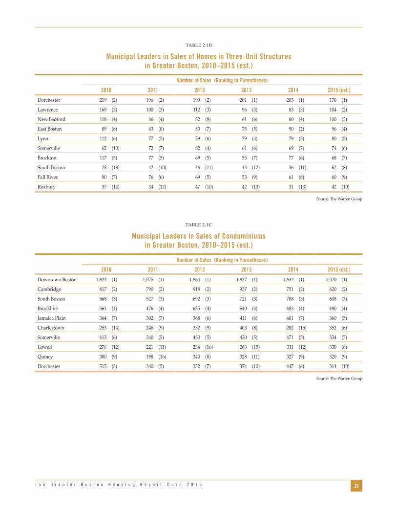
Table 2.1b shows Dorchester, Lawrence, New Bedford, East Boston, and Lynn maintaining their places as the top five communities in Greater Boston for sales of triple-decker units . This year, we estimate that while Dorchester will retain its No . 1 position, it will see only 170 sales by the end of 2015, the lowest for that cate-gory since before 2010 . Other communities, however, are seeing a relative increase . By the end of 2015, we estimate that three-unit home sales in Lawrence will increase by 25 percent; in Roxbury by 35 percent; and in South Boston by 72 percent . These increases are again a response to investors buying up triple-deckers to rent them out to a population desperate for rental housing and willing to cram many roommates — each paying a high monthly fee — into one unit .
As Table 2.1c indicates, the highest number of condo-minium sales in Greater Boston continues to be inside the city and its immediate surrounding neighbor-hoods . Since 2010, downtown Boston, Cambridge, South Boston and Brookline have logged the most sales . But as is true of single-family homes, condo sales
are weakening a bit in these communities . According to the latest 2015 estimates, downtown Boston will only have 1,520, down 6 .9 percent from last year . South Boston sales are expected to drop 14 .1 percent from 2014 . Somerville, which up until 2015 had been in the top five, has fallen two ranks and is expected to have only 334 total sales in 2015 — a 29 .1 percent decrease from the previous year .
Housing PermitsIn the last Greater Boston Housing Report Card, we celebrated the fact that the number of housing permits issued in Greater Boston had more than doubled from a low of 4,714 in 2009 to nearly 10,940 in 2013 . By the end of last year, however, the number of permits slipped a bit . What might happen in 2015 was a big question mark .
With data for the first two quarters of 2015, we are now confident that the housing production trend we saw before 2014 will continue at least for another year . As Figure 2.5 demonstrates, we expect that by the end of this year nearly 12,800 permits will have been issued for new housing development across the five counties of Greater Boston, the highest total since 2005 .
21T h e G r e a t e r B o s t o n H o u s i n g R e p o r t C a r d 2 0 1 5
TABLE 2 .1B
Municipal Leaders in Sales of Homes in Three-Unit Structures in Greater Boston, 2010–2015 (est.)
Number of Sales (Ranking in Parentheses)
2010 2011 2012 2013 2014 2015 (est.)
Dorchester 219 (2) 196 (2) 199 (2) 201 (1) 203 (1) 170 (1)
Lawrence 169 (3) 100 (3) 112 (3) 96 (3) 83 (3) 104 (2)
New Bedford 118 (4) 86 (4) 52 (8) 61 (6) 80 (4) 100 (3)
East Boston 89 (8) 63 (8) 53 (7) 75 (5) 90 (2) 96 (4)
Lynn 112 (6) 77 (5) 59 (6) 79 (4) 79 (5) 80 (5)
Somerville 62 (10) 72 (7) 82 (4) 61 (6) 69 (7) 74 (6)
Brockton 117 (5) 77 (5) 69 (5) 55 (7) 77 (6) 68 (7)
South Boston 28 (18) 42 (10) 46 (11) 43 (12) 36 (11) 62 (8)
Fall River 90 (7) 76 (6) 69 (5) 53 (9) 61 (8) 60 (9)
Roxbury 37 (14) 34 (12) 47 (10) 42 (13) 31 (13) 42 (10)
Source: The Warren Group
TABLE 2 .1C
Municipal Leaders in Sales of Condominiums in Greater Boston, 2010–2015 (est.)
Number of Sales (Ranking in Parentheses)
2010 2011 2012 2013 2014 2015 (est.)
Downtown Boston 1,622 (1) 1,575 (1) 1,864 (1) 1,827 (1) 1,632 (1) 1,520 (1)
Cambridge 817 (2) 790 (2) 918 (2) 937 (2) 751 (2) 620 (2)
South Boston 568 (3) 527 (3) 692 (3) 721 (3) 708 (3) 608 (3)
Brookline 561 (4) 476 (4) 635 (4) 540 (4) 483 (4) 490 (4)
Jamaica Plain 364 (7) 302 (7) 368 (6) 411 (6) 401 (7) 360 (5)
Charlestown 253 (14) 246 (9) 332 (9) 403 (8) 282 (15) 352 (6)
Somerville 413 (6) 340 (5) 450 (5) 430 (5) 471 (5) 334 (7)
Lowell 276 (12) 221 (11) 234 (16) 263 (15) 311 (12) 330 (8)
Quincy 300 (9) 198 (16) 340 (8) 328 (11) 327 (9) 320 (9)
Dorchester 515 (5) 340 (5) 352 (7) 374 (10) 447 (6) 314 (10)
Source: The Warren Group

22 U n d e r s t a n d i n g B o s t o n
FIGURE 2 .5
Total Housing Permits Issued in Five-County Greater Boston Region 2000–2015
0
2,000
4,000
6,000
8,000
10,000
12,000
14,000
16,000
2015(est.)
201420132012201120102009200820072006200520042003200220012000
9,5638,929 8,558
11,120
12,713
15,107
12,332
9,772
6,529
4,714
5,8235,275
7,966
10,938
12,795
10,733
Source: U .S . Census Bureau, Building Permits Survey for Essex, Middlesex, Norfolk, Plymouth and Suffolk counties .
FIGURE 2 .6
Number of Housing Unit Permits in Five-County Greater Boston Region, by Structure Type 2000–2015
0
1,000
2,000
3,000
4,000
5,000
6,000
7,000
8,000
9,000
10,000
2015(est.)
201420132012201120102009200820072006200520042003200220012000
6,376
7,564
2,682
4,131
1,929
550
3,523
8,722
1,180
2,527
660
Single-Family Two- to Four-Unit 5 or More Unit
Source: U .S . Census Bureau, Building Permits Survey for Essex, Middlesex, Norfolk, Plymouth and Suffolk counties

23T h e G r e a t e r B o s t o n H o u s i n g R e p o r t C a r d 2 0 1 5
of multi-family structures with five or more units . In 2009, only 1,929 permits were issued for this type of housing throughout Greater Boston . By 2014, the number had climbed to 6,126, a 218 percent increase over that five-year period . Based on the permits issued during the first six months of 2015, we project that more than 8,700 permits for such large develop-ments will be issued this year . In contrast, we project a 14 percent decline in single-family permits from the previous year .
These recent data underscore the major shift in the Boston housing market away from single-family homes and heading, full speed, toward multi-family units .
What is of equal or greater interest is the type of housing now under construction . As Table 2.2 and Figure 2.6 indicate, the number of permits issued between 2005 and 2009 decreased drastically across all housing types before beginning to rebound . Two- to four-unit structures are a small part of total produc-tion, but the number of permits issued for such hous-ing increased by 47 percent between 2010 and 2014, eclipsing the 34 percent rise in single-family produc-tion during this same period .
What has really taken off — and this is a strong sign that developers are responding to the demo-graphic changes in the region — is the production
TABLE 2 .2
Single-Family and Multi-Family Building Permits in Greater Boston 2000–2015 (est.)
YearTotal Units
% Change from Prior
Year
Units in Single-Family
Structures
% Change from
Prior Year
Units in 2–4 Unit
Structures
% Change from Prior
Year
Units in 5+ Unit
Structures
% Change from Prior
Year
2000 9,563 6,376 660 2,527
2001 8,929 -6 .6% 5,604 -12 .1% 642 -2 .7% 2,683 6 .2%
2002 8,558 -4 .2% 5,531 -1 .3% 709 10 .4% 2,318 -13 .6%
2003 11,120 29 .9% 5,290 -4 .4% 1,067 50 .5% 4,763 105 .5%
2004 12,713 14 .3% 6,222 17 .6% 985 -7 .7% 5,506 15 .6%
2005 15,107 18 .8% 6,552 5 .3% 991 0 .6% 7,564 37 .4%
2006 12,332 -18 .4% 4,910 -25 .1% 1,180 19 .1% 6,242 -17 .5%
2007 9,772 -20 .8% 4,139 -15 .7% 636 -46 .1% 4,997 -19 .9%
2008 6,529 -33 .2% 2,682 -35 .2% 376 -40 .9% 3,471 -30 .5%
2009 4,714 -27 .8% 2,507 -6 .5% 278 -26 .1% 1,929 -44 .4%
2010 5,823 23 .5% 3,057 21 .9% 340 22 .3% 2,426 25 .8%
2011 5,275 -9 .4% 2,773 -9 .3% 226 -33 .5% 2,276 -6 .2%
2012 7,966 51 .0% 3,461 24 .8% 374 65 .5% 4,131 81 .5%
2013 10,938 37 .3% 4,107 18 .7% 472 26 .2% 6,359 53 .9%
2014 10,733 -1 .9% 4,107 0 .0% 500 5 .9% 6,126 -3 .7%
2015 (est .) 12,795 19 .2% 3,523 -14 .2% 550 10 .0% 8,722 42 .4%
Percentage Change
2000–2005 58 .0% 2 .8% 50 .2% 199 .3%
2005–2009 -68 .8% -61 .7% -71 .9% -74 .5%
2009–2010 23 .5% 21 .9% 22 .3% 25 .8%
2010–2014 84 .3% 34 .3% 47 .1% 152 .5%
2014–2015 (est .)* 19 .2% -14 .2% 10 .0% 42 .4%
Source: U .S . Census Building Permit Survey for Essex, Middlesex, Norfolk, Plymouth and Suffolk counties .
* The annualized estimates of 2015 housing permits were calculated by multiplying the number of permits issued through July by 12/7 .

24 U n d e r s t a n d i n g B o s t o n
only way we accommodated 67,000 new households with only 15,000 new units was through a sharp reduc-tion in the housing vacancy rate, which inevitably led to higher prices and rents . The lack of available units allows sellers and landlords to raise prices without fear of not selling or renting their units .
Housing Production by Type and Location
Where is the most new housing being built and what form does it take? As in past Greater Boston Housing Report Cards, we rank the 15 communities that issue the largest number of housing permits annually . Each year, not surprisingly, the City of Boston leads the pack . What is surprising is the huge increase in the estimated number of units permitted in 2015 (see Table 2.3a) . If our estimate holds, based on data through July, by year’s end Boston will have issued nearly 4,400 permits, an increase of 54 percent over 2014 and five times as many as in 2011 . Mayor Martin J . Walsh’s ambitious plans for producing more housing in his city seem to be bearing fruit, although much of this is luxury housing in locations like the South Boston waterfront .
Figure 2.7 demonstrates vividly this shift to build-ings with five or more units . In 2000, such develop-ment only accounted for a little more than one-quarter (26 .4 percent) of all new housing units in Greater Boston . By 2005, these larger multi-unit developments contained half of all the newly constructed housing units in the region . Today, with the sharp increase this year, these developments account for more than two-thirds of all new housing units . In 2012, Governor Deval Patrick called for the production of 10,000 units of multi-family housing per year through 2020 .3 The 8,700 units produced this year in Greater Boston alone suggest that, statewide, this goal may have been met for the first time in 2015 .
The increasing number of permits and the shift toward larger multi-family units is a welcome trend in Greater Boston . But, unfortunately, new housing supply lags far behind demand even with the improved permit numbers . Note that between 2010 and 2014, the total number of permits issued in the region was 40,735, far below the more than 67,000 new households added to the region during that same period .
However, only 15,000 units of housing were actually built . That means the region must not only see more housing permits, there must be an acceleration in turn-ing those permits into real houses, apartments and condominiums . As we will see in the next chapter, the
FIGURE 2 .7
5+ Unit Housing Unit Permits as a Percent of All Housing Permits Greater Boston, 2000–2015
0%
20%
10%
40%
50%
30%
60%
70%
80%
2015(est.)
201420132012201120102009200820072006200520042003200220012000
26.4%
30.0%
27.1%
42.8% 43.3%
50.1% 50.6% 51.1%53.2%
40.9% 41.7% 43.1%
51.9%58.1%
68.2%
57.1%
Source: U .S . Census Bureau, Building Permits Survey for Essex, Middlesex, Norfolk, Plymouth and Suffolk counties .

25T h e G r e a t e r B o s t o n H o u s i n g R e p o r t C a r d 2 0 1 5
The City of Everett, which will likely issue more than 950 permits, ranks 2nd in Greater Boston . More than twice as many permits are expected to be issued in Everett in 2015 as in the previous year and 13 times as many as in 2011 . Following Everett are Chelsea, Watertown, and Framingham . In each case, permitting has soared in these communities, as it generally has in the municipalities ranked six through 14 . Cambridge falls last in the number of permits that will likely be issued this year, well below the records it set in previ-ous years when developments were proliferating in Kendall Square .
While total permits have increased markedly in many communities, Table 2.3b indicates that this is not generally true for single-family homes . Permits for this type of housing have flattened out since 2011 in most municipalities, with the exception of Reading, while other towns are actually issuing fewer permits than in 2014 .
Plymouth leads all other Greater Boston communi-ties in issuing permits for single-family homes . But
even here, the number issued in 2015 is expected to be less than in both previous years . The same is true of No . 4 Methuen, No . 9 Acton, and No . 11 Kingston . The one community setting a new record for single-family permits is Reading (No . 7), which issued more permits this year than in the entire period between 2011 and 2014 .
Table 2.3c demonstrates the increased interest in multi-family housing development . Boston will likely issue 4,161 multi-family permits in 2015, a 60 percent increase over 2014 and nearly five times as many as in 2011 . What is more, communities surround-ing Boston also seem to be responding to the rising demand for apartments and condos in larger housing developments . Everett, Chelsea, Watertown, Quincy, and Arlington are not just issuing more multi-family permits, but some are granting that kind of permit for the first time in years . This trend is evident when looking at the total number of municipalities issuing multi-family housing permits in general . Between 2011 and 2014, more than 300 of the Commonwealth’s 351
TABLE 2 .3A
Municipalities Adding the Most New Housing Units, 2011–2015
2015 Rank Most Permits Municipality 2011 2012 2013 2014 2015 (est.)
Change in Total Units 2011–2015
Change in Total Units 2014–2015
1 Boston 785 1,776 2,561 2841 4,375 3,590 1,534
2 Everett 68 108 432 437 957 889 520
3 Chelsea 113 165 332 385 837 724 452
4 Watertown 220 14 468 13 535 315 522
5 Framingham 14 19 27 77 360 346 283
6 Burlington 18 43 49 56 345 327 289
7 Canton 42 73 97 116 254 212 138
8 Quincy 80 91 112 119 250 170 131
9 Arlington 60 89 100 119 223 163 104
10 Plymouth 149 185 241 236 221 72 -15
11 Middleborough 52 87 123 139 214 162 75
12 Concord 167 137 171 117 194 27 77
13 Needham 43 73 104 106 166 123 60
14 Bedford 56 55 40 38 165 109 127
15 Cambridge 34 392 995 285 123 89 -162
Note: 2015 estimates dirived by taking permitting numbers through July and multiplying by 12/7 .
Source: U .S . Census Bureau, Annual New Privately- owned Residential Building Permits for Places in Massachusetts
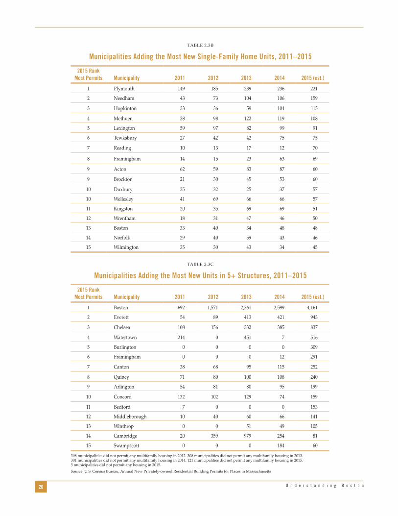
26 U n d e r s t a n d i n g B o s t o n
TABLE 2 .3B
Municipalities Adding the Most New Single- Family Home Units, 2011–2015
2015 Rank Most Permits Municipality 2011 2012 2013 2014 2015 (est.)
1 Plymouth 149 185 239 236 221
2 Needham 43 73 104 106 159
3 Hopkinton 33 36 59 104 115
4 Methuen 38 98 122 119 108
5 Lexington 59 97 82 99 91
6 Tewksbury 27 42 42 75 75
7 Reading 10 13 17 12 70
8 Framingham 14 15 23 63 69
9 Acton 62 59 83 87 60
9 Brockton 21 30 45 53 60
10 Duxbury 25 32 25 37 57
10 Wellesley 41 69 66 66 57
11 Kingston 20 35 69 69 51
12 Wrentham 18 31 47 46 50
13 Boston 33 40 34 48 48
14 Norfolk 29 40 59 43 46
15 Wilmington 35 30 43 34 45
Source: U .S . Census Bureau, Annual New Privately- owned Residential Building Permits for Places in MassachusettsTABLE 2 .3C
Municipalities Adding the Most New Units in 5+ Structures, 2011–2015
2015 Rank Most Permits Municipality 2011 2012 2013 2014 2015 (est.)
1 Boston 692 1,571 2,361 2,599 4,161
2 Everett 54 89 413 421 943
3 Chelsea 108 156 332 385 837
4 Watertown 214 0 451 7 516
5 Burlington 0 0 0 0 309
6 Framingham 0 0 0 12 291
7 Canton 38 68 95 115 252
8 Quincy 71 80 100 108 240
9 Arlington 54 81 80 95 199
10 Concord 132 102 129 74 159
11 Bedford 7 0 0 0 153
12 Middleborough 10 40 60 66 141
13 Winthrop 0 0 51 49 105
14 Cambridge 20 359 979 254 81
15 Swampscott 0 0 0 184 60
308 municipalities did not permit any multifamily housing in 2012 . 308 municipalities did not permit any multifamily housing in 2013 . 301 municipalities did not permit any multifamily housing in 2014 . 121 municipalities did not permit any multifamily housing in 2015 . 5 municipalities did not permit any housing in 2015 .
Source: U .S . Census Bureau, Annual New Privately- owned Residential Building Permits for Places in Massachusetts

27T h e G r e a t e r B o s t o n H o u s i n g R e p o r t C a r d 2 0 1 5
As of last year, 2,535 40R housing units were either built or were in construction . As of this year, the number is up to 2,905, an increase of 370 . Close to half of these units had two or more bedrooms . Of the total, the overwhelming proportion (85 percent) was rental apartments and almost half (45 percent) of these units were affordable by HUD standards . Of those already built, 98 percent are in multi-family developments, taking advantage of the density requirements under the 40R regulations . At the present time, an addi-tional 633 units have been permitted and are awaiting construction . If all of these are built, the total number of 40R units will exceed 3,500 .
The communities that have produced the most housing units under 40R are:
North Reading 406Haverhill 362Reading 253Lakeville 204Lynnfield 180Boston 159Northampton 145Brockton 140Natick 138Lawrence 137Lunenburg 131Chelsea 120Pittsfield 112Fitchburg 105
towns and cities did not issue any multi-family hous-ing permits at all . But by July of 2015, that number was down to 121 communities, five of which did not issue a single housing permit of any kind .
Table 2.3d shows that the increase in building permits is not uniform across the five counties of Greater Boston . Essex, Norfolk, and Plymouth are all expected to issue fewer permits in 2015 than last year . It is in Suffolk and Middlesex counties where the number of permits has increased sharply, driven by a sharp increase in larger developments with five or more units . What is uniform about the shifting market is the decline in permits for single-family homes, largely a response to the changing demographics of the region .
The Role of Chapter 40R in Housing Production
Since the passage of Chapter 40R, the Smart-Growth Overlay Zoning statute, we have been keeping track of the number of Massachusetts communities taking advantage of this new housing law and the number of units permitted and constructed .4 As of September of this year, there were 40 Approved Districts in 31 different municipalities with a total of 29 completed, in construction, or active/pending projects . In addi-tion, there are six more communities awaiting site plan approval for 40R projects (see Table 2.4) .
TABLE 2 .3D
Permitting by Housing Type for Five Greater Boston Counties, 2014–2015
County Year Single Family 2–4 Units 5+ Units Total Units% Change in Total Units
Essex2014 736 98 523 1,357 -45 .9%
2015 (est .) 555 62 117 734
Middlesex2014 1,610 88 1,543 3,241 33 .1%
2015 (est .) 1,455 146 2,714 4,315
Norfolk 2014 758 36 800 1,594 -19 .4%
2015 (est .) 646 79 559 1,284
Plymouth2014 949 72 197 1,218 -11 .9%
2015 (est .) 811 87 175 1,073
Suffolk 2014 54 206 3,063 3,323 62 .2%
2015 (est .) 55 177 5,158 5,390
Source: U .S . Census Bureau, Annual New Privately-owned Residential Building Permits for Places in Massachusetts

28 U n d e r s t a n d i n g B o s t o n
TABLE 2 .4
Housing Units Constructed in Chapter 40R Smart-Growth Districts in Massachusetts
Bedrooms Affordable Units
CIty/Town District Name Studio 1 BR 2 BR 3 BR 4 BRTotal Units Own Rent
Number Affordable
Percent Affordable
Amesbury Gateway (Amesbury)
Belmont Oakley Neighborhood 15 2 17 17 3 18%
Boston Olmsted Green 75 68 16 0 159 19 159 159 100%
Bridgewater Waterford Village
Brockton Downtown (Brockton) 2 2 2 2 100%
Brockton Downtown (Brockton) 5 4 16 25 25 14 56%
Brockton Downtown (Brockton) 63 45 5 113 113 71 63%
Brockton Downtown (Brockton)
Chelsea Gerrish Ave 53 5 40 20 2 120 26 94 55 46%
Chicopee Chicopee Center
Dartmouth Village @ Lincoln Park
Easthampton Downtown (Easthampton) 11 30 9 50 50 50 100%
Easton Queset Commons 10 26 14 50 50 13 26%
Fitchburg SGOD (Fitchburg) 21 76 8 105 105 27 26%
Fitchburg SGOD (Fitchburg)
Grafton Fisherville Mill
Haverhill Downtown (Haverhill) 193 112 305 305 61 20%
Haverhill Downtown (Haverhill) 11 46 57 57 33 58%
Haverhill Downtown (Haverhill)
Holyoke Downtown (Holyoke) 5 5 3 2 0 0%
Holyoke Downtown (Holyoke) 6 24 24 54 54 54 100%
Kingston 1021 Kingston's Place
Lakeville Lakeville Station 55 149 204 204 100 49%
Lawrence Arlington/Malden Mills 17 58 75 75 72 96%
Lawrence Arlington/Malden Mills 62
Lowell Downtown (Lowell) 33 19 52 52 26 50%
Lowell Downtown (Lowell) 4 13 49 4 70 57 81%
Ludlow SGOD
Lunenburg Tri-Town Landing 21 66 12 99 99 93 94%
Lunenburg Tri-Town Landing 32
Lynnfield SGOD (Lynnfield) 108 72 180 180 45 25%
Marblehead Pleasant Street
Marblehead Vinnin Square
Natick Paperboard 138 138 28 20%
North Andover Osgood Landing
North Reading Berry Center 238 168 406 406 102 25%
Northampton Village Hill/State Hospital 19 25 18 62 22 40 32 52%
Northampton Village Hill/State Hospital 83 83 43 52%
Norwood Guild St
Norwood St . George Ave . 10 3 2 15 15 3 20%
Pittsfield SGOD (Pittsfield) 16 51 67 67 67 100%
Pittsfield SGOD (Pittsfield) 19 20 6 45 45 43 96%
Plymouth Cordage Park
Reading Downtown (Reading) 23 30 53 53 11 21%
Reading Gateway (Reading) 94 106 200 200 40 20%
Sharon Sharon Commons
Swampscott Vinnin Square
Westfield Southwick Rd
Totals 271 906 1,294 115 4 2,905 302 2,458 1,304
Total (percent) 9% 31% 45% 4% 0 .14% 100% 10% 85% 45%
Source: Massachusetts Department of Housing and Community Development, October 2015

29T h e G r e a t e r B o s t o n H o u s i n g R e p o r t C a r d 2 0 1 5
while foreclosure deeds dropped 90 percent from 244 to just 25 in the same period . Between 2004 and 2007, however, the number of petitions soared by a stagger-ing factor of four from 1,533 to 8,977 . During the same period, the number of foreclosure deeds increased by a factor of 40 from just 50 deeds in 2004 to 2,061 in 2007, a span of only three years . Then, in 2008, foreclosure petitions dropped from 8,977 to 6,439 while foreclosure deeds continued to rise from 2,061 to 3,055 . The banks
Foreclosure Activity in Greater Boston
In our last report, we suggested “we can breathe a tentative sigh of relief over the state of residential fore-closures in Greater Boston .”5 We clearly were wrong . Figure 2 .8 and Figure 2 .9 show a resurgence in fore-closures this year . Between 2000 and 2003, foreclosure petitions increased by 54 percent from 561 to 863,
FIGURE 2 .8
Annual Number of Foreclosure Petitions of Single-Family Homes in Five-County Greater Boston Region, 2000–2015
0
2,000
1,000
4,000
5,000
3,000
6,000
7,000
8,000
9,000
10,000
2015(est.)
201420132012201120102009200820072006200520042003200220012000
561 751 821 863
1,533
3,168
6,173
8,977
6,439
8,686
7,714
4,127
5,859
1,682
2,473
3,154
Source: The Warren Group
FIGURE 2 .9
Annual Number of Foreclosure Deeds of Single-Family Homes in Five-County Greater Boston Region, 2000–2015
0
1,000
500
2,000
2,500
1,500
3,000
3,500
2015(est.)
201420132012201120102009200820072006200520042003200220012000
244 192 13525 50
180
811
2,061
3,055
2,168
3,015
2,146
1,880
737
1,112
877
Source: The Warren Group
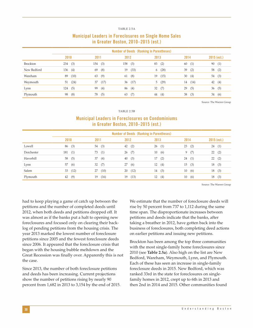
30 U n d e r s t a n d i n g B o s t o n
We estimate that the number of foreclosure deeds will rise by 50 percent from 737 to 1,112 during the same time span . The disproportionate increases between petitions and deeds indicate that the banks, after taking a breather in 2012, have gotten back into the business of foreclosures, both completing deed actions on earlier petitions and issuing new petitions .
Brockton has been among the top three communities with the most single-family home foreclosures since 2010 (see Table 2.5a) . Also high on the list are New Bedford, Wareham, Weymouth, Lynn, and Plymouth . Each of these has seen an increase in single-family foreclosure deeds in 2015 . New Bedford, which was ranked 33rd in the state for foreclosures on single-family homes in 2012, crept up to 6th in 2013 and then 2nd in 2014 and 2015 . Other communities found
had to keep playing a game of catch up between the petitions and the number of completed deeds until 2012, when both deeds and petitions dropped off . It was almost as if the banks put a halt to opening new foreclosures and focused only on clearing their back-log of pending petitions from the housing crisis . The year 2013 marked the lowest number of foreclosure petitions since 2005 and the fewest foreclosure deeds since 2006 . It appeared that the foreclosure crisis that began with the housing bubble meltdown and the Great Recession was finally over . Apparently this is not the case .
Since 2013, the number of both foreclosure petitions and deeds has been increasing . Current projections show the number of petitions rising by nearly 90 percent from 1,682 in 2013 to 3,154 by the end of 2015 .
TABLE 2 .5A
Municipal Leaders in Foreclosures on Single Home Sales in Greater Boston, 2010–2015 (est.)
Number of Deeds (Ranking in Parentheses)
2010 2011 2012 2013 2014 2015 (est.)
Brockton 234 (3) 154 (3) 158 (3) 83 (2) 60 (1) 90 (1)
New Bedford 136 (4) 69 (8) 19 (33) 6 (28) 39 (2) 58 (2)
Wareham 89 (10) 63 (9) 61 (8) 19 (15) 30 (4) 54 (3)
Weymouth 51 (24) 37 (17) 36 (17) 5 (29) 14 (14) 42 (4)
Lynn 124 (5) 99 (4) 86 (4) 32 (7) 29 (5) 36 (5)
Plymouth 98 (8) 78 (5) 63 (7) 44 (4) 38 (3) 34 (6)
Source: The Warren Group
TABLE 2 .5B
Municipal Leaders in Foreclosures on Condominiums in Greater Boston, 2010–2015 (est.)
Number of Deeds (Ranking in Parentheses)
2010 2011 2012 2013 2014 2015 (est.)
Lowell 86 (3) 54 (3) 42 (2) 26 (1) 23 (2) 24 (1)
Dorchester 181 (1) 73 (1) 26 (7) 10 (6) 9 (7) 22 (2)
Haverhill 58 (5) 37 (4) 40 (3) 17 (2) 24 (1) 22 (2)
Lynn 57 (6) 32 (7) 27 (6) 12 (4) 15 (3) 18 (3)
Salem 33 (12) 27 (10) 20 (12) 14 (3) 10 (6) 18 (3)
Plymouth 42 (9) 19 (16) 19 (13) 12 (4) 10 (6) 18 (3)
Source: The Warren Group

31T h e G r e a t e r B o s t o n H o u s i n g R e p o r t C a r d 2 0 1 5
themselves in the top rankings in the past two years . Wareham, which was at 15th in 2013, is now being projected to be 3rd in 2015 . Weymouth, which had not ever been higher than 17th since 2011, now has the 4th
highest number of single-family foreclosure deeds in Greater Boston .
Compared to single-family foreclosure deeds, the number of condominium foreclosures has remained more stable during the past three years (see Table 2.5b) . In 2015, we expect that Lowell will have the largest number of condo foreclosures, followed closely by Dorchester and Haverhill . In each of the six communities with the most condo foreclosure deeds in 2015, only one (Haverhill) had more in the previous year . Foreclosure activity is once again a problem for a number of the region’s municipalities .
ConclusionsIn the last edition of the Greater Boston Housing Report Card, we said we were “a bit gun-shy about making predictions [about housing production] in such an unstable market” . . . but we did see a trend toward “solid improvement” in housing production and “a real turnaround in the Greater Boston housing market .”6
Now with new data for 2015, we are more certain of the trend toward increased production as measured by the number of building permits issued . Particu-larly encouraging is the shift from single-family home construction to larger multi-family developments that are more in line with changing demand as the number of aging baby boomers grows along with a larger number of younger millennials .
But we must recognize that these statistics reflect permitting activity and not construction per se . To the extent that developments take time to complete, it is likely that the full impact of increased produc-tion will have little impact on single-family home and condo prices or rents . Indeed, as the next chapter will show, both home prices and rents are continuing to soar despite more housing construction since 2009 . Even with this encouraging trend in permitting, it still appears to be true that the supply of new housing continues to lag far behind demand .

32 U n d e r s t a n d i n g B o s t o n
CHAPTER THREE
Home Prices and Rents in Greater Boston
In Chapter One we reported that the Greater Boston economy has been particularly strong over the past three years, with employment opportunities expand-ing and the unemployment rate falling . Partly as a result of the improved economy, the region’s popu-lation has been growing . Both factors have contrib-uted to strong housing demand . In Chapter Two, we shared the favorable news that housing production has increased sharply in 2015 . We expect that the total number of new permits issued by the end of this year will exceed the number in any year back to 2000 with the exception of 2005 .
With demand increasing and new supply on the way, it is of interest to investigate what has happened to home prices and rents . In this chapter we explore this question with the latest price data for single-family homes, condominiums, duplex units and traditional “triple-deckers .” We also look at new data on rents in the Greater Boston metro region .
The results of our analysis suggest that despite new construction in the pipeline, demand for housing continues to outstrip supply, leading to higher prices and rents pretty much across the board .
Home Prices in Greater Boston
Greater Boston, like much of the rest of the country, has experienced volatile home prices during the past three decades as depicted in Figure 3.1 . According to the Case-Shiller Home Price Index (single family), annual changes in prices have ranged from a decline of 8 .1 percent in 1991 to an increase of nearly 16 percent in 2001 .1 In the single decade between 1995 and 2005, the median price of single-family homes in Greater Boston increased by a factor of more than 2 .5, adding enormous asset value to the fortunate homeowners who purchased homes in the early 1990s . The burst-ing of the housing bubble at the end of 2005 reduced those values, but by no means as much as the appre-ciation during the previous ten years . Following the housing meltdown, prices began to rise again in 2010
only to slip in 2011 . But since then, prices have been on the increase . They rose 7 .2 percent in 2013; another 6 percent in 2014; and according to figures through June of this year, we project they will rise at least 6 percent in 2015 .
What is particularly interesting about 2015 is that it marks the year in which the Case-Shiller index reached its previous peak, which was set back in 2005 after continuous annual appreciation from 1993 through 2005 . That is, across the entire Greater Metro area, the median single-family home price is finally back to where it was a decade ago, having survived the Great Recession and the housing bubble meltdown . Figure 3.2 tracks this history for both the current housing price cycle along with the previous cycle that lasted from 1988 through 1997 . During the first 10-year cycle, prices fell for 43 months before beginning to recover . Within 39 months, prices were back to 90 percent of their previous high . Within another 24 months, prices had returned to their peak .
The current cycle also took 43 months for prices to reach their nadir . But unlike the earlier cycle, the post-2009 recovery has been erratic and has taken an additional 11 months to return to its previous peak . By this time in the last cycle, single-home prices were 10 percent higher than their previous peak .
Homeowner Vacancy Rates and Housing Prices
In the previous Greater Boston Housing Report Card, we suggested that the slight decline in the Case-Shiller index between 2013 and 2014 (as shown in Figure 3.1) might be a harbinger of smaller annual price increases as demand for single-family homes weakened with changing demographic trends . It appears that in 2015 we shall find that prices rose no less than in 2014 and perhaps will approach the rate of increase in 2013 .
What is driving this appears to be a continued decline in homeowner vacancy rates . As shown in Figure 3.3, the vacancy rate in Greater Boston declined to 0 .7 in
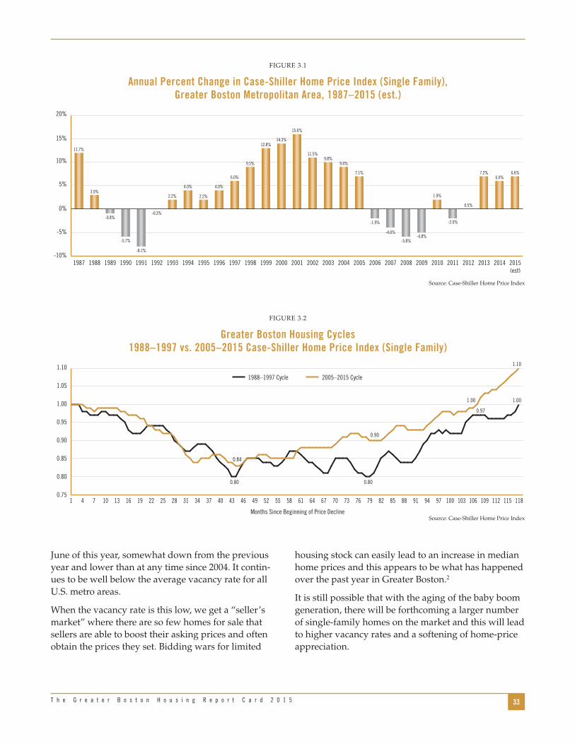
33T h e G r e a t e r B o s t o n H o u s i n g R e p o r t C a r d 2 0 1 5
housing stock can easily lead to an increase in median home prices and this appears to be what has happened over the past year in Greater Boston .2
It is still possible that with the aging of the baby boom generation, there will be forthcoming a larger number of single-family homes on the market and this will lead to higher vacancy rates and a softening of home-price appreciation .
June of this year, somewhat down from the previous year and lower than at any time since 2004 . It contin-ues to be well below the average vacancy rate for all U .S . metro areas .
When the vacancy rate is this low, we get a “seller’s market” where there are so few homes for sale that sellers are able to boost their asking prices and often obtain the prices they set . Bidding wars for limited
FIGURE 3 .1
Annual Percent Change in Case-Shiller Home Price Index (Single Family), Greater Boston Metropolitan Area, 1987–2015 (est.)
-10%
-5%
0%
5%
10%
15%
20%
2014 2015(est)
201320122011201020092008200720062005200420032002200120001999199819971996199519941993199219911990198919881987
11.7%
3.0%
-0.8%
-5.7%
-8.1%
-0.3%
2.2%
4.0%
2.2%
4.0%
6.0%
9.5%
12.8%14.3%
15.6%
11.5%9.8%
9.4%
7.1%
-1.9%
-4.0%
-5.8%-4.8%
1.9%
-2.0%
0.5%
7.2%6.0%
6.6%
Source: Case-Shiller Home Price Index
FIGURE 3 .2
Greater Boston Housing Cycles 1988–1997 vs. 2005–2015 Case-Shiller Home Price Index (Single Family)
0.75
0.80
0.85
0.90
0.95
1.00
1.05
1.10
0.800.80
0.84
0.90
1.10
1.001.00
0.97
109106 112 115 118103100979491888582797673706764615855524946434037343128252219161310741
2005–2015 Cycle1988–1997 Cycle
Months Since Beginning of Price DeclineSource: Case-Shiller Home Price Index

34 U n d e r s t a n d i n g B o s t o n
median in 2014 . Precisely as is true of the Case-Shiller index, this marks the first time in a decade that single-family home prices have reached their previous peak . Just since 2009, the median price of a Greater Boston single-family home has increased by more than 19 percent — rising from roughly $339,000 to $405,000 .
Data from the Warren Group that tracks housing sales and prices in Greater Boston by simply collect-ing information on each sale of a home regardless of size is fully consistent with the trend we see in the Case-Shiller index . As Figure 3.4 demonstrates, the median price of single-family homes in Greater Boston by mid-2015 is already nearly $9,500 higher than the
FIGURE 3 .3
Homeowner Vacancy Rates, Greater Boston vs. U.S. Metro Areas 1990–2015
0.0
0.5
1.0
1.5
2.0
2.5
3.0
2015(through
June)
201420132012201120102009200820072006200520042000 2001 2002 2003
0.6
1.4
0.6
1.7
0.5
1.7
1.2
1.9 1.9
1.5 1.5
2.0
2.4
2.82.9
2.6
1.2
2.6
1.4
2.5
1.3
2.0
1.2
2.0
0.8
1.8
0.7
1.7
0.7
1.8
0.3
1.6
Boston Metro Area Inside Metropolitan Statistical Areas
Home Price Stabilization Vacancy Rate: 2%
Source: U .S . Census Bureau, Housing Vacancy Survey
FIGURE 3 .4
Annual Median Price of Single-Family Homes in Five-County Greater Boston Region, 2000–2015
$200,000
$250,000
$300,000
$350,000
$400,000
$450,000
2015:II201420132012201120102009200820072006200520042003200220012000
$260,196
$284,713
$326,657
$353,178
$385,560
$405,059$394,571 $397,928
$359,086
$339,123
$354,207$345,037 $348,096
$380,931
$405,198$395,740
Source: The Warren Group

35T h e G r e a t e r B o s t o n H o u s i n g R e p o r t C a r d 2 0 1 5
Diverging Price AppreciationWhile, on average, single-family home prices across Greater Boston in the second quarter of 2015 reached their previous 2005 peak, this experience varied widely across the region’s towns and cities . In some commu-nities, as shown in Table 3.1, the median selling price in 2015 was still at least 15 percent below the 2005 median . Among these communities were Brockton, Randolph, Lawrence, Lowell, and Bridgewater — all with a large number of working-class families .
A number of towns had come close to returning to peak values, including Acton, Norfolk, Hopkinton, and Norwell — mostly suburban communities . And then there were the real “winners” where home prices in 2015 exceeded the price peak before the Great Reces-sion . They tended to be municipalities with wealthier households, such as Westwood, Milton, Belmont, Wellesley, Concord, Newton, and Brookline . The price of a single-family home in downtown Boston is now 76 percent higher than in 2005 and in Cambridge, it is double what it was 10 years ago .
Essentially, this distribution of price appreciation over the past decade reflects something of the chang-ing pattern of income and wealth distribution in the region and nation . The rich have continued to become richer while working-class and lower-income families continue to fall behind . If you were wealthy enough
to own a home in Cambridge in 2005 and still owned it in 2015, you likely saw your housing asset double in value . If you bought a home in Brockton, Randolph, or Lawrence in 2005 and still owned it this year, you likely have experienced a decline in value of 20 percent or more .
Condominium PricesAs we noted in the last edition of the Greater Boston Housing Report Card, condominium and multi-unit housing prices weathered the recession and recovery far better than did single-family homes . As Figure 3.5 shows, even before the housing bust, median condo prices were rising rapidly: between 2000 and 2005, they soared by 70 percent, from just under $177,000 to more than $300,000, compared with a 56 percent rise in single-family home prices during the same period . Condo prices outperformed during the crash as well, declining 8 .7 percent between 2007 and 2009, in contrast with a 14 .7 plunge in home prices . Follow-ing the 2008 recession, condo prices hit a brief low of $280,000 in 2009 and promptly rose by 22 percent to more than $350,000 by 2014 . And then condo prices exploded . By June 2015, the median price of condo-miniums in Greater Boston had soared to more than $401,000, a leap of nearly 15 percent over the median price a year earlier .
$150,000
$250,000
$200,000
$300,000
$350,000
$400,000
$450,000
2015(through
June)
201420132012201120102009200820072006200520042003200220012000
$176,686
$199,576
$242,520
$261,357
$287,938$300,458 $301,619 $306,523 $304,465
$279,911$293,679
$302,137$309,940
$333,579
$401,398
$350,272
FIGURE 3 .5
Annual Median Price of Condominiums in Five-County Greater Boston Region, 2000–2015
Source: The Warren Group

36 U n d e r s t a n d i n g B o s t o n
TABLE 3 .1
Ratio of Single-Family Home Prices 2015: Q2 vs. 2005
0.75 to 0.85 0 .75 Brockton
0 .76 Randolph
0 .79 Lawrence
0 .79 Whitman
0 .80 Taunton
0 .81 Stoughton
0 .81 Holbrook
0 .81 Middleborough
0 .81 Hanson
0 .82 North Andover
0 .82 Ipswich
0 .82 Wareham
0 .83 Methuen
0 .83 Bellingham
0 .83 Swampscott
0 .83 Medway
0 .83 Marlborough
0 .83 Lowell
0 .84 Haverhill
0 .84 Rockland
0 .85 Bridgewater
0 .85 Revere
0 .85 Boxford
0 .85 Mansfield
86 to .90 0 .86 Duxbury
0 .86 Hull
. 0 .86 East Bridgewater
0 .86 Abington
0 .87 Gloucester
0 .87 Franklin
0 .87 Chelsea
0 .87 Westford
0 .87 Saugus
0 .88 Dracut
0 .88 Everett
0 .88 Lynn
0 .89 Sudbury
0 .90 Pepperell
0 .90 Kingston
0 .90 Norton
0 .90 Raynham
0.91 to 0.95 0 .91 Canton
0 .91 Plymouth
0 .91 Maynard
0 .92 Framingham
0 .92 Amesbury
0 .92 Marshfield
0 .93 Peabody
0 .93 Tewksbury
0 .94 Danvers
0 .94 Foxborough
0 .94 Easton
0 .94 Weymouth
0 .94 Andover
0 .94 Pembroke
0 .95 North Reading
0.96 to 1.00 0 .96 Boxboro
0 .96 Topsfield
0 .96 Hudson
0 .96 Billerica
0 .96 Acton
0 .96 Salem
0 .96 Malden
0 .97 Norfolk
0 .97 Beverly
0 .97 Braintree
0 .98 Dedham
0 .98 Marblehead
0 .99 Holliston
0 .99 Hopkinton
0 .99 Hanover
0 .99 Norwood
0 .99 Lynnfield
0 .99 Chelmsford
1 .00 Norwell
1.01 to 1.09 1 .01 Scituate
1 .01 Waltham
1 .03 Woburn
1 .03 Quincy
1 .04 Medfield
1 .04 Wakefield
1 .05 Burlington
1 .05 Wilmington
1 .07 Weston
1 .07 Hingham
1 .07 Newburyport
1 .08 Stoneham
1 .08 Natick
1 .09 Sharon
1 .09 Walpole
1 .09 Wayland
Over 1.10 1 .11 Westwood
1 .13 Reading
1 .14 Melrose
1 .14 Medford
1 .14 Wrentham
1 .18 Milton
1 .18 Belmont
1 .22 Bedford
1 .24 Wellesley
1 .24 Winchester
1 .24 Watertown
1 .27 Concord
1 .28 Needham
1 .32 Lexington
1 .35 Arlington
1 .47 Newton
1 .52 Brookline
1 .76 Ashland
1 .76 Boston (Downtown)
2 .01 Cambridge

37T h e G r e a t e r B o s t o n H o u s i n g R e p o r t C a r d 2 0 1 5
triple-decker was slightly less at around $244,000 . Since then the price of triple-deckers has eclipsed duplex units . By the first half of 2015, the median price of a triple-decker stood at $477,000, significantly more than the median price of all condominiums in the region . Essentially, the price of a single triple-decker unit has nearly doubled in the span of just six years — up by 95 percent since 2009 and by nearly 8 percent in the last year alone .
What is driving these extraordinary price increases for duplexes and triple-deckers is the demographic shift toward smaller households and the fact that large and small investors have found purchases of these units — at least until recently — an excellent investment oppor-tunity . With a seller’s market in this type of housing, investors can continue to increase the rents they charge their tenants for such units, generating a generous return on their investments .
With a large number of undergraduates, graduate students, medical interns and residents, and other young professionals doubling, tripling, and quadru-pling up to rent such housing, the rents landlords can now charge far exceeds what the working families that once rented these units can afford .
Another way of capturing the rising relative value of condominiums is by examining price ratios . Figure 3.6 shows that the ratio of condominium to single-family home prices has marched upward steadily since 2000, with only a few insignificant drops, rising from 0 .68 to 0 .89 by 2014 — an almost 30 percent increase . Today, in 2015, the median price of a Greater Boston condo is essentially the same as the median price of a single-family home in the region. This is a startling change in the housing market suggesting just how much demand has changed from single-family homes to condomini-ums as baby boom empty nesters seek out smaller housing units and young millennials without children who can afford to buy are purchasing condos rather than single-family homes .
Duplex and Triple-Decker PricesThe extraordinary demand for condominium units, leading to huge price increases for such housing, is also found in the market for duplex units and units in the region’s traditional triple-deckers . As Figure 3.7 demonstrates, the price of both has skyrocketed in Greater Boston since 2009 . Back then, the median price of a duplex unit was $268,000 while that of a
FIGURE 3 .6
Ratio of Condominium to Single-Family Home Prices in Five-County Greater Boston Region, 2000–2015
0.60
0.75
0.80
0.65
0.70
0.85
0.90
0.95
1.00
1.05
2015(through
June)
201420132012201120102009200820072006200520042003200220012000
0.680.70
0.74 0.740.75
0.740.76 0.77
0.850.83 0.83
0.88 0.89 0.88
0.99
0.89
Source: The Warren Group

38 U n d e r s t a n d i n g B o s t o n
of 2014 and the second quarter of 2015, rents grew by another 7 percent . This represents an average increase of $166 per month or nearly $2,000 per year . Not surprisingly, this has led to the sharp increases in rental housing burdens we noted earlier .
What Does the Future Hold for Home Prices and Rents?
The factors that contribute to home price apprecia-tion and changes in rents can be reduced to a series of supply and demand factors . On the demand side are the following:
■ The strength of the economy in terms of regional output growth and the amount of job opportu-nity as measured by employment growth and unemployment
■ The growth in population due to natural increase, domestic in-migration from other regions of the state and other states, and immigration from other countries
■ The changing demographic profile of the region in terms of the age and size of households
The Rental Market in Greater Boston
What has been happening to the rents in duplexes and triple-deckers is endemic to the entire rental market in Greater Boston as the rental vacancy rate dropped in the first half of 2015 to one of its lowest levels in years . As Figure 3.8 reveals, the vacancy rate in the second quarter of 2015 fell to 2 .6 percent, the lowest since 2001 and less than half the 5 .5 percent vacancy rate that has normally been associated in Greater Boston with relatively stable rents . With the market for rental units so strong in the region, renters find few units on the market and landlords can jack up rents and still fill their units .
The consequent increase in rents is depicted in Figure 3.9 . Beginning at the end of 2009, rents for 2-bedroom apartments in the Boston metro area rose sharply, rising by more than 31 percent in just three years . Rents more or less stabilized between 2012 and 2013, in line with the increase in rental vacancies shown in the previous figure . With rental demand extremely strong and vacancy rates plunging begin-ning in the second quarter of 2014, rents have once again been rising rapidly . Between the fourth quarter
FIGURE 3 .7
Annual Median Price of Homes in Two-Unit and Three-Unit Structures in Five-County Greater Boston Region, 2000–2015
$0
$100,000
$50,000
$200,000
$150,000
$350,000
$300,000
$250,000
$400,000
$450,000
$500,000
2015(through
June)
201420132012201120102009200820072006200520042000 2001 2002 2003
Two-Unit Three-Unit
$225,460
$273,328
$347,050
$412,859
$458,565
$492,182 $483,192
$454,028
$263,289$244,172
$275,885
$314,274
$355,418
$394,060
$443,084
$477, 057
Source: The Warren Group
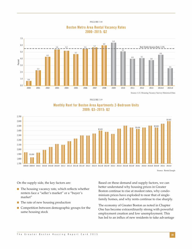
39T h e G r e a t e r B o s t o n H o u s i n g R e p o r t C a r d 2 0 1 5
Based on these demand and supply factors, we can better understand why housing prices in Greater Boston continue to rise at modest rates, why condo-minium prices have exploded to near that of single-family homes, and why rents continue to rise sharply .
The economy of Greater Boston as noted in Chapter One has become extraordinarily strong with powerful employment creation and low unemployment . This has led to an influx of new residents to take advantage
On the supply side, the key factors are:
■ The housing vacancy rate, which reflects whether renters face a “seller’s market” or a “buyer’s market”
■ The rate of new housing production
■ Competition between demographic groups for the same housing stock
FIGURE 3 .8
Boston Metro Area Rental Vacancy Rates 2000–2015: Q2
0.0
2.0
1.0
3.0
4.0
5.0
6.0
7.0
2015:II2014:II20132012201120102009200820072006200520042000 2001 2002 2003
Rent Stable Vacancy Rate: 5.5%
0.6
2.3
4.3
5.4 5.2
4.7
5.5 5.76.0
6.4
5.1
4.0 4.13.8
2.6
4.6
Perc
ent
Source: U .S . Housing Vacancy Survey Historical Data
FIGURE 3 .9
Monthly Rent for Boston Area Apartments 2-Bedroom Units 2009: Q3–2015: Q2
$1,700
$1,800
$1,900
$2,000
$2,100
$2,200
$2,300
$2,400
$2,500
$2,600
$2,700
2015:II2015:I2014:IV2014:III2014:II2012:I2011:IV2011:III2011:II 2012:IV2012:III2012:II 2013:I 2013:IV 2014:I2013:III2013:II2011:I2010:IV2010:III2010:II2010:I2009:IV2009:III
$1,830
$2,401$2,436
$2,602
$2,465
Source: Rental Jungle

40 U n d e r s t a n d i n g B o s t o n
of better job opportunities than exist in many other parts of the nation . The growth in population has natu-rally led to a formidable increase in demand for hous-ing . Moreover, the changing demographic structure of the region toward aging baby boomers and young millennials has led to a shift in demand from single-family homes to condominiums and rental units .
On the supply side, if housing construction kept up with demand, vacancy rates would remain at normal levels and prices would stabilize . But even with the substantial increase in building permits in 2015 and the shift toward the production of multi-family hous-ing units, much of this supply of new housing stock is still in the pipeline and not yet ready for occupancy . Even then, the supply continues to lag demand given the economic and demographic factors we have discussed here .
As such, it is not surprising that the prices of condo-miniums, duplexes, triple-deckers and rental apart-ments have continued to increase — in many cases sharply . Demographic shifts help explain why condo prices have nearly matched single-family home prices .
What could this mean for the future of Greater Boston? If supply does not catch up with demand and prices continue to rise, it is possible that once the economy slows down, the region will no longer be a magnet for workers and their families . This could lead to a slowdown in price and rent appreciation, but may also compromise the region’s long-run ability to attract the talent it needs to fuel future economic growth .
The alternative, as we have said in many previous report cards, is to find ways to build more housing of the types most in demand . As the next chapter will demonstrate, this may be quite difficult to do because the high cost of development in the region makes it almost impossible to build housing that is afford-able to working families and other middle-income households .

41T h e G r e a t e r B o s t o n H o u s i n g R e p o r t C a r d 2 0 1 5
There are only a few levers that can be pulled to make housing more affordable:
■ Reduce the basic cost of producing housing— the actual dollars that must be spent, including all development and construction costs
■ Increase public subsidies for affordable housing
■ Lower the cost-per-square-foot of housing by chang-ing zoning codes to allow the construction of more units per acre of land
■ Increase the amount of income available to low- and moderate-income households so that they can pay the rents necessary to support hous-ing costs or afford a conventional mortgage on a market-priced home
Understanding what it costs to produce housing — and why — is central to establishing public policy around this issue .
The ProblemHowever successful Massachusetts and its developers have been in implementing existing subsidy programs to build affordable housing for low-income house-holds, the Commonwealth has lagged well behind in the production of multi-family housing for work-ing families, due in part to a combination of the high cost of land, the expense involved in preparing sites for construction, the cost of construction itself, and severely restrictive local zoning . The net effect has been a serious gap between what a large share of Greater Boston households can afford to pay to buy or rent a home and the costs of developing it. The federal government suggests that households should pay no more than 30 percent of their gross income for rent .1 As we have shown, in Massachusetts more than 25 percent of households pay more than 50 percent of their income for rent, leaving precious little for other household and family expenses . In Greater Boston, more than half of rent-ers are spending more than 30 percent of their income for rent, and those households are disproportionately
In most markets, when prices rise in response to demand outstripping supply, firms respond by produc-ing more of the product that consumers want . Clearly, for most of the past decade or two, this has not been the case for housing in Greater Boston . For the region as a whole, home prices and rents have increased well beyond normal inflation rates as the supply of new housing continually lags behind demand . As such, and as we described in the last chapter, the prices of housing and rents have reached a point where a large number of working and middle-income families cannot afford housing without putting an enormous strain on their finances .
As this chapter will demonstrate, the two interrelated reasons for this mismatch between demand and supply are (1) the extremely high cost of producing new housing stock and (2) the acceleration in prices due to the resulting lack of supply . Essentially, the expense of developing new apartments, condominiums and single-family homes in the region results in prices and rents beyond what most working households and middle-income families can afford . In this case, devel-opers simply cannot build new housing in Greater Boston to meet supply at reasonable price points. They can build luxury housing for wealthier households, and the increase in building permits over the past five years suggests that they are . Some developers do build hous-ing for some low-income families if they can obtain sufficient subsidies to make the numbers work or to comply with inclusionary zoning requirements .
Based on a brand new analysis of cost data associated with more than 100 housing developments in Massa-chusetts and elsewhere, we have been able to track the rising cost of development over the past decade . We have also been able to drill down into the compo-nents — such as land, financing, and construction costs — that have increased the most over this period, comparing development costs in and outside the Commonwealth . The results illuminate the problems developers have in producing affordable housing stock for the Greater Boston market .
CHAPTER FOUR
The Cost of Housing Development

42 U n d e r s t a n d i n g B o s t o n
As will be explained in the next section, we acquired data from both public and quasi-public agencies and from developers willing to share information on a confidential basis . In order to compare “apples to apples,” we limited projects to new construction rental complexes in Massachusetts and in 13 other states plus Washington, D .C ., in 2004-2008 and 2011-2015, and we identify projects only by type and general location . Virtually all of the developments where we have full sets of data are low- or mid-rise construction, meaning buildings of five or fewer stories . Since only a small percentage of housing produced in Greater Boston during the periods we studied consisted of high-rises — and these were almost exclusively luxury develop-ments — we have focused on the predominant build-ing types . We are very grateful to those agencies and developers who shared both data and their thoughts about this critically important topic .
Acquiring and Analyzing Housing Cost Data
In order to obtain the broadest picture of housing cost structures, we approached a variety of Boston-based developers, some of whom also build projects outside of Massachusetts . They are both nonprofit and for-profit, with a range of project locations, construction types, number of units, and ratios of market-to-affordable units .5
Developments were limited to new construction in urban/suburban areas with a focus in Massachusetts on Gateway Cities as defined by the Commonwealth . We requested cost information on projects funded in 2004–2008 (to provide baseline data prior to the economic recession) and current data on projects funded in 2011–2015 .
Data were obtained both from developers and from the Massachusetts Department of Housing and Community Development (DHCD), MassHousing and the Massachusetts Housing Partnership . Again, to maintain consistency, data were reported in all cases in a format as close as possible to the Massachusetts OneStop application for housing subsidy programs, even for those projects developed in other states . The data we present represent the average per-square-foot costs for (1) each cost component and (2) for total
people of color and elderly women .2 A recent report on rents in Boston concluded, “a single person [or house-hold] in Boston would need a job paying $50 a hour, or about $100,000 a year, to afford the median rent of $2,497 a month .”3 This is in a city where the median household income is $58,325 . Homeowners, in general, are not in any better shape when it comes to affordable housing, as more than 40 percent of homeowners with mortgages in Greater Boston pay more than 30 percent of their gross income for housing .4
It is also important both to place this problem in a broader economic perspective and to see it from the viewpoint of on-the-ground human concerns . In terms of the Massachusetts economy, high housing costs could once again make the Commonwealth a less attractive destination for businesses as they try to encourage employees to stay here (as opposed to moving somewhere much cheaper) or — even more difficult — recruit new talent from other states with much lower costs of living . On the human level, we are making it especially difficult for our children and our parents — many on fixed incomes — to find affordable housing in the communities where they have lived most of their lives . When housing costs consume so much of a family’s income, there is not only little left over for necessities, but there is significant stress on the family unit .
Finding ways to reduce the costs of production will be necessary to build an ample supply of housing that will ultimately lower the level of home prices and rents or at least keep them from rising as steeply as they have over the past few years .
Introduction to the Cost StudyCurrent information about housing costs is more anecdotal than anything else . “Everybody knows” that the components of housing production in Massa-chusetts cost too much, but finding organized hard data is very difficult . Although we cannot pretend that this is a rigorous scientific study, we believe that the information we have been able to aggregate takes this study far beyond the anecdotal, and is intended to begin the conversation and hopefully lead to a more comprehensive review .

43T h e G r e a t e r B o s t o n H o u s i n g R e p o r t C a r d 2 0 1 5
Table 4.1 provides information on the location of the 115 housing developments for which we obtained cost data . One of our sources with the largest number of out-of-state developments provided us with the state in which the development was located and whether it was urban or suburban, but not the name of the municipality .
development costs . Separate estimates have been prepared for urban projects in Massachusetts, subur-ban projects in Massachusetts, and for out-of-state projects .
The authors of this report interviewed developers and contractors to get their candid perspectives on the drivers of costs . The authors alone are responsible for the conclusions and recommendations at the end of this report .
TABLE 4 .1
Dukakis Cost Analysis Communities
Massachusetts Urban Massachusetts Suburban Out-of-State Urban Out-of-State Suburban
Allston Acton Chicago, Illinois Westhampton, New York
Chelsea Amherst Durham, North Carolina Elkton, Maryland
Dorchester Attleboro Indianapolis, Indiana
Framingham Bedford Norfolk, Virginia
Lowell Belmont Pittsburgh, Pennsylvania
Lynn Berkeley Washington, D .C .
Quincy Bourne
Revere Carlisle Additional Projects in Municipalities Within:
Roxbury Chatham California (4) California (4)
Salem Chelmsford Connecticut (2) Connecticut (5)
Somerville Danvers Maryland (2) Maryland (1)
Worcester Dennis New Jersey (5) New Jersey (2)
Falmouth New York (2) New York (6)
Groton Texas (2) Washington State (1)
Harwich Virginia (3)
Harwich Washington State (4)
Lakeville
Lunenburg
Marshfield
Northampton
Paxton
Plainville
Provincetown
Stoughton
Sudbury
Tyngsborough
Westford
Source: Dukakis Center Housing Cost Analysis

44 U n d e r s t a n d i n g B o s t o n
period at $202 per square foot . But by 2011–2015, they had ballooned to nearly the cost of urban projects .
Back in 2004–2008, urban projects elsewhere in the United States were much cheaper to develop than in Massachusetts ($152/sq . ft . vs . $242/sq . ft .), but since then the cost of out-of-state urban projects has skyrocketed nearly as high as those in Massachusetts ($268/sq . ft . vs . $274/sq . ft .) . On the other hand, out-of-state suburban projects have remained significantly less expensive . During the early period, these devel-opments were 14 percent less expensive to build than similar Massachusetts projects, but since then the in-state suburban project costs have exploded, placing the differential between in-state and out-of-state subur-ban construction at an eye-popping 21 percent .
The Ted Williams ExampleConsider what it would cost to build a new triple-decker today . Ted Williams, the great Red Sox slugger, lived in just such a unit at 39 Foster St . in Brighton during the 1940s with two of his teammates . That building contains 3,721 square feet with two bedrooms and a single bathroom on two floors and three bedrooms and a bathroom on another . It would cost more than $1 million today — $1,018,028 to be exact — to build that structure, or slightly less than $340,000 per unit . If a median-income household (owners and renters combined) with income of $73,935 were to buy one of these units for the amount it cost to build, it would need to spend $2,000 a month on mortgage payments including principal, interest, and prop-erty taxes . This represents 32 percent of that family’s income . Adding in normal operating costs including utilities, insurance, and maintenance brings the total monthly housing cost for this unit to about $2,540 and adds up to 41 percent of the household’s income .6
As is, a single unit in Ted Williams’s old house is now renting for $2,166 per month — a whopping 62 percent of the median Boston renter household’s annual income of roughly $42,000 a year! The building itself sold for $1 .15 million in January 2015 .
A brand new unit of 1,600 square feet in a small devel-opment would be even more expensive to rent . To cover the cost of the mortgage and principal, interest, taxes and operating costs, the monthly rent would be
The Cost of Developing Housing in Greater Boston
Based on the data we collected, we have been able to calculate the average total development cost for producing new housing including:
■ Land acquisition
■ Site preparation, including needed infrastructure
■ Construction (labor and material)
■ Soft costs, including legal, architectural, and accounting fees
■ Financing
■ Developer fees
Figure 4.1 provides data on the total development costs per square foot for housing for the four regions in our study . The data refer to the “early period” (2004–2008) and the “current period” (2011 through 2015) . According to these data, a typical urban housing project in an urban area of Massachusetts cost nearly $242 per square foot to develop in 2004–2008 . Today, that cost is nearly $274 per square foot . Suburban costs in Massachusetts were substantially lower in the early
FIGURE 4 .1
Total Housing Development Costs per Square Foot Massachusetts vs. Out-of-State Urban vs. Suburban
Projects, 2004–2008 vs. 2011–2015
$241.77
$273.59
$157.51
$268.37
$201.59
$262.39
$172.93
$217.04
100
140
120
160
180
220
200
240
260
280
Out-of-StateSuburban
MassachusettsSuburban
Out-of-StateUrban
MassachusettsUrban
3002004-2008 2011-2015
Source: Dukakis Center Housing Cost Analysis

45T h e G r e a t e r B o s t o n H o u s i n g R e p o r t C a r d 2 0 1 5
soft costs, financial costs, and developer fees are each under $30 per square foot and together account for 24 percent of total development costs .
The costs of developing suburban projects in Massa-chusetts are shown in Figure 4.3 . Note that suburban land-acquisition costs are about 85 percent of the cost of land for urban projects, but site preparation costs are more than double . This is because the cost of develop-ing infrastructure, including water connections and sanitation, is higher in many suburbs . In urban areas, the infrastructure is already in place and publicly supplied . At $141/sq . ft ., construction costs in the suburbs are catching up with those in the cities . Soft costs, financial costs, and developer fees are on par as well . Overall, it costs a bit less to build in the suburbs, but only because the land is somewhat less expensive .
Changes over TimeThere is a general agreement that housing has become more expensive in the past decade and our data bear that out . From the period covering 2004–2008 to the period covering 2011–2015, Total Development Costs (TDC) for Massachusetts projects increased by $31 .82 per square foot (13 .2 percent) for urban projects and by $60 .80 per square foot (30 .2 percent) for suburban ones . This came at a time of modest overall inflation of 9 .5 percent as measured by the nation’s GDP deflator .
more like $3,215 in Boston — or 52 percent of the gross income of the median-income household .7
Large multi-family developments, as we will suggest later in this chapter, are somewhat less expensive to build on a square-foot basis as a result of economies of scale . The same is true of larger units with three or more bedrooms because the most expensive elements of a unit are the kitchen and bathroom . But even taking into account somewhat lower development costs per square foot, today’s cost of development renders home prices and rents for new housing well outside the feasible range for most working and middle-income households in Greater Boston .
The Cost Components of New Housing
The data we obtained for this analysis provides infor-mation on the average costs for each major compo-nent of housing development . For urban projects in Massachusetts, this information is found in Figure 4.2 . Of the total $273 .59 development cost per square foot, land acquisition runs about $41 per square foot, or about 15 percent of the total . Site preparation costs are another $8 .32 a square foot, or about 3 percent of the total . Construction costs, including labor and materials, account for just over half (58 percent) of total devel-opment costs — $159 per square foot . The remaining
$40.88
$8.32
$159.04
$29.20
$19.17
$16.97
Construction CostsSoft CostsFinancing CostsDeveloper FeeLand AcquisitionSite Costs
TotalDevelopment Cost
$273.59
FIGURE 4 .2
Total Housing Development Costs Per Square Foot by Cost Component,
Massachusetts Urban Projects, 2011–2015
Source: Dukakis Center Housing Cost Analysis
$34.17
$19.86
$140.60
$28.39
$21.27
$18.11
TotalDevelopment Cost
$262.39
Construction CostsSoft CostsFinancing CostsDeveloper FeeLand AcquisitionSite Costs
FIGURE 4 .3
Total Housing Development Costs Per Square Foot by Cost Component,
Massachusetts Suburban Projects, 2011–2015
Source: Dukakis Center Housing Cost Analysis

46 U n d e r s t a n d i n g B o s t o n
For urban projects, the major drivers of this increase were land acquisition and construction . The former increased by $12/sq . ft . (41 .6 percent) while the latter increased by $9 .11/sq . ft . (6 .1 percent) . It is the land acquisition cost that stands out here, with a more than 40 percent increase over the course of less than a decade . Driven by competitive demand, urban (primarily Boston) land prices have grown at a rate far in excess of almost anything else . Construction costs, on the other hand, have risen at a rate no faster and perhaps even a little slower than overall infla-tion . However, because construction costs represent such a large part of total development costs, even that nominal increase represents a large part of the dollar increase in TDC, but it is certainly not as great as many believed or as represented anecdotally over the years .
As Figure 4.5 reveals, suburban cost increases have been much higher than urban cost increases and are dominated more by construction costs . Starting from a lower base, these rose by $29 .19/sq . ft . (26 .2 percent) or half the total increase in TDC between the two periods and nearly three times faster than general inflation . There is insufficient data to determine why this has
As such, the cost of developing urban projects in the Commonwealth increased by nearly 40 percent more than overall inflation, while the cost of developing housing in the suburbs skyrocketed more than three times as fast .
The relative contribution of specific components to these increased costs was something of a surprise . As Figure 4.4 reveals, for Massachusetts urban projects, soft costs including legal fees and other costs associ-ated with the purchase of land and complying with local and state regulations rose only slightly faster than inflation, while construction costs for labor and materials increased only three-fifths as fast as the rate of overall economic inflation . Construction costs were high back in the early period and they have remained high today, but have not accelerated further . As for developers’ fees, the average fee per square foot was actually lower for these projects between 2011 and 2015 than it was in 2004–2008 . What exploded in cost was land acquisition, which rose 4 .4 times faster than infla-tion, site costs for land remediation and infrastructure that spiraled up 5 times faster, and financing costs that soared 5 .4 times faster than inflation .
4.4
5
0.6
1.1
-0.2
5.4
1.4
-1
1
0
2
3
4
5
TotalDevelopment
Cost
FinancingCosts
DeveloperFee
SoftCosts
ConstructionCosts
SiteCosts
LandAcquisition
6Ratio of Cost to GDP Deflator GDP Deflator +9.5%
FIGURE 4 .4
Development Costs vs. GDP Deflator Massachusetts Urban Housing Projects
2004–2008 vs. 2011–2015
Source: Dukakis Center Housing Cost Analysis
4.1
8.8
2.8
5.2
0.6
1.6
3.2
0
1
2
3
4
5
TotalDevelopment
Cost
FinancingCosts
DeveloperFee
SoftCosts
ConstructionCosts
SiteCosts
LandAcquisition
10
6
7
8
9
Ratio of Cost to GDP Deflator GDP Deflator +9.5%
FIGURE 4 .5
Development Costs vs. GDP Deflator Massachusetts Suburban Housing Projects
2004–2008 vs. 2011–2015
Source: Dukakis Center Housing Cost Analysis

47T h e G r e a t e r B o s t o n H o u s i n g R e p o r t C a r d 2 0 1 5
Urban vs. Suburban Costs in Massachusetts over Time
This urban/suburban cost dynamic is summarized in Figure 4.6 . In the period from 2004 to 2008, the Total Development Cost (TDC) of urban projects in our Massachusetts sample was $241 .77/sq . ft ., 20 percent higher than the average suburban cost of $201 .59/sq . ft . Driving this difference were construction costs that were, on average, 35 percent higher in urban areas . Land acquisition costs were slightly higher, as were soft costs . Developers of suburban projects in the Commonwealth had to spend somewhat more on site costs and financing costs and their developer fees were slightly higher as well .
By 2011–2015, urban costs had risen to $273 .59/sq . ft ., but now they were only 5 percent higher than the $263 .39 per-square-foot cost of suburban buildings (see Figure 4.7) . The urban/suburban construction cost differential, which had been 35 percent, had shrunk to just 13 percent . Anecdotally it has often been assumed that Boston and the suburbs were two different construction markets . That no longer seems to be the case, particularly at the subcontractor level .
happened, but many have suggested that changes in the Commonwealth’s building codes have contrib-uted to that increase . Land acquisition and site costs in Massachusetts suburban locations have spiraled upward, particularly on a percentage basis . Land costs have risen by 39 percent, more than four times faster than inflation, while site costs have gone up by 83 percent, nearly nine times faster than inflation . Presumably, the need to add private infrastructure for large housing projects where public sewers are not available is responsible for this substantial boost in site costs . While the increases in both cases are about $9/sq . ft ., they contribute to the fact that suburban development costs have increased two and one half times as fast as urban costs . It is also interesting to note that developer fees have either decreased or increased very slightly and therefore do not seem to be contrib-uting much, if anything, to increased costs overall in suburban projects or urban projects .
$28.88 $24.53
$5.65 $10.83
$149.93
$111.42
$26.50$19.02 $19.57 $20.06
$11.23 $15.73
$241.77
$201.59
0
50
100
150
200
250
Total DevelopmentCost
Financing Costs Developer FeeSoft CostsConstruction CostsSite CostsLand Acquisition
300
MA Urban 2004-2008 MA Suburban 2004-2008
FIGURE 4 .6
Development Costs for Massachusetts Urban and Suburban Housing Projects 2004–2008
Source: Dukakis Center Housing Cost Analysis

48 U n d e r s t a n d i n g B o s t o n
while this is offset to some extent by higher site costs for for-profits . Financing costs are about equal for nonprofits and for-profits alike . Nonprofit developer fees, however, appear to be almost double those for for-profit projects on a per-square-foot basis, though the numbers represent a small amount of the total cost . But what may explain much of the cost differential is that nonprofit projects are usually much smaller in terms of total units, which adds to construction cost, and the possibility that nonprofits may be developing housing on more challenging sites .
Size of ProjectFigure 4.9 demonstrates the cost difference between larger and smaller projects . Analysis of the data demonstrates a direct relationship between project size and cost, with projects smaller than about 30 units being significantly more expensive on a per-square-foot basis than those with more units . Given econo-mies of scale, this finding is not surprising . However, larger scale is often at odds with the wishes of local communities, which often insist that housing projects be limited in size in exchange for final approval from municipal authorities .
Land acquisition costs in the suburbs have increased by about the same amount as urban projects (40 percent), but site development costs in suburban projects rose by 83 percent while those in urban proj-ects came in at about half that at 47 percent . The soft costs of suburban projects have nearly caught up with those for urban projects while financing costs remain higher . Demand seems to have driven up suburban construction costs at a very rapid pace, while urban infrastructure is largely in place already, reducing the need for the high site development spending we see in the suburbs .
For Profit vs. NonprofitOne surprising result of the survey is the finding that projects developed by nonprofit developers are substantially more expensive than those built by their for-profit peers . As Figure 4.8 suggests, the average Total Development Cost of nonprofit projects in Massa-chusetts between 2011 and 2015 was $255 .37 per square foot, while that of for-profit projects was $219 .12 .
Most of the difference is in construction costs . Nonprofit projects averaged $148 .08/sq . ft . while for-profits averaged $119 .39 . Land-acquisition costs and soft costs appear to be higher for nonprofits as well,
$40.88$34.17
$8.32$19.86
$159.04
$140.60
$29.20 $28.39$19.17 $21.27$16.97 $18.11
$273.59$262.39
0
50
100
150
200
250
Total DevelopmentCost
Financing Costs Developer FeeSoft CostsConstruction CostsSite CostsLand Acquisition
300
MA Urban 2011-2015 MA Suburban 2011-2015
FIGURE 4 .7
Development Costs for Massachusetts Urban and Suburban Housing Projects 2011–2015
Source: Dukakis Center Housing Cost Analysis

49T h e G r e a t e r B o s t o n H o u s i n g R e p o r t C a r d 2 0 1 5
period, the gap had actually grown a little as depicted in Figure 4.10b, with out-of-state suburban costs at $217 .04/sq . ft . while suburban costs in Massachusetts swelled to $262 .39 . Again, most of the difference was in construction costs .
If municipalities were to allow larger projects with more than 150 units, the cost for developing a new 1,600-square-foot unit would decline to less than $263,000 . At this cost, the rent on such a unit would be about $2,190 per month (including operating expenses) — more than $1,000 less than the higher cost, smaller development triple-decker unit . In a large multi-family development, total housing costs would take “only” 35 percent of the gross income of the median income household in Boston, down from 52 percent . For the typical Boston-area renter with an income of $42,075, this new apartment in a large proj-ect would still absorb 62 percent of his or her income in rent, utilities, and management fees .8
Massachusetts vs. Other StatesIt is generally assumed that Massachusetts is a more expensive place to develop housing than other parts of the country . This was certainly true during the middle of the last decade, but it is far less so for urban projects today . As Figure 4.10a shows, during the 2004–2008 period, out-of-state suburban projects cost $172 .93/sq . ft . while comparable Massachusetts projects cost $201 .59/sq . ft . Most of the difference was in higher construction costs . By the 2011–2015
$35.01 $36.15
$15.85 $9.97
$119.39
$148.08
$24.73 $27.04
$10.31$19.58$13.83 $13.92
$219.12
$255.37
0
50
100
150
200
250
Total DevelopmentCost
Financing Costs Developer FeeSoft CostsConstruction CostsSite CostsLand Acquisition
300
For-Profit Non-Profit
FIGURE 4 .8
Per Square Foot Breakdown by Ownership Type Massachusetts, 2011–2015
Source: Dukakis Center Housing Cost Analysis
$263.02 $259.19$247.50
$185.07
$164.28
0
50
100
150
200
250
151+101-15051-10030-50<30
300
FIGURE 4 .9
Average Total Development Costs per Square Foot by Number of Units in a Housing Development
in Massachusetts
Source: Dukakis Center Housing Cost Analysis

50 U n d e r s t a n d i n g B o s t o n
$24.53 $24.61$10.83 $15.66
$111.42
$92.93
$19.02 $19.25 $20.06$8.56
$15.73 $11.92
$201.59
$172.93
0
50
100
150
200
250
Total DevelopmentCost
Financing Costs Developer FeeSoft CostsConstruction CostsSite CostsLand Acquisition
300
MA 2004-2008 Out-of-State 2004-2008
FIGURE 4 .10A
Housing Development Costs Suburban Projects Massachusetts vs. Out-of-State, 2004–2008
Source: Dukakis Center Housing Cost Analysis
$34.17 $35.28
$19.86 $23.25
$140.60
$110.99
$28.39 $29.29$21.27
$6.40$18.11
$11.82
$262.39
$217.04
0
50
100
150
200
250
Total DevelopmentCost
Financing Costs Developer FeeSoft CostsConstruction CostsSite CostsLand Acquisition
300
MA 2011-2015 Out-of-State 2011-2015
FIGURE 4 .10B
Housing Development Costs Suburban Projects Massachusetts vs. Out-of-State, 2011–2015
Source: Dukakis Center Housing Cost Analysis

51T h e G r e a t e r B o s t o n H o u s i n g R e p o r t C a r d 2 0 1 5
$28.88$14.97
$5.65 $9.64
$149.93
$97.84
$26.50$14.82 $19.57
$9.09$11.23 $11.15
$241.77
$157.51
0
50
100
150
200
250
Total DevelopmentCost
Financing Costs Developer FeeSoft CostsConstruction CostsSite CostsLand Acquisition
300
MA 2004-2008 Out-of-State 2004-2008
FIGURE 4 .10C
Housing Development Costs Urban Projects, Massachusetts vs. Out-of-State, 2004–2008
Source: Dukakis Center Housing Cost Analysis
$40.88 $46.33
$8.32$14.67
$159.04$147.40
$29.20 $32.50$19.17
$10.11$16.97 $17.36
$273.59 $268.37
0
50
100
150
200
250
Total DevelopmentCost
Financing Costs Developer FeeSoft CostsConstruction CostsSite CostsLand Acquisition
300
MA 2011-2015 Out-of-State 2011-2015
FIGURE 4 .10D
Housing Development Costs Urban Projects, Massachusetts vs. Out-of-State, 2011–2015
Source: Dukakis Center Housing Cost Analysis

52 U n d e r s t a n d i n g B o s t o n
built out . Although there is a lot of vacant land, most vacant sites are not zoned for multi-family residential development . In fact, in a review carried out in 2004, no community in Massachusetts had land zoned “as of right” for multi-family housing development . The process and ability to modify current zoning to permit the construction of multi-family housing is severely limited . The passage of the Chapter 40R Smart Growth Zoning and Housing Production program in 2004 was largely a response to this issue .
Land values within and close to Boston are rising rapidly, as are land costs near new centers of employ-ment, but Massachusetts as a whole is at the high end of land value throughout the country, and as we have shown, the cost of land acquisition has been a major driver of high total development costs in the state .
Few want to reduce the quality of the housing units producedMany seasoned practitioners in the multi-family rental industry (developers, public and private lenders, and advocates) remember when “cost containment” was the slogan of the hour for publicly assisted housing . Under this banner, particularly as applied in the 1970s and ‘80s, doors were removed from closets in low-income public housing, units for the elderly shrank so dramatically that some residents referred to their homes as “coffins,” bedrooms in family housing were so tiny they could barely accommodate twin beds, and carpeting was forbidden . The result was inhumane living conditions that over time even the poorest of the poor refused to tolerate . Certainly no one wants to repeat those mistakes .
The pendulum must not only find a happy medium, but the public must realize that we cannot have our cake (low costs of producing housing) and eat it too (have the highest quality housing units) . The chal-lenge, of course, is to reduce costs that have little nega-tive impact on design or livability .
Similarly, although the subject of operating costs is beyond the scope of this study, we should point out that over time, there have been some improve-ments in multi-family affordable housing . Owners have increased the level of security (both hardware and security personnel), resident services, job train-ing, computer labs, etc . they provide in their afford-able rental complexes . Not only do these result in a
The opposite was true of urban projects . During the 2004–2008 period, our data indicate that the TDC for out-of-state urban projects was $151 .51/sq . ft ., substan-tially lower than the $241 .77/sq . ft ., cost of urban Massachusetts projects (see Figure 4.10c) . Most of the difference was due to 50 percent higher construction costs in Massachusetts, although land acquisition was also more expensive . However, unlike suburban proj-ects, the gap for urban projects almost disappeared entirely by the 2011–2015 period, with Massachu-setts costs at $273 .50/sq . ft . and out-of-state costs at $268 .37/sq . ft . (see Figure 4.10d) . Construction costs, while higher, are now less than $12/sq . ft . greater in urban Massachusetts than in cities in other states . This is not particularly good news for Massachusetts, but certainly unwelcome news for out-of-state locations that have essentially caught up with Massachusetts’ high construction costs .
Competing Priorities That Work Against Lower Costs
We have seen how costs to produce multi-family rental housing have increased over time . But in many cases, there are good and defensible reasons for costs being as high as they are in Massachusetts, and a fair analysis of this issue must acknowledge these .
Land costs are very high in desirable places to live and workAs the experts say, real estate value is related to three things: location, location, location .9 Land costs of course vary considerably throughout the Common-wealth of Massachusetts, but do reflect what most residents love about the state: a generally good climate, relatively few threats from natural disasters, great natural beauty, access to both the ocean and the moun-tains, generally safe communities, public schools, universities, medical centers, and a high-tech/biotech sector that are the envy of most of the country . People pay a premium to live and work in desirable places, and the land prices in Boston and Massachusetts more generally reflect that, as do such prices in New York City, Washington, D .C ., San Francisco, Seattle, and other magnet U .S . cities .10
This is compounded by the fact that Massachusetts, especially the eastern part of the state, is heavily

53T h e G r e a t e r B o s t o n H o u s i n g R e p o r t C a r d 2 0 1 5
to build projects of very low density, they will do so . As a result, the housing that is built will be expen-sive and affordable only for the very well-to-do or, if public subsidies are involved, to people with very low incomes . Working and moderate-income families will not be able to afford these units . This state of affairs, of course, causes the average cost of producing multi-family housing in the Commonwealth to increase .
Massachusetts values strong government protections for tenants, those with low incomes, the elderly, and the disabledMany in Massachusetts are proud of the value placed on protecting the most vulnerable in the society . This is reflected in very strong pro-tenant laws, as well as multiple public agencies and nonprofit institu-tions focused on the welfare of low-income, elderly, and disabled people . In the housing arena, this value plays out in a wide range of government institutions at the local and state level carefully managing subsidy competitions, issuing and enforcing regulations, requiring detailed reporting of operations, and carry-ing out inspections of housing units — especially those that have received the benefit of public subsidies .
Whatever one feels about this regulatory apparatus, it does carry with it additional costs at the planning, permitting, construction, and management phases of a housing development .
Massachusetts has been innovative in its attempts to ameliorate the burden of these regulations, and more than 20 years ago state housing agencies developed the OneStop application . OneStop — like the single application for college admission — standardizes the application process for housing subsidies across agen-cies, a huge step forward . It is the use of the OneStop that has allowed us to aggregate data for this cost study in an efficient, consistent, and useful way . Over time, OneStop has gone digital and now developers can file most of their documents online, instead of following the old labor-intensive practice of submitting many hard-copy “books” at the time of application . The legal staff of the housing agencies also developed the MassDocs system, providing a common set of loan documents for projects using a variety of state and local funds . This is no small feat, especially when it is not uncommon for one subsidized housing devel-opment to have as many as fifteen sources of funds
higher quality of life for tenants, they also tend to result in more stable tenancy (and thus lower turn-over costs), and have been shown to reduce the costs of vandalism, tenant dissatisfaction, and the like . The award-winning, decades-old Tenant Assistance Program created and administered by MassHousing in its mixed-income housing is a preeminent example of the value of these enhanced services . Nonethe-less, all of this adds to rents regardless of original construction costs .
In Massachusetts, we have a strong focus on preserving community characterMassachusetts developers and agencies are justifiably proud of the fact that most publicly assisted hous-ing built since the 1980s is virtually indistinguishable from market-rate housing in the community . This has helped to generate more public support for affordable housing and has certainly resulted in better aesthetics . Affordable, multi-family rental housing need not be ugly housing, and that has been proven throughout the Commonwealth .
But highly restrictive zoning, present in virtually every one of the state’s 351 municipalities, creates an artifi-cially high barrier to development . It pushes develop-ers to propose smaller projects (i .e ., fewer units) and smaller units (i .e ., fewer bedrooms per unit) in order to reduce the perceived impact on the neighborhoods and — in the case of larger units attractive to families with school-age children — the perceived impact on the town or city’s education budget . The complexity of getting zoning changes approved dramatically extends the development period and increases carrying and soft costs . The cumulative effect drives up both the cost of development (seen in the high level of site costs, financing, and soft costs) and rents .
Thus, significant resistance to any change in the local community ambience has also meant that local support has heavily favored low-density, smaller projects, both of which are far more expensive to produce . Higher-density housing maximizes the efficiency of land use, and larger projects create economies of scale in development and construction . Massachusetts resi-dents opposed to zoning for multi-family housing at 20 units per acre are astounded to learn that the city of Paris — a pretty nice place to live with undeniable “character” — has a density of approximately 120 units per acre! When developers are given permission only
54 U n d e r s t a n d i n g B o s t o n
outside of the budgets of financially struggling hous-ing developments .
Massachusetts has high environmental standards and local communities have a lot of power over this issue . Given the long history of disregarding environmen-tal impacts, it is reasonable for the Commonwealth and individual communities to be concerned about preserving environmental quality and protecting local species of plants and animals . It is also laudable to want to maintain a reasonable amount of open space .
Unfortunately, these worthy goals are addressed in Massachusetts through a confusing, time-consuming and expensive regulatory process that may or may not address the actual issues and may often have unin-tended consequences, including cost implications . Unlike most states, Massachusetts allows individual cities and towns to review projects for environmental impact and to impose their own conditions or miti-gation requirements in excess of those required by the Commonwealth .
In addition, these powers are often used at the local level as a tool to stop multi-family development, both constraining supply and concentrating this type of housing in communities that do allow it . We would welcome an analysis of the feasibility of a statewide environmental regulatory structure that would protect the environment and, at the same time, make require-ments predictable, reasonable, and consistent through-out the Commonwealth .
Few would recommend abandoning or weakening handicapped requirements which, among other bene-fits, permit disabled residents to live in multi-family housing in the community instead of in much more expensive taxpayer-supported medical, nursing-home, or assisted-living facilities . We would, however, recom-mend careful analysis of how many handicapped-accessible housing units are needed and what disabilities they must accommodate . It may be that so-called “universal design,” which allows units to be modified easily as needed for specific residents, may reduce the cost of some handicapped-accessible units .11
But as with all the other priorities mentioned in this section, there is no obvious conclusion that wanting to fulfill these priorities is a bad thing — often, quite the opposite . The ultimate question is whether as a society we can afford them . Or are there things that we can do
and financing . MassDocs has served to moderate the increase of legal fees substantially .
Navigating the complicated development process with its attendant regulations involves site selection, architectural and engineering design, environmental reviews, local planning reviews, permitting, coordi-nating with abutters and others, developing a feasible pro forma of project costs/sources/uses, securing financing commitments, applying for public subsi-dies, obtaining sources of equity financing through various lenders and equity investors, and coordinat-ing the closing of the mortgage loan . The largest and most experienced developers can maintain this level of expertise — at significant cost — within their compa-nies . The smaller developers often need to hire outside experts . In either case, costs are added to the project . In addition, this process can literally take years, during which time other project costs are inflating and the carrying costs for site control keep adding up .
Strong public sector support for “green” and handicapped requirements and public amenitiesIt is probably fair to say that few developers today would want to return to the days of building multi-family housing without consideration of environ-mental impacts and energy efficiency, and without a provision for handicapped and disabled residents to live comfortably . Even enlightened self-interest recog-nizes that “green,” energy-efficient components result in lower utility bills and more livable units over time, and that handicapped accessibility is not only humane but expands the market for the units to be rented .
Further, developers report that many communities in Massachusetts will approve multi-family housing only if it comes with assurances that the developer will provide infrastructure, including recreational and traf-fic improvements that go far beyond what is actually required for safe development and management of the housing .
Developers also point out that these components inevi-tably have cost implications, especially at the front end . Perhaps the very highest standard of energy effi-ciency that is easily achievable in commercial construc-tion is too high a standard when we are struggling to maintain affordability in the residential housing market . And thought should be given to covering the costs of infrastructure and other public improvements

55T h e G r e a t e r B o s t o n H o u s i n g R e p o r t C a r d 2 0 1 5
Running through the data is this significant fact: urban and suburban development costs have been high in Massachusetts for some time and have increased significantly over the past decade . This inevitably translates into higher costs for tenants and buyers in the private marketplace and into the need for higher public subsidies for affordable housing . The increase in total development costs alone since the early part of the last decade has added roughly $210/month to the rent of a 1,000-square-foot apartment in Boston . In the suburbs, the impact is even greater with an increase of more than $400/month . Added to rents that were already high in Greater Boston, this has compounded the existing affordability problem in Massachusetts .
But the fundamental problem of affordability is not the hard cost of producing housing, per se . Rents are substantially higher than what is required to amortize costs because of the constraints against increasing supply, which keeps vacancy rates at extraordinarily low levels . As we have shown, there is virtually no zoning for multi-family housing in Massachusetts except that accomplished under Chapter 40R or by invoking Chapter 40B, thus artificially and severely constraining the ability to produce housing that is affordable for working and middle-income house-holds . If those constraints were lifted, land costs would ultimately moderate, improving the chances of lower-ing development costs . If suburbs found a way to help underwrite infrastructure costs, this could also reduce the cost of housing . And if new techniques could be developed to lower construction costs, the chances of increasing housing supply in Greater Boston would finally improve . You will read our recommendations for the path forward in Chapter Six .
Without lifting constraints on development, we will continue to experience housing supply that does not — and cannot — catch up with housing demand in Greater Boston . This is leading to a vicious cycle where the lack of sufficient development in the face of increasing demand leads to rising home prices and rents, making housing more unaffordable in the region year after year . This vicious cycle could have quite unfortunate consequences for the long-term economic health of the region .
to mitigate cost increases and at the same time increase the supply of excellent multi-family rental housing?
What Happens if the Cost of Producing Housing Goes Down?
Although it would seem counterintuitive, reducing the cost of producing housing does not automatically reduce the price of housing or the rent charged to the tenant . A developer will in most cases charge the high-est rent obtainable in the marketplace or — in the case of affordable housing — allowable by public regula-tions, regardless of the cost of production .
In the case of market-rate housing, higher rents (as long as the developer can keep the units rented) trans-late into higher returns (profit) to the developer . In the case of affordable housing, rent paid by the tenants is a function of their income, so public subsidy picks up any slack or, conversely, benefits from any savings . Further, in the case of affordable housing, the amount of profit to the developer is strictly regulated . Thus, in the world of subsidized housing, lower costs means less debt and/or subsidy required to support capital costs . That means more units can be produced for the same number of public dollars . This is a powerful effect in a situation such as we have in Massachusetts, where the demand for affordable housing far outstrips the supply, and is reason enough to try to reduce costs . The challenge is to maintain quality and market-ability while attempting to reduce the capital cost of production .
ConclusionsStarting at a higher base than suburban projects in 2004, the cost increase for urban projects in Massa-chusetts has been a few percent per year . Suburban development costs, on the other hand, have increased so rapidly they are now close to urban costs for simi-lar products . The same is true for urban costs outside Massachusetts . Costs in major cities outside Massa-chusetts seem to have caught up with cities in the Commonwealth . While suburban out-of-state costs remain lower than those in Massachusetts, both have increased substantially .

56 U n d e r s t a n d i n g B o s t o n
These developers have worked in close collaboration with state and federal agencies to successfully cobble together funding sources and create tens of thousands of well-designed and high-quality housing units . More often than not, this has been accomplished in the face of daunting challenges posed by restrictive zoning, NIMBYism1, and confusing or conflicting regulatory requirements . In most cases, an ongoing scarcity of public funding has made financial feasibility very diffi-cult to achieve .
Public Spending on HousingThe Commonwealth has two sources of funds to assist homeowners, renters, and developers of housing . One is its own revenue, the other is the federal government . A large portion of the state funds used for housing are annual operating funds; the remainder is capital or trust funds used for investment in public hous-ing and to subsidize affordable housing construction . All of these funds are processed through the state’s Department of Housing and Community Develop-ment (DHCD) . Traditionally, DHCD operating funds largely have been used to provide rental assistance and public housing subsidies and to pay for the adminis-tration of the agency . Since FY2010, operating funds for homelessness programs have also been administered by DHCD . As a result, efforts to address homelessness and the overall need for affordable housing are increas-ingly integrated . DHCD also manages capital funds that preserve and create new affordable housing . These funds are authorized every five years through passage of a housing bond bill . The most recent, for $1 .4 billion, was passed in late 2013 .
Federal funds for housing are made available directly to a number of local agencies, such as Massachusetts’ larger cities and local public housing authorities, but DHCD also receives federal funds for a number of programs including the Section 8 rental voucher program, and for new housing development and
The Commonwealth of Massachusetts has been a leader in the initiation of public programs to encourage the production of affordable housing . Massachusetts was the first state in the country to participate in the federal public housing program in the 1940s; one of the first states (and one of only four nationwide) to initi-ate and fund a state public housing program in 1948; one of the first to charter a housing finance agency in the 1960s; and the state that invented the concept of the local and statewide Housing Partnership in the 1980s . Massachusetts has also taken full advantage of all available federal housing programs in the decades both before and since .
Massachusetts has one of the very few programs of state-aided public housing in the country, adminis-tered through a wide network of local public hous-ing authorities, and has recently authorized a new Community Investment Tax Credit to encourage investment in housing developed by community development corporations . Through the Massachu-setts Department of Housing and Community Development and the quasi-public MassHousing, the Commonwealth manages state-aided programs that are analogues of the Federal Section 236 inter-est subsidy program (MA Chapter 13A); Section 8 rental assistance programs (the Massachusetts Rental Voucher programs); the Low-Income Housing Tax Credit (LIHTC); and the Historic Tax Credit . Other important programs are administered by the quasi-public Massachusetts Housing Partnership (MHP); the Community Economic Development Assistance Corporation (CEDAC); and Mass Development . And Massachusetts was the initiator of the Comprehensive Permit program (Chapter 40B) and the Smart Growth Zoning and Housing Production Program (Chapter 40R), both nationally recognized as methods of creat-ing zoning for higher density multi-family housing .
Further, Massachusetts has been blessed for decades with a sophisticated and robust housing development industry, both in the nonprofit and for-profit sectors .
CHAPTER FIVE
Public Policy and Public Spending on Housing in the Commonwealth

57T h e G r e a t e r B o s t o n H o u s i n g R e p o r t C a r d 2 0 1 5
In FY2010, state homeless programs were shifted from the Department of Transitional Assistance to DHCD, more than doubling DHCD’s operating funds . Bring-ing housing and homelessness programs under one agency has provided an opportunity for integration of the two efforts, and has been crucial as the state attempts to respond to increased demand by fami-lies for its largest homelessness program, Emergency Assistance (EA) . From July 2010 to October 2014, the number of families accessing EA increased 82 percent,2 forcing the state to use scare resources on shelters and motel rooms, including a $51 .5 million supplemental appropriation during FY2015 .
Since it integrated homelessness and housing programs within one agency, the state has attempted to shift toward a “Housing First” model, where preserving existing tenancies with short-term aid or the provision of rental assistance is considered more cost effective than shelters or motels . Such a shift has been difficult given that demand increased and state funds were short during the Great Recession, and as the economy recovered, low-income families have not shared in that recovery, leaving more families eligible for EA .3
rehabilitation, for energy assistance, and for various neighborhood stabilization programs . While DHCD received a temporary increase in funds from the 2009 American Recovery and Reinvestment Act (ARRA), the Budget Control Act of 2011 (“sequestration”) has made it difficult in recent years for HUD to increase funding . Through all of these funding sources, DHCD had $1 .15 billion in resources in FY2015, and potentially $1 .14 billion in FY2016 .
DHCD Operating FundsIn FY1990, DHCD operating funds peaked at $390 million (in FY2015 dollars), followed by declines each year through FY2004, with the exception of FY1999 . While dollars for some programs, such as the Hous-ing Innovations Fund, were shifted from the operat-ing account to the capital account during this period, on balance, funding for affordable housing fell . By FY2004, the agency’s operating funds had declined to $80 million, an 80 percent drop in real dollars since FY1990 . Operating funds increased each year from FY2005 to FY2008 before being slashed again in the wake of the Great Recession in FY2009 (see Figure 5.1) .
$123.72
$155.21$182.46
$0
$100
$200
$300
$400
Mill
ions
$500
2014 2015 20162006 2007 2008 2009 2010 2011 2012 20132002 2003 2004 20051998 1999 2000 2001
Fiscal Year
1994 1995 1996 19971989 1990 1991 1992 1993
$600
Operating Funds Operating Funds, Homelessness
FIGURE 5 .1
DHCD Real Operating Funds (FY2015 $), FY1989–FY2016
Source: Massachusetts/DHCD budget documents, the Massachusetts Budget Dashboard, and the Massachusetts Budget and Policy Center .

58 U n d e r s t a n d i n g B o s t o n
Federal Spending through DHCD
Through the 1990s, inflation-adjusted Federal spending through DHCD was relatively stable, averaging $328 million a year in FY2015 dollars (see Figure 5 .2) .
From FY2000 to FY2009, federal spending increased every year, with the exception of FY2005 and FY2007 . As a result of these increases, federal funds to DHCD peaked in FY2009, at $664 million . American Recovery and Reinvestment Act (ARRA) funds contributed to a further expansion of the state’s housing efforts, with $111 million in FY2010 and $195 million in FY2011 . As a result, total federal funding to DHCD for housing peaked at $854 million in FY2011 . With ARRA funds depleted and the implementation of “sequestration,” federal transfers to DHCD declined to $437 million in FY2013 . Federal funding recovered 7 .1 percent from FY2013 to FY2014, but there was only a 3 .4 percent increase for FY2015, and given that the allocations for FY2016 are not yet known, DHCD is planning no increases this year . As of this writing, current federal budget proposals indicate that there may be increases in tenant-based rental assistance (3 percent) and the Project-Based Section 8 program (8 percent), no change in funding for many other HUD programs,
DHCD’s integrated approach is beginning to bear some fruit . Though the number of families accessing EA only declined six percent from the peak in Octo-ber 2014 to June 2015, the number of families living in motels has fallen 41 percent from a high of 2,134 fami-lies in December 2013 to 1,250 families in mid-August 2015 .4 DHCD has reduced the reliance on motels by increasing the availability of shelter spaces and congre-gate housing, including a push during 2013 and 2014 to bring more than 1,000 new units on line .5 In another attempt to reduce the need for EA, DHCD also has committed new resources to the Massachusetts Rental Voucher Program (MRVP), with substantial increases in FY2014, FY2015, and FY2016 . For FY2016, MRVP funding will be $90 .9 million, a 31 percent increase from FY2015 . Funding for two other programs meant to prevent or address homelessness, HomeBASE and Residential Assistance for Families in Transition (RAFT), will increase in FY2016 (eight percent and 14 percent, respectively) . Each year, DHCD has hoped that its Housing First efforts would lead to a reduced need for EA, but supplemental appropriations have been needed annually . FY2016 is no exception, as the state is cutting EA funding 19 percent from FY2015 spending . Only time will tell if the state’s forecast is correct and a supplemental appropriation for EA can be avoided during FY2016 .
$482.1
$853.9
$483.2
$0
$100
$200
$300
$400Mill
ions $500
$600
$700
$800
2014 2015 20162006 2007 2008 2009 2010 2011 2012 20132002 2003 2004 20051998 1999 2000 2001
Fiscal Year
*Note: FY2016 Federal spending is “as recommended”, and may change.
1994 1995 1996 19971989 1990 1991 1992 1993
$900Federal Spending Federal ARRA Spending Federal Homelessness Spending
FIGURE 5 .2
Total Real Federal Spending (FY2015 $), FY1989–FY2016
Source: Massachusetts/DHCD budget documents, and the Massachusetts Budget Dashboard

59T h e G r e a t e r B o s t o n H o u s i n g R e p o r t C a r d 2 0 1 5
ConclusionsBeginning with the Menino administration in the City of Boston and the Patrick administration in the Commonwealth, there have been ambitious plans for adding to the regional and state housing supply in order to meet demand at more affordable prices . The use of Chapter 40B (since the late 1960s) and Chapter 40R (since 2005), the newer Compact Neighborhoods program based on the “carrot” approach of 40R, and recent plans to aid the state’s Gateway Cities all point in the right direction .
But as the last chapter demonstrates, more funding alone will not meet our housing requirements . We will need fundamental changes in zoning regulations to make more land available for large developments . We will need new techniques that can reduce construction costs and more public funding for needed infrastruc-ture to reduce the site costs associated with new devel-opments, particularly outside of central cities .
Without more funding, it is hard to imagine how sufficient housing can be built at affordable prices and rents and how public subsidies to both developers
and potential, substantial cuts for HOME Investment Partnerships and the Choice Neighborhoods Initiative, though there are substantial differences between the House and Senate on funding for these two programs .6
Finally, Figure 5.3 shows changes in total DHCD spending (federal, as well as state operating, trust, and capital funds), excluding homelessness funding, from FY1989 to FY2016 (in FY2015 dollars) . From FY1989 to FY1997, total funds declined 45 percent, from $1 .13 billion to $621 million . While there was some recovery in total spending from FY1998 to FY2008, federal cash infusions in FY2010 and FY2011 pushed total fund-ing back over the $1 billion threshold before falling back due to the expiration of ARRA funds and other federal cuts . There were small increases in FY2014 (4 .5 percent), and FY2015 (3 .1 percent), and though federal funds for FY2016 are not fully known at this time, total resources should increase just 2 .5 percent in FY2016, to $875 million .
$482.1
$853.9
$483.2
$0
$100
$200
$300
$400Mill
ions $500
$600
$700
$800
2014 2015 20162006 2007 2008 2009 2010 2011 2012 20132002 2003 2004 20051998 1999 2000 2001
Fiscal Year
*Note: FY2016 Federal spending is “as recommended”, and may change.
1994 1995 1996 19971989 1990 1991 1992 1993
$900Federal Spending Federal ARRA Spending Federal Homelessness Spending
FIGURE 5 .3
Total Real DHCD Spending (FY2015 $), Including Federal Share and ARRA, FY1989–FY2016
(excluding homeless program funds)
Source: Massachusetts/DHCD budget documents, the Massachusetts Budget Dashboard, and the Massachusetts Budget and Policy Center .

60 U n d e r s t a n d i n g B o s t o n
and low-income families can be large enough to cover the gap between the cost of housing and the rents that households can afford .
With the Commonwealth’s budget strapped for reve-nue and the federal government in gridlock, we will need to find new ways to produce affordable housing that relies no less on public funds per se, but equally on reducing non-financial barriers to housing produc-tion . We will need to find ways for private entities such as universities and teaching hospitals to work with housing developers to bring housing supply into line with housing demand .

61T h e G r e a t e r B o s t o n H o u s i n g R e p o r t C a r d 2 0 1 5
2. Encourage zoning for multi-family housing and at higher density.
Massachusetts has been a leader in this arena, particu-larly with the passage of Chapter 40B Comprehen-sive Zoning in the 1960s and the Chapter 40R Smart Growth Zoning and Housing Production Act in 2004 . Zoning for multi-family housing at densities of up to 20 units per acre on land that previously allowed much lower density greatly reduces the cost of land per square foot, allows the construction of more cost-efficient buildings, reduces sprawl, increases open space, and facilitates the creation of walkable communities .
Further, as we have seen in the case of Chapter 40R districts and in other mixed-use urban areas across the state, the market is hungry for easily maintained housing with attendant amenities near public trans-portation . In its Mixed Use Zoning: A Planners’ Guide, the Metropolitan Area Planning Council in Boston lists almost 20 reasons why communities might want to zone for mixed use involving housing plus space for recreation and commercial activities .2
3. Create incentives for communities, housing authorities, nonprofit organizations and businesses to donate land for affordable and mixed-income housing.
As a further method to reduce the cost per square foot for land, the Commonwealth should provide incentives for the donation of underutilized land for the construction of multi-family housing . Although most such programs are focused on the donation of land for open space and conservation, expanding the concept to include the development of multi-family housing should be explored . These incentives could include tax breaks, density bonuses for boosting the number of housing units per acre, and relaxation of height restrictions so that more stories can be added to existing low-rise apartment or commercial buildings . Proposals are currently pending to require that all surplus state land be reviewed first by the Massachusetts Department of
The Commonwealth has done much to encourage the development of affordable housing for low-income households and working families through a battery of agencies, programs, and funding sources . What it needs to turn its attention to now is how to reduce the cost of building new housing so that both for-profit and nonprofit developers can produce more of it at lower cost and freer from regulations that drive up prices and rents .
Here we present a set of eight policies that we hope will be considered given our analysis of the Massachu-setts housing market and the results of the cost study we carried out for this edition of The Greater Boston Housing Report Card .
1. Encourage larger projects with more units, since unit costs decline with the number of units in a development.
Some believe that creating paths for the construction of small rental developments with 25 units or less will assist in overcoming NIMBY1 thinking . We challenge this approach . After decades of experience producing multi-family housing, most developers in Massachu-setts would agree that even the attempt to build as few as 10 units on land that was previously zoned for single-family homes can unleash a firestorm of NIMBY opposition . Small projects involve enormous costs both per unit and per square foot because they must absorb high land, site preparation, and soft costs . In economic parlance, there are economies of scale in larger proj-ects . Generally speaking, it is very difficult to make the numbers work for new construction of fewer than 50 units except for luxury housing .
Admittedly, some types of housing require small numbers of units — group homes for the disabled are one example — and should be treated differently . But for the majority of multi-family rental and condo units, encouraging more units per project would result in lower costs overall .
CHAPTER SIX
Toward New Housing Policy
62 U n d e r s t a n d i n g B o s t o n
toward such zoning reform . Legislators should take care in promoting such reform so as not to cause a powerful local reaction that could prove to be counterproductive .4
5. Encourage innovation in the design of more efficient housing units and buildings.
No one wants to return to the days of extreme cost containment in the construction of publicly assisted housing, which resulted in units so stripped down that even the poorest of the poor refused to live in them . But finding ways to build units more efficiently needs to be considered . New design approaches and technologies may well lead the way to a more efficient use of space within both individual units and multi-family buildings . With per-square-foot costs as high as we have seen, every reduction in total square feet can make a significant difference in overall costs . One such idea — the so-called “Millennial Village” — has been suggested to produce housing that would be marketed to renters in their 20s and 30s . Such build-ings would contain a range of units, including “micro units,” with many shared common spaces and ameni-ties . It would be interesting to see the Commonwealth partner with the excellent graduate architectural and design programs at Massachusetts universities to host a competition aimed at reducing total square footage in multi-family housing while maintaining livability for all types of households.
The needs and desires of the marketplace will always, in the end, determine what is built and operated successfully . Simple micro units, for example, may be quite appropriate for the growing number of millen-nials who would prefer their own small apartment to sharing a triple-decker unit with roommates . Empty nesters in the baby boom generation may also like smaller units, but likely with more amenities and more luxurious fittings . Families need larger units to accommodate both parents and kids . As such, we need to explore many types of housing given the growing demographic diversity of Greater Boston — but in all of them it will be important to find ways to reduce square-foot costs .
Housing and Community Development to determine its suitability for housing production . Such initiatives could also contribute to reducing the cost of housing development .
4. Reform zoning rules.In our 2013 Greater Boston Housing Report Card, we focused on the types of zoning that communities have used to increase the amount of multi-unit housing production . Zoning that sets aside large tracts of land for larger housing development was shown to increase production . “Cluster” zoning that provides for dense housing development surrounded by open space has also proved useful toward this end, as has the use of “inclusionary zoning” that allows developers to construct more units of housing on a given parcel than zoning would normally permit as long as the developer sets aside some of the units as affordable for low- and moderate-income households .3 Chapter 40R was also shown to be a tool used by dozens of commu-nities to increase the amount of transit-oriented afford-able housing . The Commonwealth should work with municipalities to help them use these zoning tools to help meet housing demand in ways that other commu-nities have found acceptable .
We should note, however, that incentives alone may not provide enough impetus for the scale of hous-ing production needed in Massachusetts at this time . Some have therefore suggested that new legislation should be enacted to strengthen and mandate zoning requirements . One variant of such legislation would require that a certain percentage of the land area in a community must be zoned for multi-family housing . Another possibility would be to reform Chapter 40B’s calculation by which communities meet the state’s 10 percent goal for affordability . Currently, if a project sets aside 25 percent of the units in a development as affordable, all the units in the project can be counted toward the municipality’s 10 percent affordability goal that excuses it from further 40B developments . Instead of setting aside 25 percent of units as affordable, one might consider a minimum of 35 percent or even 50 percent if a municipality wishes to count the market-rate units in meeting the 40B goal .
Such “sticks” should be tied to greater incentives in order to counter the great suspicion in many quarters

63T h e G r e a t e r B o s t o n H o u s i n g R e p o r t C a r d 2 0 1 5
would offset high labor costs, especially where they are caused by a commercial construction boom such as we are currently experiencing in the Commonwealth . As we have seen, current high labor costs are partially a function of the construction trades being in such high demand for commercial and luxury construction, particularly in the major cities . It is not unusual for only one subcontractor to bid on a particular job and there are even cases where subcontractors pull out just before a job starts for a more lucrative contract else-where . When the construction market is so busy that demand for subcontractors exceeds the supply, labor agreements alone will not control costs . Wage rates are not the driver of high labor costs in today’s market; rather, the culprit is the very high demand for a limited supply of subcontractors, leading to the charging of premiums by those bidding on housing contracts .
At the same time, there are few if any union or open shop minority- or women-owned subcontractors . There needs to be stronger efforts to encourage, mentor, and finance such companies so that there is a greater supply and availability of experienced subcon-tractors, which over time will tend to slow the accel-eration of labor costs .
8. Encourage the appropriation of more public funding for affordable housing developments.
There is no getting around the fact that new construc-tion of quality multi-family housing is an expensive undertaking . The truth is that in practice there is no such thing as low-cost housing . We can be justifiably proud of the work of our public and private sectors in producing very high-quality housing against great odds . As we have seen, with high land costs, restric-tive zoning, and intensive regulation, costs can only be reduced so far, but not so far that most Massachusetts residents can afford to pay the full price or market rent to support those costs .
In every funding cycle there are many more excellent proposals submitted to the Commonwealth for state funding than can be supported with available appro-priations . Proposed developments must usually wait for two or three years before they can be financed, with the result that the production of affordable and mixed-income housing is delayed at a time of serious need . Such delays add to the cost of producing needed
6. Create incentives for the production of modular housing.
Massachusetts does not presently have factories to produce the components of modular multi-family housing, although there have been attempts to set them up in past years . Considerable cost savings can be achieved when standardized components are manu-factured in a factory and assembled at the building site . These cost savings are realized through efficien-cies in production and by the resulting time saved on site during construction . The national developer AvalonBay, writing about a development it built in Natick in 2013, stated that “Using modular construc-tion, the traditional one-year construction time [for apartment construction] is condensed into just a few months .”5 Further, Multifamily Executive, a periodical geared to leaders in the multi-family rental develop-ment industry, cites similar savings in construction time through the use of modular construction: “While popular in Europe, modular construction is still in its infancy in the U .S . multi-family [housing industry] and barely registers as a blip on the data screens of most apartment tracking firms . But that may be about the change .”6
Because there is currently no modular factory in-state, transportation costs have essentially canceled out the construction/time portion of the cost savings . A byproduct of having a factory in Massachusetts, of course, would be the creation of new jobs for Massa-chusetts residents .
7. Encourage labor agreements for affordable and mixed-income housing.
Organized labor has historically been supportive of efforts to create more housing for low- and moderate-income households . We can point specifically to the significant contribution of the AFL-CIO Housing Investment Trust in investing in multi-family hous-ing in Massachusetts and across the country . Further, members of organized labor are often in the very income demographic that can benefit substantially from a supply of well-designed, well-located rental housing as they are starting out and, later, as they are moving into retirement .
We believe that there are opportunities to harness the power of organized labor to craft agreements that

64 U n d e r s t a n d i n g B o s t o n
housing . More funding would enable DHCD to fund a larger percentage of projects and jump start the construction pipeline .
Accordingly, we call for a renewed government commitment for the appropriation of funds for those housing programs that have been proven to be success-ful so that the rents needed to support the final costs (after subsidies are applied) are within reach of more residents of the Commonwealth .
In that vein, we were pleased to see increased appro-priations for FY2016 (over FY2015 levels) for several housing programs, including subsidies for state-aided public housing (a small increase) and a substan-tial increase for the Massachusetts Rental Voucher Programs (MRVP) . Both programs are vital to increas-ing affordability . Public housing serves the lowest-income households in Massachusetts, while MRVP allocates rental-assistance vouchers to enable house-holds of low and moderate income and the disabled to rent housing units in the private market .7
In conclusion, Massachusetts has long been a national leader in housing support and innovation . Now is the time for our elected officials to step up and again lead on this issue . We need to provide affordable housing for more of our residents and we need help to reduce the cost of producing it . We urge the private sector, the legislature and the governor to consider these policy suggestions carefully and implement the best of them in a timely manner .

65T h e G r e a t e r B o s t o n H o u s i n g R e p o r t C a r d 2 0 1 5
3 . See Jennifer McKim, “Governor Patrick Details Multifamily Housing Plan,” The Boston Globe, November 14, 2012 .
4 . Our thanks to William Reyelt of the Massachusetts Department of Housing and Community Development (DHCD) for assembling these Chapter 40R statistics .
5 . Barry Bluestone et al, The Greater Boston Housing Report Card 2014-2015: Fixing an Out-of-Sync Housing Market (Boston: The Boston Foundation, March 2015), p . 40 .
6 . Ibid, p . 42 .
Chapter 3 1 . The Case-Shiller Home Price Indices provided by
Standard and Poor are considered the best measures of U .S . residential real estate prices, tracking changes in the value of residential real estate both nationally as well as in 20 metropolitan regions . By tracking changes in the prices of the same homes, the index avoids the problem of other measures that can conflate changes in prices with changes in the types and sizes of homes being sold in a given housing market . However, the Case-Shiller Index is only available for entire metro areas and therefore cannot be used to track prices in individual municipalities . See http:// us .spindices .com /index -family /real -estate /sp -case -shiller .
2 . For a discussion of the relationship between vacancy rates and home prices and rents, see Barry Bluestone, Mary Huff Stevenson, and Russell Williams, The Urban Experience: Economics, Society, and Public Policy (New York: Oxford University Press, 2008), pp . 417-421 .
3 . Table 3 .1 includes all of the municipalities in the five-county Greater Boston region that had 50 or more sales of single-family homes in the first half of 2015 . We restricted the sample to exclude communities where the number of sales might be too low to provide equivalent measures of average sales prices given potential differences in the types of homes sold in 2005 and 2015 .
Chapter 1 1 . Data on Massachusetts and U .S . Gross Domestic
Product are from Alan Clayton-Matthews, “Massachusetts Current and Leading Economic Indices,” MassBenchmarks, August 2015 .
2 . Data on Massachusetts employment has been compiled from the U .S . Bureau of Labor Statistics and the Massachusetts Department of Labor and Workforce Development .
3 . See U .S . Bureau of Labor Statistics .
4 . Between December 2010 and December 2014, employment in the 5-county Greater Boston region increased by 167,470 according to the U .S . Bureau of Labor Statistics . During the same period, employment in the Commonwealth increased by 215,100 . As such, Greater Boston accounted for 77 .9 percent of total state employment growth .
5 . Data on county and state population were calculated on the basis of the 2010 U .S . Census estimates and the 2014 population estimate from the American Community Survey (ACS) . See American Factfinder http:// factfinder .census .gov .
6 . Data on Massachusetts real wages were calculated on the basis of nominal wages as reported in the ES-202 files of the Massachusetts Department of Labor and Workforce Development using the U .S . Consumer Price Index (CPI) for cities for all items to account for annual inflation .
7 . See U .S . Census Bureau’s American FactFinder for the racial and ethnic distribution in Greater Boston’s five counties . www .factfinder .census .gov .
8 . See U .S . Bureau of Economic Analysis for Massachusetts GDP data for 2000 through 2014 .
Chapter 2
1 . The Warren Group, “Mass . Home Sales Maintain Torrid Pace, Gain 16 Percent in August,” September 29, 2015 .
2 . Barry Bluestone, Catherine Tumber, Nancy Lee, Alicia Sasser-Modestino, Lauren Costello, and Tim Davis, The Greater Boston Housing Report Card 2014-2015: Fixing an Out-of-Sync Housing Market (Boston: The Boston Foundation, March 2015), Chapter 2, “Greater Boston’s Demographic Revolution .” Pp . 19-28 .
Endnote

66 U n d e r s t a n d i n g B o s t o n
11 . “What is Universal Design?” from UniversalDesign .com . See http:// www .universaldesign .com /about -universal -design .html for the following text:
“Universal Design makes things safer, easier and more convenient for everyone.Universal Design involves designing products and spaces so that they can be used by the widest range of people possible . Universal Design evolved from Accessible Design, a design process that addresses the needs of people with disabilities . Universal Design goes further by recognizing that there is a wide spectrum of human abilities . Everyone, even the most able-bodied person, passes through childhood, periods of temporary illness, injury and old age . By designing for this human diversity, we can create things that will be easier for all people to use .
Who Does Universal Design Benefit? Everyone.Universal Design takes into account the full range of human diversity, including physical, perceptual and cognitive abilities, as well as different body sizes and shapes . By designing for this diversity, we can create things that are more functional and more user-friendly for everyone . For instance, curb cuts at sidewalks were initially designed for people who use wheelchairs, but they are now also used by pedestrians with strollers or rolling luggage . Curb cuts have added functionality to sidewalks that we can all benefit from .”
Chapter 5 1 . NIMBY stands for Not In My Back Yard and is the
recognized shorthand for opposition to proposed housing development based solely on not wanting any new construction in the neighborhood or the community .
2 . Massachusetts Department of Housing and Community Development homeless family case data (http:// www .mass .gov /hed /docs /dhcd /hs /ea /homelessnumberchart .pdf) .
3 . For an outline of data related to this topic, see Haig Friedman, Donna, et al (2014) . “Research for the On Solid Ground: Building Opportunity, Preventing Homelessness Report,” UMass-Boston Center for Social Policy . Accessed August 19, 2015 at https :/ /www .umb .edu /editor _uploads /images /centers _institutes /center _social _policy /Research _for _on _solid _ground _report _updated _8 .17 .15 .pdf .
4 . Massachusetts Department of Housing and Community Development homeless family case data, as of August 19, 2015 .
Chapter 4 1 . See U .S . Department of Housing and Urban
Development, “Affordable Housing,” http:// portal .hud .gov /hudportal /HUD ?src =/program _offices /comm _planning /affordablehousing/
2 . “Want to rent in Boston? Get a $50-an-hour job” by Katie Johnson, Boston Globe 12/25/14, quoting Professor Michael Stone, University of Massachusetts/Boston .
3 . Ibid .
4 . U .S . Census Bureau, American Factfinder, 2011 American Community Survey .
5 . For the purposes of this study, “market” means units with no income limitations on renters; “affordable” have income limitations and benefit from some type of public subsidy or incentive; “mixed” are developments with both market and affordable units . Most of the developments in this study are either affordable or mixed-income because during the periods covered by the study, most production of low- and mid-rise rental new construction happened as the result of various inclusionary zoning laws that required a varying number of affordable housing units .
6 . Operating expenses include insurance, heat, water, electricity, and normal maintenance fees . We estimate that insurance on such a unit amounts to $1,500 per year; utilities about $2,500 per year, and maintenance about the same, $2,500 per year . As such, total operating expenses run about $6,500 per year over and above principal, interest, and taxes .
7 . This total is made up of $2,675 per month to cover the landlord’s mortgage including principal, interest, and taxes along with $540 in operating expenses for utilities, insurance, and maintenance .
8 . This total is made up of $1,604 per month to cover development costs, $125 in insurance, $208 for utilities, $208 for maintenance costs, and $42 for management fees .
9 . See Richard Florida, “The Real Role of Land Values in the United States”, Citilab, April 10, 2015, at http:// www .citylab .com /housing /2015 /04 /the -real -role -of -land -values -in -the -united -states /389862/ .
10 . For a truly staggering graphic representation of this disparity of land value by location, see Kriston Capps, “Mapping the U .S . by Property Value Instead of Land Area,” Citilab, July 7, 2015, at http:// www .citylab .com /housing /2015 /07 /mapping -the -us -by -property -value -instead -of -land -area /397841/ .

67T h e G r e a t e r B o s t o n H o u s i n g R e p o r t C a r d 2 0 1 5
3 . See Barry Bluestone, Eleanor White, Noah Hodgetts, Michael Gleba, Nancy Lee, Monika Kondura, and Tim Davis, The Greater Boston Housing Report Card 2013 – What Follows the Housing Recovery, Chapter 4 “Zoning and Housing Production,” pp . 49-60 .
4 . For a timely discussion of one local reaction to a proposal under Chapter 40B, refer to Scott Van Voorhis, “The Affordable Housing Debate Rages On” in Banker and Tradesman, Sept 16, 2015 .
5 . Joseph Coupal, “Modular Apartment Homes Let Property Owners Rent Homes Faster,” August 2, 2013, Avalon Building Systems website, at http:// www .avalonbuildingsystems .com /_blog /Avalon _Building _Systems _Blog /post /modular -apartment -homes -let -property -owners -rent -homes -faster -natick -ma/ .
6 . Joe Bousquin, “Modular’s Moment,” Multifamily Executive, 20:10, September, 2015 or at www .multi familyexecutive .com .
7 . For summaries of the DHCD final budgets for FY2015 and FY2016, go to www .mass .gov /bb /gaa /fy2015 /app _15 /dpt _15 /hocd .htm and www .mass .gov /bb /gaa /fy2016 /app _16 /dpt _16 /hocd .htm .
5 . Massachusetts Department of Housing and Community Development (2014) . “Building on Success: State Action Plan for Creating 1,000 New Units of Supportive Housing in Massachusetts .” Accessed August 19, 2015 at http:// www .mass .gov /hed /docs /dhcd /news -updates /s -111 -buildingonsuccess -stateactinplan .pdf .
6 . National Low Income Housing Coalition, “FY16 Budget Chart for Selected HUD and USDA Programs .” http:// nlihc .org /sites /default /files /FY16HUD -USDA _Budget -Chart .pdf, accessed on 8/19/2015 .
Chapter 6 1 . NIMBY is an acronym for Not in My Back Yard, a
generally reflexive opposition to the development of anything new, especially as it applies to multi-family housing .
2 . Mixed-Use Zoning, A Planners’ Guide”, Metropolitan Area Planning Council, access at http:// www .mapc .org /sites /default /files /Mixed _Use _Planners _Toolkit .pdf, pages 2-3:
“What are the Benefits of Mixed Use Development? Different communities choose mixed use for different reasons . Some see it as an excellent way to incorporate a mix of housing types on a small scale while enhancing traditional town character . Others see it primarily as a vehicle for revitalizing struggling areas and spurring economic development . Still others use it to create or enhance village centers . Listed below are some of the many benefits of mixed use development: • Spurs revitalization • Encourages high quality design by providing both greater flexibility and more control • Preserves and enhances traditional village centers • Promotes a village-style mix of retail, restaurants, offices, civic uses, and multi-family housing • Provides more housing opportunities and choices • May increase affordable housing opportunities • Enhances an area’s unique identity and development potential (e .g ., village centers, locations near bike paths, or “gateway” areas that announce a community’s strengths) • Promotes pedestrian & bicycle travel • Reduces auto dependency, roadway congestion, and air pollution by co-locating multiple destinations • Promotes a sense of community • Promotes a sense of place • Encourages economic investment • Promotes efficient use of land and infrastructure • Guides development toward established areas, protecting outlying rural areas and environmentally sensitive resources • Enhances vitality • Improves a municipality’s Commonwealth Capital score • Embodies “Smart Growth” • Increases revenues”

68 U n d e r s t a n d i n g B o s t o n68 U n d e r s t a n d i n g B o s t o n
Appendix A Municipal Scorecard Appendix A Municipal Scorecard, continuedProduction and Sales Production and Sales (cont.) Foreclosure Activity
Municipality
Total Housing
Units (2010 Census)
Units Permitted
in 2014
Units Permitted
2015 (Estimate)
% Change 2014 to
2015 (Estimate)
Number of Single Family Home
Sales 2014
Number of Single
Family Home Sales 2015 (Estimate)
Percent Change in Number of Single
Family Sales, 2014-2015 (Estimate)
Median Single Family Home Selling Price
2005
Median Single Family Home Selling Price
2014 Municipality
Median Single Family Home Selling Price Through June
2015
Percent Change in
Median Single Family Sales Price, 2005-
June 2015
Percent Change in
Median Single Family Sales Price, 2014-
June 2015
Petitions to
Foreclose, 2014
Petitions to Foreclose,
2015 (Estimate)
Foreclosure Deeds 2014
Foreclosure Deeds 2015
(Estimate)
Percent Change in
Petitions to Foreclose, 2014-2015 (Estimate)
Percent Change in
Foreclosure Deeds,
2014-2015 (Estimate)
Abington 6,377 15 21 37 .1% 124 130 4 .8% $349,900 $303,750 Abington $301,000 -14 .0% -0 .9% 64 94 10 14 46 .9% 40 .0%
Acton 8,530 87 63 -27 .1% 207 174 -15 .9% $542,000 $525,000 Acton $520,000 -4 .1% -1 .0% 24 30 16 16 25 .0% 0 .0%
Amesbury 7,110 19 9 -54 .9% 153 136 -11 .1% $350,000 $295,000 Amesbury $321,500 -8 .1% 9 .0% 53 90 20 42 69 .8% 110 .0%
Andover 12,423 65 39 -39 .3% 349 280 -19 .8% $588,750 $579,900 Andover $555,000 -5 .7% -4 .3% 43 30 19 24 -30 .2% 26 .3%
Arlington 19,974 119 223 87 .3% 317 276 -12 .9% $501,000 $612,000 Arlington $677,500 35 .2% 10 .7% 16 16 16 4 0 .0% -75 .0%
Ashby 1,191 1 2 100 .0% 34 22 -35 .3% $275,000 $210,000 Ashby $170,000 -38 .2% -19 .0% 7 6 6 4 -14 .3% -33 .3%
Ashland 6,609 79 17 -78 .3% 153 88 -42 .5% $416,250 $387,000 Ashland $367,500 -11 .7% -5 .0% 36 22 10 28 -38 .9% 180 .0%
Avon 1,769 2 12 500 .0% 49 48 -2 .0% $320,000 $264,000 Avon $266,250 -16 .8% 0 .9% 14 16 5 4 14 .3% -20 .0%
Ayer 3,462 32 43 33 .9% 66 70 6 .1% $335,000 $286,250 Ayer $310,000 -7 .5% 8 .3% 25 24 11 8 -4 .0% -27 .3%
Bedford 5,368 38 165 333 .1% 155 142 -8 .4% $520,000 $580,000 Bedford $635,000 22 .1% 9 .5% 16 8 2 4 -50 .0% 100 .0%
Bellingham 6,365 44 29 -33 .8% 167 158 -5 .4% $320,000 $261,000 Bellingham $265,000 -17 .2% 1 .5% 70 80 22 40 14 .3% 81 .8%
Belmont 10,184 13 10 -20 .9% 168 126 -25 .0% $720,000 $899,000 Belmont $851,000 18 .2% -5 .3% 12 4 2 0 -66 .7% -100 .0%
Beverly 16,641 9 9 -4 .8% 343 264 -23 .0% $386,500 $370,000 Beverly $375,000 -3 .0% 1 .4% 48 80 15 28 66 .7% 86 .7%
Billerica 14,481 48 38 -21 .4% 383 308 -19 .6% $372,500 $346,000 Billerica $357,250 -4 .1% 3 .3% 103 146 28 54 41 .7% 92 .9%
Boston 272,481 2841 4375 54 .0% 1061 904 -14 .8% $657,115 $1,349,473 Boston $1,138,690 73 .3% -15 .6% 630 850 194 256 34 .9% 32 .0%
Boxboro 2,073 4 7 71 .4% 34 54 58 .8% $585,950 $641,333 Boxboro $560,000 -4 .4% -12 .7% 2 22 8 4 1000 .0% -50 .0%
Boxford 2,757 7 2 -75 .5% 116 76 -34 .5% $650,000 $572,500 Boxford $554,500 -14 .7% -3 .1% 8 8 2 0 0 .0% -100 .0%
Braintree 14,302 55 0 -100 .0% 304 260 -14 .5% $385,000 $365,000 Braintree $375,000 -2 .6% 2 .7% 54 60 20 20 11 .1% 0 .0%
Bridgewater 8,336 28 27 -2 .0% 171 152 -11 .1% $387,500 $310,000 Bridgewater $328,750 -15 .2% 6 .0% 54 88 25 36 63 .0% 44 .0%
Brockton 35,552 175 70 -59 .8% 619 606 -2 .1% $275,000 $204,000 Brockton $206,500 -24 .9% 1 .2% 471 648 173 246 37 .6% 42 .2%
Brookline 26,448 13 7 -47 .3% 181 158 -12 .7% $1,120,000 $1,485,000 Brookline $1,700,000 51 .8% 14 .5% 29 20 4 4 -31 .0% 0 .0%
Burlington 9,668 56 345 515 .3% 208 170 -18 .3% $412,500 $428,500 Burlington $432,000 4 .7% 0 .8% 31 32 10 6 3 .2% -40 .0%
Cambridge 47,291 285 123 -56 .7% 117 100 -14 .5% $667,500 $1,200,000 Cambridge $1,343,050 101 .2% 11 .9% 23 26 10 0 13 .0% -100 .0%
Canton 8,762 116 254 118 .7% 186 180 -3 .2% $511,250 $478,850 Canton $464,000 -9 .2% -3 .1% 32 30 23 12 -6 .3% -47 .8%
Carlisle 1,758 40 12 -70 .0% 65 46 -29 .2% $876,563 $775,000 Carlisle $825,000 -5 .9% 6 .5% 2 4 0 0 100 .0% 0 .0%
Carver 4,600 20 10 -48 .6% 108 90 -16 .7% $340,000 $275,000 Carver $297,000 -12 .6% 8 .0% 56 100 23 32 78 .6% 39 .1%
Chelmsford 13,807 11 51 367 .5% 309 252 -18 .4% $373,700 $369,000 Chelmsford $370,875 -0 .8% 0 .5% 70 82 15 28 17 .1% 86 .7%
Chelsea 12,621 385 837 117 .3% 26 24 -7 .7% $323,250 $257,500 Chelsea $281,250 -13 .0% 9 .2% 61 70 36 16 14 .8% -55 .6%
Cohasset 2,980 25 33 30 .3% 131 92 -29 .8% $765,500 $775,000 Cohasset $742,500 -3 .0% -4 .2% 14 8 4 12 -42 .9% 200 .0%
Concord 6,947 117 194 65 .6% 199 164 -17 .6% $725,000 $914,000 Concord $920,000 26 .9% 0 .7% 10 4 3 0 -60 .0% -100 .0%
Danvers 11,135 28 19 -32 .7% 210 234 11 .4% $405,000 $363,000 Danvers $380,000 -6 .2% 4 .7% 76 24 11 28 -68 .4% 154 .5%
Dedham 10,191 12 10 -14 .3% 278 234 -15 .8% $404,500 $390,000 Dedham $395,000 -2 .3% 1 .3% 36 64 22 16 77 .8% -27 .3%
Dover 1,969 28 14 -51 .0% 74 62 -16 .2% $1,057,500 $853,000 Dover $929,000 -12 .2% 8 .9% 6 4 2 0 -33 .3% -100 .0%
Dracut 11,351 49 45 -9 .0% 262 198 -24 .4% $314,000 $262,500 Dracut $275,000 -12 .4% 4 .8% 93 180 44 50 93 .5% 13 .6%
Dunstable 1,098 12 14 14 .3% 33 36 9 .1% $570,000 $410,000 Dunstable $492,500 -13 .6% 20 .1% 4 4 4 0 0 .0% -100 .0%
Duxbury 5,875 37 57 52 .9% 206 148 -28 .2% $615,500 $560,000 Duxbury $527,500 -14 .3% -5 .8% 26 24 8 8 -7 .7% 0 .0%
East Bridgewater 4,906 28 41 46 .9% 131 102 -22 .1% $328,400 $276,000 East Bridgewater $281,750 -14 .2% 2 .1% 45 70 20 18 55 .6% -10 .0%

69T h e G r e a t e r B o s t o n H o u s i n g R e p o r t C a r d 2 0 1 5
Appendix A Municipal Scorecard Appendix A Municipal Scorecard, continuedProduction and Sales Production and Sales (cont.) Foreclosure Activity
Municipality
Total Housing
Units (2010 Census)
Units Permitted
in 2014
Units Permitted
2015 (Estimate)
% Change 2014 to
2015 (Estimate)
Number of Single Family Home
Sales 2014
Number of Single
Family Home Sales 2015 (Estimate)
Percent Change in Number of Single
Family Sales, 2014-2015 (Estimate)
Median Single Family Home Selling Price
2005
Median Single Family Home Selling Price
2014 Municipality
Median Single Family Home Selling Price Through June
2015
Percent Change in
Median Single Family Sales Price, 2005-June 2015
Percent Change in
Median Single Family Sales Price, 2014-June 2015
Petitions to
Foreclose, 2014
Petitions to Foreclose,
2015 (Estimate)
Foreclosure Deeds 2014
Foreclosure Deeds 2015
(Estimate)
Percent Change in
Petitions to Foreclose, 2014-2015 (Estimate)
Percent Change in
Foreclosure Deeds,
2014-2015 (Estimate)
Abington 6,377 15 21 37 .1% 124 130 4 .8% $349,900 $303,750 Abington $301,000 -14 .0% -0 .9% 64 94 10 14 46 .9% 40 .0%
Acton 8,530 87 63 -27 .1% 207 174 -15 .9% $542,000 $525,000 Acton $520,000 -4 .1% -1 .0% 24 30 16 16 25 .0% 0 .0%
Amesbury 7,110 19 9 -54 .9% 153 136 -11 .1% $350,000 $295,000 Amesbury $321,500 -8 .1% 9 .0% 53 90 20 42 69 .8% 110 .0%
Andover 12,423 65 39 -39 .3% 349 280 -19 .8% $588,750 $579,900 Andover $555,000 -5 .7% -4 .3% 43 30 19 24 -30 .2% 26 .3%
Arlington 19,974 119 223 87 .3% 317 276 -12 .9% $501,000 $612,000 Arlington $677,500 35 .2% 10 .7% 16 16 16 4 0 .0% -75 .0%
Ashby 1,191 1 2 100 .0% 34 22 -35 .3% $275,000 $210,000 Ashby $170,000 -38 .2% -19 .0% 7 6 6 4 -14 .3% -33 .3%
Ashland 6,609 79 17 -78 .3% 153 88 -42 .5% $416,250 $387,000 Ashland $367,500 -11 .7% -5 .0% 36 22 10 28 -38 .9% 180 .0%
Avon 1,769 2 12 500 .0% 49 48 -2 .0% $320,000 $264,000 Avon $266,250 -16 .8% 0 .9% 14 16 5 4 14 .3% -20 .0%
Ayer 3,462 32 43 33 .9% 66 70 6 .1% $335,000 $286,250 Ayer $310,000 -7 .5% 8 .3% 25 24 11 8 -4 .0% -27 .3%
Bedford 5,368 38 165 333 .1% 155 142 -8 .4% $520,000 $580,000 Bedford $635,000 22 .1% 9 .5% 16 8 2 4 -50 .0% 100 .0%
Bellingham 6,365 44 29 -33 .8% 167 158 -5 .4% $320,000 $261,000 Bellingham $265,000 -17 .2% 1 .5% 70 80 22 40 14 .3% 81 .8%
Belmont 10,184 13 10 -20 .9% 168 126 -25 .0% $720,000 $899,000 Belmont $851,000 18 .2% -5 .3% 12 4 2 0 -66 .7% -100 .0%
Beverly 16,641 9 9 -4 .8% 343 264 -23 .0% $386,500 $370,000 Beverly $375,000 -3 .0% 1 .4% 48 80 15 28 66 .7% 86 .7%
Billerica 14,481 48 38 -21 .4% 383 308 -19 .6% $372,500 $346,000 Billerica $357,250 -4 .1% 3 .3% 103 146 28 54 41 .7% 92 .9%
Boston 272,481 2841 4375 54 .0% 1061 904 -14 .8% $657,115 $1,349,473 Boston $1,138,690 73 .3% -15 .6% 630 850 194 256 34 .9% 32 .0%
Boxboro 2,073 4 7 71 .4% 34 54 58 .8% $585,950 $641,333 Boxboro $560,000 -4 .4% -12 .7% 2 22 8 4 1000 .0% -50 .0%
Boxford 2,757 7 2 -75 .5% 116 76 -34 .5% $650,000 $572,500 Boxford $554,500 -14 .7% -3 .1% 8 8 2 0 0 .0% -100 .0%
Braintree 14,302 55 0 -100 .0% 304 260 -14 .5% $385,000 $365,000 Braintree $375,000 -2 .6% 2 .7% 54 60 20 20 11 .1% 0 .0%
Bridgewater 8,336 28 27 -2 .0% 171 152 -11 .1% $387,500 $310,000 Bridgewater $328,750 -15 .2% 6 .0% 54 88 25 36 63 .0% 44 .0%
Brockton 35,552 175 70 -59 .8% 619 606 -2 .1% $275,000 $204,000 Brockton $206,500 -24 .9% 1 .2% 471 648 173 246 37 .6% 42 .2%
Brookline 26,448 13 7 -47 .3% 181 158 -12 .7% $1,120,000 $1,485,000 Brookline $1,700,000 51 .8% 14 .5% 29 20 4 4 -31 .0% 0 .0%
Burlington 9,668 56 345 515 .3% 208 170 -18 .3% $412,500 $428,500 Burlington $432,000 4 .7% 0 .8% 31 32 10 6 3 .2% -40 .0%
Cambridge 47,291 285 123 -56 .7% 117 100 -14 .5% $667,500 $1,200,000 Cambridge $1,343,050 101 .2% 11 .9% 23 26 10 0 13 .0% -100 .0%
Canton 8,762 116 254 118 .7% 186 180 -3 .2% $511,250 $478,850 Canton $464,000 -9 .2% -3 .1% 32 30 23 12 -6 .3% -47 .8%
Carlisle 1,758 40 12 -70 .0% 65 46 -29 .2% $876,563 $775,000 Carlisle $825,000 -5 .9% 6 .5% 2 4 0 0 100 .0% 0 .0%
Carver 4,600 20 10 -48 .6% 108 90 -16 .7% $340,000 $275,000 Carver $297,000 -12 .6% 8 .0% 56 100 23 32 78 .6% 39 .1%
Chelmsford 13,807 11 51 367 .5% 309 252 -18 .4% $373,700 $369,000 Chelmsford $370,875 -0 .8% 0 .5% 70 82 15 28 17 .1% 86 .7%
Chelsea 12,621 385 837 117 .3% 26 24 -7 .7% $323,250 $257,500 Chelsea $281,250 -13 .0% 9 .2% 61 70 36 16 14 .8% -55 .6%
Cohasset 2,980 25 33 30 .3% 131 92 -29 .8% $765,500 $775,000 Cohasset $742,500 -3 .0% -4 .2% 14 8 4 12 -42 .9% 200 .0%
Concord 6,947 117 194 65 .6% 199 164 -17 .6% $725,000 $914,000 Concord $920,000 26 .9% 0 .7% 10 4 3 0 -60 .0% -100 .0%
Danvers 11,135 28 19 -32 .7% 210 234 11 .4% $405,000 $363,000 Danvers $380,000 -6 .2% 4 .7% 76 24 11 28 -68 .4% 154 .5%
Dedham 10,191 12 10 -14 .3% 278 234 -15 .8% $404,500 $390,000 Dedham $395,000 -2 .3% 1 .3% 36 64 22 16 77 .8% -27 .3%
Dover 1,969 28 14 -51 .0% 74 62 -16 .2% $1,057,500 $853,000 Dover $929,000 -12 .2% 8 .9% 6 4 2 0 -33 .3% -100 .0%
Dracut 11,351 49 45 -9 .0% 262 198 -24 .4% $314,000 $262,500 Dracut $275,000 -12 .4% 4 .8% 93 180 44 50 93 .5% 13 .6%
Dunstable 1,098 12 14 14 .3% 33 36 9 .1% $570,000 $410,000 Dunstable $492,500 -13 .6% 20 .1% 4 4 4 0 0 .0% -100 .0%
Duxbury 5,875 37 57 52 .9% 206 148 -28 .2% $615,500 $560,000 Duxbury $527,500 -14 .3% -5 .8% 26 24 8 8 -7 .7% 0 .0%
East Bridgewater 4,906 28 41 46 .9% 131 102 -22 .1% $328,400 $276,000 East Bridgewater $281,750 -14 .2% 2 .1% 45 70 20 18 55 .6% -10 .0%

70 U n d e r s t a n d i n g B o s t o n70 U n d e r s t a n d i n g B o s t o n
Appendix A Municipal Scorecard, continued Appendix A Municipal Scorecard, continuedProduction and Sales Production and Sales (cont.) Foreclosure Activity
Municipality
Total Housing
Units (2010 Census)
Units Permitted
in 2014
Units Permitted
2015 (Estimate)
% Change 2014 to
2015 (Estimate)
Number of Single Family Home
Sales 2014
Number of Single
Family Home Sales 2015 (Estimate)
Percent Change in Number of Single
Family Sales, 2014-2015 (Estimate)
Median Single Family Home Selling Price
2005
Median Single Family Home Selling Price
2014 Municipality
Median Single Family Home Selling Price Through June
2015
Percent Change in
Median Single Family Sales Price, 2005-
June 2015
Percent Change in
Median Single Family Sales Price, 2014-
June 2015
Petitions to
Foreclose, 2014
Petitions to Foreclose,
2015 (Estimate)
Foreclosure Deeds 2014
Foreclosure Deeds 2015
(Estimate)
Percent Change in
Petitions to Foreclose, 2014-2015 (Estimate)
Percent Change in
Foreclosure Deeds,
2014-2015 (Estimate)
Essex 1,600 9 10 14 .3% 29 36 24 .1% $485,000 $460,000 Essex $450,000 -7 .2% -2 .2% 2 88 2 22 4300 .0% 1000 .0%
Everett 16,715 437 957 118 .9% 99 90 -9 .1% $350,000 $282,000 Everett $307,000 -12 .3% 8 .9% 72 102 16 42 41 .7% 162 .5%
Foxborough 6,895 31 41 32 .7% 149 148 -0 .7% $399,900 $375,000 Foxborough $375,500 -6 .1% 0 .1% 34 36 9 20 5 .9% 122 .2%
Framingham 27,529 77 360 367 .5% 604 522 -13 .6% $384,000 $336,000 Framingham $352,000 -8 .3% 4 .8% 126 118 74 52 -6 .3% -29 .7%
Franklin 11,394 47 36 -23 .4% 253 220 -13 .0% $433,455 $398,000 Franklin $376,500 -13 .1% -5 .4% 63 62 22 22 -1 .6% 0 .0%
Georgetown 3,044 15 14 -8 .6% 84 98 16 .7% $450,000 $401,972 Georgetown $399,000 -11 .3% -0 .7% 13 28 6 14 115 .4% 133 .3%
Gloucester 14,557 65 26 -60 .4% 169 138 -18 .3% $389,000 $362,000 Gloucester $337,500 -13 .2% -6 .8% 44 46 21 20 4 .5% -4 .8%
Groton 3,989 14 21 46 .9% 123 114 -7 .3% $472,000 $412,000 Groton $426,500 -9 .6% 3 .5% 14 44 10 8 214 .3% -20 .0%
Groveland 2,439 15 14 -8 .6% 66 48 -27 .3% $386,750 $335,500 Groveland $357,450 -7 .6% 6 .5% 20 54 11 28 170 .0% 154 .5%
Halifax 3,014 16 21 28 .6% 73 98 34 .2% $330,000 $260,000 Halifax $255,385 -22 .6% -1 .8% 37 22 18 26 -40 .5% 44 .4%
Hamilton 2,880 5 2 -65 .7% 80 96 20 .0% $525,000 $462,500 Hamilton $471,750 -10 .1% 2 .0% 6 40 2 34 566 .7% 1600 .0%
Hanover 4,852 12 9 -28 .6% 148 130 -12 .2% $450,000 $445,000 Hanover $445,000 -1 .1% 0 .0% 28 30 21 4 7 .1% -81 .0%
Hanson 3,589 65 46 -28 .8% 119 84 -29 .4% $362,450 $300,000 Hanson $295,000 -18 .6% -1 .7% 47 34 19 24 -27 .7% 26 .3%
Haverhill 25,657 101 51 -49 .1% 352 346 -1 .7% $320,000 $265,000 Haverhill $269,000 -15 .9% 1 .5% 222 154 94 66 -30 .6% -29 .8%
Hingham 8,953 72 27 -61 .9% 288 212 -26 .4% $665,000 $655,000 Hingham $710,000 6 .8% 8 .4% 15 64 6 8 326 .7% 33 .3%
Holbrook 4,274 10 3 -65 .7% 131 84 -35 .9% $324,450 $248,000 Holbrook $262,450 -19 .1% 5 .8% 57 46 16 58 -19 .3% 262 .5%
Holliston 5,087 34 27 -19 .3% 150 168 12 .0% $447,500 $423,700 Holliston $441,500 -1 .3% 4 .2% 21 28 7 8 33 .3% 14 .3%
Hopkinton 5,128 104 115 10 .4% 201 140 -30 .3% $559,000 $549,100 Hopkinton $551,800 -1 .3% 0 .5% 32 16 6 8 -50 .0% 33 .3%
Hudson 7,998 24 22 -7 .1% 169 154 -8 .9% $356,000 $300,000 Hudson $341,000 -4 .2% 13 .7% 37 74 23 22 100 .0% -4 .3%
Hull 5,762 7 10 46 .9% 127 98 -22 .8% $379,000 $345,000 Hull $325,000 -14 .2% -5 .8% 38 68 16 24 78 .9% 50 .0%
Ipswich 6,007 30 26 -14 .3% 132 114 -13 .6% $517,500 $430,750 Ipswich $424,000 -18 .1% -1 .6% 28 62 6 26 121 .4% 333 .3%
Kingston 5,010 69 51 -25 .5% 152 140 -7 .9% $383,900 $339,950 Kingston $345,500 -10 .0% 1 .6% 37 36 12 8 -2 .7% -33 .3%
Lakeville 4,177 23 15 -32 .9% 112 90 -19 .6% $359,500 $297,500 Lakeville $300,000 -16 .6% 0 .8% 35 34 10 24 -2 .9% 140 .0%
Lawrence 27,137 33 33 -1 .3% 182 184 1 .1% $247,000 $188,500 Lawrence $194,600 -21 .2% 3 .2% 135 158 81 52 17 .0% -35 .8%
Lexington 12,019 99 91 -8 .2% 419 336 -19 .8% $705,000 $950,000 Lexington $932,500 32 .3% -1 .8% 6 20 2 4 233 .3% 100 .0%
Lincoln 2,617 73 9 -88 .3% 67 54 -19 .4% $1,155,000 $1,045,000 Lincoln $1,171,500 1 .4% 12 .1% 4 4 0 0 0 .0% 0 .0%
Littleton 3,477 187 43 -77 .1% 104 98 -5 .8% $452,500 $412,450 Littleton $435,000 -3 .9% 5 .5% 18 42 6 12 133 .3% 100 .0%
Lowell 41,431 101 45 -55 .9% 473 418 -11 .6% $274,900 $227,000 Lowell $229,500 -16 .5% 1 .1% 249 378 159 140 51 .8% -11 .9%
Lynn 35,776 59 21 -65 .1% 473 468 -1 .1% $290,000 $240,000 Lynn $255,000 -12 .1% 6 .3% 208 192 111 82 -7 .7% -26 .1%

71T h e G r e a t e r B o s t o n H o u s i n g R e p o r t C a r d 2 0 1 5
Appendix A Municipal Scorecard, continued Appendix A Municipal Scorecard, continuedProduction and Sales Production and Sales (cont.) Foreclosure Activity
Municipality
Total Housing
Units (2010 Census)
Units Permitted
in 2014
Units Permitted
2015 (Estimate)
% Change 2014 to
2015 (Estimate)
Number of Single Family Home
Sales 2014
Number of Single
Family Home Sales 2015 (Estimate)
Percent Change in Number of Single
Family Sales, 2014-2015 (Estimate)
Median Single Family Home Selling Price
2005
Median Single Family Home Selling Price
2014 Municipality
Median Single Family Home Selling Price Through June
2015
Percent Change in
Median Single Family Sales Price, 2005-June 2015
Percent Change in
Median Single Family Sales Price, 2014-June 2015
Petitions to
Foreclose, 2014
Petitions to Foreclose,
2015 (Estimate)
Foreclosure Deeds 2014
Foreclosure Deeds 2015
(Estimate)
Percent Change in
Petitions to Foreclose, 2014-2015 (Estimate)
Percent Change in
Foreclosure Deeds,
2014-2015 (Estimate)
Essex 1,600 9 10 14 .3% 29 36 24 .1% $485,000 $460,000 Essex $450,000 -7 .2% -2 .2% 2 88 2 22 4300 .0% 1000 .0%
Everett 16,715 437 957 118 .9% 99 90 -9 .1% $350,000 $282,000 Everett $307,000 -12 .3% 8 .9% 72 102 16 42 41 .7% 162 .5%
Foxborough 6,895 31 41 32 .7% 149 148 -0 .7% $399,900 $375,000 Foxborough $375,500 -6 .1% 0 .1% 34 36 9 20 5 .9% 122 .2%
Framingham 27,529 77 360 367 .5% 604 522 -13 .6% $384,000 $336,000 Framingham $352,000 -8 .3% 4 .8% 126 118 74 52 -6 .3% -29 .7%
Franklin 11,394 47 36 -23 .4% 253 220 -13 .0% $433,455 $398,000 Franklin $376,500 -13 .1% -5 .4% 63 62 22 22 -1 .6% 0 .0%
Georgetown 3,044 15 14 -8 .6% 84 98 16 .7% $450,000 $401,972 Georgetown $399,000 -11 .3% -0 .7% 13 28 6 14 115 .4% 133 .3%
Gloucester 14,557 65 26 -60 .4% 169 138 -18 .3% $389,000 $362,000 Gloucester $337,500 -13 .2% -6 .8% 44 46 21 20 4 .5% -4 .8%
Groton 3,989 14 21 46 .9% 123 114 -7 .3% $472,000 $412,000 Groton $426,500 -9 .6% 3 .5% 14 44 10 8 214 .3% -20 .0%
Groveland 2,439 15 14 -8 .6% 66 48 -27 .3% $386,750 $335,500 Groveland $357,450 -7 .6% 6 .5% 20 54 11 28 170 .0% 154 .5%
Halifax 3,014 16 21 28 .6% 73 98 34 .2% $330,000 $260,000 Halifax $255,385 -22 .6% -1 .8% 37 22 18 26 -40 .5% 44 .4%
Hamilton 2,880 5 2 -65 .7% 80 96 20 .0% $525,000 $462,500 Hamilton $471,750 -10 .1% 2 .0% 6 40 2 34 566 .7% 1600 .0%
Hanover 4,852 12 9 -28 .6% 148 130 -12 .2% $450,000 $445,000 Hanover $445,000 -1 .1% 0 .0% 28 30 21 4 7 .1% -81 .0%
Hanson 3,589 65 46 -28 .8% 119 84 -29 .4% $362,450 $300,000 Hanson $295,000 -18 .6% -1 .7% 47 34 19 24 -27 .7% 26 .3%
Haverhill 25,657 101 51 -49 .1% 352 346 -1 .7% $320,000 $265,000 Haverhill $269,000 -15 .9% 1 .5% 222 154 94 66 -30 .6% -29 .8%
Hingham 8,953 72 27 -61 .9% 288 212 -26 .4% $665,000 $655,000 Hingham $710,000 6 .8% 8 .4% 15 64 6 8 326 .7% 33 .3%
Holbrook 4,274 10 3 -65 .7% 131 84 -35 .9% $324,450 $248,000 Holbrook $262,450 -19 .1% 5 .8% 57 46 16 58 -19 .3% 262 .5%
Holliston 5,087 34 27 -19 .3% 150 168 12 .0% $447,500 $423,700 Holliston $441,500 -1 .3% 4 .2% 21 28 7 8 33 .3% 14 .3%
Hopkinton 5,128 104 115 10 .4% 201 140 -30 .3% $559,000 $549,100 Hopkinton $551,800 -1 .3% 0 .5% 32 16 6 8 -50 .0% 33 .3%
Hudson 7,998 24 22 -7 .1% 169 154 -8 .9% $356,000 $300,000 Hudson $341,000 -4 .2% 13 .7% 37 74 23 22 100 .0% -4 .3%
Hull 5,762 7 10 46 .9% 127 98 -22 .8% $379,000 $345,000 Hull $325,000 -14 .2% -5 .8% 38 68 16 24 78 .9% 50 .0%
Ipswich 6,007 30 26 -14 .3% 132 114 -13 .6% $517,500 $430,750 Ipswich $424,000 -18 .1% -1 .6% 28 62 6 26 121 .4% 333 .3%
Kingston 5,010 69 51 -25 .5% 152 140 -7 .9% $383,900 $339,950 Kingston $345,500 -10 .0% 1 .6% 37 36 12 8 -2 .7% -33 .3%
Lakeville 4,177 23 15 -32 .9% 112 90 -19 .6% $359,500 $297,500 Lakeville $300,000 -16 .6% 0 .8% 35 34 10 24 -2 .9% 140 .0%
Lawrence 27,137 33 33 -1 .3% 182 184 1 .1% $247,000 $188,500 Lawrence $194,600 -21 .2% 3 .2% 135 158 81 52 17 .0% -35 .8%
Lexington 12,019 99 91 -8 .2% 419 336 -19 .8% $705,000 $950,000 Lexington $932,500 32 .3% -1 .8% 6 20 2 4 233 .3% 100 .0%
Lincoln 2,617 73 9 -88 .3% 67 54 -19 .4% $1,155,000 $1,045,000 Lincoln $1,171,500 1 .4% 12 .1% 4 4 0 0 0 .0% 0 .0%
Littleton 3,477 187 43 -77 .1% 104 98 -5 .8% $452,500 $412,450 Littleton $435,000 -3 .9% 5 .5% 18 42 6 12 133 .3% 100 .0%
Lowell 41,431 101 45 -55 .9% 473 418 -11 .6% $274,900 $227,000 Lowell $229,500 -16 .5% 1 .1% 249 378 159 140 51 .8% -11 .9%
Lynn 35,776 59 21 -65 .1% 473 468 -1 .1% $290,000 $240,000 Lynn $255,000 -12 .1% 6 .3% 208 192 111 82 -7 .7% -26 .1%

72 U n d e r s t a n d i n g B o s t o n72 U n d e r s t a n d i n g B o s t o n
Appendix A Municipal Scorecard, continued Appendix A Municipal Scorecard, continuedProduction and Sales Production and Sales (cont.) Foreclosure Activity
Municipality
Total Housing
Units (2010 Census)
Units Permitted
in 2014
Units Permitted
2015 (Estimate)
% Change 2014 to
2015 (Estimate)
Number of Single Family Home
Sales 2014
Number of Single
Family Home Sales 2015 (Estimate)
Percent Change in Number of Single
Family Sales, 2014-2015 (Estimate)
Median Single Family Home Selling Price
2005
Median Single Family Home Selling Price
2014 Municipality
Median Single Family Home Selling Price Through June
2015
Percent Change in
Median Single Family Sales Price, 2005-
June 2015
Percent Change in
Median Single Family Sales Price, 2014-
June 2015
Petitions to
Foreclose, 2014
Petitions to Foreclose,
2015 (Estimate)
Foreclosure Deeds 2014
Foreclosure Deeds 2015
(Estimate)
Percent Change in
Petitions to Foreclose, 2014-2015 (Estimate)
Percent Change in
Foreclosure Deeds,
2014-2015 (Estimate)
Lynnfield 4,354 26 38 45 .1% 141 124 -12 .1% $560,000 $525,000 Lynnfield $555,000 -0 .9% 5 .7% 10 30 6 12 200 .0% 100 .0%
Malden 25,161 12 9 -28 .6% 246 212 -13 .8% $365,000 $325,000 Malden $351,500 -3 .7% 8 .2% 75 78 29 28 4 .0% -3 .4%
Manchester 2,394 11 17 55 .8% 65 48 -26 .2% $725,000 $750,000 Manchester $710,000 -2 .1% -5 .3% 5 14 7 6 180 .0% -14 .3%
Marblehead 8,838 16 5 -67 .9% 234 56 -76 .1% $581,500 $585,600 Marblehead $570,000 -2 .0% -2 .7% 20 22 5 8 10 .0% 60 .0%
Marion 2,445 9 19 111 .1% 75 56 -25 .3% $445,000 $365,000 Marion $384,500 -13 .6% 5 .3% 13 8 8 4 -38 .5% -50 .0%
Marlborough 16,416 29 27 -6 .9% 257 214 -16 .7% $359,950 $310,000 Marlborough $300,000 -16 .7% -3 .2% 64 144 32 46 125 .0% 43 .8%
Marshfield 10,940 26 29 11 .5% 286 248 -13 .3% $432,000 $362,750 Marshfield $399,300 -7 .6% 10 .1% 67 70 28 32 4 .5% 14 .3%
Mattapoisett 3,262 24 19 -20 .8% 63 66 4 .8% $390,000 $365,000 Mattapoisett $375,000 -3 .8% 2 .7% 9 12 3 4 33 .3% 33 .3%
Maynard 4,447 36 21 -42 .9% 122 106 -13 .1% $357,450 $317,000 Maynard $325,900 -8 .8% 2 .8% 15 40 6 20 166 .7% 233 .3%
Medfield 4,237 111 24 -78 .4% 150 170 13 .3% $617,500 $568,250 Medfield $640,000 3 .6% 12 .6% 12 8 4 12 -33 .3% 200 .0%
Medford 24,046 8 2 -78 .6% 310 278 -10 .3% $399,900 $420,000 Medford $455,000 13 .8% 8 .3% 63 98 20 18 55 .6% -10 .0%
Medway 4,613 26 24 -7 .7% 142 100 -29 .6% $436,570 $383,750 Medway $362,500 -17 .0% -5 .5% 39 18 9 24 -53 .8% 166 .7%
Melrose 11,751 3 62 1957 .1% 276 182 -34 .1% $428,950 $475,500 Melrose $487,000 13 .5% 2 .4% 42 18 24 2 -57 .1% -91 .7%
Merrimac 2,555 27 26 -4 .8% 60 66 10 .0% $372,500 $348,950 Merrimac $330,000 -11 .4% -5 .4% 25 42 8 22 68 .0% 175 .0%
Methuen 18,340 123 108 -12 .2% 388 380 -2 .1% $328,000 $268,000 Methuen $270,900 -17 .4% 1 .1% 146 198 55 76 35 .6% 38 .2%
Middleborough 9,023 139 214 54 .2% 191 138 -27 .7% $339,900 $272,500 Middleborough $275,000 -19 .1% 0 .9% 80 118 27 58 47 .5% 114 .8%
Middleton 3,045 32 24 -25 .0% 73 60 -17 .8% $582,500 $635,000 Middleton $628,150 7 .8% -1 .1% 18 34 8 16 88 .9% 100 .0%
Millis 3,158 27 5 -81 .0% 67 64 -4 .5% $386,500 $379,000 Millis $345,500 -10 .6% -8 .8% 21 24 7 16 14 .3% 128 .6%
Milton 9,700 10 2 -82 .9% 283 262 -7 .4% $475,000 $525,000 Milton $559,900 17 .9% 6 .6% 42 62 18 8 47 .6% -55 .6%
Nahant 1,677 0 0 0 .0% 23 30 30 .4% $557,750 $450,000 Nahant $530,000 -5 .0% 17 .8% 10 32 5 28 220 .0% 460 .0%
Natick 14,121 206 63 -69 .2% 369 310 -16 .0% $459,450 $477,000 Natick $497,500 8 .3% 4 .3% 45 42 14 20 -6 .7% 42 .9%
Needham 11,122 106 166 56 .9% 378 364 -3 .7% $663,750 $805,000 Needham $849,000 27 .9% 5 .5% 18 16 5 8 -11 .1% 60 .0%
Newbury 2,936 16 21 28 .6% 72 76 5 .6% $452,500 $427,000 Newbury $452,500 0 .0% 6 .0% 6 10 2 10 66 .7% 400 .0%
Newburyport 8,264 12 14 14 .3% 198 160 -19 .2% $456,175 $490,000 Newburyport $490,000 7 .4% 0 .0% 25 24 15 18 -4 .0% 20 .0%
Newton 32,648 67 26 -61 .6% 634 582 -8 .2% $760,000 $941,000 Newton $1,120,000 47 .4% 19 .0% 39 48 14 20 23 .1% 42 .9%
Norfolk 3,121 43 46 7 .6% 121 110 -9 .1% $505,000 $440,000 Norfolk $487,500 -3 .5% 10 .8% 8 20 10 8 150 .0% -20 .0%
North Andover 10,964 46 34 -25 .5% 263 244 -7 .2% $581,250 $480,000 North Andover $475,500 -18 .2% -0 .9% 39 42 16 32 7 .7% 100 .0%
North Reading 5,633 29 17 -40 .9% 173 162 -6 .4% $480,000 $456,020 North Reading $456,000 -5 .0% 0 .0% 28 38 12 2 35 .7% -83 .3%
Norwell 3,675 37 17 -53 .7% 142 128 -9 .9% $548,000 $506,750 Norwell $550,011 0 .4% 8 .5% 17 30 0 8 76 .5% 0 .0%

73T h e G r e a t e r B o s t o n H o u s i n g R e p o r t C a r d 2 0 1 5
Appendix A Municipal Scorecard, continued Appendix A Municipal Scorecard, continuedProduction and Sales Production and Sales (cont.) Foreclosure Activity
Municipality
Total Housing
Units (2010 Census)
Units Permitted
in 2014
Units Permitted
2015 (Estimate)
% Change 2014 to
2015 (Estimate)
Number of Single Family Home
Sales 2014
Number of Single
Family Home Sales 2015 (Estimate)
Percent Change in Number of Single
Family Sales, 2014-2015 (Estimate)
Median Single Family Home Selling Price
2005
Median Single Family Home Selling Price
2014 Municipality
Median Single Family Home Selling Price Through June
2015
Percent Change in
Median Single Family Sales Price, 2005-June 2015
Percent Change in
Median Single Family Sales Price, 2014-June 2015
Petitions to
Foreclose, 2014
Petitions to Foreclose,
2015 (Estimate)
Foreclosure Deeds 2014
Foreclosure Deeds 2015
(Estimate)
Percent Change in
Petitions to Foreclose, 2014-2015 (Estimate)
Percent Change in
Foreclosure Deeds,
2014-2015 (Estimate)
Lynnfield 4,354 26 38 45 .1% 141 124 -12 .1% $560,000 $525,000 Lynnfield $555,000 -0 .9% 5 .7% 10 30 6 12 200 .0% 100 .0%
Malden 25,161 12 9 -28 .6% 246 212 -13 .8% $365,000 $325,000 Malden $351,500 -3 .7% 8 .2% 75 78 29 28 4 .0% -3 .4%
Manchester 2,394 11 17 55 .8% 65 48 -26 .2% $725,000 $750,000 Manchester $710,000 -2 .1% -5 .3% 5 14 7 6 180 .0% -14 .3%
Marblehead 8,838 16 5 -67 .9% 234 56 -76 .1% $581,500 $585,600 Marblehead $570,000 -2 .0% -2 .7% 20 22 5 8 10 .0% 60 .0%
Marion 2,445 9 19 111 .1% 75 56 -25 .3% $445,000 $365,000 Marion $384,500 -13 .6% 5 .3% 13 8 8 4 -38 .5% -50 .0%
Marlborough 16,416 29 27 -6 .9% 257 214 -16 .7% $359,950 $310,000 Marlborough $300,000 -16 .7% -3 .2% 64 144 32 46 125 .0% 43 .8%
Marshfield 10,940 26 29 11 .5% 286 248 -13 .3% $432,000 $362,750 Marshfield $399,300 -7 .6% 10 .1% 67 70 28 32 4 .5% 14 .3%
Mattapoisett 3,262 24 19 -20 .8% 63 66 4 .8% $390,000 $365,000 Mattapoisett $375,000 -3 .8% 2 .7% 9 12 3 4 33 .3% 33 .3%
Maynard 4,447 36 21 -42 .9% 122 106 -13 .1% $357,450 $317,000 Maynard $325,900 -8 .8% 2 .8% 15 40 6 20 166 .7% 233 .3%
Medfield 4,237 111 24 -78 .4% 150 170 13 .3% $617,500 $568,250 Medfield $640,000 3 .6% 12 .6% 12 8 4 12 -33 .3% 200 .0%
Medford 24,046 8 2 -78 .6% 310 278 -10 .3% $399,900 $420,000 Medford $455,000 13 .8% 8 .3% 63 98 20 18 55 .6% -10 .0%
Medway 4,613 26 24 -7 .7% 142 100 -29 .6% $436,570 $383,750 Medway $362,500 -17 .0% -5 .5% 39 18 9 24 -53 .8% 166 .7%
Melrose 11,751 3 62 1957 .1% 276 182 -34 .1% $428,950 $475,500 Melrose $487,000 13 .5% 2 .4% 42 18 24 2 -57 .1% -91 .7%
Merrimac 2,555 27 26 -4 .8% 60 66 10 .0% $372,500 $348,950 Merrimac $330,000 -11 .4% -5 .4% 25 42 8 22 68 .0% 175 .0%
Methuen 18,340 123 108 -12 .2% 388 380 -2 .1% $328,000 $268,000 Methuen $270,900 -17 .4% 1 .1% 146 198 55 76 35 .6% 38 .2%
Middleborough 9,023 139 214 54 .2% 191 138 -27 .7% $339,900 $272,500 Middleborough $275,000 -19 .1% 0 .9% 80 118 27 58 47 .5% 114 .8%
Middleton 3,045 32 24 -25 .0% 73 60 -17 .8% $582,500 $635,000 Middleton $628,150 7 .8% -1 .1% 18 34 8 16 88 .9% 100 .0%
Millis 3,158 27 5 -81 .0% 67 64 -4 .5% $386,500 $379,000 Millis $345,500 -10 .6% -8 .8% 21 24 7 16 14 .3% 128 .6%
Milton 9,700 10 2 -82 .9% 283 262 -7 .4% $475,000 $525,000 Milton $559,900 17 .9% 6 .6% 42 62 18 8 47 .6% -55 .6%
Nahant 1,677 0 0 0 .0% 23 30 30 .4% $557,750 $450,000 Nahant $530,000 -5 .0% 17 .8% 10 32 5 28 220 .0% 460 .0%
Natick 14,121 206 63 -69 .2% 369 310 -16 .0% $459,450 $477,000 Natick $497,500 8 .3% 4 .3% 45 42 14 20 -6 .7% 42 .9%
Needham 11,122 106 166 56 .9% 378 364 -3 .7% $663,750 $805,000 Needham $849,000 27 .9% 5 .5% 18 16 5 8 -11 .1% 60 .0%
Newbury 2,936 16 21 28 .6% 72 76 5 .6% $452,500 $427,000 Newbury $452,500 0 .0% 6 .0% 6 10 2 10 66 .7% 400 .0%
Newburyport 8,264 12 14 14 .3% 198 160 -19 .2% $456,175 $490,000 Newburyport $490,000 7 .4% 0 .0% 25 24 15 18 -4 .0% 20 .0%
Newton 32,648 67 26 -61 .6% 634 582 -8 .2% $760,000 $941,000 Newton $1,120,000 47 .4% 19 .0% 39 48 14 20 23 .1% 42 .9%
Norfolk 3,121 43 46 7 .6% 121 110 -9 .1% $505,000 $440,000 Norfolk $487,500 -3 .5% 10 .8% 8 20 10 8 150 .0% -20 .0%
North Andover 10,964 46 34 -25 .5% 263 244 -7 .2% $581,250 $480,000 North Andover $475,500 -18 .2% -0 .9% 39 42 16 32 7 .7% 100 .0%
North Reading 5,633 29 17 -40 .9% 173 162 -6 .4% $480,000 $456,020 North Reading $456,000 -5 .0% 0 .0% 28 38 12 2 35 .7% -83 .3%
Norwell 3,675 37 17 -53 .7% 142 128 -9 .9% $548,000 $506,750 Norwell $550,011 0 .4% 8 .5% 17 30 0 8 76 .5% 0 .0%

74 U n d e r s t a n d i n g B o s t o n74 U n d e r s t a n d i n g B o s t o n
Appendix A Municipal Scorecard, continued Appendix A Municipal Scorecard, continuedProduction and Sales Production and Sales (cont.) Foreclosure Activity
Municipality
Total Housing
Units (2010 Census)
Units Permitted
in 2014
Units Permitted
2015 (Estimate)
% Change 2014 to
2015 (Estimate)
Number of Single Family Home
Sales 2014
Number of Single
Family Home Sales 2015 (Estimate)
Percent Change in Number of Single
Family Sales, 2014-2015 (Estimate)
Median Single Family Home Selling Price
2005
Median Single Family Home Selling Price
2014 Municipality
Median Single Family Home Selling Price Through June
2015
Percent Change in
Median Single Family Sales Price, 2005-
June 2015
Percent Change in
Median Single Family Sales Price, 2014-
June 2015
Petitions to
Foreclose, 2014
Petitions to Foreclose,
2015 (Estimate)
Foreclosure Deeds 2014
Foreclosure Deeds 2015
(Estimate)
Percent Change in
Petitions to Foreclose, 2014-2015 (Estimate)
Percent Change in
Foreclosure Deeds,
2014-2015 (Estimate)
Norwood 12,479 9 3 -61 .9% 220 214 -2 .7% $404,000 $381,250 Norwood $400,000 -1 .0% 4 .9% 45 54 8 8 20 .0% 0 .0%
Peabody 22,220 25 27 9 .7% 360 304 -15 .6% $385,000 $341,000 Peabody $356,750 -7 .3% 4 .6% 92 154 43 62 67 .4% 44 .2%
Pembroke 6,552 24 17 -28 .6% 193 182 -5 .7% $350,050 $309,900 Pembroke $330,000 -5 .7% 6 .5% 53 106 38 42 100 .0% 10 .5%
Pepperell 4,348 13 7 -47 .3% 106 80 -24 .5% $365,000 $300,000 Pepperell $327,000 -10 .4% 9 .0% 25 46 14 16 84 .0% 14 .3%
Plainville 3,482 46 63 37 .9% 68 76 11 .8% $379,000 $351,000 Plainville $355,000 -6 .3% 1 .1% 23 12 4 8 -47 .8% 100 .0%
Plymouth 24,800 236 221 -6 .3% 624 554 -11 .2% $350,000 $309,900 Plymouth $319,000 -8 .9% 2 .9% 263 356 100 118 35 .4% 18 .0%
Plympton 1,043 6 2 -71 .4% 43 38 -11 .6% $400,000 $295,000 Plympton $399,900 0 .0% 35 .6% 16 4 4 4 -75 .0% 0 .0%
Quincy 42,838 119 250 110 .3% 547 482 -11 .9% $375,000 $375,000 Quincy $385,000 2 .7% 2 .7% 109 168 62 58 54 .1% -6 .5%
Randolph 12,008 23 10 -55 .3% 268 234 -12 .7% $350,000 $255,000 Randolph $265,000 -24 .3% 3 .9% 135 168 50 60 24 .4% 20 .0%
Reading 9,617 62 70 13 .4% 258 232 -10 .1% $438,000 $475,000 Reading $493,500 12 .7% 3 .9% 28 26 3 10 -7 .1% 233 .3%
Revere 22,100 48 74 53 .6% 177 150 -15 .3% $340,000 $284,000 Revere $290,000 -14 .7% 2 .1% 120 182 37 60 51 .7% 62 .2%
Rochester 1,885 17 10 -41 .2% 48 44 -8 .3% $422,500 $340,500 Rochester $355,000 -16 .0% 4 .3% 14 16 8 8 14 .3% 0 .0%
Rockland 7,051 31 21 -33 .6% 135 126 -6 .7% $320,000 $268,000 Rockland $270,000 -15 .6% 0 .7% 58 74 22 38 27 .6% 72 .7%
Rockport 4,223 8 9 7 .1% 68 58 -14 .7% $445,000 $425,000 Rockport $440,000 -1 .1% 3 .5% 9 72 0 12 700 .0% 0 .0%
Rowley 2,253 28 0 -100 .0% 47 42 -10 .6% $466,250 $400,000 Rowley $475,000 1 .9% 18 .8% 7 74 6 32 957 .1% 433 .3%
Salem 19,130 6 0 -100 .0% 186 168 -9 .7% $353,500 $327,500 Salem $340,000 -3 .8% 3 .8% 105 70 38 46 -33 .3% 21 .1%
Salisbury 4,550 285 17 -94 .0% 56 50 -10 .7% $335,000 $299,500 Salisbury $310,000 -7 .5% 3 .5% 25 32 23 6 28 .0% -73 .9%
Saugus 10,775 15 14 -8 .6% 209 224 7 .2% $375,000 $321,000 Saugus $327,950 -12 .5% 2 .2% 64 84 18 12 31 .3% -33 .3%
Scituate 8,035 29 43 47 .8% 254 214 -15 .7% $525,000 $490,500 Scituate $530,000 1 .0% 8 .1% 35 42 4 12 20 .0% 200 .0%
Sharon 6,456 16 7 -57 .1% 214 150 -29 .9% $455,000 $488,425 Sharon $495,000 8 .8% 1 .3% 16 10 10 0 -37 .5% -100 .0%
Sherborn 1,495 3 2 -42 .9% 53 62 17 .0% $750,000 $745,000 Sherborn $720,000 -4 .0% -3 .4% 5 10 4 6 100 .0% 50 .0%
Shirley 2,427 17 14 -19 .3% 43 50 16 .3% $340,000 $330,000 Shirley $310,000 -8 .8% -6 .1% 16 24 11 14 50 .0% 27 .3%
Somerville 33,720 0 0 0 .0% 93 82 -11 .8% $428,500 $545,000 Somerville $577,000 34 .7% 5 .9% 36 100 17 10 177 .8% -41 .2%
Stoneham 9,458 22 17 -22 .1% 190 156 -17 .9% $420,000 $415,000 Stoneham $453,250 7 .9% 9 .2% 25 44 16 10 76 .0% -37 .5%
Stoughton 10,787 40 24 -40 .0% 226 170 -24 .8% $353,750 $305,000 Stoughton $285,000 -19 .4% -6 .6% 75 66 17 18 -12 .0% 5 .9%
Stow 2,526 2 5 157 .1% 92 50 -45 .7% $493,750 $446,000 Stow $485,000 -1 .8% 8 .7% 4 6 0 4 50 .0% 0 .0%
Sudbury 5,951 25 34 37 .1% 247 210 -15 .0% $737,000 $685,000 Sudbury $654,000 -11 .3% -4 .5% 14 10 6 6 -28 .6% 0 .0%
Swampscott 5,888 195 69 -64 .8% 145 170 17 .2% $516,150 $439,000 Swampscott $427,500 -17 .2% -2 .6% 28 26 17 18 -7 .1% 5 .9%
Tewksbury 10,848 201 75 -62 .5% 283 244 -13 .8% $380,000 $342,000 Tewksbury $353,250 -7 .0% 3 .3% 72 32 22 10 -55 .6% -54 .5%

75T h e G r e a t e r B o s t o n H o u s i n g R e p o r t C a r d 2 0 1 5
Appendix A Municipal Scorecard, continued Appendix A Municipal Scorecard, continuedProduction and Sales Production and Sales (cont.) Foreclosure Activity
Municipality
Total Housing
Units (2010 Census)
Units Permitted
in 2014
Units Permitted
2015 (Estimate)
% Change 2014 to
2015 (Estimate)
Number of Single Family Home
Sales 2014
Number of Single
Family Home Sales 2015 (Estimate)
Percent Change in Number of Single
Family Sales, 2014-2015 (Estimate)
Median Single Family Home Selling Price
2005
Median Single Family Home Selling Price
2014 Municipality
Median Single Family Home Selling Price Through June
2015
Percent Change in
Median Single Family Sales Price, 2005-June 2015
Percent Change in
Median Single Family Sales Price, 2014-June 2015
Petitions to
Foreclose, 2014
Petitions to Foreclose,
2015 (Estimate)
Foreclosure Deeds 2014
Foreclosure Deeds 2015
(Estimate)
Percent Change in
Petitions to Foreclose, 2014-2015 (Estimate)
Percent Change in
Foreclosure Deeds,
2014-2015 (Estimate)
Norwood 12,479 9 3 -61 .9% 220 214 -2 .7% $404,000 $381,250 Norwood $400,000 -1 .0% 4 .9% 45 54 8 8 20 .0% 0 .0%
Peabody 22,220 25 27 9 .7% 360 304 -15 .6% $385,000 $341,000 Peabody $356,750 -7 .3% 4 .6% 92 154 43 62 67 .4% 44 .2%
Pembroke 6,552 24 17 -28 .6% 193 182 -5 .7% $350,050 $309,900 Pembroke $330,000 -5 .7% 6 .5% 53 106 38 42 100 .0% 10 .5%
Pepperell 4,348 13 7 -47 .3% 106 80 -24 .5% $365,000 $300,000 Pepperell $327,000 -10 .4% 9 .0% 25 46 14 16 84 .0% 14 .3%
Plainville 3,482 46 63 37 .9% 68 76 11 .8% $379,000 $351,000 Plainville $355,000 -6 .3% 1 .1% 23 12 4 8 -47 .8% 100 .0%
Plymouth 24,800 236 221 -6 .3% 624 554 -11 .2% $350,000 $309,900 Plymouth $319,000 -8 .9% 2 .9% 263 356 100 118 35 .4% 18 .0%
Plympton 1,043 6 2 -71 .4% 43 38 -11 .6% $400,000 $295,000 Plympton $399,900 0 .0% 35 .6% 16 4 4 4 -75 .0% 0 .0%
Quincy 42,838 119 250 110 .3% 547 482 -11 .9% $375,000 $375,000 Quincy $385,000 2 .7% 2 .7% 109 168 62 58 54 .1% -6 .5%
Randolph 12,008 23 10 -55 .3% 268 234 -12 .7% $350,000 $255,000 Randolph $265,000 -24 .3% 3 .9% 135 168 50 60 24 .4% 20 .0%
Reading 9,617 62 70 13 .4% 258 232 -10 .1% $438,000 $475,000 Reading $493,500 12 .7% 3 .9% 28 26 3 10 -7 .1% 233 .3%
Revere 22,100 48 74 53 .6% 177 150 -15 .3% $340,000 $284,000 Revere $290,000 -14 .7% 2 .1% 120 182 37 60 51 .7% 62 .2%
Rochester 1,885 17 10 -41 .2% 48 44 -8 .3% $422,500 $340,500 Rochester $355,000 -16 .0% 4 .3% 14 16 8 8 14 .3% 0 .0%
Rockland 7,051 31 21 -33 .6% 135 126 -6 .7% $320,000 $268,000 Rockland $270,000 -15 .6% 0 .7% 58 74 22 38 27 .6% 72 .7%
Rockport 4,223 8 9 7 .1% 68 58 -14 .7% $445,000 $425,000 Rockport $440,000 -1 .1% 3 .5% 9 72 0 12 700 .0% 0 .0%
Rowley 2,253 28 0 -100 .0% 47 42 -10 .6% $466,250 $400,000 Rowley $475,000 1 .9% 18 .8% 7 74 6 32 957 .1% 433 .3%
Salem 19,130 6 0 -100 .0% 186 168 -9 .7% $353,500 $327,500 Salem $340,000 -3 .8% 3 .8% 105 70 38 46 -33 .3% 21 .1%
Salisbury 4,550 285 17 -94 .0% 56 50 -10 .7% $335,000 $299,500 Salisbury $310,000 -7 .5% 3 .5% 25 32 23 6 28 .0% -73 .9%
Saugus 10,775 15 14 -8 .6% 209 224 7 .2% $375,000 $321,000 Saugus $327,950 -12 .5% 2 .2% 64 84 18 12 31 .3% -33 .3%
Scituate 8,035 29 43 47 .8% 254 214 -15 .7% $525,000 $490,500 Scituate $530,000 1 .0% 8 .1% 35 42 4 12 20 .0% 200 .0%
Sharon 6,456 16 7 -57 .1% 214 150 -29 .9% $455,000 $488,425 Sharon $495,000 8 .8% 1 .3% 16 10 10 0 -37 .5% -100 .0%
Sherborn 1,495 3 2 -42 .9% 53 62 17 .0% $750,000 $745,000 Sherborn $720,000 -4 .0% -3 .4% 5 10 4 6 100 .0% 50 .0%
Shirley 2,427 17 14 -19 .3% 43 50 16 .3% $340,000 $330,000 Shirley $310,000 -8 .8% -6 .1% 16 24 11 14 50 .0% 27 .3%
Somerville 33,720 0 0 0 .0% 93 82 -11 .8% $428,500 $545,000 Somerville $577,000 34 .7% 5 .9% 36 100 17 10 177 .8% -41 .2%
Stoneham 9,458 22 17 -22 .1% 190 156 -17 .9% $420,000 $415,000 Stoneham $453,250 7 .9% 9 .2% 25 44 16 10 76 .0% -37 .5%
Stoughton 10,787 40 24 -40 .0% 226 170 -24 .8% $353,750 $305,000 Stoughton $285,000 -19 .4% -6 .6% 75 66 17 18 -12 .0% 5 .9%
Stow 2,526 2 5 157 .1% 92 50 -45 .7% $493,750 $446,000 Stow $485,000 -1 .8% 8 .7% 4 6 0 4 50 .0% 0 .0%
Sudbury 5,951 25 34 37 .1% 247 210 -15 .0% $737,000 $685,000 Sudbury $654,000 -11 .3% -4 .5% 14 10 6 6 -28 .6% 0 .0%
Swampscott 5,888 195 69 -64 .8% 145 170 17 .2% $516,150 $439,000 Swampscott $427,500 -17 .2% -2 .6% 28 26 17 18 -7 .1% 5 .9%
Tewksbury 10,848 201 75 -62 .5% 283 244 -13 .8% $380,000 $342,000 Tewksbury $353,250 -7 .0% 3 .3% 72 32 22 10 -55 .6% -54 .5%

76 U n d e r s t a n d i n g B o s t o n76 U n d e r s t a n d i n g B o s t o n
Appendix A Municipal Scorecard, continued Appendix A Municipal Scorecard, continuedProduction and Sales Production and Sales (cont.) Foreclosure Activity
Municipality
Total Housing
Units (2010 Census)
Units Permitted
in 2014
Units Permitted
2015 (Estimate)
% Change 2014 to
2015 (Estimate)
Number of Single Family Home
Sales 2014
Number of Single
Family Home Sales 2015 (Estimate)
Percent Change in Number of Single
Family Sales, 2014-2015 (Estimate)
Median Single Family Home Selling Price
2005
Median Single Family Home Selling Price
2014 Municipality
Median Single Family Home Selling Price Through June
2015
Percent Change in
Median Single Family Sales Price, 2005-
June 2015
Percent Change in
Median Single Family Sales Price, 2014-
June 2015
Petitions to
Foreclose, 2014
Petitions to Foreclose,
2015 (Estimate)
Foreclosure Deeds 2014
Foreclosure Deeds 2015
(Estimate)
Percent Change in
Petitions to Foreclose, 2014-2015 (Estimate)
Percent Change in
Foreclosure Deeds,
2014-2015 (Estimate)
Topsfield 2,175 6 10 71 .4% 68 56 -17 .6% $531,240 $559,500 Topsfield $508,125 -4 .4% -9 .2% 16 22 2 4 37 .5% 100 .0%
Townsend 3,385 24 17 -28 .6% 97 128 32 .0% $288,950 $226,800 Townsend $252,000 -12 .8% 11 .1% 43 28 12 14 -34 .9% 16 .7%
Tyngsborough 4,206 27 24 -11 .1% 96 86 -10 .4% $384,950 $384,225 Tyngsborough $335,000 -13 .0% -12 .8% 28 24 9 8 -14 .3% -11 .1%
Wakefield 10,500 19 10 -45 .9% 256 188 -26 .6% $430,000 $427,750 Wakefield $447,500 4 .1% 4 .6% 26 26 11 8 0 .0% -27 .3%
Walpole 9,040 61 31 -49 .4% 256 186 -27 .3% $462,500 $434,500 Walpole $504,500 9 .1% 16 .1% 32 38 12 14 18 .8% 16 .7%
Waltham 24,926 51 46 -9 .2% 396 324 -18 .2% $437,000 $449,450 Waltham $443,450 1 .5% -1 .3% 28 214 16 90 664 .3% 462 .5%
Wareham 12,256 31 26 -17 .1% 310 282 -9 .0% $270,000 $199,450 Wareham $222,000 -17 .8% 11 .3% 160 204 70 126 27 .5% 80 .0%
Watertown 15,584 13 535 4014 .3% 104 92 -11 .5% $465,000 $528,000 Watertown $578,250 24 .4% 9 .5% 25 20 6 4 -20 .0% -33 .3%
Wayland 5,021 39 22 -42 .9% 146 170 16 .4% $600,000 $624,120 Wayland $655,550 9 .3% 5 .0% 19 20 4 6 5 .3% 50 .0%
Wellesley 9,189 66 57 -14 .3% 357 338 -5 .3% $971,250 $1,180,000 Wellesley $1,200,000 23 .6% 1 .7% 10 14 1 0 40 .0% -100 .0%
Wenham 1,430 6 7 14 .3% 31 50 61 .3% $521,950 $571,000 Wenham $565,000 8 .2% -1 .1% 4 28 4 10 600 .0% 150 .0%
West Bridgewater 2,669 17 10 -39 .5% 69 36 -47 .8% $350,000 $270,000 West Bridgewater $319,500 -8 .7% 18 .3% 26 20 10 4 -23 .1% -60 .0%
West Newbury 1,580 14 22 59 .2% 49 56 14 .3% $480,000 $483,000 West Newbury $533,000 11 .0% 10 .4% 8 34 0 22 325 .0% 0 .0%
Westford 7,876 25 43 71 .4% 210 154 -26 .7% $515,000 $492,500 Westford $450,000 -12 .6% -8 .6% 20 20 12 2 0 .0% -83 .3%
Weston 4,008 31 14 -55 .8% 156 130 -16 .7% $1,200,000 $1,349,000 Weston $1,280,000 6 .7% -5 .1% 8 12 0 8 50 .0% 0 .0%
Westwood 5,431 387 19 -95 .1% 184 172 -6 .5% $608,000 $608,600 Westwood $677,500 11 .4% 11 .3% 4 40 2 22 900 .0% 1000 .0%
Weymouth 23,480 75 60 -20 .0% 461 470 2 .0% $345,000 $317,000 Weymouth $325,000 -5 .8% 2 .5% 149 126 58 70 -15 .4% 20 .7%
Whitman 5,522 25 19 -24 .6% 127 82 -35 .4% $315,450 $264,000 Whitman $250,000 -20 .7% -5 .3% 58 52 18 6 -10 .3% -66 .7%
Wilmington 7,808 34 45 31 .1% 263 162 -38 .4% $385,000 $375,000 Wilmington $403,900 4 .9% 7 .7% 57 32 8 8 -43 .9% 0 .0%
Winchester 7,986 35 36 2 .9% 231 210 -9 .1% $735,500 $905,000 Winchester $910,000 23 .7% 0 .6% 13 84 4 24 546 .2% 500 .0%
Winthrop 8,320 49 105 113 .4% 80 78 -2 .5% $380,000 $329,000 Winthrop $390,000 2 .6% 18 .5% 53 44 20 12 -17 .0% -40 .0%
Woburn 16,309 67 33 -51 .4% 264 280 6 .1% $390,000 $374,950 Woburn $400,000 2 .6% 6 .7% 48 44 31 8 -8 .3% -74 .2%
Wrentham 3,869 46 53 15 .5% 136 128 -5 .9% $406,000 $412,500 Wrentham $462,500 13 .9% 12 .1% 22 548 4 342 2390 .9% 8450 .0%
Sources:
Data on the number of sales and median sales prices, along with data on foreclosure petitions, auctions, and deeds, were provided by the Warren Group .
Foreclosure data represent the number of foreclosures on single-family, 2-family, 3-family, 4 or more family, and condominium properties .
Data on building permits are taken from the U .S . Census Building Permit Survey .
2015 estimates for home sales were calculated based on number of sales through the end of the second quarter of 2015 multiplied by 2 .
2015 esitmates for permit data were calculated based on the sum of all permits in a given town through July multiplied by 12/7 .

77T h e G r e a t e r B o s t o n H o u s i n g R e p o r t C a r d 2 0 1 5
Appendix A Municipal Scorecard, continued Appendix A Municipal Scorecard, continuedProduction and Sales Production and Sales (cont.) Foreclosure Activity
Municipality
Total Housing
Units (2010 Census)
Units Permitted
in 2014
Units Permitted
2015 (Estimate)
% Change 2014 to
2015 (Estimate)
Number of Single Family Home
Sales 2014
Number of Single
Family Home Sales 2015 (Estimate)
Percent Change in Number of Single
Family Sales, 2014-2015 (Estimate)
Median Single Family Home Selling Price
2005
Median Single Family Home Selling Price
2014 Municipality
Median Single Family Home Selling Price Through June
2015
Percent Change in
Median Single Family Sales Price, 2005-June 2015
Percent Change in
Median Single Family Sales Price, 2014-June 2015
Petitions to
Foreclose, 2014
Petitions to Foreclose,
2015 (Estimate)
Foreclosure Deeds 2014
Foreclosure Deeds 2015
(Estimate)
Percent Change in
Petitions to Foreclose, 2014-2015 (Estimate)
Percent Change in
Foreclosure Deeds,
2014-2015 (Estimate)
Topsfield 2,175 6 10 71 .4% 68 56 -17 .6% $531,240 $559,500 Topsfield $508,125 -4 .4% -9 .2% 16 22 2 4 37 .5% 100 .0%
Townsend 3,385 24 17 -28 .6% 97 128 32 .0% $288,950 $226,800 Townsend $252,000 -12 .8% 11 .1% 43 28 12 14 -34 .9% 16 .7%
Tyngsborough 4,206 27 24 -11 .1% 96 86 -10 .4% $384,950 $384,225 Tyngsborough $335,000 -13 .0% -12 .8% 28 24 9 8 -14 .3% -11 .1%
Wakefield 10,500 19 10 -45 .9% 256 188 -26 .6% $430,000 $427,750 Wakefield $447,500 4 .1% 4 .6% 26 26 11 8 0 .0% -27 .3%
Walpole 9,040 61 31 -49 .4% 256 186 -27 .3% $462,500 $434,500 Walpole $504,500 9 .1% 16 .1% 32 38 12 14 18 .8% 16 .7%
Waltham 24,926 51 46 -9 .2% 396 324 -18 .2% $437,000 $449,450 Waltham $443,450 1 .5% -1 .3% 28 214 16 90 664 .3% 462 .5%
Wareham 12,256 31 26 -17 .1% 310 282 -9 .0% $270,000 $199,450 Wareham $222,000 -17 .8% 11 .3% 160 204 70 126 27 .5% 80 .0%
Watertown 15,584 13 535 4014 .3% 104 92 -11 .5% $465,000 $528,000 Watertown $578,250 24 .4% 9 .5% 25 20 6 4 -20 .0% -33 .3%
Wayland 5,021 39 22 -42 .9% 146 170 16 .4% $600,000 $624,120 Wayland $655,550 9 .3% 5 .0% 19 20 4 6 5 .3% 50 .0%
Wellesley 9,189 66 57 -14 .3% 357 338 -5 .3% $971,250 $1,180,000 Wellesley $1,200,000 23 .6% 1 .7% 10 14 1 0 40 .0% -100 .0%
Wenham 1,430 6 7 14 .3% 31 50 61 .3% $521,950 $571,000 Wenham $565,000 8 .2% -1 .1% 4 28 4 10 600 .0% 150 .0%
West Bridgewater 2,669 17 10 -39 .5% 69 36 -47 .8% $350,000 $270,000 West Bridgewater $319,500 -8 .7% 18 .3% 26 20 10 4 -23 .1% -60 .0%
West Newbury 1,580 14 22 59 .2% 49 56 14 .3% $480,000 $483,000 West Newbury $533,000 11 .0% 10 .4% 8 34 0 22 325 .0% 0 .0%
Westford 7,876 25 43 71 .4% 210 154 -26 .7% $515,000 $492,500 Westford $450,000 -12 .6% -8 .6% 20 20 12 2 0 .0% -83 .3%
Weston 4,008 31 14 -55 .8% 156 130 -16 .7% $1,200,000 $1,349,000 Weston $1,280,000 6 .7% -5 .1% 8 12 0 8 50 .0% 0 .0%
Westwood 5,431 387 19 -95 .1% 184 172 -6 .5% $608,000 $608,600 Westwood $677,500 11 .4% 11 .3% 4 40 2 22 900 .0% 1000 .0%
Weymouth 23,480 75 60 -20 .0% 461 470 2 .0% $345,000 $317,000 Weymouth $325,000 -5 .8% 2 .5% 149 126 58 70 -15 .4% 20 .7%
Whitman 5,522 25 19 -24 .6% 127 82 -35 .4% $315,450 $264,000 Whitman $250,000 -20 .7% -5 .3% 58 52 18 6 -10 .3% -66 .7%
Wilmington 7,808 34 45 31 .1% 263 162 -38 .4% $385,000 $375,000 Wilmington $403,900 4 .9% 7 .7% 57 32 8 8 -43 .9% 0 .0%
Winchester 7,986 35 36 2 .9% 231 210 -9 .1% $735,500 $905,000 Winchester $910,000 23 .7% 0 .6% 13 84 4 24 546 .2% 500 .0%
Winthrop 8,320 49 105 113 .4% 80 78 -2 .5% $380,000 $329,000 Winthrop $390,000 2 .6% 18 .5% 53 44 20 12 -17 .0% -40 .0%
Woburn 16,309 67 33 -51 .4% 264 280 6 .1% $390,000 $374,950 Woburn $400,000 2 .6% 6 .7% 48 44 31 8 -8 .3% -74 .2%
Wrentham 3,869 46 53 15 .5% 136 128 -5 .9% $406,000 $412,500 Wrentham $462,500 13 .9% 12 .1% 22 548 4 342 2390 .9% 8450 .0%

78 U n d e r s t a n d i n g B o s t o n
NOTES

PLY
MO
UT
H
BA
RR
E
BO
ST
ON
TAU
NT
ON
CA
RV
ER
HO
LD
EN
SU
TT
ON
RE
HO
BO
TH
CH
AR
LTO
N
MID
DLE
BO
RO
UG
H
GR
OTO
N
DO
UG
LAS
RU
TLA
ND
IPS
WIC
H
WA
RE
HA
M
AS
HB
Y
EA
ST
ON
SP
EN
CE
R
NO
RT
ON
LAK
EV
ILL
E
FR
EE
TO
WN
HAV
ER
HIL
L
AN
DO
VE
R
OX
FO
RD
ST
ER
LIN
G
WIN
CH
EN
DO
N
UP
TO
N
TR
UR
O
PR
INC
ET
ON
ST
OW
SA
ND
WIC
H
ST
UR
BR
IDG
E
WO
RC
ES
TE
R
AC
TO
N
UX
BR
IDG
E
RO
CH
ES
TE
R
AS
HB
UR
NH
AM
TOW
NS
EN
D
SH
AR
ON
HA
RV
AR
D
HU
BB
AR
DS
TO
N
WE
ST
FO
RD
FR
AN
KLI
N
DU
DLE
Y
TE
MP
LET
ON
BIL
LE
RIC
A
DR
AC
UT
BO
UR
NE
SU
DB
UR
Y
WE
ST
MIN
ST
ER
FALL
RIV
ER
CO
NC
OR
D
BO
LTO
N
BO
XF
OR
D
OA
KH
AM
DU
XB
UR
Y
DIG
HT
ON
FIT
CH
BU
RG
HIN
GH
AM
GR
AF
TO
N
HO
PK
INTO
N
ATT
LEB
OR
O
SW
AN
SE
A
LAN
CA
ST
ER
ME
TH
UE
N
CA
NT
ON
GA
RD
NE
R
LEO
MIN
ST
ER
BR
EW
ST
ER
NA
TIC
K
LEIC
ES
TE
R
MA
RS
HF
IELD
LYN
N
LUN
EN
BU
RG
RO
YA
LST
ON
WA
LPO
LE
QU
INC
YD
OV
ER
NE
WB
UR
Y
NO
RW
EL
L
RA
YN
HA
M
HA
LIF
AXP
EM
BR
OK
E
NE
WT
ON
ME
ND
ON
RO
WL
EY
DE
NN
IS
ES
SE
X
PE
TE
RS
HA
M
PE
PP
ER
EL
L
WE
STO
N
WR
EN
TH
AM
AU
BU
RN
MIL
LIS
FR
AM
ING
HA
MPA
XT
ON
BR
IDG
EW
AT
ER
BR
OC
KT
ON
SH
IRL
EY
HA
NS
ON
KIN
GS
TO
N
BO
YL
ST
ON
BE
RLI
N
MA
NS
FIE
LD
AYE
R
BE
RK
LE
Y
LOW
EL
L
MIL
TO
N
PE
AB
OD
Y
SC
ITU
AT
E
LIN
CO
LN
BE
VE
RLY
ATH
OL
HO
LLI
ST
ON
HA
RW
ICH
TE
WK
SB
UR
YC
HE
LM
SF
OR
D
MIL
FO
RD
LIT
TLE
TO
N
MIL
LB
UR
Y
BA
RN
ST
AB
LE
CA
RL
ISLE
HA
NO
VE
RN
OR
FO
LK
HA
MIL
TO
N
WE
BS
TE
R
FO
XB
OR
OU
GH
ME
DF
IEL
D
LEX
ING
TO
N
SH
ER
BO
RN
SO
UT
HB
RID
GE
BE
DF
OR
D
WO
BU
RN
SA
LIS
BU
RY
DU
NS
TA
BLE
DA
NV
ER
S
PLY
MP
TO
N
MA
RL
BO
RO
UG
H
WA
LTH
AM
AS
HL
AN
D
HU
DS
ON
HO
LLA
ND
WE
ST
BO
RO
UG
H
ME
DW
AY
NE
ED
HA
M
BR
AIN
TR
EE
DE
DH
AM
AM
ES
BU
RY
NE
WB
RA
INT
RE
E
SA
LEM
WE
LLF
LE
ET
RE
AD
ING
PL
AIN
VIL
LE
YAR
MO
UT
H
WE
NH
AM
AVO
N
WH
ITM
AN
MA
LD
EN
SE
EK
ON
K
PH
ILL
IPS
TO
N
WA
YL
AN
D
NO
RT
HA
ND
OV
ER
WA
RR
EN
SH
RE
WS
BU
RY
WE
YM
OU
TH
BE
LLIN
GH
AM
MA
RIO
N
HA
RD
WIC
K
BR
IMF
IEL
D
SA
UG
US
WIL
MIN
GT
ON
AC
US
HN
ET
BR
OO
KF
IELD
ST
OU
GH
TO
N
MID
DLE
TO
N
NO
RT
HB
RID
GE
TOP
SF
IEL
D
NO
RT
HB
OR
OU
GH
NO
RT
HB
RO
OK
FIE
LD
TY
NG
SB
OR
OU
GH
WE
ST
BR
OO
KF
IEL
D
AB
ING
TO
N
NO
RW
OO
D
LYN
NF
IEL
D
RA
ND
OLP
H
CO
HA
SS
ET
WE
ST
WO
OD
RO
CK
LAN
D
BU
RL
ING
TO
N
SO
UT
HB
OR
OU
GH
GE
OR
GE
TO
WN
WE
ST
NE
WB
UR
Y
WE
LLE
SL
EY
EA
ST
BR
IDG
EW
AT
ER
BL
AC
KS
TO
NE
ME
DF
OR
DC
LIN
TON
GLOU
CEST
ER
ME
RR
IMA
C
WE
ST
BO
YL
ST
ON
NO
RT
HR
EA
DIN
G
NO
RT
HA
TT
LE
BO
RO
UG
H
WE
ST
BR
IDG
EW
AT
ER
GR
OV
ELA
ND
SO
ME
RS
ET
RE
VE
RE
BO
XB
OR
OU
GH
WA
KE
FIE
LD
LAW
RE
NC
E
HO
LB
RO
OK
RO
CK
PO
RT
PR
OV
INC
ET
OW
N
ST
ON
EH
AM
CA
MB
RID
GE
BR
OO
KLI
NE
EA
ST
BR
OO
KF
IELD
MA
NC
HE
ST
ER
MA
YN
AR
D
NE
WB
UR
YP
OR
T
MIL
L VIL
LE
HU
LL
HO
PE
DA
LE
BE
LMO
NT
ME
LR
OS
E
AR
LIN
GT
ON
DA
RT
MO
UT
H
WIN
CH
ES
TE
R
EA
ST
HA
M
NE
WB
ED
FO
RD
EV
ER
ET
T
OR
LE
AN
S
SO
ME
RV
ILLE
EM
AR
BL
HE
AD
WA
TE
RT
OW
N
CH
EL
SE
A
SW
AM
PS
CO
TT
MA
TTA
PO
ISE
TT
NA
HA
NT
WA
LES
WIN
TH
RO
P
WE
ST
PO
RT
Five
-Cou
nty G
reat
er B
osto
n Re
gion
The
Grea
ter B
osto
n Ho
usin
g Re
port
Car
d 20
15Co
mm
uniti
es

U N D E R S T A N D I N G B O S T O N