relating land cover changes to stream water quality in...
TRANSCRIPT

Developed by the Integrated Geospatial Education and Technology Training (iGETT) project, with funding from the National Science Foundation (DUE-0703185) to the National Council for Geographic Education. Opinions expressed are those of the author and are not endorsed by NSF. See http://igett.delmar.edu for additional remote sensing exercises and other teaching materials. Created 2009; last modified May, 2012.
Relating Land Cover Changes to Stream Water Quality in North Carolina STUDENT HANDOUT
Central Question How has land cover within Long Creek Watershed in Charlotte, NC changed between 1988 and 2008? Overview of Topic In April 2008, citing the lack of adequate planning and effects of urbanization as major threats, the advocacy group American Rivers named the Catawba River the most endangered river in America (American Rivers, 2008). Mecklenburg County, NC, is the largest urban area along the course of the Catawba River. Its population of nearly 860,000 has nearly doubled in size since 1988. As might be expected, this growth has resulted in much environmental change in the county. More than 73 percent of the major stream miles in Mecklenburg County have been designated by the Environmental Protection Agency (EPA) as impaired, or not meeting the EPA’s designated uses (LUESA 2008). Degradation of these urban streams impacts local citizens’ recreational opportunities, property values, and public health. Since Mecklenburg County draws nearly all of its water from the Catawba River, environmental changes affect not only the river, but also the county’s long-‐term success.
To understand more about why the Catawba River is endangered, we will look at how one sub-‐watershed of the Catawba system, Long Creek Watershed (LCW), has changed over a 20-‐year period (1988 to 2008). Although this exercise will not reveal everything about the Catawba River’s situation, it will help us learn how remote sensing and GIS can be used to understand watershed-‐scale changes over time, and how these may be related to current environmental conditions such as stream water quality.
Figure1
Figure 1 shows the regional map of the Catawba River Watershed over North Carolina (in purple), Mecklenburg County (in light blue) and Long Creek Watershed (in yellow). Long Creek Watershed is an interesting case. Located in the northern part of Mecklenburg County, only within the past 20 years or so
!

2
did it experience the residential and commercial development that earlier typified other areas in the county. In 1988, Long Creek water quality was judged by the Land Use Environmental Services Agency (LUESA) as “Good” (on a nine-level scale from “Excellent” to “Very Poor”). In 2008, however, the creek was judged to be “Impaired” (on a four-‐level scale from “Supporting its designated use” to “Degraded”). Although the terminology of the reporting scale changed between 1988 and 2008, the overall picture is clear: water quality has deteriorated. What is not clear from the LUESA 2008 report is how the watershed itself may have changed during this time. This is where you come in!
Before you turn the page, write 2-‐3 full paragraphs describing your thoughts on why water quality may have deteriorated in Long Creek. Be sure to include a rationale for at least two separate hypotheses (i.e., why is each hypothesis reasonable? What possible reasons or processes can you give?) Use a separate sheet of paper; you will hand this in before you leave class today.
Quite possibly, your answer above included some ideas along the lines of “increased development” or “urbanization” or “deforestation.” All of these are known to negatively affect stream water quality, and are excellent working hypotheses. Actually, this idea of changes in the watershed’s land cover will be the main focus of your exercise. Let’s clarify, though, the difference between the phrases “land cover” and “land use.” Land cover describes the vegetation and human alterations covering a land surface, while land use describes just that: how the land is actually being used. Determining land use is much more difficult to determine from satellite data. (Remember, looks can be deceiving!) For example, hunting and hiking habits are not easily discerned from space. So, we will classify types of land cover (e.g., forest, water, pavement, etc.) in LCW. Sounds simple, but you’ll discover that this is tricky work. In summary, our situation is this: the Catawba River is not only endangered, it is also critical to the prosperity of Mecklenburg County. One tributary to the Catawba, Long Creek, has seen its water quality decline dramatically since 1988. We want to know more about why this has happened, and we think it might be due to changes in land cover. This leads us to the central question guiding our remote sensing inquiry. To answer this question, you will be examining satellite data of LCW and quantifying changes in land cover from 1988 to 2008. As with most environmental questions, answering this one requires lots of intermediate steps. Developing the skill of breaking big questions into little steps is absolutely critical in remote sensing analysis. Here is a general list of four smaller questions to help keep us on track. These questions may need to be broken down themselves into smaller pieces, but they will give us a good framework within which to work.
1. What satellite data do we need? List below what types of data you think we need for this study. 1) ______________________________________________ 2) ______________________________________________ 3) ______________________________________________ 4) ______________________________________________
Q1.

3
2. How should we prepare the satellite data? In other words, once we have the satellite data, what do we have to do with them in order to actually use them? You’ll find that preparing the data for analysis is often a fair bit of work by itself.
3. How do we analyze the satellite data to estimate changes in land cover? What are the steps to actually examine the satellite data (pixel by pixel) for how land cover in 1988 differs from that in 2008?
4. How do we present the results in an ArcGIS map? Often, the numeric or tabular output from image processing is not easily understood by others. Using GIS is an ideal way of presenting your results in a clear and graphic way.
In a nutshell, this Learning Unit uses Landsat data and the image processing capabilities in ArcGIS10 software to examine land cover changes between 1988 and 2008 in LCW, a tributary to the Catawba River. Land cover classifications for LCW are developed using ArcGIS from 1988 and 2008, then quantitatively compared for differences. A map highlighting these differences is then created.
Skills you will learn along the way are:
• How to find and download Landsat data
• How to prepare data for analysis
• How to work with ArcGIS10 to analyze satellite data
In addition, there is an optional GPS exercise for field testing how well the software has classified land cover of LCW, that can be adapted if you are not close to the location. If your instructor asks you to complete this, consider yourself lucky. You will get a much richer understanding of not only satellite data and remote sensing, but also of how these data are analyzed in image processing software.
All right then, let’s get started!
What you need to hand in: Your 2-‐3 paragraph response to Question 1.

4
Question 1: What Satellite Data Do We Need? In your list of needed data above, you likely included something close to the following:
1) Satellite imagery of Long Creek Watershed from 1988 2) Satellite imagery of Long Creek Watershed from 2008
This is a good start. You will, of course, need to explore which specific files are best to use for your project. When considering which files to use, these are the key characteristics to keep in mind:
• Cloud cover (obviously, the lower the better!) • Spatial resolution (do you need 1 m or 30 m or 200 m pixels?) • Data collection time (i.e., when the image was taken) • Appropriate source (i.e., different satellites collect different data) • Georegistration (i.e., images that have been accurately linked to specific points on Earth’s
surface) As we work below in browsing and selecting the available satellite data, all of these characteristics will come into play.
A. Getting the Satellite Data
In a wonderful case of tax dollars at work, the U. S. Government has made all Landsat data available for free! [The Landsat program has been collecting satellite imagery of the Earth since 1972.] To date, seven satellites have been launched, and there are data available from six of them (Landsat 6 never achieved orbit and is at the bottom of the ocean). The oldest data, from 1972 to the early-‐1980’s, have 60m resolution. All recent data have 30 m resolution. Let’s explore how to use the online Landsat database, the USGS Global Visualization Viewer (GloVis).
1) Go to: http://glovis.usgs.gov/
!Tip: For answers to all sorts of questions about Landsat missions and data, visit: http://landsat.usgs.gov/
5
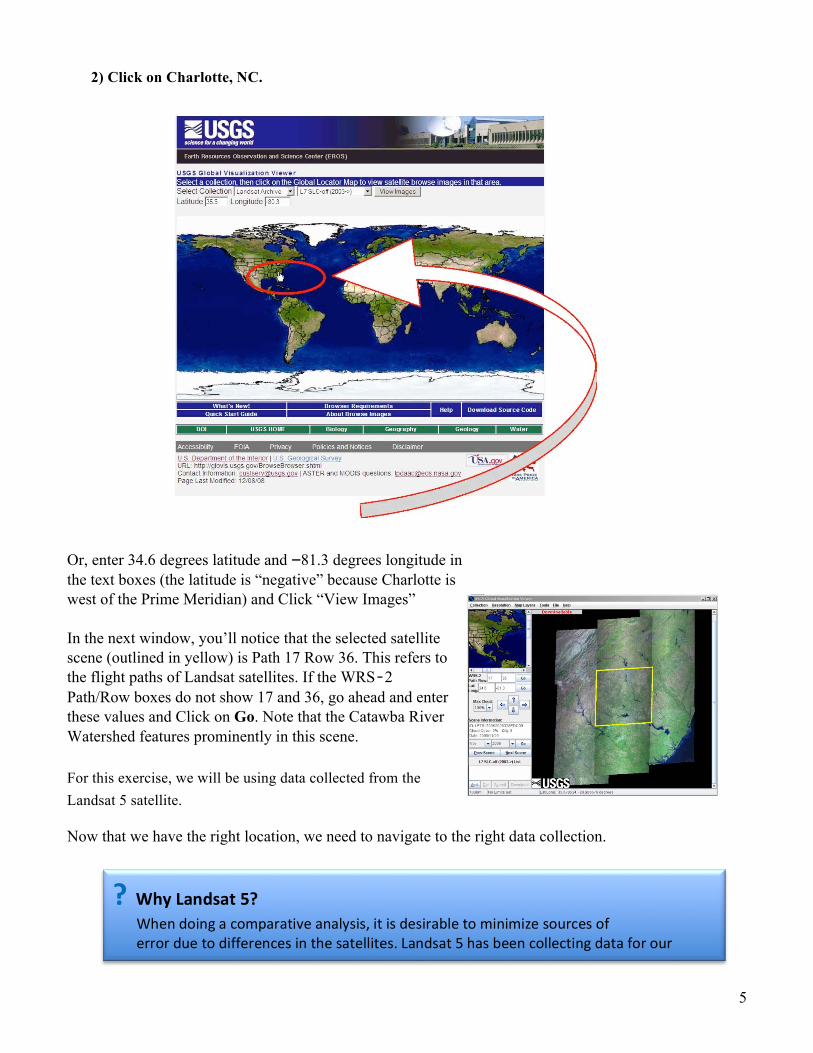
2) Click on Charlotte, NC.
Or, enter 34.6 degrees latitude and -81.3 degrees longitude in the text boxes (the latitude is “negative” because Charlotte is west of the Prime Meridian) and Click “View Images”
In the next window, you’ll notice that the selected satellite scene (outlined in yellow) is Path 17 Row 36. This refers to the flight paths of Landsat satellites. If the WRS‐2 Path/Row boxes do not show 17 and 36, go ahead and enter these values and Click on Go. Note that the Catawba River Watershed features prominently in this scene. For this exercise, we will be using data collected from the Landsat 5 satellite.
Now that we have the right location, we need to navigate to the right data collection.
? Why Landsat 5? When doing a comparative analysis, it is desirable to minimize sources of error due to differences in the satellites. Landsat 5 has been collecting data for our period of interest, so it is an ideal choice.
6
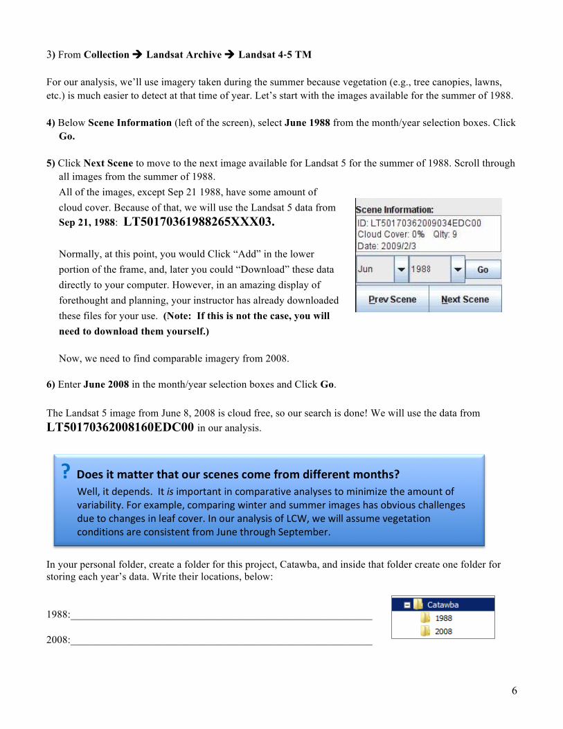
3) From Collection à Landsat Archive à Landsat 4-‐5 TM For our analysis, we’ll use imagery taken during the summer because vegetation (e.g., tree canopies, lawns, etc.) is much easier to detect at that time of year. Let’s start with the images available for the summer of 1988. 4) Below Scene Information (left of the screen), select June 1988 from the month/year selection boxes. Click
Go. 5) Click Next Scene to move to the next image available for Landsat 5 for the summer of 1988. Scroll through
all images from the summer of 1988. All of the images, except Sep 21 1988, have some amount of cloud cover. Because of that, we will use the Landsat 5 data from Sep 21, 1988: LT50170361988265XXX03. Normally, at this point, you would Click “Add” in the lower portion of the frame, and, later you could “Download” these data directly to your computer. However, in an amazing display of forethought and planning, your instructor has already downloaded these files for your use. (Note: If this is not the case, you will need to download them yourself.) Now, we need to find comparable imagery from 2008.
6) Enter June 2008 in the month/year selection boxes and Click Go.
The Landsat 5 image from June 8, 2008 is cloud free, so our search is done! We will use the data from LT50170362008160EDC00 in our analysis.
In your personal folder, create a folder for this project, Catawba, and inside that folder create one folder for storing each year’s data. Write their locations, below:
1988:_________________________________________________________
2008:_________________________________________________________
? Does it matter that our scenes come from different months? Well, it depends. It is important in comparative analyses to minimize the amount of variability. For example, comparing winter and summer images has obvious challenges due to changes in leaf cover. In our analysis of LCW, we will assume vegetation conditions are consistent from June through September.
7
Examining the Landsat Data File Structure
Before working with the Landsat data, it’s a good idea to take a quick look at the file structure.
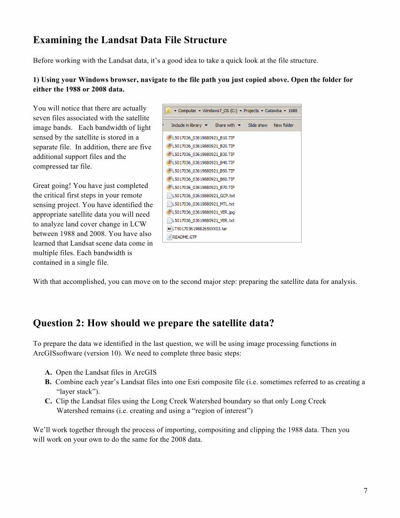
1) Using your Windows browser, navigate to the file path you just copied above. Open the folder for either the 1988 or 2008 data.
You will notice that there are actually seven files associated with the satellite image bands. Each bandwidth of light sensed by the satellite is stored in a separate file. In addition, there are five additional support files and the compressed tar file. Great going! You have just completed the critical first steps in your remote sensing project. You have identified the appropriate satellite data you will need to analyze land cover change in LCW between 1988 and 2008. You have also learned that Landsat scene data come in multiple files. Each bandwidth is contained in a single file. With that accomplished, you can move on to the second major step: preparing the satellite data for analysis.
Question 2: How should we prepare the satellite data?
To prepare the data we identified in the last question, we will be using image processing functions in ArcGISsoftware (version 10). We need to complete three basic steps:
A. Open the Landsat files in ArcGIS B. Combine each year’s Landsat files into one Esri composite file (i.e. sometimes referred to as creating a
“layer stack”). C. Clip the Landsat files using the Long Creek Watershed boundary so that only Long Creek
Watershed remains (i.e. creating and using a “region of interest”)
We’ll work together through the process of importing, compositing and clipping the 1988 data. Then you will work on your own to do the same for the 2008 data.
8
The first step in working with the data is opening ArcMap (ArcGIS v.10).
When ArcMap opens, cancel to close the Getting Started dialog. This will open a new ArcMap document. Click on the Catalog button. When Catalog opens, dock it to right side of the application window. Click on the Connect to Folder button and create a connection to your Catawba folder. Still in ArcCatalog, Right-click on your Catawba folder and from the context menu, choose New à File Geodatabase. Once it is created rename it to Catawba. Right-click on the Catawba geodatabase and make it the Default Geodatabase. As you work through this activity, data will be saved to this geodatabase. Your folder structure with the geodatabase, as it appears in ArcCatalog, should look like the one, below.
Close ArcCatalog. A. Opening 1988 Landsat Data in ArcGIS
Now you will open the Landsat files in ArcGIS.
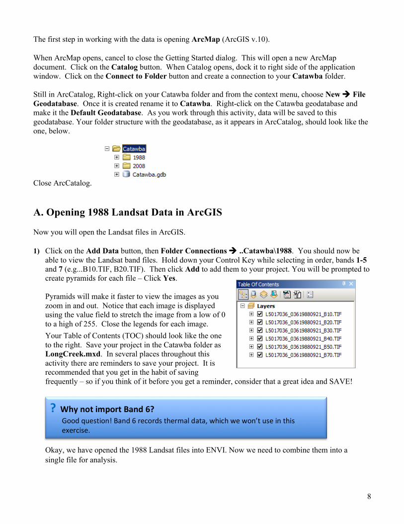
1) Click on the Add Data button, then Folder Connections à ..Catawba\1988. You should now be able to view the Landsat band files. Hold down your Control Key while selecting in order, bands 1-5 and 7 (e.g...B10.TIF, B20.TIF). Then click Add to add them to your project. You will be prompted to create pyramids for each file – Click Yes. Pyramids will make it faster to view the images as you zoom in and out. Notice that each image is displayed using the value field to stretch the image from a low of 0 to a high of 255. Close the legends for each image. Your Table of Contents (TOC) should look like the one to the right. Save your project in the Catawba folder as LongCreek.mxd. In several places throughout this activity there are reminders to save your project. It is recommended that you get in the habit of saving frequently – so if you think of it before you get a reminder, consider that a great idea and SAVE!
Okay, we have opened the 1988 Landsat files into ENVI. Now we need to combine them into a single file for analysis.
? Why not import Band 6? Good question! Band 6 records thermal data, which we won’t use in this exercise.

9
B. Creating and Displaying a Composite Layer of the 1988 Data
Our next step is to set the Environment settings in ArcToolbox, then to create a “Composite”. A Composite is a single ArcGIS layer that contains multiple bands of satellite data. Creating a composite of the Landsat data files makes using and viewing the data much easier since they will now be grouped together into a single file. It also prepares the data for analysis.
1) Open ArcToolbox. Right-click on the ArcToolbox icon (at the top of ArcToolbox) and select Environments. When the Environment Settings dialog box comes up: • Click on Workspace. Confirm that the “Current Workspace” and “Scratch Workspace” are set to
your Catawba.gdb. • Scroll down and Click on Processing Extent. Use the drop-down menu to set the “Extent” to be
“Same as L5017036_03619880921_B10.TIF”. • Under Raster Analysis, use the drop-down menu to set the Cell Size to be “Same as
L5017036_03619880921_B10.TIF”. Click OK. The selection of this particular band is arbitrary. It is just important to just set the extent and cell size, which is the same for all of the bands.
2) In ArcToolbox, Click on Data Management Tools à Raster à Raster Processing à Composite
Bands. Double-Click to open the Composite Bands tool. In the Composite Bands dialog box do the following: For “Input Rasters:” From the TOC, select all of the bands (1, 2, 3, 4, 5,7) and drag and drop them into the Composite Bands box. Double-check that they are listed in order, with band 1 first. The order is very important! Use the arrow keys to adjust the order if necessary. For “Output Raster:” Save it to your Catawba.gdb as Comp1988_1to5_7. Before clicking OK, double-check that your dialog box looks like the one below (except the exact path to the Catalba folder is likely different):
It will take a minute or two to process and then the composite image, Com1988_1to5_7 will be added to the TOC. With the next step below, you will display this composite image as a true-‐color image.
10
Displaying True Color RGB and Standard False Color Images
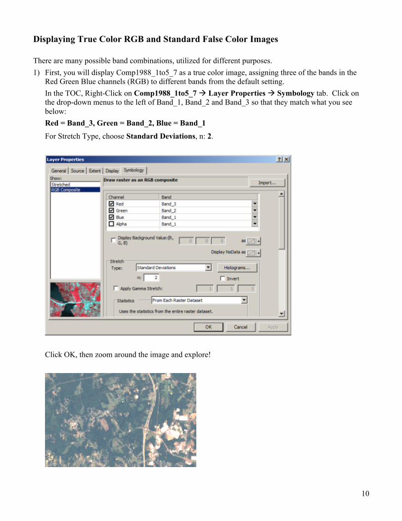
There are many possible band combinations, utilized for different purposes. 1) First, you will display Comp1988_1to5_7 as a true color image, assigning three of the bands in the
Red Green Blue channels (RGB) to different bands from the default setting. In the TOC, Right-Click on Comp1988_1to5_7 à Layer Properties à Symbology tab. Click on the drop-down menus to the left of Band_1, Band_2 and Band_3 so that they match what you see below: Red = Band_3, Green = Band_2, Blue = Band_1
For Stretch Type, choose Standard Deviations, n: 2.
Click OK, then zoom around the image and explore!

11
Now, apply the same procedure to display the image with a standard false color image, assigning the bands as follows: Red = Band_4, Green = Band_3, Blue = Band_2
? Why, if I used bands 1-‐5 and 7, are bands 1-‐6 listed in the drop-‐down menu? When the composite was created ArcGIS automatically renamed Band 7 to band 6. However, It is still data from band 7.
12
C. Clipping (Extracting) the Landsat files using the Long Creek Watershed boundary To do this we need to:
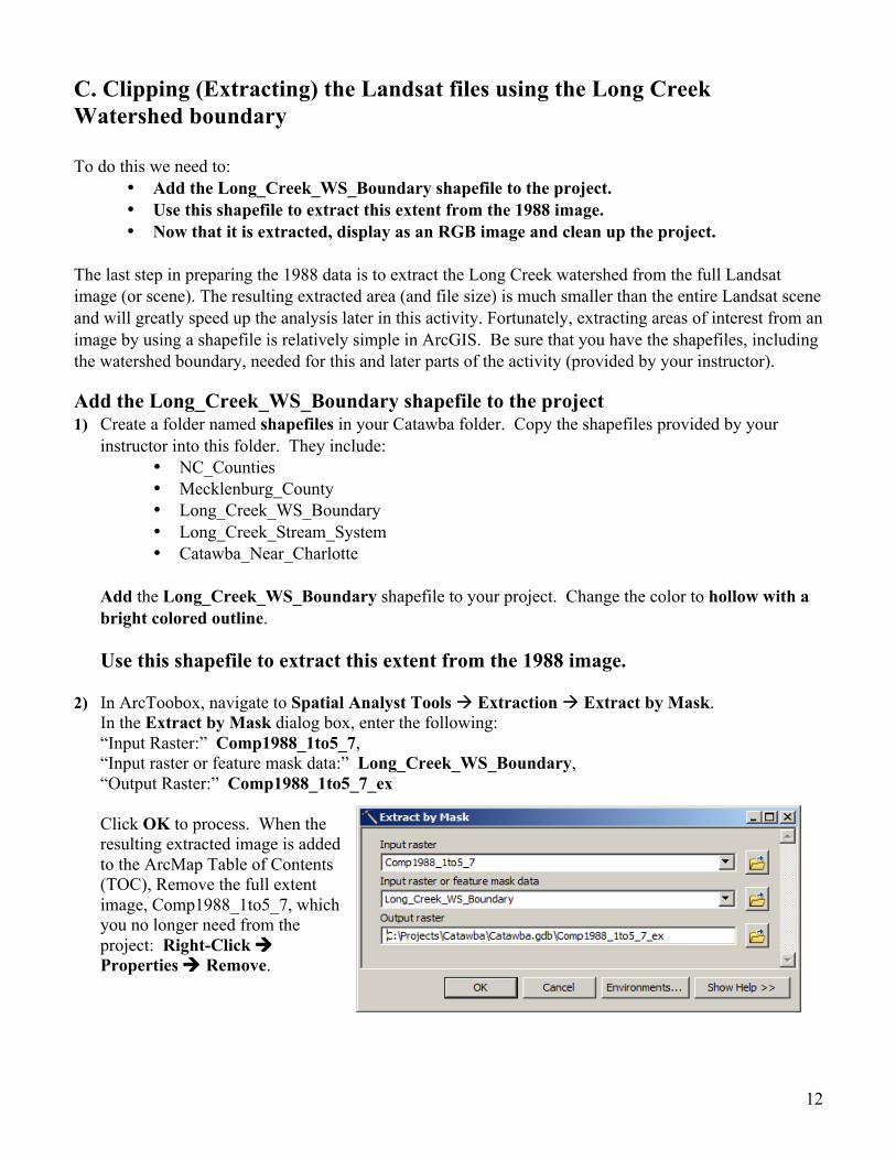
• Add the Long_Creek_WS_Boundary shapefile to the project. • Use this shapefile to extract this extent from the 1988 image. • Now that it is extracted, display as an RGB image and clean up the project.
The last step in preparing the 1988 data is to extract the Long Creek watershed from the full Landsat image (or scene). The resulting extracted area (and file size) is much smaller than the entire Landsat scene and will greatly speed up the analysis later in this activity. Fortunately, extracting areas of interest from an image by using a shapefile is relatively simple in ArcGIS. Be sure that you have the shapefiles, including the watershed boundary, needed for this and later parts of the activity (provided by your instructor).
Add the Long_Creek_WS_Boundary shapefile to the project 1) Create a folder named shapefiles in your Catawba folder. Copy the shapefiles provided by your
instructor into this folder. They include: • NC_Counties • Mecklenburg_County • Long_Creek_WS_Boundary • Long_Creek_Stream_System • Catawba_Near_Charlotte
Add the Long_Creek_WS_Boundary shapefile to your project. Change the color to hollow with a bright colored outline.
Use this shapefile to extract this extent from the 1988 image.
2) In ArcToobox, navigate to Spatial Analyst Tools à Extraction à Extract by Mask.
In the Extract by Mask dialog box, enter the following: “Input Raster:” Comp1988_1to5_7, “Input raster or feature mask data:” Long_Creek_WS_Boundary, “Output Raster:” Comp1988_1to5_7_ex Click OK to process. When the resulting extracted image is added to the ArcMap Table of Contents (TOC), Remove the full extent image, Comp1988_1to5_7, which you no longer need from the project: Right-Click à Properties à Remove.

13
Now that it is extracted, display it as an RGB image and clean up the project.
Display the extracted image as an RGB true color image (3,2,1). Zoom in on the extracted image and take a screen print. Save your ArcMap project. Project Cleanup: Remove all of the image layers, except for Comp1988_1to5_7_ex. You should be left with two layers: Comp1988_1to5_7_ex and Long_Creek_WS_Boundary. Save the Project.
Now repeat the same sets of operations for the 2008 Landsat image. Follow the same naming conventions to make it easier to trace your steps. Below are the general steps. Refer back in this activity for more detail as needed.
1) Open the 2008 Landsat data files and add them to ArcMap 2) Create a composite layer of the 2008 data 3) Extract the LCW area of interest from the 2008 Landsat scene. You should end up with an extracted
composite of this image named: Comp2008_1to5_7_ex. 4) Display the clipped LCW area as an RGB true color image. 5) Take a screen print of the clipped 2008 data 6) Remove the individual Landsat bands (..B10 – ..B70) and the full extent composite. Your TOC
should look like the screenshot below.
You should now have both the 1988 and 2008 images listed in the ArcMap TOC. To visually explore the differences between the two images, click them on and off. Through repeated clicking, you can get a sense of the changes from 1988 to 2008. In particular, you might want to examine the far eastern region for differences. Save your project.
Based on your visual interpretation of the 1988 and 2008 satellite images, how has Long Creek Watershed changed? Provide as much specific detail and as many examples as you can.
1) Screen prints of the clipped 1988 and 2008 LCW files 2) Typed ½-‐page response to Question 2.
Q2.
14
Question 3: How do we analyze the satellite data in order to estimate changes in land cover? You have made huge strides so far! You’ve identified, downloaded, and prepared the needed data, then selected only the pixels inside LCW. Great work! Now we come to the critical part of the analysis: the actual quantitative measure of land cover changes between 1988 and 2008. This is going to be interesting! To do this we need to:
A. Classify the land cover for the 1988 image B. Classify the land cover for the 2008 image C. Determine the differences between 1988 and 2008
Because we want to determine land cover changes as they might relate to stream water quality, we will use a very simple classification scheme for both images. We will divide every pixel of LCW into one of three categories: water, vegetated or non-‐vegetated. You’ll discover, though, that even though the class names are simple, it takes a bit of work to get the entire watershed into these three classes.
A. Classifying Land Cover in 1988
The process of classifying land cover actually requires two component steps: 1) Performing an “unsupervised” classification of the image (i.e., you let the ArcGIS
Unsupervised Classification tool determine which pixels are similar and should be grouped together).
2) Combining the original classification results into our three categories.
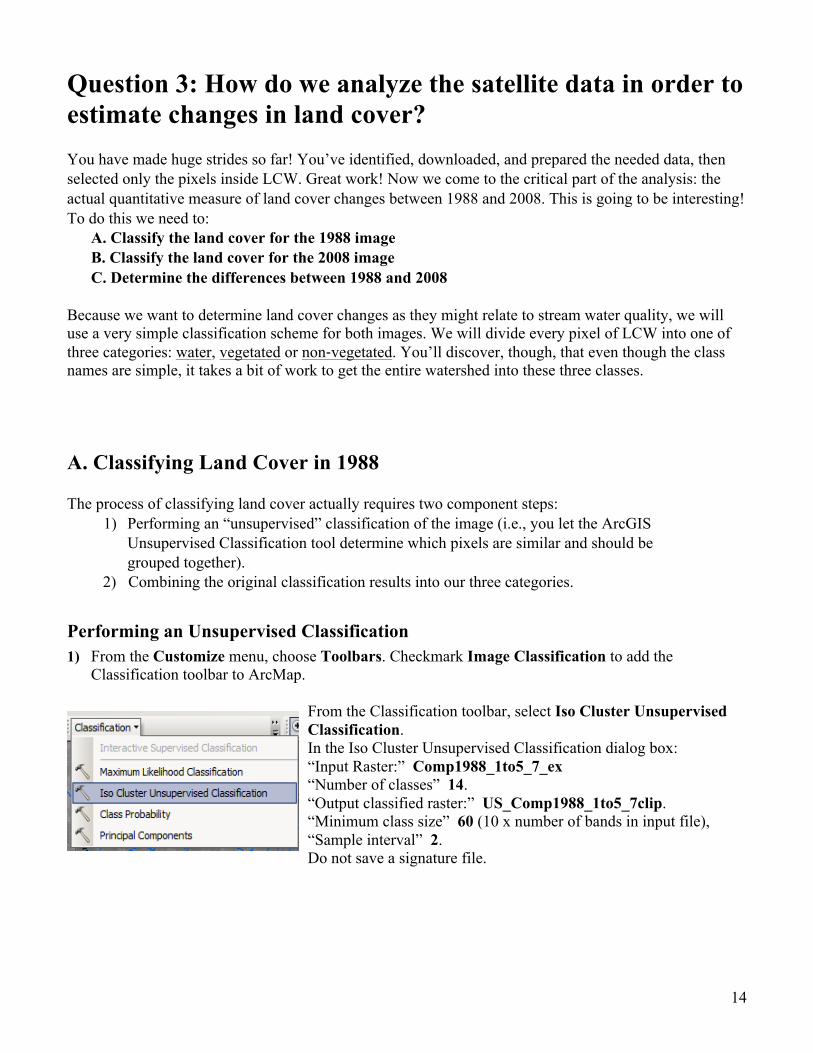
Performing an Unsupervised Classification 1) From the Customize menu, choose Toolbars. Checkmark Image Classification to add the
Classification toolbar to ArcMap.
From the Classification toolbar, select Iso Cluster Unsupervised Classification. In the Iso Cluster Unsupervised Classification dialog box: “Input Raster:” Comp1988_1to5_7_ex “Number of classes” 14. “Output classified raster:” US_Comp1988_1to5_7clip. “Minimum class size” 60 (10 x number of bands in input file), “Sample interval” 2. Do not save a signature file.
15
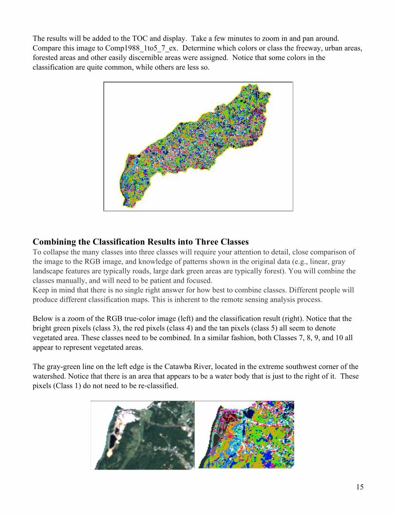
The results will be added to the TOC and display. Take a few minutes to zoom in and pan around. Compare this image to Comp1988_1to5_7_ex. Determine which colors or class the freeway, urban areas, forested areas and other easily discernible areas were assigned. Notice that some colors in the classification are quite common, while others are less so.
Combining the Classification Results into Three Classes To collapse the many classes into three classes will require your attention to detail, close comparison of the image to the RGB image, and knowledge of patterns shown in the original data (e.g., linear, gray landscape features are typically roads, large dark green areas are typically forest). You will combine the classes manually, and will need to be patient and focused. Keep in mind that there is no single right answer for how best to combine classes. Different people will produce different classification maps. This is inherent to the remote sensing analysis process.
Below is a zoom of the RGB true-‐color image (left) and the classification result (right). Notice that the bright green pixels (class 3), the red pixels (class 4) and the tan pixels (class 5) all seem to denote vegetated area. These classes need to be combined. In a similar fashion, both Classes 7, 8, 9, and 10 all appear to represent vegetated areas. The gray-green line on the left edge is the Catawba River, located in the extreme southwest corner of the watershed. Notice that there is an area that appears to be a water body that is just to the right of it. These pixels (Class 1) do not need to be re-‐classified.

16
1) The Swipe tool will be very useful while making comparisons. To activate this tool go to: Customize menu à Toolbars à Effects. On the Effects toolbar, be sure the layer you want to swipe is listed in the Layer dropdown. In this case, choose whichever of the 1988 images is on the top. Then Click on the swipe button . In the map display area click on the left mouse button and drag to control the swipe. Use the Identify tool to find out what class (Pixel value) an area you are examining has been assigned.
2) Fill in the chart below as you explore the data and decide which classes to categorize as water (class
1) vegetated (class 2), or non-vegetated (class 4). Notice that some pixels are harder to class. Do the best you can, checking in numerous locations and zooming in and out to get a sense for which class you would be best to put them in.
Unsupervised classification values (Old values)
New values Class Name
1 1 Water 2 2 Vegetated 3 2 Vegetated 4 2 Vegetated 5 2 Vegetated 6 2 Vegetated 7 4 Non-vegetated 8 4 Non-vegetated 9 4 Non-vegetated 10 4 Non-vegetated 11 2 Vegetated 12 2 Vegetated 13 4 Non-vegetated 14 4 Non-vegetated
? Why not using a value of 3 instead of 4? Because in a later step, you will be subtracting the reclassed 2008 grid from the reclassed 1998 grid. In order to have a unique number for each of the changes, we needed to use 4, instead of 3. This will make more sense when you get to the chart for the calculations in a couple of pages.

17
3) Go into Layer Properties à Symbology and change the colors to Blue for Water, Green for
Vegetated and Purple for Non-Vegetated for the 14 classes. This will help you to see how you are doing, before committing to these designations in the Reclass step that will come next. Your results should look similar to what you see below. This is an iterative process and your results won’t be perfect. Clearly, the most important classes are those that cover large areas. The classes describing the margins of land cover (e.g., the edges between developed areas and forest), are more difficult, but also less important since they occupy a relatively small percentage of the total watershed area.
Now that you have decided in which new class to put each of the 14 classes from the unsupervised classification, it is time to create a new reclassed layer.
4) From ArcToolbox, select Spatial Analyst Tools à Reclass à Reclassify. In the Reclassify dialog
box: “Input raster:” US_Comp1988_1to5_7_ex, “Reclass field:” Value, “Output raster:” Reclass_US_Comp1988. Under “Reclassification” enter the New values from the table above. Click OK.
! Tip: Start with the most common (or visible) classes, then work your way through the less obvious classes. If you need to, change the colors of the “hard to find” classes to make them easier to spot). If you have time, run the unsupervised classification again with more classes and again with fewer classes to find what you think the optimum number is for making the reclassification.

18
When the resulting raster appears in the TOC, double-check it to be sure you reclassed everything properly as it is easy to have made a mistake at this stage. Change the values in the legend so that
1 = blue and 2 = green and 4 = purple. Save your project.
Congratulations! You have now, to the best of your ability, classified the 1998 data of Long Creek Watershed into three land cover classes. You now have the basic tools with which to view your original and classified images, determine the class # for each pixel and combine similar classes into one class.
Classifying Land Cover in 2008 Go through similar steps to classify and reclassify the 2008 LCW satellite data. Use the same steps and tips as explained in the sections above. The general steps are listed below: 1) Perform an “unsupervised” classification of the image.
2) Reclassify the original classification results to combine into our three categories. Uncheck the 1988 images in the TOC, so that you are sure you are comparing the two 2008 images. Notice that this image is a bit more difficult to distinguish. The increase in urban area results in more mixed pixels at this resolution.
Unsupervised classification values (Old values)
New values Class Name
1 1 Water 2 2 Vegetated 3 2 Vegetated 4 2 Vegetated 5 2 Vegetated 6 2 Vegetated 7 4 Non-vegetated 8 4 Non-vegetated 9 2 Vegetated 10 4 Non-vegetated 11 4 Non-Vegetated 12 4 Non-vegetated 13 4 Non-vegetated 14 4 Non-vegetated
3) Adjust the colors of the Reclassed image to:
1 = blue and 2 = green and 4 = purple

19
Your results should look similar to the image below:
Take a few minutes to compare the results of both reclassed images. Do you observe any obvious changes?

20
C. Determine the Differences between 1988 and 2008
Now that you have both the 1988 and 2008 images classified into three land cover classes (and have the classes valued per the above directions), you are ready to move forward with the key step of the entire analysis: determining how land cover changed between 1988 and 2008. Conceptually, the technique is very straightforward; you will use ArcGIS tools to compare the 1988 value for each pixel with its 2008 value. This will be done using the Raster Calculator tool.
In the Raster Calculator the difference between 1988 and 2008 land cover values is determined for every pixel. Specifically, the 1988 pixel value for land cover (i.e., Water = 1, Vegetation = 2, and Non-‐vegetation = 4) will be subtracted from the 2008 value. If there has been no change in land cover, the pixel values will be the same, and the difference calculated will be zero. However, if the land cover has changed, the pixel values will differ. The difference calculated will reveal what land cover change has occurred. The outcome of this operation is a new image of LCW for which each pixel’s new value is the 2008 – 1988 Raster Calculator subtraction calculation. Table 1. The table below gives all possible changes in land cover and the resulting difference calculated using the Raster Calculator tool (2008 – 1988).
1) In ArcToolbox, open Spatial Analyst Tools à Map Algebra à Raster Calculator. In the Raster Calculator Dialog, Double-Click on Reclass_US_Comp2008 to bring it down to the workspace. Click on the minus (-) operator, then Double-Click on Reclass _US_Comp1988 to bring it down to the workspace. It will look like the expression, below:
"Reclass_US_Comp2008" - "Reclass_US_Comp1988"
For “Output Raster:” LandCoverChange. Click OK. Your result should be similar (but not necessarily exactly like) the image below. There is a potential of seven different classes shown, each resulting from a unique change in land cover between 1988 and 2008. Adjust the colors to closely match this image.
1988 Land Cover 2008 Land Cover Raster Calculator Calculation
Result (2008 value – 1988 value)
Water Water 1 – 1 0 Vegetation 2 – 1 1 Non-‐vegetation 4 – 1 3 Vegetation Water 1 – 2 -‐1 Vegetation 2 – 2 0 Non-‐vegetation 4 – 2 2 Non-‐vegetation Water 1 – 4 -‐3 Vegetation 2 – 4 -‐2 Non-‐vegetation 4 – 4 0

21
Now that you have produced a graphical result of the land cover differences, it is also helpful to also produce some summary statistics of the percent change of land cover differences. This is really quite easy.
2) Open the LandCoverChange Attribute Table. From the Options menu à Add Field. In the Add Field Dialog box: For Name: Per_change, for Type: Short Integer.
3) Right-click on the new Per_change field and choose Field Calculator. Enter the following
expression into the Field Calculator dialog box. 114,995 is the total count of pixels, calculated from the sum of the Count field.
( [Count]/114995) * 100
! Tip: Be sure to look critically at your resulting difference map! Overall, Which categories are dominant? Why is this so? Do you notice any areas that seem suspect? Consider what factors affect a pixel’s spectral pattern and also the choices made in the initial classification (number of classes for example) and the choices of which classes to combine. Don’t worry, there’s no need to get highly technical here – just be aware of how even the most careful classification effort can have small glitches.
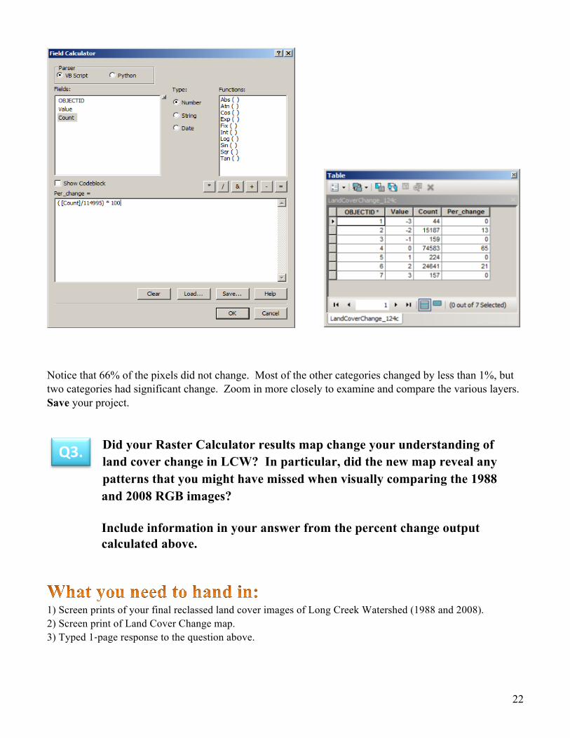
22
Notice that 66% of the pixels did not change. Most of the other categories changed by less than 1%, but two categories had significant change. Zoom in more closely to examine and compare the various layers. Save your project.
Did your Raster Calculator results map change your understanding of land cover change in LCW? In particular, did the new map reveal any patterns that you might have missed when visually comparing the 1988 and 2008 RGB images?
Include information in your answer from the percent change output calculated above.
1) Screen prints of your final reclassed land cover images of Long Creek Watershed (1988 and 2008). 2) Screen print of Land Cover Change map. 3) Typed 1-‐page response to the question above.
Q3.

23
Question 4: How do we present the results in an ArcMap Layout? We are almost finished! All we have left is to show our results in a layout. Your final map will be built using three data frames. One will show Long Creek Watershed and the Catawba River, while two will be used for smaller reference maps.
This will take four steps: A. Creating an “LCW Analysis” data frame showing your Difference Map and the Catawba
River B. Creating a “North Carolina Counties” data frame showing all North Carolina Counties C. Creating a “Mecklenburg County” data frame showing Long Creek Watershed and
Mecklenburg County D. Creating a final map
Start a New ArcMap project. When prompted, select “A new blank map”.
A. Creating the “LCW Analysis” Data Frame
To start, let’s rename the data frame to “LCW Analysis”
Renaming the data frame:
1) In the table of contents, Right-click on Layers à Select Properties In the Data Frame Properties dialog box, click on the General tab.
For Name type in: LCW Analysis. Click OK.
Adding new data to your map:
1) Click the Add Data button. Navigate to your Catawba à Shapefiles folder.
Add the following files:
• Catawba_Near_Charlotte • Long_Creek_Stream_System • Long_Creek_WS_Boundary Click the Add Data button again and navigate to Catawba à Catawba.gdb Add the following file:
• LandCoverChange

24
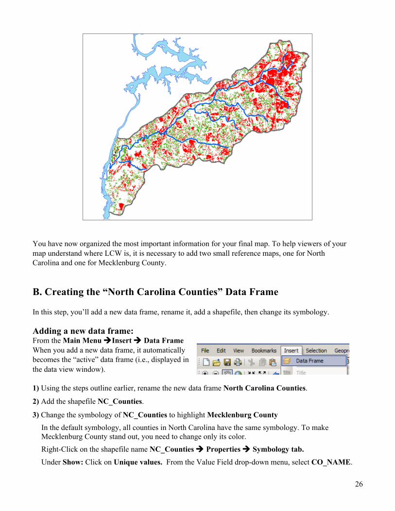
Zoom to the extent of the layer: Catawba_Near_Charlotte.
Your data view window should look something like the one to the right:
Note: the Catawba_Near_Charlotte shapefile does not contain all of the Charlotte River.
When data is added to ArcGIS the colors are randomly assigned so your symbology will likely be the same.
To change the symbology of the three shapefiles, Double Click on the color block or line near the name of the shapefile in the Table of Contents. For each shapefile, choose the colors listed below (or another color that seems appropriate to you):
Catawba_Near_Charlotte = Lake Long_Creek_Stream_System = Lapis Lazuli; line width = 2 Long_Creek_WS_Boundary = No Color; outline color = Grey 60% and width = 2
Now, let’s change the raster file’s symbology.
Changing the symbology of “LandC overChange”
1) Right-Click the file name LandCoverChange à Properties à Symbology tab Double-check that it is set to “Unique values” under the word Show:. Select the color Red for the value of 2 (Vegetation to Non-vegetation) and a Dark Green (e.g. fir green) for the value of -2 (Non-vegetation to Vegetation), Use Arctic White for the value of 0 (No change). Make all of the other categories black, as shown. Click Apply.
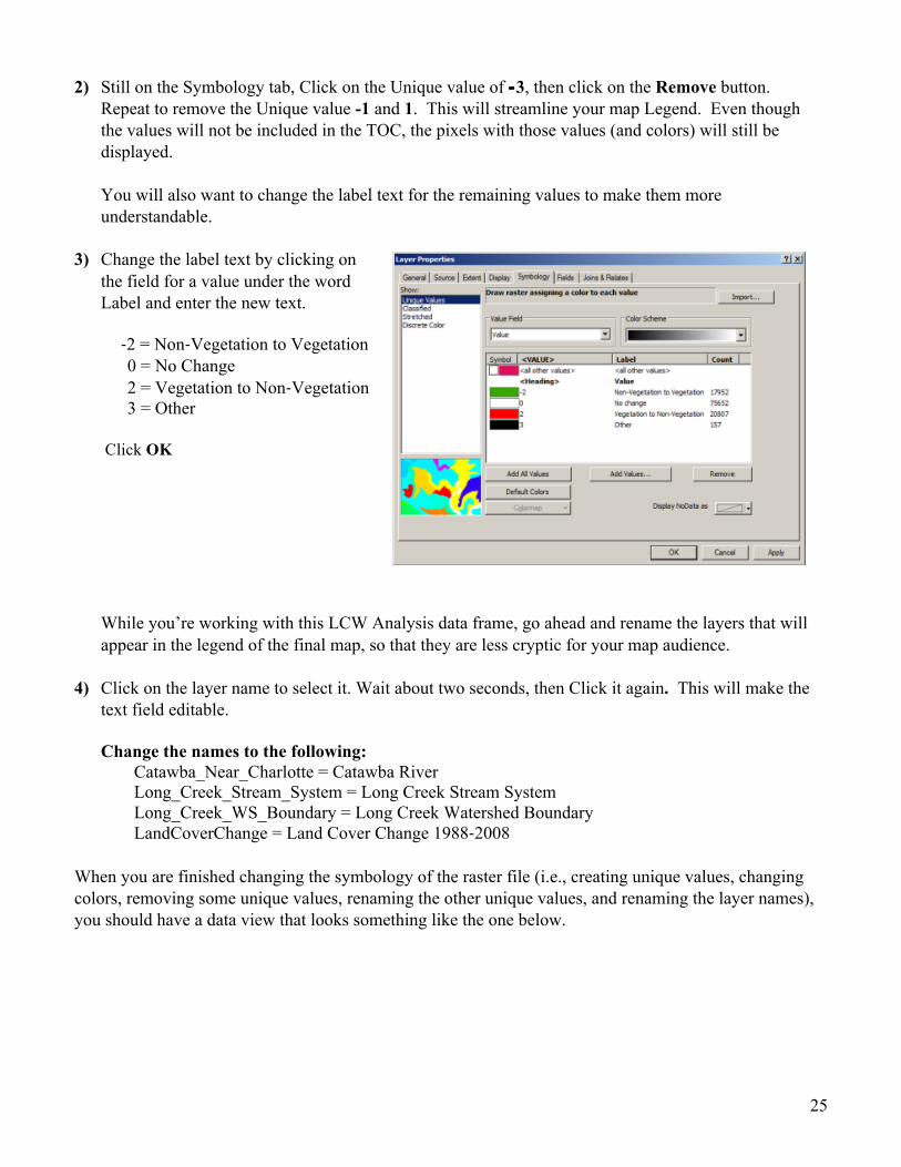
25
2) Still on the Symbology tab, Click on the Unique value of -‐3, then click on the Remove button. Repeat to remove the Unique value -1 and 1. This will streamline your map Legend. Even though the values will not be included in the TOC, the pixels with those values (and colors) will still be displayed.
You will also want to change the label text for the remaining values to make them more understandable.
3) Change the label text by clicking on the field for a value under the word Label and enter the new text.
-‐2 = Non-‐Vegetation to Vegetation 0 = No Change 2 = Vegetation to Non-‐Vegetation 3 = Other
Click OK
While you’re working with this LCW Analysis data frame, go ahead and rename the layers that will appear in the legend of the final map, so that they are less cryptic for your map audience.
4) Click on the layer name to select it. Wait about two seconds, then Click it again. This will make the
text field editable.
Change the names to the following: Catawba_Near_Charlotte = Catawba River Long_Creek_Stream_System = Long Creek Stream System Long_Creek_WS_Boundary = Long Creek Watershed Boundary LandCoverChange = Land Cover Change 1988-‐2008
When you are finished changing the symbology of the raster file (i.e., creating unique values, changing colors, removing some unique values, renaming the other unique values, and renaming the layer names), you should have a data view that looks something like the one below.
26
You have now organized the most important information for your final map. To help viewers of your map understand where LCW is, it is necessary to add two small reference maps, one for North Carolina and one for Mecklenburg County.
B. Creating the “North Carolina Counties” Data Frame
In this step, you’ll add a new data frame, rename it, add a shapefile, then change its symbology.
Adding a new data frame: From the Main Menu àInsert à Data Frame When you add a new data frame, it automatically becomes the “active” data frame (i.e., displayed in the data view window).
1) Using the steps outline earlier, rename the new data frame North Carolina Counties.
2) Add the shapefile NC_Counties.
3) Change the symbology of NC_Counties to highlight Mecklenburg County In the default symbology, all counties in North Carolina have the same symbology. To make Mecklenburg County stand out, you need to change only its color. Right-Click on the shapefile name NC_Counties à Properties à Symbology tab. Under Show: Click on Unique values. From the Value Field drop-down menu, select CO_NAME.

27
Click Add Values to bring up the Add Values box. Select Mecklenburg and Click OK.
Double-Click on the color block next to “<all other values>” and select the color Lilac Dust (or something similar) from the Fill Color drop-down.
Double-Click on the color block next to Mecklenburg County and select the color Sahara Sand (or something similar) from the Fill Color drop-down.
Your map display for the N_Counties Data Frame should looks like this:
C. Creating the “Mecklenburg County” Data Frame
Following a similar process as described earlier, complete the following steps: 1) Insert a new Data Frame and rename it Mecklenburg County.
2) Add the shapefiles: • Mecklenburg_County • Long_Creek_WS_Boundary
3) If Long_Creek_WS_Boundary is not the first layer, move it so that it is on top of Mecklenburg_County. Change the symbology so that Mecklenburg_County is filled with Sahara Sand, and LCW_Boundary is filled with no color and has a 2-point Poinsettia Red outline.
You should have a data view window for Mecklenburg County that looks like this:

28
D. Creating the Final Map
You are now on the final mapping step! You will put the pieces together to make a map showing how land cover changed in LCW between 1988 and 2008.
1) Switch your ArcGIS to View menu àLayout View. 2) Click on the LCW Analysis data frame in the
Layout display to both activate and select it. Drag on the blue handles of the selected data frame so that you can expand it to occupy the entire layout page.
3) Move the NC Counties and Mecklenburg County data frames to the lower right corner of the layout view.
4) In the Mecklenburg County Data Frame Properties à Frame tab change the border to <None>. Add a line (using the Drawing toolbar) connecting Mecklenburg County to the NC Counties map.
5) Add the title: Main Menu à Insert à Title Long Creek Watershed (Charlotte, NC) Land Cover Change 1988 to 2008
Use a bold 24-28 point font of your choice.
Before you add a scale bar and legend in the next steps, make sure the “LCW Analysis” data frame is Active. To do this Right-click on the “LCW Analysis” data frame name and select Activate from the pull down menu. 6) Add a scale bar from the
Main Menu à Insert à Scale Bar à Select Scale Line 1 Click Properties” à For resizing choose Adjust number of divisions from the drop-down. Select Kilometers under Division Units. Go back up to Division value and change to 5. Click OK, then OK again.
7) From the Main menu, Insert à legend. This starts the Legend Wizard. Although not critical, work to arrange your data layers in the order shown to the right. Click “Next”.
In the Legend Title box, remove the word Legend. Click Next, then Next again. You will next be able to edit the size and shape of the symbol patches used in the legend. Using the drop-down menus provided, select the following settings: Line = S curve for the Long Creek Stream

29
System and so on to match the legend to the right. Click Next, then Click Finish.
You now have all the necessary pieces in place for the final(!) map product of your land cover change analysis. Your map should look similar to the one on the right.
8) Now go to Main menu à Insert à Text. Add your name and the data sources.
Feel free to make any adjustments you think are needed so that the map appears as you want it.
9) Last, Go to the File menu à Export Map. Change the “Save as type” to PDF. Name the file LongCreekWS.pdf.
Fantastic!! You have completed all of the remote sensing and GIS steps of your analysis! If you remember back to the beginning of this exercise, you were presented with a situation of degraded water quality in Long Creek Watershed, a tributary to the endangered Catawba River. It became clear that one possible explanation for the lowered water quality was change in land cover in Long Creek Watershed. The purpose of this exercise was to show you how remote sensing and GIS could be used to explore that idea. Through this analysis, you have learned how to use the Glovis website to find out what Landsat data are available, chosen which images are best suited to your project, and worked with ArcGIS 10 to display and composite and extract a subset from them. You classified the raster cells within the watershed into groups relevant to your analysis. You mastered the Raster Calculator operation to determine how land cover changed (based on your classification scheme) between 1988 and 2008. Finally, you used GIS to create a presentation map highlighting your remote sensing analysis results. In your map, you were able to display your non-‐raster data such as Long Creek, the Catawba River, and Mecklenburg County with the output from your raster analysis. Well done! The only step remaining is to reconsider the original hypotheses that you formed on Page 2.
30
A) Examine the spatial pattern of land cover change in relation to the Long Creek stream system. Do you think land cover change had an effect on the water quality in the streams? Explain your answer. Be sure to provide as much detail and as many examples as you can. B) If you were to continue your analysis, what steps would you follow to help further your understanding of how land cover change in LCW might have impacted water quality? For example, can you think of additional ways you could use remote sensing and GIS to explore the relationship between land cover and stream quality? Or, are there new types of data that you think might be helpful in continuing your analysis?
1) Your finished map! 2) A 1-‐2 page essay answering Question 4. References “America’s Most Endangered Rivers 2008.” American Rivers. 01 May 2009. <http://www.nxtbook.com/nxtbooks/americanrivers/endangeredrivers/>
Land Use and Environmental Services Agency. “2008 State of the Environment Report.” Mecklenburg County, North Carolina, USA.
Q4.