paying out-of-pocket - jpmorgan chase · the jpmorgan chase institute is a global think tank...
TRANSCRIPT

September 2017
Paying Out-of-Pocket
The Healthcare Spendingof 2 Million US Families
About the InstituteThe global economy has never been more complex, more interconnected, or faster moving. Yet economists, businesses, nonprofit leaders, and policymakers have lacked access to real-time data and the analytic tools to provide a comprehensive perspective. The results—made painfully clear by the Global Financial Crisis and its aftermath—have been unrealized potential, inequitable growth, and preventable market failures.
The JPMorgan Chase Institute is harnessing the scale and scope of one of the world’s leading firms to explain the global economy as it truly exists. Its mission is to help decision-makers—policymakers, businesses, and nonprofit leaders—appreciate the scale, granularity, diversity, and interconnectedness of the global economic system and use better facts, timely data, and thoughtful analysis to make smarter decisions to advance global prosperity. Drawing on JPMorgan Chase’s unique proprietary data, expertise, and market access, the Institute develops analyses and insights on the inner workings of the global economy, frames critical problems, and convenes stakeholders and leading thinkers.
The JPMorgan Chase Institute is a global think tank dedicated to delivering data-rich analyses and expert insights for the public good.
AcknowledgmentsWe thank our fantastic research team, specifically Kerry Zhang, Chenxi Yu, David Wasser, and Pascal Noel.
This effort would not have been possible without the critical support of the JPMorgan Chase Intelligent Solutions team of data experts, including Subhor Verma, Gaby Marano, Stella Ng, Steve Farrell, Jacqueline Cush, and Bill Bowlsbey, and the JPMorgan Chase Institute team members Derek Bekebrede, Chenna Cotla, Amar Hamoudi, Chris Wheat, Chen Zhao, Natalie Holmes, Kelly Benoit, Caitlin Legacki, Courtney Hackney, Jolie Spiegelman, and Gena Stern.
We would also like to acknowledge with gratitude the invaluable input of academic experts who provided thoughtful commentary, including Thomas Selden and team at the Agency for Healthcare Research and Quality (AHRQ); Genevieve Kelly, Kyle Caswell, and team at the Urban Institute; Kyle Williams, Jacqueline Smith, and Barbara Constantz from the JPMorgan Commercial Bank Healthcare Team; David Cutler from Harvard University, Amy Finkelstein from Massachusetts Institute of Technology, and Matt Fiedler from the Brookings Institution. For their generosity of time, insight, and support, we are deeply grateful.
Finally, we would like to acknowledge Jamie Dimon, CEO of JPMorgan Chase & Co., for his vision and leadership in establishing the Institute and enabling the ongoing research agenda. Along with support from across the Firm—notably from Peter Scher, Len Laufer, Max Neukirchen, Joyce Chang, Steve Cutler, Patrik Ringstroem, Judy Miller, and Alexis Bataillon—the Institute has had the resources and support to pioneer a new approach to contribute to global economic analysis and insight.
ContactFor more information the JPMorgan Chase Institute or this report, please see our website www.jpmorganchaseinstitute.com or e-mail [email protected].
Paying Out-of-Pocket:
The Healthcare Spending of 2 Million US Families
Diana FarrellFiona Greig
Contents
2 Executive Summary
8 Introduction
10 Findings
29 Implications
31 Data Asset
41 References
43 Endnotes
45 Suggested Citation
Executive Summary
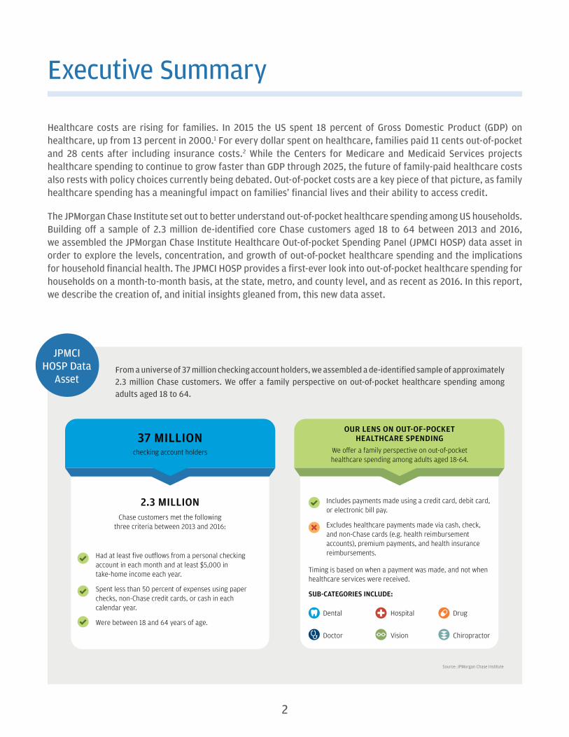
Healthcare costs are rising for families. In 2015 the US spent 18 percent of Gross Domestic Product (GDP) on healthcare, up from 13 percent in 2000.1 For every dollar spent on healthcare, families paid 11 cents out-of-pocket and 28 cents after including insurance costs.2 While the Centers for Medicare and Medicaid Services projects healthcare spending to continue to grow faster than GDP through 2025, the future of family-paid healthcare costs also rests with policy choices currently being debated. Out-of-pocket costs are a key piece of that picture, as family healthcare spending has a meaningful impact on families’ financial lives and their ability to access credit.
The JPMorgan Chase Institute set out to better understand out-of-pocket healthcare spending among US households. Building off a sample of 2.3 million de-identified core Chase customers aged 18 to 64 between 2013 and 2016, we assembled the JPMorgan Chase Institute Healthcare Out-of-pocket Spending Panel (JPMCI HOSP) data asset in order to explore the levels, concentration, and growth of out-of-pocket healthcare spending and the implications for household financial health. The JPMCI HOSP provides a first-ever look into out-of-pocket healthcare spending for households on a month-to-month basis, at the state, metro, and county level, and as recent as 2016. In this report, we describe the creation of, and initial insights gleaned from, this new data asset.
JPMCI HOSP Data
AssetFrom a universe of 37 million checking account holders, we assembled a de-identified sample of approximately 2.3 million Chase customers. We offer a family perspective on out-of-pocket healthcare spending among adults aged 18 to 64.
37 MILLIONchecking account holders
Had at least five outflows from a personal checking account in each month and at least $5,000 in take-home income each year.
Spent less than 50 percent of expenses using paper checks, non-Chase credit cards, or cash in each calendar year.
Were between 18 and 64 years of age.
2.3 MILLIONChase customers met the following
three criteria between 2013 and 2016:
OUR LENS ON OUT-OF-POCKETHEALTHCARE SPENDING
We o�er a family perspective on out-of-pocket healthcare spending among adults aged 18-64.
Includes payments made using a credit card, debit card, or electronic bill pay.
Excludes healthcare payments made via cash, check, and non-Chase cards (e.g. health reimbursement accounts), premium payments, and health insurance reimbursements.
Hospital
Vision
Dental
Doctor
Drug
Chiropractor
Timing is based on when a payment was made, and not when healthcare services were received.
SUB-CATEGORIES INCLUDE:
Source: JPMorgan Chase Institute
2

PAYING OUT-OF-POCKET: THE HEALTHCARE SPENDING OF 2 MILLION US FAMILIESExecutive Summary
Finding One
Out-of-pocket healthcare spending grew between 2013 and 2016, but remained a relatively constant share of take-home income.
Families spent on average $714 or 1.6 percent of their take-home income on out-of-pocket healthcare spending in 2016. Out-of-pocket healthcare spending grew by an average annual rate of 4.3 percent.
Source: JPMorgan Chase Institute
1.7%1.6% 1.6% 1.6%
2013 2014 2015 2016
Average annual out-of-pocket healthcare spending level and burden (2013 – 2016)
Out-of-pocket healthcare spending level
Out-of-pocket healthcare spending burden(spending as a percent of take-home income in Chase accounts)
2.6%6.9%
3.6%$629 $645
$690$714
Finding Two
The financial burden of out-of-pocket healthcare spending was highest for older, lower-income, and female account holders and increased in 2016 for low-income account holders.
Source: JPMorgan Chase Institute
1.2% 1.2%
1.4% 1.4%1.6% 1.6% 1.6% 1.7%
1.9% 1.9%
2.5%
2.8%
1.4%1.4%1.6% 1.6%
1.3%1.3%
1.0%1.0%
1.8% 1.8%
1.4% 1.5%
Age GenderQuintile of take-home income
Out-of-pocket healthcare spending as a percent of take-home income by year and demographic characteristics of the primary account holder
18-25 26-34 35-44 45-54 55-64 Quintile 1:<$24,000
Quintile 2:$24,000 to
$38,000
Quintile 3:$38,000 to
$57,000
Quintile 4:$57,000 to$92,000
Quintile 5:>$92,000
Women Men
2015 2016
3
PAYING OUT-OF-POCKET: THE HEALTHCARE SPENDING OF 2 MILLION US FAMILIESExecutive Summary
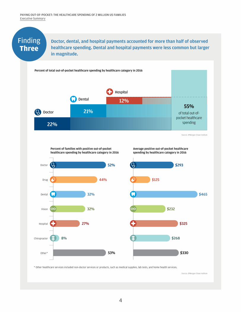
Finding Three
Doctor, dental, and hospital payments accounted for more than half of observed healthcare spending. Dental and hospital payments were less common but larger in magnitude.
Source: JPMorgan Chase Institute
Percent of total out-of-pocket healthcare spending by healthcare category in 2016
22%
21%
12%55%
of total out-of-pocket healthcare
spending
Doctor
Dental
Hospital
Source: JPMorgan Chase Institute
Doctor
Drug
Dental
Vision
Hospital
Chiropractor
Other* 53%
27%
32%
32%
44%
52%
8%
$330
$325
$232
$465
$125
$293
$268
* Other healthcare services included non-doctor services or products, such as medical supplies, lab tests, and home health services.
Percent of families with positive out-of-pocket healthcare spending by healthcare category in 2016
Average positive out-of-pocket healthcarespending by healthcare category in 2016
4
PAYING OUT-OF-POCKET: THE HEALTHCARE SPENDING OF 2 MILLION US FAMILIESExecutive Summary
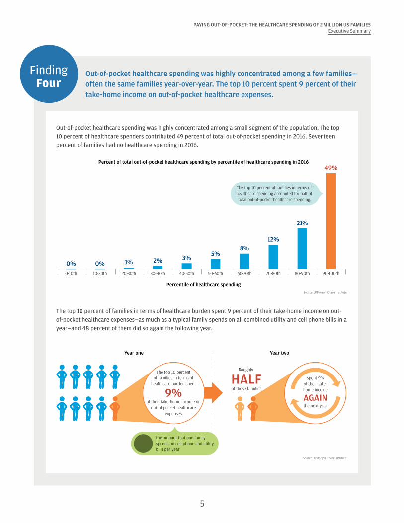
Finding Four
Out-of-pocket healthcare spending was highly concentrated among a few families— often the same families year-over-year. The top 10 percent spent 9 percent of their take-home income on out-of-pocket healthcare expenses.
Out-of-pocket healthcare spending was highly concentrated among a small segment of the population. The top 10 percent of healthcare spenders contributed 49 percent of total out-of-pocket spending in 2016. Seventeen percent of families had no healthcare spending in 2016.
Source: JPMorgan Chase Institute
The top 10 percent of families in terms of healthcare spending accounted for half of total out-of-pocket healthcare spending.
0%0% 1% 2% 3%5%
8%12%
21%
49%
0-10th 10-20th 20-30th 30-40th 40-50th 50-60th 60-70th 70-80th 80-90th 90-100th
Percentile of healthcare spending
Percent of total out-of-pocket healthcare spending by percentile of healthcare spending in 2016
The top 10 percent of families in terms of healthcare burden spent 9 percent of their take-home income on out-of-pocket healthcare expenses—as much as a typical family spends on all combined utility and cell phone bills in a year—and 48 percent of them did so again the following year.
Source: JPMorgan Chase Institute
The top 10 percentof families in terms of
healthcare burden spent
9%of their take-home income on
out-of-pocket healthcareexpenses
Roughly
HALFof these families
Year one Year two
the amount that one family spends on cell phone and utility bills per year
spent 9%of their take-home income
AGAINthe next year
5

PAYING OUT-OF-POCKET: THE HEALTHCARE SPENDING OF 2 MILLION US FAMILIESExecutive Summary
Finding Five
Families made larger healthcare payments in the months and the years when they had a higher ability to pay. Elevated dental and hospital payments primarily contributed to high healthcare spending.
Monthly out-of-pocket healthcare spending was highly correlated with monthly take-home income. In each year during 2013-2016, families had the highest out-of-pocket healthcare spending in months of elevated income: March and April (tax refund season), October, and December.
Source: JPMorgan Chase Institute
Ratio of mean monthly out-of-pocket healthcare spending, take-home income, and liquid assets to their respective levels in January (2013-2016)
Jan Feb Mar Apr May Jun Jul Aug Sep Oct Nov Dec
Out-of-pocket healthcare spending Take-home income Liquid assets
0.9
1.0
1.1
1.2Families made larger healthcare
payments in the months when they had a higher ability to pay.
High out-of-pocket healthcare spending:
• Large: at least $1,000• Significant: at least 2 percent
of take-home income
Among families with normal healthcare spending in 2015, those who transitioned to higher spending in 2016 also experienced faster growth in take-home income (4 percentage points higher) and liquid assets (6 percentage points higher) than families who exhibited normal healthcare spending again in 2016.
Source: JPMorgan Chase Institute
Take-home income
2014 2015 2016
Liquid assets
2014 2015 2016
Families with normal healthcare spending in 2015 and 2016
Families with normal healthcare spending in 2015 and high healthcare spending in 2016
$72,000
$58,000
$60,000
$62,000
$64,000
$68,000
$66,000
$70,0006%
2%
$2,000
$6,000
$0
$4,000
$12,000
$10,000
$8,000
$14,000
18%
12%4ppdi�erence
6ppdi�erence
6

PAYING OUT-OF-POCKET: THE HEALTHCARE SPENDING OF 2 MILLION US FAMILIESExecutive Summary
Finding Six
There was dramatic variation in out-of-pocket healthcare spending across and within our 23 states. Families in Colorado spent the most on healthcare, while families in Louisiana spent the highest fraction of their gross income on healthcare.
FL
TX
NMAZ
CA
NVUT
CO
OR
WA
ID
OK
MT
WY
ND
SD
NE
KS
MN
IA
MO
AR
LA
MS AL GASC
IL
WIMI
IN OH
TN
KYNC
WV VA
PA
NY
MEVT NH
RI
CT
NJ
DE
MD
MA
DC
Color intensity indicateslevel of healthcare spending
State-level map:
$500 $1,000
County-level map:
$250 $1,300
Counties with low sample size
Ranking by average out-of-pocket healthcare spending
Top 5 States
Healthcare spending
level (2016)
Healthcare spending as a
percent of gross income (2016)
Colorado $916 1.6%
Utah $906 1.6%
Connecticut $880 1.1%
Texas $873 1.6%
Oklahoma $854 1.7%
Top 5 Metro Areas *
Austin, TX $967 1.7%
Houston, TX $920 1.5%
Denver, CO $904 1.5%
Baton Rouge, LA $903 1.8%
Dallas-Fort Worth, TX $882 1.7%
* Metro area refers to the Core Based Statistical Area (CBSA).
Source: JPMorgan Chase Institute
Conclusion
The JPMorgan Chase Institute Healthcare Out-of-pocket Spending Panel (JPMCI HOSP) offers several key insights as we evaluate proposed changes to our healthcare policies. First, out-of-pocket healthcare expenses represent a stable share of household income in aggregate, but are a source of financial strain for certain families. Healthcare reform should take into consideration the impact on households who are more financially burdened by healthcare expenses—specifically older, low-income, and female account holders. Second, healthcare spending may be large, unexpected, and concentrated in the months and years when families have a higher ability to pay. As such, consumers would benefit from more transparent pricing and payment options to better manage healthcare expenses. Third, cost containment measures, including value-based care, could have meaningful impacts on costs borne by families, not just by insurers and healthcare providers. Finally, wide variation in levels and burden of healthcare spending across geographies underscores the importance of healthcare as a state and local policy issue.
7 Back to Contents
Introduction
Healthcare costs are rising for families. In 2015, the US spent 18 percent of Gross Domestic Product (GDP) on healthcare, up from 13 percent in 2000.1 For every dollar spent on healthcare, families paid 11 cents out-of-pocket and 28 cents after including insurance costs.2 While the Centers for Medicare and Medicaid Services projects health spending to continue to grow faster than GDP through 2025, the future of family-paid healthcare costs also rests with policy choices currently being debated. Out-of-pocket costs are a key piece of that picture.
A number of factors come into play in determining a family’s out-of-pocket healthcare spending. Higher out-of-pocket expenses could stem from an increase in healthcare utilization, healthcare prices, or the share of healthcare costs borne directly by consumers. Recent research has attributed the recent growth in out-of-pocket spending to all three of these factors (Health Care Cost Institute, 2016). Although the share of the population with health insurance has grown under the Affordable Care Act, those covered by private insurance have experienced an increase in premium costs and annual deductibles (Kaiser Family Foundation and Health Research & Education Trust, 2016).3
Out-of-pocket healthcare spending has a meaningful impact on families’ financial lives and their ability to access credit. As the JPMorgan Chase Institute has documented, roughly one in six families makes an extraordinary medical payment in any given year (Farrell and Greig, 2017a).4 These extraordinary medical payments are timed around moments of increased ability to pay and associated with 9 percent higher credit card debt a year later (Farrell and Greig, 2017a). Research suggests that a major medical event, such as a hospital admission, car crash, or cancer diagnosis, leads to increased medical expenditures, lower income, higher debt, and increased foreclosure and bankruptcy rates.5 Medical debt is widespread, even among the insured—roughly one in four non-elderly adults has medical debt, and 52 percent of all debts in collections are medical debts (Consumer Financial Protection Bureau, 2014; Karpman and Caswell, 2017).
The JPMorgan Chase Institute Healthcare
Out-of-pocket Spending Panel (JPMCI HOSP) provides a first-ever look into out-of-pocket healthcare
spending for households on a month-to-month basis, at the state, metro, and county level,
and as recent as 2016.
The JPMorgan Chase Institute set out to better understand out-of-pocket healthcare spending among US households. Building off a sample of 2.3 million de-identified regular Chase customers aged 18 to 64 between 2013 and 2016, we created the JPMorgan Chase Institute Healthcare Out-of-pocket Spending Panel (JPMCI HOSP). We explored the levels, concentration, and growth of out-of-pocket healthcare spending and the implications of these spending trends for overall household financial health. This new data asset provides a first-ever look into out-of-pocket healthcare spending for households on a month-to-month basis, at the state, metro, and county level, and as recent as 2016. In this report, we describe the creation of, and initial insights gleaned from, this new data asset. Box 1 below describes the JPMorgan Chase Institute lens on out-of-pocket healthcare spending in more detail.
We highlight six key findings. First, out-of-pocket healthcare spending grew between 2013 and 2016, but remained a relatively constant share of take-home income. Second, the financial burden of out-of-pocket healthcare spending was highest for older, lower-income, and female account holders and increased in 2016 for low-income account holders. Third, doctor, dental, and hospital payments accounted for more than half of observed healthcare spending; dental and hospital payments were less common but larger in magnitude. Fourth, out-of-pocket healthcare spending was highly concentrated among a few families—often the same families year over year. The top 10 percent of families spent roughly 9 percent of their take-home income on healthcare expenses. Fifth, families made larger healthcare payments in the months and the years when they had a higher ability to pay. Elevated dental and hospital payments primarily contributed to high healthcare spending. Finally, there was dramatic variation in out-of-pocket healthcare spending between and within the 23 states where Chase has a retail footprint. Families in Colorado spent the most on healthcare, while families in Louisiana spent the highest fraction of their gross income on healthcare.
8
PAYING OUT-OF-POCKET: THE HEALTHCARE SPENDING OF 2 MILLION US FAMILIESIntroduction
Box 1. The JPMorgan Chase Institute Healthcare Out-of-pocket Spending Panel (JPMCI HOSP)
The JPMCI HOSP data asset was constructed using a sample of de-identified core Chase customers for whom we observe financial attributes, including out-of-pocket healthcare spending between 2013 and 2016. For the purposes of our research, the unit of analysis was the primary account holder, whom we subsequently referred to as a family.6 We focused on accounts held by adults aged 18 to 64, as adults 65 and older were more likely to make payments using paper checks, which we could not categorize (Connolly and Stavins, 2015). To provide better visibility into income and spending, we selected families who had at least five checking account outflows each month, at least $5,000 in take-home income each year, and used paper checks, cash, and non-Chase credit cards for less than 50 percent of their total spending. In addition, we reported on out-of-pocket healthcare spending among customers who resided within the 23 states in which JPMorgan Chase has a retail branch presence.7 We re-weighted our population to reflect the joint age and income distribution among the 18-64 years old population within each state.8
We defined out-of-pocket healthcare spending as any observable outlays to healthcare providers and drugstores, including co-payments, co-insurance, deductibles, and other uninsured medical, dental, or drug spending. We excluded health insurance premium payments and insurance reimbursements. Our lens on out-of-pocket healthcare spending is based on when a healthcare payment was made, and not when a medical condition occurred or a healthcare service was received. Specifically, we observed out-of-pocket healthcare spending exclusively through payments made via debit or credit cards or electronic channels. We were not able to observe healthcare payments made using cash, paper checks, non-Chase credit or debit cards, or pre-paid health savings account cards. In addition, as described in the Data Asset section, we took a conservative approach in estimating drug spending in order to avoid capturing retail spending at drugstores. As a result, our reported levels of out-of-pocket healthcare spending are lower-bound estimates and generally fall below national benchmarks. That said, as described in the Data Asset section, comparisons between the 2015 Medical Expenditure Panel Survey and the JPMCI HOSP showed relatively consistent trends by age, income, gender, and state, allowing for valid comparisons across demographic and geographic groups.
In this report, we explored out-of-pocket healthcare spending in terms of both absolute levels and financial burden. Level refers to the dollar value of out-of-pocket healthcare spending, while financial burden refers to out-of-pocket healthcare spending as a proportion of take-home income or spending in Chase accounts. Using both level and burden allowed us to examine the magnitude of spending and account for relative differences in families’ financial conditions respectively. We provide estimates of level and burden of out-of-pocket healthcare spending by quintiles of take-home income and by the age, gender, and geography of the primary account holder, recognizing that other account users or family members paid for through the account may be of any age or gender or live elsewhere.9
Our lens on out-of-pocket healthcare spending is inherently distinct from existing public data sets. Nationally representative surveys, including the Medical Expenditure Panel Survey (MEPS), Consumer Expenditure Survey (CEX), and Current Population Survey Annual Social and Economic Supplement (CPS ASEC), all provide annual data on out-of-pocket healthcare spending on survey populations ranging from 7,000 to 75,000 households.10 Relative to these surveys, the JPMCI HOSP offers monthly data based on real financial transactions on a much larger, though not nationally representative, sample.11
Two data sets incorporate healthcare provider and insurance claims data. The National Health Expenditure Accounts (NHEA) aggregates data across a number of medical trade associations, national surveys (including CEX and MEPS), Medicaid and Medicare administrative data, and other data sources to account for all healthcare spending, including out-of-pocket healthcare spending for households. It provides an economy-wide, aggregate view but sheds little light on the healthcare spending picture at the family level. Finally, the Health Care Cost Institute (HCCI) provides good insight into out-of-pocket healthcare spending on an annual basis for families covered by employer-sponsored insurance using medical claims data from four national insurance companies (Aetna, Humana, Kaiser Permanente, and UnitedHealthcare). Relative to HCCI data, the JPMCI HOSP provides a window into monthly out-of-pocket healthcare spending among families regardless of insurance status, not just those covered by employer-sponsored insurance. In presenting our findings below, we compare our results to relevant national benchmarks.
9 Back to Contents
Findings
Finding One
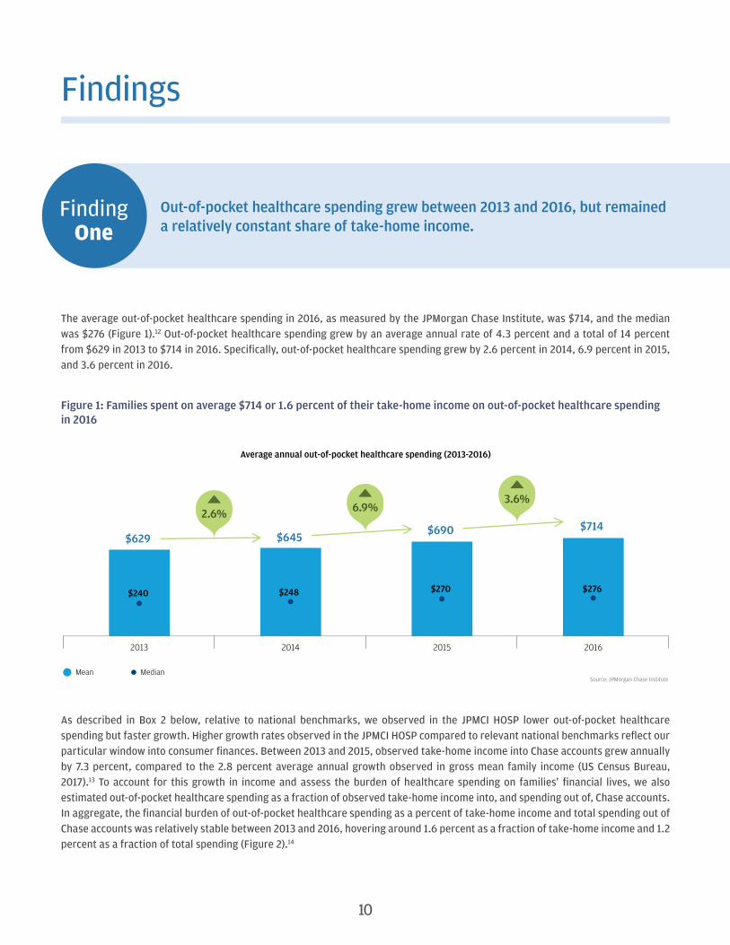
Out-of-pocket healthcare spending grew between 2013 and 2016, but remained a relatively constant share of take-home income.
The average out-of-pocket healthcare spending in 2016, as measured by the JPMorgan Chase Institute, was $714, and the median was $276 (Figure 1).12 Out-of-pocket healthcare spending grew by an average annual rate of 4.3 percent and a total of 14 percent from $629 in 2013 to $714 in 2016. Specifically, out-of-pocket healthcare spending grew by 2.6 percent in 2014, 6.9 percent in 2015, and 3.6 percent in 2016.
Figure 1: Families spent on average $714 or 1.6 percent of their take-home income on out-of-pocket healthcare spending in 2016
Source: JPMorgan Chase Institute
2013 2014 2015 2016
Mean Median
Average annual out-of-pocket healthcare spending (2013-2016)
$629 $645 $690 $714
$240 $248 $270 $276
2.6% 6.9%3.6%
As described in Box 2 below, relative to national benchmarks, we observed in the JPMCI HOSP lower out-of-pocket healthcare spending but faster growth. Higher growth rates observed in the JPMCI HOSP compared to relevant national benchmarks reflect our particular window into consumer finances. Between 2013 and 2015, observed take-home income into Chase accounts grew annually by 7.3 percent, compared to the 2.8 percent average annual growth observed in gross mean family income (US Census Bureau, 2017).13 To account for this growth in income and assess the burden of healthcare spending on families’ financial lives, we also estimated out-of-pocket healthcare spending as a fraction of observed take-home income into, and spending out of, Chase accounts. In aggregate, the financial burden of out-of-pocket healthcare spending as a percent of take-home income and total spending out of Chase accounts was relatively stable between 2013 and 2016, hovering around 1.6 percent as a fraction of take-home income and 1.2 percent as a fraction of total spending (Figure 2).14
10

PAYING OUT-OF-POCKET: THE HEALTHCARE SPENDING OF 2 MILLION US FAMILIESFindings
Figure 2: The financial burden of out-of-pocket healthcare spending remained stable between 2013 and 2016 in aggregate
Source: JPMorgan Chase Institute
Out-of-pocket healthcare spending remained a relatively constant share of take-home income and total spending between 2013 and 2016.
1.7%1.6% 1.6% 1.6%
1.1% 1.1% 1.2% 1.2%
2013 2014 2015 2016 2013 2014 2015 2016
Percent of take-home income in Chase accounts Percent of spending in Chase accounts
The observed growth in levels of out-of-pocket healthcare spending could have been driven by multiple factors. First, there is evidence that healthcare prices increased over this time frame (Health Care Cost Institute, 2016). Inflation estimates of medical care for urban consumers were 2.4 percent in 2013 and 2014, 2.6 percent in 2015, and 3.8 percent in 2016, higher than general inflation rates across all spending categories over this time frame (US Bureau of Labor Statistics, 2017a).15 A second cost-related factor was the growing prevalence of high-deductible health insurance plans which required more cost-sharing on the part of insured families than previously (Kaiser Family Foundation and Health Research & Education Trust, 2016).
Changes in healthcare utilization patterns could also have contributed to growth in levels of out-of-pocket healthcare spending. Utilization changes could have stemmed from broader health trends, as well as the growth in health insurance coverage rates over this period. Between 2013 and 2015, the percent of non-elderly adults without health insurance dropped from 18 percent to 14 percent (Barnett and Vornovitsky, 2016). Insurance coverage growth had the dual effects of lowering a family’s out-of-pocket healthcare obligations for a given unit of care, but also increasing utilization of healthcare services among families who newly gained health insurance coverage.16
Box 2. How the JPMorgan Chase Institute Health Out-of-pocket Spending Panel (JPMCI HOSP) compares to external benchmarks
We observed lower levels of out-of-pocket healthcare spending in the JPMCI HOSP compared to national benchmarks. Levels of out-of-pocket healthcare spending in the JPMCI HOSP ranged between 37 and 85 percent of national benchmarks depending on the data source (Figure 29). For a more in-depth comparison of the levels and composition of healthcare spending, see the Data Asset section. Growth rates in the JPMCI HOSP out-of-pocket healthcare spending were higher than national benchmarks, although there was substantial disagreement among benchmarks (Figure 3). For example, estimates for the year-over-year growth in out-of-pocket healthcare spending from 2014-2015 ranged from -4.0 percent in the CEX to 6.4 percent in CPS, compared to 6.9 percent growth in the JPMCI HOSP.
11

PAYING OUT-OF-POCKET: THE HEALTHCARE SPENDING OF 2 MILLION US FAMILIESFindings
Figure 3: Comparison of out-of-pocket healthcare spending growth rates between the JPMCI HOSP and national benchmarks
Source: JPMorgan Chase Institute
Year-over-year growth in out-of-pocket healthcare spending (2013-2016)
2.6%3.5% 3.1% 3.3%
-6.4%
1.7%
-6.4%
3.5%
-4.2%
1.5%1.8%0.8%
6.9%
3.6%
6.4%
3.0%
-4.0%
1.6%
2013 2014 2015 2016
JPMCI HOSP MEPS Household1 CPS1 NHEA2 CEX3 HCCI4
1 MEPS estimates are for households and CPS estimates are for families (18-64 years old).2 NHEA data reflect growth in per capita out-of-pocket healthcare spending by dividing total out-of-pocket spending by population; include population of all ages. 3 Include population of all ages. 4 Include population 0–64 years old covered by employer-sponsored insurance.
We observed lower levels of out-of-pocket healthcare spending burden in the JPMCI HOSP compared to benchmarks (Figure 4). In 2015, we estimated 1.6 percent of take-home income was spent on out-of-pocket healthcare expenses compared to 2.8 percent of gross income according to MEPS, 3.8 percent of gross income according to CPS, and 2.3 percent of after-tax income according to CEX. We found a qualitatively similar result when we compared healthcare expenses as a fraction of total spending in the CEX (2.4 percent in 2015) versus JPMCI HOSP (1.2 percent in 2015).
Although healthcare spending burden remained relatively stable over the four years, the slight decline observed in the JPMCI HOSP from 1.7 percent in 2013 to 1.6 percent in 2014 is consistent with benchmark estimates from the MEPS, CPS, and CEX, all three of which indicated a decline in burden in 2014 (Figure 4). Trends in the JPMCI HOSP diverged from these benchmarks in 2015, when national surveys show continued declines in healthcare spending burden, while the JPMCI HOSP exhibited flat or slightly increasing burden. As of this publication, no benchmarks were available for 2016.
Figure 4: Lower levels of healthcare spending burden were observed in the JPMCI HOSP compared to national benchmarks
Year
JPMCI HOSP MEPS1, 2 CPS1, 2 CEX1
Percent of take-home income
Percent of total expenditure
Percent of gross income
Percent of gross income
Percent of after-tax income
Percent of total expenditure
2013 1.7% 1.1% 5.3% 4.1% 2.5% 2.7%
2014 1.6% 1.1% 4.2% 3.8% 2.4% 2.7%
2015 1.6% 1.2% 2.8% 3.8% 2.3% 2.4%
2016 1.6% 1.2%
1 MEPS estimates are for households and CPS estimates are for families (18-64 years old). CEX estimates are for all consumer units.2 For CPS, we bottom coded family income at $5,000. For MEPS, we only included households with positive income.
12

PAYING OUT-OF-POCKET: THE HEALTHCARE SPENDING OF 2 MILLION US FAMILIESFindings
Finding Two
The financial burden of out-of-pocket healthcare spending was highest for older, lower-income, and female account holders and increased in 2016 for low-income account holders.
Out-of-pocket healthcare spending levels were highest among older and higher-income account holders (Figure 5). Healthcare spending as a percent of take-home income was highest among older and lower-income account holders.17 Out-of-pocket healthcare spending diverged most starkly across the income spectrum: in 2016, out-of-pocket healthcare spending among top income-quintile account holders ($1,322) was more than three times higher than that of account holders in the lowest income quintile ($356). This trend was the opposite for healthcare spending burden: account holders in the top income quintile spent 1.0 percent of their take-home income on healthcare compared to 2.8 percent for account holders in the lowest income quintile. Account holders with higher incomes may have consumed a higher quantity of healthcare or higher priced healthcare or been obligated to pay a higher share of healthcare expenses incurred. Account holders with lower income bore a higher burden of healthcare spending even though they spent fewer dollars on healthcare.
Figure 5: Account holders with lower income bore a higher burden of healthcare spending even though they spent fewer dollars on healthcare
Source: JPMorgan Chase Institute
Level and burden of out-of-pocket healthcare spending by demographic characteristics of primary account holder in 2016
$265$535
$792$854
$827
$356$446
$603$845
$1,322
Age
Qui
ntile
of t
ake-
hom
e in
com
e
$714 1.6%
1.2%1.4%
1.6%1.7%
1.9%
2.8%1.6%
1.4%1.3%
1.0%
Out-of-pocket healthcare spending as a fraction of take-home income in 2016
Out-of-pocket healthcarespending in 2016
Sample average Sample average
18-25
26-34
35-44
45-54
55-64
Quintile 1: <$24,000
Quintile 2: $24,000 - $38,000
Quintile 3: $38,000 - $57,000
Quintile 4: $57,000 - $92,000
Quintile 5: >$92,000
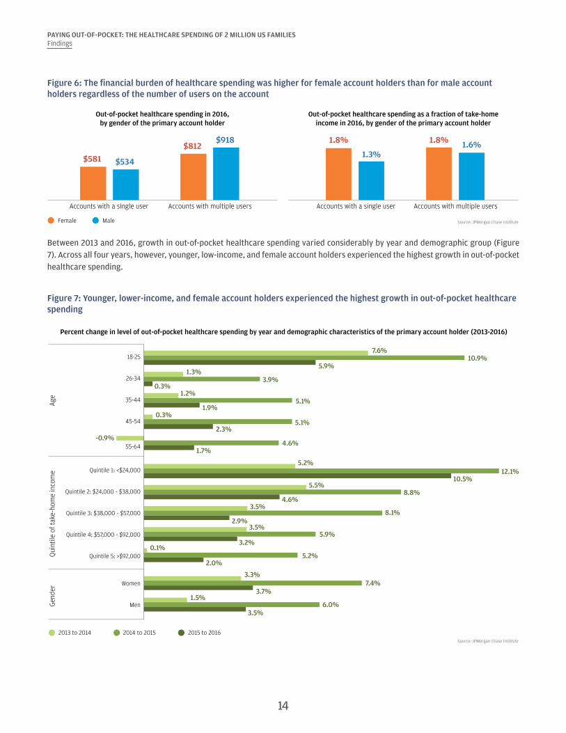
We also examined the financial burden of out-of-pocket healthcare spending by the gender of the account holder (Figure 6). In doing so we distinguished between accounts with a single user versus accounts with multiple users in order to more accurately reflect the gender of the payer and to control for the fact that accounts with multiple users—and thus likely higher spending—were more likely to be held by men (Farrell and Greig, 2017b). Among account holders who were the only authorized user on the account, women exhibited higher healthcare spending than men in both absolute terms and as a percent of take-home income. Among accounts with multiple users, we observed lower healthcare spending in accounts held by women than accounts held by men, but healthcare spending still represented a higher fraction of take-home income in accounts held by women than accounts held by men. Thus the financial burden of healthcare spending was higher for female account holders than male account holders regardless of the number of users on the account.
13
PAYING OUT-OF-POCKET: THE HEALTHCARE SPENDING OF 2 MILLION US FAMILIESFindings
Figure 6: The financial burden of healthcare spending was higher for female account holders than for male account holders regardless of the number of users on the account
Source: JPMorgan Chase Institute
Out-of-pocket healthcare spending in 2016,by gender of the primary account holder
Out-of-pocket healthcare spending as a fraction of take-homeincome in 2016, by gender of the primary account holder
Female Male
$581
$812
$534
$918
Accounts with a single user Accounts with multiple users
1.8%
1.3%
1.8%1.8% 1.6%
Accounts with a single user Accounts with multiple users
Between 2013 and 2016, growth in out-of-pocket healthcare spending varied considerably by year and demographic group (Figure 7). Across all four years, however, younger, low-income, and female account holders experienced the highest growth in out-of-pocket healthcare spending.
Figure 7: Younger, lower-income, and female account holders experienced the highest growth in out-of-pocket healthcare spending
Source: JPMorgan Chase Institute
Age
Gend
erQ
uint
ile o
f tak
e-ho
me
inco
me
7.6%
1.3%
1.2%
0.3%
5.2%
5.5%
3.5%
3.5%
0.1%
3.3%
1.5%
-0.9%
10.9%
3.9%
5.1%
5.1%
12.1%
8.8%
8.1%
5.9%
5.2%
7.4%
6.0%
4.6%
5.9%
0.3%
1.9%
2.3%
10.5%
4.6%
2.9%
3.2%
2.0%
3.7%
3.5%
1.7%
Percent change in level of out-of-pocket healthcare spending by year and demographic characteristics of the primary account holder (2013-2016)
18-25
26-34
35-44
45-54
55-64
Quintile 1: <$24,000
Quintile 2: $24,000 - $38,000
Quintile 3: $38,000 - $57,000
Quintile 4: $57,000 - $92,000
Quintile 5: >$92,000
Women
Men
2013 to 2014 2014 to 2015 2015 to 2016
14

PAYING OUT-OF-POCKET: THE HEALTHCARE SPENDING OF 2 MILLION US FAMILIESFindings
Between 2013 and 2016, although out-of-pocket healthcare spending represented a relatively constant share of take-home income in aggregate, there were a few notable changes for certain groups. First, from 2013 to 2014, the burden of healthcare spending dropped slightly for all demographic groups, but the largest percentage point drops were experienced by 55-64 year olds (0.2 percentage points drop) and low-income account holders (0.3 percentage points drop). Healthcare spending burden remained relatively flat from 2014 to 2015 but increased slightly in 2016 for low-income account holders, who experienced a 0.3 percentage points increase in burden (Figure 8).18
Figure 8: Between 2015 and 2016, out-of-pocket healthcare spending burden increased for low-income account holders
Source: JPMorgan Chase Institute
Out-of-pocket healthcare spending as a percent of take-home income by year and demographic characteristics of the primary account holder (2013-2016)
From 2013 to 2014,55-64 year olds and low-income account holders experienced the largest
percentage point drops inout-of-pocket healthcare
spending burden.
From2015 to 2016, low-
income account holdersexperienced an increase
in out-of-pockethealthcare spending
burden.
Age
Gend
erQ
uint
ile o
f tak
e-ho
me
inco
me
18-25
26-34
35-44
45-54
55-64
Quintile 1: <$24,000
Quintile 2: $24,000 - $38,000
Quintile 3: $38,000 - $57,000
Quintile 4: $57,000 - $92,000
Quintile 5: >$92,000
Women
Men
2013 2014 2015 2016
1.2%1.2%1.2%
1.2%
1.5%1.4%1.4%
1.4%
1.7%1.6%1.6%
1.6%
1.8%1.7%
1.6%1.7%
1.7%1.6%
1.6%1.6%
1.5%1.4%1.4%
1.4%
1.3%1.3%1.3%1.3%
1.1%1.0%1.0%1.0%
1.9%1.8%1.8%
1.8%
1.6%1.4%1.4%
1.5%
2.1%1.9%
1.9%1.9%
2.8%2.5%2.5%
2.8%
15
PAYING OUT-OF-POCKET: THE HEALTHCARE SPENDING OF 2 MILLION US FAMILIESFindings
Finding Three
Doctor, dental, and hospital payments accounted for more than half of observed healthcare spending. Dental and hospital payments were less common but larger in magnitude.
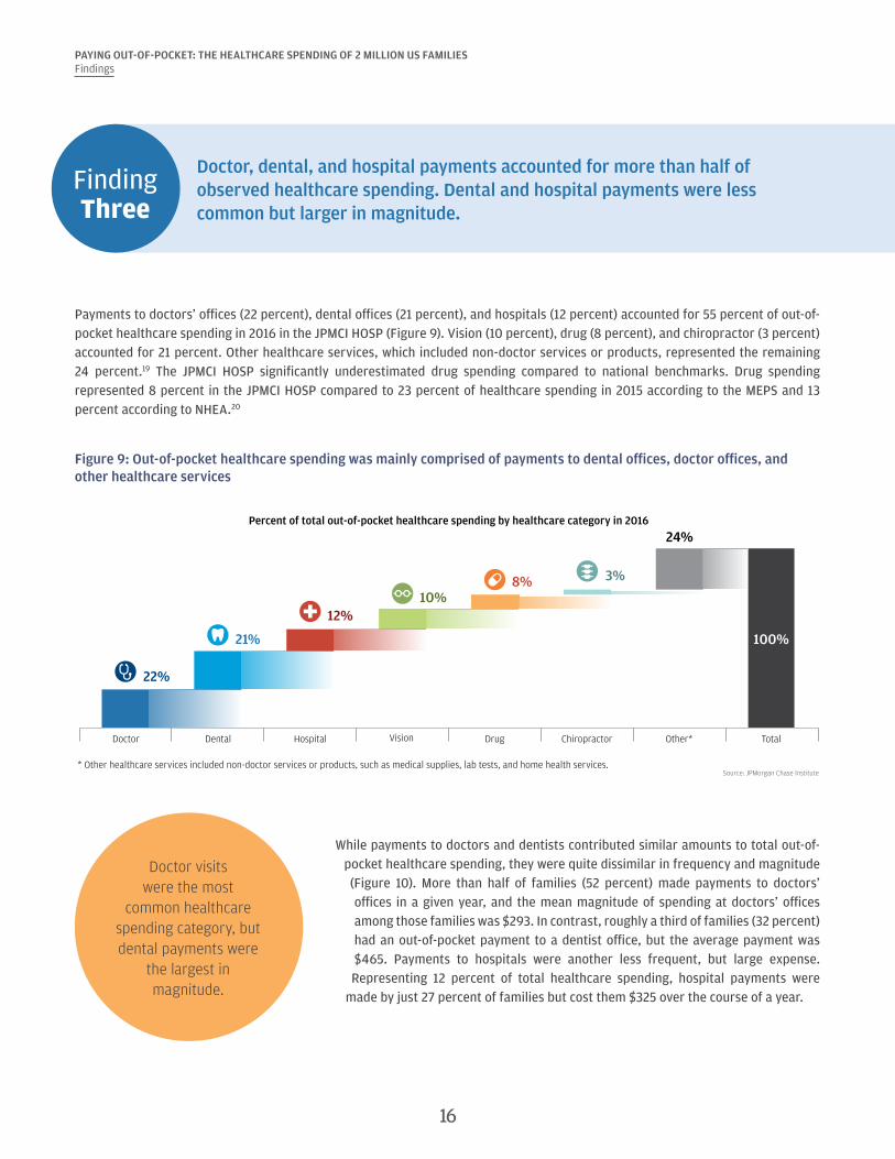
Payments to doctors’ offices (22 percent), dental offices (21 percent), and hospitals (12 percent) accounted for 55 percent of out-of-pocket healthcare spending in 2016 in the JPMCI HOSP (Figure 9). Vision (10 percent), drug (8 percent), and chiropractor (3 percent) accounted for 21 percent. Other healthcare services, which included non-doctor services or products, represented the remaining 24 percent.19 The JPMCI HOSP significantly underestimated drug spending compared to national benchmarks. Drug spending represented 8 percent in the JPMCI HOSP compared to 23 percent of healthcare spending in 2015 according to the MEPS and 13 percent according to NHEA.20
Figure 9: Out-of-pocket healthcare spending was mainly comprised of payments to dental offices, doctor offices, and other healthcare services
22%
21%
12%10%
8% 3%
24%
100%
Doctor Dental Hospital Vision Drug Chiropractor Other* Total
Percent of total out-of-pocket healthcare spending by healthcare category in 2016
* Other healthcare services included non-doctor services or products, such as medical supplies, lab tests, and home health services.Source: JPMorgan Chase Institute
Doctor visits were the most
common healthcare spending category, but dental payments were
the largest in magnitude.
While payments to doctors and dentists contributed similar amounts to total out-of-pocket healthcare spending, they were quite dissimilar in frequency and magnitude (Figure 10). More than half of families (52 percent) made payments to doctors’ offices in a given year, and the mean magnitude of spending at doctors’ offices among those families was $293. In contrast, roughly a third of families (32 percent) had an out-of-pocket payment to a dentist office, but the average payment was $465. Payments to hospitals were another less frequent, but large expense. Representing 12 percent of total healthcare spending, hospital payments were
made by just 27 percent of families but cost them $325 over the course of a year.
16

PAYING OUT-OF-POCKET: THE HEALTHCARE SPENDING OF 2 MILLION US FAMILIESFindings
Figure 10: Doctor visits were the most common healthcare spending category but dentist visits were the most expensive
Source: JPMorgan Chase Institute
Percent of families with positive healthcarespending by healthcare category in 2016
Average positive spending by healthcarecategory in 2016
52%
44%
32%
32%
27%
8%
53%
Doctor
Drug
Dental
Vision
Hospital
Chiropractor
Other*
$293
$125
$465
$232
$325
$268
$330
* Other healthcare services included non-doctor services or products, such as medical supplies, lab tests, and home health services.
Between 2013 and 2016, the fastest growing categories of out-of-pocket healthcare spending were hospitals, doctors, chiropractors, and other healthcare expenses (Figure 11). Our data indicated a decline in out-of-pocket drug spending in recent years, a trend present in both the MEPS data series and in research by Cox et al. (2016). Doctor (1.2 percentage points), hospital (0.7 percentage points), and other healthcare spending (2.1 percentage points) made the largest contributions to the 4.3 percent annual growth between 2013 and 2016.
Figure 11: Except for drug, spending in most healthcare categories increased
Source: JPMorgan Chase Institute
Average annual growth in healthcare spendingbetween 2013 and 2016, by healthcare category
Percentage point contribution to growth in healthcarespending between 2013 and 2016, by healthcare category
Other* TotalHospital VisionDental
Drug
Doctor Chiropractor
5.6%
2.9%
5.9%
0.2%
-4.4pp
4.9%
9.4%
4.3%
* Other healthcare services included non-doctor services or products, such as medical supplies, lab tests, and home health services.
1.2pp
0.6pp
0.7pp 0.0pp -0.4pp0.1pp
2.1pp 4.3pp
Other* TotalHospital VisionDental DrugDoctor Chiropractor
17

PAYING OUT-OF-POCKET: THE HEALTHCARE SPENDING OF 2 MILLION US FAMILIESFindings
Finding Four
Out-of-pocket healthcare spending was highly concentrated among a few families—often the same families year over year. The top 10 percent of families spent 9 percent of their take-home income on healthcare expenses.
Out-of-pocket healthcare spending was highly concentrated among a small segment of the population. The top 10 percent of spenders contributed 49 percent of total out-of-pocket spending in 2016 (Figure 12).21 The average family in the top 10 percent spent $3,482, and the top 5 percent spent $4,592. Seventeen percent of families had no healthcare spending in 2016.22
Figure 12: The top 10 percent of families in terms of out-of-pocket healthcare spending accounted for nearly 50 percent of all healthcare spending
Source: JPMorgan Chase Institute
Percent of total out-of-pocket healthcare spending and average spending level by decile in 2016
0% 0% 1% 2% 3% 5%8%
12%
21%
49%
$0 $3 $43 $113 $213 $355$562
$890
$1,482
$3,482
Share of total healthcare spending
Average healthcare spending in decile
0-10th 10-20th 20-30th 30-40th 40-50th 50-60th 60-70th 70-80th 80-90th 90-100th
Decile of out-of-pocket healthcare spending level in 2016
Economic wellbeing might be affected by healthcare spending, particularly for those families who spent a large fraction of their income on healthcare expenses. The top 10 percent of families in terms of healthcare spending burden spent 8.5 percent of their take-home income on healthcare services, roughly equivalent to what a typical family spends on all utilities in a year (Figure 13). The top 5 percent of families in terms of healthcare burden spent 12.3 percent of their take-home income on healthcare out-of-pocket expenses.
Figure 13: The top 10 percent of families in terms of healthcare burden spent 8.5 percent of their take-home income on healthcare expenses
Source: JPMorgan Chase Institute
Average out-of-pocket healthcare spending burden within burden decile in 2016
0-10th 10-20th 20-30th 30-40th 40-50th 50-60th 60-70th 70-80th 80-90th 90-100th
0.0% 0.0% 0.1% 0.3% 0.5% 0.8% 1.2%1.8%
2.9%
8.5%
Decile of out-of-pocket healthcare spending burden in 2016
18
19
PAYING OUT-OF-POCKET: THE HEALTHCARE SPENDING OF 2 MILLION US FAMILIESFindings
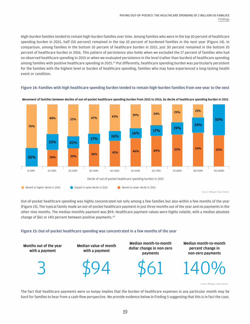
High-burden families tended to remain high-burden families over time. Among families who were in the top 10 percent of healthcare spending burden in 2015, half (50 percent) remained in the top 10 percent of burdened families in the next year (Figure 14). In comparison, among families in the bottom 10 percent of healthcare burden in 2015, just 30 percent remained in the bottom 10 percent of healthcare burden in 2016. This pattern of persistence also holds when we excluded the 17 percent of families who had no observed healthcare spending in 2015 or when we evaluated persistence in the level (rather than burden) of healthcare spending among families with positive healthcare spending in 2015.23 Put differently, healthcare spending burden was particularly persistent for the families with the highest level or burden of healthcare spending, families who may have experienced a long-lasting health event or condition.
Figure 14: Families with high healthcare spending burden tended to remain high-burden families from one year to the next
Source: JPMorgan Chase Institute
Movement of families between deciles of out-of-pocket healthcare spending burden from 2015 to 2016, by decile of healthcare spending burden in 2015
0-10th 10-20th 20-30th 30-40th 40-50th 50-60th 60-70th 70-80th 80-90th 90-100th
Decile of out-of-pocket healthcare spending burden in 2015
Moved to higher decile in 2016 Moved to lower decile in 2016Stayed in same decile in 2016
70%
48% 52%39% 34% 29% 21%
47% 43%
30%
25% 20%
16%17%
19%24%
50%
17%16%
50%
26% 29%
46% 49% 52% 54%
36% 41%
Out-of-pocket healthcare spending was highly concentrated not only among a few families but also within a few months of the year (Figure 15). The typical family made an out-of-pocket healthcare payment in just three months out of the year and no payments in the other nine months. The median monthly payment was $94. Healthcare payment values were highly volatile, with a median absolute change of $61 or 140 percent between positive payments.24
Figure 15: Out-of-pocket healthcare spending was concentrated in a few months of the year
Source: JPMorgan Chase Institute
Months out of the year with a payment
3Median value of month
with a payment
$94
Median month-to-month dollar change in non-zero
payments
$61
Median month-to-month percent change in
non-zero payments
140%The fact that healthcare payments were so lumpy implies that the burden of healthcare expenses in any particular month may be hard for families to bear from a cash-flow perspective. We provide evidence below in Finding 5 suggesting that this is in fact the case.
PAYING OUT-OF-POCKET: THE HEALTHCARE SPENDING OF 2 MILLION US FAMILIESFindings
Finding Five
Families made larger healthcare payments in the months and the years when they had a higher ability to pay. Elevated dental and hospital payments primarily contributed to high healthcare spending.
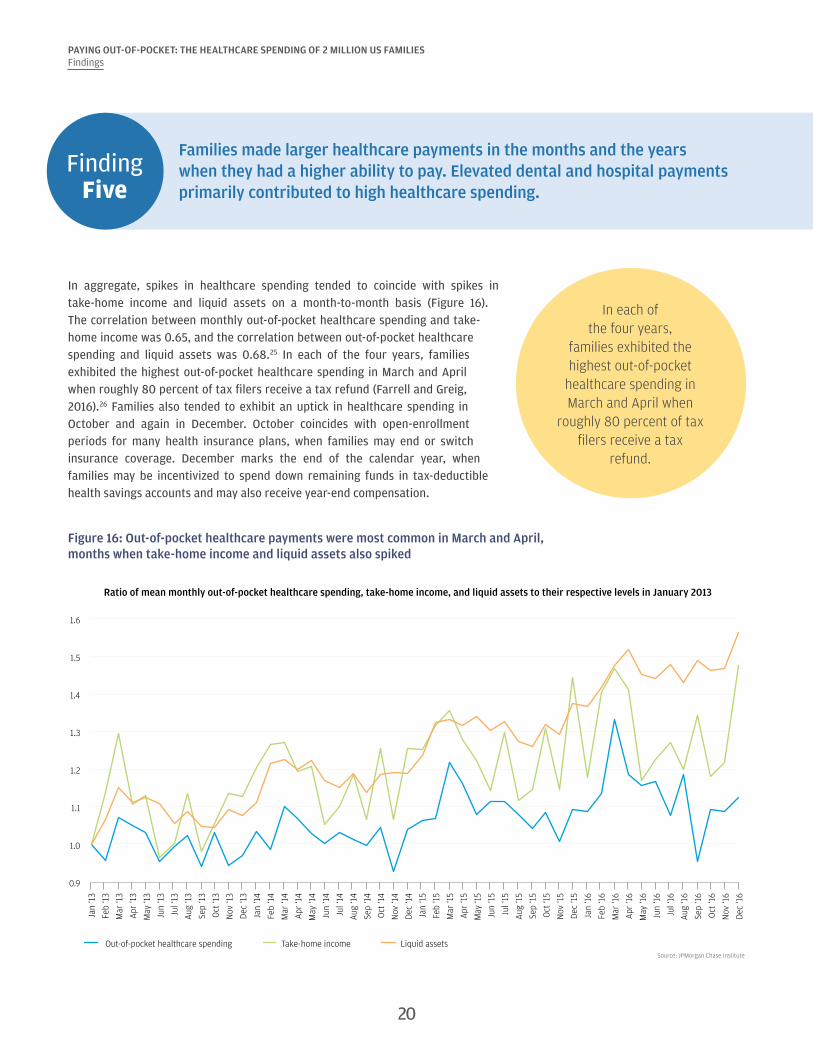
In aggregate, spikes in healthcare spending tended to coincide with spikes in take-home income and liquid assets on a month-to-month basis (Figure 16). The correlation between monthly out-of-pocket healthcare spending and take-home income was 0.65, and the correlation between out-of-pocket healthcare spending and liquid assets was 0.68.25 In each of the four years, families exhibited the highest out-of-pocket healthcare spending in March and April when roughly 80 percent of tax filers receive a tax refund (Farrell and Greig, 2016).26 Families also tended to exhibit an uptick in healthcare spending in October and again in December. October coincides with open-enrollment periods for many health insurance plans, when families may end or switch insurance coverage. December marks the end of the calendar year, when families may be incentivized to spend down remaining funds in tax-deductible health savings accounts and may also receive year-end compensation.
In each of the four years,
families exhibited the highest out-of-pocket
healthcare spending in March and April when
roughly 80 percent of tax filers receive a tax
refund.
Figure 16: Out-of-pocket healthcare payments were most common in March and April, months when take-home income and liquid assets also spiked
Source: JPMorgan Chase Institute
0.9
1.0
1.1
1.2
1.3
1.4
1.5
1.6
Jan
‘13
Feb
‘13
Mar
‘13
Apr
‘13
May
‘13
Jun
‘13
Jul ‘
13
Aug
‘13
Sep
‘13
Oct
‘13
Nov
‘13
Dec
‘13
Jan
‘14
Feb
‘14
Mar
‘14
Apr
‘14
May
‘14
Jun
‘14
Jul ‘
14
Aug
‘14
Sep
‘14
Oct
‘14
Nov
‘14
Dec
‘14
Jan
‘15
Feb
‘15
Mar
‘15
Apr
‘15
May
‘15
Jun
‘15
Jul ‘
15
Aug
‘15
Sep
‘15
Oct
‘15
Nov
‘15
Dec
‘15
Jan
‘16
Feb
‘16
Mar
‘16
Apr
‘16
May
‘16
Jun
‘16
Jul ‘
16
Aug
‘16
Sep
‘16
Oct
‘16
Nov
‘16
Dec
‘16
Out-of-pocket healthcare spending Take-home income Liquid assets
Ratio of mean monthly out-of-pocket healthcare spending, take-home income, and liquid assets to their respective levels in January 2013
20
PAYING OUT-OF-POCKET: THE HEALTHCARE SPENDING OF 2 MILLION US FAMILIESFindings
The correlations between healthcare spending and take-home income and liquid assets reinforce the previous JPMorgan Chase Institute finding that extraordinary medical payments tend to coincide with moments of higher ability to pay—specifically, spikes in liquid assets and income, particularly income from tax refunds (Farrell and Greig, 2017a). Put differently, families made larger healthcare payments in the months in which they had higher take-home income and liquid assets.
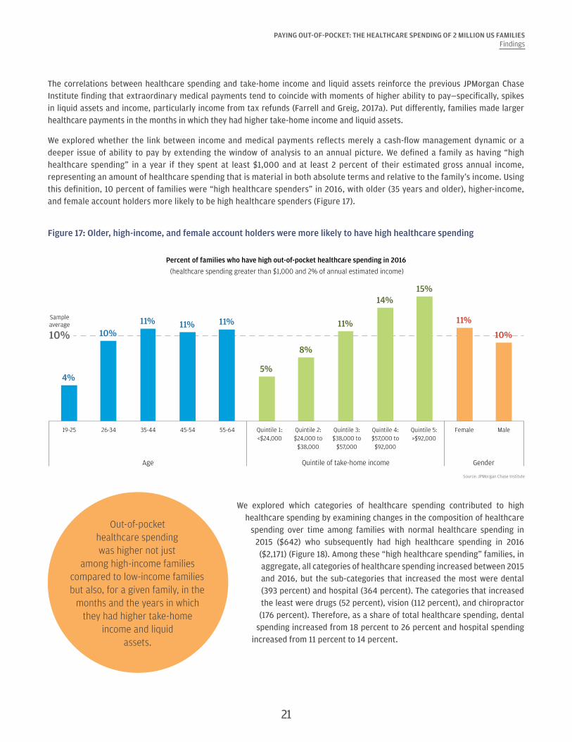
We explored whether the link between income and medical payments reflects merely a cash-flow management dynamic or a deeper issue of ability to pay by extending the window of analysis to an annual picture. We defined a family as having “high healthcare spending” in a year if they spent at least $1,000 and at least 2 percent of their estimated gross annual income, representing an amount of healthcare spending that is material in both absolute terms and relative to the family’s income. Using this definition, 10 percent of families were “high healthcare spenders” in 2016, with older (35 years and older), higher-income, and female account holders more likely to be high healthcare spenders (Figure 17).
Figure 17: Older, high-income, and female account holders were more likely to have high healthcare spending
Source: JPMorgan Chase Institute
4%
10%11% 11% 11%
5%
8%
11%
14%15%
11%
10%
Female Male
Age Quintile of take-home income Gender
19-25 26-34 35-44 45-54 55-64
Percent of families who have high out-of-pocket healthcare spending in 2016
(healthcare spending greater than $1,000 and 2% of annual estimated income)
10%
Quintile 1:<$24,000
Quintile 2:$24,000 to
$38,000
Quintile 3:$38,000 to
$57,000
Quintile 4:$57,000 to$92,000
Quintile 5:>$92,000
Sampleaverage
Out-of-pocket healthcare spending was higher not just
among high-income families compared to low-income families but also, for a given family, in the
months and the years in which they had higher take-home
income and liquid assets.
We explored which categories of healthcare spending contributed to high healthcare spending by examining changes in the composition of healthcare
spending over time among families with normal healthcare spending in 2015 ($642) who subsequently had high healthcare spending in 2016 ($2,171) (Figure 18). Among these “high healthcare spending” families, in aggregate, all categories of healthcare spending increased between 2015 and 2016, but the sub-categories that increased the most were dental (393 percent) and hospital (364 percent). The categories that increased the least were drugs (52 percent), vision (112 percent), and chiropractor (176 percent). Therefore, as a share of total healthcare spending, dental
spending increased from 18 percent to 26 percent and hospital spending increased from 11 percent to 14 percent.
21

PAYING OUT-OF-POCKET: THE HEALTHCARE SPENDING OF 2 MILLION US FAMILIESFindings
Figure 18: Dental and hospital payments accounted for a higher percent of healthcare spending when healthcare spending was elevated
Source: JPMorgan Chase Institute
Di�erence in composition of out-of-pocket healthcare spending as families transitioned from having normal spending in 2015 to having high spending in 2016
2015 (Normal healthcare spending year)
2016(High healthcare spending year)
Other*
Chiropractor
Drug
Hospital
Vision
Dental
Doctor
20%
5%
26%
8%
14%
3%
24%
23%
11%
18%
13%
11%
3%
22%
* Other healthcare services included non-doctor services or products, such as medical supplies, lab tests, and home health services.
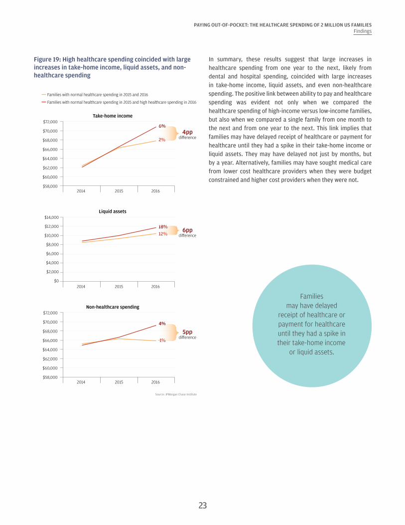
We examined changes in take-home income, liquid assets in Chase accounts, and non-healthcare spending as families transitioned from having normal healthcare spending in 2015 to high healthcare spending in 2016. To account for secular growth in take-home income and spending among this sample, we matched each “high healthcare spending” family (our treatment group) with a “normal healthcare spending” family (our control group) who had similar demographic and financial attributes but healthcare spending below $1,000 and 2 percent of estimated gross annual income in 2015. This means a key difference between these matched families, despite being very similar in 2015, was their healthcare spending level in 2016.27 Figure 19 shows that in 2015 high spending families had very similar levels of take-home income, liquid assets, and non-healthcare spending compared to normal spending families, three of the characteristics on which the families were matched in 2015. We show trends in these outcomes between 2014 (prior to the matching) and 2016 (the year when our treatment group had high healthcare spending).
Families with high healthcare spending 2016 experienced larger increases in take-home income (4 percentage points difference), liquid assets (6 percentage points difference), and non-healthcare spending (5 percentage points difference) than families with normal healthcare spending in 2016 (Figure 19). For example, take-home income increased between 2015 and 2016 by $3,466 or 6 percent for families with high healthcare spending in 2016, compared to $1,332 or 2 percent among similar families with normal healthcare spending in 2016. Similar divergent patterns existed with liquid assets and non-healthcare spending. Surprisingly, high healthcare spending was not associated with lower non-healthcare spending in aggregate. Non-healthcare spending also grew faster among high spending families in 2016 (4 percent) than normal spending families (-1 percent).
22
PAYING OUT-OF-POCKET: THE HEALTHCARE SPENDING OF 2 MILLION US FAMILIESFindings
Figure 19: High healthcare spending coincided with large increases in take-home income, liquid assets, and non-healthcare spending
Source: JPMorgan Chase Institute
Families with normal healthcare spending in 2015 and 2016
Families with normal healthcare spending in 2015 and high healthcare spending in 2016
Take-home income
2014 2015 2016
$72,000
$58,000
$60,000
$62,000
$64,000
$68,000
$66,000
$70,0006%
2%
Liquid assets
2014 2015 2016
$2,000
$6,000
$0
$4,000
$12,000
$10,000
$8,000
$14,000
18%12%
$72,000
$58,000
$60,000
$62,000
$64,000
$68,000
$66,000
$70,000
Non-healthcare spending
2014 2015 2016
4%
-1%
4ppdi�erence
6ppdi�erence
5ppdi�erence
In summary, these results suggest that large increases in healthcare spending from one year to the next, likely from dental and hospital spending, coincided with large increases in take-home income, liquid assets, and even non-healthcare spending. The positive link between ability to pay and healthcare spending was evident not only when we compared the healthcare spending of high-income versus low-income families, but also when we compared a single family from one month to the next and from one year to the next. This link implies that families may have delayed receipt of healthcare or payment for healthcare until they had a spike in their take-home income or liquid assets. They may have delayed not just by months, but by a year. Alternatively, families may have sought medical care from lower cost healthcare providers when they were budget constrained and higher cost providers when they were not.
Families may have delayed
receipt of healthcare or payment for healthcare until they had a spike in their take-home income
or liquid assets.
23
PAYING OUT-OF-POCKET: THE HEALTHCARE SPENDING OF 2 MILLION US FAMILIESFindings
Finding Six
There was dramatic variation in out-of-pocket healthcare spending between and within our 23 states. Families in Colorado spent the most on healthcare, while families in Louisiana spent the highest fraction of their gross income on healthcare.
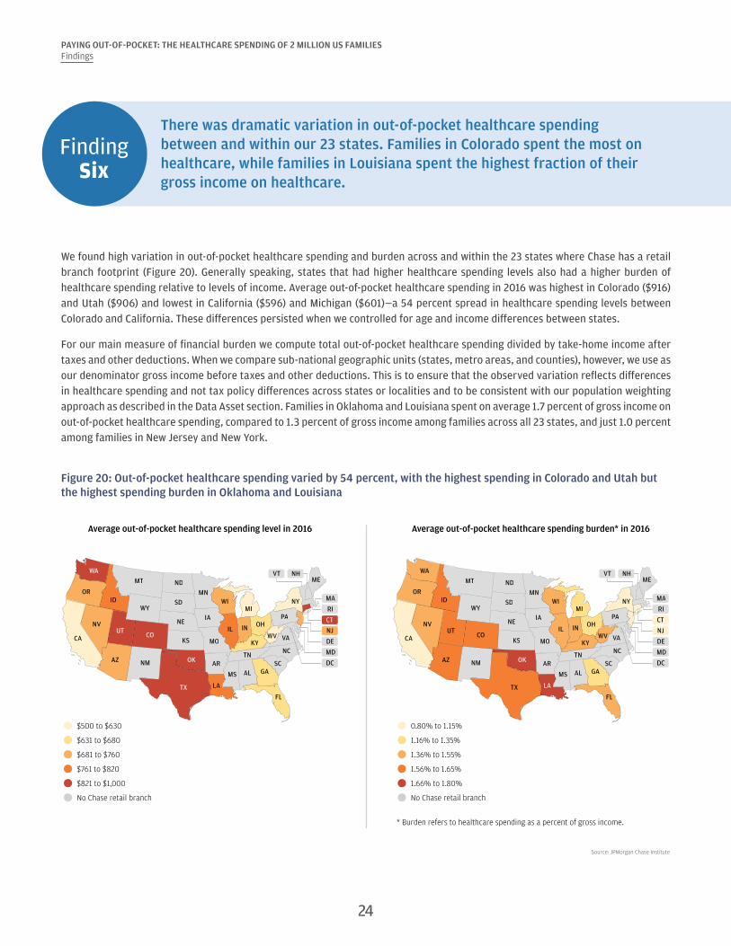
We found high variation in out-of-pocket healthcare spending and burden across and within the 23 states where Chase has a retail branch footprint (Figure 20). Generally speaking, states that had higher healthcare spending levels also had a higher burden of healthcare spending relative to levels of income. Average out-of-pocket healthcare spending in 2016 was highest in Colorado ($916) and Utah ($906) and lowest in California ($596) and Michigan ($601)—a 54 percent spread in healthcare spending levels between Colorado and California. These differences persisted when we controlled for age and income differences between states.
For our main measure of financial burden we compute total out-of-pocket healthcare spending divided by take-home income after taxes and other deductions. When we compare sub-national geographic units (states, metro areas, and counties), however, we use as our denominator gross income before taxes and other deductions. This is to ensure that the observed variation reflects differences in healthcare spending and not tax policy differences across states or localities and to be consistent with our population weighting approach as described in the Data Asset section. Families in Oklahoma and Louisiana spent on average 1.7 percent of gross income on out-of-pocket healthcare spending, compared to 1.3 percent of gross income among families across all 23 states, and just 1.0 percent among families in New Jersey and New York.
Figure 20: Out-of-pocket healthcare spending varied by 54 percent, with the highest spending in Colorado and Utah but the highest spending burden in Oklahoma and Louisiana
Source: JPMorgan Chase Institute
FLTX
NMAZ
CA
NVUT
CO
OR
WA
ID
OK
MT
WY
ND
SD
NE
KS
MN
IA
MO
AR
LA
MS AL GASC
IL
WIMI
IN OH
TN
KYNC
WV VA
PA
NY
MEVT NH
RI
CT
NJ
DE
MD
MA
DC
FLTX
NMAZ
CA
NVUT
CO
OR
WA
ID
OK
MT
WY
ND
SD
NE
KS
MN
IA
MO
AR
LA
MS AL GASC
IL
WIMI
IN OH
TN
KYNC
WV VA
PA
NY
MEVT NH
RI
CT
NJ
DE
MD
MA
DC
$500 to $630
$631 to $680
$681 to $760
$761 to $820
$821 to $1,000
No Chase retail branch
Average out-of-pocket healthcare spending level in 2016 Average out-of-pocket healthcare spending burden* in 2016
0.80% to 1.15%
1.16% to 1.35%
1.36% to 1.55%
1.56% to 1.65%
1.66% to 1.80%
No Chase retail branch
* Burden refers to healthcare spending as a percent of gross income.
24
PAYING OUT-OF-POCKET: THE HEALTHCARE SPENDING OF 2 MILLION US FAMILIESFindings
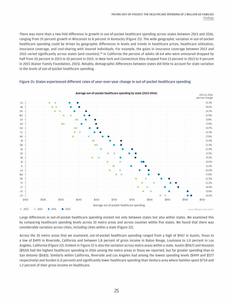
There was more than a two-fold difference in growth in out-of-pocket healthcare spending across states between 2013 and 2016, ranging from 19 percent growth in Wisconsin to 8 percent in Kentucky (Figure 21). The wide geographic variation in out-of-pocket healthcare spending could be driven by geographic differences in levels and trends in healthcare prices, healthcare utilization, insurance coverage, and cost-sharing with insured individuals. For example, the gains in insurance coverage between 2013 and 2015 varied significantly across states (and counties).28 In California the percent of adults 18-64 who were uninsured dropped by half from 20 percent in 2013 to 10 percent in 2015. In New York and Connecticut they dropped from 13 percent in 2013 to 9 percent in 2015 (Kaiser Family Foundation, 2015). Notably, demographic differences between states did little to account for state variation in the levels of out-of-pocket healthcare spending.
Figure 21: States experienced different rates of year-over-year change in out-of-pocket healthcare spending
Source: JPMorgan Chase Institute
Average out-of-pocket healthcare spending by state (2013-2016)2013 to 2016
percent change
Average out-of-pocket healthcare spending2013 2014 2015 2016
CA
MI
NY
WV
KY
GA
OH
FL
NV
IN
OR
NJ
AZ
WI
ID
IL
LA
WA
OK
TX
CT
UT
CO
$450 $500 $550 $600 $650 $700 $750 $800 $850 $900 $950
15.3%
14.6%
16.7%
12.9%
8.4%
17.4%
10.7%
12.3%
17.0%
12.4%
11.3%
13.5%
11.5%
19.1%
15.0%
13.1%
16.0%
17.0%
12.3%
12.2%
14.9%
15.9%
10.5%
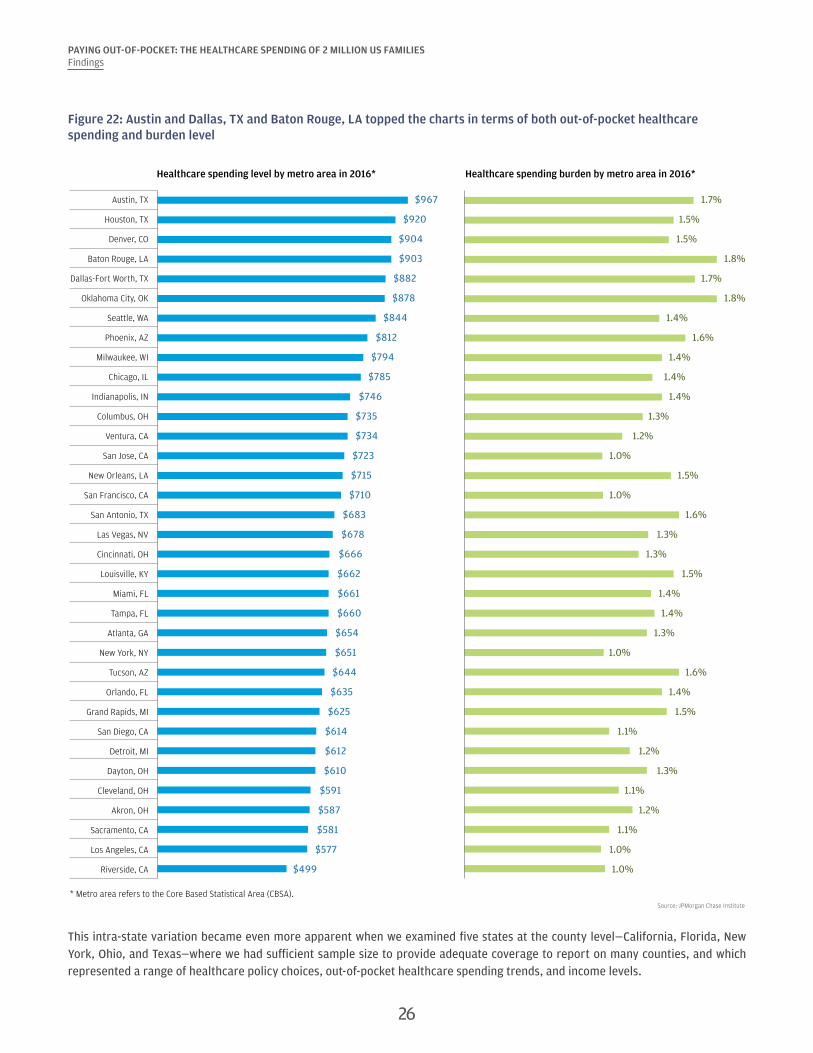
Large differences in out-of-pocket healthcare spending existed not only between states but also within states. We examined this by comparing healthcare spending levels across 35 metro areas and across counties within five states. We found that there was considerable variation across cities, including cities within a state (Figure 22).
Across the 35 metro areas that we examined, out-of-pocket healthcare spending ranged from a high of $967 in Austin, Texas to a low of $499 in Riverside, California and between 1.8 percent of gross income in Baton Rouge, Louisiana to 1.0 percent in Los Angeles, California (Figure 22). Evident in Figure 22 is also the variation across metro areas within a state. Austin ($967) and Houston ($920) had the highest healthcare spending in 2016 among the metro areas in Texas we reported, but far greater spending than in San Antonio ($683). Similarly within California, Riverside and Los Angeles had among the lowest spending levels ($499 and $577 respectively) and burden (1.0 percent) and significantly lower healthcare spending than Ventura area where families spent $734 and 1.2 percent of their gross income on healthcare.
25
PAYING OUT-OF-POCKET: THE HEALTHCARE SPENDING OF 2 MILLION US FAMILIESFindings
Figure 22: Austin and Dallas, TX and Baton Rouge, LA topped the charts in terms of both out-of-pocket healthcare spending and burden level
* Metro area refers to the Core Based Statistical Area (CBSA).Source: JPMorgan Chase Institute
Austin, TX $967 1.7%
Houston, TX $920 1.5%
Denver, CO $904 1.5%
Baton Rouge, LA $903 1.8%
Dallas-Fort Worth, TX $882 1.7%
Oklahoma City, OK $878 1.8%
Seattle, WA $844 1.4%
Phoenix, AZ $812 1.6%
Milwaukee, WI $794 1.4%
Chicago, IL $785 1.4%
Indianapolis, IN $746 1.4%
Columbus, OH $735 1.3%
Ventura, CA $734 1.2%
San Jose, CA $723 1.0%
New Orleans, LA $715 1.5%
San Francisco, CA $710 1.0%
San Antonio, TX $683 1.6%
Las Vegas, NV $678 1.3%
Cincinnati, OH $666 1.3%
Louisville, KY $662 1.5%
Miami, FL $661 1.4%
Tampa, FL $660 1.4%
Atlanta, GA $654 1.3%
New York, NY $651 1.0%
Tucson, AZ $644 1.6%
Orlando, FL $635 1.4%
Grand Rapids, MI $625 1.5%
San Diego, CA $614 1.1%
Detroit, MI $612 1.2%
Dayton, OH $610 1.3%
Cleveland, OH $591 1.1%
Akron, OH $587 1.2%
Sacramento, CA $581 1.1%
Los Angeles, CA $577 1.0%
Riverside, CA $499 1.0%
Healthcare spending level by metro area in 2016* Healthcare spending burden by metro area in 2016*
This intra-state variation became even more apparent when we examined five states at the county level—California, Florida, New York, Ohio, and Texas—where we had sufficient sample size to provide adequate coverage to report on many counties, and which represented a range of healthcare policy choices, out-of-pocket healthcare spending trends, and income levels.
26
27
PAYING OUT-OF-POCKET: THE HEALTHCARE SPENDING OF 2 MILLION US FAMILIESFindings
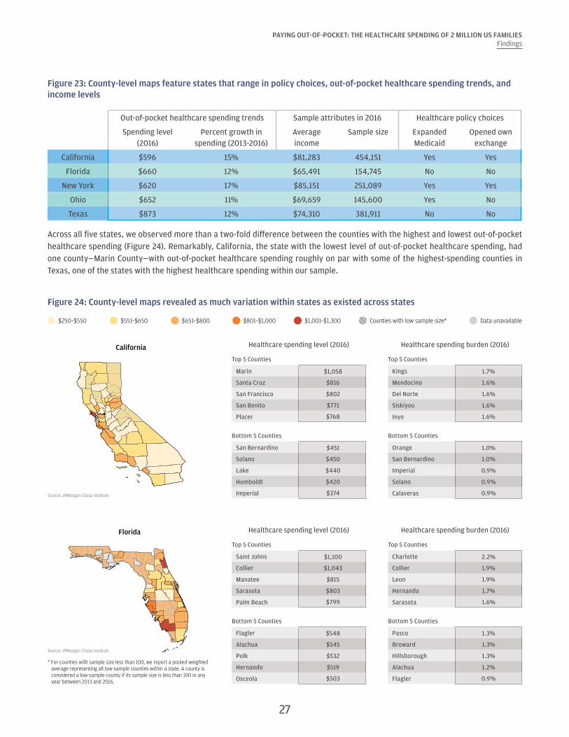
Figure 23: County-level maps feature states that range in policy choices, out-of-pocket healthcare spending trends, and income levels
Out-of-pocket healthcare spending trends Sample attributes in 2016 Healthcare policy choices
Spending level (2016)
Percent growth in spending (2013-2016)
Average income
Sample size Expanded Medicaid
Opened own exchange
California $596 15% $81,283 454,151 Yes Yes
Florida $660 12% $65,491 154,745 No No
New York $620 17% $85,151 251,089 Yes Yes
Ohio $652 11% $69,659 145,600 Yes No
Texas $873 12% $74,310 381,911 No No
Across all five states, we observed more than a two-fold difference between the counties with the highest and lowest out-of-pocket healthcare spending (Figure 24). Remarkably, California, the state with the lowest level of out-of-pocket healthcare spending, had one county—Marin County—with out-of-pocket healthcare spending roughly on par with some of the highest-spending counties in Texas, one of the states with the highest healthcare spending within our sample.
Figure 24: County-level maps revealed as much variation within states as existed across states
$651–$800 Data unavailableCounties with low sample size*$250–$550 $551–$650 $801–$1,000 $1,001–$1,300
Source: JPMorgan Chase Institute
California
Source: JPMorgan Chase Institute
Florida
* For counties with sample size less than 100, we report a pooled weighted average representing all low-sample counties within a state. A county is considered a low-sample county if its sample size is less than 100 in any year between 2013 and 2016.
Healthcare spending level (2016) Healthcare spending burden (2016)
Top 5 Counties Top 5 Counties
Marin $1,058 Kings 1.7%
Santa Cruz $816 Mendocino 1.6%
San Francisco $802 Del Norte 1.6%
San Benito $771 Siskiyou 1.6%
Placer $768 Inyo 1.6%
Bottom 5 Counties Bottom 5 Counties
San Bernardino $451 Orange 1.0%
Solano $450 San Bernardino 1.0%
Lake $440 Imperial 0.9%
Humboldt $420 Solano 0.9%
Imperial $374 Calaveras 0.9%
Healthcare spending level (2016) Healthcare spending burden (2016)
Top 5 Counties Top 5 Counties
Saint Johns $1,100 Charlotte 2.2%
Collier $1,043 Collier 1.9%
Manatee $815 Leon 1.9%
Sarasota $803 Hernando 1.7%
Palm Beach $799 Sarasota 1.6%
Bottom 5 Counties Bottom 5 Counties
Flagler $548 Pasco 1.3%
Alachua $545 Broward 1.3%
Polk $532 Hillsborough 1.3%
Hernando $519 Alachua 1.2%
Osceola $503 Flagler 0.9%
28
PAYING OUT-OF-POCKET: THE HEALTHCARE SPENDING OF 2 MILLION US FAMILIESFindings
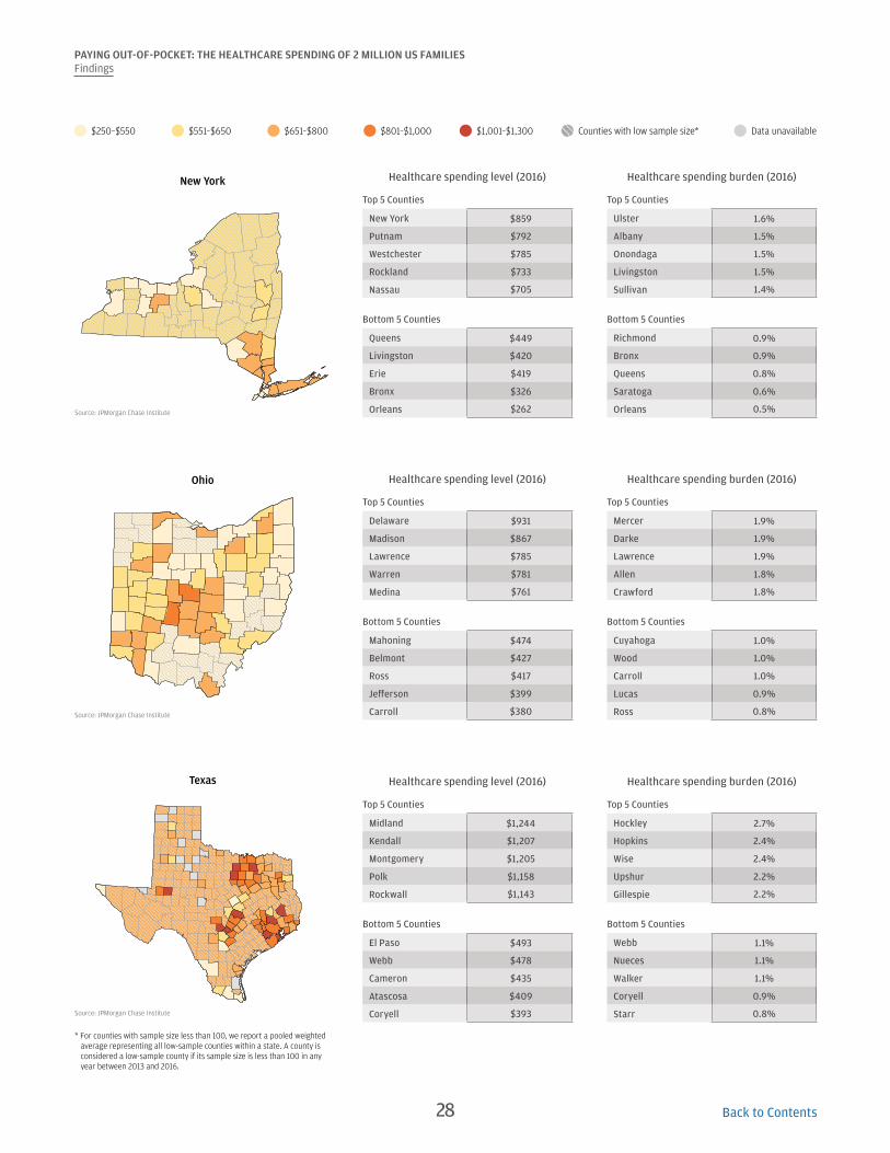
$651–$800 Data unavailableCounties with low sample size*$250–$550 $551–$650 $801–$1,000 $1,001–$1,300
Source: JPMorgan Chase Institute
New York
Source: JPMorgan Chase Institute
Ohio
Source: JPMorgan Chase Institute
Texas
* For counties with sample size less than 100, we report a pooled weighted average representing all low-sample counties within a state. A county is considered a low-sample county if its sample size is less than 100 in any year between 2013 and 2016.
Healthcare spending level (2016) Healthcare spending burden (2016)
Top 5 Counties Top 5 Counties
New York $859 Ulster 1.6%
Putnam $792 Albany 1.5%
Westchester $785 Onondaga 1.5%
Rockland $733 Livingston 1.5%
Nassau $705 Sullivan 1.4%
Bottom 5 Counties Bottom 5 Counties
Queens $449 Richmond 0.9%
Livingston $420 Bronx 0.9%
Erie $419 Queens 0.8%
Bronx $326 Saratoga 0.6%
Orleans $262 Orleans 0.5%
Healthcare spending level (2016) Healthcare spending burden (2016)
Top 5 Counties Top 5 Counties
Delaware $931 Mercer 1.9%
Madison $867 Darke 1.9%
Lawrence $785 Lawrence 1.9%
Warren $781 Allen 1.8%
Medina $761 Crawford 1.8%
Bottom 5 Counties Bottom 5 Counties
Mahoning $474 Cuyahoga 1.0%
Belmont $427 Wood 1.0%
Ross $417 Carroll 1.0%
Jefferson $399 Lucas 0.9%
Carroll $380 Ross 0.8%
Healthcare spending level (2016) Healthcare spending burden (2016)
Top 5 Counties Top 5 Counties
Midland $1,244 Hockley 2.7%
Kendall $1,207 Hopkins 2.4%
Montgomery $1,205 Wise 2.4%
Polk $1,158 Upshur 2.2%
Rockwall $1,143 Gillespie 2.2%
Bottom 5 Counties Bottom 5 Counties
El Paso $493 Webb 1.1%
Webb $478 Nueces 1.1%
Cameron $435 Walker 1.1%
Atascosa $409 Coryell 0.9%
Coryell $393 Starr 0.8%
Back to Contents

Implications
In this report we described the creation of the JPMorgan Chase Institute Healthcare Out-of-pocket Spending Panel (JPMCI HOSP) and documented the levels, growth, and burden of out-of-pocket healthcare spending between 2013 and 2016. Our findings have several important implications at the family, regional, and national level:
1. Out-of-pocket healthcare expenses are a source of financial strain for certain families. Out-of-pocket healthcare expenses are highly concentrated within a segment of the population—the same families year over year. As we have shown here, older, lower-income, and female account holders were more highly burdened by healthcare expenses. The top 10 percent of families in terms of healthcare burden spend as much in a year on medical bills as they do on their cell phone, TV, internet, heating, and electricity combined; half of these families continue to spend a similar amount year over year. For most families, healthcare payments were concentrated in just three months of the year, which means that they are more difficult to absorb than utility bills which are more evenly spread within the year.29 Put simply, healthcare payments are large and infrequent and put a strain on a household’s cash flow picture.
2. Healthcare payments and ability to pay are tightly linked. As this and previous JPMorgan Chase Institute reports document, high healthcare spending is highly correlated with ability to pay. Out-of-pocket healthcare spending was higher not just among high-income families compared to low-income families but also, for a given family, in the months and the years in which they had higher take-home income and liquid assets. Moreover, as previously documented by the JPMorgan Chase Institute, extraordinary medical payments are associated with higher levels of revolving credit card debt a year later (Farrell and Greig, 2017a).
3. Healthcare reform efforts should take into consideration the financial impacts on households. As policymakers continue to debate healthcare reform in the US, a key consideration should be the out-of-pocket healthcare costs American families face. Specifically, who bears the cost of healthcare and how expenses are paid have a large impact on a family’s cash-flow picture. Many policy choices impact out-of-pocket healthcare spending. These include eligibility criteria for, and generosity of, public health insurance; tax credits that offset the out-of-pocket spending; healthcare, drug, and health insurance premium prices; health insurance deductibles and out-of-pocket maximums; as well as the extent to which insurance companies are required to cover certain benefits. Should out-of-pocket healthcare costs to families increase, older adults, low-income families, and women may have to shoulder an even higher financial burden for receiving care.
4. Consumers might benefit from more transparent and understandable up-front billing and better tools and payment options to anticipate and manage healthcare expenses. With the growth of high-deductible plans, health savings, reimbursement accounts, changing tax deductions for out-of-pocket healthcare spending and insurance premiums, and rising insurance and healthcare prices, managing one’s healthcare spending is becoming both increasingly important and increasingly complicated. Consumers might benefit from more consumer-centric medical billing and payments. Patients should be able to see full, accurate estimates of their out-of-pocket costs of treatment in one place and in real time as or before costs are incurred. When the bill arrives, they would benefit from having flexible payment options, such as financing options, smaller payments smoothed over time, or discounts for paying on time. In planning for and managing their medical expenses over time, consumers might be well served by more integrated tools that help consumers shop around for non-emergency care and put their medical-related account balances, bills, and payments all in one place. Employers have a key role to play in helping their employees understand the tradeoffs between high- versus low-deductible plans and facilitating savings and liquidity through health savings accounts, small dollar loans, or emergency savings accounts.
5. Cost containment measures, including value-based care, could have meaningful impacts on costs borne by families, not just by insurers and healthcare providers. Employers, insurance companies, and the government are moving away from fee-for-service, which incentivizes high utilization, and exploring innovative payment and healthcare delivery structures (e.g. bundled payments and Accountable Care Organizations) that incentivize more coordinated care and better patient outcomes
29

PAYING OUT-OF-POCKET: THE HEALTHCARE SPENDING OF 2 MILLION US FAMILIESImplications
for lower cost. Evidence of the impact of these new payment structures on out-of-pocket healthcare spending deserves to be in focus as we evaluate value-based care and insurance and other cost-containment measures (Hirth, et al. 2017; Lee, et al. 2013). Some have speculated that a key financial beneficiary of these efficiency gains could be families (McClellan, 2015). Although many of these structures distribute cost savings back to healthcare providers and insurers, it is possible that families too could see a reduction in their out-of-pocket healthcare costs or at least better healthcare outcomes.
6. Out-of-pocket healthcare expenses should be a key policy issue for state and local leaders. This report documents the wide variation in the levels and burden of healthcare spending across and within states. In fact, there is as much variation in spending levels within states as there is across state lines. This underscores the extent to which out-of-pocket healthcare spending should be an issue for policymakers at both the state and local level. While constituents may well have visibility into changes in eligibility criteria and the generosity of their insurance coverage, and rising healthcare costs over time, they may not be aware of the disparities in healthcare spending between communities. These disparities exist and suggest that family healthcare costs should be an important policy issue to local leaders. Key considerations for local leaders include the level of competition among both healthcare providers and health insurance companies and eligibility criteria for, and the level of benefits provided by, public insurance programs. This is particularly important in light of the recent decisions by certain insurance companies to pull out of individual insurance markets, which could result in higher healthcare prices, if not the removal of individual health insurance options in certain areas.
7. Financial transaction data offer a rich and distinct source of insight into out-of-pocket healthcare spending. The JPMCI HOSP is distinct from and complementary to existing public data sets in four ways. First, they are high-frequency: with a month-to-month view of healthcare spending, we are able to see just how lumpy medical payments are within the year. Second, the data are recent; while other healthcare-related data sets are typically published one to three years after the present calendar year, the JPMCI HOSP is up-to-date through 2016. Third, with a sample size of 2.3 million families, we are able to drill down to the metro and county level, revealing large differences in spending levels and burden within states. Lastly, we are able to connect healthcare spending to families' other financial outcomes, such as take-home income and liquid assets, enabling us to explore the connections between healthcare payments and broader financial health.
Deepening our understanding of the levels, burden, and trends in out-of-pocket healthcare spending is critical as we evaluate healthcare policies and efforts to strengthen the financial resilience of American families.
As policymakers
continue to debate healthcare reform in the US, a key consideration should be the out-of-
pocket healthcare costs American families
face.
30 Back to Contents

Data Asset
In this report, the JPMorgan Chase Institute assembled the Healthcare Out-of-pocket Spending Panel (JPMCI HOSP), a de-identified data asset of over 2.3 million regular Chase customers between January 2013 and December 2016 to explore the levels, concentration, and growth of out-of-pocket healthcare spending, as well as the implications for household financial health. This month-to-month panel of family finances provides a first-ever look into out-of-pocket healthcare spending for households on a monthly basis at the state, metro, and county level. In conducting this research, we established strict protocols for ensuring the privacy of customer data.
Data Privacy
The JPMorgan Chase Institute has adopted rigorous security protocols and checks and balances to ensure all customer
data are kept confidential and secure. Our strict protocols are informed by statistical standards employed by
government agencies and our work with technology, data privacy, and security experts who are helping us maintain
industry-leading standards.
There are several key steps the Institute takes to ensure customer data are safe and secure:
• The Institute’s policies and procedures require that data it receives and processes for research purposes do not
identify specific individuals.
• The Institute has put in place privacy protocols for its researchers, including requiring them to undergo rigorous
background checks and enter into strict confidentiality agreements. Researchers are contractually obligated to use
the data solely for approved research and are contractually obligated not to re-identify any individual represented
in the data.
• The Institute does not allow the publication of any information about an individual consumer or business. Any data
point included in any publication based on the Institute’s data may only reflect aggregate information.
• The data are stored on a secure server and can be accessed only under strict security procedures. The data cannot
be exported outside of JPMorgan Chase’s systems. The data are stored on systems that prevent them from being
exported to other drives or sent to outside email addresses. These systems comply with all JPMorgan Chase
Information Technology Risk Management requirements for the monitoring and security of data.
The Institute provides valuable insights to policymakers, businesses, and nonprofit leaders. But these insights cannot
come at the expense of customer privacy. We take precautions to ensure the confidence and security of our account
holders’ private information.
31

PAYING OUT-OF-POCKET: THE HEALTHCARE SPENDING OF 2 MILLION US FAMILIESData Asset
Constructing our sample
From a universe of 37 million checking account holders, we assembled a de-identified sample of approximately 2.3 million Chase customers for whom we have a high degree of confidence that we are seeing the majority of their financial activities. The sample spans from January 2013 through December 2016. To be included in the sample, the primary account holder in the family had to be between the ages of 18 and 64 (i.e. nonelderly adults). We chose to exclude older adults from the sample because they were more likely to use paper checks than nonelderly adults (Connolly and Stavins, 2015). While out-of-pocket spending increases with age among Medicare beneficiaries age 65 and older, the higher prevalence of paper checks among this cohort limits our ability to categorize their spending (Cubanski et al., 2014).
We are able to connect healthcare
spending to families' other financial outcomes, such as
take-home income and liquid asset, enabling us to explore the connections between healthcare
payments and broader financial health.
We selected for families who met the following three additional criteria:
1. Had at least five outflows from their personal checking account in every month and at least $5,000 in take-home income into their personal checking account each year.
2. Spent less than 50 percent of total expenses through channels that could not be categorized, specifically paper checks, non-Chase credit cards, and ATM withdrawals in each calendar year.
3. Had an observable zip code of residence in every month of a calendar year and lived in one of the 23 states with a Chase retail branch presence (see Figure 26).
Our sample of 2.3 million Chase checking account holders who meet the four sampling criteria were slightly older and had slightly lower estimated annual gross income and liquid assets than the 33 million 18 to 64 year olds. In addition, as evidence that they were frequent users of their Chase accounts, they had significantly higher take-home income in Chase accounts (Figure 25).
Figure 25: Main attributes of all non-elderly adults Chase checking account holders and our constructed sample in 2016
Chase checking account holders age 18-64
Chase checking account holders age 18-64 who meet sampling criteria
Number of accounts 33,020,342 2,311,402
Average age 38.9 42.9
Estimated annual gross income $63,971 $63,138
Take-home income in Chase accounts $24,658 $54,194
Liquid assets in Chase accounts* $11,919 $10,256
* Annual liquid assets are calculated based on the average monthly liquid assets within a year.
32

PAYING OUT-OF-POCKET: THE HEALTHCARE SPENDING OF 2 MILLION US FAMILIESData Asset
In estimating out-of-pocket healthcare spending by state, we evaluated the option of measuring healthcare spending across all 50 states using customers who have either a Chase checking account or a Chase credit card or both. This option is possible because, even though checking accounts can only be opened within the 23 states in which Chase has physical branches, Chase credit card users span across the nation. In addition, checking account customers can (and do) move to states without Chase branches, though they overwhelmingly reside within the 23 Chase footprint states. State differences in the distribution of credit card versus checking account users are an important consideration because credit and debit card users exhibit key differences in terms of demographic and financial habits. Thus combining debit card and credit card only users into a single sample could introduce significant biases by state. For this reason, at this time, we only presented average out-of-pocket healthcare spending level and burden for families in the 23 states. Our final sample included families in 23 states with a Chase retail branch footprint, 16 of which chose to expand Medicaid (Figure 26).
Figure 26: The JPMCI HOSP sample and Medicaid expansion as of June 2017
Source: JPMorgan Chase Institute
FL
TX
NMAZ
CA
NVUT
CO
OR
WA
ID
OK
MT
WY
ND
SD
NE
KS
MN
IA
MO
AR
LA
MS AL GA
SC
IL
WIMI
INOH
TN
KY
NC
WV VA
PA
NY
MEVT NH
RI
CT
NJ
DE
MD
MA
DC
In sample, expanded Medicaid
In sample, did not expand Medicaid
Not in sample
Sample weighting
In order to make our sample more representative of the general population, we weighted our sample in each state based on the state’s underlying age and income distribution according to the American Community Survey (ACS) 2014 1-Year estimates. For the purposes of weighting, family income was based on an annual pre-tax estimate for 2014 ascertained by JPMorgan Chase using individual, third-party, and zip code-level data.30 We applied a similar weighting process to the sample underlying the maps in Finding 6. Specifically, the state- and county-level estimates were weighted according to the underlying age and income joint distribution in the state according to the 2014 ACS.
33

34
PAYING OUT-OF-POCKET: THE HEALTHCARE SPENDING OF 2 MILLION US FAMILIESData Asset
While the resulting weighted sample is representative of each state in terms of age and income, it still differs from the population along other dimensions. For example, it is biased toward people who primarily transact using card-based and electronic channels. Payment instrument usage is an important consideration because previous research has shown strong correlations between use of electronic payment instruments and age and income, which we account for, but also education (higher usage among more educated people), race (higher usage among white people), and marital status (higher usage among married people), which we do not account for (Connolly and Stavins, 2015). Thus even after re-weighting, our sample might still be biased toward individuals who are more highly educated, white, or married.
Figure 27 displays the ways our sample differed from the populations in these 23 states in terms of age, income, gender, and geography after re-weighting. Our sample had more middle-aged, higher-income, and male primary account holders. In addition, it skewed towards families living in the Midwest and West.
Figure 27: Comparison of the JPMCI HOSP sample to US adult population after re-weighting
Attributes US Adult Population* JPMCI HOSP
Age
18-25 15% 12%
26-34 20% 24%
35-44 21% 22%
45-54 23% 24%
55-64 21% 19%
Quintile of gross annual income
1st quintile (<$20,000) 20% 15%
2nd quintile ($20,000–$38,000) 17% 18%
3rd quintile ($38,000–$63,000) 18% 21%
4th quintile ($63,000–$104,600) 26% 23%
5th quintile ($104,600 +) 19% 24%
GenderMale 49% 54%
Female 51% 46%
Region
Northeast 18% 14%
Midwest 21% 25%
South 38% 31%
West 24% 30%
*Unless otherwise noted, national estimates come from the Census Bureau’s American Community Survey 2014 1-Year estimates. Regional distribution sums to greater than 100 percent due to rounding. The statistics reported for the JPMCI HOSP is also for 2014.
PAYING OUT-OF-POCKET: THE HEALTHCARE SPENDING OF 2 MILLION US FAMILIESData Asset
Categorizing out-of-pocket healthcare payments
As described above, we defined non-premium out-of-pocket healthcare spending as any observable outlays to healthcare providers and drugstores, including co-payments, co-insurance, deductibles, and other uninsured medical or drug spending. We reported on a family’s out-of-pocket healthcare spending excluding health insurance premium costs and regardless of their insurance status. We excluded health insurance premium costs as they are typically deducted directly from paychecks for individuals with employer-sponsored insurance and therefore are not visible in a comparable way to individuals who purchase insurance directly or who receive public health insurance. In addition, we reported observed healthcare payments, irrespective of whether the family might have received a reimbursement from their health insurer after the fact. Finally, we do not observe spending on any non-Chase cards, including those associated with health savings accounts, flexible spending arrangements, or health reimbursement arrangements.
We identified non-premium out-of-pocket healthcare spending by categorizing spending on debit and credit cards, as well as electronic payments to healthcare providers and drugstores. Specifically, we analyzed merchant information associated with card transactions and classify spending at the following types of merchants as healthcare spending:
• Hospitals
• Doctors and physicians
• Drug stores and pharmacies
• Optometrists and ophthalmologists
• Dentists and orthodontists
• Podiatrists
• Osteopaths
• Chiropractors
• Opticians
• Nursing and personal care
• Orthopedic goods
• Ambulance services
• Dental, lab, and medical equipment
• Medical and dental labs
• Other medical and health service
We excluded certain types of merchants, such as veterinarians, nutritional supplement stores, and spas. We also removed many non-healthcare transactions from these categories, such as payments for parking and at cafeterias, where possible.
In addition, we limited the types of transactions that we classified as healthcare spending at drugstores and pharmacies because we do not observe itemized purchase receipts and therefore cannot distinguish between spending on prescription drugs and non-healthcare items at these merchants. As a result, we have a very conservative measure of drug spending.
Our approach for classifying healthcare spending at drug stores and pharmacies consists of three steps and is displayed in Figure 28. First, we separated major drugstore chains (such as CVS and Walgreens) from all other drugstores and pharmacies. We classified all transactions at major drugstore chains that are multiples of $5 up to $300 as drug spending based on the assumption that these transactions are co-pays for drugs.31 Second, among merchants that are not major drugstore chains, we further distinguished between mail-order pharmacies and independent pharmacies. We classified all transactions involving mail-order pharmacies as drug spending. Third, we separated independent pharmacies into two groups: merchants with at least 20 percent of their transactions having whole dollar amounts and merchants with less than 20 percent of transactions having whole dollar amounts. For independent pharmacies with at least 20 percent of their transactions having whole dollar amounts, we classified all transactions as drug spending, just as we treated mail-order pharmacies. For the independent pharmacies with less than 20 percent of their transactions having whole dollar amounts, we classified all whole dollar payments that are increments of $5 up to $300 as prescription drug spending, just as we did for major drugstore chains.
35
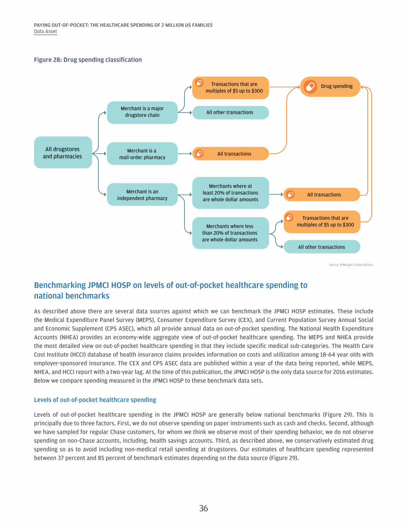
PAYING OUT-OF-POCKET: THE HEALTHCARE SPENDING OF 2 MILLION US FAMILIESData Asset
Figure 28: Drug spending classification
Source: JPMorgan Chase Institute
Drug spending
All drugstoresand pharmacies
All other transactions
Merchants where atleast 20% of transactionsare whole dollar amounts
Merchants where lessthan 20% of transactionsare whole dollar amounts
Merchant is anindependent pharmacy
Merchant is a mail-order pharmacy
Merchant is a majordrugstore chain
Transactions that aremultiples of $5 up to $300
Transactions that aremultiples of $5 up to $300
All other transactions
All transactions
All transactions
Benchmarking JPMCI HOSP on levels of out-of-pocket healthcare spending to national benchmarks
As described above there are several data sources against which we can benchmark the JPMCI HOSP estimates. These include the Medical Expenditure Panel Survey (MEPS), Consumer Expenditure Survey (CEX), and Current Population Survey Annual Social and Economic Supplement (CPS ASEC), which all provide annual data on out-of-pocket spending. The National Health Expenditure Accounts (NHEA) provides an economy-wide aggregate view of out-of-pocket healthcare spending. The MEPS and NHEA provide the most detailed view on out-of-pocket healthcare spending in that they include specific medical sub-categories. The Health Care Cost Institute (HCCI) database of health insurance claims provides information on costs and utilization among 18-64 year olds with employer-sponsored insurance. The CEX and CPS ASEC data are published within a year of the data being reported, while MEPS, NHEA, and HCCI report with a two-year lag. At the time of this publication, the JPMCI HOSP is the only data source for 2016 estimates. Below we compare spending measured in the JPMCI HOSP to these benchmark data sets.
Levels of out-of-pocket healthcare spending
Levels of out-of-pocket healthcare spending in the JPMCI HOSP are generally below national benchmarks (Figure 29). This is principally due to three factors. First, we do not observe spending on paper instruments such as cash and checks. Second, although we have sampled for regular Chase customers, for whom we think we observe most of their spending behavior, we do not observe spending on non-Chase accounts, including, health savings accounts. Third, as described above, we conservatively estimated drug spending so as to avoid including non-medical retail spending at drugstores. Our estimates of healthcare spending represented between 37 percent and 85 percent of benchmark estimates depending on the data source (Figure 29).
36

PAYING OUT-OF-POCKET: THE HEALTHCARE SPENDING OF 2 MILLION US FAMILIESData Asset
Figure 29: Comparison of out-of-pocket healthcare spending levels in the JPMCI HOSP to national benchmarks
Source: JPMorgan Chase Institute
Medical Expenditure Panel Survey (Households 18-64 years old)
Consumer Expenditure Survey (All consumer units)
Current Population Survey(Families 18-64 years old)
National Health ExpenditureAccounts (All individuals)
Health Care Cost Institute(Households under 64 years withemployer-sponsored insurance)
Ratio of JPMCI HOSP out-of-pocket healthcare spending to benchmarks in 2015
57%51%
37%
65%
85%
Out-of-pocket healthcare spending in the JPMCI HOSP represented roughly 57 percent of the household benchmark in the MEPS (Figure 29). Figure 30 confirms that similar demographic trends in out-of-pocket spending are observed in the MEPS as in the JPMCI HOSP.32
Figure 30: The JPMCI HOSP benchmarks consistently to MEPS by demographic group in 2015
Attributes JPMCI HOSP MEPS (households 18-64 years old) Ratio (JPMCI HOSP:MEPS)
Age
18-25 $250 $491 0.51
26-34 $533 $759 0.70
35-44 $778 $1,241 0.63
45-54 $834 $1,441 0.58
55-64 $813 $1,702 0.48
Quintile of gross annual income
1st quintile (<$20,000) $283 $458 0.62
2nd quintile ($20,000–$38,000) $336 $831 0.40
3rd quintile ($38,000–$63,000) $457 $1,102 0.41
4th quintile ($63,000–$104,600) $629 $1,453 0.43
5th quintile ($104,600 +) $943 $2,157 0.44
GenderMale $725 $1,157 0.63
Female $688 $1,261 0.55
Among our 23-state sample, we compared each state’s average out-of-pocket healthcare spending with those reported in the CPS ASEC, the only source of state-level estimates. Out-of-pocket healthcare spending in the JPMCI HOSP represented roughly 37 percent of the benchmark in the CPS (Figure 29). Figure 31 compares this benchmark ratio across the 23 states in our sample in order to assess how consistently JPMCI HOSP estimates benchmark to CPS by state. While there was some variation across states in this benchmark ratio, we nonetheless observed a similar ranking of states by out-of-pocket healthcare spending in the CPS and the JPMCI HOSP.
37
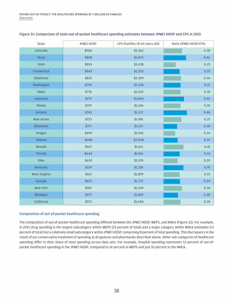
PAYING OUT-OF-POCKET: THE HEALTHCARE SPENDING OF 2 MILLION US FAMILIESData Asset
Figure 31: Comparison of state out-of-pocket healthcare spending estimates between JPMCI HOSP and CPS in 2015
State JPMCI HOSP CPS (families 18-64 years old) Ratio (JPMCI HOSP:CPS)
Colorado $906 $2,362 0.38
Texas $858 $1,873 0.46
Utah $854 $3,438 0.25
Connecticut $842 $2,553 0.33
Oklahoma $832 $2,309 0.36
Washington $796 $2,268 0.35
Idaho $776 $2,202 0.35
Louisiana $771 $1,844 0.42
Illinois $747 $2,146 0.35
Arizona $742 $1,537 0.48
New Jersey $723 $1,981 0.37
Wisconsin $717 $2,517 0.28
Oregon $699 $2,910 0.24
Indiana $688 $2,408 0.29
Nevada $667 $1,611 0.41
Florida $644 $1,961 0.33
Ohio $630 $2,190 0.29
Kentucky $619 $1,518 0.41
West Virginia $615 $1,859 0.33
Georgia $607 $1,772 0.34
New York $587 $1,549 0.38
Michigan $577 $1,892 0.30
California $573 $1,646 0.35
Composition of out-of-pocket healthcare spending
The composition of out-of-pocket healthcare spending differed between the JPMCI HOSP, MEPS, and NHEA (Figure 32). For example, in 2015 drug spending is the largest subcategory within MEPS (23 percent of total) and a major category within NHEA estimates (13 percent of total) but a relatively small subcategory within JPMCI HOSP, comprising 8 percent of total spending. This discrepancy is the result of our conservative treatment of spending at drugstores and pharmacies described above. Other sub-categories of healthcare spending differ in their share of total spending across data sets. For example, hospital spending represents 12 percent of out-of-pocket healthcare spending in the JPMCI HOSP, compared to 16 percent in MEPS and just 10 percent in the NHEA.
38
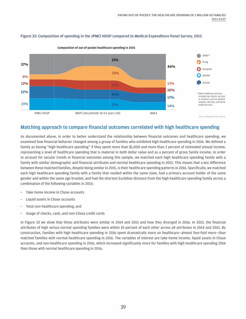
PAYING OUT-OF-POCKET: THE HEALTHCARE SPENDING OF 2 MILLION US FAMILIESData Asset
Figure 32: Composition of spending in the JPMCI HOSP compared to Medical Expenditure Panel Survey, 2015
Source: JPMorgan Chase Institute
JPMCI HOSP MEPS (Households 18-64 years old) NHEA
Composition of out-of-pocket healthcare spending in 2015
22%
8%
21%
12%
37%
19%
23%
21%
16%
21%
17%
13%
14%
10%
46%
Other*
Drug
Hospital
Dental
Doctor
* Other healthcare services included non-doctor services or products, such as medical supplies, lab tests, and home health services.
Matching approach to compare financial outcomes correlated with high healthcare spending
As documented above, in order to better understand the relationship between financial outcomes and healthcare spending, we examined how financial behavior changed among a group of families who exhibited high healthcare spending in 2016. We defined a family as having “high healthcare spending” if they spent more than $1,000 and more than 2 percent of estimated annual income, representing a level of healthcare spending that is material in both dollar value and as a percent of gross family income. In order to account for secular trends in financial outcomes among this sample, we matched each high healthcare spending family with a family with similar demographic and financial attributes and normal healthcare spending in 2015. This means that a key difference between these matched families, despite being similar in 2015, is their healthcare spending patterns in 2016. Specifically, we matched each high healthcare spending family with a family that resided within the same state, had a primary account holder of the same gender and within the same age bracket, and had the shortest Euclidian distance from the high healthcare spending family across a combination of the following variables in 2015:
• Take-home income in Chase accounts
• Liquid assets in Chase accounts
• Total non-healthcare spending; and
• Usage of checks, cash, and non-Chase credit cards
In Figure 33 we show that these attributes were similar in 2014 and 2015 and how they diverged in 2016. In 2015, the financial attributes of high versus normal spending families were within 10 percent of each other across all attributes in 2014 and 2015. By construction, families with high healthcare spending in 2016 spent dramatically more on healthcare—almost four-fold more—than matched families with normal healthcare spending in 2016. The variables of interest are take-home income, liquid assets in Chase accounts, and non-healthcare spending in 2016, which increased significantly more for families with high healthcare spending 2016 than those with normal healthcare spending in 2016.
39

PAYING OUT-OF-POCKET: THE HEALTHCARE SPENDING OF 2 MILLION US FAMILIESData Asset
Figure 33: Matched families were similar in 2014 and 2015, but diverged significantly in 2016
2014 2015 2016
Normal healthcare spenders
High healthcare spenders in 2016
Percent difference
Normal healthcare spenders
High healthcare spenders in 2016
Percent difference
Normal healthcare spenders
High healthcare spenders in 2016
Percent difference
Age 42 42 0.0% 43 43 0.0% 44 44 0.0%
Out-of-pocket healthcare spending level
$488 $835 71.3% $383 $642 67.6% $382 $2,171 467.6%
Out-of-pocket healthcare spending burden
1.1% 2.0% 80.4% 0.8% 1.4% 80.4% 0.8% 5.0% 518.1%
Non-healthcare spending
$65,416 $65,251 -0.3% $66,564 $66,911 0.5% $66,158 $69,643 5.3%
Take-home income $55,688 $55,179 -0.9% $59,034 $59,193 0.3% $60,366 $62,659 3.8%
Liquid assets $8,590 $8,798 2.4% $9,393 $10,090 7.4% $10,487 $11,896 13.4%
40 Back to Contents
References
Agency for Healthcare Research and Quality. Medical Expenditure Panel Survey (MEPS), Household Component, 2012-2015.
Barnett, Jessica C., and Marina S. Vornovitsky. 2016. "Health insurance coverage in the United States: 2015." US Census Bureau, Current Population Reports, P60-257.
Caswell, Kyle J., Timothy Waidmann, and Linda J. Blumberg. 2013. "Financial burden of medical out-of-pocket spending by state and the implications of the 2014 Medicaid expansions." INQUIRY: The Journal of Health Care Organization, Provision, and Financing 50, no. 3: 177-201.
Chung, YoonKyung. 2013. "Chronic Health Conditions and Economic Outcomes." Unpublished mimeo. http://www.sole-jole.org/14225.pdf
Connolly, Sean and Stavins, Joanna. 2015. “Payment Instrument Adoption and Use in the United States, 2009–2013, by Consumers’ Demographic Characteristics.” Federal Reserve Bank of Boston.
Consumer Financial Protection Bureau. 2014. “Consumer credit reports: A study of medical and non-medical collections.” Consumer Financial Protection Bureau.
Cox, Cynthia, Anthony Damico, Gary Claxton, and Larry Levitt. 2016. "Examining high prescription drug spending for people with employer sponsored health insurance." Peterson-Kaiser Health System Tracker.
Cubanski, Juliette, Christina Swoope, Anthony Damico, and Tricia Neuman. 2014. “Health Care on a Budget: The Financial Burden of Health Spending by Medicare Households.” Kaiser Family Foundation.
Dobkin, Carlos, Amy Finkelstein, Raymond Kluender, and Matthew J. Notowidigdo. 2016. “The economic consequences of hospital admissions.” No. w22288. National Bureau of Economic Research.
Farrell, Diana and Fiona Greig. 2016. “Taking the Financial Stress Out of Tax Time.” JPMorgan Chase Institute.
Farrell, Diana and Fiona Greig. 2017a. “Coping with Costs: Big Data on Expense Volatility and Medical Payments.” JPMorgan Chase Institute.
Farrell, Diana and Fiona Greig. 2017b. “The Gender Gap in Financial Outcomes: The Impact of Medical Payments.” JPMorgan Chase Institute.
Finkelstein, Amy, Sarah Taubman, Bill Wright, Mira Bernstein, Jonathan Gruber, Joseph P. Newhouse, Heidi Allen, Katherine Baicker, and Oregon Health Study Group. 2012. "The Oregon health insurance experiment: evidence from the first year." The Quarterly Journal of Economics 127, no. 3: 1057-1106.
Glied, Sherry, Claudia Solís-Román, and Shivani Parikh. 2016. "How the ACA's Health Insurance Expansions Have Affected Out-of-Pocket Cost-Sharing and Spending on Premiums." Commonwealth Fund Issue Brief 28: 1-16.
Golberstein, Ezra, Gilbert Gonzales, and Benjamin D. Sommers. 2015. "California’s early ACA expansion increased coverage and reduced out-of-pocket spending for the state’s low-income population." Health Affairs 34, no. 10: 1688-1694.
Gupta, Arpit, Edward R. Morrison, Catherine Fedorenko, and Scott D. Ramsey. 2015. "Cancer Diagnoses and Household Debt Overhang." Columbia Law and Economics Working Paper No. 154; Columbia Business School Research Paper No. 15-35.
Gwet, Philippe, Jerrod Anderson, and Steve Machlin. 2016. “Statistical Brief #495:Out-of-Pocket Health Care Expenses in the U.S. Civilian Noninstitutionalized Population by Age and Insurance Coverage, 2014.” Agency for Healthcare Research and Quality. https://meps.ahrq.gov/data_files/publications/st495/stat495.shtml
Health Care Cost Institute. 2016. “2015 Health Care Cost and Utilization Report.” http://www.healthcostinstitute.org/files/2015%20HCCUR_2.pdf
Hirth, Richard A., Elizabeth Q. Cliff, Teresa B. Gibson, M. Richard McKellar, and A. Mark Fendrick. 2016. "Connecticut’s value-based insurance plan increased the use of targeted services and medication adherence." Health Affairs 35, no. 4: 637-646.
41

PAYING OUT-OF-POCKET: THE HEALTHCARE SPENDING OF 2 MILLION US FAMILIESReferences
Kaiser Family Foundation. 2015. "Health Insurance Coverage of Adults 19-64." http://www.kff.org/other/state-indicator/adults-19-64/?dataView=0¤tTimeframe=0&sortModel=%7B%22colId%22:%22Location%22,%22sort%22:%22asc%22%7D
Karpman, Michael, and Kyle Caswell. 2017. "Past-Due Medical Debt among Nonelderly Adults, 2012–15." Washington, DC: Urban Institute.
Lee, Joy L., Matthew L. Maciejewski, Shveta S. Raju, William H. Shrank, and Niteesh K. Choudhry. 2013. "Value-based insurance design: quality improvement but no cost savings." Health Affairs 32, no. 7: 1251-1257.
McClellan, Mark, Kavita Patel, Lisa Latts, and Christine Dang-Vu. 2015. “Implementing Value-Based Insurance Products: A Collaborative Approach to Health Care Transformation.” Health Policy Issue Brief, The Brookings Institution.
Morrison, Edward R., Arpit Gupta, Lenora Olson, Lawrence Cook, and Heather Keenan. 2013. "Health and Financial Fragility: Evidence from Car Crashes and Consumer Bankruptcy." University of Chicago Coase-Sandor Institute for Law & Economics Research Paper No. 655; Columbia Business School Research Paper No. 13-81.
Mulcahy, Andrew W., Christine Eibner, and Kenneth Finegold. 2016. "Gaining coverage through Medicaid or private insurance increased prescription use and lowered out-of-pocket spending." Health Affairs 35, no. 9: 1725-1733.
Sarah Flood, Miriam King, Steven Ruggles, and J. Robert Warren. Integrated Public Use Microdata Series, Current Population Survey: Version 4.0. [dataset]. Minneapolis: University of Minnesota, 2012-2015. http://doi.org/10.18128/D030.V4.0.
Selden, T. M. 2009. The Within-Year Concentration of Medical Care: Implications for Family Out-of-Pocket Expenditure Burdens. Health Services Research, 44(3), 1029–1051. http://doi.org/10.1111/j.1475-6773.2009.00963.x
U.S. Bureau of the Census. 2017. “Mean Family Income in the United States [MAFAINUSA646N].” Retrieved from FRED, Federal Reserve Bank of St. Louis, July 30, 2017. https://fred.stlouisfed.org/series/MAFAINUSA646N
U.S. Bureau of Labor Statistics. 2017a. “Consumer Price Index for All Urban Consumers: Medical Care [CPIMEDSL].” Retrieved from FRED, Federal Reserve Bank of St. Louis, July 30, 2017. https://fred.stlouisfed.org/series/CPIMEDSL
U.S. Bureau of Labor Statistics. 2017b. “Consumer Price Index for All Urban Consumers: All Items [CUUS0000SA0].” Retrieved from FRED, Federal Reserve Bank of St. Louis, July 30, 2017. https://fred.stlouisfed.org/series/CUUS0000SA0
U.S. Centers for Medicare & Medical Services. National Health Expenditure Accounts (NHEA), 2012-2015.
U.S. Department of Labor, Bureau of Labor Statistics, Consumer Expenditure Survey, Interview Survey, 2012-2015.
42 Back to Contents

Endnotes
1 Estimates based on National Health Expenditure Accounts data.
2 According to the National Health Expenditures Accounts 2015 data, the federal government pays for 29 percent of health care spending, households 28 percent, private business 20 percent, and state and local governments 17 percent. Broken down by major source of fund, Medicare represents 20 percent, Medicaid 17 percent, private health insurance (including employee and individual premium payments) 33 percent, and out-of-pocket spending 11 percent (NHEA, 2015).
3 An insurance deductible is an initial amount that must be paid for by the employees when they use services before most services are paid for by the insurance plan.
4 In this previous study, the JPMorgan Chase Institute defined an extraordinary medical payment as a monthly expense that was at least $400, more than 1 percent of annual income, and more than two standard deviations away from the family’s average monthly healthcare spending in this category.
5 Several papers document the negative impacts of major medical events on financial outcomes in the context of hospital admissions (Dobkin et al. 2016), cancer diagnoses (Gupta et al. 2015), and car crashes (Morrison et al. 2013).
6 Among the JPMCI HOSP sample, 40 percent of accounts had multiple authorized users on the account and 60 percent of primary account holders were individual account holders. The mean number of authorized users per account is 1.43, lower than the national household size of 2.65 in the 2014 American Community Survey (ACS), due to the fact that authorized users are typically adults whereas ACS household size would include children. It may also be the case that some families have multiple accounts with different individuals listed as the primary account holder.
7 We select families based on state of residence in 2014. Families who lived outside of the 23 states in other years remain in the sample.
8 See the Data Asset section for a full description of our sampling criteria and weighting.
9 Gender could be inferred for roughly 84 percent of primary account holders.
10 The CEX provides estimates of healthcare spending for roughly 7,000 consumer units. The MEPS includes detailed health spending information of roughly 13,000 families each year, and the CPS provides out-of-pocket healthcare spending for 75,000 households at the national and state level.
11 See the Data Asset section for a discussion of the potential biases in the JPMCI HOSP sample relative to the nation.
12 This difference between the mean and median healthcare spending is consistent with household estimates from the MEPS, which show a mean of $1,212 and median of $443 in 2015, compared to a mean spend of $714 and median spend of $276 in the JPMCI HOSP.
13 Take-home income observed in Chase accounts includes all payroll related direct deposit, tax refunds, government income, capital income, and other income, which mostly represents paper checks. It represents 67 percent of total inflows. The other 33 percent of inflows represent incoming transfers from other accounts (8 percent) and other inflows that could not be characterized (25 percent). Several factors may account for excessive growth in income among Chase account holders. First, the Chase sample may include families whose income grew faster than that of the general population. Second, with the increase in use of electronic payment channels, an increasing fraction of checking account inflows may be visible as income in the JPMorgan Chase Institute. Third, it is possible that over the study period families included in the sample used Chase products for an increasing fraction of their financial transactions, though the sampling criteria were designed to select families who exhibited consistent use of Chase accounts.
14 Out-of-pocket healthcare spending as a fraction of take-home income is higher than as a fraction of spending in Chase accounts because a larger fraction of checking account outflows could be categorized than checking account inflows.
15 Inflation rates for urban consumers for all items were 1.5 percent in 2013, 1.6 percent in 2014, 0.1 percent in 2015, and 1.3 percent in 2016 (US Bureau of Labor Statistics, 2017b).
16 Several recent studies have documented the correlation between insurance coverage growth as a result of the Affordable Care Act, higher utilization, and lower out-of-pocket healthcare spending across geographies (Glied et al., 2016), among prescription drug-users and individuals with chronic conditions (e.g. Mulcahy et al., 2016), and low-income population in California (Golberstein et al., 2015). Similar results have been documented as a result of Medicaid expansion in Oregon 2008 (Finkelstein et al., 2012).
17 As shown in the Data Asset section, these demographic comparisons are consistent with evidence from the MEPS. Estimates for men and women do not average to population average since gender could only be inferred for 84 percent of primary account holders, and 53 percent of primary account holders were men.
18 From 2015-2016, burden for low-income account holders exhibited the highest growth both in percentage point terms and percent terms.
19 Despite the large differences in total healthcare out-of-pocket spending level across age, income, and gender, we found that the composition of healthcare spending was nearly identical across the income spectrum and by gender and varied only modestly by age. As a percentage of their total healthcare spending adults 18-34 spent just 5 percent on prescription drugs compared to 11 percent among 55-64 year olds in 2016.
20 See the Data Asset section for a more complete comparison of the composition of out-of-pocket healthcare spending observed in the JPMCI HOSP versus MEPS and NHEA.
43

PAYING OUT-OF-POCKET: THE HEALTHCARE SPENDING OF 2 MILLION US FAMILIESEndnotes
21 A similar degree of concentration in healthcare spending is observed in the 2014 MEPS data, which show that households in the top 10 percent of healthcare spending account for roughly 51 percent of all healthcare spending.
22 The JPMCI HOSP benchmarks well to MEPS data. According to MEPS, in 2014 roughly 15 percent of the population had no healthcare expenses, compared to 17 percent in JPMCI HOSP.
23 Among families who exhibited positive spending in 2015, 42 percent of families in the top decile of healthcare spending burden in 2015 remained in the top decile of burden in 2016, and 45 percent of families in the top decile of healthcare spending levels remained in the top decile of spending in 2016.
24 This is roughly consistent with the observation others have made that almost half of all out-of-pocket spending in a year occurs in a single month (Selden, 2009).
25 The correlation between healthcare spending and income remained high (0.68) when we compare average daily healthcare spending and average daily income to account for differences in the length of each month. The correlations between healthcare spending and income and liquid assets respectively also remained high (0.60 and 0.48) when we focused on intra-year variation between months and by averaging spending and income respectively by calendar month across the four years and computed the correlation between income and healthcare spending for the 12 calendar months.
26 Another possible contributing factor to the spike in healthcare payments in March is the growth of workers who are enrolled in health insurance plans with high deductibles (Kaiser Family Foundation and Health Research & Education Trust, 2016). Healthcare expenses incurred in the beginning of the calendar are more likely to result in an out-of-pocket obligation for the customer, since deductibles typically reset on January 1.
27 See the Data Asset section for a detailed description of this matching technique.
28 Gains in insurance coverage were influenced, in part, by whether states chose to expand Medicaid eligibility and/or establish their own health insurance market exchange under the Affordable Care Act.
29 See Farrell and Greig (2017a) for a more detailed account of the magnitude and volatility of each expense category.
30 This income estimate reflects gross annual income and is not based on the take-home income observed into Chase accounts, which we use as a basis for assessing burden of healthcare spending in this report.
31 It is also possible that some of these transactions were gift card purchases.
32 Caswell et al. (2013) show evidence of similar demographic trends in out-of-pocket spending according to the CPS.
44 Back to Contents

Suggested Citation
Farrell, Diana, and Fiona Greig. "Paying Out-of-Pocket: The Healthcare Spending of 2 Million US Families." JPMorgan Chase Institute, 2017.
This material is a product of JPMorgan Chase Institute and is provided to you solely for general information purposes. Unless otherwise specifically stated, any views or opinions expressed herein are solely those of the authors listed and may differ from the views and opinions expressed by J.P. Morgan Securities LLC (JPMS) Research Department or other departments or divisions of JPMorgan Chase & Co. or its affiliates. This material is not a product of the Research Department of JPMS. Information has been obtained from sources believed to be reliable, but JPMorgan Chase & Co. or its affiliates and/or subsidiaries (collectively J.P. Morgan) do not warrant its completeness or accuracy. Opinions and estimates constitute our judgment as of the date of this material and are subject to change without notice. The data relied on for this report are based on past transactions and may not be indicative of future results. The opinion herein should not be construed as an individual recommendation for any particular client and is not intended as recommendations of particular securities, financial instruments, or strategies for a particular client. This material does not constitute a solicitation or offer in any jurisdiction where such a solicitation is unlawful.
©2017 JPMorgan Chase & Co. All rights reserved. This publication or any portion hereof may not be reprinted, sold, or redistributed without the written consent of J.P. Morgan. www.jpmorganchaseinstitute.com