paper 87 basic statistics with sas® enterprise guide … will learn how to use sas to check data...
TRANSCRIPT

Paper 87 Basic Statistics with SAS® Enterprise Guide:
For Learners and Teachers and Everyone Else" AnnMaria De Mars, The Julia Group, Santa Monica, CA Chelsea Heaven, Indiana University, Bloomington, IN
ABSTRACT This Hands-On Workshop uses SAS Enterprise Guide for basic statistics, using data from both SASHELP files shipped with SAS and from public use data sets. Although we will use the desktop version of Enterprise Guide, all exercises can be used by students in classes with SAS On-Demand for Academics, available free to faculty and students. Participants will learn how to use SAS to check data quality, compute descriptive statistics for samples, make charts, tables and correlations. In the second half of this workshop, participants will use SAS Enterprise Guide to conduct two different types of analyses for event data. Logistic regression is used when the dependent variable is binary, such as whether a patient lived or died. Survival analysis with life tables or proportional hazards may be used when the dependent variable is time to the event, such as how long the patient lived after a given diagnosis. While the mathematics behind both types of procedures is a bit challenging, students are happy to find that the actual tasks involved in obtaining results for these procedures are simply a matter of pointing and clicking. Hands-on activities include producing logistic regression tables, ROC charts, life tables, survivor functions, log-log functions and estimates of covariates for proportional hazards regression.
INTRODUCTION SAS® offers many benefits for academic instruction. Students can learn programming logic, to read and write in a programming language, how to interpret statistics, data visualization and data mining. Two major barriers to learning statistics using SAS are the difficulty and the expense. For many students, the need to learn both statistics and a programming language at the same time presents a daunting challenge. A second barrier for many who want to learn is the cost of a SAS license. What to do? Try SAS Enterprise Guide with SAS On-Demand, available free (for higher education) or for a very low cost. SAS Enterprise Guide will do just about anything you could want in learning statistics. The examples presented here are from a graduate statistics course taught using SAS On-Demand, with students who had no previous SAS experience.
AVOIDING AGGRAVATION #1 - USE SAS ENTERPRISE GUIDE OR SAS ON-DEMAND One disadvantage of SAS On-Demand is that it runs on the SAS server, which means it is somewhat slower than running on your desktop. The speed can also be impacted by your Internet connection. You can avoid this aggravation by using SAS Enterprise Guide on your desktop to test and run a project, then upload the project and data to the SAS server. However, there may be times when you only have access to SAS On-Demand running on your old Windows laptop or using boot camp on your Mac. All of the exercises covered in this workshop can be done 100% using SAS On-Demand. So, either one can help you avoid aggravation - run faster with SAS installed on your desktop or run any time anywhere with SAS On-Demand. You do need to have SAS On-Demand installed on the machine you will be using, but the space and time required for installation is much less than for a Base SAS with Enterprise Guide installation.
EXERCISE 1 - TEACHING EXPLORATORY DATA ANALYSIS USING SASHELP DATA SAS Enterprise Guide includes a SASHELP directory with a diverse array of datasets cleaned of the usual data problems. There are no clerical errors where someone entered 999 instead of 99 for a patient age, missing data only occurs here and there for illustrative purposes. In short, the kind of data set you rarely encounter in real life unless you have put in a lot of work cleaning it. This makes these data sets perfect for use the first day of class when you are just introducing students to the software and you haven’t had time to get a data set of your own prepared for analysis.
CHARACTERIZE DATA TASK USING THE HEART DATA SET
Objective: Give students practice using SAS Enterprise Guide to explore data with the CHARACTERIZE DATA task 1. Open SAS Enterprise Guide
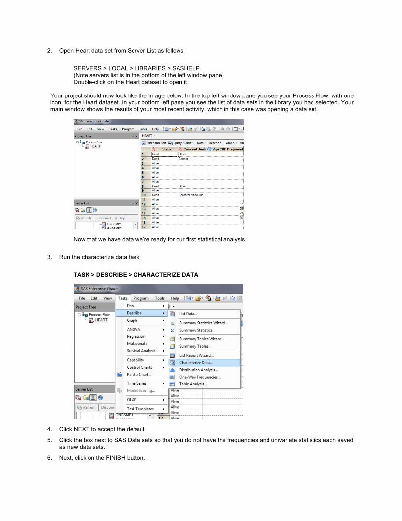
2. Open Heart data set from Server List as follows
SERVERS > LOCAL > LIBRARIES > SASHELP (Note servers list is in the bottom of the left window pane) Double-click on the Heart dataset to open it
Your project should now look like the image below. In the top left window pane you see your Process Flow, with one icon, for the Heart dataset. In your bottom left pane you see the list of data sets in the library you had selected. Your main window shows the results of your most recent activity, which in this case was opening a data set.
Now that we have data we’re ready for our first statistical analysis.
3. Run the characterize data task
TASK > DESCRIBE > CHARACTERIZE DATA
4. Click NEXT to accept the default
5. Click the box next to SAS Data sets so that you do not have the frequencies and univariate statistics each saved as new data sets.
6. Next, click on the FINISH button.

Take a look at the output produced - there should be a lot of it!
For each categorical variable, you’ll get a frequency distribution of the 30 most frequent distinct values. A partial example is shown below.
Summary of Categorical Variables for SASHELP.HEART
Limited to the 30 Most Frequent Distinct Values per Variable
Variable Label Value Frequency
Count Percent of Total
Frequency
BP_Status Blod Pressure Status High 2267 43.5208
Normal 2143 41.1403
Optimal 799 15.3388
Chol_Status Cholesterol Status Borderline 1861 35.7266
High 1791 34.3828
You’ll get descriptive statistics for each numeric variable, as shown below.
Summary of Numeric Variables for SASHELP.HEART
Label N NMiss Total Min Mean Median Max StdMean
Age at Death 1991 3218 140438 36.0 70.536 71.0 93.0 0.23665
Age at Start 5209 0 229554 28.0 44.069 43.0 62.0 0.11881 For each variable, you’ll get a histogram, with the mean and median in the footer, as in the example below.
Mean = 63.302967564
Median = 63
EXERCISE 2: HOW TO GET CORRELATIONS IN SAS ENTERPRISE GUIDE
Let’s move on to Exercise 2. Continuing with the Heart data set from Exercise 1 .....

A. CORRELATING ONE VARIABLE WITH OTHERS
1. Select TASKS > MULTIVARIATE > CORRELATIONS
2. If it is not already selected, Click the EDIT button and pull down to select the SASHELP.HEART dataset
3. Drag Weight under Analysis Variables
4. Drag Height and AgeatStart under Correlate With
5. Click Results
6. Click the box next to Create a scatter plot for each correlation pair
7. Click TITLES Give it a title and footnote
8. Click RUN
Your results will include a table of descriptive statistics similar to the one below:
Simple Statistics
Variable N Mean Std Dev Sum Minimum Maximum
Height 5203 64.81318 3.58271 337223 51.50000 76.50000
AgeAtStart 5209 44.06873 8.57495 229554 28.00000 62.00000
Weight 5203 153.08668 28.91543 796510 67.00000 300.00000
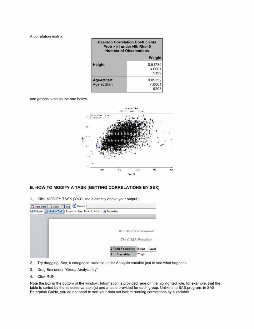
A correlation matrix:
Pearson Correlation Coefficients Prob > |r| under H0: Rho=0 Number of Observations
Weight
Height
0.51739 <.0001
5199
AgeAtStart Age at Start
0.09352 <.0001
5203 and graphs such as the one below.
B. HOW TO MODIFY A TASK (GETTING CORRELATIONS BY SEX) 1. Click MODIFY TASK (You’ll see it directly above your output)
2. Try dragging, Sex, a categorical variable under Analysis variable just to see what happens
3. Drag Sex under "Group Analysis by"
4. Click RUN
Note the box in the bottom of the window. Information is provided here on the highlighted role, for example, that the table is sorted by the selected variable(s) and a table provided for each group. Unlike in a SAS program, in SAS Enterprise Guide, you do not need to sort your data set before running correlations by a variable.

5. After you click RUN a window will pop up. Click "NO" to "Replace results from previous run"
C. CREATING A CORRELATION MATRIX Since there are task roles for Analysis variables and Correlate With variables, you might wonder how you get a
correlation matrix. The answer is simple - drag all of the variables under Analysis.
1. Click on Process Flow in the left window pane to get the process flow view
2. Click on the Heart dataset
3. Select TASKS > MULTIVARIATE > CORRELATIONS
4. Drag AgeatDeath , Smoking, Cholesterol and AgeCHDdiag under Analysis Variables
5. Click Run
Results include descriptive statistics for all variables (not shown) and the correlation matrix partially shown below.
Pearson Correlation Coefficients Prob > |r| under H0: Rho=0 Number of Observations
AgeAtDeath Smoking Cholestero
l AgeCHDdiag
AgeAtDeath Age at Death
1.00000
1991
-0.28525 <.0001
1971
0.07844 0.0006
1922
0.74811 <.0001
894
Smoking
-0.28525 <.0001
1971
1.00000
5173
-0.01178 0.4027
5049
-0.28357 <.0001
1440
EXERCISE 3 - RUNNING AN EXISTING PROJECT
Douglas Kranch (2010) gave an excellent description of how students learn computer science,
““Expertise develops in three stages. In the first stage, novices focus on the superficial and knowledge is poorly organized. During the end of the second stage, students mimic the instructor’s mastery of the domain. In the final stage, true experts make the domain their own by reworking their knowledge to meet the personal demands that the domain makes of them.”
Exercise 3 is an exercise at the beginning of a course that allows students to mimic the instructor’s analysis in a research project by opening and running an existing project. It also gives them a view of the superficial, an understanding of what a completed project and the output from it looks like. Some of the output will be familiar, such as the bar charts and descriptive statistics from the CHARACTERIZE DATA task, while the logistic regression results may be completely new to students, but this exercise serves to give them a direction of where we will be going in the course. 1. Open Ex3marriage.egp by going to FILE > OPEN >
PROJECT , opening the correct folder and selecting the project. For this workshop, it can be found in C:\HOW\DEMARS\DATA
The process flow for the project is shown at right above. This is what the students see when they open the project. 2. Click RUN > PROJECT
3. Examine the output from each of these results
4. Close the project
EXERCISE 4 - PROJECT: DESCRIPTIVE STATISTICS - LOGISTIC REGRESSION
ABOUT THE PROJECT This next exercise is completed over two or three class sessions. The objective is to introduce students to analysis using large-scale survey data. This example uses data from the 1971-1979 and 1980-1988 cohorts of the Kaiser Permanente Study of the Oldest Old (Haan et al., 2011). The objective of this study was to examine the impact of medical and lifestyle variables (i.e. smoking status, overall wellbeing, quality of medical care) on course of chronic diseases in individuals aged 65+ who were members of the Kaiser Permanente Medical Care Program. The full dataset contained records for 5990 individuals. The project was initiated by a discussion between the authors regarding the seemingly high death rate in those who are admitted to nursing homes. One of the authors observed that her grandmother died shortly after she was put in a nursing home, with the other author stating that they had heard very similar stories from other people after their relatives get put into a nursing home. This discussion sparked a curiosity to find empirical data to investigate if older adults are indeed more likely to die once they are admitted to a nursing home. The data was downloaded from the ICPSR (Inter-university Consortium for Political and Social Research) website.
MOVING FROM SAS ENTERPRISE GUIDE ON DESKTOP TO SAS ON-DEMAND Using SAS On-Demand, the LIBNAME statement in this program will refer to the directory on the SAS server assigned to your class. The LIBNAME will look something like this: LIBNAME mydata "/courses/u_2.edu1/i_123/c_2469/saslib" The change in the LIBNAME statement is the only change that needs to be done in this entire exercise to move from SAS Enterprise Guide on a desktop to using SAS On-Demand. You can include any SAS statements in the opening program, not simply assign a directory and create a temporary data set. If you have any user-written formats to apply, want to compute test scores or do any other kind of data manipulation, you can have it all in this program, run it first in the project and now your students have a nice, clean data set to use.
PART A: CREATE AND RUN A PROGRAM TO BRING IN THE DATA
1. FILE > NEW > PROGRAM
Type the following statements into your program. LIBNAME WUSS12 "c:\how\de_mars\data" ; DATA test; SET WUSS12.test ; RUN ; 2. Click RUN
PART B: CHARACTERIZE DATA This task is identical to Exercise 1. Select TASKS > DESCRIBE > CHARACTERIZE DATA Reality check! Students should get in the habit of doing this as the first task in any project and examining the results
NOTE: Data can be opened from FILE > OPEN > DATA but the instructor may wish to use a program to create new data sets, new variables, add formats
not only for data out of range, such as an age of 199 but also for reasonableness. Does it make sense that the average is 75.9 years old? In this sample it does. In a sample of eighth-graders, it does not.
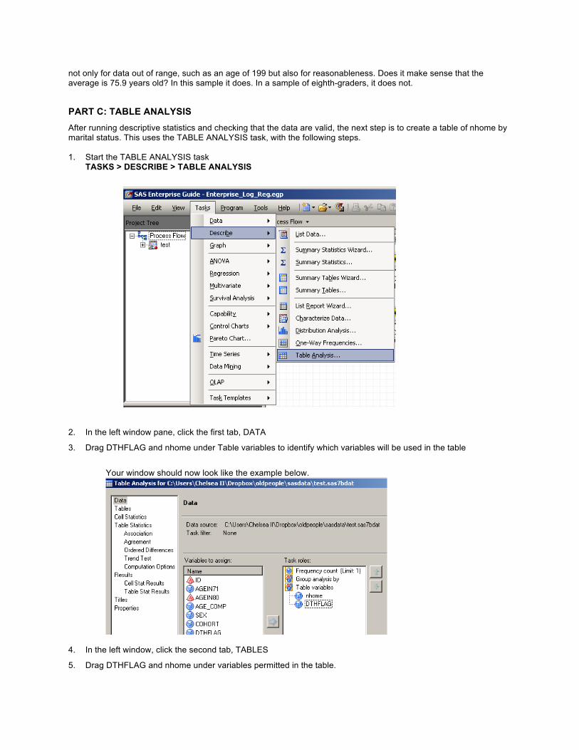
PART C: TABLE ANALYSIS After running descriptive statistics and checking that the data are valid, the next step is to create a table of nhome by marital status. This uses the TABLE ANALYSIS task, with the following steps. 1. Start the TABLE ANALYSIS task
TASKS > DESCRIBE > TABLE ANALYSIS
2. In the left window pane, click the first tab, DATA
3. Drag DTHFLAG and nhome under Table variables to identify which variables will be used in the table
Your window should now look like the example below.
4. In the left window, click the second tab, TABLES
5. Drag DTHFLAG and nhome under variables permitted in the table.

6. Drag DTHFLAG from the Variables permitted in the table window to the top of the table at right and nhome to the side.
7. In the left window pane, click the third tab, CELL STATISTICS
8. Click the boxes next to Row percentages, Cell frequencies and Include percentages in the data set
9. Under the fourth tab, TABLE STATISTICS, click on ASSOCIATION
10. Under Chi-square tests, click the button next to the first box (Include Pearson, likelihood ratio, etc.)
As mentioned previously, the bottom pane provides information on each choice within a task. This help may be particularly useful to students when they begin selecting statistical tests. These hints can reinforce information taught in the course, e.g., chi-square tests for independence.
11. Under Results, click Cell Stat Results
12. Click the button next to nhome by dthflag
13. Click RUN
Below, you see the results, the cross-tabulation of nhome by dthflag. These results indicate that 85.79% of the
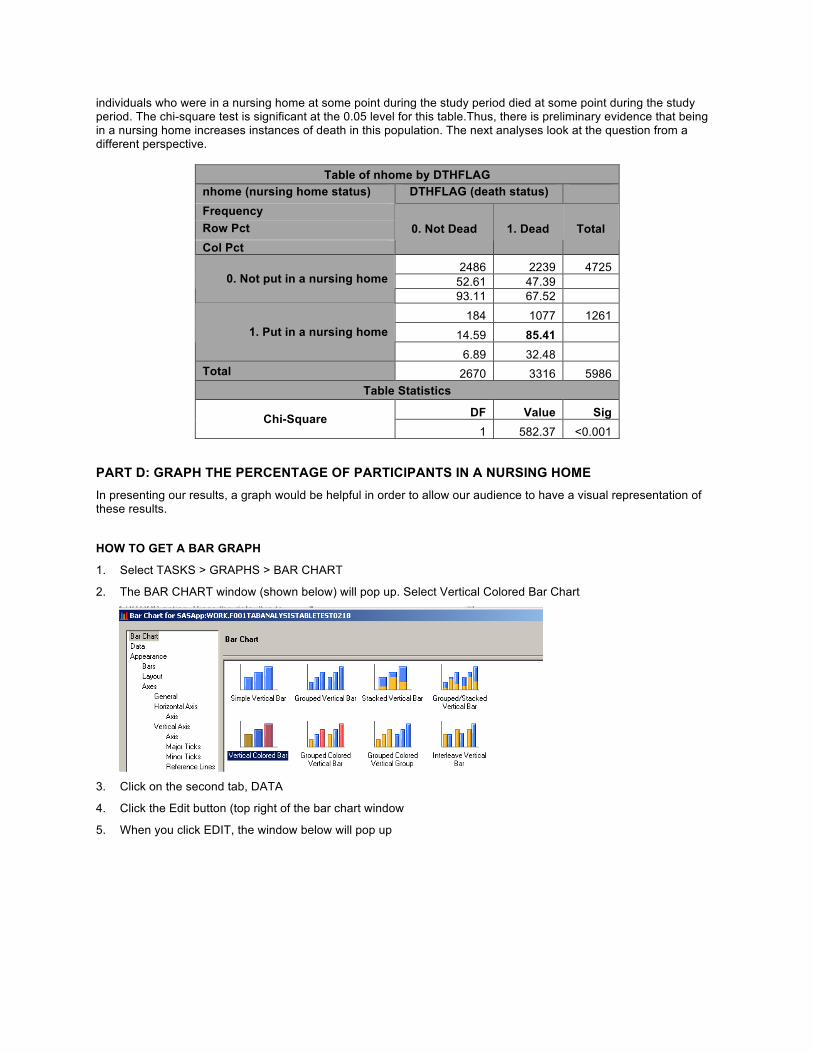
individuals who were in a nursing home at some point during the study period died at some point during the study period. The chi-square test is significant at the 0.05 level for this table.Thus, there is preliminary evidence that being in a nursing home increases instances of death in this population. The next analyses look at the question from a different perspective.
Table of nhome by DTHFLAG nhome (nursing home status) DTHFLAG (death status) Frequency Row Pct Col Pct
0. Not Dead 1. Dead Total
2486 2239 4725 52.61 47.39 0. Not put in a nursing home 93.11 67.52
184 1077 1261 14.59 85.41 1. Put in a nursing home
6.89 32.48 Total 2670 3316 5986
Table Statistics
DF Value Sig Chi-Square 1 582.37 <0.001
PART D: GRAPH THE PERCENTAGE OF PARTICIPANTS IN A NURSING HOME In presenting our results, a graph would be helpful in order to allow our audience to have a visual representation of these results.
HOW TO GET A BAR GRAPH
1. Select TASKS > GRAPHS > BAR CHART
2. The BAR CHART window (shown below) will pop up. Select Vertical Colored Bar Chart
3. Click on the second tab, DATA
4. Click the Edit button (top right of the bar chart window
5. When you click EDIT, the window below will pop up
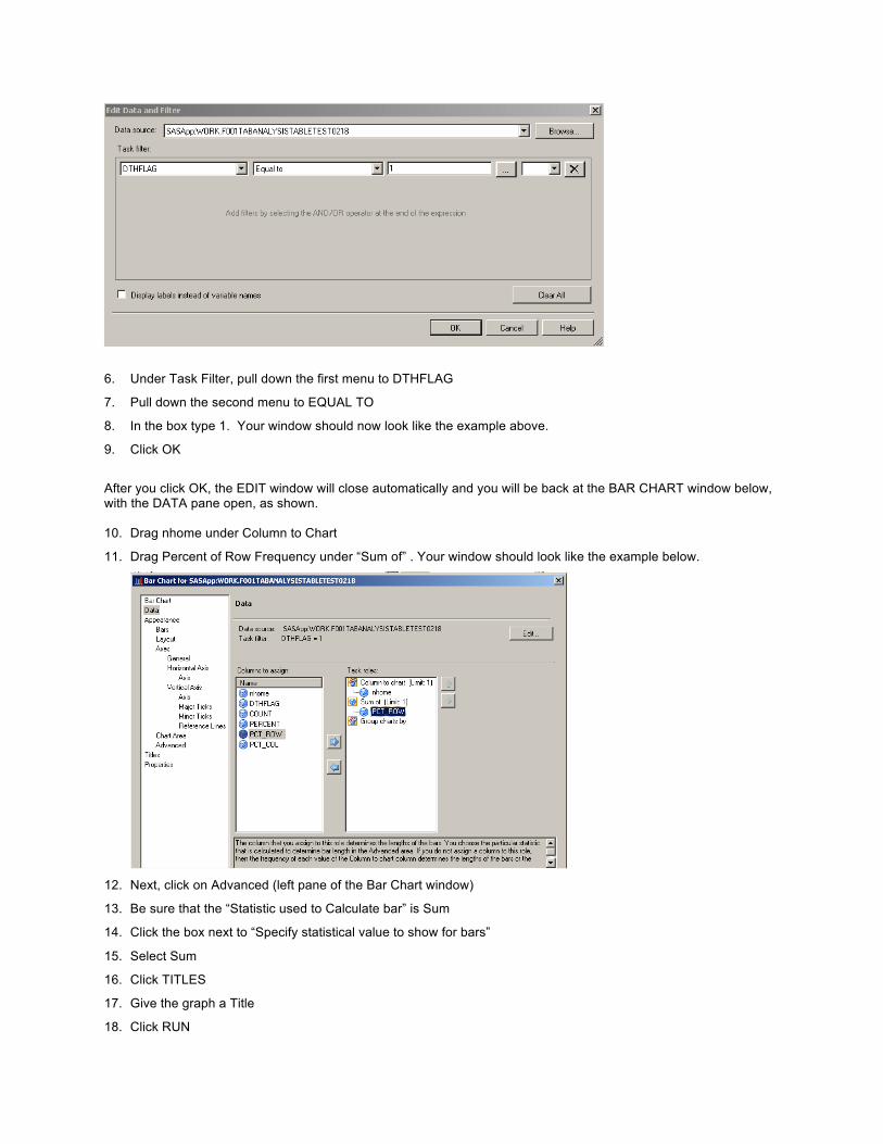
6. Under Task Filter, pull down the first menu to DTHFLAG
7. Pull down the second menu to EQUAL TO
8. In the box type 1. Your window should now look like the example above.
9. Click OK
After you click OK, the EDIT window will close automatically and you will be back at the BAR CHART window below, with the DATA pane open, as shown.
10. Drag nhome under Column to Chart
11. Drag Percent of Row Frequency under “Sum of” . Your window should look like the example below.
12. Next, click on Advanced (left pane of the Bar Chart window)
13. Be sure that the “Statistic used to Calculate bar” is Sum
14. Click the box next to “Specify statistical value to show for bars”
15. Select Sum
16. Click TITLES
17. Give the graph a Title
18. Click RUN

PART E : LOGISTIC REGRESSION So far, we have taken a look at the descriptive statistics comparing nursing home status and death status, in both graphic and tabular format. For our sample, we’ve computed a chi-square to test for statistical significance. In further discussion of our research question, we consider that some other variables may be related to both death and admittance to a nursing home for older adults. One of these is gender (SEX). We wish to explore if male participants were more likely to die during the study period than women participants, since on average men tend to die at an earlier age than women in the general population. The other demographic variable is age (AGE_COMP). We are including this in the model since we expect that that older participants will be at a greater likelihood of dying then younger participants, and want to see if this is indeed the case with this sample. Another variable we will investigate is the number of visits to the emergency room (VISSUM1). This variable may be a proxy to the overall health of the patient, with more visits to the emergency room increasing the likelihood of dying during the study period. In summary, we will be running a logistic regression analyses to investigate if multiple independent variables (admission to a nursing home (nhome), gender (SEX), age (AGE_COMP), number of visits to the emergency room (VISSUM1)) assist in the prediction of the dependent variable death during the study period (DTHFLAG). Recall that SAS Enterprise Guide uses the last used data set as a default. In this case, it would be the data set created above from the Table Analysis. We don’t want that. 1. Under Process Flow (in left pane), click on test data set to select it .
2. Select TASKS > REGRESSION > LOGISTIC
3. The window below should pop up. If you do not see this window, click on the first tab, DATA, in the left pane.

4. Drag DTHFLAG under dependent
5. In the left pane, under the MODEL tab, click on EFFECTS. The window below will appear.
6. Shift-Click on VISSUM1, AGE_COMP, nhome, and SEX.
7. Click on Main. This sets VISSUM1, AGE_COMP, nhome, and SEX to be the main effects in your logistic regression model.
8. In order to ensure that this model is modeling the probability of dying, we must set that response. Under the model tab, click on RESPONSE.
9. Ensure that “Binary” is selected under “Response Type” and “Logit” is selected under “Type of Model”.
10. In the “Response levels for DTHFLAG” box, select 1, and select 1 in the drop down menu next to “Fit model to level:” as seen in the example below.
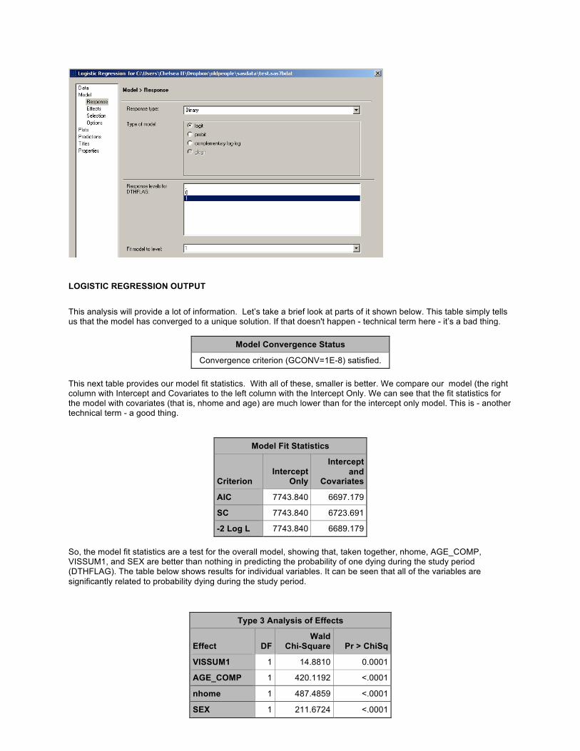
LOGISTIC REGRESSION OUTPUT
This analysis will provide a lot of information. Let’s take a brief look at parts of it shown below. This table simply tells us that the model has converged to a unique solution. If that doesn't happen - technical term here - it’s a bad thing.
Model Convergence Status
Convergence criterion (GCONV=1E-8) satisfied. This next table provides our model fit statistics. With all of these, smaller is better. We compare our model (the right column with Intercept and Covariates to the left column with the Intercept Only. We can see that the fit statistics for the model with covariates (that is, nhome and age) are much lower than for the intercept only model. This is - another technical term - a good thing.
Model Fit Statistics
Criterion Intercept
Only
Intercept and
Covariates
AIC 7743.840 6697.179
SC 7743.840 6723.691
-2 Log L 7743.840 6689.179 So, the model fit statistics are a test for the overall model, showing that, taken together, nhome, AGE_COMP, VISSUM1, and SEX are better than nothing in predicting the probability of one dying during the study period (DTHFLAG). The table below shows results for individual variables. It can be seen that all of the variables are significantly related to probability dying during the study period.
Type 3 Analysis of Effects
Effect DF Wald
Chi-Square Pr > ChiSq
VISSUM1 1 14.8810 0.0001
AGE_COMP 1 420.1192 <.0001
nhome 1 487.4859 <.0001
SEX 1 211.6724 <.0001

Skipping down to another table we see the parameter estimates, which are interpreted the same as regular regression coefficients - a negative coefficient for nhome means a lower probability - but a lower probability of what?
Analysis of Maximum Likelihood Estimates
Parameter DF Estimate Standard
Error Wald Chi-
Square Pr > ChiSq
VISSUM1 1 0.0332 0.00862 14.881 0.0001
AGE_COMP 1 0.0169 0.000825 420.1192 <.0001
nhome 0 1 -1.0134 0.0459 487.4859 <.0001
SEX 0 1 -0.8584 0.059 211.6724 <.0001
Hopefully, you noticed the note on the very first page of your logistic regression output: Probability modeled is DTHFLAG='1'. According to these results, not being in a nursing home (coded as 0) lowers the probability of death. In addition, being female (coded as 0) also lowers the probability of death. A unit increase in age and number of visits to the emergency room increases the probability of death in this sample. Therefore, the hypothesis that nursing homes are related to dying is supported. According to these results, you may want to think twice before sending grandma to the home! SAS Enterprise Guide also produces a variety of charts by default, such as the one below for predicted probabilities for DTHFLAG = 1 for participants at age 75.84.
PART F: MODIFYING THE OUTPUT FORMAT & EXPORTING THE ROC CHART SAS Enterprise Guide offers a variety of options for output. Particularly working with SAS On-Demand, since it is maintained on the SAS server and is only available to students for the few months they are in the course, I strongly encourage saving the output off-line. A major reason I encourage students to use SAS On-Demand is so that they can do original research and publish it. Export your output as an RTF file and you can just copy and paste into Word or OpenOffice. Since you have saved it, you can work on your paper any time.

SAS Enterprise Guide also gives options for saving output as PDF or HTML files. Let’s say I want to save my logistic regression results as an HTML file and then export the ROC chart as a JPG file so I can upload it and use it on my explanation on the class blog. 1. To change the format, select TOOLS > OPTIONS
2. Click on General under Results
3. Click the box next to HTML. Click the box next to RTF to turn off production of RTF results. You can produce multiple types of results if you want, such as both RTF and HTML, but in this example, we only want one type.
4. Click OK
5. To re-run the logistic regression, in the left Process Flow pane, right-click on LOGISTIC REGRESSION and select RE-RUN LOGISTIC REGRESSION
6. When prompted whether to replace the results from the previous run click YES.

7. Scroll down to the ROC chart, right-click on the picture and select SAVE PICTURE AS. I saved it as a png file.
EXERCISE 5 - SURVIVAL ANALYSIS SAS Enterprise Guide offers two options for survival analysis, Life Tables and Proportional Hazards.
PART A: LIFE TABLES
START A NEW PROJECT
1. File > New > Project
2. Set results to be a pdf file
3. Tools > Options > Results > Results General
4. Click the button next to PDF. Make sure any other formats are not checked.
5. Click OK
OPEN THE ADDICTS DATASET
6. File > Open > Data
7. Select the data set ADDICTS
PERFORM A SURVIVAL ANALYSIS USING LIFE TABLES
8. Tasks > Survival Analysis > Life Tables
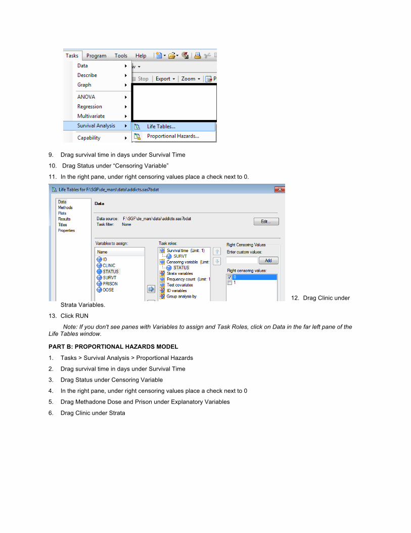
9. Drag survival time in days under Survival Time
10. Drag Status under “Censoring Variable”
11. In the right pane, under right censoring values place a check next to 0.
12. Drag Clinic under Strata Variables.
13. Click RUN
Note: If you don't see panes with Variables to assign and Task Roles, click on Data in the far left pane of the Life Tables window.
PART B: PROPORTIONAL HAZARDS MODEL
1. Tasks > Survival Analysis > Proportional Hazards
2. Drag survival time in days under Survival Time
3. Drag Status under Censoring Variable
4. In the right pane, under right censoring values place a check next to 0
5. Drag Methadone Dose and Prison under Explanatory Variables
6. Drag Clinic under Strata

7. Click Plots (in the far left pane of the Proportional Hazards Window)
8. Click the buttons next to Survival Function Plot and Cumulative Hazard Function plot
9. Click RUN
Note: If buttons are greyed out and you can't get it to run, double-check if you checked 0 or 1 under Censoring
Variable
CONCLUSION SAS Enterprise Guide, available free as part of SAS On-Demand is an effective teaching tool for students from any discipline who are starting to learn statistics. Whether the analysis calls for simple basics such as descriptive statistics and graphs, or more advanced tools like logistic regression and survival analysis, SAS On-Demand is available and offers an intuitive user-friendly interface. The best part of all – it is free!

REFERENCES De Mars, A. (2011). Ten things about SAS On-Demand for Academics. http://www.thejuliagroup.com/blog/?p=1625
Kranch, D. A. (2009). From novice to expert: Harnessing the stages of expertise development in the on-line world. Proceedings of the 2009 Association of Small Computer Users in Education conference. www.ascue.org—037.pdf
Haan, M. N., Rice, D. P., Quesenberry, C. P., & Selby, J. V. (2011). Kaiser Permanente Study of the Oldest Old 1971-1979 and 1980-1988: [California]. Inter-university Consortium for Political and Social Research (ICPSR) [distributor].
AUTHOR CONTACT INFORMATION Your comments and questions are valued and encouraged. Here is the contact information for the authors:
Dr. AnnMarie De Mars
The Julia Group 2111 7th St. #8 Santa Monica, CA 90405 (310) 717-9089 [email protected] http://www.thejuliagroup.com/
Chelsea Heaven [email protected]
SAS and all other SAS Institute Inc. product or service names are registered trademarks or trademarks of SAS Institute Inc. in the USA and other countries. ® indicates USA registration.
Other brand and product names are trademarks of their respective companies.