painting stories - horizontal format
TRANSCRIPT


Painting Stories
a life in pictures and words by Peter Selgin
Draft: Oct. 2018 / 82,000 words Author Direct Contact: 104 Mariners CT NE Milledgeville, GA 31061 (718) 549-9029 [email protected]

1
?

2
eceding through grasslands to a point at the center of the horizon, a set of railroad tracks forms an inverted “V.” In the distance, on the other-wise perfectly flat horizon, a silo rises next to a farm building of some
sort. This scene, or one like it (with a highway replacing the railroad some-times) recapitulates itself ad infinitum throughout the Midwestern plains.
The drawing, rendered painstakingly in pen and black ink, with individual blades of grass detailed, was one I did during my freshman year of art school at the Pratt Institute in Brooklyn, New York, but that has since been lost: hence the blank page seen here to your left.
This book has its genesis in my failed search for that drawing. I wanted it for a seminar I was to present at Antioch University’s Graduate Creative Writ-ing program. The seminar’s title was “Painting and Writing: A Matter of Per-spective.” My intention was to draw and extend an analogy between narrative prose writing and visual art, something I felt qualified to do, having spent close to forty years doing both, often simultaneously.
As its title suggests, my seminar had to do with perspective and with the many meanings and connotations of that word, beginning around 300 B.C., when, from a small set of humble axioms, a Greek mathematician named Euclid arrived at what today is known as Euclidian geometry. The concept of linear perspective — that objects appear smaller as they grow more distant (or, as ge-ometricians would have it, “the visual angle of an object is the angle subtended by the eye by a triangle with the object at its base”), comes to us directly from Euclid. As I would go on to explain in my seminar, it took another 1700 years
R

3
for an engineer and architect named Brunelleschi to apply Euclid’s principles to the problem of representing three-dimensional space in painting. Brunelles-chi’s experiment, conducted in the baptistry of the duomo in Florence using a drawing with a hole in it and a mirror, changed forever the way pictures are not only painted, but viewed. Its impact went far beyond revolutionizing art. It al-tered humanity’s perception of the world.
There’s another kind of perspective, related to but different from Euclid’s, that has to do more with time than with distance. Though from a psychological standpoint perspective likewise affects and is affected by the angle of percep-tion, and though the cubists and other visual artists experimented with and dis-covered bold ways to incorporate time into their art, this kind of perspective mainly concerns — not painters, but writers. We call it point of view. It, too, changes how we see the world and ourselves.
My reason for wanting that drawing of the railroad tracks was to illustrate how, as I boy, I fell in love with perspective, with the notion that objects appear smaller to us the farther away we are from them. As it altered the lives of every artist who followed Brunelleschi’s experiment, this notion, this idea, this fact, would change my life. If it didn’t make me an artist, it made me see like one.
In 2009, having made my living as a freelance artist for thirty-six years there, I left New York City to pursue an academic career. I gave away my easel and my drafting table (the Salvation Army wouldn’t take them; they were too encrusted with paint). The rest of my art supplies — my paints, my brushes, my paintings and drawings — went into storage: another reason why the pre-vious page is blank. There would be no more drawing. No more painting. No more illustrating. No more dividing myself between my two artistic loves. Until

4
then, though I had published a few books, I hadn’t come close to achieving the sort of success I’d yearned for as a writer. I saw myself not as a successful visual artist who wrote on the side, but as an author burdened by his day job no less than if that job had been processing pigs in a slaughterhouse or head fry cook at a McDonald’s. As an academic, at least, I’d have summers off and paid sab-baticals. Meanwhile I would immerse myself in books and writing. By dedicat-ing myself exclusively to the written word, at last I’d realize my dream: to make it as a writer. So I told myself.
As do many academic careers, mine began with a series of visiting posts. By the time I secured a full-time tenure-track position, I’d been away from New York for more than four years. Five years later, when I was tenured, I sold my Bronx apartment and bought a house on a lake here in Georgia, fifteen minutes by car from the university. Having moldered away for nine years in a Bronx warehouse, my art supplies joined me here, including hundreds of paintings and as many drawings stuffed into vinyl and cardboard portfolios.
It was among those portfolios that I searched for that drawing, the one of the train tracks receding into the distance, the one I never found. But in search-ing for it I found something much more valuable: the career that I’d left behind, abandoned. All those paintings, all those illustrations: I couldn’t believe how many there were. Hundreds! Pictures that I hadn’t seen or thought of in years, that I’d completely forgotten, along with the person who made them, the visual artist whom I had forsaken no less than I’d forsaken his line of work. So intent had I been on my writing, so obsessive had been my quest to gain the hand of that other artistic love, I’d all but ignored my first love. I’d come to see it strictly as a means toward an end, a way to pay the bills while writing my novels, my

5
stories, my plays. Suddenly, here were the fruits of that expediency, of those renounced labors, of that forsaken life, hundreds of them, smelling of must and mildew and already starting to yellow with age. As one by one the images passed before my eyes and through my fingers, I felt deeply moved.
To gain perspective, you need time, distance, or both. Writers and paint-ers alike know this. With perspective we gain understanding and, often, with it, appreciation and sympathy. Seeing all those pictures I’d made was like being reunited with a dear old friend. No, it was like being reunited with my dear old self. I knew then that segregating the writer from the artist in me had been a big mistake. They belonged together. They needed each other.
How to reunite them? Then it occurred to me: my words had divorced me from my pictures. I’d
use the same words to tie the knot again. I’d write about my paintings; I’d tell their stories. In a series of Facebook posts, one painting at a time, I did just that. Some who followed the posts urged me to turn them into a book.
Here is that book made of pictures and words: my pictures, my words. May you enjoy them both. CODA:
In the Spring of 2020, the university where I work plans to mount a retro-spective of my visual art, the first. I’ve converted the basement of my lake house into an art studio. I bought a new easel. I am painting again.

6
(this page is intentionally blank)

7
“Zoagli Train Station,” gouache on paper, 17 x 12, 1991
8
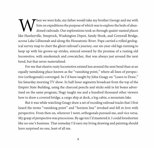
hen we were kids, my father would take my brother George and me with him on expeditions the purpose of which was to explore the beds of aban-doned railroads. Our explorations took us through quaint-named places
like Hawleyville, Steeprock, Washington Depot, Sandy Hook, and Cornwall Bridge, across Lake Lillinonah and along the Housatonic River. Papa carried a rolled geolog-ical survey map to chart the ghost railroad’s journey, our six-year-old legs running to keep up with his grown-up strides, enticed onward by the promise of a rusting old locomotive, with smokestack and cowcatcher, that was always just around the next bend, but that never materialized.
For me that elusive rusty locomotive existed less around the next bend than at an equally tantalizing place known as the “vanishing point,” where all lines of perspec-tive (orthogonals) converged. So I’d been taught by John Gnagy on “Learn to Draw,” his Saturday morning TV show. In half-hour segments broadcast from the top of the Empire State Building, using the charcoal pencils and sticks sold in kit boxes adver-tised on the same program, Nagy taught me and a hundred thousand other viewers how to draw a covered bridge, a cargo ship at dock, a log cabin, a mountain lake.
But it was while watching Gnagy draw a set of receding railroad tracks that I first heard the terms “vanishing point” and “horizon line” invoked and fell in love with perspective. From then on, wherever I went, orthogonals pursued me, and vice versa. My grasp of perspective was precocious. By age ten I’d mastered it. I could foreshorten like no one’s business. That someday I’d earn my living drawing and painting should have surprised no one, least of all me.
W
9
“New York City, Evening,” acrylic on canvas, 24 x 33, 2002

10
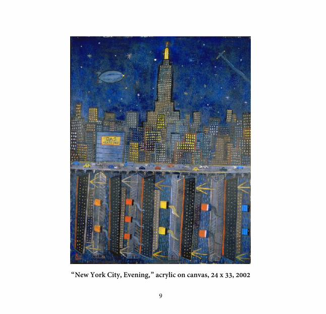
f I had a time machine, the first place I’d travel to is the passenger seat of my father’s Simca Chatelaine on my first trip to New York City with him, circa 1963. I was six years old. Though the city was only an hour’s drive from the Connecti-
cut town where I grew up, it seemed much further. On that trip I experienced two phenomena that made a permanent impression on me and that remain for me, to this day, symbols of manmade beauty at its most sublime.
In my memoir The Inventors, the middle-aged narrator describes the experience to his younger self:
At the Henry Hudson Bridge, [my father] tossed a nickel into the toll basket. You rolled under the girders of the George Washington Bridge. Here the city began in earnest. The Cloisters, Grant’s Tomb. Among drab shapes in the dis-tance patches of color appeared, the bright funnels of ocean liners in their berths. To your left, a skyscraper garden flourished, the Empire State Building a deco fountain rising from its center.
I can’t overestimate the impression that city and those ships made on me. Think-ing of it brings a tear to my eyes. It may have been the happiest day of my life.
The painting can be hung horizontally or vertically.
I

11
“Lackawanna Terminal,” collage and colored pencil, 28 x 20, 1987

12
high-angle view of the Lackawanna Railroad Terminal in Hoboken, New Jersey. Midnight, or thereabouts. A wedge of yellow moon hangs in the dull blue sky. As they pass each other, two men in business attire, one arriving at
the terminal, the other departing it, cast long, gloomy shadows. Except for the elevated viewpoint, it’s the sort of melancholic scene Edward Hopper specialized in, a study in despondency. Though melancholy, for me this painting captures something beautiful. A sense of loss, of those moments in our lives that, however dreary or banal, like all memories become beautiful once left behind.
There is a rare disease called bathosmigia, a condition in which a person’s normal depth relations are inverted, so that near objects seem far away, while objects in the distance appear to be close. To someone with this disease looking down a set of rail-road tracks, the train tracks will appear to get not farther, but closer, as the lines of perspective converge. The bathosmagiac lives in an inverted world, a world in which not only distance but time itself is turned inside-out. To approach something, he must walk away from it; to distance himself, he must draw near. It seems impossible, yet it’s a real disease. I looked it up. What could be more frightening, or harder to imagine?
Then it occurs to me: not only can I imagine this disease, I have the disease. It’s called nostalgia.
A

13
“The Museum,” whereabouts unknown, circa 1964

14
ur father kept them in a green folder labeled “The Museum” in his file cab-inet down in The Building, our name for the converted barn that was his laboratory, where he conceived, designed, engineered, and fabricated the
prototypes of his inventions. The drawings were mine and my twin brother George’s. Like most children, we both loved to draw. Until around seventh grade, George
was my equal (if not my better) as a visual artist. Then, for some reason, possibly be-cause I’d become something of an artistic show off, that side of George retreated into the shadows. Overnight, it seemed, I became the “artistic” twin, while my brother would go on to become an economist of note.
Our favorite subjects were the usual suspects of toddler boy art: red fire trucks and yellow school buses. To these I added a few predilections of my own: locomotives, clipper ships, the Queen Mary and the Empire State Building.
The best of my childhood drawings went into The Museum’s collection, where they remained until some time around fifth or sixth grade, when, reluctantly, my fa-ther gave me permission to take the green folder to school with me, so I could show its contents off to my classmates. The green folder failed to return with me. With this loss a shadow of consternation fell over our household that wouldn’t lift for months. It may not seem like such a big deal, but for my family and me, then, the loss was of a scale no less colossal than that occasioned by the burning of the Library of Alexandria. It was, after all, not “a” museum, but “The Museum.”
Anyway, that was the last of The Museum — but not quite, for in the pages of this book you have Museum No. 2.
O

15
“Queen Mary,” pencil and pen on paper, 8 x 10, 1972

16
he front section of the Cunard Liner HMS Queen Mary, starboard side. The drawing was one of many I did for my high school term paper on the history of transatlantic liners. Titled Follow Their Wake (it really should have been
“Follow in Their Wake”), my paper was unabashedly derivative of John Maxtone Gra-ham’s book on the same subject, The Only Way to Cross, published around the same time by MacMillan. I even plagiarized some of Graham’s more felicitous turns of phrase, as when he describes the French liner Normandie while burning in New York Harbor as having listed “perilously to port.”
The colored pencils I used were a brand called Prismacolor, manufactured by the Eagle Pencil Company, which had a factory in nearby Danbury. I’d make pilgrimages there and, with luck, return with a box or two of free rejects. For mysterious reasons, most of the rejected colored pencils were pink and white. The finer line work is done with a black Bic pen.
I was drawn to (and drew) ships as people are drawn to the sea, for the possibili-ties implied by infinite horizons. What is a ship, after all, but a seagoing set of possi-bilities? I enjoyed the challenges ships posed to my grasp of perspective, by the ways their shapes altered with the slightest shifts in angle of perception, their hulls growing more or less parabolic, their funnels more or less elliptical.
Years later, when as an art student at Pratt I started drawing the human figure, it occurred to me that my drawings of ships had served the same purpose, that they had been my nude models.
T

17
“Empire State Building,” acrylic on panel, 10 x 14, 2001

18
he Empire State Building again, this time not only central to the painting, but dominating it. The painting’s dimensions are as humble as its subject is mon-umental. Small buildings gather around it like disciples around their Master.
Except for some flashy red and yellow domes, the disciples wear drab, clay-like colors. In the upper left part of the sky, a full yellow moon shares its roundness with the red halo that emanates from the skyscraper’s lemon-yellow spire. I have a soft spot for the Empire State Building. I love how it telescopes upward in increasingly narrow increments, like a stack of Chinese boxes, until it arrives at its heavenly vanishing point: a vertical lesson in perspective.
The same subject, done fifty years earlier in crayon on manila construction pa-per, earned me my first taste of artistic glory: a peck on the cheek from Mrs. Decker, my kindergarten teacher, when I gave it to her. It didn’t take me long thereafter to realize I could charm my way into people’s good graces through my drawing ability. My teachers could count on me to immuminate my homework assignments, thereby earning A-plusses less for my learning than for offering them some welcomed diver-sions. Decades after I was her student, my fifth-grade science teacher, Mrs. Mastrac-chio, held on to my lavishly illustrated laboratory notebook to show her pupils. For all I know by now she has taken it to Heaven with her.
As for the original drawing that I gave to Mrs. Decker, it was one of many I did of the same subject, most of which went into — and were lost with — the Museum.
T

19
Notebook Page, black ballpoint and marker on paper, 1975

20
nce, when I was small, my father chastised me for dedicating an entire sheet of paper to a drawing that took up a fraction of the space. His reprimand instilled in me an abhorrence of wasted paper that I harbor to this day and
that explains the crowded page seen here, from a notebook I took with me in Europe on my first trip there.
I went with my friend Michael. In Italy we visited my uncle Sergio, my mother’s brother, a sixty-year-old hotel porter who lived in a decrepit, one-room pensione not far from the railway terminal in Milan. The bathroom was a water closet at the far end of a balcony lining the courtyard. You had to squat. Uncle Sergio picked his nose. He sucked his dentures. He smelled of wintergreen liniment and musk. Under his bed we found stacks of pornographic magazines. Sergio’s profile repeats itself across the top of the page, while a younger version of him appears farther down to the right. To the left of young Sergio, under a sideways fountain, is a sketch from a photograph taken the day my brother George and I were christened. That’s our father to the left next to his mother. My godmother holds one of us. Where my mother is I’m not sure. With her desire to have us christened our atheist father begrudgingly complied.
Starting in high school, wherever I went, I took a notebook with me. I sketched from photos and from life. When no other subjects were available, I drew my own hands. As the writing bug took hold, words crowded out images and finally usurped them entirely. Eventually, having come to the conclusion that the notebooks were strangling my memories, I stopped keeping them and threw most of those I had away, saving only the ones with the nicest drawings.
O

21
“Nude,” charcoal on newsprint, 24 x 18, Pratt Institute, Brooklyn, 1976

22
he first time I confronted a nude model, I was a freshman at the Pratt Institute, in Brooklyn, New York. I was nineteen. I had chosen Pratt over other schools in the city because I found Manhattan too intimidating. Brooklyn had more trees.
The drawing studio was on the top floor of the Main Building, an old brick building with arched windows that has since been destroyed by fire. I stood behind my drawing horse—a wooden platform with a gently raked surface — with my newsprint pad, charcoal sticks, and kneaded eraser arranged and ready. The studio wasn’t heated or didn’t seem to be. It was only September, but cold. To keep her from freezing an electric space heater hummed away next to the model’s platform. We kept our jackets on.
Though I knew we’d be working from a nude model, still, part of me didn’t know what to expect. When the model first shed her cloak, though I pretended not to be, for a moment I was thunderstruck. It was the first time I’d seen a strange unclothed woman in a venue other than Playboy. She was close to me in age, maybe a year or two older, and nice-looking, with arched eyebrows and chestnut hair and upturned breasts. She stood there, brazenly naked, looking more bored than anything, oblivious of the dozen students staring at her, as though we mattered as little to her as the dust floating around in that studio.
Once I started drawing, I stopped noticing such things. One form of curiosity replaced another: a curiosity about contours, shapes, values, proportions. Though it was still that of a naked woman, the body in front of me shed its sexual aura. Gazing at it through a scrim of charcoal dust, I grew blind to concepts like “female,” “body,” “breasts,” and “beauty.” I saw only shapes. That these shapes added up to “beautiful young woman” was beside the point. The model’s body served as a repository of forms and contours, a gathering place of highlights and shadows, a consortium of negative and positive spaces. Those were my drawing’s true subjects. The naked female body in front of me was just an excuse for them.
T
23
“Nude,” charcoal on paper, 18 x 24, Pratt Institute, 1976

24
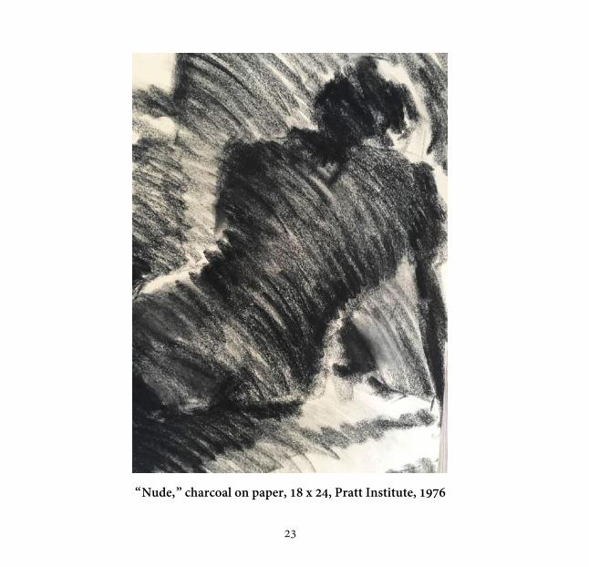
e spent twelve hours a week sketching mostly nudes. Our instructor, Phoebe Helmann, forbid us from drawing faces or genitals. “Distrac-tions,” she called them. Phoebe also barred us from outlining. “There are
no outlines in nature,” she would shout over the scrapes and scratches of charcoal pencils and sticks, “only planes and shadows. A line is a concept. We’re not here to draw concepts. We’re here to draw shapes. You can draw concepts at home.”
I disliked charcoal then and still do to this day. I’d emerge from that studio cov-ered with charcoal dust, feeling like one of those miners of the Borinage that Vincent van Gogh sketched so well. But through those layers of charcoal dust, I learned to see what was right there in front of me.
W

25
“Still Life,” oil pastel on paper, 24 x 18, 1976

26
one at the desk in my dormitory at Pratt, freshman year. A Ball mason jar next to a cylindrical “box” of Quaker Oats. In the background: another still-life done around the same time using acrylic paint on canvas board. The
painting-within-a-painting adds a meta dimension. I was showing off. Note how the mason jar and the Quaker Oats box tilt slightly away from each other. Are these subtle inclinations the product of curvilinear perspective combined with acute observation? Or an uneven tabletop? Artistic ineptitude?
In the hierarchy of artistic genres, the still-life occupies the lowest rung. It is the runt of the subject-matter litter. This one I did using oil pastel, a compromise between pencil and paint. Though one “draws” with pastels (you hold them like a pencil), the result is called a pastel “painting,” the emphasis being more on color than on line.
Like so many beginning artists, though I didn’t yet know the word, I was a sucker for verisimilitude, for trying to make things look like themselves, or “real.” I hadn’t yet discovered that half of what we think of as “reality,” the better half, comes down to perception as colored by emotion and desire, ideas and intuition. Not “reality” as the cones and rods in our eyes see it, but as we experience it personally, emotionally.
It may well be that back then, looking at these objects, all I experienced were their mundane quotidian aspects. Their shapes, their colors, their textures, how they ab-sorbed and reflected light — those things were enough for me then. Anyway that’s what I took from them, that and those neatly crosshatched colors.
D

27
“Three Men on a Motorcycle,” mixed media, about 12 x 8, 1977

28
he three men were Patrick Dillon, Jon Waldo, and myself. We were freshmen in Mary Buckley’s Light, Color, and Design class. The assemblage took up a whole wall. The right edge is fringed with a vertical frieze stenciled with blue
shot glasses and red kneeling nudes. In the upper right, alternating with abstract char-coal drawings, are headshots of a brooding young man in a gray t-shirt. A torn New York Post headline, reels of Super-8 film, Marlboro cigarette boxes, slashes of sprayed and dripped paint, random words and phrases (“I never climax,” “Art is CUM,” “I don’t feel like commenting.” “This is nothing but a bunch of sperm!”). Two portraits in oil pastel, facing each other on a diagonal, dominate the composition.
While Madam Buckley was on sabbatical, an adjunct instructor named Sayler took over her class. Subjected to his critical acumen, several students burst into tears. This led to a cabal against him in which I took part despite his enthusiasm toward my efforts. With “Three Men on a Motorcycle” Sayler couldn’t have been more pleased. He praised the “organic unity” binding its disparate elements, the organizational grid formed by those patriotic stripes, the allusions to Hollywood and cinema, the guerilla touches of spray paint and graffiti, the near-perfect balance of onanism and All-Amer-ican iconography. (These aren’t Sayler’s words, but they come close.)
Missing is the piece’s third dimension: a motorcycle we found and drizzled with red, white, and blue paint. How we got it up to the third floor of the studio building is anyone’s guess, nor do I know what we did with it afterwards.
T

29
“Three Men on a Motorcycle” (detail)

30
s for the rest of the assemblage, it met its fate in a Soho loft the following summer, when, during a drunken episode, Patrick tore it to shreds.
“You think it’s sacred, or something?” said Patrick. “Huh? That’s what you think? You think it’s goddamn sacred?”
So saying, Patrick yanked the assemblage down from the wall where it hung and attacked it, tearing it to pieces. A cloud of red dust spun away from the jagged shreds. The detail is of the one piece I salvaged and had framed. The brooding young man in the headshots is yours truly in his Marlon Brando phase.
It was the summer of Son of Sam, aka David Berkowitz, a postal letter sorter who, with .44 caliber Bulldog revolver, operating under orders from a demon in the form of a neighbor’s dog, went on a killing spree that would ultimately claim six victims’ lives, targeting lovers in parked cars.
At 9:30 that evening, an hour after “Three Men and a Motorcycle” met its end, the City of New York went as black as a charcoal stick and remained so for the next twenty-five hours. A coincidence.
A

31
“Spring Drug,” latex and enamel on paper, 40 x 60, 1977

32
ike most artists of my generation, I was influenced by Jasper Johns and John Rauschenberg. I was also taken with the remnants of sign postings on walls and garbage dumpsters, and with the décollage works of Wolf Vostell inspired
by them, especially his “Coca-Cola” (1961), with its iconic commercial subject matter and torn-billboard aesthetic.
Soho was much more ragged back then, a manufacturing zone of artists squatting in unimproved industrial spaces. Few lofts had air conditioning; many had only rudi-mentary plumbing. The whole city was much grittier then than now. That was the city that I sought to capture in this painting, one of a series I slapped together on the roof-top of the building on Broome Street between Spring and Mercer that Patrick, John, a photographer named Laura, and I sublet from Bill Hochhausen, a wood sculptor and one of our Pratt instructors. Meanwhile at a tavern two blocks away I washed dishes. To work there you had to be an artist. The bar had an open kitchen. From my dish-washing station I watched the tavern’s illustrious clientele—which included Jasper Johns and Bob Rauschenberg—drink, eat, and argue.
Among Hochhausen’s supplies I found some large sheets of inexpensive paper, stencils, and cans of latex paint in assorted colors to which I helped myself. I left the results on the roof to dry overnight and retired to the bare white cube at the loft’s center that served as my bedroom.
That night, one Laura’s three cats escaped up onto the roof. You can’t see the paw prints, but they’re there.
L

33
Untitled, gouache on paper, 10 x 14, 1976

34
ecently, I dreamed about an art exhibit. The paintings in the dream were mine. Or I dreamed they were mine. I didn’t actually paint them; they didn’t actually exist. Had I painted them, I would have been proud. Proportionately
they were shaped like the pages of a book, but much larger, about ten feet tall by six feet wide. In fact they were paintings of pages from famous novels. There was a page of Ulysses, a page of Tropic of Cancer, a page of Moby Dick, a page of Jane Eyre, and so on, filling the exhibition space.
From a distance, it was possible to read the “pages” as you would read the pages of a book, as if they were giant Xerox copies. But as you stepped closer, as with Jasper Johns’ famous painting of the American Flag, it became equally impossible to not see them as paintings, as objects meant—not to be read, but to be looked at. Up close they were unmistakably, even aggressively, paintings, with each letter of every word ren-dered in rich impasto strokes of vibrant color, the faint rainbow colors that shimmer and dance across a white surface if you stare at it long and hard enough.
I have this problem with actual books. I can’t separate content from presentation, text from typography. While trying to read, I’m also looking at. If the book is poorly designed, whatever its contents, I’ll tend to put it down and never pick it up again. On the other hand, if a book is beautifully typeset, if the font is appealing and the line-spacing and margins are generous, though in the end I may still not care for the con-tents, it will take me longer to dislike it. There have been more occasions than I care to admit when good typography has seduced me into embracing a mediocre book.
R

35
Untitled, from “Signature Series,” 10 x 14, 1976

36
oth this and the previous work are from a series of twenty-four abstract paint-ings and drawings in gouache and charcoal on notebook paper. The subject of the series was the artist’s unique “signature” as conveyed by and through
his use of line. In the earlier piece (one of only a handful of works from the series that survives), the “signature” squiggles that I used to shade and crosshatch my figurative drawings are accompanied by my literal signature, which disintegrates into pure line as it is repeated down the page. Under the drawing are some notes made with a black, ballpoint pen (“America — The American — The American Artist / Madison Ave-nue, Madison, Mad”). And though the notes must have meant something to me, it wouldn’t surprise me to learn that their function was more decorative than intellec-tual, that they were mainly there for their looks.
Much of my artistic life has been informed by this often fraught relationship be-tween pictures and words. Like me and my twin brother George when we were grow-ing up, the two loves of my artistic life haven’t always played well together. They don’t like sharing, much less to be shared. For a long time, they wouldn’t talk to each other. Each wanted all of my attention to the exclusion of the other. It’s taken me all these years to bring them together in one place, on the same pages. Bill Sayler, the adjunct instructor mentioned earlier, the one we tried to get fired, was very taken by this series. He felt that I was on to something good, that I should consider working these “studies,” as he called them, into something grander, if not monumental, in scale. Something like those book paintings in my dream exhibition.
B

37
Seated Model, oil on paper, 24 x 18, 1978

38
’m pretty sure this was the painting that I was working on when my instructor, Al Blaustein, stepped up behind me at my easel, stood there watching me for a few mo-ments, and said, wearily, in his thick Brooklyn accent, “You know what you ah, Sel-
gin? You’re an ahhtistic illiterate.” Then walked off shaking his head. Blaustein was an expressionist painter and printmaker, an accomplished artist who,
unlike most of his peers, never abandoned figuration for abstraction. Among other hon-ors, he’d won two Guggenheim Fellowships and the Rome Prize. He was also a beloved teacher who’d guided several generations of students. None of this was known to me. Had I known it, it probably wouldn’t have made any difference. Mine was the arrogance born of ignorance and insecurity.
Blaustein felt that I was pursuing glib results, painting effortless “pretty pictures” with little real depth or ambition, happily flaunting my technical facility, unwilling to en-gage any intellectual, technical, or emotional struggle for the sake of my art.
And though I pretended to shrug Blaustein’s criticism off (I may even have literally shrugged, his words struck a nerve. Deep down I knew he was right.
Having swaggered out of the painting studio with my glib result under my arm and returned to the room I rented in a church choir conductor’s apartment, I switched on my black-and-white portable TV and flopped down on my bed to see Richard Burton’s face filling the screen, saying — in his Welsh baritone as the camera drew ominously closer—“bergin ... bergin and water.” Mesmerized, I watched the rest of Mike Nichol’s screen adaptation of Edward Albee’s play Who’s Afraid of Virginia Woolf?
The next day, seated on a glass floor in the Pratt Institute Library, I found the play and read it. No sooner did I finish doing so than I’d made up my mind: I would write. I’d be a writer. I’d plumb my artistic depths with — not paint, but words.
I

39
“Boots,” Conté crayon on paper, 24 x 18, 1976
40
he next morning in figure drawing class, while everyone else sketched the model, using a charcoal pencil I filled the pages of my penny paper pad with dialogue. I was writing my first play, working my way toward a “mesmeriz-
ing” monologue. Meanwhile our instructor, Jimmy Grashow, made the rounds, of-fering criticism, walking from student to student. Like Blaustein he, too, had grown disillusioned with me, having considered me one of his more promising pupils, only to find me unteachable.
“Selgin, what the heck are you doing?” he asked. “I’m writing a play,” I said. Grashow pointed his thumb at the door. “That does it, man. Get out! I’ll give you
a B. Get the hell out of here!” At the end of that semester, I left Pratt. I spent the next year hitchhiking around
the country. I took a notebook with me. I filled it with words. No sketching allowed. For the next few years, I forbid myself from drawing.
T

41
Paul Selgin, a portrait of his mother, circa 1960
Arnaldo Ferraguti, portrait of my great aunt, 1948

42
round 1955 my father painted this portrait of his mother Giulia Treves, my grandmother. An inventor by trade, my father was also a good painter. As time went on, his paintings grew more and more slapdash, done with rav-
ished brushes on watercolor paper that he’d mount on plywood or Masonite. My father’s influence on my art can’t be overestimated. It was through his exam-
ple that I embraced drawing to begin with. More influential were those afternoons I spent as a boy watching him work on his inventions in the former barn he converted into his laboratory, turning parts on the lathe, soldering circuits, drilling holes, bent over his drafting table. Watching my papa at work, I witnessed the beauty of making something out of nothing. Like him, I, too, would become an inventor, though my inventions would only work on paper.
Next to the portrait of my grandmother is a second portrait, this one in pastel by the nineteenth century Italian painter and illustrator Arnaldo Ferraguti, whose works can be seen in museums throughout northern Italy. The subject is the painter’s wife, Olga Ferraguti, née Treves, my grandmother’s mother, daughter of Giuseppe Treves, who, with his brother Emilio, founded one of the largest publishing houses in Milan.
The two portraits share the same wall of my mother’s condominium in Danbury, Connecticut. Note how the lamps in each portrait—one painted, the other reflected—echo each other. A coincidence, or the work of a third artistic hand?
A

43
“Wooster Street I,” oil on canvas, 40 x 40, 1983

44
he photograph isn’t very good. I took it with a 1956 Kodak Pony I inherited from my mother in the studio where I did the painting, and that had been a kennel of some sort in the farm structure that became my father’s laboratory.
When I claimed it for my studio, the cages were still there, along with several large, scary, glass hypodermic syringes with rusted needles.
In the painting a local citizen confronts a U-boat that has torpedoed and sunk a steamship on dry land. This was to be part of a planned triptych of apocalyptic paint-ings of Wooster Street, the street I grew up on in Bethel, Connecticut. In the second painting of the series, Bethel High School is seen amid more swirling flames as a shad-owy figure (the arsonist?) walks past a diner in the foreground.
In both paintings fire is a theme. Painting #2 was inspired by a painting I saw in Jim Timmins’ studio on Greenwood Avenue. Timmins was Bethel’s best-known art-ist. He made sculptures from wooden hat blocks salvaged from abandoned hat facto-ries, Cornell-style box assemblages, and impressionistic paintings. The painting I saw depicted a magnificent fire in a local magnesium factory.
I’d just started the third painting of my triptych, of the Dolan Fuel Oil tanks going up in a huge fireball, when Papa’s laboratory burned down, taking my studio with it.
I call Painting #1 of the Wooster Street Triptych the “UPS painting,” since when-ever the see it hanging tin the vestibule of my mother’s condominium, delivery men never fail to admire it.
T

45
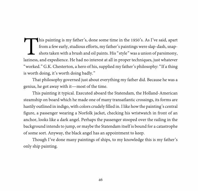
“On the Statendam,” oil on board, 18 x 14, c. 1945
46
his painting is my father’s, done some time in the 1950’s. As I’ve said, apart from a few early, studious efforts, my father’s paintings were slap-dash, snap-shots taken with a brush and oil paints. His “style” was a union of parsimony,
laziness, and expedience. He had no interest at all in proper techniques, just whatever “worked.” G.K. Chesterton, a hero of his, supplied my father’s philosophy: “If a thing is worth doing, it’s worth doing badly.”
That philosophy governed just about everything my father did. Because he was a genius, he got away with it—most of the time.
This painting it typical. Executed aboard the Statendam, the Holland-American steamship on board which he made one of many transatlantic crossings, its forms are hastily outlined in indigo, with colors crudely filled in. I like how the painting’s central figure, a passenger wearing a Norfolk jacket, checking his wristwatch in front of an anchor, looks like a dark angel. Perhaps the passenger stooped over the railing in the background intends to jump, or maybe the Statendam itself is bound for a catastrophe of some sort. Anyway, the black angel has an appointment to keep.
Though I’ve done many paintings of ships, to my knowledge this is my father’s only ship painting.
T

47
“Fruit Stand,” acrylic on board, 22 x 17, 2005

48
or this painting of mine done sixty years later, I requisitioned my father’s deep indigo outlines and crudely-filled-in colors. But what interests me most about the painting is the frame. Unlike my cheap father who, if he framed his paint-
ings at all, slapped his frames together from scrap molding, I care a great deal about frames. This one I bought in the bygone parking-garage flea market on West 26th Street in Manhattan. It is the handiwork of one Henry Heydenryk, Jr.
Established in 1845, the House of Heydenryk is the oldest framing establishment in New York City, and still the finest. Its clientele have included the Tate and National galleries in London, the Rijksmuseum in Amsterdam, and the Van Gogh Museum, for which Heydenryk did all the framing. Legend has it that van Gogh himself once paid a visit to the Hague showroom and offered several drawings in exchange for a Heydenryk frame—an offer that, I’m guessing, was not accepted.
Poor Vincent. If only he’d had my luck. The flea market dealer who sold me the frame had no idea of its worth. He offered it to me for $75. I ran to the nearest ATM and paid cash. The frame is worth no less than $800, about as much as I would sell the painting for. Unframed, that is.
F

51
Color Logo for Arts & Letters, 2015 [TK: replace image?]

52
designed this logo recently for the graduate literary journal at the university where I teach. The fonts used are Apple Chancery (for the ampersand) and Lon-don Tube (for all other text). Finding the perfect ampersand was half the battle. I love typography. If my artistic life has been a tug of war between words and
pictures, between visual and written expression, typography exists at the center of the rope, the place where words and pictures meet.
No one knows this better than type designers who will be the first to tell you that letters aren’t “written,” they are “drawn.” The German Renaissance painter, print-maker, and theorist Albrecht Dürer, himself an exquisite type designer, wrote a charming little monograph on the subject. From Of the Just Shaping of Letters, here is Dürer on how to draw the letter “B”:
And now you shall draw B in its square thus: First divide the square horizontally by the line e. f.; then bisect the lines a. e. and b. f. by the line g. h. Next, you must first set properly the broad vertical limb of the letter, distant its own breadth from the side a. c. of the square a. b. c. d. Then erect the line i. k. on the inner side of the limb already drawn, and distant from it one-tenth of a side of the square, and let it cut the line g. h. in the point l.
[TK: combine w/next?]
I
55
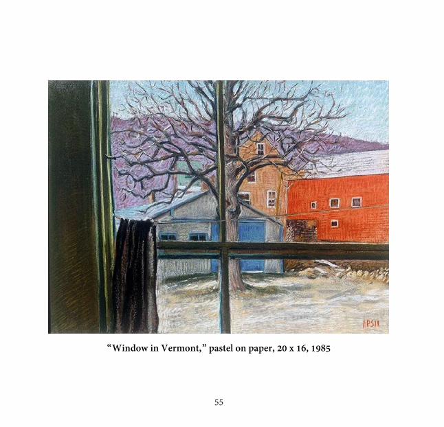
“Window in Vermont,” pastel on paper, 20 x 16, 1985

56
n the mid-1980’s, having written but failed to publish my first novel, as a source of refuge I began drawing again. For a while I worked in dry pastel. Advantages: no need to carry brushes, paint thinner, or water. Disadvantage: they can rub off
and the paintings made with them tend to be fragile. Even the best fixatives dull and darken colors, so typically the top colors are left unfixed and remain vulnerable.
By that time several of my childhood friends had relocated to Brattleboro, Ver-mont, a sleepy former mill town on the state’s southern border at the confluence of the Connecticut and West Rivers. I was still living in New York City, still chasing my dreams artistic fortune and fame while supporting myself as a typesetter. But I enjoyed visiting my friends in Brattleboro, especially in the Fall, when the leaves turned. I en-joyed our aimless walks along unpaved roads, hiking in the woods, playing guitars and smoking pot, pancake breakfasts at the greasy spoon overlooking the river.
My friends were amused by my ambition. Poor Peter, he needs to prove so much to the world — and to himself! But they were also admiring and supportive. While Michael and Christopher waited tables at the Common Ground Cafe, I got out my pastels and did this view through the ground-floor window of their apartment.
I was still wedded to the notions of “realism” and “verisimilitude,” to the defini-tion of a painting as a window through which one is offered a glimpse of an alternative world, a sham three-dimensional space carved out of two dimensions with lines, col-ors, and two-point perspective. That afternoon the alternative world was a backyard in Brattleboro, Vermont, and my subject was a literal window.
I

57
“Brooklyn Bridge,” pastel on paper, 20x 16, 1986

58
side-view of the east tower of the Brooklyn Bridge, seen against a backdrop of bright scudding clouds. Behind it: another bridge, the Triboro. In the bot-tom left corner, the Empire State Building pokes finger-like out of the hori-
zon line. Central to the view is an American flag, its stripes broken and feathery as the clouds scudding behind it. The motion of the flag along with the painting’s impres-sionistic swift strokes convey a blustery day. Though I’m not wearing one, just looking at this painting makes me want to turn up the collar of my jacket.
In foundation year at Pratt, we were taught the Golden Ratio or Mean, the an-cient ideal of beauty as a union of harmony, proportion, and symmetry expressed mathematically by the irrational number 1.618034. Considered the most perfect of all numbers, the Golden Ratio has its origins in a riddle.
The story begins in 1202, in Pisa, Italy, where under the name Fibonacci, one Leonardo Pisano Bigollo, a young man captivated by Eastern mathematical theories, published a book called Liber Abaci. Among the book’s entries was this riddle: If a pair of rabbits is placed in an enclosed area, how many rabbits will be born there if we assume that every month a pair of rabbits produces another pair, and that rabbits begin to bear young two months after their birth? The answer was a sequence of numbers the implications of which extended far beyond mathematics, to Science and Art, and to classical theories of beauty.
A

59
Fibonacci’s Spiral

60
mong the many examples of the occurrence of the Fibonacci sequence in na-ture is the nautilus shell. As the nautilus outgrows each chamber, it builds a new chamber for itself always of the same proportion, thereby causing the
shell to spiral around itself, growing ever larger while maintaining its scale. The re-sulting spiral, whose ratio is 1.618034, is called a Fibonacci spiral. For millennia it has served artists as a template for harmonious composition.
Though I wasn’t conscious of it then, most of the paintings I did during this time
paid tribute to the Golden Mean. Fibonacci Spirals and Golden Means, Euclid and Brunelleschi, verisimilitude and
vanishing points, Orthogonals and John Gnagy, … by them all — and though I had no idea — my paintings and I were held hostage. We were prisoners of perspective.
A