organizing the page: layout of page...
TRANSCRIPT
Organizing the Page:
Layout of Page Elements
Preface
Page layout is the art of manipulating the user's attention on a page to convey (menyampaikan) meaning, sequence, and points of interaction
Pendahuluan
– We'll talk about visual hierarchy, visual flow and focal points, and grouping and alignment all are predictable and rational approaches to page design.
– This chapter's patterns describe concrete ways to apply those high-level concepts to interface design.
THE BASICS OF PAGE LAYOUT
Five major elements of page layout:
– visual hierarchy,
– visual flow,
– grouping and alignment,
– how to put these three elements together,
– how to use dynamic displays.
VISUAL HIERARCHY:
WHAT'S IMPORTANT?
The concept of visual hierarchy plays a part in all forms of graphic design
the most important content should stand out the most, and the least important should stand out the least.
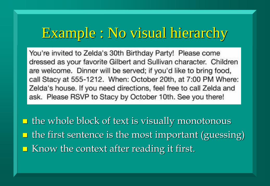
Example : No visual hierarchy
the whole block of text is visually monotonous
the first sentence is the most important (guessing)
Know the context after reading it first.

With whitespace
distinct groups of information the headline at the top and the not-quite-as-
important RSVP message at the bottom stands out a bit more because it has whitespace around it.
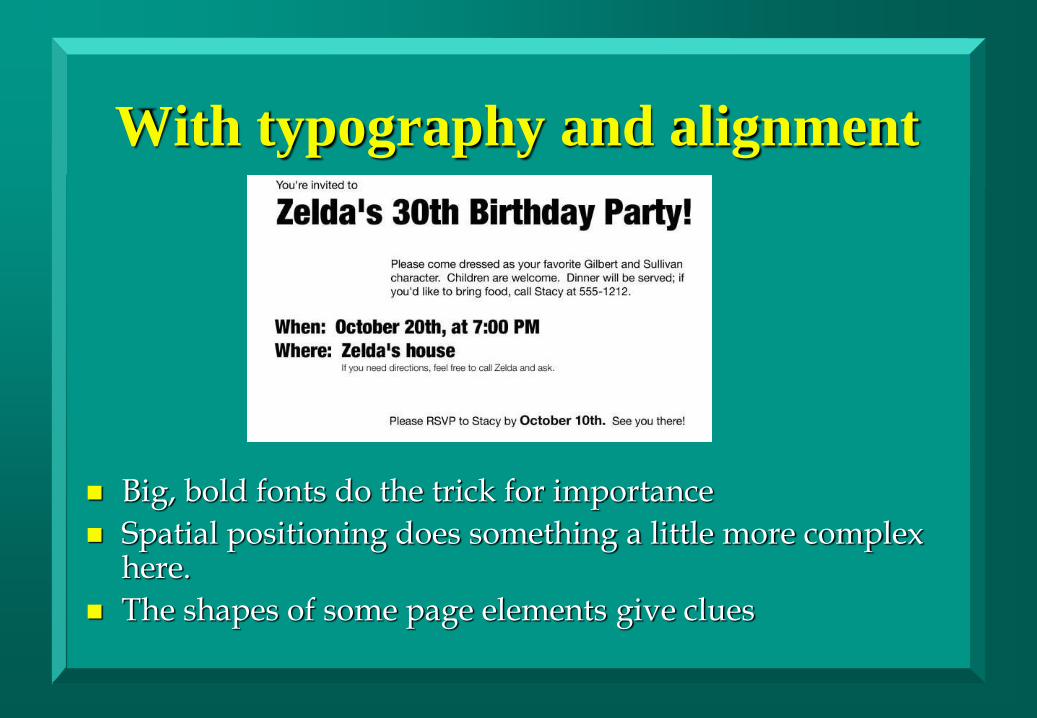
With typography and alignment
Big, bold fonts do the trick for importance
Spatial positioning does something a little more complex here.
The shapes of some page elements give clues
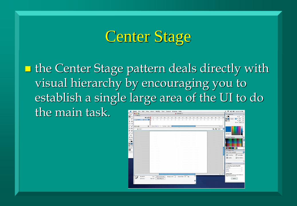
Center Stage
the Center Stage pattern deals directly with visual hierarchy by encouraging you to establish a single large area of the UI to do the main task.
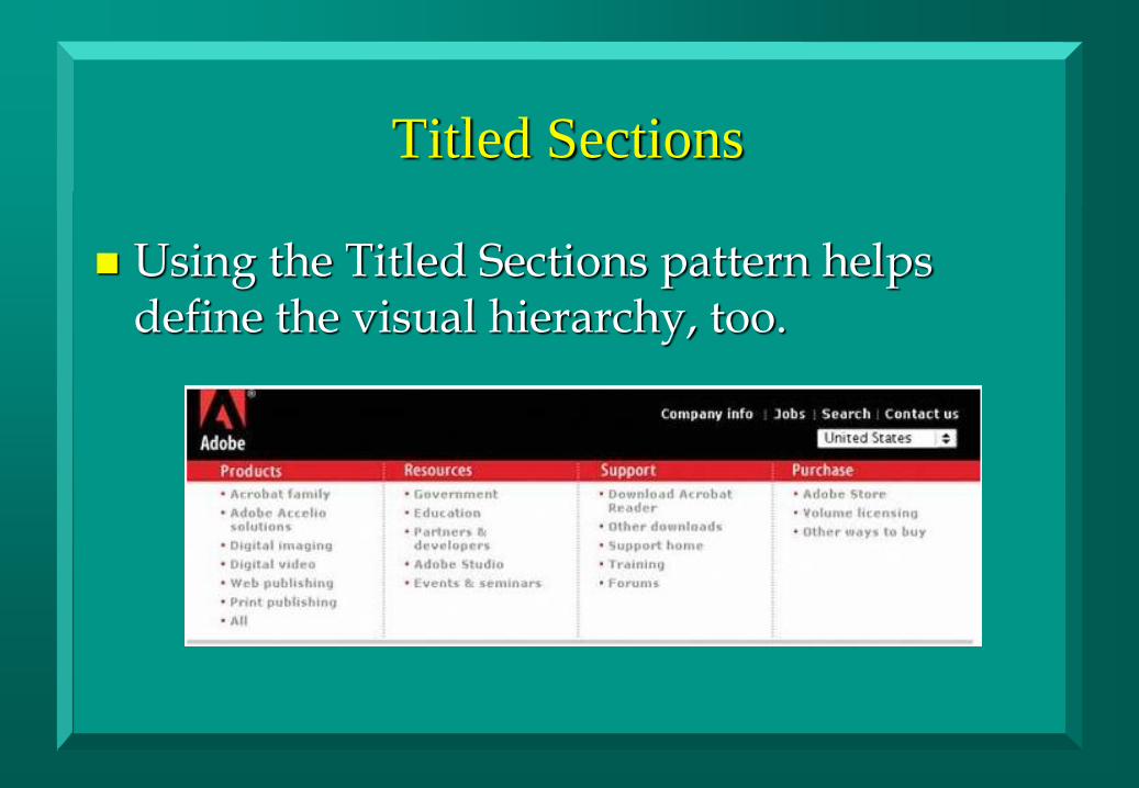
Titled Sections
Using the Titled Sections pattern helps define the visual hierarchy, too.
Visual Framework
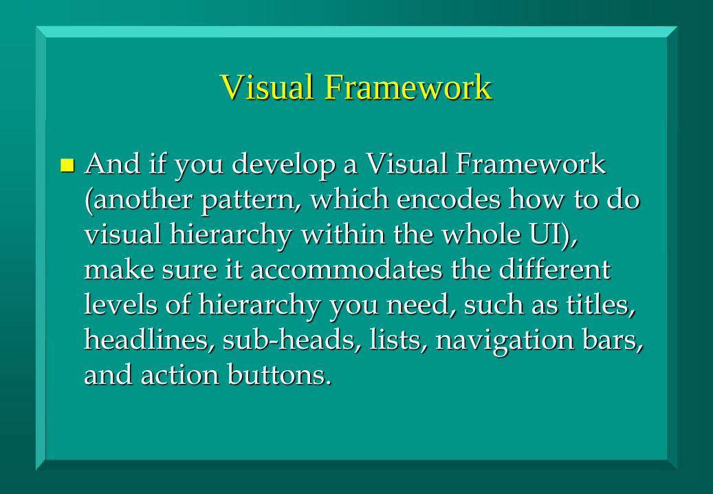
And if you develop a Visual Framework (another pattern, which encodes how to do visual hierarchy within the whole UI), make sure it accommodates the different levels of hierarchy you need, such as titles, headlines, sub-heads, lists, navigation bars, and action buttons.
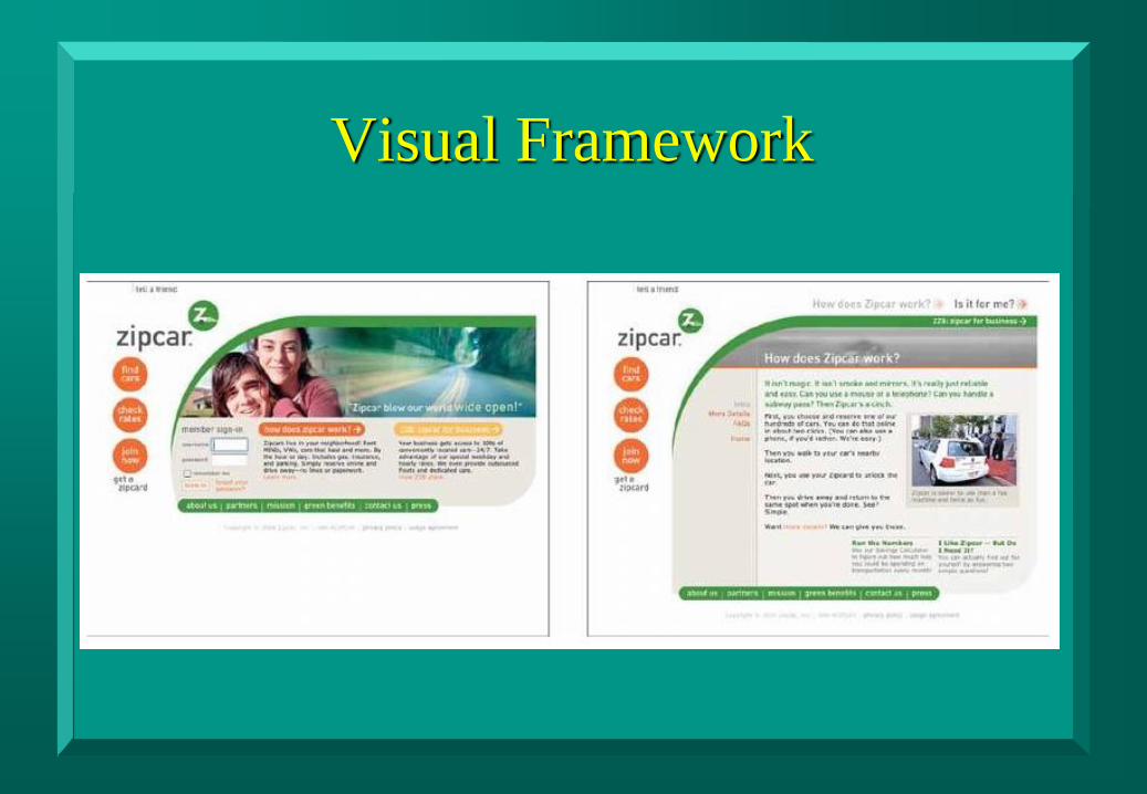
Visual Framework
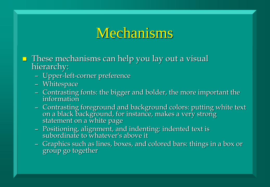
Mechanisms
These mechanisms can help you lay out a visual hierarchy: – Upper-left-corner preference – Whitespace – Contrasting fonts: the bigger and bolder, the more important the
information – Contrasting foreground and background colors: putting white text
on a black background, for instance, makes a very strong statement on a white page
– Positioning, alignment, and indenting: indented text is subordinate to whatever's above it
– Graphics such as lines, boxes, and colored bars: things in a box or group go together
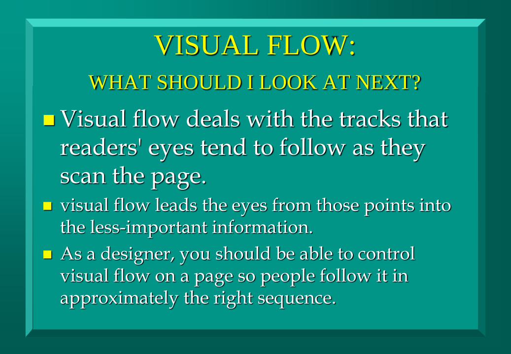
VISUAL FLOW:
WHAT SHOULD I LOOK AT NEXT?
Visual flow deals with the tracks that readers' eyes tend to follow as they scan the page.
visual flow leads the eyes from those points into the less-important information.
As a designer, you should be able to control visual flow on a page so people follow it in approximately the right sequence.
VISUAL FLOW
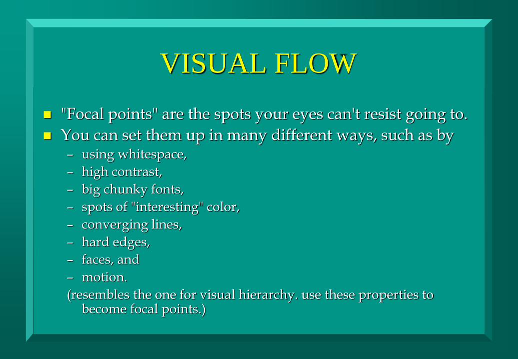
"Focal points" are the spots your eyes can't resist going to.
You can set them up in many different ways, such as by – using whitespace,
– high contrast,
– big chunky fonts,
– spots of "interesting" color,
– converging lines,
– hard edges,
– faces, and
– motion.
(resembles the one for visual hierarchy. use these properties to become focal points.)

VISUAL FLOW
a good visual flow is easier on your users' eyes
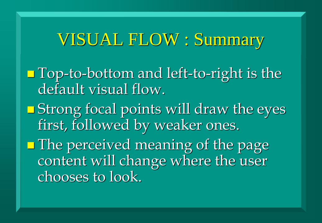
VISUAL FLOW : Summary
Top-to-bottom and left-to-right is the default visual flow.
Strong focal points will draw the eyes first, followed by weaker ones.
The perceived meaning of the page content will change where the user chooses to look.

GROUPING AND ALIGNMENT:
WHAT GOES WITH WHAT? by grouping things together visually,
– you state that they are related.
– necessary to form a clear visual hierarchy.
– also help with visual flow, by guiding the viewer's eyes from group to group.
If visual flow doesn't step in and lead the user's eyes to the button by some other means, the user may not see it.
Alignment is another, more subtle way to associate things with one another.
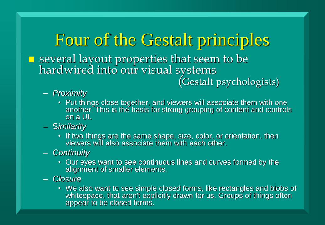
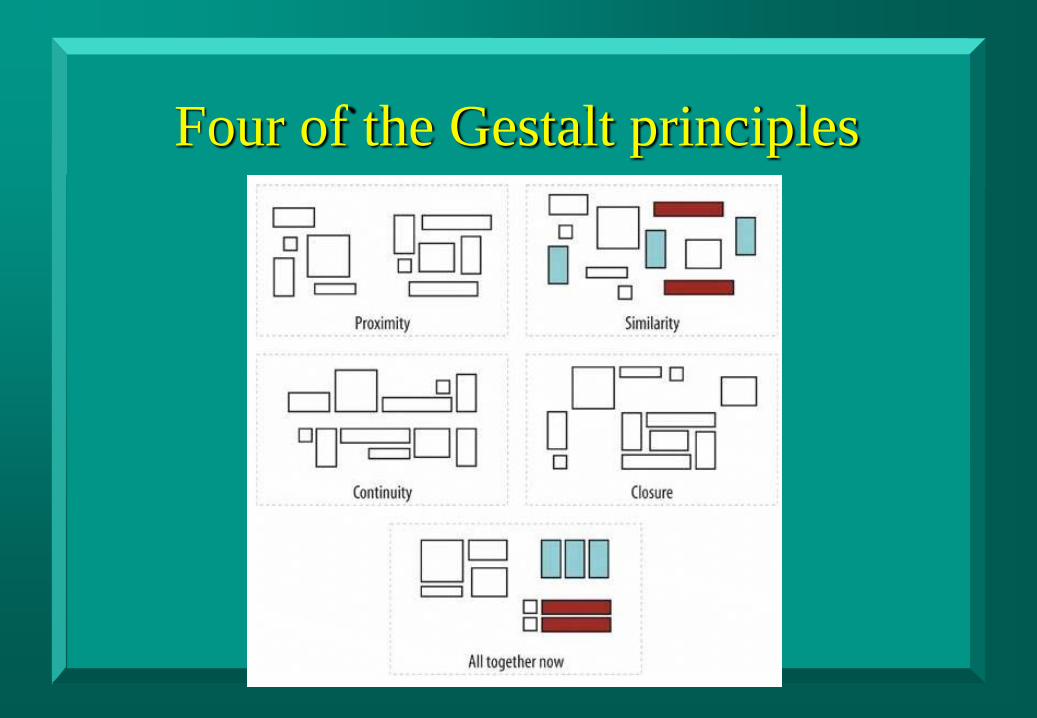
Four of the Gestalt principles several layout properties that seem to be
hardwired into our visual systems (Gestalt psychologists) – Proximity
• Put things close together, and viewers will associate them with one another. This is the basis for strong grouping of content and controls on a UI.
– Similarity • If two things are the same shape, size, color, or orientation, then
viewers will also associate them with each other.
– Continuity • Our eyes want to see continuous lines and curves formed by the
alignment of smaller elements.
– Closure • We also want to see simple closed forms, like rectangles and blobs of
whitespace, that aren't explicitly drawn for us. Groups of things often appear to be closed forms.
Four of the Gestalt principles
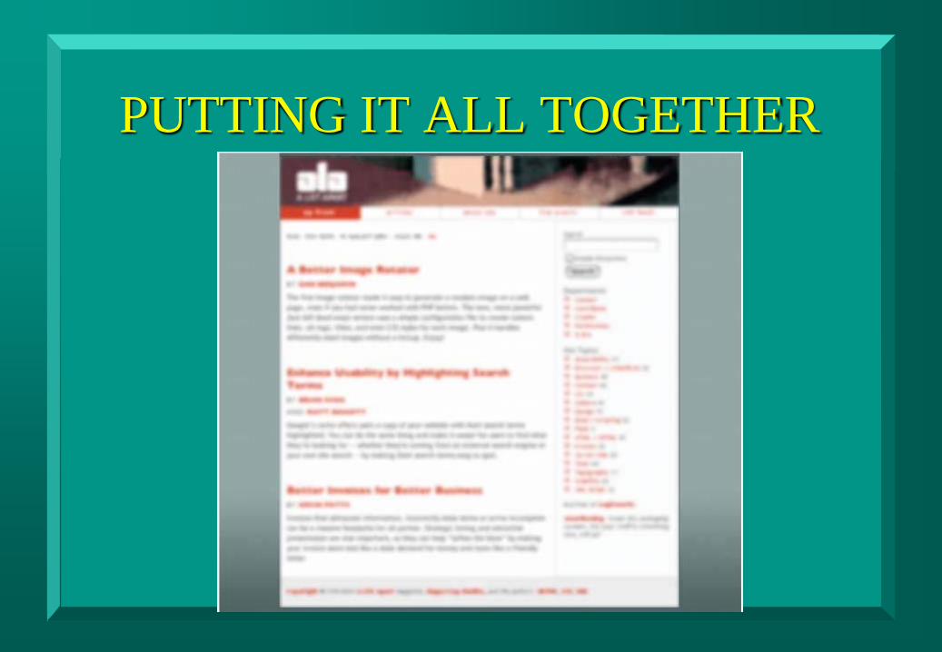
PUTTING IT ALL TOGETHER
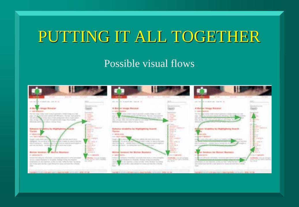
PUTTING IT ALL TOGETHER
Possible visual flows
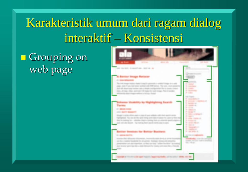
Karakteristik umum dari ragam dialog
interaktif – Konsistensi
Grouping on web page
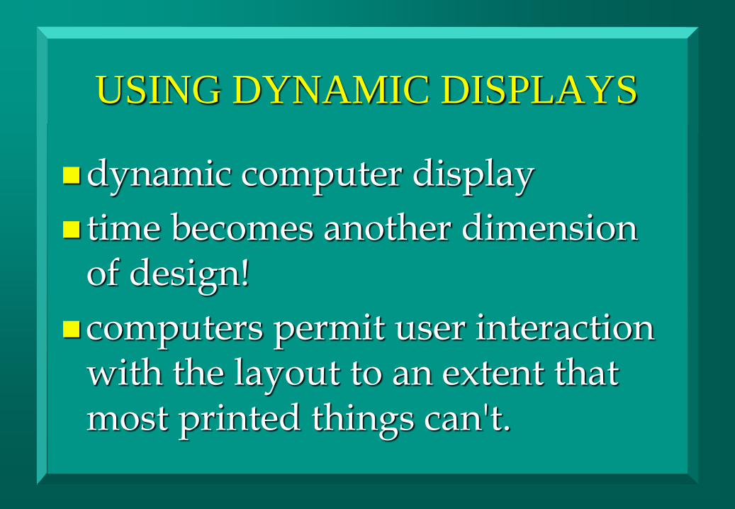
USING DYNAMIC DISPLAYS
dynamic computer display
time becomes another dimension of design!
computers permit user interaction with the layout to an extent that most printed things can't.
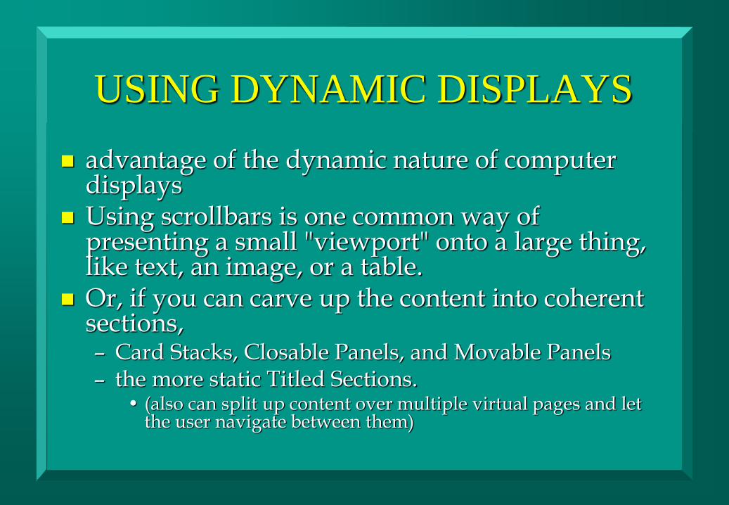
USING DYNAMIC DISPLAYS
advantage of the dynamic nature of computer displays
Using scrollbars is one common way of presenting a small "viewport" onto a large thing, like text, an image, or a table.
Or, if you can carve up the content into coherent sections, – Card Stacks, Closable Panels, and Movable Panels – the more static Titled Sections.
• (also can split up content over multiple virtual pages and let the user navigate between them)
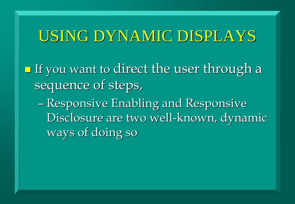
USING DYNAMIC DISPLAYS
If you want to direct the user through a sequence of steps,
– Responsive Enabling and Responsive Disclosure are two well-known, dynamic ways of doing so