objectives graphically summarizing data - pbworksbist.pbworks.com/f/0307-742-90-04-notes-6up.pdf ·...
TRANSCRIPT
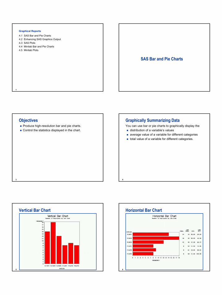
1
1
Graphical Reports
4.1 SAS Bar and Pie Charts4.2 Enhancing SAS Graphics Output4.3 SAS Plots4.4 Minitab Bar and Pie Charts4.5 Minitab Plots
SAS Bar and Pie Charts
3
ObjectivesProduce high-resolution bar and pie charts.Control the statistics displayed in the chart.
4
Graphically Summarizing DataYou can use bar or pie charts to graphically display the
distribution of a variable’s valuesaverage value of a variable for different categoriestotal value of a variable for different categories.
5
Vertical Bar Chart
6
Horizontal Bar Chart

2
7
Pie Chart
8
Specifying a ChartWhen using the GCHART procedure,
specify the physical form of the chartidentify a chart variable that determines the number of bars or pie slices to createoptionally identify an analysis variable to use for calculating statistics that determine the height (or length) of the bar or the size of the slice.
By default, the height, length, or size represents a frequency count (N).
9
Chart Variable The chart variable
determines the number of bars or slices produced within a graphcan be character or numeric.
10
The GCHART ProcedureGeneral form of the PROC GCHART statement:
Use one of these statements to specify the desired type of chart:
PROC GCHART DATA=SAS-data-set;PROC GCHART DATA=SAS-data-set;
HBAR chart-variable . . . </options>;
VBAR chart-variable . . . </options>;
PIE chart-variable . . . </options>;
HBAR chart-variable . . . </options>;
VBAR chart-variable . . . </options>;
PIE chart-variable . . . </options>;
11
Vertical Bar Chart
JobCode is the chart variable.
proc gchart data=ia.crew;vbar JobCode;
run;
Produce a vertical bar chart that displays the number of employees in each job code.
c10s1d1 12
Vertical Bar Chart

3
13
Horizontal Bar Chart
JobCode is the chart variable.
proc gchart data=ia.crew;hbar JobCode;
run;
Produce a horizontal bar chart that displays the number of employees in each job code.
c10s1d2 14
Horizontal Bar Chart
15
Pie Chart
JobCode is the chart variable.
proc gchart data=ia.crew;pie JobCode;
run;
Produce a pie chart that displays the number of employees in each job code.
c10s1d3 16
Pie Chart
17
If the chart variable is character, a bar or slice is created for eachunique variable value.The chart variable is JobCode.
Character Chart Variable
18
Numeric Chart VariableFor numeric chart variables, the variables are assumed to be continuous unless otherwise specified.
Intervals are automatically calculated and identified by midpoints.
One bar or slice is constructed for each midpoint.
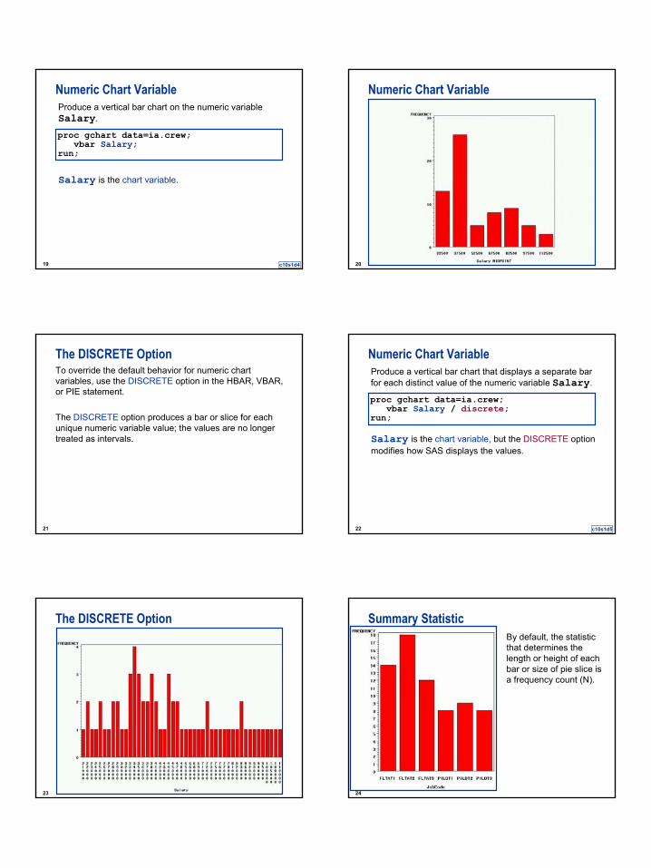
4
19
Numeric Chart Variable
Salary is the chart variable.
proc gchart data=ia.crew;vbar Salary;
run;
Produce a vertical bar chart on the numeric variable Salary.
c10s1d4 20
Numeric Chart Variable
21
The DISCRETE OptionTo override the default behavior for numeric chart variables, use the DISCRETE option in the HBAR, VBAR, or PIE statement.
The DISCRETE option produces a bar or slice for each unique numeric variable value; the values are no longer treated as intervals.
22
Numeric Chart Variable
Salary is the chart variable, but the DISCRETE optionmodifies how SAS displays the values.
proc gchart data=ia.crew;vbar Salary / discrete;
run;
Produce a vertical bar chart that displays a separate bar for each distinct value of the numeric variable Salary.
c10s1d5
23
The DISCRETE Option
24
By default, the statistic that determines the length or height of each bar or size of pie slice is a frequency count (N).
Summary Statistic

5
25
To override the default frequency count, you can use the following HBAR, VBAR, or PIE statement options:
SUMVAR=analysis-variable
TYPE=MEAN | SUM
SUMVAR=analysis-variable
TYPE=MEAN | SUM
Analysis Variable
26
SUMVAR= and TYPE= Options
If an analysis variable isspecified, the default value of TYPE is SUMnot specified, the default value of TYPE is FREQ.
specifies that the height or length of the bar or size of the slice represents a mean or sum of the analysis-variable values.
TYPE=
identifies the analysis variable to use for the sum or mean calculation.
SUMVAR=
27
Using an Analysis Variable
proc gchart data=ia.crew;vbar JobCode / sumvar=Salary type=mean;
run;
Produce a vertical bar chart that displays the average salary of employees in each job code.
c10s1d6 28
GCHART Output
29
RUN-Group ProcessingPROC GCHART supports RUN-group processing, which means
the procedure executes the group of statements following the PROC statement when a RUN statement is encounteredadditional statements followed by another RUN statement can be submitted without resubmitting the PROC statementthe procedure stays active until a PROC, DATA, or QUIT statement is encountered.
30
Pie Chart
proc gchart data=ia.crew; pie JobCode / sumvar=Salary type=sum;format Salary dollar8.;
run;
Produce a pie chart that displays the total salary of employees in each job code.
c10s1d7

6
31
Pie Chart
32
Pie ChartYou can use the FILL= option to specify whether to fill the pie slices in a solid (FILL=S) or crosshatched (FILL=X) pattern.
pie JobCode / sumvar=Salary type=sumfill=x;
format Salary dollar8.;run;
c10s1d7
33
Pie Chart
34
Exploding a Pie SliceYou can highlight individual slices of a pie chart by moving them away from the rest of the pie with the EXPLODE= option.
pie JobCode / sumvar=Salary type=sum fill=x explode='PILOT3';
format Salary dollar8.;run;quit;
c10s1d7
35
Exploding a Pie Slice
36
SummaryPROC GCHART is used to produce vertical or horizontal bar charts and pie charts of categorical or continuous variables.
Charts based on character are assumed to be categorical, whereas charts based on numeric variables are assumed to be continuous.
The MEAN or SUM of numeric variables may be charted.

7
Enhancing SAS Graphics Output
38
ObjectivesSpecify a graphics device.Incorporate titles and footnotes with graphs.Enhance graphs using color, fonts, and different size titles and footnotes.
39
Defining the Graphics DeviceTo specify the graphic device, use the GOPTIONS statement.
General form of the GOPTIONS statement:
GOPTIONS graphics-options;GOPTIONS graphics-options;
40
Graphics Device OptionThe DEVICE= (or DEV= ) graphics option in the GOPTIONS statement specifies the graphics device.Examples:
Graphics Device GOPTIONS Statement
HP Deskjet Printer goptions dev=HPD
HPLaserJet Driver goptions dev=HPL…
GIF Driver goptions dev=GIF
Tektronix Driver goptions dev=TK1
Portable Document goptions dev=PDF
PostScript Driver goptions dev=PSL
Windows Metafile Driver goptions dev=WMF
41
Adding Titles and FootnotesYou can use TITLE and FOOTNOTE statement options to modify the characteristics of text strings.
Selected Options:
COLOR=color | C=colorFONT=type-font | F=type-fontHEIGHT=n | H=n
COLOR=color | C=colorFONT=type-font | F=type-fontHEIGHT=n | H=n
42
Title and Footnote OptionsExamples:
title color=green 'Number of Pilots by Job Level';
title font=brush color=red 'March Flights';
title height=3 in font=duplex 'Flights to RDU';
footnote height=3 "IA's Gross Revenue by Region";
footnote height=3 cm 'Average Salary by Job Level';
footnote height=3 pct 'Total Flights by Model';

8
43
SummaryGOPTIONS statements with the DEVICE= option can be used to override the default graphics drivers in SAS.
TITLES and FOOTNOTES can be enhanced with the COLOR=, FONT=, and HEIGHT= options…
SAS Plots
45
ObjectivesProduce plots.Define plotting symbols.Control appearance of the axes.
46
The GPLOT ProcedureYou can use the GPLOT procedure to plot one variable against another within a set of coordinate axes.
General form of a PROC GPLOT step:
PROC GPLOT DATA=SAS-data-set;PLOT vertical-variable*horizontal-variable </options>;
RUN;QUIT;
PROC GPLOT DATA=SAS-data-set;PLOT vertical-variable*horizontal-variable </options>;
RUN;QUIT;
47
Default GPLOT Output
proc gplot data=ia.flight114;where date between '02mar2001'd and
'08mar2001'd;plot Boarded*Date;title 'Total Passengers for Flight 114';title2 'between 02Mar2001 and 08Mar2001';
run;
Produce a plot of number of passengers by date for flight number 114 over a one-week period.
c10s3d1 48
Default GPLOT Output

9
49
SYMBOL StatementYou can use the SYMBOL statement to
define plotting symbolsdraw lines through the data pointsspecify the color of the plotting symbols and lines.
50
SYMBOL StatementGeneral form of the SYMBOL statement:
The value of n can range from 1 to 99.
If n is omitted, the default is 1.
SYMBOLn options;SYMBOLn options;
51
SYMBOL StatementSYMBOL statements are
specifying the value of one option does not affect the values of other options.
additive
once defined, they remain in effect until changed or until the end of the SAS session.
global
52
SYMBOL Statement OptionsYou can specify the plotting symbol you want with the VALUE= option in the SYMBOL statement:
Selected symbol values are
VALUE=symbol | V=symbolVALUE=symbol | V=symbol
NONE (no plotting symbol)SQUARE
TRIANGLESTARDIAMONDPLUS (default)
53
SYMBOL Statement OptionsYou can use the I= option in the SYMBOL statement to draw lines between the data points.
Selected interpolation values:
draws vertical lines from the points to the horizontal axes.
NEEDLE
joins the points with a smooth line.SPLINE
joins the points with straight lines.JOIN
I=interpolationI=interpolation
54
SYMBOL Statement Options
plot Boarded*Date;symbol value=square i=join;
run;
Use a square as the plotting symbol and join the points with straight lines.
c10s3d1

10
55
SYMBOL Statement Options
56
Additional SYMBOL Statement OptionsYou can enhance the appearance of the plots with the following selected options:
specifies the color of the line.COLOR=colorC=color
specifies the thickness of the line.WIDTH=widthW=width
57
Color and Width Options
plot Boarded*Date;symbol c=red w=2;
run;
Show the line in red with double thickness.
c10s3d1 58
Color and Width Options
59
Modifying the SYMBOL StatementSet the attributes for SYMBOL1.
Modify only the color of SYMBOL1, not the V= option setting.
symbol1 c=blue v=diamond;
symbol1 c=green;
60
Cancel SYMBOL StatementsYou can cancel a SYMBOL statement by submitting a null SYMBOL statement.
To cancel all SYMBOL statements, submit the following statement:
symbol1;
goptions reset=symbol;

11
61
Controlling the Axis AppearanceYou may modify the appearance of the axes that PROC GPLOT produces with
PLOT statement optionsthe LABEL statementthe FORMAT statement.
62
PLOT Statement OptionsYou can use PLOT statement options to control the scaling and color of the axes, and the color of the axis text.
Selected PLOT statement options for axis control:
specifies the color of the text on both axes.
CTEXT=color
specifies the color of both axes.CAXIS=color
scales the vertical axis.VAXIS=values
scales the horizontal axis.HAXIS=values
63
PLOT Statement OptionsDefine the scale on the vertical axis and display the axis text in blue.
c10s3d1
plot Boarded*Date / vaxis=100 to 200 by 25ctext=blue;
run;
64
PLOT Statement Options
65
Adding Labels
plot Boarded*Date / vaxis=100 to 200 by 25ctext=blue;
label Boarded='Passengers Boarded' Date='Departure Date';
run;
Place labels on the axes.
c10s3d1 66
Adding Labels

12
67
SummaryPROC GPLOT is used to create scatter plots in SAS.
SYMBOL statements can be used to control plotting symbols and interpolation in SAS Plots.
Default axes can be modified using various options to the plot statement. Minitab Bar and Pie Charts
69
ObjectivesProduce high-resolution bar and pie charts.Control the statistics displayed in the chart.
70
%PIE Command Syntax%PIE C COUNTS C START KEXPLODE K...KORDER KCOMBINE KNOMISSLABEL KLINES
Slice attributes:TYPES CCOLORS CNOCOLORTITLE "text"GSAVE"file"
71
FLTAT1 (14, 20.3%)
PILOT3 ( 8, 11.6%)
PILOT2 ( 9, 13.0%)PILOT1 ( 8, 11.6%)
FLTAT3 (12, 17.4%)
FLTAT2 (18, 26.1%)
Pie Chart of JobCode
Pie Chart%PIE ‘Jobcode’.
72
FLTAT1 (14, 20.3%)
PILOT3 ( 8, 11.6%)
PILOT2 ( 9, 13.0%)PILOT1 ( 8, 11.6%)
FLTAT3 (12, 17.4%)
FLTAT2 (18, 26.1%)
Pie Chart of JobCode
Pie Chart (exploding a slice)%PIE ‘Jobcode’;Explode 3.

13
73
CHART Command SyntaxCHART C*C
CLUSTER C [K]STACK CINCREASINGDECREASINGCPERCENTCUMULATIVE
74
PILOT3PILOT2PILOT1FLTAT3FLTAT2FLTAT1
20
10
0
JobCode
Coun
t of J
obCo
de
Vertical Bar ChartCHART ‘Jobcode’.
75
20100
PILOT3
PILOT2
PILOT1
FLTAT3
FLTAT2
FLTAT1
Count of JobCode
JobC
ode
Horizontal Bar ChartCHART ‘Jobcode’;Transpose.
76
PILOT3PILOT2PILOT1FLTAT3FLTAT2FLTAT1
100000
90000
80000
70000
60000
50000
40000
30000
20000
JobCode
Mea
n of
Sal
ary
Vertical Bar Chart with an Analysis VariableCHART MEAN(‘Salary’)*’Jobcode’.
77
HISTOGRAM Command SyntaxHISTOGRAM C
FREQUENCYPERCENTDENSITYCUMULATIVECUTPOINT [K...K or C]MIDPOINT [K...K or C]NINTERVAL K [K]
78
HISTOGRAM Graphics Options

14
79
1100001000009000080000700006000050000400003000020000
15
10
5
0
Salary
Freq
uenc
y
HistogramHISTOGRAM ‘Salary’.
80
110000950008000065000500003500020000
20
10
0
Salary
Freq
uenc
y
HistogramHISTOGRAM ‘Salary’;Ninterval 7.
81
SummaryMinitab can produce pie charts on categorical data using the %PIE macro (implementation varies for different versions of Minitab).
The CHART command in Minitab is used to produce vertical and horizontal bar charts.
Minitab charts can be enhanced with a variety of graphics options.
Minitab Plots
83
ObjectivesProduce plots.Define plotting symbols.Control appearance of the axes.
84
PLOT Command SyntaxPLOT C * C basic form for a single graphPLOT C*C ... C*C form for multiple graphs
JITTER [K K]NOJITTERLOGSCALE K
15
85
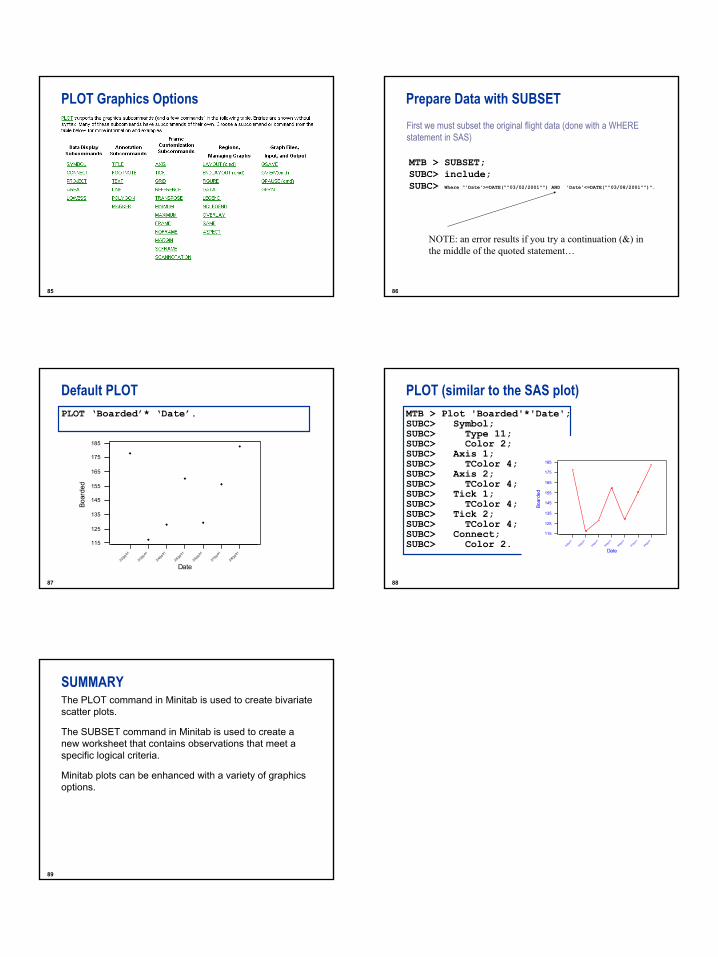
PLOT Graphics Options
86
Prepare Data with SUBSET
MTB > SUBSET;SUBC> include;SUBC> Where "'Date'>=DATE(""03/02/2001"") AND 'Date'<=DATE(""03/08/2001"")".
NOTE: an error results if you try a continuation (&) in the middle of the quoted statement…
First we must subset the original flight data (done with a WHEREstatement in SAS)
87
3/8/20
01
3/7/20
01
3/6/20
01
3/5/20
01
3/4/20
01
3/3/20
01
3/2/20
01
185
175
165
155
145
135
125
115
Date
Boar
ded
Default PLOT PLOT ‘Boarded’* ‘Date’.
88
PLOT (similar to the SAS plot)MTB > Plot 'Boarded'*'Date';SUBC> Symbol;SUBC> Type 11;SUBC> Color 2;SUBC> Axis 1;SUBC> TColor 4;SUBC> Axis 2;SUBC> TColor 4;SUBC> Tick 1;SUBC> TColor 4;SUBC> Tick 2;SUBC> TColor 4;SUBC> Connect;SUBC> Color 2. 3/8
/2001
3/7/20
01
3/6/20
01
3/5/20
01
3/4/2001
3/3/2001
3/2/2001
185
175
165
155
145
135
125
115
Date
Boar
ded
89
SUMMARYThe PLOT command in Minitab is used to create bivariate scatter plots.
The SUBSET command in Minitab is used to create a new worksheet that contains observations that meet a specific logical criteria.
Minitab plots can be enhanced with a variety of graphics options.