norman ramos graphic design portfolio
DESCRIPTION
Norman Ramos 2013 Graphic Design Portfolio shown at the San Diego AIGA Student Portfolio ReviewTRANSCRIPT

Norman Jay RamosGraphic Design Portfolio2013


NORMANJAY RAMOS
When I was nine years old, my dad installed a copy of Photoshop 4, Pagemaker and CorelDraw onto our P3 500Mhz PC tower. Little did I know these design programs would change my life. In middle school I became yearbook editor and in high school I was the director of graphic design for my high school’s associated student body for 3 years.
After graduating high school I failed an attempt at becoming an electrical engineer and realized graphic design was my true passion. I’ve developed a knack for engineering my designs into something tangible, whether it be screen printed, heatpressed vinyl, or on screen. My mantra to is “keep making.”
Introduction

2013SAN DIEGO LGBT PRIDE
San Diego celebrates the LGBT community once a year in Balboa Park. The three-day event includes a parade and unforgettable festival where over 200,000 people of all ages come to celebrate with friends and family. This year’s theme was titled “Freedom to Love and Marry” in honor of the current situations the LGBT community is facing today. To reflect the culture and excitement of the event, a dynamic identity and grid system was developed and applied
to a wide range of promotional items. I designed a crest shaped heart icon using the rainbow flag and theme. This was applied to an event website providing up to date information on the event and it’s mission. Environmental mural graphics were applied to the walls of Hillcrest businesses. A kaleidoscopic poster features photographic imagery from past parades. To unify the brand I crafted festive wristbands, tickets, and vendor badges with lanyards.
Born Gay, Fabulous By Choice


PROJE
CT
SA
N D
IEG
O L
GB
T P
RID
E

CATE
GORY/
BR
AN
DD
ING

PROJE
CT
SA
N D
IEG
O L
GB
T P
RID
E

CATE
GORY/
BR
AN
DD
ING

PROJE
CT
SA
N D
IEG
O L
GB
T P
RID
E

CATE
GORY/
BR
AN
DD
ING

PROJE
CT
TALL
TA
LES

CATE
GORY/
BR
AN
DD
ING


BOSTON MARATHON APPAREL
I think it’s important to use design to make a difference. In the wake of the tragedy that took place in Boston I was compelled to help in anyway I could. The Boston Marathon is about courage, resilience and community. Through research I found that The One Fund Boston had been created to help people most affected the tragic events that occurred on April 15, 2013. I designed a two-color print featuring a runner with his arms raised in victory to reflect the spirit of
our nation to overcome adversity and lend a hand in emergency situations. I silkscreened t-shirts and a hang tag with an African proverb “If you want to run fast, run alone. If you want to run far, run together.” This brand language was applied to a website where concerned citizens could purchase items with 100% of the proceeds going to the organization. I also printed matching baseball caps and a thank you tag to spread awareness about The One Fund Boston.
Resilience And Community Always Win

PROJE
CT
BO
ST
ON
MA
RA
TH
ON

CATE
GORY/
AP
PA
RE
L G
RA
PH
ICS

PROJE
CT
BO
ST
ON
MA
RA
TH
ON

CATE
GORY/
AP
PA
RE
L G
RA
PH
ICS

MODA 2013LOOKBOOK
Gorgeous warm weather is a great excuse to check out the fabulous fashion arriving from MODA. To show off the personal style and fashion inspiration of this brand I created a summer look book. The publication features casual, summer weekend outfits sure to appeal to an active lifestyle. Targeting middle-income men and women 20-35 it covers gym casual, super cool style and off beat looks sure to turn heads as the sun heats up. I selected NB7050, the geometric sans serif font for the MODA logo for it’s
timeless fashionable flair. Layouts feature a generous use of white space and large-scale numbers that direct consumers through steps to put together an outfit. Contour images of the clothing give emphasis and I shot the photographs in a straight forward way I felt would speak to the demographic. To differentiate this look book from the over saturated marketplace of styles I used newsprint to communicate the essential style of the brand.
Laying Out Fashion


PROJE
CT
MO
DA

CATE
GORY/
ED
ITO
RIA
L

PROJE
CT
MO
DA

CATE
GORY/
ED
ITO
RIA
L

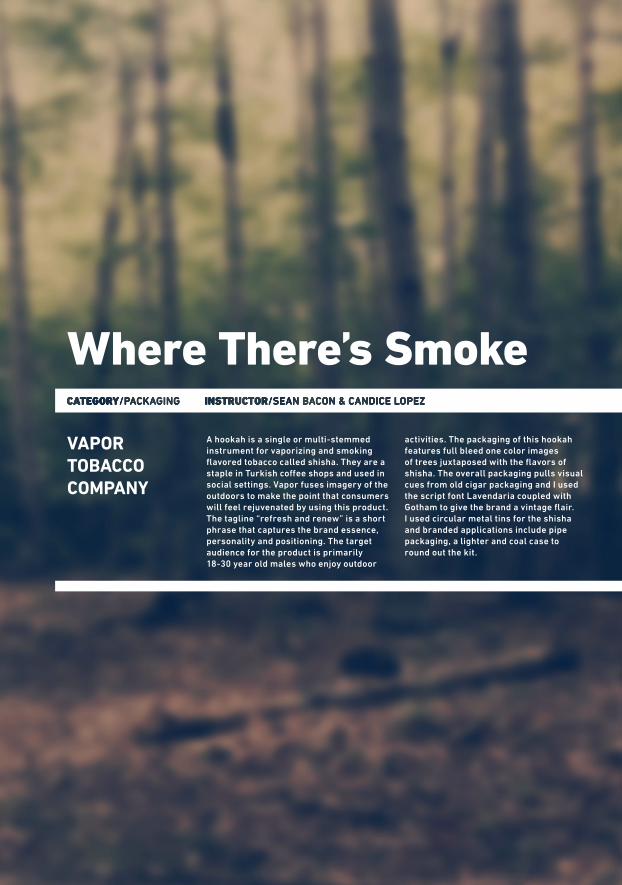
VAPORTOBACCOCOMPANY
A hookah is a single or multi-stemmed instrument for vaporizing and smoking flavored tobacco called shisha. They are a staple in Turkish coffee shops and used in social settings. Vapor fuses imagery of the outdoors to make the point that consumers will feel rejuvenated by using this product. The tagline “refresh and renew” is a short phrase that captures the brand essence, personality and positioning. The target audience for the product is primarily 18-30 year old males who enjoy outdoor
activities. The packaging of this hookah features full bleed one color images of trees juxtaposed with the flavors of shisha. The overall packaging pulls visual cues from old cigar packaging and I used the script font Lavendaria coupled with Gotham to give the brand a vintage flair. I used circular metal tins for the shisha and branded applications include pipe packaging, a lighter and coal case to round out the kit.
Where There’s Smoke

PROJE
CT
TALL
TA
LES

CATE
GORY/
BR
AN
DD
ING

POPTYPE! GRAPHICDESIGN SHOP
Poptype is an online community of artists and an e-commerce website based in San Diego, California. The big idea is a shared marketplace that values craftsmanship and integrates fun into all aspects of the process. This business was born from a love of typography, screen printing and other production processes in a garage. The goal is to collaborate with many talented individuals and make their work available to potential customers. Targeting design conscious men and women 20-35 the company is proud to offer a varied collection
of prints, cards and home décor items produced by hand. Despite the high traffic of online shopping it can be challenging to find unique items. Outstanding service and attention to details will differentiate this venture. Helvetica Bold with a drop shadow and exclamation point communicates the energetic vibe of the brand. T-shirts come in a mason jar and are cleverly packaged in a customized craft paper envelope. Playful stickers and receipts customize the look and feel of the brand. Branded applications include pillows, framed prints and posters.
SellingDesigned Goods


PROJE
CT
PO
PT
YP
E!

CATE
GORY/
BR
AN
DIN
G

PROJE
CT
PO
PT
YP
E!

CATE
GORY/
BR
AN
DIN
G

PROJE
CT
TALL
TA
LES
TAILORCLOTHINGAPP
This consumer-based app works with retailers who can embed and share information targeting upper middle income consumers 25-40 who use technology to shop online. Tailor is a San Francisco-based high tech startup that calculates human and brand-garment measurements from top clothing manufacturers and combines them with algorithms to help shoppers order garments in the right size. When consumers shop online retail outlets, they land on certain product pages and are prompted to
answer a number of questions about their height and weight, and what sizes they wear in another brand. Once they complete the simple questionnaire, Tailor determines what size to buy in that product.I created an easy to use informational website using classic colors and fonts designed to make ordering online simple and convenient resulting in less returns making it the sizing and fit solution for a generation of e-shoppers.
The Right Size Everytime

CATE
GORY/
BR
AN
DD
ING

PROJE
CT
TAIL
OR

CATE
GORY/
UX
DE
SIG
N

PROJE
CT
TAIL
OR

CATE
GORY/
UX
DE
SIG
N


GOOD WORDSCAMPAIGN
Branding is emotional. I applied this concept to the Good Words campaign to raise awareness that derogatory terms can have a strong impact on others. This campaign targets teenagers and college students and is designed to increase sensitivity and change attitudes about using the word “gay” to substitute for stupid. Data shows that queer students exposed to the phrase “That’s so gay” experience feelings of isolation and other health issues.
To hit the demographic it was imperative that the colors and type I used were bold, loud, and friendly. To communicate this message I designed a thought bubble that was used with and without the typography as a single icon or pattern. I used a street art stencil effect to grab attention and applied this to a range of branded useful items that would double as reminders including clipboards, notebooks, stickers, erasers as well as environmental posters and billboards.
Choose Your Words Carefully

PROJE
CT
GO
OD
WO
RD
S

CATE
GORY/
BR
AN
DD
ING

PROJE
CT
GO
OD
WO
RD
S

CATE
GORY/
BR
AN
DD
ING

PROJE
CT
TALL
TA
LES

CATE
GORY/
BR
AN
DD
ING

GENTRIFICATIONINFOGRAPHIC
The usual picture of gentrification is that new arrivals benefit at the expense of lower-income residents who get pushed out. The gritty character, ethnic diversity and eclectic spirit that attracted the development in the first place is then overtaken by chains, high prices and congestion. In order
to clearly weigh in on the information I created infographics designed to relate gentrification to the metaphor of using a washing machine and dryer. When a new culture is imposed on a neighborhood the original residents become economically and socially marginalized.
The MoreThings Change


PROJE
CT
GE
NT
RIF
ICA
TIO
N

CATE
GORY/
INFO
RM
AT
ION
DE
SIG
N

PROJE
CT
GE
NT
RIF
ICA
TIO
N

CATE
GORY/
INFO
RM
AT
ION
DE
SIG
N


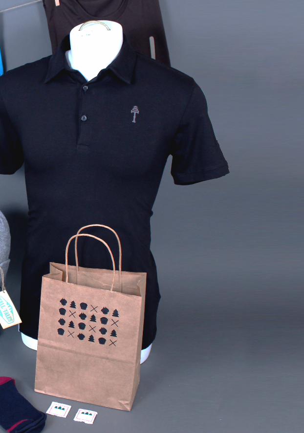
TALL TALES CLOTHING
Tall Tales is an American folklore-inspired clothing brand for men. The brand exhibits a playful twist on childhood characters aimed at men 18-36 who love fashion and hipster culture. The hand-done illustrations feature famous folklore icons such as Big Foot, Paul Bunyan and Black Beard with bold color choices that are masculine and hip without being too childish. Using the font Carnivalee I crafted several icons and a clever crest featuring three trees to represent the
strong, tall spirit of the characters. I screen printed t-shirts in my garage bringing their humorous, large personalities to life. Polo shirts with embroidered icons and hidden details further the vibe. The clothing line also features hats with hang tags, wallets and socks that push the brand language in different directions to engage consumers. Brown paper shopping bags were silkscreened with patterns of the iconography to bring it all home.
Clothing With A Story To Tell

PROJE
CT
TALL
TA
LES

CATE
GORY/
BR
AN
DD
ING

PROJE
CT
TALL
TA
LES

CATE
GORY/
BR
AN
DD
ING

PROJE
CT
TALL
TA
LES
CATE
GORY/
BR
AN
DD
ING


NORMANJAY RAMOS
I would have never gotten to this point if it weren’t for these immediate people:
My instructors:Sean BaconCandice LopezMin Choi
My friends: Etah Chen, Leanna Jones, Heber Miranda, and all my friends throughout my life as a design student.
My mother Rosalie, My dad Nicanor, My brothers Neal and Nic, cousin Maica, and my partner Ryan. Thank you for believing in me and my passion for design.
All my friends and family that I haven’t mentioned,
I Thank You!
CONTACT INFORMATION
Norman Jay Ramos
tel 619-259-9531email [email protected] www.normanjayramos.com
Keep Making