ninja pie: visualizing categorical intersections, … pie: visualizing categorical intersections,...
TRANSCRIPT
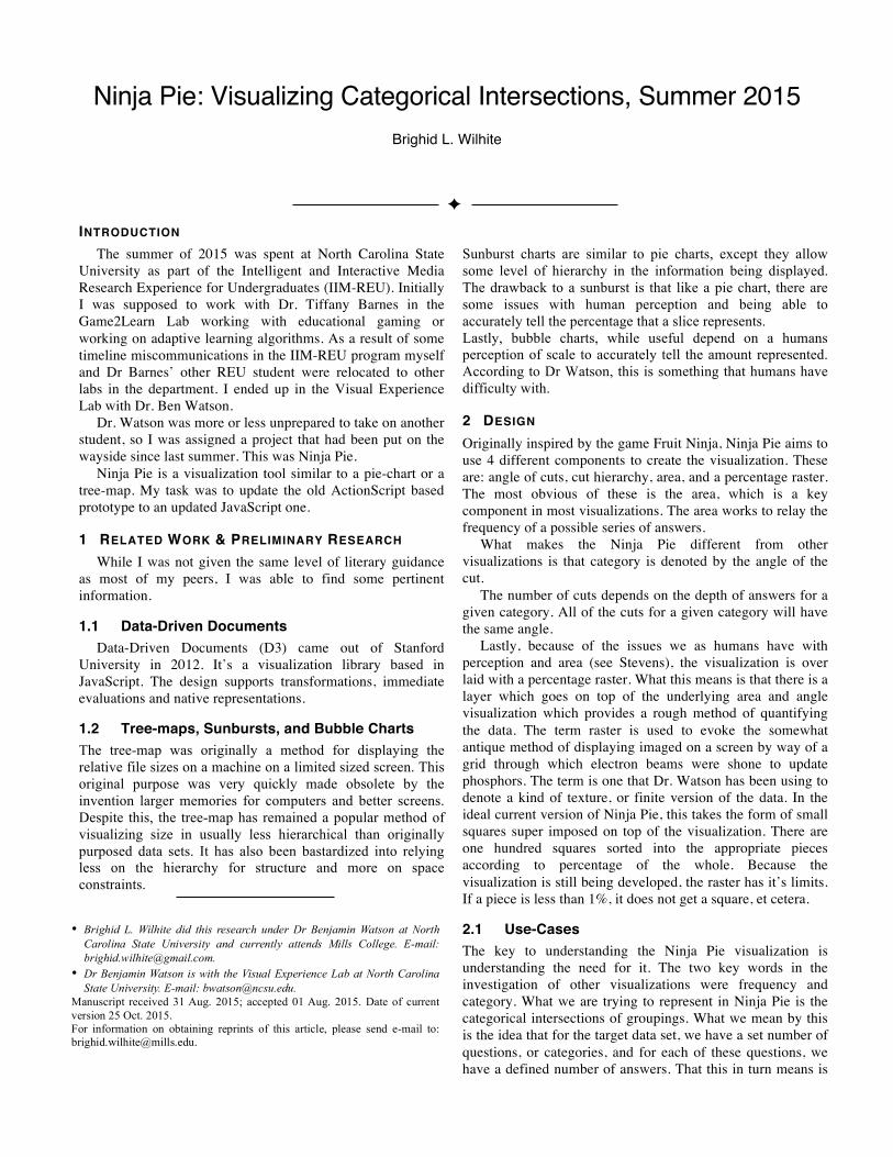
Ninja Pie: Visualizing Categorical Intersections, Summer 2015
Brighid L. Wilhite
INTRODUCTION The summer of 2015 was spent at North Carolina State
University as part of the Intelligent and Interactive Media Research Experience for Undergraduates (IIM-REU). Initially I was supposed to work with Dr. Tiffany Barnes in the Game2Learn Lab working with educational gaming or working on adaptive learning algorithms. As a result of some timeline miscommunications in the IIM-REU program myself and Dr Barnes’ other REU student were relocated to other labs in the department. I ended up in the Visual Experience Lab with Dr. Ben Watson.
Dr. Watson was more or less unprepared to take on another student, so I was assigned a project that had been put on the wayside since last summer. This was Ninja Pie.
Ninja Pie is a visualization tool similar to a pie-chart or a tree-map. My task was to update the old ActionScript based prototype to an updated JavaScript one.
1 RELATED WORK & PRELIMINARY RESEARCH While I was not given the same level of literary guidance
as most of my peers, I was able to find some pertinent information.
1.1 Data-Driven Documents Data-Driven Documents (D3) came out of Stanford
University in 2012. It’s a visualization library based in JavaScript. The design supports transformations, immediate evaluations and native representations.
1.2 Tree-maps, Sunbursts, and Bubble Charts The tree-map was originally a method for displaying the relative file sizes on a machine on a limited sized screen. This original purpose was very quickly made obsolete by the invention larger memories for computers and better screens. Despite this, the tree-map has remained a popular method of visualizing size in usually less hierarchical than originally purposed data sets. It has also been bastardized into relying less on the hierarchy for structure and more on space constraints.
Sunburst charts are similar to pie charts, except they allow some level of hierarchy in the information being displayed. The drawback to a sunburst is that like a pie chart, there are some issues with human perception and being able to accurately tell the percentage that a slice represents. Lastly, bubble charts, while useful depend on a humans perception of scale to accurately tell the amount represented. According to Dr Watson, this is something that humans have difficulty with.
2 DESIGN Originally inspired by the game Fruit Ninja, Ninja Pie aims to use 4 different components to create the visualization. These are: angle of cuts, cut hierarchy, area, and a percentage raster. The most obvious of these is the area, which is a key component in most visualizations. The area works to relay the frequency of a possible series of answers.
What makes the Ninja Pie different from other visualizations is that category is denoted by the angle of the cut.
The number of cuts depends on the depth of answers for a given category. All of the cuts for a given category will have the same angle.
Lastly, because of the issues we as humans have with perception and area (see Stevens), the visualization is over laid with a percentage raster. What this means is that there is a layer which goes on top of the underlying area and angle visualization which provides a rough method of quantifying the data. The term raster is used to evoke the somewhat antique method of displaying imaged on a screen by way of a grid through which electron beams were shone to update phosphors. The term is one that Dr. Watson has been using to denote a kind of texture, or finite version of the data. In the ideal current version of Ninja Pie, this takes the form of small squares super imposed on top of the visualization. There are one hundred squares sorted into the appropriate pieces according to percentage of the whole. Because the visualization is still being developed, the raster has it’s limits. If a piece is less than 1%, it does not get a square, et cetera.
2.1 Use-Cases The key to understanding the Ninja Pie visualization is understanding the need for it. The two key words in the investigation of other visualizations were frequency and category. What we are trying to represent in Ninja Pie is the categorical intersections of groupings. What we mean by this is the idea that for the target data set, we have a set number of questions, or categories, and for each of these questions, we have a defined number of answers. That this in turn means is
• Brighid L. Wilhite did this research under Dr Benjamin Watson at North
Carolina State University and currently attends Mills College. E-mail: [email protected].
• Dr Benjamin Watson is with the Visual Experience Lab at North Carolina State University. E-mail: [email protected].
Manuscript received 31 Aug. 2015; accepted 01 Aug. 2015. Date of current version 25 Oct. 2015. For information on obtaining reprints of this article, please send e-mail to: [email protected].

that we can organize the data into a couple difference ways. Because we are using JavaScript and the D3 library, the kinds of data we can easily use for this visualization are either JavaScript Object Notation (JSON) documents or Comma-Separated Value (CSV) files.
The most elementary method of organizing the data is to write each set of answers each time it is answered. This means that a data set of 100 answers would be, in a manner of speaking, 100 lines. The size of the data would correlate directly would be the number of entries. Prior to our work in JavaScript and the D3 library, this is how the data was stored and processed, in the form of CSV documents. Another count against this method is that there is more community support for JSON than CSV.
The next possibility of processing the data would be to organize the data in such a way that each possible answer has a count associated with the set of numbers. The count would be incremented each time another entry of that combinations added. This method of data collection would only have as many entries as there are possible combinations of answers which can be calculated by multiplying the number of choices for each question. For example, for two questions with two answers each, the most number of answers is 2*2 or 4. In the classic five answer surveys, with three questions, this would be 5*5*5 or 125. This method, for the sake of the model, would require the unused paths of answers to have a default count of 0.
The third possibility, which is far more common for a JSON object, is to represent the data hierarchically. Consider, however, a set of questions such that both are relatively trivial (e.g. age range and gender). For the initial ordering of the cuts, this would be a straight-forward relatively trivial operation over the data, iterating over each of the sub levels until all the cuts are placed. But say that we want to change the ordering, so that gender is the first cut. Reordering a hierarchal JSON document is not a trivial thing to do. While possible, it would require a great deal of shuffling of the data and would ultimately end up either with a structure similar to the second data organization possibility or a great deal of work to have every possible hierarchical ordering laid out.
Thus the second option is already sounding better. Imposing a data level hierarchy would greatly limit our ability to manipulate the data and would make it difficult to use the transformations encouraged by the D3 library.
Something else to keep in mind with the data is that D3 is typically implemented with JSON objects. While JSON objects are not particularly mutable, they provide a large range of methods for storing the data, have a great deal of community support, and easy to understand. Similarly, we must consider the how the data will be available to the user/creator of the visualization. A CSV (a common output file type from programs such as Excel) is more or less trivial to convert into a JSON object with basic knowledge of search engines or programming experience.
Now, returning to the primary concern of this section, we must consider where the information that requires categorical intersections exists such that it has use of a completely new visualization. Consider a pre-survey for a study. There are basic questions which every participant may be asked, these are usually to do with census style information (e.g. age, gender, experience with the field of study).
Representing two or fewer of these categories at a time is easily possible using existing visualizations, in fact, if there is a direct correlation between two categories, we can even display three categories. Consider the examples in fig. 1.
However, when we attempt to display more categories, we lost some facet of the data set. The tree-maps and sunbursts lose either category or frequency of the data. As seen in fig. 2 it is difficult to easily see what pieces of data mean what in the tree-map, and difficult to compare the size of slices in the sunburst. The purpose of the Ninja Pie visualization is to display as many of the categories as are needed.
That said, the visualization is currently effective of up to about five selections of three choices each, so 35 or about two hundred and three leaf nodes, as it were. In the case of the common five choice surveys, which is slightly larger than three questions.
In the future, efforts may be made to expand the possibilities for the visualization.
2.2 Understanding the Idea: How Ninja Pie works
Figure 1: examples of a sunburst and tree-map charts
Figure 2: examples of a complicated sunburst and tree-map, note that labeling schemes for the tree-map prove ineffective with more data.
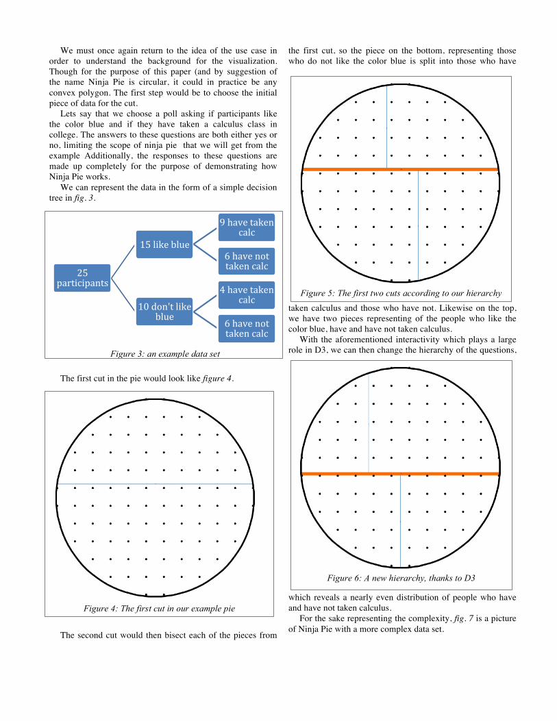
We must once again return to the idea of the use case in order to understand the background for the visualization. Though for the purpose of this paper (and by suggestion of the name Ninja Pie is circular, it could in practice be any convex polygon. The first step would be to choose the initial piece of data for the cut.
Lets say that we choose a poll asking if participants like the color blue and if they have taken a calculus class in college. The answers to these questions are both either yes or no, limiting the scope of ninja pie that we will get from the example Additionally, the responses to these questions are made up completely for the purpose of demonstrating how Ninja Pie works.
We can represent the data in the form of a simple decision tree in fig. 3.
The first cut in the pie would look like figure 4.
The second cut would then bisect each of the pieces from
the first cut, so the piece on the bottom, representing those who do not like the color blue is split into those who have
taken calculus and those who have not. Likewise on the top, we have two pieces representing of the people who like the color blue, have and have not taken calculus.
With the aforementioned interactivity which plays a large role in D3, we can then change the hierarchy of the questions,
which reveals a nearly even distribution of people who have and have not taken calculus.
For the sake representing the complexity, fig. 7 is a picture of Ninja Pie with a more complex data set.
25 participants
15 like blue
9 have taken calc
6 have not taken calc
10 don't like blue
4 have taken calc
6 have not taken calc
Figure 3: an example data set
Figure 4: The first cut in our example pie
Figure 5: The first two cuts according to our hierarchy
Figure 6: A new hierarchy, thanks to D3

3 ALGORITHM DESIGN The problems I ran into when designing the algorithms for
Ninja Pie were plenty. Dr Watson had many ideas for how the visualization should work, but little opinion on how to implement them. As someone with very little, and really no background in JavaScript, D3, visualizations, or graphics of any kind, my main approach was similar to approaching a problem set for a Data Structures or Algorithms class, which, while effective in theory, does not hold up quite so well in practice. Because there were also a good deal of features that Dr Watson wanted and due to our only weekly meetings, progress was actually somewhat slow. However, I finally wrote a set of algorithms that first calculated the first n angles for cuts, then the optimal place to place a cut of that angle on an n sided polygon. Because I wrote general algorithms, it also took a good deal of wrangling from me and the JavaScript wizardry of my rather late in the program partner Yuhao Xu to finally implement. Xu came from Zhejiang University and fortunately had experience working with JavaScript.
4 RESULTS AND THE FUTURE The final result can be seen in the above FIG. What we have, basically are the functionalities to: take data from a JSON document and parse it to our needs, cut the circle (really a 100-gon) according to the data, and show some information about the data (Dr. Watson’s preferred form of “cartographic” labels and form of quantifying the data). In the future, we will need to improve the labeling format or methods (as seen in FIG, they are very difficult to read). Additionally we will likely want to implement a form of interactive zooming, though Dr. Watson is opposed to having the visualization depend on interactivity. However, it is Xu and my opinion that this is not only necessary for understanding the visualization more thoroughly, but also a major tenet of the D3 library. Lastly the algorithm for the
quantification, via dots, is really just superimposing the visualization on a grid of dots, and while Dr. Watson believes that this is satisfactory, it is Xu and my belief that we can make it better.
5 CONCLUSIONS AND OBSERVATIONS Looking back on the summer, it was an experience I am
thankful for. While it perhaps could have been better and there might have been more guidance, both in pertinent literature (as opposed to Dr Watson’s sometimes omnipotent statements with no supporting literature) and in practice, being among peers who were doing research in a more traditional and less software engineering sort of way definitely whet my appetite for research.
One could blame my institution’s strong emphasis on social justice and being assertive despite any minority status, but it is my—uneducated and novice—opinion that the Ninja Pie visualization does not actually make data easier to see and while it perhaps does not obfuscate it more than say a pie chart or a tree-map, it does not seem to make it any easier to understand either.
ACKNOWLEDGMENTS The author would like to thank Yuhao Xu who was the mastermind behind turning algorithm designs into practical Java, Jen Albert, the queen of the IIM-REU
REFERENCES I. Herman. “Graph Visualization and Navigation in Information Visualization: A Survey.” IEEE Transactions on Visualization and Computer Graphics, volume 6, number 1, pages 24-43. January-March 2000.
H. Hofmann and M. Vendettuoli. “Common Angle Plots as Perception-True Visualizations of Categorical Associations.” IEEE Transactions on Visualization and Computer Graphics, volume 19, number 12, pages 2297-2305. December 2013.
M. Tory and T. Möller. “Human Factors in Visualization Research.” IEEE Transactions on Visualization and Computer Graphics, volume 10, number 1, pages 72-84. January/February 2004.
S. S. Stevens. “On the Psychophysical Law.” The Psychological Review, volume 64, number 3, pages 153-181. May, 1957.
Figure 7: A complicated set of cuts