ndvmubw
TRANSCRIPT

Novel dimensions in visual media for understanding the biological world: illustrating the effects of aquatic pollution in three case studies
Anna Marie Campbell
Submitted to the Department of Biological Sciences of Smith College
in partial fulfillment of the requirements for the degree of
Bachelor of Arts
L. David Smith and Michael J.F. Barresi, Honors Project Advisors
May 8, 2015

2
For the guy who is still teaching me to write, and to always “consider the source.”

3
TABLE OF CONTENTS
ACKNOWLEDGEMENTS ............................................................................................. 5 FIGURES AND TABLES ................................................................................................ 6 I. INTRODUCTION ...................................................................................................... 7
Shooting Blue Marbles ................................................................................................. 7 Research Questions and Approach ............................................................................. 9 Question 1: How can we harness the power of the 21st century scientific image to organize, visualize, and communicate biological information? .............................. 12
On visual dominance: more meets the eye than meets the eye ................................. 12 On images: a picture is worth a thousand words ...................................................... 13 On scientific images: pencils erase paradigms ......................................................... 13 On modern scientific images: the oyster’s dilemma ................................................. 15 On the future of scientific images: call for novel escapes from flatland .................. 17
Question 2: How can we apply these lessons to document the effects of anthropogenic changes in water quality worldwide? .............................................. 18
Why water? ............................................................................................................... 18 Types of pollution and the biological hierarchy ....................................................... 19 Case studies ............................................................................................................... 22
II. CASE STUDIES ...................................................................................................... 24 II.i Touching Teratogenesis: 3D-Based Tactile Models to Deepen Research and Student Understanding of Embryonic Molecular Disturbances in Zebrafish ...... 24
Background ............................................................................................................... 24 Methods ..................................................................................................................... 28 Results ....................................................................................................................... 30
II.ii Benthic Baselines: Video-Based Spatial Analysis to Optimize Scientific Surveillance of Coral Community Composition at Mexico Rocks, a Marine Reserve ......................................................................................................................... 32
Background ............................................................................................................... 32 Methods ..................................................................................................................... 35 Results ....................................................................................................................... 37
II.iii Restoration Reel: Web-Based Modular Documentary Film to Inspire Public Involvement with Ecological Efforts in He‛eia ............................................................. 39
Background ............................................................................................................... 39 Methods ..................................................................................................................... 43 Results ....................................................................................................................... 43
III. DISCUSSION ....................................................................................................... 45 III.i Perceptual Bias: the map is not the territory ................................................ 45
Constructing the map ................................................................................................ 46 Reading the map ....................................................................................................... 47
III.ii Principles of design and communication ...................................................... 48 Gestalt: a whole is more than a sum of parts ............................................................ 48 Rhetorical function .................................................................................................... 53 Viewer culture ........................................................................................................... 54

4
Modularity: two hemispheres are better than one ..................................................... 55 IV. CONCLUSION: Good Visual Practices in the 21st Century ............................. 58
Ethos, pathos, logos / lifespan of an image ............................................................... 58 Ethos / suit medium to information – but don’t force it ........................................... 59 Logos / stay true to data – but be flexible ................................................................. 60 Pathos / stay true to audiences – but accommodate multiple perspectives ............... 61
IV. References ............................................................................................................. 65

5
ACKNOWLEDGEMENTS
I would like first and foremost thank Dr. L David Smith from the bottom of my heart for his warm support, great discussions, and impressive crab-wrangling prowess. Without his wisdom, patience, and vision, neither my journey through Smith nor this project would have been any fun.
I would like to sincerely thank Dr. Michael Barresi for his guidance on this
project and for inspiring his students every day with his imagination and energy. The individual, thoughtful attention he gives to teaching and mentoring is unmatched in a researcher of his talent and drive. Also, his ribs are award-winning for a reason.
I would like to thank Douglas Harper, my mentor at NOAA Pacific Services
Center in Hawaii, for being a consistently enthusiastic role model, support system, and general mischief maker; for helping me create an amazing opportunity to make my first film; and for finally making my wish for a T-shirt that says “charismatic megafauna” come true.
I would especially like to thank 3D wizard Caitlin Schneider and coral queen
Celeste Venolia for their enormous contributions to this project. I would also like to extend my sincere gratitude to:
Barresi Lab & Teratogenesis Team
Caitlin Schneider Carla Velez BIO 303 Research Partners: Lillian Nosow and Jody Lee Crab Lab & Coral Analysis Team: Celeste Venolia and Sarah Suchower Coral Collection Team: EdVentures 2014 Spatial Analysis Lab
NOAA Hawaii Mentors: Mike Pai, Eloise Lee
Smith College Department of Education
Dr. Al Rudnitsky Funding: NOAA Department of Education: Ernest F. Hollings Scholarship McKinley Honors Fellowship
Smith College Department of Biological Sciences
Honors Program Director: Virginia Hayssen Animal Care Facility
Smith College Department of Environmental Science and Policy
Agnes Shedd Andreae Fellowship School for Field Studies Center for Marine Resource Studies Heidi Hertler Kat Millage Benthic Ladies: Lauren, Jessica, Val
Smith College Libraries Dartmouth College Libraries Autumn Brunelle for sneaking me stuff from Dartmouth College Libraries Imperial College Library Denizens of Wilder House

6
FIGURES AND TABLES
Figure 1. The Blue Marble 7 Figure 2. Nested Complexities 11 Figure 3. Types of Pollution 20 Figure 4. The Biological Hierarchy 21 Figure 5. Map of Case Study Locations 22 Figure 6. Map, Scale of Case Study 1 24 Figure 7. Structure of Naphthalene 25 Figure 8. Pharyngeal Arches Across Clades 25 Figure 9. Progression of an Arch Image 29 Figure 10. 2D Arch Comparison 31 Figure 11. 3D Arch Comparison 31 Figure 12. Map, Scale of Case Study 2 32 Figure 13. Aeriality Coral Transect 36 Figure 14. GIS Analysis of Aeriality 36 Figure 15. Photoshop Coral Transect 37 Figure 16. CPCe Analysis of Photoshop 37 Figure 17. Map, Scale of Case Study 3 39 Table 1. Case Study Overview 23 Table 2. Overview of Case Study I 24 Table 3. Overview of Case Study 2 31 Table 4. Substrates Classified by Case Study 2 33 Table 5. Overview of Case Study 3 39 Table 6. Gestalt Principles and Case Studies 49-52

7
I. INTRODUCTION
Shooting Blue Marbles
On December 7, 1972, the crew of the Apollo 17, sitting 45,000 km away from
Earth, took a photograph that has been since distributed more widely than any other: a
breathtaking view of Earth fully illuminated by sunlight (Petsko, 2011). Two
observations startle viewers immediately: “That’s us!” and, “It’s blue!” (Figure 1).
Schoolchildren commonly learn that Earth’s surface is dominated by water, whose unique
chemical characteristics are the key to sustaining life on our planet (Environmental
Protection Agency, 2012). Yet this iconic image highlights the significance of water with
startling visual immediacy unmatched by any other medium.
Figure 1. The Blue Marble. Speculated to be the most widely distributed photograph ever taken, the Crew of the Apollo 17 spacecraft shot this image on their 1977 mission, the last manned lunar operation. NASA rotated it 180º from the original to orient the North Pole at the top before releasing it. Now used for everything from news broadcast backgrounds to global company logos, it is easy to see why the timing of this image has been called “auspicious” (Petsko, 2011).

8
“The Blue Marble” was published in a time that represented the doorstep of
several revolutions (Petsko, 2011). First, the 1960s and 1970s saw the rise of a global
consciousness, the sudden perception of our species as a whole, united by our home on a
beautiful and vulnerable island planet (Jasanoff, 1996). The threats human beings posed
to their environment, and thus their own species, became apparent through works such as
Rachel Carson’s Silent Spring. Carson pointed out the pressures on global resources,
including water quality. “In an age when man has forgotten his origins and is blind even
to his most essential needs for survival,” she wrote, “water along with other resources has
become the victim of his indifference” (Carson, 1962, p. 39). Second, information
culture, including the way images were created and distributed, was rapidly responding to
the technology boom that accelerated in the latter half of the twentieth century and
continues today (Mait, 2006). Finally, Thomas Kuhn published The Structure of Scientific
Revolutions in 1962, coining the term “paradigm shift” to describe the cycles in which
scientific systems are built and destroyed based on cultural influences. In the wake of this
and Berger and Luckmann’s The Social Construction of Reality (1966), the scientific
community was left questioning its own impartiality and examining its internal culture of
communication (Giere, 2006). This social shift had a cascade of effects on Western
science; among them, the nature of perception itself suddenly demanded closer
inspection, as images and illustrations began to join verbal and mathematical descriptions
on the list of “serious” modes of scientific inquiry (Topper, 2006). Though nearly a half-
century has passed since the radical ideas of the 1960s and 70s emerged, environmental
consciousness, technological applications, and explorations of visual potential are
developing more rapidly than ever. These transformations and the developments in their

9
wake have created fertile ground for the present project that aims to explore the
intersections between environmental monitoring, technical advancement, and visual
perception.
Research Questions and Approach
In light of the current climate where environmental, technical, and perceptual
resources are heavily drawn upon but only rudimentarily understood, this project aims to
answer two questions:
Question 1 broadly encompasses Question 2, and will be addressed by analyzing
(a) the dominance of the human visual system in sensory perception; (b) the fixed and
evolving components of the power of images; and (c) the pivotal role of images in
science, both historically and currently.
Question 2 will be addressed through a series of case studies in visual
communication of the effects of aquatic pollution. The case studies are: (1) Touching
Teratogenesis, a research and education tool that aimed to produce 3D models of
developmental abnormalities in zebrafish exposed to crude oil components; (2) Benthic
Baselines, a methodology comparison that aimed to analyze underwater transect video of
coral communities threatened by climate change; and (3) Restoration Reel, a series of
documentary videos that aimed to communicate holistic dynamics of an ecosystem
susceptible to freshwater contamination. Together, these case studies provide specific
1. How can we harness the power of the 21st century scientific image to organize, visualize, and communicate biological information?
2. How can we apply these lessons to document the effects of anthropogenic changes in water quality worldwide?

10
contexts in which to analyze the challenges, benefits, and general concepts associated
with representing visually how these changes in water quality affect life ubiquitously
across scales, regions, and time (Figure 2).
The objectives of this research were to answer these questions by creating and
analyzing some forms of “cognitive art” exploring the risks associated with water quality
today. Ultimately, this project seeks to investigate what exactly it takes to create a
successful visual aid in the biological field, with respect to scale, globin to global – and
audience, undergraduates to undersecretaries.
Note: An unorthodox thesis calls for creative organization. Question 1 will be partially addressed in Section I (which represents a traditional “introduction”), as it provides an important framework for investigating question 2, the substantive body of work. Section II will focus on the case studies in support of question 2 (where a traditional “methods” section might be; note that each case study includes a “results” section of its own). We’ll touch again on question 1 and on the intersection between 1 & 2 in Section III (where a traditional overarching “results/discussion” section might be).

11
Figure 2. Nested Complexities. Broad overview of project goals illustrating relationships between nested levels of complexity investigated in research questions 1 and 2.
How can these be applied to communicate how pollution at these scales...
affects life at these scales,
and how does the reception of these products feed back into these principles?

12
Question 1: How can we harness the power of the 21st century scientific image to organize, visualize, and communicate biological information?
On visual dominance: more meets the eye than meets the eye
A greater quantity of data, measured in electrical signals, passes more rapidly
through to the nervous system from the visual system than from any other sense. It is
anticipated that vision was the last sense to develop evolutionarily and is thus the most
complex (Barry, 1997). However, subjection to this deluge of information necessitates
liberal discriminatory processes in the brain. In Novum Organum, Francis Bacon writes,
“whatever strikes the senses preponderates over everything, however superior, which
does not immediately strike them” (I.L). In the early 20th century Viennese psychologist
Otto Poetzl tested this hypothesis with respect to visual perception. The Poetzl Procedure
consisted of showing subjects a picture for only 1/100th of a second. The images were
relatively innocent, not striking in any visceral way – a fern, a bouquet, a temple. The
subject was then asked to describe verbally what they had seen. After their description
had been recorded, Poetzl told subjects to dream about the images that night.
Surprisingly, test subjects did report dreaming about the images, and when asked to
describe them, they seemed to recall more details than they had initially registered
(Johnson and Eriksen, 1961). Current models of cognition suggest enormous quantities of
visual memories are absorbed and stored by the human brain, even more than can be
accessed at any one time (Oxman, 2002). A well-developed visual system allows animals
evolutionary advantages such as the ability to quickly detect movement by prey or
predator. Thus, contrast and movement provide a base layer of information to the visual
cortex that detail is layered upon (Granit, 1977). Yet in humans, advanced visual
processing facilitates everything from the distillation of complex environmental cues to

13
self-recognition. Even our language reflects the central role vision plays in our world.
Idioms such as “seeing is believing”, “self-image”, “the mind’s eye”, “visionary”, and
“see eye-to-eye” to name a few, are constant reminders that the visual field is where most
truth-making, self-reflection, personal and social imagination, and communication begin.
On images: a picture is worth a thousand words Due to the immense visual capacity of humankind, images have always had great
social influence. This power has benefits including selectivity, separation of observation
from analysis, universality, and the authority to open questions. However, all of these
components have their dangerous counterpart: selectivity can give way to selection bias;
the perspective of a creator will forever be embedded in her image; some details will
inevitably become lost in certain translations; and questions may seem prematurely
closed simply because an image has asserted its authority too loudly. Taking into account
these hopes and fears for the role a visual display can play in understanding, one thing is
certain: graphic information is proven to improve an audience’s “comprehension,
memory, and inference” (Agrawala et al., 2011, p. 60), and these are three pillars of
scientific inquiry.
On scientific images: pencils erase paradigms
“Cognitive art” is the deferential term astrophysicist Philip Morrison once coined
for aesthetic organizations of complex data (Tufte, 1990). However, while visual
communication certainly has intrinsic aesthetic value, it should not be reduced to an
afterthought of scientific inquiry. Images can capture both the quantitative and physical
qualities of reality as well its more elusive, holistic ones. Visual and spatial displays of
information are thus integral at every step of the scientific method (Tufte, 1990;

14
Newcombe, 2013). At the observational stage, sketches, photographs, and videos allow
for quick, permanent capture of ephemeral surroundings. The record of these
observations helps generate questions and conjectures that mold the hypotheses around
which an experiment is structured. At the experimental stage, basic and advanced
visualization techniques allow for a greater understanding of everything from molecular
pathways to weather patterns. At the analytical stage, graphs, charts, and maps help
explore relationships between variables by juxtaposing them visually. And at the
dissemination stage, well-designed visuals, including those from every preceding stage,
can make the difference between publication and rejection, spark collaborations, and
bridge the gap between scientific results and practical applications by enhancing the
understanding of non-scientists.
An image possesses the unique ability to illustrate a phenomenon in such a way
that relationships between its features become instantly visible. This immediacy affords
even the most rudimentary of images to induce a paradigm shift in a discipline by
suggesting new relationships that may supplant currently accepted ones. For example, in
the 16th century, Copernicus’ heliocentric diagram in On the Revolutions of the Celestial
Spheres suggested what was at the time a radical deviation from the accepted geocentric
model. The sketch has since been called “the most revolutionary set of concentric circles
ever drawn” (Robin, 1993, p. 12). In 1869, Dmitri Mendeleev drew out the periodic table,
settling on one of literally hundreds of proposed arrangements that accommodated the
complexity of elemental relationships. This image, “one of the most recognized spatial
structures in all of science”, provided enough new information about the relationships
between the properties of elements to correctly predict where more would be discovered

15
(Newcombe, 2013, p. 26). Darwin’s Origin of Species only had one figure: a simple tree
depicting separate species that diverged from a single common ancestor (Darwin, 1859).
This tree – the first phylogeny – sparked a revolutionary paradigm shift from which
Western culture still seems to reel. All of these examples reframed traditional views
about relationships – whether between celestial bodies, chemical elements, or species on
Earth. Today, a visual medium’s greatest power still lies in its ability to show
connections: twelve of the most recent Nobel prizes have been awarded to scientists who
developed some new type of microscopy, a field whose primary goal is exploring causal
and physical relationships on cellular, molecular, and nanomolecular scales (Chalfie,
2008). Scientific inquiry and visual imagery are forever interlocked because the core
mission of each is to represent relationships.
On modern scientific images: the oyster’s dilemma The scientific world has come a long way from the early days of biological
illustrations, which focused almost exclusively on purely descriptive accounts of human
anatomy, animal figures, and medicinal plants (Robin, 1992). Today technical advances
in visual data exploration (electron microscopy, biocompatible dyes and stains, remote
sensing and satellites, for instance) and conceptual visualization (network mapping,
spatial analysis, and graphic design, for example) have added an enormous quantity of
scientific data to professional and popular literature. Today’s information nation is an
arena for excellence – albeit a saturated, competitive one; it affords unprecedented
freedom to tinker with images constructively – though also to doctor them intentionally;
it provides a large, diverse audience – some members of which may be alienated from a
message if they do not possess the requisite background to understand it; and it is

16
experiencing a democratization of platforms and widespread inexpensive tools for image-
making – that may only be able to close so much of the gap between themselves and their
expensive, inaccessible counterparts. Yet the overarching theme of the information age
can find no caveat: the modern scientific image has an unprecedented reach, to probe
microscopic and macroscopic scales never before visualized, and communicate the
information found there more quickly than ever to the largest audience in history.
But despite estimates that the scientific community at large has increased its
volume of acquired data tenfold over the past 10 years, approximated currently at nearly
2,000 exabytes (i.e., billions of gigabytes) in 2011, Agrawala, Li, and Berthouzoz (2011)
point out that “too often data is either poorly visualized or not visualized at all” (p. 60).
To echo the words of Alan Gregg in 1938,
[I] wonder if what we have in the way of communication and transport now hasn’t supplied society with an infinitely more complex nervous system than it ever had before. . . . [If] you put a human nervous system into an oyster, . . . for the first few weeks the poor oyster is going to have a devil of a time because he has got a great deal more feeling and information rushing in him than he is prepared to handle. (Gregg, 1938 in LaFollette, 2013, p. 217). While hitherto given scant attention in the specific context of the sciences, the
mechanics and aesthetics of visual display and presentation have been analyzed for
decades. Now is the time to expand this analysis to scientific communication. Processing
all this data takes time, effort, and money – not to mention a spectacular sense of
direction within a labyrinth of available information. How can we maximize the benefits
of this new nervous system (ease of data collection, accessibility of sharing platforms) –
and minimize the costs (underdeveloped or misleading communication, overwhelming or
irrelevant details)?

17
On the future of scientific images: call for novel escapes from flatland Visual literacy scholar Edward R. Tufte (1990) begins Envisioning Information by
pointing out the following dilemma:
“Even though we navigate daily through a perceptual world of three spatial dimensions and reason occasionally about higher dimensional arenas with mathematical ease, the world portrayed on our information displays is caught up in the two-dimensionality of the endless flatlands of paper and video screen” (12). He goes on to state that escaping this “flatland” is the “essential task... all the
interesting worlds (physical, biological, imaginary, human) that we seek to understand
are inevitably and happily multivariate in nature” (Tufte, 1990, p. 12). This multi-
dimensionality and constant interplay is particularly apparent in biology – the study of
living things. The complexity found there permeates the entire body of biological
information amassed by human observers over the centuries. The more avenues can be
found to escape “flatland”, the closer biologists can come to accurately representing the
enormous complexity and nuance of their field. In the present study we will examine
several of these avenues, and challenges technological developments in visual media
have overcome in biology and ecology. Visual media is constantly sprouting new
“dimensions” in several ways. A medium may grow thus by circumventing historical
challenges (field sites where access is limited; the tiny scale of molecular level changes;
the biases of commercial media outlets), finding a way to reveal hidden information (2D
to 3D; qualitative to quantitative; obscure to immediate), or finding a new way to share it
(exploring physical tools, protocols, or platforms to facilitate understanding). All of these
“dimensions” bring the simple, yet confounding nature of representations closer to the
ordered yet chaotic complexity of nature, and the observer one step farther from
‘flatland’. As anthropogenic activity continues to alter the planet’s biological pulse at an

18
exponential rate, evaluating the strengths, weaknesses, and potential of visual media
avenues emergent in the 21st century to communicate this information is a key quest for
scientists, educators, and journalists alike.
Question 2: How can we apply these lessons to document the effects of anthropogenic changes in water quality worldwide?
Why water?
Water emerges as a natural topic in which to ground these analyses. Globally,
awareness of our species’ dependence on clean water and oceans is at a critical point. An
estimated 26,000 tons of crude oil have been spilled into the ocean in just the past five
years (ITOPF). According to the most recent comprehensive reports, 20% of global coral
reefs are considered completely lost and 54% are estimated to be under destructive threat
(Wilkinson, 2008). Runoff of nutrients, pesticides, nitrogen and sediments from a
growing number of impermeable surfaces is accumulating in fresh water supplies and
interfering with agriculture, recreation, and near shore ecosystems (Laws et al., 1994).
We are greater risk than we have ever been of using up, or rendering unusable, the natural
resources on which we depend.
The accelerating impacts of human activity on every scale present an urgent need
to improve visual communication of biological concepts. Since 1950, “The Great
Acceleration” has seen human demand for energy and goods and the ecological impact of
meeting these needs increase exponentially (Revkin, 2015). This activity is producing
contaminants of various types, with different reaches and impacts on all levels of the
biological hierarchy. It is only if we can visualize these networks of effects that we have
a hope of altering our course.

19
Types of pollution and the biological hierarchy
Anthropogenic water pollution can be classified according to its reach or its
effects (summarized in Figure 3). These pollutants affect life at all levels of the biological
hierarchy (Figure 4).
Oil spills such as the Deepwater Horizon in 2010 are an example of a singular
event whose impacts spread to the boundaries of a certain region. This is
incidental/point-source pollution. Crude oil itself is an example of oxygen depleting,
suspended matter, and chemical pollution whose teratogenic effects are investigated in
Case Study 1.
As atmospheric CO2 levels rise, increases in atmospheric temperature lead to
increases in water temperature. Acting as carbon sinks, oceans experience lowered pHs as
CO2 consumes carbonate ions (Feely et al., 2004). The widespread effects of this
designate it as transboundary pollution. The warming ocean is an example of thermal
pollution whose effects on species competition are investigated in Case Study 2.
Surface runoff and overland flow that carries heavy metals, petroleum, pesticides,
and bacteria over impenetrable or saturated surfaces to the ocean, or seeps into
groundwater, is an example of chemical, nutrient, and suspended matter ambient/non-
point-source pollution whose effects on island ecosystems are investigated in Case
Study 3 (Figure 3).

20
(1) Effects • Chemical
contamination • Nutrient
imbalance • Oxygen
depletion • Suspended
matter • Thermal stress
Figure 3. Types of pollution. Water quality can be assessed based on (1) the nature of effects of pollutants on (2) several scales.
Global
Regional
Local

21
These contaminants influence life at several scales. Anthropogenic effects on
living organisms often begin on a very physically small scale, with the alteration of gene
expression and subsequent protein-protein interactions, in both developing and adult
organisms. Visualizing these changes is a challenge at the molecular scale. Case Study 1,
which examines the role of Polycyclic Aromatic Hydrocarbons (PAHs) in the
teratogenesis of zebrafish cranial neural crest cells, is an example of this.
Local ambient changes in chemical composition, e.g., water quality, often cause
changes during the lifetimes of individual organisms and colonies. The food web in a
particular area will be affected depending on which species thrive in which conditions.
Visualizing these changes in habitat structure presents a challenge at the community
scale. Case Study 2, which examines changes in coral community structure, is an
example of this.
The big picture is sometimes the easiest and sometimes the most difficult to
visualize because of its holistic incorporation of many disparate elements. Visualizing
watershed changes in an entire ecosystem, for example a complex trophic network that
includes humans, is a challenge at the ecosystem scale. Case Study 3, which examines
some of the players in a Hawaiian watershed, is an example of this.
Figure 4. Biological hierarchy. Changes in chemical and physical composition of environments affect life on micro- and macro-scales.

22
Case studies
The case studies (1) Touching Teratogenesis, (2) Benthic Baselines, and (3)
Restoration Reel investigate how recently developed forms of visual media for
representation, analysis, and communication can capture effects of aquatic toxins on
organisms, communities, and ecosystems. Figure 5 illustrates the three tropical and sub-
tropical regions from which the following case studies draw; Table 1 outlines their
structure. The case studies presented here aim to address a variety of audiences including
students and teachers in an education setting, researchers in a laboratory and field setting,
and the general public in an informal online setting. Bridging gaps of understanding
between these different populations is essential if we are to encourage water stewardship,
restore healthy ecosystems, and reflect on the environmental consequences of human
action, as well as mold the future course of scientific study.
Figure 5. Case study locations. Case Study 1 examines the effects of point-source pollution in the Gulf of Mexico; Case Study 2 examines those of transboundary pollution in Ambergris Caye, Belize, and Case Study 3 examines those of non-point-source pollution located in Oahu, Hawaii.

23
Case Study Medium Objective Location Case Study 1 – Touching Teratogenesis
3d-based tactile models
To deepen student and scientific understanding of embryonic molecular disturbances in zebrafish
Deepwater Horizon site, Gulf of Mexico
Case Study 2 – Benthic Baselines
Video-based spatial analysis
To optimize scientific surveillance of coral community composition
Mexico Rocks, Ambergris Caye, Belize
Case Study 3 – Restoration Reel
Web-based modular documentary film
To inspire public involvement with ecological efforts
He‛eia, Oahu, Hawaii
Table 1. Summary of Case Studies. The title of each subsequent section aims to capture each project’s mode, goal, and the pollution site on which it focuses.

24
II. CASE STUDIES
II.i Touching Teratogenesis: 3D-Based Tactile Models to Deepen Research and Student Understanding of Embryonic Molecular Disturbances in Zebrafish
Background
]
Scale: Cellular/molecular Location: Gulf of Mexico
Pollutant: naphthalene, a Polycyclic Aromatic Hydrocarbon (PAH)
Goal: deepen and enhance research and student learning
Impact: developmental defects as modeled by zebrafish embryos
Technology: 3D modeling and printing
Pollutant and Environmental Context
In 2010, The Deepwater Horizon rig ruptured, killing 11 and spilling at least
518,000,000 liters of crude oil into the near shore ecosystem of the Gulf of Mexico
(Cornwall, 2015). Images from the spill are familiar and disturbing: pelicans turned into
skeletal figures by black oil, turtles and dolphins in the midst of slicks, a dramatic black
plume rising from the water. However, one method of destruction of which was invisible
at first was the effect of the oil on developing organisms.
Polycyclic Aromatic Hydrocarbons (PAHs) are a basic component of crude oil.
The most structurally basic of these is naphthalene, C10H8 (Figure 7). It is found in coal
tar and is known to cause hemolytic anemia in humans (Santucci and Shah, 2000). It has
been established that naphthalene and other PAHs affect embryogenesis (Geffard et al.,
[Figure 6]
[Table 2]

25
2002). In 2012, the Barresi Laboratory proved that water from the Deepwater Horizon
was no exception.
Craniofacial features and heart formation were disrupted, implicating a population of
cells called cranial neural crest (CNC) (de Soysa et al., 2012). In vertebrates, cranial
neural crest cells give rise to the skeletal elements, tendons, and connective tissue of the
jaw (Grenier et al., 2009). CNC coagulate around to form structures called pharyngeal
arches, just posterior to the zebrafish embryo’s eye at about 30-48 hours post fertilization
(hpf). These structures are remarkably conserved across species (Figure 8). CNC cells
Figure 7. Structure of naphthalene, teratogenic Polycyclic Aromatic Hydrocarbon.
Figure 8. Sketch of pharyngeal arch formation in different species. The arch structures are generally conserved with variation across clades. Credit: Scott F. Gilbert, Developmental Biology 10th Ed.

26
anterior and medial to the eye form skeletal, muscular, and vascular endothelia of cranio-
facial features such as the lateral ethmoid plate, trabeculae, and mandible. Other cells
migrate farther and disperse to alternative muscular fates including heart and smooth
muscle (Dougherty et al., 2012). Observing and tracking a disruption in CNC
proliferation and migration indicates that an embryo will experience a cascade of
downstream abnormalities in these features.
Technology
Additive Manufacturing (AM), better known as 3D printing, has been under
development since the 1980s, but only recently achieved widespread popularity and
become relatively inexpensive. The technology is becoming widely available for use by
classrooms and professionals alike. AM’s slow but steady spread of notoriety and
applications has been noted to be surprisingly similar to the trends of personal computing
in the 1980s and 1990s. AM has already been tested as a tool in education and scientific
contexts, but it is still in its infancy as far as potential applications and public awareness
and endorsement are concerned (Lipson and Kerman, 2013).
3D printing is particularly suited to show these particular structures and the
effects of pollutants in general in a research environment, because of AM’s capacity for:
a) great magnification, elucidating the subtle effects of toxins b) easy comparison of
controls with a treatment groups in three dimensions, and c) instant display of
conformational changes that were previously invisible to the naked eye and even to
advanced microscopy techniques.
AM is also well suited to an educational setting. The ability to touch 3-
dimensional structures and directly feel textures has been linked to more intense student

27
engagement (Kostakis et al., 2014). Additionally, helping to create models from raw data
allows students feel a new kind of ownership over material that feels abstract (Kok et al.,
2013). A variety of printing qualities and materials are now available for many budgets
(Lipson and Kerman, 2013). It is not impossible to imagine a day in the not-too-distant
future where each student is able to print his own models of biological micro-structures
that he can play with to enhance concept comprehension, a biological equivalent of
chemistry model kits that many students currently employ.
Project
In the Barresi lab at Smith College, students have been studying the toxicity of
PAHs to developing organisms, as well as the mechanisms behind this toxicity, since
2010. The current stage of the research is to investigate the molecular mechanisms
responsible for the teratogenic effects and what resources, if any, an embryo can draw
upon to rescue its phenotype. Zebrafish were chosen as a model system because of their
quick development time, transparency, and representation of other vertebrates.
This project began as an exploration of the potential for 3D printing in biology
education – its applications to laboratory research were unexpectedly valuable. In tandem
with the BIO 302/303 developmental biology research course at Smith, an experiment
was developed that equally aimed to produce results about teratogenesis and serve as an
educational environment to give students hands-on laboratory experience. From this
experiment, 3D data was transformed into 3D models with the help of Masters student
Caitlin Schneider. Throughout the process, applications to both research and teaching
were interlocked.

28
In the coming months, these concepts will be applied to the creation of a database
of biological microstructures for integration with textbook lessons to facilitate student
understanding of molecular interactions. These will be hosted on the National Institute of
Health’s 3D-Print Exchange website and linked to the 11th edition of Developmental
Biology.
Methods
Zebrafish embryos were treated in four ways to compare development over the
48-hour period post-conception. The treatments were as follows: (1) control (no
treatment), (2) exposure to naphthalene (nap), (3) artificially upregulated mRNA for r-
spondin, a suspected molecular component in the response pathway to the toxin, and (4)
combined treatment of r-spondin and nap. The embryos were fixed at four stages in their
development (30 hpf, 36 hpf, 40 hpf, and 48 hpf). Irregularities in pharyngeal arch shape
and number in each group were noted using fluorescence microscopy. Representative
samples were imaged using the Laser Scanning Confocal Microscope (LSCM), which
obtains z-stacks, vertical stacks of thin cross-sectional images of tissue. The image series
were then converted using Volocity software and “cleaned up” using ImageJ. Cleaning
up involved (1) converting each image in the stack to its “binary” (black-and-white)
version, where each pixel represented positive or negative space; (2) erasing errant pixels
at each cross-sectional latitude and (3) making sure that existing “substance” was all
connected so that the data could give rise to one cohesive object (Figure 9).

29
Figure 9. Progression of arch
visualization. Top: Basic fluorescence image of pharyngeal arches and pouches of an embryo. Middle: Confocal imagery of the same embryo (single slice). Bottom: binary image almost ready for printing.

30
Results
Due to time and expense constraints, thus far only the 42 hpf nap-treated and
control arches have reached the stage of physical models. Yet already, several invisible
nuances of healthy arches and those exposed to the effects of naphthalene have been
identified. The arches of nap-treated embryos appeared less even overall, in terms of
spacing apart and thickness along proxima-distal and lateral axes. This observation was
confirmed by the 3D models. Interestingly, posterior arches appeared more separated
than was apparent from maximum projections when visualized in 3D (Figures 10 and
11), indicating a potential rescue effect that was not discernable from 2D images.
Applying AM to teratogenesis in this case allowed us to illuminate obscure
morphological details; instantly represent and share our results, encouraging wide
communication about the effects an environmental disaster of the magnitude of
Deepwater Horizon can have on developing organisms; and provide a gateway to future
educational tools.

31
Figures 10-11. 2D (top) vs. 3D (bottom) pharyngeal arches of control (R) and nap-treated (L) embryos at 42 hpf.
10
11

32
II.ii Benthic Baselines: Video-Based Spatial Analysis to Optimize Scientific Surveillance of Coral Community Composition at Mexico Rocks, a Marine Reserve
Background
Scale: community/habitat Location: Ambergris Caye, Belize
Pollutant: CO2, through warming and acidity effects
Goal: Standardize and optimize measurement techniques of image analysis to monitor compositional changes over time
Impact: bleaching, disease, algal regimes Technology: analysis of underwater video
Pollutant and Environmental Context
Ocean acidification and warming temperatures, direct pollution from runoff and
development, as well as overfishing, are all impacting reef ecosystems worldwide
(Wilkinson, 2008). Coral bleaching, the process of zooxanthellae exiting symbiotic
relationships with coral polyps under thermal stress, became a recognized threat to
tropical and sub-tropical reefs in the late 1970s (Barton and Casey 2005). Throughout the
Caribbean and across the world, coral communities are suffering the effects of ocean
acidification, rising temperatures, and booming coastal populations (Wilkinson, 2008). In
many regions, coral reefs are responding to these anthropogenic changes by undergoing
shifts in stable states from hard coral-dominated to algal- and soft-coral-dominated
regimes (Hughes et al., 2007). At Mexico Rocks, a recently designated Marine Protected
Area (MPA) near Ambergris Caye, Belize, coral mounds are exposed to stresses
[Figure 12]
[Table 3]

33
associated with tourism such as physical damage, but may be soon somewhat relieved
from fishing pressure (Hawkins & Callum, 1992; Yong & Bilgre, 2002).
Technology
Underwater data collection is an excellent example of where progress has been
made by leaps and bounds by a series of discrete developments in technology, as well as
their subsequent (sometimes delayed) popularization. With the advent of Self-Contained
Underwater Breathing Apparatus (SCUBA) diving in the mid-20th century came the
ability to stay underwater for longer periods of time to collect data. This greatly expanded
the areas of the seafloor that could be surveyed as well as the types of data that could be
collected. The first underwater photograph was shot as early as 1856, and the first
underwater motion picture was made in 1914 in the Bahamas by John Ernest Williamson
using a cumbersome casing called a “photosphere” (SDHF). Underwater photography
and videography rose to prominence in the 1960s, and have only become more accessible
since the beginning of the digital age (Warnecke, 2010).
Underwater photography has only recently begun to fulfill its potential to capture
transient information in challenging environments (Dumas et. al, 2009). And the advent
of simple, lightweight underwater video cameras allows sampling of large areas faster
than ever. Capturing data on video also has great potential for accuracy as multiple
frames of the same location are collected, combining multiple representations of a single
feature to better settle on a stable interpretation. Today, scientific dives together with
Remotely Operated Vehicles (ROVs) that use these imaging tools yield more information
about underwater habitats than has ever been available.

34
Project
Smith College students and faculty have been collecting data on the composition
of specific coral communities at Mexico Rocks off the island of Ambergris Caye since
2013 through Smith College’s Coral Reef Ed-Ventures Program. Mexico Rocks has
recently been designated as a Marine Protected Area by the Belize Department of Natural
Resources. These monitoring efforts seek to establish a baseline for percent cover of the
substrates shown in Table 4. Future benthic data will be collected and compared against
this to assess the effectiveness of protected area status over the next several years.
Accurate documentation of these phase shifts is a key aspect of monitoring
changes on the local and regional levels as well as determining the effectiveness of
various mitigation plans. Quality of data on the phenomenon worldwide has suffered for
lack of standardization of methods to assess it, and small size, either spatially or
temporally, of coral health and environmental conditions datasets (Barton and Casey
2005; Glynn 1993). Though the topic has received more widespread attention in recent
years, these challenges persist (Goreau et al 2006). Therefore, it is essential to establish a
Substrate types
Barren
Hard coral
Soft coral
Macroalgae
Table 4. Substrate types quantified by monitoring efforts at Mexico Rocks.

35
“best practices” protocol for scientists in the field and in the laboratory analyzing percent
cover of benthic substrates and thus analyzing ecosystem health.
Methods
In the summer of 2014, three coral mounds were observed. One-meter wide video
transects were taken from the leeward to the windward side of each mound along its
north-south axis by student divers. Two methods for image composition from videos and
two methods for analyzing their contents were compared.
To transform a 1-2 minute video into an image fit for analysis, frames were either
automatically or manually stitched together to create an oblong strip representing a
transect. These manual and automatic stitching methods were compared with respect to
time and accuracy. Each video transect was converted by hand to an image strip using
Adobe Photoshop or automatically converted using Precision Silver LCC’s 2014 pilot
software program Aeriality Video Pushbroom. Using the Import Video Frames to Layers
tool, Photoshop automatically imports frames at designated intervals from a video, and
overlapping features were detected by hand to form a strip. Alternatively, strip images
were automatically produced using the pushbroom algorithms in Aeriality, software
designed for the purpose of turning aerial videos into images. After prompting the user to
enter the start and end points of the video, Aeriality produces strip images from transect
videos such as the one in Figure 13.
Two methods of image analysis were also compared. Pixel counts were generated
from semi-transparent polygons manually traced over features using ESRI’s ArcGIS
mapping software. These estimates were compared with the results of a benthic
assessment program, Coral Point Count with Excel extensions (CPCe), a Windows-

36
based software created by the National Coral Reef Institute. CPCe places spatially
random points on images, which users identify manually. The software then calculates
coverage statistics (Kohler and Gill, 2006). Estimates for each of the four substrate types
were compared.
Figure 13. Aeriality + GIS stitching and analysis. Top: frames
of videos were assembled automatically by Aeriality; bottom: the resulting strip was analyxed by hand using GIS.
Figure 14. Photoshop + CPCe stitching and analysis. Top: frames of videos were assembled by hand in Photoshop; middle: the resulting strip was analyzed by random point scattering. Bottom left: CPCe interface.

37
Results Aeriality only produced one successful strip out of about twenty-five transects, due to the
unevenness of the videos captured. Thus, Photoshop provided a generally better image.
CPCe failed to capture soft coral and tended to overestimate hard coral (Figure 13). GIS
analysis provided surprising consistency, yielding similar percent cover estimates even
when analyzing different videos taken from different angles of a transect (Figure 14).
Figure 16. Comparison of percent cover of four substrate types found using GIS analysis.
Figure 15. Comparison of percent cover of four substrate types found using CPCe.
0 0.1 0.2 0.3 0.4 0.5 0.6 0.7 0.8
Perc
ent C
over!
Aeriality
Image Stitching
0 0.1 0.2 0.3 0.4 0.5 0.6 0.7 0.8
Perc
ent C
over!
Aeriality
Image Stitching
Figure 16. Comparison of percent cover of four substrate types found using GIS.

38
In the 2015 field season it is recommended that researchers strive for even videos,
use Aeriality to stitch the frames together, and invest the most time in tracing GIS
polygons, even if rough.
Applying underwater video and image analysis to coral health (1) allowed for
quick, permanent sampling of an ephemeral, difficult environment; (2) facilitated a cost-
benefit analysis for analysis techniques to be refined, and (3) provided a gateway to
future standardized, optimized monitoring protocols.

39
II.III RESTORATION REEL: WEB-BASED MODULAR DOCUMENTARY FILM TO INSPIRE PUBLIC INVOLVEMENT WITH ECOLOGICAL EFFORTS
IN HE‛EIA
Background
Scale: ecosystem Location: Oahu, Hawaii
Pollutant: Nitrogen, fecal coliform, heavy metals
Goal: Increase awareness and inspire to action
Impact: deteriorated salt crops, threats to native plant life, toxic aquaculture, threatened reef health
Technology: YouTube video series
Pollutant and Environmental Context
Reefs offshore of Oahu provide food, recreation, and services such as storm
buffering and a subject to study climate change to the island community. Beyond their
practical use, they are an integral part of Hawaiian culture, which associates the natural
world with spirits that are animate and sacred. Yet due to its reputation as a sought-after
tourist destination, global meeting place, and tropical paradise, the city of Honolulu,
Hawaii is expanding at an alarming rate. Rapid development is eroding hillsides and
polluting limited freshwater supplies, contributing significantly to the sedimentation of
valuable ecosystems offshore of Oahu (Laws et al., 1999; De Carlo et al., 2004). Invasive
species and deforestation are removing the natural filtration systems that would help
offset these pressures (Davis, 2013). Perhaps most destructive is the growing number of
impermeable surfaces (asphalt, concrete, etc.) that disrupt the natural water cycle and
[Figure 17]
[Table 5]

40
allow storm water to wash heavy metals, fecal coliform, excess nitrogen and other
pollutants directly into freshwater stores and the sea.
Food security in island nations like Hawaii is of central concern due to their heavy
reliance on outside exports. A common saying in Honolulu holds that if some event were
to bring shipping to a halt, there would only be enough food on the island to last two
weeks. The National Oceanic and Atmospheric Administration (NOAA)’s priorities in
the Pacific region mainly focus on preparedness for natural disasters, which are
increasing in frequency as climate change progresses (Hanjra and Qureshi, 2010).
Achieving real food “security” thus means depending on the island’s own productivity
and resilience.
All Hawaii’s native agriculture and aquaculture is dependent on the quality of
fresh and salt water. The only source of freshwater on Oahu is rainfall, which is stored in
shallow aquifers (Ridgley and Giambelluca, 1991). The chemical makeup of near shore
seawater is heavily linked to the fate of this freshwater, subject to whatever nutrients,
metals, or other contaminants may be added as it flows downhill. The staples of a
traditional Hawaiian diet included taro (a breadfruit-sweet potato facsimile that can be
mushed into a paste called poi, made into chips or eaten fried) and seafood. Taro, like
rice, is somewhat unique in that it thrives in the saturated soil of floodplains. Thus, it
grows especially well in tropical lowlands. However, the taste, quality, and yield of the
taro crop are tied to the specific salinity of the bog in which it is grown. This means that
as sea levels rise, and the saltwater wedge – the rising of salt water into the fresh water
table – reaches these farmlands, the quality of the crop suffers. Hawaiians did not only
grow taro—typically, the crop was grown as part of a larger system of polyculture, all of

41
which respond to fluctuations in temperature, salinity, and nutrient availability.
Similarly, traditional aquaculture involves simple wooden gates constructed at the
mouths of bays, designed to let juvenile fish inside but trap adults. Because this method
provides far less control over water quality than other aquaculture methods, its success
depends heavily upon the state of the fresh water that flows down into the bay, and even
mild eutrophication can alter outputs drastically (Byrzeski and Newkirk, 1997).
Invasive species, especially plants, pose an additional challenge to these
ecosystems. Many of these are successful because they have thin, shallow roots that
allow them to propagate and spread quickly. When these species outcompete the native
species, which typically have longer, more firmly attached roots, systems that naturally
filter out pollutants are removed, and erosion accelerates.
Technology
There is a surprising gap where scientific literature might explore the recent shift
in documentary culture, where personal agency to take initiative to document and share
media is beginning to supplant reliance on commercial news and programming outlets.
Perhaps it is too young a phenomenon for analysis. However there is no doubt the
development of (1) lightweight, high-quality camcorders and (2) common video sharing
platforms (e.g.. YouTube, Vimeo) allowed this project to achieve things it could not have
were it carried out ten years ago. First, media tycoons would have been in charge of the
production, making it almost impossible to select a subject who didn’t already possess the
resources to garner the attention of a commercial media outlet. Second, whole film crews
carrying unwieldy video cameras would have been forced to trample through the mud
and disturb the peace of the farms, ponds, and neighborhoods that they were trying to

42
record. I, as a student, likely would not have had the proper training to operate this
equipment. Third, the interviews may not have been nearly as casual and down to earth,
were the subjects laboriously prepared for a major media appearance.
Project
He‛eia is an ahupua‛a (watershed) on the windward side of the island of Oahu. In
Hawaiian tradition, land was divided into adjacent tracts that stretched from the
mountains to the sea. It was the responsibility of the members of an ahupua’a to preserve
and protect it, not by preserving the land, but by cultivating it. In modern Western
thought, watersheds are equally important as divisions of resource management. The
National Oceanic and Atmospheric Administration (NOAA) even has a slogan “ridge to
reef” describing the importance of considering questions of land management
holistically.
In He‛eia, various community Non-Governmental Organizations (NGOs) are
working to restore this holistic vision for water quality, food security, and resource
stewardship. This collaborative effort was outlined in a series of internet videos that I
produced over the summer of 2014 with NOAA as part of the Ernest F. Hollings
Scholarship Program.
At the base of the mountains, nestled into the steep cliffs that mark the top of the
ahupua’a, nursery Hui Ku Maoli Ola is working to regrow native plants and remove the
invasives that are contributing to erosion and outcompeting native flora. In the kula lands,
or the flatlands, agriculture project Kako‛o ‘Oiwi is attempting to reinstate the taro-
polyculture system, restoring the wetlands that naturally filter freshwater before it enters
Kaneohe Bay. Aquaculture site Paepae o He‛eia operates a traditional Hawaiian fishpond

43
at the mouth of the bay. For any part of this system to work, the other stewards have to be
doing their part: He‛eia stream ties them all together and each relies on it being kept free
of heavy metals, fecal coliform, and excess nutrients.
The intended audience included members of the general public who would be
inspired to contribute in some way to the restoration efforts. The non-profit leaders
wished to reach out to their neighbors, making local residents aware of the challenges and
projects in their immediate community. Other intended audience members included
private donors to the nonprofit organizations and private and public funding agencies
from which Paepae, Kako‛o and Hui might receive grants-in-aid.
Methods
Initial relationships had already been developed with NOAA’s regional partners
in He‛eia during a project related to assessing the threats of sea level rise to their
respective activities. Based on their input, a storyboard was sketched out before filming
began. Interviews were conducted using a small handheld Canon camcorder with an
attached microphone. It was the content of the interviews rather than the storyboard that
ended up guiding the structure of the piece. Footage of interviews, close ups of the flora
and fauna of He‛eia, as well as wide shots of the picturesque landscape were edited
together using Adobe Premiere. The film was distributed online via YouTube after a few
initial “draft” screenings with the primary stakeholders.
Results
This project provided a short overview of a very complex and large-scale system.
While oversimplification is a risk, putting these perspectives together into one synopsis
for what may have been the first time yielded benefits for stakeholders and audiences

44
alike. Most of all, this modification of the documentary genre gives us the option to look
at the details of efforts that are currently in progress rather than projects that are already
complete enough to have a glossy success story ready for publication. This can help
grassroots organizations like these gain visibility, volunteers, and the funding they need
to continue.

45
III. DISCUSSION
III.i Perceptual Bias: the map is not the territory
In a slightly despairing introduction, Nobel laureate Ragnar Granit opens his
neurobiological treatise, The Purposive Brain, with a caveat about the impenetrable
nature of truth: “All of us are in the end fated to beat our head against a wall... we shall
never know.” His emphasis, however, is not on the shortcomings of human understanding
but rather the individualized nature of these shortcomings. “The structure of the wall,” he
asserts, “depends on the head that beats it.” (1977, p. 1). Can we ever know truth?
Perceptual psychologist J.J. Gibson drew an important distinction between the
“visual field” – a somewhat essentialist concept of the world “out there” based on the
patterns of light reaching the retina – and the “visual world”, the synthesized
interpretation of reality that is gleaned from it after the image is filtered through layers of
physiology, memory, association, and feeling (Gibson, 1950 in Barry, 1997). These
filters, mechanical and emotional in nature, add up to the distance between the
representation and the reality it strives to represent. This is sometimes called the map-
territory problem. Francis Bacon, sometimes called the first philosopher of science,
issued a timeless warning about the quest for objectivity. “The human understanding,” he
mused, “resembles not a dry light, but admits a tincture of the will and passions, which
generate their own system accordingly, for man always believes more readily that which
he prefers” (Bacon, 1620, I.XLIX). Semantics scholar Alfred Korzybski popularized an
idiom in 1931 that echoed Bacon’s thoughts and is often repeated today: “the map is not
the territory.” “Maps” in this case may refer not only directly to artifacts of representation

46
but also to the perceptual frameworks at their roots, the construction of models of the
world from which they arise.
Constructing the map
Extending the cartography analogy, the relationship between reality and “maps”
of any kind that attempt to represent reality is one primarily of selection, and secondarily
of detail. The cartographer must first determine where the boundaries of the map will lie,
based not only on the particular purpose that representative component is designed to
serve but also what territory is penetrable to exploration in the first place. She must then
decide which features within that territory to represent, how to represent them, and to
what degree of detail. At every stage of this process, distortions arise due to the way we
consciously select information to process, subconsciously process it, and are limited by
our tools along the way.
Case Study 1 is a clear example of this selection power: only cells displaying a
specific marker for cranial neural crest are visualized. The negative spaces in the models
are not actually negative spaces – they simply represent other unknown types of cells
interlocking through and between the cranial neural crest population. As data is prepared
for printing, boundaries are drawn at the edges of the area of interest, the pharyngeal arch
region. And the printer itself contains a resolution limit for fine detail. In Case Study 2,
coral mounds were selected for longitudinal monitoring in part due to ease of access. And
Case Study 3 attempted to communicate enormously complex community-ecosystem
dynamics through the voices of just a few individuals. Information relevant to these three
experimental questions may well be present outside all these types of boundaries, but
absent in the visual representations used to explore them.

47
Reading the map
Audiences of visual displays will perceive what they desire to perceive, what is
easy to perceive, and what is directly relevant to them. Some simple examples of
graphical biases in visual perception range from the natural human preference for
perceiving horizontal and vertical as opposed to oblique lines, edges, or gradients to our
tendency to overestimate height as compared to width (Granit, 1977, and Barry, 1997),
but perceptual bias goes much deeper.
A relatively recent discovery in the science of perception, and one that still has
not gained widespread acknowledgement, is neuroscientist Joseph LeDoux’s
demonstration of the central role in perception played by the amygdala, an early-
developed part of the brain where emotion is housed (with an emphasis on fear). Before
LeDoux mapped the limbic system – the neural complex in the brain concerned with
instinct and mood – it was generally believed that upon firing of an environmental cue,
the brain of the observer analyzes the cue rationally first and then decides how to
interpret it emotionally. In plain terms, this concept of ‘thinking before feeling, let alone
acting’ is still the dominant one. LeDoux and his team actually found that the process
occurs the other way around – all perception, logical and otherwise, actually takes place
on an emotional groundwork that is already laid by the amygdala from the moment a
stimulus occurs. The mammalian cortex, thought to be the seat of intelligence, is the part
of the brain generally responsible for rational reasoning, and only joined the amygdala as
a tool for perception around the Ice Age (Barry, 1997). Today it has been proven that in
the perceptual process, this same order is replicated – first the reptilian “lizard brain” lays
a groundwork for reception, and then this information is passed along to the cortex,

48
which supplies an internal motor response. The emotional “coloring” of a situation
creates an emotional bias long before the signal is determined strong enough to make it
through to the secondary pathway that produces the thought that the viewer has
consciously, logically decided how to act (Barry, 1997).
This has implications for all three case studies examined. In Case Study 1,
researchers and students handling the models are struck by several factors that may elicit
an emotional response before a logical one is supplied. These may include the novelty of
the medium itself; the organic qualities of the shape displayed augmented by the chaos of
its textural details; even emotional responses to the color and consistency of the plastic
chosen. In Case Study 2, photo analysts may find their quantitative approach to the
images is underscored by an emotional reaction to the perceived condition of the seafloor
in the photos (its color, textures, and diversity) or even the ease or difficulty of the
software interface. Case Study 3, however, is the most prominent example of emotional
underscoring. Some of these factors are purposefully manipulated by the creator (the tone
of the background music, sequence of shots, backdrops of interviews); others are less
controllable (tone of voice and facial expressions of interview subjects).
III.ii Principles of design and communication
Gestalt: a whole is more than a sum of parts
At the turn of the 20th century, Gestalt psychologists Koffka, Wertheimer, Kohla,
Mach, and von Ehrenfels drew attention to several psychological principles that would
later become fundamental concepts of graphic design. In addition to the traditional
principles of design including balance, emphasis, proportion and repetition, the Gestalt
principles such as continuation, closure, and proximity provide insight on how people

49
receive and process images, and can be valuable tools to harness in the creation of visual
aids of any kind. At its heart, Gestalt shows that the human brain fills in automatically
what it cannot perceive directly through the senses. For example, a blind spot in the
middle of the eye’s retinal field is automatically filled in based on the context of the
surroundings. Some of the Gestalt principles are listed in Table 6 along with their
influences in the three case studies featured.
Gestalt Principles 3D Models Photo Analysis Modular Documentary
Closure: Mind combines complex parts to form a simpler whole.
Risk of any visualization of organic complexity.
Helpful in image stitching, potentially problematic in random point assignment.
Help audience infer spatial relationships between figures and scenes, imagine how the parts are connected.
Common fate/Synchrony: Elements that appear to have a mutual destination appear related.
Natural movement ties all movement together.
Transect direction may be a factor.
180º rule applies.
Common Regions: Elements grouped together seem related.
Creates its own region.
Helpful (background) in stitching photos.
If scenes are filmed with different backgrounds, they may seem more disparate than they are.
Table 6. Gestalt principles of design applied to three case studies.

50
Continuation: Eyes follow curves.
Touch is a natural extension of continuation.
Random points may appear to be in a line; continuation may help with manual stitching.
Audiences can “follow it to its logical end” provided filmmaker is conscious that lines in frames do notlead away from a subject.
Emergence: The whole is identified before its parts.
Students will see the overall shape of a structure before they notice the nuanced sub-structures it is made up of. 3D modeling works in harmony with emergence to present a 360º view of a structure.
Looking at the whole image will yield a personal estimate of percent cover before any technical analysis can break it down. Researchers should take care to keep this in mind when presenting data to the public and to each other.
Emergence can be in competition with modularity or assist it.
Figure/Ground: Elements are perceived as either subject or background.
3D models take full advantage of this relationship, eliminating ground entirely in the analysis process.
Analysis creates a new ‘figure’ – risk of forgetting background’s background, which is actually a feature we seek to analyze.
Risk of viewer’s focus being on interviewee rather than environment, even when it would be beneficial to treat the latter as a character.
Focal Points: The eye is drawn to emphasis, contrast, or movement.
There is a risk of abnormal features, or individual distortions becoming focal points in models that seek to represent a ‘type’ or ‘rule.’
Depending on the distribution of random points on the image, very intentionally determined focal points can throw out useful information (causing foreground to become background).
Film field has several concepts that speak to focal points and how to draw the viewer’s gaze to a specific region. Making use of these will be important.

51
Invariance: The mind specializes in recognizing similarities and differences.
This is the key to the success of the arch project.
Invariance is very helpful when comparing photos or videos of different regions or the same region over time. Combined with statistical analysis this can be a beneficial bias.
This is difficult to utilize in a film that does seek to contrast, but with historical time period that has limited visual data available on it.
Law of Pragnaz/Simplicity/Good Figure: The mind adds perceived missing parts to a whole automatically.
3D modeling is as good as the data used to produce it. If it is assumed that the data is of a high quality and resolution, Law of Pragnaz will only come into play in 3D models when students try to imagine what is inside the structure presented.
Can create statistical bias in strictly analytical photo processing.
This is very helpful in film editing as DW Griffith discovered that editing film in a similar way to how perception occurs (i.e. not from a fixed viewpoint) can lend viewers a more realistic experience. In filling the gaps between selected scenes, inferring spatial, temporal and other types of relationships, law of simplicity comes into play.
Multi-Stability: Multiple stable interpretations of an image can only be held one at a time.
Multi-stability will mainly come into play when students imagine how various 3d structures interact with each other, but the effect will greatly be lessened in an individual model.
Analyzing images in multiple ways is essential for gleaning maximum information from them to make the most of multi-stability
Ideally film logic will guide the viewer to which perceptions are desired, so it should be noted carefully what audiences will perceive based on their experience or expectations.
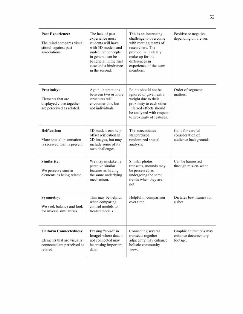
52
Past Experience: The mind compares visual stimuli against past associations.
The lack of past experience most students will have with 3D models and molecular concepts in general can be beneficial in the first case and a hindrance in the second.
This is an interesting challenge to overcome with rotating teams of researchers. The protocol will ideally make up for the differences in experience of the team members.
Positive or negative, depending on viewer.
Proximity: Elements that are displayed close together are perceived as related.
Again, interactions between two or more structures will encounter this, but not individuals.
Points should not be ignored or given extra weight due to their proximity to each other. Inferred effects should be analyzed with respect to proximity of features.
Order of segments matters.
Reification: More spatial information is received than is present.
3D models can help offset reification in 2D images, but may include some of its own challenges.
This necessitates standardized, randomized spatial analysis.
Calls for careful consideration of audience backgrounds.
Similarity: We perceive similar elements as being related.
We may mistakenly perceive similar features as having the same underlying mechanism.
Similar photos, transects, mounds may be perceived as undergoing the same trends when they are not.
Can be harnessed through mis-en-scene.
Symmetry: We seek balance and look for inverse similarities.
This may be helpful when comparing control models to treated models.
Helpful in comparison over time.
Dictates best frames for a shot.
Uniform Connectedness: Elements that are visually connected are perceived as related.
Erasing “noise” in ImageJ where data is not connected may be erasing important data.
Connecting several transects together adjacently may enhance holistic community view.
Graphic animations may enhance documentary footage.

53
Rhetorical function
In their 1997 textbook on the subject, Lay et al. assert that the first step in
communicating technical information is establishing the rhetorical function of a display.
This they define as “the specific purpose... including the clarification of relationships
among pieces of data and the trends they suggest” (p. 343). While this may sound more
aptly applied to charts and graphs than to other kinds visual media, consider again the
central role relationships play in visual artifacts, including the purposeful and accidental
implications about relationships that are present or absent. Graphs are a subset of visual
media in which relationships are explicit, making them obvious and present for analysis.
That is not to say that graphs cannot be misleading, but their errors generally occur before
the data is presented visually – that is, deciding where to draw endpoints, and which
outliers to eliminate. In the case of other visual artifacts, a deceptive relationship can
appear at any stage in the process. Graphs typically may purposefully explore one or a
handful of relationships between variables; images of other kinds may incidentally
explore many. Establishing the rhetorical function of an image, and directly
communicating to the viewer what it is, will allow the viewer to narrow his focus to the
relationships that are pertinent in context.
Declarations of intent have become passé and almost laughable – for example, the
fictionality claim at the beginning of films and television programs whose characters
clearly do resemble persons living or dead, or the nominal conflict of interest statement
that never suggests that the authors of a scientific study actually may have a conflict of
interest. I propose we bring them back into fashion in earnest, striving to accompany any
visual aid we use with pertinent information about the context of its creation and the

54
implicit and explicit relationships, causal and otherwise, that it seems to suggest. For
example, an out-of-context image of part of a reef environment that is roughly 60%
covered in hard coral may suggest particular relationships between coral and macroalgae
(coral is dominant), and the mound at different time points (it is resilient to pollutive
stress). When supplied with accompanying information, however, the viewer may
recognize that the particular area of the mound pictured has been steadily declining (90%,
80%, 70%,), and that it in fact may be less resilient than a neighboring mound, which
may be maintaining a steady 30% cover. Misconceptions can be avoided if researchers
always clarify that the rhetorical function of this display is long-term monitoring.
Viewer culture
Lay et al. (2000) defines “cultural background” as an important first consideration
when adapting visual communication to a particular audience. While this phrase may
strike the reader with its most obvious interpretation – does the audience speak your
language? Are they familiar with your scientific method? – it can actually be read a bit
more specifically. A “cultural understanding” according to Lay et. al is a “shared
understanding of various symbols, shapes, and colors within a given culture” (p. 347).
This draws a clear distinction, for example, between professional scientists, students, and
the general public, even if all three groups are subsets of “American culture”. A
YouTuber in Hawaii who finds Restoration Reel will likely have many of the same
graphical associations as science students in New England, and some that are very
different, based on overlapping but not identical visual associations.

55
Modularity: two hemispheres are better than one
After determining the rhetorical function of your display and considering the
cultural context of its viewers, there are several other principles of technical
communication as a larger field that can apply specifically to scientific and biological
communication, including the case studies presented here. One such example is that of
the power of modularity, one that is employed in the illustration of instructive diagrams
on how to assemble a particular tool, for example. Modularity is quite useful all three
case studies. The multiple layers of the confocal image of pharyngeal arches allow for its
assembly into a three-dimensional structure; many of these structures could be put to use
in the classroom to encourage interactive participation (i.e. “protein Legos”). The
multiple frames stitched together to form a holistic image of a coral mound, and even
multiple videos taken from different angles covering the same area of benthos, provide
supplementary information that would be impossible to glean from one image alone. For
example, the trend in biological illustration historically has been from sketching
individuals to classifying types (Baigrie, 1996). Illustrators soon caught onto the flawed
nature of the idea that the particular lighting, shadows, and graphic circumstances of one
individual, say in a photograph, could lend clues about what all individuals in a species or
subgroup are like. Thus, data on multiple individuals’ appearances must be collected in
order to form a more complete understanding of a class of organism, let alone to
distinguish one class from another. It is the same way with video transects of an
environment, especially where researchers seek to describe minute individual-level
changes. In the documentary project, it was actually the separation of the project into
smaller pieces that encouraged the interest of the participants. Knowing that they would

56
be portrayed both individually and as relating to a larger goal made interview subjects
more willing to cooperate, and allowed for the audience to be subdivided into further
groups. It is interesting to note that the concept of modularity actually stems from
language, the first instance where the brain picks apart certain pieces and learns that they
can be rearranged and coagulated to form new, more complex meanings. Unifying this
modular-verbal ability with the brain’s natural quick processing of images, it is possible
to imagine that we are inducing a more complete and immediate understanding by
engaging both hemispheres of our audiences’ brains.
The focus on Otto Poetzl’s results tends to surround the prevalence of
subconscious absorption of visual information. Another interpretation of the experiments
might focus on the difference between verbal and visual understanding. In response to
immediate pressure to regurgitate visual information about what they had just seen
verbally, Poetzl likely lost much detail in translation. His subjects could then retrieve this
information by: a) dreaming about the thing itself and b) actually allowing the time the
brain needs—say, overnight—to process the “basic” visual information to the more
analytical verbal information.
David Topper argues in his essay Towards an Epistemology of Scientific
Illustration that an illustration of a train at the beginning of an explanation of relativity is
often seen as superfluous because of the common belief that a “cognitive hierarchy”
exists that places visual perception at the bottom and language, mathematics, and
analytics at the top, and since the concept can be described solely using vectors and
equations, a fully detailed picture of a train is unnecessary and therefore unscientific.
“The process of moving up the hierarchy,” he notes, “is one of abstraction – at once a

57
retreat from the sensual and an advance toward the intellectual” (1996, p. 218). He then
refers to Rudolf Arnheim, who championed the terms “visual thinking” and “perception
as cognition” to combat this hierarchical concept, especially extreme form the idea of
“linguistic determinism,” that people only see what they have the tools to describe (p.
220). Ultimately, it is the intersection between parts and wholes, language and images
that engage both hemispheres of the brain and produce the most enthusiastic and
memorable response.

58
IV. CONCLUSION: GOOD VISUAL PRACTICES IN THE 21ST CENTURY Considering the vast power of images to inform or mislead, the principles of
perception, design and communication at play when we communicate visually, and the
dynamic, sensitive nature of biological data, what makes gives an image staying power in
the 21st century? Traditional modes hold, but some addendums are required.
Ethos, pathos, logos / lifespan of an image
Aristotle put forth that an argument has three components: ethos, the voice with
which it is spoken, logos, the logic it presents, and pathos, the emotional response it
invites, a system that advertisers have been exploiting for decades (Rath and Bharadwaj,
2014). The communicator must first establish her credibility by establishing trust in the
character of the voice: her ethos. Achieving this can be difficult or easy for scientists
depending on the audience and context. In many situations where communication of
environmental risks is key, such as persuading lawmakers, industry executives, and
religious groups of the importance of a study, ethos may be a scientist’s biggest hurdle.
The second principle of persuasion is pathos, where the communicator appeals to the
audiences’ emotions. Recall how emotional processing occurs faster than logical
processing – Aristotle knew this. Once a speaker has gotten their subject’s willing
attention and established the emotional tone for their message, they may present claims,
and reasoning to back them up – logos.
This trifecta can be extended to communication at large, and visual
communication specifically. An image will go through three stages (intermixed, out of
order, and concurrently, of course) in its lifespan. First, it will be created by an agent,
who must take his own perceptual biases into account to maintain credibility as an image-

59
maker (ethos). At that point the image will be a packet of information, a representation of
some selective facet of reality, which hopefully stays as true to the data it carries as
possible (logos). Finally the display will get disseminated to an audience, who will
primarily respond to it emotionally (pathos). At each of these stages are particular
recommendations for the 21st century gleaned from the three case studies examined here.
Ethos / suit medium to information – but don’t force it
Some important critical questions to evaluate ethos at an image’s conception
include: is the format suited to the speaker? Is the communicator using the best available
tools? Is the voice consistent? Have methods been analyzed for cost-benefit balance?
First, it is established that the image medium must be suited to the information it
is trying to convey. However, purposeful and careful deviations from this – or at least,
expanding our willingness to accept newer or older media as equally or more appropriate
than current media – could actually result in the lessening of observer bias as we try to
over-manipulate things to make them suitable to a particular mode. For instance, 3D
models revealed attributes of arch formation that were simply not visible even when all
the confocal images used to create the model were combined. This was a particularly
good match of message to medium. While videos seemed to provide the most information
possible about the Mexico Rocks habitat, our process of analysis involved lengthy
conversion back into what was essentially a photographic format – if it weren’t for the
sampling speed video allows, perhaps it would be better to stick to still photographs. The
documentary on Hawaiian ecosystems emphasized the human dimensions of the project,
but skimped on the rigorous scientific monitoring being performed by the restoration
groups because those activities were simply less “televisable”. While it is important to

60
aim for consistency, this may not come about by squeezing one type of information to fit
a medium that matches another or a perceived ‘state of the art’ standard – technology
goes backwards as well as forwards when it comes to practical applications.
Logos / stay true to data – but be flexible
Some important critical questions to evaluate logos in an image’s representation
include: is the medium suited to the data? Is it acknowledged that it is an imperfect
replica of reality? Is the representation ethical – does it strive for objectivity while
recognizing the barriers to it?
Once the media and styles are chosen, the image must strive to be high quality,
i.e. as true as possible to the data it represents. When the type of data it represents is also
visual in nature, this can be assessed with a “visual check” (Barry, 1997). This is difficult
to perform with subjects that are too big (Hawaiian ecosystems), too small
(embryogenesis), or too slow (changes in coral cover) to understand with the naked eye.
In this case it is best checked against the closest available research, beta tested with
feedback from experts in the field, and supplemented with the aforementioned text
outlining the context and dynamics of the subject and the investigators. Displaying
statistical graphs with error bars is a clean, simple example of this – so why not apply the
same principle to all visual representations? Announcing shortfalls and potential biases
not only gives the scientist more credibility – back to ethos – but also provides clear
future directions for her colleagues to go forward from her project and improve upon her
results.
The mode of communication chosen will act as a filter for information comes
through, so it must be chosen first and with much diligent foresight. Within this given

61
framework, accuracy is key. Accuracy can be enhanced by comparing similar studies
against one another and supplying viewers with accompanying information. Distortions
will always exist—the way in which they are acknowledged will depend on the type of
thinking desired in the audience. No matter who is watching, recognizing the obstacles to
objective truth is the only hope we have of inching closer to it.
Finally, it is important, as in Case Study 2, to be willing to revisit the same sets of
data with different analytical tools and approaches. This will allow new information to
come forth, whether about the subject itself, the quality of analyses relative to one
another, or the flexibility of interpretation.
Pathos / stay true to audiences – but accommodate multiple perspectives
Finally, as an image reaches its audience and touches them with pathos, one can
ask: Is the format suited to the type of thinking the communicator wishes to incite? Are
the “gaps” of Gestalt minded? Is a positive emotional climate established? Are visual and
verbal components both present and complementary? Is it dynamic?
Relevance
A visual product must be suited to its audience: their background knowledge,
their preferred methods of receiving information, and the type of thinking the
communicator hopes to spark within them (it has been discretely proven that “learning
styles” do not actually exist, but preferred styles, usually due to confidence and skill
levels, do [Riener and Willingham, 2010]). This, again, is already a revered rule in the
communication and education fields. However, the 21st century has seen a startling rise of
a “global audience” who is less and less separated into neat cultural pockets. Instead of
the “one-on-one tutoring” they are used to, or at least the “standard classroom” of a

62
conference, media appearance, or actual classroom, biologists now often find themselves
lecturing to the “one-room schoolhouse” of the internet – all ages, nationalities, levels of
background knowledge, and previous experience arrive expecting answers. When it does
not come at the expense of the above principles, the visual must be suited also as best as
possible to other audiences outside the target audience, because in as our world becomes
more globally connected, clarity is a priority. Communicators must acknowledge that
audiences are growing more diverse, and rather than oversimplifying concepts to cater to
the lowest common denominator, scientists must employ a multitude of strategies and
tools to get at the same information in from different angles. With respect to aquatic
pollution and other universal problems, the media used to represent it must be as
pluralistic and diverse as possible. Water quality issues affect many intersectional groups,
so it does not makes sense that a one-dimensional approach to a conversation about them
would ever suffice.
Emotional Tone
In the present gloomy climate of environmental science, emotional tone is an
especially important consideration. Both positive and negative messages will motivate
people to act. However, actions motivated by positive emotions like hope, vision,
empowerment, and cooperation will endure longer and be more likely to persist into habit
than those motivated by guilt or fear, which tend to fizzle out (Lockwood et al., 2002).
Even when the message is not directly positive, negative, or motivational, researchers
must consider what emotional climate their choices of media, style, and content may
subtly evoke, striving to prime audiences to absorb their data with an open mind.

63
Dynamic and interactive
Francis Bacon wrote also in his Novum Organum, “The human understanding is,
by its own nature, prone to abstraction, and supposes that which is fluctuating to be
fixed” (Bacon, 1620, I.LI) Most of our basic visual apparati are primed for quick
detection of movement (Barry, 1997). An audience quickly loses interest is quickly lost
when a subject is not dynamic, showing significant changes over time. Dissecting a dead
frog in the classroom is interesting so long as there are new parts to discover, but it soon
becomes apparent that a third-grade class would much rather be outside catching live
frogs and observing how they respond to survival cues. So why not communicate the
dynamic quality, the place an attribute or scientific finding has in a larger dynamic
system or timeline, as part of the communication itself? If a display is not “moving”, and
does not provide an interactive space that audiences can move into as well, audiences will
ignore it and move on. Some ways to include dynamic components in visualizations
include providing a method for frequent updates and revisions (as in Case Study 2);
allowing audiences to directly interact with a display (as in Case Study 1); and covering
topics that have both a timeless thematic quality yet a sense of recency and urgency (as in
Case Study 3).
The pulse of life flickers at each and every spatial scale, all inextricably linked
and rarely separated into the clean categories our rationality may seek. Ecosystems are
changing in composition and character, chemically, physically, and biologically, by the
minute and by the century. Animals outcompete one another for space, food, and
sunlight, as individuals, populations, and species. The guiding principles of the life
sciences—ever-evolving circumstances permitting new relationships and reactions,

64
combinations and recombinations of factors leading to unexpected and beautiful
novelty—are difficult to put into words, let alone to convey visually with any coherence.
Yet it is precisely this coherence that is required to organize, visualize, and communicate
biological information effectively under the pressures of our rapidly changing
environment.
As communicators we should strive to adhere to traditionally sound visual
practices, such as (a) sticking by a display’s rhetorical function, (b) staying mindful of
our audiences’ varying cultures, harnessing psychology to achieve more clarity such as
(c) minding the Gestalt ‘gaps’, (d) acknowledging our own distortions and those of
others, and (e) engaging both verbal and visual modes of thinking. If we are able to bear
these in mind while we add some 21st century supplements, such as (a) exhibiting
flexibility in matching exactly our displays to our own voice, information, and target
audience, and instead focusing on keeping our information (b) accurate, (c) relevant, (d)
positive, and (d) dynamic, we will see the power of the images we create grow
exponentially. And according to Carson, “The more clearly we can focus our attention on
the wonders and realities of the universe about us, the less taste we shall have for the
destruction of our race” (1952, p. 94). With these tools to bring about this clarity, we,
too, have the power to incite a revolution.

65
IV. REFERENCES
1. (Eds), B. and Y. (2012). Science Communication: A Practical Guide for Scientists [Paperback] (p. 384). Wiley-Blackwell. Retrieved from http://www.amazon.co.uk/Science-Communication-Practical-Guide-Scientists/dp/1119993121/ref=sr_1_1?ie=UTF8&qid=1395075102&sr=8-1&keywords=science+communication+yeoman
2. Agrawala, M., Li, W., & Berthouzoz, F. (2011). Design principles for visual communication. Communications of the ACM, 54(4), 60. doi:10.1145/1924421.1924439
3. Anderson, N., & Dietrich, M. R. (2012). The Educated Eye: Visual Culture and Pedagogy in the Life Sciences. Hanover, NH: Dartmouth College Press.
4. Bacon, F. (1620). I. Novum Organum or True Suggestions for the Interpretation of Nature. New York, NY: P.F. Collier & Son.
5. Barry, A. M. S. (1997). Visual Intelligence: perception, image, and manipulation in visual communication. Albany, NY: State University of New York Press.
6. Barton, A. D., & Casey, K. S. (2005). Climatological context for large-scale coral bleaching. Coral Reefs, 24(4), 536–554. doi:10.1007/s00338-005-0017-1
7. Behrens, R. R. (1998). Art, design and gestalt theory. Leonardo, 31(4), 1–7. doi:10.2307/1576669
8. Bianco, C. (2000). How Vision Works. 9. Bradley, S. (2014). Design Principles: Visual Perception And The Principles of Gestalt.
Smashing Magazine. 10. Bringing AM to the classroom. (2014). Metal Powder Report, 69(6), 42.
doi:10.1016/S0026-0657(14)70291-7 11. Brøchner, C. B., Vestentoft, P. S., Lynnerup, N., Andersen, C. Y., & Møllgård, K.
(2010). A two- and three-dimensional approach for visualizing human embryonic stem cell differentiation. Methods In Molecular Biology (Clifton, N.J.), 584, 179–193. doi:10.1007/978-1-60761-369-5_10
12. Brzeski, V., & Newkirk, G. (1997). Integrated coastal food production systems of current literature a review. Science, 34(1), 55–71.
13. Carroll, L. (1893). The Man in the Moon. In Sylvie and Bruno Concluded (Lit2Go ed.). London, England: MacMillan and Co. Retrieved from http://etc.usf.edu/lit2go/211/sylvie-and-bruno-concluded/4652/chapter-11-the-man-in-the-moon/
14. Carson, R. (1962). Silent Spring. Houghton Mifflin Harcourt. 15. Castro-Alonso, J. C., Ayres, P., & Paas, F. (2015). Animations showing Lego
manipulative tasks: Three potential moderators of effectiveness. Computers & Education, 85, 1–13. doi:10.1016/j.compedu.2014.12.022
16. Chang, D., Dooley, L., & Tuovinen, J. E. (2002). Gestalt Theory in Visual Screen Design — A New Look at an old subject. Retrieved from http://crpit.com/abstracts/CRPITV8Chang.html
17. Christensen, L. L. (2007). Visuals. In The Hands-On Guide for Science Communicators (p. 81). Springer.
18. Cohen, C. a., & Hegarty, M. (2014). Visualizing cross sections: Training spatial thinking using interactive animations and virtual objects. Learning and Individual Differences, 33, 63–71. doi:10.1016/j.lindif.2014.04.002
19. Cook, J. (n.d.). All the Water on Earth. United States: Woods Hole Oceanographic Institution. Retrieved from http://www.whoi.edu/page.do?cl=78993&pid=83456&tid=5122
20. Coppola, N. W., & Karis, B. (2000). Technical communication, Deliberative Rhetoric, and Environmental Discourse: Connections and Directions.

66
21. Crone, T. J., & Tolstoy, M. (2010). Magnitude of the 2010 Gulf of Mexico oil leak. Science (New York, N.Y.), 330(6004), 634. doi:10.1126/science.1195840
22. Davis, M. a. (2013). Invasive Plants and Animal Species. Threats to Ecosystem Services. Climate Vulnerability: Understanding and Addressing Threats to Essential Resources (Vol. 4). Elsevier. doi:10.1016/B978-0-12-384703-4.00405-6
23. De Carlo, E. H., Beltran, V. L., & Tomlinson, M. S. (2004). Composition of water and suspended sediment in streams of urbanized subtropical watersheds in Hawaii. Applied Geochemistry, 19(7), 1011–1037. doi:10.1016/j.apgeochem.2004.01.004
24. De Soysa, T. Y., Ulrich, A., Friedrich, T., Pite, D., Compton, S. L., Ok, D., … Barresi, M. J. F. (2012). Macondo crude oil from the Deepwater Horizon oil spill disrupts specific developmental processes during zebrafish embryogenesis. BMC Biology, 10(1), 40. doi:10.1186/1741-7007-10-40
25. Dougherty, M., Kamel, G., Shubinets, V., Hickey, G., Grimaldi, M., and Liao, E.C. (2012). Embryonic fate map of first pharyngeal arch structures in the sox10:kaede zebrafish transgenic model. Journal of Craniofacial Surgery, 23(5): 1333-7.
26. Dumas, P., Bertaud, A., Peignon, C., Léopold, M., & Pelletier, D. (2009). A “quick and clean” photographic method for the description of coral reef habitats. Journal of Experimental Marine Biology and Ecology, 368(2), 161–168. doi:10.1016/j.jembe.2008.10.002
27. Environmental Protection Agency, U. S. (2008). Polycyclic Aromatic Hydrocarbons (PAHs). Office of Solid Waste, (January), 1–3.
28. Foster, J. (1982). Induction, Explanation and Natural Necessity. Proceedings of the Aristotelian Society, 83, pp. 87–101. Retrieved from http://www.jstor.org/stable/4544993
29. Friedhoff, R. M., & Benzon, W. (1989). Visualization: the second computer revolution. New York, NY: Harry N. Abrams, Inc.
30. Geffard, O., He, Ã., Physico-toxicochimie, L. De, Naturels, S., & Bordeaux, U. De. (2002). The Effects of Elutriates from PAH and Heavy Metal Polluted Sediments on Crassostrea gigas (Thunberg) Embryogenesis, Larval Growth and Bio-accumulation by the Larvae of Pollutants from Sedimentary Origin. Ecotoxicology, 11(1), 403–416.
31. Goodson, F. E. (2002). Apperception. In The Evolution and Function of Cognition (p. 252). New York, NY: Psychology Press.
32. Graham, L. (2008). Gestalt theory in interactive media design. Journal of Humanities & Social Sciences, 2(1), 1–12. doi:10.1145/1754393.1754394
33. Granit, R. (1977). The Purposive Brain. Cambridge, MA: MIT Press. 34. Grenier, J., Teillet, M. A., Grifone, R., Kelly, R. G., & Duprez, D. (2009). Relationship
between neural crest cells and cranial mesoderm during head muscle development. PLoS ONE, 4(2). doi:10.1371/journal.pone.0004381
35. Hanjra, M. a., & Qureshi, M. E. (2010). Global water crisis and future food security in an era of climate change. Food Policy, 35(5), 365–377. doi:10.1016/j.foodpol.2010.05.006
36. Hartline, H. K., & Granit, R. (1947). Sensory Mechanisms of the Retina. Oxford, England: Oxford University Press.
37. Hodges, E. R. S. (Ed.). (2003). The Guild Handbook of Scientific Illustration (2nd ed.). Hoboken, NJ: John Wiley & Sons, Inc.
38. Hubel, D. H., & Wiesel, T. N. (1972). Laminar and columnar distribution of geniculo-cortical fibers in the macaque monkey. The Journal of Comparative Neurology, 146(4), 421–450. doi:10.1002/cne.901460402
39. Incardona, J. P., Swarts, T. L., Edmunds, R. C., Linbo, T. L., Aquilina-Beck, A., Sloan, C. a, … Scholz, N. L. (2013). Exxon Valdez to Deepwater Horizon: comparable toxicity of both crude oils to fish early life stages. Aquatic Toxicology (Amsterdam, Netherlands), 142-143, 303–16. doi:10.1016/j.aquatox.2013.08.011

67
40. International Tank Owners Pollution Federation (ITOPF). (2014). Oil Tanker Spill Statistics. Retrieved from http://www.itopf.com/knowledge-resources/data-statistics/statistics/
41. Isaila, N. (2011). Learning systems with modular resources reused. Procedia - Social and Behavioral Sciences, 15, 311–315. doi:10.1016/j.sbspro.2011.03.092
42. Jasanoff, S. (1996). Image and Imagination: The Formation of Global Environmental Consciousness. In C. Miller & P. Edwards (Eds.), Changing the Atmosphere: Expert Knowledge and Environmental Governance (pp. 309–338). Cambridge, MA: MIT Press. Retrieved from http://belfercenter.ksg.harvard.edu/files/imagination.rev.pdf
43. Knight, D. (2006). Public Understanding of Science: a history of communicating scientific ideas. (J. Krige, Ed.). New York, NY: Routledge.
44. Kok, N., Chia, H., Cai, Y., Kiak, N., Kee, N., & Thalmann, N. (2013). 3D Immersive and Interactive Learning. In Springer Science & Business Media (pp. 105–121). Springer. doi:10.1007/978-981-4021-90-6
45. Kostakis, V., Niaros, V., & Giotitsas, C. (2014). Open source 3D printing as a means of learning: An educational experiment in two high schools in Greece. Telematics and Informatics, 32(1), 1–11. doi:10.1016/j.tele.2014.05.001
46. Kostakis, V., & Papachristou, M. (2014). Commons-based peer production and digital fabrication: The case of a RepRap-based, Lego-built 3D printing-milling machine. Telematics and Informatics, 31(3), 434–443. doi:10.1016/j.tele.2013.09.006
47. Kovács, I., & Julesz, B. (1993). A closed curve is much more than an incomplete one: effect of closure in figure-ground segmentation. Proceedings of the National Academy of Sciences of the United States of America, 90(16), 7495–7497. doi:10.1073/pnas.90.16.7495
48. Kuhlbrandt, W. (2014). Microscopy: Cryo-EM enters a new era. eLife Sciences, (3). Retrieved from http://elifesciences.org/content/3/e03678
49. LaFollette, M. C. (2013). Science on American Television (Vol. 90). Retrieved from http://www.ncbi.nlm.nih.gov/pubmed/24280199
50. Laws, E. a., Hiraoka, J., Mura, M., Punu, B., Rust, T., Vink, S., & Yamamura, C. (1994). Impact of land runoff on water quality in an Hawaiian estuary. Marine Environmental Research, 38(3), 225–241. doi:10.1016/0141-1136(94)90009-4
51. Laws, E. a., Ziemann, D., & Schulman, D. (1999). Coastal water quality in Hawaii: The importance of buffer zones and dilution. Marine Environmental Research, 48(1), 1–21. doi:10.1016/S0141-1136(99)00029-X
52. Lay, M. M., Wahlstrom, B. J., Rude, C. D., Selfe, C. L., & Selzer, J. (2000). Technical Communication (2nd ed.). McGraw-Hill Higher Education.
53. Lima, M. (2011). Visual Complexity: Mapping Patterns of Information. (L. Lee, Ed.). New York, NY: Princeton Architechtural Press.
54. Lipson, H., & Kurman, M. (2013). Fabricated: the new world of 3D printing. Indianapolis, IN: John Wiley & Sons, Inc.
55. Mait, J. N. (2006). A History of Imaging: Revisiting the Past to Chart the Future. Optics and Photonics News, 17(2), 22. doi:10.1364/OPN.17.2.000022
56. Marcus, A. (2007). Information Graphics : A Celebration and Recollection, 1–11. 57. Mascarelli, A. (2010). After the oil, 467(September). 58. McCluhan, M. (1964). The Medium is the Message. In Understanding Media: The
Extensions of Man (pp. 1–18). New York, NY: McGraw-Hill. doi:10.1016/j.plrev.2011.10.017
59. Metscher, B. D. (2009). MicroCT for Developmental Biology : A Versatile Tool for High-Contrast 3D Imaging at Histological Resolutions, (February), 632–640. doi:10.1002/dvdy.21857
60. Natt, O., Watanabe, T., Boretius, S., Radulovic, J., Frahm, J., & Michaelis, T. (2002). High-resolution 3D MRI of mouse brain reveals small cerebral structures in vivo.

68
Journal of Neuroscience Methods, 120(2), 203–209. doi:10.1016/S0165-0270(02)00211-X
61. Newcombe, N. S. (2013). Seeing Relationships. American Educator, 26–32. 62. Nogales, E., Whittaker, M., Milligan, R. a., & Downing, K. H. (1999). High-resolution
model of the microtubule. Cell, 96(1), 79–88. doi:10.1016/S0092-8674(00)80961-7 63. Oxman, R. (2002). The thinking eye: Visual re-cognition in design emergence. Design
Studies, 23(2), 135–164. doi:10.1016/S0142-694X(01)00026-6 64. Pauwels, L. (2006). Visual Cultures of Science: rethinking reprsentational practices in
knowledge building and science. (L. Pauwels, Ed.). Hanover, NH: Dartmouth College Press.
65. Petsko, G. A. (2011). The blue marble. Genome Biology, 12(4), 112. doi:10.1186/gb-2011-12-4-112
66. Priest, S. H. (Ed.). (2010). Visual Images in Science Communication. In Encyclopedia of Scientific and Technological Communication Volume II (pp. 933–939). Thousand Oaks, CA: SAGE Publications.
67. Raimondo, S., Jackson, C. R., Krzykwa, J., Hemmer, B. L., Awkerman, J. a, & Barron, M. G. (2014). Developmental toxicity of Louisiana crude oil-spiked sediment to zebrafish. Ecotoxicology and Environmental Safety, 108, 265–72. doi:10.1016/j.ecoenv.2014.07.020
68. Ramirez Gaviria, A. (2008). When Is Information Visualization Art? Determining the Critical Criteria. Leonardo. doi:10.1162/leon.2008.41.5.479
69. Rath, P., & Bharadwaj, A. (2014). Deconstructing symbolic ideology in contemporary communication strategy in advertising: The case of Nirma and Wheel. IIMB Management Review, 26(1), 17–27. doi:10.1016/j.iimb.2013.12.001
70. Rengier, F., Häfner, M. F., Unterhinninghofen, R., Nawrotzki, R., Kirsch, J., Kauczor, H. U., & Giesel, F. L. (2013). Integration of interactive three-dimensional image post-processing software into undergraduate radiology education effectively improves diagnostic skills and visual-spatial ability. European Journal of Radiology, 82(8), 1366–1371. doi:10.1016/j.ejrad.2013.01.010
71. Ridgley, M. a., & Giambelluca, T. W. (1991). Drought, groundwater management and land use planning: the case of central Oahu, Hawaii. Applied Geography, 11(4), 289–307. doi:10.1016/0143-6228(91)90019-6
72. Riener, C., & Willingham, D. (2010). The Myth of Learning Styles. Change: The Magazine of Higher Learning, 42(5), 32–35. doi:10.1080/00091383.2010.503139
73. Robin, H. (1993). The Scientific Image: From Cave to Computer. (P. Freeman, Ed.). New York, NY: Harry N. Abrams, Inc.
74. Russell, N. (2010a). The Future’s Bright? Professional scientific communication in the age of the internet. In Communicating Science: Professional, Popular, Literary (p. 161). Cambridge, England: Cambridge University Press.
75. Russell, N. (2010b). The Influence of New Media. In Communicating Science: Professional, Popular, Literary (p. 51). Cambridge, England: Cambridge University Press.
76. Schelly, C., Anzalone, G., Wijnen, B., & Pearce, J. M. (2015). Open-source 3-D printing technologies for education: Bringing additive manufacturing to the classroom. Journal of Visual Languages & Computing, 28, 226–237. doi:10.1016/j.jvlc.2015.01.004
77. Students Use 3D Printing to Reconstruct Dinosaurs. (n.d.). American Museum of Natural History. Retrieved from https://www.youtube.com/watch?v=_KBxG1_WO8k
78. The Williamson Brothers. (n.d.). Retrieved February 10, 2015, from http://www.scubahalloffame.com/hallmembers/Early Pioneers/williamsonbrothers.html
79. Todd, J. J., & Marois, R. (2004). Capacity limit of visual short-term memory in human posterior parietal cortex. Nature, 428(6984), 751–754. doi:10.1038/nature02466

69
80. Tufte, E. R. (1990). Envisioning information. Cheshire, Connecticut: Graphics Press. Retrieved from http://libproxy.smith.edu:2048/login?url=http://search.ebscohost.com/login.aspx?direct=true&db=cat00321a&AN=fivecol.000392820&site=eds-live
81. Tufte, E. R. (1997). Visual Explanation. Cheshire, Connecticut: Graphics Press. 82. United States Environmental Protection Agency. (2012). Water, Water, Everywhere! In
The Water Source Books: Grade Levels 3-5 (pp. 1–5). Retrieved from http://water.epa.gov/learn/kids/drinkingwater/upload/The-Water-Sourcebooks-Grade-Level-3-5.pdf
83. Warnecke, J. (2010). History of Underwater Photography. Retrieved December 12, 2014, from http://www.cmas.org/visual/about-2012032620
84. Weems, J. (2012). Vision at California scale: Charles and Ray Eames, systems thinking, and the diminishing status of the human body after World War II. In Where Minds and Matters Meet: Technology in California and the West (pp. 251–263).
85. Wilkinson, C. (2008). Status of Coral Reefs of the World: 2008. Status of Coral Reefs of the World: 2008, 5–19.