nber working paper series the world distribution of …
TRANSCRIPT

NBER WORKING PAPER SERIES
THE WORLD DISTRIBUTION OF INCOME(ESTIMATED FROM INDIVIDUAL COUNTRY DISTRIBUTIONS)
Xavier Sala-i-Martin
Working Paper 8933http://www.nber.org/papers/w8933
NATIONAL BUREAU OF ECONOMIC RESEARCH1050 Massachusetts Avenue
Cambridge, MA 02138May 2002
This paper was partly written when I was visiting Universitat Pompeu Fabra in Barcelona. I thank Sanket
Mohapatra for extraordinary research assistance and for comments, suggestions and short speeches related
to this paper. I also benefitted from the comments of Elsa V. Artadi, Robert Barro, François Bourguignon,
Laila Haider and Casey B. Mulligan. The views expressed herein are those of the author and not necessarily
those of the National Bureau of Economic Research.
© 2002 by Xavier Sala-i-Martin. All rights reserved. Short sections of text, not to exceed two paragraphs,
may be quoted without explicit permission provided that full credit, including © notice, is given to the
source.

The World Distribution of Income (estimated from Individual Country Distributions)Xavier Sala-i-MartinNBER Working Paper No. 8933May 2002JEL No. D31, F0, I30, I32, O00
ABSTRACT
We estimate the world distribution of income by integrating individual income distributions for
125 countries between 1970 and 1998. We estimate poverty rates and headcounts by integrating the
density function below the $1/day and $2/day poverty lines. We find that poverty rates decline
substantially over the last twenty years. We compute poverty headcounts and find that the number of one-
dollar poor declined by 235 million between 1976 and 1998. The number of $2/day poor declined by 450
million over the same period. We analyze poverty across different regions and countries. Asia is a great
success, especially after 1980. Latin America reduced poverty substantially in the 1970s but progress
stopped in the 1980s and 1990s. The worst performer was Africa, where poverty rates increased
substantially over the last thirty years: the number of $1/day poor in Africa increased by 175 million
between 1970 and 1998, and the number of $2/day poor increased by 227. Africa hosted 11% of the
world’s poor in 1960. It hosted 66% of them in 1998. We estimate nine indexes of income inequality
implied by our world distribution of income. All of them show substantial reductions in global income
inequality during the 1980s and 1990s.
Xavier Sala-i-MartinDepartment of EconomicsColumbia University420 West 118th Street, 1005New York, NY 10027and NBER and [email protected]

1. Introduction . . . . . . . . . . . . . . . . . . . . . . . . . . . . . . . . . . . . . . . . . . . . . . . . . . . . . . . . 12. Estimating the World Distribution of Income . . . . . . . . . . . . . . . . . . . . . . . . . . . . . . . . 3
A.- Step 1: Estimating Yearly Income Shares between 1970 and 1998 . . . . . . . . 3B.- Step 2: Estimating Country Histograms . . . . . . . . . . . . . . . . . . . . . . . . . . . . . 6C.- Step 3. Estimating Each Country’s Income Distribution. . . . . . . . . . . . . . . . . 7
Comparing Country Poverty Estimates with Quah (2002) . . . . . . . . . . . 12D.- Step 4: Estimating the World Income Distribution Function . . . . . . . . . . . . . 12
“Vanishing Twin-Peaks” and “Emergence of a World Middle-Class” . . . 14The Cumulative Distribution Function . . . . . . . . . . . . . . . . . . . . . . . . . . 15Kernel of Kernels vs. Kernel of Quintiles . . . . . . . . . . . . . . . . . . . . . . . 16
3. Poverty . . . . . . . . . . . . . . . . . . . . . . . . . . . . . . . . . . . . . . . . . . . . . . . . . . . . . . . . . . 17A.- Poverty Rates . . . . . . . . . . . . . . . . . . . . . . . . . . . . . . . . . . . . . . . . . . . . . . 17B.- Poverty Headcounts . . . . . . . . . . . . . . . . . . . . . . . . . . . . . . . . . . . . . . . . . . 18C.- Comparing Poverty Rates and Headcounts with Sala-i-Martin (2002) . . . . . 19D.- Consumption vs. Income Poverty: Comparing with Chen and Ravallion (2002)
. . . . . . . . . . . . . . . . . . . . . . . . . . . . . . . . . . . . . . . . . . . . . . . . . . . . . . 20E.- Distribution of Regional Poverty . . . . . . . . . . . . . . . . . . . . . . . . . . . . . . . . . 22
Asia . . . . . . . . . . . . . . . . . . . . . . . . . . . . . . . . . . . . . . . . . . . . . . . . . . . 22Latin America . . . . . . . . . . . . . . . . . . . . . . . . . . . . . . . . . . . . . . . . . . . 23Sub-Saharian Africa . . . . . . . . . . . . . . . . . . . . . . . . . . . . . . . . . . . . . . . 25
4. World Income Inequality . . . . . . . . . . . . . . . . . . . . . . . . . . . . . . . . . . . . . . . . . . . . . 275. Conclusions . . . . . . . . . . . . . . . . . . . . . . . . . . . . . . . . . . . . . . . . . . . . . . . . . . . . . . . 30References . . . . . . . . . . . . . . . . . . . . . . . . . . . . . . . . . . . . . . . . . . . . . . . . . . . . . . . . . . 32Tables . . . . . . . . . . . . . . . . . . . . . . . . . . . . . . . . . . . . . . . . . . . . . . . . . . . . . . . . . . . . . 34Figures . . . . . . . . . . . . . . . . . . . . . . . . . . . . . . . . . . . . . . . . . . . . . . . . . . . . . . . . . . . . . 44Appendix Figures: Income Shares for Selected Large Countries . . . . . . . . . . . . . . . . . . 59

1
1. IntroductionEconomists, journalists, politicians and critics of all varieties have recently paid a lot of
attention to the world distribution of income. Different observers care about different aspects of this
distribution: some worry about individual income disparities (or income inequality) and their
evolution over time, some worry about the fraction of the worldwide population that live with less
than one or two dollars a day (the so called, poverty lines), some worry about the total number of
poor and some worry about the polarization between the haves and the havenots.
Estimating the world distribution of individual income is not easy because the level of income
of each person on the planet is not known. As a result, previous researchers have been forced to
make a number of approximations. For example, economists like Quah (1996, 1997), Jones
(1997), and Kremer, Onatski and Stock (2001) estimate a distribution of world per capita GDPs in
which each country is one data point. This approach is sensible if one wants to analyse the success
of individual country policies or institutions and if we think of each country as performing an
independent “policy experiment”. However, it is not a good assumption if one wants to discuss
global welfare: treating countries like China and Grenada as two data points with equal weight does
not seem reasonable because there are about 12,000 Chinese citizens for each person living in
Grenada. In other words, if income per capita in Grenada grows by 300% over a period of 20
years, the world distribution of individual income does not change by much because there aren’t
many Grenadians in the world. However, if income per capita in China grows at the same rate, then
the incomes of one fifth of the world’s citizens increase substantially and this has a great impact on
global human welfare.
Some researchers like Theil (1979, 1996), Berry, Bourguignon and Morrisson (1983),
Grosh, M. and E.W. Nafziger (1986), Theil and Seale (1994), Schultz (1998), Firebaugh (1999)
and Melchior, Telle and Wiig (2000) solve this problem by using population-weighted GDP per
capita. Although this is a step in the right direction, these papers still ignore intra-country income
disparities. For example, when China’s GDP per capita grows, the income of all its citizens does
not increase in the same proportion. Dowrick and Akmal (2001), Bourguignon and Morrisson
(2002) and Sala-i-Martin (2002) allow for within-country income disparities. For example, Sala-i-
Martin (2002) uses the Deininger and Squire (1996) estimates of five income shares for selected
1 Bourguignon and Morrisson (2002) use a similar methodology for selected years goingback to 1820 using the Maddison data set.
2
years to construct five income categories per country and year. The population of each country is
divided into five different types and each type is assigned an income level. He then estimates a
world income distribution with these five categories per country.1 The drawback of this approach is
that it assumes that all individuals within each of the five categories for each country are assumed to
have the same level of income. This assumption, for example, leads to a systematic underestimation
of the level inequality within the distribution, although it is not clear the direction in which it biases its
evolution over time. When we estimate the fraction of the distribution below a certain threshold (as
we do, for example, when we estimate poverty rates), we assign the whole quintile to be either
below or above the threshold. In reality, only a fraction of the population of that particular quintile
may be below the threshold. Although this clearly introduces a bias in our estimates, it is not clear
the direction in which this bias goes.
This paper goes one step further and uses the same income shares to estimate a yearly
income distribution for 97 countries between 1970 and 1998. We then integrate all these individual
density functions to construct a worldwide income distribution. We complement our original 97
economies data set with 28 additional countries for which there are no income shares so we have a
total of 125 countries. Overall, we cover about 90% of the world’s population. To our knowledge,
this is the first attempt to construct a world income distribution by aggregating individual-country
distributions.
The rest of the paper is organized as follows. Section 2 discusses the data and the
estimation of the individual country distributions for each year between 1970 and 1998. We display
graphically the evolution of these distributions for the nine most populous countries in the world. We
discuss the construction of the world income distribution and analyze how it evolves over time.
Section 3 estimates worldwide poverty rates and headcounts. It also analyzes the regional
distribution of world poverty and its evolution over time. We report estimates for individual
countries within Asia, Latin America and Africa. Section 4 estimates global income inequalities using
seven popular indexes. Section 5 concludes.
2 These survey data have been criticized by Atkinson and Brandolini (2001).
3
2. Estimating the World Distribution of Income
Our goal is to estimate the worldwide distribution of individual incomes. In principle, we
need to know the income level of each person in the world. Since we obviously do not, we have to
approximate individual incomes using available aggregate data. We use the following four-step
procedure.
A.- Step 1: Estimating Yearly Income Shares between 1970 and 1998
We start with the PPP-adjusted GDP data from Heston, Summers, and Aten (2001). One
of our goals is to generate a time series of worldwide income distribution density functions. Hence,
we need to have the same sample of countries every year. The Summers-Heston data set goes
back to 1950 for just a few countries. Therefore, if we try to take our estimates back to 1950, we
lose many of them. If we restrict our analysis to 1970-1998, however, we can extend our analysis
to 125 countries with close to 90% of the world’s population.
We also use the income shares estimated by Deininger and Squire (DS) which have been
extended with the World Development Indicators (WDI) of the World Bank. These studies report
income shares for five quintiles for a number of countries for selected years based on national-level
income and expenditure surveys.2 Let be the income share for quintile k, for country i during
year t.
Using these data we have three broad groups of countries (listed in Appendix Table 1):
Group A.- Those for which the income shares are reported for more than one year.
Group B.- Those for which we have only one observation between 1970 and 1998.
Group C.- Those for which we have NO observations of income shares.
There are 68 countries in group A. Together, in 1998 they had 4.7 billion inhabitants, which
account for 88% of our sample population. For these countries, we plot the income shares over
time and we observe that they tend to follow very smooth trends (see the Appendix Figures). In
3 Obviously, these trends can only be temporary since income shares are bounded between0 and 1.
4 It can be persuasively argued that India experienced a large increase in inequality after theliberalization policies enacted after 1991. Sala-i-Martin (2002) allows for two “slopes” for India(one for before and one for after liberalization) and argues that his measures of global incomeinequality are not very different from those estimated with the same trend for both periods.
5 This assumption was made by Berry et al. (1983) for ALL countries.
4
other words, although the income shares estimated by Deininger and Squire and the World Bank
are not constant, they do not seem to experience large movements in short periods of time. Instead,
they seem to have smooth time trends.3 Using this information, we regress income shares on time to
get a linear trend for each country. This was done using two methods. First, the regressions were
estimated independently for each of the five quintiles without worrying about adding-up constraints.
A second method estimated the regressions for the top two and the bottom two quintiles, leaving
the income share of the middle quintile as the residual. Both methods gave identical results.4 We use
the projected income shares, from these regressions.
There are 29 countries in group B, with 316 million people (or 6% of the total 1998
population). The income shares for this group were assumed to be constant for the period 1970-98.
Hence, for group B, we allow for within-country income disparities, but we do not let them change
over time. That is, we assume for all t.5 To the extent that income inequality within
these countries changes, our assumption introduces a measurement error in the estimation of the
world’s income distribution. However, given that we do not know the direction in which disparities
have changed within these countries, the direction of the error is unknown. An alternative would
have been to restrict our analysis to the states that have time-series data (that is, Group A), as is
done by other researchers (see for example Dowrick and Akmal (2001)). The problem is that this
may introduce substantial bias which might change some of the results. The reason is that the
countries that are excluded tend to be poor and tend to have “diverged”. Their exclusion from our
analysis, therefore, tends to bias the results towards finding an excessive compactness of the
distribution. Since, as it turns out, we will find that the distribution becomes more compact over time
6 The largest countries excluded from our sample are those from the former Soviet Union.There is little we can do to incorporate them because they did not exist until the early 1990s. It isunclear how the exclusion affects our global inequality measures. On the one hand, it seems clearthat disparities within these countries have increased. On the other hand, they were relatively “rich” and have experienced negative aggregate growth rates. Thus, the individual incomes for thesecountries has “converged” towards those of the 1.2 billion Chinese, 1 billion Indians and 700 millionAfricans. The first effect leads to an increase in global inequality whereas the second effect tends tolower it. The overall effect of excluding the former Soviet Union on worldwide inequality, therefore,is unclear.
The effects on poverty, on the other hand, are a lot clearer since the collapse of incomes inthe former soviet republics have brought about substantial increases in poverty rates andheadcounts. Chen and Ravallion (2002) estimate that the overall poverty rate for “Eastern Europeand Central Asia” increased from 0.24% in 1987 to 5.14% in 1998. In Section 3D we compare theChen and Ravallion results for the world with ours and we show that their estimates of poverty arelarger than ours. But if we use their estimates of the evolution of poverty in Eastern Europe andCentral Asia we see that the total number of poor increased from 1 to 24 million people between1987 and 1998, not nearly enough to offset the overall decline in poverty headcounts.
7 This approach was followed by Bourguignon and Morrisson (2002). Alternatively, wecould assign the income shares of a typical country to the economies in Group C. We preferred not‘create’ any data and use only the data that are available.
5
(that is, income inequalities go down over time), we do not wish to introduce a bias that favors one
of the main conclusions of the paper by stacking the cards in our favor. Thus, we include these
countries in our analysis.
If we add up groups A and B we see that, out of the 125 countries in the Summers-Heston
data set, income inequality based on quintile income shares could be calculated for 97 countries,
which cover 95 % of the sample population.
The 28 countries of group C have no data on income shares. We therefore treat all
individuals within these states as if they all had the same level of income. In other words, we assume
. Again, we could exclude this group from the analysis, but we prefer not to do so
because, as we already stated, their exclusion may lead to important biases in the results.6 An
alternative would be to assign to each of the countries in Group C the income shares estimated for
other countries that the researcher believes to have similar characteristics.7 The problem with this
approach is that there is an undesirable amount of arbitrariness on the part of the researcher who
has to decide which countries are “similar”. We prefer to avoid this arbitrariness and neglect
8 Sala-i-Martin (2002c) assigns to each of the countries in group C the average incomeshares of the continent in which this country is located.
9 Despite the increase in inequalities across the five quintiles in China, it is apparent that thelevel of income of the lowest quintile increases significantly. In other words, even the poorestChinese citizens enjoy a higher level of income.
6
inequalities within the countries in Group C.8 In any event, quantitatively, the evolution of the
worldwide distribution of income will not depend on this assumption because, overall, Group C
comprises a very small fraction of the world’s population.
In sum, we have a data set of 125 countries with a combined 1998 population of 5.23
billion (or 88% of the world’s 5.9 billion inhabitants in 1998).
B.- Step 2: Estimating Country Histograms
Once we have estimated the income shares, , we assign a preliminary level of income
to each fifth of the population. We divide each country’s population in five groups and assign to
them a different level of income. Let be the population in country i at time t, and let be
the income per capita for country i at time t. We assign to each fifth of the population, , the
income level . In this intermediate step, each individual is assumed to have the same
level of income within each quintile. Figures 1a and 1b put together the individual histograms for all
countries for 1970 and 1998. Naturally, China has the tallest bars because it has the largest
population, followed by India and the United States. It is interesting to note that, if we compare the
histograms for 1970 and 1998, China’s columns seem to have shifted to the right (China’s growth
rate has been positive and large) and the Chinese columns seem to have spread (inequality within
China has increased).9 Notice that the rest of the picture is a bit confusing due to the large number
of little columns that obscure the overall pattern. This is one reason for constructing individual-
country distributions. And this is what we do next.
10 Most of the literature on income distribution agrees that country income distributions areclose to lognormal (See Mulligan (2002) and Cowell (1995)). It has been argued that, for theUnited States, the upper tail of the distribution is not well captured by a lognormal since thisdistribution tends to underestimate the number of obscenely rich people. Thus, some analysts proxythe overall distribution with a lognormal function for most of the levels of income and a Paretofunction (which has a thicker upper tail) for the larger levels of income. See Mulligan (2002) for adiscussion and for some estimates of the bias of assuming a lognormal function for all levels ofincome.
11 We use the gaussian kernel density function but we experimented with other kernels. Forexample, using the Epanechnikov kernel function delivers exactly the same results, as long as thebandwidth is held constant across estimation methods.
7
C.- Step 3. Estimating Each Country’s Income Distribution.
Sala-i-Martin (2002) utilized the data used to create the histograms reported in Figure 1 to
directly estimate a kernel density function that captures the world distribution of income for each
year between 1970 and 1998. This procedure assumes that all individuals within a quintile of each
country have the same level of income and, therefore, ignores differences in income levels within
quintiles. There are two ways to get around this. One is to assume that the density function within
each country has a particular functional form and use the quintile data to estimate the income
distribution. For example, if we assume that the density function is lognormal, we can estimate the
whole distribution from knowledge of mean log-income and the variance (which can be computed
from our income shares).10 Quah (2002) shows that one can estimate the income distribution of a
country if one assumes that its functional form is Pareto and one knows the Gini coefficient and the
mean or per capita income. He applies this finding to China and India for 1980 and 1992.
Alternatively, we can estimate a kernel density function for each country and each year. A
kernel density function is an approximation to the true density function from observations
on . Although some assumptions have to be made on how to estimate this function, this
procedure does not restrict the country distribution to have a specific functional form.11 One key

12 One particular kernel density function is the histogram, a function that counts the numberof observations in a particular income interval or bin. As is well known, the shape of the intervaldepends crucially on the number of bins. The bandwidth of a kernel is similar to the inverse of thenumber of bins in a histogram in that smaller widths provide more detail.
13Economists have recently pointed out that Chinese statistical reporting during the last fewyears has been less than accurate (see for example, Ren (1997), Maddison (1998), Meng and
8
parameter that needs to specified or assumed is the bandwidth of the kernel.12 The convention in
the literature suggests a bandwidth of w=0.9*sd*(n-1/5), where sd is the standard deviation of (log)
income and n is the number of observations. Obviously, each country has a different standard
deviation so, if we use this formula for w, we would have to assume a different w for each country
and year. Instead, we prefer to assume the same bandwidth w for all countries and periods. One
reason is that, with a constant bandwidth it is very easy to visualize whether the variance of the
distribution has increased or decreased over time. Given a bandwidth, the density function will have
the regular hump (normal) shape when the variance of the distribution is small. As the variance
increases, the kernel density function starts displaying peaks and valleys. Hence, a country with a
distribution that looks ‘normal’ is a country with small inequalities, and a country with a weird
distribution (with many peaks and valleys) is a country with large income inequalities.
In choosing the bandwidth, we note that the average sd for the United States between 1970
and 1998 is close to 0.9, the average Chinese sd is 0.6 (although it has increased substantially over
time) and the average Indian sd is 0.5. For many European countries the average sd is close to 0.6.
We settle on sd=0.6, which means that the bandwidth we use to estimate the gaussian kernel
density function is 0.35. We evaluate the density function at 100 different points so that each
country’s distribution is decomposed into 100 centiles.
Once the kernel density function is estimated, we normalize it (so the total area under it
equals to one) and we multiply by the population to get the number of people associated with
each of the 100 income “categories” for each year. In a way, what we do is to estimate the incomes
of a 100 centiles for each country and each year between 1970 and 1998.
Figure 2 displays the results for the nine largest countries for 1970, 1980, 1990 and 1998.
Panel 2a shows the evolution of the Chinese distribution of income.13 The figure also plots two
Wang (2000), and Rawski (2001).) The complaints pertain mainly to the period starting in 1996and especially after 1998 (see Rawski (2001)). This coincides with the very end of and after oursample period, so it does not affect our estimates. However, we should remember that we do notuse the official statistics of Net Material Product supplied by Chinese officials. We use the numbersestimated by Heston, Summers and Aten (2001), who attempt to deal with some of the anomaliesfollowing Maddison (1998). For example, the growth rate of Chinese GDP per capita in our dataset is 4.8% per year, more than two percentage points less than the official estimates (the growthrate for the period 1978-1998 is 6.1% in our data set as opposed to the 8.0% reported by theChinese Statistical Office).
14 Ravallion et al. (1991) define poverty in terms of consumption rather than income. Wediscuss the differences between their estimates and ours in Section 3D.
9
vertical lines which correspond to the World Bank’s official poverty lines: the one-dollar-a-day
($1/day) line and the two-dollar-a-day ($2/day) line.14 Since the World Bank defines “absolute
poverty” in 1985 values and the Summers and Heston data that we are using are reported in 1996
dollars, the annual incomes that define the $1/day and $2/day poverty in our data set are $532 and
$1064 respectively. The unit of the horizontal axis is the logarithm of income so that the two poverty
lines are at 6.28 and 6.97 respectively.
We notice that the Chinese distribution for 1970 is hump-shaped with a mode at 6.8
($898). About one-third of the function lies to the left of the $1/day poverty line (which means that
about one-third of the Chinese citizens in 1970 lived in absolute poverty) and close to three-
quarters of the distribution lies to the left of the $2/day line. We see that the whole density
function“shifts” to the right over time, which reflects the fact that Chinese incomes are growing. The
incomes of the richest Chinese increases substantially (the upper tail of the distribution shifts
rightwards significantly). The incomes of the poor also experience positive improvements. By 1998,
the distribution has a mode at 7.6 ($2,000) and it appears that a local maximum starts to arise at
8.5 ($4,900). The fraction of the distribution below the one-dollar line is now less than 3% and the
fraction below the two-dollar line is less than one-fifth. An interesting feature to notice is that the
distribution seems to be more “dispersed” in 1998 than it was in 1970 or 1980. This reflects the
well known increase in income inequality within China. In sum, over the last twenty years, the
incomes of the Chinese have grown, poverty rates have been reduced dramatically and income
inequalities within the most populous nation in the world have increased.

15 This is true, despite the 15.6% decline in GDP that, according to our data, Indonesiasuffered in 1998 as a direct consequence of the East Asian financial crises. Poverty rates in 1997were even smaller: 0.007% and 1.4% respectively.
10
Figure 2b reproduces the income distributions for India, the second most populated country
in the world. The positive growth rates of India over this period have shifted the distribution to the
right, especially during the eighties and nineties. This has reduced dramatically the fraction of poor:
while two-thirds of the distribution lay to the left of the two-dollar line in 1970, the fraction of two-
dollar poor in 1998 was less than one-fifth. If we use the one-dollar definition, we note that the
fraction of poor declined from 33% in 1970 to less than 1.5% in 1998. Inequalities in India do not
appear to have increased or decreased substantially over the sample period.
Figure 2c shows the incomes for the United States, the third largest country in the world in
terms of population. Again, we see that the positive aggregate growth rate has shifted the whole
distribution to the right, lifting the incomes of virtually all Americans. We notice that the fraction of
the distribution below the poverty lines is zero for all years. Three interesting points about the U.S.
must be noted. Firstly, there seems to be a local maximum at the bottom end, which reflects that
fact that the lowest quintile of the American incomes are and remain substantially behind the rest of
the distribution. Secondly, even the lower tail of the distribution shifts to the right (so income of the
poorest Americans increases over time). Thirdly, the upper tail of the distribution seems to shift
further, which suggests that inequalities within the United States have increased over the last three
decades. This is not because the poor have been hurt, but because the rich have gained relatively
more.
Figure 2d displays a very interesting case: Indonesia. In 1970, the mode of the distribution
coincided with the $1/day poverty line, close to one half of the distribution lay to the left of the one-
dollar line and three-quarters lay below the two-dollar definition. Indonesian citizens were extremely
poor. Over time, the distribution shifted to the right substantially, and the fraction lying to the left of
the poverty lines declined dramatically. In fact, the fraction below the one-dollar and two-dollar
lines in 1998 were less than 0.1% and less than 6% respectively.15 Indeed, Indonesia displays a
remarkable success in eliminating poverty. An interesting aspect is that, as Indonesia grew and
eliminated poverty at extraordinary rates, its distribution became more compact. Thus, income
inequality in Indonesia declined as the economy grew. This is important because some analysts

11
suggest that growth and increasing income inequality usually go together. The case of Indonesia
does not support this view.
The distribution for Brazil, displayed in Figure 2e, does not appear to be “normal” in the
sense of being “hump-shaped”. The reason is that the variance of the Brazilian distribution is much
larger than the variance we used to compute the bandwidth. Hence, the appearance of non-
normality of this density function simply reflects that Brazil has a very unequal income distribution. In
terms of poverty, we see that the fraction of the distribution below the one-dollar line declined
substantially between 1970 and 1980, but then it remained fairly constant (at around 3%) over the
following two decades. The same is true for the $2/day rate: it declined from 35% to 18% between
1970 and 1980, and it remained stable after that.
Figure 2f shows the distribution of Pakistan. It seems to have shifted a little bit to the right
over time, but the changes are less dramatic than those experienced by China, India or Indonesia.
The $1/day poverty rate did not change much between 1970 and 1980 (and it remained close to
15-20%), it then fell to about 5% in 1990 and it remained there during the last eight years.
Inequality in Pakistan does not appear to have changed dramatically.
The evolution of Japan’s income distribution (Figure 2g) is similar to that of Indonesia in the
sense that it has shifted to the right (Japanese citizens have become richer) and it has become more
compact (inequality has declined) which again shows that positive growth rates do not always come
with more unequal distributions. The fraction of the density function to the left of the poverty lines
was practically zero for all years.
The income distribution in Bangladesh (Figure 2h) was very flat in 1970, and well over 50%
of the people lived under two dollars per day. The distribution worsened during the 1970s: by
1980, almost 65% of the people lived with less than two dollars and 29% with less than one dollar.
Things improved dramatically during the 1980s and 1990s, as the income distribution shifted to the
right. $1/day rates fell to 5% and $2/day rates fell to 34 in 1998. Among the largest Asian
countries, Bangladesh is still the one with largest poverty rates and should still be a cause for
concern. But things seem to have improved over the last twenty years.
Finally, Figure 2i displays what is perhaps the most interesting case: Nigeria. As it is the
case for a lot of African nations, Nigerian GDP per capita has grown at negative rates over the last
thirty years, which is reflected in Figure 2i by a shift of the distribution to the left. The dramatic

12
implication of these negative growth rates is that the fraction of people living with less than $1/day
increased from 9% in 1970, to 17% in 1980, to 31% in 1990, to 46% in 1998. The explosion of
$2/day poverty was also dramatic: from 45% in 1970 to 70% in 1998. The interesting part is that,
although the average GDP declined, inequalities in Nigeria increased so dramatically that the upper
tail of the distribution has actually shifted to the right! In other words, although the average citizen
was worse off in 1998 than in 1970, the richest Nigerian was much better off. This is an example
where the increases in inequality within a country more than offset the aggregate growth trends so
that different parts of the distribution move in different directions. Unfortunately, although this
phenomenon is unique among the nine largest countries reported in Figure 2, it is not uncommon in
Africa.
Comparing Country Poverty Estimates with Quah (2002)
Quah (2002) uses the Gini coefficient and the average per capita income to estimate a
Pareto distribution function for India and China in 1980 and 1992. He then estimates $2/day
poverty rates and headcounts for these two countries by integrating the density function below the
poverty lines. Quah finds that the poverty rate for China in 1980 was somewhere between 0.37 and
0.54 (see Table 3 of Quah (2002).) Our poverty rate for China in 1980 is 0.56, slightly above but
very close to Quah’s. Quah estimates that the number of poor in China ranges from 360 million and
530 million. We estimate that there are 554 million poor in China in 1980.
For India, Quah finds that the poverty rate was between 0.48 and 0.62. Our estimate is
0.54, right in the middle of his range. His headcount ranges from 326 and 426 million. Ours is 373,
again right in the middle of his range. We conclude that Quah’s (2002) methodology for estimating
poverty rates delivers similar results to ours, at least for China and India.
D.- Step 4: Estimating the World Income Distribution Function
We have now assigned a level of income to each individual in a country for every year
between 1970 and 1998. We can use these individual income numbers to estimate a gaussian
kernel density function that proxies for the world distribution of individual income.
Previous researchers have used kernel densities to estimate world income distributions. For
example, Quah (1996, 1997), Jones (1997), and Kremer, Onatski and Stock (2001) estimate it by
16 The bandwidth used is 0.35.
13
assuming that each country is one data point (and the concept of income is per capita GDP).
Instead, we use the individual incomes estimated in the previous section. Thus, our unit of analysis is
not a country but a person.
Figure 3 reports the estimates of the density functions for 1970, 1980, 1990 and 1998.16
To see how the world distribution is constructed from the individual country functions, we also plot
the distributions for the 9 largest countries in the same graph. We start our analysis with Figure 3a,
which displays our 1970 estimates. Since we have computed it so that the area under the
distribution is proportional to the country’s population, the“tallest” distribution corresponds to
China, followed by India and the United States. These individual distributions correspond exactly to
the ones reported in Figure 2. In the earlier figure, each panel reported a single country for various
years whereas now we report all the countries together for a single year.
The world distribution of income is the aggregate of all the individual country density
functions. We notice that the mode in 1970 occurs at 6.8 ($897), below the two-dollar poverty
line. More than one-third (and close to 40%) of the area under the distribution lies to the left of the
two-dollar line and almost one fifth-lays below the one-dollar line. The fraction of the world
population living in poverty in 1970 was, therefore, staggering! The distribution seems to have a
local maximum at 9.07 ($8,690), which mainly captures the larger levels of income of the United
States, Japan, and Europe.
The picture for 1980 (Figure 3b) is very similar to that of 1970. The maximum is slightly
higher at 6.93 ($1022), still very close to the two-dollar line, and the local maximum of the rich is
now at 9.22 ($10,097) which suggest that the world was slightly richer in 1980 than in 1970, but
the picture looks basically identical.
Things change dramatically in the 1990s (Figure 3c and 3d correspond to 1990 and 1998
respectively). We notice that as China, India, Indonesia start growing (their individual distributions
shift to the right), the lower part of the world distribution (which contains most of the people in the
1970s and 1980s) also shifts rightward. Within countries, we see that, while the Indian distribution
retains the same shape, the Chinese density function becomes flatter and more dispersed. This
reflects the fact that, while inequality within India has not increased dramatically over this period,

14
inequality within China has. The fraction of the worldwide distribution of income to the left of the
poverty lines declines dramatically. By 1998, less than one-fifth lies below the two-dollar line (down
from over 40% in 1970) and less than 7% lies below the one-dollar line (down from 17% in 1970).
The world, therefore, has had an unambiguous success in the war against poverty rates during the
last three decades. The bad news is that, if we look closely at the lower left corner of Figure 2d for
1998, we see that Nigeria seems to show up from nowhere. Actually, Nigeria has been in our
analysis all along, but it was “buried” below India, China and Indonesia in the previous pictures.
While the three Asian nations grew (and their distributions shifted to the right), the African country
became poorer over time (and its distribution shifted to the left). Thus, in 1998, it stands as the only
large country with a substantial portion of its population living to the left of the poverty lines.
Moreover, Nigeria is only one example of what happened in Africa over the last thirty years
(although it is the most important example since it is the most populated nation in the continent).
“Vanishing Twin-Peaks” and “Emergence of a World Middle-Class”
To make the comparison over time easier, Figure 4a reports the four worldwide income
distributions for 1970, 1980, 1990 and 1998 in the same figure. It is now transparent that the
distribution shifts rightward so that the incomes of the majority of the world’s citizens increase over
time. It is also clear that the fraction of the world population living to the left of the poverty lines
declines dramatically. An interesting point worth emphasizing is that the “bimodality” of the 1970
distribution seems to have disappeared by 1998. Quah (1996) suggests that the world distribution
of income is characterized by “emerging twin peaks” which means that the world distribution of
income is the 1960s and 1970s was unimodal and, over time, became bimodal or “twin-peaked”.
Our results differ sharply from those of Quah. In fact, we reach the exact opposite conclusion: any
trace of bimodality which may have existed in the 1970s, is gone by 1998. Rather than the
“emerging twin-peaks” found by Quah (1996) in the cross-country data, our individual data
suggests “vanishing twin-peaks”. The key difference stems from the fact that Quah’s unit of analysis
are countries, whereas ours are individuals. The distinction turns out to be important because
countries like China, India and Indonesia are just three data points in Quah’s sample whereas they
represent more than one-third of our sample of citizens (since they comprise more than one third of
the world’s population). Thus, when these three very poor countries grow, they have a negligible
15
effect on Quah’s world distribution of income but they change ours in two important ways. Firstly,
the growth of the incomes of the poorest people in these countries has led to a reduction in “height”
of the lowest maximum (there are less people in the world with very low levels of income) and shift
of this maximum to the right. And secondly, the levels of income of the richest quintiles in these three
countries have “caught up” to the levels of income to some of the citizens of the OECD. This has led
to the disappearance of the second maximum (or the “twin peak”, as Quah would put it) and the
emergence of a “world middle class”.
Later in the paper we measure income inequality more precisely, but a simple look at Figure
4 suggests that dispersion has declined over time. This can be seen by observing that the lower tail
of the distribution has shifted rightwards more dramatically than the upper tail. The implication is that
worldwide income inequality has decreased.
The Cumulative Distribution Function
Figure 4b shows the world’s cumulative income distribution functions (CDFs) for the same
four years reported in Figure 4a. We see that the CDF constantly shifts to the south-east which
suggests that most levels of incomes improved over time. We also see that the 1998 CDF lies
completely to the right of the 1970 CDF. This suggests that 1998 displays first order stochastic
dominance over 1970. We also see that this is not true for the lower end of the 1990 distribution. In
other words, the 1998 CDF does not dominate the 1990 distribution. As we will see later, the
explanation is given by the dismal performance of Africa and, in particular, of two of its largest
countries: Congo-Zaire and Nigeria.
The CDFs offer a simpler way to see poverty rates visually: the $1/day rate is simply the
image of the CDF corresponding to log(532) (that is, the image of 6.2766). Similarly, the $2/day
rate is the image of the CDF corresponding to 6.9698. Figure 4b shows clearly that the images of
these two numbers decline substantially between 1970 and 1980, between 1980 and 1990 and
between 1990 and 1998. Thus, it is clear that $1 and $2 poverty rates have fallen continuously over
the last thirty years.
16
Kernel of Kernels vs. Kernel of Quintiles
The methodology used in this paper to compute the worldwide distribution of individual
income across individuals is a bit different from the one used in Sala-i-Martin (2002). Both papers
exploit the stability of income shares over time to estimate the income shares for the years between
1970 and 1998 where these are not directly available. Both papers use these fitted income shares
and the country-wide GDP per capita to estimate the level of income of the five population quintiles
for each year and assign that particular level of income to each person within each quintile for each
country for each year. And here is where they depart: while Sala-i-Martin (2002) estimates the
worldwide kernel density function by fitting it through the quintile data, in this paper we estimate an
individual kernel density function for each country and then use these estimates to construct the
worldwide kernel density function. In other words, whereas Sala-i-Martin (2002) estimates the
worldwide “kernel of quintiles”, in this paper we estimate a “kernel of kernels”. The basic
difference is that Sala-i-Martin (2002) implicitly assumes that all individuals within a quintile for each
country are assumed to have the same level of income whereas we allow for differences within
quintiles.
The interesting question is whether the two methods deliver radically different worldwide
distributions of income. The answer is no. Figure 5 displays the two density functions for 1998. We
see that, by and large, the two functions are very similar. As expected, the kernel of kernels used in
this paper is a little smoother than the kernel of quintiles estimated by Sala-i-Martin (2002). One
difference is that the kernel of kernels lies a bit above the kernel of quintiles at very low levels of
income, which means that our estimated poverty rates will be larger than those of Sala-i-Martin
(2002). Another difference is that the kernel of quintiles seems to have one absolute mode (which is
the same in both distributions and it is located at 7.6 or $2,000) and two local modes: one at 8.5
($4,915) and one at 9.7 ($16,318). The kernel of kernels tends to smooth these two local modes
into a big world middle class at around $5,000. The reason for the disappearance of the middle
modes is that the richest quintiles of China and India tend to stand up above the rest of the quintiles
so that, when we estimate the kernel directly out of this quintile data, we get a slight bump. On the
other hand, when we estimate the kernel density function for China and India before integrating
them into the worldwide distribution function, the top quintile numbers get smoothed away. Despite
17
(1)
these small differences, however, we see that the two distributions are remarkably similar, as seen in
Figure 5.
3. Poverty
A.- Poverty Rates
We can now use the individual and worldwide income distributions estimated in the
previous section to compute poverty rates and headcounts. Absolute poverty rates can be inferred
from our estimated density functions. Poverty rates are defined as the fraction of the world’s
population that live below the absolute poverty line. As we have been doing throughout the paper,
we use two of the conventional definitions of absolute poverty: less than $1/day and less than
$2/day in 1985 prices which, again, correspond to annual incomes of $532 and $1064 in our data
set. As suggested in Section 2, we already offered two visual representations of the poverty rates:
one was the area under the distribution (reported in Figure 4a) that lies to the left of the poverty
lines. Another was the image of the CDF function (reported in Figure 4b) for the values
corresponding to the log of $532 and $1064.
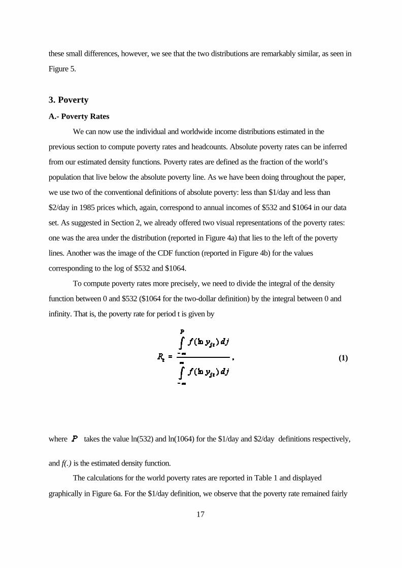
To compute poverty rates more precisely, we need to divide the integral of the density
function between 0 and $532 ($1064 for the two-dollar definition) by the integral between 0 and
infinity. That is, the poverty rate for period t is given by
where takes the value ln(532) and ln(1064) for the $1/day and $2/day definitions respectively,
and f(.) is the estimated density function.
The calculations for the world poverty rates are reported in Table 1 and displayed
graphically in Figure 6a. For the $1/day definition, we observe that the poverty rate remained fairly

17 The poverty rate did not fall between 1990 and 1998 if one uses a rate of less than$0.55/day. We will later argue that this might be a statistical artifact due to the fact that Congo is atype C country. See footnote 20.
18
constant over the 1970s (the poverty rate was 17% in 1970 and 16.3% in 1976), and then declined
dramatically over the following two decades. Indeed, the lowest poverty rate corresponds to the
last year of the sample, 1998, with 6.7%. The poverty rate, therefore, was cut by a factor of almost
three over the last thirty years. The poverty rate fell by 0.04 during the 1970s, by 0.045 during the
1980s and by 0.019 during the 1990s.
The reduction of the poverty rate when we use the $2/day definition was even more
dramatic. The rate fell monotonically throughout the period. It declined from 41% in 1970 to 18.6%
in 1998, a reduction of close to 60%. The rate fell by 0.064 during the 1970s, by 0.088 during the
1980s and by 0.072 during the 1990s. Thus, although there was an unambiguous success
throughout, the largest declines occurred during the 1980s, followed by the 1990s.
The reader who is interested in computing the evolution of other poverty rates can do so by
simply using Figure 4b. The reader can pick his own poverty line and check the evolution of the
corresponding poverty rate over time by looking at the image of that line for the four CDFs. A
simple look at Figure 4b suggests that it does not matter what definition one wants to use: poverty
rates fell between 1970 and 199817.
B.- Poverty Headcounts
Some have argued that the poverty rates are irrelevant and that the really important
information is the number of people in the world that live in poverty (some times this is called
“poverty headcount”). The distinction is important because, although poverty rates have declined,
the increase in world population could very well have brought with it, an increase in the total number
of poor citizens. A veil of ignorance argument, however, suggests that the world improves if poverty
rates decline. To see why, we could ask ourselves whether, with the veil of ignorance, we would
prefer our children to be born in a country of a million people with half a million poor (poverty rate
of 50%) or in a country of two million people and 600,000 poor (a poverty rate of 33%). Our
chance of being poor is much smaller in the country with a smaller poverty rate so we prefer our

18 Those people who might still prefer the country with the smaller headcount should askthemselves if they would also prefer a country of half a million people with 499,999 poor.
19
offsprings to live in the country with smaller poverty rates...although they have a larger headcount.18
Thus, we should say that the world is improving if the poverty rates, not the headcounts, decrease.
Of course the best of the worlds would be one in which both the poverty rates and poverty
headcounts decline over time. Although this wonderful world might appear to be too much to ask
for, we next show that it is exactly the world in which we live! To see this, we estimate poverty
headcounts by multiplying our poverty rates by the overall population each year. The results are
displayed in Figure 6b. Using the $1/day definition, the overall number of poor increased during the
first half of the 1970s from 554 in 1970 to close to 600 million in 1976. After that, it declined to
352 million in 1998, an overall reduction in the number of poor by more than 235 million people. If
we breakup the numbers by decades, the number of poor went down by 40 million, 134 million and
47 million in the 1970s, 1980s and 1990s respectively.
Using the two-dollar definition, the number of poor also increased in the first half of the
1970s from 1.32 billion to 1,43 billion in 1976. After that, the number declined to 973 million in
1998. The number of poor, therefore, declined by more than 450 million people between 1976 and
1998. The breakup by decades shows that the total number of $2/day poor increased during the
70s and decreased dramatically after that: 153 million during the 1980s and 226 million during the
1990s.
In sum, world poverty has declined substantially over the last twenty five years. This is true
if we use the $1/day or the $2/day definition and whether we use poverty ratios or poverty counts.
C.- Comparing Poverty Rates and Headcounts with Sala-i-Martin (2002)
An interesting question is how our estimates of poverty rates and headcounts compare with
those of Sala-i-Martin (2002) who computes the world distribution of income under the assumption
that all individuals within a quintile for each country and year have the same level of income. Table 2
reports the comparisons and Figure 6 also displays the numbers estimated by Sala-i-Martin (2002).
The main conclusion is that the two methods deliver a remarkably similar picture and yield a
remarkably similar lesson. They both show a substantial decline in poverty rates (using the $1/day
20
and the $2/day definitions) during the last thirty years. The two-dollar poverty rates from quintile
data are a little bit larger than our kernel estimates in 1970, but the rates converge to virtually the
same number by 1998. This means, of course, that Sala-i-Martin (2002) tends to slightly
overestimate the decline in the two-dollar poverty rates (his rate declines by 25.8 percentage points
whereas ours falls by 22.4 points). The $1/day rates, on the other hand, are virtually identical in
1970 and slightly different in 1998. Our 1998 rate is slightly above Sala-i-Martin (2002) which
again suggests that he tends to slightly overestimate the decline. According to our estimates, the
$1/day falls by 10.4 percentage points (from 17.2% to 6.7%) whereas Sala-i-Martin (2002)’s
declines by 11.1% (from 16.5% to 5.5%).
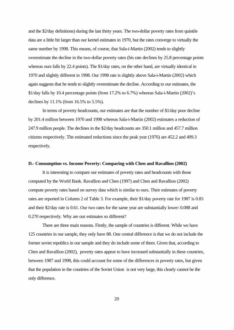
In terms of poverty headcounts, our estimates are that the number of $1/day poor decline
by 201.4 million between 1970 and 1998 whereas Sala-i-Martin (2002) estimates a reduction of
247.9 million people. The declines in the $2/day headcounts are 350.1 million and 457.7 million
citizens respectively. The estimated reductions since the peak year (1976) are 452.2 and 499.3
respectively.
D.- Consumption vs. Income Poverty: Comparing with Chen and Ravallion (2002)
It is interesting to compare our estimates of poverty rates and headcounts with those
computed by the World Bank. Ravallion and Chen (1997) and Chen and Ravallion (2002)
compute poverty rates based on survey data which is similar to ours. Their estimates of poverty
rates are reported in Column 2 of Table 3. For example, their $1/day poverty rate for 1987 is 0.83
and their $2/day rate is 0.61. Our two rates for the same year are substantially lower: 0.088 and
0.270 respectively. Why are our estimates so different?
There are three main reasons. Firstly, the sample of countries is different. While we have
125 countries in our sample, they only have 88. One central difference is that we do not include the
former soviet republics in our sample and they do include some of them. Given that, according to
Chen and Ravallion (2002), poverty rates appear to have increased substantially in these countries,
between 1987 and 1998, this could account for some of the differences in poverty rates, but given
that the population in the countries of the Soviet Union is not very large, this clearly cannot be the
only difference.
21
The second difference between our estimates and those of Chen and Ravallion (2002) is
that we use income data whereas they use consumption data. The original poverty line (adopted by
the World Bank) was defined by Ravallion et al. (1991). A person is said to be poor if he or she
consumes less than one (or two) dollars a day. Thus, they measured poverty in terms of
consumption expenditure using survey data. When one uses aggregate data (as we and Chen and
Ravallion (2002) do), we need to decide whether to use aggregate consumption or aggregate
income data to adjust the survey data to construct poverty rates. The reason is that if we use
national accounts consumption data, we implicitly assume that everyone in the economy consumes
(and saves) the same fraction of their income. In particular, if we adjust our income data by the
national savings rate to estimate individual consumption, we implicitly assume that the people whose
income is less than one dollar a day save the same fraction of their income as the average person in
the economy. This is probably not a good approximation since people with less than one dollar a
day probably do not save anything. Hence, we believe that income poverty is probably a better
measure of consumption poverty than consumption poverty itself.
Having said this, we can calculate consumption distributions for each and every country for
each and every year between 1970 and 1998 by simply repeating the procedure described in
Section 2 but using per capita consumption rather than using per capita income. The details are
reported in Sala-i-Martin (2002b) and a summary of the results are reported in the last two columns
of Table 3. We observe that the one and two-dollar poverty rates for 1987 are 0.215 and 0.436
respectively, much closer to those reported by Chen and Ravallion. Thus, a substantial fraction of
the difference between our results and theirs can be explained by the fact that they use consumption
rather than income.
The third difference is that their definition of poverty rates refers to the fraction of the
THIRD WORLD POPULATION that lives with less than one or two dollars a day. Our definition
of worldwide poverty rates refers to the fraction of the WORLD’S POPULATION that lives with
less than one or two dollars a day. In other words, our denominator includes the population of the
whole world whereas their denominator includes the population of poor countries only. Thus, if the
numerators were the same, then our rates would automatically be larger because the number of
poor people living with less than one dollar a day in rich countries is virtually zero. To assess the
importance of this effect, we divide our aggregate consumption-poverty in 1987 (reported in Table
22
3) by third world population rather than worldwide population, and we find that the two poverty
rates are 0.27 and 0.54, almost the same as the 0.28 and 0.61 reported by Chen and Ravallion.
Since we have computed the poverty rates using consumption rather than income data, we
can see the evolution of the consumption-poverty rates over time, which we depict in Figure 7.
Panel A shows the one-dollar poverty rates. We see that, although the income poverty rate line lies
below the consumption poverty line, the two decline significantly between 1978 and 1998. Figure
7a also displays the estimates from Chen and Ravallion (2002) for the years 1987, 1990, 1993,
1996 and 1998. We see that the overall pattern is about the same to ours for the corresponding
years: the rate goes up between 1987 and 1990, but it declines over the nineties. The main lessons
are broadly the same for the $2/day rates, reported in Figure 7b.
The conclusion is that the different sample of countries, the fact that we deal with income
rather than consumption and the fact that we define worldwide poverty rates as the fraction of
world population (rather than the fraction of the THIRD WORLD population) can account for the
poverty rates estimated by Chen and Ravallion (2002) and those estimated in this paper.
E.- Distribution of Regional Poverty
The substantial reduction in worldwide poverty rates and headcounts documented in the
previous section delivered an unambiguously optimistic picture of the world: global poverty is
declining. The question is whether this reduction is homogeneously distributed across the land. To
get an answer, we analyze poverty across various regions around the world. The summary results
for Asia, Latin America and Africa are reported in Table 4 and in Figures 8 and 9. The results for
individual countries within each of the three regions are reported in Tables 5, 6 and 7 respectively.
Asia
Table 4 shows that the biggest success occurs, without a doubt, in Asia. The $1/day
poverty rate declined from 0.22 in 1970 to 0.02 in 1998. The $2/day rate declined from 0.60 to
0.16. The reduction in headcounts was also dramatic: 369 million people abandoned the $1/day
poverty status and 650 the $2/day one. Obviously, some of this success is due to the positive
growth rates experienced by the largest country in the world: China.

23
Table 4 shows that this is partially true, but that it is not the whole story. The number of
$1/day poor Chinese went down by about 186 million during the last thirty years and the number of
$2/day by 377 million. The corresponding numbers for non-Chinese Asians are 183 and 274. Thus,
about one-half of the reduction in the number of poor in Asia can be accounted for by China, and
one-half by the rest of the continent.
If we break up the reductions by decades, we see that the largest decline in $1/day Asian
poor occurred in the 1980s (192 million), followed by the 1990s (121 million) and the 1970s (56
million), whereas the largest decline in the $2/day occurred in the 1990s (335 million), followed by
the 1980s (298 million) and the 1970s (18 million).
Table 5 decomposes the Asian rates across countries. We see that, although China is an
extraordinary success, it is by no means an exception. $1/day poverty rates were almost eliminated
everywhere (Nepal was the only Asian country with more than 10% of the population living below
the $1/day poverty line in 1998, and the only one that witnessed an increase in its poverty
headcount). The most remarkable example, in fact, is not China but Indonesia: a poverty rate of
37% in 1970 and virtually zero in 1998. The overall number of $1/day poor in Indonesia was cut by
43 million. India’s poverty rates and headcounts declined during the 80s and 90s (although not
during the 70s, when its aggregate growth performance was dismal) and the same is true for
Bangladesh. All countries in Asia reduced both poverty rates between 1970 and 1998. The only
ones that did not (Japan, Taiwan, Hong Kong and Singapore), already had zero poverty rates.
In terms of $2/day poverty, the rates declined or stayed the same in all countries. However,
because of the large population growth, poverty headcounts increased in Pakistan (by 0.7 million),
Bangladesh (by 3.5 million), Philippines (by 0.1 million), and Nepal (by 3.1 million).
The overall success of Asia meant that, while it hosted 76% of the world’s one-dollar poor
in 1970, it had only 15% of them by 1998 (see Table 4c).
Latin America
The picture for Latin America is a little different and a little bit less optimistic. Table 4a
shows that the $1/day poverty rate was a lot smaller than that in Asia in 1970 (5% compared to
22.4%). However, by 1998, the rate was larger in Latin America (2.2%) than in Asia (1.7%). The
total number of Latin American poor went down by 8.6 million during the last thirty years. The
19 Believers in mean-reversion should not find this surprising, although this is not necessarilya general phenomenon, as we will see in the next section when we discuss Africa.
24
problem is that all of the progress occurred in the 1970s, when poverty rates fell from 5% to 1.2%.
The rates increased to 1.9% during the 1980s and to 2.2% during the 90s. After decreasing by
15.2 million in the 1970s, the number of Latin American poor went up by 4 million during the 1980s
(the “lost decade” of the international debt crisis) and by 2.7 million during the 1990s.
Table 6 decomposes the evolution of Latin American poverty by countries. We see that
those that had the largest $1/day poverty rates where those that experienced the largest declines19:
Brazil, Dominican Republic, Panama, Jamaica and Trinidad and Tobago. The number of poor in
Brazil alone declined by 11 million during the whole period (although the headcount increased by
about one million during the 1980s). Mexico’s poor decreased by about 3 million. At the other end
of the spectrum, the total number of poor increased in Colombia, Peru, Venezuela, Guatemala,
Bolivia. Honduras, El Salvador, Paraguay and Costa Rica. It decreased in Brazil, Mexico, Chile,
Ecuador, Panama, Jamaica, Trinidad and Tobago, and Guyana.
The $2/day poverty rate in Latin America was about a third of that in Asia in 1970 (22%
versus 60%). After declining to 10.5% by 1998, the rate was still below the Asian at the end of the
sample period. Notice that the rate in Latin America in 1998 was about the same as in 1980. The
losses of the 1980s (when $2/day poverty rates grew by 0.036) were partially offset during the
1990s (when poverty fell by 0.035). The total amount of $2/day poor in Latin America declined by
about 9.3 million. The reduction was very large during the 1970s (24.1 million), but the ‘terrible’
1980s brought 23.1 million back. Luckily, poverty declined again during the 1990s by about 8.3
million people. Brazil and Mexico contributed by about 8 million each. The largest increases
occurred in Colombia, Peru, Venezuela, Bolivia, Honduras, and Nicaragua. In general, most of the
increases happened during the 1980s.
Table 4c shows that Latin America has hosted between 1% and 3% of the world’s poorest
and between 3% and 5% of the two-dollar poor. The fraction has remained quite stable over time.
20 The increase in the 1990s might be a little bit of a statistical artifact. The reason is that onelarge country, the Republic of Congo (Zaire for most of the sample period) witnessed a substantialreduction of per capita GDP. In fact, it went from above the $1/day poverty line in 1990 to belowthe line in 1998. Since Congo is in our Group C, that is, it is a country for which we do not haveincome shares, we assign the same level of income to all its citizens. Thus, poverty increased byabout 50 million people during this period. In reality, however, a fraction of the Congolesepopulation was already poor in 1990 and a fraction remained above the line by 1998 so the overallreduction in our numbers is somewhat artificial.
Although Congo is an important part of the story, it is not the whole story: the number of$1/day poor outside Congo increased by about 50 million citizens during the 90s.
25
Sub-Saharian Africa
The biggest disaster of the last three decades occurred in Sub Saharian Africa. Table 4
shows that, in 1970, the $1/day poverty rate (22.2%) was very similar to that of Asia (22.4%). By
1998, however, the African rate almost doubled to 40.5% whereas the Asian almost disappeared
(1.7%). The increase was very small during the 1970s but substantial during the 1980s and 1990s.
The number of poor increased by 175.5 million over the entire period: 22.8 million in the 1970s,
51.7 in the 1980s and 101 million in the 1990s.20
Table 7 shows that the largest increases in poverty rates occurred in Madagascar, Nigeria,
Zambia, Central African Republic, Mozambique, Sierra Leone, Burundi, Ghana and Tanzania. In
1998, nine countries had poverty rates of more than 50%: Tanzania (which had the world’s record
with 70% of the population living below the $1/day line), Ethiopia, Guinea Bissau, Sierra Leone,
Central African Republic, Zambia, Mali, Burundi and Madagascar.
Because of its large population, Nigeria is the country with the largest number of poor: 56
million. This was not true in 1970, when Ethiopia had this dubious honor and Tanzania, Uganda and
Ghana had more poor than Nigeria. But its horrible growth performance together with the increase
in inequality documented in Section 2 have made of Nigeria one of the world’s disasters. This is
especially true in the 1990s, a period in which the number of Nigerian poor increased by about 26
million.
Although the African picture looks very bleak, not all the news coming from the continent is
bad. We observe, for example, that $1/day poverty rates were reduced between 1970 and 1998 in

21 Kenya’s rate declined substantially in the 1970s, but then it rose back up in the followingtwo decades. The behavior of Uganda’s rate is exactly the opposite: up in the 1970s, and down inthe 80s and 90s.
26
13 countries: South Africa, Kenya,21 Uganda, Cote d’Ivoire, Zimbabwe, Burkina Faso, Mali,
Rwanda, Guinea, Lesotho, Gabon, Mauritius and Botswana. In fact, Botswana cut poverty rates
spectacularly from 35% to less than 1% in less than thirty years. The performance of Asia’s poorest
countries (which looked very similar to Africa in terms of poverty rates in 1970) and that of these
African success stories suggests that there is hope for reducing poverty in the Sub Saharan
continent, provided that the right policies are implemented and the right institutions are developed.
The $2/day rates in Africa in 1970 were about 10% smaller than in Asia (53% in Africa
versus 60.3% in Asia). By 1998, Asia’s rates were 15.6% whereas Africa’s had shot up to 64%.
The total number of poor increased by 227 million Africans: an increase in 52 million in the 1970s,
78 million in the 80s and 98 million in the 1990s. The worst performers were, again, Nigeria,
Mozambique, Madagascar, Niger, Zambia and the Central African Republic.
The largest cuts in $2/day poverty rates occurred in Botswana (from 60% in 1970 to 9% in
1998), Lesotho (from 68% to 43%), and Uganda (from 88% to 69%).
The combination of spectacular reductions in Asian poverty with the disastrous increases in
Africa led to a dramatic shift in the fraction of the world’s poor hosted by each continent (reported
in Table 4C). In 1970, only 11% of the world’s one-dollar poor lived in Africa and 76% in Asia.
By 1998, the numbers had almost reversed: 66% lived in Africa and 15% in Asia.
The main reason for decline in poverty in Asia is almost all the countries in that continent
experienced rapid aggregate growth. The main reason for the increase in poverty in Africa is that
almost all countries in that continent experienced negative growth. The lesson is very clear: if we
want to reduce poverty rates in Africa, we must find a way for that continent to grow. The welfare
implications of finding how to turn around the growth performance of Africa are so staggering, that
this has probably become the most important question in economics.
22 See Cowell (1995) for a description and properties of each of them.
23 See Atkinson (1970).
24 The label is supposed to reflect the fact that these indexes have been computed from theindividual incomes estimated using a kernel for each country. We use this label because, later in thissection we compare our estimates to those of Sala-i-Martin (2002), who estimates a worldwidekernel density function using quintile data (and we call that approach “kernel of quintiles” rather than“kernel of kernels”).
27
4. World Income Inequality
We can now analyze other aspects of the world distribution of income estimated in the
previous sections. In particular, we can estimate its dispersion, which reflects the extent to which
individual incomes across the planet are unequal. Many indexes of income inequality have been
proposed in the literature. Some have desirable properties and some do not. Some can be derived
from social welfare functions, and some cannot. Since the scope of this paper is not to settle the
question of what index best represents worldwide income inequalities, we will simply report the nine
most popular indexes used in the literature22: The Gini coefficient, the Theil Index (which
corresponds to the Generalized Entropy Index with coefficient 1), the Mean Logarithmic Deviation
(MLD, which corresponds to the Generalized Entropy Index with coefficient 0), the Atkinson
indexes with coefficient 0.5 and 1,23 the squared of the coefficient of variation (which is the standard
deviation divided by the mean), the variance of the logarithm of income, the ratio of the average
income of top 20% of the distribution to the bottom 20% and the ratio of income of the person
located at the bottom of the top quintile divided by the income of the person located at the top of
the bottom quintile .
The results of estimating each of the first seven indexes for each year between 1970 and
1998 are reported in Table 7 and Figures 10a through 10g (the relevant lines in Figure 10 are those
labeled “from Kernels”24). The main lessons from these estimations are the following. Firstly, they all
show a remarkably similar pattern of worldwide inequality over time. Secondly, inequality remained
more or less constant (or maybe increased) during the 1970s. Thirdly, inequality declined
substantially during the 1980s and 1990s. The size of the decline depends a bit on the exact
measure: the largest reduction corresponds to the MLD index, which declined by almost 13% since
its peak in 1978. The Theil index went down by more than 10%, the two Theil indexes decreased

28
by 11% and 8%, the coefficient of variation declined by 9.6%, the variance of the logarithm by
6.7% and the Gini coefficient by 5%. Despite these small differences across measures, the overall
picture is clear: inequality has reduced substantially during the last twenty years.
This conclusion was also reached by Sala-i-Martin (2002), who computed the exact same
indexes for a world income distribution estimated directly out of quintile data for each country (as
described in Section 2 of this paper). It is interesting to see how our estimates compare with his. To
make this comparison, Figures 10a-c also display a line labeled “From Quintiles”. Some interesting
lessons arise from this comparison. Firstly, our estimates of global inequality are higher than those of
Sala-i-Martin (2002). This was expected because Sala-i-Martin (2002) estimates the world
distribution of income by assuming that all individuals within a quintile (for each country and year)
have the same level of income. In the present paper, we estimate the differences of incomes within
quintiles by fitting a country density function. Naturally, our method allows for greater disparities
across individual incomes and this shows up in terms of a larger estimated aggregate inequality. The
fact that our level of inequality is higher than the one estimated by researchers who assume equal
income within quintiles implies that our estimate of the fraction of global inequality accounted for by
within-country disparities is larger. The reason is that the across-country inequalities (that is, the
disparities that arise from estimating worldwide income inequality under the assumption that all
individuals in a country have the same level of income) are, by construction, independent of how we
allocate income across individuals within a country. Since our estimate of global inequality is larger
and the across-country index is the same, the ratio of across to global must be smaller. It follows
that the fraction of inequality accounted for by across-country disparities is smaller and,
correspondingly, the fraction accounted for by within-country inequality must be larger.The
difference is not quantitatively large, but it is noticeable. For example, for the MLD, we estimate
that 65% of world inequality can be accounted for by across-country disparities whereas Sala-i-
Martin’s (2002) estimate is 69%. For the Theil index, we estimate that 66% of world inequality
comes from across-country dispersion whereas Sala-i-Martin (2002) estimates that the fraction is
25 Bourguignon (1979), Shorrocks (1980), and Cowell (1995) show that the only measuresthat can be decomposed into within and across country indexes are the ones of the GeneralizedEntropy Index class. Of our measures, only MLD, the Theil index and the Squared of theCoefficient of Variation correspond to that class so the decompositions cannot be made for theother measures.
29
72%. Finally, for the squared of the coefficient of variation, we get that 51% of the overall inequality
is accounted for by across-country dispersion whereas Sala-i-Martin (2002) gets 59%25
The second lesson from Figures 10a-g is that the two lines are virtually parallel. This
suggests that, although the assumption of same income within quintile made by Sala-i-Martin (2002)
tends to underestimate overall inequality, it allows for a correct estimation of the evolution of
inequality over time. Thus, both this paper and Sala-i-Martin (2002) reach the same conclusion
about the evolution of global income inequality: it declined substantially between 1980 and 1998.
Finally, Figure 10h displays two additional popular measures of income inequality. The first
is the ratio of the average income of the to 20% of the population to the bottom 20%. We see that
this ratio increased from 40 in 1970 to 45 in 1980. During the last 20 years, however, the ratio
declined to 41 in 1990 and to 39 in 1998. The second measure is the ratio of the income of the
person located at the bottom of the top quintile (the person located in the 80% of the distribution) to
the income located at the top of the bottom quintile (the person located in the 20% of the
distribution). This ratio remained virtually constant at 10 between 1970 and 1980, and it declined to
9.2 in 1990 and to 8.6 in 1998.
30
5. Conclusions
Using the Deininger and Squire (1996) and World Bank estimates of income shares for
selected years and selected countries, we estimated five income shares for 97 countries from 1970
to 1998. Based on these shares, we estimated the distribution of income for each country and each
year. We then integrated these individual distributions to construct the world distribution of income.
The analysis of various aspects of this global income distribution led us to a number of interesting
conclusions:
Firstly, the distribution “shifted to the right” remarkably over the last thirty years. This
reflects the fact that, by and large, individual incomes increased substantially over this period.
Secondly, the world distribution of income seemed to show certain bimodality in 1970: the
peak for the poor lay between the one-dollar and two-dollar poverty lines whereas the peak for the
rich lay around $9,000. By 1998, these “twin peaks” had vanished giving rise to a large “world
middle class”. The “emerging twin peaks” found by Quah (1996) using aggregate country data
become“vanishing twin peaks” when one uses individual income data.
Thirdly, global poverty rates declined significantly between 1970 and 1998. This is true for
the $1/day definition as well as for the $2/day definition.
Fourthly, global poverty headcounts also declined substantially over this period, but
especially after 1976. The total number of one-dollar poor declined by 234 million between 1976
and 1998. The number of two-dollar poor decreased by more than 450 million people. The success
in reducing poverty is, therefore, clear.
Fifthly, success does not mean victory. The number of poor is still embarrassingly large: in
1998, more than 350 million people still had an income of less than a dollar a day and close to a
billion citizens had to live with less than two dollars a day.
Sixthly, the decomposition of poverty rates across regions, suggests that the reductions in
poverty were not uniform across continents. The bulk of the decline took place in Asia. Latin
America reduced poverty overall, but most of the gains occurred during the 1970s with little or no
gains after that. Africa was the worst performer since poverty headcounts in that continent increased
by 175 million people according to the one-dollar definition and by 227 million according to the

31
two-dollar line. One-dollar poverty rates in Africa doubled from 22% to 44% and two-dollar rates
increased from 53% to 64%.
Seventhly, we estimated nine measures of global income inequality. All of them deliver the
same picture: inequality declined substantially during the last two decades.
Eighthly, we compared our level estimates of income inequality with those estimated by
Sala-i-Martin (2002) (under the assumption that all individuals within a quintile for each country and
year have the same level of income). We find that Sala-i-Martin (2002) underestimates the global
level of income inequality but gets the correct pattern over time. Hence, studies that aim to estimate
the evolution of income inequality can get the correct answer if they treat all citizens within a quintile
identically.
The final conclusion is that the last three decades saw a reversal of roles between Africa
and Asia: in 1970, 11% of the world’s poor were in Africa and 76% in Asia. By 1998, Africa
hosted 66% of the poor and Asia’s share had declined to 15%. Clearly, this reversal was caused
by the very different aggregate growth performances. Poverty reduced remarkably in Asia because
Asian countries grew. Poverty increased dramatically in Africa because African countries did not
grow. As a result, perhaps the most important lesson to be learned from this paper is that a central
question economists interested in human welfare should ask, therefore, is how to make Africa grow.
32
References
Atkinson A. B. (1970), “On the Measurement of Inequality”, Journal of Economic Theory, 2,244-263.
Atkinson A. B. Ad A. Brandolini, (2001), “Promise and Pitfalls in the use of ‘Secondary’ Data-Sets: Income Inequality in OECD Countries as a Case Study”, Journal of EconomicLiterature, vol XXXIX, number 3, pp.771-800, September.
Barro R. J. and X. Sala-i-Martin, (1998) "Economic Growth", MIT Press.Berry, A., F. Bourguignon and C. Morrisson, (1983), “Changes in the World Distribution of
Income Between 1950 and 1977", The Economic Journal, June, pp. 331-350.Bourguignon, F., (1979) “Decomposable Income Inequality Measures”, Econometrica 47, pp.
901-920.Bourguignon, F. and C. Morrisson, C., (2002) , “Inequality Among World Citizens: 1820-1992",
forthcoming American Economic Review. Chen, S. and M. Ravallion, (2002), “How did the World’s Poorest Fare in the 1990s?”, WorldBank Working Paper..Cowell, F.A., (1995), “Measuring Income Inequality”, 2nd Edition, Harvester Wheatsheaf,
Hemel Hempstead.Deininger, K. and L. Squire, (1996), "A New Data Set Measuring Income Inequality," World Bank
Economic Review, Vol. 10, pp. 565–91.Dowrick, S. and M. Akmal, (2001), "Contradictory Trends in Global Income Inequality: A Tale of
Two Biases", mimeo Australian National University, March. Firebaugh, G., (1999), “Empirics of World Income Inequality”, American Journal of Sociology,
104: 1597-1630.Grosh, M. and E.W. Nafziger, (1986), “The Computation of World Income Distribution”,
Economic Development and Cultural Change, pp 347-359. Heston, A. R. Summers, and B. Aten, (2001), Penn World Table Version 6.0, Center for
International Comparisons at the University of Pennsylvania (CICUP), December.Jones, C. I., (1997) "On the Evolution of the World Income Distribution", Journal of Economic
Perspectives, Summer.
Kremer, M., A. Onaski, and J. Stock, (2001), "Searching for Prosperity", Carnegie-RochesterConference Series on Public Policy, vol 55, December.
Maddison, A. (1998), “Chinese Economic Performance in the Long Run”, Edited by OECD.Melchior, A, K. Telle and H. Wiig, (2000), Globalisation and Inequality – World Income
Distribution and Living Standards, 1960-1998. Oslo: Royal Norwegian Ministry ofForeign Affairs, Report 6b/2000.
Meng, L. and X. Wang, (2000), “An Estimate of the Reliability of Statistical Data on China’sEconomic Growth”, Jingji yanji (economic Research), 10: 3-13.
Milanovic, B., "True World Inequality 1988 and 1993: First Calculations Based on HouseholdSurveys Alone", World Bank Working Paper, 2000

33
Mulligan, C. B. (2002), “Economic Limits on ‘Rational’ Democratic Redistribution’, mimeoUniversity of Chicago.
Quah, D., (1997), "Empirics for Growth and Distribution: Polarization, Stratification, andConvergence Clubs", Journal of Economic Growth, 2.
Quah, D., (1996), "Twin Peaks: Growth and Convergence in Models of Distribution Dynamics",Economic Journal, July.
Quah, D. (2002), “One-Third of the World’s Growth and Inequality”, mimeo LSE.Ravallion, M. and S. Chen, (1997), “What Can New Survey Data Tell Us About Recent Changes
in Distribution and Poverty?” World Bank Economic Review. 11: 357-82.Ravallion, M., Datt, G., and van de Walle, D. (1991) “Qualifying Absolute Poverty in the
Developing World”, Review of Income and Wealth, 37, 345-361.Rawski, T. G., “What’s Happening to Chinese Statistics?”, China Economic Review, December.Ren, R., (1997), “China’s Economic Performance in International Perspective”, OECD, Paris.Sala-i-Martin, X. (2002), “The Disturbing ‘Rise’ of Global Income Inequality”, NBER Working
Paper 8904, April.Sala-i-Martin, X. (2002b), “Consumption vs. Income Poverty: Estimation from a World
Distribution of Individual Consumption”, mimeo Columbia University.Sala-i-Martin, X. (2002c), “New Estimates of the World Distribution of Income”, mimeo Columbia
University.Schultz, T.P., (1998), “Inequality and the Distribution of Personal Income in the World: How it is
Changing and Why”, Journal of Population Economics, pp. 307-344. Shorrocks, A. F., (1980), “The Class of Additively Decomposable Inequality Measures”,
Econometrica 48, pp 613-625.Summers, R. and A. Heston, (1988), “A new set of international comparisons of real product and
price levels estimates for 130 countries, 1950-1985", Review of Income and Wealth,34(1), March, 1-25.
Summers, Robert and Heston, Alan., (1991), The Penn World Table (Mark 5): an expanded set ofinternational comparisons, 1950-1988, Quarterly Journal of Economics, 106(2), May,327-68.
Theil, H., (1967), “Economics and Information Theory”, North-Holland, Amsterdam, Theil, H., (1979), “World Income Inequality”, Economics Letters, 2: 99-102.Theil, H., (1996), “Studies in Global Econometrics”, Kluwert Academic Publishers, Amsterdam.Theil, H. And J. L. Seale, (1994), “The Geographic Distribution of World Income, 1950-1990",
The Economist, 4.
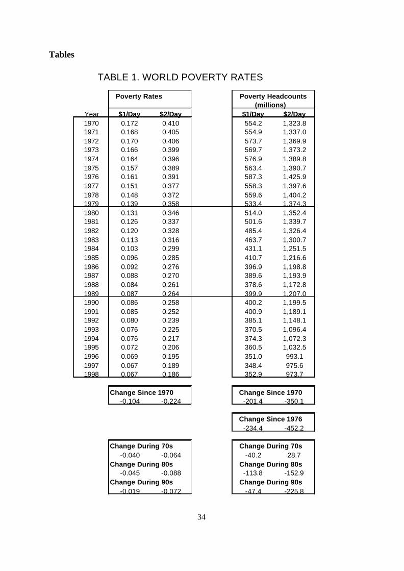
34
TABLE 1. WORLD POVERTY RATES
Poverty Rates Poverty Headcounts (millions)
Year $1/Day $2/Day $1/Day $2/Day1970 0.172 0.410 554.2 1,323.81971 0.168 0.405 554.9 1,337.01972 0.170 0.406 573.7 1,369.91973 0.166 0.399 569.7 1,373.21974 0.164 0.396 576.9 1,389.81975 0.157 0.389 563.4 1,390.71976 0.161 0.391 587.3 1,425.91977 0.151 0.377 558.3 1,397.61978 0.148 0.372 559.6 1,404.21979 0.139 0.358 533.4 1,374.31980 0.131 0.346 514.0 1,352.41981 0.126 0.337 501.6 1,339.71982 0.120 0.328 485.4 1,326.41983 0.113 0.316 463.7 1,300.71984 0.103 0.299 431.1 1,251.51985 0.096 0.285 410.7 1,216.61986 0.092 0.276 396.9 1,198.81987 0.088 0.270 389.6 1,193.91988 0.084 0.261 378.6 1,172.81989 0.087 0.264 399.9 1,207.01990 0.086 0.258 400.2 1,199.51991 0.085 0.252 400.9 1,189.11992 0.080 0.239 385.1 1,148.11993 0.076 0.225 370.5 1,096.41994 0.076 0.217 374.3 1,072.31995 0.072 0.206 360.5 1,032.51996 0.069 0.195 351.0 993.11997 0.067 0.189 348.4 975.61998 0.067 0.186 352.9 973.7
Change Since 1970 Change Since 1970-0.104 -0.224 -201.4 -350.1
Change Since 1976-234.4 -452.2
Change During 70s Change During 70s-0.040 -0.064 -40.2 28.7
Change During 80s Change During 80s-0.045 -0.088 -113.8 -152.9
Change During 90s Change During 90s-0.019 -0.072 -47.4 -225.8
Tables
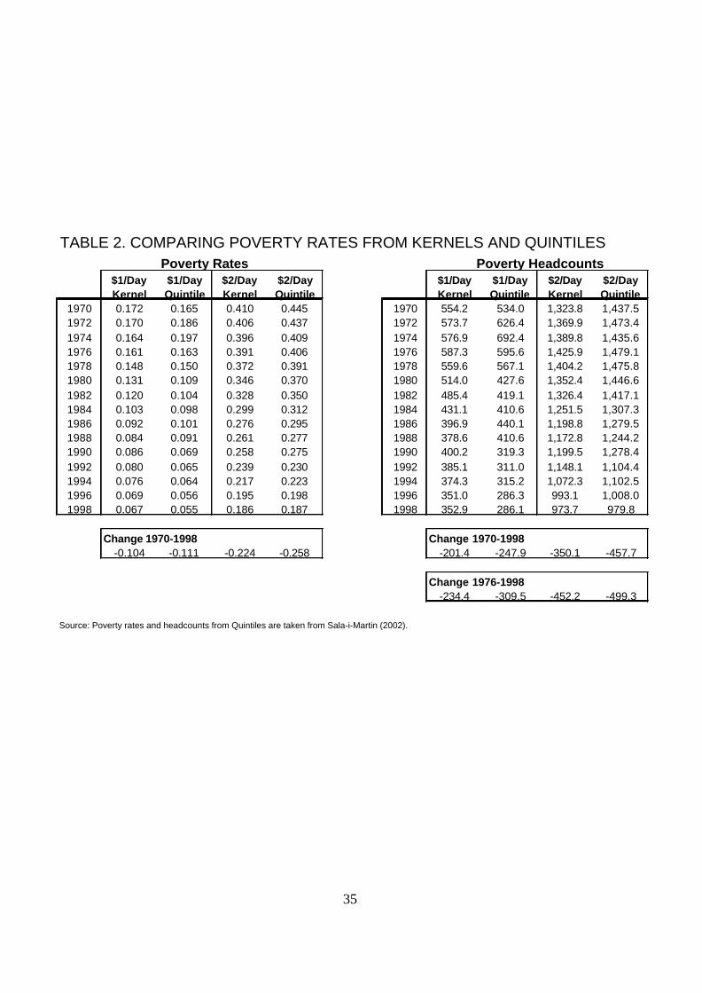
35
TABLE 2. COMPARING POVERTY RATES FROM KERNELS AND QUINTILES Poverty Rates Poverty Headcounts
$1/Day $1/Day $2/Day $2/Day $1/Day $1/Day $2/Day $2/DayKernel Quintile Kernel Quintile Kernel Quintile Kernel Quintile
1970 0.172 0.165 0.410 0.445 1970 554.2 534.0 1,323.8 1,437.51972 0.170 0.186 0.406 0.437 1972 573.7 626.4 1,369.9 1,473.41974 0.164 0.197 0.396 0.409 1974 576.9 692.4 1,389.8 1,435.61976 0.161 0.163 0.391 0.406 1976 587.3 595.6 1,425.9 1,479.11978 0.148 0.150 0.372 0.391 1978 559.6 567.1 1,404.2 1,475.81980 0.131 0.109 0.346 0.370 1980 514.0 427.6 1,352.4 1,446.61982 0.120 0.104 0.328 0.350 1982 485.4 419.1 1,326.4 1,417.11984 0.103 0.098 0.299 0.312 1984 431.1 410.6 1,251.5 1,307.31986 0.092 0.101 0.276 0.295 1986 396.9 440.1 1,198.8 1,279.51988 0.084 0.091 0.261 0.277 1988 378.6 410.6 1,172.8 1,244.21990 0.086 0.069 0.258 0.275 1990 400.2 319.3 1,199.5 1,278.41992 0.080 0.065 0.239 0.230 1992 385.1 311.0 1,148.1 1,104.41994 0.076 0.064 0.217 0.223 1994 374.3 315.2 1,072.3 1,102.51996 0.069 0.056 0.195 0.198 1996 351.0 286.3 993.1 1,008.01998 0.067 0.055 0.186 0.187 1998 352.9 286.1 973.7 979.8
Change 1970-1998 Change 1970-1998-0.104 -0.111 -0.224 -0.258 -201.4 -247.9 -350.1 -457.7
Change 1976-1998-234.4 -309.5 -452.2 -499.3
Source: Poverty rates and headcounts from Quintiles are taken from Sala-i-Martin (2002).
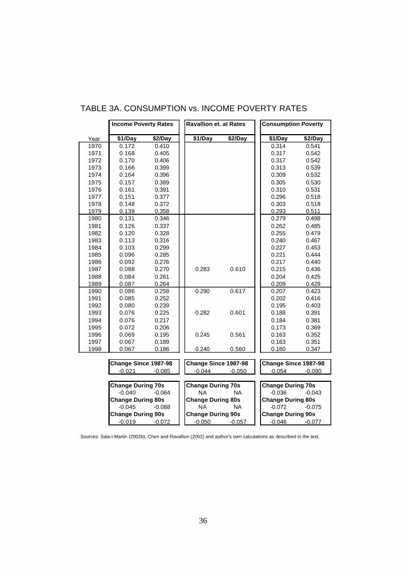
36
TABLE 3A. CONSUMPTION vs. INCOME POVERTY RATES
Income Poverty Rates Ravallion et. al Rates Consumption Poverty
Year $1/Day $2/Day $1/Day $2/Day $1/Day $2/Day1970 0.172 0.410 0.314 0.5411971 0.168 0.405 0.317 0.5421972 0.170 0.406 0.317 0.5421973 0.166 0.399 0.313 0.5391974 0.164 0.396 0.309 0.5321975 0.157 0.389 0.305 0.5301976 0.161 0.391 0.310 0.5311977 0.151 0.377 0.296 0.5181978 0.148 0.372 0.303 0.5181979 0.139 0.358 0.293 0.5111980 0.131 0.346 0.279 0.4981981 0.126 0.337 0.262 0.4851982 0.120 0.328 0.255 0.4791983 0.113 0.316 0.240 0.4671984 0.103 0.299 0.227 0.4531985 0.096 0.285 0.221 0.4441986 0.092 0.276 0.217 0.4401987 0.088 0.270 0.283 0.610 0.215 0.4361988 0.084 0.261 0.204 0.4251989 0.087 0.264 0.209 0.4291990 0.086 0.258 0.290 0.617 0.207 0.4231991 0.085 0.252 0.202 0.4161992 0.080 0.239 0.195 0.4031993 0.076 0.225 0.282 0.601 0.188 0.3911994 0.076 0.217 0.184 0.3811995 0.072 0.206 0.173 0.3691996 0.069 0.195 0.245 0.561 0.163 0.3521997 0.067 0.189 0.163 0.3511998 0.067 0.186 0.240 0.560 0.160 0.347
Change Since 1987-98 Change Since 1987-98 Change Since 1987-98-0.021 -0.085 -0.044 -0.050 -0.054 -0.090
Change During 70s Change During 70s Change During 70s-0.040 -0.064 NA NA -0.036 -0.043
Change During 80s Change During 80s Change During 80s-0.045 -0.088 NA NA -0.072 -0.075
Change During 90s Change During 90s Change During 90s-0.019 -0.072 -0.050 -0.057 -0.046 -0.077
Sources: Sala-i-Martin (2002b), Chen and Ravallion (2002) and author's own calculations as described in the text.
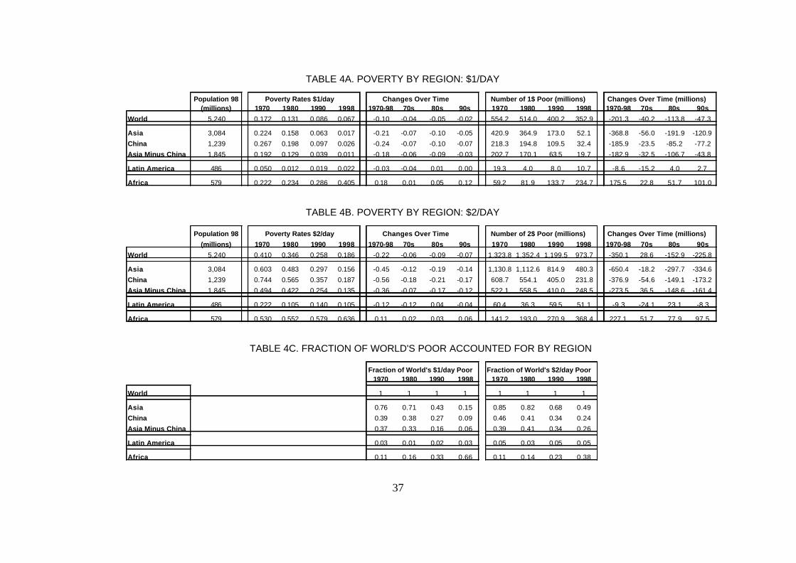
37
TABLE 4A. POVERTY BY REGION: $1/DAY
Population 98 Poverty Rates $1/day Changes Over Time Number of 1$ Poor (millions) Changes Over Time (millions)(millions) 1970 1980 1990 1998 1970-98 70s 80s 90s 1970 1980 1990 1998 1970-98 70s 80s 90s
World 5,240 0.172 0.131 0.086 0.067 -0.10 -0.04 -0.05 -0.02 554.2 514.0 400.2 352.9 -201.3 -40.2 -113.8 -47.3
Asia 3,084 0.224 0.158 0.063 0.017 -0.21 -0.07 -0.10 -0.05 420.9 364.9 173.0 52.1 -368.8 -56.0 -191.9 -120.9
China 1,239 0.267 0.198 0.097 0.026 -0.24 -0.07 -0.10 -0.07 218.3 194.8 109.5 32.4 -185.9 -23.5 -85.2 -77.2
Asia Minus China 1,845 0.192 0.129 0.039 0.011 -0.18 -0.06 -0.09 -0.03 202.7 170.1 63.5 19.7 -182.9 -32.5 -106.7 -43.8
Latin America 486 0.050 0.012 0.019 0.022 -0.03 -0.04 0.01 0.00 19.3 4.0 8.0 10.7 -8.6 -15.2 4.0 2.7
Africa 579 0.222 0.234 0.286 0.405 0.18 0.01 0.05 0.12 59.2 81.9 133.7 234.7 175.5 22.8 51.7 101.0
TABLE 4B. POVERTY BY REGION: $2/DAY
Population 98 Poverty Rates $2/day Changes Over Time Number of 2$ Poor (millions) Changes Over Time (millions)
(millions) 1970 1980 1990 1998 1970-98 70s 80s 90s 1970 1980 1990 1998 1970-98 70s 80s 90s
World 5,240 0.410 0.346 0.258 0.186 -0.22 -0.06 -0.09 -0.07 1,323.8 1,352.4 1,199.5 973.7 -350.1 28.6 -152.9 -225.8
Asia 3,084 0.603 0.483 0.297 0.156 -0.45 -0.12 -0.19 -0.14 1,130.8 1,112.6 814.9 480.3 -650.4 -18.2 -297.7 -334.6
China 1,239 0.744 0.565 0.357 0.187 -0.56 -0.18 -0.21 -0.17 608.7 554.1 405.0 231.8 -376.9 -54.6 -149.1 -173.2
Asia Minus China 1,845 0.494 0.422 0.254 0.135 -0.36 -0.07 -0.17 -0.12 522.1 558.5 410.0 248.5 -273.5 36.5 -148.6 -161.4
Latin America 486 0.222 0.105 0.140 0.105 -0.12 -0.12 0.04 -0.04 60.4 36.3 59.5 51.1 -9.3 -24.1 23.1 -8.3
Africa 579 0.530 0.552 0.579 0.636 0.11 0.02 0.03 0.06 141.2 193.0 270.9 368.4 227.1 51.7 77.9 97.5
TABLE 4C. FRACTION OF WORLD'S POOR ACCOUNTED FOR BY REGION
Fraction of World's $1/day Poor Fraction of World's $2/day Poor1970 1980 1990 1998 1970 1980 1990 1998
World 1 1 1 1 1 1 1 1
Asia 0.76 0.71 0.43 0.15 0.85 0.82 0.68 0.49
China 0.39 0.38 0.27 0.09 0.46 0.41 0.34 0.24
Asia Minus China 0.37 0.33 0.16 0.06 0.39 0.41 0.34 0.26
Latin America 0.03 0.01 0.02 0.03 0.05 0.03 0.05 0.05
Africa 0.11 0.16 0.33 0.66 0.11 0.14 0.23 0.38

38
TABLE 5A. POVERTY IN ASIA: $1/DAY
Population 98 Poverty Rates $1/day Changes Over Time Number of 1$ Poor (millions) Changes Over Time (millions)(millions) 1970 1980 1990 1998 1970-98 70s 80s 90s 1970 1980 1990 1998 1970-98 70s 80s 90s
China 1,239 0.27 0.20 0.10 0.03 -0.24 -0.07 -0.10 -0.07 218.3 194.8 109.5 32.4 -185.9 -23.5 -85.2 -77.2India 980 0.21 0.17 0.05 0.01 -0.20 -0.04 -0.12 -0.04 113.3 114.4 38.4 6.4 -107.0 1.1 -76.1 -32.0Indonesia 204 0.37 0.07 0.00 0.00 -0.37 -0.30 -0.07 0.00 43.1 10.2 0.6 0.1 -43.1 -33.0 -9.6 -0.5Pakistan 132 0.13 0.11 0.03 0.02 -0.11 -0.03 -0.07 -0.01 8.0 8.7 3.7 2.9 -5.1 0.7 -5.0 -0.8Japan 126 0.00 0.00 0.00 0.00 0.00 0.00 0.00 0.00 0.0 0.0 0.0 0.0 0.0 0.0 0.0 0.0Bangladesh 126 0.28 0.29 0.13 0.05 -0.23 0.02 -0.16 -0.09 18.5 25.5 14.7 5.7 -12.8 7.1 -10.9 -9.0Philippines 75 0.16 0.04 0.03 0.01 -0.14 -0.11 -0.01 -0.02 5.8 2.1 2.0 1.1 -4.8 -3.8 -0.1 -0.9Thailand 61 0.19 0.09 0.00 0.00 -0.19 -0.10 -0.08 0.00 6.7 4.0 0.2 0.0 -6.7 -2.7 -3.8 -0.2Korea, Rep. 46 0.02 0.00 0.00 0.00 -0.02 -0.02 0.00 0.00 0.8 0.0 0.0 0.0 -0.8 -0.8 0.0 0.0Nepal 23 0.27 0.28 0.20 0.15 -0.12 0.01 -0.09 -0.04 3.1 4.1 3.7 3.5 0.4 1.0 -0.4 -0.2Malaysia 22 0.14 0.01 0.00 0.00 -0.14 -0.12 -0.01 0.00 1.5 0.2 0.0 0.0 -1.5 -1.3 -0.1 0.0Taiwan 22 0.00 0.00 0.00 0.00 0.00 0.00 0.00 0.00 0.0 0.0 0.0 0.0 0.0 0.0 0.0 0.0Sri Lanka 19 0.14 0.06 0.01 0.00 -0.14 -0.08 -0.04 -0.01 1.7 0.8 0.2 0.0 -1.7 -0.9 -0.6 -0.2Hong Kong 7 0.00 0.00 0.00 0.00 0.00 0.00 0.00 0.00 0.0 0.0 0.0 0.0 0.0 0.0 0.0 0.0Singapore 3 0.00 0.00 0.00 0.00 0.00 0.00 0.00 0.00 0.0 0.0 0.0 0.0 0.0 0.0 0.0 0.0
Total 3,084 0.224 0.158 0.063 0.017 -0.21 -0.07 -0.10 -0.05 420.9 364.9 173.0 52.1 -368.8 -56.0 -191.9 -120.9
TABLE 5B. POVERTY IN ASIA: $2/DAY
Population 98 Poverty Rates $2/day Changes Over Time Number of 2$ Poor (millions) Changes Over Time (millions)(millions) 1970 1980 1990 1998 1970-98 70s 80s 90s 1970 1980 1990 1998 1970-98 70s 80s 90s
China 1,239 0.74 0.56 0.36 0.19 -0.56 -0.18 -0.21 -0.17 608.7 554.1 405.0 231.8 -376.9 -54.6 -149.1 -173.2India 980 0.59 0.54 0.32 0.14 -0.44 -0.04 -0.22 -0.18 321.1 373.1 275.0 140.5 -180.6 52.0 -98.1 -134.5Indonesia 204 0.69 0.36 0.10 0.03 -0.66 -0.34 -0.26 -0.07 81.6 53.0 17.6 6.7 -74.9 -28.6 -35.3 -10.9Pakistan 132 0.50 0.45 0.28 0.23 -0.26 -0.05 -0.17 -0.05 30.1 37.3 30.3 30.8 0.7 7.2 -6.9 0.4Japan 126 0.00 0.00 0.00 0.00 0.00 0.00 0.00 0.00 0.1 0.0 0.0 0.0 -0.1 -0.1 0.0 0.0Bangladesh 126 0.59 0.64 0.49 0.34 -0.25 0.05 -0.15 -0.15 39.3 55.6 54.1 42.8 3.5 16.4 -1.6 -11.3Philippines 75 0.34 0.22 0.21 0.17 -0.17 -0.12 0.00 -0.05 12.6 10.4 13.4 12.7 0.1 -2.1 3.0 -0.7Thailand 61 0.38 0.26 0.09 0.05 -0.33 -0.12 -0.17 -0.05 13.4 11.9 5.0 2.8 -10.7 -1.5 -6.9 -2.3Korea, Rep. 46 0.19 0.03 0.00 0.00 -0.19 -0.16 -0.03 0.00 6.1 1.1 0.0 0.0 -6.1 -5.0 -1.1 0.0Nepal 23 0.72 0.69 0.57 0.49 -0.23 -0.03 -0.12 -0.08 8.2 10.0 10.7 11.3 3.1 1.8 0.8 0.6Malaysia 22 0.32 0.14 0.05 0.01 -0.30 -0.18 -0.08 -0.04 3.4 1.9 1.0 0.3 -3.1 -1.6 -0.9 -0.7Taiwan 22 0.07 0.00 0.00 0.00 -0.07 -0.07 0.00 0.00 1.0 0.0 0.0 0.0 -1.0 -1.0 0.0 0.0Sri Lanka 19 0.41 0.29 0.16 0.04 -0.37 -0.13 -0.12 -0.12 5.2 4.2 2.8 0.8 -4.4 -0.9 -1.4 -2.0Hong Kong 7 0.02 0.00 0.00 0.00 -0.02 -0.02 0.00 0.00 0.1 0.0 0.0 0.0 -0.1 -0.1 0.0 0.0Singapore 3 0.00 0.00 0.00 0.00 0.00 0.00 0.00 0.00 0.0 0.0 0.0 0.0 0.0 0.0 0.0 0.0
Total 3,084 0.603 0.483 0.297 0.156 -0.447 -0.120 -0.186 -0.141 1,130.8 1,112.6 814.9 480.3 -650.4 -18.2 -297.7 -334.6

39
TABLE 6A. POVERTY IN LATIN AMERICA: $1/DAY
Population 98 Poverty Rates $1/day Changes Over Time Number of 1$ Poor (millions) Changes Over Time (millions)(millions) 1970 1980 1990 1998 1970-98 70s 80s 90s 1970 1980 1990 1998 1970-98 70s 80s 90s
Brazil 166 0.137 0.019 0.022 0.010 -0.13 -0.12 0.00 -0.01 13.14 2.27 3.24 1.73 -11.42 -10.87 0.97 -1.51Mexico 96 0.058 0.002 0.001 0.000 -0.06 -0.06 0.00 0.00 2.96 0.15 0.07 0.01 -2.95 -2.81 -0.09 -0.05Colombia 41 0.038 0.018 0.030 0.035 0.00 -0.02 0.01 0.01 0.85 0.51 1.03 1.43 0.59 -0.33 0.52 0.40Peru 25 0.001 0.000 0.013 0.010 0.01 0.00 0.01 0.00 0.01 0.00 0.28 0.26 0.24 -0.01 0.27 -0.02Venezuela 23 0.000 0.000 0.001 0.001 0.00 0.00 0.00 0.00 0.00 0.00 0.01 0.02 0.02 0.00 0.01 0.01Chile 15 0.006 0.005 0.005 0.000 -0.01 0.00 0.00 -0.01 0.06 0.06 0.07 0.00 -0.05 0.00 0.01 -0.07Ecuador 12 0.065 0.002 0.010 0.010 -0.06 -0.06 0.01 0.00 0.39 0.02 0.10 0.12 -0.27 -0.37 0.08 0.01Guatemala 11 0.055 0.021 0.086 0.113 0.06 -0.03 0.07 0.03 0.29 0.14 0.75 1.22 0.93 -0.15 0.61 0.46Dominican Republic 8 0.104 0.023 0.039 0.003 -0.10 -0.08 0.02 -0.04 0.46 0.13 0.28 0.03 -0.43 -0.33 0.15 -0.25Bolivia 8 0.002 0.000 0.055 0.238 0.24 0.00 0.05 0.18 0.01 0.00 0.36 1.89 1.88 -0.01 0.36 1.53Honduras 6 0.002 0.005 0.133 0.301 0.30 0.00 0.13 0.17 0.00 0.02 0.65 1.85 1.85 0.01 0.63 1.20El Salvador 6 0.005 0.011 0.040 0.025 0.02 0.01 0.03 -0.01 0.02 0.05 0.20 0.15 0.14 0.03 0.15 -0.05Paraguay 5 0.228 0.154 0.136 0.128 -0.10 -0.07 -0.02 -0.01 0.54 0.48 0.58 0.67 0.13 -0.06 0.10 0.09Nicaragua 5 0.000 0.000 0.069 0.266 0.27 0.00 0.07 0.20 0.00 0.00 0.26 1.28 1.28 0.00 0.26 1.01Costa Rica 4 0.018 0.004 0.008 0.005 -0.01 -0.01 0.00 0.00 0.03 0.01 0.02 0.02 -0.01 -0.02 0.02 -0.01Uruguay 3 0.000 0.000 0.000 0.000 0.00 0.00 0.00 0.00 0.00 0.00 0.00 0.00 0.00 0.00 0.00 0.00Panama 3 0.115 0.038 0.035 0.006 -0.11 -0.08 0.00 -0.03 0.17 0.07 0.09 0.02 -0.16 -0.10 0.01 -0.07Jamaica 3 0.099 0.047 0.003 0.002 -0.10 -0.05 -0.04 0.00 0.18 0.10 0.01 0.00 -0.18 -0.08 -0.09 0.00Trinidad and Tobago 1 0.132 0.001 0.001 0.001 -0.13 -0.13 0.00 0.00 0.13 0.00 0.00 0.00 -0.13 -0.13 0.00 0.00Guyana 1 0.018 0.009 0.055 0.009 -0.01 -0.01 0.05 -0.05 0.01 0.01 0.04 0.01 -0.01 -0.01 0.04 -0.04Barbados 0 0.013 0.004 0.004 0.003 -0.01 -0.01 0.00 0.00 0.00 0.00 0.00 0.00 0.00 0.00 0.00 0.00
Countries in Group CArgentina 36 0 0 0 0 0.00 0.00 0.00 0.00Haiti 8 0 0 0 0 0.00 0.00 0.00 0.00Belize 0 0 0 0 0 0.00 0.00 0.00 0.00Grenada 0 0 0 0 0 0.00 0.00 0.00 0.00
Total 485 0.050 0.012 0.019 0.022 -0.028 -0.039 0.007 0.003 19.26 4.04 8.04 10.70 -8.56 -15.22 4.01 2.66
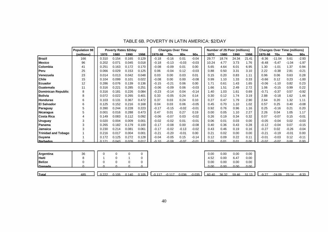
40
TABLE 6B. POVERTY IN LATIN AMERICA: $2/DAY
Population 98 Poverty Rates $2/day Changes Over Time Number of 2$ Poor (millions) Changes Over Time (millions)(millions) 1970 1980 1990 1998 1970-98 70s 80s 90s 1970 1980 1990 1998 1970-98 70s 80s 90s
Brazil 166 0.310 0.154 0.165 0.129 -0.18 -0.16 0.01 -0.04 29.77 18.74 24.34 21.41 -8.36 -11.04 5.61 -2.93Mexico 96 0.202 0.071 0.045 0.018 -0.18 -0.13 -0.03 -0.03 10.24 4.77 3.73 1.76 -8.48 -5.47 -1.04 -1.97Colombia 41 0.251 0.163 0.172 0.170 -0.08 -0.09 0.01 0.00 5.65 4.64 6.01 6.95 1.30 -1.01 1.37 0.94Peru 25 0.066 0.029 0.153 0.125 0.06 -0.04 0.12 -0.03 0.88 0.50 3.31 3.10 2.22 -0.38 2.81 -0.21Venezuela 23 0.014 0.013 0.042 0.048 0.03 0.00 0.03 0.01 0.15 0.20 0.83 1.11 0.96 0.06 0.63 0.28Chile 15 0.104 0.099 0.101 0.022 -0.08 0.00 0.00 -0.08 0.99 1.10 1.33 0.33 -0.66 0.12 0.23 -1.00Ecuador 12 0.286 0.076 0.139 0.136 -0.15 -0.21 0.06 0.00 1.71 0.61 1.43 1.65 -0.06 -1.10 0.82 0.23Guatemala 11 0.316 0.221 0.285 0.251 -0.06 -0.09 0.06 -0.03 1.66 1.51 2.49 2.72 1.06 -0.15 0.99 0.22Dominican Republic 8 0.316 0.181 0.226 0.084 -0.23 -0.14 0.04 -0.14 1.40 1.03 1.61 0.69 -0.71 -0.37 0.57 -0.92Bolivia 8 0.072 0.022 0.265 0.401 0.33 -0.05 0.24 0.14 0.30 0.12 1.74 3.19 2.88 -0.18 1.62 1.44Honduras 6 0.103 0.131 0.367 0.472 0.37 0.03 0.24 0.10 0.27 0.47 1.79 2.90 2.64 0.20 1.32 1.11El Salvador 6 0.125 0.152 0.216 0.168 0.04 0.03 0.06 -0.05 0.45 0.70 1.10 1.02 0.57 0.25 0.40 -0.08Paraguay 5 0.390 0.244 0.228 0.223 -0.17 -0.15 -0.02 -0.01 0.92 0.76 0.96 1.16 0.25 -0.16 0.21 0.20Nicaragua 5 0.001 0.016 0.288 0.473 0.47 0.01 0.27 0.19 0.00 0.05 1.10 2.27 2.26 0.04 1.05 1.17Costa Rica 4 0.149 0.083 0.112 0.092 -0.06 -0.07 0.03 -0.02 0.26 0.19 0.34 0.32 0.07 -0.07 0.15 -0.01Uruguay 3 0.020 0.004 0.009 0.001 -0.02 -0.02 0.01 -0.01 0.06 0.01 0.03 0.00 -0.05 -0.04 0.02 -0.03Panama 3 0.265 0.182 0.179 0.100 -0.17 -0.08 0.00 -0.08 0.40 0.36 0.43 0.28 -0.12 -0.04 0.07 -0.15Jamaica 3 0.230 0.214 0.081 0.061 -0.17 -0.02 -0.13 -0.02 0.43 0.46 0.19 0.16 -0.27 0.02 -0.26 -0.04Trinidad and Tobago 1 0.216 0.017 0.004 0.001 -0.21 -0.20 -0.01 0.00 0.21 0.02 0.00 0.00 -0.21 -0.19 -0.01 0.00Guyana 1 0.172 0.125 0.272 0.128 -0.04 -0.05 0.15 -0.14 0.12 0.09 0.22 0.11 -0.01 -0.03 0.12 -0.11Barbados 0 0.121 0.043 0.026 0.017 -0.10 -0.08 -0.02 -0.01 0.03 0.01 0.01 0.00 -0.02 -0.02 0.00 0.00
Argentina 36 0 0 0 0 0.00 0.00 0.00 0.00Haiti 8 1 0 1 0 4.52 0.00 6.47 0.00Belize 0 0 0 0 0 0.00 0.00 0.00 0.00Grenada 0 0 0 0 0 0.00 0.00 0.00 0.00
Total 485 0.222 0.105 0.140 0.105 -0.117 -0.117 0.036 -0.035 60.40 36.32 59.46 51.13 -9.27 -24.09 23.14 -8.33

41
TABLE 7A. POVERTY IN AFRICA: $1/DAY
Population 98 Poverty Rates $1/day Changes Over Time Number of 1$ Poor (millions) Changes Over Time (millions)(millions) 1970 1980 1990 1998 1970-98 70s 80s 90s 1970 1980 1990 1998 1970-98 70s 80s 90s
Nigeria 120.8 0.085 0.166 0.309 0.459 0.375 0.081 0.143 0.150 4.50 11.80 29.75 55.50 51.00 7.29 17.96 25.75Ethiopia 61.3 0.605 0.565 0.629 0.611 0.006 -0.039 0.064 -0.018 17.50 21.32 32.20 37.43 19.94 3.83 10.87 5.24South Africa 41.4 0.059 0.032 0.038 0.043 -0.016 -0.027 0.006 0.005 1.30 0.87 1.33 1.78 0.48 -0.42 0.46 0.44Tanzania 32.1 0.571 0.528 0.639 0.702 0.131 -0.042 0.111 0.063 7.82 9.82 16.28 22.56 14.74 2.00 6.46 6.28Kenya 29.3 0.500 0.338 0.352 0.350 -0.150 -0.161 0.014 -0.003 5.74 5.63 8.30 10.25 4.51 -0.11 2.67 1.95Uganda 20.9 0.553 0.732 0.492 0.379 -0.174 0.179 -0.239 -0.113 5.42 9.37 8.04 7.92 2.50 3.95 -1.33 -0.12Ghana 18.5 0.049 0.110 0.202 0.202 0.153 0.062 0.092 0.000 0.42 1.18 3.00 3.72 3.31 0.76 1.82 0.72Mozambique 16.9 0.030 0.160 0.271 0.268 0.238 0.130 0.111 -0.003 0.28 1.94 3.84 4.54 4.25 1.65 1.90 0.70Madagascar 14.6 0.084 0.190 0.396 0.506 0.422 0.106 0.206 0.109 0.57 1.69 4.61 7.38 6.80 1.11 2.92 2.77Cote d'Ivoire 14.5 0.065 0.030 0.070 0.049 -0.015 -0.035 0.041 -0.021 0.36 0.24 0.82 0.72 0.36 -0.11 0.57 -0.10Zimbabwe 11.7 0.175 0.149 0.113 0.105 -0.070 -0.026 -0.035 -0.008 0.92 1.04 1.10 1.23 0.31 0.12 0.06 0.13Burkina Faso 10.7 0.609 0.534 0.485 0.433 -0.176 -0.076 -0.049 -0.052 3.43 3.71 4.31 4.65 1.22 0.28 0.59 0.34Mali 10.6 0.555 0.461 0.530 0.514 -0.040 -0.094 0.069 -0.016 2.96 3.04 4.49 5.45 2.49 0.08 1.45 0.96Niger 10.1 0.235 0.279 0.398 0.442 0.207 0.044 0.118 0.044 0.98 1.56 3.07 4.48 3.50 0.58 1.51 1.41Zambia 9.7 0.192 0.305 0.404 0.516 0.324 0.113 0.099 0.112 0.80 1.75 3.14 4.99 4.18 0.94 1.39 1.85Senegal 9.0 0.209 0.223 0.230 0.234 0.025 0.014 0.007 0.004 0.87 1.23 1.69 2.12 1.25 0.37 0.45 0.43Rwanda 8.1 0.312 0.175 0.195 0.238 -0.074 -0.137 0.020 0.043 1.16 0.90 1.36 1.93 0.76 -0.26 0.45 0.57Guinea 7.1 0.027 0.022 0.027 0.016 -0.010 -0.005 0.005 -0.011 0.10 0.10 0.16 0.12 0.01 -0.01 0.06 -0.04Burundi 6.5 0.356 0.359 0.321 0.511 0.155 0.004 -0.038 0.189 1.25 1.48 1.75 3.34 2.09 0.23 0.27 1.59Sierra Leone 4.9 0.423 0.444 0.487 0.591 0.168 0.021 0.043 0.104 1.12 1.44 1.95 2.87 1.75 0.31 0.51 0.93Central African Rep. 3.5 0.298 0.356 0.432 0.537 0.239 0.058 0.077 0.104 0.55 0.82 1.27 1.87 1.32 0.27 0.45 0.60Lesotho 2.1 0.461 0.240 0.238 0.234 -0.228 -0.221 -0.002 -0.005 0.49 0.32 0.41 0.48 -0.01 -0.17 0.09 0.07Botswana 1.6 0.354 0.080 0.012 0.004 -0.350 -0.275 -0.068 -0.008 0.23 0.07 0.01 0.01 -0.22 -0.15 -0.06 -0.01Gambia, The 1.2 0.251 0.175 0.299 0.353 0.102 -0.076 0.124 0.054 0.12 0.11 0.27 0.43 0.31 0.00 0.16 0.15Gabon 1.2 0.007 0.002 0.002 0.004 -0.003 -0.005 0.000 0.002 0.00 0.00 0.00 0.00 0.00 0.00 0.00 0.00Guinea-Bissau 1.2 0.506 0.626 0.540 0.611 0.105 0.120 -0.086 0.071 0.27 0.50 0.53 0.71 0.44 0.23 0.03 0.18Mauritius 1.2 0.003 0.001 0.001 0.001 -0.002 -0.002 0.000 0.000 0.00 0.00 0.00 0.00 0.00 0.00 0.00 0.00
Total 470.6 59.17 81.95 133.67 186.47 127.31 22.78 51.72 52.80
Countries in Group CCongo, Dem. Rep. 48.2 0 0 0 1 0.0 0.0 0.0 48.2Cameroon 14.3 0 0 0 0 0.0 0.0 0.0 0.0Angola 12.1 0 0 0 0 0.0 0.0 0.0 0.0Malawi 10.5 0 0 0 0 0.0 0.0 0.0 0.0Chad 7.3 0 0 0 0 0.0 0.0 0.0 0.0Benin 5.9 0 0 0 0 0.0 0.0 0.0 0.0Togo 4.5 0 0 0 0 0.0 0.0 0.0 0.0Congo, Rep. 2.8 0 0 0 0 0.0 0.0 0.0 0.0Namibia 1.7 0 0 0 0 0.0 0.0 0.0 0.0Comoros 0.5 0 0 0 0 0.0 0.0 0.0 0.0Equatorial Guinea 0.4 0 0 0 0 0.0 0.0 0.0 0.0Cape Verde 0.4 0 0 0 0 0.0 0.0 0.0 0.0Sao Tome 0.1 0 0 0 0 0.0 0.0 0.0 0.0Seychelles 0.1 0 0 0 0 0.0 0.0 0.0 0.0
Total 579.4 0.222 0.234 0.286 0.405 0.183 0.012 0.051 0.119 59.2 81.9 133.7 234.7 175.50 22.78 51.72 100.99
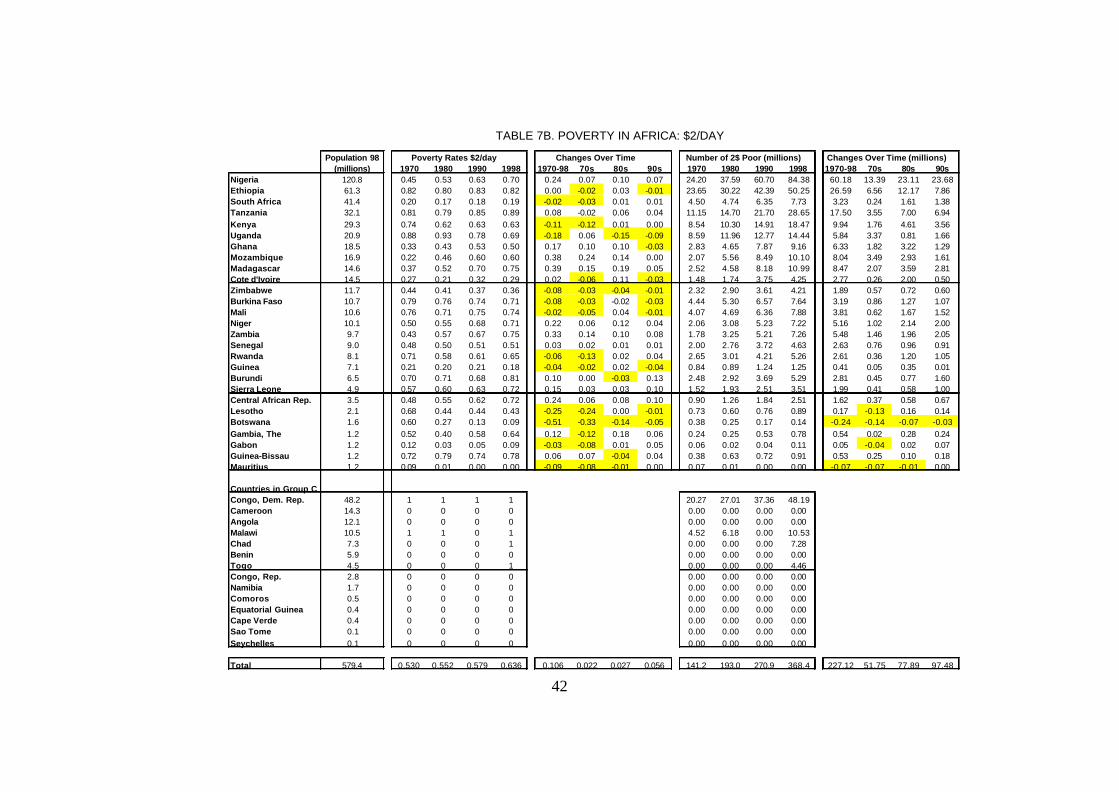
42
TABLE 7B. POVERTY IN AFRICA: $2/DAY
Population 98 Poverty Rates $2/day Changes Over Time Number of 2$ Poor (millions) Changes Over Time (millions)(millions) 1970 1980 1990 1998 1970-98 70s 80s 90s 1970 1980 1990 1998 1970-98 70s 80s 90s
Nigeria 120.8 0.45 0.53 0.63 0.70 0.24 0.07 0.10 0.07 24.20 37.59 60.70 84.38 60.18 13.39 23.11 23.68Ethiopia 61.3 0.82 0.80 0.83 0.82 0.00 -0.02 0.03 -0.01 23.65 30.22 42.39 50.25 26.59 6.56 12.17 7.86South Africa 41.4 0.20 0.17 0.18 0.19 -0.02 -0.03 0.01 0.01 4.50 4.74 6.35 7.73 3.23 0.24 1.61 1.38Tanzania 32.1 0.81 0.79 0.85 0.89 0.08 -0.02 0.06 0.04 11.15 14.70 21.70 28.65 17.50 3.55 7.00 6.94Kenya 29.3 0.74 0.62 0.63 0.63 -0.11 -0.12 0.01 0.00 8.54 10.30 14.91 18.47 9.94 1.76 4.61 3.56Uganda 20.9 0.88 0.93 0.78 0.69 -0.18 0.06 -0.15 -0.09 8.59 11.96 12.77 14.44 5.84 3.37 0.81 1.66Ghana 18.5 0.33 0.43 0.53 0.50 0.17 0.10 0.10 -0.03 2.83 4.65 7.87 9.16 6.33 1.82 3.22 1.29Mozambique 16.9 0.22 0.46 0.60 0.60 0.38 0.24 0.14 0.00 2.07 5.56 8.49 10.10 8.04 3.49 2.93 1.61Madagascar 14.6 0.37 0.52 0.70 0.75 0.39 0.15 0.19 0.05 2.52 4.58 8.18 10.99 8.47 2.07 3.59 2.81Cote d'Ivoire 14.5 0.27 0.21 0.32 0.29 0.02 -0.06 0.11 -0.03 1.48 1.74 3.75 4.25 2.77 0.26 2.00 0.50Zimbabwe 11.7 0.44 0.41 0.37 0.36 -0.08 -0.03 -0.04 -0.01 2.32 2.90 3.61 4.21 1.89 0.57 0.72 0.60Burkina Faso 10.7 0.79 0.76 0.74 0.71 -0.08 -0.03 -0.02 -0.03 4.44 5.30 6.57 7.64 3.19 0.86 1.27 1.07Mali 10.6 0.76 0.71 0.75 0.74 -0.02 -0.05 0.04 -0.01 4.07 4.69 6.36 7.88 3.81 0.62 1.67 1.52Niger 10.1 0.50 0.55 0.68 0.71 0.22 0.06 0.12 0.04 2.06 3.08 5.23 7.22 5.16 1.02 2.14 2.00Zambia 9.7 0.43 0.57 0.67 0.75 0.33 0.14 0.10 0.08 1.78 3.25 5.21 7.26 5.48 1.46 1.96 2.05Senegal 9.0 0.48 0.50 0.51 0.51 0.03 0.02 0.01 0.01 2.00 2.76 3.72 4.63 2.63 0.76 0.96 0.91Rwanda 8.1 0.71 0.58 0.61 0.65 -0.06 -0.13 0.02 0.04 2.65 3.01 4.21 5.26 2.61 0.36 1.20 1.05Guinea 7.1 0.21 0.20 0.21 0.18 -0.04 -0.02 0.02 -0.04 0.84 0.89 1.24 1.25 0.41 0.05 0.35 0.01Burundi 6.5 0.70 0.71 0.68 0.81 0.10 0.00 -0.03 0.13 2.48 2.92 3.69 5.29 2.81 0.45 0.77 1.60Sierra Leone 4.9 0.57 0.60 0.63 0.72 0.15 0.03 0.03 0.10 1.52 1.93 2.51 3.51 1.99 0.41 0.58 1.00Central African Rep. 3.5 0.48 0.55 0.62 0.72 0.24 0.06 0.08 0.10 0.90 1.26 1.84 2.51 1.62 0.37 0.58 0.67Lesotho 2.1 0.68 0.44 0.44 0.43 -0.25 -0.24 0.00 -0.01 0.73 0.60 0.76 0.89 0.17 -0.13 0.16 0.14Botswana 1.6 0.60 0.27 0.13 0.09 -0.51 -0.33 -0.14 -0.05 0.38 0.25 0.17 0.14 -0.24 -0.14 -0.07 -0.03Gambia, The 1.2 0.52 0.40 0.58 0.64 0.12 -0.12 0.18 0.06 0.24 0.25 0.53 0.78 0.54 0.02 0.28 0.24Gabon 1.2 0.12 0.03 0.05 0.09 -0.03 -0.08 0.01 0.05 0.06 0.02 0.04 0.11 0.05 -0.04 0.02 0.07Guinea-Bissau 1.2 0.72 0.79 0.74 0.78 0.06 0.07 -0.04 0.04 0.38 0.63 0.72 0.91 0.53 0.25 0.10 0.18Mauritius 1.2 0.09 0.01 0.00 0.00 -0.09 -0.08 -0.01 0.00 0.07 0.01 0.00 0.00 -0.07 -0.07 -0.01 0.00
Countries in Group CCongo, Dem. Rep. 48.2 1 1 1 1 20.27 27.01 37.36 48.19Cameroon 14.3 0 0 0 0 0.00 0.00 0.00 0.00Angola 12.1 0 0 0 0 0.00 0.00 0.00 0.00Malawi 10.5 1 1 0 1 4.52 6.18 0.00 10.53Chad 7.3 0 0 0 1 0.00 0.00 0.00 7.28Benin 5.9 0 0 0 0 0.00 0.00 0.00 0.00Togo 4.5 0 0 0 1 0.00 0.00 0.00 4.46Congo, Rep. 2.8 0 0 0 0 0.00 0.00 0.00 0.00Namibia 1.7 0 0 0 0 0.00 0.00 0.00 0.00Comoros 0.5 0 0 0 0 0.00 0.00 0.00 0.00Equatorial Guinea 0.4 0 0 0 0 0.00 0.00 0.00 0.00Cape Verde 0.4 0 0 0 0 0.00 0.00 0.00 0.00Sao Tome 0.1 0 0 0 0 0.00 0.00 0.00 0.00Seychelles 0.1 0 0 0 0 0.00 0.00 0.00 0.00
Total 579.4 0.530 0.552 0.579 0.636 0.106 0.022 0.027 0.056 141.2 193.0 270.9 368.4 227.12 51.75 77.89 97.48
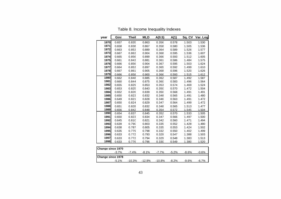
43
Table 8. Income Inequality Indexes
year Gini Theil MLD A(0.5) A(1) Sq. CV Var. Log
1970 0.657 0.835 0.863 0.356 0.578 1.503 1.5301971 0.658 0.838 0.867 0.358 0.580 1.505 1.5361972 0.663 0.853 0.889 0.364 0.589 1.526 1.5771973 0.667 0.863 0.904 0.368 0.595 1.536 1.6071974 0.665 0.856 0.899 0.366 0.593 1.512 1.6051975 0.661 0.843 0.881 0.361 0.586 1.484 1.5751976 0.666 0.856 0.904 0.367 0.595 1.503 1.6241977 0.664 0.853 0.897 0.365 0.592 1.499 1.6101978 0.667 0.861 0.905 0.368 0.596 1.520 1.6261979 0.666 0.858 0.900 0.366 0.593 1.515 1.6121980 0.662 0.848 0.885 0.362 0.587 1.492 1.5871981 0.660 0.844 0.875 0.360 0.583 1.496 1.5641982 0.655 0.829 0.853 0.353 0.574 1.469 1.5241983 0.653 0.825 0.843 0.350 0.570 1.472 1.5041984 0.652 0.826 0.839 0.350 0.568 1.491 1.4911985 0.650 0.823 0.832 0.348 0.565 1.491 1.4801986 0.649 0.821 0.828 0.346 0.563 1.491 1.4721987 0.650 0.824 0.829 0.347 0.564 1.499 1.4721988 0.651 0.828 0.832 0.348 0.565 1.513 1.4771989 0.656 0.842 0.848 0.354 0.572 1.545 1.5041990 0.654 0.837 0.845 0.352 0.570 1.533 1.5051991 0.650 0.823 0.834 0.347 0.566 1.497 1.5001992 0.645 0.810 0.821 0.342 0.560 1.471 1.4941993 0.639 0.790 0.803 0.335 0.552 1.428 1.4801994 0.638 0.787 0.805 0.335 0.553 1.424 1.5021995 0.635 0.779 0.798 0.332 0.550 1.402 1.4991996 0.633 0.772 0.793 0.329 0.547 1.388 1.5031997 0.633 0.772 0.794 0.329 0.548 1.383 1.5131998 0.633 0.776 0.796 0.330 0.549 1.380 1.520
Change since 1970-3.7% -7.4% -8.1% -7.7% -5.2% -8.6% -0.6%
Change since 1978-5.1% -10.3% -12.9% -10.8% -8.2% -9.6% -6.7%
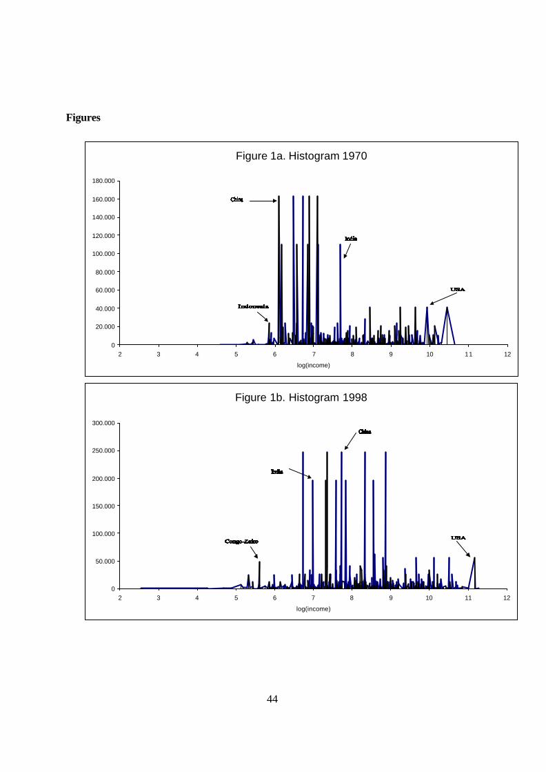
44
Figure 1a. Histogram 1970
0
20.000
40.000
60.000
80.000
100.000
120.000
140.000
160.000
180.000
2 3 4 5 6 7 8 9 10 11 12
log(income)
Figure 1b. Histogram 1998
0
50.000
100.000
150.000
200.000
250.000
300.000
2 3 4 5 6 7 8 9 10 11 12
log(income)
Figures

45
Figure. 2a. Income Distribution: China
0
20,000
40,000
60,000
80,000
100,000
5 6 7 8 9 10
log(income)
1970 1980 1990 1998
Figure. 2b. Income Distribution: India
0
20,000
40,000
60,000
80,000
100,000
5 6 7 8 9 10
1970 1980 1990 1998
Figure. 2c. Income Distribution: USA
0
5,000
10,000
15,000
20,000
5 6 7 8 9 10 11 12 13
log(income)
1970 1980 1990 1998

46
Figure. 2d. Income Distribution: Indonesia
0
3,000
6,000
9,000
12,000
15,000
18,000
5 6 7 8 9 10
log(income)
1970 1980 1990 1998
Figure. 2e. Income Distribution: Brazil
0
2,000
4,000
6,000
8,000
5 6 7 8 9 10 11
log(income)
1970 1980 1990 1998
Figure. 2f. Income Distribution: Pakistan
0
3,000
6,000
9,000
12,000
5 6 7 8 9 10
log(income)
1970 1980 1990 1998
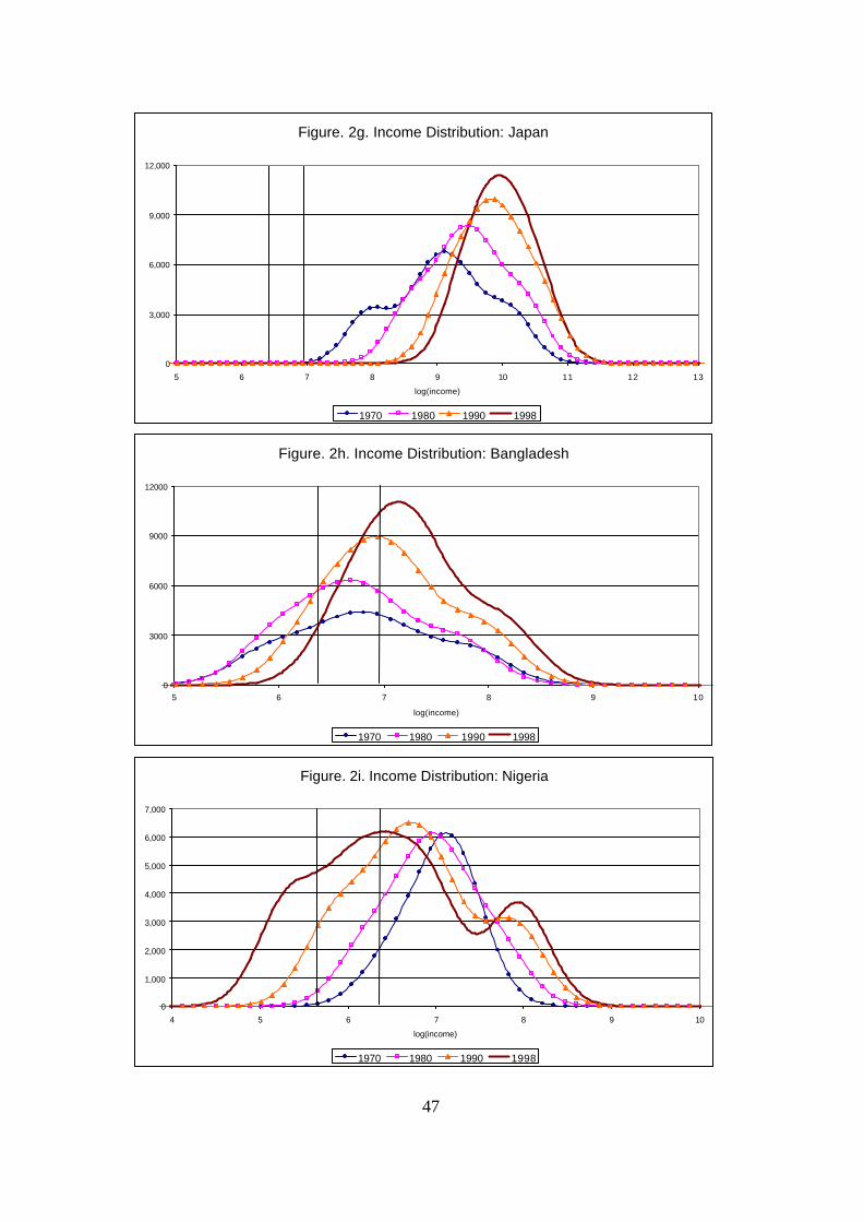
47
Figure. 2g. Income Distribution: Japan
0
3,000
6,000
9,000
12,000
5 6 7 8 9 10 11 12 13
log(income)
1970 1980 1990 1998
Figure. 2i. Income Distribution: Nigeria
0
1,000
2,000
3,000
4,000
5,000
6,000
7,000
4 5 6 7 8 9 10
log(income)
1970 1980 1990 1998
Figure. 2h. Income Distribution: Bangladesh
0
3000
6000
9000
12000
5 6 7 8 9 10
log(income)
1970 1980 1990 1998
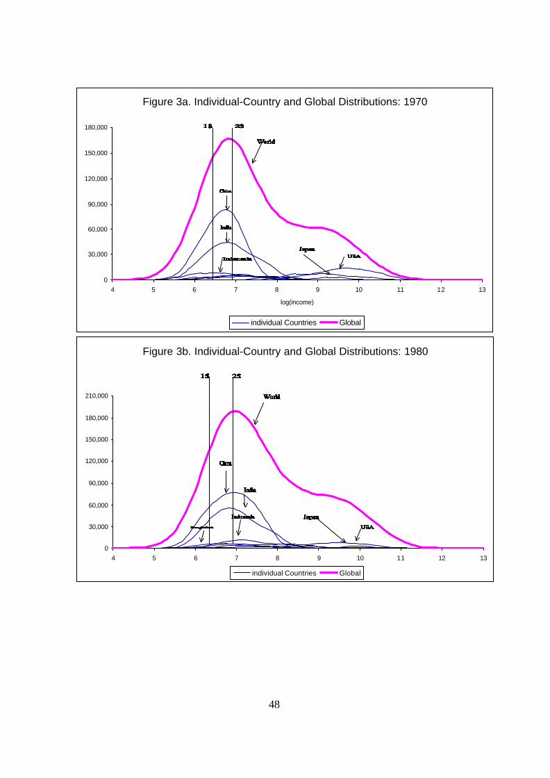
48
Figure 3a. Individual-Country and Global Distributions: 1970
0
30,000
60,000
90,000
120,000
150,000
180,000
4 5 6 7 8 9 10 11 12 13
log(income)
individual Countries Global
Figure 3b. Individual-Country and Global Distributions: 1980
0
30,000
60,000
90,000
120,000
150,000
180,000
210,000
4 5 6 7 8 9 10 11 12 13
log(income)individual Countries Global

49
Figure 3c. Individual-Country and Global Distributions: 1990
0
30,000
60,000
90,000
120,000
150,000
180,000
210,000
240,000
4 5 6 7 8 9 10 11 12 13
log(income)individual Countries Global
Figure 3d. Individual-Country and Global Distributions: 1998
0
50,000
100,000
150,000
200,000
250,000
4 5 6 7 8 9 10 11 12 13
log(income)
Individual Countries Global
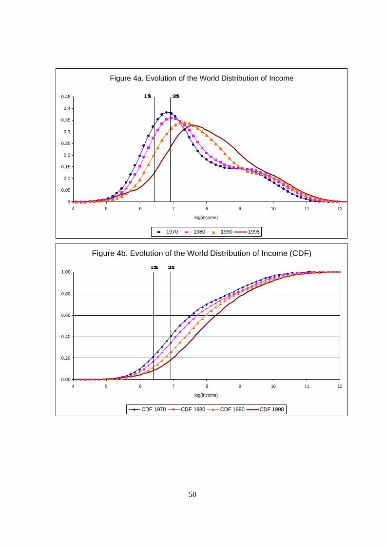
50
Figure 4a. Evolution of the World Distribution of Income
0
0.05
0.1
0.15
0.2
0.25
0.3
0.35
0.4
0.45
4 5 6 7 8 9 10 11 12
log(income)
1970 1980 1990 1998
Figure 4b. Evolution of the World Distribution of Income (CDF)
0.00
0.20
0.40
0.60
0.80
1.00
4 5 6 7 8 9 10 11 12
log(income)
CDF 1970 CDF 1980 CDF 1990 CDF 1998
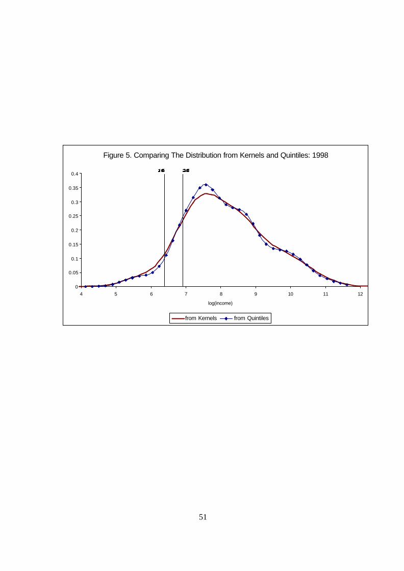
51
Figure 5. Comparing The Distribution from Kernels and Quintiles: 1998
0
0.05
0.1
0.15
0.2
0.25
0.3
0.35
0.4
4 5 6 7 8 9 10 11 12
log(income)
from Kernels from Quintiles
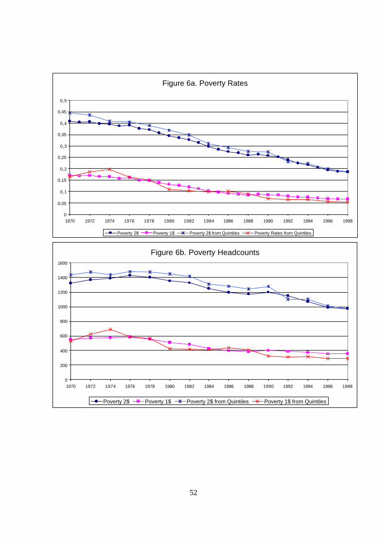
52
Figure 6a. Poverty Rates
0
0,05
0,1
0,15
0,2
0,25
0,3
0,35
0,4
0,45
0,5
1970 1972 1974 1976 1978 1980 1982 1984 1986 1988 1990 1992 1994 1996 1998
Poverty 2$ Poverty 1$ Poverty 2$ from Quintiles Poverty Rates from Quintiles
Figure 6b. Poverty Headcounts
0
200
400
600
800
1000
1200
1400
1600
1970 1972 1974 1976 1978 1980 1982 1984 1986 1988 1990 1992 1994 1996 1998
Poverty 2$ Poverty 1$ Poverty 2$ from Quintiles Poverty 1$ from Quintiles
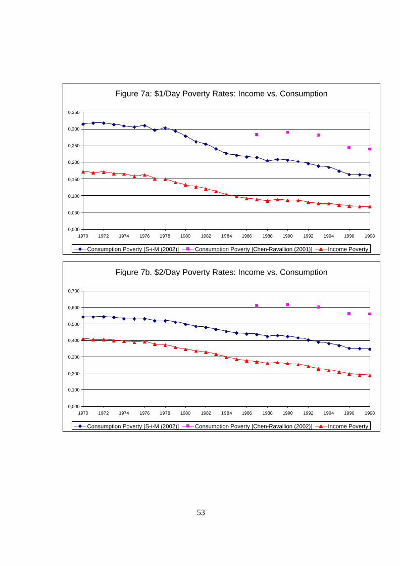
53
Figure 7a: $1/Day Poverty Rates: Income vs. Consumption
0,000
0,050
0,100
0,150
0,200
0,250
0,300
0,350
1970 1972 1974 1976 1978 1980 1982 1984 1986 1988 1990 1992 1994 1996 1998
Consumption Poverty [S-i-M (2002)] Consumption Poverty [Chen-Ravallion (2001)] Income Poverty
Figure 7b. $2/Day Poverty Rates: Income vs. Consumption
0,000
0,100
0,200
0,300
0,400
0,500
0,600
0,700
1970 1972 1974 1976 1978 1980 1982 1984 1986 1988 1990 1992 1994 1996 1998
Consumption Poverty [S-i-M (2002)] Consumption Poverty [Chen-Ravallion (2002)] Income Poverty

54
Figure 8B. Poverty Headcounts for World Regions: 1$/Day
0
100
200
300
400
500
600
1970 1980 1990 1998
Mill
ions
of P
eopl
e
World Africa Latin America Asia Asia Minus China China
Figure 8a. Poverty Rates for World Regions: 1$/Day
0,00
0,10
0,20
0,30
0,40
0,50
1970 1980 1990 1998
Fra
ctio
n of
Wor
ld P
opul
atio
n
World Africa Latin America Asia Asia Minus China China

55
Figure 9A. Poverty Rates for World Regions: 2$/Day
0,00
0,10
0,20
0,30
0,40
0,50
0,60
0,70
0,80
1970 1980 1990 1998
Fra
ctio
n of
Wor
ld P
opul
atio
n
World Africa Latin America Asia Asia Minus China China
Figure 9b. Poverty Headcounts for World Regions: 2$/Day
0
300
600
900
1.200
1.500
1970 1980 1990 1998
Mill
ions
of P
eopl
e
World Africa Latin America Asia Asia Minus China China

56
Figure 10a. Global Income Inequality : Gini Coefficient
0,6
0,62
0,64
0,66
1970
1971
1972
1973
1974
1975
1976
1977
1978
1979
1980
1981
1982
1983
1984
1985
1986
1987
1988
1989
1990
1991
1992
1993
1994
1995
1996
1997
1998
From Kernels From Quintiles
Figure 10b. Global Income Inequality: Theil Index
0,7
0,75
0,8
0,85
0,9
1970
1971
1972
1973
1974
1975
1976
1977
1978
1979
1980
1981
1982
1983
1984
1985
1986
1987
1988
1989
1990
1991
1992
1993
1994
1995
1996
1997
1998
From Kernels From Quintiles
Figure 10c. Global Income Inequality: MLD
0,65
0,7
0,75
0,8
0,85
0,9
0,95
1970
1971
1972
1973
1974
1975
1976
1977
1978
1979
1980
1981
1982
1983
1984
1985
1986
1987
1988
1989
1990
1991
1992
1993
1994
1995
1996
1997
1998
From Kernels From Quintiles

57
Figure 10d. Global Income Inequality: Atkinson (0.5)
0.3
0.32
0.34
0.36
0.38
1970
1971
1972
1973
1974
1975
1976
1977
1978
1979
1980
1981
1982
1983
1984
1985
1986
1987
1988
1989
1990
1991
1992
1993
1994
1995
1996
1997
1998
From Kernels From Quintiles
Figure 10e. Global Income Inequality: Atkinson (1)
0.5
0.53
0.56
0.59
0.62
1970
1971
1972
1973
1974
1975
1976
1977
1978
1979
1980
1981
1982
1983
1984
1985
1986
1987
1988
1989
1990
1991
1992
1993
1994
1995
1996
1997
1998
From Kernels From Quintiles
Figure 10f. Global Income Inequality: Squared of CV
1
1.1
1.2
1.3
1.4
1.5
1.6
1970
1971
1972
1973
1974
1975
1976
1977
1978
1979
1980
1981
1982
1983
1984
1985
1986
1987
1988
1989
1990
1991
1992
1993
1994
1995
1996
1997
1998
From Kernels From Quintiles
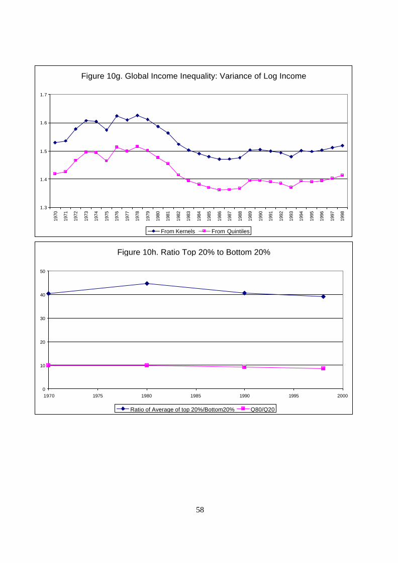
58
Figure 10g. Global Income Inequality: Variance of Log Income
1.3
1.4
1.5
1.6
1.7
1970
1971
1972
1973
1974
1975
1976
1977
1978
1979
1980
1981
1982
1983
1984
1985
1986
1987
1988
1989
1990
1991
1992
1993
1994
1995
1996
1997
1998
From Kernels From Quintiles
Figure 10h. Ratio Top 20% to Bottom 20%
0
10
20
30
40
50
1970 1975 1980 1985 1990 1995 2000
Ratio of Average of top 20%/Bottom20% Q80/Q20

59
China Income share of Quintile 1
y = -0.0021x + 0.1126R
2 = 0.6565
0
0.02
0.04
0.06
0.08
0.1
0.12
1970
1972
1974
1976
1978
1980
1982
1984
1986
1988
1990
1992
1994
1996
1998
Quintile 1 Linear (Quintile 1)
China Income share of Quintile 2
y = -0.0022x + 0.1613
R2 = 0.6646
00.020.040.060.08
0.10.120.140.160.18
1970
1972
1974
1976
1978
1980
1982
1984
1986
1988
1990
1992
1994
1996
1998
Quintile 2 Linear (Quintile 2)
China Income share of Quintile 3
y = -0.002x + 0.2025R2 = 0.6571
0
0.05
0.1
0.15
0.2
0.25
1970
1972
1974
1976
1978
1980
1982
1984
1986
1988
1990
1992
1994
1996
1998
Quintile 3 Linear (Quintile 3)
China Income share of Quintile 4
y = -2E-05x + 0.2506R
2 = 1E-05
0
0.05
0.1
0.15
0.2
0.25
0.3
0.35
1970
1972
1974
1976
1978
1980
1982
1984
1986
1988
1990
1992
1994
1996
1998
Quintile 4 Linear (Quintile 4)
China Income share of Quintile 5
y = 0.0063x + 0.2753R2 = 0.661
00.05
0.10.15
0.20.25
0.30.35
0.40.45
0.5
1970
1972
1974
1976
1978
1980
1982
1984
1986
1988
1990
1992
1994
1996
1998
Quintile 5 Linear (Quintile 5)
Appendix Figures: Income Shares for Selected Large Countries

60
India Income share of Quintile 1
y = 4E-05x + 0.0873
R2 = 0.0123
0.000.010.020.030.040.050.060.070.080.090.10
1970
1972
1974
1976
1978
1980
1982
1984
1986
1988
1990
1992
1994
1996
1998
Quintile 1 Linear (Quintile 1)
India Income share of Quintile 2
y = -0.0002x + 0.1294R
2 = 0.1602
0.00
0.02
0.04
0.06
0.08
0.10
0.12
0.14
1970
1972
1974
1976
1978
1980
1982
1984
1986
1988
1990
1992
1994
1996
1998
Quintile 2 Linear (Quintile 2)
India Income share of Quintile 3
y = -0.0003x + 0.1694
R2 = 0.2915
00.020.040.060.08
0.10.120.140.160.18
0.2
1970
1972
1974
1976
1978
1980
1982
1984
1986
1988
1990
1992
1994
1996
1998
Quintile 3 Linear (Quintile 3)
India Income share of Quintile 4
y = -0.0006x + 0.2234R
2 = 0.4097
0
0.05
0.1
0.15
0.2
0.25
1970
1972
1974
1976
1978
1980
1982
1984
1986
1988
1990
1992
1994
1996
1998
Quintile 4 Linear (Quintile 4)
India Income share of Quintile 5
y = 0.001x + 0.3903R
2 = 0.2291
00.050.1
0.150.2
0.250.3
0.350.4
0.450.5
1970
1972
1974
1976
1978
1980
1982
1984
1986
1988
1990
1992
1994
1996
1998
Quintile 5 Linear (Quintile 5)

61
USA Income share of Quintile 1
y = -0.0004x + 0.056R
2 = 0.7013
0.00
0.01
0.02
0.03
0.04
0.05
0.06
1970
1972
1974
1976
1978
1980
1982
1984
1986
1988
1990
1992
1994
1996
1998
Quintile 1 Linear (Quintile 1)
USA Income share of Quintile 2
y = -0.0007x + 0.1218R
2 = 0.9503
0.00
0.02
0.04
0.06
0.08
0.10
0.12
0.14
1970
1972
1974
1976
1978
1980
1982
1984
1986
1988
1990
1992
1994
1996
1998
Quintile 2 Linear (Quintile 2)
USA Income share of Quintile 3
y = -0.0007x + 0.1795R2 = 0.8822
00.020.040.060.080.1
0.120.140.160.180.2
1970
1972
1974
1976
1978
1980
1982
1984
1986
1988
1990
1992
1994
1996
1998Quintile 3 Linear (Quintile 3)
USA Income share of Quintile 4
y = -0.0002x + 0.2426R
2 = 0.1933
0
0.05
0.1
0.15
0.2
0.25
0.3
1970
1972
1974
1976
1978
1980
1982
1984
1986
1988
1990
1992
1994
1996
1998
Quintile 4 Linear (Quintile 4)
USA Income share of Quintile 5
y = 0.002x + 0.4002
R2 = 0.9307
00.050.1
0.150.2
0.250.3
0.350.4
0.450.5
1970
1972
1974
1976
1978
1980
1982
1984
1986
1988
1990
1992
1994
1996
1998
Quintile 5 Linear (Quintile 5)
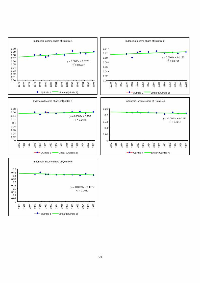
62
Indonesia Income share of Quintile 1
y = 0.0006x + 0.0728
R2 = 0.5507
0.000.010.020.030.040.050.060.070.080.090.10
1970
1972
1974
1976
1978
1980
1982
1984
1986
1988
1990
1992
1994
1996
1998
Quintile 1 Linear (Quintile 1)
Indonesia Income share of Quintile 2
y = 0.0004x + 0.1135R2 = 0.1714
0.00
0.02
0.04
0.06
0.08
0.10
0.12
0.14
1970
1972
1974
1976
1978
1980
1982
1984
1986
1988
1990
1992
1994
1996
1998
Quintile 2 Linear (Quintile 2)
Indonesia Income share of Quintile 3
y = 0.0003x + 0.153R
2 = 0.1646
00.020.040.060.080.1
0.120.140.160.18
1970
1972
1974
1976
1978
1980
1982
1984
1986
1988
1990
1992
1994
1996
1998
Quintile 3 Linear (Quintile 3)
Indonesia Income share of Quintile 4
y = -0.0004x + 0.2233R
2 = 0.3212
0
0.05
0.1
0.15
0.2
0.2519
70
1972
1974
1976
1978
1980
1982
1984
1986
1988
1990
1992
1994
1996
1998
Quintile 4 Linear (Quintile 4)
Indonesia Income share of Quintile 5
y = -0.0009x + 0.4375R
2 = 0.2631
00.050.1
0.150.2
0.250.3
0.350.4
0.450.5
1970
1972
1974
1976
1978
1980
1982
1984
1986
1988
1990
1992
1994
1996
1998
Quintile 5 Linear (Quintile 5)

63
Brazil Income share of Quintile 1
y = 3E-05x + 0.0272R
2 = 0.0025
0.00
0.01
0.01
0.02
0.02
0.03
0.03
0.04
0.04
1970
1972
1974
1976
1978
1980
1982
1984
1986
1988
1990
1992
1994
1996
1998
Quintile 1 Linear (Quintile 1)
Brazil Income share of Quintile 2
y = -0.0001x + 0.0588R
2 = 0.0222
0.00
0.01
0.02
0.03
0.04
0.05
0.06
0.07
1970
1972
1974
1976
1978
1980
1982
1984
1986
1988
1990
1992
1994
1996
1998
Quintile 2 Linear (Quintile 2)
Brazil Income share of Quintile 3
y = 0.0003x + 0.1011R
2 = 0.0274
0
0.02
0.04
0.06
0.08
0.1
0.12
0.14
0.16
1970
1972
1974
1976
1978
1980
1982
1984
1986
1988
1990
1992
1994
1996
1998
Quintile 3 Linear (Quintile 3)
Brazil Income share of Quintile 4
y = 0.0004x + 0.178
R2 = 0.0702
0
0.05
0.1
0.15
0.2
0.25
1970
1972
1974
1976
1978
1980
1982
1984
1986
1988
1990
1992
1994
1996
1998
Quintile 4 Linear (Quintile 4)
Brazil Income share of Quintile 5
y = -0.0006x + 0.6347R
2 = 0.0218
0
0.1
0.2
0.3
0.4
0.5
0.6
0.7
0.8
1970
1972
1974
1976
1978
1980
1982
1984
1986
1988
1990
1992
1994
1996
1998
Quintile 5 Linear (Quintile 5)
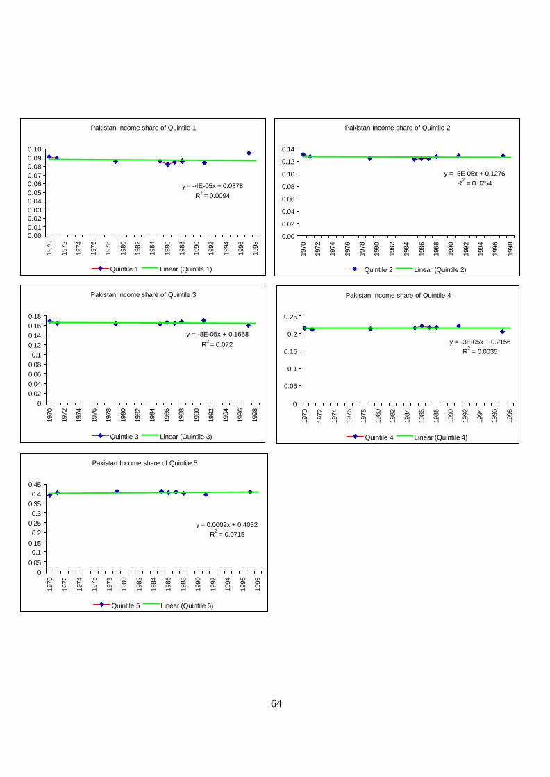
64
Pakistan Income share of Quintile 1
y = -4E-05x + 0.0878R2 = 0.0094
0.000.010.020.030.040.050.060.070.080.090.10
1970
1972
1974
1976
1978
1980
1982
1984
1986
1988
1990
1992
1994
1996
1998
Quintile 1 Linear (Quintile 1)
Pakistan Income share of Quintile 2
y = -5E-05x + 0.1276R
2 = 0.0254
0.00
0.02
0.04
0.06
0.08
0.10
0.12
0.14
1970
1972
1974
1976
1978
1980
1982
1984
1986
1988
1990
1992
1994
1996
1998
Quintile 2 Linear (Quintile 2)
Pakistan Income share of Quintile 3
y = -8E-05x + 0.1658
R2 = 0.072
00.020.040.060.080.1
0.120.140.160.18
1970
1972
1974
1976
1978
1980
1982
1984
1986
1988
1990
1992
1994
1996
1998
Quintile 3 Linear (Quintile 3)
Pakistan Income share of Quintile 4
y = -3E-05x + 0.2156R
2 = 0.0035
0
0.05
0.1
0.15
0.2
0.25
1970
1972
1974
1976
1978
1980
1982
1984
1986
1988
1990
1992
1994
1996
1998
Quintile 4 Linear (Quintile 4)
Pakistan Income share of Quintile 5
y = 0.0002x + 0.4032R
2 = 0.0715
00.05
0.10.15
0.20.250.3
0.350.4
0.45
1970
1972
1974
1976
1978
1980
1982
1984
1986
1988
1990
1992
1994
1996
1998
Quintile 5 Linear (Quintile 5)
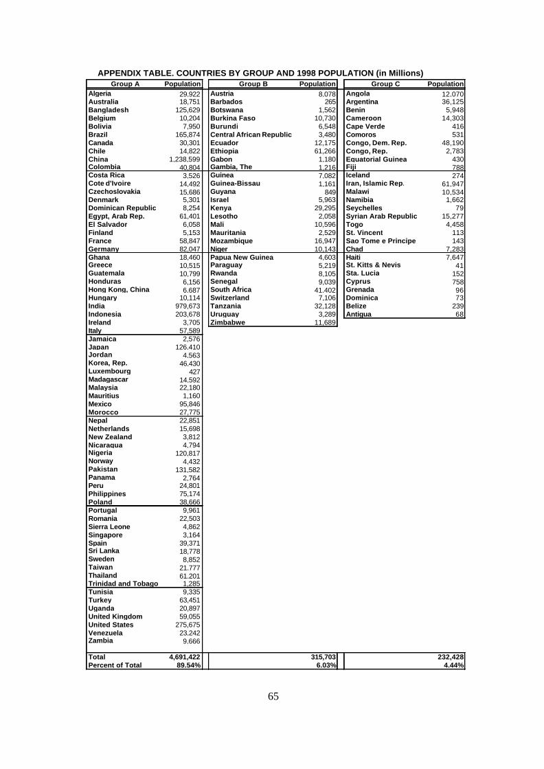
65
APPENDIX TABLE. COUNTRIES BY GROUP AND 1998 POPULATION (in Millions)Group A Population Group B Population Group C Population
Algeria 29,922 Austria 8,078 Angola 12,070Australia 18,751 Barbados 265 Argentina 36,125Bangladesh 125,629 Botswana 1,562 Benin 5,948Belgium 10,204 Burkina Faso 10,730 Cameroon 14,303Bolivia 7,950 Burundi 6,548 Cape Verde 416Brazil 165,874 Central African Republic 3,480 Comoros 531Canada 30,301 Ecuador 12,175 Congo, Dem. Rep. 48,190Chile 14,822 Ethiopia 61,266 Congo, Rep. 2,783China 1,238,599 Gabon 1,180 Equatorial Guinea 430Colombia 40,804 Gambia, The 1,216 Fiji 788Costa Rica 3,526 Guinea 7,082 Iceland 274Cote d'Ivoire 14,492 Guinea-Bissau 1,161 Iran, Islamic Rep. 61,947Czechoslovakia 15,686 Guyana 849 Malawi 10,534Denmark 5,301 Israel 5,963 Namibia 1,662Dominican Republic 8,254 Kenya 29,295 Seychelles 79Egypt, Arab Rep. 61,401 Lesotho 2,058 Syrian Arab Republic 15,277El Salvador 6,058 Mali 10,596 Togo 4,458Finland 5,153 Mauritania 2,529 St. Vincent 113France 58,847 Mozambique 16,947 Sao Tome e Principe 143Germany 82,047 Niger 10,143 Chad 7,283Ghana 18,460 Papua New Guinea 4,603 Haiti 7,647Greece 10,515 Paraguay 5,219 St. Kitts & Nevis 41Guatemala 10,799 Rwanda 8,105 Sta. Lucia 152Honduras 6,156 Senegal 9,039 Cyprus 758Hong Kong, China 6,687 South Africa 41,402 Grenada 96Hungary 10,114 Switzerland 7,106 Dominica 73India 979,673 Tanzania 32,128 Belize 239Indonesia 203,678 Uruguay 3,289 Antigua 68Ireland 3,705 Zimbabwe 11,689Italy 57,589Jamaica 2,576Japan 126,410Jordan 4,563Korea, Rep. 46,430Luxembourg 427Madagascar 14,592Malaysia 22,180Mauritius 1,160Mexico 95,846Morocco 27,775Nepal 22,851Netherlands 15,698New Zealand 3,812Nicaragua 4,794Nigeria 120,817Norway 4,432Pakistan 131,582Panama 2,764Peru 24,801Philippines 75,174Poland 38,666Portugal 9,961Romania 22,503Sierra Leone 4,862Singapore 3,164Spain 39,371Sri Lanka 18,778Sweden 8,852Taiwan 21,777Thailand 61,201Trinidad and Tobago 1,285Tunisia 9,335Turkey 63,451Uganda 20,897United Kingdom 59,055United States 275,675Venezuela 23,242Zambia 9,666
Total 4,691,422 315,703 232,428Percent of Total 89.54% 6.03% 4.44%