my school mag pres
TRANSCRIPT
Analysing my school magazine cover

The software I used to create my school magazine cover was Serif Page Plus and the magazine is based on art at St Gregory's school.
The image
The image I have chosen for the cover is of an A-level art student painting in one of the schools art rooms. The image attracts other art students and I decided to take the photograph in an art room so that the reader understands the atmosphere. The cover model is a sixth former and they are not in uniform to convey a sense of students expressing themselves as they are all given a choice on what to wear which relates to art because everyone has their own style.

The masthead
The masthead is in white with a navy blue background to specifically link to the school's logo which consists of the same colours. I used the blues and whites because they do not clash with the image and also blue can be suited to any audience. My magazine is called 'School Style' which means it is aimed at parents and children and also implies a fun and artistic magazine. 'School' and 'style' are in different fonts to convey that school can be smart as well as creative and fun.

The tag line
The tagline is directly below the masthead to follow conventions that the tag line goes more into depth after the masthead. It has a navy blue background which emphasises schooling and education as well as being gender neutral as it is a colour that most people will enjoy. The tagline states; 'Art special issue at St. Gregory's school' which informs the reader that it is a significant issue/magazine which makes them feel that they would miss out if they did not purchase it.

Secondary images
I have also used secondary images to show the reader that there is more exciting content throughout the magazine. One of the images I used was of a classroom which specialised in photography so the reader gets an idea of the size of the rooms and the photos on the walls imply the creativity that takes place. The cover lines are simple yet effective such as 'Art and photo fun' which relates to a younger audience and sums up what is featured in simple way. I am happy with my school magazine front cover because it is eye-catching and aims at a wide target audience.
Other features
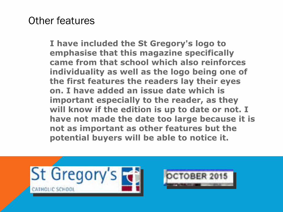
I have included the St Gregory's logo to emphasise that this magazine specifically came from that school which also reinforces individuality as well as the logo being one of the first features the readers lay their eyes on. I have added an issue date which is important especially to the reader, as they will know if the edition is up to date or not. I have not made the date too large because it is not as important as other features but the potential buyers will be able to notice it.