music video- good photos
TRANSCRIPT

Good Photos

This is a nice photo with natural light. The model looks happy and is not blinking (this time)! We used natural props to create synergy between the photo and video. However it was not of the main character/ singer so it would have broken conventions if there was an image of her on the digipak but not the main character/ singer.

This mid shot has nice natural lighting in the background. The mid shot focuses more on her expressions and because it is a low angle shot it empowers the character. For this shot we should have used the main character as we could have used it on the ‘extra’ panel on the digipak.

This photo has nice, warm natural light connoting warm positive feelings. Also with the characters facing away it encourages the audience to look at the view they are looking at. We did not use this picture as we thought it did not fit the panoramic effect we wanted.

The lighting is more noticeable on the left side making it seems like an uneven shot. Also the image is too close up and does not have the potential for a panoramic shot as this is what we wanted to do.

This is an image which we decided to use on the digipak. It uses leading lines with the green and brown grass and the wall. It could imply that we are wanting the audience to look at the characters (which we are). It’s a nice focused shot and has good potential to have a panoramic shot which is what we intended to do.

This image has nice colours and the silhouettes are effective because it looks unique and natural. However we did not use it as the colours did not fit our colour scheme and it was a bit random and irrelevant.

This shot is mysterious however it was not captivating and gives away a bit of the plot which is not what we wanted to do.
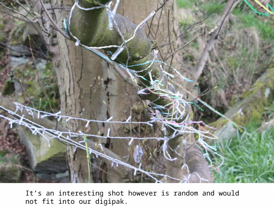
It’s an interesting shot however is random and would not fit into our digipak.

The lighting is dull and it is not as in focus as it could be meaning it does not meet our standards for a professional look.

We used this on our digipak as it is in focus and the lighting is good enhancing the natural colours and colours of the mask.

Although it has nice lighting its layout wasn’t suitable for the panel on the digipak.

This photo uses the rule of thirds well and the colours from the wall are vibrant. Also it is simple for the front of the digipak which we thought needed to focus on our logo.