music magazine preparation
TRANSCRIPT

8/14/2019 Music Magazine Preparation
http://slidepdf.com/reader/full/music-magazine-preparation 1/19
RESEARCH &PREPARATION
For the production task: the music
magazine

8/14/2019 Music Magazine Preparation
http://slidepdf.com/reader/full/music-magazine-preparation 2/19
What is a house style?
The house style of a magazine is the way that
the magazine ‘holds together’. All pages
within the magazine need to show some
evidence of being the same publication.Without a house style, the magazine will look
disjointed and disorientating. With it, the
authority and professionalism of the production
shines through.

8/14/2019 Music Magazine Preparation
http://slidepdf.com/reader/full/music-magazine-preparation 3/19
NME - House Style
The NME house style is very effective, immediately it is clear that these 3 pages belong to the same magazine through the use of
colour scheme and typography. A convention used throughout the magazine is headlines and anchorage text, these are both
used effectively to draw the reader in. The colour scheme of red, white and black is used throughout the magazine which is very
effective as the colours all compliment each other really well. On the front cover a plug has been used to draw attention to
important information. Also the imagery used is quite similar with all photos being quite mysterious which draws the reader in as
they want to find out more information. I would say this house style is very mysterious but also slick which makes the publication
seem very relevant and retro but at the same time very dangerous and edgy.

8/14/2019 Music Magazine Preparation
http://slidepdf.com/reader/full/music-magazine-preparation 4/19
PME- House Style
I don’t find this house style to be very effective because although the magazine
maintains a consistent colour scheme I don’t think the magazine looks very
professional. I think the use of imagery makes the front cover seem very cheap and
unprofessional. Also I think that the colour scheme includes to many colours and itmakes the front cover and contents page look too crowded.

8/14/2019 Music Magazine Preparation
http://slidepdf.com/reader/full/music-magazine-preparation 5/19
Kerrang - House Style
I think this front cover is very effective as the colour scheme and typography are very consistent which makes the
publication seem very professional. The conventions that are most dominant are the secondary leads and feature
photos these make the magazine more accessible as it offers the audience more choice on artists. The different
bands have been grouped together effectively which makes the magazine easier to follow for the reader. Overall I
think this house style is very hard core and is completely dedicated to its genre of music which is shown
throughout the magazine with the constant action shots.

8/14/2019 Music Magazine Preparation
http://slidepdf.com/reader/full/music-magazine-preparation 6/19
Real R n’ B - House Style
I don’t find this house style to be effective because on the front cover numerous different
typographies are used which makes the whole magazine seem unprofessional. Also the
conventions used on the cover aren’t very effective. For example the secondary lead blends in with
the background so it isn’t really visible, this makes the whole purpose of the secondary lead
pointless. Furthermore the size of things aren’t proportionate to the size they should be on the front
cover.

8/14/2019 Music Magazine Preparation
http://slidepdf.com/reader/full/music-magazine-preparation 7/19
Rolling Stone - House Style
I don’t find this house style to be effective as no apparent colour scheme or typography
is noticeable. The only convention really used to any effect is the use of kickers and
cover lines which have all been effectively grouped on the left hand side of the page.
Information on the contents page has not been grouped effectively and can be quiteconfusing for people to follow as the information is scattered all over the page.

8/14/2019 Music Magazine Preparation
http://slidepdf.com/reader/full/music-magazine-preparation 8/19
Issuu – the Dawn on the Online Magazine
I think this house style is very effective as information is clearly grouped
and is very easy to follow. Also the colour scheme and typography are
consistent which makes the publication seem very professional.
Furthermore the size of everything is in proportion which makes thewebsite easily accessible to everybody.

8/14/2019 Music Magazine Preparation
http://slidepdf.com/reader/full/music-magazine-preparation 9/19
Deconstruction
To make my magazine appropriate for my
genre and audience, I have decided to
deconstruct a professional publication that is
of a similar genre to my own. I have chosenNME. I have also chosen to deconstruct their
website to see how It differs from the print
publication.

8/14/2019 Music Magazine Preparation
http://slidepdf.com/reader/full/music-magazine-preparation 10/19
Front cover
The masthead has been placed
in the primary optical area which
is where stereotypically most
mastheads are placed. The
masthead is also placed on top of
the photo emphasising the
magazines importance.
The colour scheme for this cover
is very basic with a white andblack colour scheme. This colour
scheme has been successfully
contrasted with the main images
bright red hair which connotes
passion and excitement.
To signify the importance of the
artist, NME have effectively
placed her as the only visible
image. This makes her seem
immediately superior andmakes her seem more
important.
The imagery used uses the direct
mode of address which makes the
magazine seem warm and
welcoming. This has been effectively
contrasted with the moody serious
expression used by the artist. This
makes the magazine and the artist
seem mysterious.
The layout of this page is very
professional as seen by the kickers
and cover lines placed together at
the side of the page.
Similar typographies have been
used on the cover which makes it
seem more professional and easier
to follow for the reader.
To make the focus solely on the
main image NME have chosen not
to add any graphic features or
secondary leads which again makes
the main artist seem more
independence and dominating.

8/14/2019 Music Magazine Preparation
http://slidepdf.com/reader/full/music-magazine-preparation 11/19
Contents Page
Information has been grouped
effectively to make it easierfor the reader to navigate
around the magazine. Also to
make it easier to find what
you want there is headings
and the contents underneath
it.
The colour scheme has
remained consistent from thefront cover which makes the
publication more professional.
Colour has been used skilfully
on this contents page to make
certain information stand out.
This is a good example ofmagazine advertisement
which is a convention of
music magazines. It is also a
good way of advertising the
online version of themagazine which offers the
readers a chance to interact
with their favourite artists.
The contents page contains lots
of different stories which offers
the reader a wide range of
things.
Also even though there is lots
of text, it has been spreadaround the page effectively
which makes it less boring for
the reader.
Imagery has been used
successfully on this page to
break up the text and also
intrigue the reader and want to
make them read on.
This page also uses headers
above the text which
immediately informs the
reader of the vast amount of
topics the magazine covers.

8/14/2019 Music Magazine Preparation
http://slidepdf.com/reader/full/music-magazine-preparation 12/19
Double Page Spread
Information has been
effectively placed into 3
different columns which
breaks the text down
really well.
The headline used is very
clever as it is a pun which
gives the whole article a
humorous, light hearted feel.
The different sizes of
typography have beenused successfully to
make some information
seem more important.
The direct mode of
address has been usedwhich makes the article
seem more welcoming.
On the other hand the
way the artist has been
positioned makes her
seem attractive andsignifies to the reader the
strength and
independence of women.
The colour scheme
again is very simple, so
the sharp contrast of
red works really and
highlights the
importance of the artist.
The colour red also
makes the article seem
more welcoming.

8/14/2019 Music Magazine Preparation
http://slidepdf.com/reader/full/music-magazine-preparation 13/19
NME Online
The online version of
NME doesn’t differ that
greatly in the content it
contains. However the
main difference is the use
of multi-media which
allows the reader to
watch videos, join chats
instantly and follow a
news story for moredetail.
Another difference I
have noticed is the
use of advertisement
which is all over the
online home page.
This is because this is
the only way for a free
online magazine to
make money.
The masthead and
colour schemehave remained
consistent to the
print magazine with
the iconic red,
white and black
colour scheme
used throughout.
Another thing that
is different to the
print magazine is
the use of extra
photos which are
usually kept to a
minimum on the
print version. But
seemed to be usedin excess on the
online version of
the magazine.
The online magazine is also very easy to navigate aroundwith a navigation bar been used and a menu strip across
the top. This makes the website seem very welcoming andfriendly.

8/14/2019 Music Magazine Preparation
http://slidepdf.com/reader/full/music-magazine-preparation 14/19
Inspiration for my own
magazine
From analysing NME, I found that the lack of secondary
leads and graphic features made the cover seem more
professional and less crowded. This is something that I
will try to use on my cover.
I also like the red, white and black colour scheme which
I would also like to use for my own magazine as I think
that it makes the magazine seem very retro but also
very current.
Furthermore I also like the use of just one big mainimage on the double page spread. I also found the use
of columns to be very effective.
For the main image I think the direct mode of address is
very effective with the close up. This is something I am

8/14/2019 Music Magazine Preparation
http://slidepdf.com/reader/full/music-magazine-preparation 15/19
Magazine Ideas
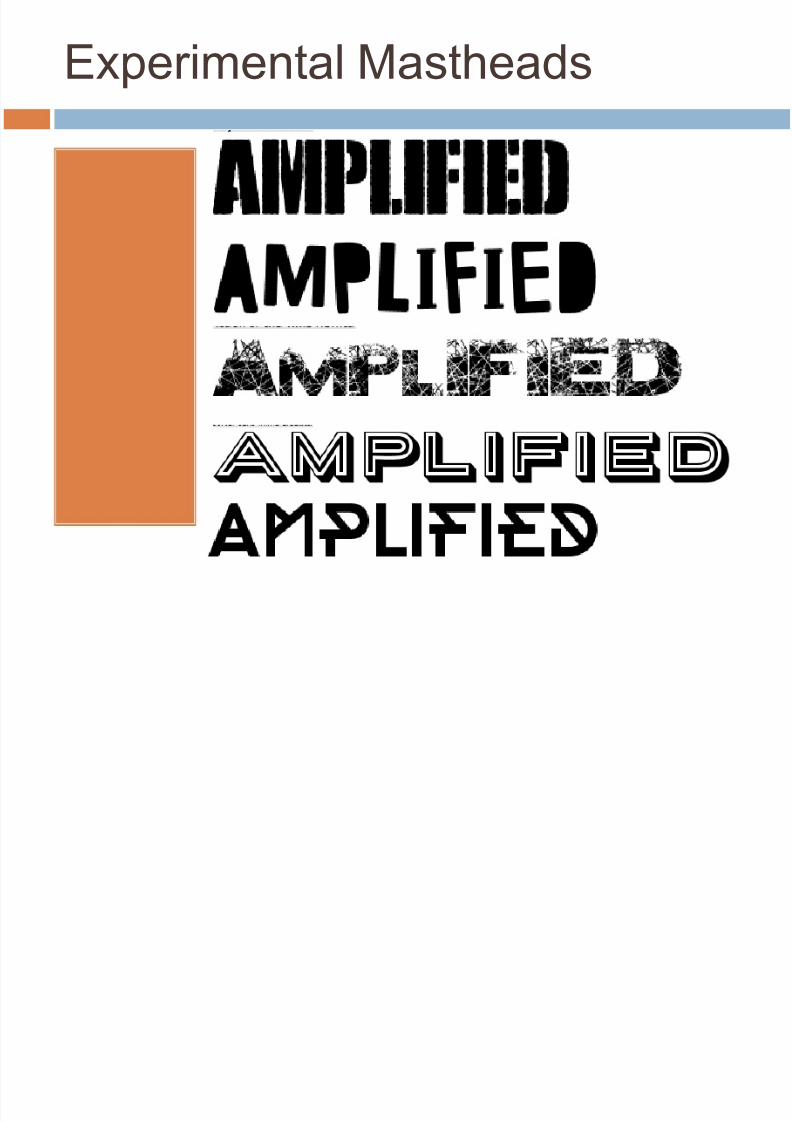
Possible names for my magazine: Amplified, Take Note,
Opening Act
Colour scheme: Red, white and black
Possible Fonts: Felix Tilting, Goudy Stout, RosewoodStd, Stencil Std
4 possible features that I will include on my cover:
Banner, secondary lead, plug or a puff.
Slogan: The ultimate source of Alternative Rock! Unique selling point: all British artists

8/14/2019 Music Magazine Preparation
http://slidepdf.com/reader/full/music-magazine-preparation 16/19
Experimental Mastheads
AMPLIFIED

8/14/2019 Music Magazine Preparation
http://slidepdf.com/reader/full/music-magazine-preparation 17/19
Experimental Mastheads
8/14/2019 Music Magazine Preparation
http://slidepdf.com/reader/full/music-magazine-preparation 18/19
Experimental Mastheads

8/14/2019 Music Magazine Preparation
http://slidepdf.com/reader/full/music-magazine-preparation 19/19
Ideas for Content
Double Page Spread: behind the scenes of Liam Henry’s
success
Double Page Spread: We just love to Rock and Roll
Main story (Headline) : Introducing Luke Bailey
Anchorage text: Ready to put Britain back on the Map Main story (Headline) : Britain's Best New Comer
Anchorage Text : The Widows ready to take Centre stage
Graphic Feature: Best live shows of the summer
Cover lines: This years biggest break through acts
Kicker: Exclusive Interviews inside
Cover Lines: The state of rock and roll today
Kicker: ‘No kid can do a mans job’
Cover Lines: Ryan Cage returns
Kicker: Music is the best form of medication
Cover lines: Plus ( list bands )