moving beyond choropleth maps - research on socio-economic...
TRANSCRIPT

1
Moving beyond choropleth maps
Using geo-coordinates of schools to answer difficult education policy questions and
understand internal migration better
August 2015
Martin Gustafsson
Version of 18 Aug 2015
PD
F processed w
ith CuteP
DF
evaluation editionw
ww
.CuteP
DF
.com

2
What’s a choropleth map?
Map from a DBE report on ANA to be released soon. So a choropleth map is simply one with different administrative areas colour-coded according to some variable.
Zululand, a well-performing district relative to SES.
Clearly reliability of ANA data should be a concern, but checks using e.g. year-on-year learner-level correlations pointed to fairly reliable data, at least for many green districts. There are now 86 education districts.

3
Contents
� Introduction
� Available geo-coordinates and required software
� The grade configuration picture in South Africa
� Urbanisation with an important kink
� More, not fewer small schools?
� The pull of quality
� Understanding teacher entry, exit and migration
� Conclusion: Ideas for future work

4
Introduction
� We need to develop the middle ground between ignorance of the basic quantities and overly ambitious do-everything models (Dan Inbar’s ‘over-sophisticated, abstract models’).
� It’s good to mix some painting of the background with a specific focus on policies.
� A few policy concerns in this presentation: curriculum and resourcing in small schools; controls over school expansion; Funza Lushaka bursary programme for new teachers; inter-provincial teacher movement.

5
� Spatial analysis, in the context of inherited apartheid perversions, should not just be a school infrastructure concern.
� School data should be used in demographic analysis, due to its details and frequency of collection. In fact, the demographics textbooks recommend this.
� Maps offer another avenue within the difficult terrain of communicating data patterns.
� Perhaps 50% of the work behind this presentation consisted of data normalisation (‘cleaning’), in particular linking schools across various datasets. An annotated panel dataset has been constructed.

6
Available geo-coordinates and required software
� Geo-coordinates for 98% of schools publicly available.
� Snap Survey enrolment data for 1999 to 2013, also 2010-2013 school- and subject-level Grade 12 examinations data, available from UCT’s DataFirst portal.
� Nice tools if one wants to move beyond choropleths:
� Function to create honeycomb cells or tessellations.
� Function to link points to the shapes they are in (Stata
command, proudly South African, gpsbound).
� Function to calculate distances.

7
Grade configuration picture
Predominant grade configurations in 2013
1-7, 8-12
1-9, 10-12
1-7, 8-9, 10-12
1-6, 7-9, 10-12
Other
66% of learners in EC and 29% of learners nationally are not in traditional primary (R/1 to 7) or secondary (8 to 12) schools.
The former Transkei ‘homeland’, and an area which does relatively well in Grade 9 ANA mathematics, a trend almost certainly influenced by grade configuration.
Cells in this map only appear if there are at least two schools with Grade 1 and two with Grade 12.

8
Policy implications
In general, there is not enough sensitivity amongst planners and researchers to the ‘abnormal’ grade configuration of 29% of learners. On the monitoring side, expenditure per learner by primary versus secondary level (an indicator required e.g. by UNESCO) are often wrong due to confusion around grade configurations.
9
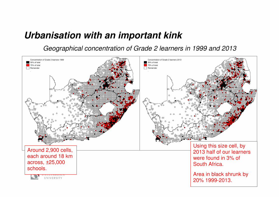
Urbanisation with an important kink
Geographical concentration of Grade 2 learners in 1999 and 2013
Concentration of Grade 2 learners 1999
50% of total
75% of total
Remainder
.
Concentration of Grade 2 learners 2013
50% of total
75% of total
Remainder
.
Using this size cell, by 2013 half of our learners were found in 3% of South Africa.
Area in black shrunk by 20% 1999-2013.
Around 2,900 cells, each around 18 km across, ±25,000 schools.

10
Comparison of metro population and enrolment growth 2001-2011
Similar rankings, but enrolment growth has lagged behind population growth. School data confirm that Stats SA trend of weak population growth (shrinkage?) in Durban (ETH) is real.
Changes in grade repetition could explain some of the enrolment-population discrepancy, but over-estimation of population also seems to be a problem.
Areas of circles are proportional to the 2011 national census totals.
PDF processed with CutePDF evaluation edition www.CutePDF.com

11
Slowing down since 2011 is linked to the geographical distribution of larger birth cohorts.
At the 90th percentile, the figure for all schools moved from 3.6 to 3.4 over the period.
An enrolment-based indicator of urbanisation
Important kink

12
Official grade-specific enrolment totals 1999 to 2013
Declines in e.g. Grade 1 enrolment up to 2009 have been explained to a large degree.
What has generally not been analysed is the over 10% increase in the sizes of the grade cohorts starting 2011.

13
% increase in Grade 2 enrolments 2011-2013(25,50](10,25](-10,10][-25,-10]
Growth in rural areas has tended to be especially strong, with the exception of ex-Transkei.
Analysis of (1) age-specific school data and (2) birth registration data point to an increase in births of 13% between 2003 and 2005. What analysts need to focus on is whether one is dealing with a ‘hill’ or a ‘plateau’. Have birth cohorts become permanently larger? Some analysis points to a ‘semi-plateau’, i.e. some decline in births post-2005.

14
0
2
4
6
8
10
12
14
16
18
EC FS GP KN LP MP NC NW WC SA
% in
cre
ase
Gr 2
en
ro
lme
nt 2
01
1-2
01
3Grade 2 increase 2011-2013
Growth in all provinces, but some important differences.
15
Policy implications
Better monitoring of demographic trends is needed. Demographers and education planners need to talk more to each other.
Planned adjustments to Treasury’s equitable share formula could be more sensitive to projected (as opposed to just existing) enrolments.
School improvement strategies need to be geared towards relatively large class size contexts, though some class size alleviation is possible through better school-level utilisation of teacher time.

16
More, not fewer small schools?
The process of urbanisation:
� Low density areas become less dense, but some people always continue living there.
� More areas become low density areas and their schools become smaller.
� Scholar transport in rural areas is very costly.
� It should then not surprise us that the number of small schools would increase, even if the percentage of learners in such schools declines.

17
Small school trends 1999-2013
The percentage of learners in schools with an average grade group size (GGS) <28 has increased in recent years (28 is roughly the threshold below which multi-grade teaching becomes necessary).
On the other hand, percentage of learners in extremely small schools has declined.
PDF processed with CutePDF evaluation edition www.CutePDF.com
18
Policy implications
Recent policy drives to reduce the number of small schools need to be informed to a greater degree by demographic projections. Going further, we should anticipate which schools will move from being ‘medium’ to ‘small’, or ‘small’ to ‘micro’ (classifications in the 2013 infrastructure norms (Government Regulation 920 of 2013)).

19
The pull of quality
Gauteng Province
North West Province
Kilometres
0 50
Schools attracting studentsSchools losing studentsOther schools
Green (attracter) schools saw Grade 12 enrolment increase by at least 10 learners a year 2005-2010, and the average mathematics score increase by 0.03 learner-level standard deviations a year. Red (loser) schools saw similarly large changes in the opposite direction.
Clearly, quality does seem to pull learners. Red or green schools account for 16% of schools, their moving learners being around 7% of learners, roughly.
From Gustafsson and Taylor (2015).
This is one instance where it is useful to represent individual schools with points in a map.

20
Interesting non-spatial pattern:
If one examines educators changing school 2011-2012, by far the closest correlation between old and new school Grade 12 mathematics averages is found if one uses 2008 figures. The pattern is that teachers move to better schools, as one might expect. But relatively old data inform these decisions, it seems (as one may also expect).
55% of moving educators moved to a better school 2011-2012. On average the ‘step up’ was 0.13 of a standard deviation large.
Teacher movements and school quality 2011-2012
Standardisation occurred in such a way that the 2008 mathematics average in Grade 12 becomes a score with a mean of 500 and standard deviation of 100. Circles are in proportion to the number of moving teachers and appear for every multiple of 50 on the vertical axis.
-100
-50
0
50
100
150
300 400 500 600 700 800
Ne
w s
ch
oo
l sc
ore
min
us
old
sc
ho
ol
sco
re
Standardised Grade 12 mathematics average 2008 in former school

21
Policy implications
Learners and parents voting with their feet, especially where this is between public schools, should be explicitly monitored, and should be used as one of several indicators when appraising school principals. Learner/parent perceptions of quality are not entirely reliable, but they are not irrelevant.
LURITS should be used for this (and many other things).

22
Understanding teacher entry, exit and migration
DEPARTURES
From Persal payroll data, so this is movement out of a status as a publicly paid schools-based educator.
Note concentration of departures in WC.
Percentage of educators leaving 2010 (not re-appearing 2011 or 2012)
0% to 1%
>1% to 3%
>3% to 6%
>6%
23
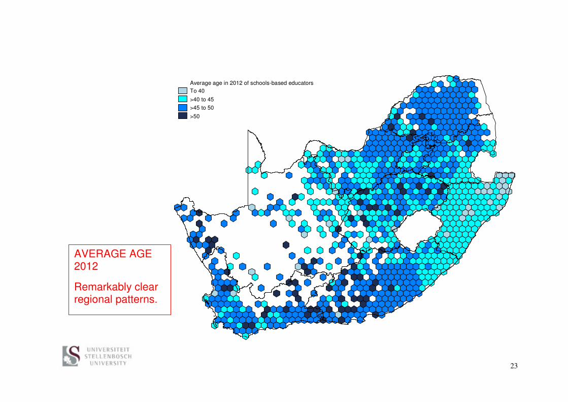
Average age in 2012 of schools-based educators
To 40
>40 to 45
>45 to 50
>50
AVERAGE AGE 2012
Remarkably clear regional patterns.

24
Percentage of educators moving school 2011-2012
Loss of 2% or more
Loss of 2% to 0%
Gain of 0% to 2%
Gain of 2% or more
‘TRANSFERS’
Loss means percentage of schools-based educators in 2011 who would be in a different school in 2012. Gain refers to 2012. Net loss or gain per cell is illustrated.
Areas of gains standing out include GP and central KN.

25
Percentage of educators arriving 2012 (not appearing 2010 or 2011)
0%
0% to 3%
>3% to 6%
>6%
ARRIVALS
Low level of hiring in EC and LP in 2012 stands out.

26
0
500
1,000
1,500
2,000
2,500
3,000
3,500
5 10
15
20
25
30
35
40
45
50
55
60
65
70
75
80
85
90
95
10
01
05
11
01
15
12
01
25
13
01
35
14
01
45
15
0
Nu
mb
er
of
ed
uc
ato
rs
Kilometres to next school (multiples of 5km)
Distance moved by educators 2011-2012
Mean is 60 km, median 23 km.
27
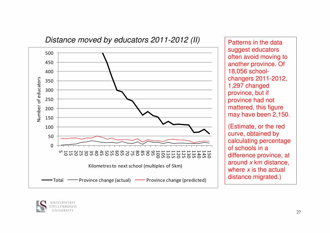
Distance moved by educators 2011-2012 (II)
0
50
100
150
200
250
300
350
400
450
500
5 10
15
20
25
30
35
40
45
50
55
60
65
70
75
80
85
90
95
10
01
05
11
01
15
12
01
25
13
01
35
14
01
45
15
0
Nu
mb
er
of
ed
uc
ato
rs
Kilometres to next school (multiples of 5km)
Total Province change (actual) Province change (predicted)
Patterns in the data suggest educators often avoid moving to another province. Of 18,056 school-changers 2011-2012, 1,297 changed province, but if province had not mattered, this figure may have been 2,150.
(Estimate, or the red curve, obtained by calculating percentage of schools in a difference province, at around x km distance, where x is the actual distance migrated.)

28
Policy implications
Careful management of the budget is necessary to ensure that the hiring of teachers needed for the basic functioning of the system is not stalled.
Without impinging on provincial autonomy, one can make it easier for teachers to change provinces in order to improve the matching of supply and demand.

29
Ideas for future work
� The panel of data constructed should allow for the generation of better knowledge on what motivates teachers to move and stay, and hence provide a better base for the teacher incentives discourse.
� Stats SA and education planners must clearly work together more closely to clarify immensely important issues relating to demographic trends.

30
� In general more minds (especially young and fresh ones!) need to have access to the available data and should be allowed to analyse them. However, analysts must also study policies, or work with people who understand them well.
31
Relevant texts
Brophy, T.S.L., Daniels, R.C. & Musundwa, S. (2014). gpsbound: Routine for importing and verifying geographical information from a user provided shapefile. Cape Town: SALDRU.
Gustafsson, M. (2012). The gap between school enrolments and population in South Africa: Analysis of the possible explanations. Stellenbosch: University of Stellenbosch.
Gustafsson, M. (2015). Enrolment ratios and related puzzles in developing countries: Approaches for interrogating the data drawing from the case of South Africa. International Journal of Educational Development, 42: 63-72.
Gustafsson, M. & Taylor, S. (2013). Treating schools to a new administration: The impact of South Africa's 2005 provincial boundary changes on school performance. Stellenbosch: University of Stellenbosch. Available from: <http://ideas.repec.org/p/sza/wpaper/wpapers204.html> [Accessed December 2013].
Gustafsson, M. & Taylor, S. (2015). Treating schools to a new administration: Evidence from South Africa of the possible impact of better practices in the

32
system-level administration of schools. Stellenbosch: University of Stellenbosch. [Forthcoming]
Inbar, D.E. (1996). Planning for innovation in education. Paris: IIEP.