mobile holographic surface hub xboxiot desktop
TRANSCRIPT

Spark the future.
May 4 – 8, 2015Chicago, IL

From the small screen to the big screen:Building Universal Windows Apps with XAMLHarini KannanProgram Manager, XAML
BRK2310

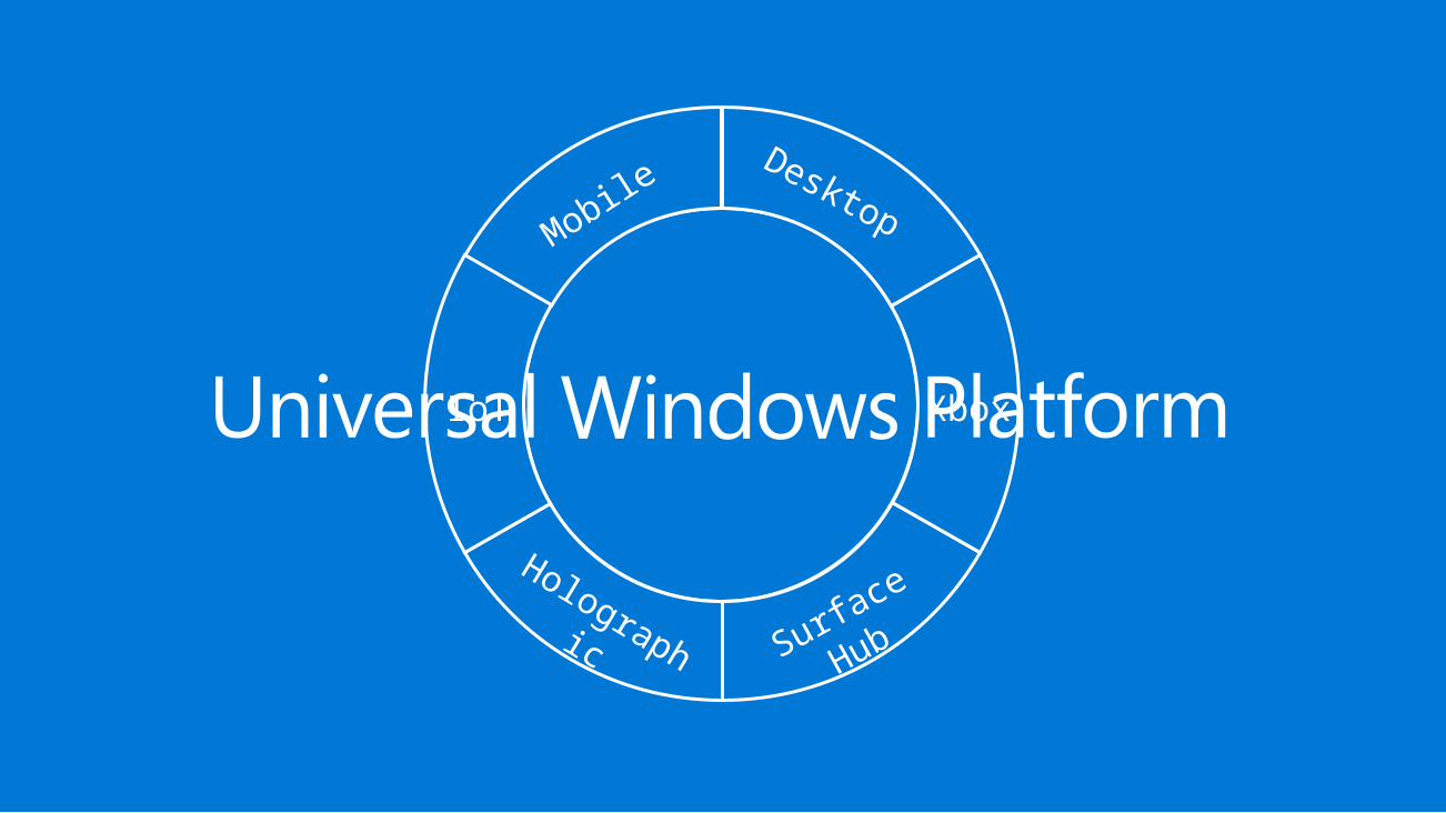
Mobile
Holographic Surface
Hub
XboxIoT
Desktop

UWP becomes the one developer platform for developers. Learn one set of core APIs for all devices.
Yay, so what does that mean for me?

What do I get for free when I target UAP? Fluid
What are small things I can do for most Universal scenarios? Responsive
What do I need to do for more specific scenarios still targeting UAP? Tailored
Determining if you need anything specific…

From a UI standpoint, we believe a large majority of these decisions/challenges can be answered by pivoting on window size and, if necessary, capabilities.

Windows 10 XAML ‘free’
Responsive layout with new APIs
Flexibility and power through extensibility
Highly-tailored
< XAML />

What do I get for free?

MenuFlyout mf = new MenuFlyout();mf.ShowAt(sender, e.GetPosition(sender));

Window gets resized, Pivot headers moveMouse and Keyboard capable automatically

• Single scale factor system for all apps• Guarantees consistent visual size of text and graphics (abstracts panel
density and viewing distance for you)• 100%, 200% and 400% are the most important sizes to support in
assets• Scale factors work well with 4-px grid• See session 2-63 Display Scaling: Why it matters for more details
Scaling happens automaticallyScale Factors
100
125
150 200 250 300 400

Respond to windows size changes using markup
Position UI around intuitively
Enabling some small->big screen common scenarios
Easier Responsive UI
XAML in Windows 10 provides new building blocks for quicker development of basic responsive scenarios

Glenn Versweyveld (@depechie)Deani Hansen (@deanihansen)http://bit.ly/1P2jvAp

Demo
Core responsive XAML building blocks

Visual State Triggers (code snippet)
<VisualStateGroup x:Name="WindowSizeStates"><VisualState x:Name="WideState">
<VisualState.StateTriggers><AdaptiveTrigger MinWindowWidth="720" />
</VisualState.StateTriggers><VisualState.Setters>
<Setter Target="MySplitView.IsPaneOpen" Value="True" /><Setter Target="MySplitView.DisplayMode"
Value="Inline" /></VisualState.Setters>
</VisualState></VisualStateGroup>

“media queries” for XAML Respond to a condition and goes to that
state Declarative way of doing what you can
today Built-in AdaptiveTrigger for window size Setters enable more readable/direct value
changing
VisualState Triggers

Visual State Setters (code snippet)<VisualState x:Name="Pressed">
<Storyboard><ObjectAnimationUsingKeyFrames Storyboard.TargetName="RootGrid"
Storyboard.TargetProperty="Background"><DiscreteObjectKeyFrame KeyTime="0" Value="{ThemeResource
SystemControlBackgroundBaseMediumLowBrush}" /></ObjectAnimationUsingKeyFrames><ObjectAnimationUsingKeyFrames Storyboard.TargetName="ContentPresenter"
Storyboard.TargetProperty="BorderBrush"><DiscreteObjectKeyFrame KeyTime="0" Value="{ThemeResource
SystemControlHighlightTransparentBrush}" /></ObjectAnimationUsingKeyFrames><ObjectAnimationUsingKeyFrames Storyboard.TargetName="ContentPresenter"
Storyboard.TargetProperty="Foreground"><DiscreteObjectKeyFrame KeyTime="0" Value="{ThemeResource
SystemControlHighlightBaseHighBrush}" /></ObjectAnimationUsingKeyFrames>
</Storyboard></VisualState>
<VisualState x:Name="Pressed"><VisualState.Setters>
<Setter Target="RootGrid.Background" Value="{ThemeResource …}" /><Setter Target="ContentPresenter.BorderBrush" Value="{ThemeResource …}" /><Setter Target="ContentPresenter.Foreground" Value="{ThemeResource …}" />
</VisualState.Setters></VisualState>

Constraint-based panel Allows developers to express spatial
relationships Huge enabler for responsive UI scenarios Leverage’s x:Name’d elements for
RelativeTo* positioning
RelativePanel

RelativePanel (code snippet)
<RelativePanel x:Name="panel" Margin="4.75" Height="190"> <Image x:Name="MapImage" controls:GoogleImageDependencyObject.GoogleImageUrl="{Binding Map}" Stretch="None“
RelativePanel.AlignBottomWithPanel="True" RelativePanel.AlignLeftWithPanel="True" RelativePanel.AlignRightWithPanel="True" RelativePanel.AlignTopWithPanel="True" HorizontalAlignment="Stretch" VerticalAlignment="Stretch"/> <Rectangle x:Name="topRect" Fill="White" Opacity="0.85" Height="30“ RelativePanel.AlignBottomWithPanel="True“ RelativePanel.AlignLeftWithPanel="True" RelativePanel.AlignRightWithPanel="True" HorizontalAlignment="Stretch"/> <Rectangle x:Name="bottomRect" Fill="White" Opacity="0.85" Height="45“ RelativePanel.AlignTopWithPanel="True“ RelativePanel.AlignLeftWithPanel="True" RelativePanel.AlignRightWithPanel="True" HorizontalAlignment="Stretch"/> <Image Source="{Binding TypeImageUrl}" Height="18" Margin="4.75“ RelativePanel.AlignBottomWithPanel="True“ RelativePanel.AlignLeftWithPanel="True"/> <Image Source="ms-appx:///Assets/ThumbsUp.png" Height="18" Margin="4.75" RelativePanel.AlignBottomWithPanel="True"
RelativePanel.AlignHorizontalCenterWithPanel="True"/> <Image Source="ms-appx:///Assets/appbar.trophy.png" Height="18" Margin="4.75" RelativePanel.AlignBottomWithPanel="True" RelativePanel.AlignRightWithPanel="True"/> <Ellipse x:Name="profilePic" Style="{StaticResource ProfileEllipse}" Margin="4.75“ RelativePanel.AlignLeftWithPanel="True" RelativePanel.AlignTopWithPanel="True"> … </Ellipse> <TextBlock x:Name="ActivityName" Text="{Binding Name}" TextTrimming="CharacterEllipsis" Foreground="{StaticResource
KlivaMainBrush}" Margin="0,0,4.75,0" FontFamily="{StaticResource OpenSansFontSemibold}“ RelativePanel.AlignTopWithPanel="True" RelativePanel.RightOf="profilePic"/> <TextBlock x:Name="ActivityMetaData" Text="{Binding Athlete.FullName}" RequestedTheme="Light" Margin="0,-2.375,4.75,0“
FontFamily="{StaticResource OpenSansFontLight}“ RelativePanel.RightOf="profilePic" RelativePanel.Below="ActivityName"/> <TextBlock x:Name="ActivityDateTime" Text="{Binding StartDate, Converter={StaticResource RelativeTimeConverter}}"
FontFamily="{StaticResource OpenSansFontSemibold}" Foreground="DarkGray" Margin="4.75,-2.375,4.75,0" /></RelativePanel>

Above Below LeftOf RightOf Align*With
Top, Bottom, Left, Right, HorizontalCenter, VerticalCenter
RelativePanel Spatial Properties

Building block for transient content Can be used for navigational patterns Helps with responsive UI scenarios for
showing related UI in single views No direct guidance built-in – use it if it
makes sense Overlay, Inline and Compact modes
SplitView Control

SplitView
Pane
Content

USE BUILT-IN XAML FEATURES
ONE SIMPLY DOES NOT

API type-based checking Allow you to determine capabilities without
OS version check Analogous to web development capability
checking
Feature Detection using ApiInformation

Haptic feedback exampleusing Windows.Foundation.Metadata.ApiInformation;using Windows.Phone.Devices.Notifications;
// give haptic feedback for an errorif (IsTypePresent("Windows.Phone.Devices.Notifications.VibrationDevice")){
VibrationDevice.GetDefault().Vibrate(TimeSpan.FromMilliseconds(550));}
Note: The string for the type is always single-dotted notation, even for C++

…when my ViewModel changes …based on the input type …based on physical screen size
Ok then…
But I want to have a VSM Trigger…
Demo
Extending VisualState triggers

public class InputTypeTrigger : StateTriggerBase{ private FrameworkElement _targetElement; private PointerDeviceType _lastPointerType, _triggerPointerType; public FrameworkElement TargetElement { get { return _targetElement; } set { _targetElement = value; _targetElement.AddHandler(FrameworkElement.PointerPressedEvent, new
PointerEventHandler(_targetElement_PointerPressed), true); } } public PointerDeviceType PointerType { get { return _triggerPointerType; } set { _triggerPointerType = value; } } private void _targetElement_PointerPressed(object sender, PointerRoutedEventArgs e) { _lastPointerType = e.Pointer.PointerDeviceType; SetActive(_triggerPointerType == _lastPointerType); } }
Custom Trigger Definition (code snippet)

Custom Trigger Usage (code snippet)
xmlns:triggers="using:StravaMobile.UAP.Triggers"
<VisualStateGroup x:Name="InputTypeStates"><VisualState>
<VisualState.StateTriggers><triggers:InputTypeTrigger TargetElement="{x:Bind ActivityList}"
PointerType="Touch" /><triggers:InputTypeTrigger TargetElement="{x:Bind ActivityList}"
PointerType="Pen" /></VisualState.StateTriggers><VisualState.Setters>
<Setter Target="GoToTopButton.Visibility" Value="Visible" /></VisualState.Setters>
</VisualState></VisualStateGroup>

Simple base class to let the framework know when to make active
You define the logic Can combine Triggers Leverage other features within your Trigger
like x:Defer
Extensible Triggers
Download Sample: https://github.com/Microsoft/Windows-universal-samples/tree/master/xaml_statetriggers

Windows Insiders FTW!
http://github.com/dotMorten/WindowsStateTriggersMorten NielsenWindows Developer MVP (@dotMorten)

From a UI standpoint, we believe a large majority of these decisions/challenges can be answered by pivoting on window size and, if necessary, capabilities.

Custom control development Providing specific interactions for Continuum
Where ApiInformation isn’t sufficient Please, please tell us where these are the case using the Feedback Tool
Device families like Xbox and Surface Hub
Tailoring Your Experiences
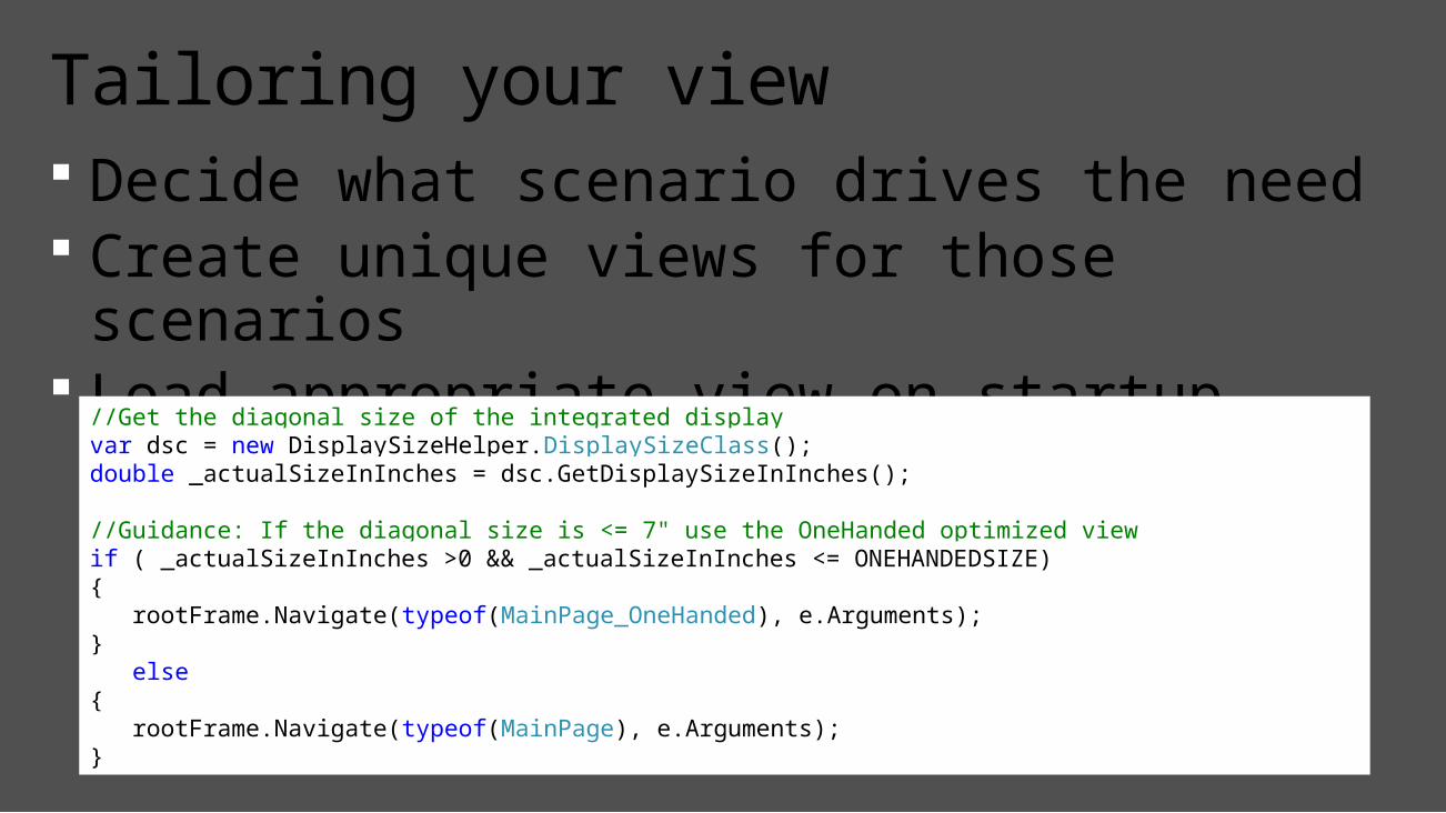
Decide what scenario drives the need Create unique views for those scenarios Load appropriate view on startup based on
scenario
Tailoring your view
//Get the diagonal size of the integrated displayvar dsc = new DisplaySizeHelper.DisplaySizeClass();double _actualSizeInInches = dsc.GetDisplaySizeInInches();
//Guidance: If the diagonal size is <= 7" use the OneHanded optimized viewif ( _actualSizeInInches >0 && _actualSizeInInches <= ONEHANDEDSIZE){ rootFrame.Navigate(typeof(MainPage_OneHanded), e.Arguments);} else{ rootFrame.Navigate(typeof(MainPage), e.Arguments);}

SplitView vs. Pivot
Commands at the top vs. bottom
Create/migrate your app to UWP Leverage Visual Studio preview tools for UI
previews Think first about window size, use Triggers,
RelativePanel to help adapt Give us feedback using Windows Feedback
tool and Developer forums http://dev.windows.com
Call to action

Visit Myignite at http://myignite.microsoft.com or download and use the Ignite Mobile App with the QR code above.
Please evaluate this sessionYour feedback is important to us!

© 2015 Microsoft Corporation. All rights reserved.