meljun cortes research seminar 1 presentation techniques
DESCRIPTION
MELJUN CORTES Research Seminar 1 Presentation TechniquesTRANSCRIPT

Presentation TechniquesPresenting Your Data Easily
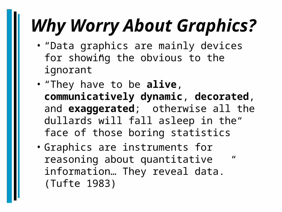
Why Worry About Graphics?• “Data graphics are mainly devices for
showing the obvious to the ignorant”• “They have to be alive,
communicatively dynamic, decorated, and exaggerated; otherwise all the dullards will fall asleep in the face of those boring statistics”
• Graphics are instruments for reasoning about quantitative information… They reveal data.” (Tufte 1983)
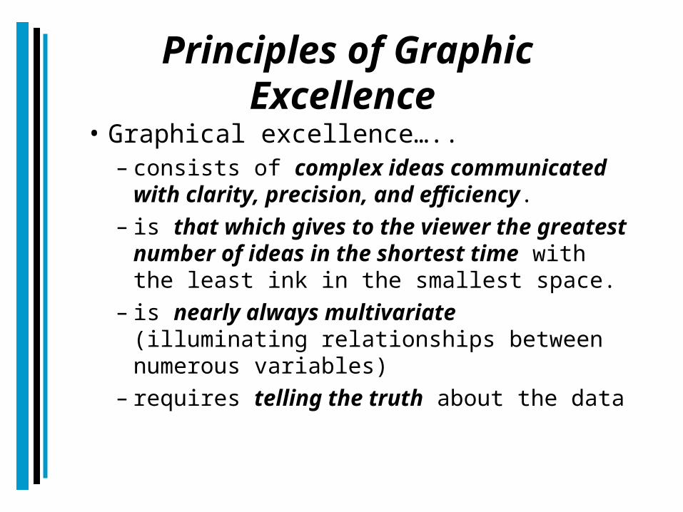
Principles of Graphic Excellence
• Graphical excellence…..– consists of complex ideas communicated
with clarity, precision, and efficiency.– is that which gives to the viewer the
greatest number of ideas in the shortest time with the least ink in the smallest space.
– is nearly always multivariate (illuminating relationships between numerous variables)
– requires telling the truth about the data
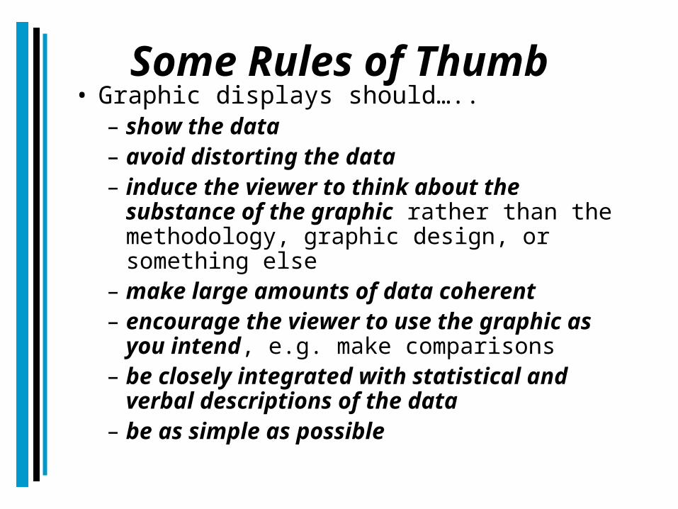
Some Rules of Thumb • Graphic displays should…..
– show the data– avoid distorting the data– induce the viewer to think about the
substance of the graphic rather than the methodology, graphic design, or something else
– make large amounts of data coherent– encourage the viewer to use the graphic
as you intend, e.g. make comparisons– be closely integrated with statistical
and verbal descriptions of the data– be as simple as possible
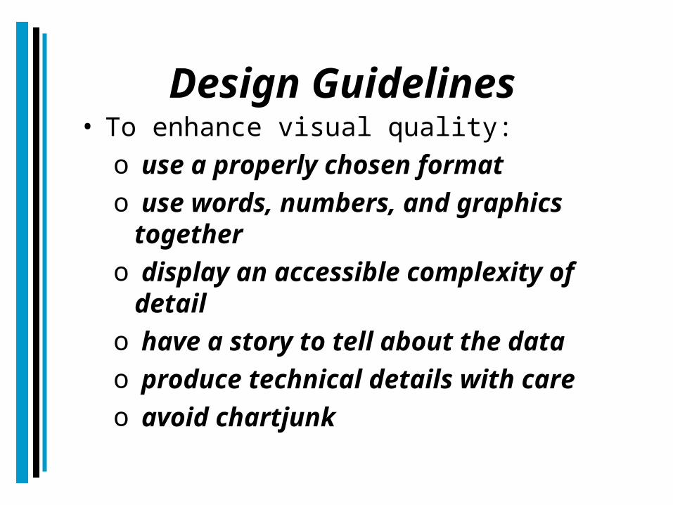
Design Guidelines• To enhance visual quality:
o use a properly chosen formato use words, numbers, and graphics
togethero display an accessible complexity of
detailo have a story to tell about the datao produce technical details with careo avoid chartjunk
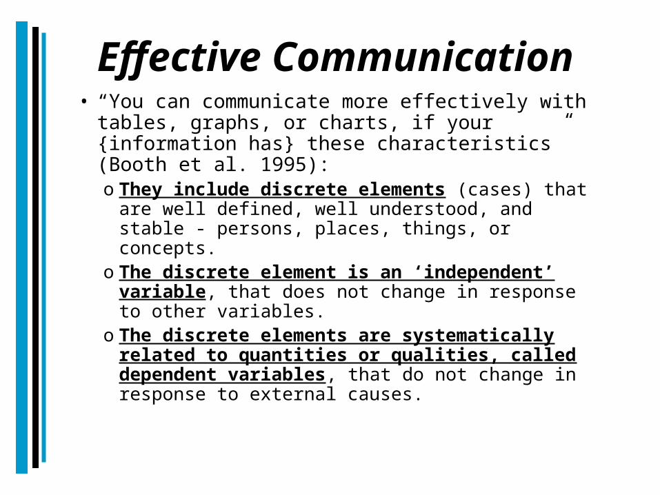
Effective Communication• “You can communicate more effectively with
tables, graphs, or charts, if your {information has} these characteristics” (Booth et al. 1995):o They include discrete elements (cases) that
are well defined, well understood, and stable - persons, places, things, or concepts.
o The discrete element is an ‘independent’ variable, that does not change in response to other variables.
o The discrete elements are systematically related to quantities or qualities, called dependent variables, that do not change in response to external causes.
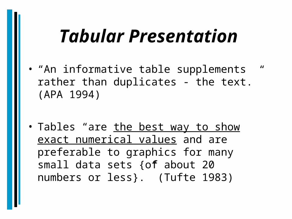
Tabular Presentation• “An informative table supplements
rather than duplicates - the text.” (APA 1994)
• Tables “are the best way to show exact numerical values and are preferable to graphics for many small data sets {of about 20 numbers or less}.” (Tufte 1983)
State of Florida Household Income, 1999
Taken from the US Census Bureau Website
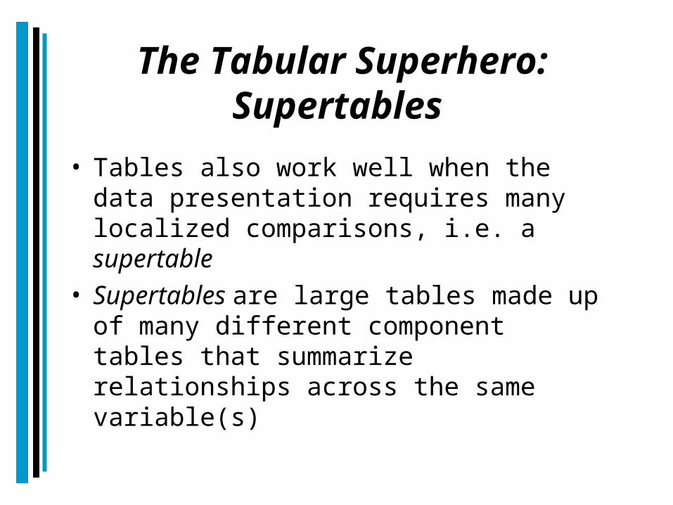
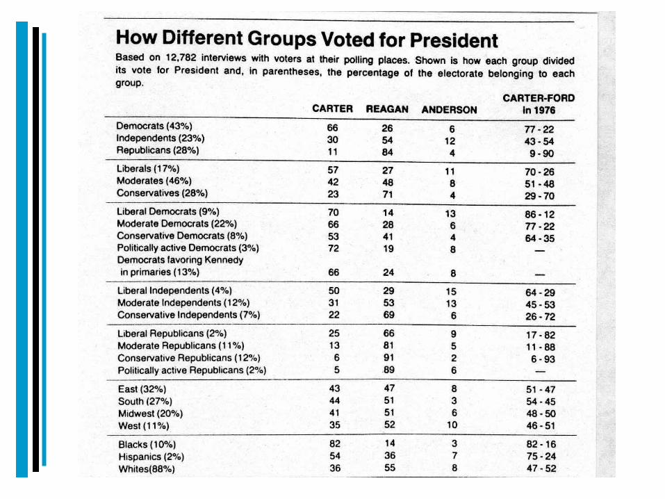
The Tabular Superhero: Supertables
• Tables also work well when the data presentation requires many localized comparisons, i.e. a supertable
• Supertables are large tables made up of many different component tables that summarize relationships across the same variable(s)


Rules of Thumb for Good Tables• Tables need a comprehensive and descriptive
title (Variable, Geography, Time)Bay County Percent Population by Race, 2000
• Right justify numbers in tables• Use commas to delineate thousands• Use numeric signs to signpost the table viewer
(percent signs (%), dollar signs ($), etc.)• Always use the same number of decimal places• Use gridlines to separate table elements• Use italics and bold to identify column
headings
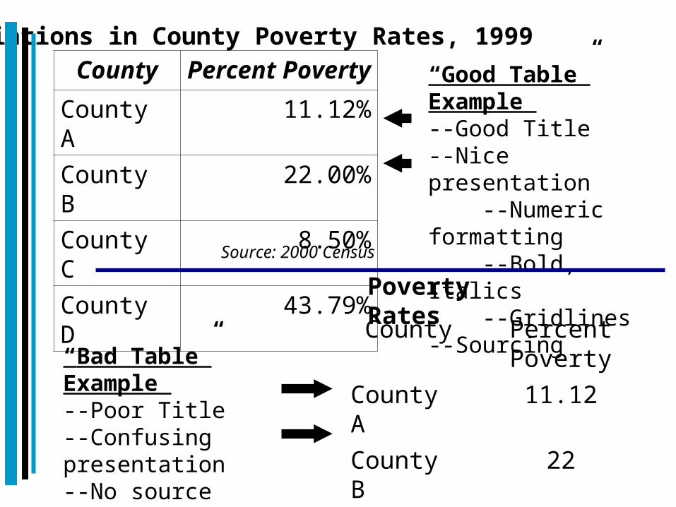
Variations in County Poverty Rates, 1999County Percent
PovertyCounty A
11.12%
County B
22.00%
County C
8.50%
County D
43.79%
Source: 2000 Census
County Percent Poverty
County A 11.12County B 22County C 8.4967County D 43.8
Poverty Rates
“Good Table” Example --Good Title--Nice presentation --Numeric formatting --Bold, Italics --Gridlines--Sourcing
“Bad Table” Example --Poor Title--Confusing presentation--No source
Choosing Formats: Charts/Graphs
• “Figures convey at a quick glance an overall pattern of results.”
• They are especially useful in describing an interaction - or the lack thereof - and nonlinear relations.” (APA 1994)
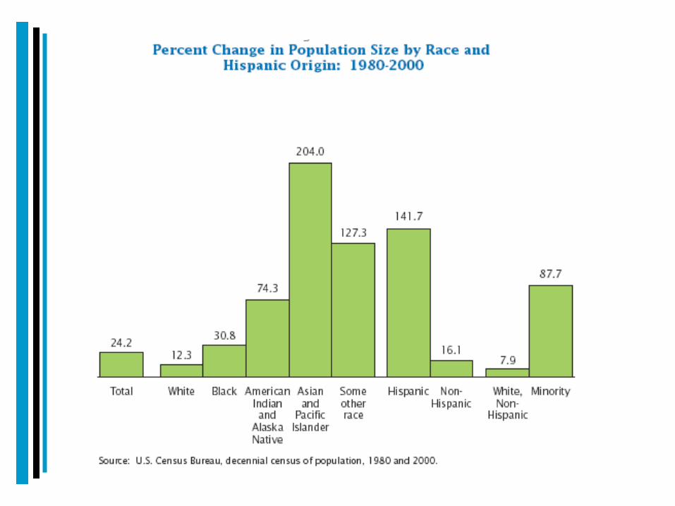
Bar Charts and Graphs• Bar charts / graphs (histograms)
are typically used when the independent variables are categorical variables [Nominal Variables]
• They are also useful for showing changes over time as well (although line charts are often a better choice to show these relationships).
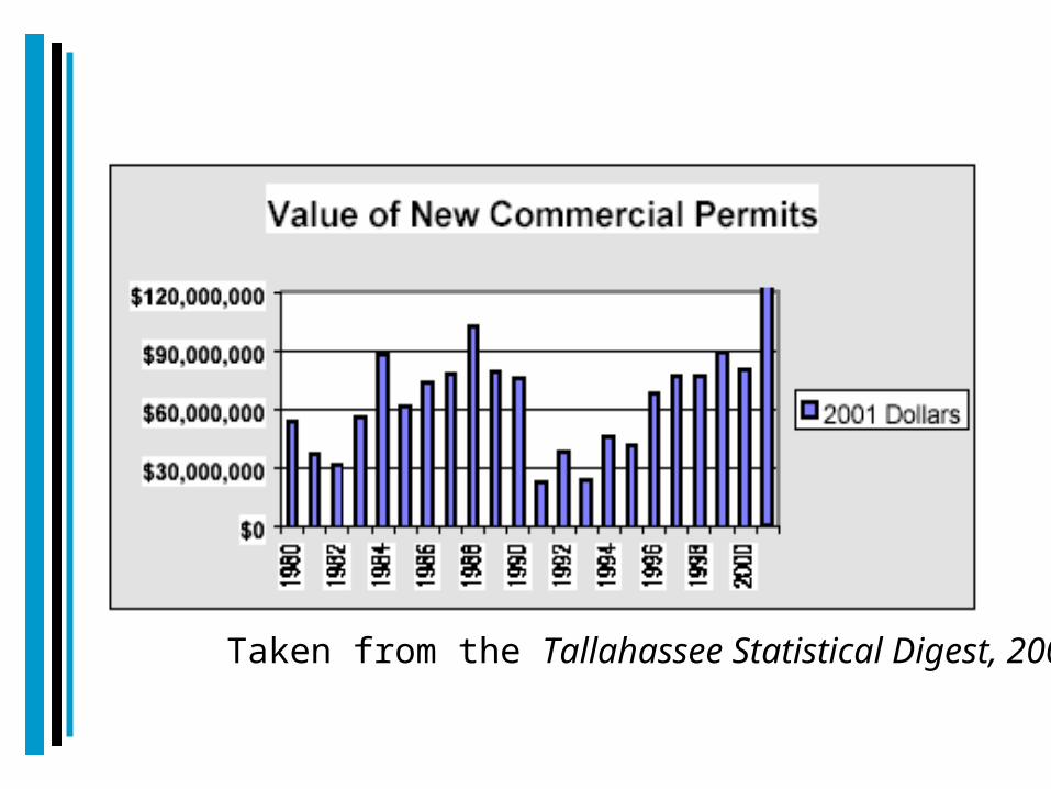
Taken from the Tallahassee Statistical Digest, 2001
Pie Charts• Pie charts are used to illustrate
percentages or proportions of a whole. They are par5ticularly useful in investigating discrete elements of:-Populations -Budgets
• But “at best, they allow readers to see crude proportions among a few elements.” (Booth et al. 1995)
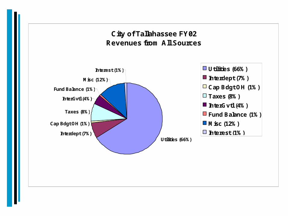
City of Tallahassee FY02 Revenues from All Sources
Utilities (66%)Interdept (7%)
Cap Bdgt OH (1%)
Taxes (8%)
InterGvtl (4%)
Fund Balance (1%)
Misc (12%)
Interest (1%) Utilities (66%)Interdept (7%)Cap Bdgt OH (1%)Taxes (8%)InterGvtl (4%)Fund Balance (1%)Misc (12%)Interest (1%)

Line Graphs• Scatter plots and line graphs are used
to show the relation between two quantitative variables where there is a unique value of the dependent variable for any value of the independent variable
• The independent variable is typically plotted on the x axis while the dependent variable is plotted on the y axis
• Line graphs are especially effective at presenting data that vary continuously
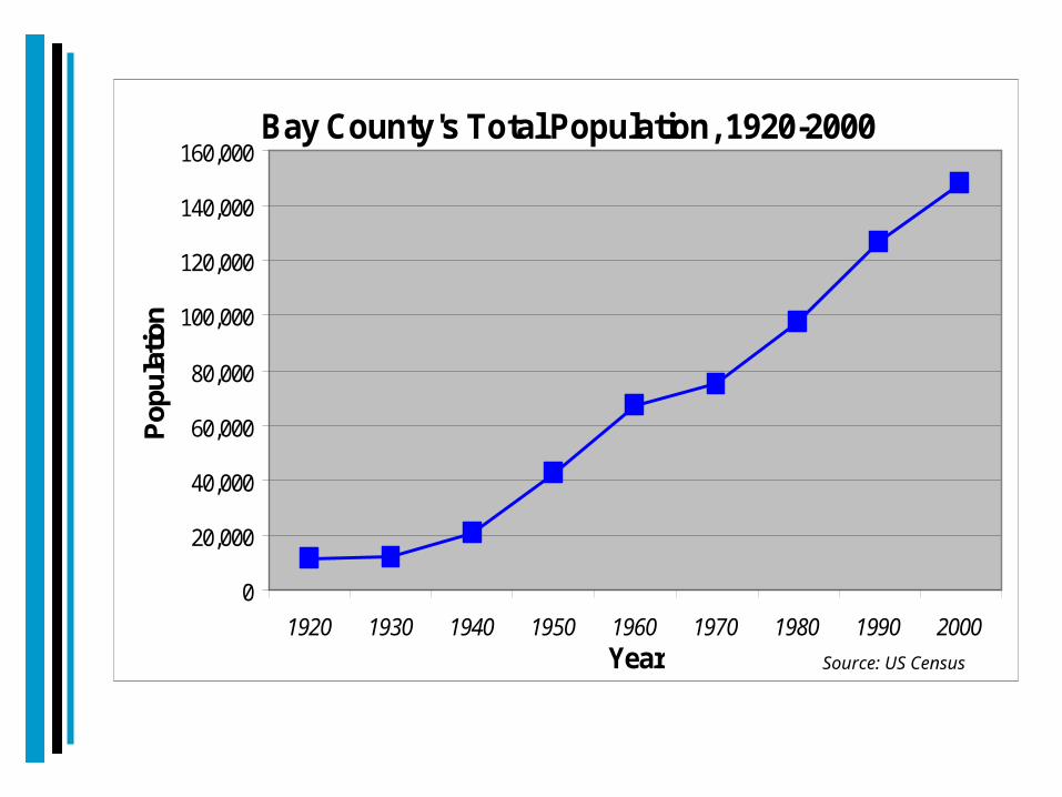
Bay County's Total Population, 1920-2000
0
20,000
40,000
60,000
80,000
100,000
120,000
140,000
160,000
1920 1930 1940 1950 1960 1970 1980 1990 2000Year
Popu
latio
n
Source: US Census

Complex Graphs: Combination Charts
• There are times when you want to present two or more variables in the same chart.
• Combination charts allow the user to combine two different variables in the same chart in order to illustrate the relationships between these variables.
• The choice of presentation method is dictated by the variables and the nature of the relationship between the variables.
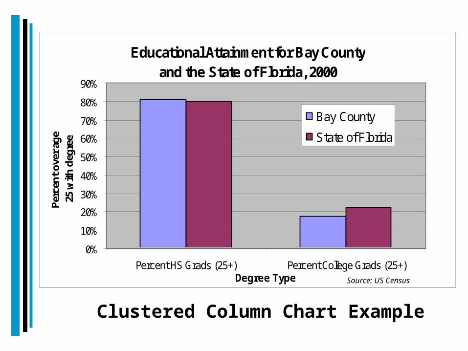
Educational Attainment for Bay County and the State of Florida, 2000
0%
10%
20%
30%
40%
50%
60%
70%
80%
90%
Percent HS Grads (25+) Percent College Grads (25+)Degree Type
Perc
ent o
ver a
ge
25 w
ith d
egre
e
Bay County
State of Florida
Source: US Census
Clustered Column Chart Example
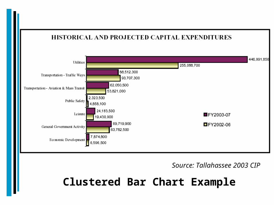
Source: Tallahassee 2003 CIP
Clustered Bar Chart Example
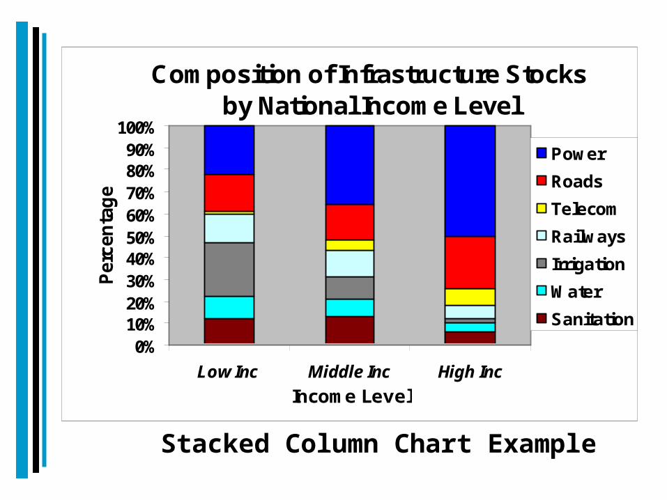
Composition of Infrastructure Stocks by National Income Level
0%10%20%30%40%50%60%70%80%90%
100%
Low Inc Middle Inc High IncIncome Level
Perc
enta
ge
PowerRoadsTelecomRailwaysIrrigationWaterSanitation
Stacked Column Chart Example
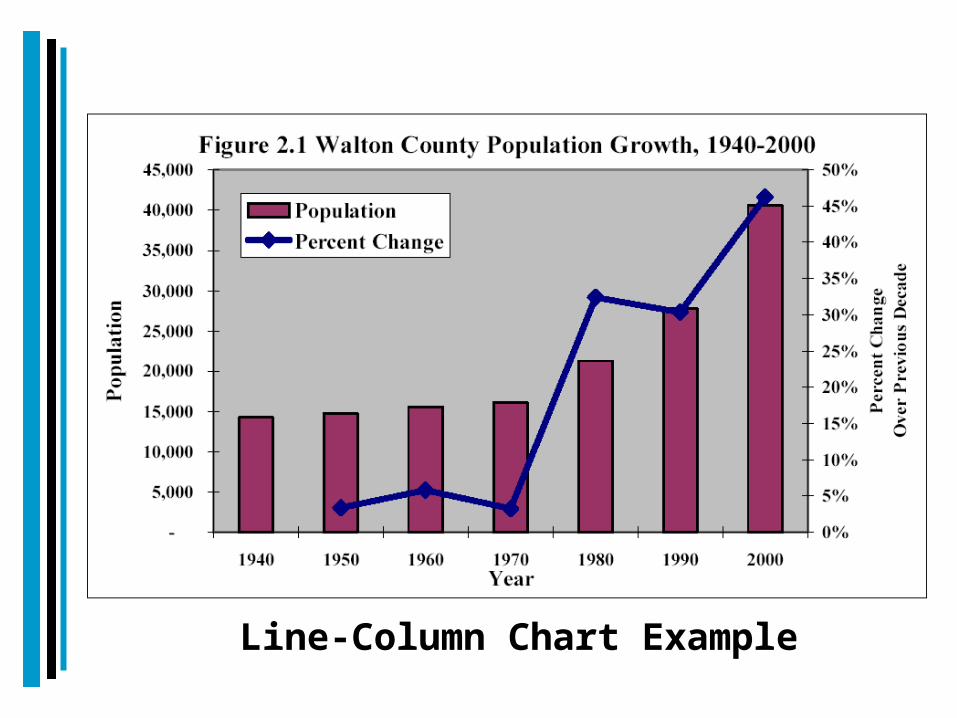
Line-Column Chart Example

Four Broad Principals of Data Presentation (from
Myers)• Integration: Tables and graphics should be part of a “seamless information flow”. Text should refer to and direct readers towards these exhibits.
• Speed and Efficiency of Communication: Exhibits should be clearly and simply presented, well-titled, and linked to the purpose of the report/memo; The goal is efficiency of communication.
• Engagement in Depth: The longer the viewer spends with an exhibit, the more they should get out of it. “The goal is to create a richly informative exhibit that is dense with information, but open and accessible to the eye.”
• Trustworthiness: Exhibits present factual information. They must be supported with appropriate sourcing and with all information presented correctly and understandably.
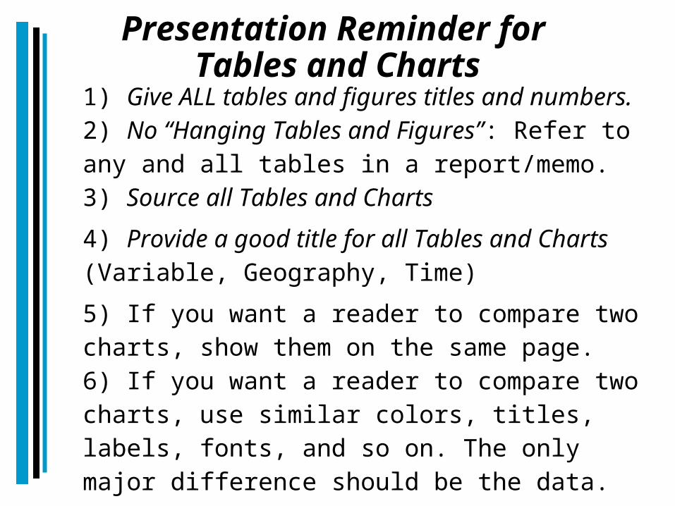
Presentation Reminder for Tables and Charts
1) Give ALL tables and figures titles and numbers.2) No “Hanging Tables and Figures”: Refer to any and all tables in a report/memo.3) Source all Tables and Charts 4) Provide a good title for all Tables and Charts (Variable, Geography, Time)5) If you want a reader to compare two charts, show them on the same page.6) If you want a reader to compare two charts, use similar colors, titles, labels, fonts, and so on. The only major difference should be the data.
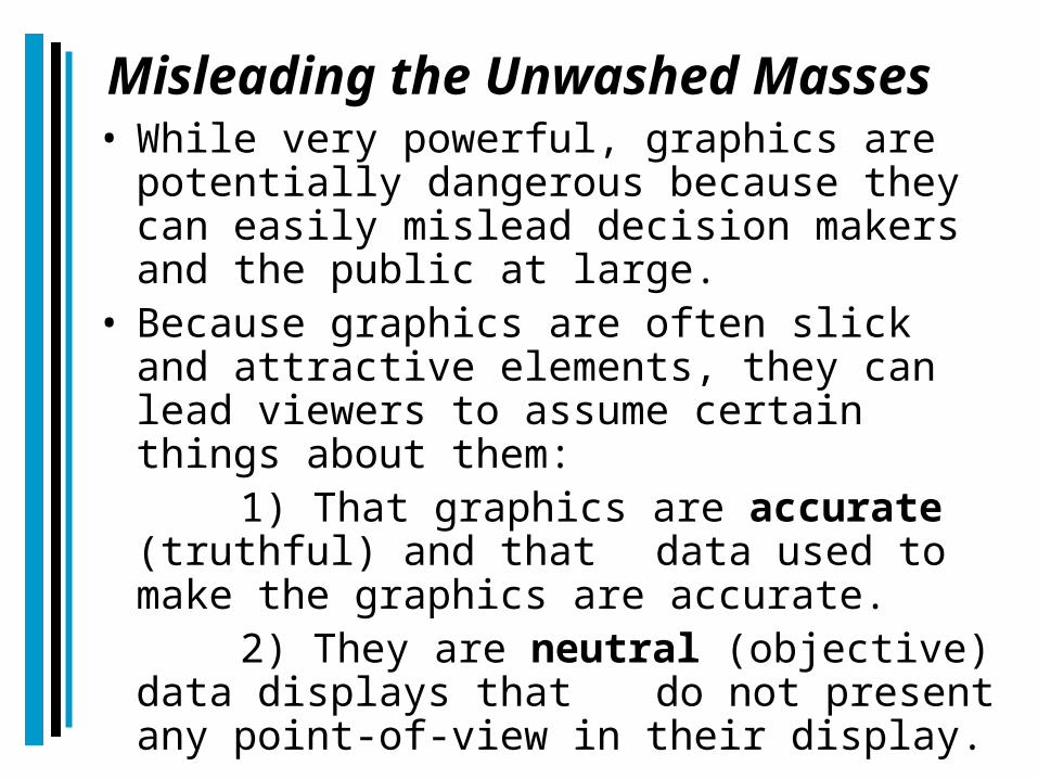
Misleading the Unwashed Masses• While very powerful, graphics are
potentially dangerous because they can easily mislead decision makers and the public at large.
• Because graphics are often slick and attractive elements, they can lead viewers to assume certain things about them:
1) That graphics are accurate (truthful) and that data used to make the graphics are accurate.
2) They are neutral (objective) data displays that do not present any point-of-view in their display.

A Graphical Caveat• “A single map is but one of an indefinitely
large number of maps that might be produced for the same situation or the same data.”
Monmonier, How to Lie with Maps, p. 2
• The maker of a graphic (maps and chart, especially) has tremendous power over the product and the consumer. This power can be used to create effective, attractive graphics that competently and truthfully convey information or graphics that unfairly distort reality and (un)intentionally mislead the audience.
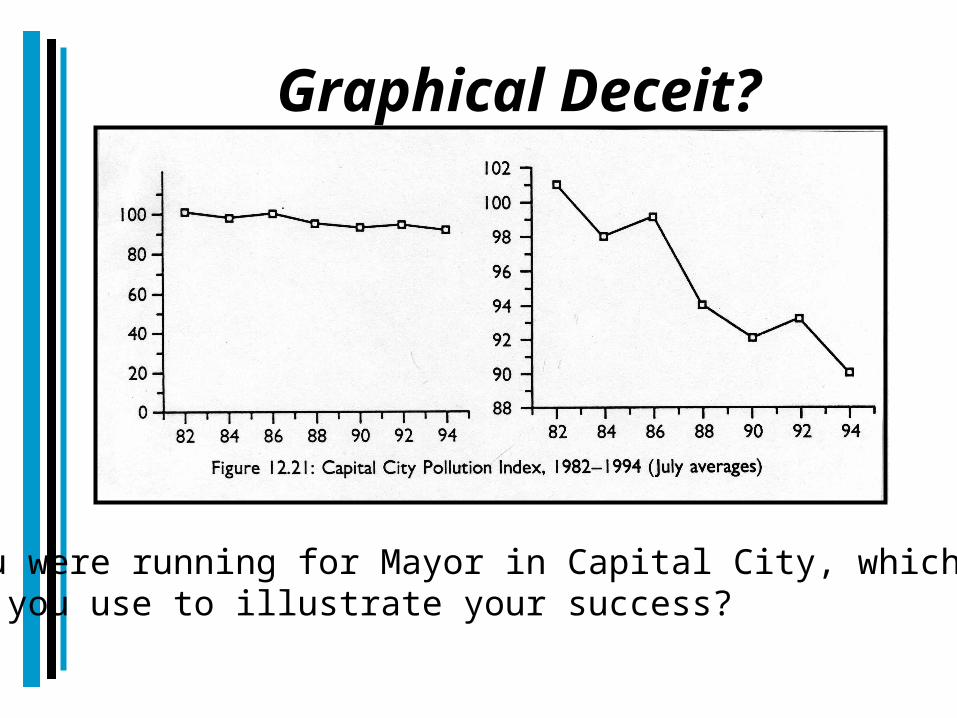
Graphical Deceit?
If you were running for Mayor in Capital City, which graphicwould you use to illustrate your success?
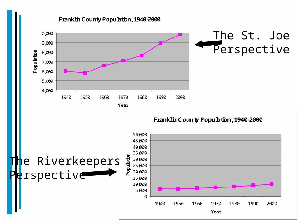
The St. Joe Perspective
The RiverkeepersPerspective
Franklin County Population, 1940-2000
4,000
5,000
6,000
7,000
8,000
9,000
10,000
1940 1950 1960 1970 1980 1990 2000
Year
Popu
latio
n
Franklin County Population, 1940-2000
05,000
10,00015,00020,00025,00030,00035,00040,00045,00050,000
1940 1950 1960 1970 1980 1990 2000
Year
Popu
latio
n