mc graw hill - 007144162x - say it with charts workbook - fly
TRANSCRIPT

no screenZelazny_007144162-x_FM.qxd 2/22/05 4:16 PM Page iv

McGraw-Hill
New York Chicago San Francisco Lisbon LondonMadrid Mexico City Milan New Delhi San Juan
Seoul Singapore Sydney Toronto
Say It With Charts
Workbook
GENE ZELAZNY
Edited by Steve Sakson
no screenZelazny_007144162-x_FM.qxd 2/22/05 4:16 PM Page i

no screenZelazny_007144162-x_FM.qxd 2/22/05 4:16 PM Page ii
Copyright © 2005 by Gene Zelazny. All rights reserved. Manufactured in the United States of America. Except as permitted under the United States Copyright Act of 1976, no part of this publication may be reproduced or distributed in any form or by any means, or stored in a database or retrieval system, without the prior written permission of the publisher. 0-07-145493-4 The material in this eBook also appears in the print version of this title: 0-07-144162-X All trademarks are trademarks of their respective owners. Rather than put a trademark symbol after every occurrence of a trademarked name, we use names in an editorial fashion only, and to the benefit of the trademark owner, with no intention of infringement of the trademark. Where such designations appear in this book, they have been printed with initial caps. McGraw-Hill eBooks are available at special quantity discounts to use as premiums and sales promotions, or for use in corporate training programs. For more information, please contact George Hoare, Special Sales, at [email protected] or (212) 904-4069. TERMS OF USE This is a copyrighted work and The McGraw-Hill Companies, Inc. (“McGraw-Hill”) and its licensors reserve all rights in and to the work. Use of this work is subject to these terms. Except as permitted under the Copyright Act of 1976 and the right to store and retrieve one copy of the work, you may not decompile, disassemble, reverse engineer, reproduce, modify, create derivative works based upon, transmit, distribute, dis seminate, sell, publish or sublicense the work or any part of it without McGraw -Hill’s prior consent. You may use the work for your own noncommercial and personal use; any other use of the work is strictly prohibited. Your right to use the work may be terminated if you fail to comply with these terms. THE WORK IS PROVIDED “AS IS.” McGRAW-HILL AND ITS LICENSORS MAKE NO GUARANTEES OR WARRANTIES AS TO THE ACCURACY, ADEQUACY OR COMPLETENESS OF OR RESULTS TO BE OBTAINED FROM USING THE WORK, INCLUDING ANY INFORMATION THAT CAN BE ACCESSED THROUGH THE WORK VIA HYPERLINK OR OTHERWISE, AND EXPRESSLY DISCLAIM ANY WARRANTY, EXPRESS OR IMPLIED, INCLUDING BUT NOT LIMITED TO IMPLIED WARRANTIES OF MERCHANTABILITY OR FITNESS FOR A PARTICULAR PURPOSE. McGraw-Hill and its licensors do not warrant or guarantee that the functions contained in the work will meet your requirements or that its operation will be uninterrupted or error free. Neither McGraw- Hill nor its licensors shall be liable to you or anyone else for any inaccuracy, error or omission, regardless of cause, in the work or for any damages resulting therefrom. McGraw-Hill has no responsibility for the content of any information accessed through the work. Under no circumstances shall McGraw- Hill and/or its licensors be liable for any indirect, incidental, special, punitive, consequential or similar damages that result from the use of or inability to use the work, even if any of them has been advised of the possibility of such damages. This limitation of liability shall apply to any claim or cause whatsoever whether such claim or cause arises in contract, tort or otherwise. DOI: 10.1036/0071454934

Contents
SAY IT WITH CHARTS WORKBOOK 1
NOW IT’S YOUR TURN TO SAY IT WITH CHARTS 15
CERTIFICATE OF COMPLETION 120
INDEX 122
iii
no screenZelazny_007144162-x_FM.qxd 2/22/05 4:16 PM Page iii
For more information about this title, click here

no screenZelazny_007144162-x_FM.qxd 2/22/05 4:16 PM Page iv
This page intentionally left blank.
Say It With Charts
WorkBook
IntroductionIn my book Say It with Charts, I lay out some easy techniquesthat business people can use to create visual presentations thatare powerful, persuasive, and eye-catching. However, if you’relike many who face the challenge of mastering this skill, youknow it takes time, patience, and, most of all, practice, practice,and more practice. That's why I offer you this workbook.
In it, you'll find three things:
• A series of business charts that I've gathered from real-life situations
• A challenge to you to improve them
• Suggested improvements to communicate the information more quickly and clearly.
Your challenge in this workbook is to avoid the temptation of simply flipping the page to see my solution. Instead, Iencourage you to study the charts and use the space you'll findbelow them to sketch your ideas for improvement. Then, turn
1
Zelazny_2-23.qxd 2/23/05 4:41 PM Page 1
Copyright © 2005 by Gene Zelazny. Click here for terms of use.

2
the page to compare your ideas with what I came up with inthe real world and what led to my thinking.
As you accept this challenge, understand that I am in no wayclaiming that my answer is the best one. In fact, I have everyconfidence that your answer could work just as well. Theimportant thing is that you take a critical look to determinewhat the level of improvement can be.
Also, understand that there's nothing requiring you to do theseexercises sequentially. Start anywhere. Dip in and out. Comeback to the same example again as new ideas come up. I hopethat after you've done a few of these you'll conclude that "playing it with charts" can actually be fun.
Before you start, let me offer this quick refresher on thefundamentals of charts. As readers of Say It with Charts will remember, charts generally fall into two broad categories:
• Data charts, also called quantitative charts, depict numbers graphically to make a point.
• Concept charts, also called nonquantitative charts, use words and images.
Of course, some charts use elements of both categories.
Zelazny_2-23.qxd 2/23/05 4:41 PM Page 2

Data Charts
We can translate data into five kinds of comparisons. Each comparison is shown best by a specific chart form. Here's a reminder of how they are best used.
3
COMPONENT
PIE
BA
RC
OL
UM
NL
INE
DO
T
ITEM TIME SERIES FREQUENCY CORRELATION
BA
SIC
CH
AR
T F
OR
MS
KINDS OF COMPARISON
Zelazny_2-23.qxd 2/23/05 4:41 PM Page 3

4
Concept Charts
Concept charts describe a situation, such as interaction,interrelationship, leverage, or forces at work. There arebasic examples in the visual below, but for some "thoughtstarters," before you tackle the exercises in this workbook,allow me to turn your attention to the fourth edition of Say It with Charts. In Section 3 of the book, you'll find"Solutions in Search of Problems," a chapter that offers a range of ideas for nonquantitative visuals.
INTERACTION LEVERAGE FORCES AT WORK
FLOW OR PROCESS ORGANIZATION MATRIX
Zelazny_2-23.qxd 2/23/05 4:41 PM Page 4

As you begin your journey through this workbook, you’llnotice I've presented the examples in a jumbled manner.That's to keep you on your toes. However, to help get youstarted, here are some broad categories for solutions to bothdata and concept charts. These solutions are by no meansexhaustive. I call them:
• Simpler is better.
• More is better.
• Different is better.
• Creativity is better.
Take a look at the samples of each of these solutions on the following pages.
5
Zelazny_2-23.qxd 2/23/05 4:41 PM Page 5

6
Simpler is betterIn this solution, we remove details from the chart that get in the way of the message we’re trying to send. This isn't always easy. It's a naturaltendency to want to give your audience as much information as possible.
The problem is that this prompts you to present too much information, so your audience actually absorbs and retains very little of it.
The "simpler is better" solution requires you to think hard about themessage you really want to convey in a chart, and eliminate materialthat distracts from that message.
Here's an example. The top chart supports the point that PVC is the lowest-cost polymer. Here, you're quick to see that it shows all the data gathered during the problem-solving stage to make the point. This mightbe okay for a paper document, in which readers can spend as much timewith the chart as they need. But if you’re presenting this chart to anaudience, onscreen, the content should be greatly simplified.
For example:
• Do we need two measures of cost performance to support the samemessage—one expressed in cents per pound, the other in cents per cubic inch? No. Cents per pound will do.
• Must we show the data at the end of every bar? No. A scale will be sufficient to show the relationships.
In addition to these changes that make the chart simpler, I’ve changed the sequence of the bars, ranking them from high to low, to better showPVC's position. The new chart with less data focuses attention on themessage that PVC's cost is lower than that of all other polymers.
Zelazny_2-23.qxd 2/23/05 4:41 PM Page 6

7
CURRENT COST OF PVC IS COMPETITIVE WITH OTHER MATERIALS
30
32
29
27
45
48
62
113
98
116
113
113
100
30¢
Cents per pound Cents per cubic inchPolymers
Polypropylene
HD polyethylene
LD polyethylene
Polystyrene
PVC
SAN
ABS
Acrylic
Polyphenylene
Polyester
Nylon 66
Cellulose
Polycarbonate
Polyacetal 5.13
4.90
4.86
4.78
4.64
4.47
2.67
1.80-1.84
1.74
1.17-1.34
1.11-1.15
1.04-1.07
1.03-1.04
.98¢
PVC—LEAST EXPENSIVE POLYMER
0.00 0.25 0.50 0.75 1.00 1.25
Nylon 66
Polyphenylene
Cellulose
Polycarbonate
Polyacetal
Polyester
Acrylic
ABS
SAN
LD polyethylene
HD polyethylene
Polystyrene
Polypropylene
PVC
¢/Pound
Zelazny_2-23.qxd 2/23/05 4:41 PM Page 7

8
More is betterHere, we create multiple charts to give a message that is toocomplex to be told on just one chart.
Sometimes, your goal for the presentation requires you to keep thedetails that you might eliminate if you used a "Simpler is better"solution. So you go back to cramming too much stuff on a pageand hope you can explain it all to your audience.
The solution isn't to eliminate details, but to present them in bitesthat are small enough to absorb. Sure, this will increase the numberof pages in your presentation but, whenever this worries you, justremember this mantra:
"It takes the same amount of time to present five ideas on one slide as it does to present one idea on five slides."
This example demonstrates what I mean. The visual on top showshow the information was captured on paper. I'll grant you that ifyou were just distributing this on paper; the page might work,since, in this circumstance, the reader controls the communication.He or she can take as much time as needed to review all theinformation.
However, for an onscreen presentation to an audience, where you,the speaker, control the communication, I would suggest using sixlegible slides, with each slide comparing the competitor’s approachto one of the components of the business system.
An added benefit of this approach is that the audience focuses onone idea at a time, as it is presented. There is no risk that some willfocus on different aspects of the visual than the point you'rediscussing.
Yet another benefit: because there's less information on each visual, we can use a larger type to fill the screen and ensure legibility.
Zelazny_2-23.qxd 2/23/05 4:41 PM Page 8

9
THE BUSINESS SYSTEM FOR EARTH-MOVING EQUIPMENT
Business system element
Technology Product design Manufacturing Sales/marketing Distribution Service
• Own technology • Limited engineering investment because CAT works with the best suppliers to create their equipment
• Subcontracted, with CAT doing assembly
• Heavy investment
• Sell to broad market
• Competitive pricing
• Extensive dealer network
• Fast repair timeCompany A
• Own technology • High engineering investment to design to their own equipment
• Vertically integrated for a large percent of their equipment parts
• Limited investment
• Sell to asset-intensive segments
• Competitive pricing
• Limited dealer network
• Low frequency of equipment breakdown
Company B
COMPETING IN EARTH-MOVING EQUIPMENT
TechnologyProductdesign
Manufac-turing
Sales/marketing
Distribution Service
Company A Company B
Own technology
Own technology
Zelazny_2-23.qxd 2/23/05 4:41 PM Page 9

10
Different is betterIn this solution, we scrap the chart form we had been usingentirely and use a completely different form—one moreappropriate for the data we’re trying to convey.
For instance, while the top chart on the facing page iscertainly simple, I find it difficult to determine its message.Can you figure out which country's margins are rising orfalling without reading the data at the top of the columns?Also, is there any logic to the sequence of countries?
With such charts, it's helpful to go back to the matrix at thebeginning of this book to determine which chart form mightbe more effective. In this case, we're comparing profitmargins for six countries over time. A column chart is oftenappropriate for a "time comparison," but if you switch to aline chart, use a larger scale, and put the countries indescending order, the trends become clearer. Now theaudience can quickly see which countries have the highestmargins and where the trends are going.
Zelazny_2-23.qxd 2/23/05 4:41 PM Page 10

11
18% 15% 15% 17% 16%
3Q 04 4Q 04 1Q 05 2Q 05 3Q 05
Iberia France Germany
U.K. Canada Brazil
13% 7% 11% 9%1%
3Q 04 4Q 04 1Q 05 2Q 05 3Q 05
38% 36% 32% 35%25%
3Q 04 4Q 04 1Q 05 2Q 05 3Q 05
3Q 04 4Q 04 1Q 05 2Q 05 3Q 05
EBITDA MARGIN
5% 1% 2% 5% 4%
3Q 04 4Q 04 1Q 05 2Q 05 3Q 05
44%48%40%38%
43%
3Q 04 4Q 04 1Q 05 2Q 05 3Q 05
-3% -5%
5% 7% 4%
EBITDA MARGINPercent
Brazil
2004
3 4 1 2 3
2005
Q
Canada
2004
3 4 1 2 3
2005
Iberia
2004
3 4 1 2 3
2005
U.K.
2004
3 4 1 2 3
2005
France
2004
3 4 1 2 3
2005
Germany
2004
3 4 1 2 3
2005
0
10
20
30
40
50
Zelazny_2-23.qxd 2/23/05 4:41 PM Page 11

12
Creativity is betterI would be the first to say that, at times, a basic text slide is all that's needed to convey a message. On the otherhand, creative images can help tell your story in a moreinteresting way, thereby reinforcing understanding. That's what this solution is all about.
For instance, here is a list of recommended steps forplanning any business presentation. Since, in this case,there is no set sequence to the order of these steps, and allthe steps are independent, I'd suggest that the puzzle imagewill help make them more memorable.
Furthermore, you can use the puzzle image as a table ofcontents or "tracker page" to help guide your audiencethrough the chapters of your story. As you move from stepto step, you can add each piece of the puzzle. Then, bydisplaying the entire puzzle at the end, you effectivelysummarize your main points.
Zelazny_2-23.qxd 2/23/05 4:41 PM Page 12

13
SAY IT WITH PRESENTATIONS
Specify objective
Analyze audience
Define message
Determine scope
Select medium
Analyzeaudience
Specifyobjective
Definemessage
Selectmedium
Determinescope
SAY IT WITH PRESENTATIONS
Zelazny_2-23.qxd 2/23/05 4:41 PM Page 13

Zelazny_2-23.qxd 2/23/05 4:41 PM Page 14
This page intentionally left blank.

Now it’s YOUR TURN toSay It with
Zelazny_2-23.qxd 2/23/05 4:41 PM Page 15
Copyright © 2005 by Gene Zelazny. Click here for terms of use.

Zelazny_2-23.qxd 2/23/05 4:41 PM Page 16
This page intentionally left blank.

17
TRADITIONAL MATERIALS END-USE MARKETSPercent
Market
MaterialAircraft/aerospace
Recreation/consumer
Automotive/transportation
Industrialmechanical
Electrical/ electronic
Petro-chemical
Construction/building Plumbing Packaging Adhesive
Furniture/furnishings Other Total
PVC -- 4 3 -- 8 -- 64 -- 10 2 6 3 100%
PP -- 15 7 -- 8 -- -- -- 22 -- 24 24 100%
HDPE -- 10 5 4 4 -- 10 -- 52 -- 3 12 100%
Your solution
Zelazny_2-23.qxd 2/23/05 4:41 PM Page 17
18
Different is betterHere, we’ll assume that the content and its message are wellthought through, but that somehow the layout you see— or don’t see—is simply illegible.
Now let’s be clear: if the chart is important enough to bepresented, then it’s important enough to be legible. Sowhat can you think of that would make the chart legible?
Yes, you could remove those columns that show no data,only dashes. However, grant me that that’s not going tohelp very much. Another solution I sometimes hear is tomake a chart out of it. But grant me that charts use morespace than tabular data do, so that’s not the solution here.Yes, you could break the table and make it into twohorizontal rows, or for that matter, put it on several pages.
However, in this case the solution is so simple that it oftenescapes us: simply switch the axes. That’s exactly what Idid to use the largest possible type to fill the visual, andyou can see how the solution is many times more legible.
Zelazny_2-23.qxd 2/23/05 4:41 PM Page 18

19
TRADITIONAL MATERIALS END-USE MARKETSPercent
Market
MaterialAircraft/aerospace
Recreation/consumer
Automotive/transportation
Industrialmechanical
Electrical/ electronic
Petro-chemical
Construction/building Plumbing Packaging Adhesive
Furniture/furnishings Other Total
PVC -- 4 3 -- 8 -- 64 -- 10 2 6 3 100%
PP -- 15 7 -- 8 -- -- -- 22 -- 24 24 100%
HDPE -- 10 5 4 4 -- 10 -- 52 -- 3 12 100%
TRADITIONAL MATERIALS END-USE MARKETS
Market
Aircraft/aerospace
Recreation/consumer
Automotive/transportation
Industrial/mechanical
Electrical/electronic
Petrochemical
Construction/building
Plumbing
Packaging
Adhesive
Furniture/furnishings
Other
Total
PVC
Material
–
4%
3
–
8
–
64
–
10
2
6
3
100%
PP
–
15%
7
–
8
–
–
–
22
–
24
24
100%
HDPE
–
10%
5
4
4
–
10
–
52
–
3
12
100%
Gene’s solution
Zelazny_2-23.qxd 2/23/05 4:41 PM Page 19

Zelazny_2-23.qxd 2/23/05 4:41 PM Page 20
This page intentionally left blank.

21Your solution
Risk management
• Credit• Market• Funding/liquidity• Operations• Environmental
Corporate lendingand advisory
• Corporate finance/advisory• M&A• Merchant banking• Underwriting• Middle market lending and
services• Commercial lending
Institutional asset management
• Domestic bond and equity fundamental funds
• Domestic index/structured funds
• Global fundamental funds• Global index/structured funds• Cash/FX, real estate, venture,
LBO funds
Sales and trading
WHOLESALE BANKING BUSINESS
• Cash management• Corporate trust• CP issuance• Custody
Fee-based services — cash, custody, and trust services
• Exchange-based cash instruments (e.g., NYSE)
• OTC cash instruments (e.g., FX, most bonds, London stocks)
• Exchange and OTC derivatives• Customer and proprietary
business
Zelazny_2-23.qxd 2/23/05 4:41 PM Page 21

22
More is betterThis chart is actually not bad if you plan to use it in a memoor a report. However, for an onscreen presentation to alarge audience, I'd recommend using six slides: the first to introduce the five quadrants, the subsequent five tohighlight each quadrant—one at a time. (See the back of thefacing page for subsequent slides.)
Yes, I feel your resistance. After all, using six slides wherewe had one seems to suggest more presentation time. But I think you'd agree that the amount of informationbeing presented is exactly the same. So the time it takes to present that information should also be the same.
Using six slides also avoids the problem of audiencedistraction. They'll focus on the specific point you'remaking instead of reading other portions of the slide. And using six slides makes this a truly visual visualpresentation, where you keep the audience's interest bychanging, changing, changing slides versus forcing them to look at the same slide for a boringly long time.
Zelazny_2-23.qxd 2/23/05 4:41 PM Page 22

23
Risk management
• Credit• Market• Funding/liquidity• Operations• Environmental
Corporate lendingand advisory
• Corporate finance/advisory• M&A• Merchant banking• Underwriting• Middle market lending and
services• Commercial lending
Institutional asset management
• Domestic bond and equity fundamental funds
• Domestic index/structured funds
• Global fundamental funds• Global index/structured funds• Cash/FX, real estate, venture,
LBO funds
Sales and trading
WHOLESALE BANKING BUSINESS
• Cash management• Corporate trust• CP issuance• Custody
Fee-based services — cash, custody, and trust services
• Exchange-based cash instruments (e.g., NYSE)
• OTC cash instruments (e.g., FX, most bonds, London stocks)
• Exchange and OTC derivatives• Customer and proprietary
business
WHOLESALE BANKING BUSINESS
Risk Management
CorporateLending
and Advisory
Institutional Asset
Management
Salesand Trading
Fee-based Services
Gene’s solution
Zelazny_2-23.qxd 2/23/05 4:41 PM Page 23

24
WHOLESALE BANKING BUSINESS
Sales and trading
• Exchange-based cash instruments
• OTC cash instruments
• Exchange and OTC derivatives
• Customer and proprietary business
WHOLESALE BANKING BUSINESS
Fee-based services
• Cash management
• Corporate trust
• CP issuance
• Custody
Zelazny_2-23.qxd 2/23/05 4:41 PM Page 24

25Your solution
VARIABLE MANUFACTURING COST$ per hundredweight
5 .40
5 .44
5.02
5.12
5.08
5.38
4.89
4.85
4.89
5.10
4.94
4.85
$ 4.79
1.61
1.43
1.85
1.73
1.66
1.32
1.68
1.69
1.58
1.58
1.31
1.31
1.28
HFCS – 42
Cargill – Cedar Rapids, IAGrain processing – Muscatine, IACPC – Argo, ILTuckahoe – Keokuk, IAPenick & Ford – Cedar Rapids, IAStaley – Decatur, ILAM – Cedar Rapids, IAAmerican Maize – Hammond, INCargill – Dayton, OHStaley – Busch/Lafayette, INAmerican Maize – Decatur, ALAmstar – Dimmit, TXCPC – Winston/Salem, NC
PEARL STARCH
Clinton – Clinton, IA
Tuckahoe – Keokuk, IA
Staley – Decatur, IL
Staley – Lafayette, IN
ADM – Decatur, IL
Staley – Busch/Lafayette, IN
Great Western – Johnstown, CO
Cargill – Dayton, OH
Clinton – Montezuma, NY
Staley – Loudon, TN
Cargill – Memphis, TN
CPC – Argo, IL
ADM – Cedar Rapids, IA
$6.07
6.16
6.25
6.68
6.47
6.54
6.57
6.70
6.74
6.85
6.87
6.87
7.01
HFCS – 55
Clinton – Clinton, IA
Tuckahoe – Keokuk, IA
ADM – Decatur, IL
Staley – Lafayette, IN
ADM – Cedar Rapids, IA
Great Western – Johnston, CO
Cargill – Dayton, OH
Cargill – Memphis, TN
Staley – Loudon, TN
American Maize – Decatur, IA
CPC – Winston/Salem, NC
Amstar – Dimmit, TX
Staley – Morrisville, PA
$6 .53
6 .61
6.58
6.58
6.64
6.70
6 .64
6 .95
6.95
7.30
7.70
7.84
7.78
0.59
0.59
0 .66
0 .68
0 .68
0 .67
0 .88
0.63
0.80
0 .69
0.84
0 .86
0 .93
$7.127.207.247.267.32
7.347.527.587.75
7.998.548.708.71
5.74
6 .05
6 .01
5.94
5 .70
5 .65
5 .37
5 .32
5 .13
5 .35
5 .13
5.08
$ 5 .02
2 .51
2 .01
1.97
1.91
1.98
1.97
2 .16
1.96
2.08
1.78
1.92
1.75
1.46
Cargill – Cedar Rapids, IAPenick & Ford – Cedar Rapids, IAADM – Decatur, ILStaley – Decatur, ILADM – Cedar Rapids, IACPC – Argo, ILTuckahoe – Keokuk, IAStaley – Lafayette, IACargill – Dayton, OHAmerican Maize – Decatur, IAStaley – Busch/Lafayette, INCargill – Memphis, TNCPC – Kansas City, KS 6.28
6.43
6.40
6.10
6 .10
6 .08
5 .78
5 .78
5 .83
5 .88
5.83
5.83
$ 5 .73
0 .83
0 .59
0 .56
0 .76
0.66
0 .54
0 .83
0.84
0.66
0 .57
0.60
0.54
0.54 $6.276.376.436.456.49
6.626.766.866.967.027.11
6.526.61
CORN SYRUP
$6.48
6.83
7.05
7.13
7.21
7.28
7.53
7.62
7.68
7.85
7.98
8.06
8.25
2
4
2
7
Corn Processing Total Corn Processing Total
Corn Processing Total Corn Processing Total
Zelazny_2-23.qxd 2/23/05 4:41 PM Page 25
26
Simpler and different are betterAt times, the obvious solution of splitting one detailed chart intoseveral isn't the answer to legibility. Sometimes, just reducing theamount of detail and highlighting the most important componentof the story can result in a major improvement.
Follow the story: "This chart shows that the Tuckahoe plant is doing anexcellent job of keeping variable costs low in the manufacture of three outof four products. For HFCS-42 and HFCS-55, it ranks as the second-lowest-cost producer. While it ranks fourth for pearl starch, the costdifferential with the lowest-cost plant is small. However, for corn syrup,the combination of a seventh ranking and a sizable cost differentialindicates the need to search for cost-reduction opportunities."
For the visual presentation, the most obvious solution would be touse a separate slide for each product. However, with as many as13 horizontal bars for each, the plant names would probably still be illegible. And creating four separate pages would prevent theaudience from easily comparing the four products.
In this case, the answer is to "visualize the message, not the mess."The important elements of the message here are: performance andTuckahoe ranking. We use a range column chart to show thespread in total variable cost between the best and worst performersfor the four products. Here, the ranges are the same length,creating an index chart; that is, the spread equals 100 regardless ofthe cost differentials. We show Tuckahoe's ranking against the topand bottom performers. The message comes across with one clearand legible chart. If you feel the need to provide the detailed data,just distribute the original chart as part of any handouts you leavebehind with your audience.
Zelazny_2-23.qxd 2/23/05 4:41 PM Page 26

27
VARIABLE MANUFACTURING COST$ per hundredweight
5 .40
5 .44
5.02
5.12
5.08
5.38
4.89
4.85
4.89
5.10
4.94
4.85
$ 4.79
1.61
1.43
1.85
1.73
1.66
1.32
1.68
1.69
1.58
1.58
1.31
1.31
1.28
HFCS – 42
Cargill – Cedar Rapids, IAGrain processing – Muscatine, IACPC – Argo, ILTuckahoe – Keokuk, IAPenick & Ford – Cedar Rapids, IAStaley – Decatur, ILAM – Cedar Rapids, IAAmerican Maize – Hammond, INCargill – Dayton, OHStaley – Busch/Lafayette, INAmerican Maize – Decatur, ALAmstar – Dimmit, TXCPC – Winston/Salem, NC
PEARL STARCH
Clinton – Clinton, IA
Tuckahoe – Keokuk, IA
Staley – Decatur, IL
Staley – Lafayette, IN
ADM – Decatur, IL
Staley – Busch/Lafayette, IN
Great Western – Johnstown, CO
Cargill – Dayton, OH
Clinton – Montezuma, NY
Staley – Loudon, TN
Cargill – Memphis, TN
CPC – Argo, IL
ADM – Cedar Rapids, IA
$6.07
6.16
6.25
6.68
6.47
6.54
6.57
6.70
6.74
6.85
6.87
6.87
7.01
HFCS – 55
Clinton – Clinton, IA
Tuckahoe – Keokuk, IA
ADM – Decatur, IL
Staley – Lafayette, IN
ADM – Cedar Rapids, IA
Great Western – Johnston, CO
Cargill – Dayton, OH
Cargill – Memphis, TN
Staley – Loudon, TN
American Maize – Decatur, IA
CPC – Winston/Salem, NC
Amstar – Dimmit, TX
Staley – Morrisville, PA
$6 .53
6 .61
6.58
6.58
6.64
6.70
6 .64
6 .95
6.95
7.30
7.70
7.84
7.78
0.59
0.59
0 .66
0 .68
0 .68
0 .67
0 .88
0.63
0.80
0 .69
0.84
0 .86
0 .93
$7.127.207.247.267.32
7.347.527.587.75
7.998.548.708.71
5.74
6 .05
6 .01
5.94
5 .70
5 .65
5 .37
5 .32
5 .13
5 .35
5 .13
5.08
$ 5 .02
2 .51
2 .01
1.97
1.91
1.98
1.97
2 .16
1.96
2.08
1.78
1.92
1.75
1.46
Cargill – Cedar Rapids, IAPenick & Ford – Cedar Rapids, IAADM – Decatur, ILStaley – Decatur, ILADM – Cedar Rapids, IACPC – Argo, ILTuckahoe – Keokuk, IAStaley – Lafayette, IACargill – Dayton, OHAmerican Maize – Decatur, IAStaley – Busch/Lafayette, INCargill – Memphis, TNCPC – Kansas City, KS 6.28
6.43
6.40
6.10
6 .10
6 .08
5 .78
5 .78
5 .83
5 .88
5.83
5.83
$ 5 .73
0 .83
0 .59
0 .56
0 .76
0.66
0 .54
0 .83
0.84
0.66
0 .57
0.60
0.54
0.54 $6.276.376.436.456.49
6.626.766.866.967.027.11
6.526.61
CORN SYRUP
$6.48
6.83
7.05
7.13
7.21
7.28
7.53
7.62
7.68
7.85
7.98
8.06
8.25
2
4
2
7
Corn Processing Total Corn Processing Total
Corn Processing Total Corn Processing Total
TUCKAHOE VARIABLE MANUFACTURING COSTSARE COMPETITIVE EXCEPT FOR CORN SYRUP
Corn syrup
$7.01
$6.16#2
HFCS-42
$6.07
$8.25
$6.84#2
HFCS-55
$6.48
$8.71
$7.26#4
Pearl starch
$7.12
$7.11
$6.61#7
$6.27Best performer
Tuckahoe ranking
Worst performer
$ per hundredweight
Gene’s solution
Zelazny_2-23.qxd 2/23/05 4:41 PM Page 27

Zelazny_2-23.qxd 2/23/05 4:41 PM Page 28
This page intentionally left blank.

29Your solution
TRANSFORMATION THEMES
• Capture regional and domestic growth
• Achieve first-class operational efficiencyand effectiveness
• Strengthen financial structure
• Earn customer loyalty
• Attract and develop the most talented people
• Enable Qcompany's development
QTURN
Zelazny_2-23.qxd 2/23/05 4:41 PM Page 29

30
Creativity is betterThis one took me a while to figure out, but the impact was worth the effort.
The solution came to me once I saw that the company'sname, at the bottom of the list, started with the letter "Q,"and that the logo-like symbol in the title began with a "Q."
It became clear that the "Q" needed to dominate the visual. I was able to place the bullet points so the most importanttheme was at the center of the diagram and to positionanother theme at the bottom of the "Q," reinforcing theimage of movement over time.
I'm often asked how these ideas come to mind. Likeanything else, the more you exercise your creativity, themore skillful you become. Practice, practice, practice!
Zelazny_2-23.qxd 2/23/05 4:41 PM Page 30

31
TRANSFORMATION THEMES
• Capture regional and domestic growth
• Achieve first-class operational efficiencyand effectiveness
• Strengthen financial structure
• Earn customer loyalty
• Attract and develop the most talented people
• Enable Qcompany's development
QTURN
Q-TURN TRANSFORMATION THEMES
Attract and develop the most talented people
Enabled Qcompany'sdevelopment
Achievefirst-class
operational
efficiency
effectivenessand
Strengthenfinancial
structure
Capture
growth
regionaland
domestic
Earn
loyalty
customer
TURN
Gene’s solution
Zelazny_2-23.qxd 2/23/05 4:41 PM Page 31

Zelazny_2-23.qxd 2/23/05 4:41 PM Page 32
This page intentionally left blank.
33Your solution
ECONOMIC STRUCTUREPVC OIRONCE 21.34.2
0.91.9
14.3 Compoundredesign and ingredientpurchasing($2.1 million)
Product/customer mix($5 million)
Scheduling,utilities, andmaterialefficiency($13.3 million)
Impact of profit improvements
AdjustedOIRONCE
PotentialOIRONCE
Zelazny_2-23.qxd 2/23/05 4:41 PM Page 33

34
Different is betterI'm with you if you feel this chart might suffice in manycases. It's a typical example of a "waterfall" chart, showingthe parts of a whole.
However, it strikes me as unnecessarily busy: I'm notgetting a clear indication of the sum of the improvements;I'd like the dollars of improvements to line up; I don't needto repeat the OIRONCE label at the bottom of bothcolumns, since it's introduced in the subtitle. All of thisargues for using a different chart form.
By combining the profit improvement into one subdividedcolumn chart, the labels line up and the dollars stack up totheir total.
Zelazny_2-23.qxd 2/23/05 4:41 PM Page 34

35
ECONOMIC STRUCTUREPVC OIRONCE 21.34.2
0.91.9
14.3 Compoundredesign and ingredientpurchasing($2.1 million)
Product/customer mix($5 million)
Scheduling,utilities, andmaterialefficiency($13.3 million)
Impact of profit improvements
AdjustedOIRONCE
PotentialOIRONCE
ECONOMIC STRUCTUREPVC OIRONCE
Compound redesign and ingredient purchasing
Product/customer mix
Scheduling, utilities, andmaterial efficiency
Impact of profit improvements
$ Millions
Adjusted Potential
14 .3% 1.9
0.9
4.2
21.3%
2.1
5.0
$13.3
$20.4
Gene’s solution
Zelazny_2-23.qxd 2/23/05 4:41 PM Page 35

Zelazny_2-23.qxd 2/23/05 4:41 PM Page 36
This page intentionally left blank.

37Your solution
COST STRUCTURE BY MARKET SEGMENT
Net sales
Variableshop costs
Basecosts
Operatingprofits
Net sales
Variableshop costs
Basecosts
Operatingprofits
Net sales
Variableshop costs
Basecosts
Operatingprofits
Net sales
Variableshop costs
Basecosts
Operatingprofits
100% 45.3
46.0
8.7
100% 43.0
41.0
16.0
100% 38.7
51.5
9.8
100% 35.0
51.8
13.2
Segment A Client Competitor
Segment B Client Competitor
Zelazny_2-23.qxd 2/23/05 4:41 PM Page 37

38
Different is betterOnce more, the waterfall chart is at work here, but this onestrikes me as even busier than the last.
The scale is so squeezed that the differences in the plottedvalues are difficult to measure. In addition, the labels at thebottom of the columns are redundant. Most importantly,the chart doesn't accomplish its main goal: allowing theaudience to easily compare the company and its competitorin each of the two segments.
By placing the components within 100 percent columns, I can use a much bigger scale, I limit the number of labels,and I line up the data in a way that allows an easycomparison.
Zelazny_2-23.qxd 2/23/05 4:41 PM Page 38

TEAM FLY
39
COST STRUCTURE BY MARKET SEGMENT
Net sales
Variableshop costs
Basecosts
Operatingprofits
Net sales
Variableshop costs
Basecosts
Operatingprofits
Net sales
Variableshop costs
Basecosts
Operatingprofits
Net sales
Variableshop costs
Basecosts
Operatingprofits
100% 45.3
46.0
8.7
100% 43.0
41.0
16.0
100% 38.7
51.5
9.8
100% 35.0
51.8
13.2
Segment A Client Competitor
Segment B Client Competitor
COST STRUCTURE BY MARKET SEGMENT
41.046.0
43.0
45.3
16.08.7
51.551.8
38.735.0
9.813.2
Segment A Segment B
Operatingprofit
Variableshop costs
Base costs
Client Competitor Client Competitor
Gene’s solution
Zelazny_2-23.qxd 2/23/05 4:41 PM Page 39

Zelazny_2-23.qxd 2/23/05 4:41 PM Page 40
This page intentionally left blank.

41Your solution
COMPANY A VS. COMPETITION ATTRIBUTE RATINGS
Good food attributes Co. CCo. A Co. B Co. D
Food tastes good 68% 60% 76% 78% 54%
Co. E
They use only the highest quality ingredients
53 50 63 71 43
They serve food thatpeople serve at home
43 54 61 48 49
Most of the food is cooked to order
60 61 65 69 64
Percent
Zelazny_2-23.qxd 2/23/05 4:41 PM Page 41

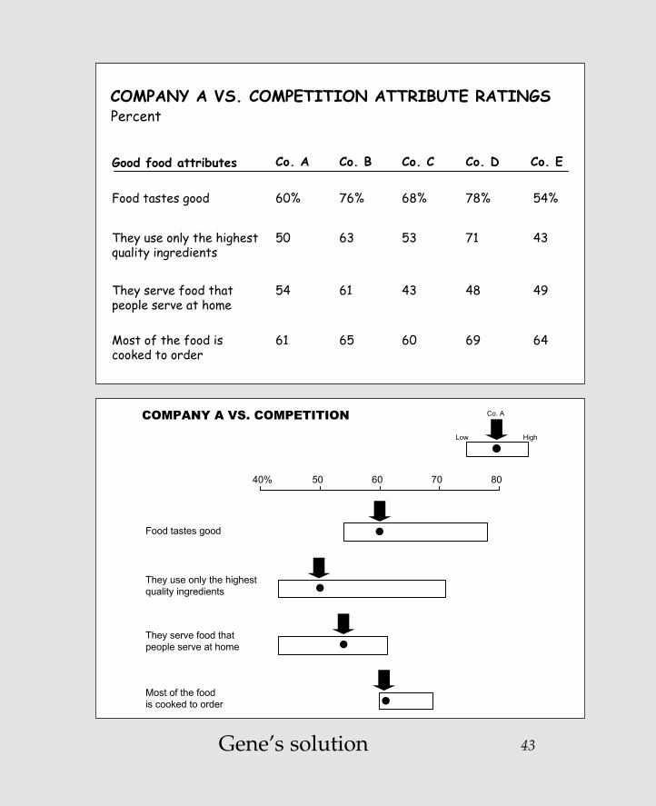
Different is betterI'll grant that there are those in the business communitywho "inhale" tabular data. That is, they look at a list ofnumbers and quickly read the trends they represent.However, as I point out in Say It with Charts, data impliesrelationships, whereas charts demonstrate them. And so it is with this example.
In this case, by plotting the range between the low and highperformers for each of the attributes, we see Company A'sranking much more quickly and without needing to readand interpret all the numbers in the table.
42
Zelazny_2-23.qxd 2/23/05 4:41 PM Page 42
43
COMPANY A VS. COMPETITION ATTRIBUTE RATINGS
Good food attributes Co. CCo. A Co. B Co. D
Food tastes good 68% 60% 76% 78% 54%
Co. E
They use only the highest quality ingredients
53 50 63 71 43
They serve food thatpeople serve at home
43 54 61 48 49
Most of the food is cooked to order
60 61 65 69 64
Percent
COMPANY A VS. COMPETITION
40% 50 60 70 80
Food tastes good
They use only the highest quality ingredients
They serve food thatpeople serve at home
is cooked to order
Low
Co. A
High
Most of the food
Gene’s solution
Zelazny_2-23.qxd 2/23/05 4:41 PM Page 43

Zelazny_2-23.qxd 2/23/05 4:41 PM Page 44
This page intentionally left blank.

45Your solution
Developed markets Proposed solution
• Problem accounts under control
• Banks operate based on risk-adjusted profits
• Practices and policies to ensure accurate information
• Known sources of risk
Emerging markets
• Large number of problem accounts
• Performance assessment based on volume or net profits
• Information is not available/accurate
• Unknown/unqualifiableservices of risk (i.e., complex cross-share holdings)
vs.
• Process to systematically address large number of loans
• Tools to assist in data collection and decision making
• Organization compartments to support process
DIFFERENCES IN EMERGING MARKETS
Zelazny_2-23.qxd 2/23/05 4:41 PM Page 45

46
Creativity is betterOn the surface, it's hard to see why we would want tochange the chart at the top of the next page. After all, itdoes a good job of showing how the proposed solutioncomes out of the differences identified between thedeveloped and emerging markets.
And yet, for me, the word "Differences" in the title made mefeel that the solution resulted from the combined forces atwork—therefore what you see on the bottom chart.
The added benefits are that the visual looks more attractiveas a design, and it makes it stand out from the crowd ofother visuals we traditionally see in presentations.
Zelazny_2-23.qxd 2/23/05 4:41 PM Page 46

47
Developed markets Proposed solution
• Problem accounts under control
• Banks operate based on risk-adjusted profits
• Practices and policies to ensure accurate information
• Known sources of risk
Emerging markets
• Large number of problem accounts
• Performance assessment based on volume or net profits
• Information is not available/accurate
• Unknown/unqualifiableservices of risk (i.e., complex cross-share holdings)
vs.
• Process to systematically address large number of loans
• Tools to assist in data collection and decision making
• Organization compartments to support process
DIFFERENCES IN EMERGING MARKETS
DIFFERENCES IN EMERGING MARKETS
PROPOSED SOLUTION
• Process to systematically address large number of loans
• Tools to assist in data collection and decision making
• Organization compartments to support process
DEVELOPED MARKETS
• Problem accounts under control
• Banks operate based on risk-adjusted profits
• Practices and policies to ensure accurate information
• Known sources of risk
EMERGING MARKETS
• Large number of problem accounts
• Performance based on volume or net profits
• Information is not available/ accurate
• Unknown/unqualifiable services of risk
vs.
Gene’s solution
Zelazny_2-23.qxd 2/23/05 4:41 PM Page 47

Zelazny_2-23.qxd 2/23/05 4:41 PM Page 48
This page intentionally left blank.

49Your solution
COMPARING APPROACHES
Same objectiveExpand beyond LD to capture
more revenue/profit
Growing, changing, anduncertain markets?
COMPANY A"Get as much footprint as quickly as possible given financial constraints, through opportunistic and uncertain alliances"
• Make opportunistic moves through small investments/acquisitions and alliances
• Resell and form alliances with established players
• Extend reach through alliances, JVs• Have strong partners well established in their
areas of expertise• Reach large customer segments, with an
increasing consumer orientation
COMPANY B"Expand from core competencies while retaining control along the way"
• Make big bests through large investments and acquisitions
• Build own capabilities
• Use own distribution• Have weaker partners who can be better
influenced• Target fewer high-value customers to sell
more things to
Different approaches
vs.
vs.
vs.vs.
vs.
Fast and opportunistic moves, with potential execution challenges
Planned approach aiming for wholly owned perfect answers and customer control
Zelazny_2-23.qxd 2/23/05 4:41 PM Page 49

Zelazny_2-23.qxd 2/23/05 4:41 PM Page 50
This page intentionally left blank.

Remember, your solutionmay be BETTER than mine
Resist the temptationto sneak a peak
Zelazny_2-23.qxd 2/23/05 4:41 PM Page 51
Copyright © 2005 by Gene Zelazny. Click here for terms of use.

52
Creativity is betterIt doesn't take long to understand that the point of the chartat the top of the next page is to contrast the approaches thatthe two companies take to reach the same objective.
However, I find myself spending too much valuable timereading all the bullet points to be able to appreciate thedistinctions the chart describes and the flow of ideas.
My solution, shown below the first chart, is to switch the flowfrom top–bottom to bottom–top. In this manner, the chart firstidentifies the forces at work (growing, changing, uncertainmarkets) that lead to a summary of each company's approach,seen at the base of the arrows. Then, the eye moves up to see asimpler and clearer contrast of each company's moves, all ofwhich leads to the common objective at the top.
Adding the arrows in perspective helps the eyes follow the flow.
A general tip is worthy of mention here: arrows arepowerful tools to convey a number of concepts—changes ina situation, movement, or the passage of time, just to namea few. I use them often to “point the way.”
Zelazny_2-23.qxd 2/23/05 4:41 PM Page 52

53
COMPARING APPROACHES
Same objectiveExpand beyond LD to capture
more revenue/profit
Growing, changing, anduncertain markets?
COMPANY A"Get as much footprint as quickly as possible given financial constraints, through opportunistic and uncertain alliances"
• Make opportunistic moves through small investments/acquisitions and alliances
• Resell and form alliances with established players
• Extend reach through alliances, JVs• Have strong partners well established in their
areas of expertise• Reach large customer segments, with an
increasing consumer orientation
COMPANY B"Expand from core competencies while retaining control along the way"
• Make big bests through large investments and acquisitions
• Build own capabilities
• Use own distribution• Have weaker partners who can be better
influenced• Target fewer high-value customers to sell
more things to
Different approaches
vs.
vs.
vs.vs.
vs.
Fast and opportunistic moves, with potential execution challenges
Planned approach aiming for wholly owned perfect answers and customer control
COMPARING APPROACHES
Expand beyond LDto capture morerevenue/profit
Co. A Co. B
Growing, changing, uncertain markets
"Get your foot in the door
ASAP throughopportunistic
and uncertainalliances"
"Expand from corecompetencies
while retainingcontrol along
the way"
Fast and opportunistic moves, with potential execution challenges
Planned approach aiming for wholly-owned, perfect answers and customer control
Build own capabilities
Resell and form alliances
vs.
Use own distributionExtend reach through alliances, JVs
vs.
Have partners who can be influenced
Have strong partners vs.
Target fewer high-volume customers
Reach large customer segments vs.
Make opportunistic
moves
Make bigbets
vs.
Gene’s solution
Zelazny_2-23.qxd 2/23/05 4:41 PM Page 53

Zelazny_2-23.qxd 2/23/05 4:41 PM Page 54
This page intentionally left blank.

55Your solution
SIGNIFICANT CHANGES IN MARKET SHAREPercentage of domestic cigarette market
Q1 Q2 Q3 Q4
Company F
Company E
Company D
Company C
Company B
Company A0
10
20
30
40
50
60
70
80
90
100
Zelazny_2-23.qxd 2/23/05 4:41 PM Page 55

56
Different is betterOne of the criteria for designing charts that work is makingsure that the chart clearly depicts the message in the title.
In this case, I just don't experience the word "significant."
I do see the decline over the year for Company A because it'smeasured against a flat base line. But what about the othercompanies?
Can you appreciate the difference that results from showingeach company against its own base line? Also, notice that bysqueezing the time scale and making better use of the layoutspace, we’re able to use a bigger scale that magnifies the"significant" differences mentioned in the title.
Zelazny_2-23.qxd 2/23/05 4:41 PM Page 56

57
SIGNIFICANT CHANGES IN MARKET SHAREPercentage of domestic cigarette market
Q1 Q2 Q3 Q4
Company F
Company E
Company D
Company C
Company B
Company A0
10
20
30
40
50
60
70
80
90
100
Company ECompany D
SIGNIFICANT CHANGES IN MARKET SHAREPercentage of domestic cigarette market
Company F
Company CCompany BCompany A
Q1 Q2 Q3 Q4 Q1 Q2 Q3 Q4 Q1 Q2 Q3 Q4
Q1
10
20
30
0
10
0
Q2 Q3 Q4 Q1 Q2 Q3 Q4 Q1 Q2 Q3 Q4
Gene’s solution
Zelazny_2-23.qxd 2/23/05 4:41 PM Page 57

Zelazny_2-23.qxd 2/23/05 4:41 PM Page 58
This page intentionally left blank.

59Your solution
TRADITIONAL "CORRECTIVE" APPROACH VS. NEW "PREVENTIVE" APPROACH
New preventive approach
Proactive:"Prevent the problem from occurring"
Lead time: Longer lead times to act
Tracking: Need to track business fundamentals
Traditional corrective approach
Reactive: "Fix the problem once it appears"
Lead time: Very short lead-time
Tracking: Need to track loan-specific metrics
70-80%
Preventive
10-20%
Traditional
Recovery rate
Zelazny_2-23.qxd 2/23/05 4:41 PM Page 59

Creativity is betterOnce more, an example of a chart that's easy to followand that doesn't appear to need change.
However, did you notice the back-and-forth movement of your eyes as you sought to figure out the relationship of the column chart at the right with the column headingson the left?
Can you now appreciate the added benefit of the arrows,which more quickly distinguish the opposite direction ofthe two approaches and lead to the corresponding "recoveryrate" resulting from each approach?
60
Zelazny_2-23.qxd 2/23/05 4:41 PM Page 60

61
TRADITIONAL "CORRECTIVE" APPROACH VS. NEW "PREVENTIVE" APPROACH
New preventive approach
Proactive:"Prevent the problem from occurring"
Lead time: Longer lead times to act
Tracking: Need to track business fundamentals
Traditional corrective approach
Reactive: "Fix the problem once it appears"
Lead time: Very short lead-time
Tracking: Need to track loan-specific metrics
70-80%
Preventive
10-20%
Traditional
Recovery rate
CORRECTIVE VS. PREVENTIVE APPROACH
Preventive approach
Proactive:Prevent the problem from occurring
Lead time: Longer lead times to act
Tracking: Need to track business fundamentals
Corrective approach
Reactive:Fix the problemonce it appears
Lead time: Very short lead-time
Tracking: Need to track loan-
specific metrics
70-80%
Recovery rate
10-20%
Recovery rate
Gene’s solution
Zelazny_2-23.qxd 2/23/05 4:41 PM Page 61

Zelazny_2-23.qxd 2/23/05 4:41 PM Page 62
This page intentionally left blank.

63Your solution
3.4
-1.5
10.0
-0.1
12.0
0.8 1.1
15.6
-0.2
17.6
5.0-0.4
5.3
0.0
6.2
3.2 1.2 5.7
-0.3
10.0
ETHICAL PHARMACEUTICAL MARKET GROWTH
1.77.9
3.6-0.5
13.2
1.0 1.0 5.0-0.6
6.5
1.8 0.89.2
-1.1
10.8
Price TotalGenericsInnovation/otherVolumeMarket
U.S.
U.K.
France
Italy
Japan
Total
Germany
MixSources of change CAGR, percent
Zelazny_2-23.qxd 2/23/05 4:41 PM Page 63

Different is betterHere's an example showing that plotting every numberresults in hardly any visual difference among the data. It renders the chart frustratingly difficult to read, especiallybecause the scale is so squeezed.
In this case, I plotted just the totals in a vertical bar chartand then left the rest of the data in a table underneath itsrespective country. In this manner, we can see the range of growth by country and then study the sources thatcontribute to the change in a much more restful table.
By the way, the sequence of columns could have beenarranged in either descending or ascending order,depending on the situation at hand. Granted that this is an"item comparison" that should be treated more often thannot as a horizontal bar chart. Let's be flexible in this caseand agree that the vertical bars work better.
This chart provides a good illustration of a solution that issometimes so obvious we don't see it. We frequently feelobligated to plot our data in bars, columns, or whatever,when the best idea may be to just "table it."
64
Zelazny_2-23.qxd 2/23/05 4:41 PM Page 64

65
3.4
-1.5
10.0
-0.1
12.0
0.8 1.1
15.6
-0.2
17.6
5.0-0.4
5.3
0.0
6.2
3.2 1.2 5.7
-0.3
10.0
ETHICAL PHARMACEUTICAL MARKET GROWTH
1.77.9
3.6-0.5
13.2
1.0 1.0 5.0-0.6
6.5
1.8 0.89.2
-1.1
10.8
Price TotalGenericsInnovation/otherVolumeMarket
U.S.
U.K.
France
Italy
Japan
Total
Germany
MixSources of change CAGR, percent
ETHICAL PHARMACEUTICAL MARKET GROWTH
CAGR 2003-2005
6.5 6.2
10 .0
17 .6
13 .212 .0
10 .8
Total Italy U.S. France U.K. Germany Japan
Sources of change
Volume
Price
Generics
Other
3.2%
1.2%
-0.3%
5.7%
0.8
1.1
-0.2
15.6
1.7
7.9
-0.5
3.6
3.4
-1.5
-0.1
10.0
1.8
0.8
-1.1
9.2
1.0
1.0
-0.6
5.0
5.0
-4.0
0
5.3
Gene’s solution
Zelazny_2-23.qxd 2/23/05 4:41 PM Page 65

Zelazny_2-23.qxd 2/23/05 4:41 PM Page 66
This page intentionally left blank.

67Your solution
3.2
4.4
2.9
3.2
50.2
2.0
1.9
2.12.1
4.8
5.0
5.6
1.51.6
2.67.3
OVERVIEW OF OUTSIDE DATA PROCESSING EXPENSE$ Millions
Large systems
Voice & optical equipment
Large printers
PCs Other & unknown
Terminals (main-frame)
Proprie-tary terminals
Other & unknown
Com-puters
Optical equipment
Peri-pherals & terminals
Other & unknown
Data process-ing
Software Program-ming
Total
Total depreciation = $16.2
Total rent/lease = $9.8
Total repair/maintenance = $14.2
Total DP services = $10.2
Zelazny_2-23.qxd 2/23/05 4:41 PM Page 67

Different is betterWaterfall charts work best when they are used to show acombination of pluses and minuses. Otherwise, theydemonstrate the first habit of bad chart design: "Nothing is ever so simple that we cannot make it complex."
Can you see—or not see—that all we have here is a piechart showing how the parts add up to the total? On theother hand, given the number of components in thiscase, I'll grant that a pie chart would not work.Therefore, make it into an "item comparison" and createfour clusters of bar charts.
Now you can use a much larger scale to differentiate thedata. And notice how the labels are much easier to read,since they're no longer limited by the width of thecolumns.
68
Zelazny_2-23.qxd 2/23/05 4:41 PM Page 68

69
3.2
4.4
2.9
3.2
50.2
2.0
1.9
2.12.1
4.8
5.0
5.6
1.51.6
2.67.3
OVERVIEW OF OUTSIDE DATA PROCESSING EXPENSE$ Millions
Large systems
Voice & optical equipment
Large printers
PCs Other & unknown
Terminals (main-frame)
Proprie-tary terminals
Other & unknown
Com-puters
Optical equipment
Peri-pherals & terminals
Other & unknown
Data process-ing
Software Program-ming
Total
Total depreciation = $16.2
Total rent/lease = $9.8
Total repair/maintenance = $14.2
Total DP services = $10.2
OVERVIEW OF OUTSIDE DATA PROCESSING EXPENSE $ Millions
Large systems 7.3
2.6
1.6
1.5
3.2
5.6
2.1
2.1
5.0
4.4
2.9
1.9
4.8
3.2
2.0
Voice & optical equipment
Large printers
PCs
Other
Terminals
Proprietary terminals
Other
Computers
Optical equipment
Peripherals & terminals
Other
Data processing
Software
Programming
Depreciation$16.2
Rent/lease$9.8
Repair/maintenance$14.2
DP services$10.0
100% = $50.2
Gene’s solution
Zelazny_2-23.qxd 2/23/05 4:41 PM Page 69

Zelazny_2-23.qxd 2/23/05 4:41 PM Page 70
This page intentionally left blank.

71Your solution
TYPICAL MANAGEMENT ACTIONS TO DRIVE SALES PERFORMANCE SOMETIMES MISS THE MARK
Lever
Segmentation
Coverage model
Skills and incentives
Sales process
Performance management
• Focus on largest customers
• Allocate more reps against key customers
• Increase quota• Implementation training program
• Improve efficiency with contact-management software
• Get the deal at any price
• Ask managers to "over-inspect" the sales force
• Large customers not always most profitable
• 20-30% productivity improvement possible from current reps
• Can drive short-term growth at cost of customer satisfaction
• Without coaching, majority of benefit lost within one month
• Limited impact without behavioral change
• Actual margin often negative for >50% of customers
• Most managers overburdened with metrics/meetings
"Common remedies" Reality
Zelazny_2-23.qxd 2/23/05 4:41 PM Page 71

72
More is betterI'd like to believe that by now you can quickly figure out what to do with this one.
As before, this chart works well on a single page as ahandout.
But for an onscreen presentation—no matter the pressure to minimize the number of slides—breaking it into multipleslides concentrates comments on each of the levers one at atime, and avoids the problem of the audience readingahead.
Zelazny_2-23.qxd 2/23/05 4:41 PM Page 72

73
TYPICAL MANAGEMENT ACTIONS TO DRIVE SALES PERFORMANCE SOMETIMES MISS THE MARK
Lever
Segmentation
Coverage model
Skills and incentives
Sales process
Performance management
• Focus on largest customers
• Allocate more reps against key customers
• Increase quota• Implementation training program
• Improve efficiency with contact-management software
• Get the deal at any price
• Ask managers to "over-inspect" the sales force
• Large customers not always most profitable
• 20-30% productivity improvement possible from current reps
• Can drive short-term growth at cost of customer satisfaction
• Without coaching, majority of benefit lost within one month
• Limited impact without behavioral change
• Actual margin often negative for >50% of customers
• Most managers overburdened with metrics/meetings
"Common remedies" Reality
TYPICAL MANAGEMENT ACTIONS TO DRIVE SALES PERFORMANCE
Lever
Common remedy
Focus on largest customers
Reality
Large customers not always most profitab
Segmentation
Coverage model
Skills and incentives
Sales process
Performance management
Gene’s solution
Zelazny_2-23.qxd 2/23/05 4:41 PM Page 73

74
TYPICAL MANAGEMENT ACTIONS TO DRIVE SALES PERFORMANCE
Lever
Segmentation
Coverage model
Skills and incentives
Sales process
Performance management
Common remedyAllocate more reps against key customers
Reality20-30% productivity improvementpossible from current reps
TYPICAL MANAGEMENT ACTIONS TO DRIVE SALES PERFORMANCE
Lever
Segmentation
Coverage model
Skills and incentives
Sales process
Performance management
Common remedy• Increase quota
• Implement training program
Realities• Can drive short-term growth at cost of customer satisfaction
• Without coaching, majority of benef lost within one month
Zelazny_2-23.qxd 2/23/05 4:41 PM Page 74

75Your solution
RELATIONSHIP OF SUPERMARKET SALES TO EARNINGS
0
10
20
30
40
50
60
70
80
90
100
0 10 20 30 40 50 60 70 80 90 100
Dairy
Produce
Meat
Grocery
Sales, %
Earnings, %
Zelazny_2-23.qxd 2/23/05 4:41 PM Page 75

76
Different is betterAs simple as the chart looks, it takes time to figure out howbest to read the information. With a bit of effort, we finallysee that this is meant to show the correlation between thepercentages of sales to earnings for each of foursupermarket product categories.
The same message can be delivered more easily and quicklyby using a two-columned chart.
Zelazny_2-23.qxd 2/23/05 4:41 PM Page 76

77
RELATIONSHIP OF SUPERMARKET SALES TO EARNINGS
0
10
20
30
40
50
60
70
80
90
100
0 10 20 30 40 50 60 70 80 90 100
Dairy
Produce
Meat
Grocery
Sales, %
Earnings, %
25
70
15
15
10
35
5
25
SMALLEST EARNINGS GENERATED BY AREA OF GREATEST SALES EFFORT
100% 100%
Grocery
Meat
Produce
Dairy
Sales Earnings
Gene’s solution
Zelazny_2-23.qxd 2/23/05 4:41 PM Page 77

Zelazny_2-23.qxd 2/23/05 4:41 PM Page 78
This page intentionally left blank.

79Your solution
OPERATING PROFIT — CONTRIBUTION BY SECTOR Euro millions
61
(16)(3)
(17)
65
20
12
Retailing Wood-basedpanels
ShoppingCenters
Telecoms Tourism Others Total
Zelazny_2-23.qxd 2/23/05 4:41 PM Page 79

80
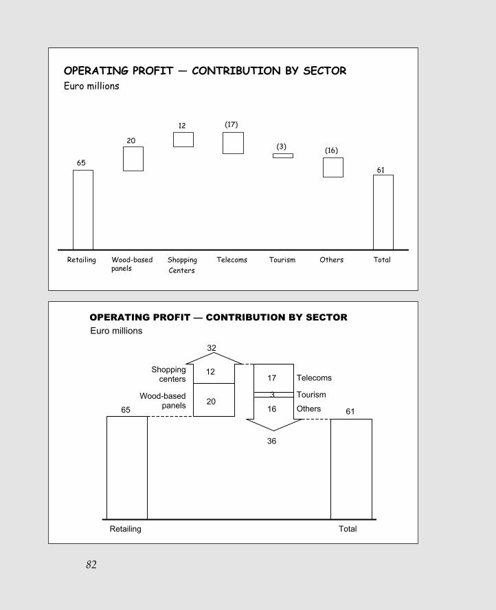
Creativity is betterI have two simple suggestions that would make this charteasier to read.
One you see on the bottom, which is to use directionalarrows to make it easier to see the ups and downs of thevarious components.
Second, on the other side of the facing page, is to group allthe pluses into one arrow versus the sum of all the minuses,thereby reducing the number of individual components weusually see on these charts.
Zelazny_2-23.qxd 2/23/05 4:41 PM Page 80

81
OPERATING PROFIT — CONTRIBUTION BY SECTOR Euro millions
61
(16)(3)
(17)
65
20
12
Retailing Wood-basedpanels
ShoppingCenters
Telecoms Tourism Others Total
OPERATING PROFIT — CONTRIBUTION BY SECTOR Euro millions
Retailing
65
Wood-basedpanels
Shoppingcenters
20
12
61
TotalTelecoms Tourism Others
173
16
Gene’s solution
Zelazny_2-23.qxd 2/23/05 4:41 PM Page 81
82
OPERATING PROFIT — CONTRIBUTION BY SECTOR Euro millions
61
(16)(3)
(17)
65
20
12
Retailing Wood-basedpanels
ShoppingCenters
Telecoms Tourism Others Total
Retailing
65
Shoppingcenters
Wood-basedpanels
32
12
20
Total
61
36
Telecoms
Tourism
Others
17
3
16
OPERATING PROFIT — CONTRIBUTION BY SECTOR
Euro millions
Zelazny_2-23.qxd 2/23/05 4:41 PM Page 82

83Your solution
Hungary**NPLs: 0.4% of GDP: 1%% of total loans: 3%
Mexico**NPLs: 5% of GDP: 1%% of total loans: 7%
Chile**NPLs: 0.8% of GDP: 1%% of total loans: 2%
Argentina**NPLs: 10% of GDP: 4%% of total loans: 12%
Brazil**NPLs: 8% of GDP: 1%% of total loans: 5%
ThailandNPLs: 50% of GDP: 41%% of total loans: 45%
MalaysiaNPLs: 43% of GDP: 48%% of total loans: 39%
IndonesiaNPLs: 22% of GDP: 14%% of total loans: 78%
PhilippinesNPLs: 11% of GDP: 15%% of total loans: 38%
TaiwanNPLs: 83% of GDP: 27%% of total loans: 18%
JapanNPLs: 1,201% of GDP: 25%% of total loans: 30%
KoreaNPLs: 64% of GDP: 14%% of total loans: 26%
Russia**NPLs: 1.3% of GDP: 0.4%% of total loans: 3%
PRCNPLs: 480% of GDP: 44%% of total loans: 40%
Poland**NPLs: 6% of GDP: 4%% of total loans: 15%
PROBLEMATIC LOANS ARE A GLOBAL CONCERNU.S. $ Billions
Zelazny_2-23.qxd 2/23/05 4:41 PM Page 83

Simpler is betterWhereas I find the use of the world map attractive, I don'thave to convince you that this chart has a major legibilityproblem. Also, it bothers me that the label for Hungary is all the way to the left, above those for Mexico and Chile,when it should be with its geographical colleagues ofPoland and Russia across the top.
Beyond that, I find the repetition of the labels for the threemeasures redundant. And it takes up a lot of real estate.
In this case my solution to the problem is to "table it." By putting all the data in a simple table, I can reduce theredundant labels, and make the chart legible. Also, the map is greatly simplified and the table of countries lines up vertically with their relative positions on the map.Depending upon the audience, the map could be arrangedwith Europe or the U.S. first instead of Asia, as shown.
84
Zelazny_2-23.qxd 2/23/05 4:41 PM Page 84

85
Hungary**NPLs: 0.4% of GDP: 1%% of total loans: 3%
Mexico**NPLs: 5% of GDP: 1%% of total loans: 7%
Chile**NPLs: 0.8% of GDP: 1%% of total loans: 2%
Argentina**NPLs: 10% of GDP: 4%% of total loans: 12%
Brazil**NPLs: 8% of GDP: 1%% of total loans: 5%
ThailandNPLs: 50% of GDP: 41%% of total loans: 45%
MalaysiaNPLs: 43% of GDP: 48%% of total loans: 39%
IndonesiaNPLs: 22% of GDP: 14%% of total loans: 78%
PhilippinesNPLs: 11% of GDP: 15%% of total loans: 38%
TaiwanNPLs: 83% of GDP: 27%% of total loans: 18%
JapanNPLs: 1,201% of GDP: 25%% of total loans: 30%
KoreaNPLs: 64% of GDP: 14%% of total loans: 26%
Russia**NPLs: 1.3% of GDP: 0.4%% of total loans: 3%
PRCNPLs: 480% of GDP: 44%% of total loans: 40%
Poland**NPLs: 6% of GDP: 4%% of total loans: 15%
PROBLEMATIC LOANS ARE A GLOBAL CONCERNU.S. $ Billions
PROBLEMATIC LOANS ARE A GLOBAL CONCERNU.S. $ Billions
NPLs
% of GDP
% of total loans
Thai
land
50 43 22 480 64 1,201 83 11
41 48 14 44 14 25 27 15
45 39 78 40 26 30 18 38
5 0.8 10 8
1 1 4 1
7 2 12 5
6 1.3
4 0.4
0.4
1
15 3 3
Mal
aysi
aIn
done
sia
PRC
Kor
ea
Japa
n
Taiw
an
Phi
lippi
nes
Mex
ico
Chi
le
Arg
entin
a
Bra
zil
Pol
and
Rus
sia
Hun
gary
Gene’s solution
Zelazny_2-23.qxd 2/23/05 4:41 PM Page 85

Zelazny_2-23.qxd 2/23/05 4:41 PM Page 86
This page intentionally left blank.
TEAM FLY
87Your solution
0
1
2
3
4
5
6
7
8
9
10
A B C D E F G H
MARKET SHARE PERFORMANCE BY SALESPERSONShare of market
Salesperson
Zelazny_2-23.qxd 2/23/05 4:41 PM Page 87

88
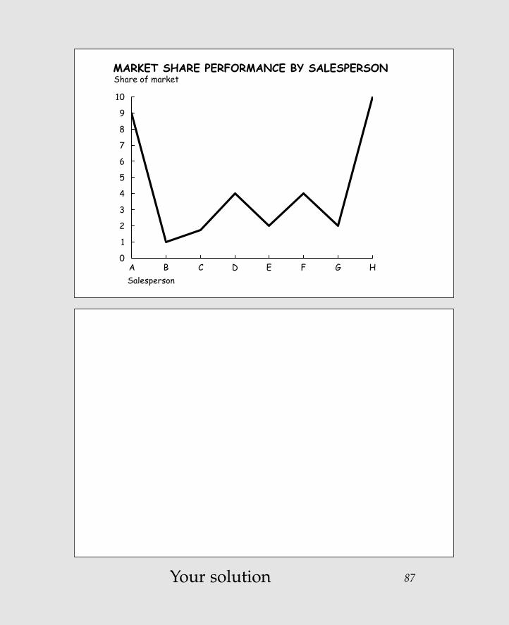
Different is betterThis is an example that demonstrates one of the first rules of chart design—that charts provide a quick visualimpression and that the title, scale, and footnotes are allsecondary to that impression.
When I first looked at this chart, my quick impression was that the share of market went through some wildfluctuations over time, but finally reversed the grave loss it endured in the first period.
When I looked more closely, I realized that this is not a"time series comparison" but an "item comparison" thatcontrasts the performance of several salespeople. Noticehow much faster and more accurate the visual impressionbecomes when treated as a bar chart.
Zelazny_2-23.qxd 2/23/05 4:41 PM Page 88

89
0
1
2
3
4
5
6
7
8
9
10
A B C D E F G H
MARKET SHARE PERFORMANCE BY SALESPERSONShare of market
Salesperson
THE SHARE OF MARKET COVERED BY SALESPERSONSVARIES SHARPLY
Share of market
H
A
D
F
E
G
C
B
Salesperson
0 2 4 6 8 10
Gene’s solution
Zelazny_2-23.qxd 2/23/05 4:41 PM Page 89

Zelazny_2-23.qxd 2/23/05 4:41 PM Page 90
This page intentionally left blank.

91Your solution
5.7
15 .0
9.5
12.0
75 .8
27%6%
40%
217.9
130.1
214.1
13.7%
Employment, Thousands
Company A Company B
Total assets, $ Millions
Company A Company B
Then Now Then Now Then Now Then Now
79 .55.0
33%24%
4%
246.0
11.3
27.2
16%
Sales, $ Millions
Company A Company B
Net income, $ Millions
Company A Company B
Then Now Then Now Then Now Then Now
6.1
119.9
263.7
Zelazny_2-23.qxd 2/23/05 4:41 PM Page 91

92
Different is betterAt times, in our effort to show all the data we've gathered,we plot the wrong figures. Here it's not so much thecomparisons of the actual employment, assets, sales, andnet income that tells the story, but their percentage changeover time—in this case, the average annual growth rates.
By plotting these growth rates, we more clearly and quicklysee the reverse pattern mentioned in the message title.
By the way, if showing the absolute values remainsimportant, it's perfectly appropriate to include them intabular form underneath their respective time periods as you see here at the bottom of the chart.
Zelazny_2-23.qxd 2/23/05 4:41 PM Page 92

93
5.7
15 .0
9.5
12.0
75 .8
27%6%
40%
217.9
130.1
214.1
13.7%
Employment, Thousands
Company A Company B
Total assets, $ Millions
Company A Company B
Then Now Then Now Then Now Then Now
79 .55.0
33%24%
4%
246.0
11.3
27.2
16%
Sales, $ Millions
Company A Company B
Net income, $ Millions
Company A Company B
Then Now Then Now Then Now Then Now
6.1
119.9
263.7
IN SPITE OF COMPANY A'S GREATER GROWTH IN SALES, ASSETSAND EMPLOYMENT, COMPANY B OUTPERFORMED COMPANY A
Sales Assets Employment Net income
Then Now Then Now Then Now Then Now
Averageannualgrowthrates 33%
24%
40%
14%
27%
6%
16%
4%
Co. A
Co. B
$ Millions $ Millions $ Thousands $ Millions
79.5
119.9
246.0
263.7
75.8
130.4
27.9
214.1
5.7
9.5
15.0
12.0
5.0
11.3
6.1
27.2
Co. A
Co. B
Gene’s solution
Zelazny_2-23.qxd 2/23/05 4:41 PM Page 93

Zelazny_2-23.qxd 2/23/05 4:41 PM Page 94
This page intentionally left blank.
95Your solution
67
48 49
52 51
33
EXTERNAL RESEARCH SUPPLIERS ARE USED HEAVILY IN ALL AREAS OF RESEARCH
2614 12
86 8874
3726
38
16
45 46
7462
84
55 5463
100% 100%
Copy
rese
arch
Med
ia re
sear
chAd
eff
ectiv
enes
s
Pack
aging
des
ign
Prod
uct t
estin
gN
ew p
rodu
ct a
ccep
tanc
e
Cons
umer
pan
els
Stor
e au
dits
Prom
otion
sM
arke
t sha
re a
nalys
is
Chan
nel s
tudi
es
Sale
s qu
otas
100%
Advertising research Product research Sales & market research
Relative frequency of use of inside versus external researchInternal research department
External research department
Zelazny_2-23.qxd 2/23/05 4:41 PM Page 95

96
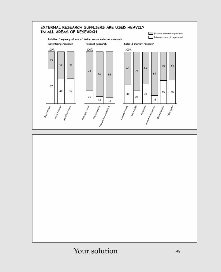
Different is betterI work very hard to make sure that I don't ask the reader to turn his or her head in order to read the labels at the bottom of each column, as you must here. Similarly, I work hard to avoid forcing the reader to look back andforth between the legend and the chart itself to see whatcorresponds to what.
Here, by using horizontal bars instead of vertical columns,more room is allowed for the labels, so they may be readnormally. Also, we can delete the legend and make itsinformation part of the chart. We do this with a sliding 100 percent bar chart, using the line that separates internaland external as the base line so the differences betweenthem are more clearly contrasted.
Zelazny_2-23.qxd 2/23/05 4:41 PM Page 96

97
67
48 49
52 51
33
EXTERNAL RESEARCH SUPPLIERS ARE USED HEAVILY IN ALL AREAS OF RESEARCH
2614 12
86 8874
3726
38
16
45 46
7462
84
55 5463
100% 100%
Copy
rese
arch
Med
ia re
sear
chAd
eff
ectiv
enes
s
Pack
aging
des
ign
Prod
uct t
estin
gN
ew p
rodu
ct a
ccep
tanc
e
Cons
umer
pan
els
Stor
e au
dits
Prom
otion
sM
arke
t sha
re a
nalys
is
Chan
nel s
tudi
es
Sale
s qu
otas
100%
Advertising research Product research Sales & market research
Relative frequency of use of inside versus external researchInternal research department
External research department
EXTERNAL RESEARCH SUPPLIERSARE USED HEAVILY IN ALL AREAS OF RESEARCH
100% 80 60 40 20 0 20 40 60 80 100%
Internal External
Copy research
Media research
Ad effectiveness
Packaging design
Product testing
New product acceptance
Consumer panels
Store audits
Promotions
Market share analysis
Channel studies
Sales quotas
Advertising
Product
Sales/market
Gene’s solution
Zelazny_2-23.qxd 2/23/05 4:41 PM Page 97

Zelazny_2-23.qxd 2/23/05 4:41 PM Page 98
This page intentionally left blank.

99Your solution
CONSUMER MARKET SEGMENTATION
Techno wannabe• 50% have kids, only 17%
of these have PCs• 45% own game systems
Technophile• 50% Purchased PCs before
1993• 45% are self-employed• 45% manage investments
with their computer
Technophobe• 55% are over 55 years of age• 74% are not college graduates
Techno follower• 55% purchased PCs
before 1993
Demand• Low-cost, easy-to-use
service appliance• Health monitoring
Demand• Multimedia replacement
PCs• Powerful home business
equipment
Demand• Low-cost family PC• High immersion games and
interactive TV
Demand• High immersion games
and interactive TV• PC gadgets• Powerful home business
equipment• Home banking
High
Low
Low High
Technology receptivity
PC ownership
Zelazny_2-23.qxd 2/23/05 4:41 PM Page 99

100
Creativity is betterAs is, the chart does a good job of presenting thecharacteristics and demand for four segments of theconsumer market for technology. It would be fine to leaveit that way for the handout.
If you were doing an onscreen presentation, however, a"More is better" solution would be to design several visuals:the first to introduce the four quadrants, the second throughfifth, to show the detailed characteristics and demand foreach of the four quadrants.
My real-life situation in dealing with this material involveda large audience at an off-site conference. So we took thechallenge one step further. As you see, we characterized thefour quadrants with illustrations that gave a personality toeach segment, leaving the speaker free to elaborate in asmuch or as little detail as the audience needed.
Zelazny_2-23.qxd 2/23/05 4:41 PM Page 100

CONSUMER MARKET SEGMENTATION
Techno wannabe• 50% have kids, only 17%
of these have PCs• 45% own game systems
Technophile• 50% Purchased PCs before
1993• 45% are self-employed• 45% manage investments
with their computer
Technophobe• 55% are over 55 years of age• 74% are not college graduates
Techno follower• 55% purchased PCs
before 1993
Demand• Low-cost, easy-to-use
service appliance• Health monitoring
Demand• Multimedia replacement
PCs• Powerful home business
equipment
Demand• Low-cost family PC• High immersion games and
interactive TV
Demand• High immersion games
and interactive TV• PC gadgets• Powerful home business
equipment• Home banking
High
Low
Low High
Technology receptivity
PC ownership
Hig
h
Low L
ow
Hig
h
. . . phile
. . . follower
PC ownership
Technology receptivity
. . . phobe
. . . wannabe
TECHNO . . .
Gene’s solution 101
Zelazny_2-23.qxd 2/23/05 4:41 PM Page 101

Zelazny_2-23.qxd 2/23/05 4:41 PM Page 102
This page intentionally left blank.

103Your solution
ACS SERVICES MARKET ESTIMATED REVENUE GROWTH
2002
2005
VoIP local access & VoBB services
24CAGRPercent
82 78 19 68
VoIP toll bypass services
ACSinfrastructure HW & SW
UMC messaging services
UMC-related enhanced services
IP eCRMcontact center services
Multi-channel collaboration services
Speech-enabled info services (portals)
86 93 0 41 124
IP Centrex
1 .3 22.5 5 1 .5 .12.5
6 11 3 4 40 12 7 3 10 4
.2.3
2.5
Web-casting services
111
Zelazny_2-23.qxd 2/23/05 4:41 PM Page 103

Zelazny_2-23.qxd 2/23/05 4:41 PM Page 104
This page intentionally left blank.

Earn extra
CREDITT
hink
of
AN
OT
HER
WA
Y
Zelazny_2-23.qxd 2/23/05 4:41 PM Page 105
Copyright © 2005 by Gene Zelazny. Click here for terms of use.

Different is (mercifully) betterLet's nominate this one to the charting Hall of Shame. It's both illegible and too complex. It took me some time,but I've come up with two possible solutions.
1. Multiple column charts show the pattern over time foreach of the components. Respective growth is muchmore apparent because everything is measured against a common base. (I left off the CAGRs—compound annualgrowth rates—but I could have included them to the right ofthe second column.)
2. As I show on the back of the facing page, sometimes it’s simpler to leave information in tabular form. I realizethat I've already said that tabular data merely impliescomparisons whereas charts demonstrate them.However, a table works better here because the numbersline up with each other, making the comparison easy. If nothing else, it certainly works many times better thanthe original treatment.
106
Zelazny_2-23.qxd 2/23/05 4:41 PM Page 106

107
ACS SERVICES MARKET ESTIMATED REVENUE GROWTH
2002
2005
VoIP local access & VoBB services
24CAGRPercent
82 78 19 68
VoIP toll bypass services
ACSinfrastructure HW & SW
UMC messaging services
UMC-related enhanced services
IP eCRMcontact center services
Multi-channel collaboration services
Speech-enabled info services (portals)
86 93 0 41 124
IP Centrex
1 .3 22.5 5 1 .5 .12.5
6 11 3 4 40 12 7 3 10 4
.2.3
2.5
Web-casting services
111
ACS SERVICES MARKET ESTIMATED REVENUE GROWTH$ Billions
2002 2005 2002 2005 2002 2005 2002 20052002 2005
$18.1
$102.5
1.0
11.0
2.5
6.0
0.3
3.0
1.0
12.0
0.5
7.0
0.2
4.0
0.1
2.5
5.0
40.0
2.5
10.0
2.0
4.0
3.0 3.0
IP eCRMcontact center VoIP toll bypass
UMC-relatedenhanced
Speed-enabledinformation
Multi-channelcollaboration
Web castingVoIP local access & VoBB
IP Centrex
HW & SW
ICS infrastructure
UMC messagingTOTAL
Gene’s solution No. 1
Zelazny_2-23.qxd 2/23/05 4:41 PM Page 107

108 Gene’s solution No. 2
ACS SERVICES MARKET ESTIMATED REVENUE GROWTH
2002
2005
VoIP local access & VoBB services
24CAGRPercent
82 78 19 68
VoIP toll bypass services
ACSinfrastructure HW & SW
UMC messaging services
UMC-related enhanced services
IP eCRMcontact center services
Multi-channel collaboration services
Speech-enabled info services (portals)
86 93 0 41 124
IP Centrex
1 .3 22.5 5 1 .5 .12.5
6 11 3 4 40 12 7 3 10 4
.2.3
2.5
Web-casting services
111
ACS SERVICES MARKET ESTIMATED REVENUE GROWTH$ Billions
2002 2005
$18.1
$102.5Total
IP eCRM contact center
Multi-channel collaboration
HW&SW
VoIP toll bypass
Web casting
ICS infrastructure
UMC-related enhanced
VoIP local access & VoBB
Speech-enabled information
IP Centrex
5.0
1.0
1.0
2.5
0.5
2.5
2.0
0.2
3.0
0.1
40.0
12.0
11.0
10.0
7.0
6.0
4.0
4.0
3.0
2.5
68
86
82
41
93
24
19
111
0
124
2002 2005 CAGR, %
$ Billions
Zelazny_2-23.qxd 2/23/05 4:41 PM Page 108

109Your solution
BANK PORTFOLIO BY MARKET SEGMENT
-8
-6
-4
-2
0
2
4
6
8
10
-4 -3 -2 -1 0 1 2 3 4 5
-8
-6
-4
-2
0
2
4
6
8
10
-4 -3 -2 -1 0 1 2 3 4 5
-8
-6
-4
-2
0
2
4
6
8
10
-4 -3 -2 -1 0 1 2 3 4 5
ROAPercent
ROAPercent
ROAPercent
Return on spending, percent Return on spending, percent Return on spending, percent
1. Individual2. Small commercial3. Real estate dev.4. Middle market
5. Large corporate6. International7. Government8. Depository inst.
9. Intraco10. Affiliates11. Bank total
2003 2004 2005
10
9
11
8
7
12
36
4
5
7
36
9
118
10
21
5
4 11
8
910
2
36
5
1
74
Zelazny_2-23.qxd 2/23/05 4:41 PM Page 109

More and different are betterGive up? How much effort did it take you to follow thebouncing numbers … and their changing sizes … over thethree time horizons … to figure out the message of this chart?
As you can see from my solution, one answer is to dividethe message into its component thoughts and use fiveseparate slides to get the story across. I've shown them allon one visual here, which would work for a handout. Foran onscreen presentation to a large audience, you may wantto show the first two in one slide as you explain how to readthe upcoming charts, then show the next three, full-screen,in succession to ensure legibility.
The first two visuals explain the axes of the matrix and howto read the chart. The latter three show the pattern for thesegments that became more profitable, those that showed no change, and those that lost their position over the threeyears.
110
Zelazny_2-23.qxd 2/23/05 4:41 PM Page 110

111
BANK PORTFOLIO BY MARKET SEGMENT
-8
-6
-4
-2
0
2
4
6
8
10
-4 -3 -2 -1 0 1 2 3 4 5
-8
-6
-4
-2
0
2
4
6
8
10
-4 -3 -2 -1 0 1 2 3 4 5
-8
-6
-4
-2
0
2
4
6
8
10
-4 -3 -2 -1 0 1 2 3 4 5
ROAPercent
ROAPercent
ROAPercent
Return on spending, percent Return on spending, percent Return on spending, percent
1. Individual2. Small commercial3. Real estate dev.4. Middle market
5. Large corporate6. International7. Government8. Depository inst.
9. Intraco10. Affiliates11. Bank total
2003 2004 2005
10
9
11
8
7
12
36
4
5
7
36
9
118
10
21
5
4 11
8
910
2
36
5
1
74
-8
-6
-4-2
0
2
46
8
10
-4 -3 -2 -1 0 1 2 3 4 5
-4 0 5-8
0
10%
Individual
-4 0 5-8
0
10%
International
-4 0 5-8
0
10%
Real estate dev.
-4 0 5-8
0
10%
Intraco
-4 0 5-8
0
10%
Large corp.
-4 0 5-8
0
10%
Affiliates
-4 0 5-8
0
10%
Government
-4 0 5-8
0
10%
Depository inst.
-4 0 5-8
0
10%
Middle market
-4 0 5-8
0
10%
Small commercial
3 SEGMENTS GAINED 3 SEGMENTS SHOWED NO CHANGE 4 SEGMENTS LOST POSITION
ROS ratio ROS ratio ROS ratio
-8
-6
-4
-2
0
2
4
6
8
10
-4 -3 -2 -1 0 1 2 3 4 5
Loss
Profit
ROS ratio
ROA ROA
ROS ratio
PORTFOLIO FRAMEWORK BANK TOTAL
2003 04 05
Gene’s solution
Zelazny_2-23.qxd 2/23/05 4:41 PM Page 111

Zelazny_2-23.qxd 2/23/05 4:41 PM Page 112
This page intentionally left blank.

113Your solution
GETTING THE BASICS RIGHT FOR PUBLIC SCHOOL
• Develop, attract, and retain excellent principals and teachers
• Improve school curricula, academic programs, and learning environments
• Develop a customer service-oriented central administration that excels at support to schools
• Maximize the dollars used to improve student achievement
• Enable and energize parent and community involvement
• Optimize interagency coordination
Zelazny_2-23.qxd 2/23/05 4:41 PM Page 113

114
Creativity is betterI include this last one only to remind you that, at times,your best bet for finding ways to develop creative andinteresting visuals is to look in the fourth edition of mybook, Say It with Charts. Just turn to Section 3, and thechapter I subtitle "Solutions in Search of Problems." This chapter offers a range of ideas for concept visuals.
Here is a sampling of the options I found.
Zelazny_2-23.qxd 2/23/05 4:41 PM Page 114

115
GETTING THE BASICS RIGHT FOR PUBLIC SCHOOL
• Develop, attract, and retain excellent principals and teachers
• Improve school curricula, academic programs, and learning environments
• Develop a customer service-oriented central administration that excels at support to schools
• Maximize the dollars used to improve student achievement
• Enable and energize parent and community involvement
• Optimize interagency coordination
GETTING THE BASICS RIGHT FOR PUBLIC SCHOOL
Optimize interagency coordination
Develop, attract, and retain excellent
principals and teachers
Improve school curricula, academic
programs, and learning environments
Develop a customer service-oriented central
administration
Maximize the dollars used to improve student achievement
Enable and energize parent and community
involvement
PUBLICSCHOOL
Zelazny_2-23.qxd 2/23/05 4:41 PM Page 115

116
Develop, attract, and retain excellent
principals and teachers
Improve school curricula,
academic programs, and learning environments
Develop a customer service-oriented central administration
Maximize the dollars used to improve
student achievement
Enable and energize parent and
community involvement
Optimize interagency coordination
GETTING THE BASICS RIGHT FOR PUBLIC SCHOOL
PUBLICSCHOOL
Develop, attract, and retain excellent principals and teachers
Develop, attract, and retain excellent principals and teachers
Improve school curricula, academic programs, and learning environments
Improve school curricula, academic programs, and learning environments
Maximize the dollars
used to improve student
achievement
Maximize the dollars
used to improve student
achievement
Enable andenergize
parent andcommunity
involvement
Enable andenergize
parent andcommunity
involvement
Optimize interagency coordination
Developa customer
service-oriented central
administration
Developa customer
service-oriented central
administration
GETTING THE BASICS RIGHT FOR PUBLIC SCHOOL
PUBLICSCHOOL
Zelazny_2-23.qxd 2/23/05 4:41 PM Page 116

117
Improve sc
hool curric
ula, academic p
rograms, and learning
environments
excellent principals and teachers
Develop, attract, and retain
Develop a customer service-oriented
central administration
Maximize the dollars used to improve
student achievement
Enable and energize parent and community
involvement
Optimize interagency coordination
GETTING THE BASICS RIGHT FOR PUBLIC SCHOOL
Develop, attract, and retain excellent
principals and teachers
Develop, attract, and retain excellent
principals and teachers
Improve school curricula, academic programs, and
learning environments
Improve school curricula, academic programs, and
learning environments
Develop a customer service-oriented
central administration
Develop a customer service-oriented
central administration
Maximize the dollars used to
improve student achievement
Maximize the dollars used to
improve student achievement
Enable and energize parent and community
involvement
Enable and energize parent and community
involvement
Optimize interagency coordination
Optimize interagency coordination
Public school
GETTING THE BASICS RIGHT FOR PUBLIC SCHOOL
Zelazny_2-23.qxd 2/23/05 4:41 PM Page 117

118
Develop, attract, and retain excellent
principals and teachers
Improve school curricula, academic
programs, and learning environments
Develop a customer
service-oriented central
administration
Maximize the dollars used to
improve student achievement
Enable and energize
parent and community involvement
Optimize interagency coordination
GETTING THE BASICS RIGHT FOR PUBLIC SCHOOL
GETTING THE BASICS RIGHT FOR PUBLIC SCHOOL
Develop a customer service-oriented central administration
Develop, attract, and retain excellent principals and teachers
Improve school curricula, academic programs, and learning environments
Maximize the dollars used to improve student achievement
Enable and energize parent
Optimize interagencycoordination
and community involvement
Start
Zelazny_2-23.qxd 2/23/05 4:41 PM Page 118

119
Public school
Goals 2 3 4 5 611
1. Develop, attract, and retain
excellent principals and teachers
GETTING THE BASICS RIGHT FOR PUBLIC SCHOOL
PS REPORT CARD
Develop, attract, and retain
excellent principals and teachers
Improve school curricula, academic
programs, and learning environments
Develop a customer service -oriented
central administration that excels at
support to schools
Maximize the dollars used to
improve student achievement
Enable and energize parent and
community involvement
Optimize interagency coordination
GETTING THE BASICS RIGHT FOR PUBLIC SCHOOL
Zelazny_2-23.qxd 2/23/05 4:41 PM Page 119

Congratulations!Here’s your certificate of completion
for your willingness to
Play It With Charts
120
Zelazny_2-23.qxd 2/23/05 4:41 PM Page 120
Copyright © 2005 by Gene Zelazny. Click here for terms of use.

121
Zelazny_2-23.qxd 2/23/05 4:41 PM Page 121

Arrows, 52–53, 60–61, 80–82Audience, 6, 12–13, 84
comparisons by, 26, 38focus on one idea at a time, 8large, 22, 100, 110reading ahead by, 72
Axes, 18, 110
Bar charts, 3horizontal, 26–27, 64, 96–97item comparison as, 64, 68–69, 88–89sequence change for, 6–7vertical, plotting totals in, 64–65
Base lines, 56, 96, 106Bullet points, 30–31, 52–53
Certificate of completion, 120–121Characteristics, presenting, 100Chart(s). See also specific charts
categories, 2–4data, 2–3, 5design of, 56, 68, 88forms, 3, 10, 34goals of, 38as handouts, 26, 72, 100, 110multiple, 8, 26, 106–107reading, 110relationships and data v., 42tabular data v., 18, 106two-columned, 76–77
Column charts, 3column headings’ relationship with, 60labels on, 34–35multiple, 106–107range, 26for time comparison, 10–11
Columnsarranging sequence of, 64headings, 60removing blank, 18vertical, horizontal bars v., 96
Company name, as logo-symbol, 30–31Comparisons. See also Item comparison
by audience, 26, 38of competitor’s approaches, 8–9data charts for, 3, 26–27, 106tables for, 106, 108time, 10–11time series, 3, 88
Components, 3arrows for ease in reading, 80–82dividing messages into, 110
Components (Cont.)highlighting most important, 26within 100 percent columns, 38–39patterns for, 106
Concept(s)charts, 2, 4, 5conveyed by arrows, 52visuals, ideas for, 114–119
Correlation, 3, 76
Data. See also Tabular datachart forms for, 10charts, 2–3, 5plotting, 64relationships and charts v., 42in tables, 64–65, 84–85
Details, 100messages and, 6, 8reducing, 26
Dot charts, 3
Flow, 4, 52–53Footnotes, 88
Growth rates, 64–65, 92–93, 106–107
Illustrations, for quadrants, 100–101Images, 2, 12–13, 30Index charts, 26Information
communication of, 1–2less, for legibility, 8offering too much, 6reading, 76
Interactions, 4Item comparison, 3
as bar charts, 64, 68–69, 88–89
Labelson column charts, 34–35limiting, 38, 68reading, 68, 96redundant, 84
Layout space, making use of, 56Legends, 96Legibility, 110
changes for, 18, 84less information for, 8multiple charts for, 26, 106
Leverage, 4Line charts, 3
for time comparison, 10–11
Index
122
Zelazny_2-23.qxd 2/23/05 4:41 PM Page 122
Copyright © 2005 by Gene Zelazny. Click here for terms of use.

Maps, 84–85Matrix, 4, 10, 110Medium, selecting, 13Messages, 13
chart forms for, 10details and, 6, 8dividing into components, 110important elements of, 26in titles, 46, 56, 92
Movement, as concept, 52
Nonquantitative charts, 2, 4Numbers
data charts for, 2lining up, 106plotting, 64reading, 42, 110
Objective, specifying, 13100 percent bar chart, 96–97100 percent columns, 38–39Organization, in concept charts, 4
Pie charts, 3, 68Plotting
data, 64, 92growth rates, 92–93numbers, 64ranges, 42totals in vertical bar charts, 64–65values, 38
Pluses and minusesarrows for, 80, 82waterfall charts for, 68
Presentations, 1design attractiveness of, 46goals for, 8paper v. visual, 6, 8steps for planning, 12–13
Problem-solving stage, 6Process, or flow in concept charts, 4
Quadrants, illustrations for, 100–101Quantitative charts, 2
Range(s)column charts, 26of growth, 64–65plotting, 42
Readingahead by audience, 72charts, 110components, arrows for, 80–82information, 76labels, 68, 96numbers, 42, 110trends, 42
Relationshipscolumn charts with column headings,
60data v. charts and, 42
Reports, 22
Say It with Charts (Zelazny)chart categories in, 2on charts v. data, 42ideas for concept visuals in,
114–119nonquantitative visuals in, 4visual presentation techniques in, 1
Scale, 88increasing, 38, 56, 68squeezing, 56, 64
Scope, determining, 13Segments
comparisons in, 38illustrations for, 100–101pattern for, 110–111
Slidesdetermining number of, 8, 26increasing number of, 22, 72, 110text, 12
Subtitles, 34Summarizing, main points, 12
Tablesfor comparison, 106, 108of contents, 12data in, 64–65, 84–85
Tabular datacharts v., 18, 106underneath time periods, 92–93
Text slides, 12Themes, 30–31Time
arrows for passage of, 52periods, tabular data underneath,
92–93scale, squeezing, 56
Time comparisons, 10–11Time series comparison, 3, 88Titles, 30, 46, 56, 88, 92. See also SubtitlesTracker page, 12Trends, reading, 42
Values, 38, 92
Waterfall chartscomparing company and competitor with,
38–39for pluses and minuses, 68showing parts of whole with,
34–35Words, concept charts for images and, 2
123
Zelazny_2-23.qxd 2/23/05 4:41 PM Page 123

AABBOOUUTT GGEENNEE ZZEELLAAZZNNYY
Gene Zelazny is the Director of Visual Communications for McKinsey & Company.
His primary responsibility has been to provide creativeadvice and assistance to the professional staff in the designof visual presentations and written reports. This includesplanning the communication strategy; structuring the storyline; interpreting the data or concepts and recommendingthe best visual formats in terms of charts, diagrams, etc.;designing storyboards; and rehearsing the delivery of thepresentation. He is also responsible for designing andconducting communication training programs.
Gene regularly presents his ideas in a talk called "Makingthe Most of Your Business Presentation," which he hasdelivered at such business schools as Chicago, Columbia,Cornell, Darden, Harvard, Haas, Kellogg, Illinois, Michigan,Sloan, Stanford, Tuck, UCLA, Wharton, and Washington, inthe U.S., and INSEAD, LBS, and Oxford in Europe.
His first book, Say It with Charts, was first published in1985, and is now available in six languages. The sequel, Say It with Presentations, was published in 2000. Upcomingis his newest book, Say It with Imagination, in which he willdescribe ways you can combine creativity with today'smultimedia tools to impress and inspire audiences to action.
On a personal basis, you can see Gene having fun playingtennis, riding his bicycle, designing original chess sets(check out his Web site, www.zelazny.com),toying with his grandson, all whileholding hands with Judy. His book of personal essays,In the Moment, is available on www.amazon.com.
124
Zelazny_2-23.qxd 2/23/05 4:41 PM Page 124
Copyright © 2005 by Gene Zelazny. Click here for terms of use.