math review large print (18 point) edition chapter 4: data ... · algebra, geometry, and data...
TRANSCRIPT
Copyright © 2010 by Educational Testing Service. All rights reserved. ETS, the ETS logo, GRADUATE RECORD EXAMINATIONS, and GRE are registered trademarks of Educational Testing Service (ETS) in the United States and other countries.
GRADUATE RECORD EXAMINATIONS®
Math Review
Large Print (18 point) Edition
Chapter 4: Data Analysis
- 2 -
The GRE® Math Review consists of 4 chapters: Arithmetic, Algebra, Geometry, and Data Analysis. This is the Large Print edition of the Data Analysis Chapter of the Math Review. Downloadable versions of large print (PDF) and accessible electronic format (Word) of each of the 4 chapters of the Math Review, as well as a Large Print Figure supplement for each
chapter are available from the GRE® website. Other downloadable practice and test familiarization materials in large print and accessible electronic formats are also available. Tactile figure supplements for the 4 chapters of the Math Review, along with additional accessible practice and test familiarization materials in other formats, are available from ETS Disability Services, Monday to Friday 8:30 a.m. to 5 p.m. New York time, at 1-609-771-7780, or 1-866-387-8602 (toll free for test takers in the United States, U.S. Territories, and Canada), or via email at [email protected].
The mathematical content covered in this edition of the Math Review is the same as the content covered in the standard edition of the Math Review. However, there are differences in the presentation of some of the material. These differences are the result of adaptations made for presentation of the material in accessible formats. There are also slight differences between the various accessible formats, also as a result of specific adaptations made for each format.

- 3 -
Table of Contents Overview of the Math Review 4
Overview of this Chapter 5
4.1 Graphical Methods for Describing Data 6
4.2 Numerical Methods for Describing Data 28
4.3 Counting Methods 45
4.4 Probability 61
4.5 Distributions of Data, Random Variables, and Probability Distributions 73
4.6 Data Interpretation Examples 104
Data Analysis Exercises 118
Answers to Data Analysis Exercises 132
- 4 -
Overview of the Math Review
The Math Review consists of 4 chapters: Arithmetic, Algebra, Geometry, and Data Analysis.
Each of the 4 chapters in the Math Review will familiarize you with the mathematical skills and concepts that are important to understand in order to solve problems and reason quantitatively
on the Quantitative Reasoning measure of the GRE® revised General Test.
The material in the Math Review includes many definitions, properties, and examples, as well as a set of exercises (with answers) at the end of each chapter. Note, however, that this review is not intended to be all-inclusive—there may be some concepts on the test that are not explicitly presented in this review. If any topics in this review seem especially unfamiliar or are covered too briefly, we encourage you to consult appropriate mathematics texts for a more detailed treatment.
- 5 -
Overview of this Chapter
This is the Data Analysis Chapter of the Math Review.
The goal of data analysis is to understand data well enough to describe past and present trends, predict future events, and make good decisions. In this limited review of data analysis, we begin with tools for describing data; follow with tools for understanding counting and probability; review the concepts of distributions of data, random variables, and probability distributions; and end with examples of interpreting data.
- 6 -
4.1 Graphical Methods for Describing Data
Data can be organized and summarized using a variety of methods. Tables are commonly used, and there are many graphical and numerical methods as well. The appropriate type of representation for a collection of data depends in part on the nature of the data, such as whether the data are numerical or nonnumerical. In this section, we review some common graphical methods for describing and summarizing data.
Variables play a major role in algebra because a variable serves as a convenient name for many values at once, and it also can represent a particular value in a given problem to solve. In data analysis, variables also play an important role but with a somewhat different meaning. In data analysis, a variable is any characteristic that can vary for the population of individuals or objects being analyzed. For example, both gender and age represent variables among people.
Data are collected from a population after observing either a single variable or observing more than one variable simultaneously. The distribution of a variable, or distribution of data, indicates the values of the variable and how frequently the values are observed in the data.

- 7 -
Frequency Distributions
The frequency, or count, of a particular category or numerical value is the number of times that the category or value appears in the data. A frequency distribution is a table or graph that presents the categories or numerical values along with their associated frequencies. The relative frequency of a category or a numerical value is the associated frequency divided by the total number of data. Relative frequencies may be expressed in terms of percents, fractions, or decimals. A relative frequency distribution is a table or graph that presents the relative frequencies of the categories or numerical values.
Example 4.1.1: A survey was taken to find the number of children in each of 25 families. A list of the 25 values collected in the survey follows.
1 2 0 4 1 3 3 1 2 0 4 5 2 3 2 3 2 4 1 2 3 0 2 3 1

- 8 -
The resulting frequency distribution of the number of children is presented in a 2-column table in Data Analysis Figure 1 below. The title of the table is “Frequency Distribution.” The heading of the first column is “Number of Children” and the heading of the second column is “Frequency.”
Frequency Distribution Number of Children Frequency
0 3 1 5 2 7 3 6 4 3 5 1 Total 25
Data Analysis Figure 1

- 9 -
The resulting relative frequency distribution of the number of children is presented in a 2-column table in Data Analysis Figure 2 below. The title of the table is “Relative Frequency Distribution.” The heading of the first column is “Number of Children” and the heading of the second column is “Relative Frequency.”
Relative Frequency Distribution Number of Children
Relative Frequency
0 12% 1 20% 2 28% 3 24% 4 12% 5 4% Total 100%
Data Analysis Figure 2

- 10 -
Note that the total for the relative frequencies is 100%. If decimals were used instead of percents, the total would be 1. The sum of the relative frequencies in a relative frequency distribution is always 1.
Bar Graphs
A commonly used graphical display for representing frequencies, or counts, is a bar graph, or bar chart. In a bar graph, rectangular bars are used to represent the categories of the data, and the height of each bar is proportional to the corresponding frequency or relative frequency. All of the bars are drawn with the same width, and the bars can be presented either vertically or horizontally. Bar graphs enable comparisons across several categories, making it easy to identify frequently and infrequently occurring categories.
Example 4.1.2: A bar graph entitled “Fall 2009 Enrollment at Five Colleges” is shown in Data Analysis Figure 3. The bar graph has 5 vertical bars, one for each of 5 colleges.

- 11 -
Data Analysis Figure 3
From the graph, we can conclude that the college with the greatest fall 2009 enrollment was College E, and the college with the least enrollment was College A. Also, we can estimate that the enrollment for College D was about 6,400.

- 12 -
A segmented bar graph is used to show how different subgroups or subcategories contribute to an entire group or category. In a segmented bar graph, each bar represents a category that consists of more than one subcategory. Each bar is divided into segments that represent the different subcategories. The height of each segment is proportional to the frequency or relative frequency of the subcategory that the segment represents.
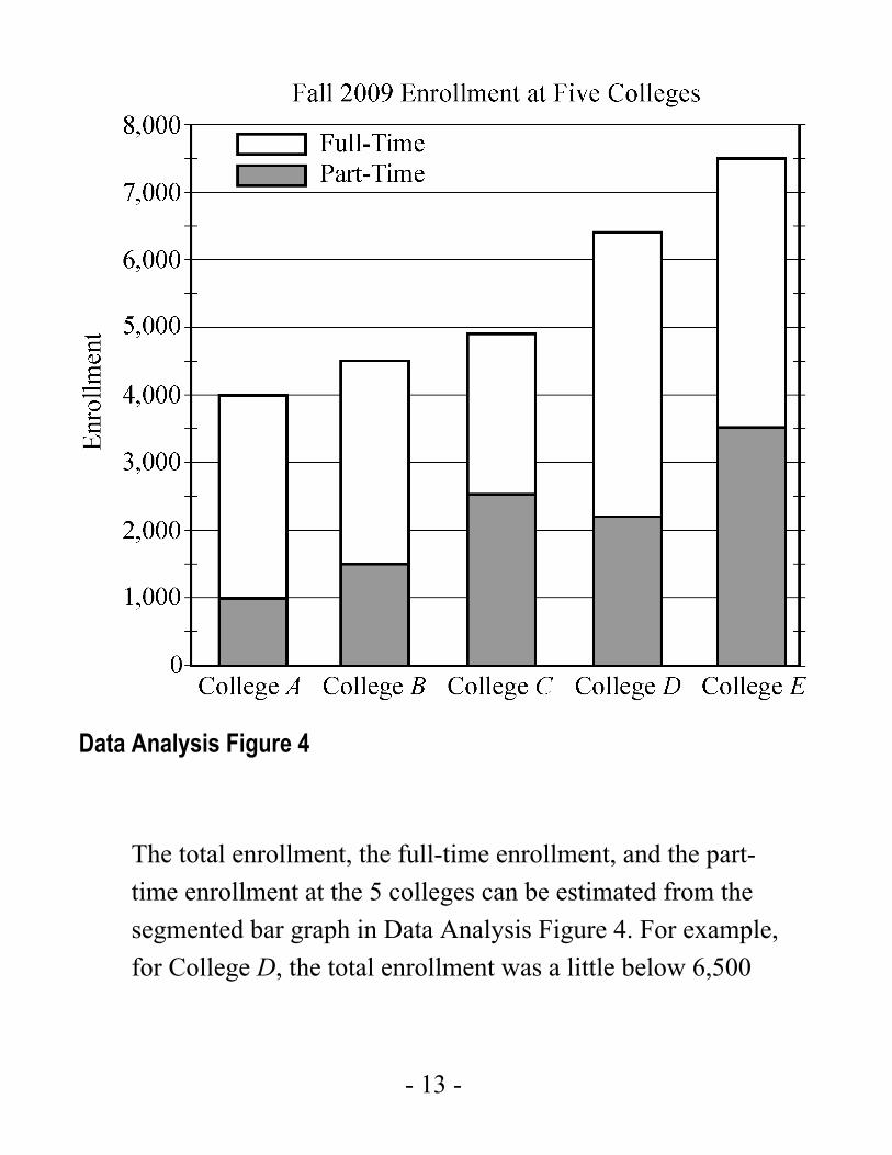
Example 4.1.3: Data Analysis Figure 4 below is a modified version of Data Analysis Figure 3. All features of Data Analysis Figure 3 are in Data Analysis Figure 4, except that each of the bars in Data Analysis Figure 4 is divided into two segments. The two segments represent full-time students and part-time students.
- 13 -
Data Analysis Figure 4
The total enrollment, the full-time enrollment, and the part-time enrollment at the 5 colleges can be estimated from the segmented bar graph in Data Analysis Figure 4. For example, for College D, the total enrollment was a little below 6,500
- 14 -
or approximately 6,400 students, the part-time enrollment was approximately 2,200, and the full-time enrollment was approximately 6,400 2,200,- or 4,200 students.
Bar graphs can also be used to compare different groups using the same categories.
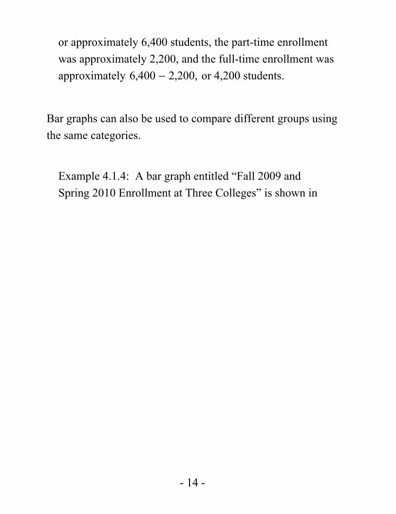
Example 4.1.4: A bar graph entitled “Fall 2009 and Spring 2010 Enrollment at Three Colleges” is shown in
- 15 -
Data Analysis Figure 5 below. The bar graph has 3 pairs of vertical bars, one pair for each of three colleges. The left bar of each pair corresponds to the number of students enrolled in Fall 2009, and the right bar corresponds to the number of students enrolled in Spring 2010.
Data Analysis Figure 5
- 16 -
Observe that for all three colleges, the Fall 2009 enrollment was greater than the Spring 2010 enrollment. Also, the greatest decrease in the enrollment from Fall 2009 to Spring 2010 occurred at College B.
Although bar graphs are commonly used to compare frequencies, as in the examples above, they are sometimes used to compare numerical data that could be displayed in a table, such as temperatures, dollar amounts, percents, heights, and weights. Also, the categories sometimes are numerical in nature, such as years or other time intervals.
Circle Graphs
Circle graphs, often called pie charts, are used to represent data with a relatively small number of categories. They illustrate how a whole is separated into parts. The data is presented in a circle such that the area of the circle representing each category is proportional to the part of the whole that the category represents.
- 17 -
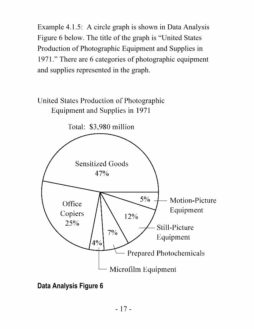
Example 4.1.5: A circle graph is shown in Data Analysis Figure 6 below. The title of the graph is “United States Production of Photographic Equipment and Supplies in 1971.” There are 6 categories of photographic equipment and supplies represented in the graph.
Data Analysis Figure 6
- 18 -
From the graph you can see that Sensitized Goods was the category with the greatest dollar value.
Each part of a circle graph is called a sector. Because the area of each sector is proportional to the percent of the whole that the sector represents, the measure of the central angle of a sector is proportional to the percent of 360 degrees that the sector represents. For example, the measure of the central angle of the sector representing the category Prepared Photochemicals is 7 percent of 360 degrees, or 25.2 degrees.
Histograms
When a list of data is large and contains many different values of a numerical variable, it is useful to organize it by grouping the values into intervals, often called classes. To do this, divide the entire interval of values into smaller intervals of equal length and then count the values that fall into each interval. In this way, each interval has a frequency and a relative frequency. The intervals and their frequencies (or relative frequencies) are often displayed in a histogram. Histograms are graphs of frequency distributions that are similar to bar graphs, but they have a number line for the horizontal axis. Also, in a histogram, there
- 19 -
are no regular spaces between the bars. Any spaces between bars in a histogram indicate that there are no data in the intervals represented by the spaces.
An example of a histogram for data grouped into a large number of classes is given later in this chapter (Example 4.5.1 in section 4.5).
Numerical variables with just a few values can also be displayed using histograms, where the frequency or relative frequency of each value is represented by a bar centered over the value.
Example 4.1.6: In Data Analysis Figure 2, the relative frequency distribution of the number of children of each of 25 families was displayed as a 2-column table.
For your convenience, Data Analysis Figure 2 is repeated below.
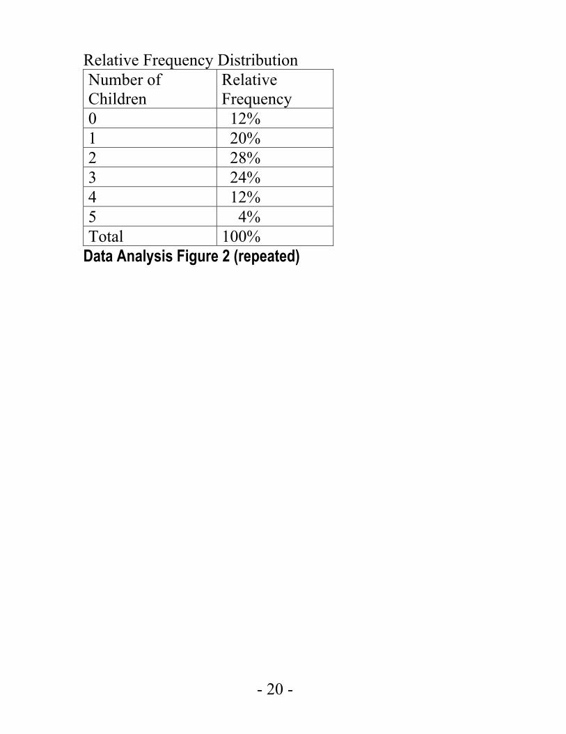
- 20 -
Relative Frequency Distribution Number of Children
Relative Frequency
0 12% 1 20% 2 28% 3 24% 4 12% 5 4% Total 100%
Data Analysis Figure 2 (repeated)

- 21 -
This relative frequency distribution can also be displayed as a histogram as shown in Data Analysis Figure 7 below.
Data Analysis Figure 7
Histograms are useful for identifying the general shape of a distribution of data. Also evident are the “center” and degree of “spread” of the distribution, as well as high-frequency and low-frequency intervals. From the histogram in Data Analysis Figure 7 above, you can see that the distribution is shaped like a mound with one peak; that is, the data are frequent in the middle and sparse at both ends. The central values are 2 and 3, and the distribution is close to being symmetric about those values.
- 22 -
Because the bars all have the same width, the area of each bar is proportional to the amount of data that the bar represents. Thus, the areas of the bars indicate where the data are concentrated and where they are not.
Finally, note that because each bar has a width of 1, the sum of the areas of the bars equals the sum of the relative frequencies, which is 100% or 1, depending on whether percents or decimals are used. This fact is central to the discussion of probability distributions later in this chapter.
Scatterplots
All examples used thus far have involved data resulting from a single characteristic or variable. These types of data are referred to as univariate; that is, data observed for one variable. Sometimes data are collected to study two different variables in the same population of individuals or objects. Such data are called bivariate data. We might want to study the variables separately or investigate a relationship between the two variables. If the variables were to be analyzed separately, each of the graphical methods for univariate data presented above could be applied.

- 23 -
To show the relationship between two numerical variables, the most useful type of graph is a scatterplot. In a scatterplot, the values of one variable appear on the horizontal axis of a rectangular coordinate system and the values of the other variable appear on the vertical axis. For each individual or object in the data, an ordered pair of numbers is collected, one number for each variable, and the pair is represented by a point in the coordinate system.
A scatterplot makes it possible to observe an overall pattern, or trend, in the relationship between the two variables. Also, the strength of the trend as well as striking deviations from the trend are evident. In many cases, a line or a curve that best represents the trend is also displayed in the graph and is used to make predictions about the population.
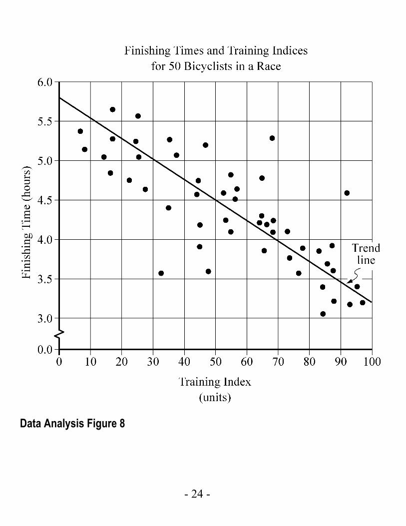
Example 4.1.7: A bicycle trainer studied 50 bicyclists to examine how the finishing time for a certain bicycle race was related to the amount of physical training in the three months before the race. To measure the amount of training, the trainer developed a training index, measured in “units” and based on the intensity of each bicyclist’s training. The data and the trend of the data, represented by a line, are displayed in the scatterplot in Data Analysis Figure 8 below.
- 24 -
Data Analysis Figure 8
- 25 -
When a trend line is included in the presentation of a scatterplot, it shows how scattered or close the data are to the trend line, or to put it another way, how well the trend line fits the data. In the scatterplot in Data Analysis Figure 8 above, almost all of the data points are close to the trend line. The scatterplot also shows that the finishing times generally decrease as the training indices increase.
Several types of predictions can be based on the trend line. For example, it can be predicted, based on the trend line, that a bicyclist with a training index of 70 units would finish the race in approximately 4 hours. This value is obtained by noting that the vertical line at the training index of 70 units intersects the trend line very close to 4 hours.
Another prediction based on the trend line is the number of minutes that a bicyclist can expect to lower his or her finishing time for each increase of 10 training index units. This prediction is basically the ratio of the change in finishing time to the change in training index, or the slope of the trend line. Note that the slope is negative. To estimate the slope, estimate the coordinates of any two points on the line. For instance, the points at the extreme left and right ends of the
- 26 -
line: ( )0, 5.8 and ( )100, 3.2 . The slope can be computed as follows:
3.2 5.8 2.6 0.026,100 0 100- -= = --
which is measured in hours per unit. The slope can be interpreted as follows: the finishing time is predicted to decrease 0.026 hours for every unit by which the training index increases. Since we want to know how much the finishing time decreases for an increase of 10 units, we multiply the rate by 10 to get 0.26 hour per 10 units. To compute the decrease in minutes per 10 units, we multiply 0.26 by 60 to get approximately 16 minutes. Based on the trend line, the bicyclist can expect to decrease the finishing time by 16 minutes for every increase of 10 training index units.
Time Plots
Sometimes data are collected in order to observe changes in a variable over time. For example, sales for a department store may be collected monthly or yearly. A time plot (sometimes
- 27 -
called a time series) is a graphical display useful for showing changes in data collected at regular intervals of time. A time plot of a variable plots each observation corresponding to the time at which it was measured. A time plot uses a coordinate plane similar to a scatterplot, but the time is always on the horizontal axis, and the variable measured is always on the vertical axis. Additionally, consecutive observations are connected by a line segment to emphasize increases and decreases over time.
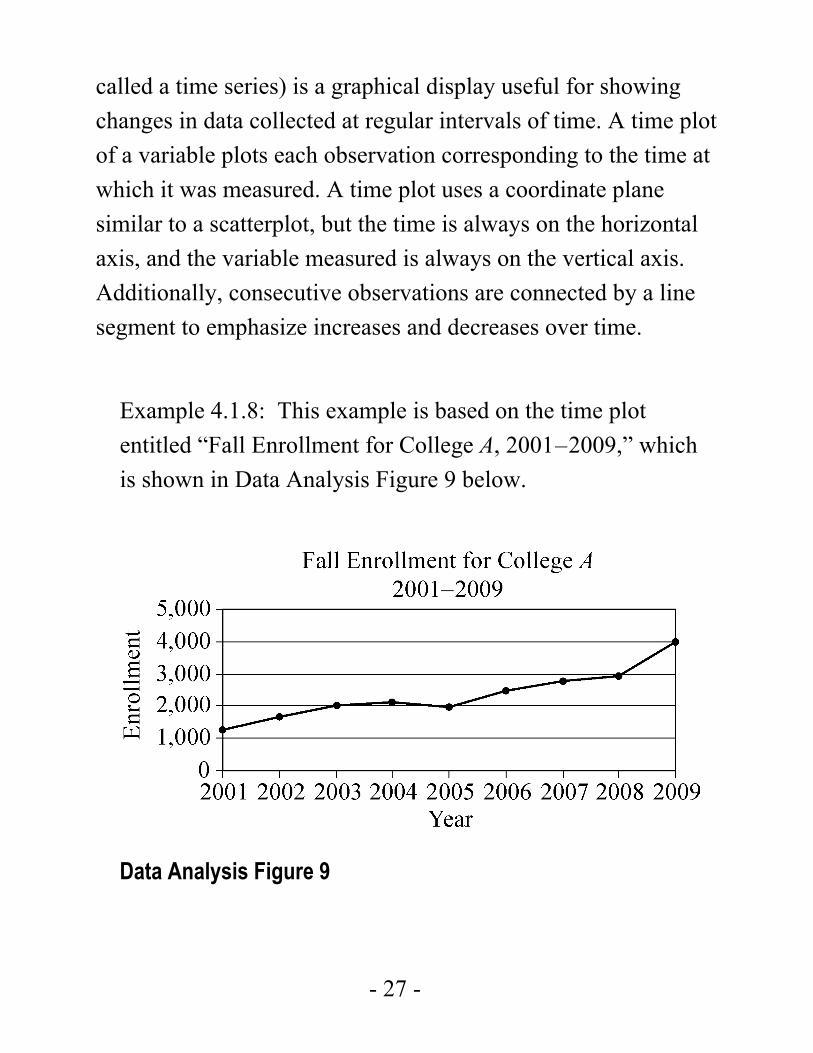
Example 4.1.8: This example is based on the time plot entitled “Fall Enrollment for College A, 2001–2009,” which is shown in Data Analysis Figure 9 below.
Data Analysis Figure 9
- 28 -
The time plot shows that the greatest increase in fall enrollment between consecutive years was the change between 2008 to 2009. The slope of the line segment joining the values for 2008 and 2009 is greater than the slopes of the line segments joining all other consecutive years, because the time intervals are regular.
Although time plots are commonly used to compare frequencies, as in example 4.1.8 above, they can be used to compare any numerical data as the data change over time, such as temperatures, dollar amounts, percents, heights, and weights.
4.2 Numerical Methods for Describing Data
Data can be described numerically by various statistics, or statistical measures. These statistical measures are often grouped in three categories: measures of central tendency, measures of position, and measures of dispersion.

- 29 -
Measures of Central Tendency
Measures of central tendency indicate the “center” of the data along the number line and are usually reported as values that represent the data. There are three common measures of central tendency: (1) the arithmetic mean—usually called the average or simply the mean, (2) the median, and (3) the mode.
To calculate the mean of n numbers, take the sum of the n numbers and divide it by n.
Example 4.2.1: For the five numbers 6, 4, 7, 10, and 4, the mean is
6 4 7 10 4 31 6.2.5 5+ + + + = =
When several values are repeated in a list, it is helpful to think of the mean of the numbers as a weighted mean of only those values in the list that are different.
- 30 -
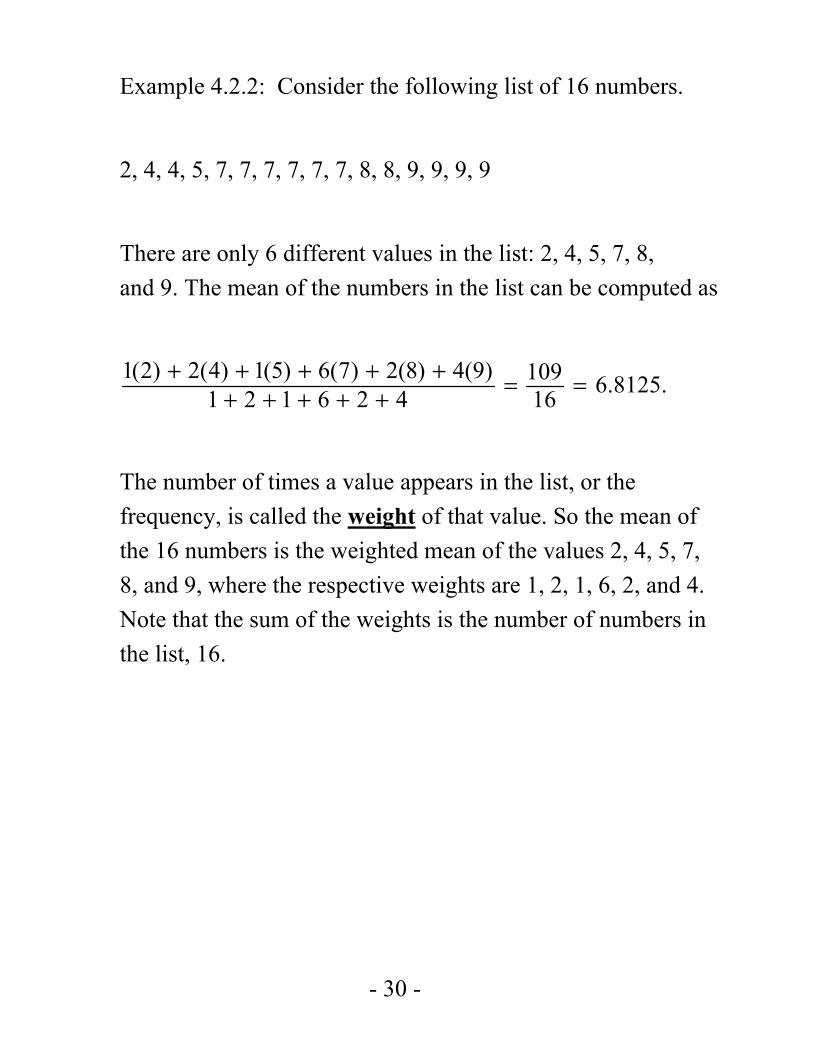
Example 4.2.2: Consider the following list of 16 numbers.
2, 4, 4, 5, 7, 7, 7, 7, 7, 7, 8, 8, 9, 9, 9, 9
There are only 6 different values in the list: 2, 4, 5, 7, 8, and 9. The mean of the numbers in the list can be computed as
1(2) 2(4) 1(5) 6(7) 2(8) 4(9) 109 6.8125.1 2 1 6 2 4 16+ + + + + = =+ + + + +
The number of times a value appears in the list, or the frequency, is called the weight of that value. So the mean of the 16 numbers is the weighted mean of the values 2, 4, 5, 7, 8, and 9, where the respective weights are 1, 2, 1, 6, 2, and 4. Note that the sum of the weights is the number of numbers in the list, 16.
- 31 -
The mean can be affected by just a few values that lie far above or below the rest of the data, because these values contribute directly to the sum of the data and therefore to the mean. By contrast, the median is a measure of central tendency that is fairly unaffected by unusually high or low values relative to the rest of the data.
To calculate the median of n numbers, first order the numbers from least to greatest. If n is odd, then the median is the middle number in the ordered list of numbers. If n is even, then there are two middle numbers, and the median is the average of these two numbers.
- 32 -
Example 4.2.3: The five numbers 6, 4, 7, 10, and 4 listed in increasing order are 4, 4, 6, 7, 10, so the median is 6, the middle number. Note that if the number 10 in the list is replaced by the number 24, the mean increases from 6.2 to
4 4 6 7 24 45 9,5 5+ + + + = =
but the median remains equal to 6. This example shows how the median is relatively unaffected by an unusually large value.
The median, as the “middle value” of an ordered list of numbers, divides the list into roughly two equal parts. However, if the median is equal to one of the data values and it is repeated in the list, then the numbers of data above and below the median may be rather different. For example the median of the 16 numbers 2, 4, 4, 5, 7, 7, 7, 7, 7, 7, 8, 8, 9, 9, 9, 9 is 7, but four of the data are less than 7 and six of the data are greater than 7.
The mode of a list of numbers is the number that occurs most frequently in the list.

- 33 -
Example 4.2.4: The mode of the six numbers in the list 1, 3, 6, 4, 3, 5 is 3. A list of numbers may have more than one mode. For example, the list of 11 numbers 1, 2, 3, 3, 3, 5, 7, 10, 10, 10, 20 has two modes, 3 and 10.
Measures of Position
The three most basic positions, or locations, in a list of numerical data ordered from least to greatest are the beginning, the end, and the middle. It is useful here to label these as L for the least, G for the greatest, and M for the median. Aside from these, the most common measures of position are quartiles and percentiles. Like the median M, quartiles and percentiles are numbers that divide the data into roughly equal groups after the data have been ordered from the least value L to the greatest value G. There are three quartile numbers, called the first quartile, the second quartile, and the third quartile that divide the data into four roughly equal groups; and there are 99 percentile numbers that divide the data into 100 roughly equal groups. As with the mean and median, the quartiles and percentiles may or may not themselves be values in the data.
- 34 -
In the following discussion of quartiles, the symbol ,1Q will be
used to denote the first quartile, 2Q will be used to denote the
second quartile, and 3Q will be used to denote the third quartile.
The numbers ,1Q 2Q , and 3Q divide the data into 4 roughly
equal groups as follows. After the data are listed in increasing order, the first group consists of the data from L to ,1Q the
second group is from 1Q to 2Q , the third group is from 2Q to
,3Q and the fourth group is from 3Q to G. Because the number
of data may not be divisible by 4, there are various rules to determine the exact values of 1Q and 3Q , and some statisticians
use different rules, but in all cases 2Q is equal to the median M.
We use perhaps the most common rule for determining the values of 1Q and 3Q . According to this rule, after the data are
listed in increasing order, 1Q is the median of the first half of the
data in the ordered list; and 3Q is the median of the second half
of the data in the ordered list, as illustrated in Example 4.2.5 below.

- 35 -
Example 4.2.5: To find the quartiles for the ordered list of 16 numbers 2, 4, 4, 5, 7, 7, 7, 7, 7, 7, 8, 8, 9, 9, 9, 9, first divide the numbers into two groups of 8 numbers each. The first group of 8 numbers is 2, 4, 4, 5, 7, 7, 7, 7 and the second group of 8 numbers is 7, 7, 8, 8, 9, 9, 9, 9, so that the second quartile, or median, is 7. To find the other quartiles, you can take each of the two smaller groups and find its median: the first quartile, ,1Q is 6 (the average of 5 and 7) and the third
quartile, 3Q , is 8.5 (the average of 8 and 9).
In this example, the number 4 is in the lowest 25 percent of the distribution of data. There are different ways to describe this. We can say that 4 is below the first quartile, that is, below ;1Q we can also say that 4 is in the first quartile. The
phrase “in a quartile” refers to being in one of the four groups determined by , , and .1 2 3Q Q Q
Percentiles are mostly used for very large lists of numerical data ordered from least to greatest. Instead of dividing the data into four groups, the 99 percentiles , , , ... ,1 2 3 99P P P P divide the data
into 100 groups. Consequently, ,1 25=Q P ,2 50= =M Q P and

- 36 -
.3 75=Q P Because the number of data in a list may not be
divisible by 100, statisticians apply various rules to determine values of percentiles.
Measures of Dispersion
Measures of dispersion indicate the degree of “spread” of the data. The most common statistics used as measures of dispersion are the range, the interquartile range, and the standard deviation. These statistics measure the spread of the data in different ways.
The range of the numbers in a group of data is the difference between the greatest number G in the data and the least number L in the data; that is, .G L- For example, the range of the five numbers 11, 10, 5, 13, 21 is 21 5 16- = .
The simplicity of the range is useful in that it reflects that maximum spread of the data. However, sometimes a data value is so unusually small or so unusually large in comparison with the rest of the data that it is viewed with suspicion when the data are analyzed—the value could be erroneous or accidental in
- 37 -
nature. Such data are called outliers because they lie so far out that in most cases, they are ignored when analyzing the data. Unfortunately, the range is directly affected by outliers.
A measure of dispersion that is not affected by outliers is the interquartile range. It is defined as the difference between the third quartile and the first quartile, that is, .3 1-Q Q Thus,
the interquartile range measures the spread of the middle half of the data.
One way to summarize a group of numerical data and to illustrate its center and spread is to use the five numbers L, ,1Q
,2Q ,3Q and G. These five numbers can be plotted along a
number line to show where the four quartile groups lie. Such plots are called boxplots or box-and-whisker plots, because a box is used to identify each of the two middle quartile groups of data, and “whiskers” extend outward from the boxes to the least and greatest values.
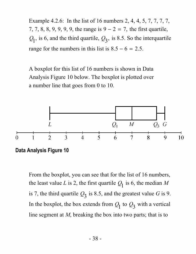
- 38 -
Example 4.2.6: In the list of 16 numbers 2, 4, 4, 5, 7, 7, 7, 7, 7, 7, 8, 8, 9, 9, 9, 9, the range is 9 2 7,- = the first quartile,
,1Q is 6, and the third quartile, ,3Q is 8.5. So the interquartile
range for the numbers in this list is 8.5 6 2.5.- =
A boxplot for this list of 16 numbers is shown in Data Analysis Figure 10 below. The boxplot is plotted over a number line that goes from 0 to 10.
Data Analysis Figure 10
From the boxplot, you can see that for the list of 16 numbers, the least value L is 2, the first quartile 1Q is 6, the median M
is 7, the third quartile 3Q is 8.5, and the greatest value G is 9.
In the boxplot, the box extends from 1Q to 3Q with a vertical
line segment at M, breaking the box into two parts; that is to

- 39 -
say, from 6 to 8.5, with a vertical line segment at 7. Also, the left whisker extends from 1Q to L, that is from 6 to 2; and the right whisker extends from 3Q to G, that is from 8.5 to 9.
There are a few variations in the way boxplots are drawn—the position of the ends of the boxes can vary slightly, and some boxplots identify outliers with certain symbols—but all boxplots show the center of the data at the median and illustrate the spread of the data in each of the four quartile groups. As such, boxplots are useful for comparing sets of data side by side.
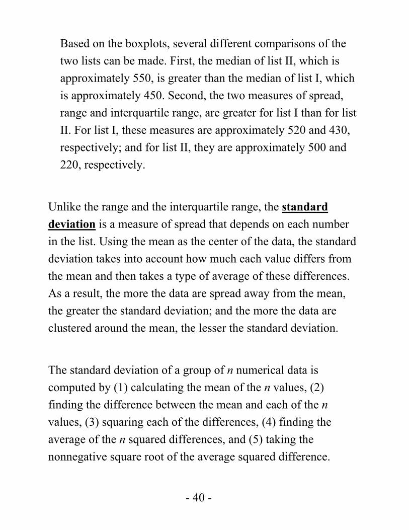
Example 4.2.7: Two large lists of numerical data, list I and list II, are summarized by the boxplots in Data Analysis Figure 11 below.
Data Analysis Figure 11
- 40 -
Based on the boxplots, several different comparisons of the two lists can be made. First, the median of list II, which is approximately 550, is greater than the median of list I, which is approximately 450. Second, the two measures of spread, range and interquartile range, are greater for list I than for list II. For list I, these measures are approximately 520 and 430, respectively; and for list II, they are approximately 500 and 220, respectively.
Unlike the range and the interquartile range, the standard deviation is a measure of spread that depends on each number in the list. Using the mean as the center of the data, the standard deviation takes into account how much each value differs from the mean and then takes a type of average of these differences. As a result, the more the data are spread away from the mean, the greater the standard deviation; and the more the data are clustered around the mean, the lesser the standard deviation.
The standard deviation of a group of n numerical data is computed by (1) calculating the mean of the n values, (2) finding the difference between the mean and each of the n values, (3) squaring each of the differences, (4) finding the average of the n squared differences, and (5) taking the nonnegative square root of the average squared difference.
- 41 -
Example 4.2.8: For the five data 0, 7, 8, 10, and 10, the standard deviation can be computed as follows. First, the mean of the data is 7, and the squared differences from the mean are
( )27 0 ,- ( )27 7 ,- ( )27 8 ,- ( )27 10 ,- ( )27 10 ,-
or 49, 0, 1, 9, 9. The average of the five squared differences
is 68 ,5 or 13.6, and the positive square root of 13.6 is
approximately 3.7.
Note on terminology: The term “standard deviation” defined above is slightly different from another measure of dispersion, the sample standard deviation. The latter term is qualified with the word “sample” and is computed by dividing the sum of the squared differences by 1n - instead of n. The sample standard deviation is only slightly different from the standard deviation but is preferred for technical reasons for a sample of data that is taken from a larger population of data. Sometimes the standard deviation is called the population standard deviation to help distinguish it from the sample standard deviation.
- 42 -
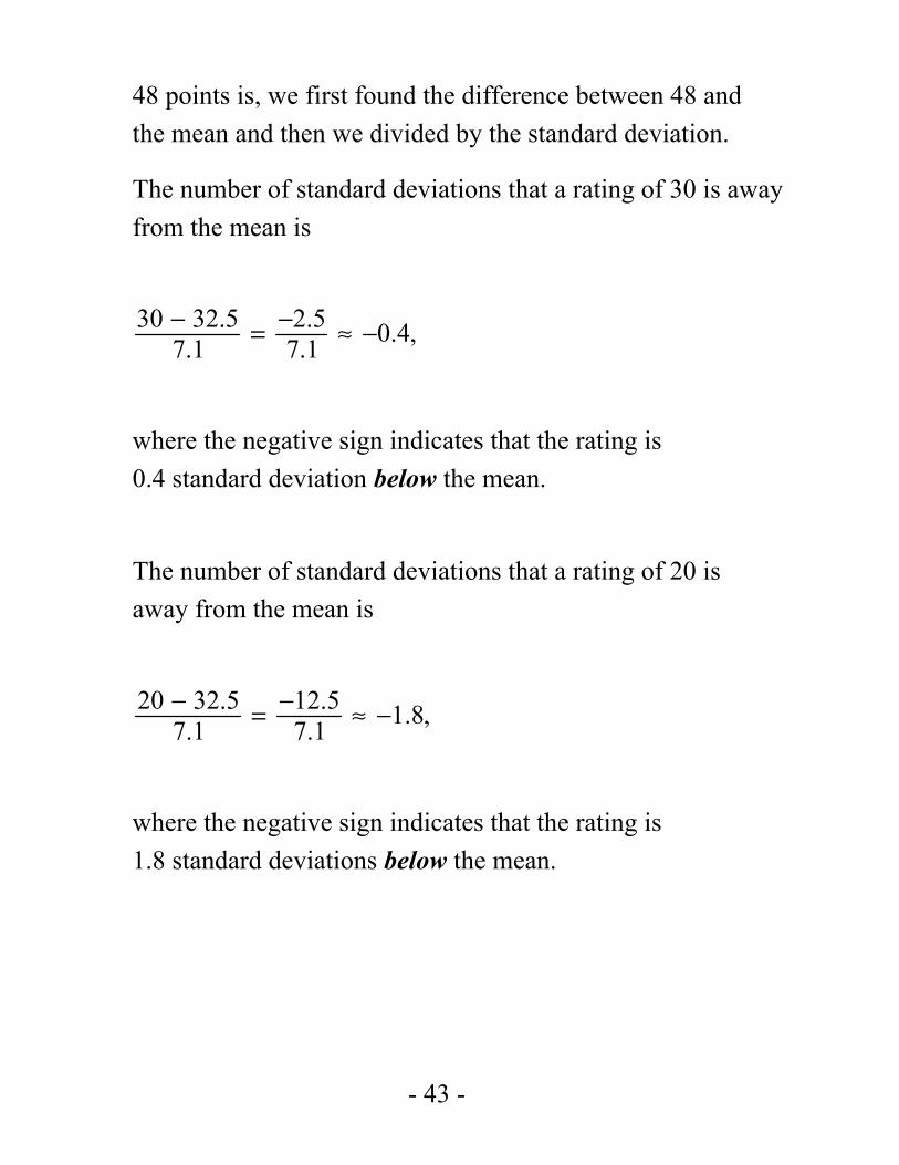
Example 4.2.9: Six hundred applicants for several post office jobs were rated on a scale from 1 to 50 points. The ratings had a mean of 32.5 points and a standard deviation of 7.1 points. How many standard deviations above or below the mean is a rating of 48 points? A rating of 30 points? A rating of 20 points?
Solution: Let d be the standard deviation, so 7.1d = points. Note that 1 standard deviation above the mean is
32.5 32.5 7.1 39.6,d+ = + =
and 2 standard deviations above the mean is
( )32.5 2 32.5 2 7.1 46.7.d+ = + =
So a rating of 48 points is a little more than 2 standard deviations above the mean. Since 48 is actually 15.5 points above the mean, the number of standard deviations that 48
is above the mean is 15.5 2.2.7.1 ª Thus, to find the number
of standard deviations above or below the mean a rating of
- 43 -
48 points is, we first found the difference between 48 and the mean and then we divided by the standard deviation.
The number of standard deviations that a rating of 30 is away from the mean is
30 32.5 2.5 0.4,7.1 7.1- -= ª -
where the negative sign indicates that the rating is 0.4 standard deviation below the mean.
The number of standard deviations that a rating of 20 is away from the mean is
20 32.5 12.5 1.8,7.1 7.1- -= ª -
where the negative sign indicates that the rating is 1.8 standard deviations below the mean.
- 44 -
To summarize:
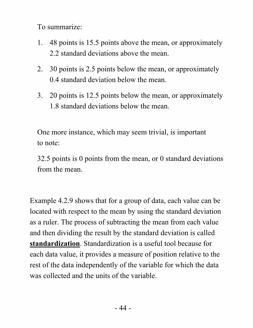
1. 48 points is 15.5 points above the mean, or approximately 2.2 standard deviations above the mean.
2. 30 points is 2.5 points below the mean, or approximately 0.4 standard deviation below the mean.
3. 20 points is 12.5 points below the mean, or approximately 1.8 standard deviations below the mean.
One more instance, which may seem trivial, is important to note:
32.5 points is 0 points from the mean, or 0 standard deviations from the mean.
Example 4.2.9 shows that for a group of data, each value can be located with respect to the mean by using the standard deviation as a ruler. The process of subtracting the mean from each value and then dividing the result by the standard deviation is called standardization. Standardization is a useful tool because for each data value, it provides a measure of position relative to the rest of the data independently of the variable for which the data was collected and the units of the variable.
- 45 -
Note that the standardized values 2.2, 0.4,- and 1.8- from last example are all between 3- and 3; that is, the corresponding ratings 48, 30, and 20 are all within 3 standard deviations of the mean. This is not surprising, based on the following fact about the standard deviation.
Fact: In any group of data, most of the data are within about 3 standard deviations of the mean.
Thus, when any group of data are standardized, most of the data are transformed to an interval on the number line centered about 0 and extending from about 3- to 3. The mean is always transformed to 0.
4.3 Counting Methods
Uncertainty is part of the process of making decisions and predicting outcomes. Uncertainty is addressed with the ideas and methods of probability theory. Since elementary probability requires an understanding of counting methods, we now turn to a discussion of counting objects in a systematic way before reviewing probability.
- 46 -
When a set of objects is small, it is easy to list the objects and count them one by one. When the set is too large to count that way, and when the objects are related in a patterned or systematic way, there are some useful techniques for counting the objects without actually listing them.
Sets and Lists
The term set has been used informally in this review to mean a collection of objects that have some property, whether it is the collection of all positive integers, all points in a circular region, or all students in a school that have studied French. The objects of a set are called members or elements. Some sets are finite, which means that their members can be completely counted. Finite sets can, in principle, have all of their members listed, using curly brackets, such as the set of even digits { }0, 2, 4, 6, 8 . Sets that are not finite are called infinite sets, such as the set of all integers. A set that has no members is called the empty set and is denoted by the symbol .∆ A set with one or more members is called nonempty. If A and B are sets and all of the members of A are also members of B, then A is a subset of B. For example, { }2, 8 is a subset of { }0, 2, 4, 6, 8 . Also, by convention, ∆ is a subset of every set.
- 47 -
A list is like a finite set, having members that can all be listed, but with two differences. In a list, the members are ordered; that is, rearranging the members of a list makes it a different list. Thus, the terms “first element,” “second element,” etc., make sense in a list. Also, elements can be repeated in a list and the repetitions matter. For example, the list 1, 2, 3, 2 and the list 1, 2, 2, 3 are different lists, each with four elements, and they are both different from the list 1, 2, 3, which has three elements.
In contrast to a list, when the elements of a set are given, repetitions are not counted as additional elements and the order of the elements does not matter. For example, the sets { }1, 2, 3, 2 and { }3, 1, 2 are the same set, which has three elements. For any finite set S, the number of elements of S is denoted by .S Thus, if { }6.2, 9, , 0.01, 0 ,p= -S then 5.S = Also, 0.∆ =
- 48 -
Sets can be formed from other sets. If S and T are sets, then the intersection of S and T is the set of all elements that are in both S and T and is denoted by .S T« The union of S and T is the set of all elements that are in either S or T or both and is denoted by
.S T» If sets S and T have no elements in common, they are called disjoint or mutually exclusive.
A useful way to represent two or three sets and their possible intersections and unions is a Venn diagram. In a Venn diagram, sets are represented by circular regions that overlap if they have elements in common but do not overlap if they are disjoint. Sometimes the circular regions are drawn inside a rectangular region, which represents a universal set, of which all other sets involved are subsets.
- 49 -
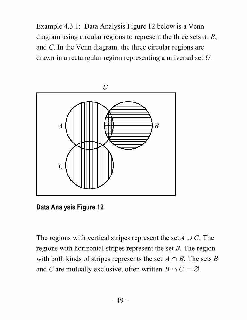
Example 4.3.1: Data Analysis Figure 12 below is a Venn diagram using circular regions to represent the three sets A, B, and C. In the Venn diagram, the three circular regions are drawn in a rectangular region representing a universal set U.
Data Analysis Figure 12
The regions with vertical stripes represent the set .A C» The regions with horizontal stripes represent the set B. The region with both kinds of stripes represents the set .A B« The sets B and C are mutually exclusive, often written .B C« = ∆
- 50 -
The last example can be used to illustrate an elementary counting principle involving intersecting sets, called the inclusion-exclusion principle for two sets. This principle relates the numbers of elements in the union and intersection of two finite sets: The number of elements in the union of two sets equals the sum of their individual numbers of elements minus the number of elements in their intersection. If the sets in the example are finite, then we have for the union of A and B,
.A B A B A B» = + - «
Because A B« is a subset of both A and B, the subtraction is necessary to avoid counting the elements in A B« twice. For the union of B and C, we have
,B C B C» = + because .B C« = ∆
Multiplication Principle
Suppose there are two choices to be made sequentially and that the second choice is independent of the first choice. Suppose also that there are k different possibilities for the first choice
- 51 -
and m different possibilities for the second choice. The multiplication principle states that under those conditions, there are km different possibilities for the pair of choices.
For example, suppose that a meal is to be ordered from a restaurant menu and that the meal consists of one entrée and one dessert. If there are 5 entrées and 3 desserts on the menu, then there are (5)(3) 15= different meals that can be ordered from the menu.
The multiplication principle applies in more complicated situations as well. If there are more than two independent choices to be made, then the number of different possible outcomes of all of the choices is the product of the numbers of possibilities for each choice.
Example 4.3.2: Suppose that a computer password consists of four characters such that the first character is one of the 10 digits from 0 to 9 and each of the next 3 characters is any one of the uppercase letters from the 26 letters of the English alphabet. How many different passwords are possible?

- 52 -
Solution: The description of the password allows repetitions of letters. Thus, there are 10 possible choices for the first character in the password and 26 possible choices for each of the next 3 characters in the password. Therefore, applying the multiplication principle, the number of possible passwords is (10)(26)(26)(26) 175,760.=
Note that if repetitions of letters are not allowed in the password, then the choices are not all independent, but a modification of the multiplication principle can still be applied. There are 10 possible choices for the first character in the password, 26 possible choices for the second character, 25 for the third character because the first letter cannot be repeated, and 24 for the fourth character because the first two letters cannot be repeated. Therefore, the number of possible passwords is (10)(26)(25)(24) 156,000.=
Example 4.3.3: Each time a coin is tossed, there are 2 possible outcomes—either it lands heads up or it lands tails up. Using this fact and the multiplication principle, you can conclude that if a coin is tossed 8 times, there are
8(2)(2)(2)(2)(2)(2)(2)(2) 2 256= = possible outcomes.
- 53 -
Permutations and Factorials
Suppose you want to determine the number of different ways the 3 letters A, B, and C can be placed in order from 1st to 3rd. The following is a list of all the possible orders in which the letters can be placed.
ABC ACB BAC BCA CAB CBA
There are 6 possible orders for the 3 letters.
Now suppose you want to determine the number of different ways the 4 letters A, B, C, and D can be placed in order from 1st to 4th. Listing all of the orders for 4 letters is time-consuming, so it would be useful to be able to count the possible orders without listing them.
To order the 4 letters, one of the 4 letters must be placed first, one of the remaining 3 letters must be placed second, one of the remaining 2 letters must be placed third, and the last remaining letter must be placed fourth. Therefore, applying the multiplication principle, there are ( )( )( )( )4 3 2 1 , or 24, ways to order the 4 letters.
- 54 -
More generally, suppose n objects are to be ordered from 1st to nth, and we want to count the number of ways the objects can be ordered. There are n choices for the first object, 1n - choices for the second object, 2n - choices for the third object, and so on, until there is only 1 choice for the nth object. Thus, applying the multiplication principle, the number of ways to order the n objects is equal to the product
( )( ) ( )( )( )1 2 3 2 1 .n n n- -
Each order is called a permutation, and the product above is called the number of permutations of n objects.
Because products of the form ( )( ) ( )( )( )1 2 3 2 1n n n- - occur frequently when counting objects, a special symbol !,n called n factorial, is used to denote this product.
For example,
( )( )( )( )( )( )( )( )( )
1! 12! 2 1 23! 3 2 1 64! 4 3 2 1 24
== == == =

- 55 -
As a special definition, 0! 1.=
Note that ( ) ( )( ) ( )( )( )! 1 ! 1 2 ! 1 2 3 !n n n n n n n n n n= - = - - = - - -
and so on.
Example 4.3.4: Suppose that 10 students are going on a bus trip, and each of the students will be assigned to one of the 10 available seats. Then the number of possible different seating arrangements of the students on the bus is
( )( )( )( )( )( )( )( )( )( )10! 10 9 8 7 6 5 4 3 2 1 3,628,800.= =
Now suppose you want to determine the number of ways in which you can select 3 of the 5 letters A, B, C, D, and E and place them in order from 1st to 3rd. Reasoning as in the preceding examples, you find that there are (5)(4)(3), or 60, ways to select and order them.
More generally, suppose that k objects will be selected from a set of n objects, where ,k n£ and the k objects will be placed in order from 1st to kth. Then there are n choices for the first
- 56 -
object, 1n - choices for the second object, 2n - choices for the third object, and so on, until there are 1n k- + choices for the kth object. Thus, applying the multiplication principle, the number of ways to select and order k objects from a set of n objects is ( 1)( 2)...( 1).n n n n k- - - + It is useful to note that
( 1)( 2) ( 1)( )!( 1)( 2) ( 1) ( )!
!( )!
n n n n kn kn n n n k n k
nn k
- - - +-= - - - + -
= -
This expression represents the number of permutations of n objects taken k at a time; that is, the number of ways to select and order k objects out of n objects.
Example 4.3.5: How many different five-digit positive integers can be formed using the digits 1, 2, 3, 4, 5, 6, and 7 if none of the digits can occur more than once in the integer?
- 57 -
Solution: This example asks how many ways there are to order 5 integers chosen from a set of 7 integers. According to the counting principle above, there are ( )( )( )( )( )7 6 5 4 3 2,520= ways to do this. Note that this is
equal to ( )( )( )( )( )( ) ( )( )( )( )( )7 6 5 4 3 2!7! 7 6 5 4 3 .(7 5)! 2!= =-
Combinations
Given the five letters A, B, C, D, and E, suppose that you want to determine the number of ways in which you can select 3 of the 5 letters, but unlike before, you do not want to count different orders for the 3 letters. The following is a list of all of the ways in which 3 of the 5 letters can be selected without regard to the order of the letters.
ABC ABD ABE ACD ACE
ADE BCD BCE BDE CDE
There are 10 ways of selecting the 3 letters without order. There is a relationship between selecting with order and selecting without order.

- 58 -
The number of ways to select 3 of the 5 letters without order, which is 10, multiplied by the number of ways to order the 3 letters, which is 3!, or 6, is equal to the number of ways to select
3 of the 5 letters and order them, which is 5! 60.2! = In short,
(number of ways to select without order)
(number of ways to order)
(number of ways to select with order).
¥
=
This relationship can also be described as follows.
(number of ways to select without order)
(number of ways to select with order) (number of ways to order)
5!5!2! 103! 3!2!
=
= = =

- 59 -
More generally, suppose that k objects will be chosen from a set of n objects, where ,k n£ but that the k objects will not be put in order. The number of ways in which this can be done is called the number of combinations of n objects taken k at a time and
is given by the formula ! .!( )!n
k n k-
Another way to refer to the number of combinations of n objects taken k at a time is n choose k, and two notations commonly
used to denote this number are Cn k and .nkÊ ˆÁ ˜Ë ¯
Example 4.3.6: Suppose you want to select a 3-person committee from a group of 9 students. How many ways are there to do this?
Solution: Since the 3 students on the committee are not ordered, you can use the formula for the combination of 9 objects taken 3 at a time, or “9 choose 3”:
(9)(8)(7)9! 9! 84.3!(9 3)! 3!6! (3)(2)(1)= = =-
- 60 -
Using the terminology of sets, given a set S consisting of n elements, n choose k is simply the number of subsets of S that consist of k elements.
The formula for n choose k, ! ,!( )!-n
k n k also holds when 0k =
and .k n= Therefore
1. n choose 0 is ! 1.0! !nn = (This reflects the fact that there
is only one subset of S with 0 elements, namely the empty set.)
2. n choose n is ! 1.!0!n
n = (This reflects the fact that there
is only one subset of S with n elements, namely the set S itself.)
Finally, note that n choose k is always equal to n choose ,n k- because
! ! ! .( )!( ( ))! ( )! ! !( )!n n n
n k n n k n k k k n k= =- - - - -
- 61 -
4.4 Probability
Probability is a way of describing uncertainty in numerical terms. In this section we review some of the terminology used in elementary probability theory.
A probability experiment, also called a random experiment, is an experiment for which the result, or outcome, is uncertain. We assume that all of the possible outcomes of an experiment are known before the experiment is performed, but which outcome will actually occur is unknown. The set of all possible outcomes of a random experiment is called the sample space, and any particular set of outcomes is called an event. For example, consider a cube with faces numbered 1 to 6, called a 6-sided die. Rolling the die once is an experiment in which there are 6 possible outcomes—either 1, 2, 3, 4, 5, or 6 will appear on the top face. The sample space for this experiment is the set of numbers 1, 2, 3, 4, 5, and 6. Two examples of events for this experiment are (1) rolling the number 4, which has only one outcome, and (2) rolling an odd number, which has three outcomes.
- 62 -
The probability of an event is a number from 0 to 1, inclusive, that indicates the likelihood that the event occurs when the experiment is performed. The greater the number, the more likely the event.
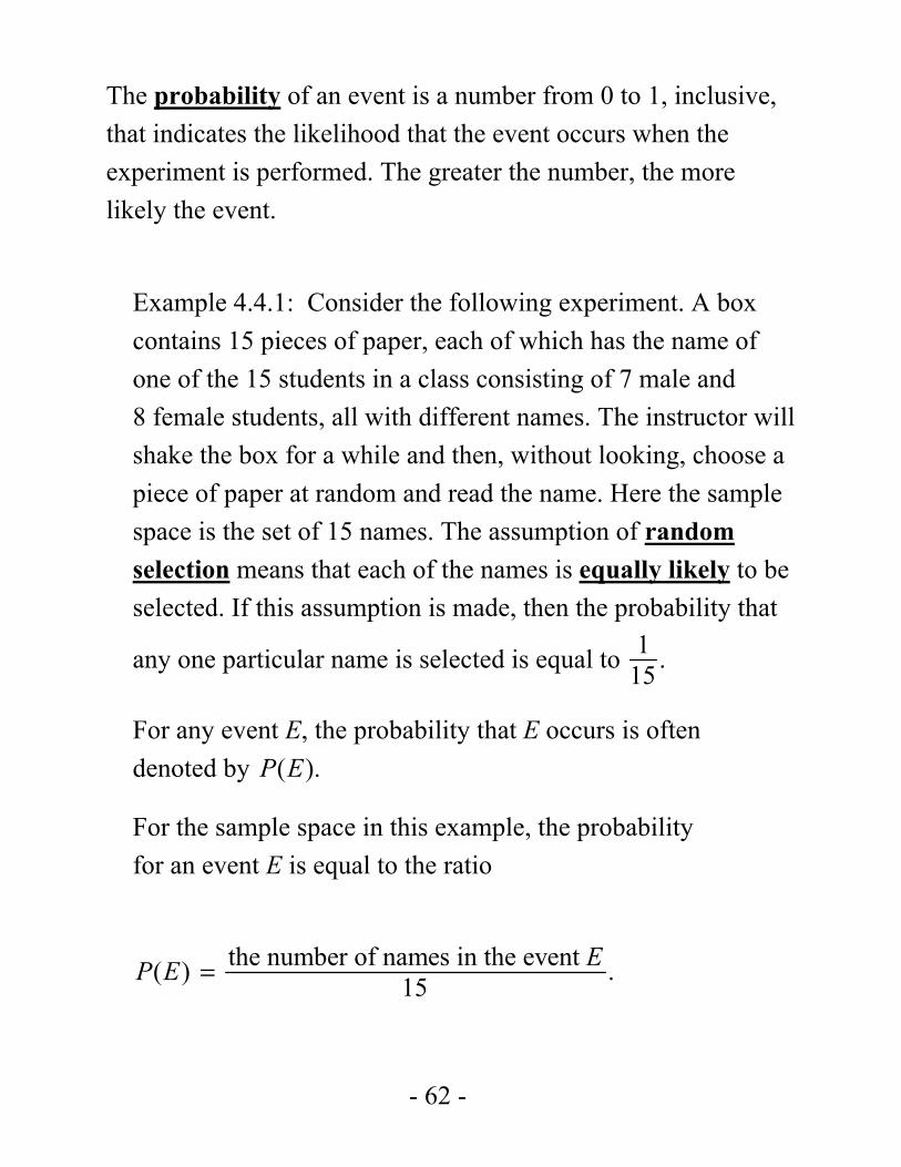
Example 4.4.1: Consider the following experiment. A box contains 15 pieces of paper, each of which has the name of one of the 15 students in a class consisting of 7 male and 8 female students, all with different names. The instructor will shake the box for a while and then, without looking, choose a piece of paper at random and read the name. Here the sample space is the set of 15 names. The assumption of random selection means that each of the names is equally likely to be selected. If this assumption is made, then the probability that
any one particular name is selected is equal to 1 .15
For any event E, the probability that E occurs is often denoted by ( ).P E
For the sample space in this example, the probability for an event E is equal to the ratio
the number of names in the event ( ) .15EP E =
- 63 -
If M is the event that the student selected is male, then 7( ) .15P M =
In general, for a random experiment with a finite number of possible outcomes, if each outcome is equally likely to occur, then the probability that an event E occurs is defined by the ratio
the number of outcomes in the event ( ) .the number of possible outcomes in the experimentEP E =
In the case of rolling a 6-sided die, if the die is “fair,” then the 6 outcomes are equally likely. So the probability of rolling a 4
is 1 ,6 and the probability of rolling an odd number—rolling a 1,
3, or 5—can be calculated as 3 1 .6 2=
The following are six general facts about probability.
Fact 1: If an event E is certain to occur, then ( ) 1.P E =
Fact 2: If an event E is certain not to occur, then ( ) 0.P E =
- 64 -
Fact 3: If an event E is possible but not certain to occur, then ( )0 1.P E< <
Fact 4: The probability that an event E will not occur is equal to ( )1 .P E-
Fact 5: If E is an event, then the probability of E is the sum of the probabilities of the outcomes in E.
Fact 6: The sum of the probabilities of all possible outcomes of an experiment is 1.
If E and F are two events of an experiment, we consider two other events related to E and F.
Event 1: The event that both E and F occur; that is, an outcome in the set .E F«
Event 2: The event that E or F or both occur; that is, an outcome in the set .E F»
Events that cannot occur at the same time are said to be mutually exclusive. For example, if a 6-sided die is rolled once, the event of rolling an odd number and the event of rolling an
- 65 -
even number are mutually exclusive. But rolling a 4 and rolling an even number are not mutually exclusive, since 4 is an outcome that is common to both events.
For events E and F, we have the following three rules.
Rule 1: ( )either or or both occurP E F
( ) ( ) ( )both and occur ,P E P F P E F= + - which is the inclusion-exclusion principle applied to probability.
Rule 2: If E and F are mutually exclusive, then ( )both and occur 0,P E F = and therefore, ( ) ( ) ( )either or or both occur .P E F P E P F= +
Rule 3: E and F are said to be independent if the occurrence of either event does not affect the occurrence of the other. If two events E and F are independent, then ( ) ( ) ( )both and occur .P E F P E P F= For example, if a fair
6-sided die is rolled twice, the event E of rolling a 3 on the first roll and the event F of rolling a 3 on the second roll are independent, and the probability of rolling a 3 on both rolls is
( ) ( ) ( )( )1 1 1 .6 6 36P E P F = = In this example, the experiment

- 66 -
is actually “rolling the die twice,” and each outcome is an ordered pair of results like “4 on the first roll and 1 on the second roll.” But event E restricts only the first roll (to a 3) having no effect on the second roll; similarly, event F restricts only the second roll (to a 3) having no effect on the first roll.
Note that if ( ) 0P E π and ( ) 0,P F π then events E and F cannot be both mutually exclusive and independent. For if E and F are independent, then ( ) ( ) ( )both and occur 0;P E F P E P F= π but if E and F
are mutually exclusive, then ( )both and occur 0.P E F =
It is common to use the shorter notation “E and F” instead of “both E and F occur” and use “E or F” instead of “E or F or both occur.” With this notation, we have the following three rules.
Rule 1: ( ) ( ) ( ) ( ) or and P E F P E P F P E F= + -
Rule 2: ( ) ( ) ( ) or P E F P E P F= + if E and F are mutually exclusive.
Rule 3: ( ) ( ) ( ) and P E F P E P F= if E and F are independent.
- 67 -
Example 4.4.2: If a fair 6-sided die is rolled once, let E be the event of rolling a 3 and let F be the event of rolling an odd number. These events are not independent. This is because rolling a 3 makes certain that the event of rolling an odd number occurs. Note that ( ) ( ) ( )and ,P E F P E P Fπ since
( ) ( ) 1 and 6P E F P E= =
and
( ) ( ) ( )( )1 1 1 .6 2 12P E P F = =
Example 4.4.3: A 12-sided die, with faces numbered 1 to 12, is to be rolled once, and each of the 12 possible outcomes is
equally likely to occur. The probability of rolling a 4 is 1 ,12
so the probability of rolling a number that is not a 4 is 1 111 .12 12- = The probability of rolling a number that is either
a multiple of 5 (that is, rolling a 5 or a 10) or an odd number (that is, rolling a 1, 3, 5, 7, 9, or 11) is equal to
- 68 -
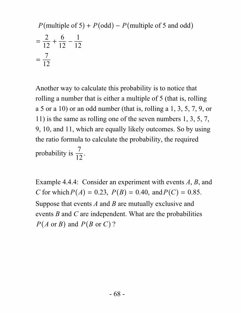
( ) ( ) ( )multiple of 5 odd multiple of 5 and odd
2 6 112 12 127
12
P P P+ -
= + -
=
Another way to calculate this probability is to notice that rolling a number that is either a multiple of 5 (that is, rolling a 5 or a 10) or an odd number (that is, rolling a 1, 3, 5, 7, 9, or 11) is the same as rolling one of the seven numbers 1, 3, 5, 7, 9, 10, and 11, which are equally likely outcomes. So by using the ratio formula to calculate the probability, the required
probability is 7 .12
Example 4.4.4: Consider an experiment with events A, B, and C for which ( ) 0.23,P A = ( ) 0.40,P B = and ( ) 0.85.P C = Suppose that events A and B are mutually exclusive and events B and C are independent. What are the probabilities ( ) or P A B and ( ) or ?P B C
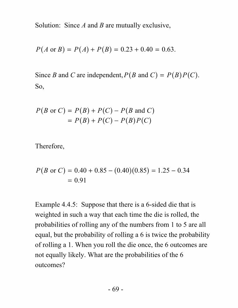
- 69 -
Solution: Since A and B are mutually exclusive,
( ) ( ) ( ) or 0.23 0.40 0.63.P A B P A P B= + = + =
Since B and C are independent, ( ) ( ) ( )and .P B C P B P C= So,
( ) ( ) ( ) ( )( ) ( ) ( ) ( )
or and P B C P B P C P B CP B P C P B P C
= + -= + -
Therefore,
( ) ( )( ) or 0.40 0.85 0.40 0.85 1.25 0.340.91
P B C = + - = -=
Example 4.4.5: Suppose that there is a 6-sided die that is weighted in such a way that each time the die is rolled, the probabilities of rolling any of the numbers from 1 to 5 are all equal, but the probability of rolling a 6 is twice the probability of rolling a 1. When you roll the die once, the 6 outcomes are not equally likely. What are the probabilities of the 6 outcomes?
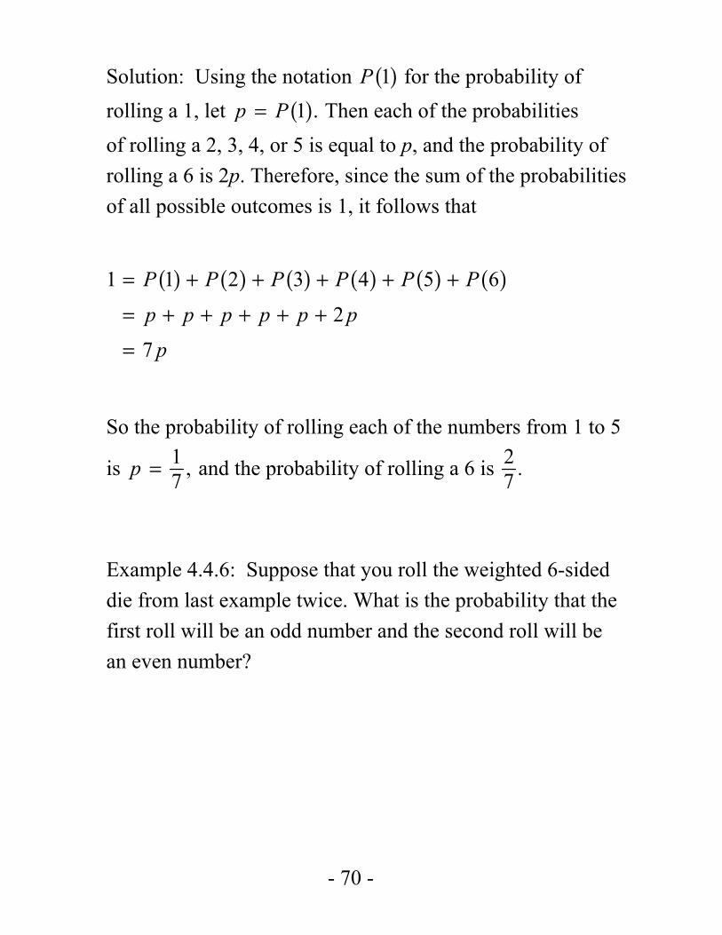
- 70 -
Solution: Using the notation ( )1P for the probability of rolling a 1, let ( )1 .p P= Then each of the probabilities of rolling a 2, 3, 4, or 5 is equal to p, and the probability of rolling a 6 is 2p. Therefore, since the sum of the probabilities of all possible outcomes is 1, it follows that
( ) ( ) ( ) ( ) ( ) ( )1 1 2 3 4 5 6
2
7
P P P P P P
p p p p p p
p
= + + + + +
= + + + + +
=
So the probability of rolling each of the numbers from 1 to 5
is 1 ,7p = and the probability of rolling a 6 is 2 .7
Example 4.4.6: Suppose that you roll the weighted 6-sided die from last example twice. What is the probability that the first roll will be an odd number and the second roll will be an even number?
- 71 -
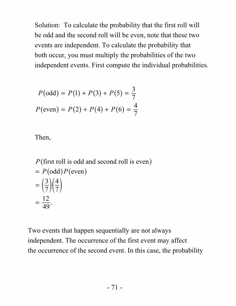
Solution: To calculate the probability that the first roll will be odd and the second roll will be even, note that these two events are independent. To calculate the probability that both occur, you must multiply the probabilities of the two independent events. First compute the individual probabilities.
( ) ( ) ( ) ( )
( ) ( ) ( ) ( )
3odd 1 3 5 74even 2 4 6 7
P P P P
P P P P
= + + =
= + + =
Then,
( )( ) ( )
( )( )first roll is odd and second roll is even
odd even3 47 7
12 .49
PP P=
=
=
Two events that happen sequentially are not always independent. The occurrence of the first event may affect the occurrence of the second event. In this case, the probability
- 72 -
that both events happen is equal to the probability that the first event happens multiplied by the probability that, once the first event has happened, the second event will happen as well.
Example 4.4.7: A box contains 5 orange disks, 4 red disks, and 1 blue disk. You are to select two disks at random and without replacement from the box. What is the probability that the first disk you select will be red and the second disk you select will be orange?
Solution: To solve, you need to calculate the following two probabilities and then multiply them.
1. The probability that the first disk selected from the box will be red
2. The probability that the second disk selected from the box will be orange, given that the first disk selected from the box is red
The probability that the first disk you select will be red
is 4 2 .10 5= If the first disk you select is red, there will be
5 orange disks, 3 red disks, and 1 blue disk left in the box,
- 73 -
for a total of 9 disks. Therefore, the probability that the second disk you select will be orange, given that the first disk
you selected is red, is 5 .9 Multiply the two probabilities to get
( )( )2 5 2 .5 9 9=
4.5 Distributions of Data, Random Variables, and Probability Distributions
In data analysis, variables whose values depend on chance play an important role in linking distributions of data to probability distributions. Such variables are called random variables. We begin with a review of distributions of data.
Distributions of Data
Recall that relative frequency distributions given in a table or histogram are a common way to show how numerical data are distributed. In a histogram, the areas of the bars indicate where

- 74 -
the data are concentrated. The histogram of the relative frequency distribution of the number of children in each of 25 families in Data Analysis Figure 7 below, illustrates a small group of data, with only 6 possible values and only 25 data altogether. (Note: This is the second occurrence of Data Analysis Figure 7 in this chapter; it was first encountered in example 4.1.6.)
Data Analysis Figure 7 (repeated)
- 75 -
Many groups of data are much larger than 25 and have many more than 6 possible values, which are often measurements of quantities like length, money, or time.
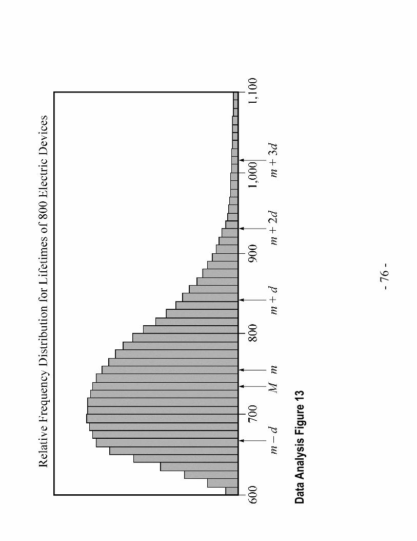
Example 4.5.1: The lifetimes of 800 electric devices were measured. Because the lifetimes had many different values, the measurements were grouped into 50 intervals, or classes, of 10 hours each: 601–610 hours, 611–620 hours, . . . , 1,091–1,100 hours. The resulting relative frequency distribution, as a histogram, has 50 thin bars and many different bar heights, as shown in Data Analysis Figure 13 on the following page. (Data Analysis Figure 13 has been rotated 90 degrees to fit on the page.)
- 76
-
Data
Ana
lysis
Figu
re 13
- 77 -
In the graph, the median is represented by M, the mean is represented by m, and the standard deviation is represented by d.
According to the graph,
m d- is between 660 and 670,
M is between 730 and 740,
m is between 750 and 760,
m d+ is between 840 and 850,
2m d+ is 930, and
3m d+ is between 1,010 and 1,020.
The standard deviation marks show how most of the data are within about 3 standard deviations of the mean (that is, between the numbers 3m d- (not shown) and 3m d+ ).
The tops of the bars of the relative frequency distribution in Data Analysis Figure 13 have a relatively smooth appearance and begin to look like a curve. In general, graphs of relative frequency distributions of very large data sets grouped into many classes appear to have
- 78 -
a relatively smooth appearance. Consequently, the distribution can be modeled by a smooth curve that is close to the tops of the bars. Such a model retains the shape of the distribution but is independent of classes.
Recall that the sum of the areas of the bars of a relative frequency histogram is 1. Although the units on the horizontal axis of a histogram vary from one data set to another, the vertical scale can be adjusted (stretched or shrunk) so that the sum of the areas of the bars is 1. With this vertical scale adjustment, the area under the curve that models the distribution is also 1. This model curve is called a distribution curve, but it has other names as well, including density curve and frequency curve.
The purpose of the distribution curve is to give a good illustration of a large distribution of numerical data that doesn’t depend on specific classes. To achieve this, the main property of a distribution curve is that the area under the curve in any vertical slice, just like a histogram bar, represents the proportion of the data that lies in the corresponding interval on the horizontal axis, which is at the base of the slice.

- 79 -
Finally, regarding the mean and the median, recall that the median splits the data into a lower half and an upper half, so that the sum of the areas of the bars to the left of M is the same as the sum of the areas to the right. On the other hand, m takes into account the exact value of each of the data, not just whether a value is high or low. The nature of the mean is such that if an imaginary fulcrum were placed somewhere under the horizontal axis in order to balance the distribution perfectly, the balancing position would be exactly at m. That is why m is somewhat to the right of M. The balance point at m takes into account how high the few very high values are (to the far right), while M just counts them as “high.” To summarize, the median is the “halving point,” and the mean is the “balance point.”
Random Variables
When analyzing data, it is common to choose a value of the data at random and consider that choice as a random experiment, as introduced in section 4.4–Probability. Then, the probabilities of events involving the randomly chosen value may be determined. Given a distribution of data, a variable, say X, may be used to represent a randomly chosen value from the distribution. Such

- 80 -
a variable X is an example of a random variable, which is a variable whose value is a numerical outcome of a random experiment.
Example 4.5.2: The data from Example 4.1.1, consisting of numbers of children, was summarized in the frequency distribution table in Data Analysis Figure 1, which is repeated below.
Frequency Distribution Number of Children Frequency
0 3 1 5 2 7 3 6 4 3 5 1 Total 25
Data Analysis Figure 1 (repeated)
- 81 -
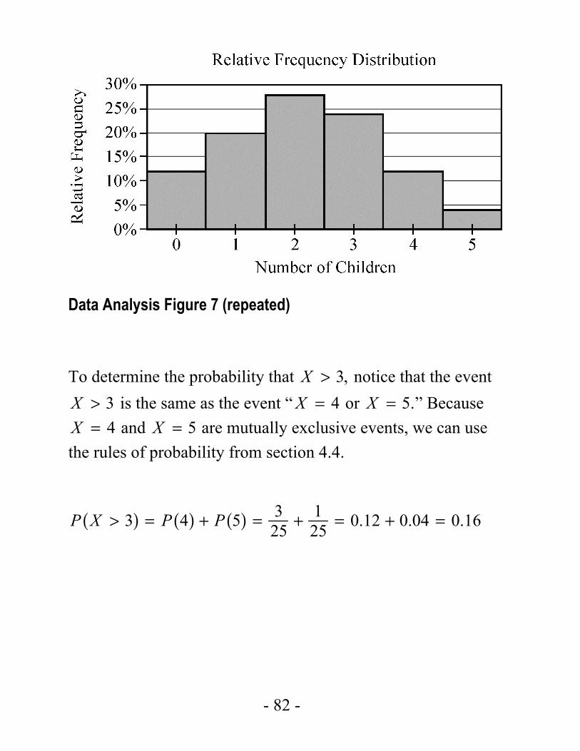
Now let X be the random variable representing the number of children in a randomly chosen family among the 25 families. What is the probability that 3 ?X = That 3 ?X > That X is less than the mean of the distribution?
Solution: To determine the probability that 3X = , realize that this is the same as determining the probability that a family with 3 children will be chosen.
Since there are 6 families with 3 children and each of the 25 families is equally likely to be chosen, the probability that
a family with 3 children will be chosen is 6 .25 That is, 3X =
is an event, and its probability is ( ) 63 ,25P X = = or 0.24.
It is common to use the shorter notation ( )3P instead of ( )3 ,P X = so you could write ( )3 0.24.P =
Note that in the histogram shown in Data Analysis Figure 7 below (repeated from Example 4.1.6), the area of the bar corresponding to 3X = as a proportion of the combined areas of all of the bars is equal to this probability. This indicates how probability is related to area in a histogram for a relative frequency distribution.
- 82 -
Data Analysis Figure 7 (repeated)
To determine the probability that 3,X > notice that the event 3>X is the same as the event “ 4X = or 5.=X ” Because 4X = and 5X = are mutually exclusive events, we can use
the rules of probability from section 4.4.
( ) ( ) ( ) 3 13 4 5 0.12 0.04 0.1625 25P X P P> = + = + = + =

- 83 -
To determine the probability that X is less than the mean of the distribution, first compute the mean of the distribution as follows.
( ) ( ) ( ) ( ) ( ) ( )0 3 1 5 2 7 3 6 4 3 5 1 54 2.1625 25+ + + + + = =
Then, calculate the probability that X is less than the mean of the distribution; that is the probability that X is less than 2.16.
( ) ( ) ( ) ( ) 3 5 7 152.16 0 1 2 0.6.25 25 25 25P X P P P< = + + = + + = =
- 84 -
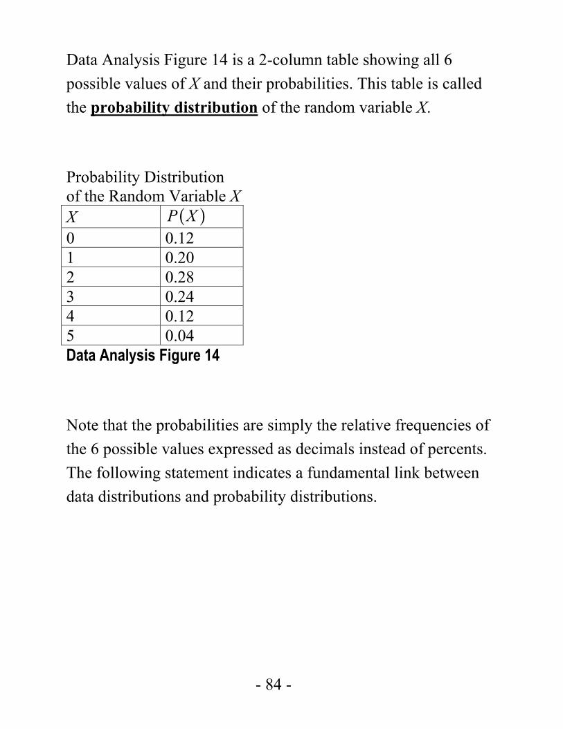
Data Analysis Figure 14 is a 2-column table showing all 6 possible values of X and their probabilities. This table is called the probability distribution of the random variable X.
Probability Distribution of the Random Variable X X ( )P X 0 0.12 1 0.20 2 0.28 3 0.24 4 0.12 5 0.04 Data Analysis Figure 14
Note that the probabilities are simply the relative frequencies of the 6 possible values expressed as decimals instead of percents. The following statement indicates a fundamental link between data distributions and probability distributions.
- 85 -
Statement: For a random variable that represents a randomly chosen value from a distribution of data, the probability distribution of the random variable is the same as the relative frequency distribution of the data.
Because the probability distribution and the relative frequency distribution are essentially the same, the probability distribution can be represented by a histogram. Also, all of the descriptive statistics—such as mean, median, and standard deviation—that apply to the distribution of data also apply to the probability distribution. For example, we say that the probability distribution above has a mean of 2.16, a median of 2, and a standard deviation of about 1.3, since the 25 data values have these statistics, as you can check.
These statistics are similarly defined for the random variable X above. Thus, we would say that the mean of the random variable X is 2.16. Another name for the mean of a random variable is expected value. So we would also say that the expected value of X is 2.16.
- 86 -
Note that the mean of X is equal to
( ) ( ) ( ) ( ) ( ) ( )0 3 1 5 2 7 3 6 4 3 5 125
+ + + + + ,
which can also be expressed as
( ) ( ) ( ) ( ) ( ) ( )3 5 7 6 3 10 1 2 3 4 525 25 25 25 25 25+ + + + + ,
which is the same as
( ) ( ) ( ) ( ) ( ) ( )0 0 1 1 2 2 3 3 4 4 5 5P P P P P P+ + + + +
Therefore, the mean of the random variable X is ( );X P X the sum of each value of X multiplied by its corresponding probability ( ).P X
The preceding example involves a common type of random variable—one that represents a randomly chosen value from a distribution of data. However, the concept of a random variable

- 87 -
is more general. A random variable can be any quantity whose value is the result of a random experiment. The possible values of the random variable are the same as the outcomes of the experiment. So any random experiment with numerical outcomes naturally has a random variable associated with it, as in the following example.
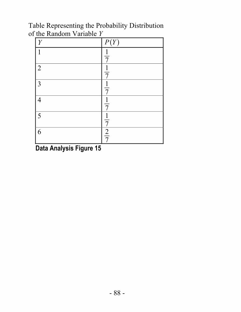
Example 4.5.3: Let Y represent the outcome of the experiment of rolling a weighted 6-sided die in example 4.4.5. (In that example, the probabilities of rolling any of the numbers from 1 to 5 are all equal, but the probability of rolling a 6 is twice the probability of rolling a 1). Then Y is a random variable with 6 possible values, the numbers 1 through 6. Each of the six values of Y has a probability. Data Analysis Figure 15 below represents the distribution of these six probabilities in a 2-column table, and Data Analysis Figure 16 represents the distribution of these six probabilities in a histogram.
- 88 -
Table Representing the Probability Distribution of the Random Variable Y
Y ( )P Y 1 1
7
2 17
3 17
4 17
5 17
6 27
Data Analysis Figure 15
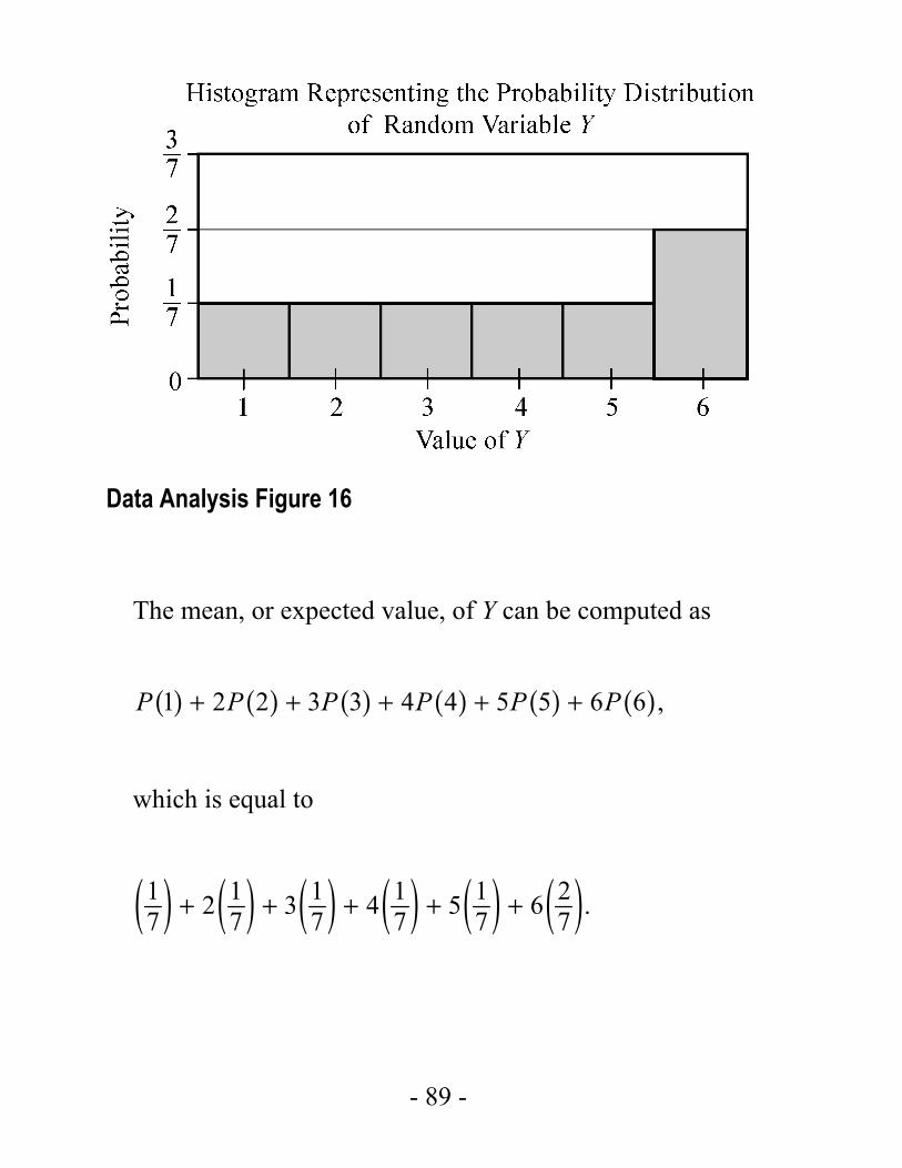
- 89 -
Data Analysis Figure 16
The mean, or expected value, of Y can be computed as
( ) ( ) ( ) ( ) ( ) ( )1 2 2 3 3 4 4 5 5 6 6 ,P P P P P P+ + + + +
which is equal to
( ) ( ) ( ) ( ) ( ) ( )1 1 1 1 1 22 3 4 5 6 .7 7 7 7 7 7+ + + + +
- 90 -
This sum simplifies to 1 2 3 4 5 12 27, or 7 7 7 7 7 7 7+ + + + + ,
which is approximately 3.86.
Both of the random variables X and Y above are examples of discrete random variables because their values consist of discrete points on a number line.
A basic fact about probability from Section 4.4–Probability, is that the sum of the probabilities of all possible outcomes of an experiment is 1, which can be confirmed by adding all of the probabilities in each of the probability distributions for the random variables X and Y above. Also, the sum of the areas of the bars in a histogram for the probability distribution of a random variable is 1. This fact is related to the following fundamental link between the areas of the bars of a histogram and the probabilities of a discrete random variable.
Fundamental Link: In the histogram for probability distribution of a random variable, the area of each bar is proportional to the probability represented by the bar.

- 91 -
If the die in example 4.4.5 were a fair die instead of weighted,
then the probability of each of the outcomes would be 1 ,6
and consequently, each of the bars in the histogram of the probability distribution would have the same height. Such a flat histogram indicates a uniform distribution, since the probability is distributed uniformly over all possible outcomes.
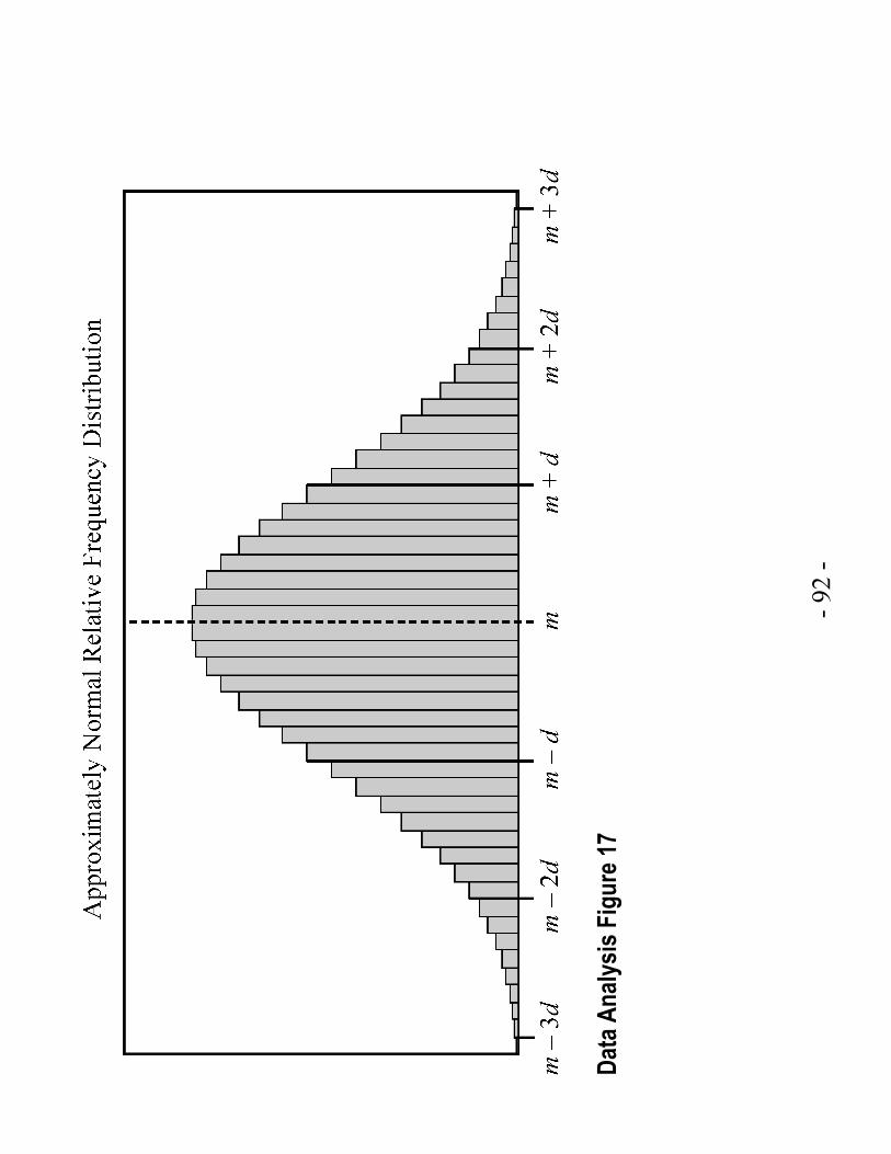
The Normal Distribution
Many natural processes yield data that have a relative frequency distribution shaped somewhat like a bell, as in the distribution with mean m and standard deviation d in Data Analysis Figure 17 on the following page. (Data Analysis Figure 17 has been rotated 90 degrees to fit on the page.)
- 92
-
Data
Ana
lysis
Figu
re 17
- 93 -
Such data are said to be approximately normally distributed and have the following four properties.
Property 1: The mean, median, and mode are all nearly equal.
Property 2: The data are grouped fairly symmetrically about the mean.
Property 3: About two-thirds of the data are within 1 standard deviation of the mean.
Property 4: Almost all of the data are within 2 standard deviations of the mean.
As stated above, you can always associate a random variable X with a distribution of data by letting X be a randomly chosen value from the distribution. If X is such a random variable for the distribution above, we say that X is approximately normally distributed.
- 94 -
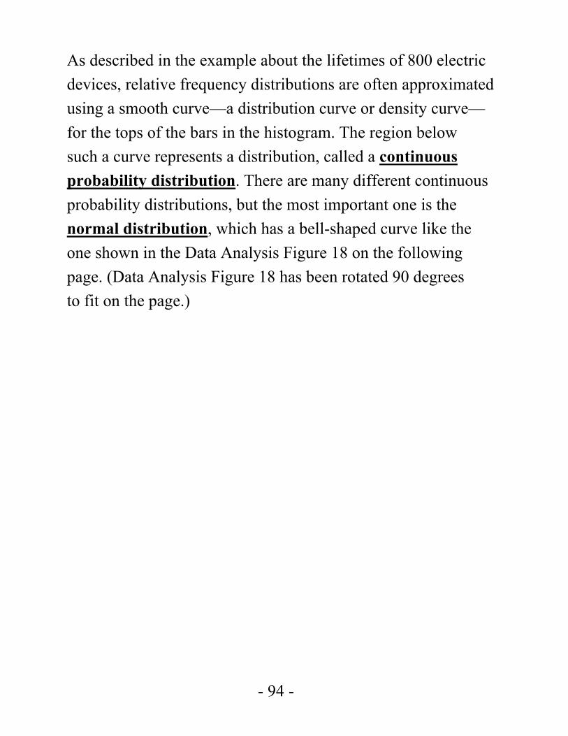
As described in the example about the lifetimes of 800 electric devices, relative frequency distributions are often approximated using a smooth curve—a distribution curve or density curve—for the tops of the bars in the histogram. The region below such a curve represents a distribution, called a continuous probability distribution. There are many different continuous probability distributions, but the most important one is the normal distribution, which has a bell-shaped curve like the one shown in the Data Analysis Figure 18 on the following page. (Data Analysis Figure 18 has been rotated 90 degrees to fit on the page.)
- 95
-
Data
Ana
lysis
Figu
re 18

- 96 -
Just as a data distribution has a mean and standard deviation, the normal probability distribution has a mean and standard deviation. Also, the properties listed above for the approximately normal distribution of data hold for the normal distribution, except that the mean, median, and mode are exactly the same and the distribution is perfectly symmetric about the mean.
A normal distribution, though always shaped like a bell, can be centered around any mean and can be spread out to a greater or lesser degree, depending on the standard deviation. The less the standard deviation, the less spread out the curve is; that is to say, at the mean the curve is higher and as you move away from the mean in either direction it drops down toward the horizontal axis faster.
In Data Analysis Figure 19 on the following page are two normal distributions that have different centers, 10- and 5, respectively, but the spread of the distributions is the same. Note that the two distributions have the same shape so one can be shifted horizontally onto the other. (Data Analysis Figure 19 has been rotated 90 degrees to fit on the page.)

- 97
-
Data
Ana
lysis
Figu
re 19
- 98 -
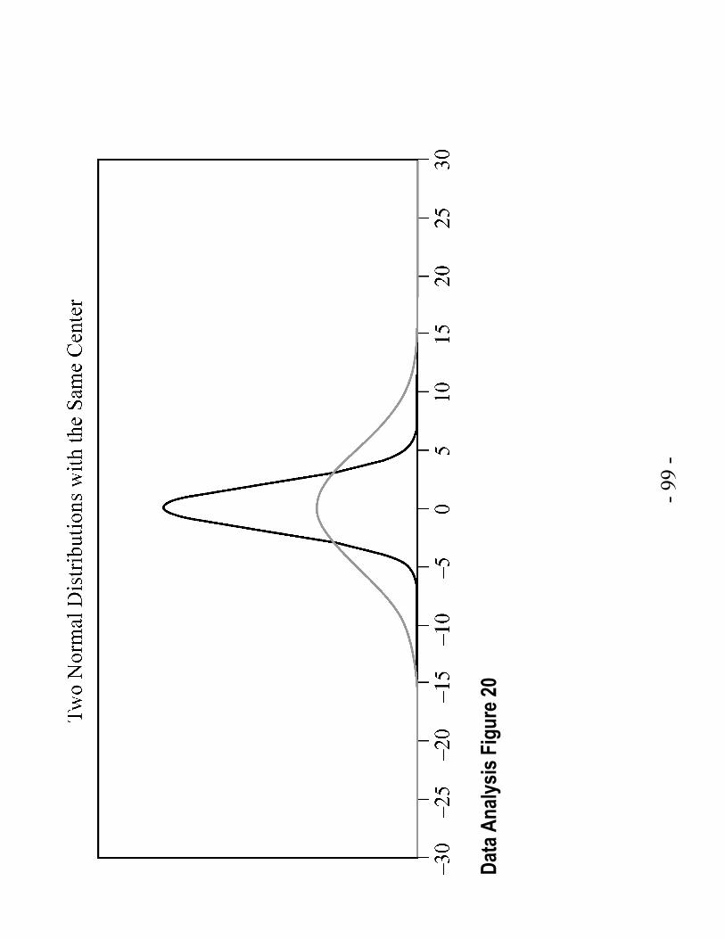
In Data Analysis Figure 20 on the following page are two normal distributions that have different spreads, but the same center. The mean of both distributions is 0. One of the distributions is high and spread narrow about the mean; and the other is low and spread wide about the mean. The standard deviation of the high-narrow distribution is less than the standard deviation of the low-wide distribution. (Data Analysis Figure 20 has been rotated 90 degrees to fit on the page.)
- 99
-
Data
Ana
lysis
Figu
re 20
- 100 -
As mentioned earlier, areas of the bars in a histogram for a discrete random variable correspond to probabilities for the values of the random variable; the sum of the areas is 1 and the sum of the probabilities is 1. This is also true for a continuous probability distribution: the area of the region under the curve is 1, and the areas of vertical slices of the region—similar to the bars of a histogram—are equal to probabilities of a random variable associated with the distribution. Such a random variable is called a continuous random variable, and it plays the same role as a random variable that represents a randomly chosen value from a distribution of data. The main difference is that we seldom consider the event in which a continuous random variable is equal to a single value like 3X = ; rather, we consider events that are described by intervals of values such as 1 3X< < and 10.X > Such events correspond to vertical slices under a continuous probability distribution, and the areas
- 101 -
of the vertical slices are the probabilities of the corresponding events. (Consequently, the probability of an event such as
3X = would correspond to the area of a line segment, which is 0.)
Example 4.5.4: If W is a random variable that is normally distributed with a mean of 5 and a standard deviation of 2, what is ( )5 ?P W > Approximately what is ( )3 7 ?P W< < Which of the four numbers 0.5, 0.1, 0.05, or 0.01 is the best estimate of ( )1 ?P W < -
Solution: Data Analysis Figure 21 on the following page is a graph of a normal distribution with a mean of 5 and a standard deviation of 2. (Data Analysis Figure 21 has been rotated 90 degrees to fit on the page.)
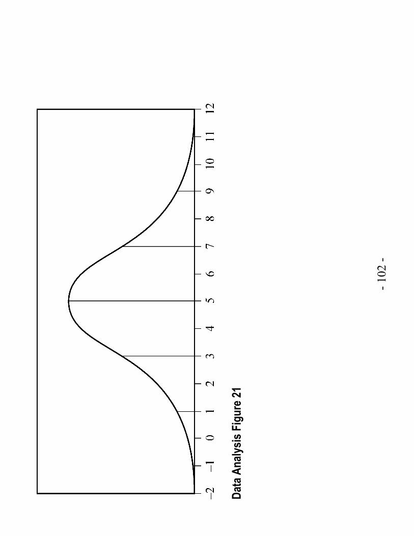
- 102
-
Data
Ana
lysis
Figu
re 21

- 103 -
The numbers 3 and 7 are 1 standard deviation away from the mean; the numbers 1 and 9 are 2 standard deviations from the mean; and the numbers 1- and 11 are 3 standard deviations away from the mean.
Since the mean of the distribution is 5, and the distribution is symmetric about the mean, the event 5W > corresponds to exactly half of the area under the normal distribution.
So ( ) 15 .2P W > =
For the event 3 7,W< < note that since the standard deviation of the distribution is 2, the values 3 and 7 are one standard deviation below and above the mean, respectively. Since about two-thirds of the area is within one standard deviation of the mean, ( )3 7P W< < is
approximately 2 .3
For the event 1,W < - note that 1- is 3 standard deviations below the mean. Since the graph makes it fairly clear that the area of the region under the normal curve to the left of 1- is much less than 5 percent of all of the area, the best of the four estimates given for ( )1P W < - is 0.01.

- 104 -
The standard normal distribution is a normal distribution with a mean of 0 and standard deviation equal to 1. To transform a normal distribution with a mean of m and a standard deviation of d to a standard normal distribution, you standardize the values; that is, you subtract m from any observed value of the normal distribution and then divide the result by d.
Very precise values for probabilities associated with normal distributions can be computed using calculators, computers, or statistical tables for the standard normal distribution. In the preceding example, more precise values for ( )3 7P W< < and ( )1P W < - are 0.683 and 0.0013. Such calculations are beyond
the scope of this review.
4.6 Data Interpretation Examples
Example 4.6.1:
Example 4.6.1 is based on the 3-column table in Data Analysis Figure 22 below.

- 105 -
Distribution of Customer Complaints Received by Airline P, 2003 and 2004 Category 2003 2004 Flight problem 20.0% 22.1%Baggage 18.3 21.8 Customer service 13.1 11.3 Reservation and ticketing 5.8 5.6 Credit 1.0 0.8 Special passenger accommodation
0.9 0.9
Other 40.9 37.5 Total 100.0% 100.0%Total number of complaints
22,998 13,278
Data Analysis Figure 22
(a) Approximately how many complaints concerning credit were received by Airline P in 2003 ?
(b) By approximately what percent did the total number of complaints decrease from 2003 to 2004 ?
(c) Based on the information in the table, which of the following three statements are true?
- 106 -
Statement 1: In each of the years 2003 and 2004, complaints about flight problems, baggage, and customer service together accounted for more than 50 percent of all customer complaints received by Airline P.
Statement 2: The number of special passenger accommodation complaints was unchanged from 2003 to 2004.
Statement 3: From 2003 to 2004, the number of flight problem complaints increased by more than 2 percent.
Solutions:
(a) According to the table, in 2003, 1 percent of the total number of complaints concerned credit. Therefore, the number of complaints concerning credit is equal to 1 percent of 22,998. By converting 1 percent to its decimal equivalent, you obtain that the number of complaints in 2003 is equal to (0.01)(22,998), or about 230.
(b) The decrease in the total number of complaints from 2003 to 2004 was 22,998 13,278,- or 9,720. Therefore, the percent
decrease was ( )( )9,720 100% ,22,998 or approximately 42 percent.

- 107 -
(c) Since 20.0 18.3 13.1+ + and 22.1 21.8 11.3+ + are both greater than 50, statement 1 is true. For statement 2, the percent of special passenger accommodation complaints did remain the same from 2003 to 2004, but the number of such complaints decreased because the total number of complaints decreased. Thus, statement 2 is false. For statement 3, the percents shown in the table for flight problems do in fact increase by more than 2 percentage points, but the bases of the percents are different. The total number of complaints in 2004 was much lower than the total number of complaints in 2003, and clearly 20 percent of 22,998 is greater than 22.1 percent of 13,278. So, the number of flight problem complaints actually decreased from 2003 to 2004, and statement 3 is false.
Example 4.6.2:
Example 4.6.2 is based on the circle graph in Data Analysis Figure 6 below. (This is the same circle graph as the circle graph in Example 4.1.6.)

- 108 -
Data Analysis Figure 6 (repeated)
(a) Approximately what was the ratio of the value of sensitized goods to the value of still-picture equipment produced in 1971 in the United States?
- 109 -
(b) If the value of office copiers produced in 1971 was 30 percent greater than the corresponding value in 1970, what was the value of office copiers produced in 1970 ?
Solutions:
(a) The ratio of the value of sensitized goods to the value of still-picture equipment is equal to the ratio of the corresponding percents shown because the percents have the same base, which is the total value. Therefore, the ratio is 47 to 12, or approximately 4 to 1.
(b) The value of office copiers produced in 1971 was 0.25 times $3,980 million, or $995 million. Therefore, if the corresponding value in 1970 was x million dollars, then
1.3 995x = million. Solving for x yields 995 765,1.3x = ª so
the value of office copiers produced in 1970 was approximately $765 million.

- 110 -
Example 4.6.3: A bicycle trainer studied 50 bicyclists to examine how the finishing time for a certain bicycle race was related to the amount of physical training in the three months before the race. To measure the amount of training, the trainer developed a training index, measured in “units” and based on the intensity of each bicyclist’s training. The data and the trend of the data, represented by a line, are displayed in the scatterplot in Data Analysis Figure 8 below. This scatterplot, which is entitled “Finishing Times and Training Indices for 50 Bicyclists in a Race,” is the same scatterplot as the scatterplot in example 4.1.7.

- 111 -
Data Analysis Figure 8 (repeated)
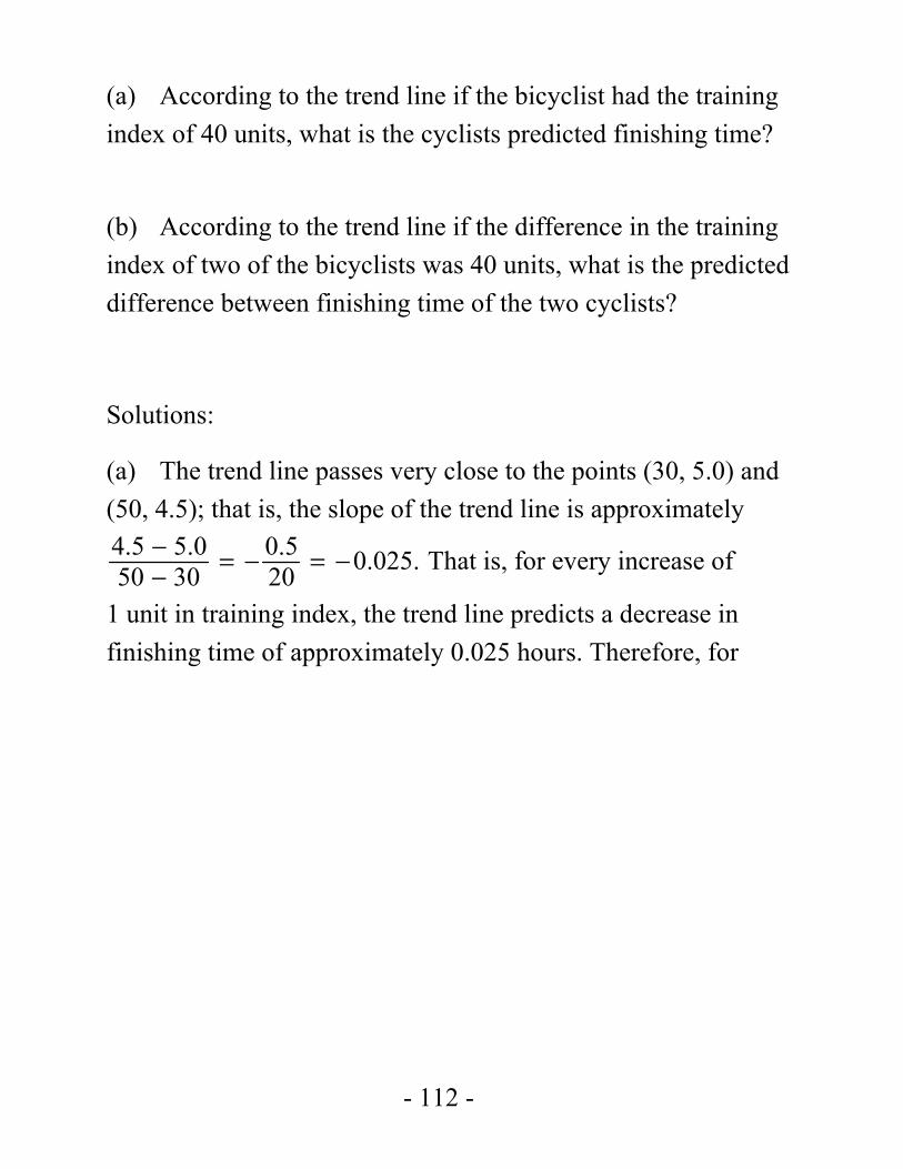
- 112 -
(a) According to the trend line if the bicyclist had the training index of 40 units, what is the cyclists predicted finishing time?
(b) According to the trend line if the difference in the training index of two of the bicyclists was 40 units, what is the predicted difference between finishing time of the two cyclists?
Solutions:
(a) The trend line passes very close to the points (30, 5.0) and (50, 4.5); that is, the slope of the trend line is approximately 4.5 5.0 0.5 0.025.50 30 20
- = - = -- That is, for every increase of
1 unit in training index, the trend line predicts a decrease in finishing time of approximately 0.025 hours. Therefore, for
- 113 -
an increase of training index of 10 units, the finishing times is predicted to decrease by 10(0.025) 0.25 hours.= Because a training index of 40 units is an increase of 10 units from a training index of 30 units, the predicted finishing time for a cyclist that had a training index of 40 is equal to 5.0 0.25 4.75 hours.- =
(b) According to the trend line, an increase of 1 unit in training index predicts a decrease of 0.025 hours in finishing time (from question (a)). Therefore, a difference in training units of 40 predicts a difference of 40(0.025) 1 hour= in finishing time.
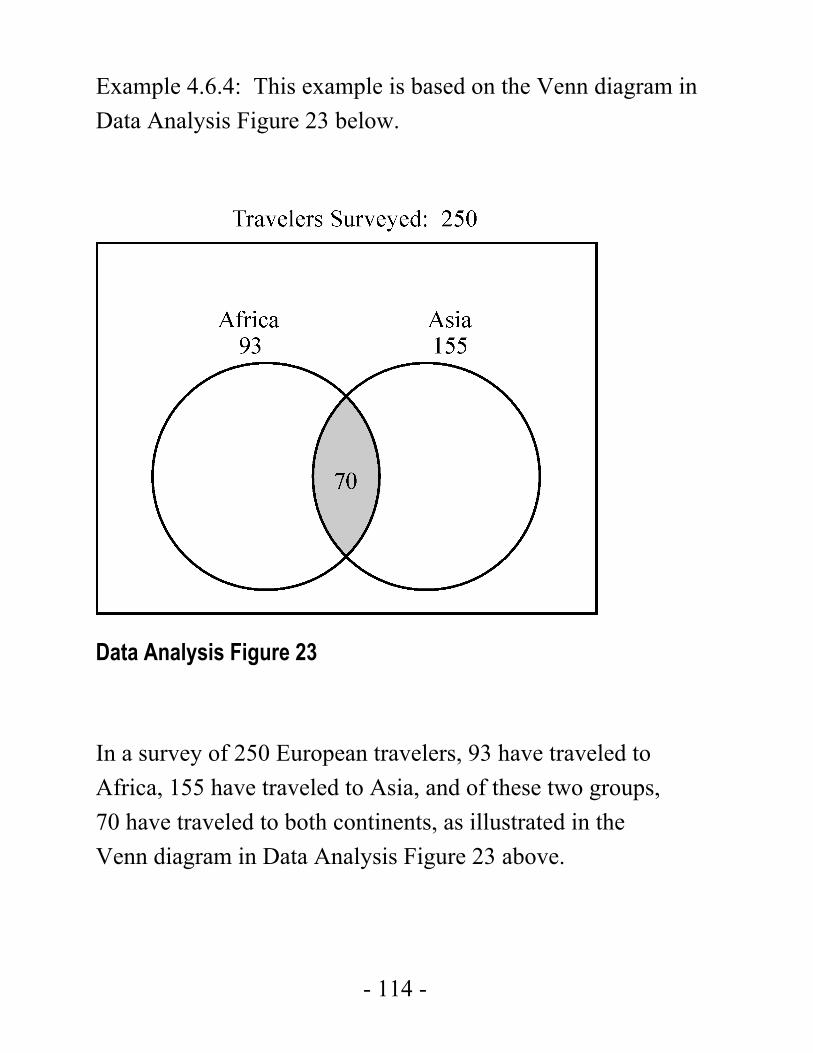
- 114 -
Example 4.6.4: This example is based on the Venn diagram in Data Analysis Figure 23 below.
Data Analysis Figure 23
In a survey of 250 European travelers, 93 have traveled to Africa, 155 have traveled to Asia, and of these two groups, 70 have traveled to both continents, as illustrated in the Venn diagram in Data Analysis Figure 23 above.

- 115 -
(a) How many of the travelers surveyed have traveled to Africa but not to Asia?
(b) How many of the travelers surveyed have traveled to at least one of the two continents of Africa and Asia?
(c) How many of the travelers surveyed have traveled neither to Africa nor to Asia?
Solutions:
In the Venn diagram in Data Analysis Figure 23, the rectangular region represents the set of all travelers surveyed; the two circular regions represent the two sets of travelers to Africa and Asia, respectively; and the shaded region represents the subset of those who have traveled to both continents.
- 116 -
(a) The set of travelers surveyed who have traveled to Africa but not to Asia is represented in the Venn diagram by the part of the left circle that is not shaded. This suggests that the answer can be found by taking the shaded part away from the leftmost circle—in effect, subtracting the 70 from the 93, to get 23 travelers who have traveled to Africa but not to Asia.
(b) The travelers surveyed who have traveled to at least one of the two continents of Africa and Asia is represented in the Venn diagram by that part of the rectangle that is in at least one of the two circles. This suggests adding the two numbers 93 and 155. But the 70 travelers who have traveled to both continents would be counted twice in the sum 93 155.+ To correct the double counting, subtract 70 from the sum so that these 70 travelers are counted only once:
93 155 70 178.+ - =
- 117 -
(c) The travelers surveyed who have traveled neither to Africa nor to Asia is represented in the Venn diagram by the part of the rectangle that is not in either circle. Let N be the number of these travelers. Note that the entire rectangular region has two main non-overlapping parts: the part outside the circles and the part inside the circles. The first part represents N travelers and the second part represents 93 155 70 178+ - = travelers (from question (b)). Therefore,
250 178,N= +
and solving for N yields
250 178 72.N = - =
- 118 -
Data Analysis Exercises
1. The daily temperatures, in degrees Fahrenheit, for 10 days in May were 61, 62, 65, 65, 65, 68, 74, 74, 75, and 77.
(a) Find the mean, median, mode, and range of the temperatures.
(b) If each day had been 7 degrees warmer, what would have been the mean, median, mode, and range of those 10 temperatures?
2. The numbers of passengers on 9 airline flights were 22, 33, 21, 28, 22, 31, 44, 50, and 19. The standard deviation of these 9 numbers is approximately equal to 10.2.
(a) Find the mean, median, mode, range, and interquartile range of the 9 numbers.
(b) If each flight had had 3 times as many passengers, what would have been the mean, median, mode, range, interquartile range, and standard deviation of the nine numbers?
(c) If each flight had had 2 fewer passengers, what would have been the interquartile range and standard deviation of the nine numbers?
- 119 -
3. A group of 20 values has a mean of 85 and a median of 80. A different group of 30 values has a mean of 75 and a median of 72.
(a) What is the mean of the 50 values?
(b) What is the median of the 50 values?
4. Find the mean and median of the values of the random variable X, whose relative frequency distribution is given in the table in Data Analysis Figure 24 below.
X Relative Frequency
0 0.18 1 0.33 2 0.10 3 0.06 4 0.33
Data Analysis Figure 24
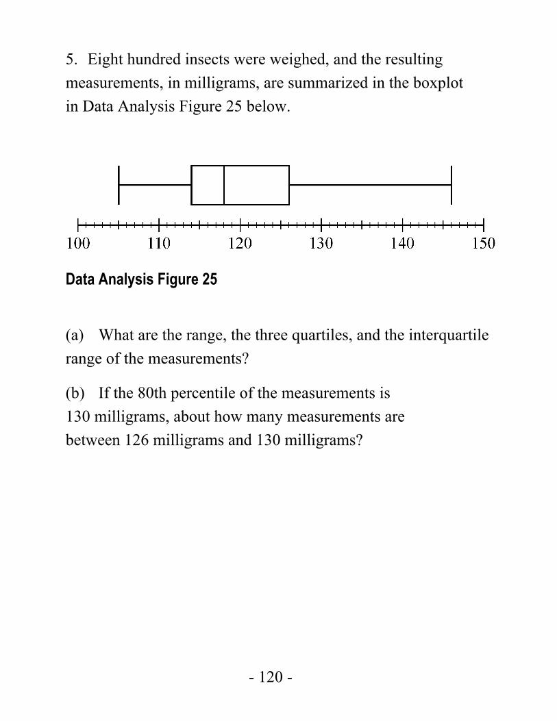
- 120 -
5. Eight hundred insects were weighed, and the resulting measurements, in milligrams, are summarized in the boxplot in Data Analysis Figure 25 below.
Data Analysis Figure 25
(a) What are the range, the three quartiles, and the interquartile range of the measurements?
(b) If the 80th percentile of the measurements is 130 milligrams, about how many measurements are between 126 milligrams and 130 milligrams?

- 121 -
6. In how many different ways can the letters in the word STUDY be ordered?
7. Martha invited 4 friends to go with her to the movies. There are 120 different ways in which they can sit together in a row of 5 seats, one person per seat. In how many of those ways is Martha sitting in the middle seat?
8. How many 3-digit positive integers are odd and do not contain the digit 5 ?
9. From a box of 10 lightbulbs, you are to remove 4. How many different sets of 4 lightbulbs could you remove?

- 122 -
10. A talent contest has 8 contestants. Judges must award prizes for first, second, and third places, with no ties.
(a) In how many different ways can the judges award the 3 prizes?
(b) How many different groups of 3 people can get prizes?
11. If an integer is randomly selected from all positive 2-digit integers, what is the probability that the integer chosen has
(a) a 4 in the tens place?
(b) at least one 4 in the tens place or the units place?
(c) no 4 in either place?
12. In a box of 10 electrical parts, 2 are defective.
(a) If you choose one part at random from the box, what is the probability that it is not defective?
(b) If you choose two parts at random from the box, without replacement, what is the probability that both are defective?
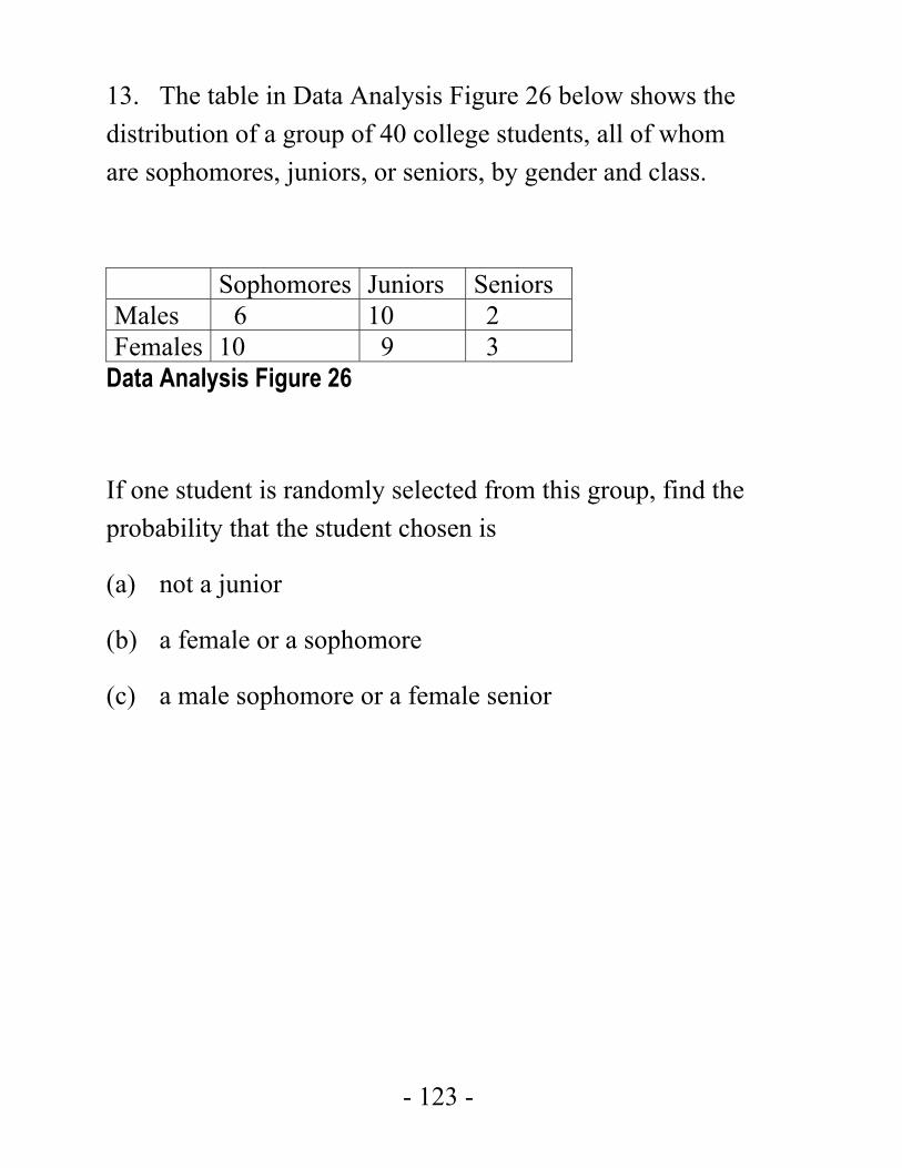
- 123 -
13. The table in Data Analysis Figure 26 below shows the distribution of a group of 40 college students, all of whom are sophomores, juniors, or seniors, by gender and class.
Sophomores Juniors Seniors Males 6 10 2 Females 10 9 3
Data Analysis Figure 26
If one student is randomly selected from this group, find the probability that the student chosen is
(a) not a junior
(b) a female or a sophomore
(c) a male sophomore or a female senior

- 124 -
14. Let A, B, C, and D be events for which ( or ) 0.6,P A B = ( ) 0.2,P A = ( or ) 0.6,P C D = and ( ) 0.5.P C = The events A
and B are mutually exclusive, and the events C and D are independent.
(a) Find ( )P B
(b) Find ( )P D
15. Lin and Mark each attempt independently to decode a message. If the probability that Lin will decode the message is 0.80 and the probability that Mark will decode the message is 0.70, find the probability that
(a) both will decode the message
(b) at least one of them will decode the message
(c) neither of them will decode the message

- 125 -
16. This exercise is based on Data Analysis Figure 27 below.
Data Analysis Figure 27
The figure shows a normal distribution with mean m and standard deviation d, including approximate percents of the distribution corresponding to the six regions shown.
Suppose the heights of a population of 3,000 adult penguins are approximately normally distributed with a mean of 65 centimeters and a standard deviation of 5 centimeters.
(a) Approximately how many of the adult penguins are between 65 centimeters and 75 centimeters tall?
(b) If an adult penguin is chosen at random from the population, approximately what is the probability that the penguin’s height will be less than 60 centimeters? Give your answer to the nearest 0.05.
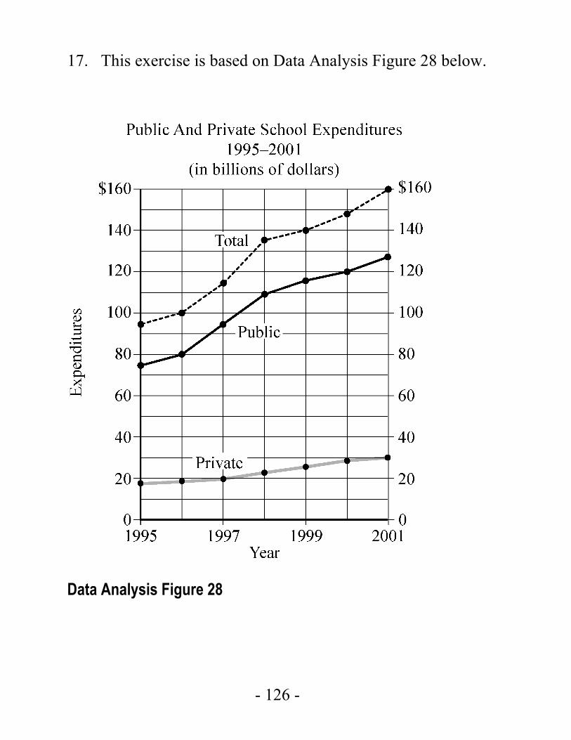
- 126 -
17. This exercise is based on Data Analysis Figure 28 below.
Data Analysis Figure 28

- 127 -
(a) For which year did total expenditures increase the most from the year before?
(b) For 2001, private school expenditures were approximately what percent of total expenditures?
18. This exercise is based on Data Analysis Figure 29 below.
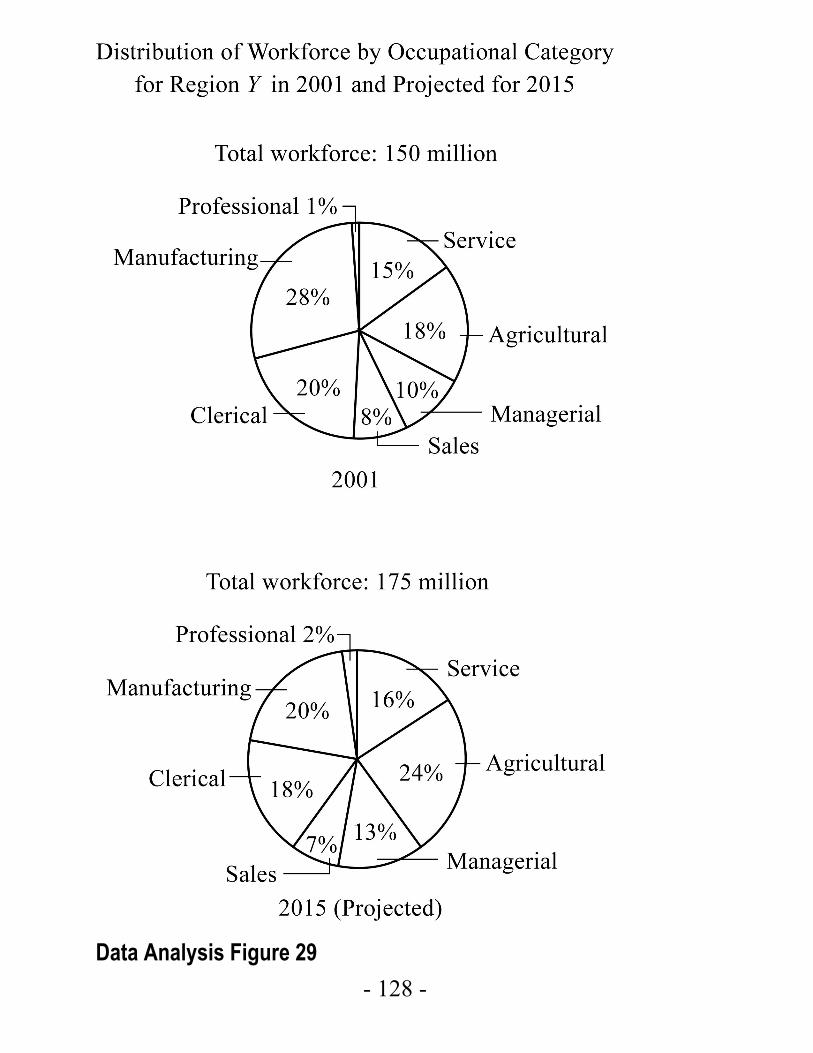
- 128 -
Data Analysis Figure 29
- 129 -
(a) In 2001, how many categories each comprised more than 25 million workers?
(b) What is the ratio of the number of workers in the Agricultural category in 2001 to the projected number of such workers in 2015 ?
(c) From 2001 to 2015, there is a projected increase in the number of workers in which of the following three categories?
Category 1: Sales
Category 2: Service
Category 3: Clerical
19. This exercise is based on Data Analysis Figure 30 on the following page. (Data Analysis Figure 30 has been rotated 90 degrees to fit on the page.)

- 130
-
Da
ta A
nalys
is Fi
gure
30
- 131 -
(a) In 2003 the family used a total of 49 percent of its gross annual income for two of the categories listed. What was the total amount of the family’s income used for those same categories in 2004 ?
(b) Of the seven categories listed, which category of expenditure had the greatest percent increase from 2003 to 2004 ?
- 132 -
Answers to Data Analysis Exercises
1. In degrees Fahrenheit, the statistics are
(a) mean 68.6, median 66.5, mode 65, range 16= = = =
(b) mean 75.6, median 73.5, mode 72, range 16= = = =
2.
(a) mean = 30, median = 28, mode = 22, range = 31, interquartile range = 17
(b) mean = 90, median = 84, mode = 66, range = 93, interquartile range = 51
940standard deviation 3 30.79= ª
(c) interquartile range 17,= standard deviation 10.2ª
3.
(a) mean 79=
(b) The median cannot be determined from the information given.

- 133 -
4. mean 2.03, median 1= =
5.
(a) range 41,= 114,1 =Q 118,2 =Q 126,3 =Q
interquartile range 12=
(b) 40 measurements
6. 5! 120=
7. 24
8. 288
9. 210

- 134 -
10.
(a) 336
(b) 56
11.
(a) 19
(b) 15
(c) 45
12.
(a) 45
(b) 145
- 135 -
13.
(a) 2140
(b) 710
(c) 940
14.
(a) 0.4
(b) 0.2
15.
(a) 0.56
(b) 0.94
(c) 0.06

- 136 -
16.
(a) 1,440
(b) 0.15
17.
(a) 1998
(b) 19%
18.
(a) Three
(b) 9 to 14, or 914
(c) Categories 1, 2, and 3
19.
(a) $17,550
(b) Miscellaneous