massachusetts one care preliminary fourth evaluation report
TRANSCRIPT
FINANCIAL ALIGNMENT INITIATIVE
Massachusetts One Care Preliminary Fourth Evaluation Report Summer 2021
Prepared for Nancy Chiles Shaffer Lanlan Xu Centers for Medicare & Medicaid Services Center for Medicare & Medicaid Innovation Mail Stop WB-06-05 7500 Security Boulevard Baltimore, MD 21244-1850
Submitted by Angela M. Greene and Zhanlian Feng RTI International 3040 East Cornwallis Road P.O. Box 12194 Research Triangle Park, NC 27707-2194 RTI Project Number 0214448.001.007.000.000.006
FINANCIAL ALIGNMENT INITIATIVE MASSACHUSETTS ONE CARE
PRELIMINARY FOURTH EVALUATION REPORT
By
Muskie School of Public Service, University of Southern Maine Elizabeth Gattine, JD Frances Jimenez, BA
RTI International Emily Costilow, MA
Ira Dave, MSPH Cleanthe (Cleo) Kordomenos, BA
Matthew Toth, MSW, PhD Paul Moore, MA Ben Huber, MS
Joyce Wang, MPH Sachin Peddada, BA
Giuseppina Chiri, PhD Hannah Cohen, BS Allison Dorneo, BA
Nolan Sroczynski, MSPH Douglas Fletcher, BS Wayne Anderson, PhD Edith G. Walsh, PhD
Project Directors: Angela M. Greene, MS, MBA, and Zhanlian Feng, PhD
Federal Project Officers: Nancy Chiles Shaffer, PhD, and Lanlan Xu, PhD
RTI International
CMS Contract No. HHSM-500-2014-00037i TO#7
Summer 2021
This project was funded by the Centers for Medicare & Medicaid Services under contract no. HHSM-500-2014-00037i TO #7. The statements contained in this report are solely those of the authors and do not necessarily reflect the views or policies of the Centers for Medicare & Medicaid Services. RTI assumes responsibility for the accuracy and completeness of the information contained in this report.
_________________________________ RTI International is a trade name of Research Triangle Institute. RTI and the RTI logo are U.S. registered trademarks of Research Triangle Institute.

S
Acknowledgments
Acknowledgments
We would like to thank the Commonwealth officials who contributed information reflected in this Interim Report through interviews during site visits and quarterly telephone calls. We also thank the managed care plan staff, consumer advocates, and other stakeholders who also answered our questions about their experience and perspectives on the demonstrations. We gratefully acknowledge the many contributions of CMS staff, especially our project officers, Nancy Chiles Shaffer and Lanlan Xu, and our former project officer, Sai Ma. We thank Amarilys Bernacet and Amy Chepaitis for their careful review of and feedback on this report. We also thank other staff at the University of Southern Maine who helped to gather information and produce tables for this report. Christopher Klotschkow, Shari Lambert, Roxanne Snaauw, and Catherine Boykin provided excellent editing, graphic design, and document preparation.
iii
Table of Contents
Contents
Section Page
Executive Summary ................................................................................................................ ES-1
1 Demonstration and Evaluation Overview ...................................................................... 1-1 1.1 Demonstration Description and Goals ....................................................................... 1-1 1.2 Purpose of This Report .............................................................................................. 1-2 1.3 Data Sources .............................................................................................................. 1-3
2 Demonstration Design and State Context ....................................................................... 2-1 2.1 Changes in Demonstration Design 2-1............................................................................. 2.2 Overview of State Context ......................................................................................... 2-2
3 Update on Demonstration Implementation .................................................................... 3-1 3.1 Integration of Medicare and Medicaid ....................................................................... 3-1
3.1.1 Integrated Systems ......................................................................................... 3-1 3.1.2 Joint Management .......................................................................................... 3-1 3.1.3 New or Innovative Services ........................................................................... 3-2 3.1.4 Alternative Payment Methodologies .............................................................. 3-2 3.1.5 Training and Support for Medicare-Medicaid Plans and Providers .............. 3-3
3.2 Eligibility and Enrollment.......................................................................................... 3-3 3.2.1 Enrollment Systems ....................................................................................... 3-3 3.2.2 Enrollment Experience ................................................................................... 3-4 3.2.3 Disenrollment Experience .............................................................................. 3-5 3.2.4 Contacting and Reaching Enrollees ............................................................... 3-6
3.3 Care Coordination ...................................................................................................... 3-7 3.3.1 Assessment Process ....................................................................................... 3-7 3.3.2 Care Coordination Model .............................................................................. 3-9 3.3.3 Long-term Services Coordination and Long-term Supports
Coordinator Role .......................................................................................... 3-14 3.4 Stakeholder Engagement ......................................................................................... 3-15
3.4.1 Implementation Council............................................................................... 3-15 3.4.2 Consumer Advisory Boards ......................................................................... 3-17
3.5 Financing and Payment ............................................................................................ 3-17 3.5.1 Demonstration Design and Updates ............................................................. 3-18 3.5.2 Financial Experience .................................................................................... 3-18
3.6 Quality of Care ......................................................................................................... 3-20 3.6.1 One Care Quality Measures ......................................................................... 3-20 3.6.2 Quality Management Structure and Activities ............................................. 3-21 3.6.3 HEDIS Quality Measures Reported for One Care MMPs ........................... 3-21
4 Beneficiary Experience ..................................................................................................... 4-1 4.1 Impact of the Demonstration on Beneficiaries .......................................................... 4-1
4.1.1 Beneficiary Overall Satisfaction .................................................................... 4-1 4.1.2 Beneficiary Experience with Care Coordination ........................................... 4-4

iv
Table of Contents
4.2 Beneficiary Protections .............................................................................................. 4-5 4.2.1 Ombudsman Services..................................................................................... 4-5 4.2.2 Grievances and Appeals ................................................................................. 4-6
5 Demonstration Impact on Service Utilization and Quality of Care ............................. 5-1 5.1 Methods Overview ..................................................................................................... 5-1 5.2 Demonstration Impact on Service Utilization Among Eligible Beneficiaries ........... 5-2
5.2.1 Cumulative Impact over Demonstration Years 1–4 ....................................... 5-2 5.2.2 Demonstration Impact in Each Demonstration Year ..................................... 5-4
5.3 Demonstration Impact on Quality of Care Measures Among Eligible Beneficiaries ............................................................................................................ 5-10 5.3.1 Cumulative Impact over Demonstration Years 1–4 ..................................... 5-10 5.3.2 Demonstration Impact in Each Demonstration Year ................................... 5-11
5.4 Demonstration Impact on Select Beneficiaries ........................................................ 5-17 5.4.1 Beneficiaries with Long-Term Services and Supports ................................ 5-17 5.4.2 Beneficiaries with Serious and Persistent Mental Illness ............................ 5-18
6 Demonstration Impact on Cost Savings .......................................................................... 6-1 6.1 Methods Overview ..................................................................................................... 6-1 6.2 Demonstration Impact on Medicare Part A and B Cost ............................................ 6-3
7 Conclusions ........................................................................................................................ 7-1 7.1 Implementation Successes, Challenges, and Lessons Learned .................................. 7-1 7.2 Demonstration Impact on Service Utilization and Costs ........................................... 7-2 7.3 Next Steps .................................................................................................................. 7-3
References .................................................................................................................................. R-1
Appendices A Data Sources ............................................................................................................. A-1 B One Care MMP Performance on Select HEDIS Quality Measures, 2015–2018 .......B-1 C Comparison Group Methodology for Massachusetts Demonstration Year 4 ............C-1 D Service Utilization Methodology .............................................................................. D-1 E Descriptive and Special Population Supplemental Analysis ..................................... E-1 F Cost Savings Methodology and Supplemental Tables ............................................... F-1

v
Table of Contents
List of Tables
Number Page
ES-1 Summary of Massachusetts cumulative demonstration impact estimates for demonstration period (October 1, 2013–December 31, 2017) ....................................... ES-7
ES-2 Summary of Massachusetts demonstration effects on total Medicare expenditures among all eligible beneficiaries ...................................................................................... ES-8
1 Percentage of members that One Care plans were unable to reach following three attempts, within 90 days of enrollment, 2014–2018 ......................................................... 3-7
2 Members whose assessments were completed within 90 days of enrollment, 2014–2018 ................................................................................................................................... 3-8
3 Members with care plans completed within 90 days of enrollment, 2014–2017 ............ 3-11 4 Members with care plans completed within 90 days of enrollment, 2018 ...................... 3-12 5 Members with documented discussions of care goals, 2014–2018 ................................. 3-12 6 Care coordination staffing, 2014–2018 ........................................................................... 3-14 7 Cumulative demonstration impact on select service utilization measures for
eligible beneficiaries in Massachusetts, October 1, 2013–December 31, 2017 ................ 5-4 8 Cumulative demonstration impact on select quality of care measures for eligible
beneficiaries in Massachusetts, October 1, 2013–December 31, 2017 ........................... 5-11 9 Cumulative demonstration effect on service utilization and quality of care
measures, beneficiaries with LTSS use versus those without LTSS use in Massachusetts, October 1, 2013–December 31, 2017 ..................................................... 5-18
10 Cumulative demonstration effect on service utilization and quality of care measures, beneficiaries with SPMI versus those without SPMI in Massachusetts, October 1, 2013–December 31, 2017 .............................................................................. 5-19
11 Data sources for monthly Medicare expenditures ............................................................. 6-2 12 Cumulative demonstration effect on Medicare Parts A and B cost for eligible
beneficiaries in Massachusetts, October 1, 2013–December 31, 2017 ............................. 6-3
vi
Table of Contents
List of Figures
Number Page
1 Total enrollment in One Care, January 2018 through January 2019 ................................. 3-4 2 Blood pressure control,1 2015–2018: Reported performance rates for One Care
MMPs .............................................................................................................................. 3-22 3 30-day follow-up after hospitalization for mental illness, 2015–2018: Reported
performance rates for One Care MMPs ......................................................................... 3-23 4 Good control of HbA1c level (<8.0%), 2015–2018: Reported performance rates for
One Care MMPs .............................................................................................................. 3-24 5 Plan all-cause readmissions, Ages 18–64, 2015–2018: Reported observed-to-
expected ratio means for One Care MMPs ..................................................................... 3-25 6 Plan all-cause readmissions, Ages 65+, 2015–2018: Reported observed-to-
expected ratio means for One Care MMPs ..................................................................... 3-26 7 Beneficiary overall satisfaction, 2015–2018: Percent of beneficiaries rating their
health plan as a 9 or 10 ...................................................................................................... 4-2 8 Beneficiary overall satisfaction, 2015–2018: Percentage of beneficiaries rating
their prescription drug plan as a 9 or 10 ............................................................................ 4-3 9 Beneficiary experience with care coordination, 2015–2018: Percentage of
beneficiaries reporting that their health plan usually or always gave them information they needed .................................................................................................... 4-4
10 Beneficiary experience with care coordination, 2015–2018: Percentage of beneficiaries reporting that in the past 6 months their personal doctors were usually or always informed about care received from specialists .................................................. 4-5
11 Cumulative and annual demonstration effects on inpatient admissions, October 1, 2013–December 31, 2017 .................................................................................................. 5-5
12 Cumulative and annual demonstration effects on ED visits, October 1, 2013–December 31, 2017 ............................................................................................................ 5-6
13 Cumulative and annual demonstration effects on SNF admissions, October 1, 2013–December 31, 2017 .................................................................................................. 5-7
14 Cumulative and annual demonstration effects on physician E&M visits, October 1, 2013–December 31, 2017 .................................................................................................. 5-8
15 Cumulative and annual demonstration effects on long-stay NF use, October 1, 2013–December 31, 2017 .................................................................................................. 5-9
16 Cumulative and annual demonstration effects on 30-day readmissions, October 1, 2013–December 31, 2017 ................................................................................................ 5-12
17 Cumulative and annual demonstration effects on ACSC admissions (overall), October 1, 2013–December 31, 2017 .............................................................................. 5-13
18 Cumulative and annual demonstration effects on ACSC admissions (chronic), October 1, 2013–December 31, 2017 .............................................................................. 5-14
19 Cumulative and annual demonstration effects on preventable ED visits, October 1, 2013–December 31, 2017 ................................................................................................ 5-15
20 Cumulative and annual demonstration effects on 30-day follow-up post mental health discharge, October 1, 2013–December 31, 2017 .................................................. 5-16

vii
Table of Contents
21 Cumulative and annual demonstration effects on monthly Medicare Parts A and B cost for eligible beneficiaries in Massachusetts, October 1, 2013–December 31 ............. 6-4

viii
Glossary
Glossary of Acronyms
ACO Accountable Care Organization
ACSC Ambulatory care sensitive condition
AGA Average geographic adjustments
CAB Consumer Advisory Board
CAHPS Consumer Assessment of Healthcare Providers and Systems
CBO Community-based Organization
CCA Commonwealth Care Alliance
CMS Centers for Medicare & Medicaid Services
CMT Contract Management Team
CTM Complaint Tracking Module
DinD Difference-in-differences
DME Durable medical equipment
D-SNP Dual Eligible Special Needs Plan
E&M Evaluation and management
ED Emergency Department
EOHHS Executive Office of Health and Human Services
EQRO External Quality Review Organization
FIDE-SNP Fully Integrated Dual Eligible Special Needs Plan
FFS Fee-for-service
HCBS Home and community-based services
HCC Hierarchical Condition Category
HEDIS Healthcare Effectiveness Data and Information Set
HOW Health outreach worker
HRA Health risk assessment

ix
Glossary
ICP Individual care plan
ICT Interdisciplinary Care Team
IRE Medicare Independent Review Entity
ITT Intent-to-treat
LTSS Long-term services and supports
MARx CMS Medicare Advantage Prescription Drug System
MCO Managed care organization
MDS Nursing Home Minimum Data Set
MFP Money Follows the Person
MMCO Medicare-Medicaid Coordination Office
MMP Medicare-Medicaid Plan
MOU Memorandum of Understanding
NF Nursing facility
OCO One Care Ombudsman
PACE Program of All-Inclusive Care for the Elderly
PMPM Per member per month
PS Propensity score
RFR Request for Responses
SCO Senior Care Options
SDRS State Data Reporting System
SHIP State Health Insurance Program
SNF Skilled nursing facility
SPMI Serious and persistent mental illness
UMMS University of Massachusetts Medical School

Executive Summary

ES-1
Executive Summary
The Medicare-Medicaid Coordination Office and the Innovation Center at the Centers for Medicare & Medicaid Services (CMS) have created the Medicare-Medicaid Financial Alignment Initiative (FAI) to test, in partnerships with States, integrated care models for Medicare-Medicaid enrollees.
The demonstration in Massachusetts, known as One Care, was implemented October 1, 2013. One Care is the only demonstration under the FAI that limits eligibility to Medicare-Medicaid beneficiaries ages 21 to 64 at the time of enrollment. Medicare-Medicaid beneficiaries enrolled in Medicare Parts A and B and eligible for Part D and MassHealth Standard or MassHealth CommonHealth are eligible to enroll in One Care.
Beneficiaries who have any other comprehensive private or public insurance, receive home and community-based service (HCBS) waiver services, or reside in an intermediate care facility for individuals with intellectual disabilities are not eligible to enroll in One Care. Enrollees who turn 65 may remain in the demonstration if they meet certain eligibility requirements.
As of January 1, 2019, One Care operated in 10 of the 14 counties in Massachusetts: Bristol, Essex, Franklin, Hampden, Hampshire, Middlesex, Norfolk, Plymouth, Suffolk, and Worcester Counties.1
Massachusetts and CMS competitively selected three Medicare-Medicaid Plans (MMPs); one health plan withdrew from participation in the demonstration as of September 30, 2015. As
1 Partial coverage of Plymouth County includes the towns Billerica, Chelmsford, Dracut, Lowell, North Billerica, North Chelmsford, Tewksbury, Tyngsborough, and Westford.

ES-2
Executive Summary
of January 1, 2019, one MMP—Commonwealth Care Alliance (CCA), operates in 10 counties, which includes partial coverage in one county; the second MMP—Tufts Health Public Plans (Tufts)—operates in three counties, including partial coverage in one county. MMPs provide Medicare and Medicaid services, care coordination, and flexible benefits under a capitated payment model.
CMS contracted with RTI International to monitor the implementation of the demonstrations under the FAI and to evaluate their impact on beneficiary experience, quality, utilization, and cost. The evaluation includes individual State-specific reports. This interim report describes implementation of the Massachusetts One Care demonstration and presents early analysis of the demonstration’s impacts. The report includes findings from qualitative data for calendar year 2018 with key updates through June 2019; it includes quantitative analysis results for October 2013 through December 2017.
Medicare Advantage enrollees are eligible and may opt-in to the Massachusetts demonstration. At the request and approval of CMS, RTI made a methodological change from previous reports by including the Medicare Advantage population in the cost savings outcome analysis, described in Appendix F. However, due to concerns about the completeness and accuracy of Medicare Advantage encounter data for years prior to 2016, RTI made a methodological change from previous reports by excluding the Medicare Advantage population from the service utilization analysis, described in Appendix E. This approach differs from previous evaluation reports that excluded only the months of Medicare Advantage enrollment. We further describe this approach in Appendix D. We used a variety of data sources to prepare this report (see Appendix A).

ES-3
Executive Summary
Highlights
Integration of Medicare and Medicaid
In June 2018, MassHealth, CMS, and the MMPs executed an addendum to the three-way contract, extending the demonstration period for One Care by 1 year through December 31, 2019. MassHealth and CMS extended the demonstration for a third and fourth time through, respectively, December 31, 2020, and December 31, 2021.
Based on its experience with One Care, Massachusetts submitted a concept paper to CMS on August 20, 2018, outlining its proposal to establish a new demonstration to serve Medicare-Medicaid beneficiaries, known as Duals Demonstration 2.0.
MassHealth has proposed an 1115A demonstration, referred to as Duals Demonstration 2.0, that continues One Care’s integrated service design. Duals Demonstration 2.0 incorporates One Care and the Commonwealth’s Senior Care Options program,2 both of which serve Medicare-Medicaid beneficiaries.
Eligibility and Enrollment
As of December 31, 2018, approximately 114,700 Medicare-Medicaid beneficiaries were eligible for One Care; just over 22,500 beneficiaries were enrolled in the demonstration at that time. This represented an increase of approximately 3,200 beneficiaries over the course of the year.
Effective January 1, 2019, one of the MMPs extended its coverage into Bristol County, expanding the footprint of One Care for the first time since the demonstration began in 2013.
2 Senior Care Options is a program that consists of Fully Integrated Dual Eligible Special Needs Plans (FIDE-SNPs) for Medicare-Medicaid beneficiaries age 65 and older.
ES-4
Executive Summary
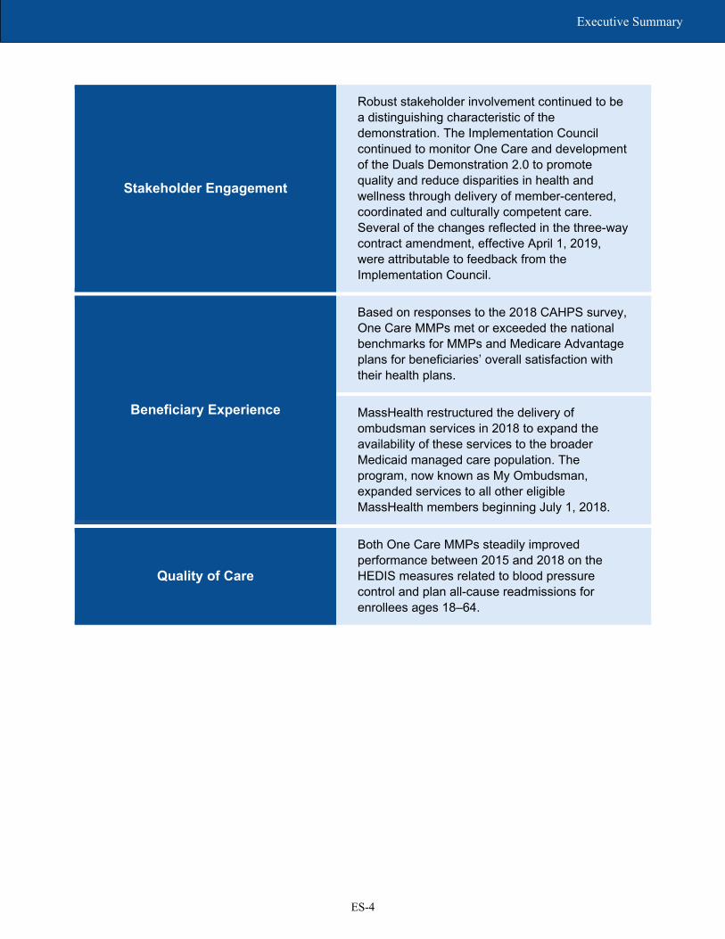
Stakeholder Engagement
Robust stakeholder involvement continued to be a distinguishing characteristic of the demonstration. The Implementation Council continued to monitor One Care and development of the Duals Demonstration 2.0 to promote quality and reduce disparities in health and wellness through delivery of member-centered, coordinated and culturally competent care. Several of the changes reflected in the three-way contract amendment, effective April 1, 2019, were attributable to feedback from the Implementation Council.
Beneficiary Experience
Based on responses to the 2018 CAHPS survey, One Care MMPs met or exceeded the national benchmarks for MMPs and Medicare Advantage plans for beneficiaries’ overall satisfaction with their health plans.
MassHealth restructured the delivery of ombudsman services in 2018 to expand the availability of these services to the broader Medicaid managed care population. The program, now known as My Ombudsman, expanded services to all other eligible MassHealth members beginning July 1, 2018.
Quality of Care
Both One Care MMPs steadily improved performance between 2015 and 2018 on the HEDIS measures related to blood pressure control and plan all-cause readmissions for enrollees ages 18–64.

ES-5
Executive Summary
Demonstration Impact on Service Utilization and Quality of Care
As shown in Table ES-1, over the course of the first four demonstration years, the number of monthly physician evaluation and management (E&M) visits increased and the probability of long-stay nursing facility (NF) use decreased among all demonstration eligible beneficiaries, relative to the comparison group. However, the probability of an inpatient admission, a skilled nursing facility (SNF) admission, an ambulatory care sensitive condition (ACSC) admission (chronic), and the number of 30-day all-cause readmissions increased, relative to the comparison group. There was no demonstration impact on emergency department (ED) visits, preventable ED visits, ACSC admissions (overall), or 30-day follow-up after mental health discharge.
The demonstration impacted the population who receive long-term services and supports (LTSS) differently from the non-LTSS population (Table ES-1). The demonstration effect for those with LTSS use was an increase in the probability of an inpatient admission, the annual count of all-cause 30-day readmissions, monthly preventable ED visits, and the probability of an SNF admission, relative to the demonstration effect for the non-LTSS population.
Table ES-1 shows that the demonstration impact did not differ for beneficiaries with serious and persistent mental illness (SPMI) and those without SPMI.

ES-6
Executive Summary
Demonstration Impact on Cost Savings
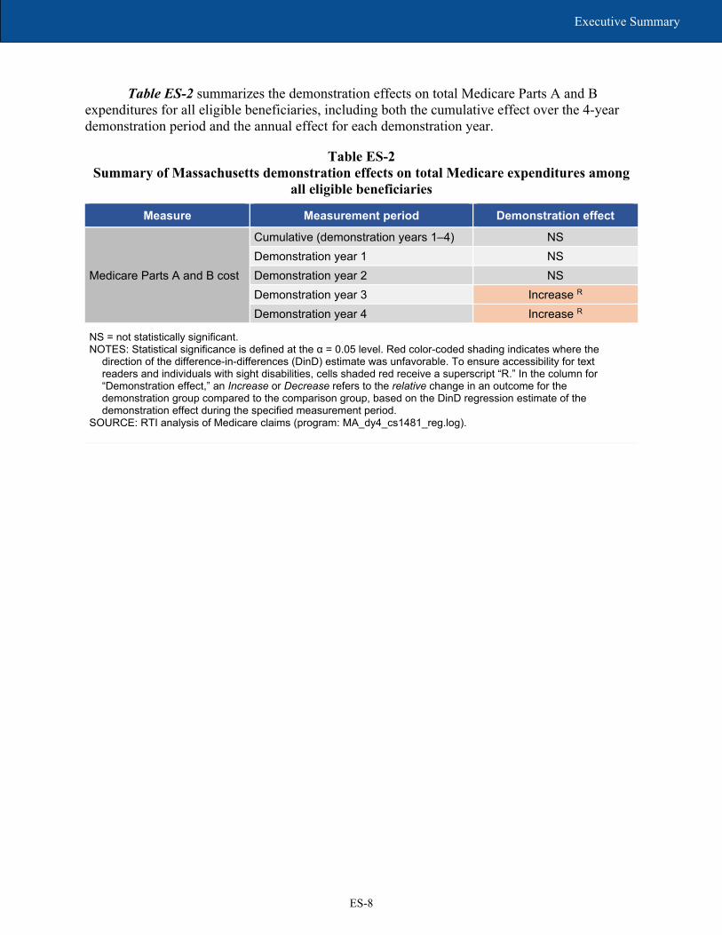
As summarized in Table ES-2, relative to the comparison group, the first 2 years of the demonstration were not associated with statistically significant savings or increased costs to the Medicare program. The third and fourth demonstration years were associated with increased costs (statistically significant) to the Medicare program. However, the cumulative impact over all 4 demonstration years was not statistically significant.
The preliminary cost savings estimates are based on Medicare Parts A and B spending either through fee-for-service or Medicare Advantage/One Care capitated rates.3 These estimates do not include Medicaid or Medicare Part D expenditures, nor do they consider the actual payments for services paid by the One Care plans.
Table ES-1 summarizes the cumulative impact estimates for the Massachusetts demonstration during demonstration years 1–4 (demonstration start through 2017), relative to the comparison group. It also shows the difference in the demonstration effect for LTSS users versus non-LTSS users, and for beneficiaries with SPMI versus those without SPMI.
3 Due to incomplete risk corridor data for demonstration year 4 and the potential of recoupment from MMP plans in demonstration year 4, the cost savings estimates presented in this report are preliminary.

ES-7
Executive Summary
Table ES-1 Summary of Massachusetts cumulative demonstration impact estimates for demonstration period
(October 1, 2013–December 31, 2017)
Measure Demonstration
effect (all eligible beneficiaries)
Difference in demonstration effect
(LTSS versus non-LTSS)
Difference in demonstration effect
(SPMI versus non-SPMI)
Probability of inpatient admission Increase R Increase R NS Probability of ambulatory care sensitive condition (ACSC) admission, overall
NS NS NS
Probability of ACSC admission, chronic Increase R NS NS
Count of all-cause 30-day readmissions Increase R Increase R NS Probability of emergency department (ED) visits
NS NS NS
Count of preventable ED visits NS Increase R NS Probability of 30-day follow-up after mental health discharge NS NS N/A
Probability of skilled nursing facility admission Increase R Increase R NS
Probability of any long-stay nursing facility use Decrease G N/A N/A
Count of physician evaluation and management visits Increase G NS NS
LTSS = long-term services and supports; N/A = not applicable; NS = not statistically significant; SPMI = serious and persistent mental illness.
NOTES: Statistical significance is defined at the α = 0.05 level. Green and red color-coded shading indicates where the direction of the difference-in-differences (DinD) estimate was favorable or unfavorable; green indicates favorable, and red indicates unfavorable. To ensure accessibility for text readers and individuals with sight disabilities, cells shaded green or red receive, respectively, a superscript “G” or “R”. Long-stay nursing facility use means stays lasting 101 days or more in a year. In the column for “Demonstration effect (all eligible beneficiaries),” an Increase or Decrease refers to the relative change in an outcome for the demonstration group compared to the comparison group, based on the DinD regression estimate of the demonstration effect during the demonstration period. The results shown in the two columns for “Difference in demonstration effect (LTSS versus non-LTSS)” and “Difference in demonstration effect (SPMI versus non-SPMI)” compare two separate DinD estimates of the demonstration effect—one for the subpopulation (e.g., LTSS users) and another for the non-subpopulation (e.g., non-LTSS users)—and indicate whether the difference between the two effect estimates is statistically significant (regardless of whether there is an overall demonstration effect for the entire eligible population). In these two columns, an Increase or Decrease measures the relative change in an outcome for the subpopulation compared to the non-subpopulation. For a given outcome, the result shown for the entire eligible population and separately for the LTSS or SPMI subpopulation can be different from each other.
SOURCE: RTI analysis of Medicare and Minimum Data Set data.
ES-8
Executive Summary
Table ES-2 summarizes the demonstration effects on total Medicare Parts A and B expenditures for all eligible beneficiaries, including both the cumulative effect over the 4-year demonstration period and the annual effect for each demonstration year.
Table ES-2 Summary of Massachusetts demonstration effects on total Medicare expenditures among
all eligible beneficiaries
Measure Measurement period Demonstration effect
Medicare Parts A and B cost
Cumulative (demonstration years 1–4) NS Demonstration year 1 NS Demonstration year 2 NS Demonstration year 3 Increase R Demonstration year 4 Increase R
NS = not statistically significant. NOTES: Statistical significance is defined at the α = 0.05 level. Red color-coded shading indicates where the
direction of the difference-in-differences (DinD) estimate was unfavorable. To ensure accessibility for text readers and individuals with sight disabilities, cells shaded red receive a superscript “R.” In the column for “Demonstration effect,” an Increase or Decrease refers to the relative change in an outcome for the demonstration group compared to the comparison group, based on the DinD regression estimate of the demonstration effect during the specified measurement period.
SOURCE: RTI analysis of Medicare claims (program: MA_dy4_cs1481_reg.log).

SECTION 1 Demonstration and Evaluation Overview

1-1
Section 1 │ Demonstration and Evaluation Overview
1.1 Demonstration Description and Goals
The Medicare-Medicaid Coordination Office (MMCO) and the Innovation Center at the Centers for Medicare & Medicaid Services (CMS) have created the Medicare-Medicaid Financial Alignment Initiative (FAI) to test, in partnerships with States, integrated care models for Medicare-Medicaid enrollees.
Key objectives of the Massachusetts demonstration, known as One Care, include improving the beneficiary experience in accessing care, delivering person-centered care, promoting independence in the community, improving quality, and eliminating cost shifting between Medicare and Medicaid (CMS MOU, 2012, pp. 2–3). Implemented October 1, 2013, One Care integrates the full array of functions performed by Medicare and Medicaid.
One Care is the only demonstration under the FAI that limits enrollment to Medicare-Medicaid beneficiaries ages 21 to 64 at the time of enrollment.4 One Care enrollees who turn 65 may remain in the demonstration if they continue to meet certain eligibility criteria required by the demonstration.
As of January 1, 2019, One Care operated in 10 of the Commonwealth’s 14 counties5 and is served by two MMPs—Commonwealth Care Alliance (CCA) and Tufts Health Public Plans (Tufts). CMS and MassHealth agreed to extend the demonstration for a third time through December 31, 2020 (One Care three-way contract, August 2019, p. 3).6
To support implementation of One Care, the Commonwealth received Federal funding that allowed it to augment its internal resources. Massachusetts received an initial contract award of $1.3 million from CMS to support the development of its original demonstration proposal, its stakeholder engagement process, and other outreach activities. After signing a Memorandum of Understanding (MOU) with CMS in 2012, Massachusetts also received an implementation grant of $9.3 million for year 1 and $5.5 million for year 2 to support infrastructure changes (e.g., enrollment interfaces and data warehouse modifications), internal staff positions to monitor and oversee the plans, and contracted services. Since 2013, CMS has awarded Massachusetts $880,000 to support enrollment and counseling activities through the Commonwealth’s State Health Insurance Program (SHIP) and the Aging and Disability Resource Centers; since 2014, CMS has awarded Massachusetts $1,975,311 for the provision of ombudsman services.7
4 Beneficiaries enrolled in any of the following programs are eligible for the demonstration only if they disenroll from the program and meet the other eligibility criteria: Medicare Advantage plan; Program of All-Inclusive Care for the Elderly (PACE); Employer Group Waiver Plans (EGWPs), other employer-sponsored plans, or plans receiving a Retiree Drug Subsidy (RDS); or the CMS Independence at Home (IAH) demonstration. Enrollees using home and community-based services (HCBS) waiver services or residing in an intermediate care facility for individuals with intellectual disabilities (ICF/IID) are not eligible to enroll (MOU, 2012, pp. 8–9). 5 Bristol, Essex, Franklin, Hampden, Hampshire, Middlesex, Norfolk, Plymouth (partial), Suffolk and Worcester. 6 A fourth extension in August 2020 continued the demonstration through December 31, 2021. 7 The Administration for Community Living (ACL) provides technical assistance to grantees through its Ombudsman Technical Assistance Program.

1-2
Section 1 │ Demonstration and Evaluation Overview
1.2 Purpose of This Report
This report includes qualitative evaluation information for calendar year 2018 (the fifth demonstration year), with relevant updates through the first half of 2019. We refer to this period as “the reporting period” in the qualitative narrative. This report provides updates to the previous Evaluation Reports in key areas, including enrollment, care coordination, beneficiary experience, and stakeholder engagement activities, and discusses the challenges, successes, and emerging issues identified during the reporting period. We present quantitative analysis results on service utilization, quality of care, and costs for the demonstration period spanning October 2013 through December 2017. The difference in timeframes between qualitative and quantitative analyses is due to the longer lag of secondary data used in quantitative analysis.
The First Annual Report includes extensive background information about the demonstration. The Second Evaluation Report and Third Evaluation Report provide prior implementation updates.
1-3
Section 1 │ Demonstration and Evaluation Overview
1.3 Data Sources
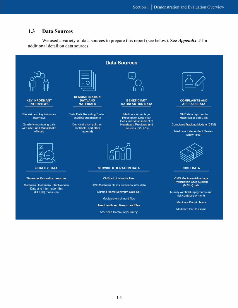
We used a variety of data sources to prepare this report (see below). See Appendix A for additional detail on data sources.

1-4
Section 1 │ Demonstration and Evaluation Overview
[This page intentionally left blank.]

SECTION 2 Demonstration Design and State Context

2-1
Section 2 │ Demonstration Design and State Context
2.1 Changes in Demonstration Design
In June 2018, MassHealth, CMS, and the MMPs executed an addendum to the three-way contract, extending the demonstration period for One Care by 1 year through December 31, 2019. The addendum also specified the quality withhold amounts, savings percentages, and risk corridors for demonstration year 6 (calendar year 2018). See Section 3.5, Financing and Payment, for more detail. Effective August 2019, CMS and MassHealth agreed to extend the demonstration for a third time through December 31, 2020.8
The One Care three-way contract was amended effective April 1, 2019, finalizing some changes that had been under discussion for several years. Some of the key changes included expanding services covered by One Care to include additional behavioral health (BH) diversionary and substance use disorder services and clarifications affecting the assessment and care planning processes based on feedback received from the Implementation Council and the ombudsman program serving the demonstration. Other changes included but are not limited to:
• complying with the 2016 Medicaid Managed Care Rule;
• modifying certain requirements related to processing appeals and grievances;
• adding State sanctions for failure to submit accurate, timely, or complete encounter data;
• adding a new rating category for enrollees who participate in the Transitional Living Program;9 and
• adding definitions and requirements to provide Community Support Program (CSP) services for chronically homeless individuals.10
One Care’s rating categories, which correlate to Medicaid reimbursement levels, are detailed in the First Annual Report.
In February 2019, MassHealth released a Request for Responses (RFR) for One Care MMPs, anticipating that new contracts with plans would be in place as of January 2020. When One Care was extended through December 31, 2020, the anticipated date for new contracts was changed to January 2021.11 Responses to the RFR were due May 24, 2019.
MassHealth reported in 2019 that one of the goals of the RFR process was to increase the number of MMPs participating in the demonstration to provide greater choice for beneficiaries
8 A fourth extension in August 2020 continued the demonstration through December 31, 2021. 9 Defined by 130 CMR 422.402 as a “program of services that may be offered by an organization in a structured group-living environment, for persons with severe disabilities who demonstrate an aptitude for independent living, but who can clearly benefit from functional skills training and supervised experience in management of health care, PCA services, and community activity in gaining the ability and confidence necessary to achieve independent living.” 10 A full summary of the contract changes can be viewed at: https://www.cms.gov/Medicare-Medicaid-Coordination/Medicare-and-Medicaid-Coordination/Medicare-Medicaid-Coordination-Office/FinancialAlignmentInitiative/Downloads/MAContractSummaryOfChanges.pdf (accessed on May 21, 2021) 11 In 2020, MassHealth postponed implementation for another year, until January 2022.

2-2
Section 2 │ Demonstration Design and State Context
and increase demonstration enrollment. Further information on the reprocurement will be included in the next Evaluation Report.
2.2 Overview of State Context
MassHealth has historically used managed care as one of its primary strategies to improve care coordination and contain costs. Under its Section 1115(a) demonstration, MassHealth mandated Medicaid managed care enrollment for most of its Medicaid-only members. As of July 2012, almost two-thirds of MassHealth members were enrolled in Managed Care Organizations (MCOs) or in the Primary Care Clinician Plan, a primary care case management program (Executive Office of Health and Human Services [EOHHS], September 30, 2013, pp. 1, 11).
Before the One Care demonstration, Medicare-Medicaid beneficiaries under age 65 were ineligible to enroll in Medicaid managed care and received services through the existing FFS system under MassHealth and Medicare. Some may have received services in PACE or Medicare Advantage plans.
This group of beneficiaries included those with the most complex conditions, highest costs, and in greatest need of care coordination and care management. They encompassed a high proportion of people with BH needs who did not have access to the diversionary BH services available to the MassHealth-only members with similar needs. One Care provided a mechanism for the Commonwealth to provide comprehensive care coordination and integrated service delivery for these beneficiaries.
Beginning July 1, 2017, MassHealth leveraged its 1115(a) demonstration waiver to authorize $1.8 million over 5 years as part of the Delivery System Reform Incentive Program (DSRIP) to enact broad restructuring reforms of its health care delivery system. Specifically, the DSRIP program provides funding for Accountable Care Organizations (ACOs), as well as for community-based organizations (CBOs) that provide highly specialized care coordination supports for members with complex needs, and various statewide workforce capacity and development efforts.
Although these reforms did not directly impact beneficiaries served by One Care, MassHealth officials reported in early 2019 that its broader health care reforms aligned with the demonstration’s principle of providing member-centered, coordinated, and culturally competent care, and that its experience with One Care helped shape aspects of those reforms.
MassHealth’s new ACO initiative launched March 1, 2018.12 In July 2018, MassHealth also implemented its Community Partners program. The program provides case management and coordination through BH and LTSS Community Partners, CBOs that work with ACOs and MCOs to provide care management and coordination to eligible individuals.
Specific to Medicare-Medicaid beneficiaries, MassHealth has continued to solicit public feedback on its new proposal, which combines elements of One Care and MassHealth’s Senior
12 One of the One Care MMPs participates in both the ACO and MCO programs; the other MMP does not participate in either.

2-3
Section 2 │ Demonstration Design and State Context
Care Options (SCO) program, which consists of Fully Integrated Dual Eligible Special Needs Plans (FIDE-SNPs) for Medicare-Medicaid beneficiaries age 65 and older. Based on experience with One Care and public feedback obtained through listening sessions and other public forums, EOHHS submitted a concept paper to CMS on August 20, 2018, outlining its proposal to establish a new demonstration—Duals Demonstration 2.0—using 1115A demonstration authority (Massachusetts Medicare-Medicaid Integration Demonstration: Duals Demonstration 2.0, August 20, 2018).
Shortly thereafter, on September 5, 2018, MassHealth issued a Request for Information soliciting feedback from plans and other interested parties on a range of policy and procurement questions related to the proposal. Key elements of the Duals Demonstration 2.0 include strategies for
• growing enrollment among Medicare-Medicaid beneficiaries;
• increasing administrative alignment and integration;
• strengthening fiscal stability;
• using innovative approaches to ensure fiscal accountability and sustainability; and
• entering into a shared savings agreement with CMS.13
As of the fall of 2019, this proposal was still under consideration by CMS. The RTI evaluation team will provide information on the status of Duals Demonstration 2.0 in future Evaluation Reports.
13 Accessed on December 30, 2019, at: https://www.mass.gov/files/documents/2018/06/15/20180614-dual-demo-2.0.pdf

2-4
Section 2 │ Demonstration Design and State Context
[This page intentionally left blank.]

SECTION 3 Update on Demonstration Implementation

3-1
Section 3 │ Update on Demonstration Implementation
In this section, we provide updates on important aspects of the demonstration that have occurred since the Third Evaluation Report. This includes updates on integration efforts, enrollment, assessment and care coordination activities, stakeholder engagement activities, financing and payment, and quality management strategies.
3.1 Integration of Medicare and Medicaid
The contract management team (CMT) has continued to work well as a vehicle for joint management of the demonstration, especially for policy discussions on the future direction of One Care.
MassHealth, MMPs, and other stakeholders viewed One Care as an opportunity to support innovations in service delivery that address social determinants of health.
Provider trainings in 2018 included approaches for improving assessment and care coordination to mitigate health disparities in care delivery.
In this section, we provide updates of the joint management structure developed for One Care as well as its integrated delivery system. This includes new or innovative types of service delivery as well as alternative payment methodologies (APMs) developed as part of the One Care demonstration.
3.1.1 Integrated Systems
Representatives from MassHealth and the MMPs, as well as other stakeholders, continued to voice strong support for the integrated care model at the beneficiary level. Some operational challenges continue, mostly in the area of enrollment system discrepancies. In early 2019, one MMP noted that reporting encounter data remains challenging and is a “very labor intensive and resource heavy” process, due to a lack of alignment in how the MMP is required to report Medicare and Medicaid services.
3.1.2 Joint Management
CMS and MassHealth officials participating on the CMT continued to report a high level of collaboration in jointly managing and overseeing the demonstration. In 2019, CMS officials described their relationship with MassHealth on the CMT as a “productive, successful, and effective collaboration,” especially at the policy level.
[CMS] continues to be very engaged, very focused, and very committed to this work and that’s always been really critical for us. Making sure [we work] in an integrated manner continues to be forefront for folks doing frontline contract management at CMS.
— MassHealth Official (2019)

3-2
Section 3 │ Update on Demonstration Implementation
The CMT continued to meet weekly in 2018, with monthly meetings that included the MMPs. Although the CMT continued its oversight of operational issues, much of the focus in 2018 involved the proposed three-way contract amendments, which were finalized in April 2019, and policy considerations relating to the Duals Demonstration 2.0.
3.1.3 New or Innovative Services
In early 2019, MassHealth officials reiterated their commitment to providing opportunity for innovation in One Care, which they carried over into the Dual Demonstration 2.0 proposal. An Implementation Council member emphasized that the council is “committed to making sure that One Care is about innovation” and that the focus remains on advancing positive outcomes for beneficiaries. During the development of the Duals Demonstration 2.0, stakeholders have continued to advocate for a design that allows for continued innovations around person-centered care, independent living, and recovery principles.
As noted in previous Evaluation Reports, under the demonstration, community-based programs were developed to support those with BH needs who would otherwise have been cared for in an inpatient setting. It also supported a mobile health integrated paramedicine initiative. More recently, MMP-level initiatives have sought to address social determinants of health—for example, by providing cell phones to individuals who are homeless to facilitate communication between enrollees and their care coordinators and providers. One MMP offered a housing workshop that secured housing for several enrollees.
3.1.4 Alternative Payment Methodologies
Although MassHealth, CMS, and the MMPs all continued to express support in early 2019 for developing APMs, they identified additional work needed to set clear goals and expectations for MMPs.
One shortfall of the current [One Care three-way] contract is we did not set any goal or expectations around [value based purchasing]. We gently encouraged everyone to do it and we got very gentle responses to that. So, we’re going to be much more clear about our expectations. We’re also going to be looking for reporting on them. What are those [APM] arrangements? What percent of your provider network is in them? What percent of enrollees are participating in them? You'll see a lot more robustness from us in the procurement [for One Care MMPs] to make sure we’re really moving that forward significantly.
— MassHealth Official (2019)
MMP leaders reported in early 2019 that they continue to focus on developing APMs despite challenges, particularly in developing risk-based models, due to factors such as limited demonstration enrollment numbers and the complexity of the population. One MMP reported having about one-third of its providers in some form of APM arrangement; this included risk sharing with providers in the MMP’s health homes. The other MMP was actively pursuing up-side-only risk arrangements in early 2019.

3-3
Section 3 │ Update on Demonstration Implementation
3.1.5 Training and Support for Medicare-Medicaid Plans and Providers
To support MMPs and providers in the delivery of the demonstration’s model of integrated care, MassHealth continues to work with UMass Medical School (UMMS) to provide shared learning webinars and training modules developed in collaboration with the Implementation Council and other community stakeholders. Topics presented in 2018 included best practices for addressing sexual health in assessment and care planning and ways to improve communication with beneficiaries facing language or cultural access issues. Webinar topics in the first half of 2019 covered incorporating recovery principles for individuals with substance use disorder into One Care services and approaches for addressing social isolation and loneliness.14
3.2 Eligibility and Enrollment
Total enrollment grew from 19,281 to 23,815 between January 31, 2018, and January 31, 2019, representing an increase of 24 percent. Both MMPs expressed interest in continued enrollment growth.
The footprint of the demonstration expanded for the first time since 2013, with one MMP providing coverage in Bristol County effective January 1, 2019.
MMPs continued to report financial and operational challenges with involuntary disenrollment of beneficiaries due to a temporary loss of Medicaid eligibility.
In this section, we provide updates in eligibility and enrollment processes, including integration of eligibility systems, enrollment methods, and outreach. We also outline significant events affecting enrollment patterns during the timeframe covered by this report, including recent enrollment activities.
3.2.1 Enrollment Systems
In April 2018, MassHealth changed its quarterly passive enrollment protocol to address continuing enrollment discrepancies between Medicare and Medicaid. Previously, to meet the target numbers set for passive enrollment, MassHealth backfilled passive enrollment transactions that were rejected due to systems or data issues to more closely approach the number agreed upon with each plan for passive enrollments for a particular enrollment effective date. MassHealth, in consultation with CMS and the MMPs, implemented a new policy increasing the number of beneficiaries eligible for passive enrollment by 2 percent above the target to account for any rejected enrollment transactions. Although this change meant that the number of beneficiaries passively enrolled could differ from the volume agreed upon, the new process simplified and lessened the work for MassHealth enrollment staff.
14 Shared learning materials can be accessed at: https://onecarelearning.ehs.state.ma.us/

3-4
Section 3 │ Update on Demonstration Implementation
In 2018, MassHealth officials reported challenges implementing new Federal requirements set to go into effect in 2019 that would affect the Commonwealth’s enrollment systems. These changes included implementation of provisions of the Comprehensive Addiction and Recovery Act (CARA) of 2016 and other requirements related to the elimination of the monthly Special Enrollment Period (SEP) for Medicare-Medicaid beneficiaries who qualify for Low Income Subsidy benefits. Although CMS waived the monthly SEP requirements for One Care, the requirement remained in place for other Medicare-Medicaid beneficiaries and Medicare plans. To alleviate potential enrollee confusion and meet CMS requirements, MassHealth modified One Care notices and clarified processes for beneficiaries.
3.2.2 Enrollment Experience
Enrollment remained relatively stable in 2018, with an overall increase for the year (see Figure 1 for quarterly enrollment numbers). As of December 31, 2018, a total of 22,514 individuals were enrolled in One Care, representing 19.6 percent of eligible beneficiaries.15
Figure 1 Total enrollment in One Care, January 2018 through January 2019
SOURCE: RTI International: State Data Reporting System (SDRS) 2018–2019.
MassHealth and CMS instituted quarterly passive enrollment phases beginning January 2017.16 For calendar year 2018, one MMP participated in all four phases of passive enrollment; the other chose to participate in only one. Although quarterly passive enrollment phases
15 Although States may consider enrollees receiving comprehensive benefits in other Medicare products (e.g., Medicare Advantage) eligible to opt in, the RTI evaluation does not consider these enrollees eligible for the demonstration while they are enrolled in another product. 16 The design of the demonstration allows beneficiaries to opt into the demonstration at any time, although the MMP may request approval of a capacity limit through the CMT (One Care three-way contract, March 2019, p. 29). See the Third Evaluation Report for additional details about the implementation of quarterly passive enrollment.

3-5
Section 3 │ Update on Demonstration Implementation
continued in 2019, the phase scheduled for an effective date of July 1, 2019, was cancelled because one MMP chose not to participate and the other was experiencing operational challenges related to upgrades in its care management platform and a transition to a new transportation vendor.
From January 1, 2018, to January 1, 2019, enrollment in one MMP increased from 16,239 to 20,881; enrollment in the other MMP remained relatively unchanged at 2,954 and 2,928, respectively.
Although officials from the latter MMP continued to express interest in growing enrollment, they cited several factors in the decision to participate in only one of the passive enrollment phases in 2018. Noting that scale often allows an organization to overcome fixed costs and other financial concerns, these officials reported that One Care required a more measured and strategic approach to enrollment than its other product lines. This is largely due to the complexity of the demonstration, including the level of integration needed for care coordination and service delivery. The MMP did not experience the same financial improvement during 2018 that it had in 2017; however, MMP officials viewed their decision to participate in one wave of passive enrollment in the fall of 2018 as a signal “that we are growing and we want to grow” (see Section 3.5., Financing and Payment, for additional detail on financial performance of the MMPs).
As of the beginning of 2019, officials at this MMP anticipated that focusing on operational stability rather than growth strategies would lead to improvements in financial performance, which in turn would support future increased enrollment. Beginning in March 2019, enrollment in this MMP declined slightly, reaching 2,620 in July 2019; the MMP anticipated participating in the October 2019 phase of passive enrollment.17
The other MMP increased its service area for One Care to Bristol County effective January 1, 2019. It has filed an application to extend operations into Barnstable County beginning in 2020. The MMP continued to emphasize the importance of passive enrollment for continued growth, but expressed interest in monthly, rather than quarterly, enrollment phases. Officials from the MMP felt that monthly enrollment would be more evenly distributed, allowing for consistent staffing levels and providing a better experience for beneficiaries.
3.2.3 Disenrollment Experience
In 2018, both MMPs continued efforts to decrease the number of enrollees involuntarily disenrolled from One Care due to lapses in Medicaid eligibility resulting from beneficiaries’ failure to complete required paperwork. One MMP noted that the enrollment process for One Care presented less opportunity for engagement with enrollees at the time of enrollment because, unlike the SCO program,18 beneficiaries enrolled in One Care through MassHealth and not through the MMP.
17 Additional detail on 2019 enrollment activities will be included in future Evaluation Reports. 18 The SCO program consists of FIDE-SNPs in Massachusetts serving Medicare-Medicaid beneficiaries ages 65 and older.

3-6
Section 3 │ Update on Demonstration Implementation
One MMP reported in early 2019 that it typically took 3 months after losing eligibility for an enrollee to regain active enrollment in the demonstration. That MMP developed a new process with MassHealth for sharing enrollee information and received weekly lists of enrollees with redetermination due dates. The MMP established successful pilots focused on outreach and assistance in processing paperwork.
Although both MMPs noted the high level of engagement provided by MassHealth to address this issue and described a highly collaborative relationship, involuntary disenrollment rates continued to present financial and operational challenges.
As noted in the Third Evaluation Report, MassHealth conducted an analysis of disenrollment patterns. Looking at One Care enrollment patterns between October 2016 and June 2017, MassHealth found 17.9 percent disenrolled within the first 3 months of being enrolled; 11.1 percent disenrolled sometime after 3 months; and 70.2 percent of individuals enrolled in that period were either still enrolled or had reenrolled as of September 2017 (RTI, SDRS, 2018). Not surprisingly, the greatest number of disenrollments occurred during the first demonstration period, when passive enrollment numbers were at their highest. MassHealth also reported differences in disenrollment patterns by MMP. In 2018 and again in 2019, MassHealth, working with UMMS, conducted surveys to better understand reasons for disenrollment and the enrollment experience of One Care beneficiaries, including among different cohorts. We will include those results in future Evaluation Reports as they become available.
3.2.4 Contacting and Reaching Enrollees
Both MMPs reported continued progress in early 2019 in reaching new enrollees early in the enrollment process and connecting them to care coordination and services. One MMP continued to leverage a dedicated clinical engagement team to reach enrollees.
It’s staffed by a number of health outreach workers who are spread out geographically who are culturally competent and doing an amazing job reaching members, literally knocking on doors and making relationships with tangential people related to the members.
— MMP Official (2019)
As shown in Table 1, the percentage of members unable to be reached within 90 days of enrollment has generally decreased over the course of the demonstration, with a high of 39 percent in quarter 3 of 2014 and a low of 12 percent in quarter 2 of 2016. In 2018, MMPs reported continuing efforts to improve outreach and strategies for locating new enrollees. For example, one MMP began applying different strategies for beneficiaries who could not be reached versus those who were reluctant to engage. In 2018 officials from both MMPs reported progress in reducing the percentage of beneficiaries not able to be reached, although quarter 4 of 2018 showed a marked increase in the percentage of members the MMPs were not able to reach within 90 days of enrollment.

3-7
Section 3 │ Update on Demonstration Implementation
Table 1 Percentage of members that One Care plans were unable to reach following three attempts,
within 90 days of enrollment, 2014–2018
Quarter Calendar year 2014
Calendar year 2015
Calendar year 2016
Calendar year 2017
Calendar year 2018
Q1 38.0 31.0 12.0 19.2 18.3 Q2 36.6 26.3 16.0 22.2 20.2 Q3 39.1 23.5 14.0 17.7 18.1 Q4 32.8 21.9 19.6 16.1 29.3
MMP = Medicare-Medicaid Plan Q = quarter. NOTE: Data for Fallon Total Care are not included for quarter 4 of 2015 and forward because the MMP withdrew
from the demonstration. SOURCE: RTI analysis of MMP-reported data for Core Measure 2.1 as of June 2020. The technical specifications
for this measure are in the Medicare-Medicaid Capitated Financial Alignment Model Core Reporting Requirements document.
3.3 Care Coordination
Based on input from the Implementation Council, MMPs added domains to the Comprehensive Assessment that addressed sexual and reproductive health, sexual orientation, and gender identity.
Both MMPs emphasized the importance of incorporating health outreach workers into their care model to better engage beneficiaries in assessment and care coordination processes.
The delivery of care coordination services through CBOs continued to be an area of focus for stakeholders.
In this section, we summarize the demonstration’s care coordination model. We highlight the status of and major accomplishments in key care coordination components and processes: assessment, care planning, LTSS coordination, and information exchange.
3.3.1 Assessment Process
One MMP reported that it was changing its assessment process based on a pilot of an assessment team model conducted in 2018 in one of the counties in which it operates. The intent was to create a specialized, dedicated team to develop a more informed, person-centered care plan. Previously, care management staff completed assessments and reassessments; this change to dedicated assessment staff creates capacity for the care coordinators to focus on the level of care coordination needed by enrollees and allows for a more rapid response in more complex cases, such as assessments needed after hospital discharge. As noted in Section 3.2.4, Contacting and Reaching Enrollees, the other MMP has integrated the assessment process into a more coordinated onboarding process.

3-8
Section 3 │ Update on Demonstration Implementation
Effective April 2019, MMPs were required to add a domain to the Comprehensive Assessment tool to include sexual and reproductive health and, at the option of the enrollee, sexual orientation and gender identity (One Care three-way contract, April 2019, Sections 2.6.1.4.8 and 2.6.1.4.9).
As indicated in Table 2, over the course of the demonstration, the percentage of assessments completed within 90 days for enrollees willing to participate and who could be reached have improved. In 2014 the percentage of assessments completed within 90 days among those who could be reached and who were willing to participate ranged from 55.8 percent in quarter 1 of 2014 to 99.8 percent in quarter 2 of 2015. Completions remained high throughout 2018; in all but the first quarter, the percentage of assessments completed within 90 days of enrollment for enrollees willing to participate and able to be reached exceeded 90 percent. One MMP restructured its onboarding process, creating a targeted team that included clinical outreach staff. It modified its sequential approach of welcome calls, assessment scheduling, and other initial enrollment activities to a more accelerated approach that combined all those functions, helping to ensure that members received the services they needed to support continuity of care.
Table 2 Members whose assessments were completed within 90 days of enrollment, 2014–2018
Quarter Total number of members
whose 90th day of enrollment occurred within
the reporting period
Percentage of assessments completed within 90 days of enrollment
All members All members willing to participate and who could be reached
2014 Q1 7,469 34.1 55.8 Q2 3,973 34.7 56.8 Q3 6,338 34.9 59.9 Q4 890 57.8 92.9
2015 Q1 1,389 53.4 84.3 Q2 750 68.1 99.8 Q3 616 69.6 96.6 Q4 827 64.2 85.8
2016 Q1 815 42.1 57.5 Q2 301 69.1 83.9 Q3 1,205 59.6 93.4 Q4 1,315 59.8 79.6
(continued)

3-9
Section 3 │ Update on Demonstration Implementation
Table 2 (continued) Members whose assessments were completed within 90 days of enrollment, 2014–2018
Quarter Total number of members
whose 90th day of enrollment occurred within
the reporting period
Percentage of assessments completed within 90 days of enrollment
All members All members willing to participate and who could be reached
2017 Q1 2,676 61.1 78.3 Q2 2,040 61.2 82.3 Q3 1,767 56.6 72.9 Q4 1,830 50.2 61.7
2018 Q1 1,366 63.0 80.5 Q2 1,988 72.7 95.1 Q3 1,996 77.4 96.4 Q4 2,825 62.4 92.1
MMP = Medicare-Medicaid Plan; Q = quarter. NOTE: Data for Fallon Total Care are not included for quarter 4, 2015, and forward because the MMP withdrew
from the demonstration. SOURCE: RTI analysis of MMP-reported data for Core Measure 2.1 as of June 2020. The technical
specifications for this measure are in the Medicare-Medicaid Capitated Financial Alignment Model Core Reporting Requirements document.
3.3.2 Care Coordination Model
MMPs, MassHealth, and stakeholders have focused on improving alignment and coordination of services at the beneficiary level. Although MMPs did not report any major changes in care model design for 2018, both MMPs continued to note the importance of incorporating health outreach workers (HOWs) into their care coordination delivery systems. One MMP initiated a pilot using HOWs to address the needs of beneficiaries with high ED utilization because beneficiary needs were not limited to clinical only.
We determined that these members didn't necessarily need more medical appointments or more LTSS but what they actually needed was a health outreach worker, a non-licensed professional, to engage more closely, develop a relationship.
—MMP Representative (2018)
As noted in Section 3.2.4, Contacting and Reaching Enrollees, this MMP is leveraging HOWs as part of its dedicated clinical engagement team responsible for initial outreach to new enrollees.

3-10
Section 3 │ Update on Demonstration Implementation
One MMP highlighted the importance of building on core competencies and bringing greater clinical specialty into the care management arena. The MMP viewed this as particularly important for One Care, given the complexity of the population. This MMP reported in early 2019 that it was in the process of reevaluating its care coordination models and anticipated making changes later in 2019.
Many changes formalized in the April 2019 three-way contract amendment focused on delivery of care coordination; several of these contractual changes resulted from recommendations received from the Implementation Council.
[The Implementation Council members] were very adamant about really emphasizing, again going back to the roots of One Care, an independent living philosophy. They made it very clear that the independent living philosophy and recovery principles should really be the kind of driving framework for addressing the medical needs of the members and, as the plan worked with the members, having them at the center of the care plan. So we took specific steps in the contract to emphasize those aspects.
— MassHealth Official (2019)
Some of the 2019 changes included requiring the Interdisciplinary Care Team (ICT) to add BH as part of treatment goals, and clarifying the ICT’s responsibility to help ensure that enrollees with serious and persistent mental illness (SPMI) have services in keeping with recovery principles, such as recovery and support programs, peer support, and other services.
As noted in Section 3.2.2., Enrollment Experience, one MMP changed vendors for its clinical case management system. Implementation of the new system resulted in several issues for providers and directly impacted some enrollees by delaying service authorizations and required notifications. In early 2019, some CBOs described long delays in authorization of LTSS for enrollees over the course of 2018, although they noted improvements moving into 2019. MassHealth and CMS officials decided to suspend passive enrollment for the phase effective July 1, 2019, to give this plan time to correct these issues.
As shown in Tables 3 and 4, the percentage of all members, and all members not documented as unwilling to complete a care plan or unreachable, with a care plan completed within 90 days of enrollment generally increased over the course of the demonstration, with variation among the quarters. The percentage of care plans completed within 90 days of enrollment for members who were reachable and willing to complete a care plan improved in 2018 and reached its highest point (93.3 percent) to date in the third quarter of the year. As noted above, both MMPs continued to refine processes over the course of the demonstration to more effectively and efficiently connect enrollees to care coordination and other needed services, including a focus on timely completion of assessments and care plans.

3-11
Section 3 │ Update on Demonstration Implementation
Table 3 Members with care plans completed within 90 days of enrollment, 2014–2017
Quarter
Total number of members whose 90th day of enrollment occurred within the reporting
period and who were currently enrolled at the end of the
reporting period
Percentage of care plans completed within 90 days of enrollment
All members All members willing to
complete a care plan and who could be reached
2014 Q1 5,871 22.8 32.8 Q2 3,977 25.8 41.0 Q3 6,330 24.8 39.2 Q4 886 37.0 59.1
2015 Q1 1,398 48.1 65.2 Q2 748 54.3 73.2 Q3 614 59.3 80.4 Q4 821 68.3 79.9
2016 Q1 810 50.6 63.5 Q2 291 61.5 72.8 Q3 1,208 63.8 81.1 Q4 1,317 56.4 74.2
2017 Q1 2,682 60.0 76.9 Q2 2,048 59.7 80.1 Q3 1,769 53.0 68.2 Q4 1,830 47.8 58.5
MMP = Medicare-Medicaid Plan; Q = quarter. NOTES: Data for Fallon Total Care are not included for quarter 4, 2015 and forward because the MMP withdrew
from the demonstration then. This measure (MA 1.1) was retired in quarter 1 of 2018; care plan data for 2018 are presented in Table 3 for Core Measure 3.2. In this table, the “All Members” column refers to the total number of members with a care plan completed within 90 days divided by the total number of members whose 90th day of enrollment occurred within the reporting period.
SOURCE: RTI analysis of MMP-reported data for State-specific MA 1.1 as of June 2020. The technical specifications for this measure are in the Medicare-Medicaid Capitated Financial Alignment Model Massachusetts-Specific Reporting Requirements document.

3-12
Section 3 │ Update on Demonstration Implementation
Table 4 Members with care plans completed within 90 days of enrollment, 2018
Quarter
Total number of members whose 90th day of enrollment occurred within the reporting period and who were currently enrolled at the end of the reporting period
Percentage of care plans completed within 90 days of enrollment
All members
All members willing to complete a care plan and who could be reached
2018 Q1 1,334 62.2 77.9 Q2 1,970 72.1 91.9 Q3 1,940 75.8 93.3 Q4 2,787 61.4 88.3
MMP = Medicare-Medicaid Plan; Q = quarter. NOTE: In this table, the “All Members” column refers to the total number of members with a care plan completed
within 90 days divided by the total number of members whose 90th day of enrollment occurred within the reporting period.
SOURCE: RTI analysis of MMP-reported data for Core Measure 3.2 as of June 2020. The technical specifications for this measure are in the Medicare-Medicaid Capitated Financial Alignment Model Core Reporting Requirements document.
As shown in Table 5, the percentage of members with at least one documented discussion of care goals in the initial care plan remained very high after the first demonstration year. From 2015 to 2018, with one exception, documentation of care goals was always greater than 92 percent.
Table 5 Members with documented discussions of care goals, 2014–2018
Quarter Total number of members with an initial care plan completed
Percentage of members with at least one documented discussion of care
goals in the initial care plan
2014 Q1 2,218 72.4 Q2 2,668 57.5 Q3 3,039 60.1 Q4 2,892 64.2
2015 Q1 1,956 98.4 Q2 2,038 97.3 Q3 573 98.8 Q4 641 99.7
2016 Q1 501 98.0 Q2 565 96.6 Q3 618 99.0 Q4 970 100.0
(continued)
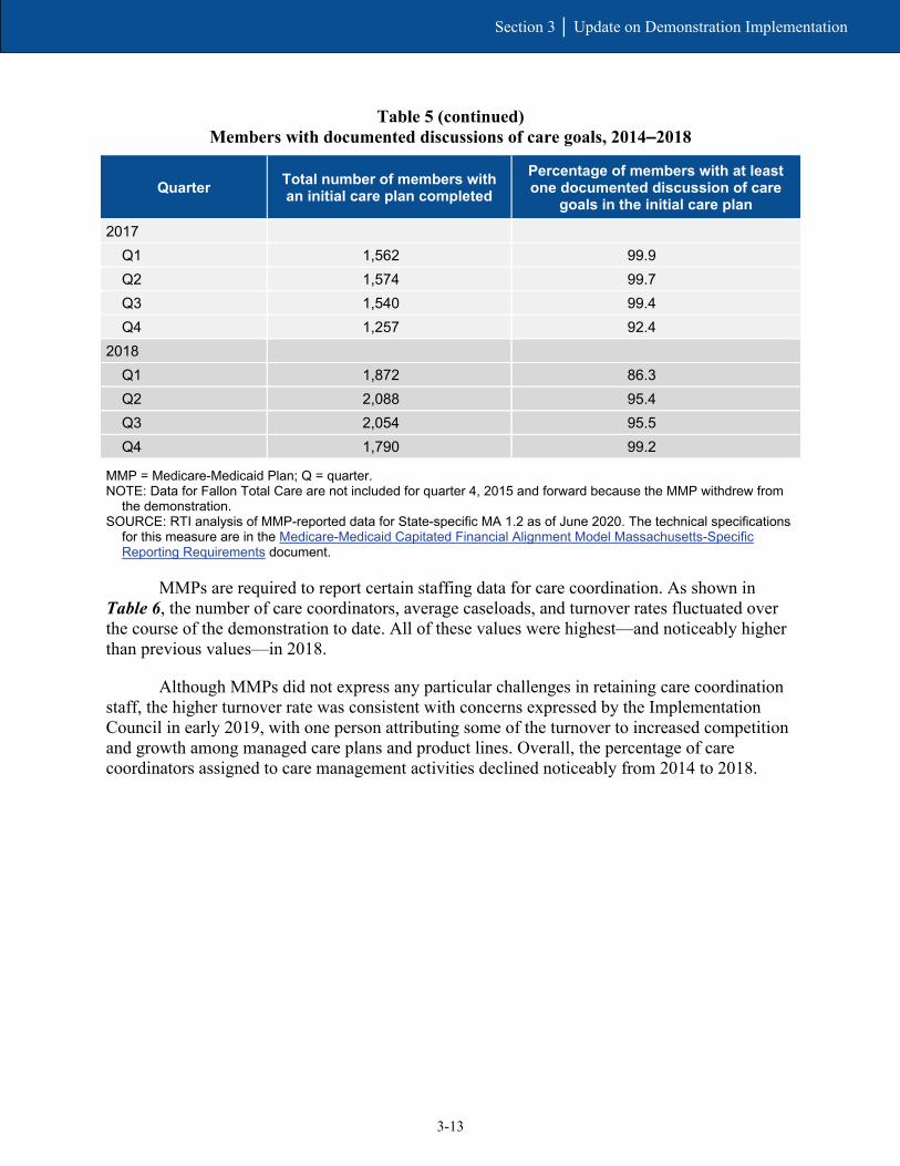
3-13
Section 3 │ Update on Demonstration Implementation
Table 5 (continued) Members with documented discussions of care goals, 2014–2018
Quarter Total number of members with an initial care plan completed
Percentage of members with at least one documented discussion of care
goals in the initial care plan
2017 Q1 1,562 99.9 Q2 1,574 99.7 Q3 1,540 99.4 Q4 1,257 92.4
2018 Q1 1,872 86.3 Q2 2,088 95.4 Q3 2,054 95.5 Q4 1,790 99.2
MMP = Medicare-Medicaid Plan; Q = quarter. NOTE: Data for Fallon Total Care are not included for quarter 4, 2015 and forward because the MMP withdrew from
the demonstration. SOURCE: RTI analysis of MMP-reported data for State-specific MA 1.2 as of June 2020. The technical specifications
for this measure are in the Medicare-Medicaid Capitated Financial Alignment Model Massachusetts-Specific Reporting Requirements document.
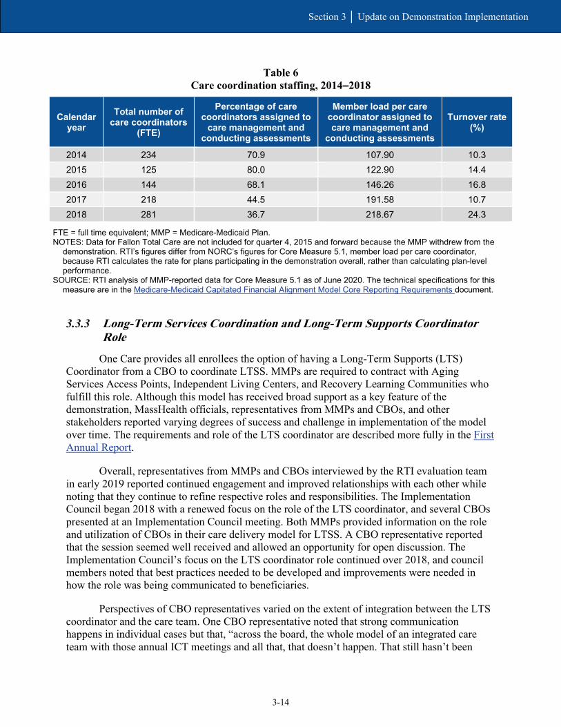
MMPs are required to report certain staffing data for care coordination. As shown in Table 6, the number of care coordinators, average caseloads, and turnover rates fluctuated over the course of the demonstration to date. All of these values were highest—and noticeably higher than previous values—in 2018.
Although MMPs did not express any particular challenges in retaining care coordination staff, the higher turnover rate was consistent with concerns expressed by the Implementation Council in early 2019, with one person attributing some of the turnover to increased competition and growth among managed care plans and product lines. Overall, the percentage of care coordinators assigned to care management activities declined noticeably from 2014 to 2018.
3-14
Section 3 │ Update on Demonstration Implementation
Table 6 Care coordination staffing, 2014–2018
Calendar year
Total number of care coordinators
(FTE)
Percentage of care coordinators assigned to
care management and conducting assessments
Member load per care coordinator assigned to care management and
conducting assessments
Turnover rate (%)
2014 234 70.9 107.90 10.3 2015 125 80.0 122.90 14.4 2016 144 68.1 146.26 16.8 2017 218 44.5 191.58 10.7 2018 281 36.7 218.67 24.3
FTE = full time equivalent; MMP = Medicare-Medicaid Plan. NOTES: Data for Fallon Total Care are not included for quarter 4, 2015 and forward because the MMP withdrew from the
demonstration. RTI’s figures differ from NORC’s figures for Core Measure 5.1, member load per care coordinator, because RTI calculates the rate for plans participating in the demonstration overall, rather than calculating plan-level performance.
SOURCE: RTI analysis of MMP-reported data for Core Measure 5.1 as of June 2020. The technical specifications for this measure are in the Medicare-Medicaid Capitated Financial Alignment Model Core Reporting Requirements document.
3.3.3 Long-Term Services Coordination and Long-Term Supports Coordinator Role
One Care provides all enrollees the option of having a Long-Term Supports (LTS) Coordinator from a CBO to coordinate LTSS. MMPs are required to contract with Aging Services Access Points, Independent Living Centers, and Recovery Learning Communities who fulfill this role. Although this model has received broad support as a key feature of the demonstration, MassHealth officials, representatives from MMPs and CBOs, and other stakeholders reported varying degrees of success and challenge in implementation of the model over time. The requirements and role of the LTS coordinator are described more fully in the First Annual Report.
Overall, representatives from MMPs and CBOs interviewed by the RTI evaluation team in early 2019 reported continued engagement and improved relationships with each other while noting that they continue to refine respective roles and responsibilities. The Implementation Council began 2018 with a renewed focus on the role of the LTS coordinator, and several CBOs presented at an Implementation Council meeting. Both MMPs provided information on the role and utilization of CBOs in their care delivery model for LTSS. A CBO representative reported that the session seemed well received and allowed an opportunity for open discussion. The Implementation Council’s focus on the LTS coordinator role continued over 2018, and council members noted that best practices needed to be developed and improvements were needed in how the role was being communicated to beneficiaries.
Perspectives of CBO representatives varied on the extent of integration between the LTS coordinator and the care team. One CBO representative noted that strong communication happens in individual cases but that, “across the board, the whole model of an integrated care team with those annual ICT meetings and all that, that doesn’t happen. That still hasn’t been

3-15
Section 3 │ Update on Demonstration Implementation
resolved on how to make that work, even after 5 years.” One MMP noted that the level of involvement often depends on the member’s needs and the types of services required.
Some CBOs still expressed a desire for more flexibility in the types of services authorized by the MMPs, beyond typical LTSS services such as homemaker or nutrition services. As one representative said, “there’s so much more to social services and social assessment than homemaker and home-delivered meals and providing the number you call to get your van rides.” Both MMPs expressed interest in continuing to further develop and leverage the role of the LTS coordinator as part of their care coordination models.
Several changes in the three-way contract executed April 2019 related to the LTS coordination role. Contract changes clarified the ability of LTS coordinators to access the centralized enrollee record maintained by the MMP (One Care three-way contract, April 2019, Sections 2.5.3.6.6 and 2.6.6.1.1). And language was added to ensure that, in addition to LTSS needs, the LTS coordinator also represented and advocated for the recovery needs of enrollees (One Care three-way contract, April 2019, Section 2.5.3.6.7).
3.4 Stakeholder Engagement
The Implementation Council continued to provide actionable feedback aimed at promoting quality and reducing health disparities and affected changes that were incorporated into the April 2019 three-way contract amendment.
Strong stakeholder engagement has continued to be a key feature of the One Care demonstration through activities of the consumer-led Implementation Council and the MMPs’ Consumer Advisory Boards. In this section, we provide updates on the stakeholder engagement activities during the period of this report and the impact of those efforts on the demonstration.
3.4.1 Implementation Council
The One Care Implementation Council began its second 3-year term in the fall of 2017. In 2018, MassHealth initiated a reprocurement process for additional Implementation Council members. In early 2019, one member reported that the council hoped to gain broader representation in its membership but noted the low number of procurement applicants. The member partly attributed this to “committee fatigue” among community members and a lack of advertisement in diverse communities and settings. As with prior council membership procurements, this member described the recruitment process as challenging due to the formality of the MassHealth procurement process. In February 2019, MassHealth selected six new members: four were appointed as consumer representatives and two represented community-based or advocacy organizations.
MassHealth officials continued to characterize robust stakeholder involvement and their engagement with the Implementation Council as a key success of the demonstration.

3-16
Section 3 │ Update on Demonstration Implementation
[Our work with stakeholders] keeps getting better over time… It’s been really rewarding to work with [the Implementation Council] on this not only because they continue to be so highly engaged and we know how important One Care remains to them and their communities, but also because they’ve evolved in their sophistication and their ability to articulate for us what they see as salient issues within the communities. They are able to give us more information around specific examples they’re seeing and specific recommendations of things they might like addressed.
— MassHealth Official (2019)
Implementation Council members, MassHealth, CMS, and MMP officials all described the decision in 2017 to include MMP and ombudsman representatives as nonvoting members of the council as a positive change. This move led to increased communication and collaboration with the MMPs. For example, in addition to attending monthly meetings, the MMPs presented quarterly on different focal areas of interest to the council. In 2018, MMPs provided overviews on their use of LTS coordinators, their grievances and appeals processes, and their progress in meeting female enrollees’ health needs.19
In keeping with the Implementation Council’s mission to promote quality and reduce disparities in health and wellness through the One Care model, key goals for 2018 included:
• integrating LTSS and LTS coordination into the larger care team;
• improving access to BH services and durable medical equipment (DME); and
• ensuring the sustainability of One Care.
Other initiatives included strategies for reducing social isolation and loneliness, improving health through nutrition; and enhancing communication skills of providers working with One Care beneficiaries. The council also created a new work group specific to women’s health.
As part of its outreach, the council hosted an interactive conference call in March 2018 as a follow-up to its 2017 town hall listening event. The Implementation Council’s focus in some of these areas led MassHealth to develop trainings for MMPs and providers as part of its online shared learning platform for One Care.20
The Implementation Council has also been actively engaged in providing input and recommendations related to the reprocurement of One Care MMPs21 and the Duals
19 MMP presentations to the Implementation Council on February 13, 2018; May 8, 2018; October 9, 2018; and November 13, 2018. https://www.mass.gov/service-details/2018-one-care-implementation-council (accessed on December 5, 2019). 20 The shared learning website is here: https://onecarelearning.ehs.state.ma.us (accessed on February 12, 2020). 21 A presentation by MassHealth at the January 2019 Implementation Council meeting summarizes these recommendations and the responses of MassHealth. This document can be accessed at: https://www.mass.gov/files/documents/2019/01/28/masshealth-implementation-council-presentation-01-15-19.pdf
3-17
Section 3 │ Update on Demonstration Implementation
Demonstration 2.0 proposal. The Implementation Council hosted meetings over the summer of 2018 in conjunction with MassHealth to review the Duals Demonstration 2.0 proposal. In November 2019, council members met with CMS officials directly to offer their feedback on the proposed design.
In early 2019, the Implementation Council and other stakeholders reported that they were carefully monitoring the development of the new demonstration proposal, including its financial aspects, to ensure that the proposal advanced health equity and wellness and incorporated principles of independent living and recovery outcomes in the care delivery model. The council and stakeholder were concerned by some of the design aspects, such as fixed enrollment periods (which differ from One Care and limit the ability of enrollees to disenroll at any time).
3.4.2 Consumer Advisory Boards
One Care MMPs are required to convene Consumer Advisory Boards (CABs) to solicit plan-level feedback from One Care beneficiaries. Both MMPs reported that the feedback received from their CABs continued to provide rich insights into the member experience. One MMP emphasized that its CAB’s success was partially due to the strong level of member participation, which in turn has held the MMP to a high level of accountability. That MMP recruited a new group of CAB members to solicit new perspectives from different members; the new members began January 2018.
In addition to establishing a CAB, one MMP also implemented a program to solicit feedback from members across all its lines of business, including One Care. Over 300 members provide the MMP with feedback on operational, clinical, and strategic program decisions. The MMP has sought feedback on areas including but not limited to palliative and end-of-life care, transportation service improvements, onboarding processes, approaches for improving medication adherence, and strategies for surveying members.
3.5 Financing and Payment
In 2018, MassHealth and CMS agreed to change the risk corridors for demonstration year 6 (calendar year 2019). This allowed for expanded sharing of losses and gains with the MMPs.
MassHealth described one of the demonstrations continuing challenges as the variable financial performance by the MMPs.
In this section, we outline changes in financing and payment since the last Evaluation Report and relevant findings relating to these changes. The First Annual Report includes a full description of the financing design of the demonstration; the Second and Third Evaluation Reports discuss subsequent changes and modifications. Key components of the financial structure include rating categories and rate adjustments, savings percentages, performance incentives, and risk corridors.

3-18
Section 3 │ Update on Demonstration Implementation
3.5.1 Demonstration Design and Updates
The Medicaid component of the capitated payment to the MMPs initially consisted of four, then six rating categories, based in part on LTSS or BH needs. Effective January 1, 2020, a new rating category was implemented for One Care, initially referenced as C3C (One Care three-way contract, April 2019, p. 199).22 This new rating category covered enrollees participating in MassHealth’s Transitional Living Program, consisting of specialized residential settings for individuals with traumatic brain injury.23
Aggregate saving percentages applied across the Medicare Parts A and B and Medicaid components of the capitated rate increased from 0.25 percent in demonstration year 4 (calendar year 2017) to 0.50 percent in demonstration years 5 and 6. The 2019 three-way contract amendment extended the latter savings percentage into demonstration year 7.
Quality withholds increased from 1.25 percent for demonstration year 4 (calendar year 2017) to 1.50 percent in demonstration year 5, then to 1.75 percent for demonstration year 6. The August 2019 three-way contract amendment extended the quality withhold of 1.75 percent for demonstration year 7 (One Care three-way contract amendment, August 2019, p. 4). In 2018, final calculations of the 2017 withholds were published, with both MMPs receiving 100 percent of withhold payment. The MMPs met five of six core measures and both of the required State-specific measures.24
In 2018 MassHealth and CMS also agreed to changes in the risk corridors in recognition of the rate structure of the demonstration as experienced by the MMPs (see Section 3.5.2, Financial Experience). CMS and MassHealth implemented these changes as part of the three-way contract amendment in June 2018 (see One Care three-way contract, June 2018, pp. 6–8). The August 2019 three-way contract amendment extended the risk corridors through demonstration year 7 consistent with the 2018 addendum.
In March 2019, MassHealth processed the Medicaid portion of the One Care risk corridor settlement for demonstration year 3 (calendar year 2016). This resulted in a payment to one MMP of $462,793 and a recoupment from the other MMP of $4,326,510. The Medicare A/B risk corridor settlement for demonstration year 3 resulted in a $2,961,410 recoupment from one MMP and a $663,395 payment to the other MMP. These amounts were processed in April 2019. Detail on the financial experience of the MMPs in 2016 is included in the Second Evaluation Report.
3.5.2 Financial Experience
MassHealth continued to describe differences in financial performance between the MMPs, as well as variable financial performance by the MMPs over time, as among the
22 Going forward, MassHealth officials reported this new rating category will be referred to as C4. 23 One Care Capitated Rate Reports can be accessed at https://www.mass.gov/service-details/one-care-capitated-rate-reports 24 See Massachusetts Medicare-Medicaid Plan Quality Withhold Analysis Results Demonstration Year 4 (Calendar Year 2017) accessed at https://www.cms.gov/Medicare-Medicaid-Coordination/Medicare-and-Medicaid-Coordination/Medicare-Medicaid-Coordination-Office/FinancialAlignmentInitiative/Downloads/QualityWithholdResultsReportMADY4.pdf

3-19
Section 3 │ Update on Demonstration Implementation
demonstration’s continuing challenges. MassHealth continued to assess root causes, and MassHealth, MMP, and CMS officials cited several potential factors. These included operational issues, plan size, membership mix, length of enrollment and disenrollments, and service utilization patterns.
[T]here is a significant investment required every time a new member comes onto this program. So, one of [our mutual] goals… has been to work on strategies to retain members in the program for as long as possible so when they are making those investments they eventually get the return on that investment…. That’s one piece. The other piece is …there’s a subset of very high-utilizing members… [s]o a couple members can really throw…off the financial picture for a plan within a given quarter or year.
— MassHealth Official (2018)
In early 2019, MassHealth and MMP officials noted that one MMP continued to report losses over 2017 and into 2018, whereas the other MMP anticipated some level of gain in line with prior years.25 Although the former reported “positive momentum” moving out of 2016 and 2017, it experienced a step back in 2018, in part because of the complexity of the population and the learning curve needed to participate in a demonstration as innovative as One Care. This MMP noted that traditional data analytics developed for use in other larger commercial product lines did not necessarily apply to the demonstration. Although scale can sometimes help mitigate fixed costs challenges, the MMP reported being cautious about growing enrollment too quickly.
In [One Care], given the high care management and clinical integration that’s necessary both directly with the member and in particular with their provider, growth has to be more measured and more strategic and more thoughtful than in any other product [the MMP has] come across.
— MMP Official (2019)
Throughout 2018, the MMP worked “in overdrive” to better analyze and address the underlying drivers of its financial performance in an effort to improve performance in the following year; its work in this area continued into 2019. MassHealth also adjusted rates within certain Medicaid rating categories in 2018 to account for the acuity of One Care enrollees; as of early 2019, MassHealth officials reported they did not yet know the impact.26 The RTI evaluation team will provide additional information and updates in the next Evaluation Report.
25 Because of the time lag in data collection, reported financial performance of the MMP can change over time. Updates on financial performance will be reported in future evaluation reports. 26 Detailed rate information is included in the Final CY 2018 Final Medicare-Medicaid Rate Report (November 20, 2018). This report can be accessed at: https://www.mass.gov/service-details/one-care-capitated-rate-reports. The report includes the final CY 2018 Medicaid rates and Medicare county base rates as well as information supporting the estimation of risk adjusted Medicare components of the rate.

3-20
Section 3 │ Update on Demonstration Implementation
Although MassHealth officials appreciated the flexibility of the demonstration in allowing MMPs to use capitated Medicare and Medicaid payments for HCBS investments, MassHealth officials expressed concern that if they were to develop experience-based rates, Medicaid rates might increase due to expanded use of HCBS while Medicare rates might decrease because of reduced utilization. To better ensure financial stability for both MassHealth and participating MMPs, MassHealth considered these concerns and their experience with One Care in designing the rate structure, risk corridors, and other financial aspects of the Duals Demonstration 2.0 proposal.
It raises a few concerns for us about the long-term financial stability of the [current demonstration], because as you can imagine just increased LTSS costs and savings accruing to the Medicare side of it might not be sustainable to the State over the long term... One thing [for Duals Demonstration 2.0] is we want more flexibility in how we measure and share savings with CMS on the demonstration going forward.
— MassHealth Official (2019)
3.6 Quality of Care
Final calculations of the 2017 withholds showed both MMPs receiving 100 percent of withhold payments. The MMPs also met five of six core measures and both State-specific measures.
Both One Care MMPs steadily improved performance between 2015 and 2018 on the HEDIS measures related to blood pressure control and plan all-cause readmissions for enrollees ages 18–64.
In this section, we provide information on the quality measures for the demonstration, updates on the quality management structure and activities for the demonstration, and HEDIS results. Results on the demonstration’s impact on quality measures, separately defined using Medicare claims, are discussed in Section 5, Demonstration Impact on Service Utilization and Quality of Care.
3.6.1 One Care Quality Measures
As described in the First Annual Report, the demonstration design requires that One Care MMPs report standardized quality measures, some of which are subject to withhold payments that are repaid based on MMP performance. In 2018, final calculations of the 2017 withholds were published, with both MMPs receiving 100 percent of withhold payments. The MMPs met

3-21
Section 3 │ Update on Demonstration Implementation
five of six core measures and both required State-specific measures.27 One MMP fell short on adherence to diabetes medication and the other on meeting encounter data specifications. Withhold results for 2018 will be included in future Evaluation Reports.
CMS and MassHealth issue annual guidance including all modifications and changes to core and State-specific reporting requirements. Effective 2018, several State-specific quality measures—including reporting on enrollees with a care plan completed within 90 days; the Mental Health Recovery Measure (previously suspended); and medication reconciliation post discharge—were retired.28 However, MMPs continued reporting on enrollees with a care plan completed within 90 days through a new core measure.
3.6.2 Quality Management Structure and Activities
Beginning in January 2018, MassHealth modified its approach for establishing and reviewing quality improvement projects (QIPs) required for MMPs. Rather than prescribing the specific QIP topics, MassHealth provided flexibility to the MMPs to identify QIP topics that are most relevant to their unique populations. As part of the change, MassHealth reviews QIPs at the time of implementation rather than retrospectively. MMPs are required to submit two status reports annually. MassHealth reported that these modifications allowed for “more touch points with the [MMPs] and the opportunity to provide real-time/actionable feedback.”
3.6.3 HEDIS Quality Measures Reported for One Care MMPs
MMPs are required to report HEDIS data to CMS and the States. HEDIS is a measure set developed and maintained by the National Committee for Quality Assurance. It is used by the vast majority of commercial, Medicare, and Medicaid health plans to measure performance on dimensions of care and service in order to maintain and/or improve quality. In the FAI, MMPs report data on a subset of HEDIS measures that are required of all Medicare Advantage plans.
Four of the 13 Medicare HEDIS measures for MMP enrollees that RTI analyzes are reported in Figures 2–6, with results on all 13 measures appearing in Table B-1 in Appendix B. RTI identified these measures in RTI’s Aggregate Evaluation Plan based on their completeness, reasonability, and sample size. Data for calendar years 2015–2018 were available for both One Care plans. Detailed descriptions of the measures can be found in the RTI Aggregate Evaluation Plan. Results reported in Figures 2–6 show MMP HEDIS performance data for calendar years 2015 through 2018 on measures for blood pressure control, 30-day follow-up after hospitalization for mental illness, good control of Hemoglobin A1c (HbA1c) levels (<8.0 percent), and plan all-cause readmissions for enrollees (ages 18–64 and 65+).
Although the primary focus of HEDIS analysis is to monitor trends over time in MMP performance, the figures and appendix table also compare MMP performance to national
27 See Massachusetts Medicare-Medicaid Plan Quality Withhold Analysis Results Demonstration Year 4 (Calendar Year 2017) accessed at https://www.cms.gov/Medicare-Medicaid-Coordination/Medicare-and-Medicaid-Coordination/Medicare-Medicaid-Coordination-Office/FinancialAlignmentInitiative/Massachusetts 28 Detailed information regarding changes and modification in reporting requirements for 2018 can be accessed at https://www.cms.gov/Medicare-Medicaid-Coordination/Medicare-and-Medicaid-Coordination/Medicare-Medicaid-Coordination-Office/FinancialAlignmentInitiative/MMPInformationandGuidance/MMPReportingRequirements.html
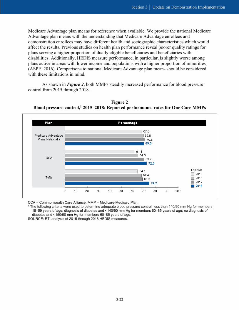
3-22
Section 3 │ Update on Demonstration Implementation
Medicare Advantage plan means for reference when available. We provide the national Medicare Advantage plan means with the understanding that Medicare Advantage enrollees and demonstration enrollees may have different health and sociographic characteristics which would affect the results. Previous studies on health plan performance reveal poorer quality ratings for plans serving a higher proportion of dually eligible beneficiaries and beneficiaries with disabilities. Additionally, HEDIS measure performance, in particular, is slightly worse among plans active in areas with lower income and populations with a higher proportion of minorities (ASPE, 2016). Comparisons to national Medicare Advantage plan means should be considered with these limitations in mind.
As shown in Figure 2, both MMPs steadily increased performance for blood pressure control from 2015 through 2018.
Figure 2 Blood pressure control,1 2015–2018: Reported performance rates for One Care MMPs
CCA = Commonwealth Care Alliance; MMP = Medicare-Medicaid Plan. 1 The following criteria were used to determine adequate blood pressure control: less than 140/90 mm Hg for members
18–59 years of age; diagnosis of diabetes and <140/90 mm Hg for members 60–85 years of age; no diagnosis of diabetes and <150/90 mm Hg for members 60–85 years of age.
SOURCE: RTI analysis of 2015 through 2018 HEDIS measures.
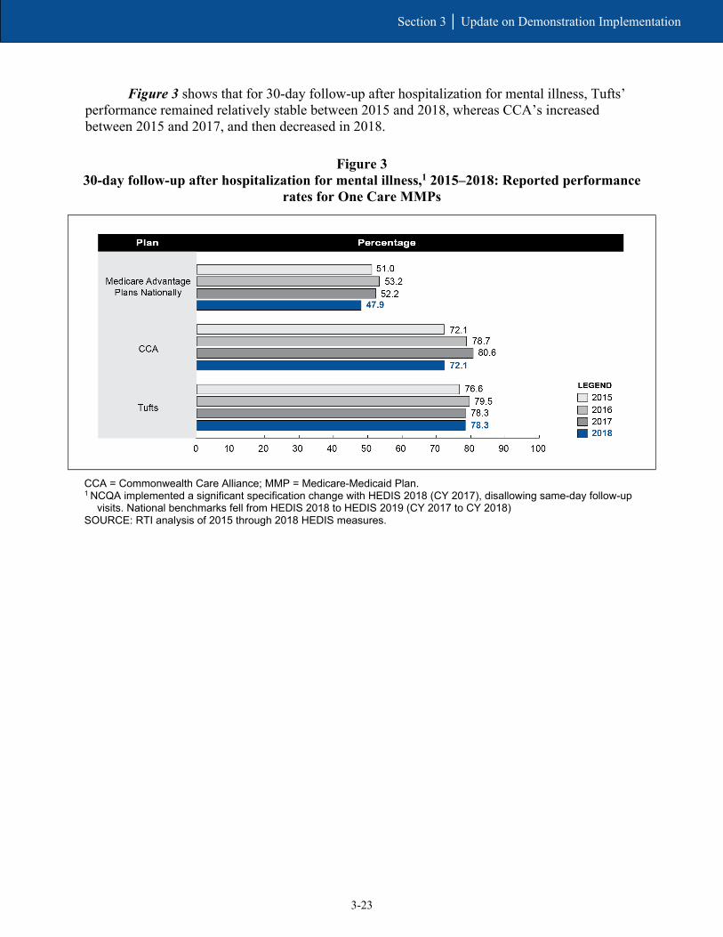
3-23
Section 3 │ Update on Demonstration Implementation
Figure 3 shows that for 30-day follow-up after hospitalization for mental illness, Tufts’ performance remained relatively stable between 2015 and 2018, whereas CCA’s increased between 2015 and 2017, and then decreased in 2018.
Figure 3 30-day follow-up after hospitalization for mental illness,1 2015–2018: Reported performance
rates for One Care MMPs
CCA = Commonwealth Care Alliance; MMP = Medicare-Medicaid Plan. 1 NCQA implemented a significant specification change with HEDIS 2018 (CY 2017), disallowing same-day follow-up
visits. National benchmarks fell from HEDIS 2018 to HEDIS 2019 (CY 2017 to CY 2018) SOURCE: RTI analysis of 2015 through 2018 HEDIS measures.

3-24
Section 3 │ Update on Demonstration Implementation
As shown in Figure 4, CCA substantially increased performance on controlling HbA1c levels (<8.0 percent) between 2015 and 2016, and then remained relatively stable between 2016 and 2018. Between 2015 and 2018, Tufts’ performance remained relatively stable.
Figure 4 Good control of HbA1c level (<8.0%), 2015–2018: Reported performance rates
for One Care MMPs
CCA = Commonwealth Care Alliance; MMP = Medicare-Medicaid Plan. SOURCE: RTI analysis of 2015 through 2018 HEDIS measures.
Plan all-cause readmissions for enrollees ages 18–64 and ages 65+ are reported in Figure 5 and Figure 6, respectively, as an observed-to-expected ratio mean, whereby an MMP’s observed readmission rate is compared to its expected readmission rate given its beneficiary case mix. A value below 1.0 (shown by the vertical line at x=1 in the figure below) is favorable and indicates that MMPs had fewer readmissions than expected for their populations based on case mix. Figure 5 shows that both MMPs generally reported lower than expected readmissions for enrollees ages 18–64, with the exception of Tufts in 2015 and 2016. Figure 6 shows a similar trend, but for enrollees ages 65+ where data were available and sample size requirements were met.

3-25
Section 3 │ Update on Demonstration Implementation
Figure 5 Plan all-cause readmissions, Ages 18–64, 2015–2018: Reported observed-to-expected ratio
means for One Care MMPs
* = not available, where RTI did not have access to MA plan national HEDIS data for this measure; CCA =
Commonwealth Care Alliance; HEDIS = Healthcare Effectiveness Data and Information Set; MA = Medicare Advantage; MMP = Medicare-Medicaid Plan.
SOURCE: RTI analysis of 2015 through 2018 HEDIS measures.

3-26
Section 3 │ Update on Demonstration Implementation
Figure 6 Plan all-cause readmissions, Ages 65+, 2015–2018: Reported observed-to-expected ratio means
for One Care MMPs
* = not available, where RTI did not have access to MA plan national HEDIS data for this measure; HEDIS =
Healthcare Effectiveness Data and Information Set; MA = Medicare Advantage; MMP = Medicare-Medicaid Plan; N/A = not applicable, where MA plans do not report such data, or where the number of enrollees in the MMP’s provided HEDIS data available for inclusion in the measure was less than 30, and therefore not reported per RTI’s decision rule for addressing low sample size.
SOURCE: RTI analysis of 2015 through 2018 HEDIS measures.

SECTION 4 Beneficiary Experience

4-1
Section 4 │ Beneficiary Experience
Based on responses to the 2018 CAHPS survey, One Care MMPs met or exceeded the national benchmarks for MMPs and Medicare Advantage plans for beneficiaries’ overall satisfaction with their health plans.
Effective July 2018, MassHealth restructured the delivery of ombudsman services, expanding the One Care Ombudsman (OCO) program to its entire managed care population through a newly procured contract. The expanded ombudsman program is now known as My Ombudsman.
The number of appeals reported by MMPs remained relatively stable throughout 2018 while the number of grievances increased over the course of the year.
One of the main goals of the demonstrations under the FAI is to improve the beneficiary experience accessing Medicare and Medicaid. In this section, we highlight beneficiary experience with One Care and provide information on beneficiary protections, data related to complaints and appeals, and critical incident and abuse reports. For beneficiary experience, we draw on findings from the CAHPS survey and stakeholder interviews. See Appendix A, Data Sources for a full description of these data sources.
4.1 Impact of the Demonstration on Beneficiaries
4.1.1 Beneficiary Overall Satisfaction
This section provides national benchmarks from Medicare Advantage plans, where available, although we recognize that there are differences in the populations served by the One Care demonstration and the Medicare Advantage population, including health and socioeconomic characteristics that must be considered in the comparison of the demonstration to the national Medicare Advantage contracts.
The percentage of CAHPS respondents that rated their health plan a 9 or 10 varied for each plan from 2015 to 2018 (see Figure 7). In each year from 2015 through 2018, the percentage of One Care enrollees who participated in the CAHPS survey and rated their MMP a 9 or a 10 was close to or higher than the national Medicare Advantage and MMP averages.

4-2
Section 4 │ Beneficiary Experience
Figure 7 Beneficiary overall satisfaction, 2015–2018: Percent of beneficiaries rating
their health plan as a 9 or 10
- = sample size data not available; CAHPS = Consumer Assessment of Healthcare Providers and Systems; CCA =
Commonwealth Care Alliance; MMP = Medicare-Medicaid Plan. SOURCE: CAHPS data for 2015–2018. This item was case-mix adjusted. The CAHPS question used for this item
was: “Using any number from 0 to 10, where 0 is the worst health plan possible and 10 is the best health plan possible, what number would you use to rate your health plan?”

4-3
Section 4 │ Beneficiary Experience
As noted earlier, the demonstration integrates a full array of Medicare and Medicaid services, including Medicare Part D benefits. As with health plan satisfaction ratings, the percentages of CAHPS respondents who rated their drug plan a 9 or 10 for both One Care MMPs were equal to or higher than the national Medicare Advantage and MMP averages (see Figure 8).
Figure 8 Beneficiary overall satisfaction, 2015–2018: Percentage of beneficiaries rating their
prescription drug plan as a 9 or 10
* = data not available; - = sample size data not available; CAHPS = Consumer Assessment of Healthcare
Providers and Systems; CCA = Commonwealth Care Alliance; MMP = Medicare-Medicaid Plan. SOURCE: CAHPS data for 2015–2018. This item was case-mix adjusted. The CAHPS question used for this item
was: “Using any number from 0 to 10, where 0 is the worst prescription drug plan possible and 10 is the best prescription drug plan possible, what number would you use to rate your prescription drug plan?”
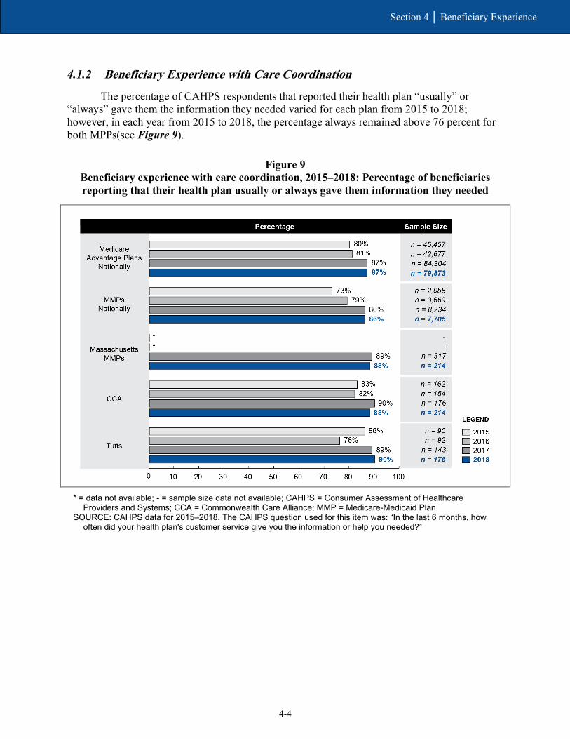
4-4
Section 4 │ Beneficiary Experience
4.1.2 Beneficiary Experience with Care Coordination
The percentage of CAHPS respondents that reported their health plan “usually” or “always” gave them the information they needed varied for each plan from 2015 to 2018; however, in each year from 2015 to 2018, the percentage always remained above 76 percent for both MPPs(see Figure 9).
Figure 9 Beneficiary experience with care coordination, 2015–2018: Percentage of beneficiaries reporting that their health plan usually or always gave them information they needed
* = data not available; - = sample size data not available; CAHPS = Consumer Assessment of Healthcare
Providers and Systems; CCA = Commonwealth Care Alliance; MMP = Medicare-Medicaid Plan. SOURCE: CAHPS data for 2015–2018. The CAHPS question used for this item was: “In the last 6 months, how
often did your health plan's customer service give you the information or help you needed?”
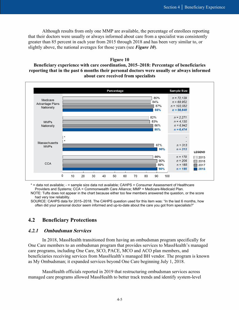
4-5
Section 4 │ Beneficiary Experience
Although results from only one MMP are available, the percentage of enrollees reporting that their doctors were usually or always informed about care from a specialist was consistently greater than 85 percent in each year from 2015 through 2018 and has been very similar to, or slightly above, the national averages for those years (see Figure 10).
Figure 10 Beneficiary experience with care coordination, 2015–2018: Percentage of beneficiaries
reporting that in the past 6 months their personal doctors were usually or always informed about care received from specialists
* = data not available; - = sample size data not available; CAHPS = Consumer Assessment of Healthcare
Providers and Systems; CCA = Commonwealth Care Alliance; MMP = Medicare-Medicaid Plan. NOTE: Tufts does not appear in the chart because either too few members answered the question, or the score
had very low reliability. SOURCE: CAHPS data for 2015–2018. The CAHPS question used for this item was: “In the last 6 months, how
often did your personal doctor seem informed and up-to-date about the care you got from specialists?”
4.2 Beneficiary Protections
4.2.1 Ombudsman Services
In 2018, MassHealth transitioned from having an ombudsman program specifically for One Care members to an ombudsman program that provides services to MassHealth’s managed care programs, including One Care, SCO, PACE, MCO and ACO plan members, and beneficiaries receiving services from MassHealth’s managed BH vendor. The program is known as My Ombudsman; it expanded services beyond One Care beginning July 1, 2018.
MassHealth officials reported in 2019 that restructuring ombudsman services across managed care programs allowed MassHealth to better track trends and identify system-level
4-6
Section 4 │ Beneficiary Experience
issues affecting different populations. MassHealth awarded the contract for ombudsman services to the Disability Policy Consortium, a cross-disability advocacy organization in Massachusetts. The expanded program, known as My Ombudsman, began serving other eligible MassHealth members on July 1, 2018.
In early 2019, My Ombudsman representatives emphasized that it was important to employ some staff members who were enrolled in One Care or other MassHealth programs, and some who had disabilities to develop trust with the populations they serve. My Ombudsman also employed a Spanish-speaking ombudsman and staff able to communicate with American Sign Language.
To reduce confusion with the transition to the new name and expanded scope of service, My Ombudsman engaged in a robust outreach strategy. Outreach activities included mail notifications to One Care enrollees as well as more direct outreach to people experiencing homelessness, individuals who were deaf or hard of hearing, and others with language access or communication barriers. Representatives from My Ombudsman and MassHealth reported that the transition went smoothly overall, in part because the contact information for ombudsman services did not change.
My Ombudsman staff reported in 2019 that most of their caseload was composed of One Care members; for example, One Care members accounted for 75 percent of all My Ombudsman calls in 2018. Staff attributed the high rates of One Care callers to the higher level of awareness among the One Care population compared to the other populations that My Ombudsman served.
The three-way contract amendment executed April 1, 2019, provided language to strengthen the role of the program by specifying that MMPs were responsible for notifying enrollees about ombudsman services and for cooperating with ombudsman staff. The latter required MMPs to provide access to records needed to investigate or resolve complaints and to designate an individual to act as a liaison with ombudsman staff (One Care three-way contract, April 2019, Section 2.5.8.6).
4.2.2 Grievances and Appeals
Enrollees have the right to file a grievance with their MMP at any time. A grievance is a complaint or dispute expressing dissatisfaction with the MMP or a provider, regardless of whether the enrollee is requesting a remedial action. Grievances are resolved at the MMP level. A “grievance” is also called a “complaint.”
Enrollees also have the right to appeal an “adverse action” taken by an MMP. An adverse action includes the MMP’s denial, reduction, or termination of services. Appeals must be filed first with the MMP.
When the MMP denies an appeal involving Medicare-only services, the MMP automatically forwards the appeal to the Medicare Independent Review Entity (IRE). When the MMP denies an appeal involving Medicaid-only services, the enrollee may appeal to the MassHealth Board of Hearings. If the appeal involves overlapping Medicare and Medicaid-related claims, the appeal is automatically forwarded to the IRE, and the enrollee may also appeal to the MassHealth Board of Hearings. If an appeal is filed with both the IRE and the
4-7
Section 4 │ Beneficiary Experience
MassHealth Board of Hearings, the MMP is bound to the outcome most favorable to the enrollee. Enrollees can also submit complaints to MassHealth, Medicare, or the Ombudsman.
Grievance (complaint) and appeals data were received from the following sources:
• data reported by MMPs on complaints made directly to them;29
• data submitted to the CMS Complaints Tracking Module (CTM) for complaints received by MassHealth and 1-800-Medicare;30
• data reported by the IRE, which is a second-level review of Medicare appeals;31 and
• qualitative information collected by the evaluation team.
Reporting periods vary across these sources.
Over the course of the demonstration, the method by which MMP -reported grievance data are analyzed has changed. Initially data were analyzed per 1,000 enrollees; effective January 2018, the method changed to analyze grievances per 10,000 enrollee months. From 2014 through 2017, the number of MMP-reported grievances per 1,000 enrollees varied—with a low of 43.2 in quarter 1 of 2016 and a high of 77.4 in quarter 4 of 2015—but increased overall.
Despite the different measurement scale, 2018 data also showed an upward trend: the total grievances per 10,000 enrollee months steadily increased from 106.7 in quarter 1 to 179.1 in quarter 4.
However, the number of complaints filed with the CMS CTM for the period October 2013–December 2018 show that the number of complaints (or grievances) decreased, ranging from a high of 69 complaints in 2014 to a low of two complaints in 2018. The highest number of complaints were in the benefits, access, and quality of care,32 and enrollment and disenrollment33 categories, followed by complaints in the provider specific,34 and other matters requiring plan review categories. CMS believed that more routinized enrollment processes in particular have contributed to the decline in CTM-filed grievances.
My Ombudsman reportedly received a total of 244 grievances from One Care beneficiaries for the last two quarters of 2018 and 132 grievances for the first quarter of 2019.35 In early 2019, My Ombudsman reported that the most common complaints from members were related to the quality of transportation services, LTSS, and issues around care coordination,
29 MMP Reported Data provided to RTI by CMS. 30 Data obtained from the CTM within the Health Plan Management System by RTI. 31 Data provided to RTI by CMS. 32 This category is defined as “Beneficiary has difficulty securing Part D prescriptions, beneficiary has difficulty finding a network provider/pharmacy, beneficiary has concerns about the quality of care they have received, Beneficiary has concerns about a denied claim.” 33 This category is defined as “Beneficiary is experiencing an enrollment issue that may require reinstatement or enrollment change, beneficiary has not received enrollment card or other membership materials.” 34 This category is defined as “Improper, insufficient, or delayed claims payment.” 35 My Ombudsman presentations to the Implementation Council on November 13, 2018, and April 9, 2019; see https://www.mass.gov/lists/2019-one-care-implementation-council.

4-8
Section 4 │ Beneficiary Experience
which was consistent with previous years of the demonstration. My Ombudsman noted that complaints about care coordination included issues with care coordinator performance or communication, as well as requests for a change in care coordinators. My Ombudsman reported that cuts to authorized personal care attendant (PCA) hours and failure to authorize PCA hours in a timely manner, as well as issues with access to DME, were also common complaints made by One Care members.
My Ombudsman staff reported that complaints filed by special populations tended to show different trends than the overall One Care population. For example, staff reported a trend in complaints around communication access and the provision of interpreters for dental providers among beneficiaries who were deaf or hard of hearing. And complaints filed by Spanish-speaking beneficiaries often centered on communication barriers that made it difficult for these beneficiaries to get clear or correct information regarding reasons for denial of DME, medication, or services. Due to the low number of calls from members outside of One Care at the time of the 2019 RTI evaluation team interviews, it was still too early for My Ombudsman representatives to meaningfully compare trends in complaints across different managed care populations.
In 2019, representatives from My Ombudsman noted that some beneficiaries found the integrated appeals process under One Care complicated. In early 2019, MassHealth expressed an interest in better integrating some of the appeals processes for Medicare and Medicaid services, partly in response to feedback from the MMPs. Some modifications to the appeals process—including changes in notice requirements and other processes— were included as part of the April 2019 three-way contract amendment.
The number of One Care appeals36 remained relatively low from 2014-2017, ranging from 2.1 to 9.0 appeals per 1,000 enrollees. As with grievance data, effective January 2018 the method by which appeals data were analyzed changed from appeals per 1,000 enrollees, to appeals per 10,000 enrollee months. In 2018, the number of appeals varied within a small range, from 23.7 to 26.4 appeals per 10,000 enrollee months.
A total of 254 appeals were reported to the IRE from 2014 through 2018, of which 195 (77 percent) were upheld, 40 (16 percent) were overturned, and 16 (6 percent) were dismissed. The most common category of appeals referred to the IRE was for practitioner services,37 closely followed by appeals for DME.
Massachusetts plans are also required to report to CMS, through its implementation contractor, the number of critical incidents and abuse reports. Critical incident refers to any actual or alleged event or situation that creates a significant risk of substantial or serious harm to the physical or mental health, safety, or well-being of a member.38 Over the course of the demonstration to date, the number of reports received per 1,000 members receiving LTSS has remained low. After a demonstration to date low of 0.0 reports received per 1,000 members in quarter 3 of 2015, the number trended upward in 2016 and 2017 (to 5.0 in quarter 4 of 2017),
36 MMP-reported data provided to RTI by CMS. 37 Examples of practitioner services include physician, chiropractic, dental, prosthetics/orthotics, and vision care. 38 See Medicare-Medicaid Capitated Financial Alignment Model reporting requirements Massachusetts Specific Reporting Requirements, February 2018, p. MA-20.

4-9
Section 4 │ Beneficiary Experience
dropped noticeably in early 2018 (to 1.5 in quarter 1), and then trended upward again to the demonstration to date high of 5.6 in quarter 4 of 2018.
MassHealth officials reported that critical incident reports in 2018 had leveled off from the prior year. Member death continued to be the most common reason for a critical incident report being filed in 2018.

4-10
Section 4 │ Beneficiary Experience
[This page intentionally left blank.]

SECTION 5 Demonstration Impact on Service Utilization and Quality of Care
5-1
Section 5 │ Demonstration Impact on Service Utilization and Quality of Care
5.1 Methods Overview
The demonstrations under the FAI are intended to shift utilization from inpatient to ambulatory care and from NF care to HCBS and to improve quality of care through care coordination activities and the demonstrations’ financial incentives. The analyses in this section evaluate the effects of the Massachusetts demonstration in demonstration years 1–4 (October 1, 2013–December 31, 2017) on service utilization and quality of care outcomes among demonstration eligible beneficiaries.
Several modifications were made to this report that resulted in differences from the Third Evaluation Report. First, RTI excluded beneficiaries who were ever enrolled in Medicare Advantage during the study period from the service utilization analysis. This approach differs from previous evaluation reports that excluded only the months of Medicare Advantage enrollment. Second, corrections were made to impact estimates from the third evaluation report that resulted in differences in our current impact estimates for demonstration years 1–3 (see Appendix E for additional details).
For this analysis, we used an intent-to-treat (ITT) approach that included all beneficiaries eligible for the demonstration, not just those who actually enrolled in the MMPs, to alleviate concerns of selection bias and to support generalizability of the results among the demonstration eligible population. An ITT analysis mimics the real-world implementation of the demonstration.
We used a quasi-experimental DinD regression analysis with inverse propensity weighting to estimate the impact of the demonstration on the change in the probability or frequency of service utilization and quality of care outcomes, relative to the comparison group. Our analyses were conducted using Medicare enrollment and FFS claims data, MMP encounter data (although encounter data for Advicare were not included because those data were deemed incomplete), Area Health and Resource Files, and the American Community Survey. Please see Appendix D for more detail on our analytic methodology.
To help interpret the DinD estimate, we present the DinD estimate as both the absolute change in the probability (for a dichotomous outcome) or frequency (for a count outcome) of the outcome, relative to the comparison group, and a relative percent change of the average outcome value in the comparison group during the demonstration period. Thus, a positive DinD value may correspond with a greater increase or a smaller decrease in the outcome in the demonstration group than in the comparison group, depending on the estimated trend in the outcome. For example, if the DinD estimate is positive and the trend is a decline in both the demonstration and comparison groups, then the interpretation of the DinD estimate is that the demonstration had a slower decline in the outcome than the comparison group did. Similarly, a negative value on the DinD estimate can result from either a greater decrease or a smaller increase in the outcome, depending on the estimated trend in the demonstration group relative to the comparison group.
The forest plots present a point estimate by demonstration year for each outcome, along with 95 percent confidence intervals of each point estimate. A point estimate indicates a statistically significant demonstration effect if neither its upper nor lower bound of the confidence interval crosses zero.

5-2
Section 5 │ Demonstration Impact on Service Utilization and Quality of Care
In addition, we discuss the demonstration effects on two special populations of interest: beneficiaries who use LTSS and beneficiaries with serious and persistent mental illness (SPMI). The interest is in understanding whether the demonstration might have impacted LTSS users (or those with SPMI) differently than non-LTSS users (or those without SPMI). We present the demonstration effects separately for LTSS users (or those with SPMI) and for non-LTSS users (or those without SPMI), and the difference between them. For a complete list of DinD estimates with 95 and 90 percent confidence intervals, please see Appendix E.
5.2 Demonstration Impact on Service Utilization Among Eligible Beneficiaries
Over the first 4 years of the Massachusetts demonstration, annual long-stay NF use declined by 15.1 percent and monthly physician visits increased by 7.0 percent, relative to the comparison group. However, the probability of an inpatient admission increased by 4.4 percent and the probability of an SNF admission increased by 6.2 percent, relative to the comparison group.
5.2.1 Cumulative Impact over Demonstration Years 1–4
The demonstration is intended to increase use of outpatient care and HCBS, while decreasing inpatient care, ED visits, and long-stay (stays lasting 101 days or more, based on the Minimum Data Set nursing home resident assessment data) NF use through improvements in care coordination and integration of a full range of medical, behavioral health and LTSS. Table 7 shows the cumulative impacts of the demonstration on service utilization. Under the Massachusetts demonstration, the probability of annual long-stay nursing facility (NF) use decreased and the number of monthly physician visits, the probability of an inpatient admission, and the probability of a SNF admission modestly increased, relative to the comparison group. There was no demonstration effect on ED visits.
• Under the demonstration, long-stay NF use decreased 0.51 percentage points annually over the demonstration period, relative to the comparison group. This decrease equates to a relative difference of 15.1 percent.
• The reduction in long-stay NF use over the entire demonstration period is likely related to care coordination efforts identified by MMPs and stakeholders in previous reports. Specifically, MMP officials noted that care coordination had helped beneficiaries gain access to LTSS that helped them live more independently. Stakeholders felt that integrative care planning was essential to understanding and meeting the LTSS needs of beneficiaries.39
• The Massachusetts demonstration resulted in 0.0678 more monthly physician visits per beneficiary over the demonstration period, relative to the comparison group. This monthly increase equates to a relative difference of 7.0 percent of the predicted number of physician visits in the comparison group during the demonstration period
39 See Section 3.3.3 of the Second Evaluation Report.

5-3
Section 5 │ Demonstration Impact on Service Utilization and Quality of Care
(0.9697). This monthly increase would amount to an annual increase of 0.8136 visits (derived by 0.0678*12), relative to the comparison group. – This increase was expected and is consistent with the care coordination activities
and improvements described by MMPs and Commonwealth officials in previous reports).40 These findings also correspond with the One Care MMP performance on HEDIS measures for ambulatory outpatient visits described in Section 3.6.3, Quality of Care.
• The probability of inpatient admissions and the probability of SNF admissions increased by 0.14 percentage points and by 0.03 percentage points, respectively, relative to the comparison group. The increase in inpatient admissions corresponds to a relative difference of 4.4 percent, and the increase in SNF admissions corresponds to a relative difference of 6.2 percent. – One Care experienced unexpected increases in care coordinator turnover from
2014 to 2016, and stakeholders identified structural issues that had made it difficult to fully integrate services and communication across plans and providers. These may have posed challenges in coordinating care for those with chronic conditions or reducing acute and post-acute admissions.41
• Despite stakeholder reports of diverting beneficiaries from ED visits,42 there is no evidence that One Care has impacted ED use.
• The FAI evaluation for Massachusetts (and indeed for all demonstration states) employs an ITT framework to produce estimates that are robust to unobserved factors influencing enrollment in the demonstration and are generalizable to the demonstration eligible population within the state. However, there are limitations to this approach. For example, the demonstration eligible population in our sample comprised of approximately 11.6 percent of One Care enrolled beneficiary months over demonstration years 1 to 4. It is possible that findings pointing to increases in inpatient and SNF use may be influenced more by the service utilization profile of the eligible nonenrolled Medicare FFS population. For example, the percentage of months with any inpatient admissions among those enrolled in the demonstration declined from 2.9 to 2.4 percent from demonstration years 1 to 4, whereas for the eligible nonenrolled population the percentage remained at 3.4 and 3.3 percent (see Table E-7 in Appendix E).
40 See the Third Evaluation Report. 41 See Section 3.3.2 of the Third Evaluation Report. 42 See Section 3.1.3 of the Third Evaluation Report.
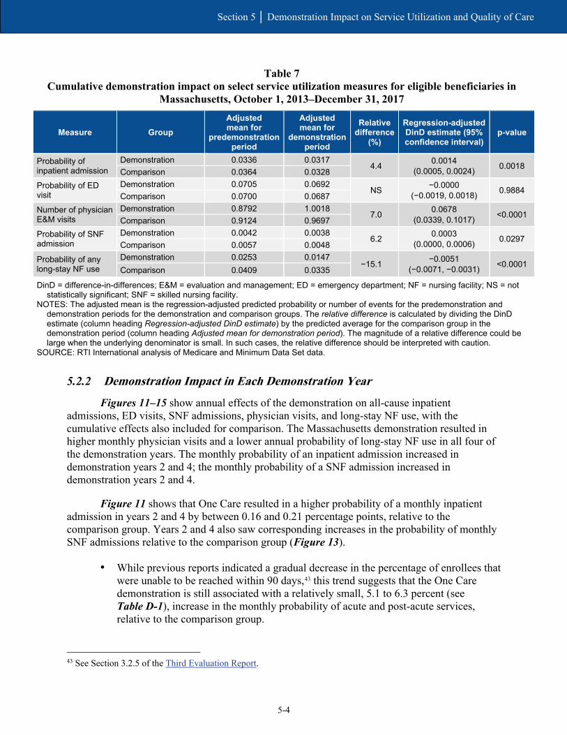
5-4
Section 5 │ Demonstration Impact on Service Utilization and Quality of Care
Table 7 Cumulative demonstration impact on select service utilization measures for eligible beneficiaries in
Massachusetts, October 1, 2013–December 31, 2017
Measure Group Adjusted mean for
predemonstration period
Adjusted mean for
demonstration period
Relative difference
(%)
Regression-adjusted DinD estimate (95% confidence interval)
p-value
Probability of inpatient admission
Demonstration 0.0336 0.0317 4.4 0.0014
(0.0005, 0.0024) 0.0018 Comparison 0.0364 0.0328
Probability of ED visit
Demonstration 0.0705 0.0692 NS −0.0000
(−0.0019, 0.0018) 0.9884 Comparison 0.0700 0.0687
Number of physician E&M visits
Demonstration 0.8792 1.0018 7.0 0.0678
(0.0339, 0.1017) <0.0001 Comparison 0.9124 0.9697
Probability of SNF admission
Demonstration 0.0042 0.0038 6.2 0.0003
(0.0000, 0.0006) 0.0297 Comparison 0.0057 0.0048
Probability of any long-stay NF use
Demonstration 0.0253 0.0147 −15.1 −0.0051
(−0.0071, −0.0031) <0.0001 Comparison 0.0409 0.0335
DinD = difference-in-differences; E&M = evaluation and management; ED = emergency department; NF = nursing facility; NS = not statistically significant; SNF = skilled nursing facility.
NOTES: The adjusted mean is the regression-adjusted predicted probability or number of events for the predemonstration and demonstration periods for the demonstration and comparison groups. The relative difference is calculated by dividing the DinD estimate (column heading Regression-adjusted DinD estimate) by the predicted average for the comparison group in the demonstration period (column heading Adjusted mean for demonstration period). The magnitude of a relative difference could be large when the underlying denominator is small. In such cases, the relative difference should be interpreted with caution.
SOURCE: RTI International analysis of Medicare and Minimum Data Set data.
5.2.2 Demonstration Impact in Each Demonstration Year
Figures 11–15 show annual effects of the demonstration on all-cause inpatient admissions, ED visits, SNF admissions, physician visits, and long-stay NF use, with the cumulative effects also included for comparison. The Massachusetts demonstration resulted in higher monthly physician visits and a lower annual probability of long-stay NF use in all four of the demonstration years. The monthly probability of an inpatient admission increased in demonstration years 2 and 4; the monthly probability of a SNF admission increased in demonstration years 2 and 4.
Figure 11 shows that One Care resulted in a higher probability of a monthly inpatient admission in years 2 and 4 by between 0.16 and 0.21 percentage points, relative to the comparison group. Years 2 and 4 also saw corresponding increases in the probability of monthly SNF admissions relative to the comparison group (Figure 13).
• While previous reports indicated a gradual decrease in the percentage of enrollees that were unable to be reached within 90 days,43 this trend suggests that the One Care demonstration is still associated with a relatively small, 5.1 to 6.3 percent (see Table D-1), increase in the monthly probability of acute and post-acute services, relative to the comparison group.
43 See Section 3.2.5 of the Third Evaluation Report.
5-5
Section 5 │ Demonstration Impact on Service Utilization and Quality of Care
• Monthly enrollment in One Care was 11.5 percent and 15 percent in demonstration years 2 and 4, respectively, in our analytic sample. Thus, similar to the cumulative findings, these findings may in part influence the service utilization experience of the eligible nonenrolled Medicare FFS population.
Figure 11 Cumulative and annual demonstration effects on inpatient admissions,
October 1, 2013–December 31, 2017
DY = demonstration year. NOTES: 95 percent confidence intervals are shown. The expected effect of the demonstration (Increase or
Decrease) is in bold. SOURCE: RTI International analysis of Medicare fee-for-service claims and encounter data.

5-6
Section 5 │ Demonstration Impact on Service Utilization and Quality of Care
Figure 12 Cumulative and annual demonstration effects on ED visits,
October 1, 2013–December 31, 2017
DY = demonstration year. ED = emergency department. NOTE: 95 percent confidence intervals are shown. The expected effect of the demonstration (Increase or
Decrease) is in bold. SOURCE: RTI International analysis of Medicare fee-for-service claims and encounter data.

5-7
Section 5 │ Demonstration Impact on Service Utilization and Quality of Care
Figure 13 Cumulative and annual demonstration effects on SNF admissions,
October 1, 2013–December 31, 2017
DY = demonstration year. SNF = skilled nursing facility. NOTE: 95 percent confidence intervals are shown. The expected effect of the demonstration (Increase or
Decrease) is in bold. SOURCE: RTI International analysis of Medicare fee-for-service claims and encounter data.

5-8
Section 5 │ Demonstration Impact on Service Utilization and Quality of Care
Despite annual increases in acute and post-acute services, the number of physician visits increased in all 4 demonstration years by between 0.06 and 0.08 visits per month, relative to the comparison group (Figure 14). These increases are consistent with findings from patient satisfaction surveys.44
Figure 14 Cumulative and annual demonstration effects on physician E&M visits,
October 1, 2013–December 31, 2017
DY = demonstration year; E&M = evaluation and management. NOTE: 95 percent confidence intervals are shown. The expected effect of the demonstration (Increase or
Decrease) is in bold. SOURCE: RTI International analysis of Medicare fee-for-service claims and encounter data.
44 See Section 4.2.5 of the Third Evaluation Report.

5-9
Section 5 │ Demonstration Impact on Service Utilization and Quality of Care
Figure 15 shows that One Care decreased already infrequent long-stay NF use in all 4 years by between 0.31 and 0.63 percentage points, relative to the comparison group. Despite mixed feedback from MassHealth officials on the success of the implementation of long-term care coordinators,45 annual declines in the probability of long-stay NF use suggest One Care has been effective in identifying the LTSS needs of its members and providing services that are helping beneficiaries live more independently.
Figure 15 Cumulative and annual demonstration effects on long-stay NF use,
October 1, 2013–December 31, 2017
DY = demonstration year; NF = nursing facility. NOTE: 95 percent confidence intervals are shown. The expected effect of the demonstration (Increase or
Decrease) is in bold. SOURCE: RTI International analysis of Minimum Data Set data.
45 See Section 3.3.3 of the Third Evaluation Report.

5-10
Section 5 │ Demonstration Impact on Service Utilization and Quality of Care
5.3 Demonstration Impact on Quality of Care Among Eligible Beneficiaries
Over the first 4 years of the Massachusetts One Care demonstration, ACSC admissions (chronic) increased by 12.3 percent, and all-cause 30-day readmissions increased by 4.6 percent, relative to the comparison group.
5.3.1 Cumulative Impact Over Demonstration Years 1–4
The Massachusetts One Care demonstration increased all-cause 30-day readmissions and ACSC admissions (chronic), relative to the comparison group. There was no cumulative effect on preventable ED visits, ACSC admissions (overall), or the probability of a 30-day follow-up after a mental health discharge.
• As indicated in Table 8, the average probability of an ACSC admission (chronic) increased in both the demonstration and comparison groups from the predemonstration period to the demonstration period. The increase was greater in the demonstration group though, resulting in a statistically significant 0.04 percentage point increase, relative to the comparison group. This monthly increase represents a relative difference of 12.3 percent.
• Similarly, all-cause 30-day readmissions increased in both groups, although the increase was greater in the demonstration group. The impact of One Care was a net increase of 0.0117 all-cause 30-day readmissions per year, which corresponds to a relative difference of 4.6 percent.
• Stakeholders identified structural issues that had made it difficult to fully integrate services and communication across plans and providers, perhaps limiting the effectiveness of transitions of posthospitalization care planning.46 The increase in ACSC admissions, relative to the comparison group, suggests challenges in managing chronic conditions in an outpatient setting.
• Additionally, One Care experienced unexpected increases in care coordinator turnover from 2014 to 2016, which may have aggravated challenges in coordinating care for those with chronic conditions.47
• That said, caution should be used when interpreting these results. As described earlier, approximately 11.6 percent of monthly observations were enrolled in One Care over demonstration years 1 through 4. Thus, it is possible that for the most part, increases observed in ASCS admissions and readmissions reflect the service utilization experience of the eligible nonenrolled population in Massachusetts. For example, Table E-8 in Appendix E shows an increase in average readmissions for the eligible nonenrolled population from demonstration years 1 to 4, whereas there was a decline in readmissions among enrolled beneficiaries during those same years.
46 See Section 3.1.3 of the Third Evaluation Report. 47 See Section 3.3.2 of the Third Evaluation Report.

5-11
Section 5 │ Demonstration Impact on Service Utilization and Quality of Care
Table 8 Cumulative demonstration impact on select quality of care measures for eligible beneficiaries in
Massachusetts, October 1, 2013–December 31, 2017
Measure Group Adjusted mean for
predemonstration period
Adjusted mean for
demonstration period
Relative difference
(%)
Regression-adjusted DinD estimate (95%
confidence interval) p-value
Preventable ED visits Demonstration 0.0423 0.0416
NS −0.0002
(−0.0019, 0.0015) 0.8177
Comparison 0.0427 0.0421
Probability of ACSC admission, overall
Demonstration 0.0039 0.0040 NS
0.0003 (-0.0001, 0.0006)
0.1091 Comparison 0.0045 0.0044
Probability of ACSC admission, chronic
Demonstration 0.0025 0.0030 12.3 0.0004
(0.0001, 0.0007) 0.0144
Comparison 0.0028 0.0030 Probability of 30-day follow-up after mental health discharge
Demonstration 0.4727 0.5138 NS −0.0039
(−0.0286, 0.0209) 0.7597
Comparison 0.4412 0.4859
All-cause 30-day readmissions
Demonstration 0.2621 0.2637 4.6 0.0117
(0.0037, 0.0198) 0.0041
Comparison 0.2641 0.2545
ACSC = ambulatory care sensitive condition; DinD = difference-in-differences; ED = emergency department; NS = not statistically significant.
NOTES: The adjusted mean is the regression-adjusted predicted probability or number of events for the predemonstration and demonstration periods for the demonstration and comparison groups. The relative difference is calculated by dividing the DinD estimate (column heading Regression-adjusted DinD estimate) by the predicted average for the comparison group in the demonstration period (column heading Adjusted mean for demonstration period). The magnitude of a relative difference could be large when the underlying denominator is small. In such cases, the relative difference should be interpreted with caution.
SOURCE: RTI International analysis of Medicare fee-for-service claims and encounter data.
5.3.2 Demonstration Impact in Each Demonstration Year
Figures 16–20 show annual effects of the demonstration on 30-day readmission, preventable ED visits, ACSC admissions (overall and chronic), and 30-day follow-up post mental health discharge, with the cumulative impact also shown for comparison. The Massachusetts One Care demonstration increased all-cause 30-day readmissions in demonstration years 2 and 4, relative to the comparison group. ACSC admissions (overall) increased in year 1 and ACSC admissions (chronic) increased in years 1 and 2 among demonstration eligible beneficiaries, relative to the comparison group.
• One Care increased all-cause 30-day readmissions by 0.0211 readmissions in demonstration year 2 and by 0.0148 readmissions in demonstration year 4, relative to the comparison group. There was no statistically significant effect in year 1 or year 3 (Figure 16).
• In demonstration year 1, the probability of an ACSC admission, both overall and chronic, increased as a result of One Care by 0.03 and 0.04 percentage points, respectively. The impact carried through to demonstration year 2 for chronic ACSC admissions only, which increased by 0.04 percentage points, relative to the comparison group. There was no statistically significant impact on either measure in demonstration years 3 or 4 (Figure 17 and Figure 18).

5-12
Section 5 │ Demonstration Impact on Service Utilization and Quality of Care
• These findings suggest that post discharge care planning and coordination for One Care enrollees continues to be challenging. MMPs reported higher observed-to-expected ratios on readmissions in 2015 and 2016, relative to the national average (see Section 3.6, Quality of Care). These findings are consistent with the HEDIS results.
• Even so, despite care coordinator turnover and structural challenges with integrating care, demonstration years 3 and 4 did not see increases in ACSC admissions (chronic or overall). This finding suggests that by 2017 the implementation of One Care may be improving in terms of better care coordination and management.
• Figures 19 and 20 show that the demonstration did not have a statistically significant effect on the number of preventable ED visits, or the probability of 30-day follow-up after a mental health discharge, during any demonstration year.
Figure 16 Cumulative and annual demonstration effects on 30-day readmissions,
October 1, 2013–December 31, 2017
DY = demonstration year. NOTES: 95 percent confidence intervals are shown. The expected effect of the demonstration (Increase or
Decrease) is in bold. SOURCE: RTI International analysis of Medicare fee-for-service claims and encounter data.

5-13
Section 5 │ Demonstration Impact on Service Utilization and Quality of Care
Figure 17 Cumulative and annual demonstration effects on ACSC admissions (overall),
October 1, 2013–December 31, 2017
ACSC = ambulatory care sensitive condition; DY = demonstration year. NOTES: 95 percent confidence intervals are shown. The expected effect of the demonstration (Increase or
Decrease) is in bold. SOURCE: RTI International analysis of Medicare fee-for-service claims and encounter data.

5-14
Section 5 │ Demonstration Impact on Service Utilization and Quality of Care
Figure 18 Cumulative and annual demonstration effects on ACSC admissions (chronic),
October 1, 2013–December 31, 2017
ACSC = ambulatory care sensitive condition; DY = demonstration year. NOTES: 95 percent confidence intervals are shown. The expected effect of the demonstration (Increase or
Decrease) is in bold. SOURCE: RTI International analysis of Medicare fee-for-service claims and encounter data.
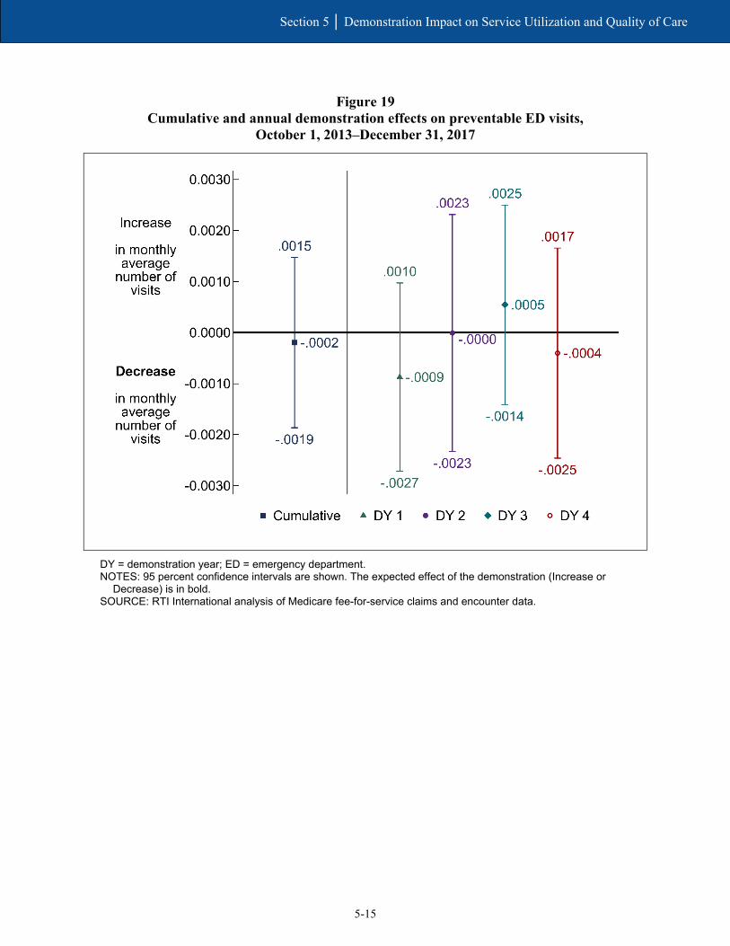
5-15
Section 5 │ Demonstration Impact on Service Utilization and Quality of Care
Figure 19 Cumulative and annual demonstration effects on preventable ED visits,
October 1, 2013–December 31, 2017
DY = demonstration year; ED = emergency department. NOTES: 95 percent confidence intervals are shown. The expected effect of the demonstration (Increase or
Decrease) is in bold. SOURCE: RTI International analysis of Medicare fee-for-service claims and encounter data.

5-16
Section 5 │ Demonstration Impact on Service Utilization and Quality of Care
Figure 20 Cumulative and annual demonstration effects on 30-day follow-up post mental health
discharge, October 1, 2013–December 31, 2017
DY = demonstration year. NOTES: 95 percent confidence intervals are shown. The expected effect of the demonstration (Increase or
Decrease) is in bold. SOURCE: RTI International analysis of Medicare fee-for-service claims and encounter data..
See Appendix E, Tables E-4 through E-9 for unadjusted descriptive statistics for all service use and quality of care measures for the demonstration eligible population, and for enrolled and nonenrolled demonstration eligible beneficiaries.

5-17
Section 5 │ Demonstration Impact on Service Utilization and Quality of Care
5.4 Demonstration Impact on Select Beneficiaries
The demonstration impacted the LTSS population differently, resulting in an increase in inpatient admissions, SNF admissions, preventable ED visits, and 30-day readmissions, relative to the demonstration effect for the non-LTSS population. The demonstration impact did not differ for beneficiaries with SPMI and those without SPMI.
Improved coordination of LTSS and BH services is a key feature of this demonstration. As such, it is expected that the demonstration may uniquely impact service utilization and quality of care among eligible beneficiaries with LTSS needs or who have SPMI, relative to non-LTSS users and those without SPMI (see Appendix D for group definitions). However, the special population analyses indicate that the demonstration impacts were less favorable for LTSS users, relative to non-LTSS users, with no differential impact on the SPMI population (see Appendix E).
See Appendix E, Tables E-7 and E-8 for unadjusted descriptive statistics for enrolled and nonenrolled demonstration eligible beneficiaries. Table E-9 provides a summary of enrollee utilization of Medicaid-type services derived from encounter data. Additionally, further analysis was conducted to examine unadjusted service utilization by racial and ethnic groups among the eligible population. Figures E-1, E-2, and E-3 provide month-level unadjusted results for service use in five settings of interest: inpatient admissions, ED (nonadmit), primary care E&M visits, outpatient therapy (physical therapy [PT], occupational therapy [OT], and speech therapy [ST]), and hospice.
5.4.1 Beneficiaries with Long-Term Services and Supports
Table 9 displays the cumulative demonstration effect on service utilization and quality of care measures for those with and without LTSS use, as well as tests of significance for the difference in the demonstration effects for those two groups. Descriptive statistics for the demonstration eligible population with LTSS use in demonstration year 4 are provided in Appendix D, Table D-1.
For some measures, One Care impacted those with LTSS use differently than those with no LTSS use (see Table 9 and Appendix E, Table E-2). For example, the cumulative demonstration effect on the probability of monthly inpatient admissions among LTSS users was 1.4 percentage points greater than the demonstration effect among non-LTSS users. In other words, the impact of the demonstration on inpatient admissions in Massachusetts was greater for the LTSS population than the non-LTSS population. Similarly, the demonstration impact for those with LTSS use was a 1.3 percentage point increase in the monthly probability of any SNF admission, relative to the demonstration effect among those with no LTSS use.
One Care resulted in an increase of 0.0815 all-cause readmissions among those with LTSS use relative to those without any LTSS use. Likewise, the demonstration resulted in an increase of 0.0077 preventable ED visits among those with LTSS use, relative to the demonstration effect for those without LTSS use.
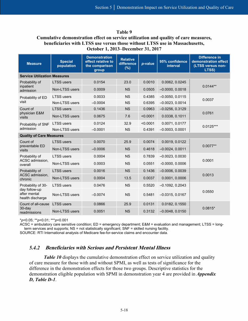
5-18
Section 5 │ Demonstration Impact on Service Utilization and Quality of Care
Table 9 Cumulative demonstration effect on service utilization and quality of care measures,
beneficiaries with LTSS use versus those without LTSS use in Massachusetts, October 1, 2013–December 31, 2017
Measure Special population
Demonstration effect relative to the comparison
group
Relative difference
(%) p-value 95% confidence
interval
Difference in demonstration effect (LTSS versus non-
LTSS) Service Utilization Measures Probability of inpatient admission
LTSS users 0.0154 23.0 0.0010 0.0062, 0.0245 0.0144**
Non-LTSS users 0.0009 NS 0.0505 –0.0000, 0.0018
Probability of ED visit
LTSS users 0.0033 NS 0.4385 –0.0050, 0.0115 0.0037
Non-LTSS users –0.0004 NS 0.6395 –0.0023, 0.0014 Count of physician E&M visits
LTSS users 0.1436 NS 0.0963 –0.0256, 0.3129 0.0761
Non-LTSS users 0.0675 7.6 <0.0001 0.0338, 0.1011
Probability of SNF admission
LTSS users 0.0124 32.9 <0.0001 0.0071, 0.0177 0.0125***
Non-LTSS users –0.0001 NS 0.4391 –0.0003, 0.0001 Quality of Care Measures Count of preventable ED visits
LTSS users 0.0070 25.9 0.0074 0.0019, 0.0122 0.0077**
Non-LTSS users –0.0006 NS 0.4618 –0.0024, 0.0011
Probability of ACSC admission, overall
LTSS users 0.0004 NS 0.7839 –0.0023, 0.0030 0.0001
Non-LTSS users 0.0003 NS 0.0551 -0.0000, 0.0006
Probability of ACSC admission, chronic
LTSS users 0.0016 NS 0.1436 –0.0006, 0.0039 0.0013
Non-LTSS users 0.0004 13.5 0.0037 0.0001, 0.0006
Probability of 30-day follow-up after mental health discharge
LTSS users 0.0476 NS 0.5520 –0.1092, 0.2043
0.0550 Non-LTSS users –0.0074 NS 0.5481 –0.0315, 0.0167
Count of all-cause 30-day readmissions
LTSS users 0.0866 25.9 0.0131 0.0182, 0.1550 0.0815*
Non-LTSS users 0.0051 NS 0.3132 –0.0048, 0.0150
*p<0.05; **p<0.01; ***p<0.001 ACSC = ambulatory care sensitive condition; ED = emergency department; E&M = evaluation and management; LTSS = long-
term services and supports; NS = not statistically significant; SNF = skilled nursing facility. SOURCE: RTI International analysis of Medicare fee-for-service claims and encounter data.
5.4.2 Beneficiaries with Serious and Persistent Mental Illness
Table 10 displays the cumulative demonstration effect on service utilization and quality of care measure for those with and without SPMI, as well as tests of significance for the difference in the demonstration effects for those two groups. Descriptive statistics for the demonstration eligible population with SPMI in demonstration year 4 are provided in Appendix D, Table D-1.
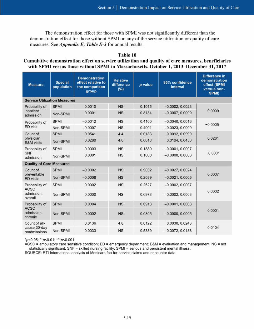
5-19
Section 5 │ Demonstration Impact on Service Utilization and Quality of Care
The demonstration effect for those with SPMI was not significantly different than the demonstration effect for those without SPMI on any of the service utilization or quality of care measures. See Appendix E, Table E-3 for annual results.
Table 10 Cumulative demonstration effect on service utilization and quality of care measures, beneficiaries
with SPMI versus those without SPMI in Massachusetts, October 1, 2013–December 31, 2017
Measure Special population
Demonstration effect relative to the comparison
group
Relative difference
(%) p-value 95% confidence
interval
Difference in demonstration
effect (SPMI versus non-
SPMI)
Service Utilization Measures Probability of inpatient admission
SPMI 0.0010 NS 0.1015 –0.0002, 0.0023 0.0009
Non-SPMI 0.0001 NS 0.8134 –0.0007, 0.0009
Probability of ED visit
SPMI –0.0012 NS 0.4100 –0.0040, 0.0016 −0.0005
Non-SPMI –0.0007 NS 0.4001 –0.0023, 0.0009 Count of physician E&M visits
SPMI 0.0541 4.4 0.0183 0.0092, 0.0990 0.0261
Non-SPMI 0.0280 4.0 0.0018 0.0104, 0.0456
Probability of SNF admission
SPMI 0.0003 NS 0.1889 –0.0001, 0.0007 0.0001
Non-SPMI 0.0001 NS 0.1000 –0.0000, 0.0003
Quality of Care Measures Count of preventable ED visits
SPMI –0.0002 NS 0.9032 –0.0027, 0.0024 0.0007
Non-SPMI –0.0008 NS 0.2039 –0.0021, 0.0005
Probability of ACSC admission, overall
SPMI 0.0002 NS 0.2627 –0.0002, 0.0007
0.0002 Non-SPMI 0.0000 NS 0.6978 –0.0002, 0.0003
Probability of ACSC admission, chronic
SPMI 0.0004 NS 0.0918 –0.0001, 0.0008
0.0001 Non-SPMI 0.0002 NS 0.0805 –0.0000, 0.0005
Count of all-cause 30-day readmissions
SPMI 0.0136 4.8 0.0122 0.0030, 0.0243 0.0104
Non-SPMI 0.0033 NS 0.5389 –0.0072, 0.0138
*p<0.05; **p<0.01; ***p<0.001 ACSC = ambulatory care sensitive condition; ED = emergency department; E&M = evaluation and management; NS = not
statistically significant; SNF = skilled nursing facility; SPMI = serious and persistent mental illness. SOURCE: RTI International analysis of Medicare fee-for-service claims and encounter data.

5-20
Section 5 │ Demonstration Impact on Service Utilization and Quality of Care
[This page intentionally left blank.]

SECTION 6 Demonstration Impact on Cost Savings

6-1
Section 6 │ Demonstration Impact on Cost Savings
RTI evaluated the impact of the Massachusetts demonstration on Medicare costs using a difference-in-differences (DinD) regression analysis of beneficiaries eligible for the demonstration, relative to the comparison group.
Our results show neither statistically significant losses nor savings to the Medicare program as a result of the demonstration in demonstration years 1 and 2, but indicate increased costs (statistically significant) in demonstration years 3 and 4. The cumulative result for all four demonstration years showed neither statistically significant savings nor increased costs.
6.1 Methods Overview
As part of the capitated financial alignment model, Massachusetts, CMS, and MMPs have entered into a three-way contract to provide services to Medicare-Medicaid enrollees (CMS, 2013). MMPs receive a blended, risk-adjusted prospective capitation payment to provide enrollees with Medicare Parts A, B, and D, and Medicaid services. CMS and Massachusetts developed the capitation payment that accounts for the services provided. CMS also adjusts the Medicare component for each enrollee using CMS’s hierarchical condition category (HCC) risk adjustment model to account for differences in characteristics of enrollees. The rate development process is described in greater detail in the Memorandum of Understanding and the three-way contract, and the Medicaid components and the risk-adjusted Medicare components of the rate are described in the Final Rate Reports (MassHealth and CMS). Compared to other States in the Financial Alignment Initiative, CMS applied lower expected savings percentages to capitation rates in Massachusetts, conceivably causing lower than expected demonstration savings. For demonstration years 2, 3, and the first 6 months of demonstration year 1, the applied savings percent was 0 percent; in the second half of demonstration year 1 and the entirety of demonstration year 4 the percentages were 1 percent and 0.25 percent respectively.
This section presents Medicare Parts A and B savings calculations for demonstration years 1 to 4 (calendar years 2013 to 2017). The results in this report differ from results in previous reports due to changes in methodology. One major difference is the inclusion of Medicare Advantage beneficiaries in this analysis where they were previously excluded. According to the three-way contract (CMS, 2013; 2019), Medicare Advantage enrollees were not eligible for passive enrollment into the demonstration, and their otherwise eligible months were previously excluded from both the comparison and demonstration groups in cost saving analyses presented in the First, Second, and Third Massachusetts Evaluation Report(s).48 However, at the request and approval of CMS, RTI made a key methodological change from previous reports by including the otherwise eligible Medicare Advantage population in both the demonstration and comparison groups. Other methodological changes are described and explained in Appendix F.
48 While Medicare Advantage beneficiaries were and still are eligible for the demonstration, those enrolled in Medicare Advantage in 2013 were not eligible for passive enrollment. However, they could participate on an opt-in basis.
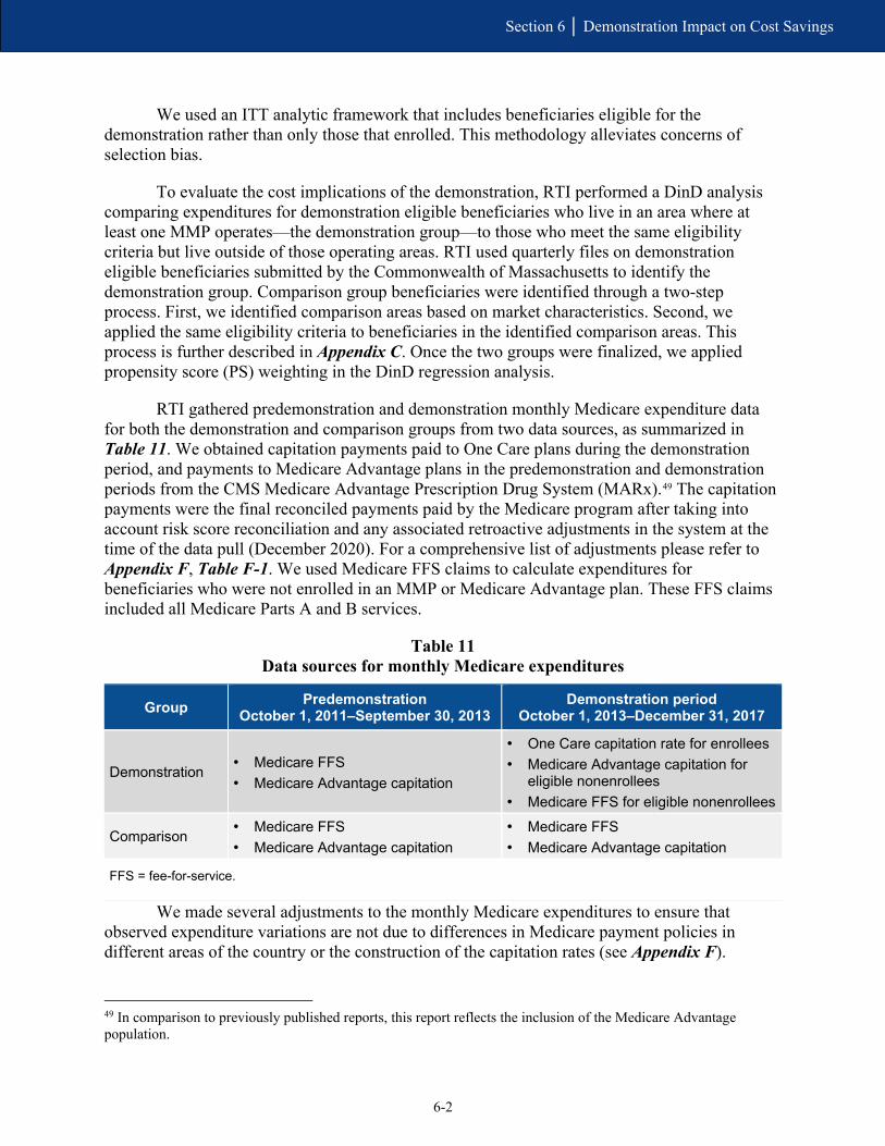
6-2
Section 6 │ Demonstration Impact on Cost Savings
We used an ITT analytic framework that includes beneficiaries eligible for the demonstration rather than only those that enrolled. This methodology alleviates concerns of selection bias.
To evaluate the cost implications of the demonstration, RTI performed a DinD analysis comparing expenditures for demonstration eligible beneficiaries who live in an area where at least one MMP operates—the demonstration group—to those who meet the same eligibility criteria but live outside of those operating areas. RTI used quarterly files on demonstration eligible beneficiaries submitted by the Commonwealth of Massachusetts to identify the demonstration group. Comparison group beneficiaries were identified through a two-step process. First, we identified comparison areas based on market characteristics. Second, we applied the same eligibility criteria to beneficiaries in the identified comparison areas. This process is further described in Appendix C. Once the two groups were finalized, we applied propensity score (PS) weighting in the DinD regression analysis.
RTI gathered predemonstration and demonstration monthly Medicare expenditure data for both the demonstration and comparison groups from two data sources, as summarized in Table 11. We obtained capitation payments paid to One Care plans during the demonstration period, and payments to Medicare Advantage plans in the predemonstration and demonstration periods from the CMS Medicare Advantage Prescription Drug System (MARx).49 The capitation payments were the final reconciled payments paid by the Medicare program after taking into account risk score reconciliation and any associated retroactive adjustments in the system at the time of the data pull (December 2020). For a comprehensive list of adjustments please refer to Appendix F, Table F-1. We used Medicare FFS claims to calculate expenditures for beneficiaries who were not enrolled in an MMP or Medicare Advantage plan. These FFS claims included all Medicare Parts A and B services.
Table 11 Data sources for monthly Medicare expenditures
Group Predemonstration October 1, 2011–September 30, 2013
Demonstration period October 1, 2013–December 31, 2017
Demonstration • Medicare FFS • Medicare Advantage capitation
• One Care capitation rate for enrollees • Medicare Advantage capitation for
eligible nonenrollees • Medicare FFS for eligible nonenrollees
Comparison • Medicare FFS • Medicare Advantage capitation
• Medicare FFS • Medicare Advantage capitation
FFS = fee-for-service.
We made several adjustments to the monthly Medicare expenditures to ensure that observed expenditure variations are not due to differences in Medicare payment policies in different areas of the country or the construction of the capitation rates (see Appendix F).
49 In comparison to previously published reports, this report reflects the inclusion of the Medicare Advantage population.
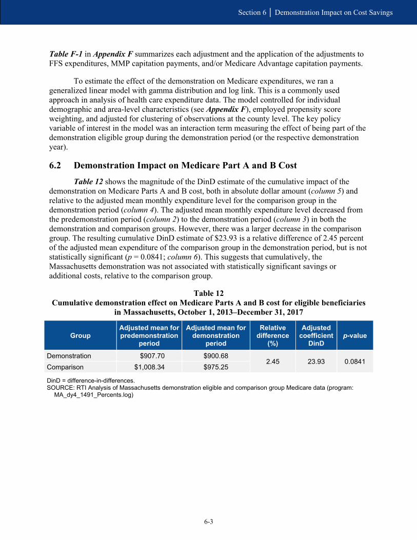
6-3
Section 6 │ Demonstration Impact on Cost Savings
Table F-1 in Appendix F summarizes each adjustment and the application of the adjustments to FFS expenditures, MMP capitation payments, and/or Medicare Advantage capitation payments.
To estimate the effect of the demonstration on Medicare expenditures, we ran a generalized linear model with gamma distribution and log link. This is a commonly used approach in analysis of health care expenditure data. The model controlled for individual demographic and area-level characteristics (see Appendix F), employed propensity score weighting, and adjusted for clustering of observations at the county level. The key policy variable of interest in the model was an interaction term measuring the effect of being part of the demonstration eligible group during the demonstration period (or the respective demonstration year).
6.2 Demonstration Impact on Medicare Part A and B Cost
Table 12 shows the magnitude of the DinD estimate of the cumulative impact of the demonstration on Medicare Parts A and B cost, both in absolute dollar amount (column 5) and relative to the adjusted mean monthly expenditure level for the comparison group in the demonstration period (column 4). The adjusted mean monthly expenditure level decreased from the predemonstration period (column 2) to the demonstration period (column 3) in both the demonstration and comparison groups. However, there was a larger decrease in the comparison group. The resulting cumulative DinD estimate of $23.93 is a relative difference of 2.45 percent of the adjusted mean expenditure of the comparison group in the demonstration period, but is not statistically significant (p = 0.0841; column 6). This suggests that cumulatively, the Massachusetts demonstration was not associated with statistically significant savings or additional costs, relative to the comparison group.
Table 12 Cumulative demonstration effect on Medicare Parts A and B cost for eligible beneficiaries
in Massachusetts, October 1, 2013–December 31, 2017
Group Adjusted mean for predemonstration
period
Adjusted mean for demonstration
period
Relative difference
(%)
Adjusted coefficient
DinD p-value
Demonstration $907.70 $900.68 2.45 23.93 0.0841
Comparison $1,008.34 $975.25
DinD = difference-in-differences. SOURCE: RTI Analysis of Massachusetts demonstration eligible and comparison group Medicare data (program:
MA_dy4_1491_Percents.log)

6-4
Section 6 │ Demonstration Impact on Cost Savings
Additionally, we estimated the effect of the demonstration in each demonstration year. As shown in Figure 21 by the vertical bars (95 percent confidence intervals) crossing the $0 line, the demonstration was not associated with statistically significant savings or increased costs in demonstration years 1 and 2. However, demonstration years 3 and 4 results were statistically significant, indicating the demonstration was associated with increased costs to the Medicare program during those years. Note that these estimates rely on the ITT analytic framework, only account for Medicare Parts A and B costs, and use the capitation rate for the One Care and Medicare Advantage plans rather than the actual amount paid by the plans for services provided.
Figure 21 Cumulative and annual demonstration effects on monthly Medicare Parts A and B cost for
eligible beneficiaries in Massachusetts, October 1, 2013–December 31
DinD = difference-in-differences; DY = demonstration year. NOTES: 95 percent confidence intervals are shown. The expected effect of the demonstration (Losses or
Savings) is in bold. SOURCE: RTI Analysis of Massachusetts demonstration eligible and comparison group Medicare data
(program: MA_dy4_cs1481_reg.log)

SECTION 7 Conclusions
7-1
Section 7 │ Conclusions
7.1 Implementation Successes, Challenges, and Lessons Learned
As One Care moved into its sixth year of operation, MassHealth officials, One Care MMPs, and other stakeholders continued to voice support for the overall model of the demonstration. In February 2019, MassHealth issued a reprocurement for One Care MMPs, hoping to attract more plans and to offer statewide coverage.50
One Care is still not available statewide, but its reach expanded in 2018 for the first time since implementation in 2013. Although the two MMPs’ enrollment and financial experiences have differed, both expressed an interest in continued growth. All involved in One Care have noted the learning curve associated with participating in a demonstration as innovative as One Care, particularly given its complex population. MMPs reported that they continued to refine processes and create new and innovative ways to improve care and measure outcomes.
MassHealth, the MMPs, and stakeholders continued to report anecdotal stories about One Care’s positive impact on beneficiary quality of life. Based on responses to the 2018 CAHPS survey, One Care MMPs met or exceeded the national benchmarks for MMPs and Medicare Advantage plans for beneficiaries’ overall satisfaction with their health plans. In 2018, MassHealth restructured the delivery of ombudsman services to expand the availability of these services to the broader Medicaid managed care population. MassHealth hoped this restructuring would improve its ability to address system-level policy issues by tracking trends across MassHealth populations.
The Implementation Council has achieved a level of sophistication that allowed it to provide comprehensive and actionable recommendations to MassHealth, CMS, and the MMPs. In addition to promoting accountability and transparency, the Implementation Council has provided unique perspectives on the needs of the One Care population with a focus on population health and the promotion of wellness and health equity. The council’s focus on BH, LTSS, women’s health, and a host of other areas has led to collaborative efforts across the council, MassHealth, the MMPs and others to address barriers to care, including those related to social determinants of health. The development of Duals Demonstration 2.0 is a key focal area for the council moving forward.
After the demonstration was developed and initially implemented, MassHealth’s efforts to oversee the demonstration stabilized. But because of the time and resources needed to develop the proposal for the Duals Demonstration 2.0 and the reprocurement for One Care MMPs, MassHealth officials reported in 2018 and early 2019 that staff resources were again stretched. We will continue to monitor these activities and will include additional information in future evaluation reports.
50 As of the fall of 2019, MassHealth and CMS agreed to extend One Care for another year, through December 31, 2020. MassHealth has also incorporated One Care’s goals of member-centered, coordinated, and culturally competent care into broader MassHealth reforms related to its 1115(a) demonstration waiver and, importantly, as part of its Duals Demonstration 2.0 proposal.

7-2
Section 7 │ Conclusions
7.2 Demonstration Impact on Service Utilization and Costs
In its first 4 years, One Care has had mixed results on service utilization and costs. Our analysis found that under One Care, annual NF use decreased, and the number of monthly physician visits increased, relative to the comparison group; this is a favorable finding. However, the probability of an inpatient admission and the probability of any SNF admission both increased under One Care, as did the number of 30-day readmissions and the probability of any ACSC admissions (chronic), relative to the comparison group; these are unfavorable results. One Care had no impact on all-cause ED visits, preventable ED visits, ACSC admissions (overall), or 30-day follow-up visit after a mental health discharge.
Stakeholders indicated that enhanced care coordination and integration of services were key to helping identify the LTSS and primary care needs of enrollees. Even so, barriers to communication across providers and plans were noted as ongoing challenges, which may help explain the slower decline in SNF and inpatient admissions relative to the comparison group. Additionally, MMPs waived the 3-day inpatient stay requirement for a post-acute care in a SNF, suggesting that acute care providers may be more inclined to discharge beneficiaries to a SNF for their post-acute needs rather than home health. Moreover, staffing challenges and barriers to integration may contribute to poorer communication and coordination post discharge and in the outpatient setting, leading to an increase in readmissions and chronic ACSC admissions.
The impact of One Care among those with LTSS was less favorable than the demonstration effect for those without LTSS. Among those with LTSS use there were increases in the probability of an inpatient admission or SNF admission, as well as the number of 30-day readmissions and preventable ED visits, relative to the demonstration effect for those without LTSS. Stakeholders saw integrative care planning as essential to understanding and meeting the LTSS needs of beneficiaries, and to perhaps identifying unmet acute needs in the LTSS population. That said, integration of services and coordination were identified as an implementation challenge and may have been especially true for those needing LTSS. Among beneficiaries with SPMI, there was no evidence that the demonstration had a differential impact, relative to beneficiaries without SPMI.
In general, these findings indicate that the One Care demonstration has been effective in reducing long-stay NF use and may have improved access to care for the overall population. However, there is no significant evidence that One Care has improved quality of care, relative to the comparison group, despite increases in primary care and community-based service use.
The FAI evaluation for all demonstration states employs an ITT framework to produce estimates that are robust to unobserved factors influencing enrollment in the demonstration and are generalizable to the demonstration eligible population within the state. However, there are limitations to this approach. The demonstration eligible population in our sample comprised of approximately 11.6 percent51 of One Care enrolled beneficiary months over demonstration years
51 There are approximately 16.7 percent of demonstration eligible beneficiaries who had any month of One Care enrollment in demonstration year 4. From demonstration years 1 to 4, 13.4 percent of beneficiaries had at least one month of One Care enrollment.

7-3
Section 7 │ Conclusions
1 to 4. Under the ITT framework used to evaluate the demonstration, it is possible these findings are influenced more by the service utilization experience of the eligible nonenrolled population.
The cumulative cost analysis did not find statistically significant savings or increased costs to the Medicare program over four demonstration years. The analysis of individual demonstration years also did not find statistically significant results in the first two demonstration years. However, increased cost (statistically significant) to the Medicare program were found for demonstration years 3 and 4. The cost analyses consider the costs of Medicare Parts A and B through fee-for-service expenditures, and capitation rates paid to MMP plans and Medicare Advantage plans. Capitation rates do not provide information on how much the plan paid for services and are based on characteristics of the beneficiary. Thus, capitation rates are not necessarily linked to actual service utilization. Further, the cost analyses do not consider Part D or Medicaid expenditures.
7.3 Next Steps
The RTI evaluation team will continue to collect information such as enrollment statistics and updates on key aspects of implementation on a quarterly basis from Massachusetts officials through the online SDRS. The RTI evaluation team will continue to conduct annual virtual site visit calls with the Commonwealth and demonstration stakeholders, and quarterly calls with the One Care Commonwealth and CMS staff. RTI will request the results of any evaluation activities conducted by CMS or its contractors, such as results from the CAHPS survey and State-specific demonstration measures the plans are required to report to CMS. We will also request from the Commonwealth any written reports or materials summarizing State-sponsored evaluations, if applicable. RTI will conduct additional qualitative and impact analyses over the course of the demonstration.
The next report will include a qualitative update on demonstration implementation and descriptive analyses of quality and utilization measures for those eligible for the demonstration and for an out-of-State comparison group. As noted previously, demonstration authority for One Care has been extended, most recently through December 31, 2021, which will provide further opportunities to evaluate the demonstration’s performance.

7-4
Section 7 │ Conclusions
[This page intentionally left blank.]
R-1
References
References
Centers for Medicare & Medicaid Services (CMS): Addendum to Contract for Capitated Model between Centers for Medicare & Medicaid Services in Partnership with The Commonwealth of Massachusetts and Commonwealth Care Alliance, Inc. and Tufts Health Public Plans, Inc. https://www.cms.gov/Medicare-Medicaid-Coordination/Medicare-and-Medicaid-Coordination/Medicare-Medicaid-Coordination-Office/FinancialAlignmentInitiative/Downloads/MAContractExtension.pdf. August 1, 2019. As obtained on October 15, 2019.
Centers for Medicare & Medicaid Services (CMS): Amended Three-Way Contract for Capitated Model between Centers for Medicare & Medicaid Services in Partnership with The Commonwealth of Massachusetts and Commonwealth Care Alliance, Inc., and Network Health, LLC. https://www.cms.gov/Medicare-Medicaid-Coordination/Medicare-and-Medicaid-Coordination/Medicare-Medicaid-Coordination-Office/FinancialAlignmentInitiative/Downloads/MAContract.pdf. March 1, 2019. As obtained on October 15, 2019.
Centers for Medicare & Medicaid Services (CMS): Addendum to Contract for Capitated Model between Centers for Medicare & Medicaid Services in Partnership with The Commonwealth of Massachusetts and Commonwealth Care Alliance, Inc. and Tufts Health Public Plans, Inc. https://www.mass.gov/files/documents/2018/06/15/fifth-one-care-contract-addendum.pdf. June 11, 2018. As obtained on October 15, 2019.
Centers for Medicare & Medicaid Services (CMS): Massachusetts One Care Demonstration: Summary of Changes to the Three-way Contract. Baltimore. CMS. https://www.cms.gov/Medicare-Medicaid-Coordination/Medicare-and-Medicaid-Coordination/Medicare-Medicaid-Coordination-Office/FinancialAlignmentInitiative/Downloads/MAContractSummaryOfChanges.pdf. As obtained on May 21, 2021.
Centers for Medicare & Medicaid Services (CMS): Medicare-Medicaid Capitated Financial Alignment Model Reporting Requirements. Effective October 1, 2017. Baltimore: CMS. https://www.cms.gov/Medicare-Medicaid-Coordination/Medicare-and-Medicaid-Coordination/Medicare-Medicaid-Coordination-Office/FinancialAlignmentInitiative/MMPInformationandGuidance/MMPReportingRequirements.html. As obtained on February 28, 2018.
Centers for Medicare & Medicaid Services (CMS) and the Commonwealth of Massachusetts: Three-Way Contract for Capitated Model: Contract Between United States Department of Health and Human Services Centers for Medicare & Medicaid Services In Partnership with The Commonwealth of Massachusetts and Commonwealth Care Alliance, Inc. Tufts Health Public Plans, Inc. https://www.mass.gov/doc/massachusetts-contract-for-one-care-plans-april-1-2019-0/download. April 1, 2019. As obtained on December 5, 2019.
R-2
References
Centers for Medicare & Medicaid Services (CMS) and the Commonwealth of Massachusetts: Memorandum of Understanding (MOU) Regarding a Federal-State Partnership to Test a Capitated Financial Alignment Model for Medicare-Medicaid Enrollees. Demonstration to Integrate Care for Dual Eligible Beneficiaries. https://www.cms.gov/Medicare-Medicaid-Coordination/Medicare-and-Medicaid-Coordination/Medicare-Medicaid-Coordination-Office/Downloads/MassMOU.pdf. Baltimore and Boston: CMS and the Commonwealth of Massachusetts, August 22, 2012. As obtained on December 5, 2019.
Centers for Medicare & Medicaid Services (CMS): Three-Way Contract for Capitated Model between Centers for Medicare & Medicaid Services in Partnership with The Commonwealth of Massachusetts and Commonwealth Care Alliance, Inc., Fallon Community Health Plan, Network Health, LLC. https://www.cms.gov/Medicare-Medicaid-Coordination/Medicare-and-Medicaid-Coordination/Medicare-Medicaid-Coordination-Office/Downloads/MassachusettsContract.pdf. July 11, 2013. As obtained on December 5, 2019.
Commonwealth of Massachusetts: Section 1115 Demonstration Project Extension Request (SFY 2015–SFY 2019). Boston: Commonwealth of Massachusetts, Executive Office of Health and Human Services, Office of Medicaid. https://www.mass.gov/doc/section-1115-demonstration-extension-request-submitted-to-cms-3/download. September 30, 2013. As obtained on December 5, 2019.
MassHealth: Massachusetts Medicare-Medicaid Integration Demonstration: Duals Demonstration 2.0. https://www.mass.gov/service-details/concept-paper. August 20, 2018. As obtained on September 15, 2019.
MassHealth: MassHealth Ombudsman for Members with Disabilities in Managed and Integrated Care Programs. https://www.mass.gov/files/documents/2017/11/03/170519-slides.pdf. May 19, 2017. As obtained on April 12, 2018.
MassHealth: MassHealth Presentation to the Implementation Council. https://www.mass.gov/files/documents/2018/06/15/20180614-dual-demo-2.0.pdf. June 14, 2018. As obtained on September 19, 2019.
MassHealth: One Care Monthly Enrollment Reports, January 2018-January 2019. https://www.mass.gov/service-details/one-care-enrollment-reports. As obtained on September 20, 2019.
MassHealth: The MassHealth Waiver: Amendment and Extension, 2017-2022. https://www.mass.gov/files/documents/2017/11/03/ma-1115-waiver-summary.pdf. As obtained on April 12, 2018.
MassHealth and the Centers for Medicare & Medicaid Services (CMS): Demonstration to Integrate care for Dual Eligible Individuals (One Care)—Tufts Health Public Plan CY 2018 Updated Final Rate Report. https://www.mass.gov/files/documents/2018/12/03/thpp-one-care-ry2018-rate-report.pdf. As obtained on August 20, 2019.

R-3
References
MassHealth and the Centers for Medicare & Medicaid Services (CMS): Demonstration to Integrate care for Dual Eligible Individuals (One Care)–Commonwealth Care Alliance Health Public Plan CY 2018 Updated Final Rate Report. https://www.mass.gov/files/documents/2018/12/03/cca-one-care-ry2018-rate-report.pdf. November 20, 2018. As obtained on August 20, 2019.
My Ombudsman: Presentation to the Implementation Council. https://www.mass.gov/doc/my-ombudsman-presentation-11-13-18/download. November 13, 2018. As obtained on December 5, 2019.
My Ombudsman: Presentation for the One Care Implementation Council. https://www.mass.gov/doc/my-ombudsman-presentation-implementation-council-meeting-04-9-19-0/download. April 9, 2019. As obtained on December 5, 2019.
Office of the Assistant Secretary for Planning and Evaluation (ASPE): Department of Health and Human Services: Report to Congress: Social Risk Factors and Performance Under Medicare’s Value-Based Purchasing Programs. https://aspe.hhs.gov/system/files/pdf/253971/ASPESESRTCfull.pdf. 2016. As obtained on December 5, 2019.
RTI International: State Data Reporting System (SDRS). 2018–2019.

R-4
References
[This page intentionally left blank.]

Appendix A Data Sources

A-1
Appendix A │ Data Sources
We used the following data sources to prepare this report.
Key informant interviews. The RTI evaluation team conducted virtual site visits in Massachusetts in January-February 2019. The team interviewed the following individuals: Commonwealth officials from MassHealth (Massachusetts’ Medicaid program) responsible for policy development, operations, contract management and quality oversight of One Care; officials from CMS’s regional and central offices; One Care Medicare-Medicaid plan (MMP) representatives; representatives from community-based organizations, including the Independent Living Centers, Recovery Learning Communities, and Aging Services Access Points; stakeholders from the Implementation Council; and representatives providing ombudsman services. To monitor demonstration progress, the RTI evaluation team also engages in periodic phone conversations with MassHealth and CMS officials. These might include discussions about new policy clarifications designed to improve plan performance, quality improvement work group activities, and contract management team actions.
Demonstration data. The RTI evaluation team reviewed data provided quarterly by Massachusetts through the State Data Reporting System. These reports include eligibility, enrollment, opt-out, and disenrollment data, and information reported by Massachusetts on its integrated delivery system, care coordination, benefits and services, quality management, stakeholder engagement, financing and payment, and a summary of successes and challenges. We also report data for quality measures reported by One Care plans and submitted to CMS’s implementation contractor, NORC.52,53 Data reported to NORC include core quality measures that all MMPs are required to report as well as State-specific measures that One Care plans are required to report. Due to reporting inconsistencies, plans occasionally resubmit data for prior demonstration years; therefore, some of the data included in this report are considered preliminary.
Demonstration policies, contracts, and other materials. The RTI evaluation team reviewed a wide range of demonstration documents, including demonstration and State-specific information on the CMS website54 and other publicly available materials on the Massachusetts One Care website55 and the Massachusetts Executive Office of Health and Human Services (EOHHS).56 The RTI evaluation team routinely reviewed available minutes and presentations from Implementation Council meetings.57
Surveys. Medicare requires all Medicare Advantage (MA) plans, including One Care plans, to conduct an annual assessment of beneficiary experiences using the Medicare Advantage and Prescription Drug Plan Consumer Assessment of Healthcare Providers and Systems
52 Data are reported for January 2014 through December 2018. 53 The technical specifications for reporting requirements are in the Medicare-Medicaid Capitated Financial Alignment Model Core Reporting Requirements document, which is available at: https://www.cms.gov/Medicare-Medicaid-Coordination/Medicare-and-Medicaid-Coordination/Medicare-Medicaid-Coordination-Office/FinancialAlignmentInitiative/MMPInformationandGuidance/InformationandGuidanceforPlans.html 54 https://www.cms.gov/Medicare-Medicaid-Coordination/Medicare-and-Medicaid-Coordination/Medicare-Medicaid-Coordination-Office/FinancialAlignmentInitiative/FinancialModelstoSupportStatesEffortsinCareCoordination.html 55 https://www.mass.gov/one-care 56 https://www.mass.gov/eohhs/ 57 https://www.mass.gov/service-details/one-care-implementation-council-0

A-2
Appendix A │ Data Sources
(CAHPS) survey instrument. In addition, MassHealth added 10 supplemental questions to the CAHPS survey. This report includes survey results for a subset of the 2015–2018 survey questions. Findings are available at the MMP level. Some CAHPS items are case mix-adjusted. Case mix refers to the respondent’s health status and sociodemographic characteristics, such as age or educational level, that may affect the ratings that the respondent provides. Without an adjustment, differences between entities could be due to case mix differences rather than true differences in quality. Comparisons with findings from all Medicare Advantage plans are available for core CAHPS survey questions.
Complaints and appeals data. Complaint (also referred to as grievance) data are from three separate sources: (1) complaints from beneficiaries reported by One Care plans to MassHealth, and separately to CMS’s implementation contractor, NORC,58 through Core Measure 4.2; (2) complaints received by MassHealth or 1-800-Medicare and entered into the CMS electronic Complaint Tracking Module; and (3) qualitative data obtained by RTI on complaints. Appeals data are generated by MMPs and reported to MassHealth and NORC, for Core Measure 4.2, and the Medicare Independent Review Entity. This report also includes critical incidents and abuse data reported by One Care MMPs to MassHealth and CMS’s implementation contractor, NORC.
HEDIS measures. We report on a subset of Medicare Healthcare Effectiveness Data and Information Set (HEDIS) measures, a standard measurement set used extensively by managed care plans, that are required of all Medicare Advantage plans.
Service utilization data. Evaluation Report analyses used data from many sources. First, the Commonwealth provided quarterly finder files containing identifying information on all demonstration eligible beneficiaries in the demonstration period. Second, RTI obtained administrative data on beneficiary demographic, enrollment, and service use characteristics from CMS data systems for both demonstration and comparison group members. Third, these administrative data were merged with Medicare claims and encounter data as well as the Minimum Data Set.
CMS administrative data identifying eligible beneficiaries who used Medicaid-reimbursed LTSS were available, and we presented their Medicare service use data in this report. Our report also includes analyses of MMP encounter data on Medicaid-type services such as personal care and nonemergency transportation.
Cost savings data. Two primary data sources were used to support the savings analyses: capitation payments and Medicare claims.
• Medicare capitation payments paid to One Care plans during the demonstration period were obtained for all demonstration enrollees from CMS Medicare Advantage Prescription Drug System (MARx) data. The capitation payments were the final reconciled payments paid by the Medicare program after taking into account risk
58 The technical specifications for reporting requirements are in the Medicare-Medicaid Capitated Financial Alignment Model Core Reporting Requirements document, which is available at: https://www.cms.gov/Medicare-Medicaid-Coordination/Medicare-and-Medicaid-Coordination/Medicare-Medicaid-Coordination-Office/FinancialAlignmentInitiative/MMPInformationandGuidance/InformationandGuidanceforPlans.
A-3
Appendix A │ Data Sources
score reconciliation and any associated retroactive adjustments in the system at the time of the data pull (February 2020). Quality withholds were applied to the capitation payments (quality withholds are not reflected in the MARx data) and quality withhold repayments, risk corridor payments for demonstration years 1 through 3 but not demonstration year 4, and recoupments based on data provided by CMS were also applied for demonstration years 1 through 3 but not demonstration year 4. For a complete list of adjustments applied please refer to Table F-1 in Appendix F.
• Medicare claims were used to calculate expenditures for all comparison group beneficiaries, demonstration beneficiaries in the predemonstration period, and demonstration eligible beneficiaries who were not enrolled during the demonstration period. Fee-for-service claims included all Medicare Parts A and B services.

A-4
Appendix A │ Data Sources
[This page intentionally left blank.]

Appendix B One Care MMP Performance on Select HEDIS Quality Measures, 2015–2018

B-1
Appendix B │ One Care MMP Performance on Select HEDIS Quality Measures, 2015–2018
Table B-1 provides 2015 through 2018 HEDIS performance data for MMPs. This table illustrates where MMP performance across demonstration years was steadily improving or worsening, and if these trends were favorable or unfavorable. Using correlation coefficients that were 0.9 and above, or −0.9 and below, we apply green and red shading to indicate where MMP performance over time for a given measure was steadily improving or worsening; green indicates a favorable trend, where red indicates an unfavorable one. No testing for statistical significance for differences across years is performed because of the limited data available. For measures without green or red shading, year-over-year MMP performance remained relatively stable between 2015 and 2018.
CCA improved over time on measures for colorectal cancer screening, effective acute phase treatment for antidepressant medication management, advance care planning and functional status assessments (both within care for older adults submeasures), controlling HbA1c levels, retinal eye exams, and blood pressure control (all within comprehensive diabetes care submeasures), and emergency department visits (per 1,000 members).
Tufts improved over time on measures for blood pressure control (standalone), HbA1c testing (within comprehensive diabetes control submeasures), and emergency department visits (per 1,000 members). Tufts worsened performance over time on breast cancer screening.
We include submeasures of care for older adults, despite the fact that few One Care enrollees are age 65 and older, and that CCA’s wide performance variation over the years may not be reliable. In years prior to 2018, Tufts did not meet the sample size criteria for any of the four care for older adults submeasures.

Appendix B
│ One C
are MM
P Performance on Select H
EDIS Q
uality Measures, 2015–2018
B-2
Table B-1 One Care MMP Performance on Select HEDIS Quality Measures
for 2015–2018 by MMP
Measure
National Medicare Advantage Plan
Mean CCA Tufts
(2018) (2015) (2016) (2017) (2018) (2015) (2016) (2017) (2018) Adults’ access to preventive/ ambulatory health services 95.0 77.9 97.3 97.3 97.8 92.2 95.8 94.5 95.6
Adult BMI assessment 96.0 97.5 87.8 94.4 95.3 96.0 93.3 98.3 95.0 Blood pressure control1 69.5 61.1 64.3 69.7 72.0 64.1 G 67.4 G 68.3 G 74.2 G Breast cancer screening 72.7 83.1 75.5 75.9 73.6 N/A 71.6 R 66.9 R 66.0 R Colorectal cancer screening 70.5 46.2 G 50.9 G 70.3 G 71.3 G 57.5 57.3 55.3 58.7 Disease modifying anti-rheumatic drug therapy in rheumatoid arthritis
77.8 84.3 84.4 87.8 83.4 N/A N/A N/A 63.2
Follow-up after hospitalization for mental illness (30 days)2 47.9 72.1 78.7 80.6 72.1 76.6 79.5 78.3 78.3
Antidepressant medication management Effective acute phase treatment3 72.1 56.6 G 57.9 G 60.9 G 63.4 G 83.1 75.5 79.3 85.4
Effective continuation phase treatment4 56.1 45.3 44.5 46.1 51.4 74.7 65.5 75.0 78.0
Care for older adults Advance care planning N/A 17.4 G 42.2 G 51.1 G 69.1 G N/A N/A N/A 20.5 Medication review N/A 65.2 89.3 81.9 89.0 N/A N/A N/A 18.0 Functional status assessment N/A 78.3 71.9 77.5 86.5 N/A N/A N/A 18.0 Pain assessment N/A 80.4 G 83.5 G 85.5 G 90.8 G N/A N/A N/A 18.0 Comprehensive diabetes care Received Hemoglobin A1c (HbA1c) testing 94.3 93.2 91.5 93.2 92.0 88.8 G 92.0 G 92.9 G 94.1 G
Poor control of HbA1c level (>9.0%) (higher is worse) 23.1 58.2 G 45.5 G 45.5 G 40.9 G 29.7 33.1 27.0 27.6
(continued)

Appendix B
│ One C
are MM
P Performance on Select H
EDIS Q
uality Measures, 2015–2018
B-3
Table B-1 (continued) One Care Demonstration Plan Performance on Select HEDIS Quality Measures
for 2015–2018 by MMP
Measure
National Medicare Advantage Plan
Mean Commonwealth Care Alliance Tufts
(2018) (2015) (2016) (2017) (2018) (2015) (2016) (2017) (2018) Comprehensive diabetes care (continued) Good control of HbA1c level (<8.0%)
65.6 35.0 G 45.5 G 46.0 G 48.9 G 62.0 59.9 62.0 61.1
Received eye exam (retinal) 73.7 66.2 G 67.4 G 69.6 G 72.0 G 63.1 68.6 79.3 75.3 Received medical attention for nephropathy 95.5 93.7 93.9 93.9 92.7 93.7 93.2 92.7 94.3
Blood pressure control (<140/90 mm Hg) 69.1 60.8 G 67.6 G 72.0 G 75.9 G 69.7 67.4 70.3 74.7
Initiation and engagement of alcohol and other drug (AOD) dependence treatment Initiation of AOD treatment5 33.6 43.3 43.1 45.8 41.6 40.0 47.9 45.4 42.6 Engagement of AOD treatment6 4.5 11.3 12.7 15.4 12.0 13.2 15.6 17.0 14.5
Plan all-cause readmissions (Observed-to-expected ratio mean7) Ages 18–64 0.75 1.00 0.93 0.85 0.88 1.08 1.08 0.86 0.90 Ages 65+ 0.71 0.80 0.69 0.76 N/A N/A N/A N/A N/A Ambulatory care (per 1,000 members) Outpatient visits 9,606.0 12,192.0 12,219.7 12,219.7 11,223.3 9,581.0 9,389.3 9,170.9 9,668.2 Emergency department visits (higher is worse) 600.8 1,418.6 G 1,299.3 G 1,299.3 G 1,257.9 G 1,446.3 G 1,308.9 G 1,163.2 G 1,086.2 G
BMI = body mass index; CCA = Commonwealth Care Alliance; HEDIS = Health Effectiveness Information and Data Set; MA = Medicare Advantage; MMP = Medicare-Medicaid Plan; N/A = not applicable, where MA plans do not report such data or not applicable, where the number of enrollees in the MMP’s provided HEDIS data available for inclusion in the measure was less than 30, and therefore not reported per RTI’s decision rule for addressing low sample size.
1 The following criteria were used to determine adequate blood pressure control: less than 140/90 mm Hg for members 18–59 years of age; diagnosis of diabetes and <140/90 mm Hg for members 60–85 years of age; no diagnosis of diabetes and <150/90 mm Hg for members 60–85 years of age.
2 NCQA implemented a significant specification change with HEDIS 2018 (CY 2017), disallowing same-day follow-up visits. National benchmarks fell from HEDIS 2018 to HEDIS 2019 (CY 2017 to CY 2018)
3 Represents the percentage of members who remained on an antidepressant medication for at least 84 days (12 weeks). (continued)
Appendix B
│ One C
are MM
P Performance on Select H
EDIS Q
uality Measures, 2015–2018
B-4
Table B-1 (continued) One Care MMP Performance on Select HEDIS Quality Measures
for 2015–2018 by MMP 4 Represents the percentage of members who remained on an antidepressant medication for at least 180 days (6 months). 5 Represents percentage of members who initiate treatment through an inpatient AOD admission, outpatient visit, intensive outpatient encounter or partial
hospitalization within 14 days of the diagnosis. 6 Represents the percentage of members who initiated treatment and who had two or more additional services with a diagnosis of AOD within 30 days of the
initiation visit. 7 Plan all-cause readmissions are reported as an observed-to-expected ratio mean. A value below 1.0 is favorable and indicates that plans had fewer readmissions
than expected for their populations based on case mix. Values of N/A appearing for Plan all-cause readmissions in MA ER3 have been updated in the current report to provide the actual result.
NOTES: Green and red color-coded shading indicates where performance over time for a given measure was steadily improving or worsening; green indicates a favorable trend, where red indicates an unfavorable one. To ensure accessibility for text readers and individuals with sight disabilities, cells shaded green or red receive, respectively, a superscript “G” or “R”. Detailed descriptions of HEDIS measures presented can be found in the RTI Aggregate Evaluation Plan.
SOURCE: RTI analysis of 2015 through 2018 HEDIS measures.

Appendix C Comparison Group Methodology for Massachusetts Demonstration Year 4

C-1
Appendix C │ Comparison Group Methodology for Massachusetts Demonstration Year 4
This appendix presents the comparison group selection and assessment results for the FAI demonstration in the state of Massachusetts.
Results for comparison group selection and assessment analyses are prepared for each demonstration year. The Third Evaluation Report for the third demonstration year, the prior two demonstration years, and two prior baseline years for the Massachusetts demonstration was publicly released in May 2019. The Technical Appendix at the end of that document describes the comparison group identification methodology in detail.
This report provides the comparison group results for the fourth performance year for the One Care demonstration in Massachusetts (January 1, 2017–December 31, 2017), and notes any major changes in the results since the previous evaluation report.
C.1 Demonstration and Comparison Group Characteristics
The Massachusetts demonstration area consists of three large urban Metropolitan Statistical Areas (MSAs) (Boston-Cambridge-Newton; Worcester; and Springfield) plus one Rest-of-State area containing rural areas. The comparison area is composed of 116 counties in 24 Metropolitan Statistical Areas. These geographic areas have not changed since the Massachusetts First Annual Report. All targeted beneficiaries in the two groups are younger than 65 years of age.
Beneficiaries who are ineligible for the demonstration include those older than 64 at the time of enrollment, have Medicare as a secondary payor, not enrolled in Medicare Part A and Part B, reside in an intermediate care facility, enrolled in PACE, receiving a retiree drug subsidy, or enrolled in an employer group waiver plan. We assess these exclusion criteria on a quarterly basis for the demonstration and comparison group in the predemonstration period and for the comparison group in the demonstration period. We use finder files provided by the State to identify the eligible population for the demonstration group during the demonstration period. We apply these exclusion criteria to the state finder file in the demonstration period to ensure comparability with the comparison group and the demonstration group during the predemonstration period.
Further analytic exclusions were performed such as: (1) removing beneficiaries with missing geographic information, (2) removing beneficiaries with zero months of eligibility during each analytic period, (3) removing beneficiaries who moved between the demonstration area and the comparison area any time during the entire study period, and (4) removing beneficiaries who died before the beginning of each analytic period. After applying these exclusions, the number of demonstration group beneficiaries has remained steady over the two predemonstration years and the four demonstration years, ranging between 107,670 and 120,870 per year. In the comparison group, which is almost twice the size of the demonstration group, the number of beneficiaries has also been relatively stable (from 205,470 to 262,252 per year).
Additionally, cost savings analysis excludes monthly observations where the beneficiary was enrolled in private Medicare cost or employer-based Medicare contracts. The final analytic sample after propensity weight calculation and additional cost savings exclusions are reported in Table C-1.

C-2
Appendix C │ Comparison Group Methodology for Massachusetts Demonstration Year 4
Medicare Advantage enrollees are eligible and may opt-in to the Massachusetts demonstration. This report includes the Medicare Advantage population in the cost savings analysis, described in Appendix F. However, due to RTI concerns on the completeness and accuracy of Medicare Advantage encounter data for this evaluation for years prior to 2016, and at the request and approval of CMS, RTI excluded demonstration eligible beneficiaries with any Medicare Advantage enrollment from the service utilization analysis, described in Appendix E. The population analyzed for the service utilization outcomes includes only demonstration eligible full-benefit Medicare and Medicaid beneficiaries enrolled in Medicare Fee-for-Service (FFS) or in MMPs. Table C-1 displays the number and percentage of beneficiaries who were in Medicare Advantage enrollment during the study period and included in the cost savings analysis, but excluded from the service utilization analysis. The prevalence of beneficiaries enrolled in Medicare Advantage per year ranges from 1.6 to 5.9 percent in the demonstration group, and 18.4 to 22.6 percent in the comparison group during the predemonstration and demonstration periods.
Table C-1 Number and percentage of beneficiaries in the demonstration and comparison groups who
were enrolled in Medicare Advantage at any point during each period
Group Predemonstration year 1
Predemonstration year 2 DY 1 DY 2 DY 3 DY 4
Demonstration Final count of beneficiaries 108,830 119,100 107,621 114,413 120,647 116,102
Count of beneficiaries with Medicare Advantage 1,741 3,116 2,713 5,088 7,140 2,482
Percent of beneficiaries with Medicare Advantage (denominator is final count of beneficiaries per period)
1.6 2.6 2.5 4.5 5.9 2.1
Comparison Final count of beneficiaries 204,271 221,105 231,870 244,014 259,230 227,581
Count of beneficiaries with Medicare Advantage 38,939 40,709 44,127 48,798 56,491 51,502
Percent of beneficiaries with Medicare Advantage (denominator is final count of beneficiaries per period)
19.1 18.4 19.0 20.0 21.8 22.6
DY = demonstration year.
Using the distance score methodology described in the Technical Appendix, the comparison area is composed of 116 counties in 24 Metropolitan Statistical Areas. These geographic areas have not changed since the Massachusetts First Annual Report.
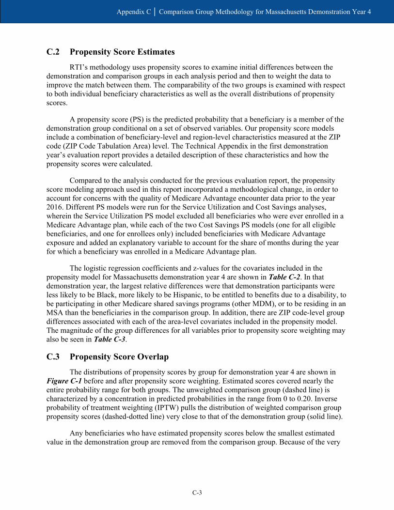
C-3
Appendix C │ Comparison Group Methodology for Massachusetts Demonstration Year 4
C.2 Propensity Score Estimates
RTI’s methodology uses propensity scores to examine initial differences between the demonstration and comparison groups in each analysis period and then to weight the data to improve the match between them. The comparability of the two groups is examined with respect to both individual beneficiary characteristics as well as the overall distributions of propensity scores.
A propensity score (PS) is the predicted probability that a beneficiary is a member of the demonstration group conditional on a set of observed variables. Our propensity score models include a combination of beneficiary-level and region-level characteristics measured at the ZIP code (ZIP Code Tabulation Area) level. The Technical Appendix in the first demonstration year’s evaluation report provides a detailed description of these characteristics and how the propensity scores were calculated.
Compared to the analysis conducted for the previous evaluation report, the propensity score modeling approach used in this report incorporated a methodological change, in order to account for concerns with the quality of Medicare Advantage encounter data prior to the year 2016. Different PS models were run for the Service Utilization and Cost Savings analyses, wherein the Service Utilization PS model excluded all beneficiaries who were ever enrolled in a Medicare Advantage plan, while each of the two Cost Savings PS models (one for all eligible beneficiaries, and one for enrollees only) included beneficiaries with Medicare Advantage exposure and added an explanatory variable to account for the share of months during the year for which a beneficiary was enrolled in a Medicare Advantage plan.
The logistic regression coefficients and z-values for the covariates included in the propensity model for Massachusetts demonstration year 4 are shown in Table C-2. In that demonstration year, the largest relative differences were that demonstration participants were less likely to be Black, more likely to be Hispanic, to be entitled to benefits due to a disability, to be participating in other Medicare shared savings programs (other MDM), or to be residing in an MSA than the beneficiaries in the comparison group. In addition, there are ZIP code-level group differences associated with each of the area-level covariates included in the propensity model. The magnitude of the group differences for all variables prior to propensity score weighting may also be seen in Table C-3.
C.3 Propensity Score Overlap
The distributions of propensity scores by group for demonstration year 4 are shown in Figure C-1 before and after propensity score weighting. Estimated scores covered nearly the entire probability range for both groups. The unweighted comparison group (dashed line) is characterized by a concentration in predicted probabilities in the range from 0 to 0.20. Inverse probability of treatment weighting (IPTW) pulls the distribution of weighted comparison group propensity scores (dashed-dotted line) very close to that of the demonstration group (solid line).
Any beneficiaries who have estimated propensity scores below the smallest estimated value in the demonstration group are removed from the comparison group. Because of the very

C-4
Appendix C │ Comparison Group Methodology for Massachusetts Demonstration Year 4
broad range of propensity scores found in the Massachusetts demonstration data, 1,910 beneficiaries were removed from the comparison group in demonstration year 4.
Table C-2 Logistic regression estimates for Massachusetts propensity score models
in demonstration year 4
Characteristic Demonstration year 4
Coef. Standard error z-score
Age (years) 0.018 0.000 45.37 Died during year −0.371 0.031 −11.92 Female (0/1) −0.203 0.009 −23.27 Black (0/1) −1.376 0.012 −112.96 Hispanic (0/1) 0.946 0.019 50.86 Disability as original reason for entitlement (0/1) 0.803 0.025 32.31 ESRD (0/1) −0.407 0.031 −13.25 Share mos. elig. during year (prop.) 0.061 0.016 3.81 Share mos. Medicare Advantage plan enrolled during year (prop.)
−2.925 0.027 −107.26
HCC risk score −0.064 0.006 −10.51 Other MDM 0.511 0.009 57.53 MSA (0/1) −0.216 0.026 −8.21 % of pop. living in married household −0.017 0.001 −33.88 % of households w/member >= 60 yrs. −0.004 0.001 −5.83 % of households w/member < 18 yrs. 0.035 0.001 55.21 % of adults under 65 with college education 0.029 0.000 73.58 % of adults under 65 with self-care limitation −0.008 0.002 −3.24 % of adults under 65 who are unemployed −0.053 0.002 −34.85 Distance to nearest hospital (mi.) −0.038 0.002 −24.94 Distance to nearest nursing facility (mi.) −0.186 0.003 −59.28 Intercept −1.186 0.062 −19.00
ESRD = end-stage renal disease; HCC = Hierarchical Condition Category; MDM = Master Data Management; MSA = metropolitan statistical area.

C-5
Appendix C │ Comparison Group Methodology for Massachusetts Demonstration Year 4
Figure C-1 Distribution of beneficiary-level propensity scores in the Massachusetts demonstration and
comparison groups, weighted and unweighted, January 1, 2017–December 31, 2017
C.4 Group Comparability
Covariate balance refers to the extent to which the characteristics used in the propensity score are similar (or “balanced”) for the demonstration and comparison groups. Group differences are measured by a standardized difference (the difference in group means divided by the pooled standard deviation of the covariate). An informal standard has developed that groups are considered comparable if the standardized covariate difference is less than 0.10 standard deviations.
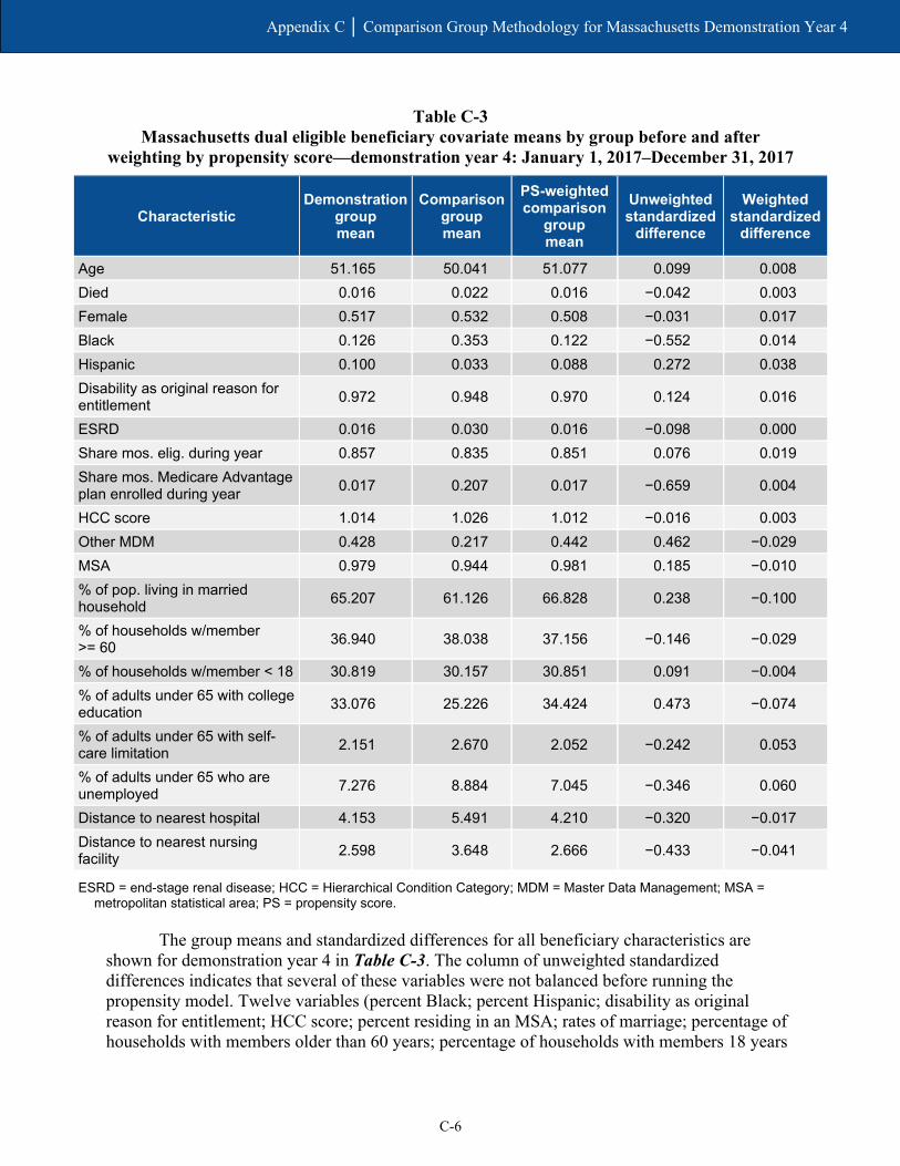
C-6
Appendix C │ Comparison Group Methodology for Massachusetts Demonstration Year 4
Table C-3 Massachusetts dual eligible beneficiary covariate means by group before and after
weighting by propensity score—demonstration year 4: January 1, 2017–December 31, 2017
Characteristic Demonstration
group mean
Comparison group mean
PS-weighted comparison
group mean
Unweighted standardized
difference
Weighted standardized
difference
Age 51.165 50.041 51.077 0.099 0.008 Died 0.016 0.022 0.016 −0.042 0.003 Female 0.517 0.532 0.508 −0.031 0.017 Black 0.126 0.353 0.122 −0.552 0.014 Hispanic 0.100 0.033 0.088 0.272 0.038 Disability as original reason for entitlement 0.972 0.948 0.970 0.124 0.016
ESRD 0.016 0.030 0.016 −0.098 0.000 Share mos. elig. during year 0.857 0.835 0.851 0.076 0.019 Share mos. Medicare Advantage plan enrolled during year 0.017 0.207 0.017 −0.659 0.004
HCC score 1.014 1.026 1.012 −0.016 0.003 Other MDM 0.428 0.217 0.442 0.462 −0.029 MSA 0.979 0.944 0.981 0.185 −0.010 % of pop. living in married household 65.207 61.126 66.828 0.238 −0.100
% of households w/member >= 60 36.940 38.038 37.156 −0.146 −0.029
% of households w/member < 18 30.819 30.157 30.851 0.091 −0.004 % of adults under 65 with college education 33.076 25.226 34.424 0.473 −0.074
% of adults under 65 with self-care limitation 2.151 2.670 2.052 −0.242 0.053
% of adults under 65 who are unemployed 7.276 8.884 7.045 −0.346 0.060
Distance to nearest hospital 4.153 5.491 4.210 −0.320 −0.017 Distance to nearest nursing facility 2.598 3.648 2.666 −0.433 −0.041
ESRD = end-stage renal disease; HCC = Hierarchical Condition Category; MDM = Master Data Management; MSA = metropolitan statistical area; PS = propensity score.
The group means and standardized differences for all beneficiary characteristics are shown for demonstration year 4 in Table C-3. The column of unweighted standardized differences indicates that several of these variables were not balanced before running the propensity model. Twelve variables (percent Black; percent Hispanic; disability as original reason for entitlement; HCC score; percent residing in an MSA; rates of marriage; percentage of households with members older than 60 years; percentage of households with members 18 years

C-7
Appendix C │ Comparison Group Methodology for Massachusetts Demonstration Year 4
or younger; rates of self-care limitations and unemployment among those younger than 65; distance to the nearest hospital; and distance to the nearest nursing facility) all had unweighted standardized differences exceeding 0.10 in absolute value.
The results of propensity score weighting for Massachusetts demonstration year 4 are illustrated in the far-right column (weighted standardized differences) of Table C-3. Propensity weighting reduced the standardized differences to meet the threshold level of 0.10 in absolute value for all covariates in our model.
There are compositional differences in the comparison group relative to the demonstration group during base years 1 and 2. These groups are unbalanced on several key characteristics. Specifically:
• Percent with ESRD status
• Share of months eligible
• Share of non-MMP MA months
• Percent participating in another shared savings program
• Percent residing in an MSA and several area-level characteristics.
This suggests that, prior to weighting, there are some idiosyncratic differences in the composition of beneficiaries in the comparison group, relative to the demonstration group, between base years 1 and 2. Weighting helps to balance the sample by minimizing those differences.
C.5 Enrollee Results
In addition, we performed PS analysis for demonstration enrollees (approximately 21 percent of the eligible demonstration population). We define the enrollee group, along with its comparison group, as follows: (1) The demonstration enrollees are those with at least three months of enrollment during the 4-year demonstration period as well as three months of eligibility during the 2-year baseline period, and (2) The corresponding comparison group beneficiaries are those with at least three months of eligibility in both the 4-year demonstration period and the 2-year baseline period.
Similar to the analysis of all eligible beneficiaries, the unweighted values of several covariates differed substantially between the demonstration and comparison group for enrollees in demonstration year 4. After propensity score weighting, the standardized differences were reduced to less than 0.10 in absolute value for all covariates.
C.6 Weights for Service Utilization Analyses
A third set of weights was produced specifically for the analyses of service utilization with two adaptations to the methodology used to produce weights for all eligible beneficiaries. The first is the explicit exclusion of beneficiaries who were ever enrolled in a Medicare Advantage plan. Due to RTI concerns on the completeness and accuracy of Medicare Advantage

C-8
Appendix C │ Comparison Group Methodology for Massachusetts Demonstration Year 4
encounter data for this evaluation for years prior to 2016, and at the request and approval of CMS, RTI made a key methodological change from previous reports by excluding all beneficiaries with any Medicare Advantage plan exposure from the service utilization analysis. The second difference is the exclusion of beneficiaries ever enrolled in a Medicare-Medicaid Plan (MMP) for which there is not complete or valid encounter data.
These exclusions reduced the number of beneficiaries by roughly 20,000 in the demonstration group and by roughly 80,000 in the comparison group. The resulting demonstration group sample ranged between 85,622 and 99,050 beneficiaries each year; the comparison group sample ranged between 131,865 and 170,360 beneficiaries each year.
Despite the difference in sample sizes, the propensity score weighting analysis had similar results to that for all eligible beneficiaries. While the unweighted values of several covariates differed substantially between the demonstration and comparison group in each baseline and demonstration year, the standardized differences of those covariates were reduced to less than 0.10 in absolute value after propensity score weighting.
C.7 Summary
The Massachusetts demonstration and comparison groups were initially distinguished by differences in 12 variables. However, propensity score weighting successfully reduced all covariate discrepancies below the threshold for standardized differences. As a result, the weighted Massachusetts groups are adequately balanced with respect to all 20 variables we consider for comparability. The propensity score weighting analysis of the enrollee group and the service utilization group yielded similar results to the main analysis on the all-eligible population presented in this appendix.

Appendix D Service Utilization Methodology

D-1
Appendix D │ Service Utilization Methodology
D.1 Service Utilization Methodology
This appendix briefly describes the overall quantitative evaluation design, the data used, and the populations and measures analyzed.
D.1.1 Evaluation Design
RTI International is using an intent-to-treat (ITT) approach for the impact analyses conducted for the evaluation, comparing the eligible population under each State demonstration with a similar population that is not affected by the demonstration (i.e., a comparison group). ITT refers to an evaluation design in which all Medicare-Medicaid enrollees eligible for the demonstration constitute the evaluation sample, regardless of whether they actively participated in demonstration models. Thus, under the ITT framework, analyses include all beneficiaries eligible for the demonstration, including those who are eligible but are not contacted by the State or participating providers to enroll in the demonstration or care model; those who enroll but do not engage with the care model; and a group of similar eligible individuals in the comparison group.
Results for special populations within each of the demonstration and comparison groups are also presented in this section (e.g., those with any long-term services and supports [LTSS] use in the demonstration and comparison groups; those with any behavioral health [BH] claims in the demonstration and comparison groups). In addition, one group for which descriptive results are also reported is not compared to the comparison group because this group does not exist within the comparison group: Massachusetts demonstration enrollees. For in-State demonstration enrollees, we compare them to in-State nonenrollees.
D.1.2 Comparison Group Identification
The comparison group serves to provide an estimate of what would have happened to the demonstration group in the absence of the demonstration. Thus, the comparison group members should be similar to the demonstration group members in terms of their characteristics and health care and LTSS needs, and they should reside in areas that are similar to the demonstration State in terms of the health care system and the larger environment. For this evaluation, identifying the comparison group members entailed two steps: (1) selecting the geographic area from which the comparison group would be drawn and (2) identifying the individuals who would be included in the comparison group.
To construct Massachusetts’ comparison group, we used both in- and out-of-State areas. We compared demonstration and potential comparison areas on a range of measures, including spending per Medicare-Medicaid enrollee by each program, the shares of LTSS delivered in facility-based and community settings, and the extent of Medicare and Medicaid managed care penetration.
Using a distance score statistical analysis, we selected the individual comparison metropolitan statistical areas (MSAs) that most closely match the values found in the demonstration area on the selected measures. We also considered other factors when selecting comparison States, such as timeliness of Medicaid data submission to CMS. We identified a

D-2
Appendix D │ Service Utilization Methodology
comparison group from MSAs in Alabama, Kentucky, Maryland, Massachusetts, Mississippi, North Carolina, Pennsylvania, Virginia, West Virginia, and Wisconsin at least as large as the eligible population in Massachusetts. For details of the comparison group identification strategy, see Appendix C.
D.1.3 Data
Our analyses used data from several sources. First, the Commonwealth provided quarterly finder files containing identifying information on all demonstration eligible beneficiaries in the demonstration period. Second, we obtained administrative data on beneficiary demographic, enrollment, and service use characteristics from CMS data systems for both demonstration and comparison group members. Third, these administrative data were merged with Medicare claims and encounter data on utilization and costs of Medicare services, Medicaid MMP encounter data, as well as the Minimum Data Set (MDS).
Medicaid service data on use of LTSS, BH, and other Medicaid-reimbursed services were available for One Care enrollees in the demonstration period. CMS administrative data identifying eligible beneficiaries who used any Medicaid-reimbursed LTSS or any Medicare BH services were also available, and we present their Medicare service in this report. Future reports will continue to include findings on Medicaid service use once data are available.
D.1.4 Populations and Services Analyzed
The population analyzed for the service utilization outcomes includes only demonstration eligible full-benefit Medicare and Medicaid beneficiaries without any Medicare Advantage enrollment who were enrolled in either Medicare FFS or MMPs. For the cost savings analyses, the prevalence of beneficiaries with any month of Medicare Advantage during a year ranges from 1.6 to 5.9 percent in the demonstration group, and 18.4 to 22.6 percent in the comparison group during the predemonstration and demonstration periods (see Appendix C, Table C-1).
Among those eligible beneficiaries without any Medicare Advantage exposure, for service utilization analyses, we focused on the following special populations: those receiving any LTSS; those with any BH service use in the last 2 years for a serious and persistent mental illness (SPMI); demonstration enrollees; and three demographic groups (age, gender, and race).
For each group and service type analyzed, we provide estimates of three access to care and utilization measures: the percentage of demonstration eligible beneficiaries with any use of a service and counts of service use for all eligible beneficiaries and for users of the respective service.
The 12 service settings analyzed include both institutional (inpatient, inpatient psychiatric, inpatient nonpsychiatric, emergency department (ED) visits not leading to admission, ED psychiatric visits, observation stays, skilled nursing facility (SNF), and hospice) and community settings (primary care, outpatient as well as independent physical, speech, and occupational therapy, and other hospital outpatient services).
In addition, six quality measures representing specific utilization types of interest are presented: 30-day all-cause risk-standardized readmission rate; preventable ED visits; rate of 30-day follow-up after hospitalization for mental illness; ambulatory care sensitive condition

D-3
Appendix D │ Service Utilization Methodology
(ACSC) overall composite rate (Agency for Healthcare Research and Quality [AHRQ] Prevention Quality Indicator [PQI] #90); ACSC chronic composite rate (AHRQ PQI #92); and depression screening rate.
Five nursing facility-related measures are presented from the MDS: two measures of annual NF utilization (admission rate and percentage of long-stay NF users) and three characteristics of new long-stay NF residents at admission (functional status, percent with severe cognitive impairment, percentage with low level of care need).
The analyses were conducted for each of the years in the 2-year predemonstration period (October 1, 2011, to September 30, 2013) and for the first, second, third, and fourth demonstration years (October 1, 2013, to December 31, 2014; January 1 to December 31, 2015; January 1 to December 31, 2016; and January 1 to December 31, 2017) for both the demonstration and comparison groups in each of the six analytic periods. Additionally, corrections were made to impact estimates from earlier reports that resulted in differences in our current impact estimates for demonstration years 1–4. Specifically, we made the following corrections: (1) confirmed dual status for State-identified FAI eligible beneficiaries against IDR data, removing erroneous zeros in the dependent variable, and (2) applied IDR-based exclusion criteria for all monthly observations in the comparison group during the predemonstration period and demonstration period, and to the demonstration group during the predemonstration period. These updates, coupled with restricting the sample in the service utilization analyses to only eligible beneficiaries with no Medicare Advantage exposure, result in differences between our current estimates for the demonstration years and the estimates reported in the Third Evaluation Report.
Table D-1 presents descriptive statistics on the independent variables used in multivariate difference-in-differences (DinD) regressions for impact analyses. Independent variables include demographic and health characteristics and market- and area-level characteristics. Results are presented for six groups: all demonstration eligible beneficiaries in the FAI State, its comparison group, demonstration enrollees, nonenrollees, demonstration eligible beneficiaries with any LTSS, and demonstration eligible beneficiaries with an SPMI.
In demonstration year 4, there were 96,595 eligible beneficiaries in the demonstration group and 152,984 beneficiaries in the comparison group. The majority of beneficiaries in both the demonstration and comparison groups were over 45 years of age, 72.4 percent and 71.7 percent, respectively. Although the majority of all groups were White, demonstration enrollees were more likely to be African American than nonenrollees; 19.8 percent of enrollees were African American, compared to 11.4 percent of nonenrollees. As in previous years in Massachusetts, the vast majority of those in the demonstration group had disability as the reason for Original Medicare entitlement (97.7 percent). HCC scores range from 1 among the demonstration and comparison populations overall to 2.4 among the LTSS special population.
The populations were relatively similar with respect to market and area characteristics. One notable exception is that comparison group beneficiaries had higher average Medicare expenditures than the demonstration group ($18,169 vs. $16,925, respectively). Additionally, the comparison group tended to have a higher fraction of beneficiaries with Medicaid managed care, 0.4 among the comparison group versus 0.1 among the demonstration group.

Appendix D
│ Analysis M
ethodology
D-4
Table D-1 Characteristics of eligible beneficiaries in demonstration year 4 by group
Characteristics Demonstration Comparison Enrollees Nonenrollees LTSS users
SPMI diagnosis
Number of beneficiaries 96,595 152,984 16,215 80,380 432 60,649 Demographic characteristics
Age
% 21 to 44 27.6 28.3 27.9 27.6 7.6 28.3
% 45 and older 72.4 71.7 72.1 72.4 92.4 71.7
Female 51.5 50.7 52.2 51.3 44.7 56.2 Race
% White 69.5 76.9 59.3 71.5 80.3 71.4
% African American 12.8 12.2 19.8 11.4 11.6 11.6
% Hispanic 9.2 3.7 12.3 8.6 4.6 9.4
% Asian 2.0 2.6 2.5 1.9 1.2 1.6
Disability
% No (0) 2.3 3.1 1.4 2.5 2.1 1.2
% Yes (1) 97.7 96.9 98.6 97.5 97.9 98.8
ESRD status
% No (0) 98.4 98.5 98.6 98.4 96.1 98.7
% Yes (1) 1.6 1.5 1.4 1.6 3.9 1.3
MSA
% Nonmetro (0) 2.3 2.2 0.6 2.7 4.2 2.3
% Metro (1) 97.7 97.8 99.4 97.3 95.8 97.7
HCC score 1.0 1.0 1.0 1.0 2.4 1.1 Shared Savings Program participation % 44.8 45.5 12.1 51.3 34.0 45.0
(continued)

Appendix D
│ Analysis M
ethodology
D-5
Table D-1 (continued) Characteristics of eligible beneficiaries in demonstration year 4 by group
Characteristics Demonstration Comparison Enrollees Nonenrollees LTSS users
SPMI diagnosis
Market characteristics Medicare spending per dual, ages 19+ 16,924.5 18,169.3 16,822.6 16,945.0 17,033.0 16,935.4 Medicare Advantage penetration rate 0.2 0.2 0.2 0.2 0.2 0.2 Medicaid-Medicare fee index, all services 0.8 0.7 0.8 0.8 0.8 0.8 Medicaid spending per dual elig. beneficiary, ages 19+
22,423.9 22,390.4 22,451.9 22,418.3 22,435.2 22,423.1
Fraction of dual elig. beneficiaries using NF, ages 65+
0.2 0.3 0.2 0.2 0.2 0.2
Fraction of dual elig. beneficiaries using HCBS, ages 65+
0.1 0.1 0.1 0.1 0.1 0.1
Fraction of dual elig. beneficiaries using personal care, ages 19+
0.0 0.0 0.0 0.0 0.0 0.0
Fraction of dual elig, beneficiaries with Medicaid managed care, ages 19+
0.1 0.4 0.1 0.1 0.1 0.1
Population per square mile, all ages 1,349.4 1,120.8 1,307.4 1,357.8 1,363.3 1,355.0 Patient care physicians per 1,000 population 1.1 0.9 1.1 1.1 1.1 1.1
Area characteristics % of pop. living in married households 65.8 67.3 60.5 66.8 69.2 65.9 % of non-senior adults with college education 33.9 35.3 32.1 34.3 37.7 34.5 % of non-senior adults who are unemployed 7.1 6.9 7.9 7.0 6.8 7.0 % of non-senior adults with self-care limitations 2.1 2.0 2.4 2.0 1.9 2.1 Distance to nearest hospital 4.1 4.2 3.3 4.3 3.9 4.1 Distance to nearest nursing facility 2.6 2.6 2.2 2.6 2.5 2.5 % of household with individuals younger than 18 30.7 30.8 30.6 30.8 30.1 30.6 % of household with individuals older than 60 37.0 37.2 34.9 37.4 38.3 36.9
ESRD = end-stage renal disease; HCBS = home and community-based services; HCC = Hierarchical Condition Category; LTSS = long-term services and supports; NF = nursing facility; MSA = metropolitan statistical area; SPMI = serious and persistent mental illness. The column “Demonstration” includes all demonstration eligible beneficiaries, regardless of enrollment in the MMPs. “Enrollees”, “Nonenrollees”, “LTSS users” and “SPMI diagnosis” are subsets of the “Demonstration” group.

D-6
Appendix D │ Analysis Methodology
D.1.5 Detailed Population Definitions
Demonstration eligible beneficiaries. Beneficiaries are identified in a given month if they were Medicare-Medicaid enrollees and met any other specific demonstration eligibility criteria. Beneficiaries in the demonstration period are identified from quarterly State finder files, whereas beneficiaries in the 2-year predemonstration period preceding the demonstration implementation date are identified by applying the eligibility criteria in each separate predemonstration quarter.
Additional special populations were identified for the analyses as follows:
• Enrollees. A beneficiary was defined as an enrollee if they were enrolled in the demonstration during the demonstration period.
• Age. Age was defined as a categorical variable where beneficiaries were identified as 21 to 44, 45 years and older during the observation year (e.g., predemonstration period 1, predemonstration period 2, and demonstration years 1 and 2).
• Gender. Gender was defined as binary variable where beneficiaries were either male or female.
• Race. Race was defined as a categorical variable where beneficiaries were categorized as White, African American, Hispanic, or Asian.
• LTSS. A beneficiary was defined as using LTSS if there was any use of institutional based services during the observation year. Information on use of HCBS was not available.
• SPMI. A beneficiary was defined as having an SPMI if there were any inpatient or outpatient mental health visits for schizophrenia or episodic mood disorder during the observation year.
D.1.6 Detailed Utilization and Expenditure Measure Definitions
For any health care service type, the methodology for estimating average monthly utilization and the percentage of users takes into account differences in the number of eligibility months across beneficiaries. Because full-benefit dual eligibility status for the demonstration can vary by month over time for any individual, the methodology used determines dual eligibility status for the demonstration for each person on a monthly basis during a predemonstration or demonstration period. That is, an individual is capable of meeting the demonstration’s eligibility criteria for up to 12 months during the observation year. The methodology adds the total months of full-benefit dual eligibility for the demonstration across the population of interest and uses it in the denominator in the measures in Section 1.4, creating average monthly utilization information for each service type. The methodology effectively produces average monthly use statistics for each year that account for variation in the number of dual eligible beneficiaries in each month of the observation year.
The utilization measures below were calculated as the aggregate sum of the unit of measurement (e.g., counts) divided by the aggregated number of eligible member months [and user months] within each group (g) where group is defined as (1) Massachusetts predemonstration year 1, (2) comparison predemonstration year 1, (3) Massachusetts

D-7
Appendix D │ Analysis Methodology
predemonstration year 2, (4) comparison predemonstration year 2, (5) Massachusetts demonstration year 1, (6) comparison demonstration year 1, (7) Massachusetts demonstration year 2, (8) comparison demonstration year 2, (9) Massachusetts demonstration year 3, (10) comparison demonstration year 3, (11) Massachusetts demonstration year 4, and (12) comparison demonstration year 4.
We calculated the average number of services per 1,000 eligible months and per 1,000 user months by beneficiary group (g). We defined user month as an eligible month where the number of units of utilization used [for a given service] was greater than zero. We weight each observation using yearly propensity weights. The average yearly utilization outcomes are measured as:
Where
Yɡ = average count of the number services used [for a given service] per eligible or user month within group g.
Ȥiɡ = the total units of utilization [for a given service] for individual i in group g. niɡ = the total number of eligible/user months for individual i in group g.
The denominator above is scaled by such that the result is interpreted in terms of average monthly utilization per 1,000 eligible beneficiaries. This presentation is preferable, compared with per eligible, because some of the services are used less frequently and would result in small estimates.
The average percentage of users [of a given service] per eligible month during the predemonstration or demonstration year is measured as follows:
x 100
Where Uig = average percentage of users [for a particular service] in a given month among
beneficiaries in group g. 𝑋𝑋𝑖𝑖𝑖𝑖 = the total number of eligible months of service use for an individual i in group g. niɡ = the total number of eligible or user months for an individual i in group g.
D.1.7 Quality of Care and Care Coordination Measures
Similar to the utilization and expenditure measures, the quality of care and care coordination measures were calculated as the aggregated sum of the numerator divided by the aggregated sum of the denominator for each respective outcome within each beneficiary group.
𝑈𝑈 =Σ𝑖𝑖𝑔𝑔𝑋𝑋𝑖𝑖𝑔𝑔Σ𝑖𝑖𝑔𝑔𝑛𝑛𝑖𝑖𝑔𝑔
11,000
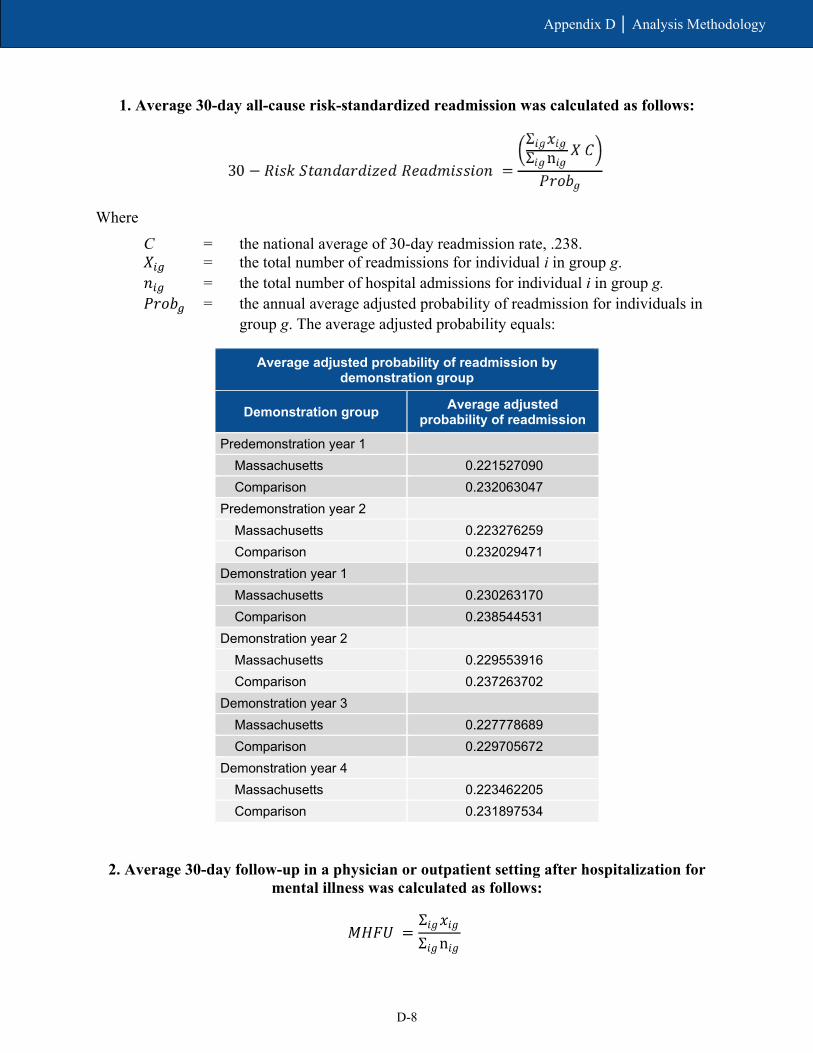
D-8
Appendix D │ Analysis Methodology
1. Average 30-day all-cause risk-standardized readmission was calculated as follows:
Where C = the national average of 30-day readmission rate, .238. 𝑋𝑋𝑖𝑖𝑖𝑖 = the total number of readmissions for individual i in group g. 𝑛𝑛𝑖𝑖𝑖𝑖 = the total number of hospital admissions for individual i in group g. 𝑃𝑃𝑃𝑃𝑃𝑃𝑃𝑃𝑖𝑖 = the annual average adjusted probability of readmission for individuals in
group g. The average adjusted probability equals:
Average adjusted probability of readmission by demonstration group
Demonstration group Average adjusted probability of readmission
Predemonstration year 1 Massachusetts 0.221527090 Comparison 0.232063047
Predemonstration year 2 Massachusetts 0.223276259 Comparison 0.232029471
Demonstration year 1 Massachusetts 0.230263170 Comparison 0.238544531
Demonstration year 2 Massachusetts 0.229553916 Comparison 0.237263702
Demonstration year 3 Massachusetts 0.227778689 Comparison 0.229705672
Demonstration year 4 Massachusetts 0.223462205 Comparison 0.231897534
2. Average 30-day follow-up in a physician or outpatient setting after hospitalization for mental illness was calculated as follows:
𝑀𝑀𝑀𝑀𝑀𝑀𝑈𝑈 =
Σ𝑖𝑖𝑔𝑔𝑥𝑥𝑖𝑖𝑔𝑔Σ𝑖𝑖𝑔𝑔n𝑖𝑖𝑔𝑔
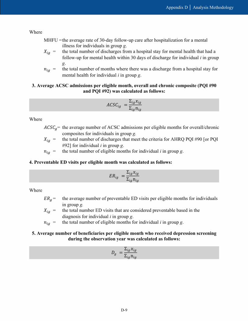
D-9
Appendix D │ Analysis Methodology
Where MHFU = the average rate of 30-day follow-up care after hospitalization for a mental
illness for individuals in group g. 𝑋𝑋𝑖𝑖𝑖𝑖 = the total number of discharges from a hospital stay for mental health that had a
follow-up for mental health within 30 days of discharge for individual i in group g.
𝑛𝑛𝑖𝑖𝑖𝑖 = the total number of months where there was a discharge from a hospital stay for mental health for individual i in group g.
3. Average ACSC admissions per eligible month, overall and chronic composite (PQI #90 and PQI #92) was calculated as follows:
Where
𝐴𝐴𝐶𝐶𝑆𝑆𝐶𝐶𝑖𝑖= the average number of ACSC admissions per eligible months for overall/chronic composites for individuals in group g.
𝑋𝑋𝑖𝑖𝑖𝑖 = the total number of discharges that meet the criteria for AHRQ PQI #90 [or PQI #92] for individual i in group g.
𝑛𝑛𝑖𝑖𝑖𝑖 = the total number of eligible months for individual i in group g.
4. Preventable ED visits per eligible month was calculated as follows:
Where
𝐸𝐸𝑅𝑅𝑖𝑖 = the average number of preventable ED visits per eligible months for individuals in group g.
𝑋𝑋𝑖𝑖𝑖𝑖 = the total number ED visits that are considered preventable based in the diagnosis for individual i in group g.
𝑛𝑛𝑖𝑖𝑖𝑖 = the total number of eligible months for individual i in group g.
5. Average number of beneficiaries per eligible month who received depression screening during the observation year was calculated as follows:
𝐴𝐴𝐶𝐶𝑆𝑆𝐶𝐶𝑖𝑖𝑔𝑔 =Σ𝑖𝑖𝑔𝑔𝑥𝑥𝑖𝑖𝑔𝑔Σ𝑖𝑖𝑔𝑔n𝑖𝑖𝑔𝑔
𝐸𝐸𝑅𝑅𝑖𝑖𝑔𝑔 =Σ𝑖𝑖𝑔𝑔𝑥𝑥𝑖𝑖𝑔𝑔Σ𝑖𝑖𝑔𝑔n𝑖𝑖𝑔𝑔
𝐷𝐷𝑔𝑔 =Σ𝑖𝑖𝑔𝑔𝑥𝑥𝑖𝑖𝑔𝑔Σ𝑖𝑖𝑔𝑔n𝑖𝑖𝑔𝑔

D-10
Appendix D │ Analysis Methodology
Where
𝐷𝐷𝑖𝑖 = the average number of beneficiaries per eligible month who received depression screening in group g.
𝑋𝑋𝑖𝑖𝑖𝑖 = the total number eligible beneficiaries who ever received depression screening in group g.
𝑛𝑛𝑖𝑖𝑖𝑖 = the total number of eligible months among beneficiaries in group g.
D.1.8 Minimum Data Set Measures
Two measures of annual NF-related utilization are derived from the MDS. The rate of new long-stay NF admissions per 1,000 eligible beneficiaries is calculated as the number of NF admissions for whom there is no record of NF use in the 100 days prior to the current admission and who subsequently stay in the NF for 101 days or more. Individuals are included in this measure only if their NF admission occurred after their first month of demonstration eligibility. The percentage of long-stay NF users is calculated as the number of individuals who have stayed in an NF for 101 days or more, who were long-stay in their last quarter of demonstration eligibility. The probability of any long-stay NF use includes both new admissions from the community and continuation of a stay in an NF.
Characteristics of new long-stay NF residents at admission are also included in order to monitor nursing facility case mix and acuity levels. Functional status and low level of care need are determined by the Resource Utilization Groups Version IV (RUG-IV). Residents with low care need are defined as those who did not require physical assistance in any of the four late-loss activities of daily living and who were in the three lowest RUG-IV categories. Severe cognitive impairment is assessed by the Brief Interview for Mental Status, poor short-term memory, or severely impaired decision-making skills.
D.1.9 Regression Outcome Measures
Five utilization measures are used as dependent variables in regression analysis to estimate the DinD effect for the entire demonstration period as well as the effect in each demonstration year. These measures are derived from Medicare inpatient, outpatient, carrier, and SNF claims and encounter data and MDS long-stay NF use. All dependent variables are provided on a monthly basis except for the MDS long-stay NF measure and 30-day inpatient readmission measure, which are annual.
The outcome measures include the following:
• Monthly inpatient admissions: The monthly probability of having any inpatient admission in which a beneficiary has an admission date within the observed month.
• Monthly ED use: The monthly probability of having any ED visit that occurred during the month that did not result in an inpatient admission.
• Monthly physician visits: The count of any evaluation and management visit within the month where the visit occurred in the outpatient or office setting, NF, domiciliary, rest home, or custodial care setting, a federally qualified health center, or a rural health center.
D-11
Appendix D │ Analysis Methodology
• Monthly SNF admissions: The monthly probability of having any SNF admission within the month.
• Long-stay NF use: The annual probability of residing in an NF for 101 days or more during the year.
In addition to the five measures above, this evaluation will estimate the demonstration effects on quality of care. The following quality of care and care coordination measures use claims/encounter-level information and are adopted from standardized HEDIS and NQF measures. The outcomes are reported monthly, with the exception of the 30-day all-cause risk-standardized readmission rate, which is annual.
• 30-day all-cause risk-standardized readmissions (NQF #1768): This is calculated both as the rate of risk-standardized readmission, defined above, and the count of the number risk-standardized readmissions that occurs during the year.
• Preventable ED visits: This is estimated as a continuous variable of weighted ED visits that occur during the month. The lists of diagnoses that are considered as either preventable/avoidable or treatable in a primary care setting were developed by researchers at the New York University Center for Health and Public Service Research.59
• 30-day follow-up after hospitalization for mental illness (NQF #576): This is estimated as the monthly probability of any follow-up visits within 30-days posthospitalization for a mental illness.
• ACSC admissions—overall composite (AHRQ PQI #90): This is the monthly probability of any acute admissions that meet the AHRQ PQI #90 (Prevention Quality Overall Composite) criteria within the month.
• ACSC admissions—chronic composite (AHRQ PQI #92): This is the monthly probability of any admissions that meet the AHRQ PQI #92 criteria within the month.
D.1.10 Regression Methodology for Determining Demonstration Impact
The regressions across the entire demonstration period compare all demonstration eligible beneficiaries in the FAI State to its comparison group. The regression methodology accounts for both those with and without use of the specific service (e.g., for inpatient services, both those with and without any inpatient use). A restricted DinD equation will be estimated as follows:
Dependent variablei = F(β0 + β1PostYear + β2Demonstration + β3PostYear * Demonstration + β4Demographics + β5-j Market + ε)
where separate models will be estimated for each dependent variable. PostYear is an indicator of whether the observation is from the pre- or postdemonstration period, Demonstration is an indicator of whether the beneficiary was in the demonstration group, and PostYear *
59 https://wagner.nyu.edu/faculty/billings/nyued-background

D-12
Appendix D │ Analysis Methodology
Demonstration is an interaction term. Demographics and Market represent vectors of beneficiary and market characteristics, respectively.
Under this specification, the coefficient β0 reflects the comparison group predemonstration period mean adjusted for demographic and market effects, β1 reflects the average difference between post period and predemonstration period in the comparison group, β2 reflects the difference in the demonstration group and comparison group at predemonstration, and β3 is the overall average demonstration effect during the demonstration period. This last term is the DinD estimator and the primary policy variable of interest, but in all regression models, because of nonlinearities in the underlying distributions, postregression predictions of demonstration impact are performed to obtain the marginal effects of demonstration impact.
In addition to estimating the model described in prior equation, a less restrictive model was estimated to produce year-by-year effects of the demonstration. The specification of the unrestricted model is as follows:
Dependent variable = F (β0 + β1-kPostYear1-n + β2Demonstration + β3-kPostYear1-n * Demonstration + β4 Demographics + β5-j Market + ε)
This equation differs from the previous one in that separate DinD coefficients are estimated for each year. Under this specification, the coefficients β3-k would reflect the impact of the demonstration in each respective year, whereas the previous equation reflects the impact of the entire demonstration period. This specification measures whether changes in dependent variables occur in the first year of the demonstration only, continuously over time, or in some other pattern. Depending on the outcome of interest, we will estimate the equations using logistic regression, Generalized Linear Models with a log link and gamma distribution, or count models such as negative binomial or Poisson regressions (e.g., for the number of monthly physician visits). We used regression results to calculate the marginal effects of demonstration impact.
Impact estimates across the entire demonstration period are determined using the DinD methodology and presented in figures for all demonstration eligible beneficiaries. We present a table displaying the cumulative estimate along with the adjusted means for each group and time period for the eligible population. We also display figures showing the annual effects of the demonstration among the overall eligible population. In each figure, the point estimate is displayed for each measure, as is the 95 percent confidence interval. If the confidence interval includes the value of zero, it is not statistically significant at that confidence level.
To determine whether the demonstration had an effect on the SPMI and LTSS populations, a triple interaction term is used to estimate the interaction effect of each special population (i.e., Demonstration * Post * LTSS). In Section 5, Demonstration Impact on Service Utilization and Quality of Care we report the cumulative DinD estimates for both the subpopulation and the non-subpopulation, and test the difference in the demonstration effect for each estimate. Annual triple-DinD results are shown in Appendix E, Tables E-2 and E-3.
The two adjusted means tables presented for the full demonstration eligible population in the report provide both DinD results and accompanying adjusted mean values that allow direct comparisons regarding service utilization and costs across the predemonstration and demonstration periods, separately for the demonstration and comparison groups. To make

D-13
Appendix D │ Analysis Methodology
meaningful comparisons for the adjusted mean value results, we needed to take into account any differences in population characteristics across the four groups. To do this, we replaced the data values for all demographic, health, and area-related characteristics in each group to be those of the comparison group in the demonstration period, which we selected as the reference group.
The steps involved in this process for each type of outcome measure are:
1. Run the regression estimating the probability or level of service use or costs. 2. Predict DinD (last two columns in each adjusted means table). 3. Replace the data values for three of the four groups to be those of the comparison
group in the demonstration period so all four groups have the same population characteristics.
4. Predict the weighted mean for each of the four groups using the regression results stored in computer memory.
The DinD estimate is also provided for reference, along with the p-value and the relative percent change of the DinD estimate compared to an average mean value for the comparison group in the entire demonstration period. The relative percent annual change for the DinD estimate for each outcome measure is calculated as [Overall DinD effect] / [Adjusted mean outcome value of comparison group in the demonstration period].
Table D-2 provides an illustrative example of the regression output for each independent variable in the negative binomial regression on monthly inpatient admissions across the entire demonstration period.
Table D-2 Logistic regression results on monthly inpatient admissions
(n = 15,338,662 person-months)
Independent variables Coefficient Standard error z-value p-value
Post period −0.109 0.013 −8.490 0.000 Demonstration group −0.085 0.040 −2.120 0.034 Interaction of post period x demonstration group 0.048 0.016 3.050 0.002 Trend 0.000 0.000 0.090 0.926 Age 0.000 0.001 −0.210 0.833 Female −0.002 0.014 −0.110 0.914 African American −0.046 0.027 −1.690 0.092 Hispanic −0.298 0.035 −8.420 0.000 Asian −0.574 0.077 −7.460 0.000 Other race/ethnicity −0.326 0.042 −7.810 0.000 Disability as reason for Medicare entitlement 0.018 0.022 0.840 0.402 End-stage renal disease 1.495 0.033 44.770 0.000 Participation in other Shared Savings Program 0.122 0.034 3.570 0.000
(continued)
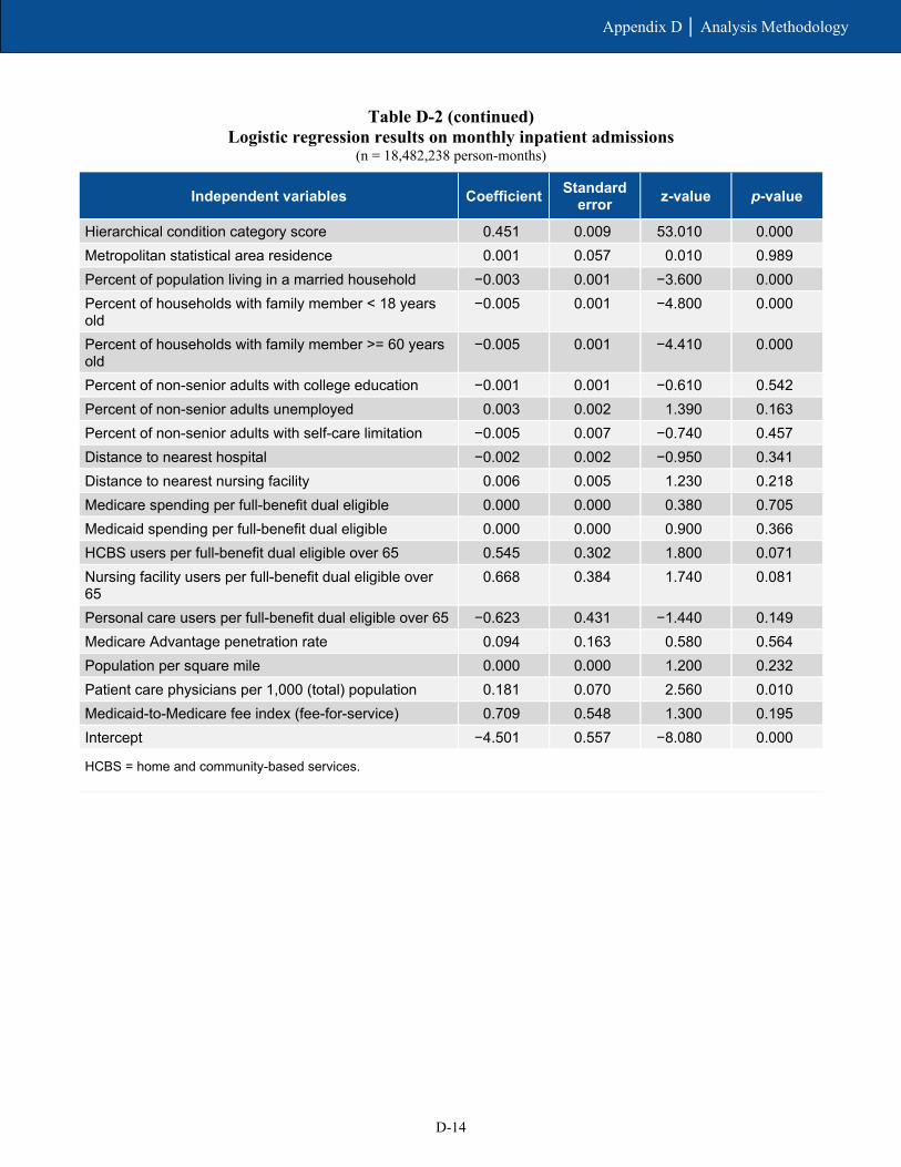
D-14
Appendix D │ Analysis Methodology
Table D-2 (continued) Logistic regression results on monthly inpatient admissions
(n = 18,482,238 person-months)
Independent variables Coefficient Standard error z-value p-value
Hierarchical condition category score 0.451 0.009 53.010 0.000 Metropolitan statistical area residence 0.001 0.057 0.010 0.989 Percent of population living in a married household −0.003 0.001 −3.600 0.000 Percent of households with family member < 18 years old
−0.005 0.001 −4.800 0.000
Percent of households with family member >= 60 years old
−0.005 0.001 −4.410 0.000
Percent of non-senior adults with college education −0.001 0.001 −0.610 0.542 Percent of non-senior adults unemployed 0.003 0.002 1.390 0.163 Percent of non-senior adults with self-care limitation −0.005 0.007 −0.740 0.457 Distance to nearest hospital −0.002 0.002 −0.950 0.341 Distance to nearest nursing facility 0.006 0.005 1.230 0.218 Medicare spending per full-benefit dual eligible 0.000 0.000 0.380 0.705 Medicaid spending per full-benefit dual eligible 0.000 0.000 0.900 0.366 HCBS users per full-benefit dual eligible over 65 0.545 0.302 1.800 0.071 Nursing facility users per full-benefit dual eligible over 65
0.668 0.384 1.740 0.081
Personal care users per full-benefit dual eligible over 65 −0.623 0.431 −1.440 0.149 Medicare Advantage penetration rate 0.094 0.163 0.580 0.564 Population per square mile 0.000 0.000 1.200 0.232 Patient care physicians per 1,000 (total) population 0.181 0.070 2.560 0.010 Medicaid-to-Medicare fee index (fee-for-service) 0.709 0.548 1.300 0.195 Intercept −4.501 0.557 −8.080 0.000
HCBS = home and community-based services.

Appendix E Descriptive and Special Population Supplemental Analysis
E-1
Appendix E │ Descriptive and Special Population Supplemental Analysis
Tables E-1, E-2, and E-3 provide the regression-adjusted difference-in-differences (DinD) estimates cumulatively and for each demonstration year, for all measures and populations. We provide both the 95 and 90 percent confidence intervals for a clearer understanding of the estimate’s precision. Tables E-2 and E-3 provide an additional test of significance on the difference between the demonstration effect for the subpopulation and non-subpopulation.
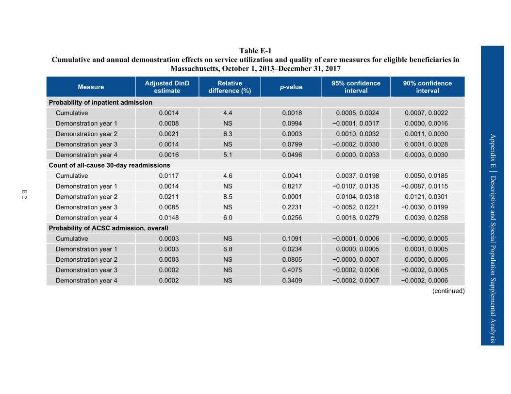
Appendix E │ D
escriptive and Special Population Supplemental A
nalysis
E-2
Table E-1 Cumulative and annual demonstration effects on service utilization and quality of care measures for eligible beneficiaries in
Massachusetts, October 1, 2013–December 31, 2017
Measure Adjusted DinD estimate
Relative difference (%) p-value 95% confidence
interval 90% confidence
interval
Probability of inpatient admission Cumulative 0.0014 4.4 0.0018 0.0005, 0.0024 0.0007, 0.0022 Demonstration year 1 0.0008 NS 0.0994 −0.0001, 0.0017 0.0000, 0.0016 Demonstration year 2 0.0021 6.3 0.0003 0.0010, 0.0032 0.0011, 0.0030 Demonstration year 3 0.0014 NS 0.0799 −0.0002, 0.0030 0.0001, 0.0028 Demonstration year 4 0.0016 5.1 0.0496 0.0000, 0.0033 0.0003, 0.0030
Count of all-cause 30-day readmissions Cumulative 0.0117 4.6 0.0041 0.0037, 0.0198 0.0050, 0.0185 Demonstration year 1 0.0014 NS 0.8217 −0.0107, 0.0135 −0.0087, 0.0115 Demonstration year 2 0.0211 8.5 0.0001 0.0104, 0.0318 0.0121, 0.0301 Demonstration year 3 0.0085 NS 0.2231 −0.0052, 0.0221 −0.0030, 0.0199 Demonstration year 4 0.0148 6.0 0.0256 0.0018, 0.0279 0.0039, 0.0258
Probability of ACSC admission, overall Cumulative 0.0003 NS 0.1091 −0.0001, 0.0006 −0.0000, 0.0005 Demonstration year 1 0.0003 6.8 0.0234 0.0000, 0.0005 0.0001, 0.0005 Demonstration year 2 0.0003 NS 0.0805 −0.0000, 0.0007 0.0000, 0.0006 Demonstration year 3 0.0002 NS 0.4075 −0.0002, 0.0006 −0.0002, 0.0005 Demonstration year 4 0.0002 NS 0.3409 −0.0002, 0.0007 −0.0002, 0.0006
(continued)

Appendix E │ D
escriptive and Special Population Supplemental A
nalysis
E-3
Table E-1 (continued) Cumulative and annual demonstration effects on service utilization and quality of care measures for eligible beneficiaries in
Massachusetts, October 1, 2013–December 31, 2017
Measure Adjusted DinD estimate
Relative difference (%) p-value 95% confidence
interval 90% confidence
interval
Probability of ACSC admission, chronic Cumulative 0.0004 12.3 0.0144 0.0001, 0.0007 0.0001, 0.0006 Demonstration year 1 0.0004 15.3 0.0003 0.0002, 0.0007 0.0002, 0.0006 Demonstration year 2 0.0004 13.5 0.0164 0.0001, 0.0007 0.0001, 0.0006 Demonstration year 3 0.0003 NS 0.0913 −0.0000, 0.0007 0.0000, 0.0006 Demonstration year 4 0.0003 NS 0.1614 −0.0001, 0.0008 −0.0001, 0.0007
Probability of ED visit Cumulative −0.0000 NS 0.9884 −0.0019, 0.0018 −0.0016, 0.0015 Demonstration year 1 −0.0003 NS 0.7370 −0.0023, 0.0016 −0.0020, 0.0013 Demonstration year 2 0.0002 NS 0.8706 −0.0021, 0.0025 −0.0017, 0.0021 Demonstration year 3 0.0008 NS 0.4986 −0.0015, 0.0030 −0.0011, 0.0026 Demonstration year 4 −0.0006 NS 0.6512 −0.0032, 0.0020 −0.0027, 0.0016
Count of preventable ED visits Cumulative −0.0002 NS 0.8177 −0.0019, 0.0015 −0.0016, 0.0012 Demonstration year 1 −0.0009 NS 0.3540 −0.0027, 0.0010 −0.0024, 0.0007 Demonstration year 2 −0.0000 NS 0.9938 −0.0023, 0.0023 −0.0020, 0.0019 Demonstration year 3 0.0005 NS 0.5848 −0.0014, 0.0025 −0.0011, 0.0022 Demonstration year 4 −0.0004 NS 0.7017 −0.0025, 0.0017 −0.0021, 0.0013
(continued)

Appendix E │ D
escriptive and Special Population Supplemental A
nalysis
E-4
Table E-1 (continued) Cumulative and annual demonstration effects on service utilization and quality of care measures for eligible beneficiaries in
Massachusetts, October 1, 2013–December 31, 2017
Measure Adjusted DinD estimate
Relative difference (%) p-value 95% confidence
interval 90% confidence
interval
Probability of SNF admission Cumulative 0.0003 6.2 0.0297 0.0000, 0.0006 0.0001, 0.0005 Demonstration year 1 0.0002 NS 0.1889 −0.0001, 0.0005 −0.0000, 0.0004 Demonstration year 2 0.0004 8.4 0.0386 0.0000, 0.0008 0.0001, 0.0007 Demonstration year 3 0.0002 NS 0.2386 −0.0001, 0.0006 −0.0001, 0.0005 Demonstration year 4 0.0004 8.9 0.0093 0.0001, 0.0007 0.0002, 0.0007
Probability of any long-stay NF use Cumulative −0.0051 −15.1 <0.0001 −0.0071, −0.0031 −0.0067, −0.0034 Demonstration year 1 −0.0031 −9.7 0.0002 −0.0047, −0.0014 −0.0044, −0.0017 Demonstration year 2 −0.0048 −14.8 <0.0001 −0.0069, −0.0027 −0.0066, −0.0030 Demonstration year 3 −0.0063 −17.6 <0.0001 −0.0086, −0.0041 −0.0082, −0.0044 Demonstration year 4 −0.0057 −16.7 <0.0001 −0.0084, −0.0030 −0.0080, −0.0035
Probability of 30-day follow-up after mental health discharge Cumulative −0.0039 NS 0.7597 −0.0286, 0.0209 −0.0246, 0.0169 Demonstration year 1 0.0023 NS 0.8521 −0.0218, 0.0264 −0.0179, 0.0225 Demonstration year 2 −0.0090 NS 0.5323 −0.0371, 0.0192 −0.0326, 0.0147 Demonstration year 3 0.0035 NS 0.8144 −0.0254, 0.0323 −0.0208, 0.0277 Demonstration year 4 −0.0148 NS 0.3957 −0.0490, 0.0194 −0.0435, 0.0139
(continued)

Appendix E │ D
escriptive and Special Population Supplemental A
nalysis
E-5
Table E-1 (continued) Cumulative and annual demonstration effects on service utilization and quality of care measures for eligible beneficiaries in
Massachusetts, October 1, 2013–December 31, 2017
Measure Adjusted DinD estimate
Relative difference (%) p-value 95% confidence
interval 90% confidence
interval
Number of physician E&M visits Cumulative 0.0678 7.0 <0.0001 0.0339, 0.1017 0.0393, 0.0963 Demonstration year 1 0.0604 6.3 0.0002 0.0286, 0.0922 0.0338, 0.0871 Demonstration year 2 0.0756 7.8 <0.0001 0.0425, 0.1088 0.0478, 0.1035 Demonstration year 3 0.0757 7.8 <0.0001 0.0405, 0.1109 0.0462, 0.1053 Demonstration year 4 0.0624 6.4 0.0053 0.0186, 0.1063 0.0256, 0.0993
ACSC = ambulatory care sensitive condition; ED = emergency department; E&M = evaluation and management; NS = not statistically significant; SNF = skilled nursing facility.
SOURCE: RTI International analysis of Medicare fee-for-service claims and encounter data, and Minimum Data Set data.

Appendix E │ D
escriptive and Special Population Supplemental A
nalysis
E-6
Table E-2 Cumulative and annual demonstration effects on service utilization and quality of care measures, beneficiaries with LTSS use
versus those without LTSS use in Massachusetts, October 1, 2013–December 31, 2017
Measure Demonstration year
Special population
Demonstration effect relative to the comparison
group
Relative difference
(%) p-value 95% confidence
interval 90% confidence
interval
Difference in demonstration
effect (LTSS versus non-
LTSS)
Service Utilization Measures
Probability of inpatient admission
Cumulative LTSS users 0.0154 23.0 0.0010 0.0062, 0.0245 0.0077, 0.0230
0.0144** Non-LTSS users 0.0009 NS 0.0505 –0.0000, 0.0018 0.0001, 0.0017
Demonstration year 1
LTSS users 0.0106 13.8 0.0075 0.0028, 0.0183 0.0041, 0.0170 0.0104**
Non-LTSS users 0.0001 NS 0.8187 –0.0010, 0.0013 –0.0008, 0.0011
Demonstration year 2
LTSS users 0.0166 27.2 0.0106 0.0039, 0.0294 0.0059, 0.0273 0.0150*
Non-LTSS users 0.0016 5.6 0.0061 0.0005, 0.0027 0.0006, 0.0025
Demonstration year 3
LTSS users 0.0229 38.8 0.0001 0.0113, 0.0346 0.0132, 0.0327 0.0220***
Non-LTSS users 0.0009 NS 0.1864 –0.0004, 0.0023 –0.0002, 0.0021
Demonstration year 4
LTSS users 0.0160 NS 0.1117 –0.0037, 0.0358 –0.0005, 0.0326 0.0149
Non-LTSS users 0.0011 NS 0.1623 –0.0005, 0.0027 –0.0002, 0.0025
Probability of ED visit
Cumulative LTSS users 0.0033 NS 0.4385 –0.0050, 0.0115 –0.0037, 0.0102
0.0037 Non-LTSS users –0.0004 NS 0.6395 –0.0023, 0.0014 –0.0020, 0.0011
Demonstration year 1
LTSS users –0.0008 NS 0.8643 –0.0103, 0.0086 –0.0088, 0.0071 0.0002
Non-LTSS users –0.0010 NS 0.3306 –0.0029, 0.0010 –0.0026, 0.0007
Demonstration year 2
LTSS users 0.0019 NS 0.7500 –0.0097, 0.0134 –0.0078, 0.0116 0.0020
Non-LTSS users –0.0002 NS 0.8967 –0.0025, 0.0022 –0.0021, 0.0018
Demonstration year 3
LTSS users 0.0143 36.8 0.0141 0.0029, 0.0257 0.0047, 0.0239 0.0141*
Non-LTSS users 0.0003 NS 0.8181 –0.0020, 0.0025 –0.0016, 0.0021
Demonstration year 4
LTSS users 0.0030 NS 0.6230 –0.0088, 0.0147 –0.0069, 0.0128 0.0039
Non-LTSS users –0.0009 NS 0.4564 –0.0034, 0.0015 –0.0030, 0.0011
(continued)

Appendix E │ D
escriptive and Special Population Supplemental A
nalysis
E-7
Table E-2 (continued) Cumulative and annual demonstration effects on service utilization and quality of care measures, beneficiaries with LTSS use
versus those without LTSS use in Massachusetts, October 1, 2013–December 31, 2017
Measure Demonstration year
Special population
Demonstration effect relative to the comparison
group
Relative difference
(%) p-value 95% confidence
interval 90% confidence
interval
Difference in demonstration
effect (LTSS versus non-
LTSS)
Service Utilization Measures (continued)
Count of physician E&M visits
Cumulative LTSS users 0.1436 NS 0.0963 –0.0256, 0.3129 0.0016, 0.2856
0.0761 Non-LTSS users 0.0675 7.6 <0.0001 0.0338, 0.1011 0.0392, 0.0957
Demonstration year 1
LTSS users 0.1099 NS 0.0812 –0.0136, 0.2333 0.0062, 0.2135 0.0554
Non-LTSS users 0.0545 6.2 0.0007 0.0228, 0.0862 0.0279, 0.0811
Demonstration year 2
LTSS users 0.1711 NS 0.1435 –0.0581, 0.4003 –0.0213, 0.3634 0.1007
Non-LTSS users 0.0704 7.9 <0.0001 0.0380, 0.1028 0.0432, 0.0976
Demonstration year 3
LTSS users 0.1891 NS 0.1063 –0.0404, 0.4185 –0.0035, 0.3816 0.1123
Non-LTSS users 0.0767 8.6 <0.0001 0.0407, 0.1127 0.0465, 0.1069
Demonstration year 4
LTSS users 0.0817 NS 0.5447 –0.1828, 0.3462 –0.1402, 0.3037 0.0124
Non-LTSS users 0.0693 7.7 0.0021 0.0251, 0.1135 0.0322, 0.1064
Probability of SNF admission
Cumulative LTSS users 0.0124 32.9 <0.0001 0.0071, 0.0177 0.0080, 0.0168
0.0125*** Non-LTSS users –0.0001 NS 0.4391 –0.0003, 0.0001 –0.0003, 0.0001
Demonstration year 1
LTSS users 0.0070 15.9 0.0074 0.0019, 0.0121 0.0027, 0.0113 0.0071**
Non-LTSS users –0.0001 NS 0.6418 –0.0003, 0.0002 –0.0002, 0.0001
Demonstration year 2
LTSS users 0.0140 40.0 0.0003 0.0065, 0.0215 0.0077, 0.0203 0.0139***
Non-LTSS users 0.0001 NS 0.6628 –0.0002, 0.0004 –0.0002, 0.0003
Demonstration year 3
LTSS users 0.0193 60.9 0.0033 0.0064, 0.0322 0.0085, 0.0301 0.0196**
Non-LTSS users –0.0003 –13.4 0.0239 –0.0005, –0.0000 –0.0005, –0.0001
Demonstration year 4
LTSS users 0.0155 43.0 0.0152 0.0030, 0.0281 0.0050, 0.0260 0.0155*
Non-LTSS users –0.0000 NS 0.9824 –0.0002, 0.0002 –0.0002, 0.0002
(continued)

Appendix E │ D
escriptive and Special Population Supplemental A
nalysis
E-8
Table E-2 (continued) Cumulative and annual demonstration effects on service utilization and quality of care measures, beneficiaries with LTSS use
versus those without LTSS use in Massachusetts, October 1, 2013–December 31, 2017
Measure Demonstration year
Special population
Demonstration effect relative to the comparison
group
Relative difference
(%) p-value 95% confidence
interval 90% confidence
interval
Difference in demonstration
effect (LTSS versus non-
LTSS)
Quality of Care Measures
Count of preventable ED visits
Cumulative LTSS users 0.0070 25.9 0.0074 0.0019, 0.0122 0.0027, 0.0114
0.0077** Non-LTSS users –0.0006 NS 0.4618 –0.0024, 0.0011 –0.0021, 0.0008
Demonstration year 1
LTSS users 0.0082 NS 0.0596 –0.0003, 0.0167 0.0010, 0.0154 0.0097*
Non-LTSS users –0.0015 NS 0.1242 –0.0035, 0.0004 –0.0032, 0.0001
Demonstration year 2
LTSS users 0.0007 NS 0.8877 –0.0093, 0.0107 –0.0077, 0.0091 0.0011
Non-LTSS users –0.0003 NS 0.7796 –0.0027, 0.0020 –0.0023, 0.0016
Demonstration year 3
LTSS users 0.0122 67.8 0.0013 0.0048, 0.0196 0.0060, 0.0184 0.0122***
Non-LTSS users 0.0000 NS 0.9864 –0.0020, 0.0020 –0.0016, 0.0017
Demonstration year 4
LTSS users 0.0040 NS 0.4013 –0.0053, 0.0133 –0.0038, 0.0118 0.0047
Non-LTSS users –0.0007 NS 0.4923 –0.0026, 0.0013 –0.0023, 0.0010
Probability of ACSC admission, overall
Cumulative LTSS users 0.0004 NS 0.7839 –0.0023, 0.0030 –0.0019, 0.0026
0.0001 Non-LTSS users 0.0003 NS 0.0551 –0.0000, 0.0006 0.0000, 0.0005
Demonstration year 1
LTSS users 0.0006 NS 0.5845 –0.0016, 0.0029 –0.0013, 0.0026 0.0003
Non-LTSS users 0.0003 8.3 0.0184 0.0001, 0.0006 0.0001, 0.0005
Demonstration year 2
LTSS users –0.0000 NS 0.9960 –0.0044, 0.0044 –0.0037, 0.0037 –0.0004
Non-LTSS users 0.0004 10.5 0.0283 0.0000, 0.0007 0.0001, 0.0007
Demonstration year 3
LTSS users 0.0008 NS 0.6367 –0.0026, 0.0043 –0.0021, 0.0037 0.0007
Non-LTSS users 0.0002 NS 0.2760 –0.0001, 0.0005 –0.0001, 0.0004
Demonstration year 4
LTSS users –0.0007 NS 0.8194 –0.0065, 0.0051 –0.0055, 0.0042 –0.0009
Non-LTSS users 0.0002 NS 0.2707 –0.0002, 0.0007 –0.0001, 0.0006
(continued)

Appendix E │ D
escriptive and Special Population Supplemental A
nalysis
E-9
Table E-2 (continued) Cumulative and annual demonstration effects on service utilization and quality of care measures, beneficiaries with LTSS use
versus those without LTSS use in Massachusetts, October 1, 2013–December 31, 2017
Measure Demonstration year
Special population
Demonstration effect relative to the comparison
group
Relative difference
(%) p-value 95% confidence
interval 90% confidence
interval
Difference in demonstration
effect (LTSS versus non-
LTSS)
Quality of Care Measures (continued)
Probability of ACSC admission, chronic
Cumulative LTSS users 0.0016 NS 0.1436 –0.0006, 0.0039 –0.0002, 0.0035
0.0013 Non-LTSS users 0.0004 13.5 0.0037 0.0001, 0.0006 0.0002, 0.0006
Demonstration year 1
LTSS users 0.0022 NS 0.0526 –0.0000, 0.0045 0.0003, 0.0042 0.0019
Non-LTSS users 0.0004 16.3 <0.0001 0.0002, 0.0006 0.0002, 0.0005
Demonstration year 2
LTSS users –0.0000 NS 0.9821 –0.0027, 0.0027 –0.0023, 0.0022 –0.0004
Non-LTSS users 0.0004 17.6 0.0022 0.0002, 0.0007 0.0002, 0.0006
Demonstration year 3
LTSS users 0.0027 121.3 0.0032 0.0009, 0.0045 0.0012, 0.0043 0.0025**
Non-LTSS users 0.0003 NS 0.0565 –0.0000, 0.0006 0.0000, 0.0005
Demonstration year 4
LTSS users 0.0005 NS 0.8387 –0.0044, 0.0054 –0.0036, 0.0046 0.0002
Non-LTSS users 0.0003 NS 0.1285 –0.0001, 0.0007 –0.0000, 0.0007
Probability of 30-day follow-up after mental health discharge
Cumulative LTSS users 0.0476 NS 0.5520 –0.1092, 0.2043 –0.0840, 0.1791
0.0550 Non-LTSS users –0.0074 NS 0.5481 –0.0315, 0.0167 –0.0277, 0.0129
Demonstration year 1
LTSS users –0.0622 NS 0.5607 –0.2716, 0.1472 –0.2379, 0.1136 –0.0626
Non-LTSS users 0.0005 NS 0.9702 –0.0236, 0.0245 –0.0198, 0.0207
Demonstration year 2
LTSS users 0.1487 NS 0.4050 –0.2014, 0.4988 –0.1451, 0.4426 0.1631
Non-LTSS users –0.0144 NS 0.2869 –0.0409, 0.0121 –0.0366, 0.0078
Demonstration year 3
LTSS users 0.1839 NS 0.2203 –0.1102, 0.4780 –0.0629, 0.4307 0.1829
Non-LTSS users 0.0010 NS 0.9475 –0.0287, 0.0307 –0.0240, 0.0260
Demonstration year 4
LTSS users –0.0424 NS 0.8146 –0.3968, 0.3120 –0.3399, 0.2551 –0.0234
Non-LTSS users –0.0190 NS 0.2658 –0.0526, 0.0145 –0.0472, 0.0091
(continued)
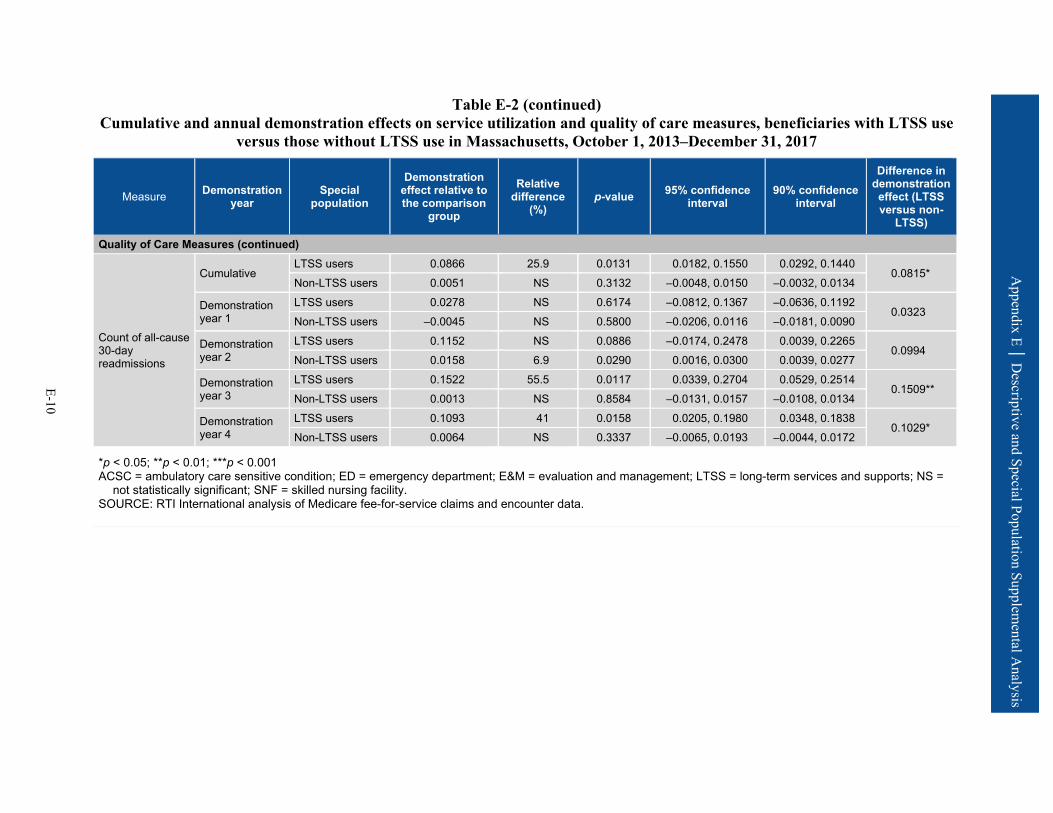
Appendix E │ D
escriptive and Special Population Supplemental A
nalysis
E-10
Table E-2 (continued) Cumulative and annual demonstration effects on service utilization and quality of care measures, beneficiaries with LTSS use
versus those without LTSS use in Massachusetts, October 1, 2013–December 31, 2017
Measure Demonstration year
Special population
Demonstration effect relative to the comparison
group
Relative difference
(%) p-value 95% confidence
interval 90% confidence
interval
Difference in demonstration
effect (LTSS versus non-
LTSS)
Quality of Care Measures (continued)
Count of all-cause 30-day readmissions
Cumulative LTSS users 0.0866 25.9 0.0131 0.0182, 0.1550 0.0292, 0.1440
0.0815* Non-LTSS users 0.0051 NS 0.3132 –0.0048, 0.0150 –0.0032, 0.0134
Demonstration year 1
LTSS users 0.0278 NS 0.6174 –0.0812, 0.1367 –0.0636, 0.1192 0.0323
Non-LTSS users –0.0045 NS 0.5800 –0.0206, 0.0116 –0.0181, 0.0090
Demonstration year 2
LTSS users 0.1152 NS 0.0886 –0.0174, 0.2478 0.0039, 0.2265 0.0994
Non-LTSS users 0.0158 6.9 0.0290 0.0016, 0.0300 0.0039, 0.0277
Demonstration year 3
LTSS users 0.1522 55.5 0.0117 0.0339, 0.2704 0.0529, 0.2514 0.1509**
Non-LTSS users 0.0013 NS 0.8584 –0.0131, 0.0157 –0.0108, 0.0134
Demonstration year 4
LTSS users 0.1093 41 0.0158 0.0205, 0.1980 0.0348, 0.1838 0.1029*
Non-LTSS users 0.0064 NS 0.3337 –0.0065, 0.0193 –0.0044, 0.0172
*p < 0.05; **p < 0.01; ***p < 0.001 ACSC = ambulatory care sensitive condition; ED = emergency department; E&M = evaluation and management; LTSS = long-term services and supports; NS =
not statistically significant; SNF = skilled nursing facility. SOURCE: RTI International analysis of Medicare fee-for-service claims and encounter data.
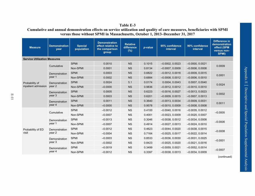
Appendix E │ D
escriptive and Special Population Supplemental A
nalysis
E-11
Table E-3 Cumulative and annual demonstration effects on service utilization and quality of care measures, beneficiaries with SPMI
versus those without SPMI in Massachusetts, October 1, 2013–December 31, 2017
Measure Demonstration year
Special population
Demonstration effect relative to the comparison
group
Relative difference
(%) p-value 95% confidence
interval 90% confidence
interval
Difference in demonstration
effect (SPM versus non-
SPMI)
Service Utilization Measures
Probability of inpatient admission
Cumulative SPMI 0.0010 NS 0.1015 –0.0002, 0.0023 –0.0000, 0.0021
0.0009 Non-SPMI 0.0001 NS 0.8134 –0.0007, 0.0009 –0.0006, 0.0008
Demonstration year 1
SPMI 0.0003 NS 0.6822 –0.0012, 0.0018 –0.0009, 0.0015 0.0001
Non-SPMI 0.0002 NS 0.6884 –0.0008, 0.0012 –0.0006, 0.0010
Demonstration year 2
SPMI 0.0024 5.1 0.0174 0.0004, 0.0043 0.0007, 0.0040 0.0024
Non-SPMI –0.0000 NS 0.9836 –0.0012, 0.0012 –0.0010, 0.0010
Demonstration year 3
SPMI 0.0005 NS 0.6223 –0.0016, 0.0027 –0.0013, 0.0023 0.0002
Non-SPMI 0.0003 NS 0.6201 –0.0009, 0.0015 –0.0007, 0.0013
Demonstration year 4
SPMI 0.0011 NS 0.3640 –0.0013, 0.0034 –0.0009, 0.0031 0.0011
Non-SPMI –0.0000 NS 0.9578 –0.0010, 0.0009 –0.0008, 0.0008
Probability of ED visit
Cumulative SPMI –0.0012 NS 0.4100 –0.0040, 0.0016 –0.0035, 0.0012
–0.0005 Non-SPMI –0.0007 NS 0.4001 –0.0023, 0.0009 –0.0020, 0.0007
Demonstration year 1
SPMI –0.0013 NS 0.3046 –0.0038, 0.0012 –0.0034, 0.0008 –0.0006
Non-SPMI –0.0007 NS 0.4914 –0.0027, 0.0013 –0.0024, 0.0010
Demonstration year 2
SPMI –0.0012 NS 0.4623 –0.0044, 0.0020 –0.0038, 0.0015 –0.0008
Non-SPMI –0.0004 NS 0.7164 –0.0025, 0.0017 –0.0022, 0.0014
Demonstration year 3
SPMI –0.0003 NS 0.8533 –0.0036, 0.0030 –0.0031, 0.0025 –0.0001
Non-SPMI –0.0002 NS 0.8423 –0.0025, 0.0020 –0.0021, 0.0016
Demonstration year 4
SPMI –0.0019 NS 0.3499 –0.0059, 0.0021 –0.0052, 0.0014 –0.0007
Non-SPMI –0.0012 NS 0.3397 –0.0038, 0.0013 –0.0034, 0.0009 (continued)

Appendix E │ D
escriptive and Special Population Supplemental A
nalysis
E-12
Table E-3 (continued) Cumulative and annual demonstration effects on service utilization and quality of care measures, beneficiaries with SPMI
versus those without SPMI in Massachusetts, October 1, 2013–December 31, 2017
Measure Demonstration year
Special population
Demonstration effect relative to the comparison
group
Relative difference
(%) p-value 95% confidence
interval 90% confidence
interval
Difference in demonstration
effect (SPM versus non-
SPMI)
Service Utilization Measures (continued)
Count of physician E&M visits
Cumulative SPMI 0.0541 4.4 0.0183 0.0092, 0.0990 0.0164, 0.0918
0.0261 Non-SPMI 0.0280 4.0 0.0018 0.0104, 0.0456 0.0132, 0.0428
Demonstration year 1
SPMI 0.0497 4.1 0.0362 0.0032, 0.0961 0.0107, 0.0887 0.0179
Non-SPMI 0.0317 4.3 <0.0001 0.0159, 0.0475 0.0185, 0.0450
Demonstration year 2
SPMI 0.0649 5.2 0.0055 0.0190, 0.1107 0.0264, 0.1034 0.0337
Non-SPMI 0.0312 4.4 0.0017 0.0117, 0.0507 0.0149, 0.0476
Demonstration year 3
SPMI 0.0594 4.8 0.0099 0.0143, 0.1046 0.0215, 0.0973 0.0287
Non-SPMI 0.0308 4.6 0.0065 0.0086, 0.0529 0.0122, 0.0494
Demonstration year 4
SPMI 0.0452 NS 0.1128 –0.0107, 0.1010 –0.0017, 0.0921 –0.0271
Non-SPMI 0.0181 NS 0.1746 –0.0080, 0.0442 –0.0038, 0.0400
Probability of SNF admission
Cumulative SPMI 0.0003 NS 0.1889 –0.0001, 0.0007 –0.0001, 0.0006
0.0001 Non-SPMI 0.0001 NS 0.1000 –0.0000, 0.0003 –0.0000, 0.0003
Demonstration year 1
SPMI –0.0000 NS 0.9595 –0.0005, 0.0005 –0.0004, 0.0004 –0.0003
Non-SPMI 0.0003 9.6 0.0025 0.0001, 0.0005 0.0001, 0.0004
Demonstration year 2
SPMI 0.0004 NS 0.2007 –0.0002, 0.0011 –0.0001, 0.0010 0.0003
Non-SPMI 0.0001 NS 0.2985 –0.0001, 0.0004 –0.0001, 0.0003
Demonstration year 3
SPMI 0.0002 NS 0.3796 –0.0003, 0.0007 –0.0002, 0.0006 0.0002
Non-SPMI 0.0000 NS 0.9971 –0.0003, 0.0003 –0.0002, 0.0002
Demonstration year 4
SPMI 0.0005 7.4 0.0353 0.0000, 0.0010 0.0001, 0.0009 0.0004
Non-SPMI 0.0001 NS 0.4419 –0.0002, 0.0004 –0.0001, 0.0004 (continued)
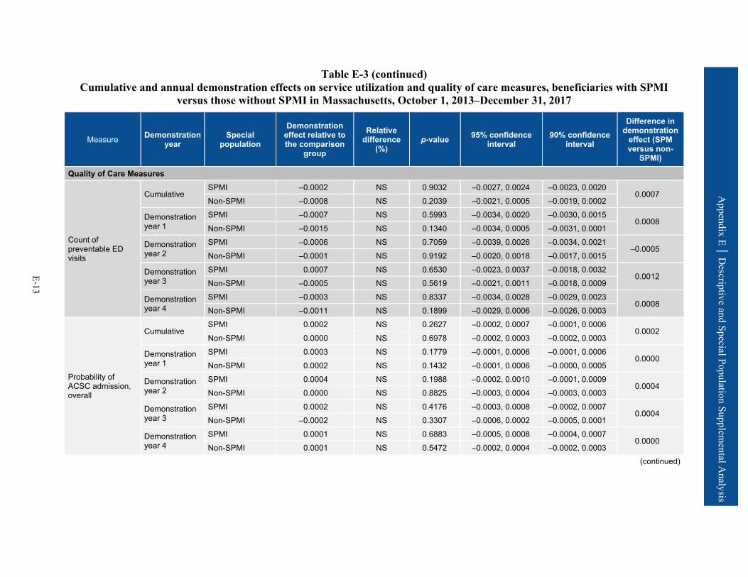
Appendix E │ D
escriptive and Special Population Supplemental A
nalysis
E-13
Table E-3 (continued) Cumulative and annual demonstration effects on service utilization and quality of care measures, beneficiaries with SPMI
versus those without SPMI in Massachusetts, October 1, 2013–December 31, 2017
Measure Demonstration year
Special population
Demonstration effect relative to the comparison
group
Relative difference
(%) p-value 95% confidence
interval 90% confidence
interval
Difference in demonstration
effect (SPM versus non-
SPMI)
Quality of Care Measures
Count of preventable ED visits
Cumulative SPMI –0.0002 NS 0.9032 –0.0027, 0.0024 –0.0023, 0.0020
0.0007 Non-SPMI –0.0008 NS 0.2039 –0.0021, 0.0005 –0.0019, 0.0002
Demonstration year 1
SPMI –0.0007 NS 0.5993 –0.0034, 0.0020 –0.0030, 0.0015 0.0008
Non-SPMI –0.0015 NS 0.1340 –0.0034, 0.0005 –0.0031, 0.0001
Demonstration year 2
SPMI –0.0006 NS 0.7059 –0.0039, 0.0026 –0.0034, 0.0021 –0.0005
Non-SPMI –0.0001 NS 0.9192 –0.0020, 0.0018 –0.0017, 0.0015
Demonstration year 3
SPMI 0.0007 NS 0.6530 –0.0023, 0.0037 –0.0018, 0.0032 0.0012
Non-SPMI –0.0005 NS 0.5619 –0.0021, 0.0011 –0.0018, 0.0009
Demonstration year 4
SPMI –0.0003 NS 0.8337 –0.0034, 0.0028 –0.0029, 0.0023 0.0008
Non-SPMI –0.0011 NS 0.1899 –0.0029, 0.0006 –0.0026, 0.0003
Probability of ACSC admission, overall
Cumulative SPMI 0.0002 NS 0.2627 –0.0002, 0.0007 –0.0001, 0.0006
0.0002 Non-SPMI 0.0000 NS 0.6978 –0.0002, 0.0003 –0.0002, 0.0003
Demonstration year 1
SPMI 0.0003 NS 0.1779 –0.0001, 0.0006 –0.0001, 0.0006 0.0000
Non-SPMI 0.0002 NS 0.1432 –0.0001, 0.0006 –0.0000, 0.0005
Demonstration year 2
SPMI 0.0004 NS 0.1988 –0.0002, 0.0010 –0.0001, 0.0009 0.0004
Non-SPMI 0.0000 NS 0.8825 –0.0003, 0.0004 –0.0003, 0.0003
Demonstration year 3
SPMI 0.0002 NS 0.4176 –0.0003, 0.0008 –0.0002, 0.0007 0.0004
Non-SPMI –0.0002 NS 0.3307 –0.0006, 0.0002 –0.0005, 0.0001
Demonstration year 4
SPMI 0.0001 NS 0.6883 –0.0005, 0.0008 –0.0004, 0.0007 0.0000
Non-SPMI 0.0001 NS 0.5472 –0.0002, 0.0004 –0.0002, 0.0003 (continued)

Appendix E │ D
escriptive and Special Population Supplemental A
nalysis
E-14
Table E-3 (continued) Cumulative and annual demonstration effects on service utilization and quality of care measures, beneficiaries with SPMI
versus those without SPMI in Massachusetts, October 1, 2013–December 31, 2017
Measure Demonstration year
Special population
Demonstration effect relative to the comparison
group
Relative difference
(%) p-value 95% confidence
interval 90% confidence
interval
Difference in demonstration
effect (SPM versus non-
SPMI)
Quality of Care Measures (continued)
Probability of ACSC admission, chronic
Cumulative SPMI 0.0004 NS 0.0918 –0.0001, 0.0008 0.0000, 0.0007
0.0001 Non-SPMI 0.0002 NS 0.0805 –0.0000, 0.0005 0.0000, 0.0004
Demonstration year 1
SPMI 0.0004 10.9 0.0253 0.0000, 0.0007 0.0001, 0.0006 –0.0000
Non-SPMI 0.0004 17.4 0.0037 0.0001, 0.0007 0.0002, 0.0006
Demonstration year 2
SPMI 0.0005 NS 0.0626 –0.0000, 0.0009 0.0001, 0.0009 0.0003
Non-SPMI 0.0001 NS 0.4267 –0.0002, 0.0005 –0.0001, 0.0004
Demonstration year 3
SPMI 0.0004 NS 0.1302 –0.0001, 0.0009 –0.0000, 0.0008 0.0004
Non-SPMI –0.0000 NS 0.7933 –0.0003, 0.0002 –0.0003, 0.0002
Demonstration year 4
SPMI 0.0002 NS 0.5133 –0.0004, 0.0009 –0.0003, 0.0008 –0.0001
Non-SPMI 0.0003 NS 0.0605 –0.0000, 0.0006 0.0000, 0.0006
Count of all-cause 30-day readmissions
Cumulative SPMI 0.0136 4.8 0.0122 0.0030, 0.0243 0.0047, 0.0226
0.0104 Non-SPMI 0.0033 NS 0.5389 –0.0072, 0.0138 –0.0055, 0.0121
Demonstration year 1
SPMI 0.0034 NS 0.7089 –0.0143, 0.0210 –0.0114, 0.0181 0.0056
Non-SPMI –0.0023 NS 0.7723 –0.0178, 0.0132 –0.0153, 0.0107
Demonstration year 2
SPMI 0.0294 10.6 0.0002 0.0142, 0.0447 0.0167, 0.0422 0.0279*
Non-SPMI 0.0016 NS 0.8423 –0.0137, 0.0168 –0.0113, 0.0144
Demonstration year 3
SPMI 0.0075 NS 0.3933 –0.0097, 0.0247 –0.0069, 0.0219 0.0008
Non-SPMI 0.0067 NS 0.4143 –0.0093, 0.0227 –0.0068, 0.0201
Demonstration year 4
SPMI 0.0144 NS 0.0550 –0.0003, 0.0291 0.0021, 0.0267 0.0036
Non-SPMI 0.0108 NS 0.2062 –0.0059, 0.0275 –0.0032, 0.0248
*p < 0.05; **p < 0.01; ***p < 0.001 ACSC = ambulatory care sensitive condition; ED = emergency department; E&M = evaluation and management; NS = not statistically significant; SNF = skilled nursing
facility; SPMI = serious and persistent mental illness. SOURCE: RTI International analysis of Medicare fee-for-service claims and encounter data.
E-15
Appendix E│ Descriptive and Special Population Supplemental Analysis
Table E-4 presents weighted descriptive results on the average percentage of demonstration eligible beneficiaries using selected Medicare service types during the months in which they met demonstration eligibility criteria in the predemonstration and demonstration periods. In addition, average counts of service use are presented across all such eligible months and for the subset of these months in which eligible beneficiaries were users of each respective service type. Data are shown for the predemonstration and demonstration periods for both Massachusetts eligible beneficiaries (i.e., the demonstration group) and the comparison group. We also present descriptive tables for the RTI quality of care and care coordination measures (Table E-5) and NF-related measures derived from the MDS (Table E-6). We did not perform testing between groups or years. The results reflect the underlying experience of the two groups; changes over time are not intended to be interpreted as caused by the demonstration.
Utilization rates across most measures were similar between the demonstration and comparison groups across all demonstration years. ED use was slightly higher on average for the demonstration group for all years, while SNF use was consistently lower for the demonstration group. Additionally, inpatient use for both the demonstration and comparison groups decreased on average over the course of the demonstration.
The demonstration group had higher rates of 30-day risk-standardized readmission and 30-day follow-up after hospitalization for mental illness across all years. Other measures of quality of care were similar between the demonstration and comparison group. Across all years, the comparison group had more new long-stay NF admissions and a greater percentage of long-stay NF users than the demonstration eligible population (Table E-6). There were differences in some characteristics of long-stay NF residents at admission: relative to the comparison group, demonstration eligible beneficiaries had better functional status and a lower proportion of beneficiaries with severe cognitive impairment.
Tables E-7 and E-8 present descriptive statistics for the demonstration enrollees, compared to those demonstration eligible beneficiaries who were not enrollees, for each service by demonstration year, to help understand the utilization experience over time.
Demonstration eligible nonenrollees generally had higher utilization than the demonstration enrollees across most service settings, though ED use was lower among the eligible nonenrollees than among enrollees (Table E-7). For the quality of care and care coordination measures, eligible nonenrollees generally had higher probabilities of ACSC admission (overall) and screening for clinical depression and lower counts of preventable ED visits (Table E-8).
Table E-9 provides a summary of Massachusetts One Care enrollee utilization of Medicaid-type services derived from encounter data.
• Personal care service use among enrollees increased steadily over the first 4 demonstration years, primarily through increased numbers of users. Intensity of use among users remained stable over the 4 years.
• During the second demonstration year, the share of enrollees using other HCBS services, the average number of services, and the intensity of use among users all increased and then decreased in the remaining demonstration years.
E-16
Appendix E│ Descriptive and Special Population Supplemental Analysis
• There was no appreciable change in long-stay nursing care use according to the encounter data as submitted by MMPs. Demonstration years 3 and 4 reflect service use among the very few service users, whereas there was no appreciable service use in earlier years.
• Behavioral health service use gradually and slightly increased over the 4 demonstration years, as measured by the percentage of enrollees with any service use and average number of service days.
• Nonemergency medical transportation increased across the overall demonstration period. This includes increases in the share of enrollees using the service, average number of days on which the service was used in a month, and average number of service days per user.

Appendix E │ D
escriptive and Special Population Supplemental A
nalysis
E-17
Table E-4 Proportion and utilization for institutional and noninstitutional services for the Massachusetts demonstration and comparison
groups
Measures by setting Group Predemonstration year 1
Predemonstration year 2
Demonstration year 1
Demonstration year 2
Demonstration year 3
Demonstration year 4
Number of demonstration beneficiaries 86,429 93,030 84,015 89,418 94,705 96,595
Number of comparison beneficiaries 131,618 141,408 150,442 156,975 167,561 152,984
Institutional setting Inpatient admissions1
Demonstration
% with use 3.7 3.5 3.4 3.4 3.2 3.2 Utilization per 1,000 user months 1,183.8 1,172.8 1,172.0 1,173.1 1,171.1 1,171.8
Utilization per 1,000 eligible months 43.2 41.1 39.6 39.4 37.8 37.2
Inpatient admissions1
Comparison
% with use 3.6 3.7 3.4 3.2 3.2 3.2 Utilization per 1,000 user months 1,169.3 1,167.0 1,163.7 1,154.6 1,153.3 1,158.3
Utilization per 1,000 eligible months 42.7 43.2 39.9 37.5 37.3 37.0
Inpatient psychiatric
Demonstration
% with use 0.8 0.8 0.8 0.7 0.7 0.7 Utilization per 1,000 user months 1,083.2 1,081.7 1,080.1 1,076.0 1,081.4 1,096.9
Utilization per 1,000 eligible months 8.8 8.2 8.3 7.8 7.1 7.2
Inpatient psychiatric
Comparison
% with use 0.7 0.8 0.7 0.6 0.6 0.6 Utilization per 1,000 user months 1,094.6 1,106.2 1,088.7 1,078.0 1,084.3 1,091.1
Utilization per 1,000 eligible months 8.0 8.4 7.7 6.4 6.4 6.3
(continued)

Appendix E │ D
escriptive and Special Population Supplemental A
nalysis
E-18
Table E-4 (continued) Proportion and utilization for institutional and noninstitutional services for the Massachusetts demonstration and comparison
groups
Measures by setting Group Predemonstration year 1
Predemonstration year 2
Demonstration year 1
Demonstration year 2
Demonstration year 3
Demonstration year 4
Inpatient nonpsychiatric
Demonstration
% with use 2.9 2.8 2.7 2.7 2.6 2.6 Utilization per 1,000 user months 1,171.1 1,160.9 1,160.7 1,163.9 1,159.7 1,155.8
Utilization per 1,000 eligible months 34.4 32.8 31.3 31.5 30.7 30.0
Inpatient nonpsychiatric
Comparison
% with use 3.0 3.0 2.8 2.7 2.7 2.7 Utilization per 1,000 user months 1,157.5 1,149.2 1,150.1 1,143.7 1,140.0 1,144.8
Utilization per 1,000 eligible months 34.6 34.8 32.2 31.1 30.9 30.7
Emergency department use (nonadmit)
Demonstration
% with use 7.6 7.4 7.5 7.6 7.4 7.1 Utilization per 1,000 user months 1,324.8 1,319.7 1,333.7 1,358.8 1,353.4 1,335.1
Utilization per 1,000 eligible months 100.2 98.1 100.6 103.0 100.4 95.1
Emergency department use (nonadmit)
Comparison
% with use 6.9 7.0 7.0 7.0 6.8 6.7 Utilization per 1,000 user months 1,327.4 1,322.3 1,337.3 1,323.7 1,307.1 1,305.3
Utilization per 1,000 eligible months 92.1 92.9 94.2 92.3 88.3 87.5
(continued)
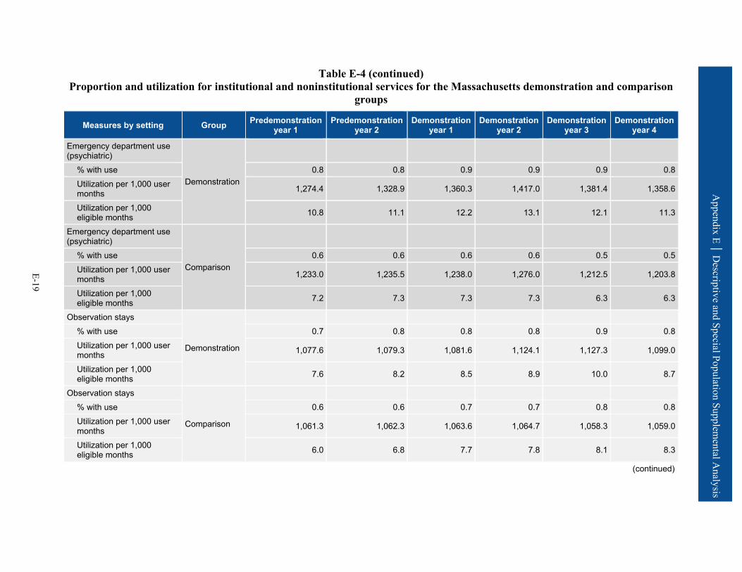
Appendix E │ D
escriptive and Special Population Supplemental A
nalysis
E-19
Table E-4 (continued) Proportion and utilization for institutional and noninstitutional services for the Massachusetts demonstration and comparison
groups
Measures by setting Group Predemonstration year 1
Predemonstration year 2
Demonstration year 1
Demonstration year 2
Demonstration year 3
Demonstration year 4
Emergency department use (psychiatric)
Demonstration
% with use 0.8 0.8 0.9 0.9 0.9 0.8 Utilization per 1,000 user months 1,274.4 1,328.9 1,360.3 1,417.0 1,381.4 1,358.6
Utilization per 1,000 eligible months 10.8 11.1 12.2 13.1 12.1 11.3
Emergency department use (psychiatric)
Comparison
% with use 0.6 0.6 0.6 0.6 0.5 0.5 Utilization per 1,000 user months 1,233.0 1,235.5 1,238.0 1,276.0 1,212.5 1,203.8
Utilization per 1,000 eligible months 7.2 7.3 7.3 7.3 6.3 6.3
Observation stays
Demonstration
% with use 0.7 0.8 0.8 0.8 0.9 0.8 Utilization per 1,000 user months 1,077.6 1,079.3 1,081.6 1,124.1 1,127.3 1,099.0
Utilization per 1,000 eligible months 7.6 8.2 8.5 8.9 10.0 8.7
Observation stays
Comparison
% with use 0.6 0.6 0.7 0.7 0.8 0.8 Utilization per 1,000 user months 1,061.3 1,062.3 1,063.6 1,064.7 1,058.3 1,059.0
Utilization per 1,000 eligible months 6.0 6.8 7.7 7.8 8.1 8.3
(continued)
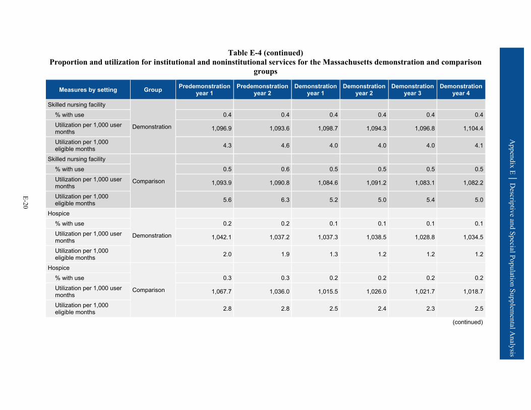
Appendix E │ D
escriptive and Special Population Supplemental A
nalysis
E-20
Table E-4 (continued) Proportion and utilization for institutional and noninstitutional services for the Massachusetts demonstration and comparison
groups
Measures by setting Group Predemonstration year 1
Predemonstration year 2
Demonstration year 1
Demonstration year 2
Demonstration year 3
Demonstration year 4
Skilled nursing facility
Demonstration
% with use 0.4 0.4 0.4 0.4 0.4 0.4 Utilization per 1,000 user months 1,096.9 1,093.6 1,098.7 1,094.3 1,096.8 1,104.4
Utilization per 1,000 eligible months 4.3 4.6 4.0 4.0 4.0 4.1
Skilled nursing facility
Comparison
% with use 0.5 0.6 0.5 0.5 0.5 0.5 Utilization per 1,000 user months 1,093.9 1,090.8 1,084.6 1,091.2 1,083.1 1,082.2
Utilization per 1,000 eligible months 5.6 6.3 5.2 5.0 5.4 5.0
Hospice
Demonstration
% with use 0.2 0.2 0.1 0.1 0.1 0.1 Utilization per 1,000 user months 1,042.1 1,037.2 1,037.3 1,038.5 1,028.8 1,034.5
Utilization per 1,000 eligible months 2.0 1.9 1.3 1.2 1.2 1.2
Hospice
Comparison
% with use 0.3 0.3 0.2 0.2 0.2 0.2 Utilization per 1,000 user months 1,067.7 1,036.0 1,015.5 1,026.0 1,021.7 1,018.7
Utilization per 1,000 eligible months 2.8 2.8 2.5 2.4 2.3 2.5
(continued)

Appendix E │ D
escriptive and Special Population Supplemental A
nalysis
E-21
Table E-4 (continued) Proportion and utilization for institutional and noninstitutional services for the Massachusetts demonstration and comparison
groups
Measures by setting Group Predemonstration year 1
Predemonstration year 2
Demonstration year 1
Demonstration year 2
Demonstration year 3
Demonstration year 4
Noninstitutional setting Primary care E&M visits
Demonstration
% with use 42.7 49.9 53.1 52.8 53.2 53.0 Utilization per 1,000 user months 1,688.5 1,765.1 1,847.1 1,906.7 1,902.9 1,888.2
Utilization per 1,000 eligible months 721.3 881.2 980.5 1,007.0 1,012.4 1,000.0
Primary care E&M visits
Comparison
% with use 44.2 50.2 52.0 52.4 52.6 52.3 Utilization per 1,000 user months 1,693.4 1,768.0 1,834.7 1,831.5 1,848.9 1,863.1
Utilization per 1,000 eligible months 748.5 887.5 953.2 960.4 972.2 974.0
Outpatient therapy (PT, OT, ST)
Demonstration
% with use 2.5 2.5 2.4 2.5 2.6 2.6 Utilization per 1,000 user months 9,885.6 9,626.0 10,219.8 10,004.1 10,209.6 9,557.7
Utilization per 1,000 eligible months 249.9 241.9 246.0 245.9 261.6 251.0
Outpatient therapy (PT, OT, ST)
Comparison
% with use 2.6 2.6 2.5 2.7 3.0 3.1 Utilization per 1,000 user months 13,981.2 13,468.6 15,739.1 16,063.9 16,943.2 16,076.3
Utilization per 1,000 eligible months 359.6 348.0 401.2 427.2 502.4 501.8
(continued)

Appendix E │ D
escriptive and Special Population Supplemental A
nalysis
E-22
Table E-4 (continued) Proportion and utilization for institutional and noninstitutional services for the Massachusetts demonstration and comparison
groups
Measures by setting Group Predemonstration year 1
Predemonstration year 2
Demonstration year 1
Demonstration year 2
Demonstration year 3
Demonstration year 4
Independent therapy (PT, OT, ST)
Demonstration
% with use 1.2 1.2 1.3 1.4 1.5 1.6 Utilization per 1,000 user months 9,586.7 9,816.1 11,646.6 11,975.2 12,188.1 11,721.1
Utilization per 1,000 eligible months 117.1 122.0 156.8 171.4 187.3 181.9
Independent therapy (PT, OT, ST)
Comparison
% with use 1.4 1.4 1.6 1.6 1.7 1.8 Utilization per 1,000 user months 10,606.7 11,148.5 13,526.5 13,833.5 13,999.3 13,503.5
Utilization per 1,000 eligible months 144.7 155.4 209.8 227.4 242.4 239.1
Other hospital outpatient services
Demonstration
% with use 37.3 36.6 36.5 36.3 36.8 36.7 Utilization per 1,000 user months — — — — — —
Utilization per 1,000 eligible months — — — — — —
Other hospital outpatient services
Comparison
% with use 23.1 23.7 23.3 23.0 23.5 23.9 Utilization per 1,000 user months — — — — — —
Utilization per 1,000 eligible months — — — — — —
— = data not available. E&M = evaluation and management; OT = occupational therapy; PT = physical therapy; ST = speech therapy. 1 Includes acute admissions, inpatient rehabilitation, and long-term care hospital admissions. SOURCE: RTI International analysis of Medicare fee-for-service claims and encounter data.

Appendix E │ D
escriptive and Special Population Supplemental A
nalysis
E-23
Table E-5 Quality of care and care coordination outcomes for the Massachusetts demonstration and comparison groups
Quality and care coordination measures Group Predemonstration
year 1 Predemonstration
year 2 Demonstration
year 1 Demonstration
year 2 Demonstration
year 3 Demonstration
year 4
30-day all-cause risk-standardized readmission rate (%)
Demonstration 22.4 22.3 19.2 19.7 19.2 19.9
Comparison 21.7 22.0 17.8 17.3 18.0 17.8
Preventable ED visits per eligible months
Demonstration 0.0471 0.0453 0.0460 0.0464 0.0441 0.0419 Comparison 0.0430 0.0438 0.0445 0.0428 0.0401 0.0397
Rate of 30-day follow-up after hospitalization for mental illness (%)
Demonstration 60.1 60.3 61.2 57.5 52.1 50.0
Comparison 52.0 53.8 54.7 51.4 44.6 44.5
Ambulatory care sensitive condition admissions per eligible months—overall composite (AHRQ PQI #90)
Demonstration 0.0040 0.0038 0.0044 0.0042 0.0044 0.0046
Comparison 0.0043 0.0043 0.0045 0.0044 0.0048 0.0050
Ambulatory care sensitive condition admissions per eligible months—chronic composite (AHRQ PQI #92)
Demonstration 0.0024 0.0022 0.0032 0.0031 0.0032 0.0035
Comparison 0.0025 0.0025 0.0030 0.0030 0.0032 0.0036
Screening for clinical depression per eligible months
Demonstration 0.0001 0.0009 0.0024 0.0040 0.0031 0.0020 Comparison 0.0001 0.0007 0.0022 0.0035 0.0038 0.0027
AHRQ PQI = Agency for Healthcare Research and Quality Prevention Quality Indicator; ED = emergency department. SOURCE: RTI International analysis of Medicare fee-for-service claims and encounter data.

Appendix E │ D
escriptive and Special Population Supplemental A
nalysis
E-24
Table E-6 MDS long-stay NF utilization and characteristics at admission for the
Massachusetts demonstration and comparison groups
Measures by setting Group Predemonstra- tion year 1
Predemonstra- tion year 2
Demonstration period 1
Demonstration period 2
Demonstration period 3
Demonstration period 4
Annual NF utilization Number of demonstration beneficiaries Demonstration 75,236 81,167 71,553 77,755 82,373 83,363
New long-stay nursing facility admissions per 1,000 eligible beneficiaries
3.8 3.1 3.8 2.4 3.0 3.0
Number of comparison beneficiaries Comparison 111,926 120,423 123,283 130,143 138,349 127,969
New long-stay nursing facility admissions per 1,000 eligible beneficiaries
5.0 5.4 4.8 4.2 4.4 4.3
Number of demonstration beneficiaries Demonstration 76,766 82,854 72,363 78,520 83,103 84,104
Long-stay nursing facility users as % of eligible beneficiaries 2.1 2.1 1.3 1.1 1.0 1.1
Number of comparison beneficiaries long-stay sample Comparison 116,456 124,909 127,057 134,205 143,311 132,309
Long-stay nursing facility users as % of eligible beneficiaries 4.0 3.9 3.2 3.2 3.6 3.5
Characteristics of new long-stay nursing facility residents at admission Number of admitted demonstration beneficiaries Demonstration 289 249 272 185 247 254
Number of admitted comparison beneficiaries Comparison 561 645 586 545 608 554
Functional status (RUG-IV ADL scale) Demonstration 6.9 7.6 6.9 7.4 7.3 7.1
Functional status (RUG-IV ADL scale) Comparison 8.3 8.4 8.5 8.4 8.9 9.0
(continued)

Appendix E │ D
escriptive and Special Population Supplemental A
nalysis
E-25
Table E-6 (continued) MDS long-stay NF utilization and characteristics at admission for the
Massachusetts demonstration and comparison groups
Measures by setting Group Predemonstra- tion year 1
Predemonstra- tion year 2
Demonstration period 1
Demonstration period 2
Demonstration period 3
Demonstration period 4
Percent with severe cognitive impairment Demonstration 17.2 15.0 13.8 17.1 13.3 12.3
Percent with severe cognitive impairment Comparison 27.0 32.1 26.3 23.8 26.1 29.2
Percent with low level of care need Demonstration 2.6 3.4 3.1 2.2 1.6 3.9
Percent with low level of care need Comparison 3.7 1.6 2.1 3.9 1.6 0.9
ADL = activity of daily living; MDS = Minimum Data Set; NF = nursing facility; RUG = resource utilization group. NOTE: A higher score on the RUG-IV ADL scale indicates greater impairment, or worse functional status. SOURCE: RTI International analysis of Minimum Data Set data.
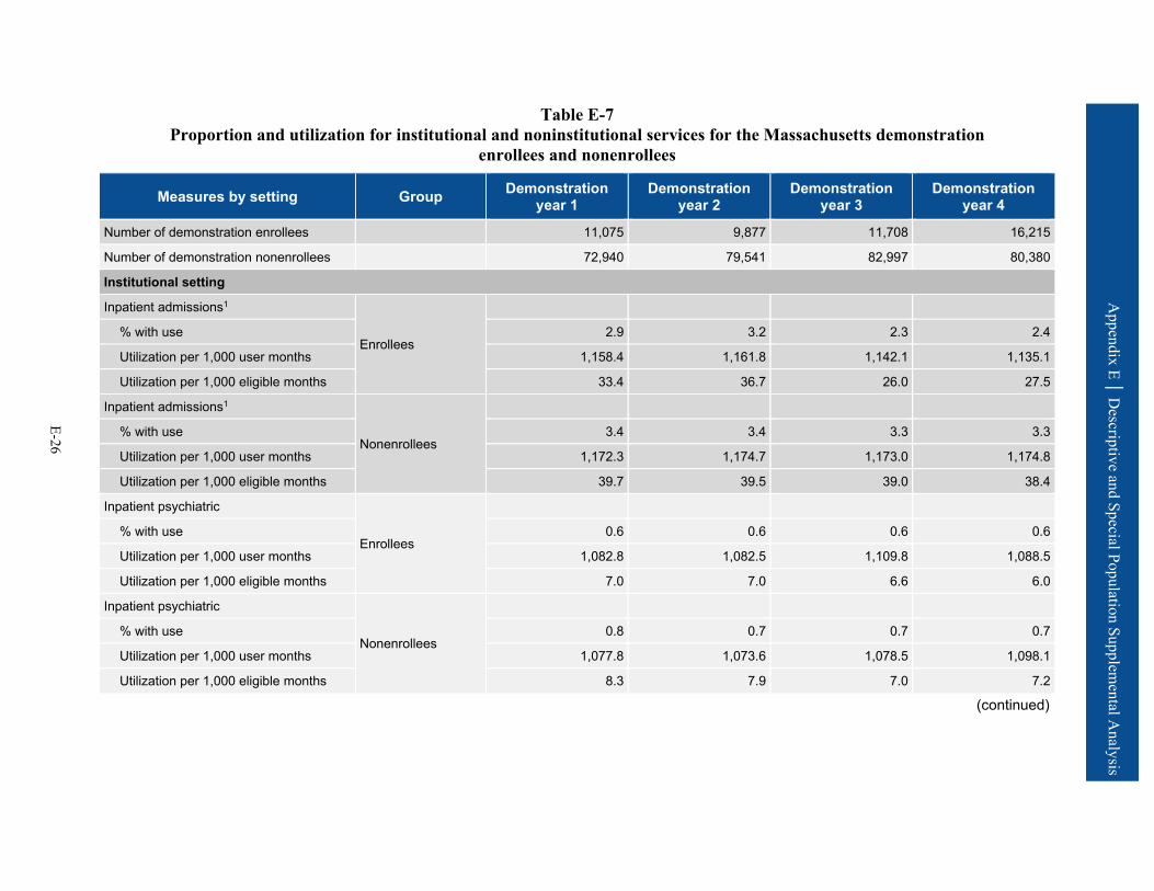
Appendix E │ D
escriptive and Special Population Supplemental A
nalysis
E-26
Table E-7 Proportion and utilization for institutional and noninstitutional services for the Massachusetts demonstration
enrollees and nonenrollees
Measures by setting Group Demonstration year 1
Demonstration year 2
Demonstration year 3
Demonstration year 4
Number of demonstration enrollees 11,075 9,877 11,708 16,215
Number of demonstration nonenrollees 72,940 79,541 82,997 80,380
Institutional setting
Inpatient admissions1
Enrollees
% with use 2.9 3.2 2.3 2.4
Utilization per 1,000 user months 1,158.4 1,161.8 1,142.1 1,135.1
Utilization per 1,000 eligible months 33.4 36.7 26.0 27.5
Inpatient admissions1
Nonenrollees
% with use 3.4 3.4 3.3 3.3
Utilization per 1,000 user months 1,172.3 1,174.7 1,173.0 1,174.8
Utilization per 1,000 eligible months 39.7 39.5 39.0 38.4
Inpatient psychiatric
Enrollees
% with use 0.6 0.6 0.6 0.6
Utilization per 1,000 user months 1,082.8 1,082.5 1,109.8 1,088.5
Utilization per 1,000 eligible months 7.0 7.0 6.6 6.0
Inpatient psychiatric
Nonenrollees
% with use 0.8 0.7 0.7 0.7
Utilization per 1,000 user months 1,077.8 1,073.6 1,078.5 1,098.1
Utilization per 1,000 eligible months 8.3 7.9 7.0 7.2
(continued)
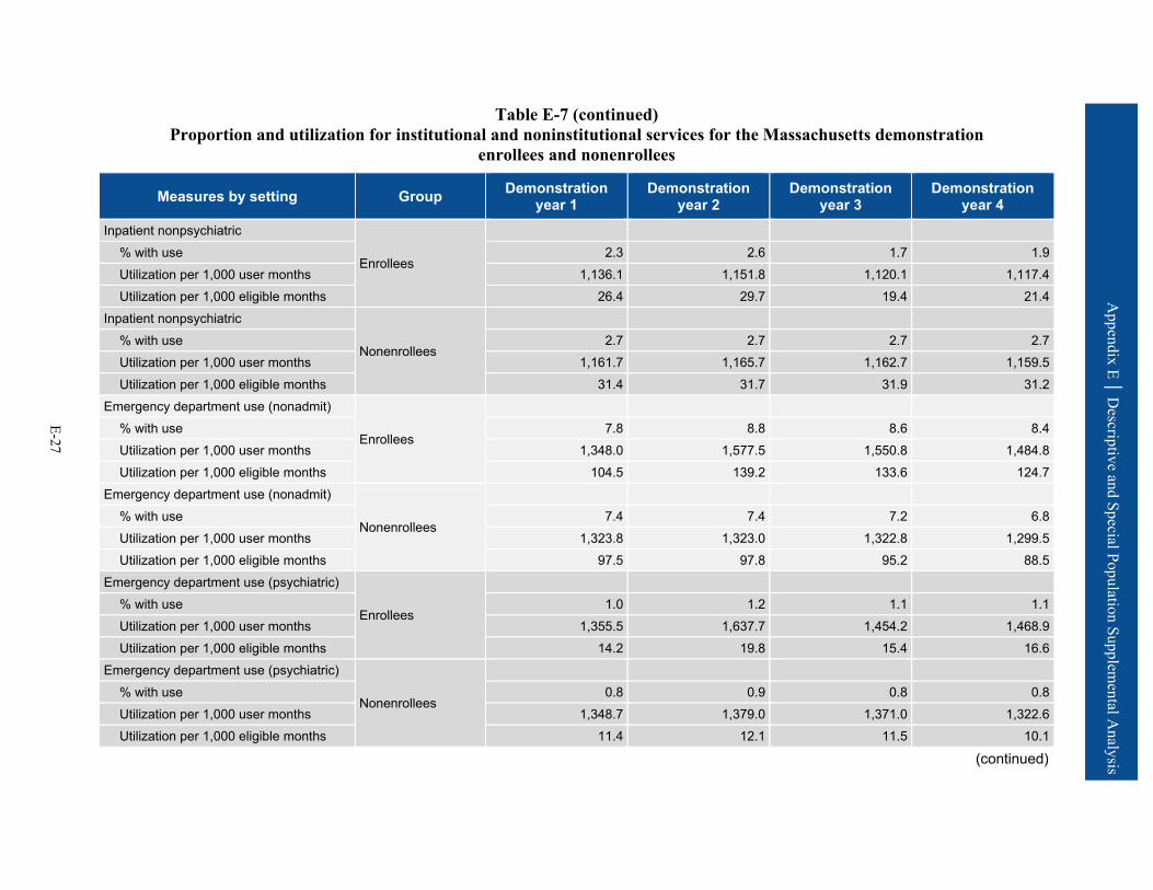
Appendix E │ D
escriptive and Special Population Supplemental A
nalysis
E-27
Table E-7 (continued) Proportion and utilization for institutional and noninstitutional services for the Massachusetts demonstration
enrollees and nonenrollees
Measures by setting Group Demonstration year 1
Demonstration year 2
Demonstration year 3
Demonstration year 4
Inpatient nonpsychiatric
Enrollees
% with use 2.3 2.6 1.7 1.9 Utilization per 1,000 user months 1,136.1 1,151.8 1,120.1 1,117.4 Utilization per 1,000 eligible months 26.4 29.7 19.4 21.4
Inpatient nonpsychiatric
Nonenrollees
% with use 2.7 2.7 2.7 2.7 Utilization per 1,000 user months 1,161.7 1,165.7 1,162.7 1,159.5 Utilization per 1,000 eligible months 31.4 31.7 31.9 31.2
Emergency department use (nonadmit)
Enrollees
% with use 7.8 8.8 8.6 8.4 Utilization per 1,000 user months 1,348.0 1,577.5 1,550.8 1,484.8 Utilization per 1,000 eligible months 104.5 139.2 133.6 124.7
Emergency department use (nonadmit)
Nonenrollees
% with use 7.4 7.4 7.2 6.8 Utilization per 1,000 user months 1,323.8 1,323.0 1,322.8 1,299.5 Utilization per 1,000 eligible months 97.5 97.8 95.2 88.5
Emergency department use (psychiatric)
Enrollees
% with use 1.0 1.2 1.1 1.1 Utilization per 1,000 user months 1,355.5 1,637.7 1,454.2 1,468.9 Utilization per 1,000 eligible months 14.2 19.8 15.4 16.6
Emergency department use (psychiatric)
Nonenrollees
% with use 0.8 0.9 0.8 0.8 Utilization per 1,000 user months 1,348.7 1,379.0 1,371.0 1,322.6 Utilization per 1,000 eligible months 11.4 12.1 11.5 10.1
(continued)

Appendix E │ D
escriptive and Special Population Supplemental A
nalysis
E-28
Table E-7 (continued) Proportion and utilization for institutional and noninstitutional services for the Massachusetts demonstration
enrollees and nonenrollees
Measures by setting Group Demonstration year 1
Demonstration year 2
Demonstration year 3
Demonstration year 4
Observation stays
Enrollees
% with use 0.6 0.9 1.3 1.0 Utilization per 1,000 user months 1,065.0 1,413.7 1,403.7 1,264.6 Utilization per 1,000 eligible months 6.5 13.2 18.3 12.8
Observation stays
Nonenrollees
% with use 0.8 0.8 0.8 0.7 Utilization per 1,000 user months 1,081.3 1,077.5 1,072.3 1,058.9 Utilization per 1,000 eligible months 8.4 8.3 8.7 7.9
Skilled nursing facility
Enrollees
% with use 0.3 0.4 0.5 0.5 Utilization per 1,000 user months 1,111.9 1,105.0 1,098.5 1,096.5 Utilization per 1,000 eligible months 3.4 4.3 5.0 4.9
Skilled nursing facility
Nonenrollees
% with use 0.4 0.4 0.3 0.4 Utilization per 1,000 user months 1,097.1 1,092.5 1,096.9 1,108.7 Utilization per 1,000 eligible months 4.1 4.0 3.8 3.9
Hospice
Enrollees
% with use 0.0 0.0 0.1 0.1 Utilization per 1,000 user months 1,000.0 1,133.3 1,000.0 1,051.9 Utilization per 1,000 eligible months 0.4 0.5 0.6 0.5
Hospice
Nonenrollees
% with use 0.1 0.1 0.1 0.1 Utilization per 1,000 user months 1,038.2 1,034.3 1,030.6 1,033.1 Utilization per 1,000 eligible months 1.4 1.3 1.3 1.4
(continued)
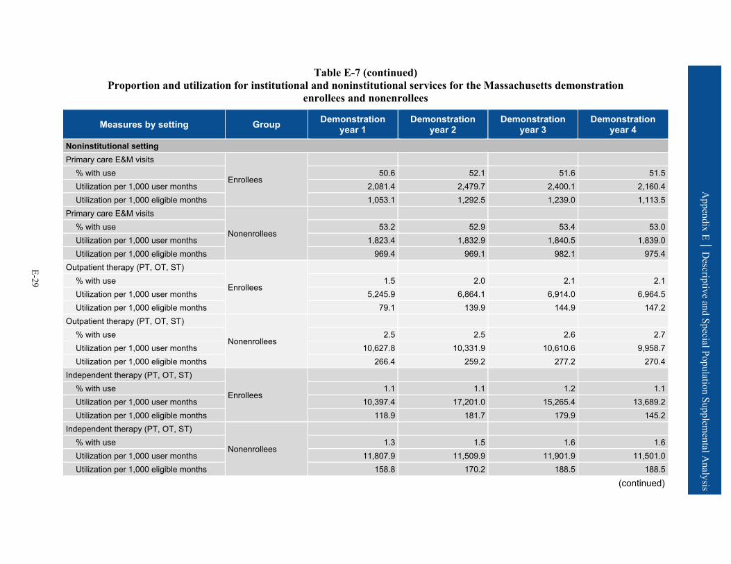
Appendix E │ D
escriptive and Special Population Supplemental A
nalysis
E-29
Table E-7 (continued) Proportion and utilization for institutional and noninstitutional services for the Massachusetts demonstration
enrollees and nonenrollees
Measures by setting Group Demonstration year 1
Demonstration year 2
Demonstration year 3
Demonstration year 4
Noninstitutional setting Primary care E&M visits
Enrollees
% with use 50.6 52.1 51.6 51.5 Utilization per 1,000 user months 2,081.4 2,479.7 2,400.1 2,160.4 Utilization per 1,000 eligible months 1,053.1 1,292.5 1,239.0 1,113.5
Primary care E&M visits
Nonenrollees
% with use 53.2 52.9 53.4 53.0 Utilization per 1,000 user months 1,823.4 1,832.9 1,840.5 1,839.0 Utilization per 1,000 eligible months 969.4 969.1 982.1 975.4
Outpatient therapy (PT, OT, ST)
Enrollees
% with use 1.5 2.0 2.1 2.1 Utilization per 1,000 user months 5,245.9 6,864.1 6,914.0 6,964.5 Utilization per 1,000 eligible months 79.1 139.9 144.9 147.2
Outpatient therapy (PT, OT, ST)
Nonenrollees
% with use 2.5 2.5 2.6 2.7 Utilization per 1,000 user months 10,627.8 10,331.9 10,610.6 9,958.7 Utilization per 1,000 eligible months 266.4 259.2 277.2 270.4
Independent therapy (PT, OT, ST)
Enrollees
% with use 1.1 1.1 1.2 1.1 Utilization per 1,000 user months 10,397.4 17,201.0 15,265.4 13,689.2 Utilization per 1,000 eligible months 118.9 181.7 179.9 145.2
Independent therapy (PT, OT, ST)
Nonenrollees
% with use 1.3 1.5 1.6 1.6 Utilization per 1,000 user months 11,807.9 11,509.9 11,901.9 11,501.0 Utilization per 1,000 eligible months 158.8 170.2 188.5 188.5
(continued)

Appendix E │ D
escriptive and Special Population Supplemental A
nalysis
E-30
Table E-7 (continued) Proportion and utilization for institutional and noninstitutional services for the Massachusetts demonstration
enrollees and nonenrollees
Measures by setting Group Demonstration year 1
Demonstration year 2
Demonstration year 3
Demonstration year 4
Other hospital outpatient services
Enrollees
% with use 28.2 32.3 34.0 34.7 Utilization per 1,000 user months — — — —
Utilization per 1,000 eligible months — — — —
Other hospital outpatient services
Nonenrollees
% with use 36.7 36.8 37.0 36.9 Utilization per 1,000 user months — — — —
Utilization per 1,000 eligible months — — — —
— = data not available. E&M = evaluation and management; OT = occupational therapy; PT = physical therapy; ST = speech therapy. 1 Includes acute admissions, inpatient rehabilitation, and long-term care hospital admissions. SOURCE: RTI International analysis of Medicare fee-for-service claims and encounter data.
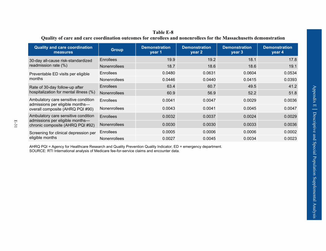
Appendix E │ D
escriptive and Special Population Supplemental A
nalysis
E-31
Table E-8 Quality of care and care coordination outcomes for enrollees and nonenrollees for the Massachusetts demonstration
Quality and care coordination measures Group Demonstration
year 1 Demonstration
year 2 Demonstration
year 3 Demonstration
year 4
30-day all-cause risk-standardized readmission rate (%)
Enrollees 19.9 19.2 18.1 17.8 Nonenrollees 18.7 18.6 18.6 19.1
Preventable ED visits per eligible months
Enrollees 0.0480 0.0631 0.0604 0.0534 Nonenrollees 0.0446 0.0440 0.0415 0.0393
Rate of 30-day follow-up after hospitalization for mental illness (%)
Enrollees 63.4 60.7 49.5 41.2 Nonenrollees 60.9 56.9 52.2 51.8
Ambulatory care sensitive condition admissions per eligible months—overall composite (AHRQ PQI #90)
Enrollees 0.0041 0.0047 0.0029 0.0036
Nonenrollees 0.0043 0.0041 0.0045 0.0047
Ambulatory care sensitive condition admissions per eligible months—chronic composite (AHRQ PQI #92)
Enrollees 0.0032 0.0037 0.0024 0.0029
Nonenrollees 0.0030 0.0030 0.0033 0.0036
Screening for clinical depression per eligible months
Enrollees 0.0005 0.0006 0.0006 0.0002 Nonenrollees 0.0027 0.0045 0.0034 0.0023
AHRQ PQI = Agency for Healthcare Research and Quality Prevention Quality Indicator; ED = emergency department. SOURCE: RTI International analysis of Medicare fee-for-service claims and encounter data.
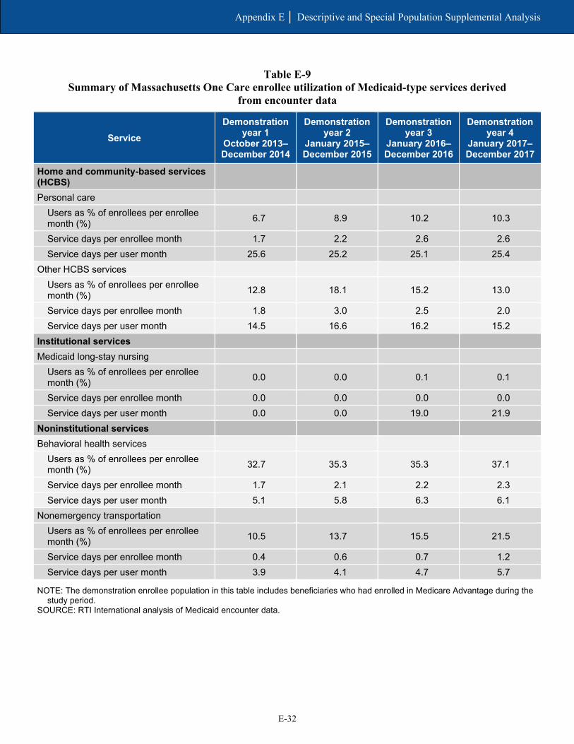
E-32
Appendix E │ Descriptive and Special Population Supplemental Analysis
Table E-9 Summary of Massachusetts One Care enrollee utilization of Medicaid-type services derived
from encounter data
Service Demonstration
year 1 October 2013–December 2014
Demonstration year 2
January 2015–December 2015
Demonstration year 3
January 2016–December 2016
Demonstration year 4
January 2017–December 2017
Home and community-based services (HCBS)
Personal care Users as % of enrollees per enrollee month (%) 6.7 8.9 10.2 10.3
Service days per enrollee month 1.7 2.2 2.6 2.6 Service days per user month 25.6 25.2 25.1 25.4
Other HCBS services Users as % of enrollees per enrollee month (%) 12.8 18.1 15.2 13.0
Service days per enrollee month 1.8 3.0 2.5 2.0 Service days per user month 14.5 16.6 16.2 15.2
Institutional services Medicaid long-stay nursing
Users as % of enrollees per enrollee month (%) 0.0 0.0 0.1 0.1
Service days per enrollee month 0.0 0.0 0.0 0.0 Service days per user month 0.0 0.0 19.0 21.9
Noninstitutional services Behavioral health services
Users as % of enrollees per enrollee month (%) 32.7 35.3 35.3 37.1
Service days per enrollee month 1.7 2.1 2.2 2.3 Service days per user month 5.1 5.8 6.3 6.1
Nonemergency transportation Users as % of enrollees per enrollee month (%) 10.5 13.7 15.5 21.5
Service days per enrollee month 0.4 0.6 0.7 1.2 Service days per user month 3.9 4.1 4.7 5.7
NOTE: The demonstration enrollee population in this table includes beneficiaries who had enrolled in Medicare Advantage during the study period.
SOURCE: RTI International analysis of Medicaid encounter data.
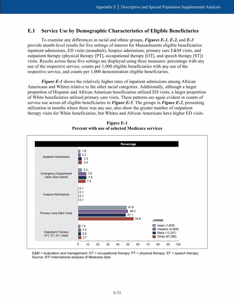
E-33
Appendix E │ Descriptive and Special Population Supplemental Analysis
E.1 Service Use by Demographic Characteristics of Eligible Beneficiaries
To examine any differences in racial and ethnic groups, Figures E-1, E-2, and E-3 provide month-level results for five settings of interest for Massachusetts eligible beneficiaries: inpatient admissions, ED visits (nonadmit), hospice admissions, primary care E&M visits, and outpatient therapy (physical therapy [PT], occupational therapy [OT], and speech therapy [ST]) visits. Results across these five settings are displayed using three measures: percentage with any use of the respective service, counts per 1,000 eligible beneficiaries with any use of the respective service, and counts per 1,000 demonstration eligible beneficiaries.
Figure E-1 shows the relatively higher rates of inpatient admissions among African Americans and Whites relative to the other racial categories. Additionally, although a larger proportion of Hispanic and African American beneficiaries utilized ED visits, a larger proportion of White beneficiaries utilized primary care visits. These patterns are again evident in counts of service use across all eligible beneficiaries in Figure E-3. The groups in Figure E-2, presenting utilization in months where there was any use, also show the greater number of outpatient therapy visits for White beneficiaries, but Whites and African Americans have higher ED visits.
Figure E-1 Percent with use of selected Medicare services
E&M = evaluation and management; OT = occupational therapy; PT = physical therapy; ST = speech therapy. Source: RTI International analysis of Medicare data
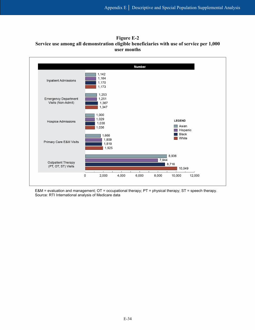
E-34
Appendix E │ Descriptive and Special Population Supplemental Analysis
Figure E-2 Service use among all demonstration eligible beneficiaries with use of service per 1,000
user months
E&M = evaluation and management; OT = occupational therapy; PT = physical therapy; ST = speech therapy. Source: RTI International analysis of Medicare data

E-35
Appendix E │ Descriptive and Special Population Supplemental Analysis
Figure E-3 Service use among all demonstration eligible beneficiaries per 1,000 eligible months
E&M = evaluation and management; OT = occupational therapy; PT = physical therapy; ST = speech therapy. Source: RTI International analysis of Medicare data

E-36
Appendix E │ Descriptive and Special Population Supplemental Analysis
[This page intentionally left blank.]

Appendix F Cost Savings Methodology and Supplemental Tables
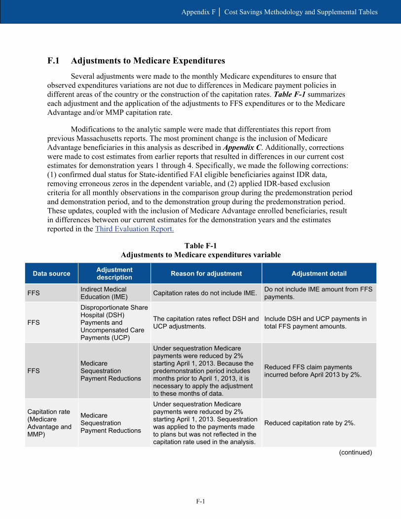
F-1
Appendix F │ Cost Savings Methodology and Supplemental Tables
F.1 Adjustments to Medicare Expenditures
Several adjustments were made to the monthly Medicare expenditures to ensure that observed expenditures variations are not due to differences in Medicare payment policies in different areas of the country or the construction of the capitation rates. Table F-1 summarizes each adjustment and the application of the adjustments to FFS expenditures or to the Medicare Advantage and/or MMP capitation rate.
Modifications to the analytic sample were made that differentiates this report from previous Massachusetts reports. The most prominent change is the inclusion of Medicare Advantage beneficiaries in this analysis as described in Appendix C. Additionally, corrections were made to cost estimates from earlier reports that resulted in differences in our current cost estimates for demonstration years 1 through 4. Specifically, we made the following corrections: (1) confirmed dual status for State-identified FAI eligible beneficiaries against IDR data, removing erroneous zeros in the dependent variable, and (2) applied IDR-based exclusion criteria for all monthly observations in the comparison group during the predemonstration period and demonstration period, and to the demonstration group during the predemonstration period. These updates, coupled with the inclusion of Medicare Advantage enrolled beneficiaries, result in differences between our current estimates for the demonstration years and the estimates reported in the Third Evaluation Report.
Table F-1 Adjustments to Medicare expenditures variable
Data source Adjustment description Reason for adjustment Adjustment detail
FFS Indirect Medical Education (IME) Capitation rates do not include IME. Do not include IME amount from FFS
payments.
FFS
Disproportionate Share Hospital (DSH) Payments and Uncompensated Care Payments (UCP)
The capitation rates reflect DSH and UCP adjustments.
Include DSH and UCP payments in total FFS payment amounts.
FFS Medicare Sequestration Payment Reductions
Under sequestration Medicare payments were reduced by 2% starting April 1, 2013. Because the predemonstration period includes months prior to April 1, 2013, it is necessary to apply the adjustment to these months of data.
Reduced FFS claim payments incurred before April 2013 by 2%.
Capitation rate (Medicare Advantage and MMP)
Medicare Sequestration Payment Reductions
Under sequestration Medicare payments were reduced by 2% starting April 1, 2013. Sequestration was applied to the payments made to plans but was not reflected in the capitation rate used in the analysis.
Reduced capitation rate by 2%.
(continued)

F-2
Appendix F │ Cost Savings Methodology and Supplemental Tables
Table F-1 (continued) Adjustments to Medicare expenditures variable
Data source Adjustment description Reason for adjustment Adjustment detail
Capitation rate (Medicare Advantage)
Bad debt
The Medicare portion of the capitation rate includes an upward adjustment to account for bad debt. Bad debt is not included in the FFS claim payments and therefore needs to be removed from the capitation rate for the savings analysis. (Note: “bad debt” is reflected in the hospital “pass through” payment.)
Reduced capitation rate to account for bad debt load (historical bad debt baseline percentage). This is 0% for CY 2011, 0.93% for CY 2012, 0.91% for CY 2013, 0.89% for CY 2014, 0.89% for CY 2015, 0.97% for CY 2016, and 0.81% for CY 2017.
Capitation rate (MMP) Bad debt
The Medicare portion of the capitation rate includes an upward adjustment to account for bad debt. Bad debt is not included in the FFS claim payments and therefore needs to be removed from the capitation rate for the savings analysis. (Note, “bad debt” is reflected in the hospital “pass through” payment.)
Reduced blended capitation rate to account for bad debt load (historical bad debt baseline percentage). This is 0.89% for CY14, 0.89% for CY15, 0.97% for CY16, and 0.81% for CY17. Reduced the FFS portion of the capitation rate by an additional 0% for CY 2013, 1.89% for CY 2014 1.71% for CY 2015, 1.84% for CY 2016, and 1.74% for CY 2017 to account for the disproportional share of bad debt attributable to Medicare-Medicaid enrollees in Medicare FFS.
FFS and capitation rate (Medicare Advantage and MMP)
Average Geographic Adjustments (AGA)
The Medicare portion of the capitation rate reflects the most current hospital wage index and physician geographic practice cost index by county. FFS claims also reflect geographic payment adjustments. To ensure that change over time is not related to differential change in geographic payment adjustments, both the FFS and the capitation rates were “unadjusted” using the appropriate county-specific AGA factor.
Medicare FFS expenditures were divided by the appropriate county-specific 1-year AGA factor for each year. Capitation rates were divided by the appropriate county-specific 5-year AGA factor for each year. Note that the AGA factor applied to the capitated rates for 2014 reflected the 50/50 blend that was applicable to the payment year.
(continued)
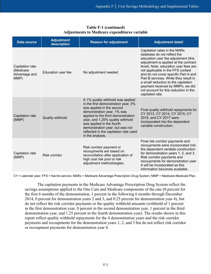
F-3
Appendix F │ Cost Savings Methodology and Supplemental Tables
Table F-1 (continued) Adjustments to Medicare expenditures variable
Data source Adjustment description Reason for adjustment Adjustment detail
Capitation rate (Medicare Advantage and MMP)
Education user fee No adjustment needed.
Capitation rates in the MARx database do not reflect the education user fee adjustment (this adjustment is applied at the contract level). Note, education user fees are not applicable in the FFS context and do not cover specific Part A and Part B services. While they result in a small reduction to the capitation payment received by MMPs, we did not account for this reduction in the capitated rate.
Capitation rate (MMP) Quality withhold
A 1% quality withhold was applied in the first demonstration year, 0% was applied in the second demonstration year, 1% was applied to the third demonstration year, and 1.25% quality withhold was applied in the fourth demonstration year, but was not reflected in the capitation rate used in the analysis.
Final quality withhold repayments for CY 2013, CY 2014, CY 2015, CY 2016, and CY 2017 were incorporated into the dependent variable construction.
Capitation rate (MMP) Risk corridor
Risk corridor payment or recoupments are based on reconciliation after application of high cost risk pool or risk adjustment methodologies.
Final risk corridor payments and recoupments were incorporated into the dependent variable construction for demonstration years 1, 2, and 3. Risk corridor payments and recoupments for demonstration year 4 will be incorporated as this information becomes available.
CY = calendar year; FFS = fee-for-service; MARx = Medicare Advantage Prescription Drug System; MMP = Medicare-Medicaid Plan.
The capitation payments in the Medicare Advantage Prescription Drug System reflect the savings assumptions applied to the One Care and Medicare components of the rate (0 percent for the first 6 months of the demonstration, 1 percent in the following 6 months through December 2014, 0 percent for demonstration years 2 and 3, and 0.25 percent for demonstration year 4), but do not reflect the risk corridor payments or the quality withhold amounts (withhold of 1 percent in the first demonstration year, 0 percent in the second demonstration year, 1 percent in the third demonstration year, and 1.25 percent in the fourth demonstration year). The results shown in this report reflect quality withhold repayments for the 4 demonstration years and the risk corridor payments and recoupments for the demonstration years 1, 2, and 3 but do not reflect risk corridor or recoupment payments for demonstration year 4.

F-4
Appendix F │ Cost Savings Methodology and Supplemental Tables
F.2 Model Covariates
Model covariates included the following variables, which were also included in the comparison group selection process. Variables were included in the model after variance inflation factor testing.
• Demographic variables included in the model were: – Age – Gender – Race/ethnicity – Enrollment in another Medicare shared savings program – End-stage renal disease status – Disability status as original reason for Medicare entitlement – Medicare Advantage status
• Area-level variables included in the savings model were: – Medicare spending per Medicare-Medicaid enrollee age 19 or older – Medicare Advantage penetration rate – Medicaid-to-Medicare FFS fee index for all services – Medicaid spending per Medicare-Medicaid enrollee age 19 or older – Proportion of Medicare-Medicaid enrollees using
■ Nursing facilities age 65 or older ■ HCBS age 65 or older ■ Personal care age 65 or older ■ Medicaid managed care age 19 or older
– Physicians per 1,000 population
– Percentage of population living in married household
– Percentage of households with member greater than age 60
– Percentage of households with member less than age 18
– Percentage of adults with college degree
– Unemployment rate
– Percentage of adults with self-care limitations

F-5
Appendix F │ Cost Savings Methodology and Supplemental Tables
F.3 Results
Once the adjustments to the expenditures are finalized, we review a required assumption of a DinD model—parallel trends in the predemonstration period—by plotting the weighted monthly mean expenditure for the demonstration and comparison groups. Figure F-1 is the resulting trend plot.
Figure F-1 Mean monthly Medicare expenditures (weighted), predemonstration and demonstration
period, One Care eligible and comparison group, October 2011–December 2017
SOURCE: RTI Analysis of Massachusetts demonstration eligible and comparison group Medicare data
(program: MADY4_paymentgraphs.log).
Tables F-2, F-3, F-4, and F-5 show the mean monthly Medicare expenditures for the demonstration group and comparison group in the predemonstration and each demonstration period, weighted and unadjusted. These tables show an increase in mean monthly Medicare expenditures during demonstration years 1–4 for both the demonstration group and the comparison group. The weighted mean increase in demonstration year 1 was $19.28 for demonstration eligible beneficiaries and $29.70 for the comparison group.
The difference-in-differences (DinD) values in each table represent the overall impact on savings using descriptive statistics. These effects are descriptive in that they are arithmetic combinations of simple means, without controlling for covariates. The change in the demonstration group minus the change in the comparison group is the DinD value. This value would be equal to zero if the differences between predemonstration and the demonstration year were the same for both the demonstration group and the comparison group. A negative value would indicate savings in the demonstration group, and a positive value would indicate increased

F-6
Appendix F │ Cost Savings Methodology and Supplemental Tables
cost in the demonstration group. Note that these values are descriptive and not adjusted, in contrast to the adjusted means table presented in Section 6, Demonstration Impact on Cost Savings. Therefore, direct comparability between these is limited.
Although the DinD values in demonstration year 1 are negative, indicating savings, none of the DinD values (weighted or unweighted) in demonstration years 2–4 are statistically significant (illustrated by the 95 percent confidence intervals that include 0).
Table F-2 Mean monthly Medicare expenditures for One Care eligible and comparison group,
predemonstration period and demonstration year 1, weighted
Group Predemonstration period
(Oct 2011–Sept 2013) (95% confidence intervals)
Demonstration year 1 (Oct 2013–Dec 2014)
(95% confidence intervals)
Difference (95% confidence
intervals)8
Demonstration $879.31 ($848.02, $910.60)
$898.60 ($875.69, $921.51)
$19.28 (−$2.34, $40.91)
Comparison $930.01 ($885.19, $974.82)
$959.71 ($904.93, $1,014.48)
$29.70 ($8.14, $51.26)
DinD N/A N/A −$10.42 (−$39.75, $18.92)
DinD = difference-in-differences; N/A = not applicable. NOTE: 95 percent confidence intervals are shown in parenthesis below estimates. SOURCE: RTI Analysis of Massachusetts demonstration eligible and comparison group Medicare data (program:
ma_y4_cs_1501_tables.log)
Table F-3 Mean monthly Medicare expenditures for One Care eligible and comparison group,
predemonstration period and demonstration year 2, weighted
Group Predemonstration period
(Oct 2011–Sept 2013) (95% confidence intervals)
Demonstration year 2 (Jan 2015–Dec 2015)
(95% confidence intervals)
Difference (95% confidence
intervals)
Demonstration $879.31 ($848.02, $910.60)
$918.14 ($894.59, $941.69)
$38.83 ($20.35, $57.30)
Comparison $930.01 ($885.19, $974.82)
$952.35 ($906.16, $998.53)
$22.34 ($3.62, $41.06)
DinD N/A N/A $16.49 (−$9.26, $42.23)
DinD = difference-in-differences; N/A = not applicable. NOTE: 95 percent confidence intervals are shown in parenthesis below estimates. SOURCE: RTI Analysis of Massachusetts demonstration eligible and comparison group Medicare data (program:
ma_y4_cs_1501_tables.log)

F-7
Appendix F │ Cost Savings Methodology and Supplemental Tables
Table F-4 Mean monthly Medicare expenditures for One Care eligible and comparison group,
predemonstration period and demonstration year 3, weighted
Group Predemonstration period
(Oct 2011–Sept 2013) (95% confidence intervals)
Demonstration year 3 (Jan 2016–Dec 2016)
(95% confidence intervals)
Difference (95% confidence
intervals)
Demonstration $879.31 ($848.02, $910.60)
$948.34 ($929.01, $967.67)
$69.02 ($41.27, $96.78)
Comparison $930.01 ($885.19, $974.82)
$979.30 ($935.87, $1,022.73)
$49.29 ($27.35, $71.23)
DinD N/A N/A $19.73 (−$14.74, $54.20)
DinD = difference-in-differences; N/A = not applicable. NOTE: 95 percent confidence intervals are shown in parenthesis below estimates. SOURCE: RTI Analysis of Massachusetts demonstration eligible and comparison group Medicare data (program:
ma_y4_cs_1501_tables.log)
Table F-5 Mean monthly Medicare expenditures for One Care eligible and comparison group,
predemonstration period and demonstration year 4, weighted
Group Predemonstration period
(Oct 2011–Sept 2013) (95% confidence intervals)
Demonstration year 4 (Jan 2017–Dec 2017)
(95% confidence intervals)
Difference (95% confidence
intervals)
Demonstration $879.31 ($848.02, $910.60)
$978.86 ($956.12, $1,001.60)
$99.54 ($74.79, $124.30)
Comparison $930.01 ($885.19, $974.82)
$993.62 ($950.38, $1,036.86)
$63.62 ($43.46, $86.77)
DinD N/A N/A $35.93 ($5.05, $66.80)
DinD = difference-in-differences; N/A = not applicable. NOTE: 95 percent confidence intervals are shown in parenthesis below estimates. SOURCE: RTI Analysis of Massachusetts demonstration eligible and comparison group Medicare data (program:
ma_y4_cs_1501_tables.log)

F-8
Appendix F │ Cost Savings Methodology and Supplemental Tables
F.4 Regression
Table F-6 shows the main results from the DinD analysis for demonstration years 1–4 and for the entire demonstration period, controlling for beneficiary demographics and market characteristics.
Table F-6 Demonstration effect on Medicare savings for eligible beneficiaries—Difference-in-
differences regression results, One Care eligible beneficiaries and comparison group
Period Adjusted coefficient DinD p-value 95% confidence
interval 90% confidence
interval
Cumulative (October 2013–December 2017) 23.93 0.0841 (−3.22, 51.09) (1.14, 46.73)
Demonstration Year 1 (October 2013–December 2014) −4.25 0.7831 (−34.55, 26.04) (−29.68, 21.17)
Demonstration Year 2 (January 2015–December 2015) 19.13 0.2063 (−10.54, 48.80) (−5.77, 44.03)
Demonstration Year 3 (January 2016–December 2016) 37.58 0.0300 (3.63, 71.53) (9.09, 66.07)
Demonstration Year 4 (January 2017–December 2017) 50.16 0.0041 (15.95, 84.37) (21.45, 78.87)
DinD = difference-in-differences. SOURCE: RTI Analysis of Massachusetts demonstration eligible and comparison group Medicare data (program:
MA_dy4_cs1481_reg.log)
Table F-7 presents the results from the DID analysis for the enrollee subgroup. The enrollee subgroup analysis focused on beneficiaries identified as enrolled for at least 3 months in the demonstration period and with at least 3 months of baseline eligibility. Note that a subset of the comparison group developed for the ITT analysis was used in the enrollee subgroup analyses. Comparison group beneficiaries used in the enrollee subgroup analyses were required to have at least 3 months of eligibility in the demonstration period (October 1, 2013–December 31, 2017) and at least 3 months of eligibility in the predemonstration period (October 1, 2011–September 30, 2013), analogous to the criteria for identifying enrollees. The results indicate statistically significant additional costs associated with enrollees. This enrollee subgroup analysis is limited by the absence of person-level data on characteristics that potentially would lead an individual in a comparison area to enroll in a similar demonstration, and thus the results should be considered in the context of this limitation.

F-9
Appendix F │ Cost Savings Methodology and Supplemental Tables
Table F-7 Demonstration effects on Medicare expenditures for enrolled beneficiaries relative to the
comparison group—Difference-in-differences regression results
Period Adjusted
coefficient DinD ($)
p-value 95% confidence
interval ($)
90% confidence interval
($)
Cumulative (October 2013–December 2017) 103.43 0.000 (72.96, 133.91) (77.86, 129.01)
Demonstration Year 1 (October 2013–December 2014) 80.00 0.000 (46.22,113.78) (51.65, 108.35)
Demonstration Year 2 (January 2015–December 2015) 89.89 0.000 (56.39, 123.39) (61.78, 118.00)
Demonstration Year 3 (January 2016–December 2016) 113.91 0.000 (70.56, 157.25) (77.53, 150.28)
Demonstration Year 4 (January 2017–December 2017) 149.97 0.000 (104.19,195.75) (111.55,188.39)
DinD = difference-in-differences. SOURCE: RTI Analysis of Massachusetts demonstration enrolled and comparison group Medicare data (program:
ma_y4_cs_1511_enrollee.log)

F-10
Appendix F │ Cost Savings Methodology and Supplemental Tables
[This page intentionally left blank.]