mapping the backbone of science - home | places & …scimaps.org/exhibit/docs/05-boyack.pdf ·...
TRANSCRIPT

Jointly published by Akadémiai Kiadó, Budapest Scientometrics,and Springer, Dordrecht Vol. 64, No. 3 (2005) 351–374
Received April 19, 2005Address for correspondence:KEVIN W. BOYACKSandia National Laboratories, P.O. Box 5800, Albuquerque, NM 87185, USAE-mail: [email protected]
0138–9130/US $ 20.00Copyright © 2005 Akadémiai Kiadó, BudapestAll rights reserved
Mapping the backbone of scienceKEVIN W. BOYACK,a RICHARD KLAVANS,b KATY BÖRNERc
a Sandia National Laboratories, Albuquerque, NM (USA)b SciTech Strategies, Inc., Berwyn, PA (USA)
c School of Library and Information Science, Indiana University, Bloomington, IN (USA)
This paper presents a new map representing the structure of all of science, based on journalarticles, including both the natural and social sciences. Similar to cartographic maps of our world,the map of science provides a bird’s eye view of today’s scientific landscape. It can be used tovisually identify major areas of science, their size, similarity, and interconnectedness. In order tobe useful, the map needs to be accurate on a local and on a global scale. While our recent work hasfocused on the former aspect,1 this paper summarizes results on how to achieve structuralaccuracy.
Eight alternative measures of journal similarity were applied to a data set of 7,121 journalscovering over 1 million documents in the combined Science Citation and Social Science CitationIndexes. For each journal similarity measure we generated two-dimensional spatial layouts usingthe force-directed graph layout tool, VxOrd. Next, mutual information values were calculated foreach graph at different clustering levels to give a measure of structural accuracy for each map. Thebest co-citation and inter-citation maps according to local and structural accuracy were selectedand are presented and characterized. These two maps are compared to establish robustness. Theinter-citation map is then used to examine linkages between disciplines. Biochemistry appears asthe most interdisciplinary discipline in science.
Introduction
About 40 years ago, Derek J. deSolla Price2 suggested studying science using thescientific methods of science. Since then, research in bibliometrics and scientometricshas developed techniques to analyze publication data sets. Most of the early workfocused on identifying networks or clusters of authors, papers, or references.3–5Alternative methods based on co-word analysis were developed to identify semanticthemes.6 Advances in computing capabilities facilitate the analysis of large-scaledocument data sets. Recent progress in visualization techniques has added the ability tovisualize knowledge domains.7 The map that we present here – a map of the backboneof science at the journal level – is an extension of this stream of research.

K. W. BOYACK et al.: Mapping the backbone of science
352 Scientometrics 64 (2005)
Our interest in mapping science stems from a desire to understand the inputs,associations, flows, and outputs of the Science and Technology (S&T) enterprise in adetailed manner that will help us guide that enterprise (or at least that portion of itoperating in our institutions) in more fruitful directions. A science map can be an idealtool for this task if constructed correctly. In the physical world, maps help us tounderstand our environment – where we are, what is around us, and the relationshipsbetween neighboring things. By knowing about our surroundings, we are given moreinformation by which to anticipate changes, especially those initiated in our immediatevicinity. Maps also provide a physical (geographical) structure for comparisons ofmetrics, such as census figures, vote tabulations, or average temperatures. Plus, mapshelp us navigate the landscape.
Our interest in disciplinary maps (e.g. mapping journals instead of authors, papers ortext) stems from the desire to help the senior R&D manager understand their enterpriseand navigate their relevant environment. Most large research laboratories anduniversities are organized along disciplinary departments. Disciplinary maps help themanagers and administrators in these organizations understand the organization’senvironment in terms that are familiar and useful to managers. Potential actions on thesemaps (e.g. exploring new territory or reducing resources in existing territory) have adirect relationship to decisions that these managers must make.
It is important that a science map be as accurate as possible when used in a decision-making context within the S&T enterprise. Use of an inferior map can result inmisallocation of funding. We do not advocate the use of science maps alone as a basisfor funding decisions, but suggest that they should be used in concert with other well-established processes such as peer review. To allow our maps to be used in the decision-making process, we have embarked on a project to make them as accurate as possible.By accuracy, we mean that journals within the same subdiscipline should be groupedtogether, and groups of journals that cite each other should be proximate to each otheron the map. The first results from this effort, dealing with local accuracy, appearedrecently.1 By contrast, this paper focuses on structural accuracy and characterization ofthe map defining the structure or backbone of science. The paper will proceed with areview of related work, a discussion of the data, similarity measures, and processing andanalysis methods. We conclude with analytical results and a characterization of thebackbone of science as it exists today.
Related work
Most maps of science have been generated from rather small static data sets(hundreds to thousands of nodes) and for rather limited knowledge domains. Very fewstudies have undertaken a mapping of the whole of science. Early work on mappingscience focused on citation or co-citation linkages between papers. Pioneering examples
K. W. BOYACK et al.: Mapping the backbone of science
Scientometrics 64 (2005) 353
include the historical map of research in DNA4 and the mapping of scientific networks.2Garfield5 constructed a map of science based on co-citation linkages associated with93,800 source documents and 867,600 referenced documents published in 1972. Afterthresholding, this map clustered 1,832 papers (of the original 94k) into 51 clusters. ISIcontinued studies in this area over the years, the most recent of which shows a maprepresenting the whole of science using the citation linkages of 36,720 documentsplaced into 35 high level clusters.8 For a good historical review of the changes in howscience has been mapped over the years, see the recent work by Moya-Anegón andassociates.9
Journals are a unit of analysis that allows one to understand how science isorganized at an aggregated level.10 ISI has published the Journal Citation Reports (JCR)for many years now, compiling citation counts between journal pairs that allow forstudies of the structure of science. Published journal-based maps have typically beenfocused on single disciplines, and have used a Pearson correlation on co-citation countswith multidimensional scaling (MDS).11–16 Other discipline-level studies not using thePearson/MDS technique include the use of relative inter-citation counts with MDS byLeydesdorff,17,18 the use of a self-organizing map by Campanario,19 and the work byTijssen and van Leeuwen to include non-ISI journals in their maps using journal contentmapping.20
Several more recent works have mapped journals on a larger scale. Bassecoulardand Zitt21 produced a hierarchical journal structure using data from the 1993 JCR.Using a symmetrical Ochiai index on journal citation counts and hierarchical clusteringfor roughly 2000 journals, they created a map with two levels of structure, comprising32 disciplines and 141 specialties within those disciplines. Leydesdorff has used the2001 JCR data to map 5,748 journals from the Science Citation Index (SCI)22 and 1,682journals from the Social Science Citation Index (SSCI)23 in two separate studies. Inboth studies Leydesdorff uses a Pearson correlation on citing counts as the edge weightsand the Pajek program for graph layout, progressively lowering thresholds to findarticulation points (i.e., single points of connection) between different networkcomponents. These network components are his journal clusters. The only potentialdrawback to this solution is that as thresholds are lowered, newly identified smallcomponents (presumably two or three journals each) are dropped from the solutionspace, so that the total number of journals comprising Leydesdorff’s clusters issubstantially less than the number in the original set. Some may actually consider thisan advantage since the clusters are pared down to only those journals that are mostcentral to their respective fields.
An alternative to using journals to map the structure of science has recently beeninvestigated by Moya-Anegón and associates9 to good effect. Using 26,062 documentswith a Spanish address from the year 2000 as a base set, they used co-cited ISI categoryassignments to create category maps. Their highest level map shows the relative

K. W. BOYACK et al.: Mapping the backbone of science
354 Scientometrics 64 (2005)
positions, sizes and relationships between 25 broad categories of science in Spain. Itwould be interesting to see if the same relationships would hold for a map based on thedocuments from all countries; however, this comparison was not made.
Our work builds on these previous efforts in that we map over 7,000 journals fromthe SCI and SSCI in an integrated fashion, thus mapping the whole of science.
Process
The general process followed by most practitioners for creating knowledge domainmaps has been explained in detail elsewhere.7 This process can vary slightly dependingupon the specific research question, but typically contains the following steps: 1)selection of an appropriate data source, 2) selection of a unit of analysis (e.g. paper,journal, etc.) and extraction of the necessary data from the selected source, 3) choice ofan appropriate similarity measure and calculation of similarity values, 4) creation of adata layout using a clustering or ordination algorithm, and 5) exploration of the mapbased on the data layout as a means of answering the original research questions. Here,we add another step after 4) – statistical validation – that allows us to choose thesimilarity measure that produces the most accurate map.
Data
Given our goal to map the local and global structure of all of science, the bestsources are the databases provided by the Institute of Scientific Information (ISI).Although the SCI and SSCI are known to lack many national and regional journals,cover mostly English language journals, and do not cover the conference and workshopproceedings predominant in some fields (e.g., Computer Science), they still provide thebest basis for attempting to map science in existence today. This is due to ISI’s broadcoverage and inclusion of high-quality citation data. As for the unit of analysis, journalsare a natural choice because journal sets are associated with disciplines (the unit ofanalysis of importance to R&D managers). In terms of similarity measures, we areinterested in using measures based on journal inter-citation and co-citation frequencies.While the Journal Citation Reports (JCR) published by ISI provide inter-citationfrequencies, they do not contain journal co-citation frequencies. ISI journal categoriescould also be used to determine the similarity of journals. However, we decided to usethe ISI category assignments as a basis for comparing different citation-based similaritymeasures.
It can be argued as to whether ISI provides the best available journal categorization.Yet, it has been constructed manually using both journal subject content and citationinformation,24,25 and thus represents a human judgment that can be considered as ahigh-quality, if outdated and imperfect, standard of comparison. Our maps and analysis
K. W. BOYACK et al.: Mapping the backbone of science
Scientometrics 64 (2005) 355
based on citation patterns, presented later in this paper, show that the ISI categories donot reflect current groupings in many cases. However, there are many more cases wherecorrespondence between journal clusters and ISI categories is very good.
Based on these considerations, we obtained the complete set of 1.058 millionrecords from 7,349 separate journals from the combined SCI and SSCI files for the year2000. Of the 7,349 journals, analysis was limited to the 7,121 journals that appeared asboth citing and cited journals. There were a total of 23.08 million references from the1.058 million records, of which roughly 30% could not be assigned (on the cited side)to any of the 7,121 journals, leaving a total of 16.24 million references between pairs ofthe 7,121 journals. Journal inter-citation frequencies were directly counted from theciting and cited journal information in these 16.24 million reference pairs. The resultingjournal-journal inter-citation frequency matrix was extremely sparse (98.6% of thematrix has zeros). Journal co-citation frequencies were also directly calculated from the16.24 million reference pairs using co-occurrence of citing papers, and subsequentsumming of co-citation counts by journal pairs. While there was a great deal more co-citation frequency information, the journal-journal co-citation frequency matrix wasalso sparse (93.6% of the matrix has zeros).
We note that most previous studies of the relationship between journals have useddata from the JCR. The JCR were not used here because, while they do contain inter-citation frequencies, co-citation frequencies based on paper-level co-occurrences ofreferences cannot be derived from anything but the original reference lists. The inter-citation frequencies used here are very similar to the 2000 JCR numbers. Anydifferences are small and are due to differences between ISI’s link-finding algorithmsand our own. Hence our results can be partially compared with previous studies byother authors.
This dataset is identical to that used in our recent study of local accuracy.1For the purpose of map validation we also retrieved the ISI journal category
assignments. For the combined SCI and SSCI, there were a total of 205 uniquecategories. Including multiple assignments, the 7,121 journals were assigned to a totalof 11,308 categories, or an average of 1.59 categories per journal.
Similarity measures
We created eight maps based on different measures of journal-journal relatedness.Five are based on journal inter-citation frequencies and three are based on co-citationfrequencies.
The five inter-citation measures include one unnormalized measure, raw frequency(IC-Raw); and four normalized measures, Cosine (IC-Cosine), Jaccard (IC-Jaccard),Pearson’s r (IC-Pearson), and the recently introduced average relatedness factor ofPudovkin and Garfield25 (IC-RFavg). Of the four normalized measures, only the

K. W. BOYACK et al.: Mapping the backbone of science
356 Scientometrics 64 (2005)
Pearson is vector-based. We note that a Cosine, as strictly formulated, is also a vectormeasure.26 However, we have chosen to use a very simple index version of a cosine-type (meaning normalized by square roots of row sums) measure as our IC-Cosine. Ourprevious experience has shown it to work very well.1 This measure should thus not bethought of as a simplified version of the vector cosine, but rather as a very simple indexmeasure analogous in form to a cosine. We note that the IC-Jaccard measure differsfrom our IC-Cosine only in the normalization. The IC-RFavg is another index measure.Equations for all five measures are given below and further discussion of theirdifferences and relative effects is given in Klavans & Boyack.1
IC-Raw j,iji,j,iji, CCRAWRAW +== ,
IC-Cosine ( )∑ ∑= =
==n
1k
n
1kkj,ki,
ji,j,iji,
CC
RAWCOSCOS ,
IC-Jaccard ( )( )ji,
n
1kkj,
n
1kki,
ji,j,iji,
RAWCC
RAWJACJAC−+
==∑∑==
,
IC-Pearson ( ) ( )
( ) ( )∑ ∑∑
= =
=
−−
−−=
n
1k
n
1k
2jkj,
2iki,
jkj,n
1kiki,
ji,RAWRAWRAWRAW
RAWRAWRAWRAWr ,
where ik,RAWn1RAW
n
1kki,i ≠= ∑
= ,
IC-RFavg ( ) 2RFRFRFARFA j,iji,j,iji, +== ,
where
= ∑
=
n
1kki,jji,6ji, CNC*10RF .
In each of the equations Ci,j is the number of times journal i (file year 2000) citesjournal j (all years), Ni is the number of papers published in journal i in current year(in this case the 2000 file year), and n is the number of journals. For all five inter-citation similarity measures, we limited the calculation to those journal pairs for whichRAWi,j > 0. This is obvious for those measures with Ci,j or RAWi,j in their numerator, inthat the calculated similarity will be zero for RAWi,j = 0. However, this is not the casefor the Pearson, which often has a non-zero result when RAWi,j = 0. Note also that for

K. W. BOYACK et al.: Mapping the backbone of science
Scientometrics 64 (2005) 357
our calculation of the Pearson correlations, we treat the diagonal as missing, a policythat is followed by most authors.
The three co-citation measures include one unnormalized measure, raw frequency(CC-Raw); the vector-based Pearson’s r (CC-Pearson), and a new normalized frequencymeasure1 that we call K50 (CC-K50). This new measure, K50, is simply a cosine-typevalue minus an expected cosine value. Ei,j is the expected value of Fi,j, and varies withthe row sum, Sj, thus K50 is asymmetric and Eij ≠ Eji . Subtraction of an expected valuecomponent tends to accentuate ‘higher than expected’ relationships between two smalljournals or between a small and a large journal, and discounts ‘lower than expected’relationships between large journals. We thus expect the K50 measure to do a better jobthan other measures of accurately placing small journals, and to reduce the influence oflarge and multidisciplinary journals on the overall map structure.
CC-Raw ji,F ,
CC-Pearson ( ) ( )
( ) ( )∑ ∑∑
= =
=
−−
−−=
n
1k
n
1k
2jkj,
2iki,
jkj,n
1kiki,
ji,FFFF
FFFFr ,
where ik,Fn1F
n
1kki,i ≠= ∑
= ,
CC-K50 ( ) ( )
−−==ji
j,ij,i
ji
ji,ji,j,iji, SS
EF,SSEFmaxK50K50 ,
where the expected value of the cosine ( )iji
ji, SSSSSE −= ,
ij,FSn
1jji,i ≠=∑
= ,
and ∑=
=n
1iiSSS .
In all three co-citation measures Fi,j is the frequency of co-occurrences of journal iand journal j in reference documents (from the combined reference lists of the file year2000 data), and n is the number of journals. For these measures, we limited thecalculation to those journal pairs for which Fi,j > 0.

K. W. BOYACK et al.: Mapping the backbone of science
358 Scientometrics 64 (2005)
Map layout
There are a number of different techniques used for dimension reduction that resultin a map layout. The most commonly used reduction algorithm is multidimensionalscaling; however, its use has typically been limited to data sets on the order of tens orhundreds of items. Factor analysis is another method for generating measures ofrelatedness. In a mapping context, it is most often used to show factor memberships onmaps created using either MDS or pathfinder network scaling, rather than as the solebasis for a map. Yet, factor values can be used directly for plotting positions. Forinstance, Leydesdorff23 directly plotted factor values (based on citation counts) todistinguish between pairs of his 18 factors describing the SSCI journal set.
We are most interested in algorithms that are capable of generating a map of sciencebased on papers rather than journals. Paper-level maps are aimed at a different usergroup (e.g., individual researchers interested in navigating the domain of researchcommunities). Paper-level maps require matrices that are dramatically larger (adisciplinary map based on journals is on the order of a 10,000 square matrix; a papermap using a full ISI file year is on the order of a million square matrix). Paper-levelmaps are also far more difficult to validate. However, validating a set of algorithms atthe smaller scale (e.g. journal-level maps) gives us confidence that the same algorithmsare a reasonable starting point for the larger scale (e.g. paper-level maps). Layoutroutines capable of handling these large data sets include Pajek,27 which has recentlybeen used on data sets with several thousand journals by Leydesdorff,22,23 and which isadvertised to scale to millions of nodes; self-organizing maps,28 which can scale, withvarious processing tricks, to millions of nodes,29 and the bioinformatics algorithmLGL,30 capable of dealing with hundreds of thousands of nodes, which uses an iterativelayout as well as data types and algorithms from the Boost Graph Library.31
We chose to use VxOrd,32 a force-directed graph layout algorithm, over the otheralgorithms mentioned, for several reasons. VxOrd improves on a traditional force-directed approach by employing barrier jumping to avoid trapping of clusters in localminima, and a density grid to model repulsive forces. Because of the repulsive grid,computation times are order O(N) rather than O(N2), allowing VxOrd to be used ongraphs with millions of nodes. VxOrd also applies edge cutting criteria, which leads tograph layouts exhibiting both local (orientation within groups) and global (group-to-group) structure. The combination of the initial node and edge structure and cuttingcriteria thus determine the number, size, shape, and position of natural groupings ofnodes. These groupings of nodes are often not circular in shape, but can be elongated orsemi-continuous (and look like ridges in a landscape type visualization). VxOrd hasbeen used in a variety of published studies33-36 ranging into the tens of thousands ofnodes, and in as yet unpublished studies of over a million nodes.

K. W. BOYACK et al.: Mapping the backbone of science
Scientometrics 64 (2005) 359
We used the VxOrd routine with each of the eight similarity matrices to generateeight graphs, or maps of science. It is important to note that we did not use the fullsimilarity matrices to generate these maps. In previous work, we discovered that moreaccurate layouts could be generated if we used only the largest 15 similarities perjournal.1 Thus, we culled the similarity files to include only the top 15 similarity pairsper journal, and these were used to create the maps. The eight different maps are shownin Figure 1.
Figure 1. Maps of science generated from eight different journal-journal similarity measures.Dots represent journals. Lines represent the edges remaining at the end of the VxOrd runs.
Similarity measures corresponding to the various map panels are listed in the middle right panel.

K. W. BOYACK et al.: Mapping the backbone of science
360 Scientometrics 64 (2005)
Analytical results
Validation of clusters
Validation of science maps is a difficult task. In the past, the primary method forvalidating such maps has been to compare them with the qualitative judgments made byexperts, and has been done only for single-discipline-scale maps (see the backgroundsection of Klavans & Boyack1 for more discussion). The issue is much moreproblematic at the scale of the whole of science. Human evaluation appears to beimpossible, as the days in which one scientist was a leading expert in all areas ofscience have passed. Patch-working smaller validated areas of science into a map of ‘allof science’ might work. However, human judgment is highly subjective and combiningtens or hundreds of individually validated maps might turn out to be task with a toohigh computational complexity to be accomplished.
A more pragmatic approach is to use the ISI journal classifications to evaluate thevalidity of the journal similarity measures and the corresponding maps. The ISI journalclassification system, while it does have its critics, is based on expert judgment and iswidely used. In principle, users would expect that pairs of journals with high similarityshould be in the same ISI category. Journals in the same cluster of a journal mappingshould have the same ISI category assignments. These assumptions are used to validateand compare the eight different similarity measures and corresponding graph layouts ormaps.
In our previous work with the current data set, and the same eight similaritymeasures and maps from Figure 1, we investigated local accuracy and the effects onaccuracy of reducing dimensionality with VxOrd1 using the ISI category assignments asa reference basis. We found that, counterintuitively, use of VxOrd algorithm to convertsimilarities to map positions actually increased local accuracy. We also found that fourof the inter-citation measures had roughly comparable local accuracy at 95% journalcoverage, and recommended the IC-Cosine measure as the best overall measure. In thiswork we focus on structural accuracy or the validity of the global structure of thesolution space. To make quantitative comparisons of our eight maps of science, weimplement a mutual information method recently used to distinguish between geneclustering algorithms.37 This mutual information method requires a reference basis, forwhich we use the ISI journal category assignments.
To employ the method of Gibbons and Roth37 we need to do a clustering of each ofthe maps. VxOrd gives (x,y) coordinate positions for each node, but does not assigncluster numbers to the nodes. Thus, k-means clustering was applied to each of the mapsin Figure 1. Other clustering methods (e.g. linkage or density-based clustering) couldhave been used. However, given that the reason for validation was to establish the
K. W. BOYACK et al.: Mapping the backbone of science
Scientometrics 64 (2005) 361
relative validity of the different similarity measures and resulting maps, we chose theeasy, accessible, and relatively fast k-means algorithm for this part of the study.
The method for computing how similar each ordination was to the ISI categories isas follows:
1. The k-means routine in MATLAB was run with the (x,y) locations from eachmap as input. Given that k-means is stochastic (different runs will producedifferent cluster assignments), k-means clustering was run three times for eachordination for 100, 125, 150, 175, 200, 225, and 250 clusters. We used amaximum of 250 clusters to bound the 205 categories used by ISI. It is notknown a priori how many clusters were best for each similarity metric. Thus,we varied the number of clusters to provide a reasonable range over which tocompare results.
2. Calculation of a quality metric from the cluster assignments was done followingthe method of Gibbons and Roth.37 Here, a contingency matrix of clusters vs.labels (i.e., the ISI category assignments for each journal) was calculated foreach k-means clustering solution. Mutual information values (MI) werecalculated as:
MI(X,Y) = H(X) + H(Y) – H(X,Y) ,where H is defined by Shannon’s formula for entropy:
H = - ∑ Pi log2 Pi ,and the Pi’s are the probabilities of each [cluster, category] combination. In our case, Xis the known category assignments (one journal to potentially multiple categories) fromISI, and Y is the calculated cluster assignments from k-means. A Z-score was thencalculated from the mutual information values as:
Z = (MIreal – MIrandom)/ Srandom ,where the random values MIrandom and Srandom (standard deviation of MIrandom) werecomputed from 5000 randomly assigned [cluster, category] distributions. Since MIrandomand Srandom vary with the number of clusters, these values were calculated for thedifferent numbers of clusters and applied appropriately. Uniform cluster sizes wereassumed for the random value calculations. A Z-score of zero indicates a randomdistribution. Higher Z-scores indicate a further distance from random assignment.
This method is quite similar to the probabilistic entropy method used byLeydesdorff38,39 in that our MI(X,Y) is equivalent to Leydesdorff’s H0, and in bothcases the values are used as metrics for clustering. Leydesdorff uses small informationsets (order of tens to hundreds), and calculates the grouping with the maximum H0 byrecursively looking at all possible groupings. In theory, that technique could be usedhere to generate a most accurate clustering, but it would be computationally very
K. W. BOYACK et al.: Mapping the backbone of science
362 Scientometrics 64 (2005)
expensive, and would not give us a 2-D “map” of science. Given our need for a 2-Dmap, we calculate mutual information and Z-scores for fixed group sizes (the k-meansoutputs) for a larger information set, and compare Z-scores over a range of group sizes.
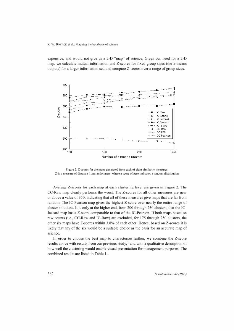
Figure 2. Z-scores for the maps generated from each of eight similarity measures.Z is a measure of distance from randomness, where a score of zero indicates a random distribution
Average Z-scores for each map at each clustering level are given in Figure 2. TheCC-Raw map clearly performs the worst. The Z-scores for all other measures are nearor above a value of 350, indicating that all of these measures give maps that are far fromrandom. The IC-Pearson map gives the highest Z-score over nearly the entire range ofcluster solutions. It is only at the higher end, from 200 through 250 clusters, that the IC-Jaccard map has a Z-score comparable to that of the IC-Pearson. If both maps based onraw counts (i.e., CC-Raw and IC-Raw) are excluded, for 175 through 250 clusters, theother six maps have Z-scores within 3.8% of each other. Hence, based on Z-scores it islikely that any of the six would be a suitable choice as the basis for an accurate map ofscience.
In order to choose the best map to characterize further, we combine the Z-scoreresults above with results from our previous study,1 and with a qualitative description ofhow well the clustering would enable visual presentation for management purposes. Thecombined results are listed in Table 1.

K. W. BOYACK et al.: Mapping the backbone of science
Scientometrics 64 (2005) 363
Table 1. Summary of validation results for maps based on eight similarity measures.Measure Local accuracy @
95% coverage1Scalability1 Z-score
for 200 clustersClustering
(qualitative)
IC-Raw 60.1% High 360.0 Too few, loose
IC-Cosine 80.2% High 381.3 Good balance
IC-Jaccard 79.5% High 387.1 Good balance
IC-Pearson 71.7% Low 386.5 Too tight
IC-RFavg 80.2% High 373.3 Good balance
CC-Raw 25.6% High 294.9 Too few, loose
CC-Pearson
65.3% Low 377.0 Too tight
CC-K50 71.4% High 376.6 Good balance
The results can be split into two categories: those for inter-citation-based maps, andthose for co-citation-based maps. Inter-citation-based maps can only be used to mapscience within the boundaries of the ISI journal list, while co-citation-based maps caninclude journals, conferences, books, etc., outside the ISI citing journal list. Manyinstitutions (including Sandia) have a significant portion of their publication output innon-journal publications or journals not covered by ISI, and may thus wish to base amap of science on more than just the ISI list of journals. An example from informationscience illustrates the value of a co-citation based map. The publication ANNU REVINFORM SCI appears in most information science maps done to date, but does notappear in our year 2000 maps. Due to a change in indexing year protocol, from volume34 in 1999 to volume 35 in 2001, ANNU REV INFORM SCI is not listed in the 2000year citing data, despite the fact that it has been published and indexed continually. Aco-citation-based map with journal titles expanded beyond the citing list would haveincluded this very important information science publication.
For a co-citation-based map, the CC-K50 measure is a clear winner for severalreasons. Although the Z-score for the CC-K50 is nearly identical to that of the CC-Pearson, the K50 measure is scalable to much larger numbers of nodes, while thePearson is a full N2 calculation, and cannot easily scale much higher than the 7000nodes used here. The CC-K50 map is a visually well-balanced map with a gooddistribution of cluster sizes and positions (see Figures 1 and 3). By contrast, the CC-Pearson map appears very stringy; clusters are very dense with less visualdifferentiation between disciplines, and thus not as suitable for presentation. The CC-K50 map also has a higher degree of local accuracy.1
K. W. BOYACK et al.: Mapping the backbone of science
364 Scientometrics 64 (2005)
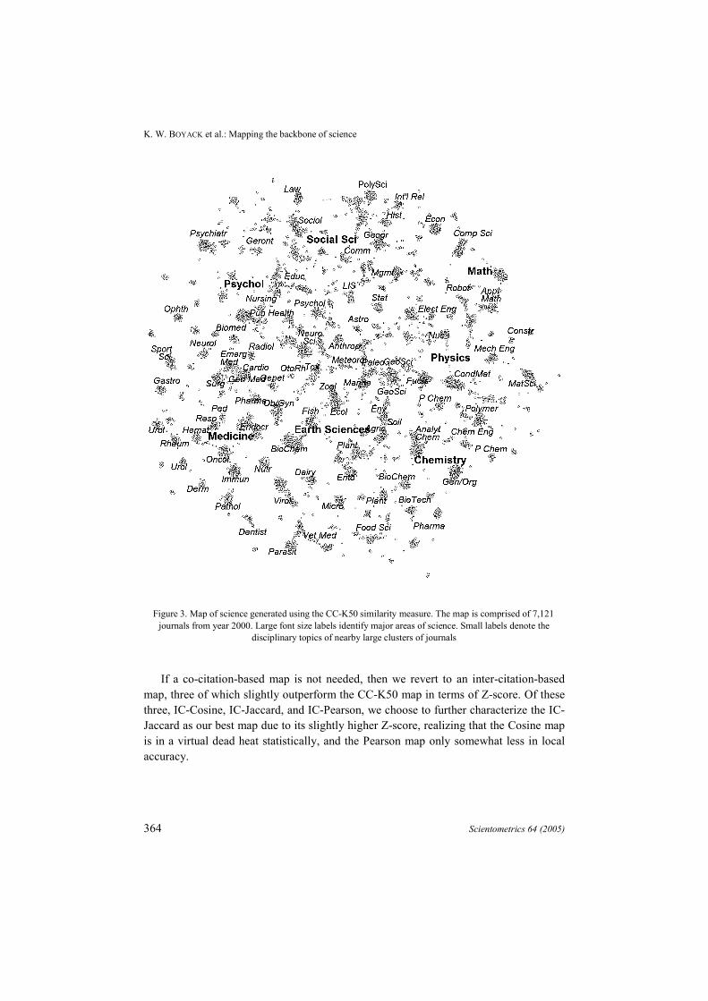
Figure 3. Map of science generated using the CC-K50 similarity measure. The map is comprised of 7,121journals from year 2000. Large font size labels identify major areas of science. Small labels denote the
disciplinary topics of nearby large clusters of journals
If a co-citation-based map is not needed, then we revert to an inter-citation-basedmap, three of which slightly outperform the CC-K50 map in terms of Z-score. Of thesethree, IC-Cosine, IC-Jaccard, and IC-Pearson, we choose to further characterize the IC-Jaccard as our best map due to its slightly higher Z-score, realizing that the Cosine mapis in a virtual dead heat statistically, and the Pearson map only somewhat less in localaccuracy.

K. W. BOYACK et al.: Mapping the backbone of science
Scientometrics 64 (2005) 365
Figure 4. Map of science generated using the IC-Jaccard similarity measure. The map is comprised of 7,121journals from year 2000. Large font size labels identify major areas of science. Small labels denote the
disciplinary topics of nearby large clusters of journals
The global structure of science
Detailed versions of the best co-citation (CC-K50) and inter-citation (IC-Jaccard)maps are shown in Figures 3 and 4 respectively. For both cases the maps were exploredinteractively using VxInsight33 and were labeled by hand using short terms to describethe disciplines that dominate clusters of journals within the maps. Seven larger labelsdesignate higher-level major fields within the sciences.

K. W. BOYACK et al.: Mapping the backbone of science
366 Scientometrics 64 (2005)
The order of major fields in Figure 3 follows an intuitive pattern as one movesclockwise around the map: Mathematics, Physics, Chemistry, Earth Sciences (includingBiological, Plant, and Animal Sciences), Medicine, Psychology, and Social Sciences.This is nearly identical to the pattern shown by the category map recently published byMoya-Anegón and associates (Ref. 9: see Figure 2). In their case, Earth Sciences andMedicine are at roughly the same radial position with Medicine on the outside. The finestructure of the map is also revealing. Engineering disciplines are near Physics andChemistry. Interfacial disciplines appear to be reasonably placed. For example, PublicHealth lies between Medicine and Psychology, Economics is at the interface betweenSocial Sciences and Mathematics, Applied Math lies between Mathematics and Physics,Physical Chemistry is between Physics and Chemistry, and two areas of Biochemistrylie between Earth Sciences and Chemistry and Medicine. In general, the more insularfields lie toward the outside of the map, and those with more interdisciplinary linkagesare toward the center.
The inter-citation-based (IC-Jaccard) map of Figure 4 depicts very similarphenomena. The pattern shown by the seven major fields is the same as for the co-citation-based map. However, there are modest differences between the two maps aswell. For example, Geological Sciences are outside of Chemistry on the IC-Jaccardmap, while they are inside of Chemistry on the CC-K50 map. Information and LibrarySciences (LIS) and Entomology are at the outside edges (top and bottom, respectively)of the IC-Jaccard map, while they are both midway between the edge and center of theCC-K50 map. Differences such as these between the maps at the discipline level arelikely due to fine-scaled differences between the co-citation and inter-citation patterns.Yet, the overall consistency between the co-citation and inter-citation-based maps ofscience suggests the general structure described here is robust.
The maps in Figures 3 and 4 show the structure of science in a very general way,simply through relative positioning of disciplines and fields. However, true structureand dependency are best shown through linkages. Figure 5 shows the IC-Jaccard map atthe disciplinary level. Clusters of journals from the map in Figure 4 were identified byhand by one of the authors, resulting in a total of 212 clusters covering 7,000 of the7,121 journals. Groups of two or three journals not near a major cluster are notaccounted for. Cluster positions in the disciplinary map of Figure 5 are the averagepositions of the constituent journals for each cluster.
The IC-Jaccard disciplinary map of science shows many facets of the structure ofscience. First, the size of each journal cluster represents the number of journals in thecluster, and thus the relative size of disciplines. This could be determined from Figure 4
K. W. BOYACK et al.: Mapping the backbone of science
Scientometrics 64 (2005) 367
as well, but not as easily or precisely. Second, the independence or insularity of eachdiscipline has been calculated and color coded in the map. Here, independence iscalculated using the equation
∑=j
ji,ji,ji, C
CF ,
where Ci,j is the number of times cluster i (file year 2000) cites cluster j (all years).Thus, independence, or Fi,i, is simply a self-citation fraction at the cluster level.
One of the artifacts of many graph layout routines, including VxOrd, is that highlylinked nodes will remain near the center of the graph, while sparsely linked nodes willtend to move to the outer edges of the graph. This phenomenon can also be true forsubgraphs within the full graph. In general, we would thus expect the more independentdisciplines to appear near the outer edges of the map, and those that are lessindependent, or more interdisciplinary, to be nearer the center. Figure 5, plotted withPajek,27 shows that this is indeed the case. Few of the darkest clusters are near thecenter of the graph. Independence also varies by major field. Most of the disciplineswithin the Social Sciences have high independence; disciplines in Physics, Chemistry,and Earth Sciences are less independent than those in the Social Sciences, and those inMedicine are even less independent. Disciplines within Psychology are moreindependent than those in Medicine, but less independent than those in the SocialSciences.
Dependency structure is shown in Figure 5 as the arrows between disciplines. Of the13,502 individual Fi,j between the 212 disciplines that could be superimposed on the IC-Jaccard disciplinary map, only the 311 where Fi,j > 0.075 are shown. Use of thisthreshold value is arbitrary, but serves to show the major structural dependencies inscience. Arrow tips point to cited clusters, and arrows denote a diffusion of informationfrom cited clusters to citing clusters.
Biochemistry is clearly one of the hubs of science. It is the largest discipline, both interms of numbers of journals and numbers of citations. Its membership includes fivewell-known multidisciplinary journals SCIENCE, NATURE, P NATL ACAD SCI USA,CELL, and J BIOL CHEM, which undoubtedly account for part of the influence of thisdiscipline. Fully one-quarter of the other disciplines (52) spend more than 7.5% of theircitations on biochemistry. Citing disciplines come primarily from Medicine, EarthSciences, and Chemistry. Biochemistry is truly an interdisciplinary hub.

K. W. BOYACK et al.: Mapping the backbone of science
368 Scientometrics 64 (2005)
Figure 5. Map of the backbone of science with 212 clusters comprising 7000 journals. Clusters are denoted bycircles that are labeled with their dominant ISI category names. Circle sizes (area) denote the number of
journals in each cluster. Circle color depicts the independence of each cluster, with darker colors depictinggreater independence. Dominant cluster-to-cluster citing patterns are indicated by arrows. Arrows show all
relationships where the citing cluster gives more than 7.5% of its total citations to the cited cluster, withdarker arrows indicating a greater fraction of citations given by the citing cluster. Some cluster positions have
been adjusted slightly to avoid covering labels for neighboring clusters. The gray box near the top showsclusters detailed in Figure 6
Other hubs, identified as those disciplines with many arrows pointing to them, areless interdisciplinary than Biochemistry. These are central to their own fields, with fewstrong links to disciplines in other fields, and include General Medicine,Ecology/Zoology, Social Psychology, Clinical Psychology, Organic Chemistry, and the
K. W. BOYACK et al.: Mapping the backbone of science
Scientometrics 64 (2005) 369
dual General Physics+Applied Physics. However, it can be seen that those few stronglinks to disciplines in other fields are what ties the whole of science together and givesit its overall structure. Social Sciences are tied to Psychology through variousspecialties in Psychology; Medicine is tied to Psychology directly and throughNeurology; Biochemistry links directly to Medicine and Chemistry; Chemistry is tied toPhysics through their interfacial disciplines Physical Chemistry and Materials Science;and Physics is tied to Mathematics through Applied Math. The most tenuous link isfrom Mathematics to the Social Sciences. Although not shown in Figure 5, once thethreshold is lowered, dependencies appear linking the two fields through ComputerScience and Education.
The local structure of science
As mentioned previously, we favor the use of VxOrd for graph layout in that itresults in maps with both global and local structure. One example of local structure isshown in Figure 6, which zooms in on the two “Information & Library Science”clusters at the top of Figure 5. The Finance cluster shown between the two LIS clustersin Figure 5 is not included in Figure 6 since there were no direct linkages between itsjournals and any of the journals in the two LIS clusters. Rather, the Finance cluster islinked down to the History of Social Sciences cluster and to the larger Finance clusterbelow it.
Features in Figure 6 are similar to those in the previous figure. Node size indicatesthe number of papers published by a journal in the year 2000. Node color is based afigure of impact, specifically the number of citations to the 1998–2000 issues of thejournal divided by the number of papers published in the 2000 issues of the journal.Darker colors denote higher impact. Edges or lines between journals denote the strengthof the Jaccard coefficient between the two journals, with darker edges denoting a largersimilarity coefficient. Figure 6 shows the clear distinction between two main areaswithin the LIS discipline. Although there are relationships between journals in the twoclusters, the dominant relationships (darkest edges) are within clusters. The journals inthe cluster at the upper left all focus on libraries and librarians and their work, whilethose in the cluster at the lower right are all focused on advances in information science.This latter group includes SCIENTOMETRICS, JASIST, and J DOCUMENTATION.Journals in the upper half of the cluster at the right all deal with electronic information.

K. W. BOYACK et al.: Mapping the backbone of science
370 Scientometrics 64 (2005)
Many other journals from ISI’s “Information & Library Science” category do notcluster in either of the two clusters shown here. For example, MIS QUARTERLY,INFORMATION & MANAGEMENT, INT J INFORM MANAGE, and several otherinformation management journals are found in the Computer Science cluster along withjournals on software systems. Although the word INFORMATION is found in the titlesof most of these journals, citation patterns suggest that they would be better classifiedwith software system journals in Computer Science.
Figure 6. Detailed view of journals comprising the two “Information & Library Science” clusters from the topof the map in Figure 5. Journal size in number of papers published in 2000 is indicated by the size of eachcircle. Circle color is based on a measure closely related to the impact factor, with darker color signifying
higher impact. Edges between journals show all of the top15 Jaccard relationships within the set of journalsshown, with darker edges signifying a larger Jaccard coefficient. Some journal positions have been adjusted
slightly to avoid covering labels for neighboring journals.

K. W. BOYACK et al.: Mapping the backbone of science
Scientometrics 64 (2005) 371
The discipline map of Figure 5 also gives us a chance to examine some of the ISIjournal categories. A close comparison of the cluster labels on the map with the list ofISI journal categories shows that some categories are represented many times, whileothers are not represented at all. An example of the former case is that of the categoryMathematics, Applied, which appears four times on the map, twice as the dominantcategory for a cluster (single label), once jointly with Engng, Mechanical, and oncejointly with Computer Science, Theory. All four clusters are near the edge of the map atthe top right. Examination of the journals comprising each cluster shows that of the twopure Mathematics, Applied clusters, one deals with linear numerical methods, and theother deals with non-linear numerical methods. The joint cluster with Engng,Mechanical is focused on engineering applications such as computational mechanicsand finite element methods, and the joint cluster with Computer Science, Theory isfocused on applied algorithms, particularly in cryptology and discrete mathematics.Interestingly, the CC-K50 map breaks the Mathematics, Applied journals into the samefour clusters. Thus, the use of more than one journal category for applied mathematicsjournals could easily be justified by the current citation information.
There are several medium-sized ISI categories (35-80 journals) that do not appear aslabels in Figure 5, including Behavioral Sciences; Biochemical Research Methods;Computer Science, Interdisciplinary Applications; Social Issues; and Social Sciences,Interdisciplinary. For each of these categories, a query of the IC-Jaccard map in Figure4 shows that the journals are spread out across many clusters. Queries to the CC-K50map show the same behavior. This begs the question of whether these categories arenecessary, given that they appear not to be specific based on current citation patterns.Journals within these listed categories could be classified with the other journals withwhom they cluster. Further investigation shows that only 32 of the 244 journals withinthese categories are singly assigned to the category. The other 208 are assigned tomultiple categories. It is no wonder, therefore, that journals in these categories werefound spread throughout the map, and in fact attests to the robustness of the mappingprocess and results.
Conclusions and implications
This paper presents a novel map of the global structure of all of science. The mapwas generated from the combined SCI and SSCI files for the year 2000, includes 7,121journals that appeared as both citing and cited journals, and shows the relation of thesejournals based on their citation interlinkages.
Eight different similarity measures were calculated from the combined SCI/SSCIdata and the resulting journal-journal similarity matrices were mapped using VxOrd.The eight maps were then compared based on two different accuracy measures, thescalability of the similarity algorithm, and the readability of layouts (clustering). The
K. W. BOYACK et al.: Mapping the backbone of science
372 Scientometrics 64 (2005)
two best measures were then used to generate maps of sciences that provide a globalview of the structure of science, and that can also be used to examine specific areas ofscience in more detail. Detailed interpretations of the maps are given.
The disciplinary map presented here is designed to support decision-making, e.g.,the allocation of resources among/between disciplines. However, it also promotes theunderstanding and teaching of the general structure of science. Although it is a staticmap, and thus does not reveal how disciplines are born, evolve, or die, it is the broadeststatic map of science published to date, and thus constitutes another step forward in thestudy of the structure and evolution of science by scientific means.
Ultimately, maps of science could be based on a much broader set of data (such asscholarly journals, proceedings, patents, grants, and funding opportunities). Alternativeunits of analysis (clusters of journals, papers, authors, funding sources and/or text)could be generated to address different user needs. Instead of being static, dynamicmaps could be generated that show high activity, scientific frontiers, andmerging/splitting of scientific areas.
We believe that these global maps of science will enable researchers andpractitioners to search for and benefit from results and expertise across scientificboundaries, counterbalancing the increasing fragmentation of science and the resultingduplication of work. These maps of science could also serve as a common datareference system for scholars from all disciplines – analogous to how geologists use theearth itself to index and retrieve data, documents, and expertise, or to how astronomersuse astronomical coordinates. If such a reference system were to exist, all researcherscould have a bird’s eye view of the landscape of science, and could use this landscapeto navigate to areas of interest, to communicate results, and to announce discoveries.This global view – as opposed to doing keyword based searches on the Web or indigital libraries with very little information about the coverage of the queried databaseor the quality of the result – would give many more people access to scientific results.This, in turn, would lead to more informed citizens and a faster spread of results andpractices benefiting all of humanity.
Obviously, the generation of dynamic maps of all of science that merge date fromdiverse, heterogeneous sources will require an infrastructure that can integrate multipledata streams from the best scholarly databases in existence. The data streams need to beprocessed and analyzed on the fly to arrive at real time visualizations of our collectivescholarly results and activities. While infrastructures that process terabytes of data arecommon in biology and physics, they are not in existence in the social sciences.However, all sciences would benefit from a global map of science such as thatdescribed here, and we hope many more researchers will decide to contribute to theirdesign, validation, and implementation.

K. W. BOYACK et al.: Mapping the backbone of science
Scientometrics 64 (2005) 373
*
This work was supported by the Sandia National Laboratories Laboratory-Directed Research andDevelopment Program, and by a National Science Foundation CAREER grant under IIS-0238261 to the thirdauthor. Sandia is a multiprogram laboratory operated by Sandia Corporation, a Lockheed Martin Company,for the United States Department of Energy under Contract DE-AC04-94AL85000.
References
1. KLAVANS, R., BOYACK, K. W., Identifying a better measure of relatedness for mapping science, Journalof the American Society for Information Science and Technology (2005, in press).
2. PRICE, D. J. D., Networks of scientific papers, Science, 149 (1965) 510–515.3. GARFIELD, E., Citation indexes for science: A new dimension in documentation through association of
ideas, Science, 122 (1955) 108–111.4. GARFIELD, E., SHER, I. H., TORPIE, R. J., The use of citation data in writing the history of science,
Philadelphia, Institute for Scientific Information, 1964.5. GARFIELD, E., Mapping the structure of science. Citation Indexing: Its Theory and Applications in
Science, Technology, and Humanities. John Wiley, pp. 98–147.6. CALLON, M., LAW, J., From translations to problematic networks – an introduction to co-word analysis,
Social Science Information, 22 (1983) 191–235.7. BÖRNER, K., CHEN, C., BOYACK, K. W., Visualizing knowledge domains, Annual Review of Information
Science and Technology, 37 (2003) 179–255.8. SMALL, H., Visualizing science by citation mapping, Journal of the American Society for Information
Science, 50 (1999) 799–813.9. MOYA-ANEGÓN, F., VARGAS-QUESADA, B., HERRERO-SOLANA, V., CHINCHILLA RODRÍGUEZ, Z.,
CORERA ÁLVAREZ, E., A new technique for building maps of large scientific domains based on thecocitation of classes and categories, Scientometrics, 61 (2004) 129–145.
10. LEYDESDORFF, L., Various methods for the mapping of science, Scientometrics, 11 (1987) 291–320.11. MCCAIN, K. W., Mapping economics through the journal literature: An experiment in journal cocitation
analysis, Journal of the American Society for Information Science, 42 (1991) 290–296.12. MCCAIN, K. W., Core journal networks and cocitation maps in the marine sciences: Tools for
information management in interdisciplinary research, Proceedings of the ASIS Annual Meeting, 29(1992) 3–7.
13. MCCAIN, K. W., Neural networks research in context: A longitudinal journal cocitation analysis of anemerging interdisciplinary field, Scientometrics, 41 (1998) 389–410.
14. MORRIS, T. A., MCCAIN, K. W., The structure of medical informatics journal literature, Journal of theAmerican Medical Informatics Association, 5 (1998) 448–466.
15. DING, Y., CHOWDHURY, G., FOO, S., Journal as markers of intellectual space: Journal cocitation analysisof information retrieval area, 1987-1997, Scientometrics, 47 (2000) 55–73.
16. TSAY, M.-Y., XU, H., WU, C.-W., Journal co-citation analysis of semiconductor literature,Scientometrics, 57 (2003) 7–25.
17. LEYDESDORFF, L., VAN DEN BESSELAAR, P., Scientometrics and communication theory: Towardstheoretically informed indicators, Scientometrics, 38 (1997) 155–174.
18. LEYDESDORFF, L., GAUTHIER, E., The evaluation of national performance in selected priority areas usingscientometric methods, Research Policy, 25 (1996) 431–450.
19. CAMPANARIO, J. M., Using neural networks to study networks of scientific journals, Scientometrics, 33(1995) 23–40.
20. TIJSSEN, R. J. W., VAN LEEUWEN, T. N., On generalising scientometric journal mapping beyond ISI'sjournal and citation databases, Scientometrics, 33 (1995) 93–116.
21. BASSECOULARD, E., ZITT, M., Indicators in a research institute: A multi-level classification of journals,Scientometrics, 44 (1999) 323–345.

K. W. BOYACK et al.: Mapping the backbone of science
374 Scientometrics 64 (2005)
22. LEYDESDORFF, L., Clusters and maps of science journals based on bi-connected graphs in the JournalCitation Reports, Journal of Documentation, 60 (2004) 371–427.
23. LEYDESDORFF, L., Top-down decomposition of the Journal Citation Report of the Social ScienceCitation Index: Graph- and factor-analytical approaches, Scientometrics, 60 (2004) 159–180.
24. MORILLO, F., BORDONS, M., GOMEZ, I., Interdisciplinarity in science: A tentative typology of disciplinesand research areas, Journal of the American Society for Information Science and Technology, 54 (2003)1237–1249.
25. PUDOVKIN, A. I., GARFIELD, E., Algorithmic procedure for finding semantically related journals, Journalof the American Society for Information Science and Technology, 53 (2002) 1113–1119.
26. JONES, W. P., FURNAS, G. W., Pictures of relevance: A geometric analysis of similarity measures,Journal of the American Society for Information Science, 38 (1987) 420–442.
27. BATAGELJ, V., MRVAR, A., Pajek - A program for large network analysis, Connections, 21 (1998)47–57.
28. KOHONEN, T., Self-Organizing Maps, Springer, 1995.29. KOHONEN, T., KASKI, S., LAGUS, K., SALOJÄRVI, J., HONKELA, J., PAATERO, V., SAARELA, A., Self
organization of a massive document collection, IEEE Transactions on Neural Networks, 11 (2000)574–585.
30. ADAI, A. T., DATE, S. V., WIELAND, S., MARCOTTE, E. M., LGL: Creating a map of protein functionwith an algorithm for visualizing very large biological networks, Journal of Molecular Biology, 340(2004) 179–190.
31. SIEK, J. G., LEE, L.-Q. , LUMSDAINE, A., The Boost Graph Library: User Guide and Reference Manual,Addison Wesley Professional, 2002.
32. DAVIDSON, G. S., WYLIE, B. N., BOYACK, K. W., Cluster stability and the use of noise in interpretationof clustering, Proceedings of IEEE Information Visualization 2001 (2001) 23–30.
33. BOYACK, K. W., WYLIE, B. N., DAVIDSON, G. S., Domain visualization using VxInsight for science andtechnology management, Journal of the American Society for Information Science and Technology, 53(2002) 764–774.
34. BOYACK, K. W., Mapping knowledge domains: Characterizing PNAS, Proceedings of the NationalAcademy of Sciences, 101 (2004) 5192–5199.
35. BOYACK, K. W., MANE, K., BÖRNER, K., Mapping Medline papers, genes, and proteins related tomelanoma research, Proceedings IEEE Information Visualisation 2004 (2004) 965–971.
36. KIM, S. K., LUND, J., KIRALY, M., DUKE, K., JIANG, M., STUART, J. M., EIZINGER, A., WYLIE, B. N.,DAVIDSON, G. S., A Gene Expression Map for Caenorhabditis elegans, Science, 293 (2001) 2087–2092.
37. GIBBONS, F. D., ROTH, F. P., Judging the quality of gene expression-based clustering methods usinggene annotation, Genome Research, 12 (2002) 1574–1581.
38. LEYDESDORFF, L., The static and dynamic analysis of network data using information theory, SocialNetworks, 13 (1991) 301–345.
39. LEYDESDORFF, L., Similarity measures, author cocitation analysis, and information theory, Journal of theAmerican Society for Information Science and Technology, 56 (2005) 769–772.