man without fear david mack daredevil and the bounds of difference
TRANSCRIPT

July 25, 2010
Man Without Fear: David Mack, Daredevil, and the Bounds of Difference (Part One)
By Henry Jenkins
Last fall, I delivered one of the keynote talks at the Understanding Superheroes conference hosted
at the University of Oregon in Eugene. The conference was a fascinating snapshot of the current
state of comics studies in North America. It was organized by Ben Sanders to accompany a
remarkable exhibit of comic art hosted at the Jordan Schnitzer Museum of Art — “Faster than a
Speeding Bullet: The Art of a Superhero,” . The exhibit consisted of original panels scanned the
entire history of the superhero genre – from its roots in the adventure comics strips through the
Golden and Silver age to much more contemporary work.
The conference attracted a mix of old time fan boys whose interests were in capturing the history of
the medium and younger scholars who applied a range of post-modern and post-structuralist theory
to understanding comics as a medium. In between were several generations of superhero comic
writers and artists who brought an industry perspective to the mix. Charles Hatfield delivered a
remarkable keynote address talking about the technical sublime in the work of Jack Kirby and my
keynote centered on the fusion of mainstream and experimental comics techniques in the work
which David Mack did for Daredevil.
The presentation was really more of a talk than a paper so it’s taken me some time to get around to
writing this up, but I had promised some of my readers (not to mention Mack) that I would try to
share some of the key ideas from the talk through my blog. A number of readers have asked about
this piece so I appreciate their patience and encouragement. In honor of Comic-Con, where I am,
as you read this, I am finally sharing with you my thoughts about David Mack’s Daredevil comics.
Images from Mack’s work here are reproduced by permission of the artist. Other images are
reproduced under Fair Use and I am willing to remove them upon request from the artists involved.
This paper is part of an ongoing project which seeks to understand what a closer look at superhero
comics might contribute to our understanding of genre theory. Several other installments of this
project have appeared in this blog including my discussion of superheroes after 9/11 and my
discussion of the concept of multiplicity within superhero comics.
At the heart of this research is a simple idea: What if we stopped protesting that comics as a
medium go well beyond “men in capes” and include works of many different genres? No one
believes us anyway. And on a certain level, it is more or less the case that the primary publishers of
comics publish very little that does not fall into the Superhero genre and almost all of the top selling
comics, at least as sold through specialty shops, now fall into the superhero genre. It was not
always the case but it has been the case long enough now that we might well accept it as the state

of the American comics industry. So, what if we used this to ask some interesting questions about
the relationship between a medium and its dominant genre? What happens when a single genre
more or less takes over a medium and defines the way that medium is perceived by its public – at
least in the American context?
One thing that happens, I’ve argued, is that the superhero comic starts to absorb a broad range of
other genres – from comedy to romance, from mystery to science fiction – which play out within the
constraints of the superhero narrative. We can study how Jack Kirby’s interests in science fiction
inflects The Fantastic Four and other Marvel superhero comics in certain directions. We can ask
why it matters that Batman emerged in Detective Comics, Superman in Action Comics, and Spider-
Man in Astounding Stories.
But second, we can explore how the Superhero comic becomes a site of aesthetic experimentation,
absorbing energies which in another medium might be associated with independent or even avant
garde practices. And that’s where my interest in David Mack comes from, since he is an artist who
works both in independent comics (where he is associated with some pretty radical formal
experiments in his Kabuki series) and in mainstream comics (where he has made a range of
different kinds of contributions to the Daredevil franchise for Marvel.)
Certainly, most comic books fans understand a distinction between underground/independent
comics and mainstream comics but there is surprisingly fluid boundaries between the two. In many
ways, independent or underground comics were often defined as “not superhero” comics and
therefore still defined by the genre even if in the negative. Throughout this essay, I am going to
circle around a range of experiments which seek to merge aspects of independent comics with the
superhero genre.
My primary goal here is to map what David Bordwell, Janet Staiger and Kristen Thompson describe
in Classical Hollywood Cinema as “the bounds of difference.” Bordwell, Staiger and Thompson draw
on concepts from Russian formalism to talk about the norms which shape artistic practice and the
ways they get encoded into modes of production. By norms, we mean general ways of structuring
artistic works, not rigid rules or codes. Norms grow through experimentation and innovation. There
is no great penalty for violating norms. Indeed, the best art seeks to defamiliarize conventions – to
break the rules in creative and meaningful ways and in the process teach us new ways of seeing.
Genres are thus a complex balance between the encrusted conventions, understood by artists and
consumers alike, built up through time, and the localized innovations which make any given work
fresh and original. The norms thus are elastic – they can encompass a range of different practices –
but they also have a breaking point beyond which they can not bend. This breaking point is what
Bordwell and Thompson describe as “the bounds of difference.” They have generally been
interested in the conservative force of these norms, showing how even works which at first look like
they fall outside the norms are often still under their influence. They have shown how the classical
system has dominated Hollywood practice since the 1910s and continues to shape most
commercial films made today.

In my work, I have been more interested in exploring the edge cases, especially looking at the
transition that occurs when an alien aesthetic gets absorbed into the classical system. This was a
primary focus of my first book, What Made Pistachio Nuts?: Early Sound Comedy and the
Vaudeville Aesthetics and it’s a topic to which I have returned at various points throughout my
career. In this talk, I want to use David Mack’s work for Marvel to help us to map “the bounds of
difference” as they impact mainstream superhero comics.
We can get a better sense of why Mack’s work represents such an interesting limit case by
sampling some of the reviews for Daredevil: Echo – Vision Quest from Amazon contributors, each
of whom has to do a complex job of situating this work in relation to our expectations about what a
mainstream superhero book looks like:
If you’d like to see Daredevil swinging through New York City beating up bad guys,
this is not the comic for you. Although this is technically Volume 8 of the
recent Daredevil run, it isn’t exactly part of the regular continuity. The five issues that
make up this volume were going to be a separate miniseries, but when Bendis and
Maleev needed a break from Daredevil (after the Issue 50 battle with the Kingpin),
the Echo mini was published under the Daredevil title instead.
This has led to an unfairly bad reputation for this beautifully painted, dream-like
exploration of identity and willingness to fight for a cause. Daredevil subscribers
expected more of the plot and action that had filled the series to that point, and this
meditative break was frustrating, particularly considering the point that Bendis had
halted the main plot.
If you are a fan of Alias (the comic) or Kabuki, this is for you. If you would like to gaze
in awe at the poetic writing, beautiful painting and stunning mixed-media art of one of
the most creative men in comics, buy this comic. You won’t regret it.
****************************************************************************************
**
I think if this had come out as a graphic novel, or as a seperate mini, I may have
enjoyed it more. But imagine being engrossed in an intelligent, gritty fast-paced work
and then being forcefed an elaborate, artsy character study on a relatively minor
character. … This should have been a seperate mini or graphic novel. Instead we get
the equivalent of a documentary on Van Gogh between Kill Bill Volume 1 and 2.
************************************************************************************
This book is a sadistic deviation from thier storyline and is writen and draw by David
Mack. This is a (…) crap fest about a very minor character and her hippie like journey
to discover her past. …He then further expresses his impotency in the field by using
chicken scratch drawings and paintings to move the story along with hardly ANY
dialog. THis book is an artsy load of crap that should not be affiliated with Daredevil
or Marvel.

Each of these responses struggles with an aesthetic paradox: Mack’s approach to the story does
not align with their expectations about what a superhero comic looks like or how it is most likely
structured – yet, and this is key, the book in question appears in the main continuity of a Marvel
flagship character. There is much greater tolerance as several of the readers note for works which
appears on the fringes of the continuity – works which is present as in some senses an alternative,
“what if?” or “elseworlds” story, works which more strongly flag themselves as site of auteurist
experimentation.
There is even space there for the moral inversion involved in telling the story from the point of view
of the villain rather than the superhero: witness the popularity of Brian Azzarello’s graphic novels
about Lex Luther and The Joker. But Mack applies his more experimental approach at the very
heart of the Marvel superhero franchise and as a consequence, the book was met with considerable
backlash from hardcore fans who are often among the most conservative at policing “the bounds of
difference.” Vision Quest is not Mack’s only venture into the Daredeviluniverse: David Mack
wrote Parts of a Hole which was illustrated by veteran Marvel artist Joe Quesada; David Mack then
contributed art to Wake Up, written by Brian Michael Bendis, perhaps the most popular superhero
script-writer of recent memory. In both cases, then, Mack’s experimental aesthetic was coupled with
someone who fit much more in the mainstream of contemporary superhero comics. The result was
a style which fit much more comfortably within audience expectations about the genre and
franchise.


We can see the difference in these two images, the first drawn by Quesada for a Mack Script, the
second as drawn by Mack based on his own conception. Both combine multiple levels of texts to
convey the fragmented perspective of Echo, the protagonist, as she confronts her sometimes lover,
sometimes foe Daredevil. The use of bold primary color and the style of drawing in Quesada’s

version pulls him that much closer to mainstream expectations, while the deployment of pastels and
of a collage-like aesthetic falls outside our sense of what a superhero comic looks like. The subject
matter is more or less the same; the mode of representation radically different and in comics, these
stylistic differences help to establish our expectations as readers.
- See more at: http://henryjenkins.org/2010/07/man_without_fear.html#sthash.30ieQkao.dpuf
July 26, 2010
Man Without Fear: David Mack, Daredevil, and the Bounds of Difference (Part Two)
By Henry Jenkins
This is part two of a four part series exploring how David Mack’s visual style challenges the
conventions of the superhero comic.
Mack helped to introduce Echo (Maya Lopez) as a character in Parts of a Hole. Her backstory is
classic superhero comics stuff. Here’s how her backstory gets described in the Marvel Universe
Character Wiki:
When she was a small girl, Maya Lopez’s father, a Cheyenne gangster, was killed by
his partner in crime, the Kingpin. The last wish of her father was that Fisk raise the
child well, a wish the Kingpin honored, caring for her as if she was his own. Believed
to be mentally handicapped, Maya was sent to an expensive school for people with
learning disabilities. There, she managed to completely replicate a song on the piano.
After that, she was sent to another expensive school for prodigies. She grew into a
gifted and talented woman. Upon visiting her father’s grave with Fisk, she asked how
he died. Fisk told her that Daredevil had killed him.
Maya was sent by the Kingpin to Matt Murdock to prove Matt’s weakness. He told her
that Matt believed he was a bad person, and that she was the only way to prove him
wrong. (As Maya believed him, it would not appear to be a lie when she told Matt.)
Matt Murdock and Maya soon fell in love. She later took on the guise of Echo, hunting
Daredevil down. Having watched videos of Bullseye and Daredevil fighting, she proved
more than a match for Daredevil. She took him down and nearly killed him, refusing
only when she found out Matt and Daredevil were one and the same. Matt managed to
correct the Kingpin’s lies. In revenge, Echo confronted Fisk and shot him in the face,
blinding him and starting the chain of events that would lead to his eventual downfall.
All of this provides the backdrop for Vision Quest. As the title suggests, Maya goes out on her own
to try to heal her wounds and think through what has happened to her. The result is a character
study told in stream of consciousness, which circles through her memories and her visions, often

depicted in a highly iconic manner. This, for example, is how Quesada depicts the moment where
Kingpen kills Maya’s father in Parts of a Hole.
Now consider the way this same event gets depicted early in VisionQuest.

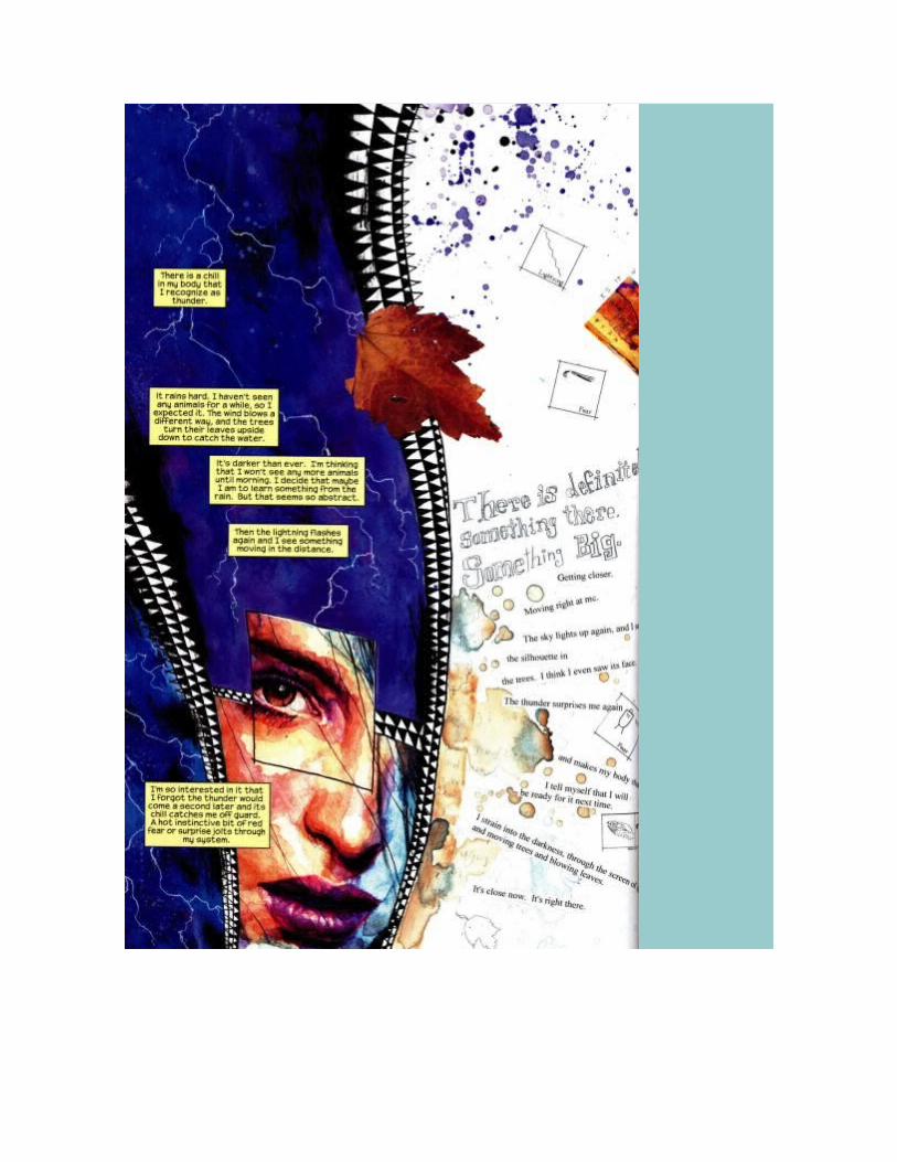
Mack’s page combines multiple modality — multiple ways of depicting the world — with highly
iconic and abstract images existing alongside hyper-realistic images of the same characters. This
radical mixing of style is a hallmark of Mack’s work, constantly forcing us to think about how things
are being represented rather than simply what is being represented. Consider this abstract

rendering of the key events — Fisk is reduced to his big feet and legs, much as he might be seen
as a child, while the breakup become Matt and Maya is rendered by the figure of the child ripping a
picture of the two of them in half.
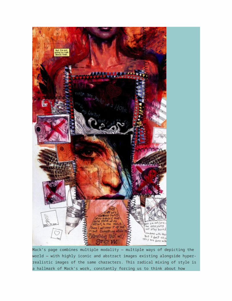
We are operating here within the theater of Maya’s mind, yet she is also presenting these events to
us with an open acknowledgment that as readers we need to have her explain what is taking place.
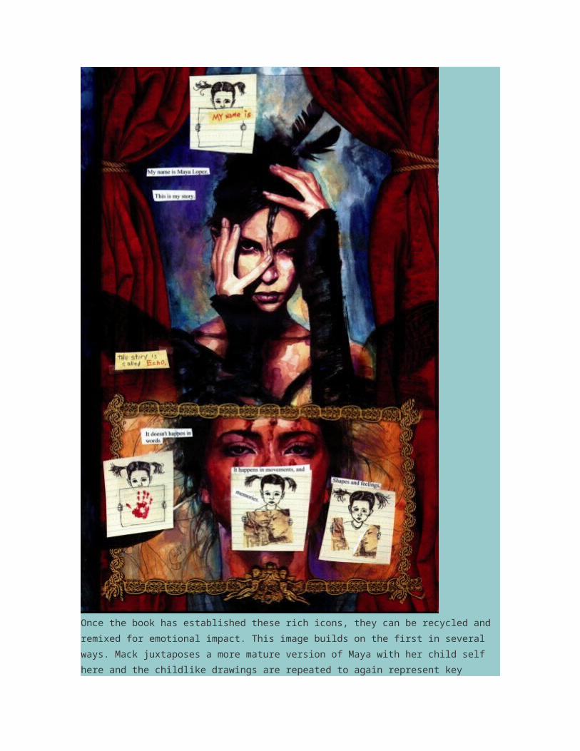
Once the book has established these rich icons, they can be recycled and remixed for emotional
impact. This image builds on the first in several ways. Mack juxtaposes a more mature version of

Maya with her child self here and the childlike drawings are repeated to again represent key
emotional moments in her life. While Mack repeats the purple of the earlier image, the dominant
color that we associate with Maya on this page is red, a color which captures her passion and rage.
She has moved from a vulnerable child victim into someone who has the capacity to strike back at
those who have caused her pain.
Let’s pull back for a moment and try to establish some baselines for thinking about what may
constitute “zero-degree style” in the superhero tradition. While his work was considered bold and
experimental at the time, Frank Miller’s run on Daredevil has helped to establish the stylistic
expectations for this particular franchise. Miller’s style was hyperbolic — though nowhere near as
much so as in his later works, including The Dark Knight Returns, 300, and Sin City. Yet, he also
allows us to see some of the ways that superhero style orientates the reader to the action. The goal
is to intensify our feelings by strengthening our identification with the superhero and with other key
supporting characters. For this to happen, the pages need to be instantly legible. We need to know
who the characters are and what’s going on at all times, even if you can use minor breaks in
conventional style in order to amplify our emotional responses to the action.

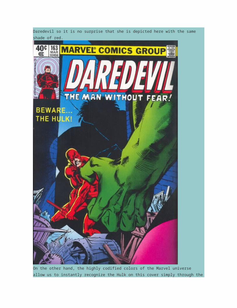
One of the most basic ways that superhero comics do this is through the color coding of key
characters, especially the hero and villain, who are depicted in colors that will pop off the page and
be distinctive from each other. Electra was designed to in many ways compliment and extend
Daredevil so it is no surprise that she is depicted here with the same shade of red.
On the other hand, the highly codified colors of the Marvel universe allow us to instantly recognize
the Hulk on this cover simply through the image of his arm and the contrasting red and green
prepares us for the power struggle which will unfold in this issue.

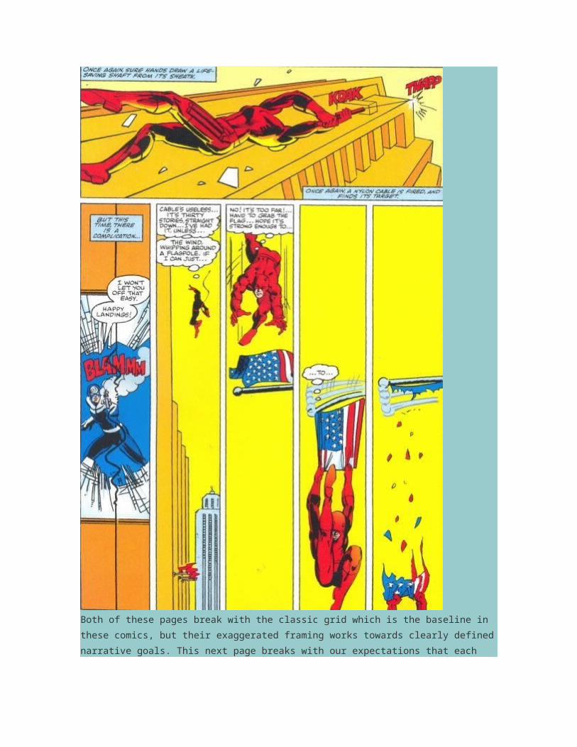
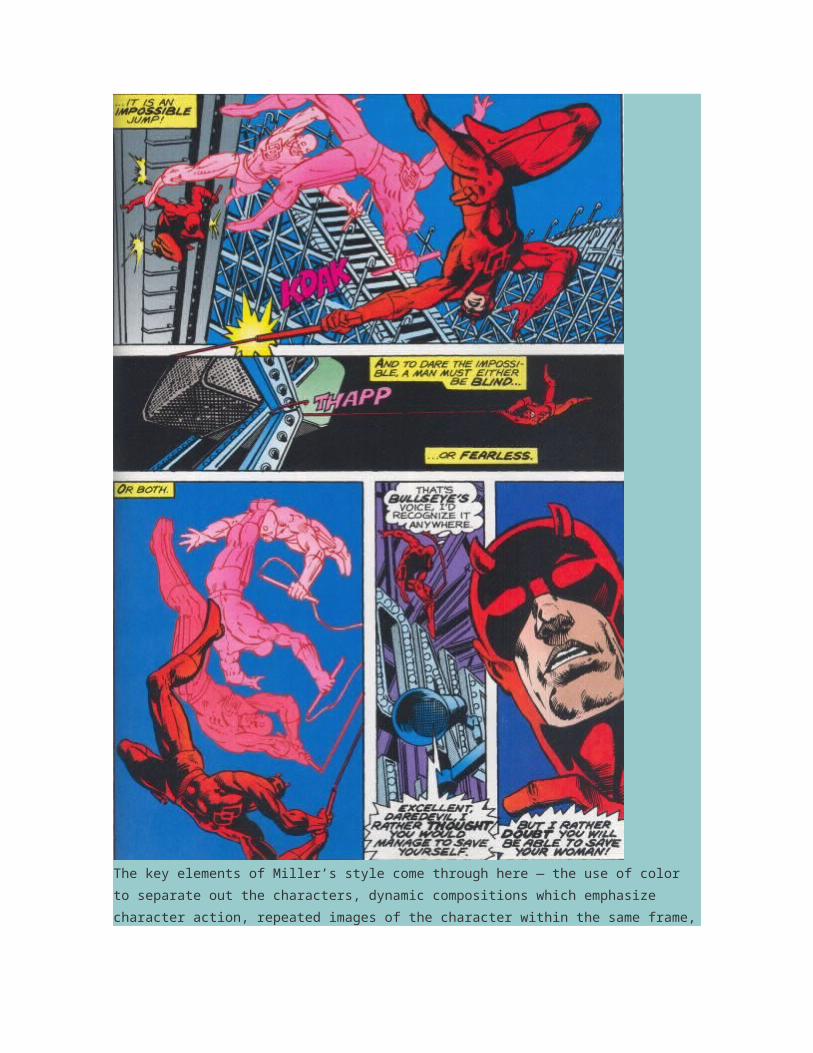
A second set of conventions center on the depiction of action and the construction of space through
framing. Miller was especially strong in creating highly kinetic compositions which intensify the
movement of the characters.

In this first page, we see Daredevil falling away from us into the city scape below, while in the
second Miller uses extremely narrow, vertical panels set against a strong horizontal panel to show
the superhero’s movements through space.
Both of these pages break with the classic grid which is the baseline in these comics, but their
exaggerated framing works towards clearly defined narrative goals. This next page breaks with our
expectations that each panel captures a single moment in time by showing multiple images of the
Daredevil in a way intended to convey a complex series of actions.

while here we seem to be looking straight down on the action in the top panel and subsequent
panels are conveyed in silhouette, though again, there is such a strong emphasis on character
motivation and action that we never feel confused about what is actually happening here.

This next image shows other kinds of formal experiments which still fall squarely within the
mainstream of the superhero genre — notice how the text becomes an active element in the
composition and notice how the falling character seems to break out of the frame, both ways of
underlying the intensity of the action.
Now, let’s contrast the layering of text here with the ways that Mack deploys text in Vision-Quest.
Notice for example the ways Mack deploys several different kinds of texts — printed fonts,
handwritten, and the Scrabble tiles each convey some aspects of the meaning of the scene. We
have to work to figure out the relationship between these different kinds of texts, which suggest

different layers of subjectivity that are competing for our attention. When I first read this book, I was
especially moved by the ways that the hand print on Echo’s face — which elsewhere in the book is
simply another marker of her supervillain identity — here becomes a metaphor for the last time her
father touched her, moments before his death, and the sense memory it left on her, an especially
potent metaphor when we consider the ways that the character is alligned with hypersensitivity and
a powerful “body memory” which allows her to replicate physically anything she has ever felt or
seen. While the sounds and dialogue emerge from the action in the case of Frank Miller’s pages,
they are layered onto the depicted events in Mack’s design, part of what gives the page the quality
of a scrapbook, recounting something that has already happened, rather than thrusting us into the
center of the action.

The key elements of Miller’s style come through here — the use of color to separate out the
characters, dynamic compositions which emphasize character action, repeated images of the
character within the same frame, flamboyant use of text, and the bursting through of the frame, all
combine to make this a particularly intense page.

Where most superhero artists seek to covey this sense of intense action in almost every frame,
Mack seeks to empty the frame of suggestions of action, seeming to suspend time. Consider this
depiction of Daredevil battling Echo from Quesada’s work for Pieces of a Hole.

The splash page traditionally either indicates a particularly significant action or a highly detailed
image, both moments of heightened spectacle. Mack, on the other hand, often empties this splash
pages so we are focusing on the character’s emotional state rather than on any physical action.

Having established these conventions of representation, the mainstream comic may tolerate a
range of different visual styles as different artists try their hand on the character, often working,
more or less, within the same continuity. So, we can see here how Tim Sale plays with color to
convey the character’s identity even through fragmented images which focus on one or another
detail of Daredevil’s body.
Or here we see how Alex Maleev creates a much more muted palette and a scratchy/grainy image
which marks his own muted version of the hyperbolic representations of the character in
earlier Daredevil titles.

The mainstream comics allow some room for bolder formal experiments but most often these come
through the cover designs rather in the panel by panel unfolding of the action.


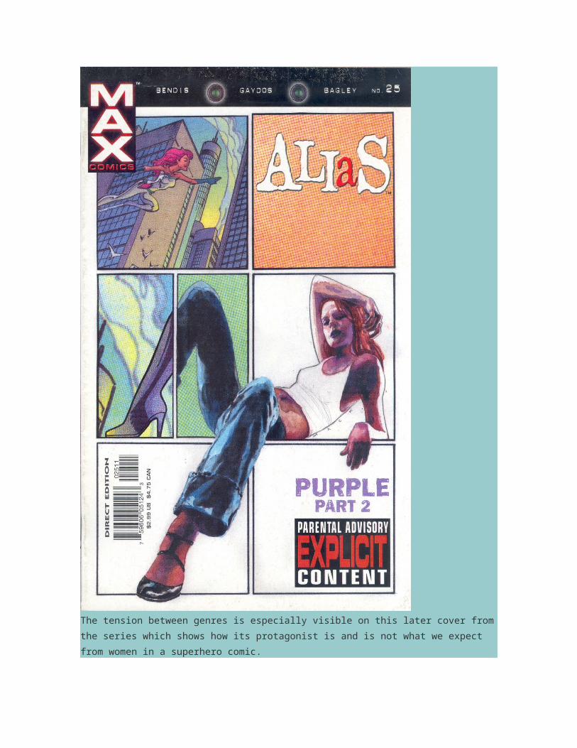
Mack’s artwork functions this way in relation to Bendis’s Alias, where he was asked to design
covers that did not look like conventional superhero covers and that might be seen as more female-
friendly, reflecting the genre bursting nature of the series content which operates on the very fringes
of Marvel’s superhero universe.


The tension between genres is especially visible on this later cover from the series which shows
how its protagonist is and is not what we expect from women in a superhero comic.
- See more at:
http://henryjenkins.org/2010/07/man_without_fear_david_mack_da.html#sthash.dDwqwbpv.dpuf

July 28, 2010
Man Without Fear: David Mack, Daredevil, and the Bounds of Difference (Part Three)
By Henry Jenkins
Last time, I explored some of the ways that David Mack’s visual style defines itself outside of the
mainstream conventions of superhero comics. Today, I want to start with a recognition that Mack is
not the only experimental comic artist who has sought to engage with the superhero genre. In so far
as it defines the expectations of what a comic book is, at least in the American comic book, artists
often seek to define themselves and their work through contrast with the superhero genre.

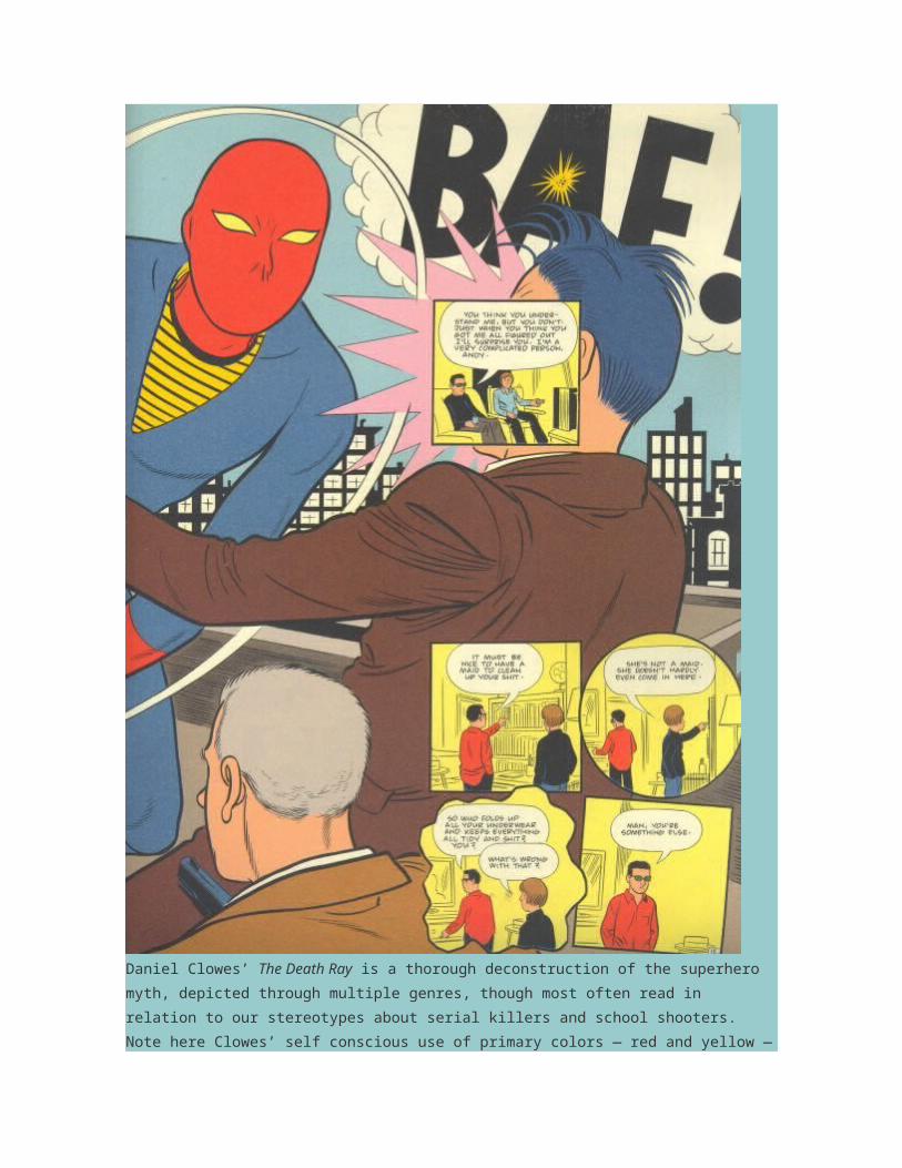
Daniel Clowes’ The Death Ray is a thorough deconstruction of the superhero myth, depicted
through multiple genres, though most often read in relation to our stereotypes about serial killers
and school shooters. Note here Clowes’ self conscious use of primary colors — red and yellow — to

set up the lurid quality of the more fantastical sequences in the book, often standing in contrast with
the more muted colors of realistically rendered scenes.
Project Superior is a recent anthology of superhero comics drawn by some of the rising stars in the
independent comic worlds, resulting in work which further defamiliarizes the conventions of the
genre.

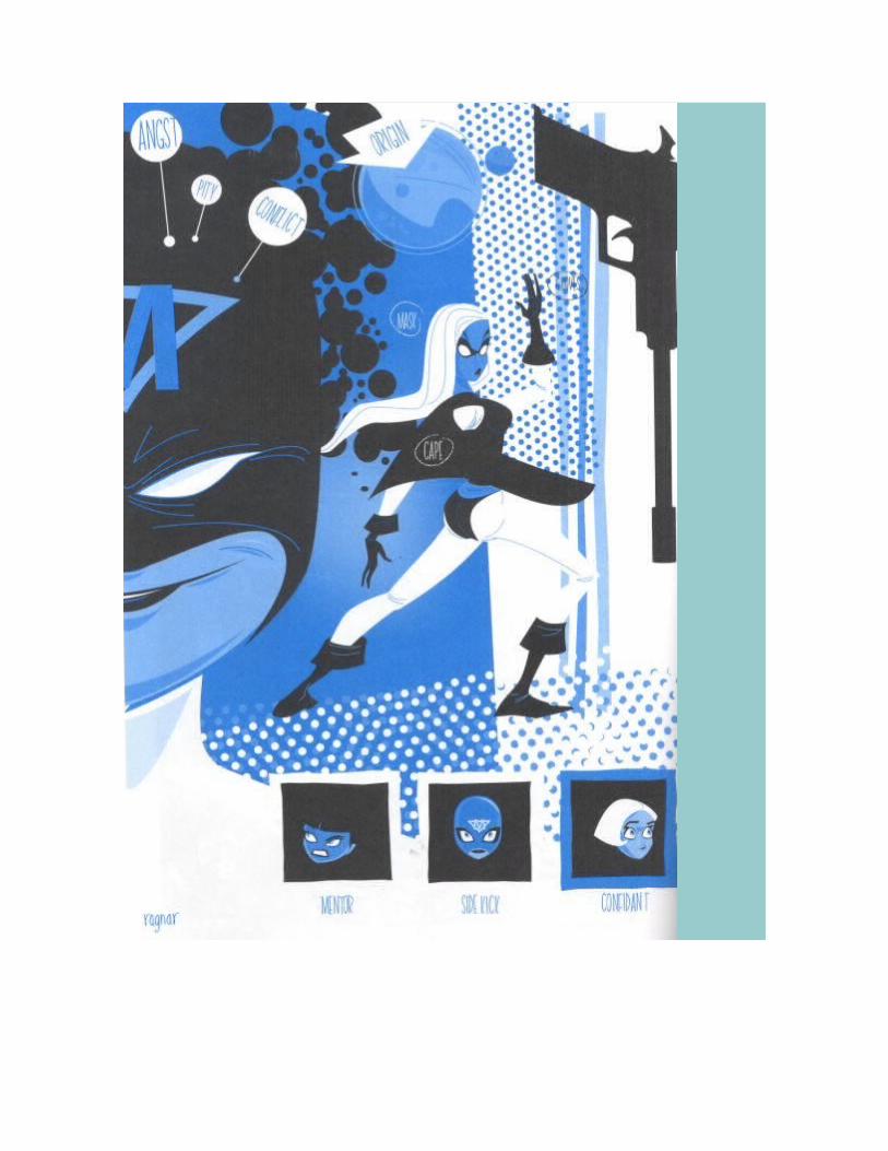
I particularly admire a series of red, yellow, and blue images created by Ragnar which reduce the
superhero saga to its basic building blocks. There is no story here, only the elements which get
repeated across stories. This Doug Frasser story is clearly intended to suggest Daredevil though
not in ways that would illicit a legal response from Marvel.

This one by Rob Ullman which combines a play with iconic elements and a much more mundane
sense what kinds of work superheroes perform.
Here, Chris Pitzer further abstracts the characters into a series of geometrical shapes with capes,
while following the basic narrative formulas to the letter.

These experiments are interesting because they explore the potentials for abstraction or realism
which exist on the margins of the mainstream industry. There is also a great pleasure in watching
these gifted cartoonists use the codes of mainstream companies as resources for their own
expressive play.

We can see similar forms of abstraction in Mack’s work in the Daredevil franchise. So, for example,
this page from Wake Up is as fascinated with the color red as anything found in Project Superior.
And we see throughout Vision Quest Mack’s fascination with reading the central characters through
various forms of abstraction, often involving pastiches of the work of particular modernist artists.


This play with abstraction can be understood as part of the process by which Echo wrestles with her
own identity, especially given the many overlays of other’s performance she has absorbed through
the years as she has exploited her powers on Kingpen’s behalf.

Or consider the various ways that Mack deconstructs Wolverine, one of the more iconic characters
in the Marvel universe and thus one which will remain recognizable even in a highly abstracted
form.

Mack is interested especially in three aspects of Wolverine’s persona — his animal like ferocity, his
claws, and his metal-enhanced skeleton — which become, in the end, all that remain of the
character in some of these images. Wolverine becomes a set of claws without a man much as the
Cheshire Cat becomes a grin without a cat.


Note how Mack uses the frame lines to pick up the shape and impact of the claws or how he
incorporates photorealistic renderings of animal bones to remind us of the skeletal structure which
gives the character his strength and endurance. By this final panel, Mack uses Exacto blades to
suggest Wolverine’s claws and shows us only the human bones beneath his skin. Here, the

abstraction serves the purpose of creating ambiguity since as we read this story it is not meant to
be clear whether Echo met the actual superhero or whether this Wolverine is a projection of her
shamanistic vision.
Mack’s collaboration with Brian Bendis seems to rely heavily on his capacity for abstraction.
For Wake Up, Mack is asked to depict the world of the superhero as seen through the eyes of an
emotionally disturbed child who has watched his father — the Frog — die at the hands of Daredevil
and who has struggled to process what he saw.


Here, Mack’s movements between highly realistic and more abstracted images are meant to convey
objective and subjective perspectives on the action. The child endlessly draws images of superhero
battles and as the story progresses, we learn how to sequence those images to match the voices
he hears in his head. Needless to say, there are clear parallels to be drawn to the movement from

single images to sequences of images which constitutes the art of comic book design. As
with Vison-Quest, the story refocuses on a secondary character — Ben Urich — with Daredevil
seen only in terms of his impact on their lives. We can see the focus on the subjective experience of
an emotionally disturbed character as a historic way that modernist style gets rationalized in more
mainstream projects — starting perhaps with the ways The Cabinet of Dr. Caligari frames German
expressionism in terms of the world as seen through the eyes of a patient in an insaine asylum or
for that matter, how Hitchcock absorbed aspects of Salvador Dali’s surrealism into Spellbound,
another film set at a mental hospital.
- See more at:
http://henryjenkins.org/2010/07/man_without_fear_david_mack_da_1.html#sthash.JfXjhp3q.dpuf
July 30, 2010
Man Without Fear: David Mack, Daredevil, and the Bounds of Difference (Part Four)
By Henry Jenkins
If Project Superior pulls the superhero genre into the space of independent comics, then a range of
recent Marvel and DC projects have pulled the independent and avant garde comics artists into the
realm of mainstream comics publishing, again via the figure of the superhero. Here, again, they
seek to motivate the experimentation through appeals to character psychology. In this case, DC
invites us to imagine what its superhero sagas would look like if they were produced by the
denizens of the Bizarro World, noted for their confusion and often reversal of the norms of human
society.

Matt Groenig (The Simpsons) shows the Justice League characters as being blown out of the pipe
of Bizarro Superman, helping to set up the premise of the collection as a whole. If Project
Superior is drawn towards forms of abstraction, the Bizarro comics have more room for the ugly
realism that we associate with certain strands of indie comics, a tendency to deflate the heroic

pretensions of the characters through various forms of the grotesque, as in this image by Tony
Millionaire,
or the everyday, as in these images by Dave Cooper,

Danny Hellman

and Leela Corman.

These superheros are very down-to-earth, their human faults and foibles on full display; the heroes
are often shown off-duty doing the kinds of things their readers regularly do. These images depend
on our pre-existing relationship with the superheros for much of their pleasures. Project
Superior depended on generic versions of the superhero, while these stories work with Batman,

Wonder Woman, Aquaman, and the others, with the artists incorporating just enough of the familiar
iconography and color palette to make it easy to recognize which characters are being evoked and
spoofed.

Anyone who has read a Batman comic will no doubt recognize much of the debris in the Bat Cave
depicted in this drawing by Kylie Baker, yet his cartoonish style is very different from what we would
expect to see within the Batman franchise itself. This Jason Little page depicts the superheroes as
bath toys, suggesting that they only come alive in the imagination of the child who is playing with
them.

Mack himself relies on the image of superhero action figures, in this case of Marvel characters,
in Wake Up, as another way into the tortured imagination of his young protagonist.

Mack’s work involves a fascinating blurring of the distinction between graphic novels and artist
books. Artist books are artworks which are intended to explore the nature of the book as a genre.
Sometimes, they are printed in limited editions. More often, they are one of a kind items. They play

with the shape, texture, and format of the book in ways that are idiosyncratic to the individual artists.
They often are focused on the materiality of print culture rather than on the content of the book.
Nothing could contrast more totally with the cheaply printed, mass produced and circulated comic
book. Historically, the art work which went into producing the comic was presumed to have no value
and was often discarded once the book has been printed, much as we might toss the manuscript
once the words have been set into type.
Yet, Mack is very interested in creating pages which are artworks on their own terms. He deploys
innovative techniques and unexpected pigments (such as coffee grinds) to construct his images.
Often, he layers physical and material objects onto the page so it is not a flat representation but
something with its own shape and feel. Mack publishes books which remove these images from
their context in the unfolding stories of his graphic novels and call attention to them on their own
terms as artist’s constructions, often describing and documenting the techniques which went into
their production. His process has been documented in a film called The Alchemy of Art, which
shows him creating some of the images contained within Vision-Quest and includes his comments
on the process. Here, the printed comic becomes almost a byproduct of his creative process which
is concentrated on the production of beautiful one-of-a-kind pages.
Throughout Vision-Quest, Mack calls attention to the often invisible but always important framelines
and buffers in his layout by using physical materials rather than drawn lines to separate out his
panels. In other instances, he glues objects such as leaves or bird’s wings directly onto the page in
what amounts to the graphic novel equivalent of Stan Brakhage’s Mothlight.


In other cases, he creates designs which play with the orientation of the page, demanding that we
physically turn the book around in order to follow the text or the action.


In his own graphic novel series, Kabuki, he plays with the notion of origami — encouraging the
reader to think of the page as something which can be folded and sculpted rather than simply part
of the printed book.


In each of these cases, Mack builds on practices associated with the art book movement, but
deploys them in relation to mass produced artifacts. He wants us to remain conscious that we are
holding a printed object in our hands that has particular properties and expects particular behaviors

from us. Here, again, he has both built upon and broken out of the visual language of mainstream
superhero comics.
This is not what a superhero comic is “supposed to look like”, even if it is telling the kind of story
which might be readily accepted if communicated through a different style or mode of
representation. Exploring the ways that Mack pushes against these expectations even as he
operates at the heart of one of Marvel’s cash cow franchises is what helps us to understand the
“bounds of difference.” And in the process, it helps us to understand how diversity operates within a
genre which has otherwise come to dominate the comics medium.
Filed Under: book shelf, Comics Culture
Comments
1. Superhero Legacy says:
August 9, 2010 at 6:38 pm
I don’t know if there’s anything Groenig can’t create a depiction of and still put his unique variation
on.
I think some of these small comic stories could be made into all-out comic series’, especially the
ones by Cooper and Corman. However, they probably would not sell as well as the originals…
2. louis vuitton outlet says:
March 28, 2011 at 1:52 am
Louis Vuitton, the world-renowned brands, but also for muxury a consideration. For these replica
louis vuitton,replica Louis Vuitton Handbags absolute comw of NPK’s high quality and fashion
design, but also added the popular bags for sale. There are also many copies of replica louis
vuitton Handbag to sell in the market, so when you choose not to pay attention to your luggage.
In addition, all of these Louis Vuitton Handbags,also used the same material,designed by replica
louis vuitton of these condescending, and large bags. In short, all of these replica Louis Vuitton
Handbags to provide you with the replica louis vuitton Handbag and so on. Speaking of Louis
Vuitton Handbags,people know, talk, and only those women who use this wealth of high-priced

bags. In the winter, it is said, the work of louis vuitton travel luggage and louis vuitton men
bags in these cities on the market very well.
CHEN
3. allied health says:
October 6, 2011 at 1:00 am
I have read almost all of your blogs. You never fail to amaze me. Thanks for posting something like
this. Good job!
aged care courses
4. Lielacarey0614 says:
October 13, 2011 at 8:15 pm
I love comics a lot. Thanks
Mykonos villas
5. cheap perfume online says:
November 23, 2011 at 3:36 am
Hello Henry.
I find it hilarious all the ideas you can think of with these DC heroes.
6. north shore removals says:

December 11, 2011 at 1:32 am
Hi Henry. I like this page of yours. It's like a comic relief only it's much better than that. I really did
enjoy reading. Thanks for posting.
7. north shore removals says:
December 11, 2011 at 1:33 am
Hello there Henry! You're very brilliant man. This article of yours really caught my attention. Thanks
for this and please post some more.
8. hard money says:
December 13, 2011 at 6:04 am
it is nice what you want to do. I am really impressed!
- See more at: http://henryjenkins.org/2010/07/man_without_fear_david_mack_da_2.html#sthash.tTzIjZXb.dpuf