magazine research
TRANSCRIPT

Magazine Research

The colour scheme on this cover in a way is quite retro. The only colours
apart from black and white are pink, red and yellow. Each of these colours
are used in a bold way. Very noticeable. Calvin Harris is a retro dance artist so the bold, minimal colours represent that. His white
jacket blends in with the backdrop to highlight his face and part of his shirt. This is used to draw attention straight
to the featured artist.
The type of photography is studio. This meaning it was taken just purely for
this cover in a studio. He is posed, not neutral. You can see this by the way he is positioned. This image is very bright. No dark or dull colours used. This goes with the theme of Calvin Harris' music.
The angle used is slightly canted. This could show the qwerky-ness of his
style or his easy-going attitude.
MixMag is published by a company called Development Hell. It was first published by a company called DMC who sold it to DH. They do not publish any other magazines because they are a company who deals with many areas of media.
The font used for the featured artist's name is in a retro style to go with all other aspects of the cover conveying this theme. All other fonts are quite plain. This is to draw attention to the more special items written in a special font.
There isn't much writing on the cover of this magazine. This could make the reader assume that the magazine is mostly about the pictures not the text. The writing style imposes that it is a guide to the best DJs and clubs worldwide.
The overall look of the design of this front cover is quite stylish. Retro yet modern. The elements on this page
that contribute to the feel are things like the fonts, colours, imagery, angles
etc. One thing that is very striking about the cover is that all text apart
from the mast head is on a canted angle just like the image of Calvin
Harris. These are put together again to highlight the image of the featured
artist.
The text/picture ratio is around 40% text and 60% image. The reason for this choice may be because of the competition in the publishing industry. Magazines these days focus more on the images than the texts. This may be because of young people's lack of interest to read.

The colour scheme on this cover is very different to the Calvin Harris cover. This
one uses much darker colours and more sinister a scheme. The black is obviously
used to fit the theme of the ‘Chemical Brother’s’ new song along with the green
which the rest of the cover follows.
The type of photography in this picture isn’t a natural picture. It was obviously
posed for the reason to scare and shock. It must have been taken in a photography
studio. The make up used on the model in the picture fits in with the theme of
the page; dark and creepy. This is all themed towards their new song which this magazine is obviously featuring. A face this big and creepy on a magazine
cover is sure to catch someone’s eye so this is a good technique for gaining
attention.
The overall feel of this page is very dark, creepy, scary. The things that contribute towards this id the colours, pictures and
the size of things. One thing that might put people off from picking up this
magazine is that because of the style of this cover, it may come across as a more
heavy metal music magazine as this is normally the kind of thing those
magazines would do therefore potentially loosing some of their
audience.
Just like the Calvin Harris cover, there isn’t much writing on this cover, but the small amount that is there looks to be quite a ‘cheeky’ way of talking to the reader. For example in the bottom left corner there is the question “We’re coming to your town. Wanna play?” This is informal and using slang. This is obviously reaching to a younger audience.
The fonts used on this cover are pretty much the same as all the other MixMag covers. They all seem to use the same font style but just change the colours to match the theme of the page. This one for instance has green and white fonts to fit with the dark and creepy theme.
The text to picture ratio is the same as the Calvin Harris cover. The majority of the page is the large picture of the clown face and the only text in the small items around ait and the mats heads. The publishers may have made this choice because pictures are always more eye-catching that text so it was in a hope to attract more readers.
MixMag is published by a company called Development Hell. It was first published by a company called DMC who sold it to DH. They do not publish any other magazines because they are a company who deals with many area of media.

The colour scheme on this page is quite bright and vibrant. The main colours used are pink, yellow white and black. These colours all seem to represent electro scenes and maybe retro themes. These colours fit in with the theme and also because they are bright, they draw more attention to the page.
All of the photography in this page is all natural poses. They were quire obviously taken while
people were just ‘doing their thing’ at the various parties. All of the people look like they are having a
good time, this may entice the readers of MixMag to attend one of these parties or similar ones hoping to
have the same experience as these people.
The overall look of this page is exciting. You can pretty much see every colour on this page through the colourful photography and the colourful fonts.
The things that add to the vibe mostly are the pictures of ‘natural partying’ and the teasing and exciting article titles that would gear you up for
partying.
The writing style of this article to me is like the reporter trying to sell these parties to you. The insane amounts of hype through the articles and pictures and the ‘need to know’ information boxes simply handing you the knowledge to go to these parties.
The fonts used are pretty basic fonts apart from the obviously different numbering at the beginning of each mini article. That font is a very disco themed font. Again this all adds to the theme of the page
which in this instance is disco and partying.
I would say that the text to picture ratio is pretty equal. If this magazine was made 20 years ago, this would be different. The majority of the page would
have been text with minimal images. These days people are more interested in the images than the text so the publishers have made an equal amount
of each.
Again published by Development HellTaken from MixMag
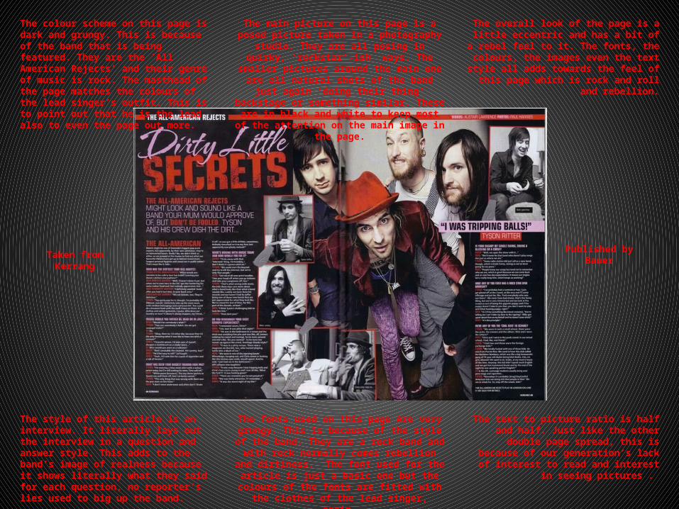
The colour scheme on this page is dark and grungy. This is because of the band that is being featured. They are the ‘All American Rejects’ and their genre of music is rock. The masthead of the page matches the colours of the lead singer’s outfit. This is to point out that he is the lead also to even the page out more.
The main picture on this page is a posed picture taken in a photography studio. They are all posing in quirky, ‘rockstar’-ish ways. The smaller pictures around the main one are all natural shots of the band just again
‘doing their thing’ backstage or something similar. These are in black and white to keep most of the
attention on the main image in the page.
The overall look of the page is a little eccentric and has a bit of a rebel feel to it. The fonts, the colours, the images even the text style all adds towards the feel of this page which is rock and
roll and rebellion.
The style of this article is an interview. It literally lays out the interview in a question and answer style. This adds to the band’s image of realness because it shows literally what they said for each question, no reporter’s lies used to big up the band.
The fonts used on this page Are very grungy. This is because of the style of the band. They are a rock
band and with rock normally comes rebellion and dirtiness. The font used for the article is just a basic one but the colours of the fonts are fitted with the
clothes of the lead singer, again.
The text to picture ratio is half and half. Just like the other double page spread, this is because of
our generation’s lack of interest to read and interest in seeing pictures .
Taken from Kerrang Published byBauer
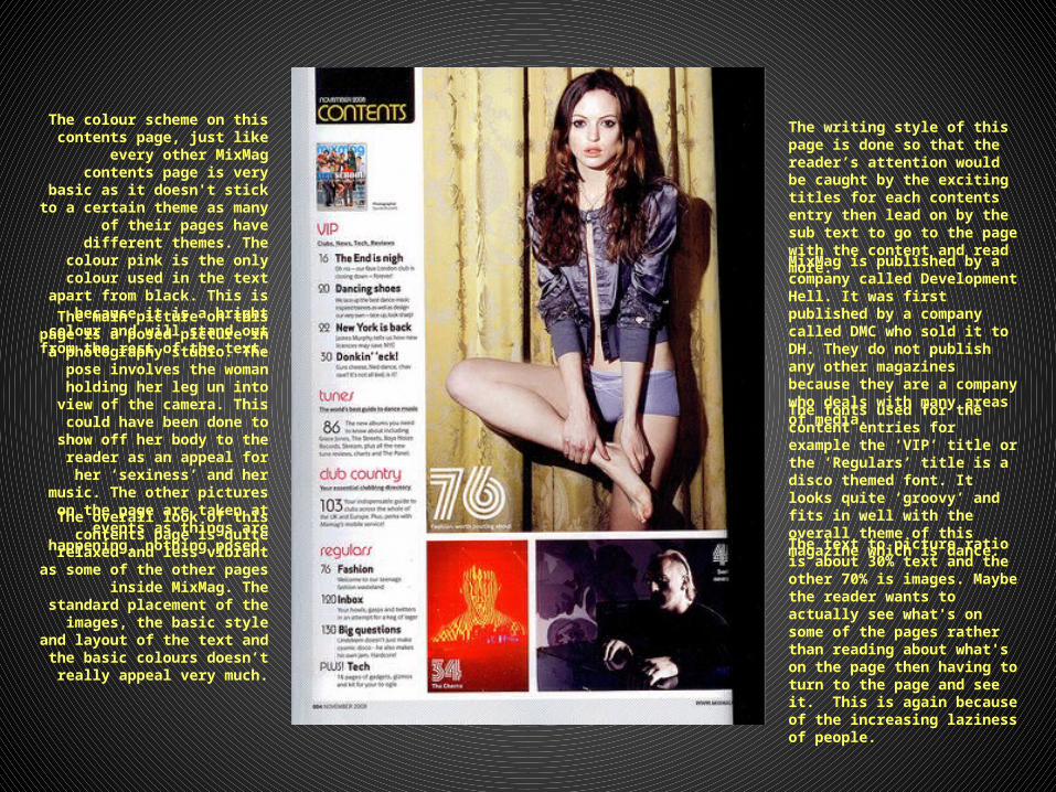
The colour scheme on this contents page, just like every other MixMag
contents page is very basic as it doesn't stick to a certain theme as many of their pages have different
themes. The colour pink is the only colour used in the text apart from black. This is because it is a bright
colour and will stand out from the rest of the text.
The main picture on this page is a posed picture in a photography studio. The pose involves the woman holding
her leg un into view of the camera. This could have been done to show off
her body to the reader as an appeal for her ‘sexiness’ and her music. The other pictures on the page are taken
at events as things are happening, nothing posed.
The overall look of this contents page is quite relaxed and less vibrant as
some of the other pages inside MixMag. The standard placement of
the images, the basic style and layout of the text and the basic colours
doesn’t really appeal very much.
The writing style of this page is done so that the reader’s attention would be caught by the exciting titles for each contents entry then lead on by the sub text to go to the page with the content and read more.
MixMag is published by a company called Development Hell. It was first published by a company called DMC who sold it to DH. They do not publish any other magazines because they are a company who deals with many areas of media.
The fonts used for the content entries for example the ‘VIP’ title or the ‘Regulars’ title is a disco themed font. It looks quite ‘groovy’ and fits in well with the overall theme of this magazine which is dance.
The text to picture ratio is about 30% text and the other 70% is images. Maybe the reader wants to actually see what's on some of the pages rather than reading about what's on the page then having to turn to the page and see it. This is again because of the increasing laziness of people.

The colour scheme on this contents page is the same as the other
MixMag contents page. Nothing special or themed because of the changing themes throughout the
other pages of the magazine.
The main picture on this page is a very natural photo take as someone
was innocently taking a drink. This photo was used because it shows
the relaxed nature of this artist rather than a fake and hyped up image. The other images on this
page however are different. They are posed. The one on the left, the
picture of the woman has been done like that to show off her
sexiness. While the one on the right is to show that guy’s rebellion and
‘not caring’ attitude to society.
Just like the other contents page, the overall look isn’t anything
special or flashy, its just boring and un themed for effect.
The writing style of this page is done so that the reader’s attention would be caught by the exciting titles for each contents entry then lead on by the sub text to go to the page with the content and read more.
MixMag is published by a company called Development Hell. It was first published by a company called DMC who sold it to DH. They do not publish any other magazines because they are a company who deals with many areas of media.
The fonts used for the content entries for example the ‘VIP’ title or the ‘Regulars’ title is a disco themed font. It looks quite ‘groovy’ and fits in well with the overall theme of this magazine which is dance.
The text to picture ratio is about 30% text and the other 70% is images. Maybe the reader wants to actually see what's on some of the pages rather than reading about what's on the page then having to turn to the page and see it. This is again because of the increasing laziness of people.