magazine
DESCRIPTION
magazine powerpoint researchTRANSCRIPT

The uses of Photography within magazines
Kerrang magazine • On page four of K magazine photos have been taken and sent
in by the readers of things they have drawn, bands they have met etc.
• On most of the other pages there are two page posters of a band with informa<on or interviews at the bo=om of the page in front of the image. Also in the middle of the magazine are seven posters which are clearly professionally taken.
• This magazine has far more images than text unlike NME. Although like NME there is always a band picture on the front along with the magazine <tle and some other informa<on cover.
• I think this magazine may appeal to 14 + for the same reasons as NME as that is around the age group people may begin to voice there opinions on the type of music within the magazines.

Kerrang
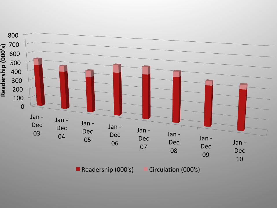
0 100 200 300 400 500 600 700 800
Jan -‐ Dec 03
Jan -‐ Dec 04
Jan -‐ Dec 05
Jan -‐ Dec 06
Jan -‐ Dec 07
Jan -‐ Dec 08
Jan -‐ Dec 09
Jan -‐ Dec 10
Read
ership (0
00's)
Readership (000's) Circula<on (000's)

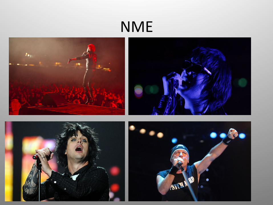
NME • NME is a much larger magazine than kerrang and has a lot
more text. • Although the magazine contains band images it is set out
somewhat like a newspaper with small wri<ng and the same sort of pages.
• I believe the photographs in this magazine are very well took, there is also I wide range such as new photo shoots and old black and white photos as does Kerrang.
• I think the age group this magazine might appeal to is anything from 14+ as any age group can like metal, grunge and indie. Although the type of people to read the magazine is not such a wide range as only certain people with this music taste would find NME interes<ng.
NME
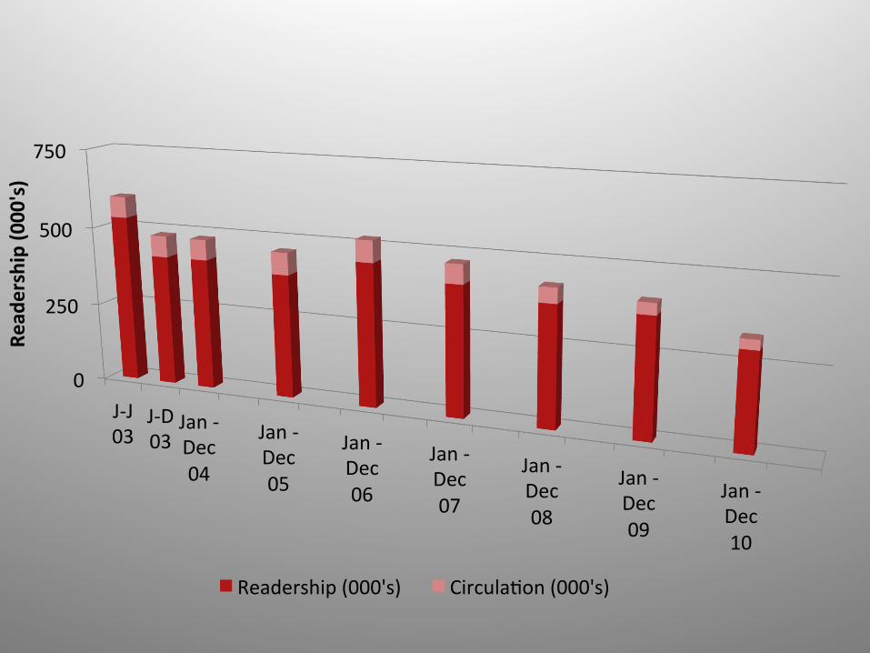
0
250
500
750
J-‐J 03
J-‐D 03
Jan -‐ Dec 04
Jan -‐ Dec 05
Jan -‐ Dec 06
Jan -‐ Dec 07
Jan -‐ Dec 08
Jan -‐ Dec 09
Jan -‐ Dec 10
Read
ership (0
00's)
Readership (000's) Circula<on (000's)
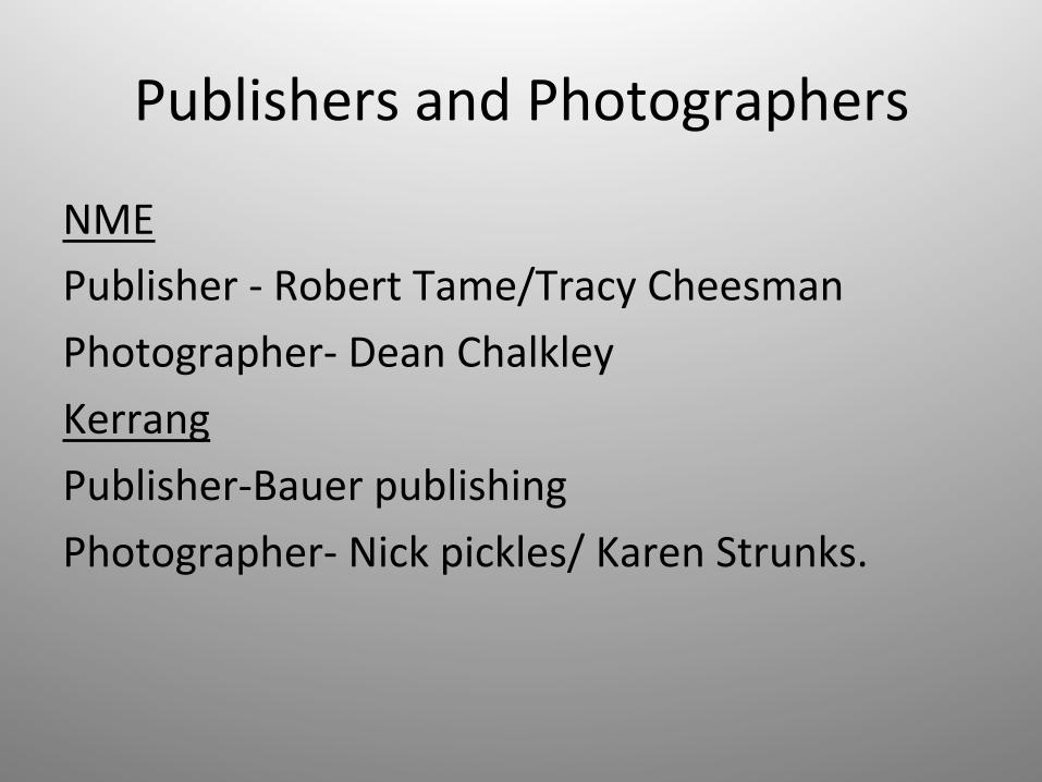
Publishers and Photographers
NME Publisher -‐ Robert Tame/Tracy Cheesman Photographer-‐ Dean Chalkley Kerrang Publisher-‐Bauer publishing Photographer-‐ Nick pickles/ Karen Strunks.

Who are the readers ?
• Both magazines being music related and both being centered around a few main music genre appeal to very similar readers being people that are in to:
• Heavy metal, metal, rock, indie, grunge, screamo etc.
• So for instance people into new pop / R&B would not enjoy this magazine at all.
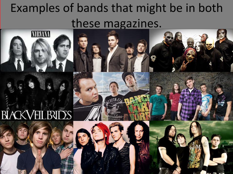
Examples of bands that might be in both these magazines.
Purpose of the photographs
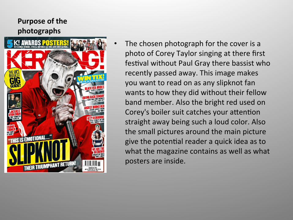
• The chosen photograph for the cover is a photo of Corey Taylor singing at there first fes<val without Paul Gray there bassist who recently passed away. This image makes you want to read on as any slipknot fan wants to how they did without their fellow band member. Also the bright red used on Corey's boiler suit catches your a=en<on straight away being such a loud color. Also the small pictures around the main picture give the poten<al reader a quick idea as to what the magazine contains as well as what posters are inside.
Purpose of the photographs
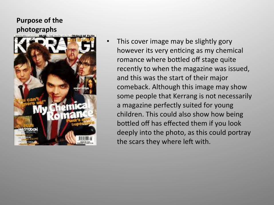
• This cover image may be slightly gory however its very en<cing as my chemical romance where bo=led off stage quite recently to when the magazine was issued, and this was the start of their major comeback. Although this image may show some people that Kerrang is not necessarily a magazine perfectly suited for young children. This could also show how being bo=led off has effected them if you look deeply into the photo, as this could portray the scars they where leg with.

Purpose of the photographs
• This cover is not as bright as the previous image although it has been done for a reason it resembles the Nirvana t-‐shirt colors of yellow and black. This image is a nice way to remember Nirvana as it I a simple pose of the three members just sihng alongside each other. The photographer has chose this photograph well as the black and white theme gives us an essence of how old Nirvana are even though the true spirit of Nirvana and grunge in general lives on.
Purpose of the photographs
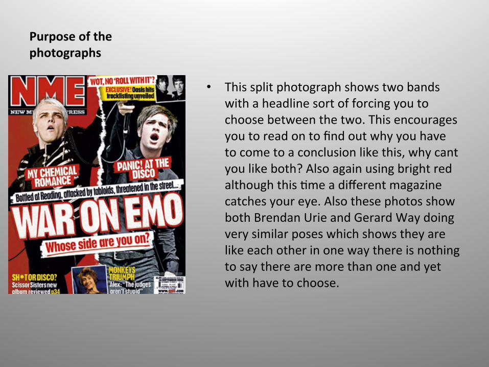
• This split photograph shows two bands with a headline sort of forcing you to choose between the two. This encourages you to read on to find out why you have to come to a conclusion like this, why cant you like both? Also again using bright red although this <me a different magazine catches your eye. Also these photos show both Brendan Urie and Gerard Way doing very similar poses which shows they are like each other in one way there is nothing to say there are more than one and yet with have to choose.

Number of buyers
Kerrang • 43,033 Total Average Net
CirculaAon / DistribuAon Per Issue01 Jan 2011 -‐ 30 Jun 2011
NME • 238,850 Daily Derived
Average Unique Browsers01 Jan 2010 -‐ 30 Jun 2010
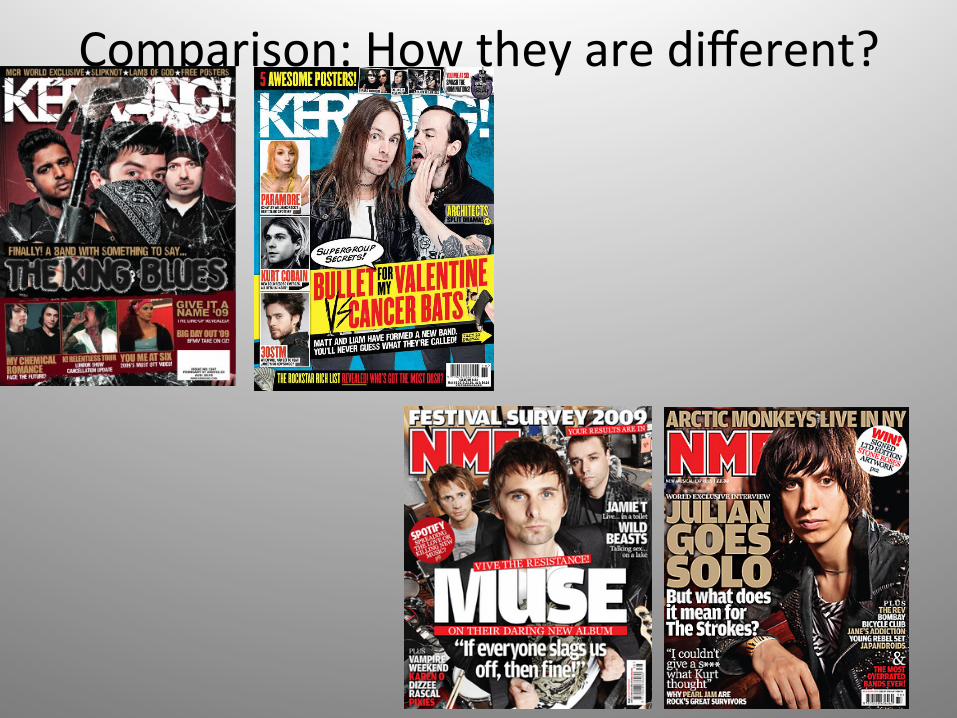
Comparison: How they are different?

Comparing NME and Kerrangs magazine covers
Both Nme and Kerrang use very similar covers in order to appeal to a similar market Nme being more for the rock/indie scene where as Kerrang maybe more to the rock/ metal/punk, however for two separate magazines maybe they are to similar, even having the same colour scheme on both occasionally. In terms of the photography used on the covers of each I think Nme covers tend to be a lot more simple, with the bands or singers simply stood with no props, Where as Kerrang more ogen than not use props, and incorporate them into the actual cover. Further more Nme uses levels so for example the lead singer may always appear higher than the other members of the band, where ar<sts on the cover of Kerrang seem to be all on the same level because the photograph hasn’t been taken from high view point looking down like that of Nme.