lsu brand guidelines v6 - loughborough students' union · abcdefghijklmnoqrstuvwxyz...
TRANSCRIPT
JUNE 2013
BRAND GUIDELINES

WE’VE RECENTLY ESTABLISHED A NEW IDENTITY THAT BETTER REFLECTS WHO WE ARE...
Our brand is our promise to you. From our logo to our colour palette, design layouts to fonts, we aim to present ourselves in a clear, consistent and professional manner.
Every time someone comes into contact with Loughborough Students’ Union, they should enjoy the same experience. By remaining consistent in every interaction, printed or online, we create a stronger brand, effectively communicating what it is we are here to do.
These guidelines are designed to help you work with our identity. So that whatever group you are from, and whoever you represent, you can be a part of our brand, as an ambassador of LSU and our mission.
If you have any questions about implementing the brand that are not covered in this document, contact us at [email protected]
2

3
SAY HELLO TO OUR LOGO
IT’S AN INTEGRAL PART OF OUR IDENTITY, AND IT’S IMPORTANT THAT IT’S HIGHLY VISIBLE AT ALL TIMES.
Using our logo establishes who you are in relation to Loughborough Students’ Union.
Our colours are bright and bold, and a really important part of our logo, so please never change the colour. This is the same for fonts and the shape, please don’t distort or adapt our logo in any way.
Our logo can be placed on a white background, or solid colour background or on imagery.

USING OUR IDENTITY
When it comes to using our logo we ask you to place it in the top left hand corner, right on the edge of the design as though it is folded over the top. This is called tagging.
Quickly tagging something with our logo will give you fl exibility to produce varied media whilst retaining the LSU brand in a set way.
There are exceptions to this rule and common sense should be applied for each and every application.
Please make sure the logo is located in the top left corner, and is legible. If you have problems let us know!
4

USING OUR IDENTITYIT’S IMPORTANT TO ENSURE THAT EVERYWHERE WE USE THE LOGO, IT’S PRESENTED IN A WAY THAT’S CLEAR AND CONCISE.
EXCLUSION ZONE: To allow the logo to stand out and be clearly visible, please allow breathing space around the logo.
Using half the width of the top of the Magenta angled block as a guide and working from the outer edge of the logo on all sides, no surrounding elements should appear within this area, nor should the exculsion zone bleed over the edge of your design.
When tagging the logo (see previous page), ignore the exclusion zone above the logo.
5
EXCLUSION ZONE BASE WIDTH TO USE
EXCLUSION ZONE

USING OUR IDENTITY
USING ON A COLOUR OR BACKGROUND IMAGE
Our colour palette allows our identity to be placed easily on background images or colours.
Whatever image or colour is behind our logo it’s very important to ensure the logo is highly visible and legible.
So, don’t feel like you have to accept second best and use a black & white version. The coloured version looks great on coloured backgrounds.
6

50MM
USING OUR IDENTITY
25MM
35MM
OVERALLMINIMUM SIZE IN PRINT
MINIMUM SIZE ON A3
35MM35MM
MINIMUM SIZE ON A4MINIMUM SIZE ON A5
50MM50MM 35MM35MM35MM35MM
MINIMUM SIZE IN PRINT
Using the logo at the right size ensures readability and presents our identity in a consistent way.
We’ve provided minumum sizes of use on A5, A4 and A3 media, that will help ensure consistency.
• For media below A5 sizes, the minimum size in print is 25mm.
• For media A5 and above, the minimum sizes are shown opposite.
• When designing above A3 - this size scales in proportion with the page size.
If in any doubt email [email protected] for guidance.
30MM
7

IDENTITY VARIATIONSWHEREVER POSSIBLE, THE FULL COLOUR LOGO SHOULD BE USED.
It maybe necessary however to use a solid black or white version of the logo. These are often useful to groups who are on a tight budget, who still wish to corectly display the brand.
MONO BLACK VERSION:You may only use this logo when you are printing in black and white or where print quality maybe too low to reproduce the colour logo eff ectively.(for example in newspapers)
REVERSE VERSION:This version may only be used in print when the background is too similar to LSU Magenta, or LSU Purple - or both (see p10).Our logo accomodates all other background colours eff ectively.
MONO BLACK VERSION REVERSE VERSION
8

OUR BRAND FAMILY
As a result we have created very simple extensions of our identity which act to tag each section individually.
So, if you are a part of a section of LSU you are free to use your individual section tag in the place of the main Loughborough Students’ Union version.
But remember, these logos are just as important as our main one, and are subject to all the same guidelines in this document.
OUR SECTIONS ARE AT THE HEART OF WHAT LSU OFFERS TO STUDENTS. WE ARE PROUD OF THEM, AND THEY ARE PROUD TO BE A PART OF LSU.
RAG MEDIA SOCIETIESACTION
9

OUR COLOURSWE ARE A PINK AND PURPLE BRAND!
Our colour palette consists of: LSU Purple Identical to the purple from the Loughborough University brand, reflecting our close relationship. LSU Magenta A vivid and bright pink colour. (it’s just pure magenta really!) We also use a grey and a white to complement our core colours and give us more flexibility when producing media.
Simplifying the colours we use garauntees a far more consistent approach to everything we do.
Don’t worry ! - We aren’t going to fine you for not sticking to these colours, in the artwork you produce but they will help us strengthen our brand.
LSU Purple
LSU Magenta
C:78 M:100 Y:0 K:33R:74 G:24 B:99WEB: #4A1863
C:0 M:100 Y:0 K:00 R:230 G:0 B:126WEB: #E5007D
C:0 M:0 Y:0 K:80R:87 G:87 B:86WEB: #575756
C:0 M:0 Y:0 K:0R:255 G:255 B:255WEB: #FFFFFF
LSU Grey
LSU White
OUR PRIMARY COLOURS
SECONDARY COLOURS
10

11
OUR TYPEFACES
OUR MAIN TYPEFACE IS THE ‘UNIVERS’ FAMILY.
We use it in capitals on our identity, and headlines and key messages.
Aller is the typeface we use for our text content (just like the text you’re reading now).
Individual projects will bring a requirement for different typefaces to promote different events etc - there’s no restriction of the use of other fonts, but core elements such as our logo and poster footer must always use our typefaces.
Where these typefaces have been used in templates provided to you, they must not be replaced.
Aller is avilable with a free 25 user license from Dalton Maag.
UNIVERS LIGHT CONDENSED& OBLIQUE ABCDEFGHIJKLMNOPQRSTUVWXYZ
Aller Light:abcdefghijklmnoqrstuvwxyz ABCDEFGHIJKLMNOPQRSTUVWXYZ
Aller Bold:abcdefghijklmnoqrstuvwxyz ABCDEFGHIJKLMNOPQRSTUVWXYZ
UNIVERS BOLD CONDENSED& OBLIQUE ABCDEFGHIJKLMNOPQRSTUVWXYZ

12
STASH LOGOSINCLUDING OUR LOGO ON YOUR STASH IS A REALLY IMPORTANT WAY OF CREATING CONSISTENCY ACROSS ALL ASPECTS OF WHAT LSU HAS TO OFFER.
We know that every group is diff erent, and our new policy aims to free you up to be creative with your stash.
To make using our logo easy we off er 3 options for where you should display it.
• On either side of the chest.• On either sleeve.• At the top of the back. (except hooded tops)
Whichever you pick, the rest of the garment is available for you and your society/club to customise.
Wherever you choose to display the logo on stash it should always be no smaller than 60mm in width!
13
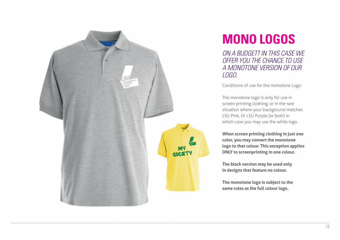
MONO LOGOSON A BUDGET? IN THIS CASE WE OFFER YOU THE CHANCE TO USE A MONOTONE VERSION OF OUR LOGO.Conditions of use for the monotone Logo:
The monotone logo is only for use in screen printing clothing, or in the rare situation where your background matches LSU Pink, Or LSU Purple (or both) in which case you may use the white logo.
When screen printing clothing in just one color, you may convert the monotone logo to that colour. This exception applies ONLY to screenprinting in one colour.
The black version may be used only in designs that feature no colour.
The monotone logo is subject to the same rules as the full colour logo.

BAD EXAMPLES IN ACTIONAND HOW TO CORRECTLY DISPLAY THE BRAND
14
15
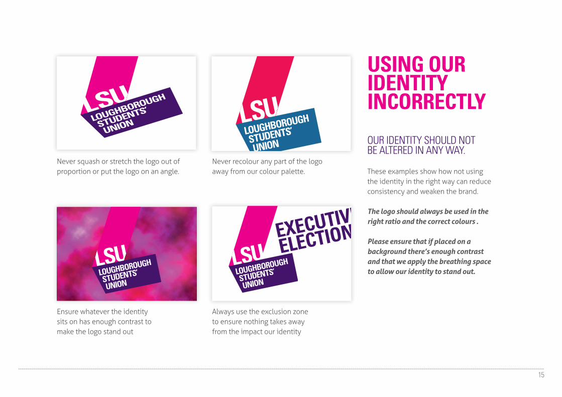
USING OURIDENTITY INCORRECTLY
OUR IDENTITY SHOULD NOTBE ALTERED IN ANY WAY.
These examples show how not using the identity in the right way can reduce consistency and weaken the brand.
The logo should always be used in the right ratio and the correct colours .
Please ensure that if placed on a background there’s enough contrast and that we apply the breathing space to allow our identity to stand out.
Never squash or stretch the logo out of proportion or put the logo on an angle.
Never recolour any part of the logo away from our colour palette.
Ensure whatever the identity sits on has enough contrast to make the logo stand out
Always use the exclusion zone to ensure nothing takes away from the impact our identity
EXECUTIVE
ELECTIONS

OUR BRAND GUIDELINES ARE HERE TO CREATE A STRONG, CONSISTENT LOOK AND FEEL, BY HELPING YOU TO USE OUR IDENTITY EFFECTIVELY.
16
We’ve provided you with this document to help you implement our brand with confidence.
If you have work that features our brand, and you need to get it signed off, or if you’re unsure of anything regarding the brand, speak to your section head, or email: [email protected]
THE BRAND IS BOLD AND CONFIDENT AND ALL THE MATERIALS WE PRODUCE SHOULD REFLECT THIS.