lessons learned from metafont - amazon s3 · lessons learned from metafont donald e. knuth type...
TRANSCRIPT

35
Lessons Learned from Metafont
Donald E. Knuth
Type designers today face an important problem, the problem of constructing digitized patterns for printing. The central question is , "What is the right way to create such patterns?" Or, rather , "What will be the right way?" - since we are concerned primarily with long term issues that are different from the problems of meeting today's deadlines . In this paper, I shall try to convey some of my excitement about exploratory research that has been going on here at Stanford, since I think we have found a small part of the answer.
Let me state at the outset that I do not foresee the problem ever becoming simple. Indeed, when I ponder what lessons I have learned so far, the main lesson turns out to be that the problem is quite difficult! In a way, this is not surprising. For more than thirty years, computers have been oversold by salesmen who claim that computing machines are easy to use, while the truth is quite the opposite: Computer programming requires more attention to detail than anything else that human beings have ever done. Moreover , the problems of letterform design are extremely subtle, much more complex than most people think, because our machines and our eyes interact with the shapes in complicated ways. I am convinced that digital alphabet design is an extremely challenging problem, and that it is significant enough to deserve the attention of our best scientific minds and our best artistic skills and sensitivities. Furthermore, I believe that the world will be a better place to live in after we learn more about the subject.
Visible Language, XIX 1 Winter 1985 Author's Address: Dept. of Computer Science, Stanford University, Stanford, Ca. 94305 (S)Visible Language, Box 1972 CMA, Cleveland , OH 44106

Figure 1
36 Visible Language XIX 1 Winter 1985
There is also another point I want to make before getting into the details of my work: I am a mathematician, well aware that I am no artist. I do not believe that mathematical methods will resolve all the problems of digital typography; but I do believe that mathematics will help. Indeed, it is almost inconceivable that more than 2000 years of accumulated knowledge about geometry and curves will prove to be irrelevant to alphabet design. Yet mathematics is a threat to people whose love for letters is partly due to their hatred of (or, let us say, lack of attraction to) algebra. I am sorry that "math anxiety" exists, but I know that it is widespread. I am well aware that the injection of mathematics into a previously untainted area can be considered unfair to the leaders of that discipline, since they suddenly have to learn an enormous amount of new material in order to stay on top of their subject. However, I do not think there is really cause for alarm; it is not unusual for a subject to be so complex that no one person can understand it all. The most fascinating thing about recent developments in typography is, in fact, the emerging collaboration between scientists and artists: the bridges that are being built between C. P. Snow's "two cultures." I am not proposing that letter designers suddenly abandon their traditional ways and learn all about computer programming; I am proposing that they team up with computer scientists the way they used to collaborate with punch cutters. On the other hand, I am also pleased to see students growing up with feet solidly grounded in both worlds.
But what specifically is it that I think is so interesting? During the past few years I have been developing a computer system called METAFONT, which has three somewhat unusual characteristics:
1 It is based on a language for drawing shapes with simulated pens that have thicknesses. For example, consider Figure 1, which shows a valentine-like curve traced by a slightly broad-edged pen. METAFONT
drew this figure with ease, given only eight points on the "spine" of the curve; the actual edge of the curve is quite complex and difficult to describe, but the pen motion is quite simple.
2 The METAFONT language also encourages the construction of designs with explicit parameters, so that a large family of shapes can be described, rather than a single shape. For example, Figure 2 shows two of the

( I
Figure 2
37 Knuth/ Lessons Learned from Metafont
sketches that Matthew Carter made when he was developing Galliard; METAFONT aims to facilitate the incorporation of variations into a design. This, in fact , accounts for the prefix "meta-" in METAFONT; the approach is "meta-" in the sense that it deals with fonts from outside, at a higher level, somewhat as "metamathematics" is the theory of mathematical proof techniques. Meta-concepts are proliferating these days: For example, I recently learned of a new game called "metagame" [7] in which the first move is to choose a game to play. (An interesting problem arises when the first player says, "Let's play metagame!")
I have written elsewhere about the concept of a meta-font [6], which is a high-level description that transcends any of the individual fonts it describes. This concept is to be distinguished from the META
FONT system itself, which is merely one way to describe meta-fonts. Figure 3 (due to Scott Kim) illustrates some of the parameter variations possible in an early version of a meta-font called Computer Modern; each of the parameters has been pushed to extremes for the sake of example. Figure 3a shows changes in the slant of characters, and Figure 3b shows changes in the width; in both cases the pens stay the same but the path is different, hence the changes in image could not be done by optical transformations. Fig-ure 3c shows what happens when the pen motion stays almost unchanged but the pen size varies . The lengths of serifs can be varied too (Figure 3d). A more .unusual transformation is shown in Figure 3e, where alterations are made in the "constant" that is used to compute curves; this changes the bowl shapes. Figure 3f shows several parameters changing simultaneously to keep the letters readable as the type size changes; this is one of the main reasons for having parameters in a design. (The letters have been scaled here so that the x-heights are the same, thereby making the other changes more evident.) In each case the letters have been generated from an identical METAFONT description; the changes were caused only by changing parameters that apply to a font as a whole.
3 In order to support characteristics 1 and 2, META
FONT descriptions of letterforms are given as programs. For example, Figure 4 shows two of the programs in an early version of a meta-font called CHEL, developed by Tom Hickey in 1982. Sample letters produced by these programs, for various settings of the

-1/Sslant.
Osla.nt
l / 6 sl ant
l / 4alant
l/3alant
l / 2olont
1/lalant.
Figure 3a
condensed by .4
condensed by .6
condenaed by .B
normal
expanded by 1.2
expanded byl.S
expanded by 2
Figure 3b
weight=-!
weight = O
weight. = 1/ 4
weight.=l/2
weight=3/4
weight. = 1
weight. = 2
Figure 3c
38 Visible Language XIX 1 Winter 1985
Typogra;phy
Typography
Typography
Typography
Typography
Typography
~Clf/40Lf7
Typography
Typography
Typography
Typography
Typography
Typography
Typography
Typography
Typography
Typography
Typography
Typography
parameters, appear at the top of the figure. The program for 'b' is quite short because most of the work is done by a subroutine, i.e., by an auxiliary program that is used to construct parts of several different letters. In this case, Hickey devised a subroutine to draw a small bowl, and he used the same subroutine also in the 'd' and 'p', etc.
METAFONT programs are quite different from ordinary computer programs because they are largely "declarative" rather than "imperative." In other words, they state relationships that are supposed to hold; they do not tell the computer how to satisfy those conditions. For example, a METAFONT description might declare that the left edge of a stem line should occur one unit from the left; the program does not need to state that the center of the pen should be positioned one unit from the left, plus half of the stem width, because the computer can figure that out . Similarly, it is possible to state that a certain point lies on the intersection of two lines; it is not necessary to specify how to compute the intersection point. Most of the mathematical complexities can therefore be handled by the computer, behind the scenes.
Since METAFONT programs include all of the information about how to draw each letter in a wide variety of circumstances, the programs are able to record the "intelligence" that lies behind a design. I believe that this aspect of META FONT - its ability to capture the designer's intentions rather than just the drawings that result from those intentions- will prove to be much more important than anything else. The ability to draw infinitely many alphabets by the variation of parameters is not usually an important goal by itself; but the ability to explain a design in precise terms is highly instructive both to the designer and to those who read his or her programs. The computer can enforce a discipline that helps its users to clarify their own knowledge; this educational experience is really the rewarding thing.
Now to return to my main theme, of lessons that I have learned so far. I think it is best to start in the summer of 1977, when I began this work; at that time I had no idea that I would ever be designing a language for letterforms , much less ever getting to know artists and typographers. I had been unable to get good drawings of the outlines of the letters that I wanted to typeset, so I was virtually forced to develop computer techniques for alphabet design , starting from

39
serirsscaled by O Typography
serih scaled by 1/ 4 Typography
ser ih scaled by 1/ 2 Typography
serirsscaledby 3/4 Typography
serih scaled byl Typography
Typography
~0~
serifsscaledby2
serihscaledby4
Figure 3d
Typography
Typography
Typography
Typography
Typography
Typography
Typography
Figure 3e
.f!OpoinL Typography
18 point. Typography
lOpoint Typography
9point. Typography
8 point. Typography
7point Typography 6point Typography S poin~ Typography
Figure 3/
Knuth/ Lessons Learned from Metafont
scratch. My publishers supplied me with high quality letterpress proof pages that had been used to make the plates for the first printing of my book, but otherwise I had to work with extremely primitive equipment. Experiments with television cameras hooked up to computers proved to be a total failure, since the TV lenses caused considerable distortion when they were used to magnify a small image, and since a slight change in the brightness of the studio lighting caused enormous changes in the televised shapes. The best results I could get were obtained by making 35 mm slides of the letterpress proofs, and by projecting them about 8 meters onto a wall in my house, where I could make pencil sketches of somewhat blurry images about 5 em high.
The three P's of META FONT -drawing with pens and parameters via programs- popped into my mind within an hour or so after I had started to make those sketches. It suddenly dawned on me that I should not simply try to copy the shapes. A human being had originally drawn them, so I really wanted to learn as much as possible about what was in that person's mind at the time, and I wanted to incorporate that knowledge into a computer program.
The programs I wrote in 1977 were done in a traditional "imperative" programming language called SAIL, which is very much like an international computer language called ALGOL. Every time I changed anything in the program for any letter, I would have to recompile the changes into the machine's language; the idea of a declarative, interpretable language like METAFONT did not occur to me until it was suggested by Robert Filman a few months later. But the lack of such a language was not actually a bottleneck in 1977; the main problem was my ignorance about how to represent shapes in a decent way.
To illustrate these early difficulties, I have decided to show you something that I have never dared to show anyone else before: the very first results that I had in 1977 when I began to attempt drawing Arabic numerals. After I had translated my first rough sketches into a computer program, the machine presented me with Figure 5, in which each column represents a different setting of the main parameters (normal , bold, small-caps, sans-serif, and typewriter, respectively). The digit '8' had a special problem that- mercifullyprevented its appearance in all but one style; but my initial errors in the '2' , '5' , '6 ' , and '7' were repeated

40 Visible Language XIX 1 Winter 1985
88 BB B B B B BB BB B B B B BB 88 8 B B B
88 8 B B B
"Tbelet.t.erB"; tall c.harb~Qin( ·a, 2, .76, ph, 0, ![pz, plt.J rl~nt );
c. pen; Z)=:t~=~=z 4 =:t11 ; ll\ 1o:t 1=tu l !'l.j
lfl=h; 114=0; ncwtopindwt, botojtop, topojbot, ~0 ;
topindmt=round{.f& r }; w,.~![w,,.,w.,,[; botoftop=round{l[bot.uchbar,l.op 00 c4ba.r]); topojbot=round(~Jbot.00 chbcr, Lop 1nch.bar]); rt.,o:t 10 =ronnd(r-ucin+lr.o); ~ 0z1 =rt.10 z10 -topindtnt; ~::!!-:.:::;·lftJo%7];%-Q=j[rl.,o:tL,lftH:tLo];
top!Jlli~=h; l/$=V1i bot.Litlit =O; Vo=Vti new Wos,Wnj Wo8=round(t.op00 chbar-botoftop); c.all dtukpcn(9S}; WoT=round(topo/bot-bol.u chbar); c..all cMckpcn(97); top0 fi l/&=top0 0chbar; bo41ll8"""botvoch.bo.r; if bo~sll&>top;1 Jis : nnr wu; Woe=wosi new wos;
Wos=Woe+I; li; l/7=![bot.JL7ll$ 1\.op00 th.b11r]; 11L o =,[top 111 vo,bo!.Qochbar~ ~1 t=V12 =chbar; l: t2= :ts; fpen; fpenwd I; w 11 ~ draw 2 . . 5;
d.n.w s .. 9; wg; drawll .. l2; bpen;bpmbt.l; w 1; draw J • • 4; tall 'a n.qarc(~. 7,wn1,to1g); tall 'b nqarc('ii,IO,wn1,UitD); tall 'c nqarc(11,7,toge,w 1g); caU ·o nqarc(8, 10, wgr,w 1g);
Figure 4
B B B B B B
%italic ton-high forcondellted
%indent. top enn on conden.ed %allow-p-ow pen for middle bar
%bottom aftopout.e.r~ % t.op oflowuout.e.rarc.
%baud on cou.nW:rwidt.bt
%wed rort.op and botton an:• % t.o control t.b.in.nin&
%of arc~ at cent.er
%~or eou.ntcn % bei&}lt of bar same u c.ap H
%t.op len! %bot. len\ %mid Inti
% •t.em % npperupper % lo-.er lower %lower upper %upper lower
b b bb bb bb b b bb bb bb b b bb bb bb b b b b bb b b b b b b
•rhelett.erb•; c.aJl d~orbegin( ' b, 2,0.11~ ,ph., 0, tP:t·llant); l:J=%2=/ch.o//; Vt=h; V2==0; hpen.btl ; bpen; w11 d.nt.w! . . 2; call 'a •m4ilbowl(le/!}
fivefold. I am showing these early results because similar problems can be expected even with today 's META
FONT; it is not easy to describe the essence of shapes to a machine.
Figure 5 is obviously riddled with errors, and it is instructive to look at them more closely. In a few cases I simply blundered: For example, I forgot to use a thick enough pen when starting the diagonal of the '2' . The strange glitch in the third '2' was due to a bad specification of the angle at the bottom; I had specified the same angle for small caps as for the normal size, even though a smaller figure was being drawn. Another bad angle occurs at the top of the bowl in each '5'. But other errors were more serious: The difficulties at the bottoms of the '5's are exhibited more severely at the tops of the '6's, where the bulbs are too high and they are joined badly to the rest of the shape. Even worse things occur at the bottoms of the '6's, where my whole approach was completely mistaken and had to be redone several times in subsequent experiments. The top of the rightmost '7' exhibits a problem that I did not resolve adequately until five years later, when I finally realized that this part of '7' (and the bottom of '2') could be regarded as an "arm," analogous to parts of a letter like 'T' or 'E'.

41
2 2 2 2 2 55 55 5 66666 77777 8 Figure 5
01234567 01234567
01234567
01234567
01234567 Figure 6
Knuth/ Lessons Learned from Metafont
By the end of 1977, the numerals in my experimental meta-font had evolved to the point shown in Figure 6. I was satisfied with them at the time, so I spent most of 1978 working on the 'lEX typesetting system and doing other sorts of computer science research. In 1979 I decided to design a symbolic language for letterforms that would reflect at a higher level what I had been thinking about when writing my ALGOL programs in 1977; this new language became the original METAFONT system [4]. Considerable work was necessary in 1980 to hook up the output of METAFONT with a high-resolution phototypesetter; during this time I was preoccupied with software problems and unable to do much with the font designs. Then finally I reached the goal that I had hoped to achieve two years earlier: I completed the second edition of my book Seminumerical Algorithms [5], a 700-page work in which everything but the illustrations had been done entirely by new computer methods. Altogether 35 fonts were used in that book- seven sizes of roman, six of italic, and three each of bold and slanted and typewriter styles, with each size drawn separately; there were six versions of sans-serif, and seven pi fonts for math symbols . All of these were created with the first METAFONT, and the sheets looked mighty good to me when they came out of the typesetter.
But I cannot adequately describe the enormous letdown I had when Seminumerical Algorithms finally appeared in print at the beginning of 1981. That was the first time I had seen the result of the entire process, including printing and binding; up to then I had been working almost entirely with low resolution equipment, and of. course the high resolution output was much nicer, so I was eagerly anticipating a beauti-ful book. When I received the first copy and opened the covers, I burned with disappointment : Everything looked wrong! The main shock was due to the fact that I now was seeing the fonts as they looked after printing and- just as important- after binding the pages in buff covers just as the first edition had been bound. The fact that the new format was encased in the old context exaggerated the deficiencies of the new format. Sure, the new text was readable, and I could console myself a little with the thought that it was not as bad as some other books that were being printed at the time; but it was not at all what I was hoping to achieve. The sans-serif was totally wrong; the weights of roman vs. italic vs. numerals were not quite right;

Figure 7a
Q Figure 7b
42 Visible Language XIX 1 Winter 1985
and the high resolution revealed unsuspected deficiencies in many individual characters. I developed a strong antipathy for the shapes of the numerals, especially the '2' and '6'. When using the book for reference or teaching, I was forced to look at the numbers on each page, and this would distract my thoughts; I wanted to think about elegant mathematics, but it was impossible to ignore the ugly typography.
However, my profound disappointment was not completely discouraging. For one thing, I had been reading a lot of biographies, and I knew about mid-life crises; since I was 40 years old in 1978, I had sort of been expecting to make at least one big mistake. My idea had always been to follow my intuition but to be ready for failure. I knew that METAFONT was quite different from what anybody else had done or was doing, and it certainly occurred to me that all of my ideas might simply be stupid: No wonder nobody else had tried them! On the other hand, it still seemed to me that the basic ideas of pens, parameters, and programs were still valid; the deficiencies in my published book were due to my faulty execution, but the ideas themselves seemed right. So I decided to persevere.
Two more years have gone by since then; in the meantime my colleagues and I have accumulated a lot of experience with the first METAFONT. I plan to spend the next year making a completely new system, starting over from scratch, based on this experience; the new system should therefore remove many of the deficiencies of the old. Since the new language will be ready in 1984 we are wondering if we should follow George Orwell and call it NEWSPEAK. Our plan is to make META FONT84 widely available and to design it so that it can be used on all but the smallest computers.
Please forgive me for inserting so many biographical remarks into this paper. My main purpose is to explain the lessons I have been learning during this work, and it is high time that I give some more concrete details.
One of the first important things that I learned was that the computer deserves to be treated as a new medium. When we approach the problem of digital type design, we should not expect to do everything exactly as it was done before; we should rather expect that we can learn to guide a computer as people have traditionally learned to guide a brush or a chisel. When using the machine, it is best to hold back and

43
Figure 8
Figure 9
Knuth / Lessons Learned from Metafont
to relinquish some of our own control- to let the machine "have its own head" as we find out what works and what does not . The ideal is to work together with the tool; we specify the important details , but we are willing to accept help as we do.
Of course, this idea makes sense only if the computer is a decent medium- only if the curves that it draws are aesthetically pleasing. Consider, for example, Figure 7a; it turns out that today's METAFONT will produce these horrid shapes if the user simply specifies eight or nine points as shown without giv-ing any additional instructions. A person soon learns how to overcome such problems and to obtain pleasing curves with METAFONT79, but the new system will be much better: John Hobby has recently done some important mathematical work that makes it possible to obtain Figure 7b from the same data that produced Figure 7 a, and his new approach will be adopted in METAFONT84. This is quite important not only because it makes the system simpler to use and more responsive, but also because curves need to be adjusted when low-resolution characters are drawn; Hobby's method makes it more likely that such adjustments will not destroy the shapes of the curves.
Figures 8 and 9 illustrate another important sense in which a designer might find that computers can provide an expressive medium. The "teardrop" shapes in Figure 8 were drawn by a METAFONT subroutine in which only a few points needed to be specified (one at the top, one at the bottom, and the horizontal coordinate at the edge of the bulb); all of the other points were determined by mathematical calculations inside the subroutine. John Hobby worked hard to create that subroutine, but a designer can learn to use teardrops effectively without worrying about exactly how the subroutine actually computes them. Figure 9 shows some of the strokes drawn by the teardrop subroutine and by three other subroutines in Hobby and Gu's early experiments on oriental character design [2]. (Further work by Hobby and Gu has led to another set of subroutines that may well be adequate for drawing a complete set of Chinese and Japanese characters in a variety of styles [3].)
The second chief lesson I learned while using METAFONT was that it· is best to let different parts of a design interact, rather than to specify them independently. For example, it is better to say that one point is midway between two others, instead of giving ex-

44
mathematics mathematics mathematics mathematics mathematics Figure 10
Figure 11
sssss sssss Figure 12
Visible Language XIX 1 Winter 1985
plicit coordinates to all three points. One way to illustrate this is shown in Figure 10, which is the result of an experiment with random numbers that I tried in 1977: I changed my early programs so that key points of the design were not specified exactly; the computer was supposed to pretend that it was a bit tipsy when placing those points. The top line shows perfect placement, but the second line shows what happened when the points were placed randomly with a standard deviation of about 1 %; the third line shows a standard deviation of 2%, and so on. The chief thing I learned from this experiment was that the result-ing letters seemed to be "warmer" when a little bit of randomness entered into the design. But the reason I am including Figure 10 is that it demonstrates that different parts of a design can be interrelated so that they depend on each other. For example, when the stems move, the serifs move with them; the individual points are not independently random.
Figure 11 exhibits a similar dependence; I made these three '6's by varying the position of only one point in the specification (point 6, which is at the top of the bowl). Many of the other points changed their position when point 6 moved, because my METAFONT
program specified their positions relative to other points rather than with absolute coordinates.
Another example of interdependence appears in Figure 12; again a series of letters has been drawn with only one parameter of the program changing. In the upper line I changed the shape at the middle of the S; in the lower line I changed the weight. In both cases a number of points changed their position in order to accommodate other changes, because I defined the positions by formulas instead of using numbers.
Perhaps the best way for me to convey the flavor of METAFONT work is to show you some of my "metaflops": things that came out in quite unexpected ways. In fact, the computer is full of surprises, and this is where a lot of the fun comes in. For example, one of my programming mistakes caused a link in the 'g' to fold over in an interesting way (Figure 13a); and one of my attempts to draw a sans-serif 'A' came out looking more like an ad for Levi's western jeans (Figure 13b). Fallacious formulas led to a marvelous 'M' (Figure 13c), a sparky 'S' (Figure 13d), and a cruel 'C' (Figure 13e). When I misplaced the serif in Figure 13f, I swear that I was not thinking about Japanese yen; the currency connection was purely coincidental!

Figure 13 a
d
45 Knuth/ Lessons Learned from Metafont
Figure 13g came about when I was trying to discover why METAFONT was drawing the wrong curve in an 'a'; I wanted to see more details of the underlying strokes, because I suspected a computer error. In this case it turned out that METAFONT was not at faultI had made a mathematical mistake when I specified the slope at the critical point.
To complete this exhibition of meta-flops, Figure 13h illustrates a ligature in which I unwittingly told the computer to make both of the 'f's aim at the dot on the 'i'. And Figure 13i is what I like to call the "£filling station."
Since 1980 I have been enormously fortunate in this research, because people like Hermann Zapf, Matthew Carter, Chuck Bigelow, and Richard Southall have generously been helping me to refine the crude tools I began with. In particular, Richard and I spent three weeks intensively going over each letter, and our preliminary studies were quite encouraging. He taught me many important lessons, and I would like to give some indication of what kinds of things we did.
b
- f I l j-l-- I
l.~~ ·:fTD· ..
f il ~~-!
L I f I I I I ' I t I I I
I 1 I I
I •.. -~, ... ) I j I 1 I -
L I I I I L t l. J
~:1~1 Jj I 1/ t]l]]~ ,.. . . 1
I . I l
11 '~-J /I I :·
I 11~ltil e I

Figure 13g
46 Visible Language XIX 1 Winter 1985
h
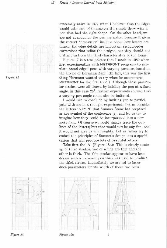
Figure 14 shows two of the 'O's we drew. The image is slightly heavier at the bottom than at the top, and we added a parameter that makes it possible to have different curves on the inside and outside without losing the properties of a meta-font. Simply drawing two independent super-ellipses with different degrees of "superness" doesn't work, because the inner curve sometimes gets too close to the outer curve or even crosses it; our solution was to draw two superellipses from the same family and then to "pull" the inner curve a certain fraction of the way towards the outer one.
Some of Richard's corrections, made as we were revising the 'P', are shown in Figure 15. Note, for example, that we took a little weight away from the stem inside the counter. In order to retain the spirit of a meta-font while making such refinements , we introduced a "stem correction" parameter that could be used for stem-weight changes in other letters. Sometimes a stern weight is changed by two or even three times the stem correction.
We were pleased to discover that METAFONT is good at notching the inside of diagonal strokes that fill in if they are not treated carefully. For example, the inside top of a bold sans-serif 'A ' has been opened up in Figure 16a, so that the counter has an appropri-ate amount of white space while giving the illusion of straight thick stems. Our METAFONT programs are designed to give this effect in low resolutions as well as high. Figure 16b shows that the same idea applies to the typewriter-style 'A'.
I can summarize this recent work by saying that we are now paying a great deal of attention to the edges; the new version of METAFONT will differ from the old one primarily in this respect. I realize now that I was
47 Knuth/ Lessons Learned from Metafont
extremely na1ve in 1977 when I believed that the edges would take care of themselves if I simply drew with a pen that had the right shape. On the other hand, we are not abandoning the pen metaphor, because it gives the correct "first-order" insights about how letters are drawn; the edge details are important second-order corrections that refine the designs, but they should not distract us from the chief characteristics of the forms.
Figure 17 is a test palette that I made in 1980 when first experimenting with METAFONT programs to simulate broad-edged pens with varying pressure, based on the advice of Hermann Zapf. (In fact, this was the first
Figure 14 thing Hermann wanted to try when he encountered METAFONT for the first time.) Although these particular strokes were all drawn by holding the pen at a fixed angle, in this case 25 °, further experiments showed that a varying pen angle could also be imitated.
Figure 15
I would like to conclude by inviting you to participate with me in a thought experiment: Let us consider the letters 'ATYPI' that Sumner Stone has prepared as the symbol of the conference [8], and let us try to imagine how they could be incorporated into a new meta-font. Of course we could simply trace the outlines of the letters; but that would not be any fun, and it would not give us any insights. Let us rather try to embed the principles of Sumner's design into a specification that will produce lots of beautiful letters.
Take first the 'A' (Figure 18a): This is clearly made up of three strokes, two of which are thin and the other is thick. The thin strokes appear to have been drawn with a narrower pen than was used to produce the thick stroke. Immediately we are led to introduce parameters for the width of those two pens.
Figure 16a b

48
~ Ill
** Figure 17
Visible Language XIX 1 Winter 1985
The strokes also taper gracefully; we can add a third parameter to govern the amount of tapering. (By varying this parameter we can experiment with letters that do not taper at all and with letters that taper too much.)
Turning to the 'T' (Figure 18b) , we see that its crossbar is neither thin nor thick. We can either introduce a new parameter, or we can assign it an intermediate weight (e.g., halfway between the narrow and wide pens in the 'A'). Tapering is present here but not quite so prominently as before; again we need not introduce a new parameter if we decide, for example, that the stem of the 'T' tapers half as much as that of the 'A'. Another parameter of the design is the angle at which the stem stroke terminates at the baseline; looking ahead, we can relate this to analogous features of the 'Y' and the 'P' .
The 'Y' itself (Figure 18c) will probably be difficult, because it will be necessary to work out the principles that underly a rather complex joining of three strokes at the center. This part of the letter looks simple, when it is done right, but I would expect to spend three or four hours trying different things before I found a scheme that would work properly as the parameters were varied.
The 'P' (Figure 18d) has an interesting little taper at the top of the bowl, but its most prominent feature is the gap at the bottom of the bowl. We should probably introduce a 'gap' parameter, which can be used also in the 'A'.
Finally there is the 'hungry I' (Figure 18e), which I do not really understand. Probably I would understand it more after actually trying to incorporate it into a meta-font, but I would want to ask Sumner for more information first. Then my METAFONT program would be able to reflect the designer's true intentions.
Looking to the future, I have not got any good insights about how new alphabets will actually be designed in, say, the year 2000. I certainly hope that none of the computer methods we are using today will still be in. use; at the moment we are just beginning to explore the subject, and we should have lots of better ideas by then. But I have a hunch that METAFONT's notions of pens, parameters, and programs will find a place as part of what is eventually perceived to be the most suitable way to apply computers in digital alphabet design.

Figure 18
Figure 19
49 Knuth/ Lessons Learned from Metafont
ATYPI a b c d e
Appendix. [I could not resist actually trying the ATYPI experiment. I hope that the following detailed example helps to clarify some of the points that I was trying to make.]
METAFONT can simulate broad-edged pen writing if we represent the pen's position by three points: left edge, middle, and right edge. The middle point is halfway between the other two. In the existing META
FONT, it is convenient to give numbers to the points by numbering the midpoint and adding 100 for the left edge and 200 for the right edge; thus, three points (101,1, 201) correspond to pen position 1. [In the new METAFONT I plan to work things out so that the points can be called ( 1L, 1 , 1R) instead.]
It is easy to write a METAFONT subroutine that draws a simple stroke with such pens, allowing for the possibility of tapering. For example, Figure 19 illustrates a subroutine that I am currently exploring. Two pen positions are given- in this case they are called (101,1, 201) and (102 ,2, 202) - together with three fractions >., p, and a; the fractions >. and p represent an amount of taper at the left and the right , while a represents the position of maximum taper. The stroke is drawn as follows: First the computer constructs points (a11, a1, a21) that are a of the way from (101,1, 201) to (102, 2, 202). [In Figure 19, for example, a is 0.4; thus a straight line drawn from 101 to 102 passes through a11, and the distance from a11 to 101 is 0.4 times the distance from 102 to 101. The three points (a11, a1, a21) constructed in this way will lie on a straight line.] Next the computer constructs point a101 by going >. of the way from a11 to a1, and it constructs a201 by going p of the way from a21 to a1; this determines the amount of taper. Finally the edges of the stroke are determined as follows: A curve starts at 101 aiming towards a1; it passes through a101, at which time it is traveling in the direction parallel to a straight line from 101 to 102; then it finishes at 102, as if coming from a1. This determines the left edge; the right edge is similar.

50 Visible Language XIX 1 Winter 1985
Figure 20
By changing the widths and angles at the endpoints, and by changing the fractions >., p, and a, it is possible to achieve a great variety of strokes. And it is possible to learn the use of these strokes without knowing or caring about the geometrical construction that produced them. Much more elaborate stroke subroutines are obviously possible, but at the moment I am getting familiar with simple ones like this. In particular, I have found that it is not difficult to get a fairly good approximation to Sumner's 'A' with just three such strokes, even when everything is parameterized so that the construction works in quite general circumstances.
Figure 20 shows the meta-A that I came up with. It was drawn by a METAFONT program that can be paraphrased as follows: "The character will be 13 units wide; its height will be 1.1 times the cap height of the font, and its depth will be zero. Pen position 1 is at the baseline, with its left edge a half unit from the left of the entire character. Pen position 4 is at the baseline with its right edge a half unit from the right of the character. Pen position 2 is at 1.1 times the cap height and at the horizontal midpoint of the character. Pen position 3 is at the cap height and on a straight line between positions 2 and 4 . The width of the pen at position 1 is the thin width; at positions 2 and 4 it is the thick width ; and at position 3 it is 2/3 of the way from thin to thick. The pen angle at 3 and 4 is 15 degrees more than the normal "cut angle" in avertical stem, and the angle at 2 exceeds the cut angle by 30 degrees. The bar line is determined by pen positions 5 and 6, whose top is at 3/7 of the cap height; the angle at 5 is 45°, the angle at 6 is 135° , and the width at both positions is a fraction of the thin width,

51 Knuth / Lessons Learned from Metafont
AAAA Figure 21
AAA Figure 22
AAA Figure 23
determined by a given "aspect ratio" parameter . Position 5 is offset to the left of where a straight line from 5 to 6 intersects a straight line from 3 to 1; the amount of offset is the "gap amount" plus half the thin pen width. Similarly position 6 is offset from where a straight line from 5 to 6 intersects a straight line from 2 to 4; the amount of offset is the gap amount plus half the thick width. Let 7 be the value of the taper parameter. The diagonal stroke from 2 to 4 is drawn with >. = 7
2, p = 7, and a = .45; the diagonal stroke
from 3 to 1 is drawn with >. = 7112
, p = 73/
2, and
a = .6." In order to complete the specification, we need to
define the parameter values. Figure 19 was obtained by letting the unit width be 26x (where x is an arbitrary scale factor); the cap height was 250x; the thin width and thick width were 22x and 44x, respectively. The aspect ratio was 0.85; the cut angle was 15 degrees; the gap amount was one unit; and the taper parameter was 7 = 0.4.
Figure 21 shows four 'A's drawn with the same parameters except that the unit widths were 17x, 20x, 23x, and 26x. Figure 22 shows the effects of increasing weight: (thin, thick) = ( 22x, 44x) , ( 33x, 55x) , and ( 44x, 66x). Finally, Figure 23 illustrates a few other variations: (a) stem weights ( 55x, 55x) ; (b) taper parameter increased to 0.6; (c) cut angle reduced to 5° and gap amount reduced to 0.1 unit. (It is doubtful, of course, that Sumner would approve of these particular examples, which were obtained by extrapolation from a single drawing. But I think the two of us could work out something satisfactory.)
Since this is an appendix, I shall conclude by appending the actual METAFONT programs, for the benefit of people who would like to see the complete details. The last half of this program, following "The letter A", is what was paraphrased above. Equivalent programs will be much simpler and more readable in next year's METAFONT.
It is possible for point 203 to stick out of the stem, for certain values of the parameters. Therefore I subsequently modified the program so that it draws the left diagonal stroke first; then it says
rpen#; thick draw 2 . . 4 ;
thereby erasing everything to the right of a straight line from 2 to 4. Then it draws the right diagonal and the bar line.

52 Visible Language XIX 1 Winter 1985
minvr 0; minvs 0; fill = 1;
% shut off velocity corrections % width of pen used to fill the strokes
subroutine penpos(index i, var angle, var d) : xi = .5[xi+loo, xi+2ool; Yi = .5[Yi+Ioo , Yi+26ol Xi+200 - Xi+lOO = d · cosd angle; Yi+200 - Yi+lOO = d ·sind angle.
% pen position subroutine
subroutine stroke (index i, index J., % stroke from i to J. var lambda, var rho , % left and right taper amounts var alpha): % position of maximum taper
Xl = alpha [xi, Xj ]; xu = alpha [xi+lOO , Xj+lOO]; x21 = alpha[xi+200 , Xj+200] ; Yl = alpha[yi,Yj]; Yll = alpha[Yi+l0o,Y1+IOO]; Y21 = alpha[Yi+20o,Y1+200]; x101 = lambda[xu , xl]; YlOl = lambda[yu,Yl]; x201 = rho[x21,X1]; Y20l = rho[Y2bYl]; cpen; fill ddraw
i + 100{ Xl - Xi+lOQ, Yl - Yi+lOO} .. 101{x1+100- Xi+lOO, Yj+lOO- Yi+IOO} . . J + lOO{Xj+lOO- XI, Yj+lOO- yl},
i + 200{xl- Xi+20o, Yl- Yi+200} .. 201{xj+200- Xi+200' Yj+200- Yi+200} . . J + 200{xj+200- XI, Yj+200- yl}.
11 The letter A11;
call charbegin('A,13,1.1phh,O); Yl = 0; x101 = .5u; Y4 = 0; X204 = r- .5u; Y2 = 1.1hh; X2 = .5r; Y3 = hh; new aa; Y3 = aa[y2,y4]; X3 = aa[x2,x4]; call penpos ( 1, -cut - 45, thin) ; call penpos (2 , cut + 25, thick) ; call penpos (3, cut + 15, ~ [thin , thick]); call penpos ( 4, cut + 15, thick) ; Y205 = Y206 = ~hh; call penpos (5, 45, aspect · thin); call penpos (6, 135, aspect · thin) ; new aa; Y5 = aa [Yl, Y3]; X5 + gap · u + .5thin = aa [x1, x3]; new aa ; Y6 = aa[y2 , y4]; X6 +gap· u + .5thick = aa[x2 ,x4]; call 'a stroke(2,4, tau· tau, tau, .45); call 'b stroke (3, 1, sqrt tau, tau · sqrt tau, .6) ; call 'c stroke (5, 6, 0, 0, .5).
% right diagonal % left diagonal
%bar line
I have used hh in this program to stand for cap height in pixels, phh for cap height in points; r denotes the right edge of the character, and u denotes the unit width , in pixels; char begin( character _code, unit_ width, heighLin_points, depth_ in_ points) is a subroutine that sets up values like r and u, and tells where to put the result in a complete font. This research and preparation was supported in part by National Science Foundation grant IST-820-1926, and by the Systems Development Foundation. ''lEX' is a trademark of the American Mathematical Society.

53 Knuth/ Lessons Learned from Metafont
References
[1] Patrick Baudelaire, personal communication , 1977.
[2] John D. Hobby and Gu Guo-an , "Using META
FONT to Design Chinese characters," Proc. 1982 International Conference of the ChineseLanguage Computer Society September 1982, 18- 36.
[3] John D. Hobby and Gu Guo-an, "A Chinese Meta-Font," Stanford Computer Science Report STAN-83-974 (July 1983).
[4] Donald E. Knuth, "METAFONT, a system for alphabet design," Stanford Artificial Intelligence Memo AIM-332 (September 1979). Reprinted as part 3 of TEX and METAFDNT: New Directions in Typesetting (American Mathematical Society and Digital Press, 1979).
[5] Donald E. Knuth, Seminumerical Algorithms, Vol. 2 of The Art of Computer Programming, second edition (Reading, Mass.: Addison-Wesley, 1981).
[6] Donald E. Knuth, "The concept of a meta-font ," Visible Language 16 (1982) , 3-27.
[7] Raymond Smullyan, "Metagame," American Math. Monthly 90 (1983) , 390.
[8] Sumner Stone, "The ATypl Logotype: A Digital Design Process," presented at Fifth ATypl Working Seminar, Stanford, California, August 1983.

54 Visible Language XIX 1 Winter 1985
The printer's mark of Wechel. 1495-1554.