lab 8: more spatial selection, importing, joining tables · 2020-01-20 · lab 8: more spatial...
TRANSCRIPT

GIS Exercises Lab 8: Importing, Joining Tables
1
Lab 8: More Spatial Selection, Importing, Joining Tables
What You’ll Learn: This lesson introduces more variants of spatial selection, importing text, combining rows, and practices with messy joins. You should have read and understood Chapters 7 and 8 in the GIS Fundamentals text. This lab also uses some tools covered in Labs 6 and 7. Data are in the Lab8 directory (make sure you have copied \Lab8 to YOUR H:\ and then copy to your
Desktop for your work; make sure you save your Desktop back to H:\ when complete..
What You’ll Produce: Three maps, one of U.S. corn production, one of California county income, and one of California counties with parks or forests (these last two maps should be on the same page/layout)
Project 1: Select by Proximity and Adjacency
Work in GIS often involves analyzing the locations of features in relation to other features. Two types of relationships are proximity (how close features are) and adjacency (features that share the same boundary). Finding points near lines We often wish to search by proximity to features, e.g., chemical spills near rivers, emergency response centers near earthquake faults, or donut stores close to a planned route. Open a new project, add a Map, and add the data from Lab8\Project1: -twocity_Mercator.shp, -35W_Mercator.shp, -USA_48_Mercator.shp.

GIS Exercises Lab 8: Importing, Joining Tables
2
Choose Select by Location from the main window, in the Feature Layer group (if needed refer to previous labs)
Specify to: - input features from “twocity_Mercator” -Relationship: Within a distance - Selecting Features of “35w_Mercator” - Set a Search Distance of 25 Miles, Then hit ‘Run’. (Video: Select by Location)
On the Map the point that represents the city of Minneapolis should be cyan, indicating it’s selected. Now we will find all states (polygons) that are intersected by 35W (a line). First, clear the previously selected features with the clear button: Select by Location (as above), with - Input Layer as USA_48_Mercator. - Relationship of Intersect - Selecting Features as 35w_Mercator. - Then Run The six polygons representing states that intersect the 35W line should be selected, similar to the figure to the right. Selecting by adjacency Now we will select polygons that are adjacent to a selected set of polygons, in this case, all states that share a boundary with a selected set of states. -First, Clear Selected Features. - Activate the manual selection cursor (‘Select’ button under ‘Map’ tab) and select a state.

GIS Exercises Lab 8: Importing, Joining Tables
3
You may click and drag to select an adjacent group of states, or you may click and release and then hold the shift key and click on a number of additional states to add to the selected set of states. For now, just select one state. For the example at right I selected Colorado, then
Left click on Select by Location and in the resulting window specify: - Input Feature layer: USA_48_Mercator, -Specify the Relationship to: Boundary touches, - Selecting Features: USA_48_Mercator -click on Run. The correct selected set is shown at the right. The tool is quite flexible in that, as shown, you can use a selected set as input and you can select a layer based on itself. You can pursue many other selection options if they appear interesting or useful. Project 2: Adding an External Table, Joining to a Shapefile This project introduces something quite common; converting tabular data and joining to a layer. Here, we will combine an Excel file on corn production for US counties with a county shapefile. - Note though that there are many other types of tabular data that are available in various text or spreadsheet formats that are summarized on a county basis, including: population, voting, education, income, crime, air pollution, and many other social, political, and environmental data. A first step is converting the Excel file to an ArcGIS compatible table. We then edit the table by deleting columns, creating join items, and combining rows before joining it with a polygon shape file. These are all common operations when ingesting tabular data. Start ArcGIS and add a new project, as appropriate, and add lwr48.shp from the Lab8\Project2\ subdirectory. Inspect the layer’s attribute table. Note there is an entry for each county in the lower 48 states of the U.S., but not much other data.

GIS Exercises Lab 8: Importing, Joining Tables
4
Now convert the Excel file cnty26.xlsx using the tool “Excel to Table” (Analysis Tab->Tools->Toolboxes). You enter the input and output file names, and Run: (Video: Convert Excel Table) Add the table to your Map, open the table, inspect the rows and columns. Open the fields view (recall, right click on the list option in the upper right of the table, then Fields view):
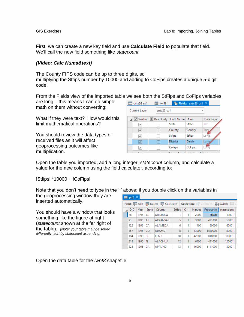
What are the types of Stfips and CoFips? These are state and county FIPS codes we’ve used before; we wish to combine them to use as a key. Do you see any problems in the data that might prevent that? What do you need for a good key when joining tables? This cnty26.xlsx file contains 1996 through 1999 seed
corn production, in bushels, for counties in the United States. This data was downloaded from the National Agricultural Statistical Service website, www.nass.usda.gov/; we’re most interested in these columns: Harvested: the acres harvested for a given yield category in a county, Production: Total bushels produced (yield times harvested) for the given yield level. Delete all the columns except the following: Stfips, CoFips, Harvested, and Production, using the tools you’ve learned in previous labs (Delete Fields, or single column manual deletes). We now want to join this table to the county shapefile, lwr48.shp. Unfortunately, there are two problems. First, the lwr48.shp doesn’t have a ready-made key for the join. There is no column that maps cleanly from the cnty26 table file to the lwr48.dbf file. The state and county FIPS codes, when combined, create a key (as described in the textbook readings), so we can use these to create a key for the county polygon table. Second, there are multiple years for each state/county pair in the corn table we imported. We want average production over the period, so we must first average across years for each county. Let’s fix these problems, and then joint the files. (note: details follow the discussions)
GIS Exercises Lab 8: Importing, Joining Tables
5
First, we can create a new key field and use Calculate Field to populate that field. We’ll call the new field something like statecount. (Video: Calc Nums&text) The County FIPS code can be up to three digits, so multiplying the Stfips number by 10000 and adding to CoFips creates a unique 5-digit code. From the Fields view of the imported table we see both the StFips and CoFips variables are long – this means I can do simple math on them without converting: What if they were text? How would this limit mathematical operations? You should review the data types of received files as it will affect geoprocessing outcomes like multiplication. Open the table you imported, add a long integer, statecount column, and calculate a value for the new column using the field calculator, according to: !Stfips! *10000 + !CoFips! Note that you don’t need to type in the ‘!’ above; if you double click on the variables in the geoprocessing window they are inserted automatically. You should have a window that looks something like the figure at right (statecount shown at the far right of the table). (Note: your table may be sorted
differently; sort by statecount ascending)
Open the data table for the lwr48 shapefile.

GIS Exercises Lab 8: Importing, Joining Tables
6
Notice that lwr48.shp also has the county and state FIPS codes in the COUNTY and STATE columns, respectively. Open the ‘Fields View’ and look at the variables. See any problems here? Create a state/county combined field that will hold a key, as you did with the data table above, so that you will be able to join the files. Try the same formula as with the imported table: [STATE] * 10000 + [COUNTY] state Get an error? That’s because you can’t multiply text by text. Some systems automatically convert text to numbers, but it is rare; Python used in calculation here doesn’t. You must convert each text variable to its numeric equivalent. You can do so with an int() function, as in: int(!STATE!) * 10000 + int(!COUNTY!) Enter the formula and click ‘Run’; this should calculate the state/county combined FIPS code, as previously with the corn table. Now we want to joint our imported corn table to our lwr48 layer table. However, if we inspect the corn table we see that although we have created a unique identifier for each county/state combination, there are multiple entries for each county.
GIS Exercises Lab 8: Importing, Joining Tables
7
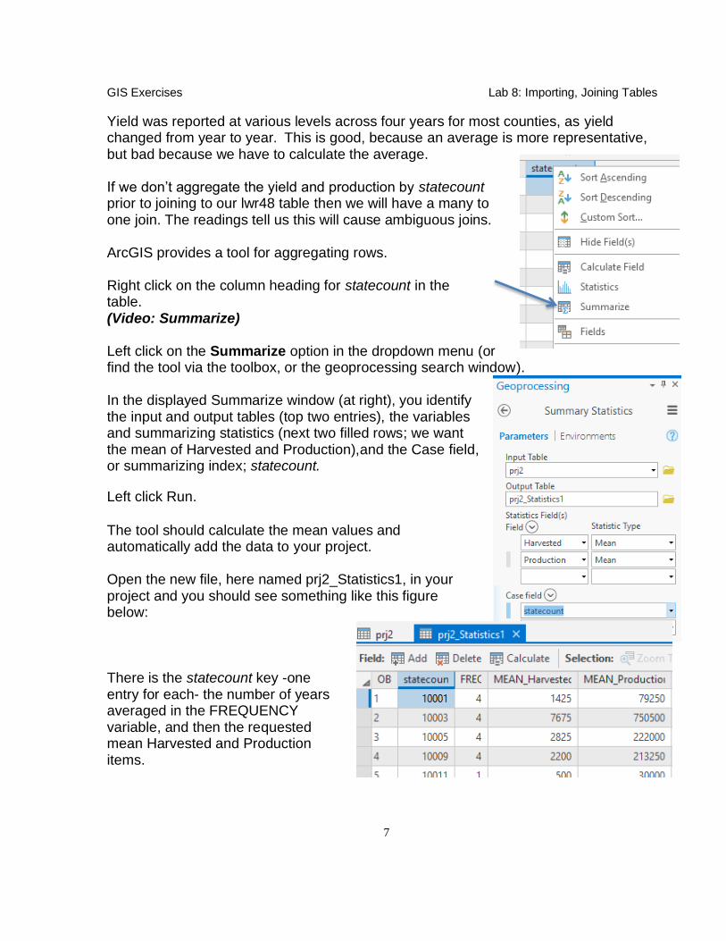
Yield was reported at various levels across four years for most counties, as yield changed from year to year. This is good, because an average is more representative, but bad because we have to calculate the average. If we don’t aggregate the yield and production by statecount prior to joining to our lwr48 table then we will have a many to one join. The readings tell us this will cause ambiguous joins. ArcGIS provides a tool for aggregating rows. Right click on the column heading for statecount in the table. (Video: Summarize) Left click on the Summarize option in the dropdown menu (or find the tool via the toolbox, or the geoprocessing search window). In the displayed Summarize window (at right), you identify the input and output tables (top two entries), the variables and summarizing statistics (next two filled rows; we want the mean of Harvested and Production),and the Case field, or summarizing index; statecount.
Left click Run.
The tool should calculate the mean values and automatically add the data to your project. Open the new file, here named prj2_Statistics1, in your project and you should see something like this figure below: There is the statecount key -one entry for each- the number of years averaged in the FREQUENCY variable, and then the requested mean Harvested and Production items.

GIS Exercises Lab 8: Importing, Joining Tables
8
Now, join the summary table you just created to the lwr48.shp file using join methods taught earlier.
We may want to further process this combined data. Because many operations are restricted on joined files, sometimes we need to save a copy to a new file.
Right click on the lw48.shp in the TOC, then left click Data > Export Features, and name and save the file appropriately, something like US_corn.shp Add this new file to your Map. (Note you are saving to a shapefile so include the .shp in your output file name. Shapefiles don’t allow long field names so your Mean_Harvested will be truncated from the right. My Mean_Harvested field was really named cnty26_ExceltoTable_Statisti.Mean_Harvested. It got shortened during Export to Features to cnty26_E_3. Your output field names could be somewhat different depending on how you named your files. At any rate, the Mean_Harvested should be the second field from the right).
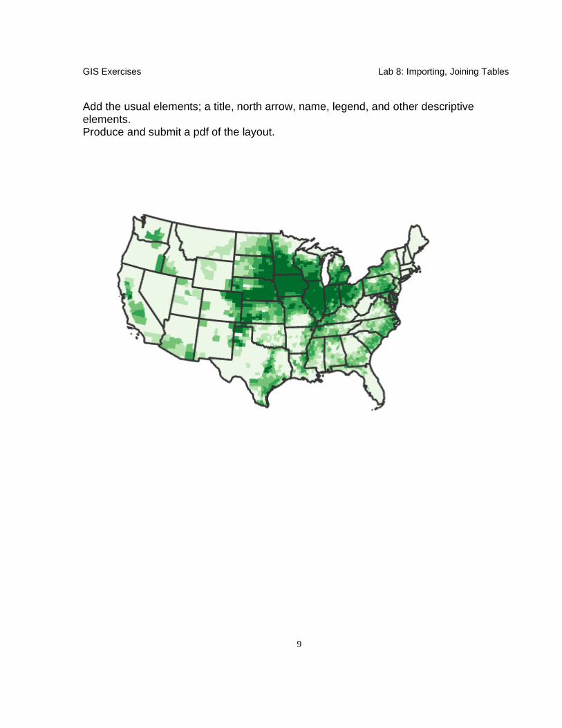
Create a Layout. If you haven’t yet, change the map coordinate system to the USA_Contiguous_Albers_Equal_Area_Conic. You should be able to find it in the projections options/tools based on what you’ve learned in previous labs. Symbolize the US_corn.shp file using graduated colors. Use Mean_Harvested as the Value, with a gradient color ramp between two distinct colors. Specify about 10 classes in a Quantiles or Natural Breaks scheme. We want to remove the county boundaries as before, so they don’t clutter the output. Remember you can click on ‘More’ in the Symbology pane then ‘Symbols’, then ‘Format all Symbols’. Refine the display of the labels of the Quanties of Mean_Harvest again by right clicking on the first range then selecting ‘Format Labels’. Select Ok, Apply and OK to complete the changes to your symbology. Add the states.shp with a hollow symbology and dark outline color. Your data layer should look something like the figure below, with highest average harvest levels of about 330,000 in the Midwest.
GIS Exercises Lab 8: Importing, Joining Tables
9
Add the usual elements; a title, north arrow, name, legend, and other descriptive elements. Produce and submit a pdf of the layout.

GIS Exercises Lab 8: Importing, Joining Tables
10
Project 3 Your third task is to produce two (2) maps on the same layout; one showing average income by county for California, and a second map showing counties with state parks or forests. These instructions will be less detailed than previous lessons, as we omit most steps we’ve covered in previous lessons. The goal is for you to synthesize these
previously-taught tools on your own. Start a new blank ArcGIS project and add a Map. Before you add data, right click on the Map, click on Properties in the dropdown menu, and set the coordinates to UTM Zone 11 N, NAD83 projection. The original data has map units of decimal degrees. Use ArcToolbox to re-project the data or set the data frame properties to the UTM coordinate system.
Rename this first map ‘Income’ (again, in the Map Properties, but General option) Create a second map named ‘Recreation’, and also change its coordinate system to the same UTM Zone 11. Data for this project are in L8\project3\ subdirectory. Add the California county boundaries which are in Cal.shp; add this layer to both maps. Income.dbf is a database file that lists average per capita income by county; add this file to the Income data frame.

GIS Exercises Lab 8: Importing, Joining Tables
11
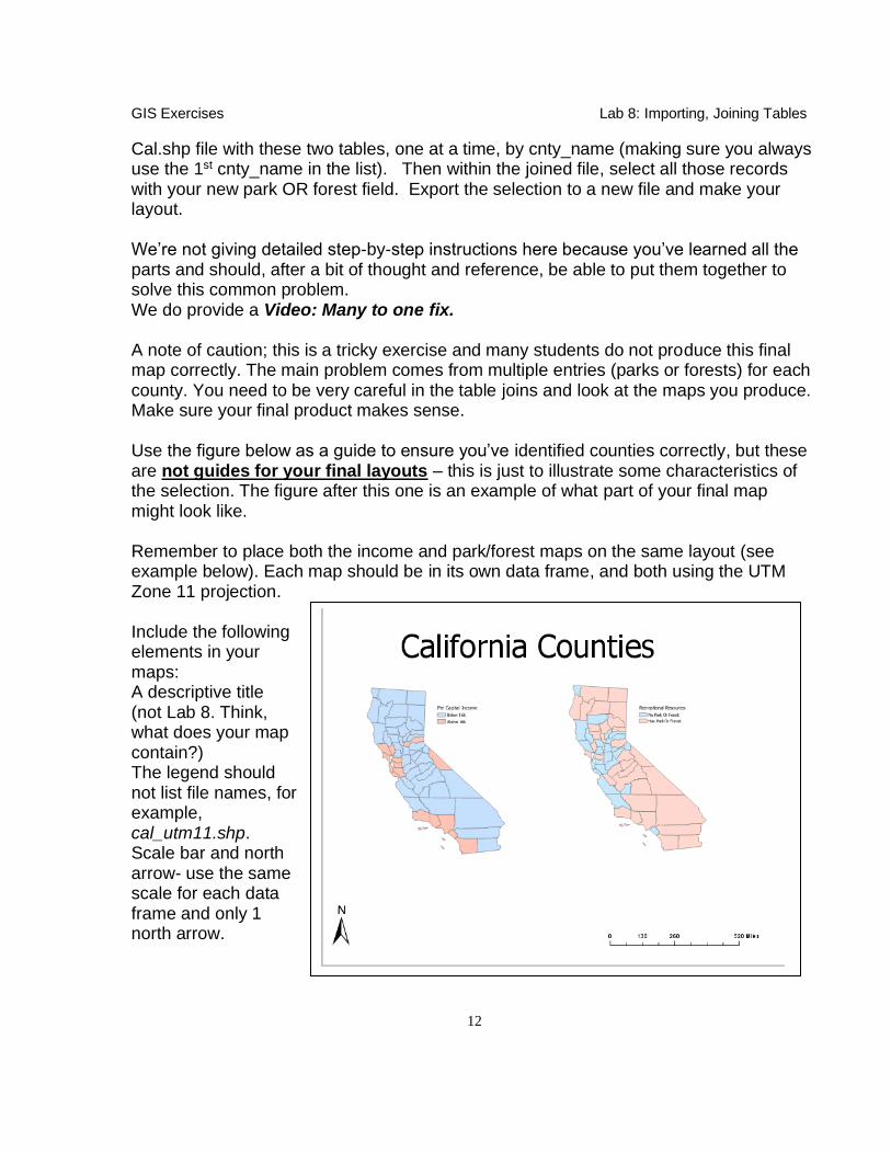
Rec.dbf is a database file that lists recreation features and properties, including county location; add this file to the Recreation data frame. The income, recreation, and county files have a common attribute – cnty_name. This common field allows you to join these files together. Income Map You need to produce a map showing only those counties with an average per capita income greater than $16,000. Create this map in a new data frame. The simplest approach uses binary indicator attribute. Select values from the table and then create a new attribute and assign the value 0 (counties below 16,000 per capita income) or the value 1 (counties above 16,000). Park/Forest Map You need to create a map of California that colors counties that contain a park, a forest, or both. Create this map in a new data frame. The database file named rec.dbf lists many recreation types, including parks and forest. We must combine this with the state county outline layer through a join, but you can’t do the join with the files as they are, because the source rec.dbf table does not have a proper key for this join. We must create a proper key before joining, removing many-to-one relationship for the counties in rec.dbf with counties in the Cal.shp file. There may be multiple entries for each county, one for each park, forest, reservoir, or other recreation features found in a county. You need to develop a list of counties with parks or forests from this rec.dbf. One way is to open the rec.dbf table and select all those counties with parks or forests and save your selected records to a new table. You then can use the Table Summarize tool, summarizing by Cnty_Name and outputting the First or Last Feature or Type. Then add a variable to this new table and assign it a value 1 for all records. Now join the new parks and forests table to Cal.shp, and color the new “1” variable. There is a map showing the correct set of counties near the end of these instructions. Another approach is to open the rec.dbf table and select JUST the parks and export them as a new table, then add a new field to new table with a value of “park”. Then again open the rec.dbf table and select JUST the forests and again export them as a new table, then add a new field to this table with a value of “forest”. Finally, join the
GIS Exercises Lab 8: Importing, Joining Tables
12
Cal.shp file with these two tables, one at a time, by cnty_name (making sure you always use the 1st cnty_name in the list). Then within the joined file, select all those records with your new park OR forest field. Export the selection to a new file and make your layout. We’re not giving detailed step-by-step instructions here because you’ve learned all the parts and should, after a bit of thought and reference, be able to put them together to solve this common problem. We do provide a Video: Many to one fix. A note of caution; this is a tricky exercise and many students do not produce this final map correctly. The main problem comes from multiple entries (parks or forests) for each county. You need to be very careful in the table joins and look at the maps you produce. Make sure your final product makes sense. Use the figure below as a guide to ensure you’ve identified counties correctly, but these are not guides for your final layouts – this is just to illustrate some characteristics of the selection. The figure after this one is an example of what part of your final map might look like. Remember to place both the income and park/forest maps on the same layout (see example below). Each map should be in its own data frame, and both using the UTM Zone 11 projection. Include the following elements in your maps: A descriptive title (not Lab 8. Think, what does your map contain?) The legend should not list file names, for example, cal_utm11.shp. Scale bar and north arrow- use the same scale for each data frame and only 1 north arrow.

GIS Exercises Lab 8: Importing, Joining Tables
13
Submit the following as .pdf via Canvas:
1) The corn map. 2) The California Income and Recreation maps (on one layout)