lab 725 accelerate your development with experience ... · in this lab you will learn how to use...
TRANSCRIPT

Lab 725
Accelerate your development withExperience Manager Core ComponentsAdobe Summit 2018

In this lab you will learn how to use Adobe Experience Manager's (AEM) Style System in conjunction with Core Components
and Template Editor to create radically different experiences using only front-end code (CSS and JavaScript).
We'll use AEM's Style System to style Core Components, using only CSS and JavaScript, to re-create the Dopetrope design at
HTML5up.net. Significant development time is saved when only front-end code is required to change the appearance of a
component.
We chose HTML5Up.net's Dopetrope design because:
1. HTML5up is unaffiliated with Adobe or Adobe Experience Manager, and thus not predisposed to aligning its templates
or design paradigms with patterns of Experience Manager
2. The design is generally simple to understand, yet representative of a modern web aesthetic.
3. The creators of this lab just like the work of HTML5up (and its fun saying "Dopetrope").
1. Understand how to use Experience Manage's Style System to apply new rules.
2. Understand how to define how and when Styles are available to Components.
3. Understand how, when used thoughtfully, the Style System and Core Components supports content-first authoring.
4. Understand how to develop CSS (or LESS) and JavaScript to work with the Style System.
AEM 6.4 Beta
AEM Core Components
Wireframe Styles
A home page built completely from AEM Core Components, and styled using only front-end code (CSS and JavaScript)
to achieve the brand aesthetic defined by the Dopetrope theme, using Experience Manager technologies.
All lab materials are available after Adobe Summmit 2018 at: https://github.com/Adobe-Marketing-
Cloud/Summit2018/tree/L728
Danny Gordon / [email protected] / Technical Marketing, Adobe
David Gonzalez / [email protected] / Technical Marketing, Adobe
Sean Schnoor / [email protected] / Technical Marketing, Adobe
Lab Overview
Key Takeaways
Provided Materials
Lab Output
Downloads
Created By

1. Open the Chrome web browser
2. Navigate to http://localhost:4502 and log in using:
Username admin
Password admin
AEM Start: http://localhost:4502/aem/start.html
Home Page Template: http://localhost:4502/editor.html/conf/l725/settings/wcm/templates/home-page-
template/structure.html
Home Page: http://localhost:4502/editor.html/content/l725/dopetrope.html
CRX Package Manager: http://localhost:4502/crx/packmgr/index.jsp
CRXDE Lite: http://localhost:4502/crx/de/index.jsp
Solution packages for each chapter can be found on via Package Manager and can be installed if you fall behind.
Note that this lab's solution packages all have the "red shield" icon.
To install a solution package:
Chapter 0: The Set Up
Log In to AEM
Browser Bookmarks
Chapter Solution Packages

1. Navigate to CRX Package Manager (http://localhost:4502/crx/packmgr) using the Bookmark.
2. Locate the Chapter solution package to install, the naming is in the format:
Chapter-#-Solution_l725.ui.apps-0.0.1-SNAPSHOT.zip where # is the chapter to provide
the solution for.
3. Tap on the Package name to expand the package's install controls.
4. Tap the Install button to the right of the package name.

Participating Personas: AEM Developer
Adobe Experience Manager Core Components are a set of standardized components that can be used to speed up
development of websites.
Core Components are versioned and installed separately from AEM. Core Components have an independent release cycle
with more frequent updates throughout the year.
Core Components should never be used directly, but rather proxied in by the custom application. The proxy components are
simply cq:Component resource definitions with a sling:resourceSuperType that points to appropriate
version of the corresponding Core Component components.
/apps/l725/components/content/title@jcr:primaryType=cq:Component@sling:resourceSuperType=core/wcm/components/title/v2/title
Core Components are standardized on BEM (Block Element Modifier) naming methodology, and use this to define Core
Components' stable, public HTML APIs.
When writing CSS and JavaScript for Core Components, only target the BEM CSS classes, and avoid selecting bare
elements.
Below is the BEM notation for the Title component
BLOCKcmp-titleELEMENTcmp-title__text
Participating Personas: AEM Developer
Review the L725 project proxied AEM Core Components.
Chapter 1: AEM Core Components
Watch & Learn
Including Core Components in your AEM project
Proxy of the Title Core Component
HTML as a Public API
Step by Step

1. Navigate to CRXDE Lite (http://localhost:4502/crx/de/index.jsp) via the Bookmarks.
2. Expanding /apps/l725/components/content .
3. Tap the title node.
4. See in the properties the sling:resourceSuperType .
5. Repeat for image, list components.

Editable Templates gives the Web Producer significant control over the page layout, without any coding. Templates are also
where various policies are configured to provide granular control over the content that can be created on pages.
In this chapter the Home Page Template is updated with a Title and Navigation structural components. The allowed
components of the Layout Container are updated.
Participating Personas: Web Producer
1. From the AEM Start Menu Navigate to Tools (Hammer icon) > General > Templates.
2. Tap into the L725 Folder.
3. Hover over Home Page Template and tap the Pencil icon to open.
4. Ensure Structure mode is enabled in the top right.
5. Open the left Sidebar and tap the Components icon.
6. Drag a Title component to the very top of the page.
7. Edit the Title component by tapping the Wrench icon.
Chapter 2: Preparing the Page Template
Step by step

In the dialog for the Title input the text Summit 2018 .
8. Drag a Navigation component from the side panel onto the page beneath the Title component and above the first
Layout Container.
9. Tap the Policy icon to open the Navigation component's Policy.
Verify Navigation Root is set to /content/l725/dopetrope .
10. Select the 1st Layout Container and tap the Policy icon.
1. In the Allowed Components Tab search for l725.
2. Check the box for l725 - Content.
3. Save the changes by taping the Check icon in the top right.

After completing the above steps, the Home Page Template should look like:
Final

Embracing Core Components and the Style System empowers content-first authoring.
Content-first authoring is the idea that content authoring can begin in parallel, and sometimes before, the Sites' branding rules
are defined and implemented.
Using content wire framing techniques that include:
A basic wireframe style
AEM's responsive Layout Container
A fully authored page that conceptually, though not visually, represents the page and its content, can be created before the
visual styling is applied.
While style is of utmost important in creating an engaging experience, the content is the foundation of the website.
Participating Personas: Experience Author
The page is pre-populated with several authored components to expedite the authoring.
1. From the AEM Start Menu Navigate to Sites > L725, select the Dopetrope page and tap Edit in the top action bar, or
tap the Home Page from the Bookmarks.
2. Ensure Edit mode is enabled in the top right.
3. Open the left Sidebar and tap the Components icon.
4. Drag a Teaser component onto the page.
5. Select the newly added Teaser component, and tap the edit (wrench) icon.
Chapter 3: Content-first Authoring
Step by step

1. In the side panel switch to the Assets panel.
2. Search for gear-icon it should be a red shield with a gear.
3. Drag and drop the gear-icon image into Teaser's dialog drop-zone.
4. Fill out the Teaser's fields
Link: /content/l725/dopetrope
Link Text: Get Started
Title: Any title text you want!
Description: Any description text you want!
6. Switch to Layout mode by tapping the Edit dropdown in the right corner of the top action bar.
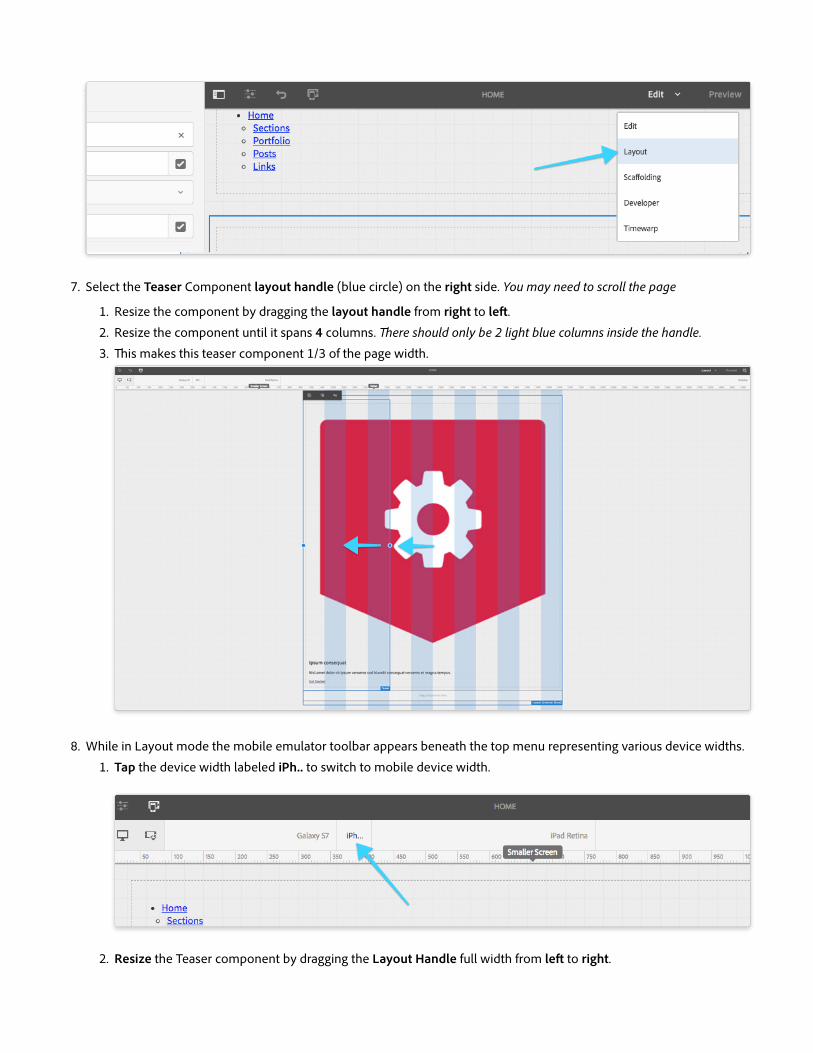
7. Select the Teaser Component layout handle (blue circle) on the right side. You may need to scroll the page
1. Resize the component by dragging the layout handle from right to left.
2. Resize the component until it spans 4 columns. There should only be 2 light blue columns inside the handle.
3. This makes this teaser component 1/3 of the page width.
8. While in Layout mode the mobile emulator toolbar appears beneath the top menu representing various device widths.
1. Tap the device width labeled iPh.. to switch to mobile device width.
2. Resize the Teaser component by dragging the Layout Handle full width from left to right.

9. Return to Edit mode by tapping the Layout mode dropdown in the upper-right corner.
10. Select the Teaser Component and tap the Copy icon.
11. Select the drop zone beneath the teaser component and tap the Paste icon to paste the teaser component.
12. Repeat the above step to paste the teaser icon a second time. There should now be three teasers across in Desktop
width.
13. Edit the middle teaser component by tapping the wrench icon.
1. In the side panel switch to the Assets panel
2. Search for bolt-icon to find the black shield with a lightning bolt image.

3. Drag and drop the bolt-icon.png image into Teaser dialog drop zone
4. Link: /content/l725/dopetrope
5. Link Text: Get Started
6. Title: Any title text you want!
7. Description: Any description text you want!
14. Edit the 3rd teaser component by tapping the wrench icon.
1. In the side panel switch to the Assets panel
2. Search for star-icon to find the grey shield with a star image.
3. Drag and drop the star-icon.png image into Teaser dialog drop zone
4. Link: /content/l725/dopetrope
5. Link Text: Get Started
6. Title: Any title text you want!
7. Description: Any description text you want!
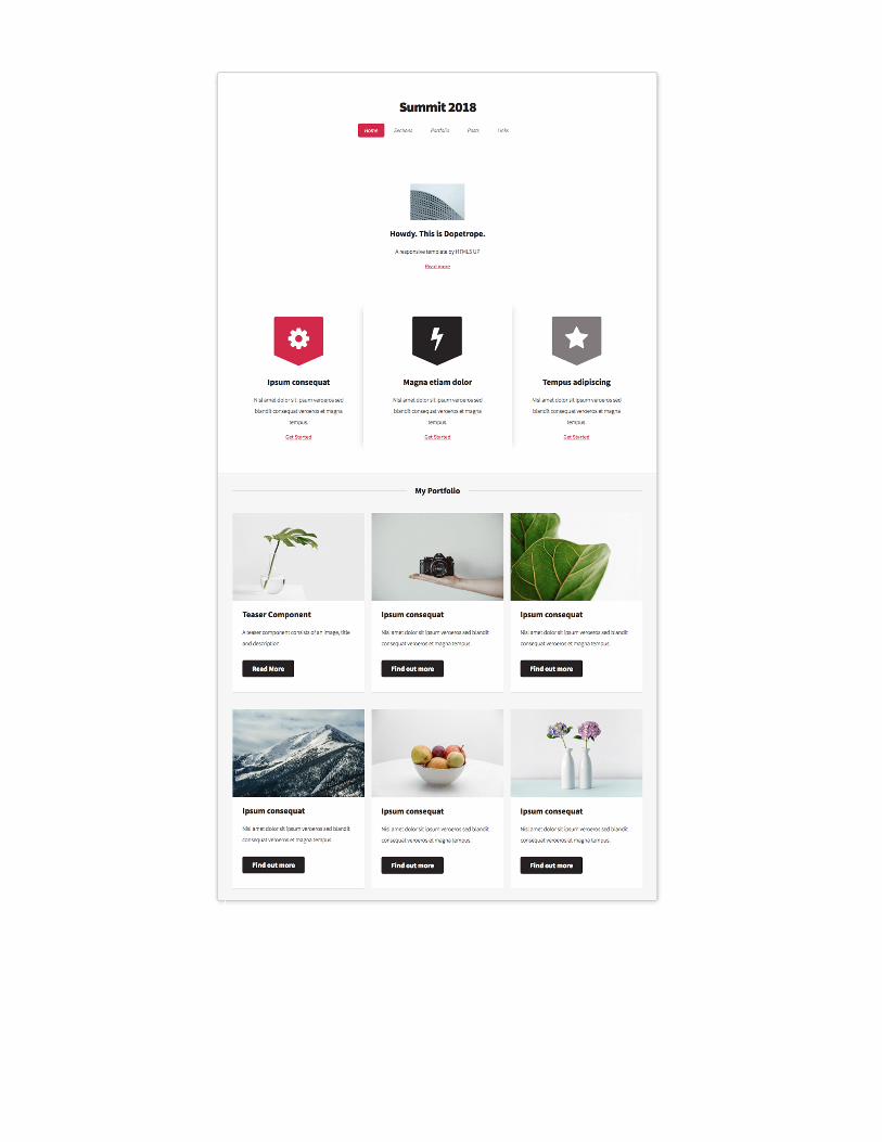
15. There should now be 3 teasers, equally spaced across the desktop view.
16. Now that we have had a taste of Authoring we will install the Chapter 3 Solution Package, to get a fully authored
page.
1. Open a new tab.
2. Navigate to CRX Package Manager (http://localhost:4502/crx/packmgr/index.jsp) or via the Bookmarks.
3. Search for Chapter-3 and tap the title to select it.
4. Tap the Install button to install the Chapter-3-Solution__l725.ui.apps-0.0.1-SNAPSHOT.zip package.

This will replace your authored content, so don't be alarmed!
5. Switch back to the Home Page.
Final

You can now see the Home Page populated with multiple components.

Participating Personas: Front-end Developer
AEM's Client Libraries provides a mechanism to organize and manage CSS and JavaScript files necessary for an AEM Sites
implementation. The basic goals for client libraries or clientlibs are:
Store CSS/JS in small discrete files for easier development and maintenance.
Manage 3rd party dependencies in an organized fashion.
Minimize the number of client-side requests by concatenating CSS/JS into a minimal number of HTTP requests.
Minify CSS/JS that is delivered to optimize speed/performance of a site.
Below is an example way to organize the top-level client library folders.
Chapter 4: Organizing Client Libraries, CSS & JavaScript
Watch & Learn
Organizing Client Libraries
Step by Step

Participating Personas: Front-end Developer
We are going to be inspecting the L725 project client libraries.
1. In a new tab navigate to CRXDE Lite (http://localhost:4502/crx/de/index.jsp) or navigated via Bookmarks.
2. Expand the /apps/l725/clientlibs node.
/apps/l725/clientlibs/clientlib-author/clientlib-base/clientlib-dependencies/clientlib-dopetrope/clientlib-wireframes
LESS (which stands for Leaner Style Sheets) is a backwards-compatible language extension for CSS. It allows front-end
developers to use variables, mixins, and nesting to ease the creation and maintenance of CSS.
Let's inspect the Dopetrope Client Library to see how LESS is used.
1. Expand clientlib-dopetrope. In order to make the maintenance of client libraries easier CSS and JS is broken out into
multiple files.
2. Double tap main.less to open. main.less imports all of the different LESS files that makes up the Dopetrope styles.
3. Expand the clientlib-dopetrope/css folder and open the variables.less file. One of the advantages of using LESS
(instead of straight CSS) is that you can create variables and mixins to make it easier to maintain consistent brand
styles.
4. Open grid.less. This file includes the AEM Responsive Grid as part of the Dopetrope CSS Client Library. Note that we
are able to define the Phone and Tablet breakpoints here, as well as the number of columns available. The inclusion of
AEM's grid.less is required to allows us to resize the components in Layout mode in the Sites editor.
Each component has a dedicated folder to include any LESS to style the component. JavaScript that adds additional
functionality/behavior to a component is also included in this folder.
When implementing the Style System, it is critical to have a standard pattern and organization for component front-end code.
The following is the pattern we have used in implementing the Dopetrope design:
Dopetrope Client Library
Component Styles

/component-x<--Allfront-endcoderelatedtothecomponentcomponent-x.js(optional)<--AnyJavaScriptrelatedtothecomponentcomponent-x.less<--Organizedcomponentstyleimports/styles<--Foldertocontaindifferentstylesdefault.less<--Defaultstylestyle-1.less<--Style1variationstyle-2.less<--Style2variation
1. Expand /apps/l725/clientlibs/clientlib-dopetrope/components/title. Notice how the pattern has been applied to the
Title component. Besides the default style for the Title component there are be 2 additional styles for the Site Title and
Section Title.
2. Expand title/styles folder and open site.less. Note that the styles are scoped by the .cmp-title--site class at
the start of the file.
3. Open section.less. Note that the styles are scoped by the .cmp-title--section class at the start of the file.
In the next chapter we will configure the Title Component to use these styles.

We will now apply the Dopetrope Client Library to the page template. We will also use the Style System to change the style
of the Title Component.
Participating Personas: Web Producer
1. Navigate to the Home Page Template, then tap the Page Properties icon in the top left, and select Edit Template.
http://localhost:4502/editor.html/conf/l725/settings/wcm/templates/home-page-template/structure.html
2. In the Home Page Template Editor, tap the Template Properties icon in the top left, and select Page Policy.
3. In the Select Policy drop down, choose the Dopetrope Theme.
Notice that the included Client-Side Library has switched to l725.dopetrope which loads the Dopetrope
CSS and JavaScript.
Chapter 5: Applying the Basic Dopetrope Style
Step by step

4. Save the Page Policy changes by tapping the Check icon in the upper right-hand corner.
Notice that the look and feel of the page as completely changed.
5. Select the Title component at the top of the Template, tap the Styles icon (paint brush) open the Styles dropdown for
the Title component.
6. Select the Site Title style from the dropdown
7. Tap the small check mark to close the Styles dropdown.
8. Switch tabs and open the Home Page (http://localhost:4502/editor.html/content/l725/dopetrope.html) or use the
Bookmarks.
9. Refresh the Home page. The wireframe aesthetic will be replaced with a basic Dopetrope brand style.

10. Scroll midway down the page and location the My Portfolio's Title component.
Tap Styles icon, and select Section Header style.
11. Scroll down and select the The Blog section's Title component, tap the Styles icon, and select Section Header.
1. With the Home Page open, tap the Preview button in the top right.
2. In the upper-right corner of the Chrome browser select the three vertical dots to expose the Chrome menu.
1. Tap More Tool > Developer Tools. This will open the Chrome Developer tools at the bottom of the page.
Bonus

3. In the upper-left corner of the Chrome Developer tools tap the Inspect icon (blue mouse cursor icon).
4. Hover over the My Portfolio component and view the HTML source. Notice that the .cmp-title--section
class is added to the div surrounding the Title Component. This is the same class that saw in Chapter 4.
5. Switch back to Edit Mode and toggle off the Section Header style. Repeat the above steps and to see the
.cmp-title--section class is removed from the DOM.
6. Re-apply the Section Header style if you had toggled it off.
After completing the above steps, your screen should look like:
Final


In this chapter the well see how the Web Producer configures Teaser Component to allow the Shadow and Portfolio styles,
which are implemented using only CSS (or in our case LESS), and how an Experience Author applies these styles to different
teasers on the page.
Participating Personas: Front-end Developer
Remember, all styling is possible w raw CSS, however we use LESS as it results in cleaner code and AEM natively compiles
LESS to CSS.
A few LESS idiosyncrasies used in this file:
Rules that start with an @ are LESS variables!
Rules that start with . end with () for example, .border-color() , are LESS mixins, and are used to
defined re-usable sets of CSS rules in variables.less .
LESS supports nesting of CSS selectors. This is handy for ensuring proper namespacing. For example, the following
LESS...
/*LESS*/.foo{color:red;.bar{color:blue;}}
..compiles to the following CSS...
/*CSS*/.foo{color:red;}.foo.bar{color:blue;}
Each Component Style LESS file is responsible for that style's visual representation. AEM's Core Components and AEM
Component development best practices outline that CSS rules should target BEM (Block Element Modifier) CSS class
names, and these BEM CSS classes are considered the stable HTML API of the component.
BLOCK represents the Component.
BLOCK__ELEMENT represents some logical "part" of the component (hyperlink, text, image, etc.)
Chapter 6: Applying the Teaser Component CSS-based Styles
Watch and Learn
The Teaser's Portfolio Styles LESS (or CSS)

BLOCK--MODIFIER represents a Component Style.
The Core Component's Teaser component generates the following HTML. The BEM CSS classes define the stable, style-able
API that can be safely targeted by our styles.
The Teaser component is an interesting case as it includes the Core Image Component, and thus has a BLOCK
( .cmp-image ) within a BLOCK ( .cmp-teaser ).
Pulling the BEM CSS classes from the above HTML, the following API is exposed and safe to target for styling.
cmp-teaser--portfoliocmp-teasercmp-teaser__imagecmp-imagecmp-image__imagecmp-teaser__titlecmp-teaser__descriptioncmp-teaser__link
<divclass="teasercmp-teaser--portfolio...aem-GridColumn--default--4"><divclass="cmp-teaser"><divclass="cmp-teaser__image"><divclass="cmp-image"><imgsrc="/content/l725/dopetrope/_jcr_content/root/responsivegrid/teaser.img.jpeg"class="cmp-image__image"/></div></div>
<h2class="cmp-teaser__title">TeaserComponent</h2><h3class="cmp-teaser__description">Ateasercomponentconsistsofanimage,titleanddescription.</h3><aclass="cmp-teaser__link"href="#">ReadMore</a></div>
Teaser Component's HTML
Teaser Component's "Portfolio Style" LESS (or CSS)

BLOCK represents the Component.
Structural styles (padding, min-height, background, etc.) are applied here, as this wraps the component and has
little or no direct content of its own.
BLOCK__ELEMENT represents some logical "part" of the component (hyperlink, text, image, etc.).
The bulk of the styles are applied at this level as this directly target the specific parts of the component.
BLOCK--MODIFIER represents a Component Style.
Typically, no styles are applied directly to this class, as this class is attached to responsive grid elements, thus
styles applied here may conflict with AEM's Grid styles.
The exception is when adjusting the AEM Grid styles is explicitly desired for this style, for example, collapsing the
margin between AEM Grid cells.
Avoid styling bare elements (p, li, a, span), and prefer the BEM Classes, no matter how tempting.
We can review the CSS (or LESS) for the Teaser's Portfolio style by navigating the CRXDE Lite (http://localhost:4502/crx/de)
in a new tab, and opening
/apps/l725/clientlibs/clientlib-dopetrope/components/teaser/styles/portfolio.less .

.cmp-teaser--portfolio{<--BLOCK--MODIFIER(ComponentStyle).cmp-teaser{<--BLOCK(Component)border-style:solid;...
.cmp-teaser__image{<--BLOCK__ELEMENT(Component'sImage)position:relative;...}
...
.cmp-teaser__link{<--BLOCK__ELEMENT(Component'sLink)display:block;...}
/*Responsivestyleadjustments*/
@media@tablet,@desktop{<--CSSMEDIAQUERIES.cmp-teaser__link{<--BLOCK__ELEMENT(Component'sLink)display:inline-block;...}}}}
The resulting CSS will be consistently name spaced, and always scoped by the .cmp-teaser--portfolio selector,
ensuring these rules do not leak and accidently effect other Teaser styles.
.cmp-teaser--portfolio.cmp-teaser{...}<--Selectorweightof2
.cmp-teaser--portfolio.cmp-teaser.cmp-teaser__image{...}<--Selectorweightof3
.cmp-teaser--portfolio.cmp-teaser.cmp-teaser__link{...}<--Selectorweightof3
This allows the application of the Component Style by simply set any parent DOM element of the Component has the
Component Style CSS Class ( .cmp-teaser--portfolio ) applied. This means Component styles can be applied
specifically for each component, or even in more advanced use cases, at the Layout Container or Page level!
Always try to keep consistent selector weight, via consistent nesting depth as described a above as it helps avoid CSS
rule collisions in more advanced use cases.
Participating Personas: Web Producer Experience Author
Step by Step

1. From the Dopetrope page tap the Page Properties icon in the top left, and select Edit Template.
2. In the Template Editor, locate the 1st Layout Container and tap its Teaser's Policy icon.
3. Create a new Policy by entering Dopetrope Teaser into the Policy Title text field.
1. Tap the Styles tab on the right.
2. Add the Default CSS Classes: cmp-teaser--default
3. Tap Add under Allowed Styles.
4. Enter the Group Name Styles .
5. For each new style, tap Add under the Style sub-heading, and enter the following Style Name and CSS Classes
pairs:
Shadow → cmp-teaser--default cmp-teaser--shadow
Portfolio → cmp-teaser--portfolio
6. Tap the Check icon in the top right save the Teaser Component Policy changes.

4. Back in the Template Editor, locate the 2nd Layout Container and tap its Teaser's Policy icon.
1. Select Dopetrope Teaser from the Select policy drop down.
2. Tap the Check icon in the top right save the Teaser Component Policy changes.
5. Close the Template Editor browser tab to return to the Dopetrope page.
6. Refresh the Dopetrope page.
7. Select the middle Teaser with the lightning bolt icon, tap the Styles icon, and select Shadow.

8. Select each of the Teasers in the My Portfolio section, tap the Styles icon, and select Portfolio.
After completing the above steps, the Teaser with the lightning bolt should have a shadow effect on the left and right side of
it, and the 6 Teasers under My Portfolio should have the portfolio card style applied, and your page should look like:
Final

In this chapter the we'll see how the Web Producer configures Teaser Component to allow the Hero and Post styles, which
are implemented using both CSS and JavaScript, and how an Experience Author applies these styles to different teasers on
the page.
Participating Personas: Front-end Developer
Before defining and applying these styles, let's look at how, why and when to use JavaScript to augment component styles.
Component JavaScript can be broken into two categories:
JavaScript that provides functional behavior for the component. For example, opening a modal, or swapping out
images.
This variety is NOT the focus of this lab.
JavaScript that modifies the component's DOM sub-tree either to facilitate CSS styling, or to inject content into the
DOM that is not naturally exposed by the component.
This variety IS the focus of this lab.
Style JavaScript follows similar guidelines as the CSS application.
Use the BLOCK--MODIFIER CSS class to identify component DOM sub-trees to process.
Target component HTML elements via their BEM CSS classes.
When inserting new DOM elements, provide corresponding BEM CSS classes to they can be clearly styled via CSS.
The below pseudocode (optionally using jQuery) to illustrates the general approach for applying JavaScript-based to
support Component styles.
The general JavaScript execution outline is:
Invoke the following logic when:
The page is loaded.
An authoring event occurs that requires a re-application of the style.
All components that match the style are located in the DOM.
For each of these components, check if the component has already been processed.
If the component has not yet been processed:
Mark the component as processed.
Derive any new data that might be required, often via AJAX calls to AEM Content Services end points.
Modify the DOM as the styles needs.
Chapter 7: Applying the Teaser Component JavaScript-based Styles
Watch and Learn
Overview of AEM Component Style JavaScript

jQuery(function($){//ThiscodewillexecutewhentheDOMisreadyfunctionapplyComponentStyles(){$(BLOCK--MODIFIERBLOCK).not("[data-<style-id>-processed]").each(function(){//Markthecomponentasprocessedforthisstylevarcomponent=$(this).attre("data-<style-id>-processed",true);//PerformanyworkincludingmodifyingtheDOMsub-treeof`varcomponent`//ormakingAJAXcallstocollectandinjectnewdatainthecomponent.});}/**The2hooksforinvokingapplyComponentStyles()**/
//ImmediatelyapplystyleswhentheDOMisready.applyComponentStyles();//WheneveracomponentisinsertedintoAEM'sresponsivegrid,applystylesifneeded.//Thishelpssupporttheapplicationofstylesduringauthoring.$(".responsivegrid").on("DOMNodeInserted",applyComponentStyles);}(jQuery))
The Teaser's Post style involves deriving the last modified data from the linked AEM Page, and injecting this new content
into the Teaser below the Teaser's title.
We can review the JavaScript for the Teaser's Post style by navigating the CRXDE Lite (http://localhost:4502/crx/de) in a
new tab, and opening
/apps/l725/clientlibs/clientlib-dopetrope/components/teaser/styles/teaser.js .
Overview of AEM Component "Post Style" JavaScript

jQuery(function($){
functionapplyComponentStyles(){...
//Teaser-Poststyle$(".cmp-teaser--post.cmp-teaser").not("[data-cmp-teaser-posted-at-processed='true']").each(function(){varteaser=$(this).attr("data-cmp-teaser-posted-at-processed",true),//Gettheteaser'sLinkelementlink=teaser.find(".cmp-teaser__link"),//Determinegettheteaser'slinkifitexistslinkHref=link?link.attr('href'):null,dateUrl;
if(linkHref){//Getthelinkedpage'spathandappendContentServicesmodel.jsondateUrl=Granite.HTTP.getPath(linkHref)+".model.json";
//MakeanAJAXcalltothepage'sAEMContentServicesend-pointtoretrievethedata.$.getJSON(dateUrl,function(jsonData){vardateObject,title,postedAtElement;
//CreateadateobjectusingtheopensourceMomentJSlibrarydateObject=moment(jsonData['lastModifiedDate']);
//Findthecomponent'sTitleelementtitle=teaser.find('.cmp-teaser__title');
//CreateanewParagraph<p>elementtodisplaytheformatteddate.postedAtElement=$("<p>")//AssignaBEMCSSClassnamesoitcanbestyledviaCSS.addClass("cmp-teaser__posted-at")//AddtheformatteddatetexttotheParagraph.text("Posted"+dateObject.fromNow());
//InjectthenewparagraphtagintotheDOMafterthetitleelement.title.after(postedAtElement);});}});}
applyComponentStyles();
$(".responsivegrid").bind("DOMNodeInserted",applyComponentStyles);});
Step by Step

Participating Personas: Web Producer Experience Author
1. From the Dopetrope page tap the Page Properties icon in the top left, and select Edit Template.
2. In the Template Editor, tap the Teaser's Policy icon from either Layout Container.
1. Tap the Styles tab on the right.
2. For each new style, tap Add under the previously configured styles, and enter the following Style Name and CSS
Classes pairs:
Hero → cmp-teaser--hero full-width
Post → cmp-teaser--post
3. Tap the Check icon in the top right save the Teaser Component Policy changes.
3. Close the Template Editor browser tab to return to the Dopetrope page.
4. Refresh the Dopetrope page.
5. Select the top-most Teaser on the page, tap the Styles icon, and select Hero.
6. Scrolling down past My Portfolio, select the 2 Teasers in the Blog section, tap the Styles icon, and select Post.

After completing the above steps, the Teaser with the lightning bolt should have a shadow effect on the left and right side of
it, and the 6 Teasers under My Portfolio should have the portfolio card style applied, and your page should look like:
Final


Chapter 8 is an exploration of how various other AEM Core Components have been styled and configured to support the
Dopetrope theme.
The Core Navigation Component is used for the top navigation and uses the Core Navigation Component. Navigation is
configured via the Template Editor and uses the Dopetrope-provided .cmp-navigation--top style.
The Navigation is a more advanced component has it drastically changes visuals and behavior for mobile devices. Using a
combination of CSS media queries and JavaScript, the menu turns into a mobile menu when the viewport is shrunk.
The Dopetrope theme styles AEM's Layout Container component in two different ways.
Chapter 8: The Bonus
The Navigation Component
The Layout Container
Layout Container Secondary Style

The Secondary style is applied to the Layout Container containing My Portfolio and The Blog at the Page level. The
Secondary style colors the background grey, adds a border across the top, and expands to the full width of the Web
browser, while keeping the content centered.
The Footer style is applied to the Layout Container containing the footer content at the Page Template level. The Secondary
style colors the background black, and expands to the full width of the Web browser, while keeping the content centered.
And interesting facet of this Layout Container style, is it inverts the background color, requiring an inversion of the text (from
the normal black, to a light grey) to maintain legibility.
Dig into how this is done by reviewing these LESS and JavaScript files:
/apps/l725/clientlibs/clientlib-dopetrope/components/layout-container/styles/inverse.less
/apps/l725/clientlibs/clientlib-dopetrope/components/list/styles/date-accent.less ,
lines 88 - 104
/apps/l725/clientlibs/clientlib-dopetrope/components/list/styles/default.less ,
lines 44 - 59
/apps/l725/clientlibs/clientlib-dopetrope/components/title/styles/section.less ,
lines 49 - 57
The Dopetrope theme allows the Core Components List component to be styled in two different ways.
Layout Container Footer Style
The List Component
List Default Style

The Default style is a simple text list and is the default list style, and requires no selection via the Styles dropdown.
Dig into how this is done by reviewing these LESS and JavaScript files:
/apps/l725/clientlibs/clientlib-dopetrope/components/list/styles/default.less ,
lines 1 - 43
The Date Accent style which injects the Last Modified date from the list item's linked page. The style uses JavaScript to
retrieve the date in a similar manner as the Teaser Post.
Dig into how this is done by reviewing these LESS and JavaScript files:
/apps/l725/clientlibs/clientlib-dopetrope/components/list/styles/date-accent.less ,
lines 1 - 87
/apps/l725/clientlibs/clientlib-dopetrope/components/list/list.js
List Date Accent Style

The appendix contains links to a various resource leveraged by this lab.
Adobe Experience Manager Core Components
github.com/Adobe-Marketing-Cloud/aem-core-wcm-components
BEM - Block Element Modifier
getbem.com
AEM Client Libraries
helpx.adobe.com/experience-manager/6-3/sites/developing/using/clientlibs.html
LESS
lesscss.org
jQuery
jquery.com
HTML5up.net - Dopetrope Template
html5up.net/dopetrope
Appendix