la reticula es buena
DESCRIPTION
El uso de la reticula aplicado al diseño webTRANSCRIPT
Grids Are Good(Right?)
March 10, 2007SXSW InteractiveAustin, TX
Khoi VinhSubtraction.com
Mark BoultonMarkBoulton.co.uk

About Khoi
I’m the Design Director for The New York Times Online.
I’m the author of Subtraction.com, a personal weblog where I write about design, technology and other subjects.
nytimes.com
subtraction.com
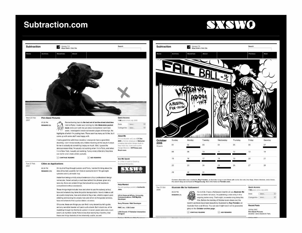
Subtraction.com

About Mark
I’m the Founder of a tiny design consultancy Mark Boulton Design.
I also write about design and whatever else takes my fancy at markboulton.co.uk
markboultondesign.com
markboulton.co.uk

MarkBoulton.co.uk

Dots to Design


From Dots to Design
• Any two or more marks on a single plane is a design.


Some History
The grid is the most vivid manifestation of the will to order in graphic design.

A Brief History of the Grid

Looking for Reason
Divining architectural proportion from nature.
Le Corbusier, “Modulor” 1948.Leonardo DaVinci, “The Vitruvian Man” 1492.

Right Up to the Modern Day

Ornamentation
From this…
Leopoldo Metlicovitz, “Fleurs de Mousse,” 1914.Advertising poster for French perfume.

Rational Design
…to this.
Theo Ballmer, “Neues Bauen” 1928.Poster for German Werkbund exhibition.

New Ideas
Rationalism became the new imperative for design.
Out with decoration and formalism, in with logic and standardization.
Jan Tschichold, “Die neue Typographie” 1928.Instructions for the standardized layout of A4 letterhead.

The More Things Change…
Modernists looked to build a new aesthetic by
• Deriving beauty from the innate qualities of the machine
• Championing standardization
Sound familiar?

…The More They Stay the Same
There is a strong overlap between what motivated grid usage nearly a century ago and what motivates grid usage today.
• Deriving beauty from the innate qualities of the browser
• Championing standardization
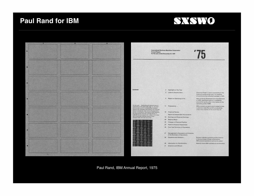
Paul Rand for IBM
Paul Rand, IBM Annual Report, 1975

J. Müller-Brockmann
Tonhalle-Quartett, 1955. Juni-Festwochen Zürich, 1959
Juni-Festwochen Zürich, 1962
Musica Viva, 1968

Massimo Vignelli for National Park Service
Unigrid as a solution to large-scale design and production of many different publications.
Grids on the Web

Crate & Barrelcrateandbarrel.com

Product Display

‘Inventory’ Display

Text Forms

Comment Is Freecommentisfree.guardian.co.uk
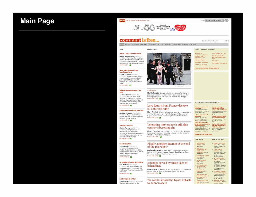
Main Page

Article Comments
With horizontal hierarchy.
Let’s Build a Grid
The Brand

What Should We Do?
Not
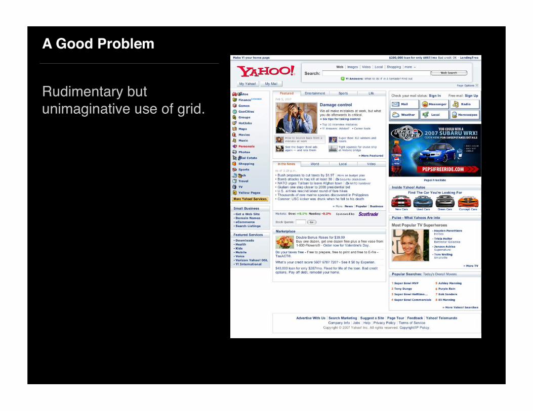
A Good Problem
Rudimentary but unimaginative use of grid.

Rather…
yeeaahh.subtraction.com

Requirements

Where to Start
Every design solution begins by defining the problem and establishing constraints.
• 1024 x 768 screen
• Big Ad Unit

Screen Resolution
• 1024 px wide by 768 tall

‘Natural’ Browser Size
• Approximately 974 px wide by 650 px tall

Canvas Area
• Less left and right margins
• Approximately 960 px wide by 650 px tall

The Big Ad
The most useful ad unit to design for is the Big Ad.
336 px wide by 280 px tall as established by the Internet Advertising Bureau.

Big Ad width:336 px
Other Ad Sizes
A design based on the Big Ad will also accommodate the width of the other popular ad unit sizes
Medium Rectangle300 px wide by
250 px tall
Half-page300 px wide by
600 px tall
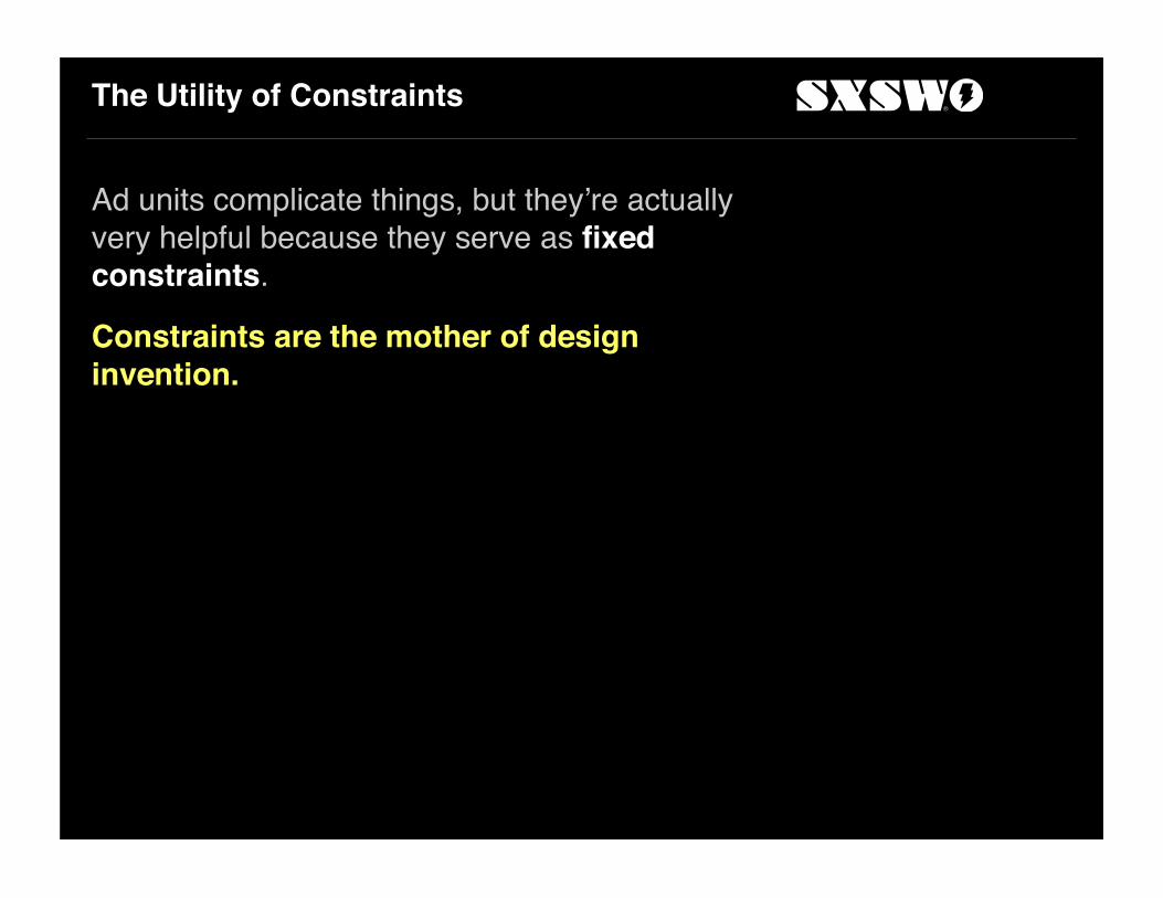
The Utility of Constraints
Ad units complicate things, but they’re actually very helpful because they serve as fixed constraints.
Constraints are the mother of design invention.

Units

Units & Columns
Units are the basic building blocks of a grid. They’re all uniform.
Columns are the groupings of units that create the visual structure of the page. They are not necessarily uniform.
In this example, four units are combined to create a single column.

The Rule of Threes… or Fours
In general, we want to create units in multiples of three or four.Twelve is ideal, because it’s a multiple of three and four.

Twelve Units Can Combine into 3 Columns…
Three columns of four units each.
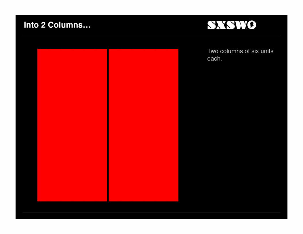
Into 2 Columns…
Two columns of six units each.

Into 4 Columns…
Four columns of three units each.

Into 6 Columns…
Six columns of two units each.

Unit and Column MathFirst Try
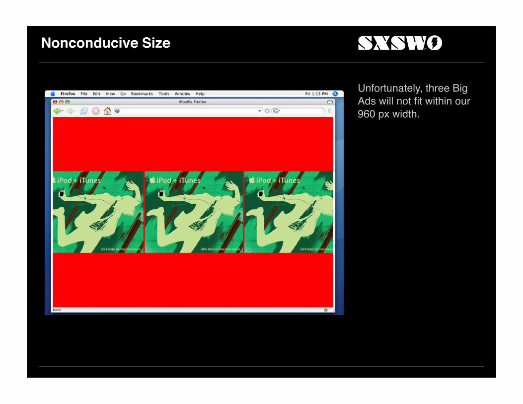
Nonconducive Size
Unfortunately, three Big Ads will not fit within our 960 px width.

Formula
Canvas - ((Total Units -1) x Gutter) ÷ Total Units = Unit
950 - ((16 -1) x 10) ÷ 16 = Unit
(Don’t worry about doing it this way.)

Round-up the Ad Column
Round up the ad unit column to an even 340 px width.

Divide the Ad Column
Divide the ad column into two units of 165 px each, with a 10 pixel gutter.
(340 - 10) ÷ 2 = 165

Extrapolate Units
Yields 5 units of 165 px each for a total width of just 865 px.These could be subdivided into 10 units but a 10 unit grid is difficult to work with.

Second Try

Round-up the Ad Column
This time round up higher to 350 px width.

Divide the Ad Column
Divide by three this time, with two 10 px gutters, for 110 px units.
(350 - (2 x 10)) ÷ 3 = 110
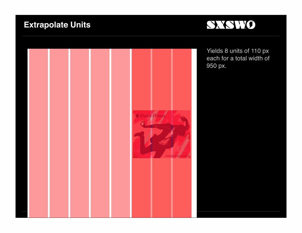
Extrapolate Units
Yields 8 units of 110 px each for a total width of 950 px.
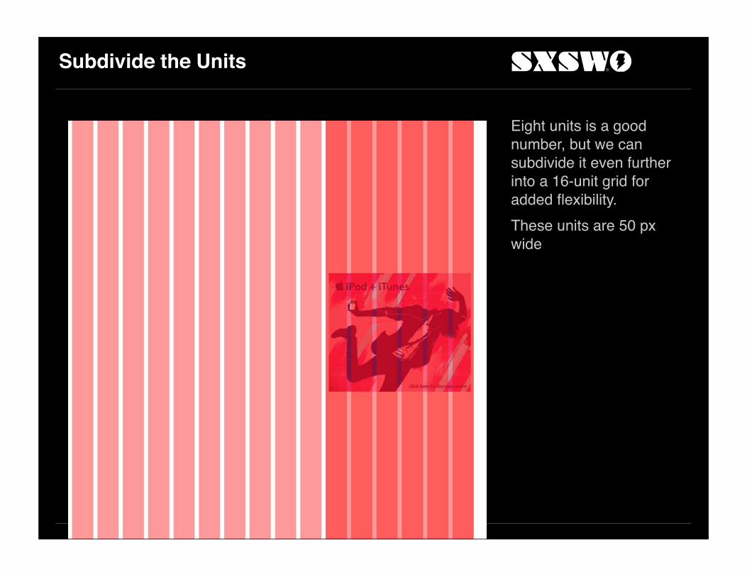
Subdivide the Units
Eight units is a good number, but we can subdivide it even further into a 16-unit grid for added flexibility.These units are 50 px wide
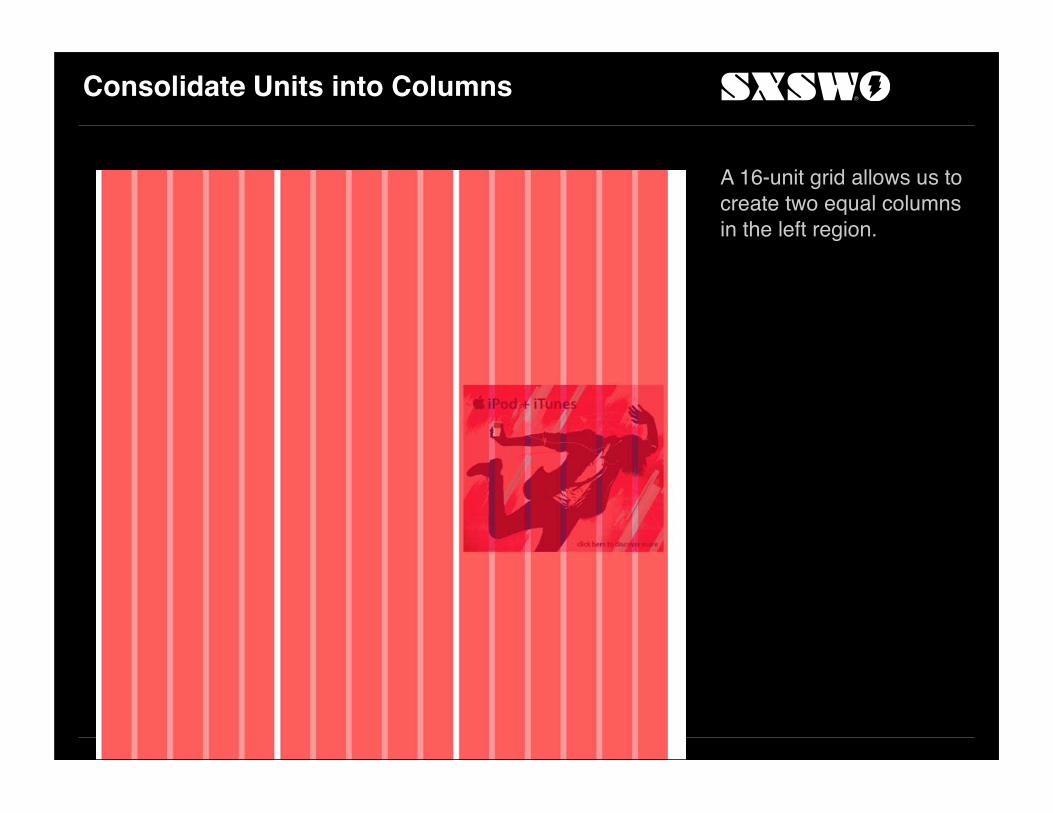
Consolidate Units into Columns
A 16-unit grid allows us to create two equal columns in the left region.
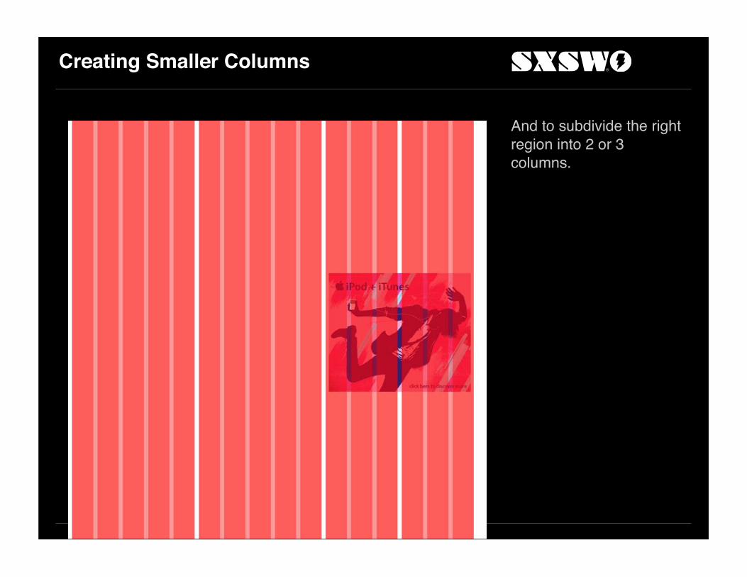
Creating Smaller Columns
And to subdivide the right region into 2 or 3 columns.

Left Navigation
We can also carve out 2 units at the left to create a left-navigation.

Third Time’s the Charm
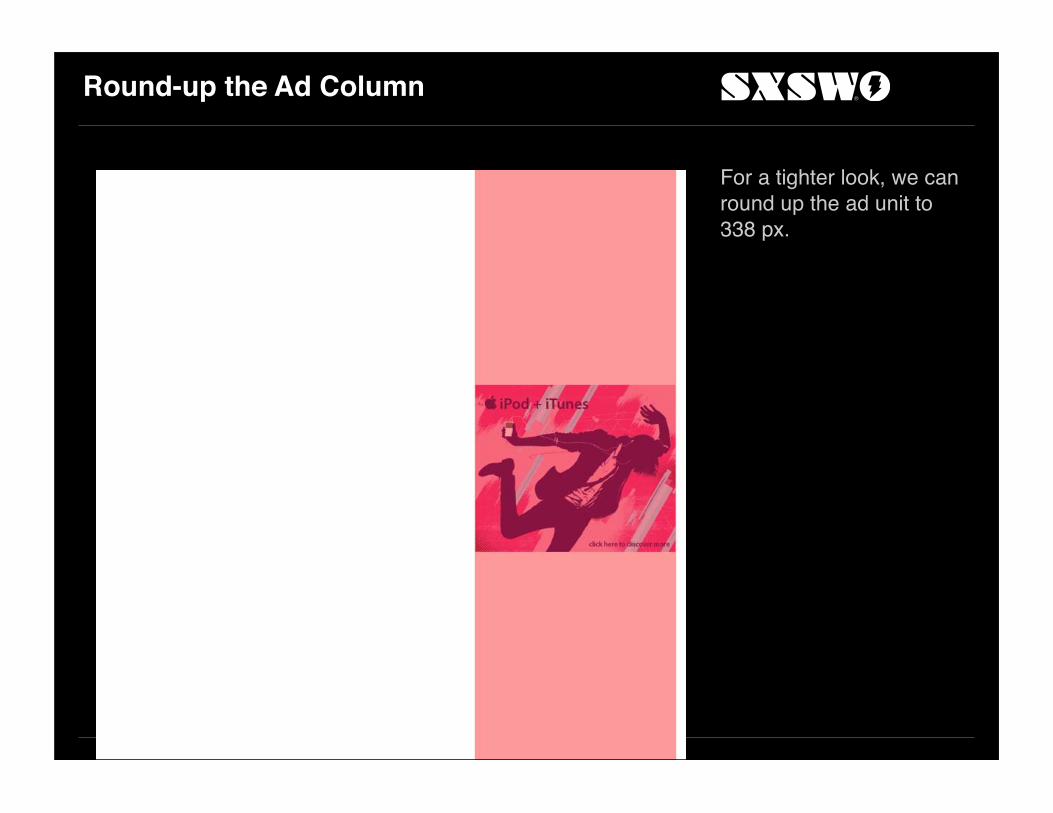
Round-up the Ad Column
For a tighter look, we can round up the ad unit to 338 px.
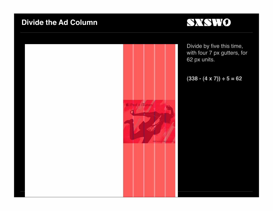
Divide the Ad Column
Divide by five this time, with four 7 px gutters, for 62 px units.
(338 - (4 x 7)) ÷ 5 = 62

Extrapolate Units
Yields 14 units of 62 px each for a total width of 959 px.Fourteen is a strange number, but sometimes that makes things more interesting.

Consolidate Units into Columns
Allows the left region to be consolidated into 3 columns.
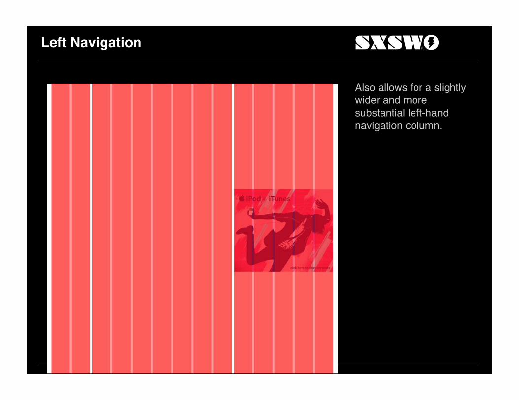
Left Navigation
Also allows for a slightly wider and more substantial left-hand navigation column.

The Grid Is Done
Time to design.
Layout

Header

Header Placement

Search Region
Use the balance of the logo area for a search region.
The Box Model
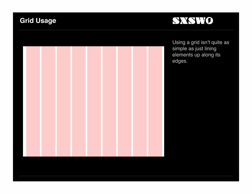
Grid Usage
Using a grid isn’t quite as simple as just lining elements up along its edges.

Example
Let’s typeset three elements on a 9-unit grid.The instinct is to left-align each right on the edge of each column.
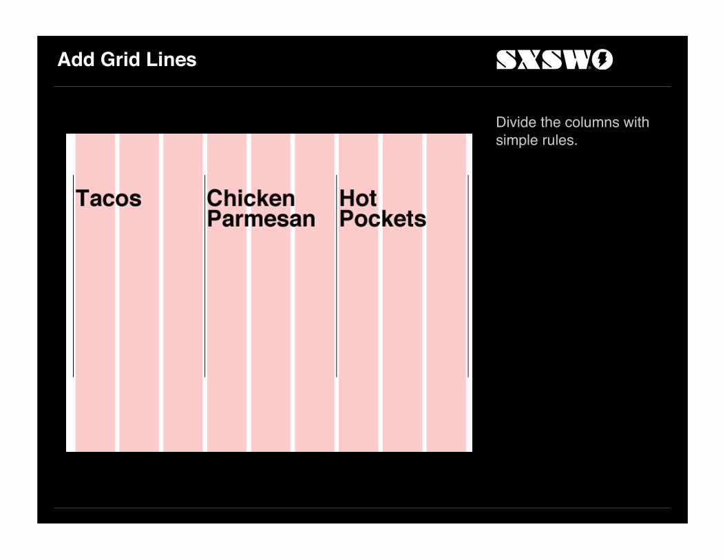
Add Grid Lines
Divide the columns with simple rules.
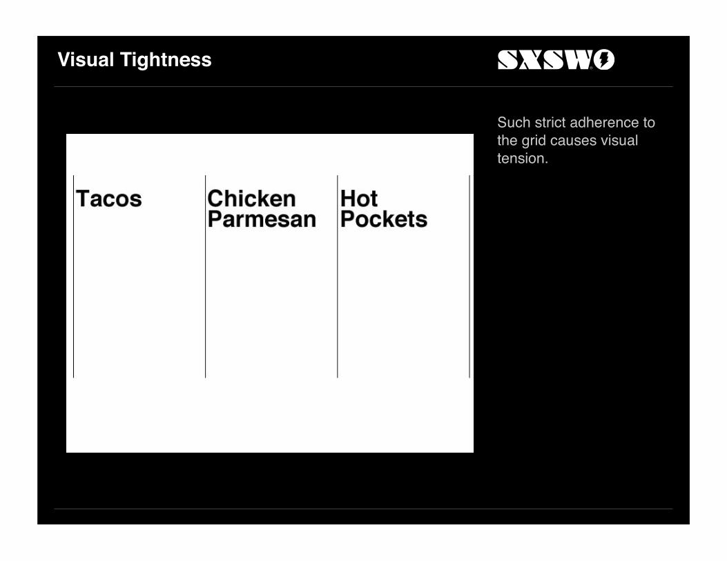
Visual Tightness
Such strict adherence to the grid causes visual tension.

Another Problem
What happens when type needs to be inset inside a box?

Accounting for Behavior
In digital media, those boxes are often behavior. That is, they may or may not appear persistently.When they’re not there, it can cause visual misalignment.
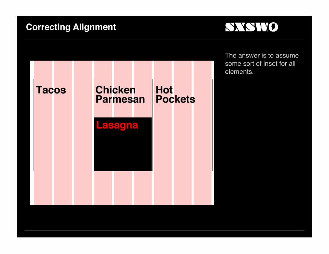
Correcting Alignment
The answer is to assume some sort of inset for all elements.

Visual Consistency
This achieves visual consistency up regardless of whether text is inset, and allows breathing room next to the grid lines.

Visual Consistency
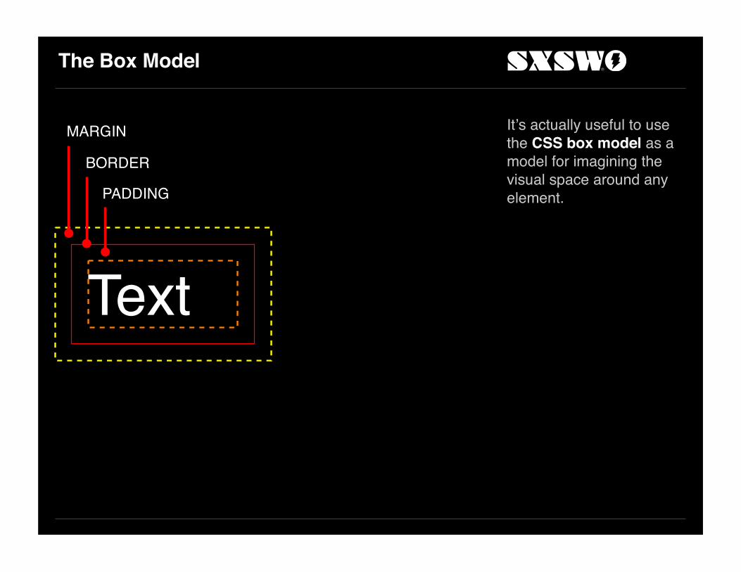
The Box Model
It’s actually useful to use the CSS box model as a model for imagining the visual space around any element.
Text
MARGIN
BORDER
PADDING

The Box Model in Practice
Text Text
COLUMNGRID LINE

Back to Search

Search Region

Search Placement
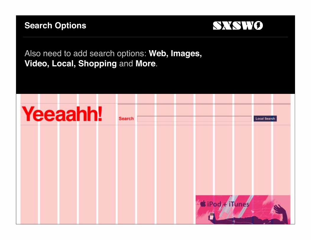
Search Options
Also need to add search options: Web, Images, Video, Local, Shopping and More.

Options Aligned on the Grid
Admittedly, probably not the most usable display, but it’ll do for now.
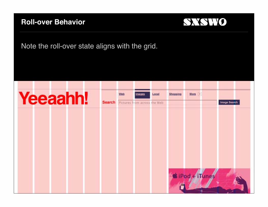
Roll-over Behavior
Note the roll-over state aligns with the grid.

Navigation (and Framing)
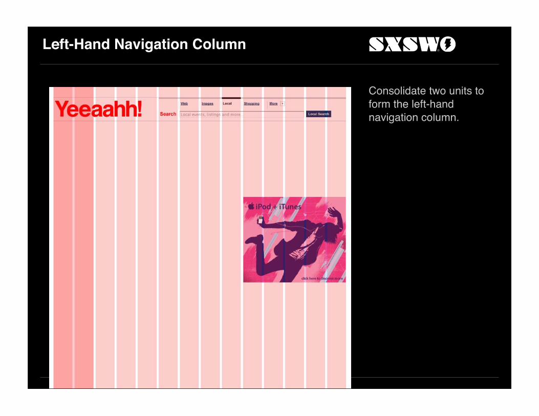
Left-Hand Navigation Column
Consolidate two units to form the left-hand navigation column.
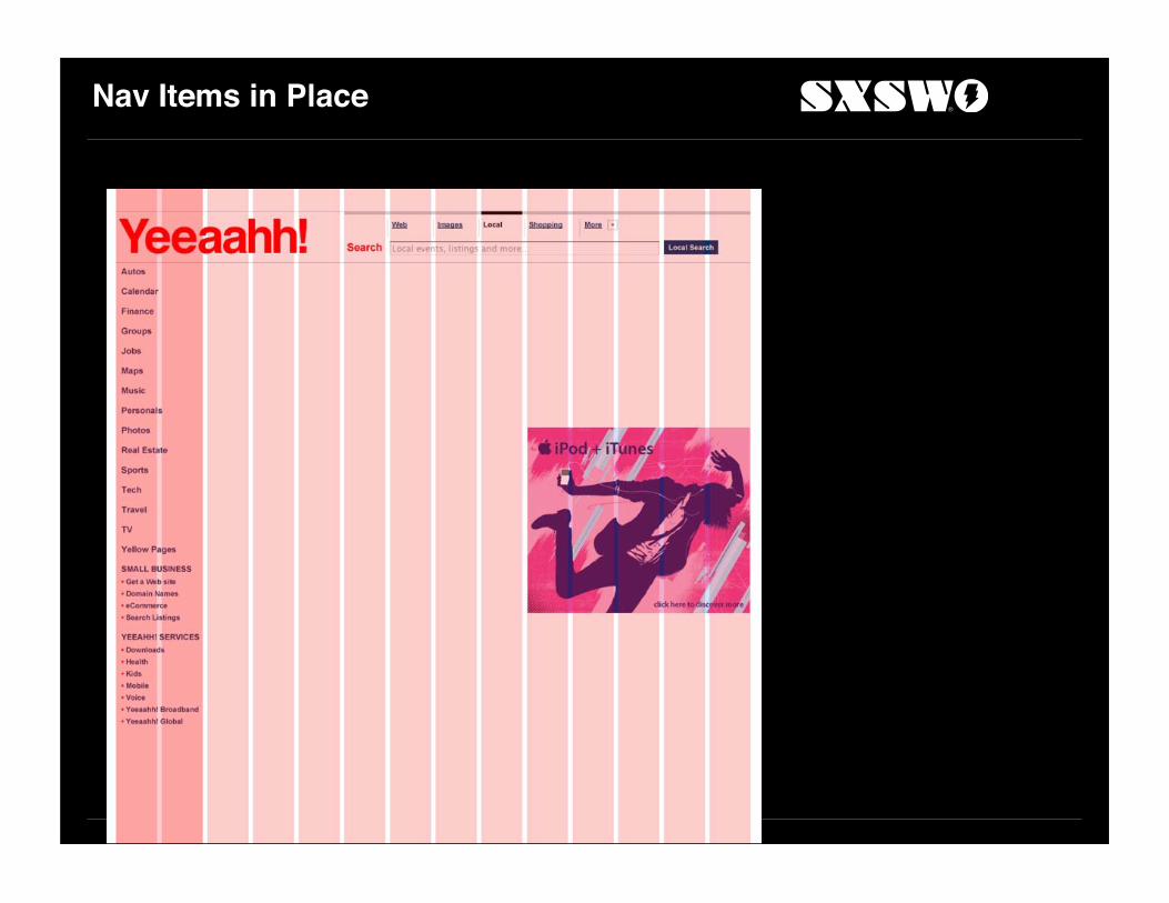
Nav Items in Place

Visual Grouping through Rules
Add rules between most nav items and to visually combine multi-item groups like Small Business and Services together.

Items and Rules
Take a closer look at the placement of rules.

Adjunct to the Box Model
Every box should be laid out using the same principles as used in framing.Padding for all sides should be visually equal. But only the top, right and left padding should be mathematically equal. The bottom should be taller.Text
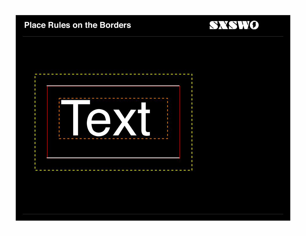
Place Rules on the Borders
Text

Visually Balanced
The result is visually balanced.
Text

Applicable to All Elements
The illusion of visual equality is enhanced when elements are stacked.Text
Text
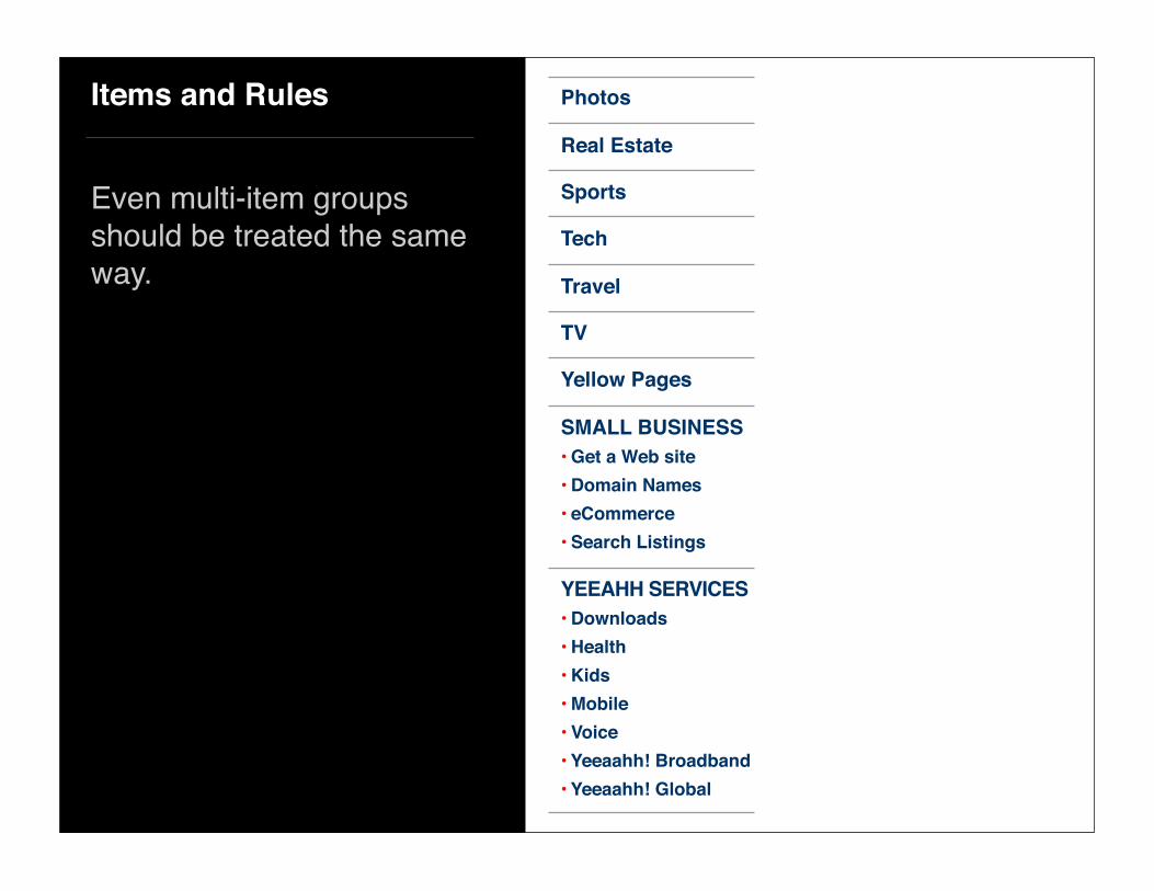
Items and Rules
Even multi-item groups should be treated the same way.
Yellow Pages
TV
Travel
Tech
Sports
Real Estate
Photos
SMALL BUSINESS• Get a Web site• Domain Names• eCommerce• Search Listings
YEEAHH SERVICES• Downloads• Health• Kids• Mobile• Voice• Yeeaahh! Broadband• Yeeaahh! Global

Nav in Place

Widgets

Widgets

Hidden Functionality

Nav in Place

Widget Region
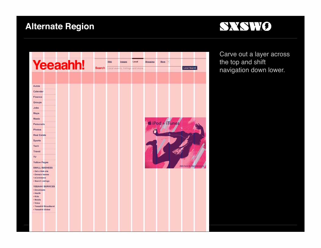
Alternate Region
Carve out a layer across the top and shift navigation down lower.

Dress Up the Layer
Add a light yellow layer and divide up the area into equal areas — except the number of units don’t easily divide.

Asymmetry Isn’t Bad
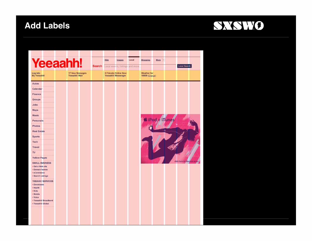
Add Labels

Add Icons
Icons from IconBuffet.com.

Odd-size Column for Weather

Remaining Widgets
Horoscope, local info and radio.

Less Visual for Right Column
Users have learned to regard colorful imagery in far right column as advertising.
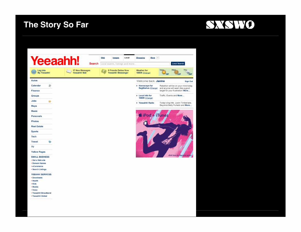
The Story So Far

Add Grid Lines

Features Area

Features Area
Consolidate seven units into a Features marquee area.Tabs for four main areas: Features, Entertainment, Sports, Life.

Add Tabs

Tabs
Tabs are off the grid.
Let tabs be tabs.

Lead Story Layout

Image Sizes
Consolidate three units into a 200 px width. Height is 120 px.
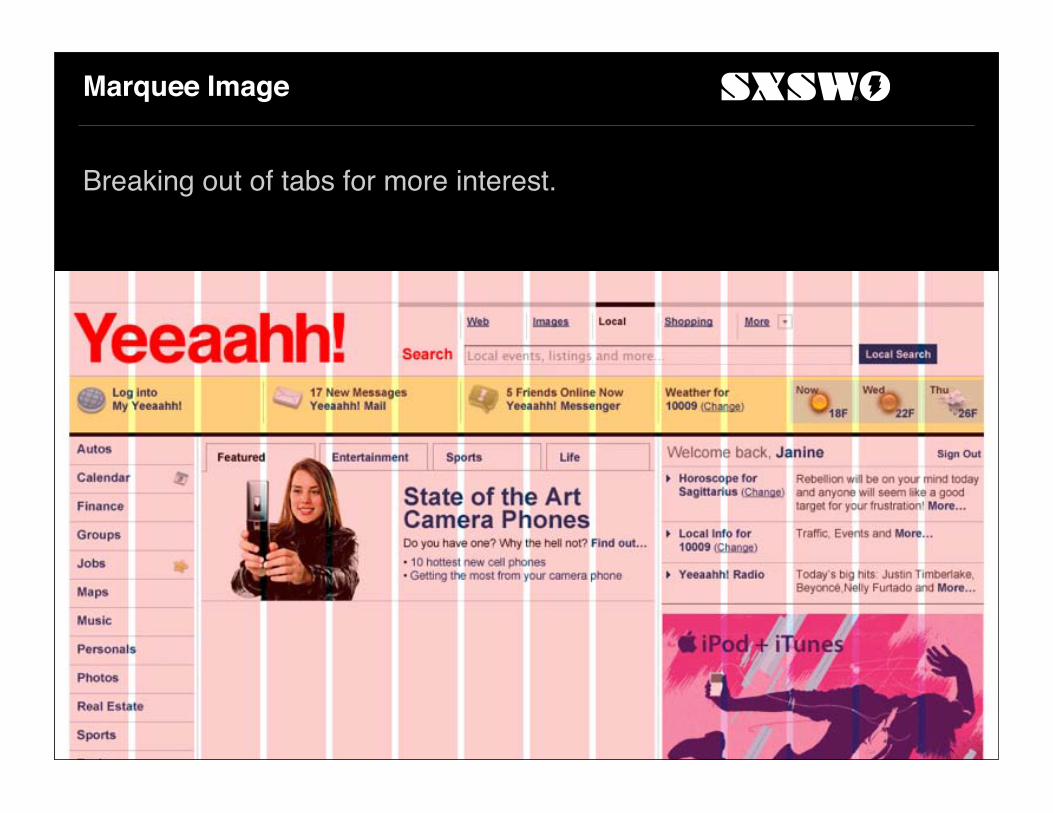
Marquee Image
Breaking out of tabs for more interest.

Other Stories
Proportional photo regions below.

A Use for the Spare Unit
Large ‘More Stories…’ area.

Nearly Complete
With images in place.

Add More Interest
Shift tabs up to ‘pop’ them.
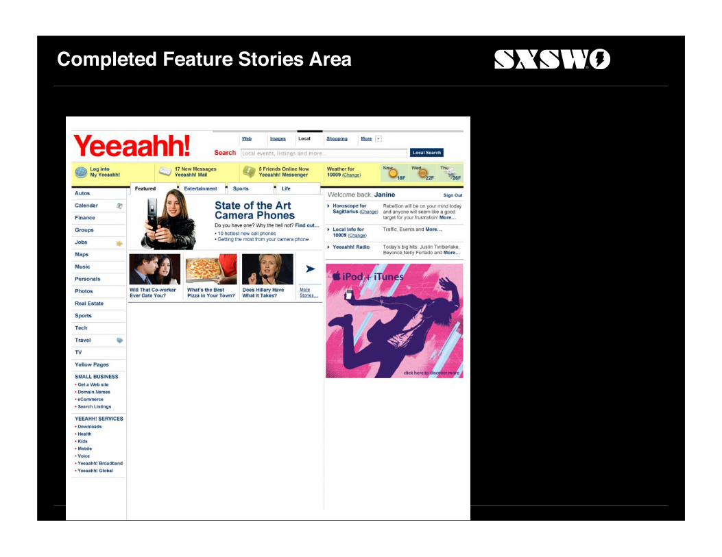
Completed Feature Stories Area

Headlines & Other Modules

Replicate Tab Structure

Flow Headlines in a List

Markets Data in Right-Hand Column

Appraise the Overall Effect
Problems parsing the Headlines tabs from the marquee above.

Embellish with a Subtle Background
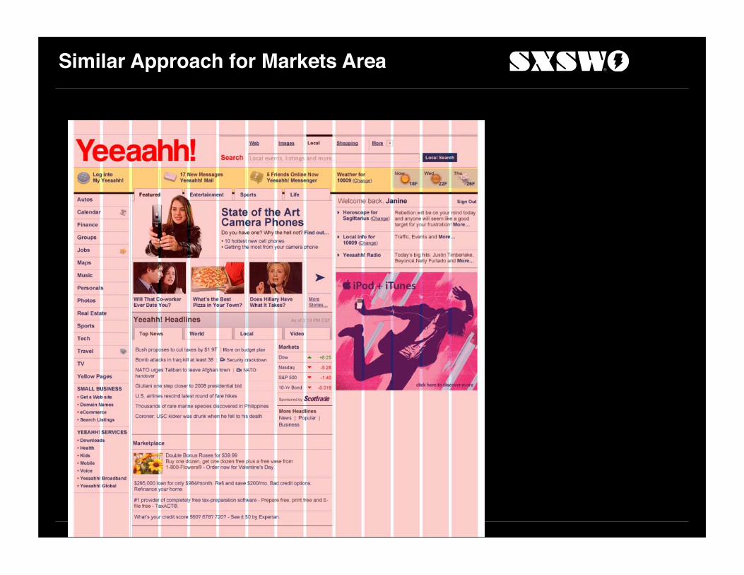
Similar Approach for Markets Area

Autos
Four un-aligned columns.
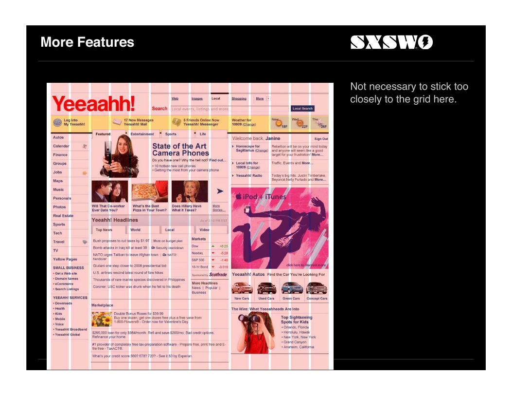
More Features
Not necessary to stick too closely to the grid here.

Most Popular
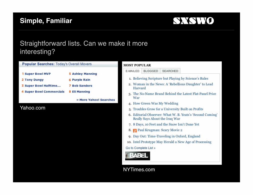
Simple, Familiar
Straightforward lists. Can we make it more interesting?
Yahoo.com
NYTimes.com
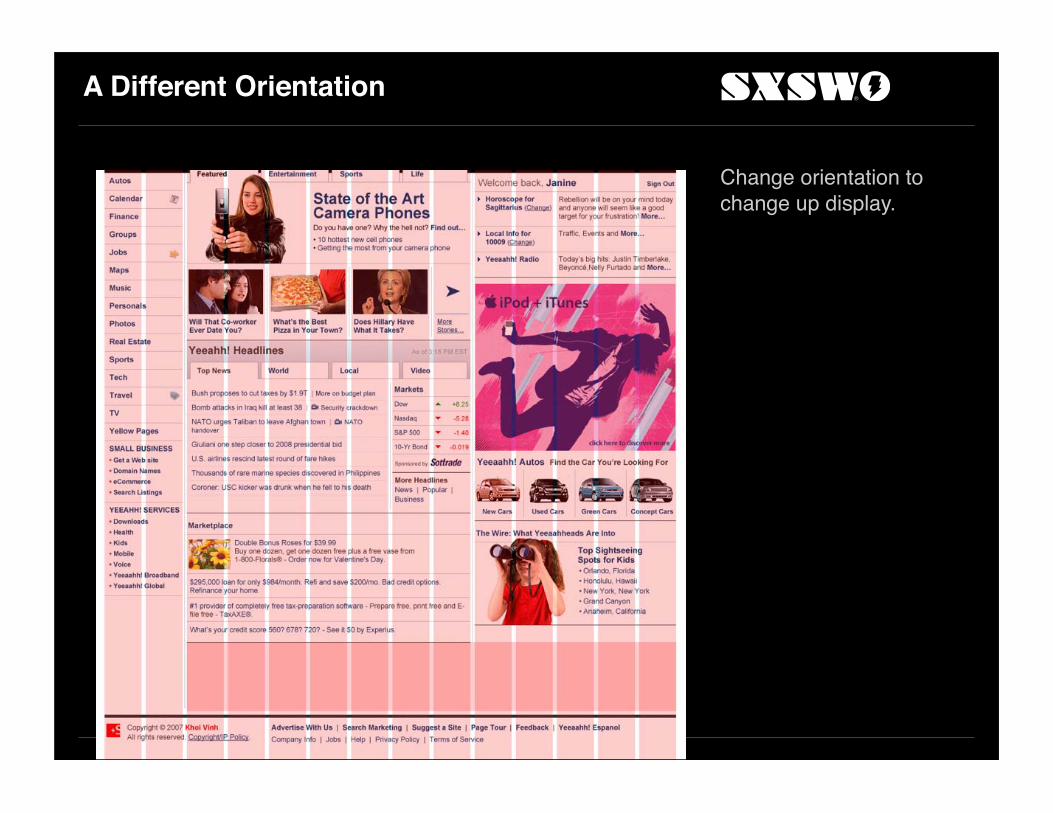
A Different Orientation
Change orientation to change up display.

Horizontal Ordered Listing

Done!

Sibling Sites

Personals

Same Units
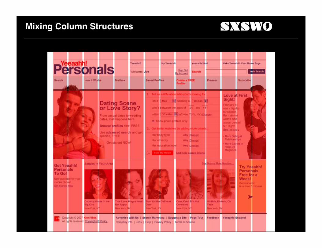
Mixing Column Structures

Mixing Column Structures

End
Special Thanks
www.iconbuffet.com