kymenlaakson ammattikorkeakoulu bachelor of culture …
TRANSCRIPT

KYMENLAAKSON AMMATTIKORKEAKOULU
Bachelor of Culture and Arts / Degree Programme in Design
Elsi Lammila
PACKAGE DESIGN FOR A NATURE-BASED TOURISM COMPANY
Bachelor's thesis 2012

ABSTRACT
KYMENLAAKSON AMMATTIKORKEAKOULU
University of Applied Sciences
Degree Programme in Design
LAMMILA, ELSI Package design for a nature-based tourism company
Bachelor’s Thesis 44 pages + 1 pages of appendices
Supervisor Sarah-Jane Leavey, lecturer
Commissioned by Aptual Oy
March 2012
Keywords ecological package design, nature-based tourism, brand building
The objective was to design a concept of ecological coffee packaging for a nature-
based tourism company. The package design had three main aspects to consider:
enhancing the brand of the company, environmental friendliness, and functionality.
The project’s purpose was to extend the brand’s usage into product and service areas
which had not previously been explored. The goal was to develop the company’s
brand recognition by package design. The aim was to determine ecological packaging
solutions, and find the balance between ecological, functional and attractive
packaging.
The design was carried out following a standard design process. The commissioner
provided demographic and practical information. Information about ecological
materials, packaging coffee, and package design in general was gathered from shops,
web pages, interviews, studies, and books.
A package is a powerful tool for a brand, because it is tangible, and therefore reaches
the customer on many levels. There can be more than one functional package design
solution for one product. The balance of what is ecological depends on the case; how
and where the product is used.
2

CONTENT
1 INTRODUCTION 5
1.1 Motivation 6
1.2 Defining conceptual Parameters 8
2 NATURE-BASED TOURISM AND TERVARUMPU 9
2.1 Nature-based tourism in Finland 10
2.2 Tervarumpu 11
2.2.1 Principles 13
2.2.2 Demographic data 13
3 PACKAGE DESIGN 14
3.1 Brand and package design 15
3.1.1 Power of packaging for a brand 16
3.1.2 Advertising by packaging 16
3.2 Features and aspects of package design 17
3.3 Coffee packaging 18
3.3.1 Regular coffee packages 18
3.3.2 Ecological aspects of packaging Tervarumpu coffee 19
3.3.3 Overview of coffee package design in Finland 20
3.4 Steps of package design process 22
3.5 Elements for Tervarumpu package design 23
4 DESIGN PROCESS 24
4.1 Creative Brief 24
3

4.2 Existing gift coffee packaging 26
4.3 Moodboard and keywords 27
4.4 Designing concepts 28
4.5 The final concept 36
4.5.1 Technical execution of the graphics 38
4.5.2 Reflection 40
5 CONCLUSION 40
REFERENCES 42
APPENDIX 44
Appendix 1 Photography and illustrations information 44
4

1 INTRODUCTION
The project determines options for packaging freshly coffee ground for a nature-based
tourism company. The client stated that the solution has to be functional, ecological,
and it has to enhance the brand. During the design process, a need for tea packaging
arose, so the same packaging has to function for both coffee and tea. The packaging
needs to be tempting to the target audience. The coffee packaging in this thesis project
is not comparable to the ones sold in shops, because of the unique target audience and
use.
The client, Tervarumpu, is a company situated in the National Park of Repovesi in
Kouvola, Southern Finland. Tervarumpu offers many services, such as guided tours,
many outdoor activities, and bed and breakfast facilities. Visitors can rent outdoor
activity equipment, and visit the museum. In 2012, Tervarumpu launches its own
coffee brand. It is ground fresh on the premises, and needs packaging which holds
small amounts, so the visitors can take the package with them on a hiking trip. The
coffee can be purchased from the webshop as well, and a part of the profit goes to
Repovesi National Park.
Nature-based tourism is a growing business. It is based on the ideology of sustainable
use of the area, and on offering quality experiences in the wilderness. In Finland,
nature-based tourism companies have neither produced their own coffee nor other
foods and drinks. Tervarumpu wants to add value to the wilderness experience for its
visitors, and decided to launch a product.
Package design is a branch of design in which form, material, and graphical elements
are combined to develop an appropriate packaging for a certain need. Packages have
different roles: container, protector and marketing tool, which have evolved over time
and with needs.
Branding differentiates a business from competitors by creating a persona for the
company. As stated in the Package Design Workbook by Steven Dupuis and John
Silva, packaging is a concrete reflection of a brand, the touchpoint of ideas and
images the viewers have in their mind, and reality. In the ideal case, the packaging
5

reinforces the brand identity, and strengthens its positive image. The buying decision
can be affected by package design. Nature-based businesses have not traditionally
concentrated on branding themselves, but the increasing competition leads to a need
for differentiation.
Considering all the information mentioned above, the design process is presented
starting from the design brief and ending with the final concept. The process is
detailed and illustrated, and the design decisions are explained and justified.
The project's main topics are: brand building, ecological package design, developing
nature-based tourism and sustainable development. The research question is:
“How can the brand of a nature-based tourism company be enhanced through the use
of package design?” Sub questions are: “How can the balance between ecological,
functional and visually attracting be found in package design?” and “What would be
the key package design elements required by Tervarumpu?”
The structure of this report is firstly the theoretical information is explained and the
ways this reflected in the Tervarumpu coffee packaging design follows. The design
process introduces different concepts and ideas, and explains where they came from
and why certain decisions were made.
1.1 Motivation
Package design has interested me since the beginning of my studies in Kymenlaakso
University. It comes from my interest in combining the field of advertising and the
fields of graphic design and product design. Ecological package design started to
interest me due to a graphic design course during my exchange studies in Limkokwing
University of Creative Technology in Malaysia. The course’s main task was to design
ecological packaging for a local food product. Package design interests me because it
is a diverse field, and it offers challenges.
Aptual is an advertising agency in Kouvola, founded by the commissioner of this
project. During my practical training at Aptual, the idea of asking for a package design
thesis project arose. The commissioner suggested this project, and it seemed perfect
6

for me, because of the ecological thinking, and the interesting fact that this project is
first of its kind.
Motivation from the client, Tervarumpu, comes from desire to add value to the
experience of visiting Tervarumpu, and to help differentiate and build the brand
further. Nature-based tourism is a growing business sector, as ongoing nature-based
tourism development projects shows. There are other companies operating in
Repovesi national park who also offer activities, such as guided tours. Tervarumpu has
young and motivated owners, who follow the prevailing trends, and most importantly
understand the importance of branding. The Tervarumpu brand is built over time, and
they believe that introducing products will help to develop the recognition of the
brand. The experience of visiting the site is stronger when the visitor can have
something tangible; something to touch, smell and taste, something to take away with
them. The coffee and tea are relevant now for Tervarumpus visitors, and there is a
possibility that other products will be launched later. The products are going to be
available from the hiking center of Tervarumpu and from their webshop.
The project is unique since there are no other coffee products launched under a nature-
based tourism brand. The main point, however, is not that the product is coffee. The
emphasis is on building brand recognition through expanding the use of the
company’s visual identity in the growing market sector of nature-based tourism. As
mentioned, packaging is an important tool for building brand recognition, since it is
tangible. The packaging has to be tempting to the target audience. There are not many
products sold under nature-based tourism brands, and package design is not common
in the field.
Since nature-based tourism is a growing business sector, it is expected that more
competition creates the need to differentiate. When the products of nature-based
tourism businesses, for example guided tours, are similar in many companies, the way
to differentiate is through recognition of established brand identity and through unique
selling points. This project is significant in this vocational field because it is pioneer.
It also shows the importance of good design in a field which has not traditionally
focused on branding in Finland.
7

1.2 Defining conceptual Parameters
Brand*The public face of a marketable product, service, or organisation.
Brand valuesThe values that reflect the core of the brand. Tervarumpu's 'principles' includes the values.
Client Tervarumpu nature-based tourism company
Commissioner Aptual advertising agency
Design brief
A document determining the starting point and goal of the design project and relevant information on the packaging.
Gift coffee
Coffee packed in smaller weights than regular coffee sold in stores. Usually the retailer is not the producer, and the product is packed in a paper bag. Often marketed for special customer groups or occasions, for example Christmas coffee.
Kuksa Traditional Finnish mug carved from wood.
Package Container
Packaging Container with written and illustrated communication.
PLAPolylactic acid, used as a liner in paper or cardboard food packaging to replace plastic. Made out of renewable materials, such as corn.
TervarumpuNature-based tourism company located in the National Park of Repovesi.
Tone of voice The linguistic style of a brand
Touch-point
The point and interface where people come into contact with the brand, for example packaging, web page, advertisement.
* More about brand and its effect on package design:
Brand identity is the image of the company. Common visual brand elements are logo,
tagline and color(s), but 'brand' goes beyond those, and is a sum of all the visual and
informational data one has from the company. A brand may have different qualities
8

depending on the viewer, but careful brand building guides a company toward the
desired image.
Brand affects on package design widely. Tervarumpu is a nature-based tourism brand,
and the packaging has to follow Tervarumpu’s brand identity. As a result of the design
process, the new coffee has its own endorsed brand.
There is an enormous selection of goods and services available, and many companies
have similar products. The consumers select the one which speaks to them the most.
As an example, there may be many nature-based tourism companies in the same area,
and the decision on which one to visit can be influenced by a well delivered brand
message.
2 NATURE-BASED TOURISM AND TERVARUMPU
The idea of nature-based tourism is to provide experiences and services in nature, in
areas which are protected. The services of nature-based tourism companies often
include accommodation, equipment rental, for example bicycles, kayaks and snow
shoes, and guided tours of the area. The challenge is to find the balance between a
quality experience of natural beauty, and protecting the ecological and cultural values
of the area. (sustainabletourismonline.com). Business activity ensures the
sustainability of the area, because the revenue is used in maintaining the natural
environment, and developing it ecologically (sustainabletourismonline.com). By
having visitors in the area, which can be in a national park or other protected area, the
public awareness of current ecological issues can also be maintained and increased.
Nature based tourism is also known as ecotourism, but some sources find ecotourism
a more specified field, that goes beyond sight-seeing to emphasising the visitors
understanding of scientific and ecological features of nature. (Tourism Western
Australia 2006.) In other words, ecotourism is one sector of nature-based tourism
field.
9

2.1 Nature-based tourism in Finland
In Finland, this field of business is at an early stage of development. A study about
nature-based tourism companies in Finland was done in 2005 by E. Koivula and O.
Saastamoinen. Presumably dramatic changes have not happened after that. The study
shows that there are companies, but they are not operating at full potential. The
education, the awareness of starting up a tourism business, and land resources are not
in balance: there are some educated people with an interest in the field but they do not
have land, and other who have, for example, inherited land but have no interest, or
knowledge of how to start up a tourism business. The existing nature-based tourism
businesses in Finland are spread across the country - the best known ones are in
Lapland and in the southern archipelagos. One challenge is to get international visitors
aware of the eco travelling possibilities in Finland. (Koivula, E. & Saastamoinen, O.
2005).
As seen in media worldwide, interest in ecological issues is a current trend. Travelling
and tourism pollute, however, this will not stop people from wanting to have
experiences. Nature-based tourism is one way to decrease one's carbon footprint,
because it does not waste natural resources as much as, for example, flying to another
country and staying in a hotel, and the overall aim is to minimize the environmental
impact. Another current trend is an interest in wilderness and ecological travelling.
The trend includes an interest in getting in contact with unspoilt nature and its
calmness, rather than the high activity of big cities and tourist traps.
'Kompassi Kouvolaan' is a project organized by Kouvola Innovation, an economic
development company of the city of Kouvola. The goal of that project is to increase
and develop the nature-based tourism in the Kouvola region. A group of local tourism
entrepreneurs travelled to Amsterdam, The Netherlands, to visit a travel fair in winter
2012, where they discovered that the Dutch are very interested in outdoor activities.
The project leader, Jukka Kinnunen, says that middle Europeans value nature-based
travelling and outdoor activities such as cycling and ice skating, which could be
organized on a greater scale in Kouvola region. Ice skating clubs in The Netherlands
are already organizing tour skating trips to Finland. (Vartti Kouvola 2012, 8).
10

Repovesi region offers great facilities for tour skating, so this, as an example, shows
the potential of the area for developing nature-based tourism further.
Outdoors.fi is a website providing information about all the outdoor activity centres in
Finland. Additionally Outdoor.fi has a webshop where you can order badges, t-shirts,
mugs, soft toys, and other products as a memento of the national park you visited. The
profit goes to the relevant national park. None of the companies operating in nature-
based tourism in Finland are grinding coffee or packing tea as a promotional product,
so launching such product could help recognize and remember Tervarumpu’s brand in
a positive way.
National parks are strong bases for ecotourism, claims an article in the largest
subscription newspaper in Finland. There are 37 national parks in Finland. In 2011,
national parks had over two million visits, and the more visitors, the more income and
employment for the area. Last year Repovesi had 78 500 visits, and 1.7 million euros
income. (Helsingin Sanomat 2012, B5).
2.2 Tervarumpu
Tervarumpu is situated at the north entrance of Repovesi National Park. The company
offers bed and breakfast facilities, guided tours, and rents equipment for outdoor
activities. The buildings are old, originally built in the 1950s for loggers. They have
been renovated as a sauna, sleeping cabin, and museum. Nothing new has been built
on the site, since all the activity is based on sustainable development. The main
building, the hiking center, is called 'Tolosen talo'. It has a café, where the packed
coffee is going to be sold. There is also a dual purpose facility that has museum and
sleeping cabins. The sauna is next to Lake Saarijärvi. All of the buildings are within
200 meters of each other and the hiking paths, which start from the Tervarumpu camp
site. The landscape is dominated by forests, hills, and lakes.
Tervarumpu has a strong brand. The personality is polite, friendly, genuine, active,
social, and a topical storyteller. The tone of voice is honest, warm and engaging.
Tervarumpu aims to be considered as a meeting point, community or a “village”.
11

Figure 1. Tervarumpu's logo
Above is Tervarumpu’s logo, which has an image of a fox, which is common
with many companies, names and events in the Repovesi area, because the
name Repovesi is related to the word 'fox'. The visual elements of the
website below give an image of the brand identity.
Figure 2. Visual elements of Tervarumpu homepage.
Tervarumpu’s activity is based on the following principles; 'stories reminds us of our
roots', 'a human being is always part of nature and society', 'ecologically sustainable
activity will succeed', 'moderation in everything' and 'persistence creates strong and
durable value'.
The area Tervarumpu is situated in has an interesting history, and some local stories
are shared on Tervarumpu’s website, so the stories play a role in the Tervarumpu
brand image.
Tervarumpu's main visitor group is young adults from 25 to 34 year olds. Age groups
from 35 to 55 visit the site a bit less, but the retired are almost as active as young
adults. The age groups share a common interest in ecologically sustainable activity
and nature. The stories and heritage interest many as well.
12

Tervarumpu was chosen for family trip destination of the year 2012 by GoExpo
travelling fair company.
After visiting the site in November 2011, my personal impression of the place formed
and helped me during the design process. The visit inspired and informed me that I
need a rougher approach to the design.
2.2.1 Principles
The principles are guidelines for all activity of Tervarumpu, so it is important to
understand what they mean, and considered how they could be applied to package
design. Below are the principles of Tervarumpu followed by my ideas of ways how to
apply them to package design.
Stories reminds us of our roots.
Illustrations of the local history and stories could be applied in the graphics and texts
of the packaging. Inspiration for material and form could come from the past.
A human being is always part of nature and society.
Nature could be the inspiration for illustration and materials.
Ecologically sustainable activity will succeed, and persistence
creates strong and durable value.
These principles have a direct effect on the material solution: the material has to be
environmentally friendly.
Moderation in everything.
Moderation should be applied to the package design in regard to the graphics, material
and the form. In practise this could mean simple graphics, material, and form.
2.2.2 Demographic data
The majority of visitors are from the 25-34 year old age groups, but according to the
client, potential coffee/tee buyers are people in different age groups with similar
values, sustainability and ecological awareness, because buying the coffee supports
the national park. Most of those visitors come from Helsinki region, but also from
Lahti and Europe.
13

Eastern Finland University and Metsähallitus (administration of Finnish forests) made
a study about the visitors of national parks. As a result the visitors were grouped in
four categories: social self-developers, spiritual well-being and nostalgia orientated
persons, sporty nature-explorers, and nature-orientated relaxers. (Helsingin Sanomat
2012, B5). The first two groups seem to be closest to typical visitors of Tervarumpu,
according to demographic data received from the commissioner. The study explains
that they are faithful to a certain area, and they tend to come back repeatedly. This
activity is desirable for Tervarumpu, and one point of the packaging is to be engaging
to the target audience. The awareness of different types of visitors is valuable, because
it gives inspiration for designing, since it gives an idea of the people you are designing
for. In conclusion, the style of the packaging is more harmonious than exiting. It could
be happy, nostalgic, and 'spiritual'.
3 PACKAGE DESIGN
Package design has developed from a need for packaging, especially food packaging.
Clay, shells, animal skins and leaves were used as containers, because food and water
needed to be carried and preserved. (Paine F. A. & Paine H. Y. 1992, 1) Later on,
when societies and cultures progressed, communication became more important, and
icons and writings were used to label the containers. Packaging has evolved a lot over
time, from basic utility to marketing tool. (Dupuis, S. & Silva, J. 2008,10).
In the early 20th century, when the grocery stores started to have aisles and a variety of
products in line, the customers had a chance to interact with the package before
buying the product. As the Package Design workbook says it: “Packaging became the
silent salesman” (Dupuis, S. & Silva, J. 2008, 12).
Starting from the late 1950s, the worldwide economy improved, and led to a variety of
new products. A new kind of store, supermarket, were introduced (groceteria.com).
The need for differentiation arose. Branding grew into new dimensions; the
psychology of consumer behaviour, buying habits, and product loyalties were studied
and analyzed. (Dupuis, S. & Silva, J., 2008, 16). Nowadays the market is full of
products and information, so it is important to affect emotions and design a clear,
unique, and desirable package to sell your products in.
14

The word packaging has evolved as well, from package, a container; to packaging, a
container with written communication (Dupuis, S. & Silva, J. 2008, 10).
Package design requires skills in 3D product design, 2D graphic design and
marketing. Traditionally, product designers and graphic designers have worked in co-
operation to deliver functional, aesthetic packaging. Nowadays, packaging requires
integration of both fields, so a new education in package design has evolved.
Worldwide, there are only a few schools specialized in package design. (Järvi-
Kääriäinen, T. & Ollila, M. 2007, 36).
3.1 Brand and package design
In the Package design workbook by Steven Dupuis and John Silva, the importance of
package design is justified as being the final touchpoint of the brand image a customer
has when developing a relationship with a brand after contact with advertising and
other information received. The book encourages the reader to consider that 75% of a
buying decision is made at the store, and 100% of your buyers see the package – no
other form of communication has such impact. In the buying situation, the packaging
is often the only source of information about the brand. If it is well designed, it is
more likely to be sold.
Figure 3. Brand Image Paradigm. (Visual by Elsi Lammila, information from Dupuis,
S. & Silva, J. 2008)
Since Tervarumpu coffee has no direct competitors, there is no requirement to think of
the design in terms differentiation in the market. Ways of thinking could include: how
to link Tervarumpu to people’s minds with the coffee packaging, how to design an
emotionally appealing and visually attractive packaging for the target audience. In
addition, the package should enhance the brand.
15

Purchasing choices can be influenced by package design. In this case, the design of
the coffee packaging, the key is to affect emotions. The main buying motivation is that
by buying, the customer supports the local environment. The package may be bought
because it is 'beautiful', which is also an emotion-based activity.
3.1.1 Power of packaging for a brand
The reason why package design is so powerful part of a brand, is that it is the only
element to reach at least four senses. The feel of the packaging is sensed through its
construction, its material and its shape. The scent is caused by the product itself, or
nowadays even a fragrance added to the packaging. The element of sound, such, as the
sound of crisp bag or opening a beer bottle awakes memories, which affects feelings.
The visual information, consisting of the form and graphical layout, is sensed first,
and is the most significant feature. In paragraph 3.2 'Features of packaging', the visual
information is specified further.
3.1.2 Advertising by packaging
As The Package Design Workbook describes the current situation:“Designers and
marketers need to realize they are not just selling products; they are telling stories
through packaging. Package design is the visual expression of the brand's soul. Used
effectively, packaging can define, build and entertain consumers.” (Dupuis, S. &
Silva, J. 2008, 34). This is something to keep in mind when designing a package for a
start-up nature-based tourism company, because the packaging tells more about the
brand to the visitors, and well designed package reinforces the customer experience,
which leads to brand loyalty.
From the 1800s to the early 20th century, advertising of products and services was
based mostly on rational reasons, informational and argument-based appeal.
Advertisements informed what was for sale, at what price, and where. Later, partly as
a reaction to the earlier method, and partly because of the development of brands,
advertising became more and more emotionally charged. Both trends coexist
nowadays. (Fennis, B. M. & Stroebe, W. 2010, 4). The rational reason to buy
Tervarumpu coffee is that the visitor actually needs coffee for a hiking trip. Most
16

likely the buying decision is based on the emotional reasons mentioned earlier. The
role of packaging is also to provide information on the product. Tervarumpu coffee
packaging has to tell the content – coffee, the weight – around 100-200 grams, and it
has to have logos of Tervarumpu and Repovesi. In addition, an important factor is the
text line, which explains that a part of the profit goes to the National Park.
3.2 Features and aspects of package design
Packaging consists of technical features (for example the opening-closing system and
pouring mechanism), the material and the shape, which are all affecting each other
when designing.
The visual elements in order of noticing are; the colour, the shape, the photography/
illustration and the words (Dupuis, S. & Silva, J. 2008, 126). Since the color is noticed
first, it is the most powerful element. The material sets boundaries for choosing the
color. Another example of how one design decision affects another is that a technical
function may affect the physical appearance, like the Finnish milk cartons, which have
a triangular top because of the opening-closing system.
The common visual elements of 'gift' coffee packaging are; the color, the shape, the
illustration/photography, the name, the body text, which can be a poem or few words
describing the product, and the legal information. Below is an example of a Finnish
gift coffee packaging with its visual features.
Figure 4. Common visual features of gift coffee packaging.
17

Many features and roles of packaging lead to a range of aspects to consider: firstly, the
target audience, the use of the product, and the information required. The requirements
of the package depend on how much the product needs protection or other features,
for example concerning hygiene. (Järvi-Kääriäinen, T. & Ollila, M. 2007, 43).
In Tervarumpu’s coffee package design important factors are: A. enhancing the brand,
B. designing the packaging to appeal to the target customers, C. durable and
ecological material, which keeps coffee fresh for about a week, and D. functionality, it
has to be easy to open and pour. Closing is not as important since the package is
designed as a single use pack.
3.3 Coffee packaging
In general food packaging requirements are that it has to protect the product from dirt,
microbes, oxygen, light, moisture, unwanted scents, and mechanical damage. The
package has to protect the product from anything that could cause danger to health,
cause changes to the structure of the product, or weaken its features, which the
consumers can sense. The package has to be easy to use and environmentally friendly,
according to the law. (Järvi-Kääriäinen, T. & Ollila, M. 2007, 51). The packages of
dry foods have to be durable enough for the specific product, because any holes and
cracks make even the best preserving features useless (Järvi-Kääriäinen, T. & Ollila,
M. 2007, 55).
3.3.1 Regular coffee packages
Most common roasted and ground coffee packages are metal foil laminate packages,
because they prevent the light and oxygen from damaging the coffee and therefore
keep the aromas fresh. When coffee beans are ground, they emit gas, so they need to
be left for a while for the pressure to balance. Ground coffee is very sensitive to air,
and light speeds the affect of oxygen, so it needs to be in airless conditions to keep the
aromas before vacuum packing. The common problem with coffee and spices is that
the taste and scent has been weakened. (Järvi-Kääriäinen, T. & Ollila, M. 2007, 55).
Tea should also be protected from light, but it is not that sensitive to oxygen.
Tervarumpu coffee is ground at the site and it does not need to stay fresh for long.
Ground coffee stays fresh enough in a paper bag for about a week. That is good when
18
designing ecological package, since the foil packages are not environmentally
friendly, because of big energy consumption in manufacturing, and the fact that they
cannot be recycled or burned.
3.3.2 Ecological aspects of packaging Tervarumpu coffee
One challenge with the packaging on this project is durability. The package should
flex enough to be packed in a rucksack with other travelling goods, such as clothes,
food, and kettles. The travelling circumstances may include moisture, which is bad for
a paper/carton and the coffee/tea itself. The unwanted scenario is that the coffee is all
over the rucksack because the package tears open. One way to strengthen and add to
the preserving features of the material is to add a layer of plastic. It seems that the
ecologicality suffers from using a layer of plastic, but there are different aspects too
look at it, as the next chapter shows.
The sales manager from the packaging company Mercamer Ltd says that a package is
most ecological when the product does not go to waste, because of the package
breaking too easily. He also says that plastics are an important part of packaging
materials and without them the environment would be loaded much more than now.
(Liinamaa, K. 2012). Another packaging company employee says that paper is more
ecological than plastic after use, but manufacturing plastic package consumes a lot
less energy, than manufacturing a similar paper bag. (Suominen, T. 2012.).
Manufacturing plastic uses oil, which is a non-renewable resource, whereas
manufacturing paper uses wood, which is a renewable material. The packaging
professionals mentioned are not specialized in food packaging, but their answers show
the complexity of what people think is ecological.
In conclusion, people’s attitudes differ on what is good or bad regarding the
environment. It is difficult to count how much energy is consumed to manufacturing a
single paper or paper bag with plastic lining, how many percent of paper bags would
get broken while camping, what the effect of that is on the overall environmental load,
and how much better for packaging coffee a paper bag with a plastic layer is than just
a paper bag.
Some paper coffee packaging has a layer of corn starch extract to keep the grease that
coffee has naturally from spoiling. For example, Pentik Oy packs flavoured coffees in
19

recyclable, compostable kraft paper with a corn starch layer (Tyrisevä, S. 2012.). This
solution could suit Tervarumpu packaging, since paper alone might be too weak and
not aroma-tight, and plastic lining is environmentally unfriendly.
The 'layer of corn starch extract', also known as polylactic acid, is more ecological
than plastic liner. Unlike petroleum based polymers (plastic), PLA can be made from
renewable, natural materials; corn, beets, potatoes, and wheat (packplus.com,
vineyardpicnicstogo.com). It is mostly used in lining cups and bags, which hold food
or drink, and it keeps moisture, grease and aromas in. PLA lined products are
biodegradable & compostable, and the manufacturing uses up to 65% less fossil fuel
to produce than common plastics. Less carbon dioxide is emitted during production
compared to producing common plastics (greenpaperproducts.com).
PLA production on a large scale was established in 1989 (minnesotainventors.org).
Few producers in the USA provide PLA lined paperbags and carton cases for food
products, but it is not very popular. The main reason is because it is more expensive to
produce than regular plastic, and does not have such good food preserving qualities.
PLA products are marketed as being compostable, but it is not easy to compost,
because it needs special composting facilities, and composting it releases carbon
dioxide, so unless the composted matter is not produced to energy in bio plant, it is not
as environmentally friendly as one might first think (europeanplasticsnews.com,
vineyardpicnicstogo.com).
The previous paragraph shows complexity of ecologicality again, and because of the
economics of business, costs affect the development of ecological solutions. The most
important factor for this Tervarumpu coffee packaging project is that PLA is non-toxic
and manufactured using renewable materials with decreased greenhouse gas emission
caused by production. The Tervarumpu coffee is not required to stay fresh for a long
time, so a PLA lining would be very suitable in this case.
3.3.3 Overview of coffee package design in Finland
Many Finnish coffee packages use warm tones, browns and reds, and a picture of a
steaming cup of coffee. Those elements have been around for a long time, and face-
lifting these packages means just minor modifications, but the mood staying the same.
The colours mentioned create a warm, appetizing feeling and of course the picture of a
20
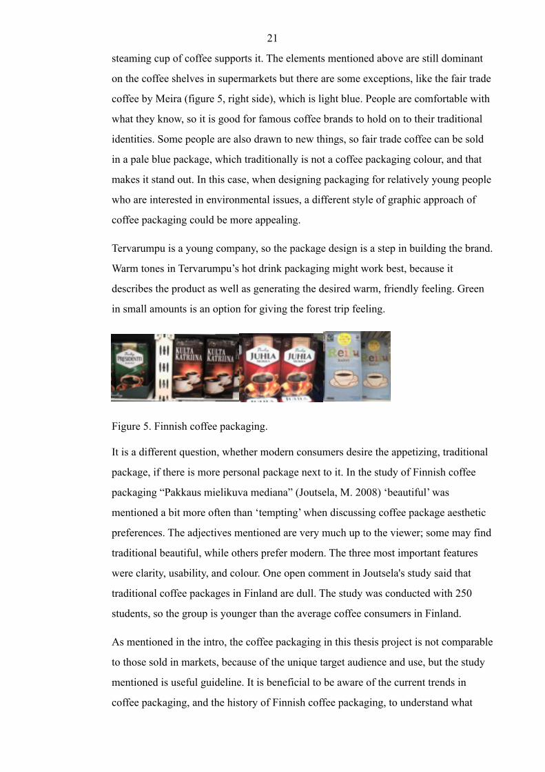
steaming cup of coffee supports it. The elements mentioned above are still dominant
on the coffee shelves in supermarkets but there are some exceptions, like the fair trade
coffee by Meira (figure 5, right side), which is light blue. People are comfortable with
what they know, so it is good for famous coffee brands to hold on to their traditional
identities. Some people are also drawn to new things, so fair trade coffee can be sold
in a pale blue package, which traditionally is not a coffee packaging colour, and that
makes it stand out. In this case, when designing packaging for relatively young people
who are interested in environmental issues, a different style of graphic approach of
coffee packaging could be more appealing.
Tervarumpu is a young company, so the package design is a step in building the brand.
Warm tones in Tervarumpu’s hot drink packaging might work best, because it
describes the product as well as generating the desired warm, friendly feeling. Green
in small amounts is an option for giving the forest trip feeling.
Figure 5. Finnish coffee packaging.
It is a different question, whether modern consumers desire the appetizing, traditional
package, if there is more personal package next to it. In the study of Finnish coffee
packaging “Pakkaus mielikuva mediana” (Joutsela, M. 2008) ‘beautiful’ was
mentioned a bit more often than ‘tempting’ when discussing coffee package aesthetic
preferences. The adjectives mentioned are very much up to the viewer; some may find
traditional beautiful, while others prefer modern. The three most important features
were clarity, usability, and colour. One open comment in Joutsela's study said that
traditional coffee packages in Finland are dull. The study was conducted with 250
students, so the group is younger than the average coffee consumers in Finland.
As mentioned in the intro, the coffee packaging in this thesis project is not comparable
to those sold in markets, because of the unique target audience and use, but the study
mentioned is useful guideline. It is beneficial to be aware of the current trends in
coffee packaging, and the history of Finnish coffee packaging, to understand what
21

consumers are used to in Finland, since Finns are the biggest customer group of
Tervarumpu.
3.4 Steps of package design process
The package design process may vary, depending on the designer(s), the product and
its manufacturing volume, the research available and needed, and timing restrictions.
The typical procedure is: discovery, creation, refinement, implementation, and
production (Dupuis, S. & Silva, J. 2008, 79).
Tervarumpu’s coffee package design project was executed as follows:
The discovery phase set the goals and objectives and the background research was
done. The creative brief, which includes all the information about packaging
requirements, customers (demographics, profile, target audience), timing, and
whatever relevant, was created based on discussions with the client. Material options,
manufacturing capabilities, and general background of the field and existing products
was studied.
The creation phase was the ideation and brainstorming step, when the moodboard
was designed and a list of keywords were developed. The first graphics for the
packaging concepts, which were more like a collection of ideas, were sketched. They
are called 'the pre-concepts' in the design process in the last chapter of this report. The
forms and structures are explored and the delivering of information is considered. One
could say that the brief is interpreted visually.
In the refinement phase, the pre-concepts were fine-tuned: developed into concepts.
As many concepts as possible were designed, a total of 15, and three of them were
chosen for progression. The three were improved again, and the final concept was
chosen.
In the implementation phase, the final concept and the content of texts is finalized and
applied to 3D-rendering and/or prototype. The packaging is ready for the last phase -
production.
22

3.5 Elements for Tervarumpu package design
The visual chart helped me to define all the features that had to be considered when
designing Tervarumpu’s package. They are: the elements of the brand, the special
requirements based on the product the package is for, and the legal and safety
requirements. The map of elements can be used for the package design of possible
future products. Below is the chart visualising the key elements of Tervarumpu
package design, and below that, the same chart adjusted for coffee package design.
Next chart on the next page.
23

Figure 6. Elements for Tervarumpu package design, and elements especially
for Tervarumpu coffee package design.
4 DESIGN PROCESS
The project started with making a creative brief, moodboard, and list of keywords. As
one will notice, the creative brief summarizes the information given in this thesis
report. Creative briefs are created to get the 'big picture' of design project. The
'Concepts' paragraph explains the design process, including designing the graphics
and choosing materials and technical solutions. The final selections are made by the
client, and discussions related to those decisions are briefly explained.
In the 'Concepts' paragraph, the italic texts are the designers/writers thoughts, which
affected the design.
4.1 Creative Brief
Project:
(fresh ground) coffee package design for Tervarumpu
24
1 Background / Overview:
Tervarumpu is launching its own coffee so that the visitors can purchase recently
ground coffee to take with them when they go hiking, or to buy the coffee at home.
The coffee is also available from the webshop. The product is unique and
experimental, since other nature-based tourism brands have not launched products
under their brand.
Tervarumpu offers services for hikers, climbers, international visitors, the retired, and
families so they are the user groups. Rather than dividing the potential coffee buyers
into age groups, the target audiencess’ common characteristic is the awareness of and
interest in ecological issues and sustainable development.
The bag would be most likely burned at the camp site, immediately after making
camp-fire coffee, or alternatively composted, recycled or re-used.
2 The objective, the purpose of the package
The whole experience of seeing the package, smelling the coffee and tasting it has to
be engaging. The idea of launching a product is to make the Tervarumpu brand more
recognizable, and to add value to the experience of visiting Tervarumpu. The package
has to enhance the Tervarumpu brand to make it touchable.
3 Target audience: who are we talking to
Potential coffee/tea buyers are people in different age groups with similar values in
regard to sustainability and ecological awareness. Most of them come from Helsinki
region, also from Lahti and Europe.
4 The core message
The main thing the packaging has to say is that the coffee is delicious and 'you want to
buy me'. The packaging has to affect emotions to be desirable. It should have a
positive mental link to Tervarumpu in the customers’ minds.
25

5 The supporting rational and emotional 'reasons to believe and buy'
It is delicious because it is freshly ground and served outdoors. Seeing the package
where they saw it the first time takes the person back to that calm, beautiful place in
the woods. It is coffee, but with the added extra of remembering the experiences and
other aspects associated with the Tervarumpu brand. Buying the product supports the
national park.
It looks and is delicious | It creates a good feeling | Buying it supports ecological
sustainability | The packaging is beautiful
4.2 Existing gift coffee packaging
A brief study of existing gift coffee packaging was made, because they fall in the same
category as Tervarumpu coffee: shape, material, and text content is similar, and their
sale is based on emotions. Usually, coffees packed in small paper bags are marketed to
a specific customer group or for a special occasion, and the retailer is not the producer.
The coffee packages below have a similar function as Tervarumpu coffee, they are not
bought because the buyer needs coffee, but because the packaging is appealing and
has emotional value. That factor enables the price per kilogram to be a lot higher than
average coffee sold in supermarkets, and often these products are bought as presents
(that is why they are called gift coffees in this report).
One of the three bags examined was lined with plastic, one with polylactic acid, and
one had no lining at all. The glue in the one with no lining had failed, and the bag had
torn open, so a thin paper bag without lining seems to be too weak, especially for
outdoor travelling circumstances. The best before date in that one was expired,
though. All of them were closed with metal wire, plastic, or paper closer. The packing
size varied from 100 to 200 grams.
Figure 7. Existing 'gift coffees'.
26

4.3 Moodboard and keywords
The moodboard was designed to inspire me at the beginning of the design project and
to keep the style in mind during it. It has pictures related to Tervarumpu and camp fire
coffee. The background consists of three patterns, jute, a treasure map, and wood. A
list of keywords is a common tool for focusing on core themes, ideas, and feelings in
relation to the brand.
Figure 8. Moodboard.
Figure 9. Keywords.
27

4.4 Designing concepts
The first thing to do was to pick the material and form. The material has to be
ecological, so the relevant options are cardboard, paper, and jute. Cardboard as a
material is diverse, and many concepts were developed, but the client did not consider
carton to be as eco-friendly as paper or jute so the materials were cut down to paper,
jute and after some research, linen. Having a fabric re-usable coffee bag was a really
nice idea, but after finding out about producers, and considering the costs, time
management, and possibilities to apply information on a fabric bag, the most
reasonable solution was to use unbleached paper. There is no reason to reinvent the
wheel, so, a paper bag, which is common in gift coffee packaging, was the strongest
suggestion for the form.
Figure 10. Sketches of form ideas.
It was obvious that as the material is unbleached, whether it was paper or cardboard,
the background color is light brown in all of the concepts. There are nature-friendlier
printing ink colors available, but brown paper/cardboard makes people think of
ecologicality so strongly that it might be best to keep it as it is. Besides, it follows the
principle; 'moderation in everything'. To keep the nice, natural feeling of fabric, one
idea was to close the bag with a jute string. Since the bag would have had to close
with something anyway it is better to use natural material rather than, for example,
plastic with metal wires (which is a common closing system for paper bag coffees).
28

The next step was to design pre-concepts for graphics. The possibilities are either to
print on the paper, print stickers, or both. The concepts were based on approximate
dimensions, since the final form, material, and size were not yet decided. Preliminary
sketches were drawn by hand and the work continued using by Adobe Illustrator. As
mentioned previously, the pre-concepts are more like a collection of ideas to show to
the commissioner.
The resource material of graphics, names, colors, and typefaces were designed and
collected together to show to the client for specifying which ideas works best. Names
such as Kuntun Aarre =Treasure of Kunttu (comes from a local story), Nuotiokahvi =
Camp Fire Coffee, Retkikahvi = Trip Coffee and Samo (made up name) were
suggested. These resources suggested themes such as “authentic Tervarumpu” which
imitates the existing Tervarumpu material seen in web pages and brochures. The
“Tales” idea has an old photo inspired by local story, and the story behind it printed on
the back. The “Moderation” idea kept the design as minimalistic as possible. Several
illustrations inspired by kuksa (wooden coffee mug), hot coffee, nature, working men
(which was common in the Tervarumpu area in the past) were introduced. One idea
was to have a specially designed rubber stamp to stamp the package. My personal
favorite was the illustration with the map of hiking paths in the area. This step helped
me to better understand what the client wanted.
Figure 11. First ideas: typefaces, colour palettes, and materials.
After meeting the client for the second time and presenting these ideas, the whole idea
of the project became clearer to me. Before this meeting, too much time and energy
was spent on finding out about the printers and bag suppliers, which turned out to be
unnecessary at this point, so attention was tuned to developing the visual content. As
the client said, “so long as the concepts are from this world, realistic, they will do”.
This second meeting was an eye-opening experience and opened the doors to a
29

freeform of creativity. Options other than a paper bag for material and form could be
considered again. Nothing final was decided at the second meeting, but new ideas
developed as a result.
’I believe that many modern consumers choose a prettier coffee package rather than a
tempting one. Let us consider that I belong to the target audience of this coffee
package. I would rather buy a package that I consider to be beautiful than one with
photo of steaming cup of coffee (if they differ). Most important with coffee packaging
is that it does not look cheap - that makes me think that the coffee tastes bad, so I do
not want to design a cheap looking package. The package should say 'quality'.
The coffee package this project aims to create will not be on the shelf with
competitors, but it should grab attention and ease the decision to buy. In fact, it
should leave no doubt whether to buy it or not. Since this is a ‘new product’, meaning
this coffee has not been sold before, I would try something exceptional, meaning
something that doesn’t resemble existing coffee packages that follow the same brand
identity year after year. In this case, the customers are relatively modern and aware so
there is a good chance that a modern, beautiful, ecological looking package would
sell better than a traditional one. With Tervarumpu coffee, the potential customers
most likely does not have an urgent need for coffee or tea, so the package should be so
appealing that it is bought anyway, an emotionally appealing package should seal the
deal. One valuable piece of information, which affects the selling rate, is that part of
the profit goes to the national park. In the ideal solution the modern, high-quality, and
delicious would meet.’
The concepts designed after second meeting had two different material solutions; non-
shiny, unbleached cardboard, and paper. The forms were; a cardboard case because it
is sturdy and durable, and a paper bag, because they are proven to work for coffee
packaging.
Three mock-ups were made from 170 g paper with different closing systems, one with
jute string, one that has a flap, and one with sticker closing. Below are photos of the
jute string and flap closing testing models. The flap cap model is developed from an
existing cardboard case, which did not keep ground coffee, but when an inner flap was
added, it kept coffee well.
30

Figure 12. Mock-ups of thick paper case.
15 concepts with different style categories were designed: traditional Finnish coffee
package style with a story-telling illustration, simplified design (mostly old style,
vintage), and a cartoonish illustration. The ideas were sketched by hand and then
created in Abode Photoshop and Illustrator. The whole process is illustrated in the
portfolio.
Some ideas for the concepts came from the subconscious, and some were
intentionally, rationally designed. The subconscious ideas just appear from the mind,
probably they are also inspired by something seen before, but it is hard to say where
and when. The map idea is one of these. In rational design, the ideas are based on
some existing ideas, which have worked before, and applied to this certain case, for
example, the idea about a hot kuksa of coffee with warm tones. Hot coffee cups are
seen in many coffee packages, but in this case, the cup is kuksa. In the end, most
concepts are a combination of the subconcious and logic.
Figure 13. Some of the concepts.
31

After meeting the client for the third time, the three potential designs to develop were
chosen; a simple design with stamp-looking label inspired by old coffee bean bags, a
cartoon-style illustrated fox concept, and one of the first ideas, a mysterious map
inspired concept. The graphics are visually introduced below followed by
explanations.
Figure 14. The Beanbag concept.
The concept inspired by old coffee bean bags is simple and convenient. Personally, I
find it beautiful and would keep it in sight at home as well. The graphics could be
printed on the bag or on a separate sticker which could be used to close the bag. A few
different versions of this concept were designed. In the picture are two alternatives
designs for the front stickers, with blocks for marking which product it contains.
Figure 15. The Map concept.
32

The map concept was one of my first ideas and was developed to have a mysterious
feeling with a story. You won't be able to say what the product is from the front. The
map was drawn by calligraphy pen, retouched in Adobe Photoshop and enhanced in
Illustrator. The poem adds the mystery; it tells about how the scent of the drink invites
you, the taste tells a story, your mind becomes peaceful and the drink is delicious.
Figure 16. The Fox concept.
The strength of the fox concept is that it has many elements; there is a character, the
hot drink in a kuksa cup, which tells of the product, and the story on the back. The
story is in the form of a poem which tells about a fox who smells the hot drink and
goes to it through a path in the forest, and then enjoys the hot drink. 'Coffee' or 'tea' is
not mentioned in the poem so it can be either. The illustration also tells a story itself.
This is the most emotionally appealing of the final concepts and it could be stretched
to other products using other animals of the forest. For example, squirrel trail mix
(nuts and dried fruit). This concept is my personal favourite.
The name was decided to be Samo. Originally the idea came from the word samooja,
which means a hiker, and has an old tone to it.
The form was decided to be a paper bag. The material was decided to be paper,
because it folds better when you put the bag in your backpack. The carton cases do not
fold so well, and that is a more important feature than sturdiness. The paper meets the
requirements: ecological, sufficiently durable so it does not tear in the backpack or
while camping, and it should keep the coffee’s aromas. The search for the best kind of
paper started. A PLA lined paper bag was found on a shop’s shelf, and more
33

information about the origins of the bag was requested from the manufacturer, and
more information about PLA as a material was searched on the web.
A new requirement the was that the bag should function for tea as well as coffee, so
the printed elements would be the same, but the sticker indicates what is inside. A
practical solution would be to use the sticker to seal the bag.
The sticker closing-system was considered to be the most practical and simple option.
It does not necessarily allow the bag to be re-closed, but the packaging portions are
small, designed for one hiking trip, so this solution will do. One of my research
questions is “How to find the balance between ecological, functional and visually
attractiveness?”. The closing system options found for the paper bag are jute string,
which is beautiful, but unpractical (hard to produce and possibly interferes with
pouring the ground coffee), a plastic or paper closer with metal wires, which is not
that ecological, and a sticker, which does not re-close well. Within these options, the
most suitable is the sticker, because it is most ecological, and re-closing is not
necessary in most Tervarumpu coffee use scenarios, because the amount of coffee the
package holds is designed for one trip.
Another new feature for me to design was the stamp which tells that part of the profit
goes to the Repovesi national park. It says that by buying the product you support the
National Park. The most visible text 'Pro Repovesi' is understood internationally, and
it is short and catchy. In the next page is the first and last design of the stamp.
Figure 17. Concept for the stamp telling that buying the product supports the
Repovesi National Park.
After the fourth meeting with the client, the map concept was chosen for the final
concept. The next step was to re-draw the map more carefully and add interesting
34

details, the sights in the area. The style stays the same, but the appearance needed
improving. The inspiration comes from historical maps, but some other, playful and
more modern elements would be nice, those together would make it my style. The
map idea was one of my first ideas, and one way to create it is that it would be printed
as one picture that goes around the paper bag, and if you tear it open (after use), it you
would have a map of Repovesi. Printing it on the whole bag may be expensive, which
leads to plan B, which is printing the map on a sticker, which covers the front of the
paper bag.
The client liked the fox concept as well, and we discussed that there are no right or
wrong ways to go. He made a really good point about the fox being used a lot in
different connections related to the Repovesi national park (there is a fox in the logo
of the national park and Tervarumpu). So it would be, if not confusing, a bit used
element in the area. Probably the fox design would have made nice packaging, but the
map concept is something new. The map concept fits well with the museum the
company is developing.
One of my colleagues in Kymenlaakson University of Applied Sciences asked about
the making of campfire coffee, and suggested some kind of measuring tool on the
packaging. The client agreed that it is a good point and he had thought about putting
the instructions in the package too.
35

4.5 The final concept
Figure 18. The final concept both sides.
The sticker closing is ecological, but not re-sealable. In this case, when the idea is to
pack the coffee in small portions (for one trip), and the packaging is likely to be
burned straight after, the ecological aspect is more important than re-closing. If the
product is bought home, and not used all at once, it can be closed with paper clip, hair
pin or any other similar item.
The material the bag is made from is kraft paper with PLA lining. It is relatively
ecological to produce, and can be burned. It keeps the coffee fresh long enough. The
bag as a form is common, and functional for coffee, because it is easy to pour the
coffee, and it fits well in the hand. The bag could also be short and wide, that would
look personal, but would not be as functional. The PLA lined bag could also be
composted after taking off the label stickers. The brown kraft paper bag is matt, and
has a softer feeling than coated paper. Brown colour, matt and soft feel creates the
sense that the product is environmentally friendly.
Just a paper bag without any lining might do as well for Tervarumpu coffee, but to
ensure the freshness of the coffee, if it is going to be stored for a longer period, I
36

decided the concept should have the PLA lining. The actual product that is produced
in the future might be packed in slightly different material.
The name, Samo, on the front does not tell about the product. It is not a real word, but
it indicates walking in the forest. The idea is that you have to pick up the product to
understand what it is. The poem, written in smaller letters, adds the mysterious
feeling, and gives an idea of the product. It creates a warm, harmonious feeling. It
talks about senses, and makes one want to sip a hot drink. The poem goes; scent
invites to hear, taste tells a story, your mind is peaceful, the hot drink tastes delicious.
In Finnish it rhymes.
The back sticker says whether it is coffee or tea. The commissioner suggested, that the
name is repeated there, so the bag can be placed either side up. The 'back' sticker
functions as a sealer, and there is a dashed line to show where to cut or tear. Usually,
when packages have dashed lines, there is a picture of scissors to tell that it is meant
to cut, but Tervarumpu packaging has a picture of a knife, since it is related to outdoor
travelling life. There are instructions for making campfire coffee. The legal
requirements are mentioned: ingredients, weight, producer, and that it is best when it
is used within one week of the purchasing date. The purchasing date could be applied
in the bottom of the bag.
The idea of putting a map of Repovesi national park on the package was one of my
first ideas, and since the beginning, there was exceptionally clear vision of it in my
mind. Subconsciously I probably knew the final concept at the start of the design
process, but it is important not to get stuck on one idea in order to develop new ones.
A map appears already in the moodboard. As mentioned, in the beginning the idea of a
map was more about the hiking paths, and the idea has progressed, and in the end, it
emphasises more the historical aspect. The idea evolved from informational to
aesthetic.
37

4.5.1 Technical execution of the graphics
A book of old maps of Finland and Scandinavia, by Van Mingroot, E. & Van Ermen,
E., was an inspiration in the final design.
The map illustration was drawn by hand and computer. An actual map of Repovesi
was used to get real lines for land and water areas. The lakes were drawn through
baking paper, and then onto sketching paper. The water areas were drawn with a
calligraphy pen imitating old maps. The drawing was imported to computer and cut
out with Adobe Photoshop. All the paths, the background and lake fillings were done
with Illustrator. The landmarks and other details were drawn by hand separately and
placed on the map. The background is light sand colour with details, which resembles
old paper or animal skin to create the feeling of old map.
Figure 19. Drawing the final concept.
The typography in the name, and the poem, is the same as Tervarumpu’s logo, because
it is related to the brand. The font is called Maiandra, and it is used in Tervarumpu’s
other marketing materials. It has the right feeling, organic, light and relaxed, but
reliable. The other font in the small legal texts is clear and neutral Helvetica Neue.
38

Figure 20. Etiquette stickers: back sticker for coffee or tea, and front sticker.
SAMO NOKIPANNUTEE
1. Sytytä nuotio ja kiehauta
litra vettä pannussa.
2. Lisää puoli pussia (n. 1 dl)
teenlehtiä.
3. Anna teen tekeytyä hetki,
mutta älä keitä.
4. Kaada kuksaan ja nauti!
Kuismantie 985 | 52920 VOIKOSKI
irtolehti tee 100 g | valmistuttaja: Tulikukko Oy
parasta nautittuna kuukauden kuluessa ostopäivästä
SAMO NOKIPANNUKAHVI
1. Sytytä nuotio ja kiehautalitra vettä pannussa.
2. Lisää puoli pussia (n. 1,5 dl) kahvinporoja.
3. Anna kahvin kuohahtaa parikertaa, mutta älä keitä.
4. Lisää loraus kylmää vettäja anna selkiytyä.
Kaada kuksaan ja nauti!
Kuismantie 985 | 52920 VOIKOSKIjauhettu kahvi 200 g | valmistuttaja: Tulikukko Oy
parasta nautittuna viikon kuluessa ostopäivästä
39

4.5.2 Reflection
The ecological PLA (polylactic acid) lined kraft paper bag as a form and material, and
the sticker closing, enhances the principles 'ecologically sustainable activity will
succeed' and 'moderation in everything'. The brown kraft paper gives a sturdy feeling,
which makes the product reliable and presents quality. It looks and is ecological. The
map, as a graphical element, enhances the principles “tales reminds us of our roots'
and “human is always part of nature and society”. The warm, harmonious tones add a
warm feeling and deliciousness. The map reinforces the desired image as a place with
a colourful history, and the feeling of a 'little village'. The combination of all the
features says: ’persistence creates strong and durable value’.
The design is timeless and applicable to other products. The package design process
does not necessarily end with production, so practical use and feedback from end-
users may give hints on how to improve the design.
5 CONCLUSION
Overall the project was fruitful, the client got the package design, and the designer
learned new things. The package designed does not expire within the near future.
The project showed that there may be many different package solutions which could
work. In this project, the client made the final decisions, but they were well justified.
Based on those decision and discussion with the client, the conclusion is that it is good
to be aware of elements used before in the field, and recent events that may aid the
decision making.
The project taught about working with a client and managing time. In the beginning I
did not understand how much time the actual production of a package requires, so the
first timetable was not realistic. At first I thought the product could be produced
within a couple of months. Luckily the commissioner/client is a specialist in design
orientated projects, so my misunderstanding did not cause bigger damage. If
something could be done differently, it would be planning the use of time, and
reserving more time for background research.
40

This project required many skills learned during my studies: project planning, graphic
design, branding, and design process execution.
For design thesis writers my advice is to define the project as specifically as possible,
write every idea and step of design process down, so it can be later on used as a basis
for the design process in the report, and be prepared for surprises. It is ideal to first
gather all the theoretical information possible, and after that start the design process.
The most challenging part of this design orientated thesis for me was producing text
and design solutions at the same time.
41

REFERENCES
DuPuis, S. & Silva, J. 2008. Package Design Workbook. Beverly, Massachusetts:
Rockport Publishers, Inc.
Europeanplasticsnews.com/subscriber/headlines2.html?cat=15&id=1235562910 2012.
[28.2.2012]
Fennis, B. M. & Stroebe, W. 2010. The psychology of Advertising. East Sussex:
Psychology Press.
Greenpaperproducts.com/biodegradable-compostable-faqs.aspx 2012. [28.2.2012]
Groceteria.com/about/a-quick-history-of-the-supermarket 1999-2012. [25.2.2012]
Helsingin Sanomat. Saavalainen, H. Luonnosta tuloa ja työpaikkoja. 29.2.2012.
Joutsela, M. 2008. Pakkaus mielikuva mediana – kahvipaketti tutkimuskohteena.
Lapland University. Available: http://taik.academia.edu.
Järvi-Kääriäinen, T. & Ollila, M. 2007. Toimiva Pakkaus. Helsinki:
Pakkausteknologia – PTR Oy.
Koivula, E. & Saastamoinen, O. 2005. Näkökulmia luontomatkailuun ja sen
tulevaisuuteen. University of Joensuu. Available: http://joypub.joensuu.fi/publications.
Liinamaa, K. Interview 13.2.2012. E-mail.
Minnesotainventors.org 2012 [16.3.2012]
Outdoors.fi
Packplus.com/paper-bags/pla-polylactic-acid-liner-paper-bags
Paine F. A. & Paine H. Y., 1992, A Handbook of Food Packaging. Glasgow: Blackie
Academic & Professional. Available at: http://books.google.fi [24.2.2012]
42

Suominen, T. Interview 8.2.2012. E-mail.
Sustainabletourismonline.com. 2010. Sustainable Tourism Online [8.2.2012]
Tervarumpu.fi
Tourism Western Australia. QuickStart Guide to TourismBusiness. 2006. Ecotourism
vs Nature Based Tourism.. Available: www.tourism.wa.gov.au. [5.3.2012]
Tyrisevä, S. Questionnaire 16.2.2012. E-mail. 2012. [28.2.2012]
Van Mingroot, E. & Van Ermen, E. 1988. Suomen ja Skandinavian vanhoja karttoja.
Helsinki: Tammi.
Vartti Kouvola. Vaurula, R. 2012. Matkailuyrittäjät punoivat verkkoa Hollannissa.
8.2.2012.
Vineyardpicnicstogo.com 2008 [16.3.2012]
43

APPENDIX
Appendix 1 Photography and illustrations information
All photography, charts and illustrations by Elsi Lammila.
Tervarumpu and Repovesi logos from Aptual Ltd.
Image of Tervarumpu webpage is a screenshot taken in January 2012.
44