kylieleuthold
DESCRIPTION
Typography 1 Video ResponsesTRANSCRIPT

GRAPHIC DESIGNERS
A Compilation
By Kylie Leuthold
:
table of contents
3
5
9
11
15
17
21
Doyald Young
Helvetica
Hillman Curtis
Marian Bantjes
Margo Chase
Art & Copy
Kit Hinrichs
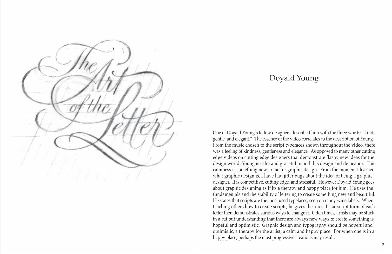
One of Doyald Young’s fellow designers described him with the three words: “kind, gentle, and elegant.” The essence of the video correlates to the description of Young. From the music chosen to the script typefaces shown throughout the video, there was a feeling of kindness, gentleness and elegance. As opposed to many other cutting edge videos on cutting edge designers that demonstrate flashy new ideas for the design world, Young is calm and graceful in both his design and demeanor. This calmness is something new to me for graphic design. From the moment I learned what graphic design is, I have had jitter bugs about the idea of being a graphic designer. It is competitive, cutting edge, and stressful. However Doyald Young goes about graphic designing as if its a therapy and happy place for him. He uses the fundamentals and the stability of lettering to create something new and beautiful. He states that scripts are the most used typefaces, seen on many wine labels. When teaching others how to create scripts, he gives the most basic script form of each letter then demonstrates various ways to change it. Often times, artists may be stuck in a rut but understanding that there are always new ways to create something is hopeful and optimistic. Graphic design and typography should be hopeful and optimistic, a therapy for the artist, a calm and happy place. For when one is in a happy place, perhaps the most progressive creations may result.
Doyald Young
3

HELVETICAHelvetica is air. Helvetica is gravity. Helvetica is timeless. Basically, Helvetica is the superman of typefaces. It achieves perfection. It cannot be made better. Most typefaces give a mood. Helvetica does not. Helvetica allows the words to give the mood.
Helvetica is boring. Helvetica is over used. Helve-tica is old. It is safe. It is everywhere. It is bland. It allows no emotion. On the pH scale it is a 7. Neutral. It has no spark. People don’t know how to react to the typeface Helvetica because it is so easy on the eyes. There is something special about it though. It has been a superstar among typefaces for over 50 years and still is young. It has yet to age. I find it interesting that the Swiss, known for remain-ing neutral in war times, created the most neutral
typeface design. It began in a small Switzerland town and spread around the world. The design-ers focused on the negative space especially in the centers of letters to steady the glyphs. Views of Helvetica vary from one designer to the next. This is an important realization to make while being in the design community. Everyone is subject to their opinion and there will always be a negative reaction. Design is subjective. My favorite part of the film was the clips shown of Helvetica in public areas. It is everywhere, and before viewing the film I had never noticed. From street signs to branding to posters, it is a major typeface of our lives. These clips encour-age me to take a closer look at typefaces (and designs) used in my surroundings.
5

ARE YOU A WINNER?www.areyouawinner.com

Milton Glaser talks on the relationships formed because of art. �is relationship can be between artist and viewer, artist and artist, or viewer and viewer. Between artist and viewer, he states how wonderful it is to see someone change because of what you've said or something you've done. Mostly artists are credited for speaking to someone or changing that person. Designers are usually credited for making something look nice. However as Glaser points out, one can be changed by a designer too, and I �nd this to be a great motivation. Between viewer and viewer, Glaser discusses the beauty of art bringing people together based on a common interest. He gives importance to this by saying a person is less likely to kill another person if they have something in common. While this may be an exaggeration, it can be true. Anything can bond people together, and art does this in a special way. People may like a sculpture for di�erent reasons but the fact that it speaks to each of them makes them similar in a unique way.
Lastly, Glaser weighs importance on sustaining your interest in your work. If you disappear from your work it loses a special quality, because if the artist cannot relate to their own work then how can a viewer relate to it. �is is an important reminder for designers. Much design work is commissioned and it is easy to get overwhelmed with pleasing the client and to lose yourself. It is necessary to give your perspective and let the job be a collaboration to prevent losing yourself. Pentagram rea�rmed and expanded on Glaser's thoughts. Solving problems should be done by �nding solutions in the product, not creating solutions. By this they mean be creative and �nd solutions. When you create solutions, they may be disconnected. Finding a solution within some sort of parameters allows for a more spectacular result. It may create great work and Michael Barou says that a designer is happy when doing great work. �is is true, so don't settle for less. Make it great. Find the greatness.
Paula Scher didn't lose herself when she created the LOUD posters for �e Public �eater. In fact, they were so loud that people responded with noise and make it a style, emulating this style in other posters. She worked with her instincts, not losing herself. She found the solution in the theater itself, visualizing the noise. From this came something great. She followed similar strate-gies to that of Glaser and the remaining Pentagramers. By using typography to translate your message, you kill two birds with one stone and �nd a harmonious relationship between the words and message on a poster or piece of design.
Stefan Sagmeister makes two noteworthy remarks in his portion of the video. First he says, "trying to look good limits my life." With failure comes success. You can't win them all but who says losing is bad? Looking bad creates a margin for growth. From that success can come excel-lence. �is is something I have a hard time with. I o�en get embarrassed by work that I'm not happy with even if its a rough sketch or preliminary thought. I must work on this because even the best designers and artists fail. �e second piece of knowledge is "worrying doesn't help." �is is also very important to realize. Worrying makes a bad situation worse, so instead of worrying, �nd a solution. It is more bene�cial and end in better results than ever expected.
Social and Political subjects are set for design. �is is a thought from James Victor. He believes that design is at its fullest potential when used for political issues. �ese issues are relatable to people and portray a message. �ey are important topics that can o�en be presented in a boring and confusing way. A contemporary designer can display a message to a mass audience and sway their opinions with a design, and thats the beauty of design.
AN ARTIST SERIES
WITHHILLMAN CURTIS 9

Marian Bantjes is a Graphic Artist on a mission to make design personal. I really enjoyed this film on Bantjes finding her to be inspiring for the college student—battling between art and design and reluctant to be in the design business—that I am. Being in the industry, she has found that its easy to lose yourself when meeting the clients' needs by particular dead-lines. She became in touch with herself and her personal aesthetics and found a way to be a successful Graphic Artist (though she is also inclusive to being labeled an Illustra-tor and Designer).
Many Graphic Designers (particularly those from Pentagram) have many great things to say about her work.
She is very detail oriented, spending much time meticulously rendering her designs, but when one sees her work it is immediately obvious that she's passionate about what she is creating. I can relate to this because, much of my work is very detail centered. I strive to be as masterful in the meticulous craft of Bantjes one day. Her process varies, as do her materials, however she prefers to first draw designs before rendering them in Illustrator. I enjoy that she values handmade work. It is a skill that must not be forgotten.
As for her work, she finds importance in the personality of her work. She believes that design must catch interest and if the
viewer feels so inclined to stop and notice something then it will likely stick with him or her because that person had to work for it. She states that she makes a living doing what she loves. I find this to be pivotal in everyone's life. Many people wouldn't love the lifestyle of Bantjes, however she loves what she's doing, so in my opinion, she is living life right.
One project in particular stood out to me. She does everything for love. This is why she began making Valen-tine's Day card to send to people, not only to benefit her business by getting her name out to big designers, but also because she loves Valentine's Day. Her Valentine's are creative, detailed and nontraditional much like the rest of her work. One year she created cards out of used Christmas cards by laser cutting a heart design on them. They are beautiful and I strive to take on similar projects in my future. The world often lacks creativity and design shown in a fun and uplifting way. It is important to make people happy with small things…such as Valentine's Day cards, because you never know when a little spirt of joy is exactly what someone needs.
I'm excited to hear Marian Bantjes' story. I started to feel in a rut think-ing that business might rule my work in the graphic design field, but after learning about Bantjes' experience I realize that its possible to keep yourself in your design with business being a smaller detail.
bantjesmarian
11

Coming soonWe Check IDs

Design can change people's lives. Margo Chase is a designer out of L.A. who lives by this belief. With over 25 years of experience in the industry, Chase is loaded with advise for upcoming designers.
A designer's workspace is key for creating an open and creative environment. I will always agree with Chase on this, in that my working/living space is comfortable and inspirational. It must also reflect the work created within it. Clients should under-stand the general design aspects of the firm when they walk into a meeting. Book are also important in a workspace. Though the internet has become a primary source of research, Chase highlights the importance of a strong library collection ranging from magazines to old typography books.
With the strong emergence of computer generated graphics, typography has shifted away from hand lettering. Chase gives a demo on hand lettering for she finds importance in it. Her quill of preference is a crow quill with various sized nibs. She creates her own quills out of bamboo. Its very interesting to learn how drastically the industry of graphic design has changed over a short amount of time with the progression of the computer and thus digital art and design. Chase is a gem of wisdom in that she designed through this evolution of design and points out the pros and cons of both handwork and digital work.
I found the most interesting part of Chase's video to be her creation of style guides for clients. A style guide defines the meaning of a brand and dissects that brand. Chase and her designers created a style guide for Starbucks. First, they created a diagram defining the colors, shapes, typography, and icons associated with Starbucks. Next they explore the style with various themes including cut and paste, nature, ink and print, etc. This guide was given to Starbucks to use for their liking. Chase was merely a was a helpful starting point for the company.
“Making things pretty is limiting.
Perfection keeps the challenge.”
Margo ChaseChase Design Group
15

"THE FRIGHTENING AND MOST DIFFICULT THING ABOUT BEING WHAT SOMEONE CALLS A CREATIVE PERSON IS THAT YOU HAVE ABSOLUTELY NO IDEA WHERE ANY OF YOUR THOUGHTS COME FROM, REALLY, AND ESPECIALLY THAT YOU DON'T HAVE ANY IDEA WHERE THEY ARE GOING TO COME FROM TOMORROW."
Art & Copy is a film meant to bring attention to the advertising industry. While 65% of Americans feel bombarded with advertise-ments, what many people may overlook is the creativity that goes into advertising. “I think creativity can solve anything,” states an advertiser featured on the film. Within advertising, creativity can make cars faster or chips tastier. While many people are in the industry, only few are really creative in their work.
The film opens with a family that operates billboards. This is interesting because it is a major part of advertising that has been around longer than I realized. One ad that stuck out was the BMW Beetle ad that uses minimalism and wit to sell a car. With only two words: think small, and one image: a beetle car that occupies a small part of the page, the ad convinces the viewer to “think small” in respect to buying a small car. Most of the ad is negative space, but that nega-tive space is vital in giving the viewer room to think.
The segment on Tommy Hilfiger’s early career sticks out as the best learning point as an early designer. By comparing himself to the big names of his industry, he brought attention to his label while putting pressure on his design to own up the comparison. His advertiser pushed for being bold in his ideas and tried new ideas to bring attention to his design. His work was successful because people talked. It is important for designers to step out of their comfort zone in order to grow. Experimenting is fun. Put a bit of boldness into everything you do!
17

join the flashback.Flahsbacks Cafe
211 W University Ave

KIT HINRICHSloves faces. He finds that people are instinctively attracted to and engaged by other people’s faces. We enjoy looking at others. His love for faces does not stop there. Hinrichs also loves typefaces. Similarly to human faces, typefaces have personality and emotion.
Hinrichs seeks out ways to use faces in his work. When you look at a newstand, it is loaded with faces. We see faces everyday. Hinrichs goal as a designer is to find a fresh and different way to use the human face in his design. The way in which the viewer interprets a face is what makes it something new. In one project, he depicts Charles Richers face as a Richter scale. A work is a success when the design channels both the image and the topic. A face is a great mean for communication. It is relatable and interesting to all viewers, however often overdone. Thus its vital to find a new way to use the face.
Typography is everywhere too. Alongside a face on the cover of a magazine is typogra-phy. It doesn’t stop there. Its on money, billboards, clothes, tattoos. Each typeface has emotional baggage. Typography on the one dollar bill has financial connotation. Typog-raphy surrounding Charlize Theron on Instyle Magazine is friendly and simple, not to take away from her stunning features.
Typefaces and human faces work well together, Hinrichs found in his retrospective design. Combining his simple face with a simple typeface, he created an icon. With each feature made of letter forms, he designed what he believes in—faces.
23
