kenya health service delivery indicator survey 2018 report
TRANSCRIPT

REPUBLIC OF KENYA
.
Kenya Health Service Delivery Indicator
Survey 2018 Report
. May 2019
. GHNDR and GEDDR
.
Report No:

ii

iii
Standard Disclaimer:
.
This volume is a product of the International Bank for Reconstruction and Development/ The World Bank and Government of Kenya. The findings, interpretations, and conclusions expressed in this paper do not necessarily reflect the views of the Executive Directors of The World Bank or the governments they represent. The World Bank does not guarantee the accuracy of the data included in this work. The boundaries, colors, denominations, and other information shown on any map in this work do not imply any judgment on the part of The World Bank and Government of Kenya concerning the legal status of any territory or the endorsement or acceptance of such boundaries.
.
Copyright Statement:
.
The material in this publication is copyrighted. Copying and/or transmitting portions or all of this work without permission may be a violation of applicable laws. The International Bank for Reconstruction and Development/ The World Bank encourages dissemination of its work and will normally grant permission to reproduce portions of the work promptly.
For permission to photocopy or reprint any part of this work, please send a request with complete information to the Copyright Clearance Center, Inc., 222 Rosewood Drive, Danvers, MA 01923, USA, telephone 978-750-8400, fax 978-750-4470, http://www.copyright.com/ or to the Ministry of Health, Kenya, PO Box 48994 00100 Nairobi.
All other queries on rights and licenses, including subsidiary rights, should be addressed to the Office of the Publisher, The World Bank, 1818 H Street NW, Washington, DC 20433, USA, fax 202-522-2422, e-mail [email protected].
.

iv
TABLE OF CONTENTS
Table of Contents .................................................................................................................................................................... iv
List of Boxes .............................................................................................................................................................................. vi
List of Figures ........................................................................................................................................................................... vi
List of Tables ............................................................................................................................................................................. vi
ACRONYMS .............................................................................................................................................................................. viii
ACKNOWLEDGEMENTS ....................................................................................................................................................... ix
EXECUTIVE SUMMARY .......................................................................................................................................................... x
What service providers know? ........................................................................................................................................... x
What service providers do? ................................................................................................................................................ xi
What service providers have to work with? ............................................................................................................... xi
What does this mean for Kenya? ...................................................................................................................................... xi
Table 1: Kenya SDI At-A-Glance ...................................................................................................................................... xiii
Table 2. SDI Country Comparisons ................................................................................................................................ xiv
I. INTRODUCTION ............................................................................................................................................................ 15
Organization of Health Sector in Kenya ....................................................................................................................... 16
II. METHODOLOGY AND IMPLEMENTATION........................................................................................................ 19
A. Implementation ....................................................................................................................................................... 19
B. SDI survey instruments ........................................................................................................................................ 19
C. Sampling ..................................................................................................................................................................... 20
III. RESULTS ..................................................................................................................................................................... 25
D. Delivering Health Services .................................................................................................................................. 25
E. Caseload ...................................................................................................................................................................... 31
F. Absence Rate ............................................................................................................................................................. 33
G. Diagnostic Accuracy ............................................................................................................................................... 38
H. Adherence to Clinical Guidelines ...................................................................................................................... 42
I. Management of Maternal and Neonatal Complications .......................................................................... 46
J. Drugs and Commodities Availability .............................................................................................................. 48
K. Availability of Vaccines Related Equipment and Supplies ..................................................................... 50
L. Equipment Availability ......................................................................................................................................... 55
M. Infrastructure Availability ................................................................................................................................... 59
N. Waste Management ................................................................................................................................................ 62
O. Governance in Health Service Delivery .......................................................................................................... 63

v
P. Health Workforce Background .......................................................................................................................... 66
Q. Family Planning Exit Interviews ....................................................................................................................... 68
R. Poverty and health service delivery in Kenya ............................................................................................. 73
S. Comparing Kenya to other SDI countries in the region .......................................................................... 74
T. Comparing both SDI Surveys in Kenya........................................................................................................... 75
V. What Does This Mean For Kenya? ........................................................................................................................ 77
VI. REFERENCES ............................................................................................................................................................ 79
VII. ANNEXES .................................................................................................................................................................... 81
Annex A. Sampling Strategy .............................................................................................................................................. 81
U. Sampling Frame for the 2018 Kenya SDI ...................................................................................................... 81
V. Sample Size and Sample allocation for the 2018 Kenya SDI ................................................................. 84
W. Sampling Health Facilities and Health Workers ......................................................................................... 84
X. Sampling Family Planning Clients for Exit Interviews ............................................................................ 85
Annex B. Definition of Indicators .................................................................................................................................... 87
Annex C. Additional Results .............................................................................................................................................. 89
Annex D. County level results maps ............................................................................................................................ 100
Annex E. Additional County Level Results ............................................................................................................... 107

vi
List of Boxes Box 1: Why focus on service Delivery? ......................................................................................................................... 15 Box 2: The Service Delivery Indicators (SDI) Program.......................................................................................... 18 Box 3: Analytical underpinnings ..................................................................................................................................... 22
List of Figures Figure 1: Levels of service delivery in Kenya ............................................................................................................. 17 Figure 3: Average number of health workers per facility by county ............................................................... 27 Figure 4: Availability of elements that comprise BEmONC and CEmONC ..................................................... 30 Figure 5: Outpatient caseload by county ..................................................................................................................... 32 Figure 6: Caseload by facility size ................................................................................................................................... 33 Figure 7. Absence rate by county .................................................................................................................................... 35 Figure 8: Reasons for absence by health worker cadre ......................................................................................... 36 Figure 9: Reasons for absence by location and sector ........................................................................................... 37 Figure 10 . Diagnostic accuracy by county .................................................................................................................. 40 Figure 11: Diagnostic accuracy and correct treatment by clinical case .......................................................... 42 Figure 12 . Adherence to clinical guidelines by county ......................................................................................... 44 Figure 13: Management of maternal and neonatal complications by county ............................................. 47 Figure 14: Availability of all priority drugs by county ........................................................................................... 49 Figure 15: Availability of individual vaccines by facility type ............................................................................ 52 Figure 16: Availability of equipment and vaccines-related supplies by facility type ................................ 53 Figure 17: Equipment indicator by county ................................................................................................................. 56 Figure 18: Infrastructure indicator by county ........................................................................................................... 60 Figure 19: Sources of electricity by facility type ....................................................................................................... 61 Figure 20: Means by which facilities communicate with their community .................................................. 64 Figure 21: Means by which facilities communicate with their community on EMHS ............................... 65 Figure 22: Average age among various health workers ........................................................................................ 66 Figure 23: Gender distribution among various health workers ........................................................................ 67 Figure 24: Education levels among various health workers ............................................................................... 67 Figure 25: Key socio-economic features among FP clients .................................................................................. 68 Figure 30: Poverty headcount against equipment availability ........................................................................... 73 Figure 31: Map of health facilities visited by SDI in Kenya .................................................................................. 86 Figure 32: Diagnostic accuracy by questions asked: Severe dehydration ..................................................... 93 Figure 33: Diagnostic accuracy by questions asked: Pneumonia ...................................................................... 93 Figure 34: Diagnostic accuracy by questions asked: Diabetes Mellitus .......................................................... 94 Figure 35: Diagnostic accuracy by questions asked: Pulmonary Tuberculosis ........................................... 94 Figure 36: Correct treatment actions: Post-partum Hemorrhage ..................................................................... 95 Figure 37: Correct treatment actions: Neonatal Asphyxia ................................................................................... 95 Figure 38: Availability of individual tracer drugs by type of facility ................................................................ 98
List of Tables Table 1: Kenya SDI At-A-Glance ...................................................................................................................................... xiii Table 2. SDI Country Comparisons ................................................................................................................................ xiv Table 3: SDI Health survey instrument description ................................................................................................ 19

vii
Table 5: Survey Sample ....................................................................................................................................................... 24 Table 6. Sample for indicators of absence and competence ................................................................................ 24 Table 7. Hours and days of service delivery ............................................................................................................... 25 Table 8. Distribution of health cadres by ownership and location ................................................................... 26 Table 9: Facilities where women give birth ............................................................................................................... 28 Table 10. Availability of basic and comprehensive emergency obstetric and neonatal care (full package) .................................................................................................................................................................................... 28 Table 11. Availability of basic and comprehensive emergency obstetric and neonatal care (package without assisted vaginal delivery) ................................................................................................................................. 29 Table 12. Outpatient caseload .......................................................................................................................................... 31 Table 13. Absence rate by cadre and facility type .................................................................................................... 34 Table 14. Diagnostic accuracy by cadre ....................................................................................................................... 39 Table 15. Number of cases correctly diagnosed ....................................................................................................... 41 Table 16. Adherence to clinical guidelines by health provider type ................................................................ 43 Table 17: Availability of Standard Treatment Guidelines .................................................................................... 45 Table 18. Management of maternal and neonatal complications by cadre ................................................... 46 Table 19. Availability of priority drugs by facility type ......................................................................................... 48 Table 20: Availability of family planning commodities ......................................................................................... 50 Table 21: Availability of vaccines by facility type .................................................................................................... 50 Table 22: Availability of vaccines by facility type across counties ................................................................... 51 Table 23: Vaccines storage - Refrigerators with temperature between 2oC and 8oC .............................. 53 Table 24: Vaccines storage - Refrigerators with temperature between 2oC and 8oC (by county) ..... 54 Table 25: Availability of basic equipment by facility type, ownership and location ................................. 55 Table 26: Availability of equipment items in the equipment indicator .......................................................... 57 Table 27: Communication equipment availability ................................................................................................... 57 Table 28: Access to various forms of communication ............................................................................................ 58 Table 29: Availability of ambulance services ............................................................................................................. 58 Table 30: Availability of infrastructure by facility type ......................................................................................... 59 Table 31: Availability of specific types of infrastructure ...................................................................................... 61 Table 32: Total proportion of facilities carrying out safe health care waste disposal .............................. 62 Table 33: Facilities that had a work plan for the current fiscal year ............................................................... 63 Table 34: Receipt of financial management instruments by public providers ............................................ 63 Table 35: Facilities that submitted a financial report for previous quarter ................................................. 64 Table 36: Facilities that share financial information with community ........................................................... 64 Table 37: Facilities that share EMHS delivery information with community .............................................. 65 Table 38: Facilities that received supervision visit ................................................................................................. 65 Table 39: Facilities with governing committees ....................................................................................................... 66 Table 40: Kenya in comparison with other countries in health service delivery ....................................... 74 Table 41: Comparisons between Kenya SDI Survey rounds ................................................................................ 76 Table 42: Distribution of facilities by Type................................................................................................................. 81 Table 43: Distribution by Ownership ............................................................................................................................ 83 Table 44: Indicator definition and method of calculation .................................................................................... 87 Table 45: Distribution of health personnel by facility type, ownership and location ............................... 89 Table 46: Distribution of health personnel by gender and mean age .............................................................. 89 Table 47: Average age of health personnel by county ........................................................................................... 89 Table 48: Determinants of Absenteeism: regression results .............................................................................. 91 Table 49: Determinants of diagnostic accuracy: regression results ................................................................ 92 Table 50: Danger signs asked for sick child vignette by cadre type ................................................................. 96 Table 51: Drug availability for the full SDI list .......................................................................................................... 97 Table 52: Drug availability for tracer drugs ............................................................................................................... 98
viii
ACRONYMS
AERC African Economic Research Consortium AfDB African Development Bank BEmONC Basic Emergency Obstetric and Neonatal Care CEmONC Comprehensive Emergency Obstetric and Neonatal Care CHMT County Health Management Team CoK Constitution of Kenya CWIQ Core Welfare Indicators Questionnaire DTP Diphtheria-Pertussis-Tetanus FP Family Planning Hep-B Hepatitis B HFA Health Facility Assessment Hib Haemophilus influenzae type b HW Health Workers IMCI Integrated Management of Childhood Illnesses IMNCI Integrated Management of Newborn and Childhood Illnesses IUD Intra-uterine Devices KEHP Kenya Essential Health Package KEML Kenya Essential Medicine List KHSSP Kenya Health Sector Strategic Plan KIHBS Kenya Integrated Household Budget Survey KNBS Kenya National Bureau of Statistics LSMS Living Standard Measurement Survey MoH Ministry of Health NCPD National Council for Population and Development NHIF National Hospital Insurance Fund PCS Patient Case Simulation PETS Public Expenditure Tracking Survey QSDS Quantitative Service Delivery Survey SAS Staff Absence Survey SDI Service Delivery Indicators STG Standard Treatment Guidelines UNICEF United Nations Children’s Fund WMS Welfare Monitoring Survey WHO World Health Organization

ix
ACKNOWLEDGEMENTS
This Kenya Health SDI report has been prepared in consultation with the Government of Kenya under the leadership of Ministry of Health (MOH) with technical guidance of Waly Wane (SDI Program Manager and co-TTL), Jane Chuma (Senior Health Economist and TTL for Kenya Health portfolio and SDI report co-TTL), Paolo Belli (Program Leader AFCE2), Antony Francis Mveyange (Consultant), Ivo Njosa (ICT Consultant). The authors of the report are Ashis Kumar Das (Consultant) and Miriam W Oiro Omollo (Consultant). The team also benefited from the leadership of Dr. Josephine Kibaru Mbae, Director General NCPD, and analytical inputs of the National Council for Population and Development (NCPD) staff including: Peter Nyakwara, Catherine Ndei, Francis Kundu, Daniel Fundi Mureithi, Samuel Lubanga, Bernard Kiprotich, and James Macharia. The Ministry of Health through Dr. Abel Nyakiongora and Dr. Peter Mbugua also assisted in providing policy interpretations of the findings, with Dr. Valeria Makori as the Project Coordinator. The team appreciates the collaboration with the Council of Governors, who facilitated the link with the counties, Kenya National Bureau of Statistics (KNBS) who provided technical assistance in sampling of Health Facilities through John Kibet Bore. Appreciation is extended to, Senior Task Leaders who provided technical assistance to field teams, Supervisors for data collection and enumerators. We also acknowledge ICT support teams who helped in addressing ICT challenges during data collection. Gratitude also goes to Counties health personnel who responded to the interviews. The team is grateful for the insights of several peer reviewers, including Ian Forde (Senior Health Specialist), Jeremy Veillard (Senior Health Specialist), and Laura Di Giorgio (Economist/Young Professional), and Felipe Jaramillo (Country Director for Kenya, Rwanda and Eritrea), provided overall guidance. The team thanks the SDI management team Roberta Gatti (Chief Economist HD VP), Ciro Avitabile (Senior Economist) and Magnus Lindelow (Practice Manager, GHN01) for their support. The views expressed in this publication are those of the authors. The findings, interpretations and conclusion expressed herein do not necessarily reflect the views of the World Bank Group, its Board of Directors or the countries they represent.
Finally, the team gratefully acknowledges the financial support from the World Bank, and William and Flora Hewlett Foundation, and the United Nations Population Fund (UNFFPA).

x
EXECUTIVE SUMMARY
The Service Delivery Indicators (SDI) provides a set of key indicators that benchmark service delivery performance in the health and education sectors in Sub-Saharan Africa. The overarching objective of the SDI is to ascertain the quality of service delivery in basic health services and primary education. This would in turn enable governments and service providers alike to identify gaps and bottlenecks, as well as track progress over time, and across countries. The broad availability, high public awareness, and a persistent focus on the indicators that SDI provide, will help mobilize policymakers, citizens, service providers, donors and other stakeholders to take the necessary steps to improve the quality of service delivery, and thereby improve development outcomes. The SDI Health survey team visited a sample of 3,094 health facilities across Kenya between March and July 2018. The 2018 Kenya SDI is the largest to date. The sample was composed of 1,781 public facilities and 1,313 private facilities. The survey team observed 13,026 workers for absenteeism and assessed 4,430 health workers for competence using patient case simulation. The data collected are representative of the 47 counties, of facility location i.e. urban/rural areas, facility ownership i.e. public/private, and level of facility i.e. first level hospital/health center/dispensary and clinic. The health workers were broken down into three categories: (i) doctors (specialist and general medical doctors), (ii) clinical officers, and (iii) nurses. This report presents the results from the implementation of the second SDI survey in the health sector in Kenya. A unique feature of the SDI surveys is that it examines the production of health services at the frontline from the perspective of beneficiaries accessing services. The production of health services requires three dimensions of service delivery: (i) the availability of key inputs such as drugs, equipment and infrastructure; (ii) providers who are skilled; and (iii) providers who exert the necessary effort in applying their knowledge and skills. Successful service delivery requires that all these elements be present in the same facility at the same time. While many data sources provide information on the average availability of these elements across the health sector, the SDI surveys allow for the assessment of how these elements come together to produce quality health services in the same facility simultaneously.
What service providers know?
• Health providers in Kenya could correctly diagnose about two-thirds (67.5 percent) of the four tracer conditions.1
• Diagnostic accuracy rate varied across case conditions, ranging from 97 percent accuracy for pulmonary tuberculosis to 32 percent for severe dehydration.
• Doctors and clinical officers correctly diagnosed about three-fourths (75.9 and 74.1 percent respectively) of all the tracer conditions. Nurses correctly diagnosed only 60.1 percent.
• Higher level facilities (first level hospitals) correctly diagnosed more of the tracer conditions
with a score of 75.7 percent. This was followed by health centers (68.3 percent) and
dispensaries (64.3 percent).
• Adherence to clinical guidelines in the management of the four tracer conditions was at 43.5 percent. The lowest was in dispensaries and clinics (41.2 percent), followed by health centers (43.6 percent) and hospitals (49.7 percent).
1 Tracer conditions include two child conditions (i) severe dehydration caused by diarrhea, and (ii) pneumonia, and two adult conditions (i) pulmonary tuberculosis and (ii) diabetes mellitus (type II) the first a communicable disease and the second a chronic condition. A third child condition malaria with anemia, which was done in the 2012 Kenya SDI and is included in all SDIs has been omitted.

xi
• Doctors adhered to more of the clinical guidelines (51.5 percent) followed by clinical officers (47.6 percent) and nurses (38.4 percent).
What service providers do?
• Outpatient caseload was high with the average health worker seeing on average 13.3 patients per day.
• Public facilities had a higher daily caseload at 17.5 patients per provider per day than private (8.4).
• Absence rate was 52.8 percent during an unannounced visit with public sector absenteeism at 56.7 percent compared to 47.5 percent in the private sector.
• Doctors had the highest absenteeism rate of 60.7 percent followed by nurses (54.5 percent) and clinical officers (49.5 percent).
What service providers have to work with?
• 54.1 percent of priority drugs were available in Kenyan facilities. Rural facilities had a slightly higher availability of priority drugs (55.3 percent) compared to urban facilities (51.6 percent).
• Priority drugs for mothers were less available than drugs for children with average scores of 34.6 percent and 62.3 percent respectively.
• About 70 percent of health facilities provide immunization services, 62.5 percent stock vaccines, of which 89.1 percent have a refrigerator in working condition. 62.3 percent of all vaccines were available in those health facilities.
• Half (50.9 percent) of health facilities in Kenya met the minimum medical equipment requirements. First level hospitals were typically better endowed in equipment (78.7 percent), followed by health centers (66.8 percent), and then dispensaries and clinics (46.1 percent). The county of Meru had the best score (73 percent) and Marsabit scored lowest at 8 percent.
• 74.6 percent of health facilities had at least one of the three forms of communication equipment (phone, radio or computer). Cell phones paid by the facility were the most widely available piece of equipment, followed by computers and personal cell phones. There was a large gap in the availability of computers in rural and urban facilities. Only 31.7 percent of rural facilities had computers compared to 66.4 percent of urban facilities.
• 72.9 percent of the health facilities had access to all three types of basic infrastructure such as toilets, clean water and access to electricity. There were large differences between urban (83.7 percent) and rural (67.8 percent) as well as private (82.1 percent) and public (64.9 percent) facilities. Kiambu county scored highest (94 percent) and Tana River scored lowest (27 percent) on the availability of all three types of infrastructure.
What does this mean for Kenya? Kenya’s progress in achieving key maternal, infant, and child health targets has been slow as set out in key national policy documents. For Kenya to make rapid progress towards Universal Health Coverage, a health system needs to have skilled human resources, minimum inputs such as drugs, commodities and infrastructure, financing, leadership and governance, and health information systems. Comparing with the previous round of SDI Survey, it would seem that almost all indicators show a decline except infrastructure. While the reasons for decline need to be investigated further using additional research, and at least some of the difference may be driven by methodological improvements between the two survey rounds, recent evidence suggests that devolution of health

xii
sector to counties could be a possible reason.2-3 After the devolution, there was a concerted effort by the county governments on improving the facility infrastructure. This is substantiated by the increase in the infrastructure indicator in this survey. Availability of skilled human resources for health (HRH) remains a major bottleneck to improving quality of care. In addition to increasing the volume of health workers to address the shortage of providers, improvements in management, supervision and training are critical to ensure quality health service delivery by a skilled HRH base. The survey found that provider knowledge and abilities are very low to deliver quality services. Training (both pre- and in-service) needs to be better focused with the main objective of capacitating health workers to accurately diagnose and treat the main causes of illness as well as to have the skills to refer complicated cases up to higher levels of care. There should also be a concerted emphasis on adhering to the national guidelines as far as managing critical health conditions is concerned. High staff absenteeism is a barrier to achieving health goals. Apart from having the requisite number of skilled staff in place, the staff should be available in the facilities to provide services. During the unannounced visit, more than half of clinical staff were absent. In fact, most of these absences were approved. The county governments should ensure establishing systems for tracking staff availability during facility operation hours to reduce absenteeism. Secondly, rational approval of staff leaves can be undertaken by the facility heads or county health managers so as not to interfere with efficient service delivery. Inputs are important and the lack of medical equipment, drugs and vaccines in facilities are concerning. Basic equipment as mandated by the Government, is not available at half of health facilities. This is alarming given the fact that most of the population accesses care at a public primary health facility. Only about half of the essential drugs are available. Drug availability, particularly for mothers is quite poor. Similarly, only less than two-thirds of the necessary vaccines are available. Equitable access to quality health services remains a key challenge. While there has been some progress in Kenya’s health sector, more can be done to improve service delivery. Like many countries, Kenya faces an inequitable geographic distribution of service quality. Competent health workers and infrastructure availability are better in urban areas.
Client satisfaction is high, but clients still pay for family planning services. A fifth of the family
planning clients report of paying for services that are supposed to be provided free of cost including
public facilities. Strong advocacy and verification measures have to be taken by the counties to ensure
that clients specifically from lower socio-economic profiles are not deterred by costs of services.
2 Kimathi, L. (2017). 3 Mugo et al. (2018).

xiii
Table 1: Kenya SDI At-A-Glance
Kenya Public Private Urban Rural
First level
hospital Health center
Dispensary and clinic
Caseload (per provider per day)
13.3 17.5 8.4 10.5 14.6 11.3 12.4 13.6
Absence from facility (% providers)
52.8 56.7 47.5 55.7 49.7 60.4 52.1 44.5
Diagnostic accuracy (% clinical cases)
67.5 68.5 65.9 70.2 65.9 75.7 68.3 64.3
Adherence to clinical guidelines (% clinical cases)
43.5 46.2 41.8 43.6 43.2 49.7 43.6 41.2
Management of maternal and neonatal complications (% clinical cases)
34.5 36.0 32.0 35.3 34.0 40.3 35.0 32.3
Drug availability (% drugs)
54.1 55.5 52.6 51.6 55.3 75.8 59.6 51.7
Equipment availability (% facilities)
50.9 42.4 60.6 61.7 45.8 78.7 66.8 46.1
Infrastructure Availability (% facilities)
72.9 64.9 82.1 83.7 67.8 89.5 82.2 70.1

Table 2. SDI Country Comparisons4
Countries’
average
Kenya (2018)
Sierra Leone (2018)
Madagascar (2016)
Mozambique (2015)
Niger
(2015)
Tanzania (2014)
Nigeria (2013)
Togo (2013)
Uganda (2013)
Kenya (2012)
Caseload (per provider per day)
7.9 13.3 10.0 5.2 17.4 9.8 7.3 5.2 5.2 6.0 9.0
Absence from facility (% providers)
29.1 52.8 31.2 27.4 23.9 33.1 14.3 31.7 37.6 46.7 27.5
Diagnostic accuracy (% clinical cases)
48 67.5 44.5 30 58.3 31.5 60.2 39.6 48.5 58.1 72.2
Adherence to clinical guidelines (% clinical guidelines)
33.8 43.5 30.2 31 37.4 17.5 43.8 31.9 35.6 41.4 43.7
Management of maternal and neonatal complications (% clinical guidelines)
22.7 34.5 31.2 21.9 29.9 12 30.4 19.8 26 19.3 44.6
Drug availability (% drugs)
53.2 54.1 56.0 48 42.7 50.4 60.3 49.2 49.2 47.2 67.2
Equipment availability (% facilities)
58.5 50.9 56.2 62 79.5 35.9 83.5 21.7 92.6 21.9 76.5
Infrastructure availability (% facilities)
37.6 72.9 47.7 28.4 34 13.3 50 23.8 39.2 63.5 56.9
Note: There are some methodological sampling differences for SDI surveys prior to 2013 that might make simple comparisons less straightforward (see Annex E for more details)
4 https://www.sdindicators.org/
15
I. INTRODUCTION
The Government of Kenya (GoK) is
committed to achieving universal health
coverage (UHC) by 2022. UHC is a
situation where all people receive
quality services when needed
(promotive, preventive, curative and
rehabilitative health services), without
being exposed to financial hardship. The
Constitution of Kenya (2010) provides
the foundation and legal framework for
UHC since it ensures a rights-based
approach to health services delivery in
the country. It stipulates that every
Kenyan has a right to the highest
standard of attainable health and that no
person shall be denied emergency
medical services.
The Constitution further delineates the
functions of the National and County
Governments in the provision of health
services to the nation. Kenya’s economic
blue print “Kenya Vision 2030: A
globally competitive and Prosperous
Kenya”, equally reinforces this
constitutional requirement since it seeks
to improve the livelihoods of Kenyans through the provision of an efficient and high-quality health
care system with best standard. The management of the health care system and funds are devolved
to the county level and there is a deliberate shift from curative to preventive health care.5 Kenya’s
Health Policy 2013-2030 in response to the Constitution of Kenya and Kenya Vision 2030 formulates
policies, principles and orientations that facilitate the development of comprehensive health
investments, plans, and service provision within the devolved healthcare system.
Despite this progress in ensuring that health system is devolved in order to ensure equity in
distribution of health services and interventions, the health outcomes are yet to converge to meet the
set policy targets, for example, the country has a life expectancy at birth of males and females of 64
and 69 years respectively6 against a national policy target of 79 years. Poor health services affect
5 Kenya Vision 2030: A globally competitive and prosperous Kenya. 6 https://www.who.int/countries/ken/en/
Box 1: Why focus on service Delivery?
Health service delivery—unlike other services such as
water and sanitation or housing in which service delivery
models are technology or infrastructure intensive—is
fundamentally different. Specifically, health service
delivery has human resource intensive service delivery
models. SDI therefore focuses on frontline service delivery
and provider behavior because of the unique aspects of
service delivery in the sector:
• The labor intensive and transaction intensive nature of the
health sector’s service delivery model.
• The highly discretionary nature of work effort determining
whether a nurse presents for work 24/7, often in tough
working conditions.
• Nurses and doctors are intrinsically motivated, but that
institutional incentives attenuate or undermine this
motivation.
• The asymmetry of information—between policymakers
and providers, as well as between communities and
providers—is particularly acute in the health sector.
• A second order result of how planning takes place is the
dominance of the “WHAT” rather than the “HOW” of
service delivery.

16
economic growth as well as the ability of households to increase their incomes. Insufficient access to
contraception, along with lower levels of female education, job opportunities, and empowerment,
results in high fertility, which leads to a vicious cycle, as it strains public service delivery, constrains
women’s time and empowerment, and limits the resources available to invest in individual children.
Labor lost to poor health lowers farm productivity, particularly in labor-intensive agricultural
activities. Health shocks also limit households’ ability to save and invest, including in income-
generating assets. In addition, Kenya has extremely high out-of-pocket expenditures. This burden
falls disproportionately on the poor, as out-of-pocket health payments are regressive, and the poor
are more likely to forgo health care.
The SDI provides information on service delivery and provider behavior, which lays a foundation for
monitoring capacity of the health system to provide quality services to Kenyans under the UHC. The
foundation for delivering on health and healthcare goals depends on whether service delivery
fundamentals are in place: Are health providers knowledgeable and skilled? Are they present at
work? Are basic inputs available such as equipment and drugs?
The SDI survey is essentially a return to the basics by shining light on these fundamentals. Service
delivery literature points towards the importance of functional health facilities, and more generally,
the quality of service delivery.7 Nurses and doctors are an invaluable resource in determining the
quality of health services. The literature has not always drawn links between systems investments
and the performance of providers, arguably the ultimate test of the effectiveness of investments in
systems.8 The literature is, however, clear that conditional on providers being appropriately skilled
and exerting the necessary effort, increased resource flows for health can have beneficial health and
education outcomes.9
Organization of Health Sector in Kenya
The Kenya Health Sector Strategic Plan (KHSSP II 2005-2010) introduced the Kenya essential
package for health (KEPH), which is defined to have six levels of curative and preventative services
as shown in Figure 1. Community health services ensure that the communities are involved in the
health development issues. Primary care services are made up of dispensaries, health centers and
nursing homes both public and private facilities. The primary referral services include county
referral hospitals, while level five and six facilities are secondary and national referral hospitals
respectively. Health care promotion and prevention services are delivered from level 1 to 3 facilities;
levels 4 to 6 provide both preventive and curative services.
7 Spence and Lewis (2009). 8 Swanson et al. (2012). 9 Spence and Lewis (2009).

17
Figure 1: Levels of service delivery in Kenya
Source: KHSSP 2013-2017
The health sector in Kenya is one of the devolved functions according to fourth schedule of the
Constitution of Kenya 2010. The National government is responsible for enacting health policies and
managing the National referral health facilities. It is also responsible for building the capacity and
providing technical assistance to counties. County governments are accountable for: (a) county
health facilities and pharmacies; (b) ambulance services; (c) promotion of primary health care; (d)
licensing and control of undertakings that sell food to the public; (e) veterinary services (excluding
regulation of the Profession); (f) cemeteries, funeral parlors and crematoria; and (g) refuse removal,
refuse dumps and solid waste disposal. The delineation of the roles of the National and County
Government in the health sector therefore makes it possible to determine who is responsible for
devising policy recommendations and taking action to remedy issues found by the study. It is of note
that SDI covered facilities in levels 2 to 4.
On health financing, the National Government through the National Treasury disburses funds
through the Division of Revenue Bill (DORB) to each county. The County Governments receive funds
from the National Government in the form of: equitable share, conditional grants and grant from
development partners. The counties then develop their own annual budgets and appropriations bills
using the laid down procedures. It is from the annual budgets that counties finance the health sectors.
County Governments also generate own source revenue (OSR) as stipulated by Article 209(3) of the
Constitution of Kenya (2010), which allows counties to impose property tax, entertainment taxes and
any other tax authorized by an Act of Parliament. The Public Finance Management (PFM) Act 2012
provides the guidelines for management of county revenues.
•Tetiary Referral Facilities LEVEL 6
•Secondary referral facilitiesLEVEL 5
•Primary referral facilties (County Referal Hospitals)
LEVEL 4
•Health CentresLEVEL 3
•DispensariesLEVEL 2
•CommunitiesLEVEL 1

18
Box 2: The Service Delivery Indicators (SDI) Program
A significant share of public health spending should contribute to good health outcomes. Understanding what takes place at these frontline service provision centers is the starting point in establishing where the relationship between public expenditure and outcomes is weak within the service delivery chain. Knowing whether spending is translating into inputs that health providers have to work with (e.g. basic equipment in health facilities), or how much work effort is exerted by health providers (e.g. how likely are they to come to work), and their competency would reveal the weak links in the service delivery chain. Reliable and complete information on these measures is lacking, in general. To date, there is no robust, standardized set of indicators to measure the quality of services as experienced by the citizen in Africa. Existing indicators tend to be fragmented and focus either on final outcomes or inputs, rather than on the underlying systems that help generate the outcomes or make use of the inputs. In fact, no set of indicators is available for measuring constraints associated with service delivery and the behavior of frontline providers, both of which have a direct impact on the quality of services that citizens are able to access. Without consistent and accurate information on the quality of services, it is difficult for citizens or politicians (the principal) to assess how service providers (the agent) are performing and to take corrective action. The SDI provides a set of metrics to benchmark the performance of health clinics in Africa. The indicators can be used to track progress within and across countries over time, and aim to enhance active monitoring of service delivery to increase public accountability and good governance. Ultimately, the goal of this effort is to help policymakers, citizens, service providers, donors, and other stakeholders enhance the quality of services and improve development outcomes. The perspective adopted by the indicators is that of citizens accessing a service. The indicators can thus be viewed as a service delivery report card on health care. However, instead of using citizens’ perceptions to assess performance, the indicators assemble objective and quantitative information from a survey of frontline service delivery units, using modules from the Public Expenditure Tracking Survey (PETS), Quantitative Service Delivery Survey (QSDS), and Staff Absence Survey (SAS). The literature points to the importance of the functioning of health facilities and more generally, the quality of service delivery. The service delivery literature however is clear that, conditional on providers being appropriately skilled and exerting the necessary effort, increased resource flows for health can indeed have beneficial education outcomes. The SDI initiative is a partnership of the World Bank, the African Economic Research Consortium (AERC), and the African Development Bank to develop and institutionalize the collection of a set of indicators that would gauge the quality of service delivery within and across countries and over time. The ultimate goal is to sharply increase accountability for service delivery across Africa, by offering important advocacy tools for citizens, governments, and donors alike; to work toward the end goal of achieving rapid improvements in the responsiveness and effectiveness of service delivery. More information on the SDI survey instruments and data, and more generally on the SDI initiative can be found at: www.SDIndicators.org and www.worldbank.org/sdi, or by contacting [email protected].

19
II. METHODOLOGY AND IMPLEMENTATION
A. Implementation
The SDI survey interviewed 3,094 heath facilities across Kenya between March 2018 and July 2018.
A total of 13,026 workers were observed for absenteeism, 4,430 health workers were assessed with
clinical cases and 3,171 family planning clients were interviewed for their satisfaction on services.
There were 161 first level hospitals, 484 health centers and 2,449 dispensaries and clinics. Within
the sample, there were 1,781 public facilities and 1,313 private facilities across Kenya. Further, there
were 2,274 rural and 820 urban facilities. The data collected are also representative of the counties,
urban and rural areas strata.
B. SDI survey instruments
SDI uses a set of instruments to collect data and compute indicators. The instrument consists of 4
modules each of which captures specific information and is directed to the person(s) in the facility
who is best informed and able to provide the relevant information. In Kenya, an additional module to
assess the family planning clients’ satisfaction and cost of services was included.
Table 3: SDI Health survey instrument description
Module of Instrument
Module Title
Main respondent
Description
Module 1 Facility information
Head of facility Information about the facility’s: functioning, infrastructure, equipment, materials, supplies, and tracer drugs.
Module 2A and 2B
Health Worker Roster
2A: Head of facility 2B: Selected medical staff
2A: Administered to head of facility to obtain a list of all health workers. 2B: Administered to randomly selected health workers to measure absence rates and to collect information about worker characteristics.
Module 3 Clinical knowledge assessment
Medical staff Administered to medical personnel who regularly treat patients to evaluate their competency in the diagnosis and treatment of routine pathologies. Done using vignettes.
Module 4 Facility finances and governance
Head of facility and accountant (where relevant)
Collection of information about revenues, expenditures, management, governance, and drug provision for the facility.
Module 5 Family planning (FP) client exit
FP Client Client satisfaction with FP services. Costs incurred in accessing the FP services.

20
Module 1 captures general information about the facility such as the availability of equipment or
infrastructure. The module is also the vehicle to check for the availability of commodities, check
whether the cold chain is in place and working, among others. An important aspect to note is that the
information collected is verified by the enumerator. For instance, the infant scale must be seen and
tested, a specific drug must be seen and the expiration date verified. On the cold chain the team does
not rely on the temperature shown on the fridge instead they carry their own thermometer to
measure the fridge temperature. Module 4 on the facility’s financing, management, and governance
follows the same principles.
To measure absence, the SDI uses an internationally accepted protocol of an unannounced second
visit. During the first visit, which is announced, the team records the full staff roster for the health
workers and the number of non-health workers in the facility. From the roster a maximum of 10
people are randomly sampled for follow up. Three days or more later the team visits the facility again
but this time they come unannounced. The team then ascertains the whereabouts of the 10 people
which were selected earlier. The team does not rely on the report of the head of facility or any other
staff instead each person in the list of 10 must be seen in the facility to record them as present. The
current activity of each staff is also documented.
Module 3 provides the information on provider’s knowledge which is measured through Patient Case
Simulations (PCS, also called “vignettes”). With this methodology, one of the surveyors acts as a case
study patient with some specific symptoms. The clinician who is informed of the simulation is asked
to proceed as if the enumerator is a real patient, while another enumerator acts as an observer. High
quality performance in outpatient consultations entails at least the following: (i) to systematically
arrive at a correct diagnosis (or preliminary diagnosis); (ii) to provide an appropriate treatment (or
referral); and (iii) to reveal important information to the patient about which actions to take (e.g.,
how to take the medicine, what to do if the patient does not get better, etc.). The methodology
presents several advantages: (a) all clinicians are presented with the same case study patients, thus
making it easier to compare performance across clinicians; (b) the method is quick to implement and
does not require waiting for patients with particular conditions; (c) it is not intrusive and eschews
ethical issues that arise with real patients. The method also has its drawbacks. The most important
one is that the situation is a not a real one and that this may bias the results.10
C. Sampling
The overall objective of the SDI is to produce accurate and representative indicators at the national,
urban and rural levels. Indicators are representative at the county level for this Kenya health SDI and
10 Comparisons of Patient Case Simulations with Direct Observation of real patients in low income contexts have revealed that performance scores typically are higher with Patient Case Simulations, but that the correlation between the two measures is substantial (e.g., Das, Hammer, and Leonard, 2008). Some authors have interpreted the score of Patient Case Simulations as a measure of competence or ability rather than actual performance (Das and Hammer, 2005, Leonard et al., 2007). There is reason to believe that Patient Case Simulations measure a blend of competence and actual performance, and that the blend depends on the actual design and framing of the tool. The Patient Case Simulations used in SDI were framed to resemble actual performance as closely as possible. Nevertheless, one should be aware of a potential upward bias of the absolute performance levels. As a measure of relative performance, though, Patient Case Simulations have considerable merit.

21
for all 47 counties. The main units of analysis are health facilities as well as health workers. The SDI
also aims to produce accurate information on providers at varying levels in the pyramid i.e. hospital,
health center and dispensaries as well as cadre (doctors, clinical officers and nurses), ownership
(public versus private) and location status (urban versus rural).
The sampling for Kenya SDI was undertaken by Kenya National Bureau of Statistics (KNBS). The
sampling frame used for the Kenya health SDI was the list of health facilities from the Master Health
Facility List. The original sample frame contained 9,654 health facilities.
A multi-stage clustered sampling strategy is adopted. The first stage cluster selection is carried out
independently within each stratum. The primary cluster considered is the county which is therefore
the primary sampling unit (PSU). All 47 counties have been sampled. Health facilities were randomly
drawn with equal probability within the level of care. At the third stage, health workers were
selected.

22
Box 3: Analytical underpinnings
Service delivery outcomes are determined by the relationships of accountability between policymakers, service providers and citizens.a Human development outcomes are the result of the interaction between various actors in the multi‐step service delivery system, and depend on the characteristics and behavior of individuals and households. The delivery of quality healthcare is contingent foremost on what happens in health facilities, where a combination of several basic elements have to be present in order for quality services to be accessible and produced at the frontline. This in turn depends on the overall service delivery system, and these institutions and governance structures provide incentives for the service providers to perform. (see Figure 2) Figure 2: Relationships of accountability: citizens, services providers and policymakers
Source: a. World Development Report, 2004.
Service Delivery Production Function Consider a service delivery production function, f, which maps physical inputs, x, the effort put in by the service provider, e, as well as his/her type (or knowledge), θ, to deliver quality services into individual level outcomes, y. The effort variable, e, could be thought of as multidimensional and, thus, include effort (broadly defined) of other actors in the service delivery system. We can think of this type as the characteristic (knowledge) of the individuals who are selected for a specific task. Of course, as noted above, outcomes of this production process are not just affected by the service delivery unit, but also by the actions and behaviors of households, which we denote by ε. We can therefore write: y = f(x,e,θ) +ε To assess the quality of services provided, one should ideally measure f(x,e,θ). Of course, it is notoriously difficult to measure all the arguments that enter the production, and would involve a huge data collection effort. A more feasible approach is, therefore, to focus instead on proxies of the arguments which, to a first‐order approximation, have the largest effects. Indicator Categories and the Selection Criteria There are a host of data sets available in health. To a large extent, these data sets measure inputs and outcomes/outputs in the service delivery process.
23
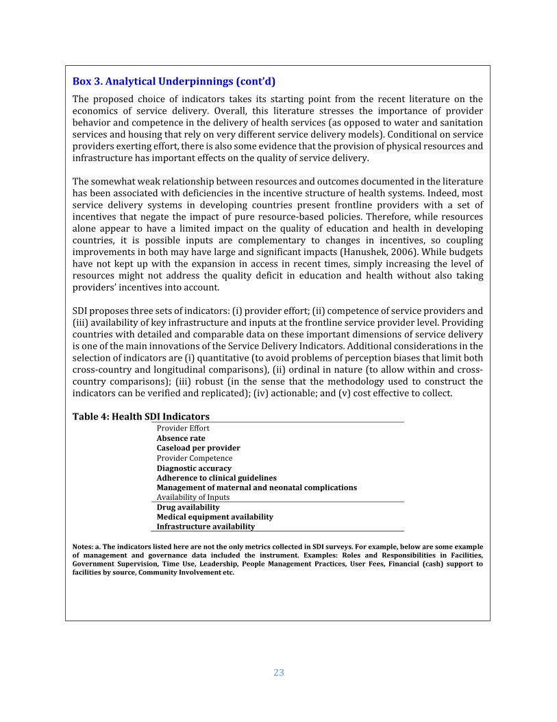
Box 3. Analytical Underpinnings (cont’d)
The proposed choice of indicators takes its starting point from the recent literature on the economics of service delivery. Overall, this literature stresses the importance of provider behavior and competence in the delivery of health services (as opposed to water and sanitation services and housing that rely on very different service delivery models). Conditional on service providers exerting effort, there is also some evidence that the provision of physical resources and infrastructure has important effects on the quality of service delivery. The somewhat weak relationship between resources and outcomes documented in the literature has been associated with deficiencies in the incentive structure of health systems. Indeed, most service delivery systems in developing countries present frontline providers with a set of incentives that negate the impact of pure resource‐based policies. Therefore, while resources alone appear to have a limited impact on the quality of education and health in developing countries, it is possible inputs are complementary to changes in incentives, so coupling improvements in both may have large and significant impacts (Hanushek, 2006). While budgets have not kept up with the expansion in access in recent times, simply increasing the level of resources might not address the quality deficit in education and health without also taking providers’ incentives into account. SDI proposes three sets of indicators: (i) provider effort; (ii) competence of service providers and (iii) availability of key infrastructure and inputs at the frontline service provider level. Providing countries with detailed and comparable data on these important dimensions of service delivery is one of the main innovations of the Service Delivery Indicators. Additional considerations in the selection of indicators are (i) quantitative (to avoid problems of perception biases that limit both cross‐country and longitudinal comparisons), (ii) ordinal in nature (to allow within and cross‐country comparisons); (iii) robust (in the sense that the methodology used to construct the indicators can be verified and replicated); (iv) actionable; and (v) cost effective to collect. Table 4: Health SDI Indicators
Provider Effort Absence rate Caseload per provider Provider Competence Diagnostic accuracy Adherence to clinical guidelines Management of maternal and neonatal complications Availability of Inputs Drug availability Medical equipment availability Infrastructure availability
Notes: a. The indicators listed here are not the only metrics collected in SDI surveys. For example, below are some example of management and governance data included the instrument. Examples: Roles and Responsibilities in Facilities, Government Supervision, Time Use, Leadership, People Management Practices, User Fees, Financial (cash) support to facilities by source, Community Involvement etc.

24
Table 5: Survey Sample
Total Share of total sample
(Unweighted, %) Share of total population
(Weighted, %)
Facilities 3,094 100 100
First level hospitals 161 5.2 5.1
Health centers 484 15.6 15.4
Dispensaries and clinics 2,449 79.2 79.5
Ownership
Public 1,781 57.6 53.1
Private 1,313 42.4 46.9
Location
Nairobi 96 3.1 7.4
Urban 820 26.5 32.4
Rural 2,274 73.5 67.6
Healthcare workers 13,026 100 100
Doctors 319 2.5 11.8
Clinical officers 2,008 15.4 14.3
Nurses 6,054 46.5 43.9 Others 4,645 35.6 30.0
Table 6. Sample for indicators of absence and competence
Cadre
Absence ratea Competence indicatorsb
Total Percentc Percentd
Total Percentc Percentd
(%) (%) (%) (%)
Doctors 319 2.5 11.8 193 4.4 7.3
Clinical officers 2,008 15.4 14.3 1,599 36.0 44.5
Nurses 6,054 46.5 43.9 2,638 59.6 48.2
Others 4,645 35.6 30.0 - - -
Total 13,026 100 100 4,430 100 100
Source: Author’s calculations using Kenya 2018 SDI data Notes: a. Absence rate is calculated using all health workers (i.e. whether clinician or not, e.g. pharmacist, laboratory technician). b. The competence indicators (e.g. diagnostic accuracy, adherence to clinical guidelines and management of maternal and neonatal complications) are measured using only those health workers who interact with patients or users). Note also that the provider must be present during the first visit to be interviewed for competence. c. Unweighted share i.e. share of the sample d. Weighted share i.e. share of population (all facilities in the country or all health workers)

25
III. RESULTS
D. Delivering Health Services
The number of days health facilities offer services and the number of hours per day they operate are
amongst the most basic indicators for measuring health service delivery. In Kenya, health facilities
are open on average 6 days per week (Table 7). Urban (6.4 days) and private (6.4 days) facilities
operate for significantly more number of days in a week than rural (5.8 days) and public (5.6 days)
facilities respectively. The number of hours facilities are open for outpatient consultations is critical
in understanding accessibility to health services. On average, facilities are open for 12.9 hours per
day. Similar to the number of days, private (14.1 hours) and urban (14.9 hours) facilities remain open
for significantly longer hours than public (11.8 hours) and rural (12 hours) facilities respectively.
Table 7. Hours and days of service delivery
Kenya
Nairobi Urban Rural
Percent difference
(%) Public Private
Percent difference
(%) Number of days per week facility was open (days)
All facilities 6.0 6.4 6.4 5.8 -11.6*** 5.6 6.4 -14.3***
First level hospitals
7.0 6.7 7.0 7.0 . 7.0 7.0 .
Health centers 6.6 7.0 6.8 6.5 -4.7*** 6.4 6.7 -4.5***
Dispensaries and clinics
5.8 6.7 6.3 5.5 -13.4*** 5.3 6.3 -19.1***
Hours outpatient consultations offered per day (hours)
All facilities 12.9 15.7 14.9 12.0 -24.2*** 11.8 14.1 -19.5***
First level hospitals
23.4 19.6 23.4 23.4 . 23.4 23.4
Health centers 18.7 24.0 20.0 18.1 -10.5*** 17.6 20.3 -15.3***
Dispensaries and clinics
11.1 19.6 13.0 10.2 -27.5*** 9.6 12.7 -32.3***
Source: Author’s calculations using Kenya 2018 SDI data Note: Level of significance: *** p<0.01, ** p<0.05, * p<0.1. The percent difference is between public and private; urban and rural facilities.
Kenya’s health workers are distributed inequitably with a majority of the high-skilled workers
concentrated in urban areas, while the rural areas remain seriously underserved. Table 8 shows the
distribution of health workers by ownership and location. Facilities on average were staffed 8.5
health workers.11 Urban facilities have almost over twice more staff (13.7 providers) compared to
rural facilities (6 providers). On average, public facilities are slightly larger (9.1) of private facilities
(7.7) in terms of number of staff.
Nairobi has 32 percent of all the country’s doctors with about 10 percent population, whereas Nyanza
with 14 percent population has only 9 percent of doctors.12 Overall, Kenya which has 13.8 skilled
11 Administrative or other support personnel are not included. 12 Kenya Health Workforce Report: The Status of Healthcare Professionals in Kenya, 2015

26
healthcare workers per 10,000 inhabitants is far below the WHO recommended minimum of 44.5 per
10,000 to meet the SDGs by 2030.
Approximately 90 percent of health personnel are either nurses (69.1 percent) or clinical officers (21
percent), and more than half of the health workers (58.1 percent) work in the public sector. Table 8
below shows that a disproportionate number of doctors (83.9 percent) work in urban areas whereas
the majority of the population (64 percent) and 40 percent of the poor, live in rural areas.13 Less than
half of (47.3 percent) the country’s health workforce and less than a fifth of all doctors (16.1 percent)
serve the rural population. This distribution between urban and rural population is likely to reinforce
service delivery and income inequalities.
Table 8. Distribution of health cadres by ownership and location
Kenya Nairobi Public Private Urban Rural
All health staff (#) 8.5 17.3 9.1 7.7 13.7 6.0 Doctors (%) 9.9 39.1 37.4 62.6 83.9 16.1 Clinical officers (%) 21.0 12.4 52.5 47.5 52.1 47.9 Nurses (%) 69.1 12.2 62.8 37.2 48.4 51.6 Total 100 14.9 58.1 41.9 52.7 47.3
Source: Author’s calculations using Kenya 2018 SDI data The average number of health workers per facility in Nairobi is 17.3 whereas the national estimate
is around half of Nairobi (8.5). About 15 percent of all health workers are in Nairobi but close to two-
fifths of the country’s doctors (39.1 percent) serve in the capital which is home to only 10 percent of
the population with 4.5 percent of the country’s poor population.14 It is also worth noting the Kenya
health private sector is quite large as 41.9 percent of health workers provide services in private
facilities. A large majority of Kenyan doctors (62.6 percent) serve in the private sector.
Figure 3 shows the average health worker number per facility by county. Urbanized counties such as
Nairobi (17.3), Kisumu (12.8) and Mombasa (12.8) possess the maximum number of health workers
per facility. On the lower end, there are counties such as Samburu (3.5), Kitui (4.2), and Isiolo (4.7)
with health workers much lower than the national average. As it can be seen from Table A5 in the
Appendix, the health worker numbers are largely driven by the hospitals in urban areas with very
high averages. For instance, the average number of health workers in the hospitals in Nairobi City
and Mombasa are 188 and 137 respectively, whereas Samburu (27) and Kitui (24) have relatively
low numbers for hospitals.
13 Kenya Integrated Household Budget Survey (2017) 14 Source: Calculations from Kenya Statistical abstract 2018 (KNBS) “Basic report on wellbeing in Kenya”

27
Figure 3: Average number of health workers per facility by county
Source: Author’s calculations using Kenya 2018 SDI data
3.5
4.2
4.7
4.9
5.0
5.4
5.6
5.8
5.9
6.1
6.2
6.2
6.3
6.3
6.4
6.6
6.9
7.0
7.1
7.3
7.4
7.4
7.7
7.7
7.7
7.7
7.7
7.7
7.8
8.3
8.3
8.5
8.6
8.9
8.9
9.4
9.6
9.7
9.9
10.0
10.0
10.2
11.1
12.5
12.8
12.8
17.3
Samburu
Kitui
Isiolo
West Pokot
Meru
Tana River
Kericho
Nyeri
Bomet
Marsabit
Makueni
Baringo
Kakamega
Nyandarua
Embu
Turkana
Elgeyo Marakwet
Homa Bay
Bungoma
Migori
Machakos
Garissa
Narok
Nakuru
Kilifi
Kirinyaga
Nandi
Trans Nzoia
Nyamira
Busia
Tharaka-Nithi
Lamu
Kajiado
Kwale
Taita Taveta
Mandera
Laikipia
Vihiga
Wajir
Kiambu
Murang’a
Siaya
Kisii
Uasin Gishu
Mombasa
Kisumu
Nairobi City
28
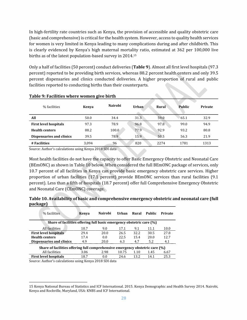
In high-fertility rate countries such as Kenya, the provision of accessible and quality obstetric care
(basic and comprehensive) is critical for the health system. However, access to quality health services
for women is very limited in Kenya leading to many complications during and after childbirth. This
is clearly evidenced by Kenya’s high maternal mortality ratio, estimated at 362 per 100,000 live
births as of the latest population-based survey in 2014.15
Only a half of facilities (50 percent) conduct deliveries (Table 9). Almost all first level hospitals (97.3
percent) reported to be providing birth services, whereas 88.2 percent health centers and only 39.5
percent dispensaries and clinics conducted deliveries. A higher proportion of rural and public
facilities reported to conducting births than their counterparts.
Table 9: Facilities where women give birth
% facilities Kenya
Nairobi Urban Rural Public Private
All 50.0 34.4 31.3 59.0 65.1 32.9
First level hospitals 97.3 78.9 96.8 97.8 99.0 94.9
Health centers 88.2 100.0 77.9 92.9 93.2 80.8
Dispensaries and clinics 39.5 78.9 15.9 50.5 56.3 21.9
# Facilities 3,094 96 820 2274 1781 1313
Source: Author’s calculations using Kenya 2018 SDI data Most health facilities do not have the capacity to offer Basic Emergency Obstetric and Neonatal Care
(BEmONC) as shown in Table 10 below. When considered the full BEmONC package of services, only
10.7 percent of all facilities in Kenya can provide basic emergency obstetric care services. Higher
proportion of urban facilities (17.1 percent) provide BEmONC services than rural facilities (9.1
percent). Less than a fifth of hospitals (18.7 percent) offer full Comprehensive Emergency Obstetric
and Neonatal Care (CEmONC) coverage.
Table 10. Availability of basic and comprehensive emergency obstetric and neonatal care (full package)
% facilities Kenya
Nairobi Urban Rural Public Private
Share of facilities offering full basic emergency obstetric care (%)
All facilities 10.7 9.0 17.1 9.1 11.1 10.0 First level hospitals 29.4 20.0 26.5 32.2 30.5 27.8 Health centers 17.4 0.0 22.5 15.4 20.0 12.7 Dispensaries and clinics 4.9 20.0 6.3 4.7 5.2 4.1
Share of facilities offering full comprehensive emergency obstetric care (%) All facilities 3.06 2.98 10.75 1.10 1.45 6.67
First level hospitals 18.7 0.0 24.6 13.2 14.1 25.3 Source: Author’s calculations using Kenya 2018 SDI data
15 Kenya National Bureau of Statistics and ICF International. 2015. Kenya Demographic and Health Survey 2014. Nairobi, Kenya and Rockville, Maryland, USA: KNBS and ICF International.

29
If the package excludes assisted vaginal delivery (table 11), then the share of facilities providing
BEmONC services nationally comes up to 53.8 percent (90.1 percent of hospitals, 71.9 percent health
centers and 40.2 percent dispensaries and clinics). Similarly, more than half of hospitals (54.1
percent) offer Comprehensive Emergency Obstetric and Neonatal Care (CEmONC) coverage.
Table 11. Availability of basic and comprehensive emergency obstetric and neonatal care (package without assisted vaginal delivery)
% facilities Kenya
Nairobi Urban Rural Public Private
Share of facilities offering full basic emergency obstetric and neonatal care (%)
All facilities 53.8 68.7 73.2 48.9 50.5 61.1 First level hospitals 90.1 73.3 93.8 86.6 94.3 83.9 Health centers 71.9 66.7 74.3 70.9 72.6 70.6 Dispensaries and clinics 40.2 73.3 59.8 37.4 36.6 50.0
Share of facilities offering full comprehensive emergency obstetric and neonatal care (%) All facilities 8.9 23.9 32.3 2.9 4.0 19.7
First level hospitals 54.1 66.7 79.6 30.3 41.2 73.2 Source: Author’s calculations using Kenya 2018 SDI data Out of all seven signal functions for BEmONC, a greater share of all facilities had the provision of
parenteral oxytocin, anticonvulsant and antibiotic, neonatal resuscitation bag, manual extraction of
placenta and retained products of conception. However, only 8 percent of dispensaries, 20 percent
of health centers and a third of hospitals (32 percent) had the provision of assisted vaginal delivery.
This particular signal function thus brings down the BEmONC values to around 10 percent (Table
11) for the whole country even though facilities have higher scores for all other signal functions.
Assisted vaginal delivery is an important signal function that can save the lives of both the newborn
and the mother. However, studies in Africa show lower rates of assisted vaginal delivery due to lack
of skills and supplies.16 There is a strong case to be made for improving the availability of assisted
vaginal delivery for the health sector to upgrade its BEmONC indicator and most importantly dealing
with high maternal mortality ratio.
It is important that the facilities have the right equipment and training to support safe deliveries in
primary health facilities. Figure 4 shows the components of BEmONC and CEmONC packages. Around
two-thirds of the first level hospitals had the provision for caesarian section and blood transfusion.
16 Ameh C, Msuya S, Hofman J, Raven J, Mathai M, et al. (2012) Status of Emergency Obstetric Care in Six Developing Countries Five Years before the MDG Targets for Maternal and Newborn Health. PLoS ONE 7(12): e49938. doi:10.1371/journal.pone.0049938

30
Figure 4: Availability of elements that comprise BEmONC and CEmONC
99%
100%
99%
96%
96%
32%
99%
66%
59%
98%
98%
91%
94%
84%
20%
96%
13%
10%
94%
94%
73%
87%
62%
8%
82%
3%
2%
Parenteral antibiotics
Parenteral oxytocin
Parenteral anticonvulsants
Manual extraction of placenta
Manual extraction of products of conception
Assisted vaginal delivery
Neonatal resuscitation bag
Blood transfusion
Cesarian section
Dispensary & Clinic Health Center First level hospital

31
E. Caseload
Caseload is usually of concern because a shortage of health workers may cause caseload to rise and
potentially compromise service quality. Overall, the average caseload in Kenya is at 13.3 outpatients
per provider per day (Table 12). Public facilities had twice daily caseload (17.5 patients per provider
per day) than private (8.4). Rural facilities on an average had four more patients a day than the urban
facilities. While in the public sector lower level facilities had higher caseloads, the situation was
reverse in private facilities.
Table 12. Outpatient caseload
Outpatient visits per provider per day
Kenya Nairobi Urban Rural Public Private
All facilities 13.3 13.9 10.5 14.6 17.5 8.4
First level hospitals 11.3 11.2 14.0 8.6 8.8 14.8
Health centers 12.4 15.6 11.2 13.0 15.2 8.2
Dispensaries and clinics 13.6 11.2 10.1 15.1 18.7 8.1
Source: Author’s calculations using Kenya 2018 SDI data
As shown in figure 5, Samburu county had the highest outpatient caseload (42), whereas Nyamira
had only 7 outpatients per day per provider.
Methodological Note The caseload indicator is defined as the number of outpatient visits (recorded in outpatient records) in the three months prior to the survey, divided by the number of days the facility was open during the 3-month period and the number of health workers who conduct patient consultations (i.e. paramedical health staff such as laboratory technicians or pharmacists assistants are excluded from the denominator). In hospitals, the caseload indicator was measured using outpatient consultation records; only providers doing outpatient consultations were included in the denominator. The term caseload rather than workload is used to acknowledge the fact that the full workload of a health provider includes work that is not captured in the numerator, notably administrative work and other non-clinical activities. From the perspective of a patient or a parent coming to a health facility, caseload—while not the only measure of workload—is arguably a critically important measure.
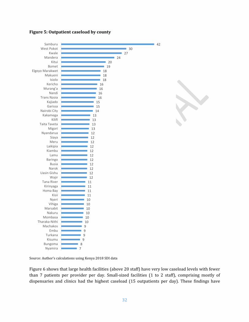
32
Figure 5: Outpatient caseload by county
Source: Author’s calculations using Kenya 2018 SDI data
Figure 6 shows that large health facilities (above 20 staff) have very low caseload levels with fewer
than 7 patients per provider per day. Small-sized facilities (1 to 2 staff), comprising mostly of
dispensaries and clinics had the highest caseload (15 outpatients per day). These findings have
78
999910101010101011111111121212121212121212121213131313
141515
16161616
181818
1920
2427
3042
NyamiraBungoma
KisumuTurkana
EmbuMachakos
Tharaka-NithiMombasa
NakuruMarsabit
VihigaNyeri
KisiiHoma BayKirinyaga
Tana RiverWajir
Uasin GishuNarokBusia
BaringoLamu
KiambuLaikipia
MeruSiaya
NyandaruaMigori
Taita TavetaKilifi
KakamegaNairobi City
GarissaKajiado
Trans NzoiaNandi
Murang’aKericho
IsioloMakueni
Elgeyo MarakwetBomet
KituiMandera
KwaleWest Pokot
Samburu
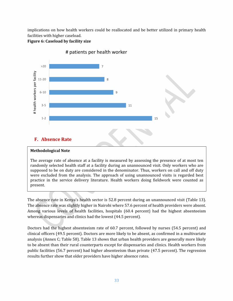
33
implications on how health workers could be reallocated and be better utilized in primary health
facilities with higher caseload.
Figure 6: Caseload by facility size
F. Absence Rate
The absence rate in Kenya’s health sector is 52.8 percent during an unannounced visit (Table 13).
The absence rate was slightly higher in Nairobi where 57.6 percent of health providers were absent.
Among various levels of health facilities, hospitals (60.4 percent) had the highest absenteeism
whereas dispensaries and clinics had the lowest (44.5 percent).
Doctors had the highest absenteeism rate of 60.7 percent, followed by nurses (54.5 percent) and
clinical officers (49.5 percent). Doctors are more likely to be absent, as confirmed in a multivariate
analysis (Annex C; Table 58). Table 13 shows that urban health providers are generally more likely
to be absent than their rural counterparts except for dispensaries and clinics. Health workers from
public facilities (56.7 percent) had higher absenteeism than private (47.5 percent). The regression
results further show that older providers have higher absence rates.
15
11
9
8
7
1-2
3-5
6-10
11-20
>20
# h
ealt
h w
ork
ers
per
fac
ility
# patients per health worker
Methodological Note The average rate of absence at a facility is measured by assessing the presence of at most ten randomly selected health staff at a facility during an unannounced visit. Only workers who are supposed to be on duty are considered in the denominator. Thus, workers on call and off duty were excluded from the analysis. The approach of using unannounced visits is regarded best practice in the service delivery literature. Health workers doing fieldwork were counted as present.

34
Table 13. Absence rate by cadre and facility type
Kenya Nairobi Urban Rural Public Private
All facilities 52.8 57.6 55.7 49.7 56.7 47.5
Facility type
First level hospitals 60.4 61.8 62.3 55.8 64.0 55.6
Health centers 52.1 58.9 56.1 50.1 55.0 46.4
Dispensaries and clinics 44.5 50.0 42.2 46.1 48.8 39.7
Cadre
Doctors 60.7 55.6 60.4 64.1 72.0 56.4
Clinical officers 49.5 49.4 50.3 48.8 55.3 42.6
Nurses 54.5 59.6 56.0 53.1 58.6 46.9
Source: Author’s calculations using Kenya 2018 SDI data.
Among the counties, absenteeism rates were the highest in West Pokot with 68 percent (See Figure
7) and lowest in Makueni (25 percent). Among doctors, Kilifi, Lamu, Murang’a, Embu, Homa Bay, and
Turkana had all doctors absent. West Pokot had the highest absenteeism among clinical officers (78.4
percent) and Wajir among nurses (80.7 percent).

35
Figure 7. Absence rate by county
Source: Author’s calculations using Kenya 2018 SDI data.
25%
36%
37%
42%
43%
44%
44%
45%
45%
45%
45%
45%
46%
46%
47%
48%
48%
48%
49%
49%
50%
50%
50%
50%
50%
51%
51%
51%
51%
56%
56%
57%
57%
58%
58%
59%
59%
60%
60%
60%
61%
64%
64%
64%
65%
66%
68%
Makueni
Mandera
Baringo
Turkana
Siaya
Bomet
Mombasa
Elgeyo Marakwet
Nyandarua
Isiolo
Samburu
Tharaka-Nithi
Laikipia
Nyamira
Migori
Kitui
Taita Taveta
Kisumu
Busia
Meru
Homa Bay
Nakuru
Embu
Murang’a
Tana River
Machakos
Kirinyaga
Kwale
Lamu
Bungoma
Kisii
Kericho
Kajiado
Nairobi City
Garissa
Uasin Gishu
Kakamega
Nandi
Kiambu
Kilifi
Trans Nzoia
Narok
Vihiga
Wajir
Nyeri
Marsabit
West Pokot

36
In any workplace setting, absence may be authorized or unauthorized. From a consumer’s
perspective, however, these providers are not available to deliver services at the health facility—
whether authorized or not. Overall (Figure 8), less than half of the absences were authorized (46
percent) followed by other category (22 percent), while 11 percent were unauthorized. Nine percent
health workers were on official mission, 7 percent were on training and 5 percent were on medical
leave. This other category could not be classified within any of the existing categories.
Most absences among doctors were work authorized absence (69 percent) followed by other
category (11 percent) and official mission (10 percent). The majority of clinical officers were on
authorized absence (47 percent) followed by other category (19 percent) and official mission (12
percent). Most common reasons for nurses were authorized absence (42 percent), other category
(28 percent) and unauthorized absence (10 percent).
There is a clear need for better organization and management of HRH to improve the availability of
staff for service delivery especially as it relates to authorized absenteeism.
Figure 8: Reasons for absence by health worker cadre
Comparing across locations (Figure 9), urban areas had a higher share of authorized absence (49
percent) than rural (41 percent). Unauthorized absence was higher in urban areas (25 percent versus
18 percent in rural). Private sector had relatively higher authorized absence (55 percent) than public
sector (40 percent).
69%
47%42% 46%
1%
5%6%
5%
5%
6%7%
7%
10%
12%7%
9%
4%
11%
10%11%
11%19%
28%22%
Doctors Clinical officers Nurses Total
Authorized Sickness/Maternity Training/seminar/meeting Official mission Unauthorized Others

37
Figure 9: Reasons for absence by location and sector
41%49%
55%
40%
6%
4%
3%
6%
7%
7%5%
9%
12%7%
8%
10%
18%25%
22%
22%
16%7% 8%
13%
Rural Urban Private Public
Location Sector
Authorized Sickness/Maternity Training/seminar/meeting Official mission Unauthorized Others

38
G. Diagnostic Accuracy
The SDI survey assessed provider ability and knowledge using two process quality indicators (the
adherence to clinical guidelines in four tracer conditions, and the management of two maternal and
newborn complications), and an outcome quality indicator (diagnostic accuracy in four tracer
conditions).
Methodological Note The choice of tracer conditions was guided by the burden of disease among children and adults, and whether the condition is amenable to use with a simulation tool, i.e., the condition has a presentation of symptoms that makes it suitable for assessing provider ability to reach correct diagnosis with the simulation tool. Two of the conditions were childhood conditions (severe dehydration and pneumonia), and two conditions were adult conditions (pulmonary tuberculosis and type I diabetes). Two other conditions were included: post-partum hemorrhage and neonatal asphyxia. The former is the most common cause of maternal death during birth, and neonatal asphyxia is the most common cause of neonatal death during birth. The successful diagnosis and management of these six conditions can avert a large share of child an adult morbidity and mortality. These indicators were measured using the patient case simulation methodology, also called clinical cases. Clinical cases are a widely used teaching method used primarily to measure clinicians (or trainee clinicians) knowledge and clinical reasoning. A vignette can be designed to measure knowledge about a specific diagnosis or clinical situation at the same time gaining insight as to the skills in performing the tasks necessary to diagnose and care for a patient. According to this methodology, one of the fieldworkers acts as a case study patient and he/she presents to the clinician specific symptoms from a carefully constructed script while another acts as an enumerator. The clinician, who is informed of the case simulation, is asked to proceed as if the fieldworker is a real patient. For each facility, the case simulations are presented to up to ten randomly selected health workers who conduct outpatient consultations. If there are fewer than ten health workers who provide clinical care, all the providers are interviewed.
There are two other commonly used methods to measure provider knowledge and ability, and each has pros and cons. The most important drawback in the patient case simulations is that the situation is a not a real one and that this may bias the results. The direction of this potential bias makes this issue less of a concern—the literature suggests that the direction of the bias is likely to be upward, suggesting that our estimates can be regarded as upper bound estimates of true clinical ability. The patient case simulation approach offers key advantages given the scope and scale of the Service Delivery Indicators methodology: (i) a relatively simple ethical approval process is required given that no patients are observed; (ii) there is standardization of the case mix and the severity of the conditions presented to the clinician; and (iii) the choice of tracer conditions is not constrained by the fact that a dummy patient cannot mimic some symptoms.

39
Results from the SDI survey reveal that provider ability and knowledge is low. Providers only
correctly diagnosed two-thirds (67.5 percent) of the tracer conditions (Table 14).17 Accuracy was
higher for urban (70.2 percent) than rural (65.9 percent). Doctors correctly diagnosed slightly more
of the tracer conditions (75.9 percent) than clinical officers (74.1 percent), whereas nurses could
diagnose only 60.1 percent of conditions. Similarly, higher level facilities correctly diagnosed
(hospitals – 75.7 percent) more of the tracer conditions than lower levels (health centers – 68.3
percent and dispensaries – 64.3 percent).
Table 14. Diagnostic accuracy by cadre
% clinical cases Kenya Nairobi Urban Rural Public Private
All 67.5 62.2 70.2 65.9 68.5 65.9
Cadre
Doctors 75.9 58.9 74.5 79.3 83.1 68.5
Clinical officers 74.1 68.9 74.0 74.3 76.5 71.3
Nurses 60.1 44.6 57.7 60.6 61.2 57.3
Facilities
First level hospitals 75.7 62.0 77.8 72.7 77.9 70.0
Health centers 68.3 64.0 68.5 68.2 68.1 68.6
Dispensaries and clinics 64.3 61.7 66.1 63.3 64.3 64.2
Source: Author’s calculations using Kenya 2018 SDI data
As shown in
Figure 10, providers from Wajir could correctly diagnose 89 percent of the tracer conditions with Vihiga being the lowest with less than half (49 percent) conditions diagnosed correctly.
17 Figures 29-34 in Appendix C show the history taking and examination questions asked.
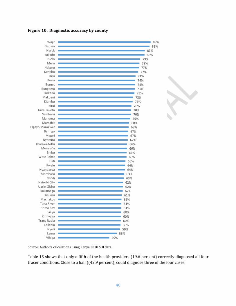
40
Figure 10 . Diagnostic accuracy by county
Source: Author’s calculations using Kenya 2018 SDI data. Table 15 shows that only a fifth of the health providers (19.6 percent) correctly diagnosed all four
tracer conditions. Close to a half ((42.9 percent), could diagnose three of the four cases.
49%56%
59%60%60%60%60%61%61%61%61%62%62%62%63%63%64%64%65%66%66%66%66%67%67%67%68%68%69%70%70%70%71%72%73%73%74%74%74%
77%77%78%79%
83%83%
88%89%
VihigaLamuNyeri
LaikipiaTrans Nzoia
KirinyagaSiaya
Homa BayTana RiverMachakos
KisumuKakamega
Uasin GishuNairobi City
NandiMombasa
NyandaruaKwale
KilifiWest Pokot
EmbuMurang’a
Tharaka-NithiNyamira
MigoriBaringo
Elgeyo MarakwetMarsabitManderaSamburu
Taita TavetaKitui
KiambuMakueniTurkana
BungomaBomet
BusiaKisii
KerichoNakuru
MeruIsiolo
KajiadoNarok
GarissaWajir

41
Table 15. Number of cases correctly diagnosed
# cases All Doctors Clinical officers Nurses
4 cases 19.6 31.6 25.7 12.1
3 cases 42.9 46.2 49.3 36.6
2 cases 26.4 16.9 21.2 32.7
1 case 9.8 4.4 3.5 16.5
No case 1.2 0.8 0.4 2.1
Source: Author’s calculations using Kenya 2018 SDI data Diagnostic accuracy rate varied across case conditions, ranging from 90 percent accuracy for
pulmonary tuberculosis to 32 percent for severe dehydration (see Figure 11).
An accurate diagnosis, however, is unfortunately not a guarantee for providing the correct treatment.
There were substantially large discrepancies between diagnosis and treatment across the board
revealing a critical disconnect in provider knowledge and follow-up. Among severe dehydration and
diabetes conditions, interestingly more providers offered correct treatment actions even though they
had lower diagnostic accuracy. With postpartum hemorrhage and neonatal asphyxia, even though a
high proportion got the diagnosis correct, only a very few provided the correct treatment. While 88
percent of health providers got the diagnosis of neonatal asphyxia correct, only 16 percent got the
correct treatment. The results of the other conditions equally show a knowledge gap in clinical
diagnosis as well as patient management.

42
Figure 11: Diagnostic accuracy and correct treatment by clinical case
H. Adherence to Clinical Guidelines
Kenyan health providers adhered to 43.5 percent of the clinical guidelines in the management of the
four tracer conditions (Table 16). Urban providers were more adherent to the guidelines (46.2
percent of guidelines) than rural (41.8 percent). Doctors adhered to more of the clinical guidelines
(51.5 percent) followed by clinical officers (47.6 percent) and nurses (38.4 percent). Adherence to
clinical guidelines was lowest in dispensaries and clinics (41.2 percent) followed by health centers
(43.6 percent) and hospitals (49.7 percent). For the most part, clinical guidelines are not followed in
primary care health facilities, which is usually the first point of entry for most beneficiaries.
32%
82%
61%
97%
90% 88%
79% 79%
63%
74%
43%
16%
24%
66%
52%
74%
40%
16%
Severe dehydration Pneumonia Diabetes TB PPH Neonatal asphyxia
Correct diagnosis Correct treatment Correct diagnosis and treatment
Methodological Note The assessment of process quality is based on two indicators: (i) clinicians’ adherence to clinical guidelines in four tracer conditions and (ii) clinicians’ management of maternal and neonatal complications. The former indicator is an unweighted average of the share of relevant history taking questions, and the share of relevant examinations performed for the four tracer conditions. The set of questions is restricted to core or important questions as expressed in the Integrated Management of Childhood Illnesses (IMCI). The second process quality indicator is clinicians’ ability to manage maternal and neonatal complications, i.e. post-partum hemorrhage and neonatal asphyxia. This indicator reflects the unweighted share of relevant treatment actions proposed by the clinician. The set of questions is restricted to core or important questions as expressed in the Integrated Management of Childhood Illnesses (IMCI) Guidelines for the tracer conditions.

43
Table 16. Adherence to clinical guidelines by health provider type
% clinical cases Kenya Nairobi Urban Rural Public Private
All 43.5 41.4 46.2 41.8 43.6 43.2
Cadre
Doctors 51.5 45.8 51.4 51.7 54.1 48.9
Clinical officers 47.6 43.3 48.1 47.1 48.8 46.2
Nurses 38.4 34.1 38.0 38.5 38.8 37.4
Facilities
First level hospitals 49.7 40.8 52.0 46.3 51.2 45.6
Health centers 43.6 41.3 44.4 43.3 42.9 45.3
Dispensaries and clinics 41.2 41.5 43.3 40.2 40.5 42.1
Source: Author’s calculations using Kenya 2018 SDI data

44
Figure 12 . Adherence to clinical guidelines by county
Source: Author’s calculations using Kenya 2018 SDI data. It must be noted that several clinicians gave partial treatment for certain conditions. For example,
the simulation presenting pneumonia also presented the “patient” with a high temperature. While 79
percent treated pneumonia only, 72 percent providers got the full treatment of pneumonia and fever.
Clearly, there is a knowledge gap on treatment for co-existing conditions. This is also against the
30%32%34%34%34%35%35%35%36%37%38%38%39%40%41%41%41%42%42%42%43%43%43%43%43%44%44%44%44%45%45%45%46%46%46%46%
48%48%50%51%51%
56%58%
59%63%
65%73%
VihigaSiaya
KakamegaTrans Nzoia
MigoriKisumu
NyandaruaNyeri
West PokotKirinyaga
NandiLaikipia
KwaleBusia
Uasin GishuMurang’a
Nairobi CityHoma BayBungoma
NakuruMandera
EmbuKiambu
MarsabitTana RiverMachakos
LamuSamburu
BaringoMombasa
NyamiraMakueni
KituiKisii
KerichoTharaka-Nithi
BometTurkana
IsioloTaita Taveta
KilifiElgeyo Marakwet
MeruWajir
KajiadoNarok
Garissa

45
backdrop of availability of drugs in stock (See Annex C Table 61). At the time of the study,
Paracetamol was available in a majority of facilities (91.4 percent).
The challenge of partial treatment is real and has both short and long-term effects. For the case of
fever, if the child is not tepid-sponged, their fever could reach higher levels and the child could easily
have a febrile convulsion, which may cause aspiration of food or fluids, biting of the tongue, among
others. If the convulsion is not well understood, it could also lead to further mismanagement of the
condition.
The survey assessed the availability of Standard Treatment Guidelines (STG) in facilities. As shown
in Table 17, less than half (42.8 percent) of the facilities had IMNCI guidelines on the premises. The
availability of guidelines for non-communicable diseases was very low across the board.
Overall, guidelines were more likely to be available in the hospitals than health centers or
dispensaries. With the exception of IMNCI and cervical cancer, private facilities were more likely to
have the guidelines available when compared with public facilities. Similarly, except for IMNCI, urban
facilities were more likely to have the guidelines available.
Table 17: Availability of Standard Treatment Guidelines
% facilities Kenya Nairobi Urban Rural Public Private First level
hospitals
Health centers
Dispensaries and clinics
IMNCI 42.8 46.7 40.1 44.1 48.8 36.0 62.1 50.5 40.0
Cardiovascular diseases
6.9 7.7 10.4 5.2 4.8 9.2 23.2 10.5 5.1
Respiratory diseases
6.2 7.2 10.0 4.3 5.0 7.4 20.1 9.6 4.6
Cervical cancer
10.5 15.4 13.6 9.0 11.4 9.4 31.3 15.5 8.1
Surgical care 1.9 1.0 3.8 1.0 1.1 2.7 9.0 2.9 1.2
Waste management
19.6 28.2 25.0 17.0 18.3 21.0 45.3 27.4 16.4
Source: Author’s calculations using Kenya 2018 SDI data

46
I. Management of Maternal and Neonatal Complications
The second process quality indicator is clinicians’ ability to manage maternal and neonatal
complications. This indicator reflects the unweighted share of relevant treatment actions proposed
by the clinician. The set of questions is restricted to core or important questions as expressed in the
Integrated Management of Childhood Illnesses (IMCI) and the Standard Treatment Guidelines.
Overall, providers adhered to only 34.5 percent of the clinical guidelines for managing maternal and
neonatal complications (Table 18). Doctors adhered to a marginally larger share of guidelines (41.5
percent of guidelines) compared to clinical officers (34.9 percent) and nurses (33.1 percent). There
was very little variation across facilities in managing maternal and neonatal complications. First level
hospitals had a higher adherence (40.3 percent) than health centers (35 percent) and dispensaries
(32.3 percent).
Table 18. Management of maternal and neonatal complications by cadre
% clinical cases Kenya Nairobi Urban Rural Public Private
All 34.5 31.6 35.3 34.0 36.0 32.0
Cadre
Doctors 41.5 32.9 42.0 40.2 47.4 35.6
Clinical officers 34.9 32.7 35.4 34.3 36.0 33.5
Nurses 33.1 28.1 30.9 33.6 34.8 28.8
Facilities
First level hospitals 40.3 27.1 41.9 38.2 42.8 34.0
Health centers 35.0 32.2 35.1 34.9 34.4 36.2
Dispensaries and clinics 32.3 32.3 31.4 32.7 33.8 30.4
Source: Author’s calculations using Kenya 2018 SDI data
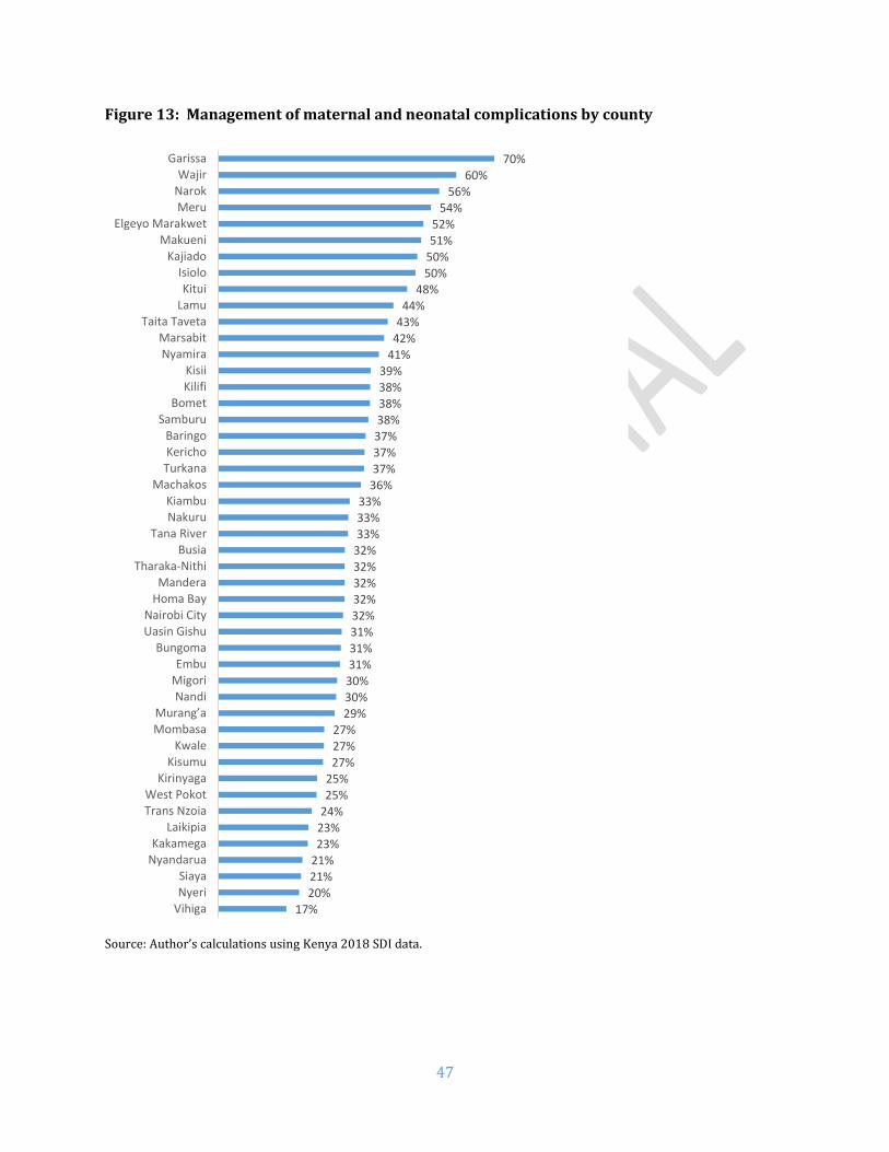
47
Figure 13: Management of maternal and neonatal complications by county
Source: Author’s calculations using Kenya 2018 SDI data.
17%20%21%21%23%23%24%25%25%
27%27%27%
29%30%30%31%31%31%32%32%32%32%32%33%33%33%
36%37%37%37%38%38%38%39%
41%42%43%44%
48%50%50%51%52%
54%56%
60%70%
VihigaNyeriSiaya
NyandaruaKakamega
LaikipiaTrans NzoiaWest Pokot
KirinyagaKisumu
KwaleMombasaMurang’a
NandiMigoriEmbu
BungomaUasin GishuNairobi City
Homa BayMandera
Tharaka-NithiBusia
Tana RiverNakuruKiambu
MachakosTurkanaKerichoBaringo
SamburuBomet
KilifiKisii
NyamiraMarsabit
Taita TavetaLamuKitui
IsioloKajiado
MakueniElgeyo Marakwet
MeruNarokWajir
Garissa

48
J. Drugs and Commodities Availability
On average, 54.1 percent of priority drugs were available in Kenyan facilities (Table 19). Rural
facilities had higher availability of priority drugs (55.3 percent) compared to urban facilities (51.6
percent). Public facilities had marginally higher availability of all priority drugs. Priority drugs for
mothers and children were available with average scores of 34.6 percent and 62.3 percent
respectively. Although over half (58.3 percent) of the tracer drugs surveyed were available in Kenya
only 4.9 percent of facilities had all tracer drugs available. Among various levels, hospitals had a
higher proportion of drugs availability.
Table 19. Availability of priority drugs by facility type
% drugs Kenya Nairobi Urban Rural Public Private First Level
hospital
Health center
Dispensary and clinic
All priority drugs
54.1 53.2 51.6 55.3 55.5 52.6 75.8 59.6 51.7
Priority drugs for Mothers
34.6 27.5 24.8 39.3 42.6 25.6 77.6 58.0 27.3
Priority drugs for children
62.3 58.8 56.2 65.3 67.4 56.7 70.0 73.8 59.6
All tracer drugs 58.3 60.3 57.1 58.9 57.7 59.0 81.8 71.1 54.3 Have all tracers (% facility)
4.9 11.8 7.9 3.4 2.5 7.5 21.4 8.6 3.1
Looking across the counties (Figure 14), Marsabit (71 percent) had the highest availability with
Kirinyaga being the lowest (41 percent).18 The detailed availability of drugs are given in the appendix
(table 61).
18 World Health Organization (WHO) guidelines stated that priority drugs are for adults and children. For SDI, tracer drugs are those considered markers of drug availability according to the SARAM 2013. SDI looked at 8 out of the 11 drugs for first level hospitals, 8 for health centers and 6 for dispensaries and clinics.
Methodological Note This indicator is defined as the number of drugs of which a facility has one or more available, as a proportion of all the drugs on the list. The drugs have to be unexpired and have to be observed by the enumerator. The drug list contains tracer medicines for children and mothers identified by the World Health Organization (WHO) following a global consultation on facility-based surveys. The list of drugs has been adjusted to the level of facility as mentioned in the 2016 Kenya Essential Medicines List (KEML).

49
Figure 14: Availability of all priority drugs by county
Source: Author’s calculations using Kenya 2018 SDI data
41%
43%
43%
44%
44%
45%
45%
47%
48%
49%
49%
49%
50%
51%
52%
52%
53%
53%
53%
54%
54%
54%
55%
56%
56%
56%
57%
57%
57%
58%
58%
59%
59%
59%
59%
59%
61%
61%
61%
62%
64%
66%
66%
68%
68%
69%
71%
Kirinyaga
Tharaka-Nithi
Bomet
Kericho
Trans Nzoia
Nyeri
Murang’a
West Pokot
Uasin Gishu
Meru
Nyandarua
Mombasa
Kakamega
Narok
Kiambu
Busia
Machakos
Nairobi City
Embu
Migori
Kisii
Nakuru
Homa Bay
Elgeyo Marakwet
Nandi
Makueni
Kajiado
Kilifi
Taita Taveta
Vihiga
Bungoma
Nyamira
Garissa
Wajir
Laikipia
Lamu
Kitui
Baringo
Tana River
Siaya
Isiolo
Mandera
Kisumu
Kwale
Samburu
Turkana
Marsabit

50
Family planning commodities Out of all facilities, 88.7 percent reported to be providing family planning (FP) services. Table 20
shows the availability of family planning supplies in facilities that do provide specific FP services.
Male condoms were available in 92.4 percent of facilities whereas female condoms in 72.1 percent.
Proportionately more rural and public facilities had the availability of male condoms. Oral
contraceptives were available in 86.6 percent of all facilities and 93.6 percent facilities had
injectables. Emergency contraceptives were available in 72.3 percent of facilities. A major share of
facilities had IUD (91.1 percent) and implants (95.4 percent). More urban facilities had the
availability of all contraceptives except male condoms.
Table 20: Availability of family planning commodities
% facilities Kenya Urban Rural Public Private First level
hospitals
Health centers
Dispensaries and clinics
# facilities
Male condoms 92.4 89.1 93.8 96.1 86.8 94.7 96.1 91.6 2398 Female condoms
72.1 76.7 70.3 72.4 71.7 64.9 74.4 72.2 733
Oral contraceptives
86.6 89.5 85.3 86.4 86.8 90.1 86.6 86.3 2209
Injectables 93.6 94.5 93.2 92.8 94.7 92.1 90.8 94.3 2538 Emergency contraceptives
72.3 74.5 71.3 69.6 76.1 73.9 66.7 73.2 1211
IUD 91.1 93 90.2 90.9 91.6 93.9 93.9 90.1 1704 Implants 95.4 96.5 94.9 95.4 95.3 98.6 95.3 95.1 2366
Source: Author’s calculations using Kenya 2018 SDI data
K. Availability of Vaccines Related Equipment and Supplies
Data from UNICEF and WHO in 2017 indicates immunization coverage is 89 percent for BCG, 82
percent for DTP3-HepB-Hib, 81 percent for polio3, and 89 percent for the measles vaccine.19 In fact,
the rates have declined by around 10 percentage points for all these vaccines compared to 2012
values.
A majority of health facilities (70.3 percent) reported providing vaccination service. However, only
89 percent of the facilities that offer immunization service store the vaccines in their premises. It is
not clear where the other 11 percent that do vaccinate children store their vaccines and it was not
possible to assess the conditions under which their vaccines are stored. Table 21 shows that 62.3
percent of all vaccines were available in Kenyan facilities. Rural facilities (70.5 percent) had higher
availability than urban (45.2 percent) and public (81.4 percent) higher than private ones (40.7
percent). Hospitals (91 percent) and health centers (85 percent) had higher availability than
dispensaries and clinics (56 percent).
Table 21: Availability of vaccines by facility type
19 Kenya: WHO and UNICEF estimates of immunization coverage: 2017 revision. http://www.who.int/immunization/monitoring_surveillance/data/ken.pdf

51
% vaccines Kenya Nairobi Urban Rural Public Private
All 62.3 64.1 45.2 70.5 81.4 40.7
First level hospitals 91.0 84.2 90.6 91.4 98.3 80.8
Health centers 85.0 100.0 71.7 91.0 94.2 71.1
Dispensaries and clinics 56.0 84.2 35.7 65.4 77.2 33.7
# Facilities 3094 96 820 2274 1781 1313
Nyamira county had the maximum vaccines availability (88.2 percent), while Mombasa was the
lowest with only 34.5 percent of vaccines available (Table 22).
Table 22: Availability of vaccines by facility type across counties
% vaccines Total First level hospital Health center Dispensary and clinic
Nyamira 88.2 100.0 100.0 80.2 Kisumu 86.1 95.9 92.9 82.2 Elgeyo Marakwet 84.2 100.0 83.1 83.1 Isiolo 82.5 100.0 66.7 84.7 Wajir 81.8 100.0 97.6 73.2 Bomet 78.6 78.6 77.8 78.7 Siaya 78.4 75.0 100.0 70.5 Nandi 77.6 100.0 74.3 77.2 Kisii 77.1 98.4 80.6 71.8 Turkana 75.6 71.4 94.6 73.0 Marsabit 74.5 100.0 82.9 71.0 Homa Bay 73.4 100.0 82.4 68.6 Narok 73.4 95.2 75.2 71.4 Bungoma 72.1 100.0 85.7 67.7 Vihiga 72.0 66.7 92.9 63.1 Mandera 69.4 89.3 87.3 56.7 Uasin Gishu 68.4 96.4 98.4 61.8 Baringo 68.3 100.0 98.4 63.0 Kakamega 67.1 100.0 71.4 63.3 Tana River 66.4 100.0 100.0 62.2 Migori 66.2 75.0 90.5 60.3 Samburu 66.1 100.0 95.2 62.2 Taita Taveta 65.5 67.9 74.3 62.7 Nakuru 65.0 100.0 91.7 57.6 West Pokot 64.6 92.9 100.0 61.4 Nairobi City 64.1 100.0 84.2 56.8 Makueni 63.6 100.0 78.6 60.2 Kajiado 63.3 100.0 97.1 56.3 Laikipia 63.3 75.0 80.0 60.4 Busia 63.3 100.0 78.6 57.1 Kericho 63.0 80.0 71.4 60.5 Murang’a 62.6 100.0 100.0 56.7 Kwale 62.2 100.0 81.6 58.5 Trans Nzoia 59.8 100.0 100.0 52.0 Lamu 59.7 100.0 100.0 50.8 Kitui 58.9 78.6 79.0 53.0 Kilifi 57.2 90.5 71.4 54.2 Machakos 56.9 100.0 82.1 52.4 Embu 55.7 100.0 71.4 51.7 Nyandarua 55.6 100.0 98.6 45.7

52
Garissa 54.8 80.0 54.5 51.9 Kiambu 50.8 80.0 62.3 47.0 Tharaka-Nithi 45.0 95.2 78.6 36.5 Kirinyaga 41.0 66.7 88.3 30.8 Nyeri 37.9 66.7 95.2 29.6 Meru 37.8 100.0 88.9 28.0 Mombasa 34.5 71.4 96.4 24.4
Source: Author’s calculations using Kenya 2018 SDI data
Considering only facilities that provide vaccination (n=2247), individual vaccines were usually
available in around 85 percent of the facilities (Figure 15). Dispensaries and clinics had a lower
availability of vaccines.
Figure 15: Availability of individual vaccines by facility type
Note: sample includes only facilities that provide vaccination Source: Author’s calculations using Kenya 2018 SDI data
There was near universal availability of all necessary material and equipment for vaccination such
as ice packs, vaccines carriers, sharps containers, and safe syringes (Figure 16) except for
refrigerators. Only around a half of the dispensaries and clinics (49 percent) had a functional
refrigerator, whereas it was 79 percent and 85 percent for health centers and first level hospitals
respectively.
96%
94%
96%
97%
97%
94%
98%
92%
92%
95%
96%
95%
94%
97%
83%
85%
86%
87%
87%
83%
94%
Measles
Polio
Pentavalent
Pneumococcal
BCG
Hepatitis B
Tetanus
Dispensary & Clinic Health Center First level hospital

53
Figure 16: Availability of equipment and vaccines-related supplies by facility type
Note: sample includes only facilities that provide vaccination Source: Author’s calculations using Kenya 2018 SDI data
Vaccine storage conditions
Vaccines need optimal storage conditions in order to maintain their potency and it is thus important
to evaluate the storage conditions of vaccines across the country. A high proportion (90.1 percent)
of refrigerators with vaccines had a temperature within the recommended 2 to 8 degrees Celsius
(Table 23). While more first level hospitals (94.9 percent) were likely to adhere to the recommended
temperature range, only 88.4 percent of the dispensaries and clinics did so.
Table 23: Vaccines storage - Refrigerators with temperature between 2oC and 8oC
% facilities Kenya Nairobi Urban Rural Public Private
All 90.1 96.1 92.9 89.2 90.4 89.3
First level hospitals 94.9 93.8 96.4 93.5 95.0 94.8
Health centers 93.7 100.0 93.0 94.0 94.5 91.9
Dispensaries and clinics 88.4 93.8 91.8 87.6 88.7 87.5
# Facilities 1,828 50 313 1,515 1,388 440
Note: sample includes only facilities that provide vaccination Source: Author’s calculations using Kenya 2018 SDI data
100%
100%
99%
100%
85%
99%
99%
95%
99%
79%
99%
95%
91%
99%
49%
Safe syringes
Vaccine carriers
Ice packs
Sharps container
Functional refrigerator
Dispensary & Clinic Health Center First level hospital
Methodological Note The main indicator to assess vaccines storage conditions is the temperature of the refrigerators. In order to independently and consistently measure fridges’ temperature, each team was provided with a thermometer. The enumerator asked the permission to put the thermometer in the refrigerator where vaccines are stored during the time of the survey. At the end of the survey, after anywhere between 3 to 6 hours, the enumerator returned to note the temperature.

54
Among the counties, three had all facilities (Tharaka-Nithi, Nyeri and Samburu) with within-range
temperatures for their refrigerators (see Table 24). Enumerators were also asked to check for any
signs of temperature monitoring in the facility, and they found it to be 90.5 percent for the total
sample.
Table 24: Vaccines storage - Refrigerators with temperature between 2oC and 8oC (by county)
% facilities Total First level
hospital
Health center
Dispensary and clinic
#
Facilities Tharaka-Nithi 100.0 100.0 100.0 100.0 24 Nyeri 100.0 100.0 100.0 100.0 34 Samburu 100.0 100.0 100.0 100.0 33 Elgeyo Marakwet 97.9 100.0 100.0 97.1 48 Kakamega 97.9 100.0 100.0 97.1 48 Kwale 97.5 100.0 100.0 96.9 40 Baringo 97.5 100.0 100.0 96.7 39 Nyandarua 97.2 100.0 100.0 95.8 36 Meru 96.7 100.0 100.0 94.4 30 Isiolo 96.6 100.0 100.0 95.7 29 Nairobi City 96.1 100.0 93.8 96.9 50 Vihiga 96.0 100.0 100.0 90.0 25 Kisii 95.9 100.0 100.0 93.3 50 Mandera 94.9 100.0 93.8 94.7 39 Siaya 94.1 100.0 93.8 93.8 51 Kiambu 93.5 100.0 71.4 97.1 46 Taita Taveta 93.5 66.7 100.0 95.5 34 Kirinyaga 93.2 100.0 90.0 94.4 30 Nandi 92.8 100.0 100.0 92.0 56 Embu 91.8 100.0 100.0 89.7 37 Mombasa 91.4 100.0 85.7 92.3 23 Kisumu 91.2 100.0 92.9 88.9 57 Nyamira 91.0 100.0 94.4 87.0 45 Makueni 91.0 100.0 100.0 88.6 44 Kilifi 90.7 100.0 100.0 88.9 43 Garissa 90.3 100.0 83.3 90.5 31 Kajiado 90.1 100.0 100.0 85.7 41 Murang’a 89.7 100.0 85.7 89.5 49 Homa Bay 89.6 100.0 85.7 90.0 49 Machakos 87.9 100.0 85.7 87.9 41 Narok 86.9 100.0 100.0 80.6 46 Trans Nzoia 86.3 0.0 100.0 88.0 33 Kitui 85.3 66.7 91.7 84.4 47 Laikipia 84.7 100.0 100.0 80.8 33 Uasin Gishu 84.4 75.0 100.0 81.8 45 Nakuru 84.2 100.0 88.9 79.2 37 Busia 84.1 66.7 100.0 82.6 32 Kericho 83.7 66.7 100.0 83.3 31 Bungoma 82.9 100.0 80.0 80.8 35 Wajir 82.9 80.0 100.0 75.0 41 Tana River 80.9 100.0 100.0 77.3 26 Lamu 80.0 100.0 75.0 78.6 20 Migori 80.0 100.0 100.0 71.0 45 Marsabit 77.5 50.0 85.7 76.9 35 West Pokot 74.6 100.0 66.7 73.5 39 Bomet 71.1 100.0 60.0 70.8 31 Turkana 68.1 100.0 87.5 61.5 50
Note: sample includes only facilities that provide vaccination; Source: Author’s calculations using Kenya 2018 SDI data

55
L. Equipment Availability
The survey found that half (50.9 percent) of health facilities in Kenya met the minimum medical
equipment requirements (Table 25). Private facilities had better availability of equipment (60.6
percent) compared to public facilities (42.4 percent); and urban facilities (61.7 percent) than their
rural counterparts (45.8 percent). Dispensaries and clinics had the lowest level of basic equipment
available (46.1 percent) than health centers (66.8 percent) and first level hospitals (78.7 percent).
Table 25: Availability of basic equipment by facility type, ownership and location
% facilities Kenya Nairobi Urban Rural Public Private
All 50.9 59.5 61.7 45.8 42.4 60.6
First level hospitals 78.7 66.7 78.5 78.9 90.3 62.3
Health centers 66.8 68.4 57.9 70.8 76.9 51.6
Dispensaries and clinics 46.1 56.8 60.8 39.3 31.0 62.0
# Facilities 3094 96 820 2274 1781 1313
Source: Author’s calculations using Kenya 2018 SDI data
Figure 17 shows availability of minimum equipment by county. Meru had the maximum share of
facilities (73 percent), while only 8 percent of facilities in Marsabit had availability of minimum
equipment.
Methodological Note The equipment indicator focuses on the availability (observed by the enumerator in functional state) of minimum equipment expected at a facility. The pieces of equipment expected in all facilities are: weighing scale (adult, child or infant), stethoscope, sphygmomanometer and thermometer; and additionally, refrigerator and sterilization equipment at health center and hospital levels.

56
Figure 17: Equipment indicator by county
Source: Author’s calculations using Kenya 2018 SDI data Figures are percentage of facilities with all minimum equipment available and functional Minimum equipment: weighing scale (adult, child or infant), stethoscope, sphygmomanometer and thermometer; and additionally refrigerator and sterilization equipment at health center and hospital levels
8%
23%
26%
31%
33%
34%
35%
38%
39%
41%
43%
45%
45%
45%
46%
47%
47%
47%
47%
48%
48%
49%
49%
50%
50%
50%
50%
50%
50%
51%
51%
52%
52%
52%
52%
54%
55%
55%
55%
58%
58%
58%
59%
61%
68%
73%
73%
Marsabit
Isiolo
Nandi
West Pokot
Samburu
Elgeyo Marakwet
Tana River
Kakamega
Turkana
Laikipia
Bomet
Tharaka-Nithi
Kiambu
Nyamira
Bungoma
Migori
Baringo
Garissa
Kwale
Uasin Gishu
Kisumu
Kilifi
Busia
Kisii
Narok
Siaya
Wajir
Mandera
Makueni
Nakuru
Nyandarua
Trans Nzoia
Kitui
Murang’a
Machakos
Taita Taveta
Lamu
Embu
Homa Bay
Kericho
Vihiga
Nyeri
Nairobi City
Kirinyaga
Kajiado
Mombasa
Meru

57
Table 26 shows the availability of specific types of medical equipment in Kenyan facilities. Most
facilities had a scale, a stethoscope, a sphygmomanometer and a thermometer. Over two-thirds of
facilities had sterilization equipment (66.6 percent). However, only over a half of facilities (55.8
percent) had a refrigerator.
Table 26: Availability of equipment items in the equipment indicator
% facilities Kenya Nairobi Urban Rural Public Private First level
hospitals
Health centers
Dispensaries and clinics
Any scale 95.1 99.0 93.3 95.9 96.9 93.0 98.0 99.0 94.1
Thermometer 92.8 99.0 97.1 90.7 89.8 96.1 97.9 97.2 91.6
Stethoscope 95.4 99.0 97.2 94.6 93.8 97.2 98.8 98.6 94.6
Sphygmomanometer 92.3 92.8 93.8 91.7 90.4 94.6 97.6 95.9 91.3
Sterilization 66.6 84.6 74.7 62.7 62.1 71.6 94.8 88.1 60.6
Refrigerator 55.8 50.3 37.6 64.5 77.0 31.8 84.9 79.0 49.4
Source: Author’s calculations using Kenya 2018 SDI data Communications equipment Table 27 shows the availability of communications equipment (radio, phone, computer) in Kenyan health facilities. The study found that around three-fourths (74.6 percent) of health facilities had at least one of the three forms of communication equipment.20 Urban and private facilities were more likely to have any communication equipment. Table 27: Communication equipment availability
% facilities Kenya Nairobi Urban Rural Public Private
All 74.6 92.8 86.2 69.0 69.8 80.0
First level hospitals 98.8 100.0 100.0 97.6 97.9 100.0
Health centers 88.4 94.7 93.4 86.1 86.3 91.6
Dispensaries and clinics 70.4 91.9 83.5 64.3 64.0 77.1
# Facilities 3094 96 820 2274 1781 1313
Source: Author’s calculations using Kenya 2018 SDI data The availability of specific types of communication equipment was also assessed (Table 28). cell
phones paid by the facility were the most widely available piece of equipment, followed by computers
and personal cell phones. There was a large gap in the availability of computers in rural and urban
facilities. Only 31.7 percent of rural facilities had computers compared to 66.4 percent of urban
facilities. Access to internet, however, was more limited with only a fourth (25.9 percent) of the
facilities with that capacity. Public facilities were less likely to have access to internet (15.5 percent)
than their private counterparts (37.5 percent), and rural (15.9 percent) less than the urban ones
(46.5 percent).
20 Note that phone cellular phones, the indicator only accepts cell phone which belongs to the facility itself or a personal cell phone but the facility supports the cost of its calls. Cell phones which belong to a staff of the facility, paid for by the staff of the facility but used also by the facility are not included in computing the indicator.

58
Table 28: Access to various forms of communication
% facilities Kenya Nairobi Urban Rural Public Private
Communication 74.6 92.8 86.2 69.0 69.8 80.0
Communication+ 90.5 97.9 96.5 87.7 87.4 94.1
Land line 6.8 22.1 15.9 2.4 3.1 11.0
Cellular Phone1 65.7 77.9 75.0 61.3 61.7 70.3
Cellular Phone2 33.9 23.1 27.8 36.8 36.7 30.7
Computer 42.9 79.5 66.4 31.7 33.0 54.2
Shortwave Radio 1.0 3.6 1.9 0.6 0.2 2.0
Internet 25.9 53.9 46.5 15.9 15.5 37.5
Source: Author’s calculations using Kenya 2018 SDI data Communication + is an aggregate including cellular phone (see footnote #24). Note: 1 - cell phone costs are paid for by the facility. 2 - Personal cell phone and costs are paid for by staff Ambulance services
An effective referral system requires the availability of ambulance services. This need not be
ownership of a dedicated emergency vehicle, but rather the facility having access to an emergency
vehicle. Table 29 shows that ownership of an ambulance is very low (10.1 percent). However, 81.9
percent of health facilities had access to a vehicle to transport their patients. Rural facilities were
more likely to have access (83.2 percent) than the urban ones (79.3 percent), whereas public facilities
(87.3 percent) were more likely than the private counterparts (75.9 percent).
Table 29: Availability of ambulance services
% facilities Kenya Nairobi Urban Rural Public Private First level hospitals
Health centers
Dispensaries and clinics
Own ambulance
10.1 18.0 13.0 8.7 10.5 9.7 67.5 22.8 3.9
Access to ambulance
70.7 79.5 59.8 75.9 84.8 54.7 95.1 86.1 66.1
Access to a vehicle not ambulance
81.9 90.8 79.3 83.2 87.3 75.9 96.4 92.7 78.9

59
M. Infrastructure Availability
Less than three-fourths (72.9 percent) of the health facilities had access to all three types of basic
infrastructure (Table 30). About two-thirds of the rural facilities (67.8 percent) had the basic
infrastructure compared to their urban counterparts (83.7 percent). There was also a large difference
between the private sector (82.1 percent) and the public sector (64.9 percent). The infrastructure
indicator steadily improved with the level of the facility, from 70.1 percent in dispensaries and clinics
to 82.2 percent in health centers and 89.5 percent in first level hospitals.
Table 30: Availability of infrastructure by facility type
% facilities Kenya Nairobi Urban Rural Public Private
All 72.9 86.7 83.7 67.8 64.9 82.1
First level hospitals 89.5 100.0 89.7 89.2 86.6 93.4
Health centers 82.2 94.7 85.1 81.0 79.0 87.2
Dispensaries and clinics 70.1 83.8 82.8 64.2 60.1 80.6
# Facilities 3094 96 820 2274 1781 1313
Source: Author’s calculations using Kenya 2018 SDI data
Figure 18 shows availability of infrastructure by county. Kiambu and Kirinyaga had the maximum
share of facilities (94 percent) with minimum infrastructure, while Tana River had the lowest (27
percent).
Methodological Note The infrastructure indicator captures the availability of three inputs: water, sanitation and electricity. The indicator is an unweighted average of these three components. Eligible sources are: Electricity sources-electric power grid, a fuel operated generator, a battery-operated generator or a solar powered system as their main source of electricity. Water sources-piped into the facility, piped onto facility grounds or comes from a public tap/standpipe, tube well/borehole, a protected dug well, a protected spring, bottled water or a tanker truck. Sanitation sources-functioning flush toilets or Ventilated and Improved (VIP) latrines, or covered pit latrine (with slab).
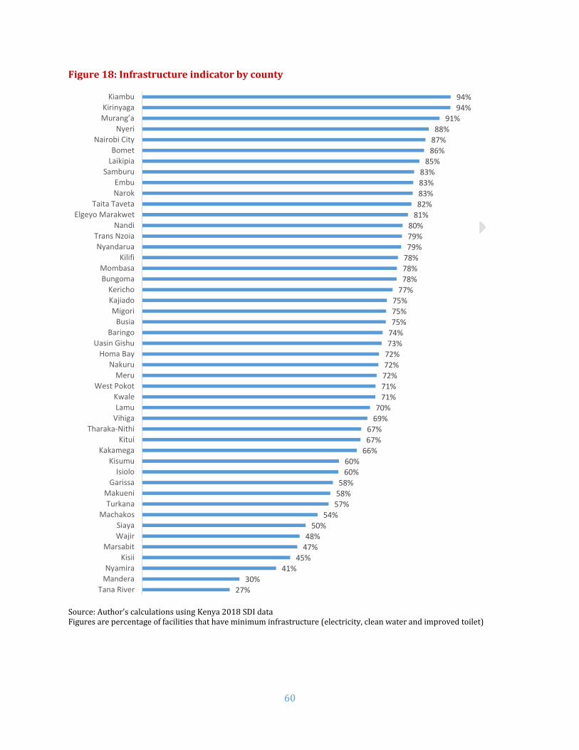
60
Figure 18: Infrastructure indicator by county
Source: Author’s calculations using Kenya 2018 SDI data Figures are percentage of facilities that have minimum infrastructure (electricity, clean water and improved toilet)
27%
30%
41%
45%
47%
48%
50%
54%
57%
58%
58%
60%
60%
66%
67%
67%
69%
70%
71%
71%
72%
72%
72%
73%
74%
75%
75%
75%
77%
78%
78%
78%
79%
79%
80%
81%
82%
83%
83%
83%
85%
86%
87%
88%
91%
94%
94%
Tana River
Mandera
Nyamira
Kisii
Marsabit
Wajir
Siaya
Machakos
Turkana
Makueni
Garissa
Isiolo
Kisumu
Kakamega
Kitui
Tharaka-Nithi
Vihiga
Lamu
Kwale
West Pokot
Meru
Nakuru
Homa Bay
Uasin Gishu
Baringo
Busia
Migori
Kajiado
Kericho
Bungoma
Mombasa
Kilifi
Nyandarua
Trans Nzoia
Nandi
Elgeyo Marakwet
Taita Taveta
Narok
Embu
Samburu
Laikipia
Bomet
Nairobi City
Nyeri
Murang’a
Kirinyaga
Kiambu

61
Table 31 shows the availability of specific types of infrastructure in Kenyan health facilities. When
considered alone, 88.6 percent had access to clean water, 91 percent to toilets and 89.2 percent had
access to electricity. The public-private and urban-rural gaps for electricity and toilets were large.
Table 31: Availability of specific types of infrastructure
% facilities Kenya Nairobi Urban Rural Public Private First level
hospitals
Health centers
Dispensaries and clinics
Infrastructure Indicator
72.9 86.7 83.7 67.8 64.9 82.1 89.5 82.2 70.1
Clean water 88.6 91.8 88.9 88.5 88.0 89.3 94.3 91.0 87.8
Toilet 91.0 94.9 95.5 88.9 88.8 93.5 96.2 93.1 90.3
Electricity 89.2 97.9 97.9 85.0 81.4 98.0 97.0 97.3 87.1
Source: Author’s calculations using Kenya 2018 SDI data As shown in Figure 19, national electric grid constitutes the major source of electricity in the
facilities (79 percent). The proportion increases further in urban (97 percent) and private (94
percent) facilities to near universal levels. However, still over a tenth of the facilities rely on solar (10
percent) for power. Over the period of three months, most of the facilities (70.3 percent) had at least
two hours of interruptions in power.
Figure 19: Sources of electricity by facility type
79%
97%
70% 65%
94% 95%89%
76%
10%
1%
14%15%
3% 1%7%
10%
1%
1%
1%1%
1% 1% 1%
1%
11%2%
15% 19%
2% 3% 3%13%
Kenya Urban Rural Public Private First levelhospital
Health Center Dispensary &Clinic
Location Ownership Facility type
Mains Solar Others No power

62
N. Waste Management
Health care waste is a product of health care activities and a potential source of infection if not
disposed properly. In order to protect the public health from hazardous waste either directly or
through vectors, health care waste must be destroyed or isolated from people, animals and disease
vectors. This serves to avoid the recycling of pathogens in the community (WHO, 2005, p. 15). Using
questionnaire and observation methods, the survey narrowed its scope to assessment of final
disposal of medical waste and sharps, presence of guidelines and history of training in health care
waste management.
Acceptable waste disposal.21 Most facilities (71.1 percent) carried out safe health care waste disposal (Table 32). However, only
19.6 percent of facilities were observed to have guidelines on health care waste management and 31
percent had training. Of these, 12 percent had both the guidelines and history of training.
Table 32: Total proportion of facilities carrying out safe health care waste disposal
% facilities Kenya Nairobi Urban Rural Public Private
All 71.1 92.8 83.3 65.3 63.5 79.8
First level hospitals 79.8 89.5 81.8 78.0 78.0 82.4
Health centers 76.1 100.0 80.5 74.2 72.3 81.8
Dispensaries and clinics 69.6 89.5 84.0 63.0 60.5 79.3
# Facilities 3094 96 820 2274 1781 1313
Source: Author’s calculations using Kenya 2018 SDI data
21 Protected ground/pit/incineration. These include incinerator burning, protected dumping and covered storage for off-site disposal. The actual safety of the method is debatable even if though it is accepted. The pits may have access to the water table and therefore potentially unsafe (WHO, 2005, p. 17). Burning of waste using a 1-chamber brick incinerator still have the risk of hazardous gases especially as their temperatures are not high enough to achieve complete combustion. Open burning, dumping on flat/unprotected ground are considered environmentally unacceptable and are discouraged (WHO, 2005, p. 41) (WHO, 1999, p. 120).

63
O. Governance in Health Service Delivery
Governance in Finance The SDI survey also looked at financial planning, financial management instruments and reporting. As the management policies differ by facility ownership, this section restricts the analysis only to publicly owned facilities. The survey found that only 45.1 percent of facilities in Kenya had a work plan for the current fiscal year (Table 33). Relatively more urban facilities had work plans compared to their rural counterparts. Nairobi County public facilities had a higher percentage of reporting (56.9 percent) compared to the national average. Table 33: Facilities that had a work plan for the current fiscal year
% Facilities Kenya
(All Public) Nairobi Urban Rural
All 45.1 56.9 50.9 44.4
First level hospitals 57.0 80.0 63.3 53.8 Health Centers 53.1 57.1 47.2 54.1 Dispensaries and clinics 42.3 0.0 48.6 41.8
# Facilities 1,766 19 149 1,617
Source: Author’s calculations using Kenya 2018 SDI data Documentation of funds disbursed and expended is crucial to financial accountability and planning, especially in the public sector. This is usually done through financial management instruments. However, only 14.1 percent of public facilities had receipt books, 47.6 percent payment vouchers, and 42.0 percent cashbooks to manage their finances. (see Table 34 below). Urban facilities had more access to financial management instruments than their counterparts. First level hospitals had more access than lower level facilities. Table 34: Receipt of financial management instruments by public providers
% Facilities
Kenya (All
Public) Nairobi Urban Rural
First level
hospitals
Health centres
Dispensaries and clinics
Receipt books 14.1 5.3 22.1 13.1 62.4 15.4 10.2
Payment vouchers 47.6 5.3 33.6 49.3 68.4 52.5 45.0
Cash books 42.0 15.8 33.1 43.1 62.0 48.0 39.1
Other 11.6 21.1 10.6 11.7 18.5 17.5 9.8 # Facilities
1,766 19 149 1,617 102 307 1357
Source: Author’s calculations using Kenya 2018 SDI data
More than two-thirds (65.2 percent) of the facilities could show that they submitted their financial
report for the previous quarter (
Table 35). More rural facilities were compliant than urban facilities.

64
Table 35: Facilities that submitted a financial report for previous quarter
% Facilities Kenya
(All Public) Nairobi Urban Rural
All 65.2 21.1 50.1 67.1
First level hospitals 85.7 40.0 86.9 85.1
Health centres 76.1 14.3 65.4 77.9
Dispensaries and clinics 61.2 0.0 33.0 63.8
# Facilities 1148 4 83 1065
Accountability and information sharing with the community: Over a half of the facilities (58.6 percent) shared the financial information with the community (Table
36). The difference was greatest between the rural (61.3 percent) and urban areas (36.3 percent).
Table 36: Facilities that share financial information with community
% Facilities Kenya
(All Public)
Nairobi Urban Rural
All 58.6 42.1 36.3 61.3
First level hospitals 38.2 40.0 22.6 46.2
Health centres 60.2 42.9 53.7 61.3
Dispensaries and clinics 59.8 0.0 33.7 62.1
# Facilities 1766 19 149 1617
Source: Author’s calculations using Kenya 2018 SDI data 87 percent communicated financial information through meetings (Figure 20), whereas 15 percent did so through posters and 10 percent via chalkboards. Figure 20: Means by which facilities communicate with their community
87%
15%
10%
7%
Meetings
Poster
Chalk board
Others

65
Similar to financial information, more than half of public facilities (56.6 percent) shared the
information about essential medicines and health supplies (EMHS) (Table 37). It is important to note
that fewer urban facilities (32.6 percent) display EMHS information than rural (59.5 percent).
Table 37: Facilities that share EMHS delivery information with community
% Facilities Kenya
(All Public)
Nairobi Urban Rural
All 56.6 42.1 32.6 59.5
First level hospitals 29.6 80.0 19.3 34.9 Health centers 62.0 28.6 53.2 63.5 Dispensaries and clinics 57.4 0.0 28.5 60.0
# Facilities 1766 19 149 1617
Source: Author’s calculations using Kenya 2018 SDI data Figure 21 shows that 27 percent of the facilities shared information of essential medicines through
meetings and 10 percent using other means.
Figure 21: Means by which facilities communicate with their community on EMHS
Source: Author’s calculations using 2018 Kenya SDI data
Supervision:
Technical supervision is a key factor in human resource appraisal and an important part of
accountability for both the provider and the supervising body. This survey addressed supervision by
the county health management teams (CHMT). More than two-thirds of facilities (78.1 percent)
received a supervision visit from the CHMT during the previous year (Table 38). Supervision was
highest in health center (94.5 percent), followed by first level hospitals (91.3 percent) and
dispensaries (90.4 percent). It is interesting to note that rural facilities had higher supervision (91.9
percent) rates than urban facilities (86.0 percent).
Table 38: Facilities that received supervision visit during the previous year
49%
2%
2%
17%
Meetings
Poster
Chalk board
Others
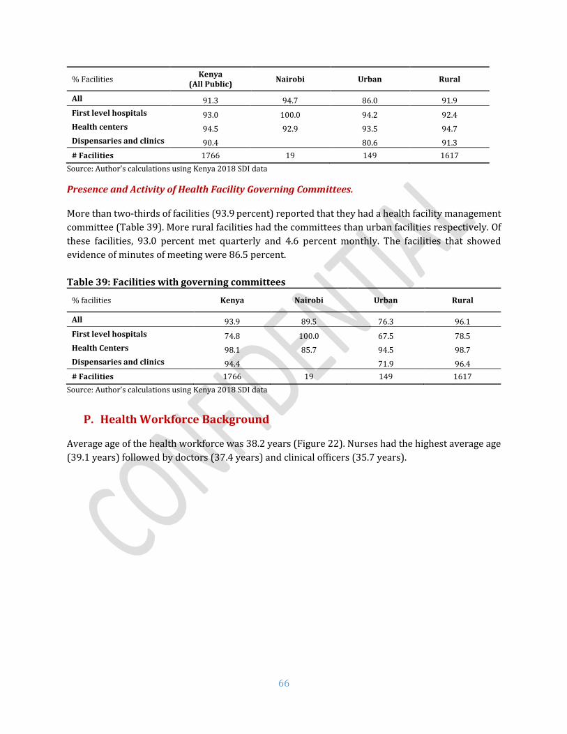
66
% Facilities Kenya
(All Public) Nairobi Urban Rural
All 91.3 94.7 86.0 91.9
First level hospitals 93.0 100.0 94.2 92.4
Health centers 94.5 92.9 93.5 94.7
Dispensaries and clinics 90.4 80.6 91.3
# Facilities 1766 19 149 1617
Source: Author’s calculations using Kenya 2018 SDI data
Presence and Activity of Health Facility Governing Committees. More than two-thirds of facilities (93.9 percent) reported that they had a health facility management
committee (Table 39). More rural facilities had the committees than urban facilities respectively. Of
these facilities, 93.0 percent met quarterly and 4.6 percent monthly. The facilities that showed
evidence of minutes of meeting were 86.5 percent.
Table 39: Facilities with governing committees
% facilities Kenya Nairobi Urban Rural
All 93.9 89.5 76.3 96.1
First level hospitals 74.8 100.0 67.5 78.5
Health Centers 98.1 85.7 94.5 98.7
Dispensaries and clinics 94.4 71.9 96.4
# Facilities 1766 19 149 1617
Source: Author’s calculations using Kenya 2018 SDI data
P. Health Workforce Background
Average age of the health workforce was 38.2 years (Figure 22). Nurses had the highest average age
(39.1 years) followed by doctors (37.4 years) and clinical officers (35.7 years).

67
Figure 22: Average age among various health workers
Majority of the workforce in the sample (Figure 23) were females (61 percent) most likely driven by the nurse category. As one would expect, proportion of females was higher among nurse (72 percent), while males dominated among doctors (68 percent) and clinical officers (61 percent) categories. Figure 23: Share of female health workers
Figure 24 shows the education levels of health workers. Most health workers had education up to
college level (78 percent). Half of nurse/midwives also had secondary education and 48 percent at
college level. Among nurses and clinical officers, a great proportion (86 and 87 percent respectively)
had college level education and most doctors had obtained a degree (70 percent).
32%
39%
72%
61%
Doctors Clinical officers Nurses All

68
Figure 24: Education levels among various health workers
Q. Family Planning Exit Interviews
Sample Characteristics A total of 3168 clients were assessed for their satisfaction on family planning services and the cost
they paid for services. Almost all of the clients were females (99 percent) with majority between 20
and 29 years of age (55 percent). Figure 25 shows that 85 percent of them were married and about
a half had primary level of education (49 percent).
Figure 25: Key socio-economic features among FP clients
Source: Author’s calculations using Kenya 2018 SDI data
4%
8%
8%
7%
3%
87%
86%
78%
70%
4%
5%
11%
23%
2%
Doctors
Clinical officers
Nurses
All
Secondary College Degree Master
6%
27%
28%
20%
13%
5%
2%
10%
85%
5%
14%
49%
30%
8%
18-19
20-24
25-29
30-34
35-39
40-44
45-49
Never married
Currently married
Fomerly married
No education
Primary
Secondary
Higher education
Age
Mar
ital
stat
us
Edu
cati
on

69
Client Satisfaction Satisfaction among clients was assessed under eight dimensions – waiting time, consultation time,
privacy, staff courtesy and respect, staff attitude, freedom of choice on a method, facility cleanliness
and receipt of services. As shown in Table 26 , a high proportion of clients (> 95 percent) were
satisfied with various dimensions of service quality except waiting time (78.9 percent). However, the
margin of differences between various socio-economic groups was not large.
Table 26: Satisfaction among FP clients by client characteristics
% satisfied
Waiting time
Consultation time
Privacy
Staff courtesy
& respect
Staff attitude
Freedom of choice
Facility cleanliness
Services received
Age 18-19 79.9 98.1 95.1 100.0 100.0 96.5 95.5 96.8 20-24 78.5 96.4 93.8 99.4 99.4 95.9 96.6 98.3 25-29 80.7 97.7 95.7 99.2 99.2 96.3 96.0 98.7 30-34 77.9 96.9 94.6 99.0 99.0 95.6 96.7 98.8 35-39 76.9 96.8 94.8 99.5 99.5 95.3 96.4 98.9 40-44 80.2 99.5 97.4 100.0 100.0 96.6 98.1 100.0 45-49 74.4 100.0 98.5 100.0 100.0 100.0 96.4 100.0 50+ 76.2 100.0 100.0 100.0 100.0 81.6 100.0 93.8
Gender Male 89.0 100.0 90.6 100.0 100.0 100.0 98.1 100.0 Female 78.7 97.2 95.0 99.3 99.3 95.9 96.4 98.6
Marital status Never married
79.0 96.5 95.0 98.5 98.5 96.4 96.0 95.9
Currently married
79.4 97.4 95.2 99.4 99.4 95.9 96.4 99.0
Formerly married
69.3 96.0 90.7 99.5 99.5 95.7 98.3 97.8
Education No education
77.3 95.3 92.7 97.9 97.9 97.0 95.1 99.2
Primary 77.9 97.3 95.1 99.5 99.5 95.3 96.4 98.5 Secondary 80.0 97.9 96.2 99.6 99.6 96.2 97.0 98.2 Higher education
82.7 97.5 93.3 99.3 99.3 97.0 96.9 99.6
Wealth Quintile Lowest 76.2 96.9 93.4 99.5 99.5 95.8 95.9 98.5 Second 80.4 97.5 94.3 99.1 99.1 95.9 97.2 99.1 Middle 76.7 97.4 95.8 99.3 99.3 96.7 96.1 98.8 Forth 81.4 96.9 94.8 99.3 99.3 96.0 96.1 98.6 Highest 79.7 97.6 96.5 99.5 99.5 95.5 96.9 98.0
Total 78.9 97.3 95.0 99.3 99.3 96.0 96.4 98.6 Source: Author’s calculations using Kenya 2018 SDI data Table 27 presents the satisfaction by facility characteristics. Reported satisfaction was slightly
higher among clients visiting rural and private facilities. Clients receiving services from dispensaries
and clinics reported the highest level of satisfaction than higher level facilities.

70
Table 27: Satisfaction among FP clients by facility characteristics
% satisfied Waiting
time Consultation
time Privacy
Staff courtesy
& respect
Staff attitude
Freedom of choice
Facility cleanliness
Services received
Location Rural 79.4 97.3 95.9 99.5 99.5 96.1 96.4 98.7 Urban 77.1 97.0 91.9 98.7 98.7 95.6 96.7 98.3
Ownership Private 86.3 98.5 94.2 99.5 99.5 97.9 96.7 98.7 Public 77.2 97.0 95.2 99.3 99.3 95.5 96.4 98.6
Facility Type First level hospital
74.4 96.8 92.9 99.6 99.6 92.8 94.3 98.3
Health center
78.7 96.7 95.8 98.8 98.8 95.5 95.7 98.3
Dispensary & Clinic
79.7 97.6 95.1 99.5 99.5 96.7 97.1 98.8
Nairobi 77.9 98.9 91.2 100.0 100.0 96.7 95.6 98.9 Total 78.9 97.3 95.0 99.3 99.3 96.0 96.4 98.6
Source: Author’s calculations using Kenya 2018 SDI data Cost of FP Services The survey assessed if the clients paid for FP services at the facilities (Table 28). Even though the FP
services were supposed to be free, about a fifth of the clients interviewed (22.2 percent) had to pay
for services at the facilities. On an average, the clients paid 305.3 KSh in total. The clients reported to
have paid the maximum for receiving contraceptives from a provider (195.4 KSh on average). Clients
did also pay for other services such as registration card (19.9 KSh), diagnostics (11.4 KSh),
contraceptive from a pharmacy (11.4 KSh), consultation (21.6 KSh), transport (40 KSh) and other
(5.6 KSh). Clients who were highly educated, older (40 to 44 years), never married, and from the
highest wealth quintile spent the most than their counterparts.

71
Table 28: Cost for FP services by client characteristics
Client Characteristics
Paid for FP
Services Card Diagnostics
Contraceptive from
provider
Contraceptive from
pharmacy Consultation Other Transport Total
Age 18-19 11.0% 11.8 4.9 85.6 0.0 2.7 3.8 28.6 137.4 20-24 21.9% 13.0 4.2 136.4 7.1 18.2 3.0 35.7 217.7 25-29 22.0% 9.1 9.3 148.3 3.3 21.4 4.7 41.6 237.7 30-34 25.4% 10.3 21.1 185.0 22.7 25.3 12.5 43.4 320.3 35-39 23.9% 12.7 19.9 363.4 23.7 15.6 1.0 41.0 477.3 40-44 19.9% 189.6 0.0 476.0 0.0 56.5 8.2 48.4 778.8 45-49 26.4% 19.3 0.0 84.1 8.9 7.2 0.0 45.8 165.4 50+ 9.6% 0.0 0.0 100.0 0.0 0.0 0.0 34.4 134.4
Gender Male 4.3% 0.0 0.0 27.5 22.5 0.0 0.0 14.9 64.9 Female 22.4% 20.0 11.4 195.8 11.3 21.6 5.6 40.4 306.1
Marital status Never married 25.7% 9.4 1.3 223.5 34.1 45.4 0.9 45.5 360.1 Currently married
21.5% 22.3 11.5 196.5 6.6 18.4 6.7 39.7 301.7
Formerly married
27.3% 7.4 28.3 127.8 32.6 20.2 0.0 34.5 250.8
Education No education 24.0% 6.6 2.3 62.0 3.1 0.0 9.5 31.6 115.1 Primary 16.7% 32.1 8.8 144.4 4.6 15.3 3.9 34.2 243.3 Secondary 24.5% 12.4 11.3 108.6 9.3 9.0 4.3 38.0 192.8 Higher education
42.5% 20.5 25.4 606.4 38.0 80.6 8.6 93.6 873.3
Wealth Quintiles Lowest 16.1% 12.6 16.5 83.6 3.6 19.7 9.3 30.0 175.3 Second 20.4% 6.2 3.8 104.6 5.1 5.8 1.1 31.2 157.8 Middle 24.0% 12.7 9.7 209.1 3.7 29.5 11.3 36.9 312.8 Forth 24.1% 14.1 5.0 142.3 1.5 15.8 4.6 43.8 227.1 Highest 26.2% 47.5 21.8 370.8 37.5 33.1 2.5 58.5 571.7 Total 22.2% 19.9 11.4 195.4 11.4 21.6 5.6 40.0 305.3
Source: Author’s calculations using Kenya 2018 SDI data; costs are in Kenyan Schillings (1 USD = 100.75 KSh22)
22 Source: Central Bank of Kenya (https://www.centralbank.go.ke/rates/forex-exchange-rates/ Accessed Nov 20, 2018)

72
More proportion of client visiting urban, private and hospitals paid for FP services than their counterparts (Table 29). Total amount paid
was higher among urban, private and health centers clients. In fact, clients in Nairobi paid KSh 697.6 on average.
Table 29: Cost for FP services by facility characteristics
Facility Characteristics
Paid for FP
Services Card Diagnostics
Contraceptive from
provider
Contraceptive from
pharmacy Consultation Other
Average transport
cost
Total
Location Rural 15.2% 9.02 4.69 75.89 3.07 5.87 6.10 34.05 138.70 Urban 46.6% 32.37 19.00 332.12 20.87 39.55 5.07 61.00 509.98
Ownership Private 70.1% 25.53 16.27 284.41 11.09 33.66 5.87 58.69 435.52 Public 11.1% 11.68 4.17 64.94 11.79 3.88 5.26 35.71 137.43
Facility Type First level hospital
34.3% 22.90 4.38 121.48 27.28 7.43 10.59 76.86 270.92
Health center 17.9% 7.72 15.59 440.61 8.07 55.71 2.47 46.74 576.91 Dispensary & Clinic
21.6% 22.74 12.08 142.51 7.84 15.32 5.15 30.98 236.62
Nairobi 31.5% 94.72 3.51 498.23 0.00 73.67 0.00 27.47 697.60 Total 22.2% 19.9 11.4 195.4 11.4 21.6 5.6 40.0 305.3
Source: Author’s calculations using Kenya 2018 SDI data; costs are in Kenyan Schillings; sample includes only users that paid for services

73
R. Poverty and health service delivery in Kenya
Figure 30 below shows select key service delivery indicators by county against the county level
poverty headcount. More than a third (36.1 percent) of the national population are poor as per the
estimates from the 2015 Kenya Integrated Household Budget Survey (KIHBS). Twenty-four counties
have lower poverty than the national average.
As it can be seen with equipment availability, there is no particular trend with poverty headcount.
For instance, Nairobi City with only 16.7 percent poverty headcount had 45.1 percent of equipment
available. On the other hand, Turkana with the highest poverty headcount (79.4 percent) had 61.6
percent of equipment available. Some counties with a higher poverty headcount had lower
equipment availability, whereas counties with lower poverty headcount had higher availability as
well. The situation was similar with diagnostic accuracy with no clear trend between poverty
headcount and accuracy of diagnosis.
Figure 30: Poverty headcount against equipment availability and diagnostic accuracy

74
IV. COMPARATIVE SDI
After the SDI pilot in Senegal and Tanzania was carried out in 2010, the SDI was revised and rolled out in a number of countries such as Kenya (2012), Uganda (2013), Nigeria, Togo, and Mozambique (2015), Madagascar and Niger (2016). This second SDI in Kenya has a great deal of overlap with the first round in terms of content and implementation methodology. However, there are some methodological sampling differences for SDI surveys prior to 2013 that might make simple comparisons less straightforward (see Annex E for more details).
S. Comparing Kenya to other SDI countries in the region
SDI has been carried out in Senegal (2010), Kenya (2012), Nigeria, Togo, and Uganda in 2013, twice in Tanzania: in 2010 and 2014, Nigeria and Mozambique (2014), Niger and Madagascar (2016). The instruments used (except in Senegal and Tanzania 2010) are fully comparable as well as the survey implementation methodology. The results for the three recent SDI surveys in the region (Madagascar, 2016; Mozambique, 2015 and Tanzania, 2014) are therefore fully comparable. Table 40 shows how Kenya compared to other countries for a few select indicators. Kenya performed higher than the average on all indicators (caseload, diagnostic accuracy, adherence to clinical guidelines, management of maternal and neonatal complications, availability of drugs and infrastructure) except for equipment availability and absenteeism. Absenteeism was not only higher than the regional average, it was in fact the highest among all SDI countries so far. Table 40: Kenya in comparison with other countries in health service delivery
Countries’ average
Kenya (2018)
Madagascar (2016)
Mozambique (2015)
Tanzania (2014)
Caseload (per provider per day)
10.0 13.3 5.2 17.4 7.3
Absence from facility (% providers)
21.9 52.8 27.4 23.9 14.3
Diagnostic accuracy (% clinical cases)
49.5 67.5 30.0 58.3 60.2
Adherence to clinical guidelines (% clinical guidelines)
37.4 43.5 31.0 37.4 43.8
Management of maternal and neonatal complications (% clinical guidelines)
27.4 34.5 21.9 29.9 30.4
Drug availability (% drugs)
50.3 54.1 48.0 42.7 60.3
Equipment availability (% facilities)
75.0 50.9 62.0 79.5 83.5
Infrastructure Availability (% facilities)
37.5 72.9 28.4 34.0 50
75
T. Comparing both SDI Surveys in Kenya
As mentioned before, an SDI survey was carried out in Kenya in 2012. There are some important differences between the 2012 and 2018 survey rounds which may influence observed differences in results. Specifically, the 2018 sample is much more comprehensive: more than 10 times as many facilities and almost 9 times as many providers were surveyed in 2018 compared to 2012. The 2012 survey was conducted in 15 counties and is representative only at the national level, while the 2018 round took place in 47 counties and is representative at national- and county-levels. Unlike the 2018 survey, the 2012 survey did not include for-profit private facilities. Annex E provides additional details on the differences between the two survey rounds. Given the interest in comparing findings from 2012 to those from 2018, Table 41 presents results for key indicators from both the 2012 and 2018 surveys. To enhance comparability of the results displayed in this table, the sample is restricted so that the analysis is only conducted in those counties that were surveyed during both the 2012 and the 2018 surveys, and excluding for-profit private facilities. It is worthwhile to note that both rounds of surveys utilized the same instruments. However, methodological improvements and differences in the nature of the samples (described above) means that there are differences in the way sampling weights are applied in calculations using data from the two surveys. Because of this, it is possible that differences observed between the 2012 and 2018 values, particularly for indicators that use provider-level disaggregated data, may be attributable to differences in weighting schemes rather than to true underlying changes. A detailed description of the similarities and differences between the two survey rounds is presented in Annex E together with some important considerations for interpreting these differences across years. It is with these caveats that a comparison of the two sets of results are presented below. Comparing the 2018 values with those from the earlier SDI (2012), Kenya appears to have had an increase in caseload, absence rate and availability of infrastructure indicators. Absence rate appears to have increased by 15.6 percentage points between the 2012 and 2018 survey rounds. However, correction for the different sampling techniques and weights used in the two surveys renders a very different interpretation (see Annex E for more details). There also seems to have been a decline in diagnostic accuracy, management of maternal and neonatal complications, adherence to clinical guidelines, and availability of drugs and equipment. However, these changes may be subject to the same weighting sensitivities as absenteeism. Most changes between 2012 and 2018 were statistically significant. However, as described above, while the differences may be statistically significant, it is not possible to rule out that some of these differences are driven by improvements in the sampling methodologies used.

76
Table 41: Comparisons between Kenya SDI Survey rounds
Kenya 2012
Kenya 2018
Unconditional Mean
Difference a
Conditional Mean
Difference b Mean [SE]
Mean [SE]
Caseload (per provider per day)
6.785 [0.723]
17.146 [0.724]
10.361*** 10.226***
[0.916]
Absence from facility c (% providers)
0.289 [0.044]
0.445 [0.015]
0.156*** 0.158*** [0.046]
Diagnostic accuracy d
(% clinical cases)
0.825 [0.033]
0.650 [0.009]
-0.175*** -0.152***
[0.033]
Adherence to clinical
guidelines d
(% clinical guidelines)
0.414 [0.023]
0.405 [0.005]
-0.010 -0.022 [0.018]
Management of maternal and neonatal
complications d
(% clinical guidelines)
0.380 [0.025]
0.331 [0.008]
-0.049* -0.036 [0.023]
Drug availability (% drugs)
0.730 [0.020]
0.561 [0.006]
-0.169*** -0.167***
[0.018]
Equipment availability (% facilities)
0.637 [0.074]
0.576 [0.018]
-0.061 -0.050 [0.077]
Infrastructure availability (% facilities)
0.506 [0.076]
0.674 [0.018]
0.168*** 0.162** [0.072]
Utilizes sample from the counties surveyed in both survey rounds and errors clustered at the facility-level; a - absolute differences between 2018 and 2012 in percentage points except caseload; b – difference is the coefficient on a year dummy of the regression of the outcome variables on the year dummy controlling for a rural/urban, public/private, and facility-level fixed-effects; c – absence rate analysis excludes for-profit private facilities; d – the conditional mean estimates for these variables are obtained from the same specification as other indicators but additionally controlling for infrastructure, equipment and drugs availability; *** p<0.01, ** p<0.05, * p<0.1
77
V. WHAT DOES THIS MEAN FOR KENYA?
Kenya’s progress in achieving key maternal, infant, and child health targets has been slow as set out in key national policy documents. For Kenya to make rapid progress towards Universal Health Coverage, a health system needs to have skilled human resources, minimum inputs such as drugs, commodities and infrastructure, financing, leadership and governance, and health information systems. Comparing with the previous round of SDI Survey, it would seem that almost all indicators show a decline except infrastructure. While the reasons for decline need to be investigated further using additional research, and at least some of the difference may be driven by methodological improvements between the two survey rounds, recent evidence suggests that devolution of health sector to counties could be a possible reason.23-24 After the devolution, there was a concerted effort by the county governments on improving the facility infrastructure. This is substantiated by the increase in the infrastructure indicator in this survey. Availability of skilled human resources for health (HRH) remains a major bottleneck to improving quality of care. In addition to increasing the volume of health workers to address the shortage of providers, improvements in management, supervision and training are critical to ensure quality health service delivery by a skilled HRH base. The survey found that provider knowledge and abilities are very low to deliver quality services. Training needs to be better focused with the main objective of capacitating health workers to accurately diagnose and treat the main causes of illness as well as to have the skills to refer complicated cases up to higher levels of care. There should also be a concerted emphasis on adhering to the national guidelines as far as managing critical health conditions is concerned. High staff absenteeism is a barrier to achieving health goals. Apart from having the requisite number of skilled staff in place, the staff should be available in the facilities to provide services. During the unannounced visit, more than half of clinical staff were absent. In fact, most of these absences were approved. The Government should ensure establishing systems for tracking staff availability during facility operation hours to reduce absenteeism. Secondly, rational approval of staff leaves can be undertaken by the facility heads or county health managers so as not to interfere with efficient service delivery. Inputs are important and the lack of medical equipment, drugs and vaccines in facilities are concerning. Basic equipment as mandated by the Government, is not available at half of health facilities. This is alarming given the fact that most of the population accesses care at a public primary health facility. Only about half of the essential drugs are available. Drug availability, particularly for mothers is quite poor. Similarly, only less than two-thirds of the necessary vaccines are available. Equitable access to quality health services remains a key challenge. While there has been some progress in Kenya’s health sector, more can be done to improve service delivery. Like many countries, Kenya faces an inequitable geographic distribution of service quality. Competent health workers and infrastructure availability are better in urban areas.
Client satisfaction is high, but clients still pay for family planning services. A fifth of the family
planning clients report of paying for services that are supposed to be provided free of cost including
23 Kimathi, L. (2017). 24 Mugo et al. (2018).

78
public facilities. Strong advocacy and verification measures should be taken by the counties to ensure
that clients specifically from lower socio-economic profiles are not deterred by costs of services.
The combination of people’s knowledge, skills and health constitute human capital. It enables individuals to reach their full potential as productive members of the society and contribute to the national economic growth. A healthy child can have better learning abilities at school and is more likely to grow up as a productive adult. Countries in sub-Saharan Africa have seen major reductions in children mortality between 1990 and 2015. However, the burden is still high and are mostly due to avoidable causes such as respiratory infections, malaria and diarrhea. As we see from the SDI survey results in Kenya, there are wide disparities even within countries. Apart from strengthening the existing healthcare systems (e.g. ensuring availability of inputs and continuous capacity development of healthcare providers), there should be additional attention to introducing reforms and innovate modalities for delivering services using current advances in technology and in decentralized settings. A better human capital is linked with optimal delivery of services, at the least with education and health sectors. Through tracking the service delivery, SDI surveys provide metrics to measuring progress towards a higher human capital – both at a national as well as regional levels.

79
VI. REFERENCES
Ameh C, Msuya S, Hofman J, Raven J, Mathai M, et al. (2012). “Status of Emergency Obstetric Care in Six Developing Countries Five Years before the MDG Targets for Maternal and Newborn Health”. PLoS ONE 7(12): e49938.
Das, J., and J., Hammer, (2005). “Which Doctor? Combining Clinical cases and Item‐Response to Measure Doctor Quality,” Journal of Development Economics, 78:348–383.
Das J, Hammer J, and Leonard K (2008). “The Quality of Medical Advice in Low‐Income Countries”. Journal of Economic Perspectives, 22(2):93–114.
Kenya: WHO and UNICEF estimates of immunization coverage: 2017 revision. Retrieved November 2018, from http://www.who.int/immunization/monitoring_surveillance/data/ken.pdf.
Kenya National Bureau of Statistics, Ministry of Health/Kenya, National AIDS Control Council/Kenya, Kenya Medical Research Institute, and National Council for Population and Development/Kenya. 2015. Kenya Demographic and Health Survey 2014. Rockville, MD, USA. Retrieved November 2018, from http://dhsprogram.com/pubs/pdf/FR308/FR308.pdf.
Kenya National Bureau of Statistics (2018). Statistical Abstract 2018. Retrieved November 2018, from https://www.knbs.or.ke/download/statistics-abstract-2018/
Kenya National Bureau of Statistics (2018). Kenya Integrated Household Budget Survey: Basic Report on Wellbeing. Retrieved November 2018, from https://www.knbs.or.ke/download/basic-report-well-kenya-based-201516-kenya-integrated-household-budget-survey-kihbs/.
Kimathi, L (2017). “Challenges of the Devolved Health Sector in Kenya: Teething Problems or Systemic Contradictions?”. Africa Development, XLII(1), 55-77.
Mugo, P., Onsomu, E., Munga, B., Nafula, N., Mbithi, J., and Owino, E. (2018). “An Assessment of Healthcare Delivery in Kenya under the Devolved System.” Kenya Institute for Public Policy Research And Analysis. Special Paper No. 19/2018.
Republic of Kenya (2007). Kenya Vision 2030: A globally competitive and prosperous Kenya.
Republic of Kenya (2010). Constitution of Kenya 2010. Retrieved November 2018, from http://kenyalaw.org/lex/rest/db/kenyalex/Kenya/The%20Constitution%20of%20Kenya/docs/ConstitutionofKenya%202010.pdf.
Republic of Kenya (2015). Kenya Health Workforce Report: The Status of Healthcare Professionals in Kenya, 2015. Retrieved November 2018, from https://www.taskforce.org/wp-content/uploads/2018/07/KHWF_2017Report_Fullreport_042317-MR-comments.pdf.
Republic of Kenya (2016). Accelerating attainment of Health Goals: Kenya Health Sector Strategic and Investment Plan (KHSSP) 2013-2017. Retrieved November 2018, from http://www.health.go.ke/wp-content/uploads/2016/03/KHSSP-BOOK.pdf.
World Bank (2014). World Development Report 2014: Risk and Opportunity—Managing Risk for Development. Retrieved November 2018, from https://openknowledge.worldbank.org/handle/10986/16092.
Spence, M. Lewis, M. (2009). Health and Growth: Commission on Growth and Development. Commission on Growth and Development. World Bank.
Swanson RC, Cattaneo A, Bradley E, Chunharas S, Atun R, et al. (2012). “Rethinking health systems strengthening: key systems thinking tools and strategies for transformational change”. Health Policy Plan. 2012 Oct;27 Suppl 4: iv54-61.
WHO (1999). Safe Management of Waste from Healthcare Activities. Retrieved November 2018, from https://www.who.int/water_sanitation_health/publications/wastemanag/en/.

80
WHO (2005). Better Health Care Waste Management. An integral component of health investment. Retrieved November 2018, WHO. http://www.who.int/water_sanitation_health/publications/better-health-care-waste-management/en/.
WHO (2011). Healthcare Waste Management Rapid Assessment Tool. Retrieved November 2018, from http://www.who.int/water_sanitation_health/medicalwaste/ratupd05.pdf.

81
VII. ANNEXES
ANNEX A. SAMPLING STRATEGY
The overall objective of the SDI is to produce accurate and representative indicators at the national, urban and rural levels. In some countries, like Kenya, it may be required that the indicators be representative at a sub-national level e.g. region or county. The main units of analysis are facilities as well as health workers. The SDI also aims to produce accurate information on providers at varying levels in the pyramid i.e. hospital, health center and clinics; as well as ownership status e.g. public versus private and location (urban and rural). It is important to note here that the sampling strategy for the SDI in Kenya was done by the Kenya National Bureau of Statistics (KNBS). The list of facilities to include was sent to NCPD (the firm responsible for the data collection) by KNBS.
U. Sampling Frame for the 2018 Kenya SDI
Administratively, Kenya’s health system is divided into 47 counties. In each county, the health sector is and managed by a County Health Management Team (CHMT). The Sampling Frame used is a list of health facilities provided by the MoH. The list contains a total of 9,654 facilities, with geographic identifications of County, constituency, sub-county and ward; as well as ownership status such as Public or Private. In addition to the list, facility type such as dispensaries, clinics, health centers, and hospitals; with their location in either Rural or Urban was provided by the nation’s statistical agency - KNBS. Table 42 and 43 below show the distribution of facilities by type and ownership respectively.
Table 42: Distribution of facilities by Type
County Dispensary/Clinic Health Center
First Level
Hospital Tertiary Hospital Total
Mombasa 214 24 14 2 254 Kwale 123 14 4 0 141 Kilifi 223 22 10 0 255 Tana River 53 8 2 0 63 Lamu 41 6 3 0 50 Taita Taveta 72 18 10 0 100 Garissa 110 31 13 1 155 Wajir 62 24 10 0 96 Mandera 61 33 8 0 102 Marsabit 70 20 3 1 94 Isiolo 41 8 3 0 52 Meru 396 39 23 1 459 Tharaka Nithi 111 17 6 0 134 Embu 162 16 7 1 186 Kitui 256 58 14 0 328 Machakos 270 36 11 1 318

82
Makueni 257 38 9 0 304 Nyandarua 122 24 4 0 150 Nyeri 266 31 9 1 307 Kirinyaga 168 30 7 0 205 Muranga 214 18 11 0 243 Kiambu 399 58 29 1 487 Turkana 142 19 8 0 169 West Pokot 111 7 5 0 123 Samburu 64 5 3 0 72 Trans Nzoia 132 16 8 0 156 Uasin Gishu 151 30 11 1 193 Elgeyo Marakwet 93 22 8 0 123 Nandi 167 15 5 0 187 Baringo 180 25 4 0 209 Laikipia 93 14 8 0 115 Nakuru 343 58 25 1 427 Narok 117 35 7 0 159 Kajiado 235 33 12 0 280 Kericho 159 20 15 0 194 Bomet 110 18 5 1 134 Kakamega 191 66 13 1 271 Vihiga 60 25 6 0 91 Bungoma 169 29 12 0 210 Busia 92 20 7 0 119 Siaya 136 49 11 0 196 Kisumu 151 47 21 1 220 Homa Bay 197 59 15 0 271 Migori 169 36 12 0 217 Kisii 113 37 22 1 173 Nyamira 85 45 8 0 138 Nairobi 549 134 33 8 724 Grand Total 7,700 1,437 494 23 9,654
Source: NCPD sampling report

83
Table 43: Distribution by Ownership
Ownership Proportion County Public Private Total Public Private Mombasa 53 201 254 21% 79% Kwale 101 40 141 72% 28% Kilifi 110 145 255 43% 57% Tana River 45 18 63 71% 29% Lamu 35 15 50 70% 30% Taita Taveta 63 37 100 63% 37% Garissa 81 74 155 52% 48% Wajir 94 2 96 98% 2% Mandera 62 40 102 61% 39% Marsabit 65 29 94 69% 31% Isiolo 36 16 52 69% 31% Meru 146 313 459 32% 68% Tharaka Nithi 72 62 134 54% 46% Embu 93 93 186 50% 50% Kitui 232 96 328 71% 29% Machakos 164 154 318 52% 48% Makueni 210 94 304 69% 31% Nyandarua 72 78 150 48% 52% Nyeri 118 189 307 38% 62% Kirinyaga 63 142 205 31% 69% Muranga 129 114 243 53% 47% Kiambu 109 378 487 22% 78% Turkana 108 61 169 64% 36% West Pokot 90 33 123 73% 27% Samburu 46 26 72 64% 36% Trans Nzoia 73 83 156 47% 53% Uasin Gishu 120 73 193 62% 38% Elgeyo Marakwet 108 15 123 88% 12% Nandi 118 69 187 63% 37% Baringo 176 33 209 84% 16% Laikipia 73 42 115 63% 37% Nakuru 164 263 427 38% 62% Narok 106 53 159 67% 33% Kajiado 92 188 280 33% 67% Kericho 134 60 194 69% 31% Bomet 110 24 134 82% 18% Kakamega 160 111 271 59% 41% Vihiga 49 42 91 54% 46% Bungoma 131 79 210 62% 38% Busia 76 43 119 64% 36% Siaya 137 59 196 70% 30% Kisumu 127 93 220 58% 42% Homa Bay 170 101 271 63% 37% Migori 131 86 217 60% 40% Kisii 117 56 173 68% 32%
84
Nyamira 87 51 138 63% 37% Nairobi 147 577 724 20% 80% Grand Total 5,003 4,651 9,654 52% 48%
Source: NCPD sampling report
In total, there are 52 percent of the facilities that are Public and 42 percent Private.
V. Sample Size and Sample allocation for the 2018 Kenya SDI
p = the anticipated proportion of facilities with the attribute of interest, q = 1- p f = the so-called design effect (deff), V2 = relative variance, (square of the relative error), 3.84 = is the square of the normal deviate (1.96) needed to provide an estimate at the 95 percent level of confidence. For 2018 SDI HFA, the following were used: p=0.5, q=0.5, f=1, v=0.18 equally for each county. Since the survey is conducted in a small sample of health facilities with the total target health facilities size N known, a finite health facility correction was further used to reduce the above calculated initial sample size to get the final sample size n* at county level. The resulting sample was later distributed proportionately across the strata (level of care) at county level. Note that deff (f) is set at 1 because survey used stratified random sampling methodology. The facilities were sampled at strata (level of care by county) level systematically. The facilities were sorted by residence and geographic characteristics before sampling.
W. Sampling Health Facilities and Health Workers
The next stage is the selection of health staff for interviews. Prior to canvassing in the selected facility, a listing of health workers, detailing categories of staff will be provided. This list will serve as the sampling frame for the selection of health staff to be interviewed. Within each health facility, up to 10 health workers will be selected. There are 2 different procedures for measuring absenteeism or
*
1 /
nn
n N=
+

85
assessing knowledge. For absence, 10 health workers will be selected in the staff roster using a random numbers table and the whereabouts of those health workers is ascertained in a return surprise visit. For the assessment, however, only health workers who actually see patients i.e. provide a diagnostic and treatment are eligible. These procedures imply that facilities across strata as well as health workers across strata and within facility do not all have the same probability of selection. It is therefore necessary to compute weights for reporting the survey results. Thus, separate weights were computed for the facility, absenteeism and competence samples. Facility weight is utilized while analyzing facility level indicators such as infrastructure, availability of equipment and drugs; absenteeism weight for calculating absenteeism and competence weight for clinical knowledge, adherence to guidelines and diagnostic accuracy.
X. Sampling Family Planning Clients for Exit Interviews
In health facilities providing family planning services, clients accessing these services were sampled for exit interviews. In dispensaries, clinics, and health centers up to a maximum of 3 clients per facility were sampled for interview while in first level hospitals a maximum of 5 clients were sampled. The sampling process was as follows;
a. The average number of family planning clients visiting a facility on a typical day is first determined.
b. Using the average number of FP clients, the sampling interval is determined by dividing the number by 3 (dispensaries, clinics, health centers) or 5 (first level hospitals).
c. From the first 3 (dispensaries, clinics, health centers) or 5 (first level hospitals) FP clients, the first interviewee is randomly selected, and the subsequent interviewees are selected by adding the sampling interval to the serial number of the previous client.
d. Where the average number of clients seen by a facility on a typical day is less than 6 (dispensaries, clinics, health centers) or 10 (first level hospitals) then the first 3 (dispensaries, clinics, health centers) or 5 (first level hospitals) were interviewed.

86
Figure 31: Map of health facilities visited by SDI in Kenya
87
ANNEX B. DEFINITION OF INDICATORS
Table 44: Indicator definition and method of calculation
Caseload per health provider
Number of outpatient visits per clinician per day.
The number of outpatient visits recorded in outpatient records in the three months prior to the survey, divided by the number of days the facility was open during the three-month period and the number of health professionals who conduct patient consultations (i.e. excluding cadre-types such as public health nurses and out-reach workers).
Absence rate
Share of a maximum of 10 randomly selected providers absent from the facility during an unannounced visit.
Number of health professionals that are not off duty and who are absent from the facility on an unannounced visit as a share of ten randomly sampled workers. Health professionals doing fieldwork (mainly community and public health professionals) were counted as present.
Adherence to clinical guidelines
Unweighted average of the share of relevant history taking questions, the share of relevant examinations performed.
For each of the following four clinical cases: (i) acute diarrhea; (ii) pneumonia; (iii) diabetes mellitus; (iv) pulmonary tuberculosis.
History Taking Questions: Assign a score of one if a relevant history taking question is asked. The number of relevant history taking questions asked by the clinician during consultation is expressed as a percentage of the total number of relevant history questions included in the questionnaire.
Relevant Examination Questions: Assign a score of one if a relevant examination question is asked. The number of relevant examination taking questions asked by the clinician during consultation is expressed as a percentage of the total number of relevant examination questions included in the questionnaire.
For each clinical case: Unweighted average of the: relevant history questions asked, and the percentage of physical examination questions asked. The history and examination questions considered are based on the Kenya Standard National Guidelines and the guidelines for Integrated Management of Childhood Illnesses (IMCI).
Management of maternal and neonatal complications
Share of relevant treatment actions proposed by the clinician.
For each of the following two clinical cases: (i) post-partum hemorrhage; and (ii) neonatal asphyxia. Assign a score of one if a relevant action is proposed. The number of relevant treatment actions proposed by the clinician during consultation is expressed as a percentage of the total number of relevant treatment actions included in the questionnaire.
Diagnostic accuracy
Average share of correct diagnoses provided in the four clinical cases.
For each of the following five clinical cases: (i) acute diarrhea; (ii) pneumonia; (iii) diabetes mellitus; (iv) pulmonary tuberculosis.
For each clinical case, assign a score of one as correct diagnosis for each clinical case if diagnosis is mentioned. Sum the total number of correct diagnoses identified. Divide by the total number of
clinical case. Where multiple diagnoses were provided by the clinician, the diagnosis is coded as correct as long as it is mentioned, irrespective of what other alternative diagnoses were given.

88
Drug availability
Share of basic drugs which at the time of the survey were available at the health facilities.
Priority medicines for mothers: Assign score of one if facility reports and enumerator confirms/observes the facility has the drug available and non-expired on the day of visit for the following medicines: Oxytocin (injectable), misoprostol (cap/tab), sodium chloride (saline solution) (injectable solution), azithromycin (cap/tab or oral liquid), calcium gluconate (injectable), cefixime (cap/tab), magnesium sulfate (injectable), benzathine benzylpenicillin powder (for injection), ampicillin powder (for injection), betamethasone or dexamethasone (injectable), gentamicin (injectable) nifedipine (cap/tab), metronidazole (injectable), medroxyprogesterone acetate (Depo-Provera) (injectable), iron supplements (cap/tab) and folic acid supplements (cap/tab).
Priority medicines for children: Assign score of one if facility reports and enumerator confirms after observing that the facility has the drug available and non-expired on the day of visit for the following medicines: Amoxicillin (syrup/suspension), oral rehydration salts (ORS sachets), zinc (tablets), ceftriaxone (powder for injection), artemisinin combination therapy (ACT), artesunate (rectal or injectable), benzylpenicillin (powder for injection), vitamin A (capsules)
We take out of analysis of the child tracer medicines two medicines (Gentamicin and ampicillin powder) that are included in the mother and in the child tracer medicine list to avoid double counting.
The aggregate is adjusted by facility type to accommodate the fact that not all drugs (injectables) are expected to be at the lowest level facility, CSB1, where health workers are not expected to offer injections.
Equipment availability
Share of facilities with thermometer, stethoscope and weighing scale, refrigerator and sterilization equipment.
Medical Equipment aggregate: Assign score of one if enumerator confirms the facility has one or more functioning of each of the following: thermometers, stethoscopes, sphygmomanometers and a weighing scale (adult or child or infant weighing scale) as defined below. Health centers and first level hospitals are expected to include two additional pieces of equipment: a refrigerator and sterilization device/equipment.
Thermometer: Assign score of one if facility reports and enumerator observes facility has one or more functioning thermometers.
Stethoscope: Assign score of one if facility reports and enumerator confirms facility has one or more functioning stethoscopes.
Sphygmomanometer: Assign score of one if facility reports and enumerator confirms facility has one or more functioning sphygmomanometers.
Weighing Scale: Assign score of one if facility reports and enumerator confirms facility has one or more functioning Adult, or Child or Infant weighing scale.
Refrigerator: Assign score of one if facility reports and enumerator confirms facility has one or more functioning refrigerator.
Sterilization equipment: Assign score of one if facility reports and enumerator confirms facility has one or more functioning Sterilization device/equipment.
Infrastructure availability
Share of facilities with electricity, clean water and improved sanitation.
Infrastructure aggregate: Assign score of one if facility reports and enumerator confirms facility has electricity and water and sanitation as defined.
Electricity: Assign score of one if facility reports having the electric power grid, a fuel operated generator, a battery-operated generator or a solar powered system as their main source of electricity.
Water: Assign score of one if facility reports their main source of water is piped into the facility, piped onto facility grounds or comes from a public tap/standpipe, tubewell/borehole, a protected dug well, a protected spring, bottled water or a tanker truck.
Sanitation: Assign score of one if facility reports and enumerator confirms facility has one or more functioning flush toilets or VIP latrines, or covered pit latrine (with slab).
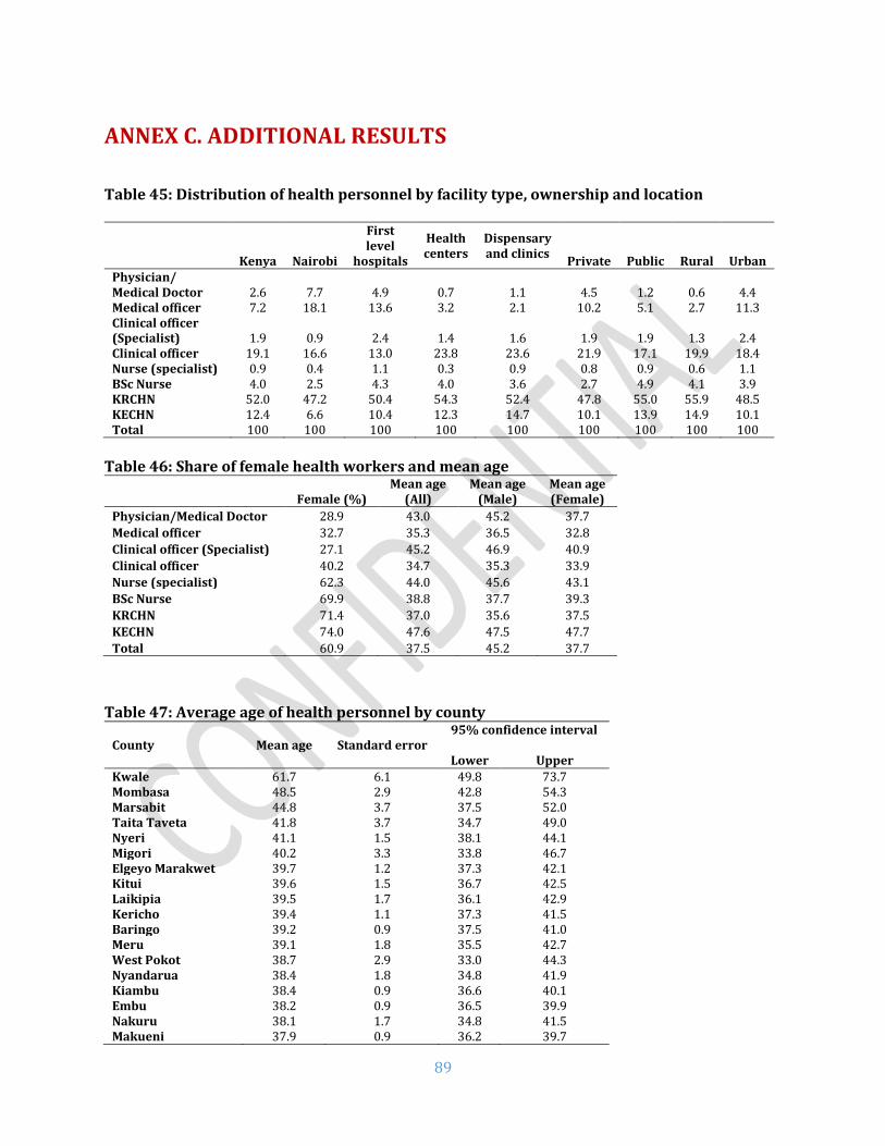
89
ANNEX C. ADDITIONAL RESULTS
Table 45: Distribution of health personnel by facility type, ownership and location
Kenya
Nairobi
First level
hospitals
Health centers
Dispensary and clinics
Private Public Rural Urban Physician/ Medical Doctor 2.6 7.7 4.9 0.7 1.1 4.5 1.2 0.6 4.4 Medical officer 7.2 18.1 13.6 3.2 2.1 10.2 5.1 2.7 11.3 Clinical officer (Specialist) 1.9 0.9 2.4 1.4 1.6 1.9 1.9 1.3 2.4 Clinical officer 19.1 16.6 13.0 23.8 23.6 21.9 17.1 19.9 18.4 Nurse (specialist) 0.9 0.4 1.1 0.3 0.9 0.8 0.9 0.6 1.1 BSc Nurse 4.0 2.5 4.3 4.0 3.6 2.7 4.9 4.1 3.9 KRCHN 52.0 47.2 50.4 54.3 52.4 47.8 55.0 55.9 48.5 KECHN 12.4 6.6 10.4 12.3 14.7 10.1 13.9 14.9 10.1 Total 100 100 100 100 100 100 100 100 100
Table 46: Share of female health workers and mean age
Female (%) Mean age
(All) Mean age
(Male) Mean age (Female)
Physician/Medical Doctor 28.9 43.0 45.2 37.7
Medical officer 32.7 35.3 36.5 32.8
Clinical officer (Specialist) 27.1 45.2 46.9 40.9
Clinical officer 40.2 34.7 35.3 33.9
Nurse (specialist) 62.3 44.0 45.6 43.1
BSc Nurse 69.9 38.8 37.7 39.3
KRCHN 71.4 37.0 35.6 37.5
KECHN 74.0 47.6 47.5 47.7
Total 60.9 37.5 45.2 37.7
Table 47: Average age of health personnel by county
County Mean age Standard error
95% confidence interval
Lower Upper
Kwale 61.7 6.1 49.8 73.7 Mombasa 48.5 2.9 42.8 54.3 Marsabit 44.8 3.7 37.5 52.0 Taita Taveta 41.8 3.7 34.7 49.0 Nyeri 41.1 1.5 38.1 44.1 Migori 40.2 3.3 33.8 46.7 Elgeyo Marakwet 39.7 1.2 37.3 42.1 Kitui 39.6 1.5 36.7 42.5 Laikipia 39.5 1.7 36.1 42.9 Kericho 39.4 1.1 37.3 41.5 Baringo 39.2 0.9 37.5 41.0 Meru 39.1 1.8 35.5 42.7 West Pokot 38.7 2.9 33.0 44.3 Nyandarua 38.4 1.8 34.8 41.9 Kiambu 38.4 0.9 36.6 40.1 Embu 38.2 0.9 36.5 39.9 Nakuru 38.1 1.7 34.8 41.5 Makueni 37.9 0.9 36.2 39.7

90
Murang’a 37.9 1.8 34.4 41.4 Kilifi 37.6 1.2 35.2 39.9 Lamu 37.1 1.2 34.8 39.4 Trans Nzoia 37.0 1.3 34.4 39.5 Vihiga 36.8 0.8 35.3 38.3 Tharaka-Nithi 36.8 0.6 35.6 37.9 Kakamega 36.7 0.7 35.3 38.1 Kisii 36.6 0.7 35.2 38.1 Tana River 36.5 1.5 33.6 39.5 Narok 36.5 1.4 33.9 39.2 Bungoma 36.5 0.6 35.3 37.7 Nairobi City 36.3 1.5 33.4 39.1 Samburu 36.2 0.6 35.0 37.4 Kirinyaga 36.0 0.8 34.5 37.6 Nandi 36.0 1.1 33.9 38.1 Busia 35.9 0.7 34.5 37.3 Nyamira 35.6 0.6 34.3 36.8 Homa Bay 35.4 0.8 33.7 37.1 Kisumu 35.3 0.8 33.7 36.9 Bomet 34.6 0.6 33.4 35.9 Uasin Gishu 34.5 1.4 31.8 37.2 Isiolo 34.1 0.9 32.2 35.9 Kajiado 33.3 1.3 30.8 35.8 Siaya 32.4 0.5 31.5 33.3 Garissa 32.4 0.4 31.5 33.2 Machakos 32.4 1.1 30.2 34.6 Mandera 32.2 0.6 31.0 33.5 Turkana 31.2 0.3 30.6 31.7 Wajir 30.4 0.4 29.6 31.2
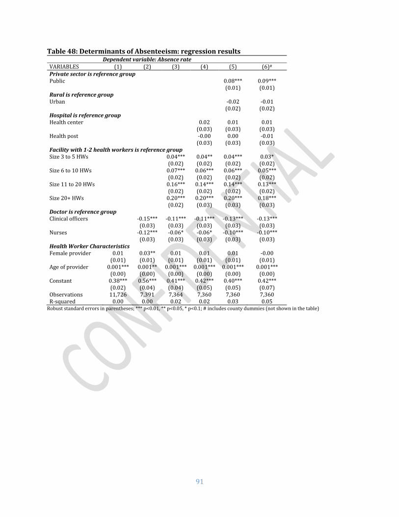
91
Table 48: Determinants of Absenteeism: regression results Dependent variable: Absence rate
VARIABLES (1) (2) (3) (4) (5) (6)#
Private sector is reference group Public 0.08*** 0.09*** (0.01) (0.01) Rural is reference group Urban -0.02 -0.01 (0.02) (0.02) Hospital is reference group Health center 0.02 0.01 0.01 (0.03) (0.03) (0.03) Health post -0.00 0.00 -0.01 (0.03) (0.03) (0.03) Facility with 1-2 health workers is reference group Size 3 to 5 HWs 0.04*** 0.04** 0.04*** 0.03* (0.02) (0.02) (0.02) (0.02) Size 6 to 10 HWs 0.07*** 0.06*** 0.06*** 0.05*** (0.02) (0.02) (0.02) (0.02) Size 11 to 20 HWs 0.16*** 0.14*** 0.14*** 0.13*** (0.02) (0.02) (0.02) (0.02) Size 20+ HWs 0.20*** 0.20*** 0.20*** 0.18*** (0.02) (0.03) (0.03) (0.03) Doctor is reference group Clinical officers -0.15*** -0.11*** -0.11*** -0.13*** -0.13*** (0.03) (0.03) (0.03) (0.03) (0.03) Nurses -0.12*** -0.06* -0.06* -0.10*** -0.10*** (0.03) (0.03) (0.03) (0.03) (0.03) Health Worker Characteristics Female provider 0.01 0.03** 0.01 0.01 0.01 -0.00 (0.01) (0.01) (0.01) (0.01) (0.01) (0.01) Age of provider 0.001*** 0.001** 0.001*** 0.001*** 0.001*** 0.001*** (0.00) (0.00) (0.00) (0.00) (0.00) (0.00) Constant 0.38*** 0.56*** 0.41*** 0.42*** 0.40*** 0.42*** (0.02) (0.04) (0.04) (0.05) (0.05) (0.07) Observations 11,726 7,391 7,364 7,360 7,360 7,360 R-squared 0.00 0.00 0.02 0.02 0.03 0.05
Robust standard errors in parentheses; *** p<0.01, ** p<0.05, * p<0.1; # includes county dummies (not shown in the table)

92
Table 49: Determinants of diagnostic accuracy: regression results
Dependent variable: Diagnostic accuracy
VARIABLES (1) (2) (3) (4) (5) (6) (7)#
Process quality 0.64*** 0.64***
(0.02) (0.03)
Minimum equipment
-0.00 -0.01 -0.00
(0.01) (0.01) (0.01)
Infrastructure 0.03*** 0.02*** 0.02**
(0.01) (0.01) (0.01)
Communication -0.02** -0.00 0.01
(0.01) (0.01) (0.01)
Ambulance access
-0.01 0.01 0.01
(0.01) (0.01) (0.01)
Drug availability 0.04* 0.02 0.02
(0.02) (0.02) (0.02)
Hospital is reference group
Health center -0.06*** -0.06*** -0.01 -0.01 -0.01 0.00 0.01
(0.02) (0.02) (0.02) (0.02) (0.02) (0.02) (0.01)
Health post -0.11*** -0.11*** -0.03 -0.03 -0.02 -0.00 0.01
(0.02) (0.02) (0.02) (0.02) (0.02) (0.02) (0.02)
Private sector is reference group
Public -0.00 0.04*** 0.04*** 0.05*** 0.03*** 0.03***
(0.01) (0.01) (0.01) (0.01) (0.01) (0.01)
Rural location is reference group
Urban 0.01 0.01 0.01 0.01 0.03***
(0.01) (0.01) (0.01) (0.01) (0.01)
Doctor is reference group
Clinical officers -0.00 -0.01 -0.00 0.01 0.02
(0.02) (0.02) (0.02) (0.02) (0.02)
Nurse -0.14*** -0.13*** -0.13*** -0.06*** -0.06***
(0.02) (0.02) (0.02) (0.02) (0.02)
Health Worker Characteristics
Female provider -0.02*** -0.02*** -0.01* -0.01
(0.01) (0.01) (0.01) (0.01)
Age of provider -0.00** -0.00* -0.00 -0.00
(0.00) (0.00) (0.00) (0.00)
Constant 0.75*** 0.75*** 0.73*** 0.76*** 0.73*** 0.38*** 0.28***
(0.02) (0.02) (0.02) (0.03) (0.04) (0.03) (0.05)
Observations 4,427 4,427 4,427 4,427 4,427 4,427 4,427
R-squared 0.02 0.02 0.08 0.09 0.09 0.24 0.28
Robust standard errors in parentheses; *** p<0.01, ** p<0.05, * p<0.1; # includes county dummies (not shown in the table)

93
Figure 32: Diagnostic accuracy by questions asked: Severe dehydration
Figure 33: Diagnostic accuracy by questions asked: Pneumonia
75%
58%
60%
93%
77%
59%
46%
93%
83%
11%
8%
41%
63%
42%
51%
89%
69%
47%
40%
75%
66%
5%
7%
28%
Vomit
Lethargic
Able to drink
Duration of diarrhea
Frequency of diarrhea
Blood in stool
Feeding well
Skin pinch
Sunken eyes
Check weight
Edema of feet
Offer drink
Wrong Diagnosis Correct Diagnosis
24%
25%
9%
98%
76%
3%
58%
56%
84%
17%
8%
16%
15%
2%
91%
63%
1%
30%
22%
50%
14%
5%
Vomit
Lethargic
Convulsions
Duration of cough
Fever
History of measles
Count respiratory rate
Difficulty breathing
Auscultate chest
Examine throat
Examine ear
Wrong Diagnosis Correct Diagnosis

94
Figure 34: Diagnostic accuracy by questions asked: Diabetes Mellitus
Figure 35: Diagnostic accuracy by questions asked: Pulmonary Tuberculosis
28%
31%
57%
56%
45%
25%
25%
8%
59%
23%
24%
40%
22%
25%
17%
18%
4%
22%
Weight
Dizziness
Appetite
Thirst
Diabetes in family
Abdomen/Liver
Blood pressure
Exercise
Urination
Wrong Diagnosis Correct Diagnosis
93%
51%
45%
74%
26%
52%
70%
26%
22%
57%
35%
10%
34%
35%
58%
16%
46%
63%
29%
34%
41%
7%
23%
30%
18%
12%
45%
19%
7%
23%
25%
49%
9%
34%
Duration of cough
Blood in sputum
Chest pain
Night sweats
Fever pattern
HIV test taken
Weight loss
Appetite
General condition
Take temperature
Check weight
Check height
Take pulse
Count respiratory rate
Chest exam
Chest retraction
Blood pressure
Wrong Diagnosis Correct Diagnosis

95
Figure 36: Correct treatment actions: Post-partum Hemorrhage
Figure 37: Correct treatment actions: Neonatal Asphyxia
54%
18%
32%
22%
3%
10%
43%
29%
19%
65%
50%
13%
24%
17%
3%
5%
34%
21%
15%
59%
Number of pads
Gestity
Placenta delivery
History of PPH
Excess fluid
Multiple pregnancies
Hypertension
Pulse
Respiratory rate
Ruptured uterus
Palpate uterus
Wrong Diagnosis Correct Diagnosis
41%
60%
12%
18%
25%
59%
66%
64%
27%
33%
28%
20%
47%
24%
44%
3%
5%
7%
35%
46%
45%
22%
20%
19%
10%
32%
Call for help
Provide oxygen
Check breathing improve
Check heart rate
Give 5 inflations
Use bag and mask
Keep baby warm
Clear airways
Compute APGAR
Look at baby color
Test irritability reflex
Check muscle tone
Observe respiratory effort
Wrong Diagnosis Correct Diagnosis
96
Table 50: Danger signs asked for sick child vignette by cadre type
% Cadre
Pneumonia Severe dehydration
Vomit Convulsion Lethargic Vomit Lethargic Drink
Doctors 33.9 17.0 29.2 75.7 60.7 58.8
Clinical officers 25.8 10.0 29.2 77.8 56.6 55.0
Nurses 17.9 5.0 16.9 55.6 36.2 51.8
Total 22.6 8.1 23.3 67.0 47.1 53.8

97
Table 51: Drug availability for the full SDI list
% facilities Kenya Nairobi Urban Rural Public Private First Level
Hospital
Health Center
Dispensary & Clinic
Core Medications Amoxicillin tab* 84.1 81.5 84.1 84.1 80.6 88.1 97.1 83.6 83.4 Coamoxiclav** 46.4 61.0 64.1 38.0 32.5 62.2 81.8 52.2 43.0 Ciprofloxacin** 75.3 82.6 81.6 72.3 68.2 83.4 89.3 76.4 74.2 Amitriptyline** 33.7 50.8 49.1 26.4 19.7 49.6 73.9 43.0 29.3 Amlodipine*** 24.2 39.0 40.6 16.3 14.5 35.2 65.0 31.3 20.2 Atenolol** 36.6 54.9 47.7 31.2 28.1 46.1 88.2 51.3 30.4 Dexamethasone** 40.6 43.6 48.9 36.6 33.7 48.3 91.4 56.8 34.1 Diazepam* 52.4 73.3 63.7 46.9 40.6 65.6 80.2 67.4 47.6 Enalapril* 50.3 58.0 57.9 46.6 42.7 58.8 95.2 64.0 44.7 Furosemide** 67.1 81.5 73.6 64.0 59.0 76.3 98.2 81.2 62.3 Hydrochlorothiazide** 60.6 61.0 63.7 59.1 53.5 68.7 94.8 71.0 56.4 Hydrocortisone* 83.2 81.5 83.9 82.9 80.6 86.1 94.0 88.8 81.4 Insulin** 24.7 43.6 40.5 17.2 15.5 35.3 91.0 40.5 17.4 Metformin** 52.3 55.9 59.8 48.7 43.6 62.1 96.6 67.9 46.4 Prednisolone** 71.0 72.3 77.1 68.1 61.3 82.0 88.8 71.7 69.7 Salbutamol* 39.7 44.1 46.5 36.4 34.9 45.2 74.8 45.5 36.3 Aspirin* 51.6 53.3 50.9 52.0 55.1 47.7 81.2 62.4 47.7 Fluconazole** 44.0 65.6 65.3 33.8 27.9 62.2 75.0 56.0 39.7 Nystatin* 69.1 55.4 63.8 71.7 71.8 66.1 85.6 78.4 66.3 Clotrimazole* 80.4 74.4 78.1 81.5 79.5 81.5 89.6 79.7 79.9 Griseofulvin** 66.3 58.0 63.9 67.5 67.4 65.1 95.5 72.7 63.2 Ibuprofen** 77.6 77.4 81.7 75.7 70.8 85.3 92.0 78.2 76.6 Tramadol** 30.1 42.6 52.7 19.3 10.5 52.3 75.9 33.0 26.6 Morphine** 5.4 4.6 10.2 3.0 3.5 7.5 51.5 7.5 2.0 Isoniazid Rifampicin** (Fixed-dose combination)
40.0 32.3 25.9 46.7 57.9 19.7 79.2 65.6 32.5
Isoniazid Rifampicin Pyrazinamide** (Fixed-dose combination)
24.6 21.0 17.4 28.0 36.1 11.5 65.7 50.1 17.0
Isoniazid Rifampicin Pyrazinamide Ethambutol** (Fixed-dose combination)
42.2 32.3 26.5 49.7 61.6 20.3 81.3 69.3 34.4
Essential Medications for mothers Oxytocin** 90.0 100.0 95.9 88.5 89.0 92.3 97.0 97.2 85.7 Calcium Gluconate** 29.2 36.9 47.3 24.6 25.4 37.6 64.9 31.8 22.3 Magnesium sulphate** 61.3 52.3 65.8 60.2 64.3 54.6 84.8 67.8 54.7 Sodium Chloride** 91.0 96.9 96.3 89.7 89.9 93.6 95.6 93.8 89.1 Misoprostol** 23.0 72.3 62.3 13.0 11.1 49.3 69.5 27.2 13.6 Ampicillin* 16.9 50.8 33.7 12.6 9.8 32.5 31.1 18.2 14.0 Gentamicin* 87.1 96.9 94.3 85.2 84.6 92.6 96.2 88.8 84.8 Metronidazole* 88.5 93.8 96.7 86.5 85.7 94.9 95.9 89.3 87.0 Azithromycin/Erythromycin**
63.9 75.4 81.1 59.5 56.0 81.5 83.7 65.9 59.8
Cefixime** 72.7 87.7 90.8 68.1 65.1 89.6 95.9 75.6 67.7 Benzathine benzyl penicillin*
83.6 90.8 92.5 81.4 80.1 91.5 93.7 89.0 79.7
Betamethasone/Dexamethasone**
50.7 60.0 72.6 45.1 43.6 66.4 91.6 60.7 39.7
Nifedipine** 51.2 72.3 79.5 44.0 39.1 78.0 80.7 55.4 44.6 Methyldopa** 47.9 69.2 71.3 42.0 41.8 61.6 86.4 60.8 36.1 Hydralazine** 38.1 58.5 61.5 32.1 32.1 51.2 78.1 47.5 27.5 Iron supplements* 84.4 76.4 73.8 89.5 92.6 75.1 95.5 93.1 82.0 Sulfadoxine/pyrimethamine**
24.4 7.2 21.8 25.7 25.6 23.2 36.7 28.5 22.9
Essential Medications for children

98
Paracetamol** 91.4 87.7 91.3 91.4 89.1 94.0 100.0 93.2 90.5 Morphine** 5.4 4.6 10.2 3.0 3.5 7.5 51.5 7.5 2.0 Amoxicillin* 72.9 75.4 76.6 71.1 64.7 82.1 82.4 75.6 71.7 Cotrimoxazole* 85.0 80.5 78.5 88.1 88.3 81.3 98.7 90.3 83.1 Benzylpenicillin* 62.7 77.4 70.3 59.1 51.9 74.9 80.2 67.0 60.7 Oral Rehydration Solution*
79.4 79.5 76.1 81.1 81.5 77.1 92.9 84.7 77.6
Vitamin A* 94.6 91.5 94.7 94.5 95.6 92.3 98.3 96.9 93.6 ACT or ALU* 79.3 76.4 75.5 81.2 82.6 75.6 93.4 84.2 77.5 Artesunate** 45.0 38.5 39.2 47.8 53.0 36.0 78.5 60.7 39.8 Albendazole* 86.8 84.6 82.9 88.6 89.9 83.2 98.1 90.0 85.4 Mebendazole** 27.3 42.6 39.5 21.5 13.6 42.9 45.0 28.3 26.0 Chlorhexidine* 25.0 22.1 21.1 26.9 30.0 19.3 57.9 43.6 19.3 Tetracycline eye ointment*
65.7 61.0 64.1 66.5 62.3 69.6 91.4 71.0 63.0
Note: Should be carried by * Dispensary/clinic and above, ** Health centers and above, *** First level hospitals according to KEML 2016
Figure 38: Availability of individual tracer drugs by type of facility
Note: Should be carried by * Dispensary/clinic and above, ** Health centers and above, *** First level hospitals according to KEML 2016
Table 52: Drug availability for tracer drugs
% facilities Kenya Nairobi Urban Rural Public Private
All 4.9 11.8 7.9 3.4 2.5 7.5
First level hospitals 21.4 33.3 25.9 17.2 15.3 30.1
82%
31%
96%
80%
93%
93%
51%
100%
76%
18%
89%
67%
85%
84%
8%
93%
72%
14%
85%
61%
78%
77%
2%
91%
Amoxycillin suspension*
Ampicillin*
Gentamicin*
Benzyl penicillin*
ORS*
ACT*
Morphine**
Paracetamol**
Dispensary & Clinic Health Center First Level Hospital

99
Health centers 8.6 15.8 15.9 5.3 3.3 16.6
Dispensaries and clinics
3.1 9.5 4.6 17.2 1.4 4.8

100
ANNEX D. County level results maps
Map 1: Absence Rate across Counties

101
Map 2: Availability of Priority Drugs across Counties

102
Map 3: Capacity to Manage Maternal and Neonatal Complications across Counties

103
Map 4: Availability of Minimum Infrastructure across Counties

104
Map 5: Share of Facilities with Minimum Equipment across Counties

105
Map 6: Average Diagnostic Accuracy of Common Conditions across Counties
106
Map 7: Average Adherence to Clinical Guidelines across Counties

107
ANNEX E. Additional County Level Results
Table A1. Facilities with basic emergency obstetric and neonatal care package (excludes assisted vaginal delivery)
County Total First level
hospital
Health Center
Dispensary and Clinic
Samburu 100.0 100.0 100.0 100.0 Embu 93.1 100.0 83.3 100.0 Tharaka-Nithi 91.4 100.0 100.0 50.0 Bomet 88.4 100.0 100.0 71.4 Garissa 81.5 100.0 85.7 73.3 Trans Nzoia 78.8 100.0 100.0 66.7 Wajir 78.6 80.0 83.3 76.0 Mandera 77.9 100.0 80.0 70.6 Nakuru 76.8 100.0 90.0 54.5 Kisumu 76.3 100.0 100.0 61.3 Marsabit 74.1 100.0 90.0 67.7 Nairobi City 68.7 66.7 73.3 64.3 Meru 66.2 50.0 75.0 66.7 Kakamega 62.7 100.0 68.8 55.9 Nyandarua 62.1 100.0 100.0 40.0 Mombasa 61.7 75.0 75.0 50.0 Kiambu 60.5 100.0 40.0 60.0 Nyamira 60.4 100.0 76.2 45.2 Nyeri 60.3 100.0 42.9 75.0 Baringo 59.7 100.0 71.4 50.0 Siaya 58.1 100.0 72.2 45.5 Elgeyo Marakwet 55.7 100.0 90.9 26.3 Kisii 53.2 88.9 84.6 32.4 Busia 52.0 100.0 62.5 42.3 Bungoma 49.2 100.0 80.0 37.2 Laikipia 48.3 100.0 100.0 35.5 Kilifi 48.1 100.0 66.7 41.5 Kericho 46.9 100.0 20.0 40.0 Kwale 46.8 100.0 85.7 38.1 Kitui 45.1 75.0 71.4 26.9 Kajiado 44.7 100.0 100.0 20.0 Kirinyaga 44.3 66.7 54.5 16.7 Taita Taveta 43.0 100.0 33.3 37.5 Makueni 42.5 100.0 88.9 28.2 Isiolo 42.2 100.0 50.0 30.8 West Pokot 41.5 100.0 66.7 35.9 Vihiga 41.4 100.0 76.9 10.5 Turkana 41.3 100.0 87.5 27.5 Murang’a 39.4 100.0 25.0 22.2 Migori 38.2 50.0 50.0 33.3 Nandi 36.9 100.0 40.0 22.2 Uasin Gishu 36.2 100.0 50.0 24.0 Lamu 34.7 100.0 33.3 27.8 Machakos 33.7 50.0 33.3 32.1 Narok 33.1 100.0 76.9 11.4 Homa Bay 28.2 100.0 40.0 16.7 Tana River 23.1 100.0 100.0 14.3

108
Table A2. Vaccines storage - Refrigerators with temperature between 2oC and 8oC
County Total First level
hospital
Health Center
Dispensary and Clinic
Mombasa 91.4 100.0 85.7 92.3 Kwale 97.5 100.0 100.0 96.9 Kilifi 90.7 100.0 100.0 88.9 Tana River 80.9 100.0 100.0 77.3 Lamu 80.0 100.0 75.0 78.6 Taita Taveta 93.5 66.7 100.0 95.5 Garissa 90.3 100.0 83.3 90.5 Wajir 82.9 80.0 100.0 75.0 Mandera 94.9 100.0 93.8 94.7 Marsabit 77.5 50.0 85.7 76.9 Isiolo 96.6 100.0 100.0 95.7 Meru 96.7 100.0 100.0 94.4 Tharaka-Nithi 100.0 100.0 100.0 100.0 Embu 91.8 100.0 100.0 89.7 Kitui 85.3 66.7 91.7 84.4 Machakos 87.9 100.0 85.7 87.9 Makueni 91.0 100.0 100.0 88.6 Nyandarua 97.2 100.0 100.0 95.8 Nyeri 100.0 100.0 100.0 100.0 Kirinyaga 93.2 100.0 90.0 94.4 Murang’a 89.7 100.0 85.7 89.5 Kiambu 93.5 100.0 71.4 97.1 Turkana 68.1 100.0 87.5 61.5 West Pokot 74.6 100.0 66.7 73.5 Samburu 100.0 100.0 100.0 100.0 Trans Nzoia 86.3 0.0 100.0 88.0 Uasin Gishu 84.4 75.0 100.0 81.8 Elgeyo Marakwet 97.9 100.0 100.0 97.1 Nandi 92.8 100.0 100.0 92.0 Baringo 97.5 100.0 100.0 96.7 Laikipia 84.7 100.0 100.0 80.8 Nakuru 84.2 100.0 88.9 79.2 Narok 86.9 100.0 100.0 80.6 Kajiado 90.1 100.0 100.0 85.7 Kericho 83.7 66.7 100.0 83.3 Bomet 71.1 100.0 60.0 70.8 Kakamega 97.9 100.0 100.0 97.1 Vihiga 96.0 100.0 100.0 90.0 Bungoma 82.9 100.0 80.0 80.8 Busia 84.1 66.7 100.0 82.6 Siaya 94.1 100.0 93.8 93.8 Kisumu 91.2 100.0 92.9 88.9 Homa Bay 89.6 100.0 85.7 90.0 Migori 80.0 100.0 100.0 71.0 Kisii 95.9 100.0 100.0 93.3 Nyamira 91.0 100.0 94.4 87.0 Nairobi City 96.1 100.0 93.8 96.9

109
Table A3. Availability of equipment
County Total First level
hospital
Health Center
Dispensary and Clinic
Meru 72.9 100.0 88.9 69.3 Mombasa 72.7 75.0 50.0 75.4 Kajiado 67.6 50.0 100.0 63.6 Kirinyaga 60.5 66.7 72.7 57.9 Nairobi City 59.5 66.7 68.4 56.8 Nyeri 58.5 66.7 100.0 52.9 Vihiga 58.4 66.7 64.3 54.8 Kericho 58.3 60.0 42.9 60.0 Homa Bay 55.4 100.0 52.9 52.7 Embu 55.0 100.0 71.4 50.9 Lamu 54.5 100.0 75.0 48.1 Taita Taveta 54.5 75.0 90.0 41.7 Machakos 52.4 50.0 75.0 50.0 Murang’a 52.3 100.0 85.7 46.3 Kitui 51.7 75.0 73.3 45.2 Trans Nzoia 51.6 50.0 85.7 47.2 Nyandarua 50.5 100.0 100.0 39.2 Nakuru 50.5 100.0 41.7 48.5 Makueni 50.3 100.0 70.0 45.7 Mandera 50.2 100.0 61.1 37.5 Wajir 50.2 100.0 83.3 30.3 Siaya 50.0 75.0 72.2 39.6 Narok 49.9 100.0 66.7 41.3 Kisii 49.5 100.0 71.4 32.6 Busia 49.3 66.7 30.0 52.2 Kilifi 48.7 33.3 71.4 47.1 Kisumu 48.3 85.7 81.3 31.1 Uasin Gishu 48.0 100.0 88.9 37.9 Kwale 47.4 100.0 71.4 42.6 Garissa 46.7 60.0 45.5 45.5 Baringo 46.6 100.0 44.4 45.8 Migori 46.5 25.0 83.3 40.0 Bungoma 45.9 75.0 30.0 46.6 Nyamira 45.5 100.0 57.1 33.3 Kiambu 45.0 60.0 54.5 42.5 Tharaka-Nithi 44.7 66.7 87.5 36.2 Bomet 43.3 100.0 44.4 40.4 Laikipia 41.5 50.0 80.0 36.4 Turkana 38.6 100.0 75.0 29.6 Kakamega 38.0 75.0 52.6 30.2 Tana River 34.6 100.0 100.0 26.5 Elgeyo Marakwet 33.7 100.0 54.5 22.7 Samburu 32.9 100.0 100.0 24.3 West Pokot 31.0 100.0 66.7 25.9 Nandi 25.9 100.0 80.0 19.4 Isiolo 22.9 100.0 66.7 7.4 Marsabit 8.4 0.0 0.0 11.1

110
Table A4. Outpatient caseload Outpatient visits per provider per day
Total First level hospital
Health center
Dispensary and clinic
Samburu 42.2 33.6 15.2 44.8 West Pokot 29.5 18.6 9.0 31.2 Kwale 27.4 55.2 28.5 26.4 Kitui 20.1 13.3 24.4 19.4 Bomet 19.4 13.8 22.6 19.1 Mandera 18.1 5.6 19.5 19.0 Elgeyo Marakwet 17.8 6.6 12.2 20.2 Makueni 17.8 9.9 14.0 18.6 Isiolo 17.6 3.4 8.4 20.4 Kericho 16.3 4.0 14.8 17.7 Murang’a 16.1 14.8 17.5 16.0 Nandi 15.7 20.7 7.3 16.3 Trans Nzoia 15.6 6.4 12.9 16.2 Kajiado 14.7 9.4 29.5 12.7 Garissa 14.7 6.8 12.8 16.2 Nairobi City 13.9 15.6 11.2 14.4 Kakamega 13.2 5.4 11.3 14.3 Kilifi 12.9 8.1 14.0 13.0 Taita Taveta 12.8 7.6 16.2 12.6 Migori 12.5 2.8 9.8 13.8 Nyandarua 12.4 9.8 11.8 12.6 Siaya 12.2 7.7 7.2 14.4 Meru 12.1 16.6 11.1 12.0 Laikipia 11.9 9.8 5.1 12.9 Kiambu 11.8 14.4 19.8 10.4 Lamu 11.8 1.0 7.2 13.3 Baringo 11.8 0.7 12.1 12.0 Busia 11.8 9.5 7.3 12.9 Narok 11.7 4.9 11.0 12.4 Uasin Gishu 11.6 6.7 12.9 11.8 Wajir 11.6 5.8 10.8 12.7 Tana River 10.9 4.1 7.5 11.4 Kirinyaga 10.9 8.0 8.6 11.5 Homa Bay 10.8 10.1 8.3 11.6 Kisii 10.7 4.9 12.7 11.2 Nyeri 10.4 29.3 10.8 9.7 Vihiga 10.3 22.7 6.2 10.8 Marsabit 10.2 3.2 9.7 10.6 Nakuru 10.0 18.5 10.7 9.3 Mombasa 9.8 9.3 6.8 10.2 Tharaka-Nithi 9.5 8.8 13.7 8.9 Machakos 9.3 4.3 11.0 9.3 Embu 9.1 7.7 4.4 9.8 Turkana 8.9 12.8 5.9 9.1 Kisumu 8.5 6.6 7.3 9.2 Bungoma 7.6 25.5 5.5 6.7 Nyamira 7.1 4.2 10.0 5.6

111
Table A5. Average health workers per facility
# workers Total First level hospital
Health center
Dispensary and clinic
Nairobi City 17 188 13 8 Kisumu 13 46 15 8 Mombasa 13 137 7 5 Uasin Gishu 13 65 22 7 Kisii 11 47 12 4 Siaya 10 38 16 6 Murang’a 10 109 18 4 Kiambu 10 98 12 3 Wajir 10 65 5 3 Vihiga 10 52 15 3 Laikipia 10 82 11 3 Mandera 9 69 6 3 Taita Taveta 9 46 7 4 Kwale 9 145 16 3 Kajiado 9 69 21 4 Lamu 9 83 12 3 Tharaka-Nithi 8 89 13 3 Busia 8 37 15 5 Nyamira 8 58 7 4 Trans Nzoia 8 47 22 3 Nandi 8 118 14 4 Kirinyaga 8 68 16 3 Kilifi 8 90 8 4 Nakuru 8 60 12 3 Narok 8 88 9 2 Garissa 7 31 6 5 Machakos 7 79 14 4 Migori 7 22 17 4 Bungoma 7 41 13 4 Homa Bay 7 36 8 4 Elgeyo Marakwet 7 57 8 2 Turkana 7 40 14 4 Embu 6 64 15 3 Nyandarua 6 111 11 2 Kakamega 6 24 10 4 Baringo 6 158 10 2 Makueni 6 80 17 2 Marsabit 6 66 5 4 Bomet 6 28 16 3 Nyeri 6 93 11 2 Kericho 6 40 7 2 Tana River 5 43 17 3 Meru 5 31 9 3 West Pokot 5 49 9 3 Isiolo 5 20 6 3 Kitui 4 24 7 2 Samburu 4 27 6 2

112
Table A6. Absence rate by cadre and facility type
County Total First level
hospital
Health Center
Dispensary and Clinic
Doctors Clinical officers
Nurses
West Pokot 67.6 84.7 78.9 50.5 0.0 78.4 63.5 Marsabit 66.3 100.0 50.0 55.0 . 63.4 70.9 Nyeri 64.6 77.1 62.1 45.3 74.1 63.9 56.1 Wajir 64.2 76.1 39.6 34.5 95.9 36.2 80.7 Vihiga 64.0 68.4 66.1 51.8 45.6 67.7 70.0 Narok 63.7 77.9 47.5 49.3 0.0 66.8 77.4 Trans Nzoia 60.6 74.5 54.9 53.4 29.0 44.1 66.7 Kilifi 60.1 71.8 41.8 51.3 100.0 46.5 56.9 Kiambu 59.9 64.4 57.6 49.3 59.0 57.9 67.1 Nandi 59.8 77.0 61.7 50.3 0.0 62.8 64.8 Kakamega 59.3 78.4 57.3 50.9 62.2 56.8 61.2 Uasin Gishu 59.0 80.0 67.0 40.2 66.3 69.0 50.6 Garissa 57.9 71.4 48.7 50.1 26.3 56.4 60.8 Nairobi City 57.6 61.8 58.9 50.0 55.6 49.3 59.8 Kajiado 57.5 67.0 67.3 39.7 74.0 43.9 62.0 Kericho 56.8 73.1 48.2 41.5 40.9 68.3 58.9 Kisii 56.5 60.5 54.8 48.6 64.8 64.1 59.3 Bungoma 55.6 62.7 52.3 50.7 21.4 53.5 58.0 Lamu 51.2 52.7 58.5 41.1 100.0 71.5 49.6 Kwale 51.2 55.7 55.5 45.2 93.1 46.5 41.7 Kirinyaga 51.2 40.3 67.8 45.1 96.1 52.3 50.4 Machakos 50.7 60.0 56.6 41.5 90.7 33.5 55.5 Tana River 50.3 33.3 64.3 54.2 . 45.3 48.4 Murang’a 50.3 58.2 44.6 43.5 100.0 35.5 33.3 Embu 49.7 49.8 59.6 45.5 100.0 34.0 50.2 Nakuru 49.7 66.4 31.6 35.2 69.3 41.7 59.4 Homa Bay 49.5 62.4 48.0 41.7 100.0 63.2 55.8 Meru 49.5 52.6 46.5 48.6 22.2 34.6 51.3 Busia 48.5 23.4 64.2 49.5 56.5 42.2 54.9 Kisumu 48.2 59.6 46.6 41.7 84.2 33.7 59.2 Taita Taveta 47.9 58.4 45.0 38.5 75.2 45.4 47.5 Kitui 47.6 57.1 45.6 44.8 68.8 41.3 48.4 Migori 47.2 60.8 51.8 38.8 83.6 44.2 59.2 Nyamira 46.3 44.8 49.9 44.5 42.2 56.4 41.1 Laikipia 45.6 49.8 62.3 38.6 58.9 44.2 51.0 Tharaka-Nithi 44.8 40.2 53.7 47.4 . 70.9 34.7 Samburu 44.8 62.0 46.7 36.8 . 52.2 51.3 Isiolo 44.8 56.5 45.3 39.3 23.2 49.6 41.0 Nyandarua 44.6 36.8 55.7 51.9 . 30.8 42.0 Elgeyo Marakwet 44.6 40.7 47.8 50.5 90.0 70.6 42.5 Mombasa 44.4 53.9 24.0 33.8 13.8 59.5 37.4 Bomet 44.4 63.1 33.1 46.3 73.2 33.4 49.1 Siaya 43.5 50.0 45.7 38.2 54.2 38.6 51.3 Turkana 42.3 34.5 42.3 47.1 100.0 40.2 38.8 Baringo 36.6 50.0 39.4 20.3 50.7 60.8 29.0 Mandera 35.8 41.8 23.5 28.9 23.5 24.2 46.4 Makueni 24.9 7.8 43.3 25.2 25.2 13.6 25.8
113
Table A7. Diagnostic accuracy % health workers
Severe dehydration
Pneumonia Diabetes TB PPH Neonatal asphyxia
Mombasa 37.8 70.0 47.9 97.3 92.4 88.1 Kwale 34.4 75.1 49.1 98.0 80.8 85.5 Kilifi 24.8 89.4 43.9 100.0 91.8 83.0 Tana River 45.4 78.2 25.6 93.2 90.1 82.6 Lamu 23.8 100.0 81.2 100.0 92.4 100.0 Taita Taveta
36.6 74.3 68.5 100.0 91.8 88.7
Garissa 78.6 98.2 75.1 98.2 91.5 94.7 Wajir 78.4 91.5 84.3 100.0 98.0 94.8 Mandera 19.3 95.7 63.6 97.9 97.9 97.2 Marsabit 26.0 87.5 58.5 100.0 95.8 97.1 Isiolo 43.2 84.9 86.4 100.0 92.4 92.4 Meru 31.7 97.2 83.3 99.4 92.1 90.4 Tharaka-Nithi
37.4 66.7 68.4 92.1 97.6 85.2
Embu 33.1 71.0 67.7 92.0 73.1 84.3 Kitui 15.7 85.3 83.3 96.4 80.7 95.3 Machakos 22.7 80.6 45.0 94.4 84.2 88.0 Makueni 10.1 87.2 91.5 98.4 92.0 97.3 Nyandarua 25.6 75.4 58.7 96.5 97.4 84.8 Nyeri 12.6 71.9 56.8 96.8 89.2 85.4 Kirinyaga 13.8 69.5 60.3 97.0 92.1 88.8 Murang’a 22.9 74.9 67.4 98.8 89.5 83.3 Kiambu 36.1 84.2 68.8 96.2 96.2 73.8 Turkana 52.5 88.4 51.3 100.0 96.5 87.7 West Pokot
32.5 83.1 49.2 97.4 84.6 89.2
Samburu 47.1 85.3 51.6 95.5 80.9 98.3 Trans Nzoia
31.6 77.4 49.2 94.2 91.6 85.5
Uasin Gishu
29.3 81.7 41.3 97.5 82.4 89.0
Elgeyo Marakwet
29.4 82.2 58.5 100.0 93.9 98.4
Nandi 31.1 88.3 34.5 98.1 88.5 79.7 Baringo 15.2 90.5 63.7 98.7 98.7 86.7 Laikipia 8.7 79.5 52.0 98.7 95.4 90.1 Nakuru 39.2 87.6 83.2 99.6 89.2 92.0 Narok 55.0 95.1 81.9 100.0 87.7 99.3 Kajiado 62.6 94.2 77.3 96.9 89.0 99.0 Kericho 40.8 89.7 77.6 98.7 91.8 94.2 Bomet 46.3 87.9 61.1 100.0 82.1 81.9 Kakamega 30.4 74.6 49.1 95.9 87.0 78.4 Vihiga 22.1 64.9 27.4 87.3 86.0 84.0 Bungoma 20.2 96.2 80.6 96.9 93.8 96.0 Busia 23.6 91.7 83.9 99.0 91.7 96.0 Siaya 25.7 69.3 51.0 95.2 94.1 96.7 Kisumu 27.5 73.2 43.6 100.0 97.6 92.4 Homa Bay 26.0 81.6 35.6 99.1 94.0 89.7 Migori 29.6 82.5 58.2 97.4 89.7 90.9 Kisii 47.4 84.9 66.0 98.1 81.6 97.3 Nyamira 29.9 73.8 66.2 96.9 75.9 88.0 Nairobi City
34.2 73.6 47.3 95.5 90.5 78.6

114
Table A8. Treatment accuracy % health workers
Severe dehydration
Pneumonia Diabetes TB PPH Neonatal asphyxia
Mombasa 70.5 54.3 50.6 63.6 14.7 4.8 Kwale 81.6 68.2 54.4 88.4 22.3 16.5 Kilifi 86.7 77.0 62.1 72.9 28.4 28.7 Tana River 87.0 68.6 49.1 86.4 47.8 0.0 Lamu 65.8 69.7 65.2 69.0 32.3 35.3 Taita Taveta
89.5 95.1 82.8 75.0 52.6 26.9
Garissa 85.3 87.5 75.5 43.0 64.4 61.7 Wajir 89.1 98.0 95.7 92.8 83.5 57.9 Mandera 90.0 91.4 61.5 55.6 13.5 1.1 Marsabit 77.9 89.6 74.3 91.7 37.2 20.3 Isiolo 83.4 97.0 93.9 45.4 77.3 43.9 Meru 72.7 89.5 96.3 40.4 57.4 33.9 Tharaka-Nithi
83.5 77.3 56.8 58.7 32.0 29.8
Embu 71.5 61.2 62.2 60.3 27.9 25.5 Kitui 77.9 76.1 80.9 83.9 67.3 44.0 Machakos 89.4 69.1 56.2 62.1 31.3 12.8 Makueni 83.8 98.4 85.6 84.7 70.6 63.7 Nyandarua 76.8 89.7 60.2 74.7 33.3 0.0 Nyeri 65.8 67.2 44.1 65.8 30.4 0.5 Kirinyaga 70.1 68.2 55.9 85.2 33.0 4.8 Murang’a 81.9 72.9 66.0 76.5 42.7 1.8 Kiambu 84.5 77.6 67.2 61.8 55.6 2.3 Turkana 89.1 74.6 62.9 94.1 53.6 8.7 West Pokot
67.3 90.1 55.6 51.2 39.4 7.4
Samburu 71.7 80.5 42.4 73.4 36.3 40.5 Trans Nzoia
68.1 76.2 41.1 75.9 37.1 15.4
Uasin Gishu
66.7 81.2 49.7 76.5 48.2 8.5
Elgeyo Marakwet
91.8 100.0 53.1 94.4 66.0 29.9
Nandi 75.6 93.9 42.3 69.4 44.8 2.2 Baringo 92.4 96.2 65.9 98.7 72.8 17.7 Laikipia 75.6 84.0 51.3 87.0 15.8 2.5 Nakuru 79.7 81.8 77.1 78.8 51.6 11.3 Narok 89.4 76.9 74.9 68.0 64.5 45.6 Kajiado 83.1 76.1 94.3 68.0 45.0 38.6 Kericho 81.9 86.4 58.6 82.6 58.5 12.5 Bomet 85.7 93.6 55.3 85.4 61.4 8.5 Kakamega 71.0 66.2 40.9 66.2 36.3 2.8 Vihiga 69.4 51.8 27.4 47.1 24.8 4.1 Bungoma 83.7 84.6 67.6 87.1 45.7 1.9 Busia 83.4 84.9 75.9 90.8 41.5 6.1 Siaya 84.7 81.3 46.1 81.7 30.7 8.0 Kisumu 74.1 82.5 36.7 89.3 49.2 8.7 Homa Bay 82.9 88.3 55.5 92.7 58.9 3.2 Migori 67.5 81.3 62.6 89.2 51.7 6.7 Kisii 52.5 79.6 61.2 67.5 31.2 41.1 Nyamira 80.1 74.9 66.2 73.3 49.5 36.8 Nairobi City
79.6 78.4 71.9 63.5 24.1 9.3

115
Table A9. Management of maternal and neonatal complications
% health workers PPH Neonatal asphyxia
Both
Mombasa 26.9 26.8 26.8 Kwale 25.5 28.0 26.7 Kilifi 34.6 42.3 38.5 Tana River 40.0 25.8 32.9 Lamu 37.7 51.1 44.4 Taita Taveta 45.4 40.6 43.0 Garissa 65.7 74.3 70.0 Wajir 60.3 60.4 60.3 Mandera 29.8 34.2 32.0 Marsabit 33.4 50.6 42.0 Isiolo 54.1 45.9 50.0 Meru 55.8 52.0 53.9 Tharaka-Nithi 32.0 32.1 32.0 Embu 29.3 32.4 30.8 Kitui 50.0 45.7 47.9 Machakos 35.3 37.0 36.2 Makueni 51.5 51.4 51.4 Nyandarua 25.6 17.0 21.3 Nyeri 25.6 15.3 20.4 Kirinyaga 27.4 22.6 25.0 Murang’a 33.0 26.0 29.5 Kiambu 40.3 26.3 33.3 Turkana 42.9 30.9 36.9 West Pokot 28.8 20.9 24.9 Samburu 34.1 42.0 38.0 Trans Nzoia 27.1 20.2 23.7 Uasin Gishu 32.1 30.4 31.3 Elgeyo Marakwet 55.4 48.6 52.0 Nandi 32.7 27.0 29.9 Baringo 48.2 26.4 37.3 Laikipia 22.4 23.2 22.8 Nakuru 38.4 27.5 32.9 Narok 55.2 56.9 56.0 Kajiado 46.0 54.9 50.5 Kericho 40.1 34.0 37.1 Bomet 44.5 32.4 38.5 Kakamega 27.3 18.0 22.6 Vihiga 20.0 14.5 17.2 Bungoma 33.5 28.6 31.1 Busia 31.8 32.3 32.1 Siaya 23.3 18.6 20.9 Kisumu 29.9 23.1 26.5 Homa Bay 40.5 23.4 32.0 Migori 35.1 25.0 30.1 Kisii 34.0 43.2 38.6 Nyamira 40.8 40.6 40.7 Nairobi City 32.3 30.9 31.6

116
Table A10. Adherence to clinical guidelines
% health workers History and examination
Important history and
examination Mombasa 33.5 44.6 Kwale 27.4 39.2 Kilifi 38.5 50.8 Tana River 30.2 43.3 Lamu 34.1 43.9 Taita Taveta 38.1 50.6 Garissa 65.8 72.7 Wajir 47.6 59.4 Mandera 32.7 42.7 Marsabit 30.3 43.2 Isiolo 36.5 49.6 Meru 47.8 57.8 Tharaka-Nithi 32.7 46.3 Embu 30.4 42.8 Kitui 35.8 46.1 Machakos 30.2 43.9 Makueni 32.2 45.3 Nyandarua 23.4 35.2 Nyeri 22.8 35.2 Kirinyaga 25.7 36.8 Murang’a 28.5 40.9 Kiambu 31.5 43.2 Turkana 36.3 48.2 West Pokot 24.7 36.1 Samburu 31.2 44.1 Trans Nzoia 25.2 34.1 Uasin Gishu 30.3 40.8 Elgeyo Marakwet 47.5 55.8 Nandi 27.3 37.5 Baringo 34.0 44.4 Laikipia 25.1 37.8 Nakuru 29.1 42.3 Narok 54.2 65.0 Kajiado 50.1 62.6 Kericho 31.4 46.2 Bomet 35.1 48.0 Kakamega 23.3 33.8 Vihiga 20.0 30.1 Bungoma 29.8 42.2 Busia 29.5 40.4 Siaya 21.5 32.4 Kisumu 24.1 35.0 Homa Bay 33.2 42.1 Migori 25.4 34.4 Kisii 34.5 46.2 Nyamira 34.1 45.3 Nairobi City 30.4 41.4
117
Table A11. Facilities that received resources from any source
% facilities Total First level hospital
Health center
Dispensary and clinic
Mombasa 14.3 25.0 12.5 13.8 Kwale 63.8 100.0 85.7 59.6 Kilifi 43.6 66.7 57.1 41.2 Tana River 80.2 100.0 50.0 82.4 Lamu 39.4 50.0 75.0 33.3 Taita Taveta 70.7 100.0 80.0 63.9 Garissa 24.2 40.0 20.0 23.3 Wajir 72.1 100.0 66.7 69.7 Mandera 26.0 50.0 16.7 28.1 Marsabit 53.7 100.0 50.0 52.8 Isiolo 20.0 0.0 16.7 22.2 Meru 29.8 75.0 33.3 26.7 Tharaka-Nithi 37.5 100.0 87.5 25.5 Embu 54.3 100.0 57.1 51.9 Kitui 55.6 50.0 66.7 53.2 Machakos 66.6 100.0 87.5 62.9 Makueni 57.5 100.0 70.0 54.3 Nyandarua 52.1 100.0 100.0 41.2 Nyeri 51.1 66.7 100.0 44.3 Kirinyaga 36.4 66.7 72.7 28.1 Murang’a 47.4 50.0 71.4 44.8 Kiambu 19.3 60.0 45.5 12.3 Turkana 58.5 100.0 87.5 51.9 West Pokot 60.6 100.0 100.0 56.6 Samburu 30.8 50.0 33.3 29.7 Trans Nzoia 27.9 50.0 71.4 20.8 Uasin Gishu 70.6 75.0 100.0 66.1 Elgeyo Marakwet 79.8 25.0 63.6 88.6 Nandi 20.2 50.0 60.0 16.1 Baringo 72.6 100.0 88.9 69.5 Laikipia 73.6 75.0 80.0 72.7 Nakuru 43.8 50.0 83.3 35.9 Narok 46.8 66.7 40.0 47.8 Kajiado 33.8 25.0 30.0 34.9 Kericho 61.4 60.0 66.7 61.0 Bomet 84.5 100.0 66.7 87.2 Kakamega 66.0 100.0 75.0 60.4 Vihiga 48.0 66.7 50.0 45.2 Bungoma 48.6 50.0 60.0 46.6 Busia 45.4 0.0 40.0 50.0 Siaya 58.5 100.0 61.1 54.2 Kisumu 66.2 57.1 75.0 64.4 Homa Bay 63.3 100.0 70.6 58.2 Migori 62.0 75.0 75.0 58.2 Kisii 69.3 66.7 71.4 69.0 Nyamira 57.0 100.0 61.9 50.0 Nairobi City 17.1 33.3 26.3 13.7

118
Table A12. Facilities that had a work plan for the current fiscal year
% facilities Total First level hospital
Health center
Dispensary and clinic
Mombasa 11.7 25.0 0.0 12.3 Kwale 41.0 50.0 57.1 38.5 Kilifi 19.2 33.3 0.0 20.6 Tana River 49.5 0.0 50.0 52.9 Lamu 3.0 0.0 25.0 0.0 Taita Taveta 7.8 0.0 20.0 5.6 Garissa 48.3 60.0 60.0 44.2 Wajir 4.0 0.0 8.3 3.0 Mandera 15.0 50.0 11.1 12.5 Marsabit 12.6 0.0 0.0 16.7 Isiolo 5.7 0.0 0.0 7.4 Meru 18.2 25.0 22.2 17.3 Tharaka-Nithi 36.0 66.7 62.5 29.8 Embu 42.0 66.7 57.1 38.9 Kitui 19.5 50.0 20.0 17.7 Machakos 24.7 0.0 62.5 21.4 Makueni 13.9 100.0 20.0 10.0 Nyandarua 26.6 100.0 70.0 15.7 Nyeri 26.5 66.7 77.8 18.6 Kirinyaga 13.9 33.3 45.5 7.0 Murang’a 14.0 25.0 14.3 13.4 Kiambu 18.1 40.0 27.3 15.1 Turkana 12.3 33.3 25.0 9.3 West Pokot 44.9 50.0 100.0 41.5 Samburu 57.2 50.0 66.7 56.8 Trans Nzoia 11.1 0.0 28.6 9.4 Uasin Gishu 39.7 0.0 50.0 41.1 Elgeyo Marakwet 45.9 0.0 45.5 50.0 Nandi 18.8 50.0 40.0 16.1 Baringo 6.3 100.0 11.1 3.4 Laikipia 49.2 25.0 80.0 47.7 Nakuru 30.5 75.0 41.7 25.0 Narok 9.3 33.3 6.7 8.7 Kajiado 15.5 25.0 10.0 15.9 Kericho 47.1 40.0 66.7 45.8 Bomet 43.3 100.0 55.6 38.3 Kakamega 35.2 50.0 37.5 33.3 Vihiga 41.8 66.7 64.3 29.0 Bungoma 47.2 25.0 60.0 46.6 Busia 30.5 33.3 20.0 32.6 Siaya 54.3 50.0 55.6 54.2 Kisumu 47.1 28.6 50.0 48.9 Homa Bay 50.6 60.0 47.1 50.9 Migori 59.1 75.0 58.3 58.2 Kisii 53.6 77.8 57.1 47.6 Nyamira 76.9 100.0 76.2 75.0 Nairobi City 21.8 0.0 36.8 19.2

119
Table A13. Facilities that received supervision visit
% facilities Total First level hospital
Health center
Dispensary and clinic
Mombasa 54.4 25.0 62.5 55.4 Kwale 70.4 100.0 100.0 65.4 Kilifi 74.3 33.3 71.4 76.5 Tana River 75.3 100.0 50.0 76.5 Lamu 81.8 100.0 75.0 81.5 Taita Taveta 92.2 100.0 100.0 88.9 Garissa 56.9 60.0 80.0 51.2 Wajir 96.0 100.0 100.0 93.9 Mandera 57.5 75.0 50.0 59.4 Marsabit 100.0 100.0 100.0 100.0 Isiolo 74.3 100.0 50.0 77.8 Meru 33.2 75.0 44.4 29.3 Tharaka-Nithi 88.1 66.7 100.0 87.2 Embu 84.2 100.0 100.0 81.5 Kitui 91.3 100.0 100.0 88.7 Machakos 83.9 100.0 87.5 82.9 Makueni 78.2 100.0 90.0 75.7 Nyandarua 92.0 100.0 100.0 90.2 Nyeri 55.8 100.0 66.7 52.9 Kirinyaga 39.5 33.3 54.5 36.8 Murang’a 87.1 100.0 100.0 85.1 Kiambu 88.8 100.0 90.9 87.7 Turkana 93.9 100.0 100.0 92.6 West Pokot 82.9 100.0 100.0 81.1 Samburu 95.2 100.0 100.0 94.6 Trans Nzoia 84.2 100.0 85.7 83.0 Uasin Gishu 72.1 100.0 87.5 67.9 Elgeyo Marakwet 98.4 75.0 100.0 100.0 Nandi 76.8 100.0 60.0 77.4 Baringo 95.7 100.0 100.0 94.9 Laikipia 73.9 25.0 80.0 77.3 Nakuru 82.7 100.0 91.7 79.7 Narok 93.7 100.0 93.3 93.5 Kajiado 67.7 50.0 80.0 66.7 Kericho 78.4 60.0 83.3 79.7 Bomet 89.7 100.0 88.9 89.4 Kakamega 82.3 100.0 93.8 77.1 Vihiga 81.0 0.0 92.9 83.9 Bungoma 63.9 50.0 80.0 62.1 Busia 71.4 100.0 60.0 71.7 Siaya 84.3 100.0 88.9 81.3 Kisumu 82.3 85.7 75.0 84.4 Homa Bay 92.1 100.0 88.2 92.7 Migori 85.9 75.0 83.3 87.3 Kisii 78.6 66.7 78.6 81.0 Nyamira 90.1 100.0 85.7 91.7 Nairobi City 86.5 100.0 94.7 83.6

120
Table A14. Facilities with governing committees
% facilities Total First level hospital
Health center
Dispensary and clinic
Mombasa 14.2 0.0 12.5 15.4 Kwale 72.2 50.0 85.7 71.2 Kilifi 47.4 33.3 71.4 45.6 Tana River 90.1 100.0 100.0 88.2 Lamu 72.7 100.0 75.0 70.4 Taita Taveta 63.2 25.0 90.0 61.1 Garissa 58.7 100.0 60.0 53.5 Wajir 91.9 80.0 100.0 90.9 Mandera 51.7 25.0 50.0 56.3 Marsabit 87.9 50.0 100.0 86.1 Isiolo 68.5 0.0 50.0 77.8 Meru 31.9 50.0 44.4 29.3 Tharaka-Nithi 49.9 66.7 75.0 44.7 Embu 62.2 100.0 71.4 59.3 Kitui 74.1 75.0 80.0 72.6 Machakos 64.8 50.0 87.5 62.9 Makueni 79.4 100.0 80.0 78.6 Nyandarua 47.3 100.0 100.0 35.3 Nyeri 44.2 0.0 88.9 40.0 Kirinyaga 40.6 66.7 81.8 31.6 Murang’a 70.3 100.0 100.0 65.7 Kiambu 34.9 60.0 54.5 30.1 Turkana 87.7 66.7 100.0 87.0 West Pokot 83.9 0.0 100.0 86.8 Samburu 71.6 50.0 66.7 73.0 Trans Nzoia 49.0 0.0 85.7 47.2 Uasin Gishu 76.4 50.0 87.5 76.8 Elgeyo Marakwet 93.3 50.0 90.9 97.7 Nandi 70.9 100.0 60.0 71.0 Baringo 92.8 100.0 88.9 93.2 Laikipia 60.6 25.0 80.0 61.4 Nakuru 55.2 75.0 83.3 48.4 Narok 82.8 100.0 73.3 84.8 Kajiado 43.0 25.0 60.0 41.3 Kericho 68.1 20.0 66.7 72.9 Bomet 89.7 100.0 77.8 91.5 Kakamega 80.8 100.0 93.8 75.0 Vihiga 62.5 66.7 92.9 48.4 Bungoma 75.0 100.0 70.0 74.1 Busia 71.1 66.7 60.0 73.9 Siaya 85.7 75.0 94.4 83.3 Kisumu 82.3 85.7 75.0 84.4 Homa Bay 88.2 100.0 88.2 87.3 Migori 71.8 75.0 66.7 72.7 Kisii 73.9 66.7 71.4 76.2 Nyamira 75.2 100.0 85.7 66.7 Nairobi City 49.7 66.7 57.9 46.6

121
Table A15. Client satisfaction
% clients Waiting
time Consultation
time Privacy
Staff courtesy
& respect
Staff attitude
Coercion Facility
cleanliness Services received
Mombasa 79.9 97.9 76.0 97.9 97.9 93.6 97.9 97.9 Kwale 60.3 98.3 77.4 100.0 100.0 98.3 95.2 96.7 Kilifi 76.9 96.3 90.8 100.0 100.0 99.1 95.4 100.0 Tana River 88.3 100.0 94.2 100.0 100.0 97.1 97.1 100.0 Lamu 45.2 100.0 100.0 100.0 100.0 96.8 87.1 100.0 Taita Taveta
82.2 100.0 98.7 100.0 100.0 91.0 98.7 98.7
Garissa 54.4 75.6 93.9 100.0 100.0 90.8 87.8 100.0 Wajir 80.1 86.3 93.2 86.3 86.3 93.5 100.0 100.0 Mandera 88.6 100.0 100.0 100.0 100.0 100.0 100.0 100.0 Marsabit 84.0 92.0 100.0 100.0 100.0 92.0 92.0 100.0 Isiolo 92.6 96.3 100.0 100.0 100.0 100.0 96.3 96.3 Meru 73.4 92.4 98.5 98.5 98.5 95.5 100.0 97.0 Tharaka-Nithi
80.4 100.0 100.0 100.0 100.0 100.0 98.3 98.3
Embu 78.0 99.3 99.3 98.5 98.5 97.2 98.7 97.9 Kitui 76.7 100.0 96.6 100.0 100.0 100.0 96.6 98.3 Machakos 85.2 98.0 89.2 100.0 100.0 98.0 91.2 100.0 Makueni 74.1 100.0 93.9 100.0 100.0 100.0 93.9 96.9 Nyandarua 63.6 100.0 97.2 100.0 100.0 86.0 97.2 97.2 Nyeri 76.9 97.6 100.0 98.8 98.8 97.6 98.8 98.8 Kirinyaga 81.8 100.0 97.4 100.0 100.0 96.1 98.7 100.0 Murang’a 81.5 100.0 100.0 100.0 100.0 97.9 98.2 100.0 Kiambu 69.7 92.5 92.4 94.1 94.1 95.4 98.5 98.4 Turkana 93.8 93.8 100.0 93.8 93.8 93.8 93.5 100.0 West Pokot
60.0 91.3 95.7 100.0 100.0 89.5 95.7 94.8
Samburu 75.0 100.0 100.0 100.0 100.0 95.0 100.0 100.0 Trans Nzoia
71.9 89.5 91.2 100.0 100.0 96.5 98.2 98.2
Uasin Gishu
86.2 96.9 95.4 100.0 100.0 77.0 98.4 92.3
Elgeyo Marakwet
84.1 97.7 93.1 100.0 100.0 95.4 89.7 100.0
Nandi 79.0 93.6 88.0 100.0 100.0 96.1 100.0 98.7 Baringo 94.8 100.0 94.8 100.0 100.0 100.0 100.0 100.0 Laikipia 74.5 97.4 94.2 100.0 100.0 100.0 97.4 100.0 Nakuru 90.3 95.2 100.0 100.0 100.0 100.0 100.0 100.0 Narok 72.2 100.0 100.0 100.0 100.0 95.4 100.0 100.0 Kajiado 91.6 95.8 100.0 100.0 100.0 95.8 95.8 100.0 Kericho 93.6 99.1 100.0 100.0 100.0 98.2 97.1 100.0 Bomet 98.7 99.3 99.3 100.0 100.0 98.0 99.4 99.3 Kakamega 69.9 98.2 91.3 100.0 100.0 87.8 91.1 96.5 Vihiga 75.5 100.0 92.6 97.6 97.6 80.6 95.2 97.6 Bungoma 73.1 100.0 96.8 99.2 99.2 85.2 97.5 100.0 Busia 72.6 96.6 94.9 99.4 99.4 97.7 94.9 97.1 Siaya 73.5 98.8 94.0 100.0 100.0 100.0 95.2 100.0 Kisumu 91.8 100.0 99.0 100.0 100.0 99.0 97.0 100.0 Homa Bay 76.1 95.6 91.5 98.5 98.5 98.5 91.1 96.2 Migori 81.0 89.8 91.1 100.0 100.0 95.0 96.2 96.2 Kisii 81.4 99.0 97.0 100.0 100.0 95.2 95.2 100.0 Nyamira 76.7 98.9 97.2 99.4 99.4 98.3 95.6 100.0 Nairobi City
77.9 98.9 91.2 100.0 100.0 96.7 95.6 98.9

122
ANNEX E. DIFFERENCES IN ABSENTEEISM RATES BETWEEN 2012 AND 2018
This annex explores more in depth the difference in raw absenteeism rates included in this report and those in the original 2012 report, which at a first glance seems to be 27 percentage points (27.5% vs 54.6%, respectively). However, there are several factors to consider when interpreting the estimates from each year, particularly differences in protocols, definitions and sampling, among others. These distinctions need to be taken into consideration when comparing the results across years. In this annex, we explore each of these elements in more detail to better understand the differences in absenteeism over this 6-year period. The results detailed below suggest that, while we cannot rule out real changes in absenteeism between 2012 and 2018, the differences in context across years (reflected through different sampling decisions) make a comparison in absenteeism rates extremely complex to make. Thus, the reader should be very careful when making these comparisons and taking the numbers at face value. 1. Ruling out changes in protocols and definitions
We first checked whether there was a change in protocols and definitions of absenteeism between the two years studied. In both rounds, the protocol to collect data on absenteeism was the same:
(i) During a first announced visit to each health facility, a roster with all staff was collected from a senior administrator or health provider. This list contained up to 50 health workers in 2012 and up to 250 in 201825.
(ii) During a second unannounced visit, up to 10 health workers from the initially-collected list were randomly selected and their presence in the facility was recorded.
(iii) If not present, the reason for being absent for each selected health worker was recorded.
We also liaised with the Field Coordinators for the 2018 survey to assess whether the protocol was followed, or whether there were any notable deviations that might have resulted in higher estimated absenteeism rates. The Coordinators reported no major deviations during their supervision visits. In fact, they could corroborate that absenteeism seemed high during their monitoring visits.
After the data described above were collected, the absenteeism rate was calculated. In both years26, the absenteeism rate was defined as the “share of a maximum of 10 randomly selected health staff absent from the facility during an unannounced visit”. It is important to clarify that health professionals actively engaged in fieldwork at the time of the second visit (mainly community and public health professionals) were counted as present. Health workers in the roster collected during the first visit but classified as temporaries, transferred, terminated, deceased, retired, resigned, off-duty, on-call, or not scheduled to work at the time of the absenteeism check were all excluded from the estimations27.
25 This fact will limit the way in which we compare the results between both years (see Section 2). 26 In 2012, the absence indicator was not estimated for hospitals because of the complex arrangements of off duty, interdepartmental shifts, etc. We correct for this when comparing the results between both years (see Section 3). 27 Information is more precise and disaggregated in 2018.

123
All of the above was extremely similar in both years, allowing us to rule out that the difference in absenteeism rates was due to changes in protocols and definitions.
2. Sampling
We also studied sampling strategies in each year, which are described in detail below. Moreover, samples and weights were made as comparable as possible in order to understand the real
differences in absenteeism. The results suggest that differences across years are extremely
sensitive to the changes in sample methodologies.
A. Summary of methodology in 2012
In 2012, the SDI survey collected information from 294 health facilities and 1,859 health providers located in 15 Kenyan counties. The results are representative at the following levels: - Nationally-representative based on geographical characteristics, population, rural/urban,
poor/non‐poor - Representative of government and private non‐for-profit28 facilities - Representative of services at the first, second and tertiary facility levels, which includes:
dispensaries, health centers (including medical clinics), and district hospitals (including sub‐district hospitals).
The procedure was as follows: - Four county strata were created based on most recent available information from the
national statistical authority: rural/urban and poor/non‐poor. - Within each stratum, counties were selected randomly29 with probability proportional to
population size within it. - Within each county, geographical locations were selected randomly with probability
proportional to population size within it. - Within a geographical location, facilities were selected randomly from a sample frame that
included public facilities (Ministries of Health) and private (non-profit) facilities, each at first, second and tertiary level of care.
B. Summary of methodology in 2018
In 2018, the SDI survey collected information from 3,094 health facilities and 16,010 health providers located in 47 counties. The results are representative at the following levels: - National, urban and rural levels - Indicators were representative at the county-level as well - Government and private (both non‐for-profit30 and for-profit) facilities - Representative of services at the first, second and tertiary facility levels, which includes:
Dispensaries/clinics, health centers, and hospitals (including first- and tertiary-levels hospitals).
28 This includes faith‐based and NGOs facilities, notably excluding private for-profit facilities. 29 Nairobi was pre‐selected because as the capital it is exceptional. Similarly, Mombasa was pre‐selected. After pre‐selecting Nairobi and Mombasa, along with three other “case study” counties. the remaining ten counties were selected randomly with the exclusion of three counties of North Eastern province due to security concerns 30 This includes faith‐based and NGOs facilities.

124
The procedure was as follows: - The sample frame included 9,631 facilities (both public/private and at 3 levels of care) in 47
counties. - In each of the 47 counties, a target number of facilities was decided based on the
overall/combined number of facilities available in the county as per the sampling frame31 - Once this target number of facilities per county was decided, it was distributed proportionally
to the number of facilities across each of the strata generated by the permutation of ownership type (i.e. community/public/private non-profit/private for-profit) AND level of care (i.e. dispensary/clinic, health center, and first level hospital).
C. Comparing estimates from 2012 and 2018
I. Accounting for difference in samples
Samples in 2012 and 2018 were designed with different purposes in mind and to ensure
representativeness at different levels. Thus, comparing any statistic one-to-one, without
considering the context, is likely not correct. The following differences need to be taken into
account for any comparison to be made:
i. Private for-profit health facilities were included in 2018 while only private not-for-profit were included in 2012.
ii. In 2012, the absence indicator was not estimated for hospitals because of the complex arrangements of off-duty, interdepartmental shifts, etc.
iii. Representativeness in 2012 is only at the national level, while in 2018 representativeness is at the national, county and rural/urban levels.
iv. Some counties were semi-randomly selected in 2012, while every county was surveyed in 2018.
v. Furthermore, three counties of North Eastern province were excluded in 2012 due to security concerns.
Taking the above into consideration, the first exercise that we perform is to create samples
that could be compared across both years. In order to achieve this, the steps below are
followed:
i. Private for-profit facilities were dropped in 2018 ii. The same counties surveyed in 2012 were kept in 2018
iii. Hospitals were dropped in 2018 from the absenteeism estimation iv. There is an issue for estimating new unbiased individual-level weights for
facilities with more than 50 health workers in the roster. Thus, for making comparisons at this level, we would need to restrict the samples to those facilities with less than 50 health workers on the roster.
II. Accounting for difference in weights
Once samples were restricted to be comparable, attention shifted to ensure the usage of the
same type of weights in both years. In 2018, absenteeism was estimated using individual-
level data with (correctly) adjusted weights for the probability of being one of the 10 staff
31 Excluding tertiary hospitals. Also, note that population size and characteristics DID NOT enter into the sampling methodology as they did in 2012.

125
selected for absenteeism check. In contrast, in 2012, weights were only used at the facility-
level.
There are two options to compare absenteeism using comparable sub-samples and
methodologies between both years. The methods and their results are summarized below
and the results are shown in Table 1.
i. Use data and weights at the facility-level (difference in absenteeism is 18.13 percentage points; 44.05% in 2018 vs 25.92% in 2012) ii. Create individual-level weights in 2012. However, information on total number of health workers is missing for 201232. We can count people in the roster but, for those with greater than 50 health workers (i.e. maximum recorded), this will bias the new individual-level weights. Nonetheless, we can still create the weights using the formula Absenteeism Weight = Facility IPW * (1 / Probability of Selection for Absenteeism Check) and restrict both 2012 and 2018 to facilities with less than 50 staff (difference in absenteeism is now 20.78 percentage points but in the opposite direction; 47.86% in 2018 vs 68.64% in 2012) Table 1: Differences in Absenteeism Rates between 2012 and 2018
2012 2018 Difference
Facility-level Weights 25.92% 44.05% 18.13%
Individual-level Weights 68.64% 47.86% -20.78%
III. Exploring channels for different results
One of the main reasons for the differences in the above results has to do with the composition of the comparable samples, facility sizes, and the differential absenteeism rates across sub-categories. Moreover, the differential effect is greater in magnitude in 2012 because, as opposed to in 2018, the probability of selecting a particular county and geographical location was proportional to its population size. This means that the proportion of facilities with more than 10 workers would presumably be higher in 2012. In fact, the data corroborates this for the comparable sub-samples, with 20% of facilities having more than 10 workers in 2012 in contrast to only 10% in 2018. In 2012, we also note that private health facilities have fewer health workers than public facilities (see Figure 1). More importantly, the distribution of private health facilities is located mostly below the cutoff point of 10 (maximum number of health workers selected for the absenteeism exercise). This means that the probability of any single health worker being selected is higher in private facilities and, therefore, the newly estimated individual-level weights will be larger for public health workers. Incidentally, the (facility-level weighted) absenteeism rate for the public sector is about 8 percentage points larger than that of the private sector.
32 This is a separate question asked prior to filling out the roster and it is relevant because the roster had a limit number of health providers to be recorded. The question was actually asked as per the survey instrument, but the information was lost and never recovered.

126
Likewise, rural facilities are smaller in size. Following the same logic, newly estimated individual-level weights are larger for workers in urban facilities. Again, (facility-level weighted) absenteeism is larger in urban settings by about 5 percentage points. Both of the above combined help to explain the very different rate of absenteeism estimated using different methodologies. Figure 1: Health facility size in 2012, stratified by public/private and urban/rural
In contrast, in 2018, the distributions of the size of public and private health facilities are much more similar, particularly below 10 workers. The same is the case for urban and rural facilities, perhaps to a lesser extent. However, as noted before, the proportion of facilities with more than 10 workers is half of that in 2012, which makes the magnitudes of absenteeism more comparable when using weights at the individual and facility levels. Figure 2: Health facility size in 2018, stratified by public/private and urban/rural
3. Summary of results SDI surveys have evolved over time and have been adapted to time-specific circumstances and needs. There are many aspects to be taken into consideration when comparing statistics across time (even between two SDI surveys in the same country), in particular differences in protocols, definitions and

127
sampling. Once accounted for, the results might be very different from those obtained from more superficial comparisons. The current Annex, with all its methodological caveats due to lack of perfect data and documentation, presents some of the main differences between the SDI surveys carried out in Kenya in 2012 and 2018. It also elaborates on some of the possible and likely sources of variation across years that might help explain the differences in absenteeism rates when restricting the sample to comparable sub-samples and using the same methodologies to account for different sampling strategies. Some other tentative sources of variation, such as seasonality and correct classification of reasons for absenteeism, were studied but showed no explanatory insights. Thus, they are not included in this Annex. It is also worth pointing out that we do not attempt or are able to rule out a real change in absenteeism. Rather, we advise the reader on the changes in methodology across years and present some potential drivers for the difference in absenteeism rates. This Annex, its content and results are a good reminder of the complexity of the SDI surveys and the need to always account for methodological differences before comparing results across time and countries.

128
ANNEX F: SUREVEY PERSONEL
Steering Committee Dr. Josephine Kibaru Mbae National Council for population and
Development (NCPD) Peter Nyakwara NCPD Margaret Mwangi NCPD Taslim Wason NCPD Robert Okumu NCPD Dr. Patrick Amoth Ministry of Health (MOH) Dr. David Soti MOH Dr. Peter Cherutich MOH Dr. David Kariuki MOH Dr. Isabel Maina MOH Dr. Izaq Odongo MOH Hentry Gakio Ministry of Planning MacDonald Obudho Kenya National Bureau of Statistics Ezekiel Ngure UNFPA Dr Jane Chuma World Bank Technical Members Peter Nyakwara NCPD Catherine Ndei NCPD Francis Kundu NCPD James Macharia NCPD John Kibet Bore KNBS Samuel Ogola KNBS Dr. Valeria Makori MOH Dr. Agnes Nakato MOH Stephen Kaboro MOH Antony Francis Mveyange World Bank National Coordinators Catherine Ndei NCPD Francis Kundu NCPD James Macharia NCPD Dr. Valeria Makori MOH Dr. Agnes Nakato MOH Antony Francis Mveyange World Bank Senior Task Leaders Dr. Abel Nyakiongora MOH Dr. Peter Mbugua MOH Dr. Collins Tabu MOH Field Team Supervisors Ibrahim Wako MOH

129
Beatrice Achieng MOH Benard Oonga MOH Margaret Mwaila NCPD Halima Yusuf MOH
Ken Lwaki NCPD
Beatrice Okundi NCPD
Jane Wanjaria NCPD
Nzomo Mulatya NCPD
Victoria Mutiso NCPD
Nkatha Mutungi (Dr) MOH
Enoch Obuolo NCPD
Wambui Kung'u NCPD
Sammy Tanui NCPD
Andrew Mutuku (Dr) PSRI
Fidelis Ndung'u NCPD
Paul Malusi MOH
Jacob Rotich MOH
Elizabeth Washika MOH
Janet Lunayo NCPD
Tecla Kogo MOH
Bernard Kiprotich NCPD
Samuel Murage MOH
Moses Ouma NCPD
Dorcas Wandera MOH
Josephine Marani NCPD
Patrick Mutua MOH
Andolo Miheso MOH
Irene Muhunzu NCPD
Patrick Omungo NCPD
Rose Wakuloba NCPD
Jedida Obure MOH
Hambale Mohamed MOH
Rukia Mahmoud MOH Hassan Ali Ibrahim MOH Hussein Buke Boru MOH Wilson Gitonga MOH Daniel Lesilele MOH Rahab Gichere MOH Robert Gesure MOH Dorcas Wandera MOH Brian Demesi MOH Florida Abuga MOH

130
Dr Jonah Magare MOH Dr. Silas Agutu MOH Dr. Violet Adeke MOH Patrick Mutua MOH Lucy Kimondo NCPD Enumerators Catherine Jebet Bunei MOH
Robinson Kipkulei MOH
Alice Kirwa MOH
Faith Khamali Gitira MOH
Mellan Mwando Asinuli MOH
Rudolf Aliuba Anjimbi MOH
Kephine Knight Ogeu MOH
Peter Maithulia MOH
Elizabeth Naini MOH
Phydy Wamwandu Baruka MOH
George Barini MOH
Maureen Ngure MOH
Anne Kiragu MOH
Catherine Wanjiru Ngacha MOH
Joseph Macharia Wachira MOH
Ekai David Logialan MOH
Reuben Ewoi Akurusit MOH
David Erukudi Lokaala MOH
Aden Mohamud Rage MOH
Sarah Aden MOH
Farhia Ahmed Aden MOH
Dennis Mose MOH
Titus Kahindi MOH
Roselyne Dzine Mwahunga MOH
Flonera Muthoni Riungu MOH
Diana Kanana Kinywa MOH
Martin Munene Kinywa MOH
Raphael Oduol MOH
Arnolda Nyangombe MOH
Ephy Abuto MOH
Isaiah Tobiko MOH
Paul Oramat Ndiema MOH
Jacob Cheruiyot MOH
Moses Lerais Lentoror MOH
Hache Mohamed Boi MOH
Talaso Chiri MOH

131
Abuga Orina Godfrey MOH
Yussuf Adan Abdi MOH
Hashim Mohamud Mohamed MOH
Abdirahman Omar Hassan MOH
Harrison Mariga MOH
Omurwa Christopher Ondieki MOH
Dominic Nyayiemi Orioki MOH
Sabina Njeri Ndumbura MOH
Ephantus Muriu MOH
Stephen Mwangi Irungu MOH
Thaddeus Kiptanui Kogo MOH
Susan Jepkorir Biwott MOH
Cynthia Kigen MOH
Gloria Ikware Ojuene MOH
Lusaka Laurence MOH
Dorcas Celia Atieli MOH
Cynthia Sitat Masiarr MOH
Sylvia Sein Koin MOH
Anne Lanoi Letira MOH
Andrew Cheruiyot MOH
David Cheruiyot MOH
John Kipkemoi Kiplagat MOH
Emily Kotut MOH
Beatrice Ng’eno MOH
Antony Kiptarus Kemboi MOH
Leonard Lusenaka MOH
Patrick Wambani MOH
Harun Namisi MOH
David Pkemei Chumakemer MOH
Joseph Korlem Lotukei MOH
Joel Nguria MOH
Ongoro Samwel Gregory MOH
Omondi Violet Achieng MOH
Edward Andrew Odhiambo MOH
Rachel Ngoiri Njenga MOH
Patric Kingori MOH
Judy Wanja Nganga MOH
Tahareni Swabir MOH
Pricilla Ng’ang’a MOH
Jeniffer Makena Mwongera MOH
Bidala Nassoro Chuphi MOH
Hanifa Mwarora MOH

132
Joseph Lutsangani MOH
Dickens Otieno Ochieng MOH
Irene Achieng Rapondi MOH
Carolyne Adongo MOH
Lucy Wanjiku Kahugu MOH
Teresa Wanjiru Ndumia MOH
Teresa Wanjiru Wanjiru MOH
Wycliffe Asengi MOH
Christabel Engefu Lidanya MOH
Lydia Kiboi MOH
Sylvia Kibeti MOH
Athman Vae MOH
Firdaus Abderehman Swaleh MOH
Carolyne Wawira Njeru MOH
Anne Nancy Muthoni Nyaga MOH
Alice W Kinyanjui MOH
Duncan Kipngeno MOH
Kirui Cheruiyot Edward MOH
Daisy Chepkoech MOH
Kipkogei Sigei MOH
Caroline Chelangat MOH
Maggy Meki Kalondu MOH
Francis Mundia Ruga MOH
Cecilia Wanjiku Njoroge MOH
John Mutei Mutua MOH
Carolyn Nthenya Sammy MOH
Faith Koki Ndeto MOH
Abdinasir Mohamed Ibrahim MOH
Mohamednur Maalim Abdi MOH
James Musyoka MOH
Alice Wambere Gitahi MOH
Margaret Njoki Ndegwa MOH
Loise Leseeto MOH
Josen Lesooni MOH
Elizabeth Habonaya MOH
Ali Maro MOH
Felix Kimathi Nyomoo MOH
Jackline Mwebia MOH
Charity Kendi ikiao MOH
Farida Akinyi Oende MOH
Lynnet Anyumba MOH
Fredrick Ochieng Ouma MOH

133
Naftaly Mwangi Macharia MOH
Stephen Njenga Ndungu MOH
Agnes Watare Muriithi MOH
Hassan Guyo Gonosa MOH
Franco Leni Lenapa MOH
Stephen Kilonzo MOH
Meshach Musyoka MOH
Mercy Riungu MOH
Elizabeth Muia MOH
Oscar Musila Makite MOH
Fredrick Odhiambo Oduar MOH
Tabitha Sandra Akala MOH
Benson Nderitu MOH
Dan Omondi Otieno MOH
Shem Nyarunda Kinara MOH
ICT Support Abduba Godana NCPD Everlyne Waruru NCPD Humphery Kaburu NCPD Cosmas Boiyon NCPD Erastus Kivaya NCPD Mercy Osiri NCPD Danston Malava NCPD Ziporah Mutunga NCPD Monica Taka NCPD Jane Ndalo NCPD Mwaniki Frank NCPD Githinji Mugwe NCPD Beatrice Otindu NCPD