jennifer_cv_portfolio_2015
TRANSCRIPT
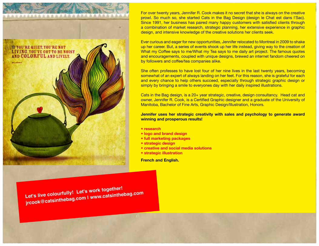
For over twenty years, Jennifer R. Cook makes it no secret that she is always on the creative prowl. So much so, she started Cats in the Bag Design (design le Chat est dans l'Sac). Since 1991, her business has paired many happy customers with satisfied clients through a combination of market research, strategic planning, her extensive experience in graphic design, and intensive knowledge of the creative solutions her clients seek.
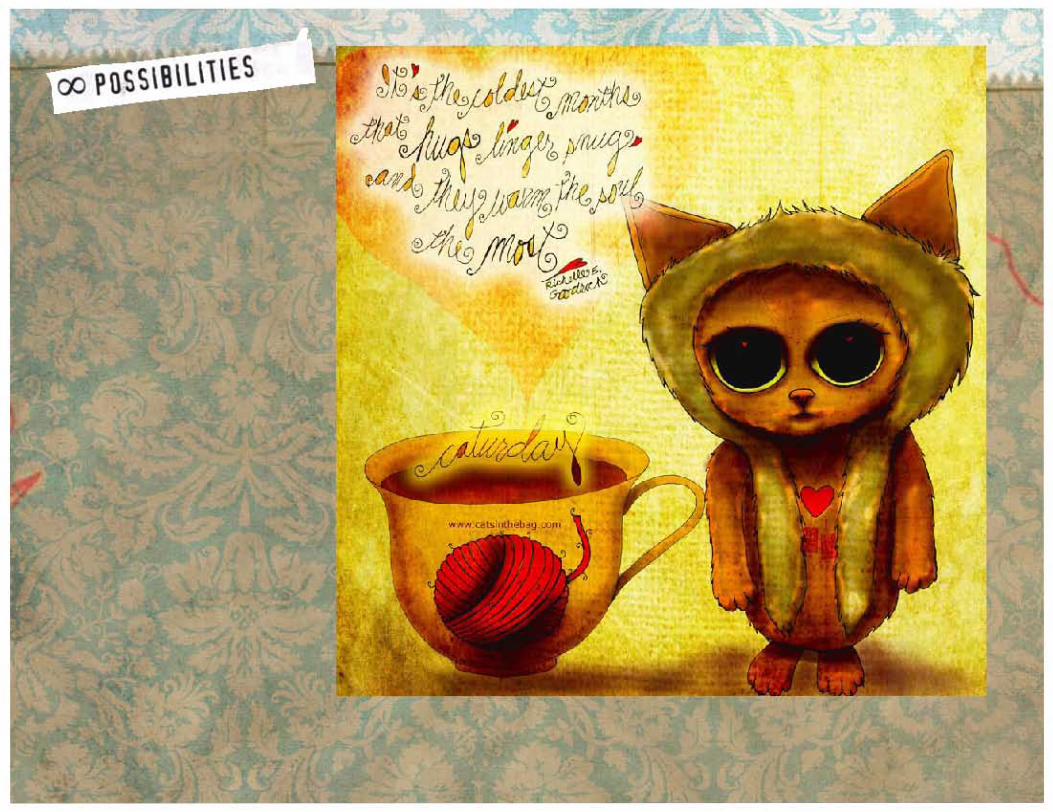
Ever curious and eager for new opportunities, Jennifer relocated to Montreal in 2009 to shake up her career. But, a series of events shook up her life instead, giving way to the creation of What my Coffee says to me/What my Tea says to me daily art project. The famous quotes and encouragements, coupled with unique designs, brewed an internet fandom cheered on by followers and coffee/tea companies alike.
She often professes to have lost four of her nine lives in the last twenty years, becoming somewhat of an expert of always landing on her feet. For this reason, she is grateful for each and every chance to help others succeed, especially through strategic graphic design or simply by bringing a smile to everyones day with her daily inspired illustrations.
Cats in the Bag design, is a 20+ year strategic, creative, design consultancy. Head cat and owner, Jennifer R. Cook, is a Certified Graphic designer and a graduate of the University of Manitoba, Bachelor of Fine Arts, Graphic Design/Illustration, Honors.
Jennifer uses her strategic creativity with sales and psychology to generate award winning and prosperous results!
• research• logo and brand design• full marketing packages• strategic design• creative and social media solutions• strategic illustration
French and English.
Let's live colourfully! Let's work together!
[email protected] | www.catsinthebag.com
What I love to do:• Create a story that engages emotionally, resonating with your customers.• Make your business and culture a place to gather to learn, to grow, to thrive• Sell with emotion. Selling is about the emotional connection you have with your audience. • Clear out the clutter and let your products and culture shine through. • Help you say more with less.
Relationships.All sales transactions are about relationships. Relationships are build on trust. Trust stems from your credibility and how you are perceived.
What I do:
• learn everything about your business your competitors and your target audience.• assess your current interactions and communications and explore optimum opportunities.• help you ask better questions which will achieve better results.• help you build a stronger relationship with your audience.• address issues regarding information and presentation of your brand.• provide you with research, strategic design and creativity that will make your business successful!
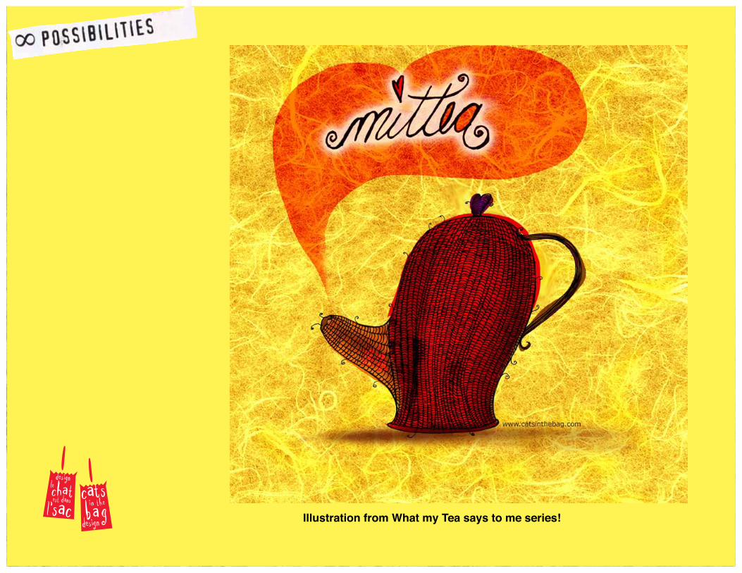
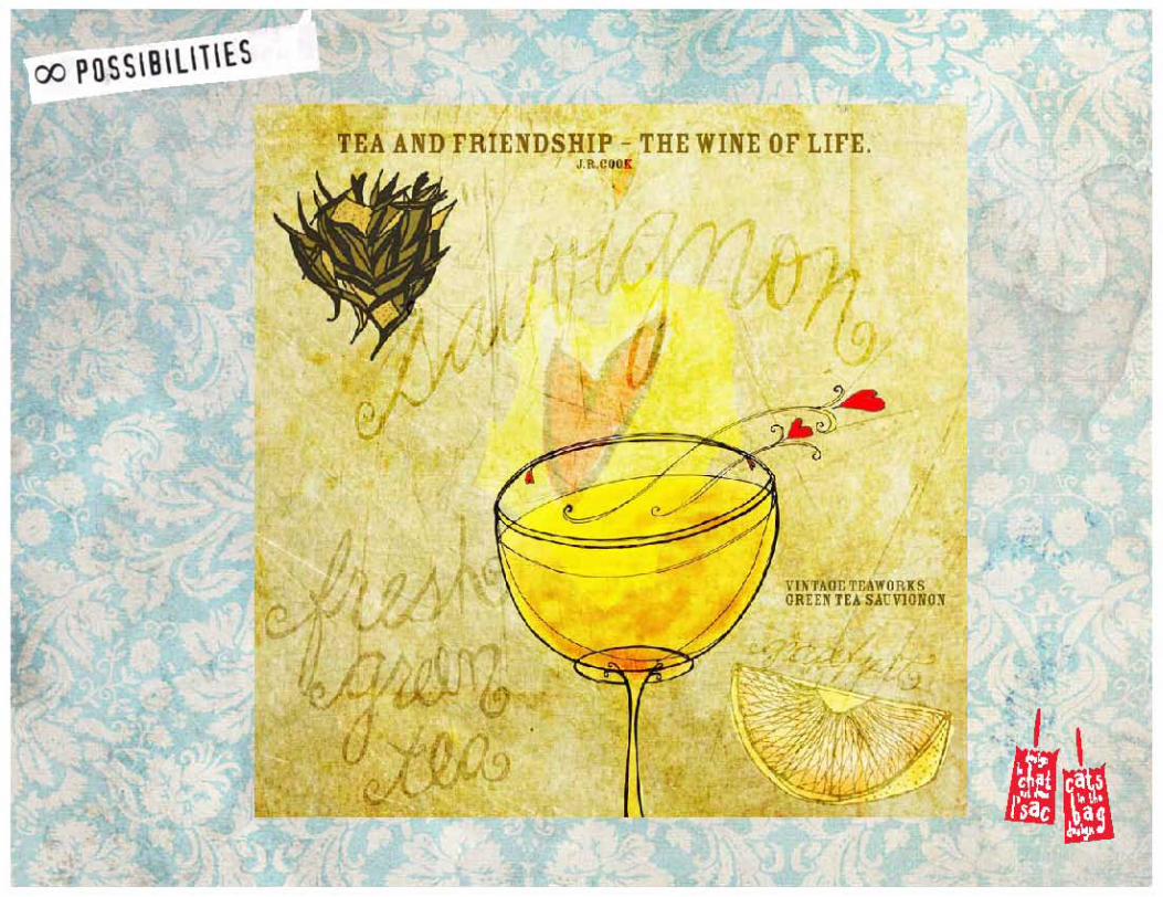
Illustration from What my Tea says to me series!
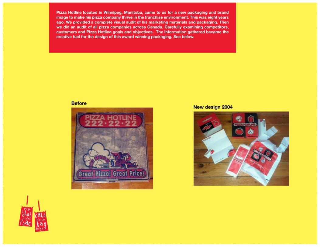
BeforeNew design 2004
Pizza Hotline located in Winnipeg, Manitoba, came to us for a new packaging and brand image to make his pizza company thrive in the franchise environment. This was eight years ago. We provided a complete visual audit of his marketing materials and packaging. Then we did an audit of all pizza companies across Canada. Carefully examining competitors, customers and Pizza Hotline goals and objectives. The information gathered became the creative fuel for the design of this award winning packaging. See below.
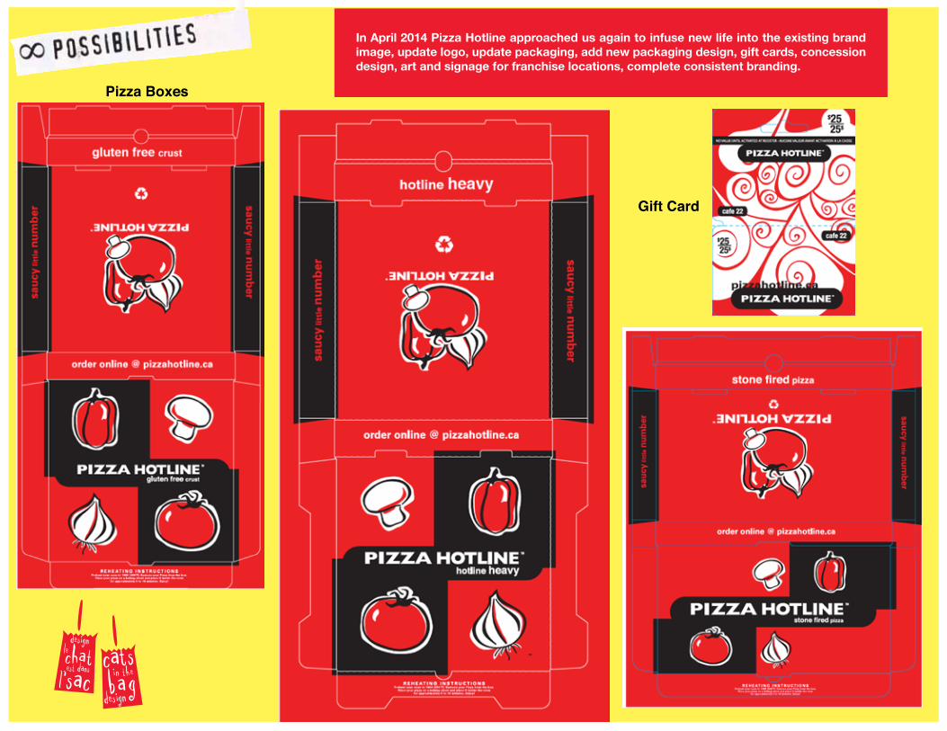
In April 2014 Pizza Hotline approached us again to infuse new life into the existing brand image, update logo, update packaging, add new packaging design, gift cards, concession design, art and signage for franchise locations, complete consistent branding.
Pizza Boxes
Gift Card
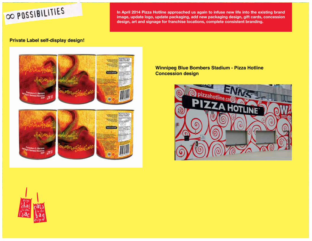
In April 2014 Pizza Hotline approached us again to infuse new life into the existing brand image, update logo, update packaging, add new packaging design, gift cards, concession design, art and signage for franchise locations, complete consistent branding.
Private Label self-display design!
Winnipeg Blue Bombers Stadium - Pizza Hotline Concession design
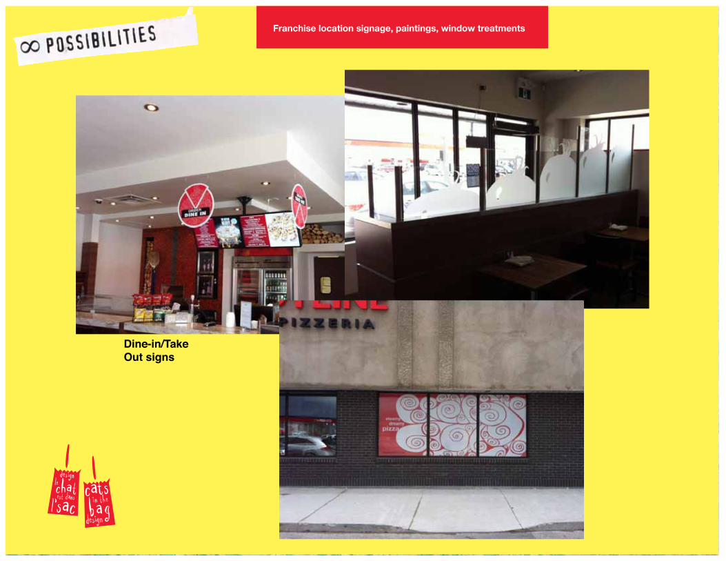
Franchise location signage, paintings, window treatments
Dine-in/Take Out signs
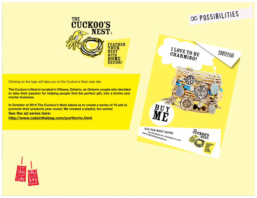
Clicking on the logo will take you to the Cuckoo's Nest web site.
The Cuckoo's Nest is located in Ottawa, Ontario, an Ontario couple who decided to take their passion for helping people find the perfect gift, into a bricks and mortar business.
In October of 2014 The Cuckoo's Nest asked us to create a series of 10 ads to promote their products year round. We created a playful, fun series! See the ad series here: http://www.catsinthebag.com/portfurrio.html
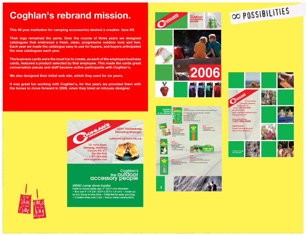
Coghlan's rebrand mission. This 40 year institution for camping accessories desired a creative face-lift.
Their logo remained the same. Over the course of three years we designed catalogues that embraced a fresh, clean, progressive outdoor look and feel. Each year we made the catalogue easy to use for buyers, and buyers anticipated the new catalogues each year.
The business cards were the most fun to create, as each of the employee business cards, featured a product selected by that employee. This made the cards great conversation pieces and staff became active participants with Coghlan's.
We also designed their initial web site, which they used for six years.
It was great fun working with Coghlan's, for five years we provided them with the bones to move forward in 2009, when they hired an inhouse designer.
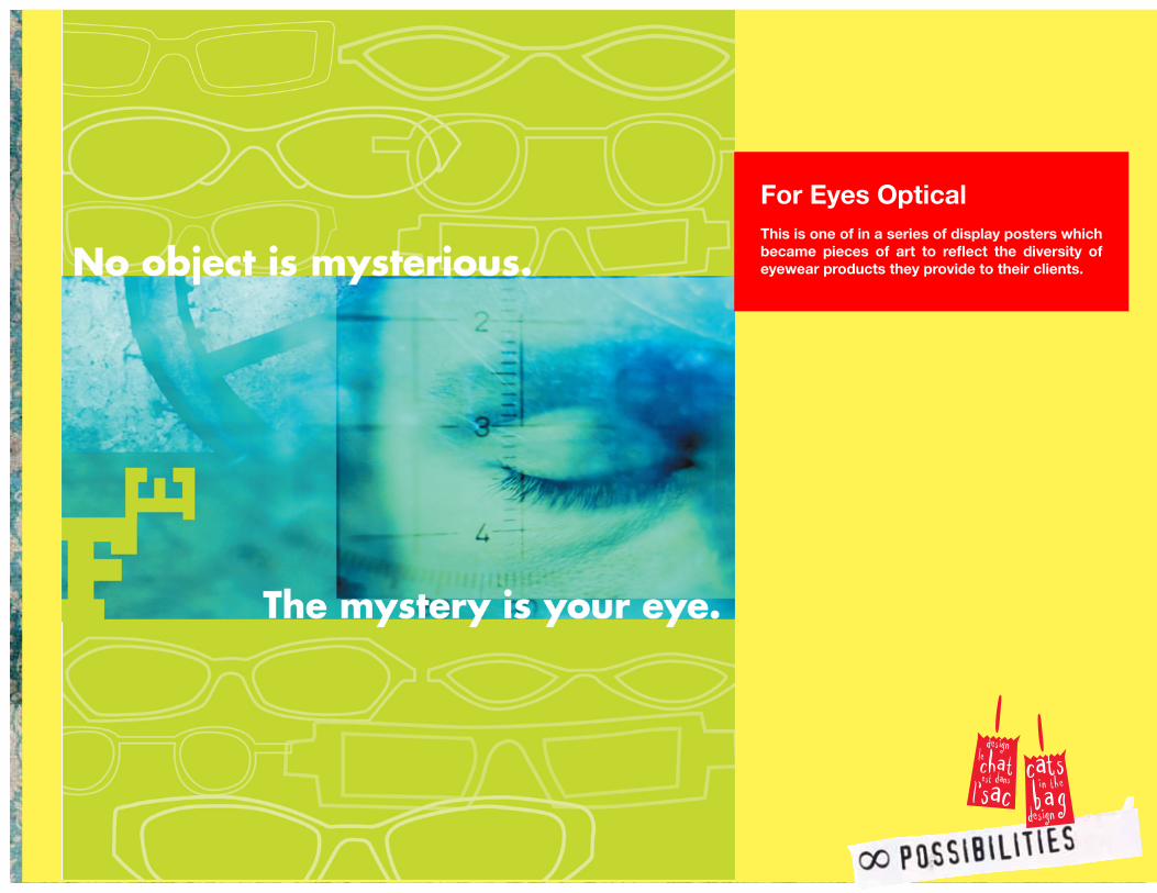
For Eyes OpticalThis is one of in a series of display posters which became pieces of art to reflect the diversity of eyewear products they provide to their clients.
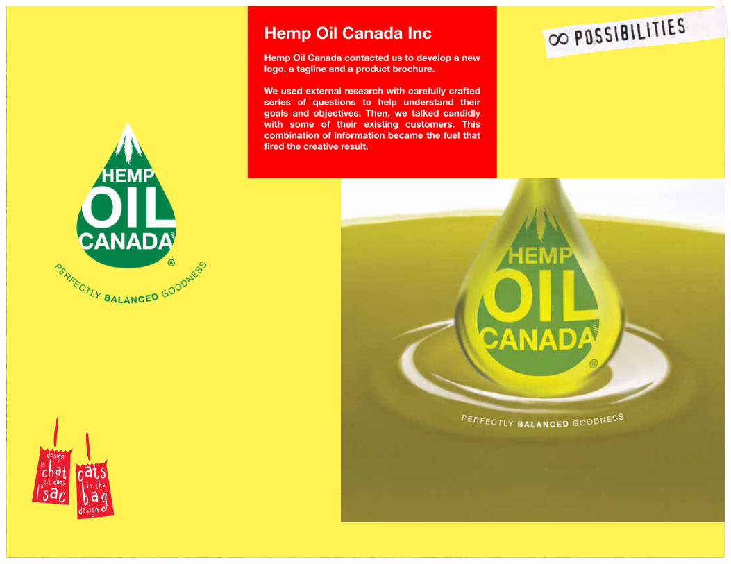
Hemp Oil Canada Inc
Hemp Oil Canada contacted us to develop a new logo, a tagline and a product brochure.
We used external research with carefully crafted series of questions to help understand their goals and objectives. Then, we talked candidly with some of their existing customers. This combination of information became the fuel that fired the creative result.
shoot for excellence
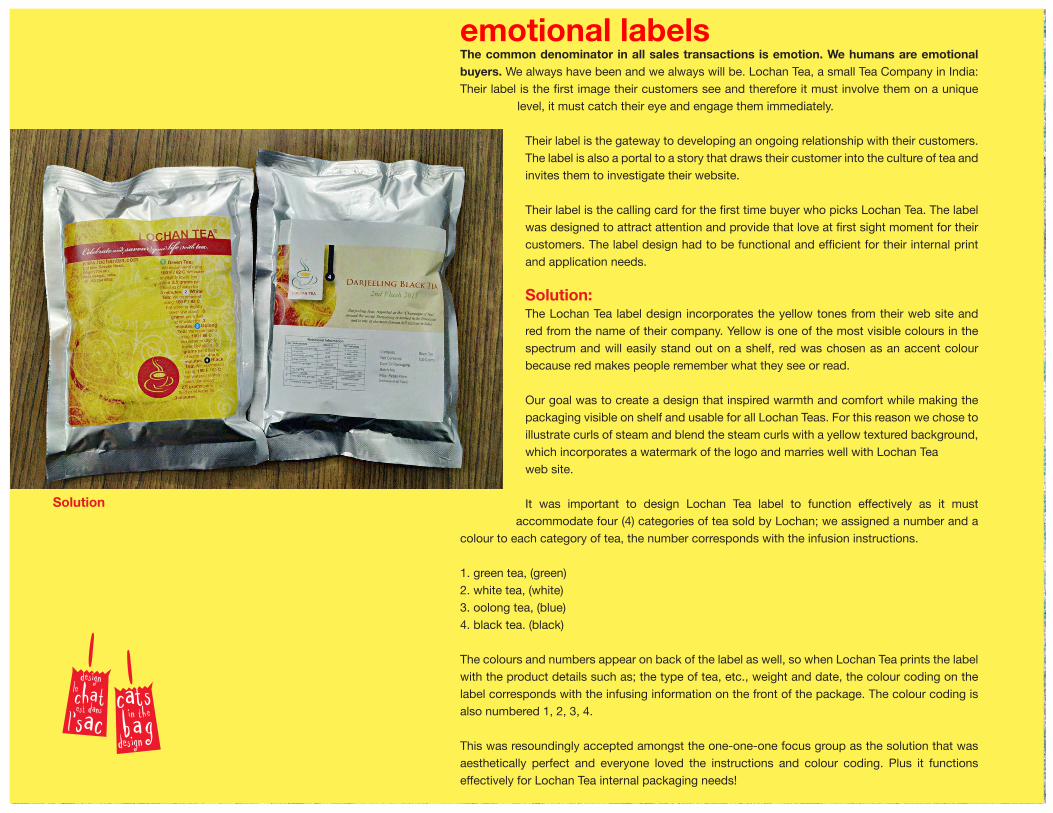
emotional labelsThe common denominator in all sales transactions is emotion. We humans are emotional buyers. We always have been and we always will be. Lochan Tea, a small Tea Company in India: Their label is the first image their customers see and therefore it must involve them on a unique
level, it must catch their eye and engage them immediately.
Their label is the gateway to developing an ongoing relationship with their customers. The label is also a portal to a story that draws their customer into the culture of tea and invites them to investigate their website.
Their label is the calling card for the first time buyer who picks Lochan Tea. The label was designed to attract attention and provide that love at first sight moment for their customers. The label design had to be functional and efficient for their internal print and application needs.
Solution:The Lochan Tea label design incorporates the yellow tones from their web site and red from the name of their company. Yellow is one of the most visible colours in the spectrum and will easily stand out on a shelf, red was chosen as an accent colour because red makes people remember what they see or read.
Our goal was to create a design that inspired warmth and comfort while making the packaging visible on shelf and usable for all Lochan Teas. For this reason we chose to illustrate curls of steam and blend the steam curls with a yellow textured background, which incorporates a watermark of the logo and marries well with Lochan Tea web site.
It was important to design Lochan Tea label to function effectively as it must accommodate four (4) categories of tea sold by Lochan; we assigned a number and a
colour to each category of tea, the number corresponds with the infusion instructions.
1. green tea, (green)2. white tea, (white)3. oolong tea, (blue)4. black tea. (black)
The colours and numbers appear on back of the label as well, so when Lochan Tea prints the label with the product details such as; the type of tea, etc., weight and date, the colour coding on the label corresponds with the infusing information on the front of the package. The colour coding is also numbered 1, 2, 3, 4.
This was resoundingly accepted amongst the one-one-one focus group as the solution that was aesthetically perfect and everyone loved the instructions and colour coding. Plus it functions effectively for Lochan Tea internal packaging needs!
Solution
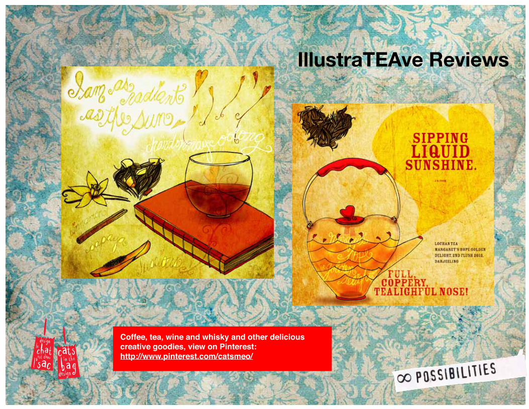
IllustraTEAve Reviews
Coffee, tea, wine and whisky and other delicious creative goodies, view on Pinterest: http://www.pinterest.com/catsmeo/
www.catsinthebag.com