isat: a visual learning analytics tool for instructors open access isat: a visual learning analytics...
TRANSCRIPT

RESEARCH Open Access
iSAT: a visual learning analytics tool forinstructorsRwitajit Majumdar1* and Sridhar Iyer1,2
* Correspondence: [email protected] Program inEducational Technology, IndianInstitute of Technology Bombay,Powai, Mumbai 400076, IndiaFull list of author information isavailable at the end of the article
Abstract
Interactive Stratified Attribute Tracking (iSAT) is a visual analytics tool for cohortanalysis. In this paper, we show how instructors can use iSAT to visualize transitionsof groups of students during teaching-learning activities. Interactive visual analyticsgives the instructor the affordance of understanding the dynamics of the class ofstudents and their activities from the data collected in their own teaching-learningcontext. We take an example of a peer instruction (PI) activity and describe how iSATcan be used to analyze its clicker responses. During PI, typically instructors only usehistograms to visualize the distribution of clicker responses in the pre- and post-discussion phases. We show that the use of iSAT to analyze clicker data in real timeto trace transitions of participants’ responses during various voting phases cansupport them in planning for their post-PI activities. Seven patterns of transitions thatemerge are aligned, returns, starburst, slide, attractor, switching, and void. We interpretthem in the context of the example. Such transition patterns are neither available inmultiple histograms of individual voting phase nor generated in real time to bevisualized as a flow diagram. We had conducted two workshops to introduce iSAT tothe instructors and demonstrated the workflow of using iSAT with their dataset.Here, we report usefulness and usability data collected from those workshops. Inconclusion, we highlight the power of iSAT for instructors to do cohort analysis intheir teaching-learning practice.
Keywords: iSAT, Active learning, Peer instruction, Learning analytics, Cohort analysis,Visual analytics, Teacher training
IntroductionTechnology-enabled active learning practices are transforming both in-class and online
teaching-learning scenarios. Many of these active learning strategies can benefit from the
availability of logged data. Learning analytics on the data logged during such activities
can further help instructors to gain insights and reflect on their practice (Duval, 2011).
We have developed a tool, Interactive Stratified Attribute Tracking (iSAT), to assist
visual learning analytics. The interactive tool helps in analyzing cohorts in educational
dataset. For a multi-attribute dataset, we can group data based on criteria set for any
attribute value. iSAT can then visualize proportions of these groups and their transi-
tions across attributes. It further assists to interactively analyze patterns that exist in
those transitions. Figure 1 shows an example iSAT visualization of cohort transitions
between the pre-test scores and the post-test scores of learners. The learners were
grouped in cohorts of high, medium, and low achievers based on set criteria of their
© 2016 The Author(s). Open Access This article is distributed under the terms of the Creative Commons Attribution 4.0 InternationalLicense (http://creativecommons.org/licenses/by/4.0/), which permits unrestricted use, distribution, and reproduction in any medium,provided you give appropriate credit to the original author(s) and the source, provide a link to the Creative Commons license, andindicate if changes were made.
Majumdar and Iyer Research and Practice in Technology Enhanced Learning (2016) 11:16 DOI 10.1186/s41039-016-0043-3
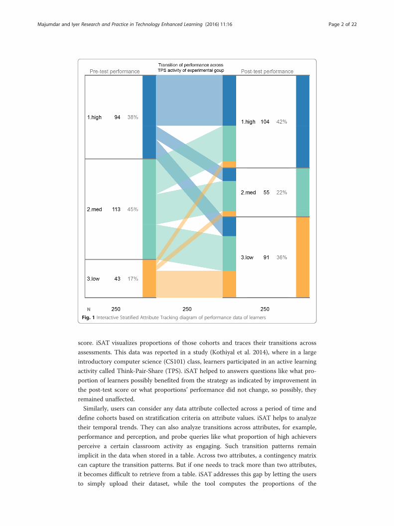
score. iSAT visualizes proportions of those cohorts and traces their transitions across
assessments. This data was reported in a study (Kothiyal et al. 2014), where in a large
introductory computer science (CS101) class, learners participated in an active learning
activity called Think-Pair-Share (TPS). iSAT helped to answers questions like what pro-
portion of learners possibly benefited from the strategy as indicated by improvement in
the post-test score or what proportions’ performance did not change, so possibly, they
remained unaffected.
Similarly, users can consider any data attribute collected across a period of time and
define cohorts based on stratification criteria on attribute values. iSAT helps to analyze
their temporal trends. They can also analyze transitions across attributes, for example,
performance and perception, and probe queries like what proportion of high achievers
perceive a certain classroom activity as engaging. Such transition patterns remain
implicit in the data when stored in a table. Across two attributes, a contingency matrix
can capture the transition patterns. But if one needs to track more than two attributes,
it becomes difficult to retrieve from a table. iSAT addresses this gap by letting the users
to simply upload their dataset, while the tool computes the proportions of the
Fig. 1 Interactive Stratified Attribute Tracking diagram of performance data of learners
Majumdar and Iyer Research and Practice in Technology Enhanced Learning (2016) 11:16 Page 2 of 22

underlying cohorts and visualizes them. This visualization adds value by explicating the
transition patterns and highlighting it to visual perception rather than a table matching
operation. Further, the tool affords interactive exploration of the transition patterns to
find proportions of cohorts in the dataset.
To report patterns in the dataset and get insights in their research context, researchers
have previously used the iSAT tool and its analysis method. In this paper, we focus on the
instructors and how iSAT can help them to understand the dynamics of their teaching-
learning environment and assist in instructional decision-making. In the next section, we
introduce a working example of peer instruction (PI), another active learning context, and
elaborate how tracing transitions of students’ response through iSAT can help instructors
take instructional decisions in that context. We then describe the workflow of how any
instructors can use iSAT with their dataset. We report a study of usefulness and usability
results of iSAT, done as a part of two introductory workshops on iSAT for instructors. At
the end, we summarize the work done and its limitation and indicate future directions of
iSAT research and development.
Example context: PIPI (Mazur, 1997) is an instructional strategy to facilitate active learning (Crouch &
Mazur 2001, Fagen et al. 2002) . In PI (see Fig. 2 for activity flow), students are en-
gaged in active learning by participating in a deep conceptual multiple-choice ques-
tion (Q1) on any topic. In the first round, they vote individually (response to Q1).
This is followed by a discussion with the neighbor to justify their answer. Then, they
re-vote their choice on the basis of the discussion (response to Q1ad). For closure,
there is an instructor-led classroom discussion regarding the correct answer or clari-
fying alternate conceptions based on which the wrong options were designed.
Smith et al. (2009) further extended the classic versions of PI for an undergraduate
genetics course and added an isomorphic question (Q2) as a third phase of voting
(see Fig. 2). An isomorphic question is on the similar concept as Q1 but has minor
variations. Later, Porter et al. (2011) investigated the effectiveness of PI with iso-
morphic questions in the domain of computer science (CS) education.
Clickers or similar personal response systems are often used as a technology sup-
port to collect student responses (Mayer et al. 2009). Instructors may choose to
show the variation in distribution of answer choices after first-round voting, after
second-round re-voting (stage 2 and stage 5 in Figs. 2 and 3), and after voting in
isomorphic question (stage 7 in Fig. 3), in the form of a histogram. Success of the
activity is gaged based on shift towards the correct option by majority of the class.
Readers interested in implementing PI as an evidence-based instructional practice
in different disciplines like physics, chemistry, biology, and computer science can
look at the review by Vickrey et al. (2015).
Fig. 2 Activity flow in a classic peer instruction (PI) activity
Majumdar and Iyer Research and Practice in Technology Enhanced Learning (2016) 11:16 Page 3 of 22

A reconstructed response dataset of a PI activity
Porter et al. (2011) reported a study based on the implementation of PI with an iso-
morphic question in the Introduction to Computer Architecture (CArch) course. They
presented percentage of correct responses for all three phases of voting (Q1, Q1ad, and
Q2) as a bar chart and also provide the flowchart (tree diagram) of the students’
response accuracy over the isomorphic sequence. We use the reported study just as an
illustrative PI activity and to regenerate dataset of responses. We reconstructed random
student responses across three PI phases such that it matched their aggregate results.
While reconstructing 300 clicker responses as answers to three multiple-choice ques-
tions by 100 students, we assumed four options with option 1 as the correct answer for
each of the three questions. The incorrect options in each question are linked to an
alternate conception in the assumed topic. An example of our generated data is as fol-
lows: student #46, response to {Q1, Q1ad, and Q2} is {2,1,3}. It means the student was
incorrect in the first phase of individual voting, and then, he chose the correct answer
during re-voting after peer discussion but was again wrong during voting for Q2.
Figure 4 presents the histogram of the voted options that match the study’s overall
accuracy values across the different voting phases.
Limitations of multiple histograms
The response data captured across multiple student voting activities contain details,
but its granularity is lost if we consider only aggregate level count and plot it as a histo-
gram for each phase. Such aggregation may limit the understanding of classroom
trends by the instructor. Importantly, separate histograms do not convey the pattern of
change of students’ response across different activities. The instructors do not know
how many students are actually improving after the intervention. It does not highlight
portion of the cohort that re-votes an incorrect option or changes from a correct
answer to an incorrect one. There is possibility of transition from one wrong option to
another one during re-voting. Such cohorts are also missed in the aggregate-level view
of the class. For example, from Fig. 4, the instructor does not get to know what
Fig. 3 Modified PI activity flow with an isomorphic question (Q2)
Fig. 4 Reconstructed histograms based on accuracy data from Porter et al. (2011). Response distribution ofa Q1, b Q1ad, and c Q2
Majumdar and Iyer Research and Practice in Technology Enhanced Learning (2016) 11:16 Page 4 of 22
proportion of the 21 % of students who voted option 3 are present in the 73 % cohort
in the next phase.
Researchers initially were interested to analyze only aggregate-level learning gain
during such activities (Hake, 1998). Later, others (Smith et al. 2009; Porter et al. 2011)
analyzed transitions of accuracy across attempts by using flowcharts. It is to be noted
that the transitions among alternate conceptions, as reflected by responses across the two
attempts, are not highlighted. It is interesting to observe those transitions (Wittmann and
Black 2014) as they help to decide post-discussion activities (Majumdar and Iyer 2015).
To the best of our knowledge, there are no tools available that can assist instructors in
tracking the transitions of responses and analyzing patterns in real time. Our earlier paper
(Majumdar and Iyer 2015) reported details of various alternatives that researchers had
used to analyze PI responses, their limitations with respect to visual analytics, and the
advantages of using iSAT. Here, we take the PI context as a working example of instruc-
tor’s use of iSAT.
iSAT to visualize transitions in students’ datasetiSAT diagram is a tool to visualize transition patterns in user datasets. In the context of
classical PI, the dataset students’ responses in each phase are the attributes. Figure 5
highlights transitions in accuracy across the two voting phases of the reconstructed PI
responses. Each of the initial response to Q1 and post-discussion response to Q1adattempts respectively are represented by a phase (see element A in Fig. 5). In each
phase, based on attribute values, strata represent cohorts. In the case of accuracy, they
are “Right” or “Wrong” (see B in Fig. 5). Transitions are the links that trace migration
of the cohort across phases (D in Fig. 5).
Utilizing iSAT in classical PI (activity flow as shown in Fig. 6a) and one with iso-
morphic question (activity flow as shown in Fig. 6b) enables an instructor to trace
various answering patterns across the voting activities and identify the different co-
horts of students based on it and effectively plan the post-PI activities. Thus, iSAT
helps to bridge the gap mentioned in the earlier section.
In subsequent sub-sections, we illustrate the detail visual structure of iSAT
visualization and the transition patterns it explicates.
Structure of iSAT visualization
Each phase of iSAT is visualized as a column (see element A in Fig. 5). Each stratum in
a phase is represented as a colored bar on the right edge of the column. The height of
the bar encodes the proportion of the corresponding stratum in that phase (see element
C in Fig. 5). The stacked bars on the left of the column represent the proportion of the
stratum that is migrating from the previous phase. For a given stratum, each bar on the
left has the representative color of the stratum of the previous phase and height
proportional to the number of records that is migrating to the current stratum (see
element E in Fig. 5).
Each stratum represents a cohort based on the attribute value in a phase. The links
also represent cohorts based on specific transition paths across the phases. For ex-
ample, the orange upward link (element D in Fig. 5) is the transiting cohort that is in-
correct at the first phase and then becomes correct. iSAT helps to visually represent
Majumdar and Iyer Research and Practice in Technology Enhanced Learning (2016) 11:16 Page 5 of 22

both of these cohorts. The click interaction on both the strata and links provide the
corresponding proportion values to the user. This affords the user to interactively ex-
plore transition and its proportions.
Figure 6a illustrates the workflow to include iSAT while conducting classical PI.
With the data being collected through any clicker system, each collected response
data is already linked to a participant by logging the answers corresponding to a
device ID. Feeding that clicker data as input, our system computes and visualizes
an iSAT diagram. It can help both instructors and researchers to look into a level
deeper in the response data than histogram or flowcharts to explicate transition
patterns. Such transition patterns can be further categorized to assist instructors to
reflect on cohorts in the students and investigate their learning characteristics.
Figure 7 shows the iSAT visualization for our regenerated dataset. iSAT has two
modes, the Overview mode and the Exploration mode. The Overview mode (see
Fig. 7) provides the static distributions of each nodes and transitions in between
them. The user enters the Exploration mode once they interact with the
Fig. 5 Structure of iSAT. Highlighting A Phases, B Strata, D Transitions. C represents the proportion of thecohort in a phase. E highlights the proportion of the stratum that transits from the previous phase
Majumdar and Iyer Research and Practice in Technology Enhanced Learning (2016) 11:16 Page 6 of 22

visualization through click/tap to explore further details of any cohort represented
(see Fig. 8).
Overview of PI dataset visualization
The Overview mode provides an overview of the transitions. For example, in Fig. 7, the
top block in the second column conveys that 73 % of the students voted option 1 dur-
ing the re-voting phase. It is seen that the right wall is proportional to 73 % of the full
column. The left wall of that block gives distribution of those 73 % cohort with respect
to the previous phase. The links (band) on the left and right visualize the cohort that is
transiting between any strata of two consecutive phases. The width of the band is pro-
portional to the transitional ratio with respect to the whole population size.
Fig. 6 a Introducing iSAT in the classical PI activity. b Cohort analysis by iSAT for modified PI withisomorphic question
Fig. 7 Overview of the transitions in the example dataset
Majumdar and Iyer Research and Practice in Technology Enhanced Learning (2016) 11:16 Page 7 of 22
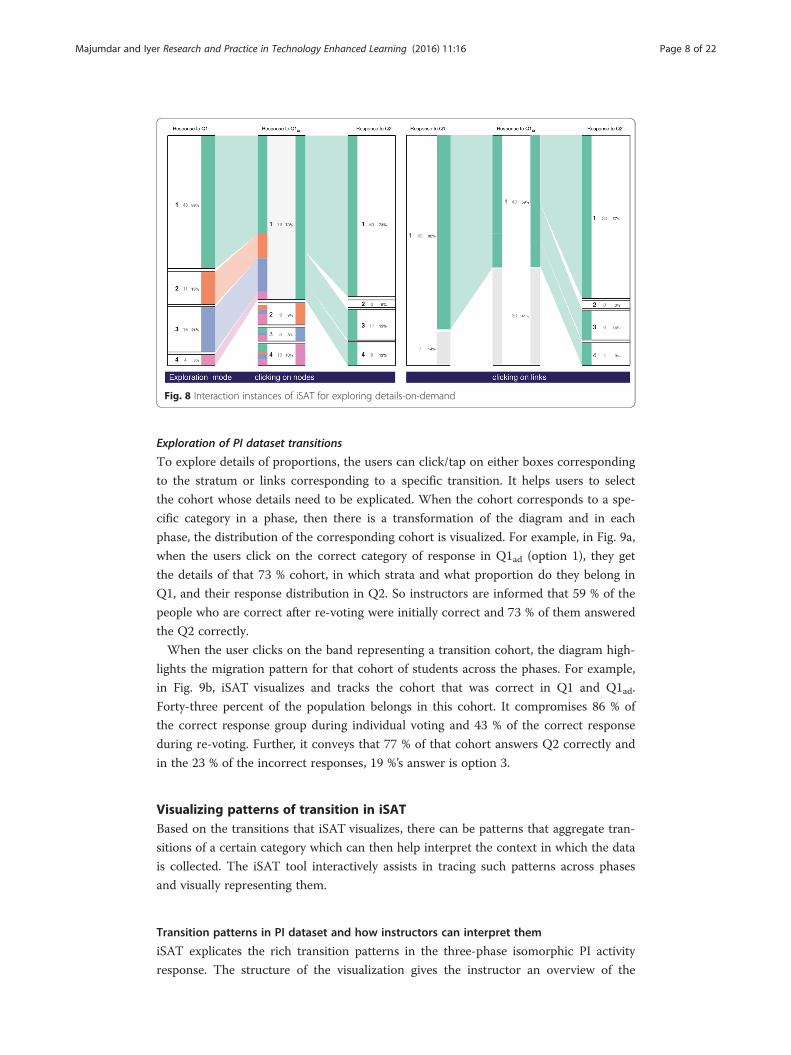
Exploration of PI dataset transitions
To explore details of proportions, the users can click/tap on either boxes corresponding
to the stratum or links corresponding to a specific transition. It helps users to select
the cohort whose details need to be explicated. When the cohort corresponds to a spe-
cific category in a phase, then there is a transformation of the diagram and in each
phase, the distribution of the corresponding cohort is visualized. For example, in Fig. 9a,
when the users click on the correct category of response in Q1ad (option 1), they get
the details of that 73 % cohort, in which strata and what proportion do they belong in
Q1, and their response distribution in Q2. So instructors are informed that 59 % of the
people who are correct after re-voting were initially correct and 73 % of them answered
the Q2 correctly.
When the user clicks on the band representing a transition cohort, the diagram high-
lights the migration pattern for that cohort of students across the phases. For example,
in Fig. 9b, iSAT visualizes and tracks the cohort that was correct in Q1 and Q1ad.
Forty-three percent of the population belongs in this cohort. It compromises 86 % of
the correct response group during individual voting and 43 % of the correct response
during re-voting. Further, it conveys that 77 % of that cohort answers Q2 correctly and
in the 23 % of the incorrect responses, 19 %’s answer is option 3.
Visualizing patterns of transition in iSATBased on the transitions that iSAT visualizes, there can be patterns that aggregate tran-
sitions of a certain category which can then help interpret the context in which the data
is collected. The iSAT tool interactively assists in tracing such patterns across phases
and visually representing them.
Transition patterns in PI dataset and how instructors can interpret them
iSAT explicates the rich transition patterns in the three-phase isomorphic PI activity
response. The structure of the visualization gives the instructor an overview of the
Fig. 8 Interaction instances of iSAT for exploring details-on-demand
Majumdar and Iyer Research and Practice in Technology Enhanced Learning (2016) 11:16 Page 8 of 22

pattern, and the interactive tool then allows them to explore further details about those
transitions. We explored all the 64 possible transition patterns across three voting
phases each having four options. Out of them, we defined seven categories of specific
transition patterns, which can be interpreted by the instructor who is conducting the
PI activity. It also signifies cohorts of interest. Some of the patterns of interest were
adopted from the consistency plot analysis done in the context of physics education re-
search to analyze pre-post student responses (Wittmann and Black 2014).
Aligned pattern
Aligned cohort remains in the same strata across phases. A bigger population of
aligned correct would probably indicate most students had the concept right and
hence consistently answered correctly across the voting phases. The instructor can
take it as a cue to go forward and introduce the next topic. An aligned cohort to
incorrect responses indicates that the cohort requires attention towards learning
the concept, as they fail to answer both the isomorphic questions correctly across
three phases of voting. For example, in our dataset, 34 % of the population voted
the same choice across three phases with 33 % consistently answering the right
option and 1 % consistently answering incorrectly without even switching their
response from option 3 (see Fig. 9a). If the aligned incorrect population proportion
is considerably more, the instructor then knows that the cohort is always stuck in
the alternate conception linked to option 3. Further, Fig. 9b shows the alignment
between two consecutive phases. Eighty-six percent of students, who gave the
correct answer (option 1) in Q1, reaffirmed their choice after the peer discussion.
Considering only the first two phases, this cohort represents the Control Group (as
defined by Porter et al. 2011). Across three phases, they belong to the cohort that
contributes to the denominator of the weighted learning gain. Interestingly, pair-
wise response alignment shows 3 and 2 % of students answer option 4 across the
voting phases, respectively, but none consistently get it wrong by answering 4 all
the time. Such analysis is not possible by plotting histograms or flowcharts.
Fig. 9 Aligned patterns a across three phases and b between each two phases
Majumdar and Iyer Research and Practice in Technology Enhanced Learning (2016) 11:16 Page 9 of 22
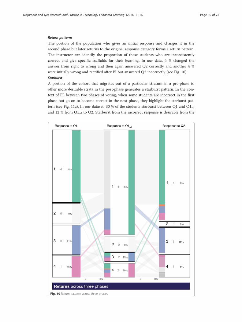
Return patterns
The portion of the population who gives an initial response and changes it in the
second phase but later returns to the original response category forms a return pattern.
The instructor can identify the proportion of these students who are inconsistently
correct and give specific scaffolds for their learning. In our data, 4 % changed the
answer from right to wrong and then again answered Q2 correctly and another 4 %
were initially wrong and rectified after PI but answered Q2 incorrectly (see Fig. 10).
Starburst
A portion of the cohort that migrates out of a particular stratum in a pre-phase to
other more desirable strata in the post-phase generates a starburst pattern. In the con-
text of PI, between two phases of voting, when some students are incorrect in the first
phase but go on to become correct in the next phase, they highlight the starburst pat-
tern (see Fig. 11a). In our dataset, 30 % of the students starburst between Q1 and Q1adand 12 % from Q1ad to Q2. Starburst from the incorrect response is desirable from the
Fig. 10 Return patterns across three phases
Majumdar and Iyer Research and Practice in Technology Enhanced Learning (2016) 11:16 Page 10 of 22

first phases. The instructor also identifies the cohort of the Potential Learner Group
(refer to Porter et al. 2011 for definition) who benefited from the PI activity.
Slide
A portion of the cohort that transits from a desirable stratum in the pre-phase to a less favor-
able stratum in the post-phase generates a slide pattern. In the PI case, the transition from a
correct answer to an incorrect answer across two phases of voting generates a slide. Since
slide from the correct to incorrect is undesirable, the instructor can create specific activities
that address the misconception that may be causing the slide. Figure 11b highlights the cohort
that slides from a correct answer to an incorrect response across voting phases in our
example. Seven percent of the students slide after individual voting, and 20 % slide during Q2.
Attractor
A portion of the cohort that migrates into a particular stratum in a post-phase from
other strata in the pre-phase generates an attractor pattern. Considering the answer op-
tion 3, the attractor pattern would highlight the cohort that has transitioned from other
strata in the pre-phase to the one of option 3 in the post-phase. For only one desired
stratum, tracing the attraction pattern corresponding to option 1, we shall get the same
plot as starburst. The instructor can compare attractor patterns of the incorrect re-
sponse options and can correspondingly decide which alternate conception can be ad-
dressed in the post-PI discussion.
Switching
Between two strata, a portion of one cohort can transit to the other across phases. A
pair of such cohort represents a switching pattern. Figure 12a highlights the switching
patterns in our dataset. While 3 % of students who gave an answer as option 3 changed
their response to option 4, an equal percentage of students switched their response
from option 4 to 3. A total of 51 % of the population migrate option choices in Q1 dur-
ing two voting phase and 43 % for the second transition. Minimum 11 % of the popula-
tion switch in pairs, for each first and second transition. Switching patterns between
incorrect responses highlight that there exists a cohort who changes their responses
across two phases but still remains incorrect. A higher proportion of them might indi-
cate higher engagement but not necessarily improved learning. The instructor can
Fig. 11 a Starburst patterns. b Slide patterns
Majumdar and Iyer Research and Practice in Technology Enhanced Learning (2016) 11:16 Page 11 of 22
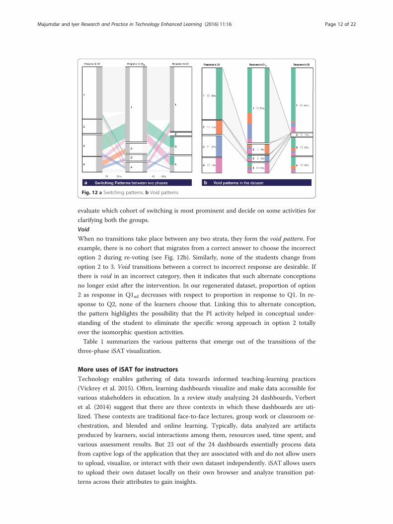
evaluate which cohort of switching is most prominent and decide on some activities for
clarifying both the groups.
Void
When no transitions take place between any two strata, they form the void pattern. For
example, there is no cohort that migrates from a correct answer to choose the incorrect
option 2 during re-voting (see Fig. 12b). Similarly, none of the students change from
option 2 to 3. Void transitions between a correct to incorrect response are desirable. If
there is void in an incorrect category, then it indicates that such alternate conceptions
no longer exist after the intervention. In our regenerated dataset, proportion of option
2 as response in Q1ad decreases with respect to proportion in response to Q1. In re-
sponse to Q2, none of the learners choose that. Linking this to alternate conception,
the pattern highlights the possibility that the PI activity helped in conceptual under-
standing of the student to eliminate the specific wrong approach in option 2 totally
over the isomorphic question activities.
Table 1 summarizes the various patterns that emerge out of the transitions of the
three-phase iSAT visualization.
More uses of iSAT for instructorsTechnology enables gathering of data towards informed teaching-learning practices
(Vickrey et al. 2015). Often, learning dashboards visualize and make data accessible for
various stakeholders in education. In a review study analyzing 24 dashboards, Verbert
et al. (2014) suggest that there are three contexts in which these dashboards are uti-
lized. These contexts are traditional face-to-face lectures, group work or classroom or-
chestration, and blended and online learning. Typically, data analyzed are artifacts
produced by learners, social interactions among them, resources used, time spent, and
various assessment results. But 23 out of the 24 dashboards essentially process data
from captive logs of the application that they are associated with and do not allow users
to upload, visualize, or interact with their own dataset independently. iSAT allows users
to upload their own dataset locally on their own browser and analyze transition pat-
terns across their attributes to gain insights.
Fig. 12 a Switching patterns. b Void patterns
Majumdar and Iyer Research and Practice in Technology Enhanced Learning (2016) 11:16 Page 12 of 22
We described the intricate patterns that emerge if we visualize the clicker responses
of the example PI activity with isomorphic question. Face-to-face instructors can use
iSAT to analyze interesting transitions in students’ attribute values during a classroom
activity or across their course. For example, apart from performance patterns across a
period, they can analyze temporal variation in students’ quantified motivation, engage-
ment, etc. It can draw their attention to whether the consistently low performers are
above the concerned threshold proportion in the class. Thus, iSAT can help visualize
and analyze patterns of temporal variation of the same attribute.
iSAT can also visualize transitions across attributes like performance and perception.
Stratifying performance level for instance as high, medium, and low and perception as
agree, neutral, and disagree, iSAT can then help to highlight patterns like what percent-
age of high performers agree to a certain perception in a given student survey. Based
on such transition patterns, the instructor can estimate effectiveness of their
instructions.
Similarly, instructors who are using online medium can analyze different data that is
logged in their system. Instructors can possibly find interesting patterns while visualiz-
ing transitions between resource use and active engagement or performance. The com-
bination of the attributes chosen to trace the transitions can help the instructor with
specific instructional decision-making. Note that there are cases, for example, visualiz-
ing transitions between perception and performance, one should not interpret causality
from this visualization. In the next section, we explain the workflow of deciding the
phases and strata of iSAT from a given dataset that instructor wants to visualize and
interactively analyze.
How can instructors use iSAT
The iSAT portal is accessible at www.et.iitb.ac.in/iSAT. The tool is accessible from the
SATisfy your Data button. The desktop UI of the tool is presented in Fig. 13.
Instructors can follow the step-by-step workflow shown in Fig. 14 to determine the
phases and corresponding strata of any possible iSAT visualization in their dataset.
Considering the PI dataset, which has records of the form {Student ID, Response to
Q1, Response to Q1ad, Response to Q2}. Response to Q1 is an attribute that the in-
structor chooses as the first phase. The attribute stores the response option of each
Table 1 Patterns of transitions in iSAT
Patterns Description
Aligned Cohort that remains in the same stratum across phases
Starburst Cohort that transits from a particular stratum in a pre-phase to other more desirable strata in thepost-phase
Slide Cohort that transits from a desirable stratum in the pre-phase to a less favorable stratum in thepost-phase
Returnsa Cohort that is in an initial stratum in first phase but transits to a different category in the secondphase and later returns back to the original stratum
Switching Pair of cohort that represent a switch between initial categories across consecutive phases
Attractor Cohort that migrates into a particular stratum in a post-phase from other strata in the pre-phase
Void When no transitions take place between any two strataaRequires at least three phases
Majumdar and Iyer Research and Practice in Technology Enhanced Learning (2016) 11:16 Page 13 of 22
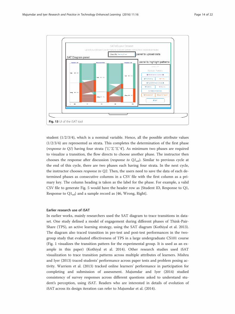
student (1/2/3/4), which is a nominal variable. Hence, all the possible attribute values
(1/2/3/4) are represented as strata. This completes the determination of the first phase
(response to Q1) having four strata {‘1’, ‘2’, ‘3’, ‘4’}. As minimum two phases are required
to visualize a transition, the flow directs to choose another phase. The instructor then
chooses the response after discussion (response to Q1ad). Similar to previous cycle at
the end of this cycle, there are two phases each having four strata. In the next cycle,
the instructor chooses response to Q2. Then, the users need to save the data of each de-
termined phases as consecutive columns in a CSV file with the first column as a pri-
mary key. The column heading is taken as the label for the phase. For example, a valid
CSV file to generate Fig. 5 would have the header row as {Student ID, Response to Q1,
Response to Q1ad} and a sample record as {46, Wrong, Right}.
Earlier research use of iSAT
In earlier works, mainly researchers used the SAT diagram to trace transitions in data-
set. One study defined a model of engagement during different phases of Think-Pair-
Share (TPS), an active learning strategy, using the SAT diagram (Kothiyal et al. 2013).
The diagram also traced transition in pre-test and post-test performances in the two-
group study that evaluated effectiveness of TPS in a large undergraduate CS101 course
(Fig. 1 visualizes the transition pattern for the experimental group. It is used as an ex-
ample in this paper) (Kothiyal et al. 2014). Other research studies used iSAT
visualization to trace transition patterns across multiple attributes of learners. Mishra
and Iyer (2013) traced students’ performance across paper tests and problem posing ac-
tivity. Warriem et al. (2013) tracked online learners’ performance in participation for
completing and submission of assessment. Majumdar and Iyer (2014) studied
consistency of survey responses across different questions asked to understand stu-
dent’s perception, using iSAT. Readers who are interested in details of evolution of
iSAT across its design iteration can refer to Majumdar et al. (2014).
Fig. 13 UI of the iSAT tool
Majumdar and Iyer Research and Practice in Technology Enhanced Learning (2016) 11:16 Page 14 of 22

Fig. 14 The workflow to determine the phases and strata of iSAT from the collected dataset
Majumdar and Iyer Research and Practice in Technology Enhanced Learning (2016) 11:16 Page 15 of 22

Workshops to introduce iSAT to instructorsWe conducted two hands-on workshops to introduce the iSAT tool to the instructors’
community. In this section, we discuss the context of the workshop and then report a
study done as a part of it. We could validate the steps developed to visualize transitions
and its method of analyzing educational dataset. The preliminary study indicated that
instructors, who were participants in those workshops, perceived the tool was an ac-
ceptable system relevant to their job.
iSAT training workshops
Out of the two workshops, the first one was a part of the Mentoring Educators in Edu-
cational Technology (MEET) 2015 workshop (Warriem, 2015). The second opportunity
was at IEEE Technology for Education (T4E) conference, where it was accepted as a
workshop (Majumdar and Warriem 2015). During T4E, the same training session was
repeated twice to accommodate willing participants. All the sessions were 1.5 h in
duration.
Workshop objective
The overall objective of both the workshops was to introduce iSAT as a tool for analy-
zing the data that instructors deal with in their classroom activities. It was in alignment
with the MEET workshop objective to facilitate engineering college instructors to
reflect on their instructional practices by conducting classroom action research. The
iSAT session there focused on analyzing cohorts in the classroom. During T4E, the
objective was to introduce iSAT as a visual learning analytics tool to trace educational
dataset.
Participants
The first training session during the MEET workshop had 14 participants. Eleven of
them were in-service engineering college instructors with minimum of 2 years of teach-
ing experience. They were from Computer Science, Electrical Engineering, and Mech-
anical Engineering departments. Among the participants, two had a PhD degree, three
were pursuing part-time doctoral program in their respective domains, and three were
Masters students of Computer Science.
The training workshop during T4E had a total of 42 participants. In a pre-workshop
demographics survey, 28 of them said they were college-level instructors.
Implementation
The workshop introduced iSAT with examples using data collected in the context of
several/various active learning interventions. Peer instruction (PI) was selected as one
such context, and patterns in user response transitions during PI were used to demon-
strate iSAT. Then, limitations of multiple histograms and usefulness of iSAT were
highlighted through series of questioning activities given to the participants. Then, the
participants used the iSAT tool with sample data from prior study (Kothiyal et al.
2014). It consisted of pre-test and post-test performance data of two groups of learners.
One group participated in a TPS activity versus others had regular lecture-based in-
struction in a CS101 course.
Example of participant tasks
We designed a worksheet for the participants that had multiple tasks to analyze transi-
tions in the TPS performance data using iSAT. While answering the queries posed in
Majumdar and Iyer Research and Practice in Technology Enhanced Learning (2016) 11:16 Page 16 of 22

each task, the participants utilized the features of iSAT and interpreted the data at four
different levels. Table 2 gives the four levels of task and their corresponding examples.
Preliminary usability and usefulness study with instructors
We carried out a research study to evaluate the usefulness and usability of iSAT. Our
research questions, methodology, and analysis technique are discussed in this section.
Research questions
The workshop introduced a method of cohort analysis with educational data that in-
structors collect in their teaching-learning environment. The iSAT tool has multiple
functionalities, which assists the user from uploading their dataset to exploring transi-
tion patterns interactively. Hence, we wanted to separately study the usefulness and the
usability of the tool.
Our first research question (RQ1) is as follows: How useful is iSAT as perceived by the
instructors? We studied the usefulness of the tool with respect to the intention of using
the tool by the workshop participants, its perceived usefulness after the introductory
session, and the relevance of such analysis in their job.
Our second RQ2 is as follows: How usable is iSAT as perceived by the instructors?
Given the multiple functionality of the tool, we studied how useful was the tool for the
workshop participants.
Instruments for data collection
We have used survey questionnaires as the instrument to evaluate the usefulness and
usability of iSAT. To answer RQ1, we had chosen constructs from the Technology Ac-
ceptability Model 2 (TAM2) (Venkatesh & Davis, 2000) and adopted eight items related
to the intention to use (Q1 & 2), perceived usefulness (Q3–Q6), and job relevance
(Q7–Q8). For RQ2, we have used SUS (Brooke, 1996) as our instrument. With each
SUS item, we had requested to elaborate the reason for their response. We also re-
ceived verbal feedback from certain participants after the workshop that expressed how
iSAT was useful in their own context.
Table 2 Levels of task and their examples
Levels of task Example
Identify characteristics of thephase
What percentage of students from the control group performed low in thepost-test?What is the ratio of low performers to high performers for the post-test in theexperimental group?
Identify characteristics of thetransitions
How many low-scorers in the pre-test within the control group improved to highscores in the post-test?Is this statement about the experimental group true: “More than half of the highscorers in the pre-test scored high even at the end of the post-test”?
Identify patterns in thetransitions
What is the percentage of learners showing the same level of performance inthe pre-post-tests within the control group?Find the ratio of the number of learners whose performance improved to thosewhose performance deteriorate across the pre- and post-tests within the experimentalgroup.
Compare two SAT diagrams What is the ratio between transitions from low-high in the control group to thesame in the experimental group?Compare and contrast effects of TPS on high achievers in the control andexperimental groups.
Majumdar and Iyer Research and Practice in Technology Enhanced Learning (2016) 11:16 Page 17 of 22
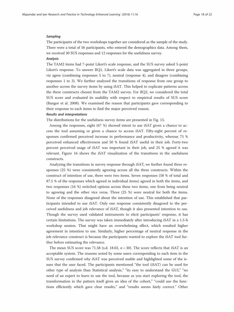
Sampling
The participants of the two workshops together are considered as the sample of the study.
There were a total of 56 participants, who entered the demographics data. Among them,
we received 30 SUS responses and 12 responses for the usefulness survey.
Analysis
The TAM2 items had 7-point Likert’s scale response, and the SUS survey asked 5-point
Likert’s response. To answer RQ1, Likert’s scale data was aggregated in three groups,
viz agree (combining responses 5 to 7), neutral (response 4), and disagree (combining
responses 1 to 3). We further analyzed the transitions of response from one group to
another across the survey items by using iSAT. This helped to explicate patterns across
the three constructs chosen from the TAM2 survey. For RQ2, we considered the total
SUS score and evaluated its usability with respect to empirical results of SUS score
(Bangor et al. 2008). We examined the reason that participants gave corresponding to
their response to each items to find the major perceived reason.
Results and interpretations
The distributions for the usefulness survey items are presented in Fig. 15.
Among the responses, eight (67 %) showed intent to use iSAT given a chance to ac-
cess the tool assuming or given a chance to access iSAT. Fifty-eight percent of re-
sponses confirmed perceived increase in performance and productivity, whereas 75 %
perceived enhanced effectiveness and 50 % found iSAT useful in their job. Forty-two
percent perceived usage of iSAT was important in their job, and 25 % agreed it was
relevant. Figure 16 shows the iSAT visualization of the transitions in the usefulness
constructs.
Analyzing the transitions in survey response through iSAT, we further found three re-
sponses (25 %) were consistently agreeing across all the three constructs. Within the
construct of intention of use, there were two items. Seven responses (58 % of total and
87.5 % of the responses which agreed in individual items) agreed in both the items, and
two responses (16 %) switched options across these two items, one from being neutral
to agreeing and the other vice versa. Three (25 %) were neutral for both the items.
None of the responses disagreed about the intention of use. This established that par-
ticipants intended to use iSAT. Only one response consistently disagreed to the per-
ceived usefulness and job relevance of iSAT, though it also presented intention to use.
Though the survey used validated instruments to elicit participants’ response, it has
certain limitations. The survey was taken immediately after introducing iSAT in a 1.5-h
workshop session. That might have an overwhelming effect, which resulted higher
agreement in intention to use. Similarly, higher percentage of neutral response in the
job relevance construct is because the participants wanted to explore the iSAT tool fur-
ther before estimating the relevance.
The mean SUS score was 71.58 (s.d. 18.02, n = 30). The score reflects that iSAT is an
acceptable system. The reasons noted by some users corresponding to each item in the
SUS survey confirmed why iSAT was perceived usable and highlighted some of the is-
sues that the user faced. The participants mentioned “the tool (iSAT) can be used for
other type of analysis than Statistical analysis,” “its easy to understand the GUI,” “no
need of an expert to learn to use the tool, because as you start exploring the tool, the
transformation in the pattern itself gives an idea of the cohort,” “could use the func-
tions efficiently which gave clear results,” and “results seems fairly correct.” Other
Majumdar and Iyer Research and Practice in Technology Enhanced Learning (2016) 11:16 Page 18 of 22

feedback were “without using for couple of times we cannot answer it (whether cum-
bersome to use),” “practice will make it user friendly,” “(cumbersome to use) may de-
pend on how many parameters,” “(I felt confident) because it is shown how to use,”
“few things which anyone can get through,” and “It is not complex, but without a guide
it might be little difficult to figure out certain functions.” All of these feedback state-
ments gave us inputs on what is required to emphasize for the next set of workshops
and possible modifications in the iSAT tool itself to support them more regarding
organizing the data.
Usage of iSAT by workshop participants
There were two instances where workshop participants used iSAT after attending the
session and reported findings in international conferences, though this usage does not
intend for real-time instructional decision-making. But both the instructors mentioned
that analyzing their data with iSAT helped them to investigate and demonstrate the
dynamics of their class.
Fig. 15 The distribution of responses of usefulness survey. (n = 12)
Fig. 16 Transitions of response across the constructs of usefulness survey
Majumdar and Iyer Research and Practice in Technology Enhanced Learning (2016) 11:16 Page 19 of 22

One participant from the MEET workshop later collaborated with her colleague and
conducted a project-based learning (PBL) activity in an automobile engineering course
across a semester, in her college. They investigated the transition of students’ perform-
ance while they participated in the PBL activity. The instructors designed assessments
of higher order thinking skills (HOTs) and lower order thinking skills (LOTs). The
phases for iSAT were the different assessment topics in LOTs (recall and apply) and
HOTs (analyze, evaluate, and create). They defined high-medium-low performance level
and traced the transition patterns of students across the assessments, separately for the
two levels of thinking skills. Further, cumulating the score for LOTs and HOTs, they
could analyze transitions between the two levels of thinking skills. Mistry et al. (2016)
reported their findings in Learning and Teaching in Computing and Engineering
(LaTiCE 2016).
Another participant who attended the T4E workshop used the tool the very next day
to present her data during the paper session. Later, we had corresponded with her on
mail to gather details of how she utilized iSAT. To quote her, “I have used the tool for
analyzing the POGIL INDIA data that I have collected from my class rooms. … this
tool (iSAT) made a way for me to show my data in a proper form.”
ConclusionEarlier studies on iSAT have demonstrated its development process over three
research-based design iterations (Majumdar et al. 2014) and its potential to be used for
learning analytics (Majumdar and Iyer 2014). In this paper, we describe the utility of
iSAT for instructors. Our iSAT tool enables an instructor to explicate transition pat-
terns across attributes in their dataset at an appropriate level of granularity and explore
them interactively in real time. To illustrate with an example context, we choose an ex-
tended version of PI that has an isomorphic second question. The transitions observed
were across the voted options in the three phases of voting (Q1, Q1ad, Q2). Well-
designed PI questions link alternate conceptions to the wrong options. iSAT can then
help the instructors to visualize such transitions of the alternate conceptions as evident
from their students’ response data. We identified seven possible patterns that are rele-
vant to analyze the three-phase example activity. Given different contexts, those pat-
terns can be interpreted accordingly. Identifying the cohorts from the transitions and
its patterns can assist the instructor to estimate the trend and take informed decisions.
The workflow of using iSAT with dataset (see Fig. 14) gives a step-by-step procedure
to determine what are the phases and corresponding strata that can be visualized. De-
pending on the specific attributes that the instructor wants to visualize, one can get in-
formed about temporal trends (e.g., variation of performance across assessments),
trends across different attributes (e.g., transitions across performance and perceptions),
or even a mixed analysis (e.g., transitions across the performance across pre-post-tests
and perception data).
The iSAT introductory workshops for the instructors helped us to gather their
perception regarding the usefulness and the usability of iSAT. While the MEET partici-
pants agreed iSAT was an interesting tool to adopt in one’s teaching-learning environ-
ment, they also emphasized that more exposure to the tool and its context is required
before they could integrate in their practice. Based on their feedback, we added an
active example of PI during the T4E workshop. The participants had to respond to the
Majumdar and Iyer Research and Practice in Technology Enhanced Learning (2016) 11:16 Page 20 of 22

PI questions in phases. Then, their collected response dataset itself was used to demon-
strate the iSAT tool. This helped in having a current context, which assisted them in
interpreting the transition patterns. Also, the four levels of queries given in the work-
sheet were structured during the second offering. The survey results indicate the use-
fulness and usability aspect of the iSAT tool as perceived by the participating
classroom instructors.
We are still improving iSAT based on the feedback received from the workshop par-
ticipants. We plan to extend the interactive visualization for more than three phases.
But we have seen that the transition patterns often become complex and difficult to
analyze. Hence, we are working to add a pre-module to assist the users to decide the
required phases and strata based on the attributes of their dataset. A set of guided
questions would be presented to the users, at the end of answering which they can
decide what are the transitions they want to trace. We believe having clarity of what
transitions the users want to trace would also help them to interpret those transitions
in the context of the data collected. Then, choosing appropriate three phases for ana-
lysis can also give insights to the context. Though the participants’ perception survey
indicates the preliminary usefulness and usability, once instructors adopt and utilize
iSAT for in-class instructional decision-making, further user study can be conducted to
investigate the mechanism of how iSAT actually assists them. We are currently examin-
ing utility of iSAT to analyze data gathered from a MOOC setting. Having MOOC
participants’ data regarding their engagement, performance and perception, iSAT can
highlight the patterns of transition across these attributes. It shall help the various
stakeholders of MOOC to understand the dynamics of the cohorts in the offered
course. MOOC instructors can possibly decide specific intervention for certain
cohorts and further compare patterns across offerings of the same course to
determine its effectiveness.
Authors’ contributionsRM carried out the development and research of iSAT under the guidence of SI. RM drafted the manuscript, SIchecked it and after review both authors read and approved the final manuscript.
Competing interestsThe authors declare that they have no competing interests.
Author details1Inter-disciplinary Program in Educational Technology, Indian Institute of Technology Bombay, Powai, Mumbai 400076,India. 2Department of Computer Science and Engineering, Indian Institute of Technology Bombay, Powai, Mumbai400076, India.
Received: 15 January 2016 Accepted: 9 August 2016
ReferencesBangor, A., Kortum, P. T., & Miller, J. T. (2008). An empirical evaluation of the system usability scale. International Journal
of Human-Computer Interaction, 24(6), 574–594. doi:10.1080/10447310802205776.Brooke, J. (1996). SUS: a “quick and dirty” usability scale. In P. W. Jordan, B. Thomas, B. A. Weerdmeester, & I. L.
McClelland (Eds.), Usability evaluation in industry (pp. 189–194). London: Taylor & Francis.Crouch, C. H., & Mazur, E. (2001). Peer instruction: ten years of experience and results. American Journal of Physics, 69(9),
970–977.Duval, E. (2011). Attention please!: learning analytics for visualization and recommendation. In Proceedings of the ACM
1st International Conference on Learning Analytics and Knowledge (LAK 2011) (pp. 9–17).Fagen, A. P., Crouch, C., & Mazur, E. (2002). Peer instruction: results from a range of classrooms. The Physics Teacher,
40(4), 206–209.Hake, R. R. (1998). Interactive-engagement versus traditional methods: a six-thousand-student survey of mechanics test
data for introductory physics courses. American Journal of Physics, 66(1), 64–74.
Majumdar and Iyer Research and Practice in Technology Enhanced Learning (2016) 11:16 Page 21 of 22

Kothiyal, A., Majumdar, R., Murthy, S., & Iyer, S. (2013). Effect of think-pair-share in a large CS1 class: 83 % sustainedengagement. In Proceedings of the ACM 9th Annual International Conference on International Computing EducationResearch (ICER 2013) (pp. 137–144).
Kothiyal, A., Murthy, S., & Iyer, S. (2014). Think-pair-share in a large CS1 class: does learning really happen? InProceedings of the 2014 Conference on Innovation & Technology in Computer Science Education (ITiCSE ’14) (pp.51–56). New York: ACM.
Majumdar, R., & Iyer, S. (2014). Using Stratified Attribute Tracking (SAT) diagrams for learning analytics. In Proceedings ofthe IEEE 14th International Conference on Advanced Learning Technologies (ICALT 2014) (pp. 386–387).
Majumdar, R., & Iyer, S. (2015). Beyond clickers: tracing patterns in students’ response through iSAT. In Procs. of Intnl.Conf on Computers in Education (ICCE 2015), Hangzhou, China.
Majumdar, R., & Warriem, J. M. (2015). iSAT: a visual learning analytics tool to trace educational datasets. In Proceedingsof the IEEE 7th International Conference on Technology for Education (T4E, 2015).
Majumdar, R., Alse, K., & Iyer, S. (2014). Interactive Stratified Attribute Tracking diagram for learning analytics. InProceedings of the IEEE 6th International Conference on Technology for Education (T4E, 2014) (pp. 138–139).
Mayer, R. E., Stull, A., DeLeeuw, K., Almeroth, K., Bimber, B., Chun, D., & Zhang, H. (2009). Clickers in collegeclassrooms: fostering learning with questioning methods in large lecture classes. Contemporary EducationalPsychology, 34(1), 51–57.
Mazur, E. (1997). Peer instruction: a user’s manual. Upper Saddle River: Prentice Hall.Mishra, S., & Iyer, S. (2013). Problem Posing Exercises (PPE): an instructional strategy for learning of complex material in
introductory programming courses. In Proceedings of the IEEE 6th International Conference on Technology forEducation (T4E, 2013) (pp. 151–158).
Mistry, R., Halkude, S., & Awasekar, D. (2016). APIT: evidences of aligning PjBL with various instructional strategies forenhancing knowledge in automobile engineering. In Proceedings of the IEEE International Conference on Learningand Teaching in Computing and Engineering (LaTiCE, 2016).
Porter, L., Bailey Lee, C., Simon, B., & Zingaro, D. (2011). Peer instruction: do students really learn from peerdiscussion in computing? In Proceedings of the ACM 7th International Workshop on Computing EducationResearch (ICER 2011) (pp. 45–52).
Smith, M. K., Wood, W. B., Adams, W. K., Wieman, C., Knight, J. K., Guild, N., & Su, T. T. (2009). Why peer discussionimproves student performance on in-class concept questions. Science, 323(5910), 122–124.
Venkatesh, V., & Davis, F. D. (2000). A theoretical extension of the technology acceptance model: four longitudinal fieldstudies. Management Science, 46(2), (pp. 186–204).
Verbert, K., Govaerts, S., Duval, E., Santos, J. L., Assche, F., Parra, G., & Klerkx, J. (2014). Learning dashboards: anoverview and future research opportunities. Personal Ubiquitous Comput., 18, 6(August 2014), 1499–1514.doi:10.1007/s00779-013-0751-2.
Vickrey, T., Rosploch, K., Rahmanian, R., Pilarz, M., & Stains, M. (2015). Research-based implementation of peer instruction:a literature review. CBE-Life Sciences Education, 14(1), es3.
Warriem, J.M. (2015) http://www.et.iitb.ac.in/~jkmadathil/et4et/index.html. Accessed 23 Dec 2015.Warriem, J. M., Murthy, S., & Iyer, S. (2013). Training in-service teachers to do action research in educational technology.
In Proc. IEEE 5th Intnl. Conf. on Technology for Education (T4E) (pp. 192–199). 18-20 Dec. 2013.Wittmann, M. C., & Black, K. E. (2014). Visualizing changes in pretest and post-test student responses with consistency
plots. Physical Review Special Topics-Physics Education Research, 10(1), 010114-1–010114-12.www.et.iitb.ac.in/iSAT. resources for iSAT tool and the discussed dataset is available as demo
Submit your manuscript to a journal and benefi t from:
7 Convenient online submission
7 Rigorous peer review
7 Immediate publication on acceptance
7 Open access: articles freely available online
7 High visibility within the fi eld
7 Retaining the copyright to your article
Submit your next manuscript at 7 springeropen.com
Majumdar and Iyer Research and Practice in Technology Enhanced Learning (2016) 11:16 Page 22 of 22