investor intelligence techical analysis guide
TRANSCRIPT

8/19/2019 Investor Intelligence Techical Analysis Guide
http://slidepdf.com/reader/full/investor-intelligence-techical-analysis-guide 1/25
An introduction to technical analysis
See more at: http://www.investorsintelligence.co.uk
An introduction to
TECHNICAL ANALYSIS

8/19/2019 Investor Intelligence Techical Analysis Guide
http://slidepdf.com/reader/full/investor-intelligence-techical-analysis-guide 2/25
An introduction to technical analysis
See more at: http://www.investorsintelligence.co.uk
An introduction to technical analysis
By downloading this guide, there is very good chance that you already use technical analysis in your
investment decision making process. However, it is always worth re-evaluating your tools, by taking a
moment to consider the nature of technical analysis and how we might use it.
What is Technical Analysis?
Quite simply, technical analysis is the study of investor behaviour and its effect on the subsequent price action of
financial instruments. The main data that we need to perform our studies are the price histories of the instruments,
together with time and volume information. These enable us to form our views, based on objective facts.
Technical Analysis versus Fundamental Analysis
Fundamental Analysis concerns itself with establishing the value of stocks and other instruments. The fundamental
analyst will concern himself with complex inter-relationships of financial statements, demand forecasts, quality ofmanagement, earnings and growth, etc. He will then make a judgement on the share, commodity, or other financial
instrument, often relative to its sector or market peers and form a judgement whether it is over- or under-valued.
The majority of stock research from brokers or investment banks will be based on company fundamentals. At Investors
Intelligence, while we admire much of this work we take a more pragmatic approach; we monitor and analyse the ways
in which investors interpret this mass of fundamental data and how they then behave. This behaviour is collectively
called sentiment. Our view is that investor sentiment is the single most important factor in determining an
instrument’s price.
We believe that technical analysis holds the key to monitoring investor sentiment. Some investors and market “experts”
believe that fundamental analysis and technical analysis are mutually exclusive. We disagree. We think they are highly
complementary and should work together to tell you what to buy or sell andwhen to buy or sell. Many successful traders
use a combination of fundamental stock selection procedures and technical analysis timing filters with excellent results.
Brief history
It is probably reasonable to assume that where commerce has flourished in civilisations so have the traders who have
paid close attention to prices and their movements. However, rather than dwell upon the wonders of the Phoenician
market for olive oil forwards, or the ancient Japanese and Chinese history of rice trading, our story starts with one
Charles Dow, inventor of the first stock market index in 1884.
Charles Dow invented point and figure charting after he noticed that by the time important corporate news entered the
public domain, the share price had already moved, due not least to insider trading. Therefore he watched the open
outcry ‘curb market’, writing down prices in a notebook, looking for clues to trending market action. Finding a page ofprice changes confusing, not surprisingly, he decided to plot price action in graphic form.
Mr Dow also wrote a series of articles for the Wall Street Journal in the latter years of the 19th century. This body
of work became known as “Dow Theory” and formed the initial basis for what we know as technical analysis today.
While we will not dwell on the finer details of Dow Theory in this section, the most important concepts that Mr Dow
recognised were that prices reflect the current balance of supply and demand (i.e. the hopes and fears of investor).
And most importantly, an imbalance of supply and demand causes prices to form recognisable trends, up and down.
Certainly, the concept of studying price action was fairly well established by the early 20th century. By the 1940s to
1950s additional pioneers of technical analysis such as Bill Jiler, Robert Edwardes, John Magee, Alexander Wheelan
and Abe Cohen were making steady progress, not only in the types of charts used to depict trends, but also techniques
for analysing price action.
However the acceleration in technical research techniques commenced in the late 1970s with the introduction of
computers. This made it possible for hypotheses and indicators to be calculated and back tested as to their efficacy.
While this has greatly expanded the body of theoretical work available on price studies, many seasoned chart readers
maintain that at least 90 percent of what they need to know about prices is revealed by the price action alone.

8/19/2019 Investor Intelligence Techical Analysis Guide
http://slidepdf.com/reader/full/investor-intelligence-techical-analysis-guide 3/25
An introduction to technical analysis
See more at: http://www.investorsintelligence.co.uk
An introduction to technical analysis
Breadth Indicators
Monitoring market conditions
For the stock or index fund investor, it is important to maintain a feel for the prevailing market conditions. Whether one
pursues a regular “buy and hold” or a more sporadic approach to stock investment, one should always be aware of theinherent risk and potential returns that the market has to offer; and your investment strategy should constantly adapt
to meet these conditions.
Market averages such as the Dow Industrials or S&P500 indices are the most readily available barometers for market
conditions. Using charts, it is relatively straight-forward to determine the current index trend, and to identify how long
this trend has been in place. However, what is more beneficial is to have an understanding of the underlying strength
of these market trends as this will go some way to determining the likelihood of the trend changing and the relative
levels of market risk. Breadth indicators were developed precisely with this task in mind: to determine the strength of
a market trend by looking at the trends of its constituent stocks.
The NYSE Bullish %
The first breadth indicator, the NYSE Bullish Percentage, was developed by Abe Cohen, the founder of Investors
Intelligence in 1955. He was an early pioneer of point & figure (p&f) stock charts and these provided the ideal building
blocks for a market barometer. By recording stock prices, p&f charts effectively map out the relationship between
demand (buyers) and supply (sellers). The advantage of p&f charts is that these supply/demand imbalances are clear
cut and easy to identify: if demand outstrips supply, a p&f bull signal is generated and if supply outstrips demand a p&f
bear signal is generated.
Abe Cohen took the logical leap that by calculating the percentage of bull trends amongst the constituent stocks of
the NYSE index, he would have an accurate picture of the supply/demand relationship for the market as a whole. For
example, if there were 2000 stocks in the NYSE index and 1000 of them were on bull signals, then the Bullish % would
be reading 50%.
As it turned out, not only did the NYSE Bullish % identify periods when the bulls were in the driving seat i.e. the best
time to buy stocks, but it also proved to be a one of the best contrary indicators for calling intermediate market tops
and bottoms.
Using the NYSE Bullish %
Probably the best and most common analogy applied to the NYSE
Bullish % is that of a football game: the level of the bullish %
represents the current field position and the “end-zones” are above
70% and below 30%.
For a basic market strategy, think of the play moving from one end-zone to the other corresponding to the levels of the bullish %:
Low risk area below 30%
Almost everyone who wants to sell has already sold. Once the “play” starts moving up from this area (indicated by
reversals on the p&f chart of the bullish %) it is time to start playing the offense i.e. aggressively buy stocks, even
volatile technology names and attempt bottom-fishing in stocks at multi-year lows.
Mid-eld
When the indicator moves up into mid-field, continue to play the offense but buy more selectively in stocks with strong
relative strength. Begin to take profits in recovery plays and holdings with weak relative strength. Buy new positions
on pull-backs.
High risk area above 70%
When the “play” starts moving down from this area (indicated by reversals down the p&f chart of the bullish %) it is
time to initiate defensive tactics. Sell any laggards (with weak relative strength). Begin to tighten stop loss points on
all holdings. Focus new positions in defensive/lower beta sectors. Use ETFs instead of individual stocks to reduce
volatility. Buy call options instead of stock to limit equity exposure.

8/19/2019 Investor Intelligence Techical Analysis Guide
http://slidepdf.com/reader/full/investor-intelligence-techical-analysis-guide 4/25See more at: http://www.investorsintelligence.co.uk
An introduction to technical analysis
Breadth Indicators
Signals from the NYSE Bullish %
Abe Cohen’s original strategy for the bullish percentage was to be bullish on readings above 52% and bearish below
48%. However, as time went by, and the back history of breadth data built up, improved applications of this indicatorwere introduced. Earl Blumenthal’s book “Chart for Profit”, published in 1975, introduced a series of rules to be applied
to the point & figure chart of the NYSE Bullish % or the “Bullish Bearish index” as he referred to it. The rules were further
refined by Mike Burke in 1982, when he became editor of Investors Intelligence, and remain to this day the recognised
method of applying breadth to market strategy.
There are seven market conditions that can be derived from the point & figure chart of the NYSE Bullish % which are
as follows:
Denitions of current Market Breadth Status
The chart below shows the current p&f chart for the NYSE Bullish %: the chart
is currently on a p&f buy signal hence is showing bull confirmed status for the
market. If the indicator were to move down below 70% is would move to bear
alert status. A move below the previous down column of Os at 50% would berequired to move it to bear confirmed status.
Alternative measurements of breadth
In the early 1970s, Investors Intelligence introduced further breadth indicators
that reflected the percentage of stocks above their 10 week (50 day) and 30
week (150 day) moving averages. These indicators provided an alternative
method of defining a bull trend and proved to be more sensitive to market
moves.
The charts below highlight the increased sensitivity of the NYSE % 10 week moving average indicator compared to the
NYSE Bullish %. Note the sharp down-move that began in January 2005 for the % 10wk indicator which has not yet
been seen by the bullish %
Since their introduction, the moving average based breadth indicators have become the leading indicators, and the role
of the bullish % has become one of a confirming indicator for medium term trends.
Bear Conrmed – chart is falling (column O’s) below
70% and has generated a p&f sell.
Bear Correction – chart is on a p&f sell but is rising
(column X’s) without having moved above 68%.
Bear Alert – chart is falling from above 70% to below
70% without yet generating a p&f sell.Bull Top - chart
is falling (column of Os) but above 70%.
Bull Conrmed – chart is on a p&f buy signal and is rising
(column of x’s); and/or is in a column of x’s above 68%.
Bull Correction – chart is on a p&f buy signal but is falling
(column of O’s) without yet reaching 70%.
Bull Alert – chart rising (X’s) moving up from below 30% but
has not yet generated a p&f buy.

8/19/2019 Investor Intelligence Techical Analysis Guide
http://slidepdf.com/reader/full/investor-intelligence-techical-analysis-guide 5/25See more at: http://www.investorsintelligence.co.uk
An introduction to technical analysis
Breadth Indicators
Applying breadth to other indices
The NYSE index, with over 2000
constituent stocks, remains a good
broad “universe” for measuring general
market breadth. The NYSE bullish %
has now been calculated for over 50
years and in the early days, before the
dawn of computers, was calculated
using hand-drawn point & figure charts
of the constituent stocks and adjusting
the bullish % figure for changes in the
number of stocks on bull signals. This
extensive back-history provides many
precedents for signals generated in all
sorts of market conditions.
The Nasdaq was founded in 1971as
an electronic marketplace for over
the counter (OTC) stocks and rapidly
developed as the home for emerging
technology and growth stocks. Breadth
indicators provide an excellent timing
tool for this market.
For small cap investors, breadth indicators based on the Russell 2000 and Value Line Composite are the most
appropriate tools.
Breadth indicators are also available for the S&P indices. This is particularly useful as a timing tool for “style” investorsas one can compare the breadth indicators for the large cap S&P500, S&P Midcap 400 and the S&P Small Cap 600.
The S&P Composite 1500 index is a conglomeration of stocks from the three indices and since it covers stocks from
the NYSE, AMEX and Nasdaq provides a viable alternative to the NYSE breadth indicators.
Breadth and ETFs
The introduction of exchange traded funds (ETFs) has provided investors with an efficient vehicle for investing in the
above indices thereby offering exposure to a diversified basket of stocks that would be difficult to achieve by direct
stock investment. Using the breadth indicators for the relevant underlying indices can provide a valuable tool for the
timing of ETF investments.
International Markets
Investors Intelligence regional services now offer breadth indicators covering markets such as the UK (FTSE 100 or
FTSE All Share constituents), Europe (the “All Europe” breadth indicators measure breadth of all major European indexconstituents), and Japan (the Topix 100 or Nikkei 225 breadth).
Conclusion
The aim of this article has been to highlight the benefits of breadth indicators as a market risk measurement tool and
to introduce the concept of tailoring one’s investment strategy to meet the current risk/reward characteristics of the
market.
Whilst the Bullish %s and other breadth indicators were largely developed by the point & figure community, we firmly
believe that this powerful form of analysis should have an appeal to any investor with market exposure.
The Investors Intelligence site displays breadth charts in a variety of formats and our daily hotlines communicate
changes in breadth status and suggested strategy in a comprehensive manner.

8/19/2019 Investor Intelligence Techical Analysis Guide
http://slidepdf.com/reader/full/investor-intelligence-techical-analysis-guide 6/25See more at: http://www.investorsintelligence.co.uk
An introduction to technical analysis
Candlestick Charts
The most commonly used tool of the technical analyst is the bar chart. This familiar representation of price action
generally consists of a vertical line showing the day’s range with a short horizontal dash depicting the close. For
example, a bar chart of a typical trading day in General Electric might be displayed as:
Note: bar charts sometimes also show the opening level with the convention
to show the opening price as a dash to the right of the vertical price-range line
with the opening level shown as a dash to the left.
Candlestick charts can be viewed as slightly more sophisticated visual representation of the bar chart. The opening
price is included in the chart and the above day’s activity would be represented as follows:
Note:an up day is signified by a white (or empty) box. A down day is represented
by a black or shaded box. The “box” shows the open to close range. The
“wick” displays the full day’s range.
Candlestick charts are generally plotted over a one-day period. Technical analysts also use weekly and monthly
candlestick charts to provide a valuable picture of the longer-term price action.
So what’s the advantage? Candlestick charting is one of the oldest methods of technical analysis, reputedly invented by
the Japanese over 100 years ago and continues to be widely used today. The key to its appeal lies in the discipline’s ability
to give a clear visual representation of the price action during the period, leading to easy-to-recognise patterns.
Reading Candlestick Charts: DynamicsEven to the casual user, a candlestick chart gives a clear
indication of the intra-day price action. Consistent up
days with the instrument’s price closing higher than the
open are shown as a string of white candles. Down days
are also quickly visible as black candles.
Daily candlestick chart of the AUD against the USD.
“Down” days shown as black candles. “Up” days as white
or empty candles.

8/19/2019 Investor Intelligence Techical Analysis Guide
http://slidepdf.com/reader/full/investor-intelligence-techical-analysis-guide 7/25See more at: http://www.investorsintelligence.co.uk
An introduction to technical analysis
Candlestick Charts
Pattern Recognition: Price action meets Eastern Mysticism
Certain types of intraday price action are indicative of investorsentiment. For example, after a sharp fall, the last day of the
downtrend may exhibit a large day’s range to the downside,
but recover mid-session to finally close unchanged, slightly
lower or even up on the day. This is known as a “long tail
down”.
S&P500 index: Monthly candlestick chart in 1st quarter 2009
shows a “long tail down”, indicating seller capitulation and a
strong rally from the lows.
Many of these intraday patterns will be self-explanatory to
students of behavioural technical analysis. The Japanese,
however, have added a touch of Eastern mysticism to the
process by naming specific patterns in their own inimitable
style. Here are a few of the key ones to watch out for:
Doji Lines: from the Japanese meaning simultaneous, or at the same time. The
pattern occurs when the opening and closing price are the same. No candle is
displayed, merely a horizontal line. Not particularly significant in itself (perhaps
a sign of indecision or lack of trend), but sometimes a component in multi-day
patterns.
Umbrellas: A short body on a larger intra-day range. Also known as “hammers”
when they occur in a downtrend. Considered to be bullish in a downtrend,
bearish in an uptrend.
Stars: A concept similar to the “Island Reversal”, pattern known to bar chart
users.A reversal indicator. Tops are rather charmingly known as “Evening
Stars“, bases as “Morning Stars“. The example on the left shows the latter.

8/19/2019 Investor Intelligence Techical Analysis Guide
http://slidepdf.com/reader/full/investor-intelligence-techical-analysis-guide 8/25See more at: http://www.investorsintelligence.co.uk
An introduction to technical analysis
Candlestick Charts
The Bear Engulng pattern (see example on left).It sounds bad, and it is.
Basically similar to an “outside day” in bar chart jargon. Another reversal pattern.
The bullish counterpart is known as a “bull engulfing” pattern.
Harami patterns: meaning pregnant in Japanese, the Harami pattern is shows
a small day’s range occurring entirely within (hence the pregnancy) the previousday’s larger range. These patterns should be viewed as an “early warning”
signal for any potential change of trend.The example on the left shows a bear
Harami.
A word of warning
Pattern recognition is historically a key component in technical analysis, but don’t get carried away. The detractors
of TA often refer to “reading the runes” or “reading the tea-leaves”. This attitude is a not unreasonable reaction to the
over-reliance of some technical analysts on pattern recognition. Candlestick charts offer us a valuable tool for the
study of intra-day (or intra-week/month) action, but as ever the basics of trend identification remain the most important
weapon in the technical analysts armoury.
What next? To learn more about Candlestick charts, try reading JJ Murphy’s well known “Technical Analysis of the
Financial Markets”, published by the New York Institute of Finance and available at good financial bookstores or at
Amazon.com. The book contains an excellent library of candlestick patterns including the exotically named “Three
Rivers Bottom” and “Upside Gap Two Crows”. For more on this subject, Steve Nison is the acknowleded sensie of
Candlestocks

8/19/2019 Investor Intelligence Techical Analysis Guide
http://slidepdf.com/reader/full/investor-intelligence-techical-analysis-guide 9/25See more at: http://www.investorsintelligence.co.uk
An introduction to technical analysis
Index Relative studies
Index Relative studies
The relative indicator (not to be confused with the“Relative Strength Index” which is a momentum
indicator) compares the performance of a particular
stock against that of a relevant index. It is displayed as
a ratio by dividing the stock price by the index price.
Traditionally, it is used to determine how the stock is
performing relative to the local stock market index of
which it forms a part or relative to its industry or sector.
It is part of a good investment discipline to check that
our portfolio holdings are outperforming their local
indices.
The relative indicator can also be used to help judge the
likely reaction to a major level of support or resistance.
For example, let’s look at Rio Tinto (RIO) the UK mining
stock. The stock has remained in a major five year
medium term sideways range. However, the relative
indicator (lower chart) confirms that this was, in fact, a
very tradable range. Let’s go through three periods on
the chart.
Point A: We have marked the highs/lows on the relative chart to highlight the “relative base” that developed in late
2001.
This suggests that moves down to support at 900p were less than falls in the market around this time i.e. selling
pressure was less for this stock than for the market and sentiment was improving.
Point B: the relative is now in an uptrend indicating that rallies in late 2001 and in late 2002 from 1000 to 1400 were
stronger than the market rally i.e. sentiment is stronger than the market.
Point C: the stock price makes a new five-year high, an event normally considered as very bullish but the relative has
not made a new high suggesting that investors are no longer buying this stock with the same vigour compared to other
stocks in the index. This suggests that sentiment is waning and indicates a time to take some well-earned profits.

8/19/2019 Investor Intelligence Techical Analysis Guide
http://slidepdf.com/reader/full/investor-intelligence-techical-analysis-guide 10/25See more at: http://www.investorsintelligence.co.uk
An introduction to technical analysis
Momentum studies
Momentum studies
Momentum indicators are used to monitor the underlying “health” of a particular trend. They do this through a variety
of measurements and most commonly by assessing the rate at which a stock or financial instrument is advancing ordeclining.
Changes in the rate of advance/decline are useful in determining the level of investor enthusiasm: for example, an
uptrend “losing momentum” suggests investors are no longer prepared to buy as much stock at current prices demand
pull has run out of steam and we can reasonably expect a period of consolidation before enthusiasm returns.
The Relative Strength Index (RSI)
Relative Strength Index or “RSI” was developed by J. Welles Wilder in 1978 and was later discussed in his book, New
Concepts in Technical Trading Systems. The name “Relative Strength Index” is slightly misleading as the RSI does notcompare the relative strength of two securities, but rather the strength of a single security to past data.
It is calculated by measuring the ratio of average price gains against average price losses over a specific rolling period.
We have set our default period at 14 days as recommended by Wells Wilder but this can be varied to suit particular
stocks or futures.
The RSI is an oscillator that ranges between 0 and 100.
There are two main signals that can be generated from this
indicator:
Oversold/overbought signals When the RSI turns up,
developing a trough from below 30, it suggests that the price
is oversold and likely to rally. Conversely, when the RSI turns
down, making a peak above 70, it suggests that the price is
overbought and likely to drop.The example chart shows the
uptrend in Royal Bank of Scotland (RBS) this year.
Using top and bottom signals in the RSI and trading out of the stock when the RSI turned down from above 70 andrepurchasing when it turned up from below 30 would have been beneficial in this case – see red and green circles.
This strategy would have enabled the technician to dodge some fairly sharp pull-backs which are marked with red
arrows.
One point to make is that one should put this indicator into perspective: the fact that it has risen above 70 cannot be
construed as entirely bearish, rather it is telling us that the security is making consistently higher closes – a sign of
strength. I like to think of the basic “overbought” signal as more of a warning that there is, in the short term, a higher
probability of a pull-back or profit-taking rather than a sell signal. The RSI divergence signal below has greater longer-
term consequences for trend.
8/19/2019 Investor Intelligence Techical Analysis Guide
http://slidepdf.com/reader/full/investor-intelligence-techical-analysis-guide 11/25See more at: http://www.investorsintelligence.co.uk
An introduction to technical analysis
Momentum studies
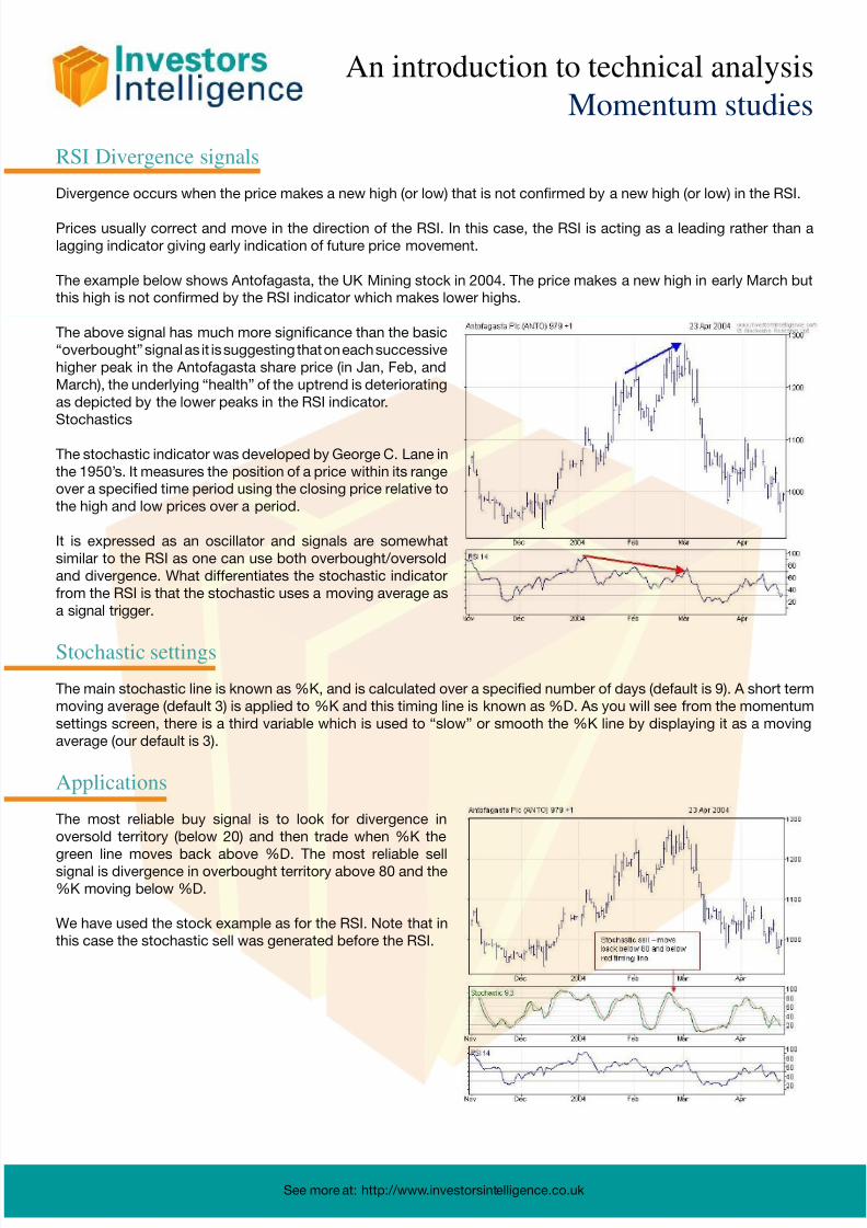
RSI Divergence signals
Divergence occurs when the price makes a new high (or low) that is not confirmed by a new high (or low) in the RSI.
Prices usually correct and move in the direction of the RSI. In this case, the RSI is acting as a leading rather than a
lagging indicator giving early indication of future price movement.
The example below shows Antofagasta, the UK Mining stock in 2004. The price makes a new high in early March but
this high is not confirmed by the RSI indicator which makes lower highs.
The above signal has much more significance than the basic
“overbought” signal as it is suggesting that on each successive
higher peak in the Antofagasta share price (in Jan, Feb, and
March), the underlying “health” of the uptrend is deteriorating
as depicted by the lower peaks in the RSI indicator.
Stochastics
The stochastic indicator was developed by George C. Lane in
the 1950’s. It measures the position of a price within its range
over a specified time period using the closing price relative to
the high and low prices over a period.
It is expressed as an oscillator and signals are somewhat
similar to the RSI as one can use both overbought/oversold
and divergence. What differentiates the stochastic indicator
from the RSI is that the stochastic uses a moving average as
a signal trigger.
Stochastic settings
The main stochastic line is known as %K, and is calculated over a specified number of days (default is 9). A short term
moving average (default 3) is applied to %K and this timing line is known as %D. As you will see from the momentum
settings screen, there is a third variable which is used to “slow” or smooth the %K line by displaying it as a moving
average (our default is 3).
Applications
The most reliable buy signal is to look for divergence in
oversold territory (below 20) and then trade when %K the
green line moves back above %D. The most reliable sellsignal is divergence in overbought territory above 80 and the
%K moving below %D.
We have used the stock example as for the RSI. Note that in
this case the stochastic sell was generated before the RSI.

8/19/2019 Investor Intelligence Techical Analysis Guide
http://slidepdf.com/reader/full/investor-intelligence-techical-analysis-guide 12/25See more at: http://www.investorsintelligence.co.uk
An introduction to technical analysis
Momentum studies
MACD Indicator
The MACD was developed by Gerald Appel and set out in his book “The Moving Average Convergence Divergence
Trading Method”.
The MACD indicator is the difference between two exponential moving averages (12 and 26 as default) and also has a
signal trigger or timing line (9 day ema as default).
When values of the MACD indicator move above the zero level, it is similar to a moving average crossover signal
described previously to identify uptrends.
However, many investors do not wait for the indicator to move above zero as a buy signal but instead look for divergence
i.e. for the price to make a lower low and the MACD to make a higher low.
A signal line in the form of a short term moving average (red line) is applied to the MACD which to provide the actual
signal.
The example below shows Bae Systems, the UK defence contractor, which has recently made new multi-year highs.
However, notice how the MACD does not confirm these highs (i.e. makes a lower high) potentially providing a good
early indication of a trend change – the actual signal will be generated when the MACD (blue line) crosses below the
signal line (red line).

8/19/2019 Investor Intelligence Techical Analysis Guide
http://slidepdf.com/reader/full/investor-intelligence-techical-analysis-guide 13/25See more at: http://www.investorsintelligence.co.uk
An introduction to technical analysis
Moving averages
Moving averages
The moving average (often shortened to “ma” in our research) is one of the most popular indicators and is used by
technical analysts for a variety of tasks:
• to identify areas of short term support/resistance
• to determine the current trend
• as a component in many other indicators such as the MACD, or Bollinger bands.
The main advantages of moving averages is firstly that they smooth the data and thus provide a clearer visual picture
of the current trend and secondly, that m.a. signals can give a precise answer as to what the trend is. The main
disadvantage is that they are lagging rather than leading indicators but this should not be a problem to longer term
investors.
There are two main forms of moving average:
The simple moving average (as the name suggests) calculates the average price over a specified moving time period.
For example, a 20 day simple moving average will calculate the average mean price from the last twenty days closing
prices and so on.
The exponential moving average (“ema”) also averages the last x days closes but assigns a greater weight to the
more recent prices making it more sensitive to current price action and thus reducing the lag effect.
Determining short term support and resistance
The chart below shows the Nasdaq 100 index with a 50 day exponential moving average (ema).
The index is making higher highs and higher lows in a consistent manner through most of 2003 and the 50 day ema
provided a good indication of where these troughs would be i.e. where to initiate trading long positions. One could
of course try a slightly longer period moving average to ensure all troughs remained above the average but from
experience we have found the 50 day ema does the job well.

8/19/2019 Investor Intelligence Techical Analysis Guide
http://slidepdf.com/reader/full/investor-intelligence-techical-analysis-guide 14/25See more at: http://www.investorsintelligence.co.uk
An introduction to technical analysis
Moving averages
Generating trading signals
The crossover method generates a fairly reliable automatic trading signal when a shorter term average cross above a
longer term average.
In the example below we have shown 20 and 50 day ema’s for the Nasdaq 100 index. The crossover method would
buy the index when the more sensitive 20 day ema (green line) crosses above the longer term 50 day ema (red line) and
would sell the index when the 20 day ema crosses back below the 50 day ema.
We have marked buys with blue arrows and sells with red arrows – this rule of thumb system would have kept us in the
market from approximately 1000 to around 1500

8/19/2019 Investor Intelligence Techical Analysis Guide
http://slidepdf.com/reader/full/investor-intelligence-techical-analysis-guide 15/25See more at: http://www.investorsintelligence.co.uk
An introduction to technical analysis
Point & Figure Chart Formations
Point & Figure Chart Formations
Our recent article “Using point & figure charts” aims to familiarise the investor with the basic concepts of point & figure
charts and to highlight some of the benefits from using them. This article follows on to illustrate many of the classicformations that are used to generate buy and sell ideas.
Bullish Formations
The Double TopThe most simple buy signal is the double top where a stock rises above the top of
the previous up column (Xs).
This signal is the basic ingredient for many of the actionable signs listed below. In
its own right, it definitely require confirmation by the main trend (see trend lines)
and positive relative strength.
The Triple TopThe triple top is similar to the double top but the area of resistance above the up
columns is stronger and so takes two attempts to breakout. These signals work
best when the main medium term trend is bullish and combined with positive
relative strength.
Stops are placed below the previous down column.
The Bullish CatapultThis formation can be looked at as a triple top buy followed by a double top buy
and is effectively a failed bull trap (see sell signals).
The price failed to follow through on its first breakout and pulls back (the bull trap)
only to reverse again to the upside.
Place a stop below the previous down column.
Bear TrapThis formation comes about when a stock breaks below a triple bottom and then
reverses back to an up column without dropping even one more box.
When the triple bottom is broken, a number of stop-losses will have been touched
off and the chances are good that a lot of short sales will have been initiated on the
downside breakout. These bears will effectively be “trapped” and their subsequent
liquidations will add to the upside momentum.
Enter the stock on the reversal.
Stops are placed below the prior low.
The Bullish ShakeoutThe late great Earl Blumenthal used to say that the first sell signal in an uptrend was
really a buy signal and this is a very overlooked thesis. The criteria for a shakeout
formation is as follows:
1.the first sell signal in a new uptrend from a double top
2.above its bullish support line
3.has broken its downtrend line
4.has a bullish relative strength chart
The stock generates a simple sell signal but fails to move more than three boxes
lower and then reverses back up. One can enter the position on this reversal (before
a new p&f buy).Stops are placed below the up-column lows i.e. on another reversal down.
X
X X
X O X
X O X
O
X
X X X
X O X O X
X O X O X
O O
Stop level
X
X X
X X X O X
X O X O X O X
X O X O X O
X O O Stop level
X
X X
X O X O X
X O X O X
O O X
O
Stop level
X X
X O X O
X O X O X
O O X
O X
O Stop level

8/19/2019 Investor Intelligence Techical Analysis Guide
http://slidepdf.com/reader/full/investor-intelligence-techical-analysis-guide 16/25See more at: http://www.investorsintelligence.co.uk
An introduction to technical analysis
Point & Figure Chart Formations
Bullish Formations - continued
Long tail down
This signal goes somewhat against the market adage of “never trying to catch afalling knife” but using the following criteria it can be good for long term “bottom
fishing” strategies.
1. The stock has dropped into a major support area (green zone)
2. The relative chart is also basing.
3. The market is becoming oversold after an important downtrend and breadth
indicators such as the NYSE Bullish % are low and moving to “bull alert” status.
4. the stock has dropped by 20 boxes or more straight down
Enter the stock on the reversal.
Stops are placed on below the up-column i.e. on another reversal.
Low PoleThis formation comes about when a down column extends by more than three
boxes below the previous down column but then retraces by more than 50% of the
down column.
This formation is excellent for generating signals on indicators such as the advance/
decline line.
It is also very good in mutual funds to use as a buy point rather than waiting for a
move above a previous top.
Bearish formations
The Double Bottom BreakoutThe most simple sell signal is the double bottom where a stock breaks below the
previous down column (Os).
This signal is the basic ingredient for many of the actionable signals listed below. In
its own right, it definitely requires confirmation by the main trend (see trend lines).
Triple BottomsThis is similar to the double bottom but it takes two attempts to breakout. These
signals work best when the stock is below its bearish resistance line and combined
with negative relative strength.
Stops are placed above the previous up column.
The Bearish CatapultThis formation can be looked at as a triple bottom sell followed by a double bottom
sell.
The price failed to follow through on its first breakout and rallies, only to reverse
again to the downside (a failed bull trap).Place a stop above the previous up column.
20 boxes down)
O
O
O
O
O
O
O
O
O
O X
O X
O X
O Stop level
O
O X
O X O
O X O
O O
O X
O X
O X
O
O
O X
O X O
O X O
O O
O
Stop level
X X
O X O X O
O X O X O
O O O
O
X X Stop
O X O X O X
O X O X O X O
O O O X O
O O
O

8/19/2019 Investor Intelligence Techical Analysis Guide
http://slidepdf.com/reader/full/investor-intelligence-techical-analysis-guide 17/25See more at: http://www.investorsintelligence.co.uk
An introduction to technical analysis
Point & Figure Chart Formations
Bearish formations - continued
Pullback after multiple Xs up
This was an Earl Blumenthal signal and is a good time to take profits, but not togo short.
More often than not a solid correction will happen after this takes place and in
some cases it will prove to be the final top.
Bull Trap
The popularity of triple tops has brought this about. The stock breaks out through
a triple top and pulls back right away without moving up one more box.This action effectively traps the bulls initiated by the false break, such as traders
with buy-stop orders and short sellers with stop losses.
High Pole
This occurs when an up column (Xs) exceeds a previous up column by at least
three Xs and then moves down in the next down column (Os) by more than 50%
of the last up column.
Place the stop above the most recent column of Xs.
Broadening Top Formation
This formation is particularly useful for stocks that have already had good up-
moves and are close to prior highs. The pattern can be spread over more columns
than in this basic example.
Look for the following formation of columns: a high(1), a low(2), a higher high (3), a
lower low (4) and finally a higher high (5).
This formation can be traded with a percentage stop, or after a high pole.
X
X O
X O
X O
X
X
X
X
X
Stop level
X
X X O
O X O X O
O X O X O
O O
Stop level
X
X O
X O
X X O
X O X
X O X
5
3 X
1 X X
X X O X
X O X O X
X O X O X O X
O X O X O X X
O X O O X O X
O X O X O X
O O X O
2 O X
O
4

8/19/2019 Investor Intelligence Techical Analysis Guide
http://slidepdf.com/reader/full/investor-intelligence-techical-analysis-guide 18/25See more at: http://www.investorsintelligence.co.uk
An introduction to technical analysis
Price Patterns
The Double Bottom
The chart below shows the Italian MIB30 index.
The red blotches from 2000 to 2002 mark the succession of lower peaks (or highs) and lower troughs (or lows) that
provided confirmation that a severe downtrend was in place. Each trough represents a temporary level of support and
each peak a level of resistance which suggests that in this case, investors are continually lowering their expectations
i.e. they are lowering the levels are which they are prepared to buy (the support level) and consequently the price keeps
making lower lows.
A Glimmer of hope in March 2003
From the above chart, we can first identify a potential change in trend in March 2003 (the blue blotch). At this point,
although the index remained in a downtrend, it made a double bottom, or did not make a lower low, i.e. investors were
prepared to support the price at the same level as in October 2002 (the previous low) which was a clear signal of an
improvement in sentiment.
This equal low represented a first sign that a change was possible but it was not until mid-2003 when the price broke
above the prior high (the last red blob) that we could suggest a change to an uptrend when the previous resistance of
late 2002 had been breached.
The above formation can also be referred to as a “base formation” with the price moving between support (at the lows)
and resistance (at most recent highs) in a trading range. Once resistance is broken, we can refer to this as a “basebreakout” and look for further comfort when the price manages to find support above the prior resistance (remember
the rule: resistance becomes support and vice versa). You can just see this happening in the above chart.
Of course, it’s always easier to spot a trend change in hindsight ! But if we follow the rules rigorously [and accept what
the charts tell us] we will be able to observe and anticipate price trend changes.

8/19/2019 Investor Intelligence Techical Analysis Guide
http://slidepdf.com/reader/full/investor-intelligence-techical-analysis-guide 19/25See more at: http://www.investorsintelligence.co.uk
An introduction to technical analysis
Price Patterns
The Triple bottom
Another rule to remember is that the more times a price finds support at a particular level, the stronger that level of
support is (vice versa for resistance ).
Let’s have a look at another example. The chart below shows the US S&P 500 index over five years (weekly bar
chart).
Notice the chart action from mid-2002 to March 2003 around the 800 level. Each time the price bounces from a
particular support level, more investors will identify this level and build it into their trading strategy. This is the direct
application of human behavioural observation.
Notice also that once the index has cleared previous highs or resistance at just below 1000 (the top green line) that this
level turns into support (the last blue blotch).
The Double topNot surprisingly, the double top formation is the inverse of the double bottom.
In this case, the price fails to make a new high i.e. investor demand is no longer expanding and reaches equilibrium
with supply at the same level rather than ahigher level.
Double top formation
in Gold Futures in April
2004.

8/19/2019 Investor Intelligence Techical Analysis Guide
http://slidepdf.com/reader/full/investor-intelligence-techical-analysis-guide 20/25See more at: http://www.investorsintelligence.co.uk
An introduction to technical analysis
Price Patterns
Head and shoulders formation
Another formation which is widely referred to is the head and
shoulders formation. This differs from the double top in that the firstevidence of its development is the generation of a lower high rather
than an equal high; in other words, sellers are beginning to appear
at lower levels than they did previously and the buyers no longer
have the same appetite at these higher levels as before.
The diagram below is an example of the head and shoulders top.
The high A is referred to as the first “shoulder” and the high B as the
“head”. The most recent lower high C is referred to as the second
“shoulder”. A trend line can be drawn below the recent lows and this is referred to as the “neckline”. The change of
trend is signalled by a decisive break below the “neckline”.
Bullish ReversalsThe previous examples use the relative positioning of peaks and troughs (Dow theory) to determine changes in trend
and these can take weeks or months to develop. The V reversal is a much more dramatic event and unlike double
bottoms, there is no higher low to alert us to a potential signal and generally we cannot identify this signal until the day
after the reversal.
Before a bullish reversal, prices will begin to accelerate downwards. This action suggests that there is fast becoming a
bearish consensus i.e. the vast majority of investors are bearish and the price drops faster and faster as the few remaining
bulls throw in the towel and liquidate their long positions – this phenomenon is also known as “capitulation”.
Analysts who are alert will flag this chart and comment that it is looking “overextended” or oversold. Momentum
indicators define this oversold status further (covered later in this tutorial).
The reversal signal culminates when the price makes a new low but then reverses up sharply the same day and actually
closes higher than the previous day; this is also known as “a key day reversal”.
Let’s try and look a little closer at what is happening to investor sentiment during a bullish reversal. As discussed
above, we know that immediately prior to the reversal, investors have capitulated i.e. the last few bulls have vanished
into thin air and that virtually everyone is now bearish. However, the majority of those who want to sell will already
have sold on the way down so, eventually, the supply will dry up. All it takes now is for one short trader to take some
profits (buy back) or a few bulls to do a bit of bargain hunting and we have an imbalance i.e. the supply (the bears or
sellers) have dried up and we have an increase in demand (bulls or buyers). This will create a reversal and the sudden
up-move will trigger other short sellers to close out positions and further bargain hunters to step in causing further
upward pressure.
This reversal is identified by
an emphatic reversal of price
action, where in an uptrend the
instrument opens up but then
closes below the low of the day
before.

8/19/2019 Investor Intelligence Techical Analysis Guide
http://slidepdf.com/reader/full/investor-intelligence-techical-analysis-guide 21/25See more at: http://www.investorsintelligence.co.uk
An introduction to technical analysis
Price Patterns
This is identical to the key day
reversal but on a weekly chart.
When this occurs it is a very
strong reversal signal.
Bullish Reversals
The bearish reversal is the inverse of the bullish reversal as discussed above. It is a dramatic top formation and
develops when prices have accelerated higher and become overextended on the upward side. It is characterised by
a new short term high followed by the price closing the day lower. an emphatic reversal of price action, where in an
uptrend the instrument opens up but then closes below the low of the day before.
Nickel accelerated up to a new
historic high in January 2004.
However, on the 6th January it
reversed to close the day sharply
lower.
The reversal in January signalled
the top and Nickel prices have
moved steadily lower since this
time.
It is not uncommon for an instrument to regain composure after a reversal and revisit the level at which the previous
reversal took place. However, it is more than likely that this level will have become a powerful level of support or
resistance and may generate a further reversal signal.
8/19/2019 Investor Intelligence Techical Analysis Guide
http://slidepdf.com/reader/full/investor-intelligence-techical-analysis-guide 22/25See more at: http://www.investorsintelligence.co.uk
An introduction to technical analysis
Price Patterns
Buying & Selling Climaxes
The above example of Nickel can also be referred to as a “buying climax”.
Investors Intelligence uses this term to describe a more specific event which occurs over a one week period.
• A buying climax is where a stock makes a new 52 week high but then closes below the previous week’s close.
• A selling climax is where a stock makes a new 52 week low and then closes above the previous week’s close.
The reason that we use such a rigid definition for climaxes is that this enables us to classify accurately and consistently
what is and what isn’t a climax. This is important as we maintain historic records of the climaxes generated each week
and have noted that important market turning points are often accompanied by a sudden rise in the number of buying
or selling climaxes.
A great example of this was in October 2002 when the Dow Industrials made its final low of that cycle. At this point, our
US Market Timing Service observed a massive increase in the number of US stocks generating selling climaxes.

8/19/2019 Investor Intelligence Techical Analysis Guide
http://slidepdf.com/reader/full/investor-intelligence-techical-analysis-guide 23/25
An introduction to technical analysis
See more at: http://www.investorsintelligence.co.uk
An introduction to technical analysis
Support and Resistance
Support and Resistance
Understanding the concepts of support and resistance is vital in developing a disciplined trading strategy. Prices
are dynamic, reflecting the continuing change in the balance between supply and demand. By identifying the pricelevels at which these balances change we can plan not only the price level at which to purchase but also the level at
which we can subsequently sell (and vice versa for a short trade). Whilst these levels may be created by the markets
subconsciously, they represent the collective opinions of the participants in the markets.
Support represents the level at which buying pressure is strong enough to absorb and overcome the selling pressure.
At price support levels buyers step into the market mopping up the imbalance between supply (sellers) and demand
(buyers) and when this happens the price will halt its decline and will potentially rise.
Resistance is the opposite of support and is the level at which the volume of selling (supply) outweighs the volume
of buying (demand). These mini-levels can change frequently but over time a clear pattern emerges and firm levels
become established.
The above chart clearly shows the sideways trading range in Smith & Nephew during 2003.
The conditions for a change from a sideways trend to an uptrend
The above scenario describes a sideways trading range. However, market conditions change (it may be due to
improvements in the earnings estimates for a stock, a newly released crop report for a commodity or economic data
for a currency or bond).
Let’s say, for example, that market conditions improve. This will alter the balance between supply and demand. The
bears (the supply or sellers) will be less keen to sell and will generally become less pessimistic. The bulls (the demand
or the buyers) will be more keen to add to positions. The next time the price approaches the previous level of resistance,
there will be less bears than before and prices will push above the previous resistance and, possibly, mark the start of
a ‘break out’ into a new trend.
Not all the bulls and bears will have changed their opinion. This is because most investment related news is open to
personal interpretation and of course, not all investors may have spotted it in the first place. It is the reaction of the
investors who didn’t change their view at the time that will establish a new trend :
Some of the short traders (who have sold stocks) will no doubt have set stop losses above the prior resistance level to
close out if the price rises to limit these losses. These ‘limit orders’ will be triggered and they will have to buy stock to
satisfy their earlier sales contracts creating more demand and more upward momentum to the price action.Other investors who had previously decided not to participate and remain out of the market will notice that the sideways
range has been broken and may decide to now take a position – this will create even more demand and push prices
higher still.

8/19/2019 Investor Intelligence Techical Analysis Guide
http://slidepdf.com/reader/full/investor-intelligence-techical-analysis-guide 24/25
An introduction to technical analysis
See more at: http://www.investorsintelligence.co.uk
An introduction to technical analysis
Support and Resistance
Looking at the above chart, notice how the resistance at around 430p was broken in October 2003. Also notice how
this level became the new support and that the price has developed a persistent uptrend.
Conditions for a new level of Support
This is where it gets interesting. The previous level of resistance will now become a level of support. This is because not
everyone got the chance to act immediately that the price broke resistance; some people may have decided to monitor
the situation for a while, others may simply have not been watching.
They will have seen the price jump ahead strongly after breaking resistance and many will be buyers if the price
retraces to this level: the short sellers who put on a position just below resistance (this strategy had worked for them
several times before so they may have upped the stakes) will want to cover with a small loss if the price gets back to
this level – this exposes market ‘fear’.Traders who had been long but taken profits at resistance will want to re-join the
party and purchase as near to where they previously sold as possible – exposing market ‘greed’.
Apart from a new level of support developing from prior resistance as discussed above, there will also be a new level
at which the buyers want to take profits i.e. a new resistance level will develop as earlier buyers reach their targets and
start to sell. This action is the first stage in the development of successive higher support and higher resistance levels
which brings us to the Concept of Trend.

8/19/2019 Investor Intelligence Techical Analysis Guide
http://slidepdf.com/reader/full/investor-intelligence-techical-analysis-guide 25/25
An introduction to technical analysisAn introduction to technical analysisPutting it all together– a basic routine for investment
Putting it all together
This tutorial aims to give a basic understanding of technical analysis and to at least whet your appetite to learn more.
The good news is that there are many excellent books on the subject.
How to apply this tutorial
Technical analysis can be applied as :
- a means of identifying potential investments which can then be investigated further using analysis of underlying
fundamentals, newsflow etc.
- a timing tool to fine tune entry and exit points for an investment selected using other forms of analysis.
However you use technical analysis, a disciplined approach is essential. Try to develop a routine way of analysing yourinvestments and follow this each time you review existing holdings or investigate new positions.
Here are some basic steps for looking at stocks:
1. Determine the current trend of the relevant stockmarket indices.
- When did this trend last change ?
- Where is the major support and major resistance ?
- Is the market trend likely to aid or hinder specific stock trends ?
2. Determine the current medium term trend of the stock (use a five year bar chart)
- When did this trend last change ?
- Where is the stock positioned relative to major support and resistance ?
3. Determine the current short term trend of the stock (use p&f chart and 6 month bar/candlestick charts)
- Where is the short term support and resistance ?
- have there been any important reversal patterns ? if so, do they re-enforce particular areas of support or
resistance?
4. Do the moving averages confirm the above trends ? is the price above its 50 day and 200 day averages and are the
shorter term averages above the longer term ones (20 ema versus 50 ema).
5. Determine the relative performance of the stock
- Is the relative indicator suggesting outperformance/underperformance and has this changed recently ?
- Is the stock in a strong sector relative to the market (view sector indices)
6. Are the momentum indicators positive and do they confirm the stock action ?
7. Has there been any strong volume activity in the last six months and did this coincide with a likely trend change or
help confirm an area of support or resistance ?
By answering the above questions, one should develop a good background to the current technical strength of the
stock in question. This will make it possible to compare it against other contenders for investment.
One should also be able to develop a strategy for investing in that stock. One can determine a potential price target at
a previous level of resistance although this is more difficult if the stock is making new highs ! One should also identify
the level at which the trend will have been negated, the “stop” level at which one should seriously consider selling one’s
holding or at the very least re-appraising the situation.